Create a FREE Account
Instant access to 1,000+ real slides from top companies like McKinsey, BCG, Goldman Sachs, Google and many more!
First Name
Last Name
Email
Password
I agree to all
Terms & Privacy Policy
Thank you! Your submission has been received!
Oops! Something went wrong while submitting the form.
Have an account?
Sign in
Library
Templates
Courses
Pricing
My Account
My Slides
✦ AI
AI Prompt Library
AI Search
Sign in
Start Here
Logout
My Saved Slides
Features a column chart comparing cost base targets from 2022 to 2025 and bullet points summarizing key actions executed and priorities for 2023.
Operational Efficiency
Financial Services
Summarizes cost reduction measures taken in 4Q22 and outlines priorities for 2023 to maintain expense discipline and operational efficiency.
cost transformation, expense reduction, priorities, operational efficiency, financial targets
Mixed Chart
Credit Suisse
Saved
Two-column layout with graphics on left and summary points on right; bright icons and metrics highlight economic and environmental benefits
Market Analysis and Trends
Environmental Services & Sustainability
Highlights Southeast Asia’s green economy potential for GDP growth, EV adoption, and power generation, emphasizing economic, energy security, and climate benefits of regional transformation.
green economy, Southeast Asia, GDP, EV growth, energy security, climate impact
Table
Bain
Saved
This slide contains two column charts. The first chart shows equity market valuations in terms of price-to-earnings ratios for various regions. The second chart shows price-to-book ratios. Color coding and markers represent different data points such as 15-year range, 15-year average, and the latest values.
Financial Performance
Financial Services
The slide analyzes global equity valuations through price-to-earnings and price-to-book ratios, comparing different regions to identify market trends and investment opportunities. It is used for financial performance evaluation and investment decision-making.
Global equities, valuations, price-to-earnings, price-to-book, financial markets, investment, Asia, Europe, AC World, S&P 500
Multiple Chart
JP Morgan
Saved
Column chart depicting perceptions of President Joe Biden's impact on transatlantic relations, with segmented responses indicating varying degrees of positivity and negativity.
Market Analysis and Trends
Government & Public Sector
Shows the impact of President Joe Biden's election on transatlantic relations, with a majority seeing it positively, as indicated by a survey of respondents.
Biden, transatlantic, relations, perceptions, survey
Single Chart
Bain
Saved
Left vertical layout lists six megatrends with arrow blocks; right side visualizes the CASE framework (Connected, Autonomous, Shared, Electric) and key focus areas.
Technology and Digital Transformation
Industrial & Manufacturing
Describes six megatrends influencing the automotive industry, including evolved customers, disruptive tech, business models, mobility, and regulation. The CASE framework reinforces strategic shifts in tech integration, customer focus, and infrastructure adaptation.
megatrends, CASE, automotive tech, mobility, EV, cybersecurity, AI, business models
Table
PwC/Strategy&
Saved
The slide features a diagram showing the value chain stakeholders for bio jet fuel production, including fuel producers, fuel distributors, aircraft manufacturers, airports, airlines, and governments. It also includes a production cost analysis and key regulations and policies in the US.
Client Case Studies
Transportation & Logistics
This slide emphasizes the need for strong policy support to make bio jet fuel production cost-competitive, highlighting the value chain stakeholders, production costs, and key regulations and policies supporting bio jet fuel development in the US.
bio jet fuel, production cost, policy support, value chain, stakeholders, regulations, US
Diagram
Kearney
Saved
Contains bar and column charts comparing incentives for various clean technologies like hydrogen and carbon capture.
Regulatory and Compliance
Energy & Utilities
Reviews governmental incentives for scaling clean technologies, crucial for policy analysis and energy sector planning.
clean technology, incentives, hydrogen, carbon capture, energy policy, regulatory, energy sector
Multiple Chart
BCG
Saved
Features a collection of stacked column charts detailing demographics such as gender, age, employment status, education, and tenure among survey respondents from different countries. Each chart uses a consistent green color scheme, and the layout provides a clear division between different demographic categories.
Market Analysis and Trends
Professional Services
This slide presents demographic data of respondents from a global survey on deskless workers, including distributions by age, gender, education, and employment status. Useful in understanding the diversity of the survey population and contextualizing the data in discussions of workplace practices in multinational contexts.
demographics, survey, global, education, employment, gender, age
Multiple Chart
BCG
Saved
Horizontal bar chart showing telcos' planned investments in ESG (Environmental, Social, Governance) initiatives, comparing telco average to cross-industry average.
Regulatory and Compliance
Telecommunications
This slide illustrates the emphasis telcos place on ESG investments, highlighting environmental, social, and governance initiatives being prioritized to support ESG goals.
ESG investment, Environmental initiatives, Social initiatives, Governance, Digital transformation
Multiple Chart
BCG
Saved
This slide presents a combination of a horizontal bar chart and stacked bar chart, depicting company revenue distributions. The green and black color scheme is used, with revenue ranges clearly labeled.
Financial Performance
Financial Services
It provides insights into the revenue distribution of companies, showing that about half reported revenues under $1 billion, while the other half reported revenues of $1 billion or more.
revenue, distribution, financial, chart, company
Single Chart
Deloitte
Saved
Line chart comparing the payout ratio and Swiss 10-year government bond yield.
Financial Performance
Real Estate & Construction
Analyzes the distribution yield of Swiss real estate funds relative to the 10-year Swiss government bond yield.
real estate, distribution yield, government bond, comparison
Single Chart
Credit Suisse
Saved
Split layout with bar chart (left) comparing GDP forecasts by institutions and line chart (right) showing Eurocoin index over time.
Market Analysis and Trends
Financial Services
The slide shows a modest downgrade in GDP growth projections for the Eurozone from major institutions. It includes monthly Eurocoin index values suggesting that leading indicators remain negative, reflecting stagnation or mild contraction.
eurozone, GDP forecast, ECB, Eurocoin, economic indicators, projections, growth, slowdown, macroeconomics
Multiple Chart
McKinsey
Saved
The slide has a combination of column and bar charts with a detailed breakdown of the roles and tools used for data analysis and analytics.
Market Analysis and Trends
Professional Services
Describes the various roles performed by Shared Services (SS) and Global Business Services (GBS) in data analytics, including tools like Cloud and ERP.
data, analytics, SS, GBS, cloud, ERP, analysis, insights, reports
Mixed Chart
Deloitte
Saved
The slide presents three column charts comparing secondary market average sales prices from NameCon, interviews, and surveys. The highest confidence estimate is highlighted.
Market Analysis and Trends
Retail & E-commerce
It compares average secondary market sales prices from different sources, indicating the range and highest confidence estimate used for market sizing.
secondary market, average price, sales, estimates, domains
Mixed Chart
BCG
Saved
A line chart showing the projected increase in cashless transactions per capita across different regions from 2015 to 2030.
Market Analysis and Trends
Financial Services
This slide explains the projected increase in cashless transactions per capita globally, driven by digital behaviors post-COVID.
cashless, uptake, projection, regions, per capita, 2015, 2030, digital behaviors, COVID
Mixed Chart
PwC/Strategy&
Saved
Uses three-tone color-coded bars representing age groups (18–34, 35–54, 55+). Structured bar chart with issue list and age-wise response percentages.
Customer and Market Segmentation
Government & Public Sector
Breaks down concerns by age group. Older respondents (55+) show stronger concern for defence and immigration; younger groups emphasize housing, education, and inequality.
age segmentation, generational views, UK issues, Ipsos, public concerns
Mixed Chart
IPSOS
Saved
Four-line graph panels showing daily tests, cases, TPR, and CFR over time in the EU with contextual insights.
Performance Metrics and KPIs
Healthcare & Pharmaceuticals
Demonstrates that increased COVID-19 testing and reduced test positivity rate contributed to a falling CFR in the EU. Shows that case identification has outpaced test positivity, influencing trends in mortality measures.
test positivity, CFR, EU, COVID-19 testing, detection rates
Mixed Chart
McKinsey
Saved
Multi-panel layout with bar charts and line graph; red and grey color scheme; financial and lease data visualized
Financial Performance
Financial Services
Highlights BOC Aviation’s strong lease fundamentals with an average lease term of 7.8 years, dispersed expiries, and high future committed revenues. Benchmarks industry peers, emphasizing the company’s long-term revenue visibility.
leases, lease term, revenue, aviation, aircraft, expiries, NBV, financial performance, committed revenue, comparison
Multiple Chart
Goldman Sachs
Saved
Four line graphs show U.S. mortgage delinquency rates, subprime mortgage originations, and financial obligation ratios, indicating trends in consumer credit health.
Operational Efficiency
Financial Services
Reviews the financial health of consumers by analyzing mortgage delinquency rates and debt ratios, relevant for operational efficiency in financial services.
consumer, credit, mortgage, delinquency, subprime, obligations, ratios, health, financial services
Multiple Chart
Morgan Stanley
Saved
Right bar chart listing top 10 consumer trade-down behaviors with % deep dive follow. Left text discusses post-inflation and value-persistence behaviors. Dark pink bars indicate strong consumer intent.
Pricing Strategies
Retail & E-commerce
Despite improved economic outlook, shoppers are expected to maintain cost-conscious behaviors. Lists key actions such as buying from off-price retailers, waiting for discounts, and choosing cheaper versions. Highlights over 80% plan to spend the same or less on fashion in 2025.
value behavior, discount shopping, price sensitivity, trade-down, economic resilience
Mixed Chart
McKinsey
Saved
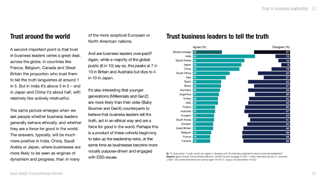
Split-screen layout: left side has a blue panel with the question and topic; right side shows a horizontal bar chart.
Market Analysis and Trends
Government & Public Sector
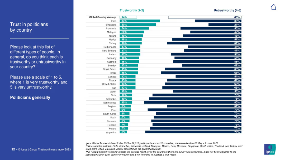
The slide presents survey data on perceived unfair treatment of minority ethnic groups across various countries. Indonesia, Netherlands, and U.S. top the list.
minority, ethnic, inequality, perception, treatment, survey, bar chart, countries, global average, Ipsos
Mixed Chart
IPSOS
Saved
Waterfall bar chart; neutral background; horizontal timeline from YE24 to YE26e with labeled blocks.
Strategic Planning
Financial Services
The slide outlines the expected evolution of risk-weighted assets (RWA) from year-end 2024 to estimated year-end 2026, maintaining capital ratio targets. It includes Basel III impacts, credit/market risk, operational risk, and expected business growth adjustments.
RWA, Basel III, CET1, capital ratio, FX, market risk, operational risk, UBS, balance sheet, risk management
Single Chart
UBS
Saved
Two column charts presenting data on the extent of SDG mention in company reporting and where they are mentioned. Simple visual layout with one column chart on each side of the slide.
Regulatory and Compliance
Financial Services
This slide shows that the majority of companies mention the Sustainable Development Goals (SDGs) in their reporting, detailing where within the reports these mentions are most frequently found.
SDGs, reporting, companies, compliance, sustainability
Multiple Chart
PwC/Strategy&
Saved
Contains a column chart comparing percentages of network budget spent on maintenance vs. modernization over four years.
Operational Efficiency
Telecommunications
Discusses changes in network spending focusing on the shift from maintenance to modernization, illustrating strategic network investments.
network modernization, budget allocation, operational efficiency, strategic investment, technology upgrades
Mixed Chart
Accenture
Saved
A horizontal bar chart comparing conservative and aggressive investment attitudes before and during the pandemic, with a small shift chart showing more conservative or risky attitudes over time.
Market Analysis and Trends
Financial Services
Examines how Canadian investors' attitudes toward investing have shifted due to the pandemic, comparing conservative and aggressive investment attitudes before and after.
attitude, investing, conservative, aggressive, shift
Multiple Chart
IPSOS
Saved
Previous
Next
If nothing, comes up, please save your slides first
Create a FREE account to continue browsing
Receive Instant Access to 1,000+ slides from companies like McKinsey, Google, and Goldman Sachs
First Name
Last Name
Email
Password
I agree to all
Terms & Privacy Policy
Thank you! Your submission has been received!
Oops! Something went wrong while submitting the form.
Have an account?
Sign in
Column Chart
Heatmap
Chevron
Org Chart
Infographic
Callouts
Timeline
List
Graphic
Picture
Process Flow
Diagram
Paragraph
Map
Table
Framework
Subtitle
Takeaway Box
Icon
Other Chart
Radar Chart
Waterfall Chart
Mekko Chart
Pie Chart
Scatter Plot
Line Chart
Bar chart
Bullet points