My Account
My Slides
Search by Category
Companies
Slide Type
Use Case
Industry
Pricing
Templates
View All Templates
Download Template Slides
✦ AI
AI Prompt Library
AI Search
Feedback
Login
Logout
Get Started
Browse all Slides
Browse all Slides
Create a FREE Account
Instant access to 1,000+ real slides from top companies like McKinsey, BCG, Goldman Sachs, Google and many more!
First Name
Last Name
Email
Password
I agree to all
Terms & Privacy Policy
Thank you! Your submission has been received!
Oops! Something went wrong while submitting the form.
Have an account?
Sign in
Saved Slides
Bar and line chart showing venture financing in China from 2018 to Q3 2024, alongside qualitative commentary box.
Market Analysis and Trends
Financial Services
Venture activity in China continues to decline, with Q3 2024 showing minimal IPO activity and reduced deal counts. The commentary suggests regulatory caution and economic uncertainty are dampening VC dynamics, with a wait-and-see approach for the remainder of 2024.
China, VC activity, deal value, IPO slowdown, regulation, economic outlook
Mixed Chart
KPMG
Saved
Combines column charts and illustrations depicting accommodation situations of refugees.
Operational Efficiency
Government & Public Sector
Discusses current accommodation status and future expectations of refugees.
refugees, accommodation, Poland, future outlook
Mixed Chart
Deloitte
Saved
This slide features various icons and column charts displaying effective methods for capturing customer feedback in contact centers, with percentage data for each method.
Market Analysis and Trends
Professional Services
The slide outlines the most effective ways for contact centers to capture customer feedback. It includes survey data showing the prevalence of different methods such as customer surveys, call/contact monitoring, social media listening, and employee focus groups, presented with corresponding icons and column charts.
Customer feedback, contact centers, survey methods, column charts, engagement
Single Chart
Deloitte
Saved
The slide features a column chart showing the adoption rates of various delivery services, such as standard delivery, next-day delivery, buy online and pick-up in store (BOPUS), and same-day delivery.
Market Analysis and Trends
Retail & E-commerce
The slide discusses consumer adoption of different delivery models, indicating a preference for standard delivery methods over newer options like same-day delivery and curbside pickup.
delivery models, consumer behavior, online shopping, standard delivery, BOPUS
Single Chart
Deloitte
Saved
Line chart showing the percentage of down payments for total and first-time buyers from Fall 2015 to Fall 2020. Two lines represent each group.
Market Analysis and Trends
Real Estate & Construction
This slide tracks the expected down payment percentages for future purchases, highlighting trends among all buyers and first-time buyers specifically.
down payment, future trends, first-time buyers, total buyers, Fall 2015-2020
Single Chart
IPSOS
Saved
Includes column charts showing projected volumes of hydrogen production and carbon capture, contrasting 2020 and 2030 scenarios.
Strategic Planning
Environmental Services & Sustainability
Provides a strategic outlook on the adoption of clean technologies driven by higher incentives, aiding in long-term planning and investment strategies.
clean technologies, hydrogen, carbon capture, strategic planning, 2030, incentives, investment strategies
Multiple Chart
BCG
Saved
Text-heavy layout with supporting line chart. Focuses on business sentiment, priorities, and outcomes from digital transformation.
Technology and Digital Transformation
Technology & Software
Emphasizes the positive outcomes of digital transformation initiatives across organizations. Key findings include faster ROI, downscaling after milestones, and growing interest in emerging tech like AI, NFTs, and Web3. Highlights customer value as a major driver.
digital transformation, ROI, customer value, AI, Web3, automation, survey
Mixed Chart
KPMG
Saved
The slide presents donut charts comparing the use of different engagement tools by medical device and pharmaceutical companies.
Technology and Digital Transformation
Healthcare & Pharmaceuticals
Offers a comparative analysis of the tools used by medical device versus pharmaceutical companies for HCP engagement.
engagement tools, medical devices, pharmaceuticals, comparison, HCP engagement
Multiple Chart
Deloitte
Saved
Structured around icons and bullet points focusing on strategies for wealth management and private banking.
Strategic Planning
Financial Services
Outlines JPMorgan's growth strategies for the next decade in asset management, including expanding and building new financial products.
Growth strategies, asset management, wealth management, private banking, financial planning, market expansion
Pillar
JP Morgan
Saved
A column chart depicts the increase in global adult education levels from 1990 to projections for 2050, with separate columns for educational stages. The layout is clear with distinct colors for each educational level.
Market Analysis and Trends
Education & Training
This slide tracks the progress in global educational attainment from 1990, showing the growing trend through 2020 and projecting further increases by 2050. It highlights shifts towards higher education levels globally, with clear demographic segmentation.
education, global, trend, projection, levels
Mixed Chart
Roland Berger
Saved
World map with colored countries indicating different growth rates in entertainment and media expenditures from 2019 to 2023.
Market Analysis and Trends
Media & Entertainment
Predicts the growth rates in entertainment and media expenditures globally, with a focus on BRIC and mature markets.
Global, Growth Rate, Entertainment, Media, Expenditures, 2019-2023, BRIC, Mature Markets
Graphic
PwC/Strategy&
Saved
Slide with multiple pie charts and bullet points. Clean layout with distinct sections for commercial, consumer loans, investment portfolio, and long-term debt.
Financial Performance
Financial Services
This slide is structured to provide an overview of a company's loan distribution and investment portfolio details as of a specific date. It's used for financial analysis and to communicate financial health and strategy to stakeholders or investors.
Financials, Analysis, Loans, Portfolio, Debt
Multiple Chart
Morgan Stanley
Saved
Contains multiple bar graphs and textual analysis. Utilizes a clean, professional layout focusing on M&A trends in the Philippines, including top bidders and deal values.
Mergers and Acquisitions
Financial Services
Provides a detailed analysis of domestic and inbound M&A in the Philippines, including major deals and sector breakdown for top bidders from 2018 to 2020.
M&A, Philippines, domestic, inbound, deal analysis, sectors, bidders
Mixed Chart
Deloitte
Saved
This slide includes a column chart showing profit before tax and other financial metrics like income, operating expenses, litigation, conduct costs, and impairment for Q122 and Q123, highlighting changes and growth rates.
Financial Performance
Financial Services
The slide displays financial performance metrics for Barclays Group, showing a 15% RoTE and profit before tax increase, with detailed breakdowns of income, expenses, and impairments for Q122 and Q123.
RoTE, profit before tax, financial metrics, income, expenses
Mixed Chart
Barclays
Saved
White background line chart showing agreement over time that society is broken by world region; blue info box on left.
Market Analysis and Trends
Government & Public Sector
Regional view of dissatisfaction with societal conditions, comparing LATAM, North America, Europe, and APAC regions; LATAM consistently shows higher agreement levels.
regional perception, societal issues, dissatisfaction, Ipsos, public opinion, trend
Mixed Chart
IPSOS
Saved
Two bar charts showing growth in procedures and installed base; table of country-specific clearances
Product and Service Analysis
Healthcare & Pharmaceuticals
Analyzes global expansion of multiport da Vinci procedures and system installations, including regional regulatory clearances across four years.
multiport, procedures, installations, regulatory clearance, global expansion, da Vinci, growth
Multiple Chart
JP Morgan
Saved
The slide features two column charts comparing 'Production Releases' and 'Improved App Ratings' over time, with annotations. On the right side, there's a text box listing awards and recognitions.
Financial Performance
Financial Services
Demonstrates increased agility in technology with a threefold increase in production releases and higher app ratings. It includes accolades such as innovation and model bank awards, implying industry recognition for technological advancements.
Agility, App Ratings, Awards, Recognition, Innovation, Technology
Single Chart
Goldman Sachs
Saved
Bar chart on fear of China taking Ukraine-like actions in Asia; Canada and US highlighted; global average included.
Risk Assessment and Management
Government & Public Sector
Addresses concern over potential aggression by China in Asia. Globally, 69% agree they fear this, while US and Canada register even higher at 75% and 76%. Slide tracks geopolitical anxieties shifting toward Asia.
China, Asia conflict, geopolitical fear, public sentiment, Ipsos
Single Chart
IPSOS
Saved
Bar chart comparing top 20 sports by engagement base, with gender split. Bottom includes paragraph description and engagement definition.
Customer and Market Segmentation
Media & Entertainment
Identifies the top 20 UK sports by engagement, highlighting football's dominance and the role of female and frequent engagement. It notes patterns, social/leisure dynamics, and Olympic impact on sport popularity.
sports ranking, UK engagement, top sports, gender mix, Olympic impact, participation
Multiple Chart
EY
Saved
This slide continues with the theme of empowerment and skills, presenting bar charts that compare responses about job impact and training concerns between different generations, specifically Gen Z and Baby Boomers.
Market Analysis and Trends
Education & Training
This slide provides insight into generational differences concerning job security and the impact of technology. It highlights concerns among younger workers about their roles being replaced by technology and their worries about not receiving adequate training.
generational differences, technology impact, training concerns, job security
Multiple Chart
PwC/Strategy&
Saved
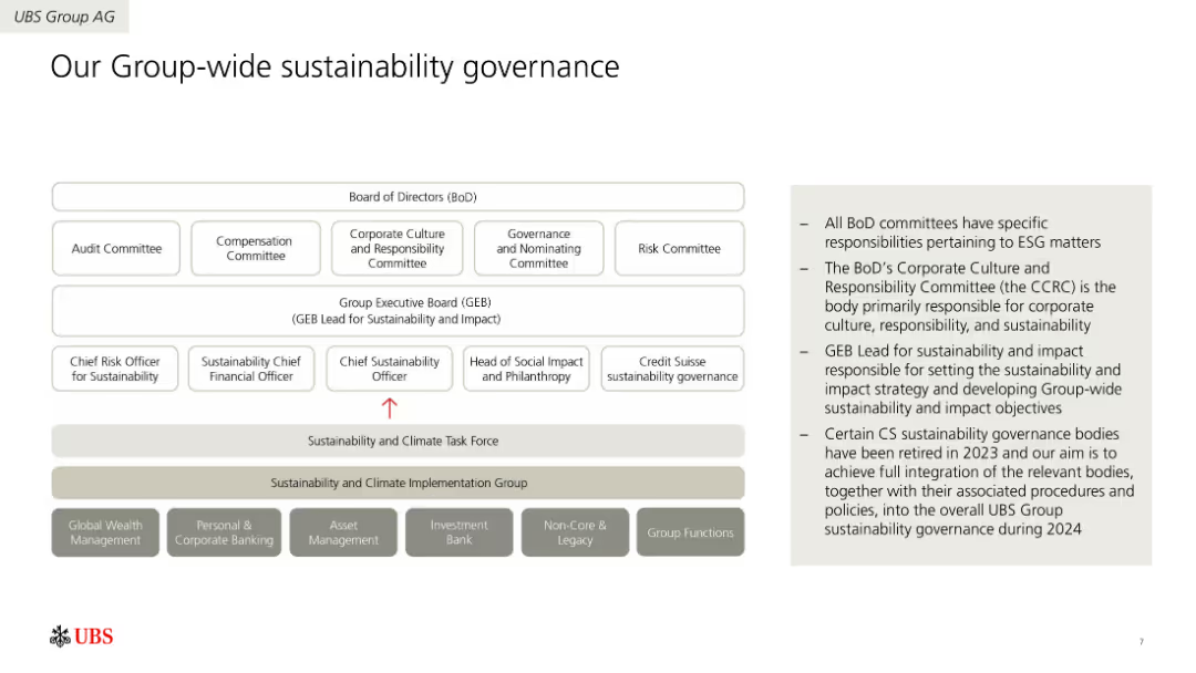
Three donut charts showing revenue mix by business and region, comparing UBS to GSIB averages. Minimalist design with gray tones.
Market Analysis and Trends
Financial Services
Compares UBS’s business model and revenue composition to GSIB averages, emphasizing UBS's 60% revenue share from wealth & asset management. The regional revenue breakdown highlights UBS’s global reach and diversified model.
UBS, diversification, revenue mix, GSIB, asset management, investment banking, APAC, EMEA, Americas
Single Chart
UBS
Saved
A column chart showing the reduction in cost per private transaction over time, with significant drops from the prototype stage to Nightfall introduction and further with batching. Includes bullet points about the technological progress and regulatory compliance features.
Technology and Digital Transformation
Technology & Software
Details the technological advancements made in reducing transaction costs on public blockchains, highlighting significant milestones and the role of regulatory compliance.
Technological progress, private transactions, business agreements, public blockchains, cost reduction, regulatory compliance
Mixed Chart
EY
Saved
A pie chart detailing the line of business revenue and a column chart displaying volatility. The layout is clean, with a focus on visual data representation in purple tones.
Risk Assessment and Management
Financial Services
Illustrates financial diversification and stability, suitable for discussions on risk management and financial planning, highlighting the benefits of a diverse business model in mitigating market volatility.
business mix, financial stability, risk management, volatility, diversification
Multiple Chart
Goldman Sachs
Saved
Features a map of the UK with highlighted regions and text boxes explaining the performance of each region on the Women in Work Index. The slide is detailed with a clear visual representation of regional data.
Market Analysis and Trends
Government & Public Sector
Highlights the top-performing regions in the UK on the Women in Work Index, such as Scotland and Northern Ireland, discussing their progress in female labor force participation and gender pay gap reduction since 2000.
UK map, regional performance, gender pay gap, female labor force participation
Graphic
PwC/Strategy&
Saved
Split into two main sections: bar chart on the left showing quarterly sales bookings (2021–1Q25), and a vertical bar chart on the right illustrating cumulative lease-up metrics. Uses blue, green, and pink colors with a clean layout.
Performance Metrics and KPIs
Telecommunications
Highlights trends in wholesale and non-wholesale sales bookings, with a focus on lease-up contribution over time. Also shows cash yield improvement from initial anchor builds to cumulative impact, demonstrating a 27% cumulative cash yield.
sales bookings, lease-up, MRR, cash yield, wholesale, telecom, 2025
Multiple Chart
Goldman Sachs
Saved
Previous
Next
If nothing, comes up, please save your slides first
Create a FREE account to continue browsing
Receive Instant Access to 1,000+ slides from companies like McKinsey, Google, and Goldman Sachs
First Name
Last Name
Email
Password
I agree to all
Terms & Privacy Policy
Thank you! Your submission has been received!
Oops! Something went wrong while submitting the form.
Have an account?
Sign in
Column Chart
Heatmap
Chevron
Org Chart
Infographic
Callouts
Timeline
List
Graphic
Picture
Process Flow
Diagram
Paragraph
Map
Table
Framework
Subtitle
Takeaway Box
Icon
Other Chart
Radar Chart
Waterfall Chart
Mekko Chart
Pie Chart
Scatter Plot
Line Chart
Bar chart
Bullet points