My Account
My Slides
Search by Category
Templates
View All Templates
Download Template Slides
Leave Feedback
Login
Logout
Get Started
Browse all Slides
Browse all Slides
Create a FREE Account
Instant access to 1,000+ real slides from top companies like McKinsey, BCG, Goldman Sachs, Google and many more!
First Name
Last Name
Email
Password
I agree to all
Terms & Privacy Policy
Thank you! Your submission has been received!
Oops! Something went wrong while submitting the form.
Have an account?
Sign in
Saved Slides
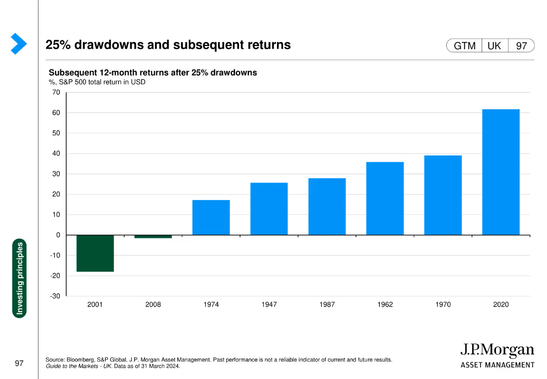
The slide shows a column chart with subsequent 12-month returns after 25% drawdowns in the S&P 500, with specific years highlighted for comparison.
Investment Analysis
Financial Services
This slide demonstrates the performance of the S&P 500 following major drawdowns, providing insights into market recovery patterns.
drawdowns, S&P 500, subsequent returns, market recovery, investment analysis
Single Chart
JP Morgan
Saved
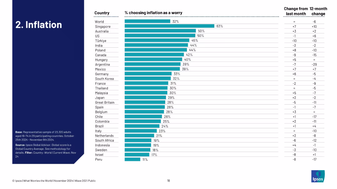
Ranked bar chart by country showing concern about inflation, with month/year change indicators.
Market Analysis and Trends
Professional Services
This slide displays country-level concern about inflation, with Singapore and Australia showing the highest worry levels. Month-over-month and year-over-year trends indicate a mixed change in perception, suggesting ongoing uncertainty about inflationary pressure.
inflation, economic pressure, global comparison, country ranking, Ipsos, financial stress, perception
Single Chart
IPSOS
Saved
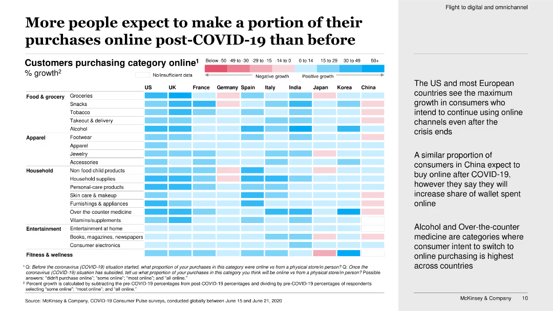
This slide features a heatmap chart showing the percentage growth of customers purchasing online in various categories post-COVID-19.
Market Analysis and Trends
Retail & E-commerce
The slide presents data on the expected increase in online purchases post-COVID-19, highlighting significant growth in online consumer behavior across multiple categories.
online purchases, post-COVID-19, growth, consumer behavior, heatmap, purchasing categories, survey, increase
Boxed
McKinsey
Saved
This slide showcases a series of column charts depicting the 2020 performance of global luxury markets such as personal luxury goods, cars, and hospitality. The layout includes a detailed year-over-year growth comparison.
Market Analysis and Trends
Consumer Goods
An in-depth review of the global luxury markets in 2020, highlighting significant contractions across various sectors such as personal goods, hospitality, and automotive due to the pandemic. It quantifies the impact in each category, offering a stark visualization of the downturn compared to 2019.
luxury markets, 2020 review, market contraction, pandemic impact, sector analysis
Single Chart
Bain
Saved
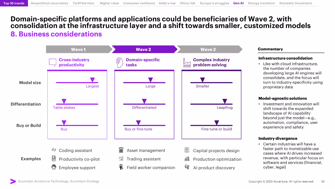
Three-column framework titled Waves 1–3 showing AI model evolution (from cross-industry to domain-specific and problem-solving); commentary on right.
Product and Service Analysis
Artificial Intelligence
The slide lays out a roadmap for AI adoption: from general productivity tools to specialized and complex use cases. It emphasizes trends like infrastructure consolidation and industry divergence, indicating a shift toward tailored, high-impact AI applications in sectors such as legal, financial, and industrial operations.
AI adoption, wave strategy, domain-specific AI, infrastructure consolidation, product evolution, industry divergence, AI models, customization
Mixed Chart
Accenture
Saved
The slide is divided into three sections, each with bar graphs and comparative data matrices. The first section forecasts Australia's renewable energy targets; the second evaluates Australia against global ESG standards in mining; the third section discusses renewable energy as a percentage of total energy generation comparing Australia to the EU and US. Each part is clearly delineated and uses a consistent color scheme for easy comparison.
Competitive Landscape
Energy & Utilities
Highlights Australia's commitment to reaching high levels of renewable energy generation by 2030 and its strong ESG policies in mining, contrasting with other major economies and demonstrating its industry leadership.
renewable energy, ESG, mining, Australia, 2030 targets, energy generation, sustainability, global standards, industry leadership, policy strength
Mixed Chart
Accenture
Saved
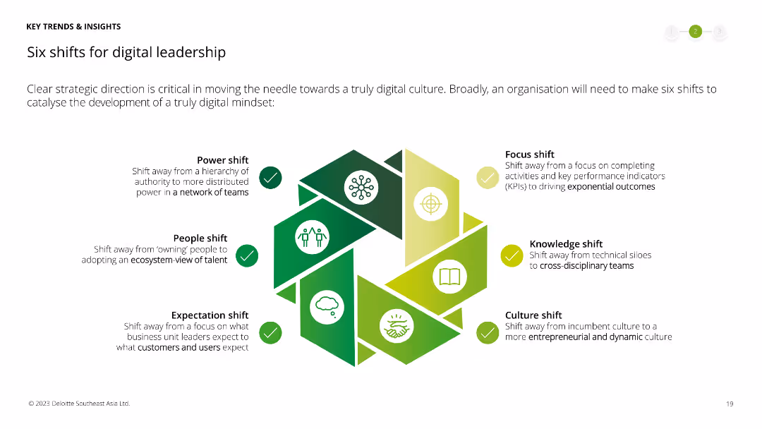
Visual representation of six shifts for digital leadership, each represented by an icon and a brief description within a hexagon, forming a hexagonal layout.
Operational Efficiency
Technology & Software
Outlines six critical shifts necessary for digital leadership, including power, people, expectation, focus, knowledge, and culture shifts to achieve a truly digital mindset.
digital leadership, power shift, people shift, expectation shift, focus shift, knowledge shift, culture shift, digital
Framework
Deloitte
Saved
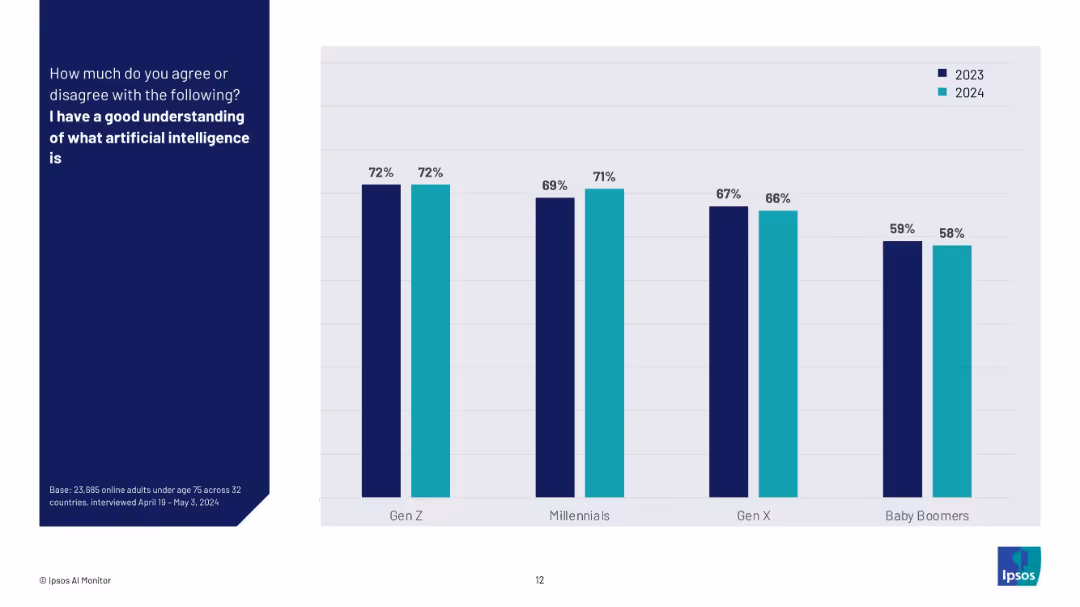
Bar chart comparing generational responses to "I have a good understanding of AI" between 2023 and 2024.
Technology and Digital Transformation
Artificial Intelligence
This slide highlights generational perspectives (Gen Z, Millennials, Gen X, Baby Boomers) on their understanding of AI over two years. It shows consistently higher confidence among younger generations and little change year over year.
generational AI knowledge, AI understanding, trend comparison, Gen Z, Millennials, Baby Boomers, Ipsos, survey, confidence in AI
Mixed Chart
IPSOS
Saved
The slide displays a quartet of column charts comparing various financial aspects over time. Each chart has a percentage scale and is labeled with the financial year quarters. The slide background is white, and the charts use a gradient of blue shades.
Market Analysis and Trends
Financial Services
This slide tracks the performance of management services, leasing, investment sales, and commercial mortgage origination, comparing current data to pre-pandemic levels. It's valuable for stakeholders interested in post-pandemic recovery and growth strategies in these specific financial areas.
Management Services, Leasing, Investment Sales, Mortgage Origination, Pandemic Recovery
Multiple Chart
Goldman Sachs
Saved
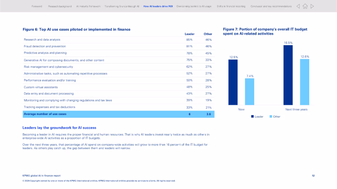
Two-panel layout with a data table on the left and a bar chart on the right; clean and grid-aligned
Product and Service Analysis
Financial Services
This slide lists the most common AI use cases implemented in finance, including research, fraud detection, and document processing. It compares leaders and other organizations in adoption levels and shows IT budget allocation to AI activities now and projected in 3 years.
AI use cases, finance operations, AI leaders, IT budget, fraud detection, predictive planning, automation, investment
Mixed Chart
KPMG
Saved
Donut chart paired with a bar chart. The donut chart shows 34% have an HR tech strategy, while the bar chart details the strategy prevalence by sector like banking and engineering.
Human Resources and Talent Management
Professional Services
Evaluates the presence of formal HR technology strategies within various sectors, highlighting a significant strategy adoption in banking and engineering.
HR strategy, sectors, technology, donut chart, bar chart
Multiple Chart
PwC/Strategy&
Saved
World map highlighting monetary policy changes with color-coded countries and key rate changes indicated by symbols. Simple, with a clear visual message.
Market Analysis and Trends
Financial Services
Analyzes global monetary policy transitions, indicating recent interest rate hikes or cuts and the implications for international markets and investment strategies.
Monetary Policy, Interest Rates, Global Economy, Rate Hikes, Central Banks, Market Strategy
Graphic
Citigroup
Saved
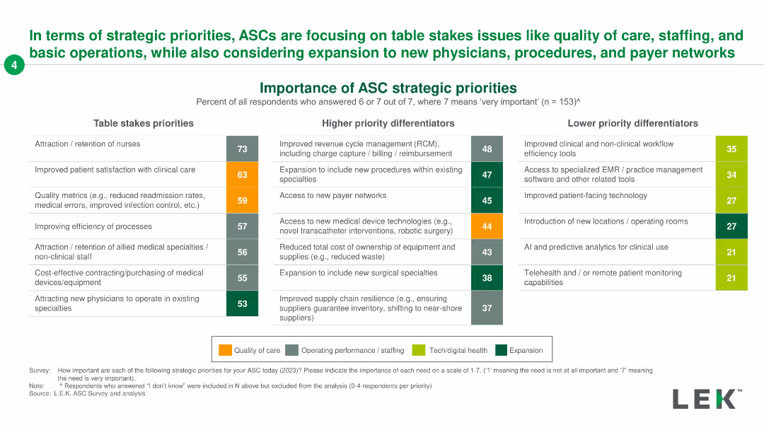
The slide features a two-column chart listing table stakes priorities and higher priority differentiators for ASC strategies, with emphasis on various operational aspects.
Strategic Planning
Healthcare & Pharmaceuticals
It outlines the strategic priorities for ASCs, emphasizing critical areas like staffing, patient care, and operational improvements, along with high-priority differentiators.
ASC, strategic, priorities, staffing, care
Table
LEK
Saved
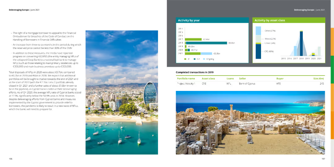
The slide presents tables of completed transactions for 2019, along with bar charts showing activity by year and asset class. The left side contains a dense text block discussing NPL volumes and bank actions.
Market Analysis and Trends
Financial Services
The slide offers a detailed overview of financial activities by year and asset class, including completed transactions in 2019, with insights into trends and strategic bank actions.
activity, transactions, asset class, trends, NPL
Multiple Chart
Deloitte
Saved
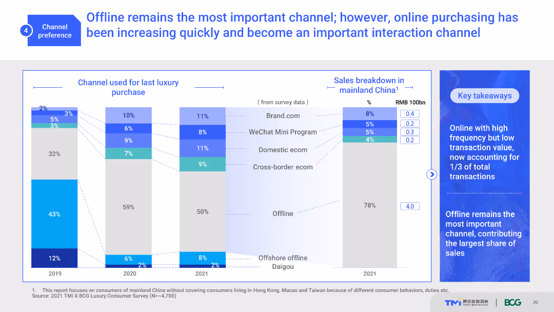
The slide uses a combination of stacked bar charts and text boxes to illustrate the importance of offline and online channels for luxury purchases. It shows channel usage trends from 2019 to 2021 and a sales breakdown in mainland China. The visual complexity is moderate with clear data presentation.
Market Analysis and Trends
Retail & E-commerce
This slide highlights the shifting consumer preferences between offline and online channels for luxury purchases. It shows historical trends and current channel usage, emphasizing the growing importance of online interactions.
channel preference, offline, online, luxury purchases, consumer behavior
Multiple Chart
BCG
Saved
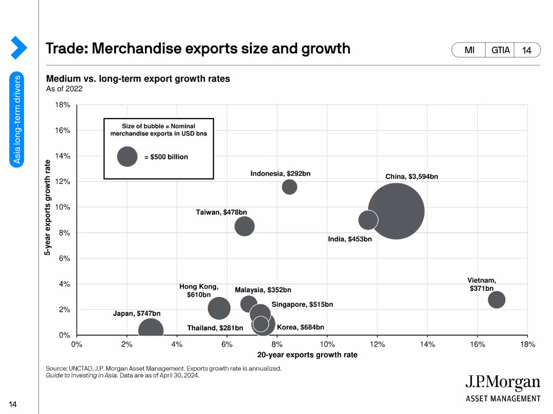
A bubble chart showing the merchandise export growth rates and sizes for various countries.
Market Analysis and Trends
Financial Services
The slide analyzes the medium vs. long-term export growth rates of merchandise exports for different countries, represented by bubble sizes corresponding to export values.
merchandise exports, growth rates, economic analysis, countries, trade, export values, financial trends, bubbles, development, export growth
Single Chart
JP Morgan
Saved
Slide includes a bar chart detailing the focus of various financial organizations on international expansion over the next three years. The design is well-organized, facilitating easy comparison of data across different organization types.
Strategic Planning
Financial Services
Analyzes the strategies of financial institutions planning to expand internationally, highlighting key areas and regions of focus based on emerging market potential.
international expansion, financial institutions, market opportunities, strategic planning, emerging markets
Mixed Chart
Deloitte
Saved
This is a timeline slide representing key events from 2015 to 2022 with corresponding icons and a brief description of each event. The design is minimalistic with red and white colors, allowing for easy readability. Each event on the timeline is linked with a dotted line for visual flow.
Strategic Planning
Professional Services
The slide outlines a historical perspective of significant events influencing the future of work, from advancements in technology to changes in labor dynamics. It's useful for illustrating trends, forecasting future developments, and understanding the evolution of work practices over time.
future of work, timeline, technological advancement, labor trends
Pillar
PwC/Strategy&
Saved
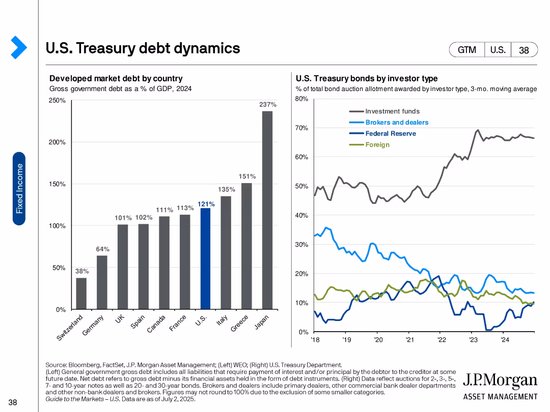
Two-panel visual: bar chart (left) of developed market debt as % of GDP and line chart (right) of bond allocations by investor type.
Market Analysis and Trends
Financial Services
The slide illustrates government debt levels across developed countries and the distribution of U.S. Treasury bond holdings by investor type. It shows the U.S. has high debt levels and investment funds dominate Treasury purchases.
U.S. debt, Treasury holdings, investor types, global debt, GDP ratio, fixed income, bond market, financial markets, government borrowing
Multiple Chart
JP Morgan
Saved
Multiple line charts displaying global freight rates by sea and air, with annotations for major events affecting prices.
Market Analysis and Trends
Transportation & Logistics
Analyzes the impact of global events on sea and air freight rates, highlighting trends and fluctuations.
Transportation, Logistics, Freight, Global, Rates, Sea, Air, Trends, Market Analysis
Multiple Chart
PwC/Strategy&
Saved
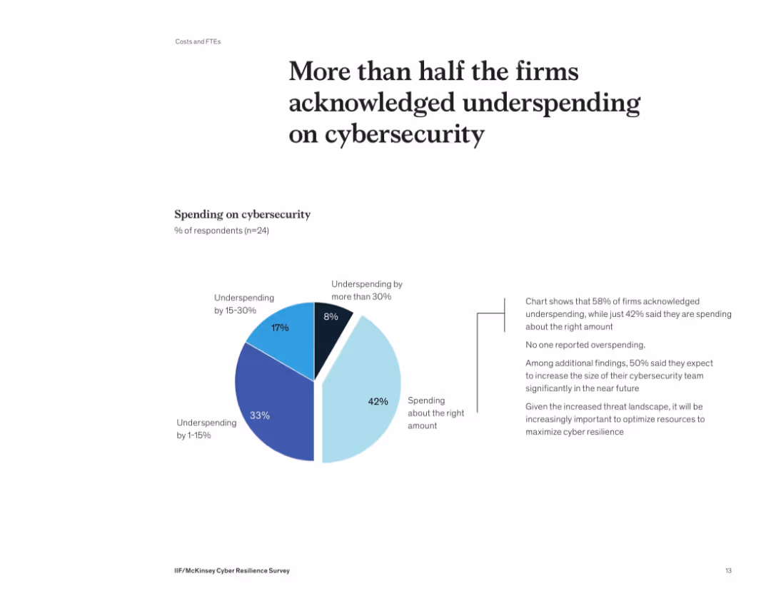
Donut-style pie chart showing distribution of cybersecurity spending levels. Supporting text on the right details implications of underinvestment.
Risk Assessment and Management
Financial Services
58% of firms admit they’re underspending on cybersecurity, with no firm reporting overspending. Many plan to grow their cybersecurity teams. The slide underscores the need to optimize security investments to align with growing threats and reduce risk exposure.
cybersecurity, budget, spending, underinvestment, risk, survey, financial firms
Mixed Chart
McKinsey
Saved
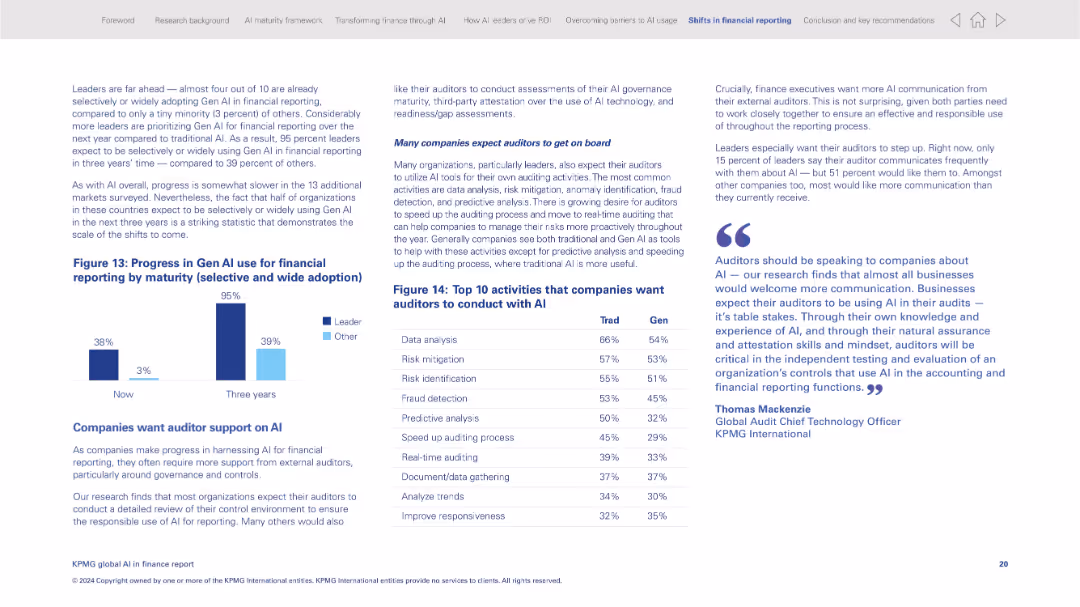
Twin bar graphs comparing adoption by leader vs. others; data table of top auditor activities with AI
Regulatory and Compliance
Financial Services
The slide explores how Gen AI is being adopted in financial reporting by maturity level, with leaders far ahead. It lists activities companies want auditors to conduct with AI tools, showing the intersection of AI and auditing practices.
Gen AI, financial reporting, auditors, regulatory compliance, AI adoption, maturity, AI tools
Mixed Chart
KPMG
Saved
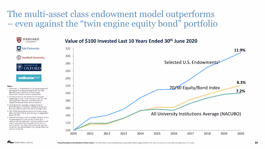
Line chart comparing the performance of different investment models over ten years.
Investment Analysis
Financial Services
This slide illustrates the superior performance of the multi-asset class endowment model compared to other investment approaches.
endowment model, investment performance, multi-asset, equity bond, financial analysis
Mixed Chart
Deloitte
Saved
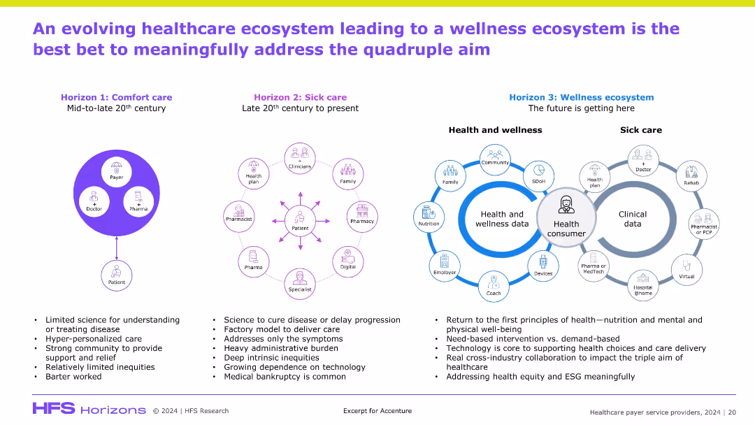
Three-part horizontal timeline (Comfort care → Sick care → Wellness ecosystem); icons around a central "health consumer" visual; descriptive text below each stage; stylized, infographic-heavy design.
Technology and Digital Transformation
Healthcare & Pharmaceuticals
This slide outlines the evolution of healthcare delivery from comfort care to a future-focused wellness ecosystem. It emphasizes consumer-centric care, technology enablement, and cross-industry collaboration as the means to achieve the quadruple aim. Wellness data and prevention-oriented care models are the future direction of transformation.
wellness ecosystem, evolution, health consumer, prevention, digital health, collaboration
Header Horizontal
Accenture
Saved
Features multiple column chart depicting changes in CET1 ratio over quarters, along with risk-weighted assets shown in smaller bar graphs beneath.
Regulatory and Compliance
Financial Services
Analyzes the CET1 capital ratio's stability through quarterly changes, highlighting the impacts of market risks, operational changes, and capital strategies. It provides insights into the bank’s capital adequacy to meet regulatory requirements and financial stability.
CET1 Ratio, Regulatory Compliance, Financial Stability, Risk Management, Capital Adequacy
Multiple Chart
Deutsche Bank
Saved
Previous
Next
If nothing, comes up, please save your slides first
Create a FREE account to continue browsing
Receive Instant Access to 1,000+ slides from companies like McKinsey, Google, and Goldman Sachs
First Name
Last Name
Email
Password
I agree to all
Terms & Privacy Policy
Thank you! Your submission has been received!
Oops! Something went wrong while submitting the form.
Have an account?
Sign in
Column Chart
Heatmap
Chevron
Org Chart
Infographic
Callouts
Timeline
List
Graphic
Picture
Process Flow
Diagram
Paragraph
Map
Table
Framework
Subtitle
Takeaway Box
Icon
Other Chart
Radar Chart
Waterfall Chart
Mekko Chart
Pie Chart
Scatter Plot
Line Chart
Bar chart
Bullet points