My Account
My Slides
Search by Category
Templates
View All Templates
Download Template Slides
✦ AI Search
Feedback
Login
Logout
Get Started
Browse all Slides
Browse all Slides
Create a FREE Account
Instant access to 1,000+ real slides from top companies like McKinsey, BCG, Goldman Sachs, Google and many more!
First Name
Last Name
Email
Password
I agree to all
Terms & Privacy Policy
Thank you! Your submission has been received!
Oops! Something went wrong while submitting the form.
Have an account?
Sign in
Saved Slides
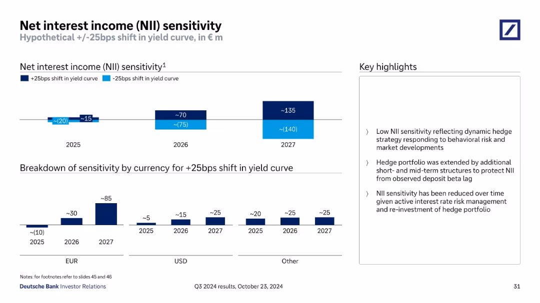
Dual-bar chart projection of NII impact under +/–25bps yield curve shifts (2025–2027), with breakdown by currency and highlights on risk management approach.
Risk Assessment and Management
Financial Services
The slide estimates the net interest income sensitivity of Deutsche Bank under interest rate changes. It highlights low sensitivity due to hedging, showing euro and USD components, and forecasts modest positive income impact in rising rate scenarios by 2026–2027.
interest income, yield curve, risk, NII, hedging, euro, USD
Multiple Chart
Deutsche Bank
Saved
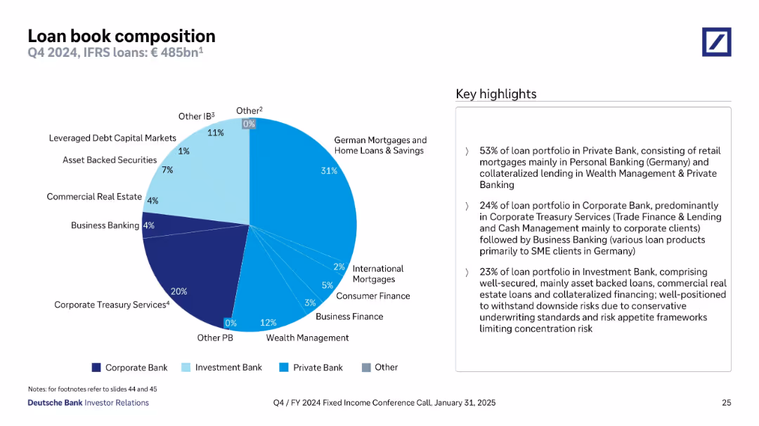
Pie chart showing loan book segmentation by business type. Different shades of blue represent divisions like Private Bank, Corporate Bank, and Investment Bank. Key highlights summarized on right.
Product and Service Analysis
Financial Services
This slide presents the composition of Deutsche Bank’s €485bn loan book as of Q4 2024. The largest portion (53%) is in the Private Bank, focusing on mortgages and wealth management. Corporate Bank accounts for 24%, led by Treasury Services. Investment Bank loans comprise 23%, with a focus on secure, well-collateralized instruments such as asset-backed loans and real estate.
loan book, Private Bank, mortgages, collateralized lending, Corporate Bank, CRE, Investment Bank, Deutsche Bank
Mixed Chart
Deutsche Bank
Saved
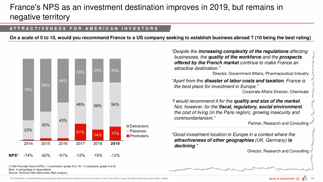
A column chart showing France's Net Promoter Score as an investment destination over several years, with text quotes from experts.
Market Analysis and Trends
Financial Services
This slide evaluates France's Net Promoter Score for investment attractiveness, highlighting opinions and trends over recent years.
NPS, investment destination, France, financial services, market analysis, yearly comparison, opinions
Mixed Chart
Bain
Saved
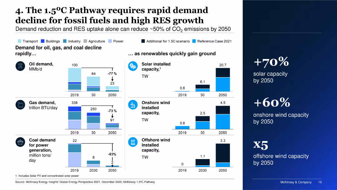
Features multiple column charts showing projections for the decline in demand for oil, gas, and coal, as well as growth in solar and wind capacities by 2050.
Market Analysis and Trends
Energy & Utilities
The slide emphasizes the necessity for rapid decline in fossil fuel demand and significant growth in renewable energy sources to achieve the 1.5°C Pathway.
fossil fuels, renewable energy, demand decline, solar, wind
Multiple Chart
McKinsey
Saved
This slide includes a box plot and a column chart showing the distribution of average daily time spent on search engines. Two tables provide detailed statistics about the time and proportion of online time spent on search engines.
Market Analysis and Trends
Technology & Software
The slide presents information on the average daily time spent on Search Engines, with detailed statistics including mean, median, and percentile distributions, based on data from Ipsos Iris Clickstream Data.
Search Engines, Daily Time, Statistics, Box Plot, Column Chart
Mixed Chart
IPSOS
Saved
Complex slide with multiple data points including bar graphs and textual information. Presents financial highlights such as revenues, net income, and EPS, with color-coded sections for different business units.
Financial Performance
Financial Services
Snapshot of Citigroup's financial performance for Q3 2023, including revenue, net income, and earnings per share. Details on various business sectors like ICG, PBWM, and Legacy provide a comprehensive overview for financial analysis.
Citigroup, financial results, Q3 2023, revenue, net income, EPS, business segments, performance snapshot, bar graphs, text.
Table
Citigroup
Saved
Bar chart showing the percentage of companies experiencing various degrees of revenue impact due to COVID-19.
Risk Assessment and Management
Professional Services
This slide details the financial impact of COVID-19 on companies, highlighting different extents of revenue decreases and increases.
COVID-19 impact, revenue changes, company performance, financial risk
Single Chart
PwC/Strategy&
Saved
Displays various graphs and a detailed breakdown of revenues by unit, showing performance trends in banking and markets.
Financial Performance
Financial Services
Offers detailed insights into the financial outcomes of the Institutional Clients Group, emphasizing revenue streams, expense management, and net income. Useful for financial analysis and understanding sector-specific performance within the organization.
Financial, Clients, Revenue, Institutional, Analysis
Mixed Chart
Citigroup
Saved
The slide showcases line graphs for yield ratios and credit quality spreads, with annotations for current, 1-month ago, 12-months ago, and median values.
Market Analysis and Trends
Financial Services
Focuses on the investment attractiveness of municipal bonds by comparing yields and credit spreads with benchmarks, useful for trend analysis and strategic decision-making in fixed income investments.
municipal bonds, yield ratios, credit spreads, line graphs, market trends, investment analysis
Multiple Chart
Morgan Stanley
Saved
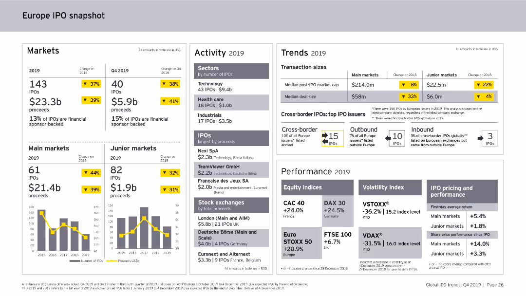
This slide includes column charts and numerical data points. It provides a snapshot of the Europe IPO market in 2019, covering markets, activity levels, trends, and performance metrics.
Market Analysis and Trends
Financial Services
The slide offers an overview of the Europe IPO market for 2019, detailing the number of IPOs, proceeds, sector activity, transaction sizes, cross-border IPOs, and performance indicators.
Europe, IPO, Market Analysis, Financial Services, Trends, Activity, Performance, 2019
Multiple Chart
EY
Saved
Depicts a series of blue column charts showing annual free cash flow over time, annotated with percentages and monetary goals.
Financial Performance
Consumer Goods
Illustrates the company's ability to generate substantial free cash flow, emphasizing improvements and future goals in financial management.
free cash flow, financial growth, goals, annual, cash management
Single Chart
Barclays
Saved
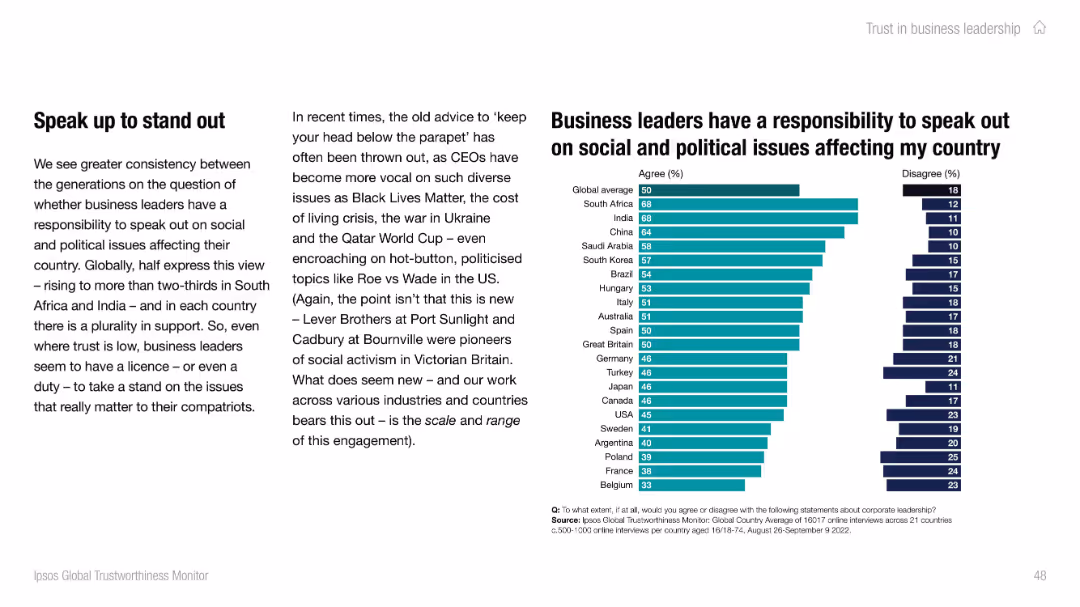
Left text explains trend toward corporate activism; right-side bar chart shows agreement levels across countries. Uses teal and navy for agree/disagree.
Strategic Planning
Professional Services
Illustrates global attitudes about business leaders’ responsibility to address social and political issues. Over two-thirds in South Africa and India agree with this role. Slide notes the growing visibility and expectation of activism among CEOs across regions.
corporate activism, leadership, Ipsos, social issues, responsibility, global sentiment
Mixed Chart
IPSOS
Saved
The slide features a multi-faceted analysis with icons and bullet points, highlighting the impact of rural e-commerce strategies in China.
Market Analysis and Trends
Retail & E-commerce
Discussing the successful increase in rural e-commerce due to service centers and partnerships, this slide presents a case study on expanding digital comfort and online purchasing within rural communities in China.
E-commerce, rural strategy, China, digital adoption
Header Vertical
BCG
Saved
The slide features a pie chart showing data on industries represented in a survey. The layout is clean and modern.
Market Analysis and Trends
Technology & Software
The slide presents survey data on the primary industries of 330 respondents, highlighting technology, media, and telecom as the top sectors. Useful for analyzing industry representation in studies.
survey, industry, representation, technology, media, telecom, data, respondents, sectors
Mixed Chart
Deloitte
Saved
Contains a column chart showcasing the growth of deposits over time segmented by different business units within the organization.
Financial Performance
Financial Services
Used to demonstrate the consistent increase in deposits across various segments of a financial institution, reflecting healthy financial growth and stability.
Deposits, Growth, Trends, Line Graph, Financial Stability, Banking, Performance, Analysis
Single Chart
Citigroup
Saved
This slide features a column chart comparing total revenue and expenditure over three fiscal years, highlighting budget surpluses or deficits.
Regulatory and Compliance
Government & Public Sector
Compares governmental revenue versus expenditure over recent years to assess financial health and operational efficiency.
Revenue, expenditure, budget deficit, fiscal years, comparison
Multiple Chart
PwC/Strategy&
Saved
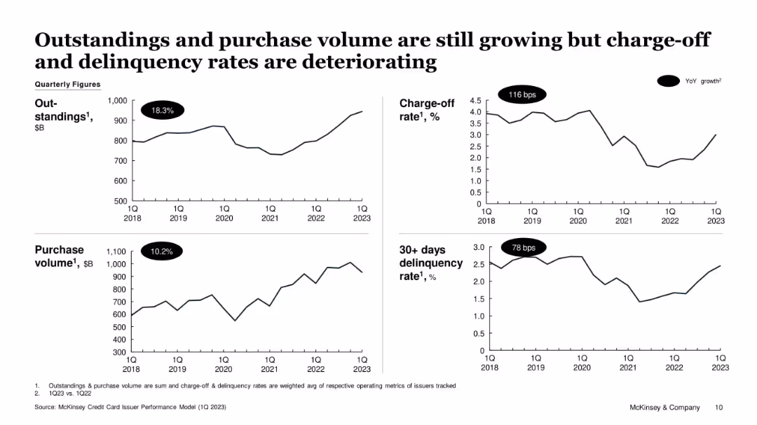
Four-panel line chart dashboard format; clear YoY labels for growth in key credit indicators
Performance Metrics and KPIs
Financial Services
The slide presents trends in credit metrics from 2018 to 2023. Despite 18.3% growth in outstandings and 10.2% growth in purchase volume, charge-off and 30+ day delinquency rates have risen significantly. This suggests increased consumer borrowing risks despite continued credit activity expansion.
credit cards, outstandings, delinquency, charge-off, purchase volume, consumer risk, McKinsey
Single Chart
McKinsey
Saved
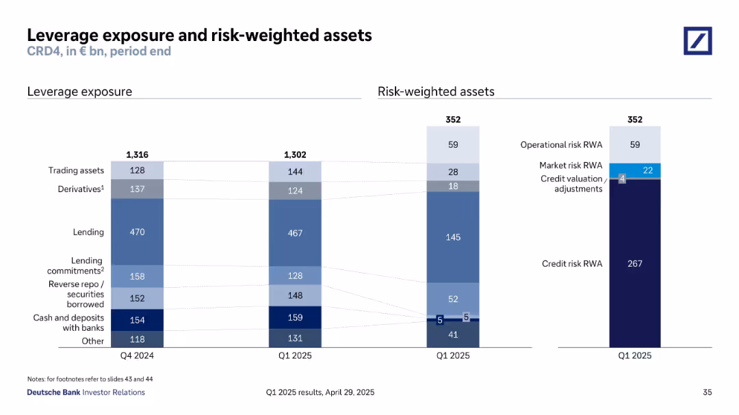
Stacked bar charts depicting components of leverage exposure and risk-weighted assets as of Q1 2025. Each category is color-coded and proportionally sized.
Regulatory and Compliance
Financial Services
The slide summarizes Deutsche Bank’s leverage exposure (€1,302bn) and risk-weighted assets (€352bn) across key categories such as trading assets, derivatives, credit risk, and operational risk. It provides a breakdown of regulatory capital measures, reflecting the bank’s risk positioning under CRD4 standards.
leverage, risk-weighted assets, exposure, CRD4, capital requirements
Multiple Chart
Deutsche Bank
Saved
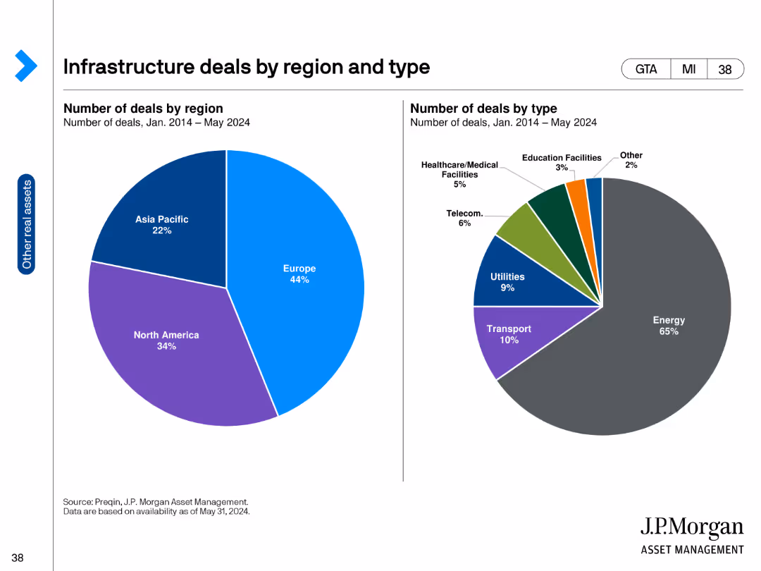
The slide contains two pie charts. The left chart shows infrastructure deals by region, and the right chart shows deals by type from Jan 2014 to May 2024.
Market Analysis and Trends
Real Estate & Construction
It categorizes infrastructure deals by region and type, illustrating the distribution of investments across different sectors and regions.
infrastructure, deals, region, type, market analysis, investments, sectors, North America, Europe, Asia Pacific
Multiple Chart
JP Morgan
Saved
Contains text descriptions and bullet points with a sidebar example of an Indian alcohol beverage manufacturer, a QR code, and percentage growth figures.
Market Analysis and Trends
Professional Services
Describes strategies for leveraging customer insights to develop and prioritize demand spaces, illustrated by a case study with positive growth outcomes.
Customer Insights, Demographics, Market Segmentation, Demand Spaces, Growth Strategy
Text Only
BCG
Saved
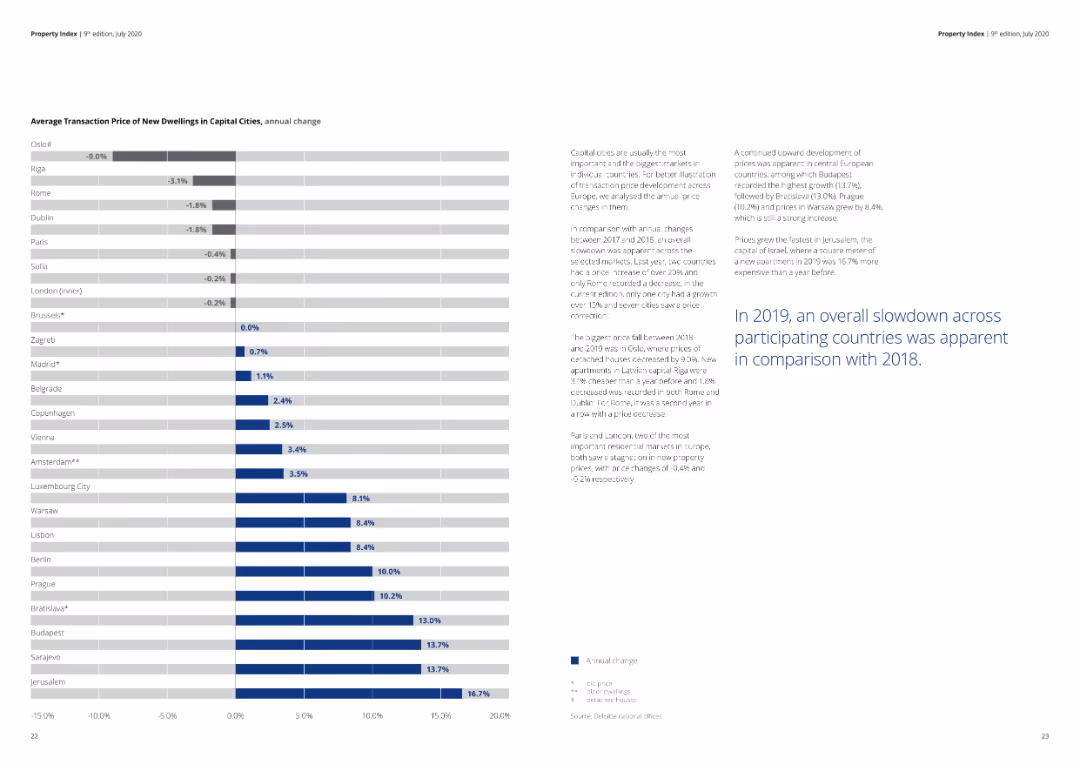
A detailed column chart illustrating the average transaction prices and annual changes in capital cities.
Market Analysis and Trends
Real Estate & Construction
The slide shows the average transaction prices and their annual change for new dwellings in various capital cities, indicating market trends.
real estate, capital cities, housing prices, transaction, annual change, market analysis
Mixed Chart
Deloitte
Saved
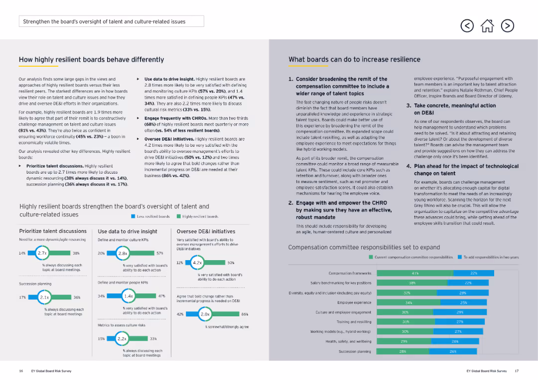
The slide mixes text and small graphs to discuss how resilient boards use different strategies to manage risk and improve decision-making.
Risk Assessment and Management
Professional Services
The slide emphasizes the strategic actions highly resilient boards take to manage risk, such as reviewing governance structures, engaging with trends, and embedding risk in performance reviews.
resilient boards, risk management, decision-making, professional services, governance, strategies, performance reviews
Multiple Chart
EY
Saved
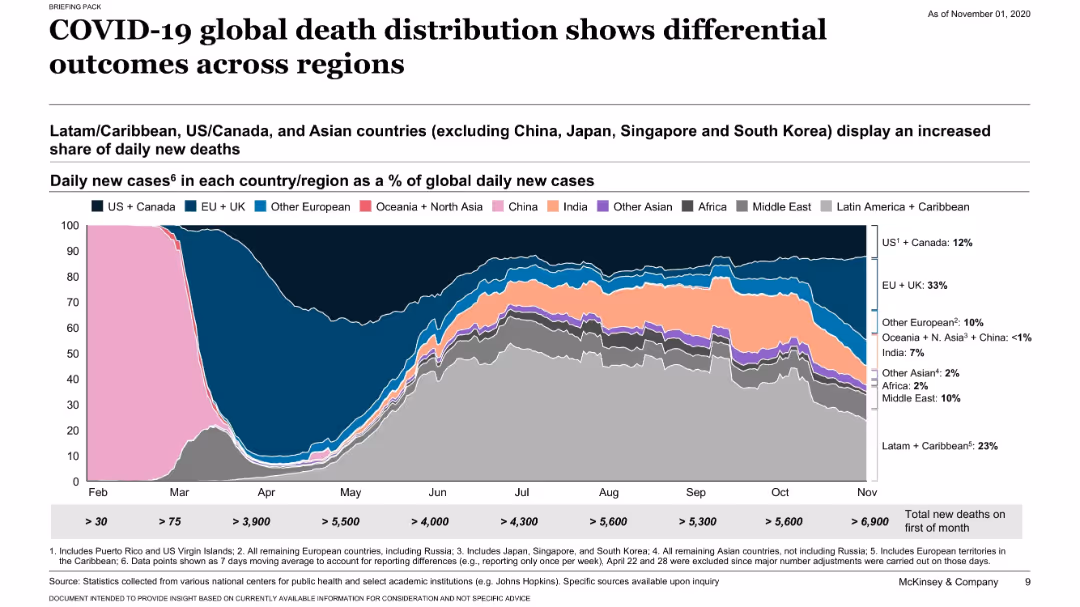
Similar layout to previous slide but for death rates; stacked area chart showing daily deaths by region; regional shares labeled.
Risk Assessment and Management
Healthcare & Pharmaceuticals
This slide compares global COVID-19 death distribution across regions. It shows that Latin America, the US/Canada, and Asian countries have increasing shares of daily new deaths, suggesting varied regional outcomes.
COVID-19, deaths, regional comparison, mortality, McKinsey, pandemic, distribution
Single Chart
McKinsey
Saved
The slide contains a column chart depicting spending priorities over the next 3 years across three categories: Physical and digital infrastructure, Medical supplies and devices, and Staff.
Strategic Planning
Healthcare & Pharmaceuticals
The slide shows the expected increase in spending by hospitals in three main areas over the next three years, with a focus on innovative drugs/therapy, physician support systems, and patient-facing digital solutions.
Hospitals, spending, infrastructure, medical supplies, staff
Multiple Chart
LEK
Saved
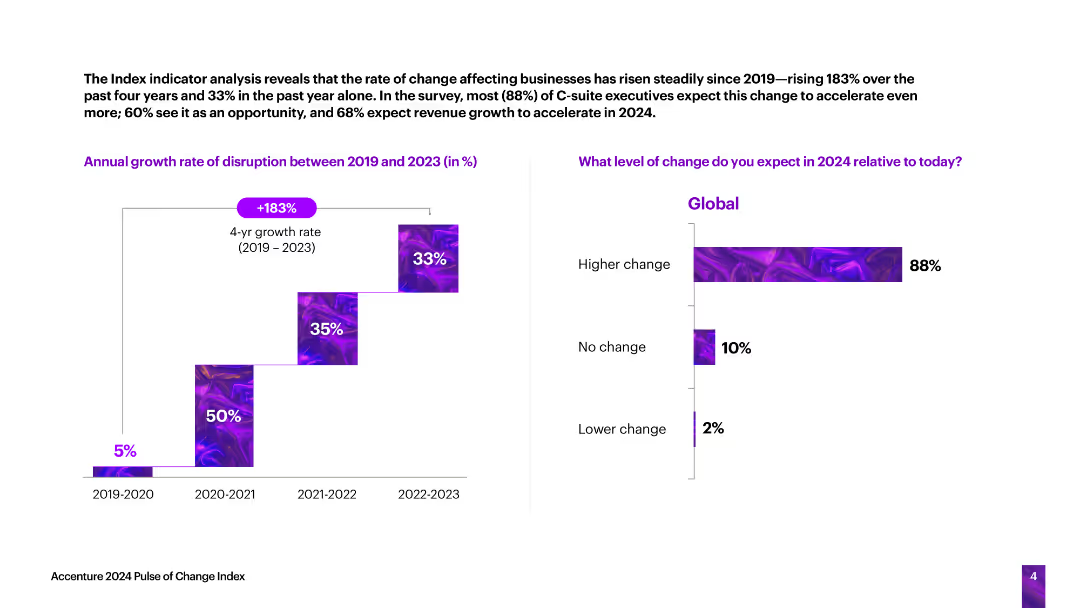
The slide features a vertical column chart showing the annual growth rate of business disruption from 2019 to 2023, and a horizontal bar chart predicting the level of change in 2024.
Technology and Digital Transformation
Technology & Software
The slide analyzes the rate of change affecting businesses, indicating a significant increase in disruption over the past four years and expectations for further changes in 2024.
business disruption, growth rate, change, predictions, technology
Multiple Chart
Accenture
Saved
Previous
Next
If nothing, comes up, please save your slides first
Create a FREE account to continue browsing
Receive Instant Access to 1,000+ slides from companies like McKinsey, Google, and Goldman Sachs
First Name
Last Name
Email
Password
I agree to all
Terms & Privacy Policy
Thank you! Your submission has been received!
Oops! Something went wrong while submitting the form.
Have an account?
Sign in
Column Chart
Heatmap
Chevron
Org Chart
Infographic
Callouts
Timeline
List
Graphic
Picture
Process Flow
Diagram
Paragraph
Map
Table
Framework
Subtitle
Takeaway Box
Icon
Other Chart
Radar Chart
Waterfall Chart
Mekko Chart
Pie Chart
Scatter Plot
Line Chart
Bar chart
Bullet points


![This year’s survey included over 330 respondents from a wide range of industries, representing more than 1,100 SSCs [Figure 1]](https://cdn.prod.website-files.com/654e70fb59937215cac87b19/67036870f67490304e3e0b3e_nyZIn7_lQaQfj1FSzsyx7TH2zEaItt8aq4C8BHqMYZU.avif)