My Account
My Slides
Search by Category
Templates
View All Templates
Download Template Slides
✦ AI Search
Feedback
Login
Logout
Get Started
Browse all Slides
Browse all Slides
Create a FREE Account
Instant access to 1,000+ real slides from top companies like McKinsey, BCG, Goldman Sachs, Google and many more!
First Name
Last Name
Email
Password
I agree to all
Terms & Privacy Policy
Thank you! Your submission has been received!
Oops! Something went wrong while submitting the form.
Have an account?
Sign in
Saved Slides
Slide features a bar chart displaying VC as a percentage of GDP and total VC amount in USD for Brazil, USA, Israel, China
Market Analysis and Trends
Financial Services
Compares venture capital investment as a percentage of GDP and in absolute terms across four countries, highlighting Brazil's position relative to more developed economies
Brazil, VC, GDP, investment, comparison
Single Chart
McKinsey
Saved
Features dual visual data representations, one for CIR outlook with column chart and one for efficiency measures.
Operational Efficiency
Financial Services
Details strategies for cost reduction and operational efficiencies, providing specific financial targets and measures.
cost, reduction, operational, efficiency, CIR, targets, financial, bar graph, measures, strategy
Mixed Chart
Deutsche Bank
Saved
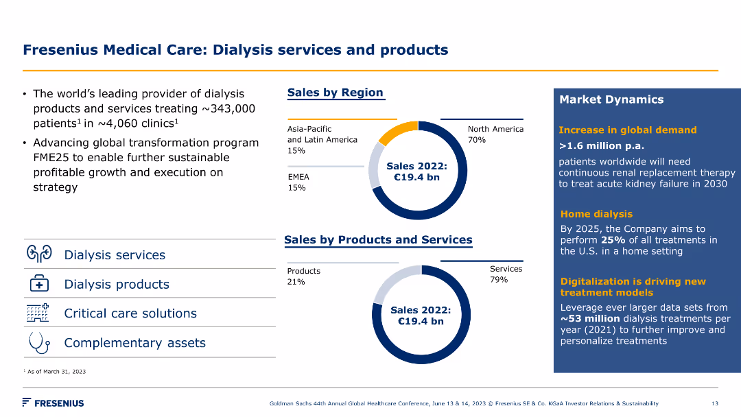
Two pie charts showing sales by region and by product/service, along with market dynamics. Visuals include icons for dialysis-related services.
Product and Service Analysis
Healthcare & Pharmaceuticals
This slide details Fresenius Medical Care's global dialysis services and products, highlighting sales distribution and market trends in the healthcare sector.
dialysis, healthcare, sales, products, services, market dynamics, Fresenius Medical Care, strategy, growth, region
Multiple Chart
Goldman Sachs
Saved
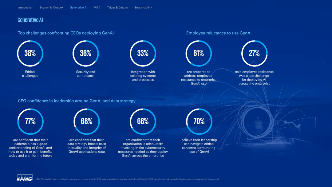
Clean, structured layout with donut charts and circular percentage visuals; dark blue background.
Technology and Digital Transformation
Artificial Intelligence
Addresses CEO concerns around GenAI deployment such as ethics, security, and employee resistance. Highlights leadership confidence in handling GenAI strategy and ethical navigation.
GenAI, ethics, compliance, integration, leadership, resistance, KPMG
Single Chart
KPMG
Saved
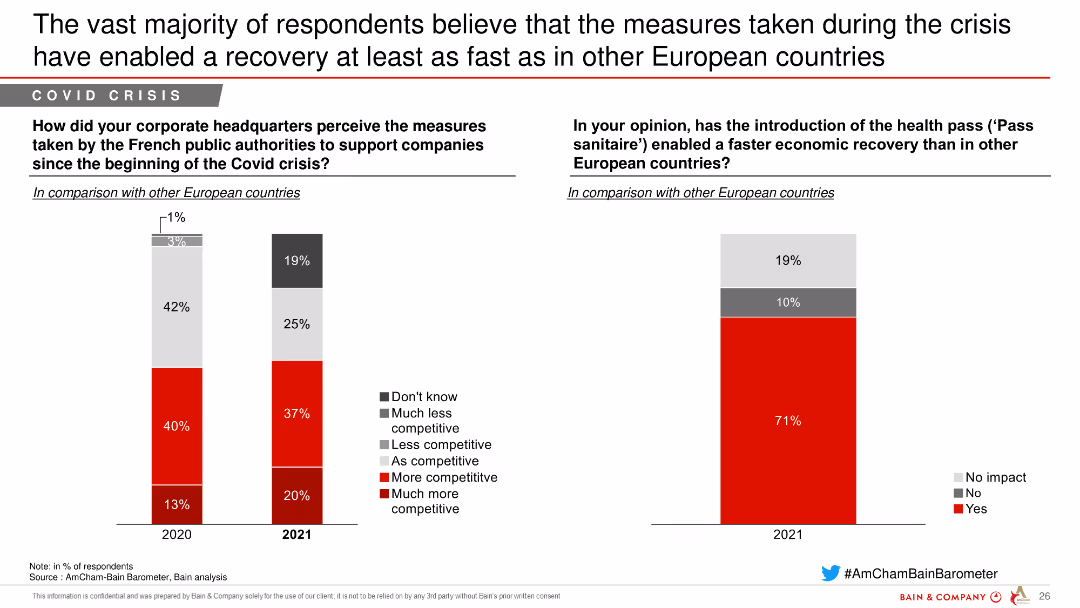
This slide features column charts comparing the competitiveness of French public authorities' measures during the Covid crisis with other European countries and the effect of the health pass.
Regulatory and Compliance
Government & Public Sector
The slide compares the competitiveness impact of measures taken by French public authorities during the Covid crisis and the perceived effectiveness of the health pass in economic recovery.
Covid crisis, recovery, measures, French authorities, competitiveness, European comparison, health pass, public sector
Multiple Chart
Bain
Saved
Column and line charts correlating deal activity in the transport and logistics sector with global GDP growth.
Mergers and Acquisitions
Transportation & Logistics
Discusses the correlation between economic performance and merger activities in the transportation sector.
Transportation, Logistics, GDP, Deals, Mergers, Acquisitions, Economic, Correlation
Mixed Chart
PwC/Strategy&
Saved
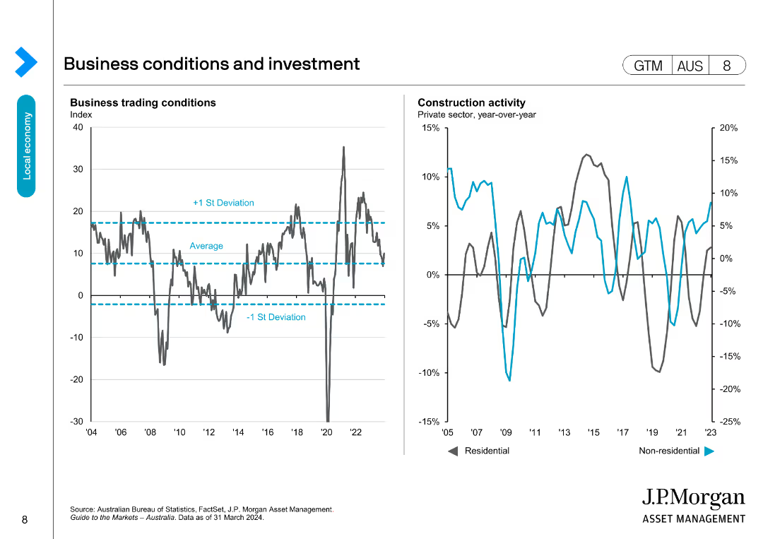
This slide includes two line charts: one showing business trading conditions with average and standard deviation lines, and the other showing construction activity.
Market Analysis and Trends
Financial Services
Analyzes business trading conditions and construction activity, comparing current performance to historical averages and deviations, useful for market analysis.
business conditions, investment, trading, construction, trends
Multiple Chart
JP Morgan
Saved
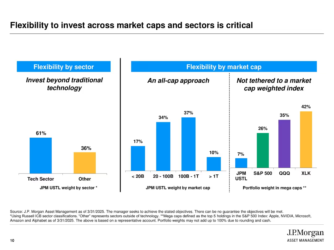
Slide is split into three vertical bar chart sections with labeled headings and blue dividers. Colors differentiate sectors and index groups (blue, orange, purple, green). Includes labels and percentages above each bar. Source notes and disclaimers appear at the bottom.
Strategic Planning
Financial Services
The slide illustrates J.P. Morgan’s diversified investment approach by showcasing flexibility in sector and market cap allocations. It emphasizes not being limited to traditional tech sectors or market-cap-weighted indices. The three sections show allocation by sector (tech vs. others), by market cap, and comparison of mega cap weightings across indices.
diversification, market cap, tech sector, investment strategy, J.P. Morgan, flexibility, portfolio allocation, index comparison, mega caps, strategic planning
Multiple Chart
JP Morgan
Saved
Contains column charts on the left comparing government/subprime mix and servicing cost per unit from 2017 to 2021. Center lists metrics, right shows green column charts for Real Estate Portfolio data and a bar chart for net charge-off rate.
Financial Performance
Financial Services
Showcases improved servicing efficiency and optimized balance sheet in home lending, with decreased government/subprime mix, reduced servicing costs, increased loan sales and securitizations, and a lower net charge-off rate.
Home Lending, Efficiency, Portfolio Management, Risk, Asset, Securitization, Charge-Off
Multiple Chart
JP Morgan
Saved
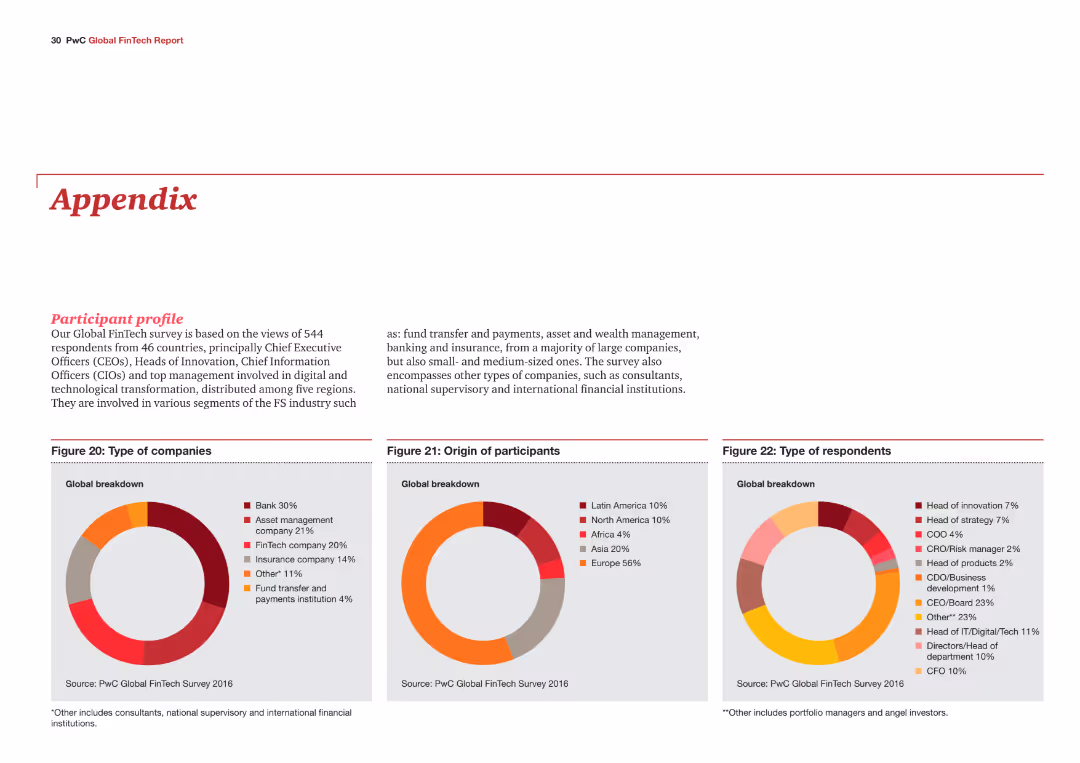
The slide includes three pie charts showing the types of companies, origin of participants, and types of respondents in the Global FinTech Survey. The charts are color-coded and labeled for clarity.
Market Analysis and Trends
Financial Services
The slide provides an overview of the participant profile in the Global FinTech Survey, detailing the types of companies involved, their geographical origin, and the roles of respondents.
FinTech, survey, participants, company types, roles
Multiple Chart
PwC/Strategy&
Saved
The slide has two sections. The first discusses 'Earthshots' with a chart on capital shift, the second, 'Downround IPOs' with a scatter graph showing cost of capital and deal growth. There are links to additional reports.
Investment Analysis
Financial Services
Highlights sustainable investment opportunities termed 'Earthshots' and the trend of downround IPOs, offering strategic insights for investments in sustainability and the tech market landscape.
Sustainable investment, Earthshots, downround IPOs, capital growth, investment trends, technology market, strategic insights, capital shifts, deal growth, sustainability
Multiple Chart
Morgan Stanley
Saved
Includes a bar graph depicting changes in human freedom scores, alongside detailed text explanations and a shaded world map, highlighting regions and relevant statistical data.
Market Analysis and Trends
Government & Public Sector
Analyzes trends in global human freedom over a decade, discussing implications for future shifts in political and civil rights, providing a basis for discussions on policy and societal change.
freedom, global trends, policy, civil rights, political rights, data, future, analysis, implications
Mixed Chart
Roland Berger
Saved
This slide displays a pie chart and bar graphs showing time saved per year and per task, with a purple and white color theme.
Operational Efficiency
Technology & Software
It reports that the average nbn user saves 169 hours a year by performing essential tasks like telehealth and remote work over the network.
nbn network, time savings, annual hours, telehealth, remote work, efficiency, essential tasks
Multiple Chart
Accenture
Saved
This slide features a column chart displaying the growth of consumer and small business CCB customers over a period from 2019 to 2022, with an 8% increase highlight. It also contains a list of key financial statistics with arrows indicating upward or downward trends, presented in a clear and professional manner.
Financial Performance
Financial Services
The slide analyzes the significant growth of consumer and small business customers over several years, highlighting success in different financial metrics. It's likely used to demonstrate market performance and customer base expansion to stakeholders.
Customer Growth, CCB, Small Business, Financial Statistics, Market Performance, Consumer Base
Single Chart
JP Morgan
Saved
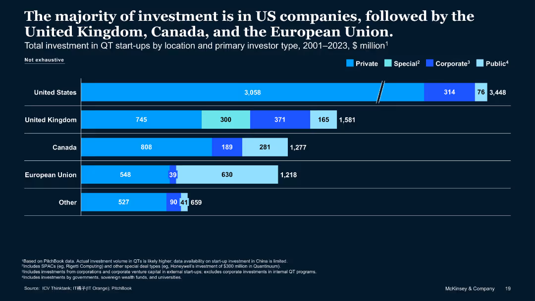
Horizontal stacked bar chart showing investment distribution by country and investor type
Investment Analysis
Artificial Intelligence
This slide illustrates total QT start-up investment from 2001–2023 by country and investor type. The US leads, followed by the UK, Canada, and the EU. Investor types include private, special, corporate, and public funds.
QT investments, United States, Private Capital, Investor Type, Startups
Single Chart
McKinsey
Saved
Professionally designed slide featuring text, a photograph of a woman working on a computer, and a graph. The use of circular shapes and a blue-green color scheme creates a visually cohesive and focused layout.
Technology and Digital Transformation
Healthcare & Pharmaceuticals
Addresses the stigma surrounding menopause, illustrating the percentage of women who work through menopausal symptoms and their comfort level in discussing these in a workplace context.
menopause, workplace, stigma, health challenges, discussion comfort, symptoms
Single Chart
Deloitte
Saved
This slide includes a collection of bar graphs, column charts, and key metric callouts arranged in a clean layout, with contrasting colors to highlight different data sets.
Financial Performance
Financial Services
Focused on the card franchise's industry leadership, the slide provides data on card sales, active accounts, and customer retention. Key figures show growth in sales volume and a sustained number 1 position in card outstandings.
Card Franchise, Industry Leadership, Sales Volume, Customer Retention, Financial Data
Multiple Chart
JP Morgan
Saved
The slide features a scatter plot with annotations for various transportation authorities like MTA, WMATA, etc., showing trends in annual ridership versus year-over-year growth rates, using different colored circles to represent each entity.
Market Analysis and Trends
Transportation & Logistics
This slide analyzes trends in bus ridership across different systems, comparing annual ridership rates and growth, highlighting how entities like MTA and others are performing. Useful for assessing transportation trends and planning.
transit, ridership, trends, comparison, analysis, bus, MTA, growth, decline
Single Chart
BCG
Saved
This slide includes a waterfall chart showing the pre-tax loss of Credit Suisse AG for 2Q23, with detailed breakdowns of acquisition-related effects and other adjustments.
Financial Performance
Financial Services
The slide presents a detailed financial analysis of Credit Suisse AG's pre-tax loss in the second quarter of 2023, including various adjustments and effects, to explain the financial impact of the acquisition.
pre-tax loss, Credit Suisse, acquisition effects, financial analysis, adjustments
Single Chart
UBS
Saved
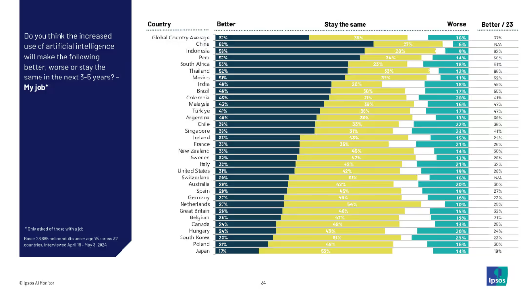
Stacked bar chart by country showing "Better," "Stay the same," and "Worse" views on AI’s job impact. Colors separate the three opinions.
Human Resources and Talent Management
Artificial Intelligence
This slide captures perceptions across countries about whether AI will improve, worsen, or not affect their job over the next 3–5 years. Optimism is highest in Asia and Latin America, while skepticism is more prevalent in Western Europe.
AI job impact, country analysis, workplace outlook, sentiment distribution, talent management, job improvement, technology shift
Mixed Chart
IPSOS
Saved
Three pie charts showing UBS Group's deposit base composition by type, currency, and client segment as of Q3 2023.
Customer and Market Segmentation
Financial Services
Analyzes UBS Group's diversified deposit base, including types of deposits, currency distribution, and client segments.
UBS, deposits, diversification, type, currency, client segment, analysis, composition, market
Multiple Chart
UBS
Saved
Contains several column charts representing different aspects of digital financial services like Digital Payment GTV, with clear labels and growth projections.
Market Analysis and Trends
Financial Services
Focuses on the growth trajectory of various digital financial services except for lending, with data on transaction values and predictions for the coming years.
Digital Financial Services, Growth, Projections, Lending
Multiple Chart
Bain
Saved
The slide has a large word cloud in the background with key social issues and three key data points highlighted in red regarding brand preferences among luxury customers.
Market Analysis and Trends
Consumer Goods
Highlights the importance of social responsibility to younger luxury customers, emphasizing a preference for brands that demonstrate social engagement.
social responsibility, luxury brands, consumer preferences, millennials, brand loyalty
Mixed Chart
Bain
Saved
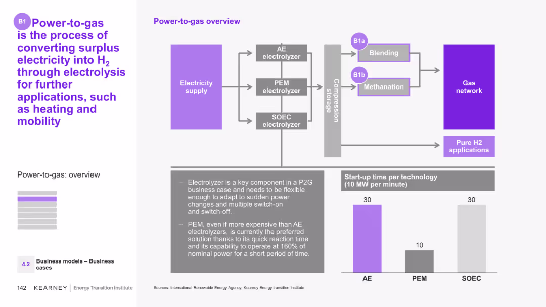
The slide includes a detailed diagram showing the Power-to-gas process, illustrating the flow from electricity supply through different types of electrolyzers to various end uses. It also includes a bar chart comparing start-up times for different technologies.
Technology and Digital Transformation
Energy & Utilities
This slide provides an overview of the Power-to-gas process, explaining how surplus electricity is converted into hydrogen via electrolysis. It details the technologies involved and their applications in heating and mobility.
Power-to-gas, electrolysis, surplus electricity, hydrogen, technology comparison
Mixed Chart
Kearney
Saved
Weighted average score table showing the influence of different hospital departments on purchasing decisions.
Market Analysis and Trends
Healthcare & Pharmaceuticals
This slide shows the influence levels of hospital departments on purchasing decisions in various APAC markets.
purchasing decisions, hospital, influence, APAC, MedTech
Table
LEK
Saved
Previous
Next
If nothing, comes up, please save your slides first
Create a FREE account to continue browsing
Receive Instant Access to 1,000+ slides from companies like McKinsey, Google, and Goldman Sachs
First Name
Last Name
Email
Password
I agree to all
Terms & Privacy Policy
Thank you! Your submission has been received!
Oops! Something went wrong while submitting the form.
Have an account?
Sign in
Column Chart
Heatmap
Chevron
Org Chart
Infographic
Callouts
Timeline
List
Graphic
Picture
Process Flow
Diagram
Paragraph
Map
Table
Framework
Subtitle
Takeaway Box
Icon
Other Chart
Radar Chart
Waterfall Chart
Mekko Chart
Pie Chart
Scatter Plot
Line Chart
Bar chart
Bullet points