My Account
My Slides
Search by Category
Templates
View All Templates
Download Template Slides
✦ AI Search
Feedback
Login
Logout
Get Started
Browse all Slides
Browse all Slides
Create a FREE Account
Instant access to 1,000+ real slides from top companies like McKinsey, BCG, Goldman Sachs, Google and many more!
First Name
Last Name
Email
Password
I agree to all
Terms & Privacy Policy
Thank you! Your submission has been received!
Oops! Something went wrong while submitting the form.
Have an account?
Sign in
Saved Slides
The slide features a column chart showing various methods banks are using to attract and retain talent, including adjusted salaries and enhanced career progression programs.
Human Resources and Talent Management
Financial Services
This slide presents different strategies banks are employing to attract and retain talent, such as offering competitive salaries, developing flexible work schedules, and enhancing employee experience.
talent attraction, banks, column charts, retention
Multiple Chart
EY
Saved
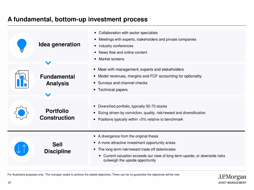
Four-section vertical layout with icons on the left and bullet text on the right. Each stage of the process is boxed and separated with visual lines. Clean white background with black text and blue highlight elements.
Investment Analysis
Financial Services
This slide explains J.P. Morgan’s structured approach to investment using a bottom-up method. It outlines four key stages: idea generation, fundamental analysis, portfolio construction, and sell discipline. Each stage lists specific tasks or considerations. The aim is to show the rigor behind identifying and managing investment opportunities.
bottom-up, investment process, fundamental analysis, portfolio construction, sell discipline, J.P. Morgan, idea generation, valuation, diversification
Vertical Flow
JP Morgan
Saved
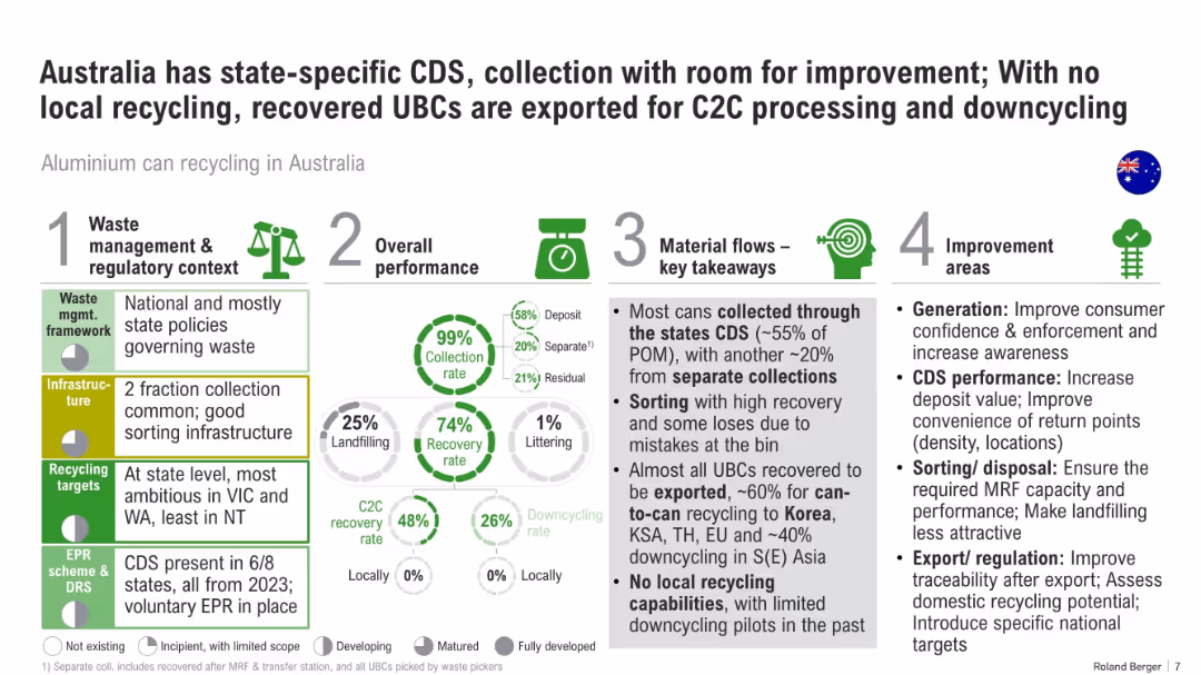
Infographic layout with four vertical blocks: policy, performance, material flow, and improvement. Includes percentages and pie charts.
Regulatory and Compliance
Environmental Services & Sustainability
This slide critiques Australia’s recycling system for aluminum cans. It notes high collection but low local processing, with most material exported. It outlines regulatory structures and areas needing improvement like infrastructure and sorting.
recycling, Australia, CDS, aluminum, policy, downcycling, C2C, export, waste management
Multiple Chart
Roland Berger
Saved
Blue-themed visual with a focus on bar graphs and circular stats. Stylized background image of light art.
Technology and Digital Transformation
Artificial Intelligence
CEOs see GenAI as a strategic advantage. The slide shows deployment priorities over the next 12–18 months, such as scaling and use case focus, alongside planned investment outlooks for the year.
GenAI, investment, scaling, enterprise, AI adoption, strategy
Multiple Chart
KPMG
Saved
Column charts showing RWA, LRD, CET1 capital ratio, and total loss absorbing capacity
Risk Assessment and Management
Financial Services
Highlights actions taken to reinforce balance sheet strength and maintain capital ratios
balance, sheet, capital, reinforcement
Multiple Chart
UBS
Saved
This slide features a series of column charts comparing challenges faced by German and Global organizations in preparing their workforce for Industry 4.0. The graphs illustrate disparities in skillset mismatches, attraction and retention of skilled talent, and the lack of necessary training programs.
Human Resources and Talent Management
Education & Training
Analyzes challenges in workforce development for Industry 4.0, showing German executives' perspectives versus global trends in skill mismatches, talent attraction, retention, and training initiatives.
Workforce, Industry 4.0, Talent, Training, Skills, Germany, Global, Challenges
Multiple Chart
Deloitte
Saved
Contains multiple bar charts and lists, comparing urban and rural populations across various income categories, using shades of blue and gray.
Market Analysis and Trends
Environmental Services & Sustainability
Analyzes the impact of urbanization on global population distribution, emphasizing the need for Earth Observation data in urban planning and disaster risk management.
urbanization, Earth Observation, population, global, disaster risk, data analysis, planning
Mixed Chart
PwC/Strategy&
Saved
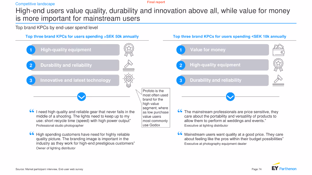
The slide compares brand key purchasing criteria (KPCs) for high-end and mainstream users, using text boxes, icons, and a column chart in the center.
Customer and Market Segmentation
Consumer Goods
It highlights the top three brand KPCs for users spending over SEK 50k and those spending less than SEK 10k annually, with supporting quotes.
Quality, durability, innovation, mainstream, value for money, brand KPCs, purchasing criteria, consumer goods, segmentation, analysis
Header Horizontal
EY
Saved
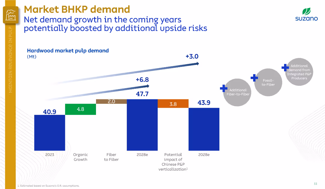
Horizontal bar chart tracks demand growth drivers; annotations highlight upside potential. Minimalist layout with emphasis on data.
Market Analysis and Trends
Industrial & Manufacturing
Suzano outlines projected demand growth for market BHKP from 2023 to 2028, driven by organic growth, fiber substitution, and potential upside from Chinese market changes and fossil-to-fiber trends.
BHKP demand, fiber-to-fiber, organic growth, pulp market, China, fossil substitution
Single Chart
Goldman Sachs
Saved
Comparative column chart with additional highlighted focus on environmental harm reduction.
Strategic Planning
Environmental Services & Sustainability
Same as previous with an emphasis circle on the importance of reducing harm to the environment.
business, opportunity, taxes, environment, global
Multiple Chart
IPSOS
Saved
The slide features a column chart displaying satisfaction levels (percentage very/somewhat satisfied) with various technologies like identity solutions, DCRs, CMPs, etc.
Technology and Digital Transformation
Technology & Software
The slide compares user satisfaction across different privacy-preserving technologies, indicating that satisfaction with DCRs is comparable to more established solutions.
satisfaction, DCRs, privacy technologies, comparison
Mixed Chart
IPSOS
Saved
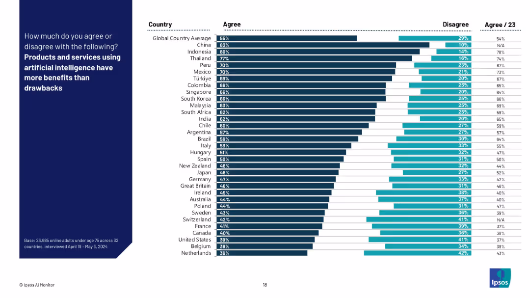
Bar chart format showing % “Agree” and “Disagree” by country with global averages; sorted in descending order of agreement.
Technology and Digital Transformation
Artificial Intelligence
The slide shows the percentage of respondents in each country who believe AI’s benefits outweigh its drawbacks. It reflects overall optimism or skepticism towards AI's societal value and utility.
AI benefits, technology value, opinion survey, Ipsos, optimism, tradeoffs, international data, AI perception, public confidence
Mixed Chart
IPSOS
Saved
Features two large column charts comparing tangible equity and parent level debt over three years. Includes textual content outlining capital priorities.
Financial Performance
Financial Services
Details the capital buildup and debt reduction over three years, emphasizing on profitability and capital return. Intended for financial review meetings or investment analysis focusing on company’s financial health over recent years.
capital growth, debt reduction, tangible equity, financial strategy, investment
Multiple Chart
Barclays
Saved
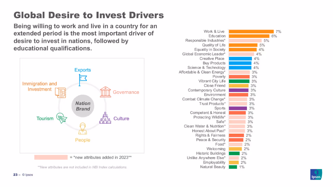
Bar chart (right) ranks top investment drivers; left visual maps drivers to nation brand sectors.
Customer and Market Segmentation
Professional Services
Work & live, education, and responsible industries are top investment drivers globally. The visual shows these drivers categorized under broader nation brand domains such as governance and economy. Many of the attributes were newly added in 2023.
investment, business drivers, Ipsos, perception, work, education, 2023, attributes, sustainability
Mixed Chart
IPSOS
Saved
The slide presents a linear progression of trends and impacts in a data-driven format. Key trends and challenges are highlighted with icons and brief descriptions, each marked with a red dot. The red-to-black gradient emphasizes the flow from current trends to delayed impacts.
Risk Assessment and Management
Professional Services
This slide is utilized to describe the current macroeconomic challenges and uncertainties. It emphasizes trends like natural resource shortages, global food pricing disruption, and financial market instability, leading to potential delayed impacts such as technological disruption and geopolitical realignment.
Macro Environment, Challenges, Trends, Uncertainty, Risks, Geopolitical, Technological, Economic Slowdown
Linear Flow
Bain
Saved
The slide presents a graph depicting the importance of various online activities categorized as Essentials, Social, and Entertainment based on user enjoyment and hours spent. It features a purple color scheme, with circles representing data points.
Market Analysis and Trends
Technology & Software
The slide illustrates how users on the nbn network prioritize essential tasks but spend more time on activities they enjoy, with large circles for music streaming and social media indicating significant user importance and time investment.
nbn, user behavior, online activities, streaming, social media, essentials, enjoyment, engagement
Single Chart
Accenture
Saved
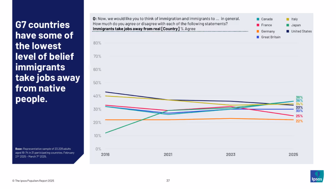
Line chart showing agreement % from 2016 to 2025 for G7 countries; legend on right; bold white text on blue background
Market Analysis and Trends
Government & Public Sector
This slide compares belief trends in G7 nations regarding whether immigrants take jobs from natives. The data suggests a general downward trend in agreement across most countries, except for Japan, where belief in job displacement by immigrants has risen significantly.
G7, immigration, job loss belief, trend analysis, comparative politics, Ipsos, public sentiment, international comparison
Mixed Chart
IPSOS
Saved
This slide features a column chart illustrating the skills expected to rise in value due to Generative AI adoption. It uses clear color coding to distinguish between human-centered and technology-centered skills.
Human Resources and Talent Management
Professional Services
The slide focuses on the increasing value of certain skills in the AI era, with data analysis, prompt engineering, and creativity among the top skills. It presents survey results with percentages for each skill category.
Generative AI, skills, data analysis, prompt engineering, creativity, technology, human-centered, survey results, workforce, value
Mixed Chart
Deloitte
Saved
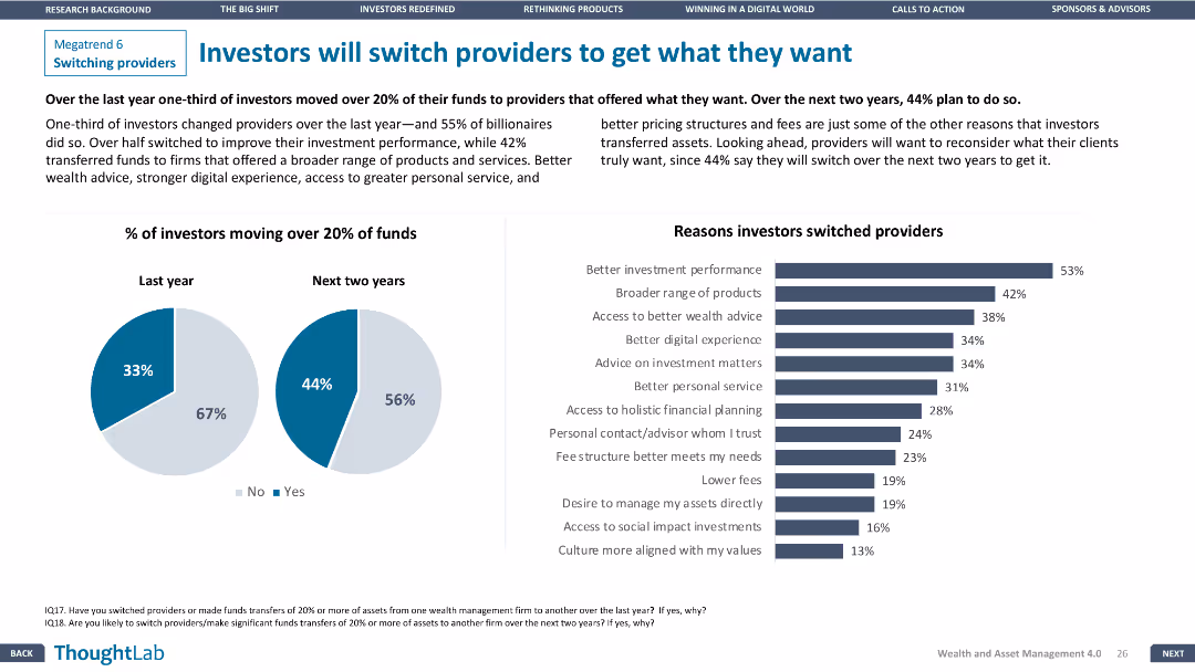
Pie charts and a column chart detailing investor fund movement and reasons for switching providers. Layout is visually clear and informative.
Customer and Market Segmentation
Financial Services
Examines investor behavior regarding switching providers, showing percentages of fund movement and key reasons driving this behavior.
investors, switching, providers, funds, reasons
Multiple Chart
Deloitte
Saved
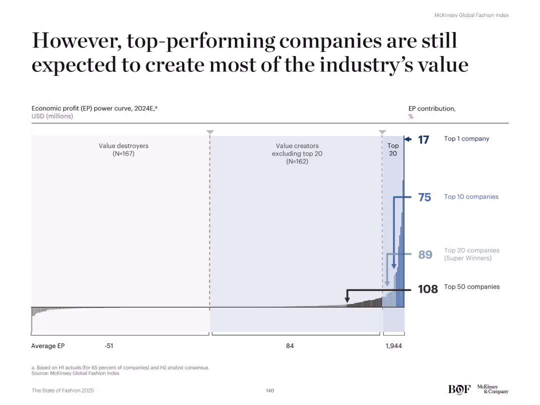
Wide bar chart resembling a power curve distribution with annotations. Horizontal layout. The chart groups companies by economic profit tiers and illustrates percentage contributions for top-performing brackets.
Financial Performance
Retail & E-commerce
Despite the narrowing EP gap, the top 20 companies (Super Winners) are still projected to deliver the majority of industry economic profit in 2024. The top 10 will account for 75% and the single top company for 17% of EP. The rest, including 167 value destroyers, generate below-average or negative EP.
super winners, economic profit, EP curve, top companies, fashion, value destroyers, retail performance
Single Chart
McKinsey
Saved
Includes a balance column chart showing job gains and losses across different industrial trends.
Market Analysis and Trends
Industrial & Manufacturing
Summarizes the net effect of various industrial trends on employment, showing overall stability despite fluctuations caused by factors like technology and offshoring. Provides a comprehensive view of the employment landscape.
Industrial Trends, Employment Stability, Job Gains, Job Losses
Single Chart
BCG
Saved
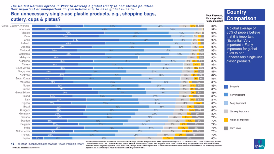
Vertical bar chart showing public opinion in different countries using five-color gradients to represent perceived importance. Includes summary statistics.
Regulatory and Compliance
Environmental Services & Sustainability
This slide highlights that a global average of 85% of people support banning unnecessary single-use plastic products. Latin American countries and Uganda show particularly high levels of support.
single-use plastics, environmental policy, global regulation, Ipsos data, public opinion, global treaty
Mixed Chart
IPSOS
Saved
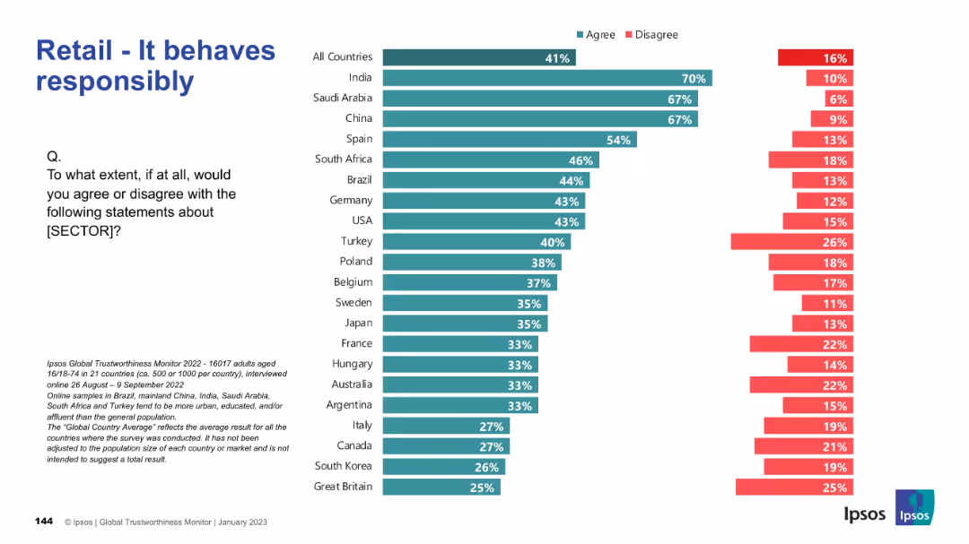
Horizontal bar chart with green/red bars per country; structured by agreement level.
Market Analysis and Trends
Retail & E-commerce
Highlights public opinion on whether the retail sector behaves responsibly. India, Saudi Arabia, and China again top the agreement rankings, while many countries show mixed views.
responsibility, ethics, retail, global, Ipsos, survey, public perception, countries
Mixed Chart
IPSOS
Saved
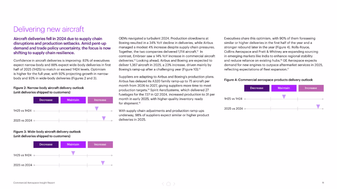
Three-column layout with bullet points and delivery outlook charts (narrow and wide-body aircraft)
Performance Metrics and KPIs
Industrial & Manufacturing
The slide focuses on improving aircraft delivery confidence for 2025, with 83–93% of executives expecting growth. It highlights OEM production plans and supply chain adjustments following a turbulent 2024, and features delivery outlook visuals segmented by aircraft type and year comparison.
aircraft delivery, OEMs, production, supply chain, Boeing, Airbus, KPIs
Mixed Chart
Accenture
Saved
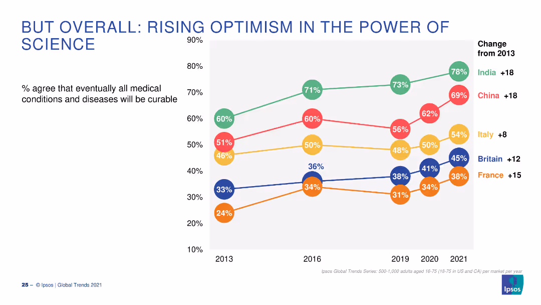
A line graph showing the percentage agreement over time (2013-2021) that all medical conditions will eventually be curable, with trends per country.
Market Analysis and Trends
Healthcare & Pharmaceuticals
The slide presents data on the rising optimism in the curability of all medical conditions, comparing several countries from 2013 to 2021.
Science, Optimism, Curability, Trends, Countries
Single Chart
IPSOS
Saved
Previous
Next
If nothing, comes up, please save your slides first
Create a FREE account to continue browsing
Receive Instant Access to 1,000+ slides from companies like McKinsey, Google, and Goldman Sachs
First Name
Last Name
Email
Password
I agree to all
Terms & Privacy Policy
Thank you! Your submission has been received!
Oops! Something went wrong while submitting the form.
Have an account?
Sign in
Column Chart
Heatmap
Chevron
Org Chart
Infographic
Callouts
Timeline
List
Graphic
Picture
Process Flow
Diagram
Paragraph
Map
Table
Framework
Subtitle
Takeaway Box
Icon
Other Chart
Radar Chart
Waterfall Chart
Mekko Chart
Pie Chart
Scatter Plot
Line Chart
Bar chart
Bullet points