My Account
My Slides
Search by Category
Templates
View All Templates
Download Template Slides
✦ AI Search
Feedback
Login
Logout
Get Started
Browse all Slides
Browse all Slides
Create a FREE Account
Instant access to 1,000+ real slides from top companies like McKinsey, BCG, Goldman Sachs, Google and many more!
First Name
Last Name
Email
Password
I agree to all
Terms & Privacy Policy
Thank you! Your submission has been received!
Oops! Something went wrong while submitting the form.
Have an account?
Sign in
Saved Slides
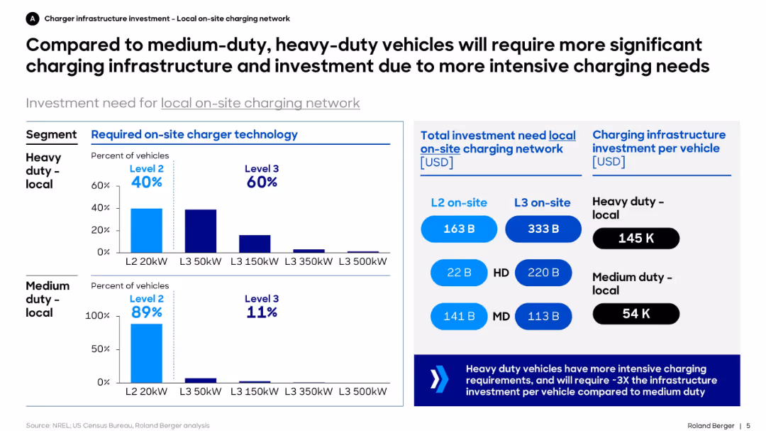
Dual bar charts for required charger levels by vehicle type, investment amount by segment, and cost per vehicle. Structured with blue-themed charts and callouts.
Technology and Digital Transformation
Transportation & Logistics
This slide contrasts the infrastructure needs of heavy-duty vs. medium-duty electric vehicles. It shows that heavy-duty fleets require higher-capacity chargers and more infrastructure investment, with significantly higher per-vehicle cost.
charging, infrastructure, EV, heavy-duty, investment, medium-duty, technology, fleet, Level 2, Level 3
Mixed Chart
Roland Berger
Saved
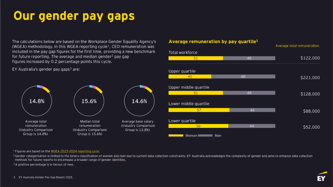
Dark background with bold yellow and white text. Features circular graphs, bar charts, and figures. Clearly divided into left-side text explanations and right-side remuneration bars by quartile.
Human Resources and Talent Management
Professional Services
This slide outlines EY Australia's gender pay gaps based on WGEA methodology, including total and median remuneration and base salary differences. It shows visual comparisons by gender across pay quartiles, revealing gaps in compensation and detailing where discrepancies occur. It emphasizes benchmarking against industry standards.
gender pay gap, remuneration, WGEA, EY Australia, salary, pay quartiles, workforce, diversity, women, equality
Multiple Chart
EY
Saved
The slide features a bubble chart and a text section. The chart displays preferences of highly skilled workers by country in percentages, with bubble sizes representing worker numbers.
Market Analysis and Trends
Professional Services
Discusses the preference of skilled workers in various countries for multinational companies, balancing business priorities and sustainability.
talent preferences, multinational companies, skilled workers, business priorities, sustainability goals, global markets, workforce trends
Mixed Chart
Accenture
Saved
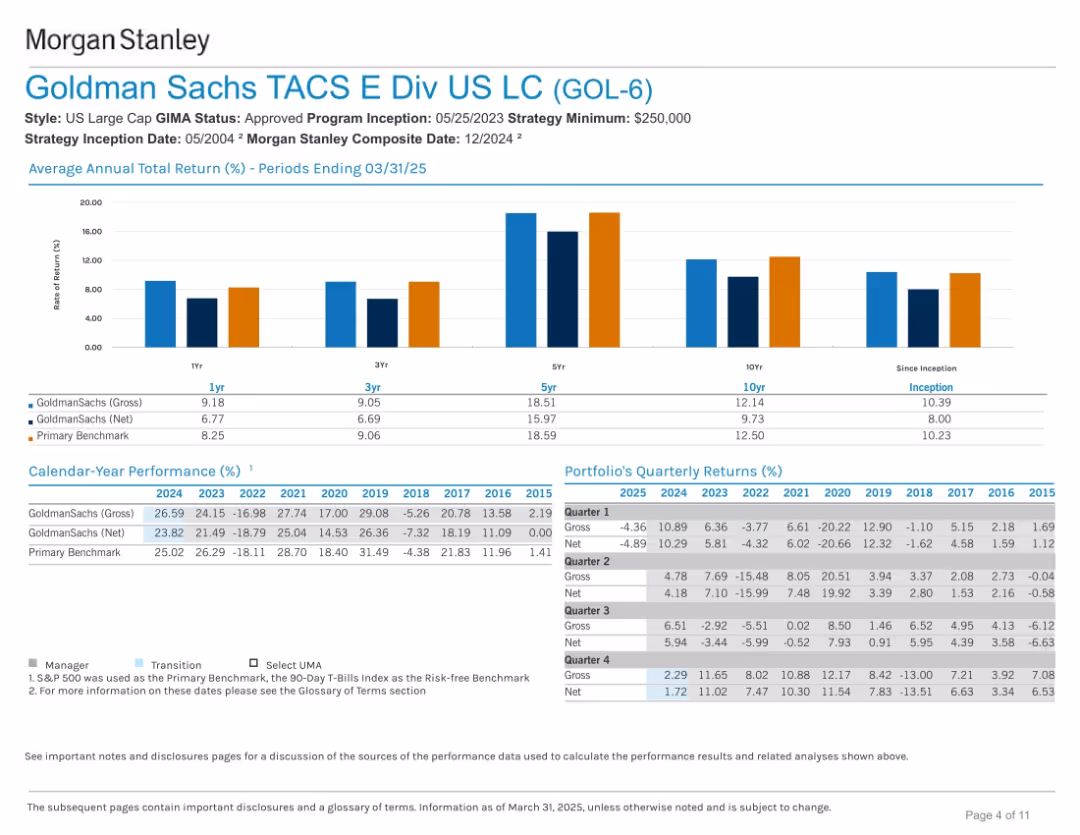
Side-by-side bar charts for total return history and calendar-year performance. Below is a grid of quarterly returns. Color-coded for clarity.
Financial Performance
Financial Services
The slide provides historical performance data across multiple timeframes (1Y, 3Y, 5Y, etc.) and calendar years. It includes returns net and gross of fees, benchmarking against a primary index, and shows resilience over time.
returns, performance, Goldman Sachs, benchmark, total return, portfolio history, calendar year, growth
Mixed Chart
Goldman Sachs
Saved
Two donut charts comparing the delivery mechanisms of podcast ads in 2017 and 2018. Includes percentages and color distinctions.
Market Analysis and Trends
Media & Entertainment
Shows the shift in podcast ad delivery mechanisms from 2017 to 2018, highlighting the increase in dynamically inserted ads versus edited-in/baked-in ads.
Podcast, Advertising, Revenue, Market Trends, Dynamic Insertion, 2017, 2018, Media
Multiple Chart
PwC/Strategy&
Saved
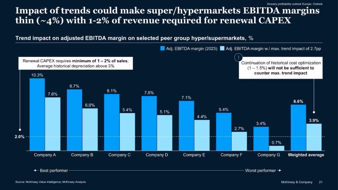
Clustered bar chart comparing 2023 adjusted EBITDA margins vs trend-adjusted margins across 7 companies.
Financial Performance
Retail & E-commerce
Demonstrates potential EBITDA margin erosion for hyper/supermarkets under current trends. Even high-performing companies could fall below sustainability thresholds unless new efficiencies are found. Renewal CAPEX adds further financial strain.
EBITDA margin, CAPEX, cost pressure, hypermarkets, financial outlook
Single Chart
McKinsey
Saved
Slide contains column charts, text, and bullet points with a clear visual hierarchy in blue, gray, and white colors. It's data-rich and detailed.
Operational Efficiency
Financial Services
This slide covers financial results and net revenue in consumer and wealth management, useful for operational reviews and financial analysis.
Consumer, Wealth, Management, Financial, Results, Net Revenue, Operational, Review, Analysis, Efficiency
Mixed Chart
Goldman Sachs
Saved
Detailed descriptions of seven key priorities for people management in the new reality post-COVID-19, including smarter work models and health initiatives.
Human Resources and Talent Management
Professional Services
Provides insights into how businesses can adapt their people management strategies to the post-pandemic world, focusing on health, flexibility, and new skills.
new reality, people management, health, flexibility, skills
Header Vertical
BCG
Saved
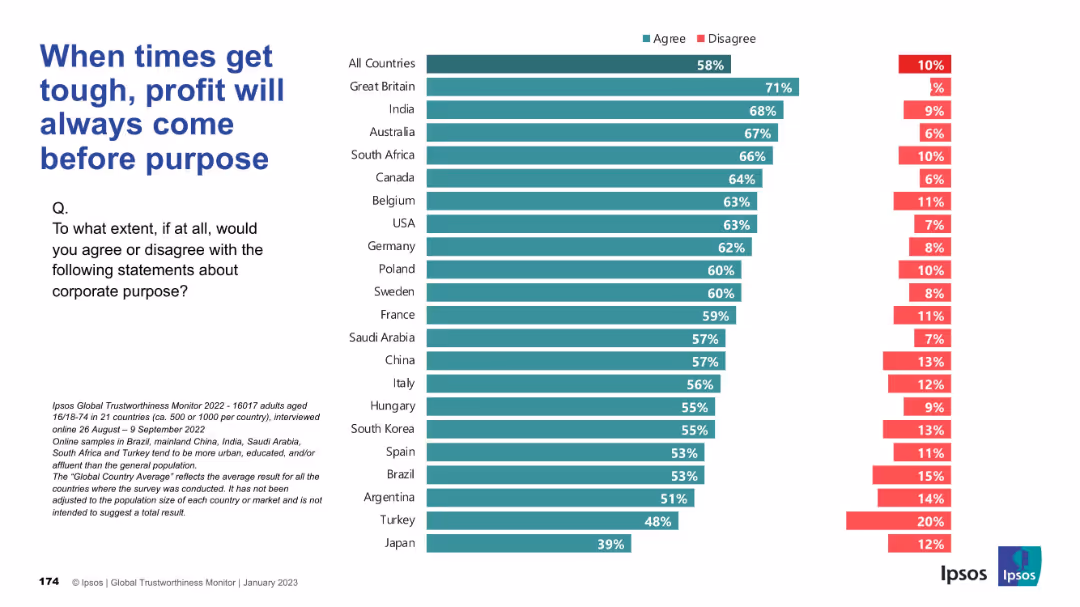
Structured bar chart showing country-level agreement on the trade-off between profit and purpose; consistent color use and layout.
Corporate Finance and Valuation
Financial Services
This chart captures the belief that businesses prioritize profit over stated social/environmental purposes during challenging times. A majority across countries agree, especially in the UK and India.
profit vs purpose, business values, financial priorities, Ipsos, public opinion, economic pressure
Mixed Chart
IPSOS
Saved
Includes column chart illustrating sustainable finance volumes and bullet points detailing recent sustainability achievements and initiatives. The design is clean and promotes easy understanding of sustainability goals.
Regulatory and Compliance
Financial Services
Highlights the bank’s efforts and achievements in sustainable finance, aligning with broader environmental and corporate responsibility goals. Useful in presentations discussing corporate sustainability and financial contributions to environmental initiatives.
sustainability, finance, banking, environmental impact
Mixed Chart
Deutsche Bank
Saved
Bar graph and icons representing the strategies executives are focusing on to achieve personalization in consumer channels.
Strategic Planning
Retail & E-commerce
Highlights specific strategies companies are adopting to provide personalized shopping experiences, with a focus on data analytics and omnichannel efforts.
Personalization, Channel Strategy, Data Analytics, Omnichannel, Executive Strategy, Bar Graph
Single Chart
Kearney
Saved
A bar chart and bullet points detailing reasons highly skilled workers consider job changes.
Human Resources and Talent Management
Professional Services
Analyzes the motivations for job changes among highly skilled workers, including pay, career progression, and work environment.
Job change, skilled workers, career progression, work environment
Mixed Chart
Accenture
Saved
Slide with bar charts showing the expected and achieved Returns on Digital Investment (RODI) by automotive companies, compared to cross-industry performance.
Financial Performance
Transportation & Logistics
Discusses the financial returns on digital investments by automotive companies, highlighting how champions outperform contenders and cadets in achieving higher than expected RODI.
RODI, financial performance, automotive, investment returns, digital transformation
Multiple Chart
Accenture
Saved
Contains a column chart comparing the importance of future food priorities to businesses and the applications companies are working on, such as plant-based proteins and conservation.
Strategic Planning
Agriculture & Food Production
Explores corporate strategies towards future food trends, revealing that most companies prioritize sustainable practices but recognize a need for capabilities improvement. It also highlights areas like conservation and plant-based innovations.
future food trends, sustainability, corporate strategies, priorities
Mixed Chart
Deloitte
Saved
The slide features two column charts comparing the impact of the Great Resignation on front and back office compensation packages. An image on the left shows professionals in a casual meeting. The charts use different shades of orange and red to display data.
Human Resources and Talent Management
Financial Services
The slide outlines how managers have increased base compensation and discretionary bonuses to address labor challenges for both front and back offices, focusing on improving compensation to retain staff.
Compensation, labor trends, Great Resignation, front office, back office
Multiple Chart
EY
Saved
This slide details various European and national funding schemes available to the T&T sector. It categorizes the schemes into thematic areas of investment, such as green transition, entrepreneurship, and cultural heritage, with descriptions of each.
Financial Performance
Hospitality & Tourism
Describes funding opportunities for the T&T sector, covering EU and national programs aimed at green transition, digital capacities, entrepreneurship, and infrastructure. Lists specific funding schemes and their objectives.
Funding, EU programs, Investment, Green transition, Entrepreneurship
Mixed Chart
EY
Saved
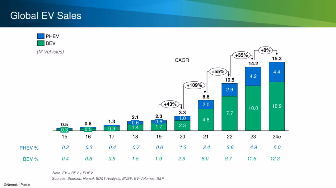
Stacked bar chart with color-coded segments for PHEV and BEV, annotated with CAGR growth percentages.
Performance Metrics and KPIs
Industrial & Manufacturing
The slide provides a historical and projected overview of global electric vehicle (EV) sales split between BEVs and PHEVs. It highlights significant year-over-year growth, especially from 2020 to 2023, and shows total volumes and market share increases.
EV sales, BEV, PHEV, CAGR, growth, market share
Single Chart
Barclays
Saved
Featuring a title, tables with detailed financial data, and a column chart on historical principal investments, the slide has a moderate level of visual complexity appropriate for conveying detailed information.
Investment Analysis
Financial Services
Targets alternative investment performance within asset management, detailing average AUS and effective fees. It's used for assessing investment strategies, updating investors, or guiding financial planning. Includes management fees and fundraising achievements.
Alternative Investments, AUS, Effective Fees, Fundraising
Mixed Chart
Goldman Sachs
Saved
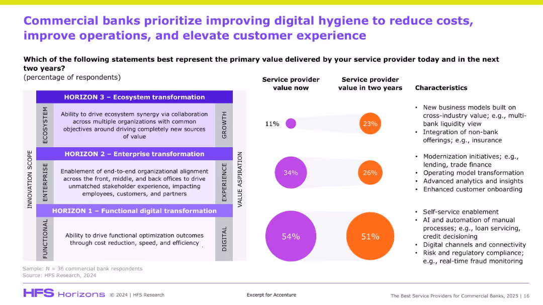
Split layout: value perception (left) vs. service priorities (right); color-coded circles and percentages.
Customer and Market Segmentation
Financial Services
The slide shows how commercial banks currently and expect to derive value from service providers, highlighting a shift from functional to ecosystem transformation over two years to enhance digital experience.
Digital hygiene, banking, transformation, cost reduction, AI, onboarding, value delivery
Mixed Chart
Accenture
Saved
Pie charts and a column chart illustrating the scope and reporting structure of shared services within organizations.
Operational Efficiency
Professional Services
Examines the maturity and scope of global business services, reporting structures, and the extent of service functions.
GBS, maturity, scope, pie chart, bar chart, reporting structure
Multiple Chart
Deloitte
Saved
The slide presents layered blocks in gradient colors representing strategic interventions across different types of shoppers to drive growth in digital transactions.
Strategic Planning
Retail & E-commerce
This slide outlines strategic actions for digital transaction growth, targeting non-buyers, occasional, and frequent shoppers with tailored approaches such as simplification, attractive propositions, and loyalty incentives.
Digital transactions, growth strategies, e-commerce
Pillar
BCG
Saved
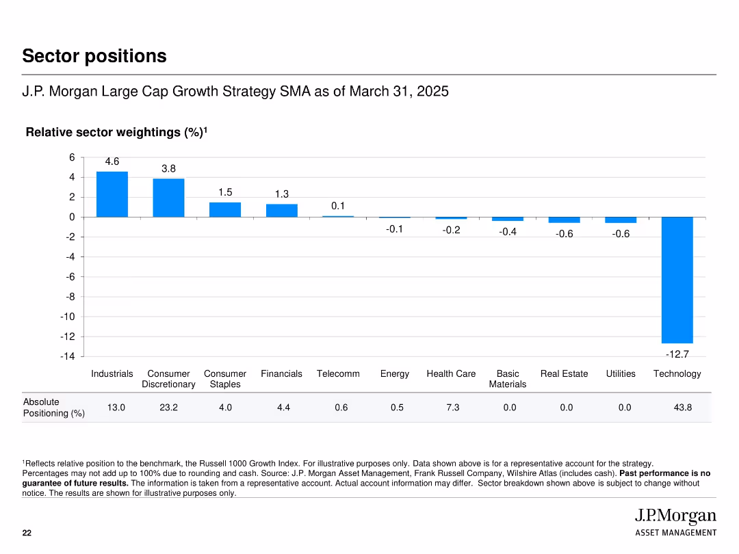
Bar chart with horizontal axis for sectors and vertical bars showing relative sector weightings
Investment Analysis
Financial Services
Shows the sector positioning of the strategy relative to the Russell 1000 Growth Index as of March 31, 2025. Technology is notably underweighted while Industrials and Consumer Discretionary are overweighted. Includes absolute positioning percentages below the chart.
sector positions, weighting, strategy, benchmark, relative position, J.P. Morgan, allocation, equity sectors
Single Chart
JP Morgan
Saved
Slide includes a combination of imagery and column icons, presenting investment data and trends.
Investment Analysis
Agriculture & Food Production
Analyzes recent investment trends in the FoodTech sector, discussing shifts in focus and investment distribution.
Investment, FoodTech, trends, growth, sustainability
Header Vertical
Accenture
Saved
Includes pie charts and bar graphs detailing deposit sources and allocations by business unit within Citibank. Highly detailed with key financial figures.
Financial Performance
Financial Services
Provides a comprehensive view of Citibank's deposit diversification and stability, highlighting key business units and regional contributions. Useful for understanding liquidity management and investment safety.
deposit sources, financial stability, Citibank, business units, liquidity management
Multiple Chart
Citigroup
Saved
The slide presents column charts comparing the online rides market from 2015 to 2025 and lists the number of active riders.
Market Analysis and Trends
Transportation & Logistics
Analyzing the SEA online rides market, the slide predicts a fivefold increase by 2025, with a special note on Indonesia's market and Singapore's highest fare per trip.
rides, SEA, market growth, Indonesia, Singapore
Mixed Chart
Bain
Saved
Previous
Next
If nothing, comes up, please save your slides first
Create a FREE account to continue browsing
Receive Instant Access to 1,000+ slides from companies like McKinsey, Google, and Goldman Sachs
First Name
Last Name
Email
Password
I agree to all
Terms & Privacy Policy
Thank you! Your submission has been received!
Oops! Something went wrong while submitting the form.
Have an account?
Sign in
Column Chart
Heatmap
Chevron
Org Chart
Infographic
Callouts
Timeline
List
Graphic
Picture
Process Flow
Diagram
Paragraph
Map
Table
Framework
Subtitle
Takeaway Box
Icon
Other Chart
Radar Chart
Waterfall Chart
Mekko Chart
Pie Chart
Scatter Plot
Line Chart
Bar chart
Bullet points