My Account
My Slides
Search by Category
Templates
View All Templates
Download Template Slides
Leave Feedback
Login
Logout
Get Started
Browse all Slides
Browse all Slides
Create a FREE Account
Instant access to 1,000+ real slides from top companies like McKinsey, BCG, Goldman Sachs, Google and many more!
First Name
Last Name
Email
Password
I agree to all
Terms & Privacy Policy
Thank you! Your submission has been received!
Oops! Something went wrong while submitting the form.
Have an account?
Sign in
Saved Slides
The slide includes a pie chart showing the percentage of Americans who have used virtual care and a grid chart on satisfaction with virtual care.
Technology and Digital Transformation
Healthcare & Pharmaceuticals
This slide discusses the adoption of telehealth, with 51% of Americans having used virtual care and 89% of those users being satisfied. It emphasizes the potential of telehealth to improve patient wellness.
Telehealth, virtual care, patient satisfaction, digital health, wellness
Mixed Chart
IPSOS
Saved
Features bar charts, pie charts, and maps, providing a complex overview of geopolitical shifts and resource distribution.
Risk Assessment and Management
Financial Services
Discusses the changing geopolitical landscape and its impact on resource allocation, crucial for strategic planning and geopolitical risk assessment.
Geopolitics, Resource Management, Strategic Planning, Global Shifts, Risk Assessment
Multiple Chart
PwC/Strategy&
Saved
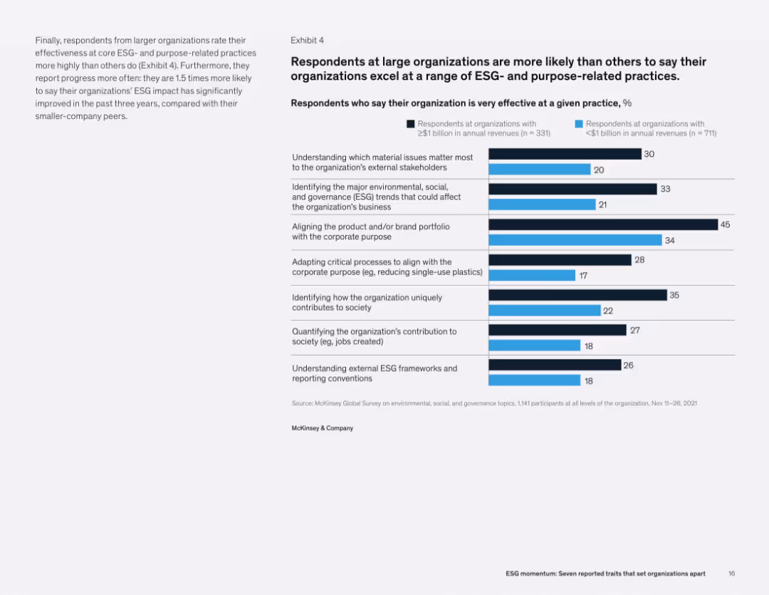
Text on left, and a bar chart on right showing how effective large vs. small organizations are at ESG practices like alignment, contribution tracking, and stakeholder engagement.
Operational Efficiency
Professional Services
Larger organizations report significantly higher effectiveness in various ESG practices, including stakeholder engagement, brand alignment with purpose, and trend identification. The data suggests a broader and more integrated ESG strategy in large firms.
ESG effectiveness, organizational practices, purpose alignment, stakeholder engagement, corporate strategy
Mixed Chart
McKinsey
Saved
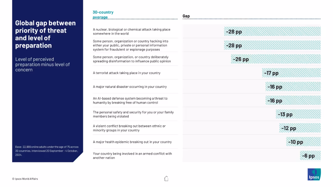
Table with two columns: threat types and corresponding global preparedness gap (concern minus confidence). Horizontal bars visualize the negative gaps.
Risk Assessment and Management
Government & Public Sector
Visualizes the global discrepancy between concern about various threats and perceived governmental preparedness. Highlights largest concern-preparedness gaps in NBC attacks and hacking across a 30-country average.
preparedness gap, risk perception, global concern, NBC threats, cyber attacks, Ipsos data
Mixed Chart
IPSOS
Saved
Contains a mix of text and bar charts, detailing reasons for job satisfaction and factors that attract Gen Zs and millennials to employers.
Human Resources and Talent Management
Professional Services
The slide discusses strategies for employers to attract and retain Gen Z and millennial talent, focusing on key factors like work-life balance, learning opportunities, and salary. It includes supporting bar charts showing the importance of these factors.
Talent retention, job satisfaction, employers, Gen Z, millennials
Mixed Chart
Deloitte
Saved
The slide shows a layered column chart for 2015 and 2025, subdivided into hotels, airlines, and rides, with a side description.
Market Analysis and Trends
Hospitality & Tourism
It discusses the SEA online travel market, expected to quadruple by 2025. The chart breaks down the market size by sectors, with additional details on the drivers of this growth.
travel, SEA, growth, hotels, airlines, rides
Mixed Chart
Bain
Saved
Moderate complexity featuring a column chart detailing deal value in US dollars over time, segmented by unicorn and other investments, accompanied by a text block explaining the chart.
Market Analysis and Trends
Financial Services
Analyzes the growth of deal activity within a region, with specific emphasis on the tech investment landscape and the trend of unicorn and non-unicorn investments.
Deal activity, investment, unicorn, tech landscape
Mixed Chart
Bain
Saved
The slide features a title, two sections with column charts, and additional small text boxes with statistics. The first chart shows the growth in consumers with hybrid fitness routines from 2020 to 2022. The second part has comparison stats on health outcomes between hybrid fitness consumers and general respondents.
Market Analysis and Trends
Healthcare & Pharmaceuticals
This slide discusses the increasing adoption of hybrid fitness models, comparing data from 2020 and 2022. It provides evidence of effectiveness by showing higher positive health outcomes among hybrid fitness users versus all respondents. The slide could be used to discuss market trends in health and fitness and consumer behavior changes post-pandemic.
Hybrid fitness, health outcomes, consumer trends, market analysis, data comparison
Single Chart
McKinsey
Saved
This slide displays a column chart showing global visibility into ad content placement across different regions with corresponding percentages. Text on the right.
Market Analysis and Trends
Professional Services
The slide shows the percentage of visibility into ad content placement globally, broken down by region (APAC, EMEA, North America, LATAM) and different levels of visibility.
ad placement, visibility, global analysis, column chart, advertising
Mixed Chart
Nielsen
Saved
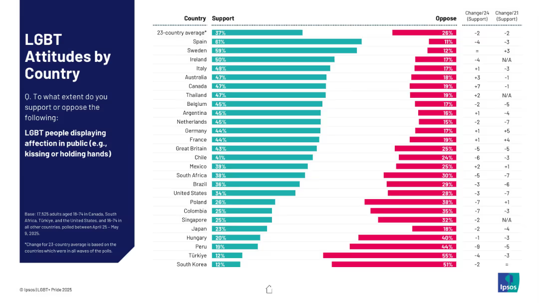
Similar to 19718 but focused on support for LGBT people displaying affection in public. Countries ranked by support with trend columns.
Market Analysis and Trends
Government & Public Sector
Compares support for public LGBT affection across 23 countries. Spain and Sweden lead; UK ranks mid-range. Notable opposition in South Korea and Türkiye. Trend data shows shifting attitudes since 2021.
LGBT, public affection, country comparison, trend analysis, Ipsos
Mixed Chart
IPSOS
Saved
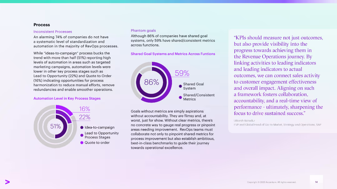
Left section shows automation levels in RevOps stages; center focuses on metrics alignment; right has quote
Operational Efficiency
Technology & Software
Reveals 74% of companies lack standardization in RevOps processes. Key gaps in automation from lead-to-order stages and misalignment in metrics (only 59% have consistent metrics across functions) are highlighted as barriers to operational excellence.
RevOps process, automation, KPIs, standardization, metrics, operational gaps
Multiple Chart
Accenture
Saved
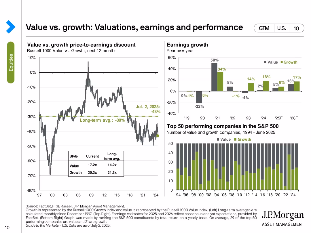
Three-part slide with valuation discount line chart, earnings growth bar chart, and value vs. growth performance bar chart of top 50 stocks.
Market Analysis and Trends
Financial Services
The slide compares valuation, earnings, and performance between value and growth stocks. As of July 2, 2025, value stocks trade at a -43% discount to growth, deeper than the long-term average. Earnings forecasts show stronger near-term growth for value stocks. Historical top-performing stock count also favors growth.
value stocks, growth stocks, valuation discount, earnings, performance, S&P 500, style investing, market segmentation
Multiple Chart
JP Morgan
Saved
Column chart show deposit amounts and percentages by channels from Q4 2019 to Q1 2022 and deposit target goals for 2024. An arrow indicates a significant increase in deposits through strategic channels, accompanied by explanatory text.
Financial Performance
Financial Services
Showcases the increase in deposits over time, focusing on the strategic channels contributing to growth. It sets forth target goals for consumer and transaction banking deposits by 2024, reflecting the company's ambitions and market analysis efforts.
deposit growth, strategic channels, 2024 targets, market analysis, column chart
Mixed Chart
Goldman Sachs
Saved
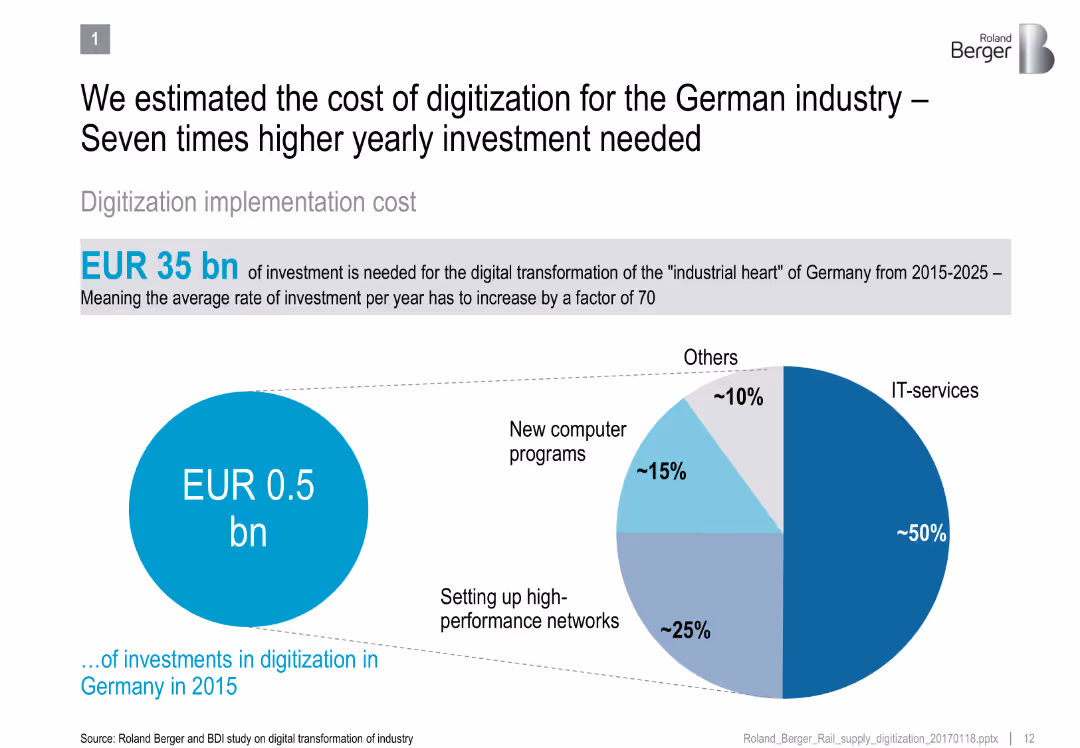
Split design: left side shows current vs required digitization investment; right side pie chart shows digitization spending allocation
Technology and Digital Transformation
Industrial & Manufacturing
Shows the significant gap between current and required investment for digitizing German industry by 2025, detailing categories like IT services and networks.
digitization, German industry, IT investment, digital transformation, capital expenditure, automation, infrastructure
Mixed Chart
Roland Berger
Saved
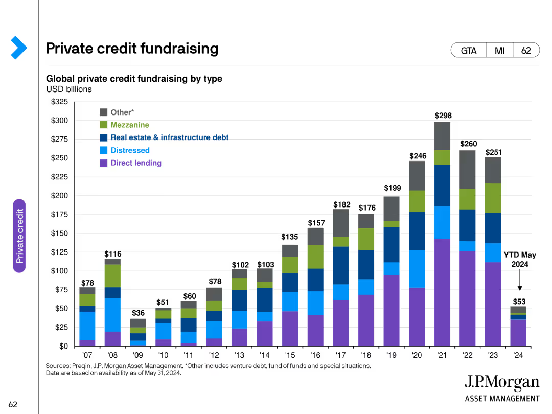
This slide features a column chart depicting global private credit fundraising by type from 2007 to May 2024. Different types of private credit fundraising are color-coded for clarity.
Financial Performance
Financial Services
The slide provides a comprehensive overview of private credit fundraising trends over the years, highlighting the growth and distribution of different types of private credit.
private credit, fundraising, financial services, trends, data
Single Chart
JP Morgan
Saved
This slide features a pie chart and bar graphs showing the growth in podcast listening over the past two years, including listener engagement and time spent listening.
Market Analysis and Trends
Media & Entertainment
The slide analyzes the growth in podcast listenership and engagement, showing that a significant number of listeners have started in the past two years and highlighting time spent listening.
podcasting growth, listener engagement, pie chart, bar graphs, media
Multiple Chart
Nielsen
Saved
This slide provides a detailed breakdown of strategic priorities along Australia's battery value chain from mining to recycling. It uses color-coded sections and icons to highlight specific areas such as mining, refining, active materials, and cell manufacturing, with bullet points detailing strategic actions for each segment. The layout is comprehensive and strategically organized to convey complex information in a structured manner.
Competitive Landscape
Energy & Utilities
Discusses how Australia can enhance its end-to-end capabilities in the battery value chain, focusing on leveraging its rich mineral resources and strengthening manufacturing and recycling.
strategic priorities, battery value chain, Australia, mining, refining, manufacturing, recycling, global market, value chain enhancement, resource management
Linear Flow
Accenture
Saved
The slide contains several rectangular callout boxes with icons, a column chart, and text descriptions. It uses a blue and white color palette and has a balanced distribution of visuals and text.
Strategic Planning
Financial Services
Outlines a strategic plan for a wealth franchise, detailing service offerings like full-service, remote advice, and self-directed investing. It serves to illustrate the comprehensive approach to client service across multiple channels, aimed at capturing a larger share of the investment wallet.
Wealth franchise, Strategic plan, Service offerings, Investment, Channels
Mixed Chart
JP Morgan
Saved
This slide shows a line chart depicting the maturity curve of CO₂ utilization technologies. It includes various stages and labeled points for different utilization methods.
Technology and Digital Transformation
Energy & Utilities
It details the maturity stages of CO₂ utilization technologies, from lab work to mature technology, highlighting methods like synthetic methane, methanol, saline formation, and enhanced coal bed methane.
CO₂ utilization, maturity curve, synthetic methane, methanol, saline formation, coal bed methane, energy, utilities
Single Chart
Kearney
Saved
A scatter plot matrix in the center, qualitative color coding for activity types, and headers at the top with explanatory notes.
Product and Service Analysis
Technology & Software
The slide maps out user enjoyment against time spent on various nbn™ network activities, highlighting entertainment as a key area.
enjoyment, activities, nbn network, user engagement, entertainment, online habits, scatter plot, user data
Single Chart
Accenture
Saved
The slide features a multi-column table comparing performance metrics across Europe, North America, and South America, with each region highlighted in a different color. There are metrics like RoTE and efficiency ratios with 2019 data and mid-term goals. Icons representing each region add a visual element. The slide uses a combination of red, pink, and light blue, with the Santander logo in the corner and a watermark of the company logo in the background.
Operational Efficiency
Financial Services
This slide compares the bank's operational performance metrics by region and outlines goals for improvement. It's suited for internal strategic discussions or investor presentations to demonstrate operational efficiency and targets in different markets.
Regional Performance, RoTE, Efficiency, Santander, Banking Metrics, Performance Goals, Operational Analysis, Financial Targets
Table
Morgan Stanley
Saved
The slide is divided into two sections: one with text bullet points and the other with a graphical representation of metrics, using a cohesive blue and white theme.
Financial Performance
Financial Services
Provides an analysis of the investment banking sector, with metrics such as wallet share, client footprint, and market rankings. It measures the company's progress and success in investment banking.
investment banking, wallet share, client footprint, market ranking, metrics
Text Only
Goldman Sachs
Saved
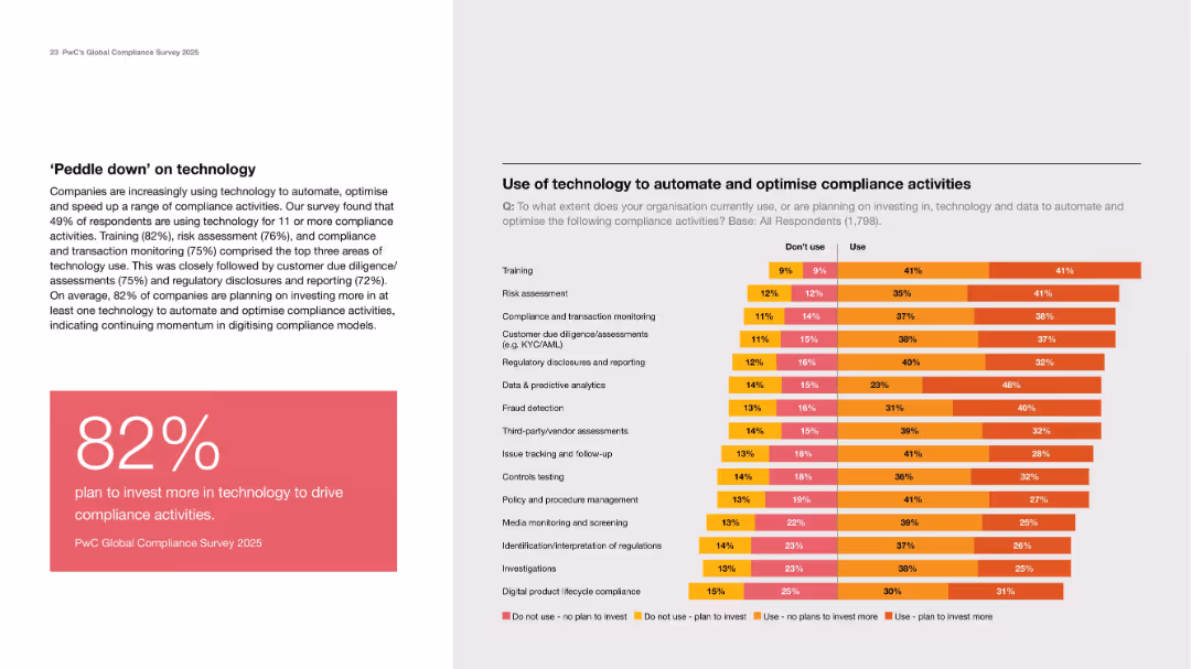
Left text and stat box; right side stacked bar chart on tech use in compliance by activity type.
Technology and Digital Transformation
Technology & Software
Emphasizes increasing tech investment in compliance, with 82% planning more investment. Training, risk assessment, and monitoring are most common use cases. The chart shows current and planned adoption levels.
automation, compliance tech, investment, risk, reporting, AI
Mixed Chart
PwC/Strategy&
Saved
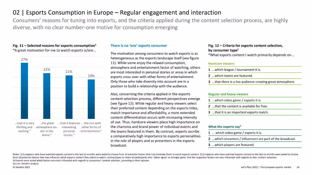
The slide features column charts and lists showing the reasons for esports consumption and criteria for content selection. The layout is organized with clear visual hierarchy.
Customer and Market Segmentation
Media & Entertainment
The slide discusses the diverse motivations and criteria for esports consumption among European viewers, indicating that there is no single dominant reason. It highlights the importance of content differentiation for hardcore, regular, and heavy viewers.
Esports, Engagement, Interaction, Content Selection
Mixed Chart
Deloitte
Saved
The slide contains bar graphs comparing gender and ethnic diversity at various levels within the organization against target goals for future years.
Regulatory and Compliance
Financial Services
Illustrates progress in diversity, equity, and inclusion within Barclays, focusing on gender and ethnic diversity at the management and board levels.
diversity, equity, inclusion, gender, management, board, targets, progress, financial services, DEI
Multiple Chart
Barclays
Saved
Previous
Next
If nothing, comes up, please save your slides first
Create a FREE account to continue browsing
Receive Instant Access to 1,000+ slides from companies like McKinsey, Google, and Goldman Sachs
First Name
Last Name
Email
Password
I agree to all
Terms & Privacy Policy
Thank you! Your submission has been received!
Oops! Something went wrong while submitting the form.
Have an account?
Sign in
Column Chart
Heatmap
Chevron
Org Chart
Infographic
Callouts
Timeline
List
Graphic
Picture
Process Flow
Diagram
Paragraph
Map
Table
Framework
Subtitle
Takeaway Box
Icon
Other Chart
Radar Chart
Waterfall Chart
Mekko Chart
Pie Chart
Scatter Plot
Line Chart
Bar chart
Bullet points