My Account
My Slides
Search by Category
Templates
View All Templates
Download Template Slides
✦ AI Search
Feedback
Login
Logout
Get Started
Browse all Slides
Browse all Slides
Create a FREE Account
Instant access to 1,000+ real slides from top companies like McKinsey, BCG, Goldman Sachs, Google and many more!
First Name
Last Name
Email
Password
I agree to all
Terms & Privacy Policy
Thank you! Your submission has been received!
Oops! Something went wrong while submitting the form.
Have an account?
Sign in
Saved Slides
Features a multi-line chart showing percentages of talent retention strategies across industries. Icons represent different strategies at the top. Each line represents a sector with clear color coding.
Strategic Planning
Retail & E-commerce
Focuses on how retail industry's talent retention strategies align with other sectors, including CGS, Auto/IE, LS/Pharma/Biotech, and Travel/Hospitality, in foundational, programmatic, strategic, and integrated categories.
Retail, Talent Retention, Consistency, Industries, Strategies, Foundational, Programmatic, Strategic, Integrated
Mixed Chart
Accenture
Saved
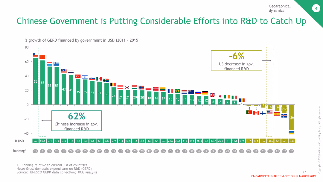
The slide features a column chart comparing the percentage growth of government-financed R&D in various countries, with China showing a significant increase, contrasted with a decrease in the US.
Market Analysis and Trends
Government & Public Sector
This slide highlights the Chinese government's efforts in increasing R&D funding compared to other countries, demonstrating China's commitment to advancing its technological capabilities.
R&D, Government, China, Funding, Comparison
Single Chart
BCG
Saved
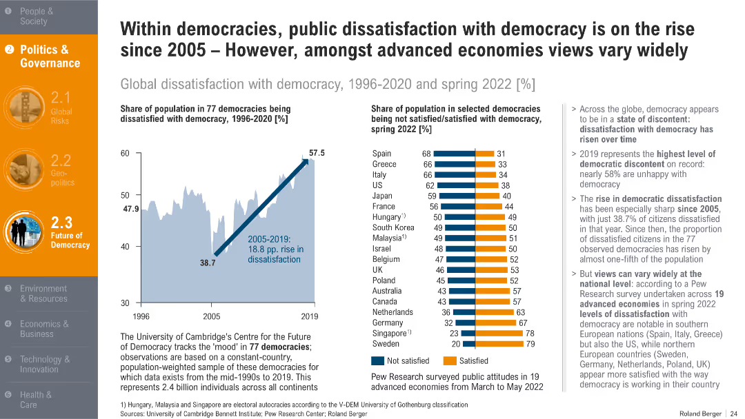
Two charts: line graph of dissatisfaction over time and bar chart showing country-wise satisfaction in 2022. Supported by bullet-point analysis.
Organizational Structure and Change
Government & Public Sector
This slide shows growing dissatisfaction with democracy since 2005, peaking in 2019. It contrasts national satisfaction levels in 2022, revealing significant variance between Southern and Northern democracies.
democratic dissatisfaction, political sentiment, governance trust, public opinion, voter discontent
Multiple Chart
Roland Berger
Saved
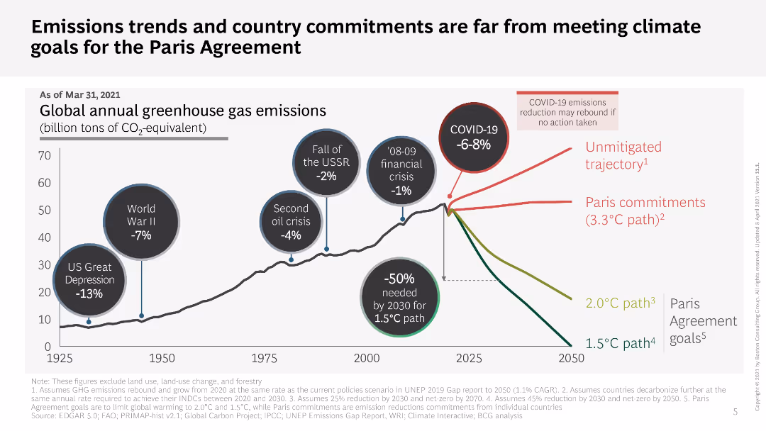
Line chart showing global greenhouse gas emissions trends with annotations for major events; text discussing the gap between current commitments and Paris Agreement goals.
Regulatory and Compliance
Environmental Services & Sustainability
Analyzes global greenhouse gas emissions trends and evaluates the gap between current country commitments and the goals set by the Paris Agreement, emphasizing the need for action.
greenhouse gas emissions, climate goals, Paris Agreement, emissions trends, country commitments, climate action, sustainability
Single Chart
BCG
Saved
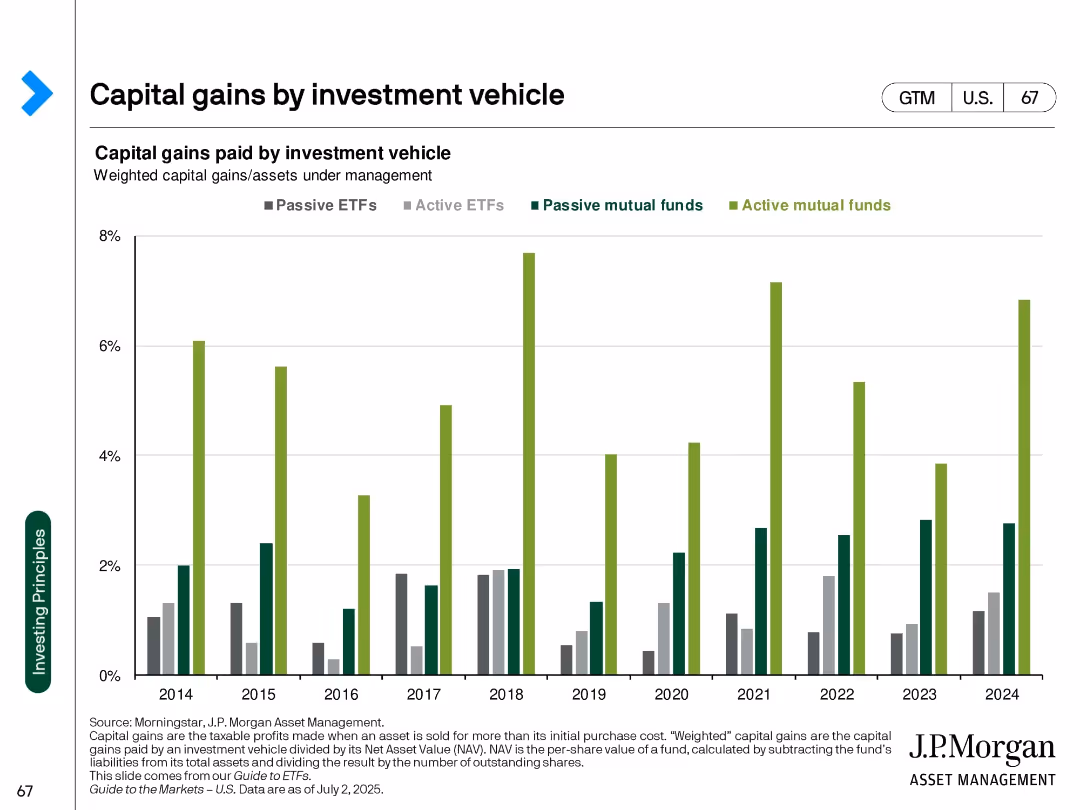
Clustered bar chart over years by vehicle type (ETFs, mutual funds) with color differentiation
Regulatory and Compliance
Financial Services
Compares capital gains distributions across investment vehicle types from 2014 to 2024. Active mutual funds show consistently higher capital gains than ETFs, indicating greater tax inefficiency.
capital gains, ETFs, mutual funds, tax efficiency, investment vehicles, fund structure, tax impact
Single Chart
JP Morgan
Saved
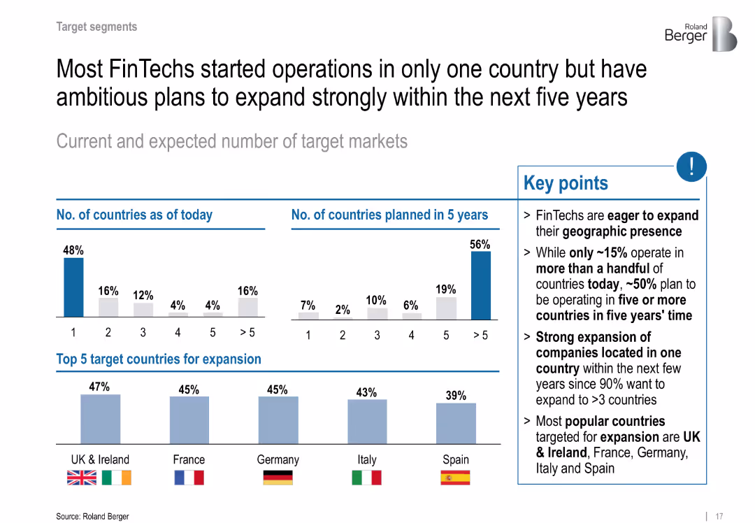
Dual bar chart compares current vs. future countries served; country flags highlight expansion targets
Sales and Business Development
Financial Services
Details current geographic reach and ambitious five-year expansion plans. Lists UK, France, Germany, Italy, and Spain as top target markets.
expansion, international growth, geographic strategy, Europe, target markets
Multiple Chart
Roland Berger
Saved
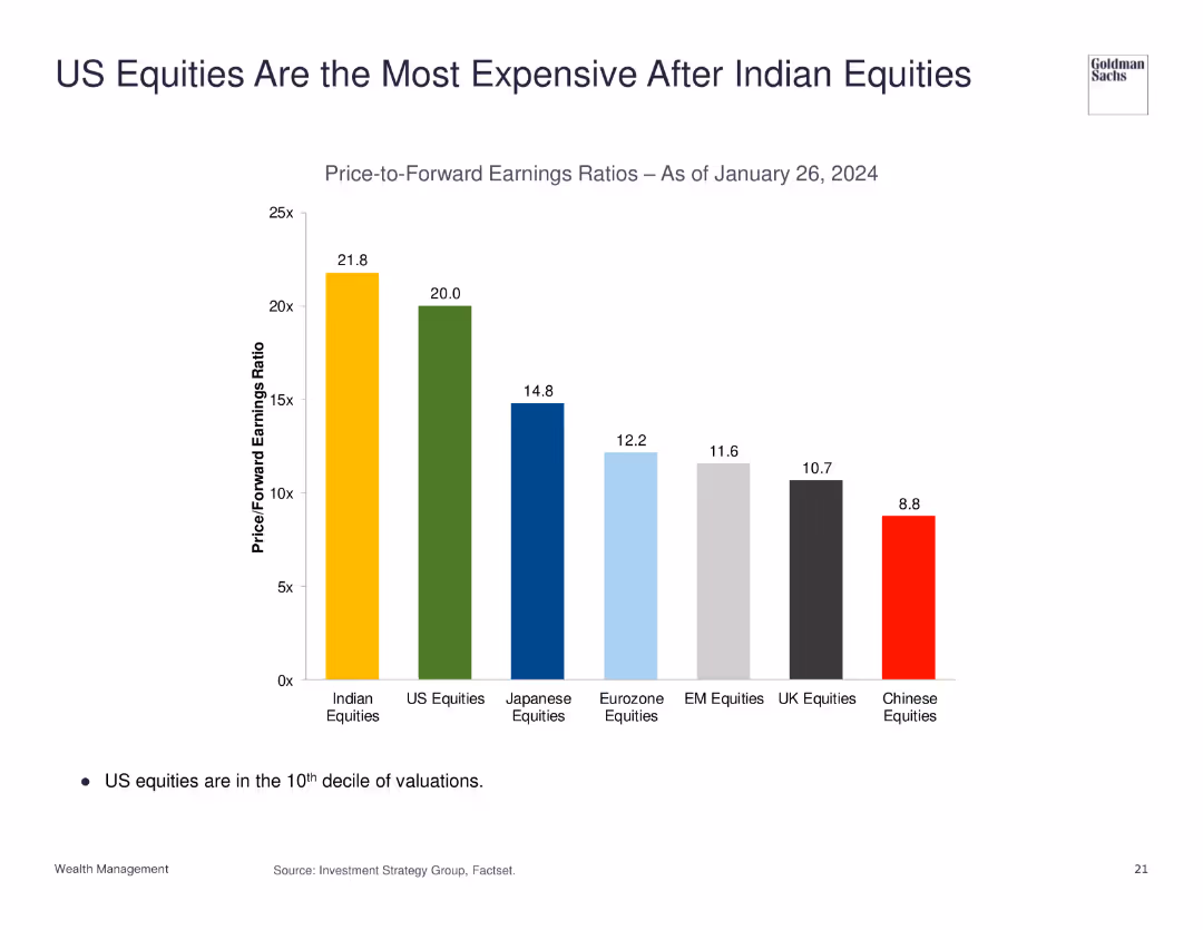
The slide features a column chart comparing the price-to-forward earnings ratios of different equities as of January 26, 2024. US equities are highlighted as the second most expensive.
Market Analysis and Trends
Financial Services
This slide presents a comparison of price-to-forward earnings ratios, indicating that US equities are highly valued, second only to Indian equities.
US equities, Indian equities, price-to-earnings ratio, market analysis, valuation
Single Chart
Goldman Sachs
Saved
Contains text blocks and images showcasing infrastructure and activities in Switzerland's food sector.
Market Analysis and Trends
Agriculture & Food Production
Highlights Switzerland's role as a leader in food and nutrition, focusing on corporate and academic contributions.
Switzerland, innovation, food, academia, corporates
Header Horizontal
Accenture
Saved
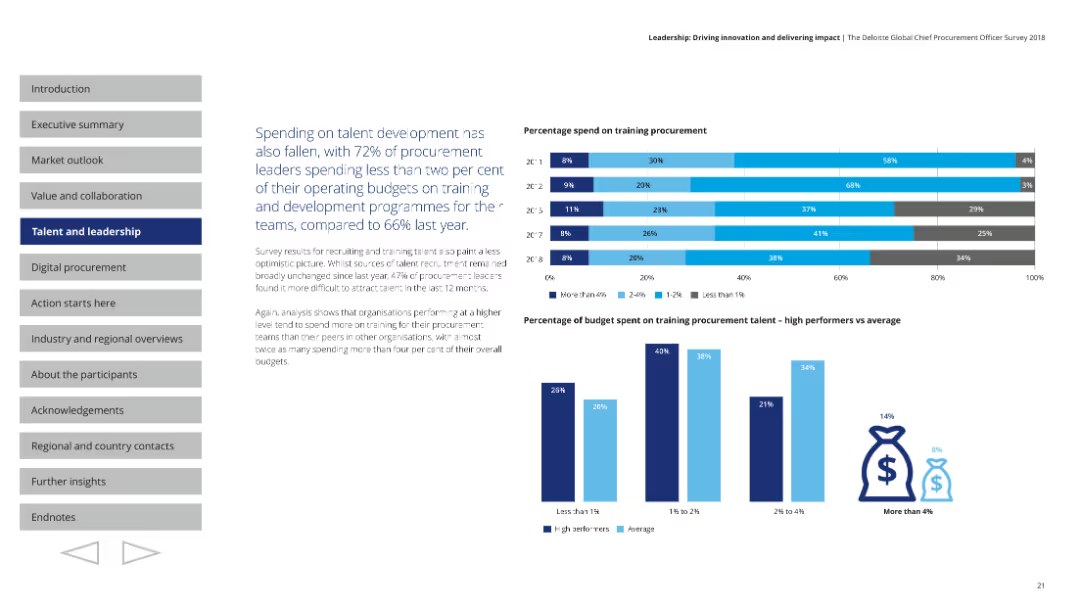
Horizontal bar charts showing the percentage of operating budget spent on training procurement talent. Additional charts compare high performers vs. average in spending. The layout uses blue shades and clear sections for easy comparison.
Human Resources and Talent Management
Professional Services
Discusses the decline in spending on talent development, with 72% of leaders spending less than 2% of their budgets on training. Highlights the disparity in spending between high performers and average organizations, emphasizing the need for better investment in talent.
talent development, procurement, training, budget, investment
Multiple Chart
Deloitte
Saved
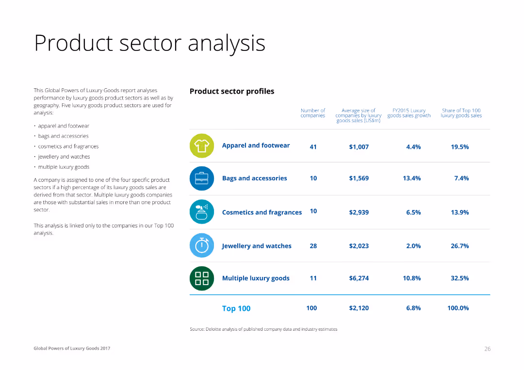
A combination of text and a table on the right, profiling luxury product sectors like apparel, accessories, cosmetics, and jewelry. Each row lists the number of companies, average size, sales growth, and share of top 100 sales for each sector.
Product and Service Analysis
Consumer Goods
This slide analyzes the performance of different luxury product sectors, providing insights into the number of companies, average size by sales, and growth rates for apparel, accessories, cosmetics, and jewelry sectors.
Product, Sector, Analysis, Luxury, Goods
Table
Deloitte
Saved
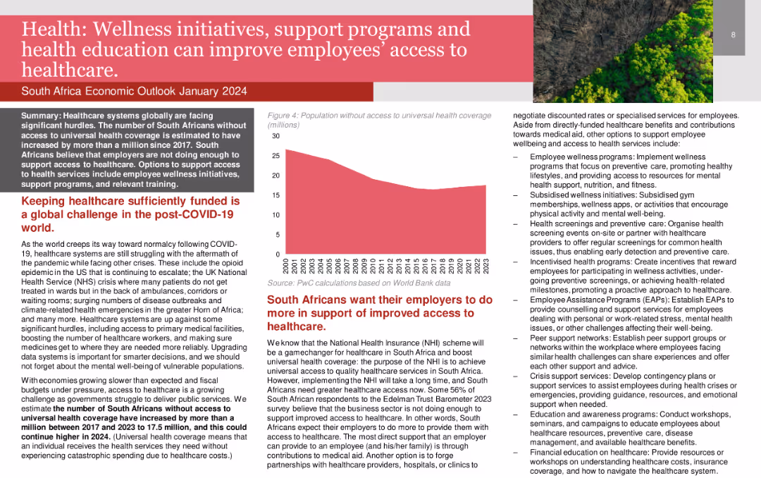
The slide contains a title in a red banner, multiple text boxes with detailed content, and a column chart displaying population without access to universal health coverage over time. The layout is dense with information.
Human Resources and Talent Management
Healthcare & Pharmaceuticals
The slide discusses the importance of wellness initiatives, support programs, and health education in improving employee access to healthcare. It highlights the challenges faced in keeping healthcare sufficiently funded and the role employers can play.
wellness, healthcare, employee support, health education, funding
Mixed Chart
PwC/Strategy&
Saved
Features column charts indicating the vaccine wastage rates at various healthcare centers before and after adopting solar power.
Regulatory and Compliance
Healthcare & Pharmaceuticals
Explores the reduction in vaccine wastage through improved power supplies via solar energy adoption, showing significant decreases in wastage rates post-implementation in Nigerian healthcare facilities.
vaccine wastage, solar power, healthcare centers, Nigeria, power supply, energy solutions
Single Chart
BCG
Saved
The slide contains column charts, and screenshots of a digital application platform showcasing growth in unsecured lending. It visually splits information on digital transformation and partnerships with platforms like Alibaba and Grab.
Operational Efficiency
Financial Services
Analyzes the growth in Citi's unsecured lending portfolio in Asia, emphasizing the shift towards digital acquisition channels and partnerships. It highlights the increase in card loans and personal loans, showcasing operational efficiency and market adaptation strategies.
unsecured lending, digital acquisition, Asia, partnerships, growth strategy
Multiple Chart
Citigroup
Saved
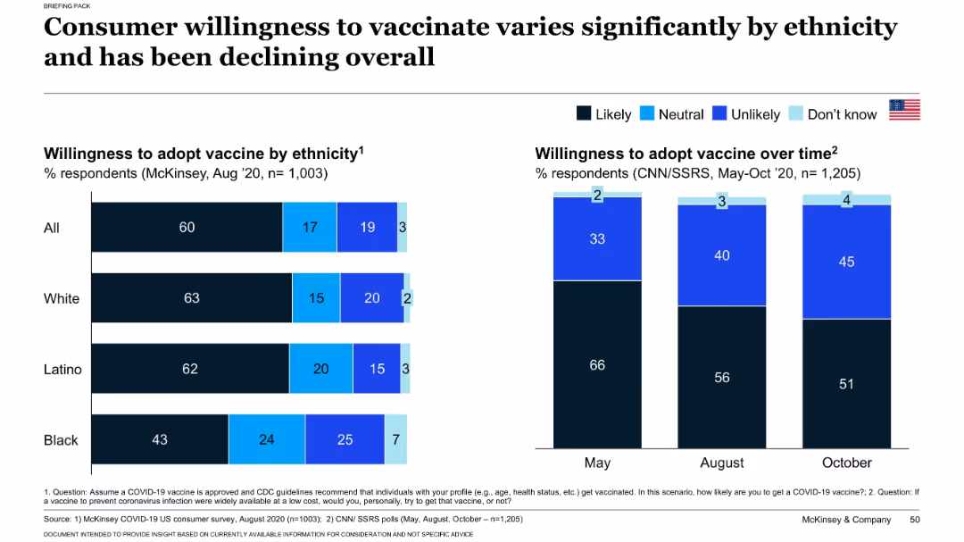
Split chart layout: left side shows willingness by ethnicity; right side shows willingness trend from May to Oct 2020.
Customer and Market Segmentation
Healthcare & Pharmaceuticals
This slide explores how willingness to receive a COVID-19 vaccine varies across ethnic groups and over time. It shows a decline in vaccine acceptance from May to October 2020 and highlights differences in likelihood to vaccinate among Black, Latino, and White populations. Insights support targeted communication strategies.
vaccine hesitancy, ethnicity, public opinion, COVID-19, trends, adoption
Multiple Chart
McKinsey
Saved
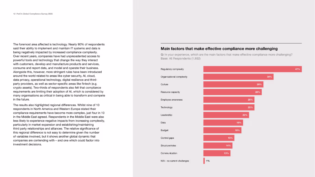
Text on tech challenges on the left; bar chart on the right ranking top challenges to effective compliance.
Operational Efficiency
Technology & Software
Identifies regulatory and organizational complexity, culture, and resource capacity as top barriers to compliance effectiveness. The left section emphasizes the major tech and regional effects on compliance adaptation.
regulatory complexity, compliance barriers, AI, tech, culture
Mixed Chart
PwC/Strategy&
Saved
The slide shows a column chart with expected EPS growth for various regions/styles and another chart for S&P 500 sectors, highlighting differences in expected earnings growth.
Financial Performance
Financial Services
The slide provides an analysis of corporate earnings growth, comparing expected earnings across regions and sectors. Useful for investment strategies.
earnings growth, EPS, corporate earnings, regions, styles, S&P 500, sectors, financial performance
Multiple Chart
Morgan Stanley
Saved
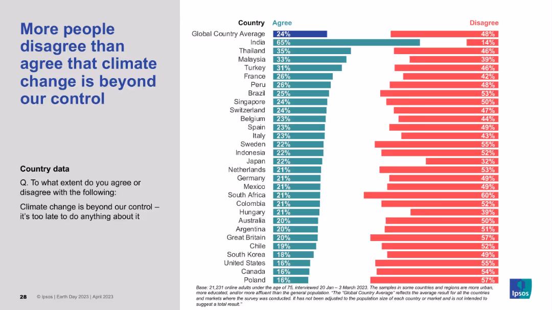
Standard format: bold blue statement on left and country agreement/disagreement distribution on right using horizontal bars.
Risk Assessment and Management
Environmental Services & Sustainability
The slide examines the belief that climate change is irreversible. While a minority agree it’s too late to act, the majority disagree, affirming a strong belief that mitigation efforts are still worthwhile and that the situation is not hopeless.
climate change, control, irreversibility, optimism, environmental responsibility, public perception, Ipsos
Mixed Chart
IPSOS
Saved
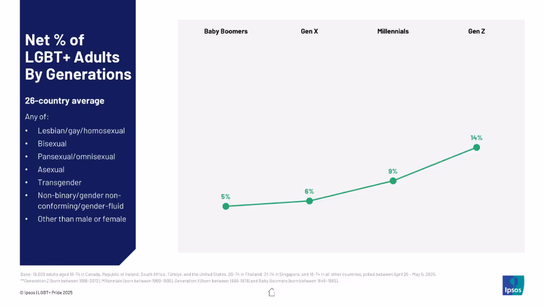
Line chart with four data points (Baby Boomers to Gen Z); left-aligned title and legend.
Market Analysis and Trends
Government & Public Sector
The graph shows a generational trend in LGBT+ self-identification, with Gen Z reaching 14%, a sharp increase from 5% for Baby Boomers, indicating a shift in openness or identity recognition over generations.
generations, LGBT+, Gen Z, social trends, demographics, identity
Mixed Chart
IPSOS
Saved
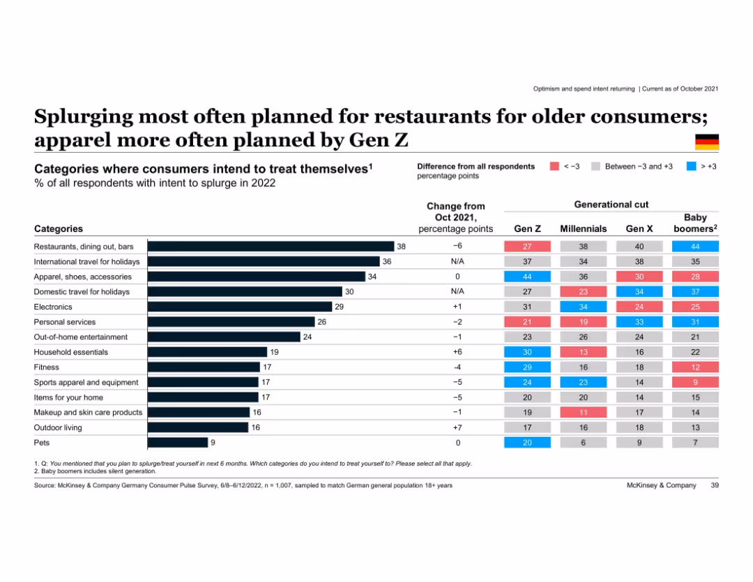
Horizontal bar chart with category-wise splurge intent; includes generational differences
Customer and Market Segmentation
Consumer Goods
Shows intended splurge categories for 2022 by generation. Older groups prioritize restaurants and holidays, while Gen Z favors apparel. Color-coded differences indicate deviation from average.
splurge intent, restaurants, apparel, generational differences, Gen Z, Baby Boomers, Germany, 2022 spending plans
Multiple Chart
McKinsey
Saved
Image of swirling light patterns. Column chart depicting the level of change in organizations impacting risk management functions.
Strategic Planning
Financial Services
This slide explores how organizations characterize the level of change impacting their risk management functions. It identifies the main areas requiring CRO attention in planned digital transformation initiatives, such as the use of GenAI, modernization of core functions, and cloud migration.
risk management, change, digital transformation, GenAI, cloud migration
Multiple Chart
EY
Saved
Bar graph and respondent quotes about steps being taken to enhance organizational agility, focusing on training and technology.
Strategic Planning
Professional Services
Outlines the specific actions companies are taking to become more agile, ranking culture and training among the top measures being implemented.
Organizational Agility, Training, Culture, Steps, Bar Graph, Quotes
Mixed Chart
Kearney
Saved
Slide shows a combination of maps, demographic tables, and data points illustrating the connectivity challenges in different regions of Indonesia.
Market Analysis and Trends
Telecommunications
Provides a comprehensive overview of Indonesia's connectivity challenges, focusing on demographic factors, school internet access, and regional disparities in connectivity.
Indonesia, demographics, connectivity, challenges, schools
Mixed Chart
BCG
Saved
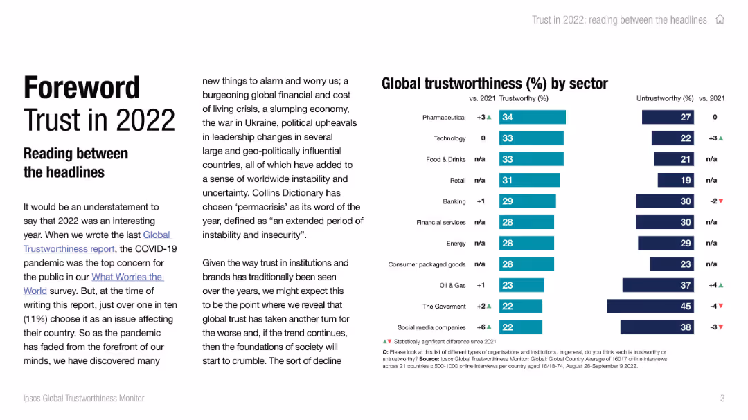
Left side contains text introduction to trust trends with bold title. Right side features a vertical bar chart of trustworthiness by sector.
Industry Overview
Professional Services
The slide introduces the 2022 trust report, highlighting the concept of 'permacrisis' and global unease. The bar chart ranks sectors by perceived trustworthiness, with pharmaceuticals and technology at the top, and government and social media companies at the bottom. Comparisons with 2021 are also shown.
trustworthiness, sectors, 2022 trends, public opinion, pharmaceuticals, technology, government, social media
Mixed Chart
IPSOS
Saved
Slide contains two scatter plots on a single frame comparing EBITDA growth and margin among various companies in renewable energy sectors like hydrogen and solar. The data points are color-coded by sector.
Market Analysis and Trends
Energy & Utilities
Discusses the financial performance of companies in the renewable sector by comparing growth and EBITDA margin, highlighting market trends and company positions within the industry.
renewable energy, EBITDA, market analysis, growth, financial performance
Multiple Chart
Barclays
Saved
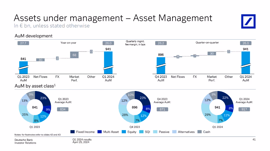
The slide contains column charts and pie charts showing assets under management development, including net flows, market performance, and asset class distribution.
Financial Performance
Financial Services
Discusses the development of assets under management in asset management, highlighting quarterly changes, asset class distribution, and market performance.
assets under management, asset management, net flows, market performance, asset class, financial performance
Multiple Chart
Deutsche Bank
Saved
Previous
Next
If nothing, comes up, please save your slides first
Create a FREE account to continue browsing
Receive Instant Access to 1,000+ slides from companies like McKinsey, Google, and Goldman Sachs
First Name
Last Name
Email
Password
I agree to all
Terms & Privacy Policy
Thank you! Your submission has been received!
Oops! Something went wrong while submitting the form.
Have an account?
Sign in
Column Chart
Heatmap
Chevron
Org Chart
Infographic
Callouts
Timeline
List
Graphic
Picture
Process Flow
Diagram
Paragraph
Map
Table
Framework
Subtitle
Takeaway Box
Icon
Other Chart
Radar Chart
Waterfall Chart
Mekko Chart
Pie Chart
Scatter Plot
Line Chart
Bar chart
Bullet points