Create a FREE Account
Instant access to 1,000+ real slides from top companies like McKinsey, BCG, Goldman Sachs, Google and many more!
First Name
Last Name
Email
Password
I agree to all
Terms & Privacy Policy
Thank you! Your submission has been received!
Oops! Something went wrong while submitting the form.
Have an account?
Sign in
Library
Templates
Courses
Pricing
My Account
My Slides
My Templates
✦ AI
AI Prompt Library
AI Search
Sign in
Start Here
Logout
My Saved Slides
The slide displays a split circular diagram divided into four segments, each with icons representing different tax amendments for 2018. The design uses bold colors like orange and red to denote different areas like Charitable activities and Foreign income taxation.
Regulatory and Compliance
Government & Public Sector
This slide presents proposed tax amendments for Namibia in 2018, detailing changes in taxation for dividends, trusts, foreign income, and charitable activities, aimed at discussing potential revenue impacts and legislative changes in a budget review.
tax, amendments, revenue, Namibia, 2018, dividend, trust, foreign, income, charitable
Framework
PwC/Strategy&
Saved
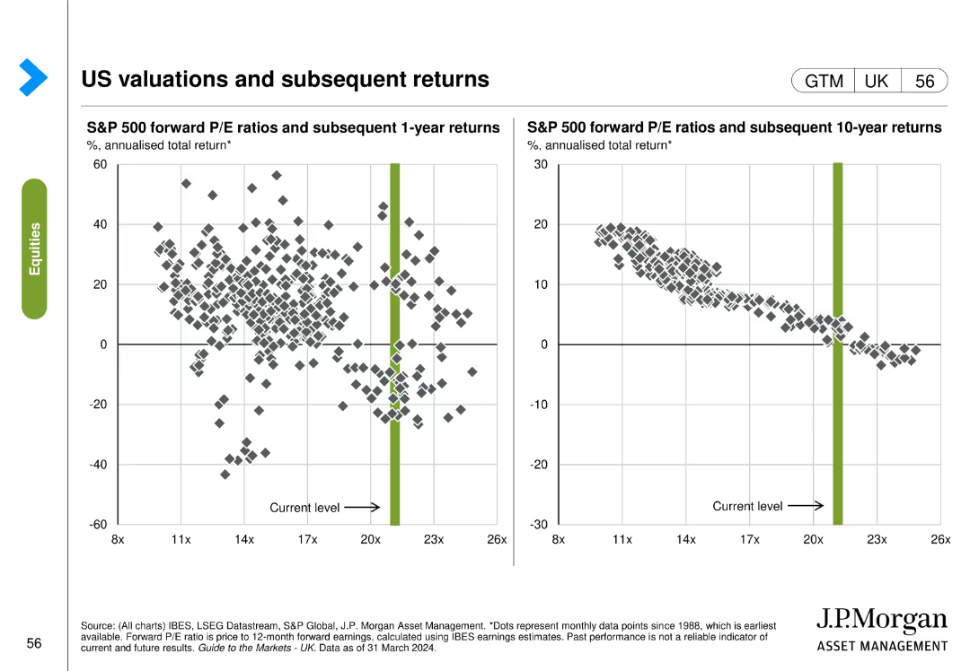
The slide contains two scatter plots: the left plot shows S&P 500 forward P/E ratios vs. subsequent 1-year returns, and the right plot shows forward P/E ratios vs. subsequent 10-year returns.
Investment Analysis
Financial Services
The slide analyzes the relationship between S&P 500 forward P/E ratios and subsequent returns over 1-year and 10-year periods, providing insights for investment strategies.
S&P 500, P/E ratios, returns, investment analysis, 1-year, 10-year, subsequent returns
Multiple Chart
JP Morgan
Saved
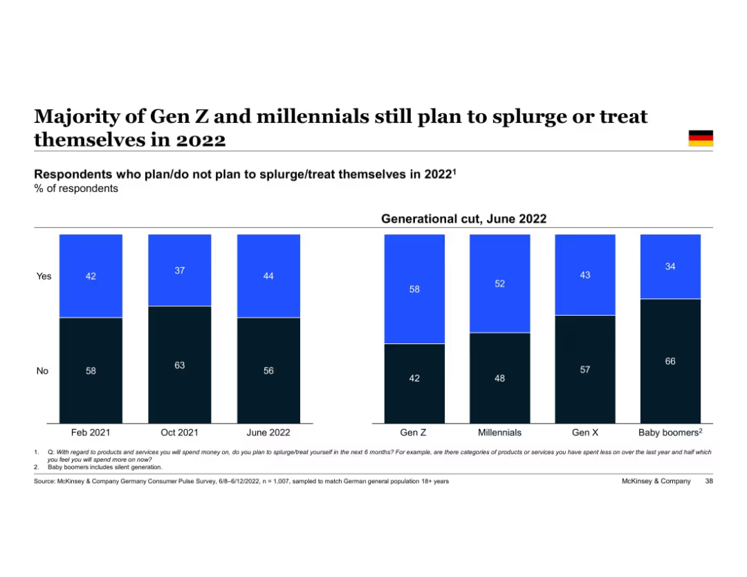
Bar chart with generational breakdown; sections labeled “Yes” and “No”
Market Analysis and Trends
Consumer Goods
Indicates that younger generations (Gen Z and Millennials) are more likely to plan for splurging or treating themselves in 2022. Tracks changes in intent across three survey waves and splits by generation.
splurging, Gen Z, millennials, consumer behavior, 2022 intent, McKinsey, Germany, spending patterns
Single Chart
McKinsey
Saved
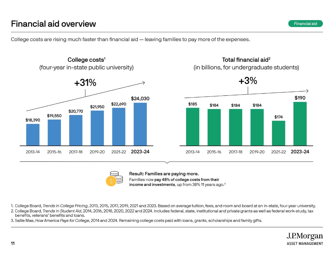
Two vertical bar charts comparing college costs and total financial aid over time. Summary box notes shifting burden to families.
Financial Performance
Education & Training
This slide highlights how college costs have risen 31% over 10 years, while financial aid increased only 3%. Families now bear a larger share of expenses, with 48% of college costs covered from income and investments compared to 38% a decade ago.
financial aid, rising costs, student burden, tuition trends, aid gap, college expenses, cost growth, funding shortfall, family responsibility
Multiple Chart
JP Morgan
Saved
The slide is packed with visual elements like icons and small images, descriptions, and various colors to differentiate the tools. It’s well-organized despite the high information density, making use of grids and alignment to maintain clarity.
Technology and Digital Transformation
Professional Services
Introduces THRIVE, a platform with tools for cost management and digital transformation, aimed at improving operational efficiency. The slide outlines each tool’s features and intended use, enhancing understanding of how digital tools can drive business improvements.
THRIVE, digital transformation, cost management, operational efficiency, tools
Pillar
Deloitte
Saved
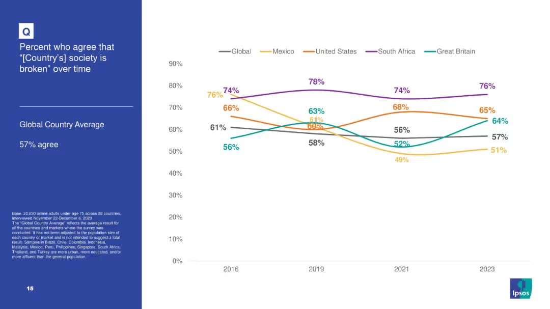
White background with line chart tracking agreement over time that “[Country]'s society is broken” for 5 countries plus global average; blue info box on left.
Market Analysis and Trends
Government & Public Sector
Tracks longitudinal data from 2016–2023 on societal dissatisfaction in select countries, noting highest levels in South Africa and consistent upward trend in Great Britain.
broken society, dissatisfaction, Ipsos, trend analysis, longitudinal data, South Africa, perception
Mixed Chart
IPSOS
Saved
Diagram with three main sections: Inspire, Engage, Impact, with supporting icons and text.
Strategic Planning
Environmental Services & Sustainability
Offers a structured guide to inspire and engage executives in SDG strategy implementation, measuring impact via surveys.
SDGs, strategic implementation, executive engagement, guide, impact measurement
Pillar
McKinsey
Saved
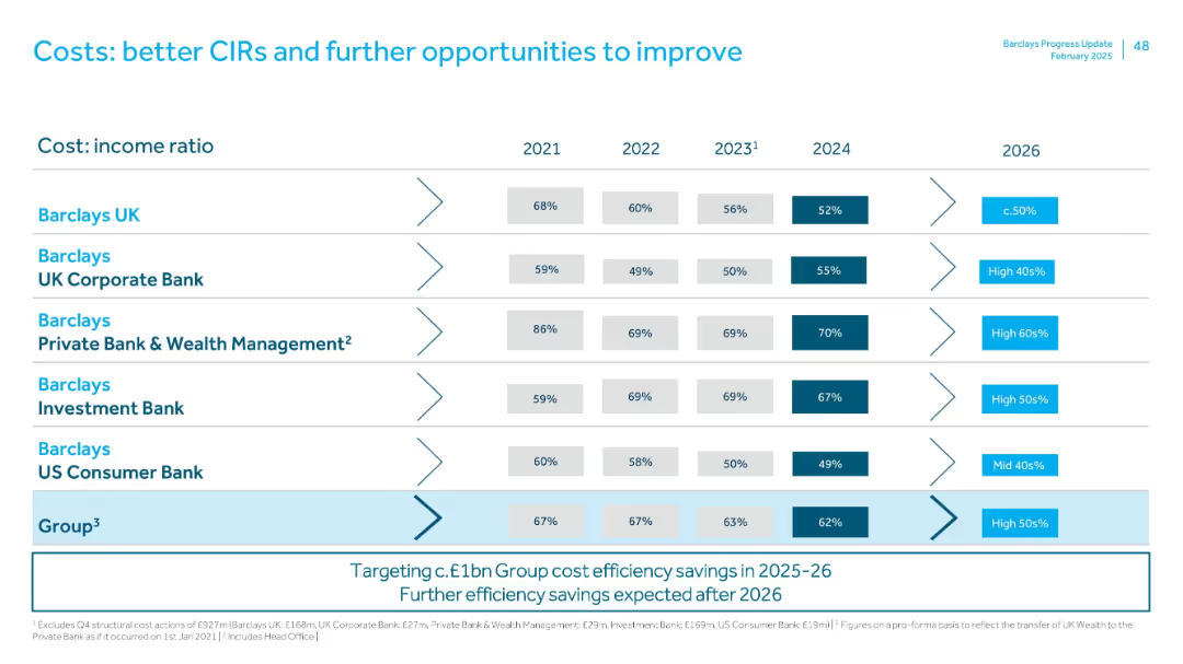
Table showing cost:income ratios across Barclays divisions from 2021–2026 with trend arrows and future targets.
Performance Metrics and KPIs
Financial Services
Breaks down CIR improvements for each Barclays segment (UK, Corporate Bank, Wealth Management, etc.), highlighting goals for 2026 (e.g., <50% for Barclays UK). Emphasizes Group-wide cost control and potential post-2026 savings.
cost:income ratio, efficiency, CIR targets, performance, division-level KPIs
Single Chart
Barclays
Saved
This slide utilizes a complex array of column charts detailing the 2019 GDP contributions and unemployment claims across various sectors in NY, segmented by industry and visualized with distinct colors.
Market Analysis and Trends
Financial Services
Offers a comprehensive snapshot of the New York economy, detailing each industry's contribution to the state's GDP and its unemployment figures in early 2020, reflecting the pandemic's impact.
NY economy, 2019 GDP, unemployment claims, industry analysis, pandemic, bar charts
Single Chart
BCG
Saved
This slide has a dark background with a yellow highlight. It features a header, body text, and a column chart displaying three circular percentage indicators, each with a different percentage, representing the most valued aspects of healthcare.
Customer and Market Segmentation
Healthcare & Pharmaceuticals
The slide emphasizes the most important factors for Irish consumers in healthcare: access to care when needed, a cost-effective system, and achieving better health outcomes. It underlines the complexity of consumer decision-making in healthcare.
healthcare, consumer values, Ireland, access, cost
Mixed Chart
EY
Saved
Displays column charts showing changes in capital metrics like CET1 ratio and leverage ratio, alongside MREL/TLAC requirements with surplus figures.
Performance Metrics and KPIs
Financial Services
Provides an update on the bank's capital position, detailing changes in capital ratios and requirements, key for regulatory compliance and stability assessment.
Capital, CET1 ratio, leverage, compliance
Multiple Chart
Deutsche Bank
Saved
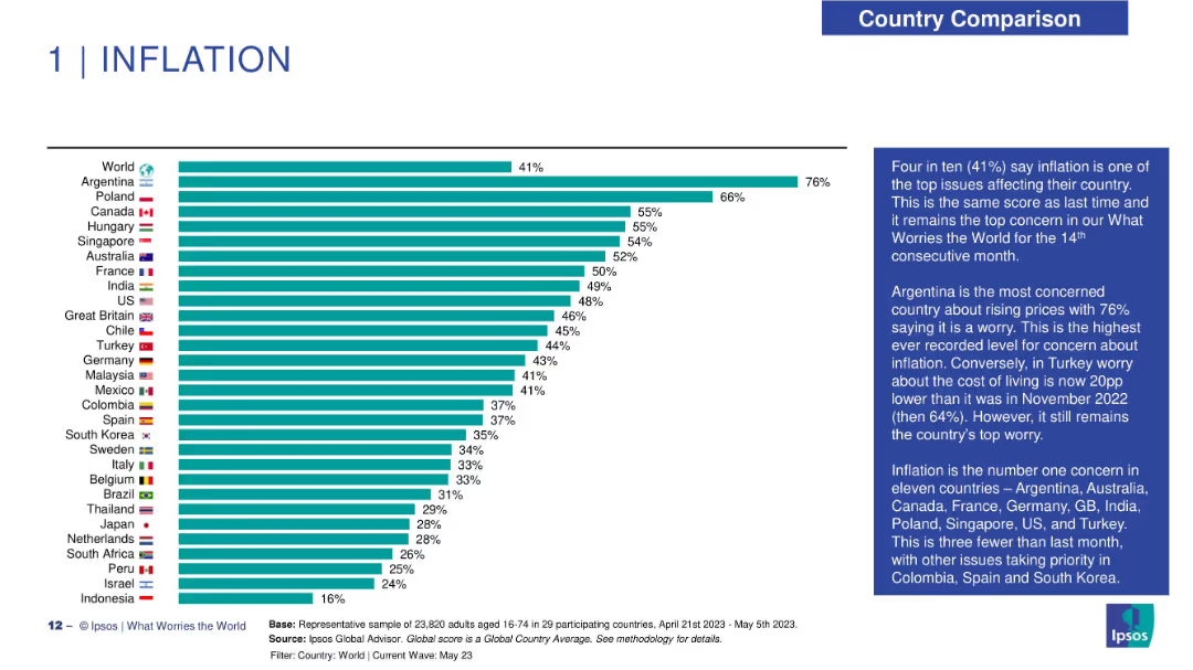
Horizontal bar chart on left displaying percentage of population concerned about inflation across 29 countries. Country flags and names are aligned on the left; percentage bars extend right. Right side includes a text box summarizing insights and trends. Clean layout with blue highlights and simple visual hierarchy.
Market Analysis and Trends
Financial Services
This slide shows survey results on public concern about inflation across various countries. Argentina ranks highest with 76%, followed by Poland and Canada at 66% and 55% respectively. A global average of 41% is reported. The text highlights that inflation has remained the top global worry for 14 months, with notable differences across countries. The slide provides comparative context and tracks concern levels over time.
inflation, global concern, country comparison, survey data, economic trends, Ipsos, financial perception, public sentiment, cost of living, market analysis
Mixed Chart
IPSOS
Saved
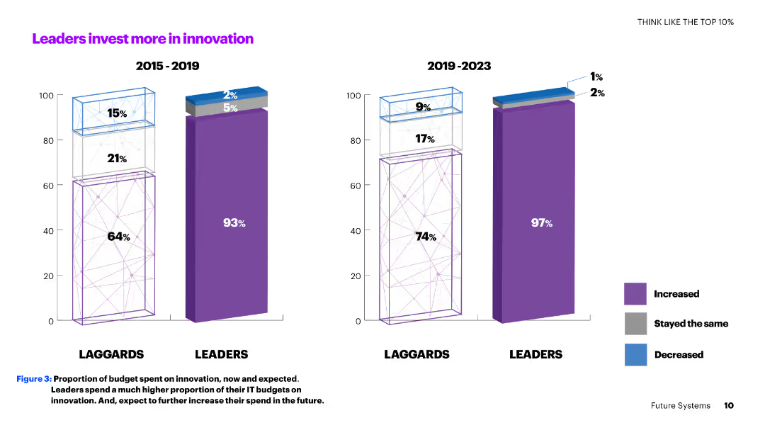
A two-column slide with vertical bar charts comparing the innovation investment percentages of leaders and laggards from 2015-2019 and 2019-2023.
Investment Analysis
Technology & Software
The slide shows how leaders consistently invest more in innovation compared to laggards, with a significant portion of their IT budgets allocated to innovation now and in the future.
innovation, investment, leaders, laggards, IT budgets, comparison, future, percentages, trends, analysis
Multiple Chart
Accenture
Saved
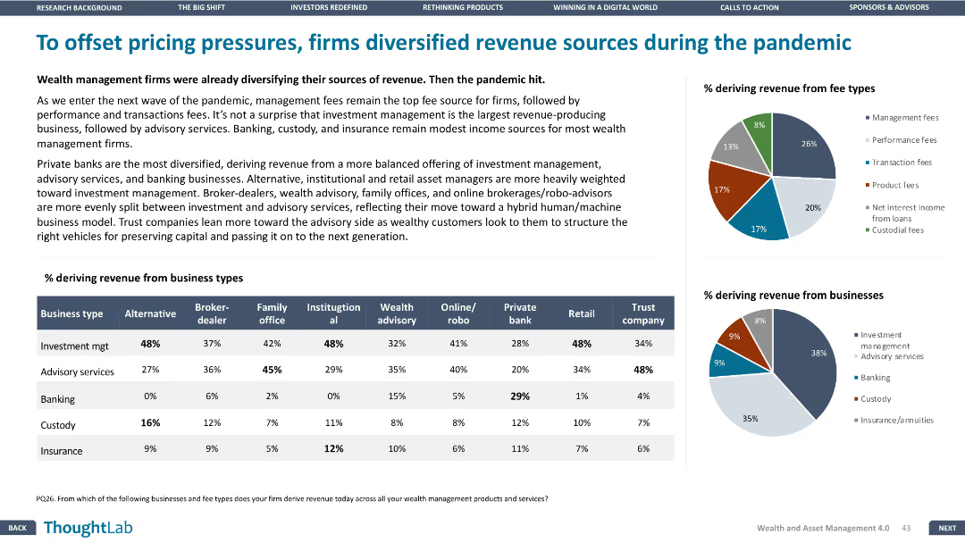
This slide has a column chart, pie charts, and a table. The layout is dense with multiple visual elements and minimal white space.
Strategic Planning
Financial Services
The slide discusses how wealth management firms diversified their revenue sources during the pandemic, with data showing the percentage of revenue from different business types and fee types.
Revenue, diversification, pandemic, wealth management, business types, fee types
Multiple Chart
Deloitte
Saved
Includes a heatmap chart depicting the interconnectedness of various risks including financial, operational, disruptive technology, and compliance risks, among others, based on industry data.
Risk Assessment and Management
Financial Services
Details how different risk types impact each other across sectors, providing a comprehensive view of potential vulnerabilities in the financial industry. Useful for strategic planning and risk assessment workshops.
risk assessment, heatmap, financial industry, strategic planning
Table
Accenture
Saved
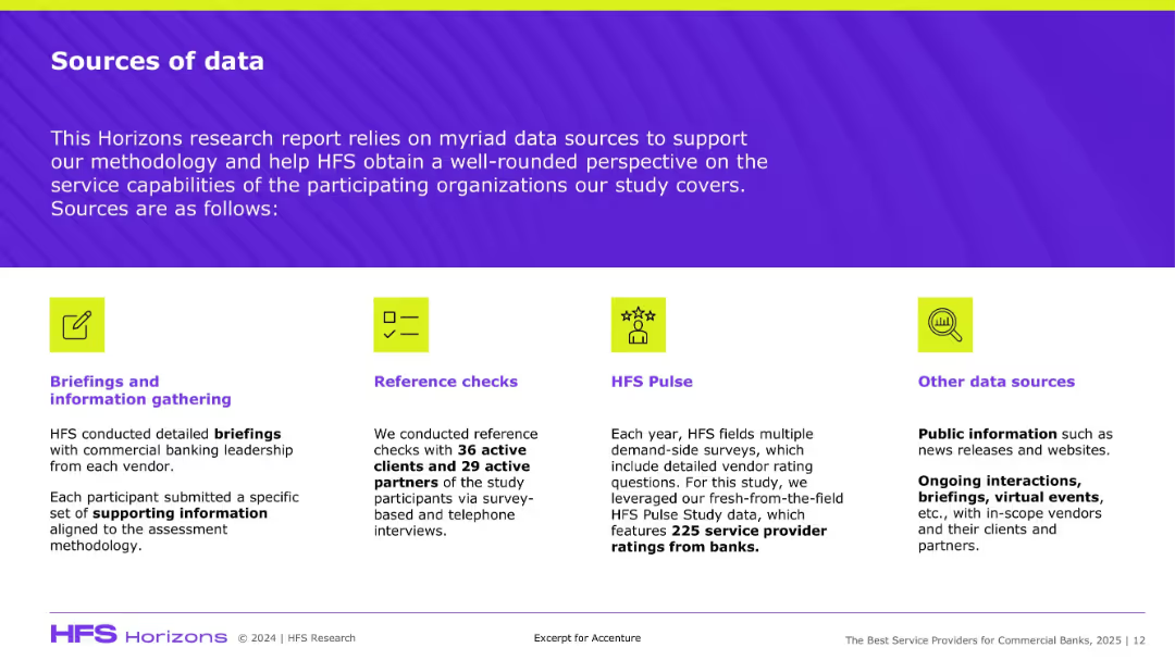
Four-block layout with icons, each detailing a type of data source; uses bright visuals and concise descriptions.
Regulatory and Compliance
Professional Services
This slide explains the methodology for gathering insights in the HFS Horizons study, covering briefings, reference checks, surveys (HFS Pulse), and public data sources to support vendor evaluation.
Data sources, HFS, methodology, research, banks, reference checks, vendor ratings
Pillar
Accenture
Saved
The slide features a maturity curve for various bioenergy products, showing their progression from research to mature technology. Products include biogasoline, biomethanol, biobutanol, bio jet fuel, renewable diesel, biomethane, gas from waste, wood pellets, wood chips, biodiesel, and bioethanol.
Technology and Digital Transformation
Energy & Utilities
This slide illustrates the maturity levels of different bioenergy products, highlighting the stages from lab work to widely deployed commercial-scale projects, and the associated technology risks and capital requirements.
bioenergy products, maturity curve, research, development, deployment, mature technology, biogasoline, biomethanol, biobutanol
Single Chart
Kearney
Saved
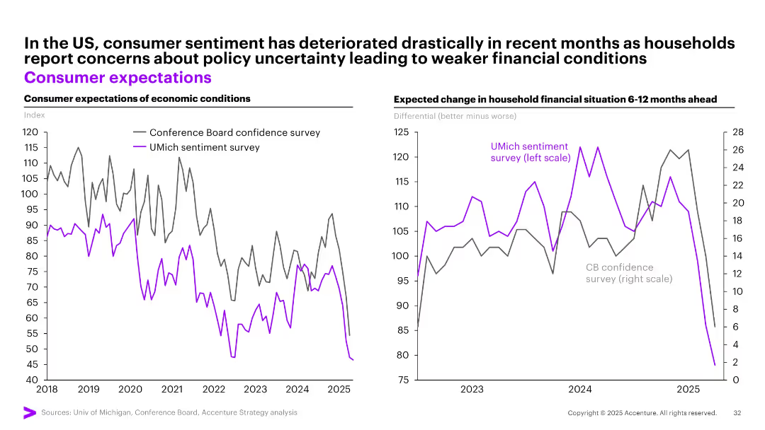
Dual line charts comparing US consumer expectations from two different sentiment surveys over time.
Market Analysis and Trends
Financial Services
The slide shows a marked decline in consumer sentiment in the US based on two major surveys (Conference Board and UMich), reflecting rising concerns over future economic and financial conditions amid policy uncertainty.
consumer sentiment, US economy, surveys, financial outlook, expectations, decline, uncertainty, economic mood
Multiple Chart
Accenture
Saved
Column charts show the proportion of clients serviced with multiple non-lending products, emphasizing strategic client relationship management.
Risk Assessment and Management
Financial Services
Focuses on how leveraging Debt Capital Market (DCM) capabilities can enhance returns through better client product integration and risk management.
DCM, client management, returns, products, risk management
Mixed Chart
Barclays
Saved
Displays text and graphics detailing the cost structure, funding, and operational models for connecting schools in Indonesia's less developed regions.
Investment Analysis
Telecommunications
Analyzes specific funding and operational models to enhance school connectivity in Indonesia's remote regions, detailing costs and potential operational models.
Indonesia, funding, schools, connectivity, models
Pillar
BCG
Saved
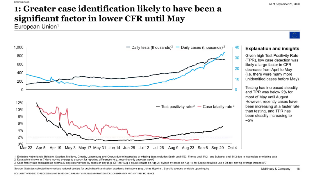
Four-line graph panels showing daily tests, cases, TPR, and CFR over time in the EU with contextual insights.
Performance Metrics and KPIs
Healthcare & Pharmaceuticals
Demonstrates that increased COVID-19 testing and reduced test positivity rate contributed to a falling CFR in the EU. Shows that case identification has outpaced test positivity, influencing trends in mortality measures.
test positivity, CFR, EU, COVID-19 testing, detection rates
Mixed Chart
McKinsey
Saved
Text-heavy discussing geographical spread and operational models of GBS with a pie chart (Figure 7) showing operational models.
Strategic Planning
Professional Services
Analyzes the benefits and considerations of various GBS deployment models, such as hub-and-spoke.
GBS, models, hub-and-spoke, deployment, benefits
Mixed Chart
Deloitte
Saved
Two column charts: Left chart depicts cumulative alternatives fundraising in billions from 2020 to 2024. Right chart shows alternatives management and other fees from 2019 to 2024. An arrow highlights the growth in fees and fundraising targets, accompanied by key financial data.
Product and Service Analysis
Financial Services
Analyzes the firm's growing momentum in the alternatives business sector, with projected fundraising and fee earnings through 2024. It demonstrates the firm's strategic targets for alternatives investments, signifying confidence in the market's growth potential.
alternatives business, growth momentum, fundraising, fees, strategy, column chart
Multiple Chart
Goldman Sachs
Saved
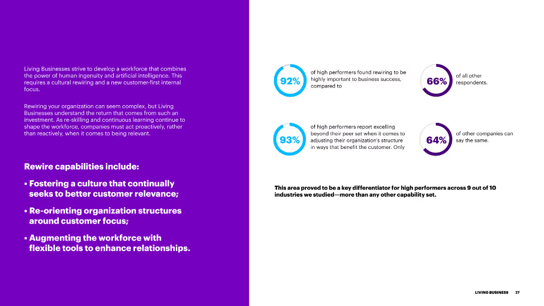
The slide features a purple background on the left and text on the right, with blue circular progress indicators. It discusses the importance of rewiring capabilities for better customer relevance.
Organizational Structure and Change
Government & Public Sector
This slide outlines the rewiring capabilities necessary for businesses to enhance customer relevance, including fostering a customer-focused culture and restructuring organizational frameworks.
rewiring, capabilities, customer relevance, culture, organizational structure
Multiple Chart
Accenture
Saved
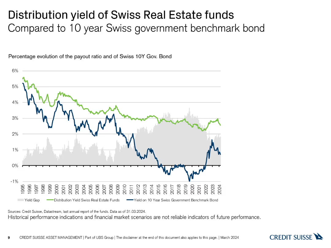
The slide shows a line chart comparing the distribution yield of Swiss Real Estate funds with the yield on the 10-year Swiss government bond from 1995 to 2024, using blue and green.
Investment Analysis
Real Estate & Construction
This slide contrasts the performance of Swiss Real Estate funds' distribution yield with the benchmark yield of the 10-year Swiss government bond, illustrating relative performance.
distribution yield, government bonds, real estate, comparison, performance
Single Chart
Credit Suisse
Saved
Previous
Next
If nothing, comes up, please save your slides first
Create a FREE account to continue browsing
Receive Instant Access to 1,000+ slides from companies like McKinsey, Google, and Goldman Sachs
First Name
Last Name
Email
Password
I agree to all
Terms & Privacy Policy
Thank you! Your submission has been received!
Oops! Something went wrong while submitting the form.
Have an account?
Sign in
Column Chart
Heatmap
Chevron
Org Chart
Infographic
Callouts
Timeline
List
Graphic
Picture
Process Flow
Diagram
Paragraph
Map
Table
Framework
Subtitle
Takeaway Box
Icon
Other Chart
Radar Chart
Waterfall Chart
Mekko Chart
Pie Chart
Scatter Plot
Line Chart
Bar chart
Bullet points