Create a FREE Account
Instant access to 1,000+ real slides from top companies like McKinsey, BCG, Goldman Sachs, Google and many more!
First Name
Last Name
Email
Password
I agree to all
Terms & Privacy Policy
Thank you! Your submission has been received!
Oops! Something went wrong while submitting the form.
Have an account?
Sign in
Library
Templates
Courses
Pricing
My Account
My Slides
My Templates
✦ AI
AI Prompt Library
AI Search
Sign in
Start Here
Logout
My Saved Slides
Features a bar chart listing top challenges faced by underwriters, including outdated systems, lack of information, and poor organization, with percentage impacts.
Risk Assessment and Management
Financial Services
Highlights the main challenges faced by insurance underwriters, such as inefficient systems and insufficient data, critical for assessing operational and risk management issues.
challenges, insurance, underwriters, risk management, inefficient systems, data accessibility, training needs
Mixed Chart
Accenture
Saved
Displays stacked bar graphs comparing sustainable fuel demand by sector and feedstock type, with a clear legend and annotations.
Investment Analysis
Energy & Utilities
Highlights the demand for different types of sustainable fuel feedstocks, which is critical information for investors considering the bioenergy sector.
Sustainable Fuels, Bioenergy, Feedstock Demand, Investment Analysis, Sector Comparison, 2050 Trends
Multiple Chart
McKinsey
Saved
Dual panel layout with a large image on the left and a series of bar charts on the right detailing dissatisfaction metrics by generation.
Market Analysis and Trends
Healthcare & Pharmaceuticals
Highlights younger consumers' dissatisfaction with traditional healthcare aspects, including treatment effectiveness and appointment convenience. Used for market analysis.
consumers, dissatisfaction, healthcare, trends, generations
Multiple Chart
Accenture
Saved
Balanced layout: left section lists capital structure policies, center shows share repurchase trend, and right contains a table of debt breakdowns.
Corporate Finance and Valuation
Financial Services
The slide highlights capital strategy, share repurchases, debt structure, and leverage ratios. It shows Gartner’s cash levels, bond maturities, interest rates, and debt ratings, along with policies on cash deployment and leverage targets.
Capital Structure, Leverage, Share Repurchase, Debt, Ratings, Cash Flow
Mixed Chart
Gartner
Saved
The slide includes multiple text boxes highlighting pain points for Canadian scale-ups, with icons for talent, IP, ventures, impact, and champions. It has a backdrop of mountains at sunset and a detailed discussion of various challenges.
Market Analysis and Trends
Technology & Software
Discusses the challenges faced by Canadian scale-ups in climate tech, focusing on talent, R&D, scaling, and producing global champions. Highlights specific pain points and suggests areas for improvement.
Scale-ups, Climate tech, Canada, Challenges, Analysis
Table
BCG
Saved
Left-aligned table with financials, center stacked bar chart for revenue breakdown, and key highlights on the right. Uses light blue and navy blue for segment distinctions.
Financial Performance
Financial Services
Provides detailed financial results for Q4 and FY 2024, including revenues, expenses, profits, and balance sheet items. Emphasizes growth areas and year-over-year comparisons with focus on divisional revenues and key operational highlights.
financials, revenue, banking, Q4 results, FY2024, Deutsche Bank
Mixed Chart
Deutsche Bank
Saved
Bar chart comparing labor productivity growth in US, Euro Area, UK, and Canada for 2015–2019 vs. 2020–2024 periods.
Strategic Planning
Professional Services
This slide highlights the growing gap in labor productivity growth between the U.S. and other developed economies post-COVID. It attributes U.S. equity outperformance partly to this productivity divergence, especially in contrast with Canada and the Euro Area. The bars clearly contrast the two periods to emphasize acceleration in the U.S. and stagnation elsewhere.
labor productivity, COVID impact, U.S. outperformance, global comparison, economic efficiency, macro trend
Single Chart
Morgan Stanley
Saved
This slide uses a combination of text boxes and flowcharts to compare the wholesale, primary retail, and secondary retail markets, with revenue and price per domain details.
Market Analysis and Trends
Retail & E-commerce
It compares the size of the secondary market to the primary market, detailing revenue and price per domain, and explaining market governance and pricing mechanisms.
market comparison, wholesale, primary retail, secondary retail, revenue, price per domain
Table
BCG
Saved
Combination of table, column charts, and substantial textual information.
Financial Performance
Financial Services
Details net revenues, management fees, and banking data, providing insights into consumer and wealth management sectors.
Consumer, Wealth, Management, Banking, Bar Charts, Revenue, Net Earnings, Management Fees, Sector, Performance
Mixed Chart
Goldman Sachs
Saved
This slide includes a pie chart showing the percentage of shoppers planning to donate during the holiday season, accompanied by text indicating the mean spend on donations.
Market Analysis and Trends
Retail & E-commerce
It presents data on the proportion of shoppers intending to donate during the holiday season and the average amount they plan to spend on donations.
donations, holiday, shoppers, spend, mean
Mixed Chart
Deloitte
Saved
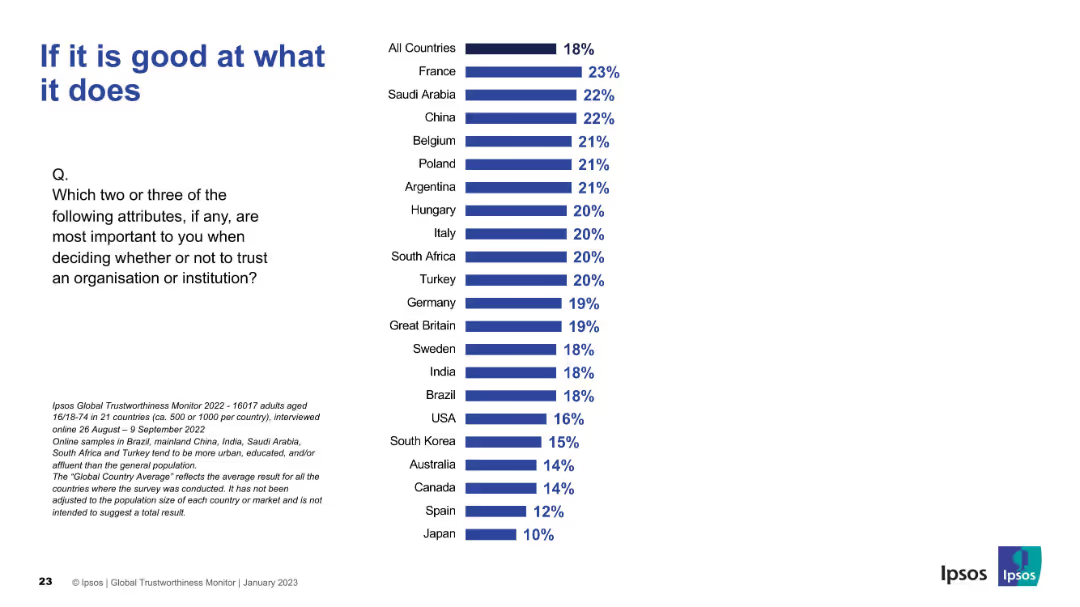
Bar chart slide with teal bars for "Agree" and red bars for "Disagree"; countries listed vertically; title and survey question on the left; Ipsos branding bottom-right.
Strategic Planning
Professional Services
This slide presents international public opinion on whether business leaders are trusted to tell the truth, using survey data. India shows the highest trust, while Western countries tend to exhibit lower trust levels.
trust, leadership, corporate ethics, Ipsos, global survey, transparency, truthfulness, reputation, perception, business confidence
Mixed Chart
IPSOS
Saved
The slide features a column chart comparing group underlying revenues/RWA for UBS FY22, CS FY22, 2H23 annualized post-merger, and projected 2026 exit rate. Text on the left lists actions: >6bn capital release by 2026, reduction of low-return exposures, alignment of return hurdle frameworks, and optimization of models and hedging activities.
Financial Performance
Financial Services
The slide outlines strategies to optimize financial resources for sustainable growth and higher returns. It includes actions for capital release, reduction of low-return exposures, and optimization of financial models. This slide is suitable for discussing financial strategy and performance improvement with stakeholders.
optimization, financial resources, sustainable growth, returns, capital
Mixed Chart
UBS
Saved
Features a line chart detailing the shift in advertising spend among digital, TV, and other platforms. Text blocks explain the trends and future predictions for advertising revenues.
Strategic Planning
Media & Entertainment
Details the redistribution of advertising revenues across digital, TV, and other media platforms from 2019 to 2024, analyzing the shift towards digital and its implications for media strategies.
Advertising, Revenue Trends, Digital Shift, Media Platforms, Future Predictions, TV, Market Analysis
Mixed Chart
Accenture
Saved
Horizontal bar chart with regional breakdown; segmented by perception type using color-coded bars; descriptive text left aligned.
Market Analysis and Trends
Government & Public Sector
This regional overview visualizes beliefs about inequality’s urgency across Latin America, Asia Pacific, Europe, and North America, showing regional trends and highlighting Latin America's elevated concern.
regional comparison, inequality perception, global attitudes, Ipsos, concern levels, urgency, public opinion
Mixed Chart
IPSOS
Saved
Line graphs of quarterly revenue and contribution margin; left section contains descriptive bullet points.
Product and Service Analysis
Technology & Software
This slide focuses on Gartner's conference business, showing fluctuating quarterly revenue and margins. It emphasizes how conferences align with client roles and add value through peer networking and research-based content.
conferences, Gartner, audience, networking, revenue, quarterly metrics
Multiple Chart
Gartner
Saved
The slide shows three different growth trajectory graphs, each with a distinct shape (S-shaped, Trendline, and U-shaped), and is accompanied by descriptive text. The design uses grey tones with blue highlights. It's cleanly structured, presenting the information in an easily digestible format.
Strategic Planning
Technology & Software
This slide illustrates the post-pandemic growth trajectories of SEA's digital sectors, which can inform strategic decisions. It differentiates between sustained growth, a return to trendline, and U-shaped recovery, offering a nuanced view of market dynamics that can guide investment and operational planning.
growth trajectories, digital sectors, SEA, post-pandemic, strategic planning, market dynamics, recovery
Multiple Chart
Bain
Saved
Pie charts showing average weekly reach potential by demographic segments, highlighting changes in linear reach potential and AVOD reach.
Market Analysis and Trends
Media & Entertainment
The slide shows the average weekly reach potential by demographic groups, emphasizing changes in linear reach and the growing impact of AVOD.
weekly reach, demo, linear reach, AVOD, potential
Multiple Chart
Nielsen
Saved
This slide features a dark background with a header, body text, and a column chart showing three percentage indicators. Each indicator is accompanied by descriptive text explaining consumer openness to virtual primary care consultations versus in-person consultations.
Technology and Digital Transformation
Healthcare & Pharmaceuticals
The slide discusses the openness of US consumers to switch to virtual primary care consultations, despite a general preference for in-person consultations. It highlights the percentage of consumers willing to consider virtual consultations.
healthcare, virtual care, primary care, US, consultations
Mixed Chart
EY
Saved
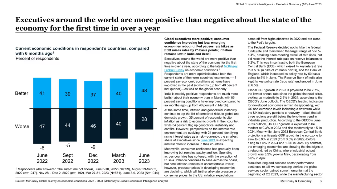
Features two line graphs overlapping, with one indicating the change in CEO confidence and the other showing projected and actual global GDP growth, accompanied by explanatory text.
Risk Assessment and Management
Financial Services
Details a regression analysis showing the predictive relationship between CEO confidence and GDP growth, implying a continued GDP decline in 2020.
CEO confidence, GDP growth, regression analysis, prediction, decline
Mixed Chart
PwC/Strategy&
Saved
This slide includes three distinct line charts, plotted over time to illustrate the trend in headline inflation numbers across China, the United States, and the Euro Area. The layout is simple and focused.
Regulatory and Compliance
Financial Services
The slide compares inflation trends, essential for financial and economic analysts assessing monetary policy implications and market strategies. It visualizes inflation data in a way that is likely to impact investment and regulatory decisions within the financial services industry.
Inflation, CPI, Trends, Economic
Single Chart
Morgan Stanley
Saved
Dual bar charts: exports to US in USD and as % of GDP. Color-coded by sector with clear visual comparison.
Market Analysis and Trends
Government & Public Sector
This slide analyzes APAC countries' exposure to US tariffs, both by export volume and GDP percentage. Vietnam and Cambodia are highlighted as highly exposed due to heavy apparel and electronics exports. The chart also breaks down key sectors by color.
APAC, US tariffs, exports, exposure, apparel, electronics, GDP share, Vietnam
Multiple Chart
Accenture
Saved
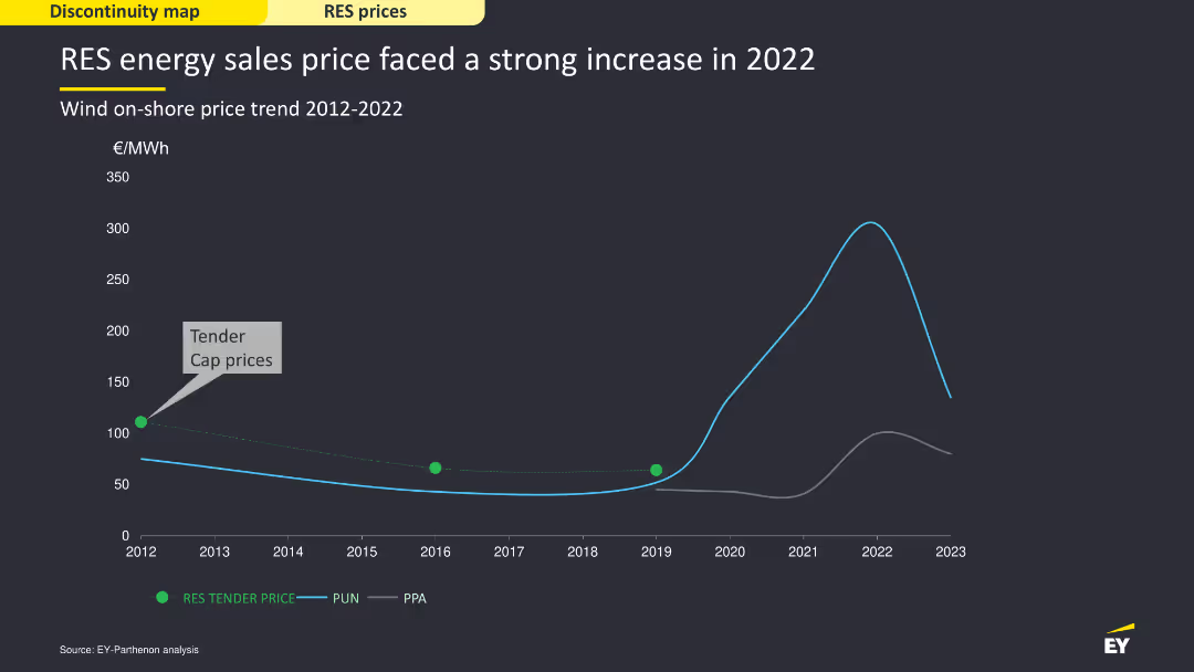
The slide includes a line chart showing historical Brent prices and the average mean reversion time, with a detailed explanation of the concept of mean reversion in commodity prices.
Market Analysis and Trends
Energy & Utilities
Explores the theory of mean reversion in oil prices, presenting historical data and future projections to explain the expected price adjustments over time.
mean reversion, Brent prices, oil market, 2020
Mixed Chart
EY
Saved
Includes a bar chart on the left and a pie chart on the right, showing automation levels and savings through RPA.
Operational Efficiency
Professional Services
Discusses the extent of automation in Shared Services Centers (SSCs) and the savings achieved through Robotic Process Automation (RPA) implementation.
automation, SSC, RPA, savings, end-to-end, processes, implementation
Multiple Chart
Deloitte
Saved
The slide features a diagram illustrating Ipsos's reputation and policy legislation intelligence platform, highlighting data sources, analytics, and actionable alerts.
Technology and Digital Transformation
Technology & Software
It details Ipsos’s AI and advanced analytics platforms, explaining how they help clients sense and respond in real time using various data sources and technologies.
AI, analytics, Ipsos, data, real-time response
Linear Flow
IPSOS
Saved
The slide includes a matrix chart and a column chart showing commodity price rises. The layout is moderately dense.
Market Analysis and Trends
Agriculture & Food Production
It discusses the constrained supply of fertilizers from Ukraine and its impact on crop production and prices of food goods.
Agribusiness, Fertilizers, Crop Production, Prices, Ukraine
Header Horizontal
BCG
Saved
Previous
Next
If nothing, comes up, please save your slides first
Create a FREE account to continue browsing
Receive Instant Access to 1,000+ slides from companies like McKinsey, Google, and Goldman Sachs
First Name
Last Name
Email
Password
I agree to all
Terms & Privacy Policy
Thank you! Your submission has been received!
Oops! Something went wrong while submitting the form.
Have an account?
Sign in
Column Chart
Heatmap
Chevron
Org Chart
Infographic
Callouts
Timeline
List
Graphic
Picture
Process Flow
Diagram
Paragraph
Map
Table
Framework
Subtitle
Takeaway Box
Icon
Other Chart
Radar Chart
Waterfall Chart
Mekko Chart
Pie Chart
Scatter Plot
Line Chart
Bar chart
Bullet points