Create a FREE Account
Instant access to 1,000+ real slides from top companies like McKinsey, BCG, Goldman Sachs, Google and many more!
First Name
Last Name
Email
Password
I agree to all
Terms & Privacy Policy
Thank you! Your submission has been received!
Oops! Something went wrong while submitting the form.
Have an account?
Sign in
Library
Templates
Courses
Pricing
My Account
My Slides
My Templates
✦ AI
AI Prompt Library
AI Search
Sign in
Start Here
Logout
My Saved Slides
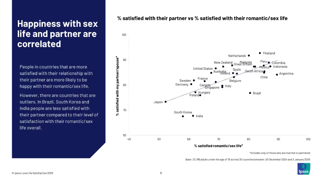
Left side explanatory text with a scatter plot on the right correlating satisfaction with partner vs romantic/sex life.
Human Resources and Talent Management
Professional Services
This slide visually correlates satisfaction with romantic/sex life and partner relationships. A scatter plot shows a strong positive trend across countries, with a few outliers like Brazil, South Korea, and India. It underscores the interconnectedness of relationship and sexual satisfaction.
correlation, partner satisfaction, romantic life, emotional well-being, Ipsos, scatter plot, relationship quality, international trends
Mixed Chart
IPSOS
Saved
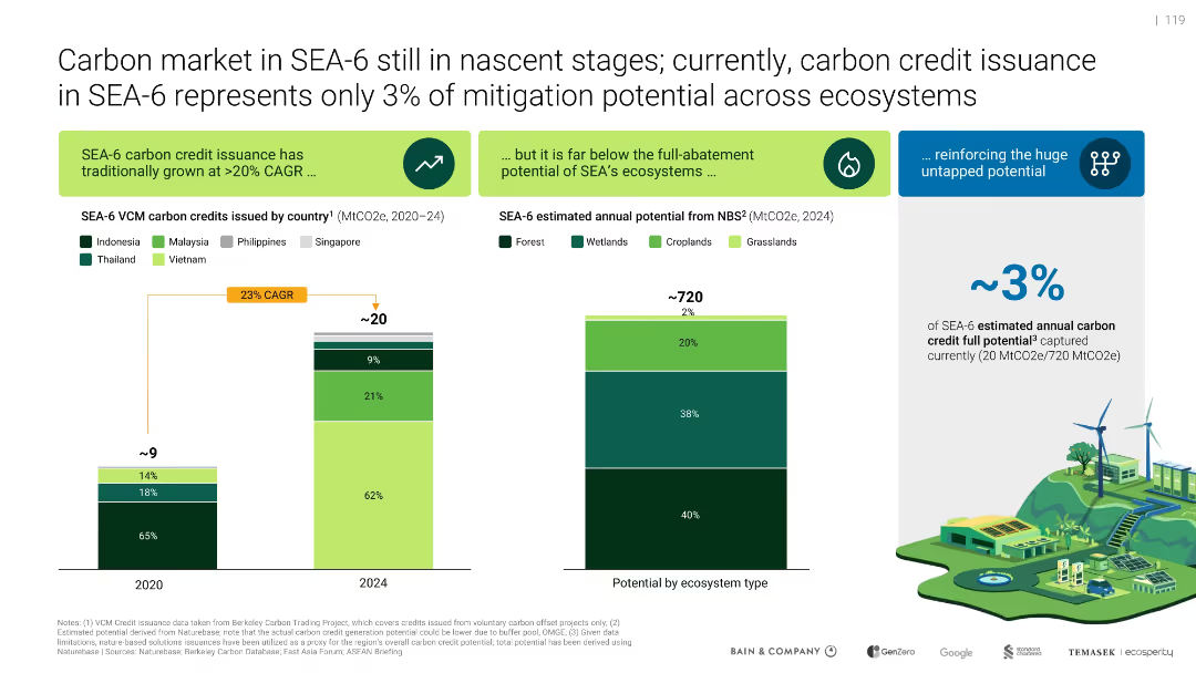
Side-by-side bar charts: carbon credits by country and mitigation potential by ecosystem type; includes CAGR arrow and ecosystem illustration.
Market Analysis and Trends
Environmental Services & Sustainability
Shows SEA-6 carbon market issuance (~3% of potential), with a CAGR of 23% (2020–2024). Emphasizes vast untapped mitigation potential across forest, wetlands, croplands. Illustrates current underperformance relative to ecosystem capacity.
carbon market, SEA-6, mitigation, VCM, ecosystems, CAGR
Multiple Chart
Bain
Saved
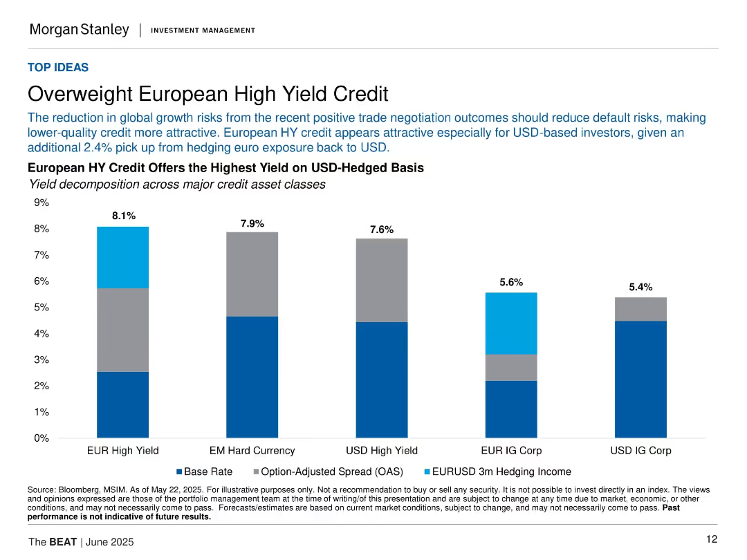
Vertical bar chart showing yields across credit classes; clean layout with three-part bar segmentation.
Investment Analysis
Financial Services
The slide recommends overweighting European High Yield (HY) credit, citing reduced global risks and high hedged yields. It compares yields (base rate, OAS, hedging income) across five credit asset types.
high yield, European credit, investment, spreads, hedging, yield comparison, bonds, fixed income, credit markets
Single Chart
Morgan Stanley
Saved
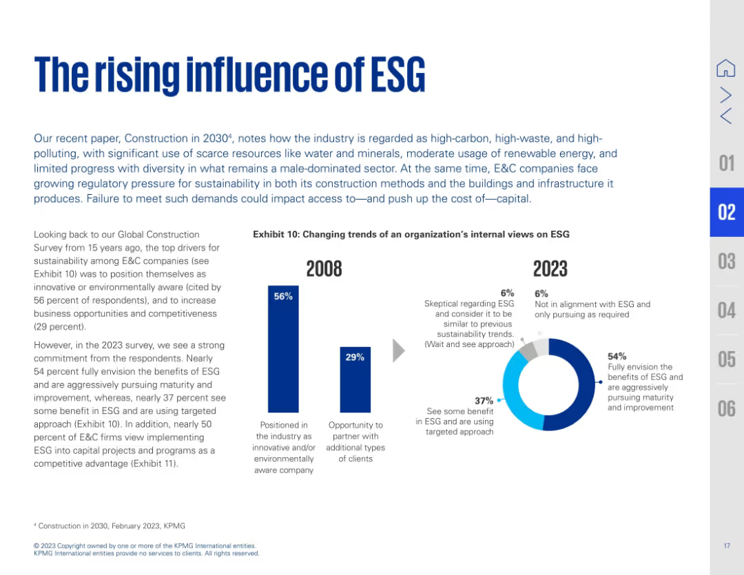
Text on left with a bold title and subtitle; right side features side-by-side bar and donut charts showing ESG perception shifts from 2008 to 2023. Blue accents highlight key data.
Strategic Planning
Real Estate & Construction
This slide presents the growing importance of ESG in construction. It compares ESG sentiment from 2008 to 2023, noting a shift from surface-level awareness to full integration. 54% now fully embrace ESG's value, with significant increases in those pursuing ESG maturity. The industry recognizes ESG as both a strategic and compliance priority.
ESG, sustainability, construction, awareness, maturity, climate, corporate strategy, environmental policy
Multiple Chart
KPMG
Saved
Simplified value chain diagram of hydrogen-based energy conversion solutions with various flow elements like gas network, power network, and liquid fuel network.
Technology and Digital Transformation
Energy & Utilities
Illustrates the role of hydrogen in the energy transition, linking multiple energy sources and industrial applications through a comprehensive value chain diagram.
Hydrogen, energy transition, value chain, energy sources, industrial applications
Diagram
Kearney
Saved
The slide features two main visual elements: a bar graph on the left side comparing UK real GDP forecasts, and a line graph on the right side displaying 12-month inflation and Bank of England interest rates. The design is moderately dense with textual annotations and a legend explaining the data sources.
Market Analysis and Trends
Financial Services
This slide presents a forecast of the UK's real GDP growth and inflation trends, showing expectations from major institutions and actual economic performance. The inflation graph shows a recent peak and the interest rates set by the Bank of England. It is likely used to communicate economic forecasts to inform financial planning or policy-making decisions.
UK GDP, Inflation, Forecast, Economic Growth, Interest Rates, Monetary Policy, Financial Outlook, Comparative Analysis
Multiple Chart
McKinsey
Saved
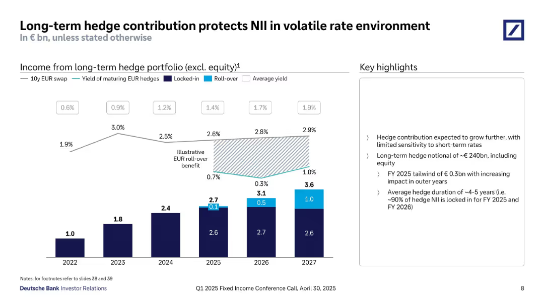
Bar chart showing income from long-term hedge portfolio over time; line graphs and shaded area show rate yields; text box with highlights.
Risk Assessment and Management
Financial Services
This slide illustrates how Deutsche Bank’s long-term hedge portfolio stabilizes NII. It shows income trends from 2022–2027, hedge yields, and locked-in rates. Key takeaways include low sensitivity to short-term rates and 90% hedge NII locked for FY 2025–26.
Hedge Portfolio, NII Protection, Interest Rate Risk, Long-term Strategy, Yield, FY 2025, Risk Management
Mixed Chart
Deutsche Bank
Saved
This slide contains a pie chart on the left, two column charts in the middle, and a text box on the right with bullet points discussing the disciplined risk process and diverse loan portfolio. The visuals are accompanied by descriptions and data points.
Risk Assessment and Management
Financial Services
Highlights the company's disciplined risk management strategy and diverse loan portfolio, contributing to strong credit quality. The data visualizations compare the firm's loan loss rate and variance against peers, illustrating financial stability and risk control.
Risk Management, Credit Quality, Loan Portfolio, Financial Stability, Peer Comparison
Multiple Chart
Goldman Sachs
Saved
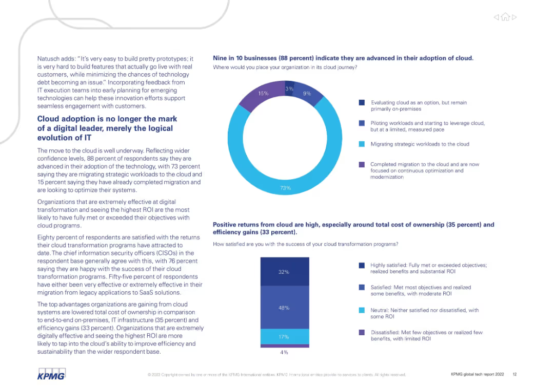
Text with donut and bar charts highlighting survey responses about cloud maturity and satisfaction.
Technology and Digital Transformation
Technology & Software
88% of organizations report advanced cloud adoption, with most in the migration or post-migration phase. Cloud transformation is no longer a differentiator but essential. Cost efficiency and ROI are key benefits. Most respondents are satisfied with cloud outcomes.
cloud adoption, ROI, SaaS, digital transformation, survey, migration, modernization
Multiple Chart
KPMG
Saved
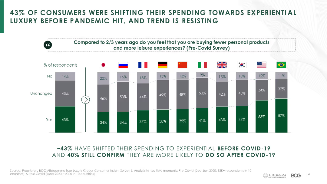
This slide presents a column chart with data on consumer spending shifts towards experiential luxury, comparing pre- and post-COVID-19 trends across various countries.
Market Analysis and Trends
Consumer Goods
It highlights the trend of consumers shifting their spending towards experiential luxury both before and after the pandemic.
consumer spending, experiential luxury, COVID-19, spending trends, country comparison
Multiple Chart
BCG
Saved
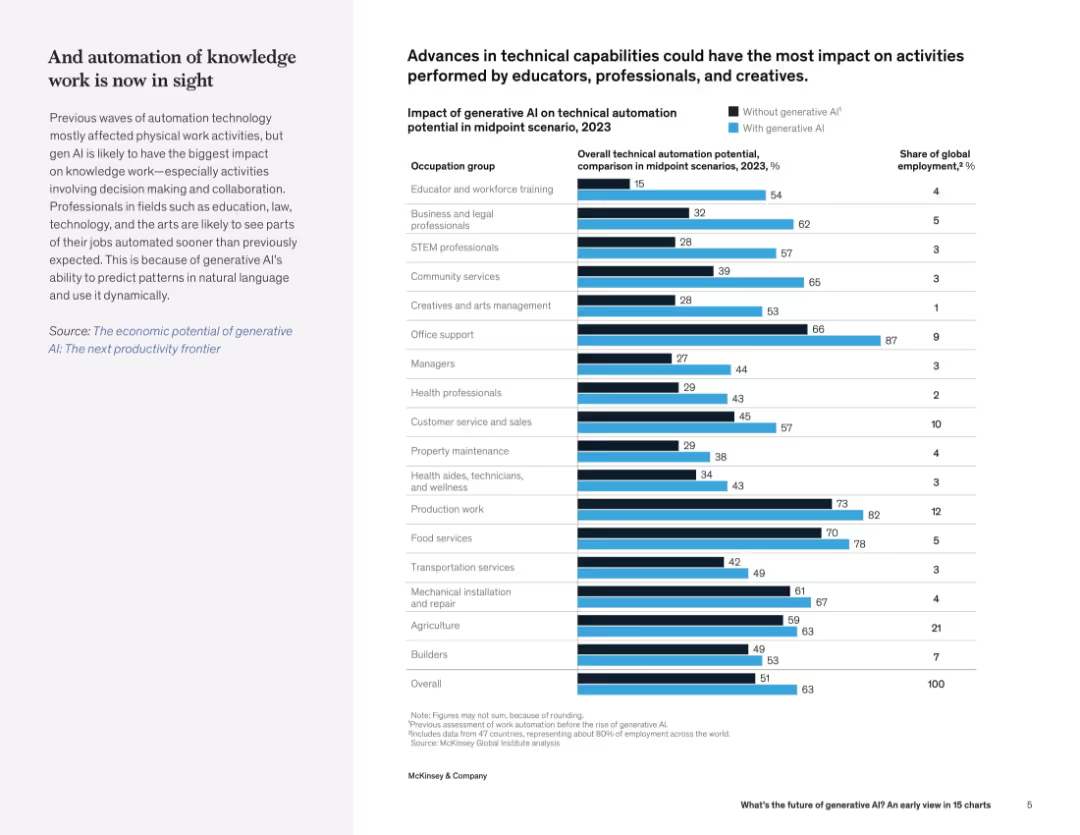
Bar chart comparing automation potential across occupations with and without generative AI; left panel discusses automation of knowledge work.
Human Resources and Talent Management
Artificial Intelligence
The slide presents how generative AI significantly increases automation potential in various occupations, especially knowledge work like education, legal, and creative roles. It quantifies AI’s impact on global employment.
automation, generative AI, occupations, workforce impact, knowledge work, employment trends
Mixed Chart
McKinsey
Saved
A column chart showing revenue progression from 2022 to 2026 with specific comments on various influencing factors like productivity and capability enhancements.
Financial Performance
Financial Services
This slide illustrates the revenue enhancement plan up to 2026, highlighting the productivity and capability improvements driving the revenue forecast.
revenue, productivity, capabilities, forecast, enhancement
Single Chart
UBS
Saved
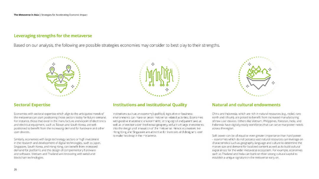
Three sections with icons representing sectoral expertise, institutions, and natural resources, each with text.
Strategic Planning
Government & Public Sector
The slide suggests strategies for economies to leverage their strengths for the metaverse, focusing on sectoral expertise, institutions, and resources.
metaverse, strengths, sectoral expertise, institutions, natural resources
Pillar
Deloitte
Saved
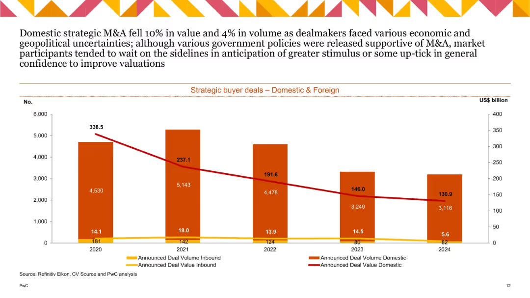
Dual-axis bar chart with orange/red bars (domestic/foreign volume) and red/yellow lines (value); covers 2020–2024; bars show significant decline.
Strategic Planning
Financial Services
Tracks strategic buyer M&A deals by origin. Domestic deals fell 10% in value and 4% in volume in 2024. Uncertainty and lack of stimulus kept participants cautious, resulting in continued deal volume/value decline across years.
strategic M&A, domestic, foreign, deal value, deal volume, trend
Single Chart
PwC/Strategy&
Saved
Features a line graph tracking the revenue growth of various internet advertising types from 2018 to 2027. Each line is color-coded, representing different advertising formats like mobile video, other display, and paid search, making it easy to follow their growth trajectories. The layout is simple with an emphasis on the graphical data, supported by bullet points highlighting key drivers such as 5G technology and social media.
Market Analysis and Trends
Media & Entertainment
Highlights the trends in mobile video advertising, showcasing its rapid growth as a primary driver in the internet advertising sector. Useful for digital marketing professionals looking to leverage the rising trend of video in advertising strategies.
mobile video, internet advertising, growth drivers, 5G technology, social media, Hong Kong
Mixed Chart
PwC/Strategy&
Saved
The slide includes three line charts depicting UK y/y real GDP (2017-27F), UK unemployment and employment (2018-23), and UK y/y headline CPI (2004-25F). The charts are detailed, with future projections and supporting explanations in the text.
Market Analysis and Trends
Financial Services
This slide analyzes the UK economic outlook for 2024, highlighting constraints on growth due to household income, housing activity, and capital expenditures despite easing inflation. It provides insights into GDP, employment, and inflation trends.
UK economy, GDP, unemployment, CPI, growth constraints
Multiple Chart
EY
Saved
Column chart comparing alignment over time with insights on factors influencing alignment in different sectors.
Strategic Planning
Professional Services
Highlights improvements in alignment between marketing and finance, discussing implications for strategic and financial planning.
alignment, marketing, finance, strategic planning, sector influence
Mixed Chart
Deloitte
Saved
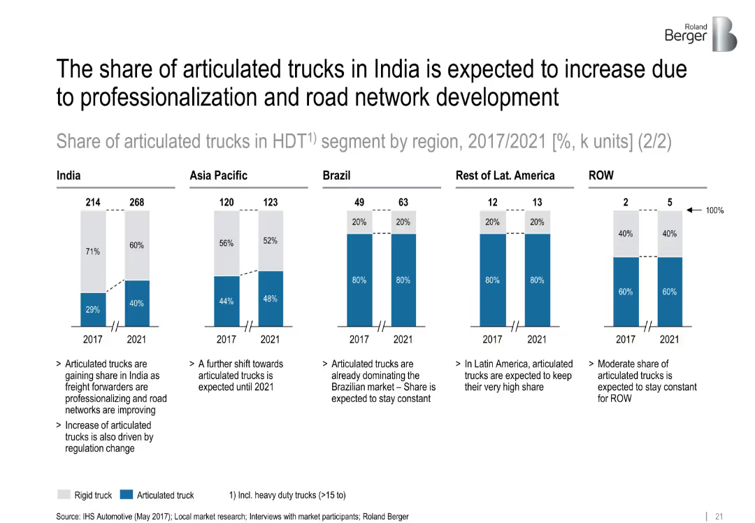
Five segmented bar charts showing articulated vs. rigid truck shares (2017 vs. 2021) by region with brief explanatory bullet points below
Market Analysis and Trends
Transportation & Logistics
This slide compares the market share of articulated vs. rigid heavy-duty trucks across five regions, highlighting India’s significant projected growth in articulated trucks due to road infrastructure improvements and professionalization. It presents both numerical data and qualitative drivers.
articulated trucks, India, professionalization, road network, freight, HDT, regional comparison
Mixed Chart
Roland Berger
Saved
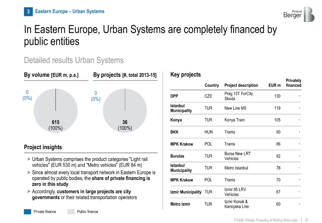
Two pie charts (volume and project count) showing 100% public finance; table listing key projects; project insights in bullet format; clean and structured layout.
Investment Analysis
Transportation & Logistics
The slide shows that from 2013–2015, all urban rail systems in Eastern Europe were publicly financed, with no private investment. Major urban transit projects are listed by cost.
urban systems, public finance, Eastern Europe, rail transport, light rail, metro, investment, municipalities, infrastructure
Mixed Chart
Roland Berger
Saved
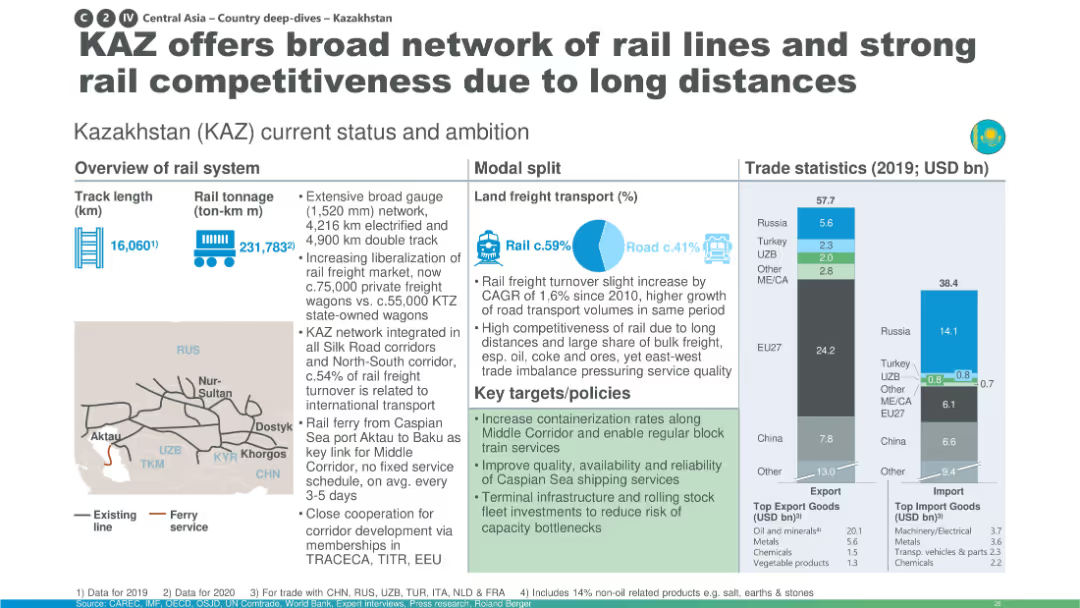
Map-heavy layout with large pie chart for modal share; emphasis on long-distance transport and containerization.
Industry Overview
Transportation & Logistics
Kazakhstan is presented as a key player in rail freight across Central Asia due to its extensive network, liberalized market, and integration into multiple corridors. The slide focuses on capacity enhancements and future development goals to maintain competitiveness.
Kazakhstan, containerization, rail freight, Caspian ferry, competitiveness, infrastructure
Multiple Chart
Roland Berger
Saved
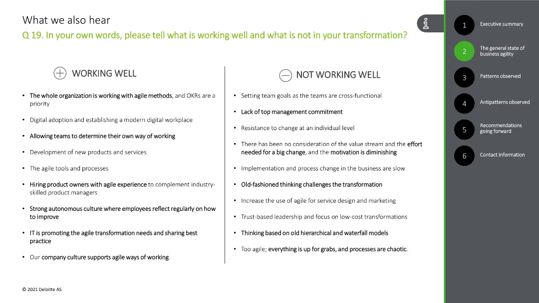
The slide has a comparative layout with two columns: "Working Well" and "Not Working Well." Each column lists several bullet points.
Risk Assessment and Management
Professional Services
This slide analyzes what is working well and what is not in the organization's transformation process based on client feedback.
agile, transformation, feedback, working well, challenges
Header Horizontal
Deloitte
Saved
Features a line chart comparing net charge-off performance against a peer group over a decade, alongside bullet points summarizing portfolio diversification and market conditions. The visual complexity is moderate with a clear focus on risk metrics.
Risk Assessment and Management
Financial Services
Outlines JPMorgan's risk discipline in commercial and industrial lending, highlighting historical performance and strategies for downturn preparedness.
risk discipline, commercial banking, loan security, industry analysis, performance metrics, market commentary
Mixed Chart
JP Morgan
Saved
Featuring two bar charts comparing the decline in market cap for tech and non-tech segments in the S&P500 and the equity capital distribution in global buyout deals, categorized by industry sectors with a significant red section representing technology, specifically software and hardware.
Market Analysis and Trends
Financial Services
This slide highlights the discrepancy in tech sector representation between public markets and private equity portfolios, pertinent to strategic discussions on portfolio composition and market exposure.
Market Cap, Tech Sector, Non-Tech, Private Equity, Public Markets, Portfolio Composition
Multiple Chart
Bain
Saved
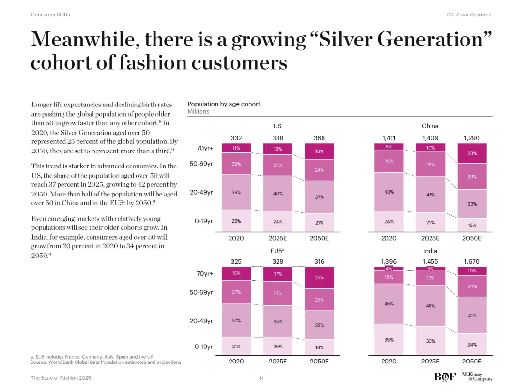
Full-width bar chart with age cohorts across countries (US, EU5, China, India) from 2020–2050. Left-aligned narrative text explains demographic trends. Pink gradient tones indicate age brackets.
Market Analysis and Trends
Retail & E-commerce
Shows population aging across regions and highlights the rapid growth of those over 50. Discusses implications for fashion brands, with China and EU5 expected to have over half of the population aged 50+ by 2050.
aging population, demographics, Silver Generation, global trends, fashion consumers
Mixed Chart
McKinsey
Saved
Scatter plot showing the relationship between the Shiller CAPE and subsequent calendar-year total return since 1945.
Investment Analysis
Financial Services
Examines how the Shiller CAPE has historically explained only 6% of the variation in equity returns in the subsequent year, questioning its reliability as a timing signal.
valuations, Shiller CAPE, equity returns, timing signal
Mixed Chart
Goldman Sachs
Saved
Previous
Next
If nothing, comes up, please save your slides first
Create a FREE account to continue browsing
Receive Instant Access to 1,000+ slides from companies like McKinsey, Google, and Goldman Sachs
First Name
Last Name
Email
Password
I agree to all
Terms & Privacy Policy
Thank you! Your submission has been received!
Oops! Something went wrong while submitting the form.
Have an account?
Sign in
Column Chart
Heatmap
Chevron
Org Chart
Infographic
Callouts
Timeline
List
Graphic
Picture
Process Flow
Diagram
Paragraph
Map
Table
Framework
Subtitle
Takeaway Box
Icon
Other Chart
Radar Chart
Waterfall Chart
Mekko Chart
Pie Chart
Scatter Plot
Line Chart
Bar chart
Bullet points