My Account
My Slides
Search by Category
Templates
View All Templates
Download Template Slides
✦ AI Search
Feedback
Login
Logout
Get Started
Browse all Slides
Browse all Slides
Create a FREE Account
Instant access to 1,000+ real slides from top companies like McKinsey, BCG, Goldman Sachs, Google and many more!
First Name
Last Name
Email
Password
I agree to all
Terms & Privacy Policy
Thank you! Your submission has been received!
Oops! Something went wrong while submitting the form.
Have an account?
Sign in
Saved Slides
This slide has a blue and white color scheme with four sections labeled A to D with icons and short texts. There is a sidebar that has the main points in a larger text size.
Human Resources and Talent Management
Technology & Software
The slide details strategies for effective talent acquisition to improve candidate pool, conversion, and success rate. It's suitable for HR departments and recruitment agencies.
talent acquisition, strategy, HR, recruitment, candidate pool, conversion rate, onboarding, success rate
Header Horizontal
Kearney
Saved
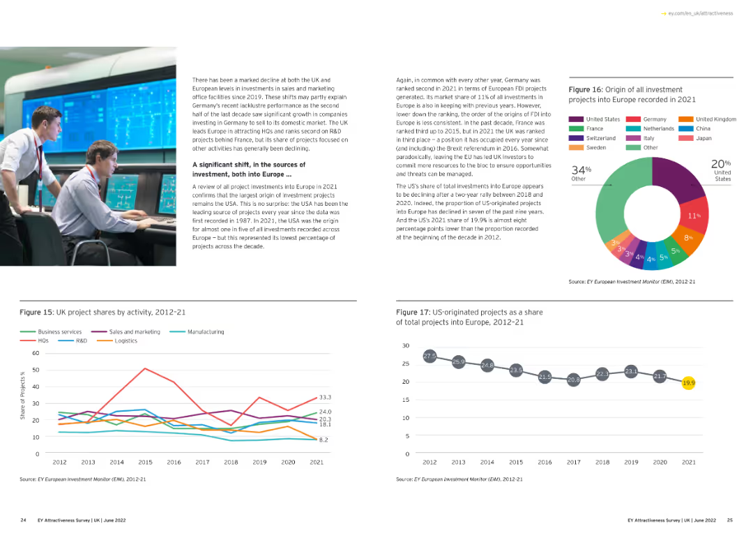
Includes a line chart that outlines the UK's market share of European projects by sector from 2012 to 2021, with lines for different sectors.
Market Analysis and Trends
Financial Services
This slide analyzes the UK's share of European projects by sector over the years, showing which sectors have gained or lost market share.
market share, UK, European projects, sectors, 2012-21
Multiple Chart
EY
Saved
The slide contains column charts showing top sellers and buyers in 2019 and 2020. It also includes two tables of transaction data.
Financial Performance
Financial Services
This slide details completed transactions in 2020 and ongoing ones in 2021, showing top sellers and buyers with financial details.
transactions, financial services, column chart, sellers, buyers
Multiple Chart
Deloitte
Saved
This comparative slide features a bar chart that contrasts active and passive business activities among Indonesian MSMEs.
Operational Efficiency
Financial Services
The slide compares active versus passive business activity levels among MSMEs, suggesting underutilization of potential in the Indonesian market. It could serve to examine strategies to activate MSMEs' full capabilities and encourage more dynamic engagement in business practices.
MSMEs, Business Activities, Market Potential, Engagement Strategy, Indonesia
Single Chart
Kearney
Saved
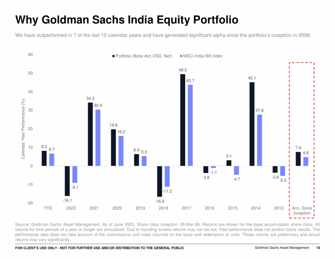
Bar chart of calendar year returns (2013–2023 YTD) with black and blue bars for portfolio vs. MSCI India IMI Index; right-side red dashed box showing annualized return since inception.
Financial Performance
Financial Services
Illustrates year-by-year net performance of Goldman Sachs India Equity Portfolio compared to the MSCI India IMI Index. The slide shows the portfolio outperforming in most years, highlighting consistency and resilience, and an annualized return since inception that beats the benchmark.
yearly performance, equity returns, MSCI India, alpha generation, GS portfolio, outperformance
Single Chart
Goldman Sachs
Saved
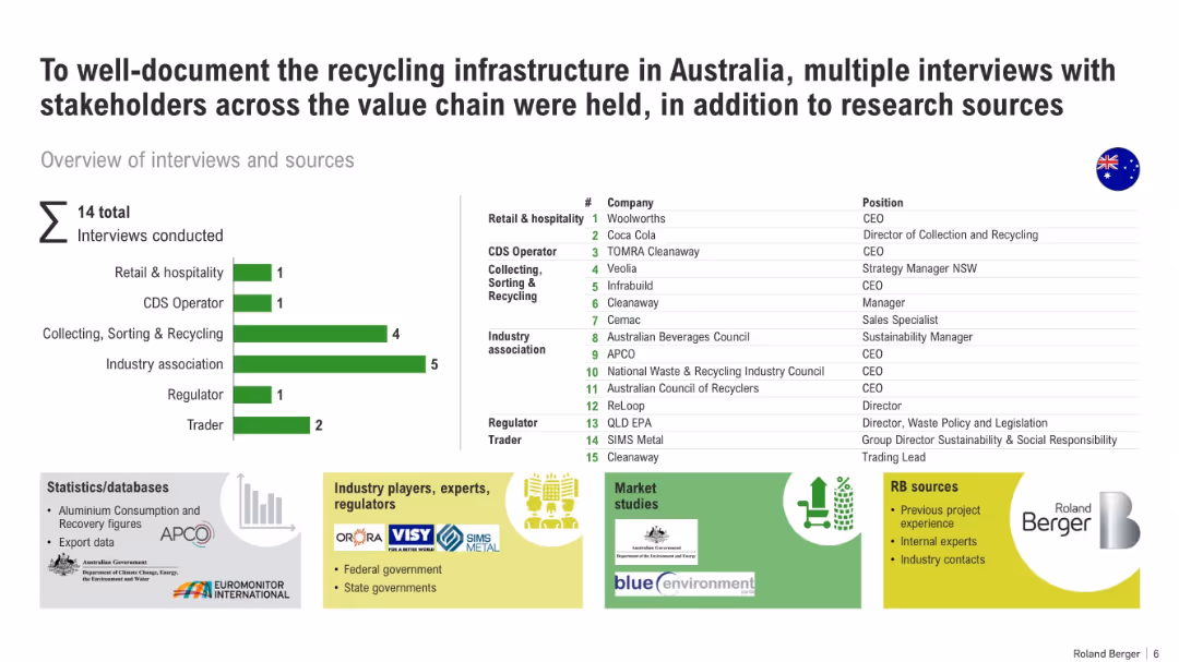
Mixed layout with bar graph (interviews by category), table (company list), and icons representing data sources.
Market Analysis and Trends
Environmental Services & Sustainability
The slide summarizes a stakeholder research effort on Australia's recycling infrastructure. It details interview categories and organizations, data sources, and research methodologies used in mapping the value chain.
recycling, stakeholder interviews, Australia, infrastructure, waste management, data sources, research
Mixed Chart
Roland Berger
Saved
The slide shows smartphone images depicting payment plans, alongside a list and checkmarks. The design is straightforward with visual examples for context.
Operational Efficiency
Financial Services
Explains new strategies for installment lending and capabilities, shown with actual interface examples. Appropriate for operational strategy updates or tech feature introductions.
installment lending, digital solutions, operational strategy, payment plans
Graphic
JP Morgan
Saved
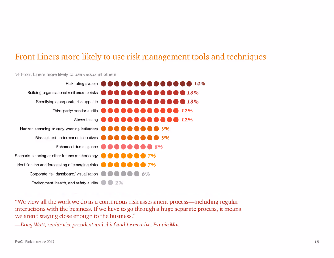
A chart slide with a dot matrix representing the percentage of Front Liners using various risk management tools. There is also a quote at the bottom.
Risk Assessment and Management
Financial Services
Highlights the percentage of Front Liners using different risk management tools. Emphasizes building organizational resilience and risk rating systems among other techniques.
Risk management, Front Liners, resilience, tools, techniques, percentages, chart, risk rating, organizational
Mixed Chart
PwC/Strategy&
Saved
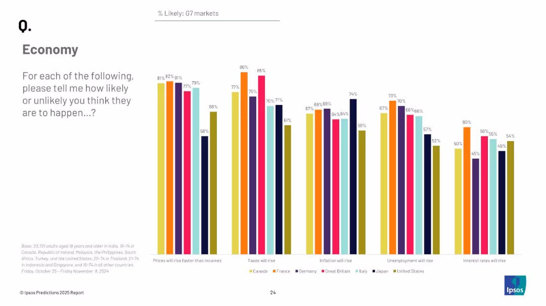
Vertical grouped bar chart for G7 countries showing likelihood of five key economic developments; color-coded by country.
Market Analysis and Trends
Financial Services
The slide compares the economic sentiment of G7 nations on five financial outcomes such as inflation, taxes, and unemployment. It highlights significant cross-country variation in perceptions.
G7, economic comparison, inflation, unemployment, tax outlook, interest rates, Ipsos, 2025
Mixed Chart
IPSOS
Saved
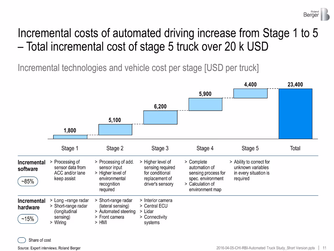
Bar graph shows cost per stage of automation (USD/truck). Table below separates costs by software vs. hardware.
Investment Analysis
Transportation & Logistics
Costs for automated truck features increase with each automation stage. The majority (~85%) of costs are software-based, with total costs exceeding $23K per vehicle.
automation cost, trucks, stage-wise cost, software expense, hardware upgrade, vehicle technology, investment analysis
Mixed Chart
Roland Berger
Saved
A diagrammatic slide with labeled tech clusters indicating their roles as Infrastructure, Enablers, and Applications. Uses a simple black and white scheme for a professional, analytical look.
Strategic Planning
Technology & Software
This slide demonstrates the exponential growth due to the combinatorial effects of technology across industries. It helps in understanding how the convergence of various tech advancements enables new business models and innovation, making it essential for strategic discussions about technological investments and industry evolution.
Combinatorial Effects, Technology, Growth, Innovation, Business Models, Investment, Industry Evolution
Framework
McKinsey
Saved
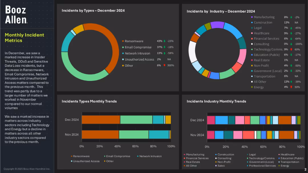
Four-panel dashboard layout with pie and bar charts showing incident types and affected industries; left panel includes summary text; uses a dark background with color-coded data elements.
Risk Assessment and Management
Technology & Software
This dashboard highlights cybersecurity incidents by type and industry for December 2024. Ransomware and email compromise are dominant threats, while financial services and healthcare industries were notably impacted. The slide also shows trends over the previous month and mentions increased threats in Technology and Energy sectors.
cybersecurity, incident metrics, ransomware, email compromise, unauthorized access, threat trends, Booz Allen, industry risk, data loss
Multiple Chart
Booz Allen Hamilton
Saved
This Timeline or Roadmap Slide outlines the expansion plan of 'Symbio' with a timeline from 2014 to 2030. It includes milestone markers, text descriptions, and a flow diagram that effectively communicates the progressive development of the company. The design employs a mix of icons, images, and a linear path to guide viewers through the timeline, making complex information easily digestible.
Strategic Planning
Energy & Utilities
Detailing the strategic development of 'Symbio' towards global leadership in commercial vehicles, this slide maps key milestones, including investments, partnerships, and future expansion plans. It highlights Michelin’s role and strategy in fuel cell development for commercial vehicles, emphasizing their commitment to sustainable energy solutions and industrial innovation.
fuel cells, expansion, global leadership, commercial vehicles, sustainability, partnerships, timeline, Symbio, Michelin
Linear Flow
Morgan Stanley
Saved
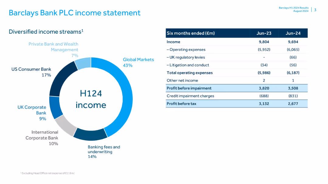
Donut chart for income breakdown by division; table of income, expenses, and profit for H1 2023 and H1 2024; blue/grey scheme
Financial Performance
Financial Services
Displays Barclays’ income and profit before tax for H1 2023 and 2024, with key figures broken down into income streams and major expenses. Provides a snapshot of profitability and changes year-over-year.
Barclays, income statement, H1 2024, profit, operating expenses, income streams, global markets, banking fees
Mixed Chart
Barclays
Saved
Presents segmented column charts showing the online luxury goods market by region and category, emphasizing growth rates and market shares with a color-coded design.
Market Analysis and Trends
Retail & E-commerce
Examines the segmentation of the online luxury goods market by geographical region and product category, highlighting the growth trends and the predominant role of Asia and the Americas in online sales.
Market Segmentation, Online Sales, Luxury Goods, Asia
Multiple Chart
Bain
Saved
Contains graphical representations and text describing next-tier economic clusters beyond BRICS, such as MINT and MIST, with a focus on their characteristics like GDP growth and population demographics.
Market Analysis and Trends
Financial Services
Explores emerging economic clusters beyond BRICS, offering insights into the next wave of influential markets. Useful for identifying new investment opportunities and understanding regional economic potentials.
emerging markets, MINT, MIST, GDP, growth
Mixed Chart
Roland Berger
Saved
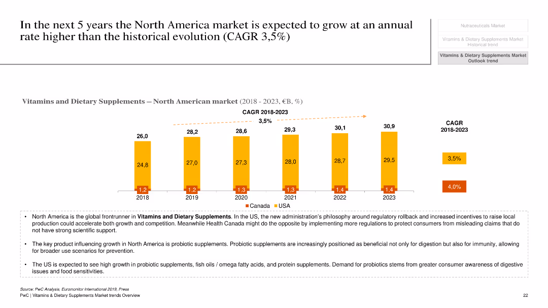
This slide contains a column chart depicting the growth of the North American market for vitamins and dietary supplements from 2018 to 2023, with separate data for the USA and Canada. Additional text provides key drivers and market dynamics.
Market Analysis and Trends
Healthcare & Pharmaceuticals
The slide forecasts the growth of the North American market for vitamins and dietary supplements, with a detailed breakdown for the USA and Canada. It discusses key drivers such as regulatory changes, consumer health awareness, and product trends, projecting a higher growth rate compared to historical trends.
North American market, vitamins, dietary supplements, growth forecast, USA, Canada
Mixed Chart
PwC/Strategy&
Saved
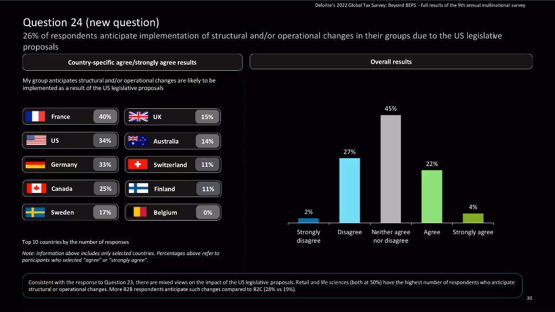
The slide features bar charts and column charts to represent anticipated structural and operational changes due to US legislative proposals.
Market Analysis and Trends
Financial Services
It shows the percentage of respondents expecting structural or operational changes in their groups due to US legislative proposals, with country-specific data.
survey, column chart, structural changes, countries
Mixed Chart
Deloitte
Saved
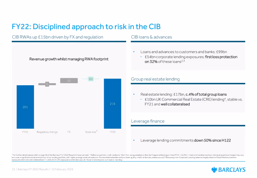
Three-part layout: Left uses a bar chart with RWA drivers; right includes text panels on CIB loans, real estate lending, and leverage finance.
Risk Assessment and Management
Financial Services
Focuses on risk management within Corporate and Investment Banking (CIB), showing RWA increases from FX/regulatory changes. It highlights low-risk exposure in real estate lending and a reduction in leveraged finance commitments.
CIB, RWAs, corporate loans, real estate, risk management, leverage finance, FX impact, regulation
Mixed Chart
Barclays
Saved
The slide contains a column chart showing a path to a ROE target with annotations, using a simple and effective design with a monochromatic color scheme for emphasis on growth levers.
Strategic Planning
Financial Services
The slide outlines strategic growth initiatives for achieving mid-teens return on equity (ROE) targets. It showcases the progression of initiatives in transaction banking, wealth management, consumer services, and alternatives, likely meant for discussing long-term financial growth and investment strategies.
ROE target, Growth initiatives, Transaction banking, Wealth management, Investment strategies
Single Chart
Goldman Sachs
Saved
Line chart comparing alternative sites of care being pursued by hospitals in developed and developing markets.
Strategic Planning
Healthcare & Pharmaceuticals
This slide illustrates the alternative care sites hospitals plan to establish to improve healthcare access in the next three years.
alternative care, hospitals, healthcare, APAC, planning
Mixed Chart
LEK
Saved
Includes stacked column charts and a table detailing credit losses and loan stages across different banking sectors.
Risk Assessment and Management
Financial Services
The slide focuses on credit loss provisions and the categorization of loans in different stages for various banking sectors, providing essential information for risk assessment and financial stability analysis. It is especially useful for credit analysts and financial risk managers looking at credit quality, risk exposure, and the effectiveness of credit management strategies within the banking industry.
Credit Risk, Loan Stages, Banking Sectors, Risk Management, Financial Stability
Multiple Chart
Deutsche Bank
Saved
Contains a two-column layout with a column chart for dividends per year on the left and a block of text with figures on share buybacks on the right.
Financial Performance
Financial Services
Displays dividend payments from 2020 to 2023 and details on share buyback in 2023, emphasizing shareholder value creation through dividends and share buybacks.
dividends, shareholder value, buyback, financials, growth
Mixed Chart
IPSOS
Saved
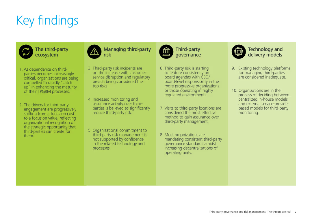
The slide has four sections with icons and text, summarizing the key findings related to the third-party ecosystem, managing third-party risk, third-party governance, and technology and delivery models.
Strategic Planning
Professional Services
This slide summarizes the key findings of the study, covering four main areas: third-party ecosystem, managing third-party risk, third-party governance, and technology and delivery models. It outlines critical insights for organizational strategy.
key findings, third-party risk, governance, technology, delivery models, strategic planning, professional services
Pillar
Deloitte
Saved
Slide is laid out in two columns, featuring a mix of text and round diagrams in red and white colors. Descriptions of PwC's audit and valuation approaches are provided alongside key audit matters.
Financial Performance
Professional Services
Discusses PwC's valuation practices during audits, highlighting the importance of accurate valuations in financial reporting and decision-making. It's intended for professionals involved in finance and accounting, particularly in understanding audit complexities.
valuation, audit, financial reporting, PwC, practices
Multiple Chart
PwC/Strategy&
Saved
Previous
Next
If nothing, comes up, please save your slides first
Create a FREE account to continue browsing
Receive Instant Access to 1,000+ slides from companies like McKinsey, Google, and Goldman Sachs
First Name
Last Name
Email
Password
I agree to all
Terms & Privacy Policy
Thank you! Your submission has been received!
Oops! Something went wrong while submitting the form.
Have an account?
Sign in
Column Chart
Heatmap
Chevron
Org Chart
Infographic
Callouts
Timeline
List
Graphic
Picture
Process Flow
Diagram
Paragraph
Map
Table
Framework
Subtitle
Takeaway Box
Icon
Other Chart
Radar Chart
Waterfall Chart
Mekko Chart
Pie Chart
Scatter Plot
Line Chart
Bar chart
Bullet points