My Account
My Slides
Search by Category
Templates
View All Templates
Download Template Slides
✦ AI Search
Feedback
Login
Logout
Get Started
Browse all Slides
Browse all Slides
Create a FREE Account
Instant access to 1,000+ real slides from top companies like McKinsey, BCG, Goldman Sachs, Google and many more!
First Name
Last Name
Email
Password
I agree to all
Terms & Privacy Policy
Thank you! Your submission has been received!
Oops! Something went wrong while submitting the form.
Have an account?
Sign in
Saved Slides
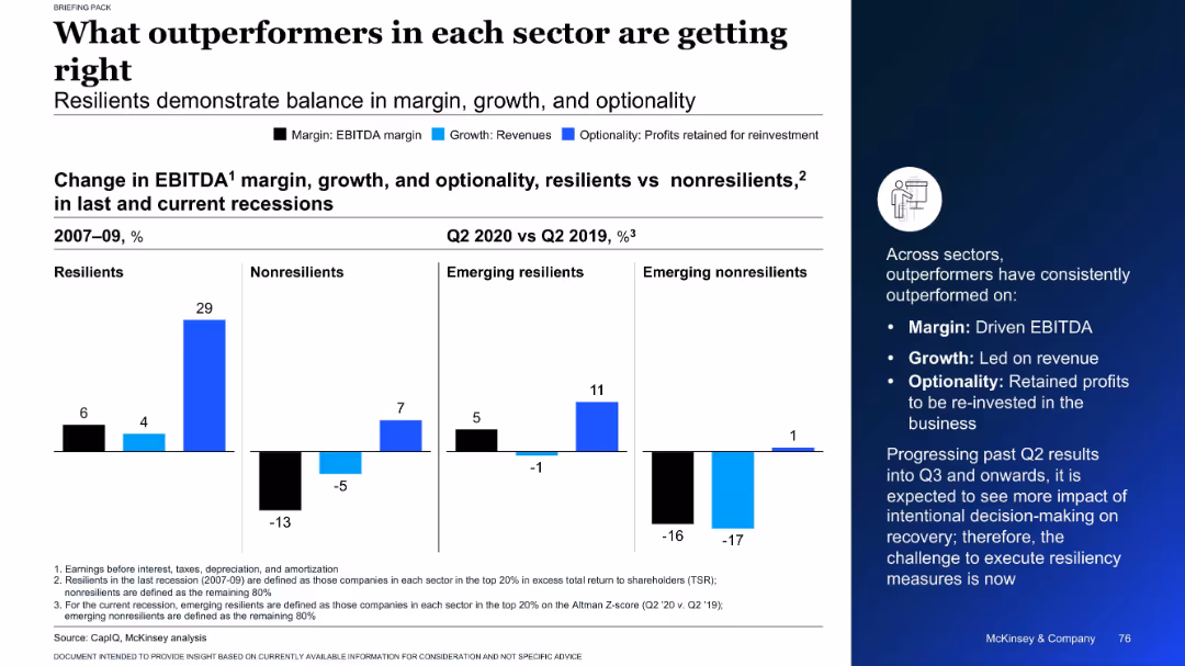
Split chart showing EBITDA, revenue, and reinvestment changes for resilient and non-resilient firms across recessions
Performance Metrics and KPIs
Professional Services
This slide highlights the traits of outperforming companies in past and current recessions. It compares resilient and non-resilient firms on margin, growth, and optionality, showing that resilient companies consistently excel in all three metrics.
EBITDA, growth, resilience, recession, company performance
Mixed Chart
McKinsey
Saved
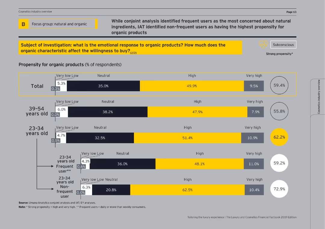
This slide features bar charts showing propensity for organic products by age groups and usage frequency, with emphasis on frequent vs. non-frequent users.
Customer and Market Segmentation
Consumer Goods
It further breaks down the propensity for organic products, highlighting differences between age groups and distinguishing between frequent and non-frequent users.
age groups, usage frequency, organic products, propensity
Single Chart
EY
Saved
Diagram of a central circle labeled 'Goldman Sachs' with connecting lines to various entities representing API connections.
Technology and Digital Transformation
Technology & Software
Outlines the central role of Goldman Sachs in connecting different sectors through APIs with a focus on technology development and service externalization.
platforms, technology, APIs, Goldman Sachs, development, externalization, developers, service
Framework
Goldman Sachs
Saved
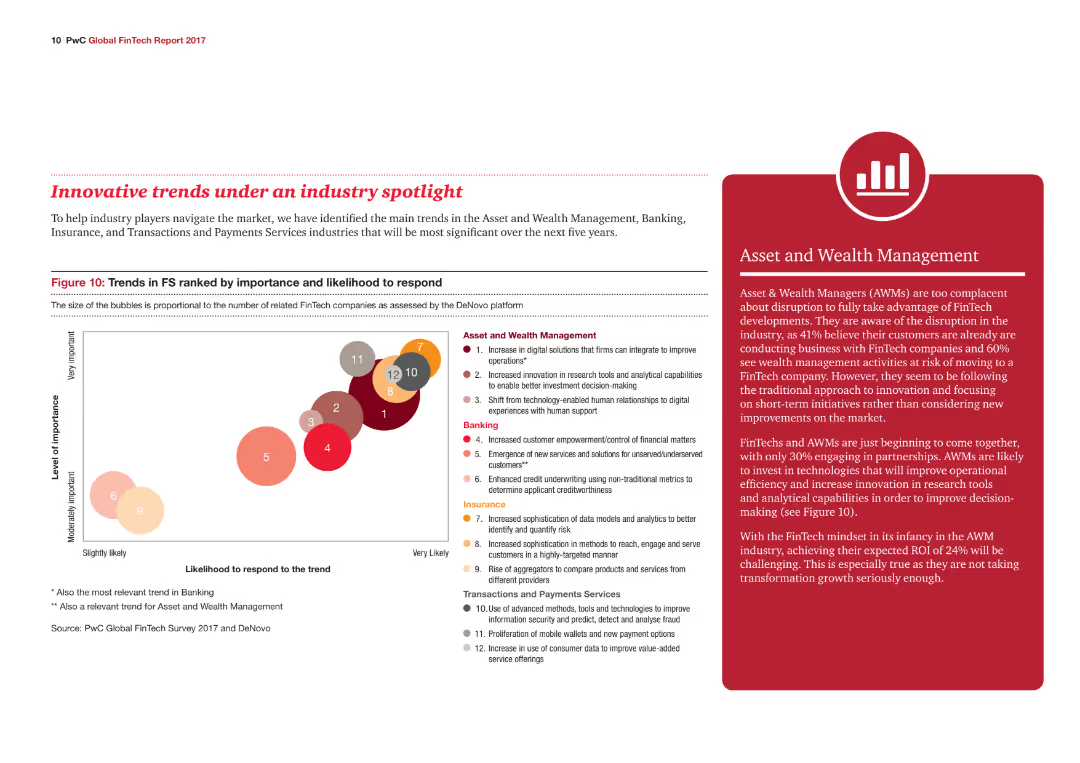
A bubble chart ranks trends in the financial services industry by importance and likelihood to respond, with different colored bubbles representing various industry trends.
Market Analysis and Trends
Financial Services
The slide outlines key trends in Asset and Wealth Management, Banking, Insurance, and Transactions and Payments Services, highlighting their importance and response likelihood.
Industry trends, Financial Services, Wealth Management, Banking, Insurance
Mixed Chart
PwC/Strategy&
Saved
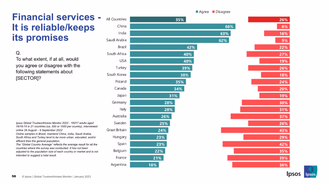
Bar chart format as with previous slides; left-aligned text and question; strong visual consistency
Strategic Planning
Financial Services
This slide assesses whether financial services are seen as reliable. China, India, and Saudi Arabia show high levels of agreement, while France, Argentina, and Belgium are among the least trusting. The global average is 35%.
reliability, promises, financial trust, countries, agreement, Ipsos, perception, strategic
Mixed Chart
IPSOS
Saved
Slide with text blocks and a central circular graphic illustrating integration of sustainability, technology, and market shifts. Uses a blue and white color scheme with icons.
Strategic Planning
Financial Services
Discusses the strategic focus of the bank on sustainability, technological integration, and adapting to market shifts to ensure growth and stability, aiming to enhance shareholder value and customer relationships.
strategic planning, sustainability, technology, market adaptation, growth strategies
Framework
Deutsche Bank
Saved
The slide contains a column chart detailing various reasons for returns, such as incorrect size and fit, unmet quality expectations, and misleading product display.
Market Analysis and Trends
Retail & E-commerce
Presents survey data on the top reasons for returns in the fashion industry, highlighting size and fit issues, quality expectations, and other key factors influencing returns.
Reasons for returns, Size & fit, Quality expectations, Survey data, Fashion industry
Mixed Chart
Roland Berger
Saved
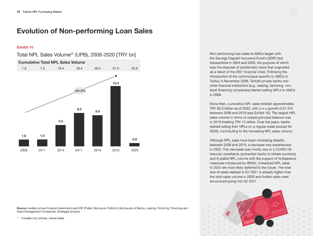
Column chart showing cumulative total NPL sales volume from 2008-2020. Text on the right explains trends and changes.
Market Analysis and Trends
Financial Services
The slide provides data on the cumulative total NPL sales in Turkey from 2008-2020, highlighting growth trends and key factors.
Non-performing loans, NPL sales, financial trends, market analysis, Turkey
Mixed Chart
PwC/Strategy&
Saved
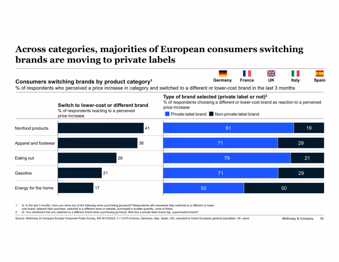
Split bar chart and horizontal bars; flags represent countries; uses blue and black color coding
Customer and Market Segmentation
Consumer Goods
Shows the percentage of consumers switching to lower-cost brands by category and highlights the share selecting private-label brands. Key insight: majority prefer private-label options in response to price increases across categories.
private-label, price sensitivity, brand switching, consumer behavior, categories, Europe, McKinsey, apparel, nonfood, eating out
Single Chart
McKinsey
Saved
This slide acts as a navigational tool for the presentation, listing topics and corresponding page numbers. The design is straightforward, with a clean white background and organized text alignment for easy reading.
Operational Efficiency
Technology & Software
An organizational slide designed to guide the viewer through the report's structure, covering topics from the introduction to specific analyses and the appendix. It ensures clarity in the presentation's flow and content distribution.
table of contents, agenda, report navigation, presentation structure, topics
Agenda
Oliver Wyman
Saved
A bar chart showing the perception of Europe’s attractiveness over three years, with different colors representing varying degrees of increase or decrease.
Market Analysis and Trends
Financial Services
The slide presents survey results on the perceived attractiveness of Europe for investment over a three-year period, indicating overall stability despite challenges.
investment, perception, Europe, survey, stability
Single Chart
EY
Saved
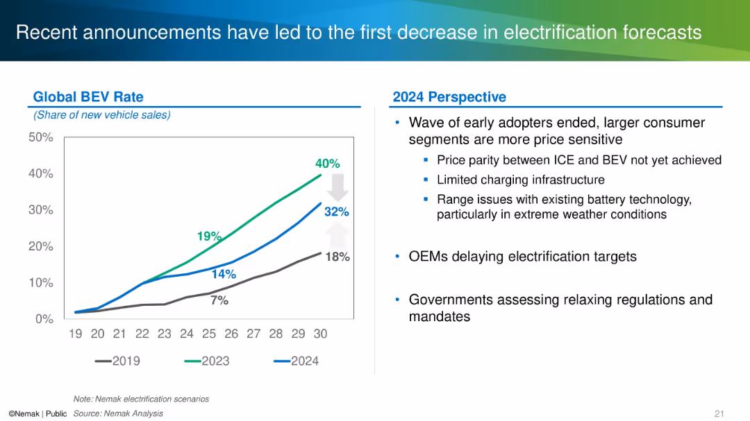
Split layout with a line chart showing BEV adoption rate scenarios on the left and textual analysis on the right.
Market Analysis and Trends
Industrial & Manufacturing
This slide discusses how changing market dynamics and consumer behaviors have lowered forecasts for global BEV adoption. It shows historical and revised adoption projections and notes OEM delays, regulatory reassessments, and technical challenges as contributing factors.
electrification, BEV, forecast, OEM, adoption rate, 2024 outlook
Mixed Chart
Barclays
Saved
Contains bar graphs showing the levelized cost of energy for solar, onshore and offshore wind, and nuclear power with and without tax credits, illustrating significant cost reductions due to fiscal incentives.
Market Analysis and Trends
Energy & Utilities
Examines how full application of tax credits could reduce the costs associated with generating energy from various renewable sources, emphasizing the financial benefits of government incentives.
renewable energy, cost reduction, tax credits, solar, wind, nuclear
Single Chart
BCG
Saved
Three interconnected circular nodes with icons, titled 'The Future of Enterprise', 'The Future of the Workforce', and 'How Work Gets Done'. The slide has a futuristic and clean design.
Technology and Digital Transformation
Professional Services
Presents an interconnected analysis of the future of enterprises, workforce, and work processes, with emphasis on disruptive forces and innovation.
future, enterprise, workforce, work processes, disruptive innovation
Linear Flow
Deloitte
Saved
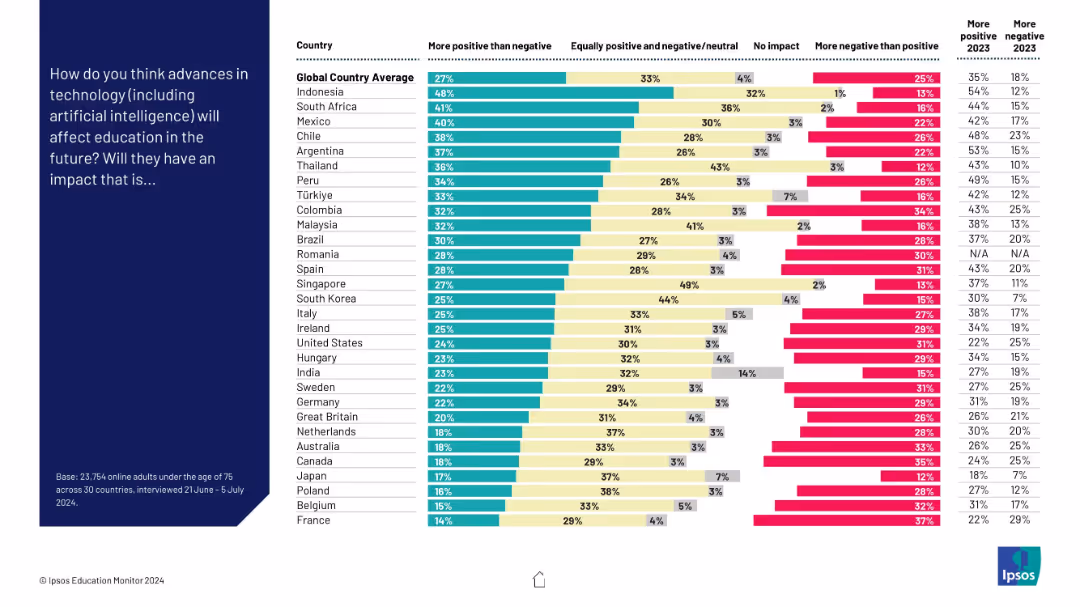
Vertical bar chart on the right showing responses from various countries, with segmented bars (more positive, neutral, no impact, more negative); dark blue left panel with question text
Market Analysis and Trends
Education & Training
The slide presents survey results across 30 countries on public perceptions of how technology (including AI) will affect education. Most countries lean toward a positive view, but significant variation exists, with some populations more skeptical.
education, technology, AI, perception, global, survey, positivity, negativity, impact
Mixed Chart
IPSOS
Saved
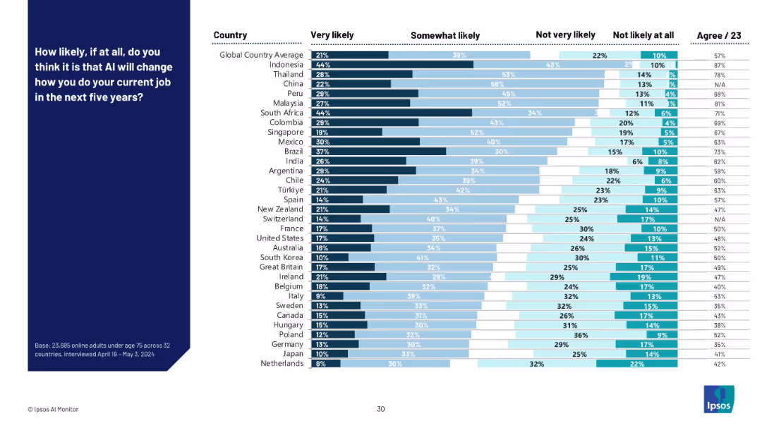
Mixed bar chart with four response categories (very likely to not likely at all) across countries. Bars are color-coded by intensity of likelihood.
Technology and Digital Transformation
Artificial Intelligence
This slide shows perceived likelihood across countries that AI will change how people perform their current jobs in the next five years. Asian countries like Indonesia and Thailand show the highest perceived likelihood, while Western European countries show more skepticism.
AI jobs, workplace transformation, future of work, employment outlook, country breakdown, likelihood perception, digital tools, survey
Mixed Chart
IPSOS
Saved
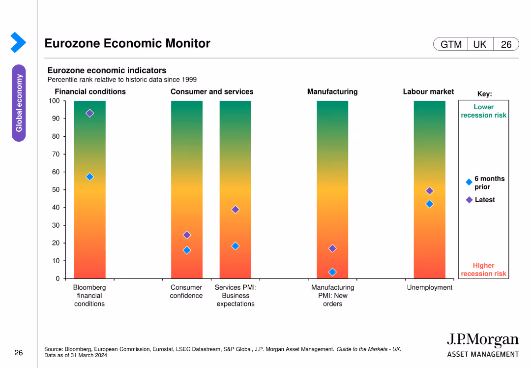
The slide includes a bar chart displaying eurozone economic indicators. The bars show percentile ranks relative to historic data across different economic conditions, consumer confidence, business expectations, manufacturing orders, and unemployment.
Market Analysis and Trends
Financial Services
This slide monitors eurozone economic health by presenting various economic indicators over time, aiding in the assessment of recession risks and economic stability.
eurozone, economic indicators, recession risk, consumer confidence, manufacturing orders
Single Chart
JP Morgan
Saved
Consists of a column chart showcasing planned growth strategies and a pie chart detailing ownership transition plans, set against a clear, textual backdrop.
Strategic Planning
Technology & Software
Presents strategic initiatives and ownership transition plans as pivotal components of business strategy, highlighting the directional shifts businesses may undertake to foster growth.
Business Strategy, Growth, Transition, Planning
Multiple Chart
JP Morgan
Saved
The slide is primarily text-based with a bold black and blue color scheme. It presents two columns of bullet-pointed text: 'The facts today (examples)' on the left and 'How this may evolve' on the right. The top of the slide features a title and a symbol of two circular arrows, suggesting a cycle or evolution.
Market Analysis and Trends
Professional Services
This slide presents current economic and public health observations alongside speculative developments on how they might evolve, suggesting possible future trends. It serves as a thought-provoking examination for strategists and analysts when considering long-term impacts and changes in market dynamics.
market trends, public health, economic response, future speculation, long-term impact
Header Horizontal
McKinsey
Saved
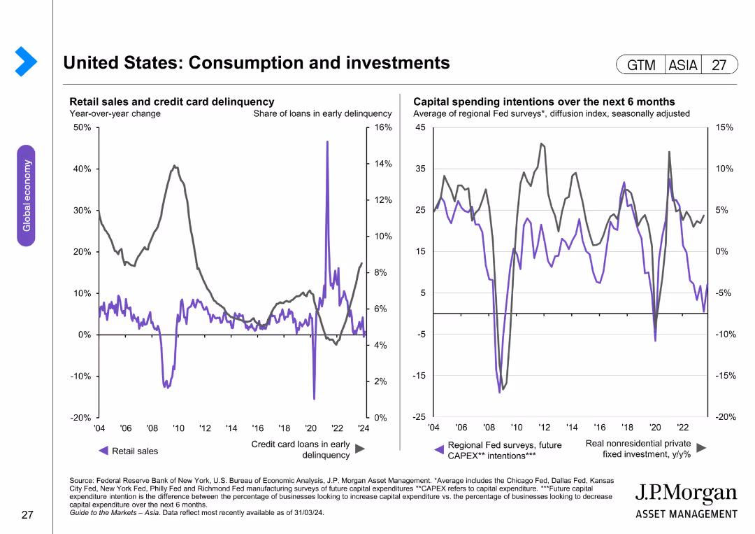
The slide features two line charts: one showing retail sales and credit card delinquency, and another showing capital spending intentions. The layout is moderately complex.
Market Analysis and Trends
Financial Services
This slide evaluates trends in retail sales, credit card delinquencies, and capital spending intentions over time, highlighting significant changes and patterns.
retail sales, credit card delinquency, capital spending, economic trends, consumer behavior
Multiple Chart
JP Morgan
Saved
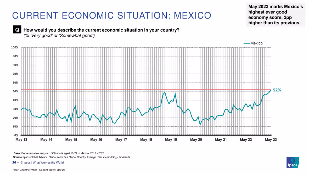
Line graph displaying Mexico’s economic perception (2013–2023); right-hand annotation notes milestone.
Strategic Planning
Financial Services
Mexico’s “good economy” sentiment reached a historic high of 52% in May 2023, up 3 percentage points from the previous month. The trend line shows steady improvement over time, reflecting increased confidence and stability in economic perception.
Mexico, economy, record high, public confidence, Ipsos, economic trend, growth, financial perception, optimism
Single Chart
IPSOS
Saved
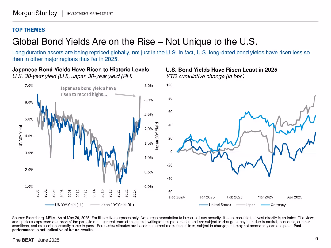
Two line charts comparing Japanese and U.S. bond yields; minimalist layout with dual-axis and legend.
Market Analysis and Trends
Financial Services
This slide analyzes global long-duration bond repricing, emphasizing that U.S. yields have risen less than in Japan or Germany. Charts show rising yields and cumulative changes across regions in 2025.
bond yields, U.S., Japan, Germany, interest rates, global market, long-term bonds, 2025, Morgan Stanley, inflation
Multiple Chart
Morgan Stanley
Saved
Column chart showing growth, company logos, red stamped labels
Mergers and Acquisitions
Industrial & Manufacturing
Strategies and outcomes of LANXESS's acquisitions
Growth, Acquisitions, Synergy, Integration, Consumer Protection
Header Vertical
Morgan Stanley
Saved
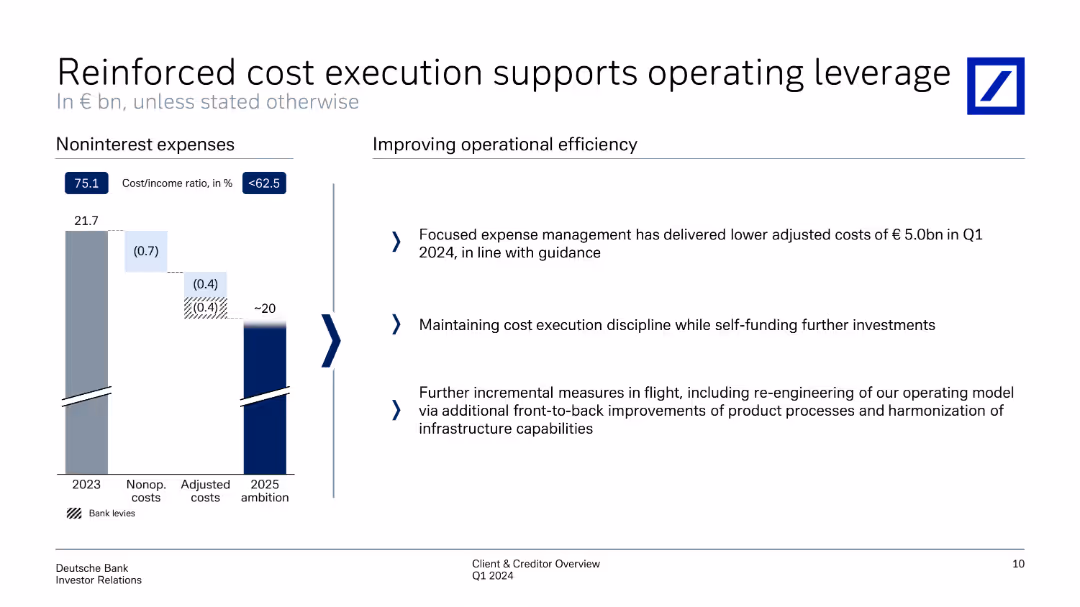
The slide features a column chart on the left showing noninterest expenses from 2023 to 2025 ambition. On the right, there are bullet points explaining measures for improving operational efficiency. The slide is moderately detailed with text and visuals balanced.
Operational Efficiency
Financial Services
Focused on cost management, this slide details how expense management has reduced adjusted costs and maintained cost execution discipline. It mentions further measures to re-engineer operating models and infrastructure capabilities for future improvements.
cost execution, operational efficiency, expense management, adjusted costs, infrastructure capabilities
Mixed Chart
Deutsche Bank
Saved
A column chart showing quarterly dividends from Q4 2021 to Q4 2022 with annotations on dividend amounts and performance statistics.
Financial Performance
Transportation & Logistics
Shows the pattern of dividends declared under a specific corporate strategy with financial outcomes over five quarters, emphasizing steady growth and shareholder value.
dividends, financial performance, shareholder value, quarterly results, value strategy
Single Chart
Deutsche Bank
Saved
Previous
Next
If nothing, comes up, please save your slides first
Create a FREE account to continue browsing
Receive Instant Access to 1,000+ slides from companies like McKinsey, Google, and Goldman Sachs
First Name
Last Name
Email
Password
I agree to all
Terms & Privacy Policy
Thank you! Your submission has been received!
Oops! Something went wrong while submitting the form.
Have an account?
Sign in
Column Chart
Heatmap
Chevron
Org Chart
Infographic
Callouts
Timeline
List
Graphic
Picture
Process Flow
Diagram
Paragraph
Map
Table
Framework
Subtitle
Takeaway Box
Icon
Other Chart
Radar Chart
Waterfall Chart
Mekko Chart
Pie Chart
Scatter Plot
Line Chart
Bar chart
Bullet points