Create a FREE Account
Instant access to 1,000+ real slides from top companies like McKinsey, BCG, Goldman Sachs, Google and many more!
First Name
Last Name
Email
Password
I agree to all
Terms & Privacy Policy
Thank you! Your submission has been received!
Oops! Something went wrong while submitting the form.
Have an account?
Sign in
Library
Templates
Courses
Pricing
My Account
My Slides
My Templates
✦ AI
AI Prompt Library
AI Search
Sign in
Start Here
Logout
My Saved Slides
Dual-pane slide with uptake chart on the left and coverage grid on the right. Color-coded lines show BIMZELX® performance versus competitors. Right side emphasizes favorable insurance coverage.
Product and Service Analysis
Healthcare & Pharmaceuticals
BIMZELX® is positioned as a high-growth asset driven by superior uptake and favorable U.S. market access. The slide shows comparative prescription trends and outlines its broad commercial coverage, especially among Medicare and Medicaid patients for psoriasis and PsA.
BIMZELX, psoriasis, IL-17, U.S. market access, prescription trends, innovation
Mixed Chart
JP Morgan
Saved
This slide features multiple graphs and data visualizations: a column chart showing mainline volumes, another column chart illustrating cost synergies, a line graph for FX hedging program, and a text list of projects. Colors like yellow, blue, and gray dominate. Overall, the design is clean with data neatly organized.
Financial Performance
Energy & Utilities
The slide presents Enbridge’s financial performance and projections, emphasizing the growth through the second half of 2017. It includes information on mainline volumes, cost synergies, FX hedging, and upcoming projects, clearly targeting stakeholders interested in the company's financial outlook and strategic direction.
Energy, Utilities, Finance, Growth, Cost, FX Hedging
Multiple Chart
Barclays
Saved
Two charts: a line chart showing the 5-year rolling correlation between bonds and equities, and a bar chart displaying cumulative returns during market drawdowns.
Risk Assessment and Management
Financial Services
Highlights the protective role of bonds during large market drawdowns, despite positive correlations to equities, with a detailed historical performance analysis.
bonds, equities, correlation, market drawdowns, financial protection
Multiple Chart
Goldman Sachs
Saved
Column charts, text annotations.
Market Analysis and Trends
Retail & E-commerce
Analyzes trends in discount luxury retail channels.
off-price, luxury, Asia, Americas, Europe
Mixed Chart
Bain
Saved
Two line charts comparing month-by-month concern levels and national sentiment trends over 12 months
Market Analysis and Trends
Professional Services
This slide tracks how public concerns and sentiment about national direction have changed over a year. Inflation shows a consistently high concern. The majority (62%) still feel their countries are on the wrong track, though the “right direction” metric has slightly improved over time.
trend, sentiment, inflation, inequality, year-over-year
Multiple Chart
IPSOS
Saved
This slide includes column charts and textual highlights. It covers the shift in mobility trends, car buying intentions, and the rise of electric vehicles based on survey responses.
Market Analysis and Trends
Transportation & Logistics
The slide provides a summary of mobility trends, including changes in travel behavior, car buying intentions, and the increasing preference for electric vehicles among consumers in the EY Mobility Consumer Index 2022 Study.
Mobility, Consumer Trends, Electric Vehicles, Survey, Transportation, 2022, Car Buying, Market Analysis, Travel Behavior
Multiple Chart
EY
Saved
A laptop screen displaying a dashboard with a pie chart and list of financial data, mostly in white and gray colors.
Financial Performance
Financial Services
The slide demonstrates a workbench for relationship managers, showcasing client information, asset allocation, and portfolio details.
Relationship manager, dashboard, financial data, pie chart, portfolio
Mixed Chart
Credit Suisse
Saved
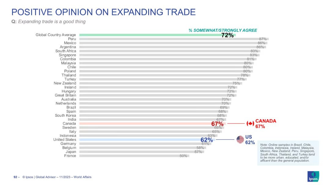
Horizontal bar chart ranked by % agreement, showing all four response categories. Average agreement noted at the top.
Regulatory and Compliance
Government & Public Sector
This slide reveals how people across 28 countries feel about tax increases for public spending. A majority disagree, with only 19% agreeing on average. The slide includes historical comparisons and visual segmentation by agreement intensity.
tax policy, public finance, taxation sentiment, Ipsos, government spending, fiscal responsibility, global opinion
Mixed Chart
IPSOS
Saved
Diagram showcasing five components of an integrated customer experience toolkit, involving digital and organizational elements.
Technology and Digital Transformation
Professional Services
Details a toolkit for enhancing customer experience through digital transformation, emphasizing the integration of feedback loops and digital interactions.
Customer Experience, Digital, Strategy
Linear Flow
Bain
Saved
The slide contains a scatter plot showing the correlation between talent pool maturity and progress in upskilling programs across different regions.
Human Resources and Talent Management
Professional Services
The slide reveals that regions with more developed talent pools see less progress in upskilling initiatives, indicating a potential complacency or other barriers.
Upskilling, talent pools, regional comparison, scatter plot, progress
Mixed Chart
PwC/Strategy&
Saved
Features two sections: a column chart illustrating invoices by month and a dashboard categorizing receivables. The design is straightforward with a dominant green color scheme, which aligns with the theme of financial visibility and transparency.
Technology and Digital Transformation
Technology & Software
This slide is centered on the use of live dashboards to enhance working capital management. It displays monthly invoicing trends and a segmentation of receivables, suggesting how real-time data transparency can lead to better financial decision-making.
working capital, invoices, receivables, financial transparency, dashboards
Boxed
Deloitte
Saved
This slide has a column chart showing revenue from 2017 to 2021, a table for market leadership, and various text annotations. The layout is balanced between visual data and descriptive information.
Financial Performance
Financial Services
Highlights J.P.Morgan's revenue growth and leadership positions in the Treasury Services sector, despite challenges such as price compression.
Revenue, Treasury Services, Market Share, Leadership, Growth, Financial Services, J.P.Morgan
Mixed Chart
JP Morgan
Saved
This slide includes multiple column charts depicting income growth and performance metrics for different segments.
Financial Performance
Financial Services
Showcases strong YoY income growth for Consumer, Cards & Payments, with specific data on income and costs.
income, growth, financial, performance, YoY
Mixed Chart
Barclays
Saved
Includes a large pie chart with statistical data and a list of three strategic actions for CEOs with associated icons.
Human Resources and Talent Management
Professional Services
This slide emphasizes the importance of leadership in the successful integration of SDGs into business strategy, presenting statistical evidence and actionable recommendations for CEOs to foster a sustainability-focused culture at all organizational levels.
Leadership, Sustainability, SDGs, Strategic Recommendations, Business Strategy
Mixed Chart
McKinsey
Saved
The slide presents a bar chart showing the average percentage of correct responses to crypto asset knowledge questions for 2023 and 2022.
Human Resources and Talent Management
Financial Services
This slide provides insights into the general knowledge about crypto assets among respondents, comparing data from 2023 to 2022. It helps in understanding education and awareness levels.
Crypto, Knowledge, Education, Awareness, Comparison
Mixed Chart
IPSOS
Saved
Illustrates the segmentation of customer base into free and premium members, with a diagram showing current features and expansion potential.
Market Analysis and Trends
Financial Services
This slide provides an analysis of the premium membership model, showcasing the transition from a free user base to a more comprehensive premium service, highlighting the potential for substantial growth through added features and services.
premium membership, customer base, expansion, segmentation, services
Mixed Chart
Barclays
Saved
Line charts display economic and trade growth from 1980 to projections in 2026, differentiated by global growth and ASEAN countries' growth. The color scheme includes red and white with dashed and solid lines, accompanied by a descriptive legend at the bottom.
Market Analysis and Trends
Financial Services
Discussing global economic trends with a focus on recovery phases and expectations for the ASEAN region. This analysis is vital for stakeholders in financial services to assess potential impacts on international trade and economic policies.
economic growth, ASEAN, trade growth, financial analysis, projections
Single Chart
Deloitte
Saved
The slide includes bar charts showing the age at which Millennials first purchase luxury goods and the average number of luxury purchases made in 2017. It also features quotes from consumers and industry experts, highlighting the early adoption and frequent purchasing behavior of Millennials.
Market Analysis and Trends
Retail & E-commerce
The slide emphasizes the role of Millennials in driving luxury market growth by starting to purchase luxury goods at an earlier age and making frequent purchases. It provides data on the average age of first luxury purchase and the average number of purchases, supported by quotes from consumers and industry experts.
Millennials, luxury growth, early adoption, frequent purchasing, consumer behavior, age groups, 2017, market trends, luxury goods
Multiple Chart
Bain
Saved
Grid of flags with GDP forecast comparisons and impact rationale. Structured into columns with visual and text elements.
Market Analysis and Trends
Government & Public Sector
This slide presents the revised GDP forecasts for major APAC economies following US tariff impacts. It contrasts initial forecasts with post-April 2nd consensus and includes rationales for impact, ranging from manufacturing dependence to sectoral sensitivities.
APAC, GDP forecast, US tariffs, Asia-Pacific, economic impact, manufacturing, trade
Single Chart
Accenture
Saved
Column chart illustrating the Bloomberg Global Aggregate USD intra-year declines versus calendar year returns from 2003 to 2024.
Financial Performance
Financial Services
This slide examines the annual returns and intra-year declines of the Bloomberg Global Aggregate USD Index, providing insights into the performance of fixed income investments.
fixed income, returns, declines, Bloomberg, performance
Single Chart
JP Morgan
Saved
A line chart showing the viewing trend of top Netflix originals over time. The lines represent different shows like Squid Game, The Witcher, You, Cobra Kai, and Maid (2021), illustrating their rise and fall in viewership.
Market Analysis and Trends
Media & Entertainment
This slide depicts the viewing trends for top Netflix originals, showing how viewership numbers peak and then decline over time. It includes data for shows like Squid Game, The Witcher, You, Cobra Kai, and Maid (2021).
viewing trends, Netflix originals, Squid Game, The Witcher, Cobra Kai
Single Chart
Nielsen
Saved
The slide features a bar chart showing percentages of respondents' management of their primary investment accounts. Each bar represents a different management method.
Investment Analysis
Financial Services
The slide presents survey data on how respondents manage their primary investment accounts, including using advisors, self-directed investment, and online advisors.
investment, advisor, portfolio, self-directed, online
Single Chart
IPSOS
Saved
Column chart showing performance returns of the MS INVF Sustainable Asia Equity Fund over various periods.
Financial Performance
Financial Services
Displays fund performance for different time horizons, compared to a blended index, emphasizing past performance metrics.
Performance, returns, fund, equity, index
Mixed Chart
Morgan Stanley
Saved
Two-column layout: left side has bullet points, right side features a horizontal bar chart comparing % agreement across statements.
Market Analysis and Trends
Government & Public Sector
This slide summarizes global public opinion on key issues surrounding the war in Ukraine. It shows levels of agreement with various statements about support for Ukraine, military involvement, refugee intake, and economic sanctions. Data represents 28-country averages.
Ukraine, public opinion, sanctions, refugees, military, Ipsos, global, support, agreement, comparison
Mixed Chart
IPSOS
Saved
The slide uses column charts to display corporate cash as a percentage of assets by sector and R&D spending across different sectors.
Market Analysis and Trends
Financial Services
It highlights the strong balance sheets of growth companies and their significant investments in research and development.
growth companies, balance sheets, R&D spending, corporate cash, sector analysis
Multiple Chart
JP Morgan
Saved
Previous
Next
If nothing, comes up, please save your slides first
Create a FREE account to continue browsing
Receive Instant Access to 1,000+ slides from companies like McKinsey, Google, and Goldman Sachs
First Name
Last Name
Email
Password
I agree to all
Terms & Privacy Policy
Thank you! Your submission has been received!
Oops! Something went wrong while submitting the form.
Have an account?
Sign in
Column Chart
Heatmap
Chevron
Org Chart
Infographic
Callouts
Timeline
List
Graphic
Picture
Process Flow
Diagram
Paragraph
Map
Table
Framework
Subtitle
Takeaway Box
Icon
Other Chart
Radar Chart
Waterfall Chart
Mekko Chart
Pie Chart
Scatter Plot
Line Chart
Bar chart
Bullet points