My Account
My Slides
Search by Category
Templates
View All Templates
Download Template Slides
✦ AI Search
Feedback
Login
Logout
Get Started
Browse all Slides
Browse all Slides
Create a FREE Account
Instant access to 1,000+ real slides from top companies like McKinsey, BCG, Goldman Sachs, Google and many more!
First Name
Last Name
Email
Password
I agree to all
Terms & Privacy Policy
Thank you! Your submission has been received!
Oops! Something went wrong while submitting the form.
Have an account?
Sign in
Saved Slides
Dark background with white text. Includes circular charts showing percentages and yellow highlights.
Market Analysis and Trends
Healthcare & Pharmaceuticals
This slide highlights that 59% of consumers would switch to virtual consultations for prescription renewal, 58% for discussing test results, 54% to save time, and 54% for minor medical conditions, indicating a preference for virtual healthcare solutions among U.S. consumers.
virtual consultations, healthcare, U.S. consumers, preferences, statistics
Mixed Chart
EY
Saved
A column chart and bullet points showing sentiments of skilled workers feeling underqualified to apply for multinational jobs.
Human Resources and Talent Management
Professional Services
Discusses the challenges and opportunities for multinational companies in tapping into underutilized skilled talent pools.
Talent pools, skilled workers, multinational hiring, job application challenges
Mixed Chart
Accenture
Saved
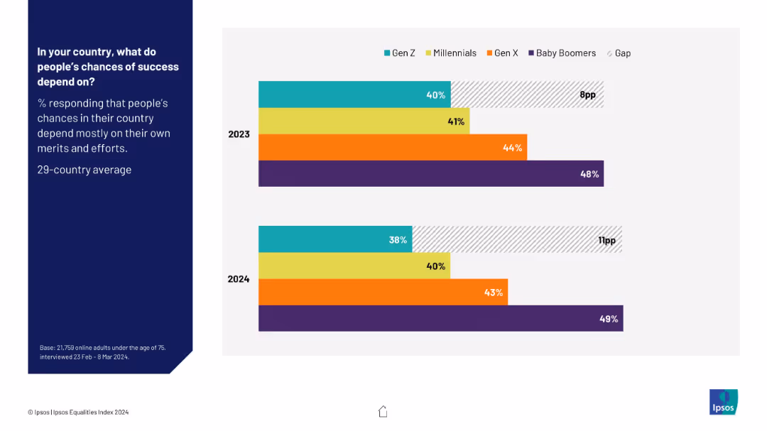
Horizontal bar chart split by generation, comparing belief in success via merit (2023 vs 2024)
Market Analysis and Trends
Education & Training
The slide tracks year-over-year trends in generational belief in meritocracy. Gen Z's agreement dropped from 40% to 38%, widening the gap with Baby Boomers. It visualizes shifts in trust in fairness across age groups.
generational gap, merit-based success, 2023 vs 2024, social belief, public opinion, Ipsos, youth perception
Mixed Chart
IPSOS
Saved
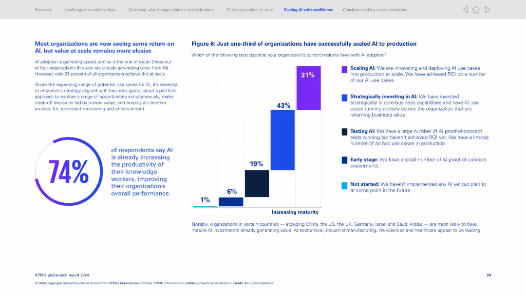
Two-column format; left has paragraph text and large circular stat (74%), right features a stacked vertical bar chart for AI maturity levels.
Technology and Digital Transformation
Artificial Intelligence
Discusses AI adoption stages, revealing only 31% have scaled AI to production. Most organizations are still in early or testing phases. It notes the productivity gains from AI and the importance of aligning AI strategy with business goals.
AI maturity, scaling AI, adoption stages, ROI, AI productivity, business alignment, digital transformation, tech return
Multiple Chart
KPMG
Saved
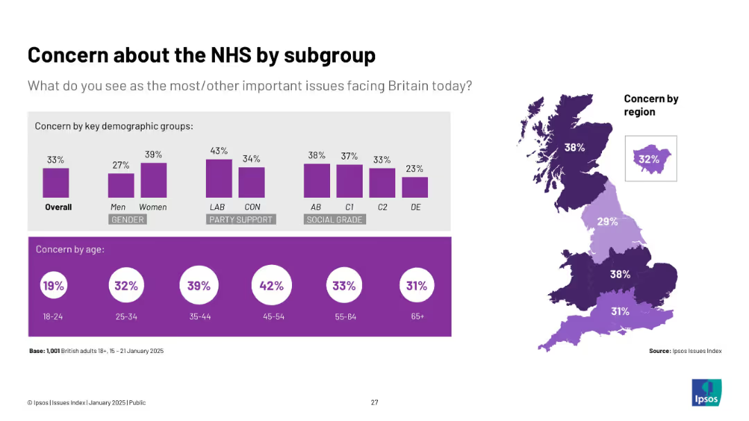
Mixed visuals: bar charts by gender, party, social grade, age + regional heat map.
Market Analysis and Trends
Healthcare & Pharmaceuticals
The slide presents concern about the NHS across key demographic groups. Women, Labour supporters, and those aged 35–54 show the highest concern. Regional analysis reveals Northern and Central England express greater NHS worries.
NHS, healthcare, gender, age, regional concern, Ipsos
Multiple Chart
IPSOS
Saved
A comparative layout with a list of priorities and goals aligned in color-coded horizontal bars.
Operational Efficiency
Financial Services
The slide outlines key priorities such as growth in institutional banking and a strategic shift away from consumer banking in certain regions.
priorities, strategy, institutional, consumer banking
Text Only
Citigroup
Saved
The slide features a column chart comparing growth/decline in oil demand from 2019 to 2035 by underlying driver, including economic development and fuel efficiencies.
Market Analysis and Trends
Industrial & Manufacturing
The slide analyzes the impact of COVID-19 on oil demand in comparison to other factors like economic development and fuel efficiencies.
COVID-19, oil demand, behavioral shifts, economic development, fuel efficiency
Boxed
McKinsey
Saved
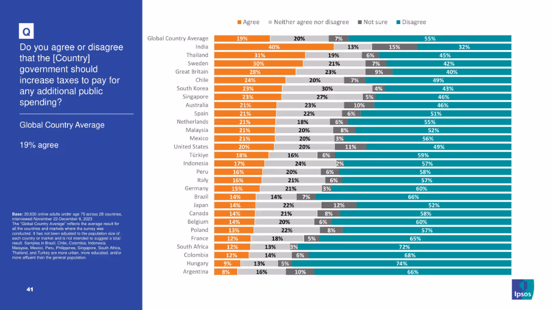
Horizontal bar chart showing agreement levels across countries regarding tax increases for more public spending; grouped responses shown in four colors
Regulatory and Compliance
Government & Public Sector
This slide shows that only 19% globally agree with raising taxes for more public spending. India shows the highest support (40%), while most countries have high disagreement levels, indicating global tax resistance.
taxes, public spending, fiscal policy, taxation, government funding, Ipsos, survey, tax attitudes, economic policy
Mixed Chart
IPSOS
Saved
A visually striking contents page with hexagonal yellow icons labeled 1–6 corresponding to sections, over a blue-toned futuristic background with a hand touching digital blocks.
Strategic Planning
Technology & Software
This slide serves as a table of contents, outlining the report's sections: Key Insights, Overview, IT Services, Engineering R&D, BPM, and Outlook. Each section is paired with a page number, providing a clear roadmap for the presentation. The modern, tech-oriented design implies a focus on digital and innovation-heavy topics.
contents, roadmap, IT, business, structure, BPM, ER&D, digital
Agenda
EY
Saved
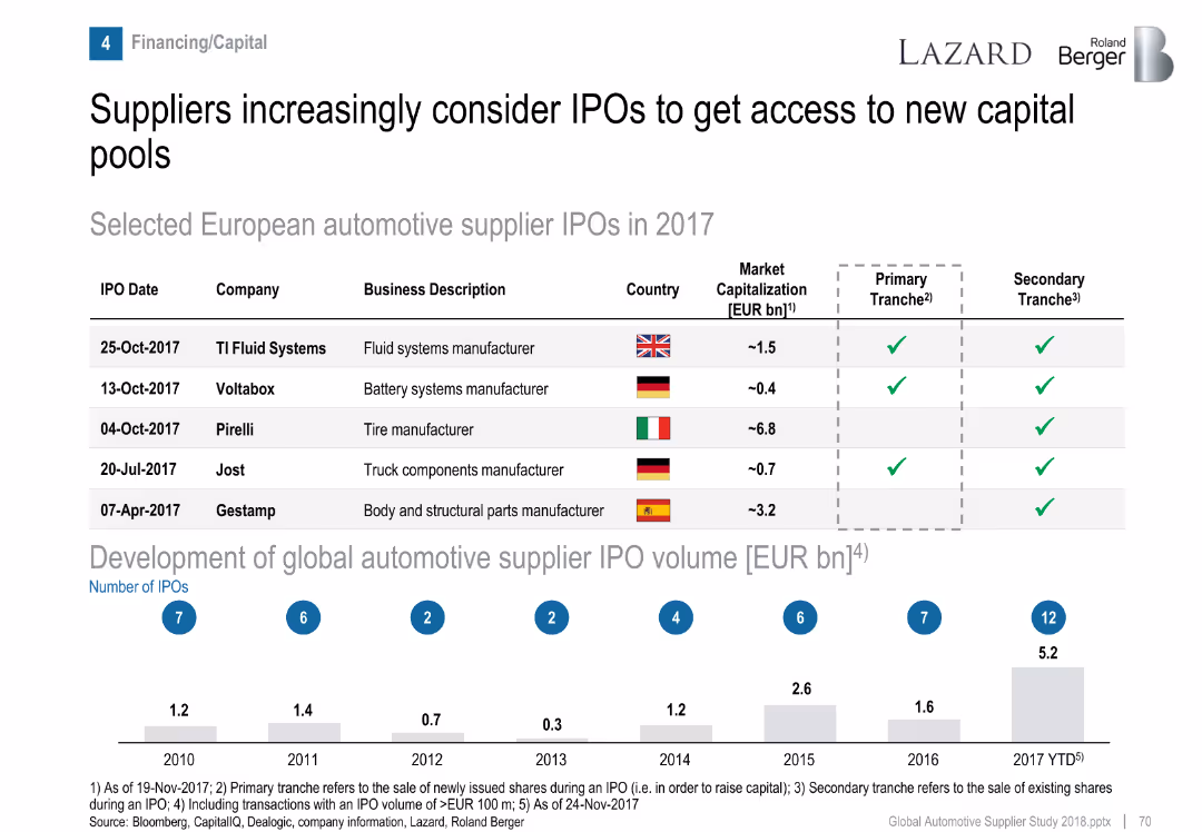
Table of IPOs and bar graph of historical IPO volumes.
Corporate Finance and Valuation
Industrial & Manufacturing
Highlights five European automotive supplier IPOs in 2017 and presents a trend in global IPO volume growth, indicating increased interest in capital markets by suppliers.
IPO, automotive suppliers, capital access, financing, market trends
Mixed Chart
Roland Berger
Saved
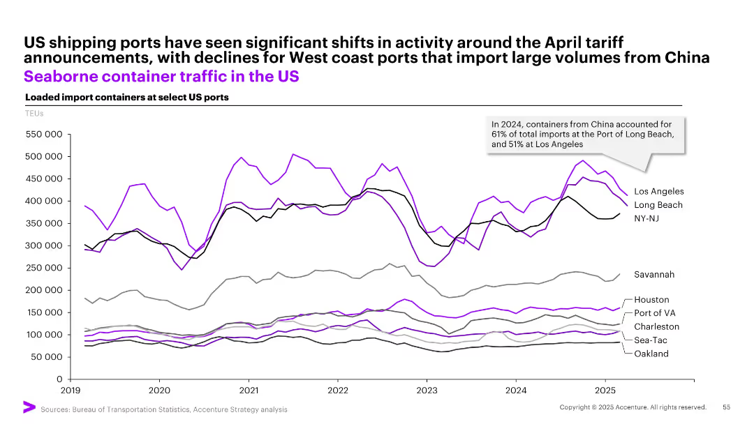
Multiline time-series graph showing TEUs of loaded imports at major US ports, color-coded by port.
Performance Metrics and KPIs
Transportation & Logistics
Depicts changes in import container volumes at key US ports from 2019–2025, noting a decline in West Coast ports due to April tariff shifts. Notes China's dominance in import origin volumes, with Long Beach and LA most affected.
shipping, TEU, tariffs, imports, China, ports, Long Beach, Los Angeles, NY-NJ, container traffic
Single Chart
Accenture
Saved
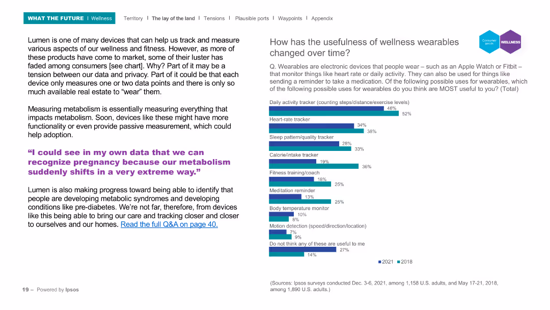
The slide includes a header, a background image, and two main sections: a text block on the left and a column chart on the right. The column chart compares the perceived usefulness of various wellness wearable features from 2018 and 2021, with a focus on features like activity tracking and heart rate monitoring.
Product and Service Analysis
Healthcare & Pharmaceuticals
Discusses the evolution and adoption of wellness wearables, highlighting their increasing functionality and the balance between data privacy and usefulness. The column chart illustrates changes in the perceived usefulness of wellness wearables over time, focusing on features such as activity tracking and heart rate monitoring.
Wellness, wearables, activity tracking, heart rate, survey
Mixed Chart
IPSOS
Saved
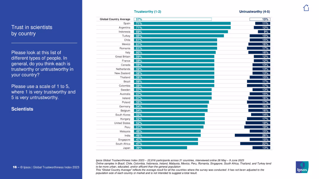
Vertical bar chart ranking countries by % trust in scientists. Similar visual format to previous slide. Countries ordered highest to lowest.
Customer and Market Segmentation
Education & Training
Highlights variation in public trust in scientists by country. Spain and Argentina top the list, while Japan ranks the lowest. The global average trust level is 57%. The chart also displays untrustworthy ratings on the right side.
scientists, trust levels, global survey, Ipsos, country comparison, public perception
Mixed Chart
IPSOS
Saved
This slide includes a text section on the left discussing carbon pricing as a commodity and two column charts on the right. One chart shows trades in CO2 emissions, and the other displays CO2 emissions intensity by region, both with clear color distinctions.
Market Analysis and Trends
Government & Public Sector
It argues for the benefits of treating carbon as a tradable commodity to drive global emissions reduction. The slide presents data on CO2 trades between regions and the carbon intensity of goods production, highlighting how regions can leverage carbon pricing to achieve more significant environmental and economic benefits.
Carbon Pricing, CO2 Emissions, Trades, Commodity, Intensity
Multiple Chart
EY
Saved
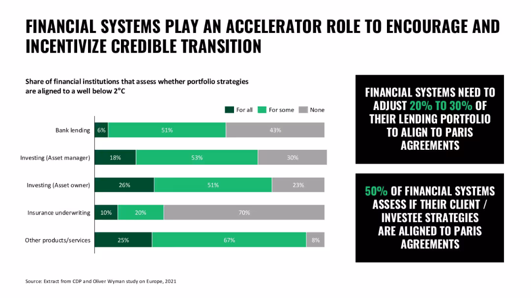
Bar chart with shaded horizontal bars for financial institution categories; callout boxes emphasize portfolio alignment
Technology and Digital Transformation
Financial Services
This slide illustrates the role of financial systems in encouraging climate alignment through lending and investing strategies, with many systems aligning some or all portfolios to 2°C targets.
finance, sustainability, climate transition, lending, investment strategy, portfolio alignment
Mixed Chart
Oliver Wyman
Saved
Multiple line charts showing the excise duty for various alcoholic beverages and cigarettes from 2017/18 to 2024/25.
Regulatory and Compliance
Government & Public Sector
Details changes in tax levies on alcohol and cigarettes, reflecting government regulatory measures.
Government, Public Sector, Alcohol, Cigarettes, Tax, Duty, Excise, Regulatory, Compliance
Single Chart
PwC/Strategy&
Saved
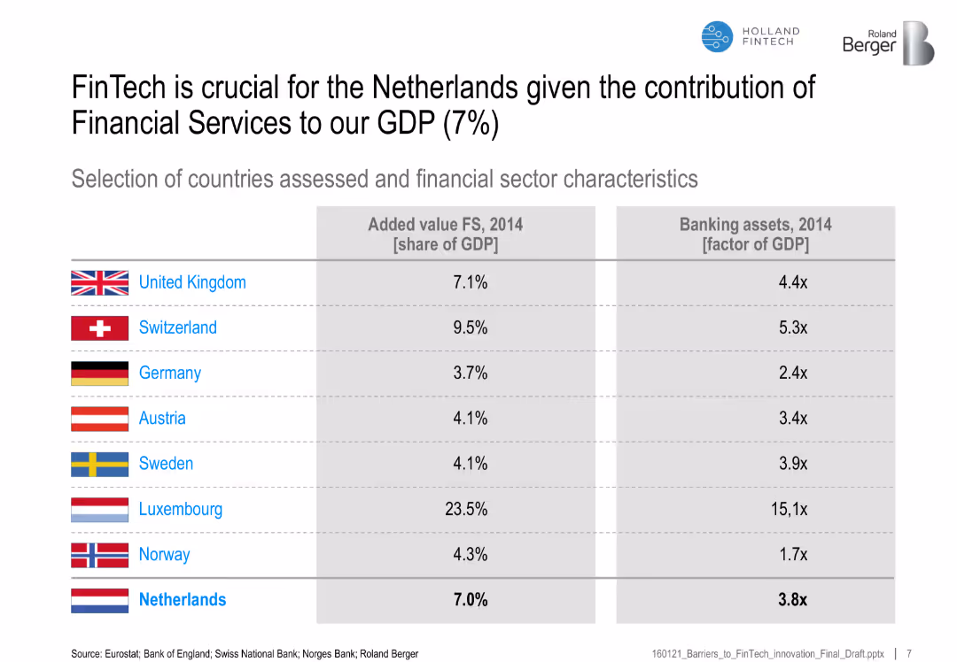
Table comparing countries by financial services' GDP share and banking assets as GDP multiple
Financial Performance
Financial Services
This slide shows the significance of financial services in different countries' GDPs, emphasizing the importance of FinTech for the Netherlands given its 7% GDP share from FS.
FinTech, Netherlands, GDP share, financial services, banking assets, country comparison
Table
Roland Berger
Saved
The slide includes multiple circular charts depicting percentages related to challenges faced by D&A leaders with AI-generated synthetic data and a triangular chart showing barriers among sales leaders.
Risk Assessment and Management
Technology & Software
This slide discusses the challenges of AI adoption for D&A and sales leaders, focusing on data accuracy, integration, and availability of data.
Generative AI, Barriers, D&A Leaders, Data Accuracy, Sales
Multiple Chart
Gartner
Saved
The slide shows a dual-axis line chart tracking accelerator attendance and equity investment over time, with text descriptions on accelerator impacts.
Market Analysis and Trends
Technology & Software
It discusses the role and impact of accelerators in Edinburgh, showing trends in equity investment and accelerator attendance from 2011 to 2020, with a focus on local technology growth.
accelerators, investment, Edinburgh, technology, growth, equity, government role, startup support, local ecosystem, economic development
Mixed Chart
Barclays
Saved
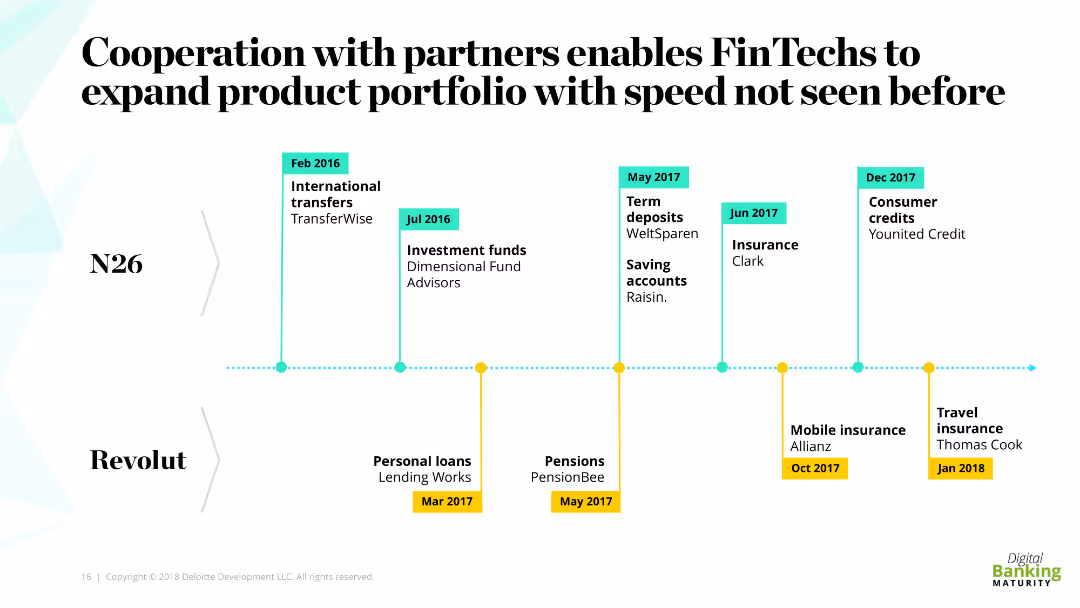
The slide features a timeline detailing the partnership expansions of N26 and Revolut with various services and products. The timeline includes specific months and years along with the names of partner companies and the types of products introduced.
Strategic Planning
Financial Services
This slide illustrates how FinTechs like N26 and Revolut have expanded their product portfolios through partnerships, showcasing the rapid development and launch of various financial products and services over time.
FinTechs, partnerships, product expansion, timeline, speed
Linear Flow
Deloitte
Saved
The slide shows a stacked bar graph comparing the office dependency of various industries. The green shades represent different work models from fully remote to fully office-based.
Market Analysis and Trends
Professional Services
This analysis is critical for understanding industry-specific work patterns, potentially used by managers to benchmark their own company's remote work policies.
Industry Comparison, Office Dependency, Work Patterns, Benchmarking, Remote Work
Single Chart
EY
Saved
Includes column charts showing the adoption rates of different air conditioning technologies, alongside a column chart projecting future energy demands for cooling in Southeast Asia.
Market Analysis and Trends
Energy & Utilities
Discusses the potential for significant carbon abatement in Southeast Asia through the adoption of more efficient cooling technologies in residential AC systems, detailing the current low penetration rates and the high potential for improvement.
cooling, energy efficiency, SEA, carbon abatement
Multiple Chart
Bain
Saved
This slide includes stacked bar charts showing mining production by location and a bar chart displaying agricultural trade balances by region over time.
Market Analysis and Trends
Financial Services
The slide provides a global overview of key resource distribution, including mining production and agricultural trade balances, useful for understanding resource management and economic dependencies.
global resources, mining production, agricultural trade, resource management, economic dependencies, trade balances
Multiple Chart
JP Morgan
Saved
Similar to slide 1844, it presents a central, bold statement with a list of key opportunities and challenges against a monochromatic background, with the second point highlighted.
Strategic Planning
Professional Services
Focuses on the digitization of globalization as a key strategic point. The slide aims to discuss the specific implications and strategic considerations of digitizing global operations.
globalization, digitization, strategy, opportunities
Agenda
McKinsey
Saved
A column chart depicts the increase in global adult education levels from 1990 to projections for 2050, with separate columns for educational stages. The layout is clear with distinct colors for each educational level.
Market Analysis and Trends
Education & Training
This slide tracks the progress in global educational attainment from 1990, showing the growing trend through 2020 and projecting further increases by 2050. It highlights shifts towards higher education levels globally, with clear demographic segmentation.
education, global, trend, projection, levels
Mixed Chart
Roland Berger
Saved
Previous
Next
If nothing, comes up, please save your slides first
Create a FREE account to continue browsing
Receive Instant Access to 1,000+ slides from companies like McKinsey, Google, and Goldman Sachs
First Name
Last Name
Email
Password
I agree to all
Terms & Privacy Policy
Thank you! Your submission has been received!
Oops! Something went wrong while submitting the form.
Have an account?
Sign in
Column Chart
Heatmap
Chevron
Org Chart
Infographic
Callouts
Timeline
List
Graphic
Picture
Process Flow
Diagram
Paragraph
Map
Table
Framework
Subtitle
Takeaway Box
Icon
Other Chart
Radar Chart
Waterfall Chart
Mekko Chart
Pie Chart
Scatter Plot
Line Chart
Bar chart
Bullet points