My Account
My Slides
Search by Category
Companies
Slide Type
Use Case
Industry
Pricing
Templates
View All Templates
Download Template Slides
✦ AI
AI Prompt Library
AI Search
Feedback
Login
Logout
Get Started
Browse all Slides
Browse all Slides
Create a FREE Account
Instant access to 1,000+ real slides from top companies like McKinsey, BCG, Goldman Sachs, Google and many more!
First Name
Last Name
Email
Password
I agree to all
Terms & Privacy Policy
Thank you! Your submission has been received!
Oops! Something went wrong while submitting the form.
Have an account?
Sign in
Saved Slides
Total No. of slides saved
0
↻ Refresh
✖ Clear all
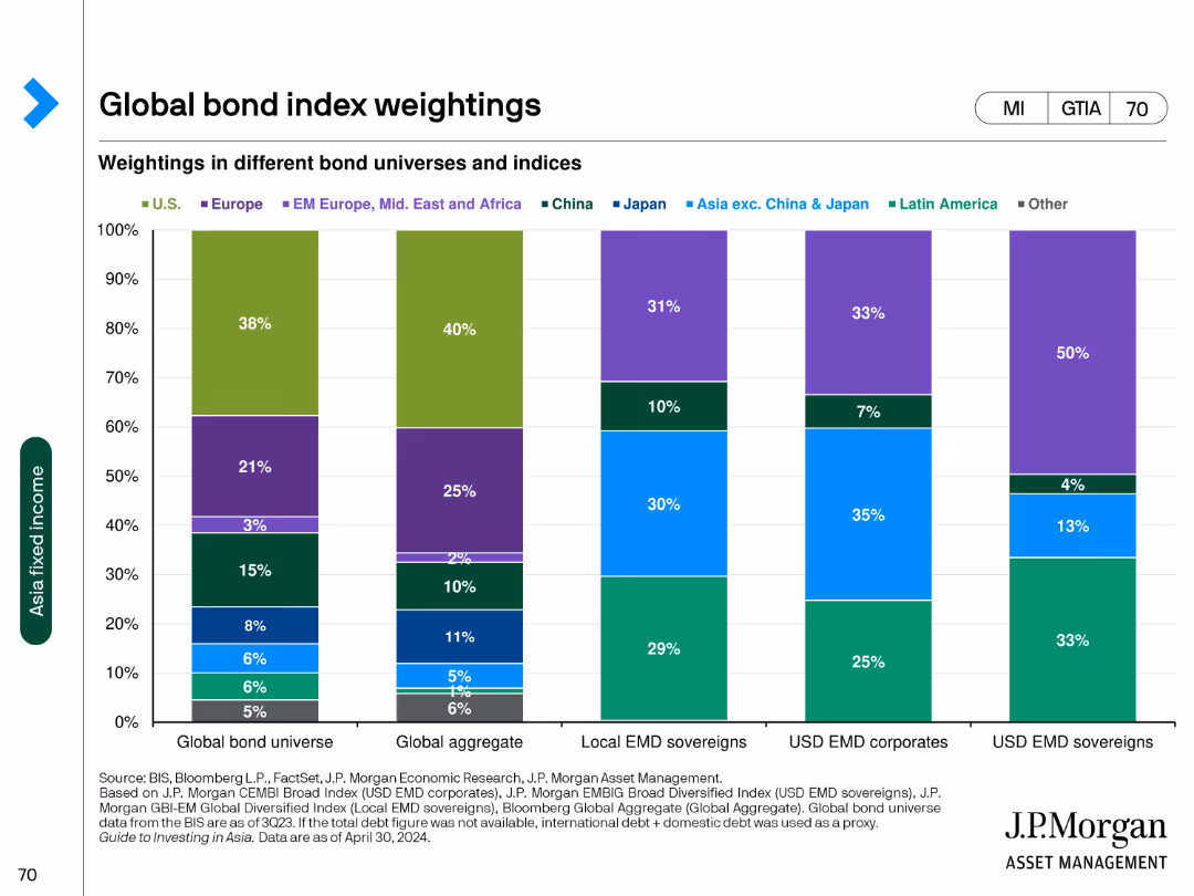
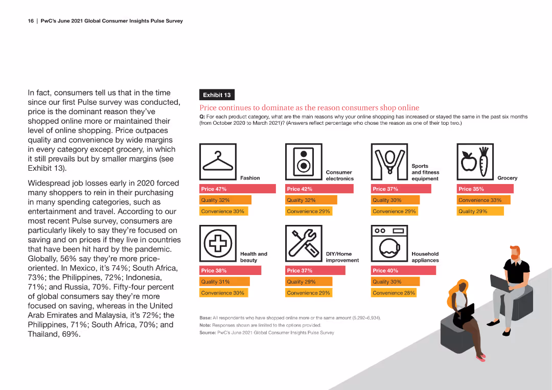
The slide features a column chart displaying the weightings in different bond universes and indices across various regions such as the U.S., Europe, and China.
Market Analysis and Trends
Financial Services
The slide presents the weight distribution in global bond universes, aggregate bonds, local EMD sovereigns, and USD EMD corporates and sovereigns.
bond, weightings, global, indices, regions
false
Market Analysis and Trends
Financial Services
Single Chart
JP Morgan
Add to my slides
Remove from favorites
Column charts comparing 10-year sovereign bond yields for developed and emerging markets, with a clear distinction between current and past data.
Financial Performance
Financial Services
This slide presents a visual comparison of sovereign bond yields across various countries, segmented into developed and emerging markets.
bond yields, developed, emerging, markets, comparison
false
Financial Performance
Financial Services
Multiple Chart
Morgan Stanley
Add to my slides
Remove from favorites
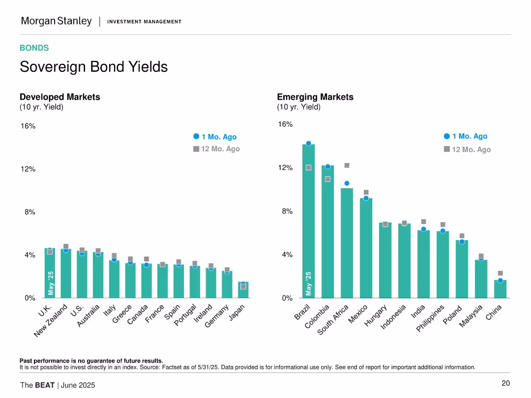
Dual bar charts split between Developed and Emerging Markets with yield comparison from 1 month and 12 months ago.
Market Analysis and Trends
Financial Services
The slide displays 10-year sovereign bond yields across developed and emerging markets, comparing values from 1 month ago and 12 months ago to May 2025.
bond yields, developed markets, emerging markets, interest rates, sovereign debt, fixed income, international, 10-year, comparison, trends
false
Market Analysis and Trends
Financial Services
Multiple Chart
Morgan Stanley
Add to my slides
Remove from favorites
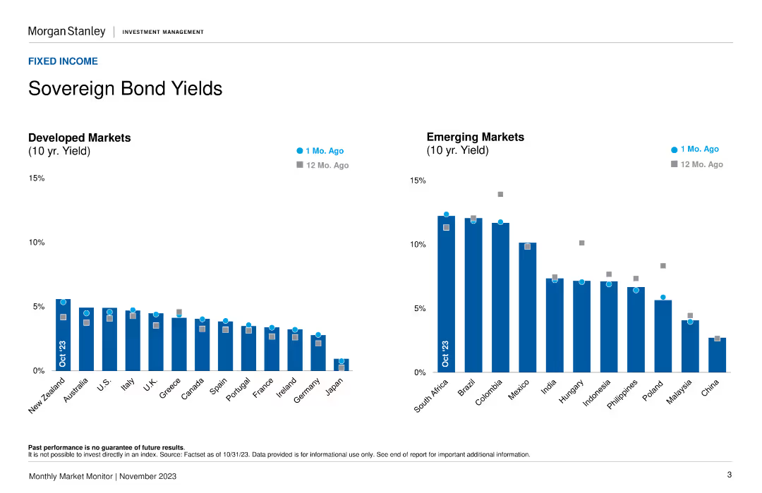
Two column charts showing 10-year bond yields for developed and emerging markets, comparing current rates to rates from 1 month and 12 months ago.
Market Analysis and Trends
Financial Services
Provides 10-year sovereign bond yields for developed and emerging markets, helping analyze trends in bond yields and their implications.
Bond yields, developed markets, trends
false
Market Analysis and Trends
Financial Services
Multiple Chart
Morgan Stanley
Add to my slides
Remove from favorites
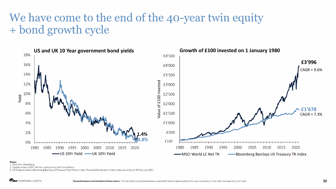
Column chart on the left shows US and UK 10-year government bond yields, line chart on the right shows investment growth.
Market Analysis and Trends
Financial Services
The slide analyzes the end of the 40-year growth cycle in equity and bonds, showing historical yields and investment growth.
bond yields, investment growth, market analysis, equity, bonds, financial cycle
false
Market Analysis and Trends
Financial Services
Multiple Chart
Deloitte
Add to my slides
Remove from favorites
Two column charts comparing 10-year bond yields of developed and emerging markets.
Financial Performance
Financial Services
This slide presents a comparison of sovereign bond yields across developed and emerging markets, showing recent and year-ago yields for context.
Bond Yields, Sovereign Bonds, Developed Markets, Emerging Markets, Financial Performance
false
Financial Performance
Financial Services
Multiple Chart
Morgan Stanley
Add to my slides
Remove from favorites
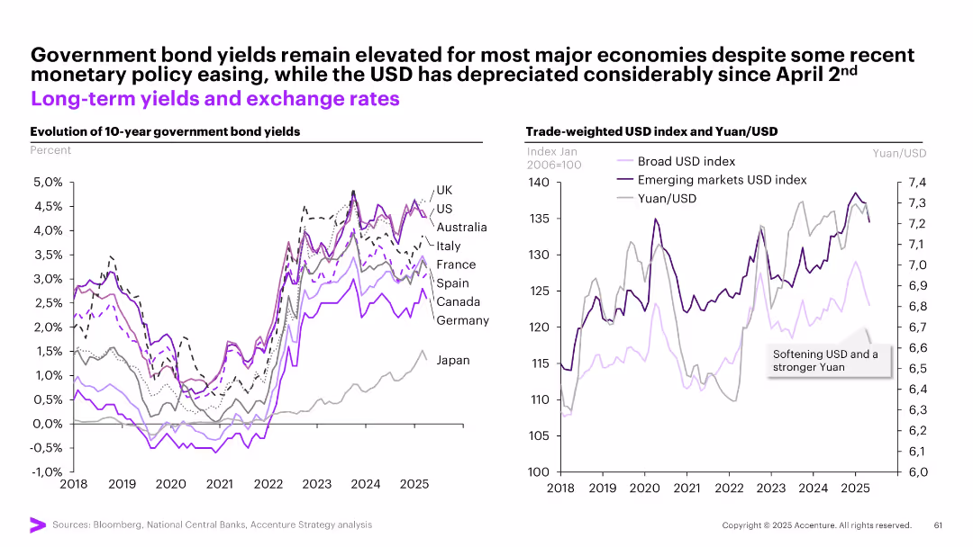
Two graphs: one for 10-year bond yields across countries, another for trade-weighted USD and Yuan/USD.
Investment Analysis
Financial Services
Examines bond yields and currency movements post-policy easing. Yields remain high despite easing, while the USD has weakened notably since April 2. A stronger Yuan and emerging markets USD index are emphasized.
bond yields, USD, Yuan, exchange rates, inflation, interest rates, investment, sovereign debt, currency trends
false
Investment Analysis
Financial Services
Multiple Chart
Accenture
Add to my slides
Remove from favorites
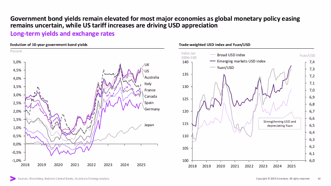
Two charts: government bond yields (left), USD and Yuan index (right); consistent color-coding and annotations.
Investment Analysis
Financial Services
This slide reviews long-term bond yield trends and USD exchange rates, noting elevated yields and a strengthening dollar driven by monetary policy and tariffs. Japan’s divergence is also shown.
Bond yields, USD, Yuan, interest rates, inflation, tariffs, global economy
false
Investment Analysis
Financial Services
Multiple Chart
Accenture
Add to my slides
Remove from favorites
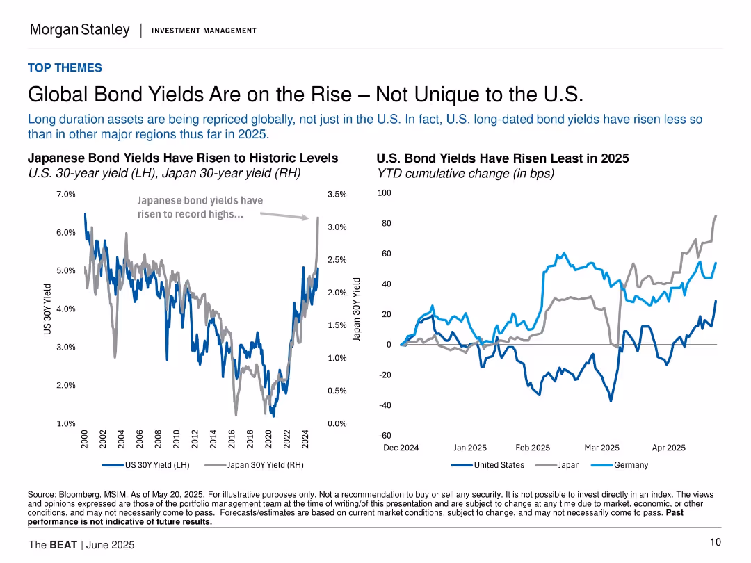
Two line charts comparing Japanese and U.S. bond yields; minimalist layout with dual-axis and legend.
Market Analysis and Trends
Financial Services
This slide analyzes global long-duration bond repricing, emphasizing that U.S. yields have risen less than in Japan or Germany. Charts show rising yields and cumulative changes across regions in 2025.
bond yields, U.S., Japan, Germany, interest rates, global market, long-term bonds, 2025, Morgan Stanley, inflation
false
Market Analysis and Trends
Financial Services
Multiple Chart
Morgan Stanley
Add to my slides
Remove from favorites
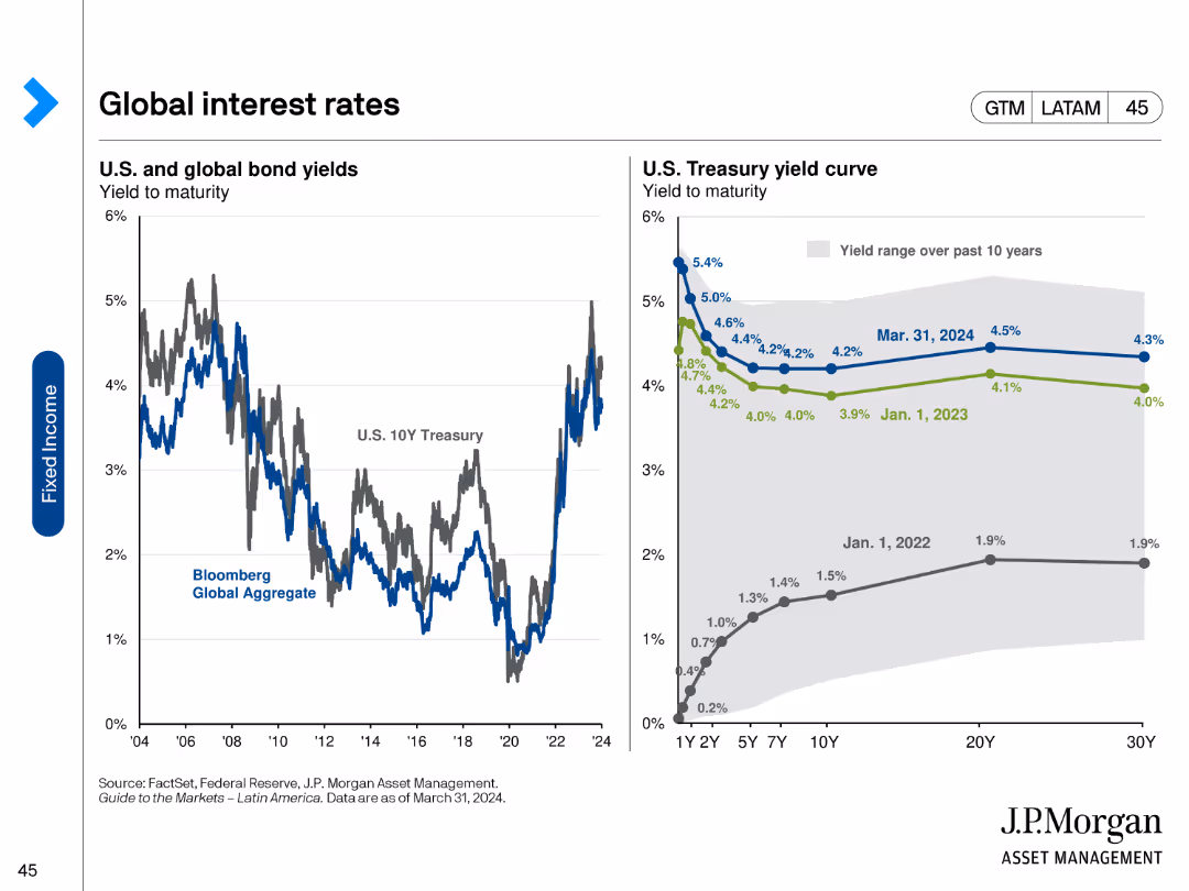
The slide includes two line charts: one showing U.S. and global bond yields over time, and the other displaying the U.S. Treasury yield curve at different points in time. The charts use distinct colors for different time periods and bond types.
Market Analysis and Trends
Financial Services
It compares the yield to maturity for U.S. and global bonds and shows changes in the U.S. Treasury yield curve over the past few years. This helps analyze trends in interest rates and predict future movements.
Bond yields, yield curve, U.S. Treasury, interest rates, global bonds
false
Market Analysis and Trends
Financial Services
Multiple Chart
JP Morgan
Add to my slides
Remove from favorites
The slide includes a table and text discussing environmental health and safety metrics such as EMR, TRIR, DART, and severity rates, alongside a descriptive analysis.
Regulatory and Compliance
Environmental Services & Sustainability
This slide outlines Booz Allen's environmental health and safety (EHS) program, detailing metrics like EMR, TRIR, DART, and severity rates to highlight workplace safety improvements.
Booz Allen, EHS, safety metrics, EMR, TRIR, DART
false
Regulatory and Compliance
Environmental Services & Sustainability
Mixed Chart
Booz Allen Hamilton
Add to my slides
Remove from favorites
The slide includes several column charts displaying employee demographics by headcount, gender, age distribution, race, ethnicity, and other diversity metrics.
Human Resources and Talent Management
Professional Services
This slide provides a snapshot of Booz Allen's employee demographics, highlighting diversity in headcount, gender, age distribution, race, ethnicity, and other inclusion metrics for 2023.
Booz Allen, employee demographics, diversity, inclusion, 2023
false
Human Resources and Talent Management
Professional Services
Multiple Chart
Booz Allen Hamilton
Add to my slides
Remove from favorites
The slide features a circular diagram representing Booz Allen's ESG governance structure, including roles of the Board of Directors, ESG Committee, ESG Council, and ESG Team.
Regulatory and Compliance
Professional Services
This slide explains Booz Allen's ESG governance, detailing the roles and responsibilities of the Board of Directors, ESG Committee, ESG Council, and ESG Team in managing ESG topics.
Booz Allen, ESG governance, ESG Committee, Board of Directors, compliance
false
Regulatory and Compliance
Professional Services
Diagram
Booz Allen Hamilton
Add to my slides
Remove from favorites
The slide presents a detailed text description of Booz Allen's ESG strategy, highlighting internal and external drivers, impact pillars, and goals, with a focus on sustainability.
Strategic Planning
Professional Services
This slide describes Booz Allen's environmental, social, and governance (ESG) strategy, emphasizing their goals, internal and external drivers, and impact pillars for sustainable growth.
Booz Allen, ESG strategy, sustainability, impact pillars, internal drivers
false
Strategic Planning
Professional Services
Pillar
Booz Allen Hamilton
Add to my slides
Remove from favorites
The slide features a column chart showing FY23 greenhouse gas emissions by category and a text description of the company's efforts to reduce carbon footprint and enhance sustainability.
Regulatory and Compliance
Environmental Services & Sustainability
This slide presents data on Booz Allen's FY23 greenhouse gas emissions, categorized by scope, and discusses initiatives to reduce the company's carbon footprint and enhance sustainability.
Booz Allen, greenhouse gas emissions, sustainability, FY23, carbon footprint
false
Regulatory and Compliance
Environmental Services & Sustainability
Multiple Chart
Booz Allen Hamilton
Add to my slides
Remove from favorites
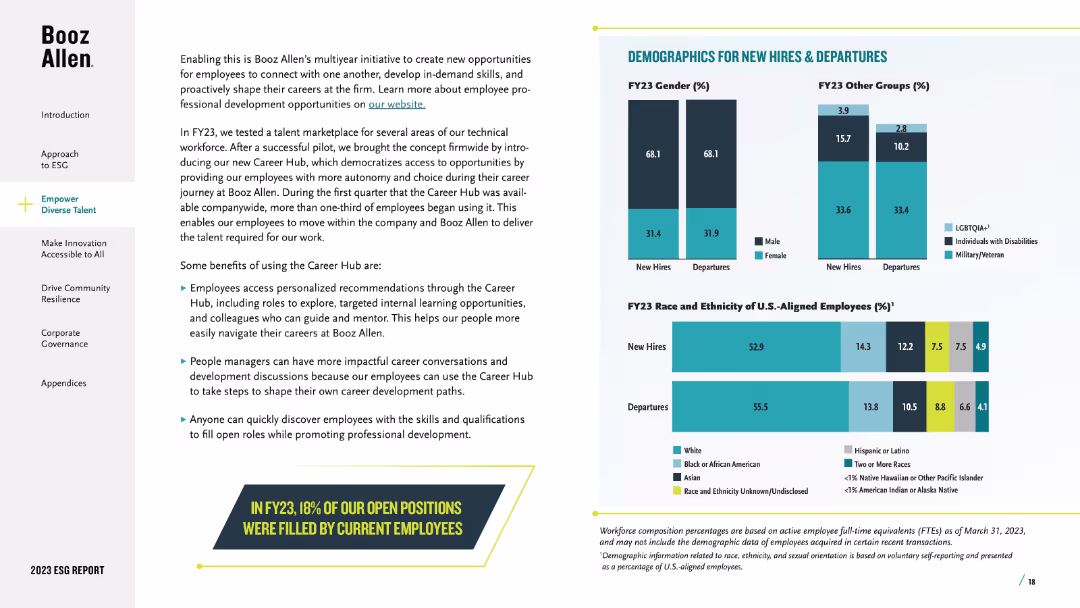
The slide showcases column charts comparing the demographics of new hires and departures by gender, race, ethnicity, and other diversity categories for fiscal year 2023.
Human Resources and Talent Management
Professional Services
This slide analyzes the demographics of new hires and departures at Booz Allen in FY23, focusing on diversity in gender, race, and ethnicity to assess hiring and retention trends.
Booz Allen, new hires, departures, demographics, diversity
false
Human Resources and Talent Management
Professional Services
Multiple Chart
Booz Allen Hamilton
Add to my slides
Remove from favorites
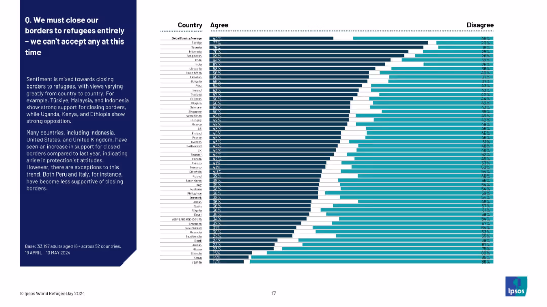
Full-width horizontal bar chart with country-wise breakdown from highest to lowest agreement
Market Analysis and Trends
Government & Public Sector
This slide presents a ranked list of countries based on public agreement with fully closing borders to refugees. Türkiye, Malaysia, and Indonesia show strong agreement, while Uganda, Kenya, and Ethiopia show the least. It reflects global protectionist sentiment shifts.
border policy, protectionism, refugee sentiment, Ipsos, country comparison, closure support, migration, attitudes
false
Market Analysis and Trends
Government & Public Sector
Mixed Chart
IPSOS
Add to my slides
Remove from favorites
Two pie charts: one showing the percentage of people who borrowed money to buy investments, and another showing if they did so based on advisor recommendations.
Financial Performance
Financial Services
Highlights the percentage of investors who borrowed money to buy investments before or during the pandemic, and the influence of financial advisors on this decision.
borrowed money, investments, advisor, pandemic
false
Financial Performance
Financial Services
Multiple Chart
IPSOS
Add to my slides
Remove from favorites
The slide includes a line graph showing the average five-year fixed contract mortgage rate trends.
Market Analysis and Trends
Real Estate & Construction
It explains how lower borrowing costs have made housing more affordable, showing the decline in mortgage rates.
Borrowing costs, affordability, mortgage rates, housing, decline, trends, line graph, financial impact, analysis
false
Market Analysis and Trends
Real Estate & Construction
Single Chart
IPSOS
Add to my slides
Remove from favorites
Line chart showing the trend of key interest rates (overnight lending rate and five-year government bond yield) from January 2009 to a forecast in July 2021.
Market Analysis and Trends
Real Estate & Construction
This slide forecasts the continuation of low borrowing costs into 2021, based on trends in key interest rates.
borrowing costs, interest rates, forecast, 2021, trends, overnight lending rate, government bond yield
false
Market Analysis and Trends
Real Estate & Construction
Single Chart
IPSOS
Add to my slides
Remove from favorites
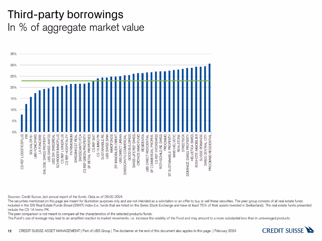
This slide contains a column chart showing the percentage of third-party borrowings in the aggregate market value for various entities.
Financial Performance
Financial Services
It presents the level of third-party borrowings as a percentage of the aggregate market value, useful for assessing financial leverage and risk among entities.
borrowings, aggregate market value, financial leverage, third-party, entities
false
Financial Performance
Financial Services
Single Chart
Credit Suisse
Add to my slides
Remove from favorites
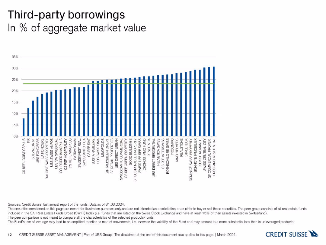
The slide shows a column chart representing the percentage of third-party borrowings relative to the aggregate market value for various Swiss Real Estate funds, with bars in blue.
Financial Performance
Real Estate & Construction
This slide illustrates the extent of third-party borrowings across different Swiss Real Estate funds, offering insights into leverage levels and financial risk.
borrowings, third-party, leverage, market value, real estate
false
Financial Performance
Real Estate & Construction
Single Chart
Credit Suisse
Add to my slides
Remove from favorites
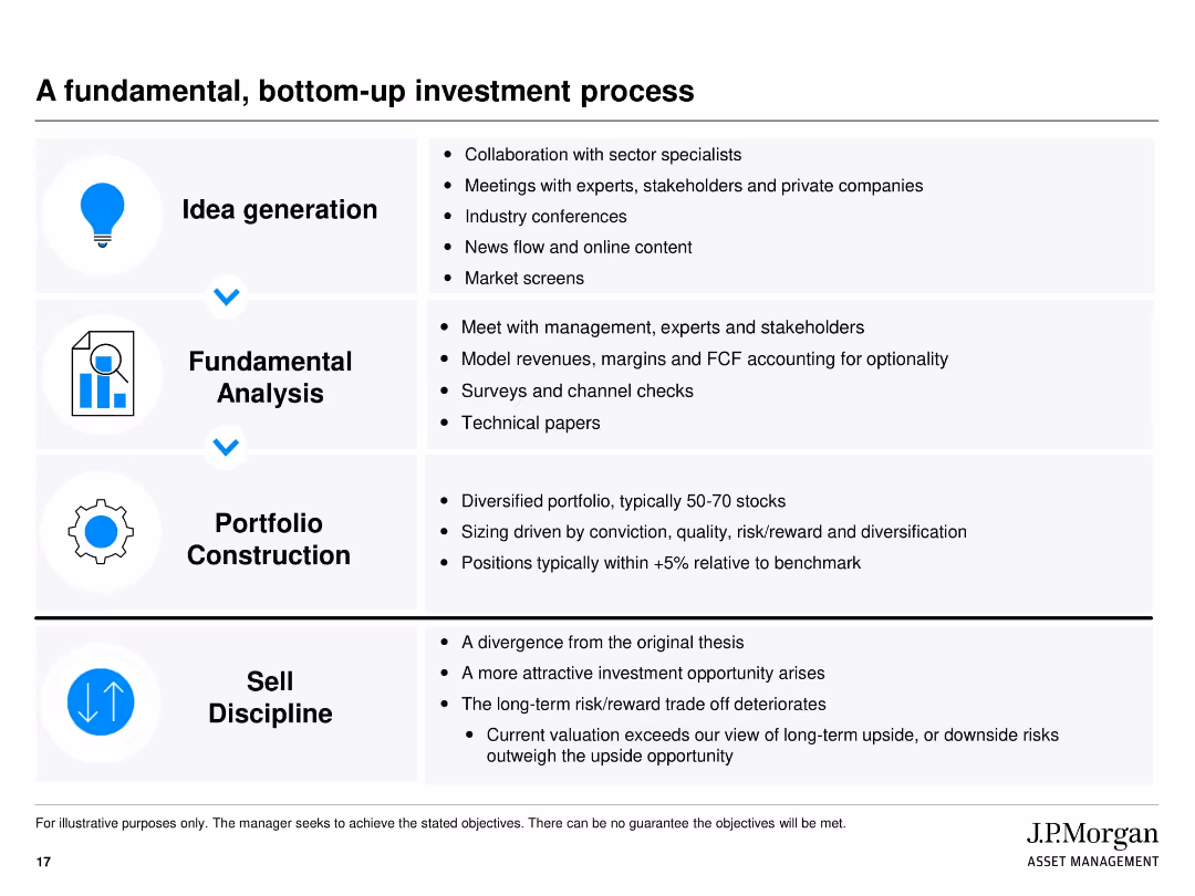
Four-section vertical layout with icons on the left and bullet text on the right. Each stage of the process is boxed and separated with visual lines. Clean white background with black text and blue highlight elements.
Investment Analysis
Financial Services
This slide explains J.P. Morgan’s structured approach to investment using a bottom-up method. It outlines four key stages: idea generation, fundamental analysis, portfolio construction, and sell discipline. Each stage lists specific tasks or considerations. The aim is to show the rigor behind identifying and managing investment opportunities.
bottom-up, investment process, fundamental analysis, portfolio construction, sell discipline, J.P. Morgan, idea generation, valuation, diversification
false
Investment Analysis
Financial Services
Vertical Flow
JP Morgan
Add to my slides
Remove from favorites
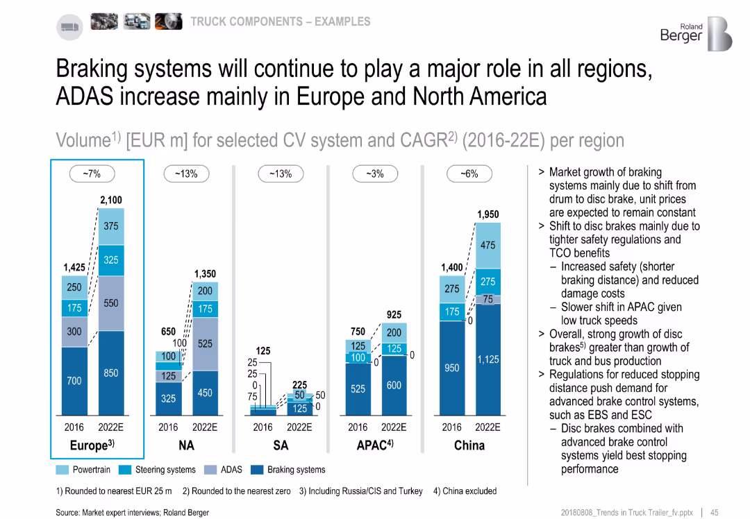
Stacked bar charts of CV system market volume by region (2016 vs. 2022E); text highlights drivers of brake market
Market Analysis and Trends
Industrial & Manufacturing
The slide emphasizes braking systems as the largest contributor across all regions. Europe and NA show major ADAS growth. The market shift from drum to disc brakes, due to regulations and safety, drives the increased demand. APAC shows the slowest transition.
braking, ADAS, disc brakes, market volume, regional trends, safety, 2022 forecast
false
Market Analysis and Trends
Industrial & Manufacturing
Multiple Chart
Roland Berger
Add to my slides
Remove from favorites
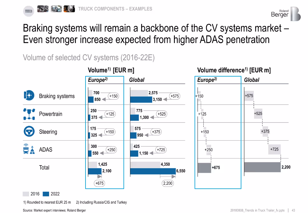
Bar charts and side-by-side comparisons of value volume (EUR m) for CV components in 2016 vs. 2022
Strategic Planning
Industrial & Manufacturing
This slide emphasizes the growing value of CV components in Europe and globally from 2016 to 2022. Braking systems lead in absolute growth, followed by ADAS and powertrain. The right panel shows the difference in value growth per component. Total growth reaches €2.2 billion globally.
braking systems, ADAS, powertrain, steering, value growth, CV systems, 2022
false
Strategic Planning
Industrial & Manufacturing
Multiple Chart
Roland Berger
Add to my slides
Remove from favorites
This slide contains two column charts showing the growth of branch count and deposits per branch from 2017 to 2022, with comparative data points.
Operational Efficiency
Financial Services
Highlights the growth strategy of the branch network with data on branch counts and deposit per branch, indicating operational expansion and optimization.
branch growth, deposits, network optimization, banking, financial services, CAGR, market expansion, operational efficiency, Chase
false
Operational Efficiency
Financial Services
Multiple Chart
JP Morgan
Add to my slides
Remove from favorites
Data visualizations include a pie chart and column charts with consistent color palette and icons.
Operational Efficiency
Financial Services
Data on customer acquisition channels, balance distribution, and banker productivity to showcase branch network importance.
Branch Network, Digital Engagement, Customer Service, Banker Productivity, Data Visualization, Strategic Asset
false
Operational Efficiency
Financial Services
Multiple Chart
JP Morgan
Add to my slides
Remove from favorites
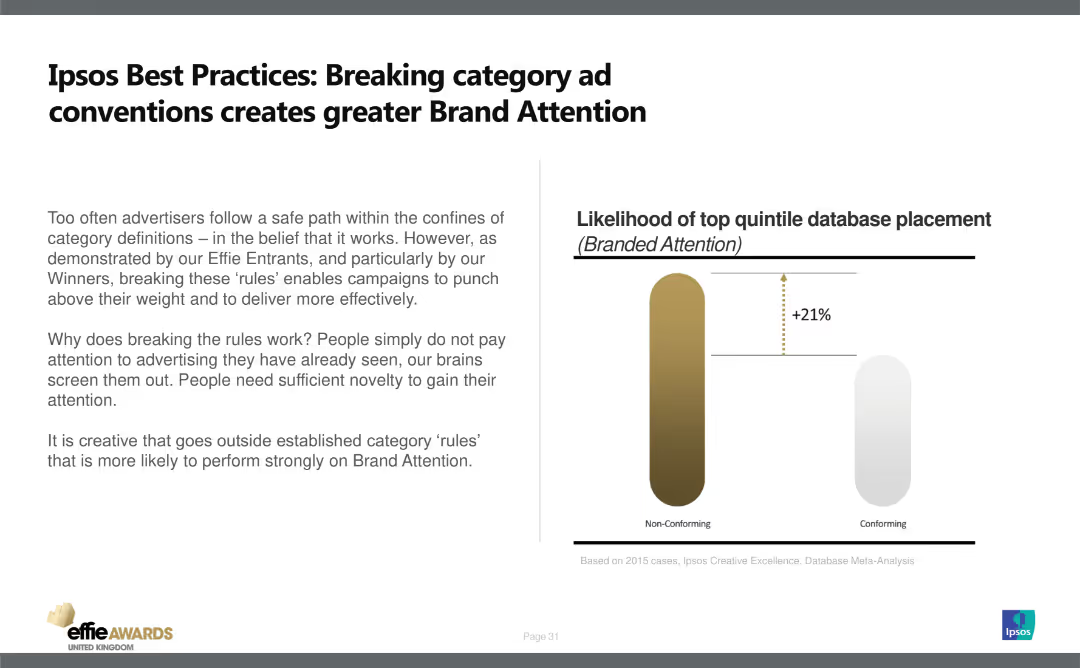
The slide has a title at the top, text on the left, and a column chart on the right. It features a simple design with minimal visual elements.
Strategic Planning
Media & Entertainment
Explains the importance of breaking category conventions in advertising to enhance brand attention. Uses data to show non-conforming ads have 21% higher likelihood of top quintile database placement.
Brand Attention, Advertising, Strategy, Conventions, Effectiveness
false
Strategic Planning
Media & Entertainment
Mixed Chart
IPSOS
Add to my slides
Remove from favorites
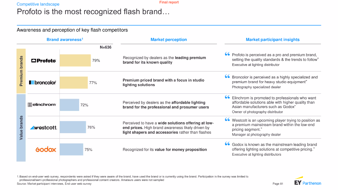
A combination of a bar chart and text boxes presents brand awareness data for key flash competitors, along with market perception and participant insights.
Pricing Strategies
Media & Entertainment
It showcases the brand awareness levels of key flash brands like Profoto, Broncolor, Elinchrom, Westcott, and Godox, with market perception and insights.
Brand awareness, flash brands, Profoto, market perception, participant insights, media, entertainment, analysis, trends
false
Pricing Strategies
Media & Entertainment
Mixed Chart
EY
Add to my slides
Remove from favorites
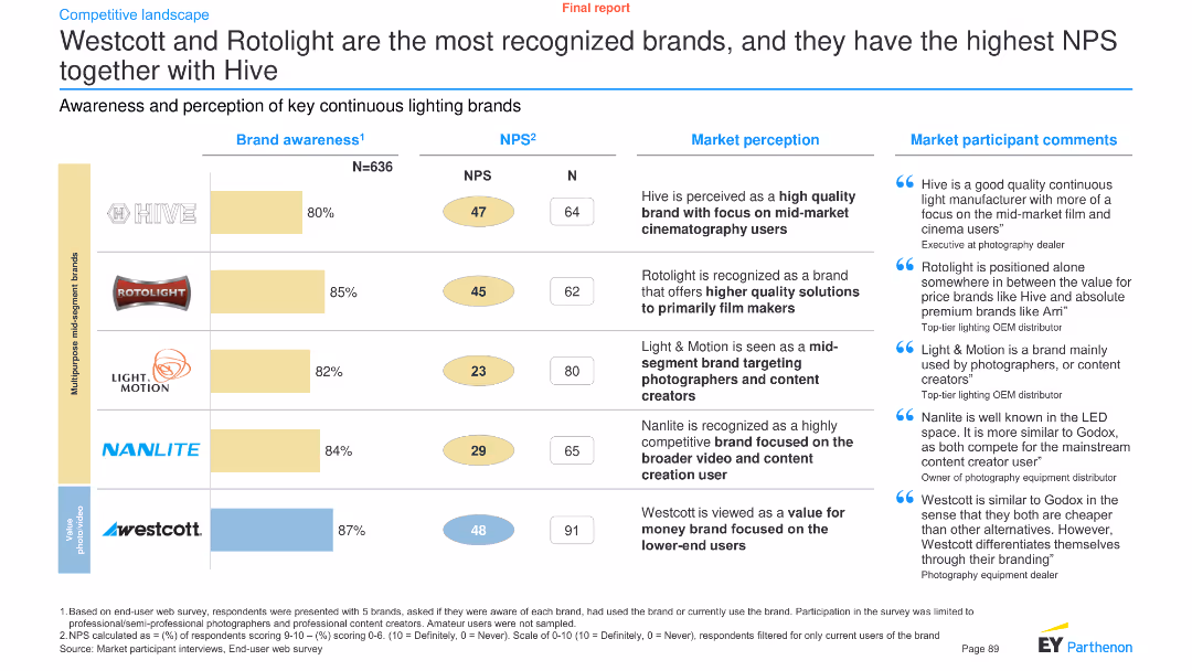
The slide presents brand awareness and NPS (Net Promoter Score) data for continuous lighting brands, using a combination of bar charts and text.
Customer and Market Segmentation
Consumer Goods
It evaluates the awareness and perception of continuous lighting brands like Hive, Rotolight, Light & Motion, Nanlite, and Westcott, along with participant comments.
Brand awareness, NPS, continuous lighting, Westcott, Rotolight, Hive, perception, consumer goods, market segmentation, analysis
false
Customer and Market Segmentation
Consumer Goods
Mixed Chart
EY
Add to my slides
Remove from favorites
Text and iconography highlighting top reasons for brand switching by region.
Customer and Market Segmentation
Retail & E-commerce
Details why Southeast Asian consumers switch brands, focusing on value and product quality.
brand choice, consumer insights, value, product quality, retail
false
Customer and Market Segmentation
Retail & E-commerce
Boxed
Bain
Add to my slides
Remove from favorites
Bar chart comparing factors influencing the choice of vehicle brand, differentiated by engine type (EV vs ICE). Multiple data points in a clean, professional layout.
Market Analysis and Trends
Transportation & Logistics
This slide examines the factors driving brand choice for new vehicles, with significant differences between EV and ICE buyers. It highlights the importance of price and product quality.
Brand choice, consumer preferences, EV vs ICE, market analysis, purchasing factors
false
Market Analysis and Trends
Transportation & Logistics
Single Chart
Deloitte
Add to my slides
Remove from favorites
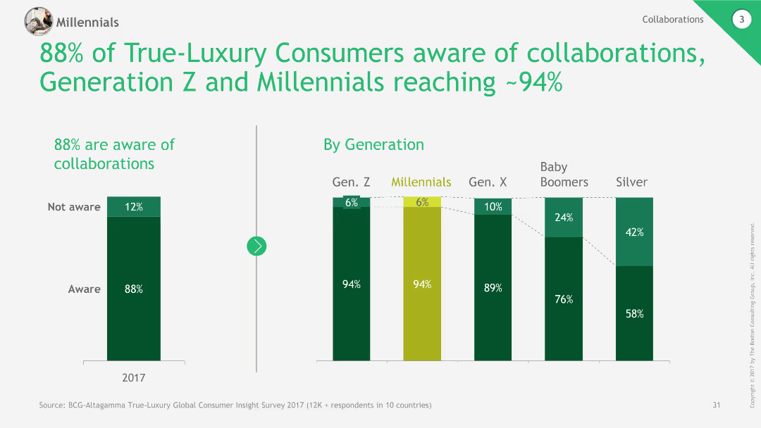
The slide contains column charts showing awareness of collaborations among different generations and overall awareness percentages.
Market Analysis and Trends
Retail & E-commerce
The slide highlights high awareness of brand collaborations among luxury consumers, particularly in Generation Z and Millennials.
Brand collaborations, Awareness, Luxury consumers, Generations, Market trends
false
Market Analysis and Trends
Retail & E-commerce
Multiple Chart
BCG
Add to my slides
Remove from favorites
The slide presents column charts comparing brand consideration (premium vs. volume) in vehicle purchases before and during COVID-19 across multiple countries (US, UK, Germany, France, Italy, China, Japan).
Market Analysis and Trends
Transportation & Logistics
Details shifts in consumer brand consideration for vehicles during the pandemic, highlighting how preferences have changed over time and across different regions.
brand consideration, vehicle purchases, COVID-19, column chart, international
false
Market Analysis and Trends
Transportation & Logistics
Multiple Chart
McKinsey
Add to my slides
Remove from favorites
Column charts comparing growth in brand building and CRM spending over several time points.
Strategic Planning
Professional Services
Discusses the trends in brand and CRM spending, noting a return to pre-Covid spending levels with a focus on brand investment over CRM. Useful for marketing strategy adjustments and budget allocation.
brand, CRM, spending, covid, trends, marketing, strategy, budget
false
Strategic Planning
Professional Services
Single Chart
Deloitte
Add to my slides
Remove from favorites
Column chart showing the percentage of respondents from various countries who are willing to spend more on a brand with a favorable image, highlighting regional trends.
Customer and Market Segmentation
Media & Entertainment
Displays the significance of brand image in purchasing decisions across different regions, with the highest value placed in Asia, the Middle East, and Africa, compared to other regions.
brand image, Asia, Middle East, Africa, survey
false
Customer and Market Segmentation
Media & Entertainment
Multiple Chart
IPSOS
Add to my slides
Remove from favorites
Column chart comparing the value placed on brand image across different countries over the years, showing the trend of increasing importance of brand image.
Market Analysis and Trends
Media & Entertainment
Examines the increasing importance of brand image in various countries over time, highlighting trends in France, India, Australia, and Argentina from 2013 to 2022.
brand image, global, trend, survey, importance
false
Market Analysis and Trends
Media & Entertainment
Multiple Chart
IPSOS
Add to my slides
Remove from favorites
Column chart comparing agreement levels on the importance of brand image among different income and education levels, with color-coded segments for agreement and disagreement.
Customer and Market Segmentation
Media & Entertainment
Investigates the correlation between income/education levels and the perceived importance of brand image, showing higher importance among higher income and education groups.
brand image, income, education, survey, importance
false
Customer and Market Segmentation
Media & Entertainment
Mixed Chart
IPSOS
Add to my slides
Remove from favorites
Column chart showing the increasing percentage of brands willing to engage with politically charged issues from February 2020 to September 2022. Insights discuss sector-specific willingness.
Customer and Market Segmentation
Professional Services
Highlights the growing trend of brands taking public stances on political issues, with data spanning over two years. It discusses sector-specific differences in brand engagement with political matters.
Branding, Politics, Engagement, Bar Chart, Trend Analysis, 2020-2022, Public Stance
false
Customer and Market Segmentation
Professional Services
Mixed Chart
Deloitte
Add to my slides
Remove from favorites
Features images of VR, cars, and lifestyle, representing different aspects of a luxury brand's in-store experience tailored to customer interests.
Customer and Market Segmentation
Retail & E-commerce
Describes how luxury retail stores are transforming into epicenters of brand story-living, enhancing customer experience through personalized brand interactions.
Branding, Retail, Customer Experience
false
Customer and Market Segmentation
Retail & E-commerce
Framework
Bain
Add to my slides
Remove from favorites
A bar chart showing reasons for switching vehicle brands, using varying shades of teal. The chart includes percentages and is straightforward in layout.
Market Analysis and Trends
Transportation & Logistics
This slide presents reasons why consumers consider switching vehicle brands, with the desire for something different being the most dominant factor. Useful for analyzing brand loyalty and consumer behavior in the automotive sector.
Brand loyalty, consumer behavior, market analysis, vehicle brands, switching reasons
false
Market Analysis and Trends
Transportation & Logistics
Single Chart
Deloitte
Add to my slides
Remove from favorites
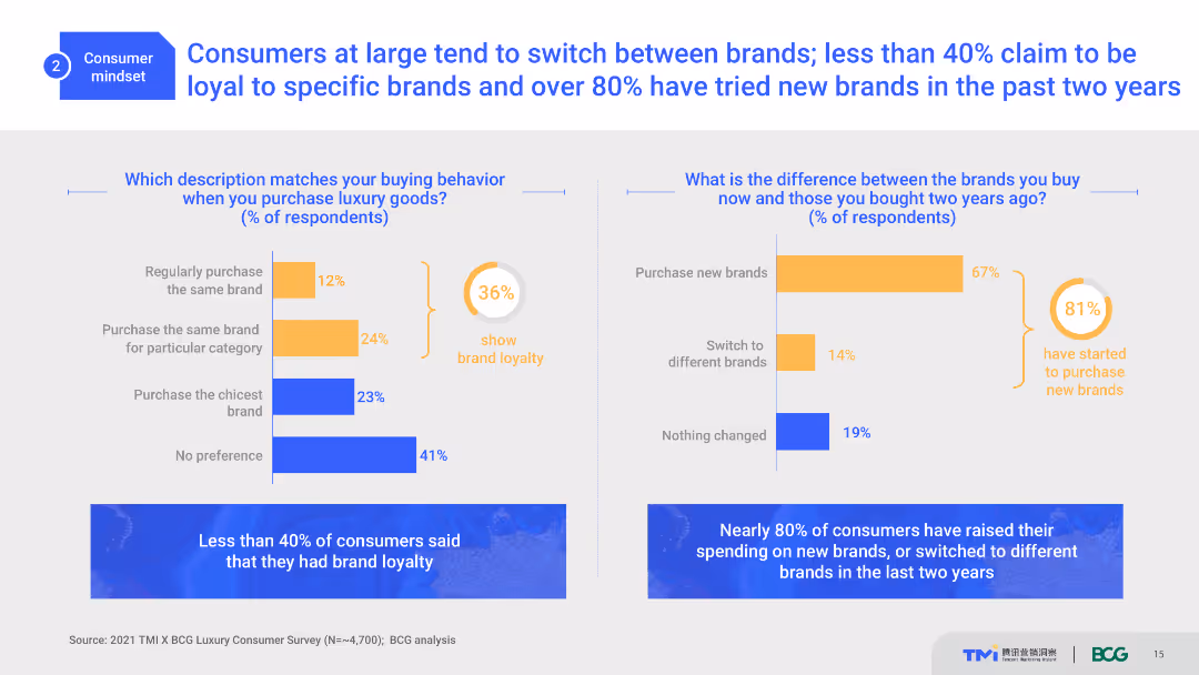
The slide contains two column charts comparing consumer buying behavior and brand loyalty. It includes percentage figures and color-coded bars. The layout is moderate with a clear separation between the two charts and descriptive text below.
Market Analysis and Trends
Consumer Goods
This slide analyzes consumer brand loyalty and purchasing behavior in the luxury goods market. It shows the percentage of consumers who purchase the same brand versus those who switch brands, providing insights into market trends.
brand loyalty, consumer behavior, trends, luxury goods, purchasing patterns
false
Market Analysis and Trends
Consumer Goods
Multiple Chart
BCG
Add to my slides
Remove from favorites
A horizontal bar chart showing the factors influencing brand loyalty among consumers, such as reliability, product availability, customer service, and ethical practices, with the percentage of respondents for each factor.
Market Analysis and Trends
Consumer Goods
The slide highlights the main drivers of brand loyalty, including reliability, product availability, and ethical practices, according to survey respondents. It provides insights into what factors keep customers loyal to a brand.
brand loyalty, consumer factors, reliability, ethical practices, product availability
false
Market Analysis and Trends
Consumer Goods
Multiple Chart
PwC/Strategy&
Add to my slides
Remove from favorites
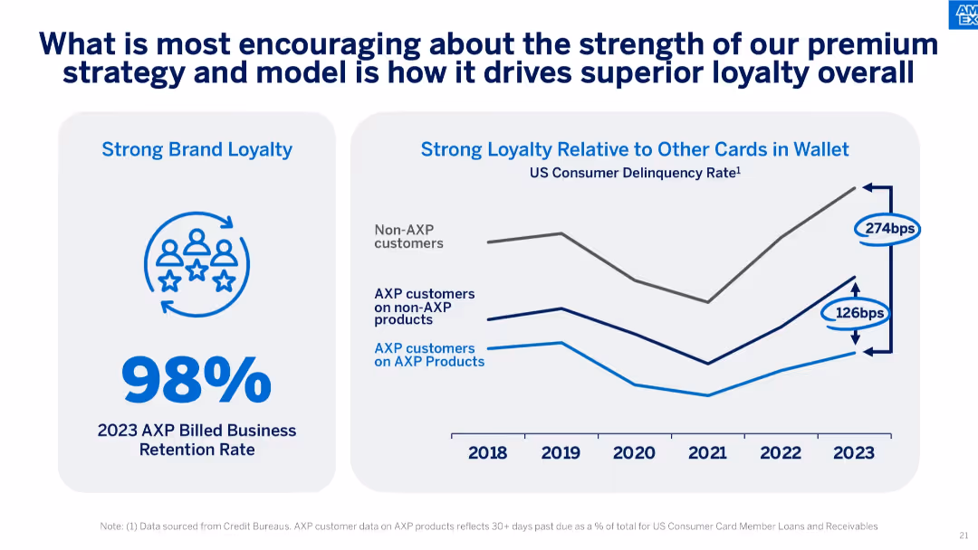
Split layout with retention rate on the left and delinquency rate trends by customer group on the right.
Customer and Market Segmentation
Financial Services
Illustrates brand loyalty through a 98% retention rate and lower delinquency rates for AXP product users compared to others, underscoring customer engagement strength.
brand loyalty, customer retention, delinquency, AXP customers, credit performance, consumer segmentation
false
Customer and Market Segmentation
Financial Services
Mixed Chart
McKinsey
Add to my slides
Remove from favorites
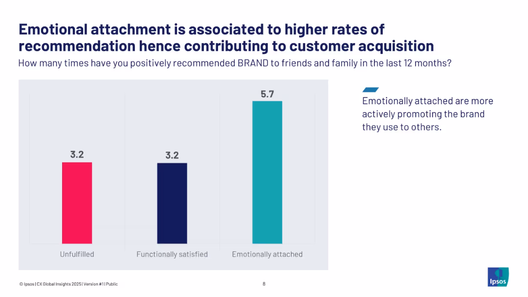
Vertical bar chart comparing unfulfilled, functionally satisfied, and emotionally attached brand recommend rates.
Customer and Market Segmentation
Consumer Goods
The slide illustrates how emotional brand attachment drives more positive customer recommendations, with emotionally attached customers recommending 5.7 times vs. 3.2 for others. This emotional engagement enhances acquisition through advocacy.
brand loyalty, emotional attachment, customer acquisition, advocacy
false
Customer and Market Segmentation
Consumer Goods
Single Chart
IPSOS
Add to my slides
Remove from favorites
Includes column charts showing cancellation rates by engine and brand preference during COVID-19.
Market Analysis and Trends
Transportation & Logistics
Analyzes consumer loyalty to car brands and engine types during the pandemic, with a focus on premium brands.
brand loyalty, engine types, purchase intent, market stability
false
Market Analysis and Trends
Transportation & Logistics
Multiple Chart
McKinsey
Add to my slides
Remove from favorites
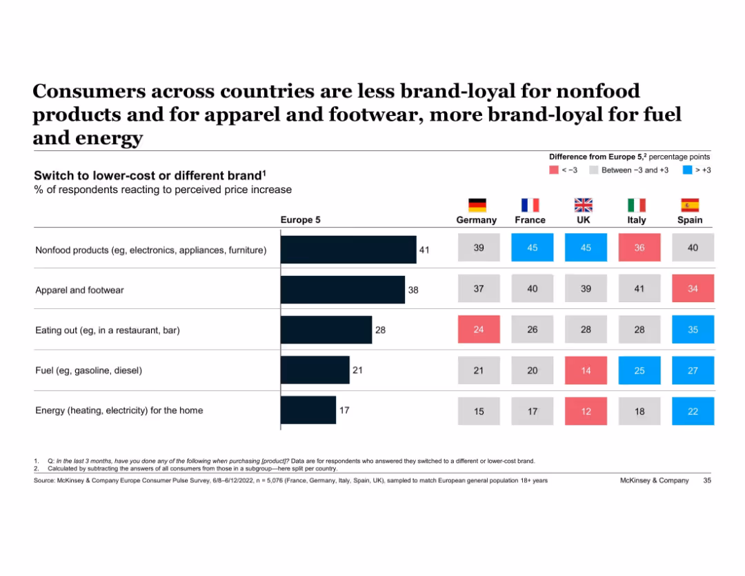
Horizontal bar chart with country-level comparison tables and color-coded difference indicators
Customer and Market Segmentation
Consumer Goods
Compares brand loyalty across five European countries by product category, showing who is more or less likely to switch brands due to price hikes. Differences from average are color-coded.
brand loyalty, price sensitivity, nonfood, energy, apparel, Europe, McKinsey, country comparison, switch behavior
false
Customer and Market Segmentation
Consumer Goods
Multiple Chart
McKinsey
Add to my slides
Remove from favorites
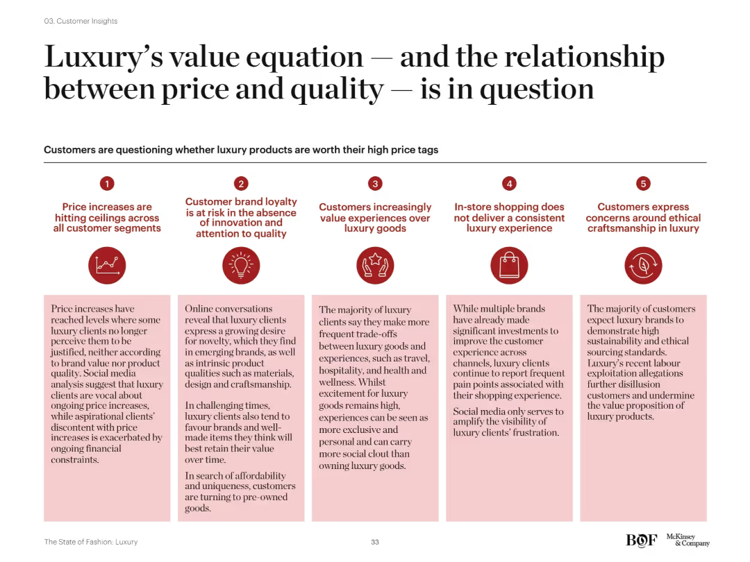
Five-column visual layout with icons and headers summarizing core customer concerns. Red color theme with brief supporting text under each icon. Visually structured for digestibility.
Customer and Market Segmentation
Consumer Goods
The slide outlines five key concerns luxury customers have about the price-quality relationship. Topics include brand loyalty, price justification, experience over product, in-store consistency, and ethical concerns, reflecting shifting consumer expectations.
brand loyalty, value perception, ethical concerns, luxury pricing, customer experience, quality, innovation
false
Customer and Market Segmentation
Consumer Goods
Pillar
McKinsey
Add to my slides
Remove from favorites
Pie chart showing the turnover distribution among Unilever’s top brands: Knorr and Hellmann’s. Gray and green colors, simple labels.
Competitive Landscape
Consumer Goods
Details the concentration of Unilever's turnover within its top brands, highlighting the significance of Knorr and Hellmann's in its global strategy. Offers insights into brand management and market penetration.
Brand Management, Turnover Distribution, Knorr, Hellmann’s, Market Penetration
false
Competitive Landscape
Consumer Goods
Single Chart
Deutsche Bank
Add to my slides
Remove from favorites
Features a heatmap and scatter plot analyzing consumer responses to different levels of brand interaction based on tracking depth.
Customer and Market Segmentation
Technology & Software
Discusses how brand relationships and data tracking levels influence consumer perceptions of interaction helpfulness.
brand, marketing, data, tracking, consumer, interaction, perception, technology, engagement, analysis
false
Customer and Market Segmentation
Technology & Software
Mixed Chart
Deloitte
Add to my slides
Remove from favorites
Map of China with location clusters marked, annotations regarding consumer travel for purchases, and a textual quote.
Market Analysis and Trends
Retail & E-commerce
Discusses a geographic marketing strategy for luxury goods, emphasizing consumer movement between city tiers, valuable for targeted marketing and sales planning.
brand marketing, location strategy, consumer mobility, luxury goods, city tiers, geographic targeting, consumer quotes, market reach
false
Market Analysis and Trends
Retail & E-commerce
Graphic
BCG
Add to my slides
Remove from favorites
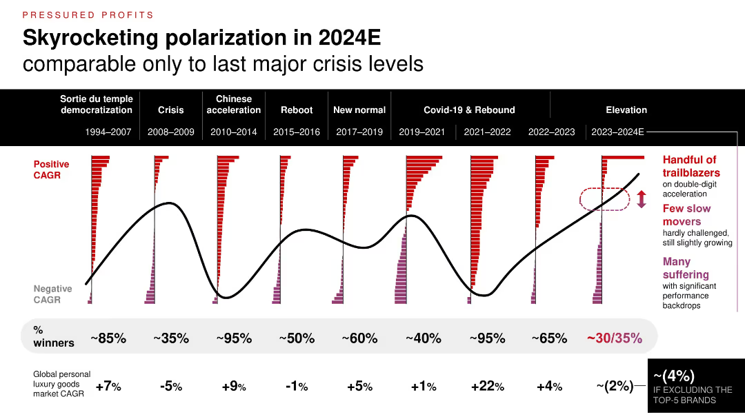
Time series chart comparing market polarization across 9 time periods; color-coded bars show brand CAGR distributions; highlights of top vs. struggling brands.
Financial Performance
Consumer Goods
The luxury sector is experiencing one of the most polarized periods since major economic crises. While a few brands thrive with double-digit growth, a majority are underperforming, contributing to a market CAGR decline (~2%) excluding top 5 players.
brand performance, CAGR, polarization, market trend, historical comparison, economic cycles
false
Financial Performance
Consumer Goods
Single Chart
Bain
Add to my slides
Remove from favorites
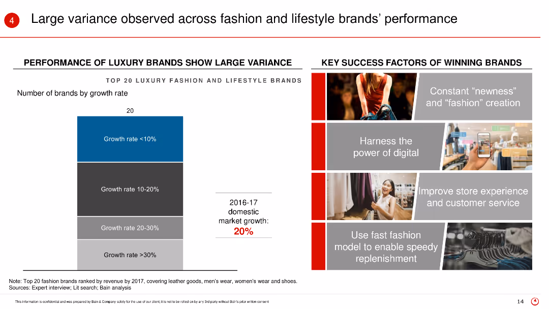
The slide includes a column chart showing the performance of top 20 luxury fashion and lifestyle brands by growth rate, accompanied by key success factors on the right.
Market Analysis and Trends
Retail & E-commerce
This slide analyzes the performance variance among top luxury brands, identifying key success factors such as digital power, customer service, and fast fashion models.
Brand performance, luxury brands, growth rate, key success factors, fashion brands
false
Market Analysis and Trends
Retail & E-commerce
Mixed Chart
Bain
Add to my slides
Remove from favorites
Slide includes website screenshots, a map, and promotional images, illustrating global brand reach and market influence.
Market Analysis and Trends
Consumer Goods
Evaluates the global influence of major cosmetic brands, detailing their market position and contributions to growth in the US and China.
brand performance, market influence, cosmetics, US, China
false
Market Analysis and Trends
Consumer Goods
Graphic
Deutsche Bank
Add to my slides
Remove from favorites
Features a combination of column charts and line graphs in grayscale and green, highlighting brand popularity in the second-hand market.
Market Analysis and Trends
Retail & E-commerce
Analyzes brand performance in the second-hand luxury market versus new goods market, with specific focus on brands like Alexander McQueen.
brand popularity, second-hand market, luxury goods, market analysis, brand performance
false
Market Analysis and Trends
Retail & E-commerce
Single Chart
BCG
Add to my slides
Remove from favorites
Column charts showing trends in brands' positions on political issues over time, with sector-specific readiness insights.
Strategic Planning
Professional Services
Evaluates the stance of brands on political issues, providing a timeline of changes and sector-specific attitudes, useful for corporate strategy and public relations.
brand positioning, political issues, sector readiness, timeline, corporate strategy
false
Strategic Planning
Professional Services
Mixed Chart
Deloitte
Add to my slides
Remove from favorites
Three circle diagrams and a column chart depict consumer preferences for domestic vs. foreign vehicle brands and the importance of local manufacturing. Clear, minimalistic design.
Market Analysis and Trends
Transportation & Logistics
This slide explores consumer attitudes towards domestic versus foreign vehicle brands and the importance they place on local manufacturing, showing a predominant indifference to brand origin if the vehicle meets their needs.
Brand preference, consumer behavior, domestic vs foreign, local manufacturing, vehicle purchase
false
Market Analysis and Trends
Transportation & Logistics
Mixed Chart
Deloitte
Add to my slides
Remove from favorites
The slide combines text and a bar chart to show what consumers expect from brands, focusing on social causes and CSR initiatives. The design is moderately dense.
Market Analysis and Trends
Professional Services
This slide discusses the importance of brand promises and social responsibility, highlighting consumer expectations for brands to support social causes and CSR initiatives.
brand promise, social causes, CSR, consumer expectations, marketing
false
Market Analysis and Trends
Professional Services
Mixed Chart
Nielsen
Add to my slides
Remove from favorites
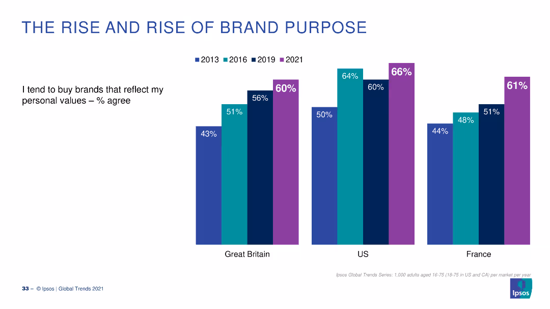
A column chart showing the percentage agreement from 2013 to 2021 that people buy brands reflecting their personal values, with data for the UK, US, and France.
Market Analysis and Trends
Consumer Goods
The slide depicts the increasing trend of consumers buying brands that reflect their personal values, comparing data from 2013 to 2021.
Brand Purpose, Consumer Behavior, Trends, Personal Values, Countries
false
Market Analysis and Trends
Consumer Goods
Multiple Chart
IPSOS
Add to my slides
Remove from favorites
A balanced layout with two distinct sections: textual content on the left explaining reasons for brand switching and a comparative visual on the right indicating these reasons across different Southeast Asian countries.
Customer and Market Segmentation
Retail & E-commerce
The slide provides insights into the primary factors influencing brand-switching decisions, such as reliability and value for money, and compares these factors across different Southeast Asian markets, emphasizing the role of perceived value and product quality.
brand reliability, value for money, consumer insights, brand switching, Southeast Asia, market comparison, product quality, consumer decisions
false
Customer and Market Segmentation
Retail & E-commerce
Boxed
Bain
Add to my slides
Remove from favorites
The slide uses a complex diagram to illustrate the expanding roles of luxury brands as friends, inspirations, and activists. It integrates various elements like emotional and functional experience pathways to explain brand interactions.
Market Analysis and Trends
Consumer Goods
Exploring the evolving roles of luxury brands, this slide details how brands are transitioning to act not only as suppliers of goods but also as sources of inspiration and social activism. It explains the pathways through which brands engage consumers on emotional, functional, and aspirational levels, emphasizing the importance of social impact.
brand roles, luxury brands, consumer engagement, social activism, brand strategy
false
Market Analysis and Trends
Consumer Goods
Diagram
Bain
Add to my slides
Remove from favorites
This slide presents two column charts comparing the usage of brand safety and suitability solutions among podcast publishers. The charts are color-coded to distinguish between active usage and planning stages.
Risk Assessment and Management
Media & Entertainment
Discusses the low adoption rates of brand safety and suitability solutions in podcast advertising and anticipates future growth as AI-driven tools become more prevalent. This slide points towards a necessary evolution in the industry to manage ad content adjacency and maintain brand integrity in a dynamic digital environment.
brand safety, podcast, advertising, AI, 2021
false
Risk Assessment and Management
Media & Entertainment
Mixed Chart
PwC/Strategy&
Add to my slides
Remove from favorites
Diagrams and text describe new business models challenging traditional brands.
Competitive Landscape
Retail & E-commerce
Outlines how new business models are disrupting established norms in luxury branding, emphasizing creativity and direct-to-consumer strategies.
brands, business models, creativity, luxury
false
Competitive Landscape
Retail & E-commerce
Diagram
Bain
Add to my slides
Remove from favorites
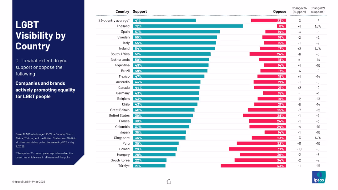
Horizontal bar chart format; countries listed on the left; right bars split between support and oppose.
Market Analysis and Trends
Government & Public Sector
This slide shows country-wise public support for brands promoting LGBT equality. Thailand, Spain, and Sweden top the list, while Türkiye and South Korea show the lowest support levels.
brands, equality, countries, LGBT, visibility, consumer sentiment, Ipsos
false
Market Analysis and Trends
Government & Public Sector
Mixed Chart
IPSOS
Add to my slides
Remove from favorites
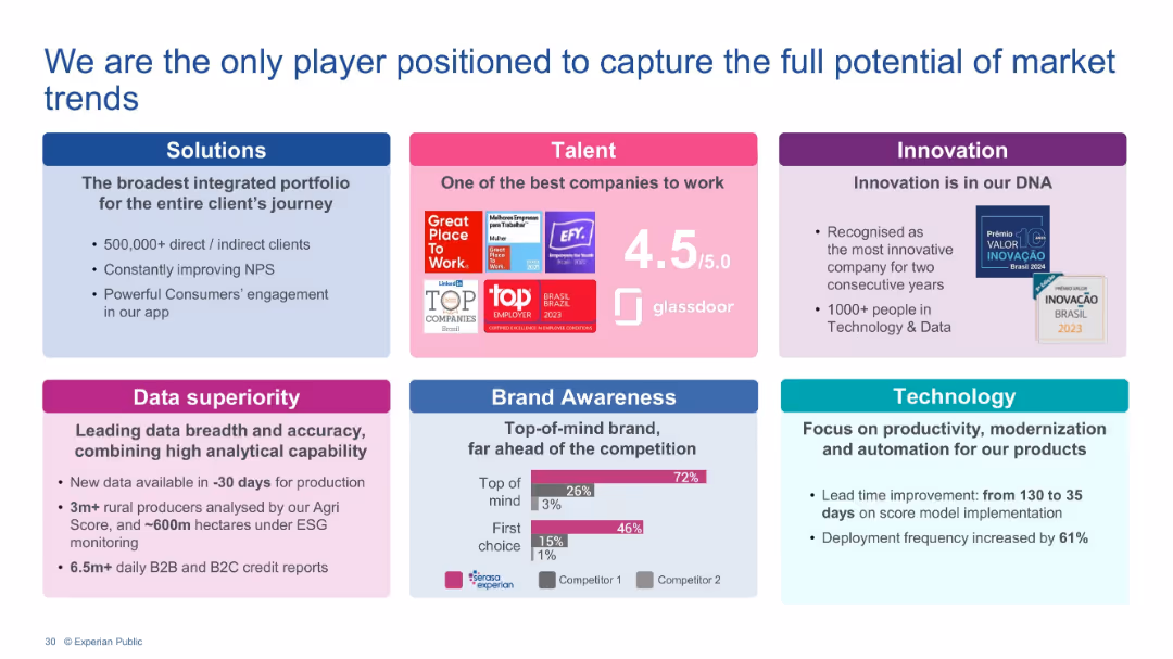
Grid layout with six colored boxes covering Solutions, Talent, Innovation, Data Superiority, Brand Awareness, and Technology. Each includes text, icons, and/or charts.
Strategic Planning
Technology & Software
This slide showcases Experian's strategic assets and competitive advantages including broad solutions portfolio, talented workforce, recognized innovation, data capabilities, strong brand awareness, and advanced technology practices. It builds the case for Experian’s unique ability to capture evolving market opportunities.
Brand strength, Talent, Innovation, Data accuracy, Technology, Market leadership, NPS, Client engagement
false
Strategic Planning
Technology & Software
Mixed Chart
Barclays
Add to my slides
Remove from favorites
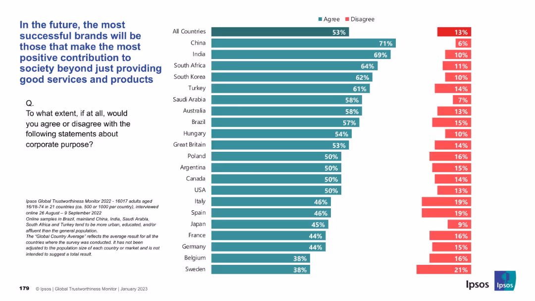
Bar chart presentation, horizontal country comparisons with green “Agree” and red “Disagree” bars
Strategic Planning
Consumer Goods
Respondents believe that brand success will hinge on societal contributions beyond just product/service quality. China, India, and South Africa show the strongest agreement, while Western Europe trails. The global average is 53% agreement.
brand success, social contribution, corporate purpose, Ipsos, consumer perception, CSR, societal value
false
Strategic Planning
Consumer Goods
Mixed Chart
IPSOS
Add to my slides
Remove from favorites
Bar chart showing brand-switching percentages for non-essentials and essentials.
Customer and Market Segmentation
Retail & E-commerce
Provides a detailed look at brand-switching behavior, particularly in non-essential categories.
brand-switching, consumer behavior, essentials, non-essentials, retail
false
Customer and Market Segmentation
Retail & E-commerce
Single Chart
Bain
Add to my slides
Remove from favorites
A content-rich slide with a bar graph and detailed text analysis. The graph on the right side displays percentages of brand-switching consumers from different Southeast Asian countries. The left side contains a descriptive analysis of brand-switching behavior.
Customer and Market Segmentation
Retail & E-commerce
Slide examines consumer openness to switching brands, with statistical data on Southeast Asian countries' brand loyalty. It discusses the implications for businesses in terms of innovation and customer retention, and variations in behavior by country.
brand switching, consumer behavior, Southeast Asia, market research, brand loyalty, business innovation, customer retention
false
Customer and Market Segmentation
Retail & E-commerce
Single Chart
Bain
Add to my slides
Remove from favorites
Large text blocks with two percentage rings, detailing brand-switching statistics.
Customer and Market Segmentation
Retail & E-commerce
Analysis of the increasing trend of consumers trying different brands and small players set to benefit.
brand-switching, consumer trends, market analysis, retail, brands
false
Customer and Market Segmentation
Retail & E-commerce
Multiple Chart
Bain
Add to my slides
Remove from favorites
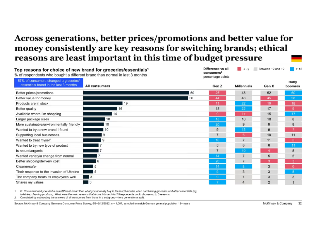
Table comparing reasons for switching brands across generations; blue and red shading indicates over- and under-indexing vs. average
Customer and Market Segmentation
Retail & E-commerce
All generations prioritize price and value when switching grocery brands. Baby boomers lead on price sensitivity, while Gen Z also emphasizes quality, ethics, and packaging. The response to the Ukraine invasion and ethical concerns are generally less impactful reasons for brand choice.
brand switching, generational comparison, price, value, ethics, grocery brands, Gen Z, baby boomers
false
Customer and Market Segmentation
Retail & E-commerce
Multiple Chart
McKinsey
Add to my slides
Remove from favorites
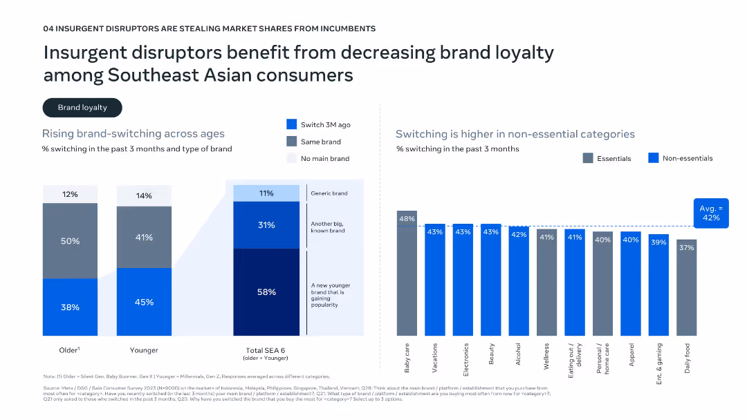
Dual-panel layout with bar graphs; left shows age-related brand-switching data; right shows switching by category (essentials vs. non-essentials).
Market Analysis and Trends
Consumer Goods
Highlights rising brand-switching behavior in Southeast Asia, especially among younger consumers and non-essential categories. The data shows a preference for newer and generic brands, suggesting that disruptors are benefiting from this decline in brand loyalty.
brand switching, loyalty, consumer behavior, generational trends, SEA
false
Market Analysis and Trends
Consumer Goods
Multiple Chart
Bain
Add to my slides
Remove from favorites
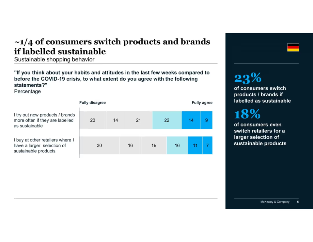
Stacked bar chart visualizing agreement with statements about switching based on sustainability labels
Customer and Market Segmentation
Consumer Goods
Indicates that roughly one-quarter of German consumers are likely to switch products or retailers for sustainable options. Suggests label influence and retailer assortment drive sustainable buying behavior.
brand switching, sustainable products, retailer selection, Germany, label influence, post-COVID, shopping habits
false
Customer and Market Segmentation
Consumer Goods
Mixed Chart
McKinsey
Add to my slides
Remove from favorites
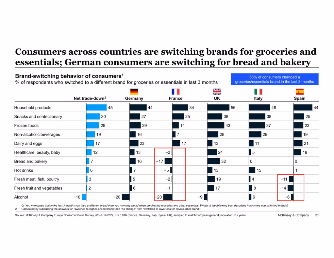
Table with net trade-down metrics by product type and country; color-coded and national flags used for comparison
Product and Service Analysis
Retail & E-commerce
Cross-country analysis of brand-switching shows Germany’s net trade-down behaviors are prominent in bread and bakery. Italy and Spain show negative trends in fresh produce and meat. This slide highlights national differences in consumer downgrading behavior across various grocery categories.
brand switching, trade-down, bakery, fresh food, groceries, Germany, Italy, Spain, cross-country comparison
false
Product and Service Analysis
Retail & E-commerce
Single Chart
McKinsey
Add to my slides
Remove from favorites
This slide has four main charts: a line chart showing consumer and industrial confidence, a bar chart for credit growth by corporates and households, and a line chart depicting the unemployment rate.
Market Analysis and Trends
Financial Services
The slide analyzes Brazil's consumer and business dynamics, focusing on confidence levels, credit growth, and unemployment trends.
Brazil, consumer dynamics, business confidence, credit growth, unemployment
false
Market Analysis and Trends
Financial Services
Multiple Chart
JP Morgan
Add to my slides
Remove from favorites
Features column charts showing the growth of the credit market in Brazil and a breakdown of transaction channels over several years.
Market Analysis and Trends
Financial Services
Analyzes the growth of Brazil's credit market post-pandemic, focusing on the increase in digital payments and credit distribution across different channels.
Brazil, credit market, digital payments, market growth, financial analysis
false
Market Analysis and Trends
Financial Services
Multiple Chart
Barclays
Add to my slides
Remove from favorites
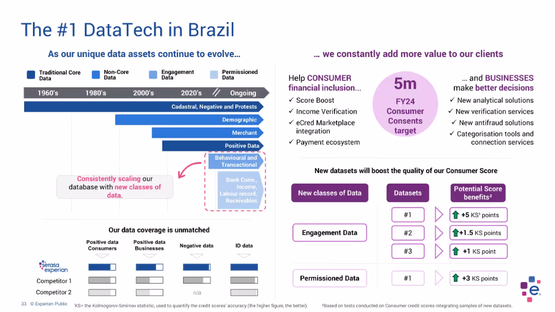
Horizontal timeline with evolving data types on the left, text highlights and comparison chart on right
Product and Service Analysis
Technology & Software
This slide emphasizes Experian’s evolution in Brazil from core to permissioned data. It details ongoing expansion in data classes and use cases such as fraud detection and credit scoring, with a comparison of competitors’ data capabilities.
Brazil, data evolution, Experian, ID data, permissioned data, analytics
false
Product and Service Analysis
Technology & Software
Mixed Chart
Barclays
Add to my slides
Remove from favorites
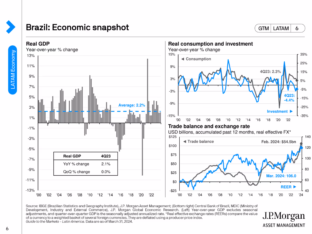
The slide includes three main charts: a bar chart for real GDP year-over-year change, a line chart for consumption and investment, and a combined line/bar chart for trade balance and exchange rate.
Market Analysis and Trends
Financial Services
The slide provides an economic overview of Brazil, detailing GDP changes, consumption, investment trends, and trade balance with exchange rate metrics.
Brazil, economic snapshot, GDP, trade balance, investment
false
Market Analysis and Trends
Financial Services
Multiple Chart
JP Morgan
Add to my slides
Remove from favorites
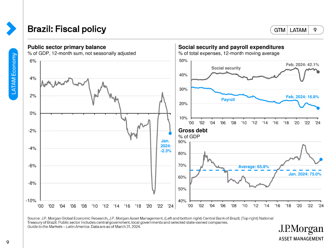
The slide features a line chart showing the public sector primary balance, a combined line/bar chart for social security and payroll expenditures, and a line chart depicting gross debt as a percentage of GDP.
Regulatory and Compliance
Financial Services
The slide presents Brazil's fiscal policy overview, including public sector balance, social security, payroll expenditures, and gross debt metrics.
Brazil, fiscal policy, public sector balance, social security, gross debt
false
Regulatory and Compliance
Financial Services
Multiple Chart
JP Morgan
Add to my slides
Remove from favorites
The slide contains two line graphs. The left graph plots the Consumer Price Index (CPI) and exchange rate (BRL per USD) over time, marked from 2007 to 2023 with a % change y-o-y. The right graph shows the Bovespa index over the same timespan, indexed to January 2007 = 100. The graphs are color-coded, with annotations and a title at the top.
Market Analysis and Trends
Financial Services
This slide presents economic data for Brazil, comparing inflation and exchange rates with stock market performance. The juxtaposition of CPI and exchange rate trends alongside the Bovespa index indicates a nuanced narrative of economic conditions, suggesting for detailed market analysis.
Brazil, inflation, exchange rate, Bovespa index, economic analysis, CPI, market performance, trend, financial chart, currency valuation
false
Market Analysis and Trends
Financial Services
Multiple Chart
McKinsey
Add to my slides
Remove from favorites
This slide contains two sections. The left side depicts the Consumer Price Index and exchange rate trends using dual line graphs, and the right side shows the Bovespa index performance with a single line graph. The layout is data-focused with a visual breakdown of each financial metric.
Financial Performance
Financial Services
This slide examines Brazil's economic metrics with a focus on inflation, currency exchange rates, and stock market performance. It provides investors and financial analysts with a visual representation of market conditions and currency value fluctuations, informing potential investment and market strategy decisions.
Brazil, Inflation, Exchange Rate, Bovespa, Market Analysis
false
Financial Performance
Financial Services
Multiple Chart
McKinsey
Add to my slides
Remove from favorites
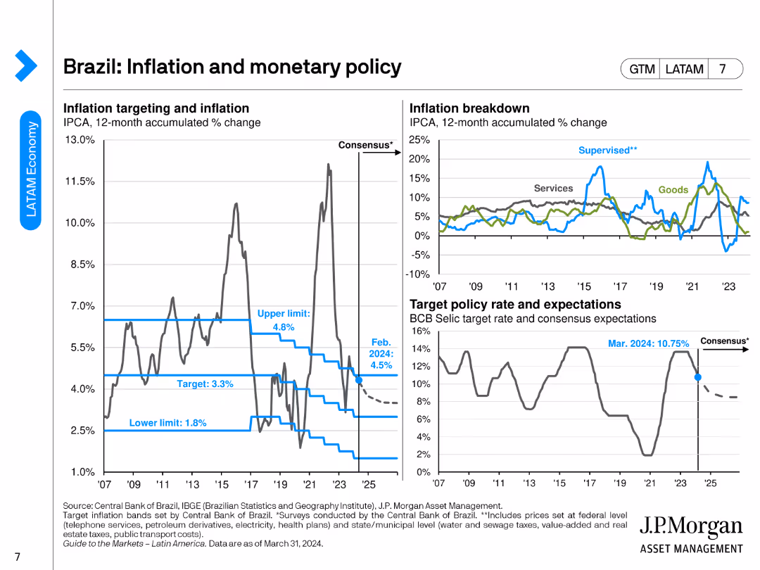
The slide features a line chart for inflation targeting and accumulated change, another line chart breaking down inflation into goods and services, and a line chart showing target policy rate and expectations.
Market Analysis and Trends
Financial Services
The slide discusses Brazil's inflation trends, monetary policy targets, and the breakdown of inflation between goods and services.
Brazil, inflation, monetary policy, target rate, economic trends
false
Market Analysis and Trends
Financial Services
Multiple Chart
JP Morgan
Add to my slides
Remove from favorites
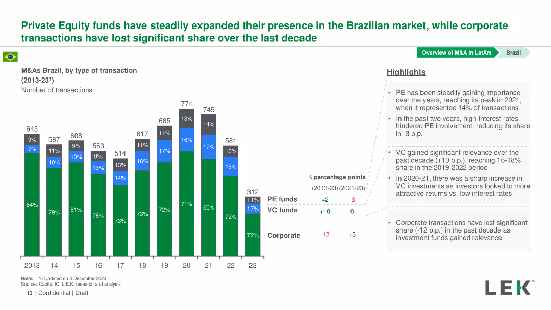
Column chart showing the number of transactions by type in Brazil from 2013-2023. The chart differentiates PE funds, VC funds, and Corporate transactions by color.
Market Analysis and Trends
Financial Services
This slide analyzes the trend of PE, VC, and Corporate transactions in Brazil from 2013-2023, highlighting the growth in PE and VC transactions over the years.
Brazil, M&A, Private Equity, Venture Capital, Corporate Transactions
false
Market Analysis and Trends
Financial Services
Mixed Chart
LEK
Add to my slides
Remove from favorites
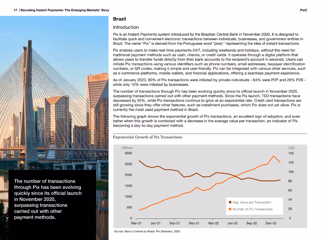
Image of a bridge with accompanying text about Pix, Brazil's instant payment system, and a line chart showing exponential growth of Pix transactions.
Market Analysis and Trends
Financial Services
Describes the exponential growth of Pix transactions in Brazil since its launch, highlighting its adoption and impact on other payment methods.
Brazil, Pix, payments, instant, growth, transactions, financial, services, exponential
false
Market Analysis and Trends
Financial Services
Mixed Chart
PwC/Strategy&
Add to my slides
Remove from favorites
Features a world map and portrait of a woman, highlighting Brazil's role as a continental hub attracting global tech companies
Market Analysis and Trends
Technology & Software
Focuses on Brazil's emerging status as a tech hub, mapping major global tech players and their activities within the region
Brazil, tech hub, global, market, innovation
false
Market Analysis and Trends
Technology & Software
Graphic
McKinsey
Add to my slides
Remove from favorites
Depicts a map with numerical data highlighting the number of unicorns in Brazil compared to other countries
Market Analysis and Trends
Technology & Software
Compares Brazil's capacity to foster high-value startups (unicorns) with other leading countries, emphasizing its growing influence in the global market
Brazil, unicorns, global, comparison, startups
false
Market Analysis and Trends
Technology & Software
Mixed Chart
McKinsey
Add to my slides
Remove from favorites
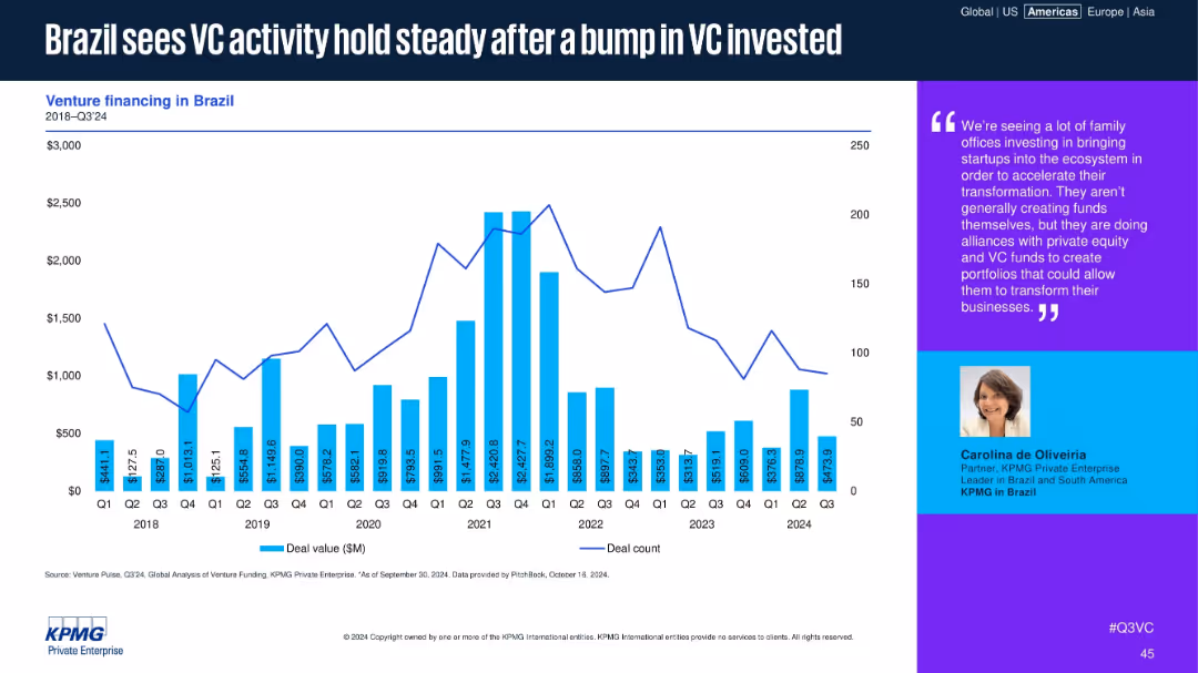
Bar and line chart for Brazil’s VC deal values and counts, with commentary from a regional KPMG partner.
Market Analysis and Trends
Financial Services
Brazil’s VC market has stabilized after a notable funding increase in 2021. While deal counts have dipped, moderate funding levels continue. Commentary highlights family office involvement and alliances with VC and PE funds to support digital transformation.
Brazil, VC activity, LATAM, family offices, KPMG, digital transformation, deal count, venture funding, steady
false
Market Analysis and Trends
Financial Services
Mixed Chart
KPMG
Add to my slides
Remove from favorites
Slide features a bar chart displaying VC as a percentage of GDP and total VC amount in USD for Brazil, USA, Israel, China
Market Analysis and Trends
Financial Services
Compares venture capital investment as a percentage of GDP and in absolute terms across four countries, highlighting Brazil's position relative to more developed economies
Brazil, VC, GDP, investment, comparison
false
Market Analysis and Trends
Financial Services
Single Chart
McKinsey
Add to my slides
Remove from favorites
The slide uses a multi-column layout with checkboxes and icons to present a checklist of 10 steps for CEOs, CISOs, and C-suite to take following a breach. It includes an example of actions taken after a ransomware attack in a sidebar.
Risk Assessment and Management
Technology & Software
The slide provides a checklist for senior leaders to follow in the event of a cyber breach, including notifying third parties, investigating the incident, and communicating clearly. An example of a real breach response is also provided to illustrate practical application.
breach, notification, investigation, communication, example
false
Risk Assessment and Management
Technology & Software
Vertical Flow
BCG
Add to my slides
Remove from favorites
The slide features a dual-axis graph displaying the growth of BREEAM and LEED certifications over time, using green bars and a blue line. To the right is a patterned yellow bar representing future targets. The background is white, and the data is accentuated with a blue and green color palette for clarity.
Regulatory and Compliance
Real Estate & Construction
The slide offers a historical view of the increase in BREEAM and LEED certifications for office buildings, the percentage of green leases, and the GRESB score, including future targets. It is ideal for presentations on building sustainability, environmental certifications, and corporate sustainability goals to investors or stakeholders in the real estate and construction industry.
BREEAM, LEED, green leases, GRESB, certifications
false
Regulatory and Compliance
Real Estate & Construction
Single Chart
Morgan Stanley
Add to my slides
Remove from favorites
This slide features a singular blue line chart tracking the price of Brent crude oil from 2016 to 2023. The layout is clean, with distinct markers for each quarter, and the title prominently displayed at the top.
Market Analysis and Trends
Energy & Utilities
Analyzing the price fluctuations of Brent crude oil, this slide shows a line chart that tracks quarterly data over several years. It can be used to understand trends in the energy sector, make financial predictions, or develop strategies for purchasing and futures contracts in industries like transportation and manufacturing.
Brent crude, oil price, trend analysis, line chart
false
Market Analysis and Trends
Energy & Utilities
Single Chart
Morgan Stanley
Add to my slides
Remove from favorites
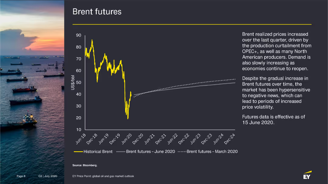
The slide presents a line chart showing historical Brent prices and Brent futures as of June 2020, with an accompanying narrative on the factors influencing these trends.
Market Analysis and Trends
Energy & Utilities
Analyzes the increase in Brent futures prices due to production cuts and rising demand, with projections for future price trends.
Brent futures, oil prices, market trends, 2020
false
Market Analysis and Trends
Energy & Utilities
Mixed Chart
EY
Add to my slides
Remove from favorites
The slide includes a line chart showing Brent futures prices from December 2019 to December 2024. It uses yellow lines for historical and future projections, with a background image of an oil rig. Text explains the trends and implications.
Market Analysis and Trends
Energy & Utilities
The slide projects Brent crude oil prices based on global vaccination programs, mobility, and OPEC+ supply discipline. It discusses factors like COVID-19 variants and decarbonization affecting medium- to long-term oil demand and pricing.
Brent futures, oil prices, OPEC+, COVID-19, decarbonization
false
Market Analysis and Trends
Energy & Utilities
Mixed Chart
EY
Add to my slides
Remove from favorites
This slide features a line chart showing the historical Brent prices and future estimates with a sunset backdrop of oil tankers at sea. The visual complexity is moderate, with clear graph lines and color contrasts for readability.
Market Analysis and Trends
Energy & Utilities
The slide discusses the short-term increase in Brent futures due to COVID-19 vaccination programs and OPEC+ actions. It highlights the ongoing scrutiny on vaccine distribution, mobility patterns, and OPEC+ actions affecting oil demand.
Brent futures, OPEC+, COVID-19, oil demand, vaccine
false
Market Analysis and Trends
Energy & Utilities
Mixed Chart
EY
Add to my slides
Remove from favorites
The slide uses two side-by-side graphs: one for Brent price forecasts and the other for WTI. Each graph compares bank/broker and consultant price estimates, using different shades of yellow for distinction. Text details the forecast ranges.
Market Analysis and Trends
Energy & Utilities
This slide provides forecasts for Brent and WTI oil prices, comparing the estimates of banks, brokers, and consultants. It discusses the factors influencing these estimates and the projected average prices for 2026.
Brent, WTI, oil price forecasts, bank/broker, consultants
false
Market Analysis and Trends
Energy & Utilities
Multiple Chart
EY
Add to my slides
Remove from favorites
Comparative column charts evaluating the impact of Brexit under different scenarios with business leader insights.
Investment Analysis
Government & Public Sector
Evaluates the potential impacts of different Brexit scenarios on French business operations and investments.
Brexit, business impact, France, UK, investment levels, company activity
false
Investment Analysis
Government & Public Sector
Multiple Chart
Bain
Add to my slides
Remove from favorites
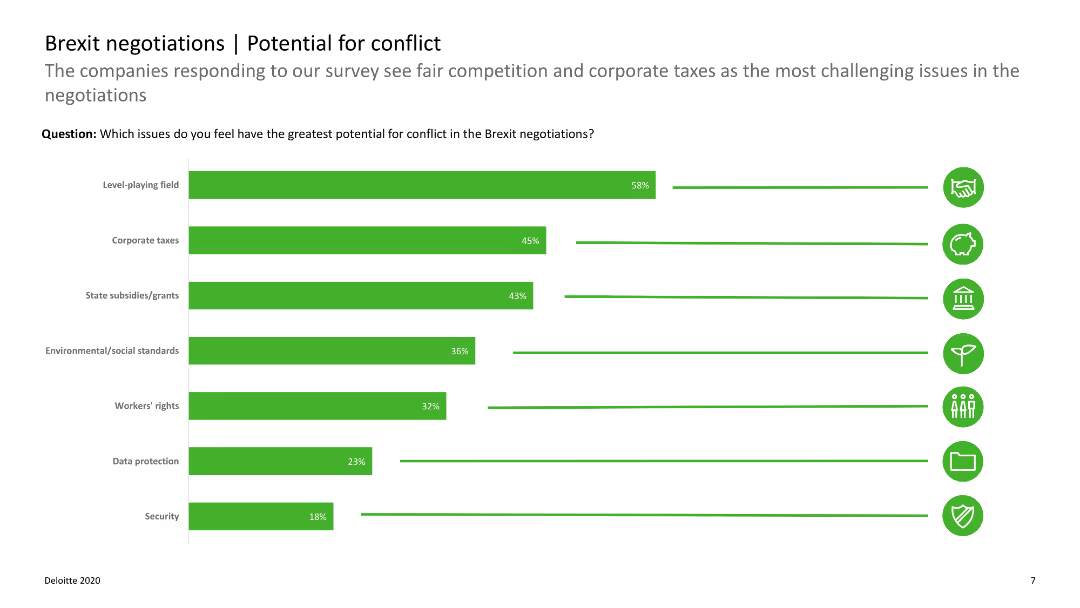
The slide includes horizontal bar charts showing potential conflict areas in Brexit negotiations, such as corporate taxes and state subsidies.
Regulatory and Compliance
Government & Public Sector
The slide outlines areas of potential conflict in Brexit negotiations, emphasizing issues like corporate taxes and fair competition. It aids in identifying key negotiation concerns.
Brexit, conflict, negotiations, corporate taxes, state subsidies
false
Regulatory and Compliance
Government & Public Sector
Single Chart
Deloitte
Add to my slides
Remove from favorites
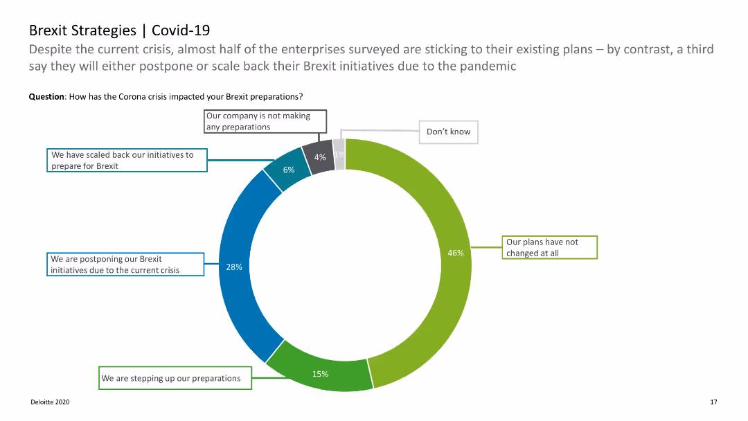
The slide shows a donut chart illustrating the impact of COVID-19 on Brexit preparations with labeled segments.
Strategic Planning
Professional Services
Explores how the COVID-19 crisis has influenced companies' Brexit strategies, including scaling back or postponing initiatives.
Brexit, COVID-19, strategies, impact, preparations
false
Strategic Planning
Professional Services
Single Chart
Deloitte
Add to my slides
Remove from favorites
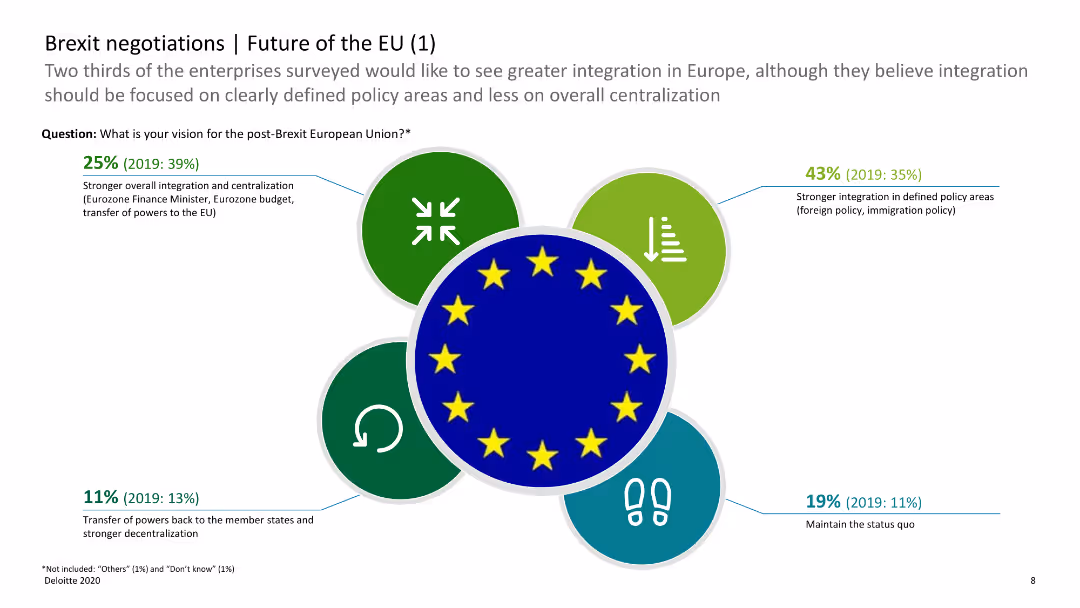
The slide has icons and horizontal bar charts showing opinions on the future of the EU post-Brexit, with categories such as integration and decentralization.
Regulatory and Compliance
Government & Public Sector
This slide shows survey results on the future of the EU, indicating preferences for integration versus decentralization post-Brexit. It helps understand future EU policy directions.
Brexit, EU future, integration, decentralization, survey
false
Regulatory and Compliance
Government & Public Sector
Diagram
Deloitte
Add to my slides
Remove from favorites
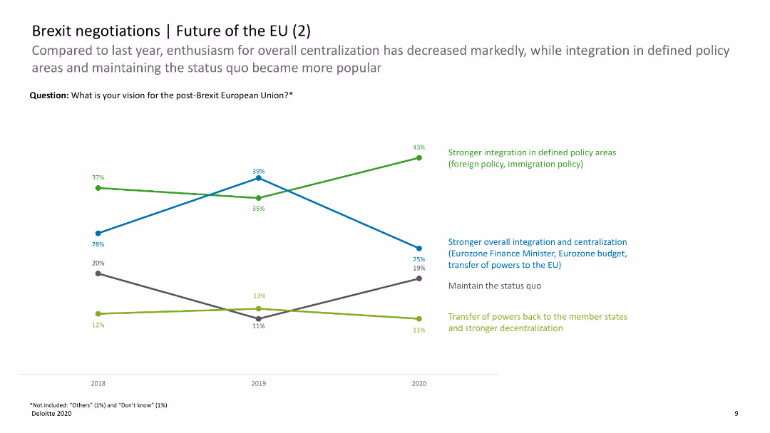
The slide includes a line chart comparing changes in opinions on the future of the EU over time, with data points for integration and decentralization preferences.
Regulatory and Compliance
Government & Public Sector
This slide compares survey data over time, showing trends in preferences for EU integration versus decentralization. It provides insights into changing opinions on EU policies post-Brexit.
Brexit, EU future, trends, integration, decentralization
false
Regulatory and Compliance
Government & Public Sector
Mixed Chart
Deloitte
Add to my slides
Remove from favorites
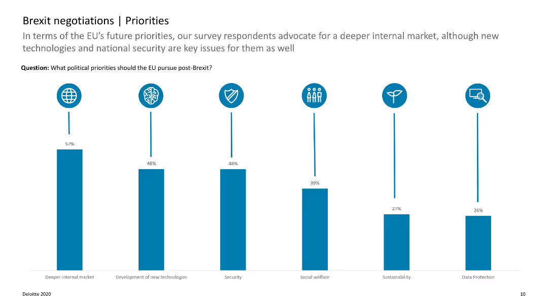
The slide features a column chart with data on the top political priorities for the EU post-Brexit, such as internal market and new technologies.
Strategic Planning
Government & Public Sector
This slide highlights the key political priorities for the EU after Brexit, showing the importance of internal market and technology development. It helps in understanding EU strategic focuses.
Brexit, EU priorities, political priorities, internal market, technology
false
Strategic Planning
Government & Public Sector
Single Chart
Deloitte
Add to my slides
Remove from favorites
Previous
Next
You don't have any favorites yet.
Please wait loading your favorites slides...
Create a FREE account to continue browsing
Receive Instant Access to 1,000+ slides from companies like McKinsey, Google, and Goldman Sachs
First Name
Last Name
Email
Password
I agree to all
Terms & Privacy Policy
Thank you! Your submission has been received!
Oops! Something went wrong while submitting the form.
Have an account?
Sign in
Upgrade to PRO to Save slides
Advanced Search and Filters
Access to 15,000+ slides
Access to Category Pages
Save/Bookmark Slides
PowerPoint Template Library
Pick a Plan
MONTHLY
$12/month
Billed every month, Cancel anytime.
YEARLY
$9/year
Billed $108 annually, Cancel anytime.
Checkout for $12/month
Checkout for $108/yr
Secured by Stripe | AES-256 bit encryption