My Account
My Slides
Search by Category
Companies
Slide Type
Use Case
Industry
Pricing
Templates
View All Templates
Download Template Slides
✦ AI
AI Prompt Library
AI Search
Feedback
Login
Logout
Get Started
Browse all Slides
Browse all Slides
Create a FREE Account
Instant access to 1,000+ real slides from top companies like McKinsey, BCG, Goldman Sachs, Google and many more!
First Name
Last Name
Email
Password
I agree to all
Terms & Privacy Policy
Thank you! Your submission has been received!
Oops! Something went wrong while submitting the form.
Have an account?
Sign in
Saved Slides
Total No. of slides saved
0
↻ Refresh
✖ Clear all
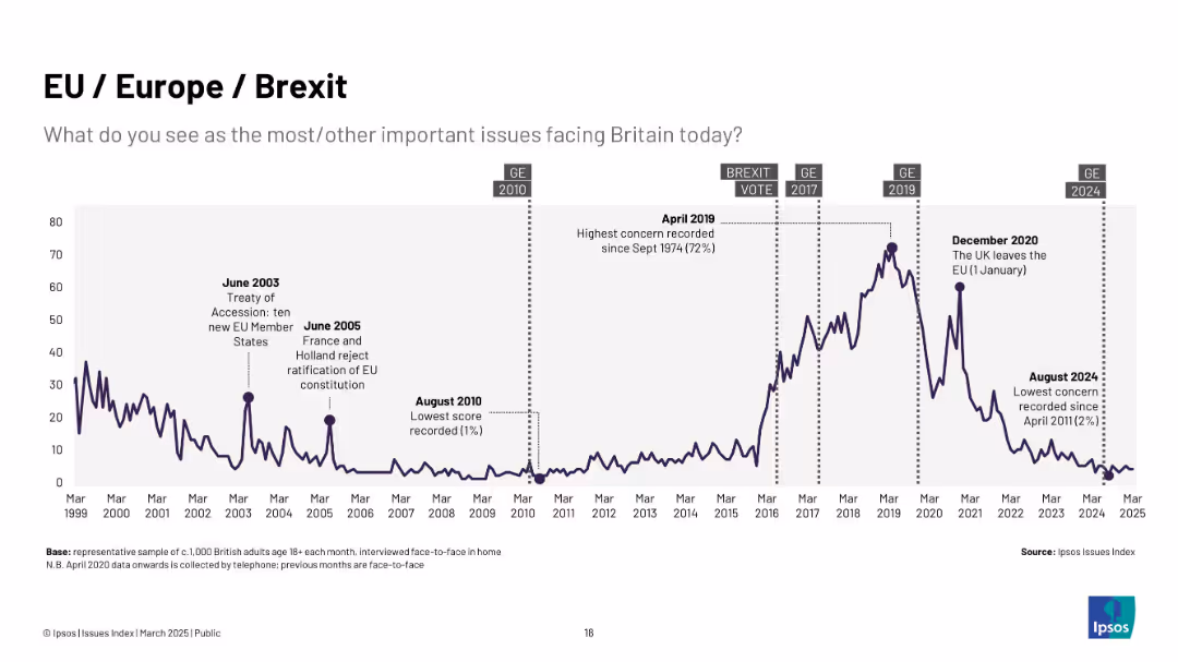
Purple line graph from 1999 to 2025; Brexit-related events are annotated; vertical dashed lines for GEs.
Market Analysis and Trends
Government & Public Sector
Reflects public concern about the EU and Brexit, with a sharp rise leading to the 2016 referendum and a peak in 2019. Post-Brexit, concern drops significantly.
Brexit, EU, referendum, UK politics, public opinion, Ipsos, sovereignty, elections, Europe
false
Market Analysis and Trends
Government & Public Sector
Single Chart
IPSOS
Add to my slides
Remove from favorites
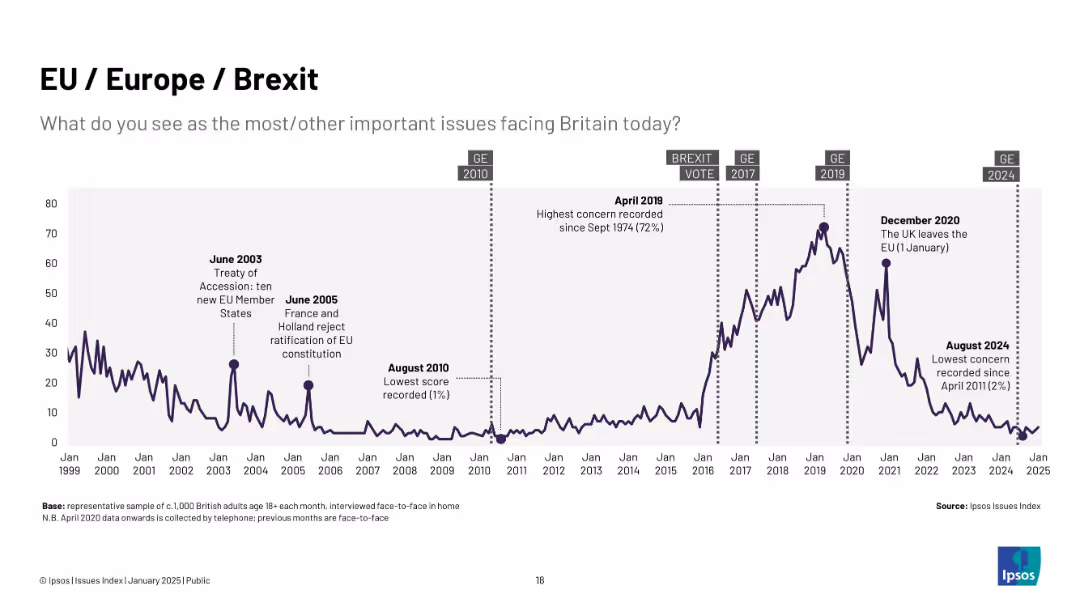
Long-term graph (1999–2025) showing rise in concern pre- and post-Brexit vote, peaking in April 2019 (72%); dark line with labeled political events.
Regulatory and Compliance
Government & Public Sector
Illustrates public concern with EU/Brexit-related issues, which spiked dramatically around the Brexit referendum and then declined to record lows by 2024.
Brexit, EU, UK politics, Europe, referendum, Ipsos, regulatory issues, concern levels
false
Regulatory and Compliance
Government & Public Sector
Single Chart
IPSOS
Add to my slides
Remove from favorites
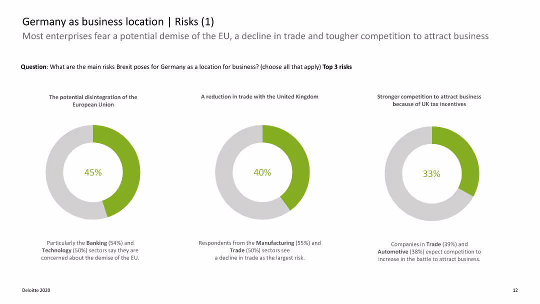
The slide includes donut charts showing the main risks of Brexit for Germany as a business location, with categories like EU disintegration and trade reduction.
Risk Assessment and Management
Government & Public Sector
This slide presents survey data on the perceived risks of Brexit for Germany, highlighting concerns about EU disintegration and trade impacts. It aids in risk assessment for businesses in Germany.
Brexit, Germany, business risks, EU disintegration, trade impacts
false
Risk Assessment and Management
Government & Public Sector
Multiple Chart
Deloitte
Add to my slides
Remove from favorites
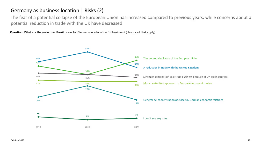
The slide features a line chart showing trends in the perceived risks of Brexit for Germany over time, with data on EU disintegration and trade concerns.
Risk Assessment and Management
Government & Public Sector
This slide shows how perceptions of Brexit risks for Germany have changed over time, focusing on issues like EU disintegration and trade. It helps in tracking risk perception trends.
Brexit, Germany, risk trends, EU disintegration, trade concerns
false
Risk Assessment and Management
Government & Public Sector
Single Chart
Deloitte
Add to my slides
Remove from favorites
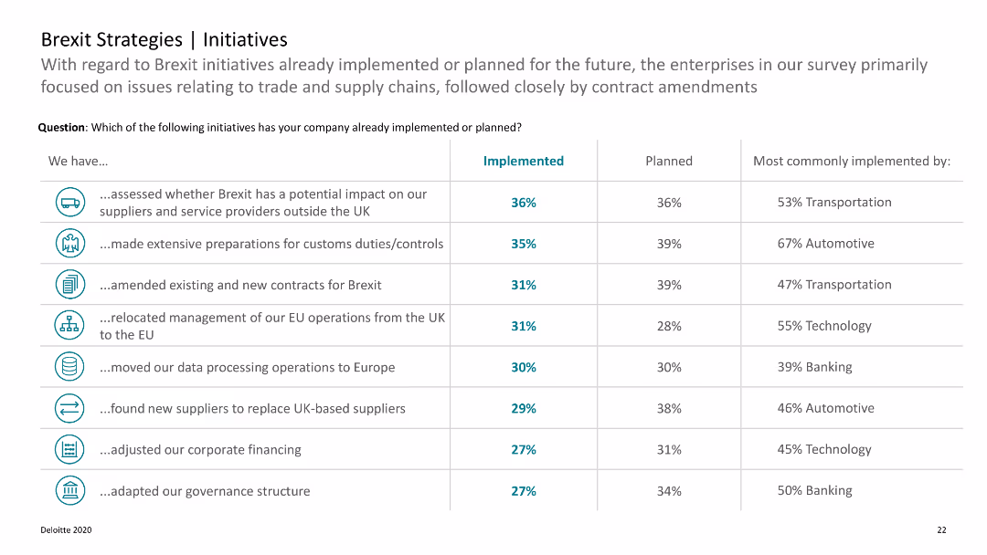
A table listing Brexit initiatives already implemented or planned, with implementation percentages and sectors.
Strategic Planning
Professional Services
Lists various Brexit-related initiatives undertaken by companies, focusing on trade, supply chains, and contract amendments.
Brexit, initiatives, planning, companies, trade
false
Strategic Planning
Professional Services
Table
Deloitte
Add to my slides
Remove from favorites
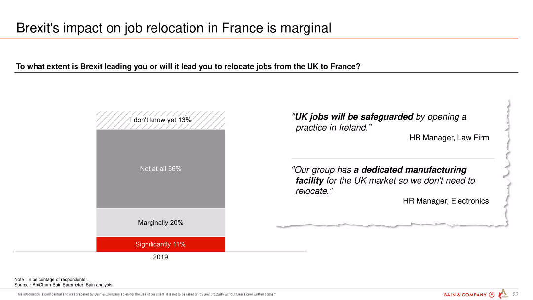
The slide features a column chart showing the extent to which Brexit is expected to lead to job relocations from the UK to France, with a majority indicating no significant impact.
Regulatory and Compliance
Government & Public Sector
The slide illustrates that most respondents do not expect Brexit to lead to significant job relocations from the UK to France, with marginal to no impact.
Brexit, job relocation, UK, France, impact, survey, expectations
false
Regulatory and Compliance
Government & Public Sector
Mixed Chart
Bain
Add to my slides
Remove from favorites
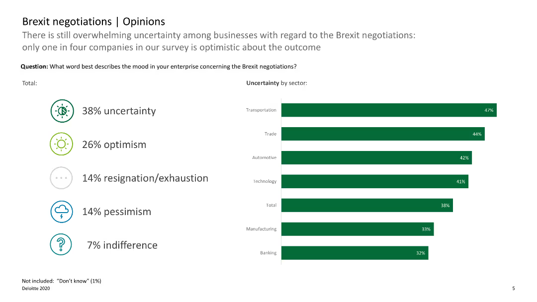
The slide uses icons and horizontal bar charts to show different opinions on Brexit negotiations, with categories such as uncertainty, optimism, and pessimism.
Regulatory and Compliance
Government & Public Sector
This slide presents survey data on business opinions regarding Brexit negotiations, highlighting uncertainty and optimism levels. It is useful for gauging business sentiment.
Brexit, opinions, survey, business sentiment, negotiations
false
Regulatory and Compliance
Government & Public Sector
Single Chart
Deloitte
Add to my slides
Remove from favorites
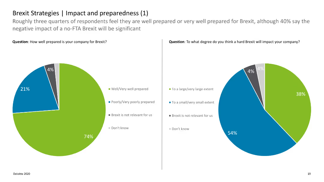
The slide has two pie charts showing preparedness levels and the expected impact of a hard Brexit.
Strategic Planning
Professional Services
Discusses how well companies feel prepared for Brexit and the anticipated impact, with a majority feeling well-prepared.
Brexit, preparedness, impact, companies, survey
false
Strategic Planning
Professional Services
Multiple Chart
Deloitte
Add to my slides
Remove from favorites
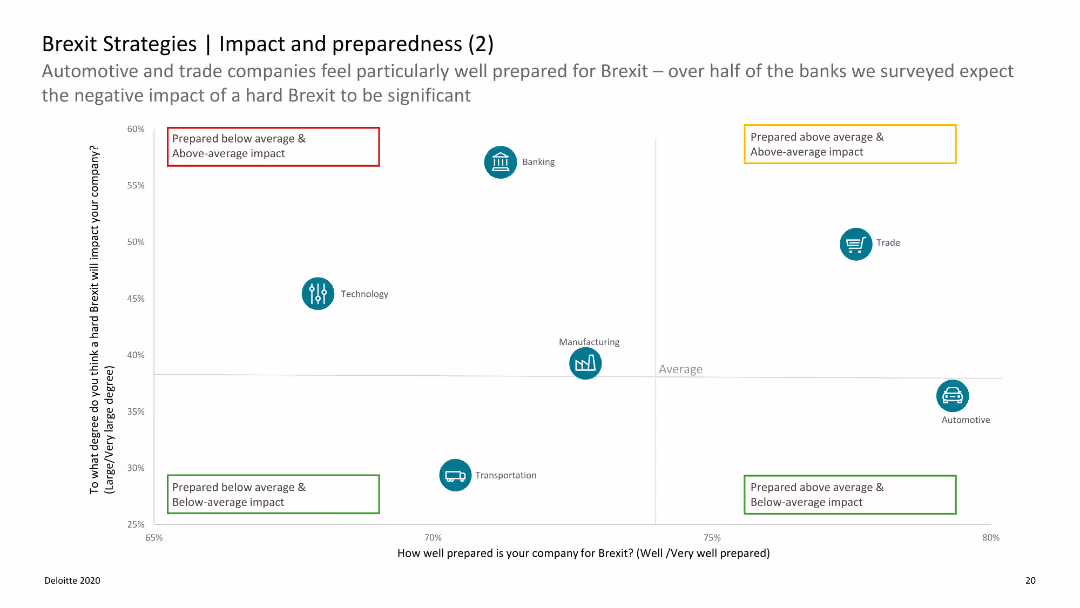
Quadrant chart categorizing companies by preparedness and impact expectation with distinct labeled quadrants.
Strategic Planning
Professional Services
Further analysis of preparedness levels across different industries, showing varying expectations of Brexit impact.
Brexit, preparedness, impact, industries, analysis
false
Strategic Planning
Professional Services
Single Chart
Deloitte
Add to my slides
Remove from favorites
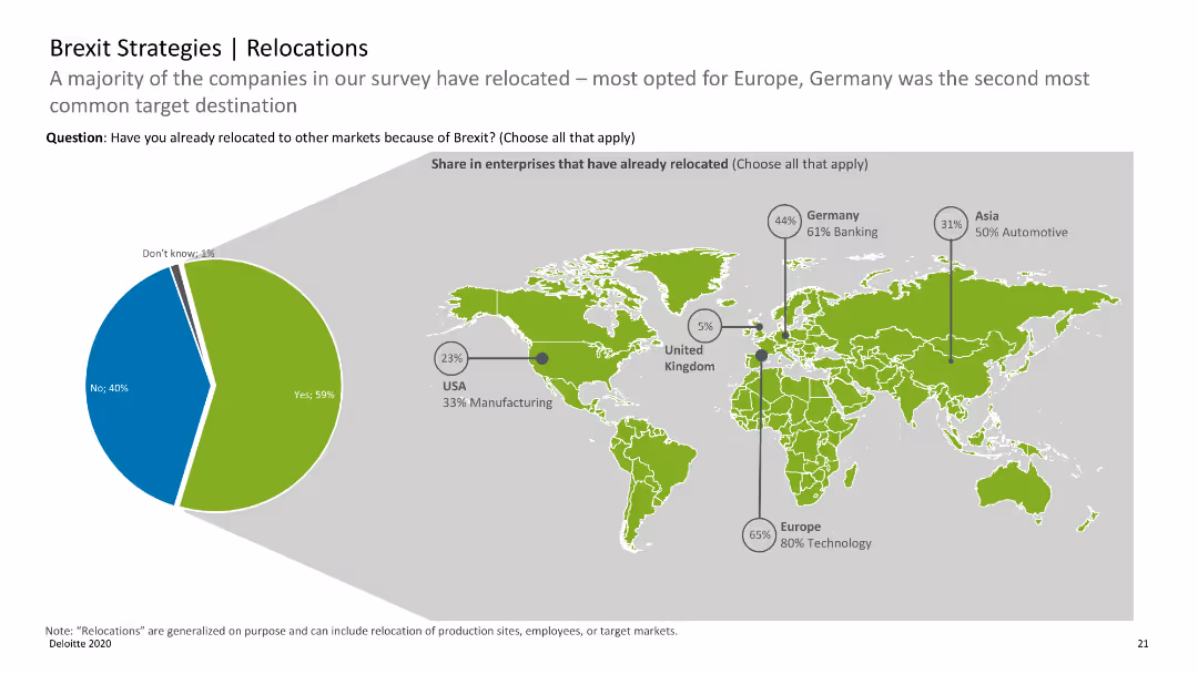
World map with pie charts indicating the share of enterprises that have relocated due to Brexit, with regional data.
Strategic Planning
Professional Services
Highlights the relocation trends of companies post-Brexit, with Europe and Germany being key relocation destinations.
Brexit, relocations, enterprises, map, trends
false
Strategic Planning
Professional Services
Mixed Chart
Deloitte
Add to my slides
Remove from favorites
A column chart showing year-over-year percentage change in real GDP from 2022 to 2025F for BRICS countries and other regions including China, India, LatAm, Brazil, Mexico, ASEAN, MENA, and SSA. Colors represent different years.
Market Analysis and Trends
Financial Services
The slide highlights economic challenges for BRICS in 2024, with India leading growth, China facing structural headwinds, and Brazil and South Africa showing below-trend growth.
BRICS, economic challenges, GDP, 2024, growth forecast, structural headwinds
false
Market Analysis and Trends
Financial Services
Single Chart
EY
Add to my slides
Remove from favorites
The slide includes two pie charts showing the share of global real GDP PPP by BRICS versus other major economies, alongside a map indicating annual real GDP PPP growth rates, with comparative data from 2015 to 2030.
Market Analysis and Trends
Financial Services
Discusses the future economic trajectory of BRICS countries, highlighting their growing influence on the global economy. Essential for presentations on emerging markets and global economic shifts.
BRICS, GDP, growth, future, global economy
false
Market Analysis and Trends
Financial Services
Diagram
Roland Berger
Add to my slides
Remove from favorites
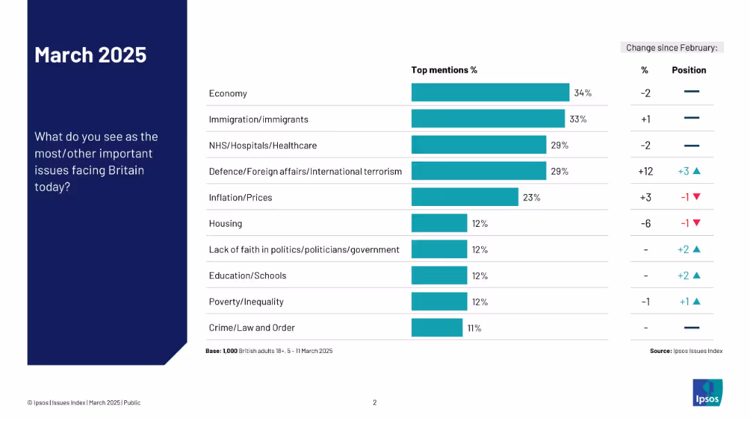
Horizontal bar chart showing most important issues facing Britain in March 2025.
Market Analysis and Trends
Government & Public Sector
The chart displays survey responses on the most important issues in Britain, with the economy, immigration, and healthcare as the top concerns. A sidebar notes changes in rankings compared to February 2025, highlighting shifts in public attention to topics like defense and inflation.
Britain, public opinion, 2025, issues, Ipsos, survey, economy, healthcare, politics, immigration
false
Market Analysis and Trends
Government & Public Sector
Mixed Chart
IPSOS
Add to my slides
Remove from favorites
Includes a map of Australia showing different GDP uplifts in various regions, complemented by bar charts comparing the effects in remote, regional, and city areas.
Strategic Planning
Telecommunications
Analyzes geographical disparities in economic benefits from broadband speed increases, highlighting the greater impact on remote areas.
broadband access, regional development, economic disparity, GDP uplift, remote areas, strategic planning, risk management, public sector, telecommunications
false
Strategic Planning
Telecommunications
Multiple Chart
Accenture
Add to my slides
Remove from favorites
Contains model equations, bullet points on methodology, and a brief author note.
Financial Performance
Telecommunications
Discusses the economic impact of broadband speeds on the Australian economy, using detailed models and data analysis.
broadband, Australia, GDP, economy, speed impact, model, analysis, economic growth
false
Financial Performance
Telecommunications
Header Vertical
Accenture
Add to my slides
Remove from favorites
Line graph overlaid on a column chart detailing the increase in broadband speeds from 2011 to 2022, with annotations explaining the growth.
Market Analysis and Trends
Telecommunications
Details the increase in broadband speeds across Australia since 2011, highlighting the impact of nbn on internet quality and speed.
broadband, Australia, nbn, speeds, growth, internet, quality, infrastructure
false
Market Analysis and Trends
Telecommunications
Mixed Chart
Accenture
Add to my slides
Remove from favorites
Contains a map of Australia, graph legends, and explanatory text detailing the geographic impact of broadband speeds.
Strategic Planning
Telecommunications
Models the benefits of broadband at a regional level in Australia, highlighting the significant speed increases and economic effects at the SA2 level.
broadband, Australia, regional analysis, SA2, internet speeds, economic impact, mapping
false
Strategic Planning
Telecommunications
Graphic
Accenture
Add to my slides
Remove from favorites
Table categorizing various broadband technologies in Australia, their descriptions, and potential speeds, using a range of colors for clarity.
Product and Service Analysis
Telecommunications
Provides a comprehensive overview of broadband technologies available in Australia along with their potential speeds and nbn compatibility.
broadband, Australia, technology, internet, DSL, fibre, satellite, speeds, nbn
false
Product and Service Analysis
Telecommunications
Table
Accenture
Add to my slides
Remove from favorites
Features a pie chart with associated column charts detailing changes in broadband subscriptions. Color-coded for clarity and visually simple to enhance understanding.
Operational Efficiency
Telecommunications
Details the modifications in broadband packages by UK households over the past year, showing preferences for better packages and cost reductions. Useful for telecom businesses to understand consumer behavior changes.
broadband, consumer behavior, subscriptions, changes, UK
false
Operational Efficiency
Telecommunications
Multiple Chart
Deloitte
Add to my slides
Remove from favorites
Includes bar graphs showing the cost of mobile broadband compared to fixed broadband as a percentage of income in Indonesia and other countries.
Strategic Planning
Telecommunications
Analyzes the affordability of mobile versus fixed broadband in Indonesia, discussing how this impacts consumer access to internet services.
broadband costs, affordability, Indonesia, mobile broadband, fixed broadband, internet access
false
Strategic Planning
Telecommunications
Multiple Chart
BCG
Add to my slides
Remove from favorites
Complex diagram linking various social and economic benefits to broadband features, illustrated with interconnected colored blocks and arrows.
Strategic Planning
Telecommunications
Analyzes the broader economic and social impacts of broadband, emphasizing its role as a critical infrastructure for modern economies.
broadband, economic growth, social benefits, digital infrastructure, economic impact, technology access, public sector, strategic planning, digital transformation
false
Strategic Planning
Telecommunications
Framework
Accenture
Add to my slides
Remove from favorites
Slide has three separate sections with bulleted lists summarizing key findings from various papers, including employment and business creation due to broadband.
Market Analysis and Trends
Telecommunications
Summarizes research findings linking broadband quality to job creation and business effects, with references to multiple studies and varied geographical impacts.
broadband, employment, business creation, research summary, job market, economic development, regional analysis, studies comparison
false
Market Analysis and Trends
Telecommunications
Table
Accenture
Add to my slides
Remove from favorites
Two separate models presented as equations and text blocks summarizing findings about employment and business impacts.
Investment Analysis
Telecommunications
Explores how changes in broadband speeds influence employment levels and business density in Australia, backed by model analysis.
broadband, employment, business impact, Australia, model, speed increase, economic analysis
false
Investment Analysis
Telecommunications
Header Horizontal
Accenture
Add to my slides
Remove from favorites
The slide features a detailed literature review layout with a mix of text blocks and table showing percentage increases in GDP relative to broadband speed. It uses purple and green colors for the charts.
Market Analysis and Trends
Telecommunications
Reviews various studies to assess how increments in broadband speed can lead to GDP growth, with a comparative analysis featuring different models and their implications.
broadband, GDP, economic growth, literature review, productivity, data analysis, comparison, methodology, international studies, models
false
Market Analysis and Trends
Telecommunications
Table
Accenture
Add to my slides
Remove from favorites
The slide features a bar charts with percentage labels, a map highlighting geographic regions, and text blocks. It visually contrasts broadband impact across different socioeconomic areas.
Market Analysis and Trends
Telecommunications
The slide discusses how increased broadband speeds have lifted GDP in lower socioeconomic areas, with a focus on Greater Melbourne, showing that faster broadband access can drive economic growth.
Broadband, GDP, Socioeconomic, Melbourne, Impact
false
Market Analysis and Trends
Telecommunications
Multiple Chart
Accenture
Add to my slides
Remove from favorites
Features maps and bar graphs depicting the distribution of mobile and fixed broadband access across Indonesia's districts and provinces.
Strategic Planning
Telecommunications
Addresses the uneven distribution of broadband connectivity in Indonesia, particularly the lack of mobile signal and low fixed broadband penetration in many areas.
broadband, Indonesia, mobile signal, fixed broadband, connectivity, provinces, districts
false
Strategic Planning
Telecommunications
Graphic
BCG
Add to my slides
Remove from favorites
Slide features bold headings and a well-organized list that highlights key points about the nbn's goals and economic impact, illustrated with the nbn logo.
Regulatory and Compliance
Telecommunications
Explains the purpose and scope of a governmental report on the national broadband network's performance in terms of economic and social objectives.
broadband, nbn, economic impact, social impact, report, government, telecommunications, policy, national infrastructure
false
Regulatory and Compliance
Telecommunications
Header Horizontal
Accenture
Add to my slides
Remove from favorites
Slide features a column chart and a line chart showing mobile and fixed broadband penetration from 2013 to 2020. Annotations and trend lines highlight key data points and policy impacts. Colors blue and gray distinguish between different data types.
Market Analysis and Trends
Telecommunications
The slide details trends in mobile and fixed broadband penetration, highlighting the decline in mobile broadband subscriptions following regulatory changes and the growth in fixed broadband due to infrastructure expansion by Telkom, who holds a significant market share in the industry.
broadband, penetration, subscribers, infrastructure, policy, Telkom, market share
false
Market Analysis and Trends
Telecommunications
Multiple Chart
BCG
Add to my slides
Remove from favorites
This slide shows a mix of bar charts and a small photograph of Airlie-Whitsundays. It displays broadband speed increases alongside GDP uplift in different regions, marked with colors for emphasis.
Market Analysis and Trends
Telecommunications
This slide outlines how regions with faster broadband have seen significant productivity boosts, with detailed examples from Airlie-Whitsundays and Wyndham Vale, highlighting the transformative impact.
Broadband, Regional, Productivity, Airlie, Wyndham
false
Market Analysis and Trends
Telecommunications
Multiple Chart
Accenture
Add to my slides
Remove from favorites
The slide features a column chart detailing broadband satisfaction levels in the UK. It has simple, clean visual elements with colors like blue and green denoting different satisfaction levels.
Market Analysis and Trends
Telecommunications
The slide presents data on the high levels of satisfaction among UK broadband users, highlighting potential market inertia against switching providers or upgrading. Intended to analyze market trends and customer satisfaction in telecommunications.
broadband, satisfaction, market trends, UK, telecommunications
false
Market Analysis and Trends
Telecommunications
Mixed Chart
Deloitte
Add to my slides
Remove from favorites
Features detailed bar charts comparing productivity impacts across various industries. Design elements are used to emphasize significant data points like in Professional, Scientific, and Technical Services.
Market Analysis and Trends
Telecommunications
Discusses the disproportionate benefits of faster broadband across different sectors, notably in services industries, where increased speeds significantly boost productivity and economic contributions.
Broadband, Services, Productivity, Impact, Industry
false
Market Analysis and Trends
Telecommunications
Multiple Chart
Accenture
Add to my slides
Remove from favorites
This slide has a bar chart comparing broadband speeds over two time points (Sep-22 and Jun-23). Visuals are clean with green gradients, and data is presented clearly.
Market Analysis and Trends
Telecommunications
Analyzes changes in consumer broadband speed preferences over time, showing a trend toward higher speeds and possible market saturation at certain speed tiers. Useful for understanding shifts in consumer technology usage.
broadband, speeds, consumer trends, technology, saturation
false
Market Analysis and Trends
Telecommunications
Mixed Chart
Deloitte
Add to my slides
Remove from favorites
The slide contains a bar chart comparing the usage of different channels (TV, Social Media, OOH, Radio) between entrants and winners. Bars are vertically oriented with labels indicating the percentage usage of each channel.
Market Analysis and Trends
Media & Entertainment
This slide shows that winners are more likely to use broadcast channels like TV as their main touchpoints compared to entrants, indicating a trend in media usage among successful campaigns.
broadcast channels, touchpoints, bar chart, media usage, marketing
false
Market Analysis and Trends
Media & Entertainment
Mixed Chart
IPSOS
Add to my slides
Remove from favorites
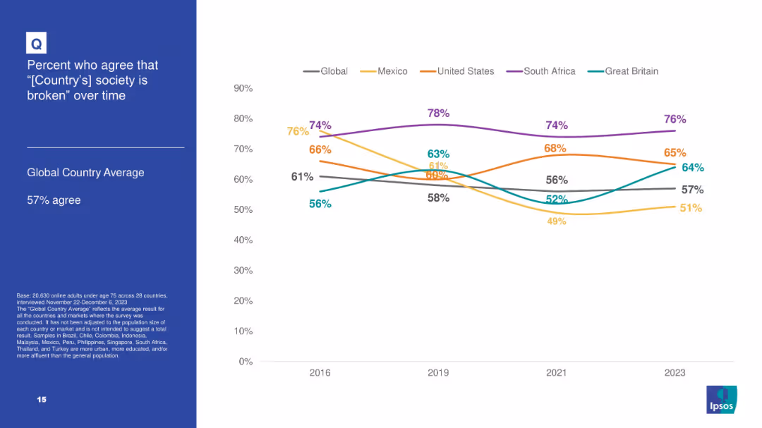
White background with line chart tracking agreement over time that “[Country]'s society is broken” for 5 countries plus global average; blue info box on left.
Market Analysis and Trends
Government & Public Sector
Tracks longitudinal data from 2016–2023 on societal dissatisfaction in select countries, noting highest levels in South Africa and consistent upward trend in Great Britain.
broken society, dissatisfaction, Ipsos, trend analysis, longitudinal data, South Africa, perception
false
Market Analysis and Trends
Government & Public Sector
Mixed Chart
IPSOS
Add to my slides
Remove from favorites
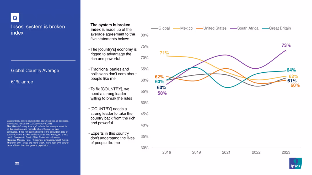
Left panel with textual explanation; right panel contains a line graph tracking sentiment over time.
Market Analysis and Trends
Government & Public Sector
This slide visualizes the "System is Broken" Index by showing trends from 2016 to 2023. It includes five constituent sentiments and compares countries like the U.S., Mexico, South Africa, and the UK to the global average.
broken system, Ipsos index, sentiment analysis, long-term trends, public trust
false
Market Analysis and Trends
Government & Public Sector
Mixed Chart
IPSOS
Add to my slides
Remove from favorites
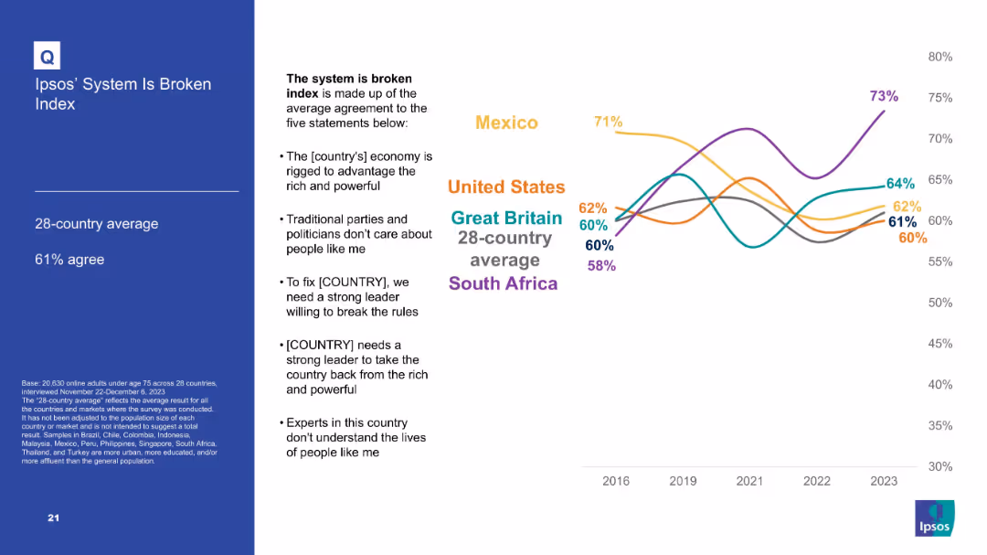
Line graph with average agreement to five statements comprising a “broken system” index; countries compared over time; text box lists index components.
Market Analysis and Trends
Government & Public Sector
Summarizes the Ipsos "broken system" index based on multiple political distrust indicators. South Africa shows highest agreement; trend data is shown for key countries from 2016–2023.
broken system, Ipsos index, trust, governance, political perception, dissatisfaction, public sentiment
false
Market Analysis and Trends
Government & Public Sector
Mixed Chart
IPSOS
Add to my slides
Remove from favorites
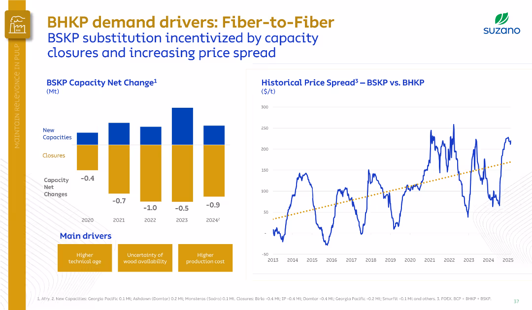
Split layout with a bar chart on the left (BSKP Capacity Net Change) and a line graph on the right (Historical Price Spread).
Market Analysis and Trends
Industrial & Manufacturing
This slide presents the declining net BSKP capacity from 2020 to 2024 due to closures and limited new capacities, alongside the rising BSKP vs. BHKP price spread. It highlights fiber substitution incentives and the main drivers behind this shift.
BSKP, BHKP, fiber substitution, capacity closures, price spread, pulp
false
Market Analysis and Trends
Industrial & Manufacturing
Multiple Chart
Goldman Sachs
Add to my slides
Remove from favorites
Includes column charts depicting potential network cost reductions across various industries after shifting to network modernization.
Strategic Planning
Telecommunications
Advocates for shifting budget allocations towards network modernization to achieve cost savings and efficiency gains in various industries.
budget allocation, cost reduction, network modernization, industry comparison, operational efficiency, strategic decisions
false
Strategic Planning
Telecommunications
Multiple Chart
Accenture
Add to my slides
Remove from favorites
This slide includes multiple column charts showing expenditure allocations by department, such as Education and Health. Each department is represented by columns for estimated and projected budgets, color-coded for clarity.
Operational Efficiency
Government & Public Sector
This slide provides a clear visual representation of how budget allocations are distributed across different government departments in Namibia, useful for discussions on government spending priorities and efficiency.
budget allocation, departmental spending, fiscal management
false
Operational Efficiency
Government & Public Sector
Single Chart
PwC/Strategy&
Add to my slides
Remove from favorites
This slide presents a bar chart detailing expenditure allocations for top 15 ministries for the fiscal year 2019/20, displayed in descending order of funding.
Regulatory and Compliance
Government & Public Sector
Showcases budget allocations across different government ministries, emphasizing financial priorities and allocations.
Budget allocation, government ministries, fiscal management
false
Regulatory and Compliance
Government & Public Sector
Single Chart
PwC/Strategy&
Add to my slides
Remove from favorites
Displays a circle diagram for budget sectoral allocations and a bubble chart showing access to regional markets with country statistics.
Strategic Planning
Government & Public Sector
This slide explores Namibia’s budget allocation across various sectors and the potential for agro-processing market expansion in neighboring countries.
budget allocation, Namibia, agro-processing, market expansion, regional markets, strategic planning
false
Strategic Planning
Government & Public Sector
Mixed Chart
PwC/Strategy&
Add to my slides
Remove from favorites
Slide uses multiple bar graphs to compare budget allocations across ten departments, using color coding to differentiate between higher and lower spending areas.
Financial Performance
Government & Public Sector
Showcases Namibia's budget allocation priorities for 2018/19, highlighting significant investments in education, health, and defense. The slide provides a clear view of governmental fiscal priorities and sectoral funding.
Budget, Allocations, Government, Sectors
false
Financial Performance
Government & Public Sector
Single Chart
PwC/Strategy&
Add to my slides
Remove from favorites
The slide is divided into five color-coded sections, each with icons representing different spending priorities like COVID-19 response and infrastructure. Text outlines key initiatives.
Regulatory and Compliance
Government & Public Sector
Describes major spending areas in the national budget, including COVID-19 response, education, public safety, and infrastructure, using simple icons and lists.
Budget, COVID-19, education, public safety, infrastructure, spending
false
Regulatory and Compliance
Government & Public Sector
Pillar
PwC/Strategy&
Add to my slides
Remove from favorites
The slide contains two primary visual elements: a column chart on the left showing the Commonwealth budget surplus/deficit as a percentage of GDP from 1971 to 2026, and a line chart on the right depicting the Commonwealth gross debt in AUD billions from 1971 to 2026.
Financial Performance
Government & Public Sector
The slide provides historical and forecasted data on Australia's budget surplus/deficit and gross debt, illustrating fiscal performance and debt levels over time. It can be used to analyze government financial health and economic policies.
Budget, Debt, Forecast, Economy, Australia
false
Financial Performance
Government & Public Sector
Multiple Chart
JP Morgan
Add to my slides
Remove from favorites
Contains multiple charts: a bar chart for federal budget composition, line charts for deficit and net interest outlays, and a line chart for federal net debt. Colorful and data-dense.
Market Analysis and Trends
Government & Public Sector
Examines the U.S. federal budget, deficit, and debt projections, suggesting that fiscal policy will be a significant issue in the upcoming election campaign.
Budget, Deficit, Debt, Fiscal Policy, Campaign
false
Market Analysis and Trends
Government & Public Sector
Multiple Chart
JP Morgan
Add to my slides
Remove from favorites
The slide features a dark background with two line charts and one column chart displaying budget deficits and total revenues/expenses over several years. Key data points are highlighted in yellow and red.
Regulatory and Compliance
Government & Public Sector
This slide presents historical and projected data on budget balance, showing actuals, estimates, and budget figures for revenues and expenses. It's used to assess financial health and planning.
budget, finance, government, revenue, expenses, deficit, projection, financial health, analysis, planning
false
Regulatory and Compliance
Government & Public Sector
Single Chart
PwC/Strategy&
Add to my slides
Remove from favorites
Features a line chart tracking changes in budget allocation over time, supplemented by insights into industry-specific budgeting.
Human Resources and Talent Management
Professional Services
Reviews trends in marketing budget allocation for training and development, highlighting industry variations and impacts of economic events.
budgeting, marketing, training, COVID-19 impact, industry comparison
false
Human Resources and Talent Management
Professional Services
Mixed Chart
Deloitte
Add to my slides
Remove from favorites
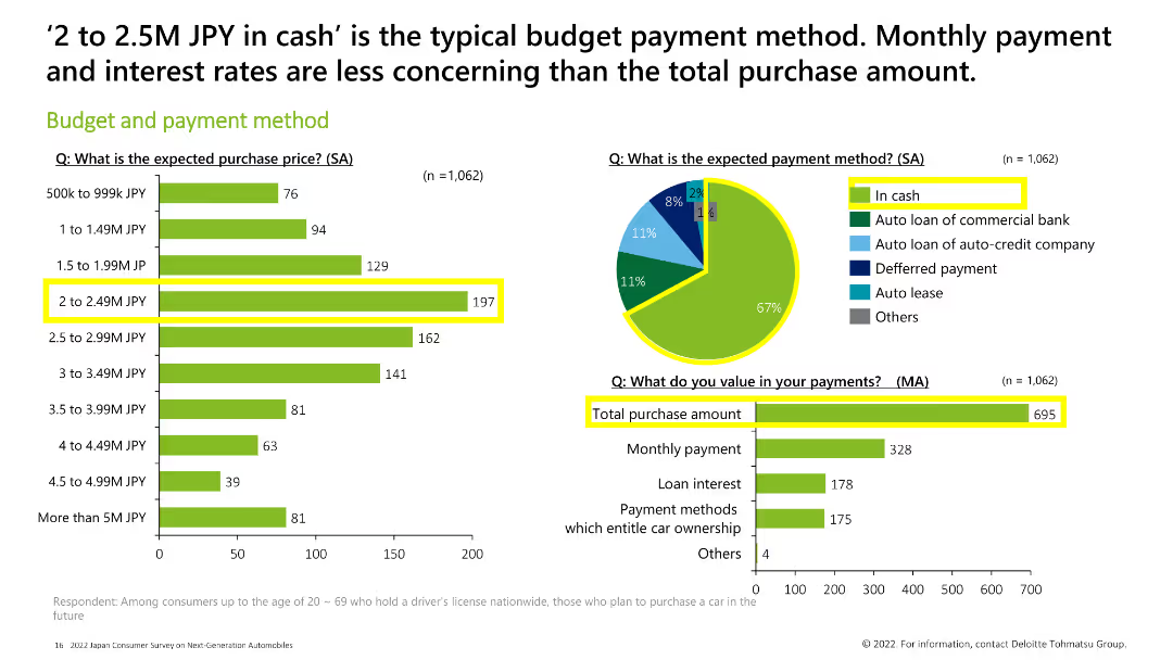
Column chart and pie chart displaying expected purchase price, payment method, and what consumers value in their payments. The most common budget is 2-2.49M JPY, and most consumers prefer to pay in cash.
Market Analysis and Trends
Financial Services
This slide illustrates the budget and payment methods of consumers, with a focus on the 2-2.49M JPY price range and a preference for cash payments. It also highlights the importance of the total purchase amount in payment considerations.
budget, payment method, purchase price, cash, total purchase amount
false
Market Analysis and Trends
Financial Services
Multiple Chart
Deloitte
Add to my slides
Remove from favorites
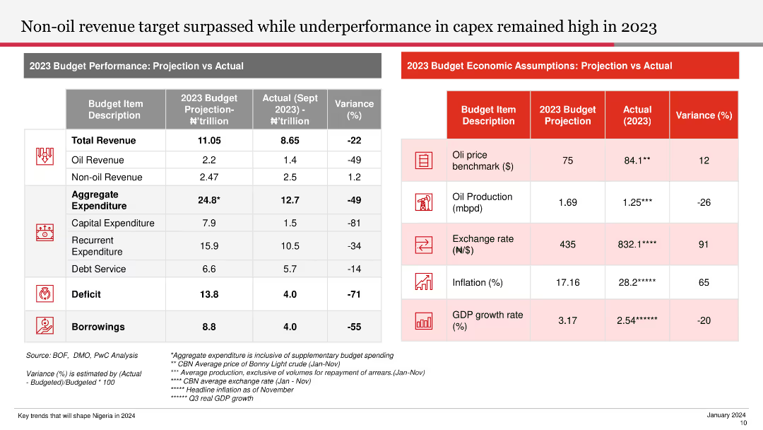
This slide uses a table to compare projected vs. actual budget performance metrics for 2023. It includes variance percentages and highlights key economic assumptions in a clean layout.
Financial Performance
Government & Public Sector
The slide analyzes the 2023 budget performance, showing variances in revenue, expenditure, and economic assumptions, providing insights into fiscal management and economic health.
Budget, Performance, Projection, Revenue, Variance
false
Financial Performance
Government & Public Sector
Table
PwC/Strategy&
Add to my slides
Remove from favorites
The slide uses a comparative layout with color-coded sections for each major spending area: Health, Finance, Education, Public Safety, and Social Welfare. Each section has key financial figures.
Financial Performance
Government & Public Sector
Summarizes the fiscal priorities of the government, emphasizing areas of significant financial input and strategic importance.
budget priorities, fiscal strategy, public spending
false
Financial Performance
Government & Public Sector
Pillar
PwC/Strategy&
Add to my slides
Remove from favorites
This slide features dual column charts showing comparisons between projected and actual revenue versus expenditure over multiple fiscal years. The layout includes labels for each fiscal year, with clear color differentiation between revenue and expenditure.
Financial Performance
Government & Public Sector
This slide is used to discuss the Namibian government's financial management by comparing projected and actual figures for revenue and expenditure over several fiscal years. It is likely used in presentations for policymakers or financial analysts.
budget projections, revenue, expenditure, fiscal management
false
Financial Performance
Government & Public Sector
Single Chart
PwC/Strategy&
Add to my slides
Remove from favorites
Features column charts comparing revenue, expenses, and deficits over three fiscal years. The columns are color-coded in pink, gray, and red, respectively.
Regulatory and Compliance
Government & Public Sector
Analyzes the financial figures from past, present, and projected budgets, detailing revenue, expenses, and deficits to assess financial health and planning. This visual helps in understanding the budgetary trends and economic strategies moving forward.
Budget, Revenue, Expenses, Deficit, Fiscal analysis
false
Regulatory and Compliance
Government & Public Sector
Single Chart
PwC/Strategy&
Add to my slides
Remove from favorites
Slide has a title at the top, a bar graph below, and related statistics on the right side with a distinct quote.
Market Analysis and Trends
Retail & E-commerce
Depicts the shift towards more budget-conscious shopping during the pandemic, with an increase in mid-range and budget brand purchases.
budget shopping, consumer behavior, pandemic impact, brand preference, economic change, testimonial
false
Market Analysis and Trends
Retail & E-commerce
Single Chart
Accenture
Add to my slides
Remove from favorites
Line chart tracking marketing budgets as a percentage of revenues over time with markers for specific dates.
Financial Performance
Financial Services
Explains the regression of marketing budgets as a percentage of revenues to pre-Covid levels despite initial growth during the pandemic. Useful for analyzing economic impacts on marketing expenditures.
budgets, revenues, marketing, covid, analysis, economic, impacts, regression
false
Financial Performance
Financial Services
Mixed Chart
Deloitte
Add to my slides
Remove from favorites
This slide features a flow diagram depicting the distribution between tax revenue and non-tax revenue, and different types of tax revenues (customs & excise, VAT, individual income tax, corporate income tax, other taxes). Uses contrasting colors for clarity. The layout is straightforward, taking central focus surrounded by explanatory text.
Financial Performance
Government & Public Sector
The slide provides an overview of Namibia's tax revenue sources for the fiscal year 2021/22, highlighting the proportion of tax vs. non-tax revenue and the breakdown of different tax types. This visualization aids in understanding the government's main revenue sources and their proportions, which is essential for stakeholders analyzing fiscal policies or the economic situation of the region.
budget, tax revenue, fiscal policy, Namibia, VAT
false
Financial Performance
Government & Public Sector
Vertical Flow
PwC/Strategy&
Add to my slides
Remove from favorites
Pie chart showing the allocation of training budgets across sectors with a clear "79% Yes" indication.
Human Resources and Talent Management
Education & Training
Highlights the allocation of annual budgets for formal training purposes across different sectors.
budget, training, allocation, sectors, annual
false
Human Resources and Talent Management
Education & Training
Multiple Chart
PwC/Strategy&
Add to my slides
Remove from favorites
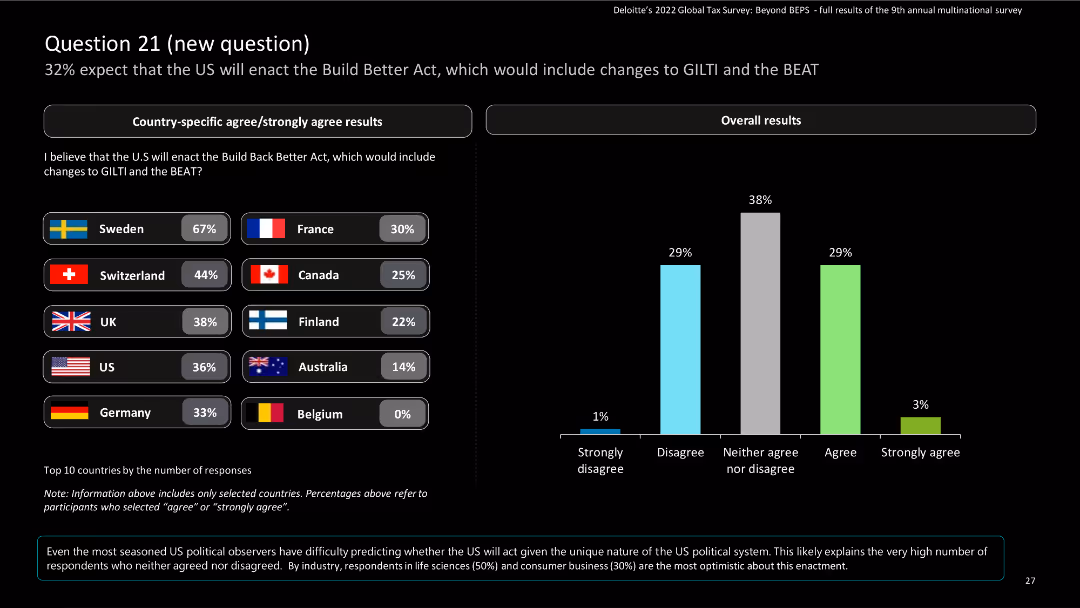
This slide includes bar charts for country-specific results and a column chart for overall results, with a donut chart for response trends.
Risk Assessment and Management
Financial Services
The slide presents survey responses on the expectation of the US enacting the Build Back Better Act, including changes to GILTI and the BEAT. It shows country-specific and overall data.
Build Back Better Act, GILTI, BEAT, survey, financial services
false
Risk Assessment and Management
Financial Services
Mixed Chart
Deloitte
Add to my slides
Remove from favorites
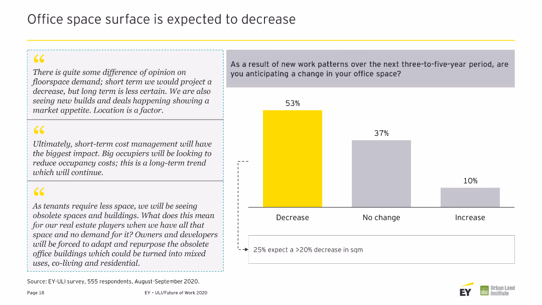
Column chart displaying changes expected in workspaces over the next three-to-five years. Contains three text quotes on the right in gray boxes. Colors used are yellow and gray.
Operational Efficiency
Real Estate & Construction
Predicts safer, healthier buildings with more collaboration spaces, advanced amenities, and services due to technological advancements and health-focused design.
Buildings, Safer, Healthier, Collaboration, Amenities, Services, Workspace, Changes, Future, Predictions
false
Operational Efficiency
Real Estate & Construction
Mixed Chart
EY
Add to my slides
Remove from favorites
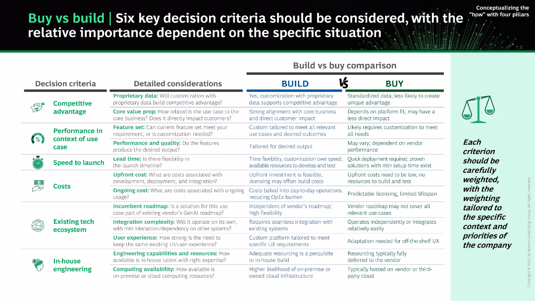
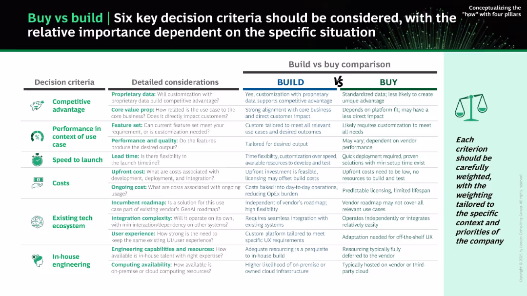
Structured side-by-side table comparison; left-aligned icons for each decision criterion; three main columns: Decision Criteria, Detailed Considerations, and Build vs Buy Comparison. Header and icons use green and black theme.
Strategic Planning
Technology & Software
The slide outlines six critical decision criteria for evaluating whether to build or buy a solution: competitive advantage, performance, speed to launch, costs, tech ecosystem, and in-house engineering. Each criterion is compared between "Build" and "Buy" with nuanced insights.
build vs buy, decision criteria, software development, IT strategy, cost, speed, customization, integration, competitive advantage, internal capability
false
Strategic Planning
Technology & Software
Table
BCG
Add to my slides
Remove from favorites
Side-by-side tabular comparison of "Build" vs "Buy" options across six criteria. Icons represent each criterion; a green/gray/white layout improves clarity.
Strategic Planning
Technology & Software
The slide compares pros and cons of building versus buying AI solutions based on competitive advantage, performance, speed, cost, tech ecosystem, and in-house skills. It encourages tailoring decisions to company-specific needs and evaluating all tradeoffs before proceeding.
build vs buy, decision framework, customization, cost, roadmap, AI strategy, integration, resourcing
false
Strategic Planning
Technology & Software
Table
BCG
Add to my slides
Remove from favorites
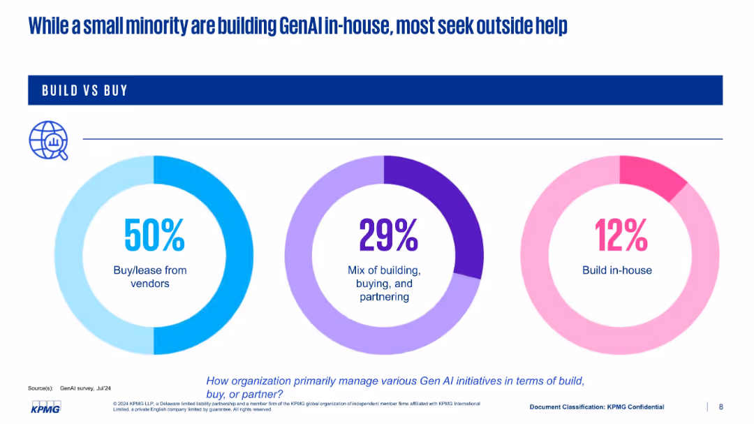
Three donut charts representing three modes of implementation: buy, mix, and build in-house
Technology and Digital Transformation
Artificial Intelligence
This slide highlights how organizations manage GenAI development—50% buy or lease from vendors, 29% use a hybrid approach, and only 12% build in-house. The chart design emphasizes the preference for external partnerships over internal development.
build vs buy, vendors, in-house, GenAI, strategy, KPMG
false
Technology and Digital Transformation
Artificial Intelligence
Single Chart
KPMG
Add to my slides
Remove from favorites
This slide presents information with a mix of text and images. It focuses on forest conservation and built environment opportunities, noting government support and carbon services ecosystem.
Market Analysis and Trends
Real Estate & Construction
Explains why the built environment sector is appealing in Singapore, discussing strong government support, high population density, and the importance of green building technologies and carbon trading.
built environment, Singapore, carbon trading, green buildings
false
Market Analysis and Trends
Real Estate & Construction
Header Horizontal
Bain
Add to my slides
Remove from favorites
Line and column chart showing characteristics of bull and bear markets in the US from 1926 to 2021, including recessions and market corrections.
Market Analysis and Trends
Financial Services
This slide details the characteristics of bull and bear markets in the US, indicating market corrections, recessions, and the impact on the market from 1926 to 2021.
bull markets, bear markets, corrections, recessions, US
false
Market Analysis and Trends
Financial Services
Mixed Chart
JP Morgan
Add to my slides
Remove from favorites
The slide has two visual elements: the upper part shows a column chart of MSCI World bull markets by duration and return, and the lower part shows a column chart of MSCI World bear markets by duration and loss.
Market Analysis and Trends
Financial Services
The slide compares the duration and returns of bull markets with the duration and losses of bear markets in the MSCI World index, providing historical context.
bull markets, bear markets, MSCI World, market trends, duration, returns, losses
false
Market Analysis and Trends
Financial Services
Multiple Chart
JP Morgan
Add to my slides
Remove from favorites
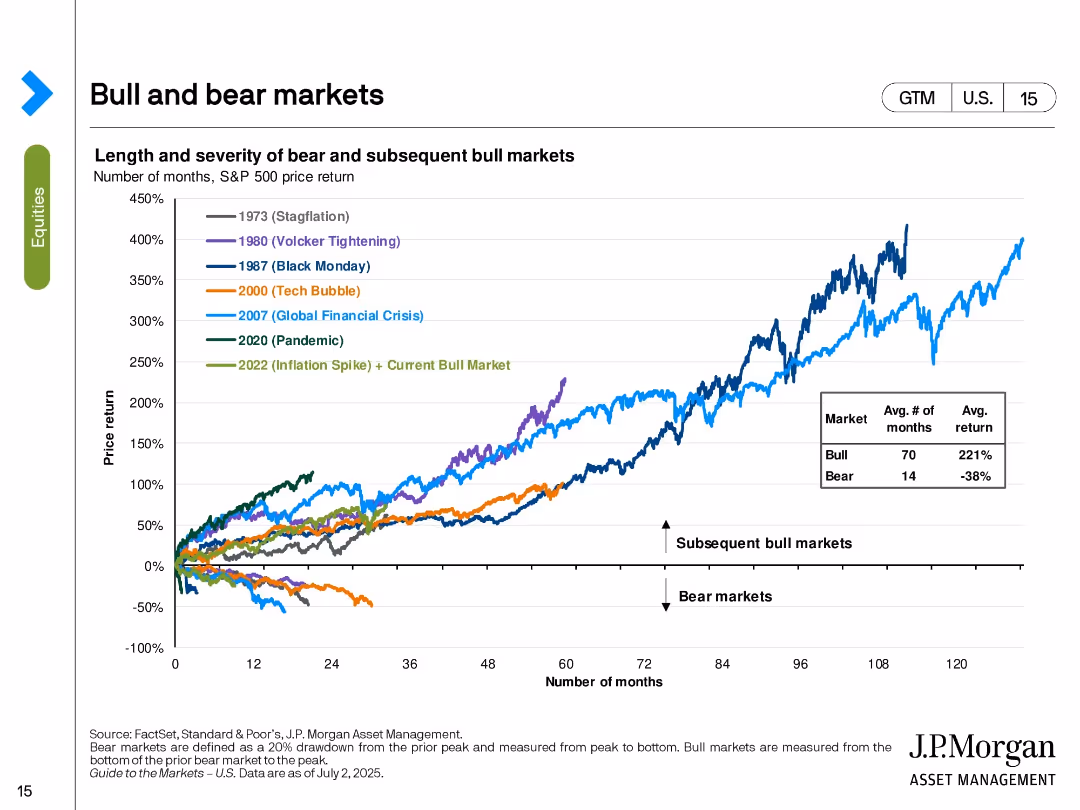
Line chart tracking the S&P 500’s performance in various historical bull and bear markets. Color-coded by major economic events.
Strategic Planning
Financial Services
The slide shows the price return trajectories of the S&P 500 in different market cycles including stagflation, tech bubble, GFC, and pandemic. It contrasts the length and return of bear vs. bull markets, with bull markets averaging 70 months and 221% return. The current bull market (since 2022) is included.
bull markets, bear markets, S&P 500, historical returns, market cycles, investment strategy, macroeconomic events, recovery
false
Strategic Planning
Financial Services
Single Chart
JP Morgan
Add to my slides
Remove from favorites
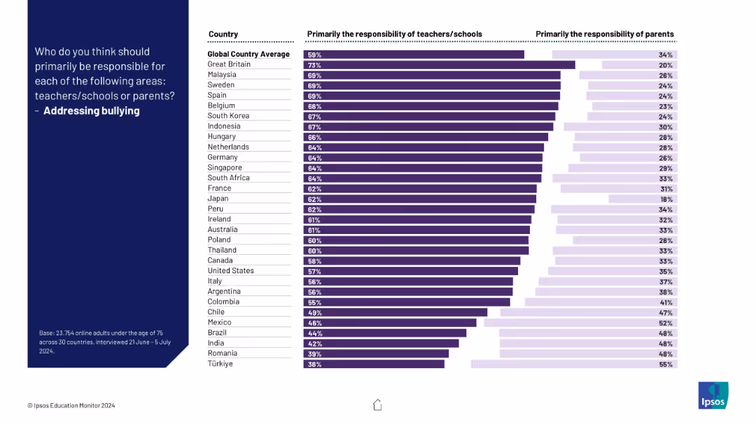
Bar chart contrasting opinions across countries on responsibility for tackling bullying; purple bars show division of roles.
Risk Assessment and Management
Education & Training
This slide assesses who is seen as responsible for addressing bullying in schools. Most countries favor institutional responsibility, though views differ significantly.
bullying, responsibility, schools, teachers, parents, children, survey, mental health, Ipsos, countries
false
Risk Assessment and Management
Education & Training
Mixed Chart
IPSOS
Add to my slides
Remove from favorites
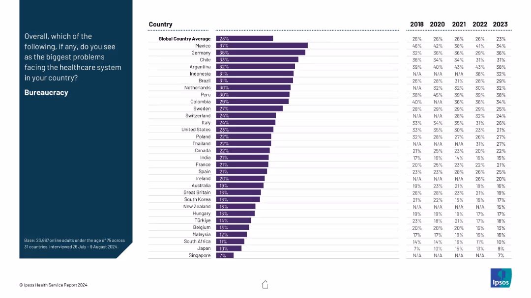
A two-column layout: the left side features the question prompt and title in white text on a dark blue background; the right side is a ranked horizontal bar chart with data from multiple countries.
Risk Assessment and Management
Healthcare & Pharmaceuticals
This slide presents data on the perceived issue of bureaucracy in healthcare systems across countries, showing how concern levels vary from 2018 to 2023. Mexico and Germany report the highest concern, above the global average.
bureaucracy, healthcare system, cross-country, trends, survey, governance, inefficiency, healthcare issues, Ipsos, 2023 data
false
Risk Assessment and Management
Healthcare & Pharmaceuticals
Mixed Chart
IPSOS
Add to my slides
Remove from favorites
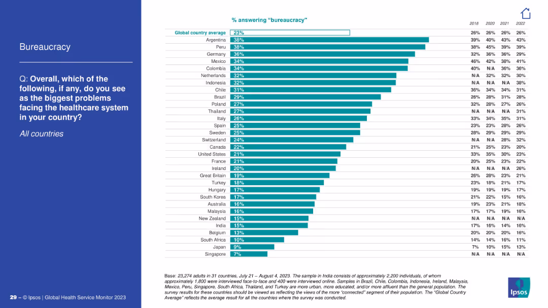
Bar chart showing country comparison on bureaucracy as a healthcare issue; blue left panel.
Operational Efficiency
Healthcare & Pharmaceuticals
Respondents from Argentina and Peru express the most concern about bureaucracy in healthcare systems. The chart illustrates comparative concern across countries with past year data (2018–2022).
bureaucracy, inefficiency, survey, healthcare
false
Operational Efficiency
Healthcare & Pharmaceuticals
Mixed Chart
IPSOS
Add to my slides
Remove from favorites
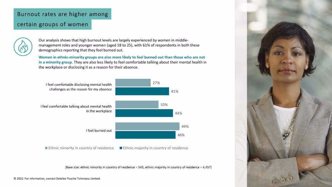
The slide compares feelings of burnout and comfort discussing mental health in the workplace between ethnic majorities and minorities, using bar graphs. The layout is clear and engaging.
Risk Assessment and Management
Professional Services
Addresses burnout levels among women in ethnic minority groups and their comfort in discussing mental health, providing insights for diversity and inclusion strategies.
burnout, ethnic minorities, mental health, workplace, discussion, 2022, health disparities, inclusion
false
Risk Assessment and Management
Professional Services
Multiple Chart
Deloitte
Add to my slides
Remove from favorites
This slide presents a straightforward column chart detailing the percentages of deskless workers feeling burned out and their job search intentions. The layout is minimalistic, focusing solely on the data presentation without extraneous visual elements, ensuring the statistics stand prominently against a clean background.
Human Resources and Talent Management
Professional Services
Provides a snapshot of the work-related burnout levels among deskless workers and their consequent job search behaviors. It highlights a significant issue within this workforce segment, stressing the need for corporate attention to employee well-being and job satisfaction to retain talent and maintain operational efficiency.
burnout, job satisfaction, deskless workers, employee retention, workforce management, job search behaviors
false
Human Resources and Talent Management
Professional Services
Multiple Chart
BCG
Add to my slides
Remove from favorites
Light background with teal and black text. It features a column chart comparing burnout rates and mental health disclosure among different groups, with a woman's photo.
Human Resources and Talent Management
Healthcare & Pharmaceuticals
Analyzes burnout rates among women in different demographics, showing that ethnic minorities and younger women experience higher burnout and less comfort in discussing mental health.
burnout, mental health, women, ethnic minorities, workplace
false
Human Resources and Talent Management
Healthcare & Pharmaceuticals
Mixed Chart
Deloitte
Add to my slides
Remove from favorites
The slide uses a combination column charts to illustrate the prevalence of burnout symptoms among different demographic groups. Includes textual analysis of the data.
Market Analysis and Trends
Healthcare & Pharmaceuticals
Focuses on the rise of burnout in professional settings, exploring demographic differences and providing insights into potential preventive measures and management strategies.
burnout, professional health, workplace wellness, demographic analysis, stress management, mental health strategies, burnout prevention, employee wellness, occupational health, survey data
false
Market Analysis and Trends
Healthcare & Pharmaceuticals
Mixed Chart
Deloitte
Add to my slides
Remove from favorites
The slide contains a column chart comparing Gen Zs and Millennials on statements related to burnout and employer responses. The layout is clean, with a text section at the top and a chart at the bottom.
Risk Assessment and Management
Professional Services
This slide discusses burnout levels among Gen Zs and Millennials and highlights the percentage of respondents agreeing with statements about workload intensity, organizational burnout, and employer responses to burnout.
Burnout, retention, employers, Gen Z, Millennials, workload
false
Risk Assessment and Management
Professional Services
Mixed Chart
Deloitte
Add to my slides
Remove from favorites
The slide uses three sets of column charts, colored green and red, depicting percentages of employee feelings towards burnout, retention, and company recommendation based on their satisfaction with managers. Each set is labeled with multipliers (1.4x, 2.2x, 3.2x) to signify the likelihood of the respective outcome.
Human Resources and Talent Management
Professional Services
This slide examines how manager satisfaction influences employee burnout, likelihood to leave, and willingness to recommend the company. It uses data from a survey of French deskless workers to show significant differences in outcomes between those satisfied and dissatisfied with their managers. Useful for HR professionals to understand managerial impact on employee retention and satisfaction.
burnout, retention, satisfaction, manager, influence, employee, French deskless workers
false
Human Resources and Talent Management
Professional Services
Multiple Chart
BCG
Add to my slides
Remove from favorites
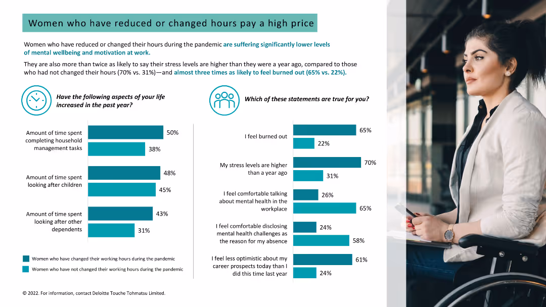
Light background with teal and black text. It features two column charts on stress levels and burnout, and increased time spent on household tasks, with a woman's photo.
Human Resources and Talent Management
Healthcare & Pharmaceuticals
Analyzes the impact of reduced or changed working hours on women's stress levels, burnout, and mental well-being, showing higher stress among those who changed hours.
burnout, stress, working hours, women, mental well-being
false
Human Resources and Talent Management
Healthcare & Pharmaceuticals
Multiple Chart
Deloitte
Add to my slides
Remove from favorites
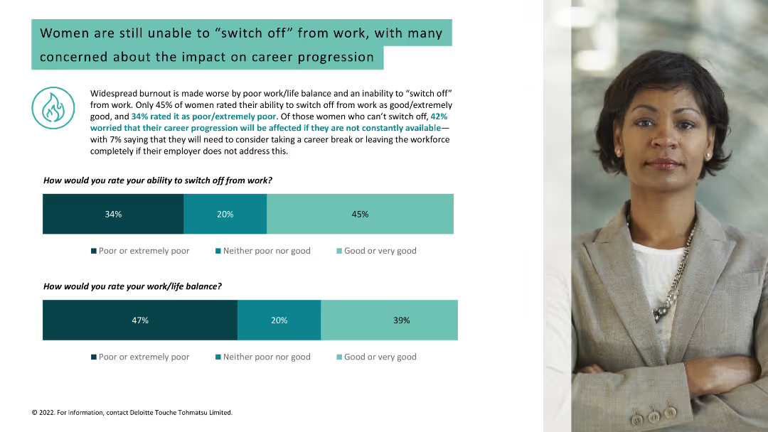
Light background with teal and black text. It includes two column charts about women's ability to switch off from work and their work/life balance, alongside a woman's photo.
Human Resources and Talent Management
Healthcare & Pharmaceuticals
Discusses widespread burnout due to poor work/life balance among women, concerns about career progression, and statistics on switching off from work and work/life balance.
burnout, work/life balance, women, career progression
false
Human Resources and Talent Management
Healthcare & Pharmaceuticals
Multiple Chart
Deloitte
Add to my slides
Remove from favorites
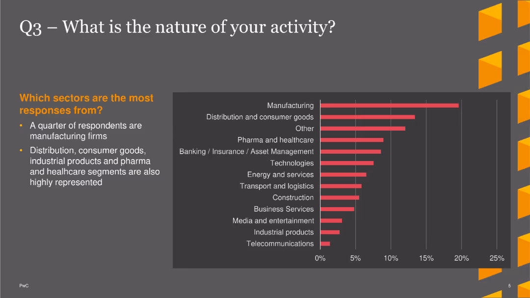
The slide displays a column chart showing the nature of business activities, with manufacturing and distribution/consumer goods being the most common.
Market Analysis and Trends
Financial Services
The slide indicates that a quarter of respondents are in manufacturing, with significant representation in distribution, consumer goods, and healthcare sectors.
Business Activity, Manufacturing, Distribution, Column Chart, PwC, Survey, 2022
false
Market Analysis and Trends
Financial Services
Mixed Chart
PwC/Strategy&
Add to my slides
Remove from favorites
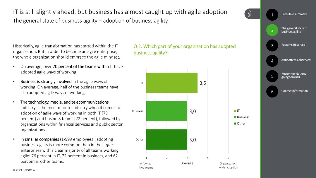
The slide includes bullet points discussing the adoption of agile practices in IT and business, along with a bar chart showing the percentage of teams adopting agile methods.
Strategic Planning
Professional Services
The slide discusses the adoption of business agility across different sectors, highlighting the percentage of IT and business teams using agile methods, and the industries most advanced in this practice.
business agility, agile adoption, IT, business, industries
false
Strategic Planning
Professional Services
Mixed Chart
Deloitte
Add to my slides
Remove from favorites
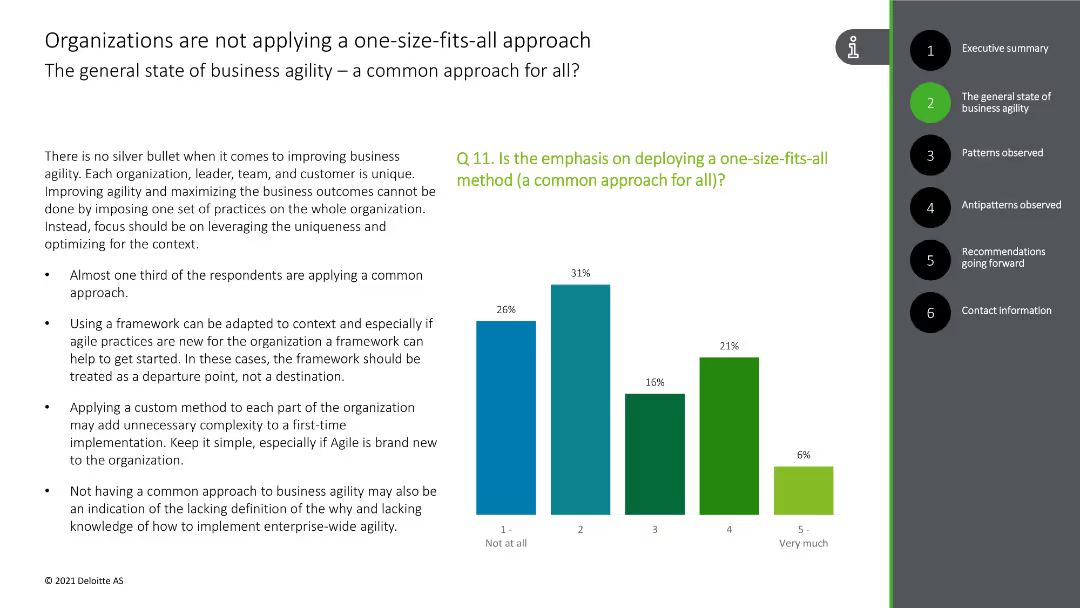
This slide presents a column chart showing the application of a common approach to business agility, with bars in green and blue colors.
Strategic Planning
Technology & Software
The slide highlights the diverse approaches to business agility, indicating that a one-size-fits-all method is not commonly applied, supported by survey data.
business agility, common approach, diversity, survey data, strategy
false
Strategic Planning
Technology & Software
Mixed Chart
Deloitte
Add to my slides
Remove from favorites
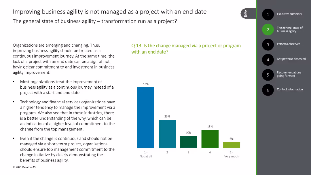
This slide includes a column chart depicting the management of business agility as a continuous journey rather than a project with an end date, with green and blue bars.
Strategic Planning
Technology & Software
The slide explains that business agility improvements are treated as ongoing processes rather than finite projects, with survey data for support.
business agility, continuous improvement, project management, survey data, strategy
false
Strategic Planning
Technology & Software
Mixed Chart
Deloitte
Add to my slides
Remove from favorites
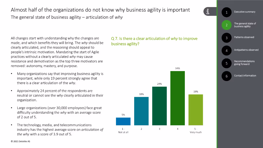
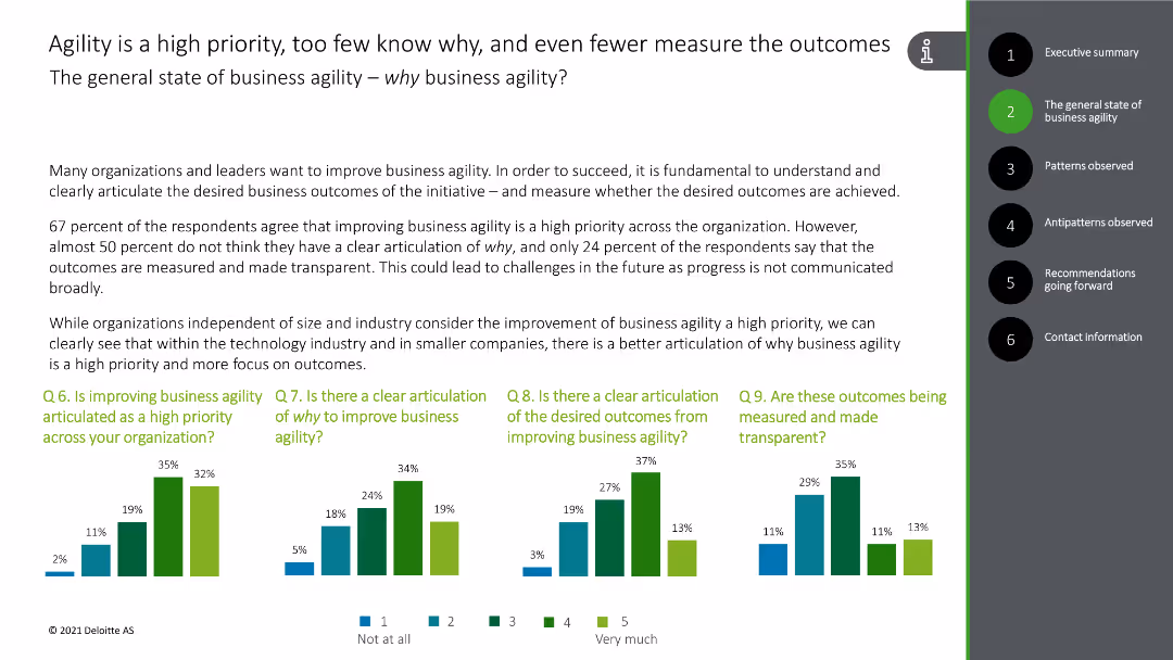
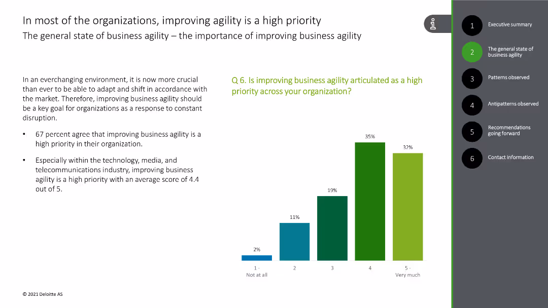
This slide includes a column chart showing levels of clarity on why improving business agility is important, with bars in various shades of green and blue.
Strategic Planning
Technology & Software
The slide highlights that many organizations lack a clear understanding of the importance of business agility, with supporting survey data on articulation of 'why'.
business agility, importance, clarity, organizations, survey data
false
Strategic Planning
Technology & Software
Mixed Chart
Deloitte
Add to my slides
Remove from favorites
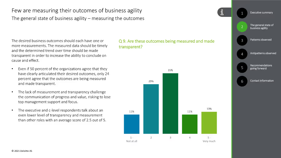
This slide displays a column chart indicating the percentage of organizations measuring their business agility outcomes, with bars in green and blue.
Performance Metrics and KPIs
Technology & Software
The slide reveals that only a minority of organizations are measuring their business agility outcomes effectively, with supporting survey statistics.
business agility, measurement, outcomes, survey data, transparency
false
Performance Metrics and KPIs
Technology & Software
Mixed Chart
Deloitte
Add to my slides
Remove from favorites
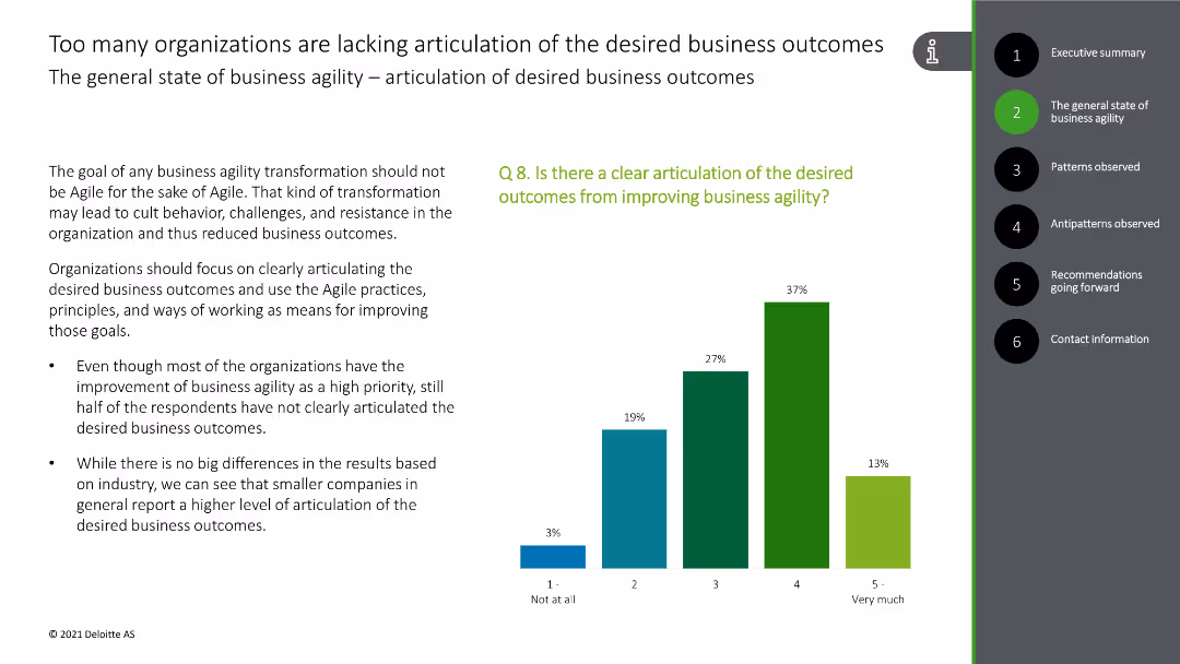
This slide presents a column chart showing levels of articulation of desired outcomes from improving business agility, with bars in green and blue shades.
Strategic Planning
Technology & Software
The slide addresses the need for clear articulation of business outcomes related to agility improvement, supported by survey results.
business agility, outcomes, clarity, articulation, survey data
false
Strategic Planning
Technology & Software
Mixed Chart
Deloitte
Add to my slides
Remove from favorites
This slide contains a column chart with various shades of green and blue bars indicating the levels of priority and clarity of business agility across organizations.
Strategic Planning
Professional Services
The slide discusses the importance of business agility, highlighting survey results on organizational priorities and clarity regarding business agility outcomes.
business agility, priority, clarity, outcomes, survey results
false
Strategic Planning
Professional Services
Multiple Chart
Deloitte
Add to my slides
Remove from favorites
This slide shows a column chart with responses on the priority of business agility in organizations, featuring bars in green and blue colors.
Strategic Planning
Technology & Software
The slide emphasizes that improving business agility is a high priority for most organizations, supported by survey data indicating a high agreement among respondents.
business agility, priority, organizations, survey data, importance
false
Strategic Planning
Technology & Software
Mixed Chart
Deloitte
Add to my slides
Remove from favorites
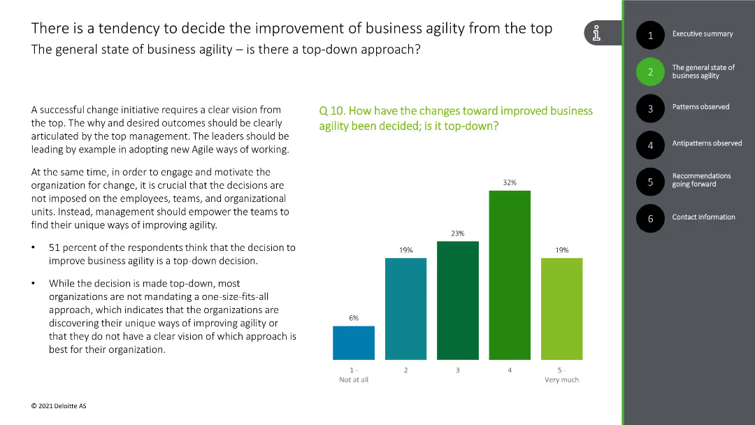
This slide shows a column chart indicating the top-down decision-making process for business agility improvements, with green and blue bars.
Organizational Structure and Change
Technology & Software
The slide emphasizes the top-down approach in deciding business agility improvements, backed by survey results.
business agility, top-down, decision-making, survey data, improvement
false
Organizational Structure and Change
Technology & Software
Mixed Chart
Deloitte
Add to my slides
Remove from favorites
The slide features a diagram with segments labeled and percentages indicating the distribution of assets between Seadrill's various entities. Adjacent to the chart, there's a list of bullet points detailing Seadrill's assets and partnerships. The overall color scheme is blue and yellow, reflecting the company branding, with the pie chart prominently positioned on the right, and text sections on the left. The chart's design is straightforward, with clear labels for each segment.
Industry Overview
Energy & Utilities
The slide provides a detailed overview of Seadrill's business structure, showing the breakdown of assets among its subsidiaries and partnerships. It lists specific figures, like the number of rigs and new builds, highlighting Seadrill's market presence and investment diversity. The slide aims to present a snapshot of the company’s core operations and strategic investments to stakeholders, possibly during an annual general meeting or investor briefing.
business, assets, Seadrill, partnerships, overview, investment, rigs, pie chart, structure, subsidiaries
false
Industry Overview
Energy & Utilities
Diagram
Barclays
Add to my slides
Remove from favorites
Central pie chart divided into four segments, with each segment's percentage and related business area labeled. Below are icons representing each business area.
Market Analysis and Trends
Financial Services
Communicates the proportional contributions of different business sectors to the overall company portfolio, emphasizing diversification and growth strategy.
Business Banking, Investment Services
false
Market Analysis and Trends
Financial Services
Mixed Chart
Goldman Sachs
Add to my slides
Remove from favorites
Two pie charts showing the distribution of business banking relationships, accompanied by a column chart showing the growth of talech customers, using blue tones.
Sales and Business Development
Financial Services
Presents the expansion strategy in business banking, indicating the potential for deepening customer relationships and adding new customers through various payment solutions.
Business Banking, talech, Bento, Growth
false
Sales and Business Development
Financial Services
Multiple Chart
Goldman Sachs
Add to my slides
Remove from favorites
This slide features a line graph over time, showing trends in investor priorities related to business capabilities and EPS guidance. It's a data-driven layout with a focus on chronological changes and comparison.
Strategic Planning
Financial Services
Shows how investor priorities have shifted over the past year regarding business capabilities and EPS guidance, useful for strategic planning and performance evaluation.
Business Capabilities, EPS Guidance, Investor Priorities, Trend Analysis, Corporate Strategy, Long-term Focus, Performance Evaluation, Investment Trends, Strategic Development, Guidance Compliance
false
Strategic Planning
Financial Services
Single Chart
BCG
Add to my slides
Remove from favorites
Scatter plot analyzing the correlation between financial performance and business & technology dimensions among companies.
Technology and Digital Transformation
Technology & Software
Evaluates how companies with strong business and technological capabilities tend to outperform in long-term profitability.
business capabilities, technology, financial performance, profitability, long-term growth, scatter plot, business dimensions, technology investment
false
Technology and Digital Transformation
Technology & Software
Mixed Chart
Accenture
Add to my slides
Remove from favorites
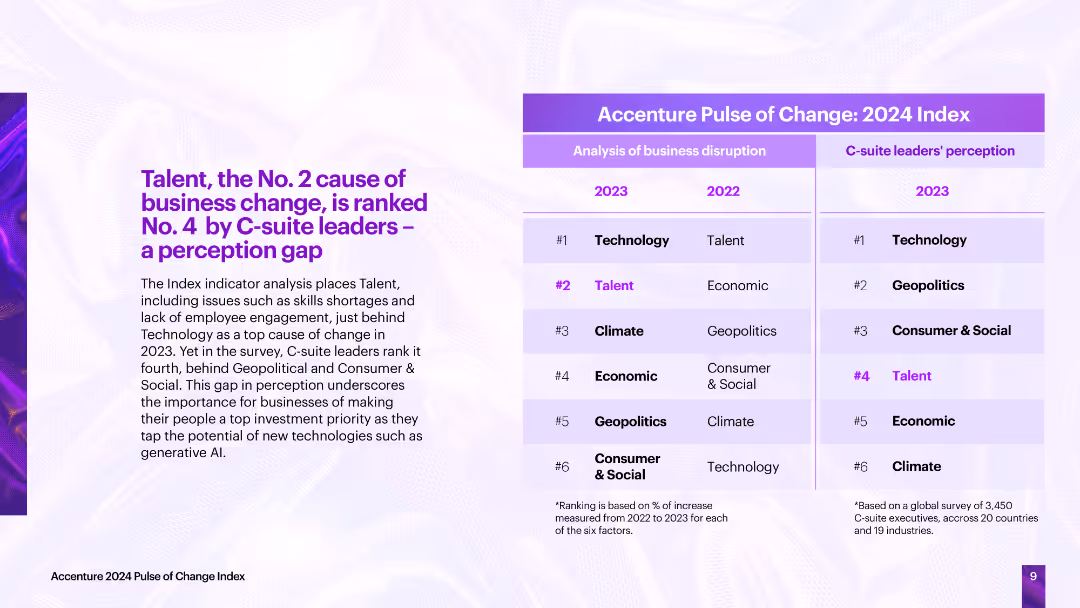
The slide contrasts the analysis of business disruption causes with C-suite leaders' perceptions, showing a perception gap, particularly in the importance of talent.
Strategic Planning
Professional Services
The slide highlights a perception gap between the actual causes of business disruption and C-suite leaders' perceptions, emphasizing the need for businesses to prioritize talent to tap into new technologies effectively.
business change, C-suite perception, disruption causes, talent, technology
false
Strategic Planning
Professional Services
Table
Accenture
Add to my slides
Remove from favorites
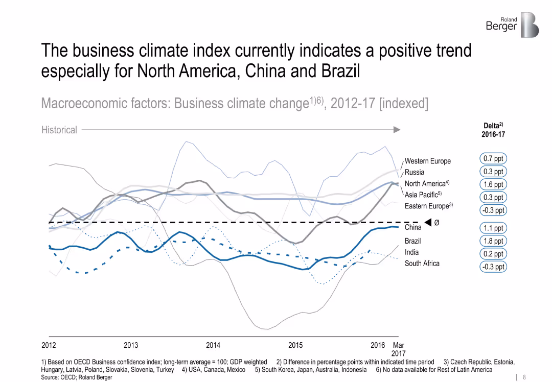
Line graph showing indexed business climate trends across regions, with emphasis on recent delta changes
Market Analysis and Trends
Industrial & Manufacturing
The slide evaluates regional business climate shifts from 2012 to 2017, highlighting recent improvements in North America, China, and Brazil. It uses OECD data to chart confidence and trend direction.
business climate, macroeconomics, confidence, North America, China, Brazil, OECD
false
Market Analysis and Trends
Industrial & Manufacturing
Single Chart
Roland Berger
Add to my slides
Remove from favorites
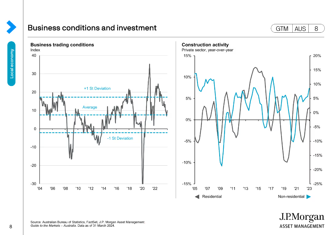
This slide includes two line charts: one showing business trading conditions with average and standard deviation lines, and the other showing construction activity.
Market Analysis and Trends
Financial Services
Analyzes business trading conditions and construction activity, comparing current performance to historical averages and deviations, useful for market analysis.
business conditions, investment, trading, construction, trends
false
Market Analysis and Trends
Financial Services
Multiple Chart
JP Morgan
Add to my slides
Remove from favorites
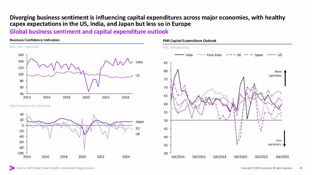
Two-panel line charts: Left shows business confidence indicators; Right shows PMI capital expenditure outlook across India, US, Euro area, UK, Japan.
Strategic Planning
Professional Services
The slide compares business sentiment and capex expectations globally. India and the US show stronger optimism, while Europe and Japan remain more subdued. It uses PMI and business confidence indicators to illustrate diverging economic outlooks.
business confidence, capex, India, US, Euro area, PMI, optimism, sentiment
false
Strategic Planning
Professional Services
Multiple Chart
Accenture
Add to my slides
Remove from favorites
The slide includes a combination of text and highlighted numbers and points. It also features quotes from various CEOs.
Strategic Planning
Government & Public Sector
The slide emphasizes the need for increased commitment and action from businesses to meet the global goals by 2030, highlighting key areas of focus and CEO perspectives.
Business Contribution, 2030 Goals, Strategic Planning, System Change, CEO Perspectives, Government
false
Strategic Planning
Government & Public Sector
Header Horizontal
Accenture
Add to my slides
Remove from favorites
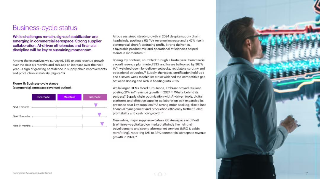
Left-side layout with a paragraph and a simple horizontal triangle graph showing expected revenue outlook. Right image shows a person analyzing a futuristic digital engine model.
Market Analysis and Trends
Industrial & Manufacturing
Presents executive outlooks on aerospace revenue over 6, 12, and 24 months, signaling confidence in increasing revenues. Also includes OEM-specific performance insights, highlighting AI, supply chain improvements, and operational resilience.
business cycle, aerospace, revenue outlook, AI tools, Airbus, Boeing, OEMs, growth forecast, supply chain
false
Market Analysis and Trends
Industrial & Manufacturing
Mixed Chart
Accenture
Add to my slides
Remove from favorites
Similar to slide 11, with the addition of 'Opportunities' in a third column; uses a simple and clean layout.
Strategic Planning
Financial Services
Strategic insights into future business development, focusing on opportunities stemming from secular changes.
Business Development, Opportunities, Strategy, Future
false
Strategic Planning
Financial Services
Linear Flow
Goldman Sachs
Add to my slides
Remove from favorites
Includes company logos, brief stats about each company, and icons representing various business aspects, making it visually comprehensive.
Strategic Planning
Technology & Software
Discusses the formation of a new business group under Faurecia, combining resources from Clarion, Parrot Automotive, and Coagent, focusing on software engineering and sales growth.
business development, strategic planning, software, sales, automotive
false
Strategic Planning
Technology & Software
Pillar
Deutsche Bank
Add to my slides
Remove from favorites
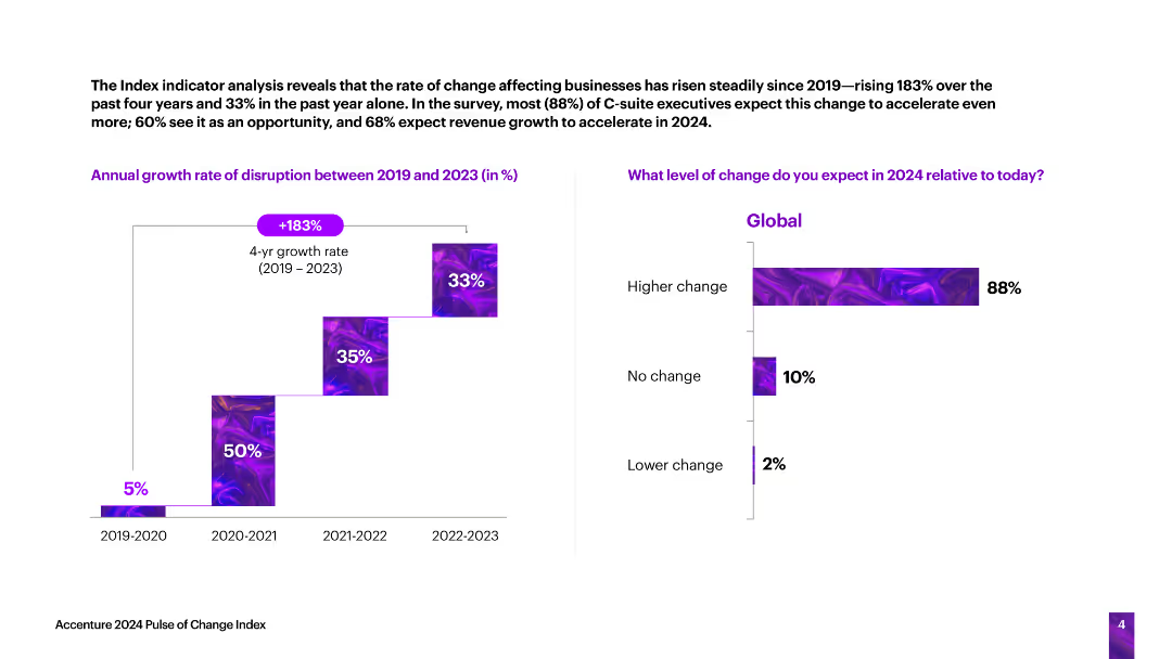
The slide features a vertical column chart showing the annual growth rate of business disruption from 2019 to 2023, and a horizontal bar chart predicting the level of change in 2024.
Technology and Digital Transformation
Technology & Software
The slide analyzes the rate of change affecting businesses, indicating a significant increase in disruption over the past four years and expectations for further changes in 2024.
business disruption, growth rate, change, predictions, technology
false
Technology and Digital Transformation
Technology & Software
Multiple Chart
Accenture
Add to my slides
Remove from favorites
Previous
Next
You don't have any favorites yet.
Please wait loading your favorites slides...
Create a FREE account to continue browsing
Receive Instant Access to 1,000+ slides from companies like McKinsey, Google, and Goldman Sachs
First Name
Last Name
Email
Password
I agree to all
Terms & Privacy Policy
Thank you! Your submission has been received!
Oops! Something went wrong while submitting the form.
Have an account?
Sign in
Upgrade to PRO to Save slides
Advanced Search and Filters
Access to 15,000+ slides
Access to Category Pages
Save/Bookmark Slides
PowerPoint Template Library
Pick a Plan
MONTHLY
$12/month
Billed every month, Cancel anytime.
YEARLY
$9/year
Billed $108 annually, Cancel anytime.
Checkout for $12/month
Checkout for $108/yr
Secured by Stripe | AES-256 bit encryption