My Account
My Slides
Search by Category
Companies
Slide Type
Use Case
Industry
Pricing
Templates
View All Templates
Download Template Slides
✦ AI
AI Prompt Library
AI Search
Feedback
Login
Logout
Get Started
Browse all Slides
Browse all Slides
Create a FREE Account
Instant access to 1,000+ real slides from top companies like McKinsey, BCG, Goldman Sachs, Google and many more!
First Name
Last Name
Email
Password
I agree to all
Terms & Privacy Policy
Thank you! Your submission has been received!
Oops! Something went wrong while submitting the form.
Have an account?
Sign in
Saved Slides
Total No. of slides saved
0
↻ Refresh
✖ Clear all
A column chart comparing active weights of China/HK by category and domicile for US and non-US managers in different fund categories from Oct-22 to Jan-23.
Market Analysis and Trends
Financial Services
The slide analyzes the varying positions of China/HK in active weights across different managers and fund categories, highlighting significant differences.
China, HK, Fund Categories, Active Weights, Managers
false
Market Analysis and Trends
Financial Services
Multiple Chart
Morgan Stanley
Add to my slides
Remove from favorites
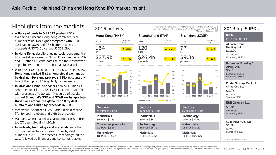
Includes column charts, data tables, and bullet points. The slide is visually detailed, focusing on IPO activities in Mainland China and Hong Kong for 2019.
Market Analysis and Trends
Financial Services
Provides insights into the IPO market activities in Mainland China and Hong Kong for 2019, highlighting major stock exchanges, sector performances, and the top IPOs by proceeds.
China, Hong Kong, IPO, market insight, 2019, trends
false
Market Analysis and Trends
Financial Services
Multiple Chart
EY
Add to my slides
Remove from favorites
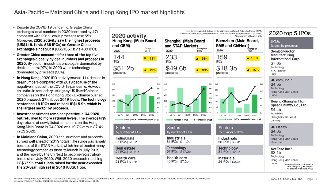
The slide features column charts and bar charts summarizing IPO activity in Mainland China and Hong Kong, highlighting key sectors and top IPOs by proceeds.
Market Analysis and Trends
Financial Services
The slide highlights IPO activity in Mainland China and Hong Kong in 2020, focusing on the performance of key stock exchanges, sectors, and top IPOs by proceeds.
China, Hong Kong, IPO, sectors, proceeds
false
Market Analysis and Trends
Financial Services
Multiple Chart
EY
Add to my slides
Remove from favorites
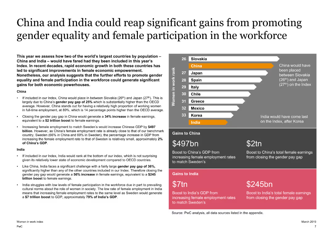
The slide presents a mix of text and a column chart comparing China and India’s potential gains from gender equality. It uses color coding to differentiate between the countries and their gains.
Market Analysis and Trends
Financial Services
It assesses the economic gains that China and India could achieve by promoting gender equality and increasing female workforce participation, highlighting potential GDP boosts.
China, India, Gender, Equality, Gains, Economy
false
Market Analysis and Trends
Financial Services
Mixed Chart
PwC/Strategy&
Add to my slides
Remove from favorites
The slide shows line graphs comparing official and alternative measures of industrial production growth in China. The use of contrasting colors helps distinguish between the two data series.
Market Analysis and Trends
Industrial & Manufacturing
Provides an analysis of industrial production growth in China, contrasting official data with alternative sources. Useful for understanding the real economic situation in China and for investment or policy-making decisions.
China, Industrial Production, Economic Analysis, Growth, Data Sources
false
Market Analysis and Trends
Industrial & Manufacturing
Single Chart
Deutsche Bank
Add to my slides
Remove from favorites
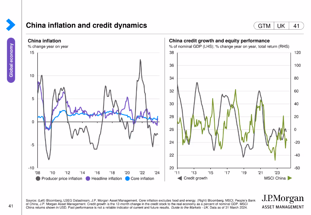
Two line charts: one displays China’s producer price, headline, and core inflation, and the other shows credit growth and equity performance with MSCI China index.
Market Analysis and Trends
Financial Services
This slide analyzes China's inflation rates across different measures and their credit growth dynamics, along with equity performance. Used for economic trend analysis and investment strategy.
China, inflation, credit, equity, MSCI
false
Market Analysis and Trends
Financial Services
Multiple Chart
JP Morgan
Add to my slides
Remove from favorites
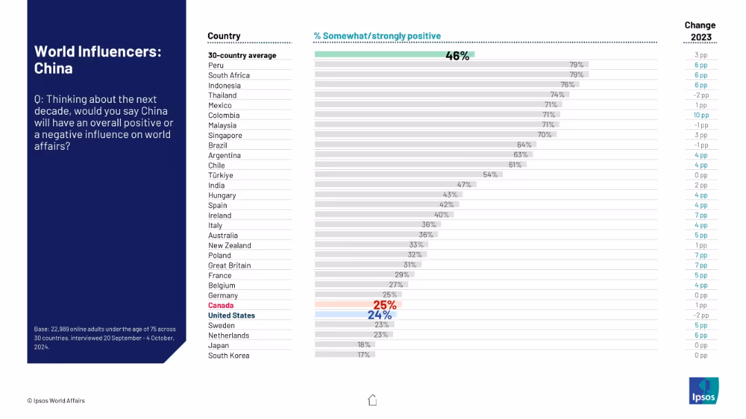
Left-hand context section and right-side horizontal bar chart comparing nations' views.
Market Analysis and Trends
Government & Public Sector
The slide summarizes global attitudes toward China’s future role in world affairs. The data show a polarized view, with some countries more favorable than others, and general sentiment still low.
China, influence perception, global opinion, Ipsos, international relations, approval ratings, sentiment data, 2024 survey, comparison chart
false
Market Analysis and Trends
Government & Public Sector
Mixed Chart
IPSOS
Add to my slides
Remove from favorites
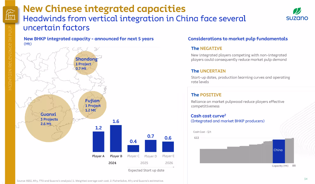
Left map shows project locations; right section outlines market impacts (positive, negative, uncertain). Uses muted tones and a segmented layout.
Competitive Landscape
Industrial & Manufacturing
Highlights new integrated BHKP capacities in China and their potential impact. Identifies risks (competition, uncertainty in execution) and advantages (market pulp reliance). A cost curve shows Chinese producers’ positioning.
China, integrated capacity, BHKP, Suzano, market risk, competitiveness, pulp
false
Competitive Landscape
Industrial & Manufacturing
Multiple Chart
Goldman Sachs
Add to my slides
Remove from favorites
Two line charts displaying fixed asset investment trends in China by ownership and sector, covering state-owned, private, and total investments.
Market Analysis and Trends
Financial Services
This slide examines investment trends in China, showing changes in fixed asset investments by state-owned enterprises, private sectors, and various industries.
China, investment, fixed assets, state-owned enterprises, private sector
false
Market Analysis and Trends
Financial Services
Multiple Chart
JP Morgan
Add to my slides
Remove from favorites
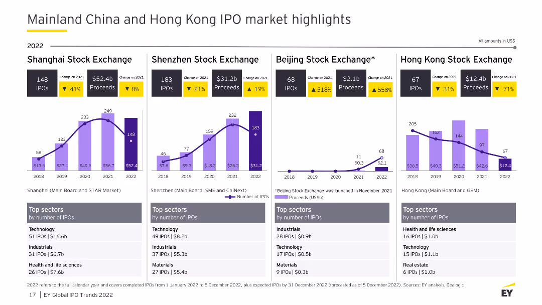
The slide contains column charts and tables detailing IPO activities across Mainland China and Hong Kong stock exchanges. It includes sector-specific data and changes from 2021.
Market Analysis and Trends
Financial Services
This slide provides a detailed analysis of IPO market highlights in Mainland China and Hong Kong for 2022, showcasing sector performance, market changes, and key data on IPO numbers and proceeds.
China IPO, Hong Kong, stock exchange, sector, 2022
false
Market Analysis and Trends
Financial Services
Multiple Chart
EY
Add to my slides
Remove from favorites
This slide features multiple column charts and tables comparing IPO activities in the Shanghai, Shenzhen, Beijing, and Hong Kong stock exchanges.
Market Analysis and Trends
Financial Services
The slide highlights the IPO market performance in Mainland China and Hong Kong, showing data on the number of IPOs and proceeds, along with the top sectors for each stock exchange.
China IPO market, Hong Kong IPOs, stock exchanges, financial trends, sector analysis
false
Market Analysis and Trends
Financial Services
Multiple Chart
EY
Add to my slides
Remove from favorites
The layout includes a bar graph labeled "FIGURE 5", textual analysis on the left, and quotes pertaining to the role of AI in skill development.
Market Analysis and Trends
Technology & Software
Focusing on China, the slide projects the future of work roles from 2017 to 2028, addressing the dominant employment sectors and the impact of automation on labor distribution.
China, Labor, Automation, Skills, Future
false
Market Analysis and Trends
Technology & Software
Mixed Chart
Accenture
Add to my slides
Remove from favorites
Red line and bar graph against a white background, showing China's cases per day and total reported cases, with key event markers.
Risk Assessment and Management
Healthcare & Pharmaceuticals
Outlines China's response to COVID-19 with lockdowns and testing, highlighting the timeline of cases and government actions.
China, lockdowns, testing, COVID-19, government response
false
Risk Assessment and Management
Healthcare & Pharmaceuticals
Single Chart
McKinsey
Add to my slides
Remove from favorites
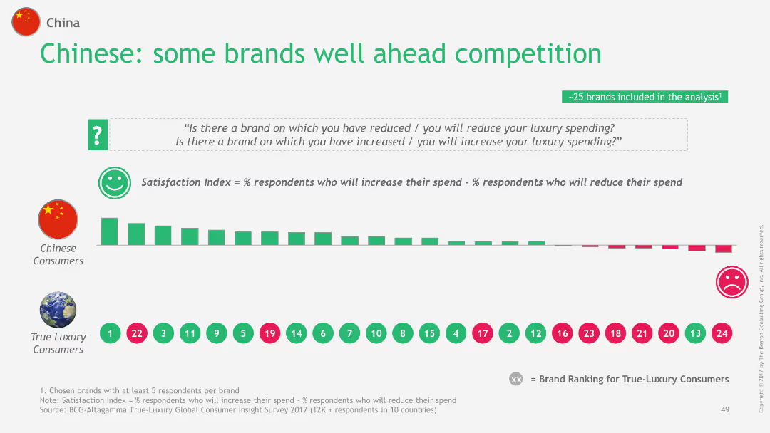
The slide features a bar chart comparing the satisfaction index of various luxury brands among Chinese consumers and True-Luxury Consumers. It shows the ranking of 25 brands based on the percentage of respondents likely to increase vs. reduce their luxury spending.
Customer and Market Segmentation
Consumer Goods
This slide presents the satisfaction index of luxury brands among Chinese consumers, highlighting which brands are ahead in customer satisfaction compared to True-Luxury Consumers, using a comparative analysis of 25 brands.
China, luxury, brand satisfaction, consumers, index
false
Customer and Market Segmentation
Consumer Goods
Single Chart
BCG
Add to my slides
Remove from favorites
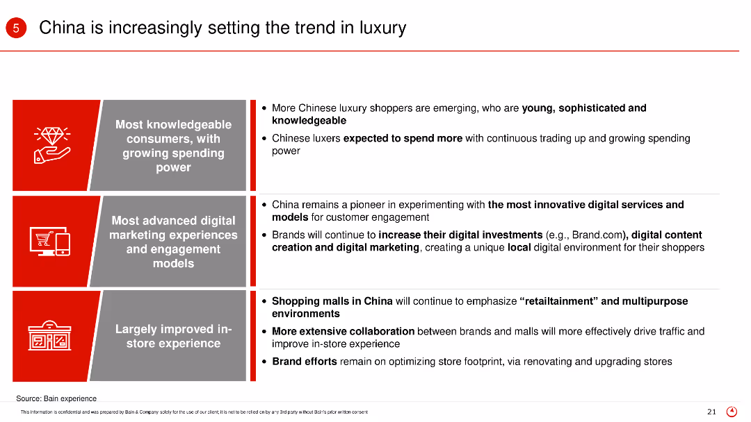
The slide uses a three-column layout with text and icons in each column. Red and gray color scheme is used for emphasis.
Market Analysis and Trends
Retail & E-commerce
The slide discusses how China is leading in luxury market trends with knowledgeable consumers, advanced digital marketing, and improved in-store experience.
China, luxury, consumers, digital marketing, trends
false
Market Analysis and Trends
Retail & E-commerce
Table
Bain
Add to my slides
Remove from favorites
This slide is focused on the Chinese luxury goods market, featuring a column chart that track consumption growth from 2012 to 2017, compared to non-Chinese markets. It uses contrasting colors like red for China and gray for other markets, effectively highlighting the differences in growth rates.
Market Analysis and Trends
Consumer Goods
Highlights the booming luxury goods consumption in China, contrasting it with more moderate growth in other global markets. Details the impact of increased consumer confidence and economic factors in China, while providing a broader view of global market trends.
China, luxury goods, market growth, consumer behavior, global comparison
false
Market Analysis and Trends
Consumer Goods
Single Chart
Bain
Add to my slides
Remove from favorites
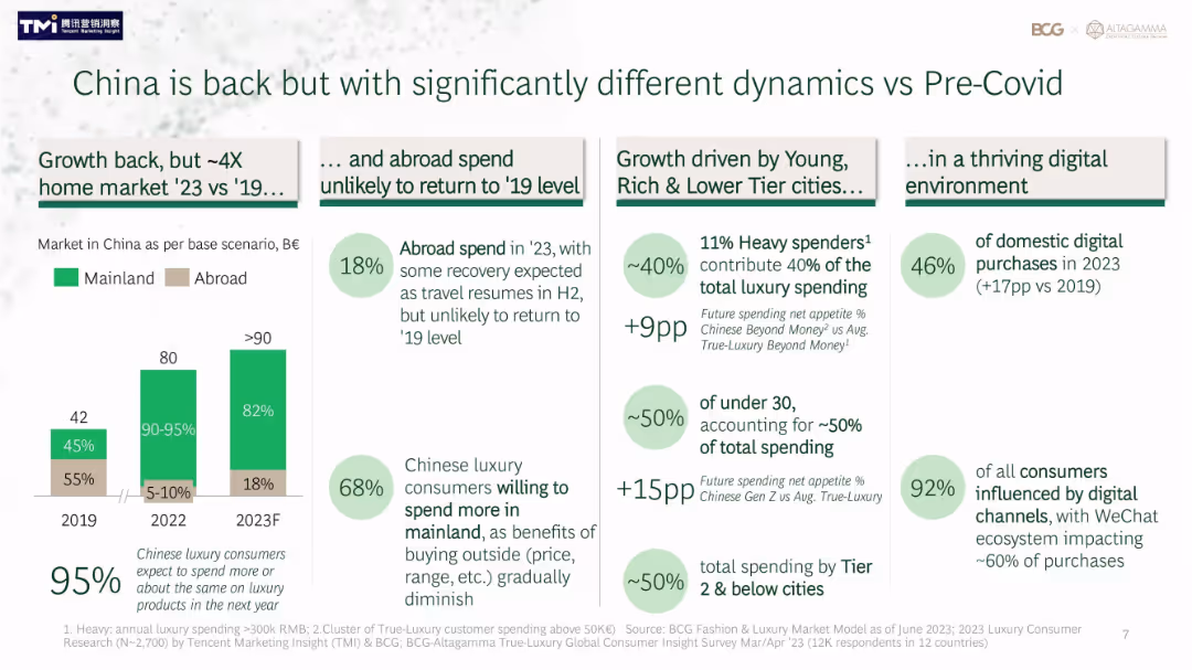
Grid layout of statistics, bar graph, and segmented insights on spending shifts and digital trends
Market Analysis and Trends
Consumer Goods
This slide details how China’s luxury market has changed since pre-Covid, noting a shift toward domestic consumption and strong digital influence. Charts and stats show reduced outbound spend, younger and lower-tier city consumer dominance, and digital purchases now making up nearly half the market.
China, luxury market, digital, consumer trends, post-Covid, Tier 2 cities, youth, e-commerce, domestic spending
false
Market Analysis and Trends
Consumer Goods
Mixed Chart
BCG
Add to my slides
Remove from favorites
Slide presents column charts and bullet points. The charts display luxury market projections for 2017 and 2025, emphasizing Chinese consumption. Red and gray colors differentiate data.
Market Analysis and Trends
Retail & E-commerce
This slide analyzes the future growth trends in the luxury goods market, focusing particularly on China's role. It highlights domestic versus international spending in the context of overall market growth.
China, Luxury Market, Growth, Consumption, Projections
false
Market Analysis and Trends
Retail & E-commerce
Multiple Chart
Bain
Add to my slides
Remove from favorites
A combination of timeline, infographic elements, and key investment figures related to the company's history and activities in China, arranged neatly with icons and bullet points.
Strategic Planning
Financial Services
Analyzes the company’s long-term involvement in China and outlines strategies for capitalizing on the developing market, emphasizing the potential for growth and investment.
China, market expansion, investments, development, strategy
false
Strategic Planning
Financial Services
Table
Goldman Sachs
Add to my slides
Remove from favorites
The slide includes a large image of the Chinese flag on the left, with text and a line graph on the right showing Chinese quarterly GDP growth rate. The layout is visually striking and data-focused.
Competitive Landscape
Industrial & Manufacturing
The slide outlines Ipsos' market strength in China, noting stability during COVID-19, the acquisition of Shanghai Focus RX, and the rebounding GDP growth in 2023.
China, market leader, GDP growth, acquisition, stability
false
Competitive Landscape
Industrial & Manufacturing
Mixed Chart
IPSOS
Add to my slides
Remove from favorites
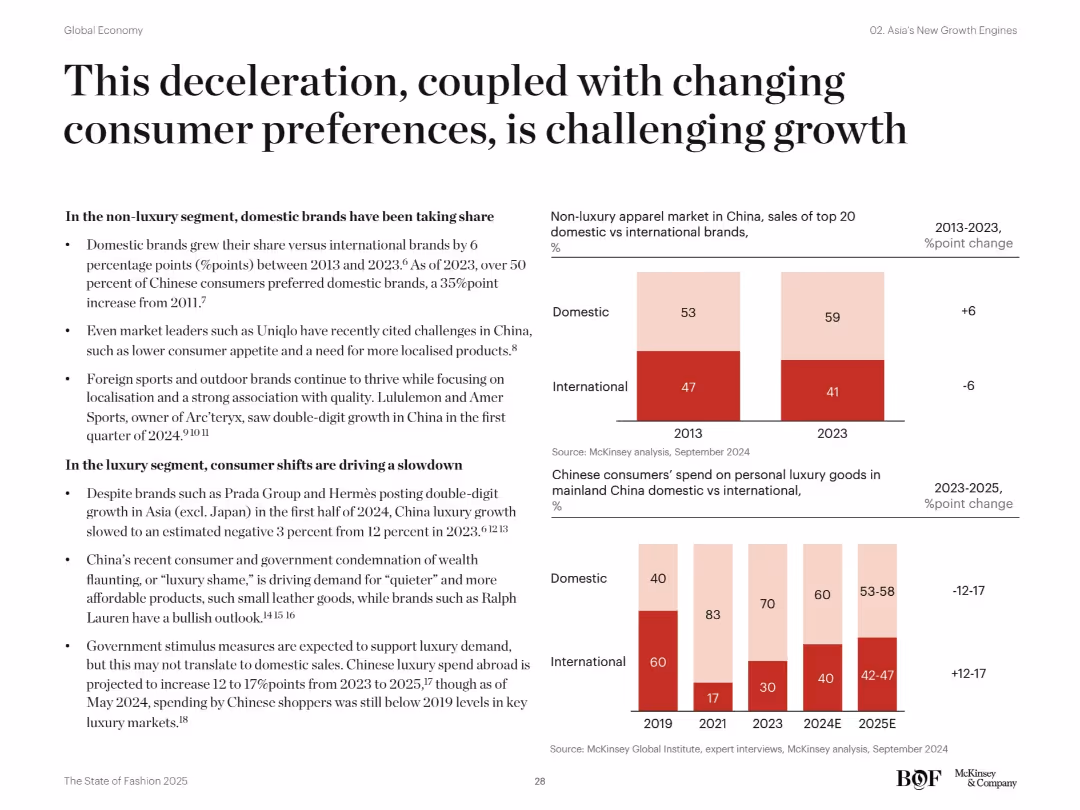
Dual section layout with bulleted content and two visual graphs. One chart shows shifts in non-luxury brand market share, the other in luxury spending behavior.
Market Analysis and Trends
Consumer Goods
This slide explores changing consumer preferences in China’s fashion market. Domestic brands are gaining in non-luxury segments, while luxury spending shows a decline due to “luxury shame” and changing values. The market outlook is cautious, with growth shifting abroad and toward domestic purchases.
China market, non-luxury, luxury, consumer trends, domestic brands, fashion, apparel, international brands, spending behavior, brand shifts
false
Market Analysis and Trends
Consumer Goods
Multiple Chart
McKinsey
Add to my slides
Remove from favorites
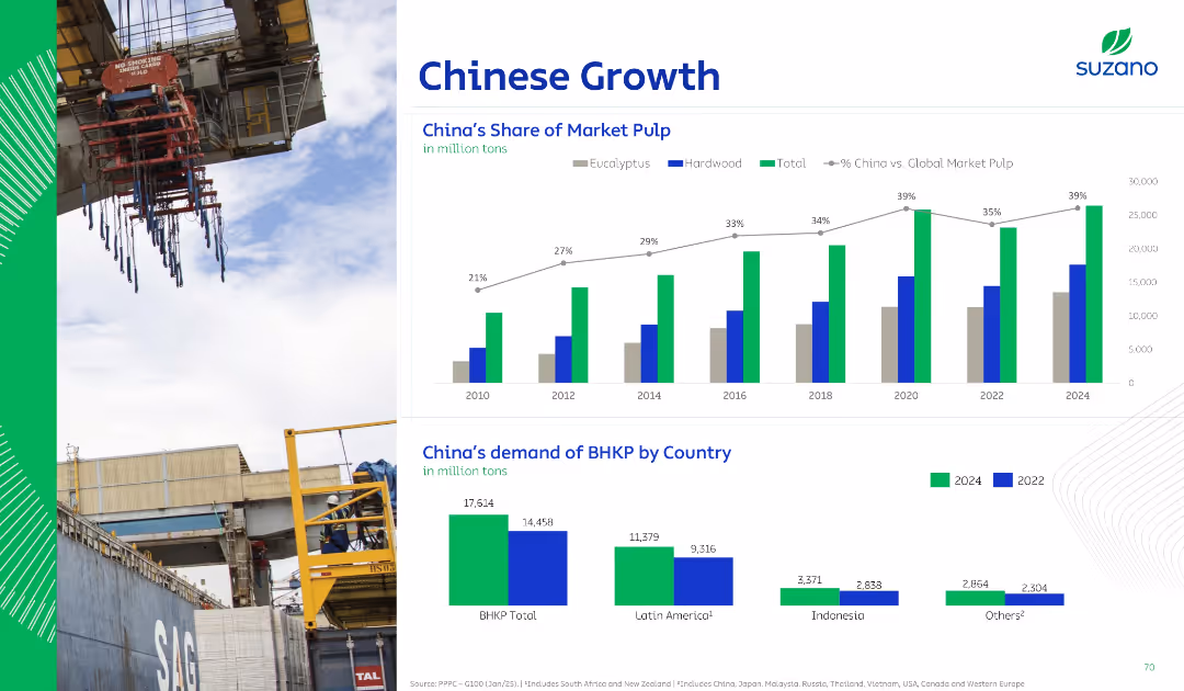
Dual-chart layout showing bar and line graphs. Top graph tracks China’s share of global pulp; bottom compares BHPP demand by region. Left-side industrial image.
Market Analysis and Trends
Industrial & Manufacturing
This slide highlights China's increasing market share in global pulp consumption, with detailed comparisons of demand across regions, especially in Latin America, Indonesia, and others for 2022 vs. 2024 projections.
China, market pulp, demand, hardwood, eucalyptus, global share, BHKP, growth, forecast
false
Market Analysis and Trends
Industrial & Manufacturing
Multiple Chart
Goldman Sachs
Add to my slides
Remove from favorites
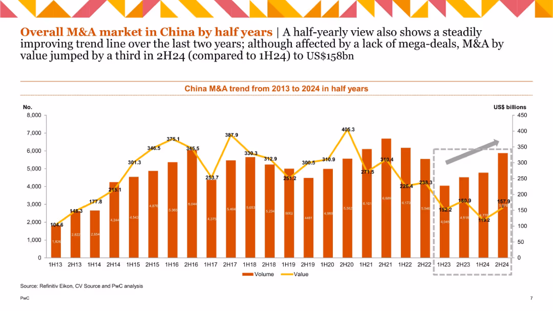
Half-yearly bar and line chart; orange bars for volume, yellow line for value; trend arrow indicating 2024 growth; gray highlight box around recent data.
Market Analysis and Trends
Financial Services
Offers a semi-annual analysis of M&A activity in China. The chart shows fluctuations with a recent uptrend in value, jumping by a third in 2H24 to US$158bn. Despite fewer mega-deals, the trend suggests renewed activity.
China M&A, semi-annual, deal value, deal volume, trend, 2024
false
Market Analysis and Trends
Financial Services
Single Chart
PwC/Strategy&
Add to my slides
Remove from favorites
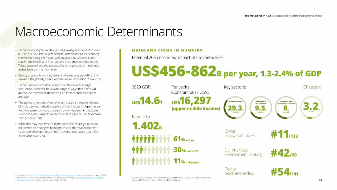
Features detailed text about China's economic impact of the metaverse, with numerical data on the right side including GDP, per capita income, and key sectors such as manufacturing, retail trade, and financial activities. The background is white.
Market Analysis and Trends
Financial Services
Discusses China's strong service sector and the potential economic impact of the metaverse, providing insights into China's GDP, innovation index ranking, and digital readiness.
China, metaverse, economic impact, service sector, digital readiness
false
Market Analysis and Trends
Financial Services
Mixed Chart
Deloitte
Add to my slides
Remove from favorites
Two line charts comparing the Chinese yuan exchange rates with CFETS RMB Index and USD/CNY, and key policy rates over time.
Market Analysis and Trends
Financial Services
The slide presents China's monetary policy impacts on exchange rates and key policy interest rates, indicating trends in currency value and policy adjustments.
China, monetary policy, exchange rate, yuan, CFETS RMB Index, policy rates
false
Market Analysis and Trends
Financial Services
Multiple Chart
JP Morgan
Add to my slides
Remove from favorites
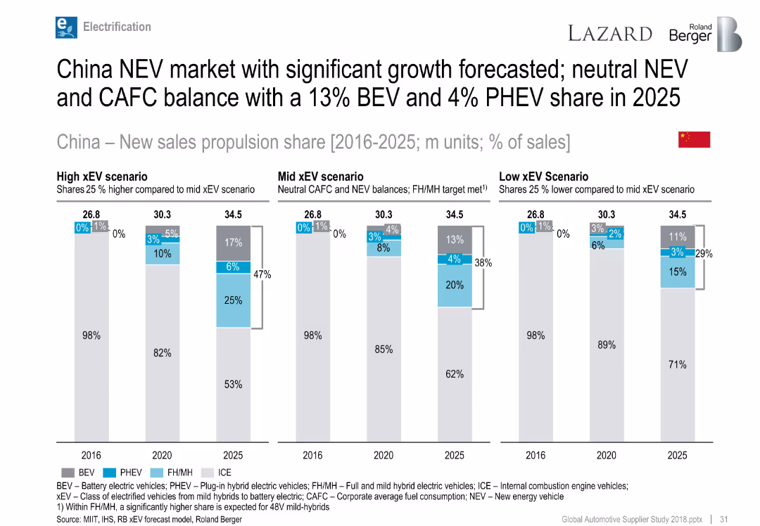
Bar charts for China propulsion share by year and scenario.
Market Analysis and Trends
Industrial & Manufacturing
Highlights strong forecasted growth for NEVs in China through 2025 under various xEV scenarios, with potential for up to 47% xEV share.
China, NEV, xEV scenarios, BEV, PHEV, electrification forecast
false
Market Analysis and Trends
Industrial & Manufacturing
Single Chart
Roland Berger
Add to my slides
Remove from favorites
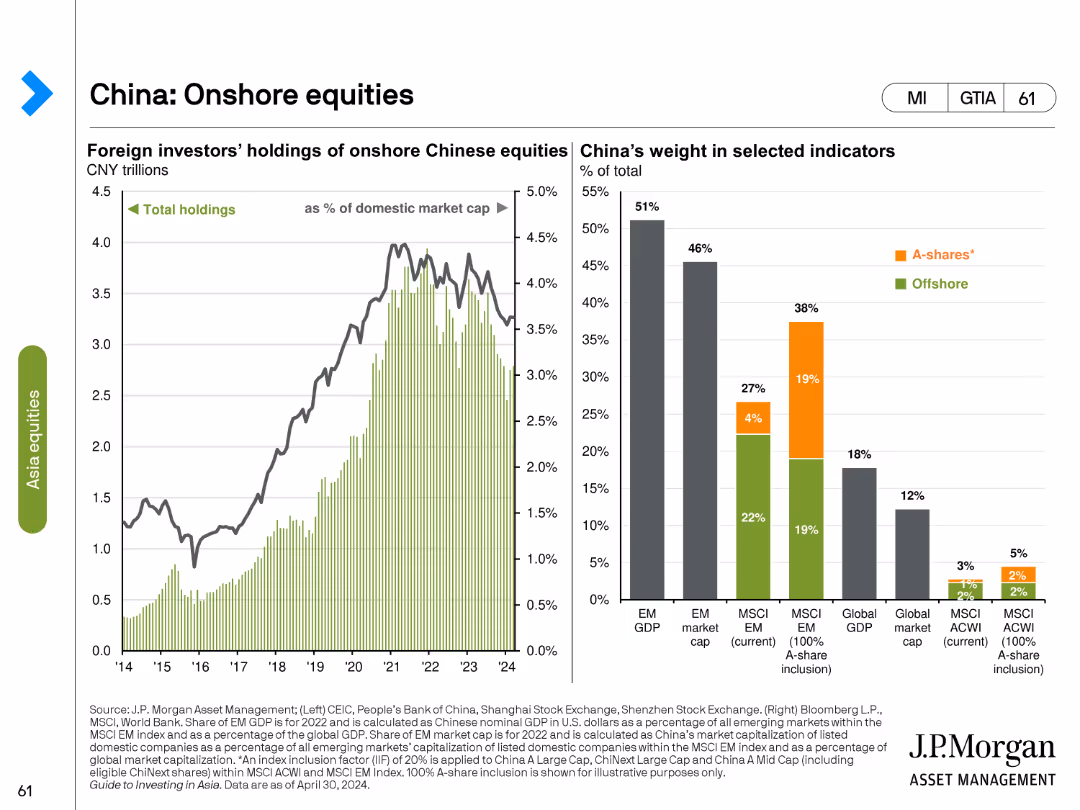
This slide has two charts: a line chart showing foreign investors' holdings of onshore Chinese equities, and a bar chart showing China’s weight in selected indicators such as EM GDP, EM market cap, and MSCI EM.
Market Analysis and Trends
Financial Services
The slide examines foreign investment in onshore Chinese equities, comparing total holdings and China's weight in various global market indicators, providing insight into the role of China in the global financial market.
China, onshore equities, foreign investment, EM GDP, EM market cap, MSCI EM, financial market, global indicators, weight, investment analysis
false
Market Analysis and Trends
Financial Services
Multiple Chart
JP Morgan
Add to my slides
Remove from favorites
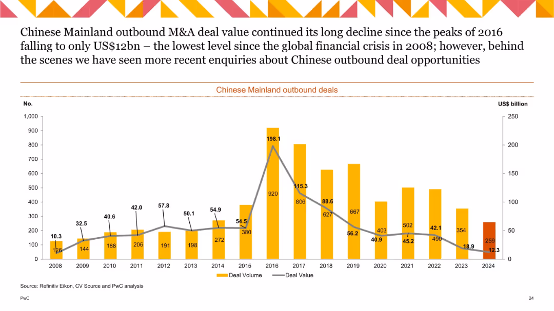
Line and bar combo chart (2008–2024) tracking deal volume and value, labeled bars for volume and line for value.
Strategic Planning
Government & Public Sector
This historical chart tracks outbound M&A activity from Mainland China, showing a major peak in 2016 followed by a significant decline through 2024. The value in 2024 is the lowest since the 2008 financial crisis, despite a modest uptick in deal count. It reflects tightening investment flows and cautious international expansion.
China outbound, M&A, deal value, historical trend, foreign investment, deal volume, strategic outlook
false
Strategic Planning
Government & Public Sector
Single Chart
PwC/Strategy&
Add to my slides
Remove from favorites
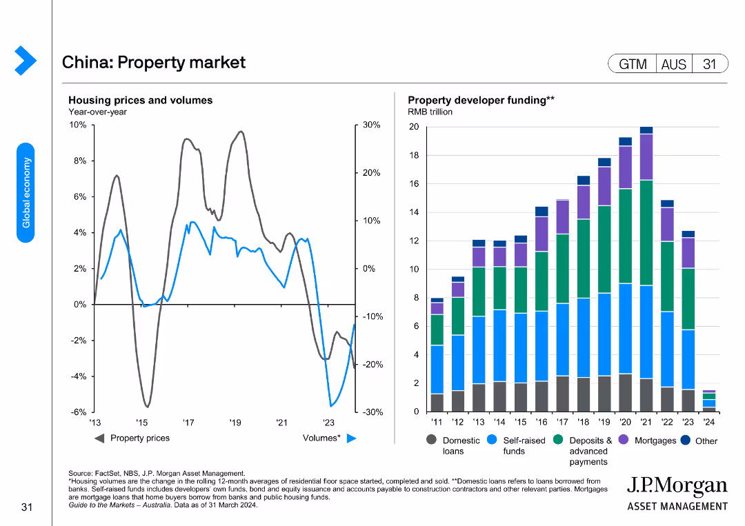
Two charts showing year-over-year changes in housing prices and volumes, and property developer funding sources.
Market Analysis and Trends
Real Estate & Construction
The slide analyzes China's property market trends, focusing on housing prices, transaction volumes, and the funding structure of property developers.
China, property market, housing prices, volumes, developer funding
false
Market Analysis and Trends
Real Estate & Construction
Multiple Chart
JP Morgan
Add to my slides
Remove from favorites
The slide features multiple column charts comparing China's recovery rates in various sectors to global rates. It includes categories like consumer products, fashion, energy, and travel. Background images correspond to each category.
Market Analysis and Trends
Financial Services
This slide shows China's recovery in various industries post-2021 compared to the world, focusing on sales growth and travel occupancy. Used for analyzing economic resilience and recovery trends.
China, recovery, consumer products, fashion, energy, tourism, sales growth, global comparison
false
Market Analysis and Trends
Financial Services
Table
BCG
Add to my slides
Remove from favorites
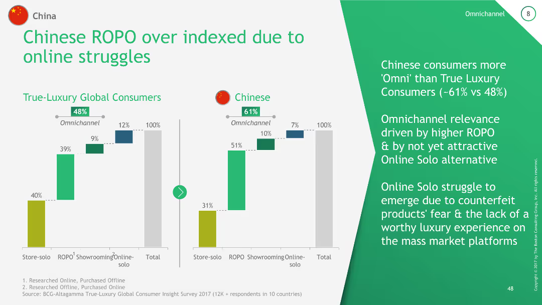
The slide includes a comparative column chart showing the ROPO (Research Online, Purchase Offline) index for True-Luxury Global Consumers and Chinese consumers. It compares the percentage of consumers engaging in omnichannel shopping versus online solo shopping.
Technology and Digital Transformation
Consumer Goods
This slide highlights the higher prevalence of ROPO behavior among Chinese consumers compared to global luxury consumers, indicating the challenges faced by online solo shopping due to counterfeit fears and lack of luxury experience on mass market platforms.
China, ROPO, omnichannel, luxury, online shopping
false
Technology and Digital Transformation
Consumer Goods
Multiple Chart
BCG
Add to my slides
Remove from favorites
The slide shows a line chart projecting China's future scrap supply and demand, with various scenarios outlined.
Strategic Planning
Industrial & Manufacturing
The slide projects future scenarios for China's scrap supply and demand by 2025, exploring potential industry developments and strategic considerations.
China, scrap, supply, demand, 2025, bar chart, column chart
false
Strategic Planning
Industrial & Manufacturing
Single Chart
McKinsey
Add to my slides
Remove from favorites
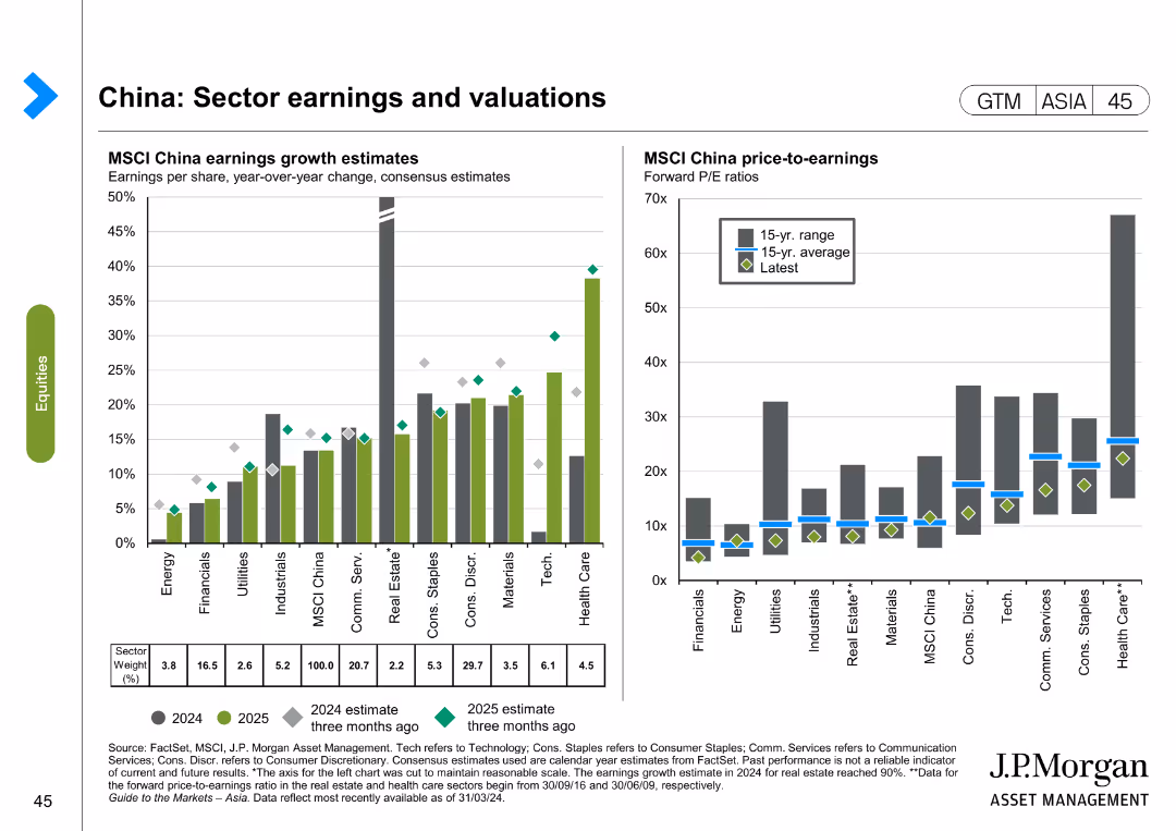
The slide contains two column charts. The left chart shows MSCI China earnings growth estimates by sector for 2024 and 2025, while the right chart shows MSCI China price-to-earnings ratios by sector.
Financial Performance
Financial Services
The slide analyzes sector earnings and valuations in China, focusing on earnings growth estimates and price-to-earnings ratios for different sectors. It is used for financial performance evaluation and investment decision-making.
China, sector earnings, valuations, MSCI, price-to-earnings, financial performance, investment
false
Financial Performance
Financial Services
Multiple Chart
JP Morgan
Add to my slides
Remove from favorites
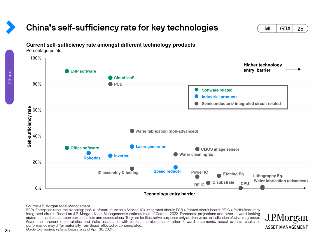
The slide contains a scatter plot showing the self-sufficiency rate of various technology products against the technology entry barrier. The products are categorized into software related, industrial products, and semiconductors/integrated circuits.
Market Analysis and Trends
Technology & Software
This slide analyzes China's self-sufficiency in key technologies, categorizing products by their self-sufficiency rates and technology entry barriers. It highlights areas where China is more or less self-sufficient in technology production.
China, self-sufficiency, technology, software, industrial products, semiconductors, scatter plot, tech barriers
false
Market Analysis and Trends
Technology & Software
Single Chart
JP Morgan
Add to my slides
Remove from favorites
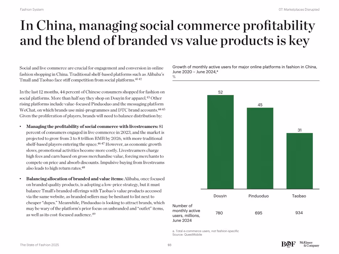
Balanced layout with left-aligned bullets and a bar chart showing MAU growth on the right; clean visual design
Market Analysis and Trends
Retail & E-commerce
The slide emphasizes the importance of social commerce and livestreaming in China’s fashion market. It discusses challenges around profitability and distribution between branded and value products. The bar chart presents monthly active user growth across Douyin, Pinduoduo, and Taobao. Strategic considerations include fee pressure from livestreamers and the shift in platform branding strategies.
China, social commerce, Douyin, livestreaming, Pinduoduo, Taobao, branded vs value, MAU
false
Market Analysis and Trends
Retail & E-commerce
Mixed Chart
McKinsey
Add to my slides
Remove from favorites
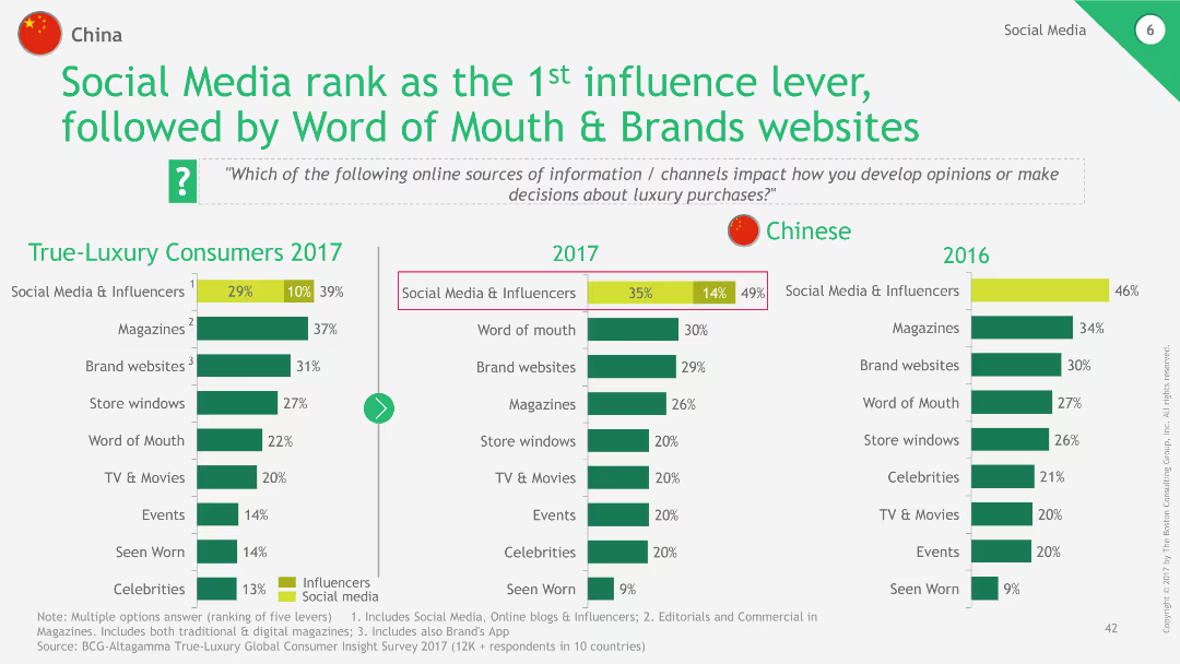
The slide includes a column chart showing the ranking of various influence levers in luxury purchases among Chinese consumers in 2017 and 2016. It highlights the top influence lever as Social Media & Influencers, followed by Word of Mouth and Brands websites.
Technology and Digital Transformation
Consumer Goods
This slide highlights the importance of social media and influencers in luxury purchase decisions among Chinese consumers, comparing data from 2017 and 2016.
China, social media, influencers, luxury, purchase
false
Technology and Digital Transformation
Consumer Goods
Multiple Chart
BCG
Add to my slides
Remove from favorites
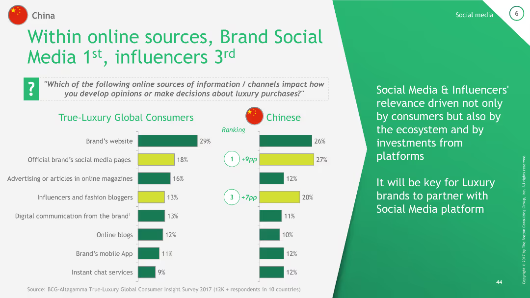
The slide contains a column chart comparing the relevance of various online sources of information for luxury purchases between True-Luxury Global Consumers and Chinese consumers. It ranks Brand's website, Official brand's social media pages, Advertising in online magazines, and Influencers.
Technology and Digital Transformation
Consumer Goods
This slide compares the relevance of different online sources of information for luxury purchases, emphasizing the higher importance of social media and influencers for Chinese consumers compared to global consumers.
China, social media, influencers, online sources, luxury
false
Technology and Digital Transformation
Consumer Goods
Multiple Chart
BCG
Add to my slides
Remove from favorites
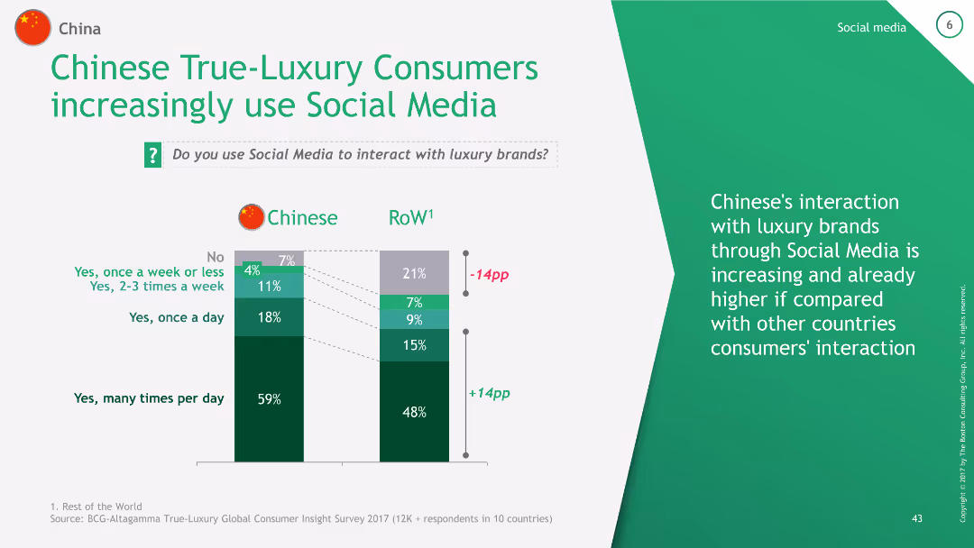
The slide features a column chart comparing the frequency of social media use among Chinese True-Luxury Consumers and the Rest of the World (RoW). It shows four frequency categories: many times per day, once a day, 2-3 times a week, and once a week or less.
Technology and Digital Transformation
Consumer Goods
This slide demonstrates the high frequency of social media use among Chinese luxury consumers compared to global averages, indicating a higher engagement with luxury brands through social media.
China, social media, luxury, engagement, frequency
false
Technology and Digital Transformation
Consumer Goods
Mixed Chart
BCG
Add to my slides
Remove from favorites
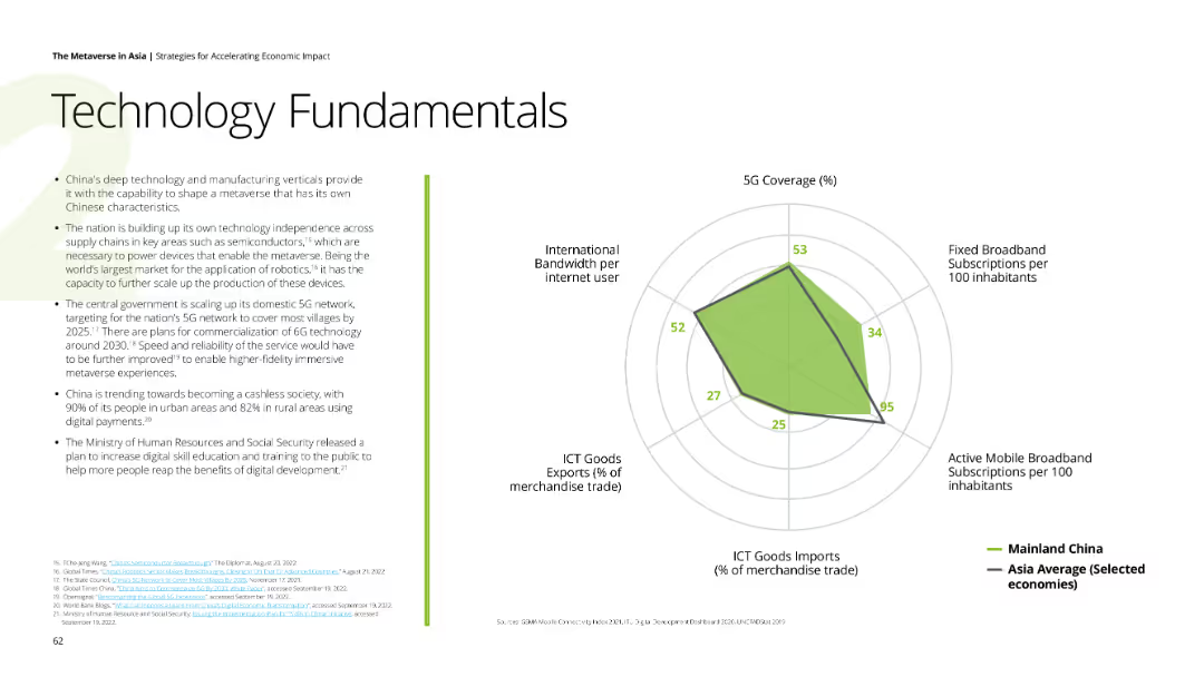
Displays a spider chart showing China's 5G coverage, broadband subscriptions, mobile broadband subscriptions, ICT goods imports, and international bandwidth per internet user compared to Asia average. Background is white with green highlights.
Technology and Digital Transformation
Technology & Software
Analyzes China's technological advancements, focusing on deep tech, manufacturing independence, and digital payment adoption, highlighting China's plans for 5G and 6G networks.
China, technology, 5G, digital payments, manufacturing independence
false
Technology and Digital Transformation
Technology & Software
Mixed Chart
Deloitte
Add to my slides
Remove from favorites
The slide uses a color scheme with gray and purple, featuring a centralized graphic representing China’s technology goals and four numbered segments with icons and brief descriptions around it. It contains moderate text and data visualizations like charts or graphs are not present.
Industry Overview
Technology & Software
This slide presents China's strategic focus in technology as outlined in their 14th Five-Year Plan, highlighting key imperatives to become a global digital powerhouse within the next five years. It breaks down the plan into four main objectives such as investment in digital infrastructure and enhancing education quality, aimed at fostering international collaboration and maintaining a policy of openness.
China, Technology, Five-Year Plan, Digital Powerhouse, Infrastructure, Education, Collaboration, Policy, Global Leader, Investment
false
Industry Overview
Technology & Software
Single Chart
Kearney
Add to my slides
Remove from favorites
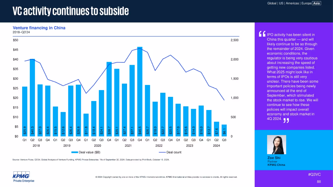
Bar and line chart showing venture financing in China from 2018 to Q3 2024, alongside qualitative commentary box.
Market Analysis and Trends
Financial Services
Venture activity in China continues to decline, with Q3 2024 showing minimal IPO activity and reduced deal counts. The commentary suggests regulatory caution and economic uncertainty are dampening VC dynamics, with a wait-and-see approach for the remainder of 2024.
China, VC activity, deal value, IPO slowdown, regulation, economic outlook
false
Market Analysis and Trends
Financial Services
Mixed Chart
KPMG
Add to my slides
Remove from favorites
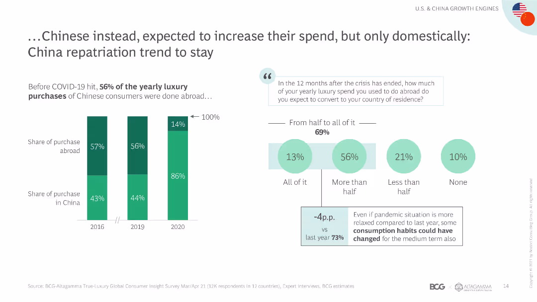
The slide includes a column chart showing the shift in luxury spending by Chinese consumers from abroad to domestic markets, with accompanying text explaining the trend.
Market Analysis and Trends
Retail & E-commerce
The slide highlights the trend of Chinese consumers increasing their luxury spending domestically, driven by repatriation and changing consumption habits post-COVID-19.
Chinese consumers, domestic spending, repatriation, luxury market, spending shift, consumption habits, market trends, COVID-19 impact, spending patterns
false
Market Analysis and Trends
Retail & E-commerce
Mixed Chart
BCG
Add to my slides
Remove from favorites
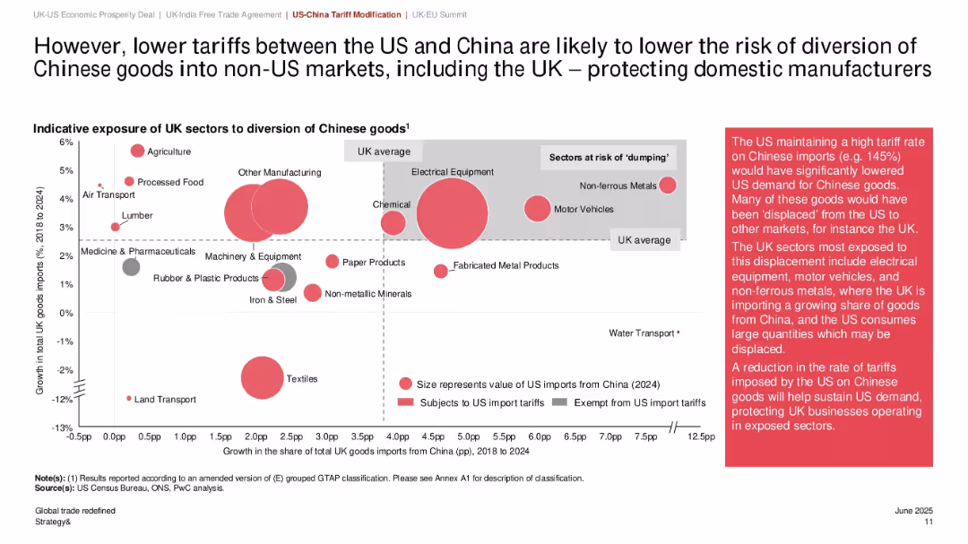
Bubble chart showing UK sectors exposed to Chinese import diversion; bubble size reflects import value; shaded zones highlight sectoral risk; annotation box explains implications.
Risk Assessment and Management
Government & Public Sector
This slide highlights how reduced US tariffs on Chinese imports lower the risk of goods being diverted into the UK market, mitigating the dumping risk for domestic manufacturers. Sectors like electrical equipment and motor vehicles are most exposed. Bubble sizes represent 2024 import values.
Chinese imports, sector exposure, dumping risk, UK manufacturing, tariff reduction, import diversion, bubble chart, global trade, domestic protection
false
Risk Assessment and Management
Government & Public Sector
Mixed Chart
PwC/Strategy&
Add to my slides
Remove from favorites
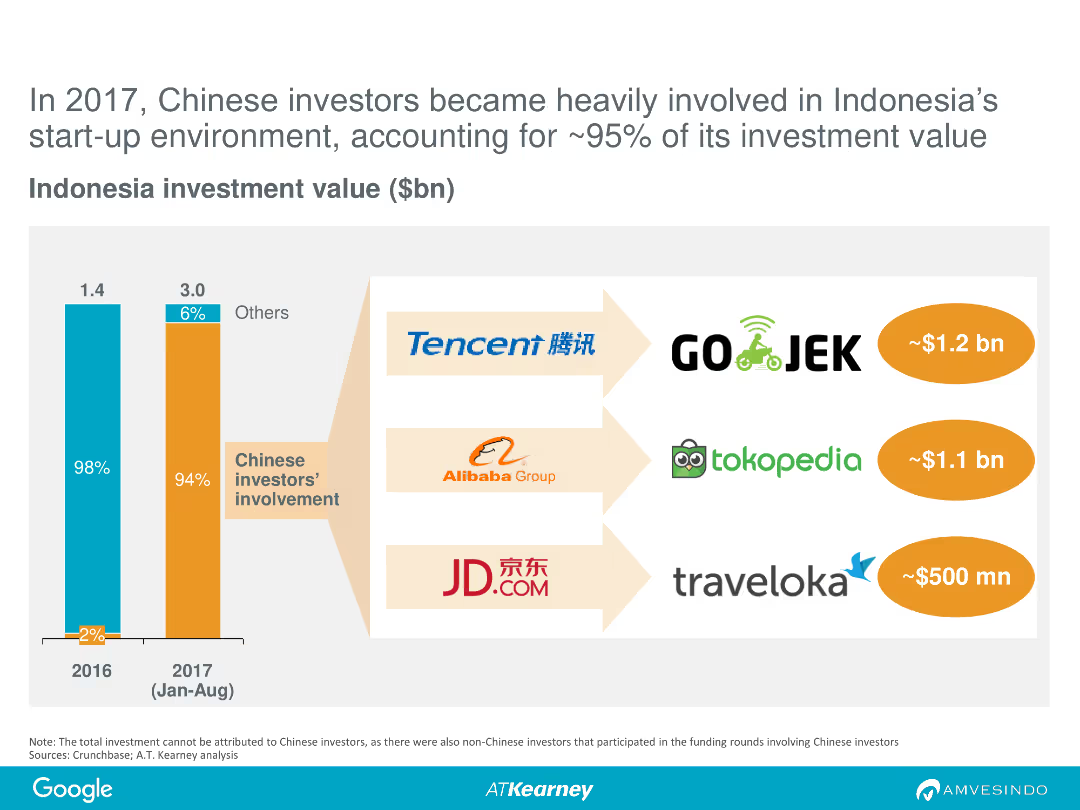
The slide features a column chart comparing investment values in Indonesia in 2016 and January-August 2017. It highlights the involvement of Chinese investors, with logos of major companies like Tencent, Alibaba, and JD.com.
Investment Analysis
Financial Services
This slide shows the significant involvement of Chinese investors in Indonesian start-ups, accounting for approximately 95% of investment value in 2017, showcasing major investment amounts from companies like Tencent and Alibaba.
Chinese investors, Indonesia, start-ups, investment, 2017, Tencent, Alibaba, JD.com
false
Investment Analysis
Financial Services
Multiple Chart
Kearney
Add to my slides
Remove from favorites
Slide uses icons, arrows, and column charts to visualize the growth in Chinese spending on luxury goods from 2015 to 2018, both locally and abroad.
Financial Performance
Retail & E-commerce
Discusses the significant impact of local and international spending by Chinese consumers on the luxury goods market over three years, highlighting the doubling of local spending.
Chinese Market, Spending Growth, Local, International
false
Financial Performance
Retail & E-commerce
Mixed Chart
Bain
Add to my slides
Remove from favorites
Contains column charts showing the role of Chinese OEMs in BEV production and their market share in the global top 100 suppliers. Includes text highlighting the professionalization and expansion of Chinese automotive suppliers.
Market Analysis and Trends
Transportation & Logistics
Discusses the growing influence of Chinese OEMs in the global automotive market, especially in BEV production. Analyzes the market share and strategic positioning of Chinese suppliers in the global top 100 suppliers.
Chinese OEMs, Market Dynamics, Automotive, BEV, Suppliers
false
Market Analysis and Trends
Transportation & Logistics
Multiple Chart
Roland Berger
Add to my slides
Remove from favorites
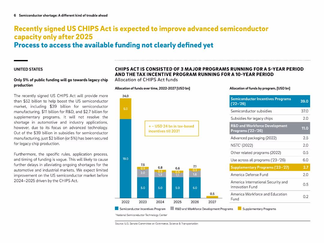
Split layout with left-aligned explanation text and bar chart on the right. Colored segments categorize different fund types.
Regulatory and Compliance
Government & Public Sector
This slide explains the funding allocation under the US CHIPS Act, emphasizing that only 5% is directed to legacy chip production. It breaks down how over $52B will be spent, highlighting delays in impact and lack of support for industrial/automotive applications.
CHIPS Act, funding, semiconductor, legacy chips, US policy, advanced technology, subsidies, R&D, timeline, market support
false
Regulatory and Compliance
Government & Public Sector
Mixed Chart
Roland Berger
Add to my slides
Remove from favorites
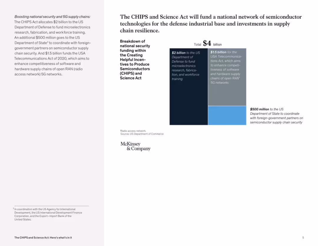
Two-column layout with text on the left and a bar graph with segmented funding blocks on the right; minimal design, McKinsey branding.
Strategic Planning
Government & Public Sector
This slide presents a $4 billion allocation from the CHIPS and Science Act, breaking it down into three components: $2B for microelectronics research and training, $1.5B for software and hardware 5G networks, and $500M for international coordination on semiconductor security.
CHIPS Act, semiconductor, funding, microelectronics, 5G, supply chain, security, US Department of Defense, workforce training, telecommunications
false
Strategic Planning
Government & Public Sector
Mixed Chart
McKinsey
Add to my slides
Remove from favorites
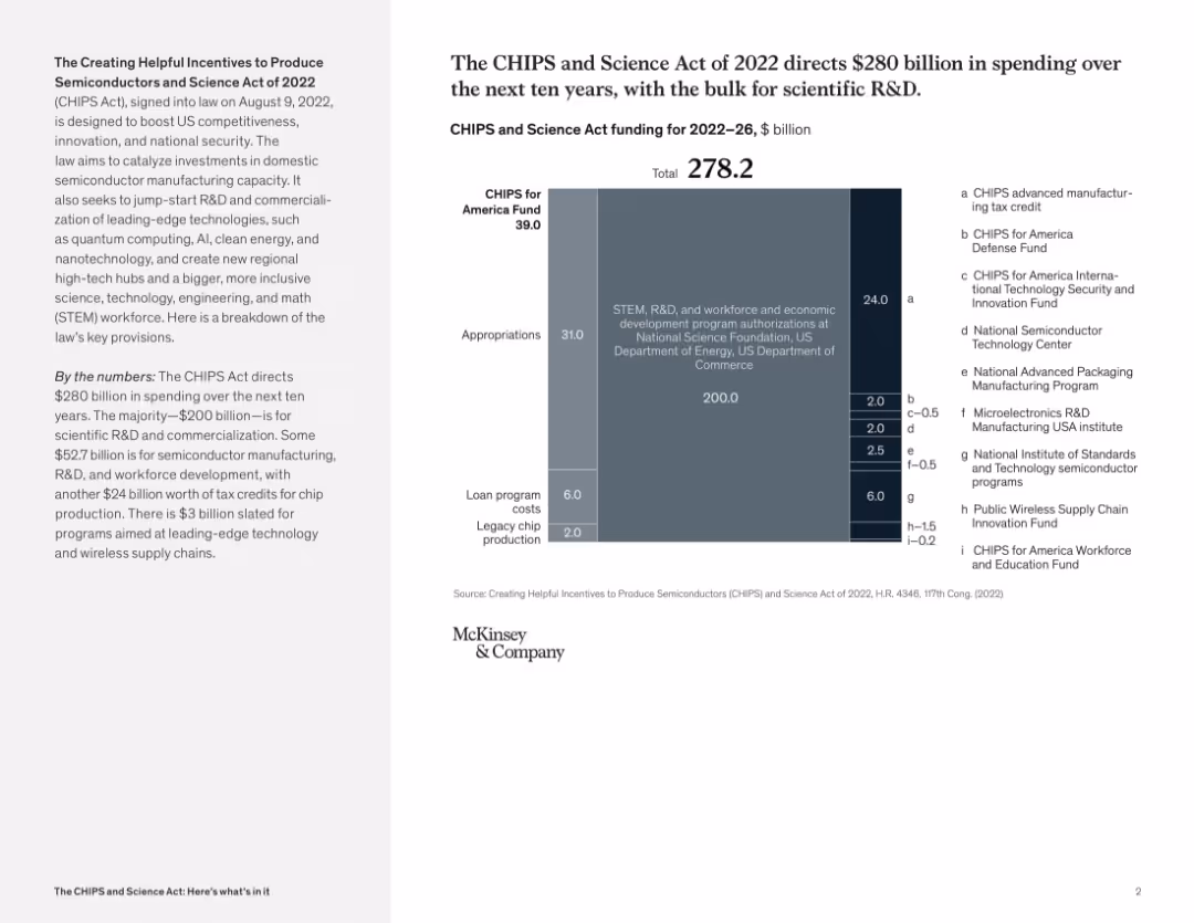
Split layout with summary and vertical funding bar graph showing $278.2B allocations; various shaded blocks and categories
Regulatory and Compliance
Government & Public Sector
This slide presents a breakdown of CHIPS Act spending from 2022–2026. It categorizes appropriations for R&D, loan programs, tax credits, and specific funds for semiconductor development and innovation. It communicates strategic investment priorities for boosting U.S. technology leadership.
CHIPS Act, semiconductor funding, R&D, government investment, science policy, U.S. competitiveness, federal spending
false
Regulatory and Compliance
Government & Public Sector
Mixed Chart
McKinsey
Add to my slides
Remove from favorites
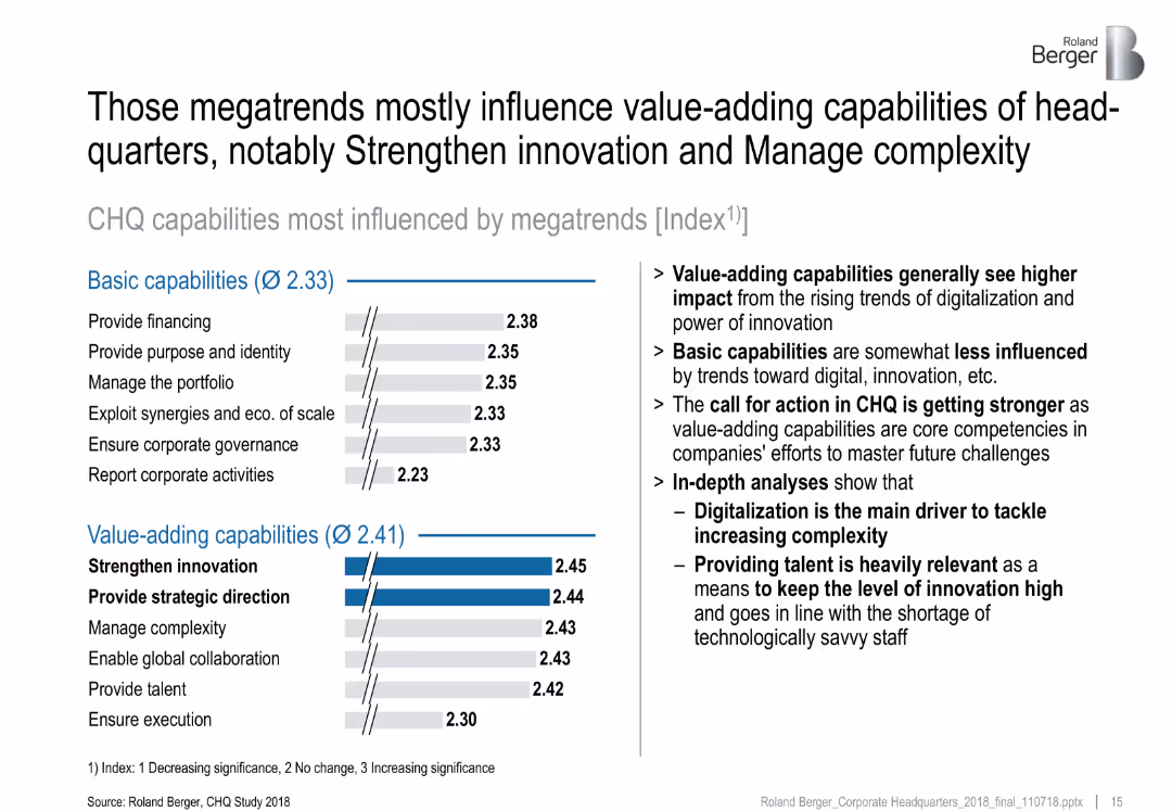
Two bar graphs comparing basic vs. value-adding CHQ capabilities; right column features bullet insights
Performance Metrics and KPIs
Professional Services
This slide contrasts the influence of megatrends on basic vs. value-adding CHQ capabilities. Value-adding functions such as “Strengthen Innovation” and “Manage Complexity” show greater impact. Digitalization and talent provision are emphasized as strategic levers.
CHQ capabilities, value-adding, megatrends, innovation, complexity, digitalization
false
Performance Metrics and KPIs
Professional Services
Multiple Chart
Roland Berger
Add to my slides
Remove from favorites
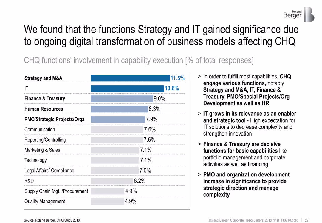
Horizontal bar chart ranked by % involvement of functions in capability execution; side notes provide context
Technology and Digital Transformation
Professional Services
This slide ranks CHQ functions by their involvement in executing capabilities, with Strategy & M&A and IT at the top. It highlights the growing strategic importance of IT and PMO roles in enabling transformation and managing complexity.
CHQ functions, IT, strategy, capability execution, transformation
false
Technology and Digital Transformation
Professional Services
Mixed Chart
Roland Berger
Add to my slides
Remove from favorites
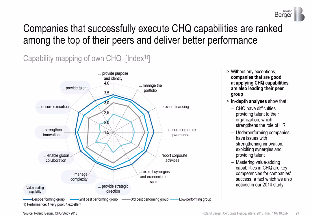
Spider/radar chart comparing performance of CHQ capabilities across four performance groups; right-hand summary
Performance Metrics and KPIs
Professional Services
This slide maps CHQ capability execution across different performance groups. Best performers excel in value-adding roles like innovation and complexity management, while low performers struggle with talent and execution.
CHQ performance, peer group, radar chart, capability mapping, innovation
false
Performance Metrics and KPIs
Professional Services
Mixed Chart
Roland Berger
Add to my slides
Remove from favorites
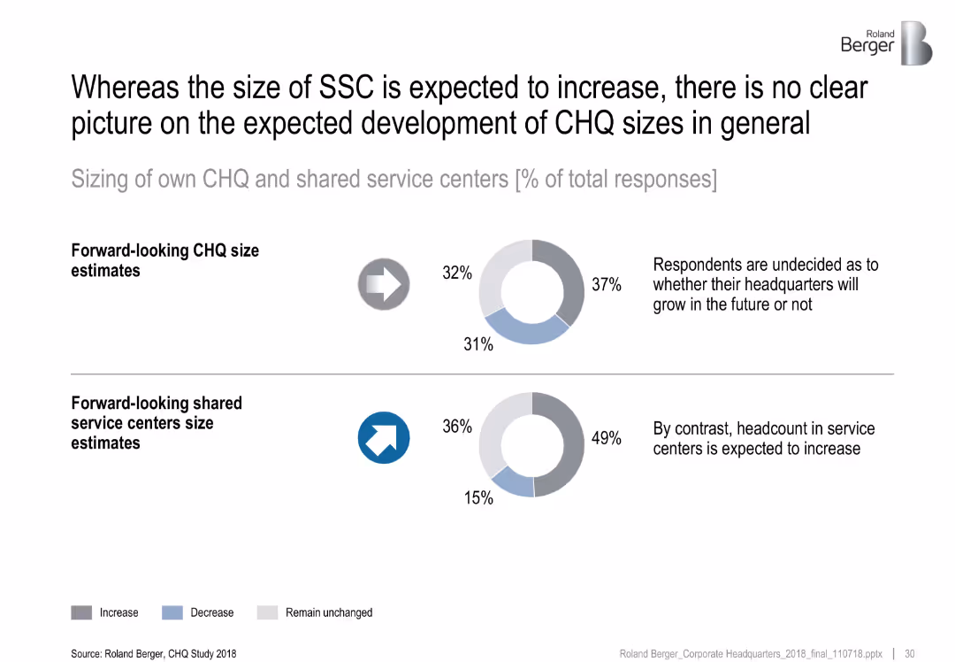
Two rows with donut charts displaying projected size trends of CHQ and SSC. Icons and summary statements on the right clarify key findings.
Organizational Structure and Change
Professional Services
This slide discusses future headcount trends. While shared service centers (SSC) are expected to grow in size, respondents are divided on the future of CHQ sizes, with nearly equal projections for increase, decrease, or no change.
CHQ size, SSC growth, headcount trends, projections, organizational structure
false
Organizational Structure and Change
Professional Services
Multiple Chart
Roland Berger
Add to my slides
Remove from favorites
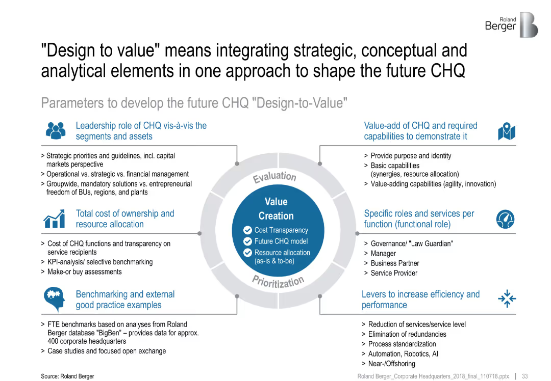
Central circular infographic detailing six development parameters around value creation. Each parameter is supported by key bullet points.
Strategic Planning
Professional Services
The slide outlines the "Design-to-Value" framework to optimize CHQ. It integrates six parameters—leadership, ownership cost, capabilities, benchmarking, roles, and efficiency—to guide future CHQ transformation.
CHQ transformation, design-to-value, strategic planning, value creation, benchmarking, efficiency
false
Strategic Planning
Professional Services
Diagram
Roland Berger
Add to my slides
Remove from favorites
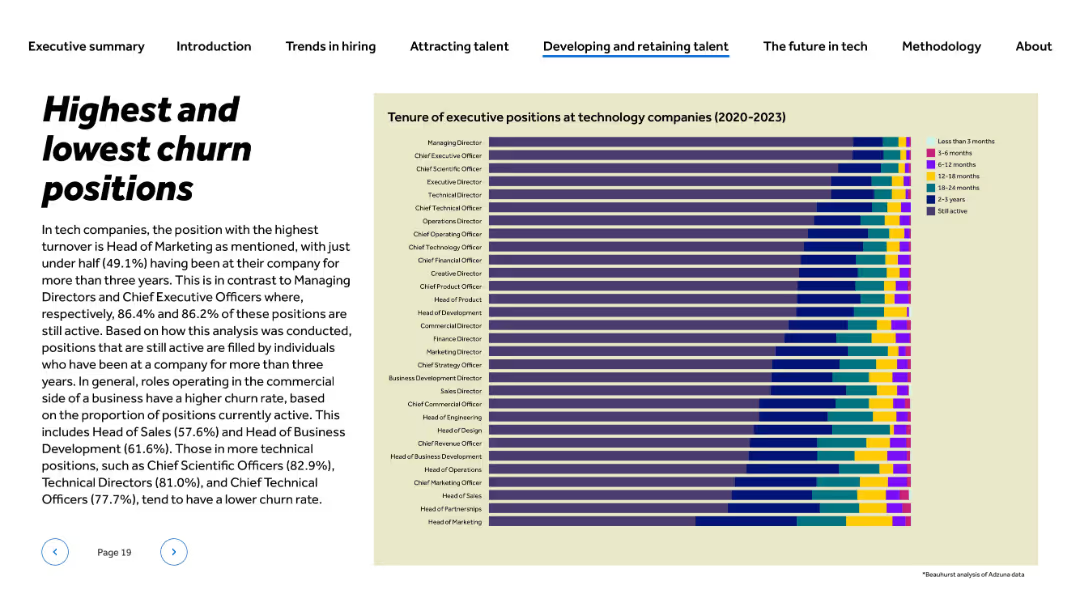
Title and paragraph on left; stacked bar chart on right showing tenure of executive roles across 2020–2023
Human Resources and Talent Management
Technology & Software
The slide compares tenure lengths for executive positions in tech companies. Head of Marketing shows the highest churn, while MDs and CEOs have the longest tenure. It emphasizes stability in technical leadership roles (e.g., CSOs, CTOs) and contrasts this with higher turnover in commercial roles, particularly in sales and marketing.
churn rate, executive tenure, HR analytics, tech leadership, turnover, marketing, retention, COO, CTO, CEO
false
Human Resources and Talent Management
Technology & Software
Mixed Chart
Barclays
Add to my slides
Remove from favorites
Combines text, icons, and pie charts to illustrate principles of operation and the impact across business segments.
Industry Overview
Financial Services
Discusses the strength and completeness of a financial institution's Corporate and Investment Banking (CIB) segment and client impact.
CIB, client engagement, product offering, revenue opportunity, cross-business impact
false
Industry Overview
Financial Services
Multiple Chart
JP Morgan
Add to my slides
Remove from favorites
Diagram showing interconnectivity between different CIB businesses and client engagement statistics in a geometric layout.
Industry Overview
Financial Services
This diagram illustrates the synergy among JP Morgan's CIB businesses—Investment Banking, Markets, Payments, and Securities Services—and their client coverage. It shows the percentage of clients engaged with multiple CIB services, emphasizing comprehensive client solutions and connectivity.
CIB, clients, business, synergy
false
Industry Overview
Financial Services
Mixed Chart
JP Morgan
Add to my slides
Remove from favorites
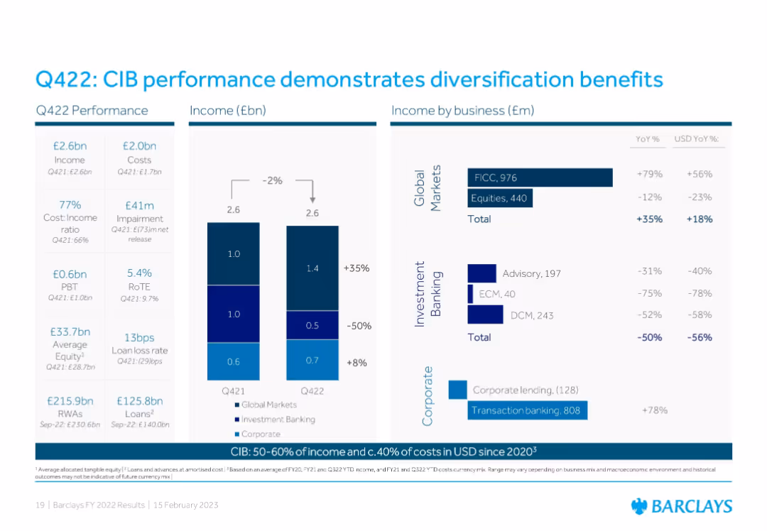
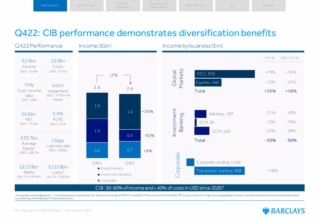
Three-panel layout: Left shows Q422 financial metrics; center has a stacked bar chart of income by business segment; right breaks down business-specific income with YoY change.
Performance Metrics and KPIs
Financial Services
Emphasizes diversified CIB performance with strong Global Markets (especially FICC) offsetting declines in Investment Banking. Highlights YoY income shifts and transaction banking gains despite sector-specific headwinds.
CIB, income, diversification, Global Markets, Investment Banking, transaction banking, FICC, performance
false
Performance Metrics and KPIs
Financial Services
Multiple Chart
Barclays
Add to my slides
Remove from favorites
Column charts showing Q422 performance and income by business. Key metrics like income, costs, and RoTE.
Financial Performance
Financial Services
Barclays' CIB performance with detailed metrics, highlighting diversification benefits across various segments.
CIB, performance, diversification, income, business
false
Financial Performance
Financial Services
Multiple Chart
Barclays
Add to my slides
Remove from favorites
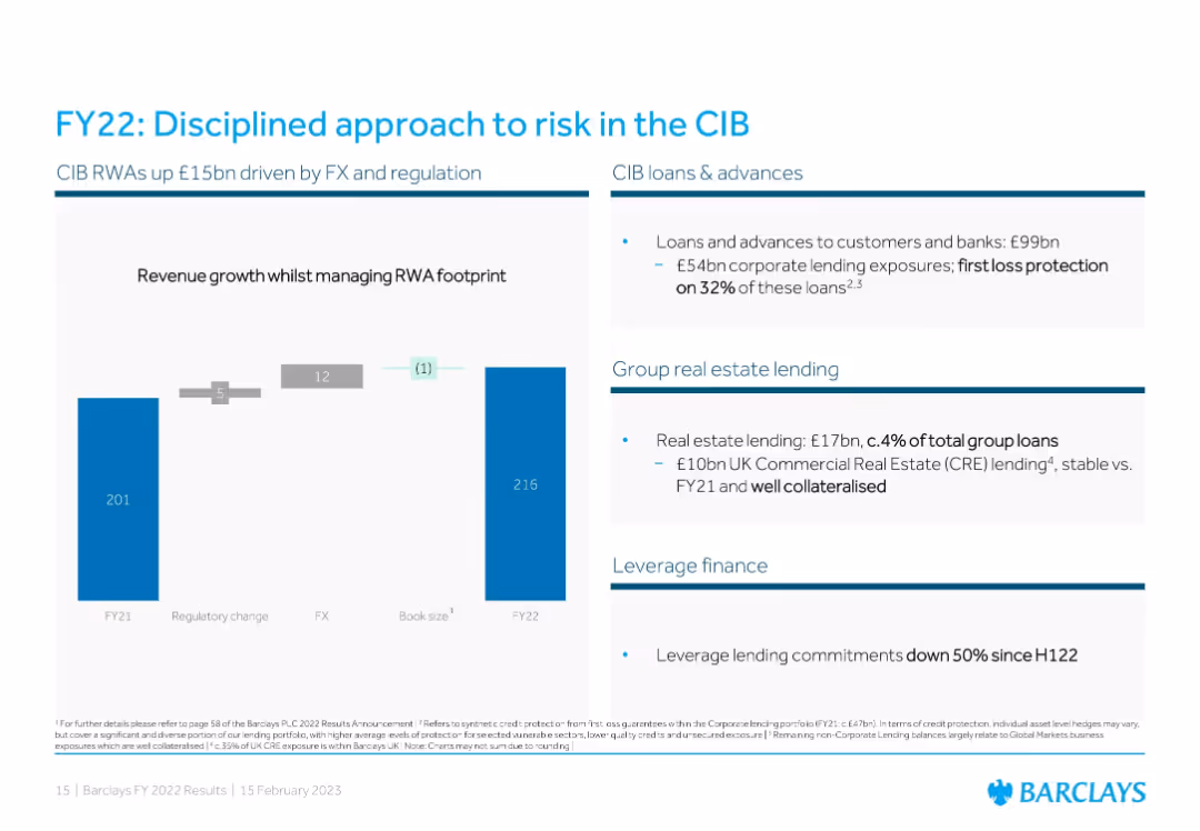
Three-part layout: Left uses a bar chart with RWA drivers; right includes text panels on CIB loans, real estate lending, and leverage finance.
Risk Assessment and Management
Financial Services
Focuses on risk management within Corporate and Investment Banking (CIB), showing RWA increases from FX/regulatory changes. It highlights low-risk exposure in real estate lending and a reduction in leveraged finance commitments.
CIB, RWAs, corporate loans, real estate, risk management, leverage finance, FX impact, regulation
false
Risk Assessment and Management
Financial Services
Mixed Chart
Barclays
Add to my slides
Remove from favorites
The slide presents two column charts, the first illustrating the growth in revenue and expenses for CIB Treasury Services, and the second showing operating and non-operating deposits growth across client segments and regions.
Financial Performance
Financial Services
Geared towards financial strategists and investors, it highlights the robust growth of CIB Treasury Services, with a focus on revenue increases, expense management, and deposit growth, essential for evaluating business health and operational strategy.
CIB, treasury services, revenue growth, expense management, deposits, operational strategy, financial health
false
Financial Performance
Financial Services
Multiple Chart
JP Morgan
Add to my slides
Remove from favorites
The slide is a comparative design with charts and visual elements. It features a timeline with circular nodes representing different business goals and strategies, icons symbolizing actions, and two large numerical statistics with accompanying text labels.
Strategic Planning
Financial Services
Discusses the growth opportunities and strategies for client acquisition and relationship management in the C&I franchise of JPMorgan Chase & Co. Utilizes numerical data and a process flow timeline to present expansion plans and customer relationship deepening methods.
C&I franchise, growth, acquisition, clients, relationships, strategy, JPMorgan Chase
false
Strategic Planning
Financial Services
Linear Flow
JP Morgan
Add to my slides
Remove from favorites
Features a pie chart depicting the C&I portfolio by industry and a line chart comparing the C&I net charge-off rate against the industry average, along with commentary on market conditions.
Risk Assessment and Management
Financial Services
Evaluates the C&I loan portfolio's risk discipline, focusing on diversified industry spread and underwriting quality, paired with market trend observations and net charge-off rates.
C&I, loan portfolio, risk management, JPMC, industry diversification, charge-off rates, market trends, underwriting quality
false
Risk Assessment and Management
Financial Services
Multiple Chart
JP Morgan
Add to my slides
Remove from favorites
The slide presents a column chart and bullet points of textual information. The chart depicts yearly revenue from 2019 to 2027 with bars in red, and the highest peak projected for 2027. It includes annotations such as CAGR percentage. The layout is split between the chart and text, which discusses impacts of COVID-19 on cinema, specific local films, and a Sci-fi drama’s earnings.
Market Analysis and Trends
Media & Entertainment
This slide analyzes the recovery and growth projections of the cinema industry in Hong Kong, highlighting impacts of COVID-19, local film market share, and revenue metrics. It's useful for presenting market recovery scenarios and future revenue estimations.
cinema, Hong Kong, COVID-19, revenue growth, local films, Sci-fi drama, market analysis, 2027 projections
false
Market Analysis and Trends
Media & Entertainment
Mixed Chart
PwC/Strategy&
Add to my slides
Remove from favorites
Slide contains a mixture of column charts and line graphs, depicting revenue trends and forecasts.
Market Analysis and Trends
Media & Entertainment
Discusses the significant drop and recovery forecast of box-office collections in India from 2020 to 2025, with specific growth percentage figures.
cinema, India, box-office, CAGR, recovery
false
Market Analysis and Trends
Media & Entertainment
Multiple Chart
PwC/Strategy&
Add to my slides
Remove from favorites
A horizontal bar chart listing the most demanding work problems faced by CIOs, with 'Resources/Talent' being the top issue. Each bar represents a different problem and its percentage of respondents.
Human Resources and Talent Management
Professional Services
The slide identifies the top challenges faced by CIOs, with a particular focus on issues related to resources and talent, making it a tool for HR strategy discussions.
CIO Challenges, Talent Management, HR Issues, Professional Services, Workplace Problems
false
Human Resources and Talent Management
Professional Services
Mixed Chart
Gartner
Add to my slides
Remove from favorites
Line chart displaying the cost-to-income ratio (CIR) evolution in Europe from 2008 to 2023. Additional sections on AI investment impact and profit potential gap.
Financial Performance
Financial Services
Shows the decline in Europe's cost-to-income ratio over 15 years and discusses the impact of AI investment on profitability and cost efficiency.
CIR, AI investment, profitability, Europe, cost efficiency
false
Financial Performance
Financial Services
Multiple Chart
Kearney
Add to my slides
Remove from favorites
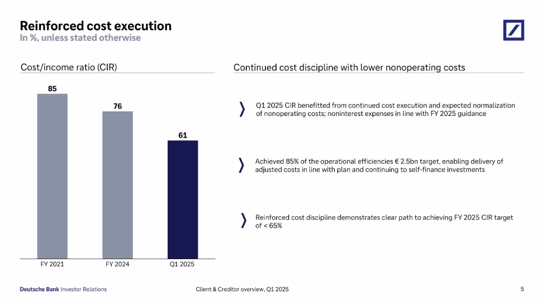
Bar chart on the left showing declining cost/income ratio (CIR) over FY2021–Q1 2025; text summary on right.
Operational Efficiency
Financial Services
The slide presents improvements in cost execution, highlighting a decline in CIR from 85% to 61%. It emphasizes cost discipline, alignment with FY2025 targets, and continued investment capacity despite lower expenses.
CIR, cost discipline, Q1 2025, operational efficiency, self-financing, cost reduction, financial management
false
Operational Efficiency
Financial Services
Mixed Chart
Deutsche Bank
Add to my slides
Remove from favorites
The slide includes text explaining the circular carbon economy concept and a diagram illustrating the four Rs.
Technology and Digital Transformation
Energy & Utilities
This slide explains the circular carbon economy concept, including reducing, reusing, recycling, and removing carbon.
Circular carbon economy, GCC, hydrogen, policy, energy
false
Technology and Digital Transformation
Energy & Utilities
Diagram
Kearney
Add to my slides
Remove from favorites
Displays diagrams and lists integrating circular intelligence into business operations, with focus areas like "Target & Performance Management" and "Measure & Monitor."
Technology and Digital Transformation
Environmental Services & Sustainability
Highlights how integrating circular intelligence can drive business value across various operational aspects. This slide is particularly useful for discussions on implementing circular strategies in business processes, enhancing data integration, and driving operational efficiencies.
Circular economy, Business intelligence, Data integration, Operational efficiency, Performance management, Sustainability, Technology integration, Business drivers, Monitoring, Reporting
false
Technology and Digital Transformation
Environmental Services & Sustainability
Linear Flow
Accenture
Add to my slides
Remove from favorites
Table format presenting various sub-models of circular business strategies, including descriptions and potential benefits.
Product and Service Analysis
Environmental Services & Sustainability
Offers a detailed view of sub-models within the circular business model framework, describing how each can be implemented to enhance sustainability and efficiency. The slide serves as a guide for businesses looking to adopt more sustainable practices by choosing appropriate sub-models based on their operational needs.
circular economy, business strategies, sustainability, sub-models, analysis
false
Product and Service Analysis
Environmental Services & Sustainability
Table
Accenture
Add to my slides
Remove from favorites
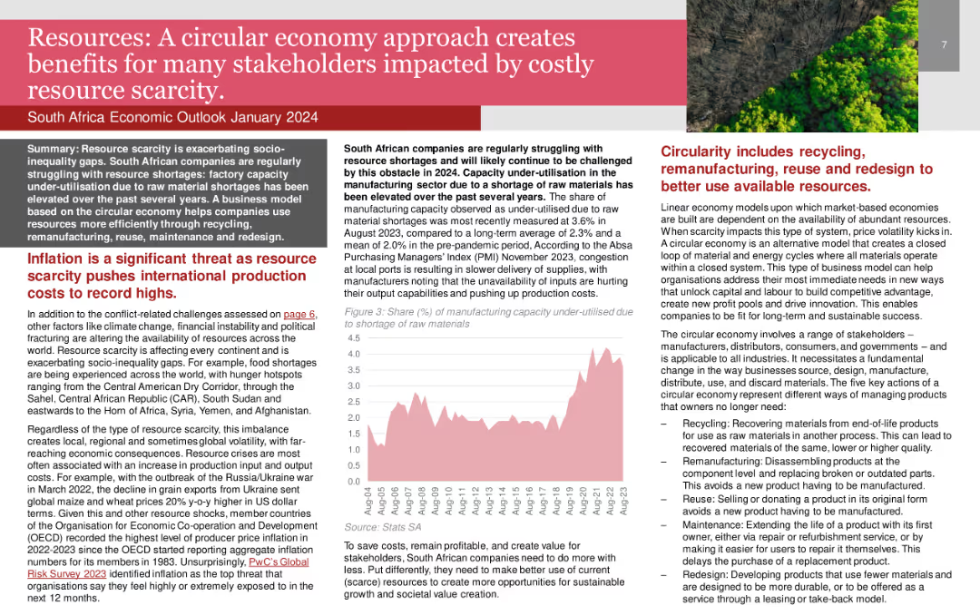
Line chart showing the share of manufacturing capacity under-utilised due to raw material shortages.
Strategic Planning
Environmental Services & Sustainability
Advocates for a circular economy approach to address resource scarcity and enhance sustainability in South Africa.
Circular Economy, Resource Scarcity, Sustainability, Manufacturing, South Africa
false
Strategic Planning
Environmental Services & Sustainability
Mixed Chart
PwC/Strategy&
Add to my slides
Remove from favorites
Circular diagram with various segments illustrating different business models aimed at enhancing sustainability through circular economy practices.
Product and Service Analysis
Environmental Services & Sustainability
Describes five different business models that leverage circular economy principles to reduce inefficiencies and enhance sustainability. These models focus on various aspects such as resource recovery, product life extension, and sharing platforms to optimize resource use.
circular economy, sustainability, business models, resource optimization, innovation
false
Product and Service Analysis
Environmental Services & Sustainability
Diagram
Accenture
Add to my slides
Remove from favorites
A flow diagram illustrating inefficiencies in linear value chains and potential interventions. Contains icons and labeled stages from product design to end-of-life disposal.
Strategic Planning
Environmental Services & Sustainability
This slide explains the concept of the circular economy by identifying key inefficiencies in traditional linear business models and suggesting strategic interventions to mitigate these inefficiencies, thereby creating business value through sustainability practices.
circular economy, sustainability, business strategy, value chain, inefficiencies
false
Strategic Planning
Environmental Services & Sustainability
Linear Flow
Accenture
Add to my slides
Remove from favorites
Lists key activities in making a product fully circular, with a case example of Timberland's transformation journey.
Product and Service Analysis
Environmental Services & Sustainability
Provides a roadmap for making a product fully circular, emphasizing the importance of starting small, learning, and scaling. Ideal for use in product development meetings or sustainability strategy sessions, focusing on practical steps and high-impact strategies for circular product design.
Circular economy, Timberland, Product design, Sustainability, High-impact strategy, Scaling, Learning, Circular transformation, Product lifecycle, Innovation
false
Product and Service Analysis
Environmental Services & Sustainability
Linear Flow
Accenture
Add to my slides
Remove from favorites
The slide features a detailed process flow diagram illustrating the circular fashion ecosystem, with icons, text boxes, and arrows showing material flows and stages in the lifecycle of fashion products.
Strategic Planning
Retail & E-commerce
The slide provides an overview of the circular fashion ecosystem, detailing various stages from brands and designers to recycling, aiming to maximize utilization and reduce demand.
Circular fashion, Ecosystem, Recycling, Material flows, Fashion lifecycle
false
Strategic Planning
Retail & E-commerce
Diagram
Roland Berger
Add to my slides
Remove from favorites
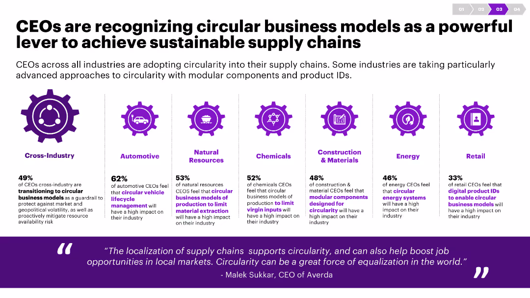
The slide uses icons and column charts to show data on the adoption of circular business models across various industries. It has a clean, balanced layout.
Strategic Planning
Environmental Services & Sustainability
This slide discusses how CEOs from different industries are integrating circular business models into their supply chains to enhance sustainability.
Circularity, CEOs, supply chain, sustainability, industry, business models, modular components, product IDs, transition, approach
false
Strategic Planning
Environmental Services & Sustainability
Pillar
Accenture
Add to my slides
Remove from favorites
Table and icons representing key opportunities for circularity across different industries like energy, construction, and transportation.
Market Analysis and Trends
Environmental Services & Sustainability
Highlights the key circularity opportunities identified for different industries to reduce inefficiencies and scale transformation. The slide maps specific strategies like repair, upgrade, and sustainable recycling to respective sectors.
circularity, industry analysis, strategic planning, sustainability, opportunities
false
Market Analysis and Trends
Environmental Services & Sustainability
Table
Accenture
Add to my slides
Remove from favorites
Slide includes column charts comparing cost-income ratios and efficiency savings across various business units.
Competitive Landscape
Financial Services
Compares financial efficiency across different sectors of the business from 2021 to 2026.
CIR, efficiency, 2026, comparison, sectors
false
Competitive Landscape
Financial Services
Multiple Chart
Barclays
Add to my slides
Remove from favorites
Features a trend line and column charts depicting CIR development and targeted operational efficiencies, using a clean and straightforward layout to emphasize data.
Operational Efficiency
Financial Services
Highlights strategies for reducing the cost/income ratio through operational efficiencies and revenue growth, suitable for analyzing operational cost management.
CIR, reduction, operational, efficiency, cost, income, financial, management, strategies, growth
false
Operational Efficiency
Financial Services
Mixed Chart
Deutsche Bank
Add to my slides
Remove from favorites
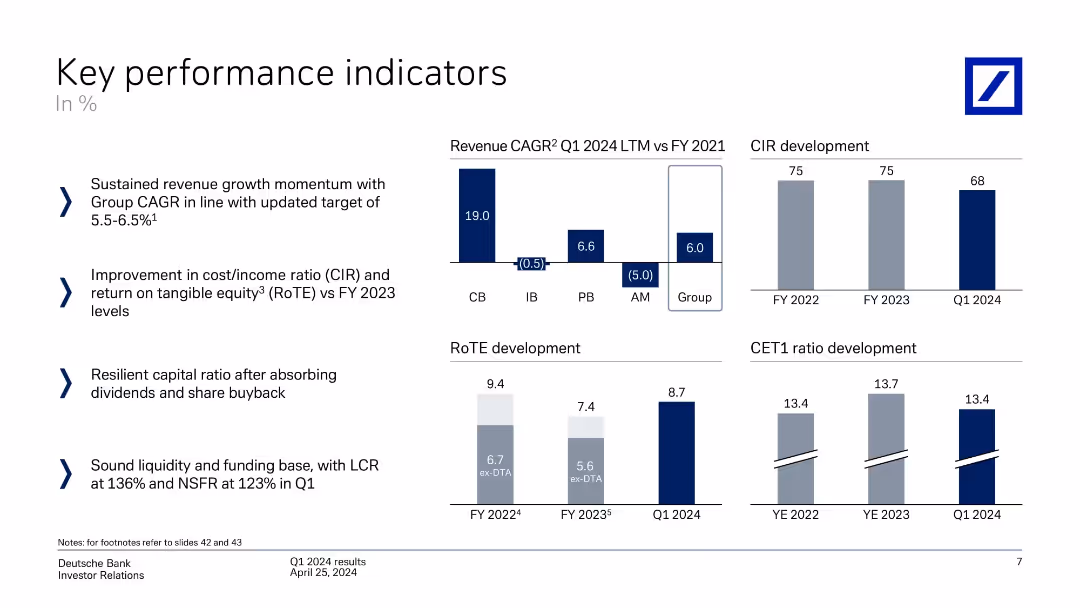
Multiple mini-charts: revenue CAGR by unit, CIR, RoTE, CET1 ratio. Left-aligned text bullets explain business performance trends.
Performance Metrics and KPIs
Financial Services
Tracks KPIs including revenue growth (Group CAGR 6%), cost/income ratio improvement, RoTE increase, and steady CET1 ratio. Demonstrates financial resilience and improved efficiency across the banking group.
CIR, RoTE, CET1, revenue growth, KPIs, financial resilience
false
Performance Metrics and KPIs
Financial Services
Multiple Chart
Deutsche Bank
Add to my slides
Remove from favorites
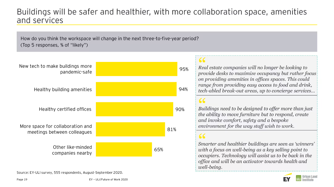
Column chart showing changes accelerated by COVID-19 on society. Includes two text quotes on the right in gray boxes. The slide is dominated by yellow and gray colors.
Strategic Planning
Real Estate & Construction
Discusses how the Future of Work puts pressure on urban development, necessitating better infrastructure and efficient local supply chains.
Cities, Communities, Infrastructure, Urban Development, COVID-19, Changes, Society, Future of Work, Pressures
false
Strategic Planning
Real Estate & Construction
Mixed Chart
EY
Add to my slides
Remove from favorites
This slide features circular graphs, percentages, and a list of city archetypes. The layout is organized, with a balance between text and visuals on a white and purple backdrop.
Market Analysis and Trends
Technology & Software
The slide classifies Indonesian cities into four tiers, illustrating the distribution of cities and highlighting various socio-economic parameters.
city classification, socio-economic criteria, Indonesian cities, digital adoption
false
Market Analysis and Trends
Technology & Software
Multiple Chart
Kearney
Add to my slides
Remove from favorites
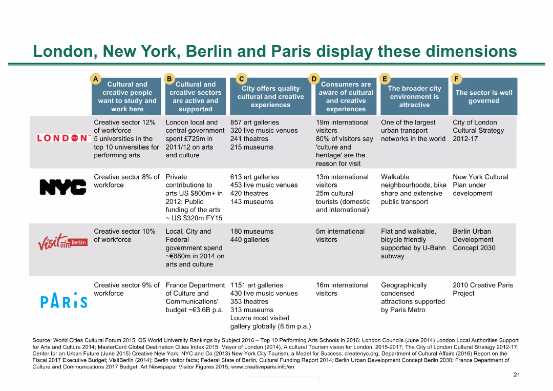
Table comparing cultural metrics across four major cities; color-coded for clarity
Market Analysis and Trends
Hospitality & Tourism
Compares cultural and creative metrics of London, New York, Berlin, and Paris, showing strengths and metrics
City comparison, cultural metrics, global cities, creative sectors, cultural experiences
false
Market Analysis and Trends
Hospitality & Tourism
Diagram
BCG
Add to my slides
Remove from favorites
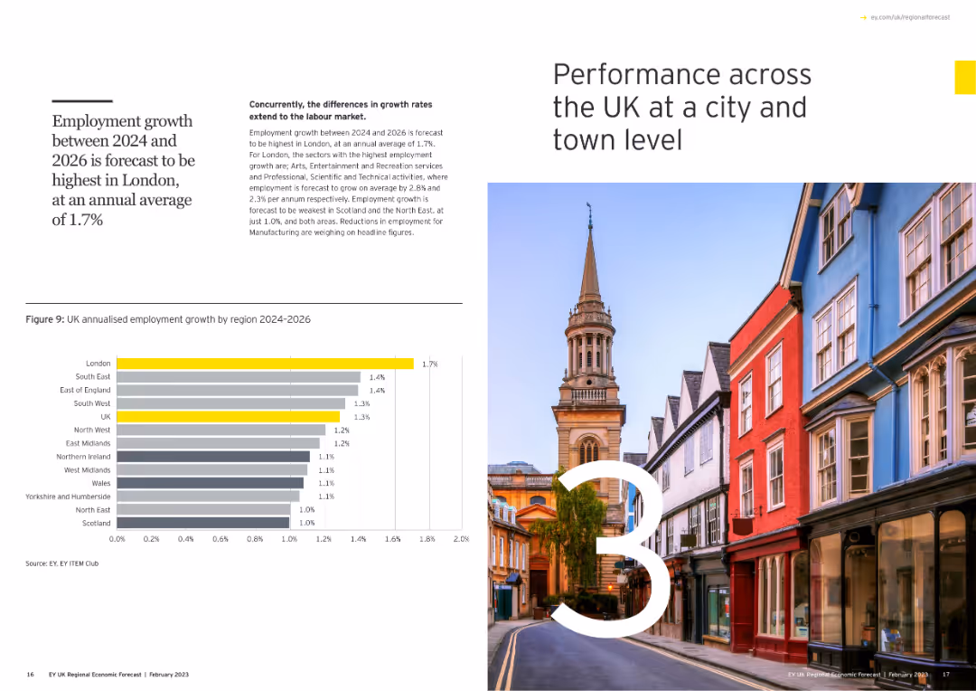
Includes a large number "3" with an image of a cityscape, and a column chart showing annualized employment growth by region for 2024-2026.
Market Analysis and Trends
Government & Public Sector
Examines city and town level performance across the UK, forecasting employment growth from 2024 to 2026, with a focus on regional disparities.
city performance, UK, employment growth, regions, column chart
false
Market Analysis and Trends
Government & Public Sector
Mixed Chart
EY
Add to my slides
Remove from favorites
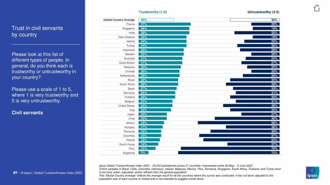
Blue sidebar with instructions; right side chart ranks trust in civil servants across countries. Countries like France rank high; Argentina lowest.
Regulatory and Compliance
Government & Public Sector
This slide visualizes public trust in civil servants, showing significant differences across countries. France, Singapore lead, while Peru and Argentina score lowest.
civil service, trust index, governance, Ipsos, public opinion, countries, regulation
false
Regulatory and Compliance
Government & Public Sector
Mixed Chart
IPSOS
Add to my slides
Remove from favorites
Consists of a world map, key facts list, and a pie chart showing sales distribution. The slide is visually dense with a high level of detail.
Operational Efficiency
Technology & Software
Provides an overview of Clarion's global presence, focusing on sales by region and the distribution of its manufacturing and development centers, emphasizing the company's operational scope.
Clarion, global, sales, manufacturing, development, automotive
false
Operational Efficiency
Technology & Software
Mixed Chart
Deutsche Bank
Add to my slides
Remove from favorites
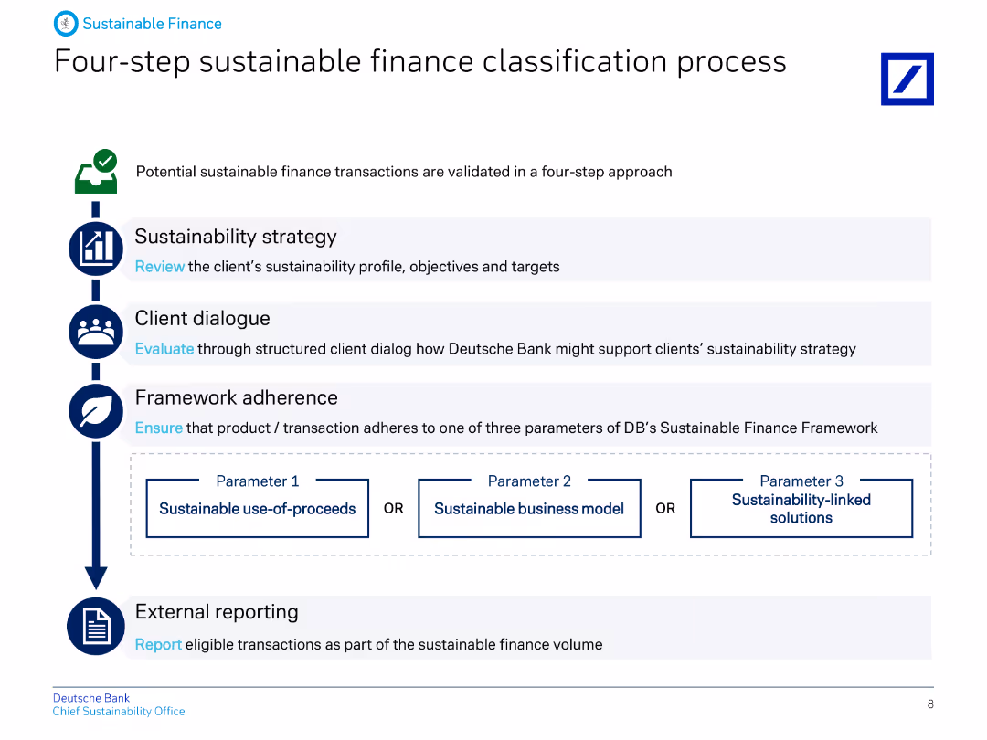
The slide features a flowchart with four steps: Sustainability strategy, Client dialogue, Framework adherence, and External reporting, with icons for each step.
Operational Efficiency
Financial Services
Describes the four-step process for classifying sustainable finance transactions at Deutsche Bank, ensuring adherence to their framework and validating through external reporting.
Classification, sustainable, finance, process, strategy, client, framework, reporting, banking, ESG
false
Operational Efficiency
Financial Services
Vertical Flow
Deutsche Bank
Add to my slides
Remove from favorites
The slide provides a detailed breakdown of newspaper revenue segments in Western Europe from 2003 to 2019. It uses a stacked column chart and a large callout highlighting classifieds' significant contribution to the revenue decline.
Market Analysis and Trends
Media & Entertainment
This slide focuses on the impact of declining classified ad revenues on overall newspaper revenue, highlighting economic challenges in the media industry. The detailed segmentation can help media companies and advertisers understand specific revenue shifts and strategize accordingly.
classifieds, revenue impact, media economics, advertising trends, strategic insights
false
Market Analysis and Trends
Media & Entertainment
Mixed Chart
Accenture
Add to my slides
Remove from favorites
The slide uses a simple text layout, listing two case studies. It employs minimal design elements, with each case study presented in bullet points and accompanied by a small, relevant image. The design is clean, using a black and white theme with blue accents.
Client Case Studies
Energy & Utilities
Highlighting how Ørsted and Iberdrola have made significant strides in reducing emissions through the adoption of clean-energy technologies, this slide serves as a case study for the positive impact and scalability of such initiatives. It is useful for discussions on best practices in sustainability within the energy sector, demonstrating tangible outcomes and strategies employed by leading companies.
clean energy, emissions reduction, case study, Ørsted, Iberdrola, sustainability, renewable energy, biomass, smart grids, hydrogen, strategic implementation
false
Client Case Studies
Energy & Utilities
Header Vertical
McKinsey
Add to my slides
Remove from favorites
Displays a line graph and accompanying text detailing global government spending on clean energy projects, set on a dark background with a stark purple column chart.
Regulatory and Compliance
Energy & Utilities
Evaluates the geopolitical and economic implications of increased global spending on clean energy, highlighting the competition and strategic positioning of nations.
clean energy, government spending, geopolitical trends, Australia, global competition, energy policy
false
Regulatory and Compliance
Energy & Utilities
Mixed Chart
Accenture
Add to my slides
Remove from favorites
This slide features a table layout, contrasting different industries in the first column with the implications of clean-energy technology trends in the second. Each industry is symbolized by an icon. The design is sleek with a black, white, and blue color palette.
Industry Overview
Energy & Utilities
This slide addresses the broader impact of clean-energy technology trends across various industries such as metals and mining, oil and gas, and construction. It discusses the implications of these trends on resource demand and value pools. Ideal for an overview of industry-wide shifts due to clean energy, it is a resource for those assessing strategic planning, investment opportunities, or regulatory impacts across the affected sectors.
clean energy, industry impact, metals and mining, oil and gas, construction, technology trends, electrification, resource demand, strategic planning, value pools
false
Industry Overview
Energy & Utilities
Header Vertical
McKinsey
Add to my slides
Remove from favorites
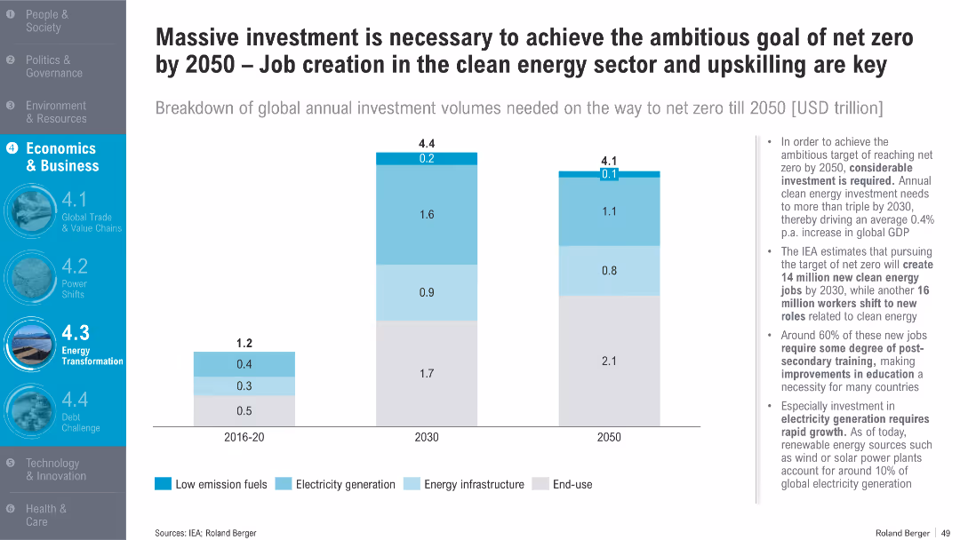
Vertical bar charts showing clean energy investment requirements by sector from 2016 to 2050; bullet points to the right provide analysis on economic and employment impacts
Investment Analysis
Energy & Utilities
This slide quantifies global investment needs in low-emission fuels, energy infrastructure, and electricity to achieve net zero by 2050. It projects clean energy job creation and underscores the importance of workforce upskilling.
clean energy, investment, net zero, jobs, electricity, training, GDP impact, energy infrastructure, renewables, 2050
false
Investment Analysis
Energy & Utilities
Mixed Chart
Roland Berger
Add to my slides
Remove from favorites
Moderate visual complexity with icons and text that streamline the presentation of key data points and statistics relevant to clean energy investment considerations for leadership.
Investment Analysis
Financial Services
Details why leaders should pay attention to clean energy trends, citing significant capital investment and regulatory changes.
clean energy, leadership, investment, regulation, power demand, corporate commitment, environmental, market cap, energy storage
false
Investment Analysis
Financial Services
Header Horizontal
McKinsey
Add to my slides
Remove from favorites
The slide presents a moderate visual complexity with infographics and charts categorizing information under power generation, sustainable fuels, and hydrogen-based fuels.
Market Analysis and Trends
Energy & Utilities
Analyzes trends in clean energy, detailing contributions from renewable energy, sustainable fuels, and hydrogen-based fuels toward net-zero emissions.
clean energy, renewable energy, sustainable fuels, hydrogen-based fuels, net-zero emissions, trends, power generation, decarbonization
false
Market Analysis and Trends
Energy & Utilities
Header Horizontal
McKinsey
Add to my slides
Remove from favorites
The slide has a two-column format comparing supportive and opposing views on clean-energy trends. Each column contains bullet points and an icon at the top. The design is straightforward with a blue and black color scheme that provides a professional and clear presentation of information.
Strategic Planning
Energy & Utilities
This slide presents contrasting perspectives on the viability and future of clean-energy technologies. It's structured for strategic planning sessions, offering a platform for debate on the sustainability of traditional renewables, the feasibility of 100% renewable energy adoption, and the growth potential in clean tech markets. This is aimed at stakeholders who are formulating long-term strategies and considering the varying opinions and data points in the clean-energy discourse.
clean energy, renewables, debate, sustainability, technology viability, market growth, strategic planning, renewable adoption, contrasting views, business opportunities
false
Strategic Planning
Energy & Utilities
Header Horizontal
McKinsey
Add to my slides
Remove from favorites
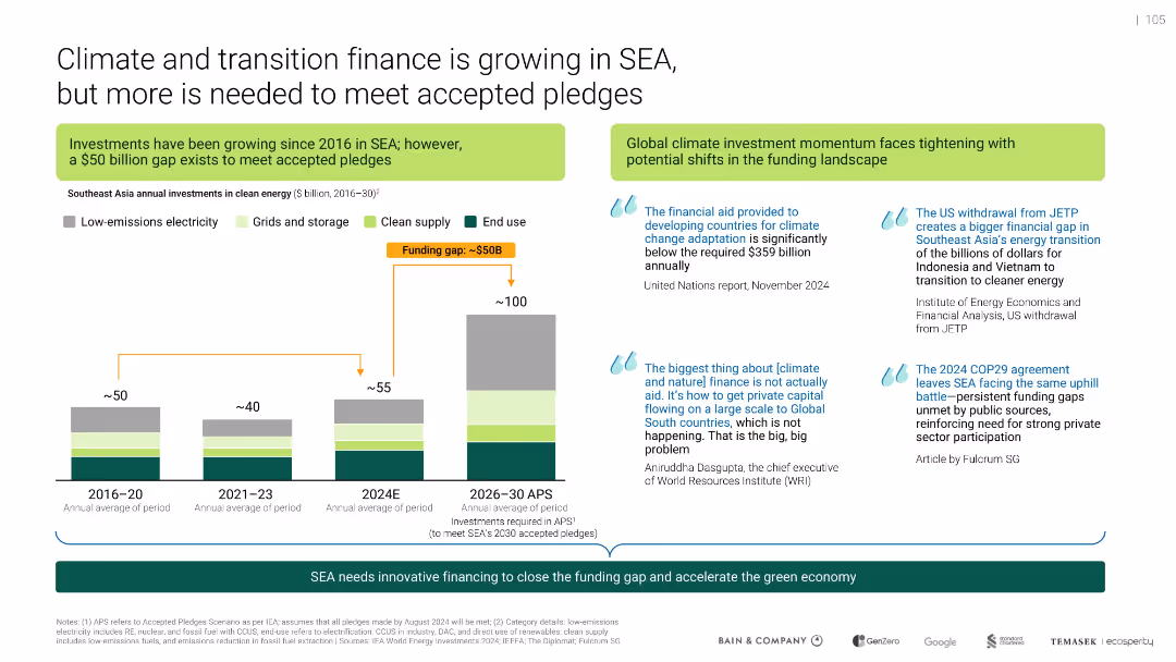
Bar chart with annual investments, funding gap annotation, side quotes, and highlighted text boxes; clean, professional layout.
Investment Analysis
Environmental Services & Sustainability
Highlights Southeast Asia's growing climate finance since 2016, identifying a $50B funding gap to meet 2030 pledges. It emphasizes the urgency for private capital and outlines structural challenges due to shifts like US withdrawal from JETP.
clean energy, SEA, funding gap, climate finance, investment, transition
false
Investment Analysis
Environmental Services & Sustainability
Mixed Chart
Bain
Add to my slides
Remove from favorites
The slide features moderate visual complexity with side-by-side comparisons of energy technologies and corresponding textual descriptions.
Technology and Digital Transformation
Energy & Utilities
Highlights key technologies shaping the future of clean energy, such as solar photovoltaics, wind generation, nuclear fusion, and hydrogen-based fuels.
clean energy, solar PV, wind generation, nuclear fusion, hydrogen, electrolyzers, technology, innovation, future, energy source
false
Technology and Digital Transformation
Energy & Utilities
Header Horizontal
McKinsey
Add to my slides
Remove from favorites
This slide has a three-column layout discussing renewables, hydrogen production, and electrification, with a final section on energy storage and smart grids. Each column is clearly labeled and uses bullet points for details, accompanied by thematic icons. The color scheme includes blue, which stands for stability and clarity, reinforcing the content's message.
Risk Assessment and Management
Energy & Utilities
Discussing the uncertainties in the clean-energy sector, this slide lists the challenges facing renewables, hydrogen production, electrification, and the integration of energy storage and smart grids. It's vital for risk management, highlighting areas that require innovation, regulatory clarity, and investment to achieve scalability in clean-energy technologies. Aimed at professionals in risk assessment and strategic planning, it calls attention to the complexities of transitioning to sustainable energy sources.
clean energy, uncertainties, renewables, hydrogen production, electrification, energy storage, smart grids, innovation, regulatory clarity, investment, scalability
false
Risk Assessment and Management
Energy & Utilities
Header Horizontal
McKinsey
Add to my slides
Remove from favorites
The slide includes a bar chart showing the break-even production cost of clean hydrogen versus incumbent technology across various sectors.
Technology and Digital Transformation
Energy & Utilities
The slide evaluates the cost-competitiveness of clean hydrogen in different sectors, emphasizing the potential for hydrogen to become competitive by 2030.
clean hydrogen, cost-competitive, sectors, 2030, energy
false
Technology and Digital Transformation
Energy & Utilities
Mixed Chart
McKinsey
Add to my slides
Remove from favorites
Previous
Next
You don't have any favorites yet.
Please wait loading your favorites slides...
Create a FREE account to continue browsing
Receive Instant Access to 1,000+ slides from companies like McKinsey, Google, and Goldman Sachs
First Name
Last Name
Email
Password
I agree to all
Terms & Privacy Policy
Thank you! Your submission has been received!
Oops! Something went wrong while submitting the form.
Have an account?
Sign in
Upgrade to PRO to Save slides
Advanced Search and Filters
Access to 15,000+ slides
Access to Category Pages
Save/Bookmark Slides
PowerPoint Template Library
Pick a Plan
MONTHLY
$12/month
Billed every month, Cancel anytime.
YEARLY
$9/year
Billed $108 annually, Cancel anytime.
Checkout for $12/month
Checkout for $108/yr
Secured by Stripe | AES-256 bit encryption