My Account
My Slides
Search by Category
Companies
Slide Type
Use Case
Industry
Pricing
Templates
View All Templates
Download Template Slides
✦ AI
AI Prompt Library
AI Search
Feedback
Login
Logout
Get Started
Browse all Slides
Browse all Slides
Create a FREE Account
Instant access to 1,000+ real slides from top companies like McKinsey, BCG, Goldman Sachs, Google and many more!
First Name
Last Name
Email
Password
I agree to all
Terms & Privacy Policy
Thank you! Your submission has been received!
Oops! Something went wrong while submitting the form.
Have an account?
Sign in
Saved Slides
Total No. of slides saved
0
↻ Refresh
✖ Clear all
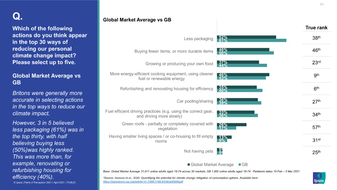
A bar chart comparing Global Market Average vs. GB for various actions to reduce personal climate change impact. The bars indicate the percentage of people selecting each action.
Market Analysis and Trends
Environmental Services & Sustainability
The slide compares how Britons and the global average rate the effectiveness of various actions to reduce personal climate change impact, with a focus on differences in perception and actual impact rankings.
climate change impact, personal actions, public perception, Global Market Average, Great Britain, environmental impact, top actions
false
Market Analysis and Trends
Environmental Services & Sustainability
Mixed Chart
IPSOS
Add to my slides
Remove from favorites
The slide includes text blocks, a supporting image, and a bar chart. The visual complexity is moderate, with an emphasis on readability and structured information presentation.
Risk Assessment and Management
Environmental Services & Sustainability
This slide discusses the impact of climate change on business operations, including risks to cost profiles, supply chains, and physical assets, supported by survey data.
Climate Change, Impact, Risk, Business, Survey
false
Risk Assessment and Management
Environmental Services & Sustainability
Mixed Chart
PwC/Strategy&
Add to my slides
Remove from favorites
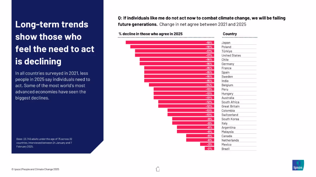
Left-aligned text on a blue panel; right side has a descending horizontal bar chart showing % change between 2021 and 2025
Market Analysis and Trends
Environmental Services & Sustainability
The chart shows declining agreement across countries that individuals must act to combat climate change. Japan, Poland, and Türkiye show the largest declines, suggesting growing disengagement despite ongoing environmental concerns.
climate change, individual action, trend analysis, public opinion, Ipsos, sustainability, 2025, perception, disengagement
false
Market Analysis and Trends
Environmental Services & Sustainability
Mixed Chart
IPSOS
Add to my slides
Remove from favorites
Horizontal bar chart comparing the agreement and disagreement levels on individual responsibility for climate action across global markets.
Market Analysis and Trends
Government & Public Sector
Reflects public sentiment that individuals also share the responsibility to combat climate change, showing varying levels of agreement by country.
climate change, individual responsibility, public opinion, global, survey
false
Market Analysis and Trends
Government & Public Sector
Multiple Chart
IPSOS
Add to my slides
Remove from favorites
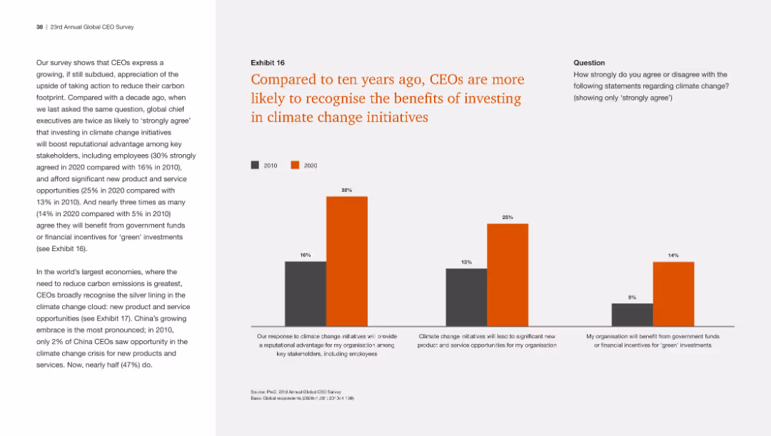
This slide includes a column chart comparing CEO responses from 2010 and 2020 on the benefits of investing in climate change initiatives, with clear visual distinctions.
Regulatory and Compliance
Environmental Services & Sustainability
The slide shows that CEOs are now more likely to acknowledge the advantages of climate change investments, including reputational benefits and new opportunities.
Climate change, investment benefits, CEO recognition, sustainability, comparison
false
Regulatory and Compliance
Environmental Services & Sustainability
Mixed Chart
PwC/Strategy&
Add to my slides
Remove from favorites
The slide features a mix of table, logos, and textual content divided into sections labeled 'Mission', 'Investment principles', and 'Portfolio as at 2023'.
Investment Analysis
Financial Services
Discusses Barclays' Sustainable Impact Capital initiative focusing on investments in climate technology, including the investment principles and portfolio examples.
climate change, investment, technology, decarbonization, innovation, portfolio, sustainable, economic, impactful, strategic
false
Investment Analysis
Financial Services
Framework
Barclays
Add to my slides
Remove from favorites
Slide features two column charts comparing leaders and lagging organizations in their concern and actions regarding climate change. It uses green and dark green bars, with significant textual annotations and percentage indicators.
Market Analysis and Trends
Environmental Services & Sustainability
This slide contrasts the attitudes and actions between leadership and lagging organizations concerning climate change, focusing on their level of concern and active measures taken.
Climate change, Leadership, Sustainability, Corporate Responsibility, Actions, Concern, Comparison, Statistics, Environmental
false
Market Analysis and Trends
Environmental Services & Sustainability
Multiple Chart
Deloitte
Add to my slides
Remove from favorites
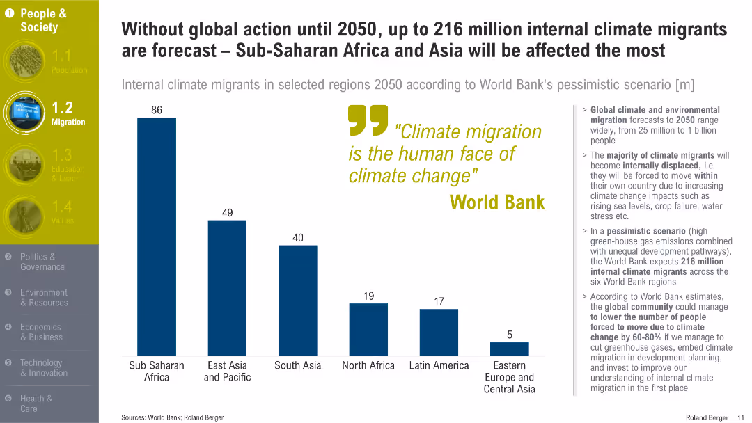
Displays three region-specific forecasts for climate-induced displacement by 2050. Includes a map overlay and key fact highlights.
Market Analysis and Trends
Environmental Services & Sustainability
This slide forecasts the potential scale of internal climate migration under a pessimistic scenario, emphasizing the need for preparedness and policy adaptation in response to climate impacts.
climate change, migration, forecast, adaptation, policy, Africa, Asia, Latin America, environment
false
Market Analysis and Trends
Environmental Services & Sustainability
Graphic
Roland Berger
Add to my slides
Remove from favorites
A bar chart comparing Millennials and Gen Z on their views about climate change, with agree/disagree metrics on whether it is too late to repair the damage.
Market Analysis and Trends
Environmental Services & Sustainability
The slide examines the views of Millennials and Gen Z on the possibility of reversing climate change damage, comparing their levels of agreement and disagreement.
Climate change, Millennials, Gen Z, agreement, disagreement, environmental views, damage reversal, sustainability, comparison
false
Market Analysis and Trends
Environmental Services & Sustainability
Mixed Chart
Deloitte
Add to my slides
Remove from favorites
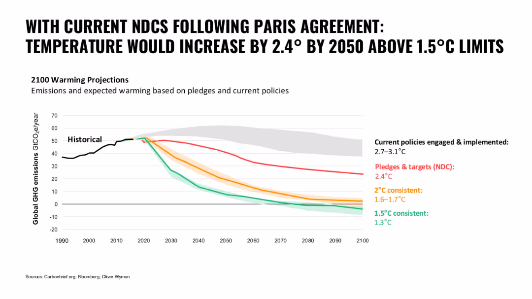
Line graph with colored paths representing different emission scenarios; bold black title and clean white background
Regulatory and Compliance
Environmental Services & Sustainability
The slide illustrates global warming projections based on current NDCs and policies versus different consistency targets. It shows the gap between policy implementation and climate goals.
climate change, NDCs, Paris Agreement, emissions, global warming, policy gap, temperature projection
false
Regulatory and Compliance
Environmental Services & Sustainability
Single Chart
Oliver Wyman
Add to my slides
Remove from favorites
This slide contains a map of Australia with markers indicating various states and their climate targets. It includes several text boxes detailing the efforts of different states in achieving net-zero emissions by 2050.
Regulatory and Compliance
Government & Public Sector
This slide discusses how Australian state governments are supporting landowners with land restoration and biodiversity efforts to achieve net-zero emissions by 2050. It highlights different state initiatives and targets in the context of climate change.
Climate change, Net zero, Government, Land restoration, Biodiversity
false
Regulatory and Compliance
Government & Public Sector
Graphic
EY
Add to my slides
Remove from favorites
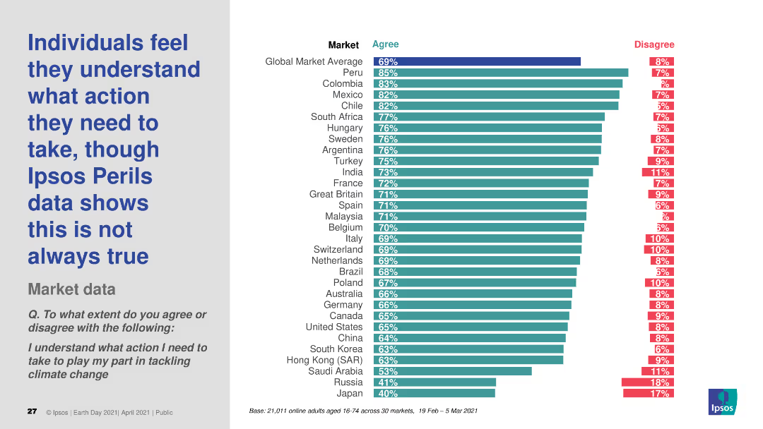
The slide presents a column chart showing the percentage of individuals who agree or disagree with the statement about understanding actions needed to tackle climate change. The chart has two colors for "Agree" and "Disagree."
Risk Assessment and Management
Environmental Services & Sustainability
The slide displays survey data on the perception of understanding actions required for tackling climate change, comparing agreement and disagreement across various global markets.
climate change, perception, understanding, survey, actions
false
Risk Assessment and Management
Environmental Services & Sustainability
Multiple Chart
IPSOS
Add to my slides
Remove from favorites
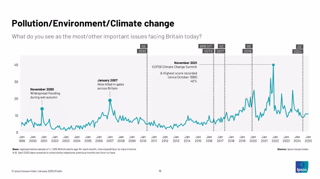
Teal line graph from 1999 to 2025 with key climate and weather-related events annotated.
Market Analysis and Trends
Environmental Services & Sustainability
This slide shows how concern over environmental issues has grown, especially during significant events like COP26 and flooding. The highest concern is noted in late 2021.
climate change, pollution, environment, COP26, UK public concern, sustainability, flooding, green issues, Ipsos
false
Market Analysis and Trends
Environmental Services & Sustainability
Single Chart
IPSOS
Add to my slides
Remove from favorites
Line chart from 1999–2025 with spikes annotated (e.g., COP26, flooding); data presented in teal with a light background.
Market Analysis and Trends
Environmental Services & Sustainability
Tracks the increasing public concern over environmental issues, peaking during events like COP26 in 2021. Long-term trend shows a steady rise in visibility.
climate change, pollution, environment, UK, COP26, flooding, sustainability, trends
false
Market Analysis and Trends
Environmental Services & Sustainability
Single Chart
IPSOS
Add to my slides
Remove from favorites
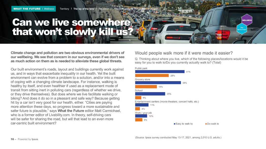
The slide features a header with the title, a background image of a traffic jam, and two main sections: a text block on the left and a column chart on the right. The column chart compares the ease of walking to various locations like parks, grocery stores, and schools, using two colors for easy identification.
Market Analysis and Trends
Environmental Services & Sustainability
Discusses climate change and pollution's impact on wellbeing, and how urban planning can evolve to address these issues. The column chart shows survey data on how easy it is for people to walk to different locations. It highlights the need for better infrastructure to support walking and reduce pollution.
Climate change, pollution, urban planning, walking, survey
false
Market Analysis and Trends
Environmental Services & Sustainability
Mixed Chart
IPSOS
Add to my slides
Remove from favorites
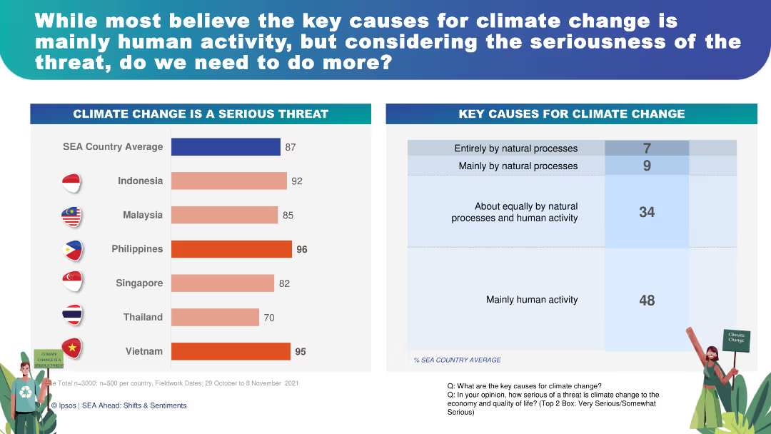
This slide features a combination of horizontal and vertical bar charts showing perceptions of climate change as a serious threat and its key causes. The charts are color-coded for easy interpretation, with accompanying text for clarity.
Risk Assessment and Management
Environmental Services & Sustainability
The slide presents survey results showing 87% of respondents consider climate change a serious threat, with 48% attributing it mainly to human activity. This can be used to discuss the urgency of climate action, public opinion on environmental issues, and strategies for risk management and mitigation.
climate change, public opinion, environmental risk, human activity, sustainability
false
Risk Assessment and Management
Environmental Services & Sustainability
Multiple Chart
IPSOS
Add to my slides
Remove from favorites
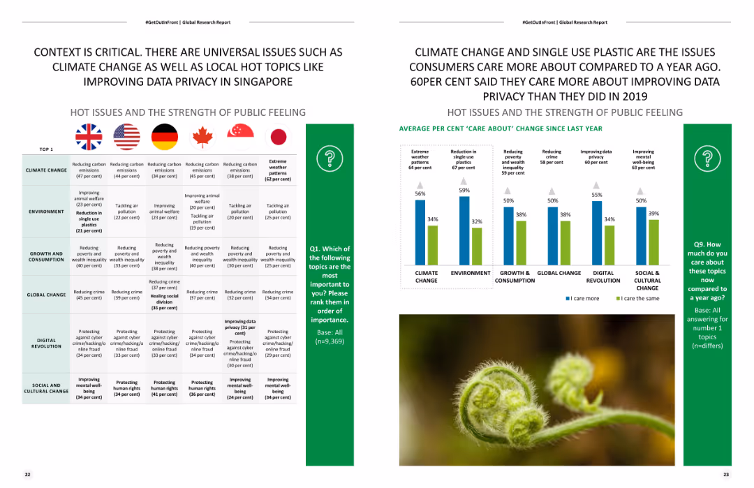
Slide includes two column charts and flags representing different countries. The left chart shows public opinion on issues by country, and the right chart shows changes in opinions over time.
Market Analysis and Trends
Environmental Services & Sustainability
Compares public concerns about various global issues, with a focus on climate change, environment, growth and consumption, etc., across different countries and over time.
Climate change, public opinion, environment, global issues, trends
false
Market Analysis and Trends
Environmental Services & Sustainability
Mixed Chart
Deloitte
Add to my slides
Remove from favorites
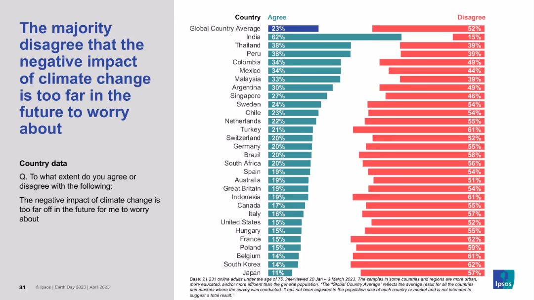
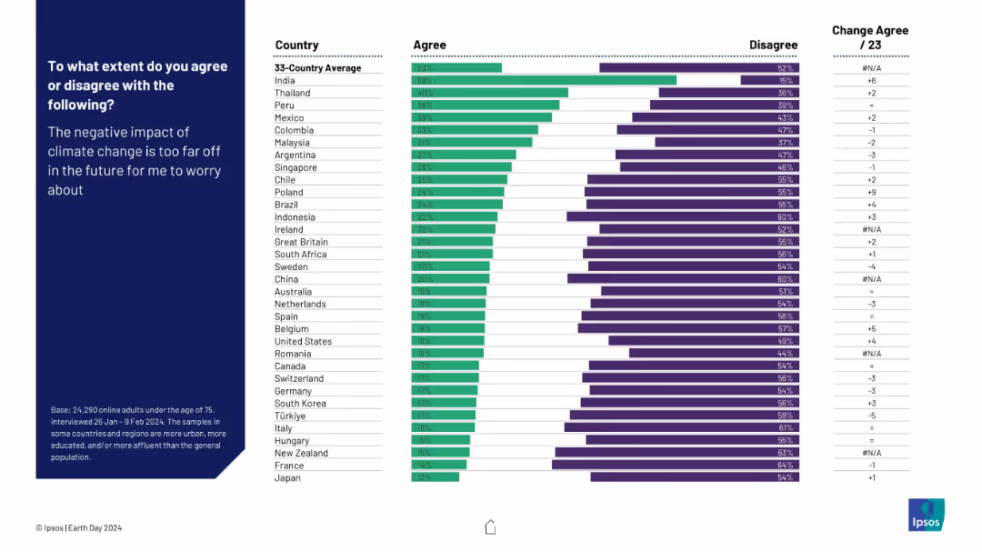
Split layout with bold blue text on the left and a horizontal bar chart on the right comparing country-level opinions.
Market Analysis and Trends
Environmental Services & Sustainability
This slide presents survey results showing that a global majority disagrees with the idea that climate change's negative effects are too distant to be concerned about. It compares agreement/disagreement percentages across countries, with India having the highest agreement and Japan the lowest.
climate change, public opinion, global survey, perception, country comparison, Ipsos, sustainability, environment, concern, urgency
false
Market Analysis and Trends
Environmental Services & Sustainability
Mixed Chart
IPSOS
Add to my slides
Remove from favorites
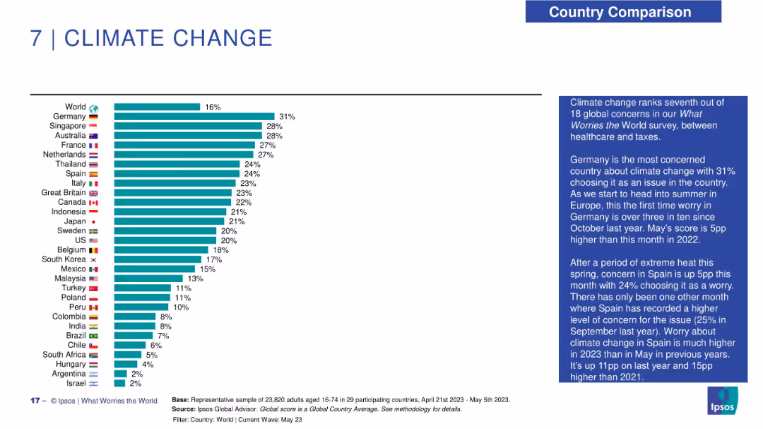
Horizontal bar chart of climate concern by country; narrative summary in blue text box at right.
Market Analysis and Trends
Environmental Services & Sustainability
The chart shows climate change concern with Germany topping the list at 31%. European countries dominate the upper half, while Latin America and parts of Asia rank lower. Global concern is 16%. Text notes increasing seasonal worry in Spain and Germany as summer approaches.
climate change, public opinion, Ipsos, Germany, environment, seasonal variation, global ranking, sustainability
false
Market Analysis and Trends
Environmental Services & Sustainability
Mixed Chart
IPSOS
Add to my slides
Remove from favorites
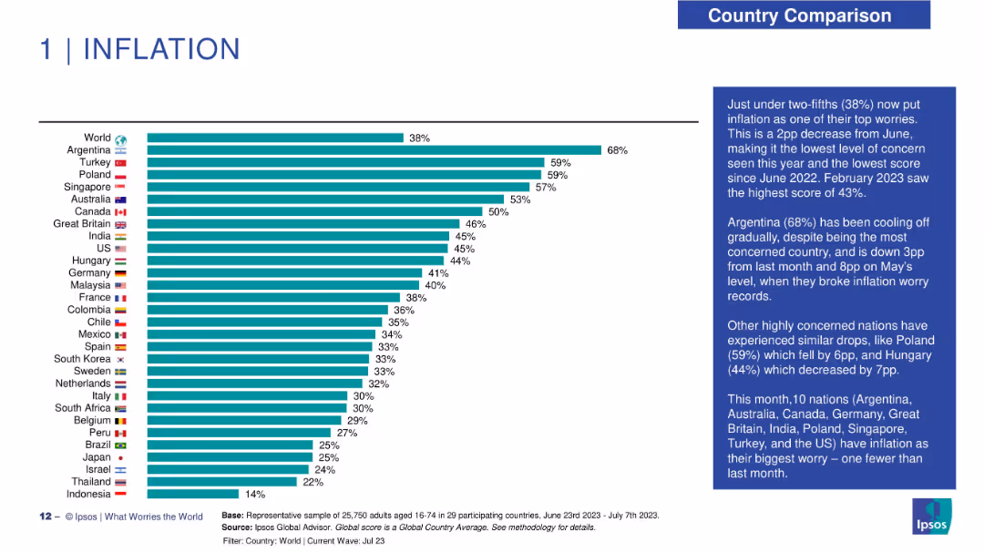
Horizontal bar chart with countries ranked by concern over inflation; sidebar text on the right.
Market Analysis and Trends
Financial Services
The chart ranks countries based on the percentage of their populations identifying inflation as a top worry. Argentina leads with 68%. The right sidebar offers insights into recent changes and historical context.
climate change, public opinion, sustainability, cost perception, global comparison, Ipsos, environmental economics, policy impact
false
Market Analysis and Trends
Financial Services
Mixed Chart
IPSOS
Add to my slides
Remove from favorites
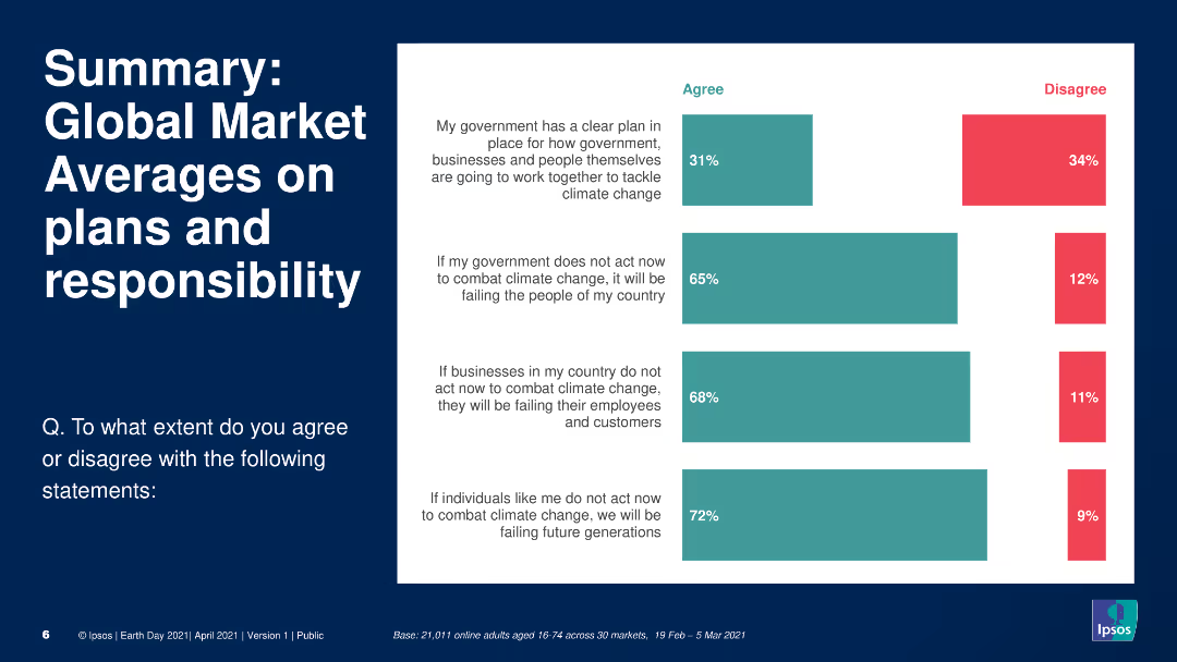
The slide features a header, a text block summarizing key points, and a column chart. The column chart displays global survey data on public agreement with statements about government, business, and individual responsibility for combating climate change, using different colors to show agreement and disagreement.
Market Analysis and Trends
Environmental Services & Sustainability
Provides a summary of global market averages on public perceptions of responsibility for climate change. The column chart shows survey data on agreement with statements regarding the roles of governments, businesses, and individuals in addressing climate change, highlighting areas of agreement and disagreement across markets.
Climate change, responsibility, global, survey, government
false
Market Analysis and Trends
Environmental Services & Sustainability
Single Chart
IPSOS
Add to my slides
Remove from favorites
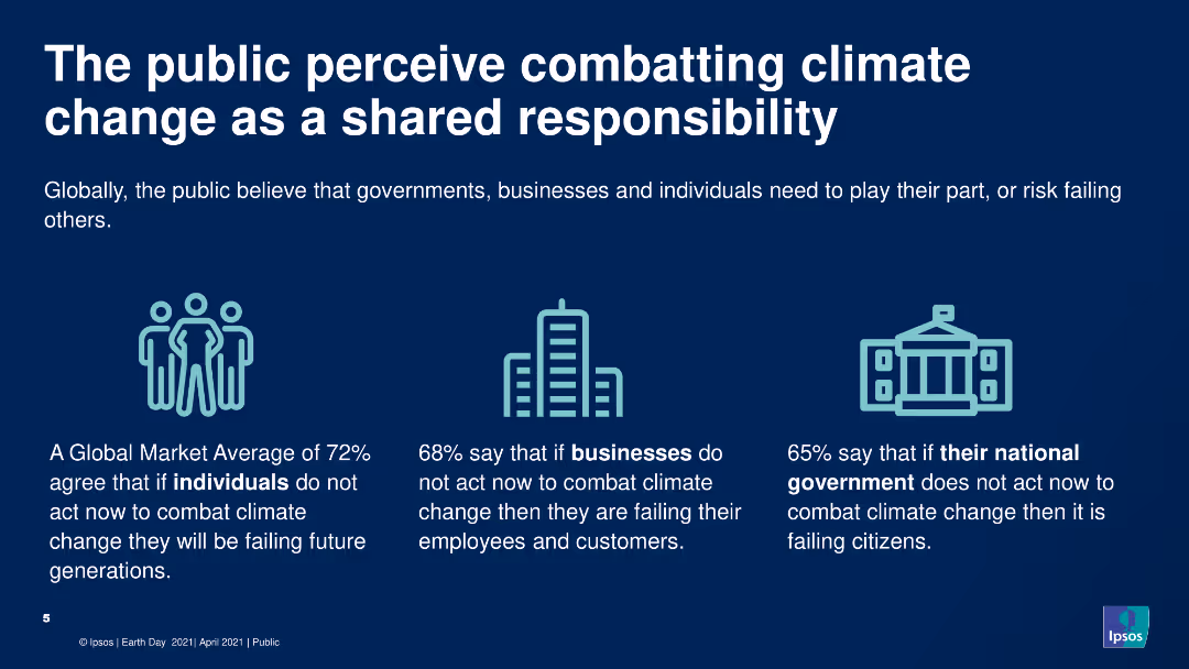
The slide includes a header, icons, and a text block summarizing survey data. The slide has a clean, simple design with three icons representing individuals, businesses, and governments, each accompanied by a key statistic from the survey about their perceived responsibility in combating climate change.
Market Analysis and Trends
Environmental Services & Sustainability
Highlights public opinion on shared responsibility for combating climate change among individuals, businesses, and governments. The slide uses icons and text to present survey data showing high agreement that all parties need to take action to address climate change.
Climate change, responsibility, public opinion, survey, environment
false
Market Analysis and Trends
Environmental Services & Sustainability
Pillar
IPSOS
Add to my slides
Remove from favorites
Image with no people, focuses on a data visualization. Column chart displaying how climate-change risks are incorporated into firms' risk management activities.
Risk Assessment and Management
Environmental Services & Sustainability
This slide focuses on the incorporation of climate-change risks into risk management activities, including scenario analysis, embedding risks in the risk management framework, and scanning for emerging risks. It provides a detailed look at how firms understand and manage their exposure to physical and transition risks of climate change.
climate-change, risk management, scenario analysis, emerging risks, physical risks
false
Risk Assessment and Management
Environmental Services & Sustainability
Multiple Chart
EY
Add to my slides
Remove from favorites
This slide features a comparative graph with a blue and grey color scheme, highlighting various risks associated with climate change in SEA compared to other regions. It includes elements like GDP impact, extreme weather risk, adaptive capacity, and an overall climate economic index.
Market Analysis and Trends
Environmental Services & Sustainability
Highlights SEA's vulnerability to climate change risks, contrasting it with other global regions and focusing on economic impacts, weather challenges, and adaptive capacity.
climate change, SEA, risks, consequences, GDP impact, extreme weather, adaptive capacity, economic index
false
Market Analysis and Trends
Environmental Services & Sustainability
Table
Bain
Add to my slides
Remove from favorites
Contains a bar chart and a column chart, with blue-green color scheme. Text is used to provide context and explanations.
Regulatory and Compliance
Environmental Services & Sustainability
Highlights the importance of climate change in corporate strategy and investments, focusing on the top pressing issues and changes in sustainability investments.
Climate change, sustainability, corporate strategy, investments
false
Regulatory and Compliance
Environmental Services & Sustainability
Multiple Chart
Deloitte
Add to my slides
Remove from favorites
This slide features a world map with various tipping points indicated by colored dots corresponding to specific global warming thresholds. Each point is labeled with the effect and the temperature range.
Regulatory and Compliance
Environmental Services & Sustainability
The slide visually represents potential environmental tipping points globally as temperatures increase, like melting ice sheets and deforestation impacts. Useful for discussing the specific climate thresholds at which irreversible changes may occur.
Climate change, Tipping points, Global warming, Deforestation, Ice melting
false
Regulatory and Compliance
Environmental Services & Sustainability
Graphic
BCG
Add to my slides
Remove from favorites
This slide features a line chart showing trends in climate concern over time across different countries. The lines are color-coded to distinguish between countries, with clear markers indicating significant changes.
Market Analysis and Trends
Environmental Services & Sustainability
The slide tracks the increasing concern about climate change from 2013 to 2021 in various countries, highlighting significant growth in awareness and urgency over the years. This can be used to analyze public sentiment trends, inform climate policy, and prioritize environmental actions.
climate concern, trend analysis, public sentiment, environmental awareness, global trends
false
Market Analysis and Trends
Environmental Services & Sustainability
Single Chart
IPSOS
Add to my slides
Remove from favorites
The slide features a vertical bar chart comparing levels of concern about the climate over several years across different countries.
Market Analysis and Trends
Environmental Services & Sustainability
Analysis of changing levels of public concern about the climate in various countries over time, showing trends and possible waning interest in some areas.
Climate, concern, trends, survey, countries
false
Market Analysis and Trends
Environmental Services & Sustainability
Mixed Chart
IPSOS
Add to my slides
Remove from favorites
Horizontal bar chart showing countries’ agreement that climate effects are too distant to worry about. Typical Ipsos layout.
Risk Assessment and Management
Environmental Services & Sustainability
This slide reveals perceptions of temporal distance from climate threats. Some respondents believe climate risks are too far in the future to act now.
climate delay, future impact, procrastination, temporal perception, Ipsos, urgency, Earth Day
false
Risk Assessment and Management
Environmental Services & Sustainability
Mixed Chart
IPSOS
Add to my slides
Remove from favorites
This content slide includes a mix of text, a photo of a worker with wind turbines, and a column chart displaying economic, energy, and emissions trends under three scenarios. The design is moderately dense with detailed information.
Market Analysis and Trends
Environmental Services & Sustainability
The slide outlines how green climate action can decouple GDP growth from emissions and energy consumption. It compares three scenarios for global economic growth and emissions trends up to 2050, showing the potential benefits of transitioning to renewable energy sources and improving energy efficiency.
Climate, Emissions, GDP, Energy, Sustainability
false
Market Analysis and Trends
Environmental Services & Sustainability
Multiple Chart
EY
Add to my slides
Remove from favorites
Column charts contrasting views from different countries. Simple and clear layout with green color highlights.
Regulatory and Compliance
Environmental Services & Sustainability
Discusses the concept of a "just transition" in sustainability efforts and its varying importance across different countries.
Climate equity, just transition, regional differences, sustainability
false
Regulatory and Compliance
Environmental Services & Sustainability
Multiple Chart
Deloitte
Add to my slides
Remove from favorites
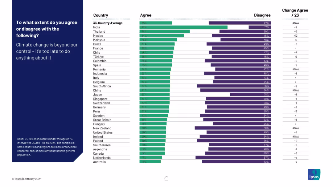
Horizontal bar chart of agreement by country on climate fatalism. Standard chart layout with bars, ranks, and text left-aligned.
Risk Assessment and Management
Environmental Services & Sustainability
This slide shows the level of climate fatalism—whether people think it's too late to stop climate change. Country responses range from resignation to optimism.
climate fatalism, urgency, climate control, belief systems, Ipsos, pessimism, public attitude
false
Risk Assessment and Management
Environmental Services & Sustainability
Mixed Chart
IPSOS
Add to my slides
Remove from favorites
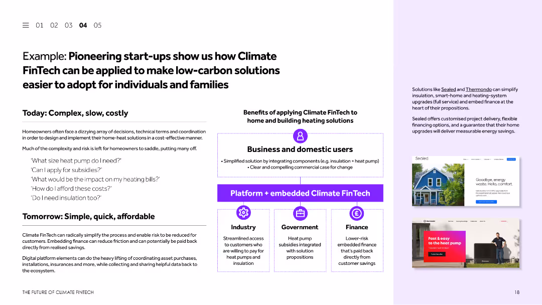
This slide uses a combination of text and images to present a case study. It discusses how Climate FinTech can simplify the adoption of low-carbon solutions for individuals and families. Visual elements include screenshots of relevant websites and a diagram explaining the process.
Client Case Studies
Financial Services
The slide presents a case study showcasing how Climate FinTech can make low-carbon solutions more accessible for individuals and families. It highlights examples of pioneering start-ups, their solutions, and the benefits of applying Climate FinTech to home and building heating solutions.
Climate FinTech, case study, low-carbon solutions, start-ups, home heating
false
Client Case Studies
Financial Services
Boxed
Barclays
Add to my slides
Remove from favorites
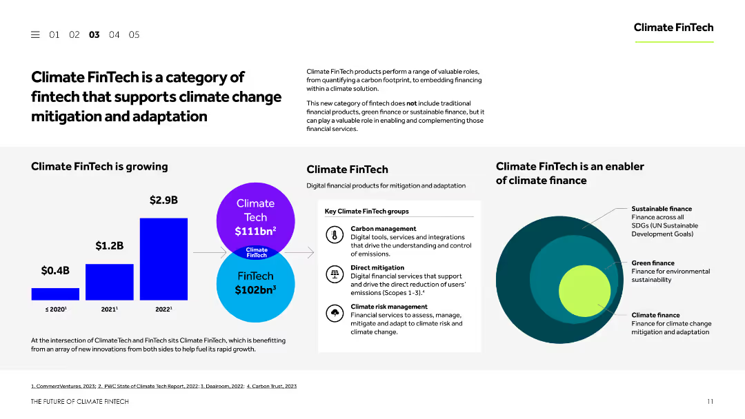
This slide features a balanced layout with text, images, and charts. It explains the concept of Climate FinTech, showcases its growth, and identifies key groups within this sector. The visual elements include a column chart and a Venn diagram.
Technology and Digital Transformation
Financial Services
The slide introduces Climate FinTech, describing its role in supporting climate change mitigation and adaptation. It highlights the growth of Climate FinTech, the main groups within the sector, and the types of digital financial products available for mitigation and adaptation.
Climate FinTech, climate change, mitigation, adaptation, digital finance
false
Technology and Digital Transformation
Financial Services
Mixed Chart
Barclays
Add to my slides
Remove from favorites
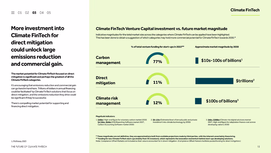
This slide combines textual content with visual elements such as column charts and icons. It discusses the market potential for Climate FinTech focused on direct mitigation, comparing current investment levels with future market opportunities.
Strategic Planning
Financial Services
The slide emphasizes the need for increased investment in Climate FinTech for direct mitigation, highlighting the potential for significant emissions reduction and commercial gain. It compares current venture funding with projected market opportunities to underscore the benefits of such investments.
Climate FinTech, direct mitigation, investment, emissions reduction, market potential
false
Strategic Planning
Financial Services
Multiple Chart
Barclays
Add to my slides
Remove from favorites
This slide is a timeline with visuals representing the company's strategy to achieve net-zero climate impact by 2030. It includes a bar chart showing the baseline and target reductions in greenhouse gas emissions. The visuals and text are well-organized and provide clear targets and strategies, using a palette of blue, white, and gray.
Corporate Finance and Valuation
Environmental Services & Sustainability
Outlines the company's commitment and strategic plan for reducing its climate impact, with targets set for 2025 and 2030. It's used to communicate the environmental goals and milestones to stakeholders, demonstrating the company's sustainability efforts and progress.
Climate Impact, Net-zero Strategy, Greenhouse Gas Reduction, Sustainability Goals, Environmental Commitment
false
Corporate Finance and Valuation
Environmental Services & Sustainability
Mixed Chart
McKinsey
Add to my slides
Remove from favorites
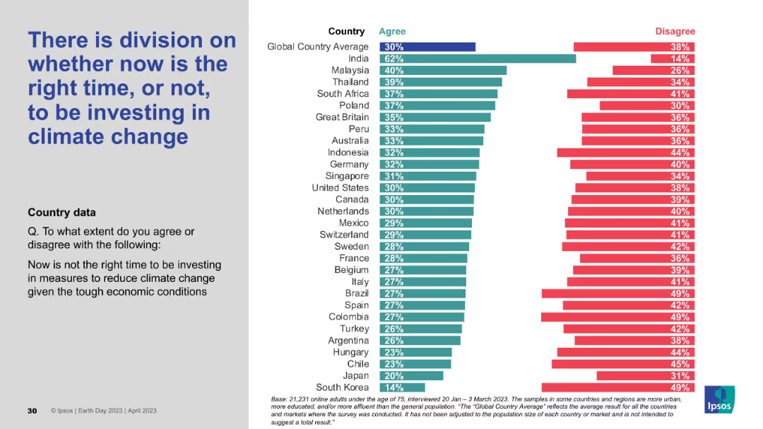
Layout includes left-aligned text and a country-based agreement/disagreement bar chart. Shows mixed levels of agreement across regions.
Investment Analysis
Environmental Services & Sustainability
This slide addresses timing concerns over investing in climate action during economic uncertainty. Opinions are divided, indicating that while some countries like India support immediate investment, others remain hesitant, revealing a tension between urgency and economic pressure.
climate investment, economic conditions, timing debate, public opinion, Ipsos, climate strategy
false
Investment Analysis
Environmental Services & Sustainability
Mixed Chart
IPSOS
Add to my slides
Remove from favorites
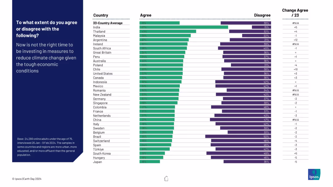
Horizontal bar chart showing agreement/disagreement percentages by country regarding investment in climate measures during economic hardship. Change from 2023 included.
Market Analysis and Trends
Environmental Services & Sustainability
This slide illustrates global sentiment on delaying climate investments due to economic constraints. India leads in agreement (67%), indicating greater economic prioritization over climate action. The data reveals varying levels of urgency or resistance to climate spending depending on national economic outlooks.
climate investment, economic hardship, climate policy, public opinion, country comparison, environmental spending, Ipsos, Earth Day, green economy
false
Market Analysis and Trends
Environmental Services & Sustainability
Mixed Chart
IPSOS
Add to my slides
Remove from favorites
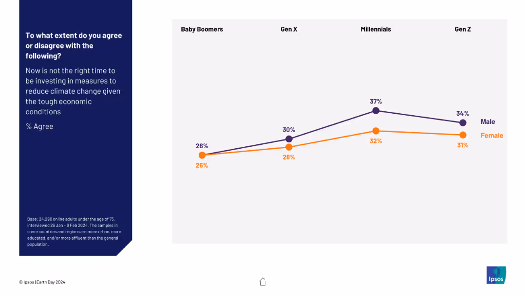
Line graph comparing gender-based agreement across four generations about delaying climate investment. Purple represents males; orange represents females.
Market Analysis and Trends
Environmental Services & Sustainability
This slide breaks down generational and gender differences in agreement with postponing climate-related investments due to economic conditions. Agreement increases with younger generations, peaking among Millennials. Males consistently show higher agreement levels than females, highlighting gendered economic risk perceptions.
climate investment, generational divide, gender perspectives, survey, economic conditions, public opinion, environment, Ipsos, Earth Day
false
Market Analysis and Trends
Environmental Services & Sustainability
Mixed Chart
IPSOS
Add to my slides
Remove from favorites
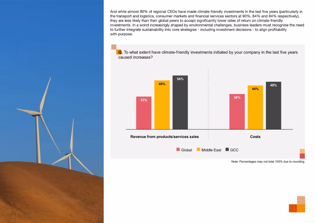
Two-bar chart for revenue and cost impacts from climate-friendly investments, comparing Global, Middle East, and GCC; wind turbines on left
Operational Efficiency
Environmental Services & Sustainability
The slide analyzes financial outcomes of climate investments, showing higher reported revenue and cost impacts in the GCC and Middle East compared to global figures.
Climate Investments, Revenue Impact, Cost Increases, Sustainability, Middle East, GCC, Environmental Strategy
false
Operational Efficiency
Environmental Services & Sustainability
Mixed Chart
PwC/Strategy&
Add to my slides
Remove from favorites
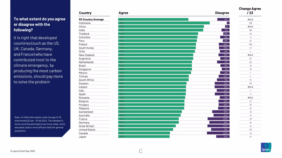
Horizontal bar chart showing agreement/disagreement by country on whether developed countries should pay more due to higher carbon contributions. Change from 2023 is noted.
Regulatory and Compliance
Environmental Services & Sustainability
This slide reflects opinions on climate justice—whether developed nations should pay more for their historic carbon emissions. Strong support is evident in Indonesia, China, and India. The data shows a global push for equitable climate responsibility distribution.
climate justice, carbon emissions, responsibility, financial contribution, global fairness, sustainability, Ipsos, Earth Day
false
Regulatory and Compliance
Environmental Services & Sustainability
Mixed Chart
IPSOS
Add to my slides
Remove from favorites
Similar format as previous: left-side large text and right-side horizontal bar chart showing country agreement/disagreement.
Market Analysis and Trends
Environmental Services & Sustainability
This slide explores public perception of whether developed countries are currently leading efforts in combating climate change. Results vary widely, with global agreement lower than on other climate topics, suggesting a more skeptical view of current leadership.
climate leadership, developed countries, perception, global view, public opinion, Ipsos, environmental action, Earth Day
false
Market Analysis and Trends
Environmental Services & Sustainability
Mixed Chart
IPSOS
Add to my slides
Remove from favorites
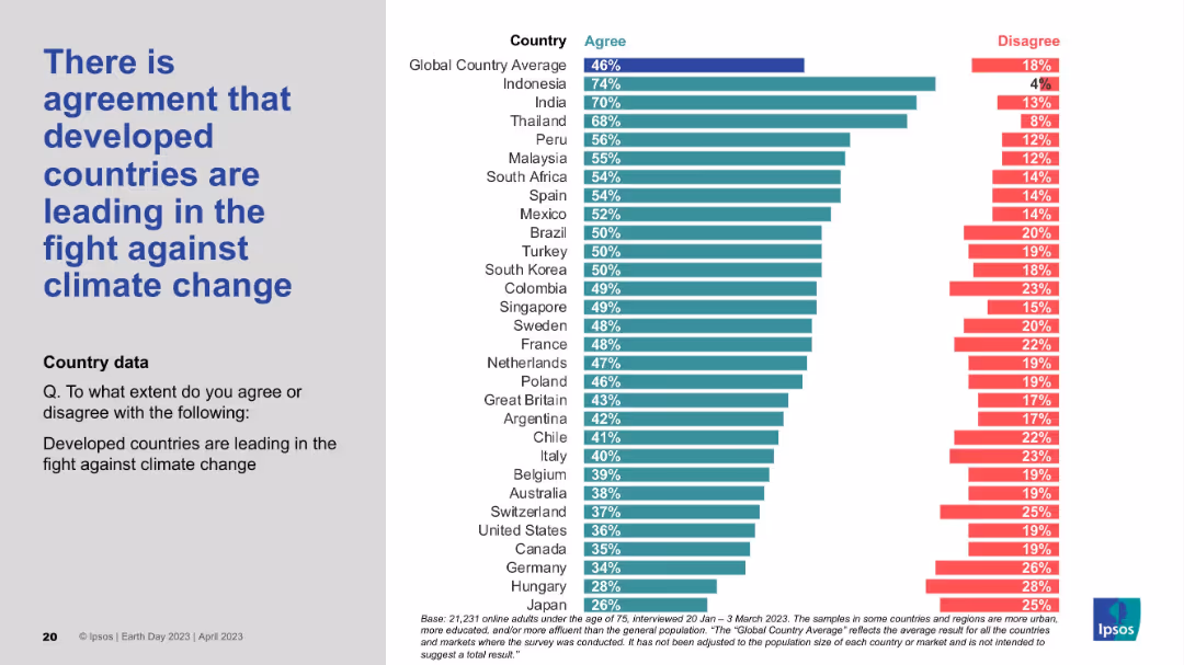
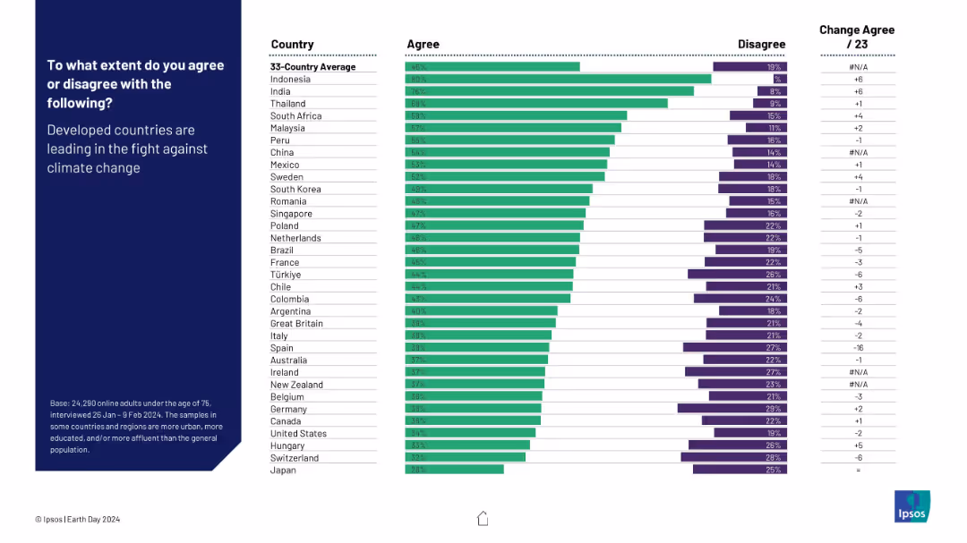
Horizontal bar chart comparing country-level agreement and disagreement on whether developed countries are leading the climate fight. Includes change from 2023.
Competitive Landscape
Environmental Services & Sustainability
This slide examines perceptions of leadership in the climate crisis. Developing countries (like Indonesia and India) show high agreement, while developed nations display skepticism. It highlights disparities in trust and accountability perceptions regarding global climate leadership.
climate leadership, developed countries, perception, public opinion, environment, global roles, Ipsos, Earth Day
false
Competitive Landscape
Environmental Services & Sustainability
Mixed Chart
IPSOS
Add to my slides
Remove from favorites
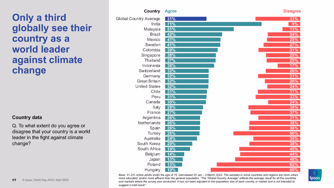
Bar chart visualizing countries’ agreement that their nation is a climate leader; large title left, data-heavy right side.
Strategic Planning
Government & Public Sector
The slide indicates low global confidence in national leadership on climate issues. Only a third of global respondents view their country as a world leader, with India topping the list. Many developed nations like Japan, Poland, and Hungary score very low in agreement.
Climate leadership, National pride, Public perception, Ipsos survey, Global ranking
false
Strategic Planning
Government & Public Sector
Mixed Chart
IPSOS
Add to my slides
Remove from favorites
Horizontal bar chart displaying agreement with the statement that each respondent’s country is a climate leader. Title left-aligned.
Market Analysis and Trends
Environmental Services & Sustainability
This slide analyzes how citizens in various countries perceive their own country’s leadership in climate efforts. Results show notable disparities in national self-perception.
climate leadership, perception, national pride, sustainability, self-assessment, Ipsos, Earth Day, global ranking
false
Market Analysis and Trends
Environmental Services & Sustainability
Mixed Chart
IPSOS
Add to my slides
Remove from favorites
Vertical bar chart ranking countries by perception of climate leadership; includes past agreement trends; title on left side.
Strategic Planning
Government & Public Sector
Captures public perception of each country’s leadership in climate change action. India, Indonesia, and Malaysia lead in agreement; others trail. Shows shifts in perceived leadership over time.
climate leadership, perception, strategic positioning, Ipsos, country rankings, environment, trend data
false
Strategic Planning
Government & Public Sector
Mixed Chart
IPSOS
Add to my slides
Remove from favorites
Slide displays icons and checklists outlining actions taken by leading organizations in climate response. Green tones dominate.
Strategic Planning
Environmental Services & Sustainability
Highlights key actions by leading companies in adapting to and mitigating climate change, emphasizing sustainable business practices.
climate leadership, sustainable practices, strategic planning, mitigation, adaptation, environmental sustainability
false
Strategic Planning
Environmental Services & Sustainability
Pillar
Deloitte
Add to my slides
Remove from favorites
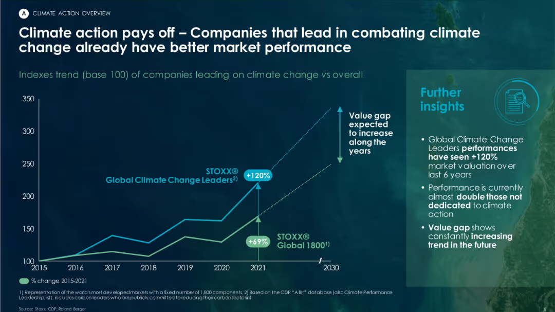
Contains a line chart showing performance trends of climate-leading companies vs. overall market. Includes insights box and minimalistic dark theme.
Investment Analysis
Environmental Services & Sustainability
The slide presents data showing that companies taking climate action outperform the market, with “Global Climate Change Leaders” showing a +120% valuation increase vs +69% for general market indexes between 2015–2021.
climate leaders, valuation, ESG, STOXX index, performance trend, investment returns
false
Investment Analysis
Environmental Services & Sustainability
Mixed Chart
Roland Berger
Add to my slides
Remove from favorites
Bar chart with blue bars showing climate migrant projections by region, supported by a large quote and summary bullets on the right.
Risk Assessment and Management
Environmental Services & Sustainability
This slide highlights the World Bank’s worst-case projection of 216 million internal climate migrants by 2050, with Sub-Saharan Africa and Asia being most affected. It explains contributing factors and mitigation potential through development and emissions policies.
climate migration, internal displacement, Sub-Saharan Africa, World Bank, environmental risks, emissions, population shift
false
Risk Assessment and Management
Environmental Services & Sustainability
Mixed Chart
Roland Berger
Add to my slides
Remove from favorites
This slide presents a comparative analysis of climate ambition, sector roadmaps, and policy frameworks across various countries, using a multi-tiered visual layout that includes icons representing countries and different levels of policy adequacy.
Regulatory and Compliance
Environmental Services & Sustainability
Evaluates the adequacy of climate policies across multiple countries, highlighting those with sufficient ambition and those lacking. Useful for discussions on enhancing climate policy frameworks and sector-specific strategies to meet global climate goals.
Climate policies, Country comparison, Policy adequacy, Ambition, Roadmaps
false
Regulatory and Compliance
Environmental Services & Sustainability
Table
BCG
Add to my slides
Remove from favorites
Stacked horizontal bars showing agree/disagree by country; historical trend data for prior years; title on left side in blue box.
Regulatory and Compliance
Government & Public Sector
Assesses global public sentiment regarding whether governments have a clear, collaborative climate action plan. Most countries show low agreement, indicating skepticism about coordinated governmental planning.
climate policy, government planning, public opinion, regulation, environmental strategy, Ipsos, citizen trust, multi-year data
false
Regulatory and Compliance
Government & Public Sector
Mixed Chart
IPSOS
Add to my slides
Remove from favorites
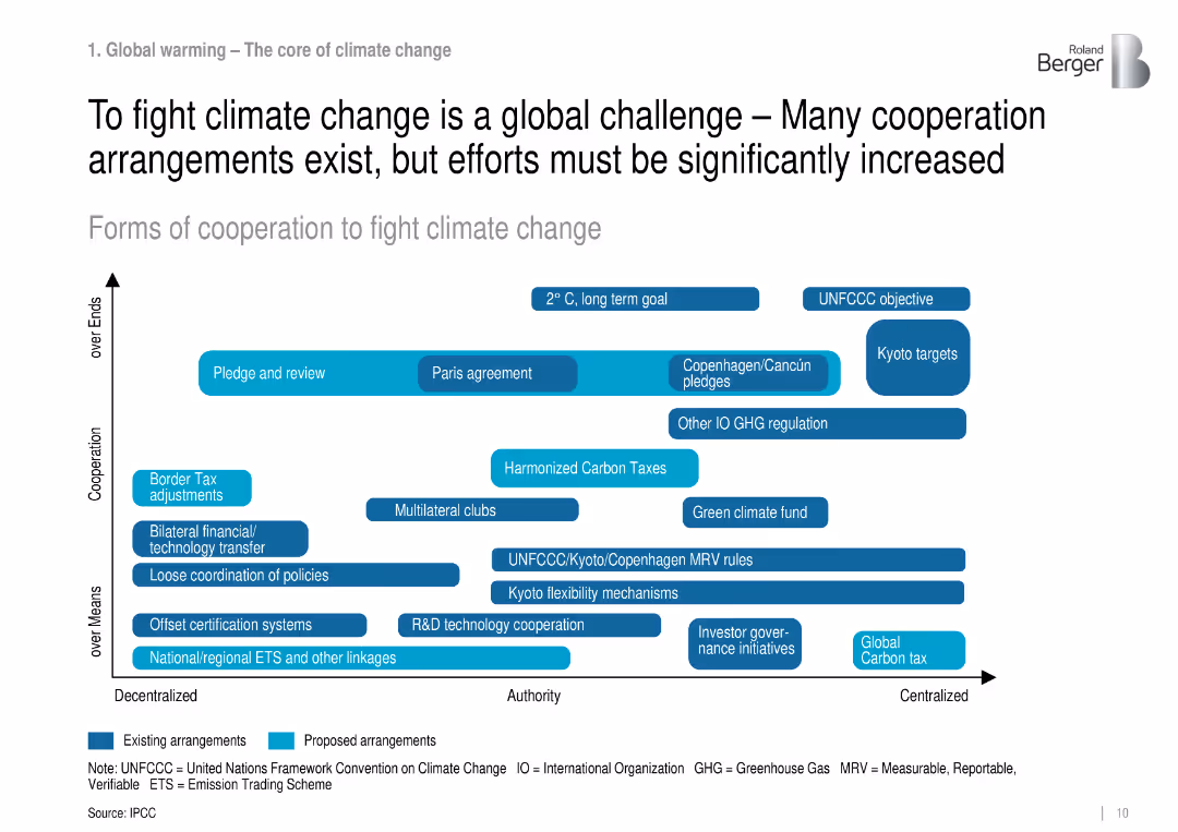
Matrix chart mapping forms of climate cooperation by decentralization and goals.
Regulatory and Compliance
Environmental Services & Sustainability
Outlines existing and proposed global cooperation mechanisms for climate change, showing a spectrum from decentralized policy tools to centralized goals like carbon taxes.
climate policy, international cooperation, UNFCCC, emissions, mitigation
false
Regulatory and Compliance
Environmental Services & Sustainability
Uncategorized
Roland Berger
Add to my slides
Remove from favorites
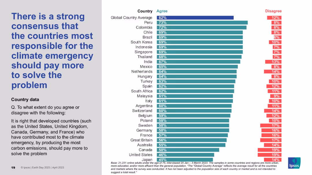
Two-column layout; left side contains large bold blue text; right side features a horizontal bar chart with country-wise agreement/disagreement percentages in teal and red.
Strategic Planning
Environmental Services & Sustainability
The slide presents survey data indicating that a majority of people globally agree that the countries most responsible for the climate emergency should bear greater financial responsibility. The chart shows percentage agreement levels across various countries.
climate responsibility, developed countries, emissions, accountability, survey, financial burden, global opinion, environmental justice, Ipsos, Earth Day
false
Strategic Planning
Environmental Services & Sustainability
Mixed Chart
IPSOS
Add to my slides
Remove from favorites
Bar chart with countries ranked by agreement that their nation should do more on climate change. Design consistent with prior slides.
Strategic Planning
Environmental Services & Sustainability
The slide highlights the demand for increased national climate efforts. Respondents from most countries support stronger action, with regional variations in urgency.
climate responsibility, national action, environmental policy, public pressure, Ipsos, climate change, international opinion
false
Strategic Planning
Environmental Services & Sustainability
Mixed Chart
IPSOS
Add to my slides
Remove from favorites
Scatter plot, color-coded data, geographical references.
Risk Assessment and Management
Environmental Services & Sustainability
Compares companies' preparedness for climate change risk against natural hazard exposure.
Climate, risk, companies, preparedness, hazards, exposure, environment, strategy
false
Risk Assessment and Management
Environmental Services & Sustainability
Single Chart
PwC/Strategy&
Add to my slides
Remove from favorites
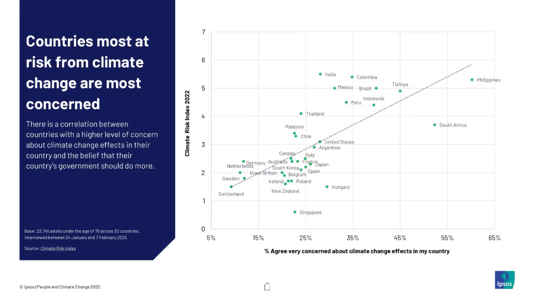
Scatterplot graph comparing % of people "very concerned" with each country's climate risk index ranking
Risk Assessment and Management
Environmental Services & Sustainability
This slide illustrates a positive correlation between climate vulnerability and public concern. Nations with higher Climate Risk Index scores like the Philippines and India show greater levels of worry, suggesting perception aligns with actual threat levels.
climate risk, concern, correlation, perception, Ipsos, vulnerability, risk index, government responsibility, public sentiment
false
Risk Assessment and Management
Environmental Services & Sustainability
Mixed Chart
IPSOS
Add to my slides
Remove from favorites
Column charts and tables showing survey results on climate and environmental risk priorities, with a focus on changes expected in the next three years.
Risk Assessment and Management
Financial Services
The slide examines the increasing importance of climate and environmental risks for CROs, detailing priority shifts and the need for better risk management practices.
Climate Risk, Environmental Risk, Priorities, Survey Results
false
Risk Assessment and Management
Financial Services
Multiple Chart
EY
Add to my slides
Remove from favorites
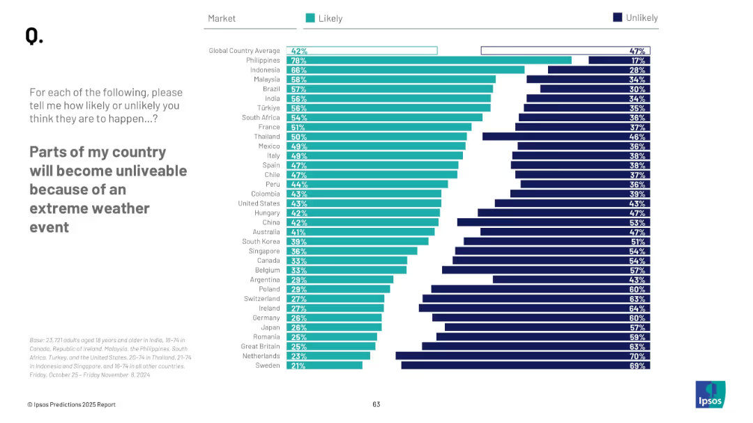
Similar horizontal bar chart format, with countries ranked by % who find it “Likely”; contrasting Likely vs. Unlikely bar lengths; side-by-side data visualization.
Risk Assessment and Management
Environmental Services & Sustainability
This slide measures the perceived likelihood of parts of countries becoming unliveable due to extreme weather. The Philippines, Indonesia, and Malaysia rank highest in concern. It highlights global public sentiment about climate change’s potential disruptive impacts on habitability.
climate risk, extreme weather, global perception, unlivable regions, Ipsos, 2025 outlook, climate change, public forecast
false
Risk Assessment and Management
Environmental Services & Sustainability
Mixed Chart
IPSOS
Add to my slides
Remove from favorites
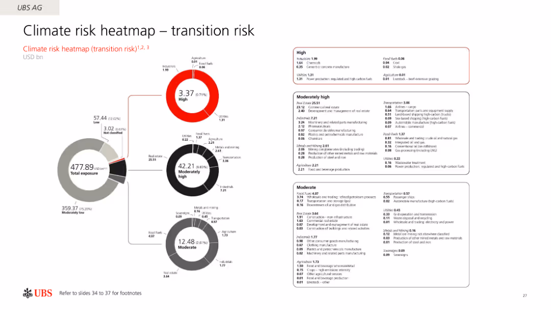
The slide uses a circular diagram to illustrate the climate transition risks across different sectors, with sections marked as high, moderately high, and moderate risk.
Risk Assessment and Management
Financial Services
The slide presents a heatmap of UBS AG's exposure to climate transition risks, categorizing various sectors based on their risk levels and financial exposure.
Climate risk, heatmap, transition risk, UBS, exposure
false
Risk Assessment and Management
Financial Services
Multiple Chart
UBS
Add to my slides
Remove from favorites
This slide contains multiple pie charts showing different maturity levels of second-line climate-risk management teams across various organizations. The layout is clean and structured.
Risk Assessment and Management
Financial Services
The slide presents data on how organizations rate the maturity of their second-line climate-risk management teams, distinguishing between G-SIBs and non-G-SIBs.
climate risk, maturity, pie charts, G-SIB, non-G-SIB
false
Risk Assessment and Management
Financial Services
Multiple Chart
EY
Add to my slides
Remove from favorites
This slide features a mix of text, an image of wind turbines, and two column charts. The charts show understanding and importance of climate-change risk management.
Risk Assessment and Management
Financial Services
It discusses the increasing importance of climate risk, maturity of understanding among CROs, and key ways to integrate climate risks into risk management activities.
Climate risk, wind turbines, risk management, understanding, integration
false
Risk Assessment and Management
Financial Services
Multiple Chart
EY
Add to my slides
Remove from favorites
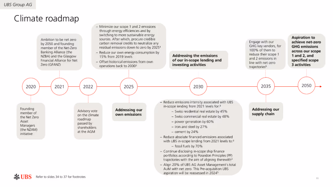
Horizontal timeline illustrating UBS's climate action milestones from 2020 to 2050. Includes detailed descriptions of goals and actions for different years. Uses icons and color coding to differentiate milestones.
Strategic Planning
Environmental Services & Sustainability
Provides a detailed roadmap of UBS's climate action plans, aiming for net-zero emissions by 2050. Describes key milestones, including emission reductions, energy efficiency improvements, and carbon offset strategies.
Climate, Roadmap, Net-Zero, Emissions, Strategy, Planning, Environmental
false
Strategic Planning
Environmental Services & Sustainability
Linear Flow
UBS
Add to my slides
Remove from favorites
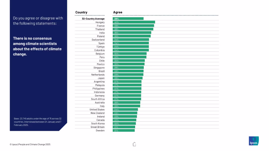
Same two-panel layout. Left panel includes statement, right shows a bar chart by country of respondents who agree.
Market Analysis and Trends
Environmental Services & Sustainability
This slide illustrates levels of public agreement with the misconception that scientists lack consensus on climate change effects. Agreement varies among countries.
climate science, public trust, misinformation, consensus, Ipsos, country-level data, perception, skepticism, global attitudes, environment
false
Market Analysis and Trends
Environmental Services & Sustainability
Mixed Chart
IPSOS
Add to my slides
Remove from favorites
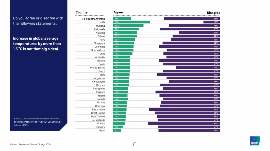
Bar chart showing % agreement and disagreement with the statement across countries; darker theme with bold text left side.
Risk Assessment and Management
Environmental Services & Sustainability
Measures minimization or denial of climate change severity. Shows how many agree that a 1.5°C rise is “not a big deal.” India and Thailand show higher agreement; most countries disagree significantly.
climate skepticism, temperature rise, risk awareness, Ipsos, global warming, public opinion, climate thresholds
false
Risk Assessment and Management
Environmental Services & Sustainability
Mixed Chart
IPSOS
Add to my slides
Remove from favorites
Features a complex layout with multiple bar charts showing the percentage of companies using strategies to promote acceptance of climate-related changes.
Strategic Planning
Environmental Services & Sustainability
Details the percentage of companies implementing strategies to enhance acceptance of their climate change efforts, segmented by company size and revenue.
climate strategies, business strategy, customer engagement, environmental initiatives
false
Strategic Planning
Environmental Services & Sustainability
Multiple Chart
Deloitte
Add to my slides
Remove from favorites
The slide features a circle divided into transition and adaptation plan sectors and three-dimensional columns representing scopes of CO2 emissions.
Strategic Planning
Industrial & Manufacturing
This slide outlines Michelin's climate strategy with a focus on transitioning towards net-zero emissions by 2050, including the adaptation plan and emissions scope.
Climate Strategy, Net-Zero Emissions, Transition Plan, Adaptation Plan, Michelin, Sustainability, CO2 Emissions, 2050 Target, Corporate Strategy, Decarbonization
false
Strategic Planning
Industrial & Manufacturing
Framework
Morgan Stanley
Add to my slides
Remove from favorites
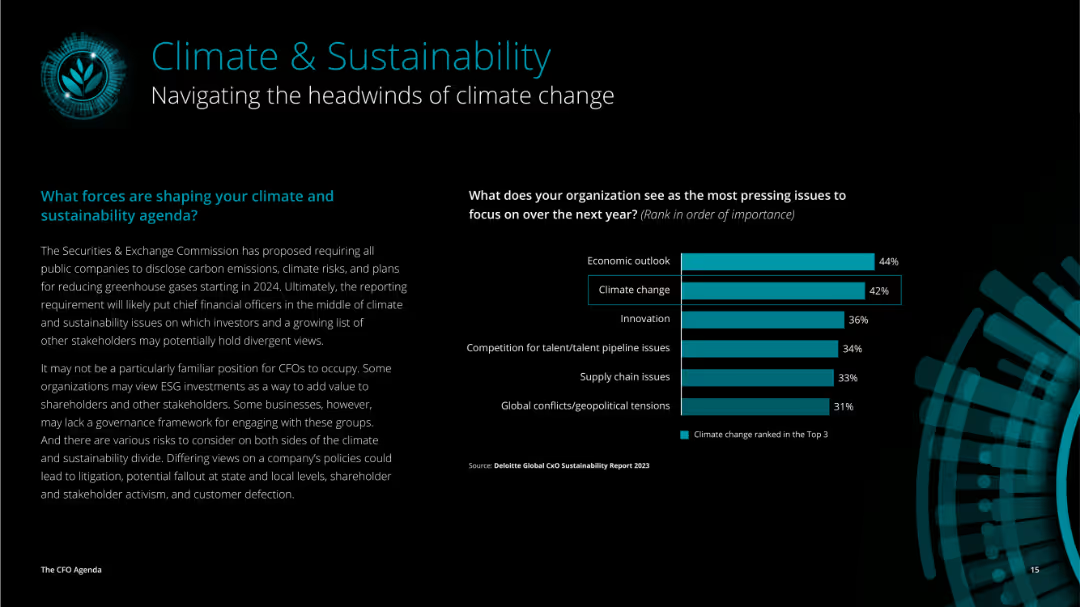
This slide has a dark background with teal and white text. It features a column chart on the right showing pressing issues, and text on the left about climate and sustainability.
Market Analysis and Trends
Environmental Services & Sustainability
Discusses forces shaping climate and sustainability agenda, with SEC regulations and organizational roles, and highlights pressing issues such as economic outlook and climate change.
climate, sustainability, economic outlook, SEC, ESG, CFO
false
Market Analysis and Trends
Environmental Services & Sustainability
Mixed Chart
Deloitte
Add to my slides
Remove from favorites
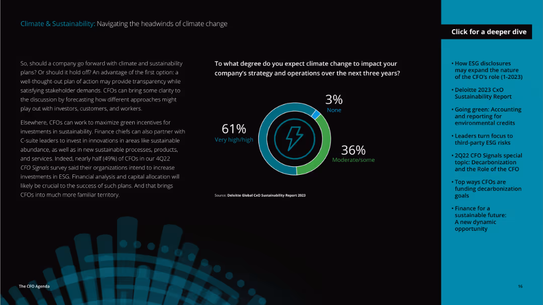
This slide has a dark background with teal and white text. It features a donut chart showing the expected impact of climate change, and text discussing strategies.
Market Analysis and Trends
Environmental Services & Sustainability
Explores if companies should proceed with climate and sustainability plans, highlights investment in ESG, and presents expected climate change impact on company strategies.
climate, sustainability, ESG, investment, strategy
false
Market Analysis and Trends
Environmental Services & Sustainability
Mixed Chart
Deloitte
Add to my slides
Remove from favorites
Features a structured diagram outlining the governance bodies involved in climate and sustainability issues at Barclays.
Regulatory and Compliance
Government & Public Sector
Details the governance framework for managing climate-related issues at Barclays, including committees and key management roles.
climate, sustainability, governance, risk management, compliance, financial services, organizational structure
false
Regulatory and Compliance
Government & Public Sector
Diagram
Barclays
Add to my slides
Remove from favorites
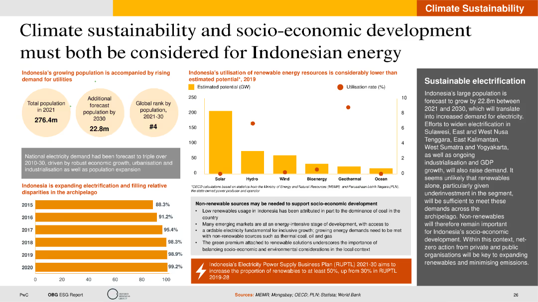
The slide includes column charts, bubble charts, and text descriptions. It is visually detailed with data on energy resource utilization, population growth, and electrification rates.
Strategic Planning
Energy & Utilities
The slide highlights the balance between climate sustainability and socio-economic development in Indonesia's energy sector. It discusses the potential and utilization rates of various renewable energy sources, the forecasted population growth, and the expansion of electrification. The slide also addresses the need for non-renewable sources to support socio-economic development and the importance of sustainable electrification strategies.
Climate sustainability, renewable energy, socio-economic development, electrification
false
Strategic Planning
Energy & Utilities
Multiple Chart
PwC/Strategy&
Add to my slides
Remove from favorites
Layout follows the same pattern: left-side statement, right-side country-wise bar chart indicating willingness to pay more taxes for climate initiatives.
Pricing Strategies
Environmental Services & Sustainability
This slide reflects public willingness to contribute financially through taxes for climate change mitigation. Around one-third agree globally, but there's a high level of opposition in most countries, suggesting tax-based measures could face strong resistance in policy adoption.
climate tax, willingness to pay, income contribution, public funding, opposition, climate finance, Ipsos data
false
Pricing Strategies
Environmental Services & Sustainability
Mixed Chart
IPSOS
Add to my slides
Remove from favorites
Horizontal bar chart comparing agreement and disagreement by country on paying more tax to fight climate change. Change since 2023 is shown.
Pricing Strategies
Environmental Services & Sustainability
This slide explores willingness to pay higher taxes to combat climate change. India and Thailand top the list in agreement. The data suggests varied fiscal support for climate policies globally, with developed countries generally showing lower agreement levels.
climate tax, willingness to pay, public support, environmental funding, global comparison, sustainability finance, Ipsos, Earth Day
false
Pricing Strategies
Environmental Services & Sustainability
Mixed Chart
IPSOS
Add to my slides
Remove from favorites
Bar chart with countries ranked by perceived likelihood of climate tech breakthrough; dark/light contrasting bars; global average highlighted at top.
Technology and Digital Transformation
Artificial Intelligence
This slide presents optimism levels across nations about the development of breakthrough technologies to stop climate change. Indonesia shows the highest hope, while Hungary and Germany are most skeptical. The global average is relatively low, showing overall caution.
climate tech, breakthrough, optimism, innovation, perception, Ipsos, AI, sustainability, country sentiment, global average
false
Technology and Digital Transformation
Artificial Intelligence
Mixed Chart
IPSOS
Add to my slides
Remove from favorites
Column chart illustrating Canada's share of global climate tech investment in various sectors from 2017 to 2022. An illustration of an industrial site is in the background.
Competitive Landscape
Environmental Services & Sustainability
Presents Canada's position in the global climate tech sector, showcasing investment in multiple emerging areas and the country's potential for leading in decarbonization.
Climate tech, Canada, investment, global, sectors
false
Competitive Landscape
Environmental Services & Sustainability
Mixed Chart
BCG
Add to my slides
Remove from favorites
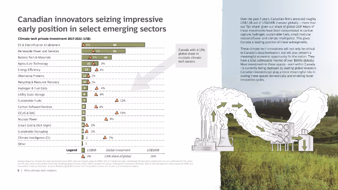
The slide includes a bar chart displaying the climate tech private investment from 2017 to 2022 across various sectors. It also features a small map of Canada, a detailed legend, and an illustration of a factory emitting green arrows to represent sustainable practices.
Market Analysis and Trends
Energy & Utilities
Highlights Canada's leading position in various emerging climate tech sectors through investments. Includes data on global and Canadian investments, emphasizing Canada’s share of the global market in these sectors.
Climate tech, Investment, Canada, Emerging sectors, Chart
false
Market Analysis and Trends
Energy & Utilities
Mixed Chart
BCG
Add to my slides
Remove from favorites
Column chart showing the readiness levels of climate tech solutions, with categories ranging from mature to small prototype. Background includes an illustration of a train.
Technology and Digital Transformation
Environmental Services & Sustainability
Illustrates the readiness of various climate tech solutions for market implementation, stressing the need for accelerated development and deployment of new technologies.
Climate tech, readiness, market, technology, deployment
false
Technology and Digital Transformation
Environmental Services & Sustainability
Mixed Chart
BCG
Add to my slides
Remove from favorites
The slide uses icons and text to outline ten key strategies for climate stabilization, including demand reduction, electrification, renewables deployment, and carbon management.
Strategic Planning
Environmental Services & Sustainability
It describes the essential strategies to limit global temperature rise, focusing on renewable energy, carbon management, and changes in power consumption.
climate, temperature, stabilization, renewables, carbon management
false
Strategic Planning
Environmental Services & Sustainability
Multiple Chart
McKinsey
Add to my slides
Remove from favorites
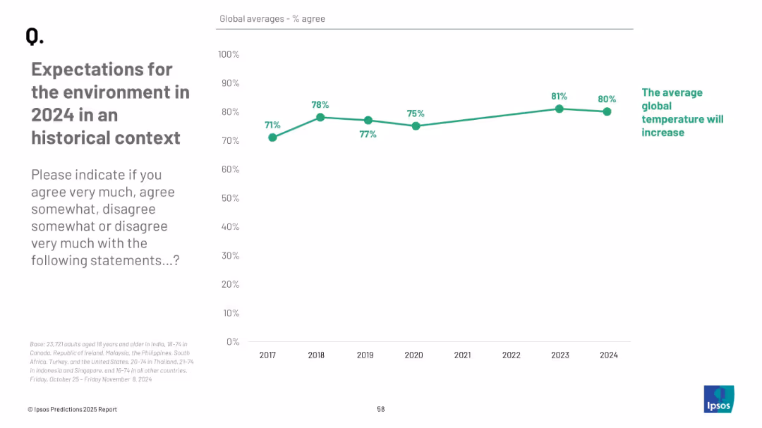
Line chart showing % agreement over years; simple green trend line on white grid background; emphasis on year-over-year changes
Market Analysis and Trends
Environmental Services & Sustainability
This historical trend chart shows how belief in global temperature increases has evolved from 2017 to 2024. The data is based on global averages and helps contextualize current environmental concerns within a longer trend.
climate trend, temperature rise, historical data, environment, public perception, timeline, Ipsos
false
Market Analysis and Trends
Environmental Services & Sustainability
Mixed Chart
IPSOS
Add to my slides
Remove from favorites
Ranked bar chart by country, with agree/disagree percentages; historical data columns to the right; bold header on left.
Risk Assessment and Management
Environmental Services & Sustainability
Highlights the widespread belief that countries are not doing enough to combat climate change. Indonesia and Philippines top the list in public urgency. Trend data helps track shifts in pressure.
climate urgency, public expectation, government responsibility, Ipsos, environmental risk, international comparison, policy gaps
false
Risk Assessment and Management
Environmental Services & Sustainability
Mixed Chart
IPSOS
Add to my slides
Remove from favorites
The slide features a two-dimensional matrix with companies plotted based on their analyst and customer scores. It's divided into zones like "Solution Leader" and "Value Leader". Each company is represented by a circle, with varying sizes indicating the company's positioning strength. The graph is overlaid with a red outline grouping certain companies as leaders.
Market Analysis and Trends
Technology & Software
This slide illustrates the competitive landscape in the Contract Lifecycle Management (CLM) industry as of Q3, 2018. It categorizes companies into different leadership zones based on performance metrics like customer and analyst scores, helping to analyze market trends and company positions.
CLM, market analysis, leadership, performance metrics, companies, competitive landscape, 2018, technology
false
Market Analysis and Trends
Technology & Software
Single Chart
Kearney
Add to my slides
Remove from favorites
This slide contains two vertical column charts. The left chart, 'Quarterly CLO Creation and Mutual Fund Flows', shows data in blue tones, with pattern differentiation for CLOs, Loan Funds, and the total. The right chart, 'Institutional Loan Volume Backing M&A', features dark and light blue bars representing different types of loans.
Investment Analysis
Financial Services
The left chart analyzes the trends in CLO creation versus mutual fund flows, suggesting an investment climate. The right chart details the volume of institutional loans supporting mergers and acquisitions, indicating market activity and investor sentiment.
CLO Creation, Mutual Fund Flows, Institutional Loans, M&A, LBO, PE-backed, Corporate, Investment Climate, Market Activity
false
Investment Analysis
Financial Services
Multiple Chart
Morgan Stanley
Add to my slides
Remove from favorites
A multi-line graph depicts the spread of CLOs against various ratings, contrasting these with underlying loan spreads.
Risk Assessment and Management
Financial Services
This slide evaluates CLO volatility relative to underlying loans, providing insights for risk management in securitized credit.
CLOs, volatility, loans, risk, securitized credit, spreads, management, analysis, ratings
false
Risk Assessment and Management
Financial Services
Single Chart
Morgan Stanley
Add to my slides
Remove from favorites
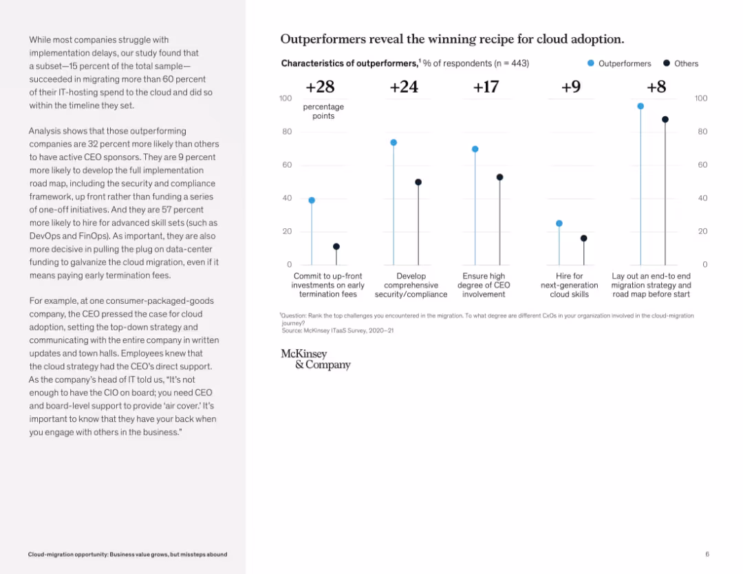
Vertical bar chart layout comparing outperformers and others across five cloud adoption success factors. Left-aligned narrative explanation.
Strategic Planning
Technology & Software
This slide identifies the traits of cloud migration outperformers, including executive sponsorship, comprehensive planning, and talent investment. Companies that commit to upfront investments and structured strategy are significantly more successful.
cloud adoption, best practices, CEO involvement, security, strategy, digital leadership, early investment, outperformers, migration success
false
Strategic Planning
Technology & Software
Mixed Chart
McKinsey
Add to my slides
Remove from favorites
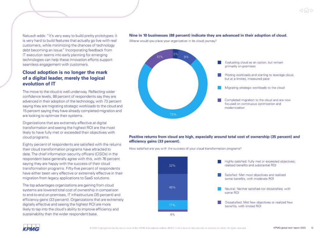
Text with donut and bar charts highlighting survey responses about cloud maturity and satisfaction.
Technology and Digital Transformation
Technology & Software
88% of organizations report advanced cloud adoption, with most in the migration or post-migration phase. Cloud transformation is no longer a differentiator but essential. Cost efficiency and ROI are key benefits. Most respondents are satisfied with cloud outcomes.
cloud adoption, ROI, SaaS, digital transformation, survey, migration, modernization
false
Technology and Digital Transformation
Technology & Software
Multiple Chart
KPMG
Add to my slides
Remove from favorites
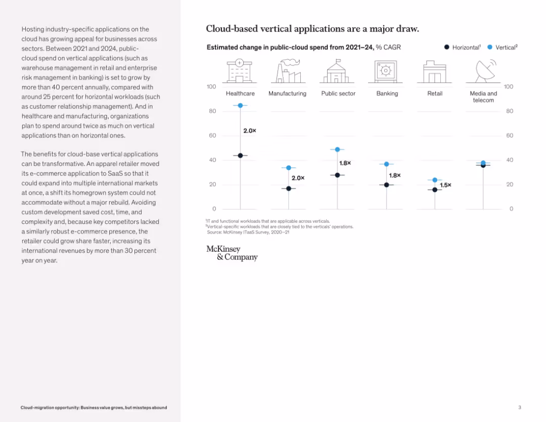
Split layout: left side with paragraph text, right side with a horizontal bar chart comparing vertical vs horizontal cloud spend growth across sectors. Clean, icon-enhanced, corporate design.
Market Analysis and Trends
Technology & Software
This slide emphasizes the growing business interest in cloud-based vertical applications, which are seeing over 40% annual growth compared to 25% for horizontal applications. It includes sector-specific statistics and explains how tailored SaaS offerings can accelerate growth and reduce development complexity.
cloud applications, vertical SaaS, industry-specific, spend growth, public cloud, transformation, international markets, cost savings, e-commerce
false
Market Analysis and Trends
Technology & Software
Mixed Chart
McKinsey
Add to my slides
Remove from favorites
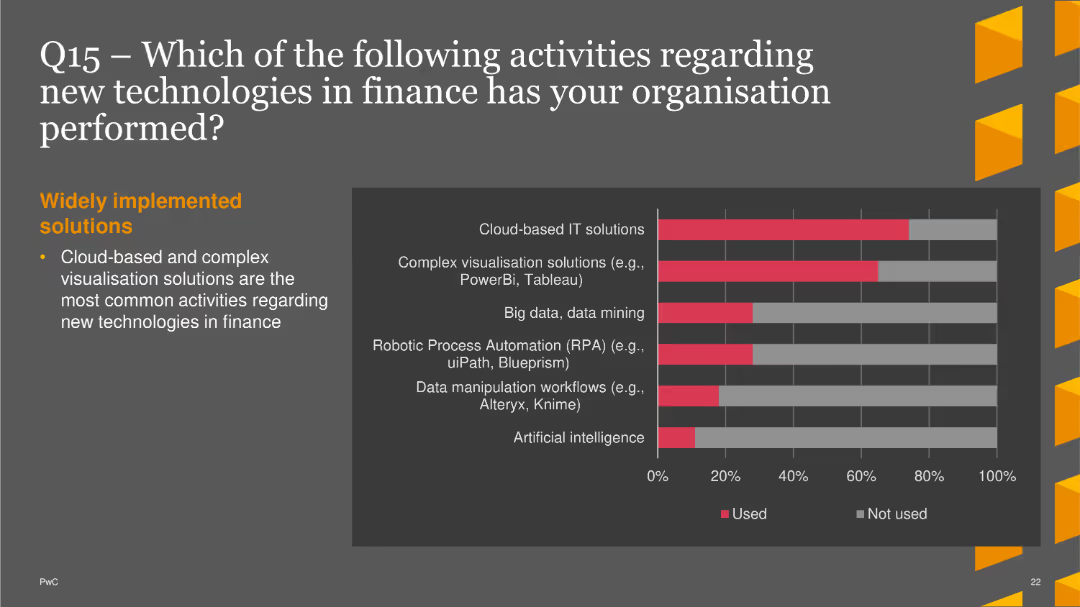
The slide features a column chart that compares the usage of various new technologies in finance. Technologies listed include Cloud-based IT solutions, complex visualization solutions, big data, data mining, robotic process automation, data manipulation workflows, and artificial intelligence. The chart uses red to indicate used technologies and gray for not used. A brief text section summarizes the widely implemented solutions.
Market Analysis and Trends
Financial Services
This slide presents survey results about the adoption of various new technologies in the finance industry, highlighting the most commonly used technologies such as cloud-based IT solutions and complex visualization tools. It is useful for understanding current technology trends in finance.
cloud-based IT, complex visualization, big data, RPA, AI, finance, technology
false
Market Analysis and Trends
Financial Services
Single Chart
PwC/Strategy&
Add to my slides
Remove from favorites
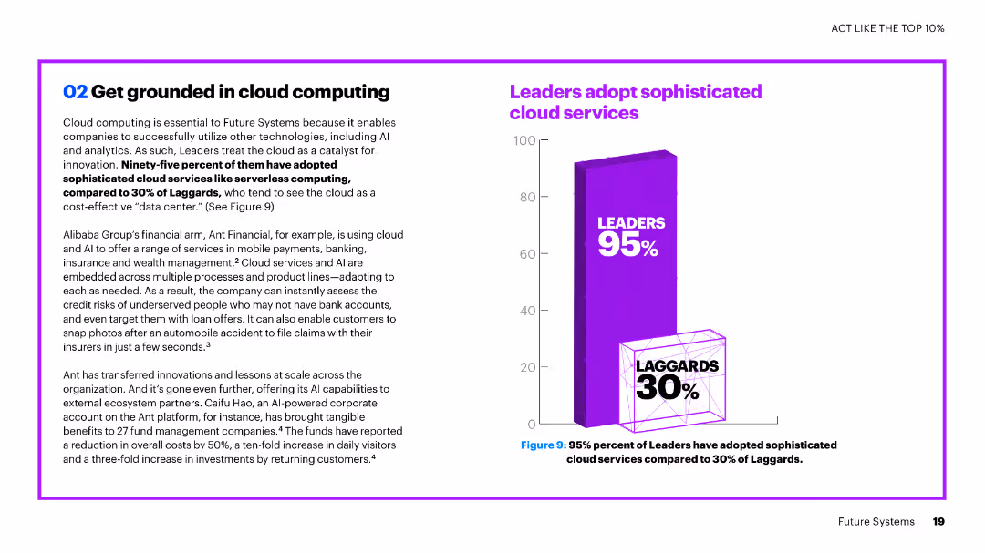
The slide features a combination of text and a vertical column chart. The chart shows a comparison of leaders and laggards in adopting sophisticated cloud services.
Technology and Digital Transformation
Technology & Software
The slide explains the importance of cloud computing in leveraging advanced technologies like AI and analytics, highlighting the adoption rates of sophisticated cloud services among leaders versus laggards.
cloud computing, AI, analytics, adoption, leaders, laggards, services, comparison, technology
false
Technology and Digital Transformation
Technology & Software
Mixed Chart
Accenture
Add to my slides
Remove from favorites
The slide features comparative visuals of traditional and edge cloud computing models. Graphical elements and color coding effectively delineate different computational approaches against a dark theme.
Technology and Digital Transformation
Technology & Software
The slide provides a clear and concise comparison between traditional cloud and edge computing. It highlights the benefits of edge computing in reducing data transmission delays and costs while offering a more relevant set of data for businesses to comply with data residency laws.
Cloud Computing, Edge Computing, Data Transmission
false
Technology and Digital Transformation
Technology & Software
Diagram
McKinsey
Add to my slides
Remove from favorites
A central cloud image with connected icons and text bubbles, facilitating a structured debate on cloud and edge computing.
Technology and Digital Transformation
Technology & Software
Highlights the main topics of debate concerning the future implications and current issues within cloud and edge computing.
cloud computing, edge computing, debate topics, security, sustainability
false
Technology and Digital Transformation
Technology & Software
Header Vertical
McKinsey
Add to my slides
Remove from favorites
The slide has a two-column layout with industry icons on the left and text explanations on the right, against a white background with a title at the top.
Technology and Digital Transformation
Technology & Software
Outlines the impact of cloud and edge computing on various industries, presenting both the affected sectors and implications of the technology trend.
cloud computing, edge computing, industry impact, technology trend, data analytics
false
Technology and Digital Transformation
Technology & Software
Header Vertical
McKinsey
Add to my slides
Remove from favorites
Features a central donut chart labeled "Client 360°" with associated data types around it, and lists on the side for business value delivery, sales enablement, and operational excellence.
Technology and Digital Transformation
Technology & Software
Explains the business value of a cloud-based, data-driven platform.
Cloud, data, platform, business, risk, analytics, forecasting, operational, sales, engagement
false
Technology and Digital Transformation
Technology & Software
Framework
JP Morgan
Add to my slides
Remove from favorites
Left narrative and right stacked bar chart showing cloud value drivers by segment. Subtle gradient theme.
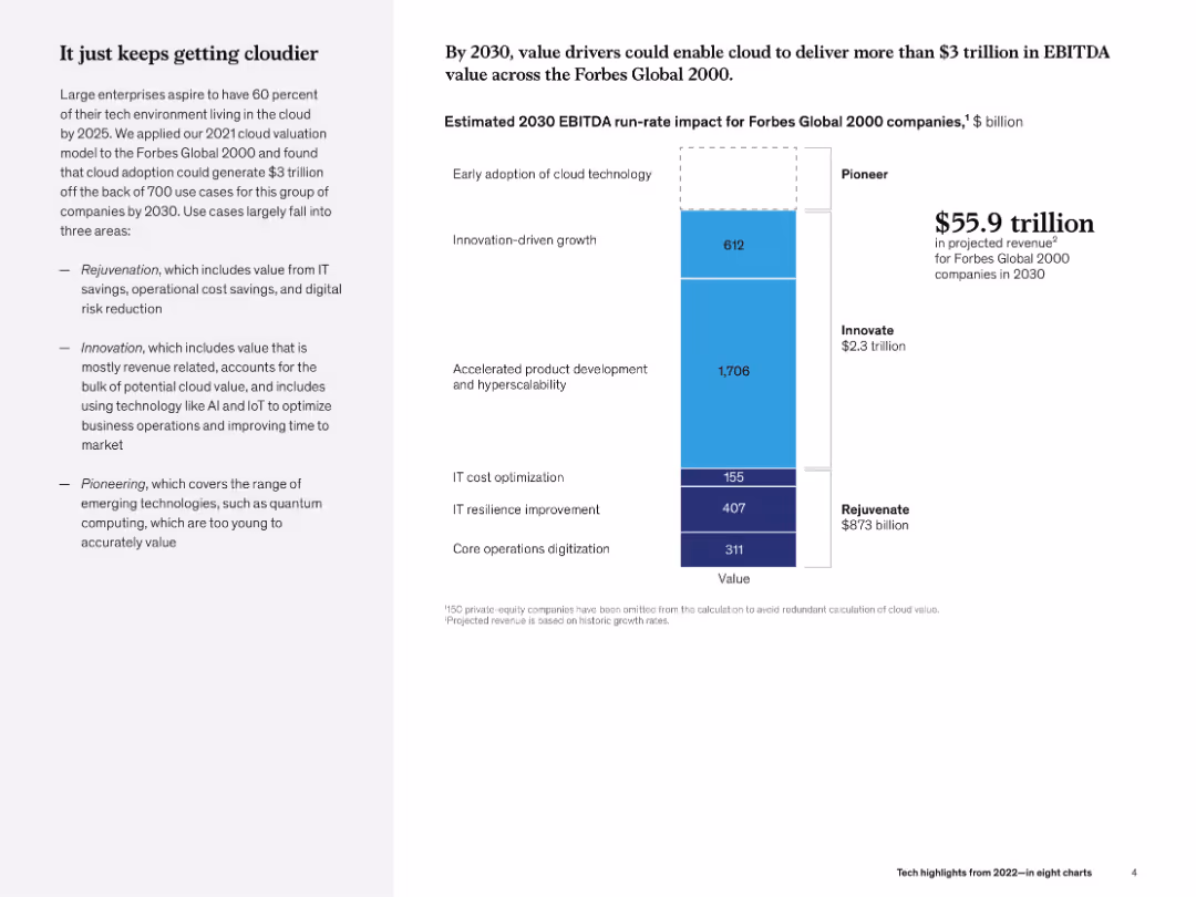
Strategic Planning
Technology & Software
The slide projects $3 trillion in EBITDA value from cloud adoption by 2030 among Forbes Global 2000 companies. It categorizes drivers into rejuvenation, innovation, and pioneering, highlighting accelerated product development's role.
cloud, EBITDA, 2030, innovation, hyperscalability, McKinsey, strategic value, digital infrastructure
false
Strategic Planning
Technology & Software
Mixed Chart
McKinsey
Add to my slides
Remove from favorites
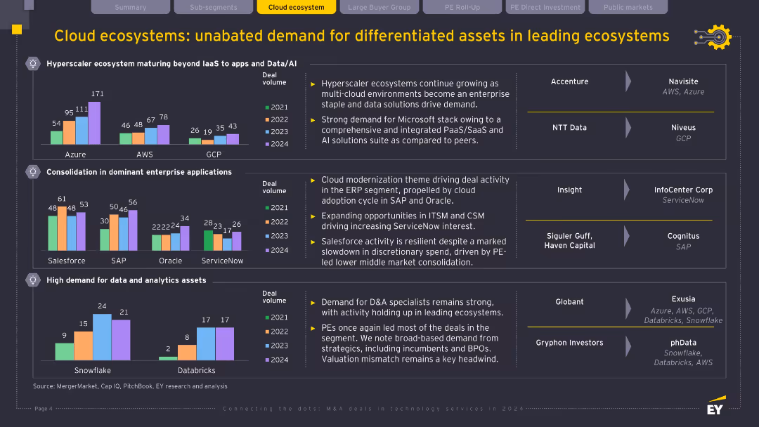
Three bar chart panels (hyperscaler growth, enterprise application consolidation, D&A demand); company logos and acquisition arrows on right; black background with yellow title bar.
Market Analysis and Trends
Technology & Software
This slide explores persistent demand for cloud ecosystem assets, highlighting hyperscaler expansion, application modernization (Salesforce, SAP), and continued strength in data & analytics. It notes strategic acquisitions and key players expanding within AWS, Azure, and other cloud domains to meet enterprise transformation demands.
cloud ecosystem, hyperscaler, data analytics, AWS, Azure, SAP, acquisitions
false
Market Analysis and Trends
Technology & Software
Multiple Chart
EY
Add to my slides
Remove from favorites
A scatter plot similar to the IT intensity slide, but focused on cloud intensity. It compares IT spending per employee and value-added per employee, with countries grouped and color-coded.
Market Analysis and Trends
Technology & Software
The slide evaluates cloud intensity by country, comparing IT spending on cloud services to the economic value added per employee, useful for understanding global cloud adoption.
Cloud Intensity, Country Analysis, Cloud Spending, Economic Value, International Comparison
false
Market Analysis and Trends
Technology & Software
Single Chart
Gartner
Add to my slides
Remove from favorites
Multi-section layout: quote at top, narrative left, bar chart right. Uses numbered step formatting with a balanced color scheme.
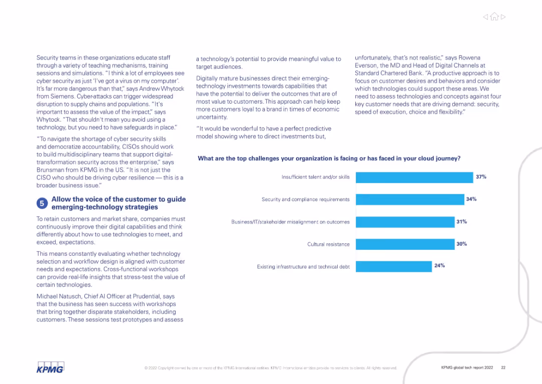
Strategic Planning
Technology & Software
Focuses on aligning technology strategies with customer expectations. Discusses the role of cross-functional workshops and emphasizes challenges like stakeholder misalignment, skills shortage, and cultural resistance.
cloud journey, customer feedback, stakeholder alignment, skills gap, digital strategy, emerging tech
false
Strategic Planning
Technology & Software
Mixed Chart
KPMG
Add to my slides
Remove from favorites
Dual-panel layout with bar charts. Left panel shows budget vs actual cloud migration cost; right panel shows migration timeline status. Bottom section details cost overrun by area.
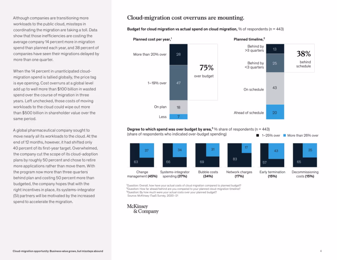
Risk Assessment and Management
Technology & Software
This slide outlines how cloud-migration projects frequently exceed budgets and experience delays. It notes that 75% of respondents went over budget and 38% were behind schedule. Change management and systems-integrator spending were top cost overrun areas.
cloud migration, cost overrun, project delay, budget excess, IT transformation, timeline issues, risk management, systems integrators, McKinsey survey
false
Risk Assessment and Management
Technology & Software
Multiple Chart
McKinsey
Add to my slides
Remove from favorites
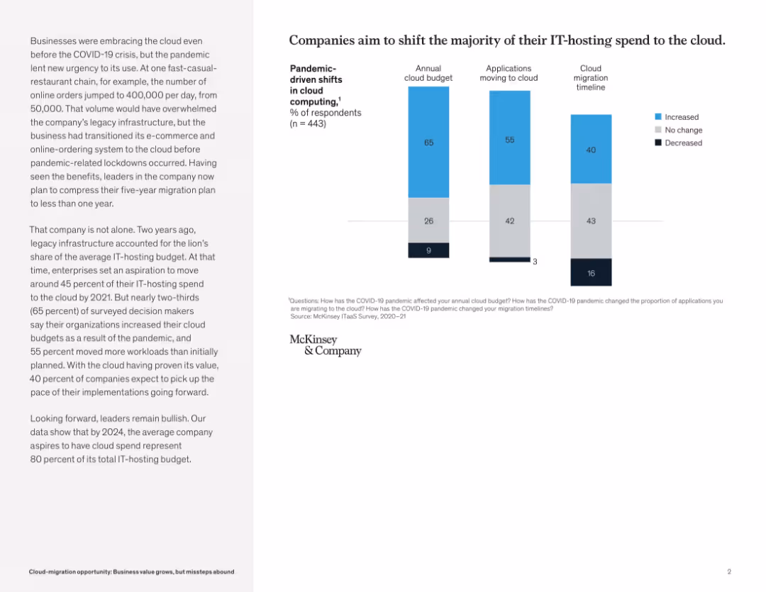
Three stacked bar graphs showing annual budget, application migration, and cloud timelines. Left has supporting narrative text.
Technology and Digital Transformation
Technology & Software
The slide reveals COVID-19 accelerated cloud migration, with 65% of respondents increasing cloud budgets and 55% moving more workloads. It highlights rapid timeline compression and long-term migration goals toward 80% IT-hosting in cloud.
cloud migration, COVID-19, IT budget, cloud timeline, digital infrastructure, McKinsey
false
Technology and Digital Transformation
Technology & Software
Mixed Chart
McKinsey
Add to my slides
Remove from favorites
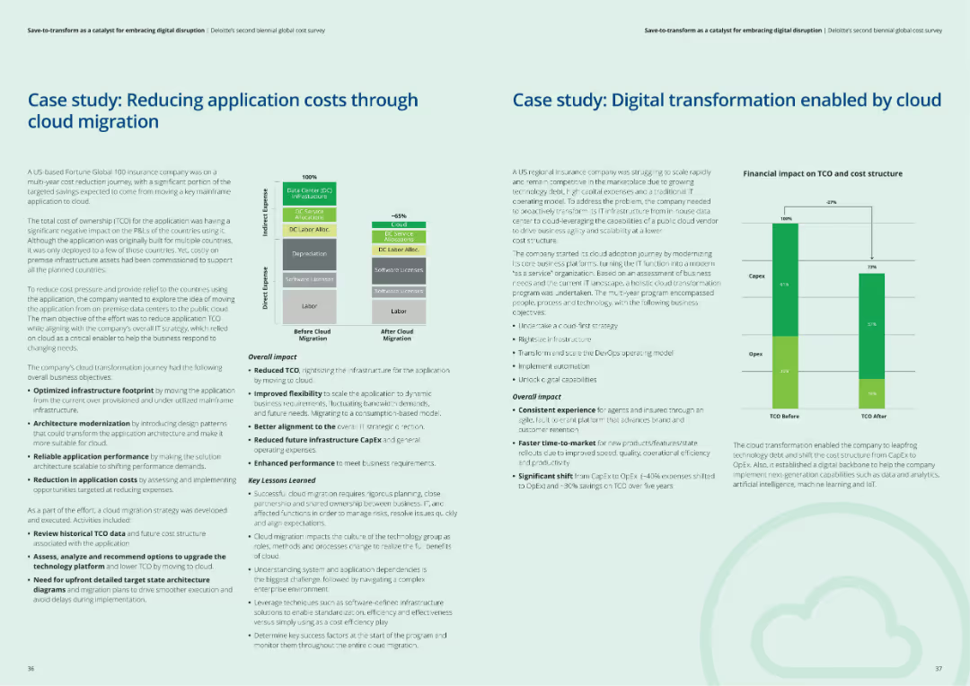
The slide includes two case studies, each with a structured layout showing context, challenges, actions taken, and results of cloud migration and digital transformation efforts.
Client Case Studies
Financial Services
The slide presents two case studies: one on reducing application costs through cloud migration and another on digital transformation enabled by cloud solutions, highlighting key lessons learned.
Cloud migration, digital transformation, case studies, client examples, financial services
false
Client Case Studies
Financial Services
Multiple Chart
Deloitte
Add to my slides
Remove from favorites
Uses timelines and arrows to show progress and completion targets for tech platforms, with icons indicating platform benefits.
Technology and Digital Transformation
Technology & Software
Outlines the status and impact of J.P.Morgan's cloud-native tech platforms, showing expected completion dates and revenue generation.
Cloud-Native, Tech Platforms, Revenue, Development, J.P.Morgan, Real-Time Payments, Liquidity
false
Technology and Digital Transformation
Technology & Software
Mixed Chart
JP Morgan
Add to my slides
Remove from favorites
Three-column layout with text describing capabilities and services, ecosystem partnerships, and value to stakeholders, accompanied by relevant icons and minimal visual elements.
Technology and Digital Transformation
Technology & Software
The slide explains how cloud and ecosystem partnerships accelerate time-to-market and deliver transformation, highlighting capabilities, partnerships, and value to stakeholders.
cloud, partnerships, transformation, capabilities, services
false
Technology and Digital Transformation
Technology & Software
Pillar
Credit Suisse
Add to my slides
Remove from favorites
Previous
Next
You don't have any favorites yet.
Please wait loading your favorites slides...
Create a FREE account to continue browsing
Receive Instant Access to 1,000+ slides from companies like McKinsey, Google, and Goldman Sachs
First Name
Last Name
Email
Password
I agree to all
Terms & Privacy Policy
Thank you! Your submission has been received!
Oops! Something went wrong while submitting the form.
Have an account?
Sign in
Upgrade to PRO to Save slides
Advanced Search and Filters
Access to 15,000+ slides
Access to Category Pages
Save/Bookmark Slides
PowerPoint Template Library
Pick a Plan
MONTHLY
$12/month
Billed every month, Cancel anytime.
YEARLY
$9/year
Billed $108 annually, Cancel anytime.
Checkout for $12/month
Checkout for $108/yr
Secured by Stripe | AES-256 bit encryption


![[COUNTRY] is a world leader in the fight…](https://cdn.prod.website-files.com/654e70fb59937215cac87b19/6899c5d7b729b6bf116405a1_jwOWIPAS-prelP9wwHtKJckmbPJMBh3EtfyvnXtJauU.avif)
![[COUNTRY] is a world leader in the fight against climate change](https://cdn.prod.website-files.com/654e70fb59937215cac87b19/6899c233d1da0f1e90aaf0e9_dXIhzebLeY47ZOl5DU0O7IhEthXAB-mq77SnCEXAp_A.avif)


![[COUNTRY]’s government has a clear plan...](https://cdn.prod.website-files.com/654e70fb59937215cac87b19/6899c22f17bfc679828149c1_isIE57pzmiCX-qvddwTcN0lYwlGo39tdp_T5K5GJDD8.avif)
![[COUNTRY] should do more in the fight…](https://cdn.prod.website-files.com/654e70fb59937215cac87b19/6899c5da3cd8e1fabdb4c60f_v3Q4RGI05F9Y1pjx9qWO3G3XGk7EAaiTUBahSuMHYd0.avif)


![[COUNTRY] should do more in the fight against climate change](https://cdn.prod.website-files.com/654e70fb59937215cac87b19/6899c237b729b6bf1162b490_G142XC939YOwIh6V-FijnmHYfAo4-tQfRbPOI0YF184.avif)