My Account
My Slides
Search by Category
Companies
Slide Type
Use Case
Industry
Pricing
Templates
View All Templates
Download Template Slides
✦ AI
AI Prompt Library
AI Search
Feedback
Login
Logout
Get Started
Browse all Slides
Browse all Slides
Create a FREE Account
Instant access to 1,000+ real slides from top companies like McKinsey, BCG, Goldman Sachs, Google and many more!
First Name
Last Name
Email
Password
I agree to all
Terms & Privacy Policy
Thank you! Your submission has been received!
Oops! Something went wrong while submitting the form.
Have an account?
Sign in
Saved Slides
Total No. of slides saved
0
↻ Refresh
✖ Clear all
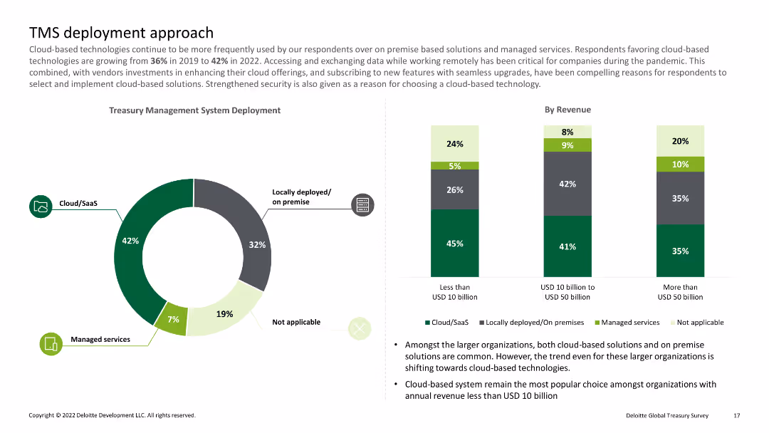
Pie chart showing percentages of cloud/SaaS, locally deployed, and managed services; bar charts detailing deployment by revenue
Technology and Digital Transformation
Financial Services
Discusses the shift towards cloud-based treasury management systems and their deployment among organizations of varying revenue sizes.
Cloud, SaaS, deployment, revenue, treasury
false
Technology and Digital Transformation
Financial Services
Multiple Chart
Deloitte
Add to my slides
Remove from favorites
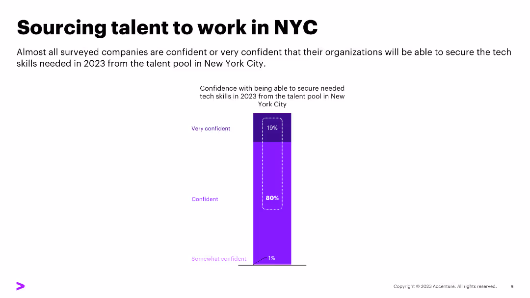
White background with multiple purple column charts comparing hiring priorities and difficulties
Human Resources and Talent Management
Technology & Software
It highlights the top skills in demand for tech talent, focusing on cloud, security, and AI skills
Cloud, Security, AI, Tech Skills, Hiring Priorities
false
Human Resources and Talent Management
Technology & Software
Single Chart
Accenture
Add to my slides
Remove from favorites
The slide has a white background with a column chart on the right side. The left side contains text discussing the importance of integrating security in cloud operations.
Technology and Digital Transformation
Technology & Software
This slide emphasizes the significance of embedding security in cloud operations for better business outcomes and the high percentage of cyber champions prioritizing cloud security.
Cloud security, business outcomes, cybersecurity, cloud operations, champions, integration, security, digital transformation, alignment
false
Technology and Digital Transformation
Technology & Software
Mixed Chart
Accenture
Add to my slides
Remove from favorites
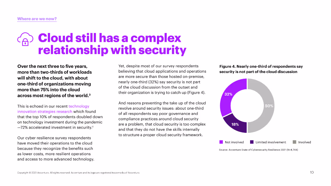
Text and a pie chart illustrating survey responses about the involvement of security in cloud discussions. The chart uses purple and gray to show different involvement levels.
Risk Assessment and Management
Technology & Software
The slide explores the ongoing challenges of cloud security, indicating that a significant portion of respondents feel that security is not adequately involved in cloud strategy discussions.
cloud, security, involvement, challenges, survey
false
Risk Assessment and Management
Technology & Software
Mixed Chart
Accenture
Add to my slides
Remove from favorites
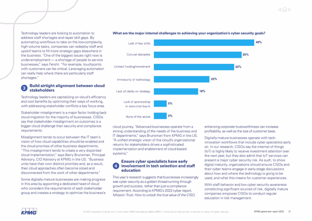
Bar chart on the right showing ranked internal challenges; left side features two text blocks with insights and strategies.
Risk Assessment and Management
Technology & Software
Details top internal cybersecurity challenges including skills shortage, cultural resistance, and funding gaps. Highlights cloud migration and the importance of early involvement of cyber specialists in strategy.
cloud security, key skills, funding, stakeholder alignment, risk, cyber strategy
false
Risk Assessment and Management
Technology & Software
Mixed Chart
KPMG
Add to my slides
Remove from favorites
The slide includes column charts showing dependence on cloud service providers by industry and geography.
Risk Assessment and Management
Technology & Software
This slide presents data on the current and future dependence on cloud service providers across industries and regions.
cloud, service providers, dependence, industry, geography
false
Risk Assessment and Management
Technology & Software
Multiple Chart
Deloitte
Add to my slides
Remove from favorites
A slide with a blend of icons and text, displayed on a dark background. Icons represent financial opportunity, hybrid cloud strategy, market growth, and security concerns, underscoring the slide's strategic message to leaders.
Technology and Digital Transformation
Technology & Software
Aimed at business leaders, the slide articulates why cloud computing is a pivotal area of technology to consider, with implications for cost savings, market growth, and security. It underscores the strategic significance of cloud services and hybrid approaches in the technological advancement of organizations.
Cloud Strategy, Market Growth, Security Concerns
false
Technology and Digital Transformation
Technology & Software
Pillar
McKinsey
Add to my slides
Remove from favorites
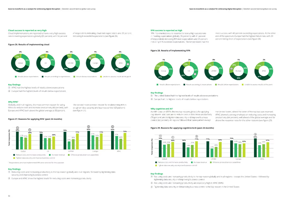
The slide includes two sets of pie charts and column charts showing the success of cloud and RPA implementations across various regions. Key findings are detailed in text boxes.
Technology and Digital Transformation
Financial Services
The slide reports on the success rates of cloud and RPA implementations, reasons for adopting these technologies, and their impact on reducing costs and increasing productivity.
Cloud success, RPA implementation, technology impact, analysis, financial services
false
Technology and Digital Transformation
Financial Services
Multiple Chart
Deloitte
Add to my slides
Remove from favorites
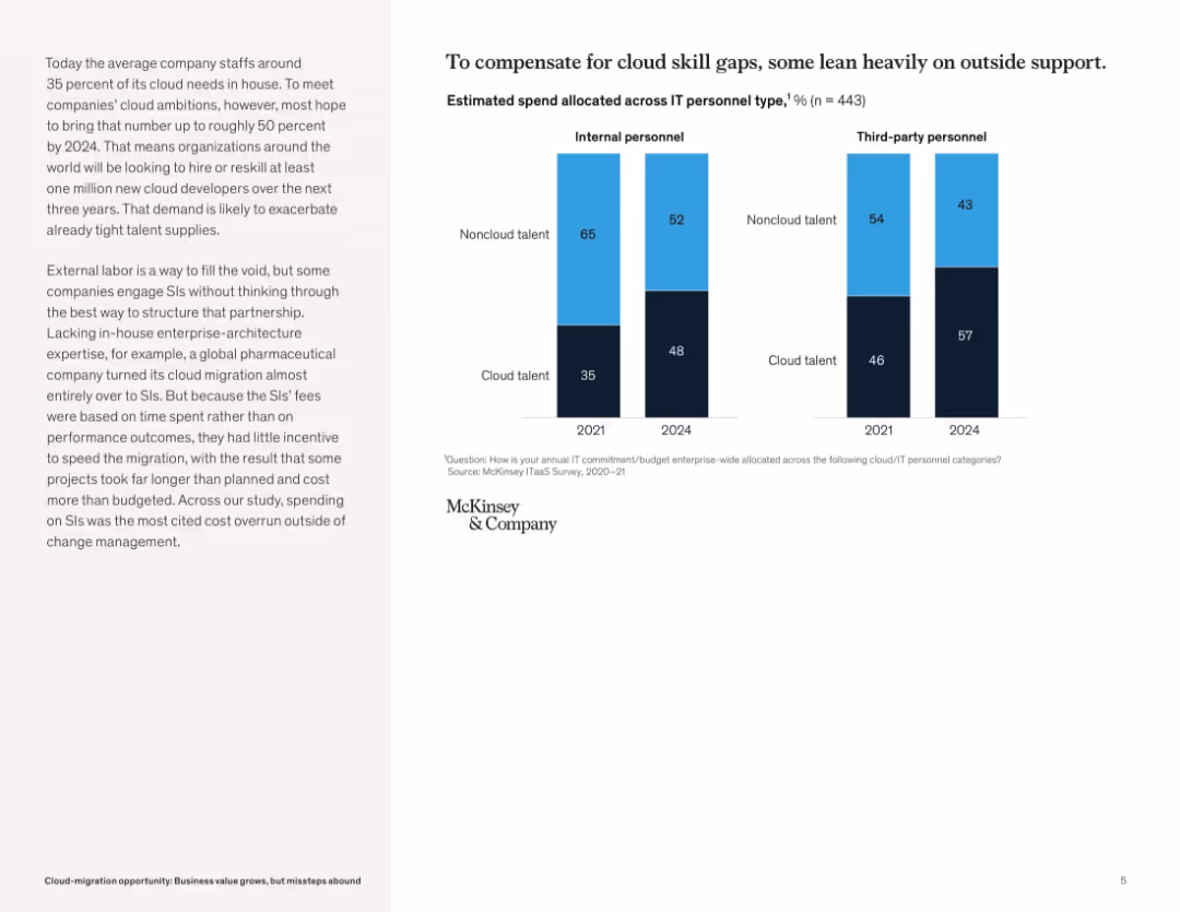
Clean bar chart layout comparing 2021 and 2024 projected allocations to internal vs third-party personnel, segmented by cloud vs noncloud talent.
Human Resources and Talent Management
Technology & Software
This slide reveals that companies are increasingly turning to third-party vendors to fill cloud skill gaps. By 2024, internal cloud talent will increase, but third-party usage remains high. It emphasizes the need for strategic outsourcing to avoid inefficiencies and higher costs.
cloud talent, IT personnel, skill shortage, outsourcing, third-party vendors, cloud staffing, digital transformation, workforce strategy
false
Human Resources and Talent Management
Technology & Software
Mixed Chart
McKinsey
Add to my slides
Remove from favorites
The left side of the slide has a table outlining the "Average Capital Structure for U.S. CLOs" with credit ratings and corresponding data. The right side features two line charts titled "CLO Tranche Support," depicting "Loss Rate" and "Default Rate."
Investment Analysis
Financial Services
Analyzing the structure and performance of U.S. CLOs, this slide contrasts various credit ratings with tranche support data. It's utilized for evaluating investment risk and potential yield advantages in portfolio management.
CLO, yield, tranche support, credit ratings
false
Investment Analysis
Financial Services
Multiple Chart
Morgan Stanley
Add to my slides
Remove from favorites
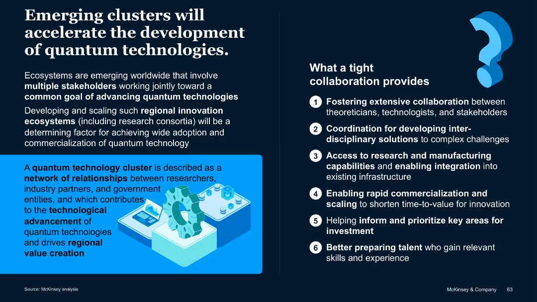
Two-column layout with bold subheadings; right column includes a numbered list; includes a blue-highlighted section with visuals.
Market Analysis and Trends
Artificial Intelligence
Highlights how regional innovation clusters support the advancement of quantum technologies through stakeholder collaboration. Describes the benefits of tight cooperation across disciplines and institutions.
Clusters, ecosystems, innovation, quantum technology, collaboration
false
Market Analysis and Trends
Artificial Intelligence
Boxed
McKinsey
Add to my slides
Remove from favorites
The slide features a column chart comparing CMHC vacancy rates for purpose-built rentals and condo rentals in 2019 and 2020.
Market Analysis and Trends
Real Estate & Construction
This slide displays the vacancy rates for purpose-built and condo rentals, showing a significant increase in 2020.
CMHC, vacancy rates, rental market, purpose-built, condo rentals, column chart
false
Market Analysis and Trends
Real Estate & Construction
Single Chart
IPSOS
Add to my slides
Remove from favorites
Column chart comparing scores of partnership levels between CMOs and CFOs in August 2021 and September 2022, both scored out of 7. Insights are provided regarding industry alignment specifics.
Customer and Market Segmentation
Professional Services
Analyzes the collaboration levels between Chief Marketing Officers (CMOs) and Chief Financial Officers (CFOs) over two periods, highlighting consistent partnership scores and noting differences across various industries.
CMO, CFO, Marketing, Finance, Bar Chart, Partnership Levels, 2021-2022, Industry Alignment
false
Customer and Market Segmentation
Professional Services
Mixed Chart
Deloitte
Add to my slides
Remove from favorites
Three main questions with related icons and background images.
Strategic Planning
Professional Services
Discusses three critical questions CMOs should consider when setting up or enhancing a loyalty program in their companies.
CMO, loyalty, program, company, questions
false
Strategic Planning
Professional Services
Pillar
BCG
Add to my slides
Remove from favorites
Contains a column chart showing CMO's top priorities for the next 12 months, with accompanying text explaining the priorities.
Market Analysis and Trends
Professional Services
This slide highlights the top priorities for Chief Marketing Officers in the coming year, focusing on digital technologies, market expansion, and customer personalization.
CMO, priorities, professional services, market trends, digital technologies
false
Market Analysis and Trends
Professional Services
Mixed Chart
Deloitte
Add to my slides
Remove from favorites
The slide includes a column chart showing costs of CO2 abatement by CCUS for various sectors.
Market Analysis and Trends
Energy & Utilities
This slide compares the costs of CO2 abatement by CCUS across different sectors, including power and industry applications.
CO2 abatement, costs, CCUS, sectors, comparison
false
Market Analysis and Trends
Energy & Utilities
Multiple Chart
Kearney
Add to my slides
Remove from favorites
The slide contains line charts comparing changes in the Consumer Price Index by CO2 accounting methods for EU27+UK and China, both production-based and consumption-based. It includes text explanations above the charts and color-coded lines for domestic and import data.
Regulatory and Compliance
Energy & Utilities
Discusses the impact of adopting a consumption-based accounting method on price indices for domestic and imported goods, suggesting a smoother change for domestic products compared to the production-based approach.
CO2 accounting, price index, domestic, import, consumption-based
false
Regulatory and Compliance
Energy & Utilities
Multiple Chart
EY
Add to my slides
Remove from favorites
This slide combines text explanations with a diagram illustrating production-based and consumption-based CO2 accounting. The diagram uses simple geometric shapes to differentiate between the accounting methods and their implications.
Technology and Digital Transformation
Government & Public Sector
It describes the two main methods of CO2 accounting: production-based, which assesses emissions generated within a country's borders, and consumption-based, which evaluates emissions based on the country's demand. It discusses the potential for carbon leakages and the importance of accurate CO2 accounting for effective climate policies.
CO2 Accounting, Production, Consumption, Climate Policy, Carbon Leakage
false
Technology and Digital Transformation
Government & Public Sector
Diagram
EY
Add to my slides
Remove from favorites
The slide displays a table listing different CO2-based products, their compounds, and the current status of deployment, categorized into commercial, lab-scale, and demonstration stages. It uses color coding for each category.
Product and Service Analysis
Energy & Utilities
The slide provides a detailed overview of various CO2-based chemical products, their current development stages, and potential applications, highlighting the maturity levels of different pathways.
CO2-based products, chemical compounds, deployment status, maturity stages
false
Product and Service Analysis
Energy & Utilities
Table
Kearney
Add to my slides
Remove from favorites
This slide features a column chart depicting the sum of CO2 capture capacity (in Mtpa) by region and status (operational, in development, completed, cancelled).
Market Analysis and Trends
Energy & Utilities
Discusses the CO2 capture capacities of CCUS projects by region, with a focus on OECD countries. Highlights future capacity projections and current capacities.
CO2 capture, capacity, OECD, CCUS, regional capacity, development, operational, trends, future projections
false
Market Analysis and Trends
Energy & Utilities
Mixed Chart
Kearney
Add to my slides
Remove from favorites
This slide contains a column chart showing the operational CO2 capture capacity per utilization and storage from 2015 to 2030, including projections and canceled projects. It uses color coding for geological storage and EOR.
Market Analysis and Trends
Environmental Services & Sustainability
The slide illustrates the growth in operational CO2 capture capacity over the years and projects future increases, with a significant rise expected around 2030 for geological storage.
CO2 capture, capacity, projections, operational, geological storage
false
Market Analysis and Trends
Environmental Services & Sustainability
Mixed Chart
Kearney
Add to my slides
Remove from favorites
The slide features a line chart depicting the levelized cost of CO2 capture for various large-scale post-combustion projects at coal-fired power plants from 2004 to 2028.
Market Analysis and Trends
Energy & Utilities
The slide highlights how CCUS technology can expect cost reductions from learning and technology deployment, showing historical and projected costs for various facilities. The chart illustrates a downward trend in capture costs over time, with expected further reductions as technology improves.
CO2 capture, cost, post-combustion, trends
false
Market Analysis and Trends
Energy & Utilities
Single Chart
Kearney
Add to my slides
Remove from favorites
The slide includes a column chart showing cost ranges for different stages of CO2 capture and storage.
Financial Performance
Energy & Utilities
This slide presents the cost breakdown for capture, compression, dehydration, transport, storage, and monitoring of CO2.
CO2 capture, costs, compression, storage, monitoring
false
Financial Performance
Energy & Utilities
Mixed Chart
Kearney
Add to my slides
Remove from favorites
The slide includes a bar chart showing the levelized cost of CO2 capture for various sectors.
Financial Performance
Energy & Utilities
This slide compares the levelized cost of CO2 capture across different industries and the concentration of CO2.
CO2 capture, cost, sectors, concentration, comparison
false
Financial Performance
Energy & Utilities
Single Chart
Kearney
Add to my slides
Remove from favorites
This slide includes a column chart showing the CO2 capture rate per case, with three distinct bars (CO2 released, CO2 avoided, Extra CO2 captured).
Market Analysis and Trends
Energy & Utilities
The slide illustrates the CO2 capture rate and LCOH increase for brown H2 sources when coupled with CCS, highlighting the additional costs involved.
CO2 capture, LCOH, brown H2, CCS, emissions, costs
false
Market Analysis and Trends
Energy & Utilities
Single Chart
Kearney
Add to my slides
Remove from favorites
A line chart indicating the trajectory of atmospheric CO2 concentrations approaching critical warming thresholds.
Strategic Planning
Environmental Services & Sustainability
Highlights the approaching critical thresholds of CO2 concentrations, essential for strategic planning in environmental management and policy making.
CO2 concentrations, critical thresholds, strategic planning, climate goals, environmental policy
false
Strategic Planning
Environmental Services & Sustainability
Single Chart
BCG
Add to my slides
Remove from favorites
A column chart compares avoided CO2 emissions and abatement costs versus coal turbines for various grid utilizations (wind, solar, grid wind, grid solar) by 2030.
Market Analysis and Trends
Energy & Utilities
The slide evaluates the CO2 emissions reduction potential and costs of converting coal turbines to P2P systems coupled with renewable energy sources.
CO2 emissions, abatement cost, coal, turbines, P2P, renewable, grid, wind, solar
false
Market Analysis and Trends
Energy & Utilities
Multiple Chart
Kearney
Add to my slides
Remove from favorites
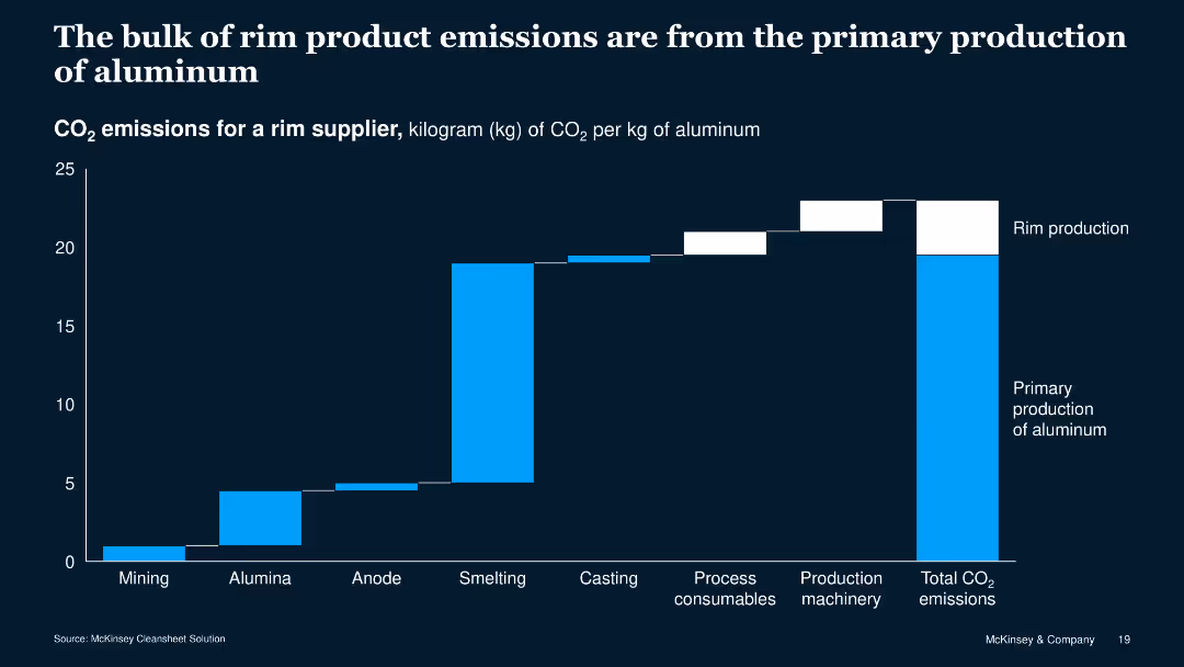
The slide features a column chart with blue and white bars showing CO2 emissions across different production stages of aluminum rims. The chart is against a dark blue background.
Risk Assessment and Management
Industrial & Manufacturing
This slide presents data on CO2 emissions from various stages of aluminum rim production, highlighting that primary production contributes most to the total emissions.
CO2 emissions, aluminum, production stages, data visualization, environment, manufacturing, risk, assessment, management, sustainability
false
Risk Assessment and Management
Industrial & Manufacturing
Single Chart
McKinsey
Add to my slides
Remove from favorites
A column chart presents avoided CO2 emissions and avoidance costs versus SMR for different grid utilizations (wind, solar, grid wind, grid solar) by 2030.
Market Analysis and Trends
Energy & Utilities
The slide highlights the potential of renewable sources to reduce CO2 emissions, with a focus on the avoidance cost compared to SMR, emphasizing the impact of electrolyzer-powered renewables.
CO2 emissions, avoidance cost, SMR, grid, wind, solar, electrolyzer, renewable
false
Market Analysis and Trends
Energy & Utilities
Multiple Chart
Kearney
Add to my slides
Remove from favorites
A line chart showing the carbon abatement cost (CAC) versus CO2 emissions from electricity generation for different countries by 2030. The chart compares costs for grid, grid + wind, and grid + solar setups.
Market Analysis and Trends
Energy & Utilities
The slide highlights that top coal consumers would not reduce CO2 emissions by coupling electrolyzers with the grid, except for the USA and Russia, at a higher cost than renewable energy sources.
CO2 emissions, CAC, coal, grid, wind, solar, electrolyzer, USA, Russia, renewable
false
Market Analysis and Trends
Energy & Utilities
Mixed Chart
Kearney
Add to my slides
Remove from favorites
A line chart shows the CAC versus CO2 emissions from electricity generation by 2030 for various countries, comparing costs for grid, grid + wind, grid + solar, and blue hydrogen CAC setups.
Market Analysis and Trends
Energy & Utilities
The slide evaluates the cost-effectiveness of hydrogen from grid-powered electrolyzers for reducing emissions, noting the carbon footprint threshold for competitive cost.
CO2 emissions, CAC, grid, wind, solar, hydrogen, electrolyzer, cost-effectiveness
false
Market Analysis and Trends
Energy & Utilities
Mixed Chart
Kearney
Add to my slides
Remove from favorites
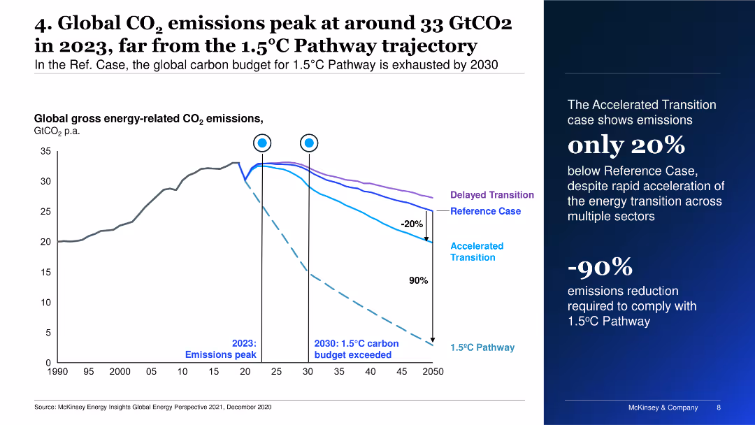
This slide presents a line chart with multiple scenarios for global CO2 emissions. It shows the peaking of emissions in 2023 and different pathways, including delayed and accelerated transitions.
Risk Assessment and Management
Energy & Utilities
It discusses global carbon emissions trends, emphasizing the peak in 2023 and the need for drastic emission reductions to meet the 1.5°C Pathway.
CO2 emissions, climate change, pathways, transition, peak
false
Risk Assessment and Management
Energy & Utilities
Mixed Chart
McKinsey
Add to my slides
Remove from favorites
Contains column charts and numerical data representing the evolution of external costs related to CO2, VOC emissions, and water withdrawals, with comparisons to past years and future ambitions.
Financial Performance
Industrial & Manufacturing
Highlights Michelin's achievements in reducing emissions and water withdrawals, exceeding its 2023 ambitions, with an emphasis on the economic aspects of environmental costs.
CO2 Emissions, Environmental Costs, VOC Emissions, Water Withdrawal, Michelin, Reduction Targets, Sustainability, Compliance, 2023 Ambitions, Financial Impact
false
Financial Performance
Industrial & Manufacturing
Single Chart
Morgan Stanley
Add to my slides
Remove from favorites
The slide features two column charts. The first chart shows global anthropogenic CO2 emissions from 1850 to 2011, and the second chart shows atmospheric CO2 concentration since 2005. Both charts have detailed axes and annotations.
Market Analysis and Trends
Energy & Utilities
This slide highlights the significant contribution of fossil fuels to CO2 emissions and the rising CO2 concentration in the atmosphere, emphasizing the urgency of addressing anthropogenic climate change.
CO2 emissions, fossil fuels, climate change, greenhouse gases, anthropogenic CO2
false
Market Analysis and Trends
Energy & Utilities
Multiple Chart
Kearney
Add to my slides
Remove from favorites
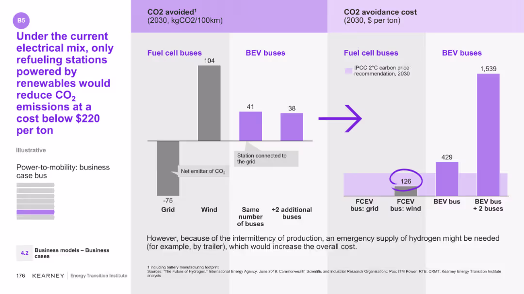
The slide features a column chart showing CO2 avoided for fuel cell buses and BEV buses, along with their CO2 avoidance costs.
Technology and Digital Transformation
Energy & Utilities
The slide compares CO2 emissions and avoidance costs between fuel cell and BEV buses under different energy sources. It suggests that only renewable-powered refueling stations can reduce CO2 emissions cost-effectively.
CO2, emissions, fuel cell buses, BEV buses, renewables
false
Technology and Digital Transformation
Energy & Utilities
Multiple Chart
Kearney
Add to my slides
Remove from favorites
The slide showcases a line graph tracking global CO2 emissions, annotated with projections for future scenarios. The visual elements are effectively spaced, with clear labeling and contrasting colors to differentiate between historical and projected data.
Market Analysis and Trends
Environmental Services & Sustainability
It presents an analysis of the global gross energy-related CO2 emissions, including historical trends and future projections under various climate commitment scenarios. It illustrates the urgency and challenges of adhering to a 1.5°C pathway and the potential global impacts.
CO2 Emissions, Global Projections, Energy-Related, Net-Zero, Climate Commitments, 1.5°C Pathway, Historical Data, Future Scenarios
false
Market Analysis and Trends
Environmental Services & Sustainability
Single Chart
McKinsey
Add to my slides
Remove from favorites
Line chart showing historical data and projections of global CO2 emissions under different scenarios.
Market Analysis and Trends
Environmental Services & Sustainability
Analyzes global CO2 emissions data and projections, emphasizing the need for new technologies to meet climate goals.
CO2 emissions, global, projections, scenarios, climate goals
false
Market Analysis and Trends
Environmental Services & Sustainability
Mixed Chart
EY
Add to my slides
Remove from favorites
This slide features a complex line graph tracing global CO2 emissions against time, with annotations indicating various future scenario projections. It uses shades of blue and red to distinguish the trajectories, with additional text boxes for context.
Industry Overview
Environmental Services & Sustainability
The slide provides an outlook on global CO2 emissions, juxtaposing historical data with projections based on different scenarios. It discusses the implications of current commitments on global warming and the disparities in achieving a 1.5°C pathway.
CO2 Emissions, Global Trends, Net-Zero, Climate Change, Scenarios, Historical Data, 2050 Outlook, 1.5°C Pathway
true
Industry Overview
Environmental Services & Sustainability
Mixed Chart
McKinsey
Add to my slides
Remove from favorites
The slide features a bar chart on the left showing the share of global CO2 emissions by country and a column chart on the right showing global CO2 emissions per capita.
Market Analysis and Trends
Environmental Services & Sustainability
It presents the distribution of CO2 emissions by country and compares per capita emissions, offering insights into the global contributions to greenhouse gas emissions.
CO2 emissions, global warming, environmental impact, greenhouse gases, country comparison, per capita emissions, J.P. Morgan, climate data, sustainability, carbon footprint
false
Market Analysis and Trends
Environmental Services & Sustainability
Multiple Chart
JP Morgan
Add to my slides
Remove from favorites
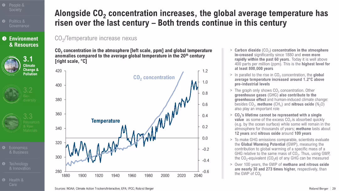
Dual-axis line chart comparing CO₂ levels with temperature anomalies from 1880 to 2040. Summary of scientific implications on the right.
Risk Assessment and Management
Environmental Services & Sustainability
This slide shows the direct correlation between rising CO₂ concentrations and global temperature increases. It explains greenhouse gas contributions and their long-term environmental impact.
CO2 emissions, global warming, greenhouse gases, temperature rise, climate science, sustainability
false
Risk Assessment and Management
Environmental Services & Sustainability
Mixed Chart
Roland Berger
Add to my slides
Remove from favorites
This slide features a column chart on the left showing avoided CO2 emissions (Mtpa) in three scenarios (minimum, reference, maximum) and a bar chart on the right indicating the abatement cost range in $ per tCO2. It also includes explanatory text below the charts.
Market Analysis and Trends
Energy & Utilities
The slide presents potential CO2 emission reductions from the H-vision project, illustrating different scopes and corresponding abatement costs. It explains how a CCS unit can significantly reduce CO2 emissions from hydrogen production.
CO2 emissions, H-vision project, CCS unit, hydrogen production, abatement cost
false
Market Analysis and Trends
Energy & Utilities
Multiple Chart
Kearney
Add to my slides
Remove from favorites
The slide uses a horizontal bar chart to compare CO2 emissions for different hydrogen production methods from various primary sources, with color coding for clarity.
Regulatory and Compliance
Energy & Utilities
The slide examines CO2 emissions from hydrogen production using different primary energy sources, such as coal, natural gas, nuclear fuel, solar, and wind, emphasizing the environmental impact of each method.
CO2 emissions, hydrogen, production, pathways, environment
false
Regulatory and Compliance
Energy & Utilities
Mixed Chart
Kearney
Add to my slides
Remove from favorites
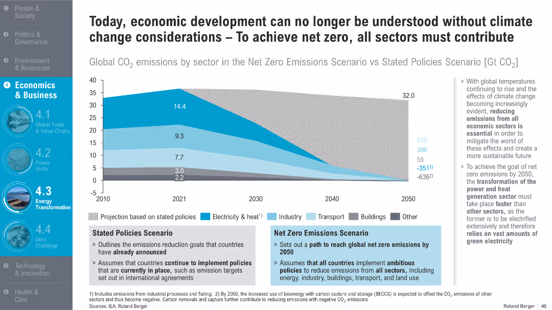
Area chart comparing global CO₂ emissions under two scenarios by sector (electricity, transport, buildings); side notes explain scenario assumptions and implications
Regulatory and Compliance
Energy & Utilities
The slide presents two global emissions scenarios—'Stated Policies' and 'Net Zero'—and emphasizes the importance of reducing emissions across all sectors to mitigate climate change. It highlights the especially vital role of electricity transformation.
CO2 emissions, net zero, climate policy, electricity, decarbonization, energy transition, sectors, sustainability, 2050
false
Regulatory and Compliance
Energy & Utilities
Mixed Chart
Roland Berger
Add to my slides
Remove from favorites
Features a column chart displaying the CO2 emission contributions from various materials in the nickel-based battery supply chain, emphasizing upstream processes.
Operational Efficiency
Energy & Utilities
Highlights the major contributions to CO2 emissions in battery production, particularly from mining and refining processes, suggesting Australia's competitive position in reducing emissions.
CO2 emissions, nickel, battery production, mining, refining, Australia, sustainability, supply chain, environmental impact
false
Operational Efficiency
Energy & Utilities
Mixed Chart
Accenture
Add to my slides
Remove from favorites
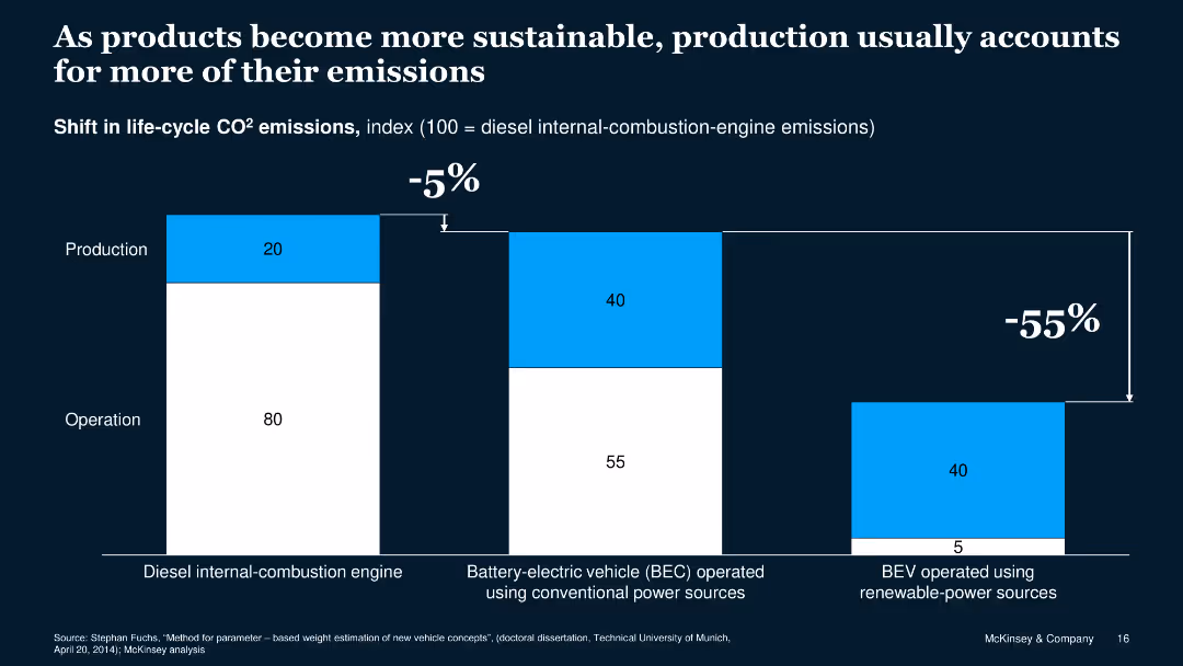
Column chart showing the shift in life-cycle CO2 emissions from different vehicle types.
Market Analysis and Trends
Environmental Services & Sustainability
Highlights the shift in CO2 emissions with a focus on production and operation of different vehicles.
CO2 emissions, production, operation, vehicles, sustainable
false
Market Analysis and Trends
Environmental Services & Sustainability
Single Chart
McKinsey
Add to my slides
Remove from favorites
Column chart showing CO2 emission differences by economic sector under baseline and LCE scenarios.
Market Analysis and Trends
Environmental Services & Sustainability
Compares CO2 emissions under different scenarios, highlighting the impact of LCE and LCE+ policies on emission reductions.
CO2 emissions, scenarios, comparison, LCE, LCE+
false
Market Analysis and Trends
Environmental Services & Sustainability
Mixed Chart
EY
Add to my slides
Remove from favorites
The slide presents a column chart showing annual regional CO2 emissions from power generation and industries, compared to the corresponding storage capacity in years. It includes bars representing different regions worldwide.
Market Analysis and Trends
Environmental Services & Sustainability
The slide details the relationship between CO2 emissions and geological storage capacities in different regions, highlighting the storage capacity as not being a constraint in mature areas like North America.
CO2 emissions, storage capacity, regional analysis, global, power generation
false
Market Analysis and Trends
Environmental Services & Sustainability
Mixed Chart
Kearney
Add to my slides
Remove from favorites
The slide includes two charts: one showing oil price scenarios and associated US CO2-EOR production forecasts, and another showing the proportion of CO2-EOR in total EOR production. The charts are color-coded with projections until 2040.
Market Analysis and Trends
Energy & Utilities
The slide analyzes the impact of oil prices on the demand for CO2-EOR projects and forecasts the production of CO2-EOR in the US, indicating potential future trends and challenges due to price fluctuations.
CO2-EOR, oil prices, production forecasts, US market, future trends
false
Market Analysis and Trends
Energy & Utilities
Multiple Chart
Kearney
Add to my slides
Remove from favorites
The slide features a comparative analysis with column charts and bar charts showing CO2 avoided and CO2 avoidance cost for FCEV and BEV under different energy sources.
Regulatory and Compliance
Energy & Utilities
The slide compares carbon abatement costs and CO2 savings for fuel cell electric vehicles and battery electric vehicles, considering various energy sources for charging stations.
CO2, FCEV, BEV, carbon abatement, energy sources
false
Regulatory and Compliance
Energy & Utilities
Multiple Chart
Kearney
Add to my slides
Remove from favorites
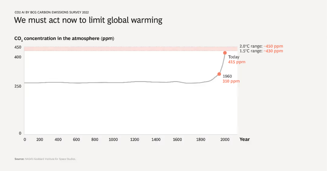
A line chart showing CO2 concentration in the atmosphere over time from year 0 to 2022. The chart highlights a significant increase in CO2 levels, especially after 1960, with today’s concentration at 415 ppm. The critical thresholds for 1.5°C and 2.0°C are also marked.
Market Analysis and Trends
Environmental Services & Sustainability
This slide emphasizes the urgent need to address global warming by illustrating the historical rise in atmospheric CO2 levels. It shows that current CO2 concentrations are dangerously high, surpassing thresholds that could limit global temperature increase.
CO2, global warming, climate change, historical data, critical thresholds
false
Market Analysis and Trends
Environmental Services & Sustainability
Single Chart
BCG
Add to my slides
Remove from favorites
A line chart showing historical CO2 concentrations, highlighting significant increases over millennia and recent years.
Regulatory and Compliance
Environmental Services & Sustainability
Offers historical context for current CO2 levels, underscoring the urgency in addressing climate change for policy makers and environmental planners.
CO2 levels, climate change, environmental policy, historical data, sustainability
false
Regulatory and Compliance
Environmental Services & Sustainability
Single Chart
BCG
Add to my slides
Remove from favorites
Contains a graph showing historical and projected CO2 levels over 20,000 years, highlighting significant increases during the Anthropocene and projections under different RCP scenarios.
Regulatory and Compliance
Environmental Services & Sustainability
Discusses the projected trajectory of CO2 levels and their potential stabilization or increase over the next 30 years and their implications on climate for the next 10,000 years. Aimed at showcasing long-term impacts of current environmental policies.
CO2 levels, Climate change, Projections, RCP scenarios, Long-term impact
false
Regulatory and Compliance
Environmental Services & Sustainability
Single Chart
BCG
Add to my slides
Remove from favorites
The slide features a flow diagram illustrating multiple chemical pathways from CO2, showcasing the conversion of CO2 into various chemical products like hydrocarbons, methanol, formic acid, and more.
Technology and Digital Transformation
Energy & Utilities
The slide presents opportunities for the chemical industry to utilize CO2 through various pathways, highlighting the potential to reduce fossil fuel dependence and valorize emitted CO2.
CO2 pathways, chemical conversion, industry opportunities, fossil fuel reduction
false
Technology and Digital Transformation
Energy & Utilities
Diagram
Kearney
Add to my slides
Remove from favorites
The slide features a column chart displaying the average CO2 price per ton (€) from 2012 to 2023. On the right, there are two bar charts comparing CCGT marginal price variation in low vs. high prices. The color scheme is green and dark grey, with green bars and texts. The layout is dense with data, providing a clear visual representation of the ETS and CCGT prices' impact.
Market Analysis and Trends
Energy & Utilities
This slide shows the increase in ETS price over the years and its significant impact on market dynamics, focusing on CO2 prices and CCGT marginal price variations. It highlights the substantial rise in CO2 price and how it affects the contribution mix and marginal prices, providing a detailed analysis of the economic implications.
CO2 price, ETS, market dynamics, CCGT price, impact
false
Market Analysis and Trends
Energy & Utilities
Multiple Chart
EY
Add to my slides
Remove from favorites
The slide includes a bar chart on the left showing CO2 thresholds for low carbon steel, and a list of decarbonization levers on the right.
Risk Assessment and Management
Industrial & Manufacturing
The slide discusses different methods for reducing CO2 emissions across three scopes and provides examples of decarbonization strategies.
CO2 reduction, decarbonization, steel, scope 1-3, emissions
false
Risk Assessment and Management
Industrial & Manufacturing
Table
McKinsey
Add to my slides
Remove from favorites
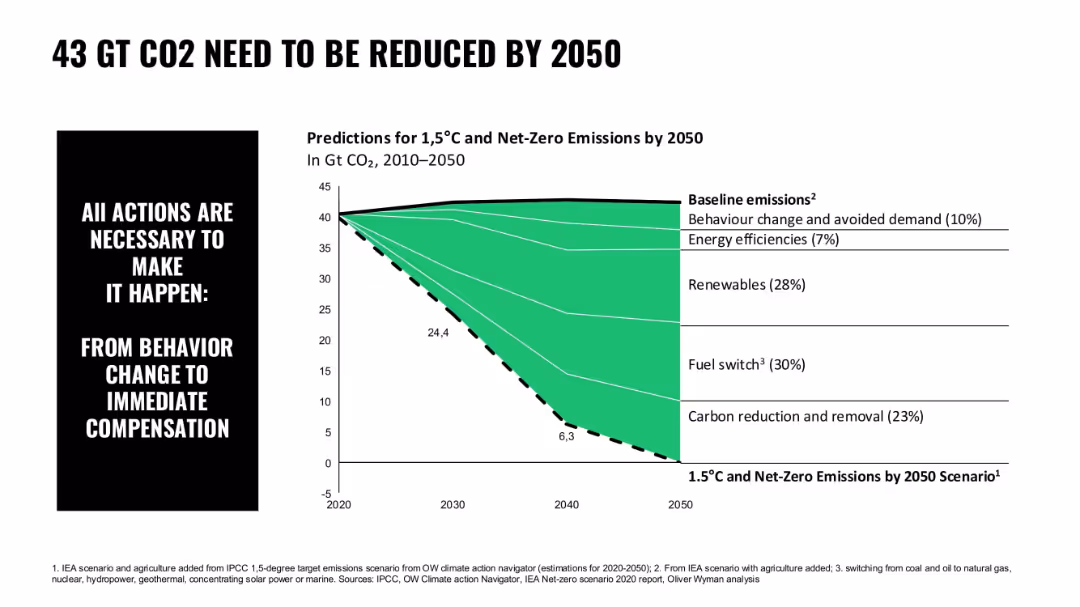
Area chart in green with segmented contributions to carbon reduction; simple typography; left-aligned callout box
Risk Assessment and Management
Environmental Services & Sustainability
The chart depicts required CO2 reduction levels by 2050 to reach 1.5°C targets, breaking it down by behavioral changes, renewables, fuel switch, and carbon removal.
CO2 reduction, emissions, net-zero, renewables, fuel switch, climate action, IEA scenario
false
Risk Assessment and Management
Environmental Services & Sustainability
Mixed Chart
Oliver Wyman
Add to my slides
Remove from favorites
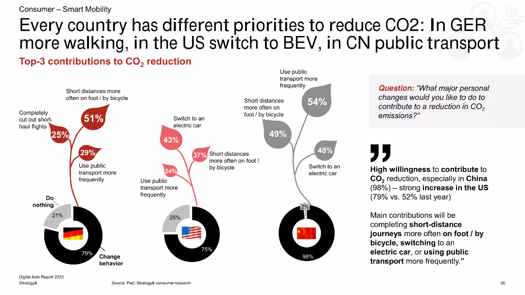
A combination of column charts showing CO2 reduction methods for Germany, the US, and China. The charts are accompanied by text highlighting key points and percentages.
Market Analysis and Trends
Transportation & Logistics
The slide compares the top three methods for reducing CO2 emissions in Germany, the US, and China, emphasizing walking, BEV, and public transport use.
CO2 reduction, Germany, US, China, walking, BEV, public transport
false
Market Analysis and Trends
Transportation & Logistics
Multiple Chart
PwC/Strategy&
Add to my slides
Remove from favorites
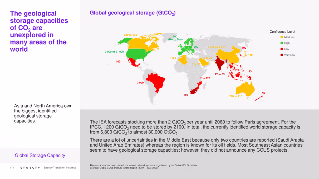
This slide includes a map and a bar chart illustrating the global geological storage capacities of CO2 with varying confidence levels across different regions. Color coding (green, yellow, red) indicates confidence levels.
Market Analysis and Trends
Environmental Services & Sustainability
The slide explores the identified geological storage capacities for CO2 globally, emphasizing areas with the highest potential and the uncertainties in certain regions like the Middle East.
CO2 storage, geological capacity, global map, confidence levels
false
Market Analysis and Trends
Environmental Services & Sustainability
Graphic
Kearney
Add to my slides
Remove from favorites
The slide includes a line chart comparing geological storage costs for CO2 in onshore and offshore sites.
Financial Performance
Energy & Utilities
This slide compares the costs of geological storage for CO2 in depleted oil and gas fields and saline aquifers.
CO2 storage, geological, costs, onshore, offshore
false
Financial Performance
Energy & Utilities
Mixed Chart
Kearney
Add to my slides
Remove from favorites
The slide features two column charts comparing storage cost curves for onshore and offshore CO2 storage in the US for 2017. The charts are labeled with percentages on the vertical axis and storage amounts on the horizontal axis.
Market Analysis and Trends
Energy & Utilities
The slide presents the storage cost curve for onshore and offshore CO2 storage in the US for 2017, highlighting that CO2 for EOR is at negative costs, and most of the onshore storage capacity in the US is available for less than $10 per ton of CO2.
CO2, storage, onshore, offshore, cost curve
false
Market Analysis and Trends
Energy & Utilities
Multiple Chart
Kearney
Add to my slides
Remove from favorites
The slide includes a line chart comparing cost estimates for long-distance CO2 transport using various methods.
Financial Performance
Energy & Utilities
This slide presents cost estimates for transporting CO2 over long distances by ship, offshore pipeline, and onshore pipeline.
CO2 transport, costs, long-distance, pipeline, ship
false
Financial Performance
Energy & Utilities
Single Chart
Kearney
Add to my slides
Remove from favorites
The slide includes an infographic showing how CO2 is used as a raw material for plastics. It illustrates the process of converting CO2 into polyols and other plastic components with various end-use applications.
Technology and Digital Transformation
Energy & Utilities
The slide highlights the innovative technology developed by Covestro to use CO2 as a raw material for manufacturing plastics, showcasing its potential to substitute oil-based raw materials and support circular economy initiatives.
CO2 utilization, plastics, raw materials, Covestro, circular economy
false
Technology and Digital Transformation
Energy & Utilities
Diagram
Kearney
Add to my slides
Remove from favorites
The slide features a flowchart depicting the order of magnitude of CO2 storage and utilization. It includes branches for conversion and non-conversion processes with specific applications like mineralization, biological, chemical, etc.
Technology and Digital Transformation
Environmental Services & Sustainability
The slide outlines the various technological pathways and their respective capacities for CO2 utilization and storage, showcasing a broad range of solutions for either using or storing carbon dioxide.
CO2 utilization, storage, technology, pathways, conversion processes
false
Technology and Digital Transformation
Environmental Services & Sustainability
Diagram
Kearney
Add to my slides
Remove from favorites
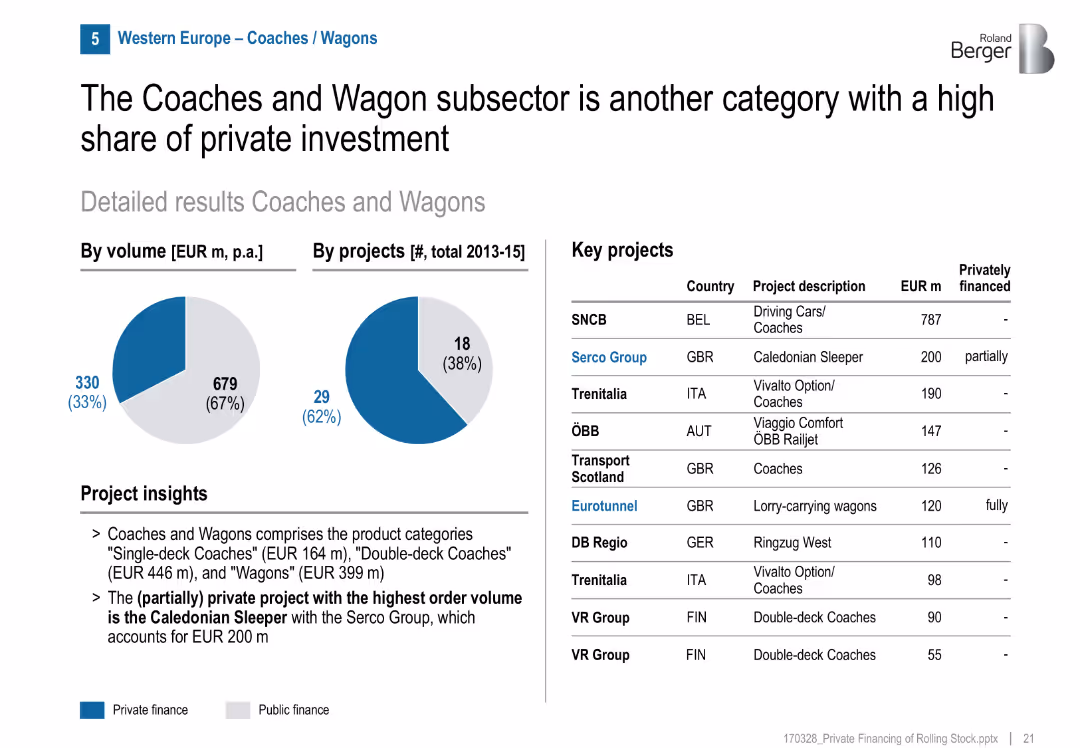
Pie charts, project table, private/public split visual
Investment Analysis
Transportation & Logistics
Coaches and Wagons attract significant private investment (33% by volume). Serco Group's Caledonian Sleeper is a major example. The segment includes single-/double-deck coaches and wagons.
coaches, wagons, Caledonian Sleeper, Serco, private share, GBR, railcars, sleeper trains
false
Investment Analysis
Transportation & Logistics
Mixed Chart
Roland Berger
Add to my slides
Remove from favorites
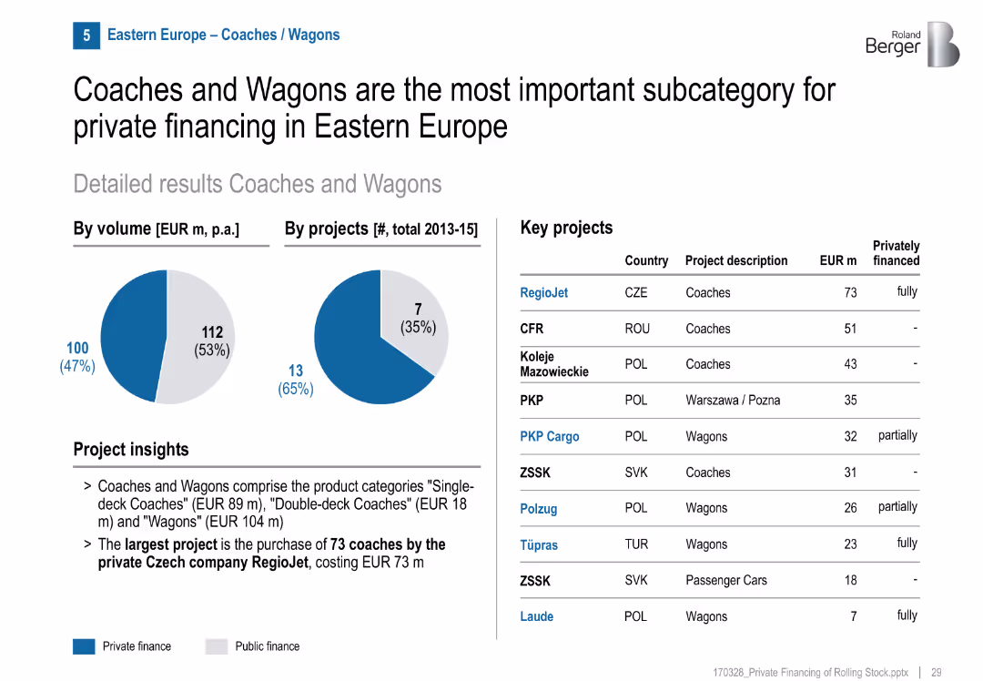
Two pie charts highlight a 47% private finance volume and 35% by project count. Key projects list includes financing type. Visuals and text are balanced.
Investment Analysis
Transportation & Logistics
Coaches and wagons receive the highest level of private investment among rolling stock categories. RegioJet's coach project is the largest privately funded project.
coaches, wagons, private financing, Eastern Europe, rolling stock, RegioJet, rail investment, transportation
false
Investment Analysis
Transportation & Logistics
Mixed Chart
Roland Berger
Add to my slides
Remove from favorites
Features a column chart displaying coastal shipping volumes for clinker and cement, along with a map highlighting major shipping routes in Australia.
Market Analysis and Trends
Transportation & Logistics
Analyzes the growth of coastal shipping for cement and clinker in Australia. Discusses the impact of cabotage costs and identifies key shipping routes and distribution centers.
Coastal shipping, cement, clinker, cabotage, Australia
false
Market Analysis and Trends
Transportation & Logistics
Mixed Chart
LEK
Add to my slides
Remove from favorites
The slide presents column charts comparing short and medium-haul coastal shipping costs for Australia, US, and France, alongside a chart for long-haul shipping costs. Bullet points discuss impacts.
Market Analysis and Trends
Transportation & Logistics
It compares the costs of short and medium-haul coastal shipping in Australia with the US and France, noting that Australian rates are higher, and explores the factors influencing these costs.
coastal shipping, cost comparison, short haul, medium haul, long haul
false
Market Analysis and Trends
Transportation & Logistics
Multiple Chart
LEK
Add to my slides
Remove from favorites
This slide features two line charts tracking the production trends of cobalt and lithium from 1980 to 2016, highlighting significant growth due to technological advancements like lithium-ion batteries.
Industry Overview
Industrial & Manufacturing
Shows historical data on cobalt and lithium production, linking growth to technological advancements, specifically in battery technology. Helpful for market trend analysis.
cobalt production, lithium production, mineral demand, line charts, battery technology, market trends, historical data
false
Industry Overview
Industrial & Manufacturing
Multiple Chart
McKinsey
Add to my slides
Remove from favorites
The slide presents a column chart with vertical bars representing different CO₂ capture technologies across various sectors. The chart uses distinct colors for each technology.
Market Analysis and Trends
Energy & Utilities
It shows the distribution of CO₂ capture technologies (oxy-combustion, pre-combustion, post-combustion) across sectors like chemicals, power generation, heavy industries, hydrogen, and oil and gas.
CO₂ capture, distribution, technologies, sectors, oxy-combustion, pre-combustion, post-combustion, energy
false
Market Analysis and Trends
Energy & Utilities
Single Chart
Kearney
Add to my slides
Remove from favorites
This slide features a line chart depicting the maturity curve of CO₂ separation and capture technologies. It includes different colored lines representing various industries and technologies.
Technology and Digital Transformation
Energy & Utilities
It illustrates the maturity stages of CO₂ separation and capture technologies from lab work to widely deployed stages, highlighting the capital requirements and technology risk involved.
CO₂ capture, maturity curve, separation technologies, capture technologies, energy, utilities, capital requirements
false
Technology and Digital Transformation
Energy & Utilities
Single Chart
Kearney
Add to my slides
Remove from favorites
This slide features two diagrams for oxy-combustion and liquid/supercritical CO₂ capture systems. It includes arrows and text boxes to illustrate the process flow for each system.
Technology and Digital Transformation
Energy & Utilities
It describes CO₂ capture systems, focusing on oxy-combustion and liquid/supercritical CO₂ processes, explaining their steps and technological details.
CO₂ capture, oxy-combustion, supercritical CO₂, processes, energy, utilities, gas separation, thermal power
false
Technology and Digital Transformation
Energy & Utilities
Linear Flow
Kearney
Add to my slides
Remove from favorites
The slide contains two process flow diagrams, one for post-combustion and one for pre-combustion CO₂ capture systems. Each diagram uses arrows and text boxes to show process steps.
Technology and Digital Transformation
Energy & Utilities
The slide explains CO₂ capture systems divided into post-combustion and pre-combustion processes, detailing the steps and components involved in each method.
CO₂ capture, post-combustion, pre-combustion, processes, energy, utilities, gas separation, thermal power
false
Technology and Digital Transformation
Energy & Utilities
Linear Flow
Kearney
Add to my slides
Remove from favorites
This slide features a bar chart with different colors to indicate the stages of technological maturity. It includes several bars aligned horizontally with labels on the left side.
Market Analysis and Trends
Energy & Utilities
It outlines the maturity levels of various CO₂ separation technologies, categorized under liquid solvent, solid absorbent, membrane, solid-looping, and inherent CO₂ capture.
CO₂ capture, technological maturity, liquid solvent, solid absorbent, membrane, solid-looping, maturity stages
false
Market Analysis and Trends
Energy & Utilities
Table
Kearney
Add to my slides
Remove from favorites
Features images of automotive interiors and circular icons describing different technologies like advanced driver assistance and cloud services. Engaging and informative layout.
Technology and Digital Transformation
Technology & Software
Showcases Clarion's advanced cockpit solutions, focusing on user interface, safety, and connectivity enhancements, positioning these solutions at the forefront of automotive innovation.
cockpit, infotainment, safety, connectivity, automotive, innovation
false
Technology and Digital Transformation
Technology & Software
Linear Flow
Deutsche Bank
Add to my slides
Remove from favorites
This slide has a bright and bold aesthetic with a large title, multiple sections with headers, and bullet-pointed lists. It highlights strategies for implementing coding in education curricula worldwide, starting from early education through advanced modules. The design includes national flags as icons and color-coded sections for clarity. The slide is visually engaging and informative.
Regulatory and Compliance
Education & Training
The slide compares various global strategies for integrating technology skills into education systems. It outlines efforts to start coding education early, make it mandatory, and introduce advanced tech modules. It includes specific country examples, providing a comprehensive overview of the progressive steps taken to prepare the next generation for a digital future.
Coding Education, Curriculum, Global Strategies, Mandatory Coding, Advanced Tech, Italy, Singapore, India, International Education, Digital Skills
false
Regulatory and Compliance
Education & Training
Header Horizontal
Kearney
Add to my slides
Remove from favorites
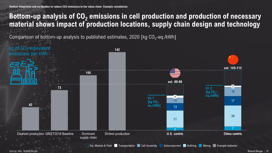
Vertical bar comparison of CO₂ emissions across scenarios; includes breakdown by activity (e.g., mining, refining); iconography emphasizes environmental impact
Risk Assessment and Management
Environmental Services & Sustainability
This slide compares CO₂ emissions across battery production supply chains, showing lower emissions in U.S.-centric vs. China-centric or worst-case scenarios. It supports environmentally conscious production planning by highlighting regional impact variations.
CO₂ Emissions, Battery Production, Supply Chain, U.S., China, Emission Breakdown, Climate Impact
false
Risk Assessment and Management
Environmental Services & Sustainability
Single Chart
Roland Berger
Add to my slides
Remove from favorites
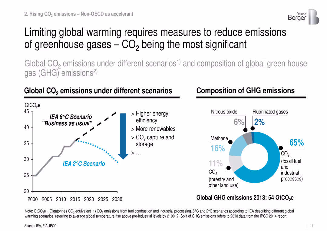
Dual-panel layout: line chart of CO₂ scenarios and donut chart of 2013 GHG composition.
Regulatory and Compliance
Environmental Services & Sustainability
Illustrates the need to reduce global CO₂ emissions by comparing a 2°C vs. 6°C scenario and shows GHG breakdown, with fossil CO₂ making up 65% of emissions.
CO₂ emissions, climate scenarios, GHG, mitigation, fossil fuel
false
Regulatory and Compliance
Environmental Services & Sustainability
Multiple Chart
Roland Berger
Add to my slides
Remove from favorites
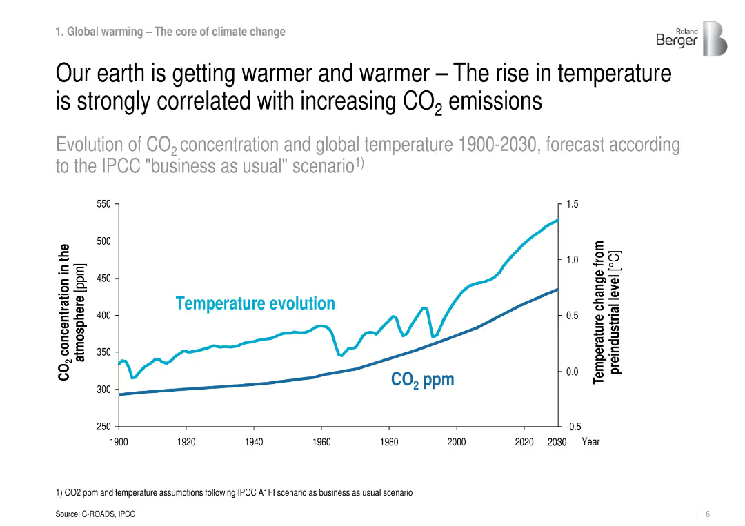
Line graph showing CO₂ concentration and temperature evolution from 1900 to 2030.
Regulatory and Compliance
Environmental Services & Sustainability
Demonstrates the strong correlation between rising CO₂ levels and temperature increases using historical and forecasted data under the IPCC scenario.
CO₂ emissions, global warming, IPCC, temperature, climate change
false
Regulatory and Compliance
Environmental Services & Sustainability
Single Chart
Roland Berger
Add to my slides
Remove from favorites
The slide features column charts comparing CO₂ emissions and abatement costs across different energy sources and scenarios. It's moderately complex with clear visuals.
Risk Assessment and Management
Energy & Utilities
Evaluates the impact of connecting injection plants to REN without grid back-up on CO₂ emissions and associated costs, presenting detailed emissions data and analysis.
CO₂ emissions, injection plants, REN, grid back-up, abatement cost, 2030, risk management, cost analysis
false
Risk Assessment and Management
Energy & Utilities
Multiple Chart
Kearney
Add to my slides
Remove from favorites
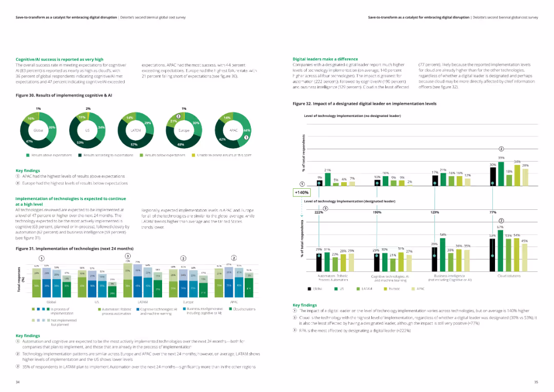
This slide presents pie charts and a column chart showing the success of cognitive/AI implementations and expected technology implementations over the next 24 months across regions.
Technology and Digital Transformation
Financial Services
The slide evaluates the success rates of cognitive/AI technologies and predicts the implementation trends of various technologies over the next 24 months in different regions.
Cognitive AI, technology implementation, success rates, analysis, financial services
false
Technology and Digital Transformation
Financial Services
Multiple Chart
Deloitte
Add to my slides
Remove from favorites
The slide has a clean and structured design featuring multiple screenshots and text representations. It focuses on various phases of data processing and visualization through a service called CognitiveSpend, highlighted by distinct green color blocks.
Technology and Digital Transformation
Technology & Software
This slide presents a Google platform-based solution called CognitiveSpend, which classifies spend data and provides insights within two weeks. It shows data aggregation, dashboard examples, and actionable insights delivery through multiple visualizations, enhancing strategic spend management.
CognitiveSpend, Google Cloud, data classification, spend management, actionable insights
false
Technology and Digital Transformation
Technology & Software
Linear Flow
Deloitte
Add to my slides
Remove from favorites
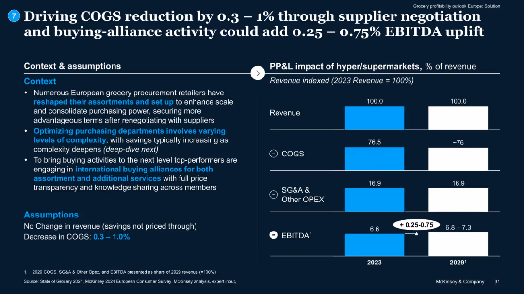
Text context on left, bar charts on right showing potential EBITDA gains from cost savings.
Pricing Strategies
Retail & E-commerce
Explains how improved supplier negotiations and alliances can lower COGS by 0.3–1%, raising EBITDA by 0.25–0.75%. No revenue change assumed.
COGS, EBITDA, supplier negotiation, buying alliances, pricing
false
Pricing Strategies
Retail & E-commerce
Mixed Chart
McKinsey
Add to my slides
Remove from favorites
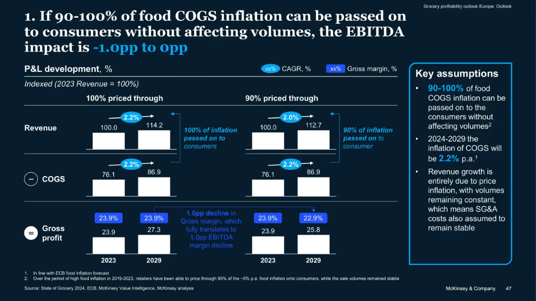
Comparative bar chart with 2 scenarios (100% vs 90% inflation pass-through); includes assumptions box
Risk Assessment and Management
Retail & E-commerce
This slide assesses the EBITDA impact of passing food COGS inflation to consumers. If 90–100% is passed through, EBITDA impact ranges from -1.0pp to 0pp. It assumes 2.2% annual inflation through 2029 with stable volumes and SG&A.
COGS, Inflation, Pricing Strategy, EBITDA, Food Retail, Pass-Through
false
Risk Assessment and Management
Retail & E-commerce
Mixed Chart
McKinsey
Add to my slides
Remove from favorites
The slide features a bar chart and pie charts displaying cost structures and impact potential for an automotive supplier's typical P/L.
Financial Performance
Industrial & Manufacturing
Examines the cost structure of an automotive supplier, highlighting the significant share of COGS and the easier impact on SG&A in the short and medium term.
COGS, SG&A, automotive, costs, impact, P/L, financial performance, bar chart, pie chart
false
Financial Performance
Industrial & Manufacturing
Single Chart
EY
Add to my slides
Remove from favorites
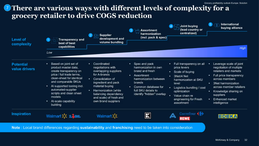
Horizontal flowchart from left to right illustrating 5 levels of complexity with icons/logos of retailers.
Operational Efficiency
Retail & E-commerce
Outlines a maturity curve for COGS reduction, from basic transparency to international alliances. Lists value drivers per stage. Shows examples from Walmart, Lidl, Carrefour, EDEKA, and others.
COGS strategy, sourcing, alliances, complexity, procurement
false
Operational Efficiency
Retail & E-commerce
Pillar
McKinsey
Add to my slides
Remove from favorites
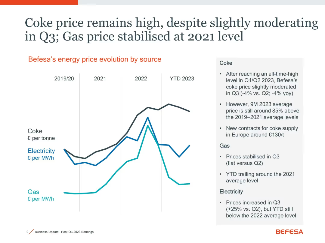
Line graph showing price evolution for coke, electricity, and gas with summary text on the side
Operational Efficiency
Industrial & Manufacturing
Energy prices, especially coke, have stayed high in 2023. Coke prices are 85% above 2019–21 levels, while gas prices have stabilized and electricity costs slightly increased in Q3. Highlights cost pressures on operations.
coke price, energy cost, gas, electricity, operational cost
false
Operational Efficiency
Industrial & Manufacturing
Mixed Chart
Goldman Sachs
Add to my slides
Remove from favorites
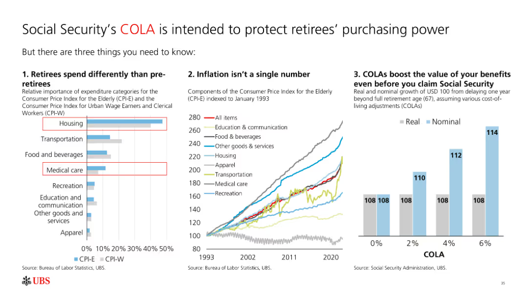
The slide features a bar chart, a line chart, and a column chart. It includes text and multiple visual elements like charts and graphs, making it moderately complex.
Regulatory and Compliance
Financial Services
The slide explains how cost-of-living adjustments (COLA) protect retirees' purchasing power by showing differences in spending, inflation impact, and benefits growth.
COLA, retirees, inflation, spending, benefits, purchasing power
false
Regulatory and Compliance
Financial Services
Multiple Chart
UBS
Add to my slides
Remove from favorites
This slide compares cold storage capacities per 1000 urban residents in several countries using column charts, showing Nigeria's low capacity relative to others. It includes a statistic on the loss percentage due to inadequate storage.
Strategic Planning
Agriculture & Food Production
The slide exposes the critical gaps in cold storage infrastructure in Nigeria compared to other countries, linking these deficiencies to high food loss rates. It underscores the necessity for investing in enhanced cold storage solutions to support food security initiatives.
Cold Storage, Capacity, Nigeria, Challenges, Comparison
false
Strategic Planning
Agriculture & Food Production
Mixed Chart
BCG
Add to my slides
Remove from favorites
This slide presents a dual bar chart comparing the daily costs of cold storage as a percentage of a farmer's income in Nigeria, India, and Rwanda, illustrating the significant financial strain on Nigerian farmers.
Strategic Planning
Agriculture & Food Production
This slide assesses the economic impact of cold storage costs on smallholder farmers in Nigeria, comparing it with other countries to highlight the disproportionate burden. It advocates for more affordable and accessible storage solutions to aid farmers and reduce food loss.
Cold Storage, Costs, Farmers, Nigeria, Comparative Analysis
false
Strategic Planning
Agriculture & Food Production
Multiple Chart
BCG
Add to my slides
Remove from favorites
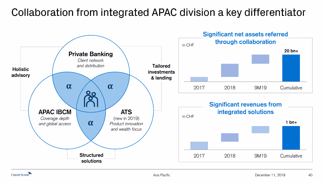
This slide features a Venn diagram illustrating the collaboration among Private Banking, APAC IBCM, and ATS. It also includes two column charts displaying net assets and revenues.
Strategic Planning
Financial Services
The slide explains the synergy between Private Banking, APAC IBCM, and ATS to deliver holistic advisory and tailored solutions, with significant assets and revenue growth data.
Collaboration, APAC, Private Banking, Revenue Growth, Net Assets
false
Strategic Planning
Financial Services
Multiple Chart
Credit Suisse
Add to my slides
Remove from favorites
The slide features a mix of text on the left and a column chart on the right. The column chart illustrates different sectors and their plans to partner with creators.
Strategic Planning
Professional Services
The slide discusses the trend of creative collaboration beyond the traditional organization structure, highlighting sectors that are planning to partner more with creators, with a supporting column chart showing sector-wise data.
Collaboration, CMOs, sectors, creative partnerships, trend
false
Strategic Planning
Professional Services
Mixed Chart
Deloitte
Add to my slides
Remove from favorites
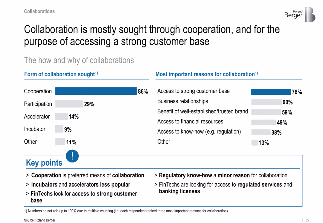
Split layout with bar charts; left shows form of collaboration, right shows reasons; key points summarized at bottom; blue accents and emphasis
Strategic Planning
Financial Services
The slide outlines preferred collaboration types in the FinTech sector—predominantly cooperation—and key motivations such as accessing a customer base and strong brand relationships. Regulatory know-how is a minor driver.
collaboration, cooperation, customer base, FinTech, business relationships, regulation, brand, licensing
false
Strategic Planning
Financial Services
Mixed Chart
Roland Berger
Add to my slides
Remove from favorites
Features column charts comparing prioritization of collaboration skills among various C-suite roles.
Organizational Structure and Change
Professional Services
Highlights how marketing leaders value collaboration and its critical role in adapting to fast-paced market changes.
collaboration, C-suite, marketing, skills, leadership, organizational change
false
Organizational Structure and Change
Professional Services
Mixed Chart
Deloitte
Add to my slides
Remove from favorites
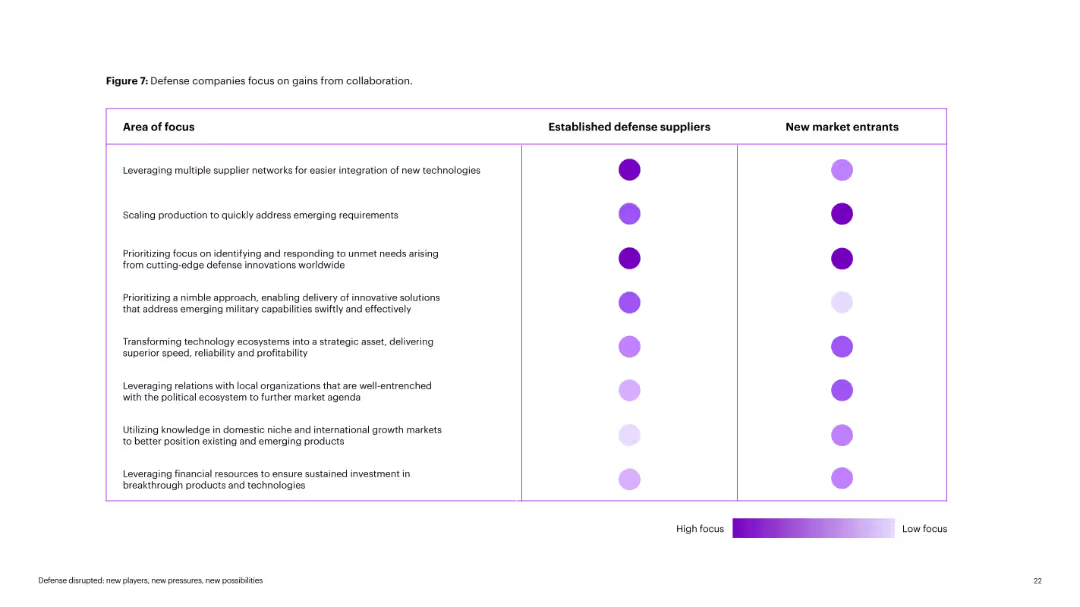
Matrix-style chart with rows as "Area of Focus" and columns comparing defense suppliers vs. new entrants. Circle intensity indicates focus level. Purple color gradient from dark (high) to light (low).
Operational Efficiency
Government & Public Sector
Visual comparison of focus areas between incumbents and startups in defense. Highlights contrasts in agility, production scaling, and innovation adoption. High-focus areas are differentiated by darker circle shades.
collaboration, defense, focus areas, startups, incumbents, innovation
false
Operational Efficiency
Government & Public Sector
Table
Accenture
Add to my slides
Remove from favorites
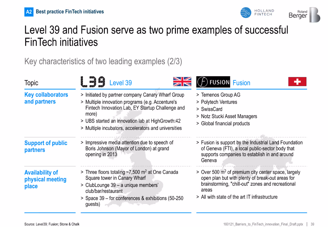
Continuation of the comparison focusing on collaborators, public support, and physical infrastructure
Competitive Landscape
Financial Services
Explores the ecosystems surrounding Level 39 and Fusion, including private and public partnerships and the physical meeting spaces available to member startups.
collaboration, FinTech, Geneva, London, partners, innovation, infrastructure
false
Competitive Landscape
Financial Services
Table
Roland Berger
Add to my slides
Remove from favorites
Features an extensive flowchart diagram with different financial services offered by the firm, divided by client needs, and includes some numerical data points.
Organizational Structure and Change
Financial Services
Details the comprehensive offerings by the firm to support clients during IB transactions and the depth of relationships.
Collaboration, Franchise, Client Support, IB Transactions, Services Offering, Commercial Banking
false
Organizational Structure and Change
Financial Services
Table
JP Morgan
Add to my slides
Remove from favorites
A vibrant, color-coded infographic slide details incentives offered by companies to promote office collaboration. It provides quantitative data on various programs through large percentage figures.
Organizational Structure and Change
Professional Services
This slide communicates the extent of strategies implemented to encourage employees to work on-site. It's likely intended for managers seeking to enhance office collaboration.
Collaboration Incentives, Office Work, Employee Programs, Quantitative Data, On-site Work
false
Organizational Structure and Change
Professional Services
Single Chart
EY
Add to my slides
Remove from favorites
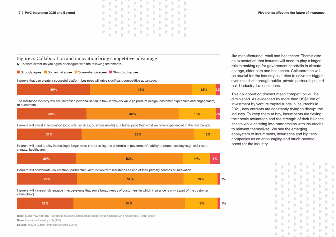
The slide includes a bar chart showing survey results on the extent to which insurers agree with statements about collaboration, innovation, and competitive advantage. It uses color coding to differentiate levels of agreement.
Strategic Planning
Financial Services
This slide highlights survey findings on the importance of collaboration and innovation in gaining competitive advantage within the insurance industry. It presents the percentage of respondents agreeing with various strategic statements.
Collaboration, Innovation, Competitive Advantage, Insurance, Survey, Strategic Planning, Bar Chart, Trends, Industry Insights, Analysis
false
Strategic Planning
Financial Services
Mixed Chart
PwC/Strategy&
Add to my slides
Remove from favorites
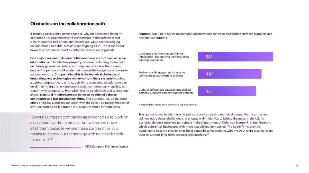
Text-heavy slide with quote at bottom; includes bar chart on right showing top three collaboration barriers. Clean layout with left narrative, right chart, and quote at bottom.
Regulatory and Compliance
Government & Public Sector
Outlines key barriers to collaboration between legacy defense firms and startups: IP concerns, system integration issues, and cultural mismatches. Includes executive quote and explanation of initiatives like the DoD’s Mentor-Protégé Program.
collaboration, IP concerns, system integration, culture, startups
false
Regulatory and Compliance
Government & Public Sector
Mixed Chart
Accenture
Add to my slides
Remove from favorites
The slide features a Venn diagram showing the relationship between Private Banking, APAC IBCM, and ATS, emphasizing global connectivity.
Strategic Planning
Professional Services
This slide outlines the collaborative approach central to the company's strategy, highlighting the synergy between Private Banking, APAC IBCM, and ATS, along with the emphasis on global connectivity.
Collaboration, Private Banking, APAC IBCM, ATS, Global Connectivity
false
Strategic Planning
Professional Services
Framework
Credit Suisse
Add to my slides
Remove from favorites
Previous
Next
You don't have any favorites yet.
Please wait loading your favorites slides...
Create a FREE account to continue browsing
Receive Instant Access to 1,000+ slides from companies like McKinsey, Google, and Goldman Sachs
First Name
Last Name
Email
Password
I agree to all
Terms & Privacy Policy
Thank you! Your submission has been received!
Oops! Something went wrong while submitting the form.
Have an account?
Sign in
Upgrade to PRO to Save slides
Advanced Search and Filters
Access to 15,000+ slides
Access to Category Pages
Save/Bookmark Slides
PowerPoint Template Library
Pick a Plan
MONTHLY
$12/month
Billed every month, Cancel anytime.
YEARLY
$9/year
Billed $108 annually, Cancel anytime.
Checkout for $12/month
Checkout for $108/yr
Secured by Stripe | AES-256 bit encryption