My Account
My Slides
Search by Category
Companies
Slide Type
Use Case
Industry
Pricing
Templates
View All Templates
Download Template Slides
✦ AI
AI Prompt Library
AI Search
Feedback
Login
Logout
Get Started
Browse all Slides
Browse all Slides
Create a FREE Account
Instant access to 1,000+ real slides from top companies like McKinsey, BCG, Goldman Sachs, Google and many more!
First Name
Last Name
Email
Password
I agree to all
Terms & Privacy Policy
Thank you! Your submission has been received!
Oops! Something went wrong while submitting the form.
Have an account?
Sign in
Saved Slides
Total No. of slides saved
0
↻ Refresh
✖ Clear all
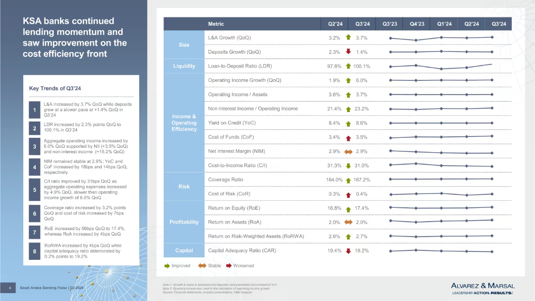
Left panel has key trends with numeric labels; right panel is a heatmap-style table comparing multiple metrics across quarters. Visual arrows indicate performance trends.
Performance Metrics and KPIs
Financial Services
Highlights Q3'24 trends in KSA banking with detailed performance metrics like LDR, operating income, yield on credit, RoE, and capital adequacy. Uses a traffic-light arrow system to reflect improvements or declines across metrics.
cost efficiency, LDR, RoE, Q3'24, KPIs, asset growth, profitability, operating income, efficiency, banking indicators
false
Performance Metrics and KPIs
Financial Services
Mixed Chart
Alvarez & Marsal
Add to my slides
Remove from favorites
Contains four column charts showing trends in operating leverage, contact cost, marketing efficiency, and fraud losses. There are striped projections for 2019 estimates and percentage changes noted.
Operational Efficiency
Financial Services
Showcases how scaling operations have led to increased efficiency and reduced costs for JP Morgan Chase, including improvements in operating leverage and marketing, as well as a reduction in fraud losses.
cost efficiency, operating leverage, fraud losses, marketing efficiency, projections
false
Operational Efficiency
Financial Services
Multiple Chart
JP Morgan
Add to my slides
Remove from favorites
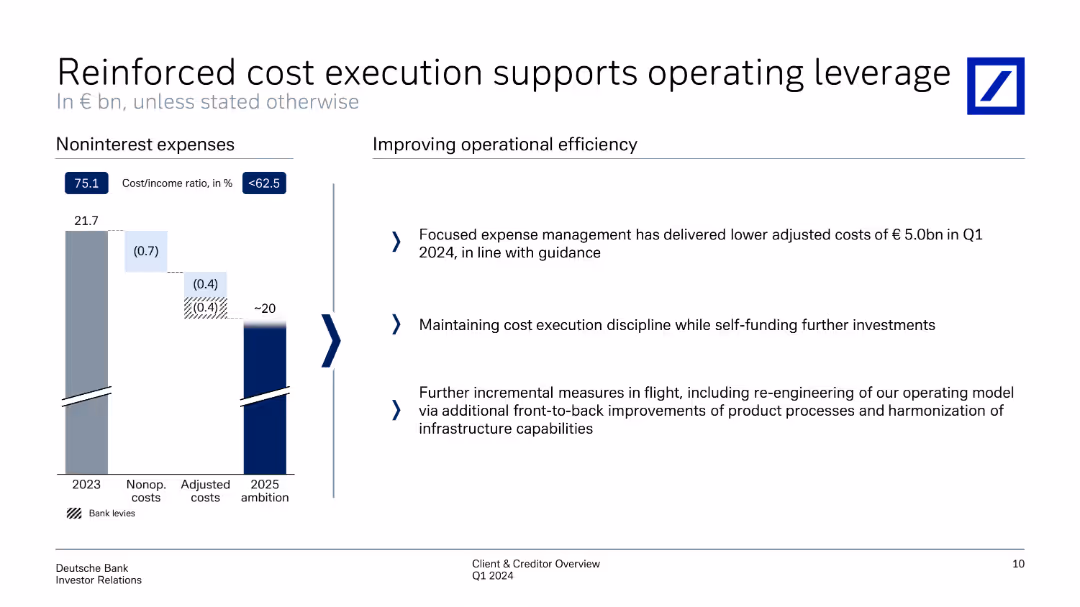
The slide features a column chart on the left showing noninterest expenses from 2023 to 2025 ambition. On the right, there are bullet points explaining measures for improving operational efficiency. The slide is moderately detailed with text and visuals balanced.
Operational Efficiency
Financial Services
Focused on cost management, this slide details how expense management has reduced adjusted costs and maintained cost execution discipline. It mentions further measures to re-engineer operating models and infrastructure capabilities for future improvements.
cost execution, operational efficiency, expense management, adjusted costs, infrastructure capabilities
false
Operational Efficiency
Financial Services
Mixed Chart
Deutsche Bank
Add to my slides
Remove from favorites
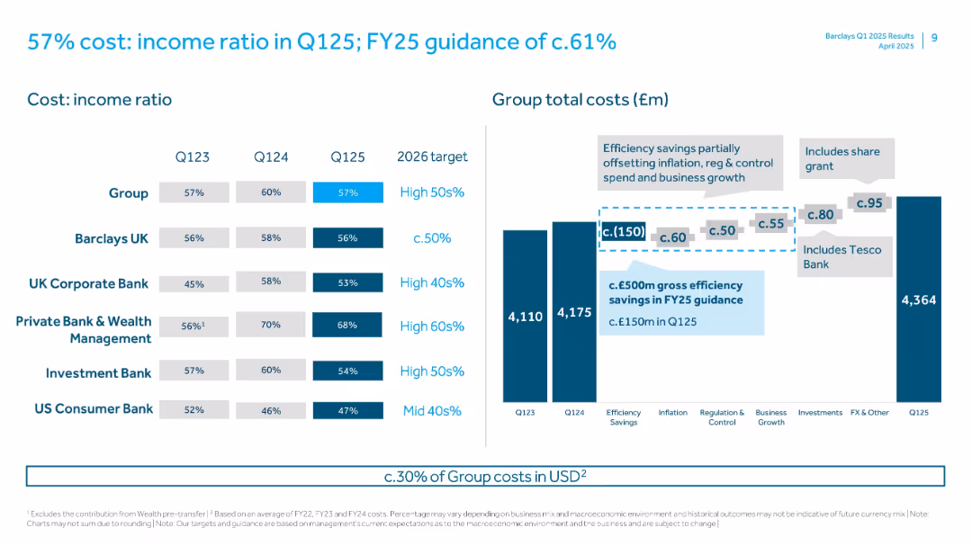
Tables and bar chart comparing cost-to-income ratios across business units.
Operational Efficiency
Financial Services
Barclays presents cost efficiency across divisions and outlines cost-to-income ratio goals. It includes group total cost breakdown and efficiency savings targets, such as the impact of Tesco Bank integration.
cost income ratio, Barclays, operating efficiency, Tesco Bank, cost control, group costs, FY25 guidance, UK finance
false
Operational Efficiency
Financial Services
Multiple Chart
Barclays
Add to my slides
Remove from favorites
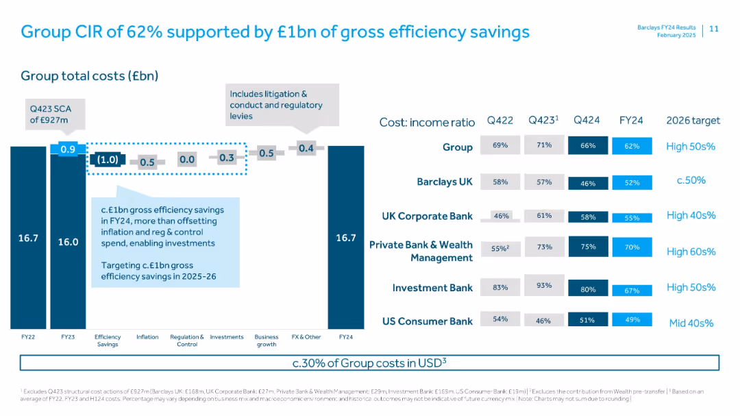
Bar charts and ratio tables; cost-income ratios shown per division; stacked bars and step-down cost waterfall with annotation overlays
Operational Efficiency
Financial Services
Provides an overview of Barclays Group’s cost-income ratio improvements due to efficiency savings. Breaks down total costs and efficiency drivers while detailing CIR targets for FY26 across divisions.
cost-income ratio, CIR, efficiency savings, Barclays, FY24, cost breakdown, targets, divisional performance
false
Operational Efficiency
Financial Services
Multiple Chart
Barclays
Add to my slides
Remove from favorites
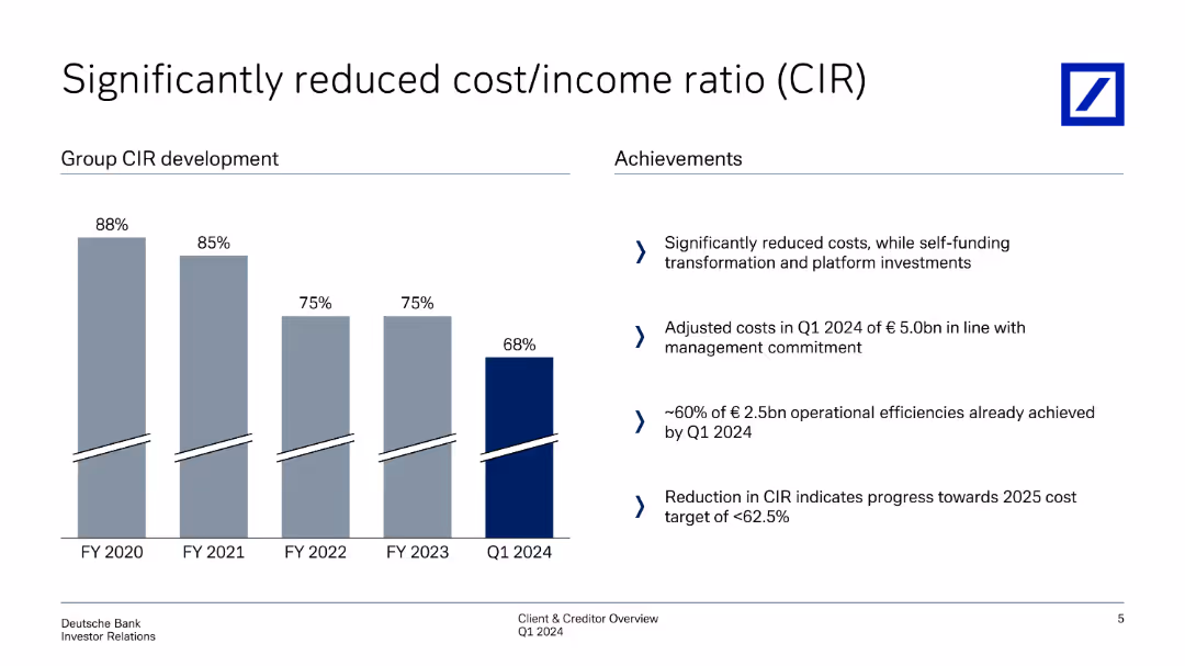
This slide shows column charts depicting the development of cost/income ratio (CIR) over fiscal years, with achievements listed on the right side.
Operational Efficiency
Financial Services
Analyzes the significant reduction in cost/income ratio over time, detailing operational efficiencies and management strategies that contributed to the reduction.
cost/income ratio, CIR, operational efficiency, cost reduction, management strategies
false
Operational Efficiency
Financial Services
Mixed Chart
Deutsche Bank
Add to my slides
Remove from favorites
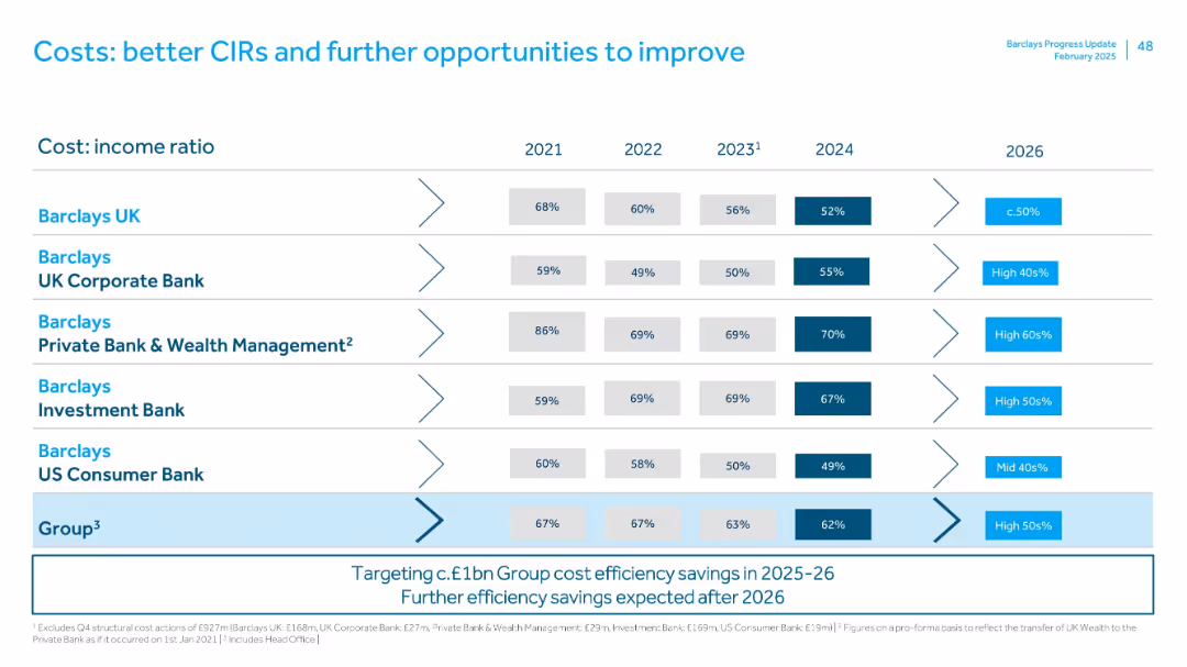
Table showing cost:income ratios across Barclays divisions from 2021–2026 with trend arrows and future targets.
Performance Metrics and KPIs
Financial Services
Breaks down CIR improvements for each Barclays segment (UK, Corporate Bank, Wealth Management, etc.), highlighting goals for 2026 (e.g., <50% for Barclays UK). Emphasizes Group-wide cost control and potential post-2026 savings.
cost:income ratio, efficiency, CIR targets, performance, division-level KPIs
false
Performance Metrics and KPIs
Financial Services
Single Chart
Barclays
Add to my slides
Remove from favorites
The slide features two bar charts comparing cost/income ratios in 2015 and 1H19 across various banks, showing Credit Suisse's performance improvements.
Competitive Landscape
Financial Services
This slide demonstrates Credit Suisse's leadership in efficiency within the Swiss banking sector by comparing cost/income ratios against domestic peers.
Cost/income ratio, efficiency, Swiss bank, performance comparison, leadership
false
Competitive Landscape
Financial Services
Multiple Chart
Credit Suisse
Add to my slides
Remove from favorites
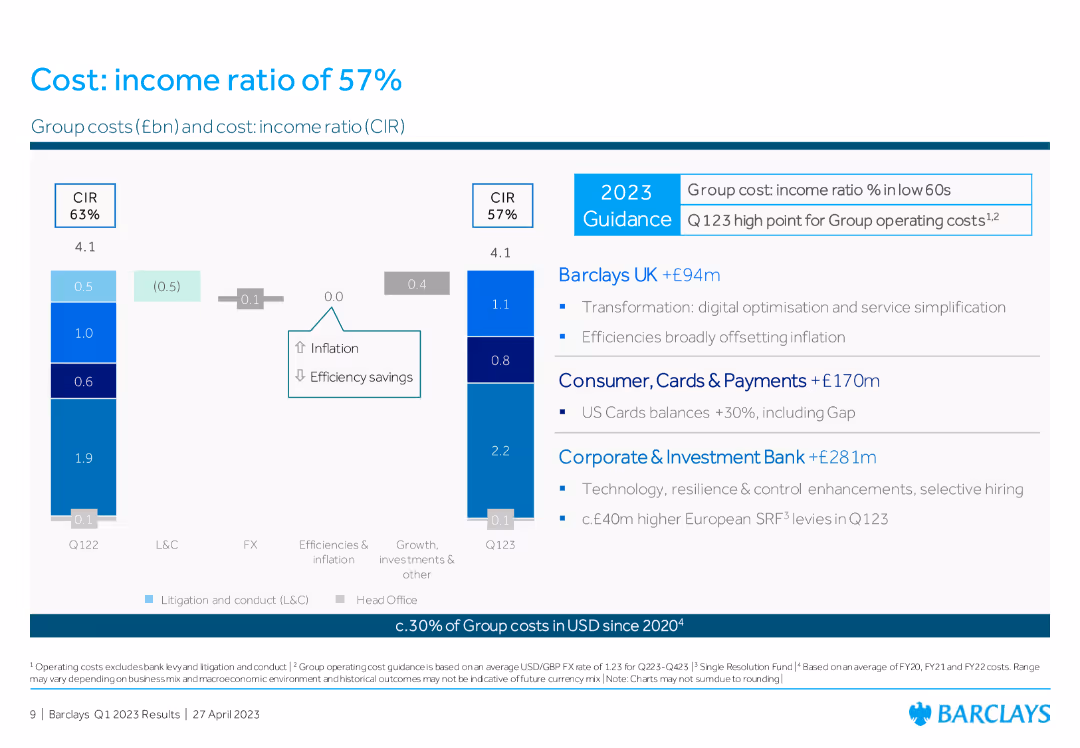
Column chart comparing group costs and cost: income ratio (CIR) between Q1 2022 and Q1 2023, with text boxes summarizing contributions from Barclays UK, Consumer, and CIB.
Operational Efficiency
Financial Services
The slide presents the cost: income ratio of Barclays, illustrating the changes in group costs and highlighting efficiencies and inflation impacts.
cost: income ratio, group costs, operational efficiency, Barclays UK, Consumer, CIB
false
Operational Efficiency
Financial Services
Multiple Chart
Barclays
Add to my slides
Remove from favorites
Slide displays two column charts comparing cost/income ratios for 2022 and a 2025 target, alongside a breakdown of efficiency measures.
Operational Efficiency
Financial Services
Details strategies to reduce Deutsche Bank's cost-income ratio through operational efficiencies and technological improvements.
Cost-income ratio, operational efficiency, Deutsche Bank, reduction, strategy, technology
false
Operational Efficiency
Financial Services
Multiple Chart
Deutsche Bank
Add to my slides
Remove from favorites
This slide contains a column chart showing the trend in cost/income ratio over several fiscal years, paired with a bullet list of key achievements related to cost reduction and operational efficiencies.
Operational Efficiency
Financial Services
Details the bank’s efforts in reducing the cost/income ratio over time and lists operational achievements that have contributed to this financial metric, suitable for understanding cost management strategies.
cost, income, reduction, financial, efficiency, operational, fiscal, CIR, management, performance
false
Operational Efficiency
Financial Services
Mixed Chart
Deutsche Bank
Add to my slides
Remove from favorites
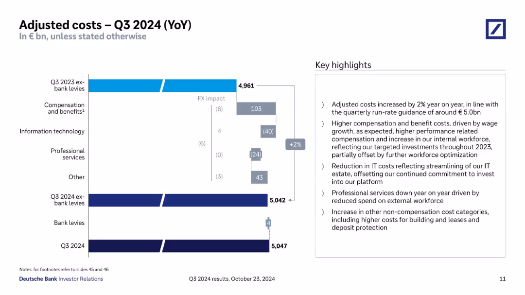
Waterfall chart showing cost components YoY; key highlights box on right.
Operational Efficiency
Financial Services
Analyzes changes in adjusted costs year-over-year, attributing changes to compensation, IT, professional services, and FX impact. Costs rose 2%, mainly due to compensation and growth in internal workforce, with IT and services offsetting increases.
cost increase, YoY comparison, workforce, IT costs, FX impact
false
Operational Efficiency
Financial Services
Mixed Chart
Deutsche Bank
Add to my slides
Remove from favorites
Multiple column charts detailing material inflation and commodity price trends over 5 years. Includes World Bank data, focus on crude palm, soybean oil, and Brent crude. Blue and red bars/columns to show price trends and inflation.
Risk Assessment and Management
Consumer Goods
Evaluates the impact of rising commodity prices on Unilever's operations, focusing on strategies to manage cost inflation and its effects on profitability. Highlights the urgency of managing operational costs in volatile market conditions.
Cost Inflation, Commodity Prices, Risk Management, Operational Costs, Profitability
false
Risk Assessment and Management
Consumer Goods
Multiple Chart
Deutsche Bank
Add to my slides
Remove from favorites
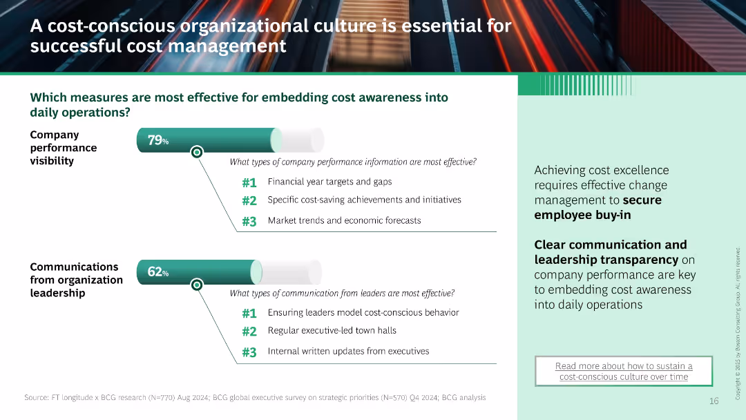
Two horizontal bar charts show effectiveness of performance visibility and leadership communication. Sidebar emphasizes need for transparency and change management.
Human Resources and Talent Management
Professional Services
Promotes embedding cost awareness through performance tracking and leadership messaging. Lists top effective methods such as financial targets, town halls, and executive updates. Highlights employee buy-in as critical for cost control.
cost management, culture, transparency, leadership, employee engagement, cost awareness, communication
false
Human Resources and Talent Management
Professional Services
Mixed Chart
BCG
Add to my slides
Remove from favorites
Utilizes diagrams and flow charts to compare traditional and customer-centric cost management approaches.
Strategic Planning
Professional Services
Explores the shift from function-oriented to process-oriented cost management to enhance customer focus.
cost management, customer-centric, process, strategic
false
Strategic Planning
Professional Services
Boxed
Deloitte
Add to my slides
Remove from favorites
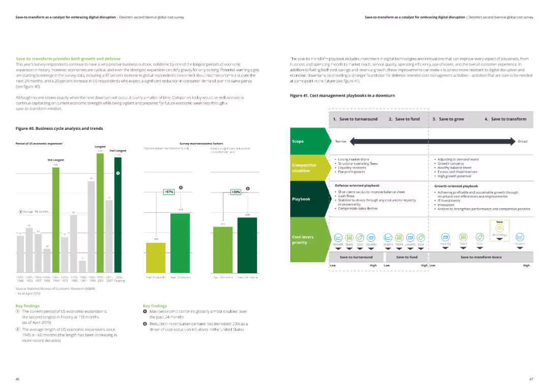
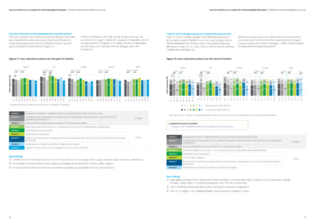
The slide features a timeline with different cost management playbooks for downturns, alongside a bar chart showing macroeconomic concerns and reduction in consumer demand over the past 24 months.
Risk Assessment and Management
Professional Services
This slide presents a playbook for managing costs during economic downturns, emphasizing defensive and growth-oriented strategies. It also covers survey data on macroeconomic concerns and consumer demand reduction.
cost management, economic downturn, macroeconomic concerns, consumer demand, playbook
false
Risk Assessment and Management
Professional Services
Multiple Chart
Deloitte
Add to my slides
Remove from favorites
Contains a column chart and a series of stepwise diagrams illustrating cost management strategies, with clear textual categorizations for each segment.
Operational Efficiency
Financial Services
Discusses strategies for reducing noninterest expenses by 2025, focusing on efficiency measures, operational improvements, and cost management to sustain investment and maintain competitive leverage in the market.
Cost Management, Efficiency, Noninterest Expenses, Operational Improvements, Strategic Investments
false
Operational Efficiency
Financial Services
Mixed Chart
Deutsche Bank
Add to my slides
Remove from favorites
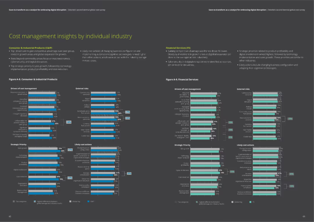
The slide contains two column charts comparing drivers of cost management, external risks, strategic priorities, and likely cost actions for Consumer & Industrial Products and Financial Services sectors.
Market Analysis and Trends
Financial Services
Insights on cost management, including drivers, risks, priorities, and actions for Consumer & Industrial Products and Financial Services. Helps understand industry-specific trends.
cost management, industry insights, risks, priorities, actions
false
Market Analysis and Trends
Financial Services
Multiple Chart
Deloitte
Add to my slides
Remove from favorites
Features a column chart showing survey results on companies' strategies to manage cost increases in 2023 and 2024, with opinions from various industry leaders about cost management challenges.
Financial Performance
Financial Services
Explores corporate strategies for offsetting cost increases due to inflation and other economic challenges, highlighting different industry perspectives on transferring costs to consumers.
cost management, inflation, economic challenges, consumer prices, efficiency plans, industry strategy, financial planning, cost offsetting, corporate strategy
false
Financial Performance
Financial Services
Mixed Chart
Bain
Add to my slides
Remove from favorites
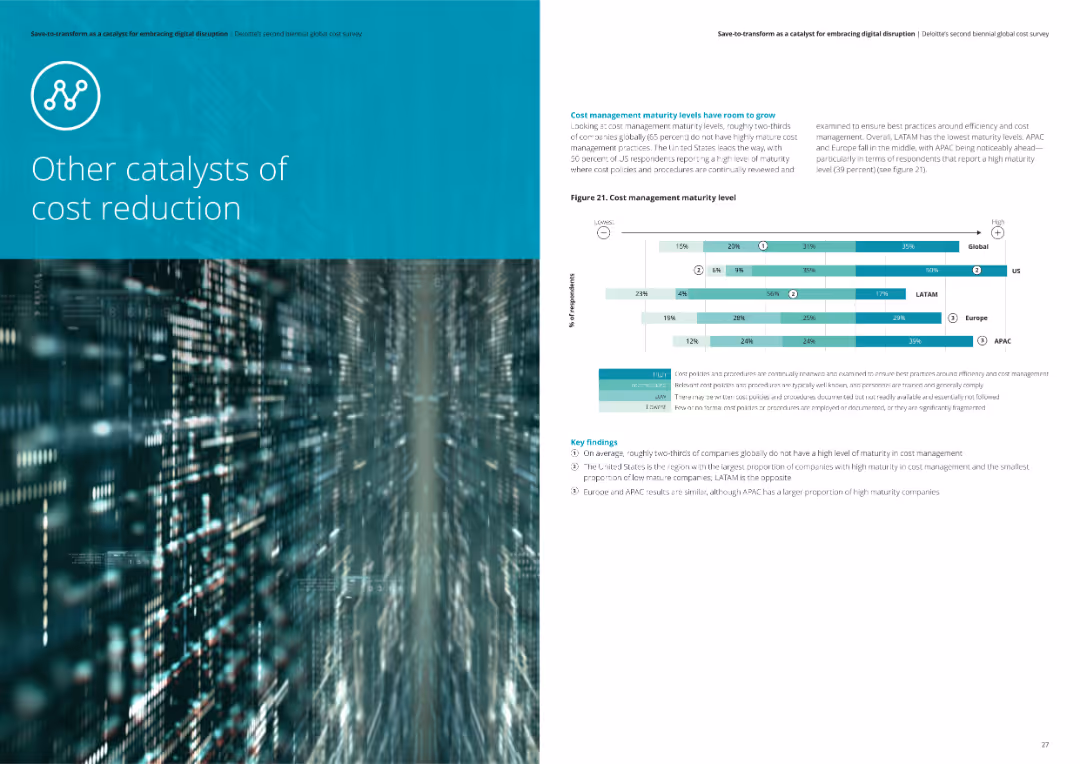
The slide displays a horizontal bar chart showing cost management maturity levels across different regions. Key findings are noted in text boxes.
Operational Efficiency
Financial Services
The slide examines the maturity levels of cost management practices globally and by region, identifying areas with low, moderate, and high maturity levels.
Cost management, maturity levels, analysis, financial services
false
Operational Efficiency
Financial Services
Mixed Chart
Deloitte
Add to my slides
Remove from favorites
Contains bar charts comparing cost management maturity levels across different regions including the Nordics.
Risk Assessment and Management
Professional Services
Explores the maturity levels of cost management practices globally, emphasizing that Nordic regions report lower maturity compared to the global average, and discusses potential areas for improvement.
Cost Management, Maturity Levels, Nordic, Global Comparison, Improvement
false
Risk Assessment and Management
Professional Services
Mixed Chart
Deloitte
Add to my slides
Remove from favorites
Slide features complex graphical data including column chart detailing noninterest expenses and projected cost management strategies with clear visual segmentation.
Operational Efficiency
Financial Services
Highlights the bank's focus on stringent cost management and operational efficiency, detailing projected cost reductions and efficiency measures to support financial health and operational leverage.
cost management, operational efficiency, financial health, cost reduction, efficiency measures
false
Operational Efficiency
Financial Services
Mixed Chart
Deutsche Bank
Add to my slides
Remove from favorites
Slide presents a flow from noninterest expenses in 2023 to projected adjustments by 2025 using column chart and strategic annotations outlining cost management strategies and expected impacts.
Operational Efficiency
Financial Services
Examines cost management and operational efficiency strategies from 2023 to 2025. Focuses on noninterest expenses and the strategic initiatives expected to reduce costs and improve operational leverage in financial services.
cost management, operational efficiency, noninterest expenses, financial services, 2025
false
Operational Efficiency
Financial Services
Mixed Chart
Deutsche Bank
Add to my slides
Remove from favorites
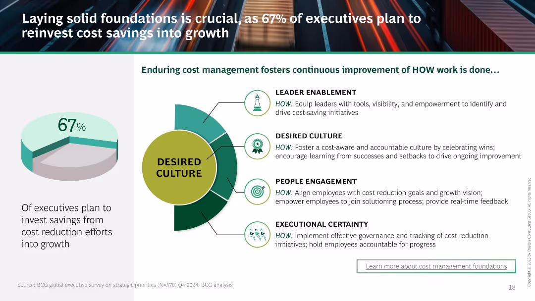
Uses a green circular diagram to depict the ideal organizational culture for enduring cost management, accompanied by text sections describing elements of the culture such as 'People engagement'.
Organizational Structure and Change
Professional Services
Explains how effective cost management is supported by organizational culture, highlighting aspects like leadership, execution, and employee engagement crucial for sustainable cost improvements.
cost management, organizational culture, leadership, sustainability
false
Organizational Structure and Change
Professional Services
Framework
BCG
Add to my slides
Remove from favorites
Displays a list of six key levers for addressing the cost base in a strategic manner, each accompanied by an icon and a brief description.
Operational Efficiency
Professional Services
Outlines the six essential levers for strategic cost management, detailing their relevance and impact on business operations. The levers include Operating Governance, Service Delivery Model, Business Process Optimisation, Organisation Design, External Spend Management, and Demand Management. This slide is essential for understanding strategic approaches to cost reduction.
Cost Management, Strategic Levers, Business Operations, Optimization
false
Operational Efficiency
Professional Services
Table
Deloitte
Add to my slides
Remove from favorites
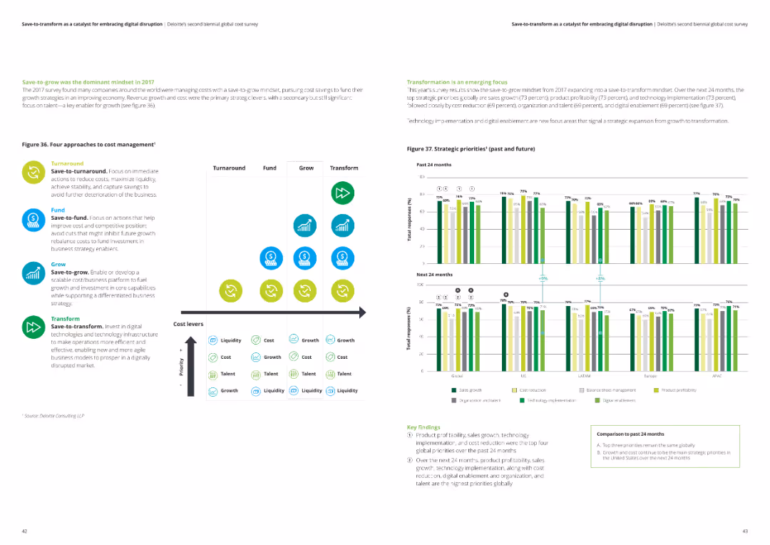
The slide has a comparative layout, listing four cost management strategies (turnaround, fund, grow, transform) with corresponding icons and a column chart comparing strategic priorities over the past and future 24 months.
Strategic Planning
Professional Services
The slide details different strategic approaches to cost management, highlighting key priorities such as liquidity, cost, talent, and growth. It shows survey results on top strategic priorities globally.
cost management strategies, strategic planning, liquidity, talent, growth, survey results
false
Strategic Planning
Professional Services
Multiple Chart
Deloitte
Add to my slides
Remove from favorites
Includes a simple column chart and detailed bullet points on cost actions.
Operational Efficiency
Financial Services
Highlights the importance of various cost management actions to maintain a competitive advantage in 2024, emphasizing supply chain and manufacturing costs.
cost management, supply chain, manufacturing, competitive advantage
false
Operational Efficiency
Financial Services
Mixed Chart
BCG
Add to my slides
Remove from favorites
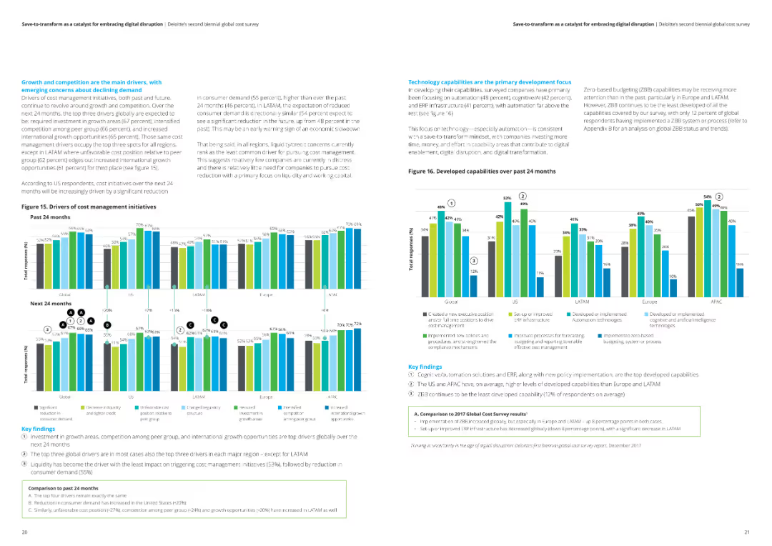
This slide has two column charts displaying drivers of cost management initiatives and developed capabilities over the past 24 months. Key findings are outlined in text boxes.
Operational Efficiency
Financial Services
The slide discusses the main drivers of cost management and the focus on developing technology capabilities over the past 24 months. Key insights are provided for each region.
Cost management, technology capabilities, drivers, analysis, financial services
false
Operational Efficiency
Financial Services
Multiple Chart
Deloitte
Add to my slides
Remove from favorites
Offers comparative analysis through lists and bullet points on linking cost management and value creation.
Strategic Planning
Professional Services
Discusses aligning cost reduction efforts with value creation strategies across different business functions.
cost management, value creation, strategy, business
false
Strategic Planning
Professional Services
Table
Deloitte
Add to my slides
Remove from favorites
This slide features a line chart displaying the sensitivity of the levelized cost of energy for different energy sources to changes in the cost of capital.
Financial Performance
Energy & Utilities
The slide explores how changes in the cost of capital affect the levelized cost of energy for renewable and conventional sources, emphasizing the financial implications for energy project investments.
Cost of Capital, Energy Investment, LCOE, Sensitivity, Financial Analysis
false
Financial Performance
Energy & Utilities
Single Chart
Roland Berger
Add to my slides
Remove from favorites
The slide contains three charts: a line chart of long-term interest rates, a column chart of global and US M&A activity, and a line chart of exchange rates vs. USD. The layout is organized with a blue and white color scheme, clear labels, and legends.
Market Analysis and Trends
Financial Services
The slide examines how increased market volatility and a rapid global monetary policy tightening cycle impact the cost of capital, highlighting trends in interest rates, M&A activity, and exchange rates.
cost of capital, market volatility, monetary policy, interest rates
false
Market Analysis and Trends
Financial Services
Multiple Chart
EY
Add to my slides
Remove from favorites
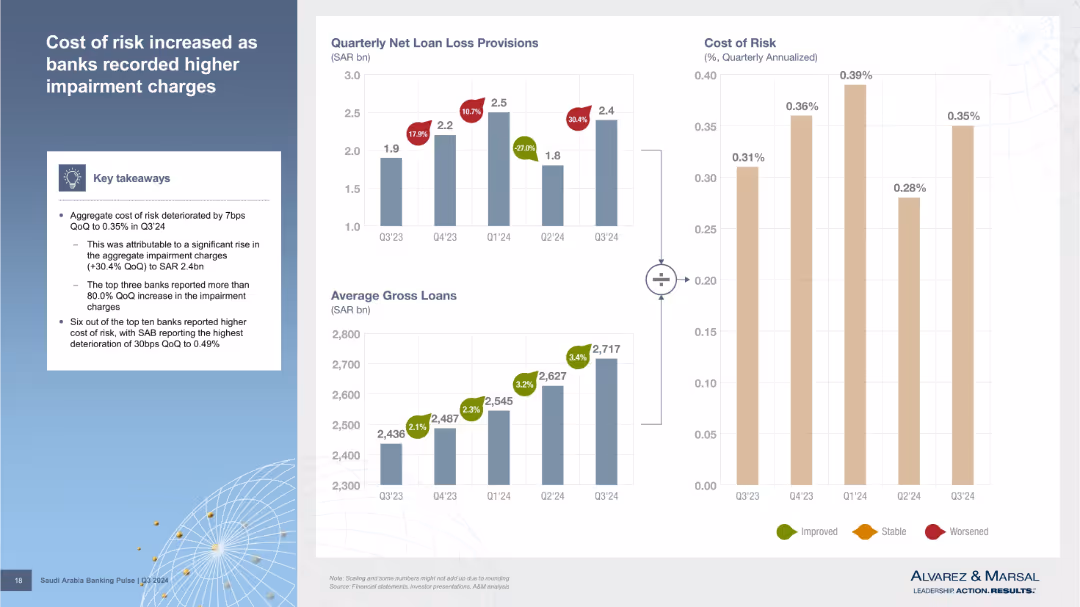
Three charts: Quarterly Loan Loss Provisions, Average Gross Loans, and Cost of Risk. Color-coded directional arrows indicate trends. Summary box on the left explains key drivers.
Risk Assessment and Management
Financial Services
Cost of risk rose to 0.35% due to a 30.4% increase in impairment charges. The slide notes that several banks contributed significantly to this rise. Gross loans also increased steadily. Charts clearly connect loan volume, loss provisions, and cost of risk outcomes.
cost of risk, loan loss, impairment charges, gross loans, Q3 2024
false
Risk Assessment and Management
Financial Services
Multiple Chart
Alvarez & Marsal
Add to my slides
Remove from favorites
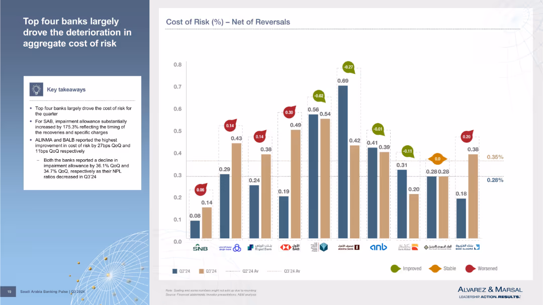
Bar chart showing Cost of Risk (net of reversals) across banks, with change indicators. Summary insights on the left. Improved, stable, and worsened performance marked with colored arrows.
Risk Assessment and Management
Financial Services
Highlights bank-level contributions to the rising cost of risk. SAB saw the largest increase in impairment allowance; ALINMA and BALB saw the most improvement. Visual comparison across banks shows variance in net risk performance.
cost of risk, reversals, SAB, impairment allowance, ALINMA, BALB, net impact
false
Risk Assessment and Management
Financial Services
Mixed Chart
Alvarez & Marsal
Add to my slides
Remove from favorites
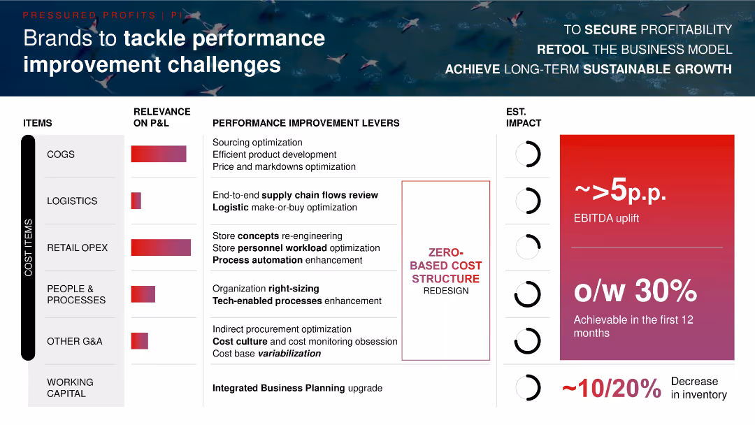
Structured matrix layout with cost categories on the left, improvement levers center, impact estimates on the right; bold fonts and red-purple gradients.
Operational Efficiency
Consumer Goods
Outlines levers for boosting profitability across major cost items like COGS, logistics, and OpEx. Promotes zero-based cost redesign and integrated planning, with estimated EBITDA uplift of >5p.p. and 10–20% inventory reduction potential.
cost optimization, EBITDA, zero-based budgeting, supply chain, automation, inventory
false
Operational Efficiency
Consumer Goods
Multiple Chart
Bain
Add to my slides
Remove from favorites
The slide contains a line chart showing grid slot utilization and key metrics such as -50% reduction in printing volume and -27% in storage costs, highlighting regional variability.
Operational Efficiency
Financial Services
This slide outlines strategies to optimize maintenance spending by increasing cost variability and leveraging managed services, showing significant cost reductions.
cost optimization, maintenance, grid computing, managed services, cost reduction, variability, new technology, strategic partnerships
false
Operational Efficiency
Financial Services
Mixed Chart
Credit Suisse
Add to my slides
Remove from favorites
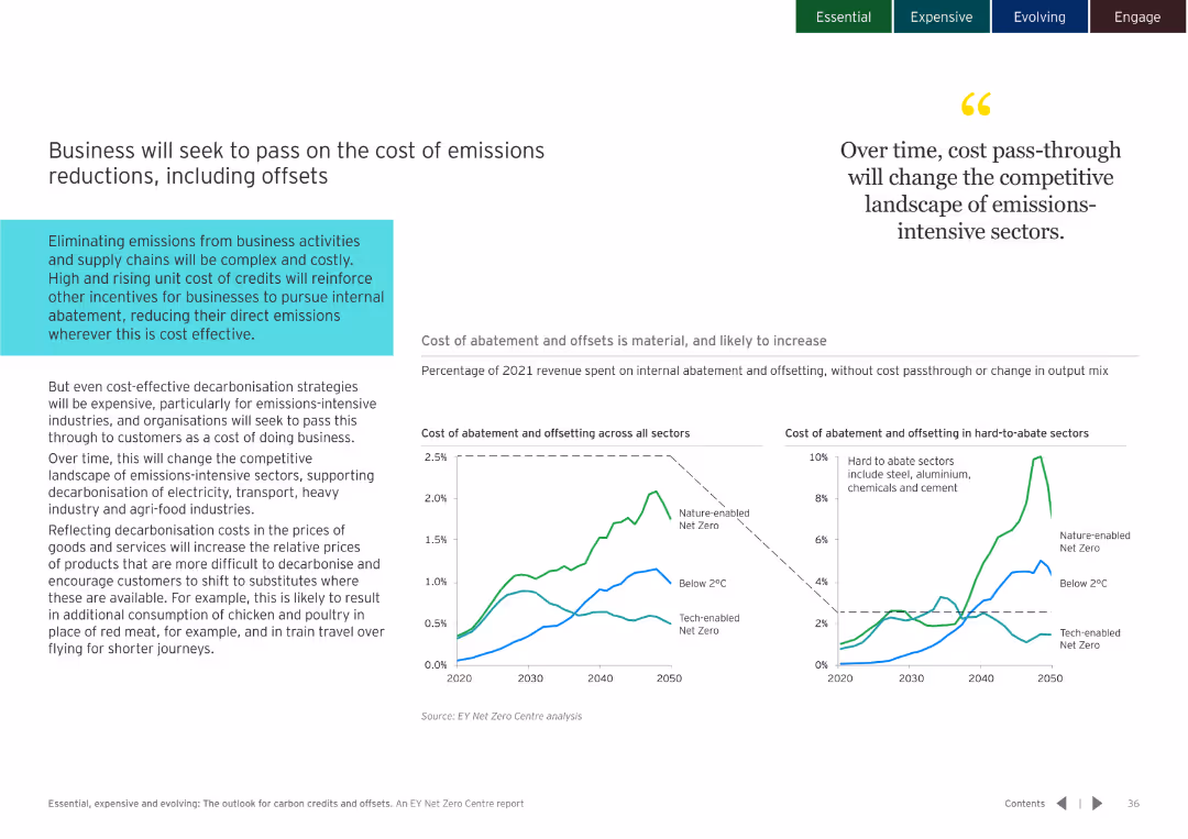
White background with line charts showing the cost of abatement and offsets across sectors. Quotes and text blocks explain the impact on businesses.
Financial Performance
Environmental Services & Sustainability
Discusses how businesses will manage and pass on the costs of emissions reductions, including the use of offsets.
cost pass-through, emissions reduction, business impact
false
Financial Performance
Environmental Services & Sustainability
Multiple Chart
EY
Add to my slides
Remove from favorites
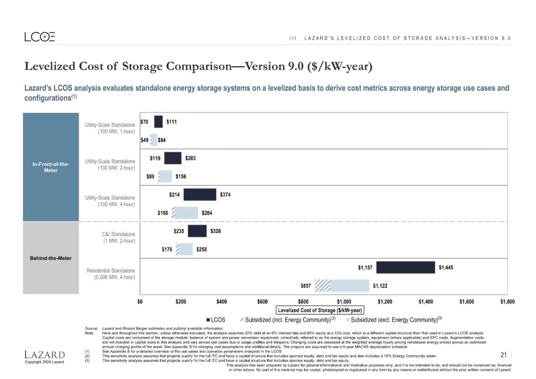
Bar chart format, similar structure as previous slide, but uses $/kW-year as the cost metric.
Technology and Digital Transformation
Energy & Utilities
This slide converts the energy storage cost metric to $/kW-year for broader insight into annualized capacity cost. It maintains the breakdown by system configuration and subsidy impact, providing an alternative financial view of storage economics.
cost per kW-year, energy storage, capacity cost, utility-scale, subsidy, standalone
false
Technology and Digital Transformation
Energy & Utilities
Single Chart
Roland Berger
Add to my slides
Remove from favorites
Two column charts showing cumulative annualized gross cost reductions and cumulative integration-related expenses, with projections.
Strategic Planning
Financial Services
The slide details the progress of cost-saving initiatives, expecting 50% of targeted saves by the 2024 exit rate, with future projections included.
cost plans, savings, projections, integration expenses, financial goals
false
Strategic Planning
Financial Services
Multiple Chart
UBS
Add to my slides
Remove from favorites
Line graph comparing current MMIS vs. modular MMIS cost projections. Detailed explanatory text and a table with cost comparisons over years.
Financial Performance
Government & Public Sector
Projected cost savings of $13.5M for New Hampshire with a modular MMIS approach between 2022 and 2030, comparing current and future cost trajectories.
Cost Projections, MMIS, Modular, Savings, Fiscal Year
false
Financial Performance
Government & Public Sector
Mixed Chart
Alvarez & Marsal
Add to my slides
Remove from favorites
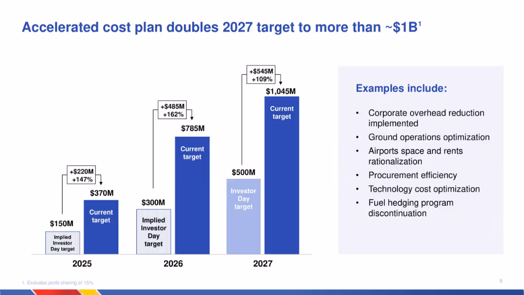
Column chart showing increasing targets for cost savings from 2025 to 2027; includes callout box listing cost-saving initiatives on the right.
Operational Efficiency
Transportation & Logistics
Details an updated cost reduction plan that significantly increases the 2027 savings target. Provides specific examples such as procurement efficiency and overhead reduction. Visuals emphasize growth of targets over time.
cost reduction, 2027 target, operational savings, procurement, technology optimization, transportation, plan acceleration, efficiency
false
Operational Efficiency
Transportation & Logistics
Mixed Chart
JP Morgan
Add to my slides
Remove from favorites
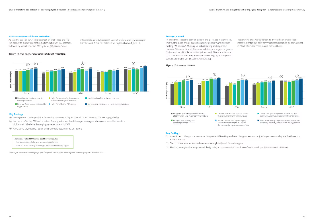
This slide includes a column chart illustrating the top barriers to successful cost reduction globally and regionally. Key findings are summarized in text boxes.
Risk Assessment and Management
Financial Services
The slide highlights the key barriers to successful cost reduction, including management challenges and ineffective ERP systems, with a comparison to the 2017 survey results.
Cost reduction, barriers, challenges, analysis, financial services
false
Risk Assessment and Management
Financial Services
Multiple Chart
Deloitte
Add to my slides
Remove from favorites
The slide contains two main sections each with a distinct visual graph: the left section has a column chart comparing cost of vanadium redox flow batteries between countries; the right section has a bar chart detailing the composition of manufacturing costs in Australia.
Market Analysis and Trends
Energy & Utilities
Discusses the potential for Australian producers to reduce costs in vanadium redox flow battery manufacturing by focusing on electrolyte costs, comparing to costs in China and the US.
cost reduction, battery manufacturing, electrolyte, vanadium, Australia, China, US, comparative analysis, industry costs
false
Market Analysis and Trends
Energy & Utilities
Multiple Chart
Accenture
Add to my slides
Remove from favorites
Slide with two column charts displaying underlying operating expenses and total RWA, along with three lists highlighting cost reduction, capital release, and protecting customer franchise.
Operational Efficiency
Financial Services
The slide focuses on strategies to drive lower costs and efficient capital release for non-core and legacy assets at UBS.
cost reduction, capital release, efficient capital, non-core assets, UBS efficiency
false
Operational Efficiency
Financial Services
Multiple Chart
UBS
Add to my slides
Remove from favorites
The slide features bar charts showing operating expenses and total RWA from 2Q23 to 4Q23, with text detailing actions for cost reduction, capital release, and protecting customer franchise. Ambitions for PBT and RWA by 2026 are also listed.
Risk Assessment and Management
Financial Services
The slide outlines strategies for reducing costs and releasing capital in non-core and legacy sectors. It includes data on operating expenses, RWA, and strategic actions to achieve these goals. This slide can be used to communicate cost management and capital release strategies in non-core and legacy areas.
cost reduction, capital release, operating expenses, strategic actions, non-core
false
Risk Assessment and Management
Financial Services
Multiple Chart
UBS
Add to my slides
Remove from favorites
This slide presents a simple, three-part horizontal comparison layout, using arrows to indicate reductions and green bars to visualize savings for clients in different financial areas.
Financial Performance
Financial Services
The slide demonstrates JPMorgan’s efforts in reducing various fees and commissions, quantifying the annual savings for clients, intended to showcase cost efficiency.
cost reduction, client savings, JPMorgan, fees, commissions, percentage decrease, financial services
false
Financial Performance
Financial Services
Multiple Chart
JP Morgan
Add to my slides
Remove from favorites
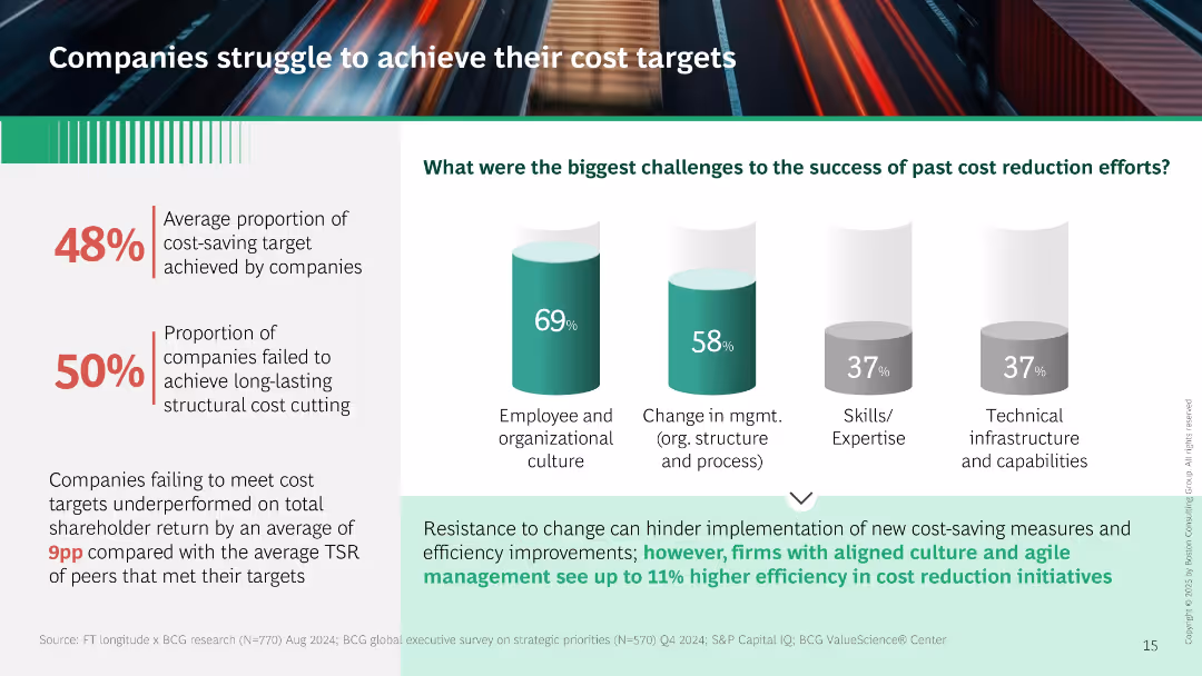
Left panel shows metrics on underperformance. Right has vertical bar charts showing barriers to cost reduction (culture, management, skills). Footer text links resistance to change to cost-saving failures.
Performance Metrics and KPIs
Professional Services
Demonstrates that only 48% of cost-saving targets are met, with organizational culture and management structure as key obstacles. Links cost target failures to lower shareholder return. Suggests culture alignment improves outcomes.
cost reduction, culture, performance, shareholder return, management change, implementation barriers
false
Performance Metrics and KPIs
Professional Services
Mixed Chart
BCG
Add to my slides
Remove from favorites
Presents a flow chart with elements classified into Traditional, Next Generation, and Digital Optimization phases, each with icons and text.
Strategic Planning
Professional Services
Explores the evolution of cost reduction programs, from traditional levers focused on operating model efficiency to digital optimization incorporating advanced technologies for real-time insights and automation.
Cost Reduction, Digital Optimization, Traditional Levers, Next Generation, Evolution
false
Strategic Planning
Professional Services
Table
Deloitte
Add to my slides
Remove from favorites
The slide includes a column chart showing cost reduction targets over the years, accompanied by text explanations of selected cost levers.
Operational Efficiency
Financial Services
The slide outlines a plan to reduce group costs by 15% by 2025 through various strategic cost management initiatives and operational efficiencies.
cost, reduction, efficiency, target, strategy
false
Operational Efficiency
Financial Services
Mixed Chart
Credit Suisse
Add to my slides
Remove from favorites
Contains two column charts comparing the effectiveness of cost reduction efforts across North America, Europe, and Asia. The slide uses shades of green and dark gray, with percentages and brief textual descriptions.
Risk Assessment and Management
Industrial & Manufacturing
Analyzes the effectiveness of past cost reduction strategies across different global regions, highlighting the temporary nature of cost savings and the varying impacts on business growth.
cost reduction, global strategy, North America, Europe, Asia
false
Risk Assessment and Management
Industrial & Manufacturing
Multiple Chart
BCG
Add to my slides
Remove from favorites
Features flow charts and lists that compare traditional vs. holistic approaches to cost management.
Strategic Planning
Professional Services
Advocates for integrating cost management tools beyond conventional programs to improve decision making.
cost reduction, holistic, integration, decision making
false
Strategic Planning
Professional Services
Boxed
Deloitte
Add to my slides
Remove from favorites
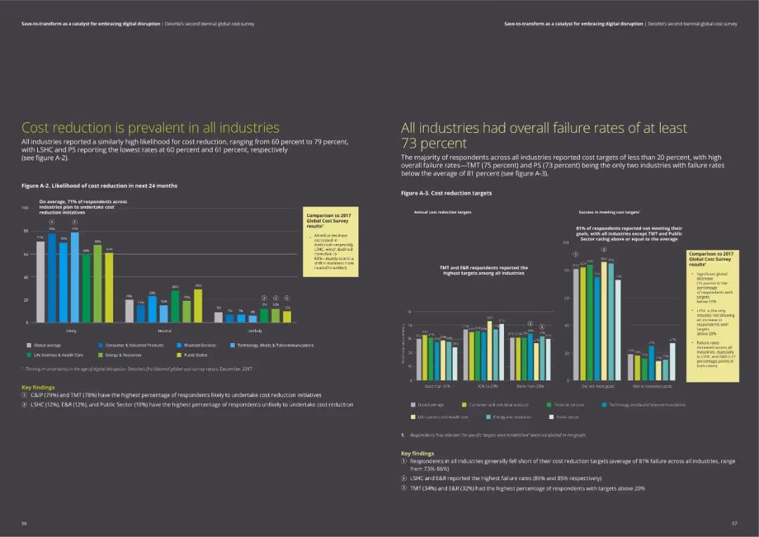
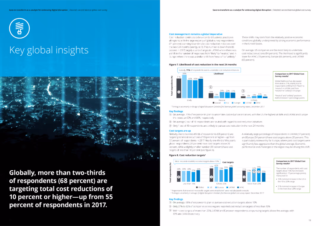
The slide contains a bar chart comparing the likelihood of cost reduction across industries over the next 24 months and a chart on annual cost reduction targets.
Risk Assessment and Management
Professional Services
The slide discusses the prevalence of cost reduction initiatives across different industries, highlighting survey data on likelihood and targets. It emphasizes the high failure rates in meeting cost reduction targets across industries.
cost reduction, industry analysis, failure rates, survey data, cost targets
false
Risk Assessment and Management
Professional Services
Multiple Chart
Deloitte
Add to my slides
Remove from favorites
Contains several column charts displaying the likelihood of cost programs, ambition levels, and success rates, with specific focus on the Nordic regions compared to others.
Market Analysis and Trends
Professional Services
The slide provides statistical data on the likelihood, ambition, and success rates of cost reduction programs globally, emphasizing lower initiation but higher ambition and failure rates in Nordic countries, compared to other regions.
Cost Reduction, Nordic, Ambition, Success Rates, Global Comparison
false
Market Analysis and Trends
Professional Services
Multiple Chart
Deloitte
Add to my slides
Remove from favorites
Features dual visual data representations, one for CIR outlook with column chart and one for efficiency measures.
Operational Efficiency
Financial Services
Details strategies for cost reduction and operational efficiencies, providing specific financial targets and measures.
cost, reduction, operational, efficiency, CIR, targets, financial, bar graph, measures, strategy
false
Operational Efficiency
Financial Services
Mixed Chart
Deutsche Bank
Add to my slides
Remove from favorites
Displays a column chart tracking the cost/income ratio over several years with detailed annotations about significant reductions and achievements in cost management.
Operational Efficiency
Financial Services
Details the bank's successful strategies in reducing operational costs and improving efficiency, aligning with financial stability and strategic investments, providing insights into fiscal management and efficiency.
cost reduction, operational efficiency, financial stability, strategic investments, CIR
false
Operational Efficiency
Financial Services
Mixed Chart
Deutsche Bank
Add to my slides
Remove from favorites
Circle diagram and lists detailing a cost-saving program, showing major areas of expense reduction planned for the next year.
Operational Efficiency
Financial Services
Discusses strategies for significant cost reduction and operational simplification expected to save around $750 million.
cost reduction, operational efficiency, savings, strategy, diagram
false
Operational Efficiency
Financial Services
Mixed Chart
Barclays
Add to my slides
Remove from favorites
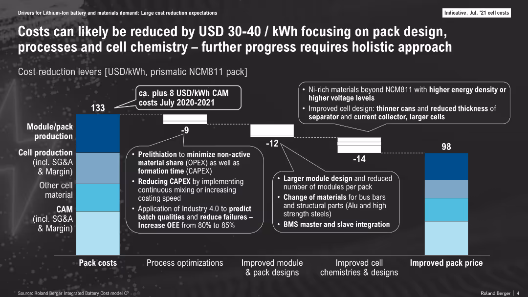
Bar chart comparing 2020-2021 and future cost breakdowns with annotations; segmented by cost areas
Operational Efficiency
Energy & Utilities
This slide breaks down battery pack cost components and shows how design, process, and material improvements can lower costs from $133/kWh to $98/kWh. Key levers include pack/module redesign, cell production optimization, and chemistry upgrades.
cost reduction, pack design, NCM811, cell production, BMS, energy storage, CAPEX
false
Operational Efficiency
Energy & Utilities
Mixed Chart
Roland Berger
Add to my slides
Remove from favorites
Contains a waterfall chart illustrating short and medium-term cost reduction potential across various expense categories.
Operational Efficiency
Industrial & Manufacturing
Demonstrates the potential for cost reduction without significantly impacting output, detailing short-term and medium-term savings across different expenses.
cost reduction, potential, expenses, short-term, medium-term, savings, waterfall chart
false
Operational Efficiency
Industrial & Manufacturing
Single Chart
EY
Add to my slides
Remove from favorites
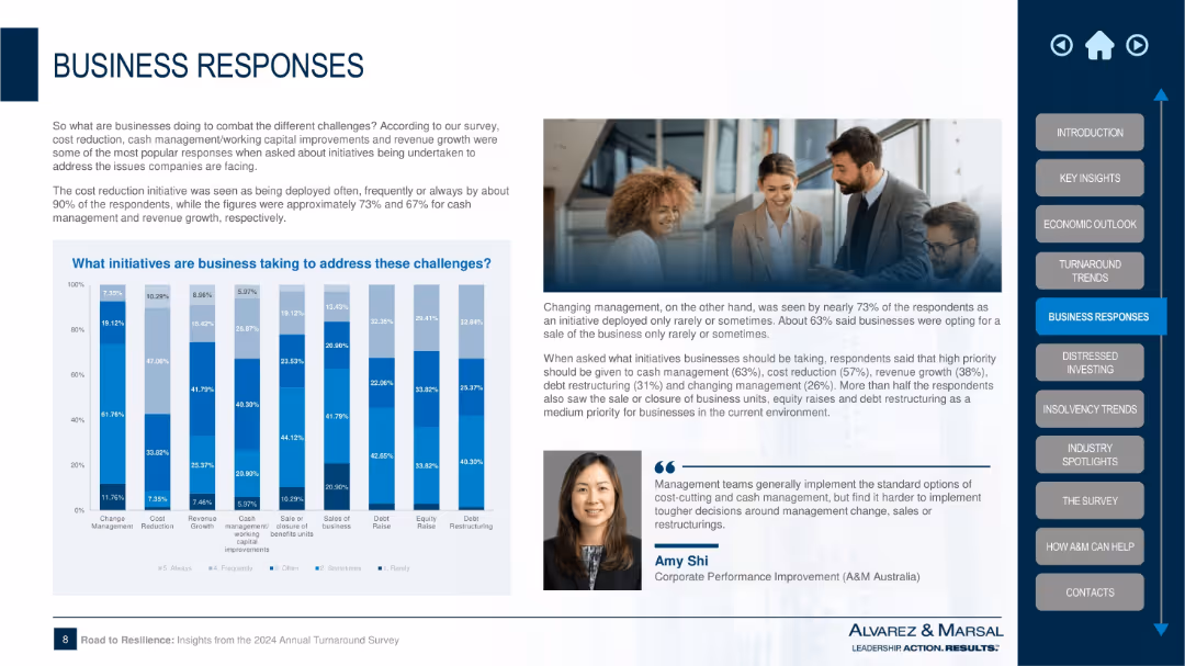
Split layout with bar chart on left, text explanation in center-right, image of businesspeople top-right, and sidebar navigation on right
Strategic Planning
Professional Services
The slide outlines the top initiatives businesses are taking to address challenges such as cost reduction, revenue growth, and cash management. A bar chart shows frequency of actions like changing management, equity raise, and debt restructuring. Survey insights and expert commentary are included.
cost reduction, revenue growth, cash management, survey, business strategy, equity raise, restructuring, turnaround, corporate response, insights
false
Strategic Planning
Professional Services
Mixed Chart
Alvarez & Marsal
Add to my slides
Remove from favorites
Features two column charts comparing data from 2014 and 2019. It has headers for 'Engagement' and 'Expenses and Simplification', along with descriptive text and icons.
Operational Efficiency
Financial Services
The slide discusses how shifting to self-service has decreased transaction costs and the optimization of branch networks, pointing towards an increase in efficiency and engagement.
Cost Reduction, Self-Service, Branch Optimization, Banking, Efficiency
false
Operational Efficiency
Financial Services
Multiple Chart
JP Morgan
Add to my slides
Remove from favorites
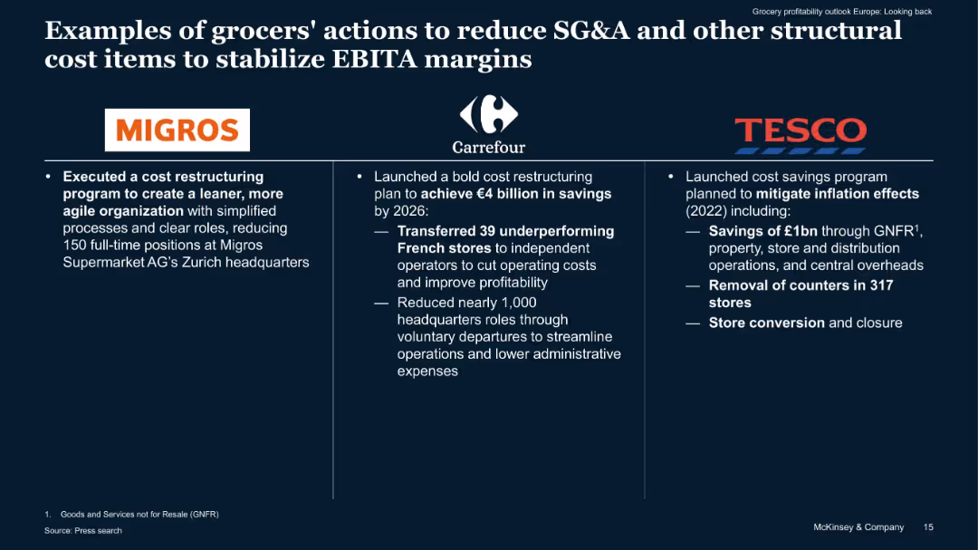
Three-column layout with company logos, bullet points, and bold keywords describing cost-saving measures.
Operational Efficiency
Retail & E-commerce
The slide showcases cost restructuring efforts by Migros, Carrefour, and Tesco to reduce SG&A and operational costs. Actions include store closures, HQ downsizing, and overhead cuts to preserve EBITA margins amid macroeconomic challenges.
cost reduction, SG&A, EBITA, restructuring, Tesco, Carrefour, efficiency
false
Operational Efficiency
Retail & E-commerce
Pillar
McKinsey
Add to my slides
Remove from favorites
Slide shows column charts and breakdowns by business segments and cost types, detailing significant financial allocations aimed at restructuring.
Strategic Planning
Financial Services
Details strategic financial decisions aimed at reducing costs and improving returns, with specifics on allocations to different business units and expected savings.
cost reduction, strategic planning, Q423, savings, future returns, Barclays, financial planning
false
Strategic Planning
Financial Services
Multiple Chart
Barclays
Add to my slides
Remove from favorites
The slide features two column charts showing cost reduction actions over the past and next 24 months across different regions. Key findings are included in text boxes.
Operational Efficiency
Financial Services
The slide details tactical and strategic cost reduction actions taken in various regions over the past 24 months and projected for the next 24 months.
Cost reduction, tactical actions, strategic actions, analysis, financial services
false
Operational Efficiency
Financial Services
Multiple Chart
Deloitte
Add to my slides
Remove from favorites
Bar chart detailing adjusted costs by category such as compensation, IT, and professional services. Accompanied by bullet points of key highlights.
Operational Efficiency
Financial Services
Detailed analysis of quarterly changes in adjusted costs, focusing on the impacts of technology investments and operational efficiency.
Costs, adjustments, technology, efficiency
false
Operational Efficiency
Financial Services
Mixed Chart
Deutsche Bank
Add to my slides
Remove from favorites
This slide features a diagram illustrating potential cost savings in rail and port operations if Australia could match the efficiencies of other countries.
Strategic Planning
Transportation & Logistics
The slide proposes that reducing the cost gap in rail and port operations between Australia and other countries could save the Australian wheat export industry approximately $130 million annually, with detailed data and scenarios.
Cost savings, Australia, rail costs, port costs, wheat export, strategic planning, transportation, logistics
false
Strategic Planning
Transportation & Logistics
Mixed Chart
LEK
Add to my slides
Remove from favorites
Central image of a circular “Desired Culture” model with four action areas. Left shows pie chart (67% reinvestment). Structured to show how continuous improvement enables reinvestment.
Strategic Planning
Professional Services
Describes how cost savings can be reinvested if companies cultivate a culture focused on leader enablement, accountability, and employee engagement. Positions cultural foundations as key to sustaining cost management.
cost savings, culture, reinvestment, leadership, employee engagement, continuous improvement, governance
false
Strategic Planning
Professional Services
Mixed Chart
BCG
Add to my slides
Remove from favorites
Slide with two column charts depicting cumulative gross cost reductions and integration-related expenses by year-end 2026.
Financial Performance
Financial Services
The slide outlines UBS's goal to achieve 13 billion in cumulative gross cost savings by the end of 2026 through various initiatives.
cost savings, cumulative reductions, integration expenses, UBS cost management
false
Financial Performance
Financial Services
Multiple Chart
UBS
Add to my slides
Remove from favorites
Slide presents a series of blue column charts tracking EBIT Margin Benefit from Cost Savings over several years.
Financial Performance
Consumer Goods
This slide demonstrates the company’s financial efficiency over time, highlighting consistent cost savings as reflected in EBIT margin improvements.
cost savings, EBIT margin, financial, yearly, analysis
false
Financial Performance
Consumer Goods
Single Chart
Barclays
Add to my slides
Remove from favorites
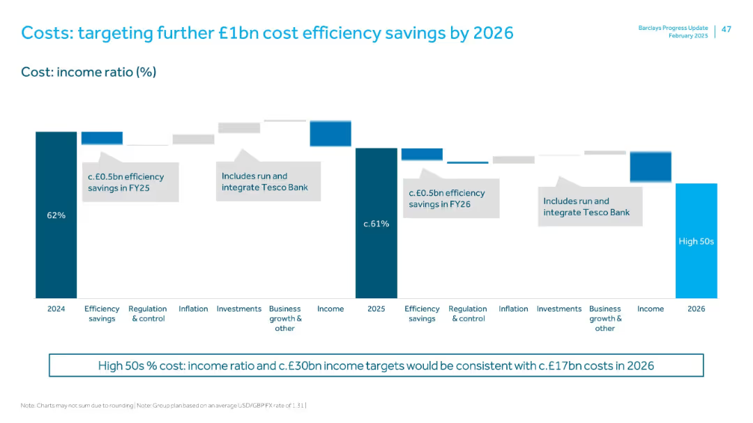
Waterfall chart outlining cost:income ratio (CIR) changes from 2024–2026, highlighting efficiency drivers and integration costs.
Operational Efficiency
Financial Services
Details Barclays’ plan to reduce CIR from 62% (2024) to high 50s by 2026. Targets £1bn in cost savings via efficiency gains, business growth, and integrating Tesco Bank. Reinforces income and regulatory factors.
cost savings, efficiency, Tesco Bank integration, CIR, operational improvement
false
Operational Efficiency
Financial Services
Mixed Chart
Barclays
Add to my slides
Remove from favorites
The slide contains two column charts side by side, showing cumulative gross cost reductions and cumulative integration-related expenses as percentages of total saves and expenses.
Operational Efficiency
Financial Services
This slide demonstrates the projected cost savings and integration-related expenses from 2023 to 2026, detailing the impact on gross cost savings.
cost savings, expenses, integration, gross cost, 2026
false
Operational Efficiency
Financial Services
Multiple Chart
UBS
Add to my slides
Remove from favorites
Features a pie chart illustrating savings by workstream, accompanied by statistics on initiatives and employee engagement.
Organizational Structure and Change
Financial Services
Highlights the impact of corporate initiatives on cost savings, emphasizing employee engagement and fiscal responsibility.
cost savings, initiatives, employee engagement, accountability, pie chart
false
Organizational Structure and Change
Financial Services
Single Chart
Barclays
Add to my slides
Remove from favorites
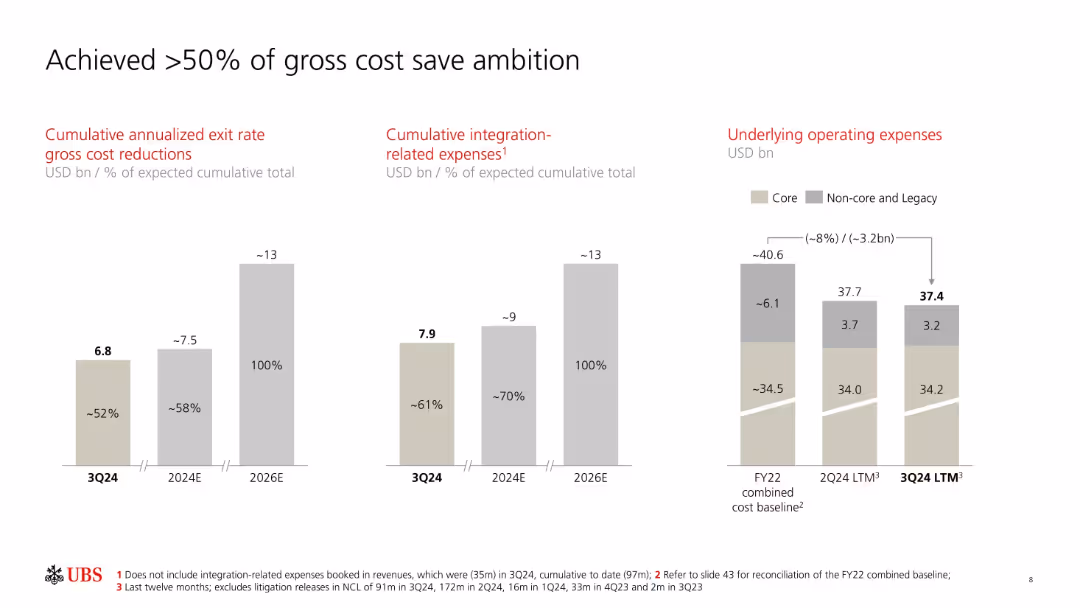
Three vertical bar charts show cumulative cost reductions, integration expenses, and operating expenses.
Strategic Planning
Financial Services
Highlights UBS's progress toward its cost reduction goals, showing 52% achievement in gross cost savings and 70% in integration-related expenses. Visuals segment core and non-core components and indicate targets for 2024 and 2026.
cost savings, integration, core vs non-core, targets, UBS
false
Strategic Planning
Financial Services
Multiple Chart
UBS
Add to my slides
Remove from favorites
This slide is divided into two sections, 'Benefits' and 'Risks and uncertainties', each with their own set of bullet points and corresponding icons.
Strategic Planning
Transportation & Logistics
Advises leaders on what to consider in terms of benefits and risks when adopting new mobility technologies, from cost savings to customer perceptions.
cost savings, market expansion, sustainability, safety, technology uncertainty, privacy concerns
false
Strategic Planning
Transportation & Logistics
Boxed
McKinsey
Add to my slides
Remove from favorites
This slide shows two sets of column charts. The first chart displays 'Cost Saves Limiting Expense Growth' over time, and the second chart shows 'Merger Costs Fading'. There is a clear visual trend of decreasing costs highlighted by the arrow.
Operational Efficiency
Financial Services
Illustrates cost savings over time and the reduction of merger-related expenses. It effectively uses visual trends to demonstrate financial discipline and the benefits realized from the merger, such as reducing operational costs and achieving synergies.
Cost Savings, Merger, Expense Management, Financial Discipline, Synergies
false
Operational Efficiency
Financial Services
Multiple Chart
Goldman Sachs
Add to my slides
Remove from favorites
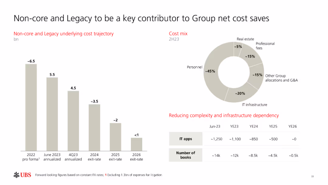
The slide includes a column chart for cost trajectory and a pie chart for cost mix, along with a table showing the reduction in complexity and infrastructure dependency.
Operational Efficiency
Financial Services
This slide outlines the contributions of non-core and legacy segments to the group’s net cost savings, highlighting cost trajectory and mix, and infrastructure reduction.
cost savings, non-core, legacy, cost mix, infrastructure
false
Operational Efficiency
Financial Services
Multiple Chart
UBS
Add to my slides
Remove from favorites
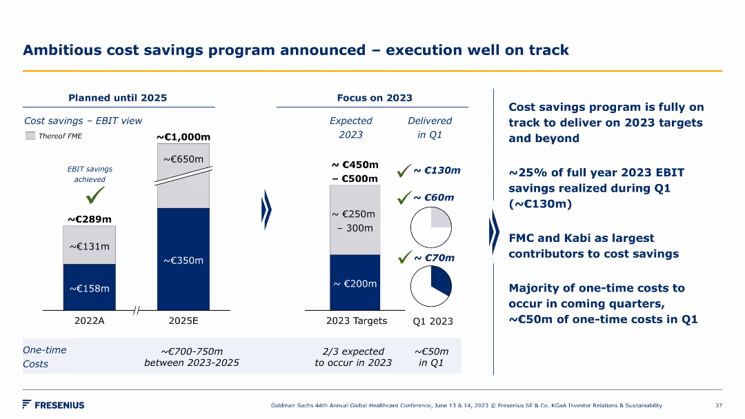
Bar chart illustrating cost savings from 2022 to 2025 and another chart focusing on 2023 targets. Bullet points detail the execution progress and main contributors to savings.
Operational Efficiency
Healthcare & Pharmaceuticals
This slide outlines Fresenius's ambitious cost savings program, highlighting the progress towards 2023 targets, main contributors to savings, and planned cost-saving measures.
cost savings, targets, execution, progress, savings
false
Operational Efficiency
Healthcare & Pharmaceuticals
Multiple Chart
Goldman Sachs
Add to my slides
Remove from favorites
This slide consists of a column chart and a flow diagram. The chart shows a decrease in advisor loans from 2017 to 2020, marked with a downward arrow and percentage. The diagram depicts a talent development program with timelines for training and roles, using arrows and a dashed line.
Strategic Planning
Financial Services
The slide compares advisor recruitment costs and the reallocation of those funds into advisor development. It suggests a strategic shift in investing more in talent development rather than recruitment, aligning with long-term growth and operational efficiency.
Cost saving, talent development, advisor recruitment, investment strategy, training program, operational efficiency, long-term growth, financial planning, human resources, strategic shift
false
Strategic Planning
Financial Services
Multiple Chart
Morgan Stanley
Add to my slides
Remove from favorites
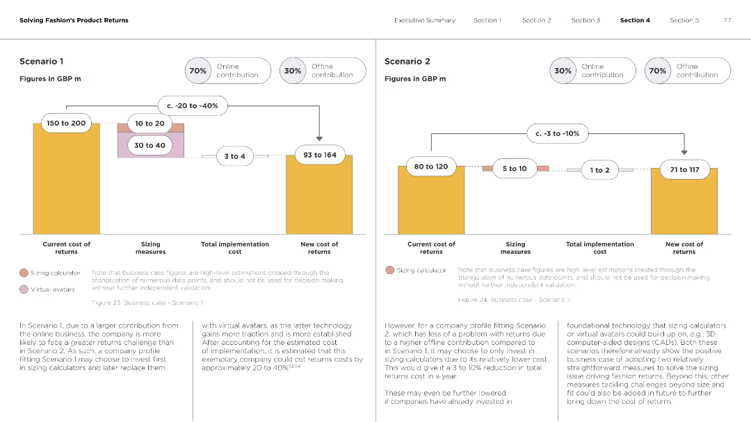
The slide includes two sets of column charts showing different cost scenarios for returns, including current cost, sizing measures, and new cost.
Strategic Planning
Retail & E-commerce
This slide analyzes two business case scenarios for reducing the cost of fashion returns through sizing measures and virtual avatars.
cost scenarios, fashion returns, sizing measures, virtual avatars, business case
false
Strategic Planning
Retail & E-commerce
Multiple Chart
Roland Berger
Add to my slides
Remove from favorites
Slide shows bar charts and adjustments in financial figures with annotations for specific impacts like FX and IT services on Deutsche Bank's adjusted costs.
Financial Performance
Financial Services
Provides a breakdown of Deutsche Bank’s adjusted costs for Q3 2023 with a focus on year-over-year changes and specific cost drivers.
costs, financial analysis, banking, year-over-year, adjustments
false
Financial Performance
Financial Services
Mixed Chart
Deutsche Bank
Add to my slides
Remove from favorites
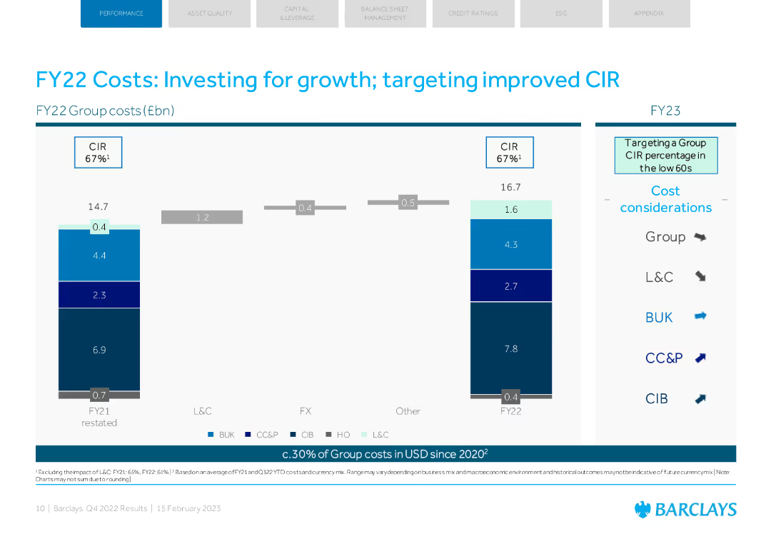
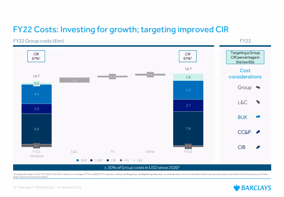
The slide features a bar chart comparing group costs and a detailed cost breakdown by categories. The layout is organized with blue tones.
Operational Efficiency
Financial Services
The slide details Barclays' FY22 group costs, focusing on investments for growth and targeting a lower cost-to-income ratio (CIR).
costs, investment, growth, CIR, Barclays
false
Operational Efficiency
Financial Services
Single Chart
Barclays
Add to my slides
Remove from favorites
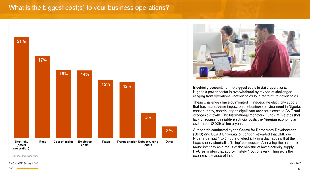
A vertical column chart shows different cost factors impacting business operations, with electricity being the highest. An image of a man working at a desk is on the right side.
Operational Efficiency
Financial Services
The slide outlines the major cost contributors to business operations, highlighting electricity, rent, and cost of capital as primary concerns. It emphasizes the economic impact of these costs on business efficiency in Nigeria.
Costs, Operations, Electricity, Business, PwC
false
Operational Efficiency
Financial Services
Mixed Chart
PwC/Strategy&
Add to my slides
Remove from favorites
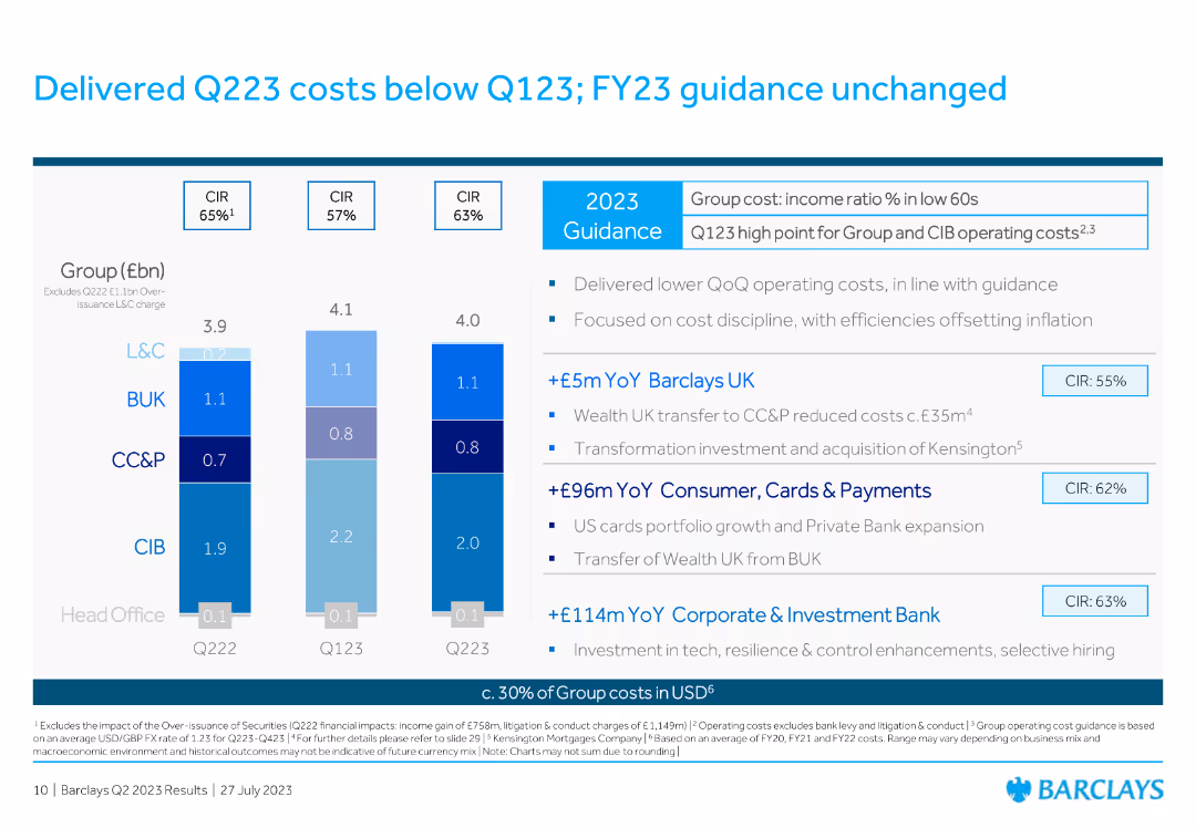
The slide features a column chart comparing group costs across different quarters and fiscal guidance.
Financial Performance
Financial Services
The slide discusses the cost performance in Q223 compared to Q123, maintaining FY23 guidance, and provides details on cost discipline and efficiency measures.
costs, Q223, Q123, financial, guidance, performance, column chart, efficiency, fiscal, group
false
Financial Performance
Financial Services
Mixed Chart
Barclays
Add to my slides
Remove from favorites
Slide displays bar charts with financial metrics.
Operational Efficiency
Financial Services
Discusses adjusted costs and exceptional items for Q4.
costs, Q4, financial, adjustments
false
Operational Efficiency
Financial Services
Mixed Chart
Deutsche Bank
Add to my slides
Remove from favorites
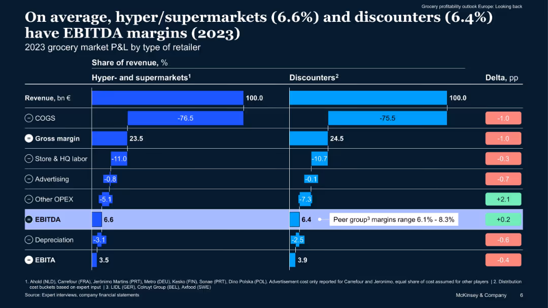
Bar chart comparing cost structures of hypermarkets and discounters, with percentage breakdowns of revenue allocation (COGS, labor, EBITDA, etc.). Clear delta column compares differences.
Financial Performance
Retail & E-commerce
Breakdown of EBITDA margins for hypermarkets and discounters, showing near parity. Includes details on cost of goods sold, operational expenses, and EBITDA levels. Highlights cost management and profitability levers for grocery players.
cost structure, EBITDA, discounters, hypermarkets, grocery profitability
false
Financial Performance
Retail & E-commerce
Multiple Chart
McKinsey
Add to my slides
Remove from favorites
The slide presents column charts comparing the all-in operating costs per rig between Seadrill and its peer group over several years. The data is segmented by rig type (floaters and jack-ups) and shows a trend of decreasing costs. The design is straightforward, with different colors representing different years, making it easy to track changes over time. Each chart is clearly labeled, and the layout allows for quick comparison of cost efficiency between Seadrill and its competitors.
Financial Performance
Energy & Utilities
This slide examines Seadrill's cost efficiency in rig operation compared to its industry peers, focusing on the all-in operating cost per rig from 2015 to Q1 2018. It is critical for financial review meetings or investor presentations, as it highlights Seadrill's ability to manage costs effectively, an important factor in profitability and competitive advantage. The slide provides a clear, visual representation of cost trends, supporting strategic discussions on operational improvements and investment decisions.
cost structure, financial performance, Seadrill, column charts, operating costs, rig types, cost efficiency, profitability, competitive advantage, strategic discussions
false
Financial Performance
Energy & Utilities
Multiple Chart
Barclays
Add to my slides
Remove from favorites
This slide has a pie chart divided into 'Compensation & Benefits' and 'Non-Compensation' expenses with a blue color theme and four key points with check marks on the left.
Operational Efficiency
Financial Services
This slide discusses the financial distribution within an organization, showing a focus on investment and returns. It's designed to communicate how a flexible cost structure can support the company's growth and profitability through disciplined expense management and investment in digitalization.
cost structure, investments, returns, expense management
false
Operational Efficiency
Financial Services
Mixed Chart
Goldman Sachs
Add to my slides
Remove from favorites
Two-column layout with a bar chart showing operating expenses over time and text describing cost structure changes, including immediate exit rate savings and defragmentation strategies.
Operational Efficiency
Financial Services
This slide explains the cost structure transition from a federated to a centralized model, highlighting operating expense reductions and strategies for immediate savings and defragmentation.
cost, structure, transition, centralized, savings
false
Operational Efficiency
Financial Services
Mixed Chart
Credit Suisse
Add to my slides
Remove from favorites
The slide includes a column chart and multiple pie charts analyzing the success rates of respondents in meeting cost reduction targets. It shows different levels of success across regions with key findings summarized on the right.
Performance Metrics and KPIs
Professional Services
This slide evaluates the success rates of meeting cost reduction targets from Deloitte's survey. It includes comparative data across regions and highlights key findings on the failure rates and levels of success in achieving cost savings.
cost targets, success rates, Deloitte, survey, cost reduction
false
Performance Metrics and KPIs
Professional Services
Multiple Chart
Deloitte
Add to my slides
Remove from favorites
Contains a column chart displaying cost trends alongside strategic investments in technology and staffing, showing changes over time.
Investment Analysis
Financial Services
Evaluates the impact of past investments in technology and human resources on cost efficiency and future income growth at Barclays.
cost, technology, investment, efficiency, growth
false
Investment Analysis
Financial Services
Single Chart
Barclays
Add to my slides
Remove from favorites
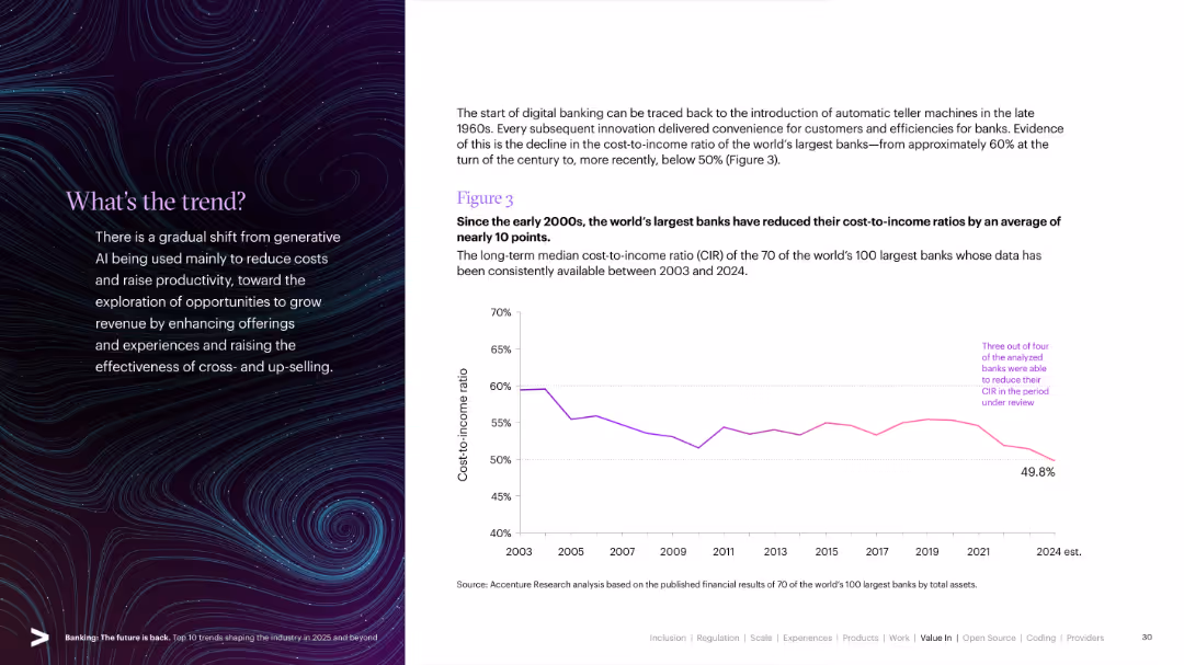
Split slide: left side has a stylized visual with text; right side features a line graph showing cost-to-income ratio trends from 2003 to 2024.
Operational Efficiency
Financial Services
Demonstrates how the world's largest banks have successfully reduced their cost-to-income ratios over two decades, highlighting improvements in digital banking and operational efficiency.
Cost-to-Income, Efficiency, Digital Banking, CIR, Banking Trends, Global Banks, Operational Metrics
false
Operational Efficiency
Financial Services
Mixed Chart
Accenture
Add to my slides
Remove from favorites
Left side shows two stacked bar charts comparing FY21 and FY22 group costs by division; right side includes CIR metrics and FY23 cost direction indicators with color-coded arrows.
Operational Efficiency
Financial Services
This slide outlines Barclays’ cost breakdown and growth investments, maintaining a 67% CIR while targeting a reduction in FY23. It details divisional cost allocations, currency impacts, and strategies to improve cost efficiency.
cost-to-income ratio, FY22 costs, BUK, CC&P, CIB, efficiency, investment, cost targets, USD exposure
false
Operational Efficiency
Financial Services
Mixed Chart
Barclays
Add to my slides
Remove from favorites
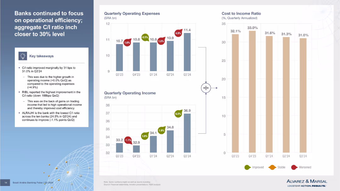
Three bar charts (Operating Expenses, Operating Income, Cost-to-Income Ratio) with callouts and a textbox of key takeaways on the left. Visual style is clean with color-coded indicators (green/red/yellow) for improvement, stability, or worsening metrics.
Performance Metrics and KPIs
Financial Services
The slide shows a marginal improvement in the cost-to-income (C/I) ratio driven by higher income growth over expenses. RIBL had the best improvement, while ALRAJHI maintained the lowest C/I ratio. The visual aids illustrate these financial efficiency trends across Q3’24.
cost-to-income ratio, operating income, operating expenses, bank efficiency, Q3 2024
false
Performance Metrics and KPIs
Financial Services
Multiple Chart
Alvarez & Marsal
Add to my slides
Remove from favorites
Features a column chart comparing cost base targets from 2022 to 2025 and bullet points summarizing key actions executed and priorities for 2023.
Operational Efficiency
Financial Services
Summarizes cost reduction measures taken in 4Q22 and outlines priorities for 2023 to maintain expense discipline and operational efficiency.
cost transformation, expense reduction, priorities, operational efficiency, financial targets
false
Operational Efficiency
Financial Services
Mixed Chart
Credit Suisse
Add to my slides
Remove from favorites
The slide features column charts showing group cost base and full-time employee trends, as well as a table with restructuring expenses.
Operational Efficiency
Financial Services
This slide provides updates on group costs and employee reductions, highlighting actions already initiated to achieve cost base reduction by 2023.
cost transformation, group cost base, full-time employees, restructuring expenses, cost reduction
false
Operational Efficiency
Financial Services
Multiple Chart
Credit Suisse
Add to my slides
Remove from favorites
The slide includes a line chart showing the maturity curve of CO₂ transport and storage technologies. The chart has labeled points along the curve indicating different stages.
Technology and Digital Transformation
Energy & Utilities
It outlines the maturity stages of CO₂ transport and storage technologies, from research to mature technology, with specific points for shipping, pipeline, and truck/rail transport methods.
CO₂ transport, maturity curve, storage technologies, shipping, pipeline, truck, rail, energy, utilities
false
Technology and Digital Transformation
Energy & Utilities
Single Chart
Kearney
Add to my slides
Remove from favorites
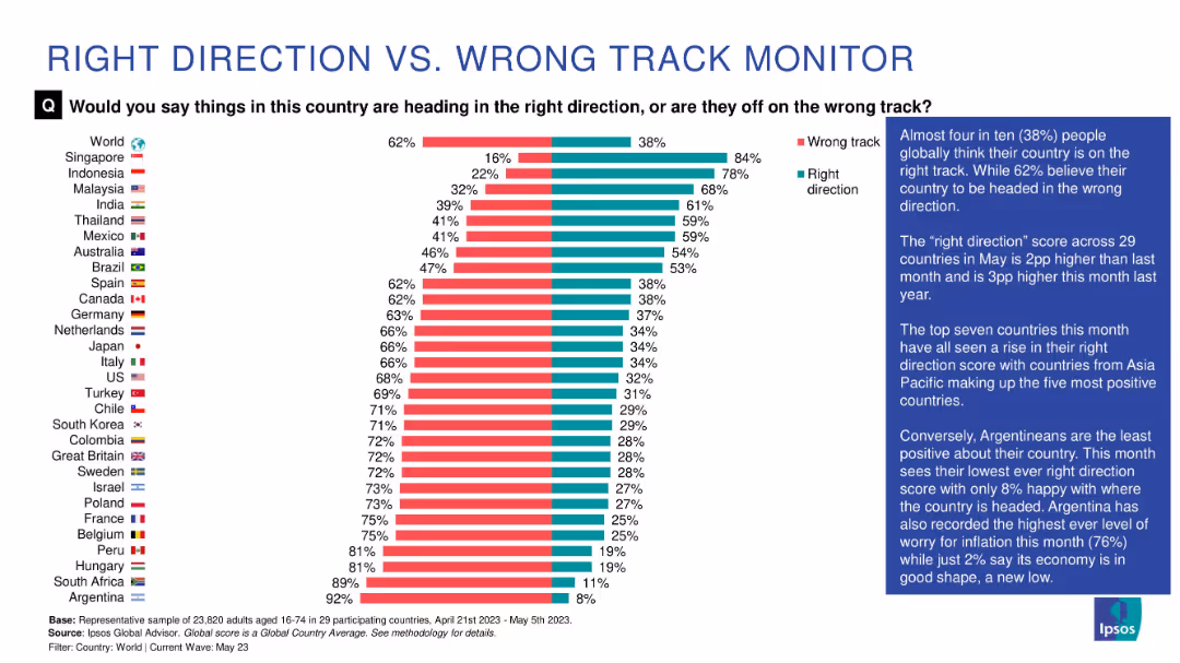
Vertical bar chart comparing country-level sentiment (Right vs. Wrong Track) alongside explanatory text
Strategic Planning
Government & Public Sector
This slide shows how people in 29 countries perceive their nation’s trajectory. Countries like Singapore and Indonesia show high optimism, while Argentina ranks lowest (8%). The global average shows 38% think their country is on the right track. Commentary highlights changes and country-level differences.
country comparison, sentiment, optimism, pessimism
false
Strategic Planning
Government & Public Sector
Mixed Chart
IPSOS
Add to my slides
Remove from favorites
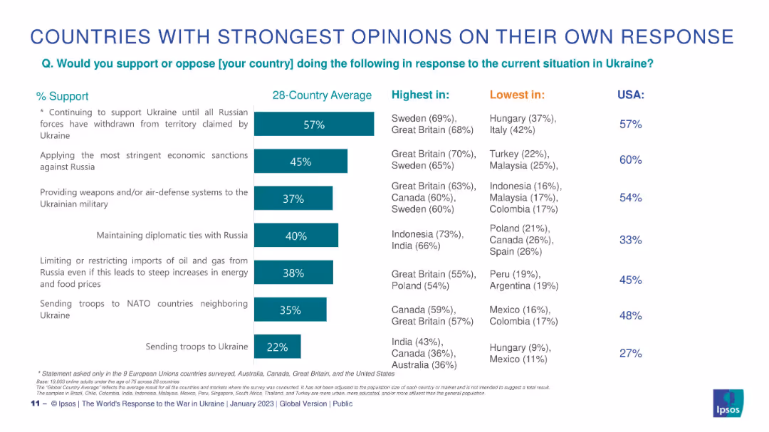
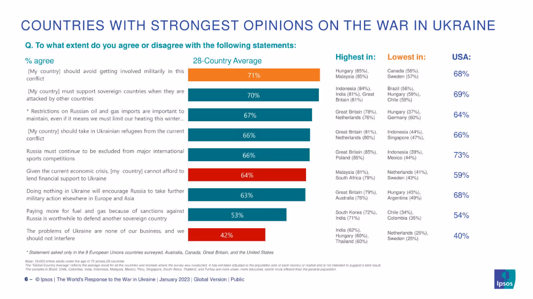
Horizontal bar chart centered, flanked by lists of countries with highest and lowest agreement. U.S. data shown separately.
Market Analysis and Trends
Government & Public Sector
This slide compares the strength of opinions across countries regarding statements about the Ukraine conflict. It highlights where support or opposition is highest and lowest for each statement, showing substantial variation in global sentiment.
country comparison, Ukraine, agreement levels, Ipsos, military, sanctions, support, differences, global
false
Market Analysis and Trends
Government & Public Sector
Single Chart
IPSOS
Add to my slides
Remove from favorites
Horizontal stacked bar chart of 28 countries; shows % agree, disagree, neutral, and unknown on societal breakdown; left panel shows average.
Market Analysis and Trends
Government & Public Sector
Displays how many people in each country think their society is broken, with South Africa, Sweden, and Hungary showing highest agreement; includes historical trend data.
country data, societal breakdown, Ipsos, international comparison, perception, bar chart
false
Market Analysis and Trends
Government & Public Sector
Mixed Chart
IPSOS
Add to my slides
Remove from favorites
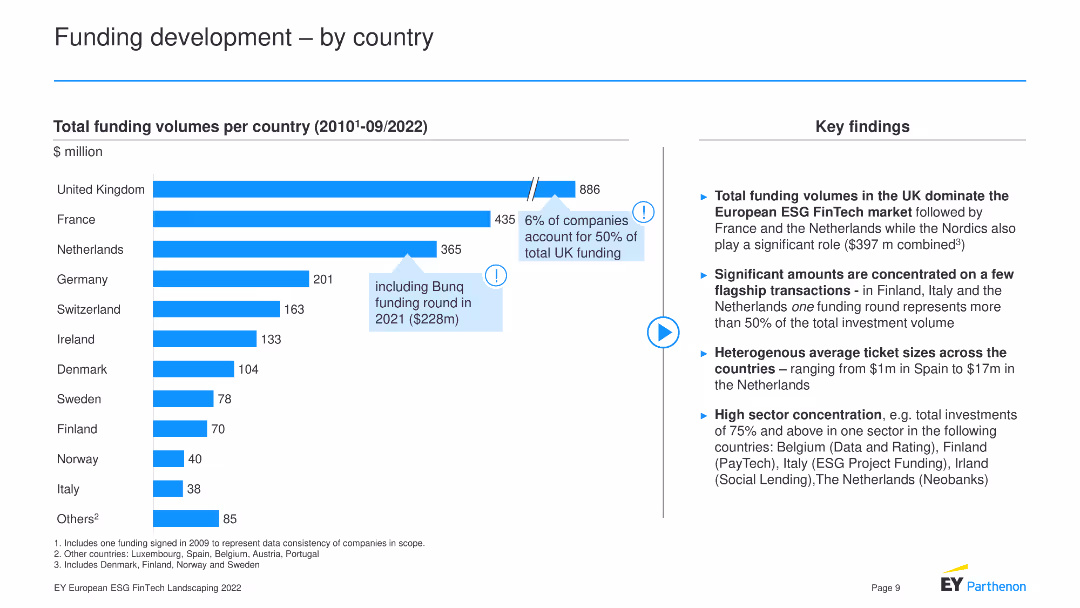
This slide features a bar chart showing funding volumes by country (2010-09/2022) and key findings.
Market Analysis and Trends
Financial Services
The slide compares total funding volumes across various countries, highlighting the UK's dominance in ESG FinTech funding, significant funding transactions in specific countries, heterogeneous average ticket sizes, and high sector concentration in certain regions.
Country Funding, ESG FinTech, Market Comparison
false
Market Analysis and Trends
Financial Services
Mixed Chart
EY
Add to my slides
Remove from favorites
World map showing the ranking and score movements of various countries in the Automotive Disruption Radar, with China, the Netherlands, and Singapore leading.
Competitive Landscape
Transportation & Logistics
Provides an overview of the country rankings and score movements in the Automotive Disruption Radar, highlighting the top three countries and their performance changes.
country ranking, automotive disruption, global, ADR
false
Competitive Landscape
Transportation & Logistics
Table
Roland Berger
Add to my slides
Remove from favorites
Vertical bar chart by statement with highest and lowest support countries labeled; U.S. data listed separately.
Customer and Market Segmentation
Government & Public Sector
This slide compares country-level support for their own government actions regarding the Ukraine conflict. It reveals where actions like sanctions or military support are most or least favored, giving insight into national attitudes toward foreign policy.
country ranking, military support, sanctions, Ipsos, Ukraine, diplomatic support, public perception
false
Customer and Market Segmentation
Government & Public Sector
Single Chart
IPSOS
Add to my slides
Remove from favorites
Previous
Next
You don't have any favorites yet.
Please wait loading your favorites slides...
Create a FREE account to continue browsing
Receive Instant Access to 1,000+ slides from companies like McKinsey, Google, and Goldman Sachs
First Name
Last Name
Email
Password
I agree to all
Terms & Privacy Policy
Thank you! Your submission has been received!
Oops! Something went wrong while submitting the form.
Have an account?
Sign in
Upgrade to PRO to Save slides
Advanced Search and Filters
Access to 15,000+ slides
Access to Category Pages
Save/Bookmark Slides
PowerPoint Template Library
Pick a Plan
MONTHLY
$12/month
Billed every month, Cancel anytime.
YEARLY
$9/year
Billed $108 annually, Cancel anytime.
Checkout for $12/month
Checkout for $108/yr
Secured by Stripe | AES-256 bit encryption


![[Country]’s society is broken](https://cdn.prod.website-files.com/654e70fb59937215cac87b19/6899bd22175570c8a9d0c09f_X2xzthrzf9BLbqp5Ya1yb_-Xb0muWInqTutI9ALADlY.avif)