My Account
My Slides
Search by Category
Companies
Slide Type
Use Case
Industry
Pricing
Templates
View All Templates
Download Template Slides
✦ AI
AI Prompt Library
AI Search
Feedback
Login
Logout
Get Started
Browse all Slides
Browse all Slides
Create a FREE Account
Instant access to 1,000+ real slides from top companies like McKinsey, BCG, Goldman Sachs, Google and many more!
First Name
Last Name
Email
Password
I agree to all
Terms & Privacy Policy
Thank you! Your submission has been received!
Oops! Something went wrong while submitting the form.
Have an account?
Sign in
Saved Slides
Total No. of slides saved
0
↻ Refresh
✖ Clear all
Features a column chart showing responses about the future role of crypto assets, divided into several ratings.
Market Analysis and Trends
Financial Services
The slide discusses Canadians' opinions on the future role of crypto assets, showing a split view but with a significant portion believing in their importance. It also highlights the correlation between demographics and their views on crypto.
Crypto assets, future, financial ecosystem
false
Market Analysis and Trends
Financial Services
Mixed Chart
IPSOS
Add to my slides
Remove from favorites
Column chart showing the market value of crypto assets held by owners, with values ranging from less than $1,000 to over $1,000,000.
Market Analysis and Trends
Financial Services
Displays the distribution of the market value of crypto assets held by owners, with a focus on the range of asset values held by different owners.
crypto assets, market value, asset distribution, financial analysis, investment trends
false
Market Analysis and Trends
Financial Services
Single Chart
IPSOS
Add to my slides
Remove from favorites
Column chart showing the distribution of crypto asset values held in 2022 and 2023, with textual analysis of changes and investor characteristics.
Market Analysis and Trends
Financial Services
Examines the market value distribution of crypto assets held by Canadians, comparing 2022 and 2023. Provides insights into investor characteristics and market trends.
Crypto Assets, Market Value, Canada, Investor Characteristics, Trends
false
Market Analysis and Trends
Financial Services
Mixed Chart
IPSOS
Add to my slides
Remove from favorites
The slide displays a column chart comparing reasons for not purchasing crypto assets between 2022 and 2023, with bars indicating percentage responses.
Risk Assessment and Management
Financial Services
It outlines the main reasons for avoiding crypto investments, such as perceived risk, lack of understanding, and concerns about volatility and security.
Crypto assets, non-purchase, reasons, risk, 2023, 2022, security, volatility, understanding, concerns
false
Risk Assessment and Management
Financial Services
Multiple Chart
IPSOS
Add to my slides
Remove from favorites
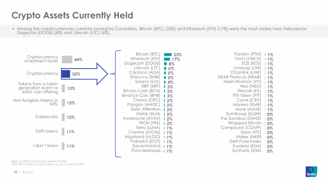
Displays a column chart listing the types of crypto assets currently held, like Bitcoin and Ethereum.
Market Analysis and Trends
Financial Services
The slide shows the types of crypto assets currently owned by Canadians, highlighting Bitcoin and Ethereum as the most popular, and providing detailed percentages for various other cryptocurrencies and digital assets.
Crypto assets, ownership, types
false
Market Analysis and Trends
Financial Services
Multiple Chart
IPSOS
Add to my slides
Remove from favorites
Includes a column chart showing different ratings about the plan to purchase crypto assets in the next 12 months.
Market Analysis and Trends
Financial Services
The slide presents data on Canadians' plans to buy crypto assets, indicating a significant portion not planning to purchase and correlating these plans with demographic factors like age and income.
Crypto assets, purchase plan, Canadians
false
Market Analysis and Trends
Financial Services
Mixed Chart
IPSOS
Add to my slides
Remove from favorites
Displays a column chart with various reasons why Canadians purchase crypto assets, categorized by different motivations.
Market Analysis and Trends
Financial Services
The slide lists various reasons for purchasing crypto assets, such as long-term investment, speculative investment, diversification, and other financial motivations. It highlights demographic differences in these reasons.
Crypto assets, purchase reasons, investment
false
Market Analysis and Trends
Financial Services
Multiple Chart
IPSOS
Add to my slides
Remove from favorites
Features a column chart depicting various uses of crypto assets by Canadians, including conversion to cash and payments.
Market Analysis and Trends
Financial Services
This slide details the ways Canadians use crypto assets, with top uses being conversion to cash, exchanging for other assets, and making payments. It shows demographic differences in the usage patterns of crypto assets.
Crypto assets, usage, Canadians
false
Market Analysis and Trends
Financial Services
Mixed Chart
IPSOS
Add to my slides
Remove from favorites
The slide features a column chart comparing reasons for holding value-referenced crypto assets (VRCAs) between 2022 and 2023, with horizontal bars for each reason.
Market Analysis and Trends
Financial Services
The slide presents data on why individuals hold VRCAs, highlighting the stability, ease of payment, portfolio diversification, and investment opportunities as key reasons.
Crypto assets, VRCAs, reasons, 2023, 2022, investment, portfolio, stability, payment ease, diversification
false
Market Analysis and Trends
Financial Services
Mixed Chart
IPSOS
Add to my slides
Remove from favorites
The slide includes multiple data visualization formats: a column chart depicting crypto market cap growth, a table on stablecoin circulation, a line chart on DeFi TVL, and a sparkline graph on bitcoin mining stocks. Utilizes a dark background with blue accents.
Market Analysis and Trends
Financial Services
Showcases the rapid expansion of digital assets from 2019 to 2022 with specific focus on cryptocurrency market cap, stablecoin values, DeFi TVL, and stock prices of bitcoin mining companies. Intended for financial and market trend analysis.
cryptocurrency, DeFi, stablecoins, mining stocks, growth
false
Market Analysis and Trends
Financial Services
Multiple Chart
McKinsey
Add to my slides
Remove from favorites
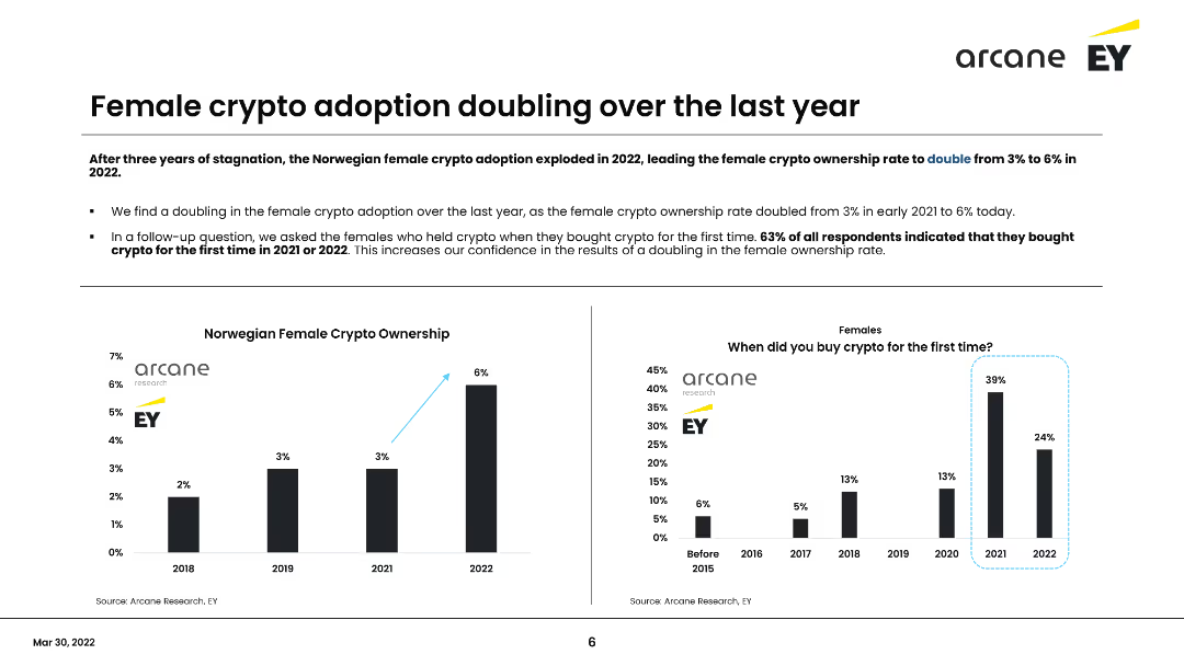
The slide contains a column chart showing the percentage of female crypto ownership from 2018 to 2022 and a survey on when females first bought crypto. It discusses the doubling of female crypto ownership in the past year and the implications of this trend.
Market Analysis and Trends
Financial Services
Discusses the doubling of female cryptocurrency ownership in Norway over the last year, highlighting survey findings that 63% of female respondents bought crypto for the first time in 2021 or 2022. Emphasizes the growing adoption among women.
Cryptocurrency, Female adoption, Norway, Survey, Trends
false
Market Analysis and Trends
Financial Services
Multiple Chart
EY
Add to my slides
Remove from favorites
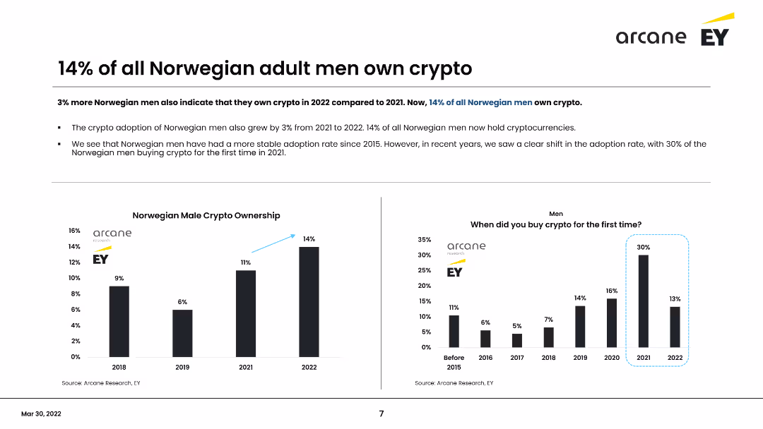
This slide presents data on Norwegian men owning cryptocurrency, including a column chart showing the percentage from 2018 to 2022 and a survey on when men first bought crypto. It highlights a 3% increase in ownership in 2022, reaching 14% overall.
Market Analysis and Trends
Financial Services
Shows that 14% of Norwegian men own cryptocurrency, with a steady increase over the years. Highlights the growth from 2021 to 2022 and the survey findings on the timeline of initial crypto purchases among men.
Cryptocurrency, Male adoption, Norway, Survey, Trends
false
Market Analysis and Trends
Financial Services
Multiple Chart
EY
Add to my slides
Remove from favorites
Two columns comparing "Crypto perceptions" vs. "Crypto realities" with icons and lists highlighting misconceptions and facts about cryptocurrencies.
Risk Assessment and Management
Financial Services
Debunks common misconceptions about cryptocurrencies, contrasting them with real data. Valuable in educational settings or discussions on the legitimacy and risks of crypto investments.
Cryptocurrency, Misconceptions, Facts, Risks, Investments, Perceptions, Realities
false
Risk Assessment and Management
Financial Services
Boxed
McKinsey
Add to my slides
Remove from favorites
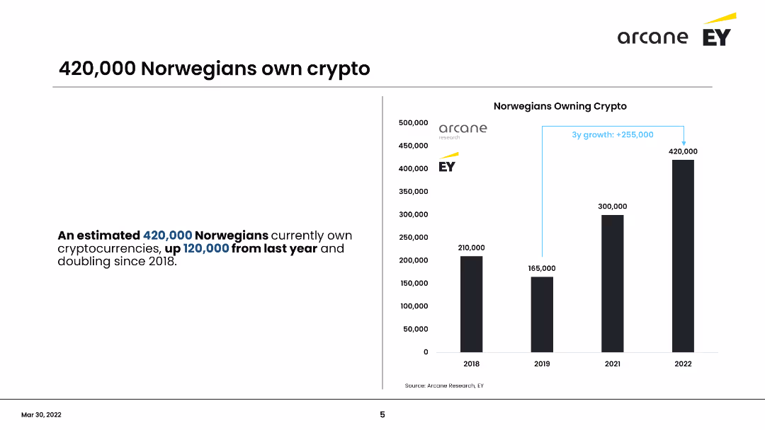
This slide includes a column chart showing the number of Norwegians owning cryptocurrency from 2018 to 2022. It emphasizes the growth in crypto ownership, with an increase of 120,000 owners from the previous year, totaling 420,000 in 2022.
Market Analysis and Trends
Financial Services
Shows the significant increase in cryptocurrency ownership among Norwegians, doubling since 2018 to 420,000 in 2022. Highlights the annual growth and demographic changes, focusing on the increase from the previous year.
Cryptocurrency, Norway, Growth, Ownership, Trends
false
Market Analysis and Trends
Financial Services
Mixed Chart
EY
Add to my slides
Remove from favorites
This slide includes a column chart showing the number of Norwegians owning cryptocurrency from 2018 to 2022. It emphasizes the growth in crypto ownership, with an increase of 120,000 owners from the previous year, totaling 420,000 in 2022.
Market Analysis and Trends
Financial Services
Shows the significant increase in cryptocurrency ownership among Norwegians, doubling since 2018 to 420,000 in 2022. Highlights the annual growth and demographic changes, focusing on the increase from the previous year.
Cryptocurrency, Norway, Growth, Ownership, Trends
false
Market Analysis and Trends
Financial Services
Multiple Chart
EY
Add to my slides
Remove from favorites
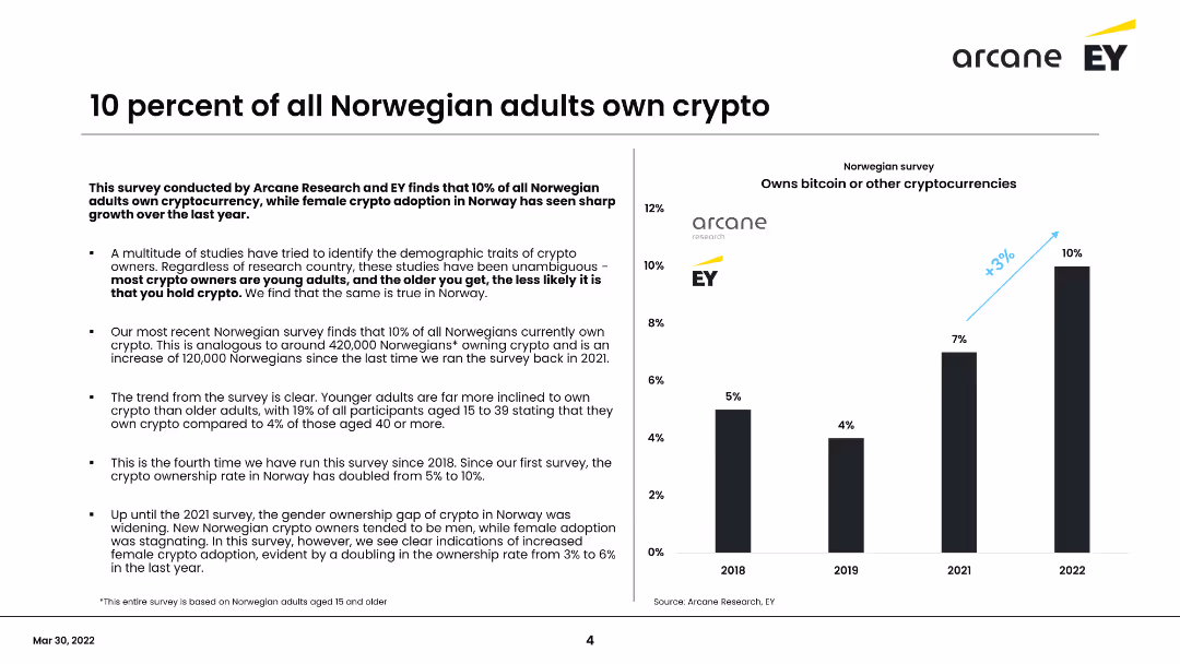
The slide presents survey findings on cryptocurrency ownership among Norwegian adults. It includes a column chart showing the percentage of adults owning crypto from 2018 to 2022 and a summary of key points about demographic trends and adoption rates.
Market Analysis and Trends
Financial Services
Highlights a survey by Arcane Research and EY showing that 10% of Norwegian adults own cryptocurrency, with a significant increase in adoption among young adults and females in the last year. Summarizes key demographic trends and growth over time.
Cryptocurrency, Norway, Survey, Adoption, Demographics
false
Market Analysis and Trends
Financial Services
Mixed Chart
EY
Add to my slides
Remove from favorites
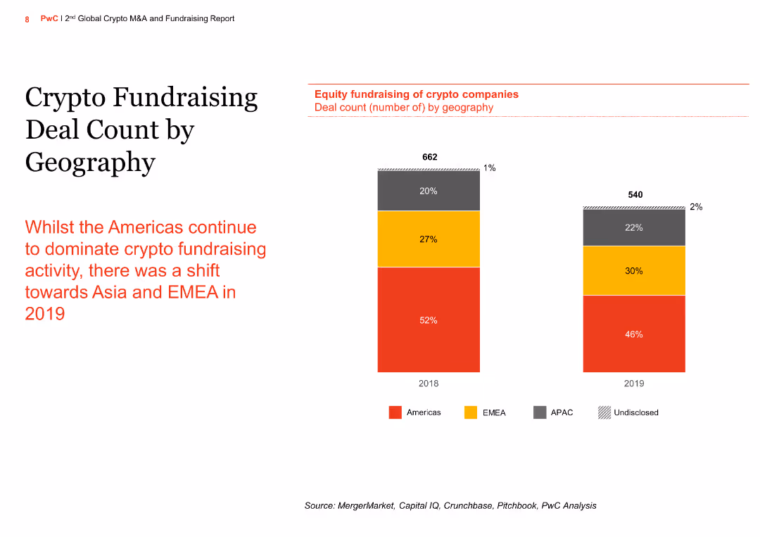
The slide features a column chart showing the deal count for crypto fundraising by geography, highlighting a shift in activity from the Americas to Asia and EMEA in 2019, with text summarizing the geographic trends.
Market Analysis and Trends
Financial Services
This slide examines the geographical distribution of crypto fundraising deals, noting a significant shift towards Asia and EMEA regions in 2019, as the Americas continue to lead but with a reduced share.
Crypto fundraising, deal count, geography, Americas, Asia, EMEA, financial services, market trends, investment activity, 2019 trends
false
Market Analysis and Trends
Financial Services
Mixed Chart
PwC/Strategy&
Add to my slides
Remove from favorites
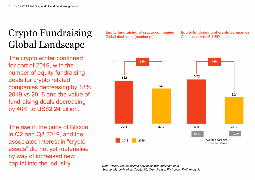
The slide has a column chart showing the decline in equity fundraising deals for crypto companies from 2018 to 2019, with a text summary of the continued "crypto winter" and its impact on fundraising activities.
Market Analysis and Trends
Financial Services
The slide provides an overview of the global landscape for crypto fundraising, highlighting a significant decrease in deal volume and value in 2019 compared to 2018, and the challenges faced by the industry.
Crypto fundraising, global landscape, equity deals, deal volume, deal value, crypto winter, financial services, market analysis, investment trends, 2018 vs 2019
false
Market Analysis and Trends
Financial Services
Mixed Chart
PwC/Strategy&
Add to my slides
Remove from favorites
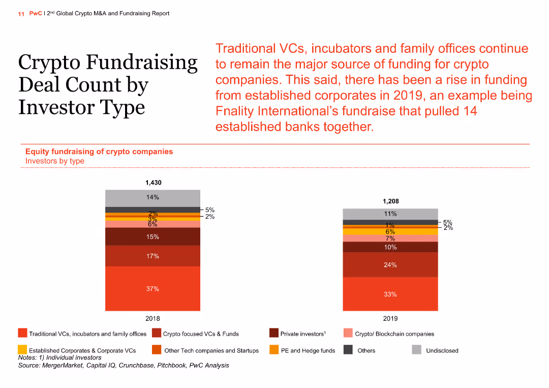
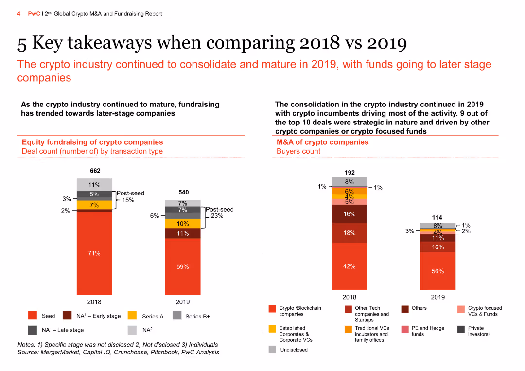
The slide features a column chart comparing crypto fundraising deal counts by investor type for the years 2018 and 2019. Investor types include traditional VCs, corporate VCs, tech startups, and private investors.
Market Analysis and Trends
Financial Services
The slide details the distribution of fundraising deals among different investor types, noting an increase in deals by established corporates and a continued dominance by traditional VCs and family offices in 2019.
crypto, fundraising, investor type, column chart, comparison
false
Market Analysis and Trends
Financial Services
Multiple Chart
PwC/Strategy&
Add to my slides
Remove from favorites
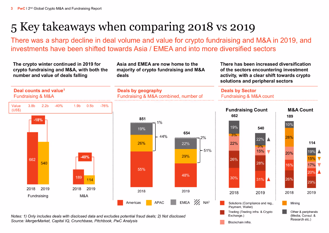
The slide has multiple column charts comparing deal counts and values, deals by geography, and deals by sector between 2018 and 2019. The data show a sharp decline in deal volume and value for crypto fundraising and M&A.
Market Analysis and Trends
Financial Services
This slide presents key takeaways on the decline in crypto fundraising and M&A deal volumes and values from 2018 to 2019, highlighting geographic and sectoral shifts in investment activities.
Crypto fundraising, M&A, deal volume, deal value, geography, sector, financial services, market trends, investment, 2018 vs 2019
false
Market Analysis and Trends
Financial Services
Multiple Chart
PwC/Strategy&
Add to my slides
Remove from favorites
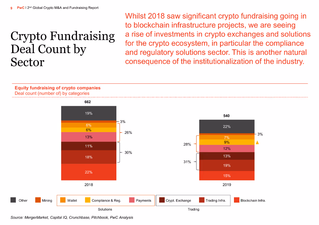
The slide features a column chart depicting the equity fundraising deal count of crypto companies across various categories for the years 2018 and 2019. It includes a stacked column chart with different colored segments representing different categories such as blockchain infrastructure, trading infra, crypto exchange, etc.
Market Analysis and Trends
Financial Services
The slide analyzes the changes in equity fundraising for crypto companies by sector from 2018 to 2019, highlighting the rise in investments in crypto exchanges and compliance and regulatory solutions, reflecting the institutionalization of the industry.
Crypto, Fundraising, Sector, Compliance, Regulatory, Exchange, Blockchain, Infrastructure, Trading, Analysis
false
Market Analysis and Trends
Financial Services
Multiple Chart
PwC/Strategy&
Add to my slides
Remove from favorites
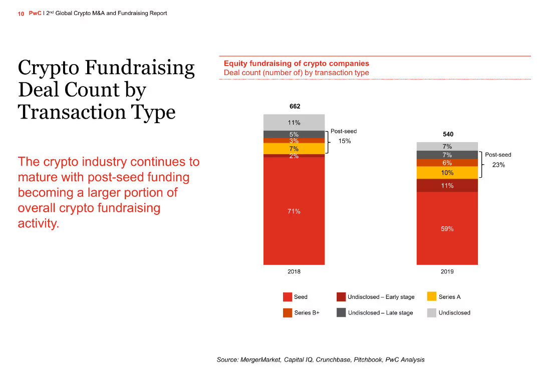
The slide contains a column chart comparing crypto fundraising deal counts by transaction type for the years 2018 and 2019. The chart shows the distribution of seed, Series A, Series B+, and undisclosed funding stages.
Market Analysis and Trends
Financial Services
The slide illustrates the maturation of the crypto industry with an increasing portion of post-seed funding. It compares the number of deals across different funding stages between 2018 and 2019, highlighting the growth in post-seed funding.
crypto, fundraising, transaction type, column chart, comparison
false
Market Analysis and Trends
Financial Services
Mixed Chart
PwC/Strategy&
Add to my slides
Remove from favorites
This slide contains a column chart showing reasons for not buying crypto investment funds in 2022 and 2023, with percentages and demographic variations.
Risk Assessment and Management
Financial Services
The slide details why respondents avoid crypto investment funds, citing reasons such as high risk, volatility, lack of government guarantees, and insufficient market knowledge.
Crypto funds, non-purchase, reasons, risk, 2023, 2022, government guarantees, volatility, knowledge
false
Risk Assessment and Management
Financial Services
Multiple Chart
IPSOS
Add to my slides
Remove from favorites
Features a column chart listing reasons for purchasing crypto investment funds, including safety and diversification.
Market Analysis and Trends
Financial Services
The slide outlines reasons Canadians purchase crypto investment funds, emphasizing financial motivations like safety, diversification, and speculative investment, and notes demographic differences in these reasons.
Crypto funds, purchase reasons, investment
false
Market Analysis and Trends
Financial Services
Multiple Chart
IPSOS
Add to my slides
Remove from favorites
The slide displays two sets of bar charts, one for crypto assets and one for crypto investment funds, showing gains and losses for 2023 and 2022.
Financial Performance
Financial Services
This slide shows the percentage of gains and losses from crypto assets and investment funds, comparing data from 2023 to 2022. It helps in assessing investment performance.
Crypto, Gains, Losses, Investment, Comparison
false
Financial Performance
Financial Services
Multiple Chart
IPSOS
Add to my slides
Remove from favorites
The slide features a bar chart depicting the ability of respondents to correctly identify crypto assets, comparing 2023 to 2022.
Technology and Digital Transformation
Financial Services
This slide shows the percentage of respondents who could correctly identify crypto assets, highlighting changes between 2023 and 2022. It is useful for assessing awareness and knowledge levels.
Crypto, Identification, Awareness, Knowledge, Comparison
false
Technology and Digital Transformation
Financial Services
Mixed Chart
IPSOS
Add to my slides
Remove from favorites
The slide features column charts comparing equity fundraising and M&A of crypto companies in 2018 vs 2019 by transaction type and buyers count, showing the consolidation of the crypto industry and investment trends.
Market Analysis and Trends
Financial Services
The slide highlights trends in crypto equity fundraising and M&A, showing consolidation towards later-stage companies and strategic deals driven by other crypto companies or focused funds.
Crypto industry, equity fundraising, M&A, transaction type, buyers count, consolidation, investment trends, financial services, market analysis, 2018 vs 2019
false
Market Analysis and Trends
Financial Services
Multiple Chart
PwC/Strategy&
Add to my slides
Remove from favorites
The slide features a column chart comparing the market value of crypto investment funds held in 2022 and 2023, with values ranging from less than $1,000 to over $1,000,000. There is also a side-by-side comparison for broader value ranges.
Market Analysis and Trends
Financial Services
This slide shows the distribution of market values of crypto investment funds for 2022 and 2023, indicating trends and changes over the two years. It can be used to analyze market behavior and investment patterns.
Crypto, Investment, Market Value, Trends, Comparison
false
Market Analysis and Trends
Financial Services
Mixed Chart
IPSOS
Add to my slides
Remove from favorites
The slide features a column chart on the right displaying reasons for not purchasing crypto investment funds, with corresponding percentage bars on the left. The layout is moderately complex.
Risk Assessment and Management
Financial Services
This slide lists reasons for not buying crypto investment funds, including perceived risk, lack of understanding, and security concerns. It aims to identify barriers to entry for crypto investment funds.
crypto, investment, risk, concerns, barriers
false
Risk Assessment and Management
Financial Services
Multiple Chart
IPSOS
Add to my slides
Remove from favorites
The slide includes a series of bar charts showing the correct, wrong, and 'don't know' responses to various statements about crypto assets for 2023 and 2022.
Human Resources and Talent Management
Financial Services
This slide evaluates the general knowledge of crypto assets, presenting correct and incorrect beliefs among respondents, and comparing changes from 2022 to 2023. It helps in assessing overall awareness.
Crypto, Knowledge, Awareness, Education, Comparison
false
Human Resources and Talent Management
Financial Services
Mixed Chart
IPSOS
Add to my slides
Remove from favorites
The slide presents a bar chart showing the average percentage of correct responses to crypto asset knowledge questions for 2023 and 2022.
Human Resources and Talent Management
Financial Services
This slide provides insights into the general knowledge about crypto assets among respondents, comparing data from 2023 to 2022. It helps in understanding education and awareness levels.
Crypto, Knowledge, Education, Awareness, Comparison
false
Human Resources and Talent Management
Financial Services
Mixed Chart
IPSOS
Add to my slides
Remove from favorites
The slide features a column chart with vertical bars indicating the approximate value lost during a crypto incident, fraud, or scam.
Risk Assessment and Management
Financial Services
The slide describes the distribution of losses among crypto asset holders due to hacking incidents, fraud, or scams.
Crypto, Loss, Hacking, Fraud, Scam
false
Risk Assessment and Management
Financial Services
Single Chart
IPSOS
Add to my slides
Remove from favorites
The slide shows a column chart comparing M&A deal counts by acquirer type for 2018 and 2019. Acquirer types include crypto/blockchain companies, tech startups, established corporates, VCs, and private investors.
Market Analysis and Trends
Financial Services
The slide provides an overview of the types of acquirers involved in crypto M&A deals, noting a significant increase in acquisitions by crypto/blockchain companies and a consolidation trend in the ecosystem.
crypto, M&A, acquirer type, column chart, comparison
false
Market Analysis and Trends
Financial Services
Multiple Chart
PwC/Strategy&
Add to my slides
Remove from favorites
The slide features a column chart comparing the M&A deal count by geography for 2018 and 2019. The regions include the Americas, EMEA, APAC, and undisclosed.
Market Analysis and Trends
Financial Services
The slide shows the geographic distribution of M&A deals in the crypto sector, with an increase in deals in Asia and EMEA in 2019 compared to 2018, aligning with fundraising trends.
crypto, M&A, geography, column chart, comparison
false
Market Analysis and Trends
Financial Services
Mixed Chart
PwC/Strategy&
Add to my slides
Remove from favorites
The slide presents a comparison of global M&A deal count and deal value for crypto companies between 2018 and 2019. It includes a column chart showing a significant drop in deal numbers and value in 2019.
Market Analysis and Trends
Financial Services
The slide highlights the decline in the number and value of M&A deals for crypto companies in 2019 compared to 2018, showing a 40% decrease in deal count and a 76% drop in total deal value.
crypto, M&A, global, column chart, comparison
false
Market Analysis and Trends
Financial Services
Multiple Chart
PwC/Strategy&
Add to my slides
Remove from favorites
Textual analysis with bullet points detailing the characteristics, demographics, and behaviors of crypto owners.
Customer and Market Segmentation
Financial Services
Provides a detailed profile of crypto asset owners, including their financial literacy, demographics, and behaviors. Emphasizes market segmentation and targeted advertising.
Crypto, Market Segmentation, Financial Literacy, Demographics, Advertising
false
Customer and Market Segmentation
Financial Services
Mixed Chart
IPSOS
Add to my slides
Remove from favorites
This slide includes a column chart showing the number of M&A deals by sector for the years 2018 and 2019. Sectors include mining, trading, and various service providers like media, research, and consulting.
Market Analysis and Trends
Financial Services
The slide highlights the decline in M&A activity in the crypto mining sector in 2019 and an increase in deals within the service provider space, driven by firms diversifying their service offerings.
crypto, M&A, sector, column chart, comparison
false
Market Analysis and Trends
Financial Services
Mixed Chart
PwC/Strategy&
Add to my slides
Remove from favorites
Text-heavy slide with bullet points outlining the demographics, financial literacy, and behavior of crypto asset owners, along with a doughnut chart.
Customer and Market Segmentation
Financial Services
Detailed profile of crypto asset owners, discussing demographics, investment behaviors, financial literacy, and the influence of advertising on ownership decisions.
crypto owners, demographics, financial literacy, investment behavior, advertising influence
false
Customer and Market Segmentation
Financial Services
Mixed Chart
IPSOS
Add to my slides
Remove from favorites
Column chart comparing crypto ownership statistics between 2022 and 2023, with additional textual data on investor demographics and trends.
Market Analysis and Trends
Financial Services
Analyzes the ownership of crypto assets in Canada, showing trends and differences between 2022 and 2023. Highlights investor demographics and the market value of crypto assets held.
Crypto, Ownership, Canada, Investor Demographics, Trends
false
Market Analysis and Trends
Financial Services
Mixed Chart
IPSOS
Add to my slides
Remove from favorites
A doughnut chart in the center showing the distribution of crypto asset ownership categories, with percentages indicated in different colors.
Market Analysis and Trends
Financial Services
Presents data on crypto asset ownership among Canadians, highlighting the percentages of current and previous owners, and the breakdown of asset categories.
crypto ownership, crypto assets, investment funds, market analysis, financial services
false
Market Analysis and Trends
Financial Services
Mixed Chart
IPSOS
Add to my slides
Remove from favorites
The slide includes a column chart detailing the methods of payment used to purchase crypto assets in 2023 and 2022. Methods include cash savings, credit cards, and loans.
Financial Performance
Financial Services
This slide provides insights into the various methods used to finance crypto asset purchases, comparing 2023 with 2022. It helps in understanding the financial behaviors of crypto investors.
Crypto, Payment, Financing, Methods, Comparison
false
Financial Performance
Financial Services
Mixed Chart
IPSOS
Add to my slides
Remove from favorites
The slide features a horizontal bar chart depicting various methods of payment for purchasing crypto assets. Each bar represents a different payment method.
Financial Performance
Financial Services
The slide presents statistics on how people financed their purchase of crypto assets, including cash savings, credit cards, and borrowing money.
Crypto, payment methods, financing, assets, statistics
false
Financial Performance
Financial Services
Mixed Chart
IPSOS
Add to my slides
Remove from favorites
The slide includes a bar chart showing levels of regret in purchasing crypto assets for 2023 and 2022, with ratings from 1 to 7.
Market Analysis and Trends
Financial Services
This slide illustrates the extent of regret among crypto asset purchasers, comparing responses from 2023 to 2022. It helps in understanding investor sentiment.
Crypto, Regret, Investment, Sentiment, Comparison
false
Market Analysis and Trends
Financial Services
Mixed Chart
IPSOS
Add to my slides
Remove from favorites
The slide presents a column chart on the right side listing reasons for not purchasing crypto assets, with corresponding percentage bars on the left side. The layout is moderately complex.
Risk Assessment and Management
Financial Services
This slide lists various reasons people avoid buying crypto assets, such as lack of understanding, fear of scams, and perceived risk. It aims to highlight the main concerns preventing crypto adoption.
crypto, risk, avoidance, concerns, understanding
false
Risk Assessment and Management
Financial Services
Multiple Chart
IPSOS
Add to my slides
Remove from favorites
This slide presents a column chart showing the storage methods for crypto assets in 2023 and 2022. Methods include exchanges, online wallets, and hardware wallets.
Technology and Digital Transformation
Financial Services
The slide compares how crypto asset owners stored their assets in 2023 and 2022, highlighting preferences for storage methods. It is useful for understanding storage security trends.
Crypto, Storage, Methods, Security, Comparison
false
Technology and Digital Transformation
Financial Services
Pillar
IPSOS
Add to my slides
Remove from favorites
The slide features a bar chart showing the frequency of crypto asset trades over the past 12 months for 2023 and 2022, with categories ranging from 'Never' to 'Daily'.
Financial Performance
Financial Services
This slide illustrates how often crypto asset holders traded their assets in the past year, highlighting differences between 2023 and 2022. It can be used to assess trading activity trends.
Crypto, Trade Frequency, Activity, Comparison, Trends
false
Financial Performance
Financial Services
Multiple Chart
IPSOS
Add to my slides
Remove from favorites
The slide features a bar chart showing different types of fees associated with crypto trading platforms, with corresponding percentages. The layout is moderately complex.
Market Analysis and Trends
Financial Services
This slide details the various fees charged by crypto trading platforms, such as spread fees and commission disclosures. It aims to inform about the cost structure of trading on these platforms.
crypto trading, platform fees, costs, structure, information
false
Market Analysis and Trends
Financial Services
Single Chart
IPSOS
Add to my slides
Remove from favorites
The slide includes a column chart listing various issues faced by users of crypto trading platforms, with corresponding percentages. The layout is moderately complex.
Risk Assessment and Management
Financial Services
This slide highlights common issues experienced by users of crypto trading platforms, such as withdrawal problems and lack of understanding of fees. It aims to identify and address user concerns in the crypto trading ecosystem.
crypto trading, platform issues, user experience, problems, concerns
false
Risk Assessment and Management
Financial Services
Single Chart
IPSOS
Add to my slides
Remove from favorites
A column chart comparing the use of various crypto trading platforms in 2023 and 2022, with an additional column chart for 2023 platforms usage not listed in 2022.
Market Analysis and Trends
Financial Services
This slide presents the usage rates of different crypto trading platforms in 2023 compared to 2022, highlighting significant changes and trends in user preferences.
Crypto, trading, platforms, 2023, 2022, comparison
false
Market Analysis and Trends
Financial Services
Multiple Chart
IPSOS
Add to my slides
Remove from favorites
The slide lists various crypto trading platforms used by Canadians, with corresponding percentages shown in column charts. The layout is moderately complex.
Market Analysis and Trends
Financial Services
This slide lists the most commonly used crypto trading platforms among Canadians, with Coinbase, Wealthsimple Crypto, and Binance being the top three. It aims to identify preferred platforms for trading.
crypto trading, platforms, usage, Canadians, popular
false
Market Analysis and Trends
Financial Services
Multiple Chart
IPSOS
Add to my slides
Remove from favorites
The slide features a donut chart showing the percentage of users who received risk information from crypto trading platforms before trading. The layout is moderately complex.
Risk Assessment and Management
Financial Services
This slide reveals that 65% of users received risk information from crypto trading platforms before trading, highlighting the importance of risk communication. It aims to assess the dissemination of risk information in crypto trading.
crypto trading, risk information, platforms, users, communication
false
Risk Assessment and Management
Financial Services
Single Chart
IPSOS
Add to my slides
Remove from favorites
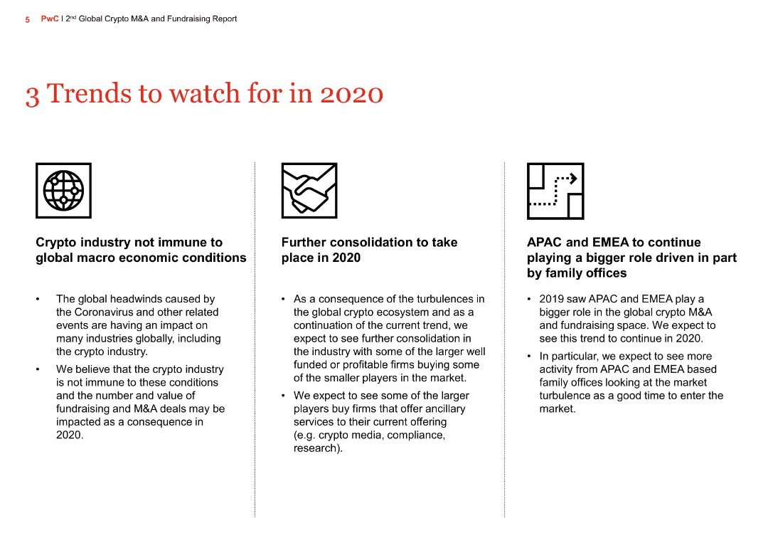
The slide includes text boxes discussing three key trends: the impact of global macroeconomic conditions, further consolidation in the crypto industry, and the growing role of APAC and EMEA in crypto M&A.
Market Analysis and Trends
Financial Services
This slide identifies three important trends for 2020 in the crypto industry, including the effects of macroeconomic conditions, industry consolidation, and increased activity in APAC and EMEA regions.
Crypto trends, macroeconomic conditions, industry consolidation, APAC, EMEA, M&A, financial services, market trends, 2020 forecast, crypto industry
false
Market Analysis and Trends
Financial Services
Pillar
PwC/Strategy&
Add to my slides
Remove from favorites
The slide features a column chart displaying various uses of crypto assets in 2022 and 2023, including conversion to cash and payment for services.
Market Analysis and Trends
Financial Services
It explores how crypto owners use their assets, from cash conversion to payments and unsuccessful sale attempts, noting demographic variations in usage patterns.
Crypto usage, 2023, 2022, cash conversion, payments, sale attempts, demographic variations
false
Market Analysis and Trends
Financial Services
Mixed Chart
IPSOS
Add to my slides
Remove from favorites
Three-column "FROM–TO–TO" visual structure with boxed content. Bottom has a paragraph block and a quote with purple highlights. Consistent use of purple theme and gradient for emphasis.
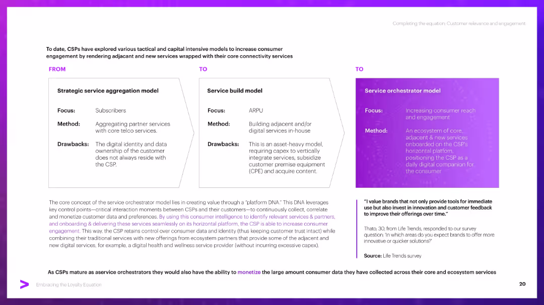
Strategic Planning
Telecommunications
Compares three CSP service models: aggregation, service build, and orchestrator. Emphasizes the orchestrator model’s benefit in owning data and driving engagement via a horizontal platform, providing tailored, adjacent services to customers.
CSP models, aggregation, platform DNA, engagement, monetization, orchestrator
false
Strategic Planning
Telecommunications
Header Horizontal
Accenture
Add to my slides
Remove from favorites
Split layout with a central question in purple, two text columns with paragraphs, and a horizontal bar chart on the right. The design maintains a clean white background with purple highlights.
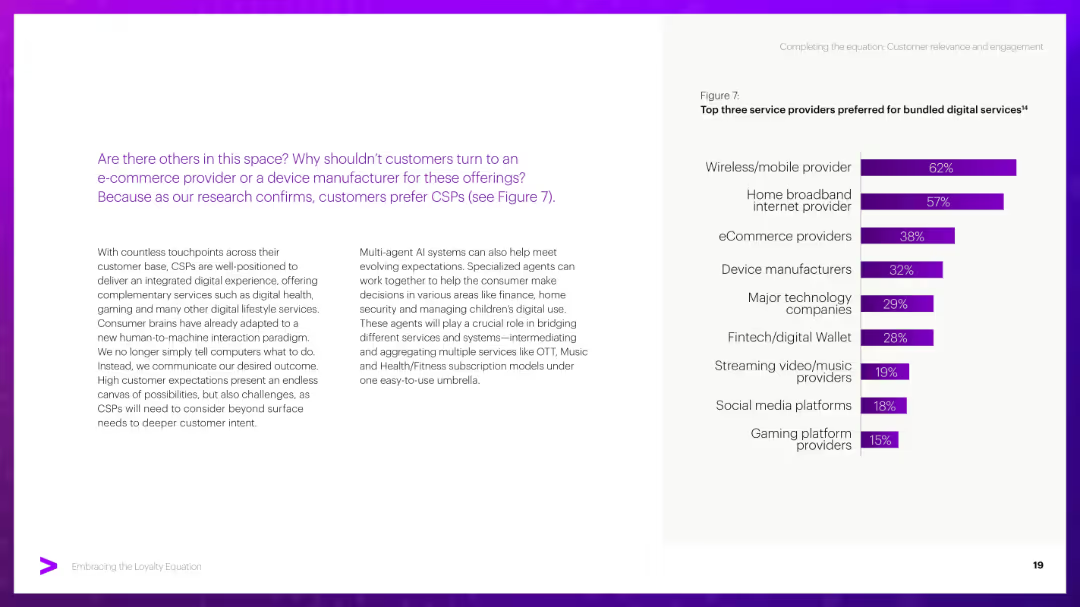
Competitive Landscape
Telecommunications
Argues that although other service providers exist (e.g., eCommerce, tech firms), consumers still prefer CSPs. Includes data on preferred providers and discusses AI’s potential to integrate services and improve customer engagement.
CSPs, digital services, eCommerce, AI agents, consumer preference, integration
false
Competitive Landscape
Telecommunications
Mixed Chart
Accenture
Add to my slides
Remove from favorites
Featuring bar charts, this slide shows internal and external factors driving social and environmental impact, and CSR performance reporting policies.
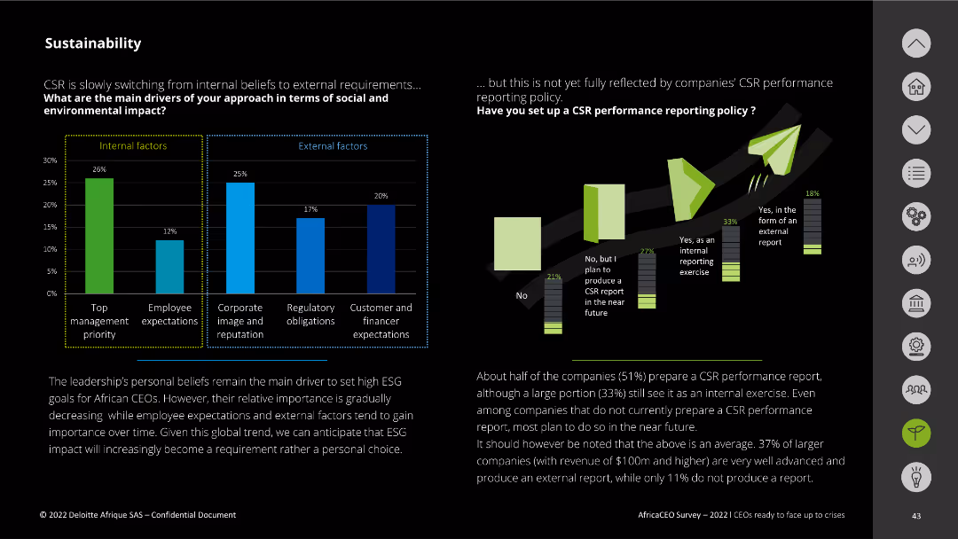
Risk Assessment and Management
Environmental Services & Sustainability
It identifies key internal and external factors influencing social and environmental impact and the status of CSR performance reporting among companies.
CSR, internal factors, external factors, reporting policy, environmental impact
false
Risk Assessment and Management
Environmental Services & Sustainability
Multiple Chart
Deloitte
Add to my slides
Remove from favorites
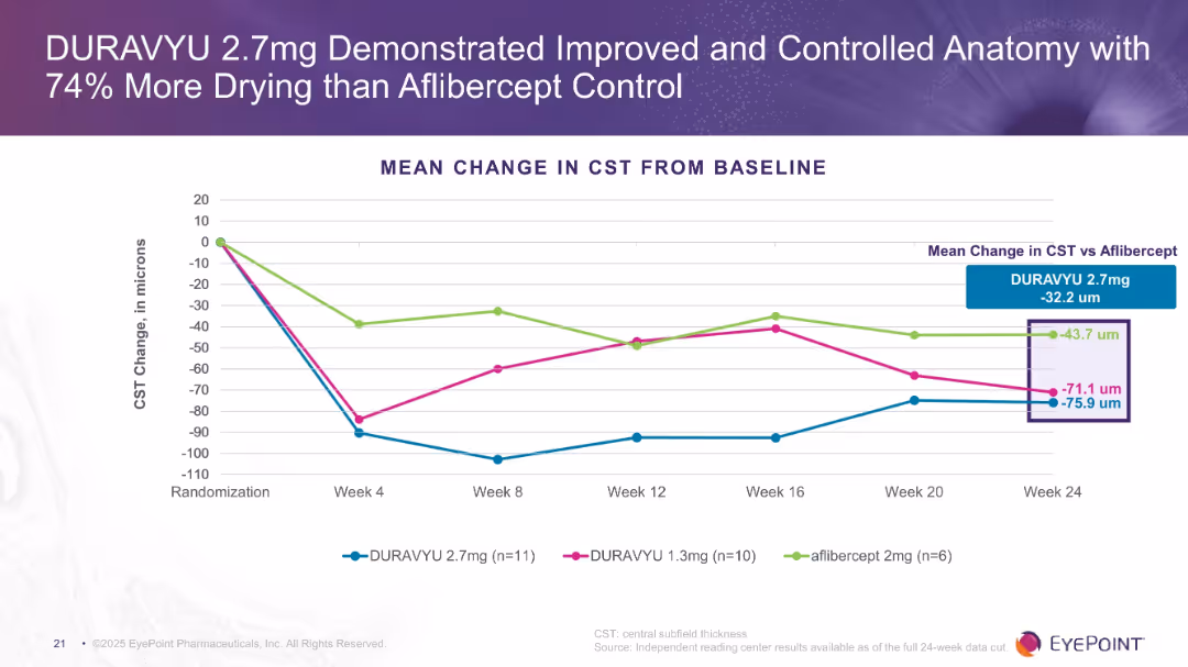
Line chart showing CST change in microns across treatment arms over 24 weeks. Clear visual comparison of drying effects. Purple theme consistent with previous slides.
Product and Service Analysis
Healthcare & Pharmaceuticals
The slide emphasizes anatomical control with DURAVYU 2.7mg, showing greater reduction in CST compared to aflibercept and DURAVYU 1.3mg. Indicates more efficient fluid reduction in the retina.
CST, drying, anatomical improvement, retina, DURAVYU, aflibercept
false
Product and Service Analysis
Healthcare & Pharmaceuticals
Single Chart
Goldman Sachs
Add to my slides
Remove from favorites
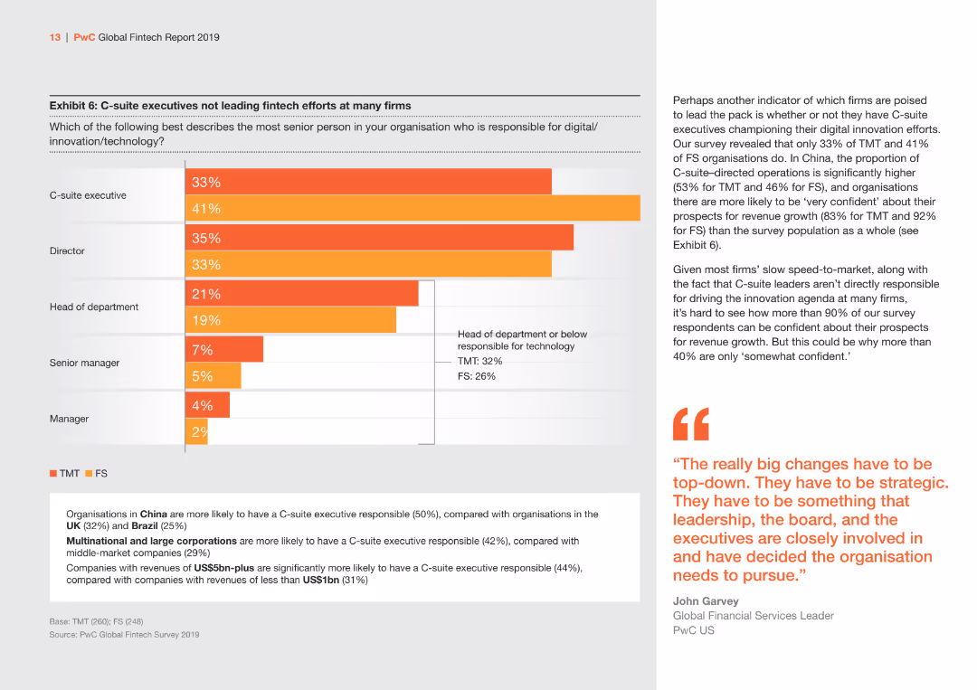
The slide features a bar chart displaying the distribution of responsibility for digital innovation/technology among different roles within organizations. Colors are orange and gray.
Strategic Planning
Financial Services
Highlights the distribution of responsibility for digital innovation/technology among C-suite executives, directors, and other roles, comparing TMT and FS sectors.
C-suite, digital innovation, TMT, FS, responsibility
false
Strategic Planning
Financial Services
Mixed Chart
PwC/Strategy&
Add to my slides
Remove from favorites
Slide with comparative data in bar graph format, emphasizing regional differences in executive confidence and outlook for 2023, using green, red, and gray color scheme.
Market Analysis and Trends
Professional Services
Compares the optimism and confidence among C-suite leaders globally, highlighting regional variations and strategic concerns for 2023.
C-suite, optimism, strategy, 2023, global
false
Market Analysis and Trends
Professional Services
Multiple Chart
BCG
Add to my slides
Remove from favorites
Diagram showing hierarchical structure with CTO, CEO, COO, and CFO.
Organizational Structure and Change
Professional Services
Defines the role and responsibilities of a Chief Transformation Officer within a corporate hierarchy.
CTO, roles, corporate, hierarchy, leadership
false
Organizational Structure and Change
Professional Services
Diagram
McKinsey
Add to my slides
Remove from favorites
Content slide with three icons and descriptions: Person-Level, In-Session, and Modernized. Each section details different aspects of CTV ad optimization.
Technology and Digital Transformation
Media & Entertainment
Describes the unique features of Nielsen Streaming Signals, focusing on person-level optimization, session data, and modern privacy measures.
CTV, ad optimization, Nielsen, person-level, in-session, modernized
false
Technology and Digital Transformation
Media & Entertainment
Header Vertical
Nielsen
Add to my slides
Remove from favorites
A column chart showing total usage of the TV screen by various viewing activities in January 2021 and January 2022, with color-coded categories.
Market Analysis and Trends
Media & Entertainment
The slide highlights the increasing share of connected TV (CTV) and time-shifting in total TV screen usage, reflecting changes in viewing habits over the past year.
CTV, television, usage, viewing habits, trends
false
Market Analysis and Trends
Media & Entertainment
Mixed Chart
Nielsen
Add to my slides
Remove from favorites
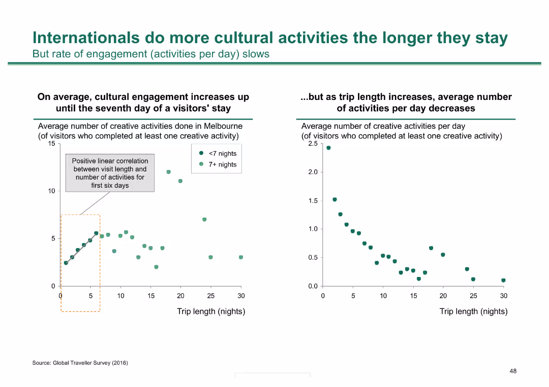
Two scatter plots: one shows a positive correlation between visit length and number of activities in Melbourne; the other shows the average number of activities per day decreases as stay lengthens.
Market Analysis and Trends
Hospitality & Tourism
Analyzes how international visitors' engagement with cultural activities in Melbourne increases with longer stays, though the rate of daily activities decreases over time.
cultural activities, visitor engagement, Melbourne, stay length, tourism
false
Market Analysis and Trends
Hospitality & Tourism
Multiple Chart
BCG
Add to my slides
Remove from favorites
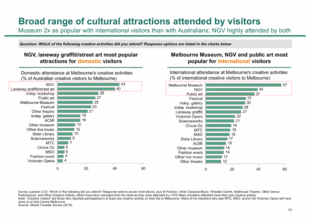
Two column charts: one showing the popularity of creative activities among domestic visitors and the other among international visitors, highlighting key cultural attractions.
Market Analysis and Trends
Hospitality & Tourism
The slide details the attendance at various creative activities in Melbourne, comparing the preferences of domestic and international visitors to identify popular cultural attractions.
cultural attractions, Melbourne, creative activities, domestic visitors, international visitors, popularity, tourism, trends
false
Market Analysis and Trends
Hospitality & Tourism
Multiple Chart
BCG
Add to my slides
Remove from favorites
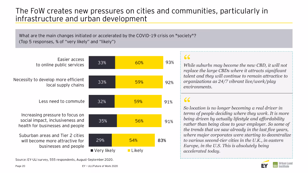
Combination of a column chart and textual information comparing regional expectations of changes in remote work over the next three-to-five years. Colors are yellow and gray.
Market Analysis and Trends
Real Estate & Construction
Compares regional expectations of future work changes, noting significant differences in expectations for remote work between Europe, APAC, and Americas.
Cultural Bias, Europe, Changes, Future of Work, Regional, Comparison, Remote Work, Expectations, Survey
false
Market Analysis and Trends
Real Estate & Construction
Mixed Chart
EY
Add to my slides
Remove from favorites
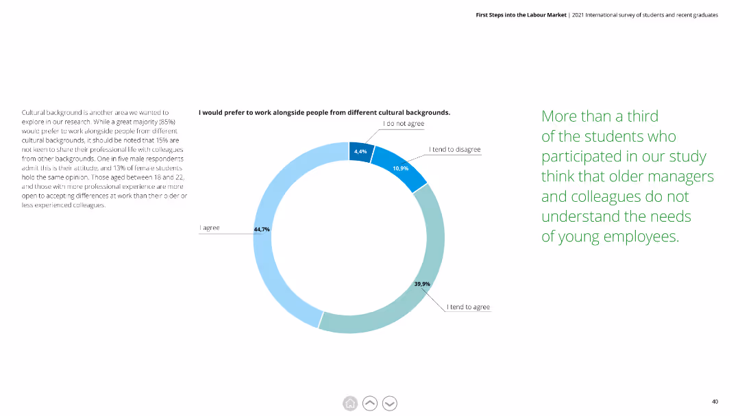
This slide features a pie chart with blue and green segments. Text is divided into two columns, explaining the importance of cultural diversity and respondents' attitudes toward it.
Human Resources and Talent Management
Professional Services
Highlights that 85% prefer working with people from different cultural backgrounds. Notes that 15% are not keen to share professional life with colleagues from other backgrounds.
cultural diversity, workplace, respondents, preferences, attitudes, cultural backgrounds
false
Human Resources and Talent Management
Professional Services
Mixed Chart
Deloitte
Add to my slides
Remove from favorites
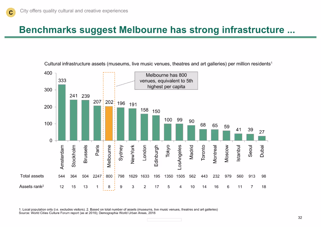
Column chart comparing cultural infrastructure assets across various cities
Industry Overview
Media & Entertainment
Highlights Melbourne's strong cultural infrastructure compared to other cities, with numerous venues per capita.
Cultural infrastructure, Melbourne, comparative analysis, venues, global cities
false
Industry Overview
Media & Entertainment
Single Chart
BCG
Add to my slides
Remove from favorites
A slide with a comparative graph displaying barriers to delivering strategies, with cultural factors, capital, and technology leading. The design uses translucent overlays on images of people in motion, in shades of blue and purple, symbolizing dynamic change.
Strategic Planning
Professional Services
Focuses on the human factors that present barriers in strategy delivery, such as cultural readiness and capital availability. It serves as a risk assessment tool to identify and manage organizational challenges related to strategic change.
Cultural Readiness, Capital Availability, Technology Infrastructure, Leadership Skills, Alignment, Silos, Partnerships, Strategy Barriers, Organizational Challenges
false
Strategic Planning
Professional Services
Single Chart
Accenture
Add to my slides
Remove from favorites
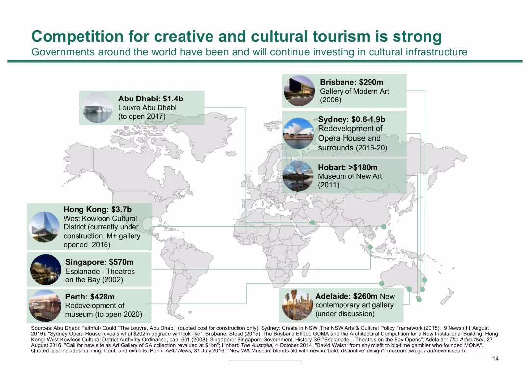
World map with various cities highlighted; text boxes with investment amounts and projects, minimal text
Market Analysis and Trends
Hospitality & Tourism
Highlights investments in cultural infrastructure worldwide, emphasizing competitive investments in tourism
Cultural tourism, investment, infrastructure, world map, cities, projects, tourism competition
false
Market Analysis and Trends
Hospitality & Tourism
Graphic
BCG
Add to my slides
Remove from favorites
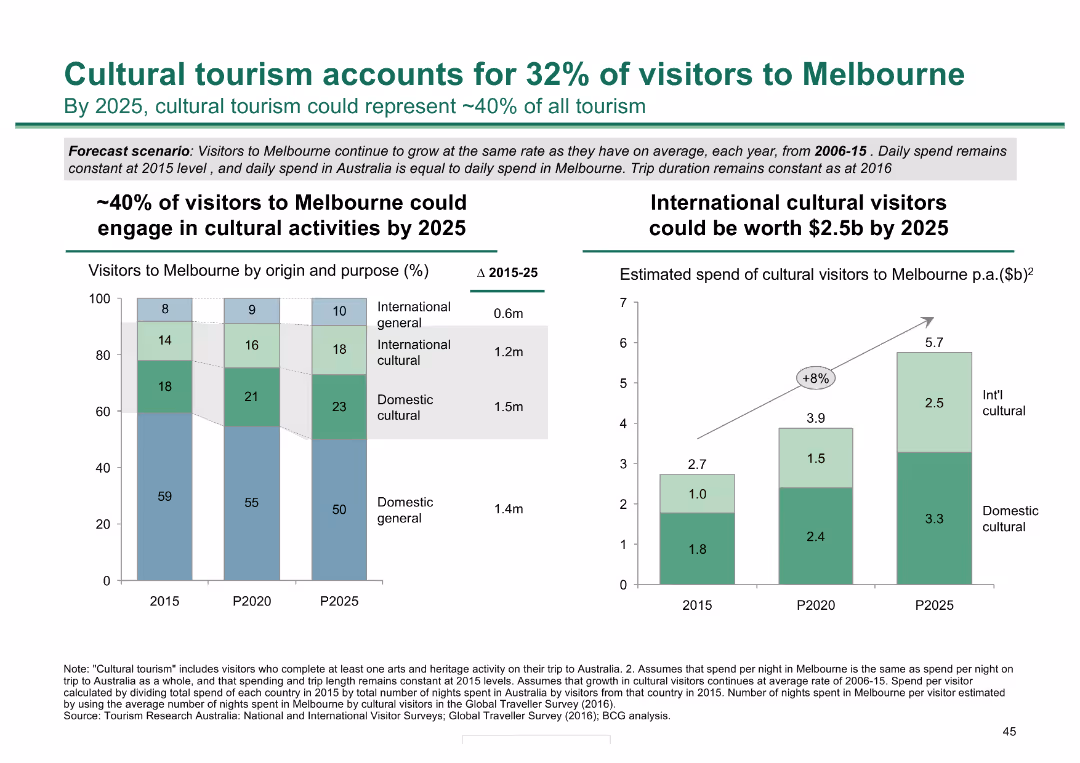
Two column charts: one shows the percentage of visitors to Melbourne by origin and purpose, the other estimates the spend of cultural visitors by 2025.
Market Analysis and Trends
Hospitality & Tourism
Projects the growth of cultural tourism in Melbourne by 2025, predicting it could account for 40% of visitors and be worth $2.5 billion annually.
cultural tourism, Melbourne, visitors, market analysis, spending
false
Market Analysis and Trends
Hospitality & Tourism
Multiple Chart
BCG
Add to my slides
Remove from favorites
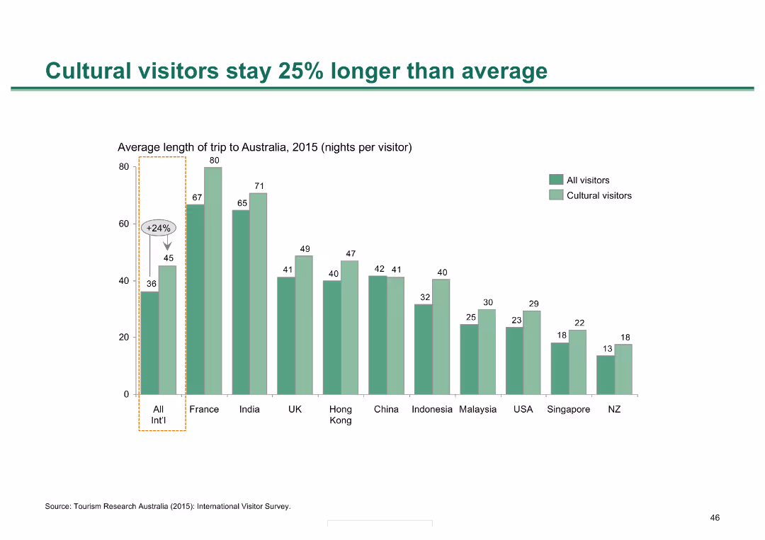
A column chart showing the average length of stay for cultural visitors compared to all visitors, with data broken down by country of origin.
Market Analysis and Trends
Hospitality & Tourism
Demonstrates that cultural visitors tend to stay longer in Australia compared to the average visitor, with specific country breakdowns highlighting variations.
cultural visitors, length of stay, Melbourne, tourism, visitor analysis
false
Market Analysis and Trends
Hospitality & Tourism
Single Chart
BCG
Add to my slides
Remove from favorites
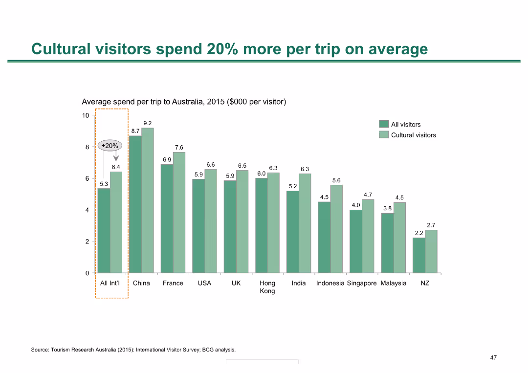
A column chart comparing average spend per trip to Australia by cultural visitors against all visitors, with specific data for various countries.
Market Analysis and Trends
Hospitality & Tourism
Highlights that cultural visitors to Australia spend significantly more per trip compared to the average visitor, with detailed spending figures for different nationalities.
cultural visitors, spending, tourism, Melbourne, economic impact
false
Market Analysis and Trends
Hospitality & Tourism
Single Chart
BCG
Add to my slides
Remove from favorites
Contains multiple red rectangular sections, each titled (Brand, Product, Innovation, etc.), connected by lines, textual descriptions in each box.
Strategic Planning
Professional Services
The slide presents a strategic view for enhancing cultural and creative excellence in business through various domains like brand, product, innovation, and customer experience. Geared towards corporate restructuring and strategic leadership.
culture, innovation, strategy, customer experience, business model, CEO agenda, branding, marketing, resilience
false
Strategic Planning
Professional Services
Diagram
Bain
Add to my slides
Remove from favorites
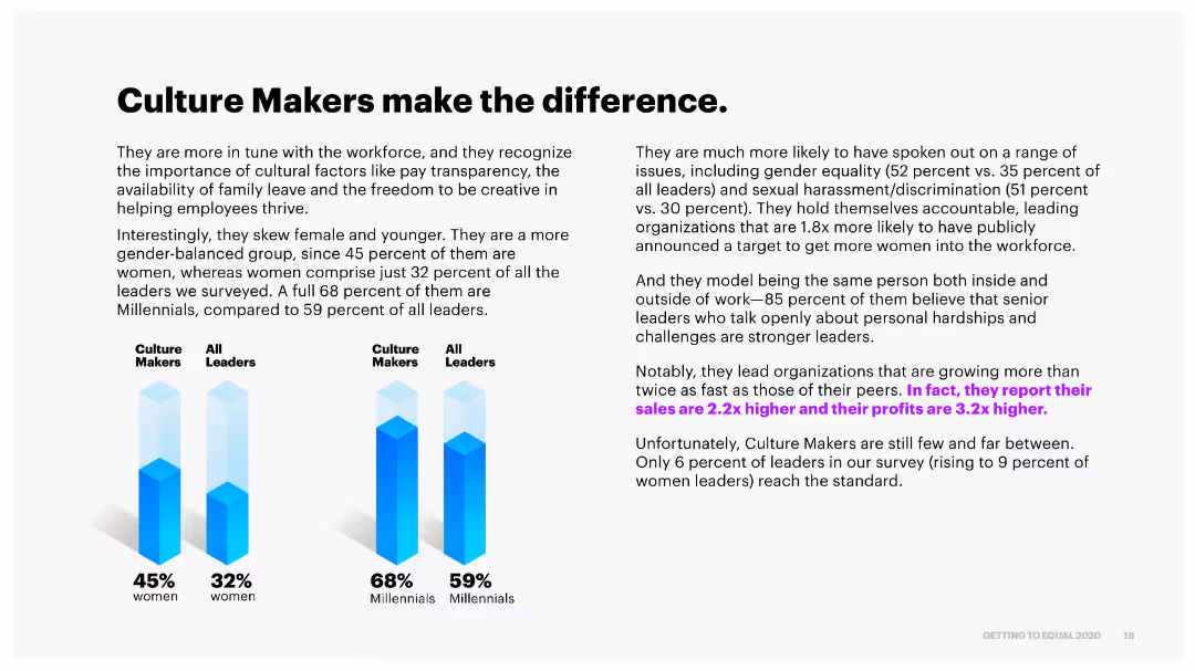
The slide uses a combination of text and column charts to depict the characteristics and impacts of Culture Makers versus all leaders, emphasizing gender and generational differences.
Organizational Structure and Change
Professional Services
It highlights the qualities of Culture Makers, such as gender balance and younger demographics, and their positive impact on organizational growth and leadership compared to other leaders.
culture makers, gender balance, growth, leadership, generational differences
false
Organizational Structure and Change
Professional Services
Multiple Chart
Accenture
Add to my slides
Remove from favorites
The slide features a large triangle diagram with six layers, each representing a different aspect of best practices in a company’s operations, with text explanations on the left. The color scheme is blue and teal with white text.
Organizational Structure and Change
Professional Services
This slide outlines the six fundamental aspects of best practices within an organization, likely to be discussed in detail in subsequent slides. It is useful for organizational strategy and planning.
culture, talent, compensation, acquisition, enablement, retainment, practices, organizational, strategy, planning
false
Organizational Structure and Change
Professional Services
Framework
Kearney
Add to my slides
Remove from favorites
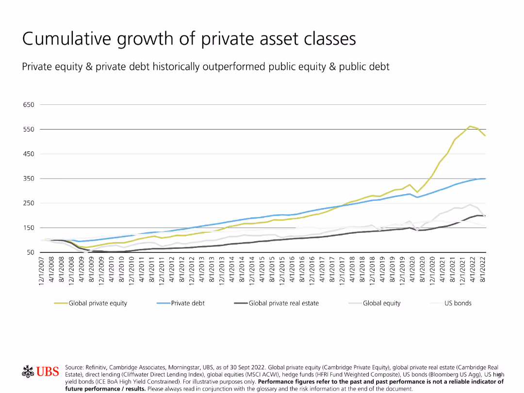
Shows a line chart comparing the cumulative growth of different private asset classes over time, including private equity, private debt, and global private real estate.
Investment Analysis
Financial Services
Illustrates the superior cumulative growth of private asset classes compared to public equity and debt, indicating stronger long-term performance.
Cumulative growth, private asset classes, private equity, private debt, real estate
false
Investment Analysis
Financial Services
Single Chart
UBS
Add to my slides
Remove from favorites
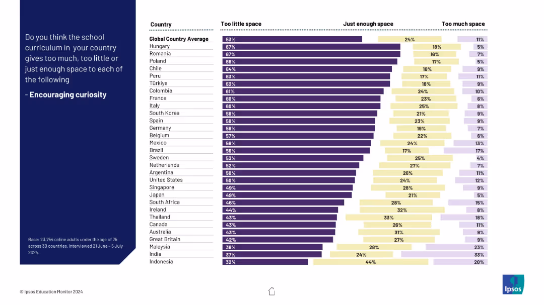
Identical visual format as Slide 19547; ranking countries by public opinion on curriculum focus on curiosity; bar segmentation shows “too little” to “too much.”
Strategic Planning
Education & Training
This slide evaluates whether school curricula sufficiently foster curiosity. The majority of respondents believe curiosity is underemphasized in schools, with highest concern in countries like Romania and Poland.
curiosity, education, learning, curriculum, global opinion, too little, creativity, teaching approach
false
Strategic Planning
Education & Training
Mixed Chart
IPSOS
Add to my slides
Remove from favorites
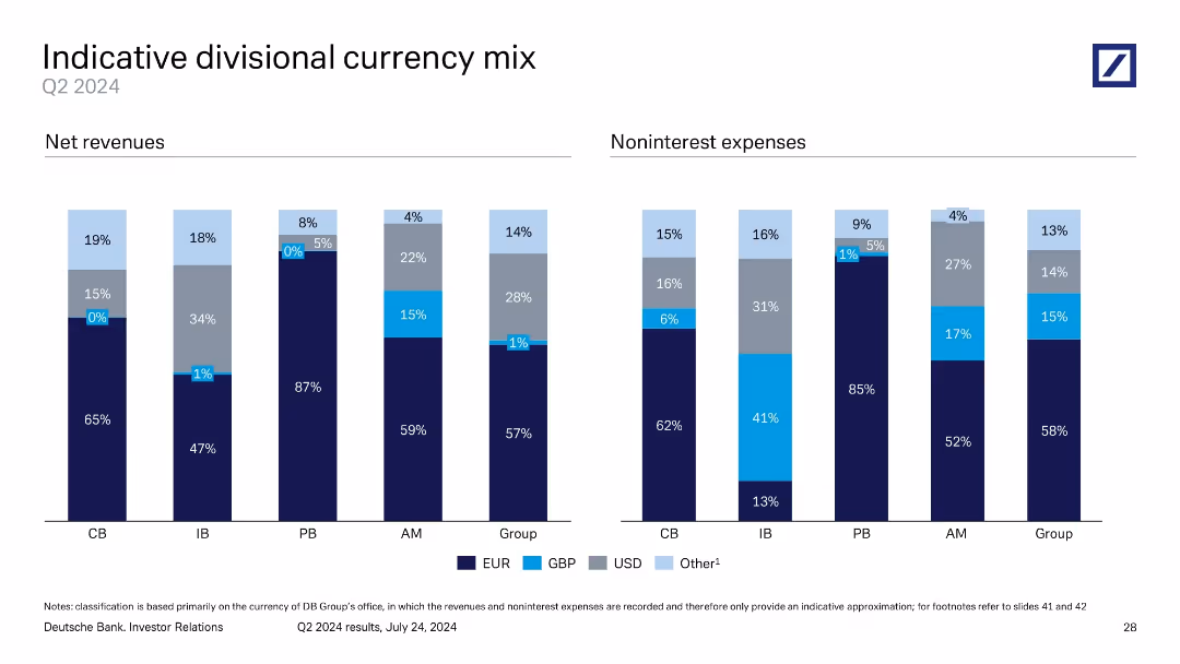
Consists of colored column charts representing currency distribution across different divisions, with clear labeling and segmented color coding.
Financial Performance
Financial Services
This slide provides an overview of the currency mix in Q4 2023 across different banking divisions, highlighting exposure to various currencies.
currency analysis, financial exposure, Q4 2023, divisional revenues, banking
false
Financial Performance
Financial Services
Multiple Chart
Deutsche Bank
Add to my slides
Remove from favorites
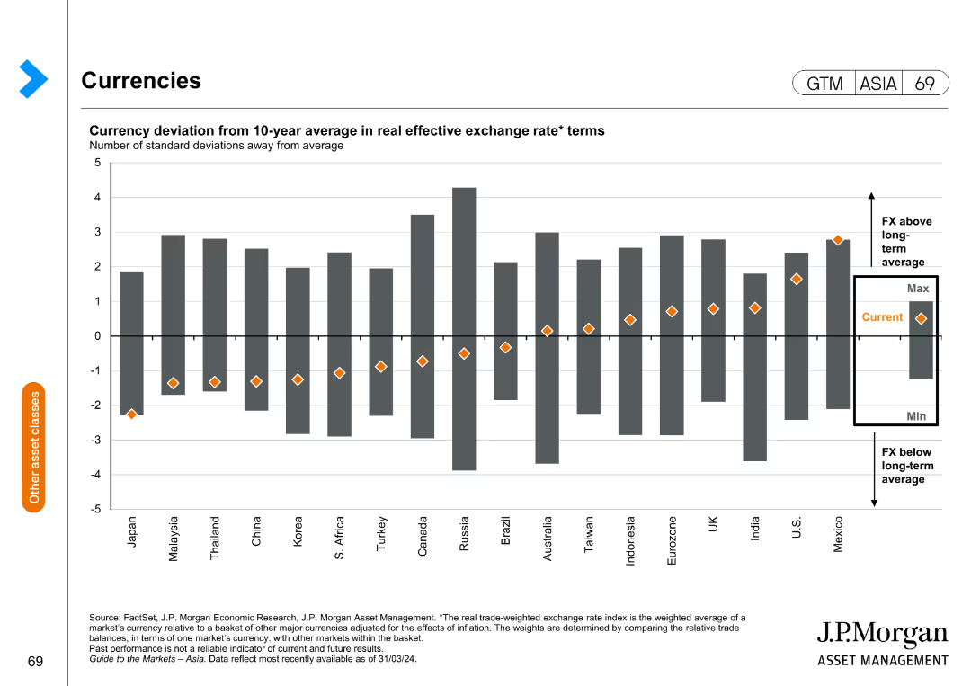
This slide features a column chart showing the currency deviation from the 10-year average in real effective exchange rate terms. The chart has columns representing standard deviations from the average for various countries.
Investment Analysis
Financial Services
This slide provides an analysis of currency deviations from the historical average, aiding in investment decisions by highlighting currency trends and potential risks.
currency deviation, investment, exchange rate, financial analysis, trends
false
Investment Analysis
Financial Services
Single Chart
JP Morgan
Add to my slides
Remove from favorites
Two sets of grouped vertical bar charts showing net revenues and noninterest expenses across business divisions, broken down by currency (EUR, GBP, USD, Other).
Risk Assessment and Management
Financial Services
Illustrates the currency mix of revenues and expenses for Deutsche Bank's divisions in Q2 2024. EUR dominates most segments, especially in Private Banking. Helps assess currency exposure and hedging needs.
currency exposure, EUR, USD, GBP, noninterest expenses, revenues
false
Risk Assessment and Management
Financial Services
Single Chart
Deutsche Bank
Add to my slides
Remove from favorites
Multiple stacked column charts depict the divisional currency mix for net revenues and noninterest expenses, using a clear color-coded scheme to indicate various currencies.
Financial Performance
Financial Services
Provides a detailed breakdown of Deutsche Bank's currency exposure across different divisions for Q2 2023, illustrating how revenues and expenses are allocated by currency.
Currency exposure, financial analysis, revenue allocation, expense distribution, Deutsche Bank, Q2 2023
false
Financial Performance
Financial Services
Multiple Chart
Deutsche Bank
Add to my slides
Remove from favorites
Features a table and a pie chart showing net revenues and total expenses in various currencies (CHF, USD, EUR, GBP, other) and sensitivity analysis on group results, along with a visual of currency mix capital metrics.
Financial Performance
Financial Services
This slide provides an overview of currency contributions to net revenues and expenses, as well as sensitivity analysis on the financial results due to currency fluctuations. It is used to assess the impact of currency movements.
Currency mix, capital metrics, revenues, expenses, sensitivity analysis, financial impact, currency fluctuations, group results, analysis, financial performance
false
Financial Performance
Financial Services
Mixed Chart
Credit Suisse
Add to my slides
Remove from favorites
Two side-by-side stacked bar charts for Q1 2024: net revenues and noninterest expenses by currency
Financial Performance
Financial Services
Depicts the currency composition of revenues and expenses across Deutsche Bank divisions. EUR dominates most segments, but some variation exists in USD and GBP exposure. Provides insight into forex sensitivity across business lines.
currency mix, EUR, USD, GBP, net revenue, expenses, forex exposure
false
Financial Performance
Financial Services
Single Chart
Deutsche Bank
Add to my slides
Remove from favorites
Two bar charts comparing currency mix of net revenues and expenses across divisions
Risk Assessment and Management
Financial Services
This slide shows the currency composition (EUR, GBP, USD, Other) of net revenues and noninterest expenses by division. It highlights the currency risk exposure across the bank’s operating units and supports FX risk management.
Currency Mix, FX Risk, EUR, USD, GBP, Revenue, Expenses, Divisions
false
Risk Assessment and Management
Financial Services
Single Chart
Deutsche Bank
Add to my slides
Remove from favorites
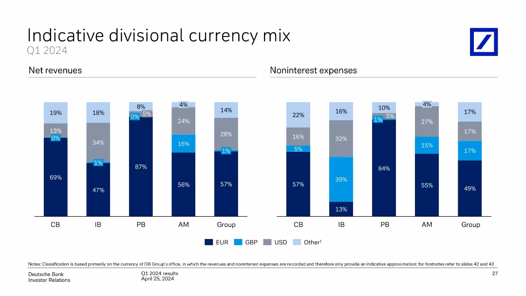
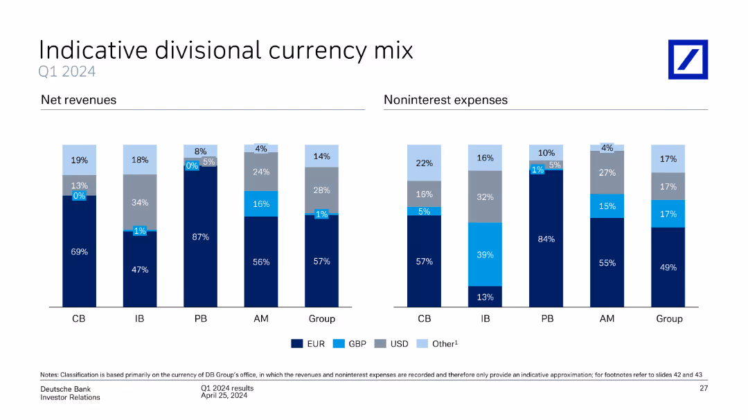
This slide contains two column charts, one for net revenues and the other for noninterest expenses, divided by currency mix (EUR, GBP, USD, Other) and business divisions (CB, IB, PB, AM, Group).
Market Analysis and Trends
Financial Services
The slide provides an analysis of Deutsche Bank's divisional currency mix for Q1 2024, showing net revenues and noninterest expenses by currency and business division. It highlights the distribution and significance of different currencies.
currency mix, net revenues, noninterest expenses, business divisions, Deutsche Bank, Q1 2024, analysis
false
Market Analysis and Trends
Financial Services
Multiple Chart
Deutsche Bank
Add to my slides
Remove from favorites
Dual vertical bar charts comparing net revenues and noninterest expenses across divisions by currency.
Risk Assessment and Management
Financial Services
Shows currency composition of revenues and expenses for each banking division. EUR is dominant, but USD and other currencies have notable shares, especially in Investment Banking. Aids in assessing currency exposure and operational risk.
currency mix, revenue, expenses, EUR, USD, GBP, risk, FX exposure, divisions
false
Risk Assessment and Management
Financial Services
Single Chart
Deutsche Bank
Add to my slides
Remove from favorites
Slide includes two sets of column charts depicting the currency mix for net revenues and noninterest expenses across divisions.
Financial Performance
Financial Services
This slide details the divisional currency distribution for net revenues and noninterest expenses, aiding financial strategy and risk assessment.
Currency mix, revenues, expenses, analysis
false
Financial Performance
Financial Services
Multiple Chart
Deutsche Bank
Add to my slides
Remove from favorites
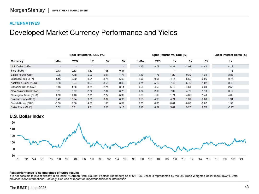
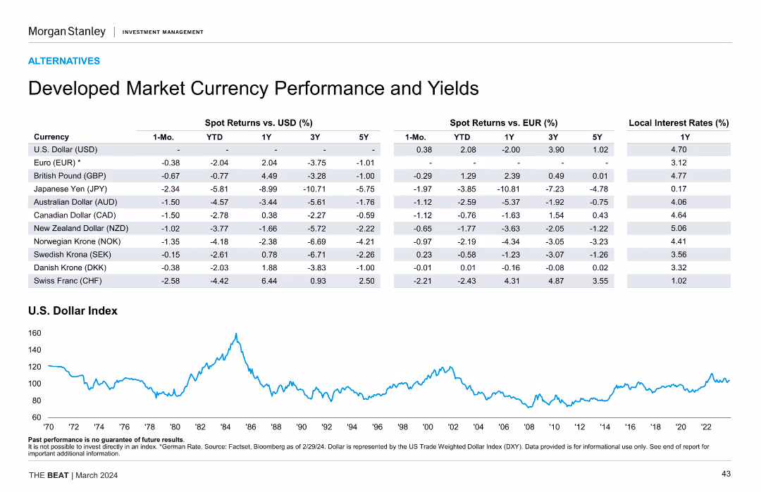
The slide contains a table comparing spot returns and local interest rates for various developed market currencies and a line chart showing the U.S. Dollar Index over time.
Market Analysis and Trends
Financial Services
This slide analyzes the performance and yields of developed market currencies, comparing spot returns and local interest rates, with a focus on the U.S. Dollar Index.
currency performance, developed markets, spot returns, interest rates, U.S. Dollar
false
Market Analysis and Trends
Financial Services
Mixed Chart
Morgan Stanley
Add to my slides
Remove from favorites
Table of spot returns vs USD and EUR and local interest rates for developed market currencies, with a historical chart of the USD Index.
Investment Analysis
Financial Services
This slide tracks currency performance against the USD and EUR, detailing 1-month to 5-year returns along with local interest rates. The U.S. Dollar Index chart shows long-term trends. It aids in assessing FX risk and return in developed markets.
currency performance, interest rates, developed markets, USD index, FX risk, spot returns, yields
false
Investment Analysis
Financial Services
Mixed Chart
Morgan Stanley
Add to my slides
Remove from favorites
Table displaying spot returns vs. USD and EUR for various developed market currencies. Includes a line chart of the U.S. Dollar Index performance over time.
Market Analysis and Trends
Financial Services
The slide analyzes currency performance and yields for developed markets, comparing spot returns against USD and EUR, and showcasing historical U.S. Dollar Index performance.
currency, performance, yields, developed, market
false
Market Analysis and Trends
Financial Services
Mixed Chart
Morgan Stanley
Add to my slides
Remove from favorites
The slide shows a table with various currencies' spot returns versus USD and EUR, and a line chart of the U.S. Dollar Index over time.
Market Analysis and Trends
Financial Services
This slide examines developed market currencies' performance and yields, comparing spot returns and local interest rates, and includes a historical U.S. Dollar Index chart.
currency performance, yields, spot returns, U.S. Dollar Index
false
Market Analysis and Trends
Financial Services
Mixed Chart
Morgan Stanley
Add to my slides
Remove from favorites
The slide features a detailed table comparing spot returns and yields of various developed market currencies against USD and EUR, along with a line chart showing the historical performance of the U.S. Dollar Index.
Market Analysis and Trends
Financial Services
The slide provides an analysis of developed market currency performance and yields, including spot returns versus USD and EUR, and historical performance of the U.S. Dollar Index, aiding in currency market analysis and investment strategy formulation.
currency performance, yields, USD, EUR, developed markets, U.S. Dollar Index, spot returns, financial analysis
false
Market Analysis and Trends
Financial Services
Mixed Chart
Morgan Stanley
Add to my slides
Remove from favorites
Features a table showing spot returns vs. USD and EUR for various currencies over multiple time frames (1 month, YTD, 1 year, 3 years, 5 years) and local interest rates. Also includes a line chart for the U.S. Dollar Index performance over time.
Financial Performance
Financial Services
Analyzes the performance and yields of developed market currencies compared to USD and EUR, highlighting changes in spot returns and interest rates. Useful for currency market analysis and investment strategies.
currency performance, yields, USD, EUR, spot returns, interest rates, U.S. Dollar Index
false
Financial Performance
Financial Services
Mixed Chart
Morgan Stanley
Add to my slides
Remove from favorites
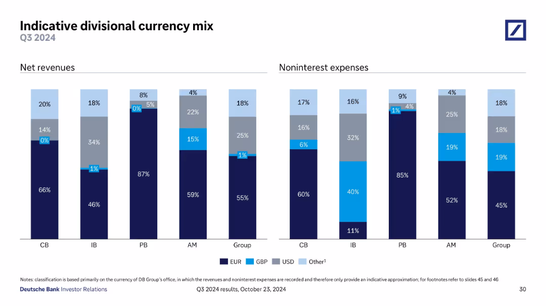
Consists of two column charts comparing revenue and expense distributions across different currencies.
Financial Performance
Financial Services
This slide provides a breakdown of revenue and non-interest expenses by currency for different banking divisions, illustrating the financial impact of currency distribution on overall financial health. It targets financial analysts and managers, facilitating insights into strategic decisions related to currency risk management and operational planning in a global banking context.
Currency, Revenue, Expenses, Financial Distribution, Risk Management
false
Financial Performance
Financial Services
Multiple Chart
Deutsche Bank
Add to my slides
Remove from favorites
Two bar graphs comparing net revenues and noninterest expenses by currency (EUR, USD, GBP, Other) across various divisions; labeled by percent share per division.
Risk Assessment and Management
Financial Services
This slide displays currency exposure by business unit. It reveals revenue and cost structures by currency, helping assess foreign exchange risk. EUR dominates net revenues in most divisions, while cost bases show more currency diversification, especially in the IB.
currency, revenue, expenses, forex, EUR, USD, GBP, risk
false
Risk Assessment and Management
Financial Services
Single Chart
Deutsche Bank
Add to my slides
Remove from favorites
Two sets of bar charts dominate this slide, showing the current and previous year local interest rates for developed and emerging markets. The color-coded bars allow for easy year-over-year comparison.
Market Analysis and Trends
Financial Services
The slide analyzes sovereign currency yields, comparing the interest rates of different currencies from developed and emerging markets against previous year's rates, useful for evaluating investment risks and opportunities.
currency yields, interest rates, developed markets, emerging markets, financial analysis, investment, year-over-year comparison
false
Market Analysis and Trends
Financial Services
Multiple Chart
Morgan Stanley
Add to my slides
Remove from favorites
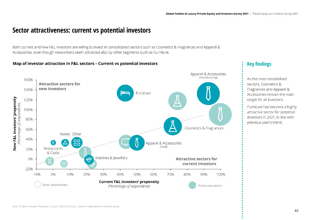
Bubble chart comparing attractiveness of sectors for current vs new investors. Sectors like Cosmetics & Fragrances and Apparel & Accessories are highly attractive.
Investment Analysis
Financial Services
Both current and new investors are drawn to sectors like Cosmetics & Fragrances and Apparel & Accessories, with Furniture also being highly attractive in 2021.
current investors, potential investors, sector attractiveness, F&L industry, investment trends
false
Investment Analysis
Financial Services
Mixed Chart
Deloitte
Add to my slides
Remove from favorites
Previous
Next
You don't have any favorites yet.
Please wait loading your favorites slides...
Create a FREE account to continue browsing
Receive Instant Access to 1,000+ slides from companies like McKinsey, Google, and Goldman Sachs
First Name
Last Name
Email
Password
I agree to all
Terms & Privacy Policy
Thank you! Your submission has been received!
Oops! Something went wrong while submitting the form.
Have an account?
Sign in
Upgrade to PRO to Save slides
Advanced Search and Filters
Access to 15,000+ slides
Access to Category Pages
Save/Bookmark Slides
PowerPoint Template Library
Pick a Plan
MONTHLY
$12/month
Billed every month, Cancel anytime.
YEARLY
$9/year
Billed $108 annually, Cancel anytime.
Checkout for $12/month
Checkout for $108/yr
Secured by Stripe | AES-256 bit encryption