My Account
My Slides
Search by Category
Companies
Slide Type
Use Case
Industry
Pricing
Templates
View All Templates
Download Template Slides
✦ AI
AI Prompt Library
AI Search
Feedback
Login
Logout
Get Started
Browse all Slides
Browse all Slides
Create a FREE Account
Instant access to 1,000+ real slides from top companies like McKinsey, BCG, Goldman Sachs, Google and many more!
First Name
Last Name
Email
Password
I agree to all
Terms & Privacy Policy
Thank you! Your submission has been received!
Oops! Something went wrong while submitting the form.
Have an account?
Sign in
Saved Slides
Total No. of slides saved
0
↻ Refresh
✖ Clear all
Light background with green accents, multiple bar charts comparing cyber maturity levels and their impact on business, with explanatory text in columns.
Strategic Planning
Technology & Software
The slide explains how different levels of cyber maturity affect business outcomes, with examples of cyber planning strategies and activities from high-maturity organizations.
Cyber maturity, business impact, planning strategies, survey, bar charts
false
Strategic Planning
Technology & Software
Mixed Chart
Gartner
Add to my slides
Remove from favorites
The slide features a dark background with large white and green text. It includes a section with a 38%, 41%, and 21% segment data representation in circular icons.
Market Analysis and Trends
Technology & Software
Explains the importance of cyber maturity, defining it through robust planning, key activities, and board engagement, with a focus on different maturity levels.
Cyber maturity, cyber planning, engagement, key activities, segmentation
false
Market Analysis and Trends
Technology & Software
Mixed Chart
Deloitte
Add to my slides
Remove from favorites
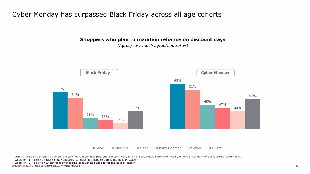
The slide features a column chart comparing the reliance on Black Friday and Cyber Monday discounts across various age cohorts, with distinct colors for each group.
Market Analysis and Trends
Retail & E-commerce
It highlights the trend of increased reliance on Cyber Monday over Black Friday for shopping discounts among different age groups.
Cyber Monday, Black Friday, discounts, age groups, trends
false
Market Analysis and Trends
Retail & E-commerce
Multiple Chart
Deloitte
Add to my slides
Remove from favorites
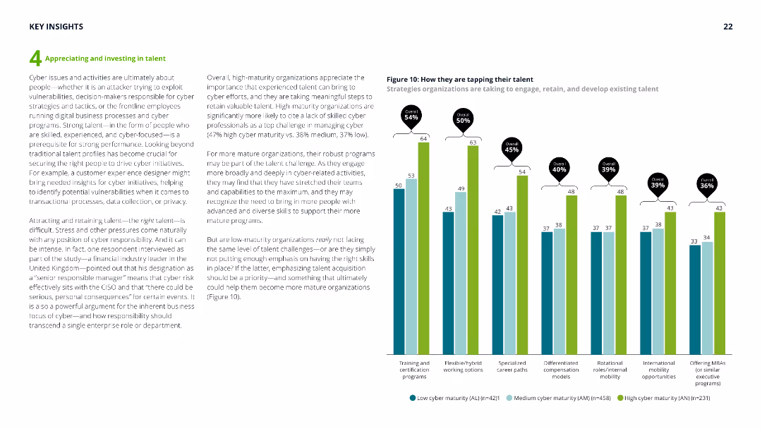
The slide includes a column chart with green and blue bars showing the implementation of cyber planning actions across different maturity groups.
Operational Efficiency
Technology & Software
Explores the extent to which organizations have implemented cyber planning actions, detailing various aspects like incident-response plans and strategic planning.
Cyber planning, incident-response, strategic planning, data protection, implementation
false
Operational Efficiency
Technology & Software
Mixed Chart
Deloitte
Add to my slides
Remove from favorites
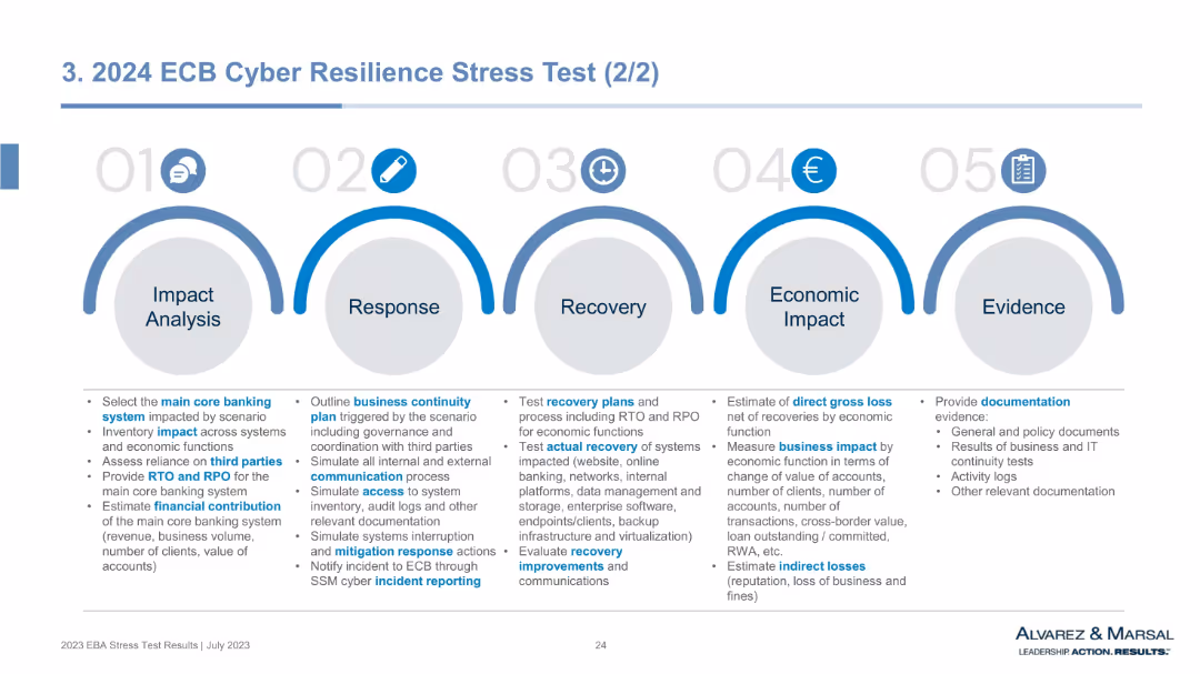
Horizontal infographic with 5 blue arc-shaped sections labeled 01–05 for stages from Impact Analysis to Evidence. Each section contains bullet-point lists.
Risk Assessment and Management
Financial Services
This slide outlines the framework for the ECB's cyber resilience stress test. It maps the response process across five steps—from identifying core banking system impacts to evaluating economic damage and providing audit evidence. The format emphasizes operational preparedness, continuity, recovery, and communication under cyberattack scenarios.
cyber resilience, ECB stress test, business continuity, recovery planning, impact analysis, cyber risk, documentation, RTO, RPO
false
Risk Assessment and Management
Financial Services
Pillar
Alvarez & Marsal
Add to my slides
Remove from favorites
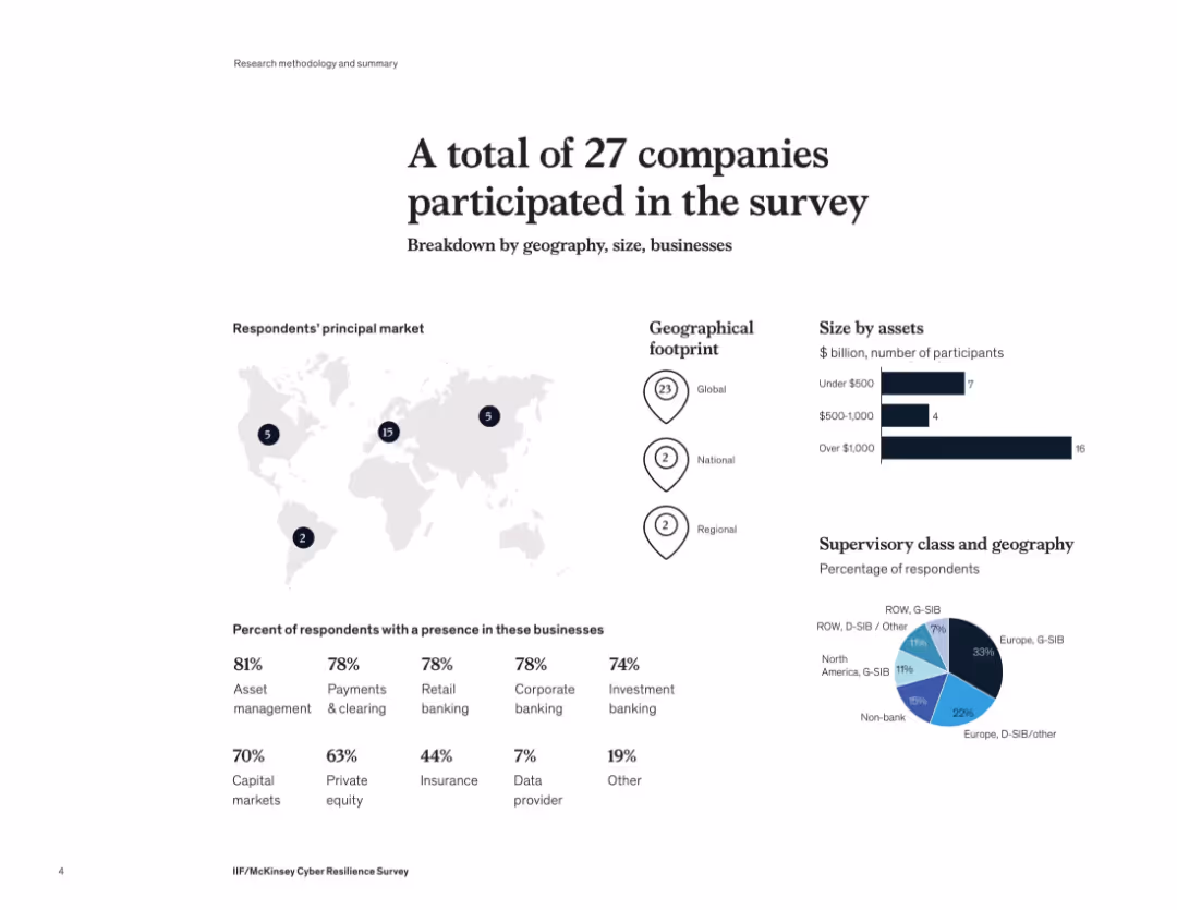
Infographic layout with maps, bar charts, and pie charts showing company distribution by geography, size, and business sector. Clean and visually segmented layout with dark blue icons and map markers.
Industry Overview
Financial Services
This slide summarizes participant demographics in a McKinsey cyber resilience survey. The 27 companies surveyed span global to regional operations, mostly with over $1B in assets. Key sectors represented include asset management, retail banking, investment banking, and private equity. A geographic breakdown highlights strong European participation.
cyber resilience, financial services, global footprint, asset size, banking, survey demographics
false
Industry Overview
Financial Services
Multiple Chart
McKinsey
Add to my slides
Remove from favorites
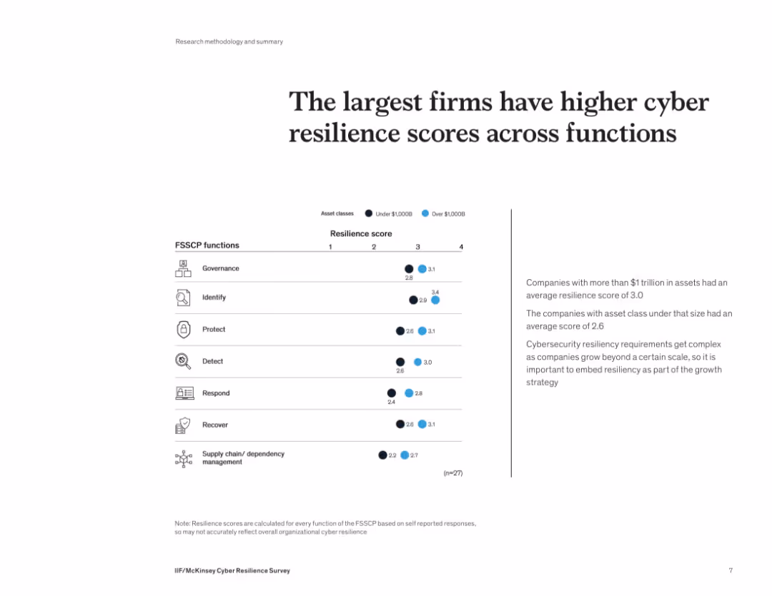
Simple, clean layout with a horizontal resilience score table and icon-based FSSCP functions on the left. A short explanatory text box is included on the right.
Risk Assessment and Management
Financial Services
The slide shows that larger firms (with >$1T in assets) report stronger cyber resilience across key security functions like governance, protection, and detection. These organizations have a more mature cybersecurity posture, averaging a score of 3.0 versus 2.6 for smaller firms. Scaling up security capabilities is essential for growing institutions.
cyber resilience, governance, large firms, cybersecurity, FSSCP functions, detection, asset class
false
Risk Assessment and Management
Financial Services
Mixed Chart
McKinsey
Add to my slides
Remove from favorites
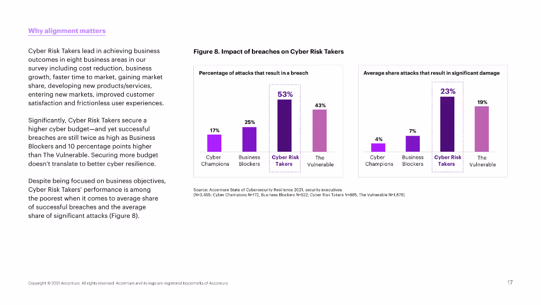
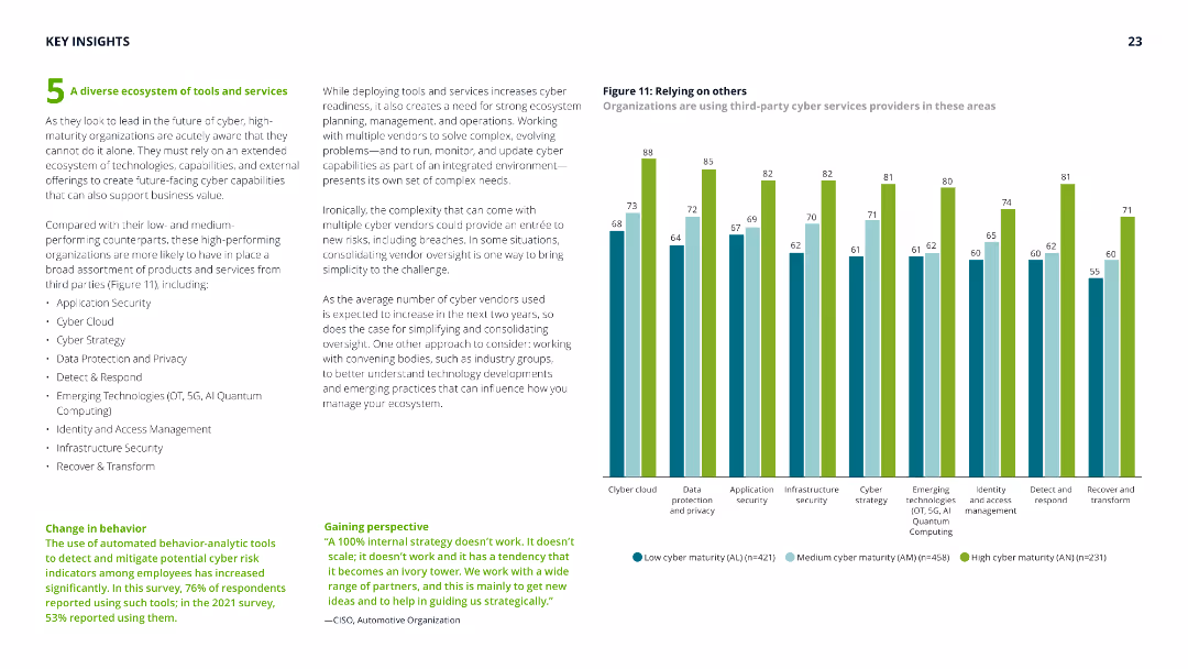
The slide has a white background with a column chart and bar chart on the right. The left side contains text explaining the significance of cyber risk takers.
Risk Assessment and Management
Technology & Software
This slide explains the impact of breaches on cyber risk takers, highlighting that higher budgets don't necessarily lead to better cyber resilience and outlining key business outcomes.
Cyber risk, breaches, budget, resilience, outcomes, alignment, business, cybersecurity, survey
false
Risk Assessment and Management
Technology & Software
Multiple Chart
Accenture
Add to my slides
Remove from favorites
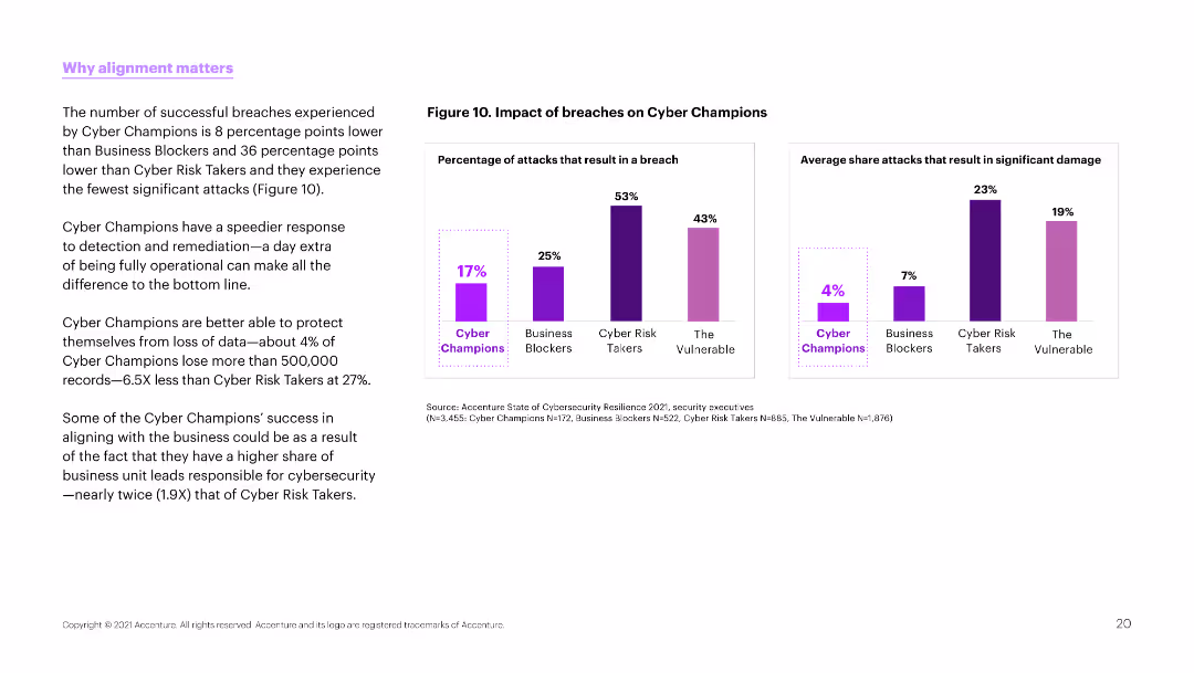
The slide has a white background with two column charts on the right side. The left side contains text discussing successful breaches and the effectiveness of cyber champions.
Risk Assessment and Management
Technology & Software
This slide highlights the lower breach rates of cyber champions compared to other groups and their ability to protect against significant data loss.
Cyber risk, breaches, protection, champions, business, cybersecurity, data loss, effectiveness, survey
false
Risk Assessment and Management
Technology & Software
Multiple Chart
Accenture
Add to my slides
Remove from favorites
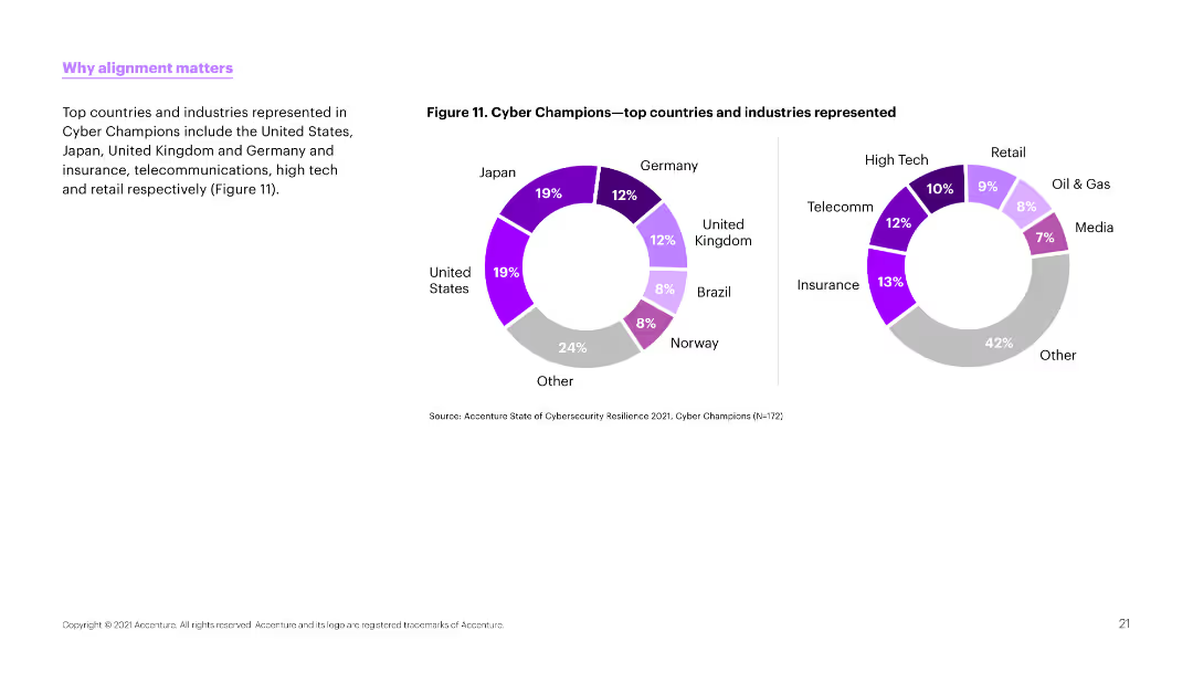
The slide features a donut chart on the left side showing the top countries and industries represented in cyber champions. The right side contains explanatory text.
Risk Assessment and Management
Technology & Software
This slide shows the geographical and industry representation of cyber champions, emphasizing the diversity and spread across different sectors.
Cyber risk, champions, countries, industries, representation, diversity, sectors, business, cybersecurity
false
Risk Assessment and Management
Technology & Software
Multiple Chart
Accenture
Add to my slides
Remove from favorites
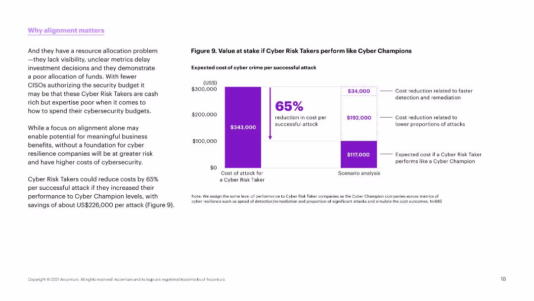
The slide features a column chart on the right side showing the value at stake if cyber risk takers perform like cyber champions. The left side contains detailed explanatory text.
Risk Assessment and Management
Technology & Software
This slide presents a cost analysis, showing a potential 65% reduction in cyber crime costs if cyber risk takers improved their performance to match cyber champions.
Cyber risk, cost reduction, performance, cyber crime, budget, resilience, security, alignment, business
false
Risk Assessment and Management
Technology & Software
Mixed Chart
Accenture
Add to my slides
Remove from favorites
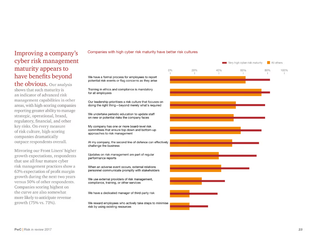
This slide has a white background with red and black text. It includes a column chart on the right side comparing different companies' risk cultures. The chart uses red and orange colors to represent very high and all other cyber risk maturity, respectively.
Risk Assessment and Management
Financial Services
The slide explains how improving cyber risk management maturity can benefit companies in various areas, including strategic, operational, and financial aspects. It compares companies with high cyber risk maturity to those with lower maturity.
cyber risk, maturity, benefits, comparison, companies, management, culture, improvement, strategic, operational
false
Risk Assessment and Management
Financial Services
Mixed Chart
PwC/Strategy&
Add to my slides
Remove from favorites
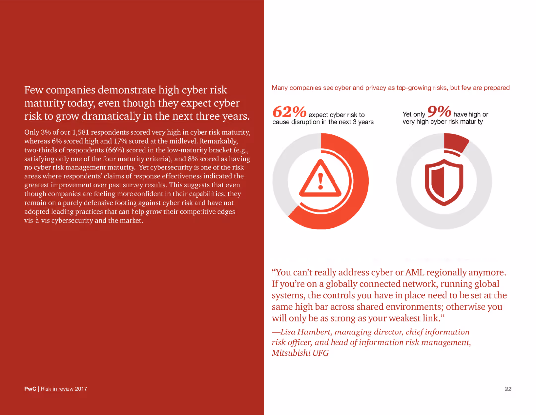
The slide features a red background with white text on the left, and two pie charts with accompanying text on the right. The layout includes a quote at the bottom right. The pie charts use red and gray colors to highlight key statistics.
Risk Assessment and Management
Financial Services
The slide discusses the low levels of cyber risk maturity among companies and highlights key statistics and quotes to emphasize the importance of improving cyber risk management.
cyber risk, maturity, companies, statistics, management, improvement, challenges, future, growth
false
Risk Assessment and Management
Financial Services
Multiple Chart
PwC/Strategy&
Add to my slides
Remove from favorites
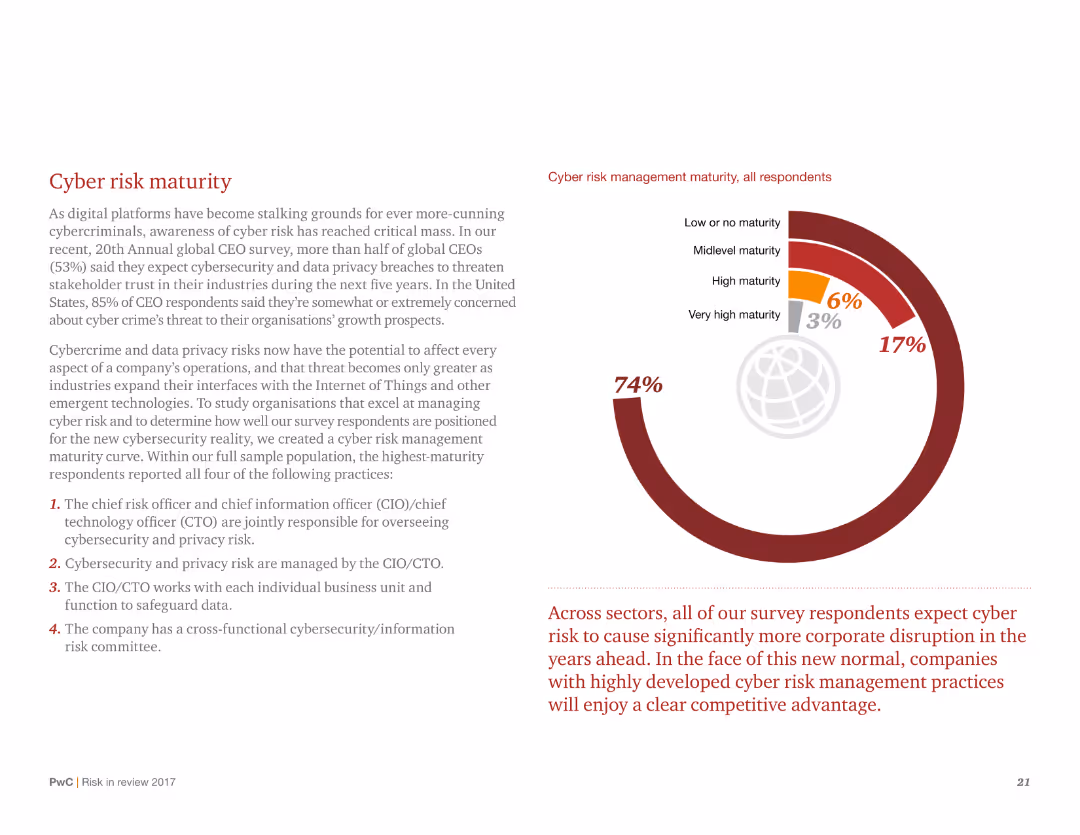
A donut chart illustrating cyber risk management maturity levels among respondents, with detailed text explaining the practices of high-maturity organizations.
Risk Assessment and Management
Technology & Software
Discusses the maturity levels of cyber risk management and outlines the four key practices adopted by high-maturity organizations to manage cybersecurity and data privacy risks.
Cyber risk, maturity, cybersecurity, data privacy, management practices, donut chart, respondents, high maturity
false
Risk Assessment and Management
Technology & Software
Mixed Chart
PwC/Strategy&
Add to my slides
Remove from favorites
Light background with green accents, text divided into columns, a colorful column chart on the right displaying survey results on digital transformation initiatives.
Risk Assessment and Management
Financial Services
The slide details how interconnected risks and digital business optimization are key in addressing cyber threats, with survey data on companies' transformation initiatives.
Cyber risks, digital transformation, survey, business optimization, data analytics
false
Risk Assessment and Management
Financial Services
Mixed Chart
Gartner
Add to my slides
Remove from favorites
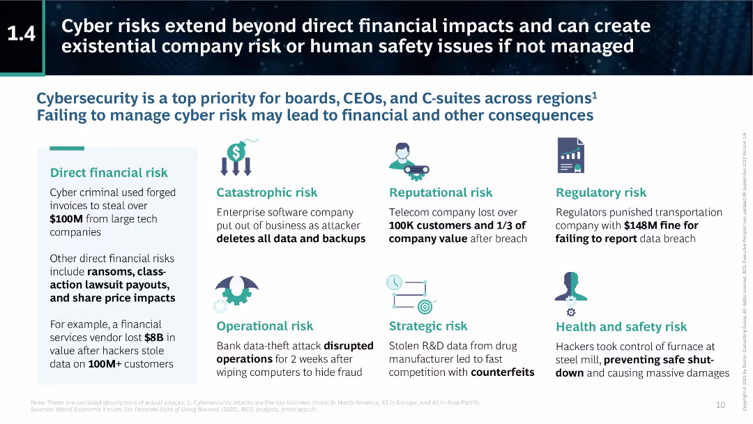
The slide includes various icons and text blocks detailing different types of cyber risks, such as direct financial risk, catastrophic risk, and reputational risk.
Risk Assessment and Management
Technology & Software
This slide discusses the broader implications of cyber risks, extending beyond direct financial impacts to include catastrophic, reputational, regulatory, and health and safety risks. It underscores the importance of comprehensive cybersecurity measures.
cyber risks, financial impact, catastrophic risk, reputational risk, regulatory risk, health and safety, cybersecurity, BCG
false
Risk Assessment and Management
Technology & Software
Header Vertical
BCG
Add to my slides
Remove from favorites
The slide features a structured layout with five key steps in mitigating cyber risks: "Identify," "Protect," "Detect," "Respond," and "Recover." Each step is contained in a box with an accompanying descriptive subtitle.
Operational Efficiency
Technology & Software
This slide outlines a strategy for mitigating cyber risks, emphasizing the importance of each step in the cyber risk management process. It's relevant for presentations focused on cybersecurity within financial institutions, detailing a proactive approach to protecting firm and client data.
cyber risks, mitigation, Goldman Sachs, protection, response
false
Operational Efficiency
Technology & Software
Boxed
Goldman Sachs
Add to my slides
Remove from favorites
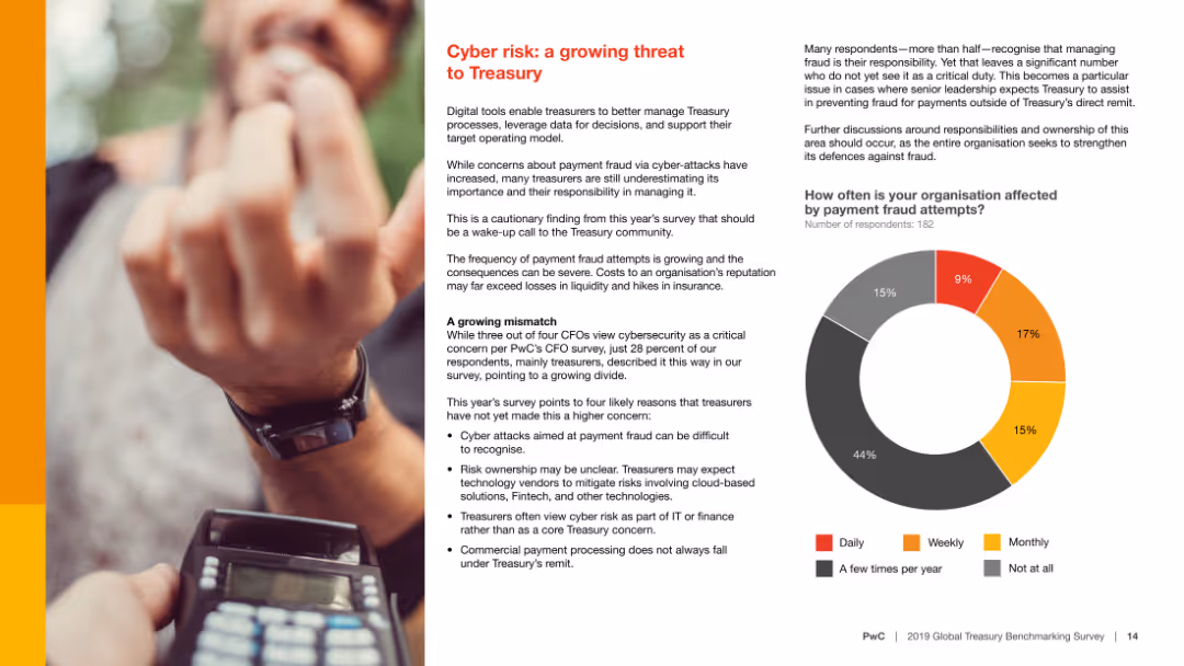
The slide includes a bar chart and a pie chart, and text explaining cyber risks and survey results on payment fraud attempts frequency.
Risk Assessment and Management
Financial Services
It highlights the growing threat of cyber risk to Treasury functions, with statistics on how often organizations face payment fraud attempts and how they manage it.
Cyber risk, Treasury, payment fraud, survey, statistics
false
Risk Assessment and Management
Financial Services
Mixed Chart
PwC/Strategy&
Add to my slides
Remove from favorites
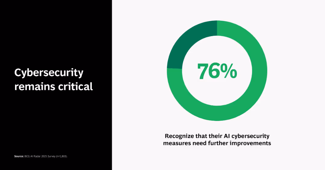
Donut chart showing 76% with caption below and supporting message on the left; strong green theme across elements.
Risk Assessment and Management
Artificial Intelligence
Shows that 76% of respondents recognize their AI cybersecurity measures need improvement, indicating a widely acknowledged vulnerability.
cybersecurity, AI risk, chart, survey, 76%, improvement, awareness, BCG
false
Risk Assessment and Management
Artificial Intelligence
Single Chart
BCG
Add to my slides
Remove from favorites
Bar chart showing percentages of cybersecurity breach experiences, with supporting text explanation.
Risk Assessment and Management
Financial Services
Details the cybersecurity threat experiences of APAC family offices, including the timeline and frequency of breaches.
cybersecurity, breaches, APAC, family offices, data security
false
Risk Assessment and Management
Financial Services
Mixed Chart
EY
Add to my slides
Remove from favorites
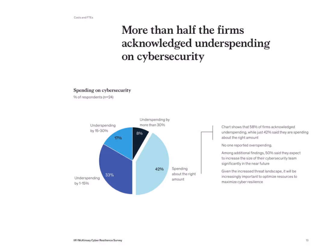
Donut-style pie chart showing distribution of cybersecurity spending levels. Supporting text on the right details implications of underinvestment.
Risk Assessment and Management
Financial Services
58% of firms admit they’re underspending on cybersecurity, with no firm reporting overspending. Many plan to grow their cybersecurity teams. The slide underscores the need to optimize security investments to align with growing threats and reduce risk exposure.
cybersecurity, budget, spending, underinvestment, risk, survey, financial firms
false
Risk Assessment and Management
Financial Services
Mixed Chart
McKinsey
Add to my slides
Remove from favorites
Dark background with green accents, text on the left, a column chart on the right showing survey data. The slide is moderately dense with multiple texts and visual elements.
Strategic Planning
Technology & Software
The slide discusses how cyber initiatives are foundational for business value, highlighting survey data about cyber investment and its impact on business priorities.
Cybersecurity, business value, survey, investment, impact
false
Strategic Planning
Technology & Software
Mixed Chart
Gartner
Add to my slides
Remove from favorites
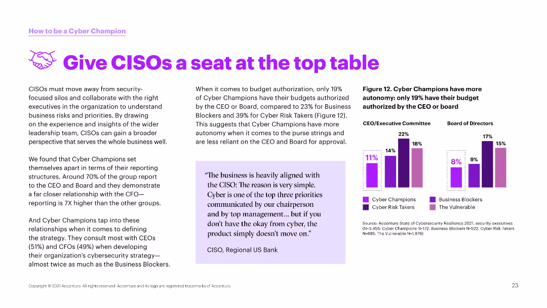
The slide has a white background with a column chart on the right side. The left side contains text emphasizing the importance of CISOs in business alignment.
Strategic Planning
Technology & Software
This slide explains the role of CISOs in aligning cybersecurity with business strategies and the need for their involvement in executive decision-making.
Cybersecurity, CISOs, business alignment, strategy, executive decision, champions, risk management, security, leadership
false
Strategic Planning
Technology & Software
Mixed Chart
Accenture
Add to my slides
Remove from favorites
The slide features a pie chart and several smaller charts detailing the investment focus on cloud security, cyber resilience, and related initiatives.
Risk Assessment and Management
Technology & Software
The slide discusses the increasing investment in cybersecurity, highlighting cloud security and cyber resilience as top priorities for organizations.
cybersecurity, cloud security, resilience, data privacy, cyber initiatives
false
Risk Assessment and Management
Technology & Software
Multiple Chart
EY
Add to my slides
Remove from favorites
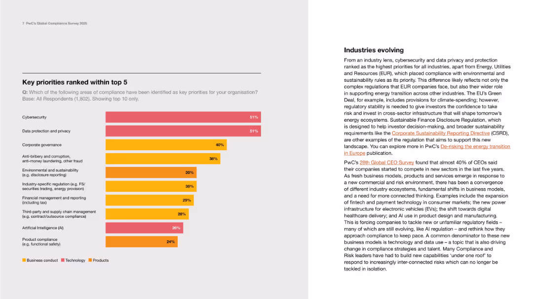
Left-aligned bar chart with color-coded segments; right column of text on industry insights.
Strategic Planning
Professional Services
This slide displays a bar chart ranking the top 10 compliance priorities by percentage of respondents, highlighting cybersecurity and data privacy as top concerns. The right text explains evolving industry priorities and regulations.
Cybersecurity, data privacy, compliance, governance, AI, sustainability
false
Strategic Planning
Professional Services
Mixed Chart
PwC/Strategy&
Add to my slides
Remove from favorites
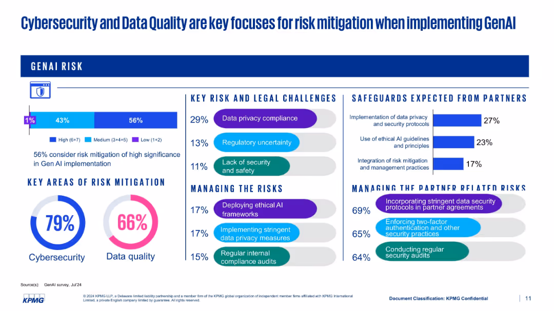
Multi-section layout with bars, pie charts, and bullet points covering risk challenges and mitigation efforts
Risk Assessment and Management
Artificial Intelligence
This slide presents various dimensions of GenAI risk mitigation. Cybersecurity (79%) and data quality (66%) are leading focus areas. It also shows expectations from partners and strategies for managing both legal and partner-related risks.
cybersecurity, data quality, compliance, mitigation, KPMG, GenAI risks
false
Risk Assessment and Management
Artificial Intelligence
Multiple Chart
KPMG
Add to my slides
Remove from favorites
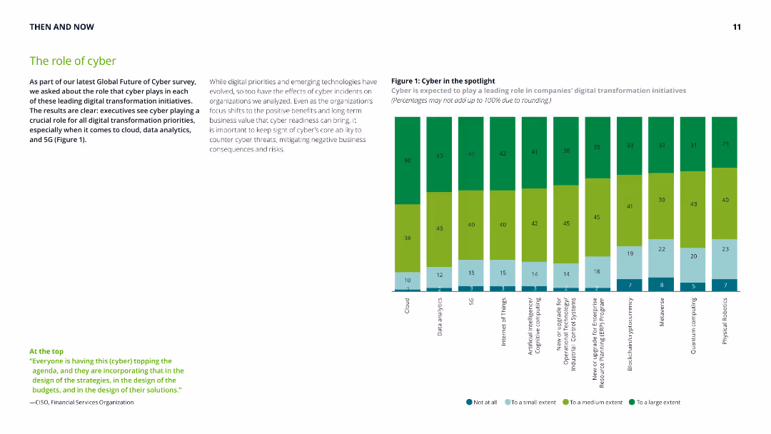
Column chart depicting the role of cyber in various digital transformation initiatives, accompanied by text explaining the importance of cyber readiness in mitigating threats and ensuring business value.
Risk Assessment and Management
Technology & Software
Discusses the critical role of cyber security in digital transformation, highlighting the impact on cloud, data analytics, and 5G initiatives, and the importance of readiness in preventing cyber threats.
cyber security, digital transformation, cloud, data analytics, 5G, cyber threats, business value, risk management, readiness
false
Risk Assessment and Management
Technology & Software
Mixed Chart
Deloitte
Add to my slides
Remove from favorites
A mix of text, graphics, and data points addressing the need for digital trust technologies due to growing cybersecurity threats.
Technology and Digital Transformation
Technology & Software
Emphasizes the importance of cybersecurity in light of increasing threats, rising costs, and the need for regulatory compliance.
cybersecurity, digital trust, risk management, technology impact
false
Technology and Digital Transformation
Technology & Software
Text Only
McKinsey
Add to my slides
Remove from favorites
Includes column charts and icons related to security. The design is compact with a significant amount of data points and narrative information organized for clear readability.
Risk Assessment and Management
Technology & Software
Focuses on cybersecurity initiatives, including data on alert processing and expenditure. It discusses efforts to improve security infrastructure and partnerships with public entities.
cybersecurity, expenditure, compliance, security alerts, authentication, regulatory, infrastructure, partnership, NIST, resilience
false
Risk Assessment and Management
Technology & Software
Multiple Chart
JP Morgan
Add to my slides
Remove from favorites
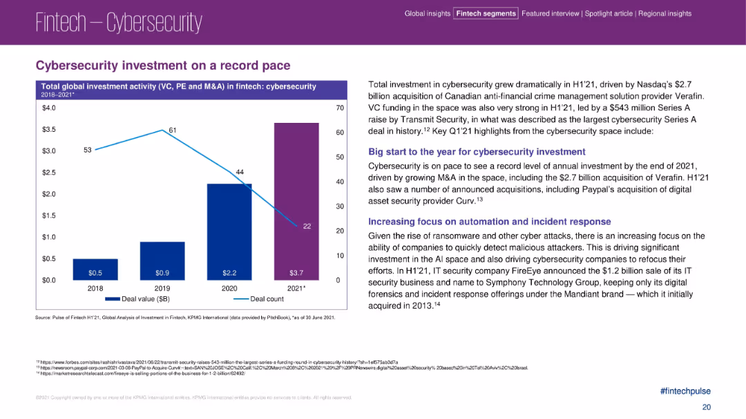
Left chart shows increasing cybersecurity investment value; text on the right details causes and key deals.
Risk Assessment and Management
Financial Services
The slide outlines record-setting investment in fintech cybersecurity in early 2021, driven by M&A, rising threats, and automation needs. It features notable acquisitions (e.g., Verafin, Curv) and highlights industry focus on faster threat detection and AI-powered defenses.
cybersecurity, fintech, investment, M&A, ransomware, automation, threat detection
false
Risk Assessment and Management
Financial Services
Mixed Chart
KPMG
Add to my slides
Remove from favorites
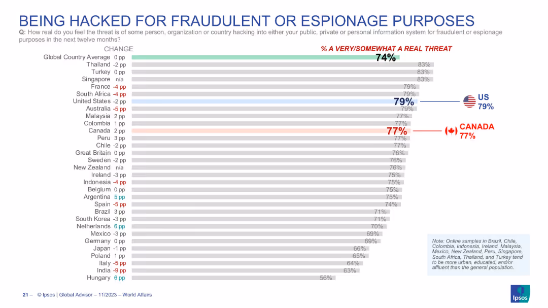
Bar graph showing perceived threat of hacking incidents; horizontal layout; Canada and US emphasized with bold numbers and flags.
Risk Assessment and Management
Technology & Software
The slide conveys the perceived risk of being hacked for fraudulent or espionage purposes over the next twelve months. A high percentage of respondents—79% in the US and 77% in Canada—consider it a real threat. The global average stands at 74%, indicating a widespread concern over cybersecurity.
cybersecurity, hacking, fraud, espionage, threat perception, survey, Canada, USA, digital risk, Ipsos
false
Risk Assessment and Management
Technology & Software
Single Chart
IPSOS
Add to my slides
Remove from favorites
Identical format to 18831. Horizontal bar chart ranks countries by confidence in hacking response. Side panel repeats the survey question focused on cyber attacks.
Risk Assessment and Management
Government & Public Sector
Displays public perception across 30 countries regarding their government’s ability to respond to hacking incidents. Visual emphasis is again placed on Canada and the US with comparative average confidence rates and year-over-year changes.
cybersecurity, hacking, public confidence, cyber response, information security, threat readiness, Ipsos, comparative analysis
false
Risk Assessment and Management
Government & Public Sector
Mixed Chart
IPSOS
Add to my slides
Remove from favorites
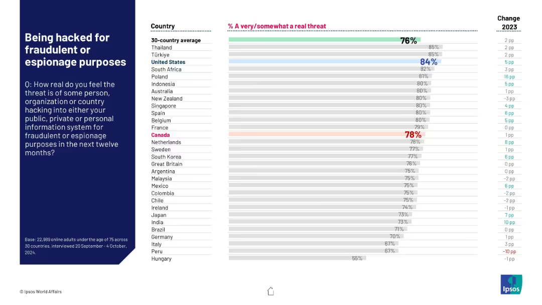
Horizontal bar chart by country with agreement percentages on hacking threats; change from 2023 shown.
Risk Assessment and Management
Technology & Software
This slide shows how concerned people are about cyber threats such as fraud or espionage. The United States and Türkiye lead concern levels at 84% and 85% respectively. The global average is 76%. Many countries report increases in concern compared to 2023.
cybersecurity, hacking threat, espionage, digital risk, data protection, global awareness, Ipsos, public concern, year change, fraud
false
Risk Assessment and Management
Technology & Software
Mixed Chart
IPSOS
Add to my slides
Remove from favorites
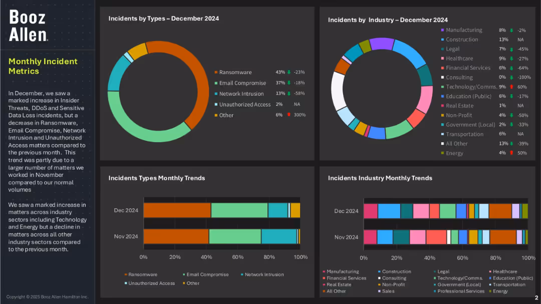
Four-panel dashboard layout with pie and bar charts showing incident types and affected industries; left panel includes summary text; uses a dark background with color-coded data elements.
Risk Assessment and Management
Technology & Software
This dashboard highlights cybersecurity incidents by type and industry for December 2024. Ransomware and email compromise are dominant threats, while financial services and healthcare industries were notably impacted. The slide also shows trends over the previous month and mentions increased threats in Technology and Energy sectors.
cybersecurity, incident metrics, ransomware, email compromise, unauthorized access, threat trends, Booz Allen, industry risk, data loss
false
Risk Assessment and Management
Technology & Software
Multiple Chart
Booz Allen Hamilton
Add to my slides
Remove from favorites
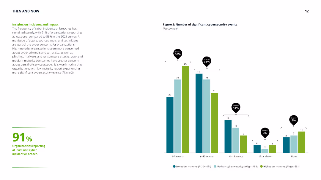
Column chart showing the number of significant cybersecurity events, with accompanying text highlighting the steady frequency of cyber incidents and differences in concerns across maturity levels.
Risk Assessment and Management
Technology & Software
Provides insights into the frequency and impact of cybersecurity incidents, emphasizing the concerns of low, medium, and high-maturity organizations and their experiences with cyber threats.
cyber security, incidents, impact, risk assessment, maturity levels, cyber threats, frequency, organization concerns
false
Risk Assessment and Management
Technology & Software
Mixed Chart
Deloitte
Add to my slides
Remove from favorites
The slide features a column chart with main reasons for investing in cyber security.
Market Analysis and Trends
Technology & Software
The slide details various reasons companies invest in cyber security, with a focus on business continuity and compliance.
cyber security, investment, business continuity, compliance, regulation, reputation, data protection
false
Market Analysis and Trends
Technology & Software
Single Chart
IPSOS
Add to my slides
Remove from favorites
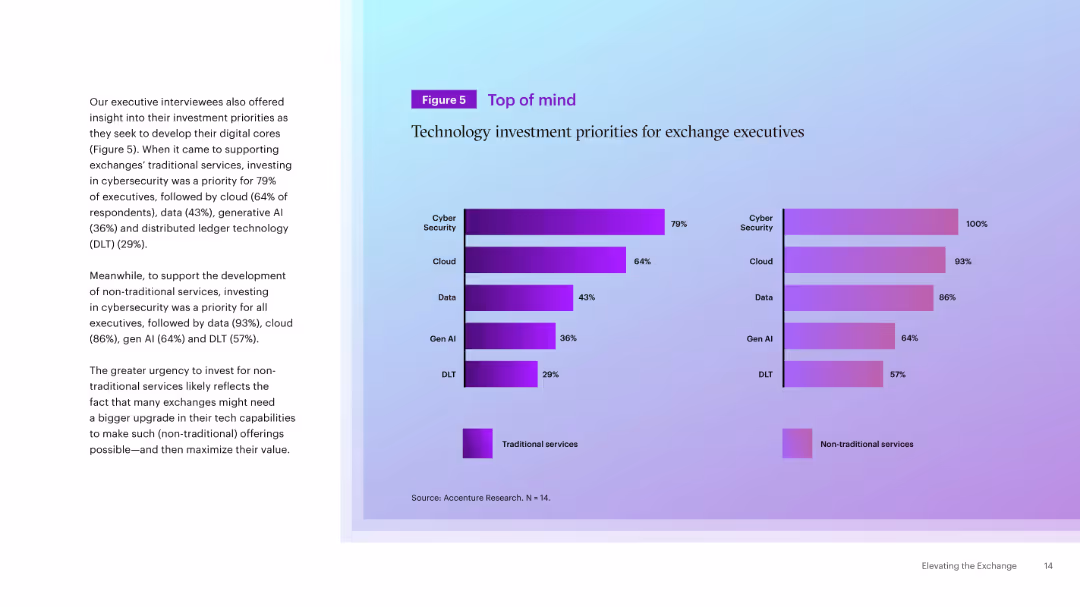
Dual horizontal bar charts comparing tech priorities for traditional vs. non-traditional services. Text explanation on the left. Purple-themed color coding.
Strategic Planning
Technology & Software
This slide summarizes executive priorities for technology investments in exchanges. Cybersecurity is top across both traditional and non-traditional services, with a stronger push in non-traditional areas for data, cloud, and AI adoption.
Cybersecurity, Investment, Exchange, Cloud, AI, Data, Tech Priorities, Traditional, Strategic Planning
false
Strategic Planning
Technology & Software
Mixed Chart
Accenture
Add to my slides
Remove from favorites
This slide features a column chart and a bar chart. The layout is visually balanced, with ample white space around the charts.
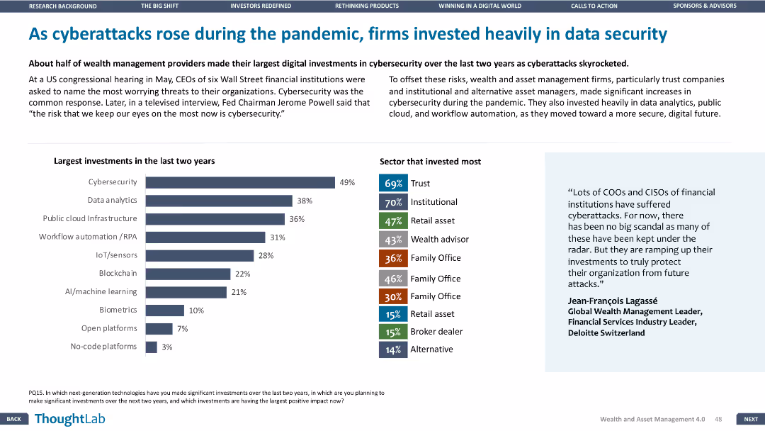
Risk Assessment and Management
Financial Services
The slide emphasizes the significant investments in data security made by firms in response to the rise in cyberattacks during the pandemic, highlighting areas like cybersecurity and data analytics.
Cybersecurity, pandemic, data security, investments, risk management
false
Risk Assessment and Management
Financial Services
Mixed Chart
Deloitte
Add to my slides
Remove from favorites
Bar chart showing percentages of family offices lacking cybersecurity response plans, with explanatory text.
Risk Assessment and Management
Financial Services
Addresses the lack of cybersecurity response plans among APAC family offices, highlighting vulnerabilities and risks.
cybersecurity plans, APAC, family offices, response plans, vulnerabilities
false
Risk Assessment and Management
Financial Services
Mixed Chart
EY
Add to my slides
Remove from favorites
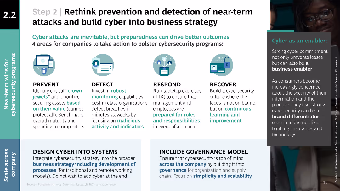
The slide uses a combination of text and icons in a multi-column layout. It features four main areas with icons representing prevent, detect, respond, and recover, with supporting text in each section. There is also a sidebar discussing the importance of cybersecurity.
Risk Assessment and Management
Technology & Software
The slide emphasizes the importance of integrating cybersecurity into business strategy by focusing on prevention, detection, response, and recovery. It highlights the steps companies should take to bolster their cybersecurity programs, mentioning specific actions and benefits.
cybersecurity, prevention, detection, response, recover
false
Risk Assessment and Management
Technology & Software
Linear Flow
BCG
Add to my slides
Remove from favorites
Features a detailed network diagram depicting cybersecurity infrastructure and risk management with labeled nodes for various organizational elements.
Risk Assessment and Management
Technology & Software
This slide emphasizes the importance of cybersecurity and risk management in financial systems, presenting a three-tier defense model. It could be used in risk management training or to explain an organization's security protocols.
Cybersecurity, Risk Management, Financial Services, Compliance
false
Risk Assessment and Management
Technology & Software
Framework
JP Morgan
Add to my slides
Remove from favorites
This slide contains column charts and bullet points. Charts illustrate the growth in security data processed, application vulnerability scanning, and devices secured from 2019 to 2022. The color scheme is teal and dark blue, with each point accompanied by a relevant icon.
Financial Performance
Financial Services
Details the bank's cybersecurity measures and investments, underscoring consistent efforts despite increased demand and evolving threats.
Cybersecurity, Risk Management, Technology, Data Protection, Financial Services, Investment, Device Security
false
Financial Performance
Financial Services
Multiple Chart
JP Morgan
Add to my slides
Remove from favorites
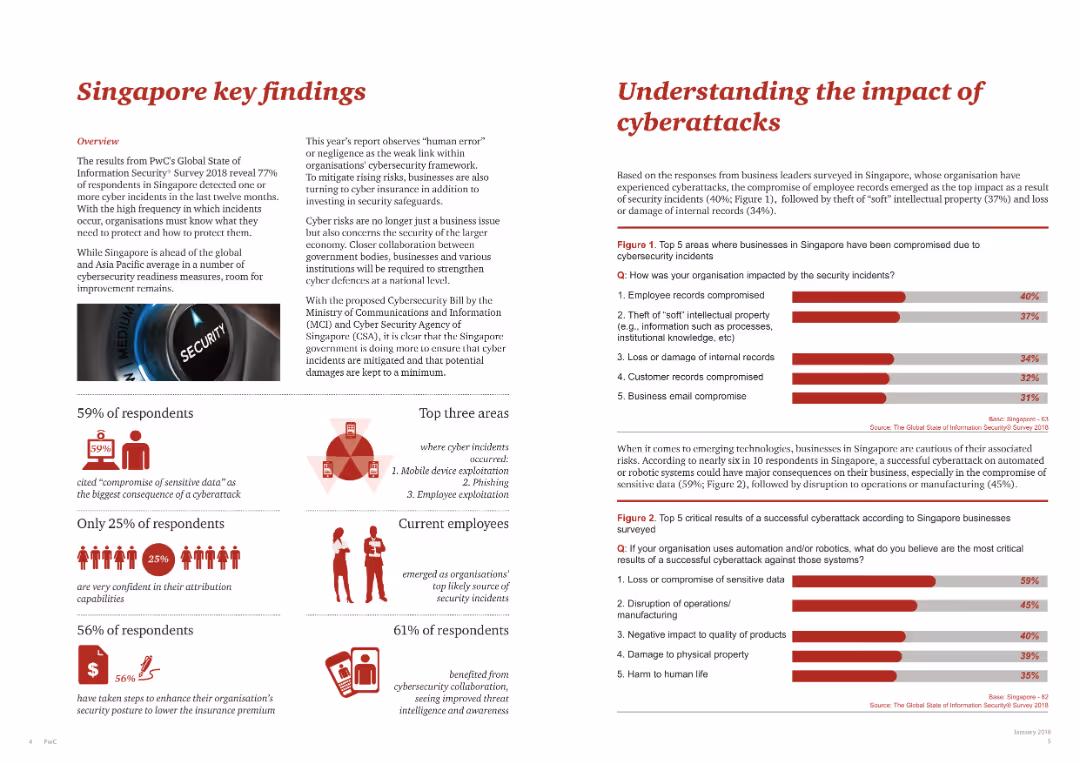
This slide has multiple sections including textual content, infographics, and a bar chart showing impacts of cyberattacks.
Risk Assessment and Management
Telecommunications
Presents key findings from a survey on cyber incidents in Singapore, highlighting vulnerabilities and the need for enhanced cybersecurity measures.
cybersecurity, Singapore, cyberattacks, survey findings, risk assessment
false
Risk Assessment and Management
Telecommunications
Multiple Chart
PwC/Strategy&
Add to my slides
Remove from favorites
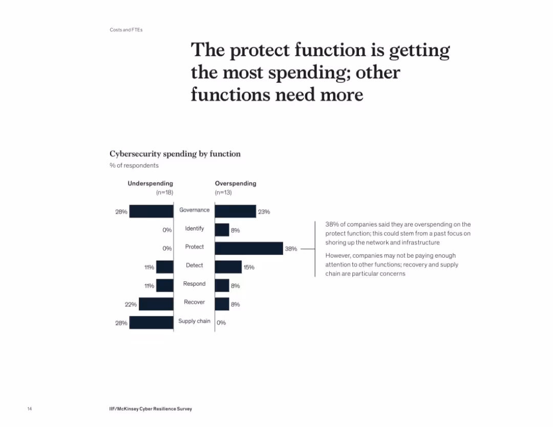
Split bar chart contrasting under- and overspending across cybersecurity functions; text commentary
Performance Metrics and KPIs
Technology & Software
The slide analyzes how cybersecurity budgets are allocated across functions. It shows that 38% of companies are overspending on the "protect" function while underspending on areas like recovery and supply chain. The visual comparison indicates a misalignment in budget priorities for cyber resilience.
cybersecurity, spending, protection, budget allocation, recovery, supply chain, governance, overspending, underspending, McKinsey
false
Performance Metrics and KPIs
Technology & Software
Mixed Chart
McKinsey
Add to my slides
Remove from favorites
This slide uses a circular diagram to illustrate key focus areas in cybersecurity. Each segment is color-coded and labeled clearly, enhancing the slide's visual and informational clarity. The overall design is streamlined, with a focus on readability and immediate comprehension of the content.
Strategic Planning
Technology & Software
This slide outlines strategic focus areas in cybersecurity, including building a security culture, managing identity and access, and securing remote work environments. It's useful for strategic discussions on strengthening organizational cybersecurity frameworks and practices.
Cybersecurity, Strategy, Identity Management, Remote Work, Security Culture, Diagram
false
Strategic Planning
Technology & Software
Framework
PwC/Strategy&
Add to my slides
Remove from favorites
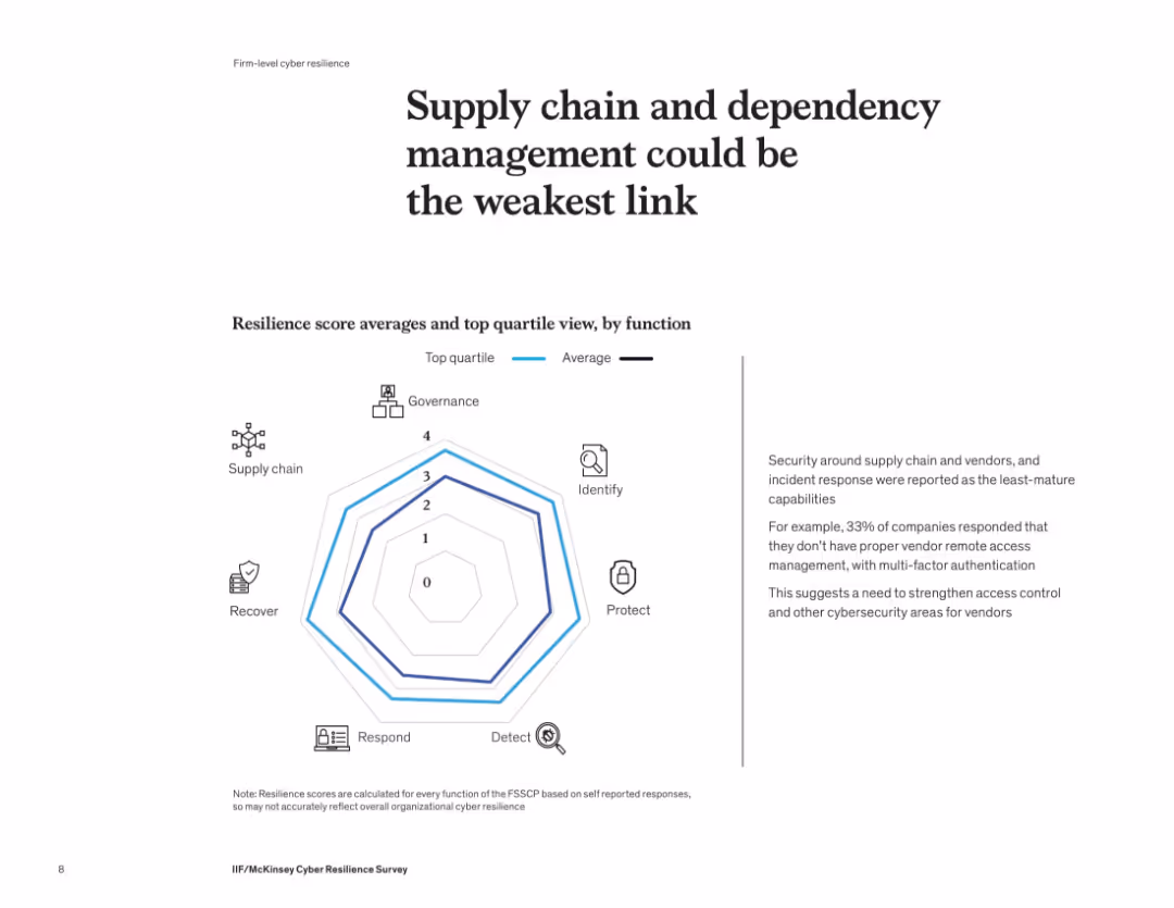
Radar/spider chart compares average vs. top quartile resilience scores across cybersecurity functions. Text box on the right provides insights into vendor access weaknesses.
Risk Assessment and Management
Financial Services
The slide highlights supply chain and dependency management as the least mature cybersecurity function. Companies report weak vendor access control and limited use of multi-factor authentication. Incident response also shows gaps, suggesting a need for strengthened controls and vendor oversight.
cybersecurity, supply chain, dependency management, weak link, vendor control, risk management, radar chart
false
Risk Assessment and Management
Financial Services
Mixed Chart
McKinsey
Add to my slides
Remove from favorites
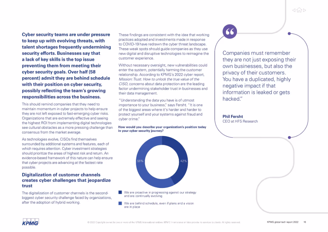
Balanced layout with bold section headers and a donut chart. Text-heavy with bold statistics and quotes; donut shows security progress status split.
Risk Assessment and Management
Technology & Software
Discusses cyber security issues organizations face, notably talent shortages and evolving threats. Emphasizes the growing responsibilities of cyber teams and challenges in digitalizing customer channels.
cybersecurity, talent shortage, digitalization, hybrid working, data protection, customer trust
false
Risk Assessment and Management
Technology & Software
Mixed Chart
KPMG
Add to my slides
Remove from favorites
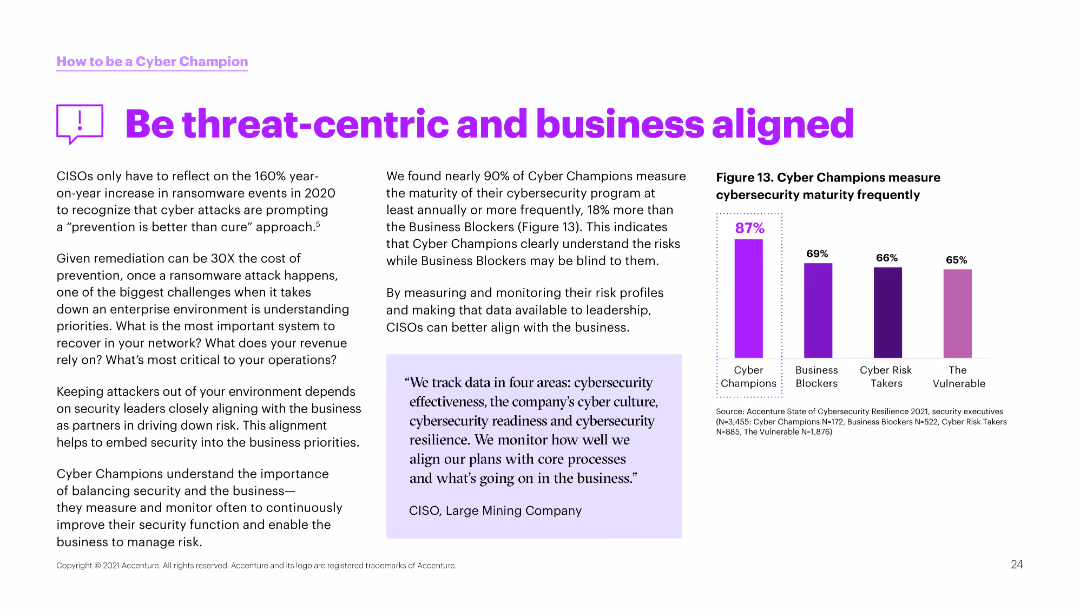
The slide has a white background with a column chart on the right side. The left side contains text discussing the importance of aligning cybersecurity with business priorities.
Strategic Planning
Technology & Software
This slide highlights the need for continuous improvement in cybersecurity through regular measurement and alignment with business goals, showing data on frequent cybersecurity reviews.
Cybersecurity, threat-centric, business alignment, priorities, measurement, improvement, reviews, champions, security
false
Strategic Planning
Technology & Software
Mixed Chart
Accenture
Add to my slides
Remove from favorites
The slide includes a ranked index chart and supporting text boxes, visually distinguishing between the least prepared threat types for organizations. The colors used are primarily black, grey, and red, enhancing the visual impact and readability of the data presented.
Operational Efficiency
Professional Services
This slide analyzes preparedness against various cybersecurity threats, noting that organizations are least prepared for cyber criminals, hacktivists, and insider threats. It discusses the disparity in organizational readiness and emphasizes the need for improved security measures in response to increasing cyber threats.
Cybersecurity, Threats, Preparedness, Hacktivists, Insider Threats, Rank Index Chart
false
Operational Efficiency
Professional Services
Mixed Chart
PwC/Strategy&
Add to my slides
Remove from favorites
Contains a column chart with green and blue bars representing strategies for engaging and developing cyber talent across different maturity groups.
Human Resources and Talent Management
Technology & Software
Analyzes strategies used by organizations to engage, retain, and develop cyber talent, highlighting the challenges and importance of having the right skills in place.
Cyber talent, engagement, retention, skill development, HR strategies
false
Human Resources and Talent Management
Technology & Software
Mixed Chart
Deloitte
Add to my slides
Remove from favorites
Light background with green accents, text on the left, a table on the right detailing negative consequences of cyber incidents, and a large green percentage figure at the bottom.
Strategic Planning
Professional Services
The slide highlights how cyber threats are prioritized at the board level, emphasizing the consequences of cyber incidents and their impact on business decisions and resources.
Cyber threats, board level, business impact, survey, consequences
false
Strategic Planning
Professional Services
Table
Gartner
Add to my slides
Remove from favorites
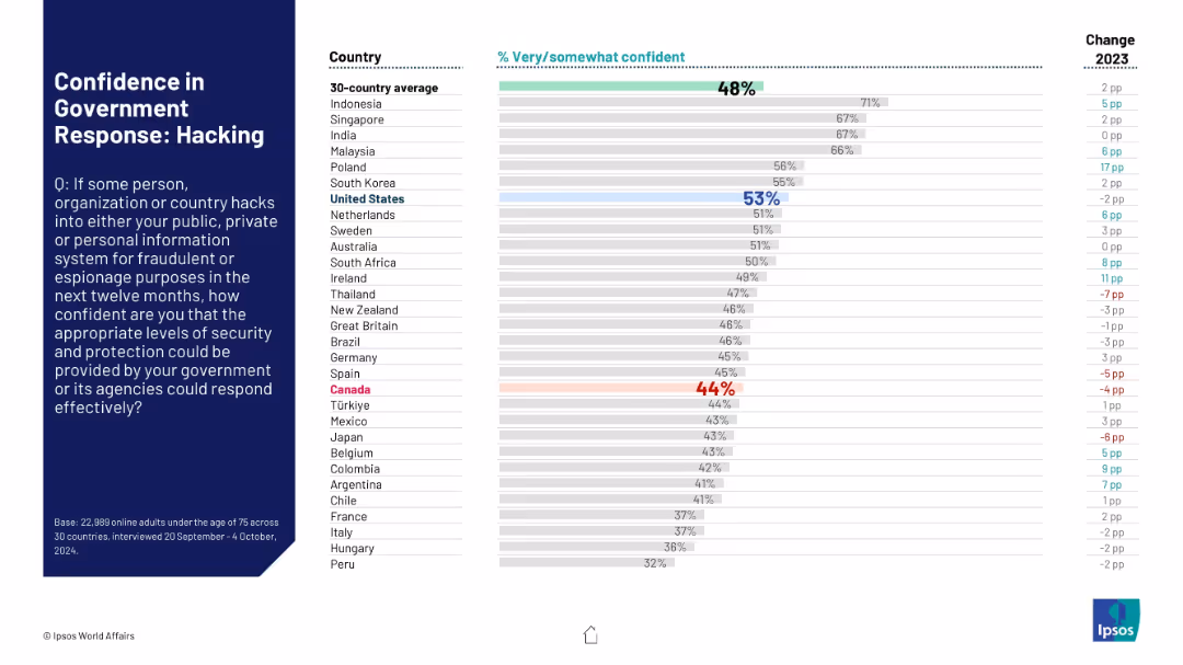
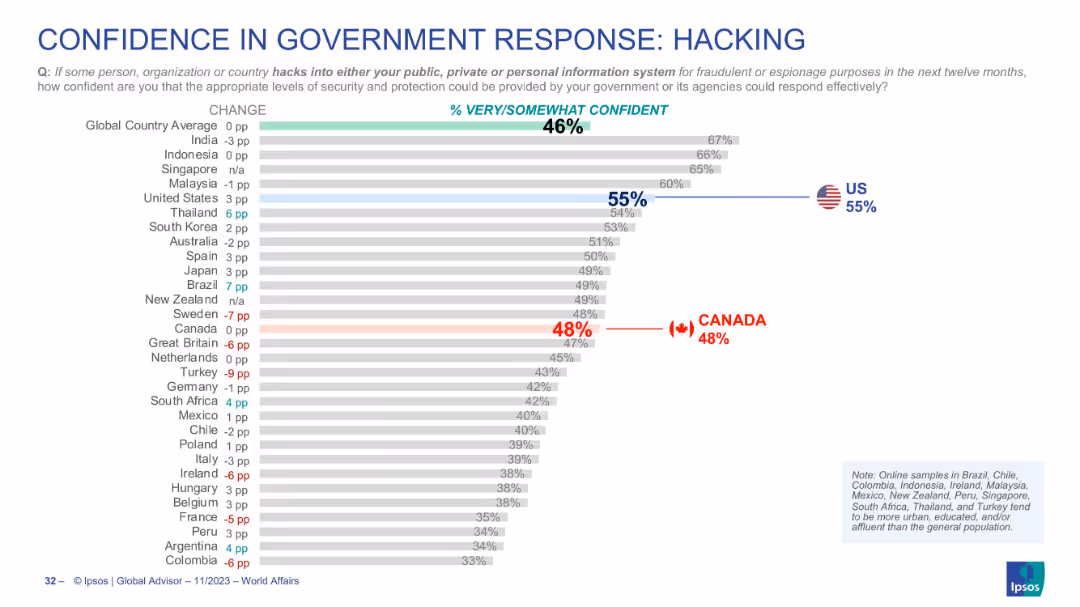
Bar chart format, color-coded, highlights on US (55%) and Canada (48%) with world rankings
Risk Assessment and Management
Government & Public Sector
This slide focuses on cyber threats, measuring confidence in governmental response to hacking. U.S. is at 55% confidence, Canada at 48%, with a global average of 46%.
cyber threats, hacking, cybersecurity, government trust, Canada, US, Ipsos, digital risk
false
Risk Assessment and Management
Government & Public Sector
Single Chart
IPSOS
Add to my slides
Remove from favorites
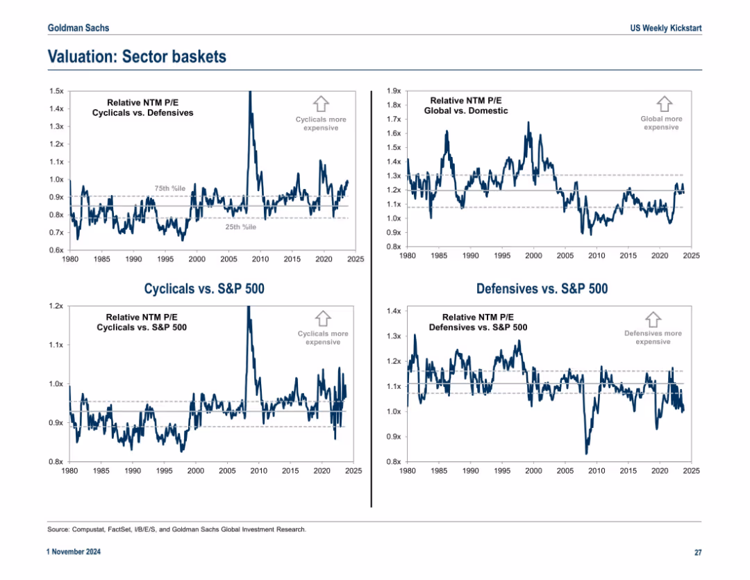
2x2 matrix of charts showing relative P/E valuations across cyclical/defensive sectors and global/domestic equities. Clean layout with directional annotations and percentile bands.
Market Analysis and Trends
Financial Services
This slide compares valuation trends for cyclical vs. defensive sectors and global vs. domestic equities using relative P/E ratios. Annotations indicate over/undervaluation using historical percentiles.
cyclical, defensive, valuation, sector P/E, global, domestic, S&P 500, trends
false
Market Analysis and Trends
Financial Services
Multiple Chart
Goldman Sachs
Add to my slides
Remove from favorites
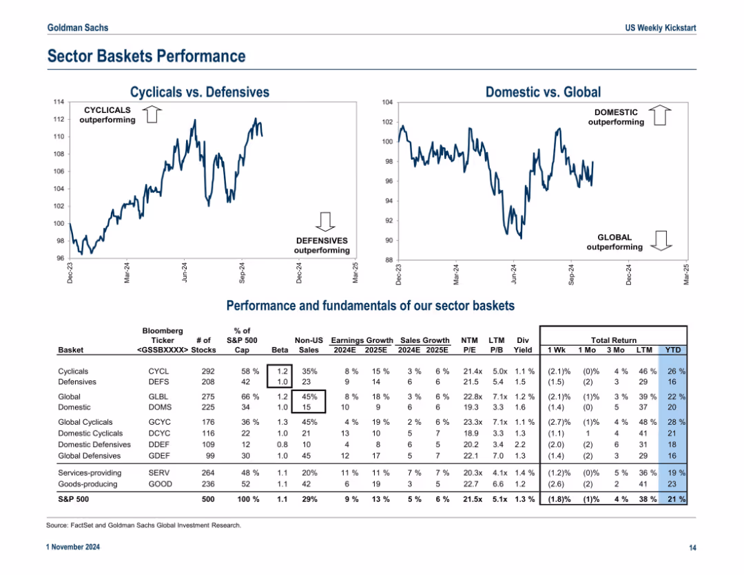
Dual line charts (Cyclicals vs. Defensives and Domestic vs. Global) with supporting table showing sector basket fundamentals and returns; structured and data-rich layout
Product and Service Analysis
Financial Services
This slide contrasts performance trends between cyclical vs. defensive and domestic vs. global equity baskets, supplemented by a detailed table showing earnings, sales growth, valuation metrics, and total returns.
cyclical stocks, defensive stocks, global vs domestic, basket returns, sector fundamentals
false
Product and Service Analysis
Financial Services
Multiple Chart
Goldman Sachs
Add to my slides
Remove from favorites
Features stacked column charts comparing costs and incentives for DAC from 2022 to 2030.
Investment Analysis
Environmental Services & Sustainability
Assesses the financial incentives for investing in direct air capture technology, important for investment decisions in carbon removal technologies.
DAC, financial incentives, investment analysis, carbon removal, 2030, technology investment
false
Investment Analysis
Environmental Services & Sustainability
Multiple Chart
BCG
Add to my slides
Remove from favorites
A bar chart (horizontal) illustrating the likelihood of consuming fewer dairy products across various countries. The chart uses different colors to show likely and unlikely responses.
Market Analysis and Trends
Agriculture & Food Production
This slide examines the likelihood of consumers reducing their intake of dairy products. It provides a comparative view of consumer behaviors across different regions, highlighting trends in dietary adjustments for health and environmental reasons.
dairy consumption, dietary changes, sustainability, consumer behavior, comparative data
false
Market Analysis and Trends
Agriculture & Food Production
Multiple Chart
IPSOS
Add to my slides
Remove from favorites
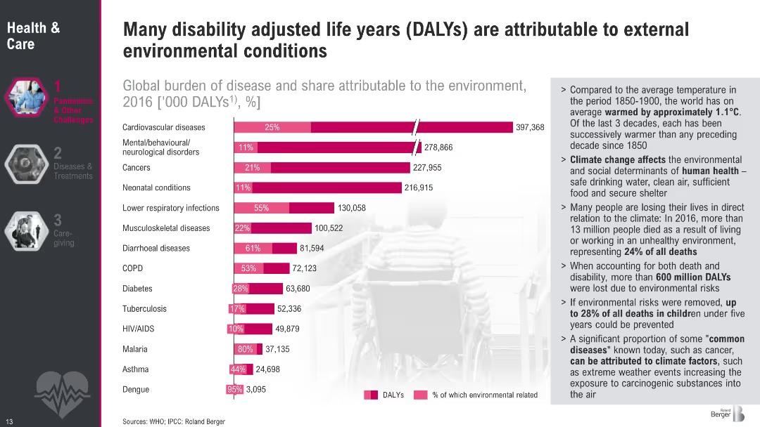
Bar chart comparing diseases and DALYs with pink bars indicating environmental attribution. Includes a sidebar with detailed bullet points on climate impact.
Performance Metrics and KPIs
Healthcare & Pharmaceuticals
The slide highlights the contribution of environmental factors to various diseases using DALYs. It shows that up to 28% of childhood deaths and over 600 million DALYs are due to environmental risks. Key diseases like cardiovascular issues and respiratory infections have large environmental components. Sidebar notes contextualize global warming and its impact on human health determinants such as air, water, and housing.
DALYs, environmental risks, disease burden, cardiovascular, respiratory, child mortality, WHO, climate impact
false
Performance Metrics and KPIs
Healthcare & Pharmaceuticals
Mixed Chart
Roland Berger
Add to my slides
Remove from favorites
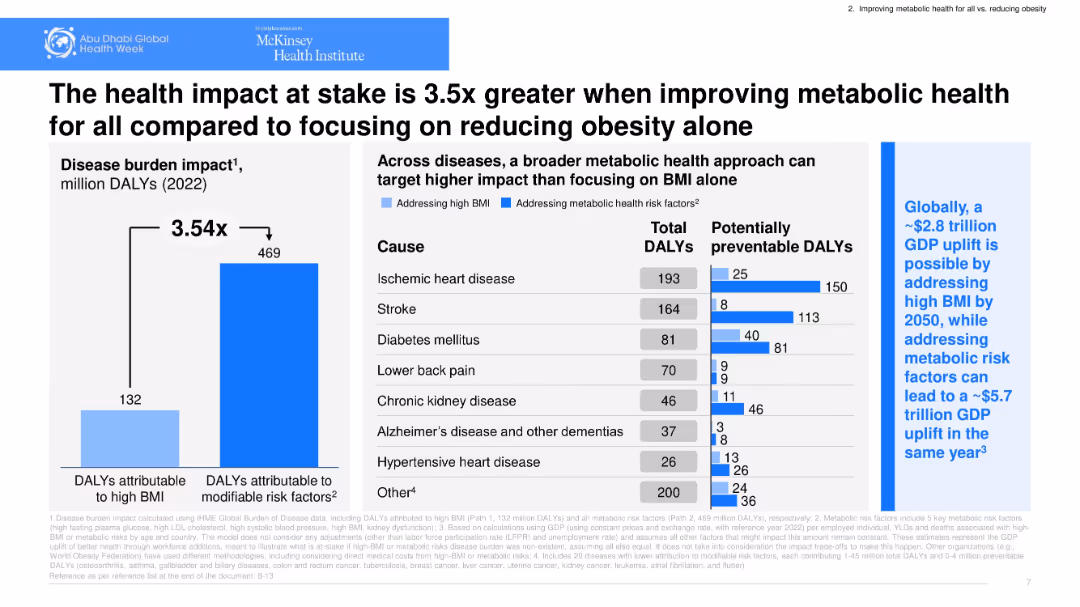
Bar chart comparing DALYs, table of disease causes, blue-on-white clinical design.
Risk Assessment and Management
Healthcare & Pharmaceuticals
Emphasizes that addressing broad metabolic risk factors has a far greater health impact than focusing solely on BMI. Includes breakdown of disease burden and potentially preventable DALYs. Links to economic benefits.
DALYs, metabolic risk, disease burden, public health, GDP impact
false
Risk Assessment and Management
Healthcare & Pharmaceuticals
Multiple Chart
McKinsey
Add to my slides
Remove from favorites
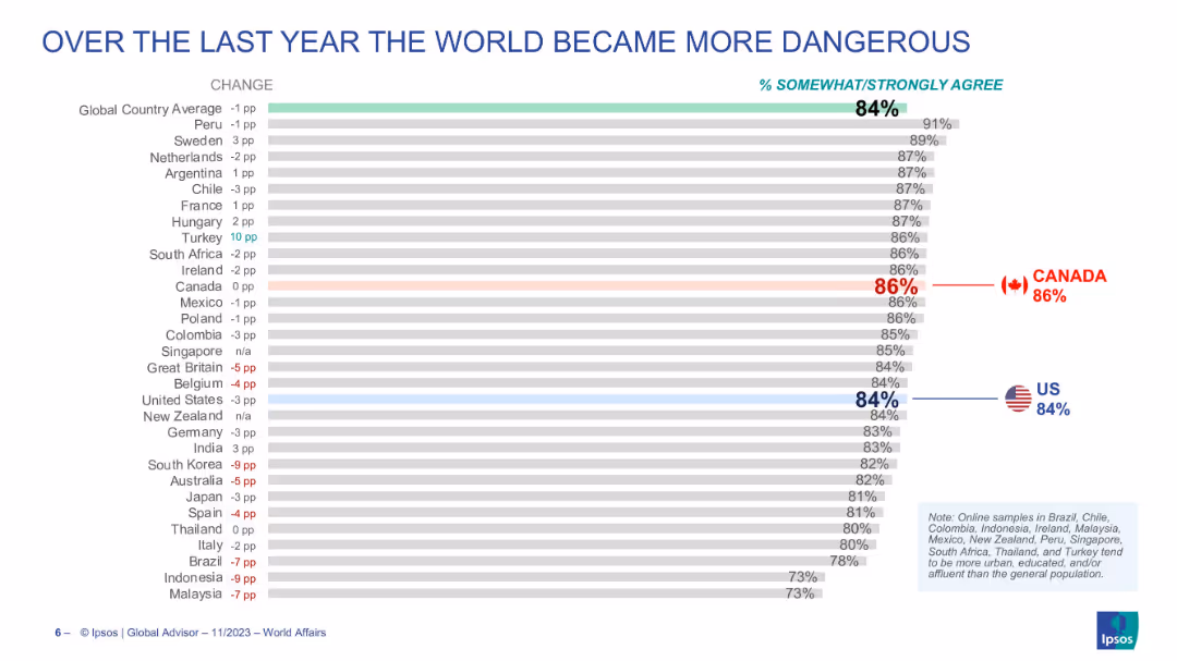
Bar chart showing percentage of people in various countries who believe the world became more dangerous, along with year-over-year change.
Market Analysis and Trends
Media & Entertainment
The slide compares countries on the perception that the world has become more dangerous, with most countries near or above the global average of 84%.
danger, global perceptions, safety, country comparison, annual change, risk awareness
false
Market Analysis and Trends
Media & Entertainment
Single Chart
IPSOS
Add to my slides
Remove from favorites
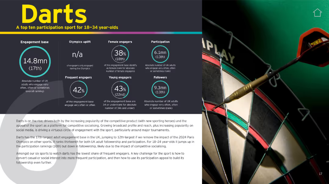
Left-aligned, infographic-style slide with multiple circular and numerical stat boxes in teal and white on a dark background; right side features a photo of a dart hitting a bullseye.
Customer and Market Segmentation
Media & Entertainment
This slide highlights the growing engagement with darts, particularly among young adults in the UK. It shows metrics such as participation rate, social media followers, and gender/age demographics. Darts is gaining traction as a social and competitive activity, with its presence notably high among 18–24-year-olds. The slide also explains the sport’s appeal and challenges in converting casual fans into frequent participants.
Darts, engagement, youth, participation, demographics, social media, UK
false
Customer and Market Segmentation
Media & Entertainment
Mixed Chart
EY
Add to my slides
Remove from favorites
Includes an area graph for DARTs, a column chart for margin loans, and a line graph for profit margins.
Financial Performance
Financial Services
Continues the narrative of IBKR’s growth, featuring area and column charts for trading activity and loans, with a line graph for profit margins.
DARTs, Margin Loans, Profit Margins, Area Graph, Column Chart, Line Graph, Automation, Platform
false
Financial Performance
Financial Services
Multiple Chart
Goldman Sachs
Add to my slides
Remove from favorites
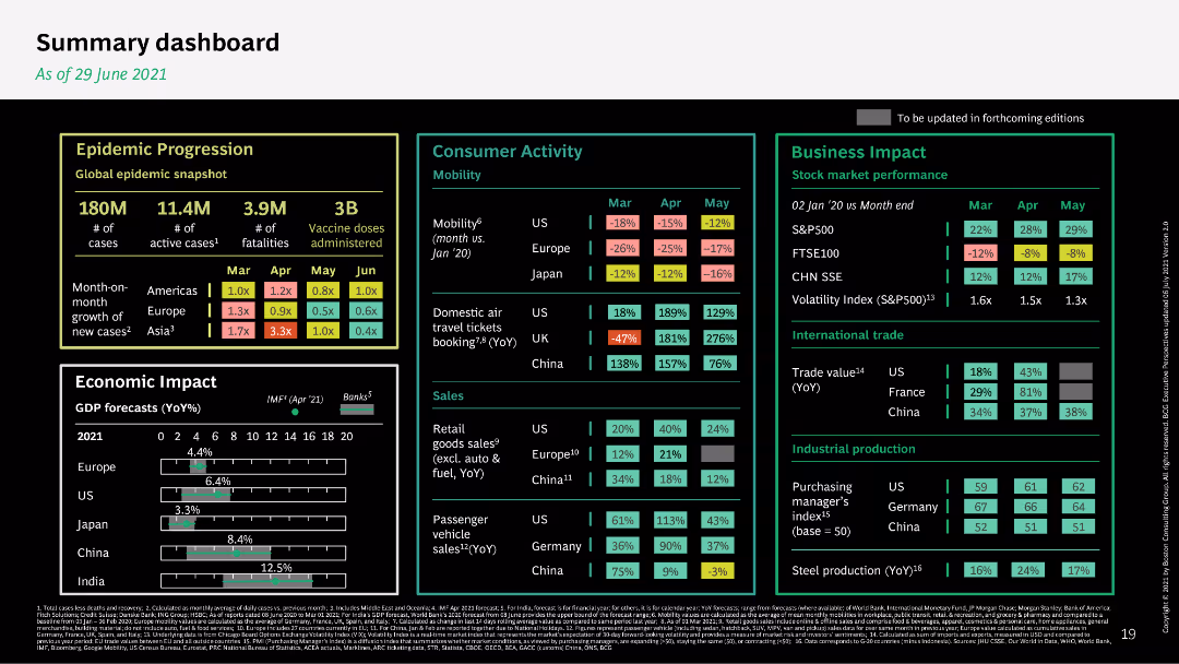
The slide features a comprehensive dashboard with metrics on epidemic progression, consumer activity, and business impact. It uses a dark background with colorful data points for clarity.
Performance Metrics and KPIs
Healthcare & Pharmaceuticals
The summary dashboard provides an overview of various metrics, including epidemic progression, economic impact, consumer activity, and business performance as of June 2021.
dashboard, metrics, epidemic, economic impact, business performance
false
Performance Metrics and KPIs
Healthcare & Pharmaceuticals
Mixed Chart
BCG
Add to my slides
Remove from favorites
The slide features a large image of a network globe with text on the right and a trend assessment.
Technology and Digital Transformation
Technology & Software
Covers the significance of data and AI in creating personalized consumer experiences and improving supply chain automation.
Data, AI, Personalization, Consumer Experience, Supply Chain, Automation, Blockchain
false
Technology and Digital Transformation
Technology & Software
Multiple Chart
Deloitte
Add to my slides
Remove from favorites
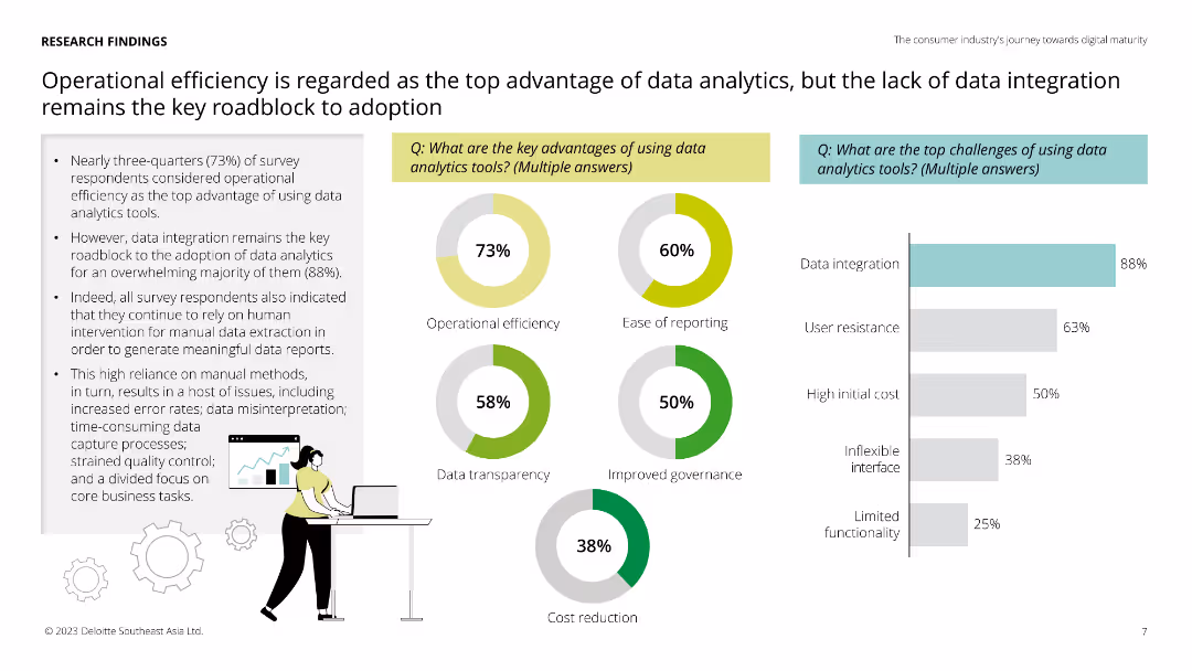
Two pie charts showing the advantages and challenges of data analytics tools according to survey respondents.
Technology and Digital Transformation
Technology & Software
This slide outlines the perceived advantages and challenges of using data analytics tools, highlighting operational efficiency as a key benefit and data integration as a major roadblock. Useful for understanding user perspectives on data analytics tools.
data analytics, advantages, challenges, efficiency
false
Technology and Digital Transformation
Technology & Software
Multiple Chart
Deloitte
Add to my slides
Remove from favorites
Bar charts showing survey respondents' reports of cost savings and revenue growth from data analytics investments, alongside projections of future spending increases.
Financial Performance
Technology & Software
The slide presents data on the financial impact of data analytics investments, including cost savings and revenue growth, and expectations for future spending. Useful for assessing the return on investment in data analytics.
data analytics, cost savings, revenue growth, investment
false
Financial Performance
Technology & Software
Multiple Chart
Deloitte
Add to my slides
Remove from favorites
Bar charts showing the key decision-makers in data analytics tools procurement and the top attributes considered in purchasing these tools.
Strategic Planning
Technology & Software
The slide identifies the primary decision-makers for data analytics tools procurement and the critical attributes considered during the purchase process, with a focus on interface-friendliness and compatibility. Useful for understanding procurement dynamics and criteria.
data analytics, procurement, decision-makers, attributes
false
Strategic Planning
Technology & Software
Multiple Chart
Deloitte
Add to my slides
Remove from favorites
Shows a variety of charts including column and pie charts, focused on the current usage and scaling of different technologies in procurement.
Technology and Digital Transformation
Professional Services
Highlights the importance of data-driven insights in procurement, detailing the main purposes and current use of various technologies.
Data analytics, procurement, technology usage, scaling
false
Technology and Digital Transformation
Professional Services
Multiple Chart
Deloitte
Add to my slides
Remove from favorites
The slide has a combination of column and bar charts with a detailed breakdown of the roles and tools used for data analysis and analytics.
Market Analysis and Trends
Professional Services
Describes the various roles performed by Shared Services (SS) and Global Business Services (GBS) in data analytics, including tools like Cloud and ERP.
data, analytics, SS, GBS, cloud, ERP, analysis, insights, reports
false
Market Analysis and Trends
Professional Services
Mixed Chart
Deloitte
Add to my slides
Remove from favorites
Pie chart and bar chart showing survey results on data analytics utilisation and confidence in data accuracy among respondents.
Technology and Digital Transformation
Technology & Software
The slide presents survey findings on the maturity of data analytics utilisation and confidence in data reliability among organizations. It includes key success factors for a data analytics ecosystem.
data analytics, survey, utilisation, confidence, maturity
false
Technology and Digital Transformation
Technology & Software
Multiple Chart
Deloitte
Add to my slides
Remove from favorites
The slide has a central illustration of a 70% statistic on a presentation screen, accompanied by text boxes and a person holding a magnifying glass. The right side has text detailing training initiatives.
Human Resources and Talent Management
Financial Services
The slide discusses the importance of training employees in data analytics and provides examples from the banking sector, including on-the-job training, external training, and in-house programs.
data analytics, training, workforce, banking sector, on-the-job, external, in-house, employee upskilling, AI, ML
false
Human Resources and Talent Management
Financial Services
Mixed Chart
Deloitte
Add to my slides
Remove from favorites
Features vibrant purple boxes detailing assets and solutions across multiple market segments. Layout is structured and visually appealing.
Operational Efficiency
Technology & Software
Discusses the unique assets of the company and how they cater to different market needs, particularly in healthcare data management and provider solutions. Ideal for business strategy meetings or pitches to potential partners in tech solutions.
data assets, market solutions, healthcare, technology integration
false
Operational Efficiency
Technology & Software
Linear Flow
Barclays
Add to my slides
Remove from favorites
This slide displays a table chart comparing the cost of data breaches across various industries from 2021 to 2022. It uses a blue color scheme for the bars, making it easy to differentiate between the years. The layout is clear, with each industry listed alongside its corresponding data breach cost.
Risk Assessment and Management
Technology & Software
The slide provides a detailed comparison of data breach costs by industry for 2021 and 2022, highlighting the financial impact of security incidents across sectors. It serves as a valuable resource for discussions on cybersecurity risk management and financial implications of data security breaches.
Data Breach, Cost, Industry Comparison, Cybersecurity, Risk Management, Table Chart
false
Risk Assessment and Management
Technology & Software
Single Chart
PwC/Strategy&
Add to my slides
Remove from favorites
Horizontal bar chart, standard layout similar to previous slides. Bars represent likelihood by country with accompanying change vs 2023.
Risk Assessment and Management
Technology & Software
This slide shows concern about personal data breaches across countries. Türkiye, Indonesia, and the Philippines rank highest in concern. The chart indicates a growing trend, with the global average rising slightly compared to 2023.
data breach, cybersecurity, privacy, internet, digital risk
false
Risk Assessment and Management
Technology & Software
Mixed Chart
IPSOS
Add to my slides
Remove from favorites
Bubble chart plotting capacity vs CAGR for APAC nations. Color-coded regions and a note on transaction volume record. Implications box on right.
Market Analysis and Trends
Technology & Software
The slide shows regional trends in APAC data center growth, with China currently leading but India, Japan, and ASEAN expected to drive future expansion. It discusses geopolitical and financial considerations for corporates in tech and real estate.
data center, APAC, capacity, CAGR, China, India, ASEAN, growth
false
Market Analysis and Trends
Technology & Software
Mixed Chart
Accenture
Add to my slides
Remove from favorites
A line chart tracks the growth of U.S. data center construction starts from January 2014 to April 2019. The chart features a rising blue line on a green gradient background.
Industry Overview
Technology & Software
This slide shows the increasing investment in U.S. data center construction over several years, highlighting growth trends in the technology sector.
data center, construction, technology, investment, growth
false
Industry Overview
Technology & Software
Single Chart
Deutsche Bank
Add to my slides
Remove from favorites
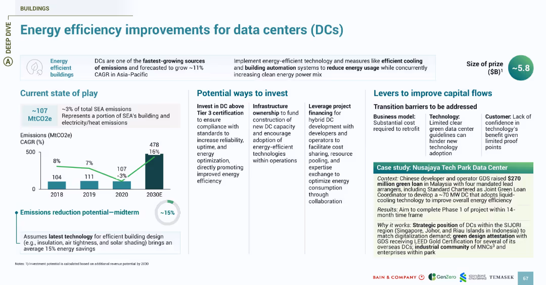
Follows the energy slide design with sections for emissions, investment, challenges, and a green-shaded case study. Focus on energy-efficient buildings.
Investment Analysis
Technology & Software
Focuses on energy consumption by data centers, one of SEA’s fastest-growing sources of emissions. Shows 15% midterm reduction potential with efficient cooling, automation, and green design. Investment opportunities include infrastructure ownership and Tier 3+ certification. Case study highlights GDS’s $270M green loan to develop a Malaysia-based DC using liquid cooling and green certification strategies.
data centers, energy efficiency, emissions, GDS, Malaysia, DCs, cooling, green loans
false
Investment Analysis
Technology & Software
Multiple Chart
Bain
Add to my slides
Remove from favorites
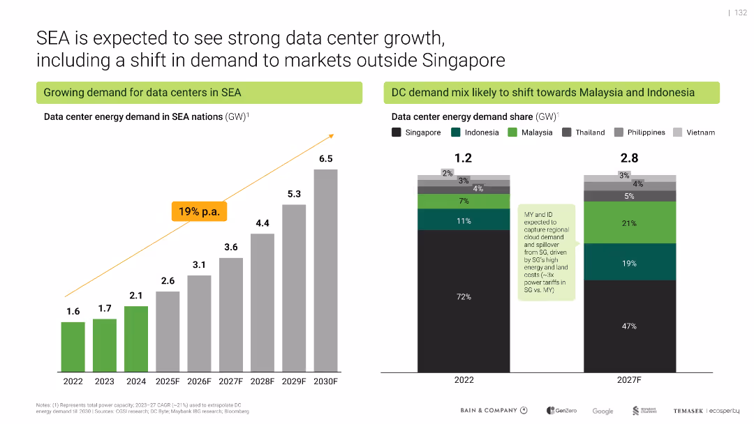
Two-column layout; bar graphs on both sides; green and gray color theme; key figures emphasized
Market Analysis and Trends
Technology & Software
Highlights the rapid growth in data center energy demand across Southeast Asia, with a projected 19% CAGR through 2030. It shows a shifting demand mix away from Singapore towards Malaysia and Indonesia due to lower costs.
data centers, Southeast Asia, energy demand, Singapore, Indonesia, Malaysia, growth, CAGR, infrastructure
false
Market Analysis and Trends
Technology & Software
Multiple Chart
Bain
Add to my slides
Remove from favorites
Two-column layout with explanatory text on left and horizontal bar chart on right showing survey data.
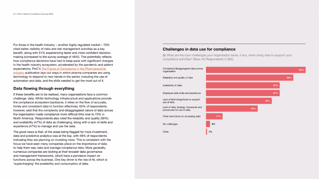
Risk Assessment and Management
Healthcare & Pharmaceuticals
The slide highlights the challenges organizations face in using data for compliance, particularly in highly regulated sectors like healthcare. It discusses fragmented data, poor data quality, lack of tools, and skills gaps. A bar chart quantifies the top challenges reported by 1,802 respondents, with data complexity and quality being most cited.
data challenges, compliance, healthcare, risk, skills, infrastructure
false
Risk Assessment and Management
Healthcare & Pharmaceuticals
Mixed Chart
PwC/Strategy&
Add to my slides
Remove from favorites
Column chart showing the contribution to revenue from different data collection methods (online, face-to-face, telephone, postal) from 2019 to 2022, with a notable increase in online methods.
Technology and Digital Transformation
Telecommunications
This slide tracks the shift in data collection methods over the years, emphasizing the growing reliance on online data collection methods compared to traditional methods.
data collection, online, revenue, survey methods, trend
false
Technology and Digital Transformation
Telecommunications
Single Chart
IPSOS
Add to my slides
Remove from favorites
The slide displays a diagram outlining data collection methods for operations and maintenance, linking past surveys to updated methods and areas of focus like energy use.
Operational Efficiency
Environmental Services & Sustainability
Highlights the methodology for collecting data on operations and maintenance, updating from past practices to improve accuracy in resource use and environmental impact assessments.
Data collection, operations, maintenance, environmental impact, resource use, methodology update, energy consumption, sustainability practices
false
Operational Efficiency
Environmental Services & Sustainability
Diagram
Deloitte
Add to my slides
Remove from favorites
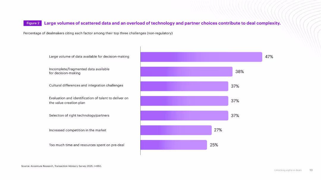
Horizontal bar chart with purple gradient bars illustrating percentages for top non-regulatory challenges in dealmaking. Clean and minimalist layout.
Risk Assessment and Management
Professional Services
Depicts top challenges in dealmaking, including data overload, integration issues, and tech/partner selection complexity. Emphasizes how data-related issues are dominant barriers.
data complexity, decision-making, deal challenges, technology, integration
false
Risk Assessment and Management
Professional Services
Single Chart
Accenture
Add to my slides
Remove from favorites
Column charts showing the amount of data created and connected devices worldwide from 2010 to 2035, with a list of activities that happen in 60 seconds on the Internet.
Technology and Digital Transformation
Technology & Software
This slide illustrates the exponential growth in data creation and connected devices, driven by the rise of IoT. It emphasizes the increasing interconnectedness and the potential of smart physical objects and processes to transform various industries through massive data generation and utilization.
Data Creation, IoT, Connected Devices, Internet
false
Technology and Digital Transformation
Technology & Software
Multiple Chart
Roland Berger
Add to my slides
Remove from favorites
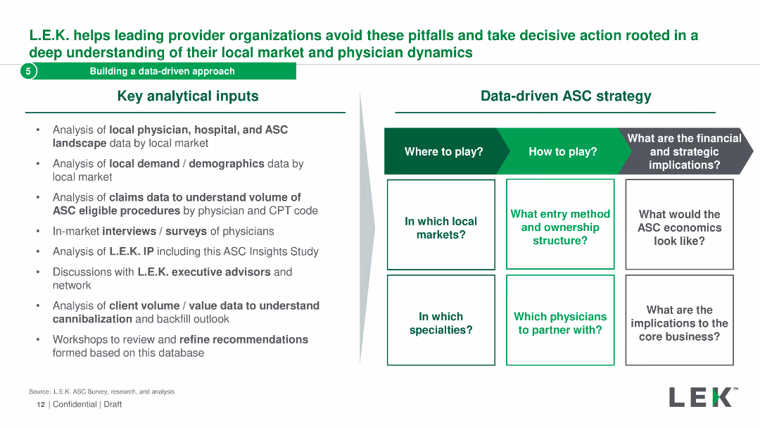
The slide is split into two sections: key analytical inputs and a matrix for a data-driven ASC strategy. It lists various data analysis methods and strategic questions.
Strategic Planning
Healthcare & Pharmaceuticals
It describes the analytical inputs and strategic considerations for building a data-driven ASC strategy, including local market analysis and physician dynamics.
data-driven, ASC, strategy, analysis, inputs
false
Strategic Planning
Healthcare & Pharmaceuticals
Header Horizontal
LEK
Add to my slides
Remove from favorites
Features table style displaying branch consolidations, savings, deposit share gains, and new builds. Highlights key market data points.
Operational Efficiency
Financial Services
Presents a data-driven approach for optimizing the branch network to align with customer demand in various markets.
Data-Driven, Branch Optimization, Customer Demand, Market Expansion, Financial Efficiency, Savings
false
Operational Efficiency
Financial Services
Table
JP Morgan
Add to my slides
Remove from favorites
Diagram details various stages of data maturity in marketing from "Nascent" to "Pioneer" with descriptive activators for each stage.
Technology and Digital Transformation
Media & Entertainment
Highlights the importance of data-driven strategies in marketing, from data collection to personalized marketing tactics.
data-driven marketing, personalization, data stages, marketing strategies, diagram
false
Technology and Digital Transformation
Media & Entertainment
Vertical Flow
BCG
Add to my slides
Remove from favorites
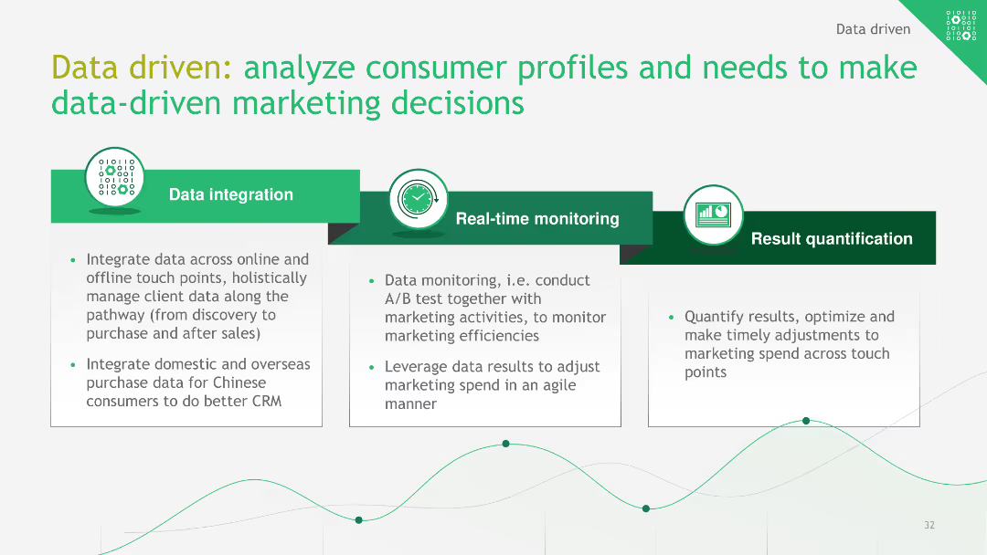
The slide features a flowchart explaining the data-driven approach to marketing, covering data integration, real-time monitoring, and result quantification.
Technology and Digital Transformation
Consumer Goods
This slide outlines a data-driven marketing strategy, emphasizing the integration of data, real-time monitoring, and quantification of results to optimize marketing decisions.
data-driven, marketing strategy, consumer profiles, data integration, real-time monitoring
false
Technology and Digital Transformation
Consumer Goods
Linear Flow
BCG
Add to my slides
Remove from favorites
A table and indicators showing performance in data-driven marketing strategies.
Technology and Digital Transformation
Media & Entertainment
Details the performance of companies in data-driven marketing, highlighting leaders and laggards in various activators.
data-driven, marketing, targeting, content, feedback
false
Technology and Digital Transformation
Media & Entertainment
Multiple Chart
BCG
Add to my slides
Remove from favorites
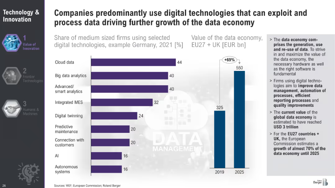
Bar chart showing the share of medium-sized firms using selected digital technologies in Germany in 2021 and a bar chart projecting the value of the data economy in the EU and UK from 2019 to 2025.
Technology and Digital Transformation
Technology & Software
This slide showcases the adoption of various digital technologies by medium-sized firms in Germany and projects the growth of the data economy in the EU and UK. It underscores the significance of digital technologies like cloud data and AI in driving economic value and efficiency.
Data Economy, Digital Technologies, Germany, EU
false
Technology and Digital Transformation
Technology & Software
Multiple Chart
Roland Berger
Add to my slides
Remove from favorites
Contains a diagram illustrating the flow of data in circular business models, emphasizing data sharing and performance metrics.
Technology and Digital Transformation
Environmental Services & Sustainability
Discusses the role of data in enhancing the efficiency of circular business models, focusing on the benefits of increased data flow and sharing. Useful for sessions on digital transformation strategies, where data utilization plays a crucial role in improving business processes and sustainability practices.
Data flow, Circular business models, Digital transformation, Data sharing, Sustainability, Performance metrics, Business efficiency, Data utilization, Technology strategies, Innovation
false
Technology and Digital Transformation
Environmental Services & Sustainability
Linear Flow
Accenture
Add to my slides
Remove from favorites
The slide features an illustrative map with arrows and bubbles indicating the magnitude of cross-border data flows among different regions. A sidebar provides a color-coded key for bandwidth ranges, with larger bubbles on the map representing greater interregional bandwidth usage.
Market Analysis and Trends
Technology & Software
The slide communicates the exponential growth in cross-border data flows, emphasizing a 45x increase since 2008. The map and side key effectively showcase the regional disparities in data flow volume, providing a clear visualization of how digital connectivity is evolving globally. This serves as an indicator of international digital communication and business collaboration trends.
Data Flows, Global Connectivity, Bandwidth, Regions, Digital Communication, Business Collaboration, Growth, Telecommunications
false
Market Analysis and Trends
Technology & Software
Multiple Chart
McKinsey
Add to my slides
Remove from favorites
Showcases a dual-axis column charts and a line graph, illustrating the growth of data and increase in execution speed in technology. The slide has a blue color scheme and is marked with number 8.
Investment Analysis
Financial Services
Presents statistical data on the growth of digital data and the increase in execution speeds, highlighting technological advancements and their impact on the market.
data growth, execution speed, technology, market trends
false
Investment Analysis
Financial Services
Multiple Chart
Goldman Sachs
Add to my slides
Remove from favorites
This slide has a dual-list structure with icons and data points on the left and implications for the organization on the right, with a central dividing line.
Technology and Digital Transformation
Professional Services
Analyzes the impact of data growth, company lifespan, and public trust on businesses, and what these trends mean for future organizational strategies.
data growth, organizational strategy, public trust, business longevity, competitive advantage
false
Technology and Digital Transformation
Professional Services
Framework
Deloitte
Add to my slides
Remove from favorites
Includes a line graph showing data growth over years and a smartphone interface. Visual elements are in purple and blue, with clear textual annotations.
Strategic Planning
Financial Services
Explores how Experian plans to use consumer data to enhance personalization features in its services, including new ways for consumers to share their data, impacting credit scores and financial offerings.
data growth, personalization, consumer data, credit scores, financial services
false
Strategic Planning
Financial Services
Multiple Chart
Barclays
Add to my slides
Remove from favorites
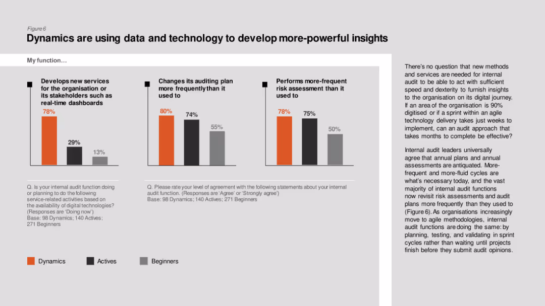
Column charts comparing development of new services, changes in auditing plans, and frequent risk assessments among Dynamics, Actives, and Beginners.
Technology and Digital Transformation
Professional Services
The slide describes how internal audit functions are leveraging data and technology to develop powerful insights, with Dynamics leading in frequent risk assessments and new services.
Data insights, technology, internal audit, new services, risk assessment
false
Technology and Digital Transformation
Professional Services
Multiple Chart
PwC/Strategy&
Add to my slides
Remove from favorites
Features bar charts showing the difference in data and business intelligence maturity between leaders and laggards.
Operational Efficiency
Technology & Software
Discusses the integration of data sources and the use of analytics in making business decisions, highlighting gaps in daily practices.
data integration, analytics, business intelligence, decision-making, bar chart
false
Operational Efficiency
Technology & Software
Multiple Chart
BCG
Add to my slides
Remove from favorites
Features bullet points, a bar graph, and case examples highlighting the integration of data and technology for a unified customer profile.
Technology and Digital Transformation
Retail & E-commerce
Highlights the strategic imperative of integrating data and technology across business functions to achieve a holistic view of the customer.
Data Integration, Customer View, Technology, Sales, Marketing, Service
false
Technology and Digital Transformation
Retail & E-commerce
Linear Flow
BCG
Add to my slides
Remove from favorites
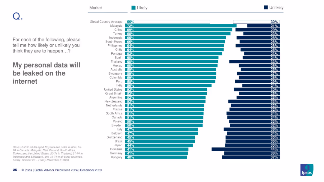
Horizontal bar chart with global and country-specific perceptions on data privacy risks
Risk Assessment and Management
Technology & Software
The slide surveys people's concerns across different countries about their personal data being leaked online. It illustrates global awareness and fears surrounding cybersecurity and privacy.
data leak, privacy, cybersecurity, internet safety, global awareness
false
Risk Assessment and Management
Technology & Software
Mixed Chart
IPSOS
Add to my slides
Remove from favorites
Pie charts and column charts showing the importance and impacts of data-led customer engagement.
Technology and Digital Transformation
Technology & Software
Highlights the strategic importance of data-led customer engagement and its impact on company growth and efficiency.
data-led, growth, efficiency, marketing, sales
false
Technology and Digital Transformation
Technology & Software
Multiple Chart
BCG
Add to my slides
Remove from favorites
Bar chart showing consumer trust levels in various entities to manage vehicle-generated data, with distinct color coding for clarity.
Risk Assessment and Management
Transportation & Logistics
This slide evaluates consumer trust in different entities, such as dealers and manufacturers, to handle their vehicle-generated data, highlighting a significant trust gap with a high percentage distrusting all listed entities.
Data management, consumer trust, vehicle data, privacy concerns
false
Risk Assessment and Management
Transportation & Logistics
Single Chart
Deloitte
Add to my slides
Remove from favorites
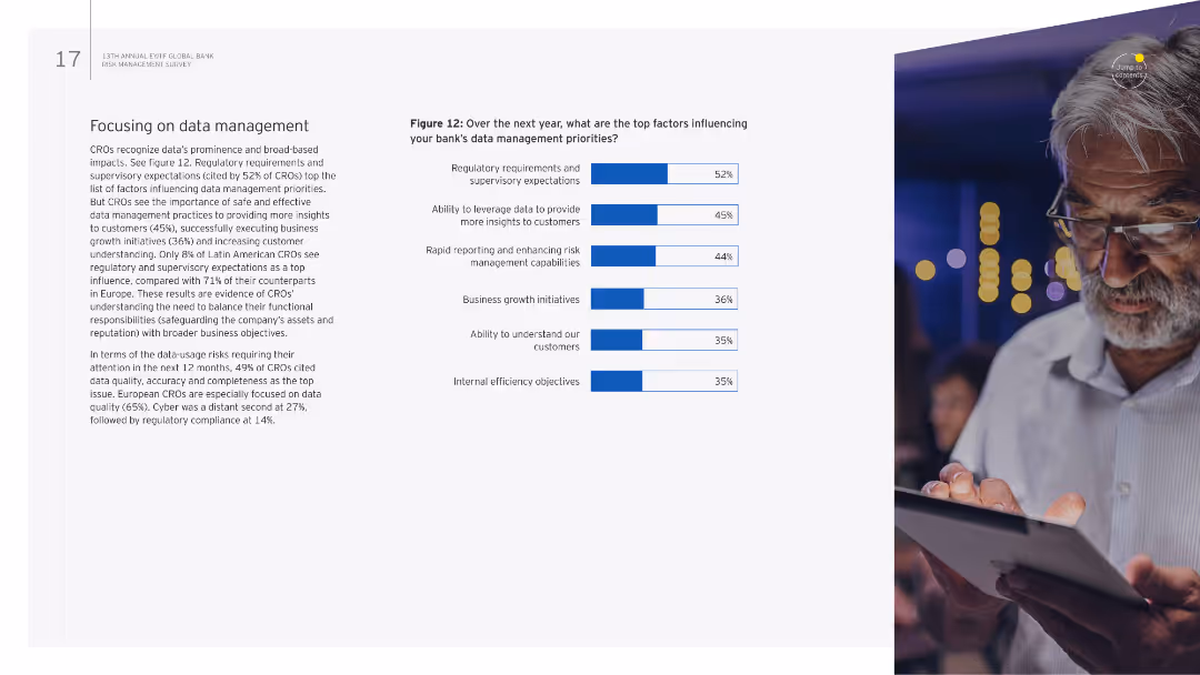
The slide has a combination of text and a column chart on the right. The chart identifies the top factors influencing data management priorities over the next year.
Strategic Planning
Financial Services
It emphasizes the importance of data management in banking, identifying key influencing factors such as regulatory requirements, data quality, and customer insights.
Data management, regulatory requirements, priorities, data quality, customer insights
false
Strategic Planning
Financial Services
Mixed Chart
EY
Add to my slides
Remove from favorites
Previous
Next
You don't have any favorites yet.
Please wait loading your favorites slides...
Create a FREE account to continue browsing
Receive Instant Access to 1,000+ slides from companies like McKinsey, Google, and Goldman Sachs
First Name
Last Name
Email
Password
I agree to all
Terms & Privacy Policy
Thank you! Your submission has been received!
Oops! Something went wrong while submitting the form.
Have an account?
Sign in
Upgrade to PRO to Save slides
Advanced Search and Filters
Access to 15,000+ slides
Access to Category Pages
Save/Bookmark Slides
PowerPoint Template Library
Pick a Plan
MONTHLY
$12/month
Billed every month, Cancel anytime.
YEARLY
$9/year
Billed $108 annually, Cancel anytime.
Checkout for $12/month
Checkout for $108/yr
Secured by Stripe | AES-256 bit encryption