My Account
My Slides
Search by Category
Companies
Slide Type
Use Case
Industry
Pricing
Templates
View All Templates
Download Template Slides
✦ AI
AI Prompt Library
AI Search
Feedback
Login
Logout
Get Started
Browse all Slides
Browse all Slides
Create a FREE Account
Instant access to 1,000+ real slides from top companies like McKinsey, BCG, Goldman Sachs, Google and many more!
First Name
Last Name
Email
Password
I agree to all
Terms & Privacy Policy
Thank you! Your submission has been received!
Oops! Something went wrong while submitting the form.
Have an account?
Sign in
Saved Slides
Total No. of slides saved
0
↻ Refresh
✖ Clear all
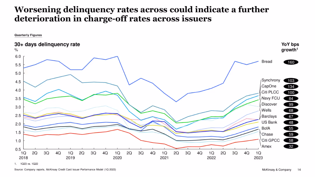
Time series line chart showing 30+ days delinquency rates by issuer from 1Q18 to 1Q23. Bread shows the highest increase. YoY bps growth listed on the right.
Risk Assessment and Management
Financial Services
The chart shows a worsening trend in delinquency rates among issuers, especially Bread, CapOne, and Synchrony. This suggests potential for higher future charge-off rates. The data spans 5 years with consistent issuer tracking.
Delinquencies, Credit Cards, CapOne, Synchrony, Bread, Risk Trends
false
Risk Assessment and Management
Financial Services
Single Chart
McKinsey
Add to my slides
Remove from favorites
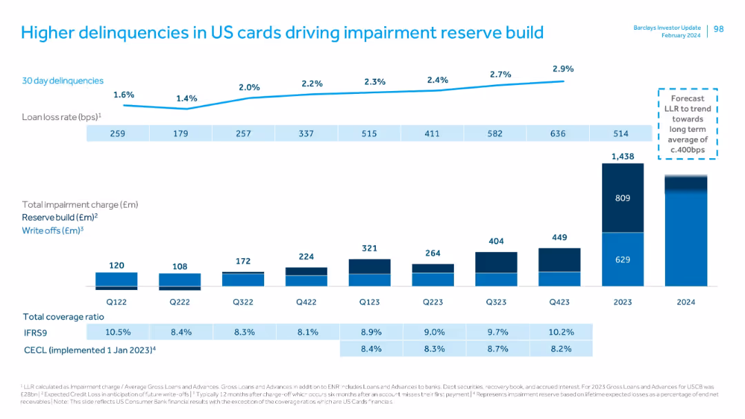
Features column charts and a line graph detailing loan loss rates and impairment charges over several quarters. The layout is straightforward, using contrasting colors to differentiate between different types of data, providing a clear visual representation of trends and specifics.
Risk Assessment and Management
Financial Services
Discusses the trends in loan delinquencies and the resulting financial strategies, such as reserve builds and write-offs, illustrating how Barclays manages financial volatility and credit risk.
delinquencies, impairment charges, financial strategy, credit risk
false
Risk Assessment and Management
Financial Services
Multiple Chart
Barclays
Add to my slides
Remove from favorites
Mixed chart showing delinquencies, loan loss rates, and impairment charges by quarter, alongside reserve build and write-offs.
Risk Assessment and Management
Financial Services
Highlights increasing delinquencies and corresponding impairment reserves in the US card portfolio. Forecasts suggest stabilization in LLR. Provides quarterly and annual breakdown of reserve actions and write-offs.
delinquencies, impairment, reserves, write-offs, LLR, financial risk, US cards
false
Risk Assessment and Management
Financial Services
Multiple Chart
Barclays
Add to my slides
Remove from favorites
Two line charts side by side. Left chart titled "US Credit Card Delinquency Rates" with lines representing "100 Largest Banks" and "Other Banks" from 1985-2023. Right chart titled "US Commercial Bank Interest Rates: Credit Card" showing a single line trend from 1985-2023.
Market Analysis and Trends
Financial Services
This slide presents a comparison of credit card delinquency rates among different banks over time, alongside the trend in commercial bank interest rates for credit cards. Intended for financial analysis and prediction of market behavior.
delinquency, interest rates, credit card, banks, trend
false
Market Analysis and Trends
Financial Services
Multiple Chart
Morgan Stanley
Add to my slides
Remove from favorites
Slide features a title on top, two-column charts comparing Chase's delinquency rate to industry, and Chase's servicing cost per unit from FY14 to FY18. Red highlights draw attention to specific data points. Small text and footnotes are at the bottom.
Financial Performance
Financial Services
The slide presents financial data from 2014 to 2018, comparing Chase's mortgage delinquency rates and servicing costs against the industry average, emphasizing the company's risk management and cost efficiency.
delinquency rate, servicing cost, financial data, risk management, efficiency
false
Financial Performance
Financial Services
Multiple Chart
JP Morgan
Add to my slides
Remove from favorites
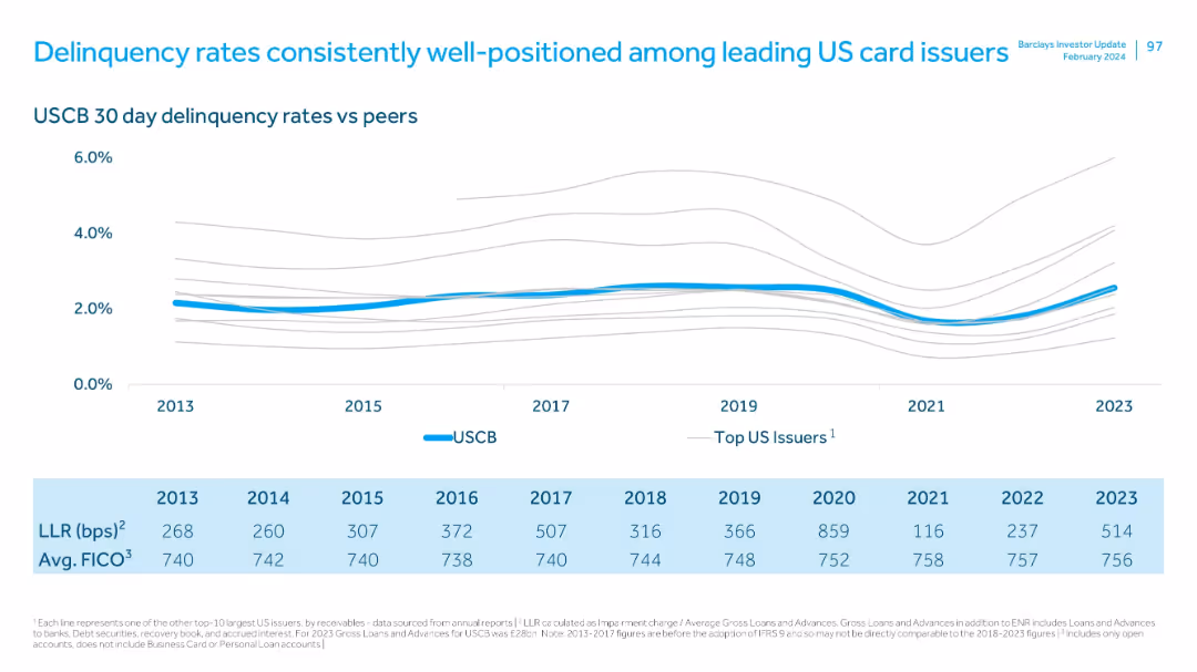
The slide presents a line chart comparing delinquency rates of Barclays against its peers from 2013 to 2023. It features a clean, professional look with a consistent use of blue tones, ensuring easy comparison of data points.
Risk Assessment and Management
Financial Services
Highlights Barclays' favorable position in managing delinquency rates compared to other leading US card issuers, emphasizing its strength in risk management.
delinquency rates, risk management, US card issuers, comparison
false
Risk Assessment and Management
Financial Services
Mixed Chart
Barclays
Add to my slides
Remove from favorites
Line graph comparing USCB delinquency rates to peers, with tabulated LLR and FICO scores by year (2013–2023).
Risk Assessment and Management
Financial Services
Illustrates how USCB has maintained low 30-day delinquency rates relative to other major issuers, supported by consistent FICO scores and moderate loan loss rates. Signals superior credit risk management.
delinquency, risk management, FICO, LLR, card issuers, benchmarking, credit quality
false
Risk Assessment and Management
Financial Services
Mixed Chart
Barclays
Add to my slides
Remove from favorites
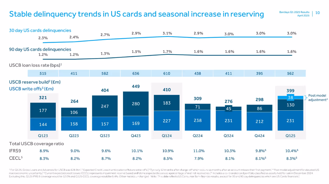
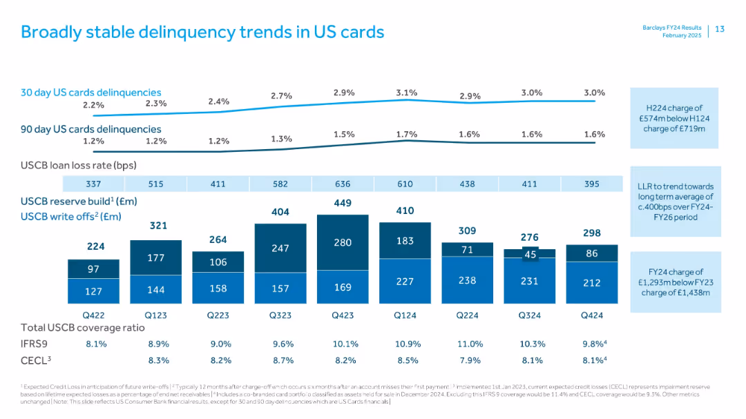
Line and bar graphs tracking delinquencies, loan loss rates, and reserve changes.
Risk Assessment and Management
Financial Services
This slide monitors US card delinquency trends and reserve builds. It shows stable patterns with seasonal variance and discusses reserve ratios and write-offs, particularly under IFRS9 and CECL standards.
delinquency, US cards, loan loss, reserve build, CECL, IFRS9, Barclays, write-offs, credit risk, seasonal trends
false
Risk Assessment and Management
Financial Services
Multiple Chart
Barclays
Add to my slides
Remove from favorites
Line chart on delinquencies with bar graphs for reserves and write-offs; clear bps trend lines; color-coded build vs. write-off bars
Risk Assessment and Management
Financial Services
Monitors delinquency trends in Barclays US credit card portfolio. Presents data on 30/90-day delinquencies, reserve build, and write-offs. USCB loan loss rate and CECL/IFRS coverage ratios indicate stable but elevated risk levels.
delinquency, US cards, reserve build, write-offs, LLR, CECL, IFRS9, Barclays, credit risk
false
Risk Assessment and Management
Financial Services
Multiple Chart
Barclays
Add to my slides
Remove from favorites
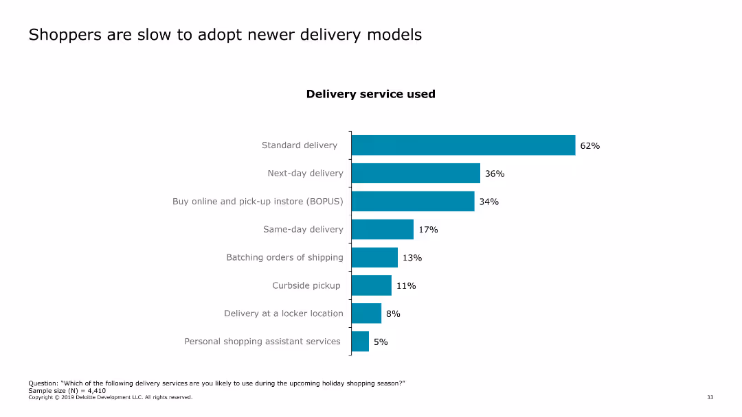
The slide features a column chart showing the adoption rates of various delivery services, such as standard delivery, next-day delivery, buy online and pick-up in store (BOPUS), and same-day delivery.
Market Analysis and Trends
Retail & E-commerce
The slide discusses consumer adoption of different delivery models, indicating a preference for standard delivery methods over newer options like same-day delivery and curbside pickup.
delivery models, consumer behavior, online shopping, standard delivery, BOPUS
false
Market Analysis and Trends
Retail & E-commerce
Single Chart
Deloitte
Add to my slides
Remove from favorites
A content slide with a bar chart showing the percentage of respondents who have fully standardized core and new service delivery processes across different service categories. A callout box highlights the high standardization rate among Champions.
Operational Efficiency
Professional Services
This slide emphasizes the importance of standardized delivery processes for effective and scalable service delivery, comparing the standardization levels across service categories.
delivery processes, standardization, Champions, Strivers, service delivery
false
Operational Efficiency
Professional Services
Mixed Chart
Accenture
Add to my slides
Remove from favorites
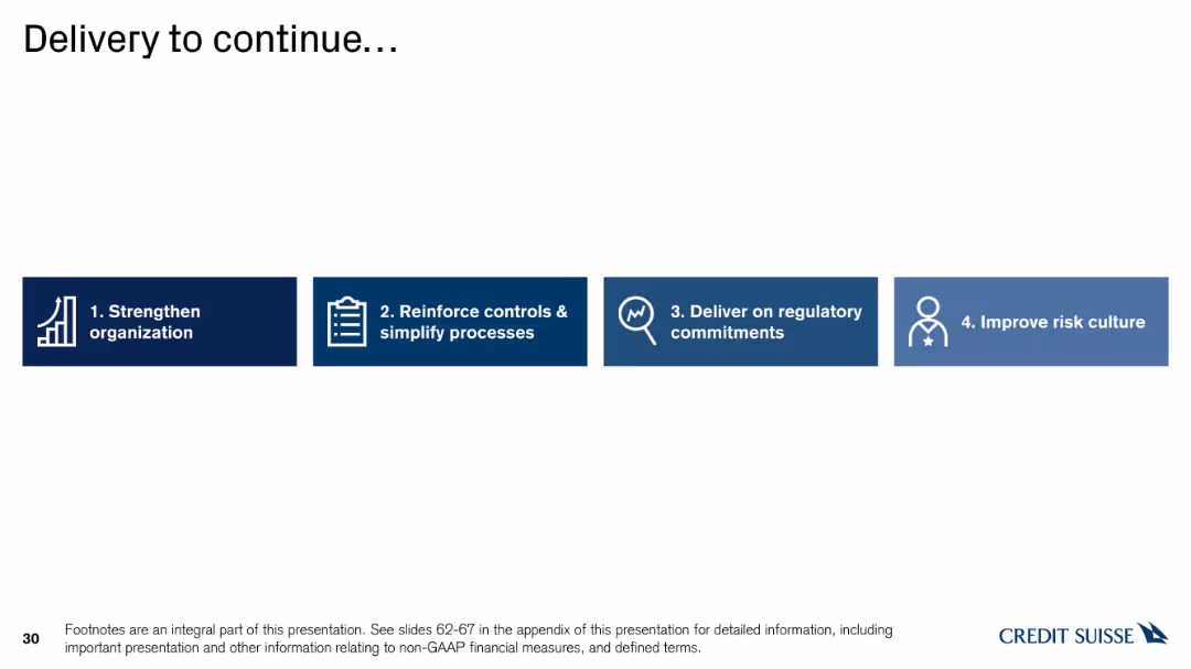
Horizontal bar chart with icons representing four steps: Strengthen organization, Reinforce controls, Deliver on commitments, and Improve risk culture.
Strategic Planning
Financial Services
The slide details the ongoing delivery strategy, focusing on strengthening organization, reinforcing controls, delivering on regulatory commitments, and improving risk culture.
delivery, strategy, organization, controls, commitments
false
Strategic Planning
Financial Services
Linear Flow
Credit Suisse
Add to my slides
Remove from favorites
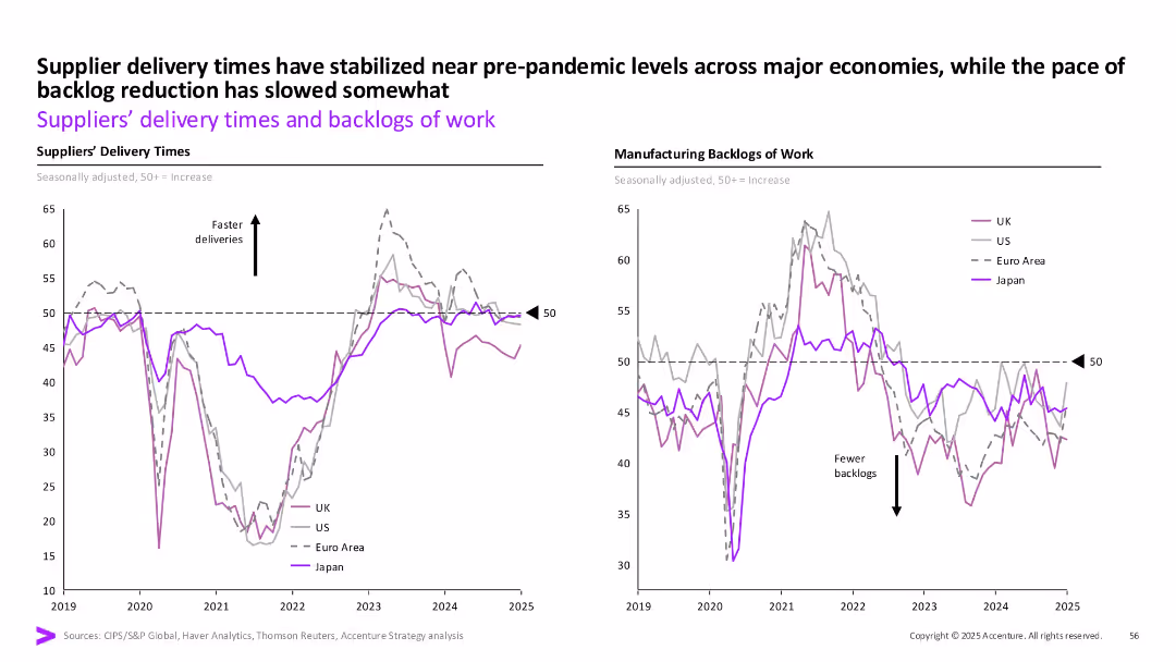
The slide includes two line charts comparing suppliers' delivery times and manufacturing backlogs of work across UK, US, Euro area, and Japan.
Operational Efficiency
Industrial & Manufacturing
The slide provides insights into how delivery times and backlogs have normalized to pre-pandemic levels in major economies.
delivery times, backlogs, suppliers, manufacturing, industrial, operational efficiency
false
Operational Efficiency
Industrial & Manufacturing
Multiple Chart
Accenture
Add to my slides
Remove from favorites
Dual line charts (delivery times left, backlogs right) by region with consistent styling, labeled axis and arrows.
Operational Efficiency
Industrial & Manufacturing
The slide shows that supplier delivery times have returned to near pre-pandemic levels across regions while backlog reduction has slowed. It emphasizes operational recovery with regional disparities post-COVID.
Delivery times, manufacturing, UK, US, Euro Area, Japan, backlog, stabilization
false
Operational Efficiency
Industrial & Manufacturing
Multiple Chart
Accenture
Add to my slides
Remove from favorites
Multiple sections, logos, screenshots, mixed layouts
Technology and Digital Transformation
Technology & Software
Outlines Deloitte's CAI solutions and partnerships
Deloitte, CAI, TrueServe, NVIDIA
false
Technology and Digital Transformation
Technology & Software
Framework
Deloitte
Add to my slides
Remove from favorites
Features multiple icons and brief text descriptions organized in a grid, detailing different aspects of Deloitte's end-to-end support for digitizing finance functions.
Technology and Digital Transformation
Professional Services
Explains Deloitte’s capabilities in assisting organizations to go digital with their finance functions, covering diagnostics, data model design, technology deployment, and change management, highlighted by a visual framework.
Deloitte, digital finance, end-to-end support, technology deployment, change management, finance function, policy design, strategic value
false
Technology and Digital Transformation
Professional Services
Header Vertical
Deloitte
Add to my slides
Remove from favorites
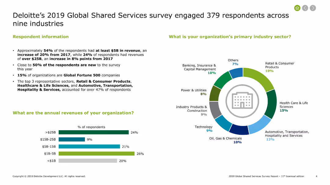
Text and charts showing survey respondent information, primary industry sectors, and annual revenues of organizations involved in shared services.
Market Analysis and Trends
Professional Services
Summarizes Deloitte's 2019 survey results on global shared services, including industry sectors, revenue ranges, and the distribution of respondents across various industries.
Deloitte, survey, shared services, industries, revenues
false
Market Analysis and Trends
Professional Services
Multiple Chart
Deloitte
Add to my slides
Remove from favorites
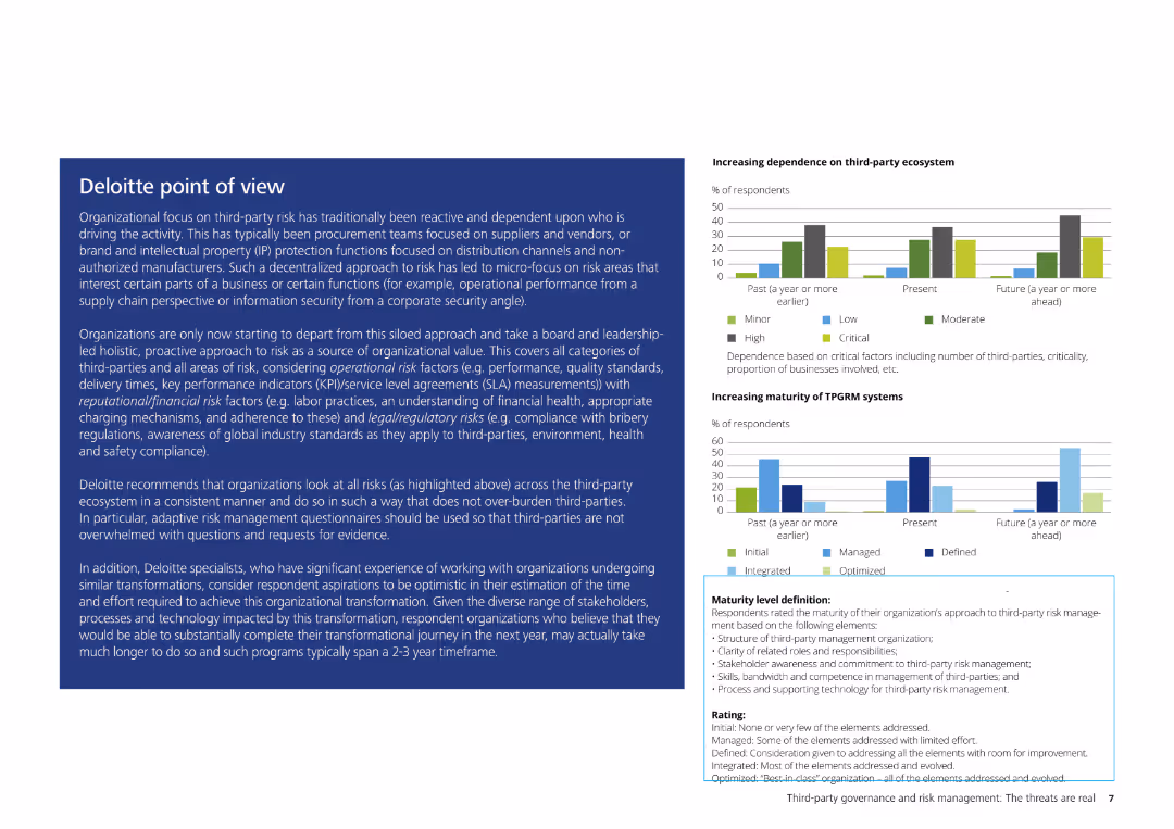
The slide contains a detailed text description of Deloitte's perspective on third-party risk, accompanied by small charts illustrating increasing dependence on third-party ecosystems and the maturity of TPRGM systems.
Risk Assessment and Management
Professional Services
This slide provides Deloitte's perspective on third-party risk management, highlighting the importance of a proactive, holistic approach to risk. It discusses various risk factors and offers recommendations for improving third-party risk management processes.
Deloitte, third-party risk, risk management, TPRGM systems, professional services, risk assessment, organizational strategy
false
Risk Assessment and Management
Professional Services
Multiple Chart
Deloitte
Add to my slides
Remove from favorites
Pie chart showing GMV by channel, a bar chart for demand generation percentage, and a line chart for LTV to CAC ratios over different cohorts.
Operational Efficiency
Retail & E-commerce
Analyzes demand generation costs and unit economics for Farfetch, illustrating low cost/organic vs. paid channels and customer value over time.
Demand generation, unit economics, Farfetch, GMV, LTV
false
Operational Efficiency
Retail & E-commerce
Multiple Chart
Deutsche Bank
Add to my slides
Remove from favorites
White background with multiple text sections and bar charts showing credit cost distribution over time. Important quotes highlighted.
Market Analysis and Trends
Environmental Services & Sustainability
Analyzes the increasing demand for carbon credits, rising costs, and the implications for future pricing and supply dynamics.
demand increase, carbon credits, supply costs
false
Market Analysis and Trends
Environmental Services & Sustainability
Multiple Chart
EY
Add to my slides
Remove from favorites
Contains lists and bullet points detailing levers and strategies for optimizing demand management processes.
Strategic Planning
Professional Services
Provides strategies for reducing unnecessary work and aligning organizational processes with market demands.
demand management, strategies, optimization, alignment
false
Strategic Planning
Professional Services
Table
Deloitte
Add to my slides
Remove from favorites
Four separate text boxes with icons, detailing different market aspects, occupy the slide's center. Each box has its title and list of bullet points, presented in a clean and organized manner.
Market Analysis and Trends
Industrial & Manufacturing
This slide gives an outlook on the demand recovery in various markets, highlighting the increase in raw material prices and the impact on the company's divisions like Advanced Intermediates and Consumer Protection.
demand recovery, raw material prices, Advanced Intermediates, Specialty Additives, Consumer Protection, Engineering Materials, market outlook, LANXESS
false
Market Analysis and Trends
Industrial & Manufacturing
Header Vertical
Morgan Stanley
Add to my slides
Remove from favorites
Features column charts comparing education funding levels and allocations within the Indonesian government budget over several years. Additional bar charts compare Indonesia's education spending to neighboring countries, with annotations highlighting key statistics and trends.
Financial Performance
Education & Training
Reviews the sustainability of government funding for education in Indonesia, comparing it to neighboring countries and discussing potential impacts of policy changes on funding levels. Offers insights into the challenges and opportunities within the education funding landscape.
demand, subsidy
false
Financial Performance
Education & Training
Multiple Chart
BCG
Add to my slides
Remove from favorites
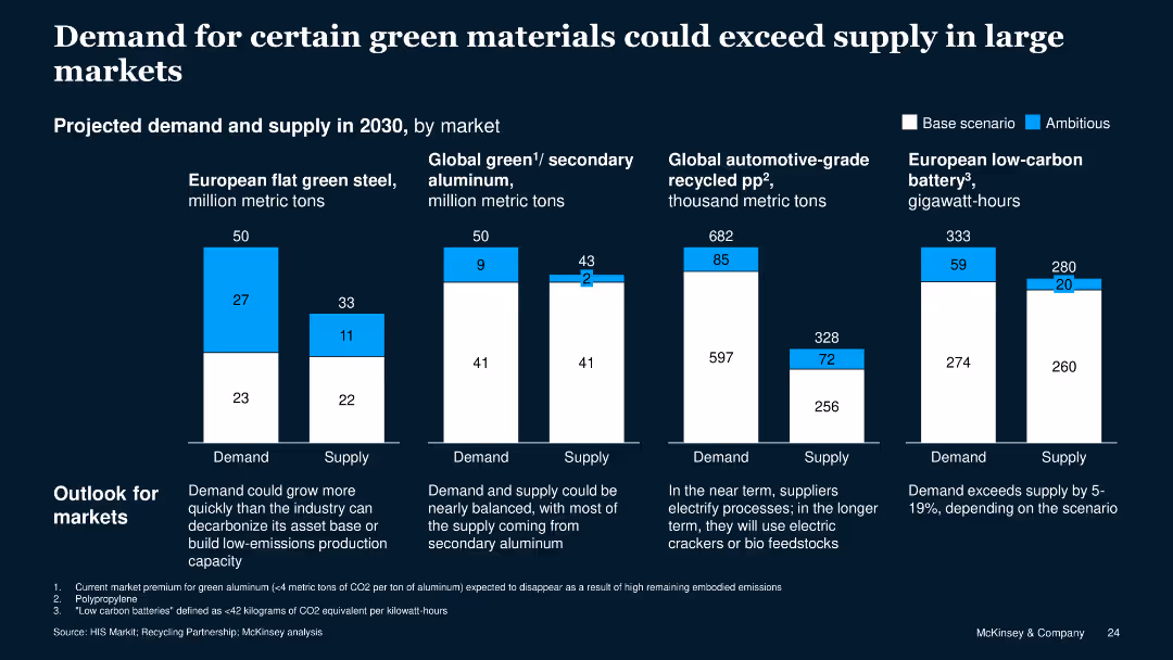
The slide displays multiple column charts comparing projected demand and supply for various green materials in 2030, with blue and white bars.
Market Analysis and Trends
Industrial & Manufacturing
This slide analyzes the future demand and supply of green materials, highlighting potential shortages in key markets such as green steel, aluminum, recycled polypropylene, and batteries.
demand, supply, green materials, market analysis, trends, 2030, steel, aluminum, polypropylene, batteries
false
Market Analysis and Trends
Industrial & Manufacturing
Multiple Chart
McKinsey
Add to my slides
Remove from favorites
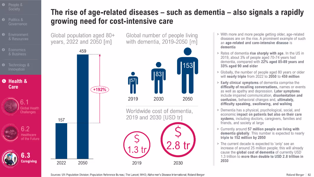
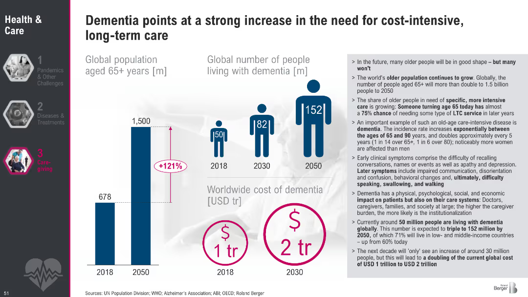
Infographic style with three key visuals: population growth bar chart, dementia patient figures, and cost projection icons; right-side text panel
Market Analysis and Trends
Healthcare & Pharmaceuticals
This slide projects a sharp increase in the aging population and dementia cases globally, highlighting a 192% rise in people aged 80+ by 2050 and a growing global cost burden of dementia, expected to more than double by 2030. It emphasizes the growing health and economic pressures associated with age-related diseases.
Dementia, aging population, global cost, healthcare burden, age-related diseases, cost-intensive care, 2050 projections, elderly care, cognitive decline
false
Market Analysis and Trends
Healthcare & Pharmaceuticals
Multiple Chart
Roland Berger
Add to my slides
Remove from favorites
Bar and pictogram charts showing global aging population, projected dementia growth, and dementia-related costs; supporting bullet text on right
Market Analysis and Trends
Healthcare & Pharmaceuticals
This slide illustrates the dramatic increase in dementia cases and associated care costs expected by 2050. It highlights the global aging population and outlines implications for long-term care systems, including physical, social, and economic burdens.
dementia, aging, population, healthcare costs, long-term care, trends, 2050, global burden
false
Market Analysis and Trends
Healthcare & Pharmaceuticals
Mixed Chart
Roland Berger
Add to my slides
Remove from favorites
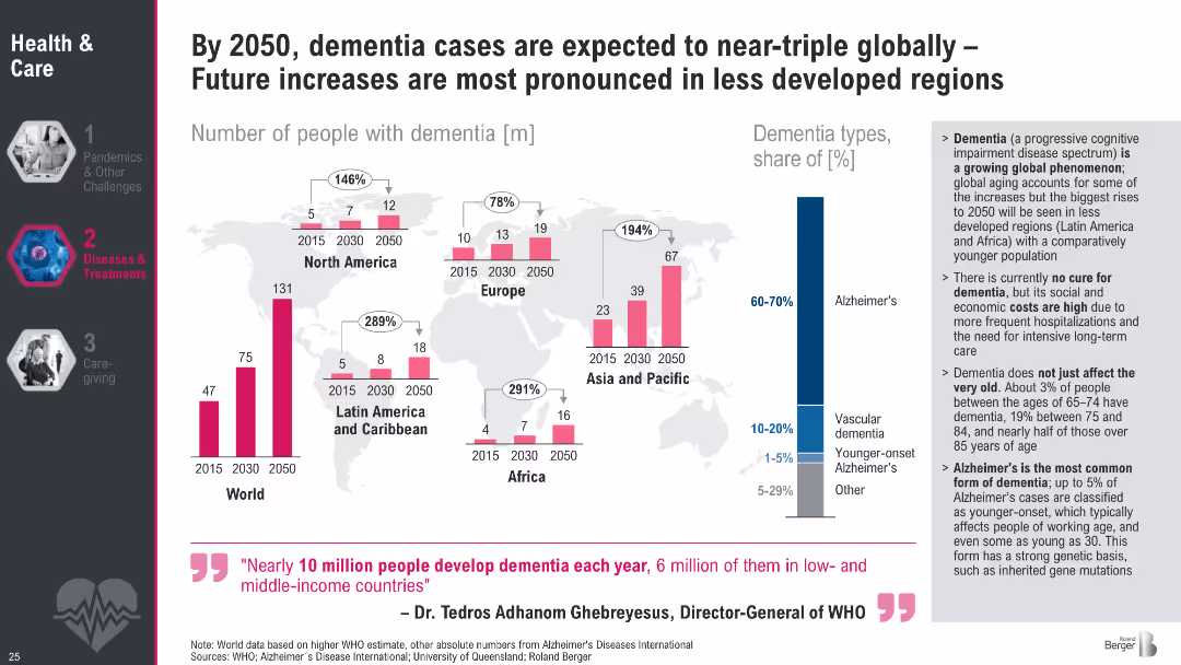
Bar charts over world map displaying dementia prevalence by region (2015–2050); includes dementia type breakdown
Strategic Planning
Healthcare & Pharmaceuticals
The slide forecasts a tripling of global dementia cases by 2050, particularly in less developed regions. It highlights Alzheimer's dominance among dementia types and outlines the lack of cure, the societal burden, and the rise in early-onset cases.
dementia, Alzheimer's, global aging, healthcare burden, projections, WHO, regional trends, memory loss, neurodegeneration, healthcare planning
false
Strategic Planning
Healthcare & Pharmaceuticals
Multiple Chart
Roland Berger
Add to my slides
Remove from favorites
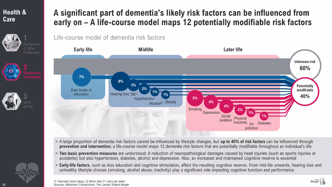
Flowchart mapping modifiable dementia risk factors by life stage; early, mid, and later life
Risk Assessment and Management
Healthcare & Pharmaceuticals
This slide outlines a life-course model showing 12 potentially modifiable risk factors for dementia. It emphasizes early intervention and lifestyle factors like education, smoking, and physical inactivity that influence dementia risk over time.
dementia prevention, risk factors, lifestyle, public health, education, smoking, obesity, hearing loss, cognitive decline, modifiable risks
false
Risk Assessment and Management
Healthcare & Pharmaceuticals
Multiple Chart
Roland Berger
Add to my slides
Remove from favorites
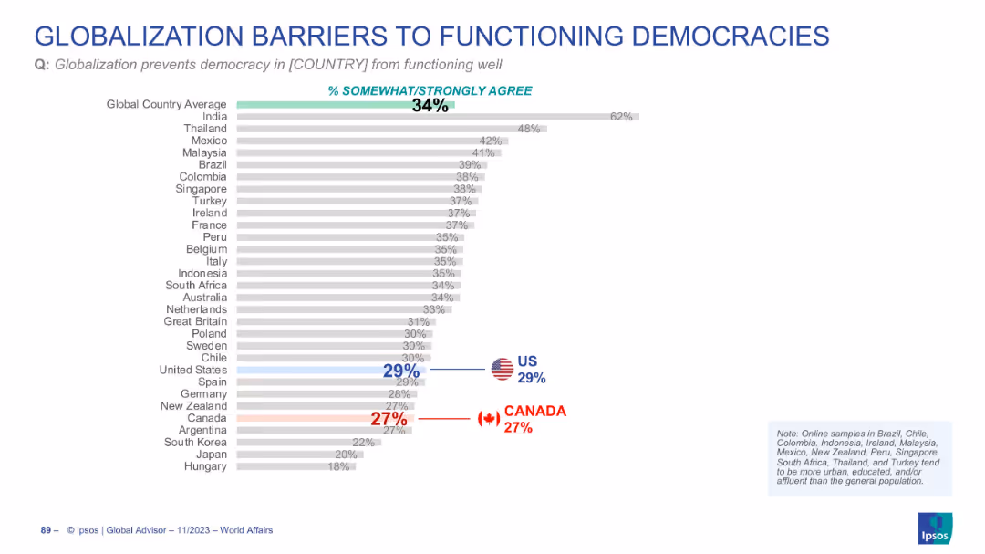
Horizontal bar chart with global and country-specific agreement percentages
Regulatory and Compliance
Government & Public Sector
The data explores how globalization might hinder democratic function. The global average is 34%, with the US at 29% and Canada at 27%, indicating moderate concern.
democracy, globalization, governance, public trust, political systems
false
Regulatory and Compliance
Government & Public Sector
Single Chart
IPSOS
Add to my slides
Remove from favorites
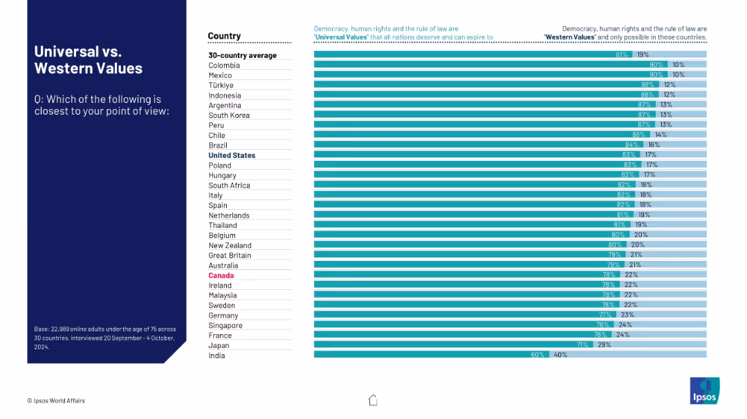
Two-column bar chart comparing country-level opinions on whether democracy, human rights, and rule of law are universal or Western values.
Market Analysis and Trends
Government & Public Sector
This slide presents survey results from 30 countries on public perceptions of democracy and human rights as either universal or Western values. The majority in every country view these as universal. The visual compares percentages with blue and teal bars for each option.
democracy, human rights, rule of law, global values, cultural perception
false
Market Analysis and Trends
Government & Public Sector
Mixed Chart
IPSOS
Add to my slides
Remove from favorites
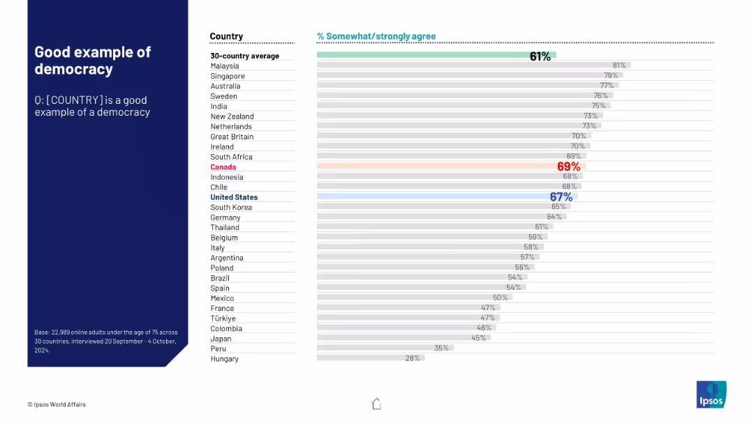
Similar design as 18841: left-aligned dark panel with question; right section features a ranked bar chart by country showing agreement percentages.
Market Analysis and Trends
Government & Public Sector
This slide ranks countries based on the percentage of people who believe their country is a good example of democracy. It provides a comparative visual across 30 nations with benchmark averages and annual shifts.
democracy, public perception, governance, international comparison, Ipsos, 2024 data, national image, global standing, civic values, global democracy
false
Market Analysis and Trends
Government & Public Sector
Mixed Chart
IPSOS
Add to my slides
Remove from favorites
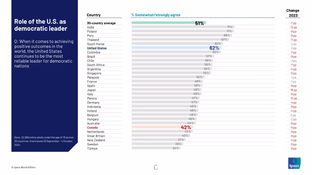
Horizontal bar chart of agreement levels across countries regarding the U.S. as a reliable leader for democracies.
Strategic Planning
Government & Public Sector
The slide shows that the U.S. is still considered a reliable democratic leader by 62% of Americans and similar levels globally. However, several Western countries express lower confidence, with a downward trend from 2023.
democracy, U.S. leadership, global influence, reliability, perception
false
Strategic Planning
Government & Public Sector
Mixed Chart
IPSOS
Add to my slides
Remove from favorites
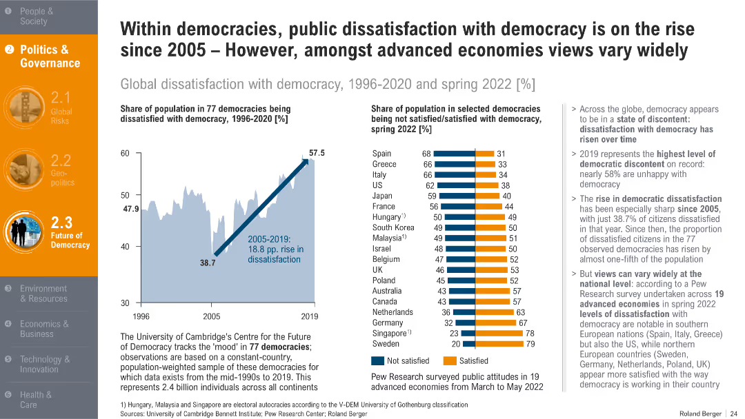
Two charts: line graph of dissatisfaction over time and bar chart showing country-wise satisfaction in 2022. Supported by bullet-point analysis.
Organizational Structure and Change
Government & Public Sector
This slide shows growing dissatisfaction with democracy since 2005, peaking in 2019. It contrasts national satisfaction levels in 2022, revealing significant variance between Southern and Northern democracies.
democratic dissatisfaction, political sentiment, governance trust, public opinion, voter discontent
false
Organizational Structure and Change
Government & Public Sector
Multiple Chart
Roland Berger
Add to my slides
Remove from favorites
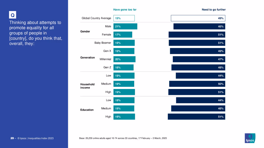
Bar charts showing demographic breakdowns of those who believe equality efforts have gone too far vs. need to go further.
Strategic Planning
Government & Public Sector
The slide explores demographic opinions on national equality efforts. It provides comparative percentages across gender, generation, income, and education, assessing whether groups feel progress has been excessive or insufficient.
demographic analysis, equality, opinions, survey, gender, generation, income, education
false
Strategic Planning
Government & Public Sector
Mixed Chart
IPSOS
Add to my slides
Remove from favorites
This slide showcases a series of column charts that provide demographic data on European respondents, including global revenue, number of employees, functional affiliation, seniority, and gender identity. The charts are color-coded and labeled for easy interpretation.
Market Analysis and Trends
Professional Services
Provides comprehensive demographic data on European respondents of a survey conducted in 2020. The data cover aspects such as global revenue size, employee count, job function, and more. Useful for analyzing respondent profiles and targeting further research efforts.
demographic data, European survey, respondent analysis
false
Market Analysis and Trends
Professional Services
Multiple Chart
PwC/Strategy&
Add to my slides
Remove from favorites
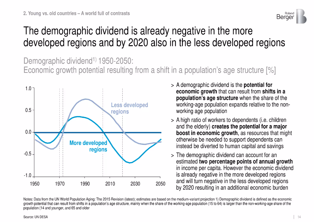
Dual-line chart with accompanying text, illustrating economic growth potential due to demographic structure shifts from 1950 to 2050.
Strategic Planning
Government & Public Sector
This slide discusses demographic dividends, showing how more developed regions have already lost growth benefits from age structure shifts, and less developed regions will follow by 2020, impacting economic output.
demographic dividend, economic growth, age structure, dependency ratio, population aging, labor force
false
Strategic Planning
Government & Public Sector
Mixed Chart
Roland Berger
Add to my slides
Remove from favorites
The slide presents demographic data for 2023 with icons and percentages for gender, age, household composition, and more.
Customer and Market Segmentation
Financial Services
It details the demographics of Canadians in 2023, including gender, age, education, and employment status.
Demographics, 2023, Canadians, Gender, Age, Household, Education, Employment, Financial, Segmentation
false
Customer and Market Segmentation
Financial Services
Multiple Chart
IPSOS
Add to my slides
Remove from favorites
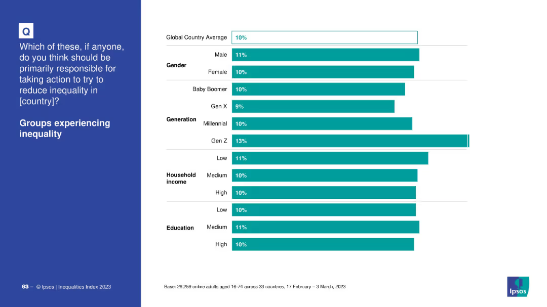
Demographic bar chart on whether affected groups should be responsible for reducing inequality.
Market Analysis and Trends
Government & Public Sector
This slide shows how support varies among demographic groups for the idea that disadvantaged groups should take the lead in addressing inequality. Gen Z shows the highest support.
demographics, affected groups, inequality, Ipsos, Gen Z, responsibility, perception, education
false
Market Analysis and Trends
Government & Public Sector
Mixed Chart
IPSOS
Add to my slides
Remove from favorites
Contains multiple line charts, bar graphs, and informational text. The slide is dense with data showcasing demographic changes globally.
Market Analysis and Trends
Financial Services
This slide analyzes global demographic trends, showing aging populations and youth demographics to inform market strategies and policy development.
Demographics, Aging Population, Youth, Market Trends, Global Analysis
false
Market Analysis and Trends
Financial Services
Multiple Chart
PwC/Strategy&
Add to my slides
Remove from favorites
Column chart showing the population growth rates in different age segments across U.S. metro areas, with different shades of green representing various age groups, displaying a shift towards an older demographic.
Market Analysis and Trends
Transportation & Logistics
Presents data on demographic changes within U.S. metro areas, focusing on aging populations and implications for services and infrastructure. Useful for market analysis in sectors like healthcare and real estate.
demographics, aging, US metros, population trends, market analysis
false
Market Analysis and Trends
Transportation & Logistics
Single Chart
BCG
Add to my slides
Remove from favorites
The slide is divided into three sections: a left section with general statistics, a middle section with role distributions, and a right section with jurisdiction data, represented by bar charts.
Market Analysis and Trends
Financial Services
This slide summarizes the demographics of the survey respondents, including the size of family offices, their roles, and the jurisdictions they operate in within the APAC region.
demographics, APAC, survey, roles, jurisdictions
false
Market Analysis and Trends
Financial Services
Multiple Chart
EY
Add to my slides
Remove from favorites
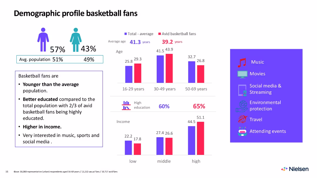
Mixed visual layout with bar charts, icons, and callout box summarizing demographic insights
Customer and Market Segmentation
Media & Entertainment
Defines basketball fans as younger, better educated, and higher income than average. Interests include music, streaming, and attending events.
demographics, basketball fans, education, income, age, social media, music, interests, segmentation, Nielsen
false
Customer and Market Segmentation
Media & Entertainment
Mixed Chart
Nielsen
Add to my slides
Remove from favorites
Two donut charts showing company size by revenue and industry distribution with color-coded segments.
Market Analysis and Trends
Professional Services
Provides demographic data on the companies surveyed, detailing their size and industry affiliations.
demographics, company size, industry, revenue, survey
false
Market Analysis and Trends
Professional Services
Multiple Chart
Deloitte
Add to my slides
Remove from favorites
Split layout: demographic comparison bar chart with gender, generation, income, education on the right.
Market Analysis and Trends
Professional Services
This slide analyzes demographic responses to the view that employers should take responsibility for reducing inequality. High-income and well-educated groups show higher support.
demographics, employers, responsibility, education, income, gender, generational views, Ipsos, inequality
false
Market Analysis and Trends
Professional Services
Mixed Chart
IPSOS
Add to my slides
Remove from favorites
Split-screen layout: left panel with text and topic, right panel with segmented horizontal bars by demographics.
Market Analysis and Trends
Government & Public Sector
This slide breaks down the global average (23%) for perceived unequal treatment of minority ethnic groups by gender, generation, income, and education level.
demographics, ethnic groups, inequality, gender, income, generation, education, perception
false
Market Analysis and Trends
Government & Public Sector
Mixed Chart
IPSOS
Add to my slides
Remove from favorites
Depicts pie charts and a bar graph detailing respondent demographics by job title and company revenue for a consumer survey, titled 'Sample Composition'.
Market Analysis and Trends
Media & Entertainment
Analyzes respondent demographics of an executive survey, including titles and company revenue, relevant for market segmentation studies.
Demographics, Executive Survey, Job Titles, Company Revenue, Market Segmentation, Consumer Goods
false
Market Analysis and Trends
Media & Entertainment
Multiple Chart
Kearney
Add to my slides
Remove from favorites
Mixed icon and bar chart layout; country flags, gender and age group breakdown
Customer and Market Segmentation
Consumer Goods
Describes survey demographics from McKinsey across Germany, Austria, and Switzerland for analyzing consumer sentiment around FMCGs and sustainability. Shows generational and gender representation across the three countries.
demographics, FMCG, consumer sentiment, sustainability, DACH, McKinsey, generational data, gender balance
false
Customer and Market Segmentation
Consumer Goods
Single Chart
McKinsey
Add to my slides
Remove from favorites
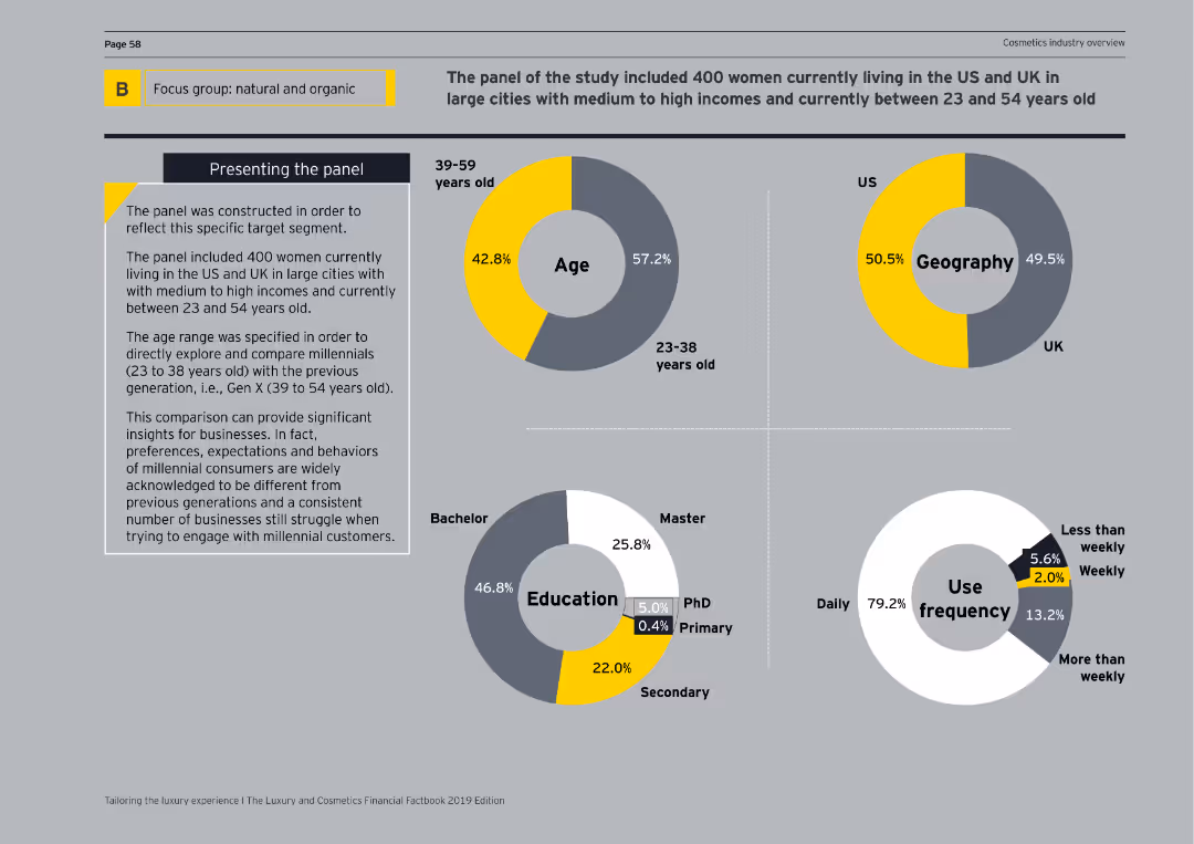
The slide includes circular diagrams representing age, geography, education, and use frequency of a focus group panel. Key statistics are visually highlighted.
Customer and Market Segmentation
Consumer Goods
This slide presents the demographic breakdown of a focus group studying natural and organic product preferences, detailing age groups, geographical distribution, and usage frequency.
demographics, focus group, natural products, age, geography
false
Customer and Market Segmentation
Consumer Goods
Multiple Chart
EY
Add to my slides
Remove from favorites
The slide features multiple icon-based graphics detailing demographic information, such as gender, age, and education.
Customer and Market Segmentation
Financial Services
The slide provides demographic statistics of survey respondents, including gender distribution, age groups, education levels, and employment status.
Demographics, Gender, Age, Education, Employment
false
Customer and Market Segmentation
Financial Services
Multiple Chart
IPSOS
Add to my slides
Remove from favorites
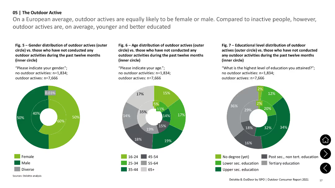
Three donut charts comparing gender, age, and education distribution of outdoor actives vs. non-actives. Green shades represent different groups.
Market Analysis and Trends
Consumer Goods
Compares gender, age, and education level distributions of individuals who participated in outdoor activities versus those who did not.
Demographics, Gender, Age, Education, Outdoor Activities
false
Market Analysis and Trends
Consumer Goods
Multiple Chart
Deloitte
Add to my slides
Remove from favorites
A slide filled with various charts and graphs: pie charts for gender and age distribution, bar charts for income, and employment status, and a map showing the regional distribution of respondents.
Customer and Market Segmentation
Financial Services
Provides demographic information about the survey respondents, including gender, age, region, income, employment status, household composition, marital status, and education level.
demographics, gender, age, income, employment
false
Customer and Market Segmentation
Financial Services
Multiple Chart
IPSOS
Add to my slides
Remove from favorites
The slide includes a gender breakdown, an age distribution pie chart, and a regional distribution bar chart. The layout is clean and visually balanced.
Customer and Market Segmentation
Financial Services
The slide shows demographic data of survey respondents, including gender, age, and regional distribution, providing a snapshot of the survey sample.
demographics, gender, age, region, survey
false
Customer and Market Segmentation
Financial Services
Multiple Chart
IPSOS
Add to my slides
Remove from favorites
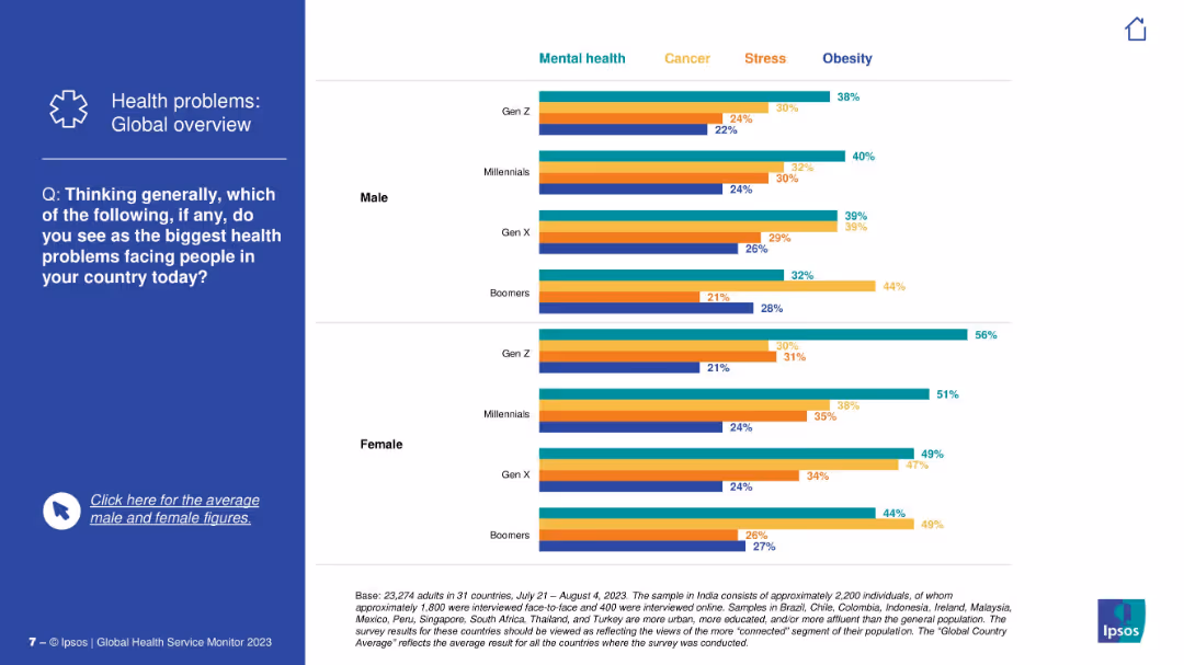
Left text prompt; right side contains segmented horizontal bar charts showing perceptions by gender and generation for top health problems.
Customer and Market Segmentation
Healthcare & Pharmaceuticals
This slide segments global health concern perceptions by generation and gender. It shows mental health as the leading concern among Gen Z and women, while Boomers more frequently identify obesity. Visuals reflect comparative insight.
demographics, gender comparison, generational insight, mental health, obesity, health priorities, stress, public opinion, Ipsos
false
Customer and Market Segmentation
Healthcare & Pharmaceuticals
Mixed Chart
IPSOS
Add to my slides
Remove from favorites
The slide includes a bar chart and a pie chart illustrating the demographics, gender split, and other characteristics of young people.
Customer and Market Segmentation
Education & Training
The slide presents an analysis of young people's demographics, highlighting gender, ethnicity, educational background, and various socio-economic factors.
demographics, gender split, young people, ethnicity, socio-economic
false
Customer and Market Segmentation
Education & Training
Multiple Chart
EY
Add to my slides
Remove from favorites
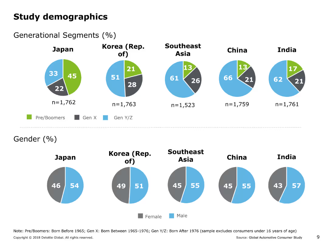
The slide contains several pie charts showing generational segments and gender distribution of the study's respondents across Japan, Korea, Southeast Asia, China, and India.
Market Analysis and Trends
Professional Services
This slide presents demographic information about the respondents in the study, including generational segments (Pre/Boomers, Gen X, Gen Y/Z) and gender distribution across various Asia Pacific countries.
demographics, generational segments, gender distribution, pie charts, market analysis, professional services, study demographics
false
Market Analysis and Trends
Professional Services
Multiple Chart
Deloitte
Add to my slides
Remove from favorites
Displays bar charts and timelines indicating the popularity of specific consumer behaviors among Gen Z and Millennials across various industries.
Market Analysis and Trends
Technology & Software
Analyzes consumer trends and their impact on industries, particularly focusing on the preferences of younger demographics like Gen Z and Millennials.
demographics, Gen Z, Millennials, retail, technology
false
Market Analysis and Trends
Technology & Software
Multiple Chart
Bain
Add to my slides
Remove from favorites
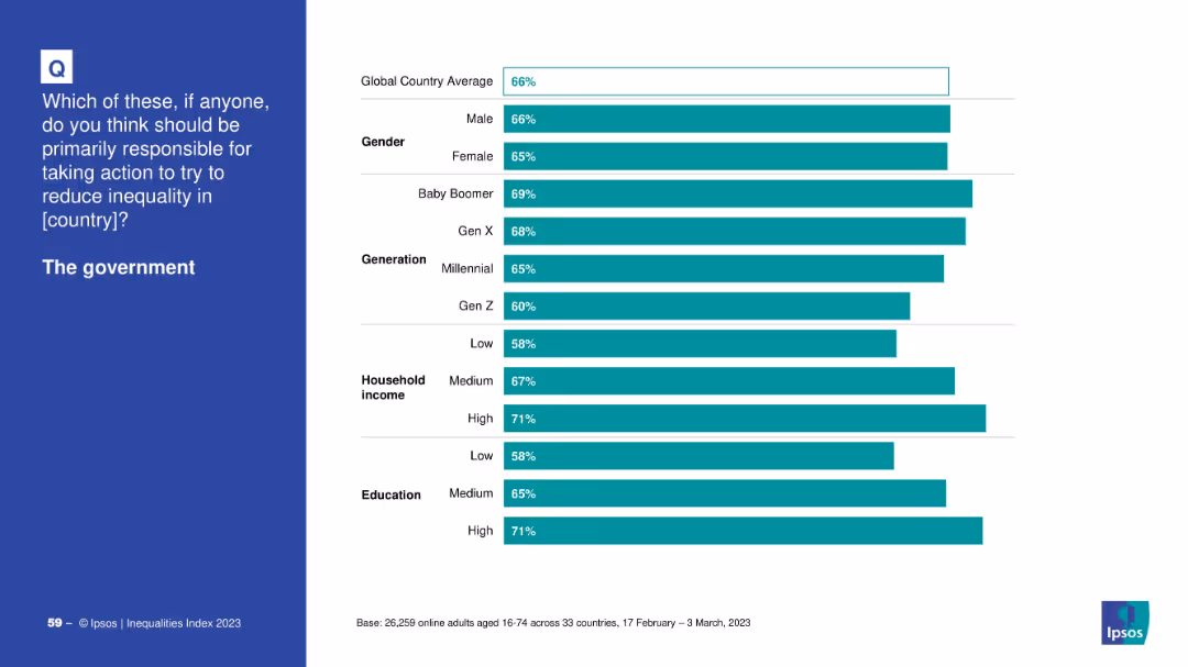
Bar chart comparing demographic support for government responsibility on inequality.
Market Analysis and Trends
Government & Public Sector
This demographic breakdown shows that support for government action is highest among high-income and highly educated individuals, as well as Baby Boomers and Gen X.
demographics, government, inequality, support, income, education, generation, Ipsos, public perception
false
Market Analysis and Trends
Government & Public Sector
Mixed Chart
IPSOS
Add to my slides
Remove from favorites
This slide presents a gender and age-based demographic analysis through bar graphs, displaying growth factors with arrow indicators to denote the doubling or tripling of user base numbers.
Market Analysis and Trends
Retail & E-commerce
Analyzing the demographic factors driving growth in online spending, it reveals that women, non-metros, and those aged 35+ will predominantly influence the market, offering valuable insights for targeted marketing strategies.
Demographics, growth drivers, online spending
false
Market Analysis and Trends
Retail & E-commerce
Multiple Chart
BCG
Add to my slides
Remove from favorites
Moderate visual complexity with numerical data and demographic analysis.
Market Analysis and Trends
Government & Public Sector
Focuses on structural factors influencing long-term prospects in Southeast Asia, useful for policy-making and business strategy development.
demographic shifts, economic growth, Southeast Asia, structural factors
false
Market Analysis and Trends
Government & Public Sector
Multiple Chart
Bain
Add to my slides
Remove from favorites
Features a demographic column chart and a photo of a senior woman, representing the growing senior population.
Market Analysis and Trends
Healthcare & Pharmaceuticals
Discusses the implications of an aging population on various industries, projecting significant increases in the senior demographic by 2030.
demographic shifts, seniors, market impact, aging population, 2030 projections
false
Market Analysis and Trends
Healthcare & Pharmaceuticals
Single Chart
Deutsche Bank
Add to my slides
Remove from favorites
Grid of demographic distribution visualizations: gender, age, income, and shopping types. Uses bars and color blocks.
Market Analysis and Trends
Consumer Goods
Provides demographic and economic background of the consumer survey sample, covering gender, age groups, income levels, and preferred shopping venues. Sets the foundation for interpreting insights in subsequent slides.
demographics, income distribution, age segmentation, shopping types, survey sample, consumer data, McKinsey, Germany
false
Market Analysis and Trends
Consumer Goods
Multiple Chart
McKinsey
Add to my slides
Remove from favorites
A pie chart on the left showing passive and active investors, with a table on the right comparing demographics, income, and financial situation changes between the two groups.
Market Analysis and Trends
Financial Services
It provides demographic and financial comparisons between passive and active investors during the pandemic, showing differences in gender, age, income, and financial situation changes.
demographics, income, financial, active, passive
false
Market Analysis and Trends
Financial Services
Mixed Chart
IPSOS
Add to my slides
Remove from favorites
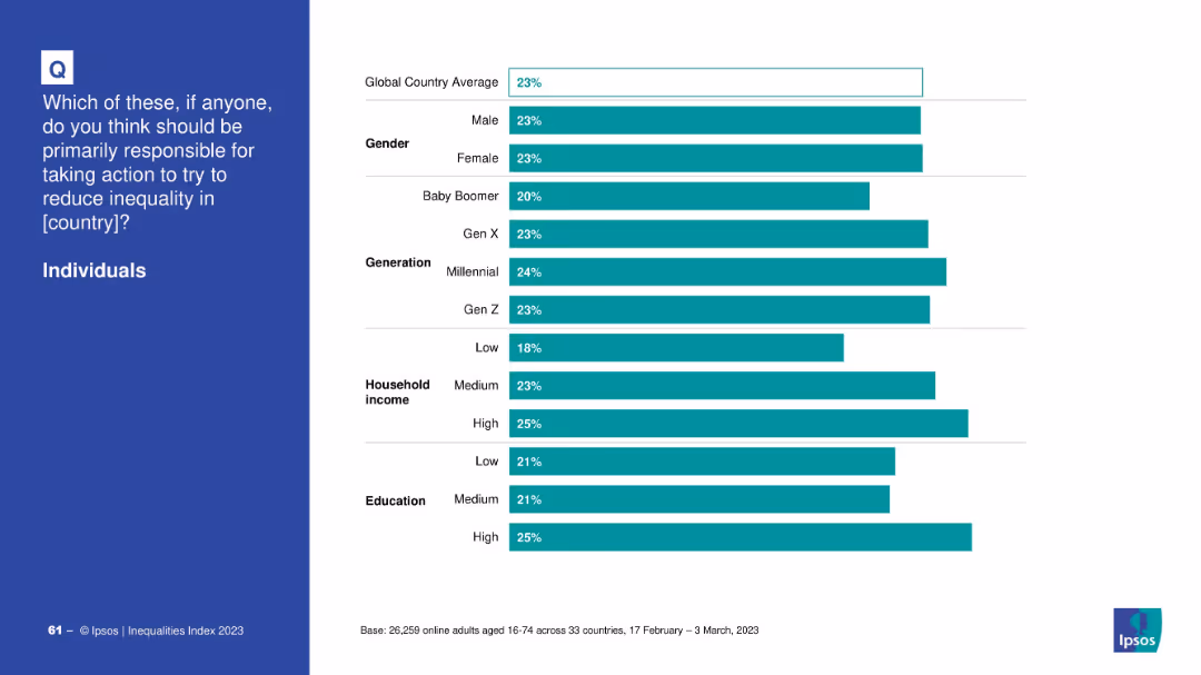
Demographic bar chart on views about individual responsibility in addressing inequality.
Market Analysis and Trends
Professional Services
The demographic analysis indicates a relatively uniform perception across genders and generations, with slightly higher support from Millennials and high-income earners.
demographics, individuals, inequality, responsibility, Ipsos, education, income, generation, support
false
Market Analysis and Trends
Professional Services
Mixed Chart
IPSOS
Add to my slides
Remove from favorites
Bar charts and a pie chart showing the distribution of survey participants by industry, revenue, and roles. Different colors and sections indicate various categories.
Market Analysis and Trends
Professional Services
This slide provides a breakdown of survey participants by industry, revenue brackets, and roles. It includes visual data on the number of participants from different sectors and their respective revenues.
demographics, industry, revenue, roles, participants
false
Market Analysis and Trends
Professional Services
Multiple Chart
Accenture
Add to my slides
Remove from favorites
Vertical bar chart comparing views on the importance of inequality across demographic subgroups.
Market Analysis and Trends
Government & Public Sector
This slide shows how different demographic segments (gender, generation, income, education) rate the importance of inequality in their country relative to other issues, with a majority rating it as important.
demographics, inequality, importance, perception, global average, survey analysis
false
Market Analysis and Trends
Government & Public Sector
Mixed Chart
IPSOS
Add to my slides
Remove from favorites
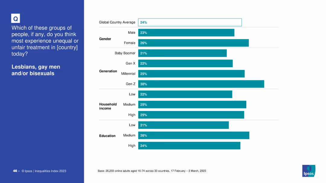
Horizontal bar chart segmented by gender, generation, income, and education on white background
Market Analysis and Trends
Government & Public Sector
The slide shows demographic breakdowns of global responses to unfair treatment of LGB individuals, categorized by gender, generation, household income, and education. Gen Z and females reported the highest perception of inequality.
demographics, inequality, LGB, Ipsos, Gen Z, gender, education, income, survey, 2023
false
Market Analysis and Trends
Government & Public Sector
Mixed Chart
IPSOS
Add to my slides
Remove from favorites
Slide features multiple data visualizations: pie charts, bar charts, detailing job roles, premium ranges, company sizes, age, and tenure within the insurance industry.
Market Analysis and Trends
Financial Services
Provides a demographic breakdown of insurance industry respondents, covering aspects like job title, focus area, account premiums, and company's net premiums, useful for market analysis.
demographics, insurance, market analysis, job roles, premiums, company size, age distribution, tenure, industry trends
false
Market Analysis and Trends
Financial Services
Multiple Chart
Accenture
Add to my slides
Remove from favorites
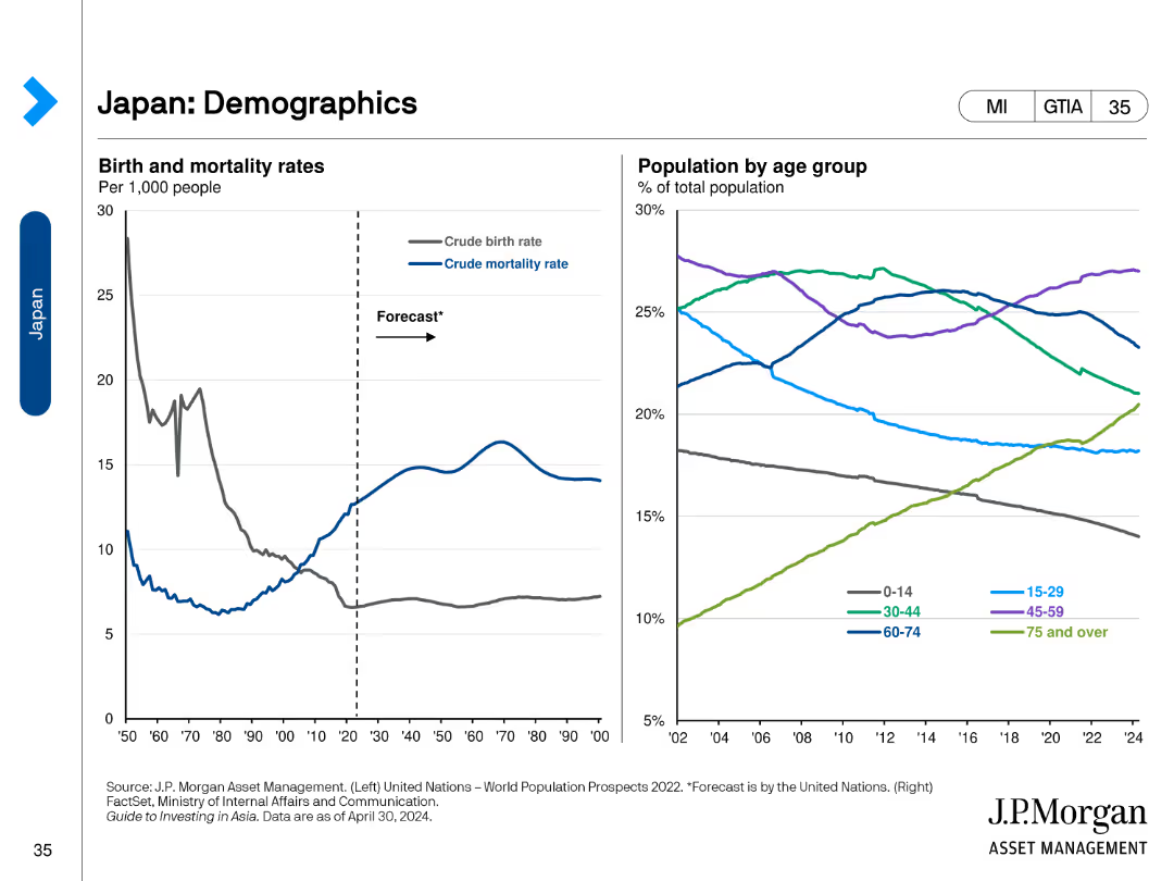
The slide includes two line charts. The left chart shows birth and mortality rates per 1,000 people. The right chart shows the population by age group.
Market Analysis and Trends
Healthcare & Pharmaceuticals
This slide reviews demographic trends in Japan, presenting data on birth and mortality rates and the population distribution by age group.
Demographics, Japan, Birth Rate, Mortality, Age
false
Market Analysis and Trends
Healthcare & Pharmaceuticals
Multiple Chart
JP Morgan
Add to my slides
Remove from favorites
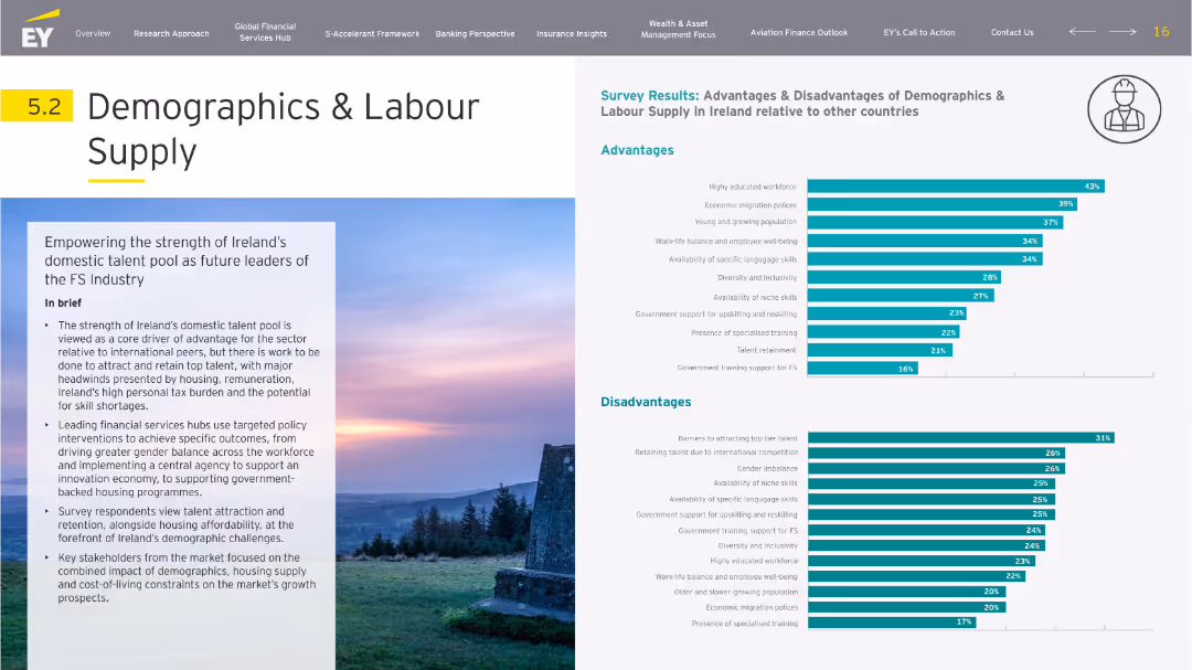
Balanced layout with left-side narrative and right-side dual bar charts (advantages/disadvantages). Icons and soft backgrounds create visual segmentation.
Human Resources and Talent Management
Professional Services
Focuses on Ireland's domestic talent pool as an advantage in FS industry growth. Survey results show strengths in education and migration, with drawbacks including retention issues and high taxes. The slide discusses workforce balance, housing concerns, and government training policies.
demographics, labor supply, talent, migration, education, retention
false
Human Resources and Talent Management
Professional Services
Multiple Chart
EY
Add to my slides
Remove from favorites
This slide contains multiple column charts displaying demographic information about Chinese luxury consumers, including age, education, and gender distribution.
Customer and Market Segmentation
Consumer Goods
Analyzes the demographic characteristics of Chinese luxury consumers, focusing on their youth, education, and predominantly female composition.
demographics, luxury, consumer, China, education, gender, age, distribution, market segmentation
false
Customer and Market Segmentation
Consumer Goods
Multiple Chart
BCG
Add to my slides
Remove from favorites
Slide presents multiple column charts comparing manager demographics and distribution by company type across several countries, using flags for identification.
Market Analysis and Trends
Professional Services
Offers a comparative analysis of demographics, company types, and sectors across countries, useful for understanding corporate and workforce distributions in various regions.
demographics, managers, company types, countries, bar chart, column chart, workforce analysis, sector data, comparative analysis
false
Market Analysis and Trends
Professional Services
Multiple Chart
BCG
Add to my slides
Remove from favorites
This slide displays two comparative column charts showing the distribution of personal luxury goods consumers by generation in 2016 and a 2017 estimate. The charts are color-coded in shades of red and gray, highlighting generational shifts particularly among Millennials and Gen Z.
Market Analysis and Trends
Consumer Goods
Analyzes shifts in consumer demographics for luxury goods, emphasizing the growing influence and market share of Millennials and Generation Z from 2016 to 2017. Demonstrates how these younger generations are becoming significant consumers in the luxury market.
demographics, Millennials, Gen Z, luxury goods, market shift
false
Market Analysis and Trends
Consumer Goods
Multiple Chart
Bain
Add to my slides
Remove from favorites
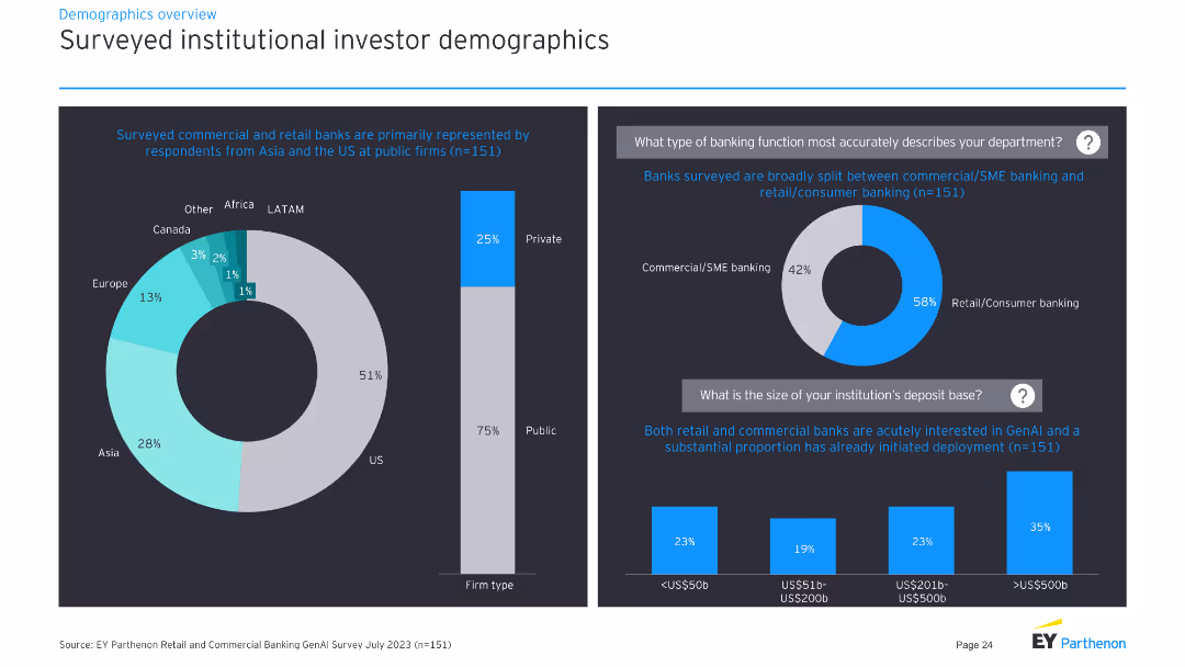
Pie charts and a column chart showing demographics of surveyed investors, firm types, and banking functions.
Market Analysis and Trends
Financial Services
This slide presents demographic information of surveyed commercial and retail banks, including their regions, firm types, and banking functions.
demographics, pie chart, column chart, investors, banking
false
Market Analysis and Trends
Financial Services
Multiple Chart
EY
Add to my slides
Remove from favorites
The slide shows four area charts, each representing population distribution by age group (Under 15, 15-64, 65+) for the US, Eurozone, UK, and China, with historical and forecast data.
Market Analysis and Trends
Financial Services
This slide provides demographic trends and forecasts for key regions, crucial for understanding long-term economic and market implications.
Demographics, population, age distribution, forecast, economic trends
false
Market Analysis and Trends
Financial Services
Multiple Chart
JP Morgan
Add to my slides
Remove from favorites
This slide features a horizontal layout with text at the top and four images aligned horizontally below it, each representing different aspects of society (Population, Migration, Values, Education). The text is succinct and above the images.
Market Analysis and Trends
Education & Training
The slide presents the megatrend "People & Society," discussing demographic aspects such as population, migration, values, and education. It aims to highlight the dynamic nature of society and its foundational influence on various sectors and policies.
demographics, society, education, migration, population
false
Market Analysis and Trends
Education & Training
Pillar
Roland Berger
Add to my slides
Remove from favorites
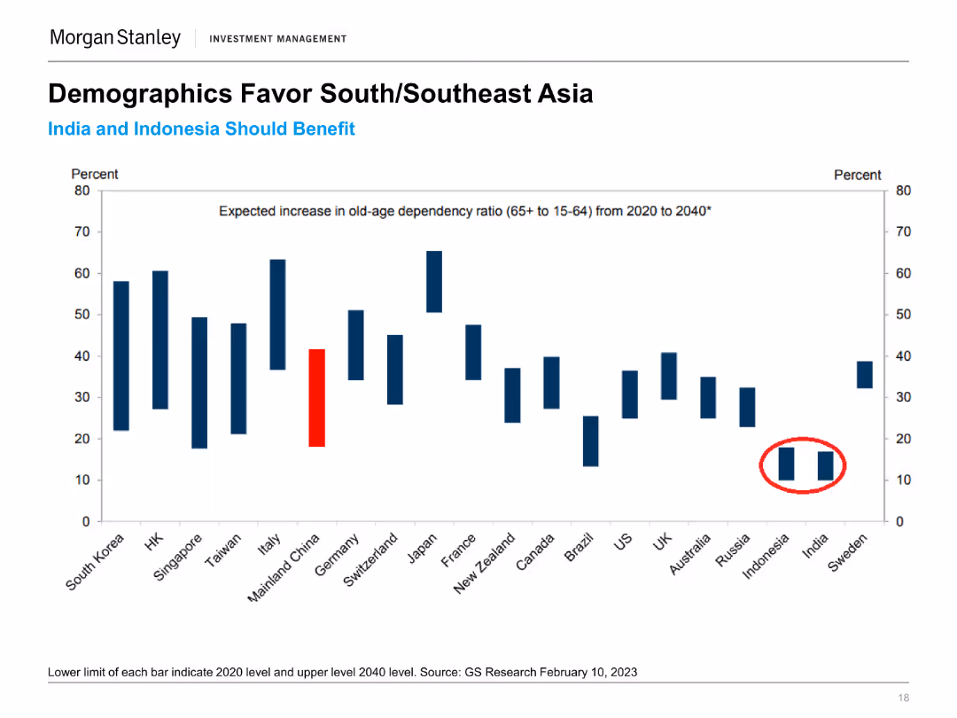
The slide presents a column chart illustrating the expected increase in old-age dependency ratio (65+ to 15-64) from 2020 to 2040 for various countries. Specific countries are highlighted.
Market Analysis and Trends
Financial Services
The slide analyzes demographic trends favoring South and Southeast Asia by projecting old-age dependency ratios, indicating potential economic advantages for these regions.
Demographics, South Asia, Southeast Asia, Old-Age Dependency, Economic Trends, Population Growth, Market Analysis, Regional Advantages
false
Market Analysis and Trends
Financial Services
Single Chart
Morgan Stanley
Add to my slides
Remove from favorites
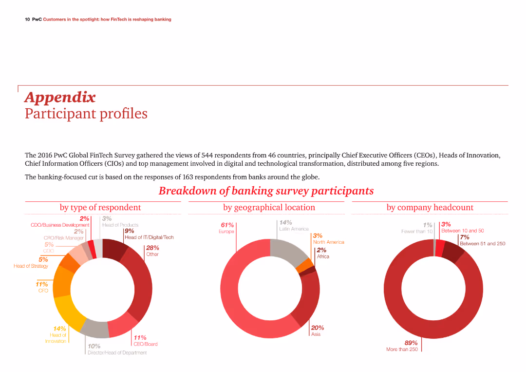
The slide features three column charts showing participant breakdowns by type, geographical location, and company headcount. It is visually balanced with text and visuals in harmony.
Client Case Studies
Financial Services
The slide provides an overview of the 2016 PwC Global FinTech Survey participants, focusing on those from the banking sector, with detailed participant demographics.
demographics, survey, banking, participants, PwC
false
Client Case Studies
Financial Services
Multiple Chart
PwC/Strategy&
Add to my slides
Remove from favorites
A pie chart showing company size distribution and a world map indicating surveyed countries. Text lists respondent demographics and industries.
Market Analysis and Trends
Professional Services
The slide presents the demographic breakdown of a survey, including company size, industries, and geographical distribution of the respondents.
Demographics, Survey, Company Size, Industries, Global Distribution
false
Market Analysis and Trends
Professional Services
Mixed Chart
Accenture
Add to my slides
Remove from favorites
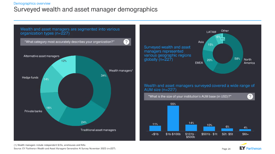
The slide contains two charts: a pie chart showing the types of organizations surveyed and a column chart showing the geographic regions of respondents. It also includes a bar chart for AUM size distribution.
Market Analysis and Trends
Financial Services
This slide provides demographic information about the survey respondents, detailing the types of organizations they represent, their geographic distribution, and the size of their assets under management (AUM).
demographics, survey, financial services, organization types, geographic regions, AUM, pie chart, column chart, bar chart
false
Market Analysis and Trends
Financial Services
Multiple Chart
EY
Add to my slides
Remove from favorites
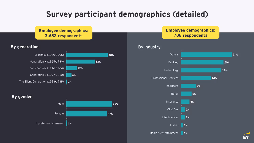
Features a collection of stacked column charts detailing demographics such as gender, age, employment status, education, and tenure among survey respondents from different countries. Each chart uses a consistent green color scheme, and the layout provides a clear division between different demographic categories.
Market Analysis and Trends
Professional Services
This slide presents demographic data of respondents from a global survey on deskless workers, including distributions by age, gender, education, and employment status. Useful in understanding the diversity of the survey population and contextualizing the data in discussions of workplace practices in multinational contexts.
demographics, survey, global, education, employment, gender, age
false
Market Analysis and Trends
Professional Services
Multiple Chart
BCG
Add to my slides
Remove from favorites
This slide includes a table, column charts, and a photo. The left side features a table of survey respondents by country, while the right has column charts for industries and demographics.
Market Analysis and Trends
Professional Services
Presents survey demographics, showing respondents by country, industry representation, and age group. Highlights key statistics about the survey sample.
demographics, survey, industries, age groups, countries
false
Market Analysis and Trends
Professional Services
Multiple Chart
EY
Add to my slides
Remove from favorites
Pie charts and a mekko chart showing industry representation and geographical distribution of survey respondents across multiple sectors.
Market Analysis and Trends
Professional Services
Provides demographic insights into a survey, detailing the industry sectors and geographical locations of respondents, useful for market analysis.
demographics, survey, industry, geographic, distribution, sectors, market, analysis
false
Market Analysis and Trends
Professional Services
Multiple Chart
Accenture
Add to my slides
Remove from favorites
Slide includes a title at the top, followed by a two-column layout with one column dedicated to methodology description and the other to pie and bar charts displaying demographic data such as ethnicity, age, seniority, and LGBT percentage.
Market Analysis and Trends
Professional Services
The slide presents demographic breakdowns from a survey of 5,000 women across 10 countries, detailing ethnicity, age, seniority, and LGBT representation in the professional environment.
demographics, survey, methodology, ethnicity, age, seniority, professional, representation
false
Market Analysis and Trends
Professional Services
Mixed Chart
Deloitte
Add to my slides
Remove from favorites
A column chart showing the demographics of survey respondents by generation and gender, and another column chart showing the respondents by industry.
Market Analysis and Trends
Professional Services
This slide provides detailed demographics of survey participants, including generation, gender, and industry, to give context to the survey data presented in the report.
Demographics, Survey, Respondents, Generation, Industry
false
Market Analysis and Trends
Professional Services
Multiple Chart
EY
Add to my slides
Remove from favorites
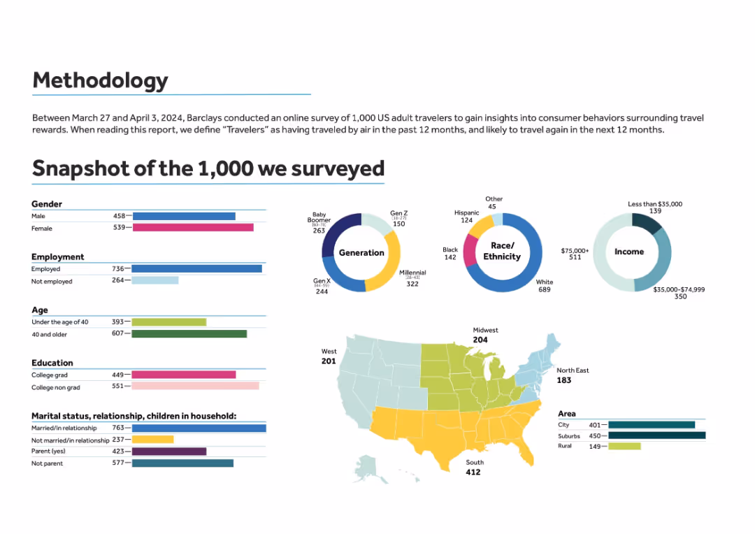
Infographic-style layout with horizontal bar graphs, pie charts, and a U.S. regional map in pastel colors.
Market Analysis and Trends
Professional Services
This slide presents the methodology and demographic breakdown of a survey conducted by Barclays among 1,000 US adult air travelers. It includes statistics on gender, employment, age, education, income, marital/parental status, race, region, and area type to provide context for subsequent insights.
demographics, survey, travelers, region, gender, age, income, education
false
Market Analysis and Trends
Professional Services
Multiple Chart
Barclays
Add to my slides
Remove from favorites
Circular diagram in the center partitioned into four segments labeled 'Larger', 'Older', 'Drivers', and 'Connected', each segment in a different shade of green, highlighting key demographic and technological drivers in metro areas.
Strategic Planning
Transportation & Logistics
Explores the primary demographic and technological changes affecting metro areas in the U.S., such as population growth and connectivity enhancements. Useful for urban planning and policy making.
demographics, technology, metro areas, growth, connectivity, planning
false
Strategic Planning
Transportation & Logistics
Linear Flow
BCG
Add to my slides
Remove from favorites
Grid bar chart with breakdown by gender and age across countries. Consistent use of purple shades.
Customer and Market Segmentation
Healthcare & Pharmaceuticals
This slide expands on slide 18925, showing demographic specifics (male/female, age groups) on those who think vaping is more harmful than smoking. It identifies perception gaps across gender and generational lines.
demographics, vaping, harm perception, gender, age, survey data, tobacco, Ipsos
false
Customer and Market Segmentation
Healthcare & Pharmaceuticals
Single Chart
IPSOS
Add to my slides
Remove from favorites
Matrix bar chart segmented by country, gender, and age groups. Purple bars aligned in columns.
Customer and Market Segmentation
Healthcare & Pharmaceuticals
This slide provides a detailed demographic breakdown (gender and age) of perceptions on vaping harm across countries. It shows consistently high concern across all groups, with notable variations between men and women and across age segments.
demographics, vaping perception, age groups, gender, tobacco harm, cross-country comparison, Ipsos, matrix chart
false
Customer and Market Segmentation
Healthcare & Pharmaceuticals
Single Chart
IPSOS
Add to my slides
Remove from favorites
This slide features three sections comparing demographic characteristics of employees across different work profiles: Office Optimal, Hybrid Hopeful, Remote Ready.
Market Analysis and Trends
Professional Services
Provides analysis of key demographic characteristics influencing employee choices in different work environments, including office, hybrid, and remote work profiles.
Demographics, Work profiles, Office optimal, Hybrid hopeful, Remote ready
false
Market Analysis and Trends
Professional Services
Multiple Chart
EY
Add to my slides
Remove from favorites
Left side has images representing innovators, governments, corporates, investors. Right side lists key focus areas and actions for driving projects.
Operational Efficiency
Technology & Software
The slide provides a deep dive into strategies and approaches for large-scale demonstration projects, emphasizing collaboration and innovative solutions.
Demonstration projects, Strategy, Collaboration, Innovators, Corporates
false
Operational Efficiency
Technology & Software
Vertical Flow
BCG
Add to my slides
Remove from favorites
Features title, multiple bar charts showing potential impacts of digital initiatives in Denmark with values for "Total Value at Stake" and "Trapped Value".
Investment Analysis
Technology & Software
Highlights specific digital initiatives in Denmark and their economic impact, focusing on sectors like e-commerce, connected travel, and assisted driving.
Denmark, digital initiatives, economic impact, e-commerce, connected travel
false
Investment Analysis
Technology & Software
Mixed Chart
Accenture
Add to my slides
Remove from favorites
Contains multiple vertical bars in two shades representing the expenditure allocations by department for two consecutive fiscal years.
Regulatory and Compliance
Government & Public Sector
This slide facilitates comparison of budget allocations across various government departments, aiding in departmental financial analysis and planning.
departmental, expenditure, budget, allocation, government, analysis, planning, fiscal, finance, comparison
false
Regulatory and Compliance
Government & Public Sector
Single Chart
PwC/Strategy&
Add to my slides
Remove from favorites
Column chart comparing departmental expenditures over two fiscal years. Departments like Education, Health, and Defense are highlighted with different colors for clarity.
Financial Performance
Government & Public Sector
Shows funding allocations to various government departments, useful for policy analysis and resource allocation discussions within public sector finance.
departmental spending, budget allocation, government finance
false
Financial Performance
Government & Public Sector
Single Chart
PwC/Strategy&
Add to my slides
Remove from favorites
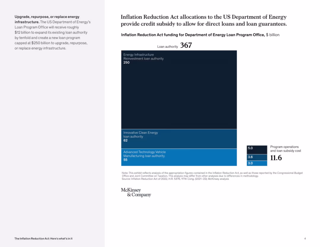
Full-screen treemap with a bold vertical block format; right-side numeric box for operational costs; left panel describes DOE program expansion.
Investment Analysis
Government & Public Sector
This slide details how $367B in IRA funding is allocated to the DOE Loan Program Office, emphasizing energy infrastructure and innovative technologies. It also accounts for operational and subsidy costs.
Department of Energy, loans, clean energy, subsidies, infrastructure, investment, vehicle tech
false
Investment Analysis
Government & Public Sector
Mixed Chart
McKinsey
Add to my slides
Remove from favorites
This slide features a table with green and grey bars representing the percentage of respondents for different departments recovered to pre-COVID-19 levels.
Operational Efficiency
Healthcare & Pharmaceuticals
This slide shows the recovery of various hospital departments to pre-COVID-19 levels, with a focus on elective procedures across different regions.
department recovery, pre-COVID-19 levels, elective procedures, hospital departments, regional comparison
false
Operational Efficiency
Healthcare & Pharmaceuticals
Multiple Chart
LEK
Add to my slides
Remove from favorites
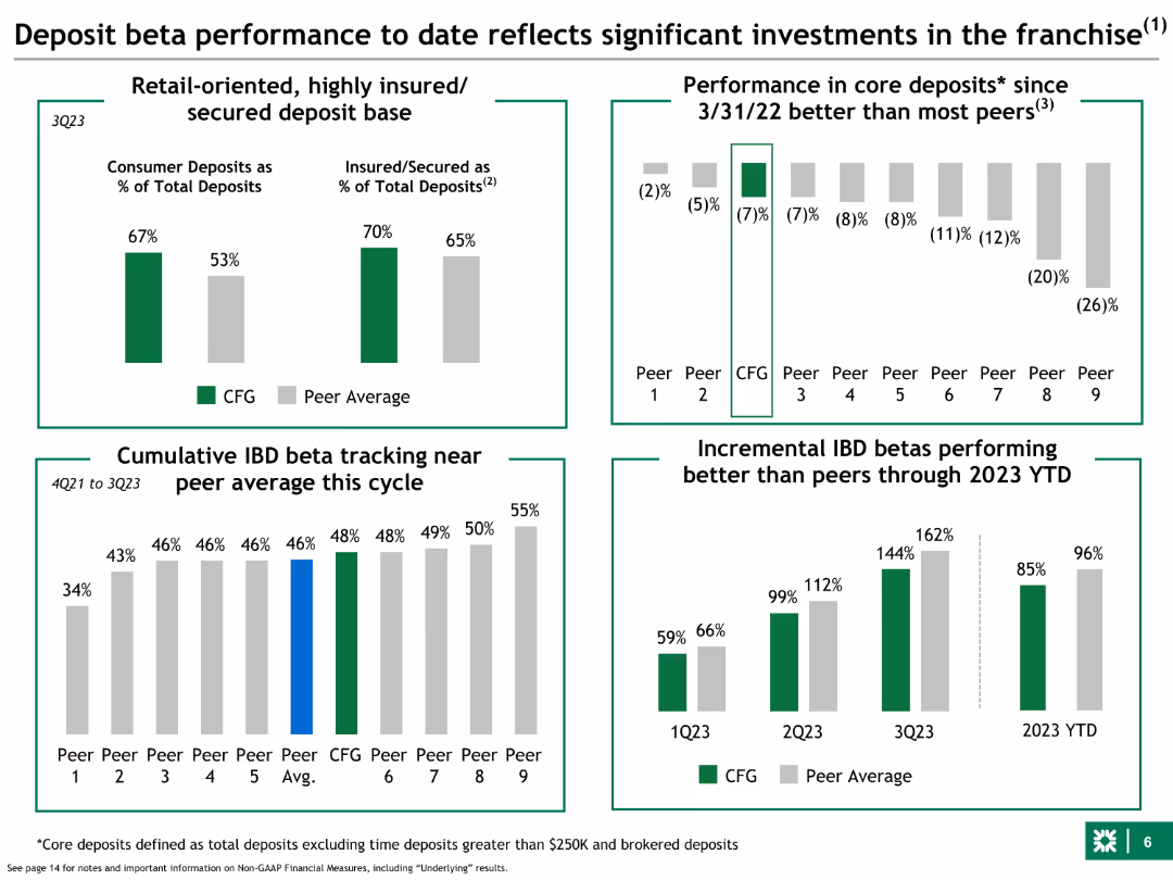
Multiple charts: bar charts for deposit base composition and core deposit performance; column charts for incremental IBD betas; trend lines for cumulative IBD beta tracking.
Financial Performance
Financial Services
Analyzes deposit beta performance and investments in Citizens' franchise, comparing consumer deposits, insured deposits, and beta performance with industry peers.
deposit, beta, performance, Citizens, franchise, investments, consumer, insured, industry peers
false
Financial Performance
Financial Services
Multiple Chart
Goldman Sachs
Add to my slides
Remove from favorites
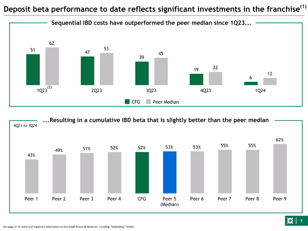
Column charts showing sequential IBD costs compared to peer median, and cumulative IBD beta. The slide uses green and grey colors for comparison.
Financial Performance
Financial Services
This slide shows the bank's deposit beta performance over time, comparing sequential costs with peers and demonstrating a cumulative beta slightly better than the median.
deposit, beta, performance, IBD, peer median
false
Financial Performance
Financial Services
Multiple Chart
Barclays
Add to my slides
Remove from favorites
This slide has two main sections. The left section features a column chart tracking deposit growth over two periods with arrows indicating changes. The right section contains two pie charts showing the composition of funding mix at two different points in time, illustrating a shift towards an even split between deposits and wholesale unsecured funding.
Market Analysis and Trends
Financial Services
It illustrates the growth trajectory of deposits and the evolving mix of unsecured funding, which can be instrumental for financial analysts or business strategists evaluating market trends and deposit strategies.
deposit growth, funding mix, bar chart, pie chart, market trend, financial analysis, strategic planning, unsecured funding, banking sector, resource allocation
false
Market Analysis and Trends
Financial Services
Multiple Chart
Goldman Sachs
Add to my slides
Remove from favorites
Various pie and column charts with financial data, text blocks outlining investment strategies, and key metrics in deposit growth. A logo is present.
Financial Performance
Financial Services
The slide covers the bank's deposit growth strategy, emphasizing investments in branches, products, and data-driven insights. Used for financial updates and demonstrating growth in the banking sector.
deposit growth, investment strategy, banking, financial data, consumer accounts, treasury
false
Financial Performance
Financial Services
Multiple Chart
Morgan Stanley
Add to my slides
Remove from favorites
A line graph and a stacked column chart dominate the slide. It also features numerical annotations and a color-coded key for clarity.
Financial Performance
Financial Services
The slide demonstrates year-over-year loan and deposit growth, and the quarterly average of interest-earning assets, essential for financial growth discussions.
deposit growth, loan growth, assets, optimization
false
Financial Performance
Financial Services
Multiple Chart
JP Morgan
Add to my slides
Remove from favorites
Previous
Next
You don't have any favorites yet.
Please wait loading your favorites slides...
Create a FREE account to continue browsing
Receive Instant Access to 1,000+ slides from companies like McKinsey, Google, and Goldman Sachs
First Name
Last Name
Email
Password
I agree to all
Terms & Privacy Policy
Thank you! Your submission has been received!
Oops! Something went wrong while submitting the form.
Have an account?
Sign in
Upgrade to PRO to Save slides
Advanced Search and Filters
Access to 15,000+ slides
Access to Category Pages
Save/Bookmark Slides
PowerPoint Template Library
Pick a Plan
MONTHLY
$12/month
Billed every month, Cancel anytime.
YEARLY
$9/year
Billed $108 annually, Cancel anytime.
Checkout for $12/month
Checkout for $108/yr
Secured by Stripe | AES-256 bit encryption


![Compared to all the other problems facing [country], would you say that inequality is…?](https://cdn.prod.website-files.com/654e70fb59937215cac87b19/6899c833d1da0f1e90ad9dac_bwvDFeCz5xBPc9fWKH7Gi4zCIu5ktHb8G27NmmlwgKg.avif)