My Account
My Slides
Search by Category
Companies
Slide Type
Use Case
Industry
Pricing
Templates
View All Templates
Download Template Slides
✦ AI
AI Prompt Library
AI Search
Feedback
Login
Logout
Get Started
Browse all Slides
Browse all Slides
Create a FREE Account
Instant access to 1,000+ real slides from top companies like McKinsey, BCG, Goldman Sachs, Google and many more!
First Name
Last Name
Email
Password
I agree to all
Terms & Privacy Policy
Thank you! Your submission has been received!
Oops! Something went wrong while submitting the form.
Have an account?
Sign in
Saved Slides
Total No. of slides saved
0
↻ Refresh
✖ Clear all
Features bar charts display the market cap of top technology companies in Brazil for 2010 and 2019, showing new entrants and growth.
Technology and Digital Transformation
Technology & Software
Examines the rise of digital disruptors in Brazil's tech industry, showing new leading companies in 2019 compared to 2010.
digital disruptors, market cap, Brazil, technology companies, 2019
false
Technology and Digital Transformation
Technology & Software
Multiple Chart
McKinsey
Add to my slides
Remove from favorites
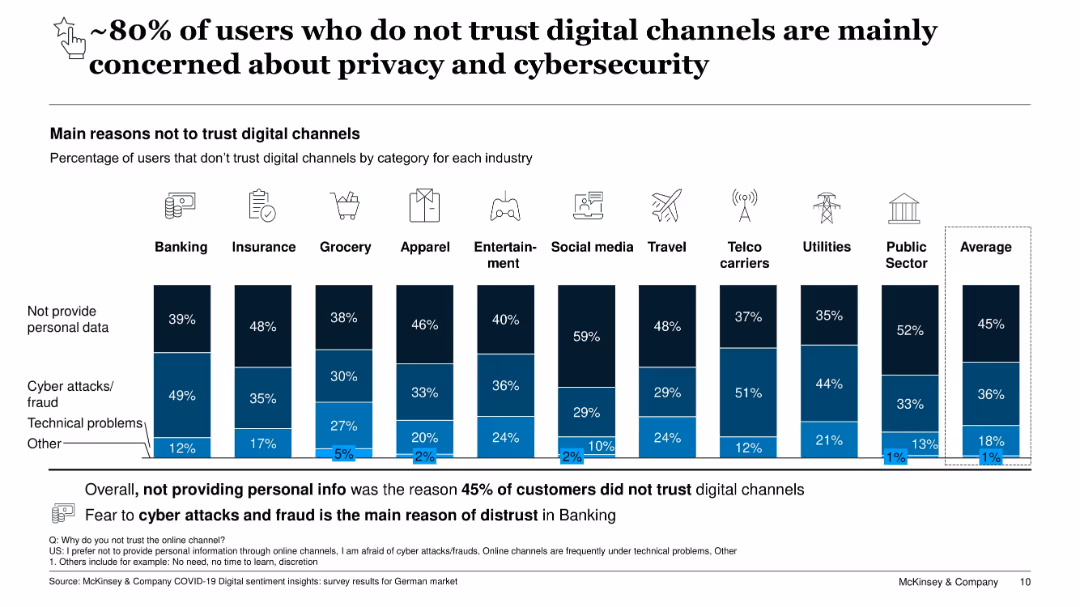
Horizontal bar chart with industries listed, each bar divided into reasons (privacy, cyber fraud, technical, other); large headline
Risk Assessment and Management
Technology & Software
This slide shows users' lack of trust in digital channels, highlighting privacy concerns and fear of cyber attacks as primary factors. On average, 45% avoid digital channels due to unwillingness to share personal data, and 36% due to cyber fraud risks. Minor concerns include technical problems and other personal reasons.
digital distrust, cybersecurity, privacy, fraud risk, technical problems, user concerns, data protection, industry breakdown, Germany
false
Risk Assessment and Management
Technology & Software
Single Chart
McKinsey
Add to my slides
Remove from favorites
Two column charts comparing the prevalence of computer skills in developing and developed countries, showing the population with no computer skills and with standard computer skills.
Technology and Digital Transformation
Technology & Software
This slide highlights the digital divide caused by unequal technological advancements and diffusion. It compares the prevalence of computer skills in developing and developed countries, emphasizing the need for inclusive technology and equitable access to new innovations.
Digital Divide, Computer Skills, Technological Inequality
false
Technology and Digital Transformation
Technology & Software
Mixed Chart
Roland Berger
Add to my slides
Remove from favorites
Features a simple layout with two bar charts comparing the year-on-year changes in digital access between income groups. The charts are color-coded to distinguish between positive and negative trends.
Market Analysis and Trends
Technology & Software
Focuses on the increasing gap in digital access and subscription services among different income levels, emphasizing the economic factors influencing digital consumption.
digital divide, economic impact, access to technology, income levels, digital consumption, year-on-year change, socio-economic analysis, market trends, consumer behavior, digital access
false
Market Analysis and Trends
Technology & Software
Multiple Chart
Deloitte
Add to my slides
Remove from favorites
This slide showcases comparative data through multiple donut charts, illustrating disparities in digital product ownership and service subscriptions between higher and lower income households.
Market Analysis and Trends
Technology & Software
Examines the digital divide by comparing access to technology and subscription services in different income brackets. Useful in discussions on socio-economic disparities and digital inclusion.
digital divide, income disparity, technology access, subscription services, socio-economic status, market analysis, consumer behavior, digital inclusion, accessibility, demographics
false
Market Analysis and Trends
Technology & Software
Multiple Chart
Deloitte
Add to my slides
Remove from favorites
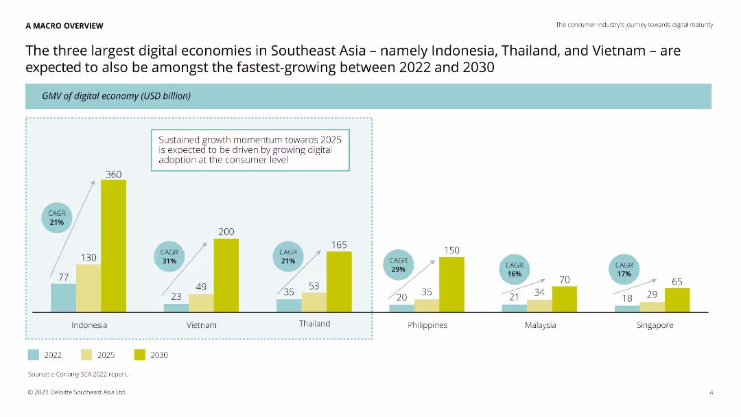
Column chart comparing GMV of digital economies in Indonesia, Vietnam, Thailand, Philippines, Malaysia, and Singapore for 2022, 2025, and 2030.
Market Analysis and Trends
Technology & Software
This slide compares the digital economies of Southeast Asian countries, projecting growth in GMV. It highlights the fastest-growing digital markets, providing valuable insights for investors and businesses.
digital economies, Southeast Asia, growth, projections
false
Market Analysis and Trends
Technology & Software
Single Chart
Deloitte
Add to my slides
Remove from favorites
This slide includes text blocks and icons in a bi-directional flowchart layout, highlighting factors of ASEAN's digital economy boom and related talent demand. It is clear with well-spaced elements, a white background, and teal highlights.
Investment Analysis
Technology & Software
Detailing the booming digital economy in ASEAN, this slide lays out contributing factors like internet penetration and digital services demand. It also emphasizes the role of digitalization in traditional industries, which impacts the demand for specialized local talent.
digital economy, ASEAN, internet penetration, talent demand, digitalization
false
Investment Analysis
Technology & Software
Linear Flow
Kearney
Add to my slides
Remove from favorites
This slide features a large title at the top, a column chart with projected carbon footprint (CO2e) from 2021 to 2030, and a key for interpreting the chart. Text boxes provide additional details on methodologies for CO2e calculation across various sectors. The layout is clean with ample white space.
Market Analysis and Trends
Technology & Software
The slide projects the growth of the digital economy's carbon emissions, with forecasts reaching ~20 MT CO2e by 2030. It details the methodologies used in the transportation, food delivery, and e-commerce sectors. This could be used for presentations on environmental impact forecasting or digital economy planning.
digital economy, CO2e, projections, transportation, food delivery, e-commerce, methodology, sustainability
false
Market Analysis and Trends
Technology & Software
Mixed Chart
Bain
Add to my slides
Remove from favorites
Varied column charts and line graphs are presented with projections for the overall digital economy and specific sectors like E-commerce and transport.
Market Analysis and Trends
Technology & Software
The slide forecasts the digital economy's trajectory, focusing on E-commerce as a major growth driver, useful for discussing market potential.
digital economy, e-commerce growth, transport, online media, projections, trends
false
Market Analysis and Trends
Technology & Software
Multiple Chart
Bain
Add to my slides
Remove from favorites
This slide features column charts and forecasts showcasing growth in the digital economy, with a focus on e-commerce, online travel, and media. It is color-coded in blue tones and uses arrows for growth trajectory, accompanied by CAGR percentages. The information is clearly structured and presented in a professional layout.
Market Analysis and Trends
Technology & Software
The slide details the substantial growth of the digital economy in 2022 with projections for 2025, emphasizing the burgeoning e-commerce sector. It provides a snapshot of market potential and is likely aimed at investors or stakeholders considering digital economy ventures.
digital economy, e-commerce, online travel, media, CAGR, market growth, 2022 projections, 2025 forecast
false
Market Analysis and Trends
Technology & Software
Multiple Chart
Bain
Add to my slides
Remove from favorites
This slide features column charts showing growth in Malaysia's digital economy, with separate sections for e-commerce, online travel, transport and food, and online media. There's also a legend for growth metrics.
Market Analysis and Trends
Technology & Software
It presents the growth of Malaysia's digital economy by 2023 and e-commerce acceleration plans for 2025. It analyzes sector-specific growth and decline, highlighting the economic impact of online travel and e-commerce, crucial for stakeholders tracking market trends.
Digital Economy, E-commerce, Travel, Growth, Forecast, Malaysia, Column Chart
false
Market Analysis and Trends
Technology & Software
Multiple Chart
Bain
Add to my slides
Remove from favorites
This slide presents column charts on Singapore's digital economy, segmented into e-commerce, travel, food, and online media. Key metrics are annotated, and the layout is similar to slide 1812 but with a different color theme.
Market Analysis and Trends
Technology & Software
The slide predicts Singapore's digital economy growth by 2025, with travel and e-commerce being significant sectors. It's suitable for stakeholders in the digital economy to understand market trajectories and plan for future investments.
Digital Economy, E-commerce, Travel, Growth, Forecast, Singapore, Column Chart
false
Market Analysis and Trends
Technology & Software
Multiple Chart
Bain
Add to my slides
Remove from favorites
A collection of blue column charts comparing digital economy growth to GDP growth for various SEA countries.
Financial Performance
Technology & Software
The slide demonstrates the digital economy's growth, anticipated to be twice as fast as GDP growth through 2030 in SEA countries.
digital economy, GDP growth, SEA, CAGR, forecast
false
Financial Performance
Technology & Software
Multiple Chart
Bain
Add to my slides
Remove from favorites
The slide is densely packed with multiple column charts detailing the growth of various segments within the digital economy. Each chart is accompanied by growth percentages and future projections. The design employs a color scheme of blue shades and yellow highlights to distinguish between the segments and years.
Market Analysis and Trends
Technology & Software
It discusses the year-over-year growth of Singapore's digital economy, emphasizing the contribution of e-commerce and the recovery of the travel sector. The slide can be used to assess past performance and future expectations for the overall digital economy and its individual components, highlighting compound annual growth rates and expected market sizes.
digital economy, growth, e-commerce, travel, Singapore
false
Market Analysis and Trends
Technology & Software
Multiple Chart
Bain
Add to my slides
Remove from favorites
The slide contains multiple column charts with data annotations and a legend. Dense with numerical data, use of blue tones, and clear segmentation of information.
Investment Analysis
Technology & Software
This slide details the year-over-year growth of Indonesia's digital economy, focusing on sectors such as e-commerce and online media, suitable for presentations on investment opportunities and market growth trends.
digital economy, growth, Indonesia, e-commerce, online media
false
Investment Analysis
Technology & Software
Multiple Chart
Bain
Add to my slides
Remove from favorites
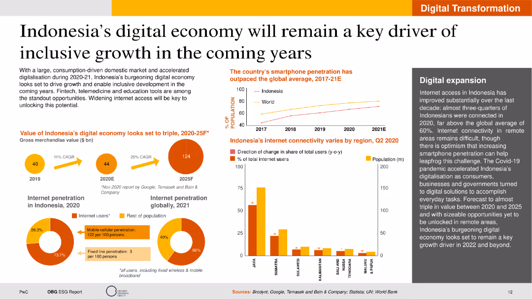
The slide contains text, a column chart showing smartphone penetration, pie charts on internet penetration, and a map. The layout is visually dense with multiple data points but remains well-structured for readability.
Market Analysis and Trends
Telecommunications
This slide highlights the growth of Indonesia's digital economy, emphasizing increased internet connectivity and smartphone usage. It discusses potential economic impacts and future opportunities in digital expansion.
Digital Economy, Indonesia, Growth, Internet, Smartphone
false
Market Analysis and Trends
Telecommunications
Multiple Chart
PwC/Strategy&
Add to my slides
Remove from favorites
This slide presents a dual-section layout. On the left is a text section titled "Unlocking the potential of the digital economy requires solving interlinked issues." On the right, a circular flow diagram with icons represents the digital economy's potential, surrounded by factors such as "Digital infrastructure" and "Talent and capability."
Market Analysis and Trends
Technology & Software
The slide emphasizes the importance of addressing interlinked imperatives to unlock the digital economy's potential, suggesting a holistic approach rather than solving issues in isolation. It appears designed for strategic discussions on improving digital infrastructure, education, and regulatory frameworks to foster economic growth.
digital economy, infrastructure, education, talent, regulation, potential, strategic planning
false
Market Analysis and Trends
Technology & Software
Diagram
Kearney
Add to my slides
Remove from favorites
This slide features column charts, each detailing different aspects of the digital economy with a focus on e-commerce and online travel. The design is information-rich.
Operational Efficiency
Technology & Software
A strategic slide highlighting the progress and forecast of Malaysia's digital economy, focusing on e-commerce and travel recovery trends, aimed at professionals involved in strategic planning and market forecasting.
digital economy, Malaysia, e-commerce, travel, forecasting
false
Operational Efficiency
Technology & Software
Multiple Chart
Bain
Add to my slides
Remove from favorites
The slide contrasts five leading sectors against four nascent sectors in the digital economy using icons and a two-column layout. It's clean and straightforward, with a focus on sector categorization.
Market Analysis and Trends
Technology & Software
The slide categorizes the sectors within the digital economy, distinguishing between established and emerging areas, thus providing a quick overview of the market coverage.
Digital Economy, Market Coverage, Leading Sectors, Nascent Sectors, Sector Categorization
false
Market Analysis and Trends
Technology & Software
Header Horizontal
Bain
Add to my slides
Remove from favorites
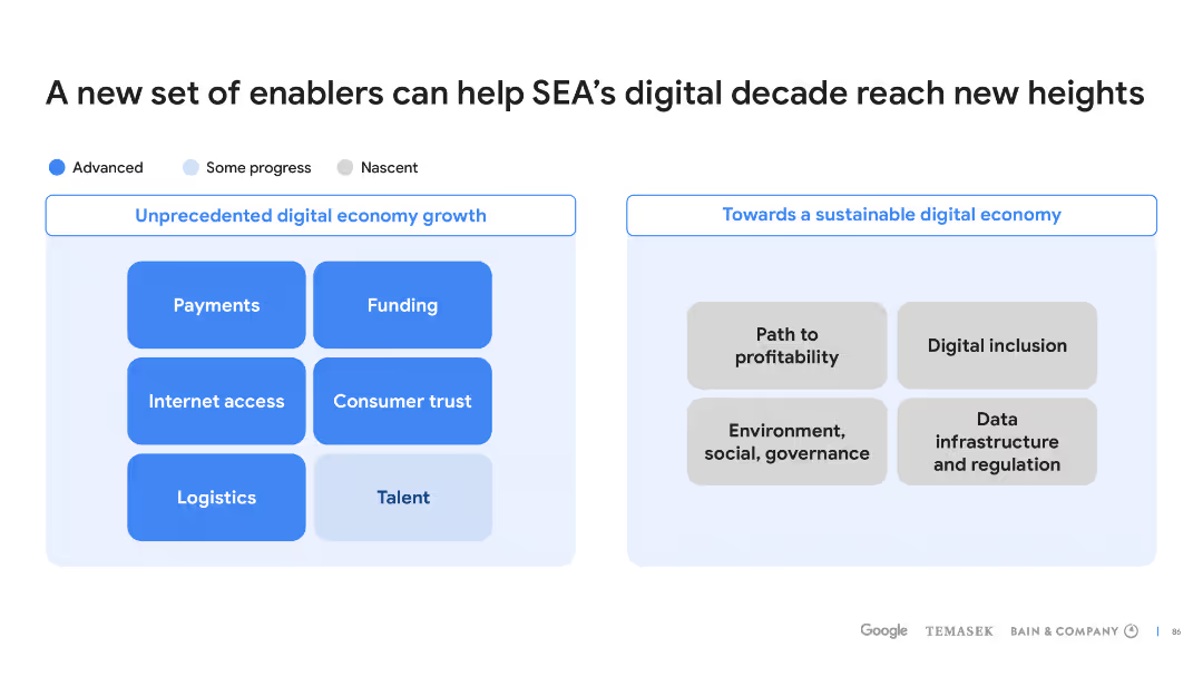
Two sets of bullet points on blue backgrounds, comparing factors for digital economy growth against those for sustainable digital economy.
Strategic Planning
Technology & Software
This slide outlines various enablers that could propel SEA's digital economy to new heights, focusing on growth and sustainability.
digital economy, SEA, enablers, growth, sustainability
false
Strategic Planning
Technology & Software
Header Horizontal
Bain
Add to my slides
Remove from favorites
This slide features a title at the top, three circles in increasing size representing data points for years 2021, 2025, and 2030 to the left, and a list of bulleted points to the right. The circles use a muted color palette and are labeled with monetary figures, denoting the SEA internet economy GMV. The slide background is white.
Market Analysis and Trends
Technology & Software
The slide predicts the growth of the SEA internet economy, reaching $1T GMV by 2030. It highlights the role of e-commerce, online grocery, and transport & food sectors in this growth. This slide could be used to illustrate potential areas for investment and development in the SEA region, focusing on the digital economy's expansive growth.
Digital Economy, SEA, GMV, Growth, E-commerce, Online Grocery, Transport & Food, 2030, Investment, Development
false
Market Analysis and Trends
Technology & Software
Single Chart
Bain
Add to my slides
Remove from favorites
This slide features a large green circle graph comparing digital economy projections for 2022, 2025, and 2030 with bullet point annotations.
Financial Performance
Technology & Software
It illustrates SEA’s digital economy growth potential up to $1T GMV by 2030 and stresses the need for sustainable development.
digital economy, SEA, GMV, growth potential, sustainable
false
Financial Performance
Technology & Software
Mixed Chart
Bain
Add to my slides
Remove from favorites
The slide consists of a complex bar chart with multiple data sets, illustrating the gross merchandise value (GMV) growth in billions across various sectors. It features a color-coded key and future projections up to the year 2025. The design uses a blue color palette with yellow highlights for emphasis.
Financial Performance
Technology & Software
Detailing the impressive growth trajectory of Southeast Asia's digital economy, this slide provides a breakdown of GMV across key sectors, projecting continued expansion. It's useful for financial analysis and forecasting, aiding investors and businesses in strategy development and market participation decisions.
digital economy, SEA, GMV growth, sector analysis, financial forecasting, bar chart, 2025 projections
false
Financial Performance
Technology & Software
Single Chart
Bain
Add to my slides
Remove from favorites
This slide serves as a section header or cover slide for a report on Southeast Asia's digital economy. It features a timeline from 2016 to 2030 with key milestones and a graphical representation of wind turbines.
Industry Overview
Financial Services
A summary of the digital economy's growth in Southeast Asia, tracking significant milestones over time and looking towards a sustainable digital economy by 2030.
Digital Economy, SEA, Google, Temasek, Bain, Research, Growth, Sustainability
false
Industry Overview
Financial Services
Linear Flow
Bain
Add to my slides
Remove from favorites
Clean design showcasing seven icons representing different sectors in the digital economy with captions, placed in a flow-like arrangement.
Market Analysis and Trends
Technology & Software
This slide covers the major sectors in the digital economy, indicating areas like e-commerce, payment systems, and health-tech among others.
Digital economy, sectors, e-commerce, payments, health-tech, SME services, lending, food delivery
false
Market Analysis and Trends
Technology & Software
Linear Flow
Kearney
Add to my slides
Remove from favorites
Slide split in two columns, one for quantitative data with pie charts, one for qualitative insights with logos.
Customer and Market Segmentation
Professional Services
Methodology of a consumer survey, and business insights from Southeast Asian leaders on digital economy impact.
digital economy, Southeast Asia, consumer behavior, methodology, business insights
false
Customer and Market Segmentation
Professional Services
Multiple Chart
Bain
Add to my slides
Remove from favorites
This slide presents complex data with a multitude of column charts and numerical annotations. The use of blue hues varies in intensity to represent different data sets against a white background. It is visually dense, providing a comprehensive look at the data points.
Market Analysis and Trends
Technology & Software
Discusses Thailand's digital economy growth, attributing significant parts to e-commerce and noting a delayed recovery in travel. It's instrumental for understanding the growth trajectory and identifying sectors contributing to the digital economy, as well as preparing for future trends.
digital economy, Thailand, e-commerce, growth, travel recovery
false
Market Analysis and Trends
Technology & Software
Multiple Chart
Bain
Add to my slides
Remove from favorites
This slide showcases multiple column charts for the SEA Internet economy GMV in US dollars. It highlights the growth rates of Vietnam and Indonesia's digital economies, using blue and grey columns to represent different years, and annotations to denote growth percentages. The layout is clear, with each country's data set distinctly presented.
Market Analysis and Trends
Technology & Software
The slide presents the robust growth of Vietnam and Indonesia's digital economies, with a strong focus on their impressive double-digit growth figures, making it useful for economic forecasting and digital market strategy discussions.
digital economy, Vietnam, Indonesia, SEA, growth, CAGR, Internet economy, GMV
false
Market Analysis and Trends
Technology & Software
Multiple Chart
Bain
Add to my slides
Remove from favorites
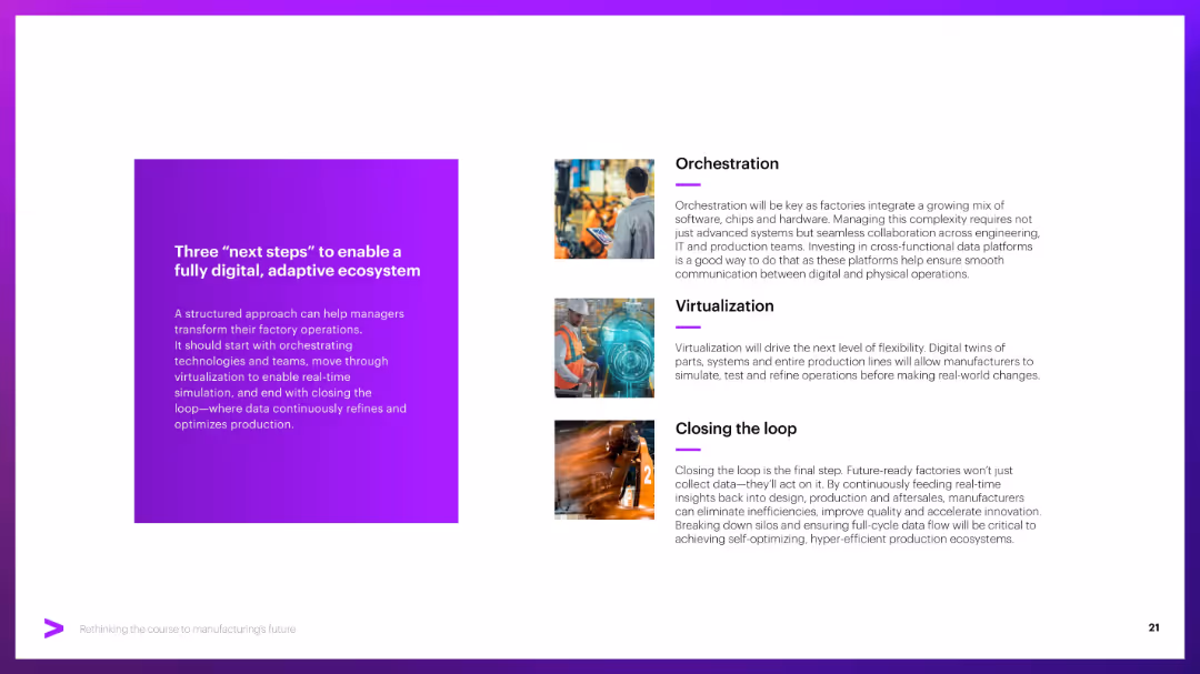
Left block with title on purple background; right side contains three vertical sections with icons and text (Orchestration, etc.).
Strategic Planning
Industrial & Manufacturing
Provides a three-step roadmap for achieving a digital factory: orchestration of systems, virtualization of processes, and closing the loop through data-driven continuous improvement.
Digital ecosystem, orchestration, virtualization, continuous improvement
false
Strategic Planning
Industrial & Manufacturing
Vertical Flow
Accenture
Add to my slides
Remove from favorites
Textual content and comparative data visualizations with maps. Shows the number of unicorns in Asia Pacific countries and outlines the initiatives of China, India, South Korea, and Japan to fulfill digital imperatives.
Industry Overview
Government & Public Sector
Compares the progress of prominent Asian countries in developing their digital ecosystems. Discusses initiatives and policies implemented to push for a flourishing digital economy, useful for understanding competitive positioning and the race to achieve key digital imperatives.
Digital Ecosystem, Unicorns, Asia Pacific, China, India, South Korea, Japan, Policy, Digital Economy, Competitiveness
false
Industry Overview
Government & Public Sector
Single Chart
Kearney
Add to my slides
Remove from favorites
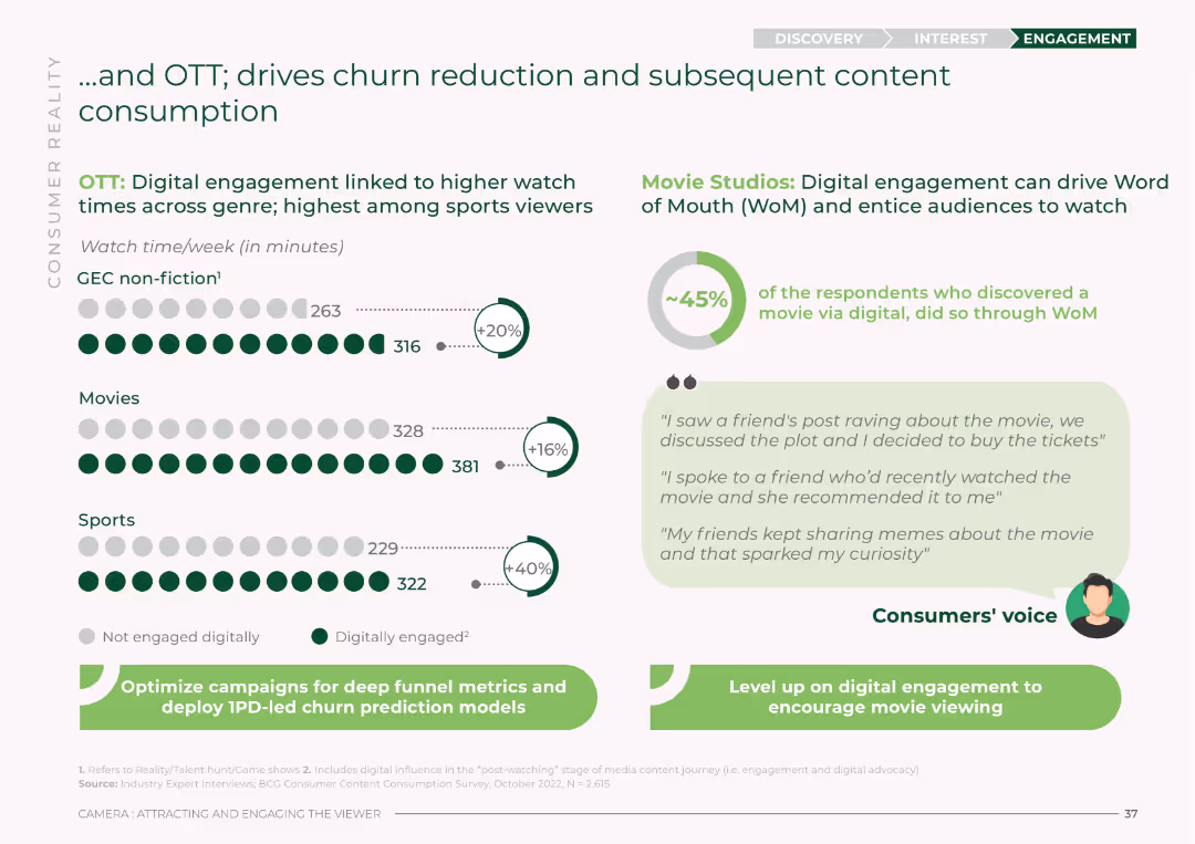
The slide features column charts showing watch time data for different genres and the impact of digital engagement. It includes icons and percentage increases, using green and white colors. The layout highlights the correlation between engagement and reduced churn.
Market Analysis and Trends
Media & Entertainment
This slide discusses how digital engagement in OTT and Movie Studios leads to higher watch times and reduces churn. It presents watch time data for GEC non-fiction, Movies, and Sports, emphasizing the importance of digital strategies.
digital engagement, churn reduction, watch time, OTT, Movie Studios, GEC non-fiction, audience engagement, digital strategies
false
Market Analysis and Trends
Media & Entertainment
Multiple Chart
BCG
Add to my slides
Remove from favorites
Featuring a mobile device graphic, pie chart, and column chart, the slide is moderately detailed with text descriptions emphasizing digital client engagement and the value proposition.
Market Analysis and Trends
Financial Services
The slide demonstrates the role of digital channels in client acquisition and growth in self-directed investing accounts, emphasizing the integrated banking and investing experience. It is useful for illustrating the digital engagement trend and its impact on client account growth and banking integration.
Digital engagement, Client acquisition, Growth, Self-directed investing
false
Market Analysis and Trends
Financial Services
Multiple Chart
JP Morgan
Add to my slides
Remove from favorites
The slide features three sets of column charts, displaying digital engagement, collaboration, and transaction metrics. The colors grey and blue differentiate between 1Q’19 and 1Q’21. A red banner at the bottom notes data inclusion from specific company divisions. Text boxes highlight key statistics.
Market Analysis and Trends
Financial Services
The purpose of this slide is to present the growth in digital engagement, collaboration, and transactions across an enterprise. It demonstrates the company’s progress in adopting digital tools and enhancing client interaction, which is crucial for staying competitive in the digital age.
Digital engagement, enterprise, collaboration, transactions, digital transformation, growth statistics, client interaction, competitive edge, market trends, digital tools
false
Market Analysis and Trends
Financial Services
Multiple Chart
Morgan Stanley
Add to my slides
Remove from favorites
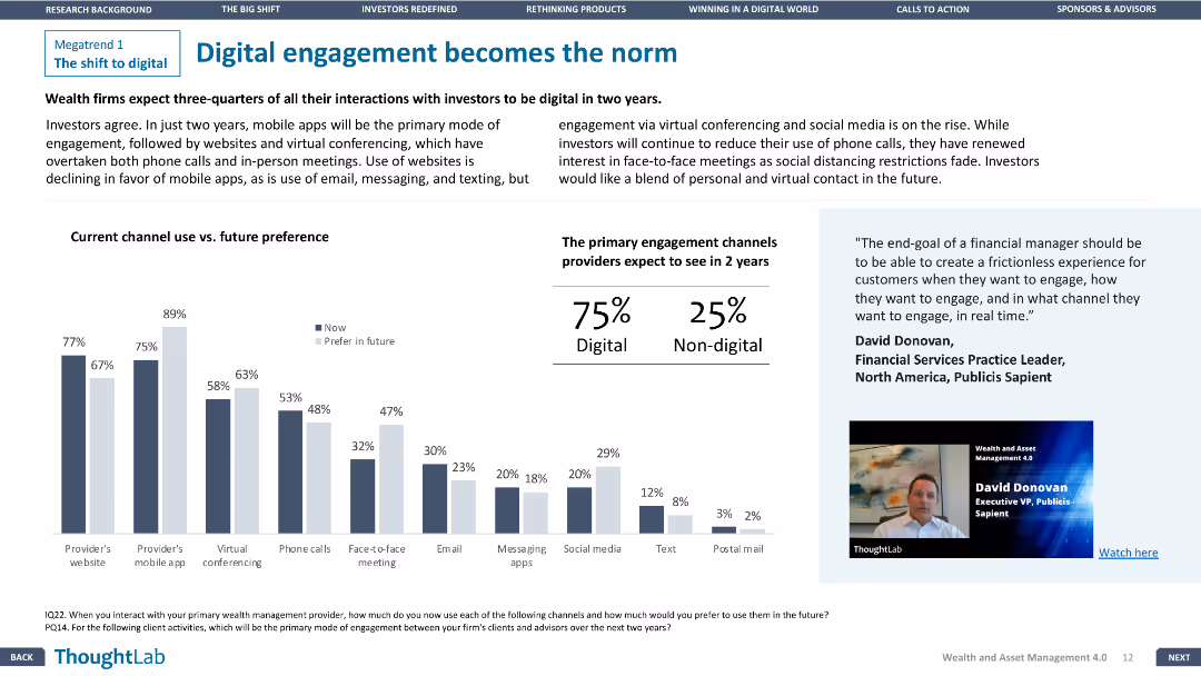
The slide features a column chart comparing current and future engagement channels and a quote on the right.
Technology and Digital Transformation
Financial Services
The slide discusses the shift towards digital engagement in wealth management, with a focus on future preferences for digital channels.
Digital engagement, Financial Services, Technology, Future trends, Channels
false
Technology and Digital Transformation
Financial Services
Mixed Chart
Deloitte
Add to my slides
Remove from favorites
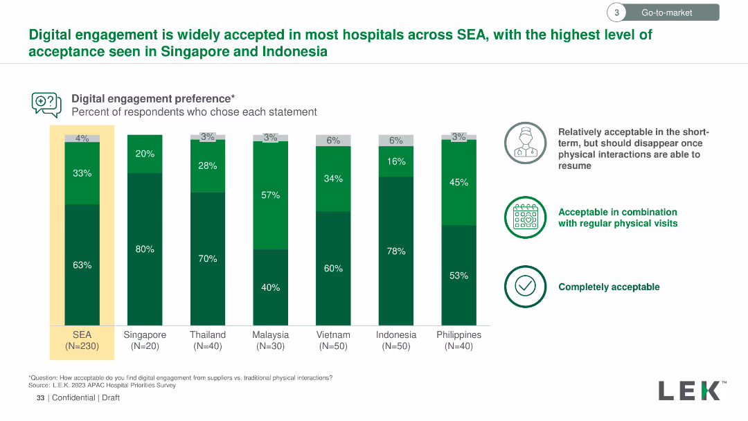
The slide uses a column chart to represent the percentage of respondents' acceptance of digital engagement in hospitals across various countries. Green shades indicate different levels of acceptance.
Market Analysis and Trends
Healthcare & Pharmaceuticals
The slide shows the acceptance levels of digital engagement in hospitals in Southeast Asia, highlighting the highest acceptance in Singapore and Indonesia. Data segments responses into three categories: short-term, regular physical visits, and completely acceptable.
Digital, engagement, hospitals, acceptance, Southeast Asia, Singapore, Indonesia, percentage, short-term, visits, acceptable
false
Market Analysis and Trends
Healthcare & Pharmaceuticals
Mixed Chart
LEK
Add to my slides
Remove from favorites
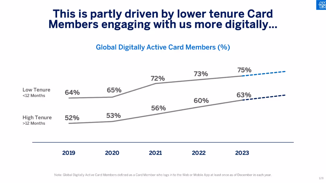
Dual-line chart showing digital engagement over time for low vs. high tenure card members.
Customer and Market Segmentation
Financial Services
This slide analyzes how newer card members (<12 months) show higher and growing digital engagement versus longer-tenured members. It supports strategies focused on improving digital experiences to retain and activate new users.
digital engagement, low tenure, high tenure, user behavior, card member trends, digital strategy, Amex
false
Customer and Market Segmentation
Financial Services
Single Chart
McKinsey
Add to my slides
Remove from favorites
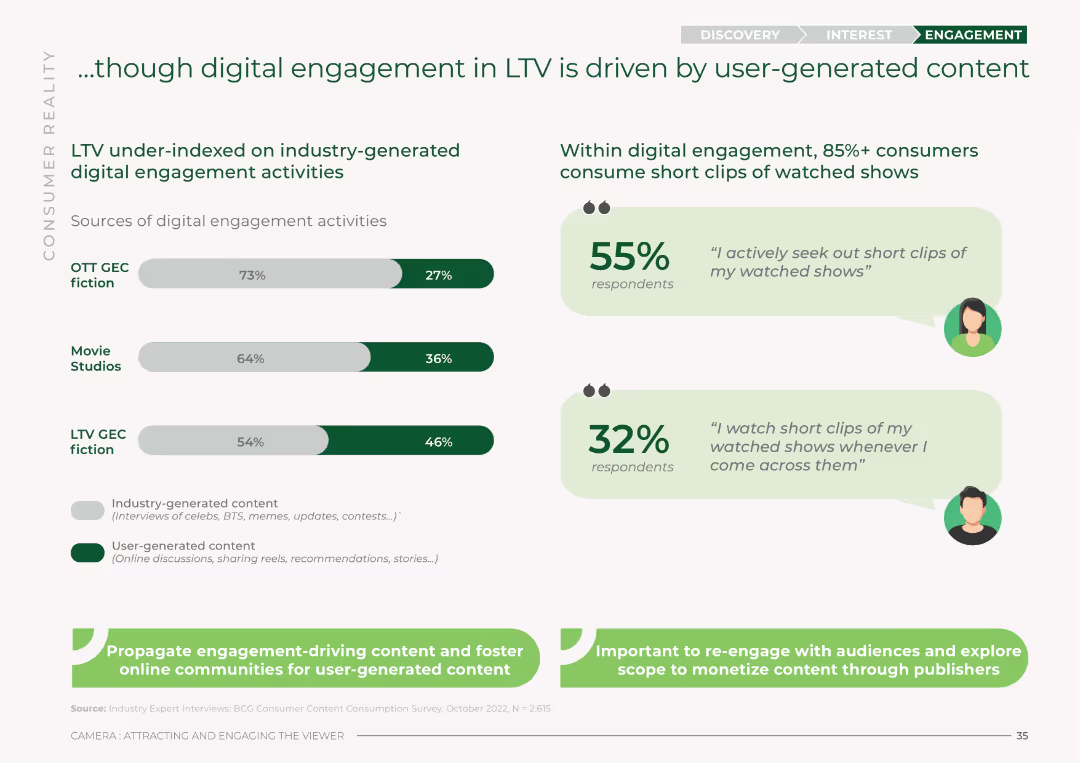
The slide features bar charts comparing industry-generated vs. user-generated digital engagement activities across OTT GEC fiction, Movie Studios, and LTV GEC fiction. It uses a green and white color scheme with percentages for each category.
Market Analysis and Trends
Media & Entertainment
This slide analyzes digital engagement in LTV, showing that user-generated content drives more engagement compared to industry-generated activities. It presents percentages for OTT GEC fiction, Movie Studios, and LTV GEC fiction.
digital engagement, LTV, user-generated content, industry-generated content, OTT, Movie Studios, engagement sources
false
Market Analysis and Trends
Media & Entertainment
Mixed Chart
BCG
Add to my slides
Remove from favorites
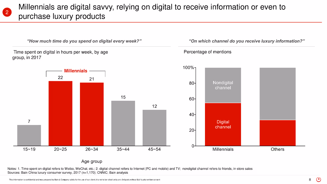
This slide features bar charts displaying the time spent on digital platforms by different age groups and the channels through which they receive luxury information. It highlights the digital engagement of Millennials compared to other age groups.
Market Analysis and Trends
Retail & E-commerce
The slide highlights the digital savviness of Millennials, showing how they rely heavily on digital platforms for receiving information and purchasing luxury products. It presents data on the average hours spent online per week and the preference for digital channels over non-digital ones for luxury information.
Digital engagement, Millennials, luxury products, online behavior, digital platforms, consumer information, purchasing habits, age groups
false
Market Analysis and Trends
Retail & E-commerce
Multiple Chart
Bain
Add to my slides
Remove from favorites
The slide uses a combination of text and circular data visualizations to show the percentage of viewers engaging with content across OTT, LTV, and Movie Studios. It uses a green and white color scheme with icons and a clear layout.
Market Analysis and Trends
Media & Entertainment
This slide compares the digital engagement rates across OTT, LTV, and Movie Studios. It highlights the high levels of engagement, with specific percentages for each vertical, indicating significant digital influence even for LTV content.
digital engagement, OTT, LTV, Movie Studios, viewer engagement, consumer survey, digital influence
false
Market Analysis and Trends
Media & Entertainment
Mixed Chart
BCG
Add to my slides
Remove from favorites
The slide includes a circular diagram for digitally enabled client experience and multiple metrics showing benefits like client returns, RM efficiency, and franchise benefits. A column chart and bullet points describe private banking international benefits.
Technology and Digital Transformation
Financial Services
The slide demonstrates how digital enablement enhances client engagement and profitability, highlighting improved client returns, reduced RM proposal time, and revenue increase. It also details the launch of Private Banking International for investment clients.
digital, engagement, profitability, private banking, technology
false
Technology and Digital Transformation
Financial Services
Framework
Credit Suisse
Add to my slides
Remove from favorites
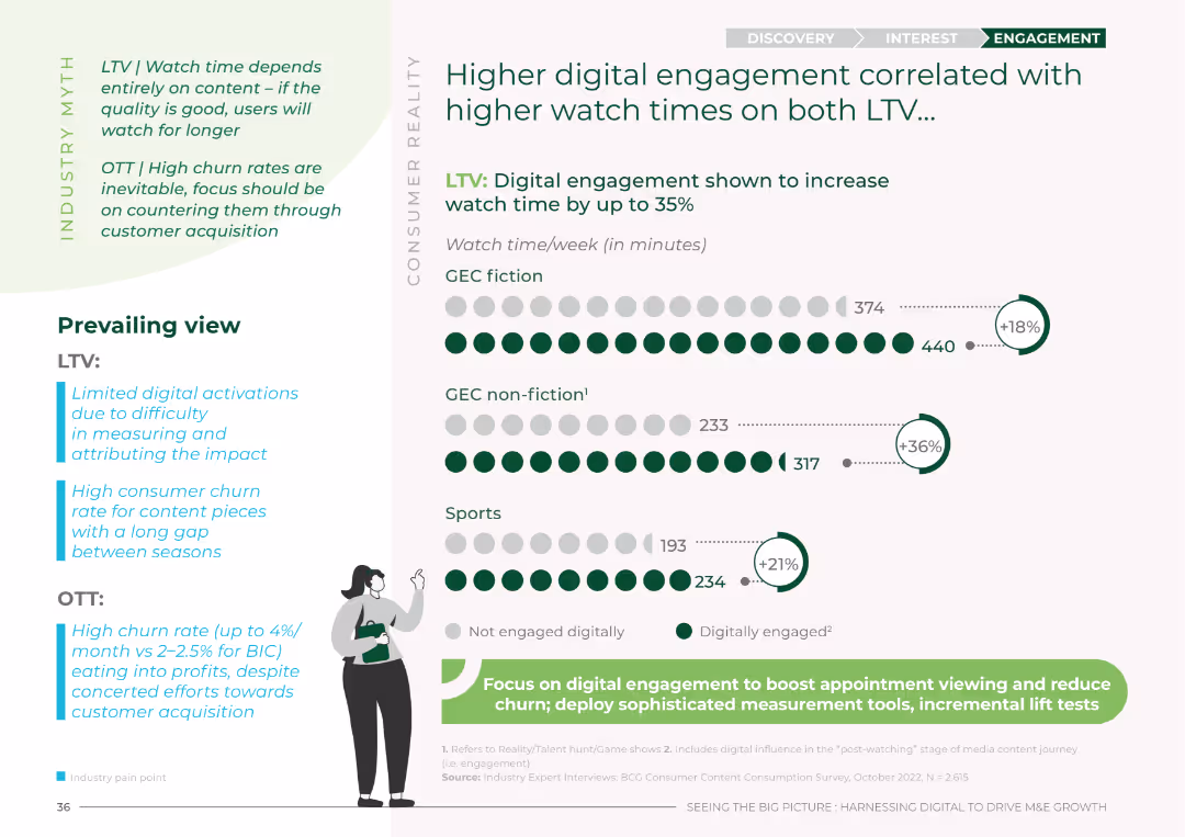
The slide uses column charts to display watch time data across various genres (GEC fiction, GEC non-fiction, Sports) and compares digital engagement impact. The layout is clean, using green and white colors, and includes icons and percentage increases in watch time.
Market Analysis and Trends
Media & Entertainment
This slide presents data on how digital engagement correlates with higher watch times for LTV content, showing significant increases in weekly watch time for different genres when audiences are digitally engaged.
digital engagement, watch time, LTV, OTT, GEC fiction, GEC non-fiction, Sports, audience engagement
false
Market Analysis and Trends
Media & Entertainment
Mixed Chart
BCG
Add to my slides
Remove from favorites
Showcases smartphone screenshots illustrating various digital banking services. The slide is visually engaging, with annotations and complementary icons to highlight each digital experience.
Technology and Digital Transformation
Financial Services
Highlights how an integrated suite of digital banking services enhances customer engagement. It's suitable for presenting digital strategy and customer experience improvements in financial services.
Digital experiences, Customer engagement, Financial services, Banking apps, Digital strategy
false
Technology and Digital Transformation
Financial Services
Graphic
JP Morgan
Add to my slides
Remove from favorites
The slide features five columns with icons and headers: Go Paperless, Go Mobile, Go Cloud, Go Automation, Go Analytics. Each column contains short bullet point descriptions below the icons.
Technology and Digital Transformation
Financial Services
Discusses different principles of digital finance like automation, mobile access, cloud data management, and leveraging analytics to empower financial teams to work remotely and efficiently.
digital finance, automation, cloud, mobile access, analytics, remote work, financial management, data management, efficiency, insight
false
Technology and Digital Transformation
Financial Services
Pillar
Deloitte
Add to my slides
Remove from favorites
The slide is divided into two sections; on the left, there is textual content, and on the right, there are three vertical bar graphs in blue and turquoise shades. The graphs display predictions for the use of various digital financial services. The layout is clean and easy to navigate, with a distinct separation between text and graphical data.
Market Analysis and Trends
Financial Services
The slide forecasts the likely adoption of digital financial services focusing on digital supply chain financing and consumer financing options over the next 1 to 2 years. It provides statistical data that can be used by financial analysts and strategists to evaluate potential areas of growth and prepare for market shifts in digital financial service offerings.
Digital Finance, Supply Chain, Consumer Financing, Future, Trends, Merchants, Adoption, Predictions, Statistics, Analysis
false
Market Analysis and Trends
Financial Services
Single Chart
Bain
Add to my slides
Remove from favorites
This slide contains multiple column charts showing the growth of digital financial services, payments, remittance flows, lending, investment, and insurance sectors from 2019 to 2030 with compound annual growth rates (CAGR). There are annotations for specific CAGRs and projected values in billions for future years.
Market Analysis and Trends
Financial Services
The slide presents a forecast of growth in various financial sub-sectors due to the shift from offline to online post-pandemic, highlighting the increasing trend in digital transactions and services with specific focus on CAGRs and future projections.
digital, financial services, CAGR, growth, forecast, pandemic, trends, online, payments, investment
false
Market Analysis and Trends
Financial Services
Multiple Chart
Bain
Add to my slides
Remove from favorites
This slide features a blue and white color scheme with multiple column charts depicting growth trends in digital financial services like payments, investment, insurance, and lending. Each chart is labeled with compound annual growth rates (CAGR).
Market Analysis and Trends
Financial Services
The slide predicts significant growth in digital financial services by 2025, with asset under management (AUM) and lending expected to reach notable figures, showcasing potential investment opportunities.
digital, financial services, growth, CAGR, investments, lending, insurance, AUM
false
Market Analysis and Trends
Financial Services
Multiple Chart
Bain
Add to my slides
Remove from favorites
This slide displays column charts with data points illustrating the growth in digital financial services. A consistent blue color theme is used for the charts, set against a white backdrop. The text and numerical data are neatly aligned, facilitating a clear understanding of the depicted trends.
Financial Performance
Financial Services
The content emphasizes the anticipated growth of digital financial services by 2025, focusing on payments, investment, and lending. It details how digitalization, especially in lending and investments, will drive this growth, likely via digital banks and fintech initiatives. Useful for investors and financial analysts to identify trends and growth areas in digital financial services.
digital financial services, growth, digitalization, investments, lending
false
Financial Performance
Financial Services
Multiple Chart
Bain
Add to my slides
Remove from favorites
Depicts a multi-category column chart with various colors representing different segments of digital financial services. Noteworthy are the substantial deal values in H1 2021 which are clearly highlighted.
Market Analysis and Trends
Financial Services
Highlights the explosive growth in digital financial services, particularly in payments and investments, with H1 2021 deal values surpassing the full year of 2020. Fintech infrastructure is presented as a significant emerging theme.
Digital Financial Services, Growth, Fintech, SEA
false
Market Analysis and Trends
Financial Services
Mixed Chart
Bain
Add to my slides
Remove from favorites
Contains several column charts representing different aspects of digital financial services like Digital Payment GTV, with clear labels and growth projections.
Market Analysis and Trends
Financial Services
Focuses on the growth trajectory of various digital financial services except for lending, with data on transaction values and predictions for the coming years.
Digital Financial Services, Growth, Projections, Lending
false
Market Analysis and Trends
Financial Services
Multiple Chart
Bain
Add to my slides
Remove from favorites
The slide includes a matrix categorizing digital services across sectors with a color code for in-house solutions and partnerships. It's neatly organized to facilitate comparative analysis.
Market Analysis and Trends
Financial Services
Presents a comprehensive overview of how various sectors are engaging in digital financial services, suggesting a strategic approach for competitive advantage.
digital, financial services, sectors, strategy
false
Market Analysis and Trends
Financial Services
Table
Bain
Add to my slides
Remove from favorites
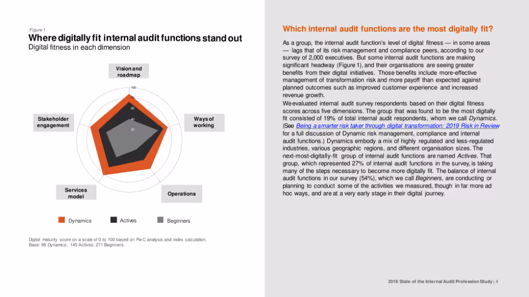
Spider chart illustrating digital fitness scores across dimensions like vision and roadmap, stakeholder engagement, and ways of working for different internal audit groups.
Technology and Digital Transformation
Professional Services
The slide highlights the areas where digitally fit internal audit functions excel, such as stakeholder engagement and services model, comparing Dynamics, Actives, and Beginners.
Digital fitness, internal audit, stakeholder engagement, vision, roadmap
false
Technology and Digital Transformation
Professional Services
Mixed Chart
PwC/Strategy&
Add to my slides
Remove from favorites
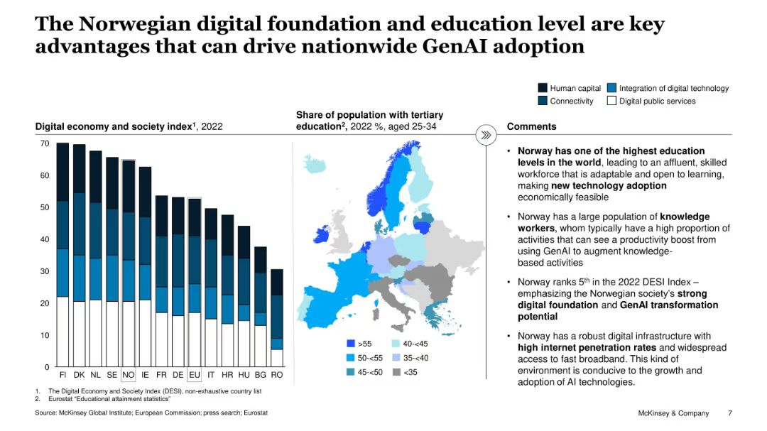
Three-part layout with bar chart, map, and bulleted insights. Focuses on DESI index, tertiary education, and enablers of GenAI adoption.
Technology and Digital Transformation
Education & Training
This slide explains why Norway is well-positioned for GenAI adoption, emphasizing its strong digital foundation, educated workforce, and high internet penetration. Includes a DESI index chart and education map.
digital foundation, education, GenAI, DESI, Norway, broadband, workforce, technology adoption
false
Technology and Digital Transformation
Education & Training
Mixed Chart
McKinsey
Add to my slides
Remove from favorites
The slide features a hexagon-shaped diagram with six colored segments, each representing a foundational aspect to address in digital policy-making, like 'Data and Privacy' and 'Work and Wage effects'.
Strategic Planning
Technology & Software
It stresses the importance of certain foundational aspects in digital transformations, such as cybersecurity and skill gaps. This slide is apt for presentations on digital strategy, policy-making, or discussing the broad implications of digitization on society.
digital foundations, policy-making, cybersecurity, data privacy, skill gaps, diagram
false
Strategic Planning
Technology & Software
Diagram
McKinsey
Add to my slides
Remove from favorites
This slide features a column chart with a range of bars in different colors signifying varying levels of digital quotient scores among businesses. It highlights a significant gap between emerging and established digital leaders.
Market Analysis and Trends
Technology & Software
The slide is used to present the disparity in digital proficiency scores among businesses, emphasizing the competitive advantage of established leaders.
digital gap, digital leaders, businesses, column chart, proficiency, competitive advantage, emerging leaders, established leaders, Digital Quotient score
false
Market Analysis and Trends
Technology & Software
Single Chart
McKinsey
Add to my slides
Remove from favorites
Slide with mixed visual elements, including pie charts and minimalist icons, describing trends in digital compliance and reporting.
Technology and Digital Transformation
Technology & Software
Explores online corporate reporting trends, focusing on GDPR compliance and the mobile-first approach, valuable for digital transformation seminars and strategic planning.
digital, GDPR, compliance, reporting
false
Technology and Digital Transformation
Technology & Software
Multiple Chart
PwC/Strategy&
Add to my slides
Remove from favorites
This slide contains six circular blue icons with human silhouettes, each representing different categories of global digital engagement. These categories are labeled and quantified, such as 'Social networking users' or 'Cross-border e-commerce shoppers'. The icons vary in size reflecting the quantities they represent.
Market Analysis and Trends
Technology & Software
The slide presents statistics on individuals globally engaged in various activities, illustrating the significant number of people involved in social networking, travel, e-commerce, and education, enabled by digital means. It could be used in presentations analyzing global digital market trends or digital consumer behavior.
digital, global engagement, social networking, e-commerce, travel, education, statistics
false
Market Analysis and Trends
Technology & Software
Multiple Chart
McKinsey
Add to my slides
Remove from favorites
Slide includes a set of stacked horizontal bars showing the percentage of leaders and overall respondents' views on digital trends like voice commerce and cryptocurrencies.
Market Analysis and Trends
Retail & E-commerce
This slide assesses leaders' optimism regarding future digital market trends, particularly in voice commerce and digital goods versus cryptocurrencies.
digital goods, voice commerce, cryptocurrency, leaders, trends, market analysis, digital market, optimism
false
Market Analysis and Trends
Retail & E-commerce
Single Chart
Deloitte
Add to my slides
Remove from favorites
The slide is split into three sections, each with an image, text, and statistical callouts, to represent digital tools for advisors, institutions, and individuals.
Technology and Digital Transformation
Financial Services
The slide promotes JPMorgan's digital offerings, illustrating how they cater to different client needs and highlighting usage statistics to demonstrate adoption and growth.
digital growth, financial tools, JPMorgan, advisors, institutions, clients, technology adoption
false
Technology and Digital Transformation
Financial Services
Table
JP Morgan
Add to my slides
Remove from favorites
The slide features the title of a report on digital growth in a bold, large font. The left side of the slide contains text while the right side displays a background image of two children looking at a screen. The design is minimal, focusing attention on the report's title and the image that hints at inclusivity and future-oriented perspectives.
Industry Overview
Technology & Software
The slide serves as the title for a report on digital growth in Indonesia, setting the stage for a detailed discussion on expanding digitalization efforts beyond metropolitan areas. The visual and textual elements combined aim to evoke curiosity and engage stakeholders in exploring the strategies for harnessing digital growth opportunities in the broader Indonesian context.
Digital Growth, Indonesia, Metropolitan Areas, Technology Inclusion, Education, Future Trends, Digitalization, Market Expansion, Strategic Development, Report Title
false
Industry Overview
Technology & Software
Title
Kearney
Add to my slides
Remove from favorites
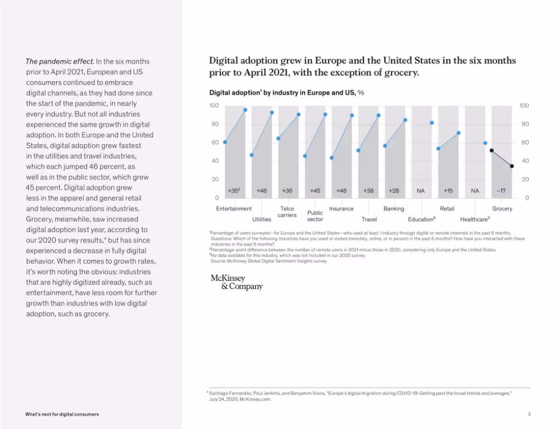
Bar chart comparing digital adoption by industry with growth metrics. Paragraph on the left gives context.
Market Analysis and Trends
Retail & E-commerce
This slide presents digital adoption rates by industry across Europe and the US. While most sectors saw growth in digital usage, the grocery sector notably declined, indicating a consumer shift back to physical channels.
digital growth, industry analysis, pandemic impact, retail trends, McKinsey, user behavior, grocery, Europe, US
false
Market Analysis and Trends
Retail & E-commerce
Mixed Chart
McKinsey
Add to my slides
Remove from favorites
Text and infographic illustrating Ipsos.Digital's 78% organic growth in 2022, covering new geographies, additional products, and client acquisition, with a testimonial from L'Oréal.
Technology and Digital Transformation
Technology & Software
The slide highlights the rapid growth of Ipsos.Digital, driven by expansion into new geographies, product development, and client acquisition, supported by a client testimonial.
digital growth, Ipsos, new geographies, product development, client acquisition
false
Technology and Digital Transformation
Technology & Software
Mixed Chart
IPSOS
Add to my slides
Remove from favorites
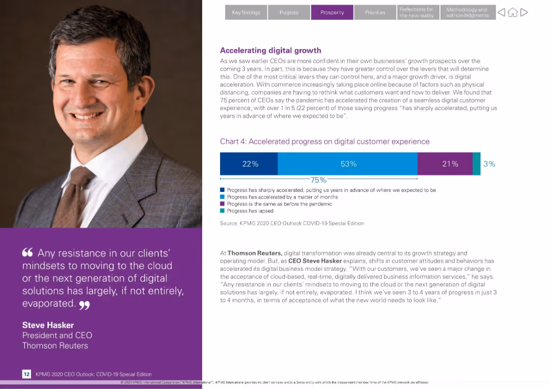
Split layout with CEO photo left, bar chart and narrative on right; features quote and digital transformation stats
Technology and Digital Transformation
Technology & Software
Highlights how the pandemic has accelerated digital transformation, especially customer experience. 75% of CEOs say progress accelerated; includes quote from Steve Hasker of Thomson Reuters on cloud adoption.
digital growth, transformation, customer experience, Steve Hasker, COVID-19, technology, progress acceleration, cloud adoption, KPMG
false
Technology and Digital Transformation
Technology & Software
Mixed Chart
KPMG
Add to my slides
Remove from favorites
Column chart showing the adoption of digital health solutions among public and private hospitals in SEA.
Technology and Digital Transformation
Healthcare & Pharmaceuticals
This slide details the adoption rates of digital health solutions in Southeast Asia hospitals, comparing public and private sector implementation.
Digital health, adoption, public hospitals, private hospitals, SEA
false
Technology and Digital Transformation
Healthcare & Pharmaceuticals
Multiple Chart
LEK
Add to my slides
Remove from favorites
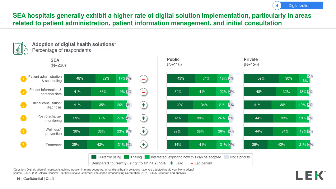
The slide uses a column chart to depict the adoption of various digital health solutions among hospitals in Southeast Asia, with comparisons to public and private hospitals. Each solution is marked with symbols indicating its priority and status compared to China and India.
Technology and Digital Transformation
Healthcare & Pharmaceuticals
The slide details the adoption rates of digital health solutions in SEA hospitals, comparing public and private sectors and indicating current use, trials, and interest levels. Highlights the leading solutions and their comparative status against China and India.
Digital health, adoption, solutions, hospitals, public, private, Southeast Asia, China, India, comparison
false
Technology and Digital Transformation
Healthcare & Pharmaceuticals
Multiple Chart
LEK
Add to my slides
Remove from favorites
The slide presents a bubble chart indicating the value from digital health solution adoption across different countries, focusing on metrics like staff efficiency, patient satisfaction, and medical error reduction.
Technology and Digital Transformation
Healthcare & Pharmaceuticals
The slide emphasizes the expected benefits of digital health solutions in hospitals worldwide, highlighting increases in staff efficiency, patient satisfaction, and the shift away from focusing solely on reducing medical errors.
Digital health, benefits, hospitals, efficiency, satisfaction
false
Technology and Digital Transformation
Healthcare & Pharmaceuticals
Single Chart
LEK
Add to my slides
Remove from favorites
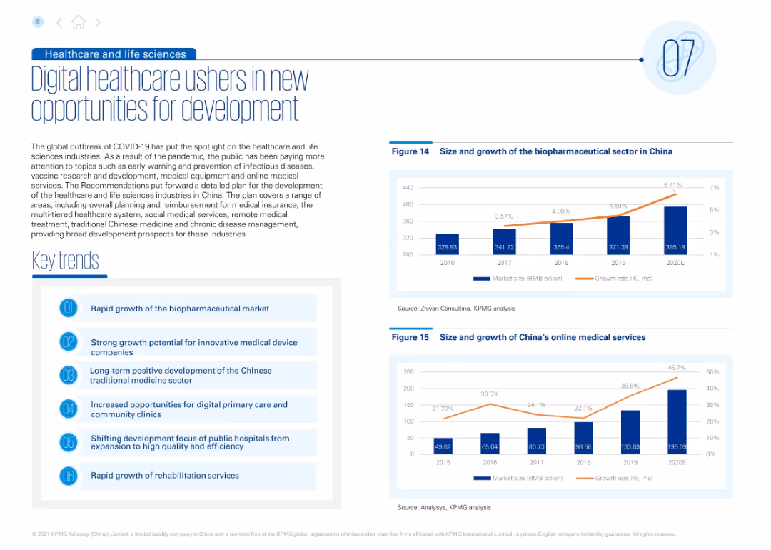
Balanced layout with text and six key trends on the left; right side shows two bar charts depicting market growth in biopharma and online medical services.
Technology and Digital Transformation
Healthcare & Pharmaceuticals
The slide explores digital healthcare’s emergence due to COVID-19, detailing market growth opportunities in biopharma, online care, and rehabilitation. It emphasizes system improvements, digital services, and traditional medicine. Charts display market growth projections and digital adoption.
digital healthcare, biopharmaceuticals, online medical services, innovation, COVID-19 impact, Chinese medicine, healthcare development, telemedicine, clinics
false
Technology and Digital Transformation
Healthcare & Pharmaceuticals
Multiple Chart
KPMG
Add to my slides
Remove from favorites
Incorporates a scatter plot and pie charts to show user growth rates and the intent to continue using digital fitness solutions post-pandemic.
Strategic Planning
Healthcare & Pharmaceuticals
Focuses on the sustained adoption and impact of digital fitness solutions during and after the pandemic, providing strategic insights into consumer engagement and market opportunities.
Digital Health, Fitness, COVID-19, Scatter Plot, Wellness, Market Strategy, User Growth, Pie Charts
false
Strategic Planning
Healthcare & Pharmaceuticals
Single Chart
McKinsey
Add to my slides
Remove from favorites
Column chart showing the perceived value of digital health solutions across various SEA countries.
Technology and Digital Transformation
Healthcare & Pharmaceuticals
This slide presents the value derived from digital health solution adoption in SEA, emphasizing better patient care and new revenue streams.
Digital health, SEA, patient care, revenue streams, adoption
false
Technology and Digital Transformation
Healthcare & Pharmaceuticals
Multiple Chart
LEK
Add to my slides
Remove from favorites
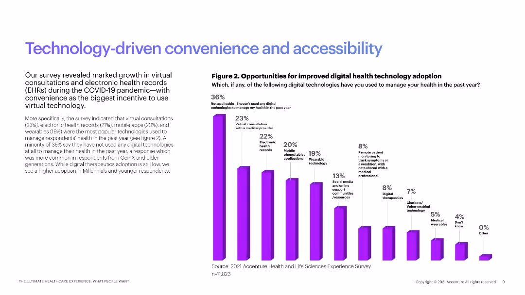
The slide contains a column chart showing the adoption of various digital health technologies among patients, with explanatory text on the left.
Technology and Digital Transformation
Healthcare & Pharmaceuticals
This slide discusses the growth of digital health technology adoption, including virtual consultations and electronic health records.
digital health, technology adoption, virtual consultations, EHR, patient technology
false
Technology and Digital Transformation
Healthcare & Pharmaceuticals
Mixed Chart
Accenture
Add to my slides
Remove from favorites
Features graphs and descriptive text on the impact of digital habits on health, such as phone addiction and sexual health discussions.
Technology and Digital Transformation
Healthcare & Pharmaceuticals
Addresses the growing importance of digital wellbeing in the health sector, emphasizing the effects of technology on mental health.
digital health, technology, mental wellbeing, phone addiction, sexual health
false
Technology and Digital Transformation
Healthcare & Pharmaceuticals
Multiple Chart
Bain
Add to my slides
Remove from favorites
The slide shows multiple column charts tracking the usage of various digital technologies for health management from 2016 to 2021. Technologies include Health Management Technology, Virtual Consultations, Electronic Health Records, Mobile Phone/Tablet Applications, and Social Media & Online Support Communities. Each technology type is represented as a separate chart with color-coded columns for each year.
Market Analysis and Trends
Healthcare & Pharmaceuticals
This slide analyzes the fluctuating interest in different digital health technologies over several years. It serves as a valuable tool for understanding trends in healthcare technology adoption, which can guide future digital health initiatives and investments. The data shows notable shifts in usage patterns, particularly the increase in virtual consultations and the decline in mobile application usage in 2021.
digital health, technology trends, adoption patterns, healthcare industry, data analysis
false
Market Analysis and Trends
Healthcare & Pharmaceuticals
Multiple Chart
Accenture
Add to my slides
Remove from favorites
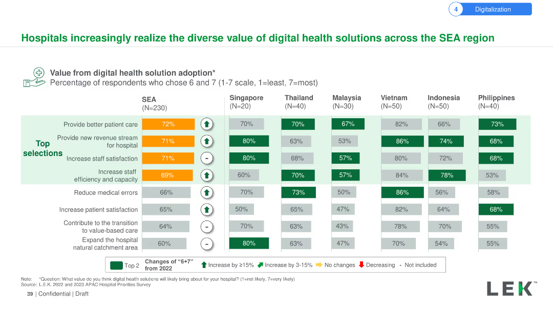
The slide uses a column chart to illustrate the perceived value from digital health solution adoption among hospitals in SEA, including better patient care, new revenue streams, and increased satisfaction. Percentages and trends are shown for multiple countries.
Technology and Digital Transformation
Healthcare & Pharmaceuticals
The slide presents the various benefits hospitals in SEA perceive from adopting digital health solutions, such as better patient care and new revenue streams. It compares these perceptions across different countries, highlighting key trends and changes from 2022.
Digital health, value, hospitals, SEA, patient care, revenue, satisfaction, adoption, countries, trends
false
Technology and Digital Transformation
Healthcare & Pharmaceuticals
Multiple Chart
LEK
Add to my slides
Remove from favorites
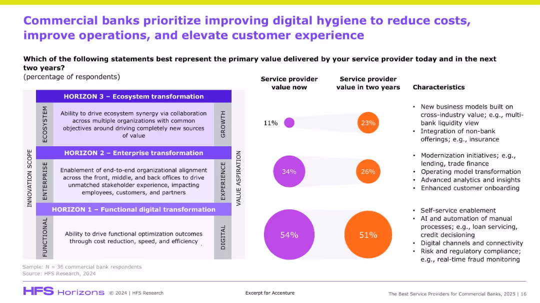
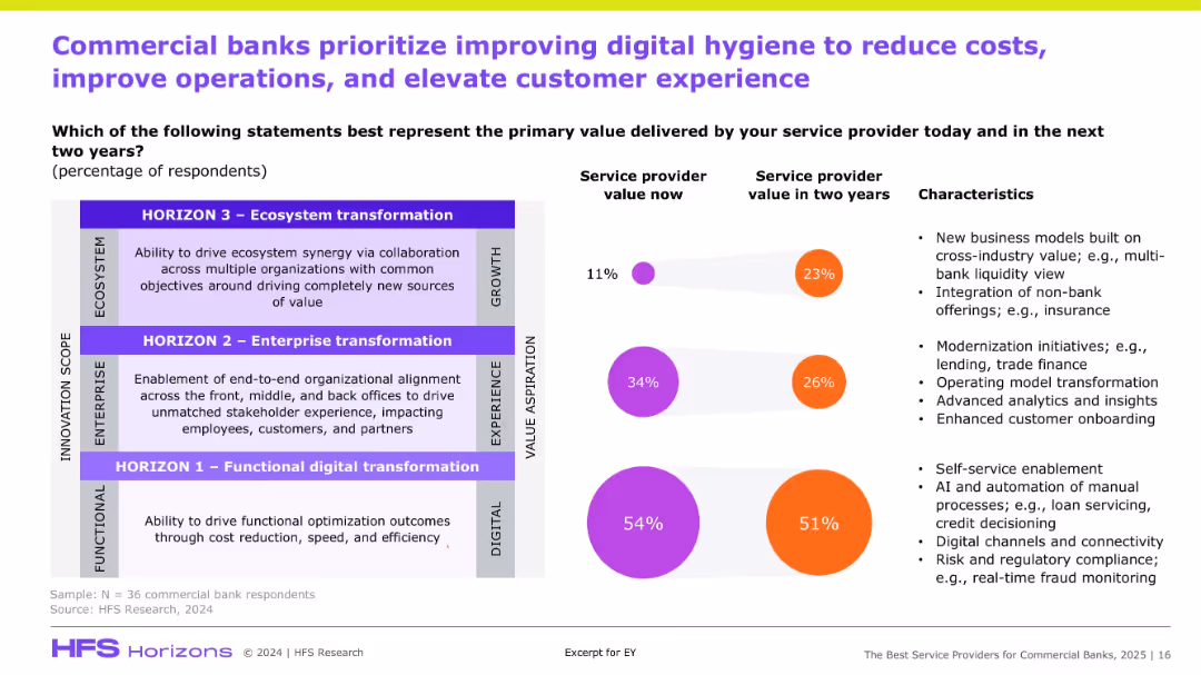
Split layout: value perception (left) vs. service priorities (right); color-coded circles and percentages.
Customer and Market Segmentation
Financial Services
The slide shows how commercial banks currently and expect to derive value from service providers, highlighting a shift from functional to ecosystem transformation over two years to enhance digital experience.
Digital hygiene, banking, transformation, cost reduction, AI, onboarding, value delivery
false
Customer and Market Segmentation
Financial Services
Mixed Chart
Accenture
Add to my slides
Remove from favorites
Split chart with percentage bubbles, columnar text on transformation horizons, and characteristics; right side lists drivers and definitions.
Strategic Planning
Financial Services
The slide identifies the evolving priorities of commercial banks, showing a projected shift in focus from basic functional digital transformation to ecosystem and enterprise transformations. It compares current vs future value expectations from service providers, and outlines characteristics like AI, advanced analytics, and business model integration.
Digital hygiene, transformation, ecosystem, enterprise alignment, AI, CX, cost reduction
false
Strategic Planning
Financial Services
Mixed Chart
Accenture
Add to my slides
Remove from favorites
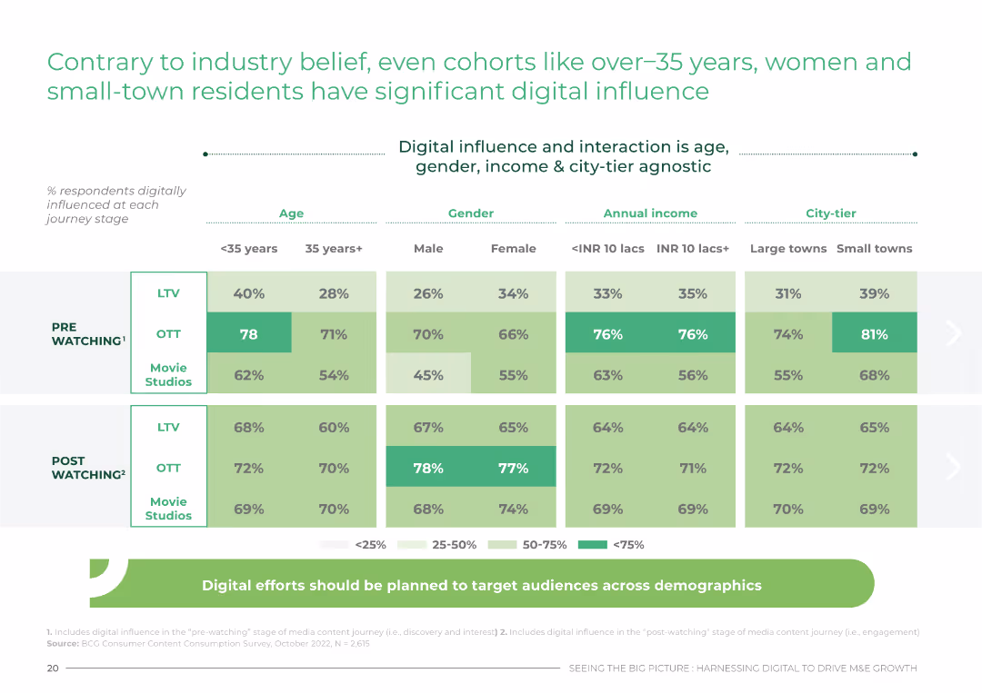
Data table showing digital influence across various demographics, including age, gender, income, and city-tier.
Customer and Market Segmentation
Media & Entertainment
This slide challenges industry beliefs by showing significant digital influence among diverse demographics in India, including over-35s and small-town residents.
digital, influence, demographics, India, segmentation
false
Customer and Market Segmentation
Media & Entertainment
Table
BCG
Add to my slides
Remove from favorites
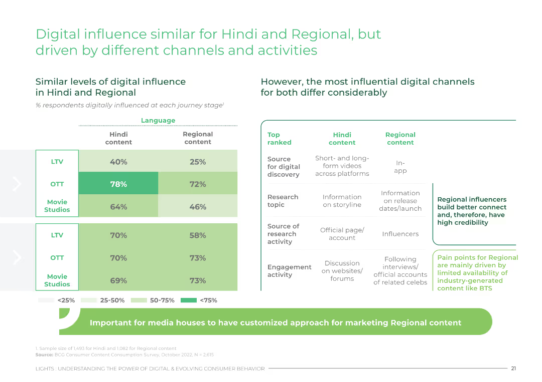
Comparative data table showing digital influence and top digital channels for Hindi and regional content across different journey stages.
Customer and Market Segmentation
Media & Entertainment
This slide compares digital influence for Hindi and regional content, highlighting the different channels and activities driving digital engagement.
digital, influence, Hindi, regional, engagement
false
Customer and Market Segmentation
Media & Entertainment
Header Horizontal
BCG
Add to my slides
Remove from favorites
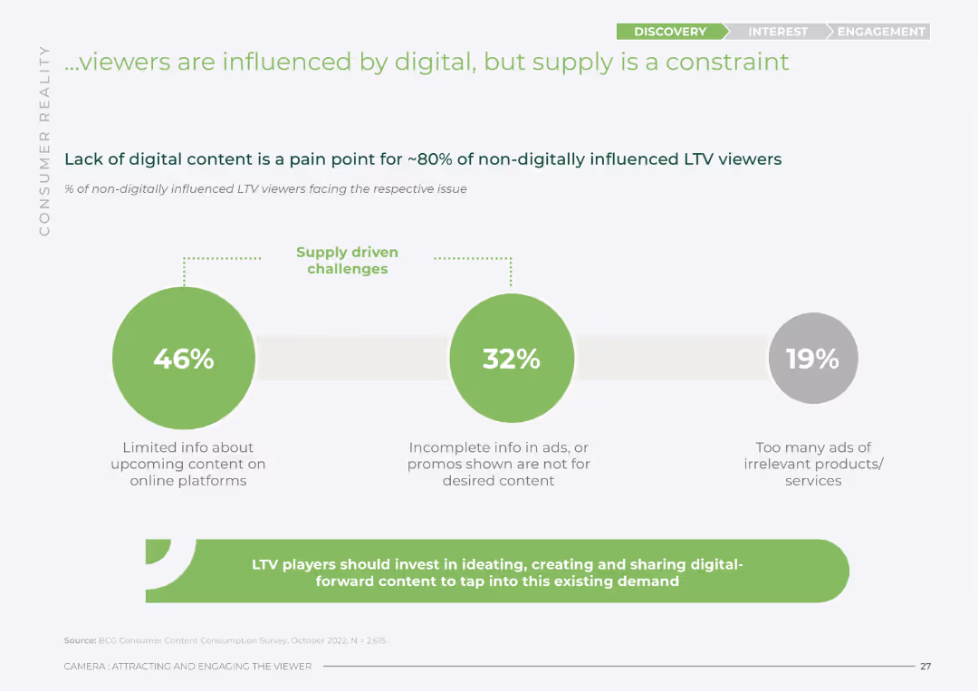
Column chart showing the percentage of non-digitally influenced LTV viewers facing various supply-driven challenges.
Market Analysis and Trends
Media & Entertainment
This slide identifies supply constraints affecting digital influence on LTV viewers, emphasizing the need for more digital content and better-targeted promotions.
digital, influence, supply, constraints, LTV
false
Market Analysis and Trends
Media & Entertainment
Mixed Chart
BCG
Add to my slides
Remove from favorites
Divided into three columns with text anda table, illustrating the benefits of digital innovation over time
Technology and Digital Transformation
Financial Services
Discusses the strategic, operational, and financial benefits of digital innovation in wealth management firms.
digital innovation, strategic planning, operational efficiency, financial benefits
false
Technology and Digital Transformation
Financial Services
Table
Deloitte
Add to my slides
Remove from favorites
Features a column chart depicting digital insurance APE/GWP growth, with projections for 2025. The slide is split between the chart and text analysis, highlighted by colored circles that connect to corresponding explanations.
Market Analysis and Trends
Financial Services
It analyzes the shift in insurance purchase behaviors moving online, disruption of traditional channels, and the rise in general and life insurance sectors' growth. The slide further explores continuous innovation in insurance products amid the digital push.
digital insurance, online transition, innovation, growth, APE/GWP
false
Market Analysis and Trends
Financial Services
Mixed Chart
Bain
Add to my slides
Remove from favorites
This slide presents two sets of bar graphs. On the left, bars represent the percentage of respondents planning to increase investments in technologies. On the right, bars show current monitoring of emerging technologies, such as "Next-gen computation" and "Metaverse and Web 3.0."
Investment Analysis
Technology & Software
The slide is designed to showcase investment trends in the digital core of businesses, highlighting areas like AI, automation, and cloud services. It also indicates the attention given to emerging technologies, useful for investors and businesses focusing on strategic technology advancements.
digital investment, AI, cloud services, emerging technology, business trends
false
Investment Analysis
Technology & Software
Multiple Chart
Accenture
Add to my slides
Remove from favorites
Bar charts, color-coded data, percentage indicators.
Investment Analysis
Technology & Software
Illustrates CEO plans to increase digital investments post-COVID-19.
Digital, investment, CEOs, COVID-19, cybersecurity, sustainability, R&D, supply chain
false
Investment Analysis
Technology & Software
Single Chart
PwC/Strategy&
Add to my slides
Remove from favorites
Slide contains a column chart depicting the investment in digital media over several years, with projections for future spending. It's straightforward, using varying shades of blue to represent different years.
Technology and Digital Transformation
Consumer Goods
Shows Clorox's increasing investment in digital media from FY15 to FY19, indicating a strategic shift towards digital channels. Useful for discussions on marketing strategies and digital transformation.
digital investment, marketing strategy, Clorox, digital transformation
false
Technology and Digital Transformation
Consumer Goods
Single Chart
Barclays
Add to my slides
Remove from favorites
A line and bar graph depict the trend of digital investments in Indonesia from 2016 to 2020, with accompanying text on investment values and deal numbers.
Investment Analysis
Technology & Software
This slide presents the growing trend of digital investments in Indonesia, illustrating a doubling of investment in 2020.
Digital investments, trends, Indonesia, growth, deal value
false
Investment Analysis
Technology & Software
Single Chart
Kearney
Add to my slides
Remove from favorites
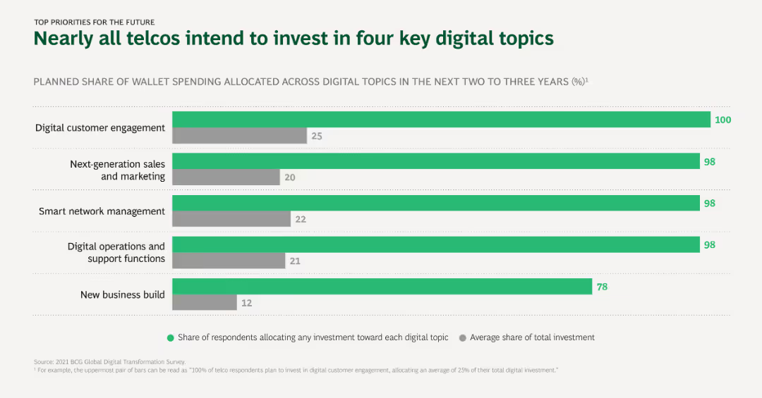
The slide uses horizontal bar charts to depict planned digital investment priorities among telcos, showing the share of wallet spending allocated to different digital topics over the next 2-3 years.
Investment Analysis
Telecommunications
This slide outlines the key digital topics that telcos plan to invest in, with digital customer engagement and next-generation sales and marketing being the top priorities.
Digital investment, Telcos, Priorities, Customer engagement, Sales and marketing
false
Investment Analysis
Telecommunications
Single Chart
BCG
Add to my slides
Remove from favorites
A split-layout design showcasing how organizations perceive their technology investments' impact on transformation programs. A bar graph titled "Reinventors capitalize on their investments in the digital core" depicts responses to technology's enabling role in transformations, with associated commentary.
Investment Analysis
Technology & Software
Positioned to evaluate the effectiveness of digital investments in corporate transformation initiatives, this slide aids in assessing the role of technology in operational strategy, signaling to leaders the high value placed on digital foundations in current business environments.
digital investment, transformation, technology, enabler, strategy, operational efficiency
false
Investment Analysis
Technology & Software
Single Chart
Accenture
Add to my slides
Remove from favorites
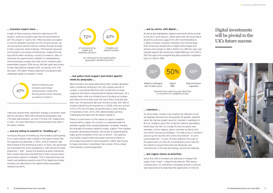
The slide features text and an image highlighting the importance of digital investments in the UK.
Technology and Digital Transformation
Technology & Software
This slide emphasizes the critical role of digital investments for the UK's future success, focusing on investor priorities, necessary policy support, and the importance of sectors like digital technologies, R&D, and data protection.
Digital Investment, UK, Future Growth, Technology
false
Technology and Digital Transformation
Technology & Software
Multiple Chart
EY
Add to my slides
Remove from favorites
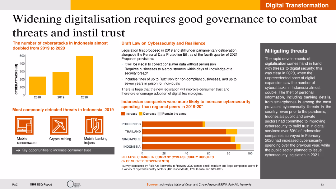
The slide features text sections on cybersecurity threats, a bar chart of cyberattack statistics, and a policy draft description. The layout is information-heavy with a clear distinction between visual and textual elements.
Technology and Digital Transformation
Telecommunications
It discusses the importance of good governance in digitalization, focusing on cybersecurity threats and the legislative response in Indonesia. The slide provides data on cyberattacks and highlights efforts to improve digital security.
Digitalisation, Cybersecurity, Governance, Indonesia, Threats
false
Technology and Digital Transformation
Telecommunications
Multiple Chart
PwC/Strategy&
Add to my slides
Remove from favorites
The slide features bar charts showing risks and opportunities percentages. Text boxes detail risks and opportunities, and a summary box highlights key takeaways.
Market Analysis and Trends
Transportation & Logistics
It presents survey results indicating a need for repositioning in aerospace and defense functions due to digitalization, with focus on production and logistics.
Digitalization, aerospace, defense, risks, opportunities, production, logistics
false
Market Analysis and Trends
Transportation & Logistics
Multiple Chart
Roland Berger
Add to my slides
Remove from favorites
The slide features bar charts showing risks and opportunities percentages. Text boxes detail risks and opportunities, and a summary box highlights key takeaways.
Market Analysis and Trends
Transportation & Logistics
It shows survey results indicating a high need for repositioning in automotive functions due to digitalization, with focus on production, procurement, and logistics.
Digitalization, automotive, risks, opportunities, production, procurement, logistics
false
Market Analysis and Trends
Transportation & Logistics
Multiple Chart
Roland Berger
Add to my slides
Remove from favorites
The slide features bar charts showing risks and opportunities percentages. Text boxes detail risks and opportunities, and a summary box highlights key takeaways.
Market Analysis and Trends
Healthcare & Pharmaceuticals
It shows survey results indicating a high need for repositioning in chemicals and pharma functions due to digitalization, focusing on sales, R&D, and innovation.
Digitalization, chemicals, pharma, risks, opportunities, sales, R&D, innovation
false
Market Analysis and Trends
Healthcare & Pharmaceuticals
Multiple Chart
Roland Berger
Add to my slides
Remove from favorites
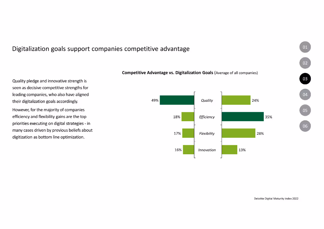
The slide contains a column chart comparing competitive advantages vs. digitalization goals across metrics like quality, efficiency, flexibility, and innovation.
Strategic Planning
Professional Services
This slide shows how companies align their digitalization goals with competitive advantages, focusing on quality, efficiency, flexibility, and innovation.
Digitalization, Competitive Advantage, Quality, Efficiency, Flexibility, Innovation
false
Strategic Planning
Professional Services
Multiple Chart
Deloitte
Add to my slides
Remove from favorites
The slide features bar charts showing risks and opportunities percentages. Text boxes detail risks and opportunities, and a summary box highlights key takeaways.
Market Analysis and Trends
Retail & E-commerce
It presents survey results indicating a high need for repositioning in consumer goods and retail functions due to digitalization, with a focus on controlling, service, and logistics.
Digitalization, consumer goods, retail, risks, opportunities, controlling, service, logistics
false
Market Analysis and Trends
Retail & E-commerce
Multiple Chart
Roland Berger
Add to my slides
Remove from favorites
Includes a column chart on global mobile data traffic growth from 2015 to 2021, emphasizing the rapid increase in digital connectivity.
Technology and Digital Transformation
Professional Services
Examines how digitalization and data flows are reshaping globalization, focusing on the increasing role of digital connections over physical trade.
digitalization, data traffic, globalization, market transformation, technology impact
false
Technology and Digital Transformation
Professional Services
Header Vertical
Roland Berger
Add to my slides
Remove from favorites
Circular diagram illustrating the data value chain from data collection to monetization, with a column chart projecting total data traffic from 2020 to 2026.
Technology and Digital Transformation
Technology & Software
The slide emphasizes the market opportunities created by digitalization along the data value chain. It outlines the process from data collection to value creation and monetization, projecting a substantial increase in data traffic and highlighting the economic potential of data-driven business models.
Digitalization, Data Value Chain, Monetization, Data Traffic
false
Technology and Digital Transformation
Technology & Software
Mixed Chart
Roland Berger
Add to my slides
Remove from favorites
The slide features bar charts showing risks and opportunities percentages. Text boxes detail risks and opportunities, and a summary box highlights key takeaways.
Market Analysis and Trends
Financial Services
It shows survey results indicating a high need for repositioning in financial services functions due to digitalization, with a focus on service, procurement, and WCM.
Digitalization, financial services, risks, opportunities, service, procurement, WCM
false
Market Analysis and Trends
Financial Services
Multiple Chart
Roland Berger
Add to my slides
Remove from favorites
Slide with iconographic bullet points detailing digital features for home buying and refinancing, and bar charts depicting customer acquisition and retention metrics.
Technology and Digital Transformation
Financial Services
Highlights the digitalization efforts and successes in home lending services, suitable for presenting technological advancement in banking services.
Digitalization, Home Buying, Customer Retention, Banking Services
false
Technology and Digital Transformation
Financial Services
Table
JP Morgan
Add to my slides
Remove from favorites
The slide features bar charts showing risks and opportunities percentages. Text boxes detail risks and opportunities, and a summary box highlights key takeaways.
Market Analysis and Trends
Industrial & Manufacturing
It shows survey results indicating a need for repositioning in industrial products functions due to digitalization, with focus on controlling, procurement, and logistics.
Digitalization, industrial products, risks, opportunities, controlling, procurement, logistics
false
Market Analysis and Trends
Industrial & Manufacturing
Multiple Chart
Roland Berger
Add to my slides
Remove from favorites
The slide features bar charts showing risks and opportunities percentages. Text boxes detail risks and opportunities, and a summary box highlights key takeaways.
Market Analysis and Trends
Industrial & Manufacturing
It shows survey results indicating a lower perceived need for repositioning in industrial services and IT functions due to digitalization, focusing on R&D and innovation.
Digitalization, industrial services, IT, risks, opportunities, R&D, innovation
false
Market Analysis and Trends
Industrial & Manufacturing
Multiple Chart
Roland Berger
Add to my slides
Remove from favorites
The slide includes a column chart assessing risks and opportunities by corporate function. There are icons for each function and highlights per industry.
Strategic Planning
Transportation & Logistics
Analyzes the risks and opportunities of digitalization across various corporate functions, with a focus on logistics and finance sectors leveraging new technologies.
Digitalization, logistics, finance, opportunities, risks, strategic planning
false
Strategic Planning
Transportation & Logistics
Table
Roland Berger
Add to my slides
Remove from favorites
Three line charts showing trends over years in digitalization, network capacity, and spend on network modernization.
Technology and Digital Transformation
Telecommunications
Visualizes the growth in digitalization and network capacity alongside increased spending on network modernization over time.
digitalization, network capacity, investment trends, technology growth, network modernization, data transmission
false
Technology and Digital Transformation
Telecommunications
Mixed Chart
Accenture
Add to my slides
Remove from favorites
Previous
Next
You don't have any favorites yet.
Please wait loading your favorites slides...
Create a FREE account to continue browsing
Receive Instant Access to 1,000+ slides from companies like McKinsey, Google, and Goldman Sachs
First Name
Last Name
Email
Password
I agree to all
Terms & Privacy Policy
Thank you! Your submission has been received!
Oops! Something went wrong while submitting the form.
Have an account?
Sign in
Upgrade to PRO to Save slides
Advanced Search and Filters
Access to 15,000+ slides
Access to Category Pages
Save/Bookmark Slides
PowerPoint Template Library
Pick a Plan
MONTHLY
$12/month
Billed every month, Cancel anytime.
YEARLY
$9/year
Billed $108 annually, Cancel anytime.
Checkout for $12/month
Checkout for $108/yr
Secured by Stripe | AES-256 bit encryption