My Account
My Slides
Search by Category
Companies
Slide Type
Use Case
Industry
Pricing
Templates
View All Templates
Download Template Slides
✦ AI
AI Prompt Library
AI Search
Feedback
Login
Logout
Get Started
Browse all Slides
Browse all Slides
Create a FREE Account
Instant access to 1,000+ real slides from top companies like McKinsey, BCG, Goldman Sachs, Google and many more!
First Name
Last Name
Email
Password
I agree to all
Terms & Privacy Policy
Thank you! Your submission has been received!
Oops! Something went wrong while submitting the form.
Have an account?
Sign in
Saved Slides
Total No. of slides saved
0
↻ Refresh
✖ Clear all
This slide includes a line chart showing the advertised primary retail market prices for Dot-Com domains from 2012 to 2020. It uses different colors to differentiate between new domain registrations and renewals, with annotations explaining price trends.
Pricing Strategies
Telecommunications
The slide analyzes the advertised primary retail market prices for Dot-Com domains, noting that renewal prices have increased since 2017 while new domain prices have remained stable. It provides insights into pricing stability and recent trends.
Dot-Com domains, pricing, renewals, new registrations, price trends
false
Pricing Strategies
Telecommunications
Mixed Chart
BCG
Add to my slides
Remove from favorites
This slide features a column chart tracking the number of registered Dot-Com domains from 2017 to 2020. It uses a green color scheme and annotations to highlight key statistics, with a text box on the right summarizing observations.
Market Analysis and Trends
Telecommunications
The slide provides an overview of Dot-Com domain registrations, showing growth trends and new registrations. It highlights that renewals and new domain registrations maintain a stable 3:1 distribution, with annual net additions ranging from 5M to 7M.
Dot-Com domains, registrations, trends, growth, renewals
false
Market Analysis and Trends
Telecommunications
Mixed Chart
BCG
Add to my slides
Remove from favorites
The slide features country-specific results and a column chart showing overall and response trend results over the years.
Regulatory and Compliance
Financial Services
The slide discusses instances of double taxation due to uncoordinated unilateral tax law changes.
Double taxation, tax law, uncoordinated, global tax, Deloitte, agree, strongly agree, survey, multinational
false
Regulatory and Compliance
Financial Services
Multiple Chart
Deloitte
Add to my slides
Remove from favorites
Line chart showing the percentage of down payments for total and first-time buyers from Fall 2015 to Fall 2020. Two lines represent each group.
Market Analysis and Trends
Real Estate & Construction
This slide tracks the expected down payment percentages for future purchases, highlighting trends among all buyers and first-time buyers specifically.
down payment, future trends, first-time buyers, total buyers, Fall 2015-2020
false
Market Analysis and Trends
Real Estate & Construction
Single Chart
IPSOS
Add to my slides
Remove from favorites
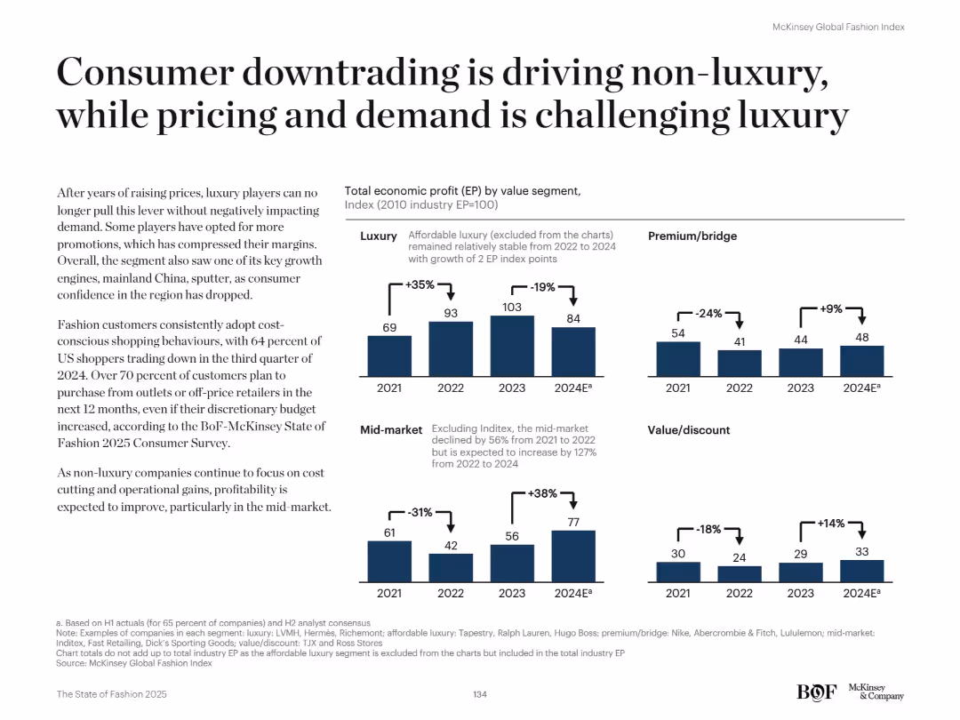
Bar charts on right compare EP by segment (Luxury, Premium, Mid-market, Value). Left-side narrative explains consumer behavior trends.
Customer and Market Segmentation
Retail & E-commerce
The slide explains how consumer downtrading is fueling growth in non-luxury segments, especially mid-market and value. Luxury struggles with demand and pricing. Shoppers are turning to outlets and off-price retailers.
Downtrading, value segment, pricing pressure, consumer behavior, EP segmentation, mid-market growth, luxury decline, affordability, retail demand
false
Customer and Market Segmentation
Retail & E-commerce
Mixed Chart
McKinsey
Add to my slides
Remove from favorites
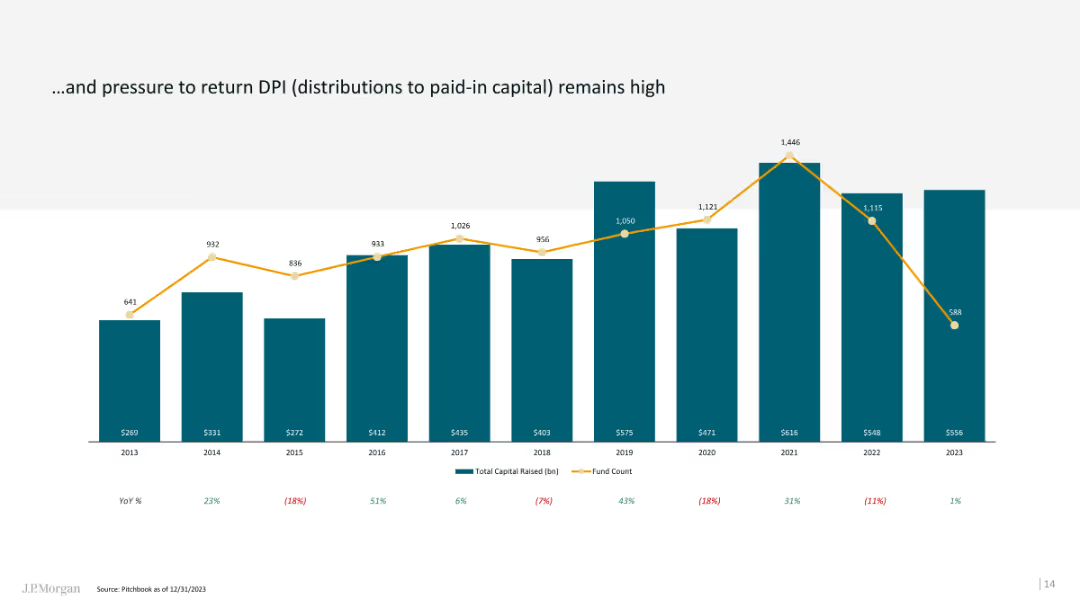
The slide features a column chart with a line overlay, showing DPI trends over time and capital raised.
Financial Performance
Financial Services
This slide discusses the high pressure on financial sponsors to return DPI, providing historical and current data.
DPI, financial performance, column chart, line overlay, capital raised
false
Financial Performance
Financial Services
Single Chart
JP Morgan
Add to my slides
Remove from favorites
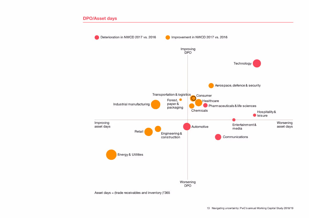
The slide includes a scatter plot showing DPO (Days Payable Outstanding) against asset days for various industries. Dots are color-coded to indicate improvement or deterioration from 2016 to 2017. Industries are labeled around the dots, providing a clear comparison of performance.
Risk Assessment and Management
Financial Services
This slide presents a detailed analysis of DPO and asset days across industries, showing trends in payables and asset management. The scatter plot visualizes how different sectors have improved or worsened in these metrics, offering insights into risk management and operational efficiency.
DPO, asset days, scatter plot, industry comparison, performance trends, risk management
false
Risk Assessment and Management
Financial Services
Single Chart
PwC/Strategy&
Add to my slides
Remove from favorites
Comprising a stacked column chart, this slide visually represents like-for-like DPU history with layers indicating operating DPU, fees in units, and capital top-up. Each column represents a year from 2018 to 2022, with a color-coding scheme and annotations for additional details. There's a legend explaining the components of the bars and a footnote defining like-for-like DPU.
Financial Performance
Financial Services
Provides a historical perspective on the Distribution Per Unit (DPU), indicating the company's financial performance and operational efficiency over a five-year period.
DPU Trends, Financial Performance, Operational Efficiency, Yearly Comparison, Capital Management, Fee Structure
false
Financial Performance
Financial Services
Single Chart
Morgan Stanley
Add to my slides
Remove from favorites
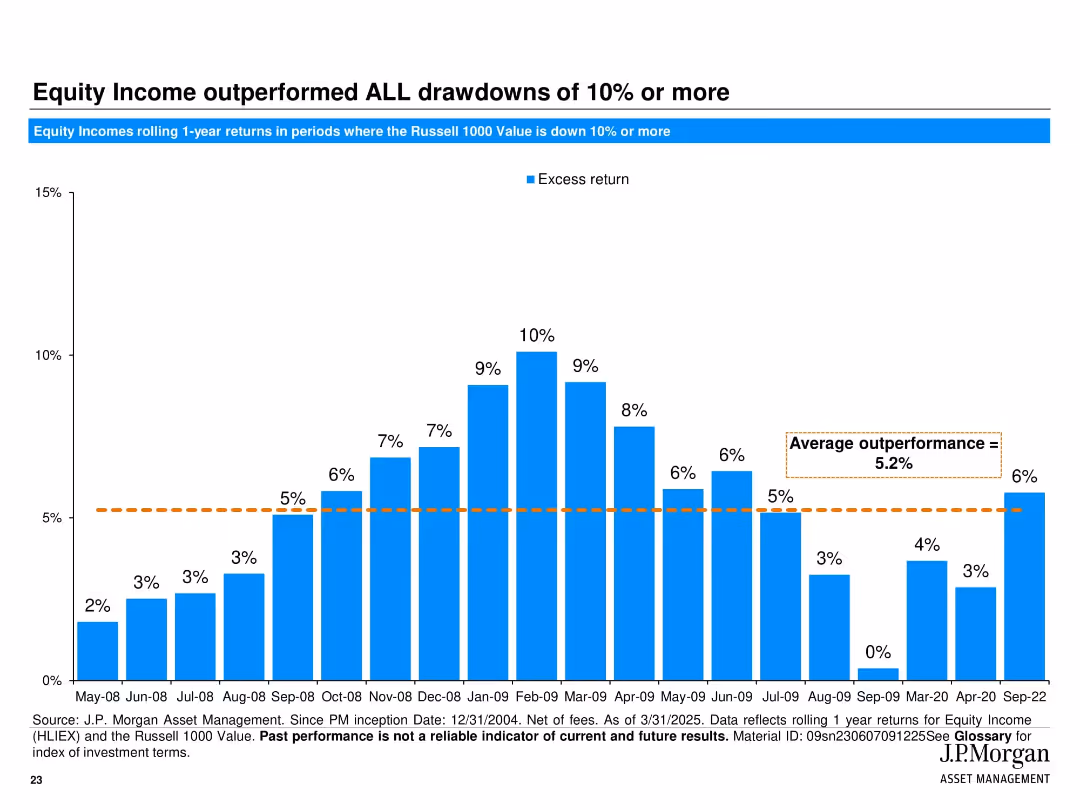
Full-width vertical bar chart visualizing excess returns during major market drawdowns.
Risk Assessment and Management
Financial Services
This slide illustrates how JPMorgan Equity Income outperformed during every market drawdown of 10% or more. The chart quantifies 1-year rolling excess returns during downturns from 2008–2022, averaging 5.2%, emphasizing downside resilience.
drawdowns, market downturns, equity income, excess return, risk management, historical performance
false
Risk Assessment and Management
Financial Services
Single Chart
JP Morgan
Add to my slides
Remove from favorites
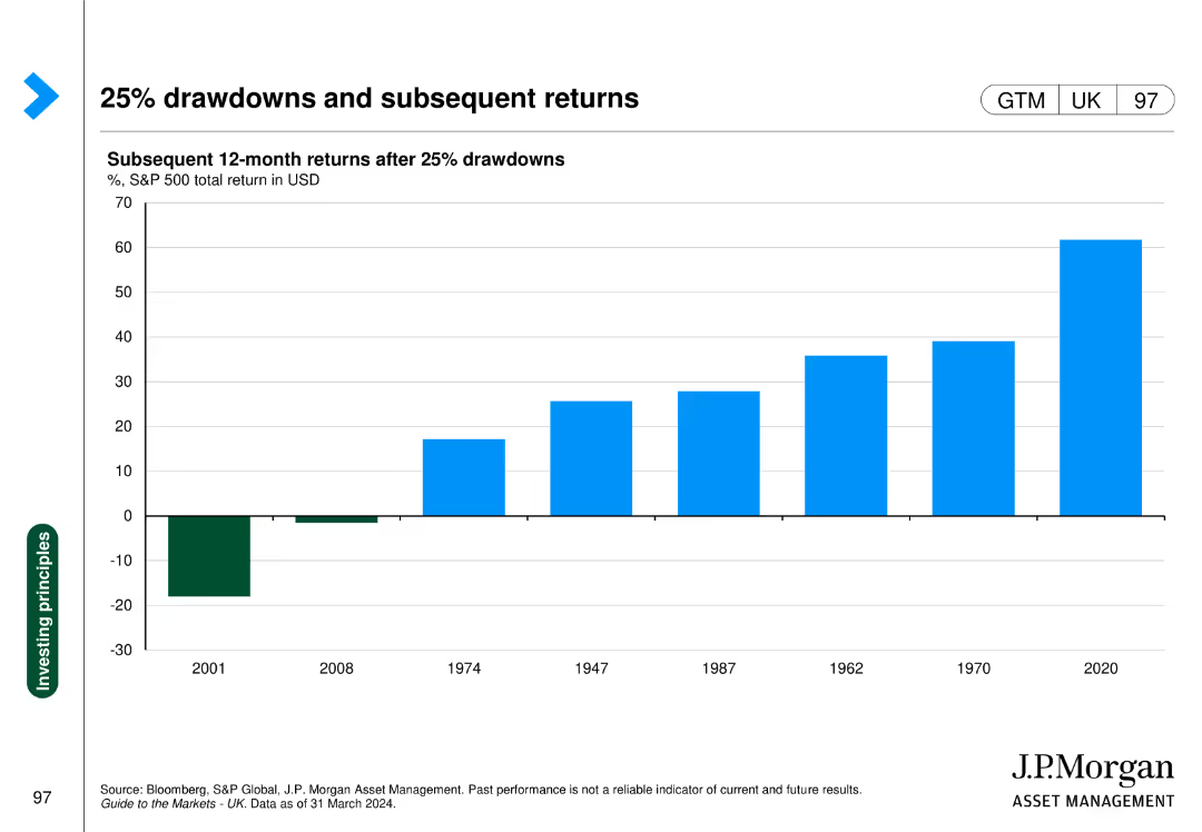
The slide shows a column chart with subsequent 12-month returns after 25% drawdowns in the S&P 500, with specific years highlighted for comparison.
Investment Analysis
Financial Services
This slide demonstrates the performance of the S&P 500 following major drawdowns, providing insights into market recovery patterns.
drawdowns, S&P 500, subsequent returns, market recovery, investment analysis
false
Investment Analysis
Financial Services
Single Chart
JP Morgan
Add to my slides
Remove from favorites
The slide features a detailed diagram highlighting the drivers' impacts on the bioenergy value chain, focusing on feedstock supply, infrastructure maturity, regulation and acceptance, technologies and economics, and substitution.
Strategic Planning
Energy & Utilities
This slide analyzes the key drivers and enablers for improving the bioenergy market environment, focusing on aspects like feedstock supply, infrastructure maturity, regulation and acceptance, technologies and economics, and substitution.
drivers, value chain, feedstock supply, infrastructure maturity, regulation, acceptance, technologies, economics, substitution
false
Strategic Planning
Energy & Utilities
Vertical Flow
Kearney
Add to my slides
Remove from favorites
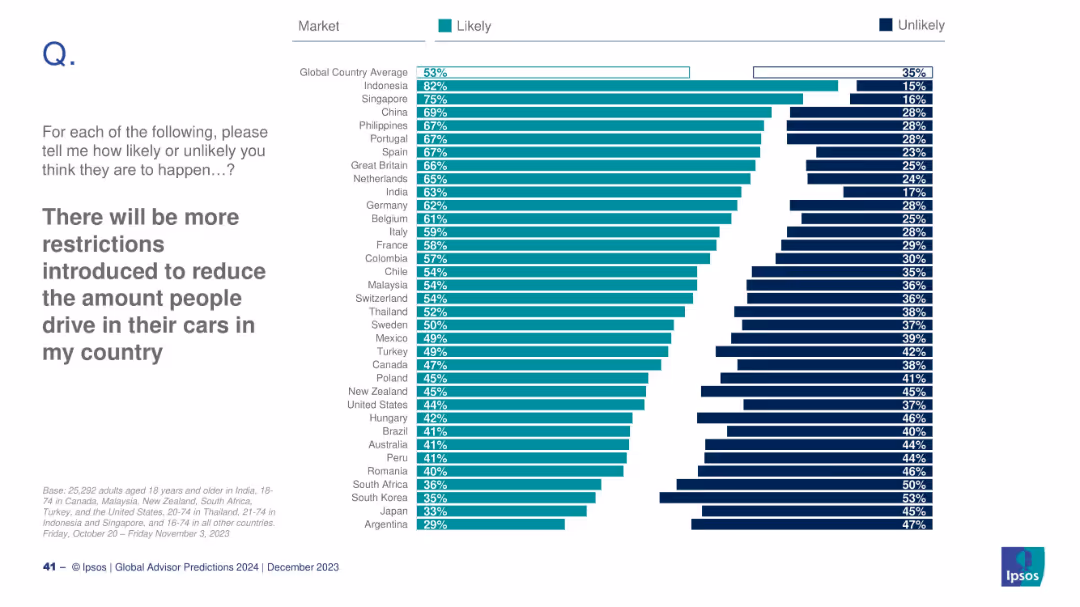
Horizontal bar chart; teal for “Likely”, dark blue for “Unlikely”; countries listed vertically; heading and instruction text left-aligned.
Market Analysis and Trends
Government & Public Sector
This slide visualizes public sentiment from various countries on the likelihood of more driving restrictions. The data reflects a global average of 53% agreeing, with Indonesia highest (82%) and Argentina lowest (29%).
driving restrictions, mobility, public opinion, environment, Ipsos, 2024 predictions, government policy, transportation, global survey, behavioral change
false
Market Analysis and Trends
Government & Public Sector
Mixed Chart
IPSOS
Add to my slides
Remove from favorites
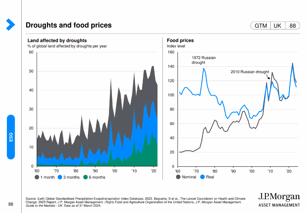
Includes a line chart on the left showing the percentage of global land affected by droughts and a line chart on the right showing the real and nominal food prices over time.
Market Analysis and Trends
Agriculture & Food Production
It examines the relationship between drought conditions and food prices, providing data on how climate impacts agriculture and the resultant economic effects on food markets.
drought, food prices, agriculture, climate impact, global land, real vs nominal prices, J.P. Morgan, environmental analysis, food market, economic effects
false
Market Analysis and Trends
Agriculture & Food Production
Multiple Chart
JP Morgan
Add to my slides
Remove from favorites
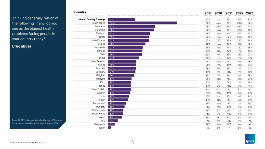
Horizontal bar chart on right with countries and multi-year data (2018–2023); prompt on the left.
Market Analysis and Trends
Healthcare & Pharmaceuticals
The slide displays country-level concern about drug abuse as a health issue. South Africa and Argentina rank highest. Time series data reveal increases in perceived severity in several regions. The global average is 21%, underscoring widespread concern.
drug abuse, addiction, health problem, global perception, survey
false
Market Analysis and Trends
Healthcare & Pharmaceuticals
Mixed Chart
IPSOS
Add to my slides
Remove from favorites
Features a complex multivariate graph detailing the supply and demand dynamics in the drybulk market over several decades, with contextual annotations.
Market Analysis and Trends
Transportation & Logistics
Provides a comprehensive analysis of the historical and recent trends in the drybulk shipping market, focusing on fleet growth, trade growth, and market fluctuations.
drybulk shipping, market analysis, supply and demand, economic trends
false
Market Analysis and Trends
Transportation & Logistics
Single Chart
Deutsche Bank
Add to my slides
Remove from favorites
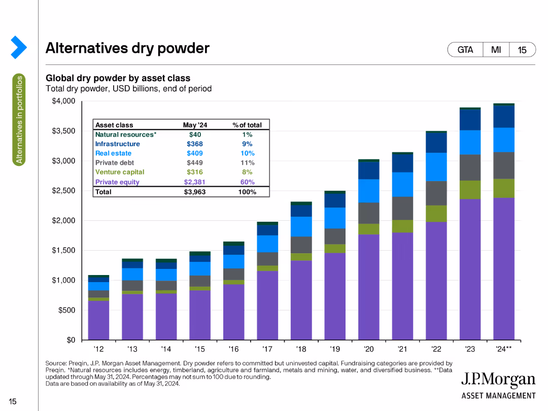
The slide presents a stacked column chart showing global dry powder by asset class in USD billions as of the end of May 2024. The chart uses different colors to depict natural resources, infrastructure, private equity, and other categories.
Investment Analysis
Financial Services
This slide details the amount of uninvested capital (dry powder) available in various asset classes, such as natural resources, infrastructure, and private equity, highlighting the total capital ready for deployment at the end of May 2024.
Dry Powder, Asset Classes, Uninvested Capital, USD Billions, Deployment
false
Investment Analysis
Financial Services
Single Chart
JP Morgan
Add to my slides
Remove from favorites
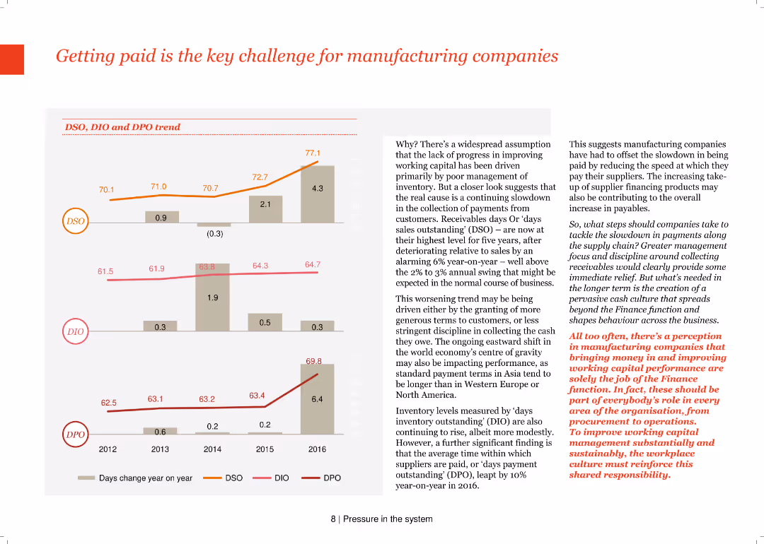
The slide features a column chart with DSO, DIO, and DPO trends from 2012-2016. Text explains the challenges in improving working capital due to slow customer payments and high receivables.
Risk Assessment and Management
Industrial & Manufacturing
It examines the key challenge of getting paid in the manufacturing sector, focusing on the trends in days sales outstanding (DSO), days inventory outstanding (DIO), and days payable outstanding (DPO), and their impact on working capital.
DSO, DIO, DPO, working capital, manufacturing, risk management, column chart, payment challenges, receivables
false
Risk Assessment and Management
Industrial & Manufacturing
Multiple Chart
PwC/Strategy&
Add to my slides
Remove from favorites
Features multiple column charts detailing the revenue share within the DTC sector by category from 2019 to 2020, highlighting Health/Wellness.
Market Analysis and Trends
Media & Entertainment
Focuses on the DTC sector within podcast advertising, underlining the continued dominance of the Health/Wellness category.
DTC, health/wellness, podcast advertising, revenue share, 2019-2020
false
Market Analysis and Trends
Media & Entertainment
Single Chart
PwC/Strategy&
Add to my slides
Remove from favorites
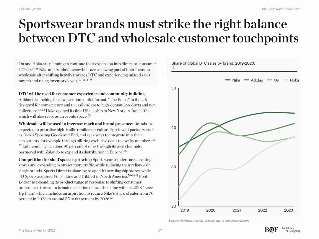
Text on left highlights DTC vs wholesale strategies; right line chart tracks DTC sales share by brand (2019–2023)
Sales and Business Development
Consumer Goods
This slide compares direct-to-consumer (DTC) vs wholesale strategies for major sportswear brands like Nike, Adidas, Hoka, and On. It emphasizes using DTC for brand control and wholesale for reach. The chart shows how DTC share has evolved over time, highlighting Nike's decline and On’s and Hoka’s rise.
DTC, wholesale, Nike, Adidas, On, Hoka, sales strategy, distribution, touchpoints
false
Sales and Business Development
Consumer Goods
Mixed Chart
McKinsey
Add to my slides
Remove from favorites
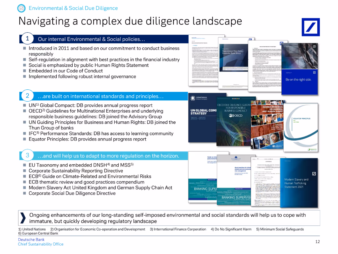
The slide features a numbered list and images of various guidelines and principles related to environmental and social due diligence.
Regulatory and Compliance
Financial Services
It describes Deutsche Bank's internal environmental and social policies, international standards and principles they follow, and how they adapt to new regulations.
due diligence, environmental policies, social policies, international standards, regulatory adaptation, Deutsche Bank
false
Regulatory and Compliance
Financial Services
Header Vertical
Deutsche Bank
Add to my slides
Remove from favorites
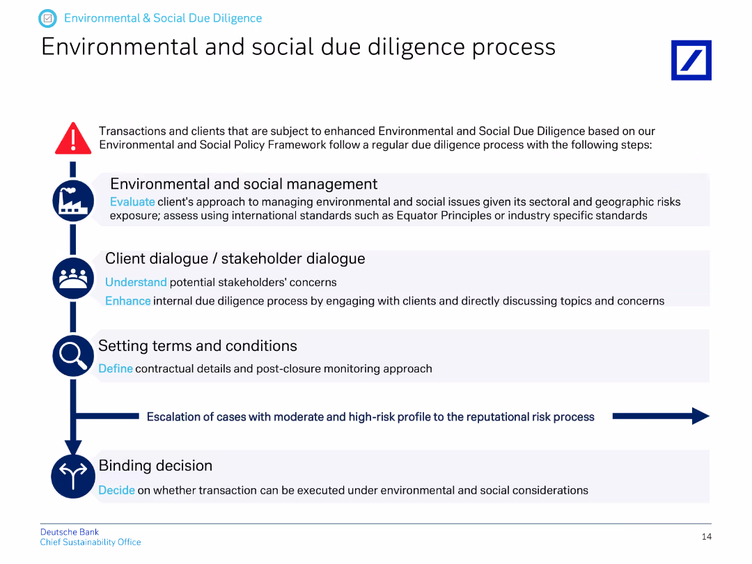
The slide presents a vertical flow chart outlining the steps in the environmental and social due diligence process.
Regulatory and Compliance
Financial Services
This slide explains the process for environmental and social due diligence, detailing steps from management to stakeholder dialogue, setting terms, and making binding decisions.
due diligence, environmental process, social process, stakeholder dialogue, terms and conditions, decision-making
false
Regulatory and Compliance
Financial Services
Vertical Flow
Deutsche Bank
Add to my slides
Remove from favorites
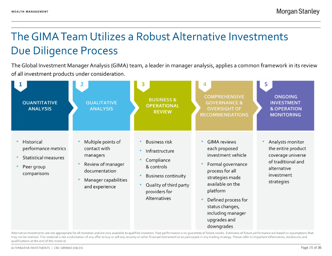
The slide lists five steps in the due diligence process using colored boxes with descriptions under each step, emphasizing the systematic approach.
Operational Efficiency
Financial Services
The slide outlines the five-step due diligence process used by the GIMA team: Quantitative Analysis, Qualitative Analysis, Business & Operational Review, Comprehensive Governance & Oversight, and Ongoing Investment Monitoring.
Due Diligence, GIMA, Process, Analysis, Governance
false
Operational Efficiency
Financial Services
Linear Flow
Morgan Stanley
Add to my slides
Remove from favorites
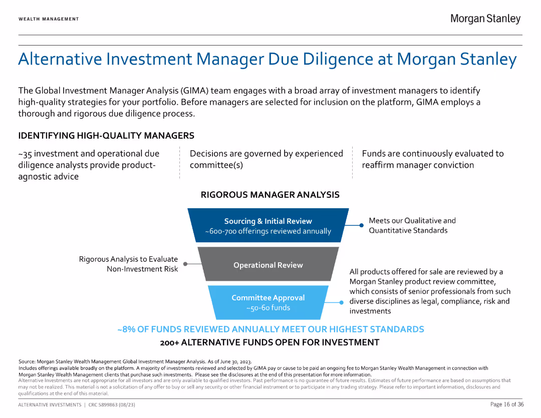
The slide uses a flowchart to depict the due diligence process with descriptions for each step, illustrating a comprehensive review mechanism.
Risk Assessment and Management
Financial Services
The slide explains the rigorous due diligence process employed by Morgan Stanley to identify high-quality investment managers, involving sourcing, operational review, and committee approval.
Due Diligence, Morgan Stanley, Investment, Review, High-Quality
false
Risk Assessment and Management
Financial Services
Diagram
Morgan Stanley
Add to my slides
Remove from favorites
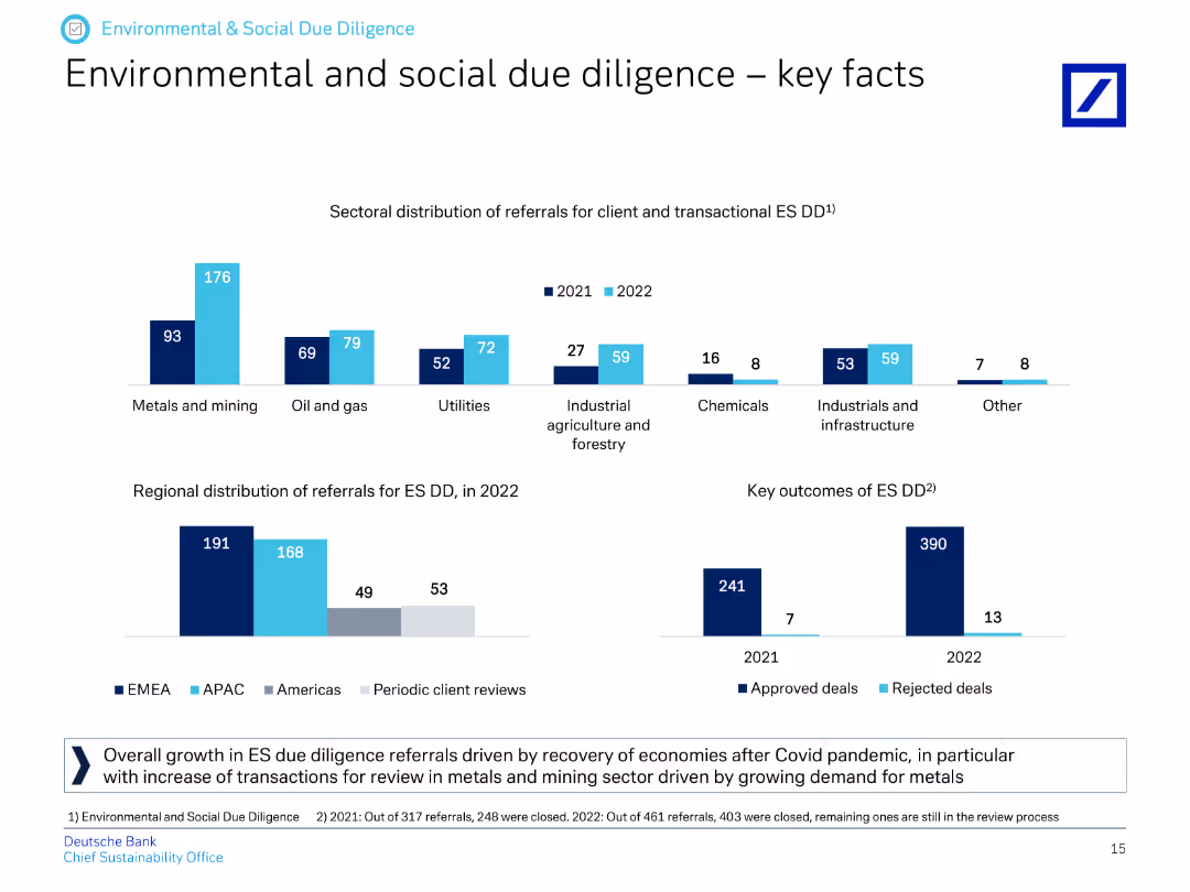
The slide contains column charts showing the sectoral distribution and regional distribution of referrals for environmental and social due diligence in 2021 and 2022.
Regulatory and Compliance
Financial Services
It provides key facts about environmental and social due diligence, highlighting sectoral and regional distribution of referrals and outcomes for approved and rejected deals.
due diligence, sector distribution, regional distribution, referrals, environmental, social, approved deals, rejected deals
false
Regulatory and Compliance
Financial Services
Multiple Chart
Deutsche Bank
Add to my slides
Remove from favorites
Bar chart with five categories (1–5+ nights) showing percentage breakdown, orange bars; simple design.
Market Analysis and Trends
Hospitality & Tourism
The slide outlines how long international attendees stayed in Texas, with 66% staying 5 or more nights and an average of 6 nights overall, suggesting a high level of extended tourism engagement.
duration of stay, tourism behavior, event impact, overnight stay, international visitors, average nights
false
Market Analysis and Trends
Hospitality & Tourism
Single Chart
Nielsen
Add to my slides
Remove from favorites
Line chart showing mean change in BCVA over 24 weeks for 3 treatment groups. Purple-themed background with EyePoint branding and annotated data points.
Product and Service Analysis
Healthcare & Pharmaceuticals
Demonstrates visual acuity improvements in patients treated with DURAVYU 2.7mg compared to lower dosage and aflibercept. Results show early and sustained benefits with similar performance to aflibercept.
DURAVYU, BCVA, visual acuity, clinical trial, ophthalmology, EyePoint
false
Product and Service Analysis
Healthcare & Pharmaceuticals
Single Chart
Goldman Sachs
Add to my slides
Remove from favorites
Tabular comparison of ING, Rabobank, and ABN-AMRO across Connect, Operate, and Invest categories; maturity indicators shown
Strategic Planning
Financial Services
Provides a comparative overview of Dutch banks’ FinTech engagement activities, highlighting varying levels of initiative maturity across connection, operation, and investment categories.
Dutch banks, FinTech, ING, Rabobank, ABN-AMRO, investment, innovation
false
Strategic Planning
Financial Services
Mixed Chart
Roland Berger
Add to my slides
Remove from favorites
Contains timelines and icons depicting hydrogen electrolysis capacity targets, infrastructure roadmaps, and targeted end-use sectors in a segmented layout.
Strategic Planning
Energy & Utilities
Discusses the Netherlands' hydrogen strategy focusing on developing infrastructure and scaling hydrogen use in various sectors by 2050, with specific targets for electrolysis capacity and transport applications.
Dutch, Hydrogen, Strategy, Infrastructure, Targets
false
Strategic Planning
Energy & Utilities
Mixed Chart
McKinsey
Add to my slides
Remove from favorites
Contains logos of major Dutch payment providers, pie charts for payment methods, and text boxes with recent deals and market drivers.
Market Analysis and Trends
Financial Services
Analysis of the Dutch payments market, highlighting major players, market drivers, and recent notable deals. Includes payment method preferences for e-commerce and Point of Sale.
Dutch payment providers, Adyen, Mollie, Buckaroo, market drivers, notable deals, payment methods, financial services, market analysis, trends
false
Market Analysis and Trends
Financial Services
Multiple Chart
Deloitte
Add to my slides
Remove from favorites
Features a bar chart analyzing the critical success factors for implementing End-to-End processes, such as role clarity and leadership alignment.
Operational Efficiency
Professional Services
Identifies key factors contributing to the successful implementation of End-to-End processes in GBS organizations.
E2E processes, GBS, success factors, leadership, operational efficiency
false
Operational Efficiency
Professional Services
Mixed Chart
Deloitte
Add to my slides
Remove from favorites
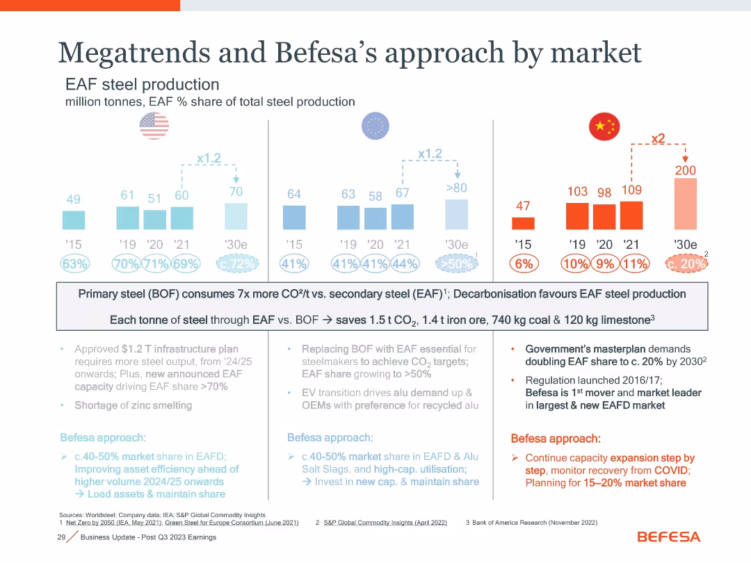
Split panel layout with three regional bar charts (US, EU, China) showing EAF steel production trends; includes annotations, icons, and text boxes explaining strategic implications
Strategic Planning
Industrial & Manufacturing
The slide compares EAF steel production trends across the US, EU, and China, emphasizing carbon savings from EAF over BOF. It outlines government policies and Befesa's market share strategies, highlighting environmental drivers and future expansion.
EAF, BOF, steel production, decarbonisation, market share, CO2 savings, infrastructure, zinc smelting, policy
false
Strategic Planning
Industrial & Manufacturing
Mixed Chart
Goldman Sachs
Add to my slides
Remove from favorites
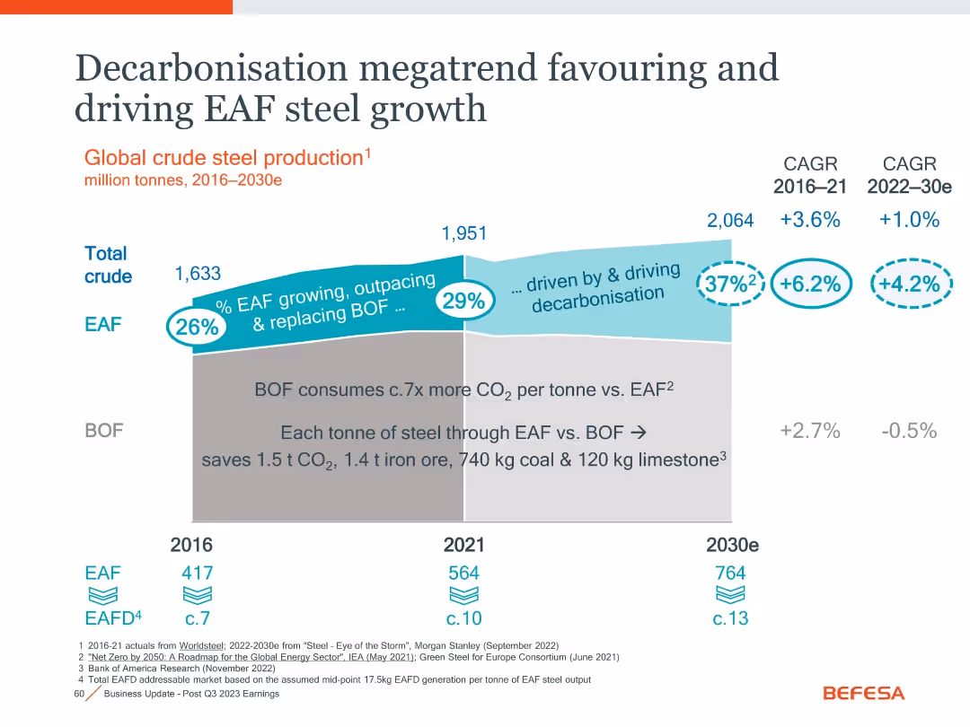
Stylized stacked area chart showing shift from BOF to EAF steel production, annotated with decarbonization benefits.
Market Analysis and Trends
Environmental Services & Sustainability
Projects global steel production shift from BOF to EAF through 2030, driven by sustainability. Emphasizes lower CO₂ output and energy/material savings per ton via EAF, predicting growth in EAF steel and associated market.
EAF, BOF, steel production, decarbonization, CO₂, market trend, CAGR
false
Market Analysis and Trends
Environmental Services & Sustainability
Single Chart
Goldman Sachs
Add to my slides
Remove from favorites
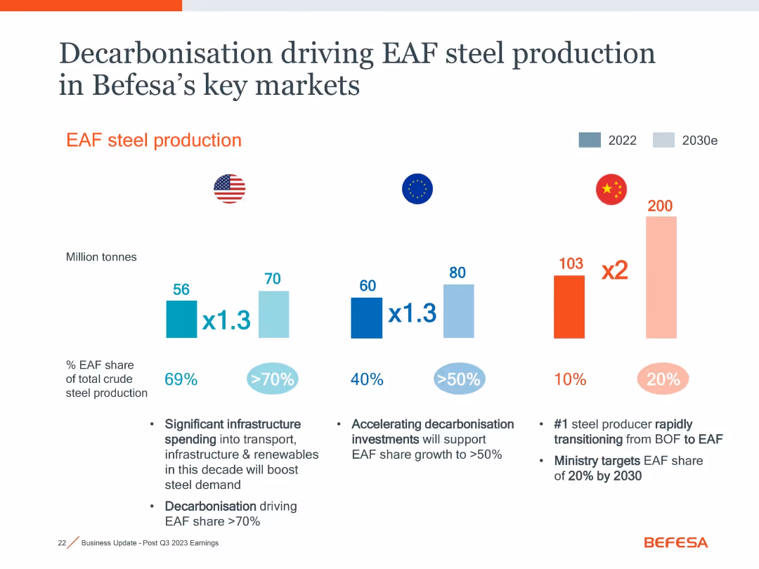
Bar graphs for steel production in US, EU, China with forecasts to 2030; text annotations explaining drivers and EAF % share.
Market Analysis and Trends
Industrial & Manufacturing
This slide visualizes projected EAF steel production increases across the US, EU, and China through 2030. It emphasizes decarbonization as a key driver and forecasts significant shifts in market share, especially in China.
EAF, decarbonization, steel production, market forecast, 2030, US, EU
false
Market Analysis and Trends
Industrial & Manufacturing
Mixed Chart
Goldman Sachs
Add to my slides
Remove from favorites
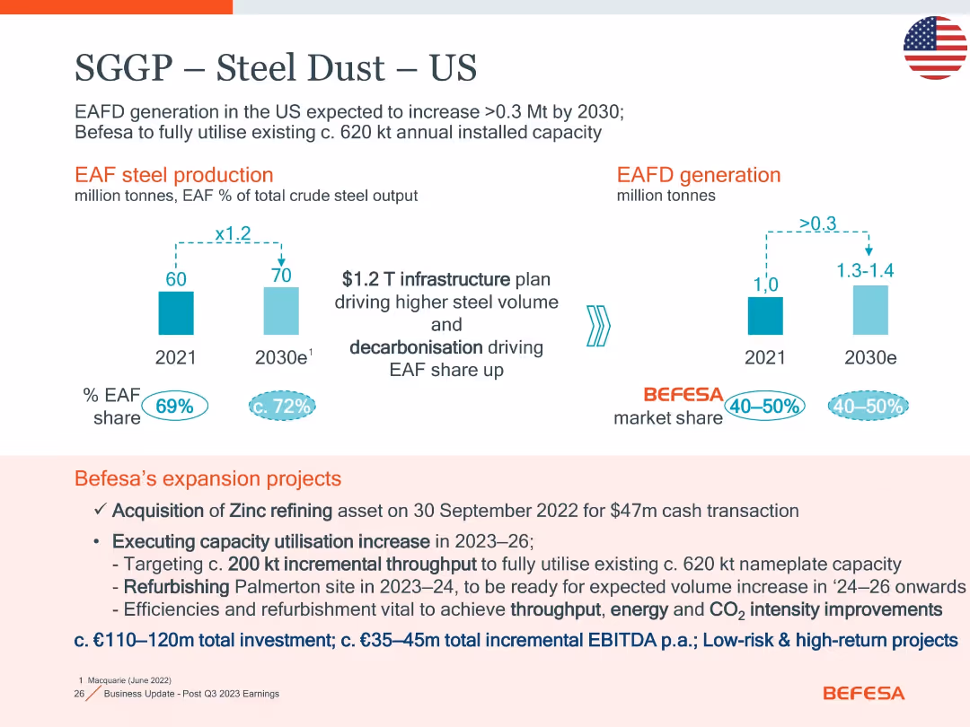
Two bar charts for EAF production and EAFD generation; bottom section lists Befesa’s US expansion actions and investment details.
Strategic Planning
Industrial & Manufacturing
Focuses on EAFD growth and market share in the US through 2030. It outlines Befesa’s strategic projects, including zinc refining and Palmerton refurbishment, with low-risk high-return investments (€110–120m) aimed at capacity and efficiency improvement.
EAFD, expansion, zinc refining, Palmerton, CO2, throughput, investment
false
Strategic Planning
Industrial & Manufacturing
Mixed Chart
Goldman Sachs
Add to my slides
Remove from favorites
Three regional bar graphs with EAF production history and projections; detailed annotations of company strategy by region.
Market Analysis and Trends
Industrial & Manufacturing
The slide compares EAF steel production growth by region (US, EU, China) and links it to Befesa’s strategic approach. It highlights carbon savings and regional market share strategy, with a focus on decarbonization trends and recycling capacity.
EAF, regional strategy, CO2 savings, recycling, market share, decarbonization
false
Market Analysis and Trends
Industrial & Manufacturing
Mixed Chart
Goldman Sachs
Add to my slides
Remove from favorites
US map with locations, timeline bar graph, and steelmaker investment table with Capex and capacity data through 2030.
Investment Analysis
Industrial & Manufacturing
This slide maps and lists planned EAF steel capacity expansions in North America through 2030, highlighting investments by major steelmakers. It ties into Befesa’s positioning with their US plants and notes total Capex of $15B and 19 Mt of new capacity.
EAF, steelmakers, US map, capacity expansion, Capex, investment, 2030
false
Investment Analysis
Industrial & Manufacturing
Mixed Chart
Goldman Sachs
Add to my slides
Remove from favorites
Duplicate of slide 18031 with same layout, bar charts, and content, showing EAF market evolution and regional strategies
Strategic Planning
Industrial & Manufacturing
Repeats slide 18031 content, summarizing EAF production trends in the US, EU, and China, with a focus on carbon reduction benefits and Befesa’s regional strategic responses to policy and demand shifts.
EAF, steel production, CO2 reduction, regional strategy, US, EU, China, decarbonisation, infrastructure
false
Strategic Planning
Industrial & Manufacturing
Mixed Chart
Goldman Sachs
Add to my slides
Remove from favorites
Bar chart comparing 2022 vs. 2030e EAF production in US, EU, China with textual insights below
Industry Overview
Industrial & Manufacturing
Projects significant growth in electric arc furnace (EAF) steel production in the US, EU, and China driven by decarbonization goals. China's EAF share expected to double by 2030.
EAF, steel production, decarbonisation, infrastructure, forecast
false
Industry Overview
Industrial & Manufacturing
Mixed Chart
Goldman Sachs
Add to my slides
Remove from favorites
Pie chart showing the types of buyers of EAMs in Switzerland from 2014-2021.
Mergers and Acquisitions
Financial Services
The slide identifies the primary buyers in the EAM consolidation market, including banks, asset managers, and others.
EAM buyers, mergers, acquisitions, sector consolidation, financial analysis
false
Mergers and Acquisitions
Financial Services
Mixed Chart
Deloitte
Add to my slides
Remove from favorites
Features a collage of app icons, text blocks, and profile summaries against a white background, effectively merging imagery with content.
Product and Service Analysis
Technology & Software
Highlights the digital lifestyle of early adopters in Indonesia, portraying their preference for various digital platforms and services.
early adopters, digital lifestyle, app usage, Indonesia
false
Product and Service Analysis
Technology & Software
Header Horizontal
Kearney
Add to my slides
Remove from favorites
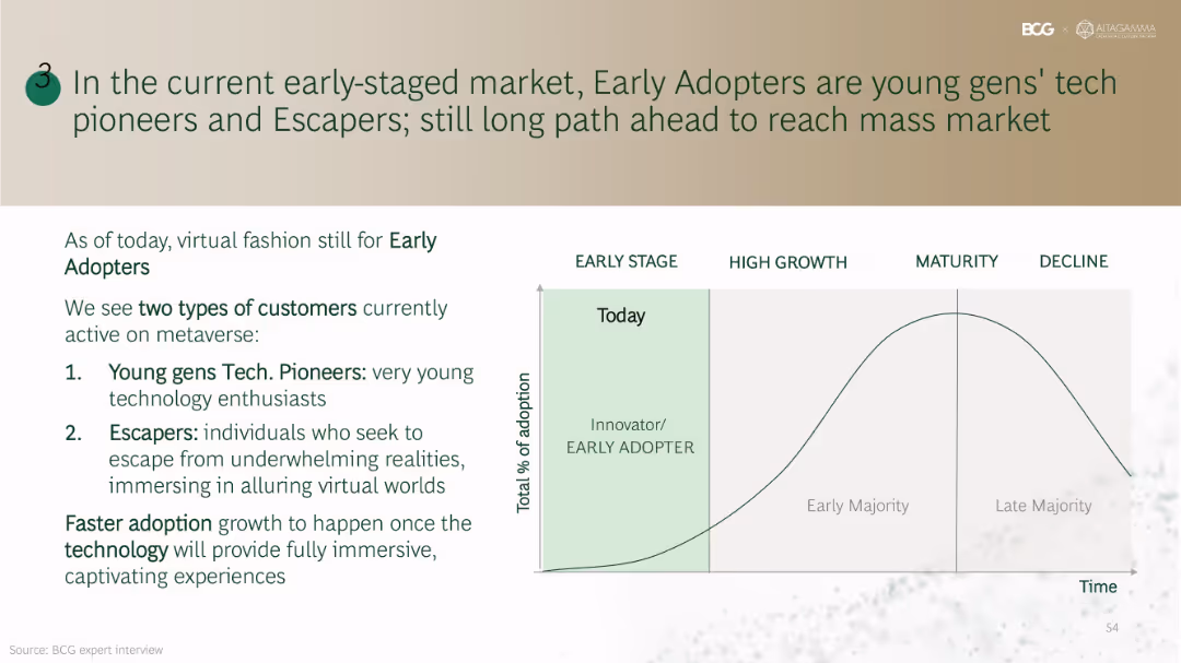
Left side lists customer personas (Tech Pioneers & Escapers); right side includes a classic innovation adoption curve from Early Stage to Decline with annotations.
Market Analysis and Trends
Consumer Goods
Defines current adopters of virtual fashion as tech-savvy young users and escapists seeking immersive experiences. Emphasizes that mass adoption will require advancements in immersive technologies and user experience quality.
early adopters, innovation curve, metaverse users, immersive experience, Gen Z, Escapers
false
Market Analysis and Trends
Consumer Goods
Mixed Chart
BCG
Add to my slides
Remove from favorites
Left-aligned text on white background; right side contains donut chart visualizing six AI user segments.
Customer and Market Segmentation
Technology & Software
Explains the segmentation of early AI adopters into six types: Protectors, Investigators, Creators, Trailblazers, Enjoyers, and Optimizers. Emphasizes the importance of tailoring brand strategies to the varying needs and motivations of each group.
early adopters, segmentation, AI personas, user behavior, brand strategy, Ipsos, generative AI
false
Customer and Market Segmentation
Technology & Software
Mixed Chart
IPSOS
Add to my slides
Remove from favorites
Slide presents column charts and statistics on early childhood education outcomes and hub participant engagement in playgroups.
Market Analysis and Trends
Education & Training
Analyzes the influence of community hubs on early childhood development, focusing on educational outcomes and parental support systems.
Early childhood, educational outcomes, community hubs, parental support, playgroups
false
Market Analysis and Trends
Education & Training
Multiple Chart
Deloitte
Add to my slides
Remove from favorites
This slide contains a bar chart showing various reasons for investing in early childhood, such as fairness and societal benefits, with different bars representing different reasons.
Market Analysis and Trends
Education & Training
The slide indicates that many people believe in the importance of investing in early childhood to ensure fairness and support societal well-being.
Early childhood, fairness, investment, bar chart, public opinion, Ipsos, education, development, survey
false
Market Analysis and Trends
Education & Training
Single Chart
IPSOS
Add to my slides
Remove from favorites
This slide contains a pie chart showing the perceived importance of early childhood on later life outcomes, with different segments representing levels of importance.
Market Analysis and Trends
Education & Training
The slide emphasizes that a significant majority (91%) believe early childhood is crucial for shaping future life, with various levels of importance highlighted.
Early childhood, importance, shaping life, pie chart, survey, Ipsos, education, development, UK
false
Market Analysis and Trends
Education & Training
Mixed Chart
IPSOS
Add to my slides
Remove from favorites
The slide features a bar chart illustrating public recognition of different life stages' importance in shaping future lives, with different bars representing various age ranges.
Market Analysis and Trends
Education & Training
It shows that there is varied recognition of the importance of different life stages in shaping future lives, with early childhood recognized less compared to other stages like primary school.
Early childhood, life stages, importance, bar chart, public opinion, Ipsos, education, development, survey
false
Market Analysis and Trends
Education & Training
Single Chart
IPSOS
Add to my slides
Remove from favorites
This slide shows a bar chart with percentages indicating public opinion on how early childhood affects various aspects of later life, such as mental health and relationships.
Market Analysis and Trends
Education & Training
It underscores that many believe early childhood significantly impacts mental health and well-being, as well as relationships and happiness.
Early childhood, mental health, impact, bar chart, public opinion, Ipsos, education, development, survey
false
Market Analysis and Trends
Education & Training
Single Chart
IPSOS
Add to my slides
Remove from favorites
The slide presents a bar chart with different statements on the benefits of investing in early childhood, highlighting mental health and other societal benefits.
Market Analysis and Trends
Education & Training
It emphasizes that investing in early childhood is seen as crucial for reducing future mental health issues and creating a happier society.
Early childhood, mental health, investment, bar chart, public opinion, Ipsos, education, development, survey
false
Market Analysis and Trends
Education & Training
Single Chart
IPSOS
Add to my slides
Remove from favorites
This slide presents a horizontal bar chart showing percentages of agreement with statements about the priority of early childhood in societal focus. Different bars represent different statements.
Market Analysis and Trends
Education & Training
The slide indicates that a significant portion of the public agrees that early childhood should be a top priority for society, with various levels of agreement on different statements.
Early childhood, societal focus, priority, horizontal bar chart, public opinion, Ipsos, education, development, survey
false
Market Analysis and Trends
Education & Training
Single Chart
IPSOS
Add to my slides
Remove from favorites
The slide features two horizontal bar charts comparing public opinion on the need for more support in early childhood development.
Market Analysis and Trends
Education & Training
It highlights that nearly half of the public believes there is insufficient support for early childhood development, with higher agreement among parents of young children.
Early childhood, support, development, horizontal bar chart, public opinion, Ipsos, education, parents, survey
false
Market Analysis and Trends
Education & Training
Single Chart
IPSOS
Add to my slides
Remove from favorites
This slide features moderate visual complexity, incorporating pie charts to reflect opinions on the timing of international assignments in one's career. It has a clear textual layout and uses a consistent color theme to present the statistics, making the data easily understandable.
Human Resources and Talent Management
Professional Services
The content discusses the demand for early mobility experiences and the lack thereof in many organizations. It suggests that timely international experiences can influence employees’ outlook on mobility and are crucial for developing a diverse leadership pipeline. The slide encourages organizations to offer such opportunities earlier.
Early mobility, Workforce development, Leadership pipeline, Timing
false
Human Resources and Talent Management
Professional Services
Multiple Chart
PwC/Strategy&
Add to my slides
Remove from favorites
Contains area graphs detailing funding stages (Seed to Series E+) over time, with text annotations regarding growth and investment trends.
Market Analysis and Trends
Financial Services
It showcases the growth in early-stage funding, indicating confidence in the Southeast Asian startup ecosystem. It's beneficial for discussing investment strategies and identifying emerging market opportunities.
Early-stage deals, Funding, SEA, Startup ecosystem, Investment trends, Series funding
false
Market Analysis and Trends
Financial Services
Multiple Chart
Bain
Add to my slides
Remove from favorites
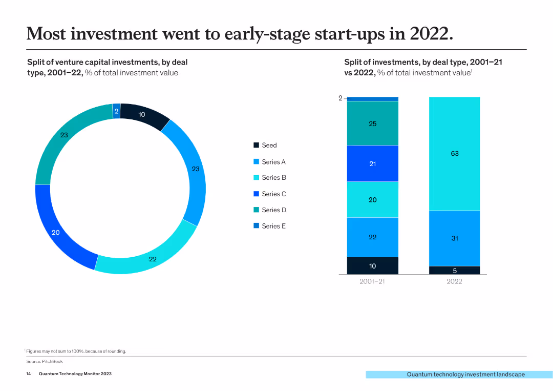
The slide includes a pie chart and a column chart. The pie chart shows the split of venture capital investments by deal type (Seed, Series A-E) from 2001-2022, and the column chart compares investment types between 2001-21 and 2022.
Investment Analysis
Financial Services
This slide illustrates that most investments in 2022 went to early-stage start-ups, with detailed breakdowns of investment types and their changes over time.
early-stage start-ups, venture capital, investment types, deal types, growth trends
false
Investment Analysis
Financial Services
Multiple Chart
McKinsey
Add to my slides
Remove from favorites
Includes line and scatter plots comparing earnings/coupon yield on a 60/40 portfolio and subsequent 10-year annualized returns.
Financial Performance
Financial Services
Analyzes the relationship between earnings/coupon yield on a 60/40 portfolio and future annualized returns over a period from 1985 to 2014.
earnings, coupon yield, portfolio, returns, annualized
false
Financial Performance
Financial Services
Multiple Chart
JP Morgan
Add to my slides
Remove from favorites
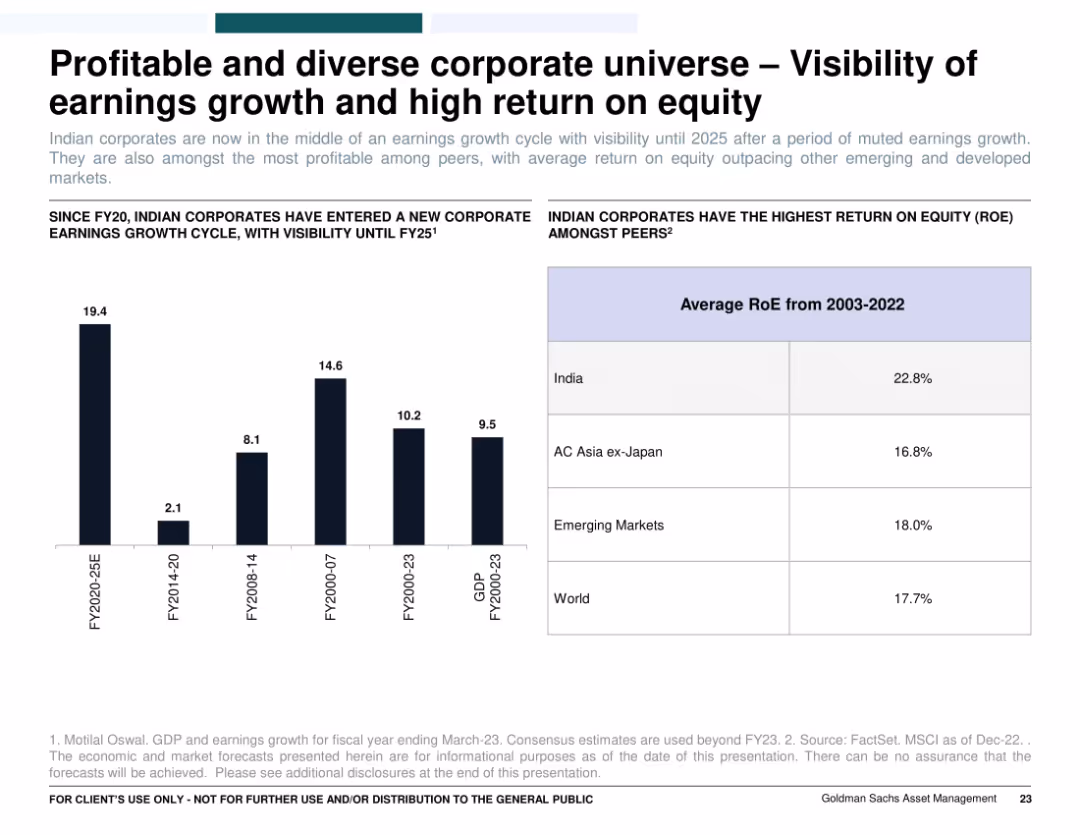
Two charts: left bar graph showing earnings cycles by fiscal year group, right table comparing average RoE across regions (India, Asia, World, EM). Clean design with blue highlights.
Strategic Planning
Financial Services
Shows that Indian corporations have entered a strong earnings growth cycle expected to continue to FY25. Also compares India's superior return on equity (RoE) to other global regions, positioning it as one of the most profitable investment destinations.
earnings cycle, RoE, India corporates, profitability, global comparison, FY25, earnings visibility
false
Strategic Planning
Financial Services
Mixed Chart
Goldman Sachs
Add to my slides
Remove from favorites
This slide includes two pie charts comparing the business mix and regional split of income between FY07 and FY19, using contrasting color schemes for clarity.
Market Analysis and Trends
Financial Services
Demonstrates the diversification of Macquarie's earnings by business type and geography over time, suggesting a strategic approach to revenue distribution. Intended for market analysts and investors.
earnings, diversity, business, geography, revenue, strategy, analysis, pie chart, market, investors
false
Market Analysis and Trends
Financial Services
Multiple Chart
Goldman Sachs
Add to my slides
Remove from favorites
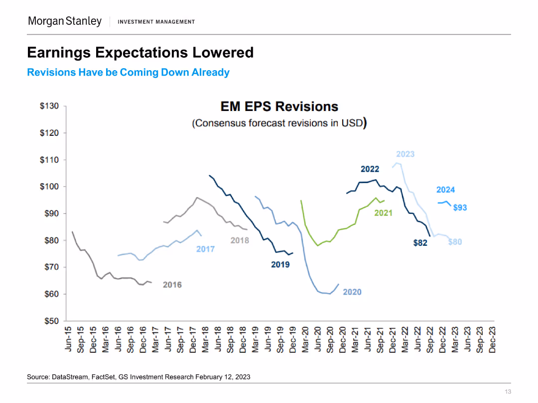
The slide shows a line chart depicting EM EPS Revisions in USD from 2015 to 2024, with projected values highlighted for 2023 and 2024. The chart includes several lines for different years.
Financial Performance
Financial Services
This slide details the revisions in earnings expectations for emerging markets, showing how projections have been adjusted downward in recent years.
Earnings Expectations, EM EPS, Financial Performance, Market Projections, Economic Forecast, Earnings Revision, Market Trends, EPS Analysis
false
Financial Performance
Financial Services
Single Chart
Morgan Stanley
Add to my slides
Remove from favorites
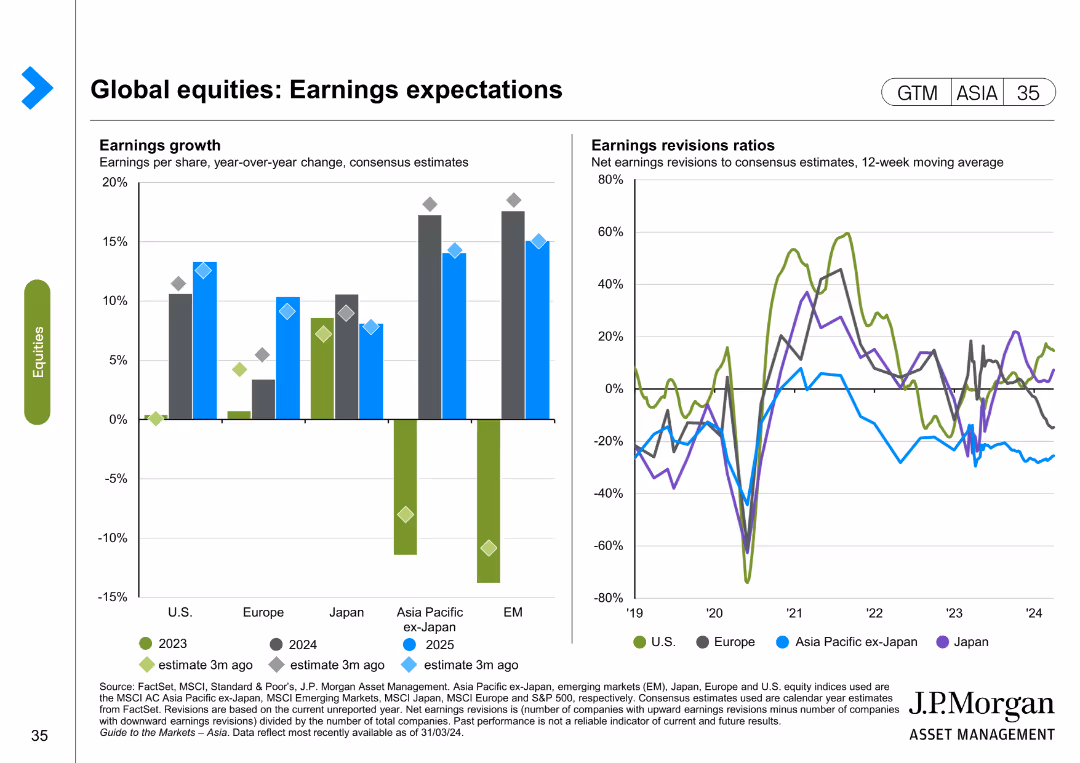
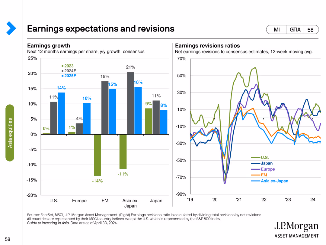
The slide includes two charts: a column chart for earnings growth and a line chart for earnings revisions ratios. The layout is detailed and moderately complex.
Investment Analysis
Financial Services
This slide presents expectations for global equity earnings, showing both growth projections and revisions ratios over recent periods.
earnings expectations, equity earnings, growth projections, earnings revisions, investment analysis
false
Investment Analysis
Financial Services
Multiple Chart
JP Morgan
Add to my slides
Remove from favorites
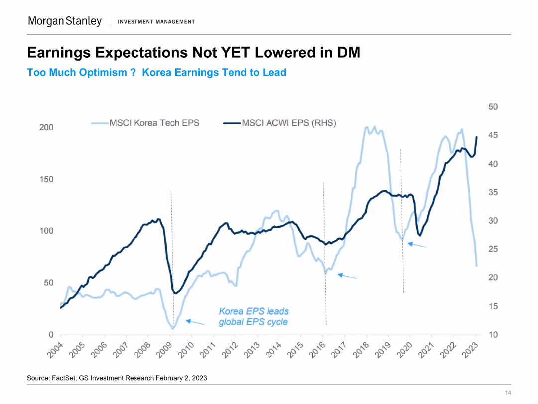
The slide features a line chart comparing MSCI Korea Tech EPS and MSCI ACWI EPS from 2004 to 2023. Two lines represent the earnings per share for each index over time.
Financial Performance
Financial Services
This slide discusses the earnings expectations in developed markets, highlighting Korea's earnings trends compared to global averages and noting optimism in projections.
Earnings Expectations, Korea EPS, MSCI, Developed Markets, Financial Performance, Market Trends, Tech Sector, EPS Comparison
false
Financial Performance
Financial Services
Single Chart
Morgan Stanley
Add to my slides
Remove from favorites
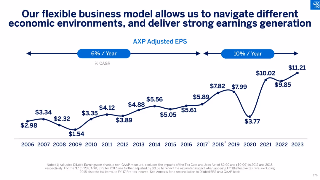
Line graph of adjusted EPS from 2006–2023 with CAGR annotations; economic cycle inflection points noted
Strategic Planning
Financial Services
Traces steady adjusted EPS growth over nearly two decades, highlighting business model flexibility and earnings consistency across economic cycles. Marks acceleration in earnings CAGR in the most recent years.
earnings growth, adjusted EPS, economic cycles, business model, CAGR, financial performance
false
Strategic Planning
Financial Services
Single Chart
McKinsey
Add to my slides
Remove from favorites
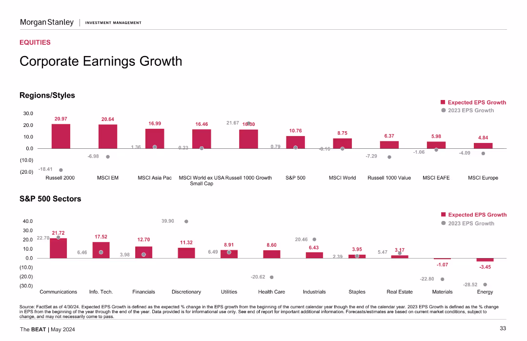
The slide shows a column chart with expected EPS growth for various regions/styles and another chart for S&P 500 sectors, highlighting differences in expected earnings growth.
Financial Performance
Financial Services
The slide provides an analysis of corporate earnings growth, comparing expected earnings across regions and sectors. Useful for investment strategies.
earnings growth, EPS, corporate earnings, regions, styles, S&P 500, sectors, financial performance
false
Financial Performance
Financial Services
Multiple Chart
Morgan Stanley
Add to my slides
Remove from favorites
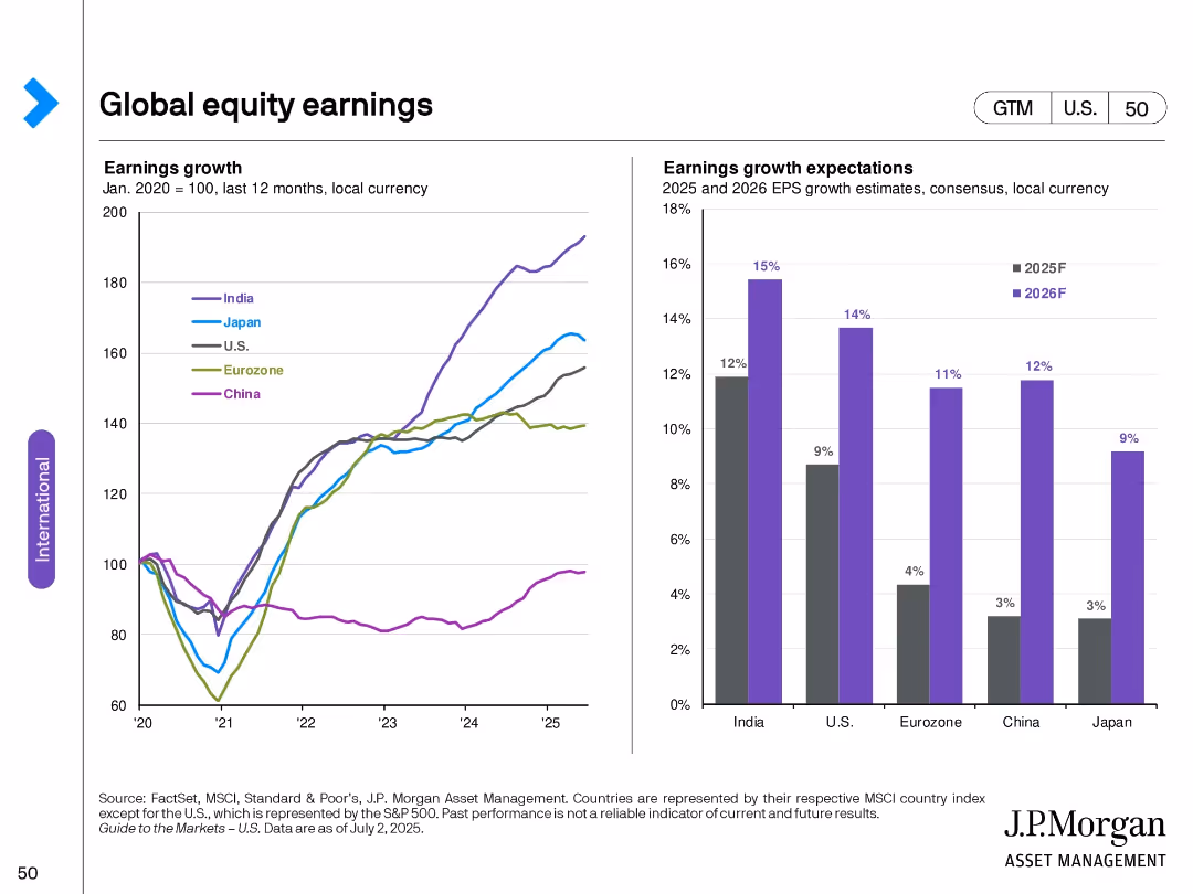
Dual chart layout: Left—indexed earnings growth by country; Right—bar chart of forecasted EPS growth (2025–2026).
Financial Performance
Financial Services
Displays historical earnings growth trends across key global regions and compares forward-looking EPS growth forecasts. India shows the strongest expected growth, with Japan and China lagging.
earnings growth, EPS forecast, regional comparison, financial outlook, 2025 projections, historical analysis
false
Financial Performance
Financial Services
Multiple Chart
JP Morgan
Add to my slides
Remove from favorites
Two sets of column charts showing expected EPS growth for various regions/styles and S&P 500 sectors. The slide is divided into different categories for comparison.
Financial Performance
Financial Services
This slide presents an analysis of corporate earnings growth, with expected EPS growth data segmented by regions/styles and S&P 500 sectors, providing insights into financial performance.
earnings, growth, EPS, sectors, regions
false
Financial Performance
Financial Services
Multiple Chart
Morgan Stanley
Add to my slides
Remove from favorites
Contains column charts comparing expected and 2022 EPS growth for various regions and S&P 500 sectors. The bars are color-coded for clarity, with labels clearly indicating the percentages. The layout is organized, allowing for quick visual comparisons.
Investment Analysis
Financial Services
Geared towards investment analysts, this slide provides insights into corporate earnings growth, contrasting expectations with actual growth across regions and sectors. It's key for evaluating company performances and future earning potentials, vital for crafting earnings-based investment strategies.
Earnings Growth, EPS, S&P 500, Regions, Sector Analysis
false
Investment Analysis
Financial Services
Multiple Chart
Morgan Stanley
Add to my slides
Remove from favorites
Two-column charts showing earnings growth expectations for the next 12 months and earnings revision ratios over a 12-week moving average for various regions.
Market Analysis and Trends
Financial Services
Analyzes earnings growth projections and recent revisions, providing insights into market expectations and changes in corporate earnings forecasts.
earnings growth, expectations, revisions, column charts, financial analysis, market projections, regional analysis, corporate earnings
false
Market Analysis and Trends
Financial Services
Multiple Chart
JP Morgan
Add to my slides
Remove from favorites
Sequential column charts showing the growth in pretax pre-provision earnings over different quarters.
Financial Performance
Financial Services
Reviews the growth in pretax earnings over time, highlighting effective financial management and earnings stability.
Earnings, Growth, Finance, Stability
false
Financial Performance
Financial Services
Single Chart
Barclays
Add to my slides
Remove from favorites
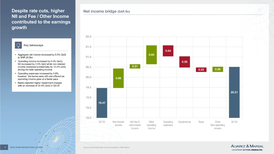
Left panel with bullet points; right side features a waterfall chart showing net income bridge components from Q2’24 to Q3’24.
Financial Performance
Financial Services
Explains net income growth through drivers such as higher net interest income, fee income, and other operating income, despite rising expenses and impairment charges. A waterfall chart visually tracks movement from Q2 to Q3.
earnings growth, NII, net income, impairments, fee income, operating income, Q3'24, cost structure, waterfall chart, SAR
false
Financial Performance
Financial Services
Mixed Chart
Alvarez & Marsal
Add to my slides
Remove from favorites
Features two column charts depicting earnings per share and operating income over several years. The design is straightforward and focused on data representation.
Financial Performance
Financial Services
Shows the consistent growth in earnings and operating income, fitting for financial reviews or shareholder meetings.
Earnings Growth, Operating Income, Financial Review, Shareholder Information
false
Financial Performance
Financial Services
Multiple Chart
Morgan Stanley
Add to my slides
Remove from favorites
Mixed chart types showing EBITDA and organic revenue growth, with an accompanying legend and notes.
Strategic Planning
Financial Services
Provides analysis of earnings growth linked to organic revenue increase.
Earnings growth, organic revenue, financial analysis, EBITDA, performance
false
Strategic Planning
Financial Services
Mixed Chart
Booz Allen Hamilton
Add to my slides
Remove from favorites
The slide displays two column charts, one illustrating EPS from FY14 to FY20, and the other showing operating income for the same period. The bars are shaded differently to indicate H1 and H2 for each fiscal year.
Financial Performance
Financial Services
Focused on Macquarie's earnings performance over several years, the slide reveals a positive trend in EPS and operating income, crucial for financial analysts and investors reviewing company performance.
earnings, growth, performance, financial, fiscal, income, EPS, trend, analysis, investors
false
Financial Performance
Financial Services
Multiple Chart
Goldman Sachs
Add to my slides
Remove from favorites
Dual chart layout: left side has a bar graph showing EPS growth; right side is a column chart of net FII and DII flows. Background is clean with clear fonts.
Financial Performance
Financial Services
The slide discusses the surge in earnings for the BSE Sensex Index and increased participation by Foreign Institutional Investors. It shows earnings per share reaching an all-time high and consistent net inflows from both foreign and domestic investors, reinforcing confidence in growth sustainability.
earnings growth, Sensex, FII, DII, EPS, investors, India, capital flows, FY2023, equity market
false
Financial Performance
Financial Services
Multiple Chart
Goldman Sachs
Add to my slides
Remove from favorites
The slide presents two complex scatter plots comparing industry performance and stability. It uses color-coded dots for different industries and banks.
Competitive Landscape
Financial Services
This visual comparison is used to showcase long-term earnings growth and stability within the banking sector, highlighting the company's superior performance.
earnings growth, stability, industry comparison, banks
false
Competitive Landscape
Financial Services
Multiple Chart
JP Morgan
Add to my slides
Remove from favorites
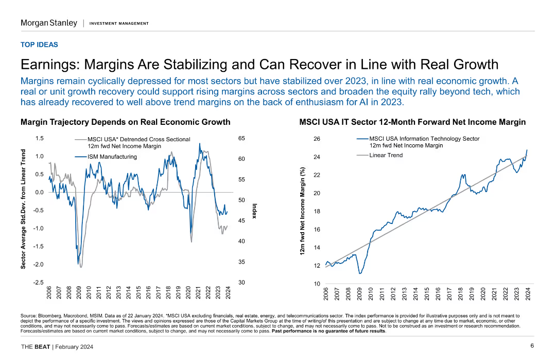
Two line charts illustrating margin trajectory based on real economic growth and MSCI USA IT sector 12-month forward net income margin.
Financial Performance
Financial Services
This slide analyzes the stabilization and potential recovery of earnings margins in relation to real economic growth, focusing on specific sector performance.
earnings, margins, economic growth, IT sector, financial performance
false
Financial Performance
Financial Services
Multiple Chart
Morgan Stanley
Add to my slides
Remove from favorites
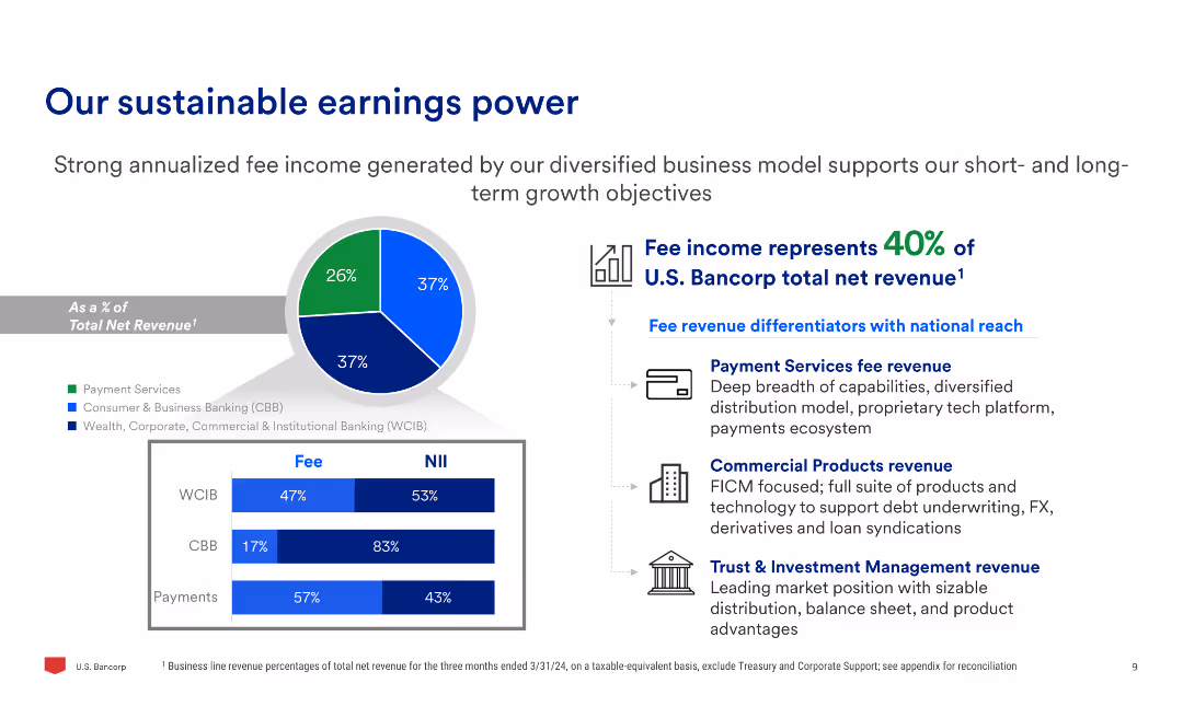
Includes a pie chart showing fee income composition and three bar charts detailing fee and net interest income (NII) breakdowns across three segments: WCIB, CBB, and Payments.
Financial Performance
Financial Services
Emphasizes the strength of U.S. Bancorp's diversified fee income, showing the percentage of total net revenue derived from different business segments, and outlines key revenue differentiators.
earnings, power, fee income, revenue, WCIB, CBB, payments, net interest income
false
Financial Performance
Financial Services
Multiple Chart
Barclays
Add to my slides
Remove from favorites
Contains column charts and highlighted statistical data, focusing on pre-provision profit and profitability ratios. The layout is structured to emphasize trends over time with subtle use of color gradients.
Financial Performance
Financial Services
Highlights Deutsche Bank's financial strength through key profitability metrics such as RoTE and CIR across recent halves. It details how revenue performance and nonoperating costs influence overall financial health.
earnings, profitability, financial metrics, RoTE, CIR
false
Financial Performance
Financial Services
Multiple Chart
Deutsche Bank
Add to my slides
Remove from favorites
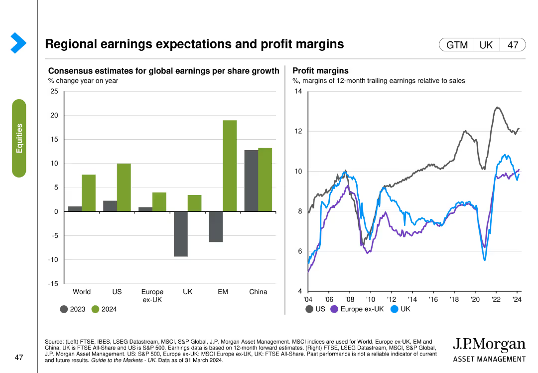
Two charts: one column chart shows consensus estimates for global earnings per share growth across regions, and one line chart shows profit margins over time.
Market Analysis and Trends
Financial Services
This slide provides insights into regional earnings expectations and profit margins, comparing various regions like US, Europe, and China.
Earnings, profit margins, regions, US, Europe, China
false
Market Analysis and Trends
Financial Services
Multiple Chart
JP Morgan
Add to my slides
Remove from favorites
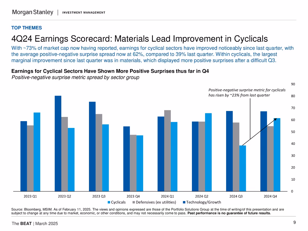
Vertical bar chart comparing cyclical, defensive, and tech earnings surprises by quarter. Blue tones for different sectors.
Financial Performance
Financial Services
The slide details Q4 2024 earnings, showing a notable rise in positive earnings surprises, particularly in cyclical sectors like materials. The spread between positive and negative earnings surprises has widened significantly from the previous quarter.
earnings, Q4, cyclical sectors, materials, positive surprise, defensives, technology, growth
false
Financial Performance
Financial Services
Single Chart
Morgan Stanley
Add to my slides
Remove from favorites
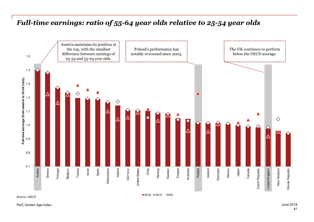
Column chart depicting the ratio of full-time earnings between 55-64 year olds and 25-54 year olds in various countries.
Financial Performance
Professional Services
The slide compares the full-time earnings of older adults to those of younger adults across different countries over three periods (2003, 2015, 2016).
earnings, ratio, age comparison, full-time, OECD, trend
false
Financial Performance
Professional Services
Single Chart
PwC/Strategy&
Add to my slides
Remove from favorites
This slide has two column charts side by side, each chart represents earnings volatility over different time periods (5 years and 15 years). It uses a grayscale color scheme, with the bar for Macquarie highlighted in green. The text and legends are clearly readable, following a structured layout.
Financial Performance
Financial Services
The slide compares Macquarie's earnings volatility to that of other institutions over 5 and 15 years. It's used for demonstrating Macquarie's stability in earnings relative to other global and domestic investment banks, asset managers, and major banks, especially including periods of financial crises like the GFC.
earnings, volatility, Macquarie, comparison, financial stability, investment banks, asset managers, global, domestic, GFC
false
Financial Performance
Financial Services
Multiple Chart
Morgan Stanley
Add to my slides
Remove from favorites
This slide includes column charts comparing satellite imagery market worldwide and other diagrams detailing market shares in various segments. The layout is dense with multiple visual elements including charts, legends, and text annotations.
Market Analysis and Trends
Environmental Services & Sustainability
The slide discusses the global market trends in the Earth Observation downstream industry, highlighting market sizes, growth rates, and market shares among major companies and technologies. It’s useful for analyzing market dynamics and predicting future industry movements.
Earth Observation, market trends, satellite imagery, global market, growth rates, market shares
false
Market Analysis and Trends
Environmental Services & Sustainability
Multiple Chart
PwC/Strategy&
Add to my slides
Remove from favorites
Features text blocks explaining the concept, alongside images and diagrams of satellites and data processing.
Market Analysis and Trends
Technology & Software
Provides an introduction to Earth Observation, describing technologies used and their applications in monitoring Earth.
Earth observation, satellites, data processing, technology introduction
false
Market Analysis and Trends
Technology & Software
Vertical Flow
PwC/Strategy&
Add to my slides
Remove from favorites
This slide features a two-column layout. The left side lists key takeaways in bullet points. The right side contains a column chart detailing economic impacts.
Regulatory and Compliance
Government & Public Sector
Covers the use of Earth Observation for security purposes, benefits of satellite data in surveillance, and economic impacts of such technology in Europe.
Earth Observation, surveillance, satellite data, economic impact, security applications
false
Regulatory and Compliance
Government & Public Sector
Mixed Chart
PwC/Strategy&
Add to my slides
Remove from favorites
Flow chart and images detail the value chain from satellite manufacturing to end-user services, with a focus on Earth Observation.
Market Analysis and Trends
Technology & Software
Discusses the stages of the Earth Observation value chain and its economic implications across different sectors.
Earth observation, value chain, economic impact, data services
false
Market Analysis and Trends
Technology & Software
Vertical Flow
PwC/Strategy&
Add to my slides
Remove from favorites
Stacked bar chart by industry; reasons for satisfaction coded by color (ease of use, speed, design, offers, overall)
Performance Metrics and KPIs
Technology & Software
The slide outlines key reasons for digital satisfaction. Ease of use is the most cited factor across all industries, followed by speed and attractive design. Each bar shows the breakdown of reasons given by satisfied users, with Banking customers valuing speed most and Apparel customers influenced by offers.
ease of use, digital satisfaction, mobile design, app speed, customer experience, performance drivers, KPIs
false
Performance Metrics and KPIs
Technology & Software
Single Chart
McKinsey
Add to my slides
Remove from favorites
Pie charts, bar chart by country, text insights, blue/gray chart visuals
Operational Efficiency
Transportation & Logistics
Eastern Europe sees 11% of total volume from private sources, focused on Poland and the Czech Republic. Private investment especially targets locomotives and coaches/wagons.
Eastern Europe, private finance, Czech Republic, Poland, regional share, locomotives, wagons
false
Operational Efficiency
Transportation & Logistics
Multiple Chart
Roland Berger
Add to my slides
Remove from favorites
Two column charts show Eaton's segment operating margin and sales from 2000 to 2018, across different business divisions like Electrical Products and Hydraulics.
Financial Performance
Technology & Software
Tracks profitability changes in Eaton’s various business divisions over nearly two decades, useful for financial analysis and strategy planning.
Eaton, profitability, sales, financial analysis
false
Financial Performance
Technology & Software
Multiple Chart
Deutsche Bank
Add to my slides
Remove from favorites
Contains three sections labeled "Eaton Past," "Eaton Today," and "Eaton Future," each with images depicting each era's focus on technology and digital solutions.
Strategic Planning
Technology & Software
Discusses Eaton's strategic transition from a vehicle component manufacturer to a focus on power management and future digital solutions.
Eaton, strategy, growth, technology, digital solutions
false
Strategic Planning
Technology & Software
Header Horizontal
Deutsche Bank
Add to my slides
Remove from favorites
Two pie charts compare Eaton's business and revenue segmentation from 2008 and 2018, showcasing growth and shifts in business strategy.
Financial Performance
Technology & Software
Illustrates Eaton's financial and structural changes over a decade, focusing on capital deployment and revenue growth, highlighting shifts towards more profitable sectors.
Eaton, transformation, revenue, growth, business strategy
false
Financial Performance
Technology & Software
Multiple Chart
Deutsche Bank
Add to my slides
Remove from favorites
Final part of CET1 depletion data per bank. Bar chart format, consistent with previous slides. Also includes data on Nordic, Eastern, and Southern European banks.
Risk Assessment and Management
Financial Services
The table wraps up bank-level CET1 depletion analysis, highlighting best-performing institutions like Länsförsäkringar Bank and Caixa Geral. Compares 2023 to 2021 values and shows quadrant rankings. Reinforces disparities in stress resilience across EU banks.
EBA 2023, CET1 impact, stress comparison, Nordic banks, Eastern Europe, resilient banks
false
Risk Assessment and Management
Financial Services
Single Chart
Alvarez & Marsal
Add to my slides
Remove from favorites
Four vertical columns with dark blue circular icons and titles. Bullet points in each section. White background with light blue headings. Visual separation between segments.
Risk Assessment and Management
Financial Services
This slide summarizes the key findings from the 2023 EBA stress test. It outlines capital depletion impacts, banks’ resilience, country-specific insights, and upcoming stress test initiatives like cyber and climate stress. Emphasis is placed on capital flexibility and potential for dividends and buybacks.
EBA, stress test, CET1, capital depletion, resilience, country impact, ECB, 2023 results
false
Risk Assessment and Management
Financial Services
Pillar
Alvarez & Marsal
Add to my slides
Remove from favorites
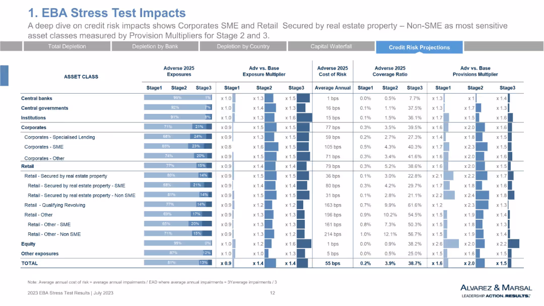
Data-dense table with horizontal bar visuals showing adverse 2025 exposures, multipliers, risk cost, and provision multipliers across asset classes. Uses shades of blue and structured rows/columns.
Risk Assessment and Management
Financial Services
This slide presents a detailed breakdown of EBA stress test impacts, highlighting corporate SME and retail assets secured by real estate as the most sensitive categories. It evaluates exposures and risk multipliers across stages and asset classes, emphasizing cost of risk and provision coverage. The structure supports a comparative view of risk metrics under adverse scenarios.
EBA stress test, credit risk, exposures, provision multipliers, cost of risk, corporates, SME, retail, asset class, financial stress
false
Risk Assessment and Management
Financial Services
Multiple Chart
Alvarez & Marsal
Add to my slides
Remove from favorites
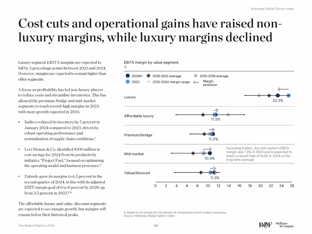
Right-side dot plot shows EBITA margins by segment. Left text details margin evolution and cost-saving efforts.
Performance Metrics and KPIs
Retail & E-commerce
The slide contrasts margin trends across fashion segments. Non-luxury EBITA margins rise due to cost-cutting and operational gains, while luxury margins decline despite remaining above average. Companies like Inditex and Levi's drive improvement.
EBITA, margins, cost savings, supply chain, segment analysis, operational gains, profitability, fashion strategy, luxury vs non-luxury
false
Performance Metrics and KPIs
Retail & E-commerce
Mixed Chart
McKinsey
Add to my slides
Remove from favorites
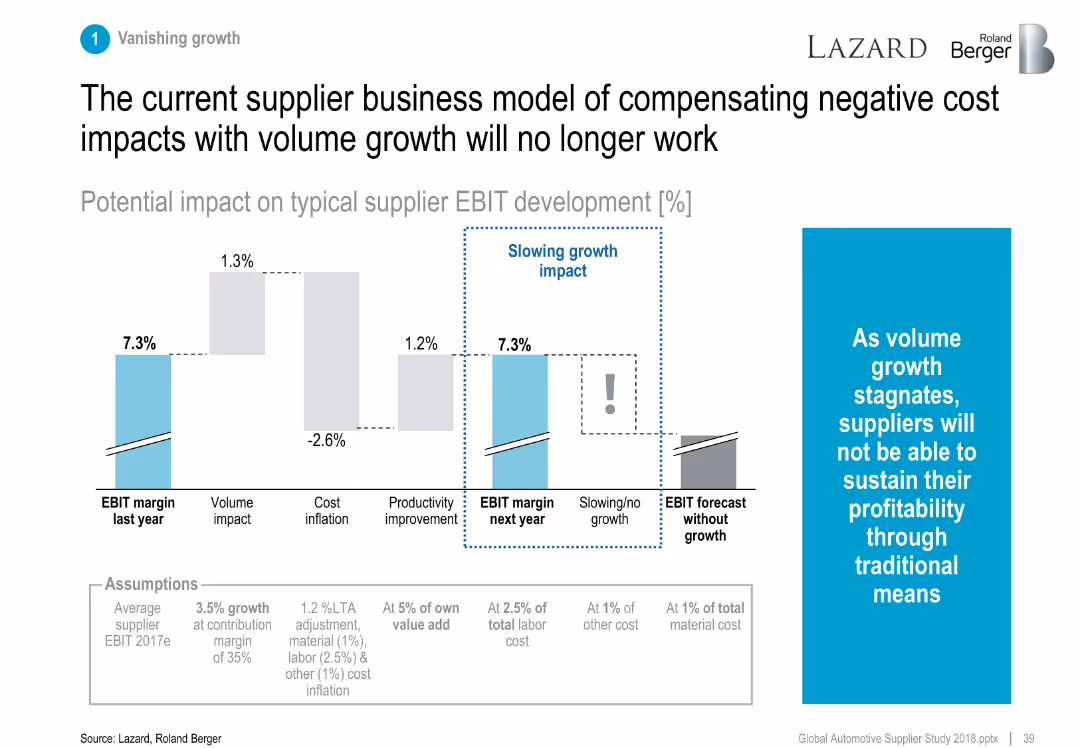
Bar chart showing EBIT impact breakdown from growth, cost, and productivity.
Financial Performance
Industrial & Manufacturing
Demonstrates that stagnating volume growth will challenge supplier profitability, making traditional margin offsets ineffective.
EBIT, cost inflation, productivity, volume growth, supplier margins
false
Financial Performance
Industrial & Manufacturing
Mixed Chart
Roland Berger
Add to my slides
Remove from favorites
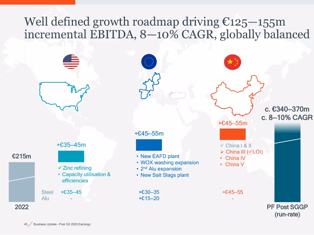
World map with regional callouts (US, EU, China) in color-coded boxes, bar charts showing EBITDA growth, CAGR curve at right side.
Strategic Planning
Industrial & Manufacturing
Outlines expected EBITDA growth across US, EU, and China from zinc refining, EAFD plants, and expansion projects, projecting €125–155m in incremental EBITDA and 8–10% CAGR globally.
EBITDA, CAGR, expansion, zinc refining, EAFD, global growth, EU, China, US
false
Strategic Planning
Industrial & Manufacturing
Mixed Chart
Goldman Sachs
Add to my slides
Remove from favorites
The slide contains a complex column and line chart, with the bars in multiple shades of blue representing EBITDA versus cash generated, and a line representing the percentage. There are also explanatory notes below the chart and a text block to the right detailing the conversion of EBITDA to cash flow.
Financial Performance
Financial Services
It offers an in-depth analysis of EBITDA relative to cash flow, including historical data and conversion rates, suitable for financial experts or stakeholders analyzing the company's financial efficiency and performance over time.
EBITDA, Cash Flow, Conversion, Financial Analysis, Historical Data, Operational Activities
false
Financial Performance
Financial Services
Single Chart
Goldman Sachs
Add to my slides
Remove from favorites
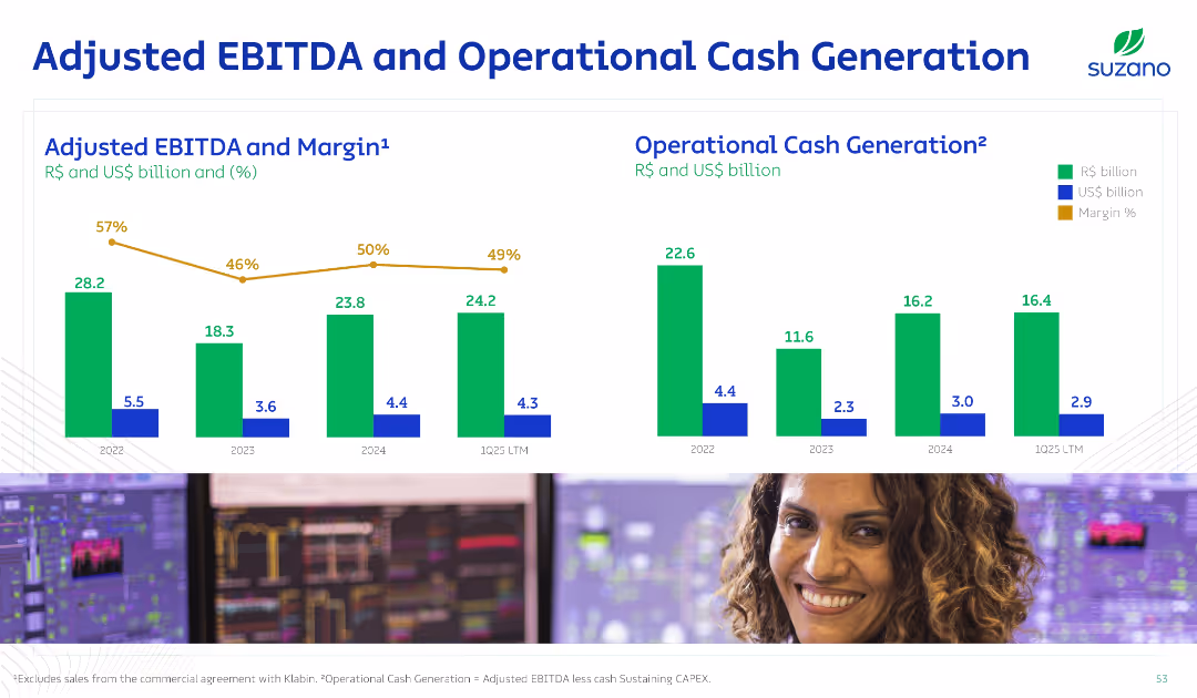
Two side-by-side bar charts for EBITDA and cash generation, with trend lines for margin %, using green for R$ and blue for US$; employee image at bottom.
Financial Performance
Consumer Goods
The slide presents Suzano's adjusted EBITDA and operational cash generation over four time periods, showing trends in profitability and operational efficiency. Margin percentages are highlighted, indicating financial resilience.
EBITDA, Cash Flow, Margin, Financials, Operations
false
Financial Performance
Consumer Goods
Single Chart
Goldman Sachs
Add to my slides
Remove from favorites
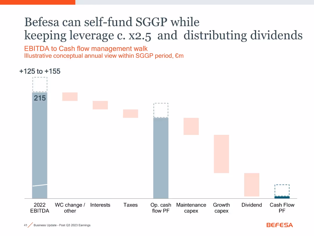
Waterfall chart showing EBITDA to cash flow use; pastel and gray blocks illustrate spending allocation
Financial Performance
Financial Services
Demonstrates Befesa's ability to self-fund SGGP investments with ~€125–155m from EBITDA while maintaining leverage and paying dividends. Covers operational and growth capex plus dividend flow.
EBITDA, cash flow, SGGP, dividends, leverage, capex, financial planning
false
Financial Performance
Financial Services
Single Chart
Goldman Sachs
Add to my slides
Remove from favorites
Line graph showing the impact on EBITDA over time, comparing high performing transformations to median results.
Financial Performance
Financial Services
Evaluates the financial impact of high performing transformations on EBITDA over time.
EBITDA, financial, transformation, impact, performance
false
Financial Performance
Financial Services
Single Chart
McKinsey
Add to my slides
Remove from favorites
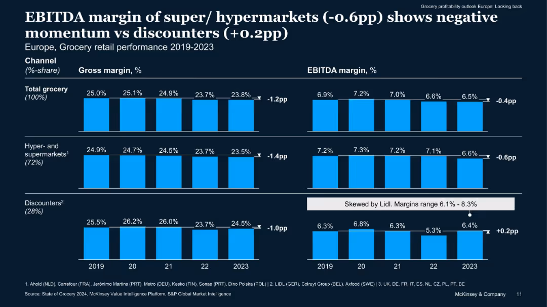
Dual-panel bar chart showing gross and EBITDA margins from 2019 to 2023 for total grocery, hyper/supermarkets, and discounters. Clean dark background with blue bars.
Financial Performance
Retail & E-commerce
The slide presents trends in gross and EBITDA margins for European grocery retail from 2019–2023, showing discounters improving margins while hypermarkets declined. The shift indicates a competitive advantage for discounters amid inflationary pressures.
EBITDA, gross margin, discounters, hypermarkets, trends, retail, Europe
false
Financial Performance
Retail & E-commerce
Multiple Chart
McKinsey
Add to my slides
Remove from favorites
The slide displays a column chart depicting semi-annual EBITDA over multiple years. It includes a large blue circle highlighting a recent increase, with a clear and simple layout focusing on financial performance.
Financial Performance
Financial Services
This slide presents the EBITDA growth over the years, highlighting strong earnings growth, particularly in the most recent period. It's designed to communicate financial health and performance trends to stakeholders.
EBITDA, growth, financial performance, mining, earnings, profitability
false
Financial Performance
Financial Services
Single Chart
Morgan Stanley
Add to my slides
Remove from favorites
Previous
Next
You don't have any favorites yet.
Please wait loading your favorites slides...
Create a FREE account to continue browsing
Receive Instant Access to 1,000+ slides from companies like McKinsey, Google, and Goldman Sachs
First Name
Last Name
Email
Password
I agree to all
Terms & Privacy Policy
Thank you! Your submission has been received!
Oops! Something went wrong while submitting the form.
Have an account?
Sign in
Upgrade to PRO to Save slides
Advanced Search and Filters
Access to 15,000+ slides
Access to Category Pages
Save/Bookmark Slides
PowerPoint Template Library
Pick a Plan
MONTHLY
$12/month
Billed every month, Cancel anytime.
YEARLY
$9/year
Billed $108 annually, Cancel anytime.
Checkout for $12/month
Checkout for $108/yr
Secured by Stripe | AES-256 bit encryption