My Account
My Slides
Search by Category
Companies
Slide Type
Use Case
Industry
Pricing
Templates
View All Templates
Download Template Slides
✦ AI
AI Prompt Library
AI Search
Feedback
Login
Logout
Get Started
Browse all Slides
Browse all Slides
Create a FREE Account
Instant access to 1,000+ real slides from top companies like McKinsey, BCG, Goldman Sachs, Google and many more!
First Name
Last Name
Email
Password
I agree to all
Terms & Privacy Policy
Thank you! Your submission has been received!
Oops! Something went wrong while submitting the form.
Have an account?
Sign in
Saved Slides
Total No. of slides saved
0
↻ Refresh
✖ Clear all
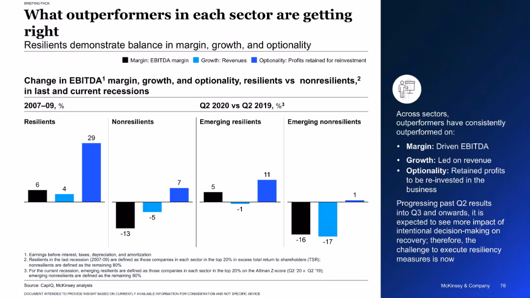
Split chart showing EBITDA, revenue, and reinvestment changes for resilient and non-resilient firms across recessions
Performance Metrics and KPIs
Professional Services
This slide highlights the traits of outperforming companies in past and current recessions. It compares resilient and non-resilient firms on margin, growth, and optionality, showing that resilient companies consistently excel in all three metrics.
EBITDA, growth, resilience, recession, company performance
false
Performance Metrics and KPIs
Professional Services
Mixed Chart
McKinsey
Add to my slides
Remove from favorites
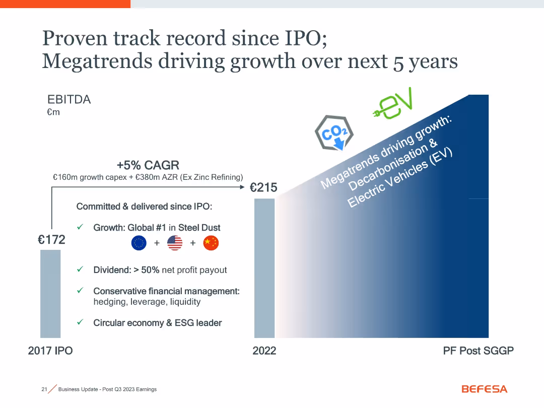
Bar chart showing EBITDA growth from 2017 to 2022 and future outlook, annotated with strategic highlights and trend icons (EV, CO2).
Financial Performance
Industrial & Manufacturing
This slide presents EBITDA growth since the company’s IPO, citing +5% CAGR and major strategic drivers like decarbonization and EV growth. It includes key financial management practices and market leadership in steel dust recycling.
EBITDA, IPO, CAGR, decarbonisation, EV, financial growth, steel dust
false
Financial Performance
Industrial & Manufacturing
Single Chart
Goldman Sachs
Add to my slides
Remove from favorites
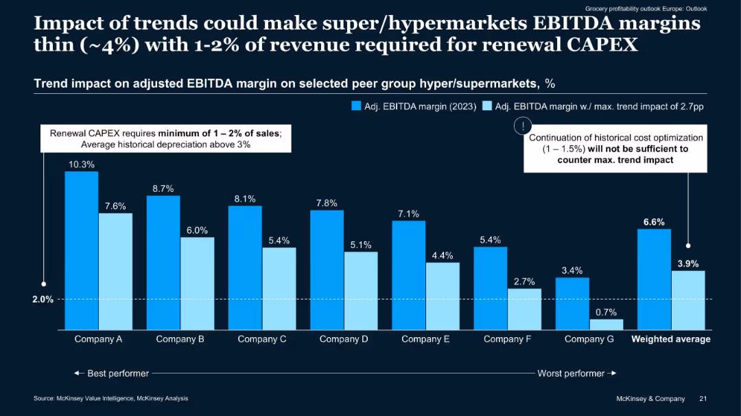
Clustered bar chart comparing 2023 adjusted EBITDA margins vs trend-adjusted margins across 7 companies.
Financial Performance
Retail & E-commerce
Demonstrates potential EBITDA margin erosion for hyper/supermarkets under current trends. Even high-performing companies could fall below sustainability thresholds unless new efficiencies are found. Renewal CAPEX adds further financial strain.
EBITDA margin, CAPEX, cost pressure, hypermarkets, financial outlook
false
Financial Performance
Retail & E-commerce
Single Chart
McKinsey
Add to my slides
Remove from favorites
Bar graphs and case studies showcasing the EBITDA of market leaders in distribution, emphasizing the importance of relative market share (RMS).
Market Analysis and Trends
Financial Services
The slide demonstrates the correlation between high relative market shares and better performance in distribution businesses, using vehicle parts and safety equipment case studies.
EBITDA, market leaders, distribution, relative market share, RMS, vehicle parts, safety equipment
false
Market Analysis and Trends
Financial Services
Single Chart
EY
Add to my slides
Remove from favorites
The slide features a complex line chart tracking the EBITDA multiples over time for different industry sectors. There are four lines representing the medians for Food & Beverage, Industrials, Utilities, and Diversified sectors. Tables with key statistics are positioned at the top right.
Market Analysis and Trends
Technology & Software
This slide presents market performance data for process automation companies, indicating trading ranges of EBITDA multiples and comparing sectors. Useful for financial and market trend analysis.
EBITDA, Market Performance, Process Automation, Financial Analysis, Industry Comparison, Trading Ranges, Sector Median, Utilities, Industrials
false
Market Analysis and Trends
Technology & Software
Single Chart
LEK
Add to my slides
Remove from favorites
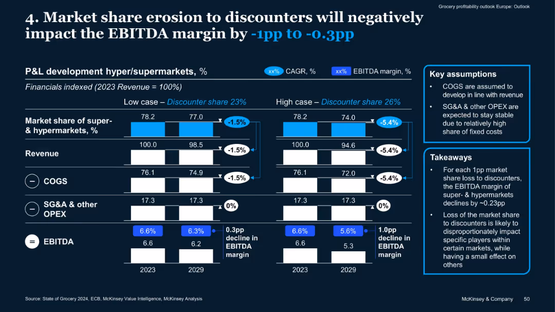
Dual scenario bar charts, revenue/COGS/SG&A breakdowns, key assumptions and takeaways in side boxes
Financial Performance
Retail & E-commerce
This slide analyzes how market share loss to discounters affects EBITDA margin of supermarkets/hypermarkets. In high and low scenarios, a 1–5.4% drop in revenue translates to 0.3–1.0pp EBITDA margin decline, driven mainly by lost volume.
EBITDA, market share, discounters, COGS, OPEX, revenue impact, margin
false
Financial Performance
Retail & E-commerce
Mixed Chart
McKinsey
Add to my slides
Remove from favorites
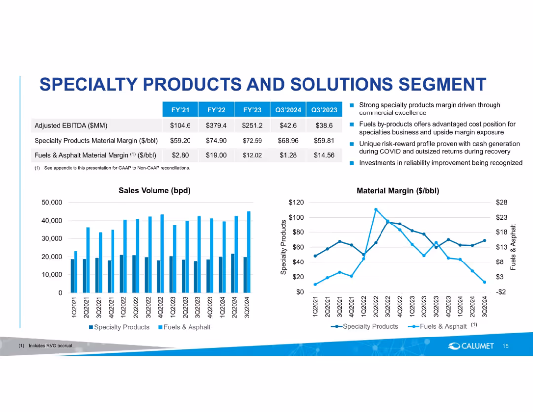
Two-panel slide with data tables, bullet points, and dual graphs (bar and line chart) on white background with blue accents.
Financial Performance
Energy & Utilities
Compares specialty and fuels & asphalt material margins across fiscal years and quarters. Highlights key performance drivers like commercial excellence, risk profiles, and investment impacts, with supporting sales and margin data.
EBITDA, material margin, sales volume, specialty products, fuels, asphalt, quarterly data, margin comparison, performance drivers
false
Financial Performance
Energy & Utilities
Multiple Chart
Goldman Sachs
Add to my slides
Remove from favorites
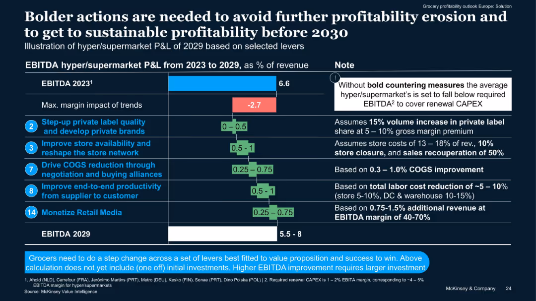
Horizontal bar chart with margin impacts, accompanied by numeric and note columns. Blue, green, and red color-coded bars.
Financial Performance
Retail & E-commerce
Shows projected EBITDA changes for hyper/supermarkets from 2023 to 2029 based on five key levers. Highlights a -2.7% margin trend risk without bold action, and outlines the potential upside of selected strategic initiatives.
EBITDA, private label, store network, COGS, productivity, retail media
false
Financial Performance
Retail & E-commerce
Mixed Chart
McKinsey
Add to my slides
Remove from favorites
A flow chart showing the relationship between product complexity and EBITDA margin across different industries.
Product and Service Analysis
Financial Services
Compares EBITDA margins for less complex and more complex products, highlighting the impact of technical support.
EBITDA, Product Complexity, Technical Support, Margins, Distribution
false
Product and Service Analysis
Financial Services
Linear Flow
EY
Add to my slides
Remove from favorites
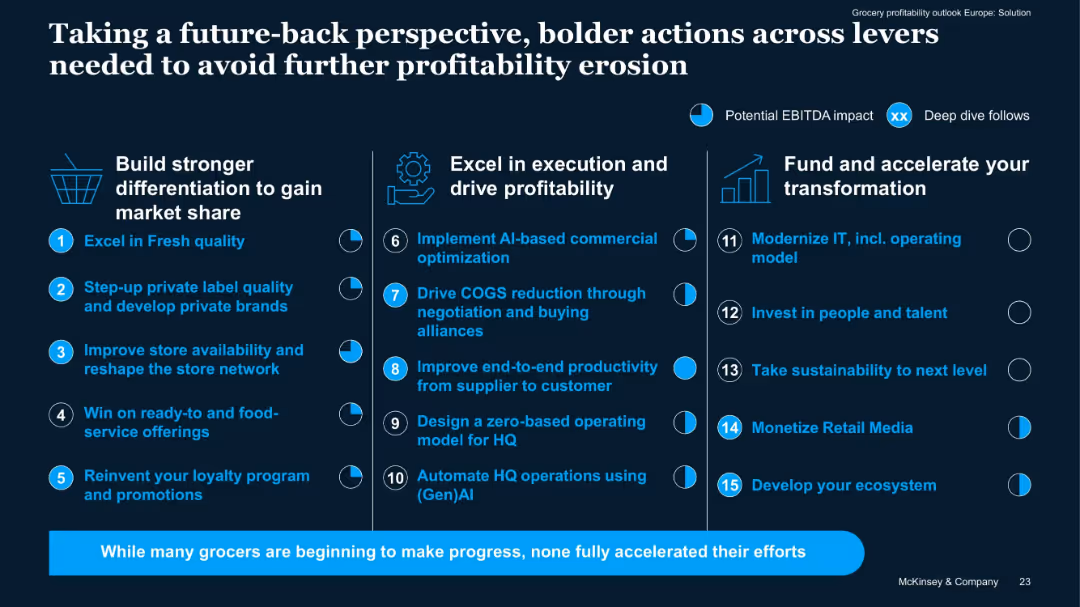
Three-column layout with icons and numbered action items. Blue and white on dark background. Circles highlight EBITDA impact and deep dives.
Strategic Planning
Retail & E-commerce
Outlines 15 action levers across three areas—differentiation, profitability, and transformation—to avoid profit erosion and drive future growth. Highlights areas with potential EBITDA impact and deep dives.
EBITDA, profitability, transformation, grocery, strategy, levers, AI, automation, IT, loyalty
false
Strategic Planning
Retail & E-commerce
Single Chart
McKinsey
Add to my slides
Remove from favorites
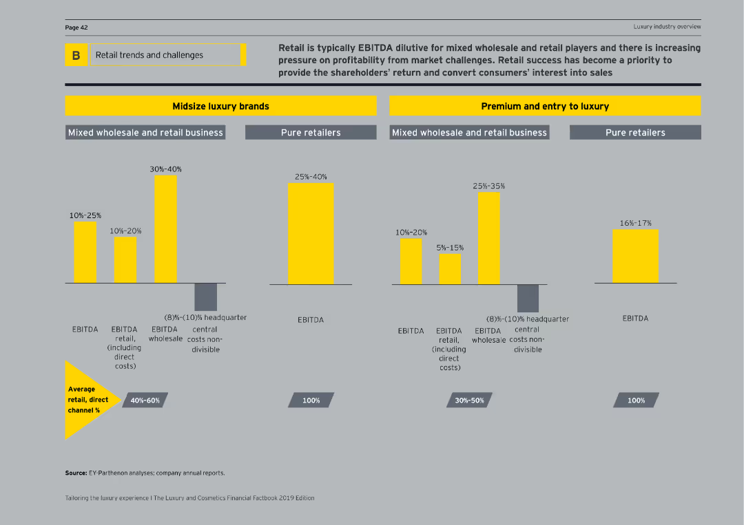
Displays various bar charts comparing EBITDA percentages for midsize luxury brands and premium/entry-to-luxury segments across different business models.
Market Analysis and Trends
Retail & E-commerce
Discusses the EBITDA impact on retail business models within midsize luxury brands and premium/entry-to-luxury segments, highlighting profitability.
EBITDA, retail business, luxury brands, premium, entry-to-luxury, profitability, business models, bar charts, market analysis
false
Market Analysis and Trends
Retail & E-commerce
Multiple Chart
EY
Add to my slides
Remove from favorites
A column chart compares the EBITDA multiple of global education companies in 2013. A dashed line represents the typical valuation size of standalone education assets.
Financial Performance
Education & Training
The slide is used to compare the EBITDA multiples of various education companies, showcasing the superior returns offered by education platforms compared to the typical valuation of standalone assets. It's useful for demonstrating the financial advantages of investing in the education sector.
EBITDA, Returns, Investors, Education, Valuation, Companies, Comparison
false
Financial Performance
Education & Training
Single Chart
EY
Add to my slides
Remove from favorites
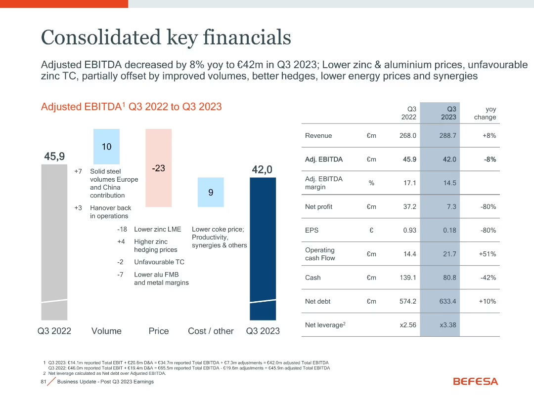
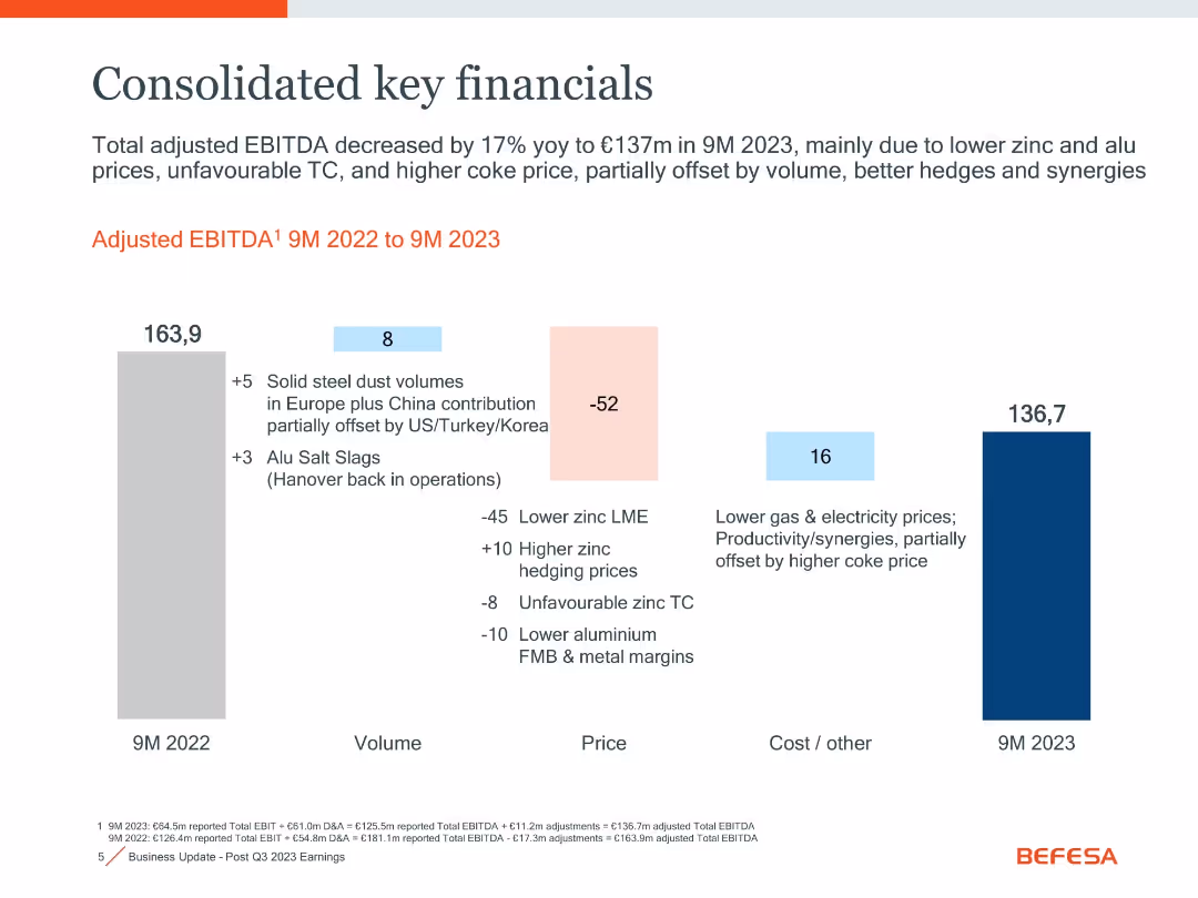
Waterfall chart on left; financial table on right
Financial Performance
Financial Services
This slide summarizes Befesa’s Q3 2023 financial performance, including revenue, EBITDA, cash flow, and profit metrics, with year-over-year comparisons.
EBITDA, Revenue, Cash Flow, Financials, Profit, Q3 2023
false
Financial Performance
Financial Services
Mixed Chart
Goldman Sachs
Add to my slides
Remove from favorites
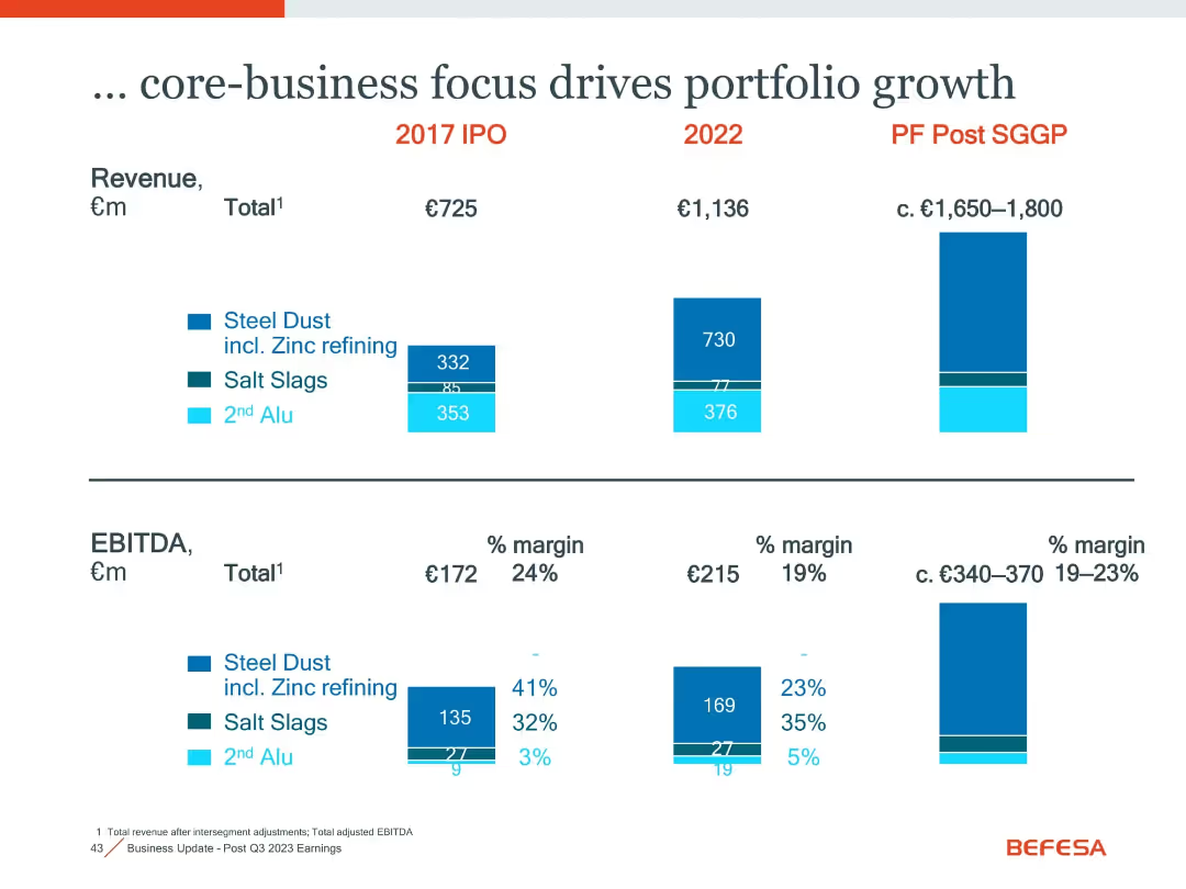
Bar charts showing revenue and EBITDA across 2017, 2022, and post-SGGP; includes % margins and segment splits
Strategic Planning
Financial Services
Highlights revenue and EBITDA growth by business segment over time. Shows strengthened steel dust focus and margin trends while maintaining balanced growth across salt slags and secondary aluminium.
EBITDA, revenue, core business, steel dust, salt slags, portfolio growth, SGGP
false
Strategic Planning
Financial Services
Multiple Chart
Goldman Sachs
Add to my slides
Remove from favorites
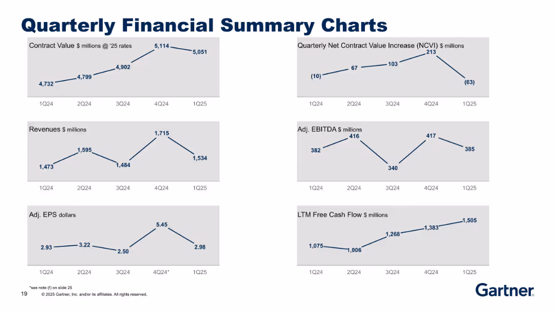
Grid of six line charts with a clean, minimalist design on a grey background, each showing quarterly data trends (1Q24–1Q25). Title is bold and centered at the top.
Financial Performance
Technology & Software
Presents Gartner's financial performance across six metrics: Contract Value, NCVI, Revenues, Adjusted EBITDA, Adjusted EPS, and LTM Free Cash Flow. Displays quarter-over-quarter trends to highlight financial health and changes in momentum.
EBITDA, revenue, earnings, contract value, cash flow, financial trends
false
Financial Performance
Technology & Software
Multiple Chart
Gartner
Add to my slides
Remove from favorites
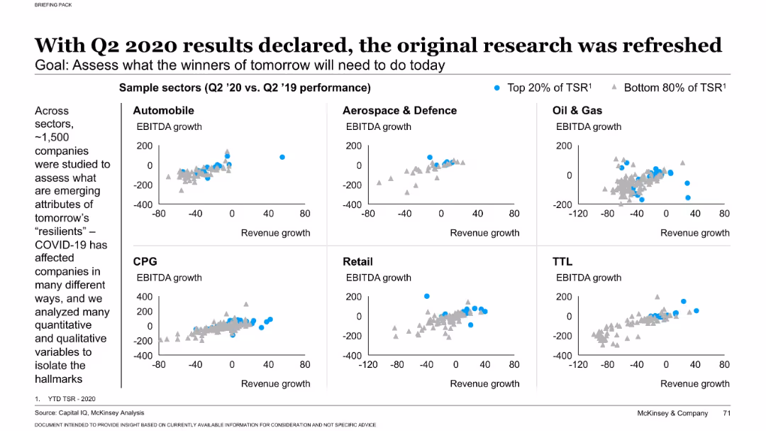
Left-aligned narrative; right grid of scatter plots by industry sectors showing EBITDA vs revenue growth
Performance Metrics and KPIs
Professional Services
This slide analyzes how companies across six sectors performed during COVID-19 by plotting revenue vs. EBITDA growth. Companies in the top 20% of Total Shareholder Return (TSR) are highlighted, showing emerging patterns among resilient firms post-pandemic.
EBITDA, revenue, sector performance, COVID-19 impact, TSR
false
Performance Metrics and KPIs
Professional Services
Multiple Chart
McKinsey
Add to my slides
Remove from favorites
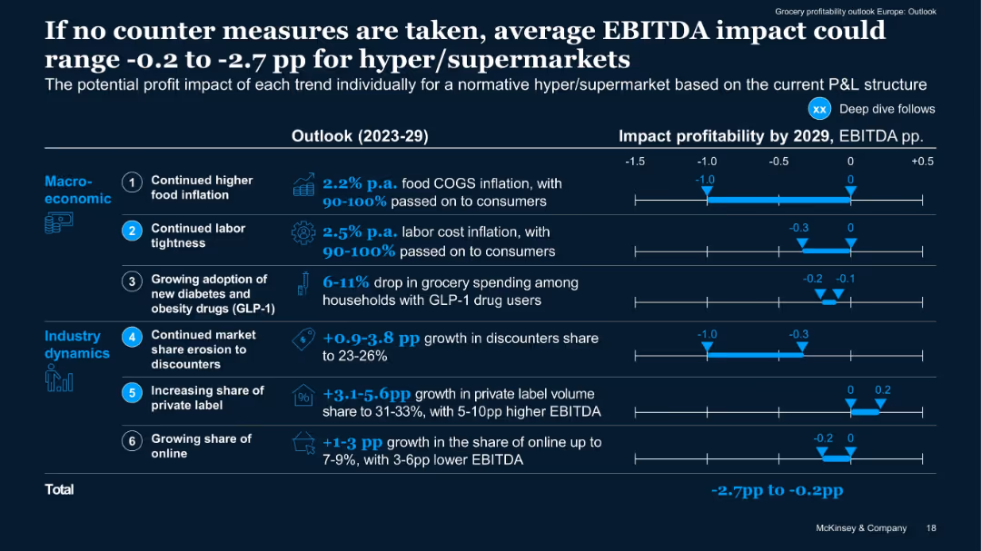
Horizontal bar impact chart quantifying EBITDA effect per trend from 2023–2029. Blue shaded bars show range.
Risk Assessment and Management
Retail & E-commerce
Quantifies potential downside to EBITDA if current trends continue without mitigation. Segments macroeconomic vs industry dynamics and provides projected ranges per trend. Total potential impact: -2.7pp to -0.2pp EBITDA.
EBITDA risk, impact forecast, industry dynamics, cost drivers, 2029
false
Risk Assessment and Management
Retail & E-commerce
Mixed Chart
McKinsey
Add to my slides
Remove from favorites
Bar chart with annotated vertical bars comparing 9M 2022 to 9M 2023 EBITDA, color-coded by volume, price, and cost/other factors
Financial Performance
Industrial & Manufacturing
The slide illustrates a 17% YoY decrease in adjusted EBITDA from €163.9m to €136.7m for 9M 2023. The drop is attributed to lower zinc/aluminium prices and unfavorable treatment charges, partially offset by volume and synergies.
EBITDA, zinc prices, aluminium, cost reduction, volume, hedging, synergy
false
Financial Performance
Industrial & Manufacturing
Single Chart
Goldman Sachs
Add to my slides
Remove from favorites
Bar chart waterfall showing EBITDA change from 9M 2022 to 9M 2023 with explanatory annotations, titled headers and summary at top.
Financial Performance
Industrial & Manufacturing
Shows 17% YoY decline in adjusted EBITDA to €137m in 9M 2023, attributed to lower zinc/aluminum prices and higher costs, partially offset by improved volumes, hedges, and synergies.
EBITDA, zinc prices, aluminum margins, hedging, synergies, YoY comparison
false
Financial Performance
Industrial & Manufacturing
Single Chart
Goldman Sachs
Add to my slides
Remove from favorites
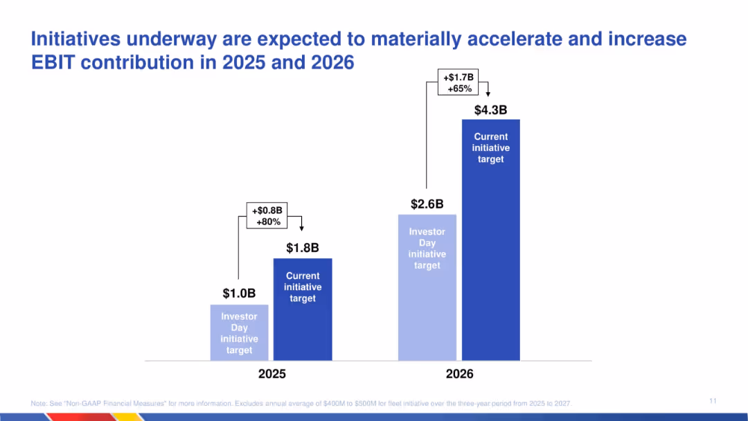
Column chart showing revised EBIT targets for 2025 and 2026; comparison of original and updated projections with labels for increase.
Strategic Planning
Transportation & Logistics
Communicates expected EBIT growth due to ongoing initiatives. The chart shows a material increase in EBIT targets for 2025 and 2026, emphasizing strategy execution effectiveness and operational uplift.
EBIT growth, initiatives, strategic plan, transportation, projections, acceleration, financial targets, operational improvement
false
Strategic Planning
Transportation & Logistics
Single Chart
JP Morgan
Add to my slides
Remove from favorites
This slide features multiple column charts and iconographic elements. The first chart shows the evolution of EBIT for the luxury goods market from 2019 to 2021F. Other areas detail spending directions per key cost bucket with icons representing different expenses such as marketing and digital.
Financial Performance
Consumer Goods
The slide analyzes the financial impact on the personal luxury goods market over three years, highlighting a significant drop in 2020 with partial recovery expected in 2021. It also provides strategic insights into cost management and investment focus areas like digital marketing and operational expenditures to mitigate financial impacts.
EBIT, luxury goods, financial impact, cost management, recovery
false
Financial Performance
Consumer Goods
Mixed Chart
Bain
Add to my slides
Remove from favorites
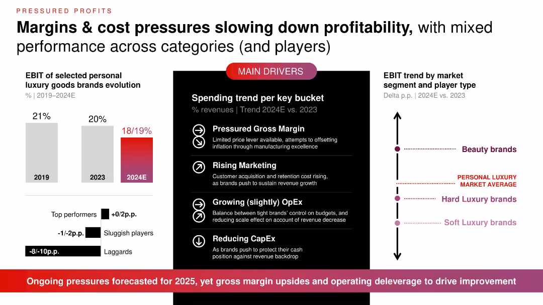
Three-panel slide with bar chart (left), drivers section (center), and vertical delta trend chart (right); red and black color themes dominate.
Financial Performance
Consumer Goods
Highlights declining EBIT in personal luxury goods (from 21% in 2019 to 18–19% in 2024E) due to pressured margins, marketing spend, rising OpEx, and reduced CapEx. Beauty brands are outperforming others. Points to expected continued pressure into 2025.
EBIT, luxury goods, profitability, gross margin, marketing, OpEx, CapEx, trends, forecast
false
Financial Performance
Consumer Goods
Multiple Chart
Bain
Add to my slides
Remove from favorites
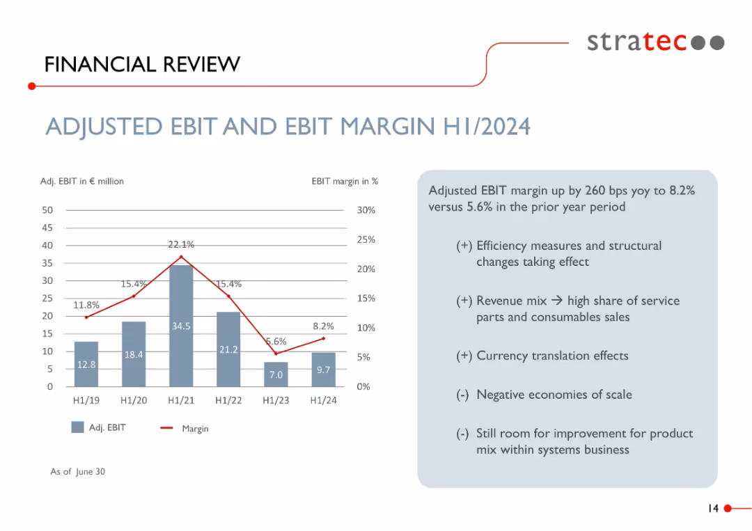
Dual-axis bar and line chart showing EBIT value and margin % from H1/19 to H1/24; commentary on the right side in a light blue box.
Financial Performance
Healthcare & Pharmaceuticals
Details the adjusted EBIT and margin trend over five years, with margin improving to 8.2% in H1/2024. Drivers include efficiency measures, revenue mix favoring consumables, and currency effects. Notes scale challenges and improvement potential in systems business.
EBIT, margin, financials, diagnostics, cost efficiency, revenue mix, STRATEC, service parts
false
Financial Performance
Healthcare & Pharmaceuticals
Mixed Chart
Goldman Sachs
Add to my slides
Remove from favorites
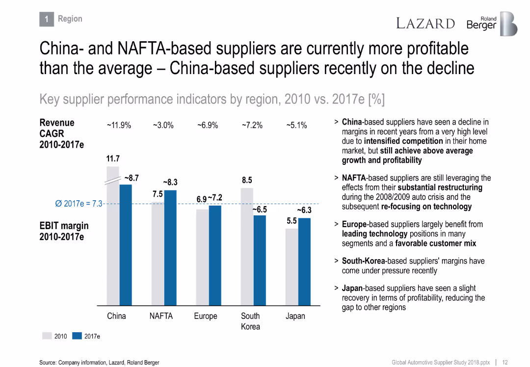
Bar chart comparing EBIT margins and revenue CAGR by region (China, NAFTA, Europe, South Korea, Japan), with explanatory text on the right.
Financial Performance
Industrial & Manufacturing
Compares supplier profitability across global regions from 2010 to 2017e. China and NAFTA regions show higher margins despite challenges, with commentary on competitive dynamics, restructuring effects, and customer mix advantages.
EBIT margin, suppliers, NAFTA, China, profitability, regions, restructuring, competition
false
Financial Performance
Industrial & Manufacturing
Mixed Chart
Roland Berger
Add to my slides
Remove from favorites
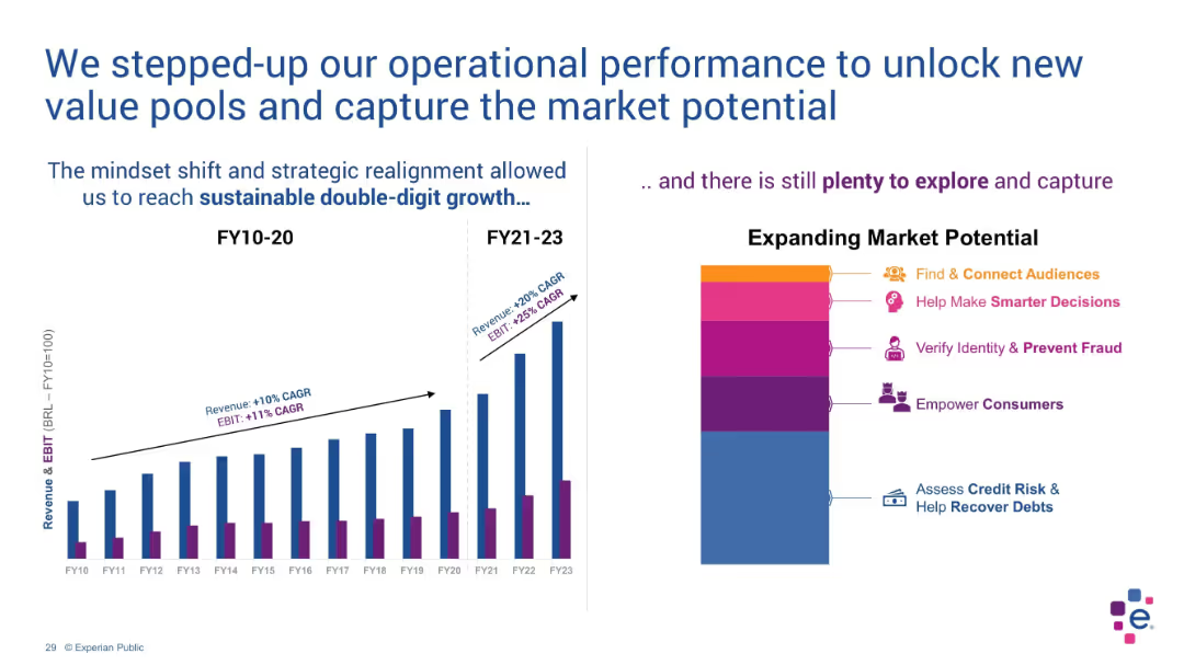
Dual-panel layout with bar chart on left and stylized stacked blocks on right
Operational Efficiency
Technology & Software
The slide illustrates growth acceleration in revenue and EBIT due to strategic shifts. The bar chart compares FY10–20 vs FY21–23 performance. A stylized chart shows market opportunities such as fraud prevention and consumer empowerment.
EBIT, revenue growth, strategy, double-digit, market potential, FY23
false
Operational Efficiency
Technology & Software
Multiple Chart
Barclays
Add to my slides
Remove from favorites
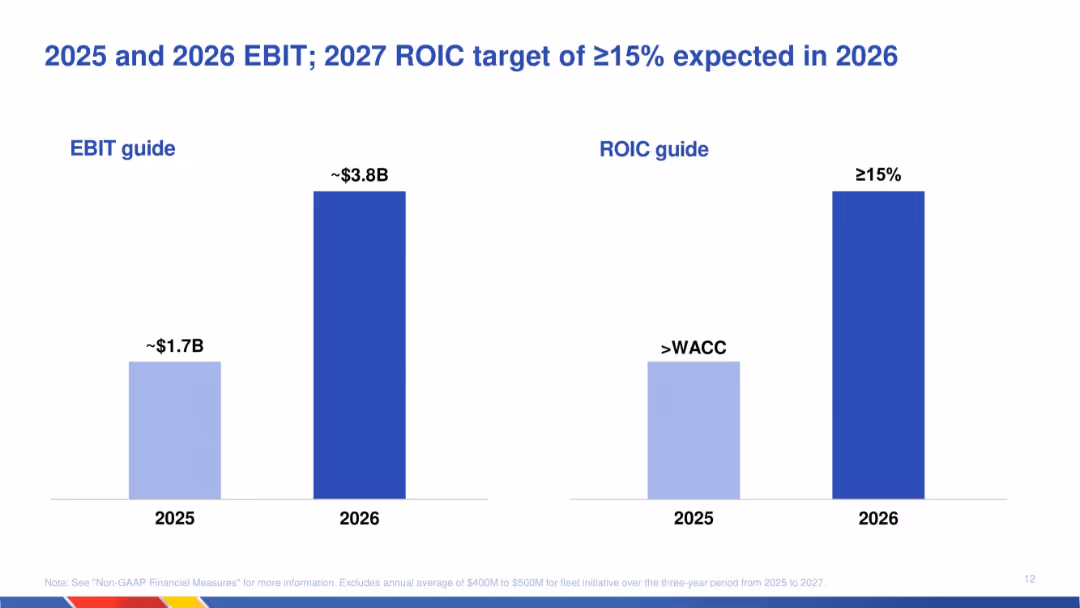
Side-by-side bar charts for EBIT and ROIC guidance across 2025 and 2026; simple format with emphasis on meeting and exceeding financial benchmarks.
Financial Performance
Transportation & Logistics
Provides financial projections indicating that EBIT is expected to more than double from 2025 to 2026, while the return on invested capital (ROIC) is projected to exceed 15% by 2026. Indicates confidence in strategic initiatives.
EBIT, ROIC, projections, financial targets, 2025, 2026, strategic outcomes, transportation, value creation
false
Financial Performance
Transportation & Logistics
Single Chart
JP Morgan
Add to my slides
Remove from favorites
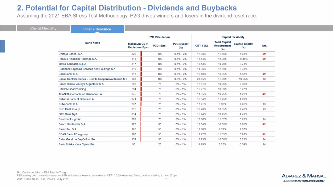
Final set of banks in same tabular format, concluding comparative data series across banks’ CET1 ratios, P2G, and capital flexibility.
Regulatory and Compliance
Financial Services
This slide wraps up the full list of banks assessed for potential capital distributions post-EBA stress test. It reinforces the framework from earlier slides, evaluating regulatory expectations against actual capital positions. The slide also reflects on the implications of P2G for dividends and buffer requirements.
ECB guidance, stress scenario, capital planning, CET1 levels, excess capital, resilience analysis, risk buffer
false
Regulatory and Compliance
Financial Services
Single Chart
Alvarez & Marsal
Add to my slides
Remove from favorites
This slide includes a line chart illustrating ECB forecasts for core inflation versus actual outturns. The red line represents the forecast, while the multi-colored bars indicate different years' actual outturns. The slide includes a textual source reference.
Market Analysis and Trends
Financial Services
This slide shows the European Central Bank's core inflation forecasts in comparison to the actual figures, emphasizing the difference between projected and real outcomes. It is suitable for discussions on economic forecasting accuracy, policy decision-making, and the challenges of predicting inflation trends.
ECB, Inflation Forecasts, Economic Predictions, Core Inflation, EU, Bar Chart, Forecast Accuracy
false
Market Analysis and Trends
Financial Services
Single Chart
JP Morgan
Add to my slides
Remove from favorites
Two line charts: left showing European Central Bank policy rate expectations and right showing European 10-year government bond spreads over Germany for countries like Italy, Spain, and France.
Regulatory and Compliance
Financial Services
The slide highlights European Central Bank policy rate expectations and government bond spreads, indicating monetary policy impacts and financial stability across different European countries.
ECB, policy rates, government bonds, Eurozone, financial stability
false
Regulatory and Compliance
Financial Services
Multiple Chart
JP Morgan
Add to my slides
Remove from favorites
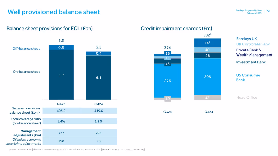
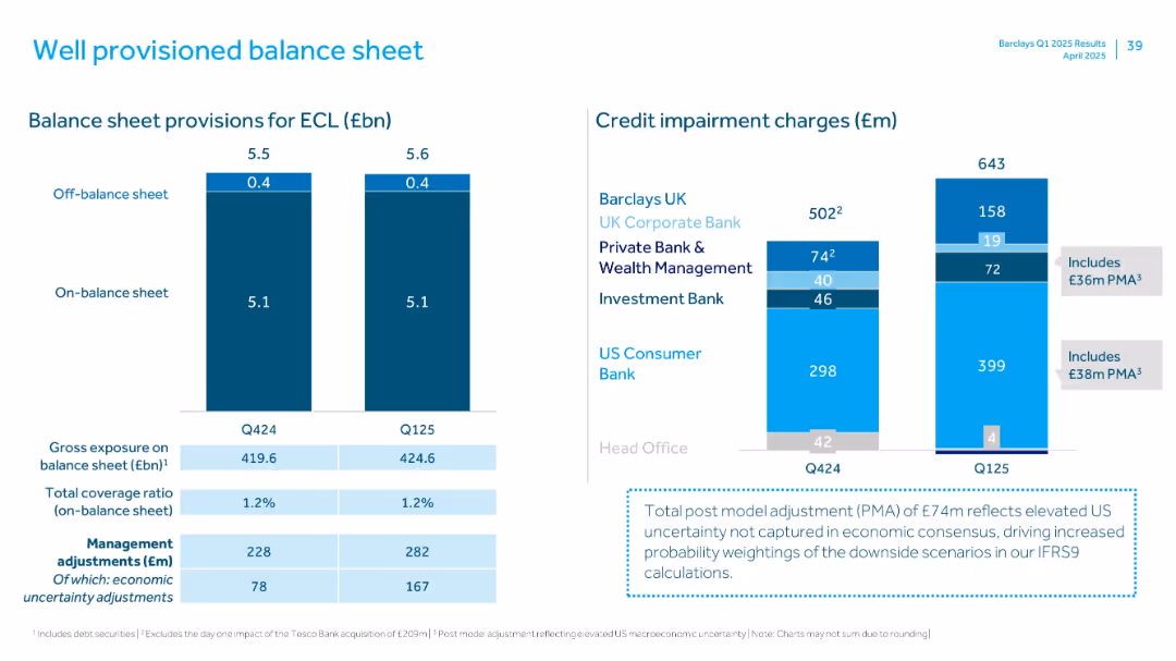
Dual charts: bar chart of ECL provisions and credit impairment charges; light blue/white color scheme, legends by division
Risk Assessment and Management
Financial Services
This slide outlines Barclays’ expected credit loss (ECL) provisions, segmented into on- and off-balance sheet amounts. It includes gross exposure, coverage ratios, and economic uncertainty adjustments. Credit impairment charges are broken down by division in stacked format.
ECL, balance sheet, credit impairment, provision, gross exposure, economic risk
false
Risk Assessment and Management
Financial Services
Multiple Chart
Barclays
Add to my slides
Remove from favorites
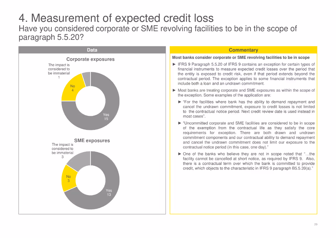
Pie charts depicting the consideration of corporate and SME revolving facilities within the scope of certain regulatory paragraphs, accompanied by detailed commentary.
Financial Performance
Financial Services
Discusses how banks consider corporate and SME revolving facilities within the scope of regulatory requirements, including specific examples and exceptions.
ECL, corporate, SME, revolving, facilities, scope, regulatory, banks, requirements, exceptions
false
Financial Performance
Financial Services
Multiple Chart
EY
Add to my slides
Remove from favorites
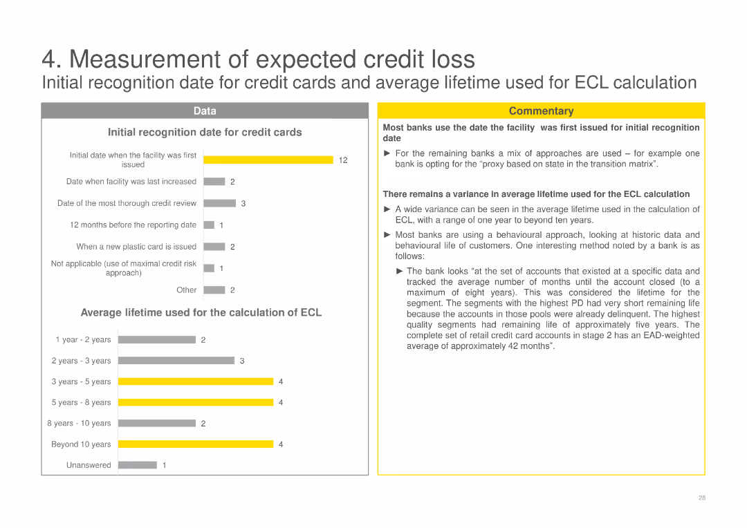
Column charts showing initial recognition dates for credit cards and average lifetime used for ECL calculation, with commentary explaining variance among banks.
Financial Performance
Financial Services
Analyzes the initial recognition dates for credit cards and the average lifetime used by banks for ECL calculation, showing variations in practice and methods used.
ECL, credit cards, measurement, banks, recognition, average lifetime, calculation, variance, methods
false
Financial Performance
Financial Services
Multiple Chart
EY
Add to my slides
Remove from favorites
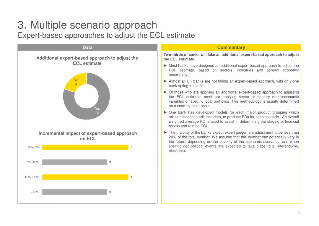
A pie chart depicting the use of expert-based approaches for adjusting ECL estimates and a column chart showing the impact on ECL.
Risk Assessment and Management
Financial Services
Focuses on the use of expert judgment in adjusting ECL estimates, highlighting how banks apply sector-specific and macroeconomic variables to these estimates.
ECL, expert-based, adjustment, banks, estimates, macroeconomic, sector-specific, judgement, impact
false
Risk Assessment and Management
Financial Services
Multiple Chart
EY
Add to my slides
Remove from favorites
Dual panel with bar charts showing provisions for expected credit loss (ECL) and credit impairment by business
Risk Assessment and Management
Financial Services
Displays Barclays’ provisions for expected credit loss and credit impairments across business divisions, emphasizing stable coverage ratios and increased post model adjustments reflecting macroeconomic uncertainty.
ECL, impairments, balance sheet, PMA, credit risk
false
Risk Assessment and Management
Financial Services
Multiple Chart
Barclays
Add to my slides
Remove from favorites
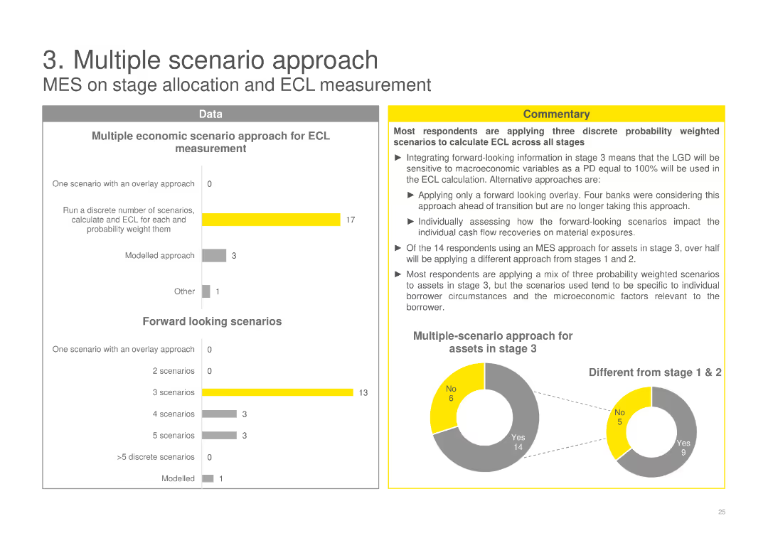
A column chart showing various approaches for ECL measurement, a pie chart showing multiple-scenario approach, and detailed commentary.
Risk Assessment and Management
Financial Services
Discusses the application of multiple economic scenarios for expected credit loss (ECL) measurement, highlighting various methods used by banks.
ECL, scenario, measurement, banks, methods, stage, forward looking, probability, weighted, assessment
false
Risk Assessment and Management
Financial Services
Multiple Chart
EY
Add to my slides
Remove from favorites
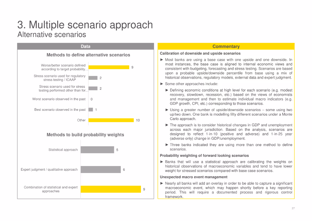
Column charts displaying methods to define alternative scenarios and build probability weights, alongside a detailed commentary section.
Risk Assessment and Management
Financial Services
Explores methods banks use to define alternative scenarios and build probability weights for ECL, including historical data and expert judgment approaches.
ECL, scenarios, probability, banks, methods, historical, expert judgment, weights, alternative, downside
false
Risk Assessment and Management
Financial Services
Multiple Chart
EY
Add to my slides
Remove from favorites
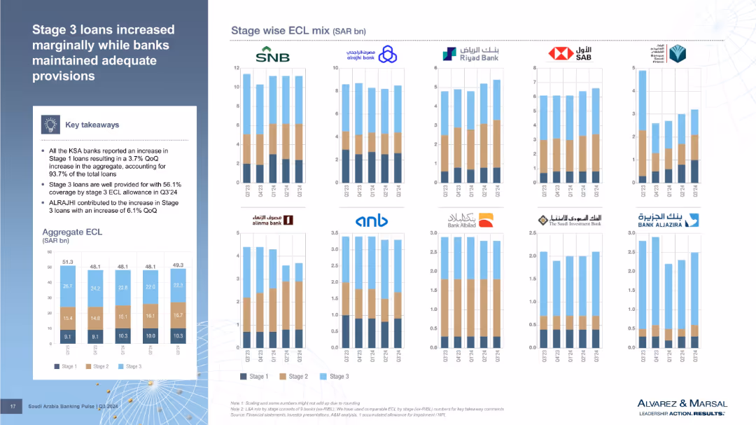
Bar charts per bank showing stage-wise ECL mix, plus an aggregate ECL bar chart. The slide uses three distinct colors to show Stage 1–3 loans. Summary box on the left includes main insights.
Risk Assessment and Management
Financial Services
Analyzes Expected Credit Loss (ECL) distribution by loan stage. Stage 1 loans grew across all banks while Stage 3 loans are well provisioned. ALRAJHI contributed significantly to Stage 3 loan increases. The visual format highlights bank-wise and stage-wise credit quality metrics.
ECL, stage 3 loans, provisions, credit quality, ALRAJHI, loan stages
false
Risk Assessment and Management
Financial Services
Multiple Chart
Alvarez & Marsal
Add to my slides
Remove from favorites
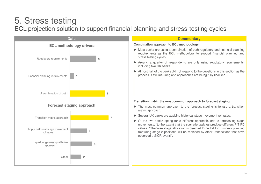
Column charts showing ECL methodology drivers and forecast staging approach, with commentary on combination approaches and the use of transition matrices.
Risk Assessment and Management
Financial Services
Outlines the drivers behind ECL methodologies and forecast staging approaches used by banks, emphasizing a combination of regulatory and financial planning needs.
ECL, stress testing, methodology, banks, drivers, forecast, staging, approach, transition matrix, combination
false
Risk Assessment and Management
Financial Services
Multiple Chart
EY
Add to my slides
Remove from favorites
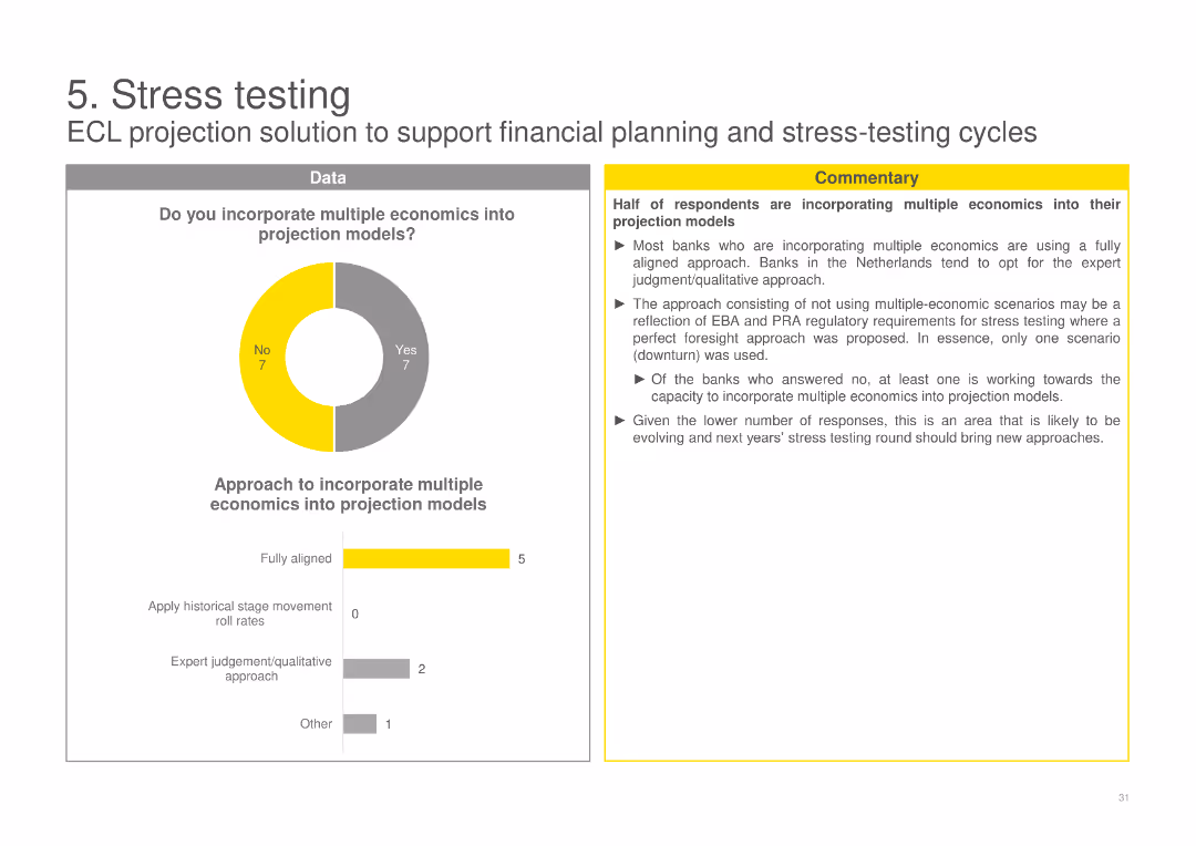
A pie chart on the incorporation of multiple economics into projection models, with a column chart detailing the approaches used by banks, and accompanying commentary.
Risk Assessment and Management
Financial Services
Examines whether banks incorporate multiple economic scenarios into their projection models for stress testing, detailing the different approaches taken.
ECL, stress testing, projection models, multiple economics, banks, scenarios, incorporation, approaches, testing
false
Risk Assessment and Management
Financial Services
Multiple Chart
EY
Add to my slides
Remove from favorites
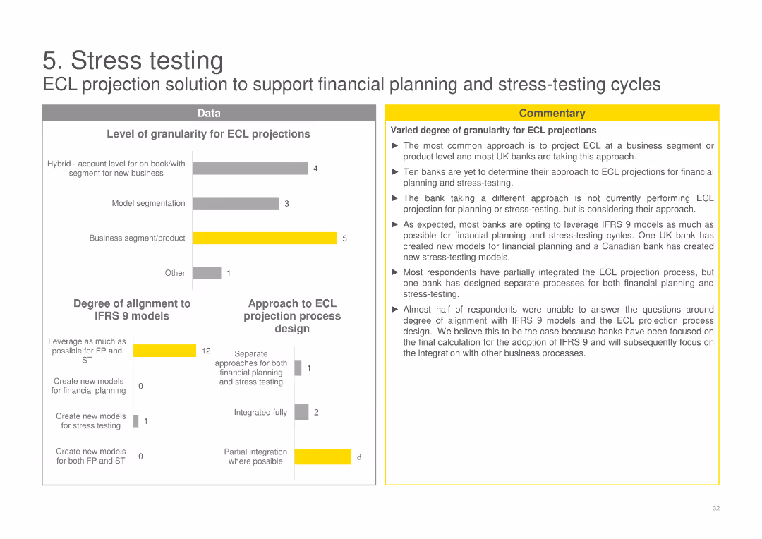
Column charts showing the level of granularity for ECL projections and the degree of alignment to IFRS 9 models, with commentary on varied approaches.
Risk Assessment and Management
Financial Services
Reviews the level of granularity banks use for ECL projections and their alignment to IFRS 9 models, noting different strategies and the extent of integration.
ECL, stress testing, projections, banks, granularity, IFRS 9, alignment, models, strategies, integration
false
Risk Assessment and Management
Financial Services
Multiple Chart
EY
Add to my slides
Remove from favorites
Includes column charts comparing Barclays' service distribution with major US banks and showcasing investment in high-growth sectors.
Strategic Planning
Financial Services
Strategically planning to rebalance service offerings towards Equity Capital Markets (ECM) and Advisory services, targeting high-growth areas like technology.
ECM, advisory, strategic planning, investment, high-growth
false
Strategic Planning
Financial Services
Multiple Chart
Barclays
Add to my slides
Remove from favorites
Contains a flowchart summarizing the steps taken to identify and implement eco-design options for ground stations, from brainstorming to evaluation of solutions.
Product and Service Analysis
Environmental Services & Sustainability
Describes the methodology used in reducing environmental impacts of ground stations through eco-design, involving multiple stakeholders and solution assessments.
eco-design, environmental impact, ground stations, mitigation, flowchart, brainstorming, solution assessment, sustainability
false
Product and Service Analysis
Environmental Services & Sustainability
Linear Flow
Deloitte
Add to my slides
Remove from favorites
Contains a bar chart and a photograph. Bar chart shows percentage of consumers who expect eco-friendly products. Photo shows people collaborating.
Customer and Market Segmentation
Environmental Services & Sustainability
Highlights the high consumer demand for eco-friendly products across different regions and emphasizes the importance of making these options widely available.
eco-friendly, consumer demand, market segmentation, partnerships, sustainability
false
Customer and Market Segmentation
Environmental Services & Sustainability
Mixed Chart
Accenture
Add to my slides
Remove from favorites
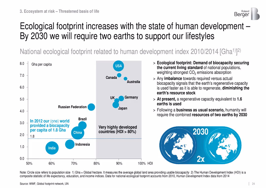
Scatter plot of footprint vs. HDI, with bubble sizes for population; includes 2030 projection.
Market Analysis and Trends
Environmental Services & Sustainability
Explores the link between HDI and ecological footprint, projecting a need for two earths by 2030 if current consumption trends continue.
ecological footprint, HDI, consumption, sustainability, overshoot
false
Market Analysis and Trends
Environmental Services & Sustainability
Mixed Chart
Roland Berger
Add to my slides
Remove from favorites
The slide includes a column chart on the left showing the number of Earths required to meet ecological demand sustainably, and a bar chart on the right showing US sales growth.
Market Analysis and Trends
Environmental Services & Sustainability
It highlights the sustainability concerns by showing the ecological footprint and the growth rate of US sales for products with and without ESG claims.
ecological footprint, sustainability, ESG, sales growth, US market, consumer concerns, environmental impact, resource consumption, J.P. Morgan, global footprint
false
Market Analysis and Trends
Environmental Services & Sustainability
Multiple Chart
JP Morgan
Add to my slides
Remove from favorites
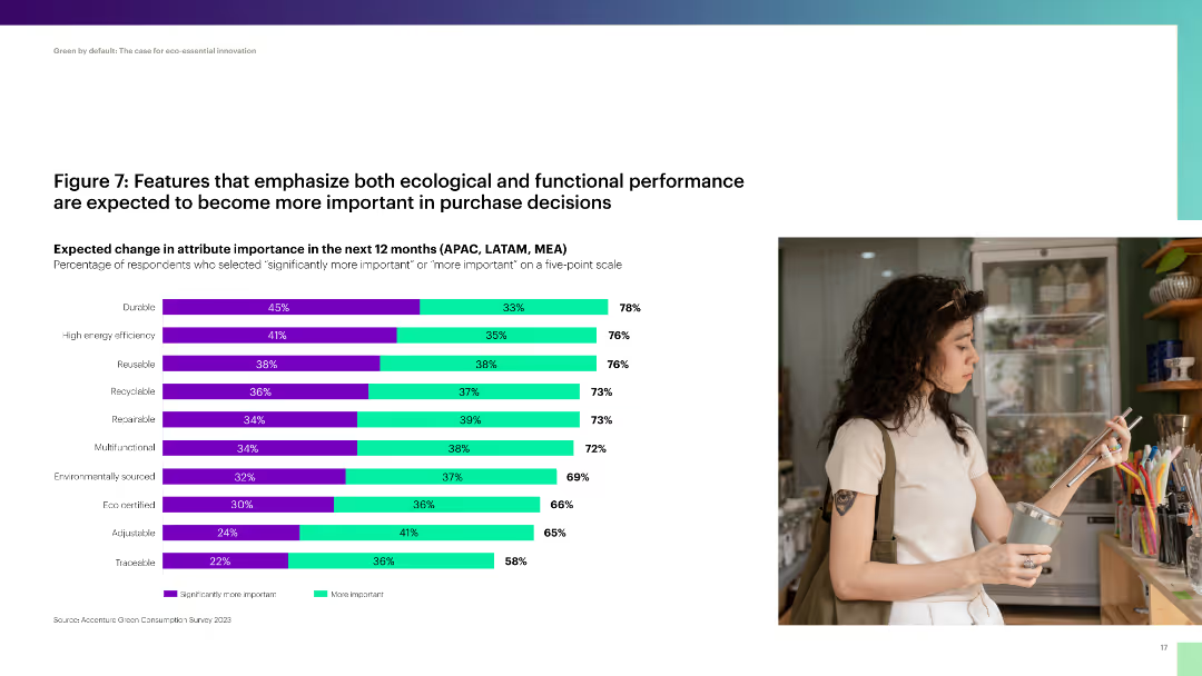
Column chart showing the expected change in importance of various product attributes like durability, efficiency, and recyclability.
Product and Service Analysis
Consumer Goods
The slide outlines the expected increase in importance of ecological and functional product features in consumer purchase decisions.
ecological, functional, performance, purchase decisions, durability, efficiency
false
Product and Service Analysis
Consumer Goods
Single Chart
Accenture
Add to my slides
Remove from favorites
The slide has a clear title and subtitle, featuring two sets of column charts for 2021 to 2023, assessing the impact of the State's ecological efforts and how geopolitical context affects companies' climate commitments. Includes quotes on funding and regulations.
Regulatory and Compliance
Environmental Services & Sustainability
Surveys the effects of France's governmental actions on ecological attractiveness and examines the stability of companies' climate commitments amidst changing geopolitical and economic contexts.
ecological transition, government policy, France, climate commitments, geopolitical impact, public funding, environmental regulation, sustainability, corporate social responsibility
false
Regulatory and Compliance
Environmental Services & Sustainability
Multiple Chart
Bain
Add to my slides
Remove from favorites
This slide includes a series of column charts indicating e-commerce usage before, during, and after COVID-19 lockdowns, with text explanations on the side. The design is clean with a focus on the visual data.
Market Analysis and Trends
Retail & E-commerce
Provides an analysis of e-commerce adoption across the region, highlighting the reasons for its increase and expected permanency. Suitable for discussions on consumer behavior changes in retail.
e-Commerce, adoption, COVID-19, consumer behavior, online shopping, regional analysis
false
Market Analysis and Trends
Retail & E-commerce
Single Chart
Bain
Add to my slides
Remove from favorites
The slide shows a stacked column chart from 2018 to 2022 representing the composition of Mainland China's e-commerce platform advertising revenue by type. The chart uses multiple shades to differentiate between types of advertising such as live, embedded, and display advertising.
Market Analysis and Trends
Retail & E-commerce
Analyzes the composition of e-commerce advertising revenue in China from 2018 to 2022, focusing on the rise of live video and e-commerce streaming. Highlights the increasing share of live advertising in the total e-commerce advertising revenue.
e-commerce, China, live video, advertising revenue, market trends
false
Market Analysis and Trends
Retail & E-commerce
Mixed Chart
PwC/Strategy&
Add to my slides
Remove from favorites
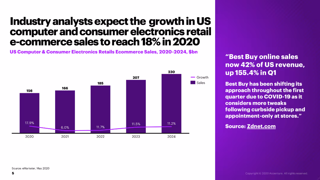
The slide presents a column chart showing projected US computer and consumer electronics retail e-commerce sales from 2020 to 2024, alongside a relevant quote.
Market Analysis and Trends
Retail & E-commerce
The slide projects growth in US computer and consumer electronics retail e-commerce sales, with specific statistics and an anecdote about Best Buy's sales increase.
e-commerce, consumer electronics, growth, sales projections, Best Buy
false
Market Analysis and Trends
Retail & E-commerce
Mixed Chart
Accenture
Add to my slides
Remove from favorites
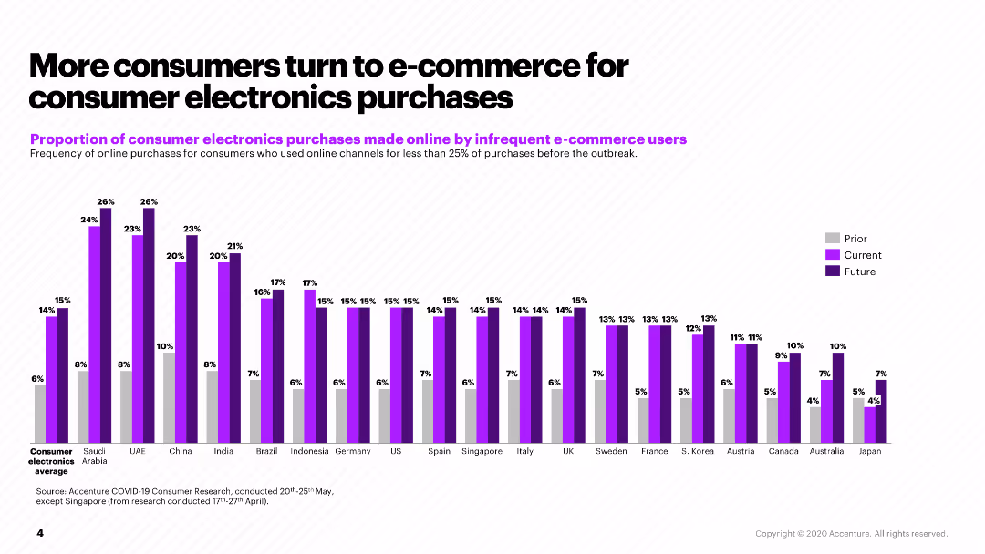
The slide features a column chart displaying the proportion of consumer electronics purchases made online by infrequent e-commerce users across various countries.
Market Analysis and Trends
Retail & E-commerce
The slide discusses the increased shift to e-commerce for consumer electronics, comparing purchase frequencies prior to, during, and expected post-COVID-19 trends.
e-commerce, consumer electronics, online purchases, COVID-19, market trends
false
Market Analysis and Trends
Retail & E-commerce
Single Chart
Accenture
Add to my slides
Remove from favorites
The slide showcases a comparison of monthly active users for e-commerce and groceries across various consumer segments. It uses column charts with annotations, employing a blue color scheme for differentiation. The layout is well-organized, presenting clear comparative data points.
Market Analysis and Trends
Technology & Software
This slide examines the disparity in e-commerce and grocery shopping habits between urban and suburban users in SEA. It's an analytical tool for identifying gaps in market penetration and for developing strategies to increase online grocery adoption among less engaged demographic groups.
e-commerce, consumer habits, SEA, urban vs. suburban, online groceries, market penetration, column chart
false
Market Analysis and Trends
Technology & Software
Multiple Chart
Bain
Add to my slides
Remove from favorites
The slide includes a column chart illustrating the influence of COVID-19 on purchase decisions for various devices, showing new, refurbished, and postponed purchases.
Market Analysis and Trends
Retail & E-commerce
The slide analyzes the impact of COVID-19 on the purchase of new and refurbished electronic devices, highlighting shifts in consumer behavior during the pandemic.
e-commerce, COVID-19, consumer behavior, refurbished devices, purchase trends
false
Market Analysis and Trends
Retail & E-commerce
Single Chart
Accenture
Add to my slides
Remove from favorites
Left-aligned narrative on online marketplaces and right-side line chart and bar graph comparing stock performance of fashion e-commerce players. Green and gray lines show trends.
Strategic Planning
Retail & E-commerce
Analyzes decline in share prices for early e-commerce marketplace players post-Covid boom. Highlights underperformance of specialized players like Boohoo and Asos. Attributes decline to increased competition, profit pressure, and consumer return to physical stores.
e-commerce decline, stock trends, Boohoo, Asos, profitability, market correction
false
Strategic Planning
Retail & E-commerce
Mixed Chart
McKinsey
Add to my slides
Remove from favorites
Line graph displaying e-commerce revenue growth from 2017 to 2025 in eight countries, with a detailed analysis text on the left.
Market Analysis and Trends
Retail & E-commerce
Details significant growth in e-commerce revenue, attributing it to increased digital maturity and internet usage in target markets.
e-commerce, digital maturity, revenue growth, internet usage, target markets, growth analysis, 2017-2025, countries
false
Market Analysis and Trends
Retail & E-commerce
Mixed Chart
Accenture
Add to my slides
Remove from favorites
The slide is filled with column charts comparing funding values across sectors like e-commerce, digital media, and others. There is a clear title and a legend that helps identify each sector. The design is minimalist, with a white background and blue columns, ensuring the data stands out without distraction.
Investment Analysis
Technology & Software
The slide communicates the rising investment in e-commerce and digital media, providing key insights for stakeholders interested in the landscape of private funding and sector priorities. It is likely used for investment briefings or market trend analyses.
e-commerce, digital media, DFS, investment, private funding, market analysis, sector comparison
false
Investment Analysis
Technology & Software
Single Chart
Bain
Add to my slides
Remove from favorites
The slide features a series of column charts displaying the perceived helpfulness of different internet services before, during, and after lockdown, categorized under e-Commerce, Transport & Food, and Online Media.
Market Analysis and Trends
Technology & Software
The slide analyzes the perceived value of digital services during different phases of lockdown, suggesting a lasting positive shift in user sentiment towards these services.
e-Commerce, digital services, lockdown, perception shift, column chart, user sentiment, helpfulness
false
Market Analysis and Trends
Technology & Software
Single Chart
Bain
Add to my slides
Remove from favorites
Features dual bar graphs showing the percentage of increased usage and spend on various e-commerce categories compared to pre-COVID times.
Market Analysis and Trends
Technology & Software
Reveals a significant uptick in frequency and spend on digital services since the pandemic, especially in essential services like groceries and food delivery.
e-commerce, digital services, pandemic, usage increase, spending surge, essentials, groceries, food delivery
false
Market Analysis and Trends
Technology & Software
Multiple Chart
Bain
Add to my slides
Remove from favorites
This slide features a vertical bar chart and a pie chart, showing concerns about the environmental impact of e-commerce across different countries. The visuals include percentages and are accompanied by relevant graphics and text.
Market Analysis and Trends
Retail & E-commerce
The slide indicates that 61% of SEA country respondents are concerned about the environmental impact of e-commerce, with varying levels of concern across different countries. This information can be used to discuss environmental policies, consumer behavior, and sustainability in the context of online shopping.
e-commerce, environmental impact, consumer concern, sustainability, online shopping
false
Market Analysis and Trends
Retail & E-commerce
Multiple Chart
IPSOS
Add to my slides
Remove from favorites
Column chart with two data series (Global retail sales and E-commerce penetration), accompanied by text on the right side.
Market Analysis and Trends
Retail & E-commerce
Illustrates the growth of global e-commerce sales and their impact on warehouse capacity needs and automation solutions.
e-commerce, global sales, automation, warehouse, labor shortage
false
Market Analysis and Trends
Retail & E-commerce
Mixed Chart
LEK
Add to my slides
Remove from favorites
Contains a large title, two sections of text, and a column chart with projected growth figures. The layout is simple with clear separation between text and graphics.
Market Analysis and Trends
Retail & E-commerce
Highlights the surge in e-commerce GMV to $62B and explores factors like consumer and SME migration, online grocery shopping, and the diversification of e-commerce. Useful for analyzing e-commerce trends.
e-Commerce, GMV, consumer trends, SME migration, online grocery, diversification
false
Market Analysis and Trends
Retail & E-commerce
Mixed Chart
Bain
Add to my slides
Remove from favorites
Contains a large blue column chart for e-Commerce GMV growth and text boxes outlining key insights related to market dynamics.
Strategic Planning
Retail & E-commerce
Highlights the rapid growth of e-Commerce GMV and details the synergy with digital financial services and the informal e-commerce sector. The slide can serve to inform investment decisions and digital transformation strategies, particularly in fintech and retail sectors.
E-commerce, GMV, DFS, Growth
false
Strategic Planning
Retail & E-commerce
Mixed Chart
Bain
Add to my slides
Remove from favorites
The slide features stacked column charts depicting the distribution of retail categories in e-commerce GMV. It utilizes contrasting colors to differentiate categories and includes descriptive text.
Market Analysis and Trends
Technology & Software
The slide compares the online shopping trends for groceries over time and the expected continuity of these habits. It provides insights into changing consumer behavior and market opportunities.
e-Commerce, groceries, online shopping, consumer behavior, market trends
false
Market Analysis and Trends
Technology & Software
Mixed Chart
Bain
Add to my slides
Remove from favorites
This slide includes a clear title and a combined column chart showing the growth of the internet economy, with a legend and CAGR indication. Colors differentiate between sectors such as e-commerce, online media, etc. The design is clean, making the data easy to interpret.
Market Analysis and Trends
Retail & E-commerce
The slide displays the e-commerce sector's dominant role in driving the market growth of the internet economy in SEA, with a projected continuation till 2025. It highlights the exponential growth in e-commerce, contrasted against other sectors like online media and travel, to underscore the surge in digital consumer behavior and its long-term market implications.
e-commerce, growth, internet economy, SEA, CAGR, market trends, digital consumer behavior
false
Market Analysis and Trends
Retail & E-commerce
Single Chart
Bain
Add to my slides
Remove from favorites
It shows column charts with percentage growth indicators and a projection for 2025. The slide is text-light with more focus on the graphical representation of data. The color scheme is consistent with the previous slides.
Financial Performance
Technology & Software
Discusses the rise of e-commerce and offsets in travel and transport sectors, showing the resilience and adaptation to changing market conditions. Ideal for financial and growth performance analysis.
e-Commerce, growth, online travel, food delivery, transport, financial analysis
false
Financial Performance
Technology & Software
Multiple Chart
Bain
Add to my slides
Remove from favorites
Displays a bold title with a line graph beneath it showing the growth of e-commerce over a decade, annotated with key points.
Market Analysis and Trends
Retail & E-commerce
This slide demonstrates the rapid acceleration of e-commerce adoption as a share of retail sales, suggesting a transformative shift in shopping habits.
e-commerce growth, retail trends, market analysis, digital transformation, sales data, pandemic impact
false
Market Analysis and Trends
Retail & E-commerce
Single Chart
Accenture
Add to my slides
Remove from favorites
Features multiple blue column charts for e-commerce sector growth, with annotations for percentage changes.
Market Analysis and Trends
Retail & E-commerce
This slide analyzes sector-wise growth in e-commerce, with a focus on the significant role e-commerce plays as a growth driver in the economy. It discusses challenges in online travel, offering insights into current trends and future projections, useful for strategic planning in e-commerce and associated industries.
E-commerce, Growth, Sector, Challenge
false
Market Analysis and Trends
Retail & E-commerce
Multiple Chart
Bain
Add to my slides
Remove from favorites
This slide presents textual content alongside a pie chart comparing the use of ecommerce platforms for intentional purchases versus general browsing.
Market Analysis and Trends
Retail & E-commerce
Highlights the growing preference for using ecommerce as a platform for intentional purchases, with insights into how consumers engage with online retail spaces for specific needs.
Ecommerce, intentional purchases, online engagement, consumer trends, pie chart
false
Market Analysis and Trends
Retail & E-commerce
Single Chart
Bain
Add to my slides
Remove from favorites
The slide is filled with stacked column charts comparing private funding values across sectors, with percentages illustrating the distribution of investments.
Competitive Landscape
Financial Services
Discussing the appeal of E-commerce for investments in H1 2022, it shows the sector outperforming others, indicating market trends and investor confidence.
E-commerce, investments, unicorn, market trends, investor confidence, sector comparison
false
Competitive Landscape
Financial Services
Single Chart
Bain
Add to my slides
Remove from favorites
Column chart with annotations comparing marketplace and logistics funding over years, set against a white and blue backdrop.
Market Analysis and Trends
Technology & Software
Analyzes the e-commerce sector's shift, noting a reduction in logistics deals after a period of growth and market consolidation.
e-commerce, logistics, funding trends, market consolidation, deal reduction, column chart, marketplace, SEA
false
Market Analysis and Trends
Technology & Software
Mixed Chart
Bain
Add to my slides
Remove from favorites
This slide features a column chart and a numeric list detailing the impact of logistics on e-commerce deals. The colors used differentiate the segments clearly, with annotations providing insights on investment trends.
Market Analysis and Trends
Transportation & Logistics
Analyzes how logistics investments have become a major driver in e-commerce deal values, with a notable surge in H1 2021. It also touches on the growing trend of non-marketplace investment opportunities within the e-commerce realm.
E-commerce, Logistics, Investment Trends, SEA
false
Market Analysis and Trends
Transportation & Logistics
Mixed Chart
Bain
Add to my slides
Remove from favorites
Contains bar charts comparing direct and indirect online sales across seven brands, highlighting average online sales percentages.
Competitive Landscape
Retail & E-commerce
Analyzes e-commerce performance in the luxury and premium markets, focusing on direct versus indirect sales and brand comparisons.
e-commerce, luxury, premium markets, direct sales, indirect sales, online sales, brand comparison, bar charts, competitive landscape
false
Competitive Landscape
Retail & E-commerce
Single Chart
EY
Add to my slides
Remove from favorites
Multiple icons representing different sales channels with accompanying percentage data across different countries.
Market Analysis and Trends
Retail & E-commerce
Compares the prevalence of various e-commerce platforms for luxury goods in different markets, highlighting the rise of social-linked sales, informative for strategic planning in e-commerce.
e-commerce, luxury retail, marketplace dominance, social media sales, international comparison, digital transformation, retail trends, sales channels
false
Market Analysis and Trends
Retail & E-commerce
Table
BCG
Add to my slides
Remove from favorites
Two maps of Malaysia show the digital participation levels across regions in green shades for demand and blue shades for supply. There is no graph or chart, just color-coded regional data.
Competitive Landscape
Technology & Software
It contrasts digital e-commerce demand and supply in Malaysia, with Kuala Lumpur leading in participation. The slide could be used to identify market gaps and areas of potential growth, valuable for regional market analysis and strategic planning.
E-commerce, Malaysia, Digital Participation, Kuala Lumpur, Demand, Supply
false
Competitive Landscape
Technology & Software
Multiple Chart
Bain
Add to my slides
Remove from favorites
Data-centric slide with a graph highlighting the relative market share of ecommerce players in Southeast Asia. The design is simple and focused on delivering statistical insights.
Investment Analysis
Retail & E-commerce
Provides an analysis of the ecommerce market in Southeast Asia, illustrating the relative size of market players and highlighting areas with potential for growth. Useful for discussions on investment and market positioning.
ecommerce, market analysis, Southeast Asia, investment opportunities, market positioning, relative market share
false
Investment Analysis
Retail & E-commerce
Multiple Chart
Bain
Add to my slides
Remove from favorites
Features a pie chart and bar graphs to showcase e-commerce penetration and growth in tier 2 and tier 3 cities from 2020 to 2025.
Market Analysis and Trends
Retail & E-commerce
Predicts e-commerce market size and penetration, key for businesses and investors to gauge future e-commerce trends and opportunities.
E-commerce, market growth, penetration, tier 2, tier 3, projections, market size, business strategy
false
Market Analysis and Trends
Retail & E-commerce
Mixed Chart
Kearney
Add to my slides
Remove from favorites
This slide includes vertical column charts breaking down the online luxury goods market by region and category for 2019, with emphasis on growth rates and market influence.
Technology and Digital Transformation
Consumer Goods
Discusses the segmentation of the online luxury goods market in 2019, focusing on how digital transformation influences consumer behavior.
E-commerce, Market segmentation, Digital transformation
false
Technology and Digital Transformation
Consumer Goods
Mixed Chart
Bain
Add to my slides
Remove from favorites
A slide with bullet points and a circular graphic, discussing the impact of e-commerce on related sub-sectors.
Market Analysis and Trends
Retail & E-commerce
Evaluates e-commerce's influence on its sub-sectors, essential for strategic planning and understanding market dynamics.
E-commerce, market segmentation, sub-sectors, strategic planning, market dynamics, social commerce, B2B commerce, specialized commerce
false
Market Analysis and Trends
Retail & E-commerce
Header Horizontal
Kearney
Add to my slides
Remove from favorites
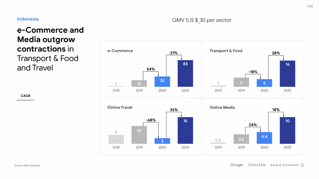
Four separate column charts compare sector growths such as e-Commerce, Online Travel, Transport & Food, and Online Media in Indonesia, with percentage changes.
Market Analysis and Trends
Technology & Software
Discussing sector performance in Indonesia's digital economy, the slide shows e-Commerce and Media outgrowing other sectors despite market downturns.
e-Commerce, Media, Sector growth, Indonesia, Digital economy, Market downturns, Online Travel, Transport & Food
false
Market Analysis and Trends
Technology & Software
Multiple Chart
Bain
Add to my slides
Remove from favorites
The slide displays a title section and multiple line charts depicting the increase in search volumes for merchant-related queries. The design is clean, with the use of blue shades to represent different countries and time periods, while annotations provide context.
Market Analysis and Trends
Retail & E-commerce
Representing an increase in merchant interest in e-commerce, the slide uses indexed search volume data to show the burgeoning desire to join the digital marketplace across various SEA countries. The comparative analysis underpins the regional e-commerce boom and indicates the digital marketplace's attractive prospects for business owners seeking to expand their reach.
e-commerce, merchant interest, search volumes, digital marketplace, SEA, business expansion
false
Market Analysis and Trends
Retail & E-commerce
Multiple Chart
Bain
Add to my slides
Remove from favorites
Features a column chart with blue bars, a key in flags representing SEA countries, and a title on top.
Industry Overview
Technology & Software
Depicts the percentage of new digital consumers across different e-commerce and online media categories in SEA countries.
e-commerce, online media, SEA, digital consumers, market segmentation
false
Industry Overview
Technology & Software
Single Chart
Bain
Add to my slides
Remove from favorites
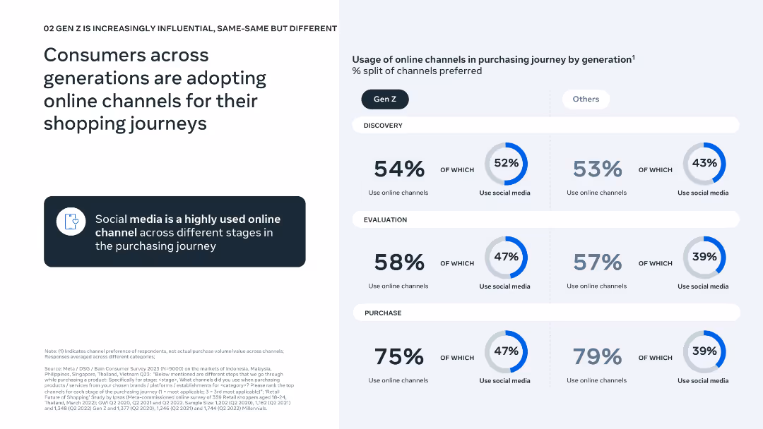
Simple left-aligned text with a three-stage funnel chart (discovery, evaluation, purchase) comparing Gen Z vs. others.
Technology and Digital Transformation
Retail & E-commerce
This slide outlines the adoption of online channels during the shopping process across age groups. It emphasizes the strong role of social media in discovery and evaluation, particularly for Gen Z.
e-commerce, online shopping, social media, Gen Z, purchase journey, consumer behavior, discovery, evaluation, purchase, digital influence
false
Technology and Digital Transformation
Retail & E-commerce
Mixed Chart
Bain
Add to my slides
Remove from favorites
Multiple column charts compare the growth of e-Commerce, Online Travel, and other sectors in Malaysia, with trend percentages.
Market Analysis and Trends
Technology & Software
Explores the contrasting trends within Malaysia's digital sectors, highlighting the significant surge in e-Commerce.
e-Commerce, Online Travel, Malaysia, Sector growth, Digital trends, Market analysis, Travel contraction
false
Market Analysis and Trends
Technology & Software
Multiple Chart
Bain
Add to my slides
Remove from favorites
Composed of text sections and accompanying icons, outlining client needs, existing capabilities, and future investments.
Customer and Market Segmentation
Technology & Software
Showcases J.P.Morgan's comprehensive solutions for e-commerce, highlighting their unique position as an end-to-end service provider.
E-commerce, Payment Solutions, J.P.Morgan, Digital Banking, Merchant Experience
false
Customer and Market Segmentation
Technology & Software
Table
JP Morgan
Add to my slides
Remove from favorites
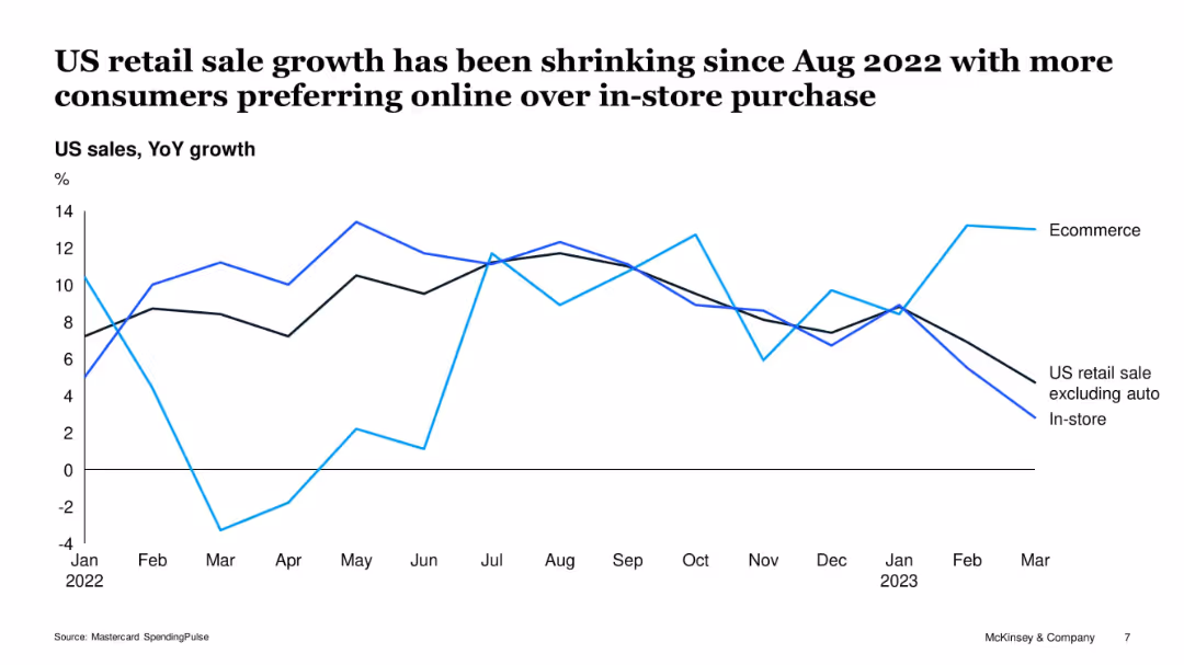
Line chart with 3 series (ecommerce, in-store, retail excl. auto); visual trend emphasis
Market Analysis and Trends
Retail & E-commerce
The slide shows a clear divergence in retail growth trends since mid-2022. Ecommerce sales remain resilient, while in-store retail has declined. The data suggests a consumer shift toward online shopping, particularly during uncertain economic periods, reflecting evolving purchase behavior.
ecommerce, retail, in-store, consumer behavior, sales growth, Mastercard, trend
false
Market Analysis and Trends
Retail & E-commerce
Single Chart
McKinsey
Add to my slides
Remove from favorites
The slide features a multi-faceted analysis with icons and bullet points, highlighting the impact of rural e-commerce strategies in China.
Market Analysis and Trends
Retail & E-commerce
Discussing the successful increase in rural e-commerce due to service centers and partnerships, this slide presents a case study on expanding digital comfort and online purchasing within rural communities in China.
E-commerce, rural strategy, China, digital adoption
false
Market Analysis and Trends
Retail & E-commerce
Header Vertical
BCG
Add to my slides
Remove from favorites
Features a column chart comparing actual eCommerce sales against goals for FY16 to FY18, with future aspirations for FY20. The chart uses blue and green colors to distinguish between actual results and goals.
Sales and Business Development
Retail & E-commerce
Analyzes the growth of Clorox's eCommerce sales, highlighting the success against set goals and future targets. Useful for discussions on eCommerce strategies and sales performance reviews.
eCommerce, sales growth, Clorox, strategic planning
false
Sales and Business Development
Retail & E-commerce
Single Chart
Barclays
Add to my slides
Remove from favorites
Slide with multiple bar graphs comparing ecommerce GMV across years and highlighting causes for 2021-2022 slowdown.
Financial Performance
Retail & E-commerce
Outlines the ecommerce sales trend, illustrating how despite slower growth, sales continue to rise with factors like inflation and supply chain pressures affecting growth rates.
ecommerce, sales trends, GMV, inflation, supply chain
false
Financial Performance
Retail & E-commerce
Multiple Chart
Bain
Add to my slides
Remove from favorites
This slide combines a comprehensive text description with a flowing graphic depicting a wave, which symbolizes growth and profitability. The design employs shades of blue and white, conveying a sense of clarity and forward movement.
Market Analysis and Trends
Technology & Software
Offering a detailed analysis of e-commerce trends, this slide argues for persistent growth in SEA despite a shift back to offline shopping, with a focus on profitability. It’s insightful for discussions on market dynamics, particularly for strategizing around customer retention, value-add services, and adapting to evolving consumer preferences.
e-commerce, SEA, growth trends, offline shopping, profitability, market analysis, consumer behavior
false
Market Analysis and Trends
Technology & Software
Single Chart
Bain
Add to my slides
Remove from favorites
This slide features a bar chart and column chart, bullet points, and a detailed methodology explanation. The design is dense with both textual and graphical information.
Market Analysis and Trends
Technology & Software
Projects the growth of the SEA ecommerce market, outlining the methodology of the calculation and the anticipated market size by 2025. It includes a bar chart representing the current and projected ecommerce spend, and a detailed explanation of the forecasting process.
eCommerce, SEA, market forecast, growth, methodology, bar chart, column chart
false
Market Analysis and Trends
Technology & Software
Mixed Chart
Bain
Add to my slides
Remove from favorites
A textual slide with headers and bullet points. It divides the ecommerce market into two segments, with company logos to represent examples.
Product and Service Analysis
Retail & E-commerce
Discusses the segmentation of the SEA ecommerce market into first-hand and second-hand goods, including the business models and monetization strategies of each, along with market size data and notable companies in the region.
eCommerce, SEA, market segments, first-hand goods, second-hand goods
false
Product and Service Analysis
Retail & E-commerce
Header Vertical
Bain
Add to my slides
Remove from favorites
This slide has a two-column format discussing present strategies under "Today" and future strategies under "Tomorrow", each accompanied by icons and numerical data.
Strategic Planning
Technology & Software
Outlines current and future strategies for e-commerce, useful for strategic planning sessions focusing on retail and technological improvements.
e-commerce, strategic planning, retail strategies, technology, business development
false
Strategic Planning
Technology & Software
Boxed
JP Morgan
Add to my slides
Remove from favorites
Presents multiple line graphs showing search trends for online selling-related queries across various countries. The design is simple, with emphasis on trend lines and minimal text.
Market Analysis and Trends
Technology & Software
Discusses the increasing efforts of suppliers to meet rising online demand, as indicated by search trends. It is useful for understanding supply dynamics in the e-commerce market.
e-Commerce, suppliers, online demand, search trends, market dynamics
false
Market Analysis and Trends
Technology & Software
Multiple Chart
Bain
Add to my slides
Remove from favorites
Bar charts illustrate sectoral growth with a focus on e-commerce and travel, using clear visual distinction and annotations.
Market Analysis and Trends
Technology & Software
Evaluates the significant rise in Thailand's e-commerce, compensating for slower recovery in travel, with projections until 2025.
E-commerce, Thailand, Travel, Growth, Recovery, Projections, 2025, Sectors
false
Market Analysis and Trends
Technology & Software
Multiple Chart
Bain
Add to my slides
Remove from favorites
Presents four column charts depicting GMV per sector in Singapore, including e-commerce, transport, travel, and media from 2015 to 2025, with a title and legends.
Market Analysis and Trends
Technology & Software
Evaluates sector-specific growths and declines within Singapore’s digital economy, highlighting challenges and opportunities, particularly useful for sector-specific strategy development.
E-commerce, Transport, Food, Travel, Media, Singapore
false
Market Analysis and Trends
Technology & Software
Multiple Chart
Bain
Add to my slides
Remove from favorites
Title at the top with three bar graphs beneath it depicting the proportion of online purchases, and a bold prediction on the right.
Market Analysis and Trends
Retail & E-commerce
Analyzes the expected persistence of e-commerce habits post-pandemic, with data on the anticipated increase in online purchases.
e-commerce trends, online shopping, consumer predictions, data analysis, pandemic aftermath
false
Market Analysis and Trends
Retail & E-commerce
Single Chart
Accenture
Add to my slides
Remove from favorites
Diagrams and bullet points explain the consumer payment process, the management of funds by an eCommerce platform, and flexible payouts to merchants, alongside benefits listed at the bottom.
Operational Efficiency
Financial Services
Illustrates the end-to-end wholesale payment solutions and benefits for eCommerce platforms, emphasizing operational efficiency and treasury optimization, suitable for discussions on improving eCommerce payment systems.
eCommerce, Wholesale Payments, Treasury, Operational Efficiency, Payouts
false
Operational Efficiency
Financial Services
Linear Flow
JP Morgan
Add to my slides
Remove from favorites
The slide includes three line charts depicting US y/y real GDP (2005-25F), US unemployment rate (2005-25F), and US y/y CPI (2005-25F). The design is moderately complex with clear labels and projections marked with dashed lines. Text at the bottom explains key economic factors.
Market Analysis and Trends
Financial Services
The slide forecasts US economic activity in 2024, highlighting slower private sector activity, easing inflation, and a modest rise in unemployment. It discusses factors influencing these trends and implications for business leaders and consumers.
economic activity, GDP, unemployment, CPI, forecast
false
Market Analysis and Trends
Financial Services
Multiple Chart
EY
Add to my slides
Remove from favorites
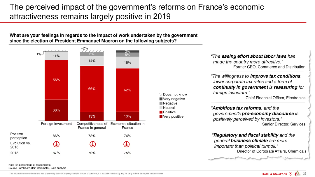
The slide includes three column charts depicting respondents' perceptions of government reforms' impact on foreign investment, competitiveness, and economic situation in France. Red and grey colors highlight positive and negative responses.
Market Analysis and Trends
Government & Public Sector
The slide highlights that most respondents view the government's reforms positively, with significant improvements in foreign investment and economic situation.
economic attractiveness, government reforms, foreign investment, competitiveness, France, 2019
false
Market Analysis and Trends
Government & Public Sector
Mixed Chart
Bain
Add to my slides
Remove from favorites
Features one column chart displaying 'Economic benefits of Copernicus through its contribution to marine exploitation and preservation' and a flow diagram showing economic impacts with icons representing various sectors such as fishing and ship routing.
Market Analysis and Trends
Environmental Services & Sustainability
The slide outlines the economic benefits from using Copernicus-derived products, focusing on improvements in ship routing and fisheries, with potential market and job creation impacts highlighted.
Economic Benefits, Copernicus, Fisheries, Ships
false
Market Analysis and Trends
Environmental Services & Sustainability
Mixed Chart
PwC/Strategy&
Add to my slides
Remove from favorites
Previous
Next
You don't have any favorites yet.
Please wait loading your favorites slides...
Create a FREE account to continue browsing
Receive Instant Access to 1,000+ slides from companies like McKinsey, Google, and Goldman Sachs
First Name
Last Name
Email
Password
I agree to all
Terms & Privacy Policy
Thank you! Your submission has been received!
Oops! Something went wrong while submitting the form.
Have an account?
Sign in
Upgrade to PRO to Save slides
Advanced Search and Filters
Access to 15,000+ slides
Access to Category Pages
Save/Bookmark Slides
PowerPoint Template Library
Pick a Plan
MONTHLY
$12/month
Billed every month, Cancel anytime.
YEARLY
$9/year
Billed $108 annually, Cancel anytime.
Checkout for $12/month
Checkout for $108/yr
Secured by Stripe | AES-256 bit encryption