My Account
My Slides
Search by Category
Companies
Slide Type
Use Case
Industry
Pricing
Templates
View All Templates
Download Template Slides
✦ AI
AI Prompt Library
AI Search
Feedback
Login
Logout
Get Started
Browse all Slides
Browse all Slides
Create a FREE Account
Instant access to 1,000+ real slides from top companies like McKinsey, BCG, Goldman Sachs, Google and many more!
First Name
Last Name
Email
Password
I agree to all
Terms & Privacy Policy
Thank you! Your submission has been received!
Oops! Something went wrong while submitting the form.
Have an account?
Sign in
Saved Slides
Total No. of slides saved
0
↻ Refresh
✖ Clear all
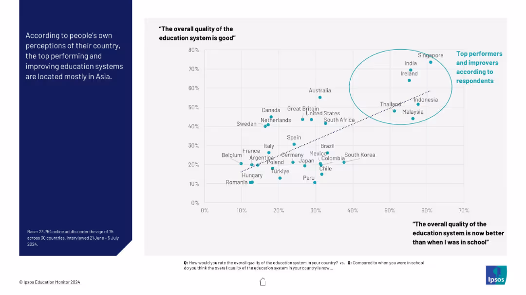
Scatter plot comparing countries on how good and improved their education systems are perceived to be. Countries like Singapore and India are highlighted in a circle as top performers.
Performance Metrics and KPIs
Education & Training
This slide shows the relationship between current perception of education quality and perceived improvement over time. It highlights countries that rank high in both, predominantly in Asia, suggesting cultural and systemic strengths.
education systems, top performers, perception, improvement, Ipsos, Asia, public opinion
false
Performance Metrics and KPIs
Education & Training
Mixed Chart
IPSOS
Add to my slides
Remove from favorites
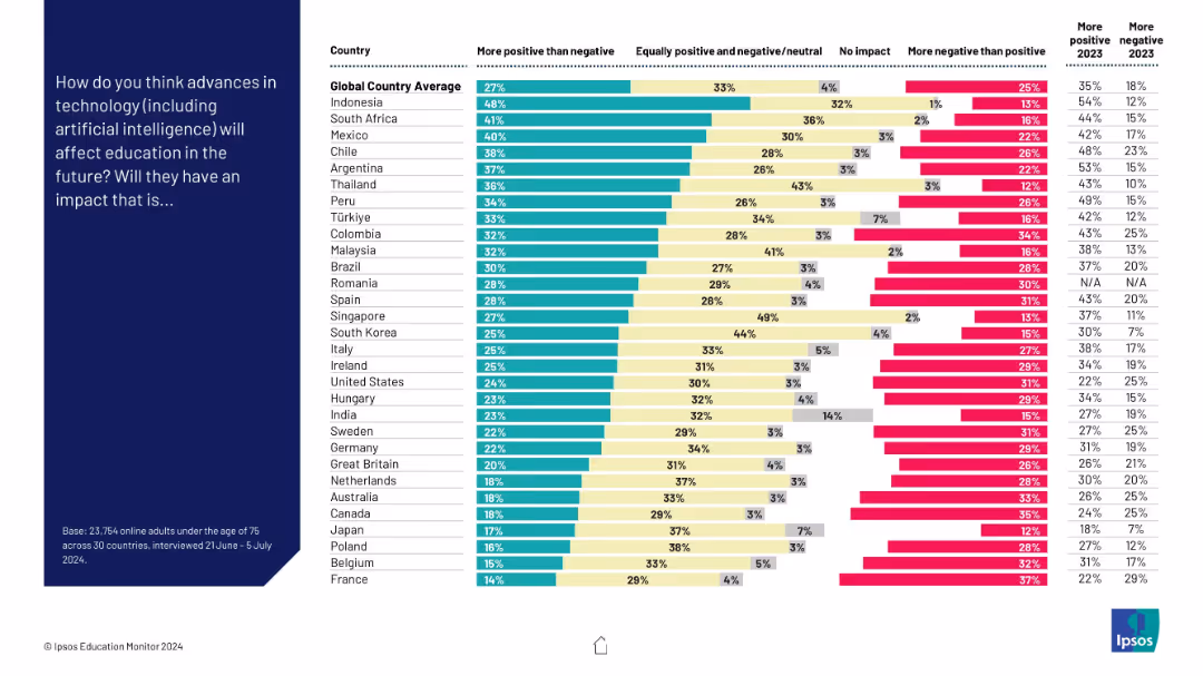
Vertical bar chart on the right showing responses from various countries, with segmented bars (more positive, neutral, no impact, more negative); dark blue left panel with question text
Market Analysis and Trends
Education & Training
The slide presents survey results across 30 countries on public perceptions of how technology (including AI) will affect education. Most countries lean toward a positive view, but significant variation exists, with some populations more skeptical.
education, technology, AI, perception, global, survey, positivity, negativity, impact
false
Market Analysis and Trends
Education & Training
Mixed Chart
IPSOS
Add to my slides
Remove from favorites
The slide uses dark green shades in a vertical bar graph format to depict the transfer rates of community college students to four-year institutions, including text annotations.
Human Resources and Talent Management
Education & Training
This slide outlines the transfer rates and graduation rates for community college students, highlighting the disparity in transfer success based on income levels.
education, transfer, community college, graduation, statistics
false
Human Resources and Talent Management
Education & Training
Mixed Chart
BCG
Add to my slides
Remove from favorites
The slide features a large pie chart detailing higher education spending and a text box with bullet points detailing the value proposition and strategic execution.
Market Analysis and Trends
Education & Training
This slide discusses the value proposition of higher education, emphasizing the significance of private education loans. It can be used to demonstrate market potential and strategic growth within the private education loan sector.
Education, Value Proposition, Loans, Market Growth, Strategic Execution, Higher Education, Investment
false
Market Analysis and Trends
Education & Training
Mixed Chart
Morgan Stanley
Add to my slides
Remove from favorites
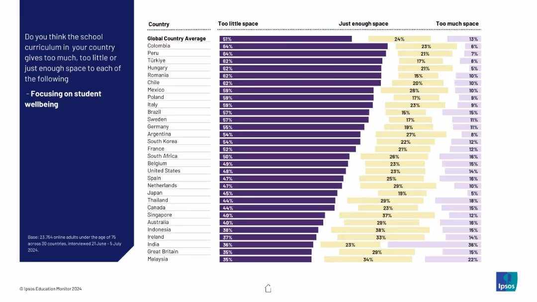
Bar chart comparison by country; vertical layout with three segments: "Too little", "Just enough", "Too much".
Market Analysis and Trends
Education & Training
This slide presents global survey results showing public opinion on how well school curricula focus on student wellbeing. Most countries show high dissatisfaction, indicating that wellbeing receives too little space in education.
education, wellbeing, global survey, school curriculum, student needs, priorities, country comparison, perception, policy, Ipsos
false
Market Analysis and Trends
Education & Training
Mixed Chart
IPSOS
Add to my slides
Remove from favorites
Column charts display the top countries by the absolute number of post-secondary educated individuals in their young workforce for 2020 and projections for 2050.
Market Analysis and Trends
Education & Training
Analyzes current figures and future projections of post-secondary educational attainment in the young workforce of major countries, emphasizing the growing role of India and China and the relative performance of others like Korea and Japan.
education, workforce, projection, 2020, 2050
false
Market Analysis and Trends
Education & Training
Multiple Chart
Roland Berger
Add to my slides
Remove from favorites
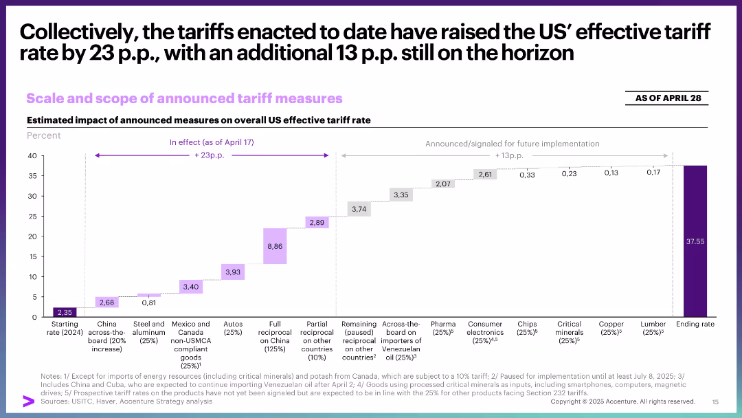
Waterfall chart illustrating cumulative increase in effective tariff rate from 2024 to 2025 across product categories.
Financial Performance
Government & Public Sector
This slide quantifies the cumulative impact of enacted and proposed tariffs, estimating a total increase of 36.9 percentage points in effective tariff rates. It breaks down contributions by category and timing.
effective tariff rate, US trade, waterfall chart, policy impact, pricing, implementation timeline
false
Financial Performance
Government & Public Sector
Single Chart
Accenture
Add to my slides
Remove from favorites
Split layout with text and bullet points detailing vaccine efficacy scenarios, complemented by quotes and regulatory considerations.
Regulatory and Compliance
Healthcare & Pharmaceuticals
Discusses the implications of different COVID-19 vaccine efficacy rates on public health strategy and vaccine adoption policies.
efficacy, vaccine, COVID-19, health policy
false
Regulatory and Compliance
Healthcare & Pharmaceuticals
Header Vertical
BCG
Add to my slides
Remove from favorites
This slide has two main sections: a comparison of cost reduction over years with column charts, and a list of efficiency improvements in text form on the right.
Operational Efficiency
Financial Services
It focuses on the efficiencies gained in the underlying business operations within Consumer & Community Banking, showing a decrease in costs and improvements in productivity metrics since 2014.
efficiency, cost, productivity, banking, operations, improvement
false
Operational Efficiency
Financial Services
Mixed Chart
JP Morgan
Add to my slides
Remove from favorites
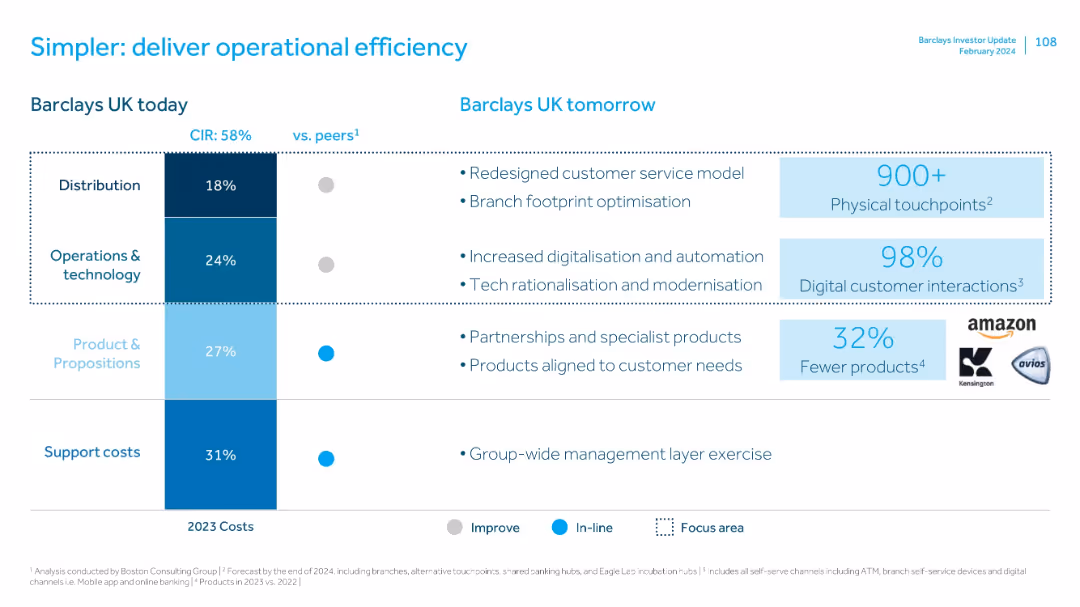
Side-by-side comparison table of current cost structure vs. future focus areas, with visual emphasis using color codes and callouts.
Operational Efficiency
Financial Services
Analyzes Barclays UK's current operational costs by department and outlines future efficiency initiatives like digitalization, service redesign, and product simplification. Includes quantitative highlights on touchpoints and product reduction.
efficiency, costs, operations, technology, product, customer service
false
Operational Efficiency
Financial Services
Mixed Chart
Barclays
Add to my slides
Remove from favorites
The slide showcases a column chart displaying a decrease in branch transactions against an increase in other channel transactions, along with a list of technological levers and movement to more efficient channels.
Operational Efficiency
Financial Services
It contrasts the decline in branch transactions with growth in digital channel usage, underscoring the efficiency driven by technology in banking operations. Ideal for analyzing technology's role in operational efficiency.
Efficiency, Digital Channels, Branch Transactions, Technological Levers, Automation, Process Improvement
false
Operational Efficiency
Financial Services
Multiple Chart
Morgan Stanley
Add to my slides
Remove from favorites
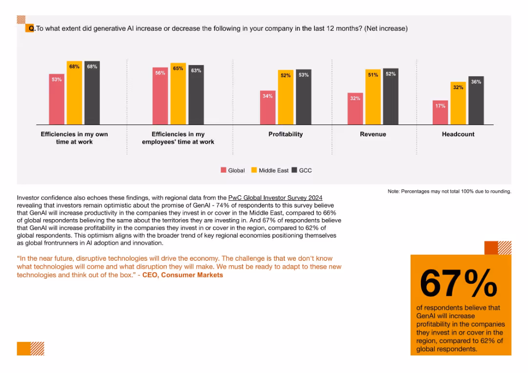
Five-category bar chart comparing impacts of GenAI on efficiency, profitability, revenue, and headcount by region
Performance Metrics and KPIs
Artificial Intelligence
This slide tracks measurable outcomes of GenAI adoption, including improved work efficiencies, profitability, and revenue. GCC firms report the highest gains in headcount, reflecting strong AI integration.
Efficiency, GenAI Impact, Headcount, Productivity, KPIs, AI Metrics, Regional Comparison
false
Performance Metrics and KPIs
Artificial Intelligence
Mixed Chart
PwC/Strategy&
Add to my slides
Remove from favorites
The slide visually represents investment strategies and efficiency measures through a sequence of connected column chart, indicating target metrics over time. The design is clean and effectively uses space to separate different focus areas.
Operational Efficiency
Financial Services
Highlights JPMorgan's operational strategies aimed at balancing cost management with strategic investments to foster growth.
efficiency, investment, operational improvement, location strategy, expense management, revenue growth
false
Operational Efficiency
Financial Services
Mixed Chart
JP Morgan
Add to my slides
Remove from favorites
The slide features text discussing efficiency measures in pharma and a line chart comparing TSR of pharma against other stock markets.
Financial Performance
Healthcare & Pharmaceuticals
This slide highlights how efficiency measures in the pharma industry have driven strong investor returns, with comparative data on stock performance.
efficiency measures, investor returns, TSR, stock markets, pharma industry
false
Financial Performance
Healthcare & Pharmaceuticals
Multiple Chart
Roland Berger
Add to my slides
Remove from favorites
Series of column charts comparing efficiency metrics across years for different product categories within Essity. Each chart is labeled with the specific area and metric change.
Operational Efficiency
Financial Services
Focuses on Essity's efforts to optimize cost, capital, and resource efficiency in production, essential for operational reviews and strategic adjustments.
Efficiency Metrics, Cost Optimization, Capital Efficiency, Resource Management
false
Operational Efficiency
Financial Services
Multiple Chart
Barclays
Add to my slides
Remove from favorites
The slide features multiple boxes outlining efficiency initiatives and a column chart comparing cost ratios.
Operational Efficiency
Financial Services
Describes efficiency gains since 2014 with workforce and branch network optimization, robot deployment, and productivity increases.
efficiency, optimization, cost reduction, workforce, branch network
false
Operational Efficiency
Financial Services
Mixed Chart
UBS
Add to my slides
Remove from favorites
A slide with a dark background displaying a column chart of the trailing twelve months' efficiency ratio and a box detailing efficiency drivers.
Operational Efficiency
Financial Services
The slide focuses on operational efficiency, showing the efficiency ratio trend over time and identifying key drivers of efficiency improvement.
efficiency ratio, operational efficiency, cost efficiencies, revenue growth, deal-related expenses, KPIs, scaling
false
Operational Efficiency
Financial Services
Mixed Chart
Goldman Sachs
Add to my slides
Remove from favorites
This slide presents a column chart visualizing the 'Efficiency Ratio' trend, along with a comprehensive table detailing various expense categories and their respective changes compared to prior periods.
Financial Performance
Financial Services
Offers a detailed view of the company's expenses, showcasing factors contributing to the efficiency ratio and providing context for the financial data, such as increased non-compensation expenses and changes in the effective tax rate.
Efficiency Ratio, Operational Expenses, Compensation, Depreciation, Technology, Professional Fees, Tax Rate, Financial Health
false
Financial Performance
Financial Services
Mixed Chart
Goldman Sachs
Add to my slides
Remove from favorites
Includes a table comparing CCB returns and overhead ratios with industry peers, and column charts showing overhead ratio comparisons within JP Morgan Chase's largest business segments.
Competitive Landscape
Financial Services
This slide compares JP Morgan Chase & Co.'s efficiency and return metrics against industry peers and within its own largest business segments, suitable for presentations on competitive analysis and financial benchmarking.
efficiency, returns, competitive analysis, financial benchmarking, JP Morgan Chase, business segments, industry peers
false
Competitive Landscape
Financial Services
Multiple Chart
JP Morgan
Add to my slides
Remove from favorites
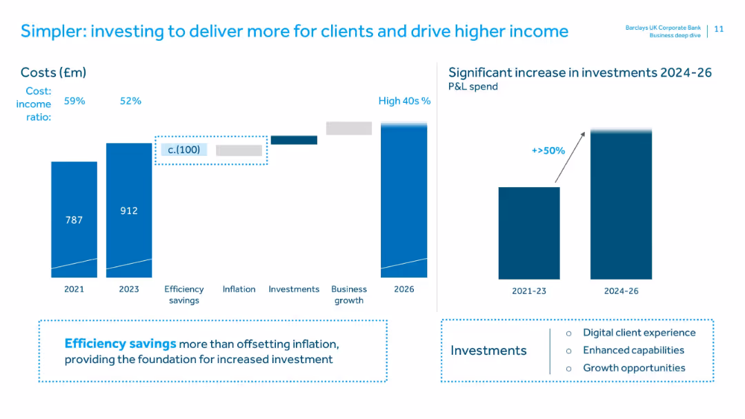
Dual bar charts on left (cost trends 2021–2026) and right (investment increase 2024–26). Highlight boxes detail efficiency savings and investment areas.
Operational Efficiency
Financial Services
Illustrates cost management with reduced cost-income ratio and increased investment plans. Emphasizes that efficiency savings will enable reinvestment in digital experience, capability building, and business growth.
efficiency savings, cost-income ratio, investment, digital experience, business growth, operational efficiency, financial planning
false
Operational Efficiency
Financial Services
Multiple Chart
Barclays
Add to my slides
Remove from favorites
Diagrams and textual descriptions detail the workings of the eFishery platform, illustrating interactions between technology and aquaculture.
Product and Service Analysis
Agriculture & Food Production
Explains the eFishery platform’s role in enhancing aquaculture through technology, focusing on sustainability and efficiency, relevant for stakeholders in agriculture and technology.
eFishery, aquaculture, technology, sustainability, diagrams, platform, service analysis, agriculture, interaction
false
Product and Service Analysis
Agriculture & Food Production
Framework
Bain
Add to my slides
Remove from favorites
The slide features a colorful diagram illustrating the EFX Cloud architecture, highlighting various technological aspects such as data integration, real-time analytics, and built-in security features.
Technology and Digital Transformation
Technology & Software
This slide introduces the next phase in Equifax's cloud technology, detailing the enhanced capabilities and benefits of the EFX Cloud in improving service delivery and data management across its operations.
EFX Cloud, technology, data management, security
false
Technology and Digital Transformation
Technology & Software
Diagram
Barclays
Add to my slides
Remove from favorites
With a split layout, the left side presents metrics and definitions under the title 'ENVIRONMENTAL HEALTH & SAFETY METRICS', while the right side emphasizes 'INCLUSIVE FACILITY DESIGN'. The color scheme is white, teal, and black with a minimalist design. There's a photo depicting a modern, accessible workspace, reinforcing the slide's focus on safety and inclusion. The bottom right displays the page number '25'.
Regulatory and Compliance
Professional Services
The slide conveys the company’s dedication to safety through its Environmental Health & Safety (EHS) program. It presents past safety metrics, underlining a commitment to safe work conditions, particularly in response to changes brought on by the pandemic. Additionally, it details the efforts towards creating inclusive and ergonomic workspaces that reflect a hybrid work model and the diverse workforce needs.
EHS, safety, inclusion, pandemic, workspace design, metrics
false
Regulatory and Compliance
Professional Services
Table
Booz Allen Hamilton
Add to my slides
Remove from favorites
This slide features two line charts and one column chart displaying polling data for the 2024 election, with red and blue lines representing different political candidates.
Market Analysis and Trends
Government & Public Sector
Analyzes polling data for the 2024 election, comparing it to the 2020 election trends for both Republican and Democratic candidates, highlighting potential similarities.
Election, Polling, Data, Analysis, Trends
false
Market Analysis and Trends
Government & Public Sector
Multiple Chart
JP Morgan
Add to my slides
Remove from favorites
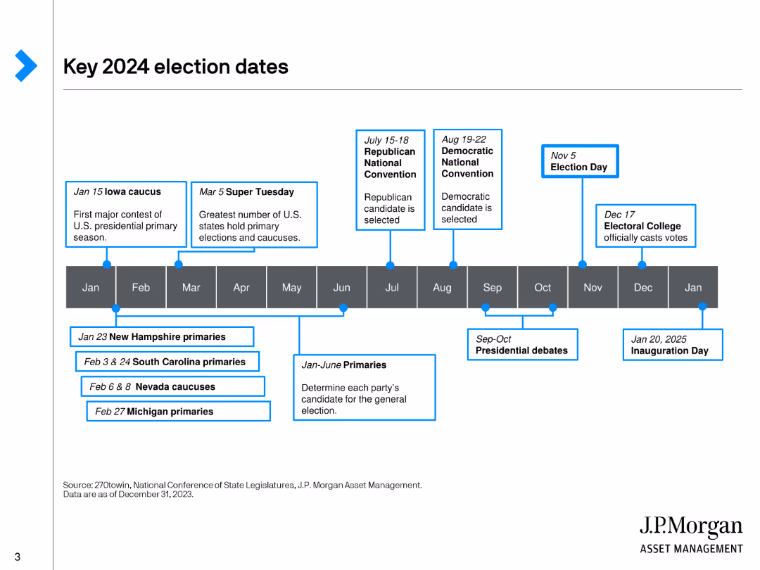
A timeline layout presenting key election dates for 2024, using a horizontal timeline with blue highlights to mark significant events and dates.
Regulatory and Compliance
Government & Public Sector
Provides a detailed timeline of key dates in the 2024 U.S. election cycle, including primary dates, conventions, election day, and inauguration day.
Election, Timeline, Dates, Government, Compliance
false
Regulatory and Compliance
Government & Public Sector
Linear Flow
JP Morgan
Add to my slides
Remove from favorites
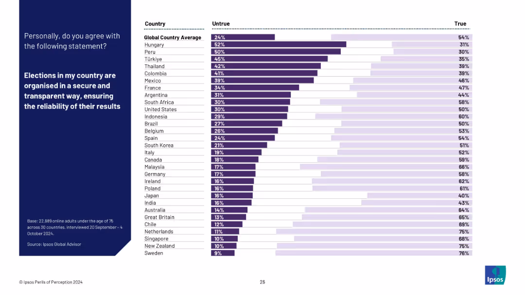
Horizontal bar chart on trust in election transparency. Countries ranked by % saying the statement is untrue vs true: “Elections in my country are secure and transparent.” Blue panel left, white background chart.
Risk Assessment and Management
Government & Public Sector
This slide displays global trust levels in electoral systems. Hungary, Peru, and Türkiye exhibit high distrust, while Sweden, New Zealand, and Singapore demonstrate strong confidence in election transparency.
election trust, political systems, voter confidence, democracy, public opinion, transparency, Ipsos, international rankings
false
Risk Assessment and Management
Government & Public Sector
Mixed Chart
IPSOS
Add to my slides
Remove from favorites
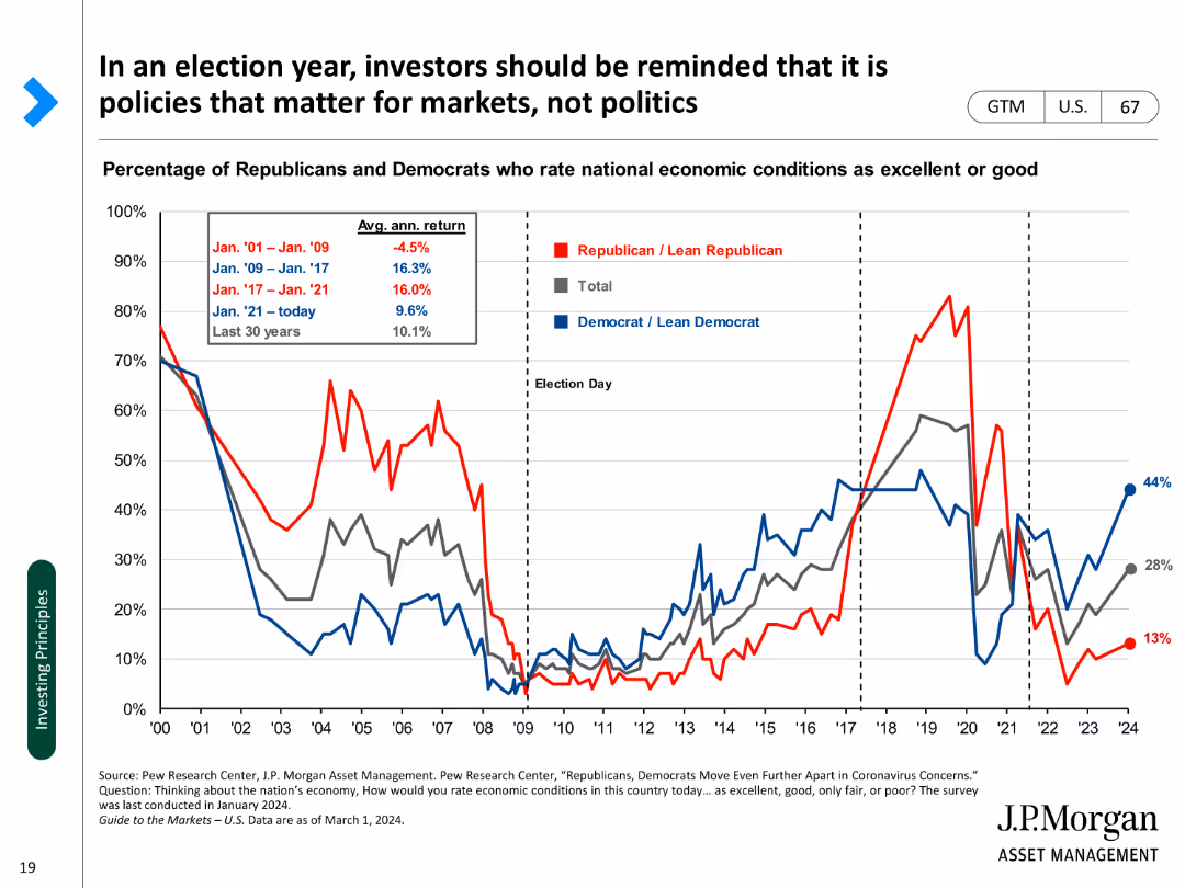
A line chart showing the percentage of Republicans and Democrats rating economic conditions as excellent or good over time.
Market Analysis and Trends
Financial Services
Examines the relationship between political sentiment and economic perceptions during election years.
Election year, investors, policies, economic conditions, sentiment, political, analysis, trends, perceptions
false
Market Analysis and Trends
Financial Services
Single Chart
JP Morgan
Add to my slides
Remove from favorites
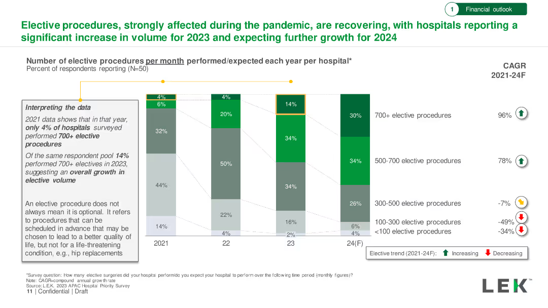
The slide features a combination of column charts to show the number of elective procedures per month performed or expected each year in different markets, alongside a bar chart listing departments with recovered operations.
Market Analysis and Trends
Healthcare & Pharmaceuticals
This slide analyzes the volume of elective procedures in APAC hospitals, showing data on monthly procedures performed or expected each year. It also highlights departments that have recovered to pre-COVID-19 operation levels.
elective procedures, APAC, healthcare, hospitals, recovery
false
Market Analysis and Trends
Healthcare & Pharmaceuticals
Multiple Chart
LEK
Add to my slides
Remove from favorites
Bar chart showing the number of elective procedures per month from 2021 to 2024, with percentages of hospitals performing varying volumes.
Market Analysis and Trends
Healthcare & Pharmaceuticals
Examination of the recovery in elective procedures post-pandemic, indicating significant growth in volume through 2024.
Elective Procedures, Pandemic, Recovery, Growth, Hospital Volume
false
Market Analysis and Trends
Healthcare & Pharmaceuticals
Mixed Chart
LEK
Add to my slides
Remove from favorites
Timeline showing the projected development of electric and hybrid-electric aviation technologies from 2020 to 2050.
Technology and Digital Transformation
Transportation & Logistics
This slide discusses the challenges and advancements in electrifying the aviation sector. It provides a timeline for the development of electric air taxis, hybrid-electric aircraft, and battery-powered planes, emphasizing their potential to reduce CO2 emissions and transform aviation.
Electric Aviation, Decarbonization, Timeline
false
Technology and Digital Transformation
Transportation & Logistics
Linear Flow
Roland Berger
Add to my slides
Remove from favorites
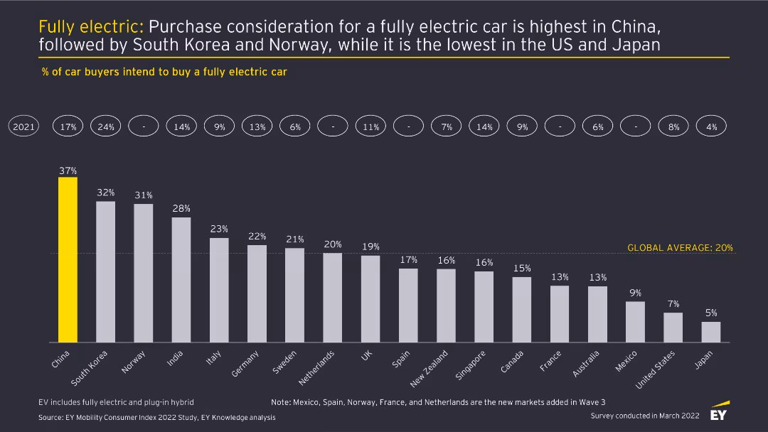
This slide features a column chart displaying the percentage of car buyers intending to buy a fully electric car across different countries. Each country is represented by a vertical bar with percentages labeled on top. The slide has a dark background with yellow highlights.
Market Analysis and Trends
Transportation & Logistics
The slide analyzes the intent to purchase fully electric cars in various countries, highlighting China as the highest and Japan as the lowest. It provides a comparison of consumer interest across 18 countries, showing the global average.
Electric cars, purchase intent, market analysis, consumer trends, automotive industry
false
Market Analysis and Trends
Transportation & Logistics
Single Chart
EY
Add to my slides
Remove from favorites
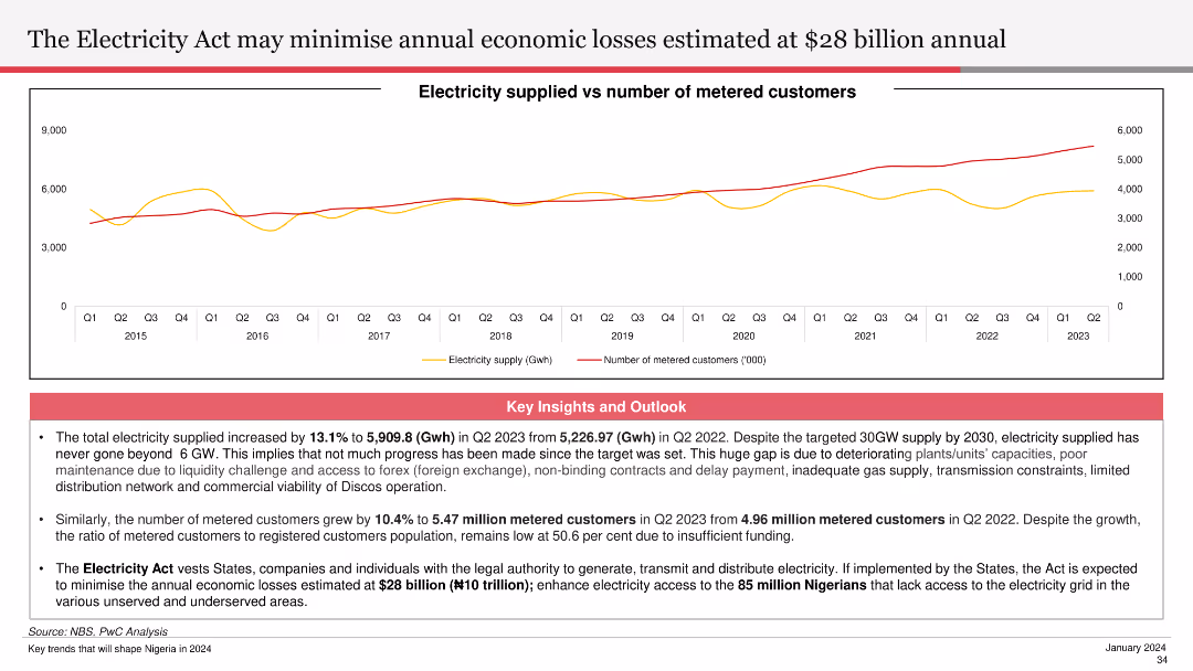
The slide includes a line chart showing electricity supplied versus the number of metered customers from Q1 2015 to Q2 2023. Key insights and outlooks discuss the potential economic impact of the Electricity Act and improvements in electricity supply.
Regulatory and Compliance
Energy & Utilities
This slide analyzes the expected impact of the Electricity Act on minimizing annual economic losses, highlighting improvements in electricity supply and customer metering. It discusses the Act's potential to enhance access and economic stability.
Electricity Act, economic losses, electricity supply, metered customers, economic stability
false
Regulatory and Compliance
Energy & Utilities
Mixed Chart
PwC/Strategy&
Add to my slides
Remove from favorites
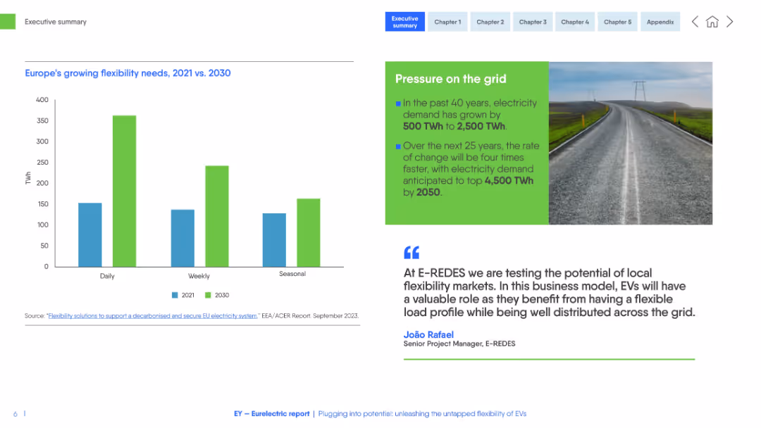
Clean white-blue layout with bar chart (TWh by time frame), photo of road and power lines, and testimonial with green sidebar.
Technology and Digital Transformation
Energy & Utilities
This slide compares electricity flexibility needs in Europe between 2021 and 2030. It forecasts a significant increase in daily, weekly, and seasonal demand, driven by EV integration and energy transition. A testimonial emphasizes distributed grid solutions.
electricity demand, flexibility, EVs, power grid, energy transition, TWh, distributed energy
false
Technology and Digital Transformation
Energy & Utilities
Mixed Chart
EY
Add to my slides
Remove from favorites
Utilizes bubble charts and linear elements to depict potential industry and societal values from digitalization in electricity, including negative impacts.
Market Analysis and Trends
Energy & Utilities
Discusses the digital transformation in electricity potentially unlocking $3.1 trillion in value, focusing on customer and emissions benefits.
Electricity, Digitalization, Societal Impact, Customer Value, Emissions Reduction
false
Market Analysis and Trends
Energy & Utilities
Mixed Chart
Accenture
Add to my slides
Remove from favorites
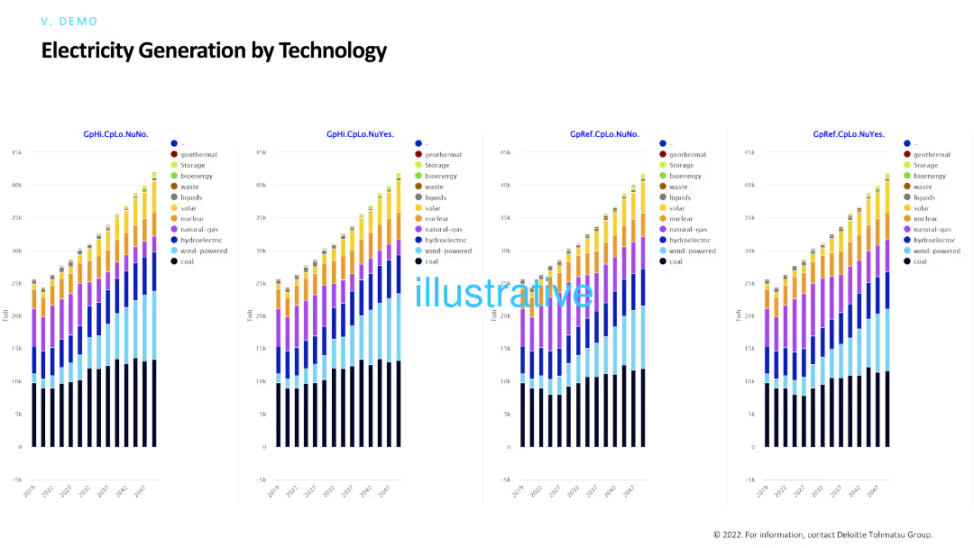
The slide includes multiple column charts comparing electricity generation by different technologies (geothermal, solar, nuclear, etc.) under various scenarios. Each chart shows a breakdown of technology contributions over time.
Technology and Digital Transformation
Energy & Utilities
This slide compares electricity generation technologies across different scenarios, highlighting the contributions of various sources like solar, wind, and nuclear, and projecting future energy mixes.
Electricity generation, technology, renewable energy, scenarios, energy mix
false
Technology and Digital Transformation
Energy & Utilities
Multiple Chart
Deloitte
Add to my slides
Remove from favorites
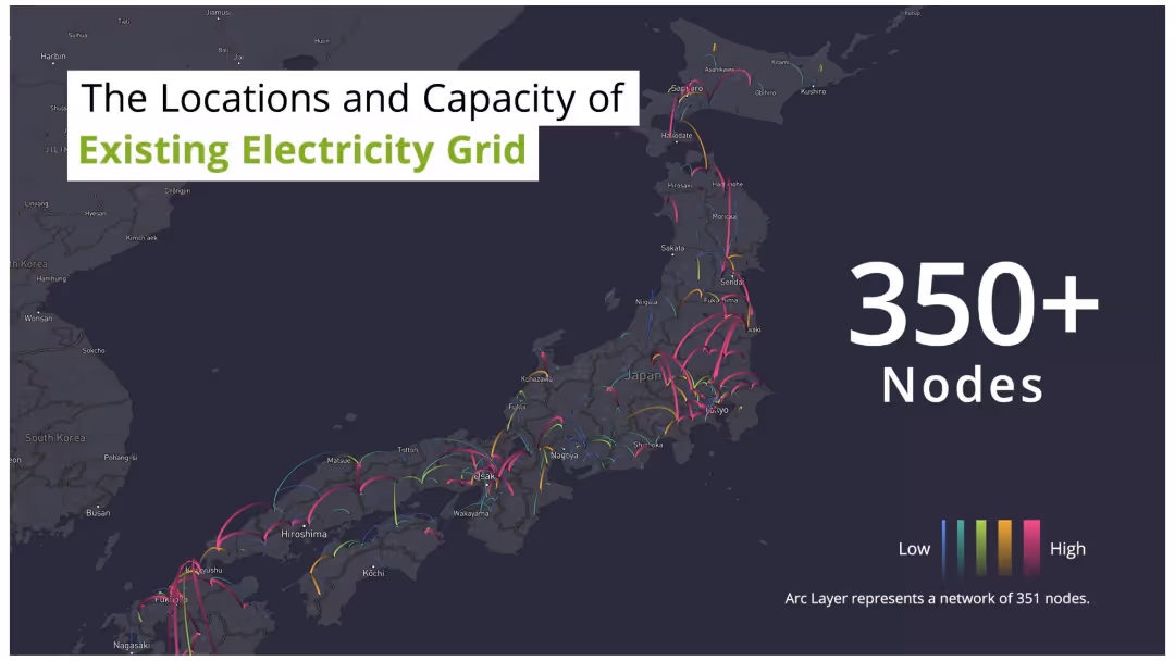
The slide features a dark map of Japan with arc lines connecting various points, indicating the locations and capacities of the electricity grid nodes. The arcs are color-coded from low to high capacity. There is also a legend.
Technology and Digital Transformation
Energy & Utilities
The slide provides an overview of the existing electricity grid in Japan, highlighting over 350 nodes with varying capacities. It's useful for understanding current infrastructure and planning upgrades.
Electricity grid, nodes, capacity, Japan, map
false
Technology and Digital Transformation
Energy & Utilities
Graphic
Deloitte
Add to my slides
Remove from favorites
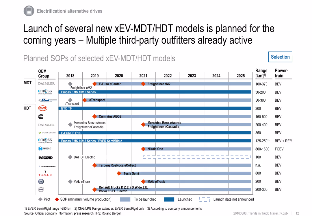
Gantt-style chart with horizontal bars across years (2018–2025) showing truck model launches; includes legend and vehicle details
Product and Service Analysis
Transportation & Logistics
This slide presents a timeline of electric medium and heavy-duty truck model launches by major OEMs. It includes BEV, FCEV, and hybrid variants with SOPs, pilot phases, and announced projects. It highlights industry readiness and growing diversity in powertrain technology.
electric trucks, OEMs, xEV, model launch, timeline, MDT, HDT, SOP, BEV, powertrain
false
Product and Service Analysis
Transportation & Logistics
Single Chart
Roland Berger
Add to my slides
Remove from favorites
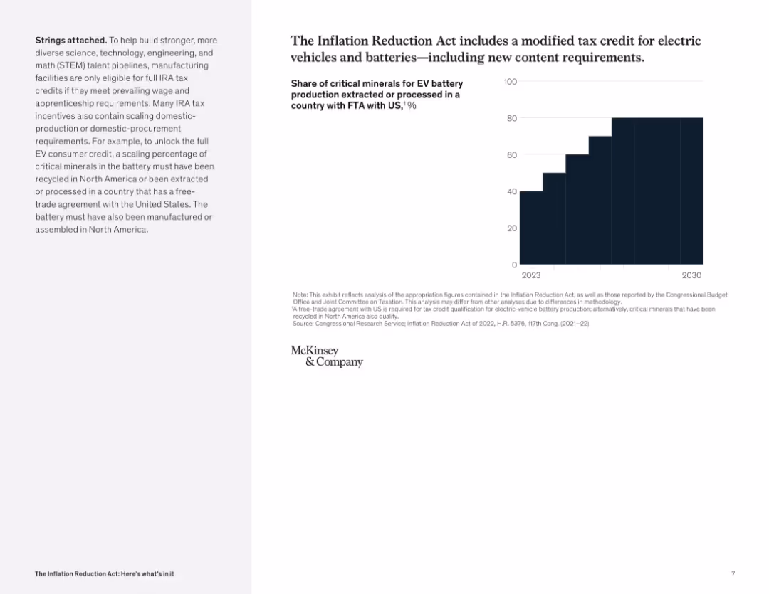
Bar chart showing percentage increase from 2023 to 2030; minimalist black bar on white background; left-side note on eligibility criteria.
Regulatory and Compliance
Industrial & Manufacturing
This slide explains new eligibility rules for EV battery tax credits under the IRA, requiring critical minerals to be sourced from specific countries. It emphasizes growing domestic content requirements over time.
electric vehicles, battery, tax credit, critical minerals, domestic production, FTA, North America
false
Regulatory and Compliance
Industrial & Manufacturing
Mixed Chart
McKinsey
Add to my slides
Remove from favorites
A bar chart shows the importance of various aspects of public EV charging experiences and payment preferences, with sections color-coded for clarity.
Market Analysis and Trends
Transportation & Logistics
Evaluates consumer priorities for public EV charging, including charging speed and payment methods, informing service improvement and customer satisfaction strategies in the automotive sector.
electric vehicles, charging experience, fast charging, payment methods, consumer preferences, service improvement, automotive industry
false
Market Analysis and Trends
Transportation & Logistics
Mixed Chart
Deloitte
Add to my slides
Remove from favorites
Comprises column charts representing the percentage of respondents considering EVs before and during COVID-19.
Market Analysis and Trends
Transportation & Logistics
Discusses the stability of consumer interest in electric vehicles despite the disruptions caused by the pandemic.
electric vehicles, consumer preference, market stability, global trends
false
Market Analysis and Trends
Transportation & Logistics
Multiple Chart
McKinsey
Add to my slides
Remove from favorites
Pie chart and bar chart detail where consumers prefer to charge EVs and their preferred public charging locations, respectively, using color coding and percentages.
Market Analysis and Trends
Transportation & Logistics
Assesses consumer charging behavior for electric vehicles, including most frequent charging locations and preferred charging station types, crucial for infrastructure planning in the automotive industry.
electric vehicles, consumer preferences, charging stations, public charging, infrastructure planning, home charging, station amenities
false
Market Analysis and Trends
Transportation & Logistics
Multiple Chart
Deloitte
Add to my slides
Remove from favorites
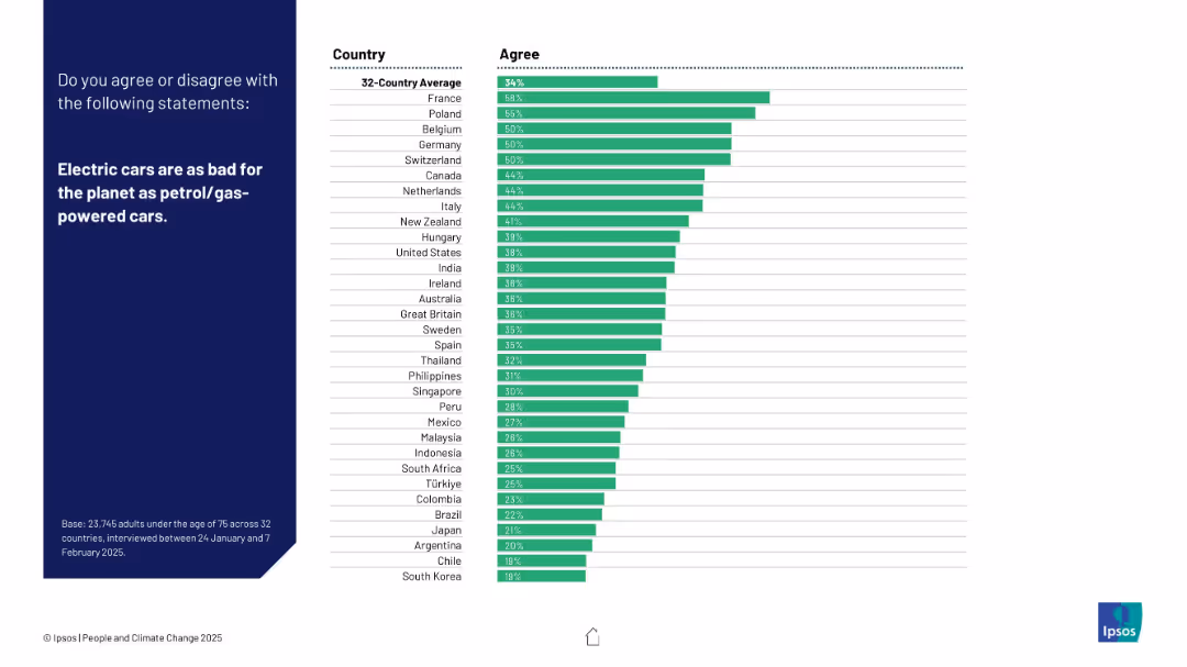
Bar chart layout with agreement percentages by country on right; statement and survey context on the left.
Market Analysis and Trends
Transportation & Logistics
The chart displays how many respondents believe electric cars are equally harmful to the environment as petrol/gas cars. France shows the highest agreement.
electric vehicles, emissions, sustainability, climate change, transportation, public perception, comparison, petrol cars, global opinion, Ipsos
false
Market Analysis and Trends
Transportation & Logistics
Mixed Chart
IPSOS
Add to my slides
Remove from favorites
Slide includes column charts showing targets versus actual sales for different electric vehicle categories, annotated with key insights and comparisons.
Performance Metrics and KPIs
Transportation & Logistics
Analyzes the discrepancy between planned and actual sales of electric vehicles under the FAME-II scheme, discussing implications for industry and policy adjustments.
electric vehicles, FAME-II, sales targets, actual sales, industry analysis, policy impact, market analysis
false
Performance Metrics and KPIs
Transportation & Logistics
Mixed Chart
PwC/Strategy&
Add to my slides
Remove from favorites
This slide contains three stacked column charts comparing the projected volume of electric vehicle units in the US, EU, and China from 2020 to 2035. Each region's chart shows significant growth in electric vehicle adoption, with China leading by volume.
Market Analysis and Trends
Transportation & Logistics
Analyzes regional differences in electric vehicle adoption, highlighting Europe and China as leaders in the transition towards electric mobility. This is relevant for discussions on global market dynamics and policy impacts on electric vehicle growth.
electric vehicles, market analysis, US, EU, China, adoption rates
false
Market Analysis and Trends
Transportation & Logistics
Multiple Chart
BCG
Add to my slides
Remove from favorites
The slide includes two column charts. The left chart shows the sales forecast for electric vehicles in the U.S. from 2012 to 2030, divided into plug-in hybrid and battery electric vehicles. The right chart presents the forecasted number of electric vehicle charging points in the U.S. from 2012 to 2030. Both charts use vertical bars and dotted lines to indicate future forecasts.
Market Analysis and Trends
Transportation & Logistics
This slide forecasts the growth of the electric vehicle market in the U.S., highlighting the increasing sales of electric vehicles and the expansion of charging infrastructure. It is intended to showcase the potential growth and investment opportunities in the electric vehicle sector.
Electric vehicles, market forecast, EV sales, charging infrastructure, transportation trends, market growth
false
Market Analysis and Trends
Transportation & Logistics
Multiple Chart
JP Morgan
Add to my slides
Remove from favorites
Features a column chart on the left showing global electric vehicle sales and market penetration, and a bar chart on the right showing the mineral content of EVs vs. conventional cars.
Market Analysis and Trends
Transportation & Logistics
It presents data on the growth of electric vehicle sales globally and the mineral requirements compared to conventional vehicles, indicating trends in the EV market.
electric vehicles, market penetration, mineral content, EV vs conventional cars, transportation, J.P. Morgan, sustainability, market trends, automotive industry, green technology
false
Market Analysis and Trends
Transportation & Logistics
Multiple Chart
JP Morgan
Add to my slides
Remove from favorites
The slide is divided into two main sections, featuring text on the left and a line chart on the right. The chart shows the purchase price difference over years between two types of vehicles.
Market Analysis and Trends
Transportation & Logistics
This slide analyzes the acceleration of electric vehicle price parity due to incentives, highlighting cost benefits over time. Useful for understanding market shifts and investment potential in the electric vehicle industry.
electric vehicles, price parity, incentives, market analysis, cost benefit, transportation, sustainability, investment
false
Market Analysis and Trends
Transportation & Logistics
Mixed Chart
BCG
Add to my slides
Remove from favorites
This slide includes multiple bar charts showing projections of electric vehicle adoption in the U.S. by 2030. It discusses light, medium, and heavy-duty vehicles.
Market Analysis and Trends
Transportation & Logistics
Focuses on the projected increase in electric vehicle sales by 2030, supported by incentives. It's helpful for strategic planning in automotive sectors and sustainability initiatives.
electric vehicles, sales projections, 2030, automotive industry, sustainability, incentives, strategic planning
false
Market Analysis and Trends
Transportation & Logistics
Multiple Chart
BCG
Add to my slides
Remove from favorites
Features images of EV charging and regulatory icons, with quotes from major automotive CEOs about shifts towards electrification.
Strategic Planning
Transportation & Logistics
Discusses the accelerating factors and strategic responses of automotive industries toward electrification, including regulatory impacts and market dynamics.
electrification, automotive industry, regulations, battery costs, OEM strategies, market dynamics
false
Strategic Planning
Transportation & Logistics
Pillar
BCG
Add to my slides
Remove from favorites
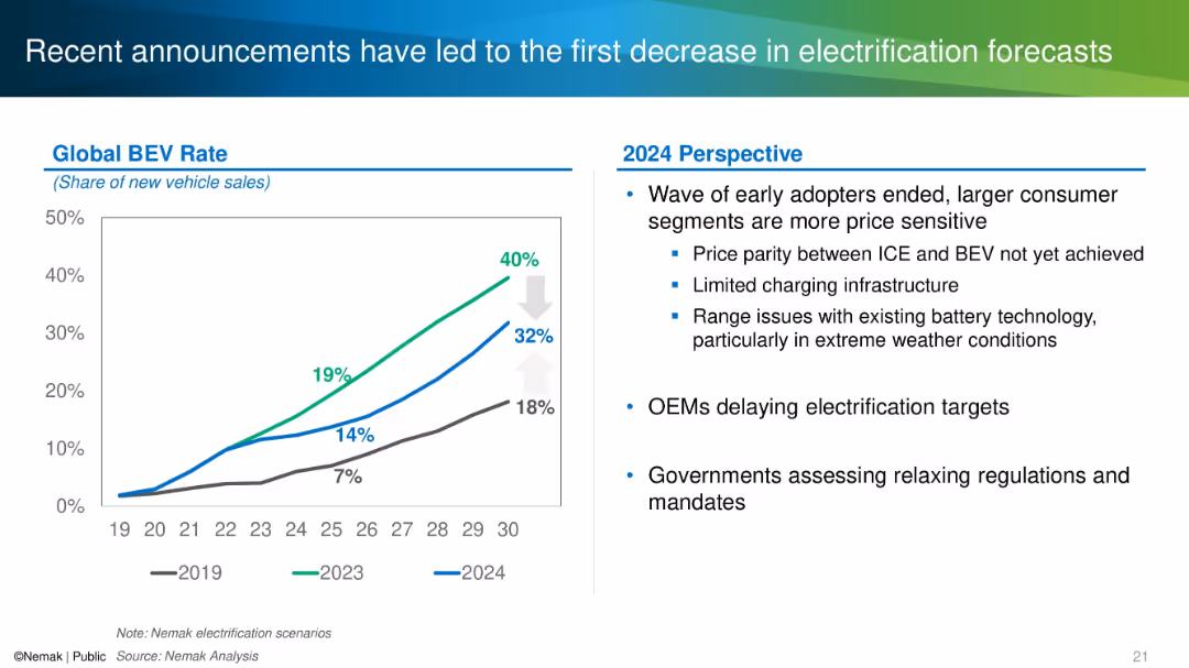
Split layout with a line chart showing BEV adoption rate scenarios on the left and textual analysis on the right.
Market Analysis and Trends
Industrial & Manufacturing
This slide discusses how changing market dynamics and consumer behaviors have lowered forecasts for global BEV adoption. It shows historical and revised adoption projections and notes OEM delays, regulatory reassessments, and technical challenges as contributing factors.
electrification, BEV, forecast, OEM, adoption rate, 2024 outlook
false
Market Analysis and Trends
Industrial & Manufacturing
Mixed Chart
Barclays
Add to my slides
Remove from favorites
Features stacked column charts showing electrification rates in Indonesia compared to other countries and across various regions within Indonesia.
Strategic Planning
Telecommunications
Analyzes the high electrification rate in Indonesia and the remaining challenges in ensuring all schools have electricity, crucial for modern education.
electrification, Indonesia, education, schools, energy access, urban, rural
false
Strategic Planning
Telecommunications
Multiple Chart
BCG
Add to my slides
Remove from favorites
This slide features multiple stacked column charts displaying the projected market share of different types of vehicle powertrains globally from 2018 to 2035. The colors differentiate types such as battery electric, plug-in hybrid, and gasoline, showing a trend towards electrification, especially after 2025.
Market Analysis and Trends
Transportation & Logistics
The slide presents data on the evolution of the vehicle powertrain market share over time, with a focus on the increasing role of electrified vehicles. It is useful for discussing the future of automotive industry trends, particularly electrification and its regulatory, technological, and market drivers.
electrification, market trends, vehicle powertrains, forecast, automotive industry
false
Market Analysis and Trends
Transportation & Logistics
Single Chart
BCG
Add to my slides
Remove from favorites
A graphically dense slide with multiple data presentations, including bar charts, icons, and callouts to highlight key figures. The slide presents information in contrasting colors of blue and yellow, with clear demarcations for different sections. Visuals include statistics on battery electric vehicles (BEVs), charts showing a premium vs. overall market share, and highlighted quotations for emphasis. There is a clear hierarchy of information from top to bottom with a strong visual flow.
Technology and Digital Transformation
Industrial & Manufacturing
Discusses the advantage of the company's tires in electric vehicles (EVs) and presents data on the adoption of BEVs. It provides insights on market share and future sales projections, relevant for conversations on technology strategy in the automotive sector.
electrification, OEM, BEVs, market share, technology, tires, electric vehicles, sales projections, automotive
false
Technology and Digital Transformation
Industrial & Manufacturing
Mixed Chart
Morgan Stanley
Add to my slides
Remove from favorites
The slide includes a bar chart showing the projected electricity demand growth by end-use technologies (TWh) from 2022 to 2050. Categories include Industrial, Commercial, Residential, Road Transport, and Other Transport. Each category has a detailed breakdown for the years 2022 and 2030.
Market Analysis and Trends
Energy & Utilities
This slide forecasts the doubling of power demand by 2050 due to electrification across various sectors. It emphasizes the significant growth in industrial and transport electricity demand, driven by technological advancements and increased adoption of electric vehicles.
Electrification, Power, Demand, Growth, 2050, Industrial, Transport
false
Market Analysis and Trends
Energy & Utilities
Mixed Chart
EY
Add to my slides
Remove from favorites
The slide is an Image with Caption Slide, featuring an exploded view of a vehicle showcasing tire components, alongside a column chart and a world map. The visual elements are well-integrated and support the slide's message. The graphical data is presented clearly with contrasting colors to differentiate Michelin from competitors, and the map illustrates global presence, making for an engaging and informative layout.
Market Analysis and Trends
Transportation & Logistics
Highlighting Michelin's competitive advantage in the electric vehicle (EV) market, the slide demonstrates key tire requirements met by Michelin’s products, superior performance statistics compared to competitors, and their status as the preferred tire maker for leading EV manufacturers globally. It showcases their strategic positioning to leverage the shift towards vehicle electrification with their unique know-how.
electrification, vehicles, tires, performance, global, market, EV OEMs, competitive advantage, Michelin
false
Market Analysis and Trends
Transportation & Logistics
Multiple Chart
Morgan Stanley
Add to my slides
Remove from favorites
The slide presents a graph showing carbon abatement cost versus grid emissions for various business cases in different countries.
Market Analysis and Trends
Energy & Utilities
The slide evaluates the benefits and costs of electrolysis for different applications, emphasizing the impact of a country’s energy mix on its effectiveness.
electrolysis, energy mix, carbon abatement, benefits, country analysis
false
Market Analysis and Trends
Energy & Utilities
Single Chart
Kearney
Add to my slides
Remove from favorites
Images of batteries, pie chart, partnership flowchart
Strategic Planning
Industrial & Manufacturing
LANXESS's partnership with TINCI in electrolyte production
Electrolyte, Batteries, Partnership, TINCI, Market Leader
false
Strategic Planning
Industrial & Manufacturing
Mixed Chart
Morgan Stanley
Add to my slides
Remove from favorites
The slide presents text explanations and line graphs showing the variability of renewable production and the response time of PEM electrolyzers. It also includes a business case opportunity section.
Operational Efficiency
Energy & Utilities
This slide discusses how electrolyzers can support grid stability by integrating renewable energy, managing variability, and improving LCOH. It highlights the quick response time of PEM electrolyzers and potential business opportunities.
electrolyzer, grid services, renewable integration, LCOH, PEM
false
Operational Efficiency
Energy & Utilities
Multiple Chart
Kearney
Add to my slides
Remove from favorites
Two sections are presented for "Electronics" and "Leonardo DRS" with red text highlighting financial data. Each section has a list of bullet points detailing strengths and initiatives. Icons represent each sub-sector. Column charts are incorrectly identified as bar charts in the OCR output.
Financial Performance
Industrial & Manufacturing
This slide indicates a positive outlook on the future potential of the electronics and defense sectors, with an emphasis on financials, such as backlog and revenue growth. It could be used to reassure stakeholders about the company's position and strategic direction in the market.
Electronics, Defense, Revenue Growth, Backlog, Strategic Direction
false
Financial Performance
Industrial & Manufacturing
Header Vertical
Goldman Sachs
Add to my slides
Remove from favorites
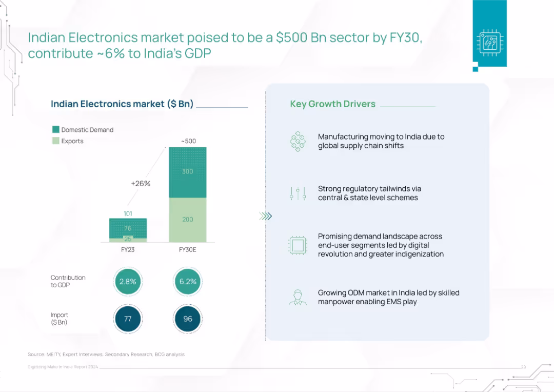
Bar chart comparing FY23 vs FY30E market size (domestic & exports). Text box details key growth drivers.
Market Analysis and Trends
Consumer Goods
This slide projects India's electronics market to reach $500B by FY30, driven by domestic demand and exports. It outlines factors like regulatory support, ODM growth, and global supply chain shifts positioning India as a key electronics hub.
electronics, GDP, India, domestic demand, exports, supply chain, ODM, FY30 forecast, manufacturing
false
Market Analysis and Trends
Consumer Goods
Mixed Chart
BCG
Add to my slides
Remove from favorites
This slide uses a combination of lists and column charts to discuss key drivers and impacts of electronification, particularly in FX and Euro Swaps markets.
Operational Efficiency
Financial Services
Details the organic and regulatory drivers of electronification and its effect on markets, focusing on reducing execution costs.
electronification, market impact, FX, Euro Swaps
false
Operational Efficiency
Financial Services
Multiple Chart
JP Morgan
Add to my slides
Remove from favorites
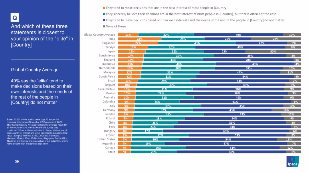
Multicolored stacked bar chart showing beliefs about elite decision-making: best interest, sincere but flawed, self-serving, or none; ordered by country
Market Analysis and Trends
Government & Public Sector
This slide assesses how people view elite motivations. Nearly half globally (49%) believe elites act in their own interest, disregarding the public. Regional variations highlight skepticism, especially in Argentina and Canada.
elite, decision-making, distrust, politics, governance, motives, Ipsos, perceptions, policy, inequality
false
Market Analysis and Trends
Government & Public Sector
Mixed Chart
IPSOS
Add to my slides
Remove from favorites
Left title box; right side contains a horizontal bar chart with countries sorted by agreement levels and change percentages over time.
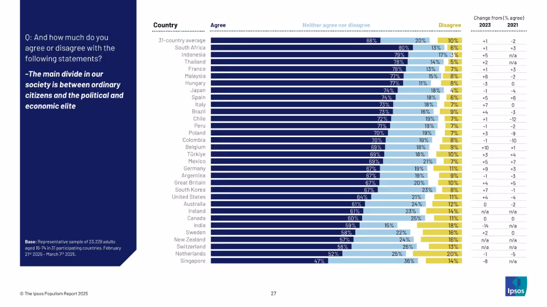
Market Analysis and Trends
Government & Public Sector
The chart illustrates agreement with the idea that the primary societal divide is between ordinary people and elites. South Africa, Indonesia, and Thailand top the list, while Japan also shows high agreement at 74%.
elite, divide, society, perception, inequality, global sentiment, Ipsos, populism, ordinary citizens, 2025
false
Market Analysis and Trends
Government & Public Sector
Mixed Chart
IPSOS
Add to my slides
Remove from favorites
Horizontal bar chart showing agreement levels per country regarding the need for a strong leader to counter elite dominance. Changes over time are displayed alongside.
Strategic Planning
Government & Public Sector
This slide explores global attitudes on whether strong leadership is needed to combat influence from the wealthy elite. Indonesia, Thailand, and South Africa show highest agreement. Germany and Switzerland rank lowest, indicating less support for such leadership models.
elite, leadership, anti-elite sentiment, strong leader, Ipsos, comparative data, global opinion
false
Strategic Planning
Government & Public Sector
Mixed Chart
IPSOS
Add to my slides
Remove from favorites
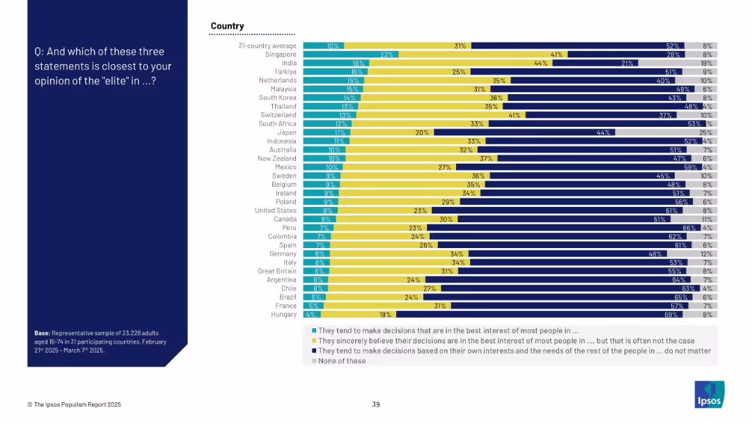
Stacked horizontal bar chart showing distribution among three opinion categories about elites plus a “none” category
Market Analysis and Trends
Government & Public Sector
This slide examines three interpretations of elite behavior: acting in the people’s best interest, sincerely believing they do, or prioritizing self-interest. Most people believe elites act out of self-interest. Country-wise differences are clearly shown with comparative data.
elite perception, decision-making, trust, public sentiment, global views, Ipsos, political sociology, influence, cynicism
false
Market Analysis and Trends
Government & Public Sector
Mixed Chart
IPSOS
Add to my slides
Remove from favorites
Dual tone bar chart showing what percentage of respondents see elites as a “closely connected group” vs “loose group.” Data spans 28 countries.
Market Analysis and Trends
Government & Public Sector
This slide explores public perceptions of elites—whether they are seen as a tight network or a dispersed group. Most countries lean toward the “closely connected” interpretation. Bar chart ranks the countries accordingly. Historical comparisons for 2021 are included for some.
elite perception, influence, public trust, social cohesion, Ipsos opinion, 2023 survey, societal power, connected elites
false
Market Analysis and Trends
Government & Public Sector
Mixed Chart
IPSOS
Add to my slides
Remove from favorites
Bar chart format with comparative percentages and time trend data.
Market Analysis and Trends
Government & Public Sector
Indicates deep mistrust toward elites with 67% global average agreement. South Africa and Thailand top the list. The slide reflects a perception that elites are disconnected from or exploit hard-working citizens.
elite, public perception, inequality, working class, trust deficit
false
Market Analysis and Trends
Government & Public Sector
Mixed Chart
IPSOS
Add to my slides
Remove from favorites
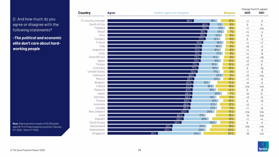
Horizontal bar chart with countries ranked by agreement with the statement, including neutral and disagreement splits and % change from 2021.
Market Analysis and Trends
Government & Public Sector
This slide explores agreement levels that elites neglect hardworking people. Countries like South Africa, Thailand, and Brazil rank high, while Japan also shows significant agreement at 66%.
elites, care, hardworking, inequality, sentiment, Ipsos, distrust, public opinion, 2025, global perception
false
Market Analysis and Trends
Government & Public Sector
Mixed Chart
IPSOS
Add to my slides
Remove from favorites
Horizontal bar chart showing beliefs about “the elite” by country; responses categorized as ‘closely connected’ or ‘loose’
Strategic Planning
Government & Public Sector
This slide explores perceptions of societal elites—whether they are a unified group with shared interests or a diverse one. Most respondents in 31 countries lean toward believing elites are a closely connected group, with the highest agreement in South Korea, Italy, and Hungary.
elites, political influence, perception, social cohesion, public opinion, Ipsos, global survey, power structures
false
Strategic Planning
Government & Public Sector
Mixed Chart
IPSOS
Add to my slides
Remove from favorites
Bar chart showing opinion split on whether elites are a “closely connected group” or a “loose group” across 28 countries; trends for 2021 and 2023 included
Strategic Planning
Government & Public Sector
This slide explores perceptions of national elites—62% globally see elites as a closely connected group. Countries like South Korea and Singapore show particularly high agreement, with a trend comparison to 2021 on the right.
elites, power, influence, perceptions, politics, society, public opinion, Ipsos, social structure, governance
false
Strategic Planning
Government & Public Sector
Mixed Chart
IPSOS
Add to my slides
Remove from favorites
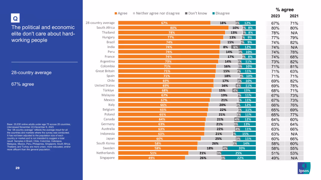
Horizontal stacked bar chart illustrating opinions on elites—whether they act in the best interest of the people or not. Rankings by country with average at the top.
Market Analysis and Trends
Government & Public Sector
This slide presents global views on how the elite operate. Most respondents across 28 countries believe elites act in their own interest, not the public’s. Three options are color-coded and displayed in ranked order by country.
elite trust, decision-making, inequality, elite behavior, Ipsos study, global opinion, 2023 insights
false
Market Analysis and Trends
Government & Public Sector
Mixed Chart
IPSOS
Add to my slides
Remove from favorites
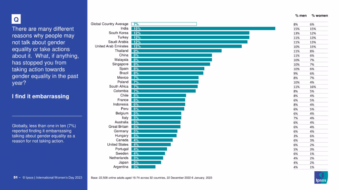
Bar chart ranking countries by % who cited embarrassment as a barrier; right-hand table with male/female split; explanatory text on the left.
Human Resources and Talent Management
Government & Public Sector
This chart shows the percentage of people who find discussing gender equality embarrassing. India leads with 15%, global average is 7%. Both male and female perceptions are displayed, highlighting cultural differences in stigma.
embarrassment, gender equality, stigma, survey, perceptions, Ipsos, global opinion
false
Human Resources and Talent Management
Government & Public Sector
Mixed Chart
IPSOS
Add to my slides
Remove from favorites
Bold purple headline on left, detailed explanation below. Bar charts on the right show AI adoption in existing vs. new products. Light and clean layout, evenly spaced sections.
Technology and Digital Transformation
Financial Services
This slide introduces the "Embed" phase of AI adoption, which integrates AI into workflows and value streams. It discusses AI's limited current use in product innovation, highlighting gaps in strategic integration. The layout contrasts usage in existing versus new services, reflecting untapped AI potential within banking.
embed, AI workflows, adoption, innovation, product development, banking
false
Technology and Digital Transformation
Financial Services
Mixed Chart
KPMG
Add to my slides
Remove from favorites
Features images of a digital banking interface, application components, and text descriptions on the side.
Technology and Digital Transformation
Technology & Software
Details J.P.Morgan's new product development for embedded banking, emphasizing speed and user experience.
Embedded Banking, Product Development, User Experience, J.P.Morgan, Digital Onboarding
false
Technology and Digital Transformation
Technology & Software
Header Horizontal
JP Morgan
Add to my slides
Remove from favorites
The slide is structured with texts and graphical icons, depicting embedded finance solutions. It features an intricate flowchart that connects various service categories and key use cases, with a light blue and white color scheme.
Product and Service Analysis
Financial Services
Detailing embedded finance solutions that address payment acceptance, fund management, and payment disbursement. It showcases how these solutions cater to client needs and support various industry sectors, highlighting scalability and client traction.
embedded finance, payment solutions, client demand, scalability
false
Product and Service Analysis
Financial Services
Table
JP Morgan
Add to my slides
Remove from favorites
White text section on the left; dark background with vertical purple bar graph on the right.
Technology and Digital Transformation
Artificial Intelligence
Defines embodied AI and its application in robotics, emphasizing physical interaction with the world. Google’s Gato model and the RT-series are highlighted. A chart shows a 4x increase in related research papers, indicating growing industry interest and technological progress.
Embodied AI, robotics, Google Gato, RT models, foundation models
false
Technology and Digital Transformation
Artificial Intelligence
Mixed Chart
Accenture
Add to my slides
Remove from favorites
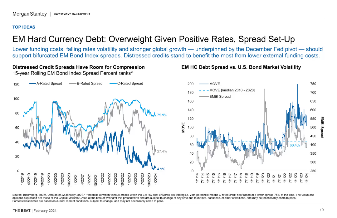
Two line charts displaying distressed credit spreads and EM hard currency debt spread vs. U.S. bond market volatility.
Investment Analysis
Financial Services
The slide supports an overweight recommendation for EM hard currency debt, citing positive rates, spread setup, and falling rate volatility.
EM debt, hard currency, distressed credit spreads, investment analysis, bond market volatility
false
Investment Analysis
Financial Services
Multiple Chart
Morgan Stanley
Add to my slides
Remove from favorites
Two line charts showing EM bond index spread ranks and the relationship between EMBI spread and EM manufacturing PMI, highlighting potential for spread compression.
Investment Analysis
Financial Services
The slide suggests an overweight position on EM hard currency debt due to lower funding costs, favorable rates, and potential for spread compression, especially in distressed credits.
EM Debt, Spread Compression, Funding Costs, Manufacturing PMI, Investment, Financial Analysis
false
Investment Analysis
Financial Services
Multiple Chart
Morgan Stanley
Add to my slides
Remove from favorites
This slide features two comparative line charts. The left chart compares EM and DM Real Yields using inflation forecasts, and the right chart shows the EM-DM Real Yield Differential.
Market Analysis and Trends
Financial Services
It highlights the real yield differences using inflation expectations and the narrowing yield differentials over the past year. Useful for comparing emerging and developed markets.
EM, DM, real yields, inflation, comparison
false
Market Analysis and Trends
Financial Services
Multiple Chart
Morgan Stanley
Add to my slides
Remove from favorites
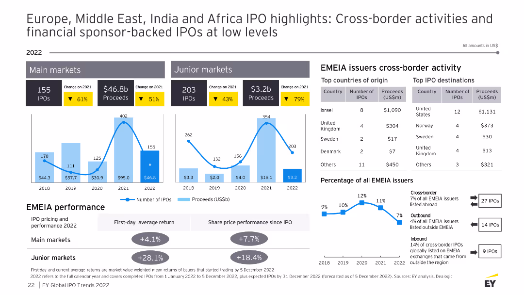
The slide features data visualizations and tables showing cross-border IPO activities in the EMEA region, including top countries of origin, top IPO destinations, and performance metrics.
Market Analysis and Trends
Financial Services
This slide details cross-border IPO activities in the EMEA region for 2022, providing insights into the top countries of origin and destinations for IPOs, as well as performance comparisons and percentage of total issuers.
EMEA, cross-border IPO, top countries, destinations
false
Market Analysis and Trends
Financial Services
Multiple Chart
EY
Add to my slides
Remove from favorites
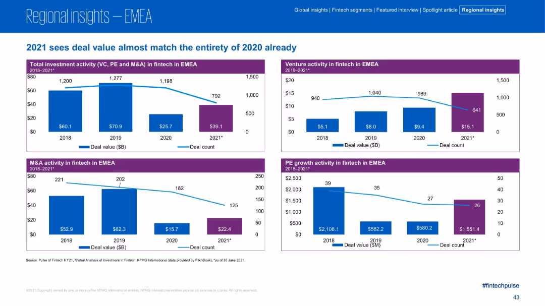
Four quadrant charts covering Total, Venture, M&A, and PE activity in EMEA; blue and purple elements with declining trend lines
Financial Performance
Financial Services
EMEA fintech deal value in H1 2021 nearly matches all of 2020. Charts show moderate decreases in deal count but increasing deal value across all investment types, especially in venture capital. The region shows robust activity despite fewer deals, suggesting larger individual transactions.
EMEA, fintech investment, PE, VC, M&A, deal value, 2021 trends, H1 comparison
false
Financial Performance
Financial Services
Multiple Chart
KPMG
Add to my slides
Remove from favorites
The slide uses data tables, column charts, and maps to present the EMEA IPO market overview, including equity indices, stock exchange performance, and major IPOs by country and sector.
Market Analysis and Trends
Financial Services
The slide gives an overview of the IPO market in Europe, Middle East, India, and Africa (EMEA) for 2022, detailing stock exchange performance, sector data, and significant IPOs, highlighting the region's strength despite market volatility.
EMEA, IPO, stock exchange, sector, 2022
false
Market Analysis and Trends
Financial Services
Multiple Chart
EY
Add to my slides
Remove from favorites
Contains multiple column charts, tables, and text boxes with highlighted statistics. Uses blue and yellow color schemes to distinguish regions and data changes.
Market Analysis and Trends
Financial Services
Summarizes IPO performance in the EMEIA regions for 2021, detailing trends, major market activities, and specific sector performances across different countries.
EMEIA, IPO, 2021 activity, market highlights, stock exchanges, sectors, proceeds, main markets, junior markets, outlook
false
Market Analysis and Trends
Financial Services
Multiple Chart
EY
Add to my slides
Remove from favorites
Features column charts, tables, and detailed bullet points with color coding to highlight key statistics and changes from the previous year.
Market Analysis and Trends
Financial Services
Provides an outlook for IPO activities in the EMEIA regions for 2022, discussing potential trends, sector growth, and market conditions impacting IPOs.
EMEIA, IPO, 2022 outlook, market analysis, trends, sectors, performance, stock exchanges, proceeds, growth
false
Market Analysis and Trends
Financial Services
Multiple Chart
EY
Add to my slides
Remove from favorites
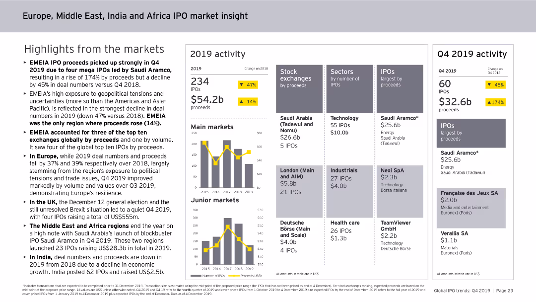
This slide features column charts and numerical data points. It shows trends in cross-border IPO activity in the EMEIA region, including outbound and inbound IPO statistics, transaction sizes, and sources of IPOs.
Market Analysis and Trends
Financial Services
The slide discusses trends in cross-border IPO activity in the EMEIA region for 2019, highlighting outbound and inbound IPO numbers, transaction sizes, and the distribution of IPO proceeds.
EMEIA, IPO, Cross-border, Market Trends, Financial Services, Outbound, Inbound, Transaction Sizes, 2019
false
Market Analysis and Trends
Financial Services
Multiple Chart
EY
Add to my slides
Remove from favorites
This slide contains column charts, numerical data points, and textual highlights. It provides an overview of IPO activities in the EMEIA region in 2019, including market activity, stock exchanges, and sector analysis.
Market Analysis and Trends
Financial Services
The slide offers a comprehensive view of IPO market activities in the EMEIA region for 2019, covering the number of IPOs, proceeds, main and junior markets, sectors by IPOs, and performance metrics.
EMEIA, IPO, Market Analysis, Financial Services, Trends, Activity, Sectors, Stock Exchanges, 2019
false
Market Analysis and Trends
Financial Services
Multiple Chart
EY
Add to my slides
Remove from favorites
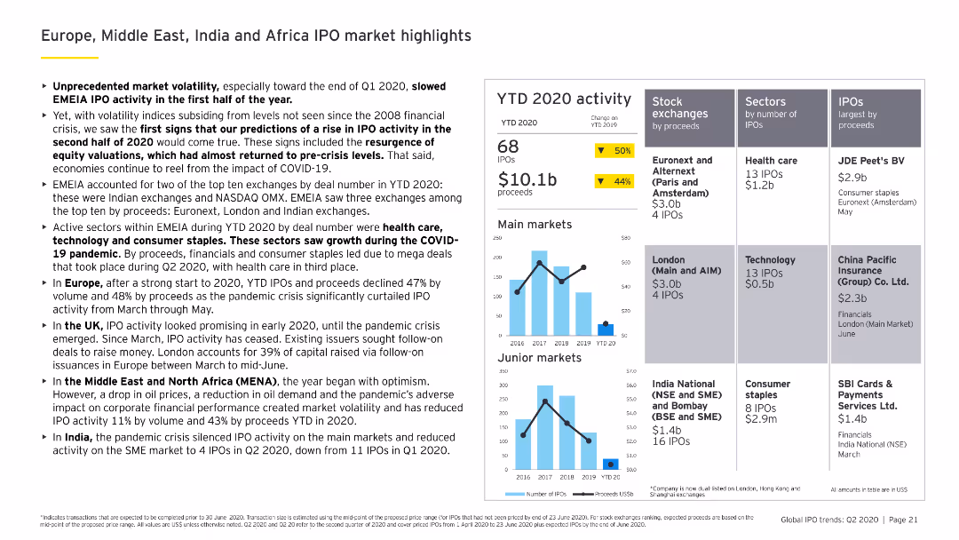
Features column charts showing YTD 2020 IPO activity across EMEIA, with detailed analysis of stock exchanges, sectors, and notable IPOs by proceeds.
Market Analysis and Trends
Financial Services
Analyzes the EMEIA IPO market's performance in 2020, with insights into the impact of COVID-19 and detailed breakdowns by stock exchanges, sectors, and major IPOs.
EMEIA, IPO market, stock exchanges, sectors, YTD 2020
false
Market Analysis and Trends
Financial Services
Multiple Chart
EY
Add to my slides
Remove from favorites
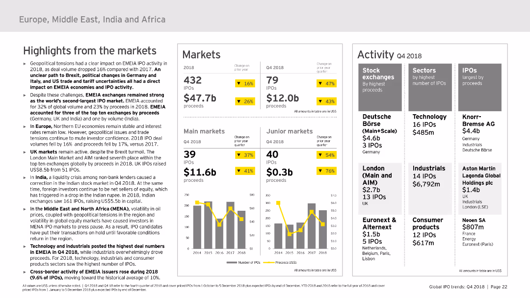
Divided into sections: highlights from the market, markets, and activity. It uses column charts and tables to present IPO data and market performance in EMEIA. The slide is detailed but well-organized, with a moderate level of visual complexity to convey information effectively.
Market Analysis and Trends
Financial Services
Covers the IPO market trends and activities in EMEIA for 2018, highlighting key market performances, sector-specific data, and overall market trends. Useful for regional market analysis and strategic insights.
EMEIA, IPO, market trends, sectors, market performance
false
Market Analysis and Trends
Financial Services
Multiple Chart
EY
Add to my slides
Remove from favorites
Combines column charts and tables to show the number and proceeds of IPOs across EMEIA regions, with a focus on cross-border activity.
Market Analysis and Trends
Financial Services
The slide presents an overview of IPO performance in EMEIA, detailing cross-border activity and performance metrics.
EMEIA, IPOs, cross-border, performance, metrics
false
Market Analysis and Trends
Financial Services
Multiple Chart
EY
Add to my slides
Remove from favorites
The slide uses column charts and tables to present the number of IPOs and proceeds in Europe, the Middle East, India, and Africa. It also includes details on stock exchanges and sectors.
Market Analysis and Trends
Financial Services
The slide discusses the robust IPO market performance in EMEIA, despite uncertainties. It showcases data on the number of IPOs, proceeds, and details of key stock exchanges and sectors.
EMEIA IPOs, market performance, financial trends, stock exchanges, sector analysis
false
Market Analysis and Trends
Financial Services
Multiple Chart
EY
Add to my slides
Remove from favorites
The slide features column charts and tables comparing IPO performance in main and junior markets within EMEIA. It includes performance metrics and cross-border activity data.
Market Analysis and Trends
Financial Services
This slide highlights the positive IPO performance in EMEIA's main and junior markets, providing detailed data on number of IPOs, proceeds, and cross-border IPO activity.
EMEIA IPOs, market performance, main markets, junior markets, cross-border activity
false
Market Analysis and Trends
Financial Services
Multiple Chart
EY
Add to my slides
Remove from favorites
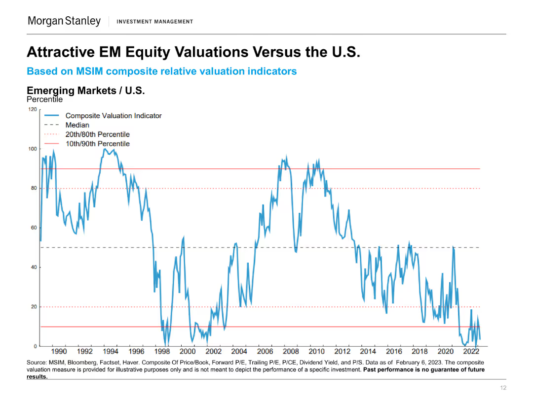
This slide displays a line chart comparing the EM Equity Valuations to the U.S. using a Composite Valuation Indicator from 1990 to 2022, showing percentiles for reference.
Investment Analysis
Financial Services
The slide evaluates the attractiveness of emerging market equities compared to U.S. equities by analyzing valuation indicators over several decades.
EM Equity, U.S. Equity, Valuation Comparison, Investment Analysis, Composite Indicator, Market Trends, Financial Valuation, Equity Analysis
false
Investment Analysis
Financial Services
Single Chart
Morgan Stanley
Add to my slides
Remove from favorites
Scatter plot comparing the Global Innovation Index and GDP per capita PPP for 2011 and 2019, focusing on emerging countries like India, Brazil, Mexico, Indonesia, Turkey, Russia, and China.
Technology and Digital Transformation
Technology & Software
The slide illustrates the progress of emerging countries in terms of innovation capabilities and economic development from 2011 to 2019. It shows how increased innovation has led to higher GDP per capita, highlighting the importance of sustained investment in technology and innovation for long-term growth.
Emerging Countries, Innovation, GDP, 2019
false
Technology and Digital Transformation
Technology & Software
Mixed Chart
Roland Berger
Add to my slides
Remove from favorites
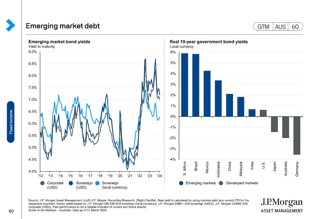
The slide includes two charts: a line chart on the left showing emerging market bond yields, and a column chart on the right showing real 10-year government bond yields.
Market Analysis and Trends
Financial Services
It provides data on emerging market debt, including yields and real government bond yields, useful for understanding investment opportunities in emerging markets.
emerging market, debt, bond yields, government, real yield
false
Market Analysis and Trends
Financial Services
Multiple Chart
JP Morgan
Add to my slides
Remove from favorites
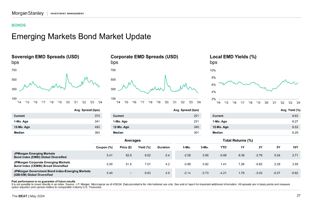
Multiple line charts display sovereign and corporate EMD spreads, along with local EMD yields. Each chart is color-coded for clarity.
Market Analysis and Trends
Financial Services
The slide provides an update on the emerging markets bond market, analyzing sovereign, corporate spreads, and local yields, presenting recent trends and averages.
Emerging Markets, Bond Market, EMD Spreads, Local Yields, Trends
false
Market Analysis and Trends
Financial Services
Multiple Chart
Morgan Stanley
Add to my slides
Remove from favorites
Slide displays three line graphs comparing spreads and yields for sovereign and corporate emerging market debts. Key data points are highlighted with markers.
Investment Analysis
Financial Services
Assesses the potential for investment in emerging markets by tracking bond spreads and yields, important for investors considering geographical diversification.
emerging markets, bond market, investment analysis, line graphs, spreads, yields
false
Investment Analysis
Financial Services
Multiple Chart
Morgan Stanley
Add to my slides
Remove from favorites
The slide presents three line charts comparing sovereign EMD spreads, corporate EMD spreads, and local EMD yields over time, along with a table summarizing key metrics.
Market Analysis and Trends
Financial Services
The slide provides an update on emerging markets bonds, highlighting spread and yield trends. Useful for analyzing emerging markets investment.
emerging markets, bond market, spreads, yields, sovereign EMD, corporate EMD, financial analysis
false
Market Analysis and Trends
Financial Services
Multiple Chart
Morgan Stanley
Add to my slides
Remove from favorites
Column charts representing expected returns for "EM IG Sovereign," "EM HY Sovereign," "CLO (BBB)," and "EM HY Corp." Column chart depict various return components like credit spread and term premium.
Market Analysis and Trends
Financial Services
Offers a comparative analysis of expected returns for emerging market bonds and CLOs, highlighting potential valuation benefits. Utilized for market assessment and investment decision-making.
emerging markets, bonds, CLOs, expected returns
false
Market Analysis and Trends
Financial Services
Multiple Chart
Morgan Stanley
Add to my slides
Remove from favorites
This slide features three line charts showing Sovereign EMD Spreads (USD), Corporate EMD Spreads (USD), and Local EMD Yields (%). The charts display data from 2014 to 2024, with tables providing current, 1-Mo. Ago, 12-Mo. Ago, and Median values. Additionally, there are tables showing coupon, price, yield, duration, and total returns.
Market Analysis and Trends
Financial Services
The slide provides an overview of the emerging markets bond market, highlighting sovereign and corporate EMD spreads, local EMD yields, and total returns.
Emerging markets, bond spreads, EMD, yields, returns, sovereign, corporate
false
Market Analysis and Trends
Financial Services
Multiple Chart
Morgan Stanley
Add to my slides
Remove from favorites
Line charts showing sovereign, corporate, and local EMD spreads and yields over time, with tables for average spreads and returns.
Market Analysis and Trends
Financial Services
Discusses the emerging markets bond market, analyzing sovereign, corporate, and local bond yields and spreads.
Emerging Markets, Bond Spreads, Sovereign Bonds, Corporate Bonds, Yields
false
Market Analysis and Trends
Financial Services
Multiple Chart
Morgan Stanley
Add to my slides
Remove from favorites
Previous
Next
You don't have any favorites yet.
Please wait loading your favorites slides...
Create a FREE account to continue browsing
Receive Instant Access to 1,000+ slides from companies like McKinsey, Google, and Goldman Sachs
First Name
Last Name
Email
Password
I agree to all
Terms & Privacy Policy
Thank you! Your submission has been received!
Oops! Something went wrong while submitting the form.
Have an account?
Sign in
Upgrade to PRO to Save slides
Advanced Search and Filters
Access to 15,000+ slides
Access to Category Pages
Save/Bookmark Slides
PowerPoint Template Library
Pick a Plan
MONTHLY
$12/month
Billed every month, Cancel anytime.
YEARLY
$9/year
Billed $108 annually, Cancel anytime.
Checkout for $12/month
Checkout for $108/yr
Secured by Stripe | AES-256 bit encryption


![Q: And how much do you agree or disagree with the following statements? -[COUNTRY] needs a strong leader to take the country back from the rich and powerful](https://cdn.prod.website-files.com/654e70fb59937215cac87b19/6899bace275395ca2ee21b18_uxNGdvpXXHxVly_aGrqivohcv9DYfjbQXvX_xm3TycI.avif)
![The people who exercise power or influence... are often called the elite. Which...is closest to your opinion of the "elite" in [Country]](https://cdn.prod.website-files.com/654e70fb59937215cac87b19/6899be52ef1b7a238e827f82_yLNu5jnVPIjCdznrUJoC9IdwwW-R33dB0qGkLW4t0p4.avif)
![And which of these three statements is closest to your opinion of the "elite" in [Country]](https://cdn.prod.website-files.com/654e70fb59937215cac87b19/6899be5775b0eec59aa55c16_tntqU7_pzjbLpYYauapTr7wLNeQRoLtjCGSNE7QRxe0.avif)