My Account
My Slides
Search by Category
Companies
Slide Type
Use Case
Industry
Pricing
Templates
View All Templates
Download Template Slides
✦ AI
AI Prompt Library
AI Search
Feedback
Login
Logout
Get Started
Browse all Slides
Browse all Slides
Create a FREE Account
Instant access to 1,000+ real slides from top companies like McKinsey, BCG, Goldman Sachs, Google and many more!
First Name
Last Name
Email
Password
I agree to all
Terms & Privacy Policy
Thank you! Your submission has been received!
Oops! Something went wrong while submitting the form.
Have an account?
Sign in
Saved Slides
Total No. of slides saved
0
↻ Refresh
✖ Clear all
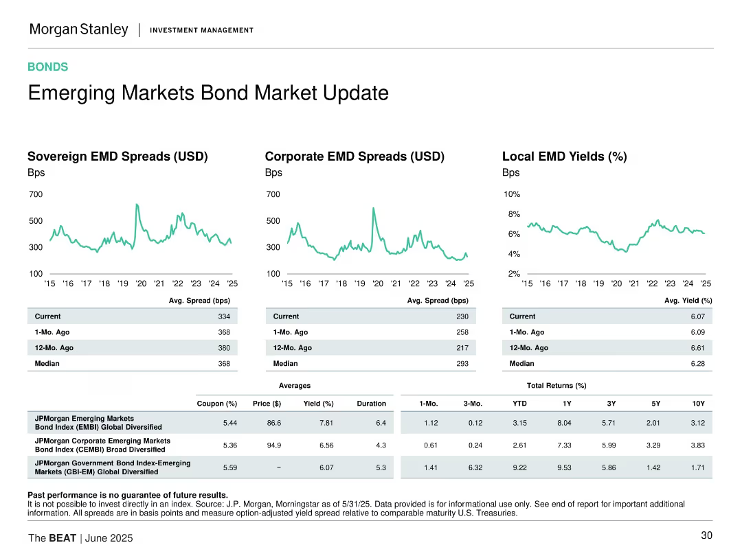
Three time-series graphs for sovereign, corporate, and local EM bonds; tables for spread, yield, and returns.
Market Analysis and Trends
Financial Services
Reviews sovereign and corporate bond spreads and local bond yields in emerging markets, comparing current data vs. past and averages, with return tables.
emerging markets, bond spreads, sovereign debt, corporate bonds, yield, returns, fixed income, investment strategy
false
Market Analysis and Trends
Financial Services
Multiple Chart
Morgan Stanley
Add to my slides
Remove from favorites
Multiple line charts showing sovereign EMD spreads, corporate EMD spreads, and local EMD yields over time.
Market Analysis and Trends
Financial Services
Updates on emerging market bonds with data on sovereign and corporate EMD spreads, and local EMD yields, providing a comprehensive view of the emerging markets bond environment.
Emerging markets, bond spreads, yields
false
Market Analysis and Trends
Financial Services
Multiple Chart
Morgan Stanley
Add to my slides
Remove from favorites
Comprises three line charts for 'Sovereign EMD Spreads', 'Corporate EMD Spreads', and 'Local EMD Yields'. Includes a color-coded legend and a table summarizing the current, 1-month ago, 12-month ago, and median values. The design is sophisticated with data-rich visualizations.
Market Analysis and Trends
Financial Services
The slide evaluates the emerging markets bond sector, comparing sovereign and corporate spreads, alongside local EMD yields. It is directed at financial professionals analyzing global market trends, offering insight into the performance of emerging markets, and is instrumental for investment strategy discussions.
Emerging Markets, Bond Spreads, Yields, Investment Strategy
false
Market Analysis and Trends
Financial Services
Multiple Chart
Morgan Stanley
Add to my slides
Remove from favorites
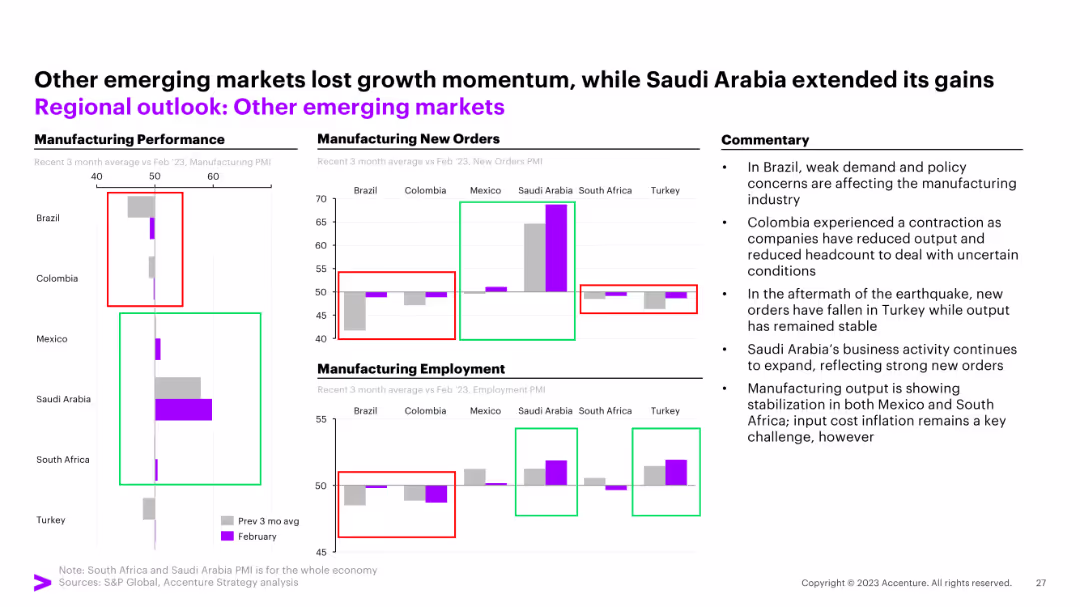
The slide displays three column charts for manufacturing performance, new orders, and employment across Brazil, Colombia, Mexico, Saudi Arabia, South Africa, and Turkey. Commentary on the right.
Market Analysis and Trends
Financial Services
The slide shows robust growth in Saudi Arabia, improving factory activity in Brazil, and a sharp production fall in Turkey.
emerging markets, Brazil, Colombia, Mexico, Saudi Arabia, South Africa, Turkey, manufacturing, new orders, employment
false
Market Analysis and Trends
Financial Services
Multiple Chart
Accenture
Add to my slides
Remove from favorites
The slide contains multiple line charts showing the performance of emerging market currencies, including nominal and REER index weights. The layout is focused and data-driven.
Market Analysis and Trends
Financial Services
The slide examines the strengthening of emerging market currencies during Q4, influenced by weaker economic data from the U.S. and Fed policy changes. It provides detailed index performance comparisons.
emerging markets, currencies, Q4 performance, FX, economic data
false
Market Analysis and Trends
Financial Services
Mixed Chart
Morgan Stanley
Add to my slides
Remove from favorites
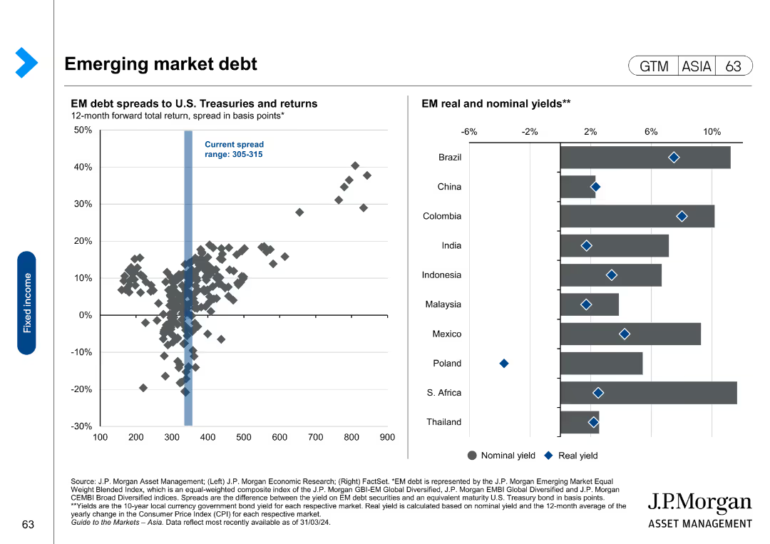
The slide shows a scatter plot of EM debt spreads and returns, and a bar chart of EM real and nominal yields.
Market Analysis and Trends
Financial Services
The slide provides an analysis of emerging market debt, highlighting spreads to U.S. Treasuries and real versus nominal yields in various countries.
emerging markets, debt spreads, nominal yields, real yields, financial analysis
false
Market Analysis and Trends
Financial Services
Multiple Chart
JP Morgan
Add to my slides
Remove from favorites
This slide includes line charts showing regional EMD spreads for sovereigns and corporates, displaying data points over time for different regions including Asia, Europe, and LATAM.
Market Analysis and Trends
Financial Services
The slide analyzes emerging market debt spreads for sovereign and corporate bonds across different regions, providing insights into market conditions and investment risks in emerging economies.
emerging markets, debt spreads, sovereign bonds, corporate bonds, Asia, Europe, LATAM, market conditions, investment risks
false
Market Analysis and Trends
Financial Services
Multiple Chart
JP Morgan
Add to my slides
Remove from favorites
The slide includes multiple charts: line charts for EM earnings by region and price-to-book ratio, and a bar chart for the growth of the middle class. Different colors distinguish regions and forecast years.
Market Analysis and Trends
Financial Services
It analyzes earnings, valuation ratios, and the growth of the middle class in emerging markets, offering a comprehensive view of the economic potential and investment opportunities in these regions.
Emerging markets, earnings, price-to-book, middle class, valuation
false
Market Analysis and Trends
Financial Services
Multiple Chart
JP Morgan
Add to my slides
Remove from favorites
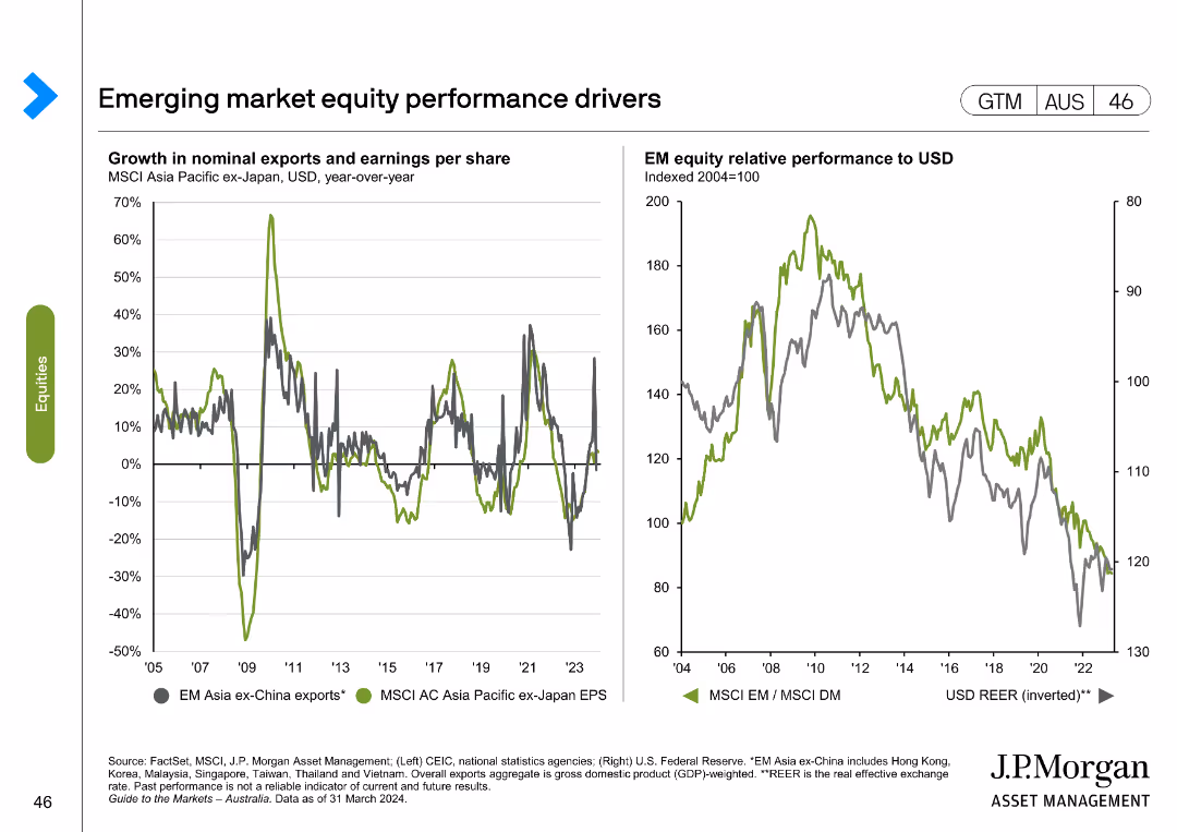
The slide displays two line charts: one showing growth in nominal exports and earnings per share for MSCI Asia Pacific ex-Japan, and another comparing EM equity relative performance to USD.
Market Analysis and Trends
Financial Services
This slide examines key drivers of emerging market equity performance, focusing on exports, earnings per share, and relative performance to USD.
emerging markets, equity performance, exports, earnings per share, MSCI Asia Pacific, USD performance, financial analysis, market drivers
false
Market Analysis and Trends
Financial Services
Multiple Chart
JP Morgan
Add to my slides
Remove from favorites
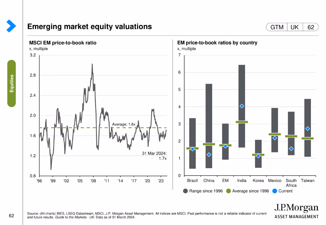
This slide contains two charts: a line chart showing the MSCI EM price-to-book ratio over time, and a column chart comparing EM price-to-book ratios by country.
Market Analysis and Trends
Financial Services
The slide provides an analysis of the MSCI EM price-to-book ratio and a comparison across various emerging markets, useful for market trend analysis.
emerging markets, equity, valuations, MSCI, price-to-book ratio, countries
false
Market Analysis and Trends
Financial Services
Multiple Chart
JP Morgan
Add to my slides
Remove from favorites
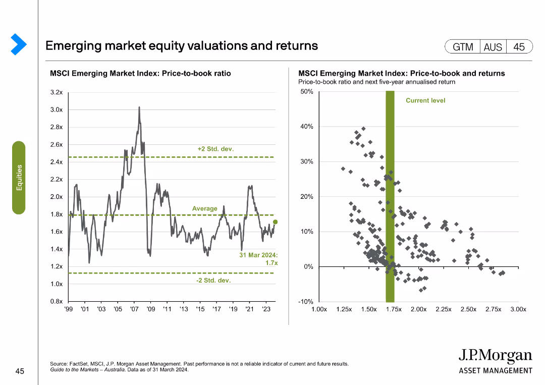
Line chart showing MSCI Emerging Market Index price-to-book ratio from 1999 to 2024. Scatter plot correlates price-to-book ratio with 5-year returns.
Investment Analysis
Financial Services
Displays historical and current valuations of emerging market equities, analyzing potential returns based on price-to-book ratio and historical data.
emerging markets, equity, valuations, returns, MSCI
false
Investment Analysis
Financial Services
Multiple Chart
JP Morgan
Add to my slides
Remove from favorites
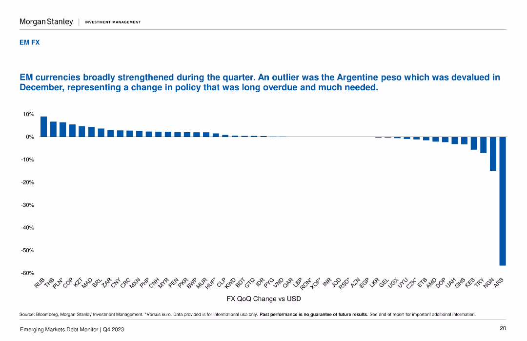
The slide features a column chart displaying the quarter-over-quarter change in FX against USD for various currencies. The layout is simple and comparative.
Market Analysis and Trends
Financial Services
The slide analyzes the strengthening of emerging market currencies during the quarter, highlighting the significant devaluation of the Argentine peso and overall positive performance.
emerging markets, FX, currency performance, USD, Q4 analysis
false
Market Analysis and Trends
Financial Services
Single Chart
Morgan Stanley
Add to my slides
Remove from favorites
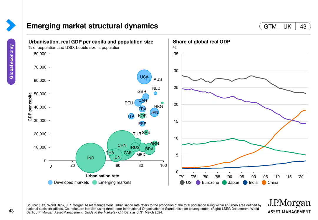
Two charts: a bubble chart comparing urbanization rate with GDP per capita across countries, and a line chart showing the share of global real GDP over time by region.
Market Analysis and Trends
Financial Services
This slide explores the structural dynamics of emerging markets, with a focus on urbanization, GDP per capita, and regional contributions to global GDP. Used for economic analysis and strategic planning in emerging markets.
Emerging markets, GDP, urbanization, global
false
Market Analysis and Trends
Financial Services
Multiple Chart
JP Morgan
Add to my slides
Remove from favorites
Three pie charts showing the composition change of the MSCI Emerging Markets Index over time, from 2004 to 2024.
Market Analysis and Trends
Financial Services
Displays the changes in the composition of the MSCI Emerging Markets Index, illustrating shifts in regional market shares over 20 years.
emerging markets, index composition, MSCI, pie charts, market analysis, regional shifts, historical data, projections
false
Market Analysis and Trends
Financial Services
Multiple Chart
JP Morgan
Add to my slides
Remove from favorites
The slide presents two line graphs depicting the EM consensus CPI and policy rate expectations, showing changes over time.
Market Analysis and Trends
Financial Services
Offers a look at inflation and policy rate expectations in emerging markets, with data supporting market trend analysis and forecasts.
emerging markets, inflation, CPI, policy rates, expectations, analysis, trends, Q4
false
Market Analysis and Trends
Financial Services
Multiple Chart
Morgan Stanley
Add to my slides
Remove from favorites
Combination of bar charts and column charts for manufacturing performance, new orders, and employment
Market Analysis and Trends
Financial Services
This slide focuses on other emerging markets, detailing manufacturing performance, new orders, and employment trends.
emerging markets, manufacturing performance, new orders, employment trends
false
Market Analysis and Trends
Financial Services
Multiple Chart
Accenture
Add to my slides
Remove from favorites
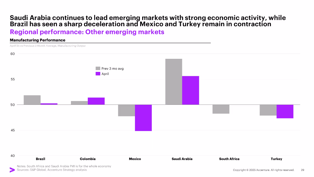
Bar chart with side-by-side bars (gray for past 3-month avg and purple for April) showing manufacturing output in 6 emerging markets.
Performance Metrics and KPIs
Industrial & Manufacturing
The slide highlights varying manufacturing momentum across emerging markets. Saudi Arabia leads with high output, while Brazil shows deceleration, and Mexico and Turkey remain in contraction.
emerging markets, manufacturing, Saudi Arabia, Brazil, contraction, April, comparison, economic activity
false
Performance Metrics and KPIs
Industrial & Manufacturing
Single Chart
Accenture
Add to my slides
Remove from favorites
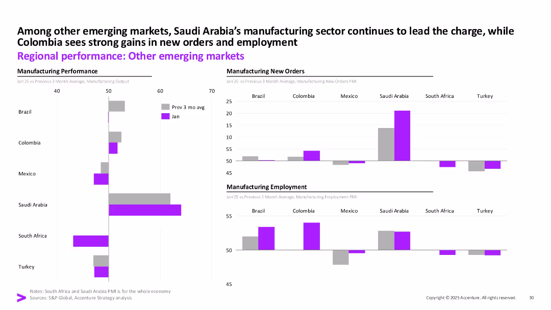
Three-column layout with bar charts showing output, new orders, and employment for emerging markets; data for Jan vs. 3-month avg.
Industry Overview
Industrial & Manufacturing
Saudi Arabia leads in manufacturing strength among emerging markets, with Colombia also showing strong gains. Other countries exhibit mixed or declining trends, particularly in new orders and employment.
Emerging Markets, Manufacturing, Saudi Arabia, Colombia, PMI, Output, Employment, Accenture
false
Industry Overview
Industrial & Manufacturing
Multiple Chart
Accenture
Add to my slides
Remove from favorites
Pie chart showing the percentage distribution of net sales in emerging markets with an additional focus on market positions for various products in Latin America and Asia.
Market Analysis and Trends
Consumer Goods
Details Essity's market positioning in emerging markets, highlighting sales figures and leading product categories, valuable for strategic planning and competitive analysis.
Emerging Markets, Market Positioning, Sales Figures, Strategic Planning
false
Market Analysis and Trends
Consumer Goods
Mixed Chart
Barclays
Add to my slides
Remove from favorites
Contains graphical representations and text describing next-tier economic clusters beyond BRICS, such as MINT and MIST, with a focus on their characteristics like GDP growth and population demographics.
Market Analysis and Trends
Financial Services
Explores emerging economic clusters beyond BRICS, offering insights into the next wave of influential markets. Useful for identifying new investment opportunities and understanding regional economic potentials.
emerging markets, MINT, MIST, GDP, growth
false
Market Analysis and Trends
Financial Services
Mixed Chart
Roland Berger
Add to my slides
Remove from favorites
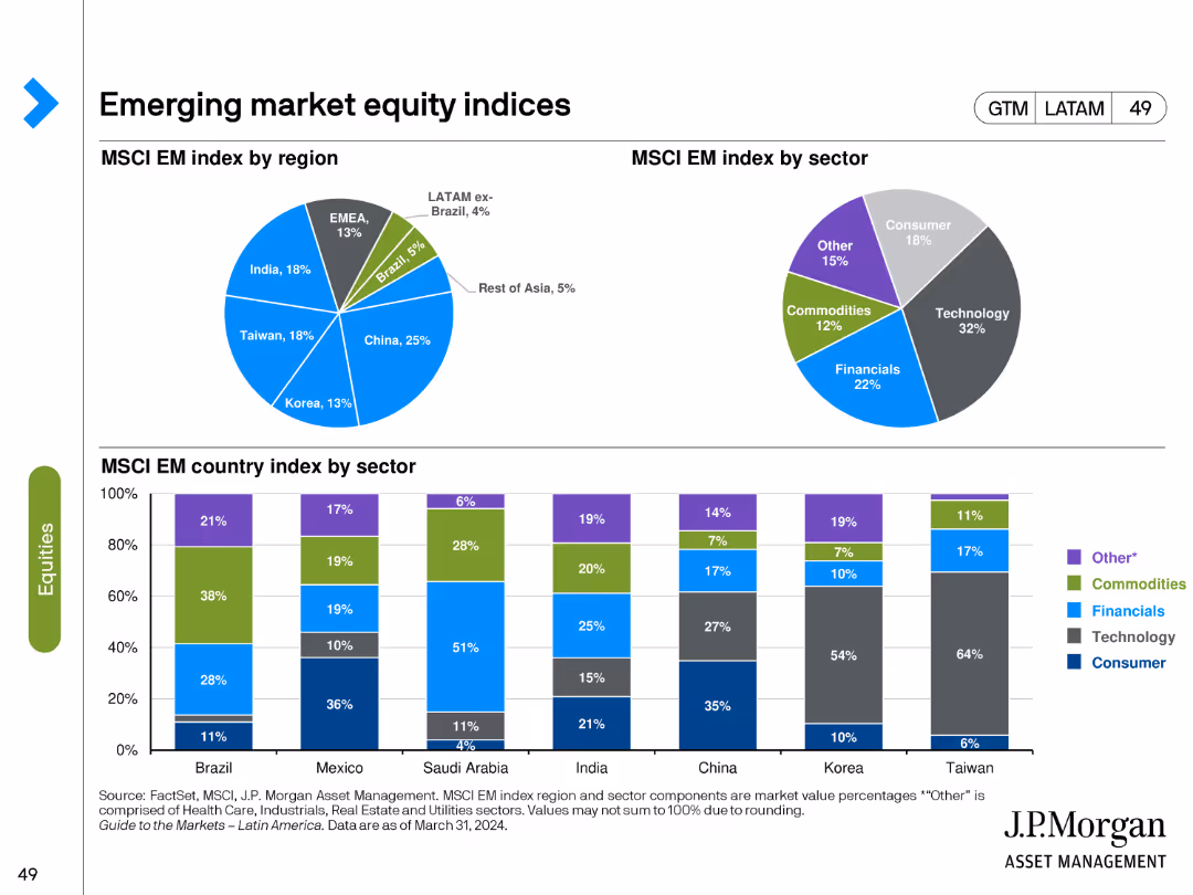
The slide features pie charts showing the MSCI Emerging Market index by region and sector, and bar charts for the index by country and sector. Various colors represent different regions, sectors, and countries.
Market Analysis and Trends
Financial Services
It breaks down the MSCI Emerging Market index, providing insights into the regional and sectoral composition of the index, which can inform investment strategies in emerging markets.
Emerging markets, MSCI index, regional composition, sectoral composition, investment
false
Market Analysis and Trends
Financial Services
Multiple Chart
JP Morgan
Add to my slides
Remove from favorites
The slide contains a map of Asia with highlighted countries and color-coded areas to depict various policies.
Market Analysis and Trends
Government & Public Sector
This slide explores ambitious policies in Indonesia, India, and Thailand aimed at growing their battery industries through strategic incentives.
emerging markets, policies, battery industry, Asia
false
Market Analysis and Trends
Government & Public Sector
Graphic
Accenture
Add to my slides
Remove from favorites
Features a world map and pie charts detailing sales in emerging markets, focusing on product types and regional distribution.
Industry Overview
Consumer Goods
Highlights sales performance in emerging markets, detailing regional distribution and product sales percentages.
emerging markets, sales, distribution, consumer goods, regional, products, performance, analysis
false
Industry Overview
Consumer Goods
Multiple Chart
Deutsche Bank
Add to my slides
Remove from favorites
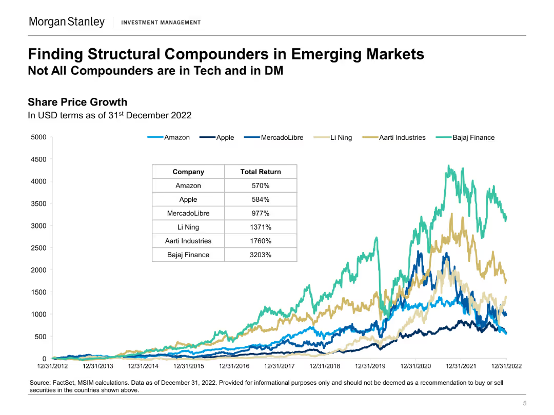
A line chart comparing the share price growth of several companies, accompanied by a table showing total returns in USD terms.
Investment Analysis
Financial Services
The slide highlights the share price growth of various companies in emerging markets, indicating potential high-growth investment opportunities.
emerging markets, share price growth, investment, high-growth, total returns
false
Investment Analysis
Financial Services
Single Chart
Morgan Stanley
Add to my slides
Remove from favorites
Features multiple pie charts and tables comparing emerging risks by overall, G-SIB, and non-G-SIB perspectives, alongside organizational change statistics.
Risk Assessment and Management
Financial Services
The slide provides a detailed analysis of the most critical emerging risks identified by CROs, including climate risk and technological disruptions, with comparative insights by bank type.
Emerging Risks, Climate Risk, Technological Disruption, Comparative
false
Risk Assessment and Management
Financial Services
Multiple Chart
EY
Add to my slides
Remove from favorites
The slide contains a mix of text and column charts. The left side has a textual overview while the right side includes two column charts with horizontal bars.
Risk Assessment and Management
Financial Services
The slide discusses the top emerging risks identified by CROs, including climate change and AI, and how these risks are viewed by risk organizations and boards.
Emerging risks, CRO, climate change, AI, risk management
false
Risk Assessment and Management
Financial Services
Multiple Chart
EY
Add to my slides
Remove from favorites
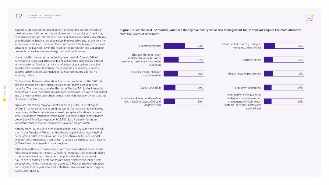
The slide has a column chart listing the top emerging risks for CROs, with text explaining the results. The right side highlights the opinions of respondents from different regions.
Risk Assessment and Management
Financial Services
The slide outlines emerging risks identified by CROs, including cybersecurity, geopolitical risks, and environmental risks, and their impact on the insurance industry.
emerging risks, CRO, insurance, geopolitical, environmental
false
Risk Assessment and Management
Financial Services
Multiple Chart
EY
Add to my slides
Remove from favorites
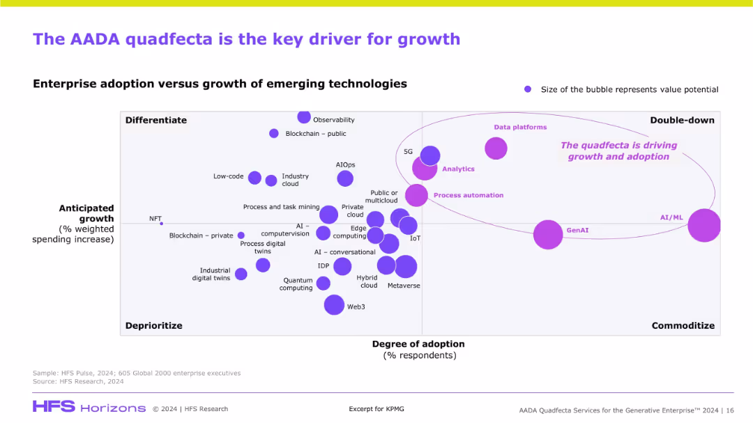
Scatterplot chart mapping emerging technologies based on adoption and anticipated growth. Bubble size denotes value potential. Purple elements highlight AADA’s prominence.
Market Analysis and Trends
Artificial Intelligence
This slide visualizes the strategic positioning of AADA technologies (Analytics, AI/ML, Automation, Data Platforms) as high-growth, high-adoption drivers. GenAI and AI/ML appear as key focal areas for investment and differentiation in enterprise tech.
emerging tech, AADA, GenAI, AI/ML, analytics, data platforms, adoption, growth, quadrant chart
false
Market Analysis and Trends
Artificial Intelligence
Single Chart
KPMG
Add to my slides
Remove from favorites
This slide features three column charts showing the adoption rates of newer digital health technologies such as Remote Patient Monitoring, Chatbots/Voice-enabled technology, and Digital Therapeutics from 2016 to 2021. Colors differentiate the years, highlighting trends over time.
Market Analysis and Trends
Healthcare & Pharmaceuticals
The slide presents data on emerging digital health technologies with a focus on recent growth trends. It's particularly useful for stakeholders interested in the adoption rates of innovative health technologies and their impact on healthcare delivery. The increasing usage of digital therapeutics in 2021 suggests a growing market acceptance.
emerging technologies, digital health, adoption rates, healthcare innovation, market trends
false
Market Analysis and Trends
Healthcare & Pharmaceuticals
Multiple Chart
Accenture
Add to my slides
Remove from favorites
Displays a series of bar charts in shades of purple, showcasing the adoption rates of various emerging technologies in different regions.
Technology and Digital Transformation
Technology & Software
Evaluates the readiness and adoption rates of emerging technologies like Metaverse, Next-gen Computation, and Intelligence in Growth Markets, offering insights for tech strategists and planners.
emerging technologies, Growth Markets, Metaverse, computation, intelligence
false
Technology and Digital Transformation
Technology & Software
Mixed Chart
Accenture
Add to my slides
Remove from favorites
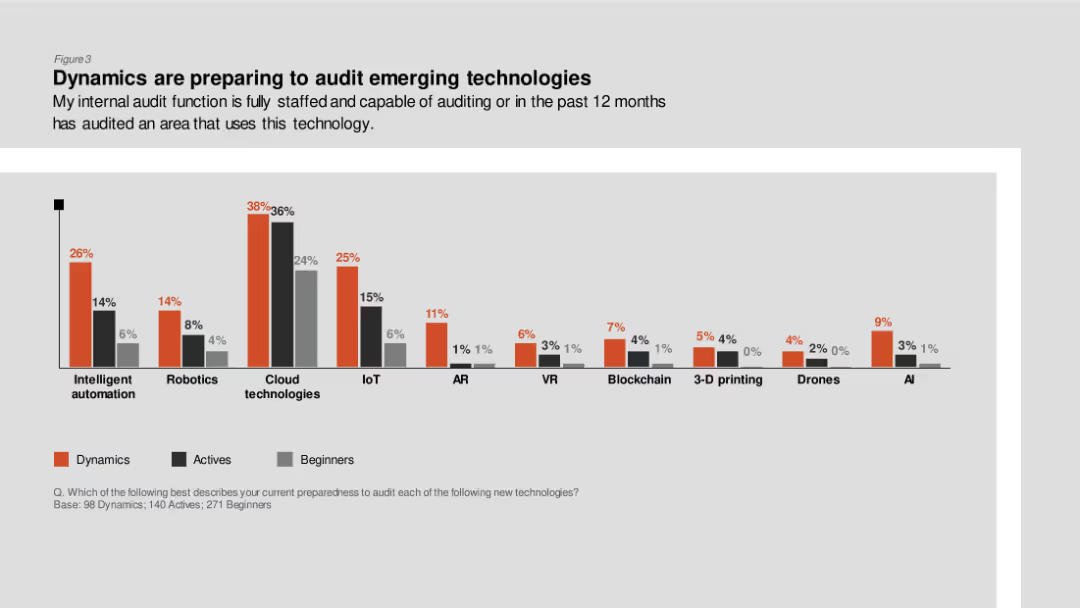
Column chart showing the preparedness of internal audit functions to audit various emerging technologies like robotics, cloud technologies, and AI, divided by Dynamics, Actives, and Beginners.
Technology and Digital Transformation
Professional Services
The slide presents data on how prepared internal audit functions are to audit emerging technologies, emphasizing higher preparedness in Dynamics for technologies like cloud and AI.
Emerging technologies, internal audit, preparedness, Dynamics, Actives
false
Technology and Digital Transformation
Professional Services
Single Chart
PwC/Strategy&
Add to my slides
Remove from favorites
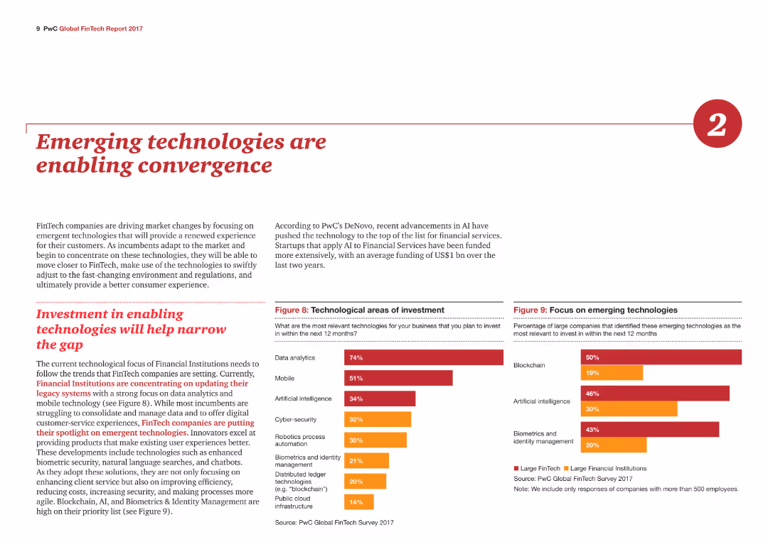
Two column charts show technological areas of investment and focus on emerging technologies, with different colors representing large FinTech and financial institutions.
Technology and Digital Transformation
Financial Services
The slide highlights how emerging technologies like AI and blockchain are driving changes in FinTech, with investment trends in data analytics, mobile, and artificial intelligence.
Emerging technologies, Investment, FinTech, AI, Blockchain
false
Technology and Digital Transformation
Financial Services
Multiple Chart
PwC/Strategy&
Add to my slides
Remove from favorites
The slide has five circular charts with percentages and descriptive text below each, set against a dark background.
Technology and Digital Transformation
Technology & Software
This slide presents survey results on employee perceptions of emerging technologies, highlighting the importance of human-centered approaches for adoption.
emerging technologies, survey results, employee perception, human-centered, adoption
false
Technology and Digital Transformation
Technology & Software
Single Chart
EY
Add to my slides
Remove from favorites
The slide includes a series of column charts showing the adoption status of various technologies and a line chart indicating concerns for cybersecurity risks.
Technology and Digital Transformation
Technology & Software
This slide outlines the current status of emerging technologies in the workplace, with a focus on cybersecurity concerns and the classification of technologies into established, emerging, and futuristic.
emerging technologies, workplace, cybersecurity, technology status, adoption status
false
Technology and Digital Transformation
Technology & Software
Single Chart
EY
Add to my slides
Remove from favorites
The slide has a clean and modern look, featuring a bar chart alongside a text section. The chart displays the percentage of risk teams using various technologies like "Data mesh technology," "Robotic process automation," and "Generative AI." It contrasts the adoption rates between top technology users and others, providing a clear visualization of technology uptake in risk management.
Technology and Digital Transformation
Technology & Software
This slide encourages investment in emerging technologies by showing the adoption rates among risk teams. It highlights the disparity in technology usage, advocating for increased investment to bridge this gap. The data serves to underscore the importance of staying current with technological advances to enhance risk management efficiency and overall business resilience.
emerging technology, investment, risk management, data mesh, automation, AI, column chart, adoption rates
false
Technology and Digital Transformation
Technology & Software
Mixed Chart
Accenture
Add to my slides
Remove from favorites
The slide features various bar graphs and pie charts detailing respondents' familiarity with different emerging technologies and their roles within organizations.
Technology and Digital Transformation
Technology & Software
The slide provides a profile of respondents' familiarity with emerging technologies, detailing the levels of familiarity, roles, and generations of respondents.
emerging tech, respondent profile, technology adoption, digital transformation, tech familiarity
false
Technology and Digital Transformation
Technology & Software
Multiple Chart
EY
Add to my slides
Remove from favorites
Contains a clear visual hierarchy with text and iconography to delineate key principles, opportunities, and actions. The slide follows a consistent color scheme with blue as the primary color.
Strategic Planning
Financial Services
This slide outlines principles and responses to emerging trends in payments, highlighting customer choice, data-led services, and sustainable innovation. It is crafted to guide strategic thinking and decision-making in response to market trends, particularly in the areas of payment flexibility and risk management.
Emerging trends, Payment innovation, Customer choice, Strategic response
false
Strategic Planning
Financial Services
Table
JP Morgan
Add to my slides
Remove from favorites
A detailed slide with a column chart showing annual global entertainment and media revenue from 2016-2025, with a red line depicting year-on-year growth percentage.
Market Analysis and Trends
Media & Entertainment
This slide analyzes the decline in global entertainment and media revenue in 2020 due to pandemic impacts, with projections up to 2025.
E&M industry, revenue impact, pandemic, global trends, 2020, projections, annual growth
false
Market Analysis and Trends
Media & Entertainment
Single Chart
PwC/Strategy&
Add to my slides
Remove from favorites
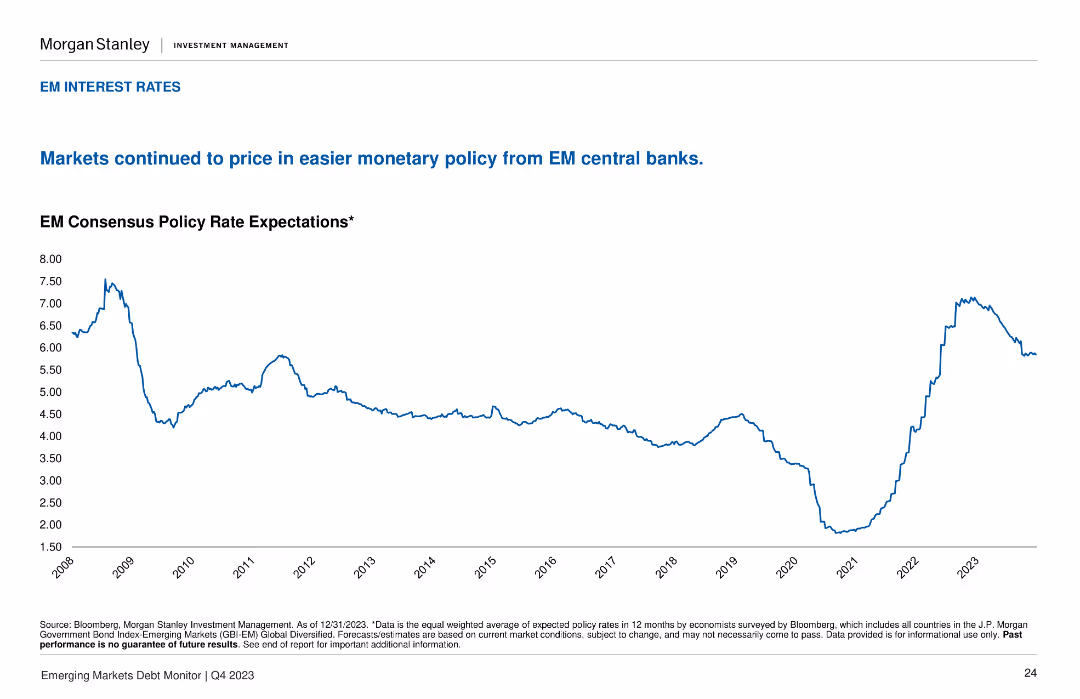
This slide contains a line chart depicting the EM Consensus Policy Rate Expectations from 2008 to 2023. The layout is simple, with a white background and blue line for the data points.
Market Analysis and Trends
Financial Services
The slide shows the expected policy rates from EM central banks, indicating trends and expectations in monetary policy over the years. Useful for analyzing economic policy trends.
EM, interest rates, policy, central banks, trend analysis
false
Market Analysis and Trends
Financial Services
Single Chart
Morgan Stanley
Add to my slides
Remove from favorites
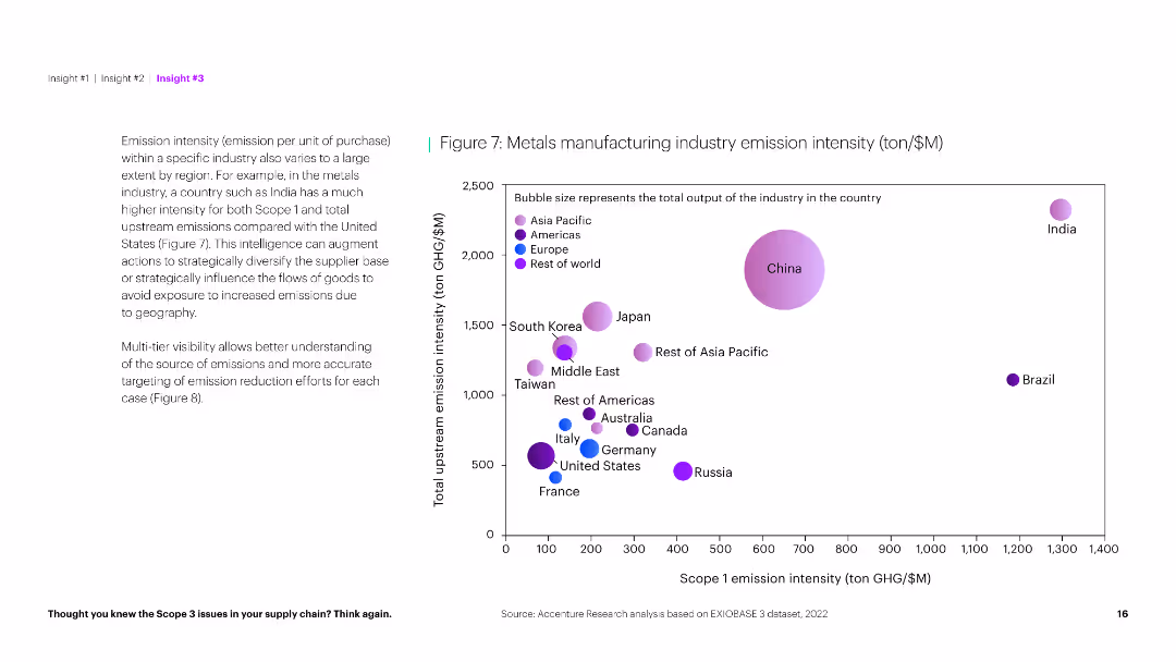
The slide uses a bubble chart to depict the emission intensity of metals manufacturing across various countries, with a clean and informative layout.
Market Analysis and Trends
Industrial & Manufacturing
This slide presents an analysis of emission intensity in the metals manufacturing industry, comparing scope 1 and upstream emissions across different countries.
Emission intensity, metals manufacturing, industry analysis, country comparison, environmental impact, sustainability, bubble chart, data visualization
false
Market Analysis and Trends
Industrial & Manufacturing
Mixed Chart
Accenture
Add to my slides
Remove from favorites
World map showing required emission reduction percentages by 2050 for major countries, with specific targets highlighted for each. The slide uses clear labeling and contrasting colors for different targets.
Regulatory and Compliance
Environmental Services & Sustainability
Outlines the necessary emission reductions by 2050 for major countries to align with climate goals, emphasizing the varied targets across different nations. Useful for discussing policy adjustments and international agreements aimed at combating climate change.
Emission reduction, 2050, Targets, Climate goals, Policy
false
Regulatory and Compliance
Environmental Services & Sustainability
Graphic
BCG
Add to my slides
Remove from favorites
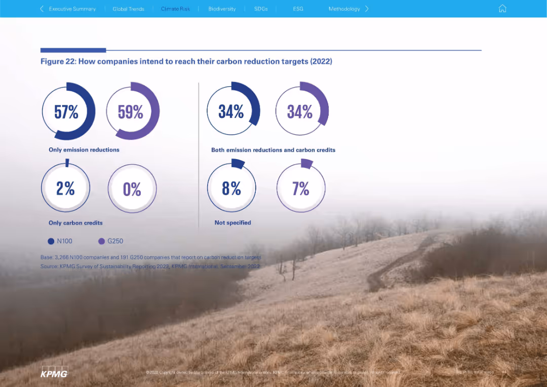
Minimalist layout with donut charts showing how N100 and G250 companies plan to meet carbon targets (emission reductions vs. credits). Presented on a photographic background.
Regulatory and Compliance
Environmental Services & Sustainability
This slide visualizes the methods companies use to achieve carbon targets. The majority opt for emission reductions alone, while a smaller percentage combine these with carbon credits. Very few rely solely on credits, highlighting a trend toward substantive emissions strategies.
emission reduction, carbon credits, G250, N100, sustainability, ESG
false
Regulatory and Compliance
Environmental Services & Sustainability
Single Chart
KPMG
Add to my slides
Remove from favorites
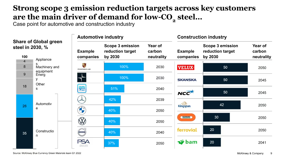
The slide includes two tables comparing emission reduction targets and years of carbon neutrality for automotive and construction industries, with example companies.
Regulatory and Compliance
Environmental Services & Sustainability
This slide analyzes the impact of scope 3 emission reduction targets on the demand for low-CO2 steel, highlighting automotive and construction industry commitments and timelines.
emission reduction, low-CO2 steel, automotive, construction, carbon neutrality
false
Regulatory and Compliance
Environmental Services & Sustainability
Multiple Chart
McKinsey
Add to my slides
Remove from favorites
The slide compares the emission reduction targets and timelines for key automotive and construction industry companies, with data on their green steel demand shares.
Regulatory and Compliance
Environmental Services & Sustainability
This slide examines how emission reduction targets in the automotive and construction industries are driving demand for low-CO2 steel, with comparative data on target timelines and demand shares.
Emission reduction, low-CO2 steel, automotive, construction, targets, demand drivers, green steel, regulatory
false
Regulatory and Compliance
Environmental Services & Sustainability
Single Chart
BCG
Add to my slides
Remove from favorites
This slide details NBN Co's approach to measuring avoided emissions, with a focus on methodology and key metrics presented in a clear, structured format.
Regulatory and Compliance
Telecommunications
This slide covers NBN Co's emissions avoidance modeling, explaining the methodologies used and the impact on environmental sustainability metrics.
emissions avoidance, NBN Co, environmental impact, sustainability, modeling, methodology
false
Regulatory and Compliance
Telecommunications
Header Vertical
Accenture
Add to my slides
Remove from favorites
Contains a column chart on the left showing GHG emissions and a stacked column chart on the right depicting the remaining carbon budget.
Risk Assessment and Management
Energy & Utilities
Highlights GHG emissions by segment in 2018 and the estimated remaining carbon budget for global warming of 1.5°C, emphasizing the urgency of reducing emissions.
Emissions, carbon budget, GHG, climate change, global warming
false
Risk Assessment and Management
Energy & Utilities
Multiple Chart
Kearney
Add to my slides
Remove from favorites
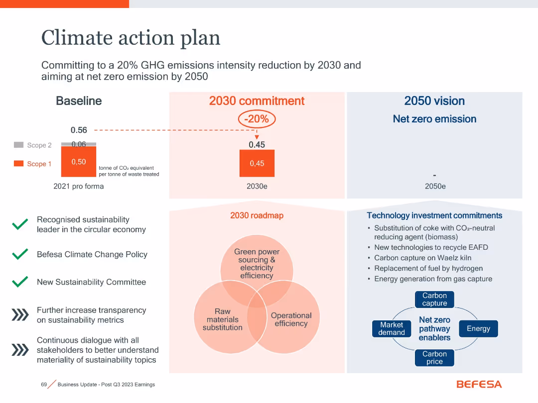
Split layout with charts, icons, and a central Venn diagram
Regulatory and Compliance
Environmental Services & Sustainability
This slide outlines Befesa’s targets for emissions reduction by 2030 and net zero by 2050, supported by policy commitments and technology investments.
Emissions, Climate Plan, Net Zero, Carbon Capture, Sustainability
false
Regulatory and Compliance
Environmental Services & Sustainability
Mixed Chart
Goldman Sachs
Add to my slides
Remove from favorites
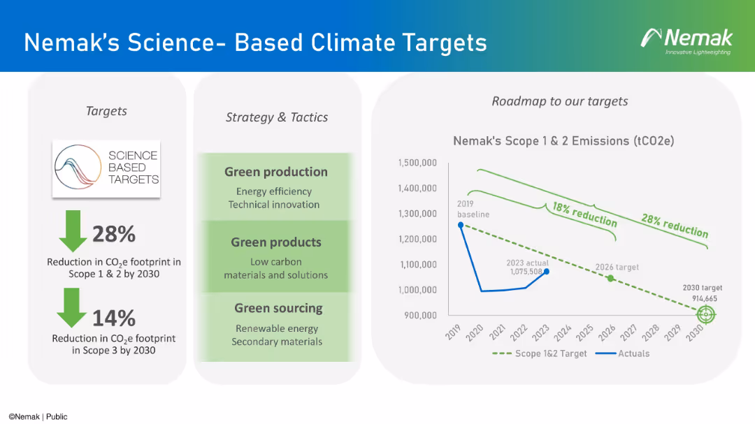
Three-column layout with icons, arrows, and a line chart depicting emissions reductions over time.
Financial Performance
Industrial & Manufacturing
The slide outlines Nemak’s targets for CO₂e emissions reduction by 2030 and the strategies to achieve them. It includes scope 1, 2, and 3 targets, highlights tactics like green production and sourcing, and presents a roadmap chart with progress and goals.
emissions, climate targets, green energy, sustainability, scope 1 2 3
false
Financial Performance
Industrial & Manufacturing
Mixed Chart
Barclays
Add to my slides
Remove from favorites
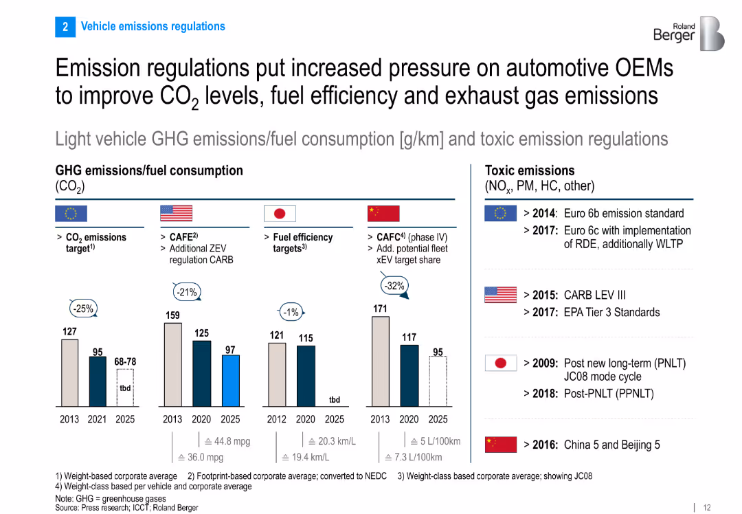
Multi-country comparison of fuel consumption and GHG emissions targets. Bar charts and policy milestones included.
Regulatory and Compliance
Industrial & Manufacturing
The slide compares regulatory approaches to CO₂ and toxic emissions across major automotive markets. It shows declining emission targets through 2025 and outlines key policy milestones in the EU, US, Japan, and China.
emissions, CO₂ targets, regulatory pressure, GHG, automotive policy, fuel efficiency
false
Regulatory and Compliance
Industrial & Manufacturing
Multiple Chart
Roland Berger
Add to my slides
Remove from favorites
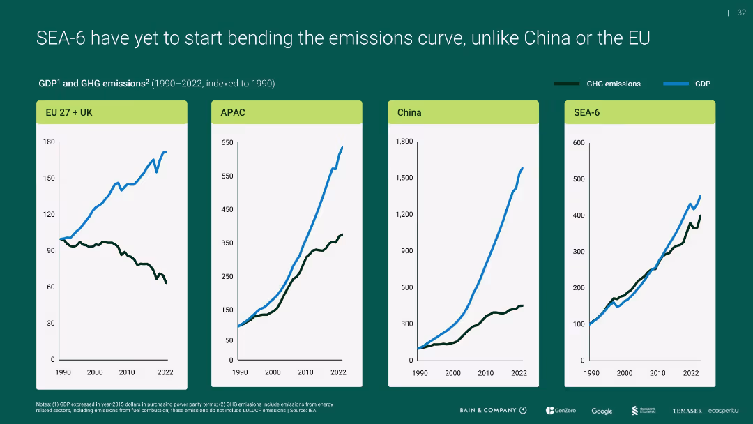
Four-panel line chart showing GDP vs. GHG emissions indexed to 1990 for EU+UK, APAC, China, and SEA-6
Performance Metrics and KPIs
Environmental Services & Sustainability
Compares emissions and economic growth over time, revealing that unlike the EU, SEA-6 and others (like APAC, China) have not decoupled emissions from GDP growth, highlighting a challenge for sustainable development.
emissions curve, GDP, SEA-6, APAC, EU, China
false
Performance Metrics and KPIs
Environmental Services & Sustainability
Multiple Chart
Bain
Add to my slides
Remove from favorites
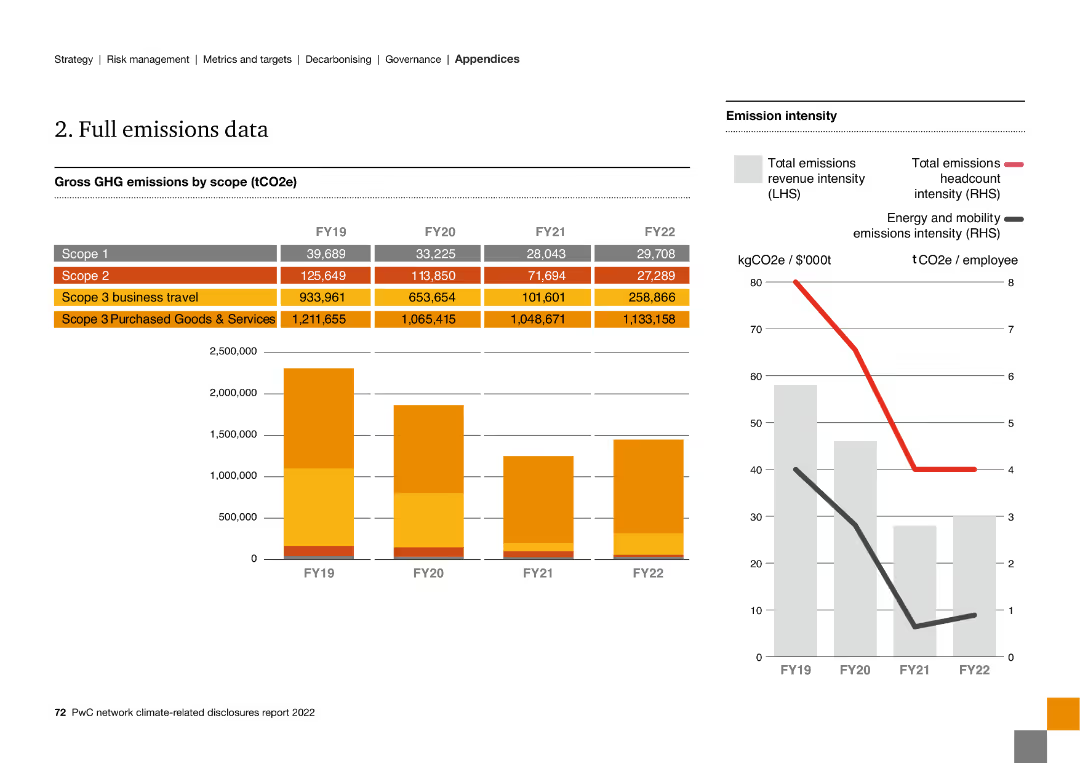
The slide includes multiple column charts and line graphs, presenting detailed GHG emissions data by scope from FY19 to FY22 and emission intensity metrics.
Financial Performance
Energy & Utilities
The slide presents comprehensive GHG emissions data across different scopes from FY19 to FY22, including business travel and purchased goods and services.
emissions data, GHG, scope, FY19, FY22, intensity, business travel, purchased goods
false
Financial Performance
Energy & Utilities
Multiple Chart
PwC/Strategy&
Add to my slides
Remove from favorites
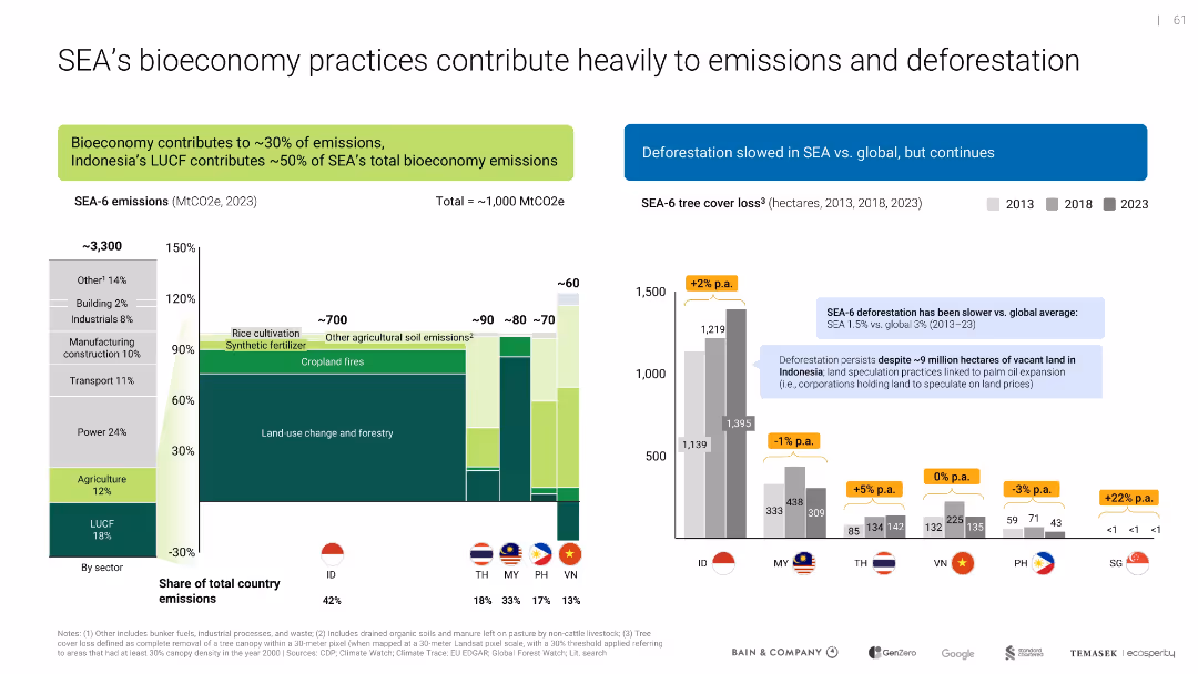
Side-by-side bar charts; one shows sector emissions breakdown, the other tracks deforestation trends by country
Risk Assessment and Management
Environmental Services & Sustainability
Analyzes emissions sources in SEA's bioeconomy, particularly land use change and agriculture. Deforestation data shows varied progress across countries, with Indonesia as a major contributor.
emissions, deforestation, LUCF, agriculture, SEA, sustainability, climate impact
false
Risk Assessment and Management
Environmental Services & Sustainability
Multiple Chart
Bain
Add to my slides
Remove from favorites
Slide features a column chart comparing 'Particle Emissions: Michelin vs. Other Premium Tiremakers', alongside images of tires and their respective emission reductions. The visual presentation is clear, with the graph effectively highlighting Michelin's lower emission levels in a distinct yellow bar. Accompanied by illustrative tire images, the data is easy to interpret and visually impactful.
Product and Service Analysis
Industrial & Manufacturing
The slide promotes Michelin’s environmental advantages in tire manufacturing, illustrating lower particle emissions compared to competitors, which translates to a significant reduction in environmental impact without compromising safety. It conveys Michelin's dedication to innovation and sustainability in their products, emphasizing their leadership in environmentally responsible manufacturing practices.
emissions, environmental impact, sustainability, tires, Michelin, safety, competitive advantage, manufacturing
false
Product and Service Analysis
Industrial & Manufacturing
Mixed Chart
Morgan Stanley
Add to my slides
Remove from favorites
The slide contains a line chart displaying the progress on Scope 2 goals from 2014 to 2023. The left side includes text with detailed emissions data and trends. The layout is dense with detailed graphs and comprehensive text.
Risk Assessment and Management
Environmental Services & Sustainability
The slide provides an overview of Booz Allen's progress on reducing Scope 2 emissions. It includes year-over-year GHG emissions data, detailed percentage reductions, and verification methods for emissions inventory.
emissions, GHG, Scope 2, reduction, environmental performance
false
Risk Assessment and Management
Environmental Services & Sustainability
Mixed Chart
Booz Allen Hamilton
Add to my slides
Remove from favorites
The slide has several sections: a large bar graph at the bottom, two smaller graphs to the right, and a section with bullet points explaining the data at the top left corner.
Regulatory and Compliance
Environmental Services & Sustainability
The slide presents the greenhouse gas emissions data for FY22, showing the progress and targets set by the company. It is suitable for audiences interested in environmental impact data and the company’s efforts in reducing its carbon footprint.
emissions, greenhouse gas, data, environmental impact
false
Regulatory and Compliance
Environmental Services & Sustainability
Multiple Chart
Booz Allen Hamilton
Add to my slides
Remove from favorites
The visual complexity is moderate with a layout that presents key end-markets requiring emissions management through iconography and text. The design facilitates an easy understanding of where emissions management systems are most needed and the potential for automation within these sectors.
Technology and Digital Transformation
Industrial & Manufacturing
The slide identifies the main industrial sectors that necessitate robust emissions management, such as Oil & Gas and Power Generation, and highlights the potential automation applications within these sectors. It offers insights into how automation can improve emissions monitoring and reporting, thus optimizing the underlying processes for better efficiency and regulatory compliance.
Emissions management, Automation potential, Industrial sectors, Regulatory compliance
false
Technology and Digital Transformation
Industrial & Manufacturing
Pillar
LEK
Add to my slides
Remove from favorites
Moderate visual complexity, this slide uses iconography to represent the drivers behind the development and adoption of Emissions Management Systems (EMS). It is text-light but the icons are accompanied by concise bullet points that explain each driver in detail.
Technology and Digital Transformation
Industrial & Manufacturing
The slide focuses on the drivers stimulating the development of sophisticated Emissions Management Systems in process industries. It points out the significant contributions of these industries to greenhouse gas emissions and the resultant demand for EMS to reduce environmental impacts while ensuring compliance with stringent governmental regulations.
Emissions Management, Environmental sustainability, Regulatory compliance, EMS drivers
false
Technology and Digital Transformation
Industrial & Manufacturing
Pillar
LEK
Add to my slides
Remove from favorites
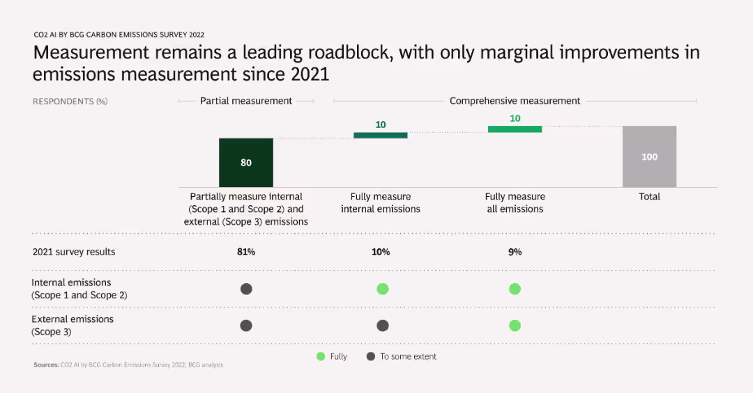
A column chart comparing 2021 and 2022 survey results on emissions measurement practices. Shows percentages of companies performing partial and comprehensive measurements of internal and external emissions.
Risk Assessment and Management
Environmental Services & Sustainability
Discusses the challenges and slow progress in improving emissions measurement accuracy and comprehensiveness. Highlights the need for better measurement practices to enhance emissions management.
emissions measurement, challenges, survey comparison, partial, comprehensive
false
Risk Assessment and Management
Environmental Services & Sustainability
Mixed Chart
BCG
Add to my slides
Remove from favorites
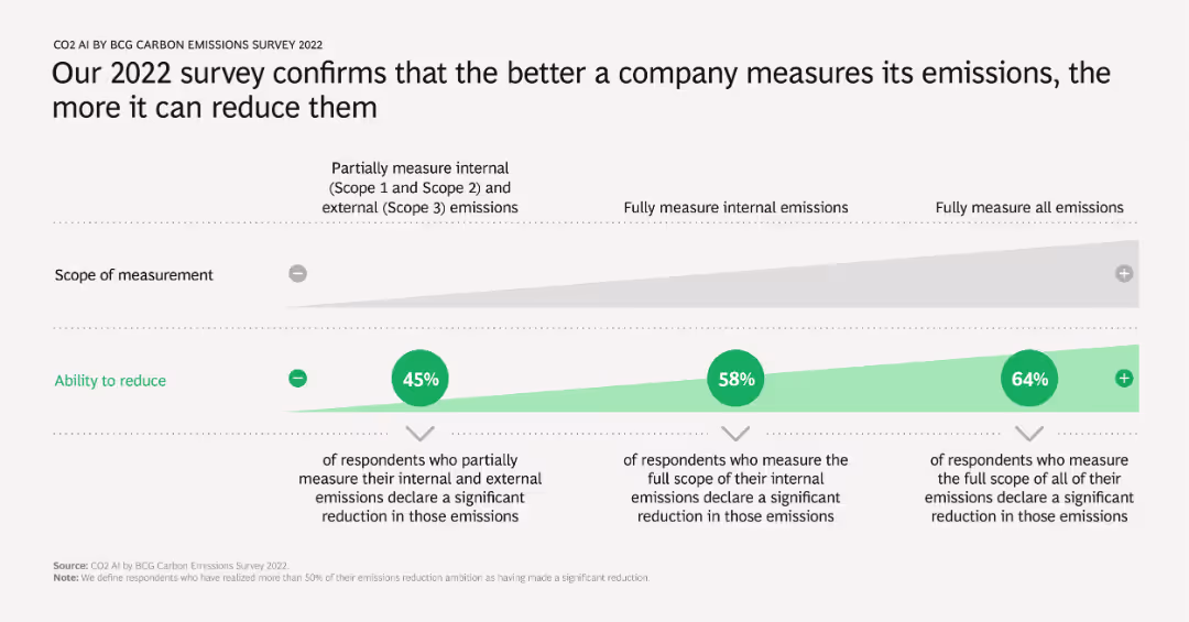
A column chart showing the correlation between the scope of emissions measurement and the ability to reduce emissions. It includes percentages of respondents who measure emissions to varying extents and their reported emission reductions.
Operational Efficiency
Environmental Services & Sustainability
Demonstrates that companies which comprehensively measure their emissions tend to achieve more significant reductions. Highlights the importance of thorough emissions tracking in achieving meaningful environmental impact.
emissions measurement, reduction, operational efficiency, scope, survey results
false
Operational Efficiency
Environmental Services & Sustainability
Table
BCG
Add to my slides
Remove from favorites
Slide shows a bubble chart indicating the share of emissions per energy and land-use system. Text is complemented by bubbles of various sizes representing data points, set against a plain background for clarity.
Industry Overview
Environmental Services & Sustainability
Explains the universal nature of emission reductions required across all energy and land-use systems for a successful net-zero transition. Includes comparative data visualization for different emission types across various sectors.
Emissions, Net-Zero, Energy, Land-Use, Reduction, Carbon Dioxide, Methane, Nitrous Oxide
false
Industry Overview
Environmental Services & Sustainability
Single Chart
McKinsey
Add to my slides
Remove from favorites
Displays a graph showing the trajectory of global emissions against time, with projections up to 2050 under different temperature pathway scenarios, highlighting the current commitments and the necessary reductions for 1.5°C and 2°C paths.
Regulatory and Compliance
Environmental Services & Sustainability
Projects global emissions up to 2050 under various climate commitments and pathways, emphasizing the gap between current commitments and necessary reductions. Useful for strategic planning in environmental policy and business adaptation to climate targets.
Emissions, Projections, 2050, Climate pathways, Policy making
false
Regulatory and Compliance
Environmental Services & Sustainability
Single Chart
BCG
Add to my slides
Remove from favorites
Title left-aligned; right side shows a bar chart comparing perceived vs actual impact ranks of various climate-related actions.
Market Analysis and Trends
Environmental Services & Sustainability
This slide reveals the mismatch between public perception and actual effectiveness of household actions on reducing emissions. Actions like recycling are overrated, while more impactful behaviors like living car-free are underrated. Data is shown across two years with actual ranks.
emissions, public perception, recycling, climate action, emission reduction, behavioral change, global survey, Ipsos, misperception
false
Market Analysis and Trends
Environmental Services & Sustainability
Mixed Chart
IPSOS
Add to my slides
Remove from favorites
This slide contains a column chart showing key emission reduction levers and their abatement costs. It uses a gradient color scheme and detailed annotations to describe different abatement strategies and their potential impact.
Operational Efficiency
Energy & Utilities
The slide identifies key emissions reduction levers and typical abatement costs, suggesting that 30-40% of emissions reduction can be achieved through low-cost or mature technologies. It includes recommendations for CEOs on value-generating initiatives.
emissions reduction, abatement costs, strategies, low-cost technologies, CEO recommendations
false
Operational Efficiency
Energy & Utilities
Mixed Chart
BCG
Add to my slides
Remove from favorites
Column chart illustrating emissions reduction trajectories. Includes detailed text on the pathway's development and projected impact.
Market Analysis and Trends
Agriculture & Food Production
Presents a model for reducing on-farm emissions in Australian agriculture, outlining a conservative yet impactful approach to achieving net zero emissions.
Emissions Reduction, Agriculture, Carbon Abatement, Net Zero, Environmental Impact, Sustainability, Pathways
false
Market Analysis and Trends
Agriculture & Food Production
Mixed Chart
EY
Add to my slides
Remove from favorites
This slide is divided into four main sections, each highlighting different areas of opportunity for mitigating emissions in the agriculture sector. A multi-colored area chart visualizes emissions reduction projections from 2019 to 2050.
Market Analysis and Trends
Agriculture & Food Production
The slide presents four key opportunity areas for reducing emissions in the agricultural sector: methane reduction, transport and electricity, land use change, and improved land management. It includes projections of emissions reduction over 30 years.
Emissions reduction, Agriculture, Methane, Electricity, Land use
false
Market Analysis and Trends
Agriculture & Food Production
Mixed Chart
EY
Add to my slides
Remove from favorites
Combines text with an image and bar charts showing different emission reduction pathways and the use of offsets from 2020 to 2050.
Strategic Planning
Environmental Services & Sustainability
Describes various business approaches to emissions reduction, including direct decarbonisation, carbon neutrality, and beyond net zero, highlighting the role of offsets.
Emissions, reduction, business, commitment, pathway, offset, decarbonisation, 2050
false
Strategic Planning
Environmental Services & Sustainability
Multiple Chart
EY
Add to my slides
Remove from favorites
Waterfall bar chart with color-coded reductions, textual callouts, and emissions trajectory lines
Risk Assessment and Management
Environmental Services & Sustainability
Demonstrates the emission reduction potential of prioritized solutions, projecting that SEA could reduce emissions by ~320 MtCO2e by 2030, closing about half the gap to target levels. Contributions by bioeconomy, grid, and EV ecosystem are quantified.
emissions reduction, GHG, 2030 targets, SEA, climate strategy, systems-level solutions, sustainability
false
Risk Assessment and Management
Environmental Services & Sustainability
Single Chart
Bain
Add to my slides
Remove from favorites
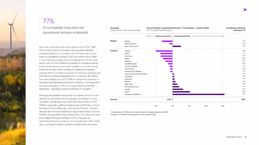
Features a combination of horizontal bar charts depicting annual changes in operational emissions intensity by region and industry from 2010 to the latest available year.
Operational Efficiency
Environmental Services & Sustainability
The slide highlights the reduction in operational emissions intensity by 77% of G2000 companies since the Paris Agreement, with industry and regional breakdowns of emissions changes.
Emissions, Reduction, Operational Efficiency, G2000, Paris Agreement
false
Operational Efficiency
Environmental Services & Sustainability
Mixed Chart
Accenture
Add to my slides
Remove from favorites
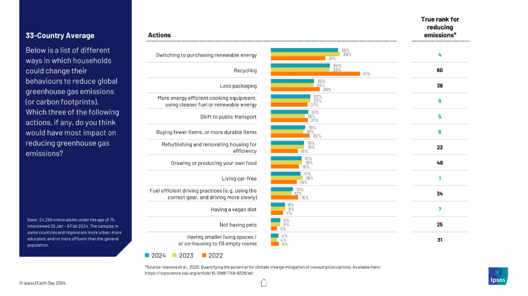
Horizontal bar chart with three years of data (2022–2024) comparing public perception of various emission-reducing actions, placed centrally with a left-aligned descriptive text box and a right column showing "true rank" of effectiveness.
Market Analysis and Trends
Environmental Services & Sustainability
The slide compares public perceptions across 33 countries on which household actions are believed to reduce greenhouse gas emissions, versus their actual effectiveness. The data highlights mismatches between perceived and actual impact, such as overestimation of recycling and underestimation of living car-free.
emissions reduction, public perception, climate change, recycling, renewable energy, transportation, Ipsos, true impact, carbon footprint, sustainability
false
Market Analysis and Trends
Environmental Services & Sustainability
Mixed Chart
IPSOS
Add to my slides
Remove from favorites
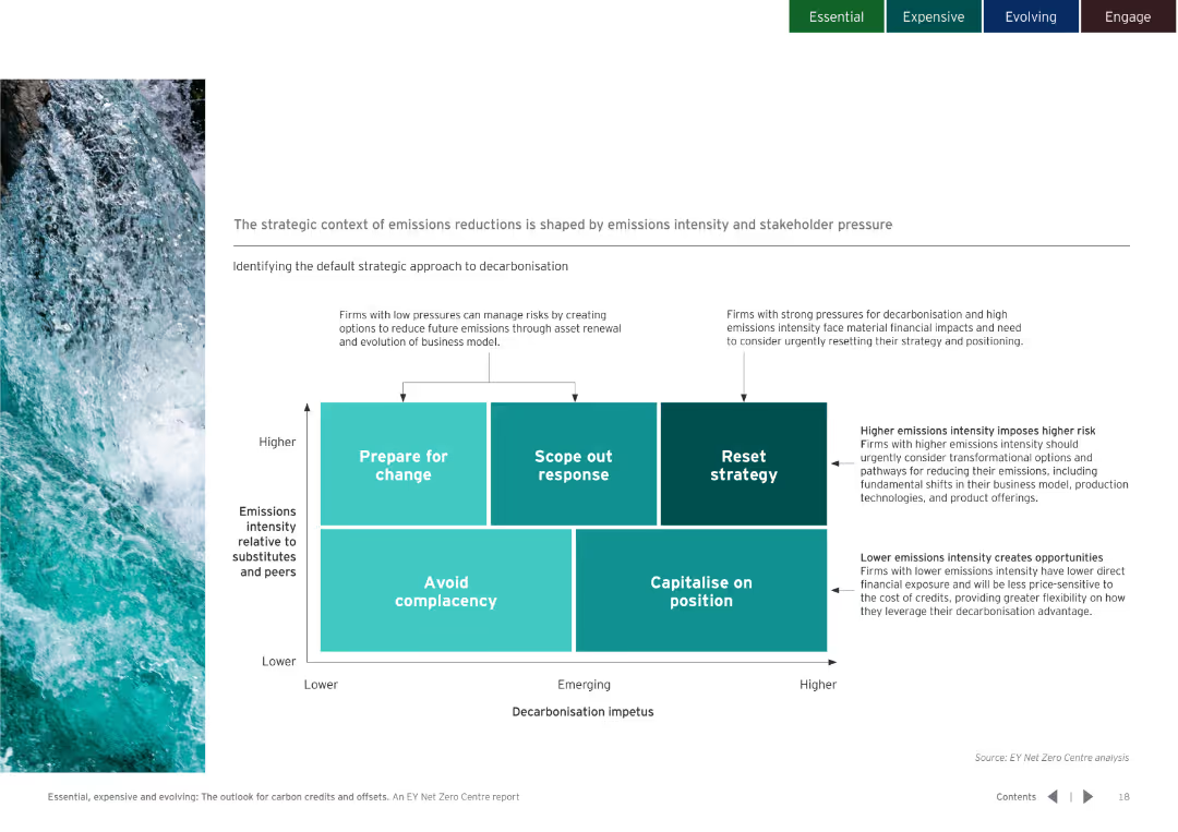
Includes a matrix diagram showing different strategic approaches to decarbonisation based on emissions intensity and stakeholder pressure.
Strategic Planning
Environmental Services & Sustainability
Identifies strategies for firms based on their emissions intensity and decarbonisation impetus, suggesting actions from preparing for change to capitalizing on position.
Emissions, reduction, strategy, decarbonisation, intensity, stakeholder, pressure, sustainability
false
Strategic Planning
Environmental Services & Sustainability
Diagram
EY
Add to my slides
Remove from favorites
Contains column charts, bar graphs, and icon legends, with annotations and a mix of conditional formatting. Colors vary across graphs to distinguish different data sets.
Market Analysis and Trends
Environmental Services & Sustainability
Details the estimated emissions gap required to achieve a 1.5°C pathway by 2030, with specific targets and reductions from various regions.
emissions, reduction, targets, SEA, 2030, NDCs, gap
false
Market Analysis and Trends
Environmental Services & Sustainability
Multiple Chart
Bain
Add to my slides
Remove from favorites
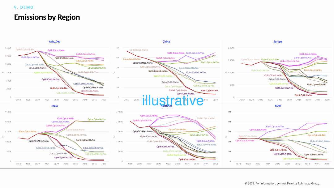
The slide shows multiple line charts comparing emissions by region (Asia_Dev, China, Europe, India, ROW) under different scenarios. Each chart tracks emissions over time, highlighting trends and differences between regions.
Risk Assessment and Management
Environmental Services & Sustainability
The slide analyzes regional emissions trends under various conditions, helping in assessing environmental risks and planning for sustainability. Useful for comparing the impact of different policies on emissions across regions.
Emissions, regions, trends, sustainability, environmental impact
false
Risk Assessment and Management
Environmental Services & Sustainability
Multiple Chart
Deloitte
Add to my slides
Remove from favorites
Line graph on the left and bullet point highlights on the right, using flags and color-coded emission trend lines.
Regulatory and Compliance
Industrial & Manufacturing
The slide compares emission regulations across the US, EU, and China, showing declining CO₂ per km targets through 2030. It discusses political influences on timelines, such as delays in Europe and regulatory stance in China and the U.S.
emissions, regulation, EV, fuel efficiency, CO₂ targets, policy
false
Regulatory and Compliance
Industrial & Manufacturing
Mixed Chart
Barclays
Add to my slides
Remove from favorites
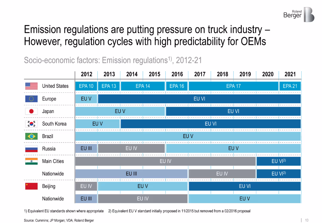
Gantt-style timeline comparing emission regulation timelines across multiple countries from 2012–2021. Color-coded by standard level.
Regulatory and Compliance
Transportation & Logistics
This slide details emission regulations in key global regions from 2012–2021. It shows how stricter environmental standards impact OEMs, emphasizing regulatory predictability and geographic differences in policy rollouts.
['emissions', 'regulations', 'trucking', 'compliance', 'OEM', 'regional standards', 'environment', 'EU', 'EPA']
false
Regulatory and Compliance
Transportation & Logistics
Table
Roland Berger
Add to my slides
Remove from favorites
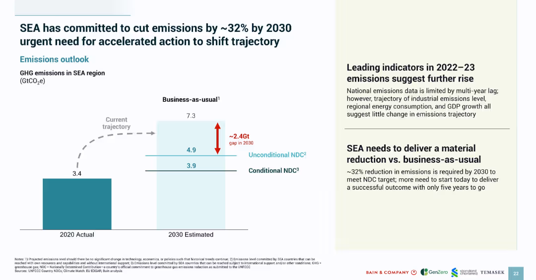
Split-panel layout with a left-side bar chart and right-side text; simple, corporate design with color coding
Strategic Planning
Environmental Services & Sustainability
This slide highlights Southeast Asia's emissions trajectory, indicating a business-as-usual scenario versus targets for 2030. It quantifies the emissions gap (~2.4Gt) and emphasizes the urgent need to meet Nationally Determined Contributions (NDCs) through accelerated action.
emissions, SEA, 2030 target, GHG, NDC, business-as-usual, reduction, sustainability, carbon gap
false
Strategic Planning
Environmental Services & Sustainability
Mixed Chart
Bain
Add to my slides
Remove from favorites
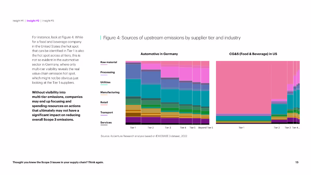
The slide presents two column charts comparing upstream emission sources by supplier tier for Automotive in Germany and CG&S in the US. It is data-dense.
Market Analysis and Trends
Environmental Services & Sustainability
This slide compares the sources of upstream emissions for automotive and food & beverage industries, highlighting differences in emission visibility across tiers.
Emissions, sources, supplier tier, automotive, food & beverage, industry comparison, upstream, Germany, US, sustainability
false
Market Analysis and Trends
Environmental Services & Sustainability
Multiple Chart
Accenture
Add to my slides
Remove from favorites
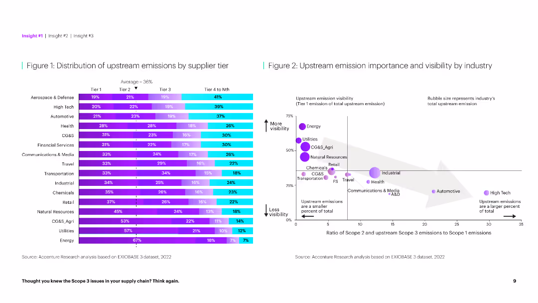
The slide features a horizontal bar chart on the left showing emission distribution by tier and a scatter plot on the right comparing emission importance.
Market Analysis and Trends
Environmental Services & Sustainability
This slide provides a detailed analysis of upstream emissions across different supplier tiers and their visibility by industry, highlighting key emission sources.
Emissions, supplier tier, distribution, visibility, industry, analysis, environmental impact, upstream, importance, sustainability
false
Market Analysis and Trends
Environmental Services & Sustainability
Multiple Chart
Accenture
Add to my slides
Remove from favorites
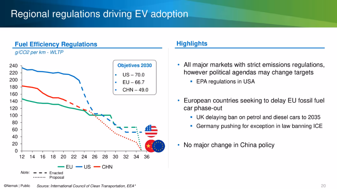
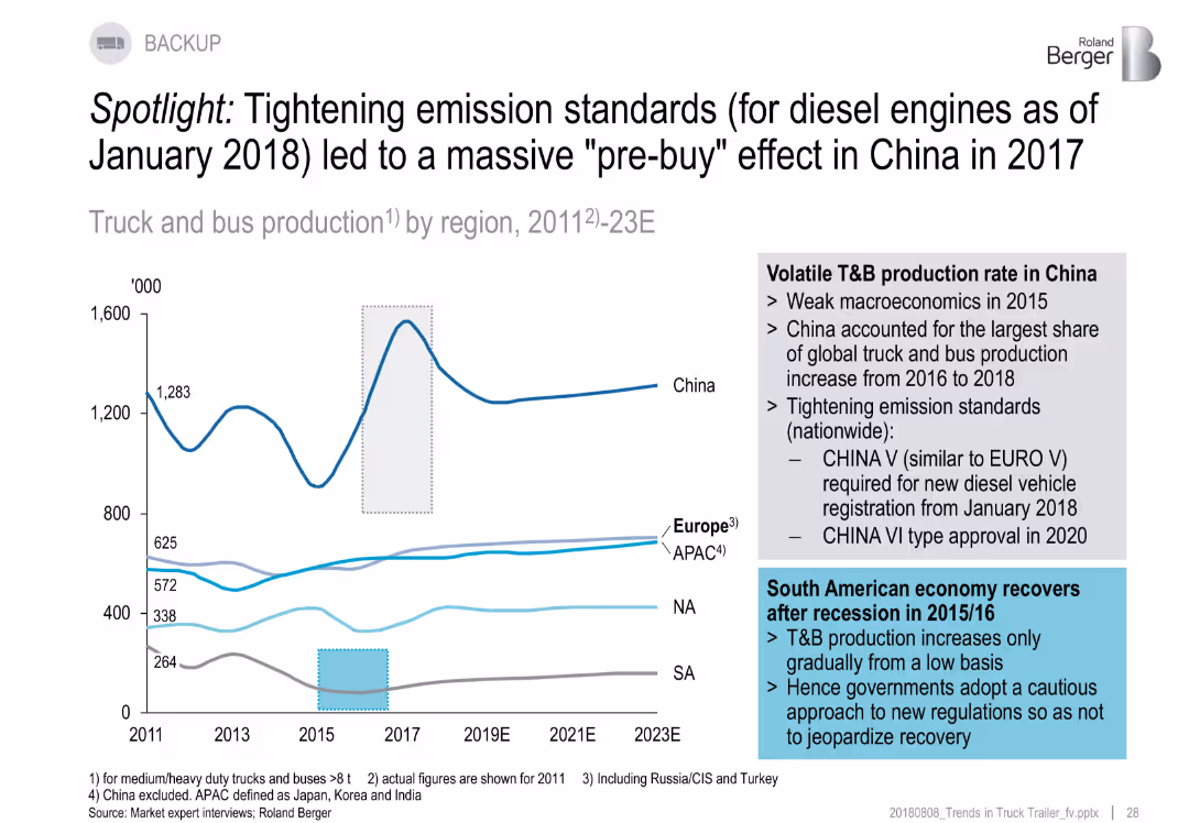
Line graph with annotations and callouts on China and South America. Highlights regulatory impacts.
Regulatory and Compliance
Industrial & Manufacturing
Emission regulations in China triggered a spike in truck/bus purchases before 2018 ("pre-buy" effect). The chart shows volatile production trends across regions, especially China. South America shows recovery post-2015/16 recession.
emission standards, China, pre-buy, regulations, truck production, trends
false
Regulatory and Compliance
Industrial & Manufacturing
Mixed Chart
Roland Berger
Add to my slides
Remove from favorites
Contains line graphs showing progress against emissions targets for various sectors within Barclays' portfolio.
Risk Assessment and Management
Government & Public Sector
Highlights Barclays' progress in reducing emissions in various sectors, aligning with global sustainability targets.
emissions, targets, progress, sustainability, financial services, risk management, environmental impact
false
Risk Assessment and Management
Government & Public Sector
Multiple Chart
Barclays
Add to my slides
Remove from favorites
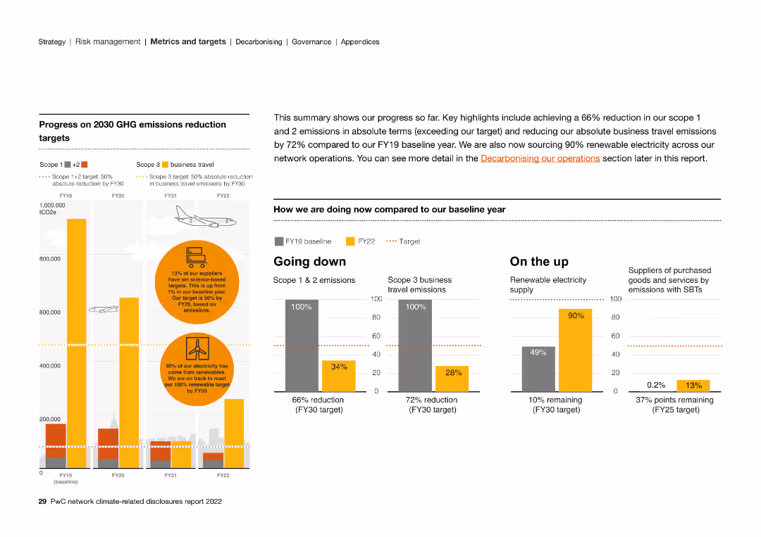
The slide includes column charts, text, and circular graphs detailing the progress of 2030 GHG emissions reduction targets, including business travel.
Strategic Planning
Energy & Utilities
The slide highlights key progress metrics in reducing GHG emissions by 2030. It showcases a 66% reduction in Scope 1 & 2 emissions and renewable energy efforts.
emissions, targets, renewable, electricity, suppliers, GHG, reduction, business travel
false
Strategic Planning
Energy & Utilities
Multiple Chart
PwC/Strategy&
Add to my slides
Remove from favorites
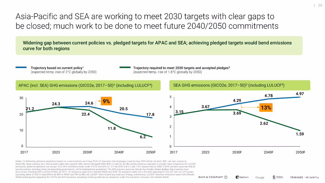
Side-by-side line charts for APAC and SEA GHG emissions; uses contrasting trajectories to show current vs. target progress
Performance Metrics and KPIs
Environmental Services & Sustainability
Demonstrates the growing gap between current emissions trajectories and pledged targets for APAC and SEA. Visualizes how more aggressive actions are needed to meet 2030, 2040, and 2050 climate goals.
emissions, targets, SEA, APAC, climate goals, policy gap
false
Performance Metrics and KPIs
Environmental Services & Sustainability
Multiple Chart
Bain
Add to my slides
Remove from favorites
A stacked column chart shows historical and projected emissions for selected countries, segmented by technological interventions like renewable electricity, efficiency improvements, and carbon capture. Each segment's potential impact on emissions is visually differentiated.
Regulatory and Compliance
Environmental Services & Sustainability
Outlines the technological solutions available for reducing emissions in key countries, emphasizing the role of innovation and technology in meeting climate goals. Useful for discussions on integrating new technologies in national policies and strategies to reduce greenhouse gas emissions.
Emissions, Technology, Renewable energy, Carbon capture, 2050
false
Regulatory and Compliance
Environmental Services & Sustainability
Single Chart
BCG
Add to my slides
Remove from favorites
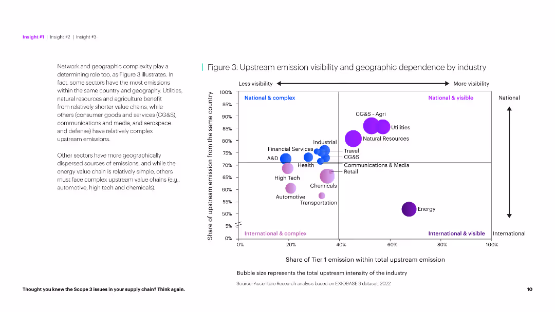
The slide uses a scatter plot to show the geographic dependency of upstream emissions and a textual analysis on the left. It has a clear and informative layout.
Market Analysis and Trends
Environmental Services & Sustainability
This slide explores the relationship between upstream emission visibility and geographic dependence across industries, identifying complex and simple sectors.
Emission visibility, geographic dependence, industry, complexity, analysis, environmental impact, sustainability, data visualization, scatter plot, insights
false
Market Analysis and Trends
Environmental Services & Sustainability
Mixed Chart
Accenture
Add to my slides
Remove from favorites
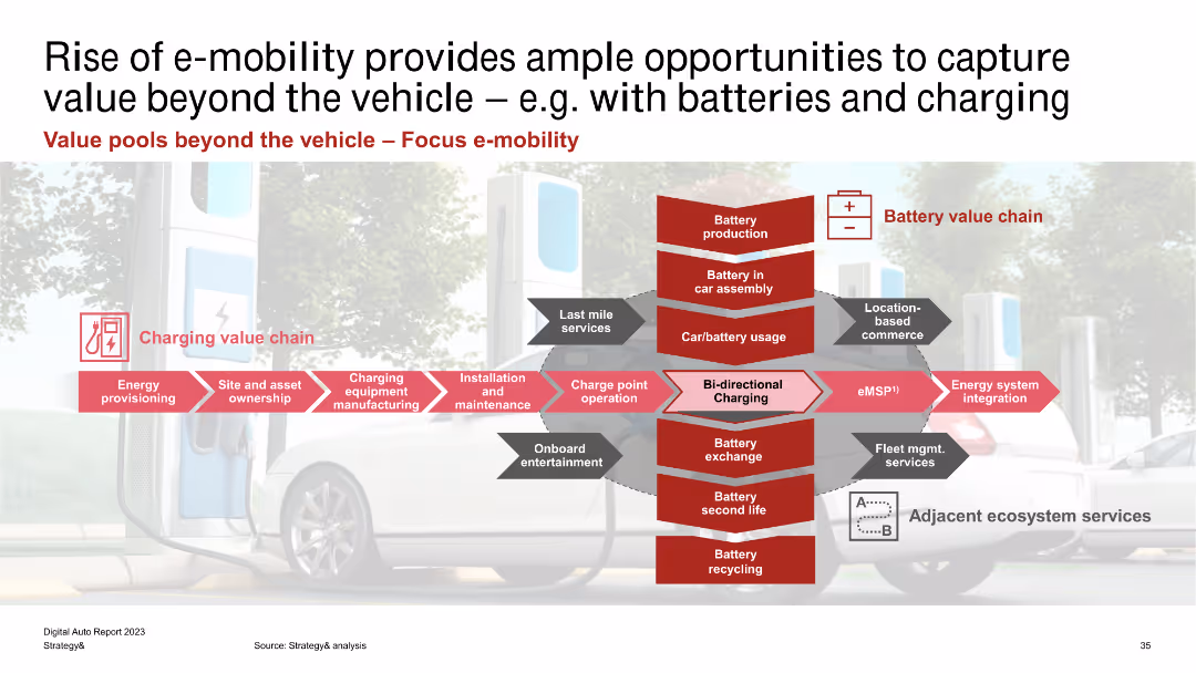
The slide features a complex diagram showing the charging value chain and battery value chain, with multiple red arrows and text boxes. The background image is of an electric car and charging station.
Market Analysis and Trends
Energy & Utilities
The slide illustrates the different value pools in the e-mobility ecosystem, focusing on the charging and battery value chains. It identifies various stages like energy provisioning, site ownership, and battery production as areas for potential value capture.
E-mobility, Charging, Battery, Value Chain, Energy Provisioning, Asset Ownership, Maintenance, Integration, Fleet Management
false
Market Analysis and Trends
Energy & Utilities
Linear Flow
PwC/Strategy&
Add to my slides
Remove from favorites
Contains a pie chart and annotated sections with icons and key points.
Market Analysis and Trends
Transportation & Logistics
Focuses on key customer concerns in the e-mobility market, such as vehicle price, charging infrastructure, and battery performance.
e-mobility, customer concerns, vehicle price, charging infrastructure, battery performance
false
Market Analysis and Trends
Transportation & Logistics
Single Chart
PwC/Strategy&
Add to my slides
Remove from favorites
Diagram centered layout showing a holistic approach to E-mobility ecosystem with sections colored in different shades of gray and red, enhancing visual segregation.
Strategic Planning
Transportation & Logistics
Describes factors influencing the development of the E-mobility ecosystem, including regulatory and financial aspects critical for sustained adoption of electric vehicles.
E-mobility, ecosystem, strategic planning, regulatory impact, financial factors, sustainable adoption
false
Strategic Planning
Transportation & Logistics
Framework
PwC/Strategy&
Add to my slides
Remove from favorites
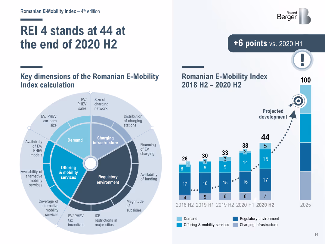
Bar chart and radar chart showing the Romanian E-Mobility Index (REI) and its key dimensions from 2018 H2 to 2020 H2, with a projection for future development.
Performance Metrics and KPIs
Transportation & Logistics
Analyzes the Romanian E-Mobility Index, detailing the progress and key dimensions of the index, including demand, infrastructure, and regulatory environment.
E-Mobility Index, Romania, performance, development
false
Performance Metrics and KPIs
Transportation & Logistics
Mixed Chart
Roland Berger
Add to my slides
Remove from favorites
Timeline visualization featuring significant government interventions aimed at transforming e-mobility in India, presented in a clear, step-wise format.
Strategic Planning
Transportation & Logistics
Details a sequence of governmental actions and policies in India that have shaped the e-mobility landscape, illustrating their timeline and intended impacts.
e-mobility, policy, government intervention, India, timeline, transportation policy, electric mobility
false
Strategic Planning
Transportation & Logistics
Linear Flow
PwC/Strategy&
Add to my slides
Remove from favorites
Shows a donut chart and a gauge chart examining the emotional engagement of managers with their teams. The charts use distinct color segments to illustrate different responses.
Human Resources and Talent Management
Professional Services
Analyzes managers' emotional engagement, essential for HR strategy sessions aiming to improve internal communication and team morale.
emotional engagement, managers, HR
false
Human Resources and Talent Management
Professional Services
Multiple Chart
PwC/Strategy&
Add to my slides
Remove from favorites
Contains images and graphs relating to emotional consumer behavior and its impact on health and brand interactions, including timelines of discussion popularity.
Customer and Market Segmentation
Technology & Software
Explores the emotional dimensions of consumer behavior, focusing on topics like "toxic positivity" and digital wellbeing.
emotional impact, health, advertising, consumer behavior, wellbeing
false
Customer and Market Segmentation
Technology & Software
Multiple Chart
Bain
Add to my slides
Remove from favorites
The slide contains pie charts showing improvements in self-confidence, presentation skills, and business networking skills among workshop participants.
Performance Metrics and KPIs
Education & Training
The slide showcases employability workshops delivered in schools, connecting young people with local labor market opportunities and key employability skills.
employability workshops, self-confidence, labor market, skills development
false
Performance Metrics and KPIs
Education & Training
Multiple Chart
EY
Add to my slides
Remove from favorites
This slide combines text and simple illustrations to outline key elements of a robust employee-centric program, with a case study included on the side. It has a balanced text-to-image ratio.
Human Resources and Talent Management
Government & Public Sector
The slide emphasizes the importance of foundational programs, visible leadership actions, inclusive policies, and expansive recruiting practices to support diverse employees, illustrated with a case study.
Employee-Centric, Program, Foundational, Leadership, Inclusive Policies, Recruiting Practices, Case Study
false
Human Resources and Talent Management
Government & Public Sector
Header Horizontal
BCG
Add to my slides
Remove from favorites
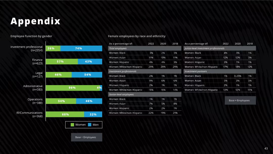
The slide features bar charts and tables showing employee function by gender, race, and ethnicity, including detailed percentages for different categories from 2018, 2020, and 2022.
Human Resources and Talent Management
Professional Services
The slide provides detailed demographic data on employees by function, gender, race, and ethnicity, highlighting changes over time.
employee demographics, gender, race, ethnicity, investment professionals, diversity
false
Human Resources and Talent Management
Professional Services
Mixed Chart
Deloitte
Add to my slides
Remove from favorites
Features a mix of line charts and bullet points detailing statistics on employee engagement, development, and demographic breakdowns.
Operational Efficiency
Financial Services
Showcases Barclays' efforts in employee development, engagement, and demographic diversity, including early career programs and female promotion rates.
employee development, training, engagement, inclusion, wellbeing, diversity, promotion, financial services
false
Operational Efficiency
Financial Services
Multiple Chart
Barclays
Add to my slides
Remove from favorites
Features line graphs and column charts, clean layout with use of green highlights.
Customer and Market Segmentation
Telecommunications
Discusses the stages of employee involvement in product development and its impact on satisfaction.
employee empowerment, involvement, product development
false
Customer and Market Segmentation
Telecommunications
Multiple Chart
Deloitte
Add to my slides
Remove from favorites
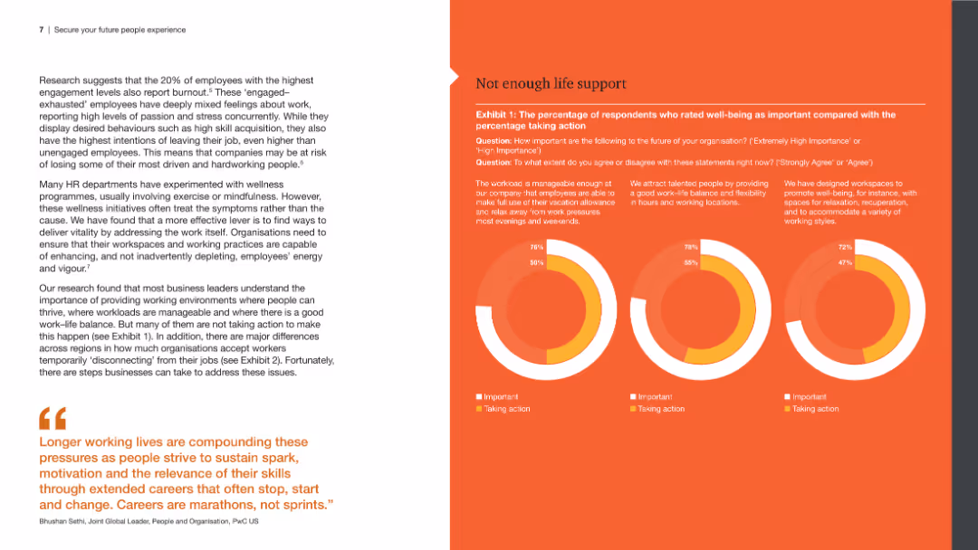
The slide includes a left panel with a detailed text analysis and a right panel with three circular graphs comparing the importance and actions taken regarding well-being, work-life balance, and workspace design.
Human Resources and Talent Management
Professional Services
The slide explores employee engagement and burnout, emphasizing the importance of well-being, work-life balance, and workspace design, backed by survey data presented in circular graphs.
Employee engagement, burnout, well-being, work-life balance, workspace design
false
Human Resources and Talent Management
Professional Services
Multiple Chart
PwC/Strategy&
Add to my slides
Remove from favorites
The slide presents a column chart at the bottom with data from three different years, comparing Clorox's employee engagement levels to industry standards, using blue shades for different years and green for benchmarks. The design is clear and straightforward.
Human Resources and Talent Management
Professional Services
Discusses Clorox's employee engagement scores relative to fast-moving consumer goods companies and high-performing global companies, showing a trend of improvement and superior performance. Useful for HR presentations and management reviews.
employee engagement, HR management, Clorox, industry comparison
false
Human Resources and Talent Management
Professional Services
Mixed Chart
Barclays
Add to my slides
Remove from favorites
A comparative layout displaying traditional vs. talent-to-value approaches in engaging organizational change agents, with two pie charts reflecting engagement strategies and their impacts.
Human Resources and Talent Management
Professional Services
This slide contrasts traditional and modern approaches to engaging employees and stakeholders in sustainability strategies, advocating for a broader inclusion of organizational talents and key customers to maximize the strategic impact and operational success in aligning with SDGs.
Employee Engagement, Sustainability, SDGs, Stakeholder Inclusion, Strategic Impact
false
Human Resources and Talent Management
Professional Services
Mixed Chart
McKinsey
Add to my slides
Remove from favorites
Text, percentage circles, and horizontal bar chart illustrating employee empowerment and primary reasons for job changes, such as pay and career growth.
Human Resources and Talent Management
Professional Services
This slide discusses employee expectations in a tight labor market, focusing on empowerment, likelihood of leaving, and primary reasons for considering new job offers, including pay and career advancement.
Employee expectations, empowerment, job change reasons, pay, career growth, labor market
false
Human Resources and Talent Management
Professional Services
Mixed Chart
EY
Add to my slides
Remove from favorites
A horizontal five-step roadmap diagram with circular nodes and accompanying text. The design is clear with a simple color scheme directing focus to each step of the process.
Technology and Digital Transformation
Professional Services
Details a strategic roadmap for crafting employee experience, from organizational review to governance and continuous improvement.
employee experience, organizational strategy, governance, continuous improvement, roadmap
false
Technology and Digital Transformation
Professional Services
Linear Flow
Deloitte
Add to my slides
Remove from favorites
Previous
Next
You don't have any favorites yet.
Please wait loading your favorites slides...
Create a FREE account to continue browsing
Receive Instant Access to 1,000+ slides from companies like McKinsey, Google, and Goldman Sachs
First Name
Last Name
Email
Password
I agree to all
Terms & Privacy Policy
Thank you! Your submission has been received!
Oops! Something went wrong while submitting the form.
Have an account?
Sign in
Upgrade to PRO to Save slides
Advanced Search and Filters
Access to 15,000+ slides
Access to Category Pages
Save/Bookmark Slides
PowerPoint Template Library
Pick a Plan
MONTHLY
$12/month
Billed every month, Cancel anytime.
YEARLY
$9/year
Billed $108 annually, Cancel anytime.
Checkout for $12/month
Checkout for $108/yr
Secured by Stripe | AES-256 bit encryption