My Account
My Slides
Search by Category
Companies
Slide Type
Use Case
Industry
Pricing
Templates
View All Templates
Download Template Slides
✦ AI
AI Prompt Library
AI Search
Feedback
Login
Logout
Get Started
Browse all Slides
Browse all Slides
Create a FREE Account
Instant access to 1,000+ real slides from top companies like McKinsey, BCG, Goldman Sachs, Google and many more!
First Name
Last Name
Email
Password
I agree to all
Terms & Privacy Policy
Thank you! Your submission has been received!
Oops! Something went wrong while submitting the form.
Have an account?
Sign in
Saved Slides
Total No. of slides saved
0
↻ Refresh
✖ Clear all
Purple theme with white bold heading, donut chart (39%) on left, central Venn-style model showing ME–WE–HERE, and two yellow quote boxes on the right.
Human Resources and Talent Management
Professional Services
This slide focuses on enhancing employee experience through three dimensions—individual (ME), team (WE), and environment (HERE). It highlights employee mobility, loyalty trends, and the importance of technology in improving HR experiences. Key statistics and quotes underscore the significance of this strategy.
employee experience, retention, HR, individual/team/environment, workforce mobility, technology, engagement
false
Human Resources and Talent Management
Professional Services
Mixed Chart
EY
Add to my slides
Remove from favorites
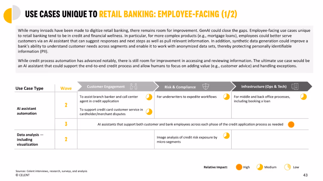
Grid chart organizing use cases across business functions like risk, engagement, and infrastructure.
Human Resources and Talent Management
Financial Services
Focuses on how GenAI can support employees in credit and dispute processes. Shows cross-functional benefits in workflows like underwriting and back-office processing. Medium to high impact predicted.
employee-facing, GenAI, credit application, underwriting, customer service, infrastructure
false
Human Resources and Talent Management
Financial Services
Mixed Chart
Oliver Wyman
Add to my slides
Remove from favorites
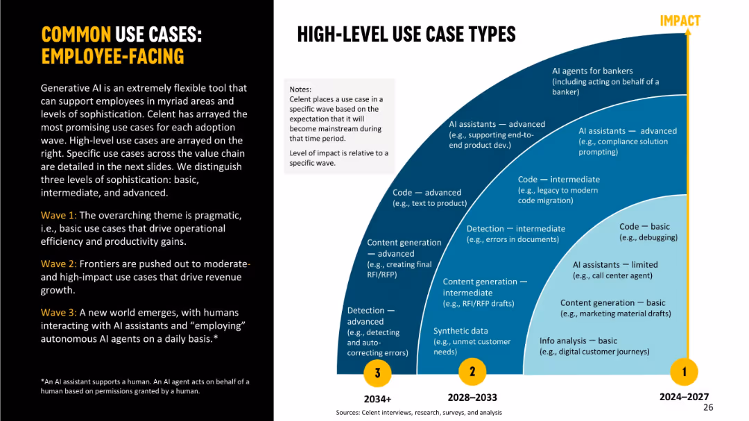
Left panel with wave description text and right semi-arch visual segmented into use case levels (basic → advanced). Use case types positioned by wave and impact.
Human Resources and Talent Management
Financial Services
Focuses on employee-facing GenAI applications over three waves. Wave 1 is basic efficiency use (e.g., debugging); Wave 2 introduces intermediate applications like document detection and code migration; Wave 3 features advanced AI agents acting on behalf of humans. Emphasizes transformation of employee tasks via increasing AI integration.
employee-facing, use cases, GenAI, code, detection, AI assistant, automation, productivity
false
Human Resources and Talent Management
Financial Services
Mixed Chart
Oliver Wyman
Add to my slides
Remove from favorites
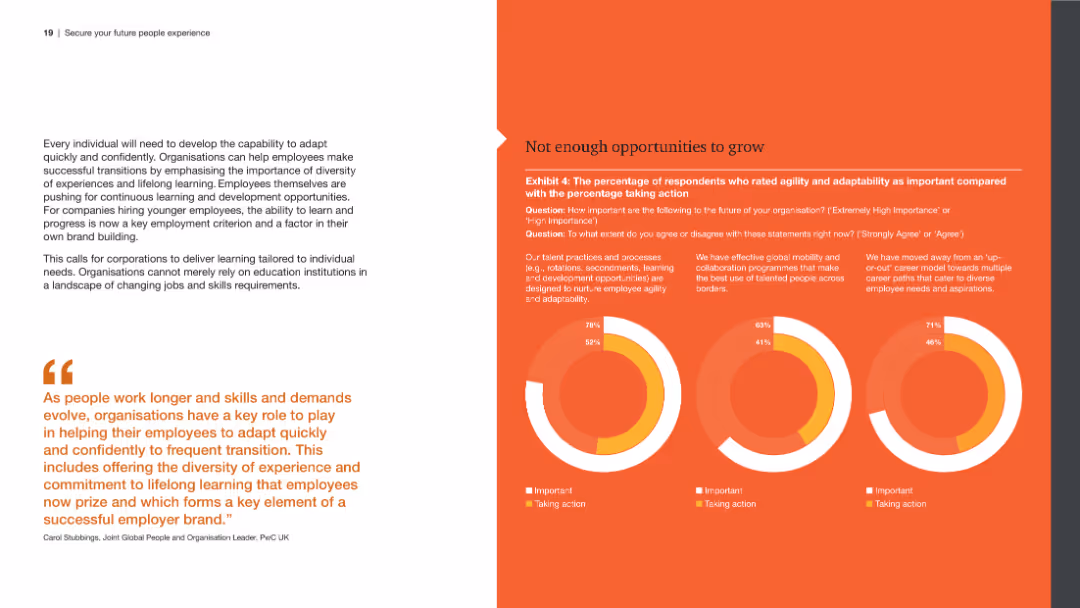
The slide has a left panel with a detailed text analysis and a right panel with three circular graphs showing the gap between the importance and action taken for agility, adaptability, and learning opportunities.
Human Resources and Talent Management
Professional Services
The slide highlights the need for employee growth opportunities, focusing on agility and adaptability, and the gaps between their importance and the actions taken by organizations, based on survey data.
Employee growth, agility, adaptability, learning opportunities, survey data
false
Human Resources and Talent Management
Professional Services
Multiple Chart
PwC/Strategy&
Add to my slides
Remove from favorites
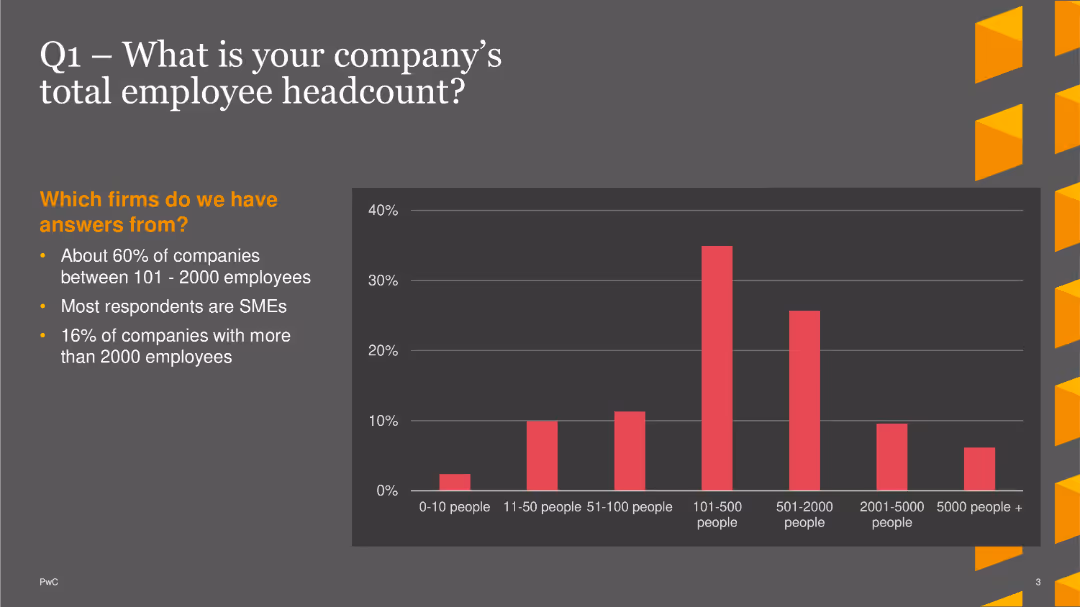
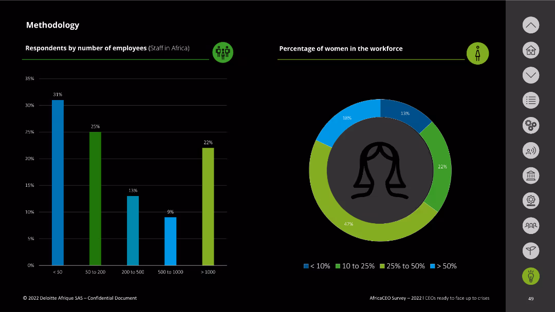
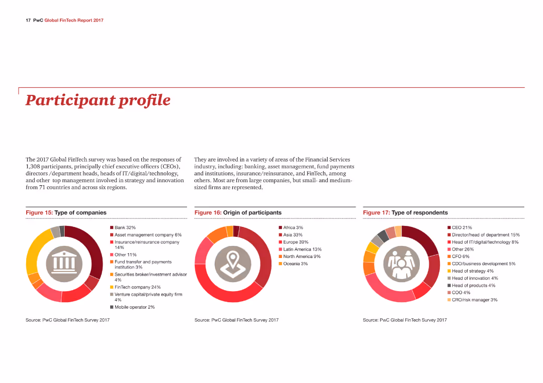
The slide features a column chart showing the distribution of company sizes based on total employee headcount. Key points are summarized on the left.
Market Analysis and Trends
Financial Services
This slide shows that about 60% of companies have 101-2000 employees, with most being SMEs, and 16% having more than 2000 employees.
Employee Headcount, SMEs, Distribution, Column Chart, PwC, Survey, 2022
false
Market Analysis and Trends
Financial Services
Mixed Chart
PwC/Strategy&
Add to my slides
Remove from favorites
This slide features texts and percentages comparing aspects like development opportunities, compensation, and workplace conditions between Ukraine and Global statistics. There are illustrations of diverse individuals on the left side.
Human Resources and Talent Management
Professional Services
This slide presents data on how employees' influence varies by region in aspects such as development opportunities, compensation, and workplace conditions. It contrasts these aspects between Ukraine and globally, highlighting regional differences and focusing on employee empowerment strategies.
Employee, Influence, Global, Ukraine, Data
false
Human Resources and Talent Management
Professional Services
Table
Deloitte
Add to my slides
Remove from favorites
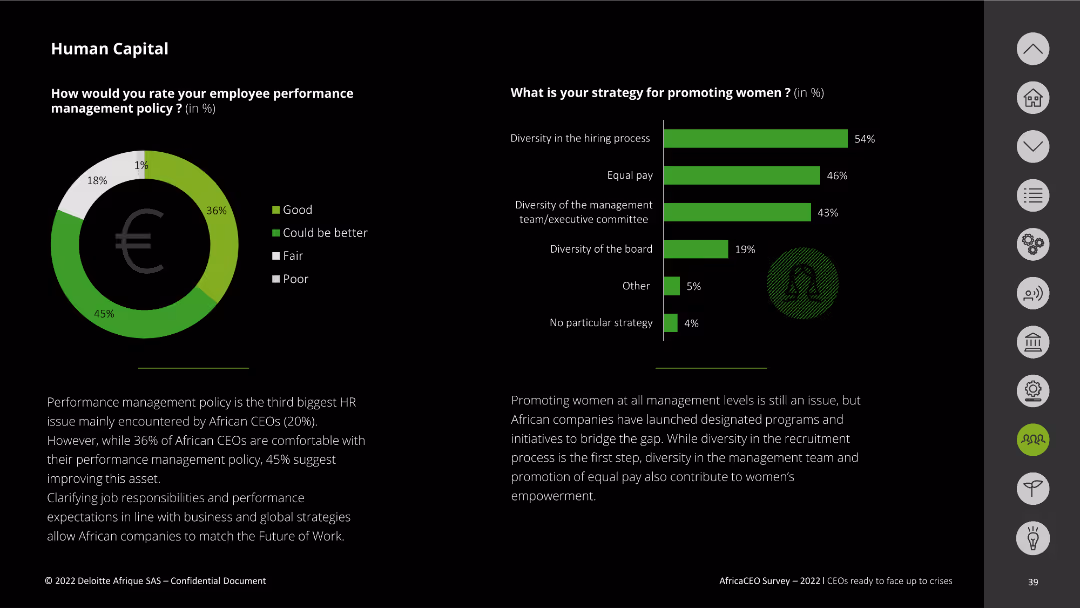
This slide has a donut chart and a vertical bar chart. The visuals represent ratings for employee management policy and strategies for promoting women. Text boxes add explanations.
Human Resources and Talent Management
Professional Services
It evaluates African CEOs' views on employee management policies and strategies to promote women within companies.
employee management, policy rating, promoting women, diversity, African CEOs
false
Human Resources and Talent Management
Professional Services
Multiple Chart
Deloitte
Add to my slides
Remove from favorites
Features bar charts and text highlighting factors affecting workplace satisfaction and motivation.
Human Resources and Talent Management
Professional Services
Analyzes key factors affecting employee motivation and workplace culture, useful for enhancing organizational culture and HR policies.
Employee Motivation, Workplace Culture, Job Satisfaction, Organizational Culture, HR Policies
false
Human Resources and Talent Management
Professional Services
Single Chart
PwC/Strategy&
Add to my slides
Remove from favorites
The slide shows ranked lists and pie charts discussing reasons for employees leaving current firms. The background is split between blue and white, with icons symbolizing each reason.
Human Resources and Talent Management
Professional Services
Examines the primary reasons employees consider leaving, with a focus on misalignment with company vision and compensation issues. Ideal for employee retention strategy development.
employee retention, company vision, compensation, job change reasons, retention strategies, pie charts
false
Human Resources and Talent Management
Professional Services
Header Horizontal
Kearney
Add to my slides
Remove from favorites
Features column charts comparing HR leaders' concerns over employees leaving due to weak benefits and the percentage of employees who would stay for the right financial package, emphasizing year-over-year increases.
Human Resources and Talent Management
Financial Services
Addresses the connection between financial benefits and employee retention, highlighting HR leaders' worries and employee preferences, valuable for retention strategy discussions.
Employee Retention, Financial Benefits, HR Concerns, Bar Graphs, Year-over-Year
false
Human Resources and Talent Management
Financial Services
Multiple Chart
Goldman Sachs
Add to my slides
Remove from favorites
Features bulleted lists, bar graphs, and a mobile app interface highlighting physical and mental health strategies. The slide uses a mix of green and dark tones for visual separation.
Human Resources and Talent Management
Healthcare & Pharmaceuticals
Focuses on workplace safety and mental health management. It covers strategies like stress management, hygiene standards, and mental health training benefits, with a service provider example showing impact on stress and burnout rates.
Employee safety, Mental health, Stress management, Burnout, Hygiene
false
Human Resources and Talent Management
Healthcare & Pharmaceuticals
Header Vertical
BCG
Add to my slides
Remove from favorites
Slide displays two sets of bar charts for a cross-geography view and France-specific data, comparing employee satisfaction with managers using shades of green and red.
Organizational Structure and Change
Professional Services
Analyzes employee satisfaction with their managers in a comparative perspective, highlighting managerial influence on workforce stability.
employee satisfaction, managers, comparison, France, bar chart
false
Organizational Structure and Change
Professional Services
Multiple Chart
BCG
Add to my slides
Remove from favorites
Circular graphs, column chart, minimalistic design with green and blue tones. Clear visual hierarchy.
Customer and Market Segmentation
Telecommunications
Focuses on employee satisfaction surveys and their correlation to customer satisfaction across different regions.
employee satisfaction, surveys, customer service, regions
false
Customer and Market Segmentation
Telecommunications
Multiple Chart
Deloitte
Add to my slides
Remove from favorites
Consists of a gauge chart and a bar chart showing the action taken by various sectors based on employee satisfaction surveys. The charts are designed for clear readability and comparison.
Human Resources and Talent Management
Professional Services
Evaluates the impact of employee satisfaction surveys on organizational actions, ideal for HR discussions about improving employee engagement and response strategies.
employee satisfaction, surveys, HR, actions
false
Human Resources and Talent Management
Professional Services
Multiple Chart
PwC/Strategy&
Add to my slides
Remove from favorites
Comprises pie charts showing employee distribution by function, gender, and region. The design is simple, focusing on the company's workforce structure.
Human Resources and Talent Management
Financial Services
Highlights the company's human resources, emphasizing world-class engineering and development capabilities, and employee diversity. It can be used to discuss human capital and development within the company.
employees, engineering, diversity, human resources, development, mining
false
Human Resources and Talent Management
Financial Services
Multiple Chart
Morgan Stanley
Add to my slides
Remove from favorites
Features two pie charts; the first shows the distribution of employees by size categories in shades of red and orange, and the second shows ownership distribution between local, foreign, and mixed, in similar color tones.
Market Analysis and Trends
Financial Services
Displays statistics on employee distribution by company size and ownership status, useful for discussions on labor markets and ownership structures within various industries.
employees, ownership, statistics, labor market, company size, foreign, local
false
Market Analysis and Trends
Financial Services
Multiple Chart
PwC/Strategy&
Add to my slides
Remove from favorites
The slide is divided into two sections, each featuring bar charts. One section shows the number of employees, and the other shows annual sales revenue percentages. This layout allows for quick comparisons between different size categories.
Market Analysis and Trends
Professional Services
This slide continues the demographic breakdown of the survey participants, focusing on the number of employees and sales revenue. It provides insights into the scale of companies involved in the survey, which can be critical for understanding the economic impact of their views and decisions.
Employees, Sales Revenue, Demographics, Survey, Company Size
false
Market Analysis and Trends
Professional Services
Multiple Chart
Deloitte
Add to my slides
Remove from favorites
Features a main header 'Key Insights' and three sections with headers and accompanying text: 'Employers know employees need more support but are cutting benefits amid budget reductions', with supporting graphics.
Human Resources and Talent Management
Financial Services
Examines the paradox between the recognition of employees' needs for more support and the trend of cutting benefits, relevant for analyzing HR strategies and employee satisfaction.
Employee Support, Financial Benefits, HR Strategies, Budget Reductions, Employee Satisfaction
false
Human Resources and Talent Management
Financial Services
Header Horizontal
Goldman Sachs
Add to my slides
Remove from favorites
The slide shows bar charts representing the number of employees and the percentage of women in the workforce among survey respondents.
Strategic Planning
Professional Services
It details the number of employees and the gender distribution in the workforce of companies surveyed, highlighting workforce diversity metrics.
employees, workforce, gender distribution, survey respondents, Africa CEO Survey
false
Strategic Planning
Professional Services
Multiple Chart
Deloitte
Add to my slides
Remove from favorites
Consists of multiple bar charts comparing factors influencing employee turnover.
Human Resources and Talent Management
Professional Services
Offers insights into the drivers of employee turnover, valuable for developing effective retention strategies.
Employee Turnover, Retention Strategies, Job Satisfaction, HR Management, Workforce Analysis
false
Human Resources and Talent Management
Professional Services
Single Chart
PwC/Strategy&
Add to my slides
Remove from favorites
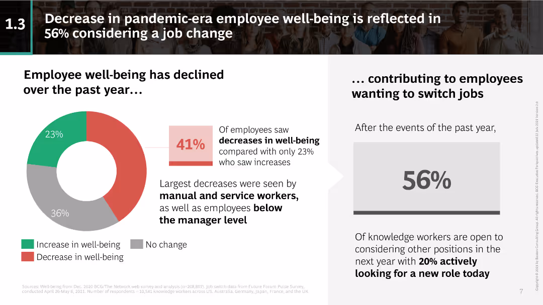
Pie chart showing the decline in employee well-being; text discussing how it has led to job change considerations.
Human Resources and Talent Management
Professional Services
Highlights the decline in employee well-being during the pandemic and its impact on job change considerations, especially among manual and service workers.
employee well-being, pandemic impact, job change, manual workers, service workers, employee health, workforce trends
false
Human Resources and Talent Management
Professional Services
Mixed Chart
BCG
Add to my slides
Remove from favorites
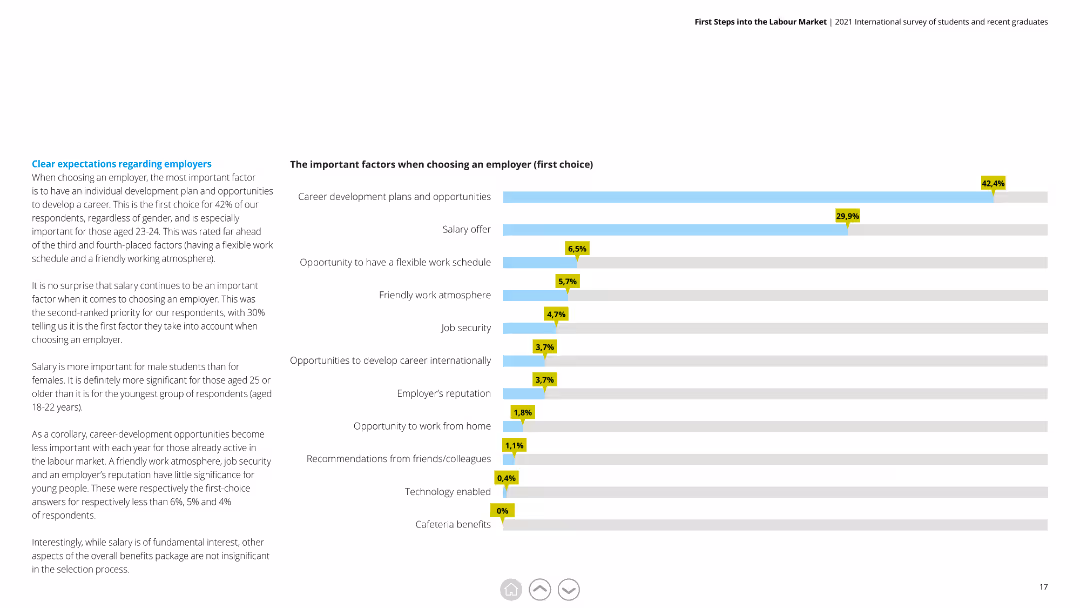
A horizontal bar chart (bar chart) displaying important factors for respondents when selecting their first-choice employer, with percentages highlighted.
Market Analysis and Trends
Professional Services
Shows the priority factors for choosing an employer, emphasizing career development, salary, and work-life balance among respondents.
Employer, Factors, Career Development, Salary, Work-life Balance, Selection, Priorities
false
Market Analysis and Trends
Professional Services
Mixed Chart
Deloitte
Add to my slides
Remove from favorites
The slide features a bar chart with horizontal bars representing survey data on employer performance in various areas important to Millennials and Gen Z. It includes comparative data and a textual analysis on the left side.
Market Analysis and Trends
Professional Services
The slide provides insights into Millennials' and Gen Z's expectations from employers, emphasizing areas like diversity, community impact, and support during the pandemic. It compares employer performance across these areas, offering a clear view of what younger generations value in their workplaces.
Employer, Millennials, Gen Z, Expectations, Performance
false
Market Analysis and Trends
Professional Services
Multiple Chart
Deloitte
Add to my slides
Remove from favorites
Uses a split layout with text and icons on one side and a graphical representation of service areas on the other, showing growth strategies.
Strategic Planning
Professional Services
This slide outlines the expansion strategies for Experian's employer services and verification solutions, emphasizing innovation and competition in the market.
employer services, verification solutions, market competition, innovation, growth strategy
false
Strategic Planning
Professional Services
Linear Flow
Barclays
Add to my slides
Remove from favorites
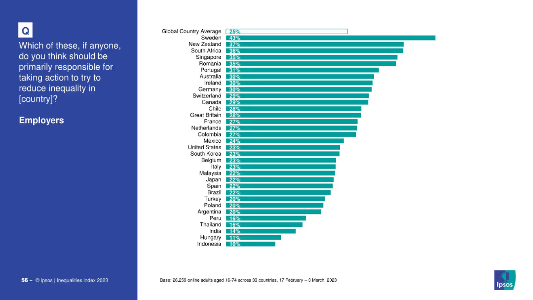
Similar layout: left side question in blue, right side a bar chart ranking countries by % choosing “employers”.
Market Analysis and Trends
Professional Services
The chart displays the proportion of respondents in each country who believe employers are primarily responsible for reducing inequality. Sweden, New Zealand, and South Africa rank highest.
employers, inequality, country comparison, Sweden, Ipsos, 2023, bar chart, responsibility, New Zealand, global
false
Market Analysis and Trends
Professional Services
Mixed Chart
IPSOS
Add to my slides
Remove from favorites
The slide features a series of column charts comparing Gen Z and Millennial satisfaction levels in various workplace aspects from 2019 to 2023. It has a clean layout with text explanations and visual data comparisons.
Organizational Structure and Change
Professional Services
This slide reviews progress made by employers in various aspects such as work/life balance, flexibility, DEI efforts, and societal impact, comparing satisfaction levels of Gen Z and Millennials over time, indicating areas where expectations are still unmet.
Employers, progress, satisfaction, Gen Z, Millennials, expectations
false
Organizational Structure and Change
Professional Services
Multiple Chart
Deloitte
Add to my slides
Remove from favorites
Features one large bar chart split into multiple segments showing different types of support provided by employers to their employees in handling diverse views and social issues at the workplace.
Organizational Structure and Change
Government & Public Sector
Focuses on the kind of support organizations provide to their employees to manage diversity of views and discusses the relatively low percentage of active company efforts in facilitating these discussions, which implies a need for more structured support systems within organizations.
employer support, diversity management, organizational support, social issues
false
Organizational Structure and Change
Government & Public Sector
Single Chart
PwC/Strategy&
Add to my slides
Remove from favorites
The content slide includes a photo of a person gardening, accompanied by three line graphs showing employment rate scenarios for Africa, India, and Southeast Asia. The visual layout is clear, with the photo providing contextual background.
Human Resources and Talent Management
Professional Services
This slide focuses on the employment rate changes in Africa, India, and Southeast Asia due to the green transition. It highlights the role of green jobs in maintaining employment levels and stresses the importance of supporting the labor market transition to avoid social unsustainability and labor shortages.
Employment, Africa, India, Southeast Asia, Green Jobs
false
Human Resources and Talent Management
Professional Services
Multiple Chart
EY
Add to my slides
Remove from favorites
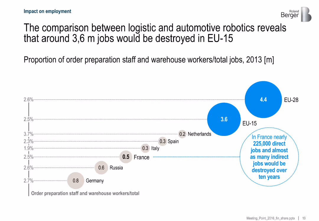
Bubble chart showing the number of jobs impacted by automation in logistics and automotive sectors across countries, with France highlighted. Includes textual insights.
Risk Assessment and Management
Industrial & Manufacturing
The slide compares potential job losses due to robotic automation in logistics across EU-15 and EU-28, estimating that around 3.6 million jobs could be displaced. It highlights the implications for France, projecting 225,000 direct and indirect job losses.
employment, automation, logistics, robotics, EU, job displacement, France, workforce impact
false
Risk Assessment and Management
Industrial & Manufacturing
Single Chart
Roland Berger
Add to my slides
Remove from favorites
The slide features a column chart showing month-over-month changes in total nonfarm employment (Jan 2021-Dec 2023) and a line chart for US real consumption expenditures and disposable income (Jan 2020-Nov 2023). The layout is clear with data points well-illustrated.
Market Analysis and Trends
Financial Services
This slide analyzes consumer trends for 2024, predicting a decline in enthusiasm due to softer employment and cost fatigue. It also suggests positive income growth could support spending, highlighting key economic indicators and their potential impacts.
employment, consumer spending, income growth, trends
false
Market Analysis and Trends
Financial Services
Multiple Chart
EY
Add to my slides
Remove from favorites
The slide features a column chart comparing employment rates and labor force participation of persons with and without disabilities in July 2023.
Human Resources and Talent Management
Professional Services
The slide highlights the employment gap between persons with and without disabilities, noting that the labor force participation rate for persons with disabilities is significantly lower.
employment, disabilities, labor force, participation rate, comparison
false
Human Resources and Talent Management
Professional Services
Mixed Chart
Accenture
Add to my slides
Remove from favorites
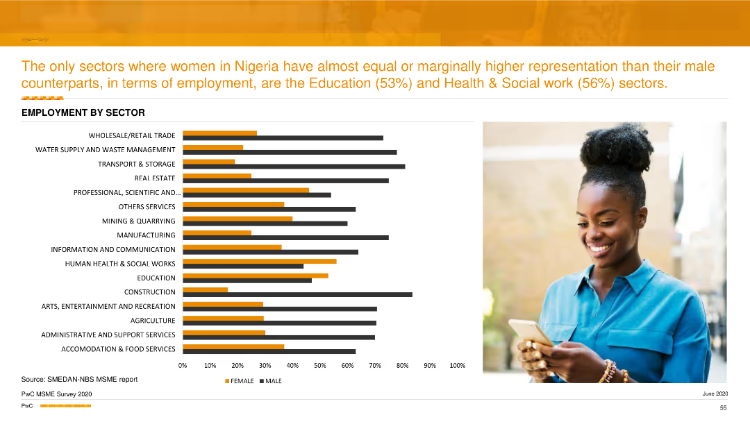
A column chart comparing male and female employment percentages across various sectors. Orange bars represent female employment, and black bars represent male employment.
Industry Overview
Professional Services
This slide compares the employment distribution by gender across different sectors, showing that women have higher representation in education and health & social work sectors.
employment distribution, gender comparison, professional services, column chart
false
Industry Overview
Professional Services
Mixed Chart
PwC/Strategy&
Add to my slides
Remove from favorites
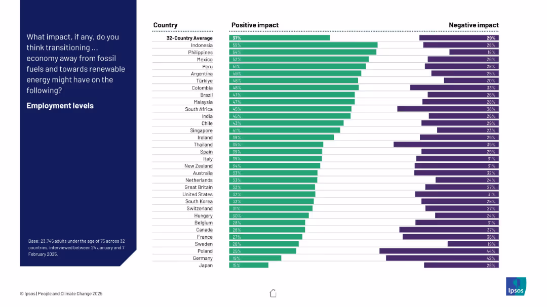
Country-wise bar chart comparing positive vs. negative expectations about the effect of energy transition on employment.
Technology and Digital Transformation
Environmental Services & Sustainability
The slide compares national perceptions of employment impact due to a shift to renewable energy. While countries like Indonesia and the Philippines show high optimism, nations like Germany and Japan are more skeptical about job creation benefits.
employment, energy transition, perception, renewables, survey, country comparison, Ipsos, bar chart
false
Technology and Digital Transformation
Environmental Services & Sustainability
Mixed Chart
IPSOS
Add to my slides
Remove from favorites
This slide contains a text description and a column chart. The chart shows the average number of FTEs serving different functions within family offices in the APAC region.
Human Resources and Talent Management
Financial Services
The slide details the average number of full-time employees (FTEs) in different functions such as finance, tax, legal, investments, support, and technology within APAC family offices.
employment, FTE, functions, family offices, APAC
false
Human Resources and Talent Management
Financial Services
Mixed Chart
EY
Add to my slides
Remove from favorites
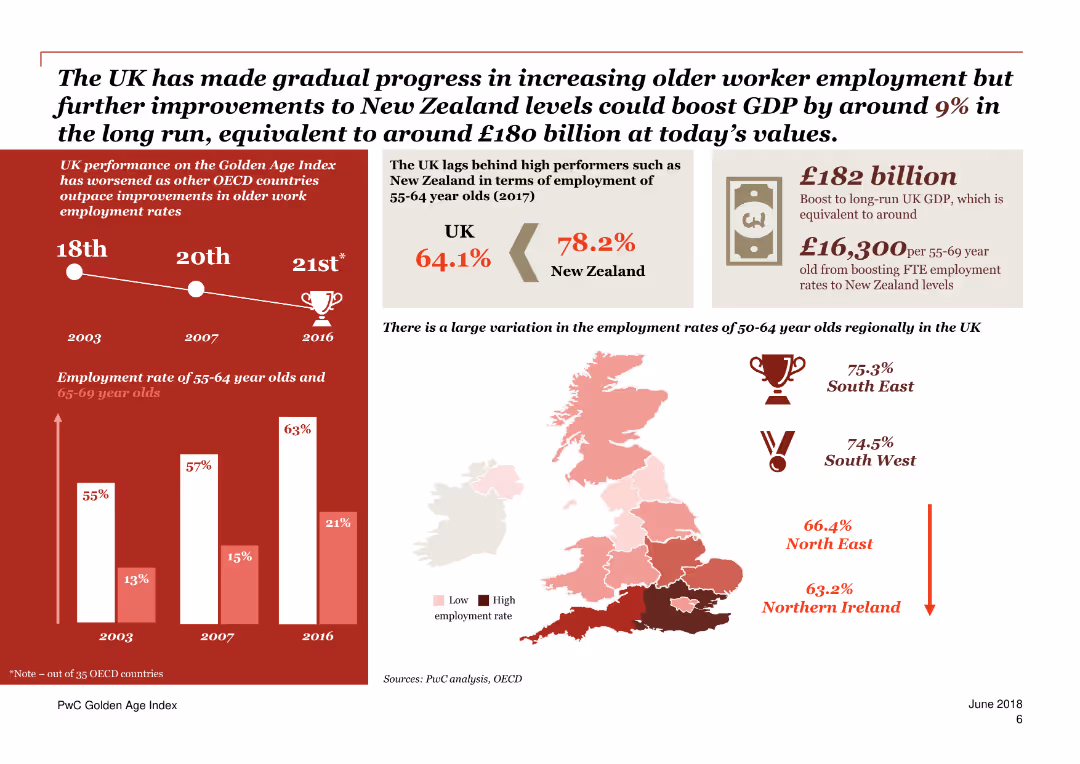
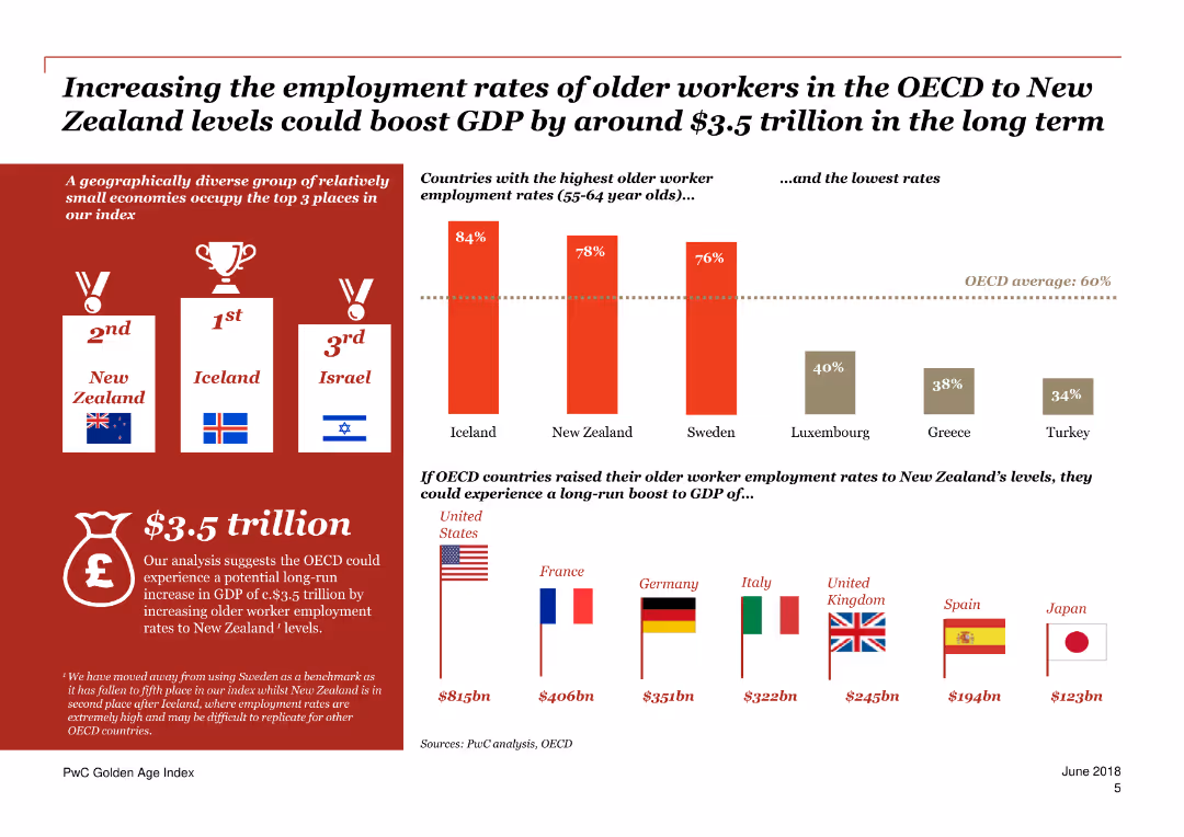
The slide contains a column chart comparing older worker employment rates across various countries and a text section estimating the potential GDP boost from increased employment rates.
Market Analysis and Trends
Financial Services
The slide discusses the economic impact of increasing older worker employment rates, highlighting the potential GDP boost for OECD countries if they reach New Zealand's levels.
Employment, GDP, Economic impact, OECD, Older workers
false
Market Analysis and Trends
Financial Services
Multiple Chart
PwC/Strategy&
Add to my slides
Remove from favorites
The slide contains a mix of column charts, maps, and text blocks. Predominantly red and white color scheme.
Market Analysis and Trends
Government & Public Sector
This slide compares the employment rates of older workers in the UK with other countries, and discusses potential GDP boosts if employment rates matched those of New Zealand.
employment, GDP, older workers, UK, New Zealand, boost, comparison, trends, OECD, potential
false
Market Analysis and Trends
Government & Public Sector
Mixed Chart
PwC/Strategy&
Add to my slides
Remove from favorites
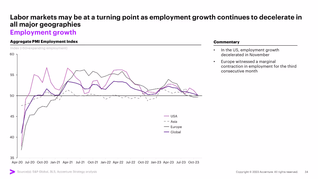
The slide displays a line graph tracking the aggregate PMI Employment Index for the USA, Asia, Europe, and globally from April 2020 to October 2023. Commentary on the right.
Market Analysis and Trends
Professional Services
The slide suggests a potential turning point in labor markets as employment growth decelerates across major geographies.
employment growth, PMI, USA, Asia, Europe, global, labor market, line graph
false
Market Analysis and Trends
Professional Services
Mixed Chart
Accenture
Add to my slides
Remove from favorites
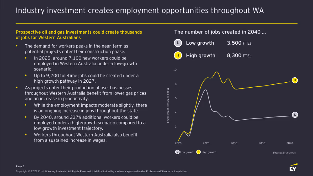
Line chart displaying employment projections under low and high growth scenarios. Accompanied by bullet points explaining employment impacts and job creation estimates.
Human Resources and Talent Management
Energy & Utilities
Highlights the job creation potential of prospective oil and gas investments, detailing the expected employment peaks and the long-term impact on job numbers in Western Australia.
Employment, Job Creation, Oil and Gas, Western Australia, Growth Scenarios, Workforce, Economic Activity
false
Human Resources and Talent Management
Energy & Utilities
Mixed Chart
EY
Add to my slides
Remove from favorites
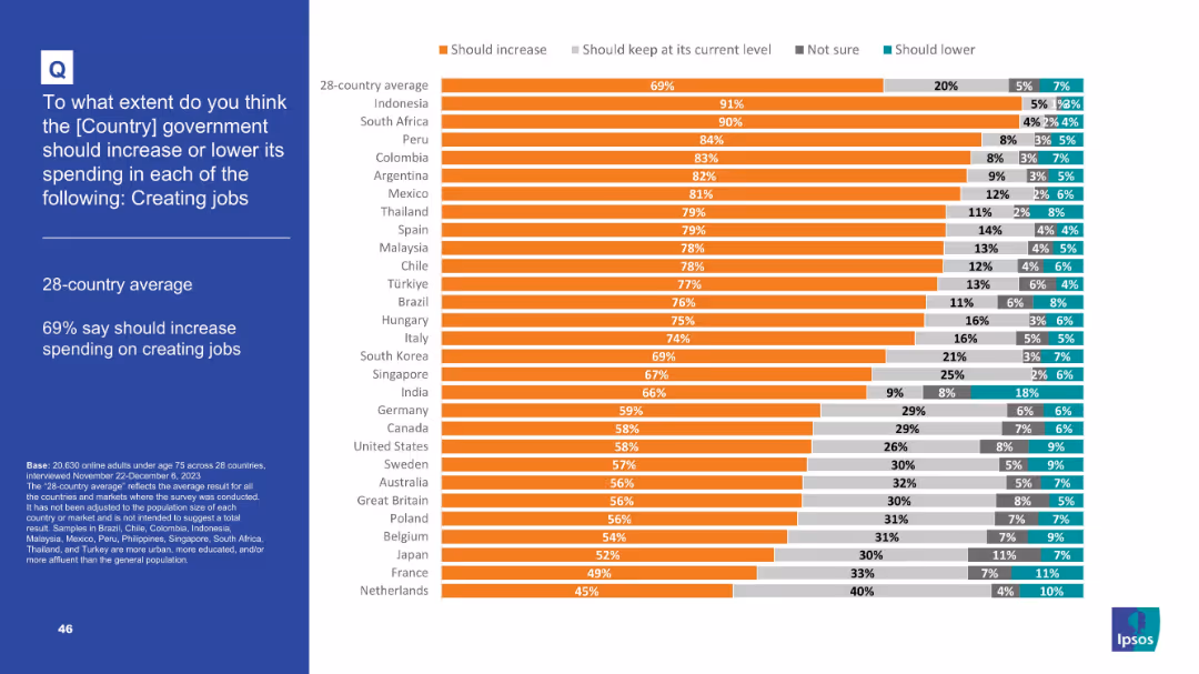
Orange bar chart displaying country-wise support for job creation spending
Strategic Planning
Government & Public Sector
This slide ranks 28 countries by public sentiment on increasing government spending to create jobs. The average is 69% in favor, with Indonesia and South Africa showing strongest support (91% and 90%, respectively).
Employment, job creation, public opinion, government spending, labor, economic development, global survey, Ipsos, strategic planning
false
Strategic Planning
Government & Public Sector
Mixed Chart
IPSOS
Add to my slides
Remove from favorites
The slide displays a complex bar chart categorizing employment by job role across different countries, accompanied by a text block for detailed explanation.
Market Analysis and Trends
Technology & Software
This slide analyzes job roles distribution by role cluster, using statistical analysis to predict the impact of intelligent technologies in various industries. It is useful for strategic workforce planning and analysis.
Employment, Job Roles, Intelligent Technologies, Workforce Planning, Analysis
false
Market Analysis and Trends
Technology & Software
Single Chart
Accenture
Add to my slides
Remove from favorites
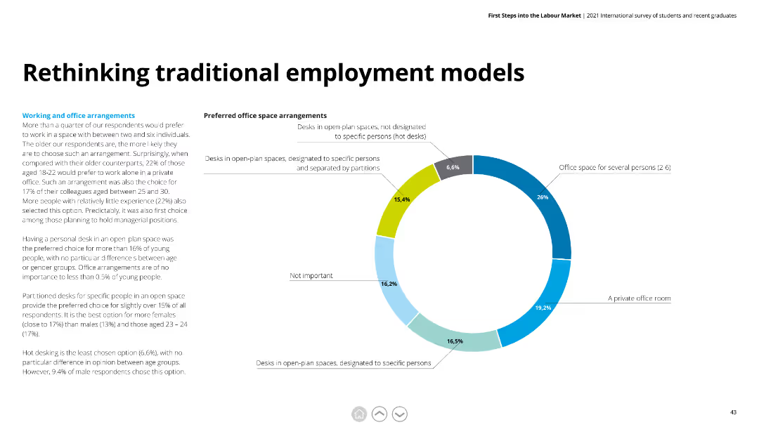
Features a pie chart with multiple segments in various shades of blue and green. Text is organized into two columns, providing detailed explanations of survey findings and their implications.
Human Resources and Talent Management
Professional Services
Explores preferred office space arrangements among respondents. Highlights preferences for open-plan spaces, private offices, and designated desks.
employment models, office space, preferences, open-plan, private offices, designated desks
false
Human Resources and Talent Management
Professional Services
Mixed Chart
Deloitte
Add to my slides
Remove from favorites
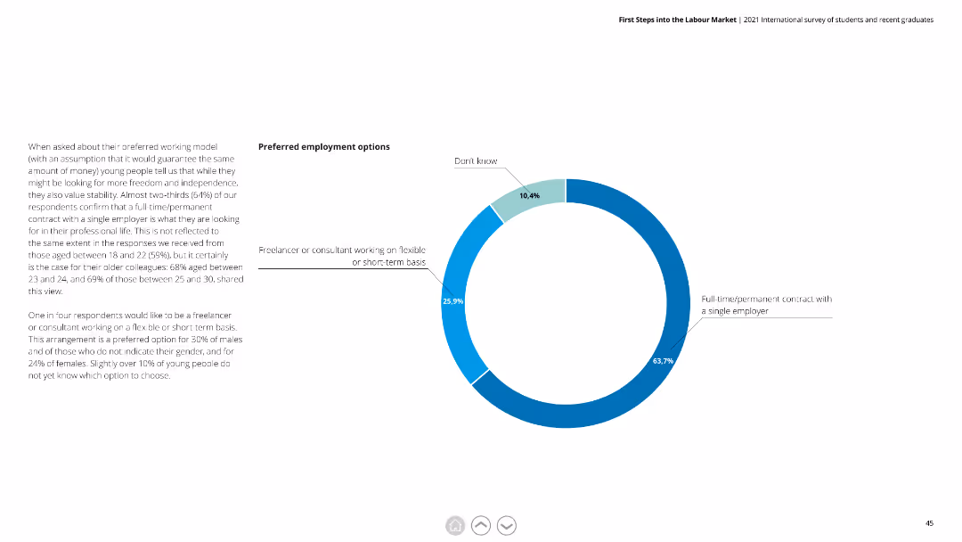
Features a pie chart with blue and green segments. The text is divided into two columns, explaining respondents' preferences for employment types and the reasoning behind these preferences.
Human Resources and Talent Management
Professional Services
Highlights that 64% prefer full-time/permanent contracts. Discusses the appeal of freelancing and consultancy work among younger respondents.
employment options, full-time, permanent contracts, freelancing, consultancy, preferences
false
Human Resources and Talent Management
Professional Services
Mixed Chart
Deloitte
Add to my slides
Remove from favorites
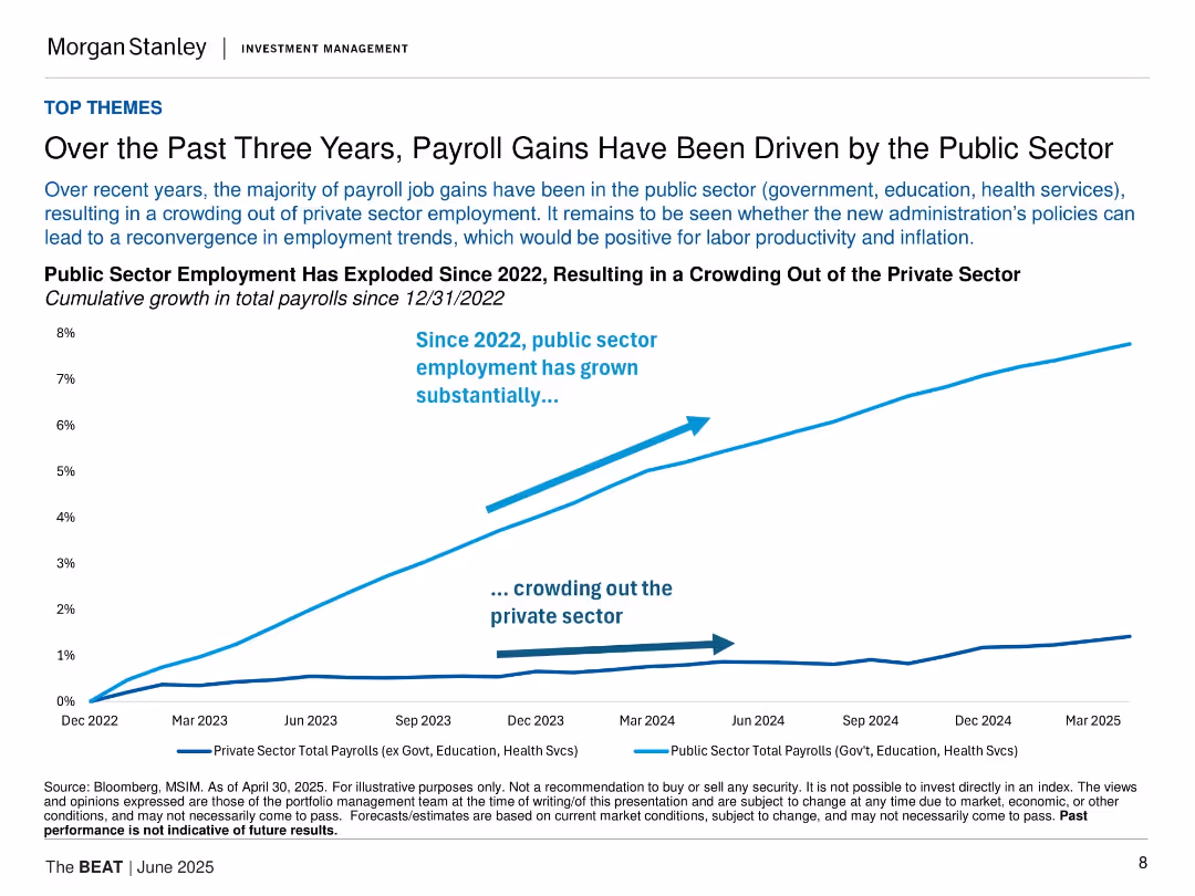
Dual-line chart tracking public vs. private payroll growth since Dec 2022; clean white background with bold annotations; arrows emphasize crowding effect.
Market Analysis and Trends
Government & Public Sector
Illustrates that payroll growth has been dominated by public sector hiring (e.g., government, health, education), crowding out private sector job growth. This trend may impact future productivity and inflation, with policy implications depending on political changes.
employment, payroll, public sector, private sector, labor market
false
Market Analysis and Trends
Government & Public Sector
Single Chart
Morgan Stanley
Add to my slides
Remove from favorites
A creatively-designed column chart showing preferences of highly skilled workers for future employment with local versus multinational companies.
Human Resources and Talent Management
Professional Services
Evaluates employment preferences of highly skilled workers, highlighting a shift towards local companies over multinationals.
Employment preferences, skilled workers, local vs multinational, talent management
false
Human Resources and Talent Management
Professional Services
Mixed Chart
Accenture
Add to my slides
Remove from favorites
Bar chart and map detailing projected net employment changes across New Zealand regions by 2030.
Strategic Planning
Industrial & Manufacturing
Slide projects employment growth across New Zealand by region, useful for regional development and investment strategies.
Employment, Projections, New Zealand, 2030, Regions
false
Strategic Planning
Industrial & Manufacturing
Multiple Chart
McKinsey
Add to my slides
Remove from favorites
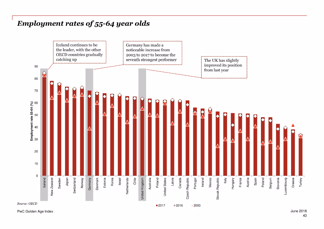
The slide features a column chart comparing the employment rates of 55-64 year olds across various OECD countries. Annotations highlight notable trends and changes over time.
Market Analysis and Trends
Government & Public Sector
This slide presents the employment rates of 55-64 year olds across OECD countries, highlighting trends and improvements in specific countries. It shows the UK's position relative to other countries and notes significant changes over time.
employment rates, 55-64 year olds, OECD, trends, UK, comparisons, improvements, data analysis
false
Market Analysis and Trends
Government & Public Sector
Single Chart
PwC/Strategy&
Add to my slides
Remove from favorites
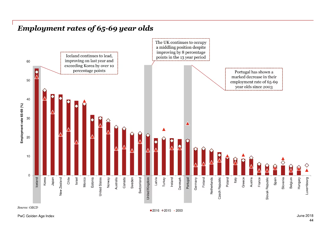
The slide includes a column chart comparing the employment rates of 65-69 year olds across various OECD countries. Text annotations highlight key points and changes over a specific period.
Market Analysis and Trends
Government & Public Sector
This slide compares the employment rates of 65-69 year olds across different OECD countries, noting the UK’s position and significant changes over time. It highlights the trends and progress in employment rates for older workers in these countries.
employment rates, 65-69 year olds, OECD, UK, trends, comparisons, older workers, data analysis
false
Market Analysis and Trends
Government & Public Sector
Single Chart
PwC/Strategy&
Add to my slides
Remove from favorites
The slide contains a column chart showing the potential GDP boost by increasing employment rates of older workers in OECD countries, with flags representing different countries.
Market Analysis and Trends
Financial Services
The slide emphasizes the economic benefits of increasing employment rates for older workers in OECD countries, detailing potential GDP boosts for various countries.
Employment rates, GDP boost, OECD, Older workers, Economic benefits
false
Market Analysis and Trends
Financial Services
Mixed Chart
PwC/Strategy&
Add to my slides
Remove from favorites
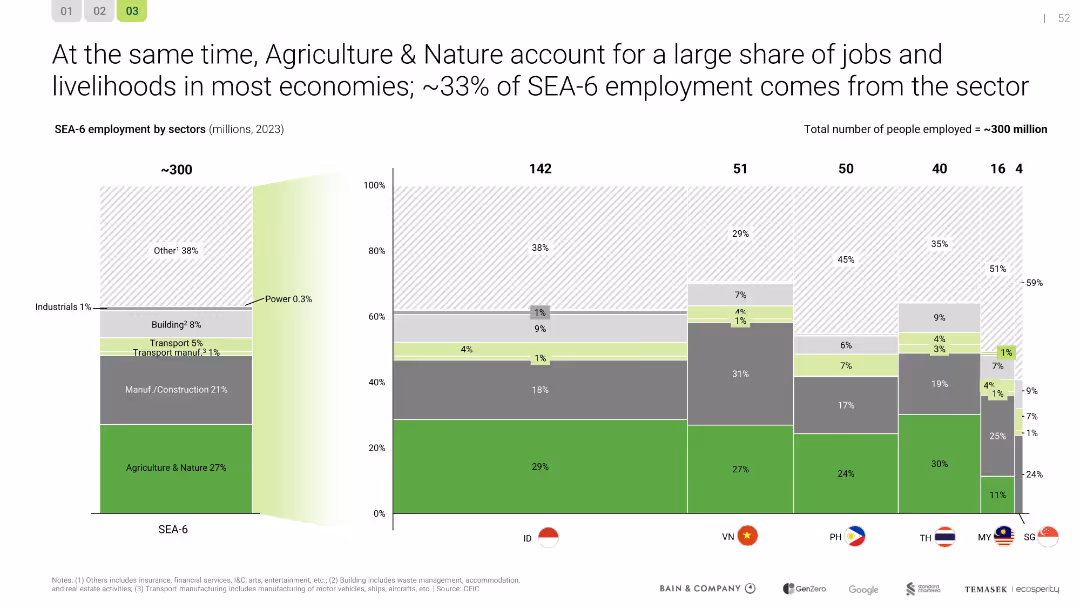
Stacked bar chart visualizing sectoral employment by country; SEA-6 region summary included
Human Resources and Talent Management
Agriculture & Food Production
Agriculture & Nature emerges as the largest employer sector (~33% of SEA employment), especially in Indonesia and Vietnam. The chart reinforces the sector’s importance for livelihoods and the socio-economic impact of green transitions.
employment, SEA, agriculture, labor, sector analysis, livelihoods
false
Human Resources and Talent Management
Agriculture & Food Production
Single Chart
Bain
Add to my slides
Remove from favorites
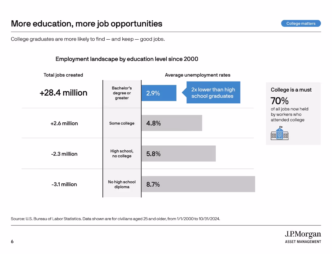
Vertical segmented graphic with job creation and unemployment stats by education level. Sidebar emphasizes importance of college.
Market Analysis and Trends
Education & Training
This slide outlines employment and unemployment rates since 2000 by education level. College graduates have gained more jobs and show lower unemployment. The takeaway is that higher education improves job security and access to employment.
employment stats, college impact, unemployment rates, education levels, labor market, job creation, job opportunities, workforce trends, higher education
false
Market Analysis and Trends
Education & Training
Mixed Chart
JP Morgan
Add to my slides
Remove from favorites
This slide is a content slide with text and several small line graphs. The text identifies key global employment clusters and their potential impacts on employment rates by scenario for different regions, with line graphs illustrating these trends.
Human Resources and Talent Management
Professional Services
It examines the employment landscape changes due to the green transition, identifying key clusters like EU27+UK, China, the US, Middle East, and Australia, and their varying impacts on employment rates by 2050. It stresses the importance of regional adaptations to manage demographic and employment trends effectively.
Employment, Transition, Clusters, Workforce, Green Economy
false
Human Resources and Talent Management
Professional Services
Multiple Chart
EY
Add to my slides
Remove from favorites
Compares UK and US job market trends using bar graphs and line charts on a split slide, with a straightforward color scheme.
Human Resources and Talent Management
Government & Public Sector
Presents employment trends in the UK and US, illustrating the impact of temporary and permanent job losses on the market.
employment trends, job market, furlough, unemployment, US, UK
true
Human Resources and Talent Management
Government & Public Sector
Multiple Chart
BCG
Add to my slides
Remove from favorites
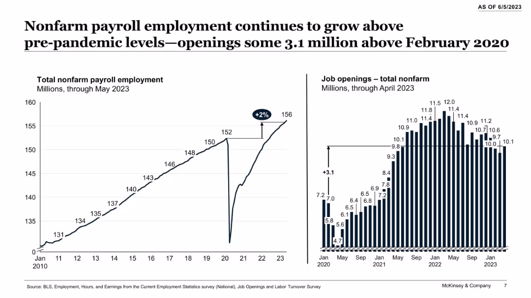
Dual-panel graph layout with line chart (left) of total employment and bar chart (right) of job openings over time.
Performance Metrics and KPIs
Government & Public Sector
The slide shows a steady post-pandemic recovery in nonfarm payroll employment, with figures exceeding pre-pandemic levels by over 3 million. Job openings remain elevated, although slightly declining, indicating persistent labor market strength in the US.
employment trends, job market, nonfarm payroll, labor force, pandemic recovery, job openings, US economy, workforce, statistics
false
Performance Metrics and KPIs
Government & Public Sector
Multiple Chart
McKinsey
Add to my slides
Remove from favorites
Includes pie charts and bar charts visually representing employment trends and sentiments.
Human Resources and Talent Management
Professional Services
Analyzes employment trends highlighting increasing job switches and wage pressures, useful for HR and organizational planning.
Employment Trends, Job Market, Wage Pressure, HR Planning, Organizational Strategy
false
Human Resources and Talent Management
Professional Services
Multiple Chart
PwC/Strategy&
Add to my slides
Remove from favorites
The slide features multiple graphs showing trends in the employment rates of older workers in the UK over time, compared to other OECD countries. It also includes life expectancy data and projections for future employment trends.
Market Analysis and Trends
Government & Public Sector
The slide provides an overview of the increasing employment rates of older workers in the UK, comparing them to other OECD countries. It highlights the growing number of older workers and suggests areas for further improvement.
employment trends, older workers, UK, OECD, life expectancy, future projections, employment rates
false
Market Analysis and Trends
Government & Public Sector
Multiple Chart
PwC/Strategy&
Add to my slides
Remove from favorites
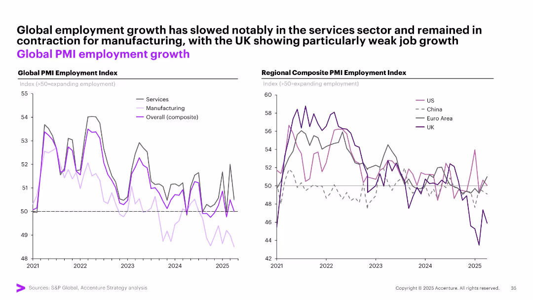
Two line graphs: one shows global employment index trends by sector (services, manufacturing), the other compares regional composite employment indexes.
Performance Metrics and KPIs
Professional Services
The slide illustrates declining employment growth globally, especially in manufacturing. The regional breakdown highlights differing trajectories for the US, UK, Euro area, and China using PMI-based employment indicators.
employment trends, PMI, manufacturing, services, regional comparison, slowdown, global workforce, hiring
false
Performance Metrics and KPIs
Professional Services
Multiple Chart
Accenture
Add to my slides
Remove from favorites
Pie charts showing the employment status and satisfaction levels of highly skilled workers in local companies.
Human Resources and Talent Management
Professional Services
Surveys the employment trends among highly skilled workers in local companies, noting high satisfaction and mobility.
Employment trends, skilled workers, job satisfaction, local companies
false
Human Resources and Talent Management
Professional Services
Multiple Chart
Accenture
Add to my slides
Remove from favorites
Continues demographic profiling with additional charts about the type of work, organization size, and full-time employment status, using a variety of chart types to present the data clearly and effectively.
Industry Overview
Government & Public Sector
Completes the demographic overview of the survey respondents by detailing their employment type, organization size, and whether they are engaged in full-time work. This information provides deeper insights into the employment conditions and contexts of the surveyed population, aiding in the analysis of broader workforce trends.
employment type, organization size, full-time status, demographic data
false
Industry Overview
Government & Public Sector
Multiple Chart
PwC/Strategy&
Add to my slides
Remove from favorites
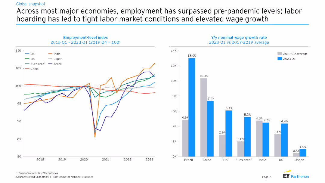
This slide includes two charts: one showing the employment-level index from 2015 to 2023 for various economies, and another showing year-over-year nominal wage growth rate in 2023 Q1 versus 2017-2019 average.
Market Analysis and Trends
Financial Services
The slide analyzes employment trends and wage growth across major economies, highlighting the tight labor market conditions and the impact of labor hoarding post-pandemic on wage growth.
employment, wage growth, economy, labor market
false
Market Analysis and Trends
Financial Services
Multiple Chart
EY
Add to my slides
Remove from favorites
Includes a mix of text and two sets of pie charts. The text emphasizes the importance of empowering employees and the positive impact on job loyalty. The pie charts compare responses of Gen Zs and millennials on empowerment and loyalty.
Human Resources and Talent Management
Professional Services
The slide discusses the significance of empowering employees in fostering a sense of belonging and loyalty within organizations. It presents data on how empowerment affects job retention and satisfaction, with supporting pie charts showing comparative data between empowered and non-empowered employees.
Empowerment, job loyalty, belonging, Gen Z, millennials
false
Human Resources and Talent Management
Professional Services
Mixed Chart
Deloitte
Add to my slides
Remove from favorites
This slide features a split layout with a large orange header. The left side contains a textual explanation in white text on a black background. The right side displays a pie chart and a bar chart comparing data on worker empowerment.
Market Analysis and Trends
Education & Training
This slide explores the empowerment of workers with specialized skills. It compares workers who have specialized training to those who do not, across several metrics such as promotions, raises, and job satisfaction. The data is sourced from PwC's Global Workforce Hopes and Fears Survey 2022.
empowerment, skills, training, job satisfaction, promotions
false
Market Analysis and Trends
Education & Training
Multiple Chart
PwC/Strategy&
Add to my slides
Remove from favorites
The slide features three column charts displaying the adoption rates of digital solutions in hospitals, categorized into fundamental systems, patient-facing solutions, and physician support systems.
Technology and Digital Transformation
Healthcare & Pharmaceuticals
The slide outlines the adoption of various digital health solutions in hospitals, highlighting electronic medical records (EMR), patient information systems, and medication management systems as top priorities.
EMR, digital solutions, hospitals, adoption, IT systems
false
Technology and Digital Transformation
Healthcare & Pharmaceuticals
Multiple Chart
LEK
Add to my slides
Remove from favorites
Slide presents a combined column and line chart with annual data from 2015 to 2024. Gray columns represent total global E&M revenue, with an overlaid line chart depicting annual growth rates in orange for negative values and green for positive values. Key years and percentage changes are highlighted, enhancing clarity.
Market Analysis and Trends
Media & Entertainment
This slide discusses the fluctuating trends in global entertainment and media (E&M) revenue, highlighting a significant decline in 2020 followed by a recovery phase. It is designed to analyze economic impacts on the industry, suitable for strategic planning in financial forecasting and market response strategies within the E&M sector.
E&M, revenue, growth, decline, forecast
false
Market Analysis and Trends
Media & Entertainment
Single Chart
PwC/Strategy&
Add to my slides
Remove from favorites
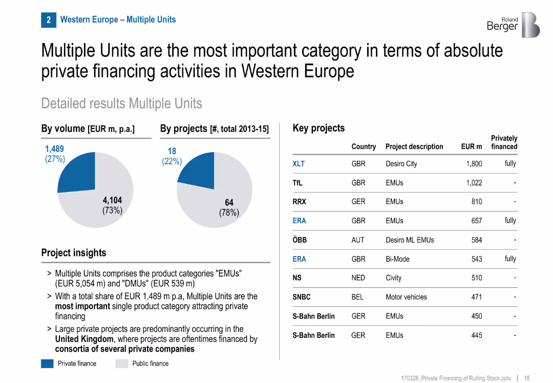
Pie charts for volume/projects, list of key projects, project insights section
Financial Performance
Transportation & Logistics
Multiple Units (EMU/DMU) are the leading category in private rail financing in Western Europe, especially in the UK. Several fully private projects were executed, often via consortia.
EMUs, DMUs, private investment, UK, consortia, rail, multiple units, GBR, financing structure
false
Financial Performance
Transportation & Logistics
Mixed Chart
Roland Berger
Add to my slides
Remove from favorites
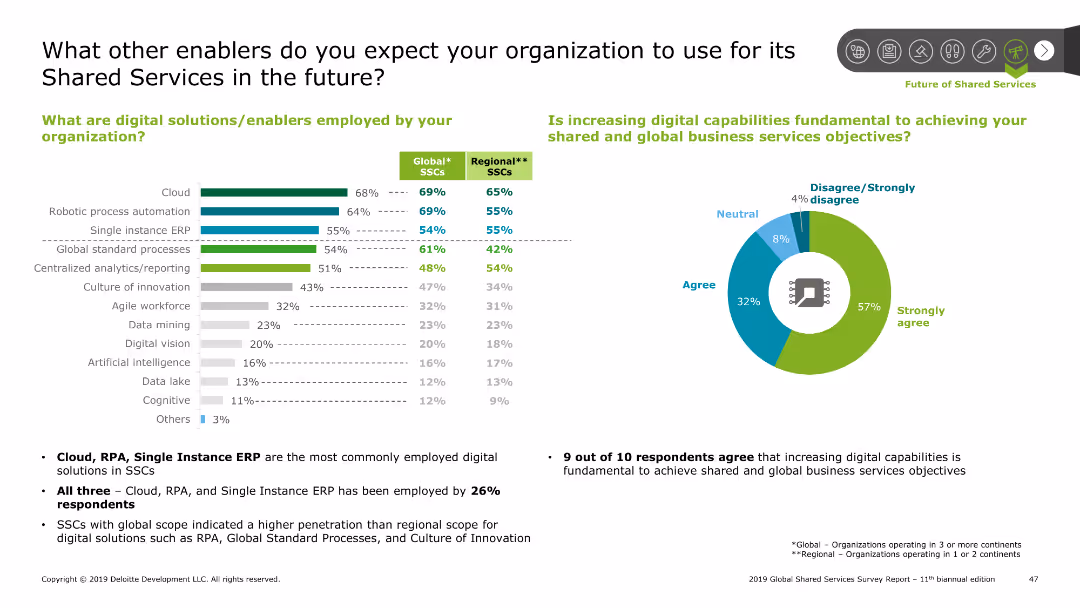
Features a bar chart on the left and a pie chart on the right, displaying digital solutions and their perceived importance.
Technology and Digital Transformation
Professional Services
Highlights the digital solutions used by organizations in Shared Services, like cloud and RPA, and the perceived importance of increasing digital capabilities.
enablers, digital, solutions, cloud, RPA, ERP, analytics, innovation, workforce
false
Technology and Digital Transformation
Professional Services
Multiple Chart
Deloitte
Add to my slides
Remove from favorites
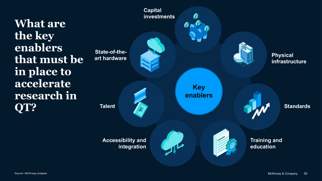
Circular radial diagram with icons around a central "Key enablers" node; dark background with high-contrast text and images.
Operational Efficiency
Artificial Intelligence
Outlines essential enablers for quantum technology advancement: capital, hardware, infrastructure, standards, talent, integration, and education. Each component supports acceleration of research and commercialization.
Enablers, hardware, talent, investment, integration, infrastructure
false
Operational Efficiency
Artificial Intelligence
Uncategorized
McKinsey
Add to my slides
Remove from favorites
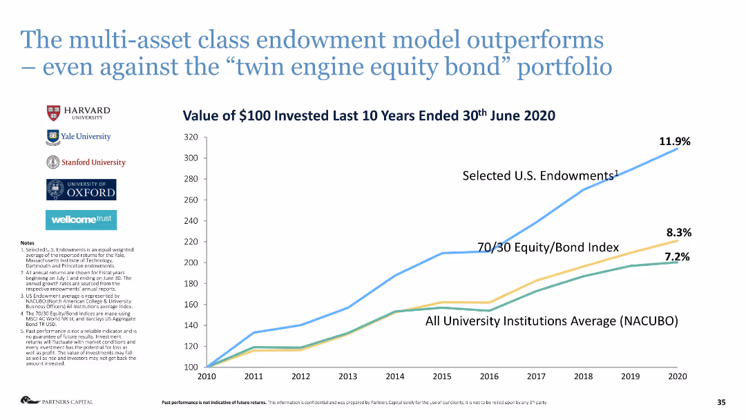
Line chart comparing the performance of different investment models over ten years.
Investment Analysis
Financial Services
This slide illustrates the superior performance of the multi-asset class endowment model compared to other investment approaches.
endowment model, investment performance, multi-asset, equity bond, financial analysis
false
Investment Analysis
Financial Services
Mixed Chart
Deloitte
Add to my slides
Remove from favorites
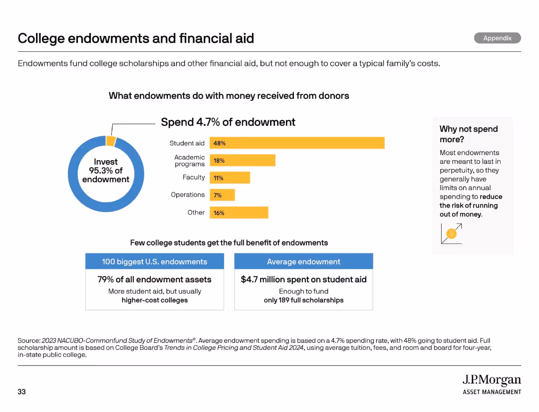
Pie chart and bar segments showing spending categories of college endowments. Includes callouts and stats.
Market Analysis and Trends
Education & Training
Analyzes how colleges allocate endowment funds, showing that only 4.7% is spent annually with a focus on student aid. It highlights the limited reach of endowments and questions sustainability and impact on student support.
endowments, financial aid, spending, college funding, student aid
false
Market Analysis and Trends
Education & Training
Multiple Chart
JP Morgan
Add to my slides
Remove from favorites
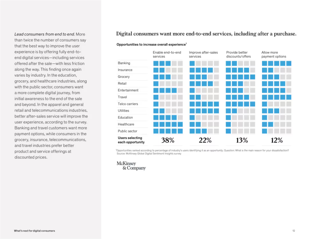
Grid matrix showing percentages selecting improvement areas like end-to-end services, after-sales, and discounts. Light-blue color coding.
Customer and Market Segmentation
Technology & Software
Consumers demand seamless digital journeys that cover post-purchase experiences. The top priority across most industries is enabling end-to-end services, followed by better after-sales support and payment options.
end-to-end, digital journey, post-purchase, after-sales, discounts, payment, consumer demand, frictionless
false
Customer and Market Segmentation
Technology & Software
Mixed Chart
McKinsey
Add to my slides
Remove from favorites
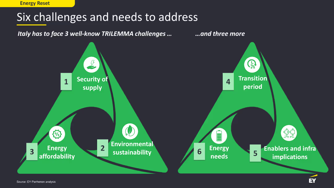
The slide has a content layout with two green triangular diagrams representing six challenges and needs in the energy sector. The diagrams are labeled with icons and text, using green and white colors for contrast. The layout is simple yet effective in conveying key points and challenges visually.
Strategic Planning
Energy & Utilities
The slide outlines six major challenges and needs that Italy must address in its energy sector, including security of supply, environmental sustainability, energy affordability, and others. It uses a trilemma framework to categorize these challenges, providing a strategic overview of the energy sector's critical issues.
energy challenges, Italy, trilemma, sustainability
false
Strategic Planning
Energy & Utilities
Diagram
EY
Add to my slides
Remove from favorites
A bar chart (horizontal) showing the likelihood of consumers to save energy at home across various countries. The chart differentiates between likely and unlikely responses using different colors.
Market Analysis and Trends
Consumer Goods
This slide presents comparative data on the likelihood of saving energy at home. It includes insights into consumer attitudes and behaviors towards energy conservation across different regions.
energy conservation, consumer behavior, sustainability, global attitudes, comparative data
false
Market Analysis and Trends
Consumer Goods
Multiple Chart
IPSOS
Add to my slides
Remove from favorites
This slide features three column charts comparing energy consumption costs in EUR/100 km for H2 ICE, FCEV, and BEV across PC, LCV, and HDT segments. Key assumptions are listed.
Market Analysis and Trends
Energy & Utilities
The slide analyzes energy consumption costs for different vehicle types, highlighting that FCEV is more competitive in heavy-duty trucks compared to BEV, with BEV being lower in LCV and PC.
Energy, Consumption, FCEV, BEV, H2 ICE
false
Market Analysis and Trends
Energy & Utilities
Multiple Chart
Roland Berger
Add to my slides
Remove from favorites
The slide features two line charts. The left chart shows energy consumption by region as a percentage of global primary energy consumption from 1992 to 2022 for the US, China, Asia excluding China, and Europe. The right chart shows Asia's energy consumption by type from 1965 to 2022, including oil, gas, coal, hydro, nuclear, and renewables.
Market Analysis and Trends
Energy & Utilities
This slide provides an overview of global and regional energy consumption trends. It highlights changes in energy consumption by region and the composition of Asia's energy consumption by type over several decades, indicating shifts in energy sources and usage patterns.
energy, consumption, global, region, type, US, China, Asia, Europe, line chart
false
Market Analysis and Trends
Energy & Utilities
Multiple Chart
JP Morgan
Add to my slides
Remove from favorites
This slide features a large image of a person walking towards wind turbines on the left side, with a multi-colored column chart on the right depicting total energy consumption under LCE scenarios in 2020 and 2050.
Technology and Digital Transformation
Energy & Utilities
It discusses the expected rise in total energy consumption globally by 23% in 2050 versus 2020 levels, driven by population growth and economic development, particularly in emerging economies, while highlighting the role of sustainable energy technologies in managing CO2 emissions.
Energy, Consumption, LCE, CO2, Sustainability
false
Technology and Digital Transformation
Energy & Utilities
Mixed Chart
EY
Add to my slides
Remove from favorites
A bar chart listing various measures companies have taken to address the energy crisis, with highlighted percentages and an explanatory text box.
Risk Assessment and Management
Financial Services
The slide details the impact of the energy crisis on business investments and lists the measures companies have implemented to mitigate these effects.
energy crisis, investment, business measures, Europe
false
Risk Assessment and Management
Financial Services
Mixed Chart
EY
Add to my slides
Remove from favorites
The slide includes text about Greece's energy crisis management, with two pie charts showing comparative performance and current tax policy impact on investment, and a bar chart on energy crisis management.
Regulatory and Compliance
Energy & Utilities
The slide provides an assessment of Greece’s management of the energy crisis, showing positive feedback from respondents. It also discusses the impact of tax policies on investment attractiveness.
energy crisis, management, Greece, tax policy, investment, assessment
false
Regulatory and Compliance
Energy & Utilities
Mixed Chart
EY
Add to my slides
Remove from favorites
The slide features a diagram and detailed table presenting the total potential of energy crops for energy production by 2060, including theoretical, technical, and sustainable potentials, and various factors affecting its scalability and sustainability constraints.
Technology and Digital Transformation
Energy & Utilities
This slide provides a deep-dive into the potential of energy crops as a feedstock for energy production, analyzing its total potential by 2060 and highlighting the scalability issues and sustainability constraints associated with its use.
energy crops, feedstock, total potential, energy production, 2060, scalability, sustainability constraints
false
Technology and Digital Transformation
Energy & Utilities
Mixed Chart
Kearney
Add to my slides
Remove from favorites
Includes a world map with column charts depicting the evolution of annual primary energy demand by region from 2015 to 2030.
Market Analysis and Trends
Energy & Utilities
Analyzes regional contributions to the increase in global energy demand, emphasizing the significant roles of China and India. Valuable for regional planning and investment in energy.
energy demand, China, India, 2030 projections, regional analysis
false
Market Analysis and Trends
Energy & Utilities
Multiple Chart
Roland Berger
Add to my slides
Remove from favorites
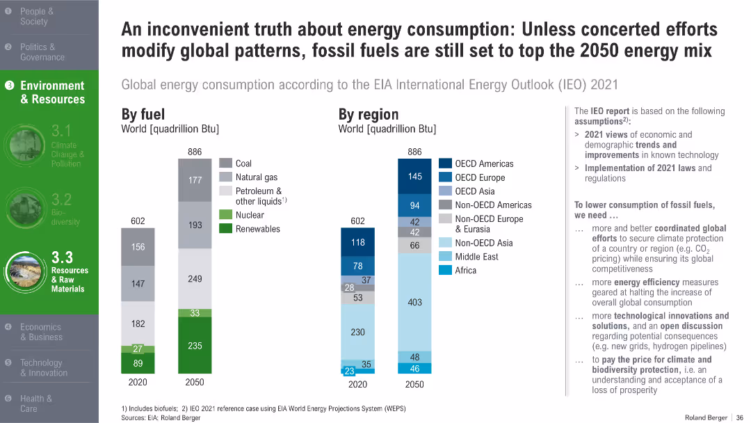
Twin bar charts showing energy consumption by fuel type and by global region for 2020 and 2050
Strategic Planning
Energy & Utilities
The slide shows that despite rising renewables, fossil fuels will still dominate global energy use in 2050 under current policies. It breaks down consumption by fuel type and global region and calls for coordinated efforts and innovations to reduce fossil dependency.
energy demand, fossil fuels, renewables, global regions, energy policy, EIA forecast, 2050
false
Strategic Planning
Energy & Utilities
Multiple Chart
Roland Berger
Add to my slides
Remove from favorites
Features a pie chart showing the distribution of global primary energy demand by country cluster in 2015 and projected for 2030.
Market Analysis and Trends
Energy & Utilities
Discusses the projected increase in global energy demand, particularly from non-OECD countries, highlighting the growing impact on energy resources. Useful for energy policy and investment discussions.
energy demand, OECD, non-OECD, 2030 projections, energy policy
false
Market Analysis and Trends
Energy & Utilities
Multiple Chart
Roland Berger
Add to my slides
Remove from favorites
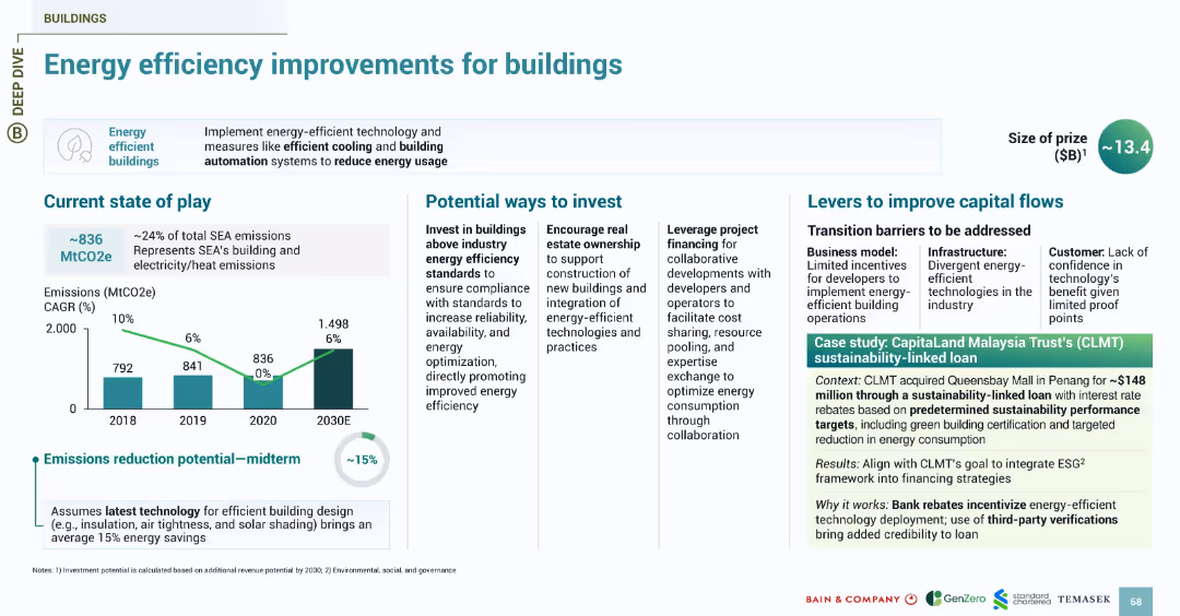
Multi-column layout with charts, icons, and a green color scheme. Left side shows bar graph; right contains case study and investment levers. Sections divided by headings and lines.
Technology and Digital Transformation
Environmental Services & Sustainability
Highlights investment opportunities in improving energy efficiency in buildings across Southeast Asia, focusing on emissions data, investment strategies, and financing levers. Includes a case study on CapitaLand Malaysia Trust’s loan tied to sustainability targets, emphasizing the role of automation and energy standards in reducing emissions.
energy efficiency, buildings, emissions, investment, automation, SEA, CapitaLand, financing, technology, sustainability
false
Technology and Digital Transformation
Environmental Services & Sustainability
Multiple Chart
Bain
Add to my slides
Remove from favorites
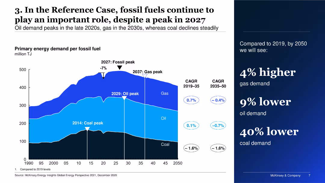
The slide features a multi-layered area chart depicting primary energy demand per fossil fuel over time, alongside key dates for peaks in coal, oil, and gas demand.
Market Analysis and Trends
Energy & Utilities
The slide shows the projected primary energy demand for fossil fuels, highlighting peak periods for coal, oil, and gas, and compares expected demand changes from 2019 to 2050.
Energy, fossil fuels, demand, projections, trends
false
Market Analysis and Trends
Energy & Utilities
Mixed Chart
McKinsey
Add to my slides
Remove from favorites
The slide features a detailed case study on energy-from-waste in the UK, covering the description, process characteristics, global market overview, and drivers/barriers. It includes a column chart showing power generation from 2014 to 2019.
Client Case Studies
Energy & Utilities
This slide provides an in-depth analysis of the energy-from-waste sector in the UK, detailing the process steps, market information, and the benefits and challenges of utilizing waste for energy production.
energy from waste, UK, case study, process description, market overview, drivers, barriers, power generation
false
Client Case Studies
Energy & Utilities
Mixed Chart
Kearney
Add to my slides
Remove from favorites
The slide features a detailed case study on the stakeholders and regulations in the energy-from-waste sector in the UK, including a value chain diagram, production cost analysis, and key regulations and policies.
Client Case Studies
Energy & Utilities
This slide examines the stakeholders and regulatory environment of the energy-from-waste sector in the UK, highlighting the value chain, production costs, and key regulations that support and govern waste-to-energy initiatives.
energy from waste, UK, case study, stakeholders, regulations, value chain, production cost, policy
false
Client Case Studies
Energy & Utilities
Mixed Chart
Kearney
Add to my slides
Remove from favorites
This slide features a horizontal bar chart comparing the levelized cost of energy for various renewable and conventional energy sources under different fuel price scenarios.
Market Analysis and Trends
Energy & Utilities
The slide analyzes how variations in fuel prices affect the levelized cost of energy for different energy sources, providing insights into cost competitiveness of renewable vs. conventional energy.
Energy, Fuel Prices, LCOE, Comparison, Renewables
false
Market Analysis and Trends
Energy & Utilities
Single Chart
Roland Berger
Add to my slides
Remove from favorites
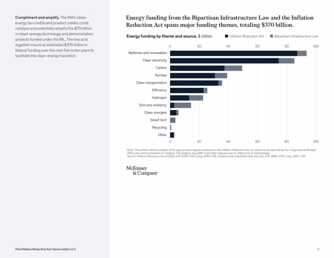
Horizontal bar chart comparing funding across categories and laws; dual color-coded bars for each theme; left text explains coordination between laws.
Market Analysis and Trends
Energy & Utilities
The chart compares funding from the Bipartisan Infrastructure Law and the Inflation Reduction Act across key energy themes. It highlights categories like batteries, clean electricity, and carbon capture, underscoring joint federal efforts.
energy funding, infrastructure law, clean energy, batteries, hydrogen, carbon, comparison
false
Market Analysis and Trends
Energy & Utilities
Mixed Chart
McKinsey
Add to my slides
Remove from favorites
Column chart showing the levelized cost of energy for gas peaking plants with a 25% hydrogen blend, comparing various technologies and subsidy scenarios.
Financial Performance
Energy & Utilities
The slide presents cost comparisons for gas peaking plants using a 25% hydrogen blend, highlighting differences in levelized costs under different technologies and subsidies.
Energy, Hydrogen blend, Cost analysis, Gas peaking plant, Subsidies
false
Financial Performance
Energy & Utilities
Single Chart
Roland Berger
Add to my slides
Remove from favorites
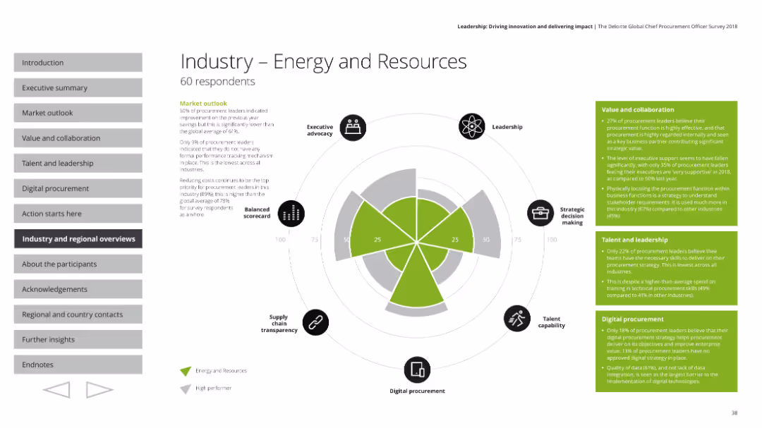
Uses a radar chart along with textual explanations to outline key metrics in the energy and resources industry, including market outlook and leadership.
Industry Overview
Professional Services
Reviews the energy and resources industry, focusing on cost reduction, strategic sourcing, and leadership's role in improving procurement processes.
Energy industry, market outlook, cost reduction, leadership
false
Industry Overview
Professional Services
Mixed Chart
Deloitte
Add to my slides
Remove from favorites
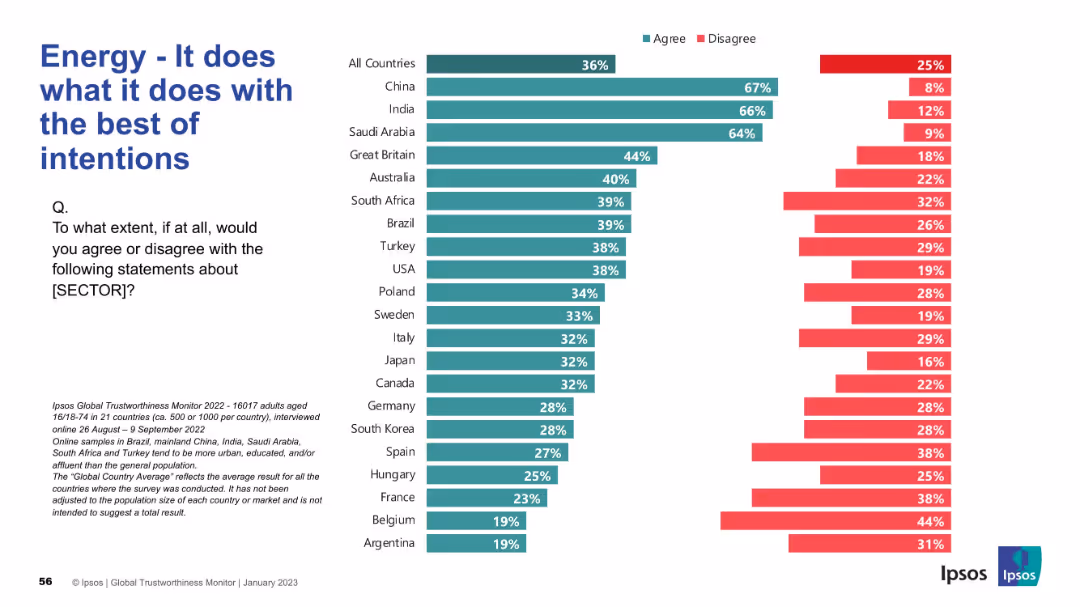
Similar visual layout to Slide 19211; bar chart with country-level comparison; emphasis on intention/perception
Market Analysis and Trends
Energy & Utilities
The slide evaluates whether people believe the energy sector operates with good intentions. China, India, and Saudi Arabia receive the highest levels of agreement. The global average is relatively low at 36%, highlighting public skepticism in many regions.
energy, intentions, ethics, global opinion, public trust, Ipsos, bar chart, international, agreement, sector reputation
false
Market Analysis and Trends
Energy & Utilities
Mixed Chart
IPSOS
Add to my slides
Remove from favorites
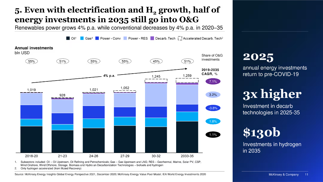
The slide shows a bar chart depicting annual energy investments from 2018 to 2035 across different sectors, including oil, gas, renewable energy, and hydrogen.
Investment Analysis
Energy & Utilities
It discusses the projected distribution of energy investments up to 2035, highlighting the continued significant investment in oil and gas sectors despite the growth of renewables.
energy investments, oil and gas, renewables, hydrogen, investment trends
false
Investment Analysis
Energy & Utilities
Mixed Chart
McKinsey
Add to my slides
Remove from favorites
The slide is neatly divided between well-organized text on the left and a graphical element or image on the right, ensuring the slide is engaging but not overwhelming.
Technology and Digital Transformation
Energy & Utilities
This slide summarizes the key insights from the "Global Energy Perspective 2022" report, breaking down complex data into accessible bullet points. It addresses significant topics like the commitment to decarbonization, the shift towards electrification, the projected peak in fossil fuel demand, implications of net-zero commitments, and investment trends in energy sectors. The content is designed to distill the comprehensive analysis of the report into essential takeaways, facilitating quick comprehension of major trends and predictions.
Energy, Key Insights, Decarbonization, Investment Trends
false
Technology and Digital Transformation
Energy & Utilities
Pillar
McKinsey
Add to my slides
Remove from favorites
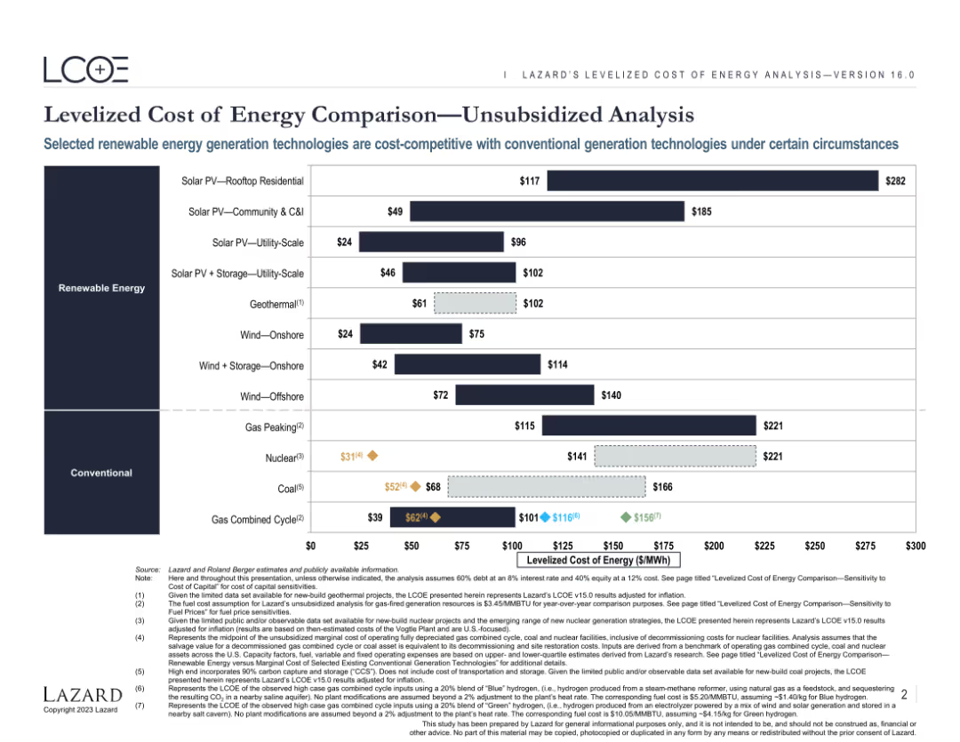
Features a comparative bar chart displaying the levelized cost of energy (LCOE) for various renewable and conventional energy sources. The chart includes both current and projected costs, highlighting the competitiveness of different technologies.
Market Analysis and Trends
Energy & Utilities
Provides an analysis of the levelized cost of energy for various renewable and conventional energy sources. Highlights the cost competitiveness and market potential of different energy generation technologies under specific conditions.
Energy, LCOE, Renewable, Conventional, Comparison
false
Market Analysis and Trends
Energy & Utilities
Single Chart
Roland Berger
Add to my slides
Remove from favorites
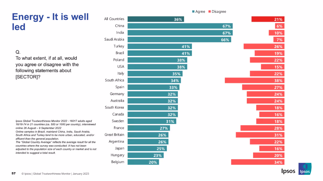
Consistent design with previous slides; bar chart displaying leadership perceptions by country
Market Analysis and Trends
Energy & Utilities
This slide explores global views on the leadership of the energy sector. High trust in leadership is observed in China, India, and Saudi Arabia. Western European countries such as Belgium, France, and Hungary report notably low agreement.
energy, leadership, management, public opinion, global comparison, Ipsos, agreement, survey, governance, trust
false
Market Analysis and Trends
Energy & Utilities
Mixed Chart
IPSOS
Add to my slides
Remove from favorites
Bar charts of energy mix by fuel type for 2013 and 2030 under 2°C and 6°C IEA scenarios.
Strategic Planning
Environmental Services & Sustainability
Compares projected global energy demand and fossil fuel use under different warming scenarios, showing reductions in fossil fuel share needed to achieve the 2°C target.
energy mix, fossil fuels, IEA scenario, global warming, CO₂ reduction
false
Strategic Planning
Environmental Services & Sustainability
Multiple Chart
Roland Berger
Add to my slides
Remove from favorites
Includes a bar chart showing the share of energy carriers in end-use sectors over time and a pie chart depicting the share of global greenhouse gas emissions by sector.
Market Analysis and Trends
Energy & Utilities
The slide analyzes energy use across different sectors and their corresponding greenhouse gas emissions, highlighting the sectors contributing most to global emissions.
energy mix, greenhouse gases, emissions, energy sectors, sustainability, global impact, sector analysis, J.P. Morgan, climate change, energy carriers
false
Market Analysis and Trends
Energy & Utilities
Multiple Chart
JP Morgan
Add to my slides
Remove from favorites
Bar chart comparing agreement and disagreement across countries; left-aligned title; dark green and red color scheme
Market Analysis and Trends
Energy & Utilities
This slide presents a cross-country survey on perceptions of the energy sector's performance. It shows the percentage of respondents agreeing or disagreeing that the sector is good at what it does. China, Saudi Arabia, and India lead in positive perception, while Belgium and Argentina rank lowest.
energy, performance, perception, trust, international comparison, Ipsos, agreement, disagreement, chart, survey
false
Market Analysis and Trends
Energy & Utilities
Mixed Chart
IPSOS
Add to my slides
Remove from favorites
The slide features two charts: a line chart on the left showing the price of oil over time, and a line chart on the right showing natural gas prices in EUR and USD.
Market Analysis and Trends
Energy & Utilities
It provides historical data on energy prices, including oil and natural gas, useful for analyzing trends in energy markets and making informed investment decisions.
energy prices, oil, natural gas, EUR, USD
false
Market Analysis and Trends
Energy & Utilities
Multiple Chart
JP Morgan
Add to my slides
Remove from favorites
Displays a line chart showing the rise in various energy pressure points from 2016 to 2023, with annotations on significant events affecting prices.
Financial Performance
Energy & Utilities
Analyzes the impact of rising energy costs on consumer purchasing power, with a focus on various energy sources and their price trends.
energy prices, purchasing power, energy pressure points, 2016-2023, financial performance, price trends
false
Financial Performance
Energy & Utilities
Mixed Chart
PwC/Strategy&
Add to my slides
Remove from favorites
The slide presents a balanced combination of text, icons, and a Venn diagram. The icons represent different business areas, while the diagram depicts the intersection of energy policies and current events.
Industry Overview
Energy & Utilities
This slide offers an overview of Seatruim's strategic focus on offshore renewables, new energy, and cleaner solutions, utilizing a Venn diagram to illustrate market positions and energy policy impacts. It could be used to outline the company's market strategy in the energy sector.
Energy, Renewables, Transition, Strategy, Market, Offshore
false
Industry Overview
Energy & Utilities
Pillar
Morgan Stanley
Add to my slides
Remove from favorites
This slide displays a world map with orange and gray circle graphs overlaid to represent regional fossil energy statistics like production and reserves, denoted in Gigatonnes of oil equivalent (Gtoe).
Market Analysis and Trends
Energy & Utilities
This slide provides a global overview of fossil energy distribution, highlighting regions like North America, the CIS, Australasia, and the Middle East with respect to their production, reserves, and resources. It identifies which regions have large reserves versus those with significant production capacities, crucial for strategic energy planning.
energy, reserves, production, global, distribution
false
Market Analysis and Trends
Energy & Utilities
Multiple Chart
Roland Berger
Add to my slides
Remove from favorites
Previous
Next
You don't have any favorites yet.
Please wait loading your favorites slides...
Create a FREE account to continue browsing
Receive Instant Access to 1,000+ slides from companies like McKinsey, Google, and Goldman Sachs
First Name
Last Name
Email
Password
I agree to all
Terms & Privacy Policy
Thank you! Your submission has been received!
Oops! Something went wrong while submitting the form.
Have an account?
Sign in
Upgrade to PRO to Save slides
Advanced Search and Filters
Access to 15,000+ slides
Access to Category Pages
Save/Bookmark Slides
PowerPoint Template Library
Pick a Plan
MONTHLY
$12/month
Billed every month, Cancel anytime.
YEARLY
$9/year
Billed $108 annually, Cancel anytime.
Checkout for $12/month
Checkout for $108/yr
Secured by Stripe | AES-256 bit encryption