My Account
My Slides
Search by Category
Companies
Slide Type
Use Case
Industry
Pricing
Templates
View All Templates
Download Template Slides
✦ AI
AI Prompt Library
AI Search
Feedback
Login
Logout
Get Started
Browse all Slides
Browse all Slides
Create a FREE Account
Instant access to 1,000+ real slides from top companies like McKinsey, BCG, Goldman Sachs, Google and many more!
First Name
Last Name
Email
Password
I agree to all
Terms & Privacy Policy
Thank you! Your submission has been received!
Oops! Something went wrong while submitting the form.
Have an account?
Sign in
Saved Slides
Total No. of slides saved
0
↻ Refresh
✖ Clear all
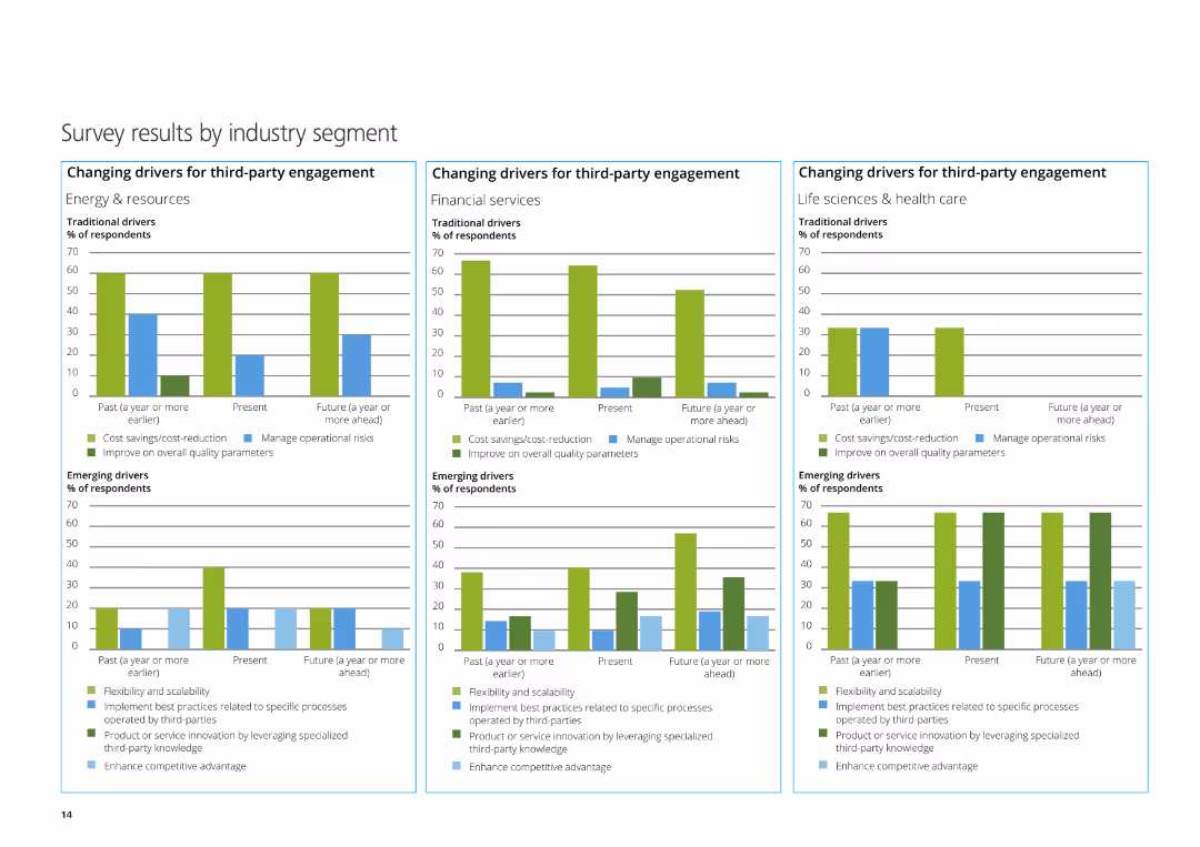
The slide features three column charts depicting the changing drivers for third-party engagement in Energy & Resources, Financial Services, and Life Sciences & Healthcare.
Market Analysis and Trends
Professional Services
This slide presents survey results by industry segment, focusing on traditional and emerging drivers for third-party engagement in various sectors.
Energy & Resources, Financial Services, Life Sciences, third-party engagement, survey
false
Market Analysis and Trends
Professional Services
Multiple Chart
Deloitte
Add to my slides
Remove from favorites
Features detailed bar charts with industry comparisons, textual annotations, and legends.
Operational Efficiency
Energy & Utilities
Shows energy savings across industries by implementing sustainable practices, emphasizing cost reduction.
Energy savings, sustainability, industry comparison, operational efficiency
false
Operational Efficiency
Energy & Utilities
Multiple Chart
McKinsey
Add to my slides
Remove from favorites
The slide features a column chart detailing the energy consumption forecast for the energy sector by subsectors (power, heat) from 2018 to 2040 under a stated policies scenario. It highlights the cumulative growth of biomass in energy industries and contributions from different fuel types.
Market Analysis and Trends
Energy & Utilities
This slide forecasts energy consumption within the energy sector, emphasizing the role of bioenergies in decarbonizing and electrifying the sector, and projecting the contributions from biomass, fossil fuels, nuclear, and renewables by 2040.
energy sector, consumption forecast, subsectors, power, heat, biomass, fossil fuels, nuclear, renewables
false
Market Analysis and Trends
Energy & Utilities
Single Chart
Kearney
Add to my slides
Remove from favorites
The slide includes a complex stacked bar graph depicting investments across various energy sectors from 2012 to 2035. It utilizes a dark and light blue color scheme to differentiate between categories. Annotations and labels provide clarity on data points.
Strategic Planning
Energy & Utilities
This slide analyzes historical and projected global investments in the energy sector, with a focus on the distribution of funds across different energy sources and the expected growth rates of clean technologies and renewables.
Energy Sector, Investments, Clean Technologies, Renewables, Fossil Fuels, CAGR, Historical Data, 2035 Projections
true
Strategic Planning
Energy & Utilities
Mixed Chart
McKinsey
Add to my slides
Remove from favorites
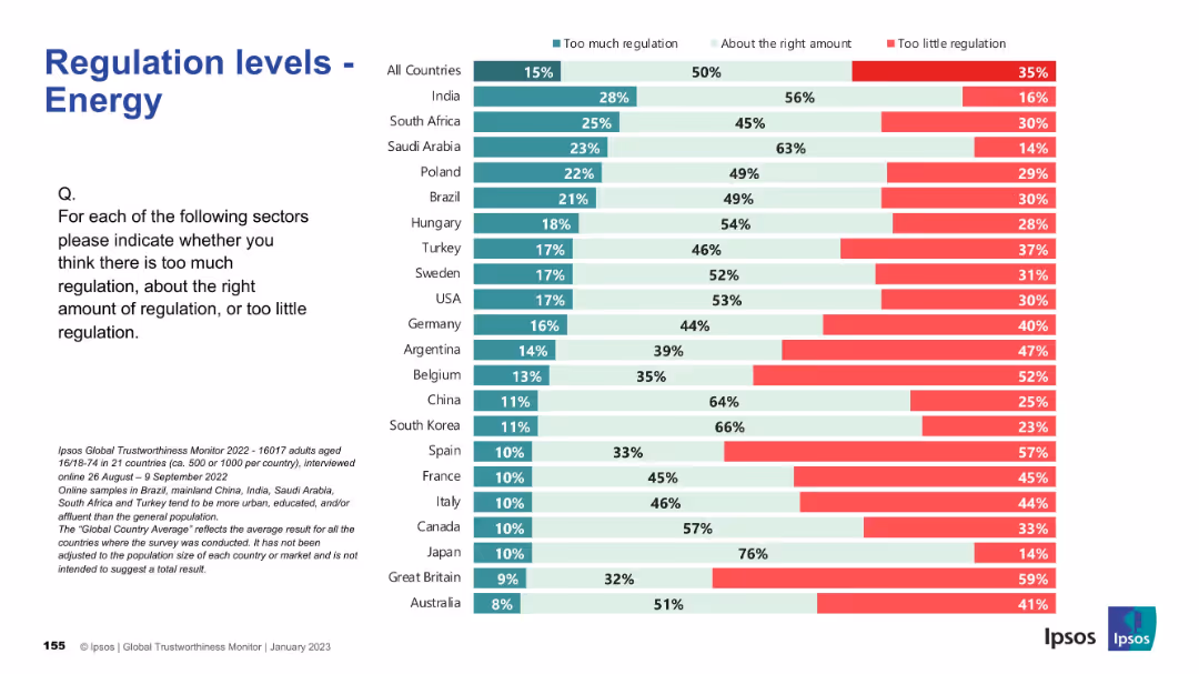
Similar layout to 19301; bar chart with red, teal, and mint green segments; country list ranked.
Regulatory and Compliance
Energy & Utilities
This slide shows perceptions of regulation in the energy sector across 21 countries. It highlights a global average sentiment that current regulation is mostly appropriate, though several countries like Belgium and Spain show higher concern over too little regulation.
energy sector, regulation, survey, Ipsos, policy, governance, international comparison, compliance, public opinion, bar chart
false
Regulatory and Compliance
Energy & Utilities
Mixed Chart
IPSOS
Add to my slides
Remove from favorites
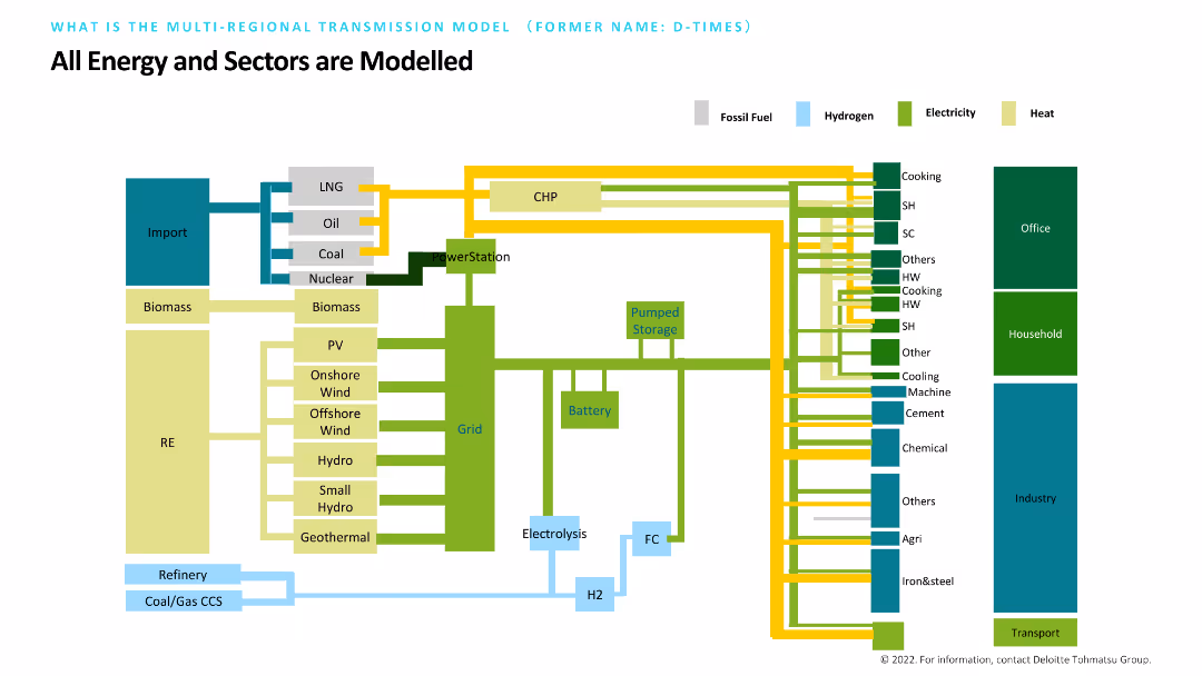
Features a detailed diagram with various energy sources and their connections to different sectors like household, industry, and transport. Each type of energy (fossil fuel, hydrogen, electricity, heat) is color-coded. The slide aims to model all energy and sector interactions comprehensively.
Market Analysis and Trends
Energy & Utilities
Provides a comprehensive model of how different energy sources interact with various sectors. The diagram helps in understanding the flow and impact of energy within households, industries, and transportation, aiming for a holistic view of energy modeling.
Energy, Sectors, Model, Fossil Fuel, Hydrogen
false
Market Analysis and Trends
Energy & Utilities
Diagram
Deloitte
Add to my slides
Remove from favorites
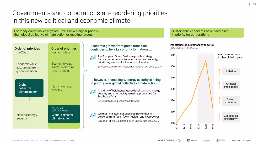
Combination of text blocks, circular diagrams, and national icons. Color-coded to distinguish between different themes such as energy security and economic needs.
Strategic Planning
Energy & Utilities
Discusses the challenges faced by governments in balancing energy security, economic stability, and decarbonization goals in the wake of global events.
energy security, economic stability, decarbonization, government priorities, Ukraine conflict
false
Strategic Planning
Energy & Utilities
Diagram
Bain
Add to my slides
Remove from favorites
Dual-column comparison of priority orders; line chart on CEO sustainability priority; includes direct quotes
Strategic Planning
Environmental Services & Sustainability
Illustrates a shift in national and corporate priorities from collective climate action to energy security amid global instability. Also shows waning CEO focus on sustainability relative to other concerns like AI and inflation.
energy security, sustainability, corporate priorities, geopolitical risk
false
Strategic Planning
Environmental Services & Sustainability
Mixed Chart
Bain
Add to my slides
Remove from favorites
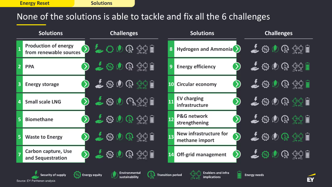
The slide includes a comparative layout with a table listing solutions on the left and the challenges they address on the right. It uses icons and color coding to show which solutions tackle which challenges, providing a clear visual comparison. The layout is detailed and structured to facilitate easy comparison.
Strategic Planning
Energy & Utilities
The slide compares various energy solutions and their effectiveness in addressing six key challenges. It uses a tabular format to show which solutions are capable of tackling specific challenges, illustrating the need for a multifaceted approach to overcome the energy sector's issues.
energy solutions, challenges, comparison, strategic
false
Strategic Planning
Energy & Utilities
Table
EY
Add to my slides
Remove from favorites
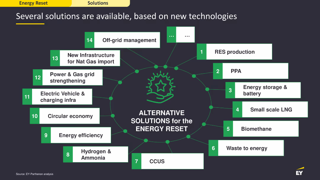
This slide features a central diagram with multiple connected nodes, each representing a different solution for energy reset. It uses green and white colors, with icons and text to illustrate each solution. The layout is moderately complex, focusing on the various technological solutions available.
Technology and Digital Transformation
Energy & Utilities
The slide showcases various technological solutions for the energy reset, highlighting options like RES production, PPA, energy storage, and more. It emphasizes the availability of multiple solutions to address energy challenges, providing a comprehensive overview of the technological landscape for energy transformation.
energy solutions, technology, digital transformation
false
Technology and Digital Transformation
Energy & Utilities
Diagram
EY
Add to my slides
Remove from favorites
Features a large pie chart showing the projected global primary energy demand by source type for 2015 and 2030, with a focus on renewable energy growth.
Market Analysis and Trends
Energy & Utilities
Discusses the future composition of global energy sources, highlighting the continued dominance of fossil fuels and the growth of renewables. Important for energy transition discussions.
energy sources, fossil fuels, renewables, 2030 forecast, energy transition
false
Market Analysis and Trends
Energy & Utilities
Multiple Chart
Roland Berger
Add to my slides
Remove from favorites
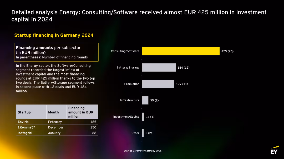
Dark-themed slide with horizontal bar chart on the right, text block on left, and a table of top 3 deals at bottom-left. Yellow accent highlights top sector.
Investment Analysis
Energy & Utilities
This slide highlights sector-specific investment trends in Germany's energy startup landscape for 2024. Consulting/Software attracted the most capital (EUR 425M across 26 rounds), followed by Battery/Storage and Production. A table lists top-funded startups like Enviria and 1Komma5°.
energy, startup, funding, Germany, 2024, software, consulting, battery, investment, capital
false
Investment Analysis
Energy & Utilities
Mixed Chart
EY
Add to my slides
Remove from favorites
Map showing various locations in the US with energy storage projects marked, including details like project size and type.
Client Case Studies
Energy & Utilities
The slide provides an overview of energy storage projects across different US locations, detailing project sizes and types for various configurations.
Energy storage, Case studies, Project size, US locations, Configuration
false
Client Case Studies
Energy & Utilities
Graphic
Roland Berger
Add to my slides
Remove from favorites
Column chart comparing the levelized cost of storage for various energy storage systems, both subsidized and unsubsidized, for different configurations and use cases.
Financial Performance
Energy & Utilities
The slide compares the capacity-based levelized cost of storage across multiple energy storage configurations, highlighting the costs with and without subsidies.
Energy storage, Cost analysis, Capacity, Subsidies, Comparison
false
Financial Performance
Energy & Utilities
Single Chart
Roland Berger
Add to my slides
Remove from favorites
Column chart comparing the levelized cost of storage for various energy storage systems, both subsidized and unsubsidized, for different configurations and use cases.
Financial Performance
Energy & Utilities
The slide evaluates the energy-based levelized cost of storage across various configurations, highlighting cost differences with and without subsidies.
Energy storage, Cost analysis, Energy, Subsidies, Comparison
false
Financial Performance
Energy & Utilities
Single Chart
Roland Berger
Add to my slides
Remove from favorites
This slide uses a column chart to break down the projected domestic demand for energy storage systems (ESS) in Australia from 2023 to 2030. The chart is detailed and uses different shades of purple to represent various categories of demand, such as grid, behind the meter, off-grid, and hydrogen potential. Annotations provide insights into the drivers of each category's growth.
Competitive Landscape
Energy & Utilities
Details the growing domestic demand for energy storage solutions in Australia, emphasizing strategic opportunities for local industry development and grid stability.
energy storage, domestic demand, Australia, 2030 forecast, grid, behind the meter, off-grid, hydrogen, energy policy, market growth
false
Competitive Landscape
Energy & Utilities
Mixed Chart
Accenture
Add to my slides
Remove from favorites
This slide features a three-column layout with clear headers in bold blue text. Each column is dedicated to a different energy technology—energy storage, energy distribution, and smart grid. Below each header is a short text description and an illustrative image of the respective technology. The color scheme is blue, white, and black, providing a professional look.
Market Analysis and Trends
Energy & Utilities
The slide compares three key technologies impacting the future of clean energy: battery storage systems, electric vehicle charging infrastructure (EVCI), and smart grids. It highlights the price decline in lithium-ion batteries, the need for extensive EV charging networks, and the benefits of a smart, integrated grid system that offers real-time insights. Aimed at professionals in the energy sector, this slide serves as an informative summary of recent advancements and considerations for integrating these technologies into the energy ecosystem.
energy storage, EVCI, smart grid, lithium-ion batteries, charging network, real-time insights, clean energy, infrastructure, technology comparison, grid integration
false
Market Analysis and Trends
Energy & Utilities
Header Horizontal
McKinsey
Add to my slides
Remove from favorites
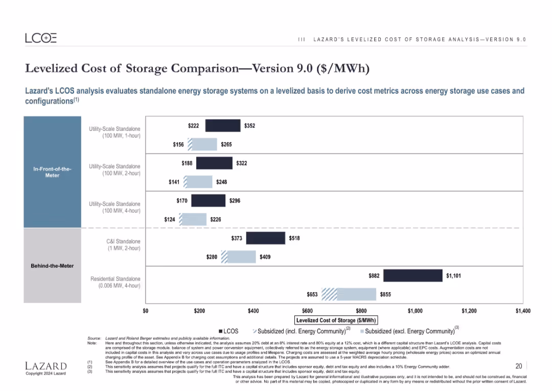
Bar chart with grouped columns showing cost ranges for various energy storage setups, with three cost scenarios.
Technology and Digital Transformation
Energy & Utilities
Displays cost ranges for energy storage systems based on use case (in-front vs. behind-the-meter) and duration. It compares unsubsidized and subsidized costs, illustrating that storage costs vary widely depending on configuration and subsidy structure.
energy storage, LCOS, MWh, utility-scale, C&I, residential, subsidy, cost comparison
false
Technology and Digital Transformation
Energy & Utilities
Single Chart
Roland Berger
Add to my slides
Remove from favorites
Column charts showing revenue from different use cases for energy storage systems, separated by in-front-of-the-meter and behind-the-meter categories.
Financial Performance
Energy & Utilities
The slide summarizes the revenue generated from different energy storage systems, highlighting financial performance in various use case scenarios.
Energy storage, Revenue, Use cases, In-front-of-the-meter, Behind-the-meter
false
Financial Performance
Energy & Utilities
Multiple Chart
Roland Berger
Add to my slides
Remove from favorites
Features a combination of column chart and maps illustrating Colgate's performance and strategic partnerships in the energy sector.
Financial Performance
Energy & Utilities
This slide showcases Colgate's historical performance in the energy sector, focusing on strategic maneuvers and partnerships that have driven growth.
energy, strategy, growth, Colgate, partnerships
false
Financial Performance
Energy & Utilities
Mixed Chart
Barclays
Add to my slides
Remove from favorites
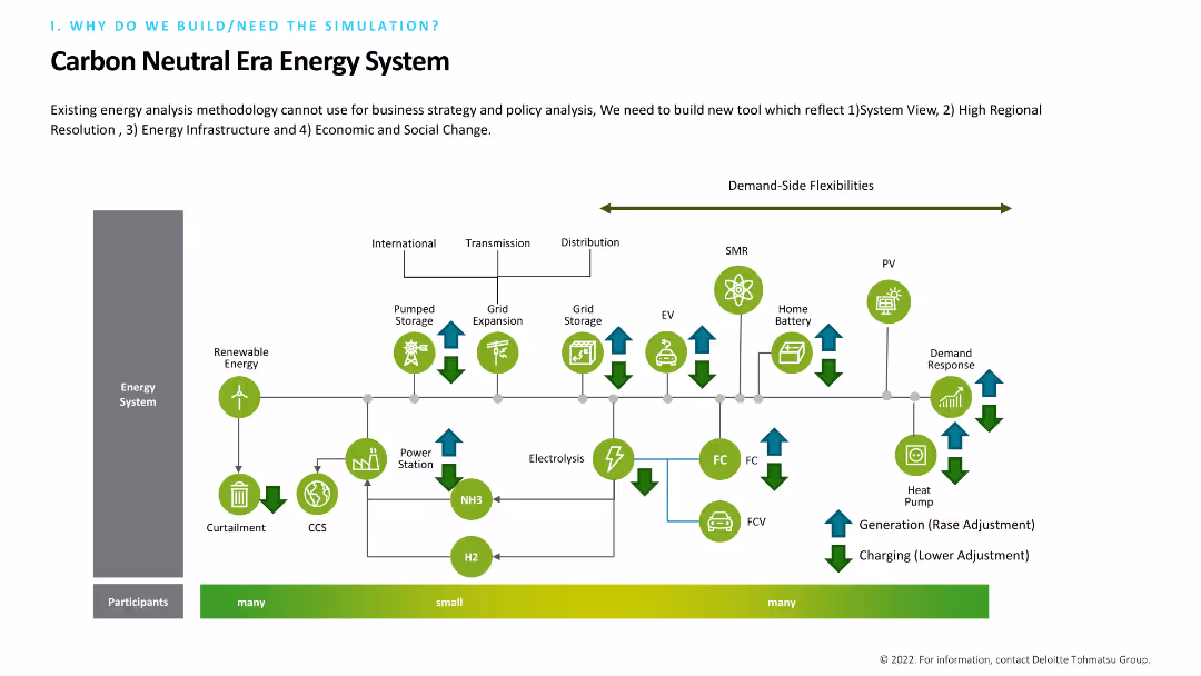
Includes a complex flow diagram illustrating an energy system with elements like renewable energy, grid expansion, and demand-side flexibilities. The diagram is color-coded and detailed, with arrows indicating the flow and interaction between different components. Text at the top explains the need for a new tool.
Technology and Digital Transformation
Energy & Utilities
Describes the necessity of building a new tool for energy analysis that incorporates system views, regional resolution, infrastructure, and social change. The detailed flow diagram maps out the interactions within a carbon-neutral energy system.
Energy System, Renewable, Grid, Flexibility, Tool
false
Technology and Digital Transformation
Energy & Utilities
Diagram
Deloitte
Add to my slides
Remove from favorites
Balanced design with a 3D layered block diagram on the left and concise text on the right, using a muted color palette to focus attention on the data representation.
Technology and Digital Transformation
Energy & Utilities
This slide presents an overview of the "Global Energy Perspective 2022," highlighting its scope across segments, energy products, and countries. The accompanying diagram illustrates the report's multidimensional approach, covering a range of sectors from transport to hydrogen supply, emphasizing the depth and breadth of analysis contained within. The text succinctly conveys the report's comprehensiveness and the state-of-the-art tools and models used to project energy demand and trends across the globe.
Energy Systems, Global Analysis, Demand Outlook, Segmentation
false
Technology and Digital Transformation
Energy & Utilities
Graphic
McKinsey
Add to my slides
Remove from favorites
The slide features a set of scatter plots comparing technology adoption rates across different regions (US, Europe, China, South Asia, Rest of the World, Global). Each scatter plot displays data for Solar, Wind, Nuclear, Coal, and Gas technologies for the years 2025 and 2050.
Market Analysis and Trends
Energy & Utilities
This slide discusses how the adoption of various energy technologies varies across different regions. It highlights the projected technology adoption rates for Solar, Wind, Nuclear, Coal, and Gas in the years 2025 and 2050, showing trends and comparisons globally.
Energy, Technology, Adoption, Rates, Global, Solar, Wind, Nuclear, Coal, Gas
false
Market Analysis and Trends
Energy & Utilities
Multiple Chart
EY
Add to my slides
Remove from favorites
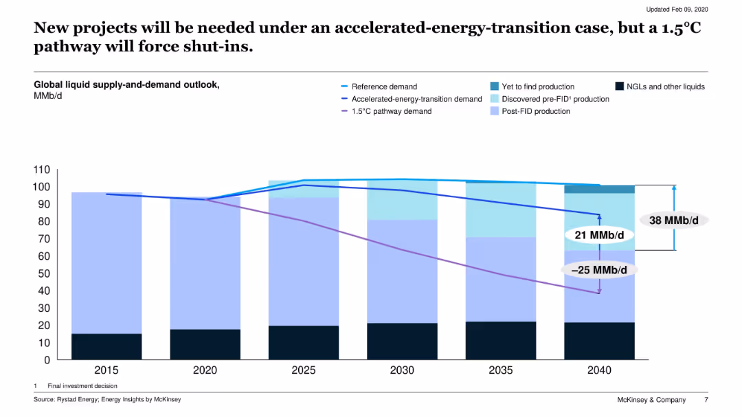
Stacked area chart showing global liquid supply and demand under three scenarios to 2040, highlighting production types and the gap/surplus.
Risk Assessment and Management
Energy & Utilities
The slide assesses oil production under three energy transition scenarios, illustrating potential overcapacity or shortfall, and the effect of climate targets on future supply needs.
energy transition, climate policy, supply-demand gap, 1.5C pathway, oil shut-ins
false
Risk Assessment and Management
Energy & Utilities
Single Chart
McKinsey
Add to my slides
Remove from favorites
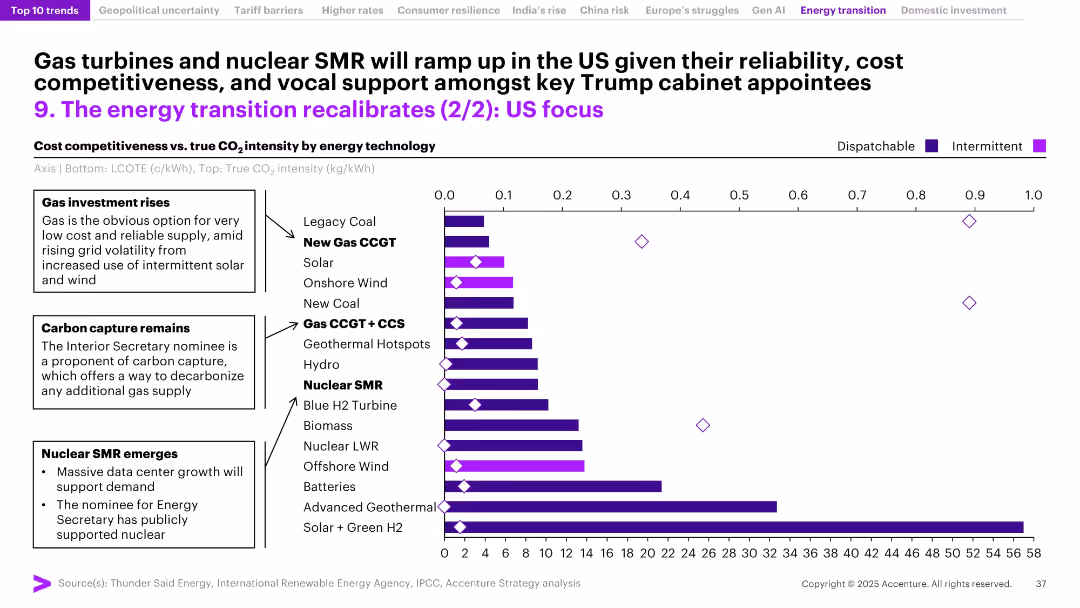
Horizontal bar chart comparing cost and CO₂ intensity across energy types; annotations highlight key investment drivers and policy support.
Technology and Digital Transformation
Energy & Utilities
The slide evaluates US energy technologies by cost and carbon intensity, showing a trend toward gas turbines and nuclear SMRs due to reliability, policy support, and low emissions. Carbon capture and rising investment in dispatchable energy sources are central themes, especially under a potential Trump-led administration.
energy transition, CO2 intensity, gas CCGT, nuclear SMR, carbon capture, cost competitiveness, dispatchable energy, Trump policy, US energy market
false
Technology and Digital Transformation
Energy & Utilities
Mixed Chart
Accenture
Add to my slides
Remove from favorites
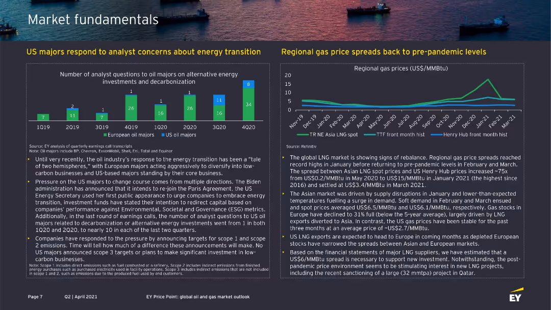
The slide contains two charts: one bar chart showing analyst questions to oil majors about energy transition, and one line chart showing regional gas price spreads.
Market Analysis and Trends
Energy & Utilities
This slide addresses concerns about energy transition and gas price trends, useful for understanding industry responses and market conditions.
energy transition, gas prices, oil majors, analyst questions, market fundamentals
false
Market Analysis and Trends
Energy & Utilities
Multiple Chart
EY
Add to my slides
Remove from favorites
The slide includes two charts: one line chart showing the global energy mix over time and another bar chart showing global investments in energy transition technologies.
Strategic Planning
Energy & Utilities
The slide highlights the shift in energy consumption from fossil fuels to renewables and the increasing investments in energy transition technologies.
energy transition, global energy mix, investments, renewables, strategic planning
false
Strategic Planning
Energy & Utilities
Multiple Chart
JP Morgan
Add to my slides
Remove from favorites
The slide is divided into eight sections, each representing a different implication of the energy transition. Key statistics and icons are used to illustrate each implication, including renewable energy dominance, electrification, localized energy systems, and increased investment.
Strategic Planning
Energy & Utilities
This slide outlines eight major implications of the global energy transition, such as the rise of renewable energy, the doubling of electricity demand, the localization of energy systems, and the substantial increase in investments in low-carbon technologies.
Energy, Transition, Implications, Renewable, Electrification, Investment
false
Strategic Planning
Energy & Utilities
Multiple Chart
EY
Add to my slides
Remove from favorites
This slide includes a column chart showing median industry price performance for 2023 and a column chart estimating IRA spending over the next decade.
Market Analysis and Trends
Energy & Utilities
The slide discusses the challenges of capital-intensive investments in the energy transition sector within a high-rate environment, despite significant potential spending under the Inflation Reduction Act (IRA). It illustrates the performance of various renewable energy sectors and the projected financial support for the industry. The slide is useful for energy market analysis and investment planning.
energy transition, IRA, renewable energy, investment, valuations
false
Market Analysis and Trends
Energy & Utilities
Multiple Chart
JP Morgan
Add to my slides
Remove from favorites
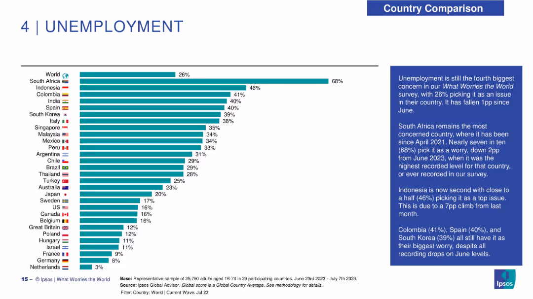
Horizontal bar chart with country rankings on unemployment concerns; annotated text box at right.
Performance Metrics and KPIs
Financial Services
Unemployment ranks as the fourth top global worry. South Africa leads with 68% concern. The commentary highlights month-over-month changes and notable movements in countries like Indonesia and Colombia.
energy transition, net impact, sustainability, climate benefit, public sentiment, environmental policy, Ipsos data
false
Performance Metrics and KPIs
Financial Services
Mixed Chart
IPSOS
Add to my slides
Remove from favorites
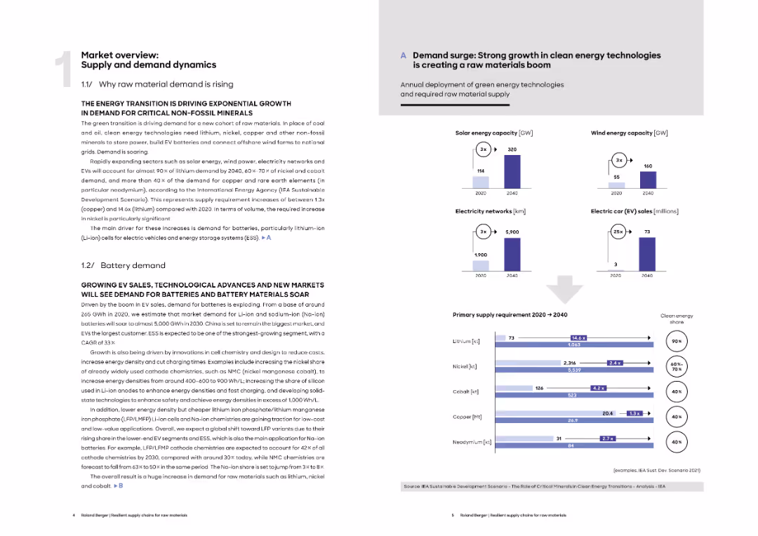
Two-column layout with text-heavy sections on supply trends and charts showing exponential growth in green energy technologies and raw material requirements.
Market Analysis and Trends
Energy & Utilities
This slide discusses the rising demand for critical non-fossil minerals driven by the energy transition, focusing on lithium, nickel, cobalt, copper, and neodymium. It includes visual projections of solar, wind, EVs, and electricity networks and their corresponding raw material needs through 2040.
energy transition, raw materials, lithium, EVs, solar, wind, electricity networks, demand forecast
false
Market Analysis and Trends
Energy & Utilities
Multiple Chart
Roland Berger
Add to my slides
Remove from favorites
Left text section lists renewable projects. Right side image of an offshore converter platform. A column chart illustrates the split in net order book between renewable and other solutions.
Strategic Planning
Energy & Utilities
Describes commitment to energy transition, detailing key renewable projects and their contribution to the net order book. Used for strategic communication of company's focus on sustainability.
energy transition, renewables, net order book, offshore wind, sustainability, investment
false
Strategic Planning
Energy & Utilities
Mixed Chart
Morgan Stanley
Add to my slides
Remove from favorites
This slide includes text on energy transitions, along with a graphic showing global final energy demand projections by fuel type and region.
Market Analysis and Trends
Energy & Utilities
The slide explores the varied pace of global energy transitions, predicting significant growth in renewable energy capacity and shifts in final energy demand by 2050.
energy transitions, renewable energy, global demand, fuel types, energy projections
false
Market Analysis and Trends
Energy & Utilities
Multiple Chart
EY
Add to my slides
Remove from favorites
A graphically intensive slide that presents a colorful chart depicting future energy consumption trends, balanced with descriptive text to the side.
Technology and Digital Transformation
Energy & Utilities
The slide projects future trends in the global energy mix, with a focus on the growing role of electricity and hydrogen. The chart and accompanying text highlight key findings, such as the expected increase in the share of these energy sources, driven by technological advancements and policy measures. It offers a visual representation of the data discussed in the report, making complex projections more accessible and emphasizing the shift towards cleaner energy sources.
Energy Trends, Electricity, Hydrogen, Future Projections
true
Technology and Digital Transformation
Energy & Utilities
Mixed Chart
McKinsey
Add to my slides
Remove from favorites
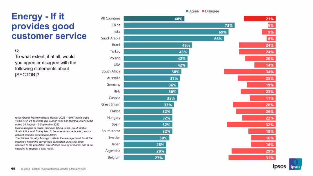
Split-screen layout with a large left-aligned title, explanatory question, and bar graph on the right.
Customer and Market Segmentation
Energy & Utilities
This slide shows global and country-specific agreement/disagreement percentages about the energy sector being trustworthy if it provides good customer service.
energy, trust, customer service, perception, Ipsos, agreement, survey, countries, utilities, public opinion
false
Customer and Market Segmentation
Energy & Utilities
Mixed Chart
IPSOS
Add to my slides
Remove from favorites
Similar bar chart layout to previous slide; green/red bars showing trust levels across countries.
Market Analysis and Trends
Energy & Utilities
This slide compares public trust in energy companies globally. India, China, and Saudi Arabia top the list for perceived trustworthiness.
energy, trust, perception, Ipsos, countries, bar chart, survey, utilities, data analysis, trustworthiness
false
Market Analysis and Trends
Energy & Utilities
Mixed Chart
IPSOS
Add to my slides
Remove from favorites
This slide features multiple graphs and data visualizations: a column chart showing mainline volumes, another column chart illustrating cost synergies, a line graph for FX hedging program, and a text list of projects. Colors like yellow, blue, and gray dominate. Overall, the design is clean with data neatly organized.
Financial Performance
Energy & Utilities
The slide presents Enbridge’s financial performance and projections, emphasizing the growth through the second half of 2017. It includes information on mainline volumes, cost synergies, FX hedging, and upcoming projects, clearly targeting stakeholders interested in the company's financial outlook and strategic direction.
Energy, Utilities, Finance, Growth, Cost, FX Hedging
false
Financial Performance
Energy & Utilities
Multiple Chart
Barclays
Add to my slides
Remove from favorites
Includes a map with icons and a pie chart. Dense with textual annotations and regional highlights.
Market Analysis and Trends
Energy & Utilities
Describes the strategic transmission and midstream operations of gas, highlighting supply connections and growth areas.
energy, utilities, gas, transmission, growth
false
Market Analysis and Trends
Energy & Utilities
Mixed Chart
Barclays
Add to my slides
Remove from favorites
Comprises multiple stacked bar charts showing organizational engagement with various AI tools for risk management.
Risk Assessment and Management
Technology & Software
Details the levels of engagement in AI tools across different risk management areas within organizations.
engagement, AI tools, risk management, organizational awareness
false
Risk Assessment and Management
Technology & Software
Single Chart
PwC/Strategy&
Add to my slides
Remove from favorites
Contains a flowchart with four elements, each paired with a descriptive text box. The design is simple and uses iconography for better understanding.
Strategic Planning
Financial Services
This slide details strategic advantages such as being complete, global, diversified, and scalable. It’s used for outlining core competencies and business strategies.
engagement, clients, diversification, scale
false
Strategic Planning
Financial Services
Table
JP Morgan
Add to my slides
Remove from favorites
Slide has three large percentage circles depicting the sentiment of frontline employees during change.
Strategic Planning
Professional Services
Focuses on the disconnect between perceived and actual employee engagement, highlighting a gap in frontline workers' information and connection.
engagement, employees, frontline, perception
false
Strategic Planning
Professional Services
Multiple Chart
Bain
Add to my slides
Remove from favorites
The slide features a two-column comparative layout with a balance of text and numerical data points. There are four sections in each column, represented by shades of blue and gray.
Market Analysis and Trends
Financial Services
This slide compares community engagement and economic outcomes, suitable for presentations on corporate social responsibility outcomes.
Engagement, Empowerment, Economic, Corporate, Social Responsibility
false
Market Analysis and Trends
Financial Services
Table
Goldman Sachs
Add to my slides
Remove from favorites
The slide features text with four icons representing different healthcare practitioners and their preferred engagement methods with pharma companies.
Strategic Planning
Healthcare & Pharmaceuticals
The slide emphasizes that engagement strategies with healthcare professionals (HCPs) need to be tailored to their specific practice areas, highlighting varied preferences.
engagement, HCPs, strategies, pharma, preferences
false
Strategic Planning
Healthcare & Pharmaceuticals
Pillar
Accenture
Add to my slides
Remove from favorites
Displays three key levers for engagement: "Innovative products," "Loyalty," and "Experiences," each in different colored blocks, under a roof-shaped figure representing 'Scale.'
Strategic Planning
Financial Services
Describes the strategic levers JP Morgan Chase employs to drive customer engagement: innovation, loyalty programs, and enriching customer experiences.
engagement, innovation, loyalty, customer experiences, growth
false
Strategic Planning
Financial Services
Diagram
JP Morgan
Add to my slides
Remove from favorites
The slide includes a bar chart showing the percentage of actions taken by Millennials and Gen Z in response to various issues.
Market Analysis and Trends
Professional Services
Details the various ways in which Millennials and Gen Z are actively engaging in societal change through different actions.
Engagement, Millennials, Gen Z, Actions, Survey, Change, Societal, Charities, Politics
false
Market Analysis and Trends
Professional Services
Mixed Chart
Deloitte
Add to my slides
Remove from favorites
A roadmap slide with a horizontal timeline detailing the engagement objectives and approach, including mapping of economic landscape, SWOT analysis, value proposition drafting, scenario analysis, and report development.
Strategic Planning
Professional Services
This slide outlines the engagement objectives and approach for a regional economic recovery analysis, detailing each step from initial mapping to final report development.
engagement objectives, roadmap, SWOT analysis, economic recovery
false
Strategic Planning
Professional Services
Linear Flow
Deloitte
Add to my slides
Remove from favorites
This slide has a content layout with sections on new inspiration channels, revenue streams, and products & technology, featuring relevant icons and brief text descriptions.
Technology and Digital Transformation
Retail & E-commerce
The slide explores the importance of engagement relevance through virtualization, highlighting new channels, revenue streams, and technological advancements in the luxury market.
Engagement relevance, virtualization, new channels, revenue streams, technology, luxury market, digital transformation, innovation, market trends
false
Technology and Digital Transformation
Retail & E-commerce
Pillar
BCG
Add to my slides
Remove from favorites
The slide presents donut charts comparing the use of different engagement tools by medical device and pharmaceutical companies.
Technology and Digital Transformation
Healthcare & Pharmaceuticals
Offers a comparative analysis of the tools used by medical device versus pharmaceutical companies for HCP engagement.
engagement tools, medical devices, pharmaceuticals, comparison, HCP engagement
false
Technology and Digital Transformation
Healthcare & Pharmaceuticals
Multiple Chart
Deloitte
Add to my slides
Remove from favorites
This slide provides a snapshot of FCG key figures and product categories, along with revenue split pie charts and a map showing the location of six plants in Europe. The layout is clear and informative, with distinct sections for each data point.
Product and Service Analysis
Industrial & Manufacturing
Showcasing the European leadership of FCG in engineered fabrics and films, this slide offers a detailed breakdown of company metrics, product categories, and their market spread. It's suited for market analysis, showcasing company strengths, and informing decisions in tech and manufacturing sectors.
engineered fabrics, European market, leadership, product categories
false
Product and Service Analysis
Industrial & Manufacturing
Mixed Chart
Morgan Stanley
Add to my slides
Remove from favorites
Bar chart and explanation of CAGR drivers by region and sector.
Market Analysis and Trends
Industrial & Manufacturing
Engineered products MES market expected to grow 4.8% annually, with Southeast Asia leading and China facing investment constraints.
engineered products, MES, Southeast Asia, FDI, economic impact
false
Market Analysis and Trends
Industrial & Manufacturing
Mixed Chart
Roland Berger
Add to my slides
Remove from favorites
Title on top, two-part text section with bullet points on investment and operational strategies, accompanied by a pie chart showing the budget allocation between them.
Operational Efficiency
Technology & Software
Details the role of engineering in growth and operations, emphasizing investment in new platforms, API ecosystems, infrastructure, and driving simplicity, underpining the firm's execution strategy.
Engineering, Growth, Operational Strategy, Investment, Infrastructure
false
Operational Efficiency
Technology & Software
Mixed Chart
Goldman Sachs
Add to my slides
Remove from favorites
The slide presents a world map with overlays indicating key performance metrics. Blue and purple boxes highlight statistics about engineering team composition and recruitment success.
Technology and Digital Transformation
Technology & Software
This slide illustrates the engineering team's expertise and growth, showcasing hiring success and the educational level of team members. It's likely used to demonstrate company growth or attract potential investors.
Engineering, Team, Recruitment, Expertise, Growth, Education, Success, Global, Performance, Technology
false
Technology and Digital Transformation
Technology & Software
Graphic
Goldman Sachs
Add to my slides
Remove from favorites
A scatter plot matrix in the center, qualitative color coding for activity types, and headers at the top with explanatory notes.
Product and Service Analysis
Technology & Software
The slide maps out user enjoyment against time spent on various nbn™ network activities, highlighting entertainment as a key area.
enjoyment, activities, nbn network, user engagement, entertainment, online habits, scatter plot, user data
false
Product and Service Analysis
Technology & Software
Single Chart
Accenture
Add to my slides
Remove from favorites
Slide includes a flow diagram and three numbered lists with green accent texts and icons, detailing steps in transforming business operations through AI.
Technology and Digital Transformation
Technology & Software
This slide encourages businesses to adopt agile methodologies and cross-functional teams to enhance AI project outcomes. It outlines steps from initial pilots to full enterprise agility.
enterprise agility, AI implementation, cross-functional teams, agile methodologies, operational transformation
false
Technology and Digital Transformation
Technology & Software
Vertical Flow
BCG
Add to my slides
Remove from favorites
Slide includes two bar charts and a column chart, and detailed text explanations.
Technology and Digital Transformation
Technology & Software
Discusses methodology for assessing application diversity and interoperability in enterprise applications.
Enterprise, application, diversity, interoperability, methodology
false
Technology and Digital Transformation
Technology & Software
Multiple Chart
Accenture
Add to my slides
Remove from favorites
This title slide features a futuristic design with a photo of three people on a bridge, overlaid with transparent, wavy design elements. The presentation's title, "Total Enterprise Reinvention," is placed prominently in the foreground, along with the Accenture logo and event information, "WEF 2023."
Organizational Structure and Change
Technology & Software
As an introductory slide, it sets the theme for a discussion on comprehensive organizational change driven by digital innovation, apt for stakeholders and decision-makers considering transformative strategies for growth and performance improvement within their companies.
enterprise reinvention, Accenture, WEF 2023, digital transformation, innovation
false
Organizational Structure and Change
Technology & Software
Title
Accenture
Add to my slides
Remove from favorites
Complex slide with bar graphs, a percentage breakdown, and color differentiation. There is text explaining the importance of non-financial targets and a legend detailing indexed scores.
Market Analysis and Trends
Professional Services
Presents comparative data on non-financial performance measures, valuable for strategic planning and assessing the impact of enterprise reinvention on sustainability and innovation.
Enterprise, Reinvention, Performance, Non-Financial, Sustainability, Innovation, Talent, Diversity
false
Market Analysis and Trends
Professional Services
Multiple Chart
Accenture
Add to my slides
Remove from favorites
Featuring an explanatory text block on the left and a colorful, detailed circular diagram on the right, this slide delves into the concept of "Total Enterprise Reinvention." The diagram includes elements like "Build Digital Core" and "People, Culture, and Purpose," highlighting components of the reinvention process.
Strategic Planning
Technology & Software
This slide introduces a comprehensive strategy model for transforming performance and operations within companies. It could be used in strategic planning sessions to facilitate discussions on the adoption of a technology-centric approach to business growth and operational excellence.
enterprise reinvention, strategy model, digital core, culture, business transformation
false
Strategic Planning
Technology & Software
Single Chart
Accenture
Add to my slides
Remove from favorites
Vertical bar charts with industry-wise revenue and enterprise value comparisons; two-tiered structure with revenue share and EV multiples.
Financial Performance
Professional Services
This slide reveals that revenues from new businesses deliver almost double the enterprise value compared to core businesses. It includes sector-wise breakdowns showing variance in contribution to revenue and value.
enterprise value, new-business, revenue share, industry comparison, financial performance, growth
false
Financial Performance
Professional Services
Mixed Chart
McKinsey
Add to my slides
Remove from favorites
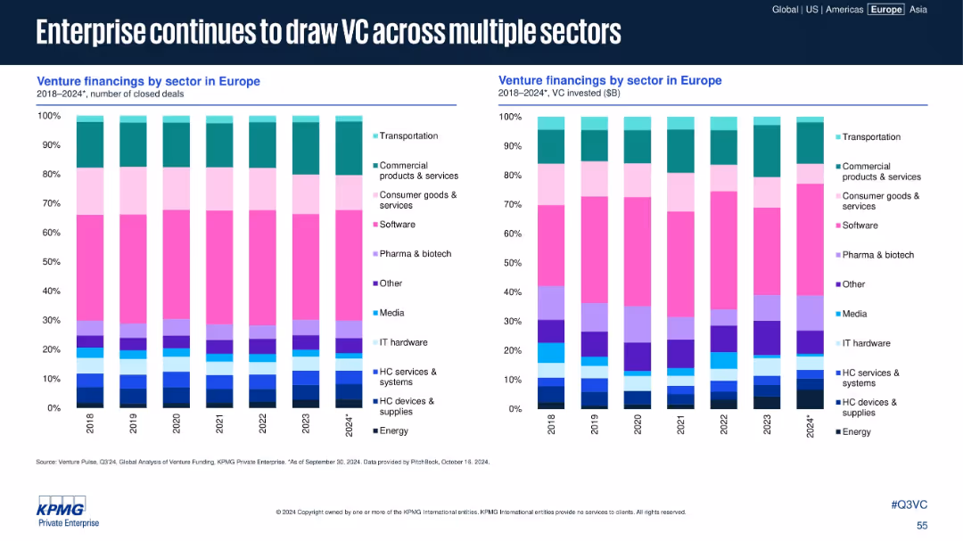
Two stacked bar charts showing sector-wise financing by deal count and VC dollars invested from 2018–2024
Customer and Market Segmentation
Technology & Software
This slide analyzes the distribution of VC investment across sectors in Europe. Enterprise-focused sectors such as software, commercial services, and transportation attract consistent investment, highlighting sustained sector interest.
enterprise, VC sector, software, biotech, transportation, deal count
false
Customer and Market Segmentation
Technology & Software
Multiple Chart
KPMG
Add to my slides
Remove from favorites
The slide includes multiple visual elements, such as a line graph showing historical and projected market size for movie theaters, alongside icons and brief points highlighting shifts in consumer preferences toward online entertainment. The layout is engaging and visually organized.
Market Analysis and Trends
Media & Entertainment
Discusses the lasting impacts of COVID-19 on the entertainment sector, focusing on the shift away from traditional movie theaters towards streaming and gaming. It details how consumer habits have evolved and the strategic implications for the industry, including potential areas for growth in digital entertainment.
entertainment trends, COVID-19 impact, streaming growth, gaming, market analysis, consumer behavior, structural change
false
Market Analysis and Trends
Media & Entertainment
Mixed Chart
BCG
Add to my slides
Remove from favorites
Spider chart showing various services and offerings for entrepreneurs, categorized by Cash & Transacting, Ecosystem, Debt Financing, etc.
Product and Service Analysis
Financial Services
Outlines the suite of services offered by the bank to entrepreneurs, categorized into different areas such as cash management and financing.
Entrepreneur services, offering suite, cash management, debt financing, ecosystem
false
Product and Service Analysis
Financial Services
Single Chart
Credit Suisse
Add to my slides
Remove from favorites
The slide shows a structured layout with a combination of text boxes detailing the key components and impacts of the TEF Entrepreneurship Programme.
Client Case Studies
Professional Services
Discusses the achievements of the Tony Elumelu Foundation's entrepreneurship programme, including its impact on job creation and business development in Africa.
entrepreneurship, Tony Elumelu Foundation, business development, Africa, impact assessment
false
Client Case Studies
Professional Services
Diagram
Accenture
Add to my slides
Remove from favorites
Country-wise horizontal bar chart split across three response options
Regulatory and Compliance
Government & Public Sector
This slide breaks down opinions on refugee entry routes by country. Lithuania and Romania favor current routes, while Nigeria and Kenya strongly support expanded legal pathways. Türkiye and Malaysia show notable opposition to providing authorized entry routes.
entry policy, country comparison, authorized routes, Ipsos, public opinion, migration, legal access
false
Regulatory and Compliance
Government & Public Sector
Mixed Chart
IPSOS
Add to my slides
Remove from favorites
Bar chart with response categories about authorized entry routes and corresponding support levels
Regulatory and Compliance
Government & Public Sector
The slide assesses global support for refugee entry methods. While 36% believe existing authorized routes are enough, 31% support expanding legal pathways. A smaller portion (14%) oppose providing any authorized routes. Results show divided views on refugee entry legality.
entry routes, refugee policy, legal migration, Ipsos, global average, access, support levels
false
Regulatory and Compliance
Government & Public Sector
Mixed Chart
IPSOS
Add to my slides
Remove from favorites
A slide with a block of text on the left and an illustration of a person with a recycling symbol on their shirt on the right.
Industry Overview
Environmental Services & Sustainability
Discusses the positive impact of the pandemic on environmental awareness and actions taken by individuals to help the environment.
Environment, Action, Millennials, Gen Z, Pandemic, Optimism, Climate Change, Individual Impact
false
Industry Overview
Environmental Services & Sustainability
Mixed Chart
Deloitte
Add to my slides
Remove from favorites
This slide features a column chart listing various environmental actions and the likelihood of people taking them in 2021. The chart uses two colors to indicate "Likely" and "Unlikely."
Market Analysis and Trends
Environmental Services & Sustainability
The slide shows survey results on the likelihood of individuals taking different environmental actions in 2021, highlighting the popularity of lower-impact actions over higher-impact ones.
environmental actions, likelihood, survey, 2021, impact
false
Market Analysis and Trends
Environmental Services & Sustainability
Multiple Chart
IPSOS
Add to my slides
Remove from favorites
The slide presents a timeline with goals for emission reductions across various scopes and a graphical representation of the company's influence on these scopes.
Strategic Planning
Environmental Services & Sustainability
Michelin's slide shows their 2030 environmental ambition to reach net-zero emissions by 2050, including specific targets for CO2 reduction and improvements in energy efficiency.
Environmental Ambition, Net-Zero Emissions, Michelin, CO2 Reduction, Energy Efficiency, Sustainability Goals, 2030 Targets, 2050 Vision, Corporate Responsibility
false
Strategic Planning
Environmental Services & Sustainability
Table
Morgan Stanley
Add to my slides
Remove from favorites
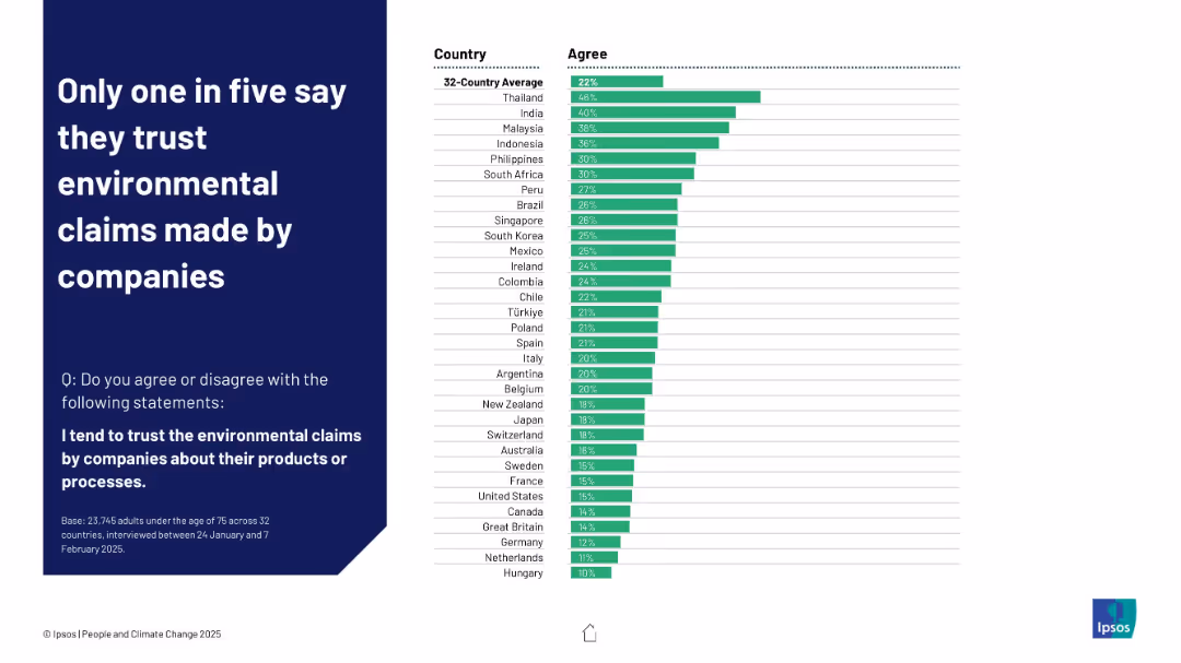
Horizontal bar chart with green bars showing agreement levels by country, average at top
Customer and Market Segmentation
Consumer Goods
This slide presents global trust levels in environmental claims made by companies. The 32-country average is 22%, with higher trust in Thailand and India and lowest in Hungary and the Netherlands, showing widespread skepticism.
environmental claims, trust, companies, Ipsos, public opinion, greenwashing, corporate credibility, perception, consumer behavior
false
Customer and Market Segmentation
Consumer Goods
Mixed Chart
IPSOS
Add to my slides
Remove from favorites
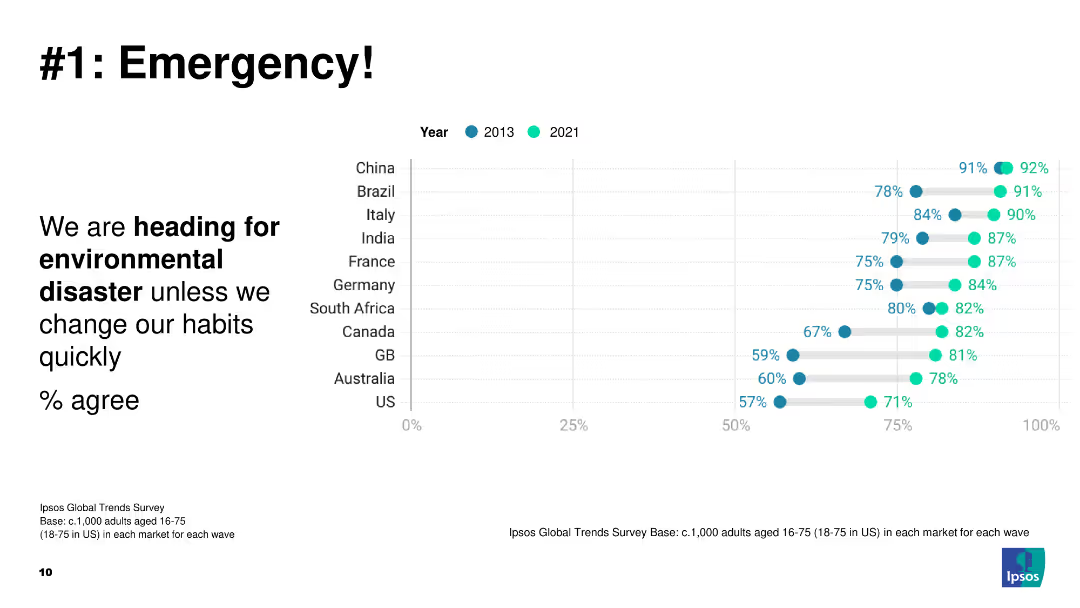
A dot plot showing the percentage of people agreeing that we are heading for environmental disaster unless habits change, comparing data from 2013 and 2021 across several countries.
Risk Assessment and Management
Environmental Services & Sustainability
The slide presents a critical view of global perceptions regarding environmental disaster. It compares data from 2013 and 2021, highlighting the urgency and growing awareness of the need for environmental action.
environmental disaster, global awareness, risk management, perception change, comparative data
false
Risk Assessment and Management
Environmental Services & Sustainability
Mixed Chart
IPSOS
Add to my slides
Remove from favorites
Features a line graph tracking the reduction in the environmental footprint, with key metrics on water, waste, solvents, energy, and CO2 emissions.
Operational Efficiency
Industrial & Manufacturing
The slide details Michelin's achievements in reducing its environmental footprint through various initiatives, with targets set for 2030 illustrated in a descending line graph.
Environmental Footprint, Michelin, Reduction, Sustainability, Metrics, 2030 Targets, Waste Management, Energy Use, CO2 Emissions, Operational Efficiency
false
Operational Efficiency
Industrial & Manufacturing
Mixed Chart
Morgan Stanley
Add to my slides
Remove from favorites
Slide displays a table aligning identified hotspots for environmental impacts with potential mitigation options discussed during brainstorming sessions with experts.
Product and Service Analysis
Environmental Services & Sustainability
Provides a detailed list of environmental hotspots and corresponding mitigation strategies that could be implemented in ground station operations.
environmental impact, hotspots, mitigation strategies, table, ground stations, brainstorming, sustainability, solutions
false
Product and Service Analysis
Environmental Services & Sustainability
Table
Deloitte
Add to my slides
Remove from favorites
Column charts tracking company actions to reduce negative marketing impacts on the environment from February 2020 to September 2022, showing varying levels of activity across different aspects like product changes and marketing promotions.
Customer and Market Segmentation
Professional Services
Reviews environmental actions taken by companies to mitigate the negative impacts of their marketing activities, showing trends over time and highlighting areas where pre-COVID levels of activity have not been regained.
Environmental Impact, Marketing, Column Chart, Pre-COVID Levels, Trend Analysis, 2020-2022
false
Customer and Market Segmentation
Professional Services
Single Chart
Deloitte
Add to my slides
Remove from favorites
Features multiple column charts comparing the percentage of companies undertaking various eco-friendly marketing actions over three years.
Market Analysis and Trends
Environmental Services & Sustainability
Discusses trends in companies' eco-friendly marketing practices over time, highlighting a decrease in environmentally focused actions.
environmental impact, marketing trends, sustainability, business strategy, ecological concerns
false
Market Analysis and Trends
Environmental Services & Sustainability
Single Chart
Deloitte
Add to my slides
Remove from favorites
A table showing environmental impacts categorized by different metrics like climate change and resource use, with specific indicators highlighted for focus.
Regulatory and Compliance
Environmental Services & Sustainability
Provides a detailed analysis of the environmental impacts of the Kiruna-1 ground station, using life cycle assessment data to emphasize significant areas such as climate change and resource depletion.
Environmental impacts, lifecycle assessment, Kiruna-1, climate change, resource use, impact analysis, sustainability, environmental metrics
false
Regulatory and Compliance
Environmental Services & Sustainability
Table
Deloitte
Add to my slides
Remove from favorites
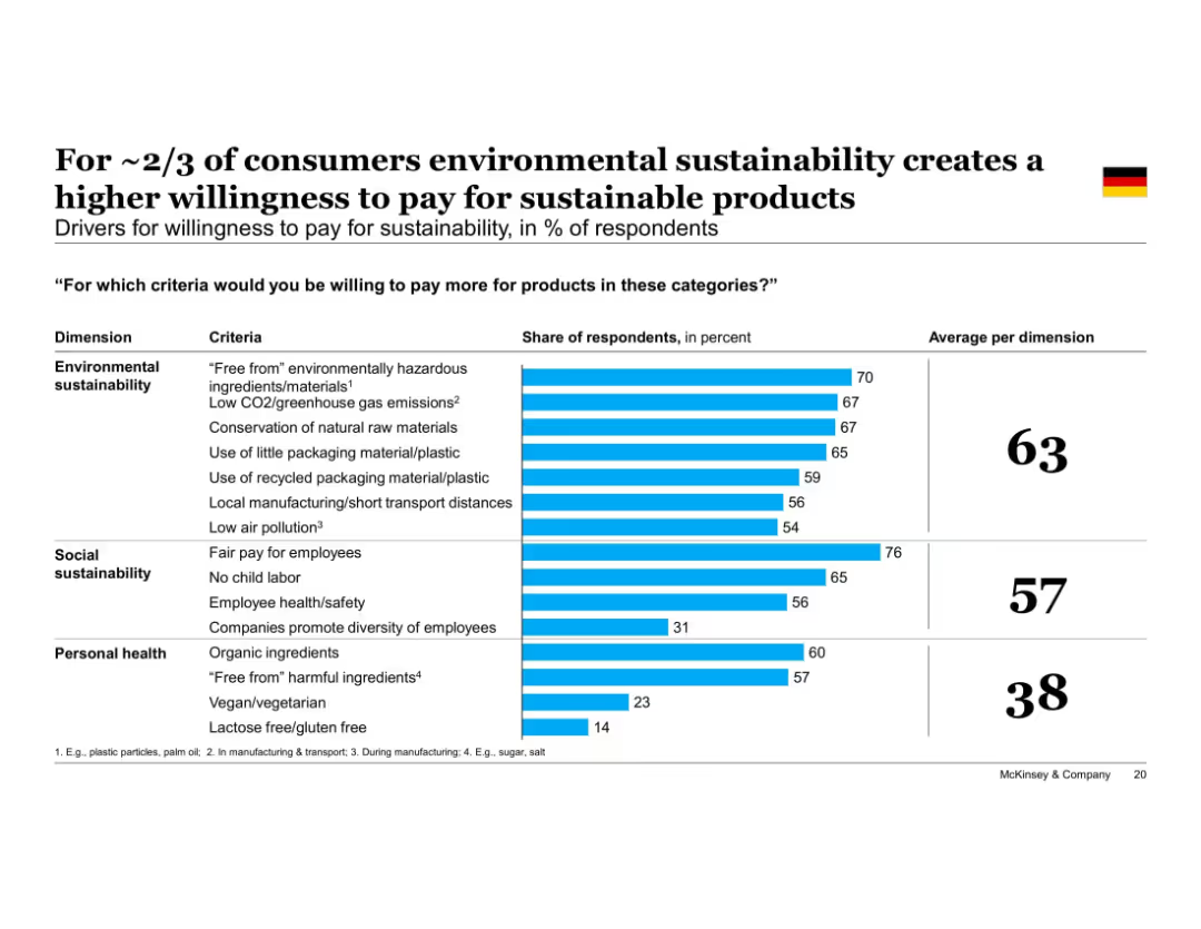
Horizontal bar chart comparing drivers across three dimensions—Environmental, Social, and Personal Health—with specific criteria listed; right panel summarizes in bold, numeric format on dark blue.
Strategic Planning
Consumer Goods
Environmental sustainability drivers (e.g., low emissions, reduced packaging) are the strongest motivators for paying more, followed by social factors like fair pay. Personal health plays a lesser role overall.
environmental impact, sustainability drivers, personal health, social responsibility, packaging, emissions, consumer behavior
false
Strategic Planning
Consumer Goods
Single Chart
McKinsey
Add to my slides
Remove from favorites
Slide shows a complex graphical representation of impact distribution across various infrastructure elements like buildings, power plants, and air conditioning systems. The use of color coding helps distinguish between different sources of impact.
Product and Service Analysis
Environmental Services & Sustainability
This slide examines the specific environmental impacts attributed to various infrastructure components of Kiruna-1, focusing on mineral resource use and toxicity.
environmental, infrastructure, resource use, toxicity, satellite, color-coded graphs, sustainability, impact distribution
false
Product and Service Analysis
Environmental Services & Sustainability
Single Chart
Deloitte
Add to my slides
Remove from favorites
The slide features a quadrant chart categorizing industry segments by near-term and long-term outlooks. Text boxes describe each segment.
Market Analysis and Trends
Environmental Services & Sustainability
The slide analyzes the near-term and long-term performance outlook of various industry segments related to environmental services.
Environmental, outlook, restoration, consulting, recycling, services, near-term, long-term, industry, response
false
Market Analysis and Trends
Environmental Services & Sustainability
Header Vertical
LEK
Add to my slides
Remove from favorites
A column chart shows the distribution of fleet age against 'eco' status, with a small chart on orders reflecting regulatory impact.
Regulatory and Compliance
Transportation & Logistics
Analyzes the impact of environmental regulations on fleet operations, focusing on compliance costs and operational adjustments in shipping.
environmental regulations, fleet management, compliance, shipping industry, operational adjustments
false
Regulatory and Compliance
Transportation & Logistics
Mixed Chart
Deutsche Bank
Add to my slides
Remove from favorites
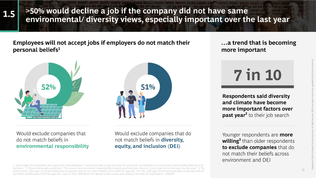
Pie charts showing percentages of employees declining jobs based on environmental and diversity views; text discussing this trend.
Regulatory and Compliance
Professional Services
Discusses the increasing importance of alignment with personal beliefs on environmental and diversity issues in job acceptance decisions.
environmental responsibility, diversity views, job acceptance, employee beliefs, corporate values, DEI, sustainability
false
Regulatory and Compliance
Professional Services
Multiple Chart
BCG
Add to my slides
Remove from favorites
The slide includes icons and brief descriptions of five environmental services sub-sectors: waste and recycling, specialty waste services, environmental consulting, response and restoration, and industrial in-plant services.
Industry Overview
Environmental Services & Sustainability
The slide provides an overview of the five sub-sectors within environmental services, summarizing the key services and areas of focus for each sub-sector.
Environmental services, waste management, specialty waste, consulting, response and restoration, industrial services
false
Industry Overview
Environmental Services & Sustainability
Pillar
LEK
Add to my slides
Remove from favorites
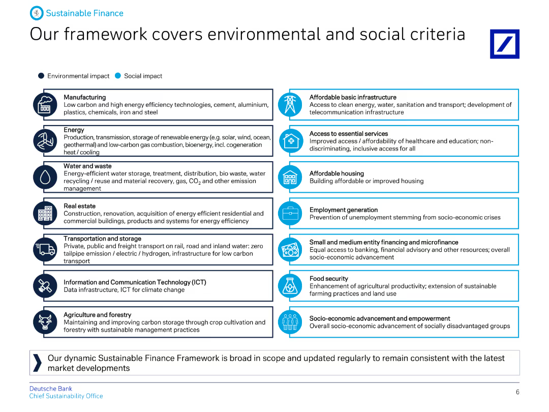
A detailed diagram categorizing various sectors under environmental and social impacts, with icons representing each category and descriptive text.
Regulatory and Compliance
Financial Services
The slide details Deutsche Bank's Sustainable Finance Framework, outlining the environmental and social criteria covered, including sectors like energy, real estate, and ICT.
Environmental, social, criteria, finance, framework, impact, sectors, sustainability, banking, regulation
false
Regulatory and Compliance
Financial Services
Table
Deutsche Bank
Add to my slides
Remove from favorites
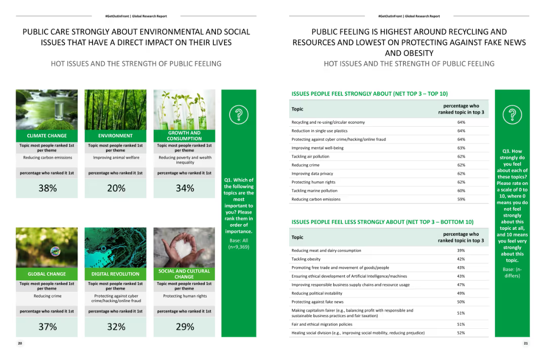
Two comparative layouts with charts and images illustrating public concern on various environmental and social issues.
Market Analysis and Trends
Environmental Services & Sustainability
Discusses the public's concern about environmental and social issues, highlighting the importance of climate change and social justice topics.
environmental, social issues, public concern, climate, social justice
false
Market Analysis and Trends
Environmental Services & Sustainability
Header Horizontal
Deloitte
Add to my slides
Remove from favorites
Contains graphs, images of ships, and text explaining the financial benefits of installing scrubbers on ships as part of an environmental compliance strategy.
Operational Efficiency
Transportation & Logistics
Discusses the economic and environmental considerations of installing scrubbers on ships, showing the cost-benefit analysis over time with market fuel spread data.
environmental strategy, shipping, cost-benefit analysis, fuel efficiency
false
Operational Efficiency
Transportation & Logistics
Mixed Chart
Deutsche Bank
Add to my slides
Remove from favorites
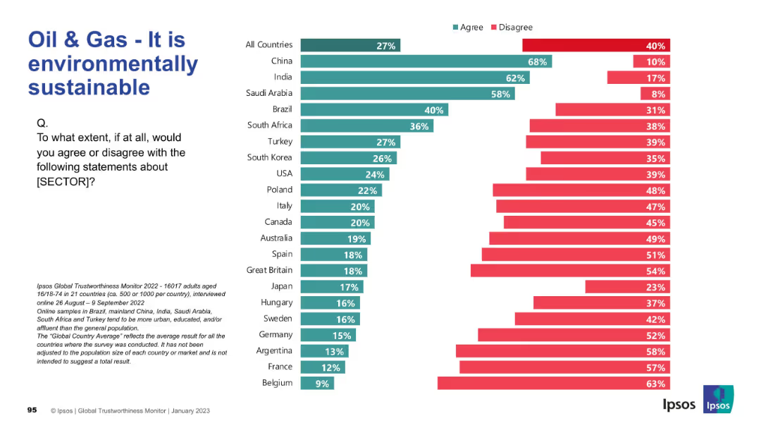
Horizontal bar chart showing public belief in environmental sustainability of oil & gas. Dark green = agree; red = disagree.
Market Analysis and Trends
Energy & Utilities
This slide examines how environmentally sustainable the public perceives the oil & gas sector to be. China, India, and Saudi Arabia report high agreement, while European countries overwhelmingly disagree with the claim.
Environmental Sustainability, Oil & Gas, Climate Impact, Public Sentiment, Energy Sector, Ipsos, Green Practices, Survey Data
false
Market Analysis and Trends
Energy & Utilities
Mixed Chart
IPSOS
Add to my slides
Remove from favorites
This slide contains a series of bar charts depicting the environmental impacts of the Kiruna-1 satellite across multiple indicators like climate change and resource use. Each category of impact is shown in different colors with comparisons between production, infrastructure, operations, and maintenance activities.
Product and Service Analysis
Environmental Services & Sustainability
The slide provides a comprehensive breakdown of the environmental impact of the Kiruna-1 satellite, particularly emphasizing the major contributions from infrastructure in terms of resource use and emissions.
environmental, sustainability, satellite, infrastructure, emissions, climate change, resource use, bar charts, impact assessment
false
Product and Service Analysis
Environmental Services & Sustainability
Mixed Chart
Deloitte
Add to my slides
Remove from favorites
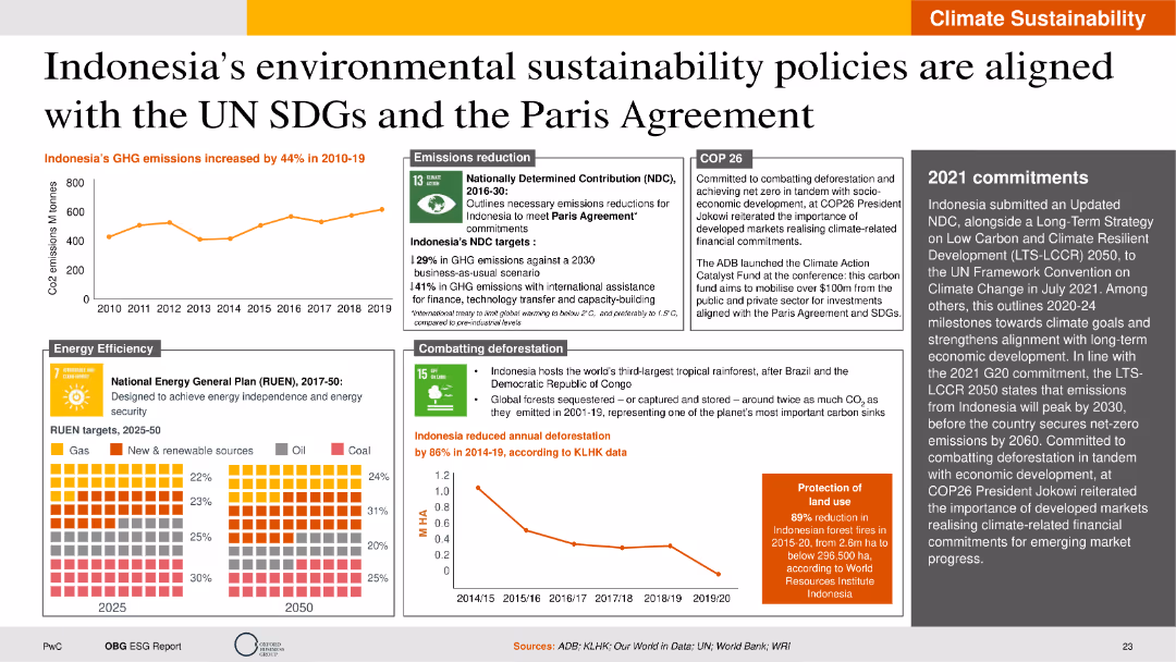
This slide includes line charts, heat maps, and detailed text descriptions. The layout is moderately complex, displaying data on GHG emissions, energy efficiency targets, and deforestation rates.
Regulatory and Compliance
Environmental Services & Sustainability
The slide outlines Indonesia's environmental sustainability policies and their alignment with the UN SDGs and the Paris Agreement. It provides an overview of GHG emission trends, energy efficiency goals, deforestation reduction efforts, and commitments made during COP26. The slide also discusses the role of international assistance and financial investments in achieving these targets.
Environmental sustainability, UN SDGs, Paris Agreement, GHG emissions, energy efficiency
false
Regulatory and Compliance
Environmental Services & Sustainability
Multiple Chart
PwC/Strategy&
Add to my slides
Remove from favorites
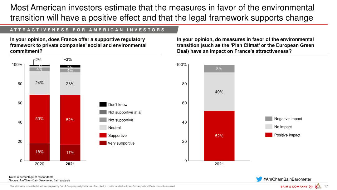
The slide includes two column charts showing the support for France's regulatory framework and the impact of environmental transition measures on attractiveness.
Regulatory and Compliance
Environmental Services & Sustainability
This slide evaluates the support for France's regulatory framework and the positive impact of environmental measures on investment attractiveness.
Environmental transition, Regulatory framework, Positive impact, Sustainability, Legal framework
false
Regulatory and Compliance
Environmental Services & Sustainability
Mixed Chart
Bain
Add to my slides
Remove from favorites
Slide with a pie chart detailing the environmental benefits reported by broadband users, specifically in reduced travel. The chart is complemented by a summary on the right side highlighting significant CO2e savings and user feedback on reduced emissions.
Product and Service Analysis
Telecommunications
Explores the environmental benefits of broadband, such as reduced travel and CO2e savings, as reported by users.
Environment, Broadband, Sustainability, Travel, Emissions, CO2e, Impact, Internet, Reduction
false
Product and Service Analysis
Telecommunications
Multiple Chart
Accenture
Add to my slides
Remove from favorites
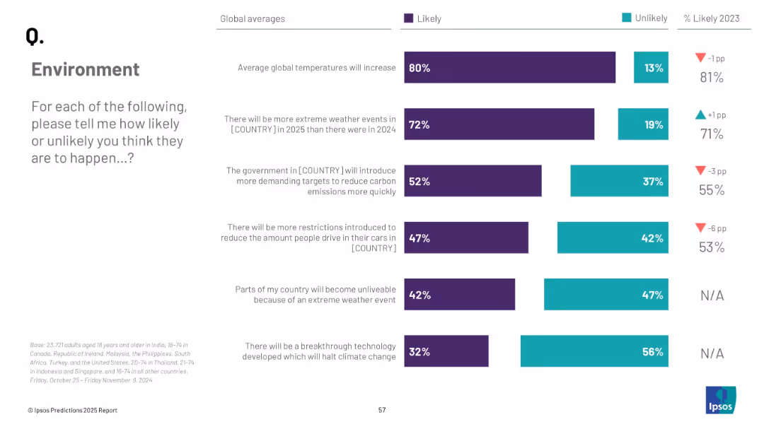
Vertical stacked bars with global averages for various climate-related predictions; mix of teal and purple; structured labels
Market Analysis and Trends
Environmental Services & Sustainability
The slide compiles multiple environmental expectations for 2025, including temperature rise, extreme weather, carbon policies, and technological breakthroughs. Each metric is represented as a percentage of global respondents considering it likely.
environment, climate change, global temperatures, public opinion, carbon policies, breakthrough, survey
false
Market Analysis and Trends
Environmental Services & Sustainability
Mixed Chart
IPSOS
Add to my slides
Remove from favorites
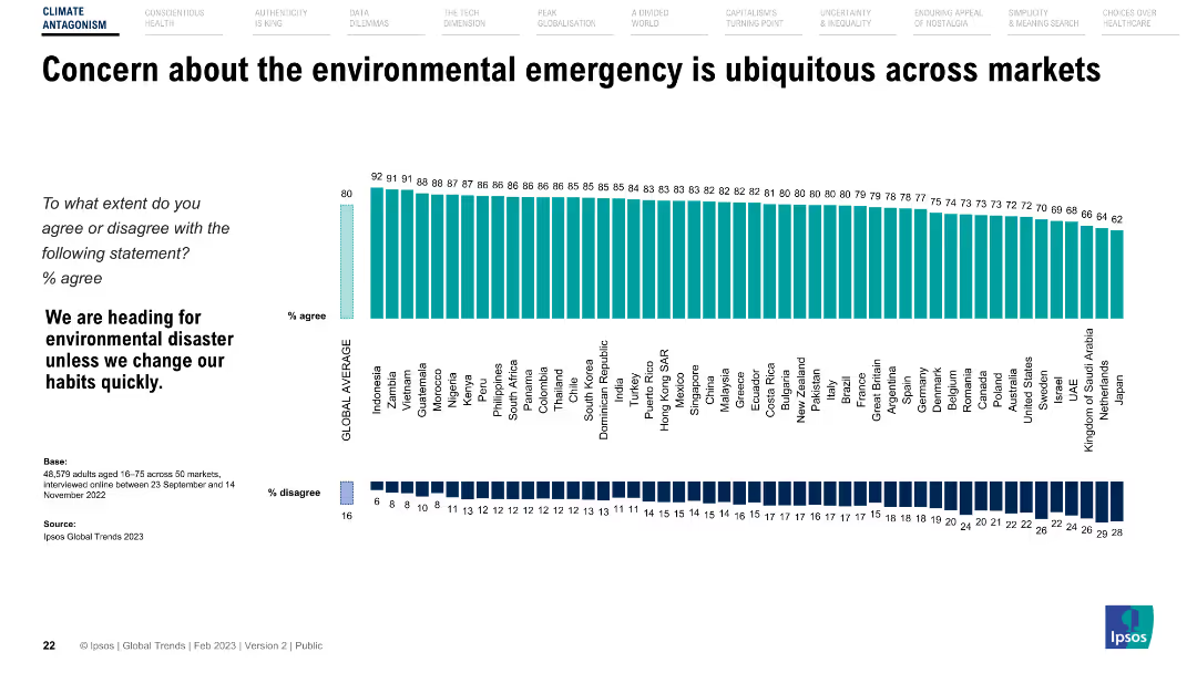
The slide features a horizontal bar chart showing agreement levels with a statement on environmental disaster across different countries.
Market Analysis and Trends
Environmental Services & Sustainability
Presents global survey data on public concern about the environmental emergency, highlighting varying levels of agreement across different countries.
Environment, concern, survey, global trends, countries
false
Market Analysis and Trends
Environmental Services & Sustainability
Multiple Chart
IPSOS
Add to my slides
Remove from favorites
The slide includes a vertical bar chart showing levels of concern about the environmental emergency across various demographic groups.
Market Analysis and Trends
Environmental Services & Sustainability
Breakdown of concern about the environmental emergency by gender, age, marital status, education, income, and working status, indicating broad agreement across groups.
Environment, demographics, concern, survey, global trends
false
Market Analysis and Trends
Environmental Services & Sustainability
Mixed Chart
IPSOS
Add to my slides
Remove from favorites
The slide features a column chart showing total environment-focused PE/VC investments from 2018 to 2023 and a series of bar charts for deal types in different sectors.
Investment Analysis
Environmental Services & Sustainability
This slide highlights trends in environment-focused PE/VC investments, showing total investments over recent years and breaking down investment types by sectors such as waste management and renewable energy.
Environment-focused, PE/VC, Investments, Trends, Sectors, Column Chart, Bar Charts
false
Investment Analysis
Environmental Services & Sustainability
Multiple Chart
EY
Add to my slides
Remove from favorites
The slide combines a paragraph of text on the left and a stylized image of a person on a bike next to trees on the right. The graphics are simple and the layout balances text and image well.
Industry Overview
Environmental Services & Sustainability
Discusses the importance of environmental issues among Millennials and Gen Z, their view on businesses' environmental focus, and the potential for a greener future.
Environment, Millennials, Gen Z, Climate Change, Survey, Business, Optimism, Future
false
Industry Overview
Environmental Services & Sustainability
Mixed Chart
Deloitte
Add to my slides
Remove from favorites
This slide contains a bar chart with horizontal bars comparing the actions taken by Millennials and Gen Z to protect the environment. The bars are color-coded to distinguish between the two groups. The slide also includes a block of text providing context and analysis.
Market Analysis and Trends
Environmental Services & Sustainability
The slide presents survey results showing the environmental actions taken by Millennials and Gen Z, with the text highlighting trends and impacts of these actions. It serves to inform stakeholders about generational differences in environmental responsibility and the influence of the pandemic on these behaviors.
Environment, Millennials, Gen Z, Sustainability, Survey
false
Market Analysis and Trends
Environmental Services & Sustainability
Mixed Chart
Deloitte
Add to my slides
Remove from favorites
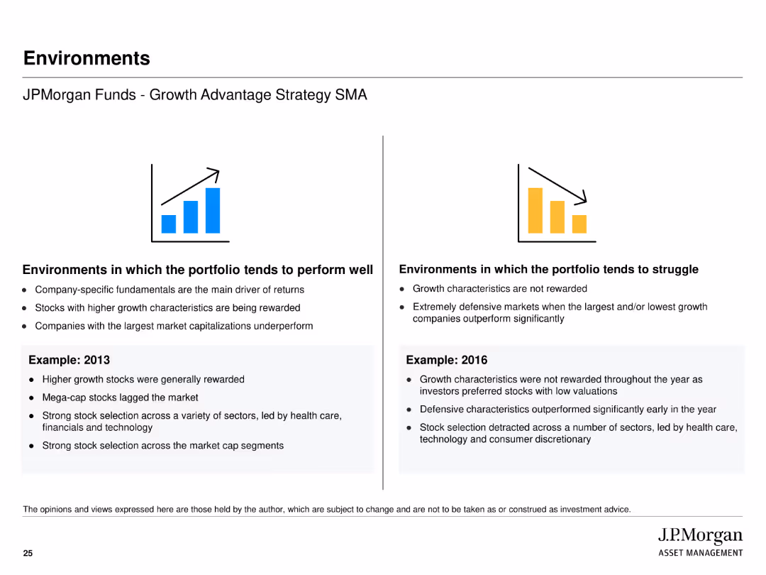
The slide uses icons and text to illustrate environments in which the portfolio tends to perform well or struggle, with examples from 2013 and 2016.
Strategic Planning
Financial Services
Describes the conditions under which J.P. Morgan Funds - Growth Advantage Strategy SMA performs well or poorly, using past performance in different market conditions.
environments, performance, strategy, planning, market conditions, text, image
false
Strategic Planning
Financial Services
Pillar
JP Morgan
Add to my slides
Remove from favorites
The slide is a visually engaging introductory slide with an image of a cross-section between a lush forest and a bird's-eye view of a green landscape. It sets the thematic tone for a discussion on environmental action.
Industry Overview
Environmental Services & Sustainability
Serving as the opening slide for a presentation on environmental initiatives in 2022, it sets the stage for discussing new challenges and moving from theoretical promises to actionable solutions in sustainability.
environment, sustainability, challenges, action, introduction
false
Industry Overview
Environmental Services & Sustainability
Title
Bain
Add to my slides
Remove from favorites
Contains infographics detailing e-money statistics and competitive landscape. It includes graphical representation of active e-wallets and transaction volumes.
Technology and Digital Transformation
Financial Services
Details the growth and competitive landscape of the e-payments sector in the Philippines, highlighting significant investments and transactions.
e-payments, digital, Philippines, transactions, growth
false
Technology and Digital Transformation
Financial Services
Table
Deloitte
Add to my slides
Remove from favorites
Highly detailed slide with tables and color-coded metrics covering epidemic progression, economic impact, and business impact.
Risk Assessment and Management
Government & Public Sector
Offers a comprehensive snapshot of various metrics relevant to COVID-19's impact, useful for data-driven decision-making.
Epidemic Progression, Economic Impact, Consumer Activity, Business Impact, Mobility, Trade, Emissions
false
Risk Assessment and Management
Government & Public Sector
Table
BCG
Add to my slides
Remove from favorites
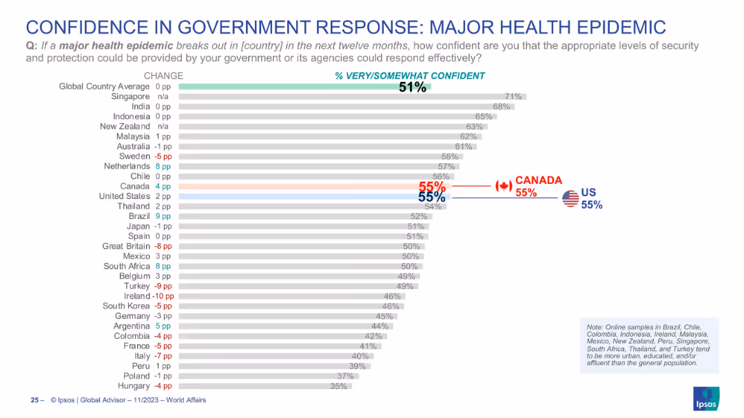
Bar chart visualizing public confidence in national government responses to health epidemics; Canada and US are marked clearly.
Regulatory and Compliance
Healthcare & Pharmaceuticals
The slide represents how confident citizens are in their government’s ability to respond to a major health epidemic. The global average of confidence is 51%, with both the US and Canada showing 55%. It sheds light on public trust in institutional crisis management and preparedness, particularly after the COVID-19 experience.
epidemic response, public confidence, government trust, healthcare, preparedness, Canada, USA, Ipsos
false
Regulatory and Compliance
Healthcare & Pharmaceuticals
Single Chart
IPSOS
Add to my slides
Remove from favorites
Previous
Next
You don't have any favorites yet.
Please wait loading your favorites slides...
Create a FREE account to continue browsing
Receive Instant Access to 1,000+ slides from companies like McKinsey, Google, and Goldman Sachs
First Name
Last Name
Email
Password
I agree to all
Terms & Privacy Policy
Thank you! Your submission has been received!
Oops! Something went wrong while submitting the form.
Have an account?
Sign in
Upgrade to PRO to Save slides
Advanced Search and Filters
Access to 15,000+ slides
Access to Category Pages
Save/Bookmark Slides
PowerPoint Template Library
Pick a Plan
MONTHLY
$12/month
Billed every month, Cancel anytime.
YEARLY
$9/year
Billed $108 annually, Cancel anytime.
Checkout for $12/month
Checkout for $108/yr
Secured by Stripe | AES-256 bit encryption


![Q. Which of these statements, if any, do you most agree with regarding refugees’ routes of entry into [COUNTRY]?](https://cdn.prod.website-files.com/654e70fb59937215cac87b19/6899ca4bd4a1c19ad4b36d90_i__NIwNQaefms0e_1vlW5_xRXI4pb9mL-TVlMF2gWec.avif)
![Q. Which of these statements, if any, do you most agree with regarding refugees’ routes of entry into [COUNTRY]?](https://cdn.prod.website-files.com/654e70fb59937215cac87b19/6899ca47f5e72ed50e4a7c9c_LtfIhc9_rP5OCy_vUh4AN9JaocGaYLnkXzNRD8FSO1s.avif)