My Account
My Slides
Search by Category
Companies
Slide Type
Use Case
Industry
Pricing
Templates
View All Templates
Download Template Slides
✦ AI
AI Prompt Library
AI Search
Feedback
Login
Logout
Get Started
Browse all Slides
Browse all Slides
Create a FREE Account
Instant access to 1,000+ real slides from top companies like McKinsey, BCG, Goldman Sachs, Google and many more!
First Name
Last Name
Email
Password
I agree to all
Terms & Privacy Policy
Thank you! Your submission has been received!
Oops! Something went wrong while submitting the form.
Have an account?
Sign in
Saved Slides
Total No. of slides saved
0
↻ Refresh
✖ Clear all
Four-column layout with icons and pink section headers; text beneath each icon in shaded gray boxes; white background with magenta accents; left sidebar navigation showing section "1 Pandemics & Other Challenges" highlighted.
Industry Overview
Healthcare & Pharmaceuticals
This slide outlines four pressing global health challenges: preparing for epidemics, antimicrobial resistance (AMR), climate change as a health crisis, and closing the global healthcare gap. Each section highlights key issues and implications, emphasizing prevention, innovation, and global health equity.
epidemics, AMR, climate crisis, healthcare gap, global health, prevention, equity, infectious disease, health systems, WHO
false
Industry Overview
Healthcare & Pharmaceuticals
Pillar
Roland Berger
Add to my slides
Remove from favorites
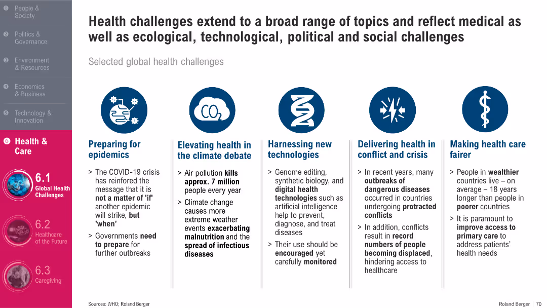
Horizontal layout with five equal-width text boxes, each under a circular icon; clean and symmetric presentation
Strategic Planning
Healthcare & Pharmaceuticals
The slide outlines five major global health challenges: epidemics, climate-linked health issues, new health technologies, healthcare during conflict, and fairer access. It emphasizes the complex interplay of medical, ecological, and societal factors in shaping global health responses.
Epidemics, Climate Change, Health Tech, Conflict, Access, Equity
false
Strategic Planning
Healthcare & Pharmaceuticals
Pillar
Roland Berger
Add to my slides
Remove from favorites
Bar chart layout (2011–2017) on left, text explanations on the right in bullet format; uses pink bars and gray text; background includes faded virus image; structured and clean design; left-hand navigation visible.
Risk Assessment and Management
Healthcare & Pharmaceuticals
Shows data on annual epidemic events and explains why local epidemics can become global pandemics. Key factors discussed include globalization, mutation speed, and long-term health impacts. Emphasizes the importance of early containment and preparedness in mitigating the spread and consequences of epidemics.
epidemics, local outbreaks, pandemic risk, containment, global health, virus spread, globalization
false
Risk Assessment and Management
Healthcare & Pharmaceuticals
Mixed Chart
Roland Berger
Add to my slides
Remove from favorites
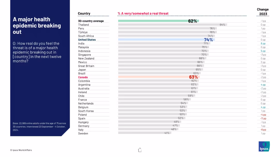
Bar graph ranking countries by perceived threat level of a major health epidemic, with color highlights for U.S. and Canada.
Risk Assessment and Management
Healthcare & Pharmaceuticals
This slide displays survey data showing the percentage of people in various countries who feel a major health epidemic is a real threat in the next 12 months. Canada and U.S. are highlighted, with U.S. at 74% concern.
epidemic, threat perception, survey, health risk, public opinion, Ipsos, U.S., Canada, 2024 data, bar chart
false
Risk Assessment and Management
Healthcare & Pharmaceuticals
Mixed Chart
IPSOS
Add to my slides
Remove from favorites
The slide includes multiple data tables and a color-coded regional map reflecting various epidemiological and economic indicators. The layout is well-organized with clear headings and distinct sections for different types of data.
Market Analysis and Trends
Government & Public Sector
This slide presents epidemiological and economic indicators for the Middle East related to a specific event, offering a comparison between countries in the region. It includes tables with numerical data and a map for visual reference, useful for analysis and decision-making in public health and policy.
Epidemiology, Economics, Middle East, Comparison, Policy, Public Health, Data, Analysis, Map, Indicators
false
Market Analysis and Trends
Government & Public Sector
Multiple Chart
McKinsey
Add to my slides
Remove from favorites
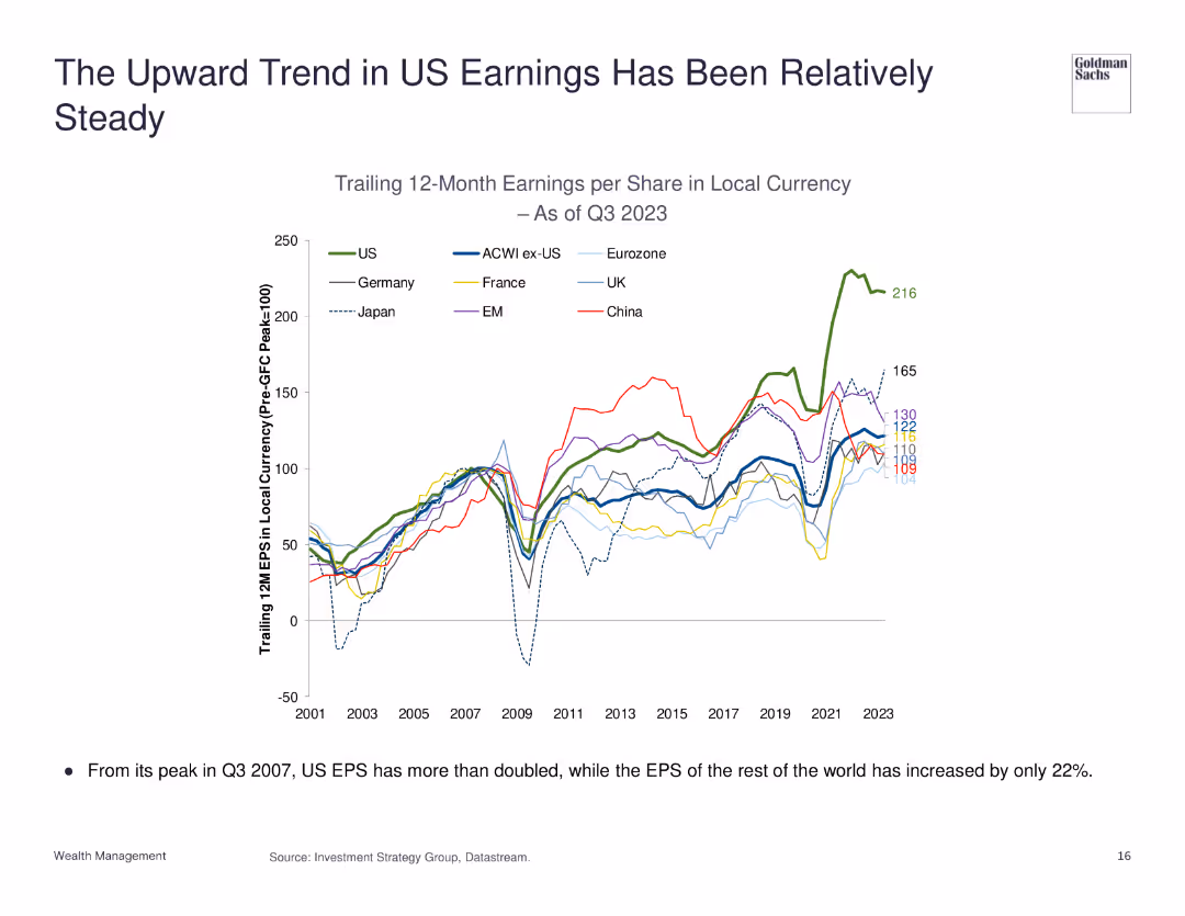
The slide presents a line chart showing the earnings per share (EPS) trends for various regions, with US EPS growth prominently displayed.
Financial Performance
Financial Services
The slide highlights the consistent upward trend in US earnings per share (EPS) over the years, comparing it with the EPS growth of other regions to show relative performance.
EPS, Earnings, US, Performance, Trend
false
Financial Performance
Financial Services
Single Chart
Goldman Sachs
Add to my slides
Remove from favorites
A line chart showing Eaton's adjusted earnings per share (EPS) from 2000 to 2019, with an upward trend noted as an 8% CAGR.
Financial Performance
Financial Services
Provides a clear view of Eaton's long-term earnings growth, reflecting effective financial management and operational efficiency.
EPS, financial growth, Eaton, CAGR, earnings
false
Financial Performance
Financial Services
Single Chart
Deutsche Bank
Add to my slides
Remove from favorites
Two sets of column charts are present. The top set displays regional/style-based expected EPS growth versus actual EPS growth in 2022, using horizontal bars. The bottom set uses vertical bars to show S&P 500 sectors' EPS growth. Red and gray color schemes distinguish between expected and actual figures.
Investment Analysis
Financial Services
This slide examines the expected versus actual earnings per share growth for different regions and S&P 500 sectors, providing insights for investors and market analysts.
EPS growth, corporate earnings, regional analysis, sector performance, financial forecasting, investment strategy
false
Investment Analysis
Financial Services
Multiple Chart
Morgan Stanley
Add to my slides
Remove from favorites
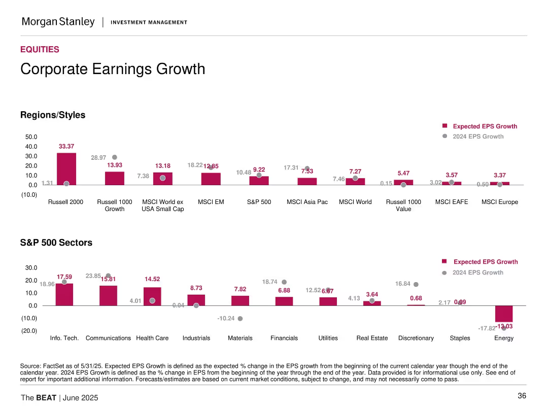
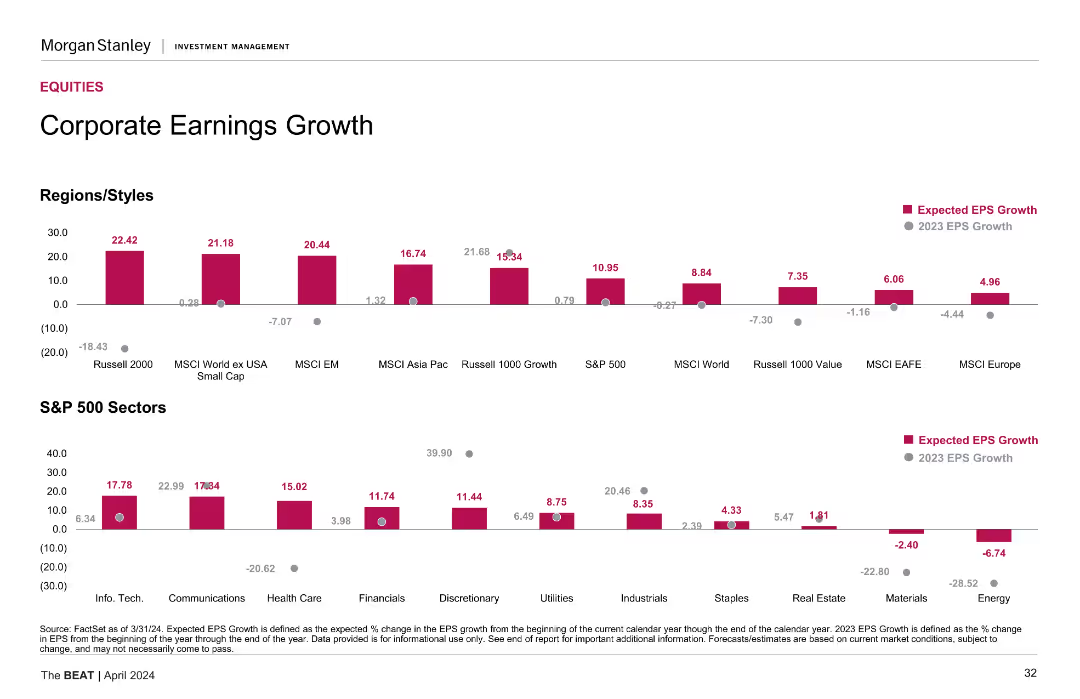
Vertical bar charts segmented by Regions/Styles and S&P 500 Sectors, with EPS growth data for 2024 and 2025.
Financial Performance
Financial Services
The slide presents projected earnings per share (EPS) growth for different global indices and S&P 500 sectors. It highlights strong expected growth in Russell 2000 and Technology, while sectors like Energy and Staples are forecasted to contract. A comparison with 2024 EPS growth is also provided.
EPS growth, earnings forecast, S&P 500 sectors, global indices, financial outlook, bar chart, projections, equities
false
Financial Performance
Financial Services
Multiple Chart
Morgan Stanley
Add to my slides
Remove from favorites
The slide features multiple column charts comparing expected EPS growth across various regions, styles, and S&P 500 sectors. The charts use different colors for clarity.
Financial Performance
Financial Services
The slide shows the expected EPS growth for 2024 in various regions, styles, and S&P 500 sectors, providing a comprehensive view of projected earnings performance.
EPS, growth, financial performance, S&P 500, regions
false
Financial Performance
Financial Services
Multiple Chart
Morgan Stanley
Add to my slides
Remove from favorites
This slide presents a growth trend using a column chart to illustrate EPS growth from FY12 to FY17, with a projection for FY17. The chart uses shades of blue to differentiate the years, accompanied by a rising arrow indicating growth over time. The design is simple yet effective, focusing on financial data.
Financial Performance
Consumer Goods
The slide discusses Tyson's EPS growth over a five-year period, projecting future earnings. It emphasizes the company’s consistent financial growth and strategic financial planning, aiming to inform investors and stakeholders about its financial health and future earnings potential.
EPS, Growth, Financial, Projection, Tyson, Analysis
false
Financial Performance
Consumer Goods
Single Chart
Barclays
Add to my slides
Remove from favorites
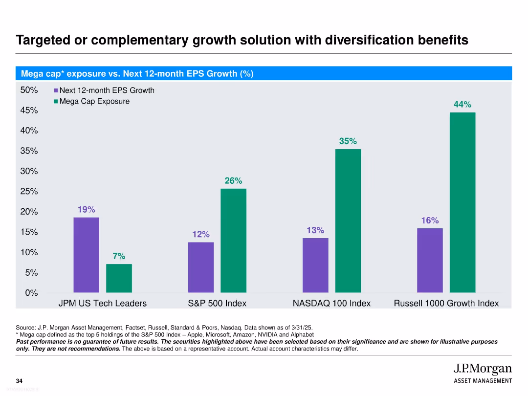
Bar chart compares next 12-month EPS growth vs. mega cap exposure across four indices. Two colors (purple and green) clearly distinguish variables. Simple structure with white background and bold headings.
Investment Analysis
Financial Services
This slide contrasts J.P. Morgan’s US Tech Leaders strategy with broader indices (S&P 500, NASDAQ 100, Russell 1000 Growth) on two metrics: expected EPS growth and mega cap exposure. It demonstrates that the JPM strategy offers higher expected growth with significantly lower mega cap concentration, suggesting a diversified approach with strong upside potential.
EPS growth, mega cap exposure, diversification, J.P. Morgan, tech leaders, S&P 500, NASDAQ, Russell 1000, investment strategy, index comparison
false
Investment Analysis
Financial Services
Single Chart
JP Morgan
Add to my slides
Remove from favorites
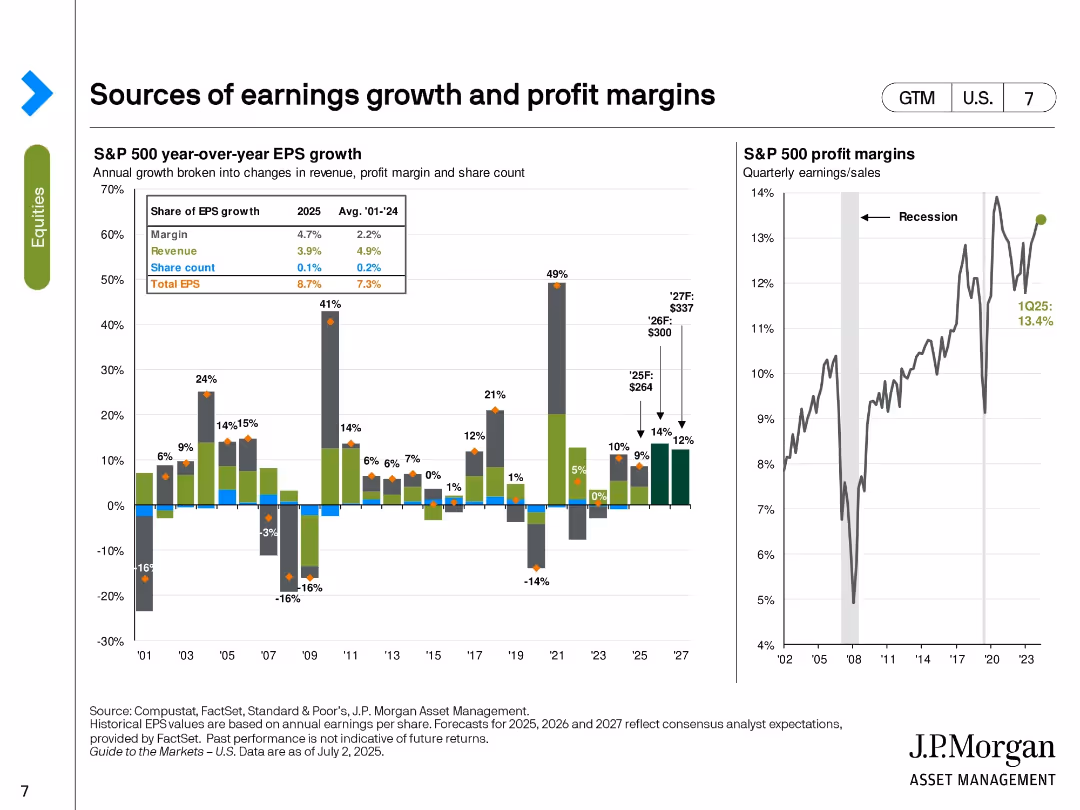
Bar and line charts showing EPS growth components and historical profit margins. EPS is broken down by margin, revenue, and share count changes.
Performance Metrics and KPIs
Financial Services
The slide illustrates the breakdown of S&P 500 EPS growth in 2025, emphasizing margins as the largest contributor (4.7%). It also includes a line chart tracking profit margins over time, highlighting a recent level of 13.4% in Q1 2025. Forecasts for EPS and margins through 2027 are included.
EPS growth, profit margin, revenue, share count, S&P 500, forecast, earnings, financial performance, historical trends
false
Performance Metrics and KPIs
Financial Services
Multiple Chart
JP Morgan
Add to my slides
Remove from favorites
The slide features two column charts: one for EPS growth of various regions/styles and one for S&P 500 sectors, comparing expected EPS growth with previous year's growth.
Market Analysis and Trends
Financial Services
This slide analyzes the expected corporate earnings growth across different regions, styles, and S&P 500 sectors, comparing it with the previous year's growth figures.
EPS growth, regions, S&P 500, earnings, analysis
false
Market Analysis and Trends
Financial Services
Multiple Chart
Morgan Stanley
Add to my slides
Remove from favorites
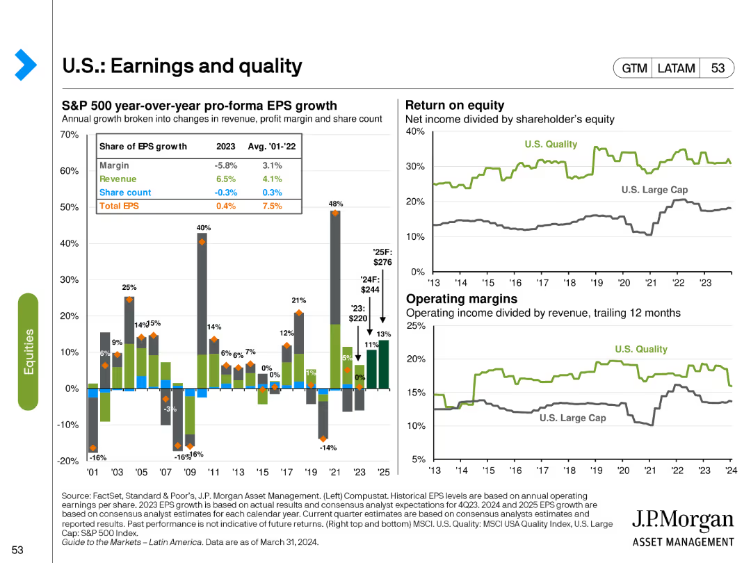
The slide features a bar chart for S&P 500 EPS growth components and line charts for return on equity and operating margins. Different colors and markers highlight various aspects of earnings growth and quality.
Financial Performance
Financial Services
It analyzes the components of EPS growth, return on equity, and operating margins for U.S. equities, providing insights into the quality and sustainability of earnings in the S&P 500 index.
EPS growth, return on equity, operating margins, S&P 500, financial quality
false
Financial Performance
Financial Services
Multiple Chart
JP Morgan
Add to my slides
Remove from favorites
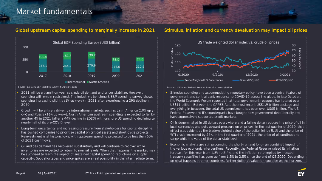
The slide features two column charts, one showing global E&P spending survey results and another line chart showing the US trade-weighted dollar index vs. crude oil prices.
Market Analysis and Trends
Energy & Utilities
It presents data on global upstream capital spending and the impact of economic factors like stimulus, inflation, and currency devaluation on oil prices.
E&P spending, capital, oil prices, trade-weighted dollar, inflation
false
Market Analysis and Trends
Energy & Utilities
Multiple Chart
EY
Add to my slides
Remove from favorites
Same layout as 18621 but for 1Q23–4Q24. Six line charts showing financial performance metrics. Title is bold and centered.
Financial Performance
Technology & Software
Shows previous year’s quarterly financial performance across six key metrics. Helps compare historical trends with more recent data in 18621. Displays growth and inflection points across revenue, EBITDA, EPS, and cash flow.
EPS, revenue, EBITDA, NCVI, contract value, financial overview
false
Financial Performance
Technology & Software
Multiple Chart
Gartner
Add to my slides
Remove from favorites
The slide features a table, a column chart showing net revenues by segment, and a section with bullet points highlighting financial overview. The design is moderate with a clear visual hierarchy.
Financial Performance
Financial Services
This slide provides a financial overview of a company’s quarterly results, comparing current and past figures. It is likely used to communicate financial health to stakeholders or in investor presentations. Data includes earnings per share, net revenues, and a breakdown of financial results by banking and market segment.
EPS, ROE, Net Revenues, Global Banking, Asset & Wealth Management
false
Financial Performance
Financial Services
Mixed Chart
Goldman Sachs
Add to my slides
Remove from favorites
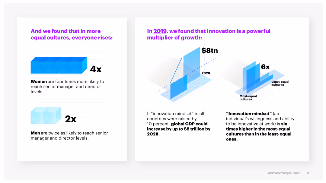
The slide features two parts: a column chart on the left showing the increased likelihood of women and men reaching senior levels in more equal cultures, and a column chart on the right showing innovation benefits.
Market Analysis and Trends
Professional Services
It shows that more equal cultures lead to higher chances for women and men to advance to senior roles and highlights the potential global economic impact if innovation mindsets are improved.
equal cultures, advancement, innovation, economic impact
false
Market Analysis and Trends
Professional Services
Multiple Chart
Accenture
Add to my slides
Remove from favorites
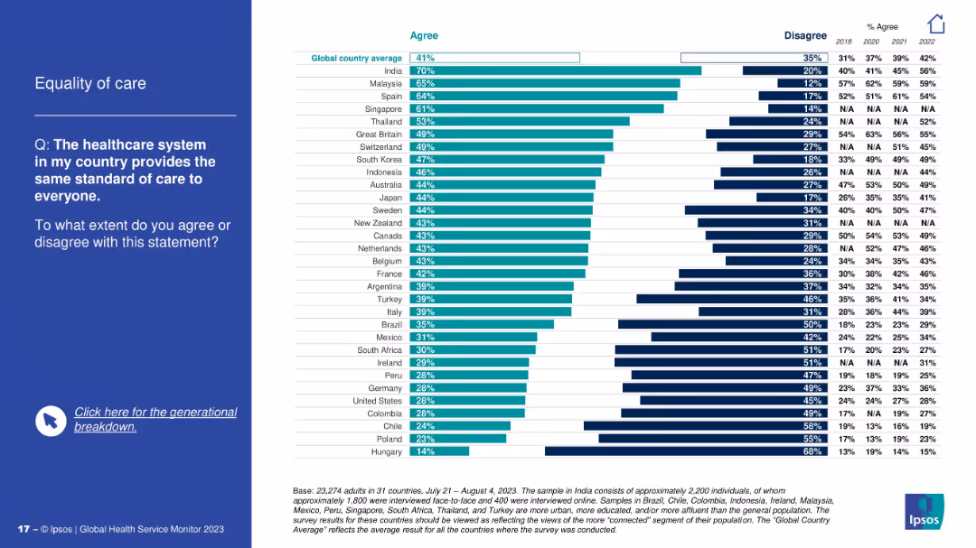
Bar chart with countries agreeing/disagreeing that care is equally provided; question on left.
Risk Assessment and Management
Healthcare & Pharmaceuticals
This slide evaluates whether citizens believe their healthcare system delivers equal care to all. India and Malaysia top agreement, while Hungary and Poland report lowest agreement, suggesting disparities in healthcare equity perception.
equality, access to care, healthcare fairness, disparities, patient trust, survey, Ipsos, comparison
false
Risk Assessment and Management
Healthcare & Pharmaceuticals
Mixed Chart
IPSOS
Add to my slides
Remove from favorites
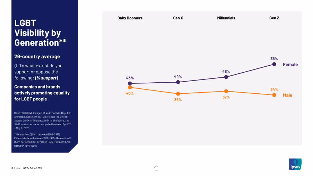
Line chart on the right displaying generational support trends by gender; dark blue text panel on left.
Market Analysis and Trends
Government & Public Sector
Generational support for corporate advocacy of LGBT equality is displayed, with Gen Z women showing the highest support (58%). Male support declines slightly with younger generations.
equality, companies, LGBT, support, generational trends, corporate activism
false
Market Analysis and Trends
Government & Public Sector
Mixed Chart
IPSOS
Add to my slides
Remove from favorites
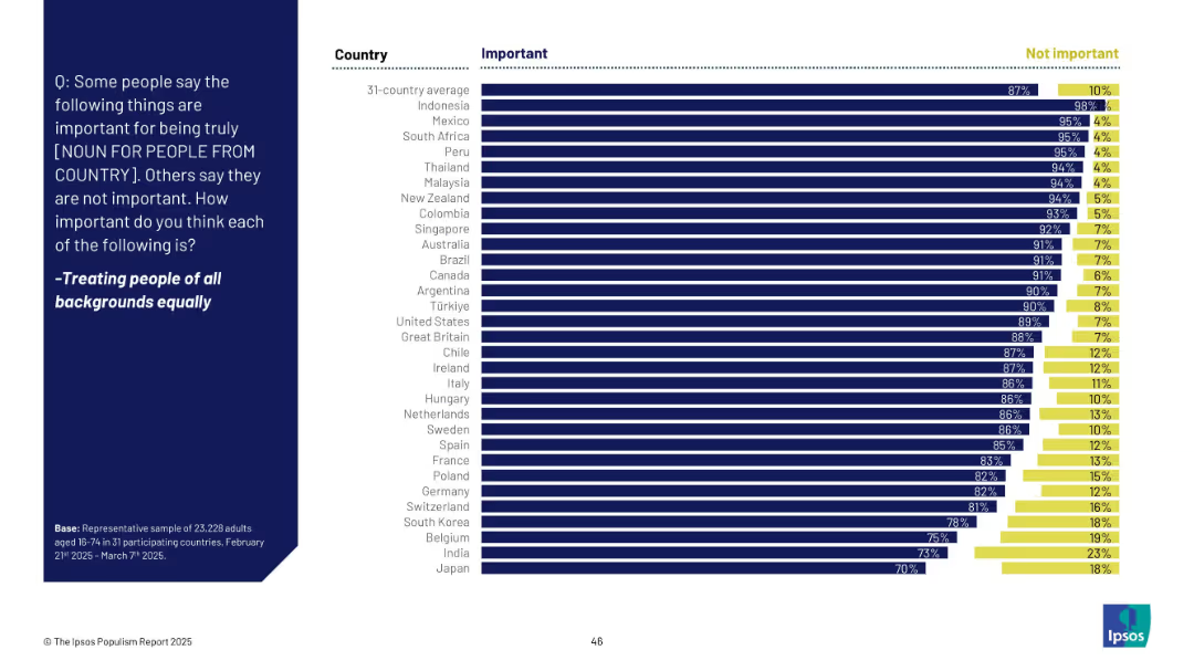
Horizontal bar chart similar in structure to slide 18911, comparing "Important" and "Not important" across countries.
Market Analysis and Trends
Government & Public Sector
The slide compares global public opinion across 31 countries regarding the importance of treating people from all backgrounds equally. Overwhelming majorities in nearly all countries consider this important, especially Indonesia (98%).
equality, diversity, inclusion, national values, public opinion, global, Ipsos, bar chart, fairness
false
Market Analysis and Trends
Government & Public Sector
Mixed Chart
IPSOS
Add to my slides
Remove from favorites
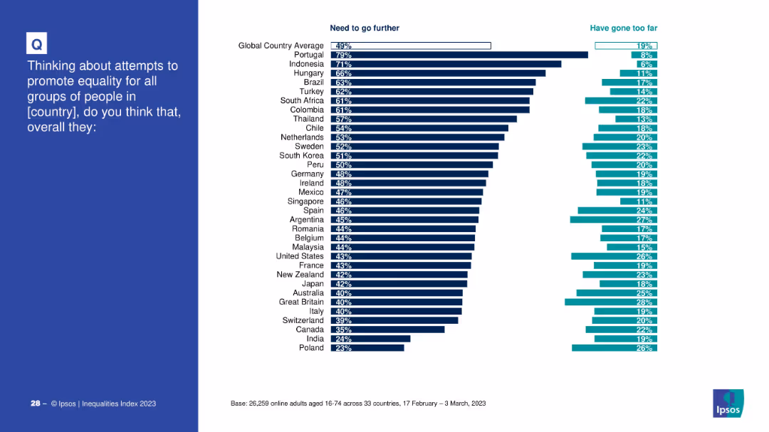
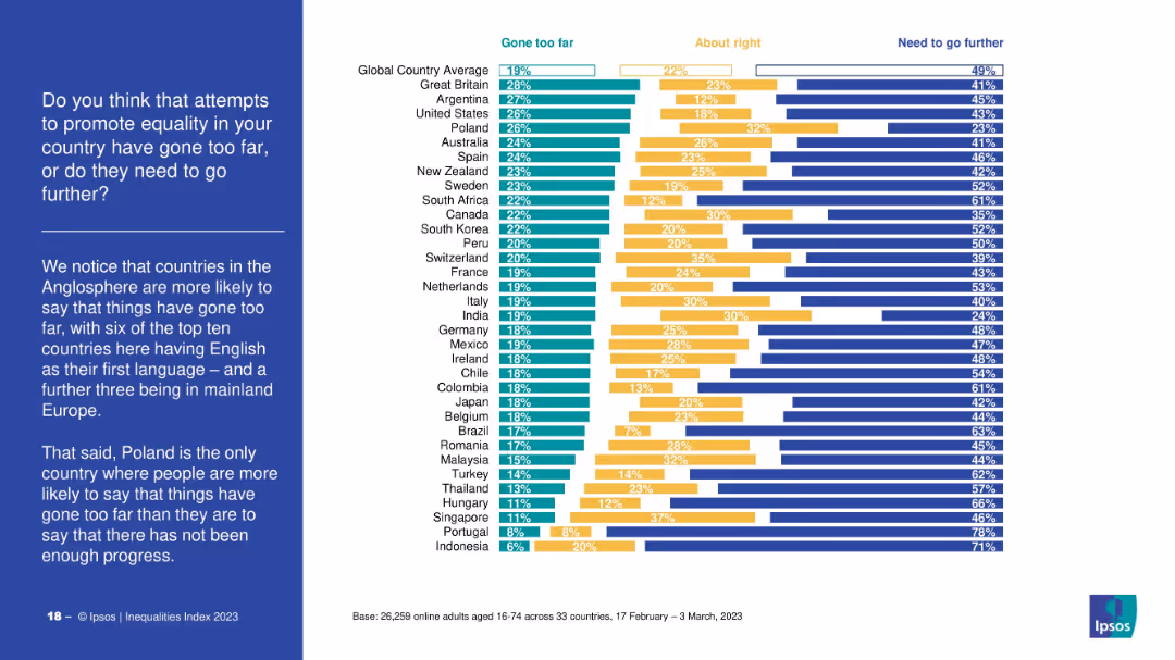
Horizontal bar chart by country comparing views on whether efforts to promote equality have gone too far or need to go further.
Strategic Planning
Government & Public Sector
This slide measures perceptions of equality promotion efforts, contrasting whether countries need to go further or have gone too far, offering a comparative view across global respondents.
equality, efforts, perception, survey, global opinion, overreach, underperformance
false
Strategic Planning
Government & Public Sector
Mixed Chart
IPSOS
Add to my slides
Remove from favorites
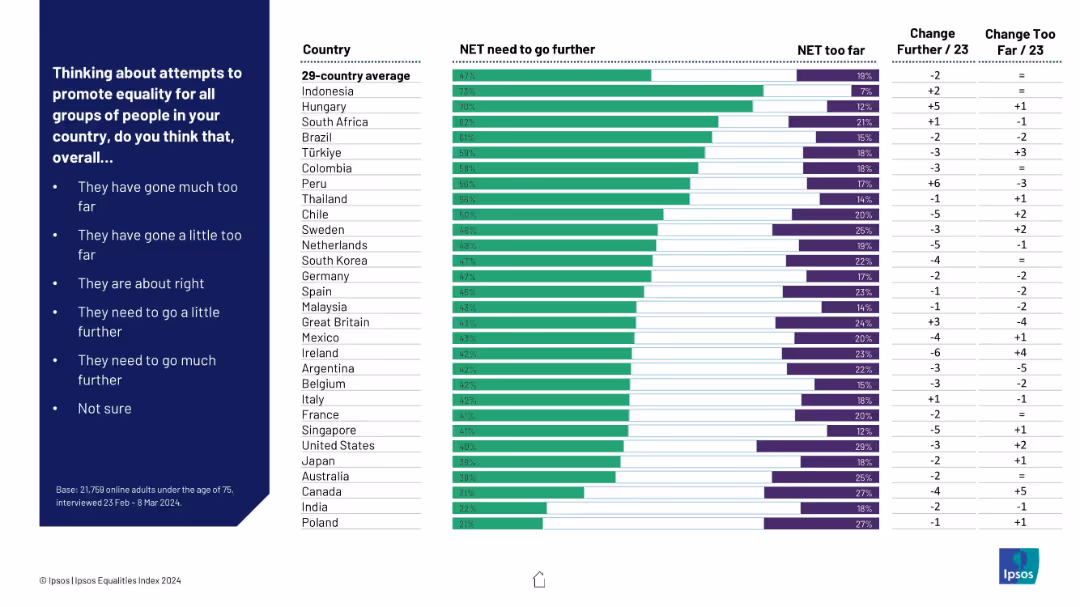
Bar chart ranking countries by agreement that “more needs to be done” vs. “gone too far”; green vs. purple bars; includes change from prior data.
Regulatory and Compliance
Government & Public Sector
This slide assesses global perceptions of efforts to promote equality. It shows which populations think more action is needed and where efforts are considered excessive, including directional trends over time.
equality efforts, too far, not enough, policy perception, international comparison, Ipsos, country ranking
false
Regulatory and Compliance
Government & Public Sector
Mixed Chart
IPSOS
Add to my slides
Remove from favorites
The slide is divided into three sections, each with a white background and bold purple headers, detailing the three pillars to achieve equality: Bold Leadership, Comprehensive Action, and Empowering Environment.
Strategic Planning
Professional Services
It outlines the key strategies identified in 2018 for promoting equality within organizations, categorized into three pillars that include leadership, policies, and empowering environments.
equality, leadership, action, environment, priority
false
Strategic Planning
Professional Services
Pillar
Accenture
Add to my slides
Remove from favorites
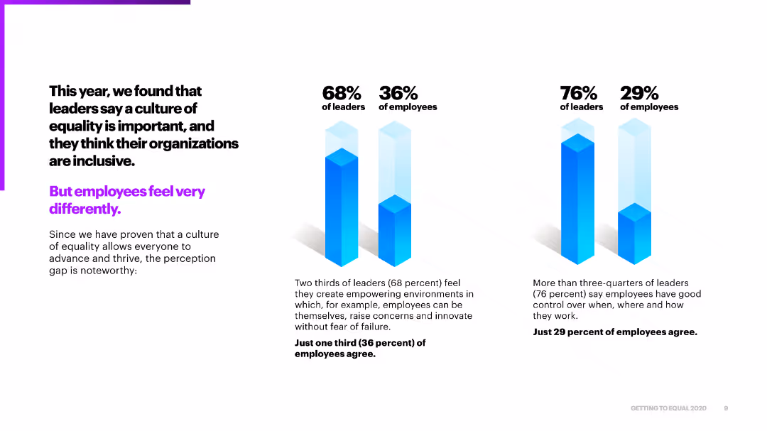
This slide features a column chart comparing the perceptions of leaders and employees on the importance of a culture of equality within organizations. The design uses blue and purple colors for emphasis.
Market Analysis and Trends
Professional Services
The slide highlights the disparity between leaders' and employees' perceptions of organizational equality, showing that a higher percentage of leaders believe in inclusive environments compared to employees.
equality, perceptions, leaders, employees, organizational culture
false
Market Analysis and Trends
Professional Services
Multiple Chart
Accenture
Add to my slides
Remove from favorites
Horizontal stacked bar chart per country showing responses: “gone too far,” “about right,” or “need to go further.” Left-side text explains that Anglophone countries are more likely to say “gone too far.”
Regulatory and Compliance
Government & Public Sector
The slide analyzes global opinions on the progress of equality measures. Countries like the UK and US show significant concern about equality efforts going too far, whereas others see a need for more progress. Poland stands out as the only country where more say things have gone too far than not enough.
equality progress, regulation, perception, Ipsos, public opinion, global survey, gone too far, need more equality
false
Regulatory and Compliance
Government & Public Sector
Mixed Chart
IPSOS
Add to my slides
Remove from favorites
The slide includes text blocks listing strategic priorities and enhancements to Equifax's technological capabilities, alongside circular icons representing various strategic areas such as innovation, customer focus, and security.
Strategic Planning
Technology & Software
It outlines Equifax's strategic priorities aimed at navigating the challenges of a tough mortgage market, emphasizing technology and data utilization to maintain competitive advantage and market leadership.
Equifax, strategic priorities, technology, mortgage market
false
Strategic Planning
Technology & Software
Table
Barclays
Add to my slides
Remove from favorites
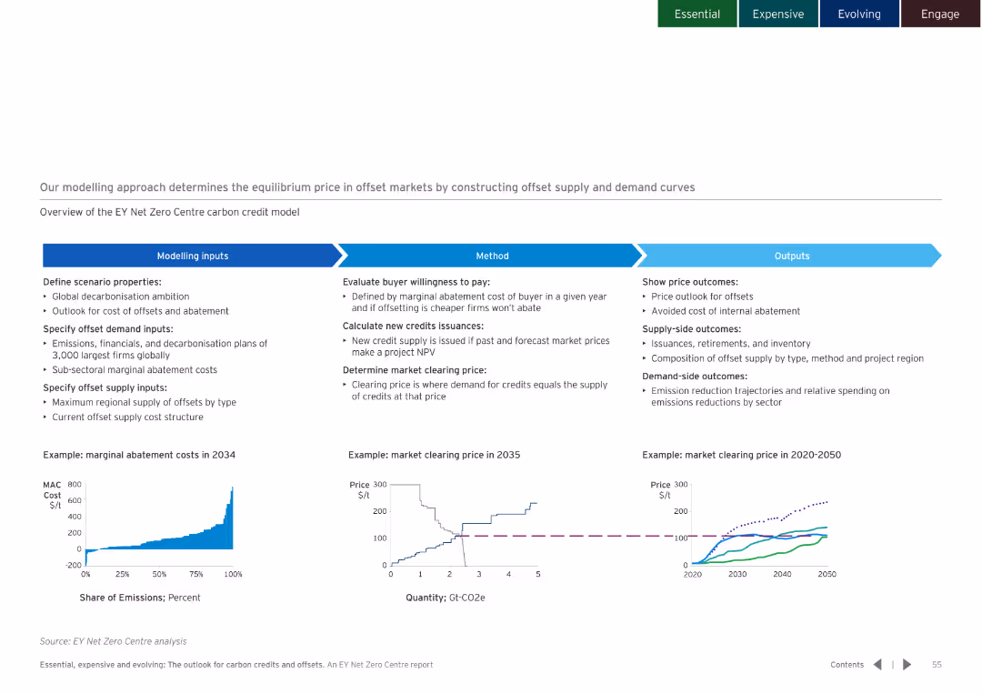
White background with a flowchart explaining the modelling approach, including inputs, methods, and outputs. Charts illustrate key concepts.
Strategic Planning
Environmental Services & Sustainability
Details the modelling approach used to determine the equilibrium price in offset markets, covering inputs, methods, and expected outputs.
equilibrium price, offset markets, modelling approach
false
Strategic Planning
Environmental Services & Sustainability
Multiple Chart
EY
Add to my slides
Remove from favorites
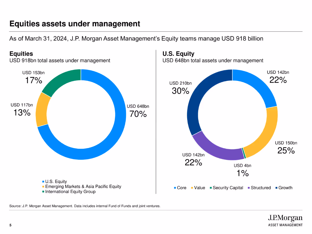
The slide features two pie charts. The first shows the distribution of total equity assets under management. The second pie chart breaks down U.S. equity assets by investment style.
Financial Performance
Financial Services
This slide outlines the total and U.S. equity assets managed by J.P. Morgan, categorized by investment styles like core, value, growth, and others.
equities, assets, management, investment styles, distribution
false
Financial Performance
Financial Services
Multiple Chart
JP Morgan
Add to my slides
Remove from favorites
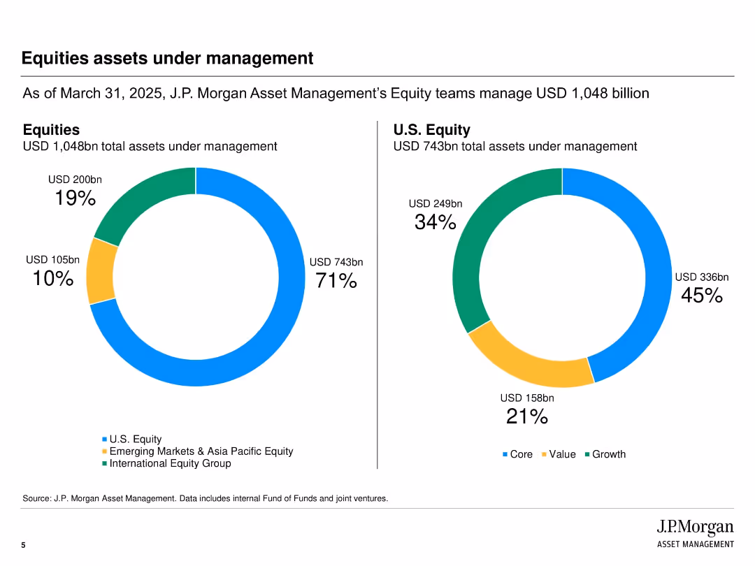
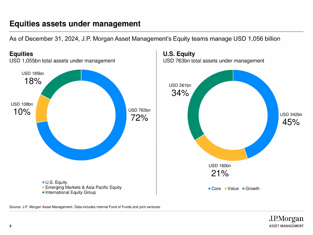
Dual donut charts visually breaking down total equities by region and style.
Performance Metrics and KPIs
Financial Services
Displays a detailed breakdown of USD 1,048 billion equities AUM. U.S. equity represents 71%, and styles are split into Core (45%), Growth (34%), and Value (21%). Helps stakeholders understand portfolio composition.
equities, AUM, U.S. equity, growth, value, portfolio distribution, investment strategy, performance
false
Performance Metrics and KPIs
Financial Services
Multiple Chart
JP Morgan
Add to my slides
Remove from favorites
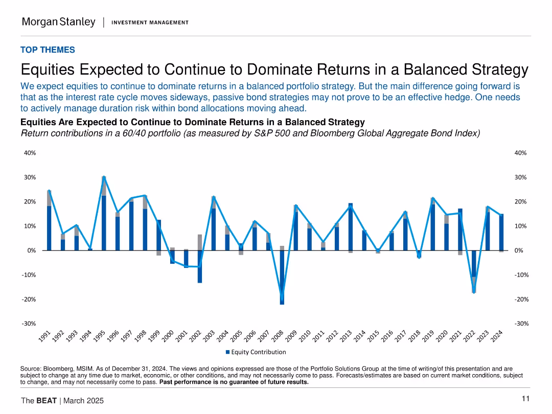
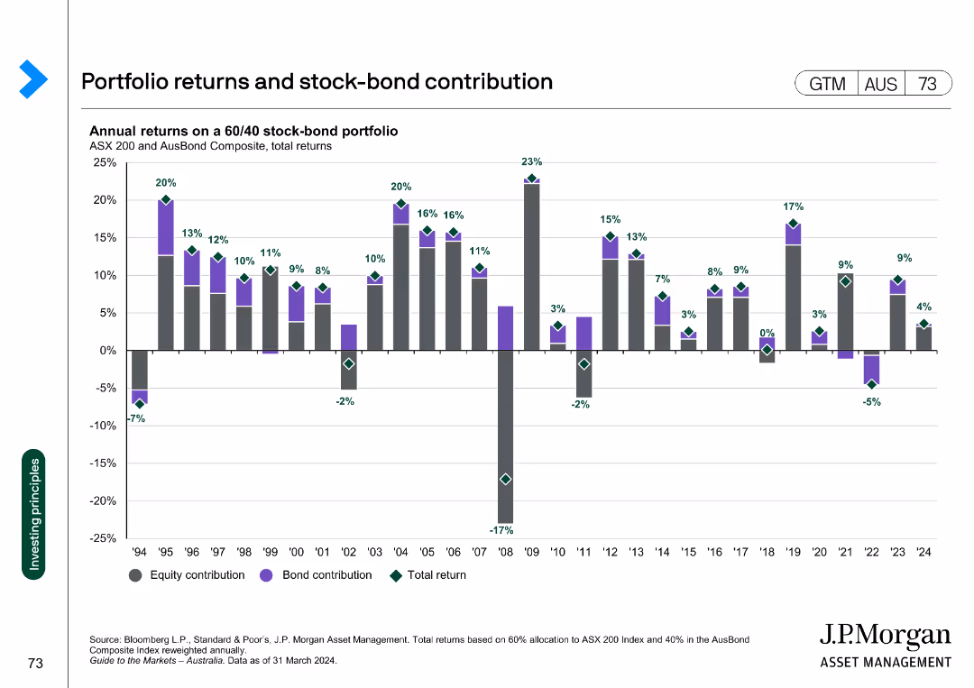
Line/bar combo chart showing equity vs bond contributions in a 60/40 portfolio across decades. Horizontal layout with dual y-axes.
Investment Analysis
Financial Services
Argues that equities will likely continue driving returns in balanced portfolios, given a flat interest rate outlook. The chart displays equity and bond return contributions since 1991, highlighting equity dominance except in select downturns.
equities, balanced strategy, bonds, returns, 60/40 portfolio, asset allocation
false
Investment Analysis
Financial Services
Single Chart
Morgan Stanley
Add to my slides
Remove from favorites
Features column charts and annotations emphasizing the growth in industry gross balances and systematic wallet growth.
Investment Analysis
Financial Services
The slide details the expansion in client financing for equities, highlighting significant increases and revenue gap bridging strategies.
equities, client financing, gross balances, systematic growth, revenue gap, market analysis, investment banking
false
Investment Analysis
Financial Services
Multiple Chart
Goldman Sachs
Add to my slides
Remove from favorites
The slide includes two charts: a line chart on the weight of top 10 companies in the index by region, and a line chart on MSCI World valuation spread.
Investment Analysis
Financial Services
Evaluates concentration risks and valuation dispersions in global equity markets, focusing on top company weights and valuation spreads, useful for risk assessment.
equities, concentration risk, valuation dispersion, MSCI, market analysis
false
Investment Analysis
Financial Services
Multiple Chart
JP Morgan
Add to my slides
Remove from favorites
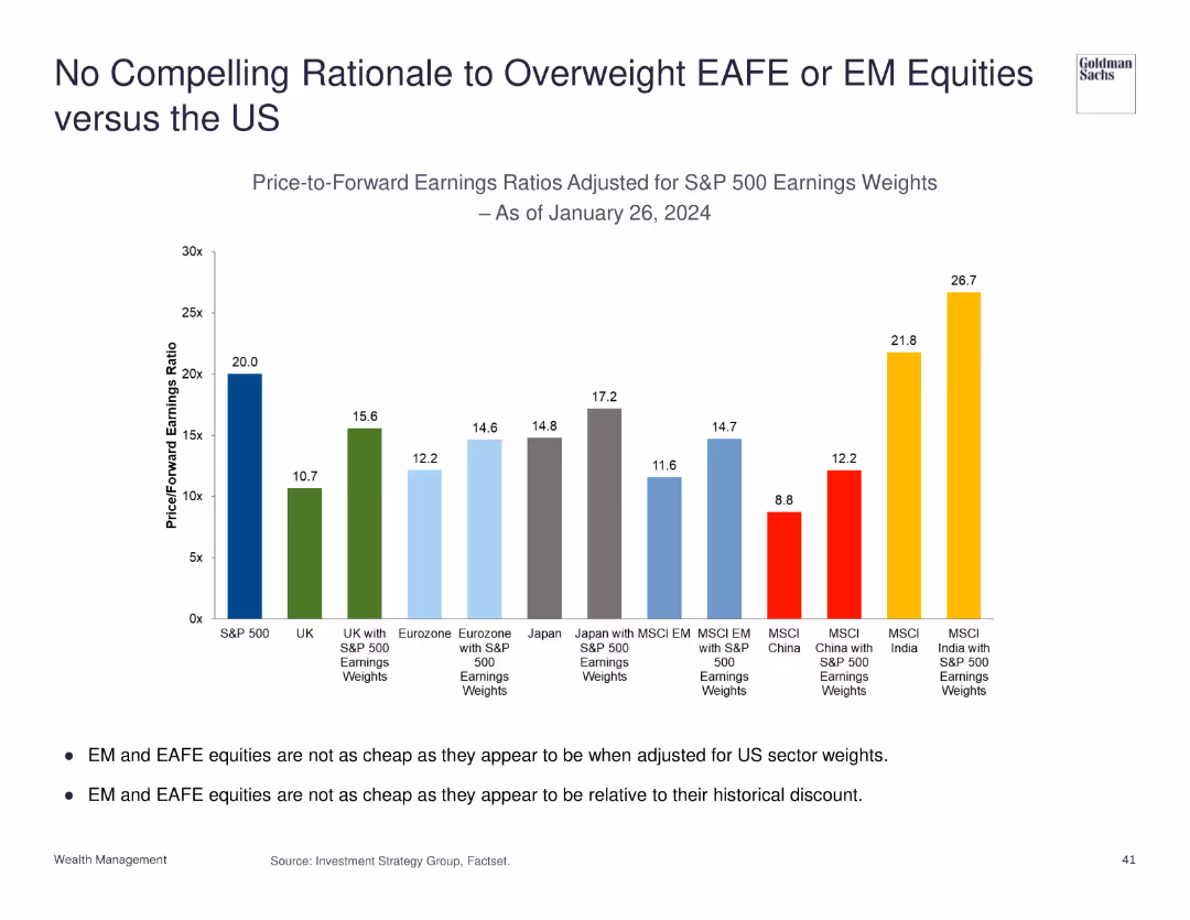
Column chart showing price-to-forward earnings ratios adjusted for S&P 500 earnings weights.
Investment Analysis
Financial Services
Discusses the lack of compelling reasons to overweight EAFE or EM equities compared to US equities based on earnings ratios.
equities, EAFE, EM, US, earnings ratios
false
Investment Analysis
Financial Services
Mixed Chart
Goldman Sachs
Add to my slides
Remove from favorites
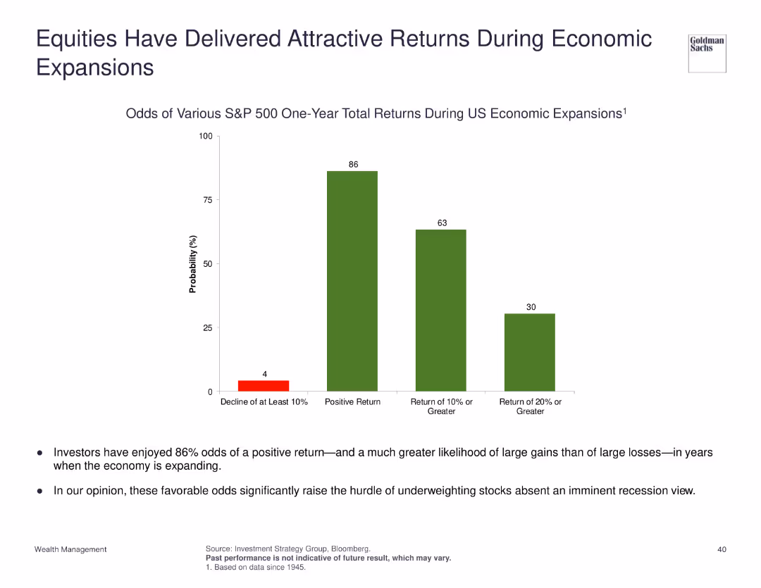
Column chart showing odds of various S&P 500 one-year total returns during US economic expansions.
Investment Analysis
Financial Services
Highlights the odds of positive returns for S&P 500 during economic expansions, suggesting high odds of gains over losses.
equities, economic expansion, S&P 500, returns, investment
false
Investment Analysis
Financial Services
Mixed Chart
Goldman Sachs
Add to my slides
Remove from favorites
Slide with a pie chart showing the 2017 Equities Client Mix, a column chart depicting investment growth, and several bullet points. The design integrates visual data representation and narrative elements.
Market Analysis and Trends
Financial Services
Discusses the progress in equities execution, with emphasis on electronic execution, acquisitions, and partnerships. It details the improvement in client service and the growth of the quant industry.
Equities, Electronic Execution, Client Service, Investment Growth, Acquisitions, Partnerships, Quant Industry, AUM, Latency Improvement
false
Market Analysis and Trends
Financial Services
Multiple Chart
Goldman Sachs
Add to my slides
Remove from favorites
Displays column and line graphs comparing equities and FICC market share growth over time, with blue and dark tones.
Market Analysis and Trends
Financial Services
Exhibits the market share gains in Equities and FICC from 2017, showing progress and ranking improvements.
equities, FICC, market share growth, financial trends, rankings
false
Market Analysis and Trends
Financial Services
Mixed Chart
JP Morgan
Add to my slides
Remove from favorites
The slide includes multiple column charts showing trends in equities and FICC, market share gains, and annual income analysis.
Financial Performance
Financial Services
It examines the impact of global markets on the corporate investment bank's income, highlighting specific areas such as equities and FICC with historical data comparison.
equities, FICC, market share, income, trends
false
Financial Performance
Financial Services
Multiple Chart
Barclays
Add to my slides
Remove from favorites
Includes market share column and line charts for equities and FICC, along with a market share comparison bar chart against peers.
Market Analysis and Trends
Financial Services
Demonstrates firm’s leading positions in equities and FICC, and market share growth relative to peers.
Equities, FICC, Market Share, Industry Wallet, Competitive Analysis
false
Market Analysis and Trends
Financial Services
Multiple Chart
JP Morgan
Add to my slides
Remove from favorites
This slide is similar in design to slide 5, focusing on equities with horizontal column chart for intermediation and financing, utilizing a blue and gray color palette to denote different financial quarters.
Financial Performance
Financial Services
Evaluates the equities segment within global markets, analyzing net revenues and the impact of market conditions on the financial performance over different quarters.
equities, global markets, net revenues, financial performance, market conditions
false
Financial Performance
Financial Services
Mixed Chart
Goldman Sachs
Add to my slides
Remove from favorites
The slide includes two charts: a line chart on growth and value forward P/E ratios, and a bar chart showing equity sector correlation changes in bond yields.
Investment Analysis
Financial Services
Examines global equity trends, comparing growth vs. value P/E ratios and sector performance relative to bond yields, useful for investment decision-making.
equities, growth, value, P/E ratios, bond yields
false
Investment Analysis
Financial Services
Multiple Chart
JP Morgan
Add to my slides
Remove from favorites
The slide presents two charts: a bar chart on sector composition by market cap for large and small caps, and a line chart on small vs. large cap relative valuation.
Investment Analysis
Financial Services
Analyzes large vs. small cap equities, focusing on market cap composition and valuation comparisons, useful for portfolio management strategies.
equities, large cap, small cap, market cap, valuation
false
Investment Analysis
Financial Services
Multiple Chart
JP Morgan
Add to my slides
Remove from favorites
Contains multiple column charts showing market share from 2014 to 2018 for JP Morgan and peers, and product performance changes in Cash Equities, Equity Derivatives, and Prime Finance.
Financial Performance
Financial Services
This slide analyzes the market share growth of JP Morgan's equities franchise, highlighting significant gains in specific financial products.
equities, market share, financial growth, performance analysis
false
Financial Performance
Financial Services
Multiple Chart
JP Morgan
Add to my slides
Remove from favorites
Contains two pie charts comparing GDP percentage and market capitalization across countries, indicating the distribution of global equity allocations.
Investment Analysis
Financial Services
Highlights the disproportionate allocation of global equity towards the U.S., illustrated by its GDP versus market capitalization share, significant for strategic investment planning.
equity allocation, GDP, market capitalization, strategic planning, investment, USA dominance, global distribution
false
Investment Analysis
Financial Services
Multiple Chart
Morgan Stanley
Add to my slides
Remove from favorites
Two pie charts showing GDP and market capitalization percentages by country.
Market Analysis and Trends
Financial Services
Illustrates US dominance in global equity market allocations, useful for investment strategies.
Equity Allocation, GDP, Market Capitalization, US Dominance, Pie Charts, Morgan Stanley, Market Monitor
false
Market Analysis and Trends
Financial Services
Multiple Chart
Morgan Stanley
Add to my slides
Remove from favorites
It contains stacked column chart and a timeline of equity portfolio balance sheet progress, using shades of blue to represent different categories. The data is dense, yet the chart is clear and well-labeled.
Investment Analysis
Financial Services
The slide evaluates the progress in equity asset sales against market value adjustments over two years. It demonstrates a financial institution's efforts in managing equity investments, highlighting disposals and equity investment balances, relevant for discussions on asset management strategies.
Equity assets, Balance sheet, Asset management, Sales progress, Investment balance
false
Investment Analysis
Financial Services
Single Chart
Goldman Sachs
Add to my slides
Remove from favorites
Side-by-side pie charts displaying total equity AUM and U.S. equity AUM with breakdown by region and investment style
Performance Metrics and KPIs
Financial Services
This slide details the composition of J.P. Morgan Asset Management’s equity AUM, breaking it down into regional allocations and investment styles such as value, growth, and core. It offers a clear visual representation of equity asset distribution as of March 31, 2025.
Equity AUM, J.P. Morgan, investment style, regional allocation, value vs. growth, fund management, equity portfolio
false
Performance Metrics and KPIs
Financial Services
Multiple Chart
JP Morgan
Add to my slides
Remove from favorites
Dual donut charts showing composition of overall and U.S. equity assets under management
Industry Overview
Financial Services
Breaks down JPMorgan Asset Management's $1.055T in equity AUM by region and style, with specific focus on U.S. equity segmentation into Core, Value, and Growth. The visual highlights the dominance of growth strategies and U.S. exposure in the equity portfolio.
equity AUM, U.S. equity, asset breakdown, value, growth, core, JPMorgan
false
Industry Overview
Financial Services
Multiple Chart
JP Morgan
Add to my slides
Remove from favorites
It contains two column charts—one in blue shades, one in green—depicting the percentage agreement from HR leaders and employees over three years. A small pie chart indicating a 9% increase is also present. The layout is simple, with prominent headers and clear, legible text.
Market Analysis and Trends
Financial Services
The slide addresses how equity compensation is perceived as a motivational factor by both HR leaders and employees, with a trend over three years. It's useful for demonstrating shifts in HR strategies and employee satisfaction related to compensation benefits in the financial sector.
equity compensation, motivation, HR leaders, employees, trend
false
Market Analysis and Trends
Financial Services
Multiple Chart
Goldman Sachs
Add to my slides
Remove from favorites
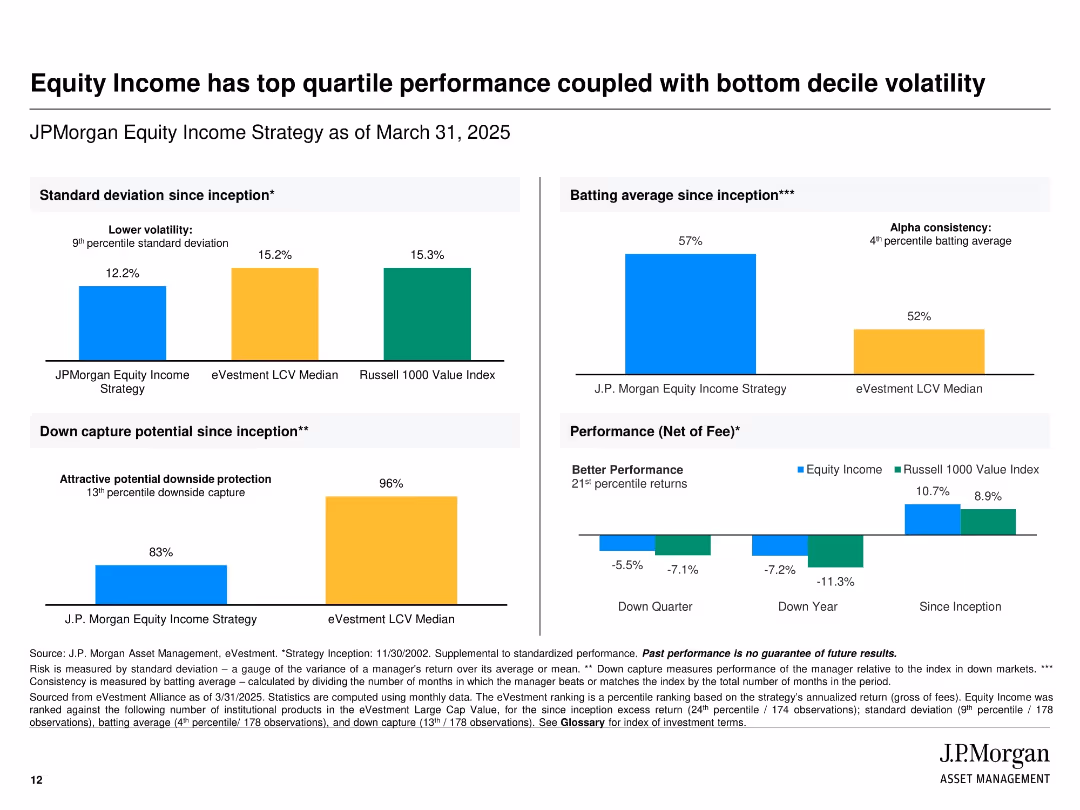
Grid-based design with grouped bar charts showing volatility, down capture, performance, and batting average compared to benchmarks.
Financial Performance
Financial Services
Demonstrates how JPMorgan’s Equity Income Strategy offers lower volatility and strong downside protection. Shows outperformance versus benchmarks across different timeframes, emphasizing consistent alpha generation and strong performance even during downturns.
equity income, performance, volatility, downside protection, benchmark comparison, standard deviation
false
Financial Performance
Financial Services
Multiple Chart
JP Morgan
Add to my slides
Remove from favorites
This slide includes two column charts. The first chart shows the contribution of the largest seven 'tech' stocks to the S&P 500. The second chart displays the contribution of the 'magnificent 7' stocks to S&P 500 return.
Competitive Landscape
Financial Services
The slide provides insights into the market concentration and impact of major tech stocks on the S&P 500, aiding in competitive landscape analysis.
equity, market concentration, tech stocks, S&P 500, market impact, analysis
false
Competitive Landscape
Financial Services
Multiple Chart
JP Morgan
Add to my slides
Remove from favorites
This slide includes a line chart showing S&P 500 index dispersion over time and a bar chart illustrating hedge fund sector exposure relative to the S&P 500 as of 4Q23.
Investment Analysis
Financial Services
The slide discusses market dispersion and hedge fund positioning within different sectors relative to the S&P 500, highlighting strategic allocations.
equity market, dispersion, hedge funds, sector exposure, S&P 500
false
Investment Analysis
Financial Services
Multiple Chart
JP Morgan
Add to my slides
Remove from favorites
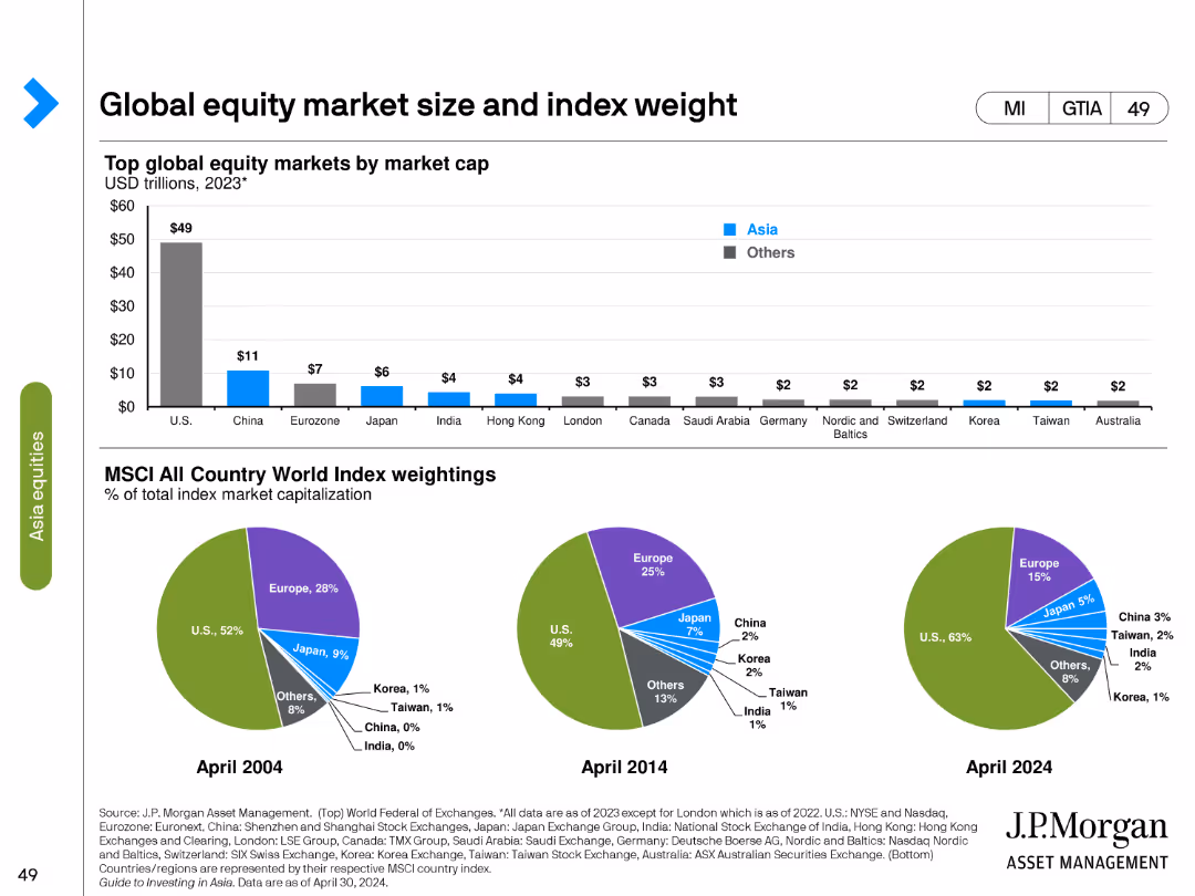
The slide contains a column chart showing the top global equity markets by market cap in 2023 and three pie charts comparing MSCI All Country World Index weightings in different years.
Market Analysis and Trends
Financial Services
Analyzes global equity market sizes by market cap and the weight of different countries in the MSCI All Country World Index from 2004, 2014, and projected for 2024.
equity market, market cap, MSCI, index weight, pie chart, column chart, global markets, financial analysis, historical data, projections
false
Market Analysis and Trends
Financial Services
Multiple Chart
JP Morgan
Add to my slides
Remove from favorites
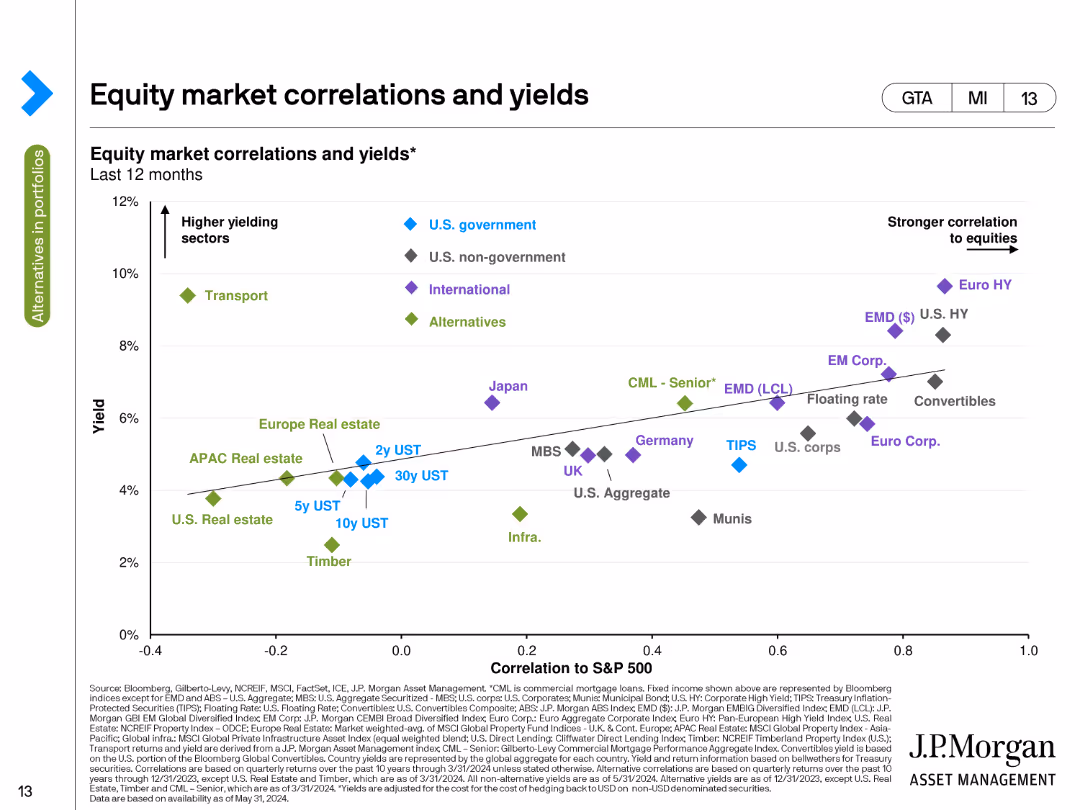
The slide features a scatter plot showing the correlation of various equity markets and yields over the last 12 months. Different symbols and colors represent different sectors, such as higher yielding sectors and stronger correlation to equities.
Market Analysis and Trends
Financial Services
This slide analyzes the correlations between equity markets and their yields over the past year, showing the relationship between yield levels and market performance across various sectors and geographical regions.
Equity Markets, Correlations, Yields, Sectors, Performance
false
Market Analysis and Trends
Financial Services
Single Chart
JP Morgan
Add to my slides
Remove from favorites
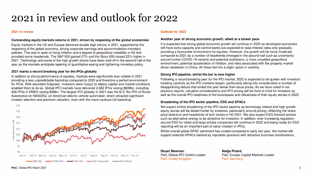
A split layout with text on one side and a line chart on the other. The chart shows equity market returns. Text blocks summarize the year's review and future outlook.
Market Analysis and Trends
Financial Services
The slide reviews the performance of equity markets in 2021 and provides an outlook for 2022, highlighting IPO activity and economic forecasts.
Equity Markets, IPO Activity, 2021 Review, 2022 Outlook, Economic Forecasts
false
Market Analysis and Trends
Financial Services
Mixed Chart
PwC/Strategy&
Add to my slides
Remove from favorites
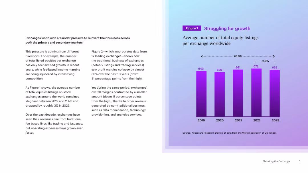
Two-column layout with a bar chart on the right showing average equity listings (2019–2023) and slight trends. Blue-purple gradient background.
Market Analysis and Trends
Financial Services
Highlights the stagnation in equity listings on global exchanges and the pressure for reinvention. Shows a modest decline in average listings, driven by margin compression and competition.
equity markets, listings, exchanges, growth trends, revenue pressure
false
Market Analysis and Trends
Financial Services
Mixed Chart
Accenture
Add to my slides
Remove from favorites
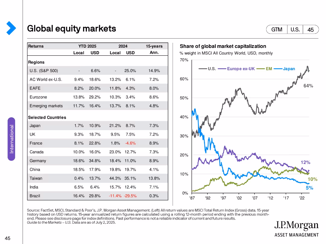
Left table with regional/country returns; right line chart of market cap shares of major regions.
Market Analysis and Trends
Financial Services
Highlights equity market returns across regions and selected countries. Also shows shifting shares of global market capitalization, where the U.S. has gained dominance while Europe and Japan have declined in relative size.
Equity markets, returns, global stocks, market capitalization, international investing, MSCI, U.S. dominance
false
Market Analysis and Trends
Financial Services
Mixed Chart
JP Morgan
Add to my slides
Remove from favorites
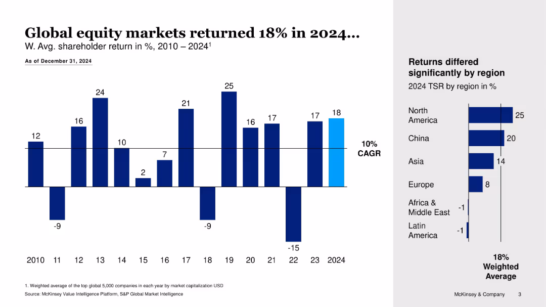
Bar chart showing annual returns 2010–2024 with side bar for 2024 TSR by region
Financial Performance
Financial Services
Summarizes global equity market performance from 2010 to 2024, highlighting an 18% return in 2024 and regional differences in TSR, with North America and China leading.
equity markets, TSR, global returns, CAGR, regional performance, financial trends
false
Financial Performance
Financial Services
Multiple Chart
McKinsey
Add to my slides
Remove from favorites
Graphs showcasing market indices and volatility trends, with side commentary on stock market recovery.
Investment Analysis
Financial Services
Reviews global equity market trends, emphasizing the volatility during the crisis and recovery patterns since lows in March.
equity markets, volatility, recovery, crisis, market indices, trends
false
Investment Analysis
Financial Services
Multiple Chart
BCG
Add to my slides
Remove from favorites
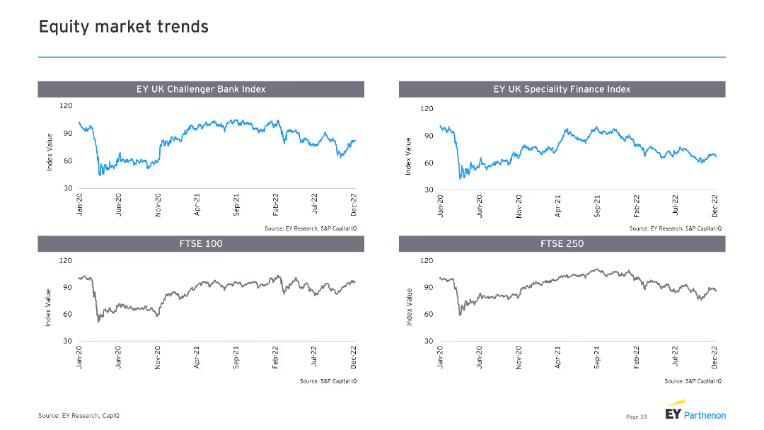
The slide includes four line charts, showing trends in the EY UK Challenger Bank Index, EY UK Specialty Finance Index, FTSE 100, and FTSE 250 over recent years.
Market Analysis and Trends
Financial Services
It provides insights into equity market trends, focusing on specific financial indices, which is useful for investment analysis and market forecasting.
equity market, trends, indices, FTSE, finance
false
Market Analysis and Trends
Financial Services
Multiple Chart
EY
Add to my slides
Remove from favorites
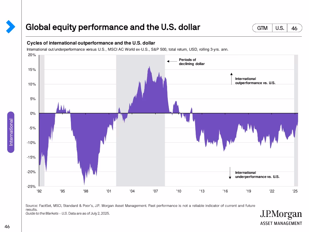
Area chart showing relative international equity performance versus the U.S. dollar over time.
Market Analysis and Trends
Financial Services
Illustrates long-term cycles of international equity outperformance versus the U.S., typically linked to periods of dollar weakening. Shows how currency trends can influence relative returns.
Equity performance, U.S. dollar, international investing, cycles, currency impact, global markets, relative returns
false
Market Analysis and Trends
Financial Services
Single Chart
JP Morgan
Add to my slides
Remove from favorites
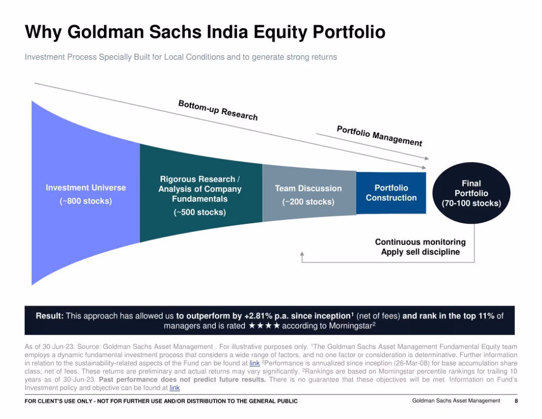
Funnel-shaped flow diagram from “Investment Universe” to “Final Portfolio”; blue gradient design with white background; concise text and arrows indicating research and selection process.
Investment Analysis
Financial Services
This slide explains the bottom-up research-driven investment process of the Goldman Sachs India Equity Portfolio, highlighting the narrowing down from 800 to 70-100 stocks. It emphasizes rigorous analysis, team discussion, and active portfolio management, claiming strong performance with a top 11% Morningstar rating and 2.81% outperformance since inception.
equity portfolio, stock selection, investment process, bottom-up research, India, Goldman Sachs, Morningstar, portfolio funnel
false
Investment Analysis
Financial Services
Mixed Chart
Goldman Sachs
Add to my slides
Remove from favorites
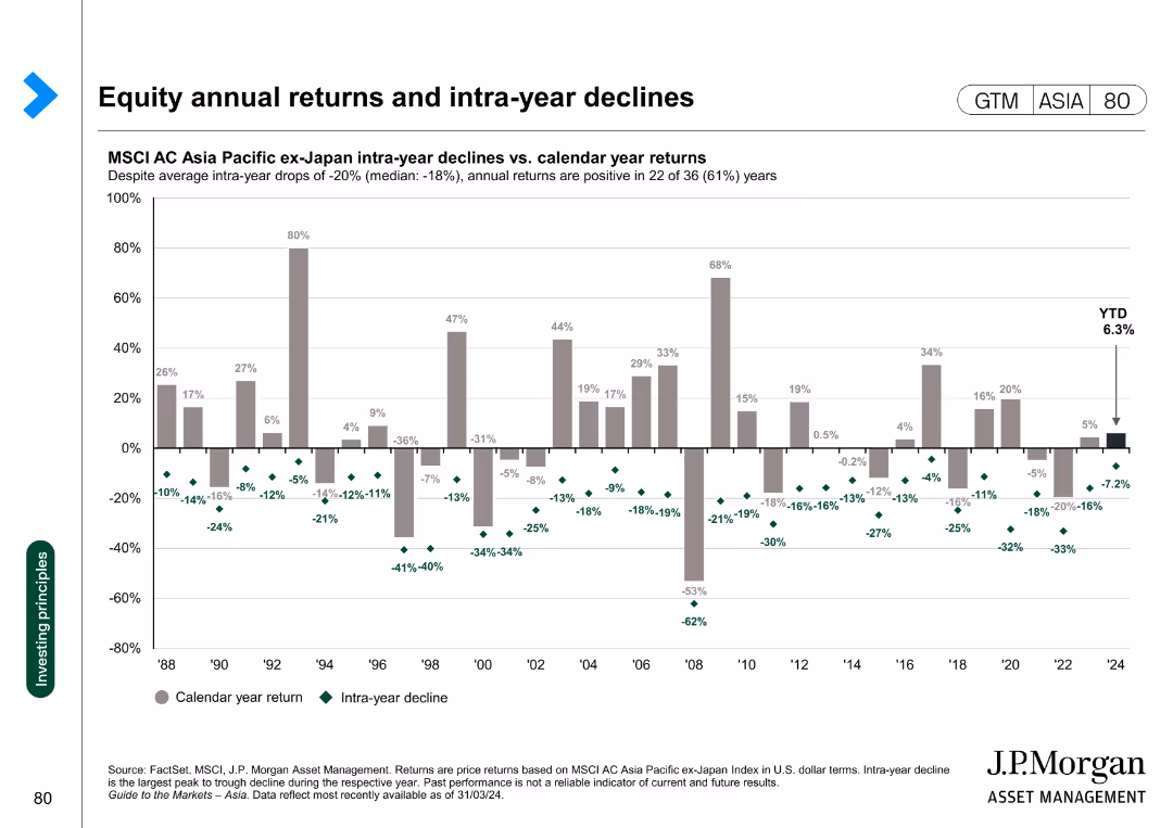
Column chart showing the intra-year declines versus calendar year returns for the MSCI AC Asia Pacific ex-Japan Index from 1988 to 2024.
Financial Performance
Financial Services
This slide analyzes the annual returns and intra-year declines of the MSCI AC Asia Pacific ex-Japan Index, highlighting the volatility and overall performance over the years.
equity, returns, declines, MSCI, volatility
false
Financial Performance
Financial Services
Single Chart
JP Morgan
Add to my slides
Remove from favorites
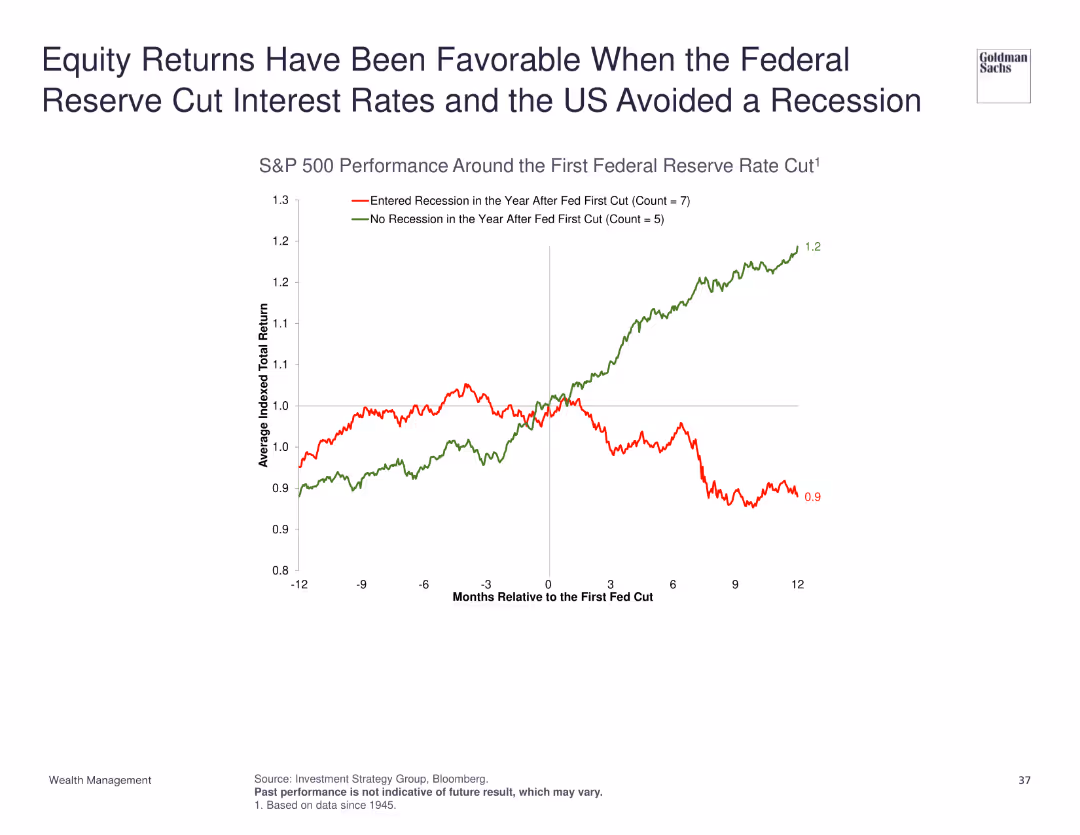
Line chart showing the performance of the S&P 500 around the first Federal Reserve rate cut, differentiating between periods with and without recession.
Market Analysis and Trends
Financial Services
Demonstrates that equity returns have been favorable when the Federal Reserve cuts interest rates and the US avoids a recession, with a detailed performance analysis of the S&P 500.
equity returns, Federal Reserve, interest rates, recession
false
Market Analysis and Trends
Financial Services
Single Chart
Goldman Sachs
Add to my slides
Remove from favorites
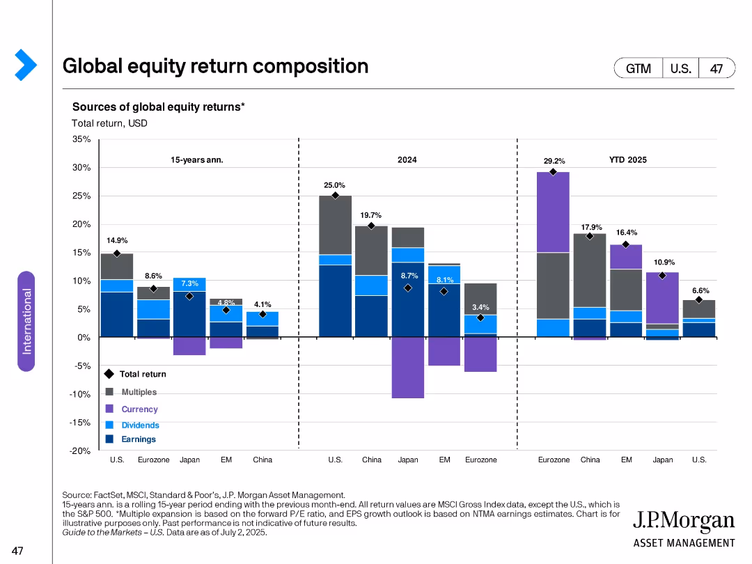
Stacked bar chart across three timeframes (15-yr avg, 2024, YTD 2025); segmented by region; color-coded by return type (multiples, currency, dividends, earnings).
Financial Performance
Financial Services
The slide analyzes sources of total global equity returns over different time periods and regions. It breaks down returns into components such as earnings, dividends, currency effects, and multiple expansions across major global markets.
equity returns, global markets, earnings, dividends, currency, valuations, historical performance, bar chart, international, U.S.
false
Financial Performance
Financial Services
Single Chart
JP Morgan
Add to my slides
Remove from favorites
Slide features a large bar chart detailing investor opinions on factors affecting equity returns, emphasizing megacap tech stocks and inflation. Simple layout with clear headers and a descriptive side note in a green box.
Market Analysis and Trends
Financial Services
Highlights investor focus on megacap tech stocks and inflation as significant drivers for equity returns in the U.S. market, useful for financial forecasting and investment strategy discussions.
equity returns, inflation, megacap stocks, U.S. market, investor focus
false
Market Analysis and Trends
Financial Services
Single Chart
BCG
Add to my slides
Remove from favorites
The slide has a column chart showing ASX 200 index intra-year declines vs. calendar year returns from 1994 to 2024. Each year is represented by a column with calendar year return in gray and intra-year decline in red dots.
Financial Performance
Financial Services
This slide analyzes the ASX 200 index's annual equity returns and intra-year declines, offering insights into market performance and volatility over the years.
Equity returns, intra-year declines, ASX 200, financial performance, market analysis, column chart, calendar year
false
Financial Performance
Financial Services
Single Chart
JP Morgan
Add to my slides
Remove from favorites
Slide features two column charts comparing equity value changes and return sensitivities for various investments in Seadrill. Left chart shows equity returns based on asset values, right chart shows return sensitivity based on company names.
Investment Analysis
Financial Services
Analyzes potential returns in a market recovery scenario using asset value increases and sensitivity analysis across different companies, serving as a strategic tool for investors.
Equity, Returns, Investment, Sensitivity, Market Recovery
false
Investment Analysis
Financial Services
Multiple Chart
Barclays
Add to my slides
Remove from favorites
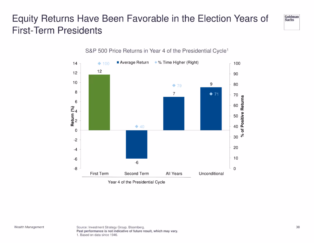
Column chart depicting S&P 500 price returns in year 4 of the presidential cycle, comparing first-term and second-term presidents, and average return statistics.
Market Analysis and Trends
Financial Services
Highlights that equity returns tend to be favorable during the election years of first-term presidents, supported by historical S&P 500 price return data across different presidential cycles.
equity returns, presidential cycle, election years, S&P 500
false
Market Analysis and Trends
Financial Services
Single Chart
Goldman Sachs
Add to my slides
Remove from favorites
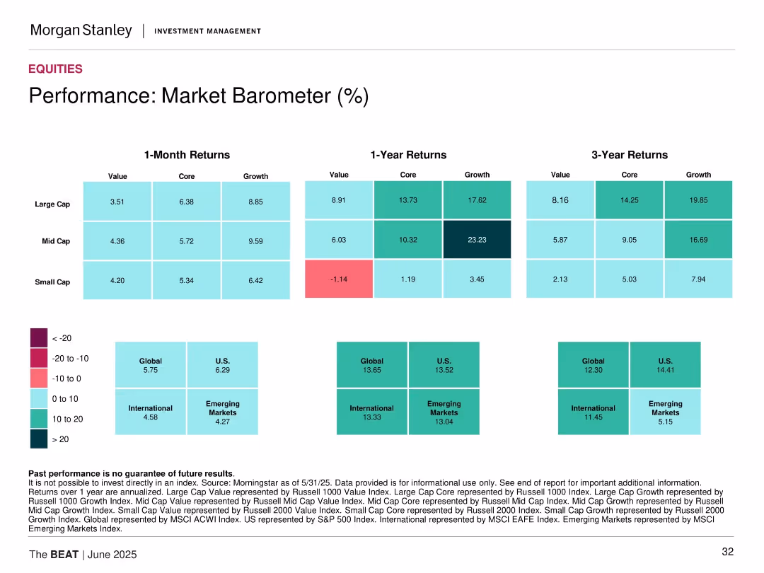
Matrix-style heatmap displaying returns over 1M, 1Y, and 3Y across value/core/growth and cap sizes.
Performance Metrics and KPIs
Financial Services
Heatmap of equity market returns categorized by style (value, core, growth) and market cap (large, mid, small) over 1-month, 1-year, and 3-year periods.
equity returns, style box, performance, small cap, large cap, mid cap, growth, value, global equity, market barometer
false
Performance Metrics and KPIs
Financial Services
Table
Morgan Stanley
Add to my slides
Remove from favorites
Two column charts: one shows global equity sector weights across regions, and the other shows MSCI World Growth and Value sector weights by market cap.
Market Analysis and Trends
Financial Services
This slide details the distribution of equity sector weights globally and the breakdown of MSCI World Growth and Value sector weights.
Equity, sector weights, global, MSCI, market cap
false
Market Analysis and Trends
Financial Services
Multiple Chart
JP Morgan
Add to my slides
Remove from favorites
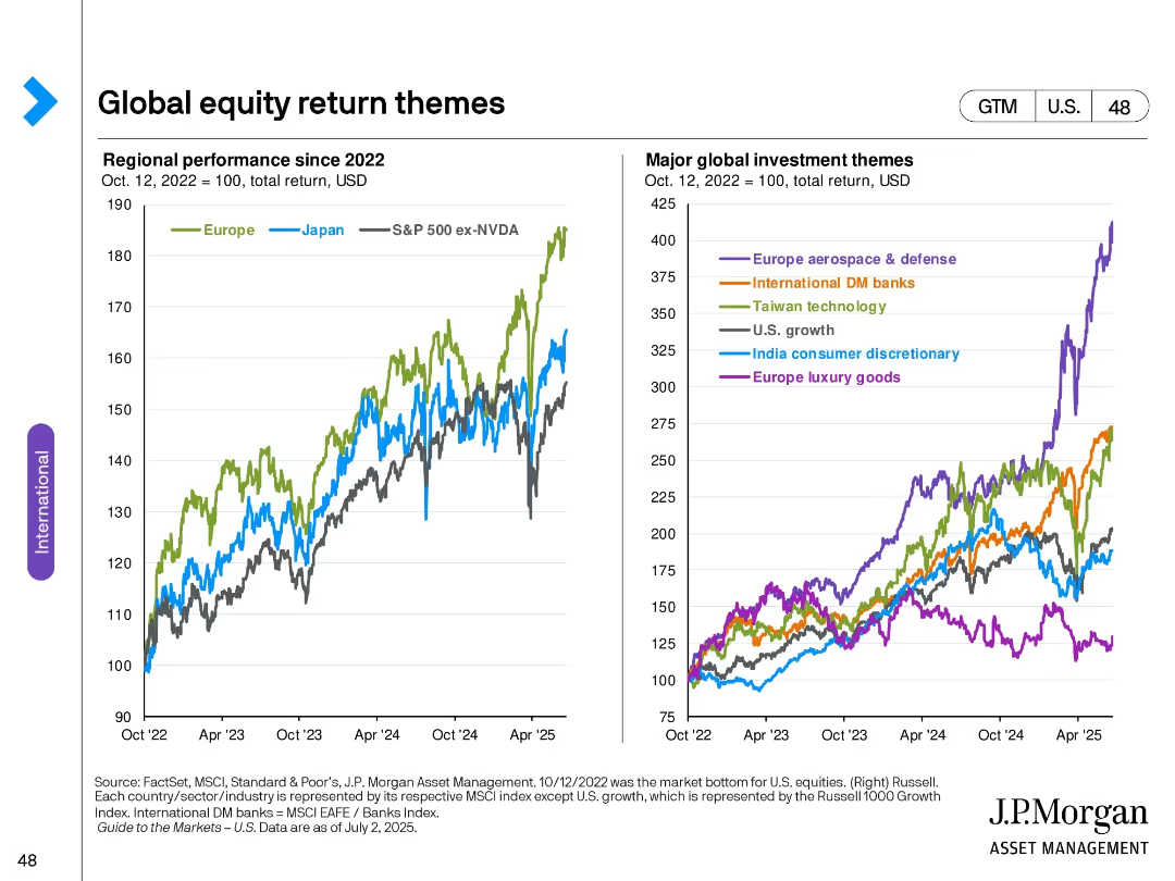
Two line charts: Left shows regional equity performance since 2022; Right shows specific sector/theme performance indexed to 100.
Market Analysis and Trends
Financial Services
Compares regional performance of equities post-2022 and highlights the most prominent global investment themes, including sectors such as aerospace & defense, technology, and luxury goods, with Europe and Japan emphasized.
equity themes, regional performance, sector trends, Europe, Japan, investment strategy, chart analysis, index tracking
false
Market Analysis and Trends
Financial Services
Multiple Chart
JP Morgan
Add to my slides
Remove from favorites
This slide displays a bar chart with cumulative equity and equity-related volume since 2010, labeled with various financial institutions and their corresponding values. On the right, four checkmarks highlight key points.
Market Analysis and Trends
Financial Services
The slide presents the cumulative equity and equity-related volume by leading financial institutions, showcasing their market position and emphasizing innovation-driven leadership through consistent performance, landmark transactions, IPO underwriting, and continuous innovation.
Equity, Underwriting, Innovation, Leadership, Financial Institutions, Market Position, Volume, IPO
false
Market Analysis and Trends
Financial Services
Single Chart
Goldman Sachs
Add to my slides
Remove from favorites
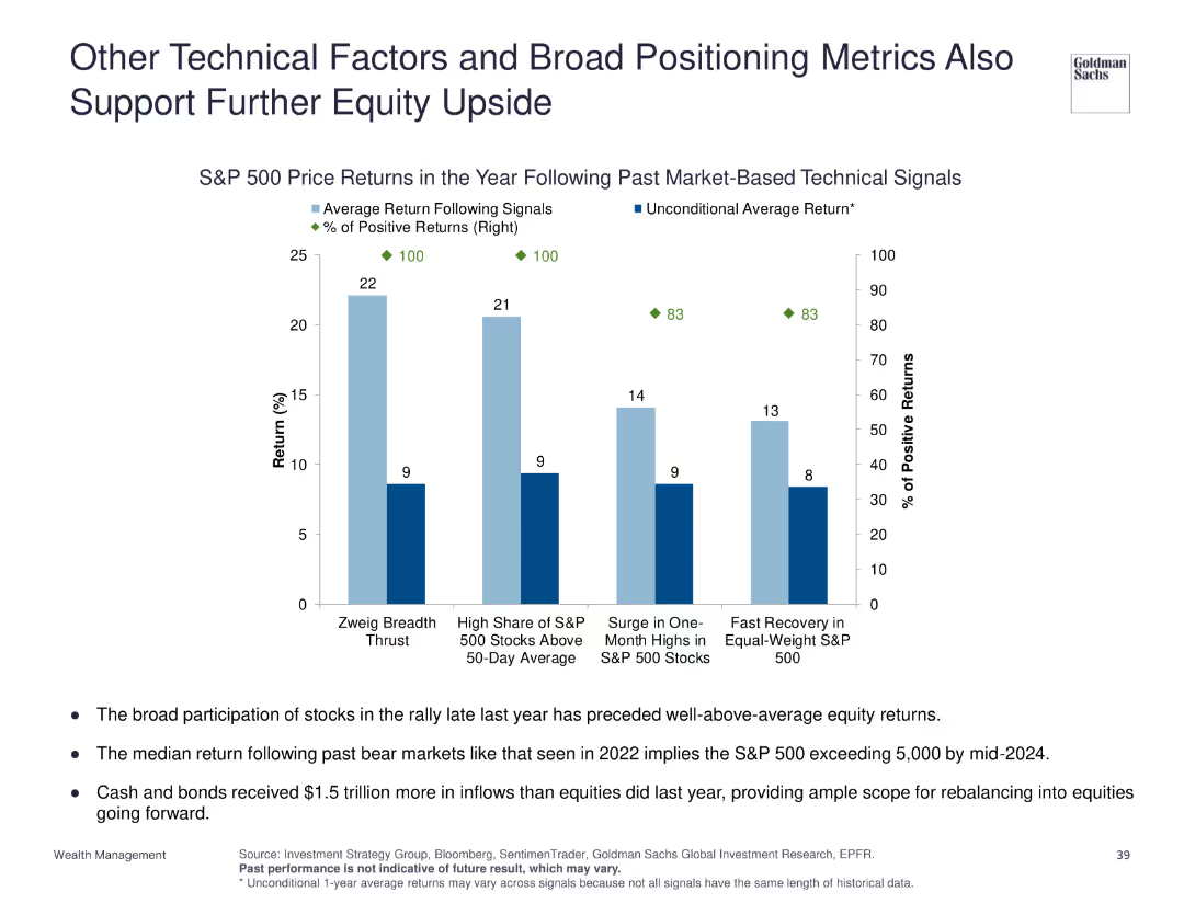
Column charts showing S&P 500 price returns following various market-based technical signals, with average returns and percentage of positive returns.
Investment Analysis
Financial Services
Supports the potential for further equity upside by analyzing historical returns of the S&P 500 following specific technical signals, emphasizing broad positioning metrics.
equity upside, technical signals, S&P 500, market positioning
false
Investment Analysis
Financial Services
Single Chart
Goldman Sachs
Add to my slides
Remove from favorites
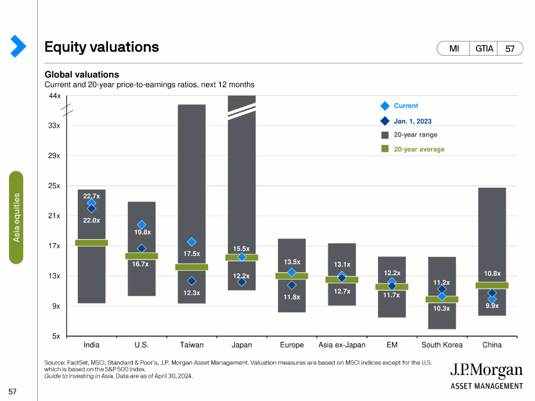
Bar chart comparing current and historical price-to-earnings (P/E) ratios across various regions, with additional markers for 20-year ranges and averages.
Investment Analysis
Financial Services
Evaluates equity valuations by comparing current P/E ratios with historical data, offering insights into regional market valuations and trends.
equity valuations, P/E ratio, bar chart, financial analysis, historical data, market trends, investment, regional analysis
false
Investment Analysis
Financial Services
Single Chart
JP Morgan
Add to my slides
Remove from favorites
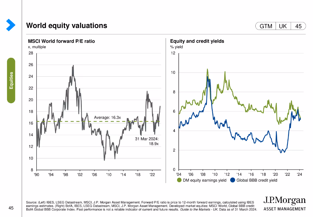
Two charts: one shows the MSCI World forward P/E ratio, and the other depicts equity and credit yields comparing developed market equity earnings yield with global BBB credit yield.
Investment Analysis
Financial Services
This slide provides an overview of global equity valuations, comparing forward P/E ratios and yields for equity and credit. Used for investment evaluation and portfolio management.
Equity, valuations, P/E ratio, yields, MSCI
false
Investment Analysis
Financial Services
Multiple Chart
JP Morgan
Add to my slides
Remove from favorites
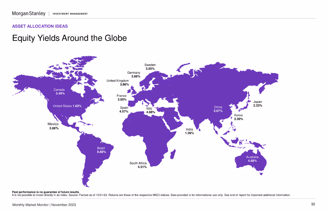
World map in purple shades, percentage yields by country, clearly labeled.
Market Analysis and Trends
Financial Services
Displays global equity yields, offering a geographic perspective for investment opportunities.
Equity Yields, Global, Investment Opportunities, Map, Geographic Distribution, Morgan Stanley, Market Monitor
false
Market Analysis and Trends
Financial Services
Graphic
Morgan Stanley
Add to my slides
Remove from favorites
A world map displaying various countries highlighted in purple, with equity yield percentages annotated next to each country. The layout is clean with a central focus on the map.
Market Analysis and Trends
Financial Services
This slide provides a comparison of equity yields across different countries, showing investors where they might find the highest yields. Useful for global market analysis and investment decisions.
equity yields, global market, investment, countries, percentages
false
Market Analysis and Trends
Financial Services
Graphic
Morgan Stanley
Add to my slides
Remove from favorites
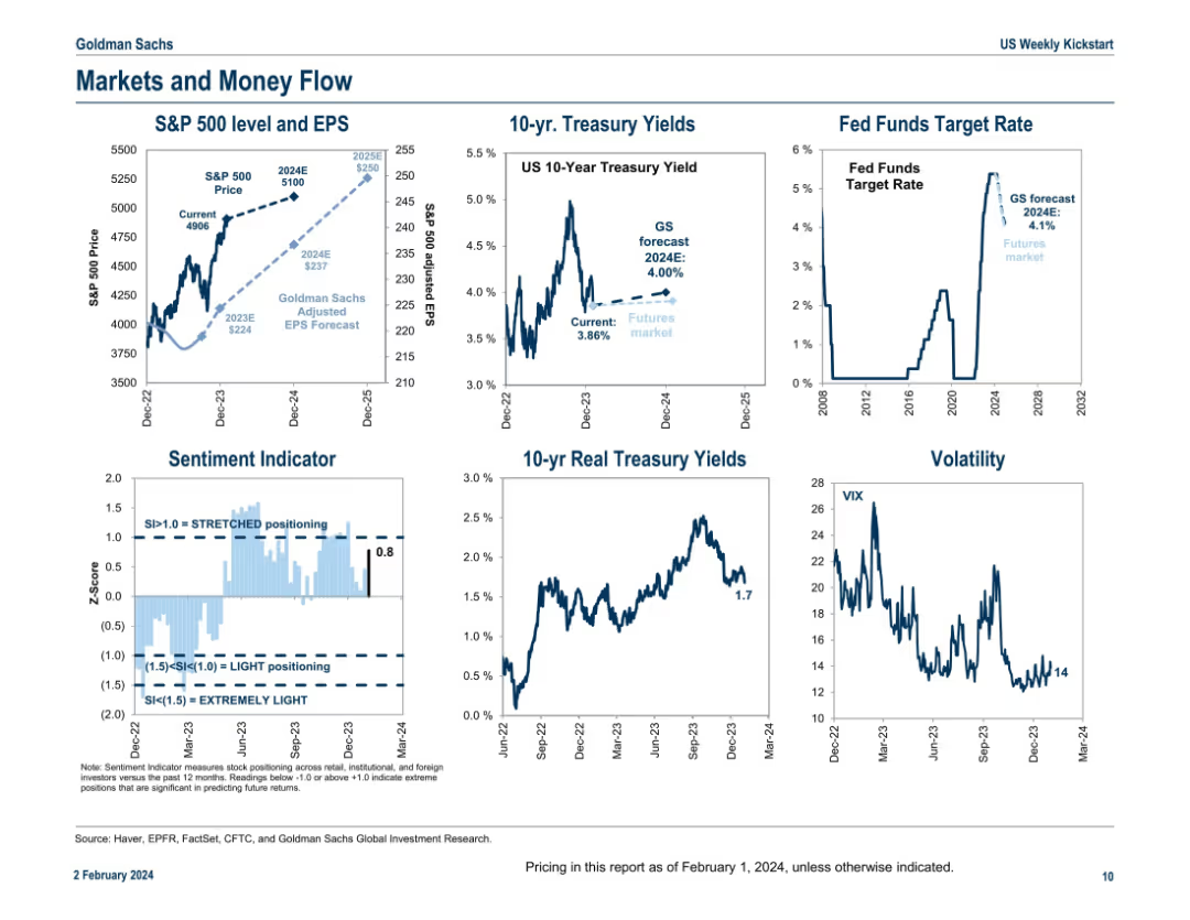
Six mini-panel layout of line charts; covers equity, bond yields, rates, sentiment, and volatility in a concise dashboard format.
Market Analysis and Trends
Financial Services
A multi-panel dashboard providing a snapshot of market indicators including S&P 500 price and EPS trends, treasury yields, sentiment, Fed funds rate projections, real yields, and VIX volatility. The slide is a macroeconomic pulse check summarizing key movements and outlooks as of early 2024.
equity, yields, sentiment, Fed rate, volatility, S&P 500, EPS, VIX, bonds
false
Market Analysis and Trends
Financial Services
Multiple Chart
Goldman Sachs
Add to my slides
Remove from favorites
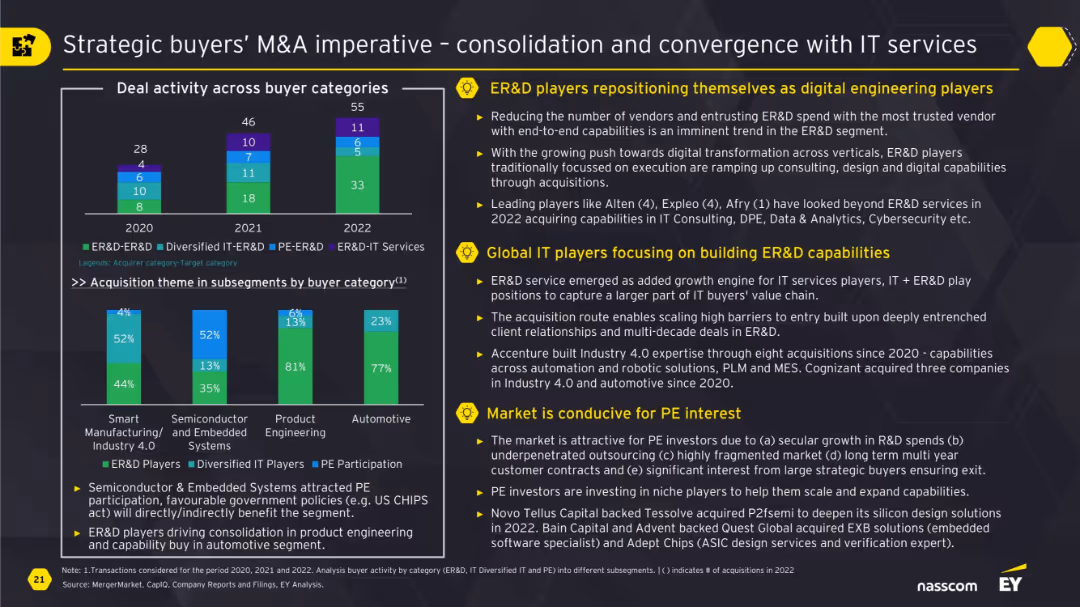
Bar chart comparing buyer categories over 3 years and stacked subsegment chart; side bullet points highlighting three strategic themes.
Strategic Planning
Technology & Software
The slide explains how ER&D players and global IT firms are converging through M&A to build digital engineering capabilities. It highlights shifting buyer strategies, rising interest in automation, and favorable conditions for PE investors due to government policies and secular growth in R&D spend.
ER&D, M&A, IT services, digital engineering, private equity, strategic buyers, consolidation
false
Strategic Planning
Technology & Software
Multiple Chart
EY
Add to my slides
Remove from favorites
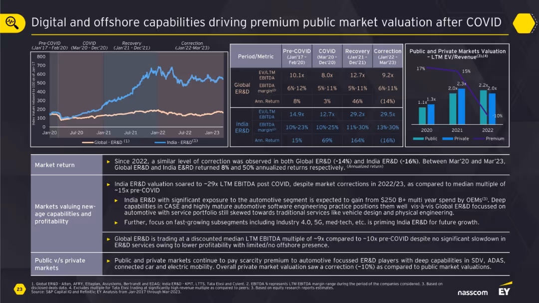
Two-line charts and two bar charts with multiple valuation and return metrics; structured in a matrix with explanations.
Financial Performance
Technology & Software
This slide presents the valuation premiums in public markets for Global and India ER&D post-COVID. It explores the correlation between digital/offshore capabilities and higher returns. It shows how investors favor niche engineering and automotive-focused firms with high profitability and innovation.
ER&D, valuation, digital, offshore, automotive, premium, public markets, returns
false
Financial Performance
Technology & Software
Multiple Chart
EY
Add to my slides
Remove from favorites
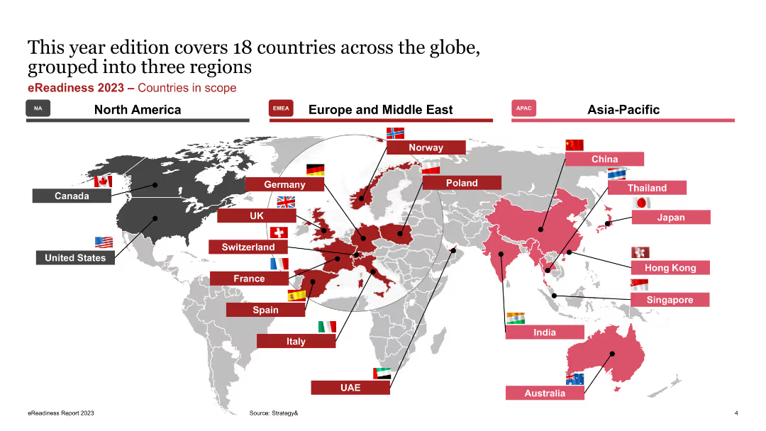
The slide features a world map highlighting 18 countries across three regions (North America, Europe and Middle East, Asia-Pacific). Each country is marked with a flag and label.
Market Analysis and Trends
Transportation & Logistics
The slide identifies the 18 countries covered in the eReadiness 2023 report, grouped into three regions: North America, Europe and Middle East, and Asia-Pacific. It visually represents the geographic scope of the study and the countries involved in the analysis.
eReadiness, Countries, Scope, Regions, North America, Europe, Middle East, Asia-Pacific, Market Analysis
false
Market Analysis and Trends
Transportation & Logistics
Graphic
PwC/Strategy&
Add to my slides
Remove from favorites
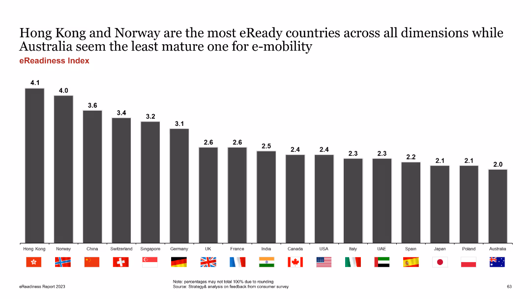
The slide features a column chart ranking countries by their eReadiness score. Each country is represented by a bar with its flag, and scores are listed above the bars.
Market Analysis and Trends
Transportation & Logistics
The slide ranks countries based on their overall eReadiness, highlighting Hong Kong and Norway as leaders and Australia as the least mature market. It aims to compare global EV market readiness.
eReadiness, country ranking, global comparison, EV market, scores
false
Market Analysis and Trends
Transportation & Logistics
Single Chart
PwC/Strategy&
Add to my slides
Remove from favorites
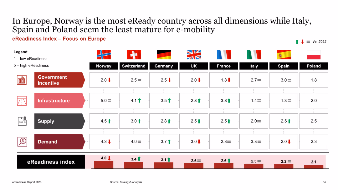
The slide shows a table with a comparative analysis of European countries' eReadiness scores across four dimensions: government incentives, infrastructure, supply, and demand. Each category is color-coded.
Market Analysis and Trends
Transportation & Logistics
The slide compares eReadiness in Europe, highlighting Norway as the most eReady country and Poland as the least. It aims to provide insights into regional differences in EV market readiness.
eReadiness, Europe, government incentives, infrastructure, supply, demand
false
Market Analysis and Trends
Transportation & Logistics
Mixed Chart
PwC/Strategy&
Add to my slides
Remove from favorites
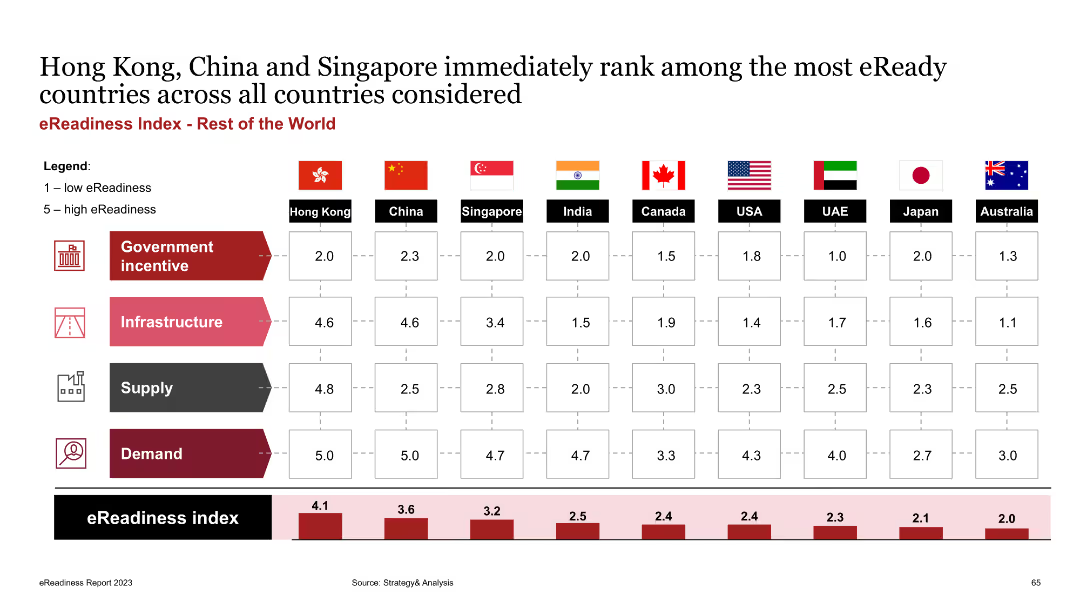
The slide features a table comparing eReadiness scores for countries outside Europe, across four dimensions: government incentives, infrastructure, supply, and demand. Each category is color-coded.
Market Analysis and Trends
Transportation & Logistics
The slide ranks eReadiness of countries globally, showing Hong Kong, China, and Singapore as leaders. It aims to provide a comprehensive view of EV market readiness beyond Europe.
eReadiness, global comparison, government incentives, infrastructure, supply, demand
false
Market Analysis and Trends
Transportation & Logistics
Mixed Chart
PwC/Strategy&
Add to my slides
Remove from favorites
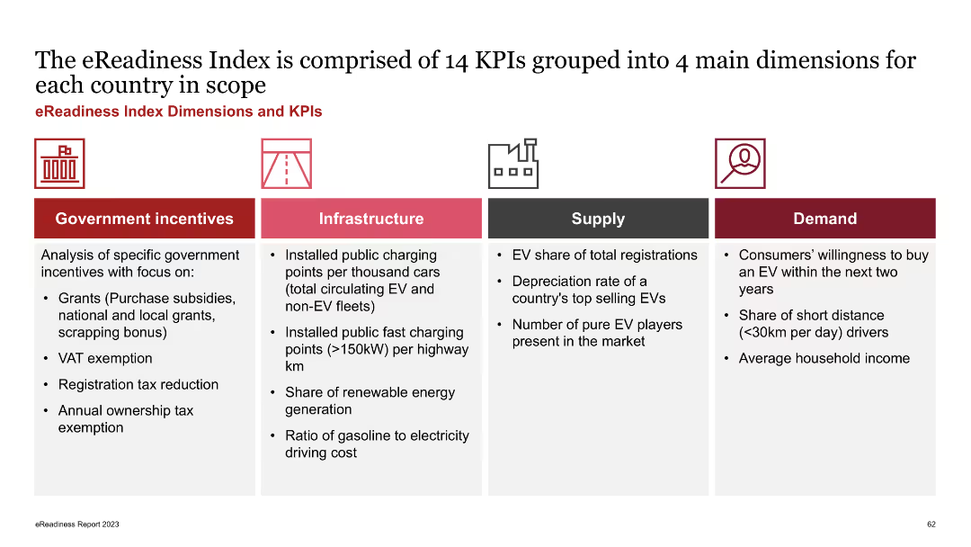
The slide is divided into four columns representing government incentives, infrastructure, supply, and demand, each listing relevant KPIs. Icons and brief descriptions accompany each category.
Strategic Planning
Transportation & Logistics
The slide outlines the key performance indicators (KPIs) used to measure eReadiness across various dimensions, including government incentives, infrastructure, supply, and demand. It aims to provide a comprehensive framework for evaluating EV market readiness.
eReadiness, KPIs, government incentives, infrastructure, supply, demand
false
Strategic Planning
Transportation & Logistics
Pillar
PwC/Strategy&
Add to my slides
Remove from favorites
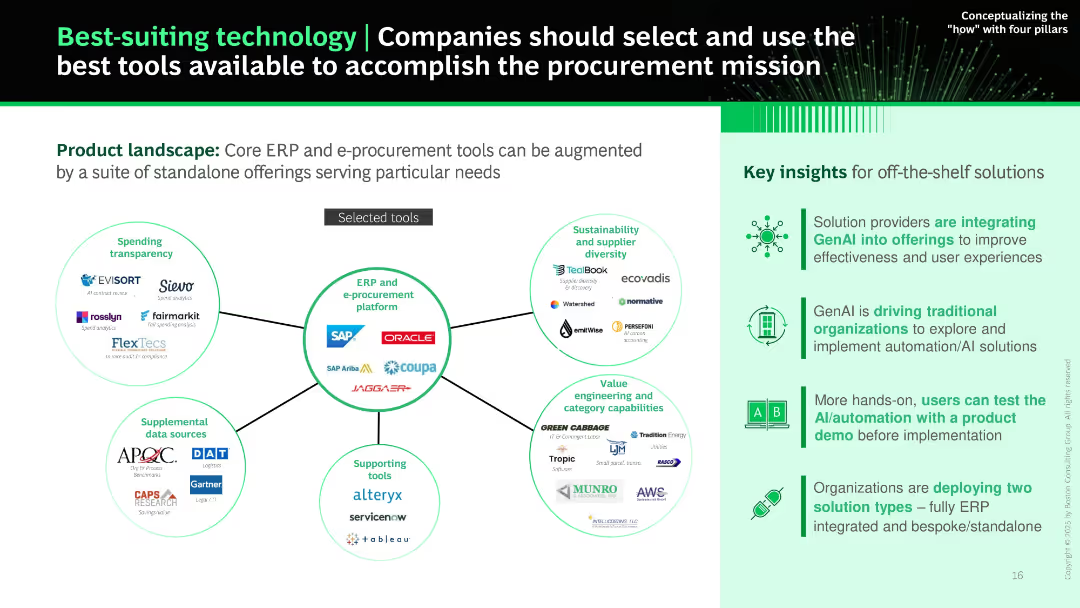
Central hub-and-spoke diagram surrounded by tool logos grouped by function (e.g., ERP, transparency, supplier diversity). Side panel summarizes key insights.
Product and Service Analysis
Technology & Software
Maps out the procurement technology landscape with core ERP platforms at the center and supplemental tools around them. Recommends selecting tools based on need and readiness for GenAI adoption. Insights include trends in ERP integration and standalone solution adoption.
ERP, procurement tools, technology selection, GenAI, software landscape, sourcing, AI tools
false
Product and Service Analysis
Technology & Software
Boxed
BCG
Add to my slides
Remove from favorites
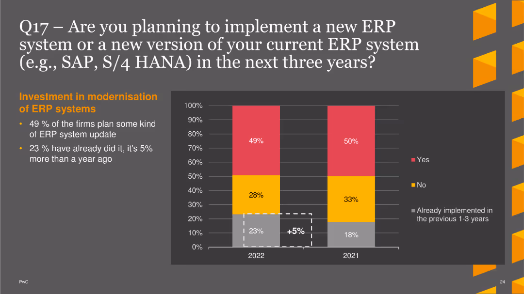
The slide includes a column chart illustrating firms' plans to update their ERP systems. It shows the percentage of firms planning updates, already implemented updates, and those not planning updates, for the years 2021 and 2022. The chart uses red for "yes", yellow for "no", and gray for "already implemented". A brief text section explains the statistics and trends in ERP system updates.
Technology and Digital Transformation
Financial Services
This slide provides data on the intentions of firms to implement or update their ERP systems within the next three years, highlighting trends in ERP modernization efforts. It helps in understanding the current state and future plans for ERP system adoption in the industry.
ERP systems, modernization, implementation, finance, technology, trends
false
Technology and Digital Transformation
Financial Services
Mixed Chart
PwC/Strategy&
Add to my slides
Remove from favorites
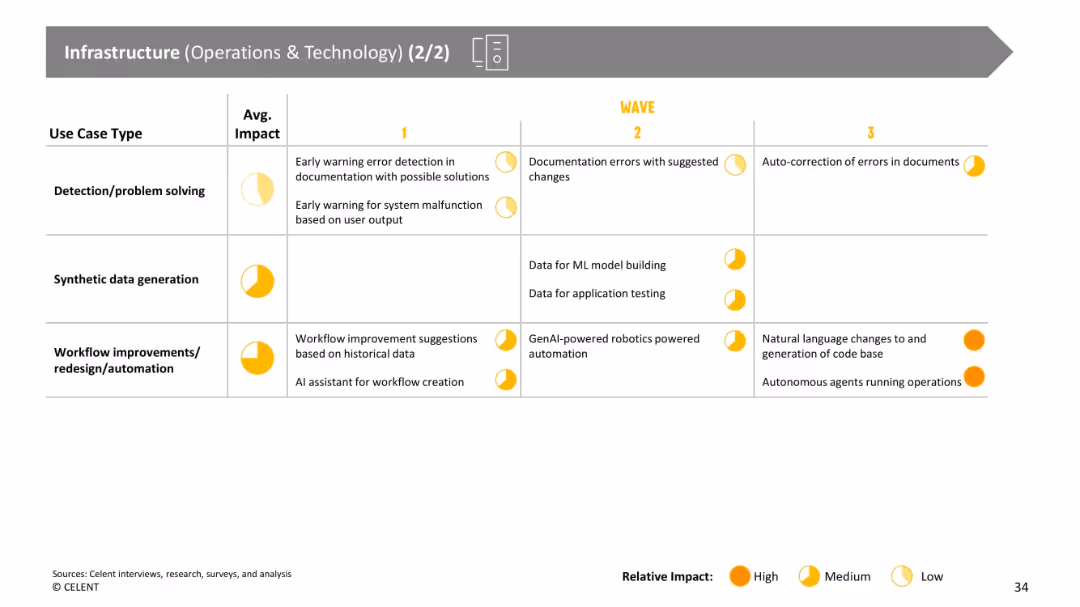
Continuation of prior slide with tabular use case categories and impact levels, using yellow circles to represent impact.
Operational Efficiency
Financial Services
Further categorizes infrastructure-related GenAI use cases like error detection, synthetic data generation, and workflow automation. Emphasis is placed on the projected impact and the timeline of adoption in different waves.
error detection, synthetic data, workflow, automation, GenAI, infrastructure
false
Operational Efficiency
Financial Services
Single Chart
Oliver Wyman
Add to my slides
Remove from favorites
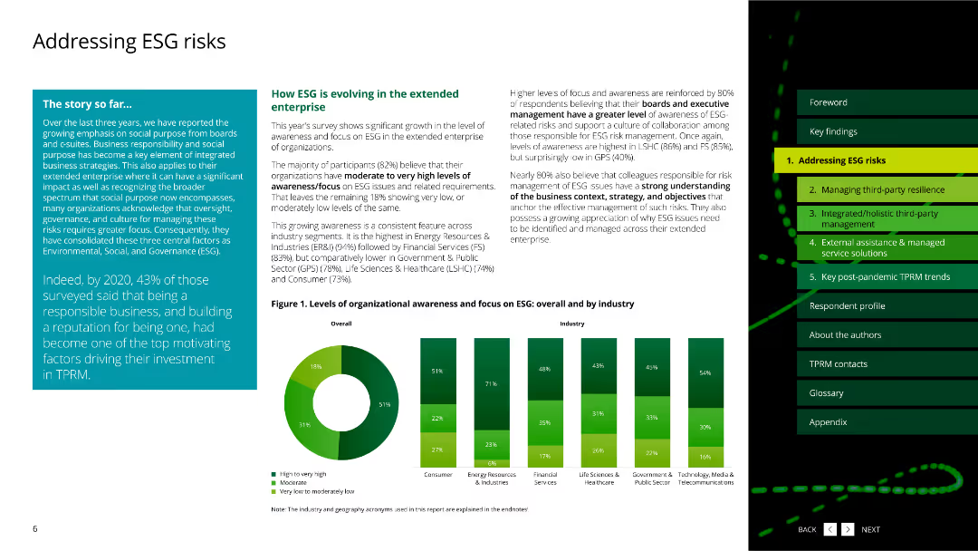
The slide features a pie chart and column charts about ESG assessment maturity by industry.
Risk Assessment and Management
Environmental Services & Sustainability
This slide covers the current maturity levels of ESG assessment across different industries based on a survey.
ESG, assessment, maturity, industry, survey
false
Risk Assessment and Management
Environmental Services & Sustainability
Multiple Chart
Deloitte
Add to my slides
Remove from favorites
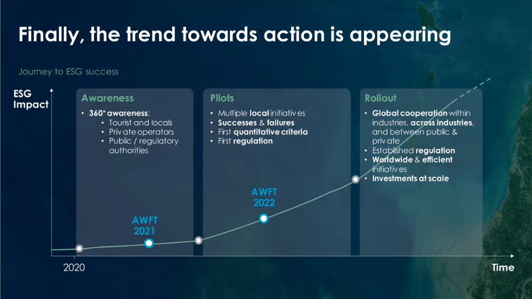
Timeline chart with three vertical panels labeled "Awareness," "Pilots," and "Rollout" on a dark background with a rising trendline labeled by years.
Strategic Planning
Environmental Services & Sustainability
The slide outlines the progressive stages of ESG (Environmental, Social, Governance) implementation: awareness (2021), pilot initiatives (2022), and eventual global rollout. It highlights increasing regulation, investment, and cooperation as ESG efforts mature over time.
ESG, awareness, regulation, investment, pilot, sustainability, global rollout, timeline
false
Strategic Planning
Environmental Services & Sustainability
Single Chart
Roland Berger
Add to my slides
Remove from favorites
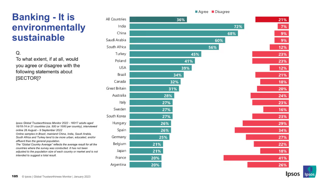
Bar chart depicting perception of the banking sector’s sustainability. Layout consistent with previous.
Market Analysis and Trends
Financial Services
Focuses on views around environmental sustainability in banking. India and China again top agreement levels, while Western countries show skepticism. Sustainability is not broadly recognized as a banking strength.
ESG, banking, sustainability, public perception, Ipsos, environment, finance
false
Market Analysis and Trends
Financial Services
Mixed Chart
IPSOS
Add to my slides
Remove from favorites
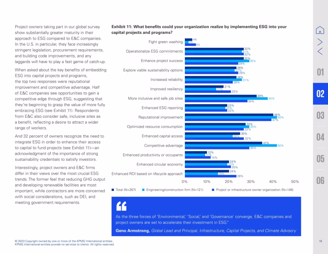
Left-aligned explanatory text and right-side bar chart with stacked responses. Bars show various benefits of implementing ESG in capital projects. Blue gradient used for three respondent groups.
Strategic Planning
Real Estate & Construction
This slide outlines potential benefits of embedding ESG into capital projects. Reputational improvement and competitive advantage rank highest, followed by enhanced ESG reporting and safer job sites. Project owners and E&C firms show different priorities: owners focus on emissions and renewable energy, while contractors emphasize social goals and compliance.
ESG benefits, competitive advantage, capital access, reputational improvement, sustainability, job safety, reporting
false
Strategic Planning
Real Estate & Construction
Mixed Chart
KPMG
Add to my slides
Remove from favorites
Contains a bar chart detailing perceived benefits of ESG transformation within organizations, such as competitive advantage and reputation enhancement. The chart is horizontal with varying lengths for each benefit listed.
Strategic Planning
Environmental Services & Sustainability
This slide assesses the perceived benefits that ESG practices bring to organizations, notably in improving reputation and competitive advantage. It suggests that businesses view ESG as more than a compliance requirement; it's a strategic enabler for long-term success.
ESG, benefits, competitive advantage, reputation, 2023
false
Strategic Planning
Environmental Services & Sustainability
Single Chart
PwC/Strategy&
Add to my slides
Remove from favorites
Slide presents three columns titled Environment, Social, Governance each with icons and associated initiatives, emphasizing Barclays' achievements and goals in ESG.
Strategic Planning
Financial Services
Highlights Barclays' ESG strategies and achievements, recognizing its status as the Best Bank for ESG in the UK by Euromoney, with detailed descriptions of initiatives across all ESG dimensions.
ESG, best practices, governance, social responsibility, environmental policy, awards
false
Strategic Planning
Financial Services
Pillar
Barclays
Add to my slides
Remove from favorites
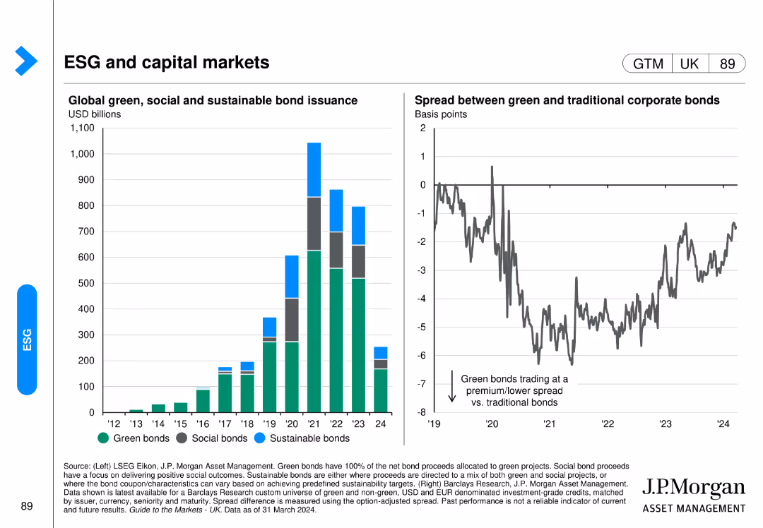
This slide has a column chart showing global green, social, and sustainable bond issuance and a line chart comparing the spread between green and traditional corporate bonds.
Investment Analysis
Financial Services
It focuses on the growth and comparative performance of ESG-related bonds in the capital markets, highlighting the financial aspects of sustainability in investment portfolios.
ESG bonds, capital markets, green bonds, sustainable investment, financial services, bond issuance, J.P. Morgan, investment analysis, market trends, social bonds
false
Investment Analysis
Financial Services
Multiple Chart
JP Morgan
Add to my slides
Remove from favorites
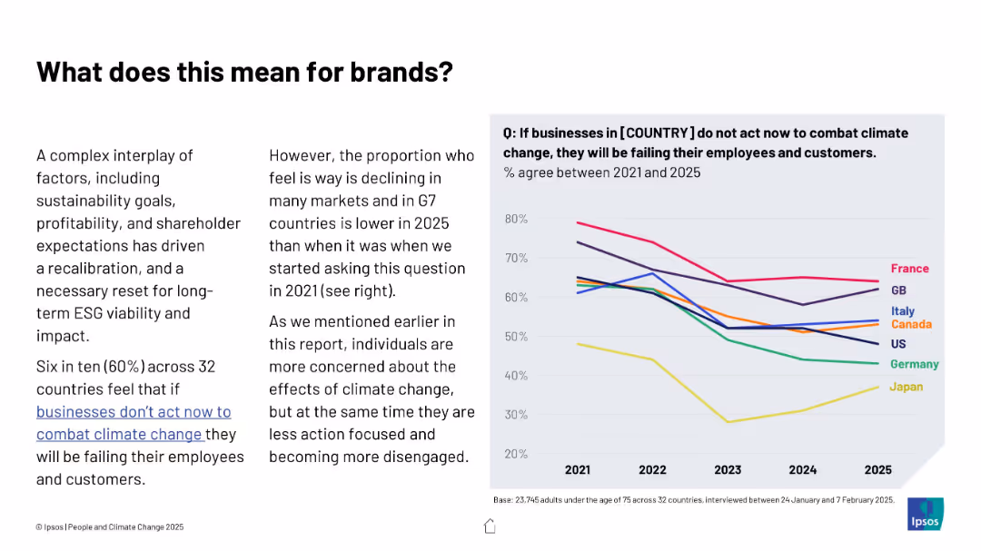
Text and line graph combination; left features contextual explanation, right shows trend lines for multiple countries from 2021 to 2025
Strategic Planning
Professional Services
The slide explores declining belief in corporate responsibility to combat climate change across G7 nations. A downward trend suggests companies may face lower public pressure, despite ongoing environmental challenges.
ESG, brands, climate responsibility, trends, business impact, public opinion, Ipsos, G7, consumer expectations
false
Strategic Planning
Professional Services
Mixed Chart
IPSOS
Add to my slides
Remove from favorites
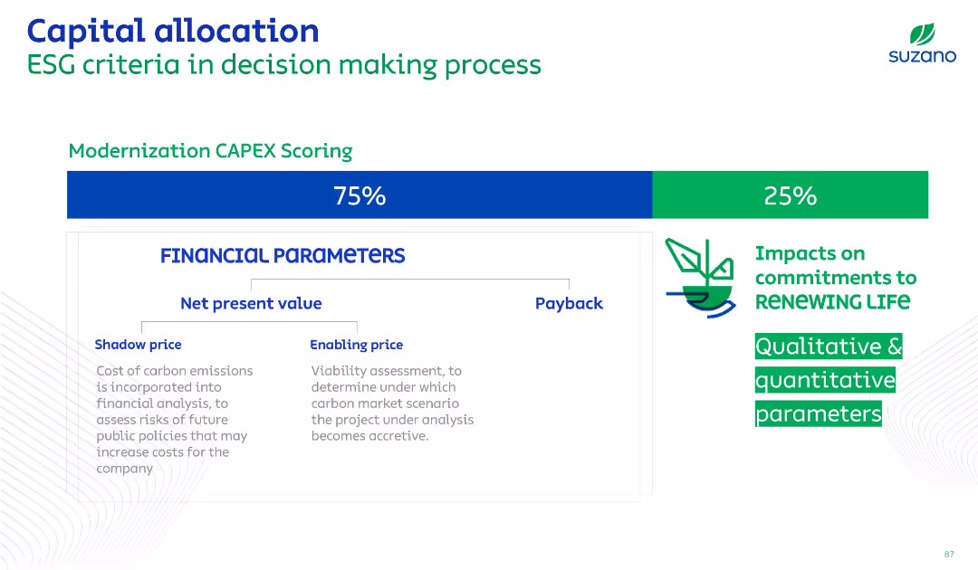
Balanced split with financial scoring on left (75%) and ESG impacts on right (25%). Text-based, minimalist design with icons and green/blue accents.
Corporate Finance and Valuation
Financial Services
Describes how Suzano incorporates ESG (Environmental, Social, and Governance) criteria into capital allocation decisions. Scoring gives weight to financial parameters and sustainability goals, with qualitative and quantitative metrics.
ESG, capital allocation, finance, valuation, sustainability, decision-making, scoring
false
Corporate Finance and Valuation
Financial Services
Mixed Chart
Goldman Sachs
Add to my slides
Remove from favorites
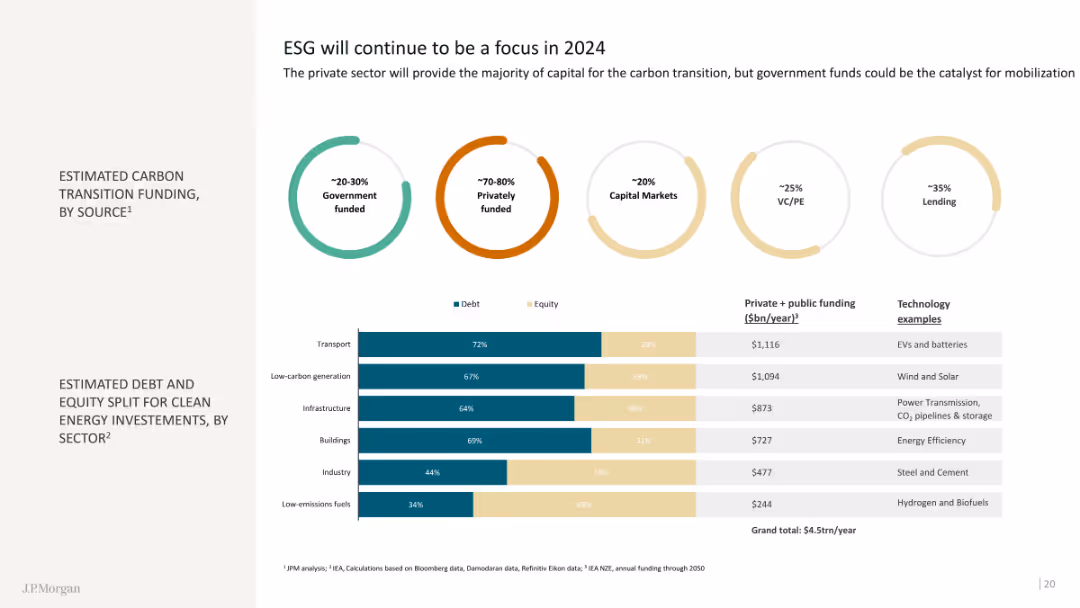
This slide features doughnut charts showing estimated carbon transition funding by source and a bar chart on estimated debt and equity split for clean energy investments by sector. The visuals are clear and informative.
Regulatory and Compliance
Financial Services
The slide details funding sources for carbon transition and the distribution of investments in clean energy sectors, highlighting the role of private sector and government funding.
ESG, carbon transition, clean energy
false
Regulatory and Compliance
Financial Services
Mixed Chart
JP Morgan
Add to my slides
Remove from favorites
Previous
Next
You don't have any favorites yet.
Please wait loading your favorites slides...
Create a FREE account to continue browsing
Receive Instant Access to 1,000+ slides from companies like McKinsey, Google, and Goldman Sachs
First Name
Last Name
Email
Password
I agree to all
Terms & Privacy Policy
Thank you! Your submission has been received!
Oops! Something went wrong while submitting the form.
Have an account?
Sign in
Upgrade to PRO to Save slides
Advanced Search and Filters
Access to 15,000+ slides
Access to Category Pages
Save/Bookmark Slides
PowerPoint Template Library
Pick a Plan
MONTHLY
$12/month
Billed every month, Cancel anytime.
YEARLY
$9/year
Billed $108 annually, Cancel anytime.
Checkout for $12/month
Checkout for $108/yr
Secured by Stripe | AES-256 bit encryption