My Account
My Slides
Search by Category
Companies
Slide Type
Use Case
Industry
Pricing
Templates
View All Templates
Download Template Slides
✦ AI
AI Prompt Library
AI Search
Feedback
Login
Logout
Get Started
Browse all Slides
Browse all Slides
Create a FREE Account
Instant access to 1,000+ real slides from top companies like McKinsey, BCG, Goldman Sachs, Google and many more!
First Name
Last Name
Email
Password
I agree to all
Terms & Privacy Policy
Thank you! Your submission has been received!
Oops! Something went wrong while submitting the form.
Have an account?
Sign in
Saved Slides
Total No. of slides saved
0
↻ Refresh
✖ Clear all
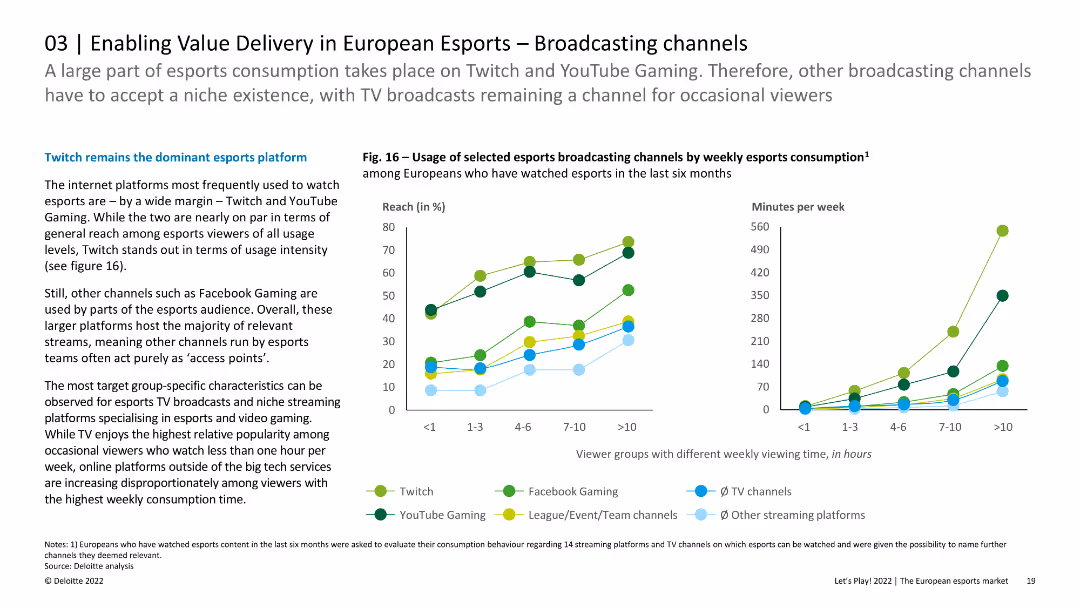
The slide features line charts showing the usage of selected esports broadcasting channels by weekly esports consumption. The layout is visually engaging with clear trend lines.
Strategic Planning
Media & Entertainment
This slide analyzes the viewing patterns of esports audiences across different broadcasting platforms in Europe, highlighting the popularity of Twitch and YouTube Gaming. It provides insights into how different viewer groups engage with these platforms based on viewing time.
Esports, Broadcasting, Platforms, Europe, Viewing
false
Strategic Planning
Media & Entertainment
Multiple Chart
Deloitte
Add to my slides
Remove from favorites
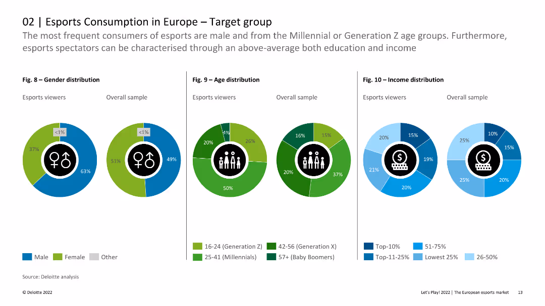
The slide includes pie charts and column charts showing gender, age, and income distribution among esports viewers compared to the overall sample. The visual layout is clear and data-centric.
Customer and Market Segmentation
Media & Entertainment
This slide provides detailed demographic breakdowns of esports viewers in Europe, emphasizing differences in gender, age, and income distribution compared to the general population. It highlights that esports viewers are younger and more male-dominated.
Esports, Demographics, Gender, Age, Income
false
Customer and Market Segmentation
Media & Entertainment
Multiple Chart
Deloitte
Add to my slides
Remove from favorites
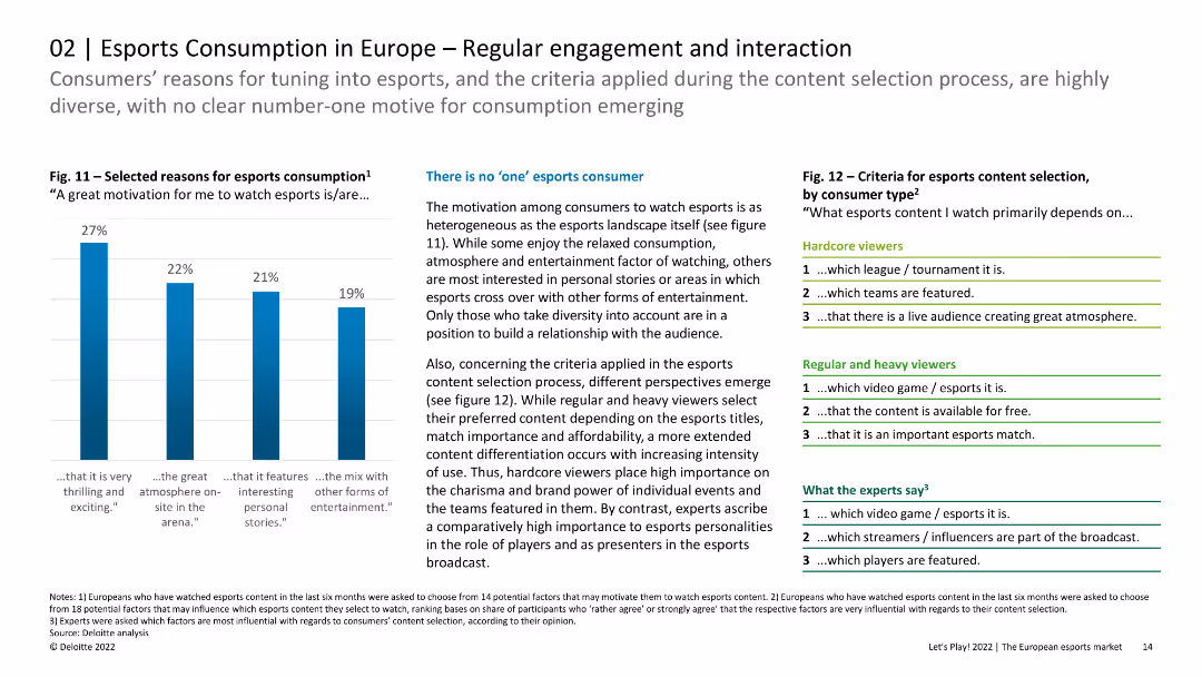
The slide features column charts and lists showing the reasons for esports consumption and criteria for content selection. The layout is organized with clear visual hierarchy.
Customer and Market Segmentation
Media & Entertainment
The slide discusses the diverse motivations and criteria for esports consumption among European viewers, indicating that there is no single dominant reason. It highlights the importance of content differentiation for hardcore, regular, and heavy viewers.
Esports, Engagement, Interaction, Content Selection
false
Customer and Market Segmentation
Media & Entertainment
Mixed Chart
Deloitte
Add to my slides
Remove from favorites
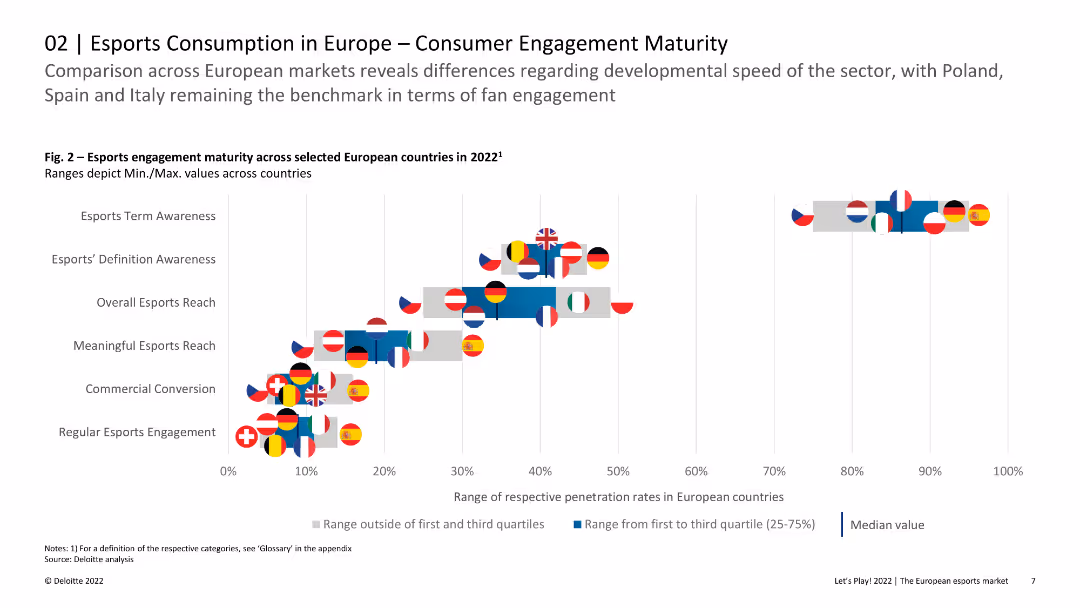
Scatter plot with flags representing European countries, comparing various esports engagement metrics like awareness and commercial conversion.
Market Analysis and Trends
Media & Entertainment
Compares esports engagement maturity across different European countries, showing variances in awareness, engagement, and commercial conversion rates.
esports, engagement, maturity, comparison, countries, Europe, conversion
false
Market Analysis and Trends
Media & Entertainment
Single Chart
Deloitte
Add to my slides
Remove from favorites
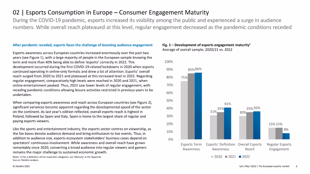
Column chart showing the development of esports engagement maturity over three years, with varying levels of awareness and engagement.
Market Analysis and Trends
Media & Entertainment
Analyzes the growth and engagement levels in esports across Europe, highlighting the increased awareness and reach over the past few years.
esports, engagement, maturity, Europe, awareness, reach, growth
false
Market Analysis and Trends
Media & Entertainment
Mixed Chart
Deloitte
Add to my slides
Remove from favorites
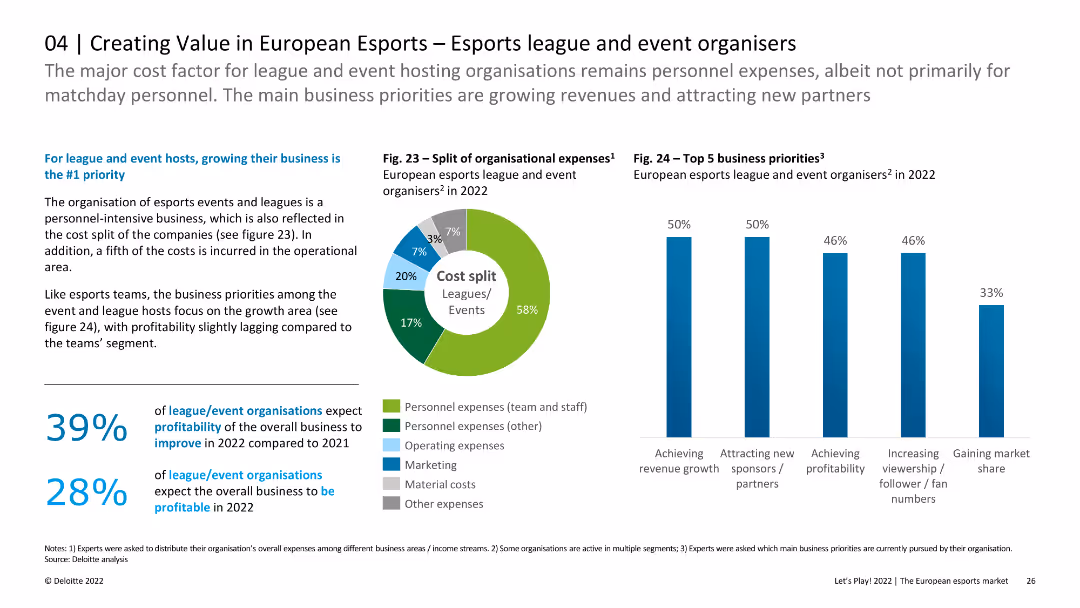
The slide includes a pie chart showing the split of organizational expenses and a column chart listing top business priorities for leagues and event organizers. It also contains text discussing profitability and growth priorities.
Market Analysis and Trends
Media & Entertainment
This slide focuses on the cost structure and business priorities of European esports leagues and event organizers. It highlights the emphasis on growing business, achieving revenue growth, and attracting new sponsors.
esports, expenses, business priorities, growth, sponsors
false
Market Analysis and Trends
Media & Entertainment
Multiple Chart
Deloitte
Add to my slides
Remove from favorites
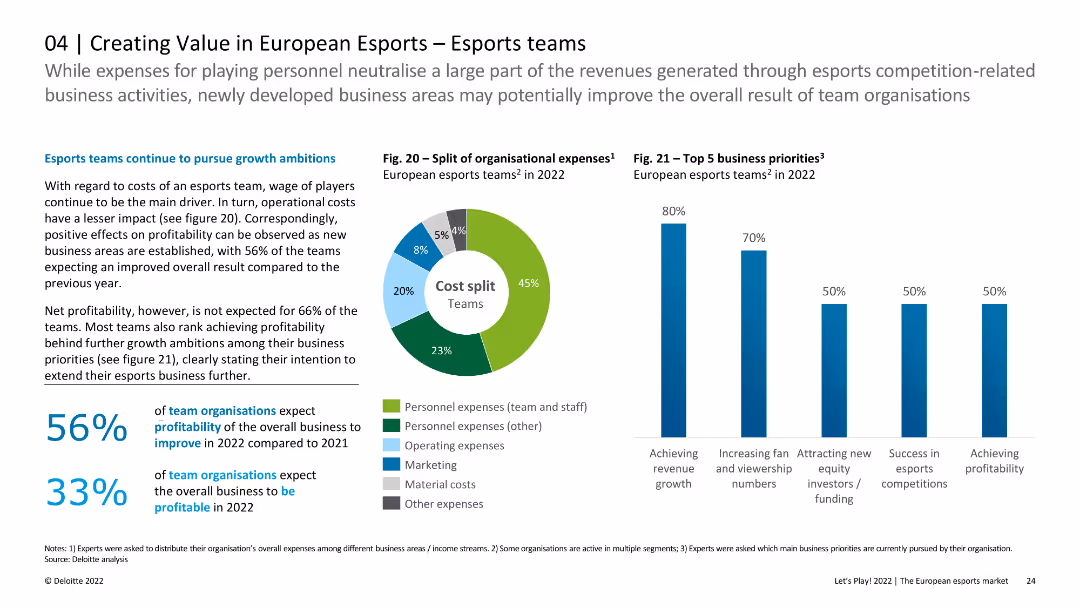
The slide features a pie chart showing the split of organizational expenses and a column chart indicating top business priorities for European esports teams in 2022. There is a mix of text and data visuals. The design is moderately detailed.
Market Analysis and Trends
Media & Entertainment
This slide analyzes the organizational expenses and business priorities of European esports teams in 2022. It highlights the distribution of costs and the key areas teams are focusing on to achieve revenue growth and profitability.
esports, expenses, business priorities, revenue, growth
false
Market Analysis and Trends
Media & Entertainment
Multiple Chart
Deloitte
Add to my slides
Remove from favorites
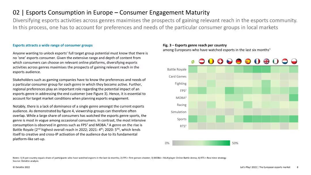
Heatmap chart showing the reach of different esports genres per country, with intensity varying by genre and country.
Market Analysis and Trends
Media & Entertainment
Explores the reach of various esports genres across European countries, highlighting the diversity in consumer preferences and engagement levels.
esports, genres, reach, countries, engagement, diversity, preferences
false
Market Analysis and Trends
Media & Entertainment
Header Horizontal
Deloitte
Add to my slides
Remove from favorites
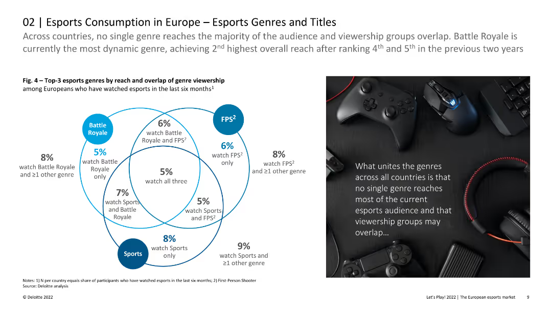
The slide features a Venn diagram showing the overlap of viewership among three esports genres: Battle Royale, FPS, and Sports. The right side includes a photo of gaming accessories. The layout is balanced with a clear, engaging visual format.
Market Analysis and Trends
Media & Entertainment
This slide presents data on the reach and overlap of esports genre viewership in Europe, highlighting that no single genre dominates the audience. It suggests the dynamic nature of Battle Royale games and the significant overlap in viewership groups.
Esports, Genres, Viewership, Europe, Battle Royale
false
Market Analysis and Trends
Media & Entertainment
Diagram
Deloitte
Add to my slides
Remove from favorites
Slide features column charts and a line graph, including numerical data and percentage changes.
Market Analysis and Trends
Media & Entertainment
Analyzes the growth potential of the video games and esports market in India, highlighting revenue projections and growth rates in various segments.
esports, India, revenue, growth, video games
false
Market Analysis and Trends
Media & Entertainment
Multiple Chart
PwC/Strategy&
Add to my slides
Remove from favorites
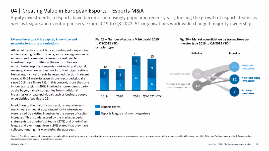
The slide features two column charts: one showing the number of esports M&A deals from 2019 to Q3 2022 by seller type, and another depicting market consolidation by investor type. Text discusses investment trends.
Mergers and Acquisitions
Media & Entertainment
This slide provides an overview of M&A activities in the esports sector from 2019 to Q3 2022. It highlights the number of deals and types of investors involved, discussing the implications for growth and market consolidation.
esports, M&A, investment, market consolidation, trends
false
Mergers and Acquisitions
Media & Entertainment
Mixed Chart
Deloitte
Add to my slides
Remove from favorites
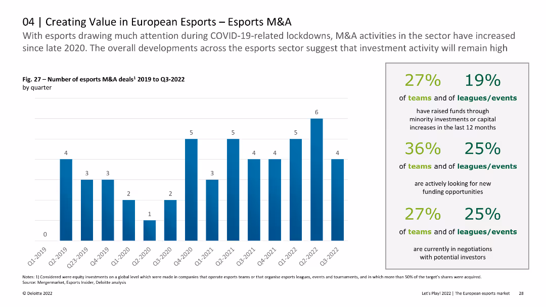
The slide includes a column chart showing the number of esports M&A deals by quarter from 2019 to Q3 2022. Text provides insights into investment activities and trends within the esports sector during this period.
Mergers and Acquisitions
Media & Entertainment
This slide analyzes the quarterly number of M&A deals in the esports sector from 2019 to Q3 2022, discussing how COVID-19 and other factors influenced investment activities and the overall market dynamics.
esports, M&A, quarterly deals, investment, trends
false
Mergers and Acquisitions
Media & Entertainment
Mixed Chart
Deloitte
Add to my slides
Remove from favorites
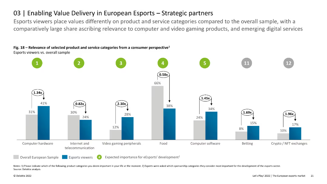
The slide features column charts showing the relevance of selected product and service categories from a consumer perspective. The visual layout is detailed and clear.
Strategic Planning
Media & Entertainment
This slide examines the preferences of esports viewers regarding various product and service categories, comparing their importance to the overall sample. It highlights the high relevance of computer hardware and gaming peripherals among esports consumers in Europe.
Esports, Product Relevance, Consumer Preferences, Europe
false
Strategic Planning
Media & Entertainment
Single Chart
Deloitte
Add to my slides
Remove from favorites
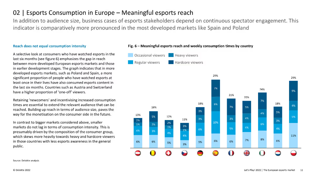
The slide includes a column chart illustrating meaningful esports reach and weekly consumption times by country. The layout is informative with clear data presentation.
Market Analysis and Trends
Media & Entertainment
The slide analyzes the reach of esports content in Europe, emphasizing that larger markets show higher consumption intensity. It highlights the importance of retaining new viewers and incentivizing increased consumption times for monetization.
Esports, Reach, Consumption, Europe, Audience
false
Market Analysis and Trends
Media & Entertainment
Mixed Chart
Deloitte
Add to my slides
Remove from favorites
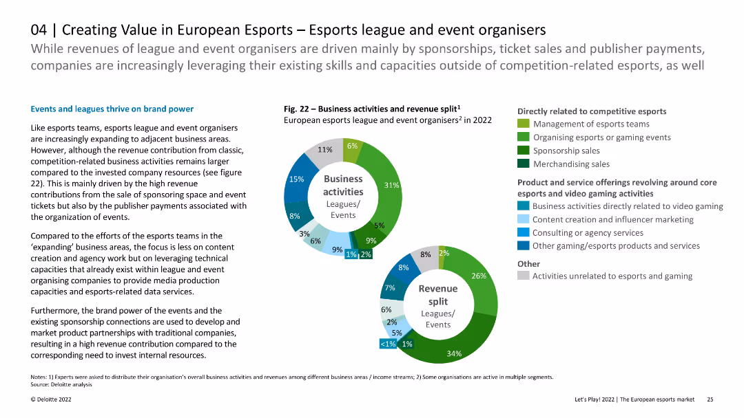
The slide presents a pie chart detailing business activities and revenue split for esports leagues and event organizers in 2022. Another pie chart shows revenue sources. Text explains trends and strategies.
Market Analysis and Trends
Media & Entertainment
This slide examines the revenue and business activities split for European esports leagues and event organizers in 2022. It discusses how brand power and sponsorship drive revenue, alongside strategies for growth and diversification.
esports, revenue, business activities, sponsorship, trends
false
Market Analysis and Trends
Media & Entertainment
Multiple Chart
Deloitte
Add to my slides
Remove from favorites
Bar chart comparing revenue growth across various media types from 2019 to 2020, highlighting internet advertising, video games, and esports as growth areas.
Market Analysis and Trends
Media & Entertainment
Discusses how esports has seen the most significant revenue growth rate among media types, complemented by the robust performance of internet advertising and video games.
esports, revenue growth, internet advertising, video games, 2019-2020
false
Market Analysis and Trends
Media & Entertainment
Single Chart
PwC/Strategy&
Add to my slides
Remove from favorites
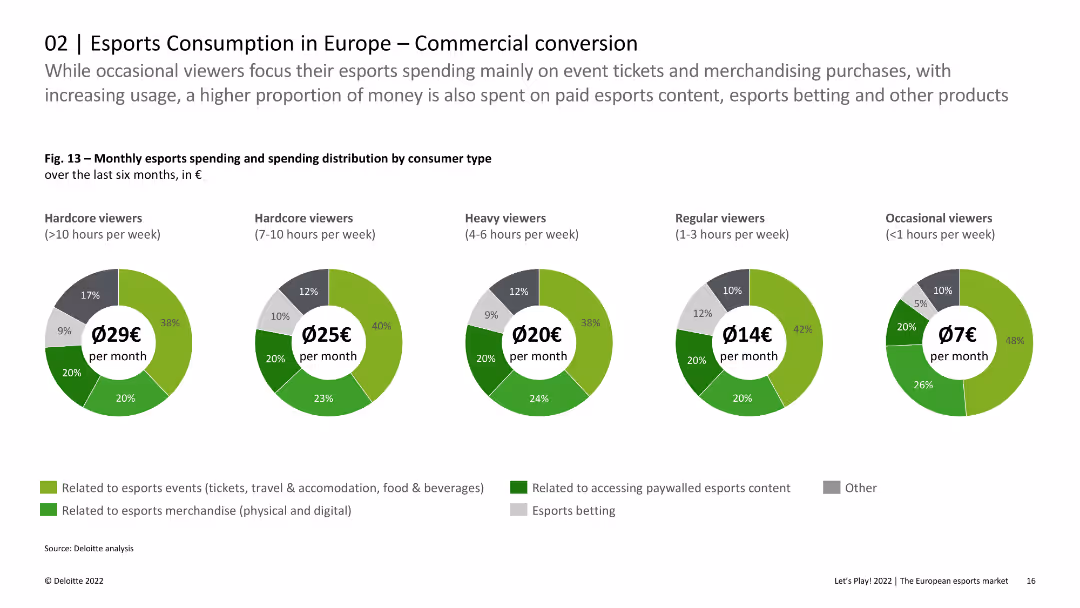
The slide includes pie charts showing monthly esports spending and spending distribution by consumer type. The visual presentation is balanced and data-rich.
Market Analysis and Trends
Media & Entertainment
This slide analyzes the spending habits of different types of esports viewers in Europe, highlighting that hardcore viewers spend more on various esports-related expenses compared to occasional viewers. It provides insights into the commercial potential of esports.
Esports, Spending, Consumer Types, Europe, Commercial
false
Market Analysis and Trends
Media & Entertainment
Multiple Chart
Deloitte
Add to my slides
Remove from favorites
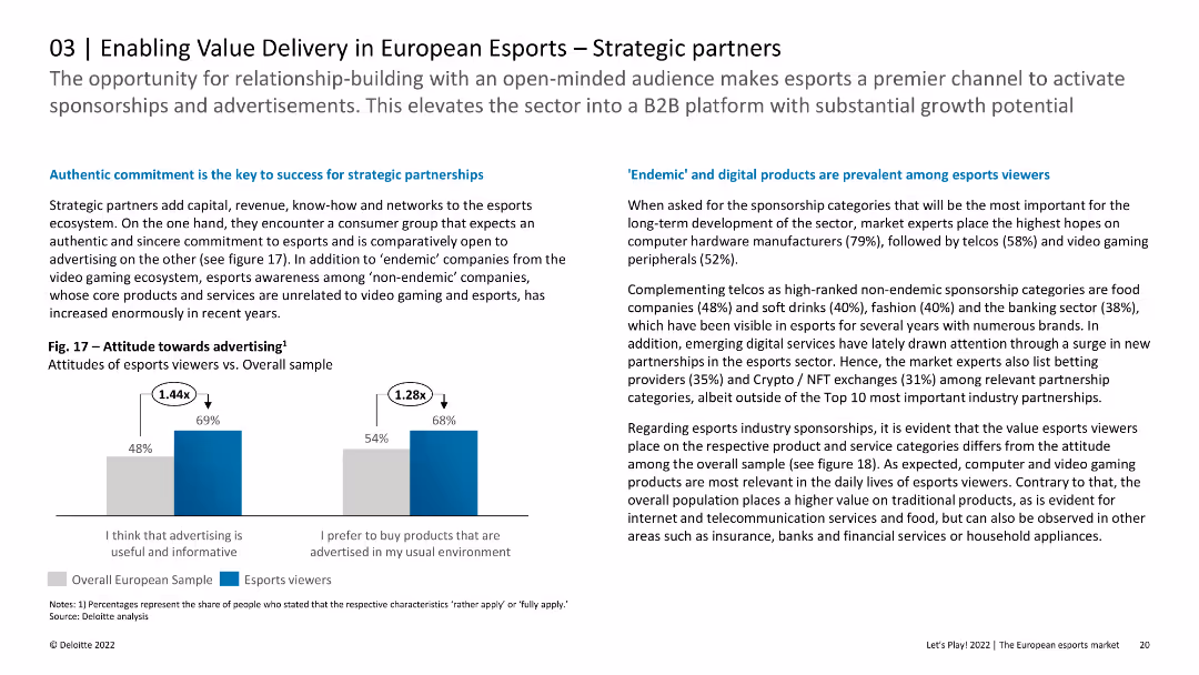
The slide includes column charts showing attitudes towards advertising among esports viewers compared to the overall sample. The layout is clean and focused on data presentation.
Strategic Planning
Media & Entertainment
This slide discusses the importance of strategic partnerships in the esports ecosystem, highlighting the positive attitudes of esports viewers towards advertising. It provides insights into the preferred sponsorship categories and the relevance of different products and services.
Esports, Strategic Partnerships, Advertising, Europe
false
Strategic Planning
Media & Entertainment
Mixed Chart
Deloitte
Add to my slides
Remove from favorites
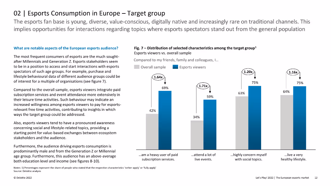
The slide features multiple charts comparing the characteristics of esports viewers to the overall sample, including paid subscription services usage and attendance at live events.
Customer and Market Segmentation
Media & Entertainment
This slide examines the demographics and behavioral characteristics of esports viewers in Europe, contrasting them with the general population. It highlights that esports fans are predominantly young, value-conscious, and digitally native.
Esports, Target Group, Demographics, Europe, Viewers
false
Customer and Market Segmentation
Media & Entertainment
Mixed Chart
Deloitte
Add to my slides
Remove from favorites
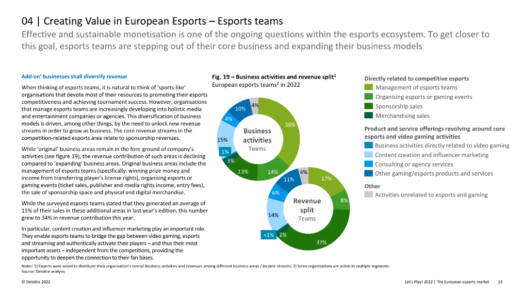
The slide features two pie charts depicting the revenue split and business activities of European esports teams, along with text discussing how these teams are diversifying their business models.
Market Analysis and Trends
Media & Entertainment
Analyzes how European esports teams are expanding beyond core activities to diversify revenue streams, supported by data on business activities and revenue contributions in different areas.
esports teams, revenue diversification, business activities, European market, esports market analysis
false
Market Analysis and Trends
Media & Entertainment
Multiple Chart
Deloitte
Add to my slides
Remove from favorites
Flow diagram detailing the consumer journey for essential items, with online and offline touchpoints.
Customer and Market Segmentation
Retail & E-commerce
Describes consumer behavior for essential items, highlighting the importance of an integrated channel experience.
essential items, shopping behavior, consumer journey, online shopping, retail
false
Customer and Market Segmentation
Retail & E-commerce
Header Horizontal
Bain
Add to my slides
Remove from favorites
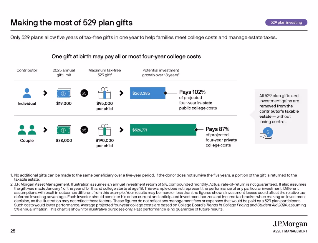
Icon row, side-by-side comparisons of individual vs. couple contributions with gift limits and investment projections.
Investment Analysis
Financial Services
This slide shows how front-loading 529 plan gifts can significantly fund future college expenses while reducing estate taxes. It compares the financial impact of individual vs. couple contributions and demonstrates how a lump sum at birth can cover nearly all four-year public college costs.
estate planning, 529 gifting, college savings, compound growth, tax-free
false
Investment Analysis
Financial Services
Mixed Chart
JP Morgan
Add to my slides
Remove from favorites
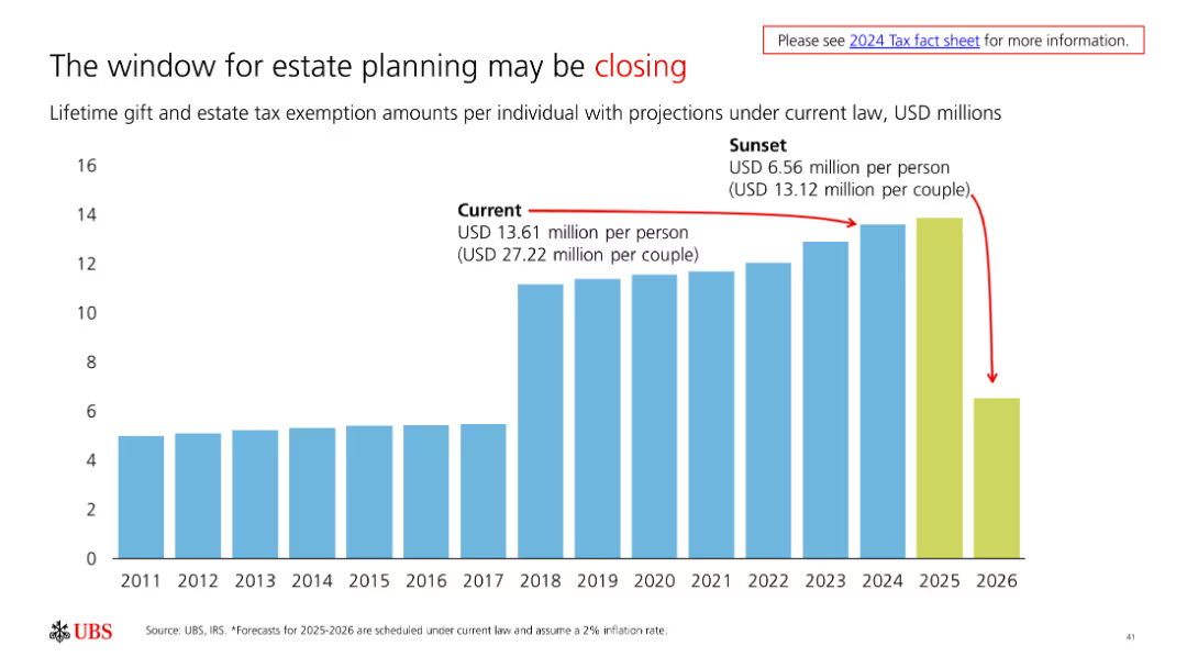
The slide features a column chart showing lifetime gift and estate tax exemption amounts over time. It is moderately complex with clear visual data representation.
Strategic Planning
Financial Services
The slide highlights the current and projected changes in estate tax exemption amounts, urging timely estate planning before the window closes.
estate planning, tax, exemption, projections, planning
false
Strategic Planning
Financial Services
Single Chart
UBS
Add to my slides
Remove from favorites
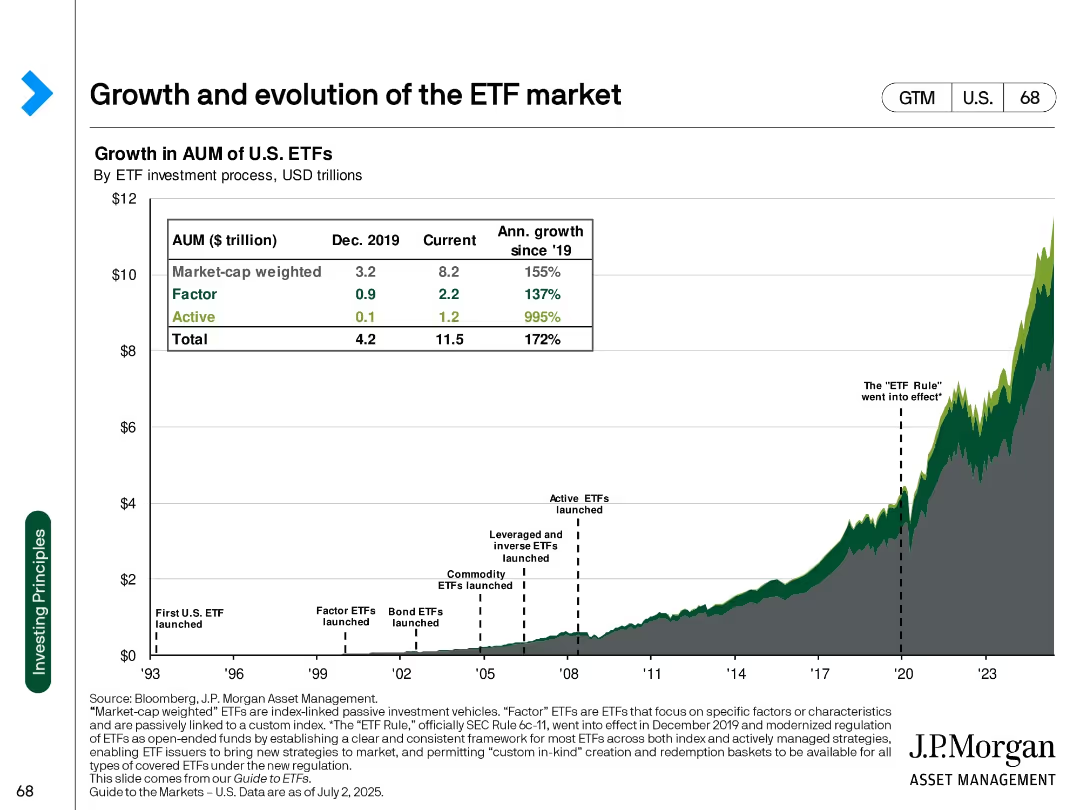
Line and area chart with annotation markers, table overlay showing AUM growth across ETF types
Market Analysis and Trends
Financial Services
Illustrates the historical growth of U.S. ETFs by investment strategy (market-cap weighted, factor, active) with notable regulatory milestones and growth metrics.
ETF, AUM, passive investment, market-cap, growth, regulation, active ETFs, factor, J.P. Morgan, U.S. market
false
Market Analysis and Trends
Financial Services
Single Chart
JP Morgan
Add to my slides
Remove from favorites
Features a dark background and multiple horizontal bars in a gradient of warm colors representing various industries. The arrangement allows for an immediate visual comparison of data.
Product and Service Analysis
Consumer Goods
Illustrates industry-specific projections for ethically driven consumer purchases by 2026. This slide is pertinent for analyzing product and service impact in the context of ethical consumerism within different sectors.
Ethical Consumerism, Industry Analysis, 2026 Forecast, Product Impact, Service Analysis
false
Product and Service Analysis
Consumer Goods
Single Chart
Kearney
Add to my slides
Remove from favorites
Stacked bar chart showing the importance of ethical guidelines for various aspects of a company.
Regulatory and Compliance
Technology & Software
Emphasizes the critical role of ethical guidelines in areas like revenue growth, brand reputation, and employee trust according to C-level executives.
ethical guidelines, revenue growth, brand reputation, employee trust, C-level executives
false
Regulatory and Compliance
Technology & Software
Mixed Chart
Deloitte
Add to my slides
Remove from favorites
This slide features a dark background with a blue and yellow pie chart on the right and a vertical bar graph on the left. Both visual elements are clear and distinct, with text annotations providing context to the data presented.
Customer and Market Segmentation
Retail & E-commerce
The slide presents data on consumer purchasing driven by ethical concerns, projected for 2026, which is crucial for discussions on ethical practices and consumer trends within various industries.
Ethical Purchasing, Consumer Trends, 2026 Forecast, Industry Analysis, Ethical Practices
false
Customer and Market Segmentation
Retail & E-commerce
Multiple Chart
Kearney
Add to my slides
Remove from favorites
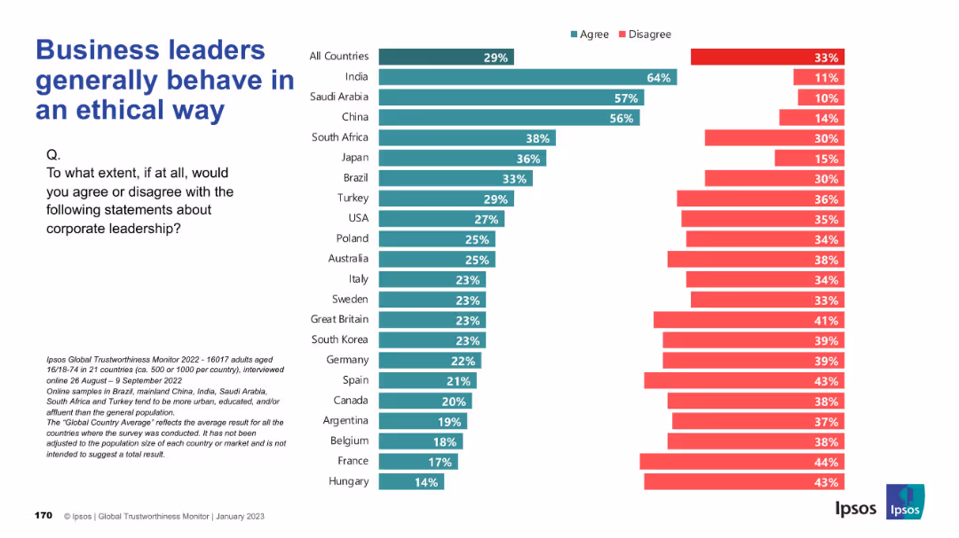
Familiar bar chart layout with agree/disagree metrics; countries displayed along the vertical axis; standard visual structure and color-coding.
Risk Assessment and Management
Professional Services
This slide examines global trust in business leaders’ ethics. India stands out positively while Western countries show skepticism, revealing a divide in corporate reputation and ethical perceptions.
ethics, corporate behavior, trust, leadership perception, global disparity, Ipsos, morality
false
Risk Assessment and Management
Professional Services
Mixed Chart
IPSOS
Add to my slides
Remove from favorites
Slide includes multiple column charts comparing German and Global responses regarding the ethical implications and organizational investments related to Industry 4.0 technologies. It shows leaders' perspectives on ethical concerns, policy exploration, and investment strategies in technologies to protect businesses.
Regulatory and Compliance
Technology & Software
Discusses ethical considerations and investment strategies by German and Global executives in response to Industry 4.0 technologies. It explores the level of concern and proactive measures taken to mitigate unethical use and disruptions.
Ethics, Industry 4.0, Technology, Investment, Germany, Global, Business Protection, Leadership
false
Regulatory and Compliance
Technology & Software
Multiple Chart
Deloitte
Add to my slides
Remove from favorites
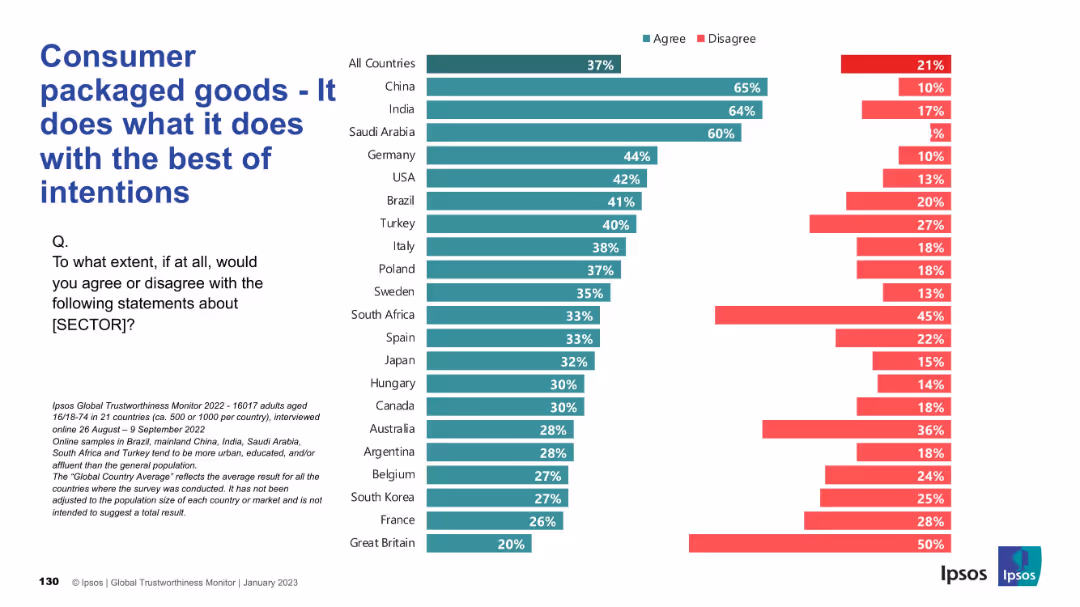
Horizontal bars showing perception of ethical intent; follows same format as previous charts; Ipsos branding and color scheme consistent.
Product and Service Analysis
Consumer Goods
This slide presents public sentiment on whether consumer packaged goods companies act with good intentions. Positive responses dominate in China, India, and Saudi Arabia. However, trust is notably lower in countries like Great Britain and France.
ethics, intent, consumer trust, product sector, international sentiment
false
Product and Service Analysis
Consumer Goods
Mixed Chart
IPSOS
Add to my slides
Remove from favorites
Slide with a dual layout, left side with a photo of foliage, right side with text and two pie charts in red and grey tones illustrating statistical data.
Corporate Finance and Valuation
Government & Public Sector
This slide discusses the shift in corporate goals towards ethical values and social responsibility, highlighting the expectations and perceptions of companies and their employees.
Ethics, Responsibility, Environment, Social, Corporate
false
Corporate Finance and Valuation
Government & Public Sector
Mixed Chart
PwC/Strategy&
Add to my slides
Remove from favorites
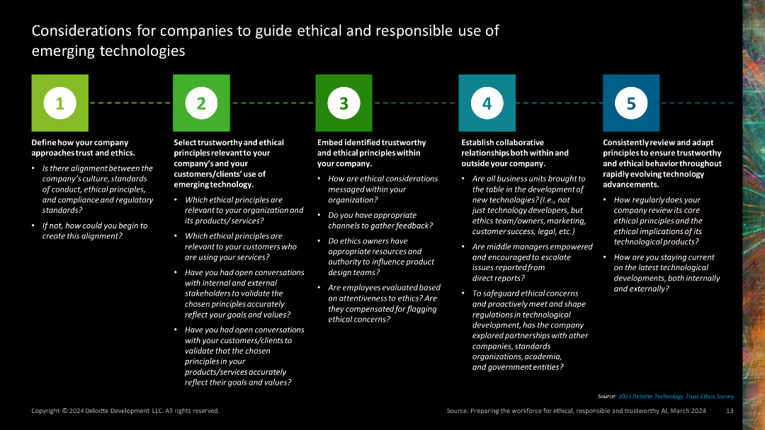
This slide contains five distinct sections, each represented by a colored number icon and text outlining considerations for ethical and responsible technology use. The layout is clear and structured with bullet points.
Regulatory and Compliance
Technology & Software
It outlines five key considerations for companies to guide ethical and responsible use of emerging technologies, covering alignment of ethics, trust principles, embedding ethics, collaboration, and adaptation.
ethics, responsible, principles, collaboration, adaptation
false
Regulatory and Compliance
Technology & Software
Linear Flow
Deloitte
Add to my slides
Remove from favorites
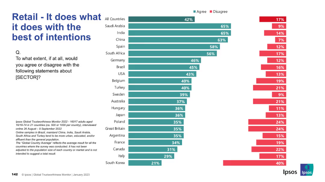
Bar chart showing agreement/disagreement with the belief that retail acts with good intent, by country.
Market Analysis and Trends
Retail & E-commerce
The slide explores the extent to which people believe the retail sector operates with good intentions, reflecting ethical perceptions globally.
ethics, retail, intention, trust, global perception, Ipsos, survey, belief, public opinion, motivation
false
Market Analysis and Trends
Retail & E-commerce
Mixed Chart
IPSOS
Add to my slides
Remove from favorites
A dark-themed slide with two sets of horizontal bar graphs, accompanied by callouts with key percentages and notable quotes. The layout is well-structured to compare categories and provides insights through selected respondent quotes.
Customer and Market Segmentation
Retail & E-commerce
Focuses on how companies plan to incorporate ethical concerns into their operations, with emphasis on transparent communication, making it relevant for discussions on corporate responsibility and communication strategies.
Ethics, Transparency, Corporate Communication, Operational Strategy, Corporate Responsibility
false
Customer and Market Segmentation
Retail & E-commerce
Mixed Chart
Kearney
Add to my slides
Remove from favorites
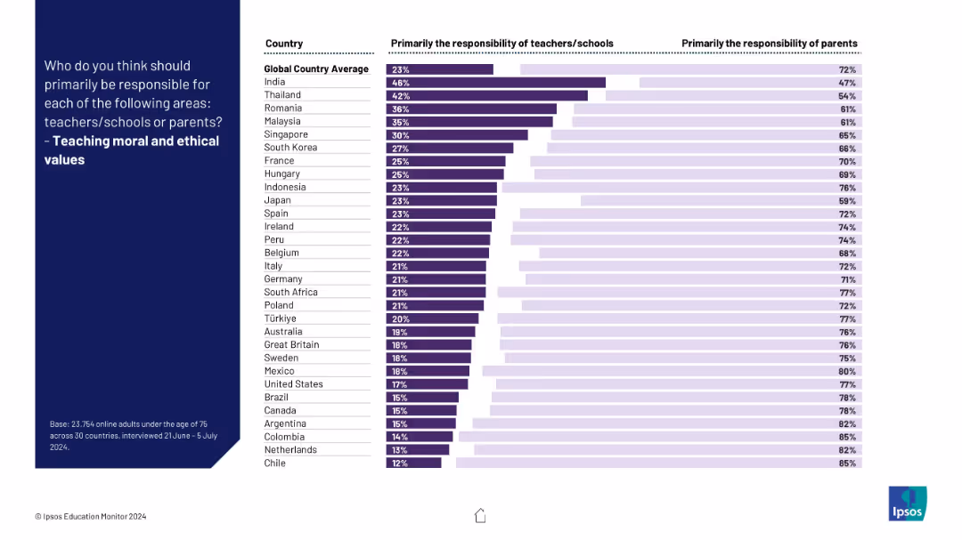
Visual ranking of countries on responsibility for instilling ethics; clear majority favor parents over schools.
Regulatory and Compliance
Education & Training
The slide illustrates global consensus that moral and ethical education should primarily fall to parents, though some variation exists.
ethics, values, morality, parenting, education, schools, culture, children, responsibility, global perspective
false
Regulatory and Compliance
Education & Training
Mixed Chart
IPSOS
Add to my slides
Remove from favorites
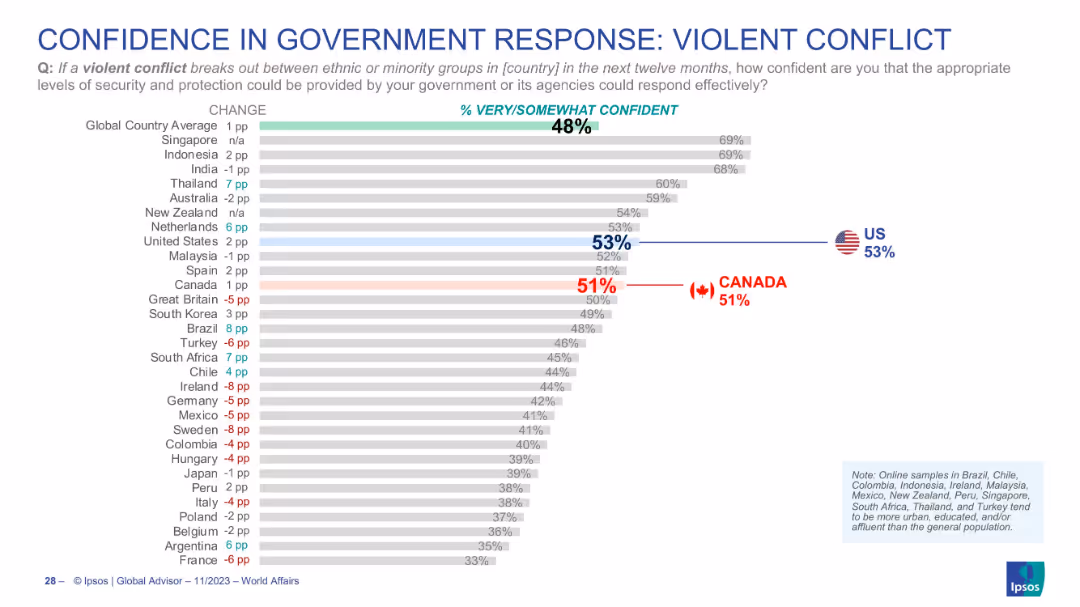
Horizontal bar chart; shows confidence in handling violent ethnic or minority group conflicts; country rankings; Canada and US emphasized.
Regulatory and Compliance
Government & Public Sector
This slide captures public opinion on how confident they are that their government can effectively manage a violent conflict involving ethnic or minority groups. With a global average confidence of 48%, the US scores 53% and Canada 51%. The data points to national variances in public faith in social stability mechanisms.
ethnic conflict, government capacity, confidence, risk management, Canada, USA, public opinion, Ipsos
false
Regulatory and Compliance
Government & Public Sector
Single Chart
IPSOS
Add to my slides
Remove from favorites
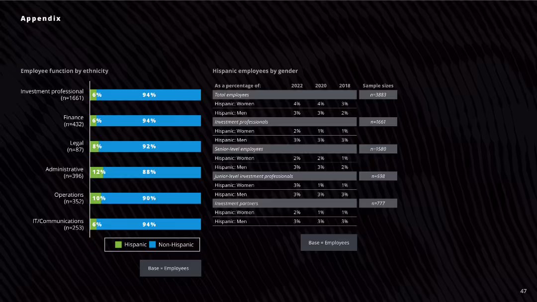
The slide features bar charts and tables showcasing the function by ethnicity, and the gender breakdown for Hispanic employees across different years.
Human Resources and Talent Management
Professional Services
The slide analyzes the ethnic diversity of employees, with a focus on Hispanic employees and their roles in investment, finance, and other functions.
ethnic diversity, Hispanic employees, gender diversity, employee functions, investment firms
false
Human Resources and Talent Management
Professional Services
Mixed Chart
Deloitte
Add to my slides
Remove from favorites
The slide contains column charts showing ethnic diversity percentages among employees, with a focus on investment professionals, junior-level professionals, and partners. Textual insights and footnotes are included.
Human Resources and Talent Management
Professional Services
This slide presents data on ethnic diversity in the venture capital industry, analyzing differences in representation among various ethnic groups across professional levels and comparing data from 2018, 2020, and 2022.
Ethnic diversity, Investment professionals, Diversity trends, VC industry, Racial representation
false
Human Resources and Talent Management
Professional Services
Mixed Chart
Deloitte
Add to my slides
Remove from favorites
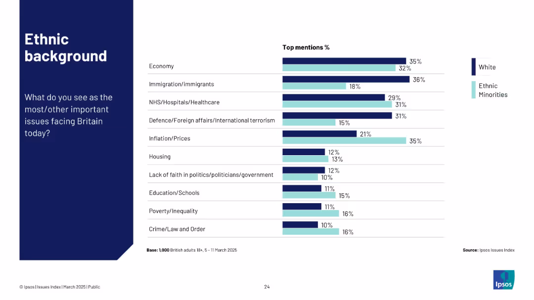
Consistent design with dark blue sidebar and horizontal bar chart. Compares White and Ethnic Minority responses using color-coded bars for key issues.
Customer and Market Segmentation
Government & Public Sector
Highlights differences in perceived national concerns based on ethnicity. Ethnic minorities show more concern for inflation, education, and poverty, while White respondents rank immigration higher.
ethnicity, Britain, public opinion, NHS, inflation, education, immigration
false
Customer and Market Segmentation
Government & Public Sector
Mixed Chart
IPSOS
Add to my slides
Remove from favorites
The slide features two column charts displaying the percentage distribution of employees by ethnicity and gender across various functions. The layout is visually dense, with a dark background and blue and green bars.
Human Resources and Talent Management
Professional Services
The slide presents the breakdown of employees by ethnicity and gender across different job functions in a company. It highlights the percentage of Hispanic and non-Hispanic employees and the distribution of Hispanic employees by gender from 2018 to 2022.
ethnicity, gender, employee distribution, column chart, job functions, Hispanic, non-Hispanic, professional services, HR
false
Human Resources and Talent Management
Professional Services
Mixed Chart
Deloitte
Add to my slides
Remove from favorites
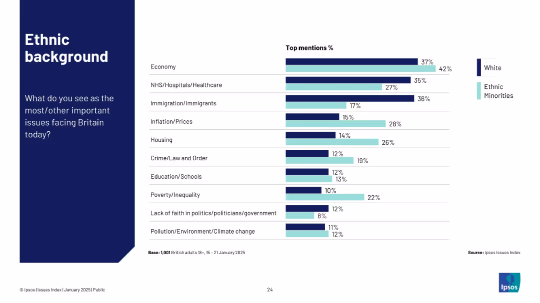
Horizontal bar chart comparing White and Ethnic Minority groups on top national issues.
Customer and Market Segmentation
Government & Public Sector
This slide compares ethnic backgrounds on top concerns in the UK. Ethnic minorities place higher emphasis on housing, inflation, and crime than White respondents. Economy remains a key issue across both groups.
ethnicity, public opinion, inflation, housing, crime, Ipsos
false
Customer and Market Segmentation
Government & Public Sector
Mixed Chart
IPSOS
Add to my slides
Remove from favorites
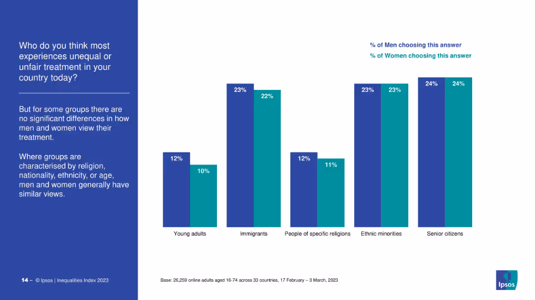
Bar chart showing percentage agreement from men and women on discrimination against different groups (e.g., young adults, immigrants, ethnic minorities), with minimal gender variation. Left-aligned text block summarizing observations.
Market Analysis and Trends
Government & Public Sector
The slide highlights that for categories related to religion, ethnicity, nationality, or age, both men and women largely agree on the presence of unfair treatment. This contrasts with earlier slides showing gender differences in perception for other marginalized groups.
ethnicity, religion, immigrants, consensus, public opinion, inequality, discrimination, survey, Ipsos
false
Market Analysis and Trends
Government & Public Sector
Mixed Chart
IPSOS
Add to my slides
Remove from favorites
The slide is divided into two sections, one for Canadian provinces and another for US states, each with a table listing ETS policies. The left section has a map with marked regions, and the tables include multiple columns with data.
Regulatory and Compliance
Government & Public Sector
This slide presents the status of Emission Trading System (ETS) policies in various Canadian provinces and US states, including the year of implementation, price per ton of CO2, and the status of the policy (operational, scheduled, or suspended).
ETS, Canada, US, state-level, policies, regulations
false
Regulatory and Compliance
Government & Public Sector
Table
Kearney
Add to my slides
Remove from favorites
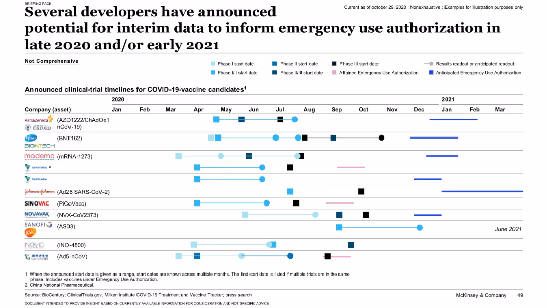
Timeline chart tracking vaccine candidates’ clinical trial phases, anticipated results, and EUA status. Very detailed and horizontally structured.
Regulatory and Compliance
Healthcare & Pharmaceuticals
This slide presents clinical development timelines for key COVID-19 vaccine candidates from companies like Pfizer, Moderna, and AstraZeneca. It shows when Phase I-III trials began and when emergency use authorizations (EUAs) were or are expected. The chart helps visualize the race to release vaccines and timelines for decisions.
EUA, vaccine trials, timelines, COVID-19, authorization, clinical phases
false
Regulatory and Compliance
Healthcare & Pharmaceuticals
Single Chart
McKinsey
Add to my slides
Remove from favorites
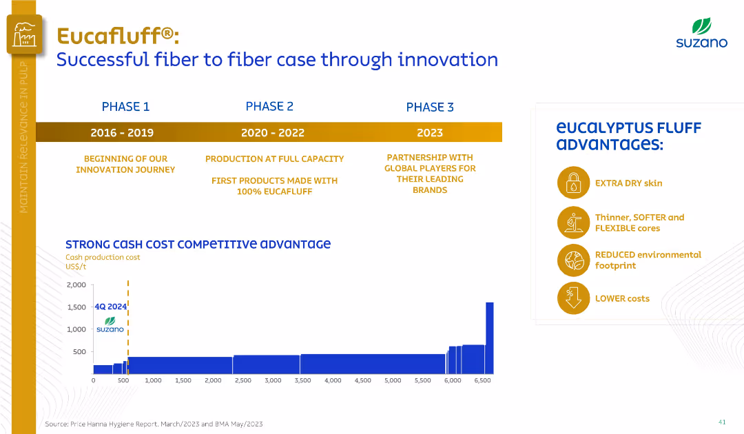
Timeline with three phases (2016–2023), bar chart of production costs, and a list of product advantages.
Product and Service Analysis
Consumer Goods
Showcasing Eucafluff® development, the slide highlights its innovation journey across three phases, production scalability, and cost competitiveness. Key advantages like softness, lower cost, and eco-friendliness are visually presented.
Eucafluff, product innovation, cost advantage, eucalyptus, hygiene
false
Product and Service Analysis
Consumer Goods
Mixed Chart
Goldman Sachs
Add to my slides
Remove from favorites
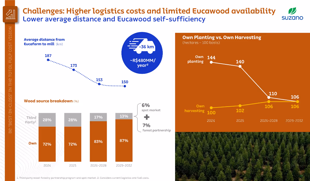
Mixed visuals including line chart, bar chart, and line comparison; two-tone theme differentiates wood source and logistics data.
Risk Assessment and Management
Agriculture & Food Production
Focused on logistics and Eucawood availability, this slide shows decreasing average distances from forest to mill and increasing self-sufficiency in wood sourcing. It details the cost-saving potential of these operational shifts.
Eucawood, logistics, cost reduction, self-sufficiency, forest operations
false
Risk Assessment and Management
Agriculture & Food Production
Multiple Chart
Goldman Sachs
Add to my slides
Remove from favorites
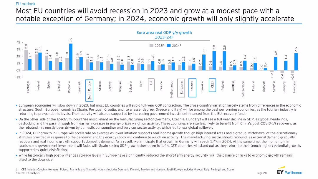
The slide features a column chart showing euro area real GDP y/y growth for 2023F and 2024F across various EU countries.
Market Analysis and Trends
Financial Services
This slide discusses the economic outlook for the EU, predicting most countries will avoid recession in 2023 and experience modest growth in 2024, with variations across different countries.
EU economy, GDP growth, recession, 2023, 2024
false
Market Analysis and Trends
Financial Services
Mixed Chart
EY
Add to my slides
Remove from favorites
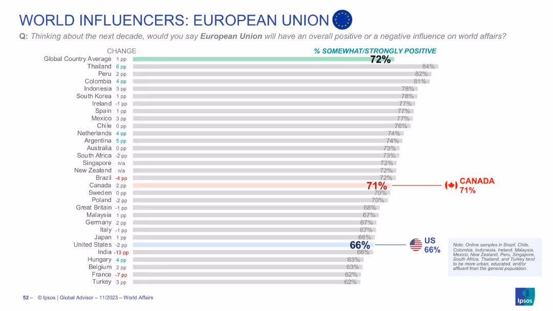
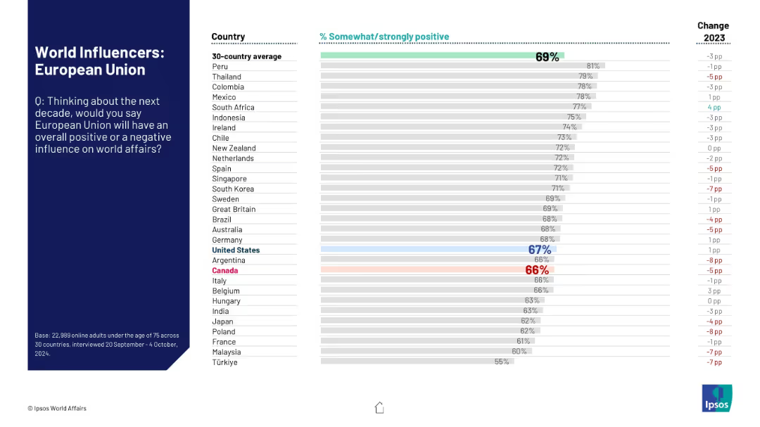
Horizontal bar chart showing perceptions of the EU; Canada and U.S. positions are highlighted
Market Analysis and Trends
Government & Public Sector
Shows international perceptions of the EU’s influence in the next decade. The global average is 72%. Canada scores it at 71% and the U.S. at 66%. Trends and change vs prior year are also depicted.
EU, European Union, world influence, Canada view, US view, Ipsos, international opinion, bar chart, perception, global affairs
false
Market Analysis and Trends
Government & Public Sector
Single Chart
IPSOS
Add to my slides
Remove from favorites
Slide with a process timeline and funding source breakdown, including bar and line graphics to represent stages from pre-commercial development to market roll-out.
Market Analysis and Trends
Energy & Utilities
Discusses the EU’s support mechanisms for hydrogen technology through various funding stages, from proof of concept to market readiness, highlighting different EU funding sources.
EU, Funding, Hydrogen, Innovation, Scale-up
false
Market Analysis and Trends
Energy & Utilities
Linear Flow
McKinsey
Add to my slides
Remove from favorites
The slide features two line charts: one for European gas reserves from 2019 to 2023, and another for EU gas prices from Jan 2019 to Jan 2023.
Market Analysis and Trends
Energy & Utilities
The slide analyzes the levels of EU gas reserves and the trends in gas prices, focusing on supply pressures and rebuilding challenges.
EU gas, reserves, prices, energy, natural gas, market trends
false
Market Analysis and Trends
Energy & Utilities
Multiple Chart
Accenture
Add to my slides
Remove from favorites
The slide presents a three-phase roadmap for the EU's hydrogen strategy up to 2050, using a horizontal timeline format with three distinct columns for each phase. The slide includes icons, a bullet list for each phase's details, and phase headers.
Strategic Planning
Energy & Utilities
This slide outlines the European Union's hydrogen strategy, focusing on the development of a renewable hydrogen mass market through three phases: initial market launch, scaling up, and mass market deployment.
EU, hydrogen, strategy, renewable, market, phases, 2020-2050, roadmap, decarbonize, infrastructure
false
Strategic Planning
Energy & Utilities
Mixed Chart
McKinsey
Add to my slides
Remove from favorites
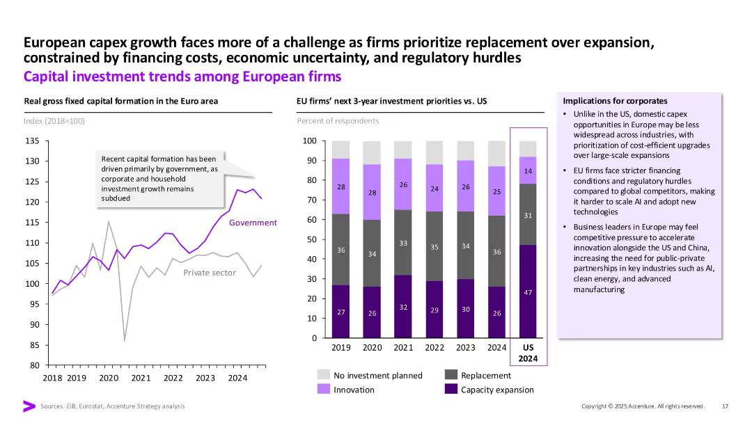
Left: Line graph showing EU capital formation by government/private. Right: Stacked bar chart of EU vs US investment priorities. Text boxes and implication callouts.
Market Analysis and Trends
Financial Services
The slide contrasts public vs private sector investment in the EU, noting government-led growth. It also compares EU and US investment priorities for 2024, highlighting EU’s focus on replacement and innovation under tighter regulatory and financing constraints.
EU, investment, capex, government, private sector, replacement, priorities
false
Market Analysis and Trends
Financial Services
Multiple Chart
Accenture
Add to my slides
Remove from favorites
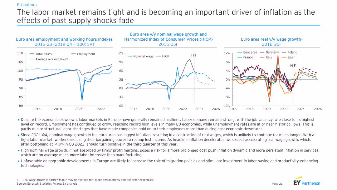
This slide contains three line charts showing employment and working hours indexes, nominal wage growth vs. HICP, and real wage growth across EU countries from 2015 to 2025. The text discusses the tight labor market and wage trends.
Market Analysis and Trends
Financial Services
The slide analyzes the tight labor market in the EU, highlighting employment growth, wage trends, and structural labor shortages. It discusses the implications of these trends for inflation and economic stability in the region.
EU labor market, wage growth, employment trends, inflation impact, structural shortages, economic stability, financial analysis, EY analysis
false
Market Analysis and Trends
Financial Services
Multiple Chart
EY
Add to my slides
Remove from favorites
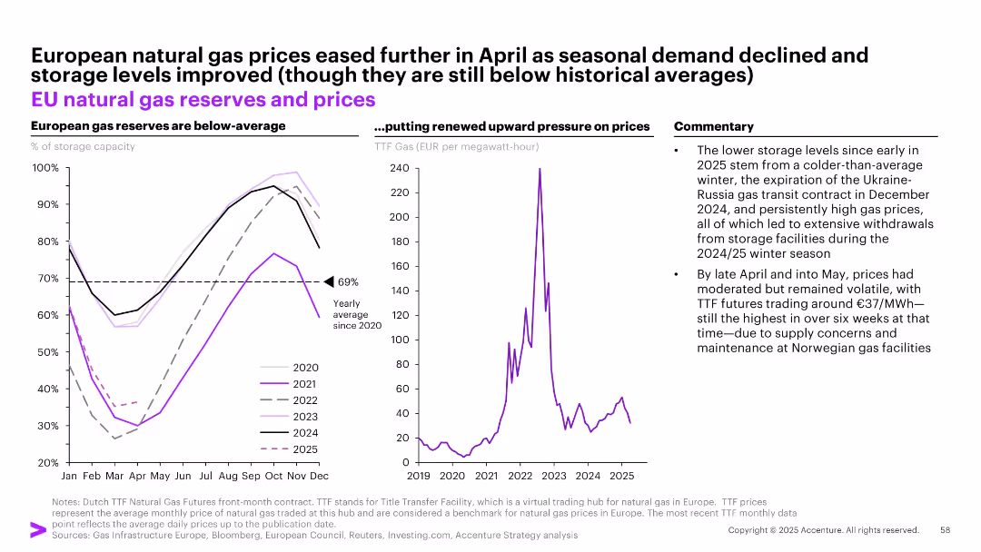
Split into three sections: left panel shows EU gas storage levels, middle panel shows gas prices (TTF), right panel has commentary.
Market Analysis and Trends
Energy & Utilities
Analyzes low EU gas reserves and price movements from 2020–2025. Points to cold winters, transit contract expirations, and storage withdrawals as key contributors. Despite easing in May, prices remain volatile due to supply concerns.
EU, natural gas, reserves, energy, TTF, storage, Ukraine-Russia, volatility, price pressure, winter
false
Market Analysis and Trends
Energy & Utilities
Multiple Chart
Accenture
Add to my slides
Remove from favorites
Column chart showing negative to positive impacts of EU politics on US investments in France, accompanied by authoritative quotes.
Strategic Planning
Government & Public Sector
Discusses the investment climate in France influenced by European political uncertainties and the strategies suggested by experts.
EU politics, US investments, France, political uncertainties, Merkel, Italian budget
false
Strategic Planning
Government & Public Sector
Mixed Chart
Bain
Add to my slides
Remove from favorites
The slide presents three line charts: Euro area real GDP (index, 2019 Q4 = 100) (2015-25F), Euro y/y area inflation (2015-25F), and ECB deposit rate (2015-25F). The charts are clear with distinct trends and projections, complemented by textual explanations.
Market Analysis and Trends
Financial Services
This slide projects a gradual rebound in the euro area economy in 2024 after a period of stagnation. It discusses the expected trajectory of GDP, inflation, and ECB deposit rates, emphasizing the role of inflation targeting in economic recovery.
euro area, GDP, inflation, ECB, economic recovery
false
Market Analysis and Trends
Financial Services
Multiple Chart
EY
Add to my slides
Remove from favorites
Line chart displaying Euro area wage growth from 1999 to 2019, with separate lines for Germany and Euro area excl. Germany. Colors are orange and blue with a source citation at the bottom left corner.
Market Analysis and Trends
Financial Services
This slide presents comparative wage growth data for Germany and the rest of the Euro area, indicating economic trends and providing insights for market analysis and financial forecasting.
Euro area, wage growth, Germany, economic data, line chart, comparison, financial trends, market analysis, ECB, J.P. Morgan.
false
Market Analysis and Trends
Financial Services
Single Chart
JP Morgan
Add to my slides
Remove from favorites
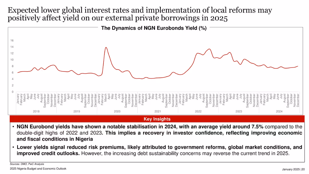
Line graph of Eurobond yields (2018–2024), illustrating volatility and recent stabilization.
Investment Analysis
Government & Public Sector
The slide reports stabilized Eurobond yields at around 7.5% in 2024, signaling improving investor confidence amid government reforms and favorable interest rates. However, rising debt risks may threaten this positive trend in 2025.
Eurobond, yield, interest rates, investor confidence, Nigeria, fiscal reforms
false
Investment Analysis
Government & Public Sector
Mixed Chart
PwC/Strategy&
Add to my slides
Remove from favorites
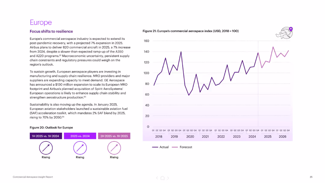
Text section on the left with growth summary; right side graph shows Europe’s aerospace index (2018–2026). Consistent with other regional slides.
Market Analysis and Trends
Industrial & Manufacturing
Forecasts a 7% growth in Europe’s aerospace sector for 2025. Highlights Airbus production targets, supply chain resilience investments, and the introduction of sustainability regulations (SAF blend targets).
Europe, aerospace growth, Airbus, supply chain resilience, sustainability, SAF, forecast, commercial aviation
false
Market Analysis and Trends
Industrial & Manufacturing
Mixed Chart
Accenture
Add to my slides
Remove from favorites
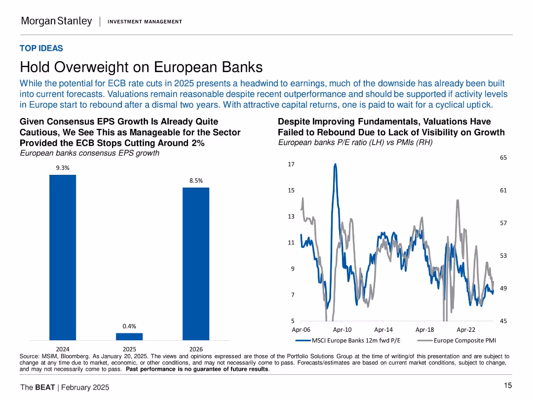
Left: bar chart of EPS forecasts for 2024–2026; Right: line chart showing P/E ratio vs PMI for European banks.
Investment Analysis
Financial Services
The slide recommends overweighting European banks, citing cautious yet positive earnings forecasts and attractive valuations. It shows earnings estimates for 2024–2026 and compares long-term valuation trends against business sentiment (PMI). The analysis suggests the downside is priced in and valuations are attractive if ECB cuts stabilize around 2%.
European banks, P/E ratio, PMI, EPS forecast, ECB cuts, valuation, overweight, investment thesis
false
Investment Analysis
Financial Services
Multiple Chart
Morgan Stanley
Add to my slides
Remove from favorites
A column chart shows sovereign debt securities as a percentage of total bank assets across various European economies as of December 2022. The textbox details implications for corporates, focusing on the potential impact of sovereign debt exposure on credit standards and lending.
Market Analysis and Trends
Financial Services
This slide evaluates the sovereign debt exposure of European banks, particularly noting the implications of confidence events on the real economy, investment, and profit pressures. It discusses potential impacts on credit availability and funding costs for corporates.
European banks, sovereign debt, credit standards, lending, confidence events, economic impact, funding costs, corporate implications, debt exposure, market analysis
false
Market Analysis and Trends
Financial Services
Mixed Chart
Accenture
Add to my slides
Remove from favorites
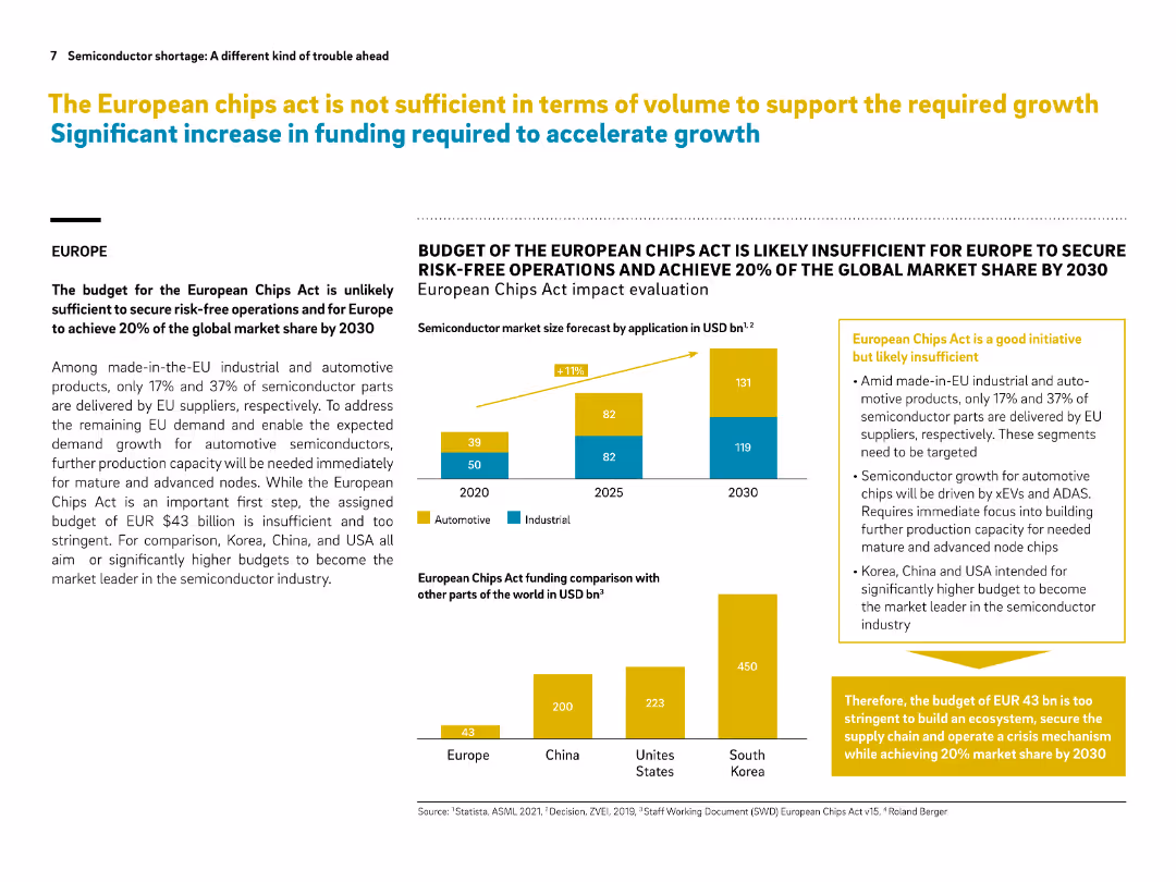
Layout includes text, bar graphs, and callout boxes in yellow. Data visuals compare budgets and market share ambitions.
Regulatory and Compliance
Government & Public Sector
This slide critiques the European Chips Act, indicating its budget is too low to secure 20% global market share by 2030. It compares funding plans across regions, highlighting that Europe’s $43B is dwarfed by the US, Korea, and China. Immediate investment in mature nodes is urged.
European Chips Act, semiconductor, funding gap, market share, automotive chips, EU policy, comparison, risk-free operations
false
Regulatory and Compliance
Government & Public Sector
Multiple Chart
Roland Berger
Add to my slides
Remove from favorites
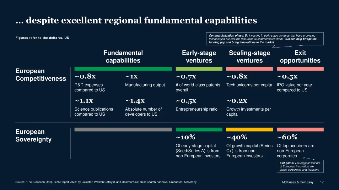
Horizontal comparative matrix across stages (capabilities to exits), US vs. Europe, using deltas and bar segments
Competitive Landscape
Technology & Software
Despite limitations in growth investments and IPOs versus the U.S., Europe shows strong fundamentals in science publications, developer availability, and manufacturing, indicating potential in Deep Tech commercialization.
European competitiveness, innovation, start-up scale, funding, R&D, patents
false
Competitive Landscape
Technology & Software
Table
McKinsey
Add to my slides
Remove from favorites
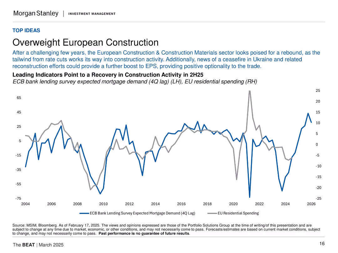
Two-line title followed by multi-sentence explanatory text in smaller font. Includes a dual-axis line graph with two indicators (blue and grey lines) showing correlation between mortgage demand and EU residential spending.
Investment Analysis
Real Estate & Construction
The slide presents an investment thesis favoring European construction, citing easing monetary policy and geopolitical developments (e.g., Ukraine ceasefire) as catalysts for recovery. The chart illustrates leading indicators of a potential rebound in EU residential construction spending.
European construction, mortgage demand, residential spending, ECB, EPS, macro trends, Ukraine, investment thesis, housing rebound, rate cuts
false
Investment Analysis
Real Estate & Construction
Single Chart
Morgan Stanley
Add to my slides
Remove from favorites
This slide combines text and a map image. On the left, there are four bullet points highlighting the sponsor's qualifications, including alignment with unitholders and on-ground European teams. On the right, there's a map of Europe indicating the sponsor's office locations with simple icons.
Strategic Planning
Real Estate & Construction
Outlines the Cromwell Property Group's strengths, including investment alignment, local expertise, and European market presence.
European Footprint, Local Expertise, Real Estate Sponsorship, Office Locations, Market Presence, Professional Experience
false
Strategic Planning
Real Estate & Construction
Table
Morgan Stanley
Add to my slides
Remove from favorites
The slide includes column charts and tables summarizing IPO activities in European main and junior markets. It shows number of IPOs, proceeds, and details on stock exchanges and sectors.
Market Analysis and Trends
Financial Services
The slide reviews the subdued IPO market in Europe, discussing the cautious investor sentiment and regulatory efforts to stimulate activity. Data on IPOs, proceeds, and key stock exchanges and sectors are provided.
European IPOs, market trends, investor sentiment, regulatory efforts, financial analysis
false
Market Analysis and Trends
Financial Services
Multiple Chart
EY
Add to my slides
Remove from favorites
Contains bar graphs and a column chart, statistical breakdowns of European Earth Observation sales and market share.
Market Analysis and Trends
Technology & Software
Provides detailed insights into the European market for Earth Observation, discussing sales trends and market share.
European market, EO sales, market trends, Earth Observation
false
Market Analysis and Trends
Technology & Software
Multiple Chart
PwC/Strategy&
Add to my slides
Remove from favorites
This slide contains a column chart and bar chart showing the growth of the European EO downstream market with detailed annotations. The layout is dense with textual information complementing the charts.
Market Analysis and Trends
Environmental Services & Sustainability
Focuses on the growth of the European Earth Observation downstream market, showing revenue forecasts and comparing different segments’ sales. It’s valuable for understanding regional market dynamics and growth potentials.
European market, growth forecast, revenue, market segments, Earth Observation
false
Market Analysis and Trends
Environmental Services & Sustainability
Multiple Chart
PwC/Strategy&
Add to my slides
Remove from favorites
Contains a flow diagram for a delivery model, capabilities checklist, and visual icons representing different payment methods.
Market Analysis and Trends
Technology & Software
Discusses J.P.Morgan's opportunities in serving European SMBs and Marketplaces, showing their capabilities and potential growth areas.
European Market, SMBs, Marketplaces, Payment Methods, J.P.Morgan, Growth Opportunity
false
Market Analysis and Trends
Technology & Software
Diagram
JP Morgan
Add to my slides
Remove from favorites
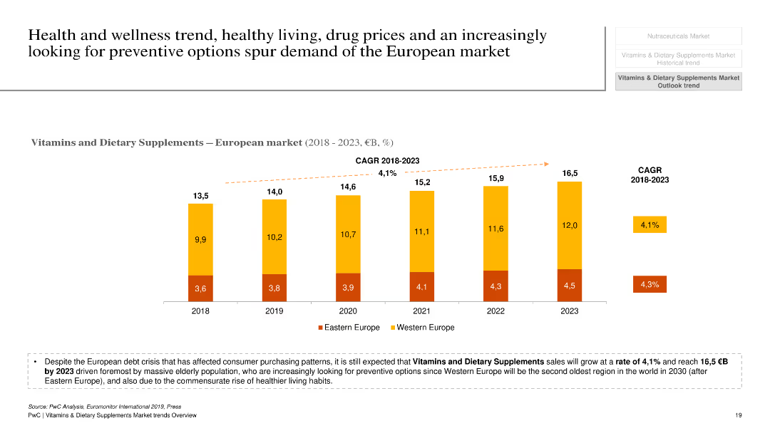
The slide features a column chart illustrating the growth of the European market for vitamins and dietary supplements from 2018 to 2023, segmented by Eastern and Western Europe. A text box below the chart highlights key drivers and market trends.
Market Analysis and Trends
Healthcare & Pharmaceuticals
The slide outlines the expected growth of the European vitamins and dietary supplements market, driven by health and wellness trends, preventive health measures, and demographic factors. It includes a comparative analysis of market segments and provides an overview of growth rates and key influencing factors.
European market, vitamins, dietary supplements, growth drivers, preventive health
false
Market Analysis and Trends
Healthcare & Pharmaceuticals
Mixed Chart
PwC/Strategy&
Add to my slides
Remove from favorites
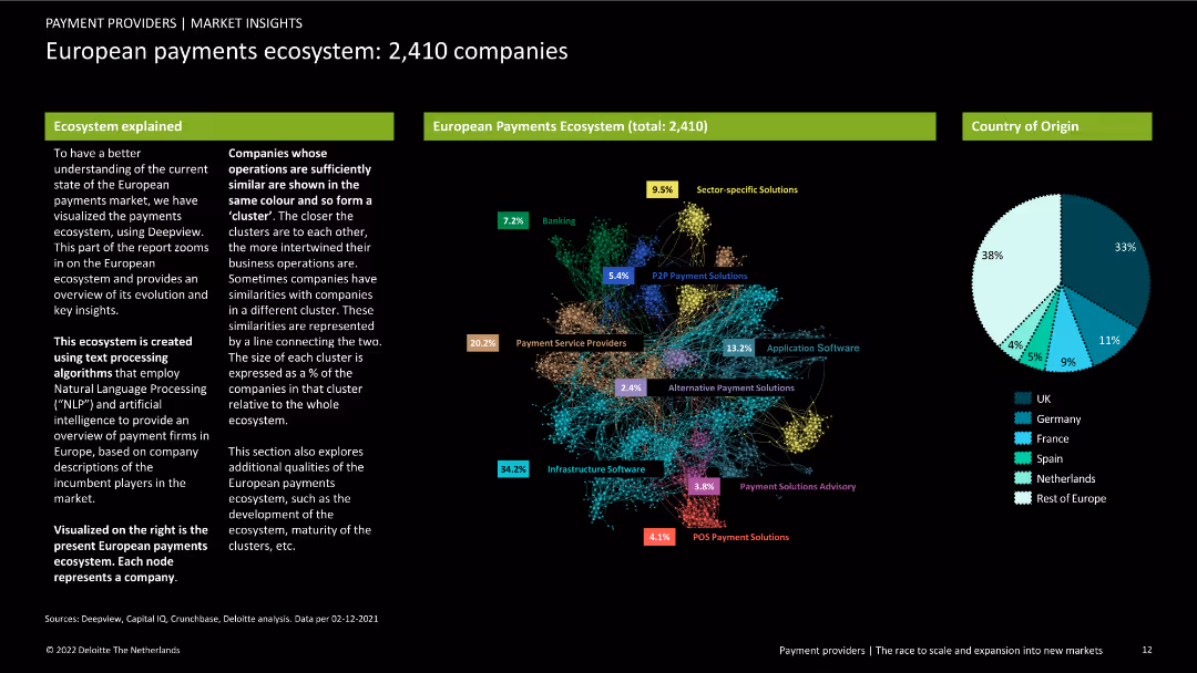
A dense slide with multiple colored clusters representing companies in the European payments ecosystem. Includes pie chart for country origin. Text explanations on left and right.
Market Analysis and Trends
Financial Services
Visualization of the European payments ecosystem showing company clusters by similarity and origin. Highlights industry structure using NLP and AI text processing.
European payments, ecosystem, companies, clustering, country origin, NLP, AI, market analysis, financial services, trends
false
Market Analysis and Trends
Financial Services
Mixed Chart
Deloitte
Add to my slides
Remove from favorites
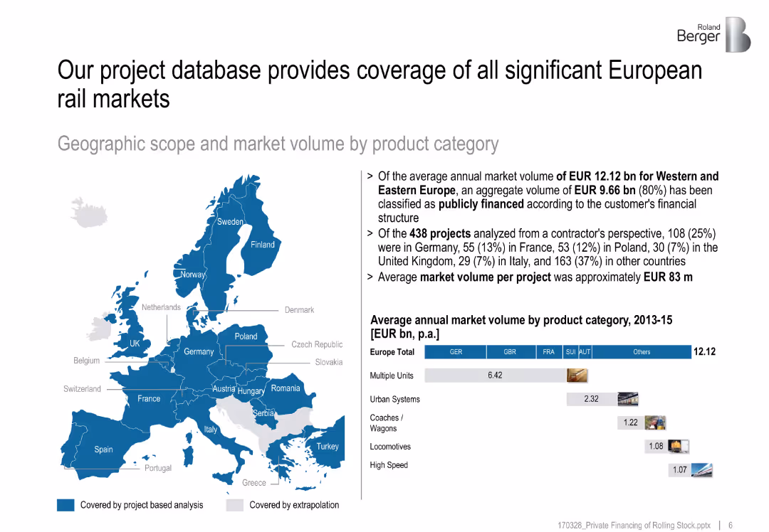
Map of Europe with market analysis coverage in blue; side panel with text insights
Market Analysis and Trends
Transportation & Logistics
Describes the geographic scope of rail project analysis in Europe, highlighting a market volume of EUR 12.12 bn and top countries by number of analyzed projects.
European rail market, project analysis, market volume, coverage map, public financing
false
Market Analysis and Trends
Transportation & Logistics
Multiple Chart
Roland Berger
Add to my slides
Remove from favorites
The slide features two column charts. The left chart shows European real estate transaction volumes in EUR billions from 1Q13 to 1Q24. The right chart breaks down transaction volumes by property type from 1Q07 to 4Q23.
Market Analysis and Trends
Real Estate & Construction
This slide provides an overview of European real estate transaction volumes over time and by property type, offering insights into the market's performance and investment distribution across different property sectors.
European real estate, transaction volumes, property types, market performance, investment trends
false
Market Analysis and Trends
Real Estate & Construction
Multiple Chart
JP Morgan
Add to my slides
Remove from favorites
Features a column chart comparing the economic impact of tourism in Europe's top countries versus the rest of Europe.
Financial Performance
Hospitality & Tourism
Provides a financial analysis of tourism's economic impact in Europe, focusing on the contribution of key countries.
European tourism, Economic impact, Financial analysis, Germany, Spain, UK, Italy, France
false
Financial Performance
Hospitality & Tourism
Multiple Chart
Bain
Add to my slides
Remove from favorites
Bar chart of 30 countries' public opinion on whether the EU will have a positive influence in world affairs over the next decade.
Strategic Planning
Government & Public Sector
This slide ranks global views on the European Union’s projected influence in world affairs. It shows overall positive sentiment and highlights changes in perception from 2023, with the EU placed alongside national actors.
European Union, global affairs, influence ranking, international relations, public sentiment, Ipsos data, geopolitical perception
false
Strategic Planning
Government & Public Sector
Mixed Chart
IPSOS
Add to my slides
Remove from favorites
Multiple column charts showing activity by asset type, completed deals, and loan sale activity by portfolio type.
Market Analysis and Trends
Financial Services
Analyzes European activity in various asset types since 2014, highlighting trends in completed and ongoing deals by country.
Europe, asset, market, trends, deals
false
Market Analysis and Trends
Financial Services
Multiple Chart
Deloitte
Add to my slides
Remove from favorites
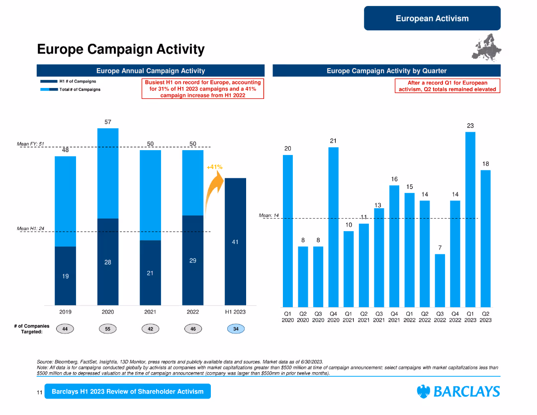
The slide displays column charts for Europe campaign activity by year and quarter, and a bar chart for campaign activity by country with percentages and counts.
Market Analysis and Trends
Financial Services
This slide reviews the European campaign activity, showing yearly and quarterly trends, and details the distribution of campaigns by country, highlighting the U.K., Germany, and the Netherlands.
Europe campaigns, annual activity, quarterly trends, country distribution, U.K., Germany, Netherlands, shareholder activism
false
Market Analysis and Trends
Financial Services
Multiple Chart
Barclays
Add to my slides
Remove from favorites
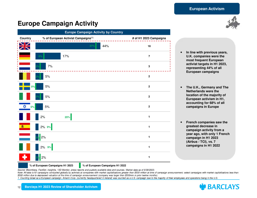
The slide presents a horizontal bar chart comparing the percentage of European activist campaigns by country and a summary text on the right.
Market Analysis and Trends
Financial Services
It provides a detailed look at European campaign activity by country, indicating that the U.K. led with 44% of campaigns, followed by Germany and the Netherlands.
Europe campaigns, country analysis, U.K., Germany, Netherlands, activism, shareholder trends
false
Market Analysis and Trends
Financial Services
Mixed Chart
Barclays
Add to my slides
Remove from favorites
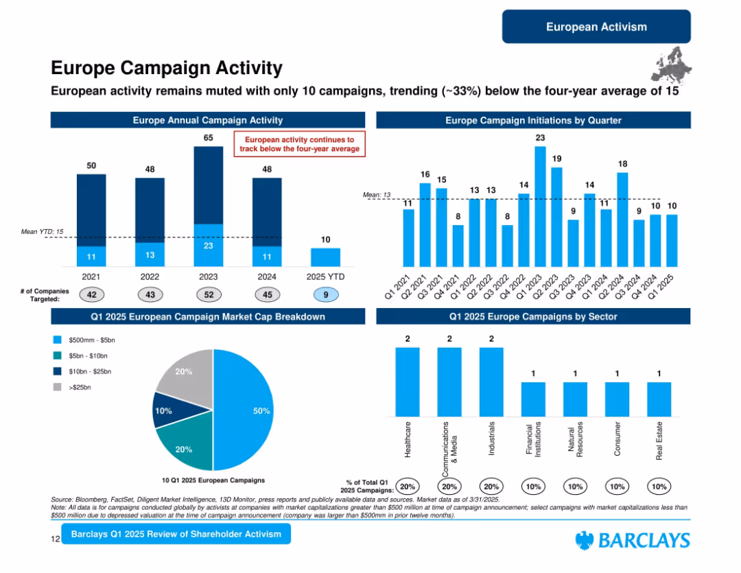
Multi-panel slide with bar charts, pie chart, and a small map. Predominantly blue color scheme. Structured in horizontal sections with clear headers.
Market Analysis and Trends
Financial Services
This slide tracks shareholder activism campaigns in Europe from 2021 to Q1 2025, noting a muted start to 2025 with activity down ~33% from the four-year average. It also breaks down market cap and sector data for Q1 2025.
Europe, Campaigns, Market Cap, Activism, Trends, Sectors, Shareholder, Quarterly, 2025, Barclays
false
Market Analysis and Trends
Financial Services
Multiple Chart
Barclays
Add to my slides
Remove from favorites
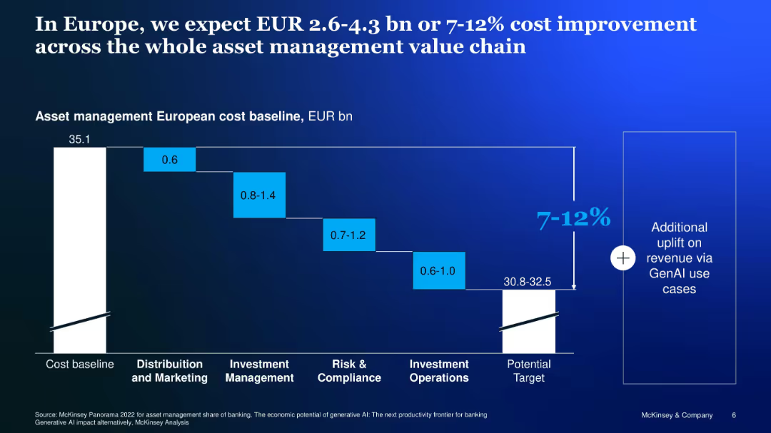
Waterfall chart showing potential GenAI-related cost reduction across asset management functions
Financial Performance
Financial Services
Analyzes cost-saving potential of GenAI across European asset management, estimating 7–12% savings from process efficiencies across marketing, investment, compliance, and operations.
Europe, cost savings, asset management, GenAI, waterfall, value chain
false
Financial Performance
Financial Services
Single Chart
McKinsey
Add to my slides
Remove from favorites
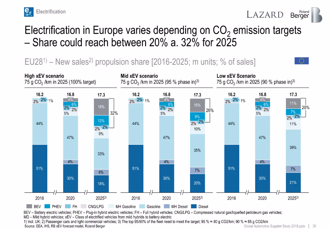
Multiple bar charts showing EU propulsion scenarios from 2016 to 2025.
Regulatory and Compliance
Industrial & Manufacturing
Projects EU xEV market penetration depending on compliance with CO₂ targets; high adoption scenario sees ~32% xEV share by 2025.
Europe, CO₂ targets, BEV, PHEV, emissions, 2025 forecast, propulsion mix
false
Regulatory and Compliance
Industrial & Manufacturing
Single Chart
Roland Berger
Add to my slides
Remove from favorites
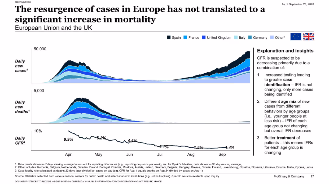
Dual area and line charts showing new cases, deaths, and CFR across European countries with explanation sidebar.
Risk Assessment and Management
Healthcare & Pharmaceuticals
Highlights the European resurgence in COVID-19 cases with no equivalent rise in mortality. Attributes the decoupling of cases and deaths to improved detection, younger age distribution, and better treatment.
Europe, COVID-19 resurgence, CFR, case detection, mortality
false
Risk Assessment and Management
Healthcare & Pharmaceuticals
Mixed Chart
McKinsey
Add to my slides
Remove from favorites
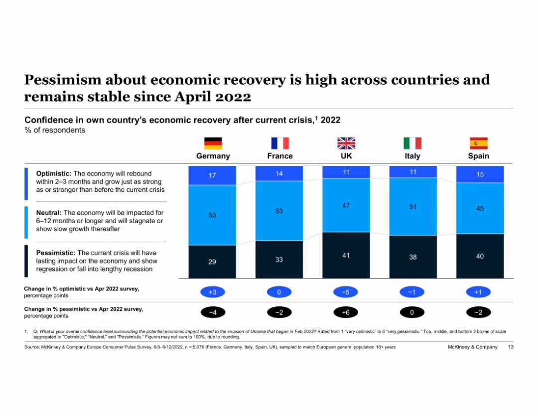
Horizontal segmented bar chart comparing Germany, France, UK, Italy, and Spain. Bars divided into “Optimistic,” “Neutral,” and “Pessimistic.” Flags above each bar. Differences from April 2022 shown below. Legends and description provided on left.
Market Analysis and Trends
Financial Services
The chart compares economic recovery confidence across five European countries in 2022, showing that pessimism remains high. Germany has slightly improved optimism (+3%) while the UK has the highest pessimistic shift. Each country’s sentiment is broken into three categories for comparison.
Europe, economic sentiment, pessimism, optimism, recovery confidence, Germany, France, UK, Italy, Spain
false
Market Analysis and Trends
Financial Services
Single Chart
McKinsey
Add to my slides
Remove from favorites
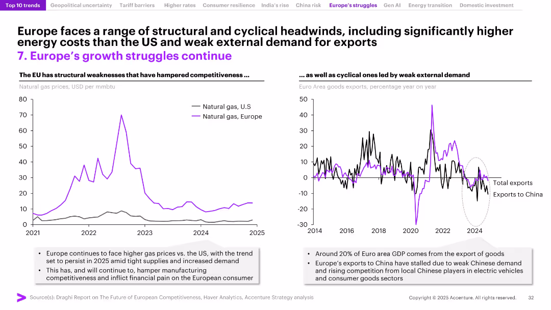
Two-panel layout: natural gas price comparison (US vs. Europe) and export trends chart (total vs. China); visual focus on cyclical and structural issues.
Market Analysis and Trends
Energy & Utilities
The slide outlines Europe's competitiveness challenges stemming from high energy costs and declining exports, particularly to China. It explains how structural inefficiencies, including energy price disparities with the US, undermine Europe’s manufacturing base and export performance.
Europe economy, energy prices, exports, competitiveness, manufacturing, natural gas, trade deficit, structural weakness, China, Eurozone
false
Market Analysis and Trends
Energy & Utilities
Multiple Chart
Accenture
Add to my slides
Remove from favorites
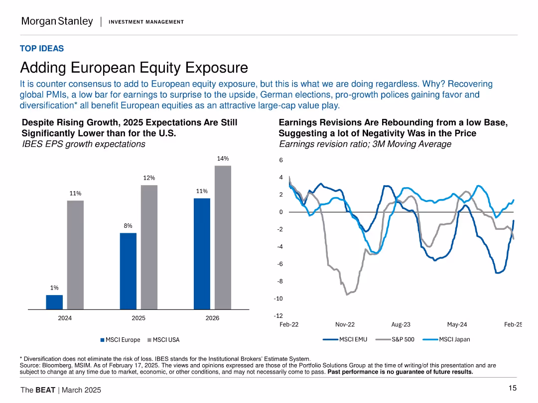
Bar chart of EPS growth expectations (EU vs US); line chart of earnings revisions by region. Clear labels and dual layout.
Investment Analysis
Financial Services
Advocates for increased European equity exposure despite a generally cautious consensus. Notes that EPS expectations are rising and revisions are turning positive, aided by global PMIs, pro-growth policies, and low valuation baselines.
Europe, equities, EPS growth, earnings revisions, MSCI Europe, diversification, investment strategy
false
Investment Analysis
Financial Services
Multiple Chart
Morgan Stanley
Add to my slides
Remove from favorites
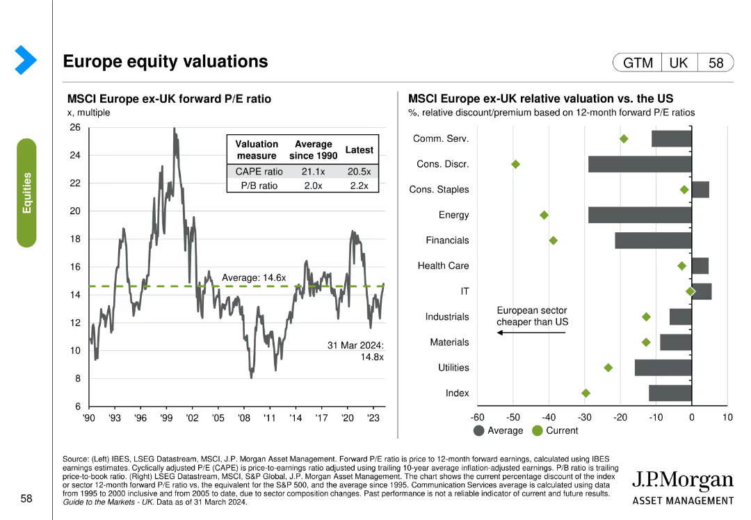
This slide features two column charts. The first chart shows the MSCI Europe ex-UK forward P/E ratio over time. The second chart compares MSCI Europe ex-UK relative valuation vs. the US across different sectors.
Investment Analysis
Financial Services
The slide presents an analysis of the MSCI Europe ex-UK forward P/E ratio and its comparison with US sectors, useful for investment analysis and strategy formulation.
Europe, equity, valuations, MSCI, P/E ratio, US, comparison, sectors
false
Investment Analysis
Financial Services
Multiple Chart
JP Morgan
Add to my slides
Remove from favorites
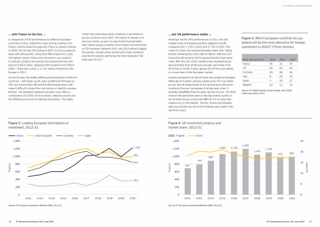
A combination of text and line graphs showing the performance of different European countries.
Market Analysis and Trends
Financial Services
The slide compares FDI performance among European countries, focusing on France's strong showing in 2021 and the UK's steady performance. It includes graphs depicting investment project numbers and market share over time.
Europe, FDI, France, UK, Market Share
false
Market Analysis and Trends
Financial Services
Multiple Chart
EY
Add to my slides
Remove from favorites
A slide with two main sections, each containing bullet points, highlighted statistics, and icons representing different countries.
Market Analysis and Trends
Financial Services
The slide summarizes the macroeconomic impact on Europe’s FDI in 2022 and discusses investment trends in various European countries.
Europe, FDI, investment, macroeconomic, trends
false
Market Analysis and Trends
Financial Services
Multiple Chart
EY
Add to my slides
Remove from favorites
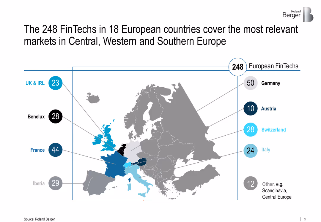
Map of Europe highlighting FinTech distribution by region with bubbles and numeric labels
Market Analysis and Trends
Financial Services
Geographic distribution of 248 FinTechs across 18 European countries, emphasizing Central, Western, and Southern Europe with visual emphasis on countries like Germany, France, and Iberia.
Europe, FinTech hubs, regional analysis, Central Europe, startup ecosystems
false
Market Analysis and Trends
Financial Services
Single Chart
Roland Berger
Add to my slides
Remove from favorites
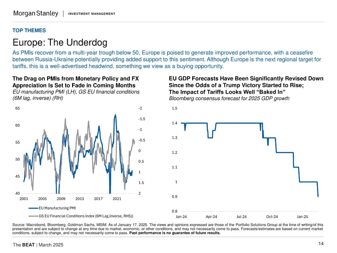
Left chart shows EU PMI vs financial conditions (inverted); right shows GDP forecast trend. Uses line and step charts in a split layout.
Strategic Planning
Financial Services
Europe is positioned as an undervalued opportunity, with easing financial conditions expected to support PMIs. Despite tariff risks and GDP downgrades, the region could improve performance due to recovering conditions and a Russia-Ukraine ceasefire outlook.
Europe, GDP forecast, PMI, financial conditions, tariffs, valuation, macro recovery
false
Strategic Planning
Financial Services
Multiple Chart
Morgan Stanley
Add to my slides
Remove from favorites
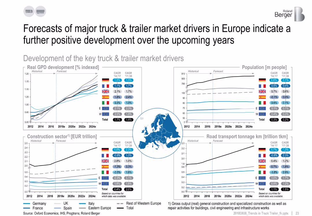
Four charts with trend lines and CAGR values, centered map of Europe, icons for each chart topic.
Market Analysis and Trends
Transportation & Logistics
The slide projects a positive outlook for European truck & trailer markets. It presents growth forecasts in GDP, population, construction sector, and road transport tonnage, highlighting economic and infrastructure drivers with country-level CAGR data.
Europe, GDP, truck drivers, forecasts, construction, transport, population
false
Market Analysis and Trends
Transportation & Logistics
Multiple Chart
Roland Berger
Add to my slides
Remove from favorites
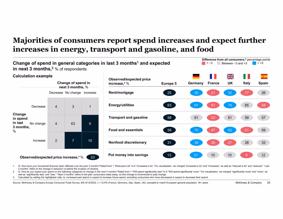
Matrix chart on left explains methodology. Right table compares observed/expected price increase % by category across Europe 5 and individual countries. Colored dots indicate variance from European average.
Market Analysis and Trends
Financial Services
This slide compares actual and expected spend increases across major categories like food, energy, transport, and savings among European countries. Germany reports above-average inflation impacts in several areas, particularly food and energy, with consistently high future spend expectations.
Europe, Germany, inflation comparison, consumer spend, future spending, energy, food, international comparison
false
Market Analysis and Trends
Financial Services
Multiple Chart
McKinsey
Add to my slides
Remove from favorites
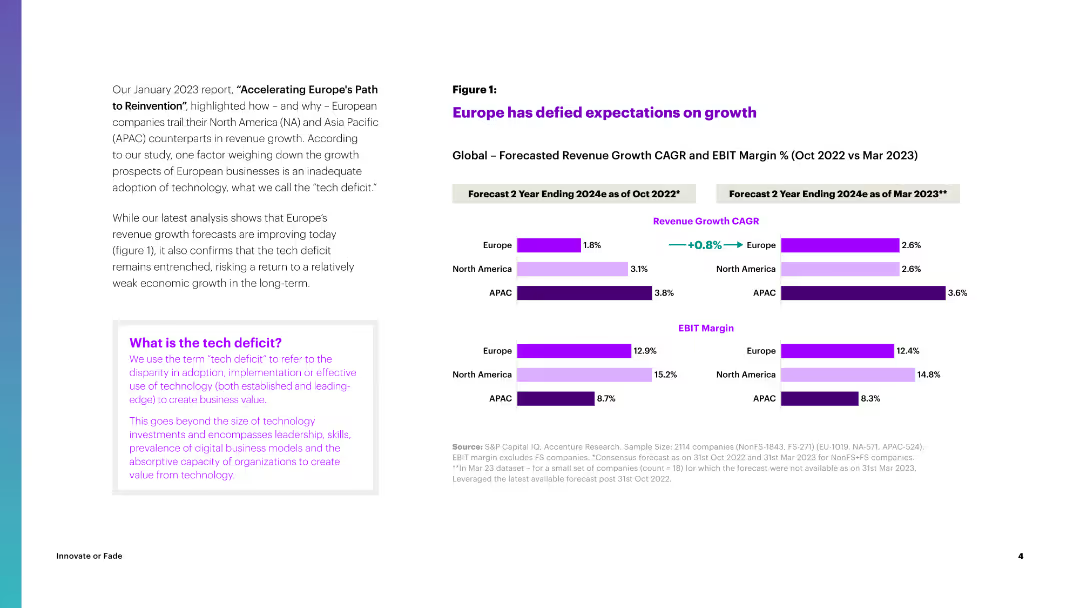
The slide presents a combination of column charts showing revenue growth CAGR and EBIT margin forecasts for Europe, North America, and APAC for 2024, compared between Oct and Mar 2023.
Market Analysis and Trends
Financial Services
It discusses how Europe's revenue growth forecasts have improved, comparing growth expectations across different regions and highlighting the tech deficit's impact.
Europe, Growth, Revenue, CAGR, EBIT Margin
false
Market Analysis and Trends
Financial Services
Multiple Chart
Accenture
Add to my slides
Remove from favorites
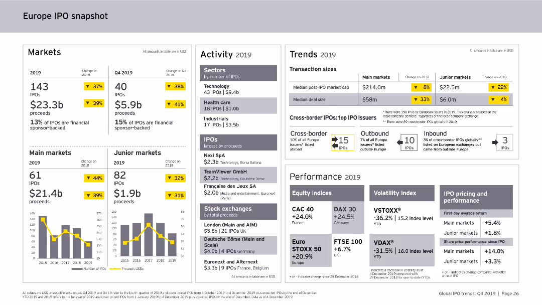
This slide includes column charts and numerical data points. It provides a snapshot of the Europe IPO market in 2019, covering markets, activity levels, trends, and performance metrics.
Market Analysis and Trends
Financial Services
The slide offers an overview of the Europe IPO market for 2019, detailing the number of IPOs, proceeds, sector activity, transaction sizes, cross-border IPOs, and performance indicators.
Europe, IPO, Market Analysis, Financial Services, Trends, Activity, Performance, 2019
false
Market Analysis and Trends
Financial Services
Multiple Chart
EY
Add to my slides
Remove from favorites
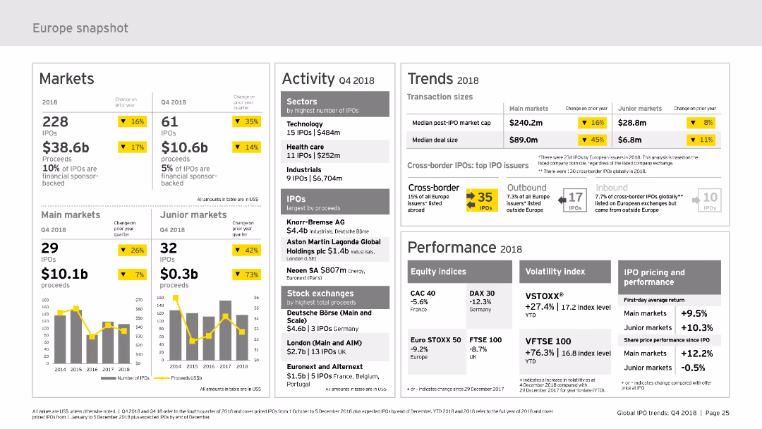
The slide provides a comprehensive snapshot of the European IPO market, divided into sections such as markets, activity, trends, and performance. It uses column charts and data tables to present information clearly. The layout is moderately complex, designed to offer detailed insights into market trends and activities.
Market Analysis and Trends
Financial Services
Offers a detailed overview of the European IPO market for 2018, including market performance, activity data, trends, and key metrics. It is useful for understanding the European market dynamics and making strategic decisions.
Europe, IPO, market snapshot, performance, trends
false
Market Analysis and Trends
Financial Services
Multiple Chart
EY
Add to my slides
Remove from favorites
Column charts and tables are used to illustrate the number of IPOs and proceeds in Europe, including main and junior markets.
Market Analysis and Trends
Financial Services
It details the performance of IPOs in Europe, highlighting major stock exchanges, sectors, and notable IPOs by proceeds.
Europe, IPOs, main markets, junior markets, stock exchanges
false
Market Analysis and Trends
Financial Services
Multiple Chart
EY
Add to my slides
Remove from favorites
The slide features a map of Europe on the left, highlighting countries in blue. On the right, there are three vertical sections with numbers 1, 2, and 3, each containing text. The layout is simple and visually balanced.
Strategic Planning
Professional Services
The slide outlines the benefits of KnowledgePanel's expansion across Europe, highlighting increased brand recognition, revenue gains, and expanded market presence.
Europe, KnowledgePanel, expansion, strategy, benefits
false
Strategic Planning
Professional Services
Graphic
IPSOS
Add to my slides
Remove from favorites
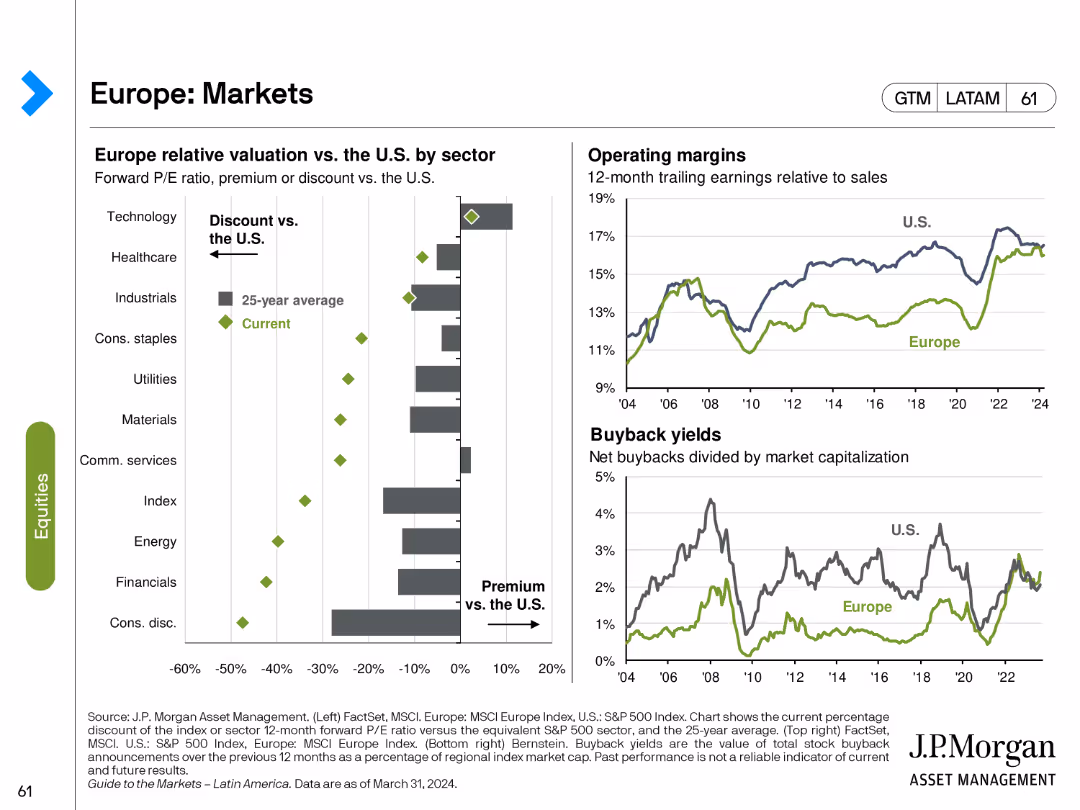
The slide features a bar chart showing Europe relative valuation vs. U.S. by sector, and two line charts depicting operating margins and buyback yields.
Market Analysis and Trends
Financial Services
This slide analyzes the European market, focusing on sector valuations relative to the U.S., as well as operating margins and buyback yields over time.
Europe, markets, sector valuation, operating margins, buyback yields
false
Market Analysis and Trends
Financial Services
Multiple Chart
JP Morgan
Add to my slides
Remove from favorites
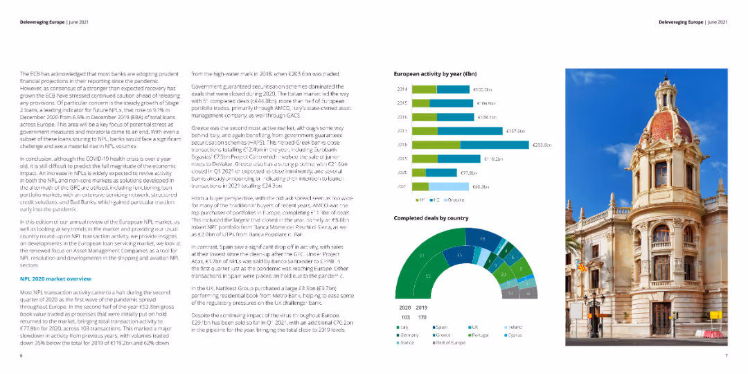
Multiple column charts showing European activity by year, completed deals by country, and NPL market overview.
Market Analysis and Trends
Financial Services
Provides an overview of NPL transactions and activity across Europe by year and by country.
Europe, NPL, activity, market, trends
false
Market Analysis and Trends
Financial Services
Multiple Chart
Deloitte
Add to my slides
Remove from favorites
Column charts for industry performance, country performance, and new orders index
Market Analysis and Trends
Financial Services
This slide examines the industry performance in Europe, detailing country-specific trends and the new orders index.
Europe outlook, industry performance, country trends, new orders
false
Market Analysis and Trends
Financial Services
Multiple Chart
Accenture
Add to my slides
Remove from favorites
Previous
Next
You don't have any favorites yet.
Please wait loading your favorites slides...
Create a FREE account to continue browsing
Receive Instant Access to 1,000+ slides from companies like McKinsey, Google, and Goldman Sachs
First Name
Last Name
Email
Password
I agree to all
Terms & Privacy Policy
Thank you! Your submission has been received!
Oops! Something went wrong while submitting the form.
Have an account?
Sign in
Upgrade to PRO to Save slides
Advanced Search and Filters
Access to 15,000+ slides
Access to Category Pages
Save/Bookmark Slides
PowerPoint Template Library
Pick a Plan
MONTHLY
$12/month
Billed every month, Cancel anytime.
YEARLY
$9/year
Billed $108 annually, Cancel anytime.
Checkout for $12/month
Checkout for $108/yr
Secured by Stripe | AES-256 bit encryption