My Account
My Slides
Search by Category
Companies
Slide Type
Use Case
Industry
Pricing
Templates
View All Templates
Download Template Slides
✦ AI
AI Prompt Library
AI Search
Feedback
Login
Logout
Get Started
Browse all Slides
Browse all Slides
Create a FREE Account
Instant access to 1,000+ real slides from top companies like McKinsey, BCG, Goldman Sachs, Google and many more!
First Name
Last Name
Email
Password
I agree to all
Terms & Privacy Policy
Thank you! Your submission has been received!
Oops! Something went wrong while submitting the form.
Have an account?
Sign in
Saved Slides
Total No. of slides saved
0
↻ Refresh
✖ Clear all
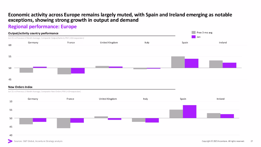
Two stacked bar sections showing composite output and new orders for major European economies. Purple bars indicate January values vs previous 3-month average.
Market Analysis and Trends
Financial Services
This slide compares economic activity in Europe by country, showing muted growth overall with notable strength in Spain and Ireland. Both output and new orders show divergence across the region, offering a granular look at regional demand and recovery.
Europe, output, new orders, Spain, Ireland, Germany, PMI, activity
false
Market Analysis and Trends
Financial Services
Multiple Chart
Accenture
Add to my slides
Remove from favorites
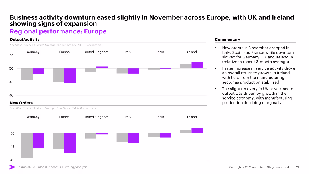
Two column charts comparing output/activity and new orders across European countries. The slide also includes commentary on business activity in November.
Market Analysis and Trends
Financial Services
This slide analyzes the performance of different European countries, comparing their output/activity and new orders, with a focus on changes observed in November.
Europe, performance, activity, orders, November
false
Market Analysis and Trends
Financial Services
Multiple Chart
Accenture
Add to my slides
Remove from favorites
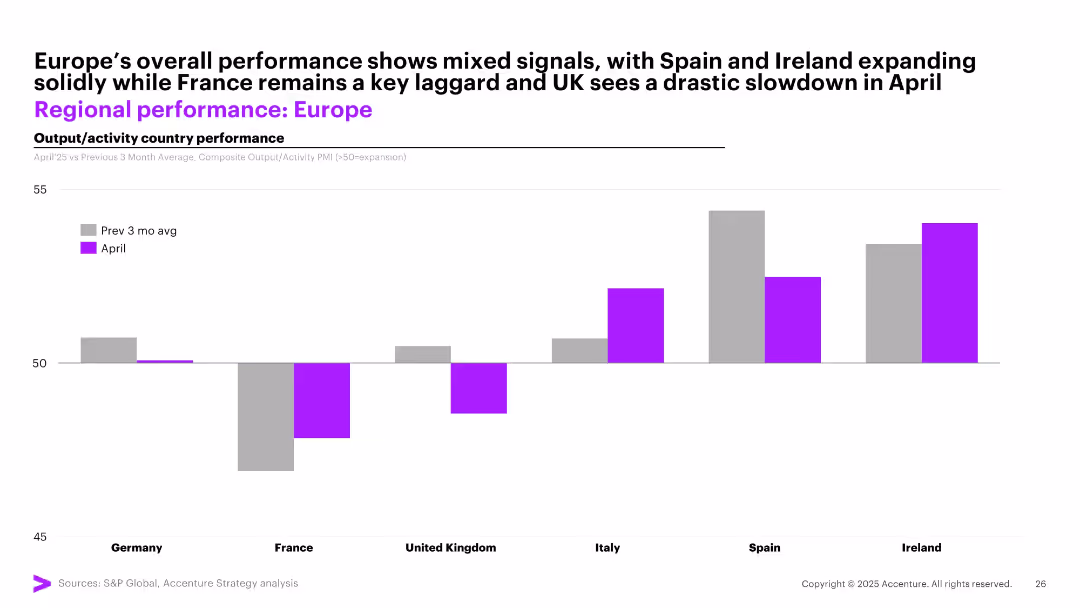
Single bar chart comparing April PMI activity vs 3-month average across major European countries; uses color coding and simple layout with country names on x-axis.
Performance Metrics and KPIs
Industrial & Manufacturing
This slide provides a comparative snapshot of economic activity in Europe. Spain and Ireland show solid growth, while France and the UK have seen notable slowdowns. Businesses should adjust regional strategies based on diverging economic performance.
Europe, PMI, regional output, France, Spain, UK, performance variation
false
Performance Metrics and KPIs
Industrial & Manufacturing
Single Chart
Accenture
Add to my slides
Remove from favorites
Map of Europe showing bank coverage, icons representing key statistics such as number of banks, branches, dimensions analyzed, and annual records database. Purple color scheme.
Market Analysis and Trends
Financial Services
Provides an overview of the 2024 Retail Banking Radar, tracking 89 retail banks across 21 European markets, detailing coverage, branches, dimensions analyzed, and annual records.
Europe, retail banks, coverage, branches, dimensions
false
Market Analysis and Trends
Financial Services
Graphic
Kearney
Add to my slides
Remove from favorites
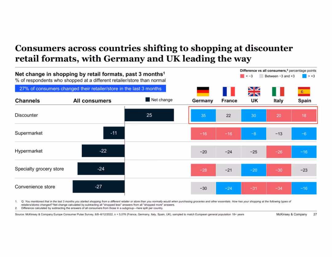
Table showing net change in retail channel preferences by country with color-coded differences vs. average; country flags and key metrics shown
Market Analysis and Trends
Retail & E-commerce
Cross-country comparison of net shopping changes by retail format highlights a Europe-wide shift toward discounter channels. Germany and the UK show the strongest movement, while traditional retail like supermarkets and specialty stores have negative net change. The data reflects a continent-wide price-conscious shopping trend.
Europe retail trends, discounters, Germany, UK, shopping behavior, cross-country comparison, inflation, consumer shift
false
Market Analysis and Trends
Retail & E-commerce
Multiple Chart
McKinsey
Add to my slides
Remove from favorites
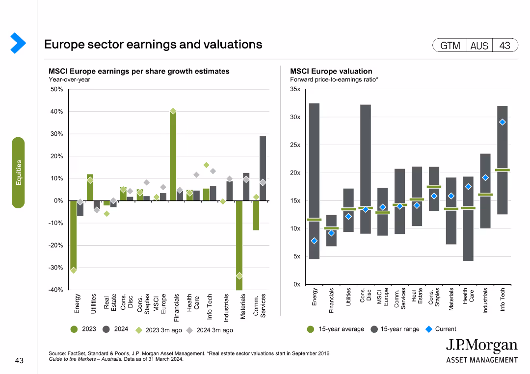
The slide includes two charts: a column chart on MSCI Europe earnings per share growth estimates, and a line chart on MSCI Europe valuation forward price-to-earnings ratio.
Financial Performance
Financial Services
Analyzes sector earnings and valuations in Europe, focusing on MSCI Europe growth estimates and P/E ratios, useful for financial performance analysis.
Europe, sector earnings, valuations, MSCI Europe, growth estimates
false
Financial Performance
Financial Services
Multiple Chart
JP Morgan
Add to my slides
Remove from favorites
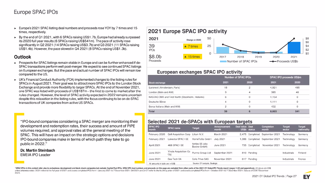
Features column charts, tables, and bullet points with highlighted statistics. Uses blue and yellow colors to indicate different SPAC activities and trends.
Market Analysis and Trends
Financial Services
Summarizes SPAC IPO activities in Europe for 2021, detailing trends, major SPAC IPOs by region and sector, and outlook for SPAC activities in Europe.
Europe, SPAC, IPO, 2021 activity, market highlights, trends, sectors, performance, outlook, stock exchanges, regulations
false
Market Analysis and Trends
Financial Services
Mixed Chart
EY
Add to my slides
Remove from favorites
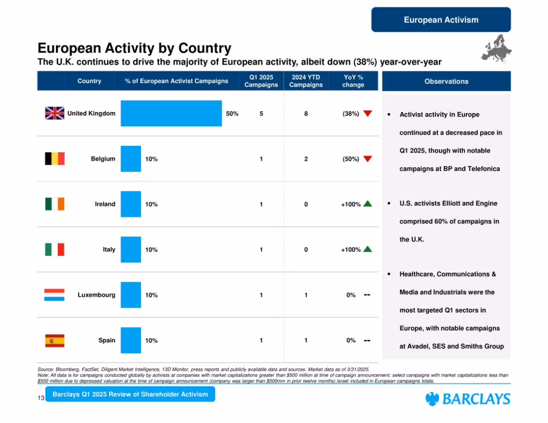
Tabular format with country flags, bars, and bullet point observations. Three main columns for metrics and one for insights.
Market Analysis and Trends
Financial Services
Provides a country-wise breakdown of activist campaign activity across Europe in Q1 2025, highlighting the UK’s dominant share and YoY changes. It also notes trends in activist involvement and sector focus across countries.
Europe, UK, Belgium, Campaigns, Activism, YoY Change, Sector Focus, Shareholder, 2025
false
Market Analysis and Trends
Financial Services
Mixed Chart
Barclays
Add to my slides
Remove from favorites
The slide features two column charts. The left chart displays Eurozone consumer confidence over time. The right chart shows accumulated excess savings as a percentage of 2019 GDP for the US, Eurozone, and UK. The charts are well-annotated with clear trends.
Market Analysis and Trends
Financial Services
This slide examines consumer confidence and savings behavior in the Eurozone, the US, and the UK, useful for consumer behavior analysis and economic forecasting.
eurozone, consumer confidence, savings, GDP, economic forecasting
false
Market Analysis and Trends
Financial Services
Multiple Chart
JP Morgan
Add to my slides
Remove from favorites
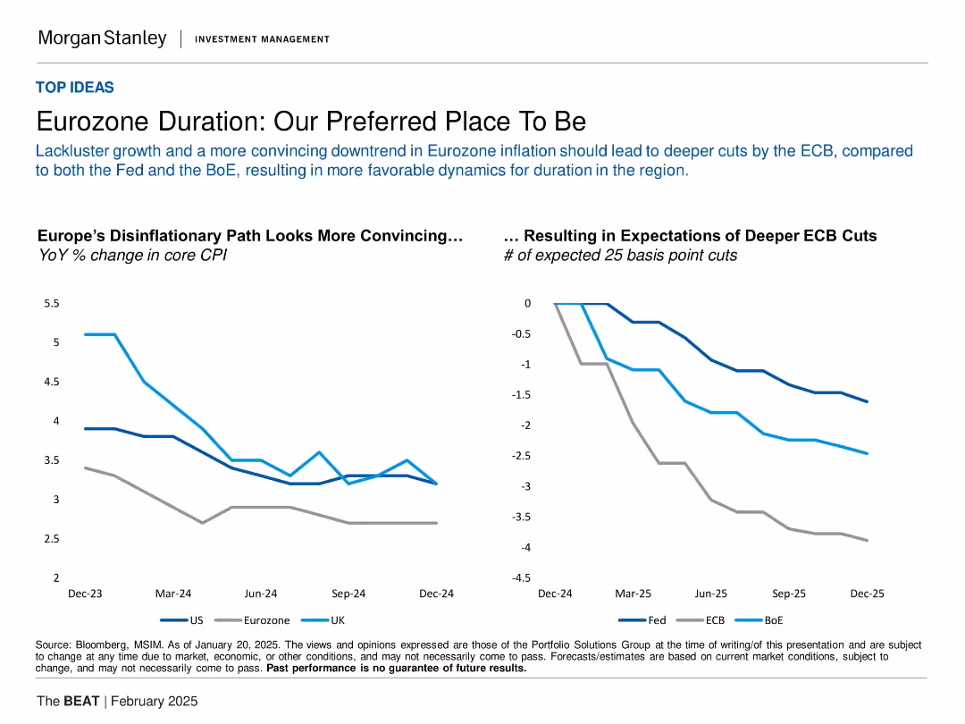
Two-line charts: Left shows YoY % change in core CPI (US, Eurozone, UK); right shows expected rate cuts (Fed, ECB, BoE) from Dec 2024–Dec 2025.
Investment Analysis
Financial Services
The slide argues that the Eurozone offers the most compelling case for bond duration investing in 2025 due to clearer disinflation trends. It compares inflation rates and interest rate expectations across major economies, showing the ECB is expected to make deeper cuts than the Fed or BoE. This sets the Eurozone apart as favorable for fixed-income strategies.
Eurozone, CPI, ECB, rate cuts, inflation, fixed income, duration strategy, disinflation, BoE, Fed
false
Investment Analysis
Financial Services
Multiple Chart
Morgan Stanley
Add to my slides
Remove from favorites
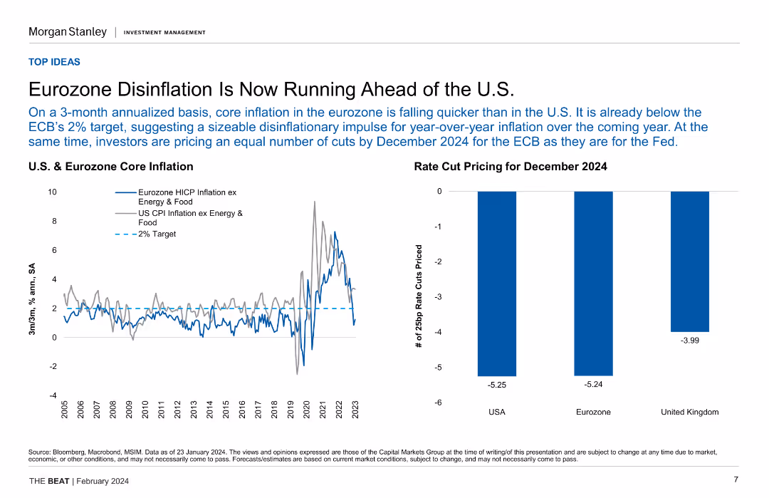
Line chart comparing U.S. and Eurozone core inflation rates, along with a column chart showing rate cut pricing for December 2024.
Market Analysis and Trends
Financial Services
The slide highlights the disinflation trend in the Eurozone compared to the U.S., projecting future rate cuts by the ECB and the Fed.
Eurozone, disinflation, core inflation, rate cut, economic trend
false
Market Analysis and Trends
Financial Services
Multiple Chart
Morgan Stanley
Add to my slides
Remove from favorites
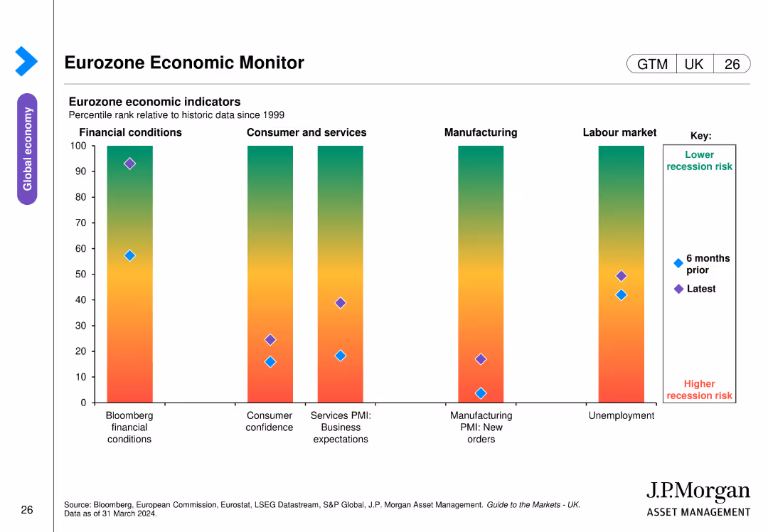
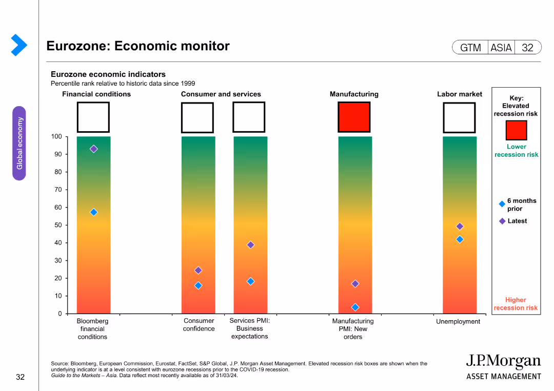
The slide includes a bar chart displaying eurozone economic indicators. The bars show percentile ranks relative to historic data across different economic conditions, consumer confidence, business expectations, manufacturing orders, and unemployment.
Market Analysis and Trends
Financial Services
This slide monitors eurozone economic health by presenting various economic indicators over time, aiding in the assessment of recession risks and economic stability.
eurozone, economic indicators, recession risk, consumer confidence, manufacturing orders
false
Market Analysis and Trends
Financial Services
Single Chart
JP Morgan
Add to my slides
Remove from favorites
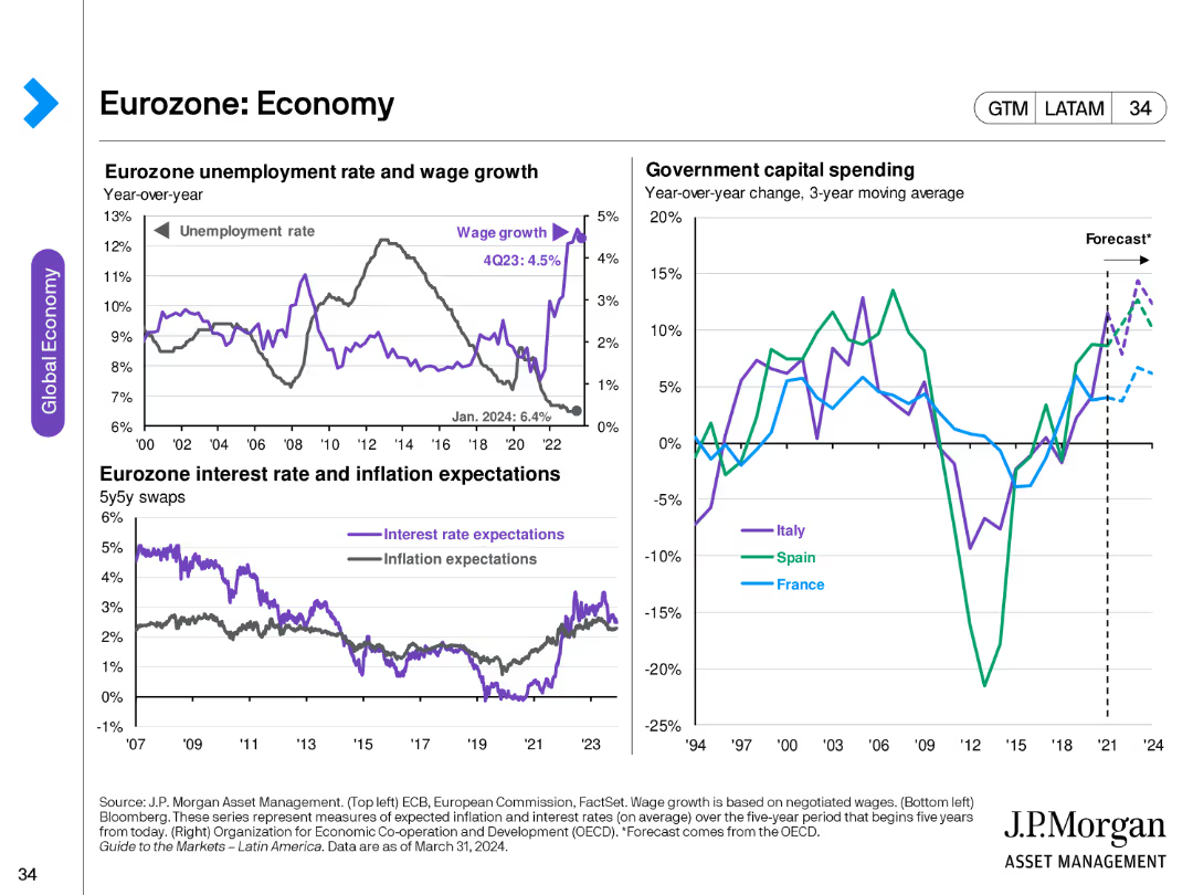
This slide includes multiple line charts showing Eurozone unemployment rate, wage growth, interest rate, and inflation expectations, along with a column chart displaying government capital spending for Italy, Spain, and France.
Market Analysis and Trends
Financial Services
The slide presents data on the Eurozone's economic indicators, including unemployment, wage growth, interest rates, and inflation expectations, alongside government capital spending trends, providing an economic overview.
Eurozone, economy, unemployment, wage growth, inflation, interest rates, government spending, Italy, Spain, France
false
Market Analysis and Trends
Financial Services
Multiple Chart
JP Morgan
Add to my slides
Remove from favorites
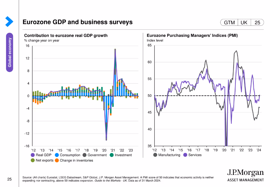
This slide contains two column charts. The left chart presents the contribution to eurozone real GDP growth by different sectors. The right chart shows Eurozone Purchasing Managers' Indices (PMI) over time. The charts are detailed and use various colors to distinguish data categories.
Market Analysis and Trends
Financial Services
The slide analyzes the eurozone's GDP growth and business activity through sector contributions and PMI trends, essential for economic analysis and business strategy.
eurozone GDP, business surveys, PMI, sector growth, economic analysis
false
Market Analysis and Trends
Financial Services
Multiple Chart
JP Morgan
Add to my slides
Remove from favorites
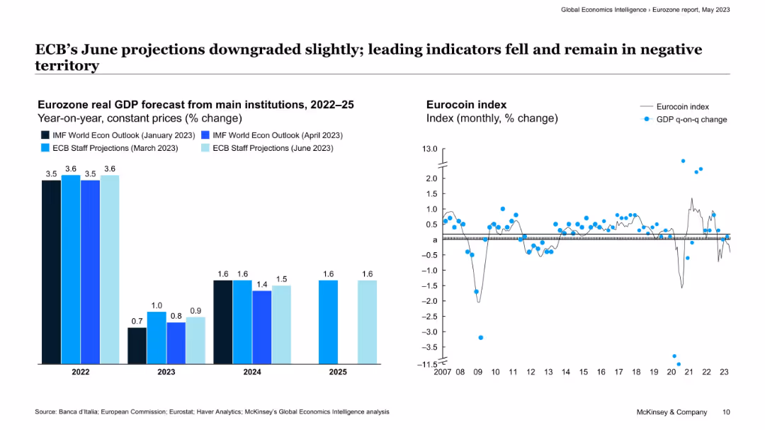
Split layout with bar chart (left) comparing GDP forecasts by institutions and line chart (right) showing Eurocoin index over time.
Market Analysis and Trends
Financial Services
The slide shows a modest downgrade in GDP growth projections for the Eurozone from major institutions. It includes monthly Eurocoin index values suggesting that leading indicators remain negative, reflecting stagnation or mild contraction.
eurozone, GDP forecast, ECB, Eurocoin, economic indicators, projections, growth, slowdown, macroeconomics
false
Market Analysis and Trends
Financial Services
Multiple Chart
McKinsey
Add to my slides
Remove from favorites
This slide contains two graphical elements: a bar chart showing Eurozone GDP quarter growth and a line chart depicting the Eurocoin index. The design includes textual elements on a white background, with the charts situated centrally for focus.
Financial Performance
Financial Services
The slide provides a comparative analysis of Eurozone GDP growth and the Eurocoin index, highlighting economic performance by country. It's useful for discussions about economic policy or investment strategy in the region.
Eurozone, GDP Growth, Economic Performance, France, Spain, Germany, Italy, Comparative Analysis, Eurocoin Index
false
Financial Performance
Financial Services
Multiple Chart
McKinsey
Add to my slides
Remove from favorites
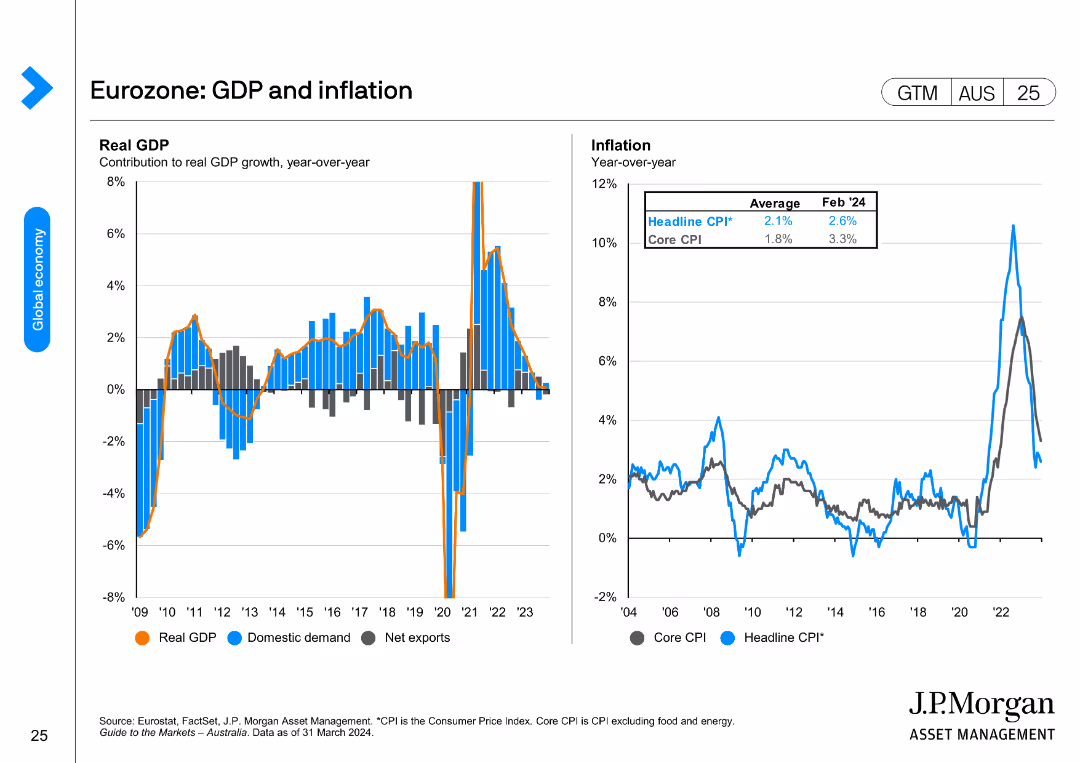
Two line charts showing year-over-year changes in Eurozone's real GDP and inflation rates, including headline and core CPI.
Market Analysis and Trends
Financial Services
The slide illustrates the Eurozone's GDP growth and inflation rates over the years, highlighting changes in domestic demand, net exports, and CPI.
Eurozone, GDP, inflation, headline CPI, core CPI, domestic demand
false
Market Analysis and Trends
Financial Services
Multiple Chart
JP Morgan
Add to my slides
Remove from favorites
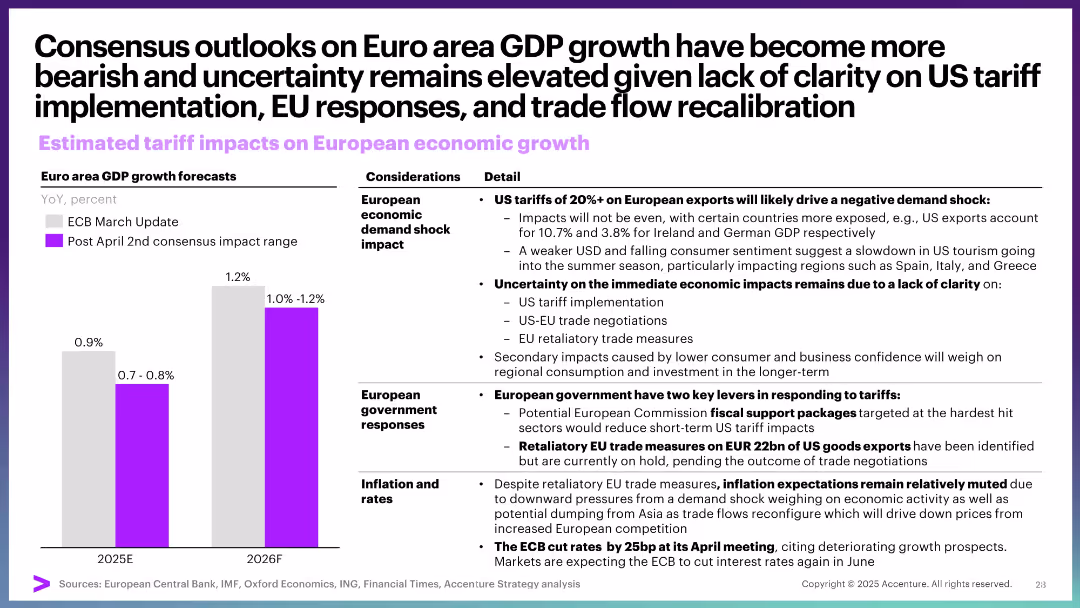
Bar chart for GDP forecasts; detailed text columns on economic shock, EU responses, and inflation. Structured layout.
Market Analysis and Trends
Government & Public Sector
This slide covers expected negative effects of US tariffs on EU economic growth, emphasizing demand shock, lack of clarity on implementation, and EU response options. Inflation expectations remain muted due to broader economic weakening.
Eurozone, GDP, tariffs, economic growth, inflation, trade negotiation, EU response
false
Market Analysis and Trends
Government & Public Sector
Mixed Chart
Accenture
Add to my slides
Remove from favorites
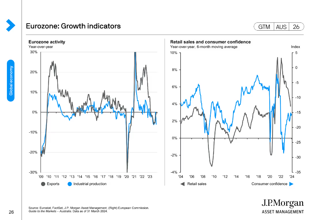
Two line charts depicting Eurozone activity through exports and industrial production, and retail sales and consumer confidence trends.
Market Analysis and Trends
Financial Services
This slide provides insights into the Eurozone's economic activity and growth indicators, focusing on exports, industrial production, retail sales, and consumer confidence.
Eurozone, growth indicators, exports, industrial production, retail sales, consumer confidence
false
Market Analysis and Trends
Financial Services
Multiple Chart
JP Morgan
Add to my slides
Remove from favorites
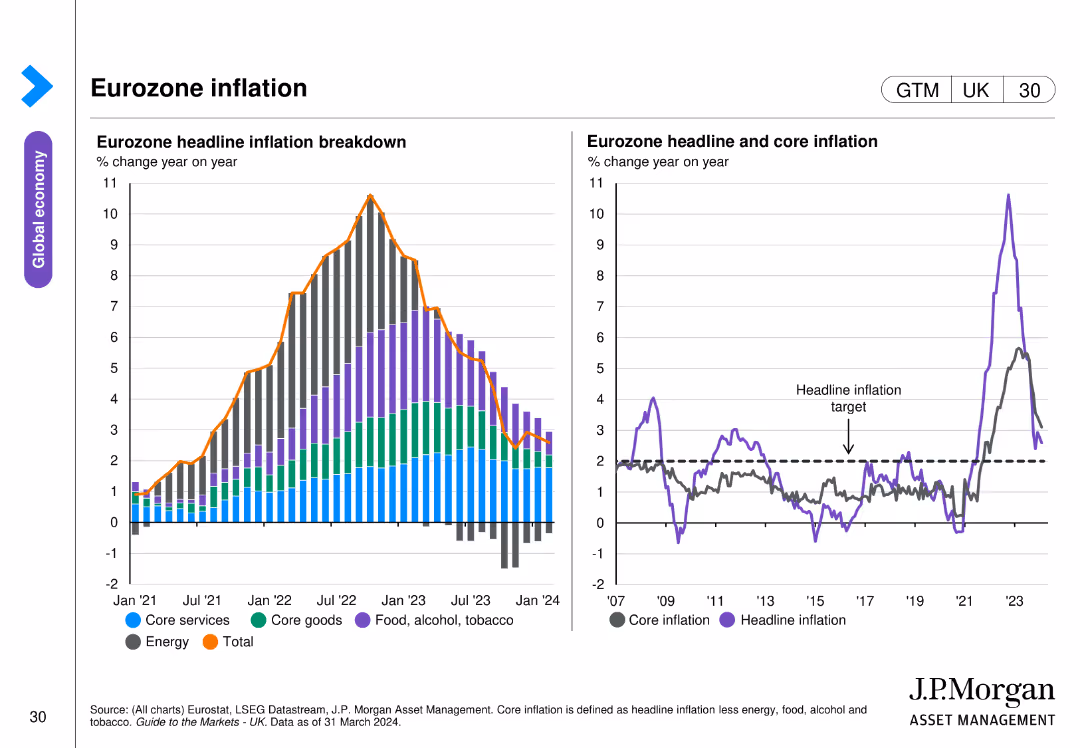
The slide features two column charts. The left chart shows a breakdown of eurozone headline inflation by different components. The right chart presents headline and core inflation trends. The charts are color-coded and include annotations for clarity.
Market Analysis and Trends
Financial Services
This slide analyzes eurozone inflation trends, breaking down the components of headline inflation and comparing headline and core inflation, important for inflation analysis.
eurozone, inflation, headline inflation, core inflation, economic trends
false
Market Analysis and Trends
Financial Services
Multiple Chart
JP Morgan
Add to my slides
Remove from favorites
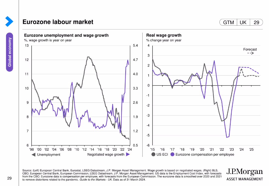
This slide includes two column charts. The left chart shows eurozone unemployment and wage growth rates over time. The right chart presents real wage growth trends for the US and Eurozone. The data is clearly segmented and color-coded.
Market Analysis and Trends
Financial Services
The slide provides insights into the Eurozone labor market, focusing on unemployment, wage growth, and real wage trends, essential for labor market analysis.
eurozone, labor market, unemployment, wage growth, real wages
false
Market Analysis and Trends
Financial Services
Multiple Chart
JP Morgan
Add to my slides
Remove from favorites
The slide includes a bar chart with color-coded bars indicating recession risks for various Eurozone economic indicators. The layout is detailed and moderately complex.
Risk Assessment and Management
Financial Services
The slide presents the risk levels of potential recession in the Eurozone using various economic indicators, comparing current data with historical trends.
Eurozone, recession risk, economic indicators, risk levels, economic stability
false
Risk Assessment and Management
Financial Services
Single Chart
JP Morgan
Add to my slides
Remove from favorites
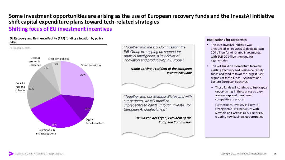
Pie chart displaying 2024 RRF fund allocation. Quotes from EU leaders and a box listing implications for corporates. Soft color palette with purple highlights.
Strategic Planning
Government & Public Sector
This slide details the EU’s policy-driven capex focus via Recovery and Resilience Facility funding. It emphasizes digital transformation and AI initiatives like InvestAI, which mobilizes EUR 200B for gigafactories, particularly in Southern and Eastern Europe.
EU, RRF, InvestAI, digital transformation, green transition, funding
false
Strategic Planning
Government & Public Sector
Mixed Chart
Accenture
Add to my slides
Remove from favorites
This slide combines bullet points and icons to highlight agricultural priorities and new EU strategies. The layout is straightforward, using icons and brief descriptions to clearly communicate key strategies.
Strategic Planning
Agriculture & Food Production
Focuses on strategic changes in agriculture for sustainability, including the Biodiversity Strategy and the Farm to Fork Strategy under the European Green Deal, aiming for a sustainable competitive food system.
EU strategies, agriculture, biodiversity, sustainability, food system
false
Strategic Planning
Agriculture & Food Production
Header Vertical
Deloitte
Add to my slides
Remove from favorites
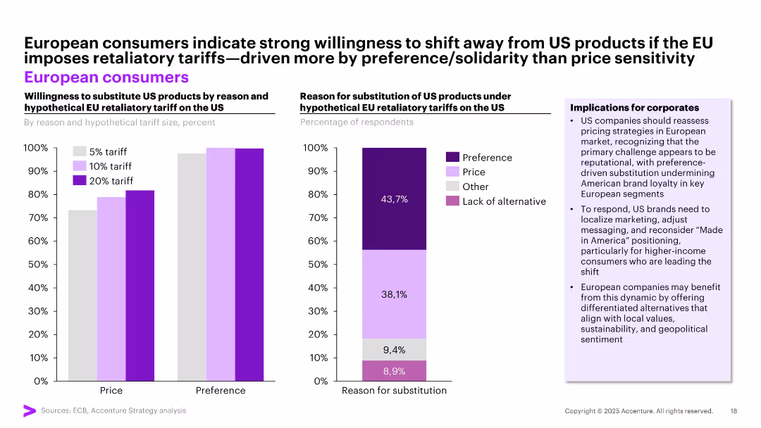
Dual chart layout showing willingness to substitute US products under tariff scenarios (left) and reasons for substitution (right); bar and stacked bar visuals; implications in side panel.
Strategic Planning
Retail & E-commerce
The slide shows that European consumers are highly likely to substitute US products if tariffs are imposed, mainly due to brand preference rather than price. This trend signals reputational risk for US brands and opportunity for localized EU branding.
EU tariffs, substitution, brand preference, pricing, reputation risk, US products
false
Strategic Planning
Retail & E-commerce
Multiple Chart
Accenture
Add to my slides
Remove from favorites
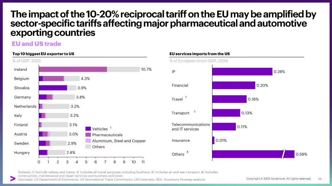
Left: bar chart of top EU exporters to US (% of GDP). Right: bar chart on EU services imports from US. Simple layout, dual visual focus.
Market Analysis and Trends
Government & Public Sector
This slide explores trade dependencies between the EU and US. It highlights the EU countries most exposed to the US through exports and the sectors affected by tariffs, notably pharmaceuticals and autos. It also details the composition of EU imports of US services.
EU trade, US tariffs, exports, pharmaceuticals, vehicles, GDP share, services
false
Market Analysis and Trends
Government & Public Sector
Multiple Chart
Accenture
Add to my slides
Remove from favorites
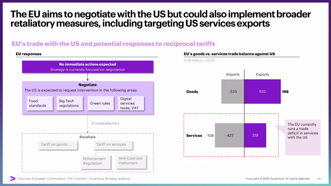
Flowchart on EU response strategies and bar chart on trade balance by goods and services. Structured for comparison.
Regulatory and Compliance
Government & Public Sector
The slide outlines EU’s strategic options in response to US tariffs. It includes negotiation paths and potential retaliation mechanisms, with a focus on the trade imbalance—goods surplus vs. services deficit.
EU, US tariffs, trade balance, negotiation, services deficit, retaliation strategy
false
Regulatory and Compliance
Government & Public Sector
Mixed Chart
Accenture
Add to my slides
Remove from favorites
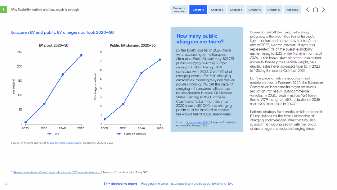
Dual-line graphs (EV stock and chargers 2020–2050), blue text box on public chargers, and right-aligned commentary on truck electrification.
Market Analysis and Trends
Energy & Utilities
The slide forecasts sharp growth in EV stock and public chargers across Europe from 2020 to 2050. It includes infrastructure data and calls for accelerated investment to meet EU targets. It also outlines challenges in electrifying heavy-duty vehicles.
EV adoption, chargers, infrastructure, electrification, EU targets, public policy, vehicle fleet
false
Market Analysis and Trends
Energy & Utilities
Multiple Chart
EY
Add to my slides
Remove from favorites
A column chart illustrating the percentage of respondents across different countries who cite high fuel prices as a key motivator for purchasing an EV. The global average is highlighted.
Market Analysis and Trends
Transportation & Logistics
The slide shows how high fuel/oil/gas prices drive consumers to adopt electric vehicles, with data from multiple countries compared to the global average.
EV adoption, fuel prices, consumer motivation, country comparison
false
Market Analysis and Trends
Transportation & Logistics
Single Chart
EY
Add to my slides
Remove from favorites
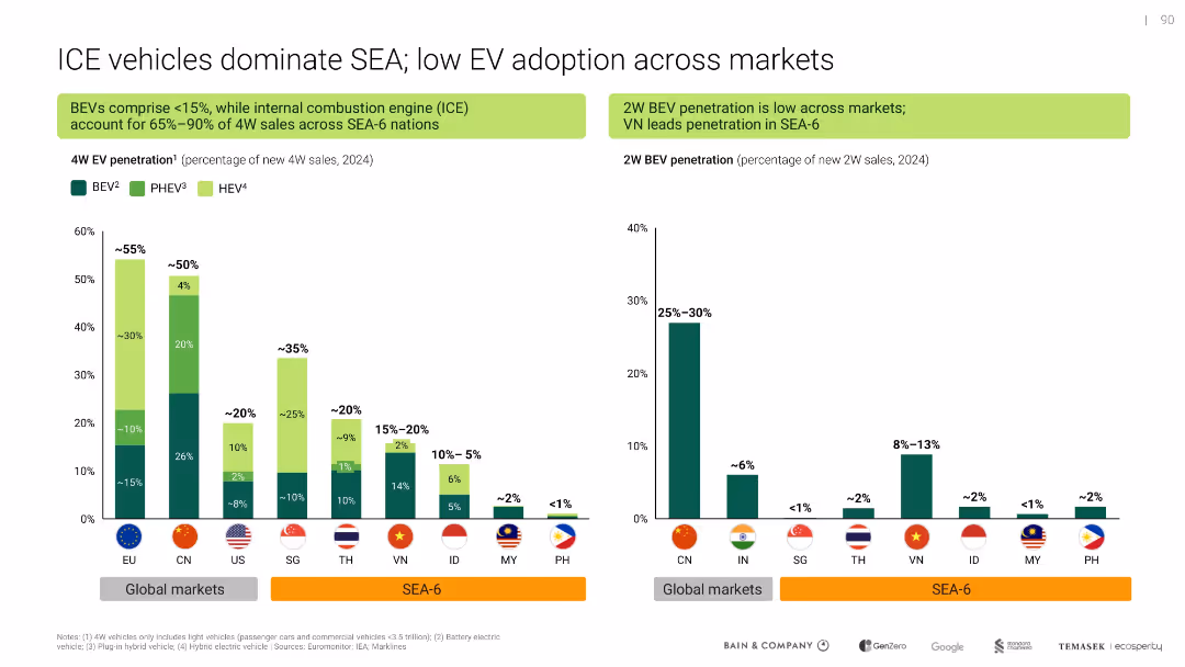
Dual-panel bar chart comparing 4W and 2W EV penetration across SEA and global markets; green color theme for EV types
Market Analysis and Trends
Transportation & Logistics
Shows that internal combustion engine (ICE) vehicles still dominate in SEA-6 countries, with low adoption of battery electric vehicles (BEVs), especially in 2-wheelers. Highlights lag in EV transition compared to global markets.
EV adoption, ICE dominance, BEV, SEA-6, 2W EV, penetration, vehicle market
false
Market Analysis and Trends
Transportation & Logistics
Multiple Chart
Bain
Add to my slides
Remove from favorites
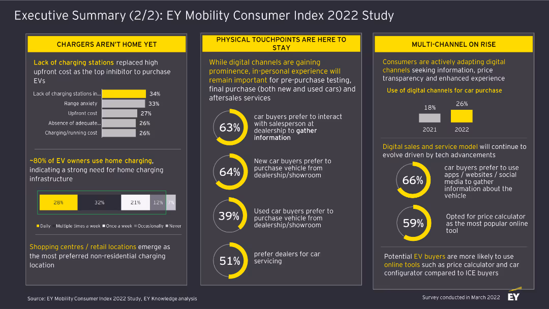
This slide includes column charts and textual highlights. It discusses the challenges in EV adoption, the importance of physical touchpoints, and the rise of digital channels for car purchases.
Market Analysis and Trends
Transportation & Logistics
The slide summarizes findings from the EY Mobility Consumer Index 2022 Study, focusing on barriers to EV adoption, the role of physical touchpoints, and the increasing use of digital channels in car buying.
EV Adoption, Physical Touchpoints, Digital Channels, Car Buying, Transportation, Market Analysis, 2022, Survey, Consumer Trends
false
Market Analysis and Trends
Transportation & Logistics
Multiple Chart
EY
Add to my slides
Remove from favorites
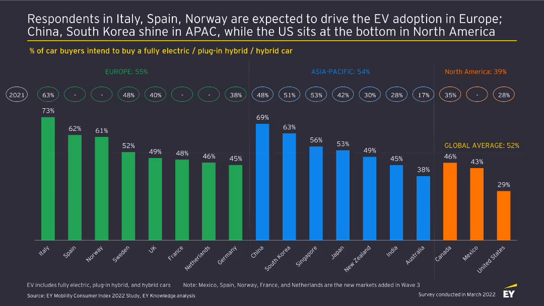
This slide features a column chart comparing the percentage of car buyers intending to buy an EV across different regions, highlighting Europe, APAC, and North America.
Market Analysis and Trends
Transportation & Logistics
The slide analyzes regional differences in EV adoption intentions based on the EY Mobility Consumer Index 2022 Study, comparing the percentage of car buyers planning to purchase an electric vehicle in Europe, APAC, and North America.
EV Adoption, Regional Comparison, Transportation, Market Analysis, 2022, Consumer Trends, Survey, Electric Vehicles, Car Buyers
false
Market Analysis and Trends
Transportation & Logistics
Multiple Chart
EY
Add to my slides
Remove from favorites
Evaluation of funding models under different assumptions
Strategic Planning
Telecommunications
Presents bar graphs with detailed cost analyses for different funding models under varying assumptions. The visual representation uses different colors to denote various types of costs, making it easy to understand at a glance which factors are the most significant in each model.
Evaluates the potential for school connectivity in Kalimantan, Sulawesi, Nusa Tenggara, and Papua under different financial assumptions, focusing on the sustainability and impact of various funding models.
false
Strategic Planning
Telecommunications
Multiple Chart
BCG
Add to my slides
Remove from favorites
A table listing criteria for evaluating ideas based on desirability, viability, and feasibility, with specific questions under each category.
Strategic Planning
Professional Services
Provides a framework for evaluating initiatives to improve Melbourne's attractiveness, considering aspects like cultural perception, economic return, and technical feasibility.
evaluation framework, strategic planning, Melbourne, criteria, initiatives
false
Strategic Planning
Professional Services
Framework
BCG
Add to my slides
Remove from favorites
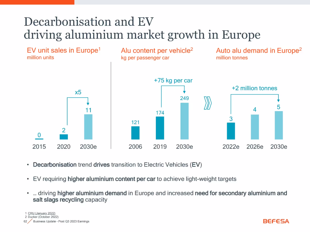
Three-column bar chart layout with annotations and summary bullet points below
Market Analysis and Trends
Industrial & Manufacturing
The slide illustrates how electric vehicle (EV) trends in Europe are increasing aluminium demand due to higher aluminium content per car and rising EV adoption.
EV, Aluminium, Market Growth, Europe, Decarbonisation, Lightweighting
false
Market Analysis and Trends
Industrial & Manufacturing
Mixed Chart
Goldman Sachs
Add to my slides
Remove from favorites
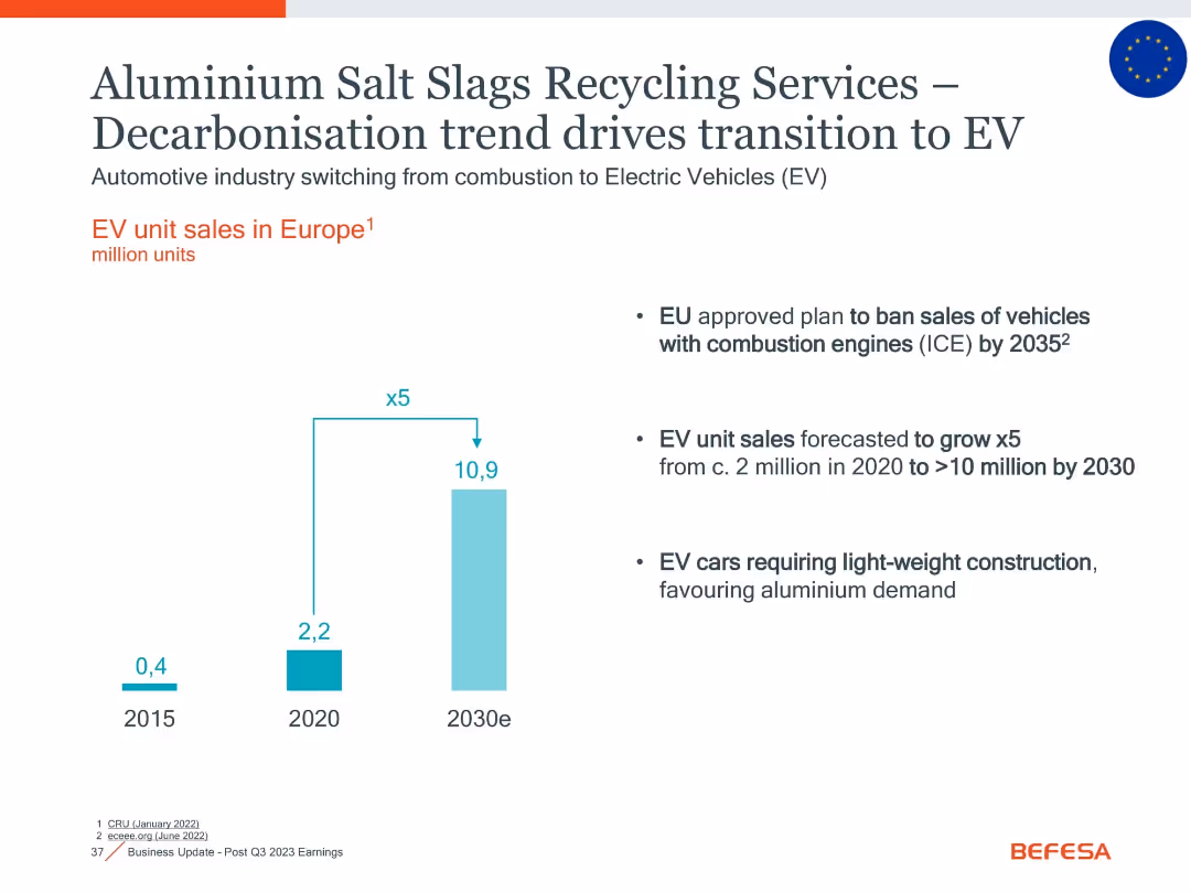
Clean, minimal layout with vertical EV unit sales bar chart; includes text highlights and EU policy info
Market Analysis and Trends
Government & Public Sector
Illustrates Europe’s rapid EV growth and policy bans on ICEs by 2035. Emphasizes increased demand for aluminium recycling driven by lightweight EV construction, positioning Befesa within this market transition.
EV, aluminium, recycling, EU, combustion ban, electrification, lightweight, vehicle sales
false
Market Analysis and Trends
Government & Public Sector
Mixed Chart
Goldman Sachs
Add to my slides
Remove from favorites
The slide shows a bar chart comparing the top 5 services consumers use or want in an EV app across different regions (APAC, EMEA, North America). Icons and colors differentiate services.
Strategic Planning
Transportation & Logistics
The slide presents the results of a survey on the most desired features in EV apps, illustrating regional differences in consumer preferences. It aims to guide EV app development strategies.
EV apps, consumer preferences, regional analysis, digital tools, survey results
false
Strategic Planning
Transportation & Logistics
Mixed Chart
PwC/Strategy&
Add to my slides
Remove from favorites
A line chart showing the global EV assembly by powertrain type from 2019 to 2028, with projected growth percentages for various EV types.
Market Analysis and Trends
Transportation & Logistics
Projects global electric vehicle assembly growth across different powertrain types, indicating a significant upward trend through 2028.
EV, assembly, global, forecast, powertrain, growth, market, BEV, PHEV
false
Market Analysis and Trends
Transportation & Logistics
Single Chart
PwC/Strategy&
Add to my slides
Remove from favorites
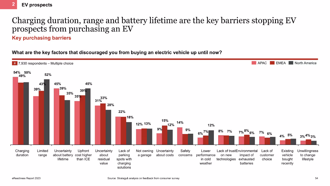
The slide uses a column chart to show the main barriers preventing EV purchases, such as charging duration, range, and battery lifetime. It includes regional comparisons indicated by colored bars for APAC, EMEA, and North America.
Market Analysis and Trends
Transportation & Logistics
This slide analyzes the key barriers to EV adoption, focusing on issues like charging duration, range, and battery lifetime. It provides regional data to show how these barriers vary across different areas.
EV barriers, column chart, charging duration, battery lifetime
false
Market Analysis and Trends
Transportation & Logistics
Single Chart
PwC/Strategy&
Add to my slides
Remove from favorites
Column charts compare the level of concern about environmental impacts of EV batteries between EV and ICE intenders, using two-tone color differentiation.
Regulatory and Compliance
Transportation & Logistics
Highlights environmental concerns related to electric vehicle batteries, crucial for regulatory compliance and sustainability strategies in the automotive and environmental sectors.
EV batteries, environmental impact, consumer concerns, regulatory compliance, sustainability, automotive industry, environmental strategy
false
Regulatory and Compliance
Transportation & Logistics
Single Chart
Deloitte
Add to my slides
Remove from favorites
Features a mix of text and stacked bar chart, showing the sourcing requirements for EV batteries and the global production shares of battery materials.
Strategic Planning
Transportation & Logistics
Discusses sourcing strategies for EV batteries under new regulations, highlighting dependency on specific countries. Essential for supply chain strategists in the automotive sector.
EV batteries, sourcing, supply chain, regulations, automotive, global production, trade
true
Strategic Planning
Transportation & Logistics
Mixed Chart
BCG
Add to my slides
Remove from favorites
Complex bar chart showing EV battery cost breakdown by component (e.g., raw material, CAM, cell production) with cost percentages and annotations.
Product and Service Analysis
Energy & Utilities
The slide breaks down the total cost structure of a lithium-ion EV battery pack (NCM 811) as of July 2021, attributing costs to materials, processing, and production. It highlights how semiconductor shortages increased costs by $2–3/kWh.
EV battery, cost breakdown, lithium-ion, NCM 811, material costs, CAM, cell production
false
Product and Service Analysis
Energy & Utilities
Single Chart
Roland Berger
Add to my slides
Remove from favorites
Features a line chart on battery price outlook and images of various battery types.
Financial Performance
Energy & Utilities
Details the expected decline in EV battery costs and market predictions up to 2030.
EV, battery cost, market forecast, lithium-ion, price decline
false
Financial Performance
Energy & Utilities
Mixed Chart
PwC/Strategy&
Add to my slides
Remove from favorites
Column chart showing the proportion of new business wins from EV projects from 2018 to 2020, using a grey and green color scheme to differentiate between non-EV and EV wins.
Strategic Planning
Industrial & Manufacturing
Focuses on the growth in new business awards related to electric vehicles (EV) for TI Fluid Systems, showing an increasing trend in EV market engagement from 2018 to 2020, reflecting strategic positioning in the evolving automotive market.
EV business, growth, 2018-2020, bar graph, strategic
false
Strategic Planning
Industrial & Manufacturing
Mixed Chart
Deutsche Bank
Add to my slides
Remove from favorites
The slide features a column chart displaying the percentage of respondents planning to buy different types of EVs from 2020 to 2023. Key points are highlighted on the right side with yellow text boxes.
Market Analysis and Trends
Transportation & Logistics
This slide shows the increasing consumer intent to buy electric vehicles, including BEVs, hybrids, and plug-in hybrids, across several years. It indicates strong sales volume and government incentives.
EV-buying intent, consumer confidence, market share, sales volume, government incentives
false
Market Analysis and Trends
Transportation & Logistics
Mixed Chart
EY
Add to my slides
Remove from favorites
A column chart depicting EV-buying intent across different countries with percentage change from 2022. The US and Nordics sections are highlighted with text boxes.
Market Analysis and Trends
Transportation & Logistics
The slide analyzes the increase in EV-buying intent across various countries, driven by government incentives, price cuts, and lower cost of ownership.
EV-buying intent, geographies, government incentives, price cuts, ownership cost
false
Market Analysis and Trends
Transportation & Logistics
Mixed Chart
EY
Add to my slides
Remove from favorites
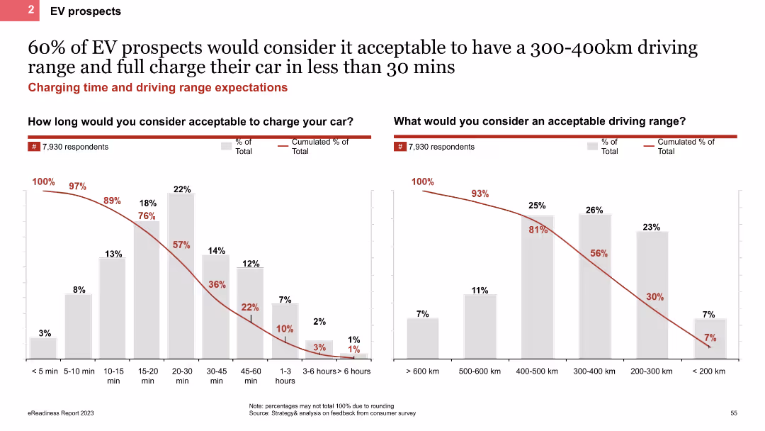
The slide contains two column charts displaying respondents' preferences for acceptable EV charging times and driving ranges. It includes clear labels and percentages, with data points highlighted for easy comparison.
Market Analysis and Trends
Transportation & Logistics
The slide highlights consumer expectations regarding EV charging times and driving ranges, based on a survey of 7,930 respondents. It aims to provide insights into the key factors influencing EV adoption.
EV charging, driving range, consumer preferences, survey data, electric vehicles
false
Market Analysis and Trends
Transportation & Logistics
Multiple Chart
PwC/Strategy&
Add to my slides
Remove from favorites
Bar charts detailing EV charging station penetration and infrastructure types.
Market Analysis and Trends
Energy & Utilities
Evaluates India's EV charging infrastructure development and market opportunities.
EV charging, infrastructure, India, market growth, investment
false
Market Analysis and Trends
Energy & Utilities
Mixed Chart
PwC/Strategy&
Add to my slides
Remove from favorites
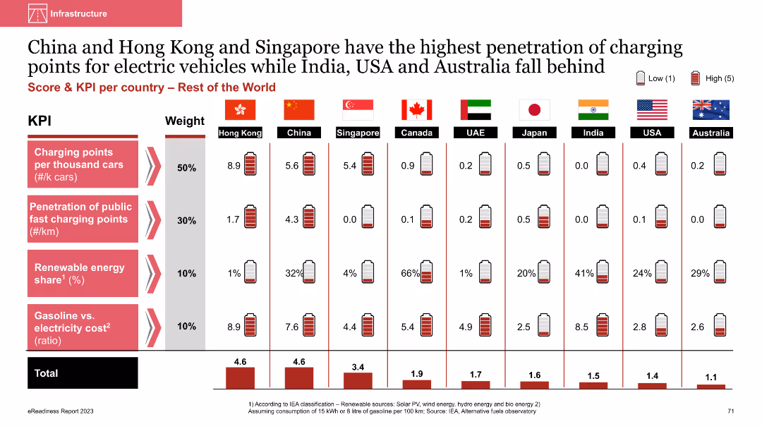
Column chart comparing EV charging infrastructure metrics across countries
Market Analysis and Trends
Energy & Utilities
This slide compares the penetration of EV charging points and renewable energy share across countries like China, Hong Kong, and Singapore, highlighting their advanced infrastructure compared to others
EV charging points, penetration, renewable energy, comparative analysis, international comparison
false
Market Analysis and Trends
Energy & Utilities
Multiple Chart
PwC/Strategy&
Add to my slides
Remove from favorites
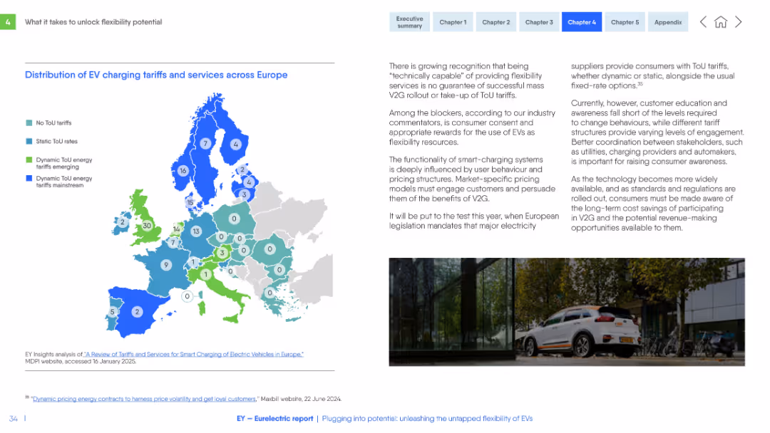
Color-coded map of Europe showing ToU tariffs. Text commentary on the right explains challenges of EV user engagement and pricing models.
Pricing Strategies
Transportation & Logistics
This slide maps the presence of time-of-use (ToU) tariffs across Europe and discusses consumer awareness, engagement levels, and regulatory implications of tariff adoption for EV smart-charging services.
EV charging, ToU tariffs, pricing models, Europe, consumer engagement, regulation, flexibility, energy services
false
Pricing Strategies
Transportation & Logistics
Mixed Chart
EY
Add to my slides
Remove from favorites
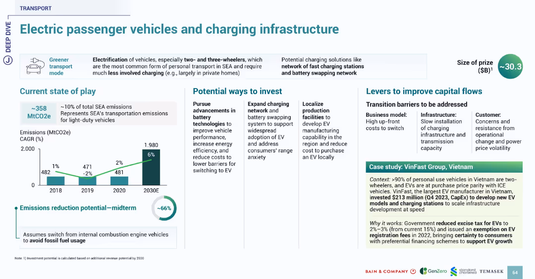
Uses familiar slide format with sections on current state, investment, barriers, and case study. Bright icons and data visualization maintain consistent transport theme.
Technology and Digital Transformation
Transportation & Logistics
Highlights the opportunity in electric passenger vehicles and associated charging infrastructure in SEA, which contributes 10% to SEA emissions. Suggests up to 66% reduction potential with a shift from fossil fuel vehicles. VinFast’s $213M investment in Vietnam illustrates local EV production and policy support. Government incentives like excise tax reduction and fee exemption are noted.
EV, charging, transport, SEA, emissions, VinFast, Vietnam, infrastructure, battery
false
Technology and Digital Transformation
Transportation & Logistics
Multiple Chart
Bain
Add to my slides
Remove from favorites
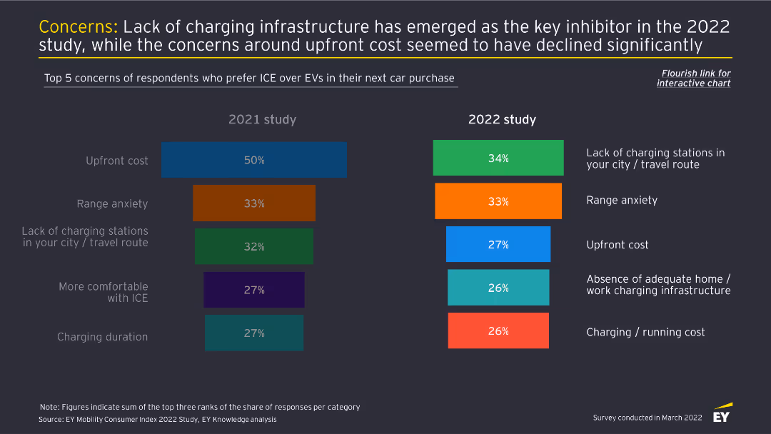
This slide features two column charts comparing the top five concerns about EV adoption between 2021 and 2022. Each concern is color-coded and ranked by percentage.
Market Analysis and Trends
Transportation & Logistics
The slide identifies the primary concerns of consumers preferring ICE over EVs, with lack of charging infrastructure being the top issue in 2022, and upfront cost concerns reducing significantly.
EV concerns, charging infrastructure, consumer behavior, market analysis, automotive industry
false
Market Analysis and Trends
Transportation & Logistics
Multiple Chart
EY
Add to my slides
Remove from favorites
The slide uses vertical bar charts to compare the top five concerns deterring EV adoption over three years (2021, 2022, 2023), each with different colors.
Market Analysis and Trends
Transportation & Logistics
This slide identifies the main concerns preventing consumers from buying EVs, such as lack of charging stations, limited range, and high purchase costs, across different years.
EV concerns, charging stations, purchase cost, range anxiety, consumer deterrents
false
Market Analysis and Trends
Transportation & Logistics
Multiple Chart
EY
Add to my slides
Remove from favorites
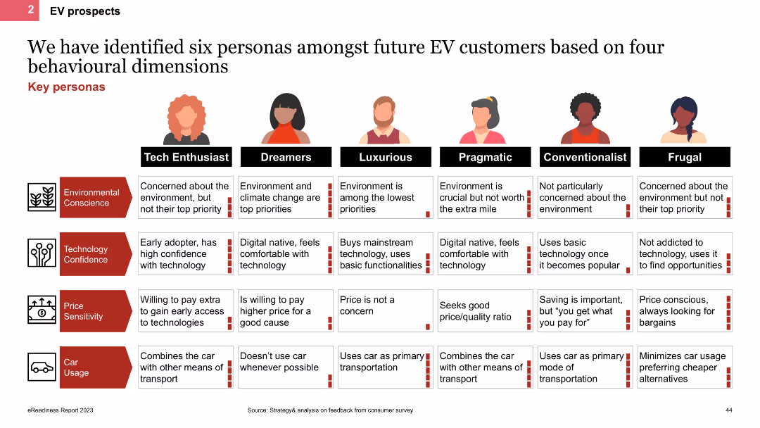
The slide features a comparative table outlining six personas of future EV customers (Tech Enthusiast, Dreamers, Luxurious, Pragmatic, Conventionalist, Frugal). Each persona is described based on environmental conscience, technology confidence, price sensitivity, and car usage.
Customer and Market Segmentation
Transportation & Logistics
This slide identifies six distinct personas of future EV customers, detailing their characteristics in terms of environmental conscience, technology confidence, price sensitivity, and car usage. It provides a framework for understanding diverse customer profiles.
EV customers, personas, behavioural dimensions, segmentation, characteristics, future trends
false
Customer and Market Segmentation
Transportation & Logistics
Table
PwC/Strategy&
Add to my slides
Remove from favorites
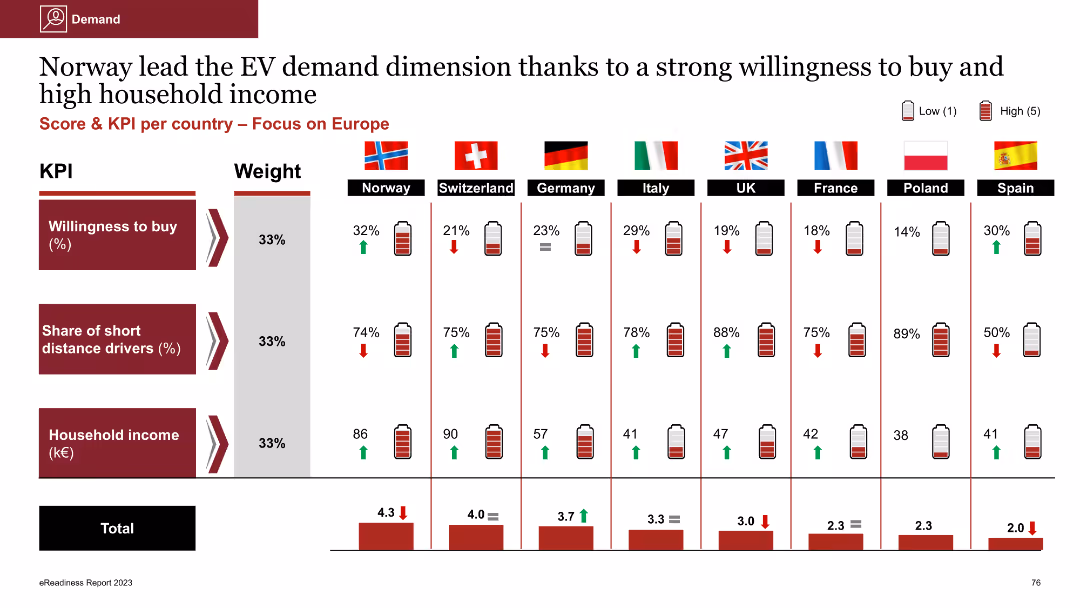
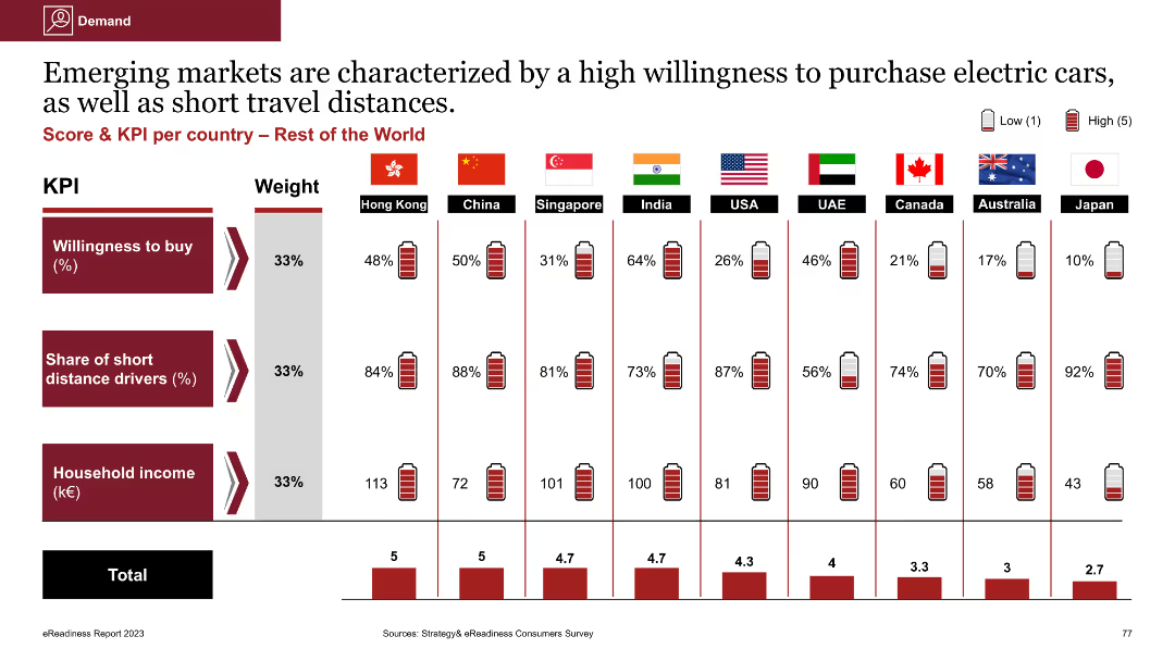
Column chart showing willingness to buy EVs, share of short distance drivers, and household income across Europe
Market Analysis and Trends
Energy & Utilities
This slide highlights Norway's lead in EV demand, supported by high willingness to buy and high household income, comparing these metrics with other European countries
EV demand, willingness to buy, household income, short distance drivers, European comparison
false
Market Analysis and Trends
Energy & Utilities
Multiple Chart
PwC/Strategy&
Add to my slides
Remove from favorites
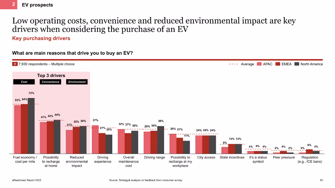
The slide features a column chart displaying the key reasons driving EV purchases, such as cost, convenience, and environmental impact. It also includes regional comparisons with colored bars representing APAC, EMEA, and North America.
Market Analysis and Trends
Transportation & Logistics
This slide analyzes the main drivers behind EV purchases, focusing on cost, convenience, and environmental impact. It provides a regional breakdown to show variations in purchasing motivations across different areas.
EV drivers, column chart, cost, convenience, environment
false
Market Analysis and Trends
Transportation & Logistics
Single Chart
PwC/Strategy&
Add to my slides
Remove from favorites
This slide contains two column charts comparing EV/EBITDA and EV/FCF multiples for Waste Management and Environmental Services sectors from 2019 to 2020. Text boxes with methodological notes and private sector observations are included on the right side.
Market Analysis and Trends
Financial Services
The slide analyzes the recovery of EV/EBITDA and EV/FCF multiples in the Waste Management and Environmental Services sectors post Q1 2020 market volatility. It provides methodological insights and observations about private sector valuation.
EV/EBITDA, EV/FCF, Waste Management, Environmental Services, Market Volatility
false
Market Analysis and Trends
Financial Services
Multiple Chart
LEK
Add to my slides
Remove from favorites
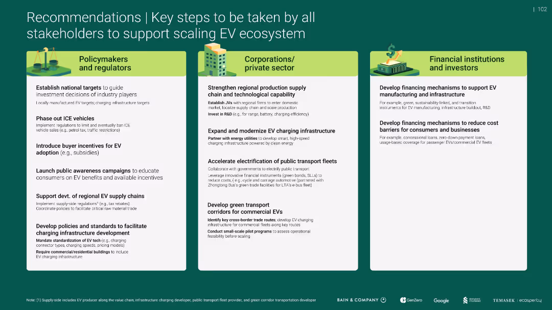
Triple-column layout with stakeholder categories; green color scheme; bullet points for action steps
Strategic Planning
Government & Public Sector
Provides tailored recommendations for scaling the EV ecosystem in SEA-6, targeting policymakers, private sector, and investors. Focuses on policy incentives, infrastructure development, and financial support mechanisms.
EV ecosystem, policy, infrastructure, investment, public sector, subsidies
false
Strategic Planning
Government & Public Sector
Pillar
Bain
Add to my slides
Remove from favorites
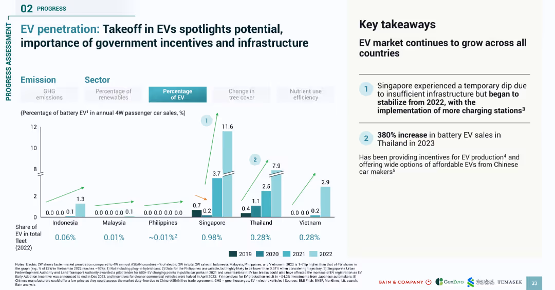
Bar chart comparing EV adoption from 2019 to 2022; right-side summary box with key findings
Market Analysis and Trends
Transportation & Logistics
Analyzes electric vehicle (EV) penetration across SEA countries from 2019–2022, revealing growth in EV sales, particularly in Singapore and Thailand. Highlights government incentives and infrastructure as critical drivers of EV market expansion.
EV, electric vehicles, SEA, adoption trends, incentives, infrastructure, passenger cars
false
Market Analysis and Trends
Transportation & Logistics
Mixed Chart
Bain
Add to my slides
Remove from favorites
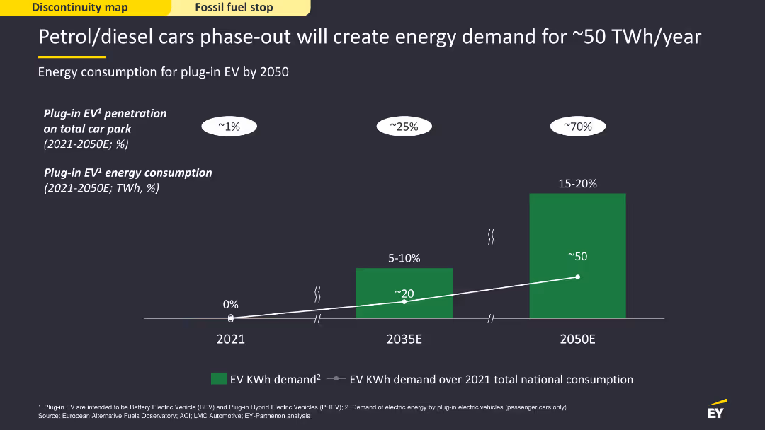
The slide features a column chart showing the projected energy consumption for plug-in electric vehicles (EV) from 2021 to 2050. The chart uses green bars and a dark background to display data clearly, with projections marked for significant future years. The layout is visually simple but informative, focusing on the energy demand increase.
Strategic Planning
Energy & Utilities
The slide forecasts the energy demand created by phasing out petrol/diesel cars, projecting the consumption for plug-in EVs up to 2050. It shows how EV penetration will grow, leading to a significant rise in energy requirements, emphasizing the need for strategic energy planning to accommodate this shift.
EV, energy demand, petrol, diesel, phase-out
false
Strategic Planning
Energy & Utilities
Single Chart
EY
Add to my slides
Remove from favorites
Hype Cycle chart focusing on Event-Driven APIs, with annotations about their current status in the market, highlighting technologies like AsyncAPI and Webhooks, and their growing importance.
Technology and Digital Transformation
Technology & Software
The slide details the market position and importance of Event-Driven APIs, supported by technologies like AsyncAPI, webhooks, and WebSocket, noting the necessity to manage both request-response and event-driven APIs.
Event-Driven APIs, AsyncAPI, Webhooks, market position
false
Technology and Digital Transformation
Technology & Software
Mixed Chart
Gartner
Add to my slides
Remove from favorites
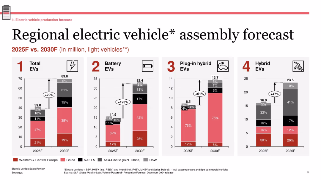
Four grouped bar charts showing production forecasts by region; labeled segments with growth percentages; standard red-gray-black color palette
Technology and Digital Transformation
Industrial & Manufacturing
The slide forecasts EV assembly volumes across major global regions between 2025 and 2030. It projects a 79% increase in total EVs, with battery EVs seeing the most significant growth (+123%). Regional shares are shown for each EV type (BEV, PHEV, Hybrid), emphasizing China and Western Europe as leading contributors.
EV forecast, regional production, BEV growth, 2030 outlook, light vehicles, automotive transformation
false
Technology and Digital Transformation
Industrial & Manufacturing
Single Chart
PwC/Strategy&
Add to my slides
Remove from favorites
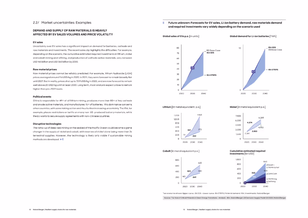
Left column provides narrative on EV sales, price volatility, and geopolitical issues. Right includes projected sales and demand curves under various scenarios.
Market Analysis and Trends
Energy & Utilities
This slide presents detailed scenarios of uncertainty affecting EV-related raw material markets. It compares forecast models for EV sales, Li-ion battery demand, and investment needs, reflecting varied assumptions and outcomes.
EV forecasts, battery demand, lithium, nickel, cobalt, scenario analysis, investment needs
false
Market Analysis and Trends
Energy & Utilities
Multiple Chart
Roland Berger
Add to my slides
Remove from favorites
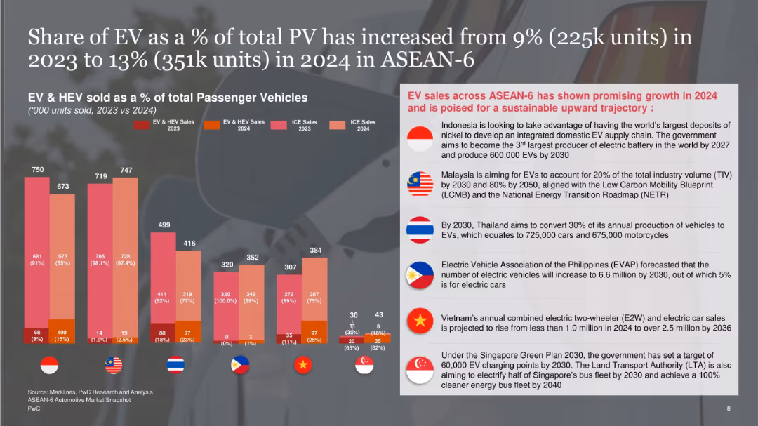
Vertical stacked bar charts of EV/HEV vs ICE vehicles by country on the left; right side has country-wise future targets and government initiatives on a shaded overlay.
Technology and Digital Transformation
Industrial & Manufacturing
Highlights EV and HEV penetration growth in ASEAN-6 from 2023 to 2024, rising to 13%. Presents government targets for EV adoption in each country, with emphasis on infrastructure development and regulatory support.
EV growth, ASEAN-6, government policy, electric vehicles, infrastructure, targets
false
Technology and Digital Transformation
Industrial & Manufacturing
Mixed Chart
PwC/Strategy&
Add to my slides
Remove from favorites
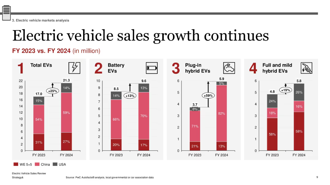
Four-column chart layout; red and gray vertical bar charts; minimal text above each chart; percentage growth bubbles; clean and consistent infographic style
Market Analysis and Trends
Industrial & Manufacturing
The slide illustrates year-over-year growth in EV sales across four categories (Total EVs, Battery EVs, Plug-in Hybrids, and Hybrids) from FY2023 to FY2024. It shows a 25% increase in total EVs, with notable growth in PHEVs (+59%). Sales are broken down by region (Western Europe, China, USA).
EV growth, battery EV, plug-in hybrid, market trends, regional EV sales, FY2024, BEV, hybrid EVs, PHEV
false
Market Analysis and Trends
Industrial & Manufacturing
Multiple Chart
PwC/Strategy&
Add to my slides
Remove from favorites
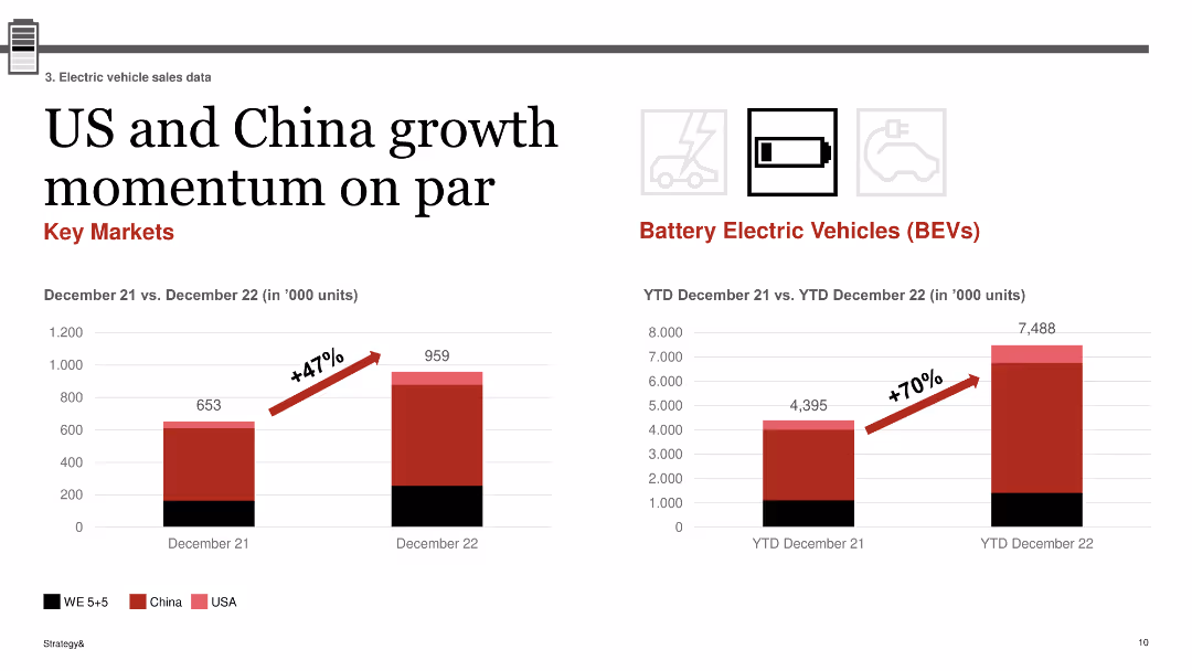
The slide includes two column charts: one showing growth in EV sales in the USA and China from December 21 to December 22, and the other showing BEV sales growth from December 21 to December 22.
Market Analysis and Trends
Transportation & Logistics
The slide highlights the parallel growth momentum in EV sales between the USA and China, with both markets experiencing significant increases in sales, demonstrating similar growth trajectories in the adoption of battery electric vehicles (BEVs).
EV growth, USA, China, BEV, sales momentum, comparison
false
Market Analysis and Trends
Transportation & Logistics
Multiple Chart
PwC/Strategy&
Add to my slides
Remove from favorites
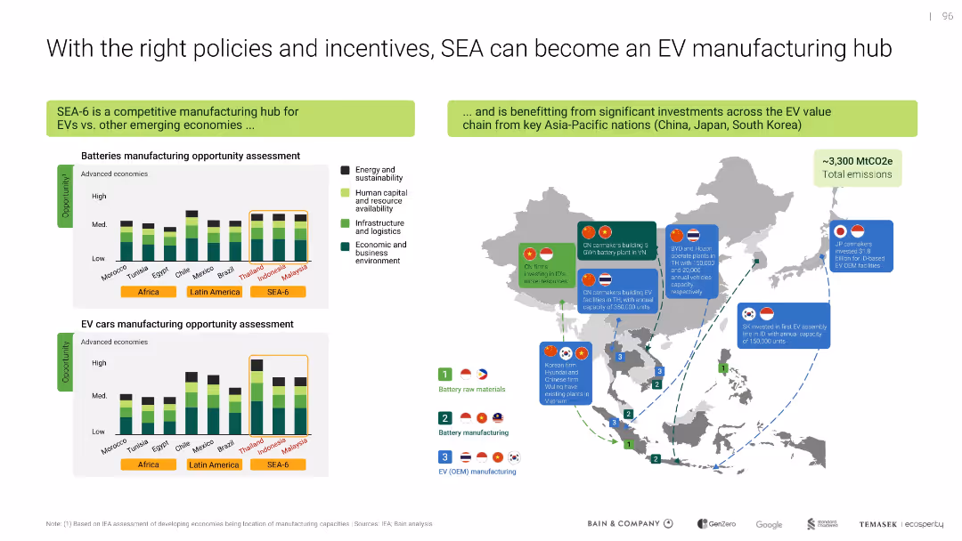
Map and bar charts show manufacturing opportunities and key investments; clear segmentation of countries and metrics
Strategic Planning
Industrial & Manufacturing
Highlights SEA-6's potential to become an EV manufacturing hub given supportive policies and investment flows from regional powers. Compares competitive advantages across battery and EV car manufacturing sectors.
EV hub, SEA-6, manufacturing, batteries, policy, incentives, investment
false
Strategic Planning
Industrial & Manufacturing
Multiple Chart
Bain
Add to my slides
Remove from favorites
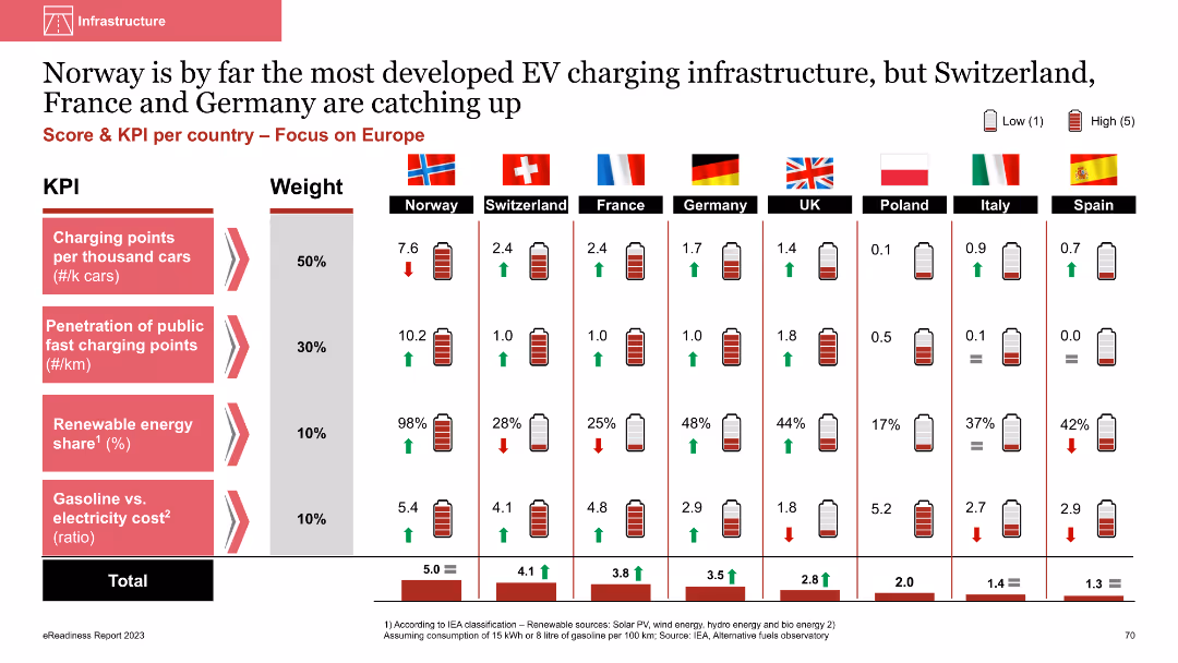
Column chart with multiple KPIs showing EV infrastructure status across European countries
Market Analysis and Trends
Energy & Utilities
The slide shows Norway's leading position in EV infrastructure, with metrics like charging points and renewable energy share, and compares it with other European countries. Norway leads significantly in all categories
EV infrastructure, charging points, renewable energy, comparative analysis, European countries
false
Market Analysis and Trends
Energy & Utilities
Multiple Chart
PwC/Strategy&
Add to my slides
Remove from favorites
The slide uses column charts to show the intention to buy electric vehicles among different personas. It also features radial gauges indicating EV preference among each persona group. The layout is dense with multiple visual elements, including icons and illustrations.
Customer and Market Segmentation
Transportation & Logistics
This slide illustrates the EV purchase intentions among different personas, highlighting Tech Enthusiasts, Dreamers, Luxurious, and Pragmatic as key segments. It provides data on cluster sizes, regional distribution, and EV preference, focusing on key target groups.
EV intention, personas, column charts, radial gauges, target segments
false
Customer and Market Segmentation
Transportation & Logistics
Multiple Chart
PwC/Strategy&
Add to my slides
Remove from favorites
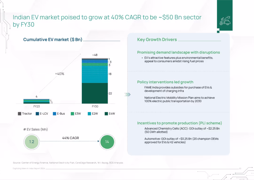
Bar chart comparing EV market size FY23 vs FY30. Segmented by EV types. Text box outlines growth drivers.
Market Analysis and Trends
Transportation & Logistics
This slide projects India’s EV market to grow to $50B by FY30 with a 40% CAGR, backed by strong policy support, consumer interest, and production incentives. EV sales are expected to rise from 1.2M to 14M units, across diverse vehicle segments.
EV market, electric vehicles, India, CAGR, growth, FY30, policy, FAME, incentives, clean mobility
false
Market Analysis and Trends
Transportation & Logistics
Mixed Chart
BCG
Add to my slides
Remove from favorites
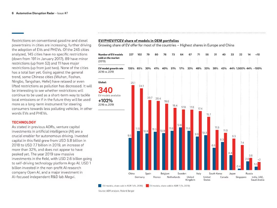
Bar chart showing the share of EV models in OEM portfolios across different countries in 2019, highlighting growth rates and number of models available globally.
Product and Service Analysis
Transportation & Logistics
Analyzes the growing share of EV models in OEM portfolios, with highest shares observed in Europe and China, and a global growth rate of 102% from 2016 to 2019.
EV models, OEM portfolios, growth rates, global, 2019
false
Product and Service Analysis
Transportation & Logistics
Mixed Chart
Roland Berger
Add to my slides
Remove from favorites
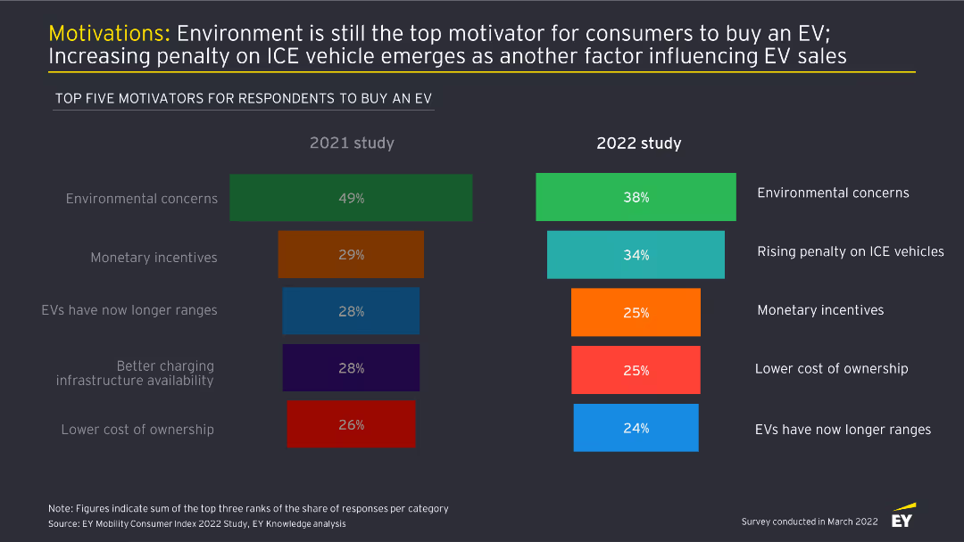
This slide contains two column charts comparing the top five motivators for buying an EV between 2021 and 2022. Each motivator is color-coded and ranked by percentage.
Market Analysis and Trends
Transportation & Logistics
The slide highlights the main reasons consumers choose to buy electric vehicles, with environmental concerns remaining the top motivator, and rising penalties on ICE vehicles becoming more significant in 2022.
EV motivations, environmental concerns, consumer behavior, market trends, automotive industry
false
Market Analysis and Trends
Transportation & Logistics
Multiple Chart
EY
Add to my slides
Remove from favorites
The slide uses vertical bar charts to compare top five motivators for respondents to buy an EV across three different years (2021, 2022, 2023). Each year's motivators are color-coded.
Market Analysis and Trends
Transportation & Logistics
This slide highlights the key motivators for potential EV buyers, showing how priorities like environmental concerns, high fuel prices, and penalties on ICE vehicles have shifted over time.
EV motivators, fuel prices, environmental concerns, ICE penalties, buyer priorities
false
Market Analysis and Trends
Transportation & Logistics
Multiple Chart
EY
Add to my slides
Remove from favorites
Simplistic layout with a text box listing organizational aspects on the left and attributes on the right, with converging lines leading to the text.
Strategic Planning
Professional Services
Depicts the company's foundational aspects and their evolution into future strategic attributes. Ideal for discussing company growth or cultural shifts.
Evolution, Company Culture, Strategy, Organizational Growth, Transparency, Core Values
false
Strategic Planning
Professional Services
Text Only
Goldman Sachs
Add to my slides
Remove from favorites
Horizontal timeline showing four key phases of Morgan Stanley's evolution from 2009 with corresponding milestones and strategies.
Strategic Planning
Financial Services
Chronicles Morgan Stanley's evolution through four strategic phases, from building scale to deepening client relationships.
Evolution, Morgan Stanley, strategic phases, building scale, technology, channel expansion, client relationships
false
Strategic Planning
Financial Services
Linear Flow
Goldman Sachs
Add to my slides
Remove from favorites
This slide provides a timeline from the 1980s to the 2010s, detailing the evolution of services with a blue and white color scheme.
Organizational Structure and Change
Financial Services
This slide could be used to depict the growth and diversification of a company's services over decades, emphasizing its established presence in the industry.
Evolution, Services, Growth, Diversification, Decades, Fixed Income, Equity, Advisory, ESG, Real Estate Credit
false
Organizational Structure and Change
Financial Services
Linear Flow
Goldman Sachs
Add to my slides
Remove from favorites
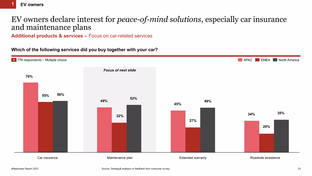
Column chart showing percentages of additional services bought by EV owners across different regions (APAC, EMEA, North America)
Market Analysis and Trends
Transportation & Logistics
This slide presents survey data on additional services purchased by EV owners, highlighting regional differences in the uptake of car insurance and maintenance plans.
EV owners, car insurance, maintenance, services, regional analysis
false
Market Analysis and Trends
Transportation & Logistics
Single Chart
PwC/Strategy&
Add to my slides
Remove from favorites
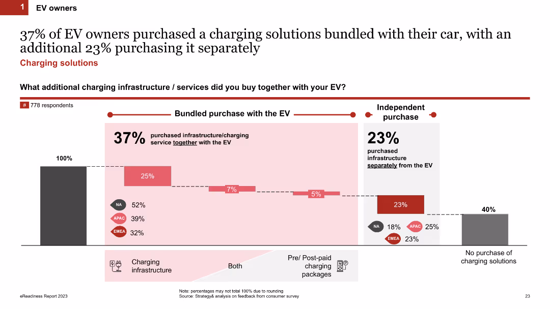
Column chart displaying percentages of EV owners who purchased charging solutions bundled with their car or separately. The slide uses shades of red and grey, includes regional breakdowns, and has text annotations explaining the data.
Market Analysis and Trends
Transportation & Logistics
This slide shows the percentage of EV owners who purchased charging solutions bundled with their car, separately, or not at all. It includes regional data from NA, APAC, and EMEA regions, highlighting purchasing trends.
EV owners, charging solutions, bundled purchase, regional breakdown, purchasing trends
false
Market Analysis and Trends
Transportation & Logistics
Single Chart
PwC/Strategy&
Add to my slides
Remove from favorites
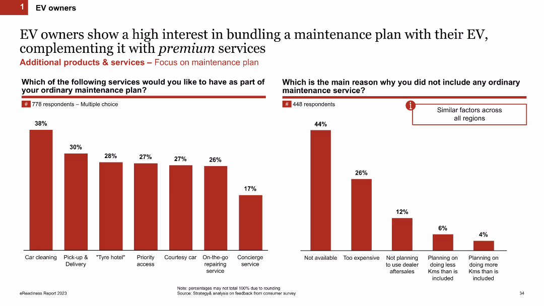
The slide contains two column charts. The first chart shows the percentage of EV owners interested in additional services for their maintenance plan, while the second chart shows the reasons for not including maintenance services.
Product and Service Analysis
Transportation & Logistics
The slide presents data on EV owners' interest in bundling additional services with their maintenance plan and the reasons some do not include maintenance services. It is useful for understanding customer preferences and barriers in the EV maintenance market.
EV owners, maintenance plan, services, reasons, chart, data
false
Product and Service Analysis
Transportation & Logistics
Multiple Chart
PwC/Strategy&
Add to my slides
Remove from favorites
A comparative column chart showing regional differences in EV ownership metrics such as income, age, gender, and living conditions across APAC, EMEA, and North America.
Market Analysis and Trends
Transportation & Logistics
Highlights the varying demographics and characteristics of EV owners in different regions, indicating different stages of EV adoption maturity.
EV owners, regional differences, income, demographics, survey
false
Market Analysis and Trends
Transportation & Logistics
Multiple Chart
PwC/Strategy&
Add to my slides
Remove from favorites
Includes a bar chart comparing EV and ICE performance across temperatures.
Operational Efficiency
Transportation & Logistics
Discusses how different cell types and vehicle configurations impact EV performance.
EV, performance challenges, temperature, cell types, vehicle configuration
false
Operational Efficiency
Transportation & Logistics
Mixed Chart
PwC/Strategy&
Add to my slides
Remove from favorites
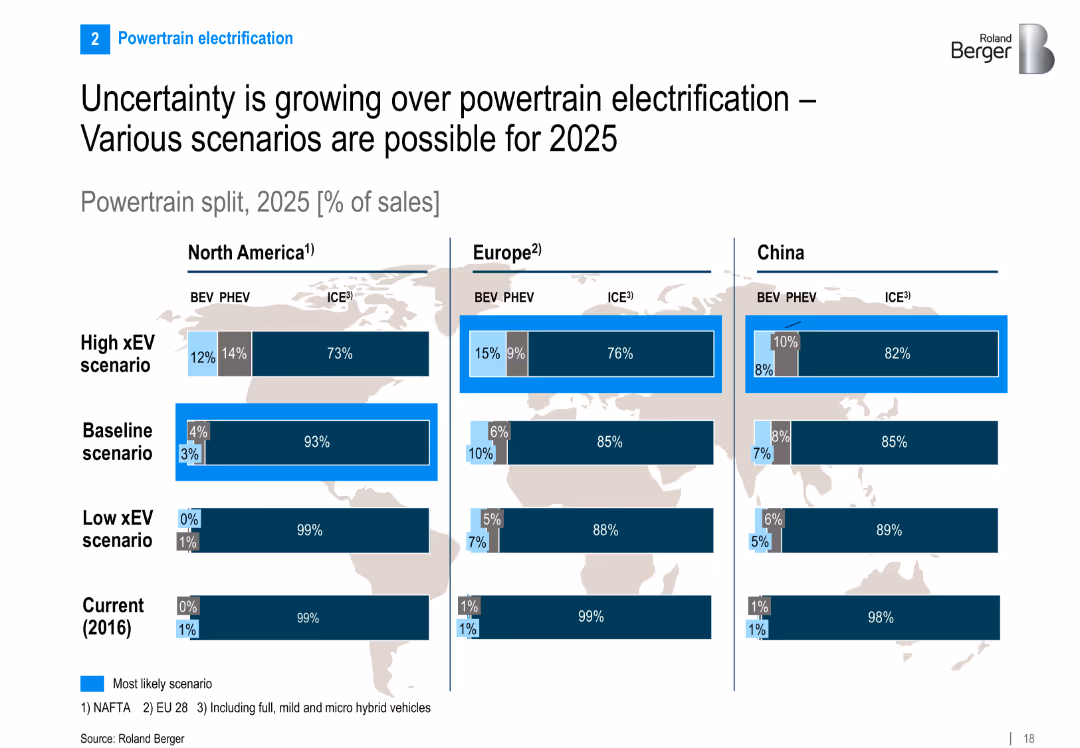
Split layout: three region-specific bar charts (NA, EU, China) showing 2025 powertrain split scenarios (BEV, PHEV, ICE); scenarios from low to high xEV adoption
Strategic Planning
Industrial & Manufacturing
Presents three scenarios for EV adoption across regions by 2025, showing potential market splits between ICEs, PHEVs, and BEVs. Highlights uncertainty in electrification growth and regional variation in expectations.
EV, PHEV, ICE, powertrain, xEV scenario, electrification, 2025 forecast, North America, Europe, China
false
Strategic Planning
Industrial & Manufacturing
Multiple Chart
Roland Berger
Add to my slides
Remove from favorites
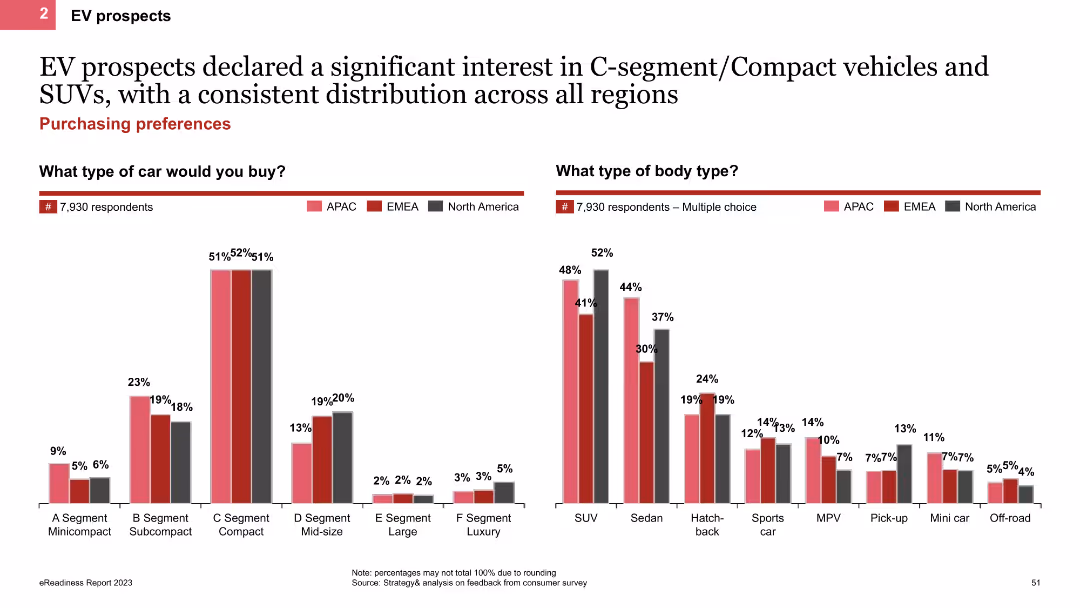
The slide uses column charts to show the types of cars and body types preferred by EV prospects. It presents data on preferences for various segments like C-segment and SUVs, with regional comparisons indicated by different colors.
Customer and Market Segmentation
Transportation & Logistics
This slide details the car and body type preferences of EV prospects, showing a significant interest in C-segment vehicles and SUVs. It includes regional data to illustrate the distribution of these preferences across different areas.
EV preferences, column chart, C-segment, SUV, regional comparison
false
Customer and Market Segmentation
Transportation & Logistics
Multiple Chart
PwC/Strategy&
Add to my slides
Remove from favorites
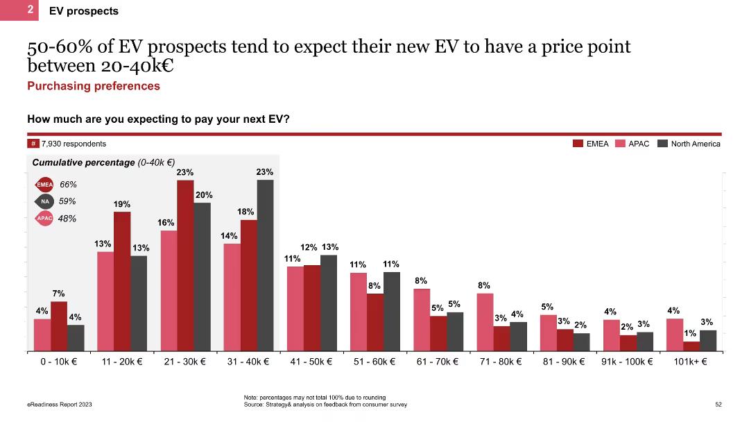
The slide features a column chart displaying the expected price range for new EVs among prospects. It shows cumulative percentages for different price points, with regional comparisons indicated by colored bars for EMEA, APAC, and North America.
Market Analysis and Trends
Transportation & Logistics
This slide presents the expected price range for new EVs among prospects, highlighting that 50-60% expect to pay between 20-40k€. It includes regional comparisons to show variations in price expectations across different markets.
EV price range, column chart, price expectations, regional comparison
false
Market Analysis and Trends
Transportation & Logistics
Single Chart
PwC/Strategy&
Add to my slides
Remove from favorites
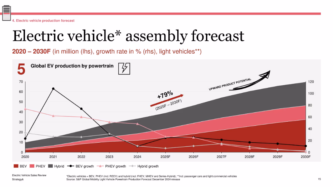
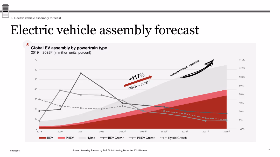
Line and area chart tracking EV production and growth rate by powertrain; annotation for “upward product potential”; uses five powertrain types and shows historical data (2020–2024) with projections to 2030
Technology and Digital Transformation
Industrial & Manufacturing
The slide presents global EV production trends by powertrain from 2020 to 2030. It includes BEV, PHEV, and hybrid vehicles, with associated growth rates. A 79% increase is forecasted between 2025 and 2030. The graphic highlights the industry’s long-term growth potential, especially for BEVs, and contextualizes recent slowdowns with projected acceleration.
EV production, global forecast, BEV, hybrid, powertrain growth, 2025–2030, automotive outlook
false
Technology and Digital Transformation
Industrial & Manufacturing
Single Chart
PwC/Strategy&
Add to my slides
Remove from favorites
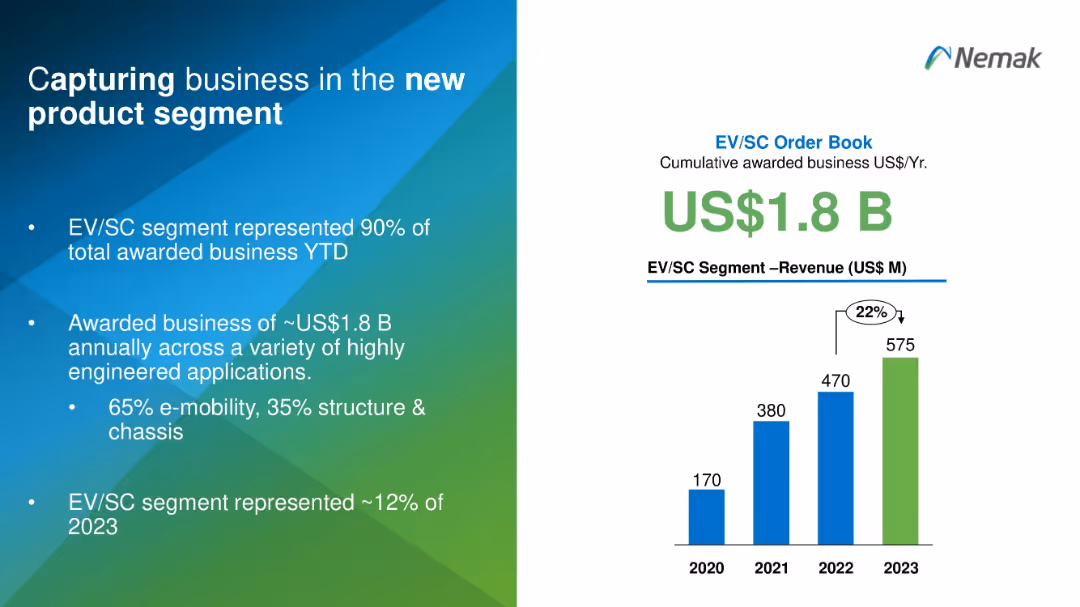
Split design with text on the left and a vertical bar chart on the right in blue and green gradients.
Sales and Business Development
Industrial & Manufacturing
This slide highlights Nemak's success in securing US$1.8B in EV/SC business, representing 90% of total awarded projects. It shows revenue growth from 2020 to 2023 and emphasizes Nemak's diversification into high-tech engineered applications, especially in e-mobility.
EV, product segment, revenue, business capture, e-mobility, engineering
false
Sales and Business Development
Industrial & Manufacturing
Mixed Chart
Barclays
Add to my slides
Remove from favorites
The slide features bar charts showing commuting habits of EV prospects across APAC, EMEA, and North America. Metrics include commuting by car, combining car with other means, days per week of commuting, daily kilometers, and typical car tenure.
Market Analysis and Trends
Transportation & Logistics
This slide compares commuting habits of EV prospects in different regions, including the percentage of car commuters, combination with other means, frequency, distance, and car tenure. It provides insights into regional commuting patterns.
EV prospects, commuting habits, regional differences, car tenure, daily kilometers
false
Market Analysis and Trends
Transportation & Logistics
Multiple Chart
PwC/Strategy&
Add to my slides
Remove from favorites
The slide presents bar charts comparing demographics and mobility preferences of EV prospects across APAC, EMEA, and North America. Key metrics include annual gross income, age, gender, urban living, and private parking availability.
Market Analysis and Trends
Transportation & Logistics
The slide provides a comparison of demographic and mobility factors for EV prospects in different regions, highlighting differences in income, age, gender, urban living, and private parking. It helps understand regional consumer profiles.
EV prospects, demographics, mobility, regional differences, income, urban living
false
Market Analysis and Trends
Transportation & Logistics
Multiple Chart
PwC/Strategy&
Add to my slides
Remove from favorites
Similar to the previous slide, this one uses line charts and icons to profile Dreamers. It includes demographic information and EV purchase intentions, showing differences from Tech Enthusiasts in terms of age, income, family size, and car usage.
Customer and Market Segmentation
Transportation & Logistics
This slide focuses on Dreamers, detailing their lower car usage, environmental consciousness, and moderate tech confidence compared to Tech Enthusiasts. It provides demographic data and insights into their EV purchase motivations.
EV prospects, Dreamers, line charts, demographics, motivation
false
Customer and Market Segmentation
Transportation & Logistics
Multiple Chart
PwC/Strategy&
Add to my slides
Remove from favorites
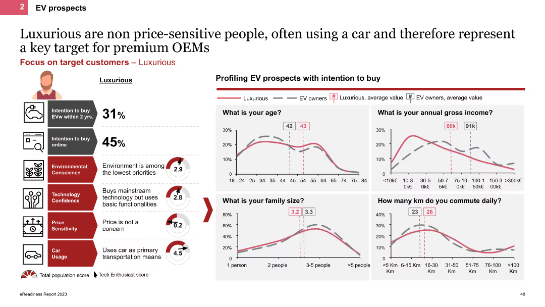
The slide profiles Luxurious personas using line charts and icons, showing demographic details like age, income, and family size. It highlights their high car usage and low price sensitivity, with charts comparing their characteristics to other EV owners.
Customer and Market Segmentation
Transportation & Logistics
This slide describes Luxurious personas, emphasizing their high income, frequent car usage, and lack of price sensitivity. It provides demographic comparisons and insights into their EV purchase behaviors and preferences.
EV prospects, Luxurious, line charts, demographics, high income
false
Customer and Market Segmentation
Transportation & Logistics
Multiple Chart
PwC/Strategy&
Add to my slides
Remove from favorites
The slide includes line charts and icons to profile Pragmatic personas. It shows demographic details and EV purchase intentions, highlighting their rational approach to buying, with less emphasis on environmental concerns and more on cost and practicality.
Customer and Market Segmentation
Transportation & Logistics
This slide profiles Pragmatic personas, noting their rational decision-making, emphasis on cost and practicality, and moderate environmental consciousness. It includes demographic data and insights into their EV purchase intentions.
EV prospects, Pragmatic, line charts, demographics, rational
false
Customer and Market Segmentation
Transportation & Logistics
Multiple Chart
PwC/Strategy&
Add to my slides
Remove from favorites
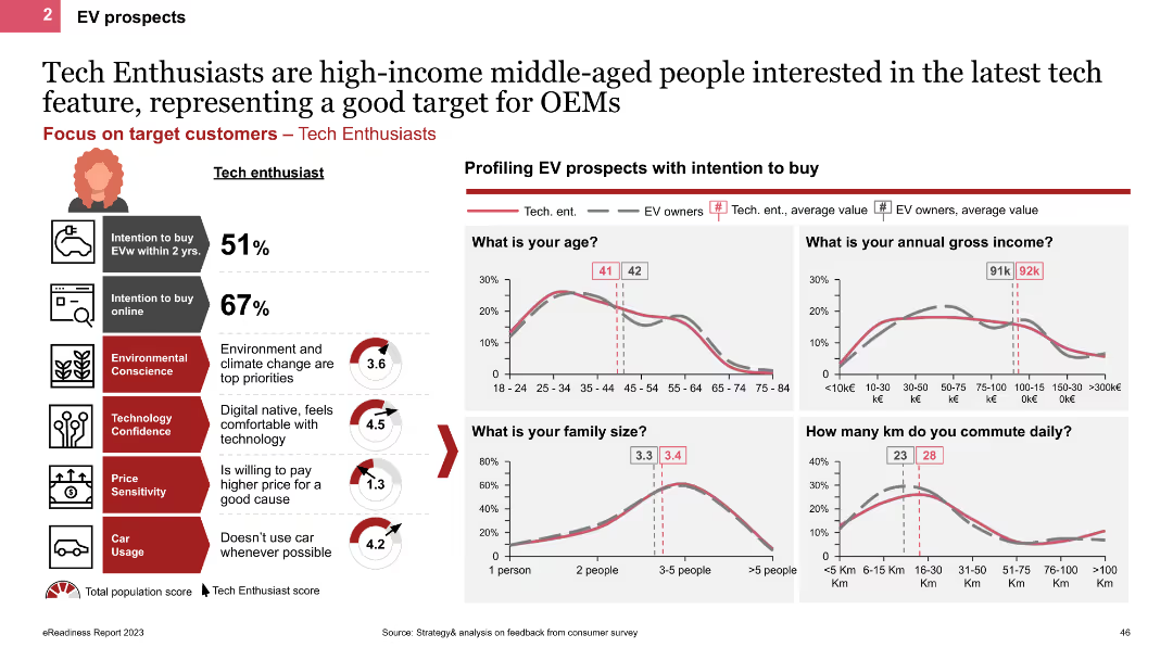
The slide includes various small line charts and icons to profile EV prospects among Tech Enthusiasts. It features demographic charts such as age, income, family size, and commute distance, with text blocks summarizing key characteristics and motivations.
Customer and Market Segmentation
Transportation & Logistics
This slide profiles Tech Enthusiasts, detailing their demographics, motivations, and EV purchase intentions. It highlights their higher income, tech-savvy nature, and preference for environmentally friendly options.
EV prospects, Tech Enthusiasts, line charts, demographics, motivation
false
Customer and Market Segmentation
Transportation & Logistics
Multiple Chart
PwC/Strategy&
Add to my slides
Remove from favorites
This slide has a large, bold title on the left, and two main content areas with bullet points and icons on the right, colored in blue and green. The layout is balanced and clear.
Human Resources and Talent Management
Technology & Software
It discusses identifying unique strengths and conveying an attractive employee value proposition (EVP) to new hires, pivotal for startups and HR branding efforts.
EVP, talent acquisition, startup, branding, culture, benefits, development opportunities
false
Human Resources and Talent Management
Technology & Software
Header Horizontal
Kearney
Add to my slides
Remove from favorites
Column chart comparing willingness to buy EVs, share of short distance drivers, and household income across countries
Market Analysis and Trends
Energy & Utilities
The slide emphasizes the high willingness to purchase EVs in emerging markets, showing comparisons of willingness to buy, short travel distances, and household income across various countries
EV purchase, willingness to buy, short distance drivers, household income, emerging markets
false
Market Analysis and Trends
Energy & Utilities
Multiple Chart
PwC/Strategy&
Add to my slides
Remove from favorites
Column chart and bar charts displaying perceptions of EV range reduction due to car age and cold weather. The slide includes data on battery health and range reduction percentages.
Customer and Market Segmentation
Transportation & Logistics
This slide examines the perceived reduction in EV range among owners, attributing it to car age and cold weather conditions. It also includes data on the current state of battery health and the extent of range reduction experienced.
EV range reduction, battery health, cold weather impact, car age, perception
false
Customer and Market Segmentation
Transportation & Logistics
Multiple Chart
PwC/Strategy&
Add to my slides
Remove from favorites
Three pie charts showing EV registration shares for WE 5+5, USA, and China, with additional data on BEV, PHEV, and Hybrid registrations.
Market Analysis and Trends
Transportation & Logistics
Provides an analysis of electric vehicle (EV) registration shares across different regions as of December 2022, highlighting BEV, PHEV, and Hybrid segments.
EV, registration, market, shares, BEV, PHEV, hybrid, USA, China, WE 5+5
false
Market Analysis and Trends
Transportation & Logistics
Multiple Chart
PwC/Strategy&
Add to my slides
Remove from favorites
Three-part layout with pie charts for WE 5+5, China, and USA; flags and national data; red-pink-black hybrid color scheme with category breakout
Market Analysis and Trends
Industrial & Manufacturing
This slide compares electric vehicle registrations in FY2024 across Western Europe, China, and the USA. Each region’s total and EV sales are provided, with breakdowns into BEVs, PHEVs, and Hybrids. China leads in absolute numbers, while Western Europe shows the highest EV share percentage. The visualization highlights regional market penetration and composition.
EV registrations, BEV, PHEV, hybrid market, regional comparison, 2024 sales, WE5+5, China, USA
false
Market Analysis and Trends
Industrial & Manufacturing
Single Chart
PwC/Strategy&
Add to my slides
Remove from favorites
Bar chart showing the growth rates and share of new EV and PHEV registrations in major European countries in 2020 H2, highlighting China's role as a key driver.
Market Analysis and Trends
Transportation & Logistics
Analyzes the sharp increase in EV and PHEV registrations across Europe and the significant role of China's economic recovery in driving global xEV sales in 2020 H2.
EV registrations, PHEV registrations, Europe, China, market growth
false
Market Analysis and Trends
Transportation & Logistics
Mixed Chart
Roland Berger
Add to my slides
Remove from favorites
The slide shows a bar chart illustrating the main reasons for rejecting EVs among sceptics in APAC, EMEA, and North America. Each region is color-coded, and multiple reasons are displayed along the x-axis.
Market Analysis and Trends
Transportation & Logistics
The slide details the primary factors discouraging EV adoption, such as long charging times and limited driving range, based on a survey of 4,108 respondents. It aims to understand and address barriers to EV uptake.
EV rejection, barriers, charging time, driving range, regional differences
false
Market Analysis and Trends
Transportation & Logistics
Single Chart
PwC/Strategy&
Add to my slides
Remove from favorites
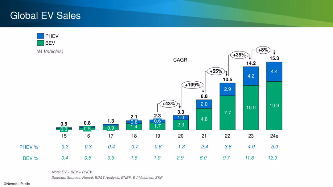
Stacked bar chart with color-coded segments for PHEV and BEV, annotated with CAGR growth percentages.
Performance Metrics and KPIs
Industrial & Manufacturing
The slide provides a historical and projected overview of global electric vehicle (EV) sales split between BEVs and PHEVs. It highlights significant year-over-year growth, especially from 2020 to 2023, and shows total volumes and market share increases.
EV sales, BEV, PHEV, CAGR, growth, market share
false
Performance Metrics and KPIs
Industrial & Manufacturing
Single Chart
Barclays
Add to my slides
Remove from favorites
Previous
Next
You don't have any favorites yet.
Please wait loading your favorites slides...
Create a FREE account to continue browsing
Receive Instant Access to 1,000+ slides from companies like McKinsey, Google, and Goldman Sachs
First Name
Last Name
Email
Password
I agree to all
Terms & Privacy Policy
Thank you! Your submission has been received!
Oops! Something went wrong while submitting the form.
Have an account?
Sign in
Upgrade to PRO to Save slides
Advanced Search and Filters
Access to 15,000+ slides
Access to Category Pages
Save/Bookmark Slides
PowerPoint Template Library
Pick a Plan
MONTHLY
$12/month
Billed every month, Cancel anytime.
YEARLY
$9/year
Billed $108 annually, Cancel anytime.
Checkout for $12/month
Checkout for $108/yr
Secured by Stripe | AES-256 bit encryption


![Batteries are key for electrification – EV battery pack cost ca. 130 USD/kWh, depending on technology/design, location, and material prices [Jul 2021 figures]](https://cdn.prod.website-files.com/654e70fb59937215cac87b19/6896e49e87536d2c8f631147_gUCi-EabqOeV5oJ6xMWkmKCydv3SD-Km2BuVp7MIklo.avif)