My Account
My Slides
Search by Category
Companies
Slide Type
Use Case
Industry
Pricing
Templates
View All Templates
Download Template Slides
✦ AI
AI Prompt Library
AI Search
Feedback
Login
Logout
Get Started
Browse all Slides
Browse all Slides
Create a FREE Account
Instant access to 1,000+ real slides from top companies like McKinsey, BCG, Goldman Sachs, Google and many more!
First Name
Last Name
Email
Password
I agree to all
Terms & Privacy Policy
Thank you! Your submission has been received!
Oops! Something went wrong while submitting the form.
Have an account?
Sign in
Saved Slides
Total No. of slides saved
0
↻ Refresh
✖ Clear all
The slide includes two column charts: one comparing EV sales in key markets (China and USA) from December 21 to December 22, and the other showing YTD EV sales growth from December 21 to December 22.
Market Analysis and Trends
Transportation & Logistics
This slide illustrates the growth in EV sales in key markets, showing a 40% increase in December 2022 compared to December 2021, and a 47% increase in year-to-date EV sales, emphasizing the upward trend in EV adoption.
EV sales, growth, China, USA, market trends, YTD
false
Market Analysis and Trends
Transportation & Logistics
Multiple Chart
PwC/Strategy&
Add to my slides
Remove from favorites
Slide features column charts comparing electric vehicle (EV) sales over years in various vehicle categories, highlighting trends in a visually straightforward manner.
Market Analysis and Trends
Transportation & Logistics
Discusses the sales trends of electric vehicles in India, with an emphasis on market dynamics, consumer preferences, and infrastructure developments affecting EV adoption.
EV sales, India, market trends, consumer preferences, infrastructure development, electric vehicles
false
Market Analysis and Trends
Transportation & Logistics
Multiple Chart
PwC/Strategy&
Add to my slides
Remove from favorites
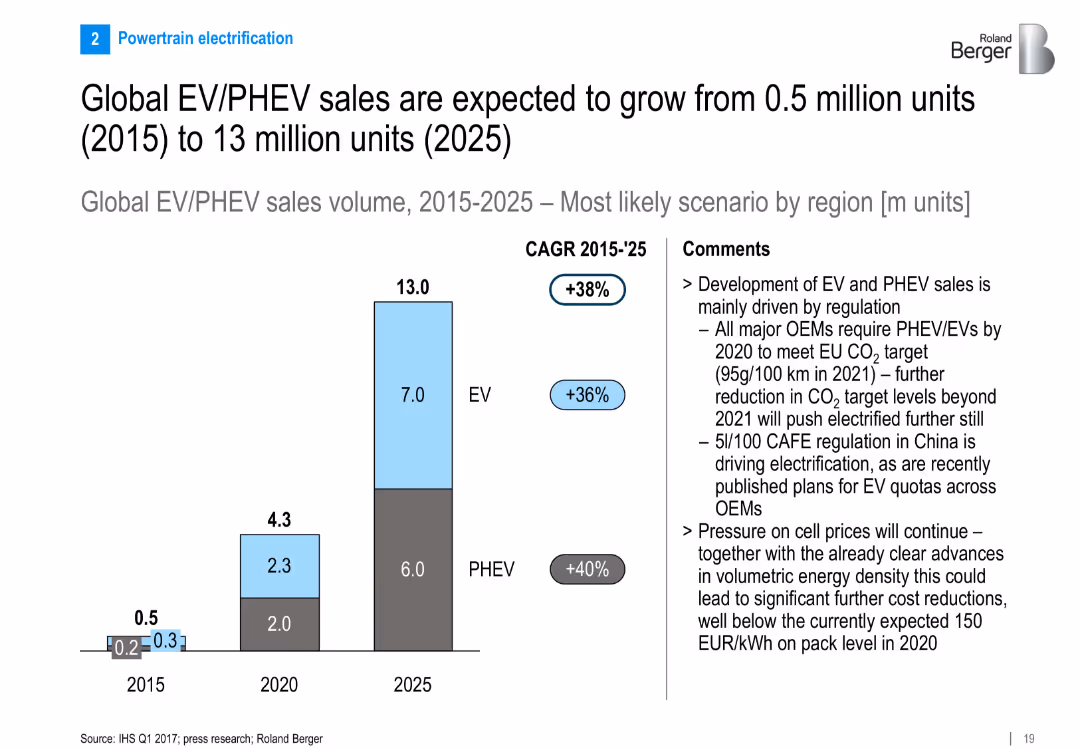
Bar chart visualizing EV/PHEV sales growth from 2015 to 2025; CAGR annotated; right side contains drivers such as regulation and cost reduction
Market Analysis and Trends
Industrial & Manufacturing
Forecasts rapid global growth of EV and PHEV sales, driven largely by regulations in EU and China. Details CAGR and suggests that battery price and density improvements will drive further adoption.
EV sales, PHEV growth, 2025 forecast, electrification, regulation, CO2 targets, battery cost, CAGR
false
Market Analysis and Trends
Industrial & Manufacturing
Mixed Chart
Roland Berger
Add to my slides
Remove from favorites
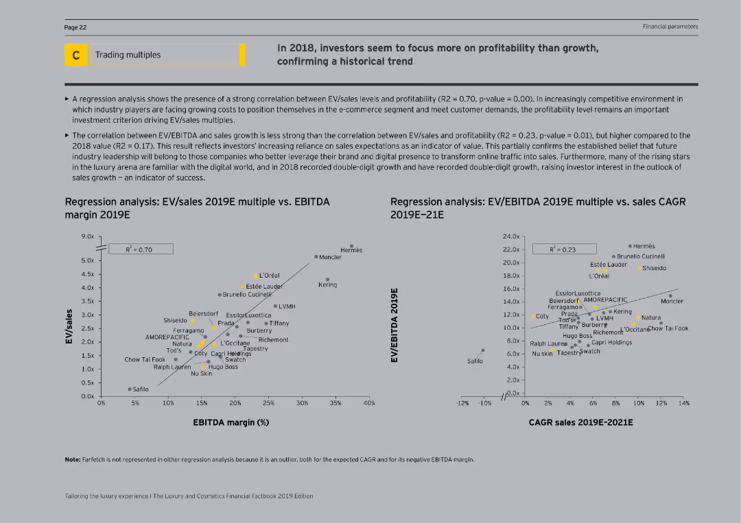
The slide features regression analysis charts with scatter plots correlating EV/sales multiples with EBITDA margins and sales CAGR for 2019E. It is visually complex, with detailed data points and regression lines, and explanatory text.
Investment Analysis
Consumer Goods
The slide highlights a regression analysis showing the correlation between EV/sales multiples and profitability versus sales growth for 2019E. It reveals that investors are focusing more on profitability, providing detailed statistical insights and supporting visualizations.
EV/Sales, Profitability, EBITDA, Sales CAGR
false
Investment Analysis
Consumer Goods
Multiple Chart
EY
Add to my slides
Remove from favorites
The slide features a table with bar charts showing demographic and mobility differences among EV sceptics in APAC, EMEA, and North America. The layout is clean with distinct color coding for each region.
Market Analysis and Trends
Transportation & Logistics
The slide provides a comparative analysis of demographics and mobility needs among EV sceptics across different regions, based on a survey of 4,108 respondents. It aims to highlight regional variations in EV adoption barriers.
EV sceptics, regional differences, demographics, mobility needs, survey data
false
Market Analysis and Trends
Transportation & Logistics
Multiple Chart
PwC/Strategy&
Add to my slides
Remove from favorites
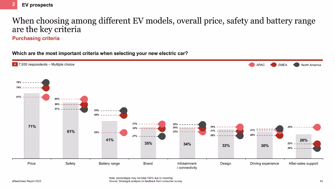
The slide features a column chart showing the most important criteria for selecting EV models, such as price, safety, and battery range. It includes regional comparisons with colored bars representing APAC, EMEA, and North America.
Customer and Market Segmentation
Transportation & Logistics
This slide identifies the key criteria for selecting EV models, emphasizing overall price, safety, and battery range as top factors. It provides regional data to highlight differences in preferences across various markets.
EV selection criteria, column chart, price, safety, battery range
false
Customer and Market Segmentation
Transportation & Logistics
Single Chart
PwC/Strategy&
Add to my slides
Remove from favorites
Image of an electric vehicle charging and a column chart showing market share of EV sales in China and India from 2019 to 2023.
Product and Service Analysis
Transportation & Logistics
The slide highlights the growth in market share of simple and affordable electric vehicles in China and India, showing market trends.
EVs, market share, China, India, electric vehicles, affordability, market trends
false
Product and Service Analysis
Transportation & Logistics
Mixed Chart
Accenture
Add to my slides
Remove from favorites
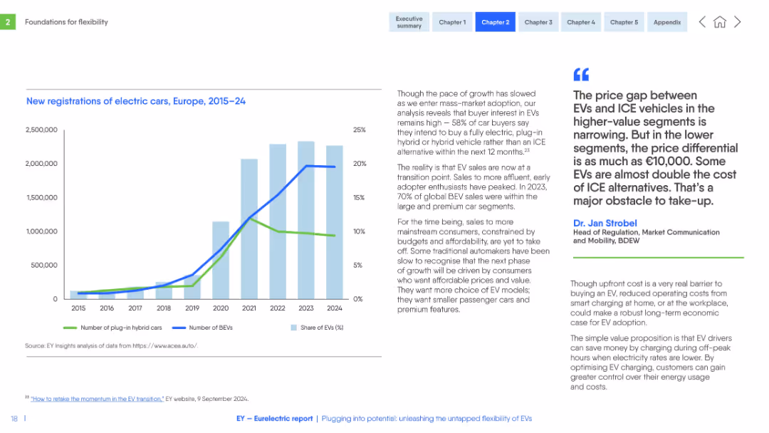
Left-aligned chart with line and bar graphs; right-aligned text and quote. Blue and green tones with clear labeling and annotations.
Market Analysis and Trends
Transportation & Logistics
The slide presents electric vehicle (EV) registration trends, showing the growth of BEVs and plug-in hybrids. It highlights market maturity, price sensitivity, and consumer behavior shifts.
EVs, registrations, BEV, PHEV, pricing, consumer adoption, trends, Europe, market shift
false
Market Analysis and Trends
Transportation & Logistics
Mixed Chart
EY
Add to my slides
Remove from favorites
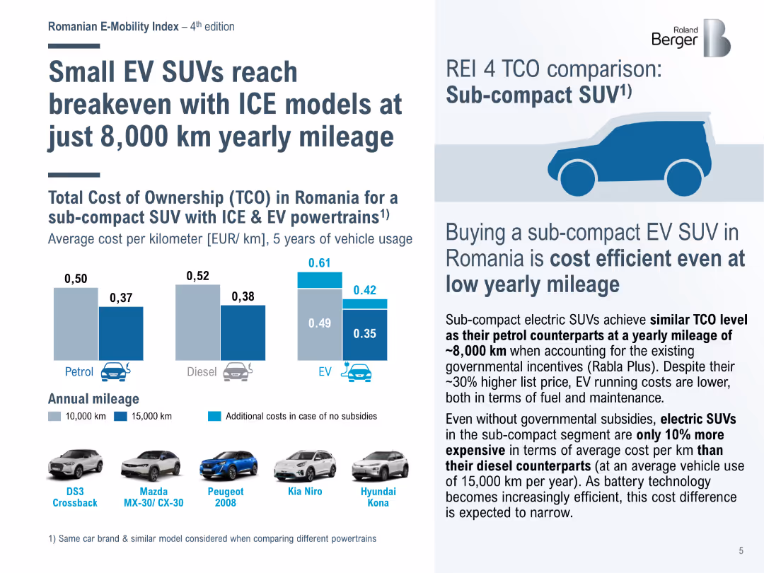
Bar chart comparing the total cost of ownership (TCO) for sub-compact SUVs with ICE and EV powertrains in Romania, showing cost efficiency at low yearly mileage.
Market Analysis and Trends
Transportation & Logistics
Highlights the cost efficiency of sub-compact EV SUVs in Romania, achieving breakeven with internal combustion engine (ICE) models at lower annual mileage due to incentives.
EV SUVs, ICE models, cost efficiency, TCO, Romania
false
Market Analysis and Trends
Transportation & Logistics
Mixed Chart
Roland Berger
Add to my slides
Remove from favorites
Contains a line graph comparing TCO for electric and diesel buses over mileage.
Investment Analysis
Financial Services
Analyzes how long-term savings from EVs can offset higher initial costs.
EV, TCO, cost savings, electric buses, diesel comparison
false
Investment Analysis
Financial Services
Mixed Chart
PwC/Strategy&
Add to my slides
Remove from favorites
Slide includes images of car parts, bar graphs showing range impacts of different HVAC technologies, and diagrams.
Technology and Digital Transformation
Transportation & Logistics
Discusses new heat pump technology in electric vehicles (EVs), efficiency, and awards in different regions.
EV technology, heat pump, efficiency, HVAC, awards
false
Technology and Digital Transformation
Transportation & Logistics
Mixed Chart
Deutsche Bank
Add to my slides
Remove from favorites
Column chart showing VC deals and investments in the Indian EV sector.
Investment Analysis
Transportation & Logistics
Highlights the growth and distribution of venture capital investments in India’s EV ecosystem.
EV, venture capital, investments, India, market growth
false
Investment Analysis
Transportation & Logistics
Mixed Chart
PwC/Strategy&
Add to my slides
Remove from favorites
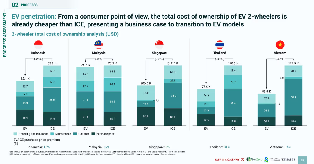
Clustered bar charts comparing total cost of ownership for ICE vs. EV 2-wheelers; simple vertical breakdown
Product and Service Analysis
Transportation & Logistics
Compares the total cost of ownership for electric versus internal combustion engine (ICE) 2-wheelers across five SEA countries. EVs are shown to be cheaper in all cases, making a strong economic case for transition despite higher upfront costs in some markets.
EV vs ICE, cost comparison, SEA, 2-wheelers, affordability, maintenance, fuel cost
false
Product and Service Analysis
Transportation & Logistics
Single Chart
Bain
Add to my slides
Remove from favorites
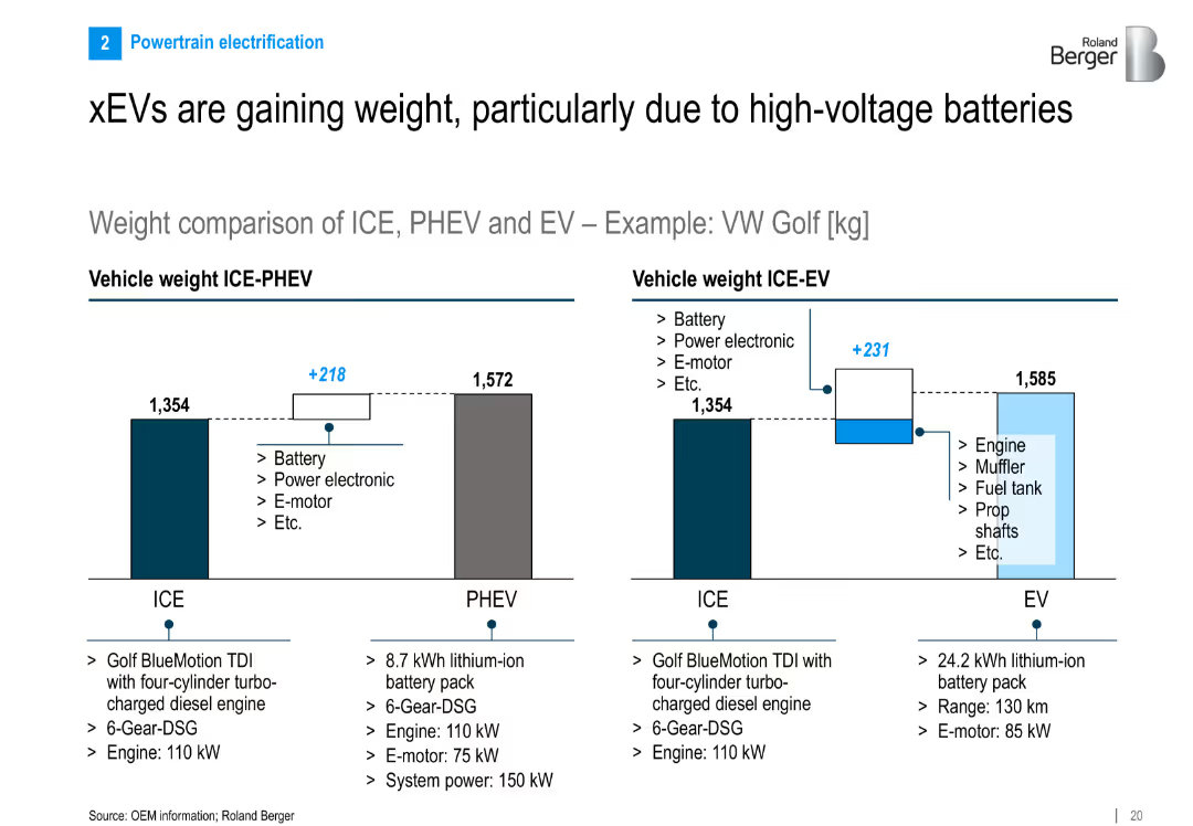
Side-by-side bar charts comparing weight of ICE, PHEV, and EV variants of VW Golf; includes breakdown of added components
Product and Service Analysis
Industrial & Manufacturing
Shows that electrified vehicles (PHEV, EV) are heavier than ICE vehicles due to components like batteries and motors. Uses VW Golf as an example to quantify weight differences and contributing components.
EV weight, PHEV, ICE, battery pack, vehicle mass, VW Golf, e-motor, power electronics
false
Product and Service Analysis
Industrial & Manufacturing
Multiple Chart
Roland Berger
Add to my slides
Remove from favorites
The slide divides into two halves; one for consumer e-wallet adoption and the other for merchant adoption. It includes bullet points and icons representing consumers and merchants.
Market Analysis and Trends
Financial Services
This slide discusses the growth in e-wallet transactions spurred by consumer and merchant adoption, fostering a 'virtuous cycle'. It can be used to highlight the impact of digital platforms on e-wallet proliferation and market engagement.
e-Wallet, Consumer, Merchant, Adoption, Growth, Digital payments, Market engagement, Incentives
false
Market Analysis and Trends
Financial Services
Header Horizontal
Bain
Add to my slides
Remove from favorites
Features multiple line graphs showing the popularity growth of e-wallets in different Southeast Asian countries, with annotations for significant surges in usage.
Market Analysis and Trends
Financial Services
This slide provides a visual representation of e-Wallet usage trends in Southeast Asian countries, useful for analyzing market penetration and identifying high-growth regions.
e-Wallet, Popularity, Southeast Asia, Malaysia, Philippines, Trend analysis, Market growth
false
Market Analysis and Trends
Financial Services
Multiple Chart
Bain
Add to my slides
Remove from favorites
Dark green background with white text, a column chart showing recycling percentages for various materials, including paper, glass, plastic, and electronic devices.
Regulatory and Compliance
Consumer Goods
The slide highlights the low recycling rates for e-waste compared to other materials, using survey data to emphasize the need for better recycling practices for electronics.
E-waste, recycling rates, materials, survey, sustainability
false
Regulatory and Compliance
Consumer Goods
Multiple Chart
Oliver Wyman
Add to my slides
Remove from favorites
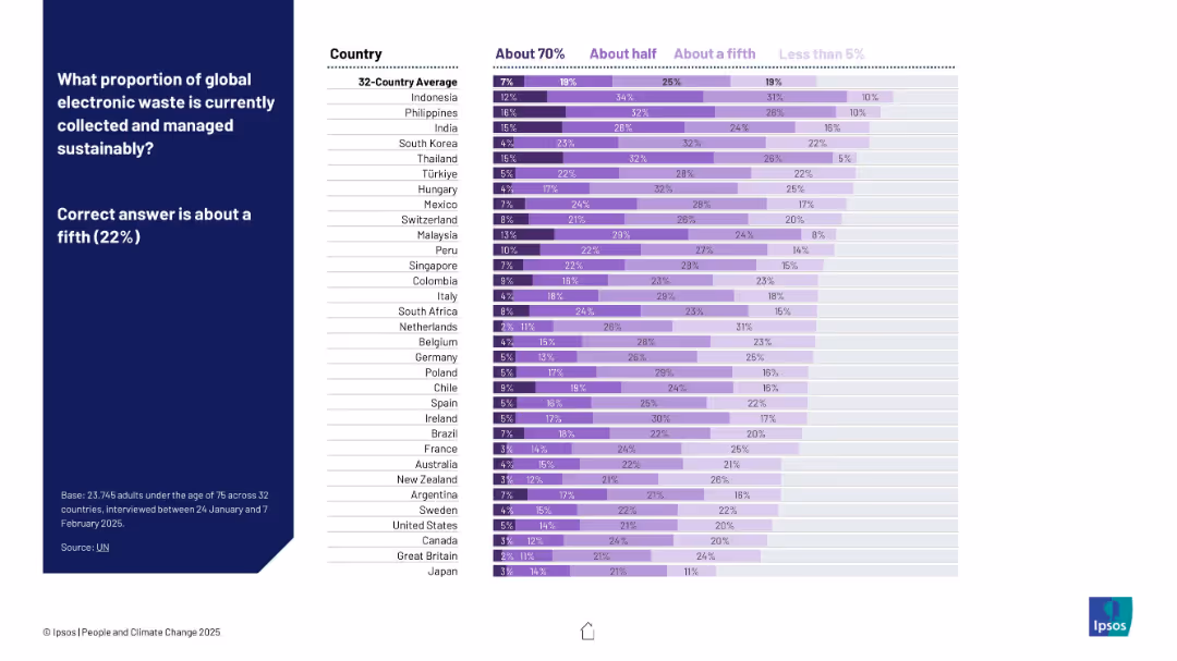
Purple stacked bar chart similar to previous slide. Includes categories like “About 70%,” “About half,” etc. Correct answer shown as 22%.
Industry Overview
Environmental Services & Sustainability
This slide presents public estimates on how much global e-waste is sustainably managed. Responses vary significantly, with many overestimating the actual 22% figure.
e-waste, sustainability, global waste, electronic recycling, public perception, Ipsos, circular economy, waste management, environmental data, awareness
false
Industry Overview
Environmental Services & Sustainability
Mixed Chart
IPSOS
Add to my slides
Remove from favorites
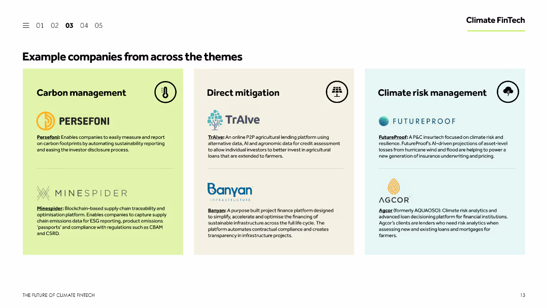
The slide presents three columns, each listing example companies under different themes: carbon management, direct mitigation, and climate risk management. Each column contains company names, logos, and brief descriptions of their activities.
Technology and Digital Transformation
Financial Services
The slide showcases example companies within the Climate FinTech sector, categorized by themes: carbon management, direct mitigation, and climate risk management. It includes brief descriptions of the companies' activities and their contributions to these themes.
Example companies, Climate FinTech, carbon management, direct mitigation, climate risk management
false
Technology and Digital Transformation
Financial Services
Pillar
Barclays
Add to my slides
Remove from favorites
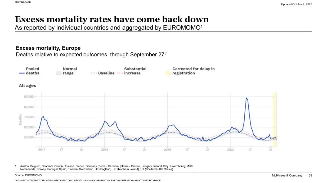
Line chart showing pooled deaths vs. baseline and normal range from 2017 through September 2020. Uses dotted and solid lines for historical comparison. Emphasizes recent dip back to normal.
Performance Metrics and KPIs
Healthcare & Pharmaceuticals
Tracks European excess mortality rates over several years, emphasizing the spike during COVID-19 but noting a return to near-baseline levels by late September 2020. The slide implies effective containment or adaptation to the health crisis.
excess deaths, Europe, baseline comparison, COVID-19 mortality, EUROMOMO, mortality trend, death rates, statistical baseline, pooled deaths, public health
false
Performance Metrics and KPIs
Healthcare & Pharmaceuticals
Single Chart
McKinsey
Add to my slides
Remove from favorites
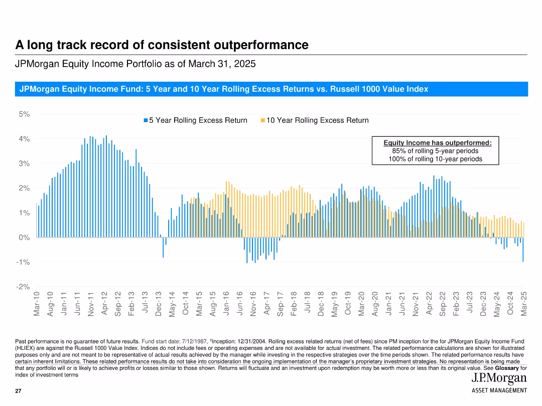
Vertical bar chart showing rolling 5- and 10-year excess returns over time; consistent visual style with blue and yellow colors and timeline from 2010 to 2025.
Financial Performance
Financial Services
Demonstrates JPMorgan Equity Income Fund’s consistent outperformance relative to the Russell 1000 Value Index across rolling 5- and 10-year periods, highlighting success in long-term strategies.
excess returns, rolling periods, outperformance, equity income, Russell 1000, performance history, consistency, fund analysis
false
Financial Performance
Financial Services
Single Chart
JP Morgan
Add to my slides
Remove from favorites
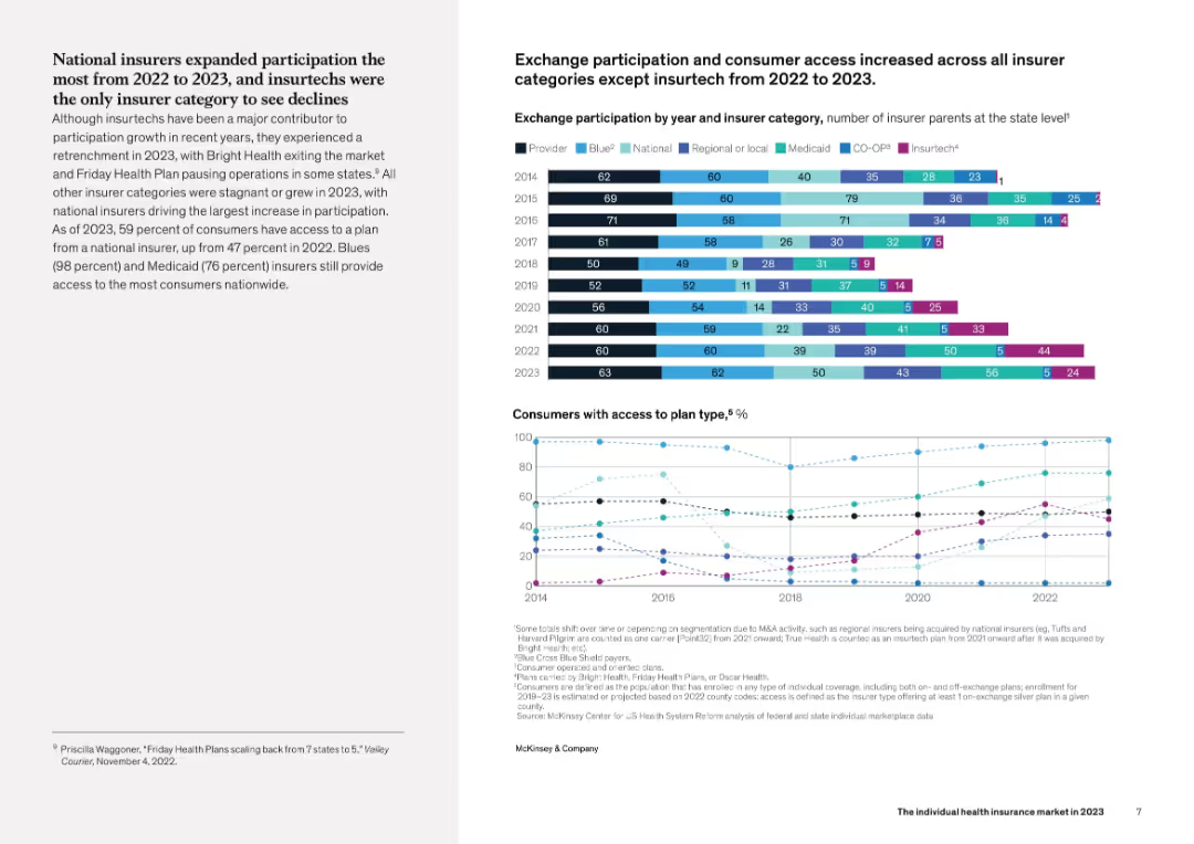
Layout features paragraph text on the left and two data visualizations on the right: a stacked bar chart showing insurer category participation from 2014 to 2023 and a line graph of consumer access by plan type. Clean, analytical design.
Industry Overview
Healthcare & Pharmaceuticals
The slide explores how exchange participation by insurer category has broadened from 2022 to 2023, with Insurtechs as the exception. It also shows the growth in consumer access to various plan types, particularly national, Medicaid, and Blue insurers. Consumer access has notably expanded across nearly all categories.
exchange, insurers, access, national plans, Medicaid, Insurtech
false
Industry Overview
Healthcare & Pharmaceuticals
Multiple Chart
McKinsey
Add to my slides
Remove from favorites
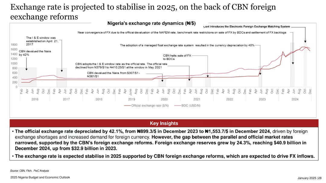
Historical timeline with annotations and dual exchange rate trends (official and parallel) from 2016–2024.
Regulatory and Compliance
Government & Public Sector
The slide shows a 42.1% depreciation in Nigeria’s official exchange rate from 2023 to 2024, alongside foreign reserve growth. CBN reforms aim to stabilize FX in 2025, narrowing the gap between official and parallel markets.
exchange rate, devaluation, naira, CBN, foreign reserves, currency reform
false
Regulatory and Compliance
Government & Public Sector
Mixed Chart
PwC/Strategy&
Add to my slides
Remove from favorites
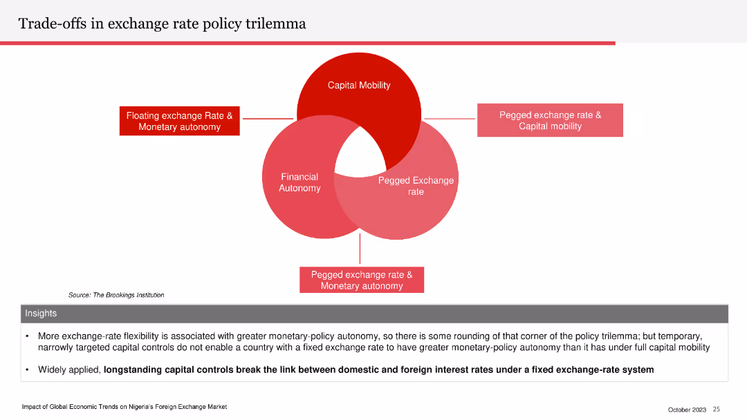
Venn diagram illustrating the exchange rate policy trilemma: capital mobility, financial autonomy, and pegged exchange rate. Insights section below.
Strategic Planning
Financial Services
The slide explains the trade-offs involved in exchange rate policy, emphasizing the limitations of having a fixed exchange rate, capital mobility, and monetary autonomy simultaneously. It highlights the impact of capital controls on interest rates.
exchange rate, policy trilemma, capital mobility, financial autonomy, pegged rate
false
Strategic Planning
Financial Services
Diagram
PwC/Strategy&
Add to my slides
Remove from favorites
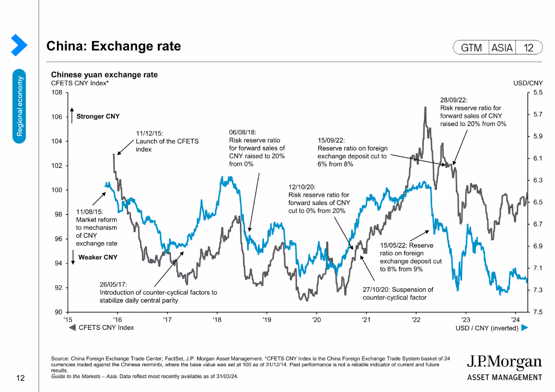
Displays a line chart depicting the Chinese yuan exchange rate with historical data and significant economic events affecting the rate.
Market Analysis and Trends
Financial Services
Provides an overview of the Chinese yuan exchange rate against a basket of currencies, useful for analyzing currency trends and economic impacts.
Exchange rate, Yuan, China, Currency trends, Economic events, Financial analysis, Market trends, FX
false
Market Analysis and Trends
Financial Services
Single Chart
JP Morgan
Add to my slides
Remove from favorites
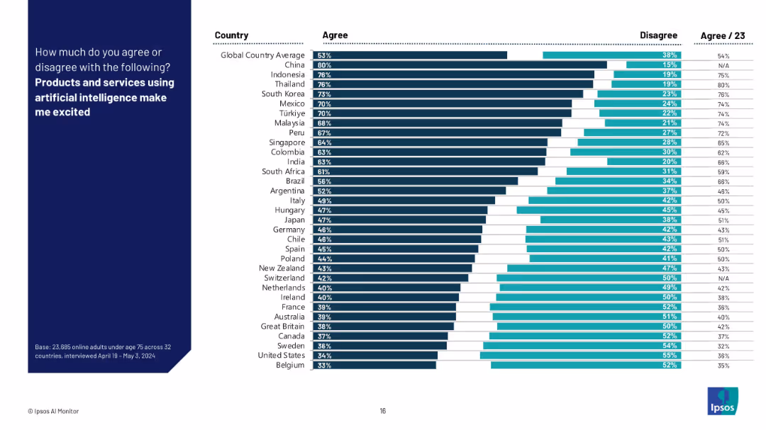
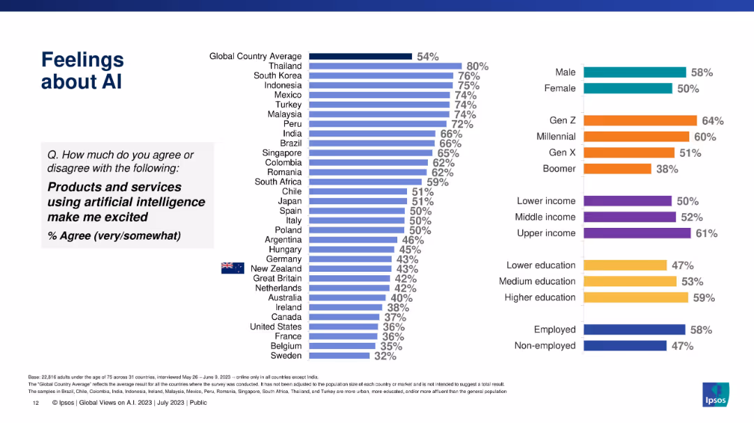
Similar bar chart format to 19071, showing “Agree” and “Disagree” rates per country, with global average highlighted.
Market Analysis and Trends
Artificial Intelligence
This slide presents comparative data on how many people in various countries are excited about AI-powered products and services. Countries are sorted by agreement levels, illustrating global enthusiasm for AI.
excitement, AI adoption, sentiment, Ipsos, countries, optimism, survey data, technology perception, global trend, enthusiasm
false
Market Analysis and Trends
Artificial Intelligence
Mixed Chart
IPSOS
Add to my slides
Remove from favorites
Similar dual-column bar chart layout as previous slide, illustrating excitement about AI by country/group.
Market Analysis and Trends
Artificial Intelligence
This slide evaluates how excited people are about AI-powered products/services across various countries and demographic groups, highlighting enthusiasm levels globally.
excitement, AI products, public sentiment, country comparison, demographics, Ipsos, emotional response
false
Market Analysis and Trends
Artificial Intelligence
Multiple Chart
IPSOS
Add to my slides
Remove from favorites
Features a single horizontal bar chart listing top executive challenges for 2024, such as 'Accessing talent' and 'Digital disruption', highlighted in varying shades of green to represent percentage responses.
Strategic Planning
Technology & Software
Focuses on the key strategic concerns for executives moving into 2024, emphasizing the importance of talent access and digital disruption, with insights applicable to strategic business planning.
executive challenges, digital disruption, talent management, 2024
false
Strategic Planning
Technology & Software
Mixed Chart
BCG
Add to my slides
Remove from favorites
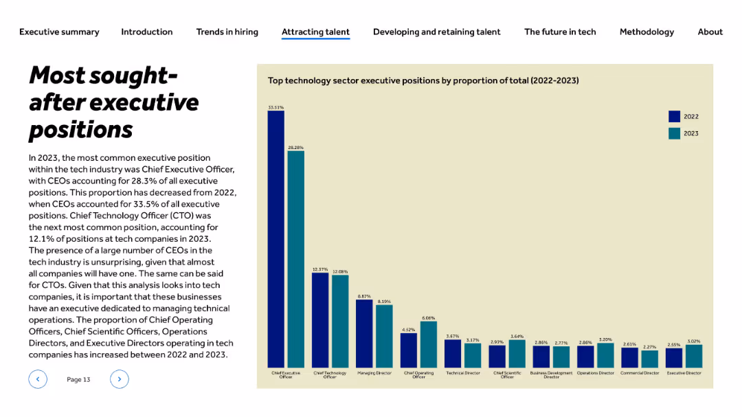
Title and text left-aligned; vertical bar chart at right comparing 2022 and 2023 percentages for executive roles
Human Resources and Talent Management
Technology & Software
The slide presents data on executive hiring trends in tech firms for 2022 and 2023. CEO was the most common executive role, though its share dropped from 33.5% to 28.3%. CTO and Managing Director follow. There’s also a rise in roles like COO and CSO, reflecting changes in tech firm leadership needs and operational focus.
executive hiring, CEO, CTO, talent trends, leadership, tech companies, 2023, HR, management, CXO roles
false
Human Resources and Talent Management
Technology & Software
Mixed Chart
Barclays
Add to my slides
Remove from favorites
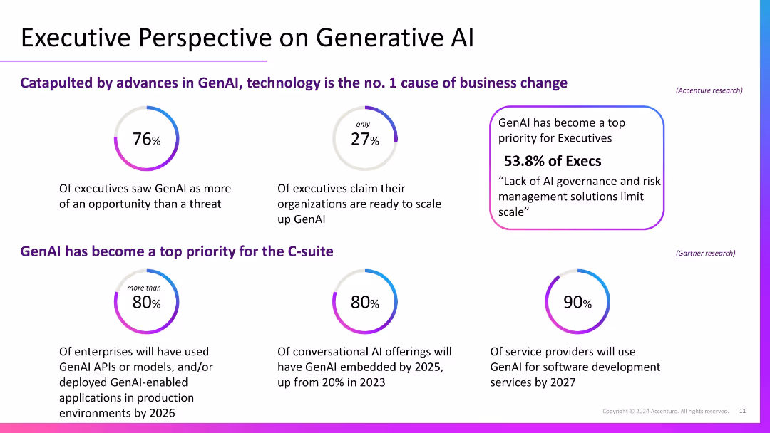
Clean layout with circular percentage graphics and two horizontal content sections; purple text highlights key insights; text-heavy with visual accents.
Strategic Planning
Professional Services
Provides insights from executive surveys showing broad enthusiasm for GenAI, but also gaps in scalability readiness. Highlights its prioritization in the C-suite and across enterprises, conversational AI adoption, and service provider integration expectations by 2025–2027.
executive insights, GenAI, AI governance, C-suite, enterprise strategy
false
Strategic Planning
Professional Services
Single Chart
Accenture
Add to my slides
Remove from favorites
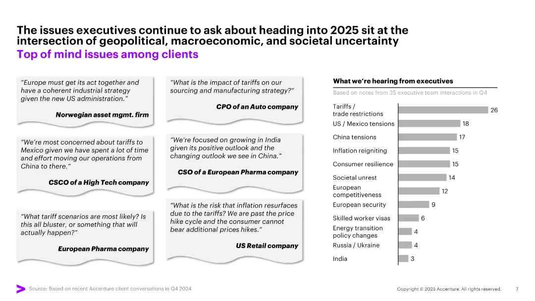
Combination of executive quote boxes (left) and a horizontal bar chart (right) with monochrome tones and minimal visuals; layout is clean and business-formal.
Market Analysis and Trends
Professional Services
The slide compiles direct executive quotes reflecting concerns about tariffs, inflation, and geopolitical shifts going into 2025. A chart ranks the top issues by frequency, led by tariffs/trade restrictions, followed by US/Mexico tensions and China-related concerns.
Executive Insights, Trade, Inflation, Tariffs, US/Mexico, China, Uncertainty, Business Risks, 2025, Priorities
false
Market Analysis and Trends
Professional Services
Mixed Chart
Accenture
Add to my slides
Remove from favorites
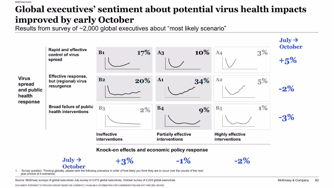
Matrix chart similar to slide 17431, displaying October survey results of ~2,000 executives across nine virus/economic scenarios. Percentages indicate perceived likelihood. Delta from July shown in blue on the right.
Strategic Planning
Professional Services
Presents October sentiment from executives on the most likely virus and economic response scenarios. Scenario A1 (recurring virus, partial economic intervention) is seen as most likely (34%). Compares shifts in opinion from July to October.
executive opinion, survey results, scenario analysis, virus impact, economic intervention, business outlook, trend shift, October update, strategic expectations
false
Strategic Planning
Professional Services
Single Chart
McKinsey
Add to my slides
Remove from favorites
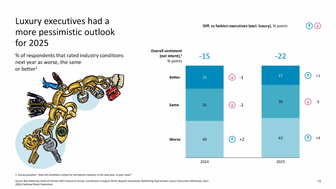
Split bar chart comparing sentiment for 2024 and 2025, with % difference vs. fashion industry
Market Analysis and Trends
Consumer Goods
The slide shows a net decline in executive optimism for the luxury sector in 2025, with more respondents expecting worse conditions compared to 2024 and versus the broader fashion industry.
executive sentiment, outlook, pessimism, fashion vs luxury, 2025 forecast, industry confidence
false
Market Analysis and Trends
Consumer Goods
Single Chart
McKinsey
Add to my slides
Remove from favorites
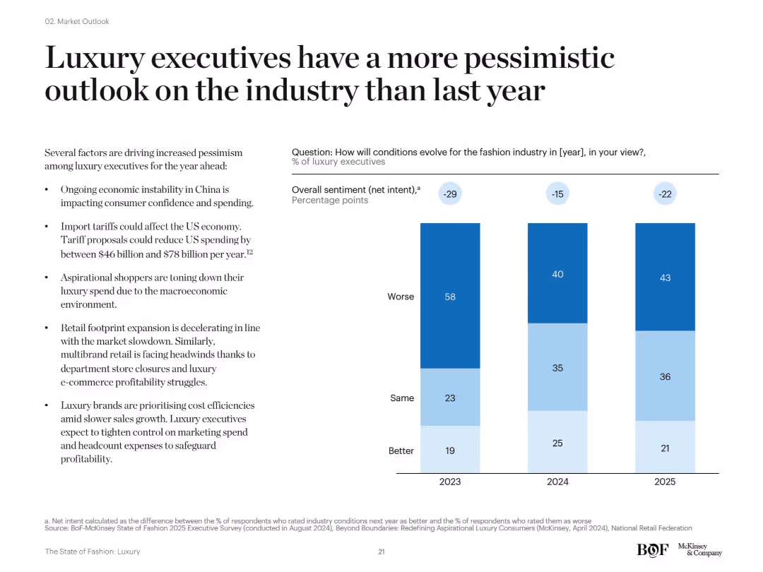
Bar chart showing net sentiment of luxury executives (better/same/worse) for 2023–2025. Accompanied by bullet points listing reasons for pessimism.
Strategic Planning
Consumer Goods
The slide illustrates declining optimism among luxury executives, with a majority expecting worse industry conditions in 2023–2025. Key concerns include macroeconomic headwinds, China’s instability, tariffs, and reduced spending from aspirational shoppers.
executive sentiment, pessimism, luxury outlook, 2024 forecast, tariffs, consumer behavior
false
Strategic Planning
Consumer Goods
Mixed Chart
McKinsey
Add to my slides
Remove from favorites
A simple and clean design with a vertical timeline graphic. The text is minimal, providing a clear, uncluttered layout.
Strategic Planning
Professional Services
This slide acts as an agenda, outlining the main sections of a professional services presentation, setting the stage for detailed discussions to follow.
executive summary, market analysis, digital growth, country spotlights, strategic planning, content outline, professional services
false
Strategic Planning
Professional Services
Agenda
Bain
Add to my slides
Remove from favorites
This slide has a red and black color scheme with a two-column layout. The left side contains a block of text with a bold title "Executive Summary," and the right side features a column chart titled "Family law final order by finalisation type, ('000) 2016-17" with data provided by FCC.
Operational Efficiency
Government & Public Sector
The slide presents a comparison between operational practices in case allocation and management within courts, highlighting differences and statistics regarding family law final orders.
Executive, Summary, Operational Practices, Courts, Comparison, Family Law, Final Orders, Statistics, FCC, Management
false
Operational Efficiency
Government & Public Sector
Mixed Chart
PwC/Strategy&
Add to my slides
Remove from favorites
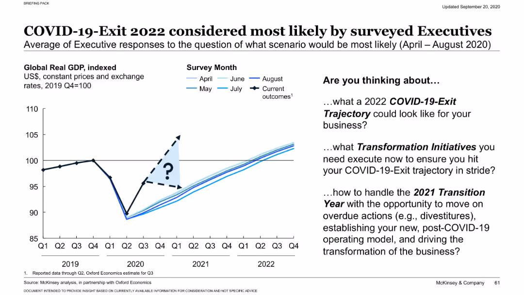
GDP projection chart with multiple scenario lines based on different survey months (April–August). Includes “?” symbol for uncertainty zone. Executive prompts listed on right side in bullet format.
Strategic Planning
Professional Services
Executive surveys from April to August 2020 show growing consensus toward a 2022 exit trajectory for COVID-19’s economic impact. The slide also encourages companies to consider transformation and transition strategies aligned with this likely scenario.
executive survey, COVID-19 exit, GDP forecast, planning, transformation, strategic transition, 2022 recovery, scenario analysis, business planning, trajectory
false
Strategic Planning
Professional Services
Mixed Chart
McKinsey
Add to my slides
Remove from favorites
This slide features a mix of bar charts and column charts. The left side shows horizontal bar charts for top sectors by value and volume, while the right side shows vertical bar charts for deal types.
Market Analysis and Trends
Financial Services
The slide provides an overview of exits in February 2023, highlighting the total value and volume of deals across various sectors and types of transactions. It aims to inform on market activity and trends within the financial services industry.
Exits, Deals, February 2023, Sectors, Value, Volume, Charts
false
Market Analysis and Trends
Financial Services
Multiple Chart
EY
Add to my slides
Remove from favorites
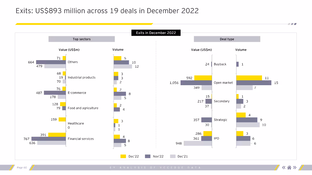
The slide features two bar charts. The left chart shows top sectors by value and volume. The right chart shows deal types by value and volume.
Market Analysis and Trends
Financial Services
This slide provides a detailed breakdown of exits in December 2022 by sector and deal type.
exits, December 2022, top sectors, deal types, value, volume, financial services
false
Market Analysis and Trends
Financial Services
Multiple Chart
EY
Add to my slides
Remove from favorites
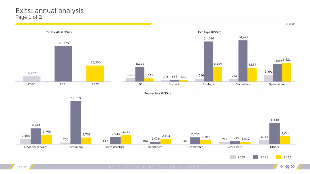
Column charts depicting total exits, exit types, and top sectors for exits by value for 2020-2022.
Market Analysis and Trends
Financial Services
Detailed analysis of exit types, sizes, and segments, highlighting top-performing sectors in exits.
exits, exit types, sectors, trends, analysis
false
Market Analysis and Trends
Financial Services
Multiple Chart
EY
Add to my slides
Remove from favorites
The slide features two bar charts: one showing top sectors by exit value and the other by the number of deals. It uses a color scheme to differentiate data from different months, providing a clear visual comparison of sector performance in exits.
Market Analysis and Trends
Financial Services
This slide presents data on exits in April 2023, highlighting the sectors with the highest exit values and number of deals. It helps in understanding sector-wise exit performance, which is crucial for strategic exit planning and investment decisions.
exits, PE/VC, sectors, exit value, number of deals
false
Market Analysis and Trends
Financial Services
Multiple Chart
EY
Add to my slides
Remove from favorites
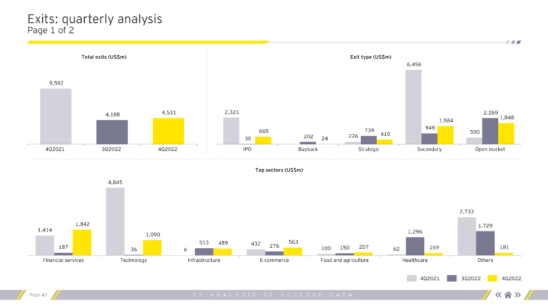
Displays column charts for total exits, exit types, and top sectors by exit value. Uses grey, purple, and yellow for color coding. Visual complexity is moderate.
Market Analysis and Trends
Financial Services
Provides a detailed analysis of quarterly exit trends, categorizing by exit type (IPO, buyback) and highlighting top sectors. Useful for market analysts and financial advisors.
exits, quarterly, analysis, sectors, financial
false
Market Analysis and Trends
Financial Services
Multiple Chart
EY
Add to my slides
Remove from favorites
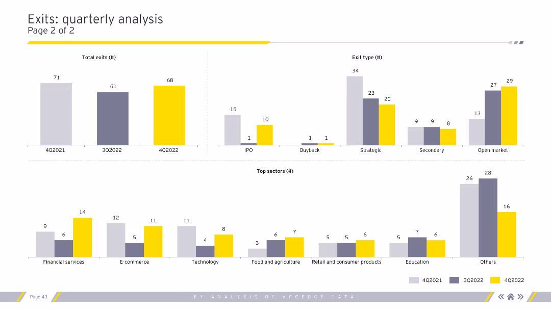
Contains column charts for total exits, exit types, and top sectors by exit volume. Uses grey, purple, and yellow colors. Visual complexity is moderate.
Market Analysis and Trends
Financial Services
Examines quarterly exit trends, focusing on total exits, types of exits, and top-performing sectors. Vital for investors and analysts tracking exit strategies.
exits, quarterly, analysis, trends, sectors
false
Market Analysis and Trends
Financial Services
Multiple Chart
EY
Add to my slides
Remove from favorites
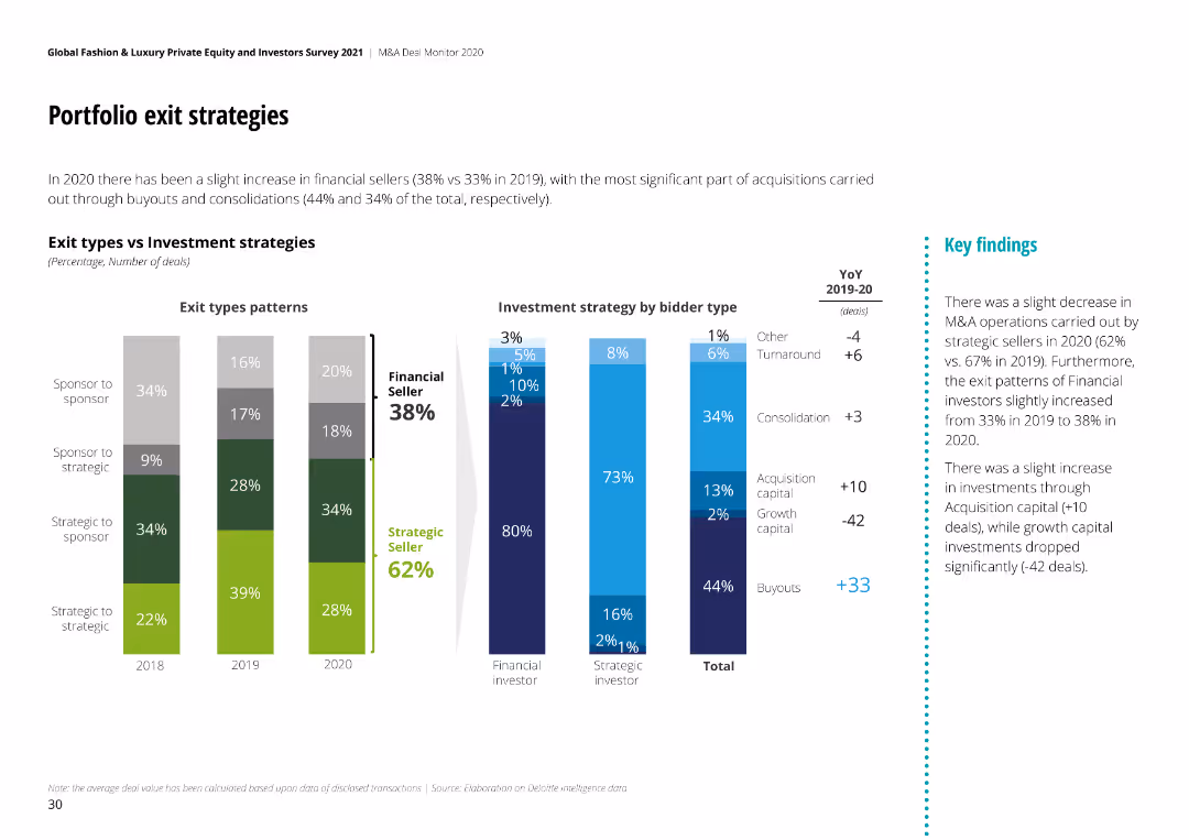
The slide includes bar charts comparing exit types and investment strategies by bidder type, with changes from 2019-2020.
Investment Analysis
Consumer Goods
It analyzes exit strategies and investment patterns, showing the distribution of different exit types and strategies in M&A deals.
Exit Strategies, Investment, Bidder Type, M&A, 2020
false
Investment Analysis
Consumer Goods
Multiple Chart
Deloitte
Add to my slides
Remove from favorites
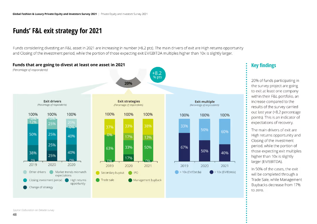
The slide contains multiple column charts showing exit drivers, strategies, and multiples for funds divesting F&L assets. Key findings are presented.
Mergers and Acquisitions
Financial Services
The slide provides insights into exit strategies for funds in F&L for 2021, covering drivers, strategies, and expected multiples.
exit strategy, F&L, funds, divestment, analysis
false
Mergers and Acquisitions
Financial Services
Multiple Chart
Deloitte
Add to my slides
Remove from favorites
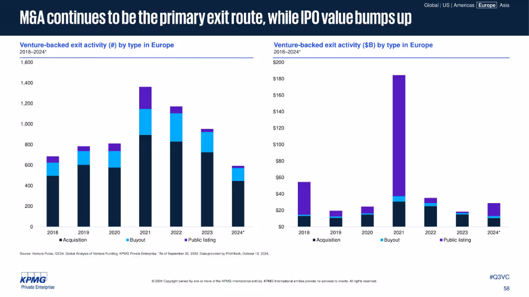
Two bar charts: Left (exit count by type), Right (exit value by type) from 2018–2024
Mergers and Acquisitions
Financial Services
This slide categorizes exit types by count and value. M&A remains the dominant path, but 2024 shows a renewed increase in IPO value, hinting at a reawakening public market despite fewer listings overall.
exit strategy, M&A, IPO, acquisition, venture-backed exits
false
Mergers and Acquisitions
Financial Services
Multiple Chart
KPMG
Add to my slides
Remove from favorites
Two primary visual elements: a column chart showing U.S. venture-backed exits by type for different quarters, and a pie chart depicting companies' long-term goals. The layout includes headers and an implications section.
Market Analysis and Trends
Financial Services
The slide juxtaposes venture-backed exit strategies against actual market realities, with implications suggesting that the uncertain macroeconomic environment makes timing for exits critical.
Exit Strategy, Venture-Backed, IPO, M&A, SPAC
false
Market Analysis and Trends
Financial Services
Multiple Chart
JP Morgan
Add to my slides
Remove from favorites
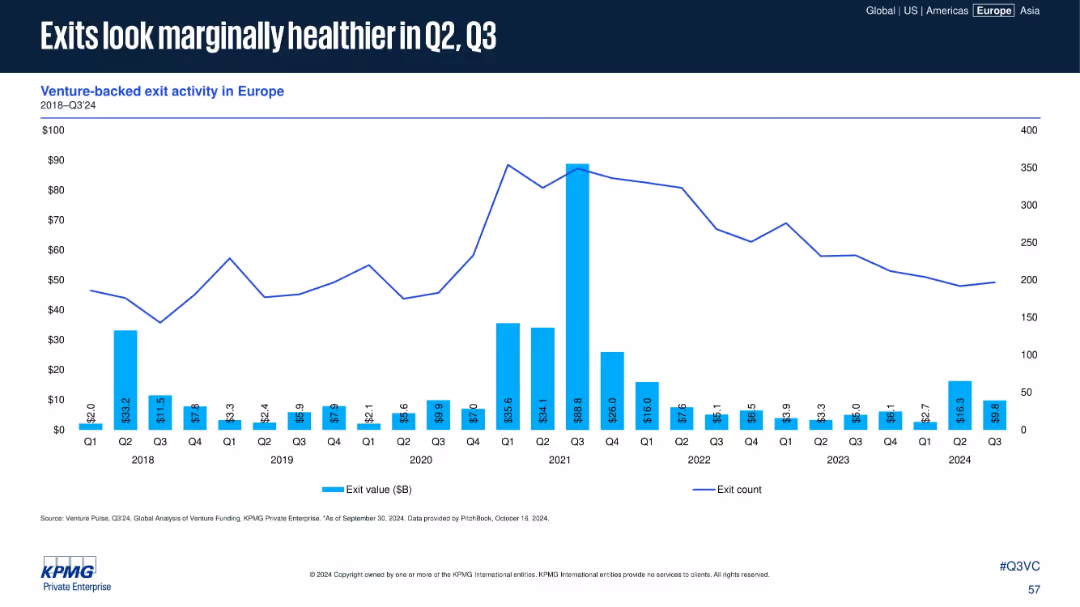
Bar and line chart depicting exit values and exit count per quarter (2018–2024)
Financial Performance
Financial Services
The slide presents exit activity trends in Europe, showing a modest recovery in Q2 and Q3 2024. Despite a general downtrend since 2021, select quarters show improved exit values, indicating potential recovery in M&A or IPO markets.
exits, venture-backed, exit value, M&A, IPO, Q3 2024
false
Financial Performance
Financial Services
Single Chart
KPMG
Add to my slides
Remove from favorites
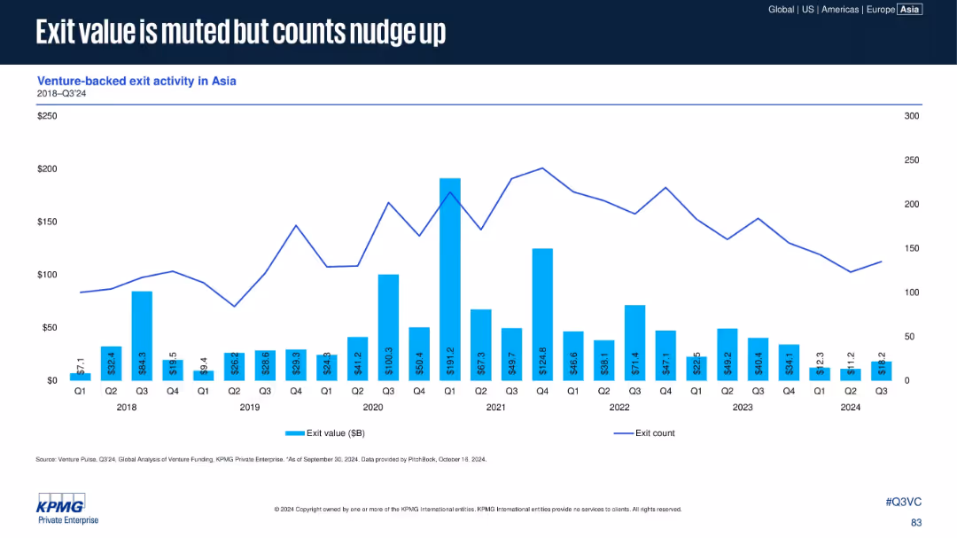
Bar chart with exit value ($B) and line for exit count from 2018–Q3 2024. Bright blue bars and navy line over white background.
Investment Analysis
Financial Services
Details trends in exit activity for VC-backed companies in Asia. While total exit values have declined, the number of exits is slightly increasing—indicating more activity despite reduced returns, likely reflecting lower valuations.
Exit Value, Asia, Venture-backed, Exits, VC Returns, Exit Count, 2024 Q3
false
Investment Analysis
Financial Services
Single Chart
KPMG
Add to my slides
Remove from favorites
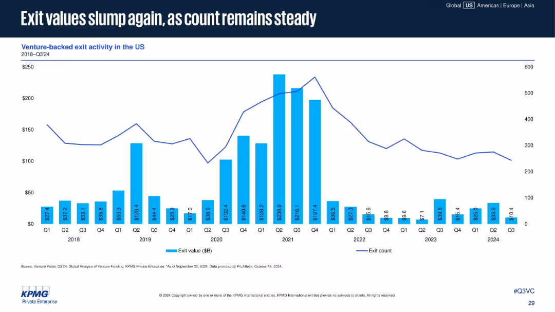
Bar-line combo chart of exit values and counts from 2018 to Q3 2024. Blue bars for value and a line for exit count.
Financial Performance
Financial Services
Exit values for venture-backed companies in the U.S. continue to decline into 2024, while the number of exits remains relatively steady. This signals reduced market valuations but persistent M&A or IPO activity.
exit value, venture-backed exits, IPO, M&A, exit count, market downturn, US exits, 2024 trends
false
Financial Performance
Financial Services
Single Chart
KPMG
Add to my slides
Remove from favorites
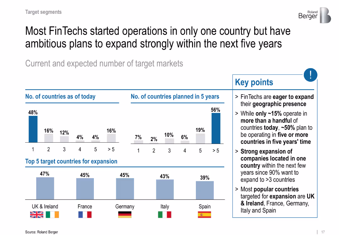
Dual bar chart compares current vs. future countries served; country flags highlight expansion targets
Sales and Business Development
Financial Services
Details current geographic reach and ambitious five-year expansion plans. Lists UK, France, Germany, Italy, and Spain as top target markets.
expansion, international growth, geographic strategy, Europe, target markets
false
Sales and Business Development
Financial Services
Multiple Chart
Roland Berger
Add to my slides
Remove from favorites
Features a U.S. map highlighting expansion and legacy states, alongside a column chart showing revenue growth in expansion markets.
Strategic Planning
Financial Services
Details JPMorgan’s expansion strategy in Middle Market Banking, highlighting the increase in clientele and revenue in new markets, thus providing a geographical and financial overview of market penetration.
Expansion, Revenue Growth, Banking, Market Analysis, Clientele Increase, Geographical Data
false
Strategic Planning
Financial Services
Mixed Chart
JP Morgan
Add to my slides
Remove from favorites
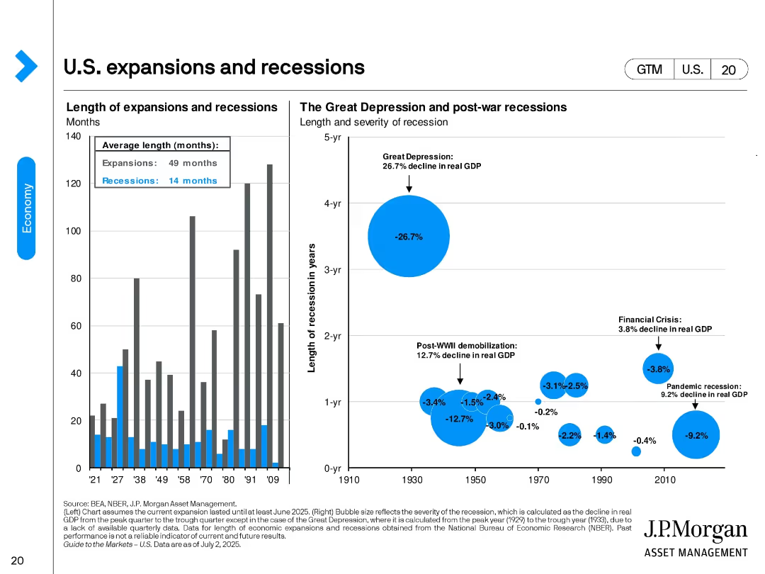
Two-panel design. Left: bar chart showing duration of U.S. expansions vs. recessions. Right: bubble chart comparing size and duration of major recessions by real GDP decline. Key events like the Great Depression are visually emphasized.
Industry Overview
Financial Services
This slide provides historical context on U.S. economic cycles, highlighting average durations (expansions: 49 months, recessions: 14 months). It visualizes the severity of downturns such as the Great Depression and the 2008 Financial Crisis.
expansions, recessions, GDP decline, Great Depression, historical economy, NBER, economic cycle, recovery duration
false
Industry Overview
Financial Services
Multiple Chart
JP Morgan
Add to my slides
Remove from favorites
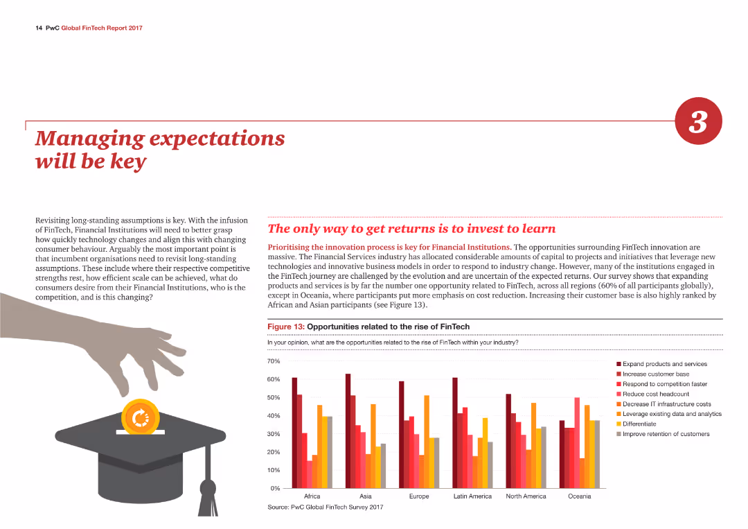
The slide contains a column chart illustrating opportunities related to the rise of FinTech by region, with different colors representing various opportunities such as expanding products.
Strategic Planning
Financial Services
The slide emphasizes the importance of managing expectations in the financial services industry, highlighting key opportunities related to FinTech across different regions.
Expectations, FinTech, Opportunities, Regions, Strategic
false
Strategic Planning
Financial Services
Mixed Chart
PwC/Strategy&
Add to my slides
Remove from favorites
Multiple column charts comparing expected returns for "U.S. Loan," "U.S. High Yield," "Euro High Yield," and "GBP High Yield." Each chart displays separate components contributing to total return, like credit spread and excess return.
Investment Analysis
Financial Services
Demonstrates potential future returns influenced by credit risk and risk-free rates across different investment categories. Helps in strategic planning for investment portfolios and risk assessment.
expected returns, credit risk, investment categories
false
Investment Analysis
Financial Services
Multiple Chart
Morgan Stanley
Add to my slides
Remove from favorites
Depicts execution rates of expenditure over three fiscal years using vertical thermometers, showing percentages to illustrate fiscal discipline or lack thereof.
Financial Performance
Government & Public Sector
Evaluates the effectiveness of Namibia's government expenditure over three fiscal years, highlighting trends in budget utilization and fiscal management. Useful for assessing government efficiency and fiscal health.
Expenditure, Budget, Fiscal, Efficiency
false
Financial Performance
Government & Public Sector
Single Chart
PwC/Strategy&
Add to my slides
Remove from favorites
Features a pie chart detailing various segments of national expenditure such as personnel costs, goods and services, and interest payments.
Financial Performance
Government & Public Sector
Breaks down Namibia's government expenditure for 2018/19 into major categories, providing a fiscal snapshot useful for financial analysis and planning. The slide helps in understanding how public funds are distributed across different governmental activities.
Expenditure, Budget, Personnel, Services
false
Financial Performance
Government & Public Sector
Single Chart
PwC/Strategy&
Add to my slides
Remove from favorites
This slide contains multiple column charts comparing annual operating expenditure, employing a red and grey color scheme to differentiate categories such as total, employee & judge expenditure, and others. Icons at the top indicate court operations, security, and travel, while text sections provide detailed descriptions.
Financial Performance
Government & Public Sector
The slide presents a financial comparison of two courts' expenses, focusing on specific areas such as employee costs and court operations. It's likely used to inform about budget allocation and financial transparency.
expenditure, courts, comparison, finance, operation costs
false
Financial Performance
Government & Public Sector
Mixed Chart
PwC/Strategy&
Add to my slides
Remove from favorites
This slide displays a dot plot chart tracking expenditure execution rates over three fiscal years, each marked with a percentage.
Regulatory and Compliance
Government & Public Sector
Evaluates the efficiency of expenditure management in the government by showing the execution rates of allocated budgets.
Expenditure, execution rates, fiscal years, government spending
false
Regulatory and Compliance
Government & Public Sector
Single Chart
PwC/Strategy&
Add to my slides
Remove from favorites
Features a stacked column chart with sections colored differently to represent various types of expenditures like personnel, services, and capital transfers over multiple years.
Regulatory and Compliance
Government & Public Sector
Provides a detailed view of government expenditure types over several years, useful for tracking financial management and identifying spending trends.
expenditure, government, tracking, management, financial, personnel, services, capital transfers, spending trends, years
false
Regulatory and Compliance
Government & Public Sector
Single Chart
PwC/Strategy&
Add to my slides
Remove from favorites
Slide with a prominent bar graph detailing the annual operating expenditure, accompanied by key expense categories. The visual elements are designed for easy comparison.
Financial Performance
Government & Public Sector
Discusses the Appeal Division's operational expenditures, with a focus on the costs associated with appeals scheduling and travel, providing a financial overview of the division's resource allocation.
expenditure, operational costs, financial overview, travel costs
false
Financial Performance
Government & Public Sector
Mixed Chart
PwC/Strategy&
Add to my slides
Remove from favorites
A line graph tracking expenditure execution rate over several years, marked with specific years and percentage values at data points.
Financial Performance
Government & Public Sector
Analyzes historical and projected government spending efficiency, which is crucial for fiscal management and accountability assessments.
expenditure rate, fiscal efficiency, government accountability
false
Financial Performance
Government & Public Sector
Single Chart
PwC/Strategy&
Add to my slides
Remove from favorites
The slide features a line graph depicting the expenditure execution rate over several years. Each data point is marked clearly, showing a trend over time.
Performance Metrics and KPIs
Government & Public Sector
This slide tracks the efficiency of expenditure execution in Namibia over recent fiscal years, illustrating trends that are crucial for evaluating financial management and operational effectiveness in government spending.
expenditure rate, fiscal management, efficiency analysis
false
Performance Metrics and KPIs
Government & Public Sector
Single Chart
PwC/Strategy&
Add to my slides
Remove from favorites
It has a split layout with a column chart on the left and bullet points on the right. The graph uses shades of blue and green, with a dotted line indicating future projections.
Financial Performance
Financial Services
The slide predicts the firm's payment expenses over the medium term and outlines the contributing factors to the anticipated expense growth.
Expense growth, forecast, firmwide payments, projections, wage inflation, productivity, investments
false
Financial Performance
Financial Services
Mixed Chart
JP Morgan
Add to my slides
Remove from favorites
Combining tha bars in a column chart and textual analysis, the slide compares technology expenses over time and investment strategies.
Financial Performance
Financial Services
This slide is designed to explain the correlation between expense growth and strategic investments, underlining the firm's commitment to innovation and efficiency.
expense growth, investments, column charts, technology, operational efficiency, JPMorgan
false
Financial Performance
Financial Services
Mixed Chart
JP Morgan
Add to my slides
Remove from favorites
The slide contains two comparative column charts with vertical bars, contrasting Goldman Sachs with US peers, and a text box detailing a three-year expense plan. The design is clean, using shades of blue.
Financial Performance
Financial Services
This slide discusses how dynamic expense management contributes to stable earnings in comparison to industry peers, with data from different years. It is used in financial strategy and performance analysis.
expense management, earnings stability, financial comparison, Goldman Sachs, revenue volatility, expense savings, corporate strategy, financial planning, cost management
false
Financial Performance
Financial Services
Multiple Chart
Goldman Sachs
Add to my slides
Remove from favorites
Two column charts depict volatility comparisons, complemented by a bullet-point list of expense management strategies.
Risk Assessment and Management
Financial Services
Analyzes how dynamic expense management can stabilize earnings, aimed at financial risk management or operational planning sessions.
Expense Management, Earnings Stability, Volatility, Risk Management, Operational Planning
false
Risk Assessment and Management
Financial Services
Multiple Chart
Goldman Sachs
Add to my slides
Remove from favorites
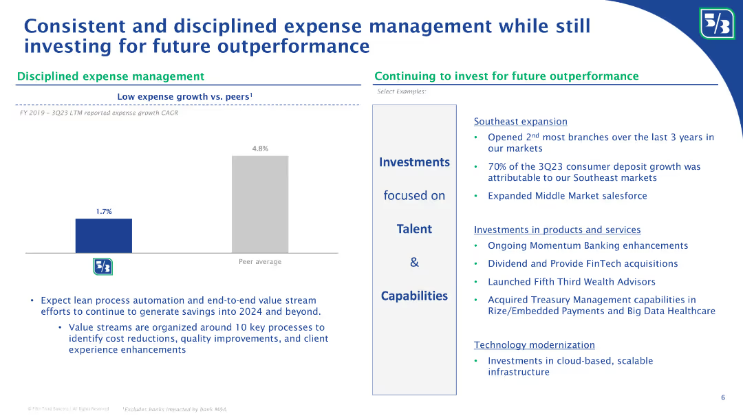
The slide features a comparative column chart depicting expense growth, a sidebar with key strategic points, and a blue background. The column chart contrasts the company's low expense growth against the peer average, using shades of blue to differentiate the data. The sidebar uses icons and bullet points to concisely present information.
Operational Efficiency
Financial Services
This slide outlines Fifth Third's expense management strategy, emphasizing its disciplined approach relative to peers. It also details investments focused on talent and capabilities, alongside technology modernization efforts. The data and content suggest its use in financial and operational strategy discussions, highlighting cost management while investing for future growth.
Expense Management, Investment, Future Growth, Comparative Analysis, Strategy, Financial Services, Technology Modernization, Talent Development
false
Operational Efficiency
Financial Services
Mixed Chart
Goldman Sachs
Add to my slides
Remove from favorites
The slide includes a bar chart showing expense growth vs. peers and bullet points on the right detailing investments in talent and capabilities, with specific examples of expansions and technological modernization.
Operational Efficiency
Financial Services
The slide discusses Fifth Third Bank’s disciplined expense management, comparing their expense growth to peers and detailing ongoing investments in talent, capabilities, and technology. It highlights key areas of expansion and modernization aimed at sustaining future outperformance.
Expense management, operational efficiency, investments, talent, capabilities, technological modernization, expense growth, peer comparison, Fifth Third Bank
false
Operational Efficiency
Financial Services
Mixed Chart
Goldman Sachs
Add to my slides
Remove from favorites
A column chart shows predicted expenses for 2023 with additional annotations on integration costs and considerations from FDIC. The layout is straightforward with clear divisions between sections.
Financial Performance
Financial Services
The slide outlines JPMorgan Chase's expense projections for 2023, excluding costs related to First Republic. It includes a detailed analysis of various business units and factors that might impact these expenses, like FDIC assessments and labor inflation.
Expense Outlook, FDIC, First Republic, Financial Analysis, JPMorgan Chase
false
Financial Performance
Financial Services
Mixed Chart
JP Morgan
Add to my slides
Remove from favorites
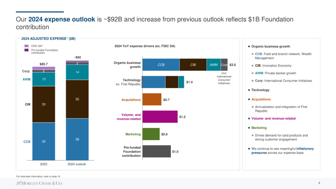
Column chart showing 2023 vs 2024 expense outlook in billions of dollars with various categories like CCB, CIB, AWM, and Corp. Contains colored segments to indicate different contributions such as FDIC SA and pre-funded Foundation contributions. Text on the right explains organic business growth and expense drivers.
Financial Performance
Financial Services
Highlights the expected 2024 expense outlook of ~$92B, an increase from the previous outlook due to a $1B Foundation contribution. The slide explains expense drivers, including organic business growth, technology, acquisitions, and marketing.
Expense, Outlook, Foundation, Technology, Growth, Acquisitions, Marketing, Financial
false
Financial Performance
Financial Services
Multiple Chart
JP Morgan
Add to my slides
Remove from favorites
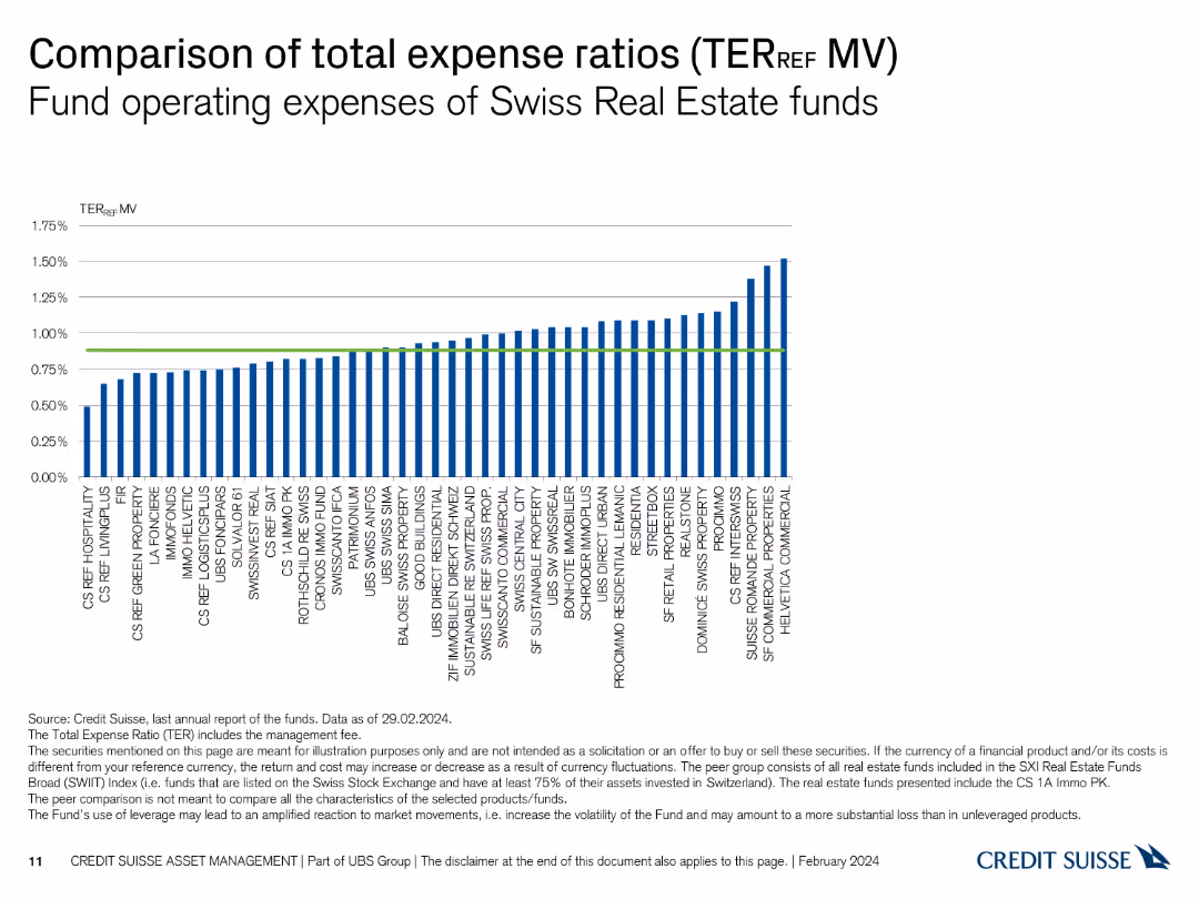
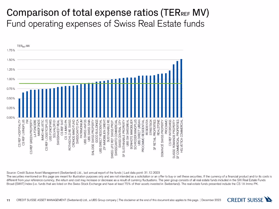
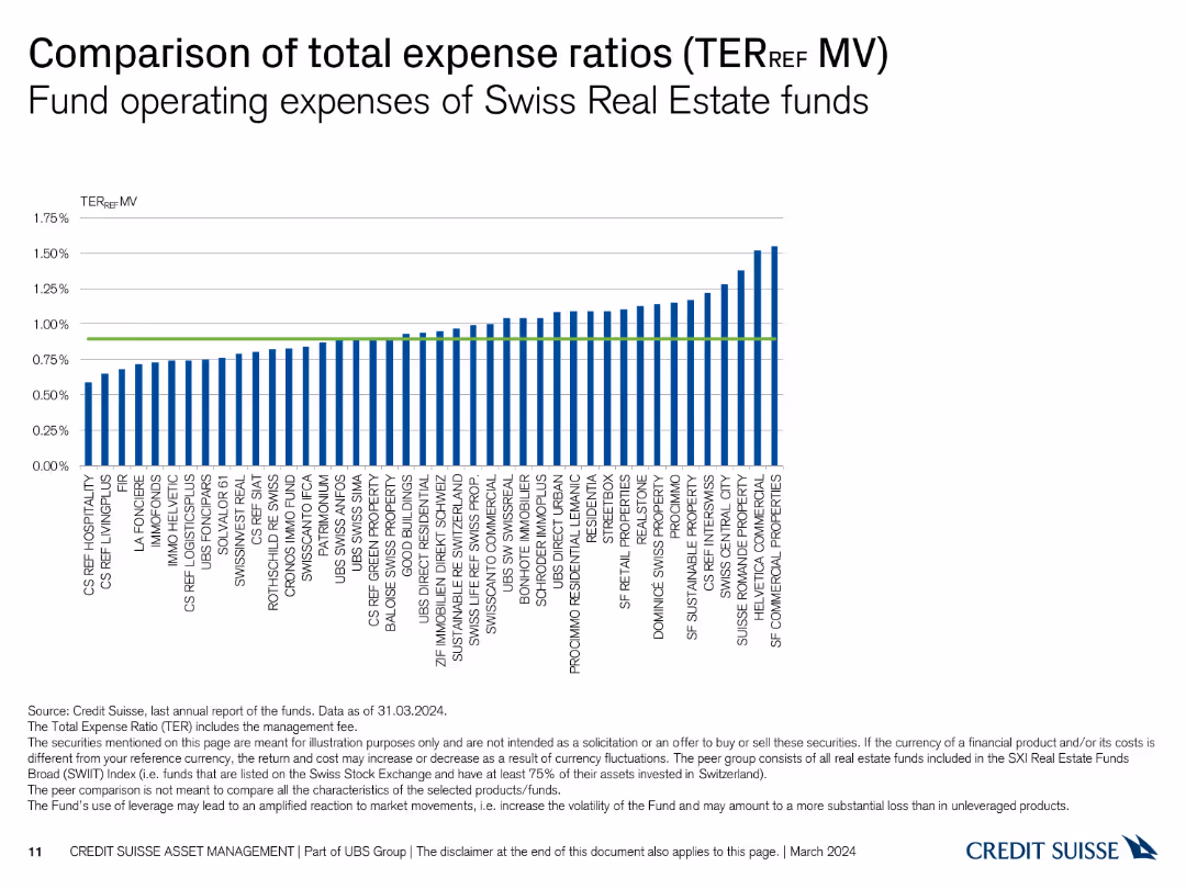
This slide features a column chart displaying the total expense ratios of various Swiss Real Estate funds. The chart uses vertical bars to represent each fund's TER_REF.
Financial Performance
Financial Services
The slide compares the operating expenses of different Swiss Real Estate funds, illustrating their total expense ratios. It helps in analyzing and comparing fund expenses.
expense ratios, Swiss Real Estate, funds, TER_REF, operating expenses
false
Financial Performance
Financial Services
Single Chart
Credit Suisse
Add to my slides
Remove from favorites
A column chart comparing the total expense ratios (TER) of various Swiss real estate funds based on market value, with a reference line for average TER.
Financial Performance
Financial Services
This slide compares the total expense ratios (TER) of Swiss real estate funds, adjusted for market value, showcasing the operational cost differences between funds.
Expense Ratios, TER, Market Value, Real Estate Funds, Cost Comparison
false
Financial Performance
Financial Services
Single Chart
Credit Suisse
Add to my slides
Remove from favorites
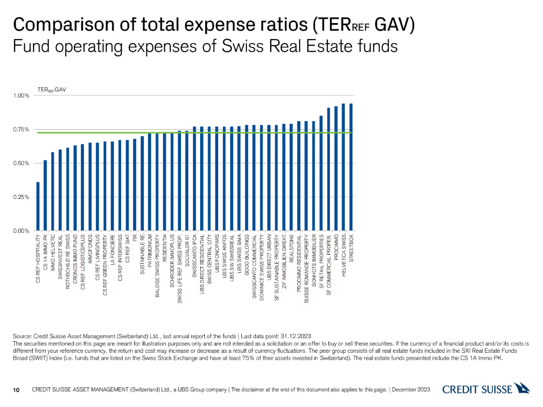
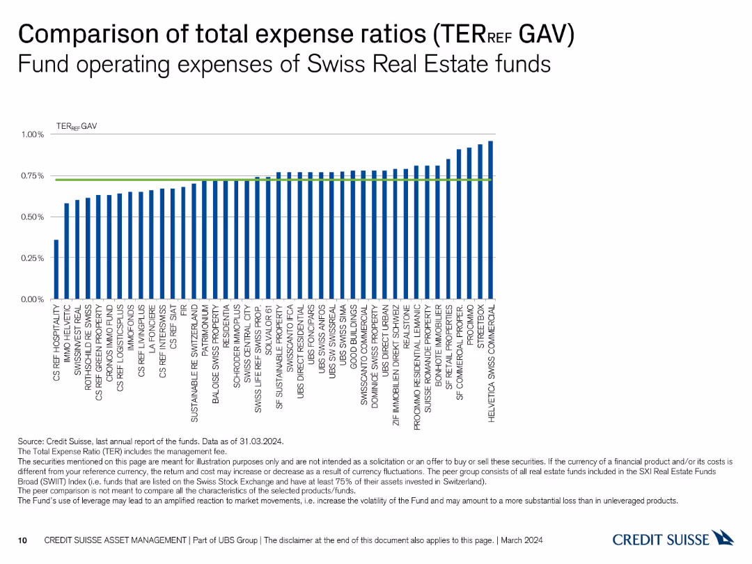
A column chart comparing the total expense ratios (TER) of various Swiss real estate funds, with a reference line for average TER.
Financial Performance
Financial Services
This slide provides a comparison of the total expense ratios (TER) for Swiss real estate funds, indicating the relative operating expenses of each fund.
Expense Ratios, TER, Real Estate Funds, Comparison, Operating Expenses
false
Financial Performance
Financial Services
Single Chart
Credit Suisse
Add to my slides
Remove from favorites
The slide features a column chart comparing the total expense ratios (TER) of Swiss Real Estate funds based on market value (MV), with a green line indicating the average TER.
Financial Performance
Real Estate & Construction
This slide examines the total expense ratios (TER) of Swiss Real Estate funds, focusing on market value (MV) as the basis for comparison, showing variations in fund expenses.
expense ratio, TER, market value, real estate, funds
false
Financial Performance
Real Estate & Construction
Single Chart
Credit Suisse
Add to my slides
Remove from favorites
The slide displays a column chart comparing the total expense ratios (TER) of various Swiss Real Estate funds, with a green line indicating the average TER across all funds.
Financial Performance
Real Estate & Construction
This slide compares the total expense ratios (TER) of Swiss Real Estate funds, highlighting differences in operating expenses relative to gross asset value (GAV).
expense ratio, TER, real estate, funds, comparison
false
Financial Performance
Real Estate & Construction
Single Chart
Credit Suisse
Add to my slides
Remove from favorites
Column chart showing operating expense reduction from 2015 to 2019. Each year has distinct bars with a color legend.
Financial Performance
Financial Services
This slide illustrates a year-on-year expense reduction with estimated savings for 2018 and 2019. It is used to highlight cost-saving achievements and future targets.
expense, reduction, financial, savings, goals
false
Financial Performance
Financial Services
Single Chart
Credit Suisse
Add to my slides
Remove from favorites
Title at the top, a three-part diagram describing expense savings strategies with bullet points in each part. Dark blue and light blue color scheme.
Operational Efficiency
Financial Services
The slide focuses on the financial impact of streamlining the organization, investing in automation, and integrated expense management to achieve significant expense savings over three years.
Expense Savings, Automation, Streamlining, Investment, Strategy
false
Operational Efficiency
Financial Services
Linear Flow
Goldman Sachs
Add to my slides
Remove from favorites
Features column chart with efficiency ratios and a strategic plan outline with arrows and bullet points detailing expense management.
Operational Efficiency
Financial Services
Showcases a plan for expense savings to enable growth funding, likely used for operational strategy meetings or financial planning discussions.
Expense Savings, Efficiency, Growth Funding, Operational Strategy, Financial Planning
false
Operational Efficiency
Financial Services
Mixed Chart
Goldman Sachs
Add to my slides
Remove from favorites
This slide is text-heavy with several bullet points, accompanied by column charts and a table. It utilizes a blue and gray color palette and is quite data-intensive.
Operational Efficiency
Financial Services
Focuses on a detailed breakdown of expenses, suitable for financial analysis and operational budgeting.
Expenses, Breakdown, Financial, Analysis, Operational, Budgeting, Detailed, Column Chart, Table, Data-Intensive
false
Operational Efficiency
Financial Services
Multiple Chart
Goldman Sachs
Add to my slides
Remove from favorites
The slide features multiple column charts displaying 'Adjusted Expenses' over a period, accompanied by annotations for specific expense categories. Other smaller bar charts illustrate cost per account for operations and branch network. The design uses shades of blue and annotations to make distinctions clear.
Operational Efficiency
Financial Services
This slide delves into the financial institution's expense management, highlighting efficiencies and cost per account metrics. It is intended for use in operational reviews and strategy meetings, potentially to discuss cost-saving measures, investment in technology, and operational improvements aimed at achieving scalability and sustainable growth.
Expenses, Efficiency, Cost Management, Financial Institutions, Technology Investment, Operational Improvement
false
Operational Efficiency
Financial Services
Multiple Chart
JP Morgan
Add to my slides
Remove from favorites
The slide displays a complex table comparing different expense categories over various quarters, alongside a single column chart showing the efficiency ratio. It utilizes a muted color palette with highlights in blue.
Operational Efficiency
Financial Services
This slide presents an in-depth look at the company's expenses, showing changes over time and highlighting operational efficiency through an efficiency ratio metric. It is used to evaluate financial management and cost-efficiency within the company.
Expenses, Efficiency Ratio, Operational, Financial Data
false
Operational Efficiency
Financial Services
Mixed Chart
Goldman Sachs
Add to my slides
Remove from favorites
The slide is dense with a mix of column charts and a data table. On the left, a table lists financial metrics with percentages. On the right, a column chart compares the efficiency ratio between 2023 and 2022, below which is a bullet point list of expense highlights.
Financial Performance
Financial Services
The slide presents a detailed financial analysis of quarterly expenses including compensation, transaction fees, and various operational costs, contrasted against previous quarters and years. An efficiency ratio graph highlights improvements in operational costs. This slide could be used in a financial review meeting to discuss cost management strategies and efficiency gains.
Expenses, Financial, Analysis, Efficiency, Cost Management, Operational, Quarterly, Comparison
false
Financial Performance
Financial Services
Mixed Chart
Goldman Sachs
Add to my slides
Remove from favorites
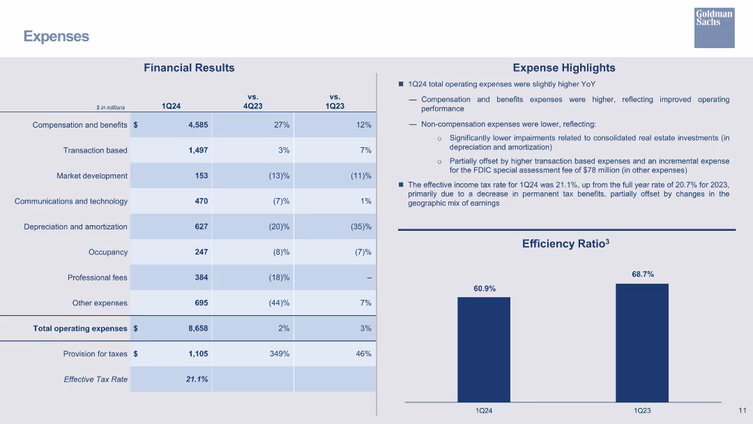
The slide features a column chart comparing 'Efficiency Ratio' for 2023 YTD and 2022 YTD, alongside a comprehensive table detailing financial expenses in various categories such as compensation, transaction-based fees, and total operating expenses with percentage changes from the previous year.
Financial Performance
Financial Services
This slide analyzes financial expenses, showing year-on-year and year-to-date comparisons. It includes insights on significant changes in non-compensation expenses and the impact of taxes on earnings, aimed at providing a snapshot of financial health and operational efficiency.
Expenses, Financial Analysis, Efficiency Ratio, Depreciation, Compensation, Year-to-Year Comparison, Taxes, Operating Expenses
false
Financial Performance
Financial Services
Mixed Chart
Goldman Sachs
Add to my slides
Remove from favorites
The slide shows a column chart representing 'CCB Adjusted Expense' in billions from 2021 to 2022, with projections for 2023. Factors contributing to changes in expenses are highlighted with arrows and brief descriptions. There are also several small icons, such as a car and a computer, which serve as visual aids to accompany the explanations of the various contributing factors.
Operational Efficiency
Financial Services
Aimed at showcasing a financial institution's expense management over the years with future outlook, the slide presents how investments, structural changes, and other factors influence overall expenses. It's meant to convey fiscal discipline and strategic investment with a goal of sustainable growth, possibly for investor reassurance or internal review.
Expenses, Financial Discipline, Investment, Forecast, Growth, Management, Strategic Planning
false
Operational Efficiency
Financial Services
Single Chart
JP Morgan
Add to my slides
Remove from favorites
The slide displays tables and bullet points outlining financial expenses and highlights, including a graph showing efficiency ratio trends.
Operational Efficiency
Financial Services
Outlines the company's financial expenses, focusing on compensation, transaction fees, and other operating costs. It also discusses the impact of litigation on the overall financial performance and operational efficiency, as well as the company's tax rate.
Expenses, Financial Performance, Operational Efficiency, Litigation, Tax Rate
false
Operational Efficiency
Financial Services
Mixed Chart
Goldman Sachs
Add to my slides
Remove from favorites
Column chart illustrating changes in operating expenses from 3Q23 to 4Q23 with contributing factors and expense categories.
Financial Performance
Financial Services
Reviews UBS's operating expenses for 4Q23, highlighting an increase compared to 3Q23, with a detailed breakdown of expense factors.
Expenses, Financial Performance, UBS, 4Q23, Analysis
false
Financial Performance
Financial Services
Mixed Chart
UBS
Add to my slides
Remove from favorites
The slide has two main sections: a table showing financial results and a column chart comparing efficiency ratios. It uses blue and grey colors with a professional layout.
Financial Performance
Financial Services
The slide details the financial results for 1Q24, comparing them to previous quarters, and highlights key expense categories and the efficiency ratio.
expenses, financial results, efficiency, cost analysis, 1Q24
false
Financial Performance
Financial Services
Mixed Chart
Goldman Sachs
Add to my slides
Remove from favorites
The slide presents column charts breaking down expense growth by category from 2019 to 2022 and details on investment spending for technology and business sectors.
Operational Efficiency
Financial Services
This slide analyzes the drivers behind JP Morgan's expense growth, categorized by investments, revenue growth, and structural changes over four years. It highlights significant financial allocations in technology and operational areas, showcasing their approach to scaling business operations efficiently.
expenses, investments, growth, technology
false
Operational Efficiency
Financial Services
Mixed Chart
JP Morgan
Add to my slides
Remove from favorites
A column chart showing expense trends over years with additional break-downs in investments, with a focus on blue tones.
Financial Performance
Financial Services
The slide tracks a company's expenses over time, highlighting investments and growth factors such as wage inflation.
expenses, investments, wage inflation, financial trend, operational efficiency
false
Financial Performance
Financial Services
Single Chart
JP Morgan
Add to my slides
Remove from favorites
A mix of column chart and comprehensive text boxes, depicting various financial metrics.
Operational Efficiency
Financial Services
Overview of company expenses including compensation, transaction, and technology costs with a year-over-year comparison.
Expenses, Operational, Efficiency, Bar Chart, Financial Results, Compensation, Technology, Tax Rate, Comparison
false
Operational Efficiency
Financial Services
Mixed Chart
Goldman Sachs
Add to my slides
Remove from favorites
Displays a column chart on efficiency ratio and comprehensive tables listing various expense categories with associated financial data.
Operational Efficiency
Financial Services
The slide offers a detailed breakdown of expenses, highlighting changes over time and efficiency ratios. It can be used to discuss operational expenses, budget planning, and financial strategy adjustments based on the illustrated data.
Expenses, Operational, Efficiency Ratio, Compensation, Technology, Clearing, Market Development, Tax Rate, Financial Results, Litigation Provision
false
Operational Efficiency
Financial Services
Mixed Chart
Goldman Sachs
Add to my slides
Remove from favorites
The slide features a column with annotations and a key. The layout is dense with numerical data, icons indicating upward or downward trends, and text boxes summarizing considerations for 2023.
Financial Performance
Financial Services
This slide presents an expense outlook for 2022 with a detailed breakdown of costs and factors contributing to changes in expenses. It is likely used for financial forecasting and budget planning.
expenses, outlook, financial, 2022, column chart, bar chart, budget, forecasting, JPMorgan
false
Financial Performance
Financial Services
Single Chart
JP Morgan
Add to my slides
Remove from favorites
A column chart showing the 2018 to 2019 outlook with changes in expenses broken down by type, such as tech investments and FDIC/other, with a title above and footnotes below.
Financial Performance
Financial Services
Demonstrates the company's financial planning, highlighting changes in expenses and investments year over year, useful for financial analysis and performance discussions.
Expenses, Outlook, Financial Planning, Investments, FDIC
false
Financial Performance
Financial Services
Single Chart
JP Morgan
Add to my slides
Remove from favorites
Includes column charts showing past and projected expenses, with a legend explaining different categories of expenses. The design is clean with the use of colors to differentiate data.
Operational Efficiency
Financial Services
It presents J.P.Morgan's firmwide expenses over time with projections, indicating areas of investment and expected declines in growth rate.
Expenses, Projections, Investment, Efficiency, Growth Rate, Financial Services, J.P.Morgan
false
Operational Efficiency
Financial Services
Mixed Chart
JP Morgan
Add to my slides
Remove from favorites
A stacked column chart details the expense growth from 2017 to 2018 due to revenue and investments, with segments for revenue-related growth, tech investments, etc. The chart features an overhead ratio percentage at the bottom.
Financial Performance
Financial Services
The slide is aimed at financial analysts or investors to explain the correlation between revenue growth and increased expenses, showcasing the areas of investment that have driven expense increases, such as technology and non-tech areas.
expenses, revenue growth, investments, overhead ratio, financial analysis, 2017, 2018, tech investments
false
Financial Performance
Financial Services
Single Chart
JP Morgan
Add to my slides
Remove from favorites
The slide has a dominant column chart showing the AWM adjusted expense over years with portions marked for investments, volume-/revenue-related, and structural changes. To the right, there's a column chart depicting the breakdown of expense types and investment focuses.
Operational Efficiency
Financial Services
Detailing the relation between increased expenses and revenue growth, the slide breaks down investment areas and their impact on the firm's financials. Likely to be used in financial planning or cost management sessions.
expenses, revenue, investment, asset management, cost analysis
false
Operational Efficiency
Financial Services
Mixed Chart
JP Morgan
Add to my slides
Remove from favorites
This slide displays a column chart tracking expenses from 2018 to 2019 in billions of dollars, highlighting overhead, revenue-related, and investment areas. The chart has a balance of dark and light blue tones, with green bars for positive changes and red for negative ones.
Financial Performance
Financial Services
The slide analyzes the expense trends for JPMorgan, showing an increase in overall expenses from 2018 to 2019 due to higher revenues and investments in technology and non-tech areas. A bar and column chart illustrates the changes in financial figures, such as overhead ratio and revenue-related expenses, offering insights into the financial planning and budgeting of the firm.
Expenses, Revenue, Investments, JPMorgan, Financial Analysis, Overhead Ratio, Bar Chart, Column Chart, Financial Planning
false
Financial Performance
Financial Services
Single Chart
JP Morgan
Add to my slides
Remove from favorites
This slide has the same layout as slide 3612, offering a comparative view of expenses with updated quarterly data. It features a table, a column chart on efficiency ratio, and annotations in blue tones.
Operational Efficiency
Financial Services
Offers an updated comparison of company expenses across different sectors, focusing on changes and the efficiency ratio, critical for stakeholders monitoring operational costs and efficiency.
Expenses Tracking, Efficiency, Cost Management
false
Operational Efficiency
Financial Services
Mixed Chart
Goldman Sachs
Add to my slides
Remove from favorites
A column chart details the changes in expenses from 2013 to 2018 with color-coding to represent different cost factors, including enterprise control spend and growth initiatives, leading to total expenses.
Operational Efficiency
Financial Services
The slide outlines the expense strategy at JPMorgan, emphasizing the reduction in complexity and focusing on growth. The analysis indicates areas of investment and cost savings over a five-year period.
expense strategy, cost management, growth initiatives, simplification, operational efficiency, enterprise spending
false
Operational Efficiency
Financial Services
Single Chart
JP Morgan
Add to my slides
Remove from favorites
Previous
Next
You don't have any favorites yet.
Please wait loading your favorites slides...
Create a FREE account to continue browsing
Receive Instant Access to 1,000+ slides from companies like McKinsey, Google, and Goldman Sachs
First Name
Last Name
Email
Password
I agree to all
Terms & Privacy Policy
Thank you! Your submission has been received!
Oops! Something went wrong while submitting the form.
Have an account?
Sign in
Upgrade to PRO to Save slides
Advanced Search and Filters
Access to 15,000+ slides
Access to Category Pages
Save/Bookmark Slides
PowerPoint Template Library
Pick a Plan
MONTHLY
$12/month
Billed every month, Cancel anytime.
YEARLY
$9/year
Billed $108 annually, Cancel anytime.
Checkout for $12/month
Checkout for $108/yr
Secured by Stripe | AES-256 bit encryption