My Account
My Slides
Search by Category
Companies
Slide Type
Use Case
Industry
Pricing
Templates
View All Templates
Download Template Slides
✦ AI
AI Prompt Library
AI Search
Feedback
Login
Logout
Get Started
Browse all Slides
Browse all Slides
Create a FREE Account
Instant access to 1,000+ real slides from top companies like McKinsey, BCG, Goldman Sachs, Google and many more!
First Name
Last Name
Email
Password
I agree to all
Terms & Privacy Policy
Thank you! Your submission has been received!
Oops! Something went wrong while submitting the form.
Have an account?
Sign in
Saved Slides
Total No. of slides saved
0
↻ Refresh
✖ Clear all
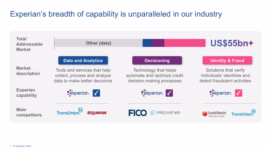
Three-column grid showing capabilities across Data & Analytics, Decisioning, and Identity & Fraud.
Product and Service Analysis
Financial Services
Highlights Experian’s extensive capabilities in data services, credit decisioning, and fraud detection. Describes market segments, company positioning, and competitors like TransUnion, Equifax, FICO, and LexisNexis.
Experian, data analytics, credit decisioning, fraud prevention, market capability, competitors
false
Product and Service Analysis
Financial Services
Mixed Chart
Barclays
Add to my slides
Remove from favorites
Slide shows a simple, structured layout with a list of strategic goals and initiatives aimed at expanding Experian's market presence.
Strategic Planning
Financial Services
Discusses Experian's mission to expand and innovate within the consumer data space, detailing strategies for financial inclusion and market leadership enhancement.
Experian, market leadership, consumer data, financial inclusion, innovation
false
Strategic Planning
Financial Services
Pillar
Barclays
Add to my slides
Remove from favorites
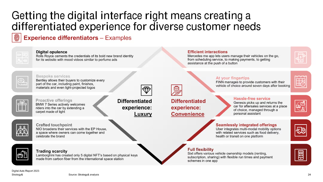
A table categorizing examples of differentiated experiences into luxury and convenience, with detailed descriptions of each example.
Product and Service Analysis
Transportation & Logistics
Illustrates various examples of how automotive companies create differentiated experiences, divided into categories of luxury and convenience, with practical applications.
experience, differentiators, luxury, convenience, automotive
false
Product and Service Analysis
Transportation & Logistics
Diagram
PwC/Strategy&
Add to my slides
Remove from favorites
A bar chart detailing the issues faced by users of crypto trading platforms in 2023 and 2022, with categories like withdrawal issues, fee misunderstandings, and hacking.
Customer and Market Segmentation
Financial Services
This slide presents user-reported issues experienced on crypto trading platforms, comparing data from 2023 and 2022.
Experiences, issues, crypto, trading, platforms, 2023, 2022
false
Customer and Market Segmentation
Financial Services
Mixed Chart
IPSOS
Add to my slides
Remove from favorites
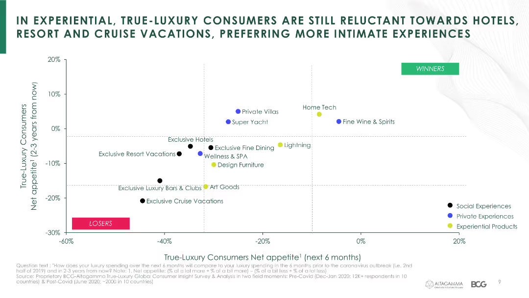
The slide features a scatter plot illustrating net appetite of true-luxury consumers for various experiential categories over the next 6 months and 2-3 years.
Market Analysis and Trends
Hospitality & Tourism
It analyzes consumer sentiment towards different types of luxury experiences, showing a preference for more intimate and private experiences post-crisis.
experiential luxury, consumer sentiment, preferences, COVID-19, hotels, resorts, cruises, intimate experiences
false
Market Analysis and Trends
Hospitality & Tourism
Single Chart
BCG
Add to my slides
Remove from favorites
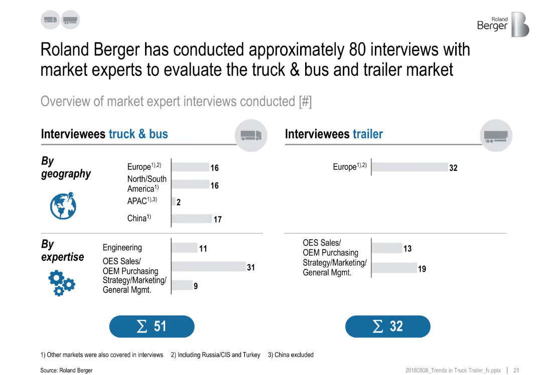
Two-column layout with icons, bar charts, and text categorizing interviewees by geography and expertise.
Strategic Planning
Professional Services
The slide provides a breakdown of about 80 expert interviews conducted by Roland Berger to assess the truck, bus, and trailer market. It segments responses by geography and expertise, split between truck & bus (51) and trailer (32) interviewees.
expert interviews, truck market, trailer, geography, expertise, strategy, segmentation, OES, OEM
false
Strategic Planning
Professional Services
Multiple Chart
Roland Berger
Add to my slides
Remove from favorites
The slide includes a pie chart and a list of areas of expertise in market and opinion research.
Strategic Planning
Professional Services
The slide highlights Ipsos' comprehensive offerings in market and opinion research across different sectors.
expertise, market research, opinion research, Ipsos, sectors, services
false
Strategic Planning
Professional Services
Single Chart
IPSOS
Add to my slides
Remove from favorites
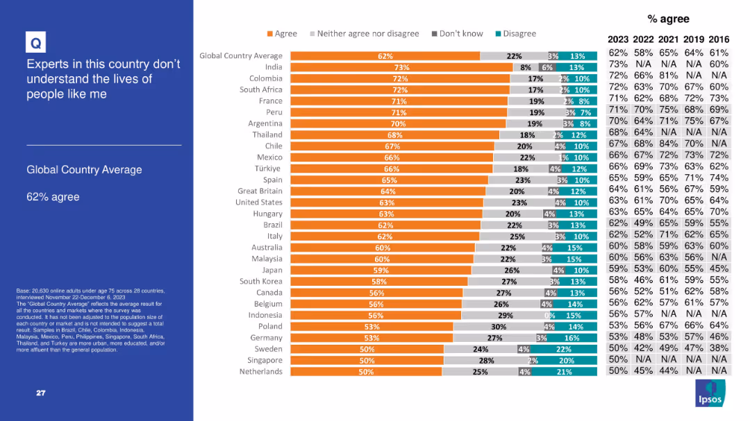
Follows consistent bar chart design with responses segmented and historical agreement percentages shown.
Customer and Market Segmentation
Government & Public Sector
With 62% of respondents agreeing, this slide reflects growing skepticism toward experts, especially in developed and developing nations alike. The sentiment suggests a perception that technocratic governance or expert advice may be disconnected from everyday concerns, fueling populist leanings and distrust.
experts, disconnection, skepticism, elite, populism, Ipsos, opinion, society, understanding
false
Customer and Market Segmentation
Government & Public Sector
Mixed Chart
IPSOS
Add to my slides
Remove from favorites
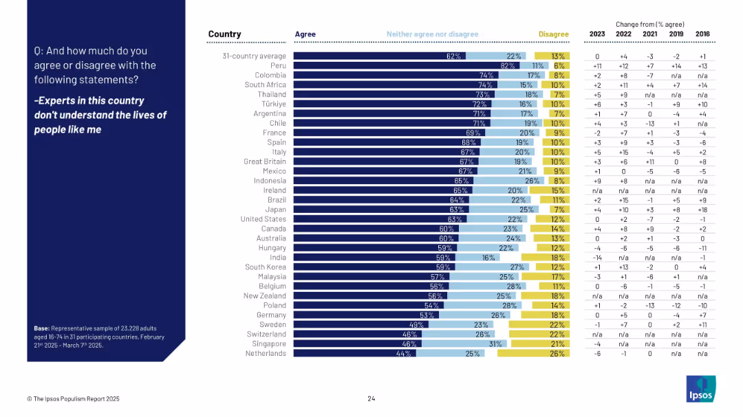
Full slide with horizontal bar chart by country showing % agree, neutral, and disagree, with right column showing change from past years.
Market Analysis and Trends
Government & Public Sector
The slide presents agreement levels with the statement that experts are disconnected from ordinary people's lives across 31 countries. Japan ranks mid-range, with notable increases in perception of disconnect in Italy and others.
experts, disconnect, public perception, agreement, international, trend, Ipsos, comparison, 2025, survey
false
Market Analysis and Trends
Government & Public Sector
Mixed Chart
IPSOS
Add to my slides
Remove from favorites
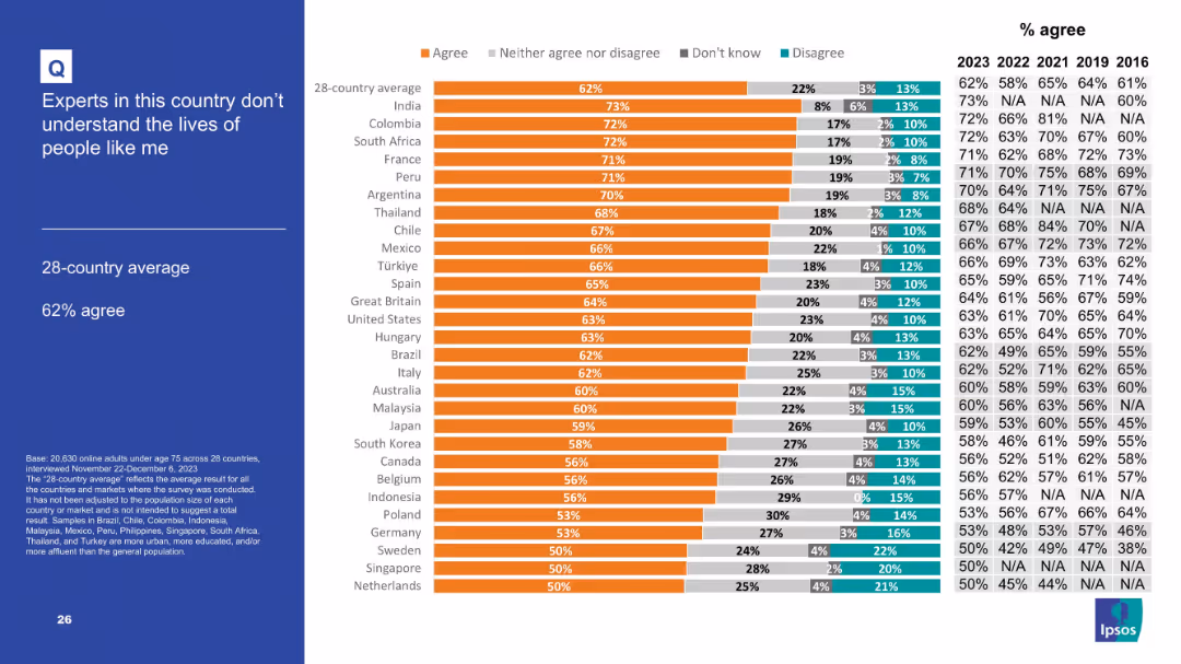
Bar chart comparing countries' agreement with the sentiment; same visual style as previous.
Market Analysis and Trends
Government & Public Sector
Captures public mistrust in experts. 62% of the 28-country average believe experts don’t understand ordinary lives. Highest agreement is seen in India, Colombia, and South Africa, indicating a widespread disconnect between elites and citizens.
experts, mistrust, elitism, survey, public perception, policy disconnect
false
Market Analysis and Trends
Government & Public Sector
Mixed Chart
IPSOS
Add to my slides
Remove from favorites
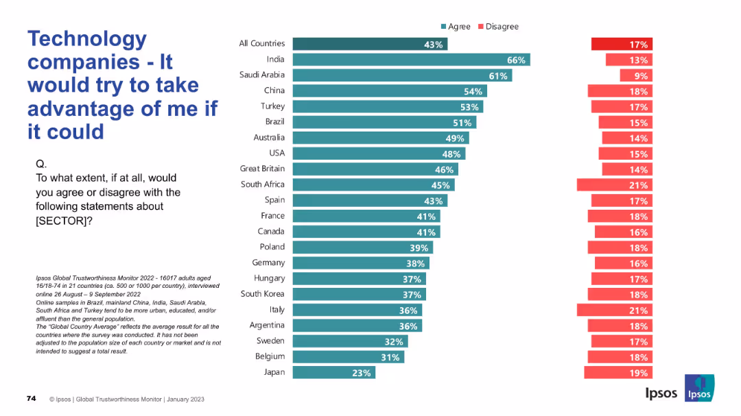
Agreement and disagreement stats across countries; negative sentiment focus; bar chart format.
Risk Assessment and Management
Technology & Software
The slide reflects public concern over the perceived exploitative potential of technology companies, with data showing who believes firms would act unethically if they could.
exploitation, distrust, tech sector, risk, ethics, Ipsos, negative sentiment, public opinion, global survey, corporate behavior
false
Risk Assessment and Management
Technology & Software
Mixed Chart
IPSOS
Add to my slides
Remove from favorites
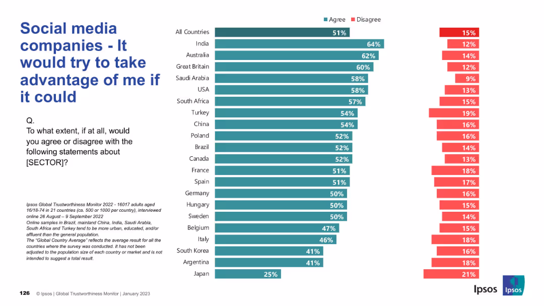
Inverted trust bar chart showing higher agreement (green) indicating negative sentiment; same horizontal layout as others.
Market Analysis and Trends
Technology & Software
This slide shows the proportion of respondents who believe social media companies would exploit users if given the chance. Unlike earlier slides, higher agreement reflects distrust. Most countries show a majority agreement, underscoring widespread user wariness and perceived exploitation.
exploitation, distrust, user sentiment, manipulation, global perception, social media
false
Market Analysis and Trends
Technology & Software
Mixed Chart
IPSOS
Add to my slides
Remove from favorites
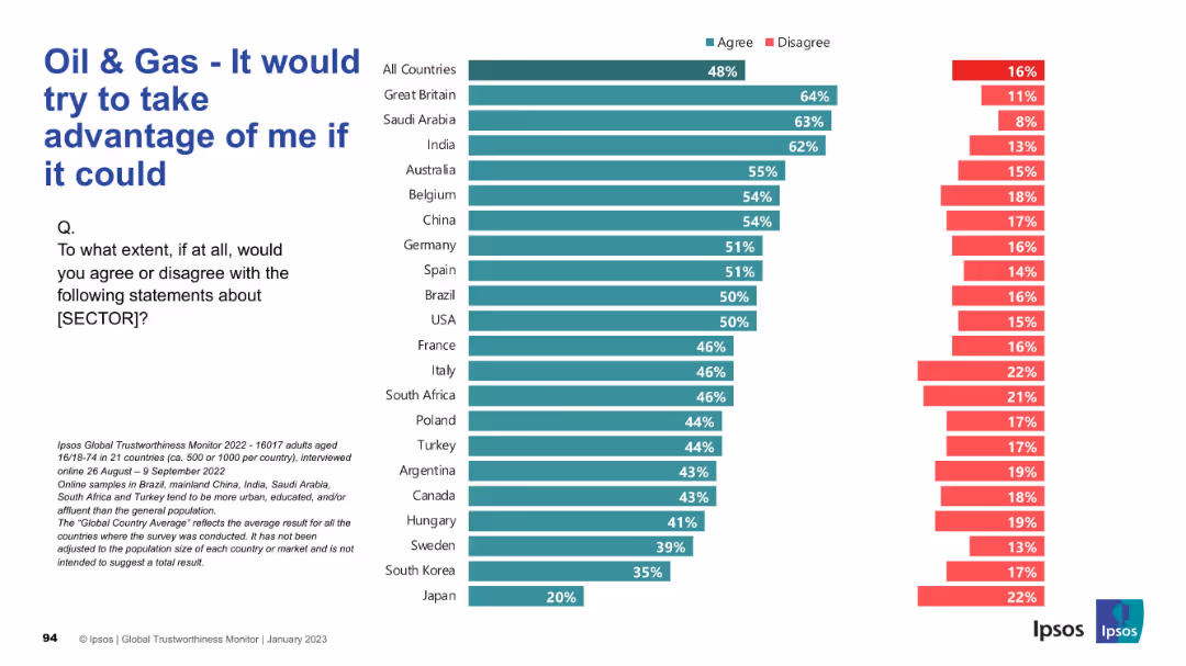
Reversed sentiment chart with “agree” indicating negative perception. Highest scores shown on top (e.g. Great Britain, Saudi Arabia, India).
Market Analysis and Trends
Energy & Utilities
Respondents indicate whether they believe the oil & gas sector would exploit them if it could. Unlike previous slides, high agreement reflects mistrust. The perception is notably high in Western and some developing countries.
Exploitation, Mistrust, Oil & Gas, Ipsos, Ethics, Global Trust, Sector Perception, Public View, Energy Industry
false
Market Analysis and Trends
Energy & Utilities
Mixed Chart
IPSOS
Add to my slides
Remove from favorites
Same visual layout. High agreement values are colored green, indicating agreement with a negative statement.
Risk Assessment and Management
Financial Services
Illustrates the public’s skepticism and fear of exploitation by banks. Over half of respondents globally agree with this distrustful sentiment, showing significant reputational challenges for the industry in many regions.
exploitation risk, distrust, banking, Ipsos, customer sentiment, fear, finance
false
Risk Assessment and Management
Financial Services
Mixed Chart
IPSOS
Add to my slides
Remove from favorites
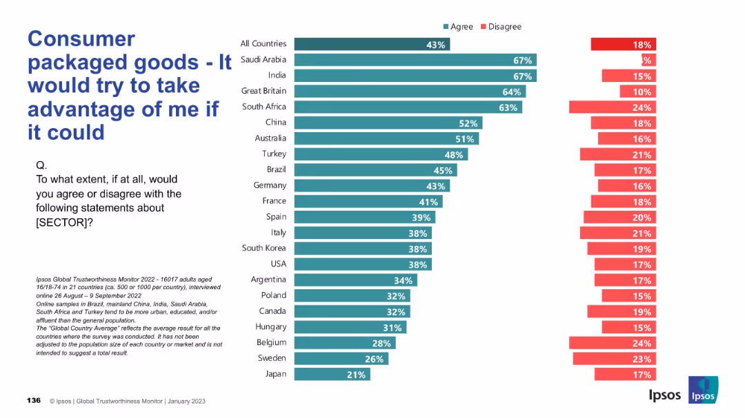
Inverted trust metric: agreement with a negative statement about the CPG sector. Red (disagree) and green (agree) bars are shown by country.
Market Analysis and Trends
Consumer Goods
This slide reflects public skepticism, showing how many people believe the CPG sector would exploit them if possible, with trust levels varying by country.
exploitation, skepticism, distrust, consumer concern, survey, Ipsos, perception, global insight, public sentiment
false
Market Analysis and Trends
Consumer Goods
Mixed Chart
IPSOS
Add to my slides
Remove from favorites
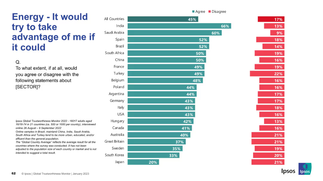
Inverted perspective with a negative prompt; bar chart shows agreement with a critical statement
Market Analysis and Trends
Energy & Utilities
This slide reflects a more skeptical view, asking if people think the energy sector would exploit them if possible. India and Saudi Arabia lead in agreement with this negative statement, while Japan shows the least suspicion.
exploitation, skepticism, energy trust, critical perception, Ipsos, survey, negative framing
false
Market Analysis and Trends
Energy & Utilities
Mixed Chart
IPSOS
Add to my slides
Remove from favorites
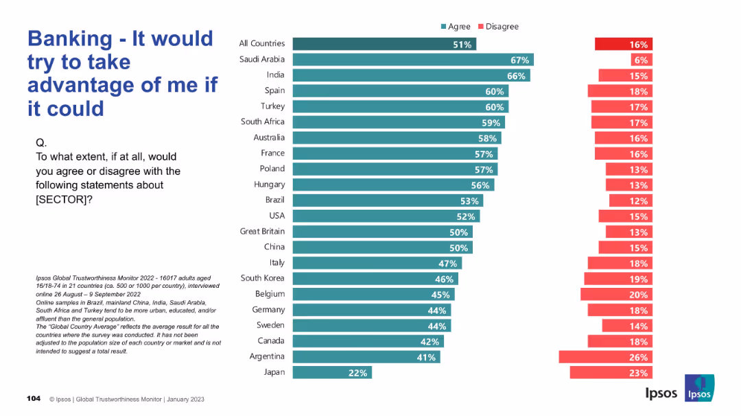
Inverted sentiment slide; high agreement interpreted negatively; same bar chart format
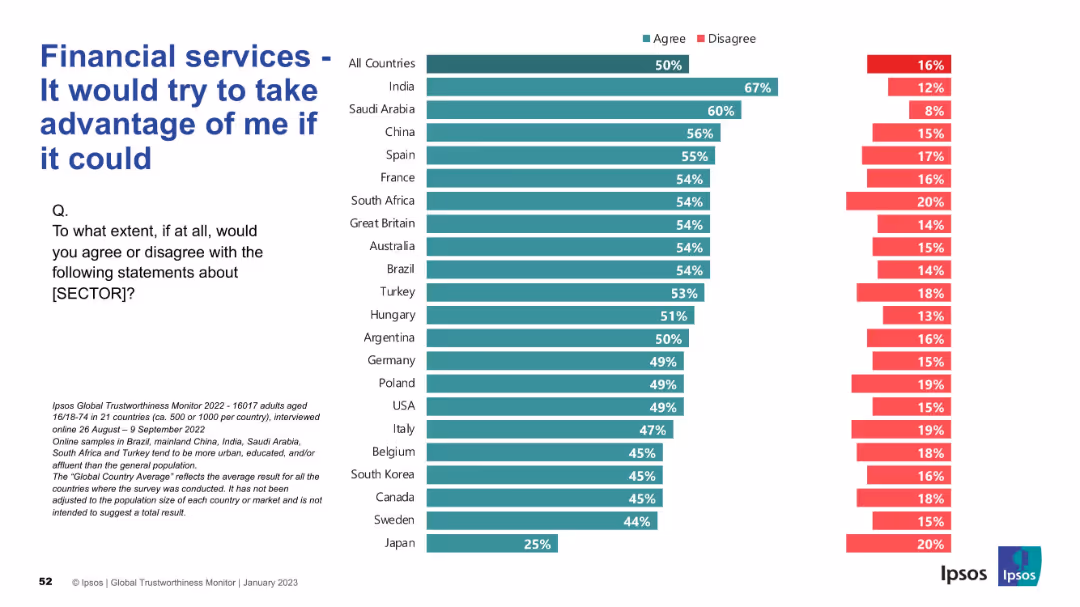
Risk Assessment and Management
Financial Services
This slide reveals a critical perspective, measuring suspicion toward financial services. High agreement in many countries (including India and Saudi Arabia) indicates a pervasive belief that financial services might exploit individuals.
exploitation, skepticism, risk, financial trust, Ipsos, perception, suspicion, survey, agreement
false
Risk Assessment and Management
Financial Services
Mixed Chart
IPSOS
Add to my slides
Remove from favorites
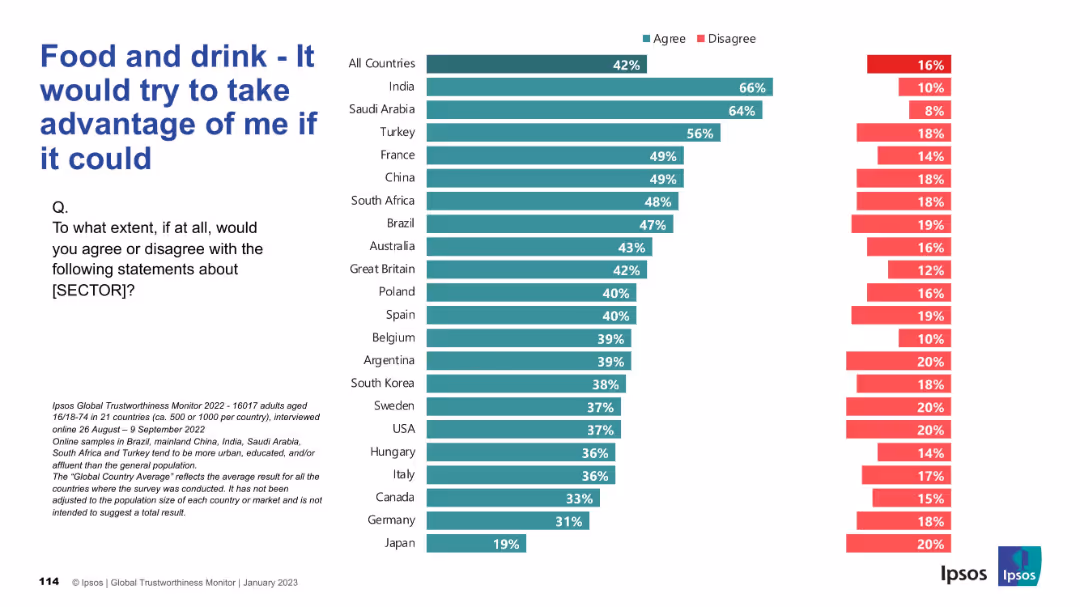
Horizontal bar chart indicating perceived exploitation potential of the food sector; disagreement on right side.
Risk Assessment and Management
Consumer Goods
The chart shows how much consumers across different countries believe the food and drink sector would exploit them if given the chance. A higher percentage in some countries indicates skepticism and perceived opportunism.
exploitation, trust, consumer risk, food industry, public perception, Ipsos, countries, bar chart, opinion, survey
false
Risk Assessment and Management
Consumer Goods
Mixed Chart
IPSOS
Add to my slides
Remove from favorites
Comparative flowchart showing current and proposed task-based approaches for FSS workers. Includes detailed explanations of service disruptions and improvements.
Operational Efficiency
Professional Services
Slide includes a detailed flowchart comparing case-based and task-based approaches to managing applications within DEHS.
Explores different approaches to handling service delivery within DEHS, contrasting the current case-based model with a proposed task-based approach to improve efficiency.
false
Operational Efficiency
Professional Services
Linear Flow
Alvarez & Marsal
Add to my slides
Remove from favorites
This slide contains multiple bar graphs and tables presenting data on potential export markets in Asia for Australian battery products. It features countries like Japan, South Korea, India, and Thailand with details on import percentages, partnerships, and vehicle manufacturing statistics. The visual layout is dense with color-coded elements distinguishing different countries and data points.
Competitive Landscape
Energy & Utilities
Discusses how Australia can leverage its reliability and strategic partnerships to boost exports of battery materials to Asian markets, particularly focusing on nations with strong EV growth projections.
exports, Australia, Asia, batteries, materials, EV adoption, market opportunities, partnerships, trade strategy, economic growth
false
Competitive Landscape
Energy & Utilities
Multiple Chart
Accenture
Add to my slides
Remove from favorites
A horizontal layout showing key export products of various Central American countries. Each product is listed under the respective country’s flag and accompanied by percentage data.
Market Analysis and Trends
Industrial & Manufacturing
The slide highlights the main export products from different Central American countries, showcasing their manufacturing capabilities and potential for leveraging friendshoring opportunities.
Exports, Central America, products, friendshoring, manufacturing
false
Market Analysis and Trends
Industrial & Manufacturing
Linear Flow
Deloitte
Add to my slides
Remove from favorites
A tree map and a donut chart depicting the main export products and destinations from Central America. The tree map uses different colors for each product, while the donut chart shows export destinations.
Market Analysis and Trends
Transportation & Logistics
This slide provides a visual breakdown of the main export products from Central America and their destinations, emphasizing trade relationships and the significance of various products.
Exports, Central America, trade, tree map, donut chart
false
Market Analysis and Trends
Transportation & Logistics
Multiple Chart
Deloitte
Add to my slides
Remove from favorites
Contains line charts depicting the growth in exports and FDI outflows for several country groups, presented with a clean and organized layout.
Market Analysis and Trends
Financial Services
This slide explores the projection of export capabilities and FDI flows, crucial for understanding future economic interactions and investments.
exports, FDI flows, economic analysis, BRICS, investment opportunities
false
Market Analysis and Trends
Financial Services
Mixed Chart
Roland Berger
Add to my slides
Remove from favorites
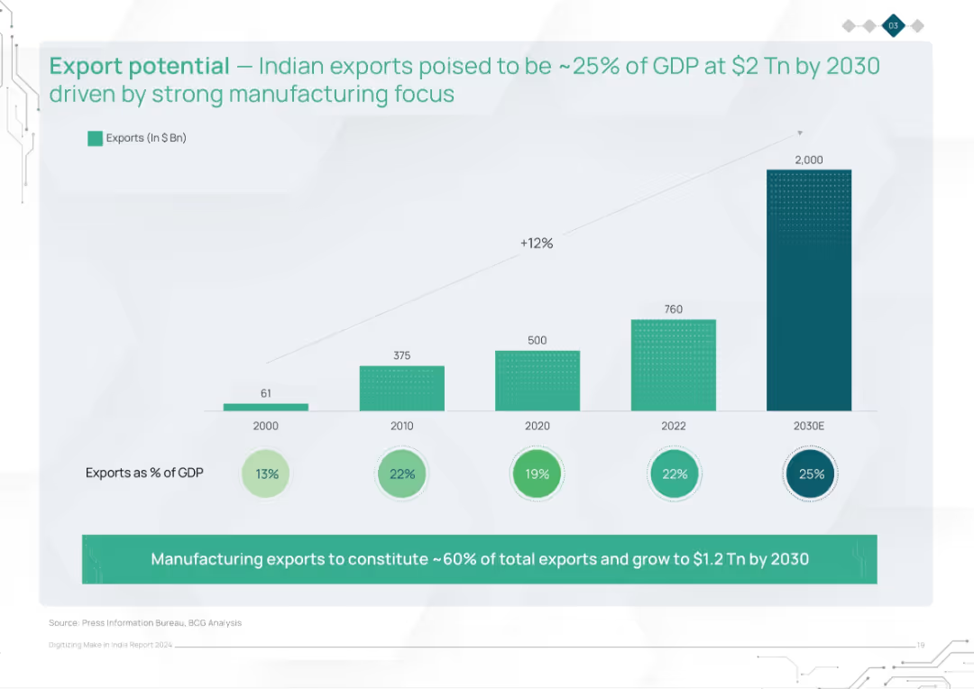
Bar chart showing export growth from 2000 to 2030E. Includes export value, % of GDP, and annotation highlighting manufacturing’s contribution.
Market Analysis and Trends
Industrial & Manufacturing
This slide shows India's export trajectory, projecting exports to reach $2 trillion by 2030, making up 25% of GDP. It emphasizes the role of manufacturing exports, which are expected to account for 60% of the total, driven by strong production focus.
exports, GDP, manufacturing, trade, growth, economic development, India, export trends, 2030 forecast
false
Market Analysis and Trends
Industrial & Manufacturing
Single Chart
BCG
Add to my slides
Remove from favorites
Two column charts. The left chart shows Asia's exports by destination, and the right chart shows Asia's imports by origin for 2003 and 2022.
Market Analysis and Trends
Financial Services
The slide compares Asia's export destinations and import origins in 2003 and 2022, highlighting the changes and trends in trade over the years.
exports, imports, trade destinations, trade origins, Asia, trade analysis, economic trends, regions, financial insights, development
false
Market Analysis and Trends
Financial Services
Multiple Chart
JP Morgan
Add to my slides
Remove from favorites
Features two line charts comparing EU and US export trends to China, using a clear color distinction between the two.
Market Analysis and Trends
Transportation & Logistics
Analyzes the impact of trade tensions on export volumes between the EU, US, and China, highlighting recent trends and changes.
exports, trade tensions, EU, US, China
false
Market Analysis and Trends
Transportation & Logistics
Multiple Chart
Deutsche Bank
Add to my slides
Remove from favorites
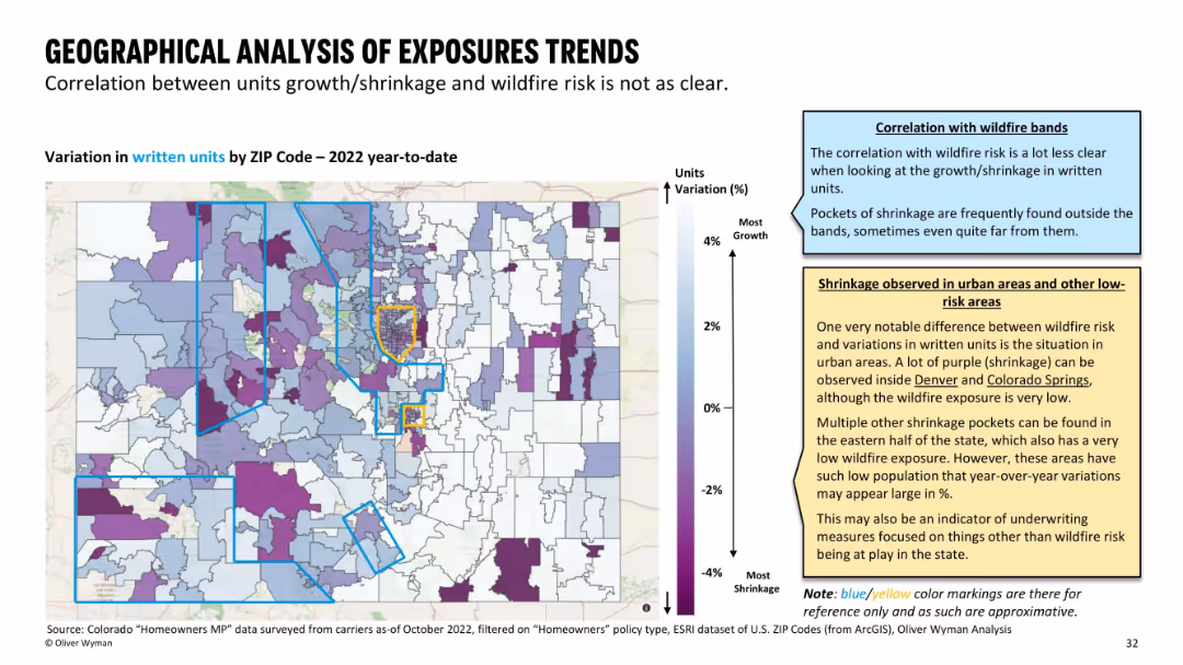
Color-coded ZIP map of Colorado showing growth/shrinkage in insurance units written; blue/yellow bands used as references for wildfire zones.
Strategic Planning
Financial Services
This slide reveals geographical patterns of insurance exposure changes in 2022. Unlike premium maps, there’s no strong correlation with wildfire risk zones. Pockets of decline appear even in low-risk or urban areas, suggesting additional underwriting considerations.
exposure trends, insurance shrinkage, wildfire zones, ZIP variation
false
Strategic Planning
Financial Services
Mixed Chart
Oliver Wyman
Add to my slides
Remove from favorites
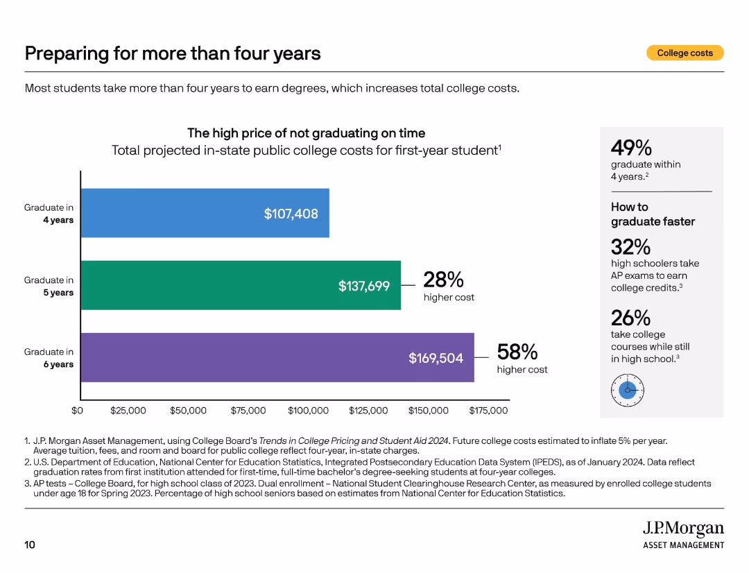
Horizontal bar chart comparing total costs of 4, 5, and 6 years of college. Sidebar suggests early credit strategies.
Investment Analysis
Education & Training
This slide explains the financial impact of delayed graduation, with 5- and 6-year degrees costing significantly more. It encourages using AP courses or dual enrollment in high school to graduate faster and save money.
extended graduation, cost increase, college planning, AP credits, high school prep, delayed degree, time to graduate, savings strategy, public college
false
Investment Analysis
Education & Training
Mixed Chart
JP Morgan
Add to my slides
Remove from favorites
Descriptions of extended reality (XR), mixed reality (MR), augmented reality (AR), and virtual reality (VR), with a column chart showing the projected market size of XR technologies from 2018 to 2030.
Technology and Digital Transformation
Technology & Software
The slide discusses the different types of extended reality technologies, including XR, MR, AR, and VR. It emphasizes the potential impact of these technologies on various sectors and projects significant market growth for XR technologies by 2030.
Extended Reality, XR, AR, VR, Market Size
false
Technology and Digital Transformation
Technology & Software
Mixed Chart
Roland Berger
Add to my slides
Remove from favorites
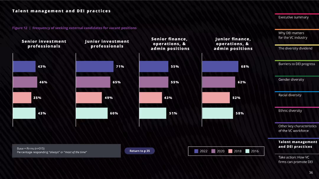
The slide features column charts showing the frequency of seeking external candidates for vacant positions across different roles in 2016, 2018, 2020, and 2022.
Human Resources and Talent Management
Professional Services
The slide analyzes how frequently firms seek external candidates for different roles, highlighting trends over time.
external candidates, hiring trends, investment professionals, finance positions, admin positions
false
Human Resources and Talent Management
Professional Services
Multiple Chart
Deloitte
Add to my slides
Remove from favorites
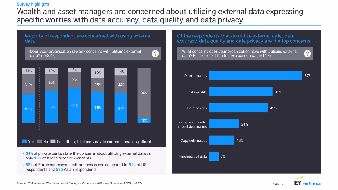
The slide includes two charts: a column chart on the left showing concerns about using external data, and a bar chart on the right detailing specific worries about data accuracy, quality, and privacy.
Risk Assessment and Management
Financial Services
This slide reveals concerns about using external data among respondents, with detailed worries about data accuracy, quality, and privacy, highlighting specific issues for different types of financial institutions.
external data, accuracy, quality, privacy, financial services, concerns, column chart, bar chart, respondents, survey
false
Risk Assessment and Management
Financial Services
Multiple Chart
EY
Add to my slides
Remove from favorites
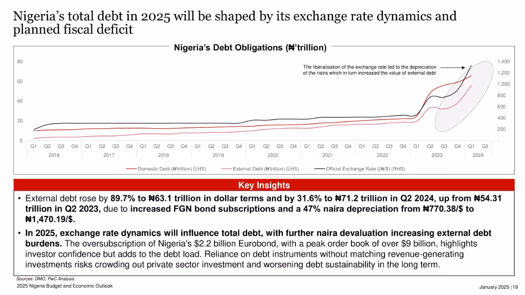
Dual-axis line chart showing domestic/external debt and exchange rate from 2016 to Q2 2024.
Financial Performance
Government & Public Sector
External debt surged by 89.7% due to a combination of bond subscriptions and a steep naira depreciation. The slide stresses how currency movements and planned deficits will determine future debt trends, potentially worsening sustainability.
external debt, naira, depreciation, bonds, debt burden, fiscal deficit, exchange rate
false
Financial Performance
Government & Public Sector
Mixed Chart
PwC/Strategy&
Add to my slides
Remove from favorites
Combines text with a column chart of top strategic risks for the next three years, emphasizing the ubiquity of cyber threats and geopolitical risks.
Risk Assessment and Management
Financial Services
This slide discusses the top external forces impacting CROs, focusing on the increasing threat of cyber attacks and geopolitical tensions, supported by survey data on strategic risks.
External Forces, Cyber Threats, Geopolitical Risks, Strategic Risks
false
Risk Assessment and Management
Financial Services
Single Chart
EY
Add to my slides
Remove from favorites
Two panels with pie and bar charts showing top external risks to business growth from a local and global perspective.
Risk Assessment and Management
Professional Services
This slide identifies the greatest external risks to business growth, highlighting sustained inflation and pandemic-related disruptions as top concerns.
External risks, business growth, inflation, pandemic, disruptions, global perspective, analysis, top concerns
false
Risk Assessment and Management
Professional Services
Multiple Chart
EY
Add to my slides
Remove from favorites
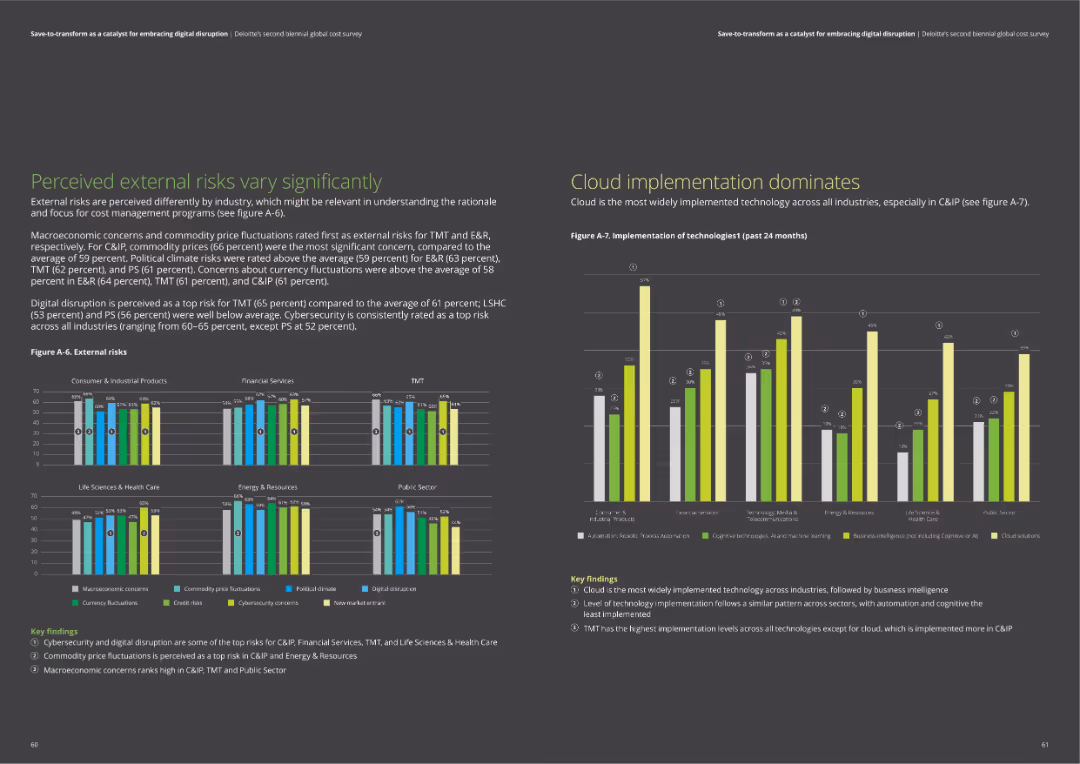
The slide includes bar charts comparing external risks across industries and a chart on the implementation of technologies like cloud and business intelligence.
Risk Assessment and Management
Professional Services
The slide examines perceived external risks such as macroeconomic concerns and digital disruption. It also highlights the widespread implementation of cloud technology and business intelligence solutions across industries.
external risks, cloud technology, business intelligence, macroeconomic concerns, digital disruption
false
Risk Assessment and Management
Professional Services
Multiple Chart
Deloitte
Add to my slides
Remove from favorites
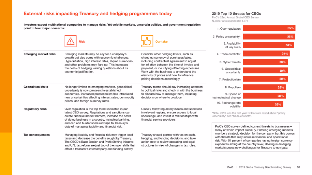
The slide contains text with a summary of external risks such as emerging market risks, geopolitical risks, regulatory risks, and tax consequences, alongside a column chart showing the top 10 threats for CEOs.
Risk Assessment and Management
Financial Services
The slide identifies major external risks impacting treasury and hedging programs, including emerging market risks and geopolitical uncertainties, and provides strategies to address these concerns.
External risks, Treasury, hedging, emerging markets, geopolitical risks, regulatory risks, tax consequences, financial services, risk management, threats for CEOs
false
Risk Assessment and Management
Financial Services
Mixed Chart
PwC/Strategy&
Add to my slides
Remove from favorites
Slide features two column charts with the title "External threats" at the top. The left chart compares three business threats: labor shortages, inflation, and competition. The right chart shows cyberattacks over the past 6 months: payments fraud, business email compromise, and malware.
Market Analysis and Trends
Technology & Software
This slide presents a comparative analysis of the most significant external business threats and cyberattacks, focusing on labor shortages and payment fraud as major concerns. It is likely used to inform stakeholders about prevailing risks and to prioritize mitigation strategies.
external threats, labor shortages, inflation, competition, cyberattacks, payment fraud, email compromise, malware
false
Market Analysis and Trends
Technology & Software
Multiple Chart
JP Morgan
Add to my slides
Remove from favorites
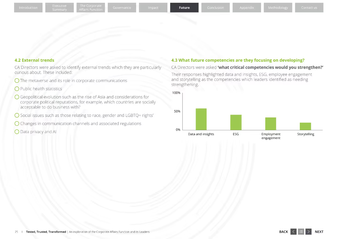
The slide features a bulleted list of external trends relevant to Corporate Affairs Directors, such as the metaverse, public health statistics, and data privacy. It also includes a column chart showing future competencies focus.
Market Analysis and Trends
Professional Services
This slide lists key external trends impacting corporate communications and highlights critical competencies Corporate Affairs Directors are focusing on developing, such as data and insights, ESG, and storytelling.
External trends, Corporate Affairs, Competencies, Data privacy, ESG
false
Market Analysis and Trends
Professional Services
Mixed Chart
Deloitte
Add to my slides
Remove from favorites
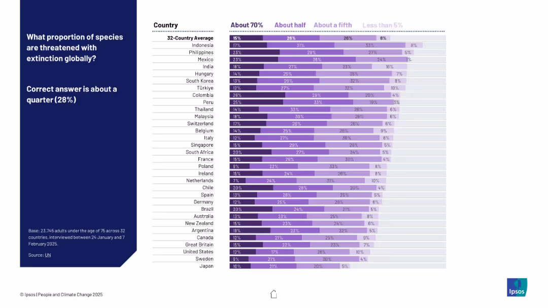
Horizontal bar chart with purple tones indicating varying perceptions by country. Sidebar on the left presents the correct answer and survey question.
Market Analysis and Trends
Environmental Services & Sustainability
This slide examines global public perceptions about how many species are threatened with extinction. Despite the correct figure being 28%, survey results vary significantly across countries, illustrating a common overestimation of biodiversity loss.
extinction, biodiversity, perception, survey, Ipsos, climate, bar chart, countries, awareness, species
false
Market Analysis and Trends
Environmental Services & Sustainability
Mixed Chart
IPSOS
Add to my slides
Remove from favorites
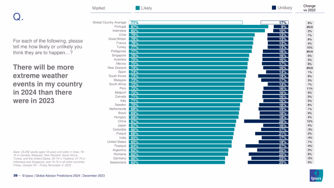
Country-level bar chart for likelihood of extreme weather; includes change from 2022.
Risk Assessment and Management
Environmental Services & Sustainability
This slide analyzes how likely people believe extreme weather events will increase in 2024 compared to 2023. Portugal and Indonesia top the list with strongest agreement. Changes from 2022 perceptions are also indicated.
extreme weather, climate change, environmental risk, Ipsos, survey, country opinion
false
Risk Assessment and Management
Environmental Services & Sustainability
Mixed Chart
IPSOS
Add to my slides
Remove from favorites
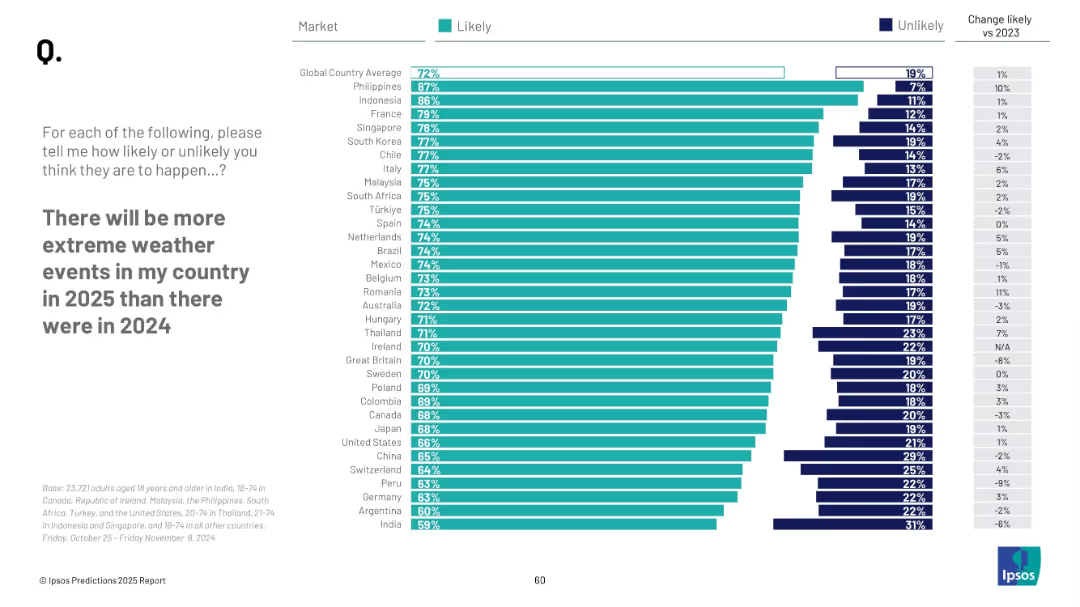
Horizontal bars sorted by country; teal vs navy segmentation; change from 2023 on right
Market Analysis and Trends
Environmental Services & Sustainability
The slide reports how likely people from different countries believe extreme weather will intensify in 2025 versus 2024. Countries are listed from most to least concerned, highlighting regional variations in climate awareness.
extreme weather, climate change, global opinion, 2025 forecast, environment, Ipsos, perception
false
Market Analysis and Trends
Environmental Services & Sustainability
Mixed Chart
IPSOS
Add to my slides
Remove from favorites
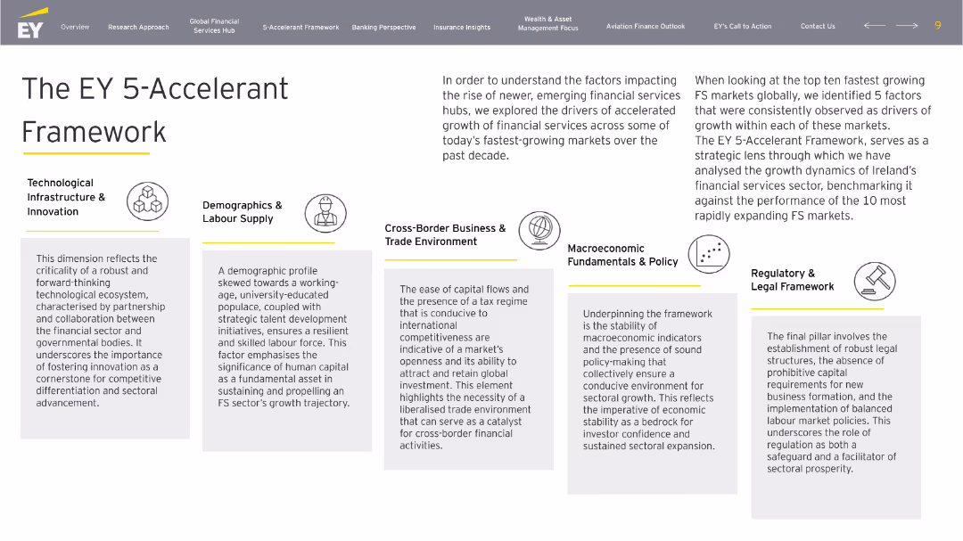
White-background slide with a central title and five horizontally aligned boxes explaining key FS growth drivers with icons and descriptions.
Strategic Planning
Financial Services
The EY 5-Accelerant Framework outlines five drivers for FS sector growth: technology, labor, trade, macroeconomics, and regulation. It benchmarks Ireland’s performance against fast-growing global FS hubs.
EY, 5-Accelerant, framework, financial growth, Ireland, FS sector, innovation, policy
false
Strategic Planning
Financial Services
Pillar
EY
Add to my slides
Remove from favorites
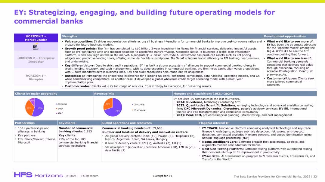
Dense information slide with multiple boxes: strengths, development, clients, revenue mix, operations, and M&A. Top section emphasizes positioning on HFS Horizon model.
Organizational Structure and Change
Financial Services
The slide positions EY as a top-tier digital transformation partner for commercial banks, citing strengths like value proposition, client kudos, and delivery footprint. It outlines EY’s investments, partnerships, and IP. Development suggestions include improving scalable IT and commercial customization. The slide supports EY’s leadership in financial services consulting.
EY, banking, modernization, Nexus, partnerships, M&A, GenAI, revenue mix
false
Organizational Structure and Change
Financial Services
Mixed Chart
Accenture
Add to my slides
Remove from favorites
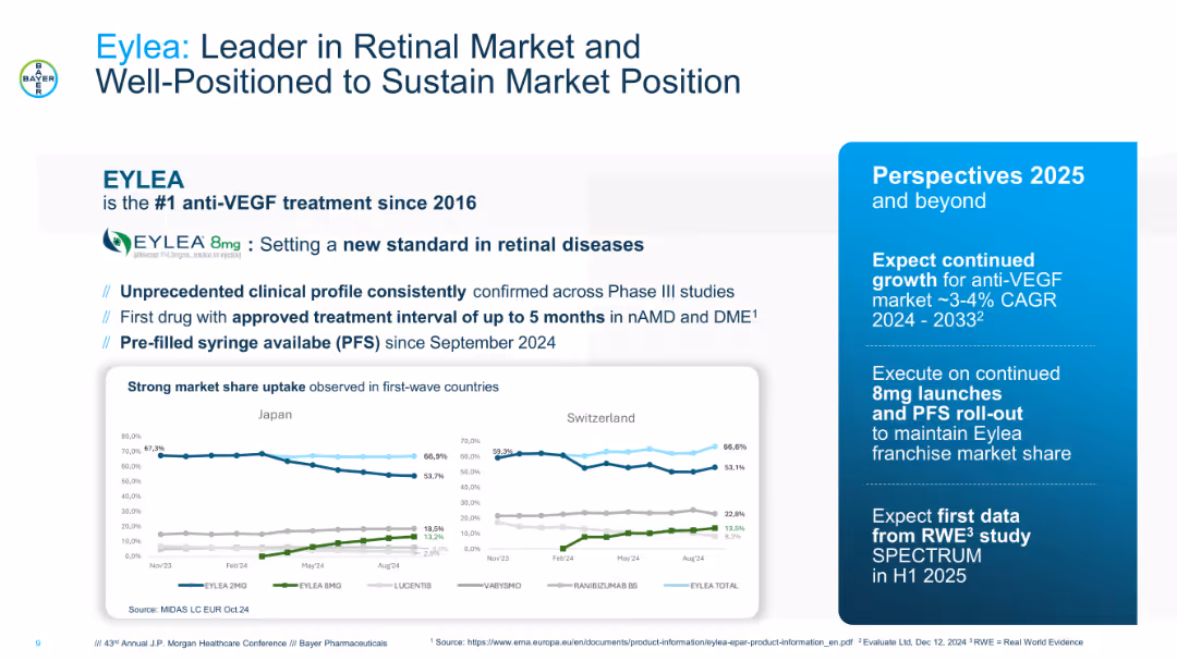
Blue-accented slide with bold header and product branding. Features market share charts for Japan and Switzerland, bulleted clinical strengths, and a sidebar outlining future growth perspectives.
Market Analysis and Trends
Healthcare & Pharmaceuticals
Focuses on Eylea’s market leadership in retinal diseases, emphasizing its superior clinical profile, recent product enhancements (8mg and PFS), and global market share trends. Also presents strategic outlook for sustaining growth in a stable anti-VEGF market through 2033.
Eylea, retinal market, anti-VEGF, growth strategy, PFS, clinical profile, ophthalmology
false
Market Analysis and Trends
Healthcare & Pharmaceuticals
Multiple Chart
JP Morgan
Add to my slides
Remove from favorites
The slide features the EY-Parthenon logo, a title, subtitle, and the name and title of the presenter.
Organizational Structure and Change
Professional Services
The slide serves as the introductory slide to a presentation on investment in distribution by EY-Parthenon.
EY-Parthenon, Distribution, Investing, Overview, Presentation, Introduction
false
Organizational Structure and Change
Professional Services
Title
EY
Add to my slides
Remove from favorites
The slide is professionally designed with a clean white background. It has three columns with headers: 'Key questions', 'EY-Parthenon capabilities', 'Representative engagements', and bullet points under each. Text is black with the exception of the slide title in red, and there are no images or graphs.
Industry Overview
Financial Services
This slide showcases EY-Parthenon’s capabilities in assisting investors to evaluate potential distribution investments, highlighting key questions for market analysis, and listing previous engagements that showcase their expertise and experience.
EY-Parthenon, distribution investments, market analysis, due diligence, proprietary research, revenue forecasting, investment trends, sector analysis, HVAC, MRO market
false
Industry Overview
Financial Services
Header Horizontal
EY
Add to my slides
Remove from favorites
Includes text describing EY's operations in real estate, with a diagram in the center highlighting key areas of transformation. Right side contains EY viewpoints in a list format.
Industry Overview
Real Estate & Construction
Overview of EY’s involvement in real estate, hospitality, and construction sectors, with a focus on future transformation areas.
EY, Real Estate, Hospitality, Construction, Overview, Transformation, Industry, Operations, Viewpoints
false
Industry Overview
Real Estate & Construction
Mixed Chart
EY
Add to my slides
Remove from favorites
A triangular diagram showing various services EY offers to private equity clients. Categories include Funds, Strategy and Transaction Services, and Portfolio Services.
Organizational Structure and Change
Professional Services
This slide outlines the range of services provided by EY to private equity clients, covering areas like fund assurance, buy and sell side advisory, tax, and legal services.
EY, services, private equity, advisory, portfolio
false
Organizational Structure and Change
Professional Services
Framework
EY
Add to my slides
Remove from favorites
The slide contains a scatter plot with vehicle classifications as mid-size and full-size and their corresponding units sold, marked by various truck models including F-150. There's a distinct arrow pointing to the F-150 indicating its lead in the market. The color palette is a mix of greens, grays, and reds with a clear text overlay.
Market Analysis and Trends
Transportation & Logistics
The slide presents data from the American University's Made in American Auto Index, showcasing the F-150 truck as a leader in sales and its status as the most American-made truck.
F-150, American-made, trucks, auto industry, sales, market leader, full-size pickup
false
Market Analysis and Trends
Transportation & Logistics
Single Chart
BCG
Add to my slides
Remove from favorites
A map of the United States showing the number of states where the F-150 is the best-selling vehicle.
Client Case Studies
Transportation & Logistics
Highlights the dominance of the F-150 as the top-selling vehicle in a vast majority of US states.
F-150, popular vehicle, US states, best-selling
false
Client Case Studies
Transportation & Logistics
Single Chart
BCG
Add to my slides
Remove from favorites
Moderate complexity with text blocks and icons representing government, schools, and EdTech solution providers. There's a balance between text information and visual elements.
Industry Overview
Education & Training
Slide details the efforts by the public and private sectors to create alternatives to face-to-face learning, featuring case studies from Singapore, Malaysia, and Indonesia.
F2F alternatives, government, schools, EdTech providers
false
Industry Overview
Education & Training
Header Horizontal
Bain
Add to my slides
Remove from favorites
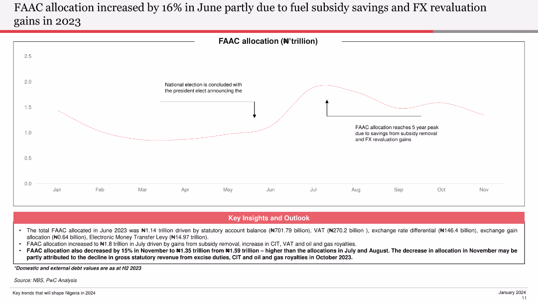
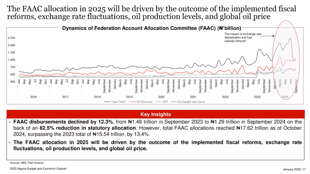
The slide features a line chart showing FAAC allocation trends over the months, with annotations for key events. It is moderately complex, focusing on visual data storytelling.
Financial Performance
Government & Public Sector
This slide provides an overview of the FAAC allocation trends, highlighting the impact of subsidy savings and FX revaluation gains, with key insights into the fiscal outlook.
FAAC, Allocation, Trends, Subsidy, FX
false
Financial Performance
Government & Public Sector
Mixed Chart
PwC/Strategy&
Add to my slides
Remove from favorites
Time series line chart tracking FAAC allocation, oil revenue, VAT, and exchange rate gains over time (2016–2024), with red highlights.
Strategic Planning
Government & Public Sector
FAAC disbursements dropped 12.3% YoY due to a sharp reduction in statutory allocations. However, total allocations in 2024 rose 13.4% over 2023. The slide links 2025 FAAC outcomes to fiscal reforms, oil output, and FX movements.
FAAC, oil revenue, VAT, exchange rate, fiscal policy, Nigeria, PwC
false
Strategic Planning
Government & Public Sector
Mixed Chart
PwC/Strategy&
Add to my slides
Remove from favorites
The slide features a timeline comparing the development and market entry times of Facebook and Lilium Aviation. Key milestones are marked along a horizontal timeline with distinct points for each company's progress.
Market Analysis and Trends
Technology & Software
This slide provides a comparative timeline showing the rapid growth of Facebook (20 months) versus the longer development period of Lilium Aviation (12 years). It highlights differences in market readiness and scaling between the two companies.
Facebook, Lilium Aviation, Timeline, Market Entry, Comparison, Development
false
Market Analysis and Trends
Technology & Software
Linear Flow
BCG
Add to my slides
Remove from favorites
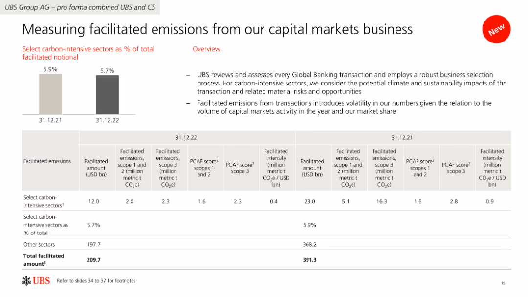
The slide contains a combination of bar and table charts displaying data on facilitated emissions from capital markets business, with a focus on carbon-intensive sectors.
Risk Assessment and Management
Financial Services
It reviews facilitated emissions by UBS's capital markets business, assessing transactions' impact on climate and sustainability, and showing data on emissions and facilitated amounts.
Facilitated emissions, carbon-intensive, capital markets, UBS, sustainability
false
Risk Assessment and Management
Financial Services
Mixed Chart
UBS
Add to my slides
Remove from favorites
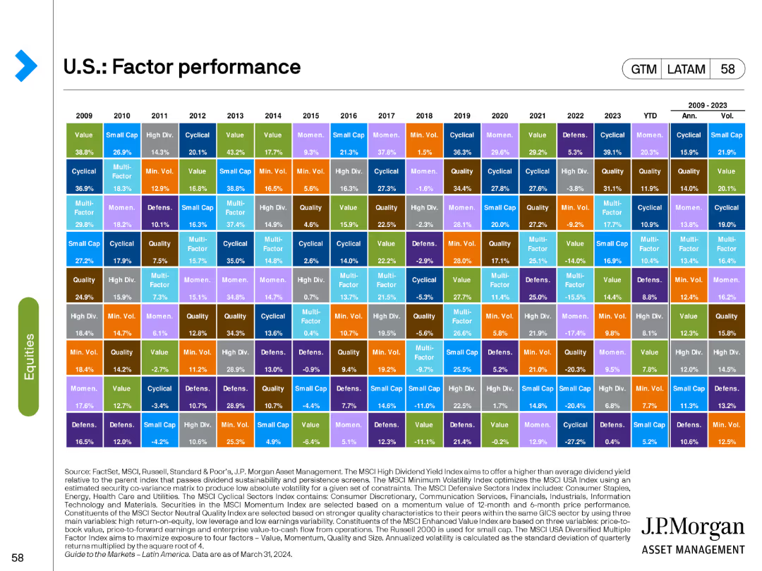
The slide showcases a matrix chart detailing the performance of various factors such as Value, Growth, Quality, etc., from 2009 to 2023.
Financial Performance
Financial Services
This slide provides a comprehensive overview of the annual performance of different investment factors, offering a historical perspective on factor performance.
factor performance, Value, Growth, Quality, annual
false
Financial Performance
Financial Services
Table
JP Morgan
Add to my slides
Remove from favorites
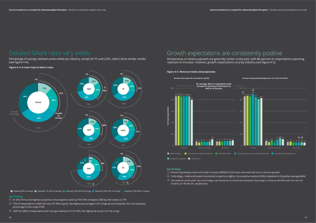
The slide features pie charts detailing failure rates across industries and a column chart showing revenue trends and projections.
Market Analysis and Trends
Professional Services
This slide analyzes failure rates in cost savings across industries and presents growth expectations. It includes comparative data on realized savings and revenue growth projections, highlighting industry-specific trends.
failure rates, revenue growth, industry trends, cost savings, projections
false
Market Analysis and Trends
Professional Services
Multiple Chart
Deloitte
Add to my slides
Remove from favorites
Comparative bar chart on fairness definitions—equal opportunity vs equal quality of life—broken down by country
Market Analysis and Trends
Education & Training
Respondents were asked whether fairness means equal opportunities or equal outcomes. Most countries leaned toward opportunity. India and Thailand were outliers, favoring quality of life. Change from 2023 to 2024 is also shown.
fairness, equality, public opinion, opportunity vs outcome, Ipsos, international views, societal values, 2024 trends
false
Market Analysis and Trends
Education & Training
Mixed Chart
IPSOS
Add to my slides
Remove from favorites
Two-column layout with a survey question on the left in a blue box and bar charts on the right comparing responses across segments.
Market Analysis and Trends
Government & Public Sector
This slide presents global survey results on the definition of a fair society. It contrasts agreement with two concepts: equal opportunity vs. equal quality of life, segmented by gender, generation, income, and education level.
fairness, equality, survey, demographics, opportunity, quality of life, perceptions
false
Market Analysis and Trends
Government & Public Sector
Mixed Chart
IPSOS
Add to my slides
Remove from favorites
Dual-line chart comparing definitions: “same opportunity” vs. “same quality of life.” Left-aligned narrative and title.
Market Analysis and Trends
Government & Public Sector
The slide contrasts generational views on fairness. While most still define fairness as equal opportunity, support for equal outcome is rising, especially among Gen Z, who show the highest support for equity.
fairness, equity, opportunity, Gen Z, definitions, values
false
Market Analysis and Trends
Government & Public Sector
Mixed Chart
IPSOS
Add to my slides
Remove from favorites
Bar chart showing agreement by country with: A) Equal opportunity defines a fair society; B) Equal quality of life defines a fair society. Teal vs. blue bars illustrate country-level splits. Left-side text block summarizes.
Strategic Planning
Government & Public Sector
This slide contrasts views on fairness: whether it should be based on equal opportunity or equal outcomes. A majority of countries favor equal opportunity, though responses vary significantly—India shows the least support for opportunity-based fairness compared to other nations.
fairness, opportunity, quality of life, societal values, global survey, Ipsos, equality definitions, public perception
false
Strategic Planning
Government & Public Sector
Mixed Chart
IPSOS
Add to my slides
Remove from favorites
The slide combines text and bar charts to discuss the rise of fake news and disinformation, and its perceived threats to businesses according to council members.
Risk Assessment and Management
Media & Entertainment
Discusses the increasing threat of fake news and disinformation campaigns, especially with AI, and the need for businesses to prepare for such risks.
Fake news, disinformation, AI threats, risk management, media
false
Risk Assessment and Management
Media & Entertainment
Mixed Chart
IPSOS
Add to my slides
Remove from favorites
Stacked bar chart of country-level responses about self-confidence in detecting fake news. Mostly green and orange bars.
Market Analysis and Trends
Media & Entertainment
This slide presents a more optimistic view, showing that the majority in most countries believe they personally can distinguish fake news. Confidence is highest in Indonesia and Peru. It reveals a discrepancy between self-confidence and trust in others’ abilities (as shown in 19348).
fake news, media literacy, global confidence, self-perception, Ipsos, misinformation, survey, trends
false
Market Analysis and Trends
Media & Entertainment
Mixed Chart
IPSOS
Add to my slides
Remove from favorites
Stacked bar chart by country showing how confident people are in others' ability to detect fake news. Green vs. orange bars.
Market Analysis and Trends
Media & Entertainment
This slide shows global variation in trust in the average person’s ability to distinguish fake news. Southeast Asian countries (Indonesia, Thailand) rank high in confidence, while countries like Japan and the US rank low. The chart suggests skepticism about general media literacy.
fake news, media trust, global survey, confidence, misinformation, disinformation, Ipsos, perception
false
Market Analysis and Trends
Media & Entertainment
Mixed Chart
IPSOS
Add to my slides
Remove from favorites
The slide features a combination of column charts and horizontal bar charts. It shows familiarity levels with crypto assets in 2023 and 2022, highlighting high and low familiarity percentages.
Market Analysis and Trends
Financial Services
This slide compares the familiarity of Canadians with crypto assets over two years, breaking down the familiarity into high, moderate, and low categories, with demographic insights.
familiarity, crypto assets, Canadians, demographics, comparison
false
Market Analysis and Trends
Financial Services
Mixed Chart
IPSOS
Add to my slides
Remove from favorites
The slide includes a column chart showing levels of familiarity with crypto assets among participants, rated from 1 to 7.
Market Analysis and Trends
Financial Services
This slide examines how familiar participants are with crypto assets, presenting data on the distribution of familiarity ratings.
Familiarity, crypto assets, knowledge, survey, participants
false
Market Analysis and Trends
Financial Services
Mixed Chart
IPSOS
Add to my slides
Remove from favorites
A detailed column chart listing key challenges for family businesses such as innovation, skills, and digitalization, with a text section discussing these challenges in the context of future growth and market conditions.
Risk Assessment and Management
Professional Services
The slide highlights major challenges family businesses expect to face, including innovation, accessing skills, and digitalization. It provides a comprehensive view of concerns impacting growth and strategic priorities over the next two years.
Family Business, Challenges, Innovation, Growth
false
Risk Assessment and Management
Professional Services
Mixed Chart
PwC/Strategy&
Add to my slides
Remove from favorites
Contains a horizontal bar chart indicating various future expectations of family businesses over the next two years.
Market Analysis and Trends
Professional Services
This slide forecasts the strategic moves family businesses plan to make in the next two years, including digital advancements and market expansions.
family business, future planning, digital capabilities, market expansion, strategic moves
false
Market Analysis and Trends
Professional Services
Mixed Chart
PwC/Strategy&
Add to my slides
Remove from favorites
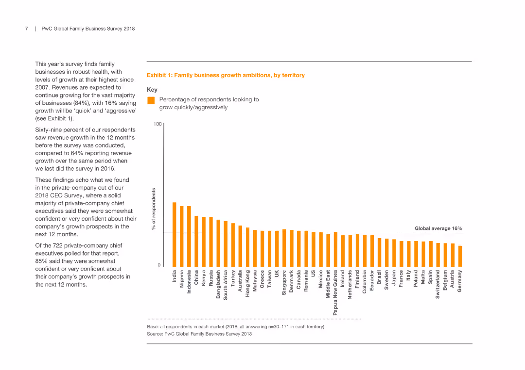
A column chart representing the percentage of respondents from various territories looking to grow quickly/aggressively, alongside a text description of growth trends and comparisons with previous years.
Market Analysis and Trends
Professional Services
This slide illustrates growth ambitions of family businesses across territories, highlighting high growth expectations and comparing them with previous survey results, reflecting confidence levels and future plans of respondents in different regions.
Family Business, Growth, Market Analysis, Territory
false
Market Analysis and Trends
Professional Services
Mixed Chart
PwC/Strategy&
Add to my slides
Remove from favorites
Utilizes flowcharts and connectors to detail the family law application process, with red and black colors to denote different courts and actions. The content is arranged for easy step-by-step tracking.
Regulatory and Compliance
Government & Public Sector
This slide compares the family law application process between two courts, highlighting the steps and variations in procedure. The clear delineation aids understanding of the complex legal procedures involved in family law cases.
Family Law, Application Process, Court Procedure, Legal Comparison, Australia
false
Regulatory and Compliance
Government & Public Sector
Diagram
PwC/Strategy&
Add to my slides
Remove from favorites
This slide has a white background with red and black text. It includes a title and two sections titled 'Family law backlog' and 'Cost to finalisation comparison'. There are two column charts and a bar chart, displaying data from 2012-2017 with comparisons between the FCC and the FCoA. The layout is balanced with a mix of text and visuals.
Industry Overview
Government & Public Sector
The slide presents an executive summary focusing on the backlog of family law cases and the cost differences in case finalization between the FCC and FCoA. It uses statistical data to highlight trends and inefficiencies, likely used for regulatory review or public sector analysis.
Family law, backlog, court, cost, FCoA, FCC, finalization, expenditure, litigation, comparison
false
Industry Overview
Government & Public Sector
Multiple Chart
PwC/Strategy&
Add to my slides
Remove from favorites
The slide shows a column chart under the title "Family law application breakdown, ('000) 2016-17". It contains a legend explaining the colors representing different types of applications for FCC and FCoA. At the bottom, the source is referenced as PwC with the date of April 2018.
Regulatory and Compliance
Government & Public Sector
The slide analyzes different types of family law applications and their distribution between FCC and FCoA, with emphasis on the caseload and order types processed by each court. The column chart illustrates the predominance of divorce applications in the FCC and consent orders in the FCoA.
family law, caseload, applications, orders, FCC, FCoA, column chart, PwC, analysis
false
Regulatory and Compliance
Government & Public Sector
Mixed Chart
PwC/Strategy&
Add to my slides
Remove from favorites
Dominated by a large flowchart diagram in shades of red and brown, the slide visualizes the family law process from lodgment to appeal, with key findings highlighted in text boxes.
Strategic Planning
Professional Services
This executive summary illustrates the flow of family law cases through the Australian courts, highlighting key statistics and findings relevant to stakeholders in the legal profession, designed for strategic planning and understanding the appeal process.
Family law, Court process, Statistics, Key findings, Legal profession, Flowchart, Appeals, Executive summary, Strategic planning
false
Strategic Planning
Professional Services
Diagram
PwC/Strategy&
Add to my slides
Remove from favorites
The slide combines column charts and text to depict the types of family law final orders and the time taken to finalize them in two courts. Colors are used to differentiate the data, and annotations highlight specific insights.
Operational Efficiency
Government & Public Sector
It presents data on the resolution of family law cases, including settlement frequencies and duration before finalization, aiding in understanding court efficiencies and decision-making times.
family law, finalisation, settlements, courts, resolution time
false
Operational Efficiency
Government & Public Sector
Multiple Chart
PwC/Strategy&
Add to my slides
Remove from favorites
The slide is moderately complex, featuring two main sections with distinct headers. On the left, a column chart details family law final order types with a key explaining colors for settled, transferred, and other outcomes. A bar graph on the right shows the age of finalizations in months.
Market Analysis and Trends
Government & Public Sector
The slide compares family law case outcomes between the Federal Circuit Court (FCC) and Family Court of Australia (FCoA), focusing on settlement rates and the duration before finalization. It's designed to present an analysis of the efficiency and process variation between the two courts.
Family law, finalization, FCC, FCoA, settlement, transfer, duration, analysis, court process, efficiency
false
Market Analysis and Trends
Government & Public Sector
Multiple Chart
PwC/Strategy&
Add to my slides
Remove from favorites
This slide features dual line charts tracking the filed, finalized, and pending family law final orders over multiple years, using color-coding to distinguish between two courts.
Regulatory and Compliance
Government & Public Sector
It analyzes trends in family law final orders, providing historical data on the progression of cases over time, indicating efficiency and potential backlogs in the courts.
family law, final orders, trends, courts, efficiency
false
Regulatory and Compliance
Government & Public Sector
Multiple Chart
PwC/Strategy&
Add to my slides
Remove from favorites
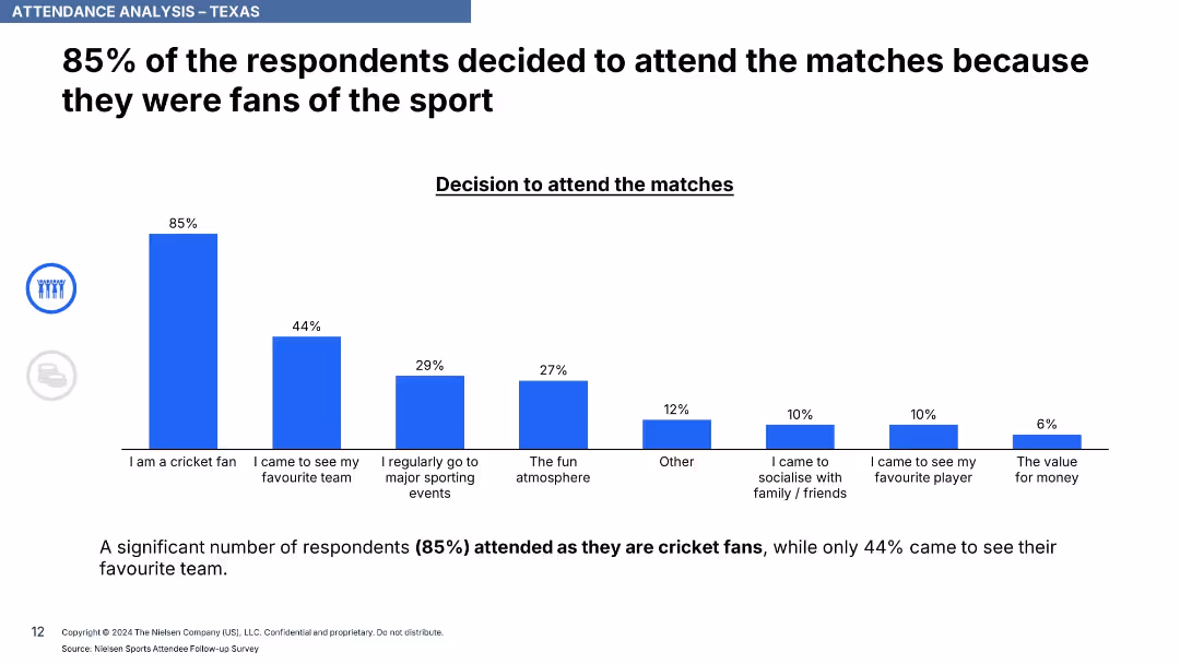
Bar chart showing reasons for attending, ordered from highest to lowest in blue bars.
Customer and Market Segmentation
Media & Entertainment
The slide shows that a large majority (85%) of attendees were cricket fans, with others motivated by team support, event atmosphere, and social reasons. It highlights primary and secondary drivers for event attendance.
fanbase, cricket, motivations, sports attendance, market segmentation, audience behavior, event drivers
false
Customer and Market Segmentation
Media & Entertainment
Single Chart
Nielsen
Add to my slides
Remove from favorites
World map with pie charts showing industry demand and Farfetch GMV percentages across different regions (Americas, EMEA, APAC) with office and localized site markers.
Strategic Planning
Retail & E-commerce
Maps out Farfetch's global platform, detailing the geographic distribution of industry demand, GMV, and presence of Farfetch offices and localized sites.
Farfetch, global platform, industry demand, GMV, regions
false
Strategic Planning
Retail & E-commerce
Multiple Chart
Deutsche Bank
Add to my slides
Remove from favorites
Column chart showing GMV growth of the Farfetch platform from 2015 to 2018 with CAGR.
Financial Performance
Retail & E-commerce
Depicts the rapid growth of the Farfetch platform in comparison to the online luxury market, emphasizing a 55% CAGR.
Farfetch, GMV, luxury market, growth, CAGR
false
Financial Performance
Retail & E-commerce
Single Chart
Deutsche Bank
Add to my slides
Remove from favorites
Combination of bar and column charts showing various financial metrics for 2018, including GMV, revenue, and gross profit.
Financial Performance
Retail & E-commerce
Presents detailed operational results for Farfetch in 2018, including platform and group GMV, revenue, and profitability metrics.
Farfetch, operations, financial metrics, GMV, revenue
false
Financial Performance
Retail & E-commerce
Single Chart
Deutsche Bank
Add to my slides
Remove from favorites
Pie chart and bullet points detailing emissions reduction methods and economic benefits. Text highlights farmer contributions and potential income from carbon projects.
Technology and Digital Transformation
Agriculture & Food Production
Highlights the role of Australian farmers in reducing emissions through various technologies and practices, emphasizing economic and environmental benefits.
Farmers, Emissions Reduction, Agriculture, Technology, Carbon Projects, Economic Benefits, Environmental Impact
false
Technology and Digital Transformation
Agriculture & Food Production
Multiple Chart
EY
Add to my slides
Remove from favorites
A complex slide with pie charts and bar graphs comparing the percentages of different types of shoppers and their preferences, also lists the barriers and benefits of online shopping in the fashion industry.
Market Analysis and Trends
Retail & E-commerce
This detailed slide dissects the barriers faced by non-buyers and occasional shoppers in the fashion e-commerce domain, juxtaposing them with the preferences of frequent shoppers. It serves to analyze factors affecting consumer decisions in online fashion purchasing.
Fashion e-commerce, shopping barriers, consumer preferences
false
Market Analysis and Trends
Retail & E-commerce
Mixed Chart
BCG
Add to my slides
Remove from favorites
Horizontal bar chart on sentiment toward market growth in different Asian countries. Text details sentiment and growth expectations. Bright red tones dominate.
Strategic Planning
Consumer Goods
Fashion executives show strong optimism for India, Japan, and emerging APAC markets. India and Korea lead in positive sentiment, driven by growth prospects, government incentives, and rising influence of Southeast Asia in global fashion. China sees a decline in sentiment.
fashion executives, India, Japan, APAC, China, sentiment, growth prospects, emerging markets, luxury, apparel industry
false
Strategic Planning
Consumer Goods
Mixed Chart
McKinsey
Add to my slides
Remove from favorites
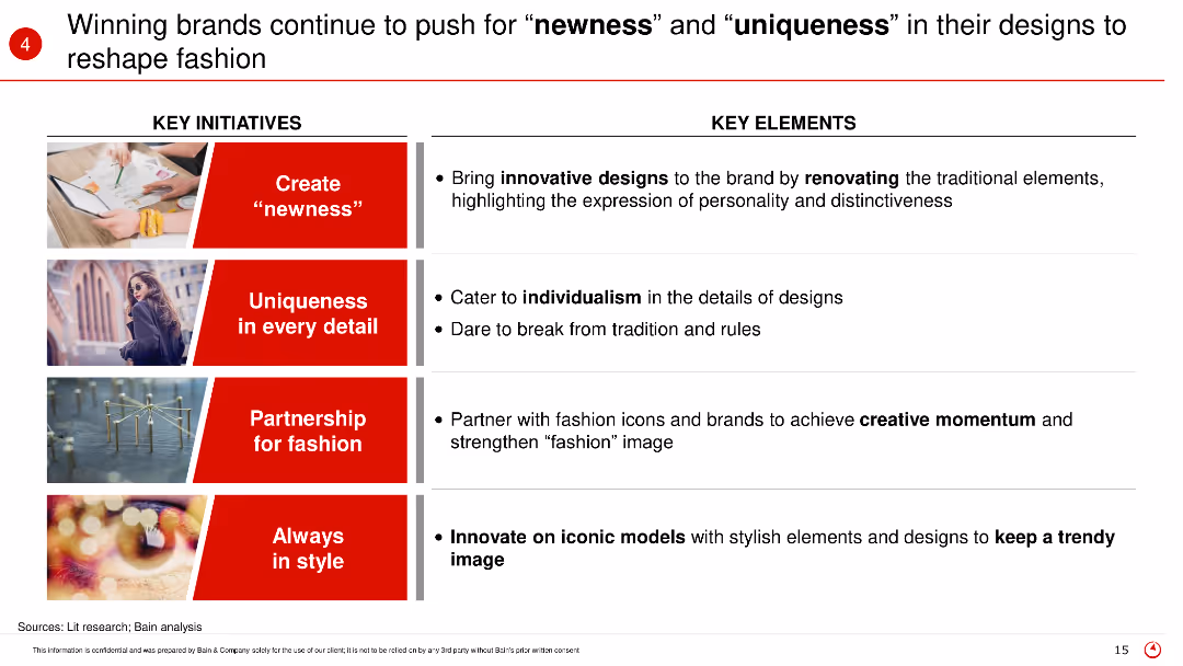
The slide highlights key initiatives and elements such as creating newness, uniqueness in every detail, partnerships for fashion, and staying in style, with supporting images for each point.
Product and Service Analysis
Retail & E-commerce
The slide discusses how winning brands in fashion are focusing on innovation, individuality, partnerships, and continuous style evolution to stay ahead in the market.
Fashion innovation, brand strategies, newness, uniqueness, design trends
false
Product and Service Analysis
Retail & E-commerce
Table
Bain
Add to my slides
Remove from favorites
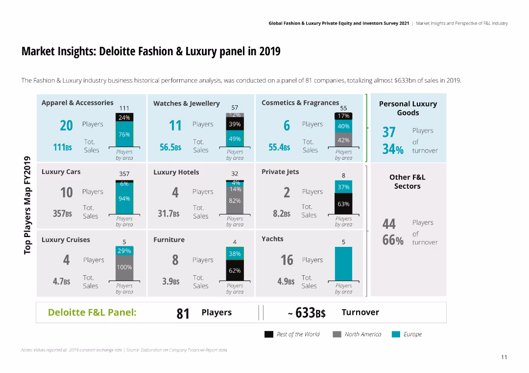
The slide is visually dense with multiple sections of bar charts, detailing the performance of various sectors within the fashion and luxury industry.
Market Analysis and Trends
Retail & E-commerce
Provides an analysis of the fashion and luxury market in 2019, including sales data across different sectors like apparel, watches, and personal luxury goods.
fashion, luxury, market analysis, retail, e-commerce, apparel, watches, sales data
false
Market Analysis and Trends
Retail & E-commerce
Multiple Chart
Deloitte
Add to my slides
Remove from favorites
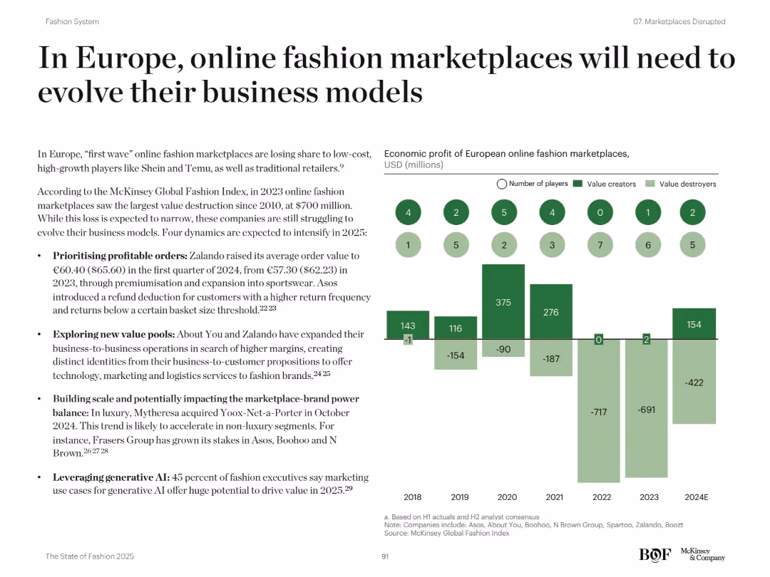
Two-column layout with bullet points on the left and a bar chart with icons and labels on the right; minimalistic design
Strategic Planning
Retail & E-commerce
This slide outlines the pressure on European online fashion marketplaces to adapt amid declining profits and market share loss. It identifies four strategic focus areas: prioritizing profitable orders, exploring B2B opportunities, balancing marketplace-brand power, and leveraging generative AI. A bar chart tracks economic profit and number of players from 2018 to 2024E, showing a downward trend.
fashion, marketplaces, Zalando, profitability, AI, B2B, Europe, Shein, Temu, trends
false
Strategic Planning
Retail & E-commerce
Mixed Chart
McKinsey
Add to my slides
Remove from favorites
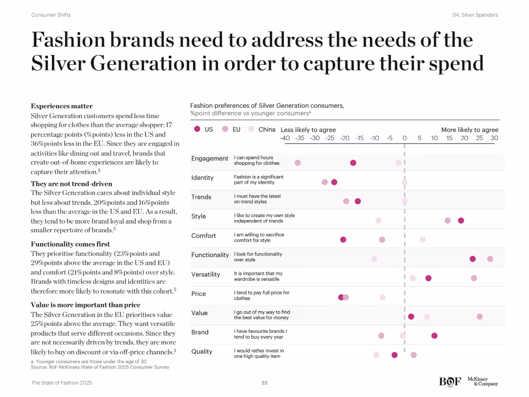
Left-aligned text with key insights and right scatter plot showing fashion preference differences by region. Pink dots compare older and younger consumers.
Customer and Market Segmentation
Retail & E-commerce
Analyzes shopping preferences of the Silver Generation vs younger consumers across categories like comfort, quality, trends, and brand loyalty. Emphasizes need for brands to focus on functionality, value, and independence in style rather than trends.
fashion preferences, older consumers, value, comfort, brand loyalty, style independence
false
Customer and Market Segmentation
Retail & E-commerce
Mixed Chart
McKinsey
Add to my slides
Remove from favorites
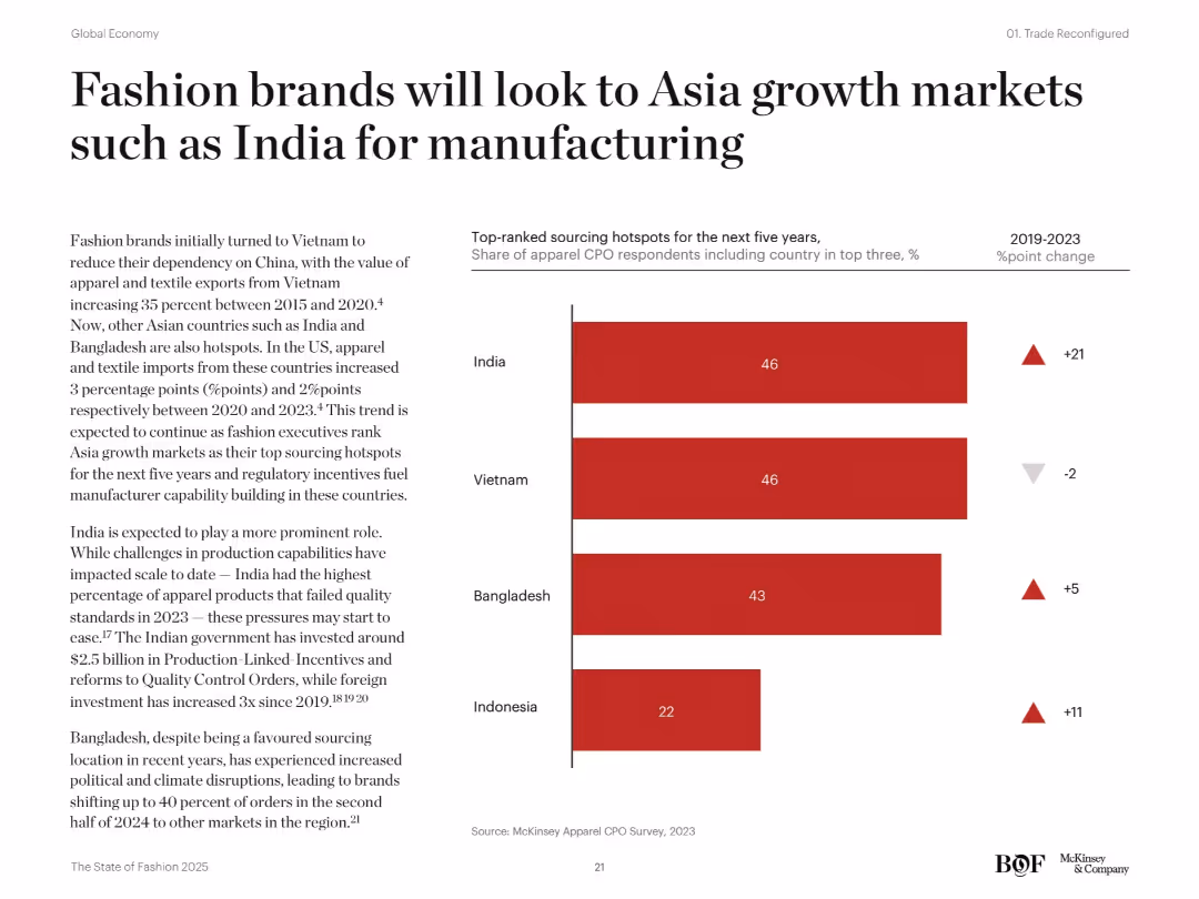
Left column with descriptive text and right-aligned bar chart showing top sourcing destinations by % and changes (2019–2023). Bold title and clean layout.
Product and Service Analysis
Consumer Goods
The slide outlines a shift in apparel sourcing toward India, Vietnam, Bangladesh, and Indonesia, driven by reduced dependency on China. India is projected as a growing hub due to government support and foreign investments, despite current production challenges.
fashion sourcing, India, Bangladesh, Vietnam, Indonesia, China, apparel manufacturing, Asia growth markets, trade shift, supplier strategy
false
Product and Service Analysis
Consumer Goods
Mixed Chart
McKinsey
Add to my slides
Remove from favorites
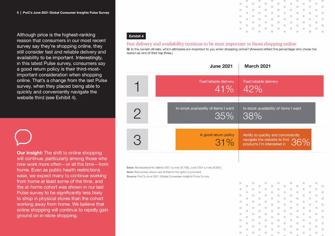
This slide features a comparative column chart displaying consumer priorities for online shopping in June 2021 and March 2021. It includes numerical percentages and color-coded bars for clarity.
Market Analysis and Trends
Retail & E-commerce
The slide presents data from a survey comparing consumer priorities for online shopping between June 2021 and March 2021. It highlights the importance of fast delivery, stock availability, and return policy changes over time.
fast delivery, online shopping, consumer priorities, survey data, comparative analysis
false
Market Analysis and Trends
Retail & E-commerce
Mixed Chart
PwC/Strategy&
Add to my slides
Remove from favorites
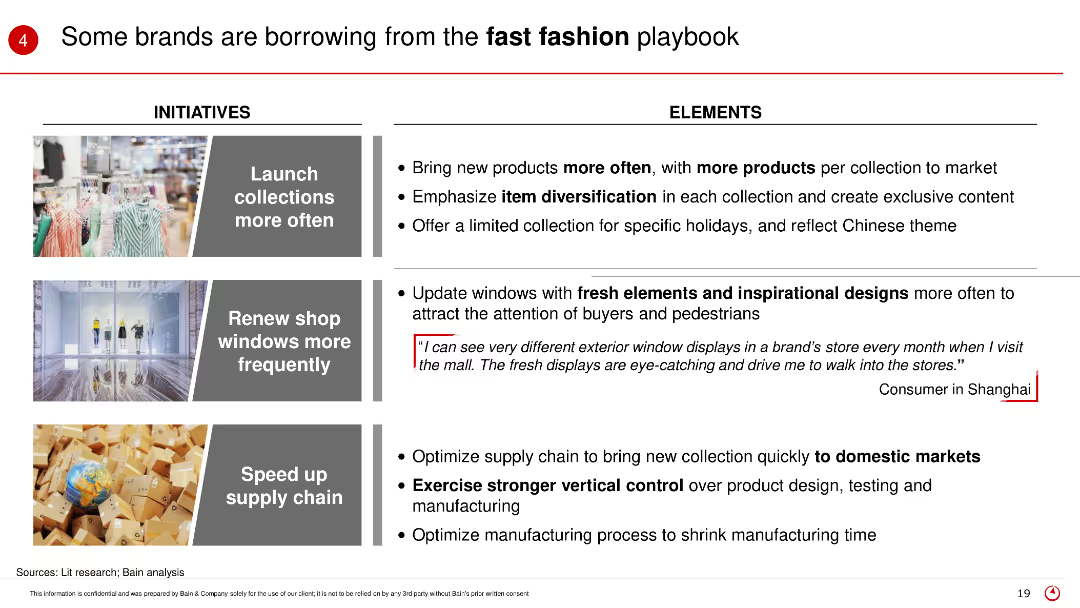
The slide presents initiatives and elements of the fast fashion strategy, including launching collections more often, updating shop windows, and speeding up supply chains, with corresponding images and consumer feedback.
Product and Service Analysis
Retail & E-commerce
This slide describes how some brands are adopting fast fashion tactics to remain competitive, focusing on frequent product launches, fresh window displays, and efficient supply chains.
Fast fashion, brand strategy, product launch, supply chain, retail trends
false
Product and Service Analysis
Retail & E-commerce
Table
Bain
Add to my slides
Remove from favorites
The slide includes a line graph showing the competitiveness of FCEV vs BEV in terms of fuel cell capex and vehicle range.
Strategic Planning
Energy & Utilities
The slide discusses the long-term competitiveness of fuel cell electric vehicles compared to battery electric vehicles, highlighting cost projections and competitive thresholds.
FCEV, BEV, competitiveness, cost, projections
false
Strategic Planning
Energy & Utilities
Mixed Chart
Kearney
Add to my slides
Remove from favorites
The slide presents a graph comparing carbon abatement costs (CAC) versus CO2 emissions from electricity generation for different countries.
Market Analysis and Trends
Energy & Utilities
The slide analyzes the cost-effectiveness of FCEV buses powered by wind versus grid-powered BEV buses in terms of carbon abatement costs and CO2 emissions from electricity generation.
FCEV, BEV, wind, grid, carbon abatement
false
Market Analysis and Trends
Energy & Utilities
Mixed Chart
Kearney
Add to my slides
Remove from favorites
The slide presents a graph comparing carbon abatement costs (CAC) versus CO2 emissions from electricity generation for FCEV trains and electric trains.
Regulatory and Compliance
Transportation & Logistics
The slide discusses the potential for FCEV trains to save CO2 emissions if grid emissions are below 300g/kWhe, comparing it to the costs of electrification.
FCEV trains, grid emissions, CO2 savings, carbon abatement, electrification cost
false
Regulatory and Compliance
Transportation & Logistics
Mixed Chart
Kearney
Add to my slides
Remove from favorites
The slide is graphically intricate with a timeline, icons, and financial data. It features a combination of timelines with icons indicating specific events, accompanied by financial figures and text explanations. Color coding assists in distinguishing different elements, while a financial summary box at the bottom provides a quick overview. The overall layout is balanced, incorporating both visual and textual information in a cohesive design.
Mergers and Acquisitions
Industrial & Manufacturing
It outlines a corporate strategy following an acquisition, showing how the integration aligns with long-term company goals in the composites sector. The slide is useful for discussing post-merger integration strategies and financial impact.
FCG, Michelin, polymer composites, strategy, acquisition, integration, financials, long-term goals, synergy
false
Mergers and Acquisitions
Industrial & Manufacturing
Header Vertical
Morgan Stanley
Add to my slides
Remove from favorites
This slide displays a title, two column charts comparing filings, finalisations, and pending applications, and a line graph showing clearance rates for FCoA and FCC, indicating a backlog in both courts.
Regulatory and Compliance
Government & Public Sector
The slide compares filings and finalisations in FCoA and FCC, revealing a pending caseload exceeding filed and finalised cases, and examines clearance rates, suggesting a lag in keeping pace with filings.
FCoA, FCC, case filings, finalisations, clearance rates, legal backlog, pending applications
false
Regulatory and Compliance
Government & Public Sector
Multiple Chart
PwC/Strategy&
Add to my slides
Remove from favorites
This slide features a title, a column chart about average attendances in FCoA and FCC from 2012-2017. A side note emphasizes a 45% higher attendance in FCoA. Icons representing legal elements are present. Red and black colors dominate, with annotations for clarity.
Regulatory and Compliance
Government & Public Sector
The slide compares court attendances between FCoA and FCC over five years, highlighting the significantly higher attendance required by litigants in the FCoA, with cost implications and details on case management practices.
FCoA, FCC, court attendances, final order finalisation, litigation costs, pre-trial management
false
Regulatory and Compliance
Government & Public Sector
Mixed Chart
PwC/Strategy&
Add to my slides
Remove from favorites
A slide with a title and two column charts, one indicating the percent of finalisations older than 12 months, the other showing unallocated cases by location, both focusing on FCoA and FCC data.
Regulatory and Compliance
Government & Public Sector
This slide sheds light on the growing age of matters when they are finalised and the number of unallocated cases within the FCoA, highlighting challenges in case allocation and completion times.
FCoA, FCC, finalisation age, unallocated cases, case management, legal system challenges
false
Regulatory and Compliance
Government & Public Sector
Multiple Chart
PwC/Strategy&
Add to my slides
Remove from favorites
The slide features a title and a single column chart tracking the median time to trial for family law final order cases from 2012-2017 in FCoA and FCC, with annotations highlighting a growing median time to trial.
Regulatory and Compliance
Government & Public Sector
This slide presents the increasing median time to trial in both FCoA and FCC over five years, with a clear indication that the time to trial is growing, alongside important caveats regarding the resolution of cases.
FCoA, FCC, median time to trial, final orders, case resolution, legal proceedings
false
Regulatory and Compliance
Government & Public Sector
Mixed Chart
PwC/Strategy&
Add to my slides
Remove from favorites
A slide with a title, a column and a line chart, one showing the number of pending cases and the other the percentage of cases pending over 12 months, both comparing FCoA and FCC from 2012-2017.
Regulatory and Compliance
Government & Public Sector
The slide addresses the caseload of matters pending applications and the age of matters pending in both courts, with an emphasis on the growth in the number of pending cases and their duration.
FCoA, FCC, pending cases, legal system, caseload growth, final order applications
false
Regulatory and Compliance
Government & Public Sector
Multiple Chart
PwC/Strategy&
Add to my slides
Remove from favorites
This slide shows a title, two column charts displaying trial lengths for FCoA and FCC, and a pie chart depicting reserved judgments delivery time. It uses red and orange hues with clear labels and a note on trial length comparison.
Regulatory and Compliance
Government & Public Sector
It breaks down the trial lengths for matters heard in FCoA and FCC, the percentage of reserved judgments delivered within three months, and highlights the significant difference in trial lengths between the two courts.
FCoA, FCC, trial lengths, reserved judgments, case management, legal proceedings
false
Regulatory and Compliance
Government & Public Sector
Multiple Chart
PwC/Strategy&
Add to my slides
Remove from favorites
Previous
Next
You don't have any favorites yet.
Please wait loading your favorites slides...
Create a FREE account to continue browsing
Receive Instant Access to 1,000+ slides from companies like McKinsey, Google, and Goldman Sachs
First Name
Last Name
Email
Password
I agree to all
Terms & Privacy Policy
Thank you! Your submission has been received!
Oops! Something went wrong while submitting the form.
Have an account?
Sign in
Upgrade to PRO to Save slides
Advanced Search and Filters
Access to 15,000+ slides
Access to Category Pages
Save/Bookmark Slides
PowerPoint Template Library
Pick a Plan
MONTHLY
$12/month
Billed every month, Cancel anytime.
YEARLY
$9/year
Billed $108 annually, Cancel anytime.
Checkout for $12/month
Checkout for $108/yr
Secured by Stripe | AES-256 bit encryption