My Account
My Slides
Search by Category
Companies
Slide Type
Use Case
Industry
Pricing
Templates
View All Templates
Download Template Slides
✦ AI
AI Prompt Library
AI Search
Feedback
Login
Logout
Get Started
Browse all Slides
Browse all Slides
Create a FREE Account
Instant access to 1,000+ real slides from top companies like McKinsey, BCG, Goldman Sachs, Google and many more!
First Name
Last Name
Email
Password
I agree to all
Terms & Privacy Policy
Thank you! Your submission has been received!
Oops! Something went wrong while submitting the form.
Have an account?
Sign in
Saved Slides
Total No. of slides saved
0
↻ Refresh
✖ Clear all
A multi-line chart showing FDI variations across several Central American countries from 2015 to 2022. Each country is represented by a different color.
Investment Analysis
Financial Services
This slide compares the Foreign Direct Investment trends in various Central American countries, indicating significant events and their impact on FDI for each country.
FDI, Central America, country comparison, trends
false
Investment Analysis
Financial Services
Single Chart
Deloitte
Add to my slides
Remove from favorites
A line chart depicting the annual variation of FDI in Central America from 2015 to 2022, with notable events marked along the timeline. The chart uses a single blue line on a black background.
Investment Analysis
Financial Services
The slide shows the trend of Foreign Direct Investment in Central America, noting significant events that impacted investment levels, such as tariffs, COVID-19, and the Russia-Ukraine war.
FDI, Central America, investment, line chart, trends
false
Investment Analysis
Financial Services
Single Chart
Deloitte
Add to my slides
Remove from favorites
Two donut charts side by side comparing the share of FDI in Central America from the USA between 2021 and 2022. Each segment is color-coded.
Investment Analysis
Financial Services
The slide compares the share of Foreign Direct Investment in Central America from the USA for the years 2021 and 2022, highlighting the changes in investment distribution by country.
FDI, Central America, USA, donut chart, comparison
false
Investment Analysis
Financial Services
Multiple Chart
Deloitte
Add to my slides
Remove from favorites
The slide includes a line chart showing the decline in foreign direct investment (FDI) in China over 25 years. It provides commentary and implications for corporates.
Market Analysis and Trends
Financial Services
The slide analyzes the trend of declining FDI in China due to geopolitical tensions and economic factors. It discusses the potential impacts on foreign companies and investment strategies.
FDI, China, geopolitical tension, economic analysis, financial services
false
Market Analysis and Trends
Financial Services
Mixed Chart
Accenture
Add to my slides
Remove from favorites
Pie chart of FDI by regions and a bar chart showing top five investing countries by FDI in Europe.
Market Analysis and Trends
Financial Services
This slide examines the origins of FDI in Europe, with a significant share coming from European companies.
FDI, Europe, investing countries, regions, origin
false
Market Analysis and Trends
Financial Services
Multiple Chart
EY
Add to my slides
Remove from favorites
A table listing the top 15 FDI countries in 2022 with statistics on the number of projects, change from the previous year, and jobs created, alongside an explanatory text box.
Market Analysis and Trends
Financial Services
The slide presents detailed data on FDI projects and job creation in Europe, ranking the top 15 countries and analyzing their performance.
FDI, Europe, investment, projects, data
false
Market Analysis and Trends
Financial Services
Table
EY
Add to my slides
Remove from favorites
A map of Europe showing FDI projects by country, with highlighted statistics and an accompanying text box providing context and analysis.
Market Analysis and Trends
Financial Services
The slide provides an overview of FDI projects in Europe by country, highlighting the variations in FDI performance across different regions.
FDI, Europe, investment, projects, map
false
Market Analysis and Trends
Financial Services
Graphic
EY
Add to my slides
Remove from favorites
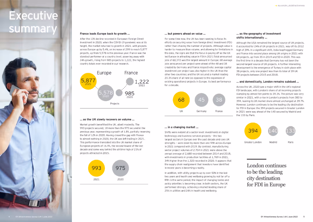
The slide combines text and visuals to summarize key points about Europe's FDI growth and shifts.
Strategic Planning
Financial Services
This executive summary slide provides an overview of FDI growth in Europe, highlighting France's lead, UK's recovery, and shifts in investor focus and market dynamics. It includes visual elements like project numbers and geographical investment distribution.
FDI, Europe, Investment Trends, Market Dynamics
false
Strategic Planning
Financial Services
Multiple Chart
EY
Add to my slides
Remove from favorites
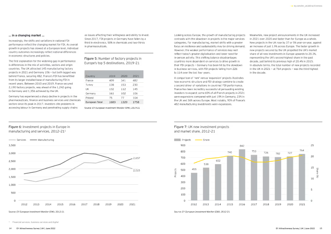
The slide features text and line charts illustrating FDI project trends in Europe.
Market Analysis and Trends
Financial Services
This slide analyzes FDI trends in Europe, emphasizing changes in national FDI performance, the impact of market shifts, and the variation in investment project types and numbers across major European countries.
FDI, Europe, Market Trends, Investment Projects
false
Market Analysis and Trends
Financial Services
Multiple Chart
EY
Add to my slides
Remove from favorites
The slide features a map of Greece highlighting investment distribution across regions with corresponding percentage values. Images of different regions are shown on the right.
Market Analysis and Trends
Financial Services
This slide illustrates the geographical distribution of foreign direct investments in Greece, showing which regions have attracted the most investment in recent years.
FDI, Greece, geographical distribution, regions, map
false
Market Analysis and Trends
Financial Services
Mixed Chart
EY
Add to my slides
Remove from favorites
Text is divided into two columns with a photo on the left showing business professionals. The right side includes a vertical bar chart of FDI projects per year from 2000-2022.
Investment Analysis
Financial Services
This slide provides data from the EY European Investment Monitor, showcasing trends in FDI projects in Greece, including historical data and recent performance.
FDI, Greece, investment, historical data, trends
false
Investment Analysis
Financial Services
Multiple Chart
EY
Add to my slides
Remove from favorites
This slide contains text-heavy content divided into sections with subheadings and bullet points. A circular infographic on the right highlights key statistics.
Market Analysis and Trends
Financial Services
The executive summary provides an overview of foreign direct investment in Greece, including performance metrics, investment trends, and economic risks.
FDI, Greece, investment, summary, economic risks
false
Market Analysis and Trends
Financial Services
Multiple Chart
EY
Add to my slides
Remove from favorites
A combination of text and a vertical bar chart showing FDI inflows into Greece from 2012-2022. The left side features a background image of olive branches and sunset.
Market Analysis and Trends
Financial Services
This slide details the trends in foreign direct investment in Greece over the last decade, highlighting significant increases and the sectors attracting the most investment.
FDI, Greece, investment, trends, sectors, 2012-2022
false
Market Analysis and Trends
Financial Services
Multiple Chart
EY
Add to my slides
Remove from favorites
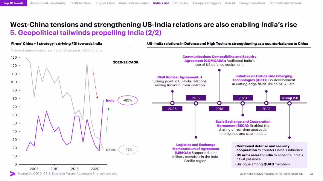
Left panel shows a line chart comparing FDI to India and China, with CAGR noted; right side features a US–India defense partnership timeline.
Strategic Planning
Government & Public Sector
The slide attributes India's FDI surge to geopolitical shifts, including the China+1 strategy and US–India defense collaborations. Key agreements highlight deeper cooperation in defense and emerging tech. India’s attractiveness as an investment destination is reinforced by improving bilateral ties and global supply chain diversification.
FDI, India, China, US relations, defense agreements, geopolitical tailwinds, China+1, foreign investment, trade diversification, national security
false
Strategic Planning
Government & Public Sector
Mixed Chart
Accenture
Add to my slides
Remove from favorites
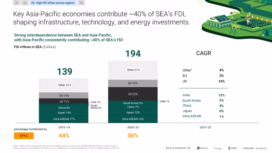
Dual bar charts comparing FDI inflows across time periods; color-coded by region; CAGR on the side
Investment Analysis
Financial Services
The slide shows how Asia-Pacific accounts for a steady 40% of FDI into SEA, highlighting the roles of China, Japan, and intra-ASEAN flows in shaping investments in infrastructure, energy, and technology.
FDI, infrastructure, SEA, China, Japan, ASEAN, investment, technology
false
Investment Analysis
Financial Services
Single Chart
Bain
Add to my slides
Remove from favorites
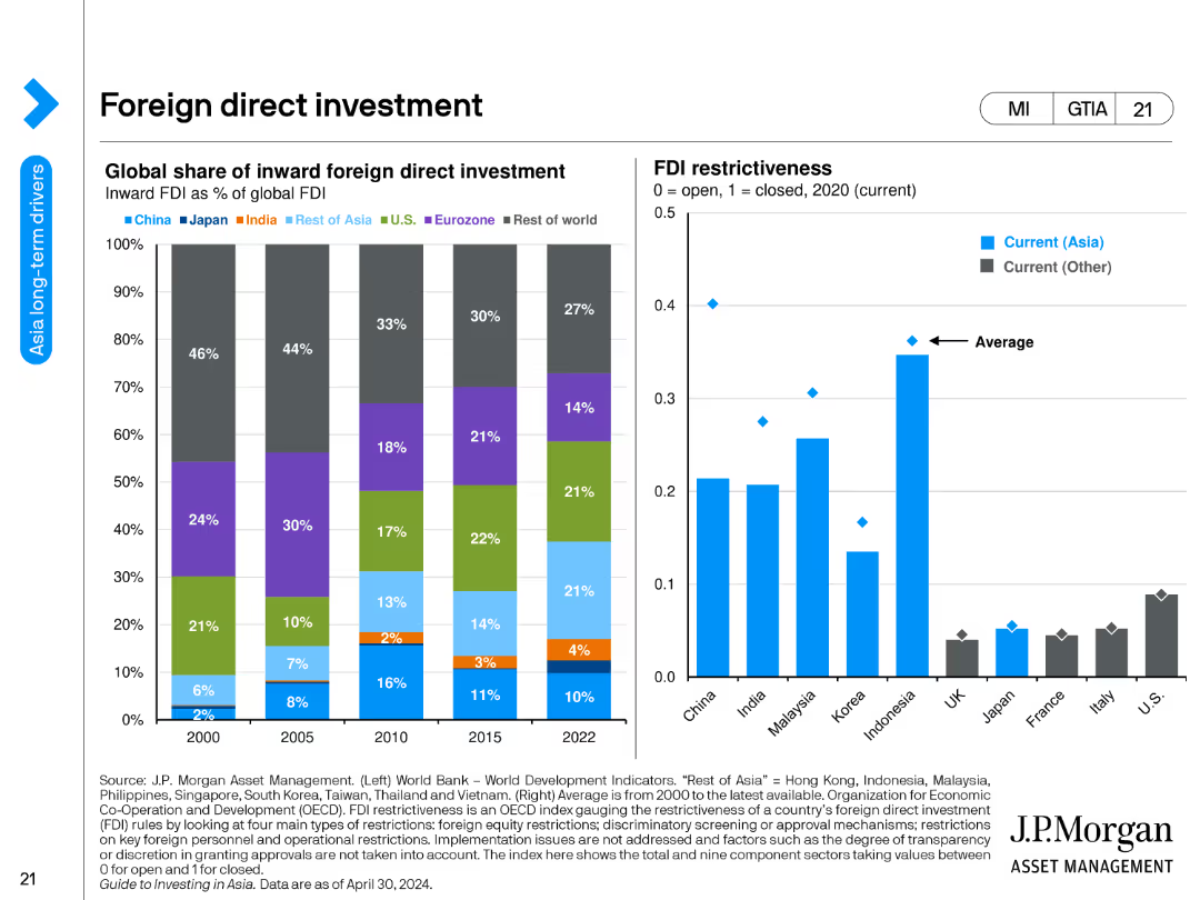
The slide contains two bar charts. The left chart shows the global share of inward foreign direct investment as a percentage of global FDI from 2000 to 2022 for various regions including China, Japan, India, the US, Eurozone, and others. The right chart measures FDI restrictiveness in 2020 for selected countries.
Investment Analysis
Financial Services
This slide examines global foreign direct investment trends and FDI restrictiveness. It compares the share of FDI among different regions over time and evaluates the openness of various countries to foreign investments based on restrictiveness scores.
FDI, investment, global, share, restrictiveness, financial services, bar chart, regions, countries
false
Investment Analysis
Financial Services
Multiple Chart
JP Morgan
Add to my slides
Remove from favorites
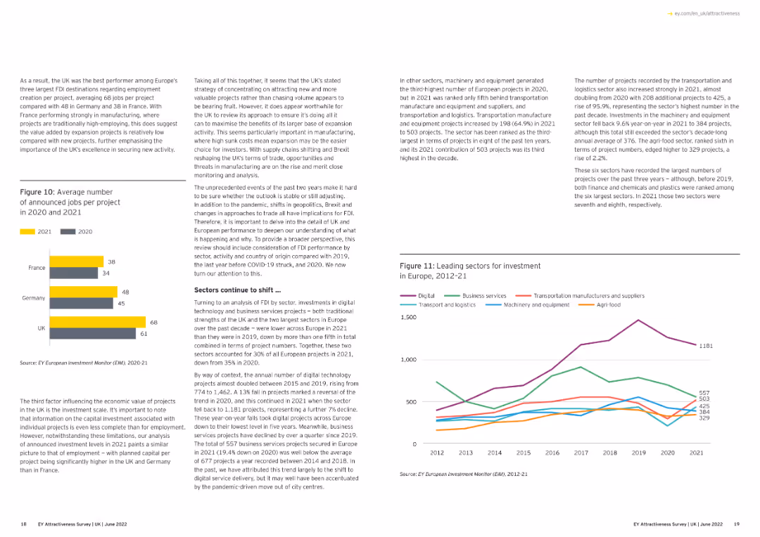
This slide features a column chart comparing the average number of announced jobs per project in 2020 and 2021 for the UK, Germany, and France.
Market Analysis and Trends
Financial Services
The slide presents a comparison of the average number of announced jobs per project in 2020 and 2021 across three countries, highlighting the UK's performance.
FDI, jobs, comparison, UK, Germany, France
false
Market Analysis and Trends
Financial Services
Multiple Chart
EY
Add to my slides
Remove from favorites
Slide includes a pie chart, a column chart, and detailed listings of FDI inflows. Clean layout with emphasis on data presentation and sector analysis.
Investment Analysis
Financial Services
Reviews foreign direct investment in the Philippines, showing trends over recent years and breakdown by industry, including major restrictions.
FDI, Philippines, investment, industry, trends, restrictions
false
Investment Analysis
Financial Services
Multiple Chart
Deloitte
Add to my slides
Remove from favorites
A column chart showing the number of foreign investment projects and jobs created from 2010 to 2022, with an accompanying text box providing context.
Market Analysis and Trends
Financial Services
The slide presents the trends in foreign direct investment projects and jobs in Europe over a period of time and discusses the factors influencing these trends.
FDI, trends, Europe, investment, jobs
false
Market Analysis and Trends
Financial Services
Mixed Chart
EY
Add to my slides
Remove from favorites
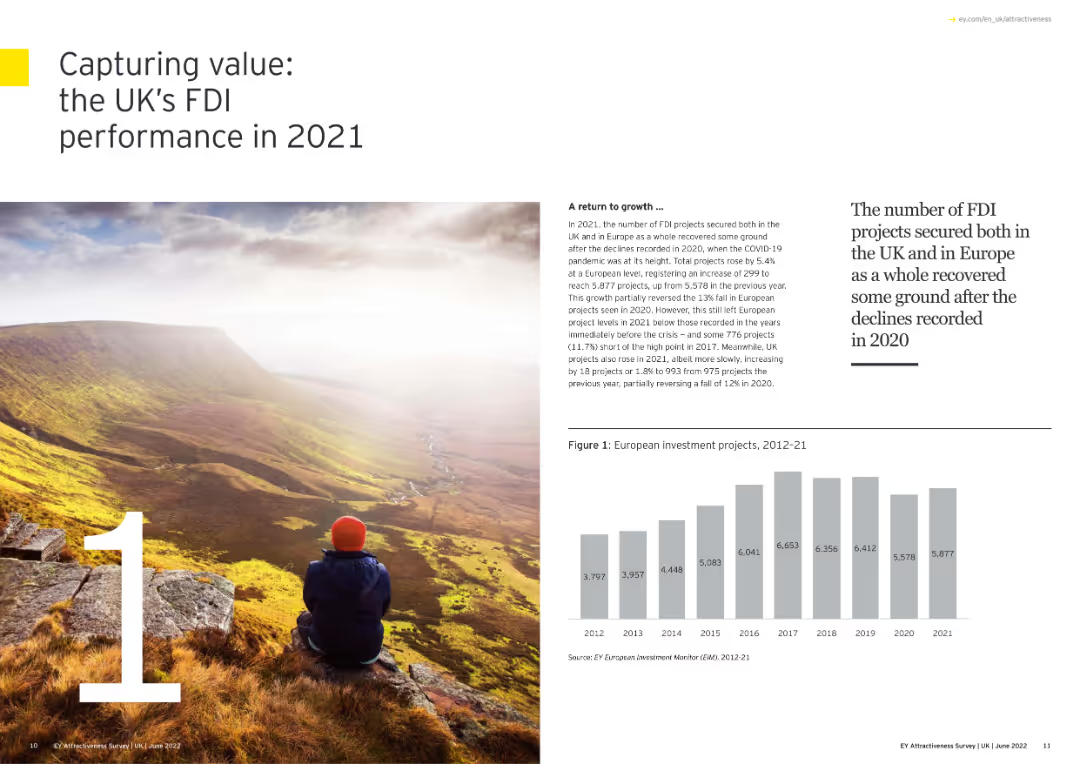
The slide has a scenic image with overlaid text summarizing the UK’s FDI performance.
Market Analysis and Trends
Financial Services
The slide summarizes the UK's FDI performance in 2021, highlighting the recovery from 2020, growth in project numbers, and the UK's leading position in attracting new FDI projects across Europe.
FDI, UK, Performance, Recovery, Growth
false
Market Analysis and Trends
Financial Services
Mixed Chart
EY
Add to my slides
Remove from favorites
Large heading and paragraph on top; lower half shows a split bar chart overlaid on an AI-themed image comparing wonder vs. worry sentiment.
Strategic Planning
Artificial Intelligence
The slide sets up one of the six tensions surrounding AI adoption, showing that more people feel worry than wonder about AI’s future. It introduces the importance of managing AI development carefully to reduce fear.
fear, optimism, AI adoption, public sentiment
false
Strategic Planning
Artificial Intelligence
Mixed Chart
IPSOS
Add to my slides
Remove from favorites
One column chart and one line chart, depicting current policy rates and market implied policy rates for various regions, and the divergence in expected policy rates.
Strategic Planning
Financial Services
This slide presents data that challenges the expectation of rate cuts by the Fed, highlighting market pricing and anticipated policy rate divergence between the US and the EU.
Fed, ECB, Policy Rates, Market Pricing, Economic Growth, Rate Cuts, Financial Conditions
false
Strategic Planning
Financial Services
Multiple Chart
Morgan Stanley
Add to my slides
Remove from favorites
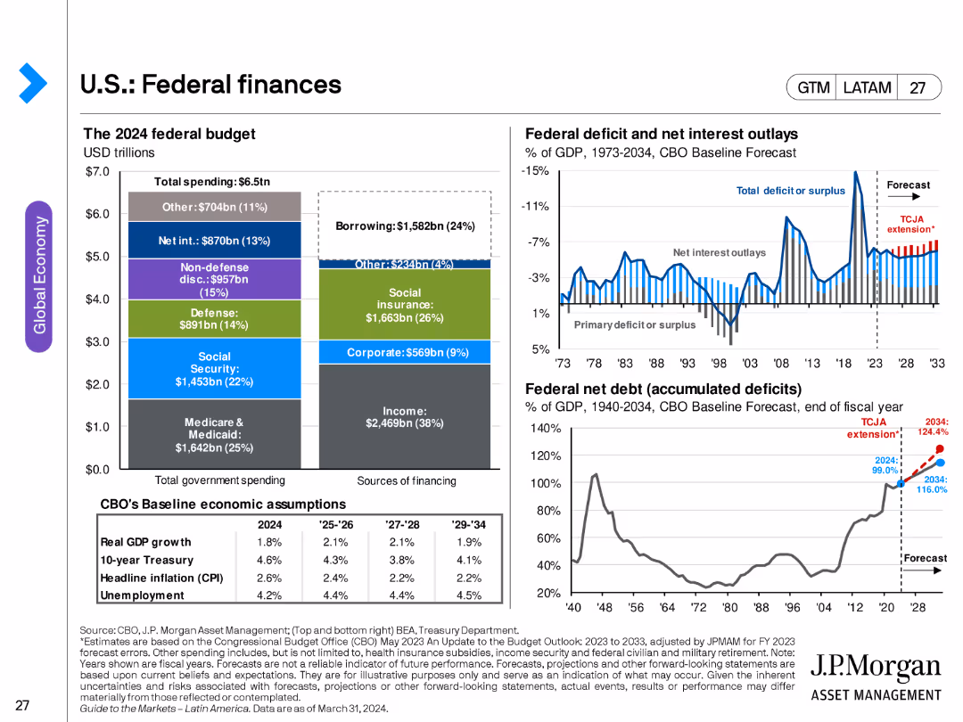
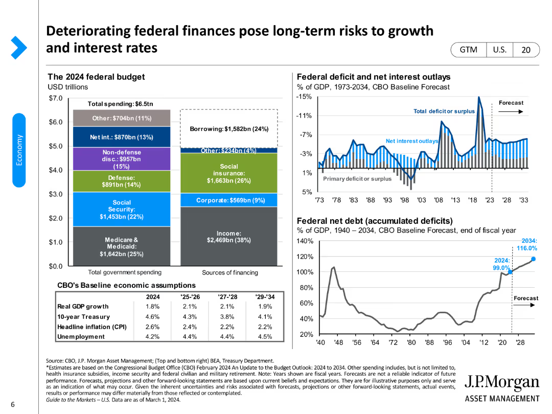
The slide features multiple charts: a pie chart showing the 2024 federal budget breakdown, a line chart for federal deficit and net interest outlays, and another line chart for federal net debt as a percentage of GDP.
Financial Performance
Government & Public Sector
This slide examines the U.S. federal finances, including budget allocation, deficit, and debt projections, providing insights into government spending and fiscal policy.
federal budget, deficit, debt, fiscal policy, government spending, U.S. finances
false
Financial Performance
Government & Public Sector
Multiple Chart
JP Morgan
Add to my slides
Remove from favorites
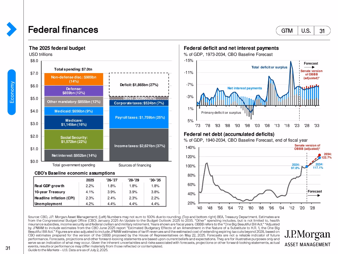
Three panels: a stacked bar showing the 2025 federal budget, a line-bar combo of deficits and interest payments, and a federal net debt line chart.
Strategic Planning
Government & Public Sector
The slide provides a snapshot of the 2025 U.S. federal budget and projections for deficits, net interest payments, and federal debt as % of GDP. It includes forecasts under the Senate’s adjusted policy proposal.
federal budget, deficit, debt, taxes, interest payments, government finance, fiscal outlook
false
Strategic Planning
Government & Public Sector
Multiple Chart
JP Morgan
Add to my slides
Remove from favorites
The slide includes stacked bar charts for federal budget components, line charts for deficit and debt forecasts, and various data labels.
Regulatory and Compliance
Financial Services
It addresses the risks posed by deteriorating federal finances on long-term economic growth and interest rates, focusing on budget deficits and debt projections.
federal budget, deficits, debt, economic growth, interest rates
false
Regulatory and Compliance
Financial Services
Multiple Chart
JP Morgan
Add to my slides
Remove from favorites
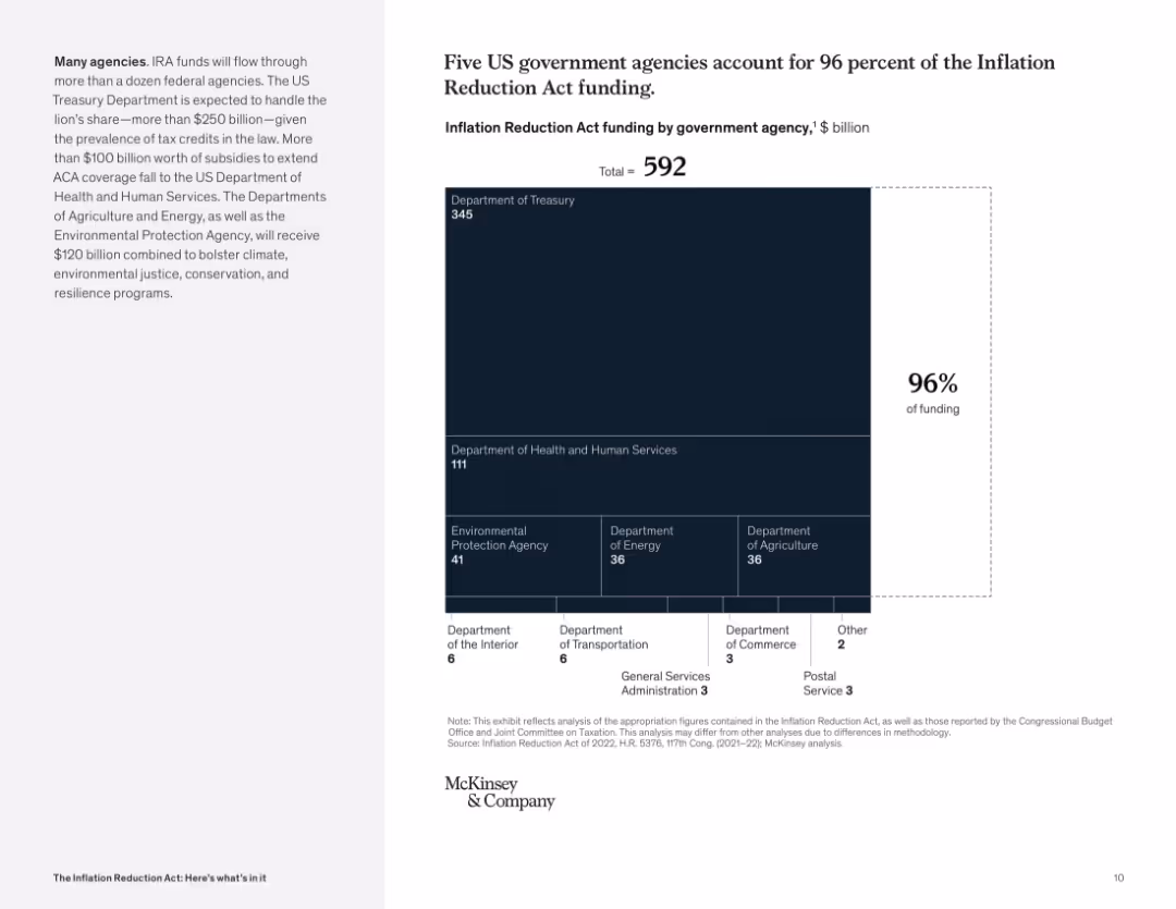
Treemap visualization with large central block for Treasury; supporting agencies in smaller blocks below; numeric data label on the right.
Operational Efficiency
Government & Public Sector
This visual shows how IRA funds are distributed across federal agencies, with the Department of Treasury and HHS receiving the bulk. It underscores administrative concentration for efficient deployment.
federal funding, government agencies, Treasury, HHS, IRA distribution, efficiency
false
Operational Efficiency
Government & Public Sector
Mixed Chart
McKinsey
Add to my slides
Remove from favorites
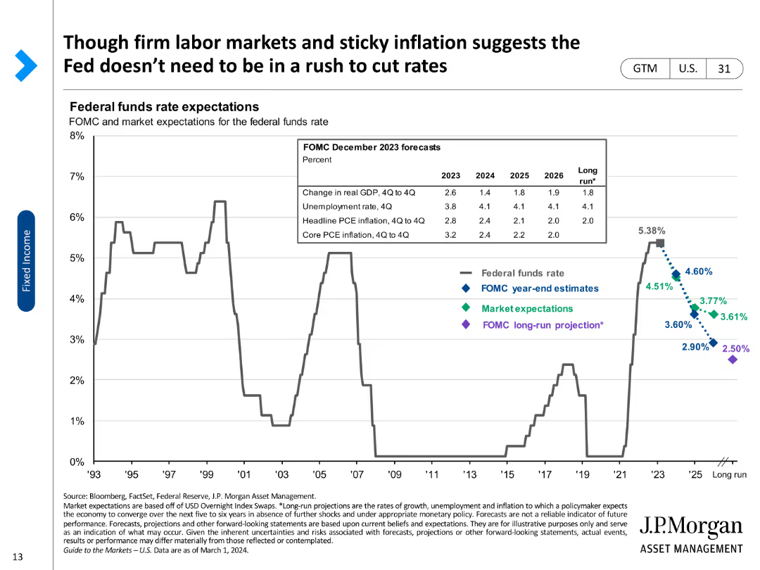
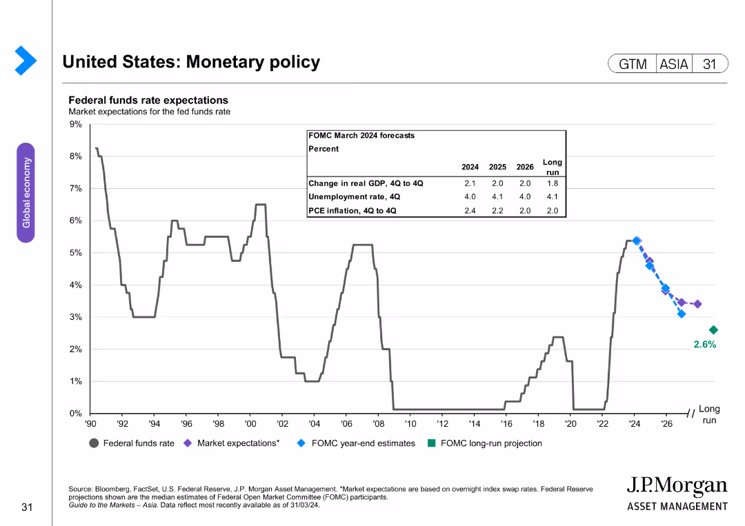
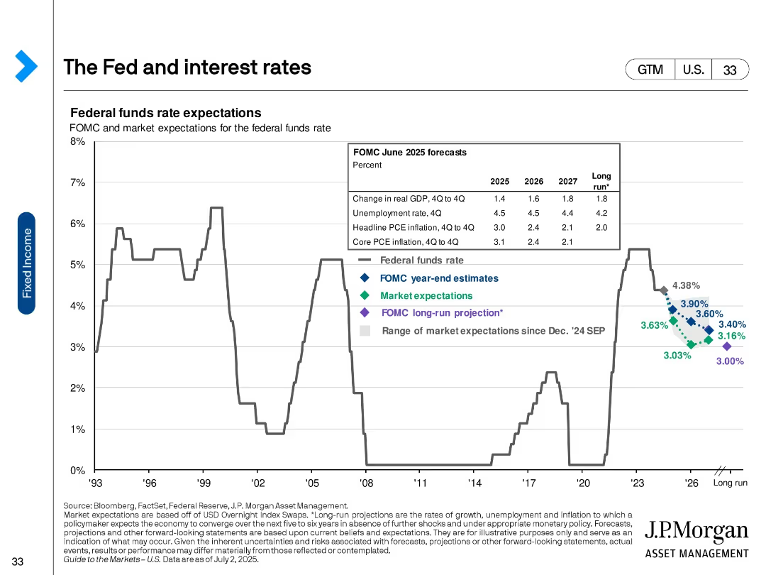
A line chart showing Federal funds rate expectations with annotations for FOMC estimates, market expectations, and projections.
Market Analysis and Trends
Financial Services
Analyzes the Federal funds rate expectations, comparing FOMC projections and market expectations for future rates.
Federal funds rate, FOMC, projections, inflation, market expectations, GDP, unemployment, PCE, long-run
false
Market Analysis and Trends
Financial Services
Single Chart
JP Morgan
Add to my slides
Remove from favorites
The slide features a line chart showing federal funds rate expectations over time with detailed projections. The layout is clear and moderately complex.
Market Analysis and Trends
Financial Services
This slide provides an overview of monetary policy by showing the market expectations for the federal funds rate, including projections from the FOMC.
federal funds rate, monetary policy, FOMC projections, interest rates, economic forecast
false
Market Analysis and Trends
Financial Services
Single Chart
JP Morgan
Add to my slides
Remove from favorites
Five icons representing different areas of focus for implementing relief with brief descriptive texts.
Strategic Planning
Government & Public Sector
Suggests key areas of focus for state governments in implementing federal relief and recovery efforts from COVID-19.
federal relief, COVID-19, strategy, government, recovery, implementation
false
Strategic Planning
Government & Public Sector
Header Horizontal
McKinsey
Add to my slides
Remove from favorites
Two-column layout with line charts showing US interest rate forecasts and federal funds rate changes from Q1 2017-Q4 2026F and across loosening cycles.
Regulatory and Compliance
Financial Services
Provides insights into the Fed's monetary policy stance and anticipated rate cuts, emphasizing patience and economic indicators.
Federal Reserve, interest rates, monetary policy, economic indicators, rate cuts
false
Regulatory and Compliance
Financial Services
Multiple Chart
EY
Add to my slides
Remove from favorites
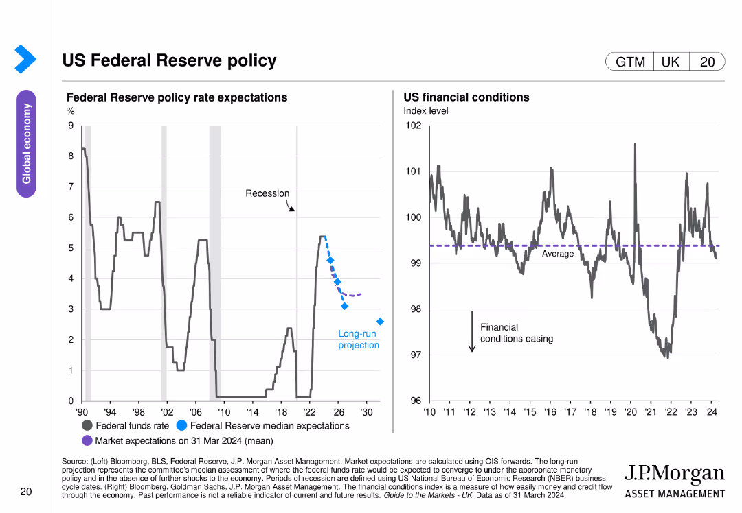
Two line charts side by side, showing Federal Reserve policy rate expectations and US financial conditions. Uses color coding and projection markers.
Regulatory and Compliance
Financial Services
Details Federal Reserve policy rate expectations and US financial conditions, highlighting projections and financial stability indicators.
Federal Reserve, policy, rate, financial, US
false
Regulatory and Compliance
Financial Services
Multiple Chart
JP Morgan
Add to my slides
Remove from favorites
This slide features a series of bar graphs displaying percentages of investors' concerns regarding various economic scenarios influenced by the Federal Reserve's actions. The layout is dense with numerical data and comparative analysis, employing a color-coded system to differentiate between scenarios considered most likely or concerning.
Market Analysis and Trends
Financial Services
The slide presents data from a survey capturing investors' beliefs about the likelihood and concern level of various economic scenarios resulting from the Federal Reserve's actions, including recession risks and inflation. Useful for discussing market sentiment and financial forecasting.
Federal Reserve, Recession, Inflation, Stagflation, Investor Concerns, Market Sentiment, Economic Forecast, Survey Data, Risk Management, Financial Analysis
false
Market Analysis and Trends
Financial Services
Multiple Chart
BCG
Add to my slides
Remove from favorites
Historical line chart of the federal funds rate with forecasted paths and projections from the FOMC and markets; inset with macroeconomic forecasts.
Investment Analysis
Financial Services
The slide outlines past and expected future federal funds rates, including FOMC year-end estimates, market expectations, and long-run projections. It includes accompanying forecasts for inflation, unemployment, and GDP growth.
Fed funds rate, inflation, GDP forecast, interest rate policy, FOMC, projections
false
Investment Analysis
Financial Services
Single Chart
JP Morgan
Add to my slides
Remove from favorites
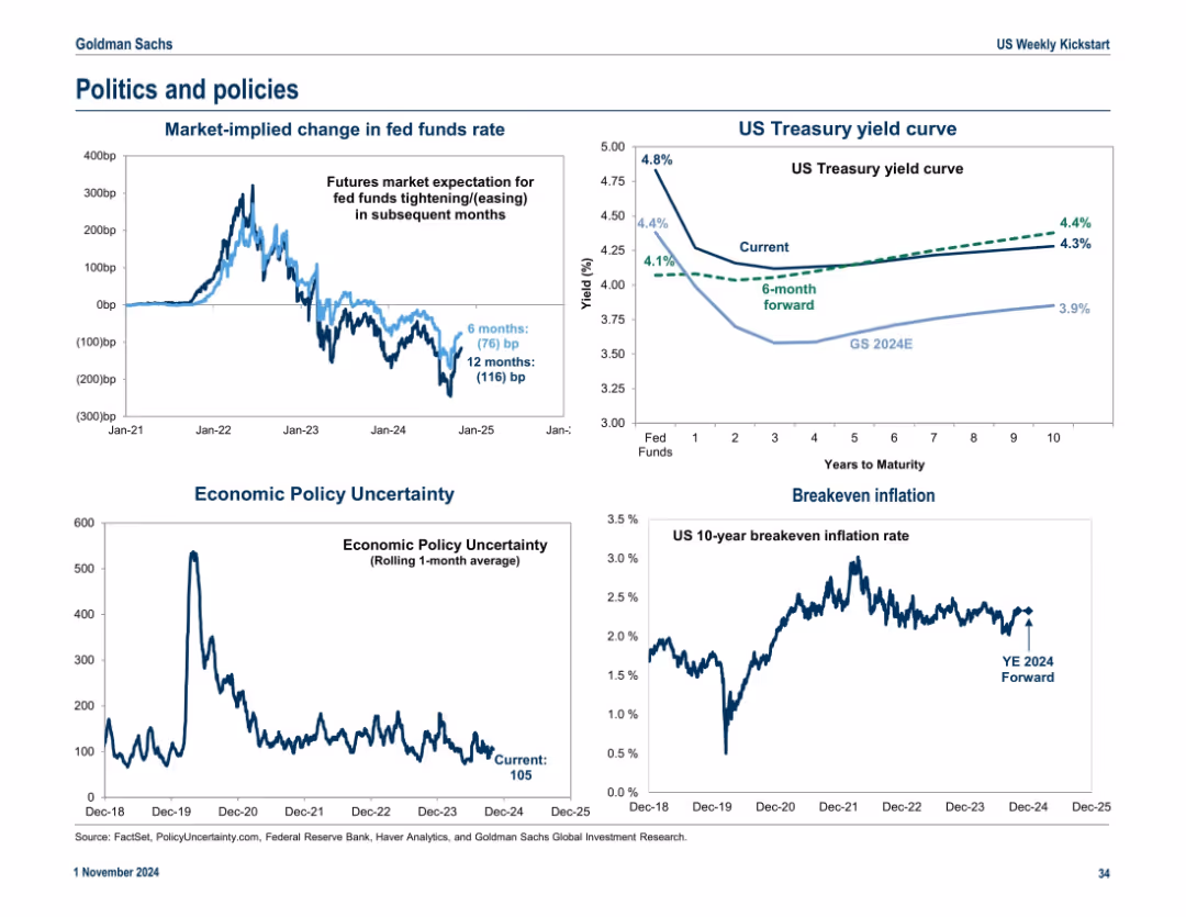
Four-quadrant layout with charts and graphs; blue-white theme with light annotations. Uses line graphs to show interest rates, yield curves, and inflation expectations.
Market Analysis and Trends
Financial Services
The slide shows economic indicators including policy uncertainty, breakeven inflation, changes in fed fund rates, and the US Treasury yield curve. It visualizes market expectations and forecasts for interest rates and economic policy shifts, offering context for future monetary policy and investor sentiment.
Fed funds rate, Treasury yield, inflation, uncertainty, policy, breakeven, interest rates, market sentiment
false
Market Analysis and Trends
Financial Services
Multiple Chart
Goldman Sachs
Add to my slides
Remove from favorites
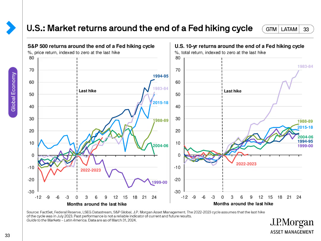
The slide features two line charts comparing S&P 500 and U.S. 10-year returns around the end of various Fed hiking cycles, indexed to zero at the last hike.
Investment Analysis
Financial Services
This slide analyzes market returns around the end of Fed hiking cycles, comparing historical S&P 500 and 10-year treasury returns to provide investment insights.
Fed hiking cycle, market returns, S&P 500, 10-year returns, investment analysis, historical trends
false
Investment Analysis
Financial Services
Multiple Chart
JP Morgan
Add to my slides
Remove from favorites
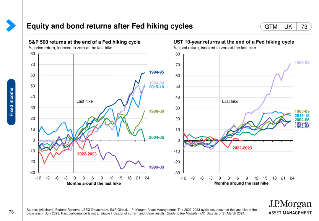
Contains two line charts showing S&P 500 and US 10-year Treasury returns around the end of Fed hiking cycles, with data from various periods highlighted.
Market Analysis and Trends
Financial Services
The slide explores the impact of Fed hiking cycles on equity and bond returns, providing historical data to understand market reactions to interest rate changes.
Fed hiking, equity returns, bond returns, S&P 500, Treasury
false
Market Analysis and Trends
Financial Services
Multiple Chart
JP Morgan
Add to my slides
Remove from favorites
The slide features a line chart showing the market implied effective Fed funds forward curve and a column chart projecting U.S. federal spending by category.
Risk Assessment and Management
Financial Services
The slide discusses market expectations for Fed rate cuts and the projected increase in U.S. federal spending, particularly noting that interest expenses on U.S. debt are expected to overtake defense spending within four years. It highlights the importance of proactive risk management given these financial trends. The slide is suitable for discussions on monetary policy and fiscal risk management.
Fed rates, federal spending, debt, interest expenses
false
Risk Assessment and Management
Financial Services
Multiple Chart
JP Morgan
Add to my slides
Remove from favorites
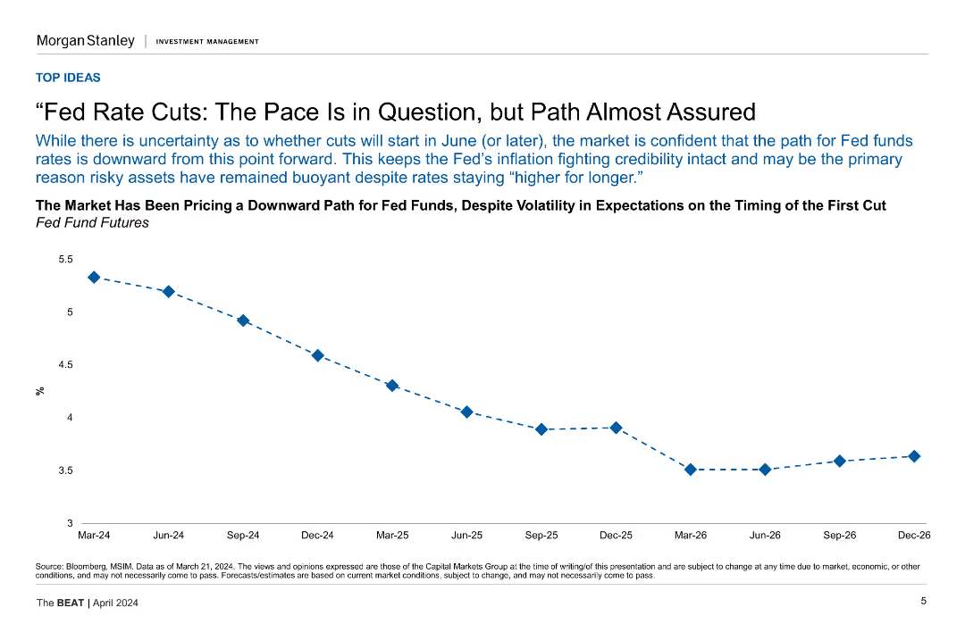
A line chart showing the downward path for Fed fund futures from Mar-24 to Dec-26.
Market Analysis and Trends
Financial Services
This slide discusses the market's expectation of a downward path for Fed funds rates despite volatility, showing projections until December 2026.
Fed Rates, Market Analysis, Futures, Projections, Volatility
false
Market Analysis and Trends
Financial Services
Mixed Chart
Morgan Stanley
Add to my slides
Remove from favorites
The slide features a column chart showing the increase in WM client assets from 2019 to 2023, alongside initiatives to drive fee-based flows, with text boxes highlighting these initiatives.
Strategic Planning
Financial Services
The slide discusses the significant opportunity to drive fee-based flows from existing brokerage assets at Morgan Stanley, emphasizing growth in WM client assets and strategic initiatives.
Fee-Based Flows, Brokerage Assets, Morgan Stanley, Client Assets, Strategic Initiatives, Column Chart, 2019-2023
false
Strategic Planning
Financial Services
Mixed Chart
Morgan Stanley
Add to my slides
Remove from favorites
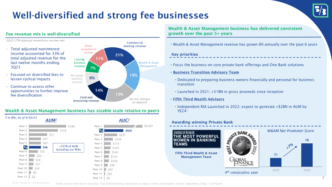
The slide features a pie chart showing the mix of noninterest income, and column charts comparing AUM and AUC with peers. Bullet points discuss the growth of the wealth and asset management business and key priorities for future growth.
Financial Performance
Financial Services
The slide highlights Fifth Third Bank’s diversified fee revenue streams, with a detailed breakdown of noninterest income sources. It showcases their wealth and asset management business growth, comparing AUM and AUC with peers, and outlines key priorities for future growth and client advisory services.
Fee businesses, noninterest income, diversified revenue, AUM, AUC, wealth management, asset management, revenue growth, client advisory, Fifth Third Bank
false
Financial Performance
Financial Services
Multiple Chart
Goldman Sachs
Add to my slides
Remove from favorites
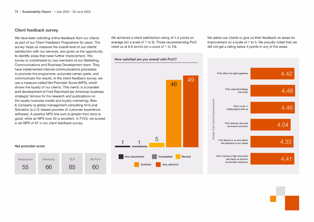
This slide contains multiple column charts and a net promoter score table. It uses a clean design with consistent colors and clear data presentation, making it easy to compare different metrics.
Customer and Market Segmentation
Professional Services
The slide presents client feedback results, including satisfaction ratings, areas for improvement, and net promoter scores across different service lines within the company.
Feedback, Survey, Satisfaction, NPS, Clients
false
Customer and Market Segmentation
Professional Services
Multiple Chart
PwC/Strategy&
Add to my slides
Remove from favorites
The slide features a column chart showing the theoretical, technical, and sustainable feedstock energy potential by feedstock type for the year 2060. The chart uses various shades of purple to represent different types of feedstock, including energy crops, municipal solid waste, forestry residues, agricultural residues, and animal waste.
Market Analysis and Trends
Energy & Utilities
This slide illustrates the potential energy that could be derived from various types of biomass feedstock by 2060. It emphasizes the portion of feedstock not gathered or collected and the competition for feedstock with other uses.
feedstock, biomass, energy, potential, 2060, theoretical, technical, sustainable, agricultural residues, energy crops
false
Market Analysis and Trends
Energy & Utilities
Single Chart
Kearney
Add to my slides
Remove from favorites
The slide features a detailed flowchart showing the possible routes for converting various feedstocks (animal waste, agricultural residues, MSW, forestry residues, algae, energy crops) into energy through conditioning, pretreatment, intermediates, conversion, and final product stages.
Technology and Digital Transformation
Energy & Utilities
This slide outlines the complex pathways for converting different types of biomass feedstocks into energy, illustrating the various conditioning, pretreatment, and conversion processes involved.
feedstocks, energy pathways, biomass, conversion, conditioning, pretreatment, intermediates, final product
false
Technology and Digital Transformation
Energy & Utilities
Diagram
Kearney
Add to my slides
Remove from favorites
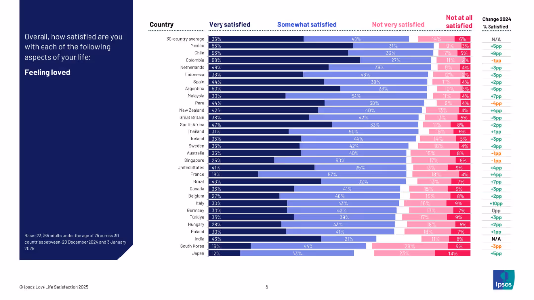
Dark blue left header; right side bar chart shows satisfaction levels by country in four response bands and change from 2024.
Human Resources and Talent Management
Professional Services
This slide visualizes how satisfied people are with feeling loved across 30 countries. It categorizes satisfaction levels and shows year-over-year change. Mexico and Colombia rank highest, while Japan and South Korea rank lowest. The chart includes detailed breakdowns per country.
feeling loved, satisfaction, emotional health, cross-country comparison, Ipsos, personal well-being, survey, 2025
false
Human Resources and Talent Management
Professional Services
Mixed Chart
IPSOS
Add to my slides
Remove from favorites
The slide features a column chart comparing feelings of being cut off from family and friends between May and December. It uses different colored bars to represent data from two time periods.
Customer and Market Segmentation
Government & Public Sector
This slide compares the feelings of being cut off from family and friends between two time periods, showing a decrease in such feelings in December compared to May, based on survey data.
feelings, family, friends, comparison, survey, cut off, column chart, time periods, public opinion
false
Customer and Market Segmentation
Government & Public Sector
Single Chart
IPSOS
Add to my slides
Remove from favorites
The slide has a pie chart showcasing fee revenue mix, bar graphs representing assets under management, and a variety of textual content. The layout is clean, with clear segmentation of sections, and uses blue and grey hues for the graphs, accented by bold colors to highlight key data points.
Financial Performance
Financial Services
It details Fifth Third's diverse fee revenue sources and the strength of its Wealth & Asset Management business, highlighting consistent growth and key priorities. The slide's comprehensive data presentation would be ideal for investor relations or strategic financial planning sessions, discussing revenue diversification and business scale in comparison to peers.
Fee Revenue, Diversification, Wealth Management, Growth, Pie Chart, Bar Graphs, Financial Services, Strategy, Comparison
false
Financial Performance
Financial Services
Multiple Chart
Goldman Sachs
Add to my slides
Remove from favorites
A stacked bar chart showing the different types of fees reported by users when trading on crypto platforms, with a comparison between 2023 and 2022.
Pricing Strategies
Financial Services
This slide outlines the various fee structures encountered by users on crypto trading platforms, highlighting changes between 2023 and 2022.
Fees, crypto, trading, platforms, 2023, 2022, comparison
false
Pricing Strategies
Financial Services
Mixed Chart
IPSOS
Add to my slides
Remove from favorites
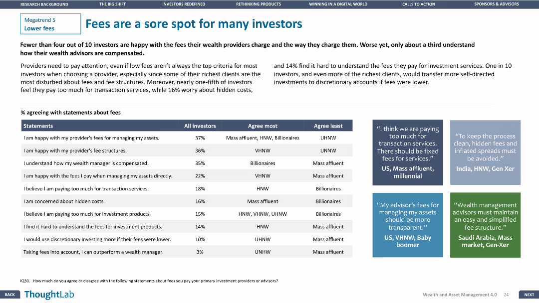
A table comparing investor agreement with fee statements. Three text boxes provide qualitative insights from different regions. Design is clear and focused.
Customer and Market Segmentation
Financial Services
Highlights investor dissatisfaction with fees and transparency issues, with specific agreement percentages and regional insights from investors.
fees, investors, satisfaction, transparency, regions
false
Customer and Market Segmentation
Financial Services
Header Vertical
Deloitte
Add to my slides
Remove from favorites
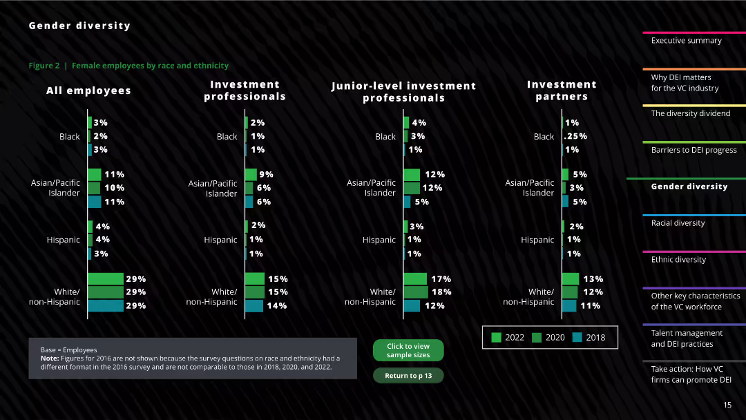
The slide features a column chart showing the distribution of female employees by race and ethnicity across different professional levels. Textual descriptions and notes on survey changes are also included.
Human Resources and Talent Management
Professional Services
This slide provides a detailed breakdown of the racial and ethnic composition of female employees within the investment sector, comparing data from 2018, 2020, and 2022.
Female employees, Racial diversity, Ethnicity, Investment sector, Diversity trends
false
Human Resources and Talent Management
Professional Services
Multiple Chart
Deloitte
Add to my slides
Remove from favorites
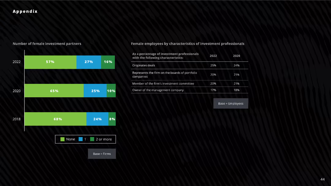
The slide includes bar charts and tables detailing the number of female investment partners and characteristics of female employees in 2018, 2020, and 2022.
Human Resources and Talent Management
Professional Services
The slide highlights trends in the number of female investment partners and their roles within firms over several years.
female investment partners, gender diversity, employee characteristics, investment firms
false
Human Resources and Talent Management
Professional Services
Mixed Chart
Deloitte
Add to my slides
Remove from favorites
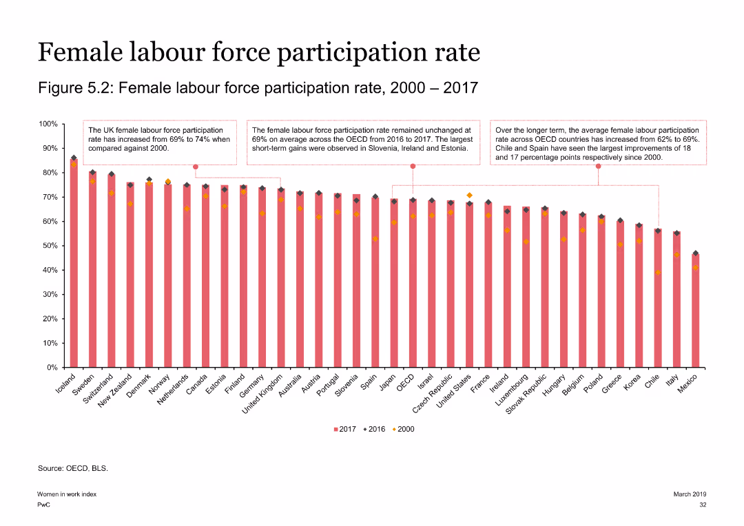
Contains a column chart depicting female labor force participation rates across OECD countries from 2000 to 2017. The slide is visually informative with annotations and a detailed visual layout.
Market Analysis and Trends
Government & Public Sector
Reviews the trends in female labor force participation rates across OECD countries, noting significant improvements in countries like Chile and Spain. The slide provides a clear comparison of participation rates over time.
female labor force, OECD, participation rates, Chile, Spain
false
Market Analysis and Trends
Government & Public Sector
Single Chart
PwC/Strategy&
Add to my slides
Remove from favorites
This slide has moderate visual complexity, featuring two pie charts to represent survey data on female millennials' attitudes toward international experience as a factor in employment. The design uses a consistent color scheme of red and grey to maintain visual coherence.
Human Resources and Talent Management
Professional Services
This slide discusses the importance of international assignments in attracting and retaining female talent, highlighting how such opportunities are crucial for employer branding. It emphasizes the need for organizations to incorporate international mobility into their employee value proposition.
Female talent, Millennials, Employer branding, International assignments
false
Human Resources and Talent Management
Professional Services
Multiple Chart
PwC/Strategy&
Add to my slides
Remove from favorites
The slide features a graph illustrating the disparity between the demand for international work by female millennials and their current representation. It has a moderate visual complexity with an icon of a woman circling a globe, alongside a bar chart displaying the percentage statistics.
Technology and Digital Transformation
Professional Services
It presents data on the demand versus the reality of female participation in international work roles. The aim is to highlight the gap and spur discussion on aligning global mobility strategies with the changing workforce demographics to fully utilize female potential.
Female workforce, International mobility, Gap analysis, Workforce demographics
false
Technology and Digital Transformation
Professional Services
Mixed Chart
PwC/Strategy&
Add to my slides
Remove from favorites
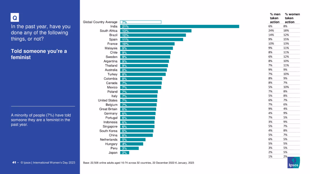
Standard layout; country comparison bar graph with gender-specific stats
Customer and Market Segmentation
Government & Public Sector
This slide shares how many individuals declared themselves feminists over the past year, by country and gender. It shows that the global average is low, indicating a potential reluctance to identify openly as feminist.
feminism, gender identity, personal belief, social opinion, Ipsos, survey, equality
false
Customer and Market Segmentation
Government & Public Sector
Mixed Chart
IPSOS
Add to my slides
Remove from favorites
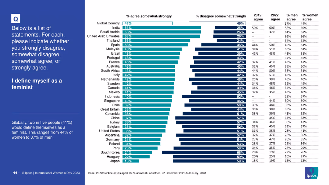
Horizontal bar chart; shows % agreement/disagreement per country; gender-specific agreement percentages; simple and clean layout
Customer and Market Segmentation
Professional Services
This slide reveals the proportion of people globally and by country who identify as feminists. It compares gender agreement levels and includes 2019 and 2022 agreement rates, offering insights into self-identification trends related to feminism.
feminism, identity, self-definition, gender, agreement rates, survey, country-level data, Ipsos
false
Customer and Market Segmentation
Professional Services
Mixed Chart
IPSOS
Add to my slides
Remove from favorites
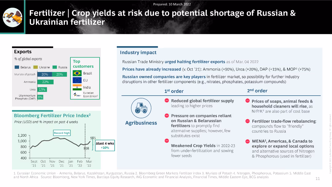
The slide features a mix of charts and text, including a column chart of fertilizer exports from Belarus, Ukraine, and Russia, a price index trend, and a detailed table of industry impacts.
Market Analysis and Trends
Agriculture & Food Production
The slide analyzes the impact of potential fertilizer shortages from Russia and Ukraine on global crop yields. It includes data on export percentages, pricing trends, and the cascading effects on agribusiness, highlighting significant challenges in the fertilizer supply chain.
fertilizer, supply disruption, crop yields, agribusiness, pricing trends
false
Market Analysis and Trends
Agriculture & Food Production
Multiple Chart
BCG
Add to my slides
Remove from favorites
Detailed textual slide with four bullet points outlining areas of concern regarding FGA's impact on technology venture investing.
Strategic Planning
Technology & Software
A thorough assessment of FGA's influence on the technology venture investing market, evaluating four key areas. It's beneficial for strategic planning and understanding FGA's role in market dynamics.
FGA, Impact, Technology, Venture Investing, Strategic Assessment
false
Strategic Planning
Technology & Software
Header Vertical
Oliver Wyman
Add to my slides
Remove from favorites
A blue bar chart presents FGA venture investments as a percentage of the technology venture investing market, accompanied by a summary text on the right side.
Market Analysis and Trends
Technology & Software
This analysis slide discusses the minor proportion of FGA venture investments in the technology sector, highlighting trends and specific large deals. It is suited for investment impact analysis.
FGA, Investment, Technology, Market Share, Analysis
false
Market Analysis and Trends
Technology & Software
Mixed Chart
Oliver Wyman
Add to my slides
Remove from favorites
Stacked bar chart shows FGA internal R&D spending versus technology venture investing, with annotations for key years and percentages.
Investment Analysis
Technology & Software
Analyzing the ratio of FGA internal R&D investments to the overall technology venture investing market, this slide is valuable for discussions on internal vs. external investment strategies.
FGA, R&D, Investment, Technology, Market Analysis
false
Investment Analysis
Technology & Software
Mixed Chart
Oliver Wyman
Add to my slides
Remove from favorites
Pie chart and descriptive statistics compare subsector growth rates with and without FGA acquisitions. It uses blue tones and is paired with detailed text explanations.
Market Analysis and Trends
Technology & Software
Comparing subsector growth rates in the presence and absence of FGA acquisitions, this slide provides insights into FGA's market influence, ideal for market segment analysis.
FGA, Subsectors, M&A, Growth Rates, Market Analysis
false
Market Analysis and Trends
Technology & Software
Mixed Chart
Oliver Wyman
Add to my slides
Remove from favorites
Scatter plot comparing venture capital investment with sales growth, highlighting the technology sector's position relative to other industries.
Strategic Planning
Technology & Software
The slide provides an analysis of the venture capital investment relative to sales growth across sectors, pinpointing the technology sector's appeal for VC investment, useful for strategic market positioning.
FGA, Venture Capital, Technology, Sector Analysis, Investment
false
Strategic Planning
Technology & Software
Mixed Chart
Oliver Wyman
Add to my slides
Remove from favorites
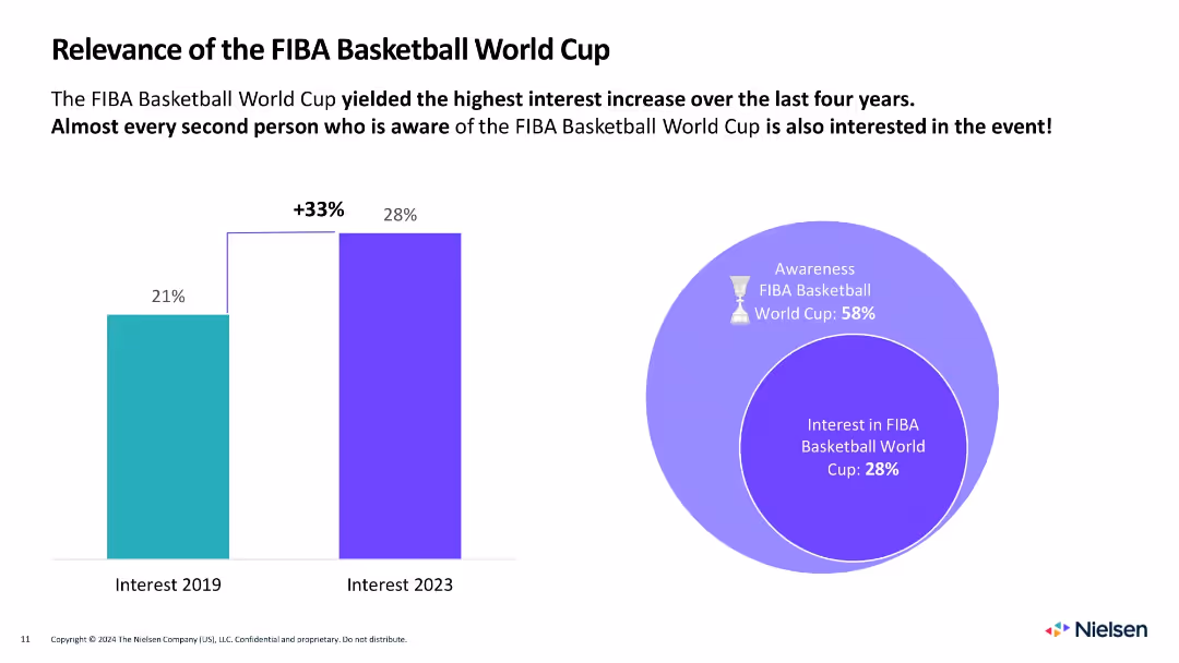
Split layout with vertical bar chart (2019 vs. 2023) on left and circular Venn diagram on right showing awareness vs. interest
Market Analysis and Trends
Media & Entertainment
Demonstrates a 33% rise in interest in the FIBA World Cup from 2019 to 2023. Also shows that 28% of respondents are interested if aware (58% awareness rate).
FIBA, basketball, interest, awareness, growth, sports events, global reach, Venn diagram, comparison, fan engagement
false
Market Analysis and Trends
Media & Entertainment
Multiple Chart
Nielsen
Add to my slides
Remove from favorites
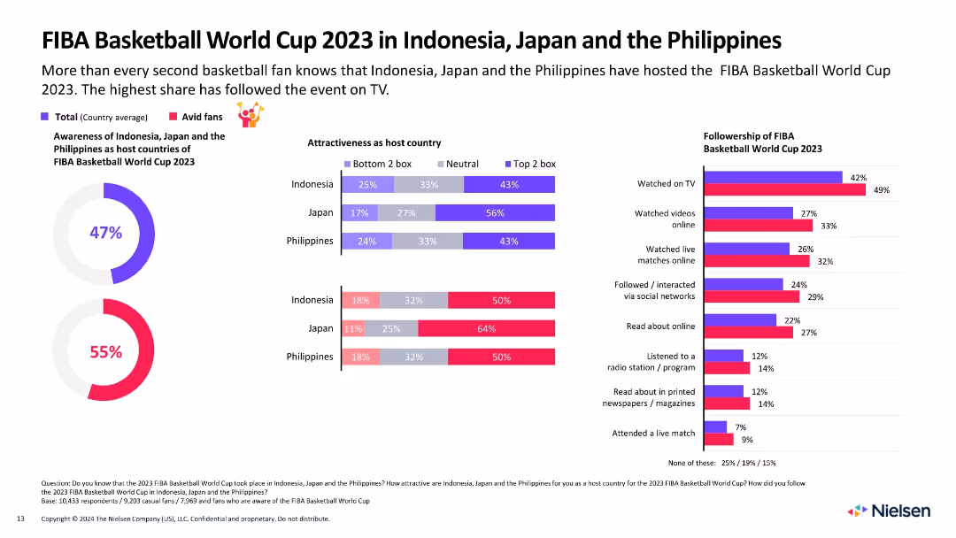
Highly detailed infographic with bar charts, donut charts, and icons; compares host perceptions and viewer behaviors
Market Analysis and Trends
Media & Entertainment
Analyzes awareness and attractiveness of Indonesia, Japan, and the Philippines as hosts. Breaks down viewer engagement by medium and fan segment (casual vs avid).
FIBA, engagement, host countries, fan behavior, awareness, media channels, audience, Indonesia, Japan, Philippines
false
Market Analysis and Trends
Media & Entertainment
Multiple Chart
Nielsen
Add to my slides
Remove from favorites
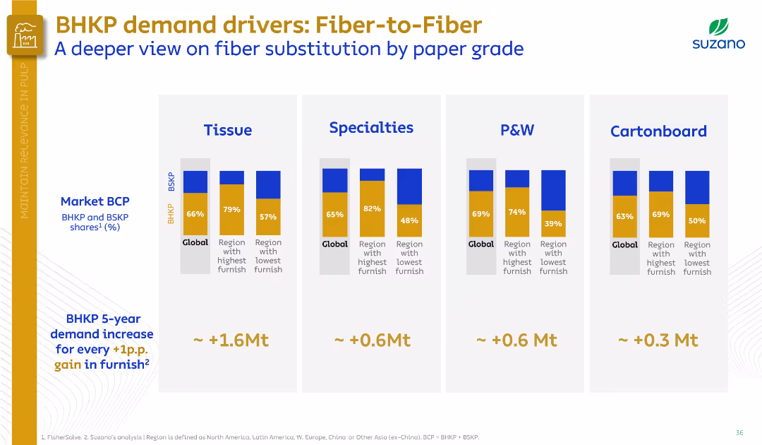
Four vertical bar clusters show fiber substitution by paper grade (Tissue, Specialties, P&W, Cartonboard). Visual-heavy and comparative.
Customer and Market Segmentation
Industrial & Manufacturing
This slide dives deeper into fiber substitution across paper grades, comparing global and regional BHKP/BSKP usage. It estimates demand increases based on furnish shifts, with the highest growth potential in tissue and specialties.
fiber substitution, BHKP, paper grades, tissue, specialties, P&W, cartonboard, furnish
false
Customer and Market Segmentation
Industrial & Manufacturing
Single Chart
Goldman Sachs
Add to my slides
Remove from favorites
Contains column chart and pie charts detailing the financing versus intermediation in industry wallet composition, using blue tones.
Investment Analysis
Financial Services
Showcases opportunities for revenue growth in FICC financing by presenting current market positions and potential revenue increases.
FICC, client financing, industry wallet, revenue growth, market analysis, intermediation, financial services
false
Investment Analysis
Financial Services
Multiple Chart
Goldman Sachs
Add to my slides
Remove from favorites
Features bar charts displaying the percentage of electronification across various FICC asset classes from 2016 to 2020, with key observations on market trends.
Market Analysis and Trends
Financial Services
Provides insights into the electronification trends in FICC products, highlighting different asset class adaptations and market responses.
FICC, electronification, asset classes, market trends
false
Market Analysis and Trends
Financial Services
Multiple Chart
JP Morgan
Add to my slides
Remove from favorites
Two main sections each containing tables and a summary box. The slide has a clear and clean layout, emphasizing the comparative financial data with blue highlights.
Market Analysis and Trends
Financial Services
Summarizes FICC and equities net revenues with annual and quarterly comparisons, accompanied by highlights discussing the financial trends and market conditions.
FICC, equities, net revenues, financial trends, market analysis, Goldman Sachs, performance review, market conditions, investment strategy, year-over-year comparison
false
Market Analysis and Trends
Financial Services
Header Vertical
Goldman Sachs
Add to my slides
Remove from favorites
Slide with two sections, each with column charts and bullet points of text analysis. Blue, gray, and white dominate the color scheme. Dense with data and text.
Financial Performance
Financial Services
Divides the focus between FICC and equities for global markets, analyzing revenue trends and market conditions, ideal for in-depth financial review.
FICC, Equities, Revenue, Trends, Analysis, Global, Markets, Conditions, Financial, Review
false
Financial Performance
Financial Services
Multiple Chart
Goldman Sachs
Add to my slides
Remove from favorites
This slide features a green upward arrows indicating progress, and a series of bullet points with checkmarks. The layout is balanced between graphical data and textual information.
Financial Performance
Financial Services
The slide presents progress across various initiatives in fixed income, currency, and commodities, highlighting key achievements such as market share metrics, new transactions, and balance sheet allocation.
FICC, Progress, Initiatives, Market Share, Transactions, Balance Sheet, Asset Managers, Engineering Capabilities, YoY Growth, Market Making
false
Financial Performance
Financial Services
Table
Goldman Sachs
Add to my slides
Remove from favorites
This slide presents a single column chart tracking the revenues from FICC intermediation over several years. The visual is clear with bold labeling for each year, and a consistent blue color scheme representing data. The simplicity of the design aids in focusing on the trend of revenue durability.
Sales and Business Development
Financial Services
Assesses the stability of revenues in Global Banking & Markets, highlighting the trends in FICC intermediation, suitable for discussions on financial stability and long-term revenue planning.
FICC, revenue stability, long-term trend
false
Sales and Business Development
Financial Services
Single Chart
Goldman Sachs
Add to my slides
Remove from favorites
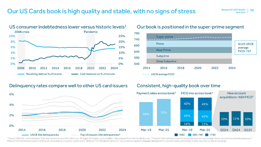
Multi-panel layout with line charts, bar graphs, and a FICO score distribution visual
Customer and Market Segmentation
Financial Services
Highlights the strength of the US cards portfolio, with high FICO score concentration, low delinquency rates, favorable payment rates, and a comparative view versus other issuers, indicating credit quality and stability.
FICO, delinquency, payment rate, super-prime, US cards
false
Customer and Market Segmentation
Financial Services
Multiple Chart
Barclays
Add to my slides
Remove from favorites
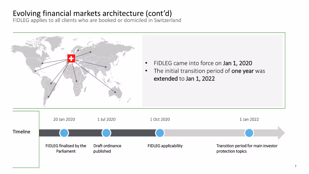
This slide features a world map with a timeline of the FIDLEG implementation phases affecting Swiss-domiciled clients.
Regulatory and Compliance
Financial Services
It provides a timeline of the FIDLEG regulatory changes impacting clients booked or domiciled in Switzerland, including key implementation dates from 2020 to 2022.
FIDLEG, timeline, regulatory, Swiss, financial markets
false
Regulatory and Compliance
Financial Services
Linear Flow
Deloitte
Add to my slides
Remove from favorites
Contains column charts and lists inside boxes detailing historical data and investment strategies.
Risk Assessment and Management
Financial Services
Highlights how principles of fiduciary mindset and insights contribute to navigating market events and client challenges, with growth data from pivotal market events.
Fiduciary, Market Events, Growth, Strategy
false
Risk Assessment and Management
Financial Services
Multiple Chart
JP Morgan
Add to my slides
Remove from favorites
This slide features line charts and bar charts to display agent capacity and available skills in field service management. It uses a dark background with blue and green lines and bars to differentiate between data points.
Operational Efficiency
Energy & Utilities
The slide offers insights into field service management, focusing on agent capacity and available skills, using line and bar charts to visualize the data, enhancing operational efficiency in managing field services.
Field Service, Management, Agent Capacity, Skills, Data Visualization
false
Operational Efficiency
Energy & Utilities
Multiple Chart
EY
Add to my slides
Remove from favorites
The slide features key metrics about FieldView's platform advantages and data collection capabilities, along with a bar chart showing the timeline to collect connected hours.
Technology and Digital Transformation
Agriculture & Food Production
This slide presents FieldView as a leading digital platform for growers, highlighting platform advantages, extensive database, and rapid data collection capabilities, emphasizing its impact on agricultural productivity.
FieldView, Digital Platform, Agriculture, Data Collection, Productivity
false
Technology and Digital Transformation
Agriculture & Food Production
Mixed Chart
Credit Suisse
Add to my slides
Remove from favorites
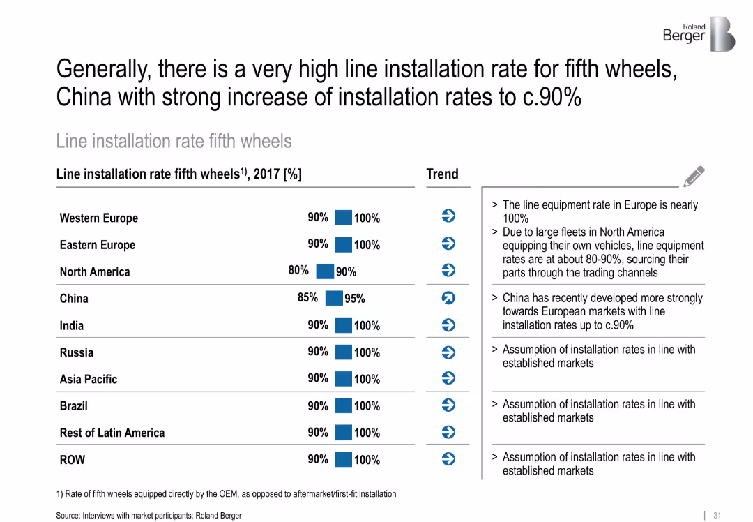
Horizontal bar chart showing installation rate by region with commentary
Technology and Digital Transformation
Transportation & Logistics
This slide highlights high global installation rates of fifth wheels across truck OEMs, with China notably catching up to Western markets. Europe and India already have near 100% installation rates.
fifth wheels, installation rates, China, OEMs, standardization, regional trends
false
Technology and Digital Transformation
Transportation & Logistics
Mixed Chart
Roland Berger
Add to my slides
Remove from favorites
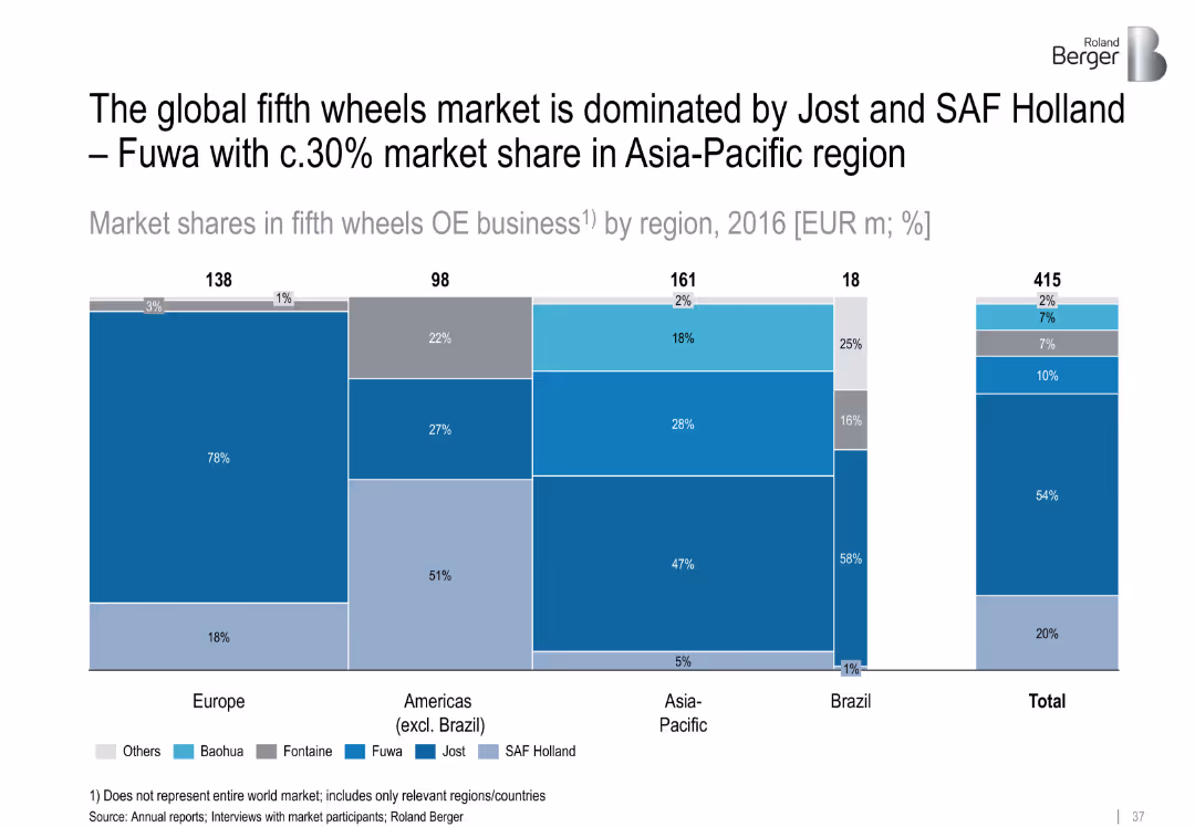
Segmented bar chart showing 2016 market shares by region; color-coded per company
Competitive Landscape
Transportation & Logistics
Jost and SAF Holland dominate the fifth wheels OE market globally. Fuwa holds ~30% share in Asia-Pacific. The chart visualizes shares by region (Europe, Americas, Asia-Pacific, Brazil), totaling EUR 415m.
fifth wheels, Jost, SAF Holland, Fuwa, market share, OE business, regional distribution
false
Competitive Landscape
Transportation & Logistics
Single Chart
Roland Berger
Add to my slides
Remove from favorites
Horizontal bar charts showing varying degrees of economic activity impairment during the Fight phase of the pandemic across different countries.
Strategic Planning
Financial Services
This slide details the economic risks during the Fight phase of COVID-19, estimating potential temporary impacts on economic activity by country.
Fight phase, economic risks, COVID-19, economic activity, temporary impacts, country analysis, economic challenges
false
Strategic Planning
Financial Services
Single Chart
BCG
Add to my slides
Remove from favorites
Column charts analyzing revenue vs. expenditure.
Financial Performance
Financial Services
Compares annual financial figures, including revenue, expenditure, and budget deficits, with visual data representation to illustrate financial trends and fiscal health.
finance, analysis, revenue, expenditure, trends
false
Financial Performance
Financial Services
Multiple Chart
PwC/Strategy&
Add to my slides
Remove from favorites
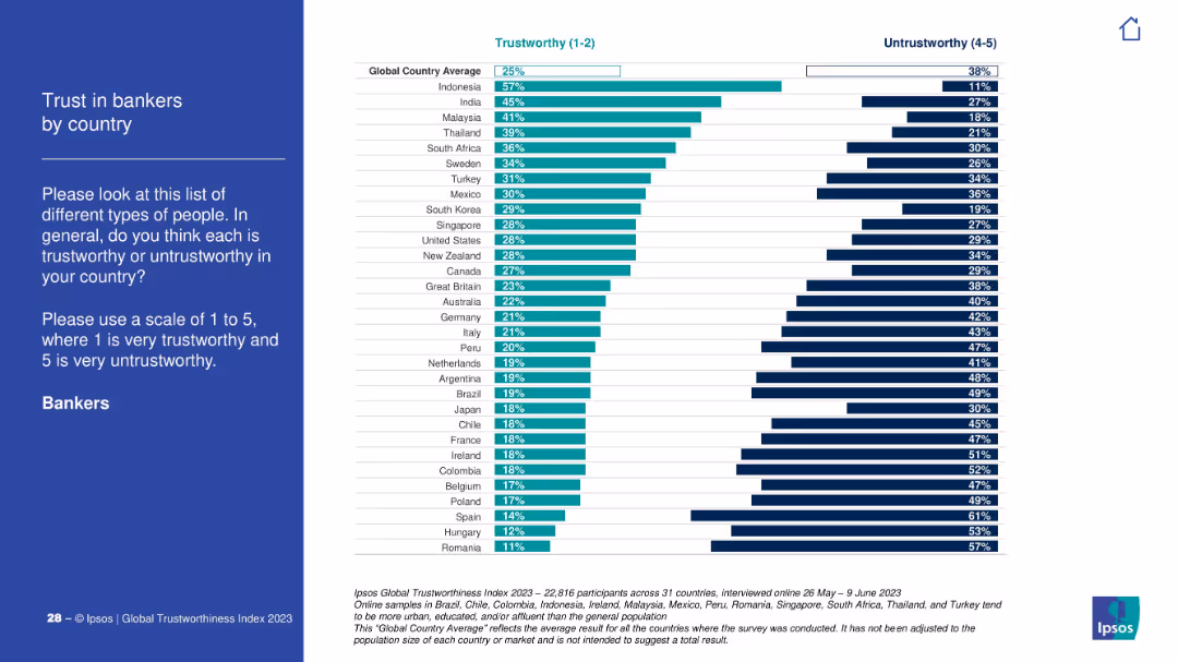
Traditional layout with explanation on left and bar comparison chart on right. Depicts trust scores of bankers by country.
Financial Performance
Financial Services
This slide shows how much people trust bankers globally. Indonesia and India lead in trustworthiness; Romania and Hungary have the lowest trust levels.
finance, bankers, trust score, country index, Ipsos, global, public perception, banking sector
false
Financial Performance
Financial Services
Mixed Chart
IPSOS
Add to my slides
Remove from favorites
Two large donut charts showing percentages of carbon-related assets in a lending portfolio for 2022 and 2023, and one for capital markets financing in wholesale credit. There are also three bar graphs below each chart.
Financial Performance
Financial Services
This slide presents data on carbon-related assets within a lending portfolio and capital market financing, showing year-on-year changes and distribution across different sectors. It's used to monitor financial exposure to carbon-intensive sectors.
finance, carbon, assets, risk, sector exposure
false
Financial Performance
Financial Services
Multiple Chart
Barclays
Add to my slides
Remove from favorites
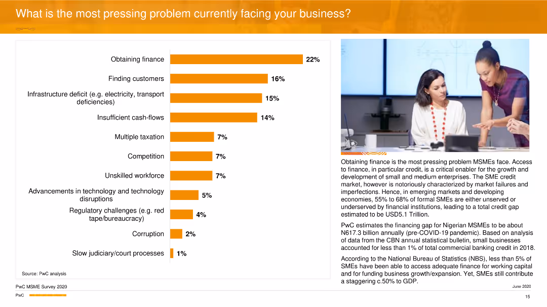
This slide features a horizontal bar chart showing various pressing problems faced by businesses. An image of two women in discussion is included on the right side.
Market Analysis and Trends
Financial Services
The slide discusses the most significant challenges businesses face, with 'Obtaining finance' being the most critical. It provides statistics on each problem's prevalence and elaborates on the financial gaps, especially in emerging markets like Nigeria.
Finance, Challenges, Business, Market Analysis, PwC
false
Market Analysis and Trends
Financial Services
Mixed Chart
PwC/Strategy&
Add to my slides
Remove from favorites
This slide contains a column chart comparing net debt ratios, a column chart showing senior note maturities from 2022 to 2029, and a text box with bullet points outlining strategic financial details.
Financial Performance
Financial Services
The slide presents the financial strategy of Permian Resources, focusing on maintaining a strong balance sheet through various financial instruments, targeted leverage ratios, and detailed notes on borrowings and strategic financial goals.
finance, debt management, leverage ratio, borrowing, financial strategy, maturity profiles, balance sheet
false
Financial Performance
Financial Services
Multiple Chart
Barclays
Add to my slides
Remove from favorites
Consists of a flow chart and additional graphics explaining Barclays' methodology for tracking and setting targets for financed emissions, aligned with the Paris Agreement.
Investment Analysis
Financial Services
Provides an overview of Barclays' approach to calculating financed emissions, including the methodologies used and the specific activities targeted for emission reduction across its portfolios.
financed emissions, Paris Agreement, methodology, sustainability, banking, investment analysis
false
Investment Analysis
Financial Services
Linear Flow
Barclays
Add to my slides
Remove from favorites
Contains a table categorizing various financial processes like Accounts Receivable and Payroll by their potential for digitization, represented in a gradient scale.
Operational Efficiency
Financial Services
Provides a categorization of finance-related tasks and their suitability for digitization based on past project experiences, serving as a reference for digital transformation initiatives in finance.
Finance, digitization, reference cases, digital transformation, accounts receivable, payroll, inventory management, process automation
false
Operational Efficiency
Financial Services
Table
Deloitte
Add to my slides
Remove from favorites
Features pie charts and column chart displaying the divisional composition of business sectors within Deutsche Bank and their respective profits, using blue tones and clear segment labels. It contrasts data from two different fiscal periods.
Financial Performance
Financial Services
Discusses the financial stability and growth of Deutsche Bank by analyzing divisional contributions to overall profit. This slide is relevant for financial analysis presentations focusing on company health and strategic financial planning.
finance, divisional performance, growth, Deutsche Bank
false
Financial Performance
Financial Services
Multiple Chart
Deutsche Bank
Add to my slides
Remove from favorites
Dual-axis line and column chart tracking the NCDOT's cash balance forecasts versus actuals over a decade, highlighting years where balances were above or below expectations.
Regulatory and Compliance
Government & Public Sector
Provides a detailed financial analysis of NCDOT's cash balances over ten years, useful for fiscal reviews and planning in government finance sessions.
finance, forecasts, government, NCDOT, analysis
false
Regulatory and Compliance
Government & Public Sector
Single Chart
McKinsey
Add to my slides
Remove from favorites
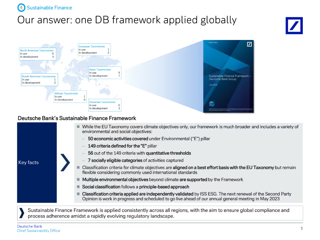
The slide includes text boxes and a map, describing Deutsche Bank's Sustainable Finance Framework and its alignment with global standards and objectives.
Strategic Planning
Financial Services
It explains Deutsche Bank's comprehensive Sustainable Finance Framework, covering economic activities and criteria for environmental and social pillars, applied globally.
Finance, framework, global, sustainability, strategy, criteria, objectives, banking, alignment, ESG
false
Strategic Planning
Financial Services
Graphic
Deutsche Bank
Add to my slides
Remove from favorites
The slide contains a mixture of pie chart and statistical data presentations. The layout is moderately dense with a clear division between graphical and textual information. Colored icons are used to represent different market segments.
Financial Performance
Financial Services
This slide presents financial data and market engagement statistics, such as net profit contribution, years in markets, and client relationships. It is meant to showcase the company’s financial standing and breadth in the commodities and global markets.
Finance, Global Markets, Commodities, Client Relationships, Profit
false
Financial Performance
Financial Services
Mixed Chart
Goldman Sachs
Add to my slides
Remove from favorites
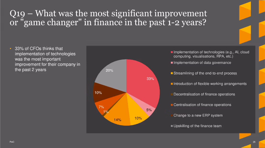
The slide features a pie chart showing the most significant improvements in finance over the past 1-2 years. Improvements include the implementation of technologies, data governance, end-to-end process streamlining, flexible working arrangements, decentralization and centralization of finance operations, changing to a new ERP system, and upskilling the finance team. The chart uses different colors for each category.
Strategic Planning
Financial Services
This slide highlights survey results on the most impactful improvements in finance over the past 1-2 years, with a focus on technological implementations and process optimizations. It is useful for understanding key drivers of recent advancements in the finance sector.
finance improvements, technology, data governance, process streamlining, ERP
false
Strategic Planning
Financial Services
Single Chart
PwC/Strategy&
Add to my slides
Remove from favorites
Combines line charts tracking the Dow Jones US Banks and Insurance indexes with additional bullet points highlighting the industry's resilience and strategic responses to the pandemic.
Market Analysis and Trends
Financial Services
Highlights the minimal impact of COVID-19 on the finance and insurance sectors, compared to others, attributing resilience to digital adoption and strong liquidity, alongside forecasts for mild future impacts.
finance, insurance, COVID-19, resilience, Dow Jones Index, line chart, digital transformation
false
Market Analysis and Trends
Financial Services
Multiple Chart
BCG
Add to my slides
Remove from favorites
This slide shows two declining line charts for banking and insurance stock indexes, alongside quotes from industry leaders on future economic challenges and the strategic outlook.
Market Analysis and Trends
Financial Services
Details the indirect and delayed impacts of COVID-19 on the finance and insurance sectors, using stock performance and executive insights to outline expected challenges and industry responses.
finance, insurance, COVID-19, stock indexes, economic challenges, line chart, executive insights
false
Market Analysis and Trends
Financial Services
Mixed Chart
BCG
Add to my slides
Remove from favorites
Contains two line charts tracking Bank and Insurance stock indexes over time, a series of bullet points outlining future expectations for banks and insurers, and two quotes from financial executives. Layout includes color coding for different elements: blue for banks, green for insurers.
Market Analysis and Trends
Financial Services
This slide analyzes the impact of economic headwinds on the finance and insurance industries, predicting indirect and delayed effects. It includes forecasts about market challenges, with specific insights from industry executives on anticipated credit losses and profitability issues due to dropping investment returns.
finance, insurance, economic impact, market forecast, stock indexes
false
Market Analysis and Trends
Financial Services
Mixed Chart
BCG
Add to my slides
Remove from favorites
This slide features a column chart and textual annotations. The layout is divided into three main columns with comparative data across different years.
Financial Performance
Financial Services
This slide presents the financial investments and adjustments within the franchise, focusing on expense ratios and investment volumes over a three-year period. It is used for evaluating financial discipline and strategic investment outcomes.
Finance, Investment, Expense, Ratio, Comparison, Data-Driven Business, Client Solutions, Client Experience
false
Financial Performance
Financial Services
Mixed Chart
JP Morgan
Add to my slides
Remove from favorites
A bar chart showing the percentage of time spent on five major finance processes: Close & Reconcile, Consolidate & Report, Accounts Payable, Receivable, Planning & Budgeting, highlighting inefficiencies.
Operational Efficiency
Financial Services
Highlights the processes where the finance team spends the most time, suggesting prioritization of these for digital transformation to improve efficiency and productivity.
finance processes, time management, digital transformation, efficiency, productivity, planning, budgeting, accounts payable
false
Operational Efficiency
Financial Services
Mixed Chart
Deloitte
Add to my slides
Remove from favorites
Slide contains a bar chart with green bars, showing the percentage of companies planning to use different financing methods to enhance productivity.
Financial Performance
Professional Services
Analyzes financing strategies companies are employing to fund productivity enhancements, such as equity from investors or debt financing.
finance, productivity, equity, investment, debt
false
Financial Performance
Professional Services
Single Chart
Deloitte
Add to my slides
Remove from favorites
This slide features two pie charts comparing divisional compositions for Q1 2023 and Q1 2022, and a column chart for Q1 2023 LTM profits with descriptive bullet points on the right.
Financial Performance
Financial Services
This slide presents a financial overview of a bank's divisional profit distribution for Q1 2023 versus Q1 2022, and its long-term profit trends. It discusses contributions from various banking divisions and strategies for managing market volatility.
Finance, Profit, Portfolio, Trends, Performance, Banking, Strategy, Market Volatility, Q1 2023
false
Financial Performance
Financial Services
Multiple Chart
Deutsche Bank
Add to my slides
Remove from favorites
Circular diagram representing the evolving roles of finance in business, emphasizing strategic partnership.
Strategic Planning
Financial Services
Explains the expected evolution of the finance function from traditional roles to more strategic, advisory roles within a company.
finance roles, business partnership, strategic evolution, management expectations, operational efficiency
false
Strategic Planning
Financial Services
Diagram
Deloitte
Add to my slides
Remove from favorites
Slide with two sections separated by a dashed line, containing column charts and checklists.
Financial Performance
Financial Services
Focuses on Equifax's financial strategies, including shifts in capital expenditures and goals for free cash flow, aiming for operational efficiency and shareholder returns.
Finance, Strategy, Capital, Growth, Efficiency
false
Financial Performance
Financial Services
Multiple Chart
Barclays
Add to my slides
Remove from favorites
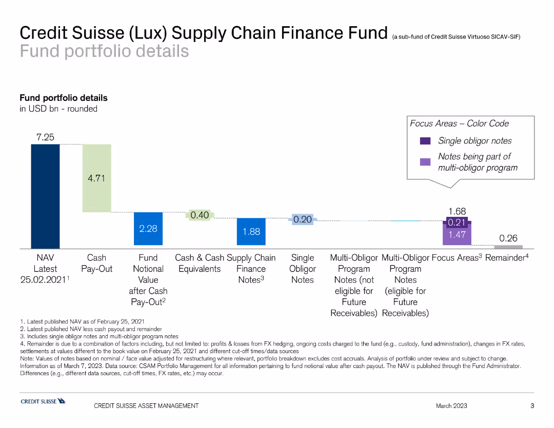
This slide shows a bar chart detailing the fund portfolio of the Credit Suisse Supply Chain Finance Fund, with different colors indicating various components such as NAV, cash pay-out, and finance notes.
Investment Analysis
Financial Services
The slide provides an overview of the Credit Suisse Supply Chain Finance Fund's portfolio, showing asset allocation and financial status. It is used for fund analysis and investment review.
finance, supply chain, portfolio, Credit Suisse, fund analysis
false
Investment Analysis
Financial Services
Single Chart
Credit Suisse
Add to my slides
Remove from favorites
Previous
Next
You don't have any favorites yet.
Please wait loading your favorites slides...
Create a FREE account to continue browsing
Receive Instant Access to 1,000+ slides from companies like McKinsey, Google, and Goldman Sachs
First Name
Last Name
Email
Password
I agree to all
Terms & Privacy Policy
Thank you! Your submission has been received!
Oops! Something went wrong while submitting the form.
Have an account?
Sign in
Upgrade to PRO to Save slides
Advanced Search and Filters
Access to 15,000+ slides
Access to Category Pages
Save/Bookmark Slides
PowerPoint Template Library
Pick a Plan
MONTHLY
$12/month
Billed every month, Cancel anytime.
YEARLY
$9/year
Billed $108 annually, Cancel anytime.
Checkout for $12/month
Checkout for $108/yr
Secured by Stripe | AES-256 bit encryption