My Account
My Slides
Search by Category
Companies
Slide Type
Use Case
Industry
Pricing
Templates
View All Templates
Download Template Slides
✦ AI
AI Prompt Library
AI Search
Feedback
Login
Logout
Get Started
Browse all Slides
Browse all Slides
Create a FREE Account
Instant access to 1,000+ real slides from top companies like McKinsey, BCG, Goldman Sachs, Google and many more!
First Name
Last Name
Email
Password
I agree to all
Terms & Privacy Policy
Thank you! Your submission has been received!
Oops! Something went wrong while submitting the form.
Have an account?
Sign in
Saved Slides
Total No. of slides saved
0
↻ Refresh
✖ Clear all
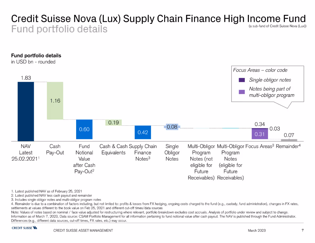
This slide contains a bar chart illustrating the portfolio details of the Credit Suisse Nova Supply Chain Finance High Income Fund, with different colors representing various financial components.
Investment Analysis
Financial Services
The slide offers a detailed view of the Credit Suisse Nova Supply Chain Finance High Income Fund's portfolio, highlighting asset distribution and financial metrics. It is used for investment assessment.
finance, supply chain, portfolio, Credit Suisse, high income
false
Investment Analysis
Financial Services
Single Chart
Credit Suisse
Add to my slides
Remove from favorites
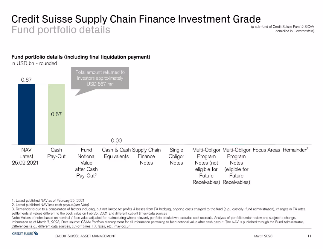
This slide features a bar chart showing the portfolio details of the Credit Suisse Supply Chain Finance Investment Grade Fund, including NAV, cash pay-out, and financial notes in different colors.
Investment Analysis
Financial Services
The slide presents the investment portfolio of the Credit Suisse Supply Chain Finance Investment Grade Fund, indicating asset allocation and financial status. It is used for analyzing investment grade funds.
finance, supply chain, portfolio, Credit Suisse, investment grade
false
Investment Analysis
Financial Services
Single Chart
Credit Suisse
Add to my slides
Remove from favorites
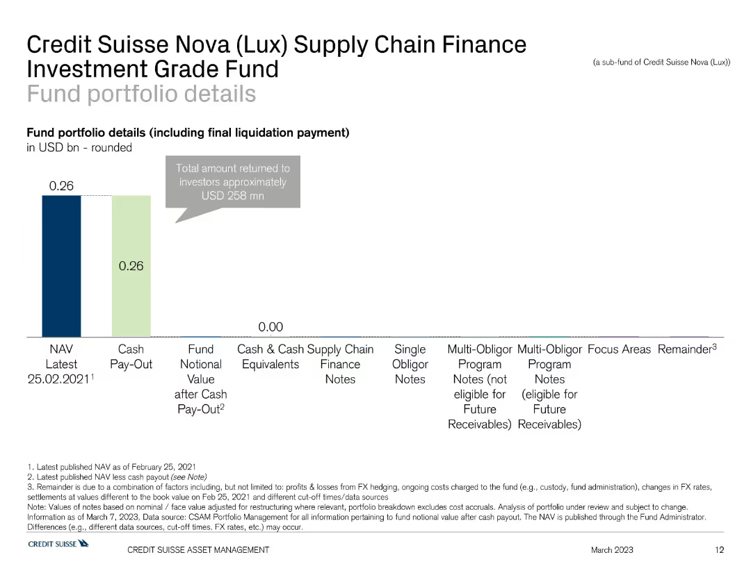
This slide shows a bar chart detailing the fund portfolio of the Credit Suisse Nova Supply Chain Finance Investment Grade Fund, with different sections indicating NAV, cash pay-out, and finance notes.
Investment Analysis
Financial Services
The slide provides an overview of the Credit Suisse Nova Supply Chain Finance Investment Grade Fund's portfolio, focusing on asset allocation and financial metrics. It is used for investment evaluation.
finance, supply chain, portfolio, Credit Suisse, investment grade
false
Investment Analysis
Financial Services
Single Chart
Credit Suisse
Add to my slides
Remove from favorites
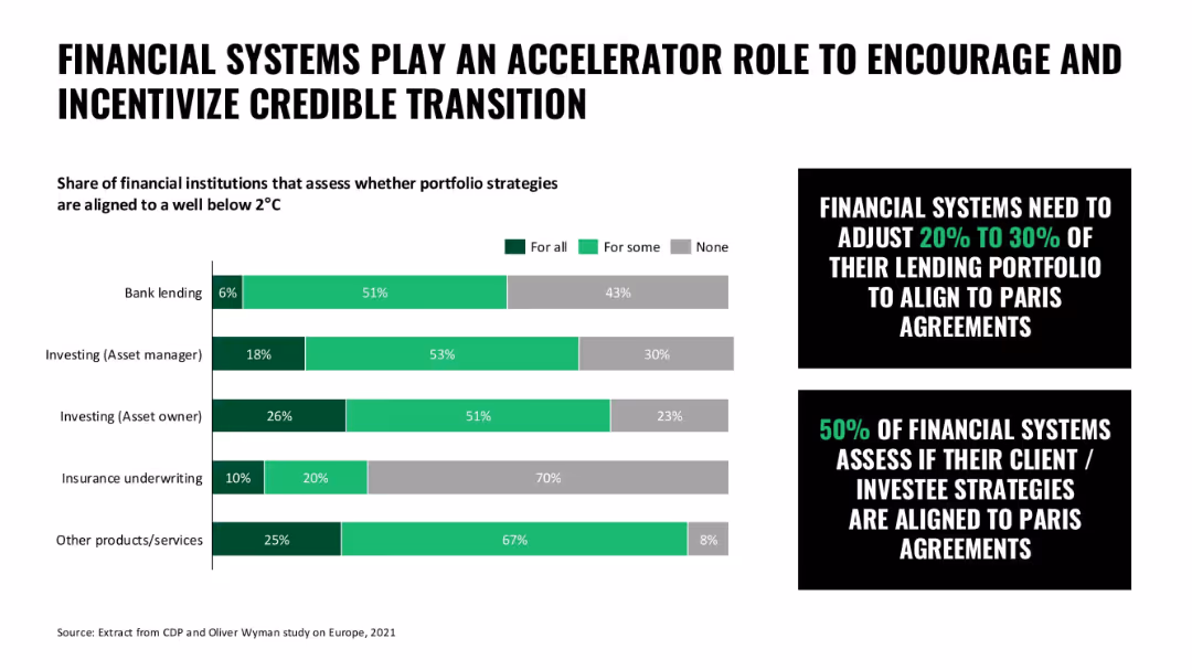
Bar chart with shaded horizontal bars for financial institution categories; callout boxes emphasize portfolio alignment
Technology and Digital Transformation
Financial Services
This slide illustrates the role of financial systems in encouraging climate alignment through lending and investing strategies, with many systems aligning some or all portfolios to 2°C targets.
finance, sustainability, climate transition, lending, investment strategy, portfolio alignment
false
Technology and Digital Transformation
Financial Services
Mixed Chart
Oliver Wyman
Add to my slides
Remove from favorites
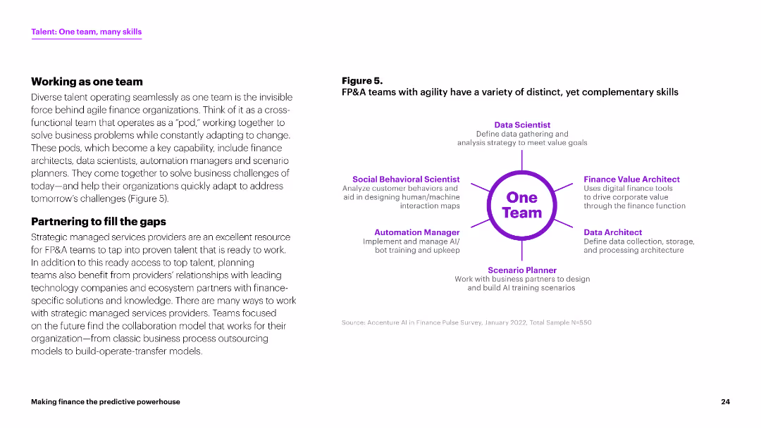
The slide features a diagram showing various roles within a finance team, such as Data Scientist and Automation Manager, in a circular layout around "One Team." The design uses purple tones.
Human Resources and Talent Management
Financial Services
This slide outlines the concept of cross-functional teams in finance, emphasizing the roles of different specialists working together to solve business challenges and adapt to changes.
finance team, cross-functional, data scientist, automation manager, collaboration
false
Human Resources and Talent Management
Financial Services
Header Vertical
Accenture
Add to my slides
Remove from favorites
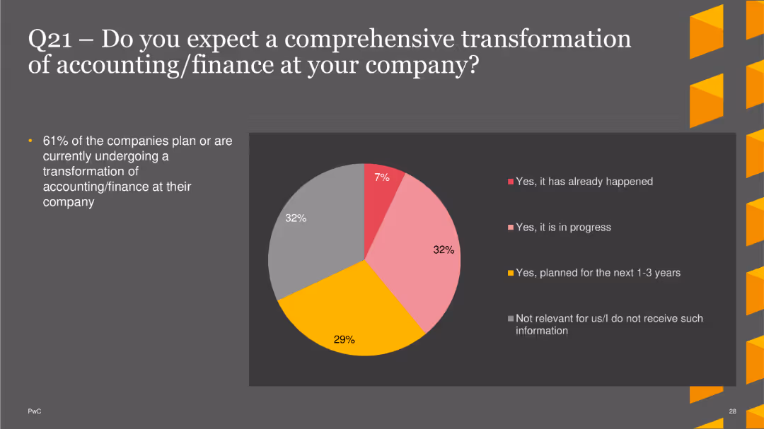
The slide features a pie chart showing expectations for comprehensive transformation in accounting/finance. Options include transformations that have already happened, are in progress, planned for the next 1-3 years, or not relevant. The chart uses different colors for each option. A brief text section explains the percentage of companies undergoing or planning transformations.
Technology and Digital Transformation
Financial Services
This slide illustrates survey results regarding companies' plans for comprehensive transformations in their accounting/finance functions, with a focus on current and future transformation efforts. It helps in understanding the adoption of transformative practices in finance.
finance transformation, accounting, digital transformation, trends, finance
false
Technology and Digital Transformation
Financial Services
Single Chart
PwC/Strategy&
Add to my slides
Remove from favorites
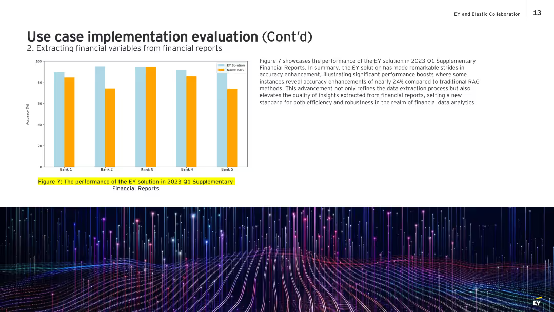
Bar chart on left showing comparative accuracy for five banks; text box on the right discusses the results.
Performance Metrics and KPIs
Financial Services
Highlights the performance improvement of EY’s data extraction system over traditional Naive RAG methods for Q1 2023 reports. The chart shows accuracy improvements of up to 24%, demonstrating robustness and quality in extracting actionable financial insights. It sets a benchmark for efficiency and reliability in financial data analysis.
financial accuracy, performance improvement, EY solution, Naive RAG, Q1 2023, analytics
false
Performance Metrics and KPIs
Financial Services
Mixed Chart
EY
Add to my slides
Remove from favorites
With contrasting green column chart for deposits and blue for credit, the slide visually separates the concepts while including percentages and CAGR values.
Financial Performance
Financial Services
The slide showcases JPMorgan’s financial advisory performance, with a focus on deposit inflows and credit portfolio growth, emphasizing balanced financial advising.
financial advisory, deposits, credit, JPMorgan, CAGR, balance sheet, portfolio growth
false
Financial Performance
Financial Services
Multiple Chart
JP Morgan
Add to my slides
Remove from favorites
Features a bar chart comparing cumulative advisory revenues and text sections summarizing M&A leadership and achievements. The design is straightforward, with blue tones and well-organized information.
Competitive Landscape
Financial Services
It outlines Goldman Sachs' dominance in financial advisory, comparing cumulative revenues and highlighting achievements in M&A, suitable for showcasing the firm’s advisory capabilities to investors or during corporate strategy meetings.
Financial advisory, M&A, revenue, market leadership, Goldman Sachs
false
Competitive Landscape
Financial Services
Mixed Chart
Goldman Sachs
Add to my slides
Remove from favorites
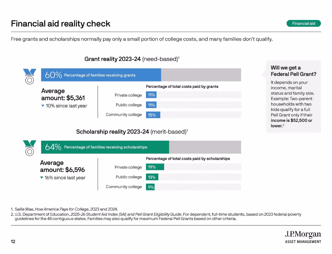
Two horizontal bar charts with icons and labels, side-by-side text block, light background with color-coded segments.
Market Analysis and Trends
Education & Training
This slide contrasts the realities of need-based grants and merit-based scholarships for the 2023–24 academic year. It highlights the percentage of families receiving each, average dollar amounts awarded, and the typical percentage of college costs covered. A sidebar explains Pell Grant eligibility criteria.
financial aid, grants, scholarships, college cost, Pell Grant, education
false
Market Analysis and Trends
Education & Training
Multiple Chart
JP Morgan
Add to my slides
Remove from favorites
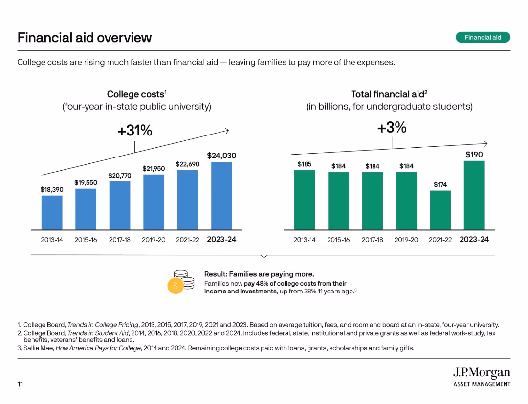
Two vertical bar charts comparing college costs and total financial aid over time. Summary box notes shifting burden to families.
Financial Performance
Education & Training
This slide highlights how college costs have risen 31% over 10 years, while financial aid increased only 3%. Families now bear a larger share of expenses, with 48% of college costs covered from income and investments compared to 38% a decade ago.
financial aid, rising costs, student burden, tuition trends, aid gap, college expenses, cost growth, funding shortfall, family responsibility
false
Financial Performance
Education & Training
Multiple Chart
JP Morgan
Add to my slides
Remove from favorites
Slide includes bar charts and a remarks section. Focuses on account premium sizes and net premiums written by companies, segmented by line of business with explanatory remarks.
Market Analysis and Trends
Financial Services
Examines the financial aspects of insurance underwriters' profiles, focusing on average account premium and company's net premiums across different lines of business.
financial analysis, insurance, premiums, account size, company revenue, business lines, personal lines, commercial lines, specialty lines
false
Market Analysis and Trends
Financial Services
Multiple Chart
Accenture
Add to my slides
Remove from favorites
Column charts display trends in net revenues, cost/income ratio, and return on equity for Q1 across two years.
Operational Efficiency
Financial Services
Analyzes early 2023 financial performance, focusing on revenue growth, efficiency improvements, and capital strength despite market volatility.
financial analysis, revenue growth, efficiency, market volatility, 2023, banking
false
Operational Efficiency
Financial Services
Multiple Chart
Deutsche Bank
Add to my slides
Remove from favorites
Comprising pie charts and column charts showing movements in asset and liability balances, this slide is organized to facilitate easy comprehension of complex financial data.
Financial Performance
Financial Services
Provides insights into Level 3 assets and liabilities, indicating the valuation and risk associated with unobservable assets, crucial for financial risk assessment and investment decision-making.
financial assets, liabilities, risk assessment, valuation
false
Financial Performance
Financial Services
Multiple Chart
Deutsche Bank
Add to my slides
Remove from favorites
Contains pie charts comparing Level 3 assets and liabilities, accompanied by column charts that trace movements in balances over a specific period. The visual elements are arranged to clearly distinguish assets and liabilities with different colors.
Risk Assessment and Management
Financial Services
Explains the concept of Level 3 assets and liabilities, which represent significant valuation uncertainty, highlighting their movement and impact on financial risk management.
financial, assets, liabilities, risk, valuation
false
Risk Assessment and Management
Financial Services
Multiple Chart
Deutsche Bank
Add to my slides
Remove from favorites
The slide includes a horizontal bar chart showing agreement and disagreement percentages on various financial attitudes, with detailed text descriptions. White background, minimalistic design.
Market Analysis and Trends
Financial Services
This slide highlights shifts in Canadian investors' financial priorities due to the pandemic, including a focus on saving, debt repayment, and extended work years for retirement savings.
financial attitudes, saving, debt repayment, retirement, COVID-19
false
Market Analysis and Trends
Financial Services
Mixed Chart
IPSOS
Add to my slides
Remove from favorites
Slide contains multiple column charts, and comparative data tables for loans and deposits across different bank types over several quarters, structured with clear section headers.
Financial Performance
Financial Services
This slide provides a quarterly financial performance overview for various types of banks, illustrating trends in loans and deposits, and highlighting key financial changes and ratios.
financial, banks, quarterly, loans, deposits, trends, performance, analysis
false
Financial Performance
Financial Services
Multiple Chart
Deutsche Bank
Add to my slides
Remove from favorites
Contains a column chart showing percentages for three years under categories such as 'significantly more attention' to 'significantly less attention' regarding employee focus on financial benefits, with an emphasis on the increase since 2022.
Performance Metrics and KPIs
Financial Services
Analyzes the trends of employee attention to financial benefits over the years, with a focus on the increased attention in the recent year, useful for gauging employee priorities.
Financial Benefits, Employee Attention, Trend Analysis, Year-over-Year, Bar Graph
false
Performance Metrics and KPIs
Financial Services
Single Chart
Goldman Sachs
Add to my slides
Remove from favorites
The slide has a two-column layout with bullet points and a small pie chart in the top right corner. The left side includes three text sections with headers, and the right side features a column chart with map icons representing various bank locations across the U.S.
Financial Performance
Financial Services
The slide emphasizes the firm's commitment to community development financial institutions and minority depository institutions, detailing financial contributions and strategic partnerships across various states in the U.S.
Financial Commitment, CDFIs, MDIs, Investment, Community Development, Partnerships, U.S. Map, Strategic Growth
false
Financial Performance
Financial Services
Boxed
JP Morgan
Add to my slides
Remove from favorites
Features a mix of text and graphics, including percentages and diagrams, to highlight financial anxieties and the benefits of hybrid working for Gen Zs and millennials.
Operational Efficiency
Professional Services
The slide addresses the financial concerns of Gen Z and millennials, focusing on their exploration of new working models, including hybrid working, to improve their income. It presents survey data and highlights the benefits and preferences for these new working models.
Financial concerns, hybrid work, Gen Z, millennials, income
false
Operational Efficiency
Professional Services
Multiple Chart
Deloitte
Add to my slides
Remove from favorites
A bar chart comparing Millennials and Gen Z on financial prudence and ability to cope with financial crises, with percentage indicators for various financial metrics.
Financial Performance
Financial Services
This slide examines long-term financial concerns and short-term financial comfort among Millennials and Gen Z, focusing on their ability to handle financial crises.
Financial concerns, short-term comfort, Millennials, Gen Z, financial prudence, financial metrics, comparison, financial crisis
false
Financial Performance
Financial Services
Mixed Chart
Deloitte
Add to my slides
Remove from favorites
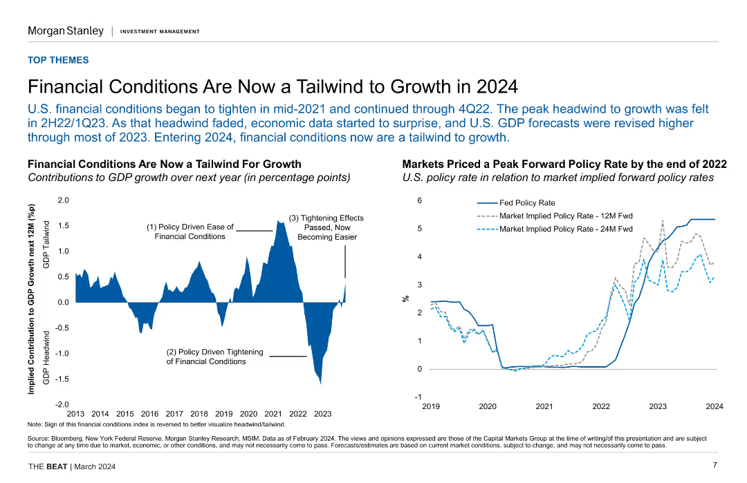
Combination of line charts illustrating the impact of financial conditions on GDP growth and market-implied policy rates over time. Includes annotations for key events and trends from 2013 to 2024.
Market Analysis and Trends
Financial Services
Examines how changing financial conditions have become favorable for economic growth in 2024, supported by data on GDP growth and policy rates. Useful for economic forecasting and investment strategy.
financial conditions, GDP growth, policy rates, economic forecasting, investment strategy
false
Market Analysis and Trends
Financial Services
Multiple Chart
Morgan Stanley
Add to my slides
Remove from favorites
The slide combines checklists with green checkmarks and company logos. It includes text bullet points on the left, highlighting attributes of Goldman Sachs’ financial counseling platform, and colorful logos of notable companies like Verizon and IBM on the right.
Strategic Planning
Financial Services
Outlines Goldman Sachs' financial counseling service, emphasizing strong corporate relationships and comprehensive advisor support. Aimed at showcasing client relationships and service features to potential corporate clients.
Financial Counseling, Corporate Relationships, Advisors
false
Strategic Planning
Financial Services
Header Horizontal
Goldman Sachs
Add to my slides
Remove from favorites
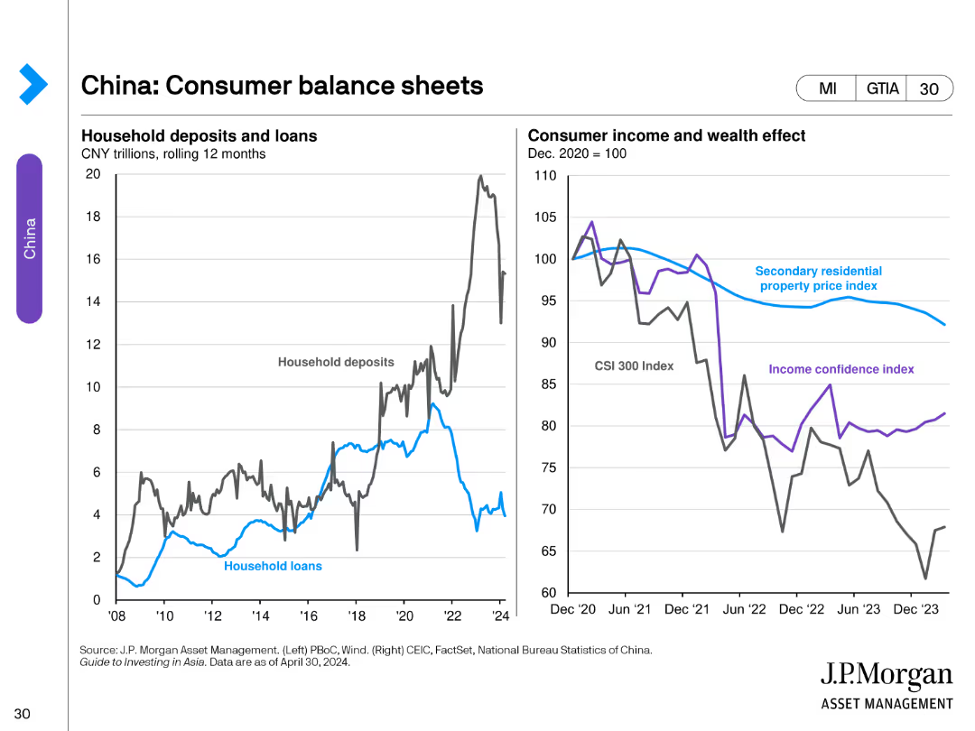
The slide features two line charts. The left chart depicts household deposits and loans in trillions of CNY. The right chart shows consumer income and wealth effect, including indexes like secondary property price and income confidence.
Financial Performance
Financial Services
This slide reviews the financial status of Chinese consumers, showing trends in household deposits and loans and examining the effect on consumer income and wealth.
Financial, Deposits, Loans, Wealth, Income
false
Financial Performance
Financial Services
Multiple Chart
JP Morgan
Add to my slides
Remove from favorites
Column chart comparing difficulties in paying bills or accessing essentials during COVID-19, between May 2020 and December 2020.
Financial Performance
Financial Services
Highlights the challenges faced by households in paying bills and accessing essentials during the COVID-19 pandemic.
financial difficulties, COVID-19, bills, essentials, household challenges
false
Financial Performance
Financial Services
Single Chart
IPSOS
Add to my slides
Remove from favorites
Detailed analysis with multiple small graphs and lists showing financial implications of digital assets across services.
Technology and Digital Transformation
Financial Services
Summarizes how various aspects of financial services are adapting to and profiting from the integration of digital assets.
Financial, Digital Assets, Blockchain, Services, Value
false
Technology and Digital Transformation
Financial Services
Linear Flow
McKinsey
Add to my slides
Remove from favorites
This slide includes a vertical arrow chart for revenue and expense CAGR, and a column chart for expense breakdown from 2017 to 2021. The design is simple and uses a blue and gray color scheme for visual consistency.
Operational Efficiency
Financial Services
Demonstrating financial discipline at JPMorgan Chase, the slide shows historical revenue and expense growth, and a detailed breakdown of expenses. It is ideal for financial oversight meetings, demonstrating fiscal responsibility and efficiency in expense management while maintaining revenue growth.
Financial Discipline, Expenses, Revenue Growth, CAGR, Investment, Structural Costs, Volume, Efficiency, Cost Management
false
Operational Efficiency
Financial Services
Multiple Chart
JP Morgan
Add to my slides
Remove from favorites
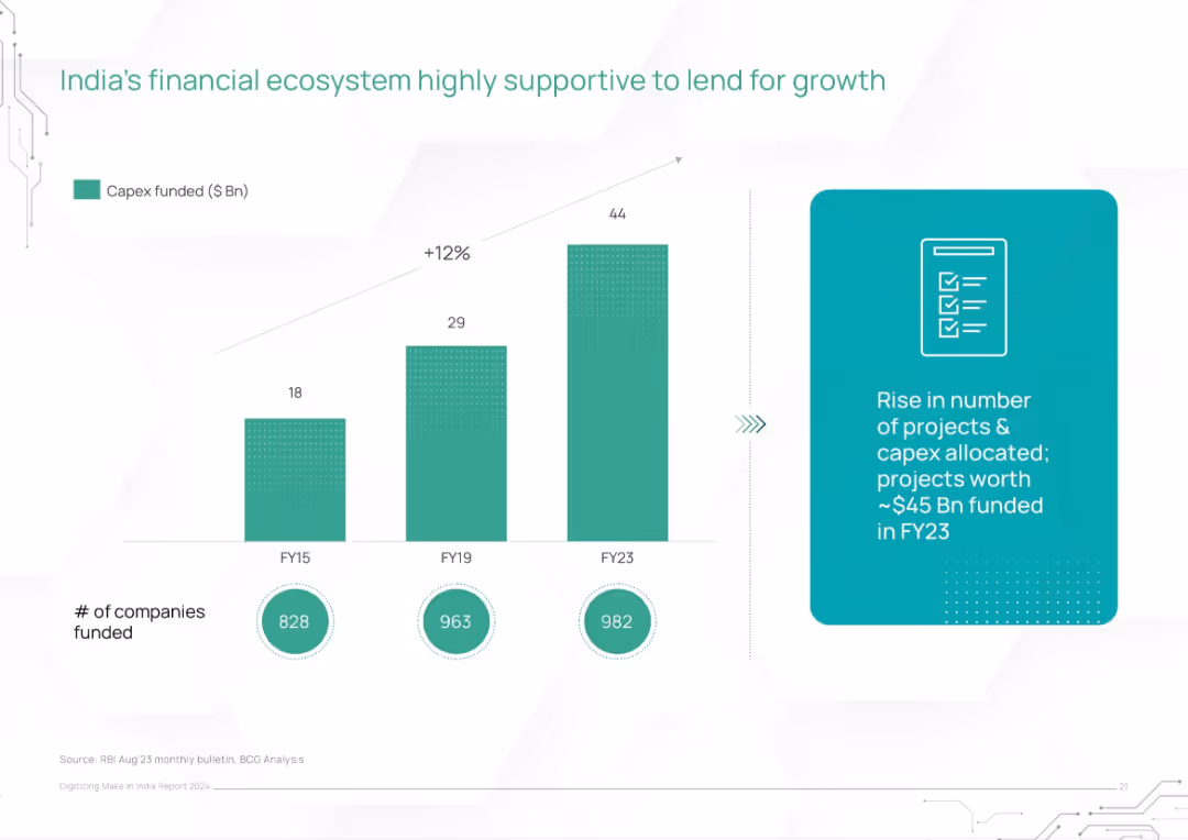
Bar chart showing growth in capex funding (FY15–FY23) and number of companies funded. Includes supporting text box.
Investment Analysis
Financial Services
The slide portrays how India's financial ecosystem is evolving to support economic growth, with a 12% CAGR in capex funding and increasing number of funded companies. It underlines the role of institutional funding in enabling large-scale projects.
financial ecosystem, capex, funding, companies, growth, investments, infrastructure finance, India economy
false
Investment Analysis
Financial Services
Mixed Chart
BCG
Add to my slides
Remove from favorites
The slide includes a column chart displaying participants' views on the importance of crypto assets in the financial ecosystem, rated from 1 to 7.
Market Analysis and Trends
Financial Services
This slide assesses participants' opinions on the current significance of crypto assets within the financial ecosystem.
Financial ecosystem, crypto assets, significance, survey, participants
false
Market Analysis and Trends
Financial Services
Mixed Chart
IPSOS
Add to my slides
Remove from favorites
The slide presents a central pie chart with a cohesive color scheme to show the division of customer types within a financial service ecosystem, surrounded by related statistics and text.
Market Analysis and Trends
Financial Services
This slide illustrates the ecosystem of a financial service provider, detailing the synergy between various business units and the benefits of cross-segment customer integration for business expansion.
financial ecosystem, customer segmentation, business integration, JPMC
false
Market Analysis and Trends
Financial Services
Single Chart
JP Morgan
Add to my slides
Remove from favorites
Slide features a line graph showing a downward trend in expense growth from 2023 to 2024, and a column chart detailing components such as Core, FDIC, Acquisitions, and Pension costs.
Financial Performance
Financial Services
Highlights the financial strategy for 2024 focusing on reducing expense growth with specific initiatives like cost savings from various corporate activities.
financial, expenses, 2024, savings, growth
false
Financial Performance
Financial Services
Mixed Chart
Barclays
Add to my slides
Remove from favorites
The slide features a column chart with vertical columns, two text blocks, and a diagram with a dotted line indicating the efficiency ratio. The layout is well-organized, and the color scheme is muted with blue highlights.
Financial Performance
Financial Services
The slide provides a detailed comparison of expenses and financial results, highlighting key areas such as compensation, transaction-based expenses, and efficiency ratio. It’s designed for financial analysis and might be used to illustrate fiscal responsibility or areas for cost reduction in a corporate finance context.
financial, expenses, efficiency, compensation, technology, professional fees, tax rate, Goldman Sachs
false
Financial Performance
Financial Services
Mixed Chart
Goldman Sachs
Add to my slides
Remove from favorites
A column chart illustrates 2022 revenue with potential increases and decreases from various business factors. Text boxes provide context for each bar, explaining the contributions to total revenue and expectations. The color scheme distinguishes between actual and hypothetical values.
Investment Analysis
Financial Services
This forward-looking slide assesses how recent investments could impact revenue and EBITDA, providing a projection beyond the current fiscal year. It's valuable for strategic planning and forecasting future financial outcomes.
financial forecasting, investment impact, strategic planning
false
Investment Analysis
Financial Services
Single Chart
Goldman Sachs
Add to my slides
Remove from favorites
Combines column charts and small line graphs with future financial projections and economic indicators.
Financial Performance
Financial Services
Provides financial forecasts based on current economic scenarios with data up to 2026.
financial, forecasts, 2026, economy, scenarios
false
Financial Performance
Financial Services
Multiple Chart
Barclays
Add to my slides
Remove from favorites
This slide is dense with text and icons representing various financial metrics. There is a central graphic that connects different components, including market share and revenue details, indicating growth over time. The color scheme is consistent with the company branding.
Financial Performance
Financial Services
This slide evaluates the success of different financial franchises within a major bank, comparing market share and revenue growth over a decade. Key performance metrics are displayed, emphasizing the company's strong market position and growth in various financial sectors. This serves as a financial performance summary and may be used to attract investors or as part of an annual report.
Financial Franchise, Market Share, Revenue Growth, Performance Metrics, Banking, Investment, Client Assets, Market Positioning
false
Financial Performance
Financial Services
Framework
JP Morgan
Add to my slides
Remove from favorites
This slide uses a series of tables to list financial targets and achievements, with the current year highlighted in blue, making it visually straightforward and focused.
Financial Performance
Financial Services
Details financial targets and performance for investment banking, facilitating discussions on goal setting and financial planning.
financial goals, investment banking, revenue targets, overhead ratio, return on equity, financial planning, performance tracking.
false
Financial Performance
Financial Services
Table
JP Morgan
Add to my slides
Remove from favorites
Presents a column chart with a trend line, illustrating growth in awarded business from 2023 to 2027. Uses red, green, and blue colors to differentiate data points and includes a legend for clarity. The chart is detailed with specific figures and percentage changes noted.
Financial Performance
Industrial & Manufacturing
Analyzes the financial growth trend based on the awarded business backlog, providing insights into future revenue potential. It’s ideal for financial forecasting and discussing strategic business decisions based on projected revenues.
financial growth, backlog, forecasting, business, revenue
false
Financial Performance
Industrial & Manufacturing
Mixed Chart
Deutsche Bank
Add to my slides
Remove from favorites
The slide features a large blue and red column chart representing CCB revenue, and a smaller area chart for net interest income. It has a clean design with annotations explaining financial figures.
Financial Performance
Financial Services
The slide analyzes financial growth, displaying CCB revenue changes and net interest income projections, aiming to inform about financial health and future expectations.
financial growth, CCB revenue, net interest income, column chart, area chart, projections, annotations, financial analysis
false
Financial Performance
Financial Services
Single Chart
JP Morgan
Add to my slides
Remove from favorites
Slide includes multiple column charts tracking growth in orders and revenues over several fiscal years, supplemented by statistical data and vibrant visuals.
Financial Performance
Financial Services
Reviews the financial growth of eCred from FY19 to FY21, showcasing increases in confirmed orders and credit card issuances, underlining its expanding market influence.
Financial growth, eCred, credit card
false
Financial Performance
Financial Services
Multiple Chart
Barclays
Add to my slides
Remove from favorites
Features a column chart displaying growth over time, complemented by side panels with text and additional small images, creating a data-rich yet organized presentation.
Financial Performance
Financial Services
The slide demonstrates the financial growth of a company and its strategic investments. It would be effective in financial analysis presentations or shareholder meetings to display performance metrics.
Financial Growth, Investment, Performance, Success, Strategy
false
Financial Performance
Financial Services
Mixed Chart
JP Morgan
Add to my slides
Remove from favorites
Two column charts showing annual figures for net sales and adjusted EBITA for Essity, excluding BSN Medical. Points are connected by arrows indicating growth, with percentages highlighting increase rates.
Financial Performance
Financial Services
Provides a snapshot of Essity's financial growth over three years, focusing on net sales and profitability. Useful for financial analysis and investment considerations within the industry.
Financial Growth, Net Sales, EBITA, Profitability, Essity
false
Financial Performance
Financial Services
Multiple Chart
Barclays
Add to my slides
Remove from favorites
Two column charts show a year-on-year comparison of total plot reserve and order book of life-cycle projects in euros. The left chart is blue, indicating total plot reserve over three years. The right chart is green, showing the order book of life-cycle projects. Each section includes year labels and the figures in euros. The slide has a clean layout with ample white space and a footer with event details.
Financial Performance
Real Estate & Construction
Presentation of the company’s growth in its focus areas over three years, shown through financial data on plot reserves and life-cycle project orders, suitable for financial overviews.
financial growth, plot reserve, life-cycle projects, annual comparison, financial data, real estate, construction industry
false
Financial Performance
Real Estate & Construction
Multiple Chart
Goldman Sachs
Add to my slides
Remove from favorites
Contains a combination of line and column chart depicting financial performance and production metrics over time.
Financial Performance
Transportation & Logistics
Reviews financial performance across years, showing resilience and growth, particularly in revenue and EBITDA margins.
financial growth, production, revenue, EBITDA, automotive industry
false
Financial Performance
Transportation & Logistics
Single Chart
Deutsche Bank
Add to my slides
Remove from favorites
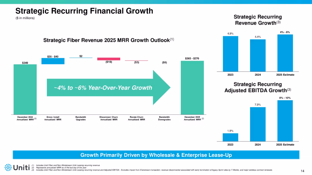
Horizontal bar chart with YoY fiber revenue growth projection; side-by-side vertical bar charts show revenue and EBITDA growth. Blue and teal tones dominate visuals.
Financial Performance
Telecommunications
Projects strategic revenue and EBITDA growth through 2025 for Uniti, with a focus on recurring revenue from fiber assets. Highlights expected 4–6% YoY growth and outlines components of MRR changes (e.g., installs, churn).
financial growth, revenue, EBITDA, Uniti, fiber, projections
false
Financial Performance
Telecommunications
Multiple Chart
Goldman Sachs
Add to my slides
Remove from favorites
This slide shows a combination of line and column charts tracking growth and returns over the years, specifically highlighting the receivables CAGR and RoTE. It uses a blue color theme that is consistent with the corporate branding, and the charts are well-organized to depict trends clearly.
Financial Performance
Financial Services
Reviews Barclays' historical financial performance, emphasizing growth in receivables and RoTE over time. It highlights the impact of external factors like COVID-19 and shows the company's resilience and capacity for recovery.
financial growth, RoTE, receivables, historical data, COVID-19
false
Financial Performance
Financial Services
Single Chart
Barclays
Add to my slides
Remove from favorites
Slide features column charts showing projections for sales growth, income growth, and shareholder returns.
Financial Performance
Financial Services
Details the company's growth strategy through key financial metrics, focusing on margin expansion and shareholder returns.
financial growth, sales, income, shareholder returns, projections, column chart
false
Financial Performance
Financial Services
Single Chart
Barclays
Add to my slides
Remove from favorites
Presents a series of column charts displaying growth in active accounts, sales volume, EOP outstandings, and revenue from 2014 to 2018. Several side notes elaborate on growth drivers.
Financial Performance
Financial Services
Highlights the financial growth of JP Morgan Chase in terms of active accounts, sales volume, and revenue, emphasizing the drivers behind the growth such as investment in rewards programs and digital engagement.
financial growth, sales volume, revenue, active accounts, digital engagement
false
Financial Performance
Financial Services
Multiple Chart
JP Morgan
Add to my slides
Remove from favorites
The slide has a dark background, divided into three sections with vertical column charts showing the growth in deposits, loan balances, and serviced portfolios over three years.
Financial Performance
Financial Services
This slide provides a financial performance overview, depicting the growth in various banking segments, indicative of the company’s scaling and market penetration over time.
financial growth, transaction banking, consumer platforms, enterprise partnerships, average deposits, loan balances, serviced portfolios, clients
false
Financial Performance
Financial Services
Multiple Chart
Goldman Sachs
Add to my slides
Remove from favorites
A mix of bullet points and small column charts present LANXESS's guidance and outlook. Graphical elements are minimal, focused on showing financial projections.
Financial Performance
Industrial & Manufacturing
The slide provides updated financial guidance, mentioning the economic recovery in specific sectors and the impact of raw material prices on the company’s EBITDA and outlook.
financial guidance, EBITDA, raw material prices, recovery, LANXESS, automotive, agro, construction, aviation, financial outlook
false
Financial Performance
Industrial & Manufacturing
Header Vertical
Morgan Stanley
Add to my slides
Remove from favorites
Two-part comparison layout with icons and percentage graphics. Left side shows two figures at a table with a 56% sign, a 5% increase arrow, and text. Right side features a graph icon with a 25% sign and a 4% increase arrow. Minimalist style with blue color highlights.
Market Analysis and Trends
Financial Services
Highlights increased employee demand for retirement planning assistance and prioritization of financial guidance in employment decisions.
Financial guidance, employees, retirement planning, demand increase, financial advisor, investment tools
false
Market Analysis and Trends
Financial Services
Boxed
Goldman Sachs
Add to my slides
Remove from favorites
Multiple data presentations including bullet points and column charts on financial metrics like RoTE, CIR, and CET1 ratio.
Operational Efficiency
Financial Services
Discusses financial outcomes for H1 2023, showing growth in revenue and operational efficiency with strong capital and resilience.
financial, H1 2023, momentum, efficiency, growth, capital, bar graph, column chart, RoTE, CET1 ratio
false
Operational Efficiency
Financial Services
Multiple Chart
Deutsche Bank
Add to my slides
Remove from favorites
Four line charts depicting trends in delinquent balances, disposable income, consumer debt, and household debt service.
Market Analysis and Trends
Financial Services
The slide analyses the financial health of consumers, showing trends in delinquency, disposable income, consumer debt, and debt service ratios.
Financial health, consumer debt, delinquent balances, disposable income, debt service
false
Market Analysis and Trends
Financial Services
Multiple Chart
Credit Suisse
Add to my slides
Remove from favorites
A slide with a clean design showing text boxes that summarize investors' preferences for financially healthy companies and the importance of delivering on EPS guidance. It employs a simple layout with a minimalistic color palette for clarity.
Financial Performance
Financial Services
Highlights investor priorities concerning the financial health of companies and the significance of EPS guidance, valuable for financial strategy discussions.
Financial Health, EPS, Guidance, Investor Expectations, Company Performance, Long-term Advantage, Strategic Priorities, Financial Planning, Corporate Investment, Shareholder Value
false
Financial Performance
Financial Services
Text Only
BCG
Add to my slides
Remove from favorites
Contains a line chart with investors' priorities for actions by financially healthy companies, like 'Invest to grow and protect revenue'. The chart uses teal and dark green bars to denote importance.
Strategic Planning
Financial Services
Discusses strategic actions that investors expect from financially healthy companies to navigate the macroeconomic environment, such as investing for growth and managing cash flow effectively.
financial health, investment strategies, growth, cash flow
false
Strategic Planning
Financial Services
Mixed Chart
BCG
Add to my slides
Remove from favorites
This slide presents key financial metrics in a table, showcasing data such as revenue, EBITDA, and EPS, with highlights indicating performance increases. The design is simple with a strong color contrast to facilitate data comparison.
Financial Performance
Financial Services
The slide provides a snapshot of the company’s financial health and growth, indicating positive trends in key performance indicators. It is suitable for financial review meetings or investor briefings.
Financial Health, Key Metrics, Growth Trends, Performance Indicators, Financial Review
false
Financial Performance
Financial Services
Table
Morgan Stanley
Add to my slides
Remove from favorites
Features a column chart depicting growth dynamics from 2001 to 2030, with annotations on key events impacting the automotive industry. Text discusses coping with thinner margins and financial health of suppliers.
Financial Performance
Transportation & Logistics
Discusses the financial challenges faced by automotive suppliers, including reduced margins and increased costs. Emphasizes the need for new skills and transformation to new powertrains to maintain profitability.
Financial Health, Margins, Automotive, Growth, Industry
false
Financial Performance
Transportation & Logistics
Mixed Chart
Roland Berger
Add to my slides
Remove from favorites
It displays column chart comparing different types of capital against regulatory requirements, using a clean layout with direct visual comparisons to enhance understanding.
Regulatory and Compliance
Financial Services
Details the financial institution’s buffer over minimum required levels for loss-absorbing capacity, important for regulatory compliance and financial health discussions in the banking sector.
financial health, regulatory, banking, compliance
false
Regulatory and Compliance
Financial Services
Multiple Chart
Deutsche Bank
Add to my slides
Remove from favorites
A bar chart presents the prioritization of factors by investors for ensuring financial health in companies, emphasizing revenue protection and cash flow management.
Strategic Planning
Financial Services
Discusses key strategies that investors believe should be prioritized to maintain financial health in companies, especially in challenging economic conditions. Useful for strategic financial planning.
financial health, strategies, investors, prioritization, resilience
false
Strategic Planning
Financial Services
Single Chart
BCG
Add to my slides
Remove from favorites
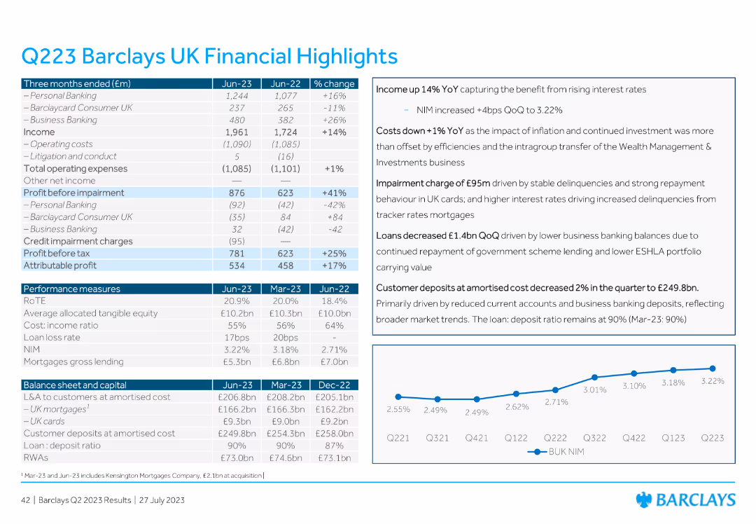
The slide contains a detailed table with financial metrics for Barclays UK, including income, operating costs, profit before impairment, credit impairment charges, and various performance measures. Includes commentary on the right.
Financial Performance
Financial Services
The slide presents detailed financial highlights for Barclays UK for Q223, including metrics like income, operating costs, profit before and after impairment, and various performance measures, with accompanying commentary.
financial highlights, Barclays UK, Q223, income, operating costs
false
Financial Performance
Financial Services
Mixed Chart
Barclays
Add to my slides
Remove from favorites
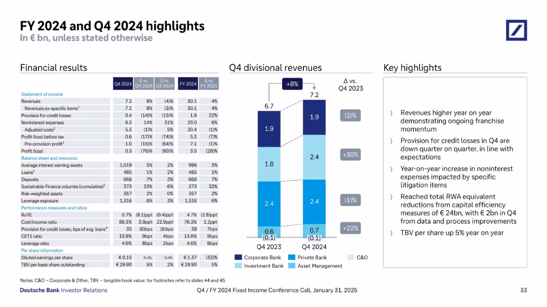
Table of income and balance sheet metrics; bar chart of divisional revenues; bullet points summarizing highlights like revenue growth, cost control, and RWA reductions.
Financial Performance
Financial Services
Provides a summary of Q4 and FY2024 results, including key metrics like revenue, profit, loan volumes, and provision for credit losses. Highlights growth drivers, expense changes, and capital efficiency efforts across divisions.
financial highlights, revenue, RoTE, RWA, Q4 2024, FY 2024, earnings
false
Financial Performance
Financial Services
Mixed Chart
Deutsche Bank
Add to my slides
Remove from favorites
Slide with two graphs—a line graph and a column chart—alongside textual highlights that provide context and additional information.
Financial Performance
Financial Services
This slide combines financial trends and consolidation trends to depict a financial institution's performance over the year. It can be used to convey progress on key financial metrics and loan repayment trends to stakeholders.
Financial Highlights, Trends, P&I, Consolidation, Loans, Repayment, Performance, Year-to-Date
false
Financial Performance
Financial Services
Multiple Chart
Morgan Stanley
Add to my slides
Remove from favorites
The slide uses a combination of column charts to compare budget outlook and profitability of public and private hospitals over the last three years, current year, and projected next three years.
Financial Performance
Healthcare & Pharmaceuticals
This slide compares the financial performance of public and private hospitals in terms of budget outlook and profitability, highlighting trends and projections over a three-year period.
financial, hospitals, profitability, public, private
false
Financial Performance
Healthcare & Pharmaceuticals
Multiple Chart
LEK
Add to my slides
Remove from favorites
Diagrams showing the integration of various types of credit data to enhance financial inclusion, with clear visual representation of data relationships.
Industry Overview
Financial Services
Explains how Experian integrates various data types to enhance credit visibility and predictability, aiming to improve financial inclusion with new analytical tools.
financial inclusion, credit data, analytics, visibility, predictability
false
Industry Overview
Financial Services
Diagram
Barclays
Add to my slides
Remove from favorites
Slide showing newspaper headlines and statistical data, utilizing a combination of visual and textual elements to present the financial instability narrative.
Risk Assessment and Management
Financial Services
Explores the impact of recent bank failures on business strategies and highlights the challenges in financial forecasting and preparedness.
financial instability, banking, forecasting, preparedness
false
Risk Assessment and Management
Financial Services
Mixed Chart
BCG
Add to my slides
Remove from favorites
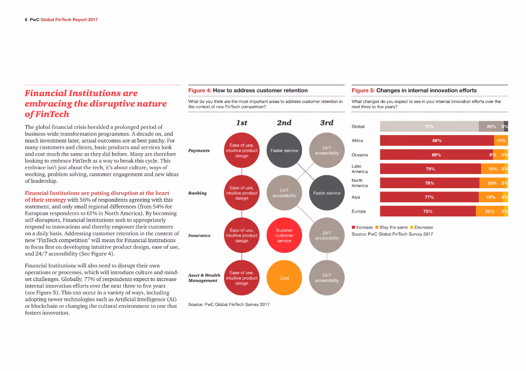
Text with bold red highlights discusses the disruptive impact of FinTech on financial institutions, accompanied by a bubble chart of customer retention strategies by sector.
Technology and Digital Transformation
Financial Services
The slide details how financial institutions are adapting to FinTech disruptions, focusing on customer retention strategies and internal innovation efforts.
Financial institutions, FinTech, Disruption, Customer retention, Innovation, Technology, Strategies, Adaptation, Transformation, Impact
false
Technology and Digital Transformation
Financial Services
Mixed Chart
PwC/Strategy&
Add to my slides
Remove from favorites
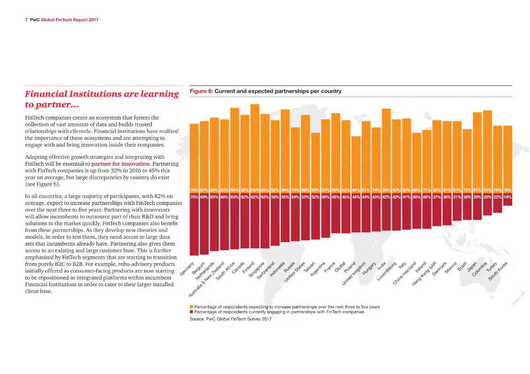
A column chart showing current and expected partnerships with FinTech companies by country, highlighting a global increase in partnerships.
Strategic Planning
Financial Services
The slide illustrates the growing trend of partnerships between financial institutions and FinTech companies, detailing expectations and current engagement levels.
Financial institutions, FinTech, Partnerships, Global, Trends, Expectations, Engagement, Strategy, Planning, Collaboration
false
Strategic Planning
Financial Services
Mixed Chart
PwC/Strategy&
Add to my slides
Remove from favorites
This slide features multiple column charts showing adjusted fixed income sales, equity sales, capital markets, advisory fees, pre-tax income, and return on regulatory capital over several quarters. The slide is dense with data.
Financial Performance
Financial Services
The slide presents financial performance metrics for the investment bank, comparing quarterly results over time for various segments. It is used to analyze the financial health and trends in the investment banking sector.
Financial, investment, performance, quarterly, analysis, trends, advisory, equity, fixed income, regulatory capital
false
Financial Performance
Financial Services
Multiple Chart
Credit Suisse
Add to my slides
Remove from favorites
A text-heavy slide with two main statistical points highlighted by large percentage graphics. Two supplementary images of a wallet and a piggy bank align with the financial theme. The slide uses contrasting colors to distinguish between different years' data.
Market Analysis and Trends
Financial Services
The slide presents statistics on financial issues affecting employees, focusing on challenges with personal budgeting and financial goal setting. It can serve as a basis for discussing financial wellness programs and HR policies in the financial services industry.
financial issues, budgeting, goal setting, employee well-being
false
Market Analysis and Trends
Financial Services
Multiple Chart
Goldman Sachs
Add to my slides
Remove from favorites
A combination of a bar chart and descriptive text detailing the results of a financial knowledge assessment among Canadians in 2023, compared to 2022.
Human Resources and Talent Management
Financial Services
This slide evaluates the financial knowledge of Canadians, showing average scores and detailed analysis of correct responses across multiple questions in 2023 and 2022.
Financial, knowledge, assessment, Canadians, 2023, 2022
false
Human Resources and Talent Management
Financial Services
Mixed Chart
IPSOS
Add to my slides
Remove from favorites
A bar chart displaying the number of correct answers to financial knowledge questions among investors, with textual data highlighting demographics more likely to score perfectly.
Human Resources and Talent Management
Financial Services
Discusses the financial knowledge of Canadian investors, showing the distribution of correct answers to financial questions and highlighting demographics with higher perfect scores.
financial knowledge, investors, questions, scores
false
Human Resources and Talent Management
Financial Services
Mixed Chart
IPSOS
Add to my slides
Remove from favorites
The slide features a bar chart on the right displaying the financial knowledge score of Canadians, with a breakdown of responses on the left. The layout is moderately complex.
Performance Metrics and KPIs
Financial Services
This slide presents the average financial knowledge score of Canadians, highlighting that 48% of questions were answered correctly. It aims to assess the general financial literacy among the population.
financial, knowledge, score, literacy, Canadians
false
Performance Metrics and KPIs
Financial Services
Mixed Chart
IPSOS
Add to my slides
Remove from favorites
Column chart showing financial management status of households in May 2020 and December 2020, with categories for well, quite well, getting by, etc.
Financial Performance
Financial Services
Highlights the financial management status of households during the COVID-19 pandemic, comparing perceptions between two periods.
financial management, COVID-19, household finances, comparison, economic stability
false
Financial Performance
Financial Services
Single Chart
IPSOS
Add to my slides
Remove from favorites
The slide shows a line chart with time on the horizontal axis and percentage on the vertical axis, displaying a rising trend.
Financial Performance
Financial Services
Details the growing proportion of marketing budgets in company finances over time, attributing the increase to digital marketing investments. Suitable for financial analysis and planning, particularly in assessing the impact of marketing on overall budgets.
financial, marketing, budgets, trends, digital, analysis, growth, investment
false
Financial Performance
Financial Services
Mixed Chart
Deloitte
Add to my slides
Remove from favorites
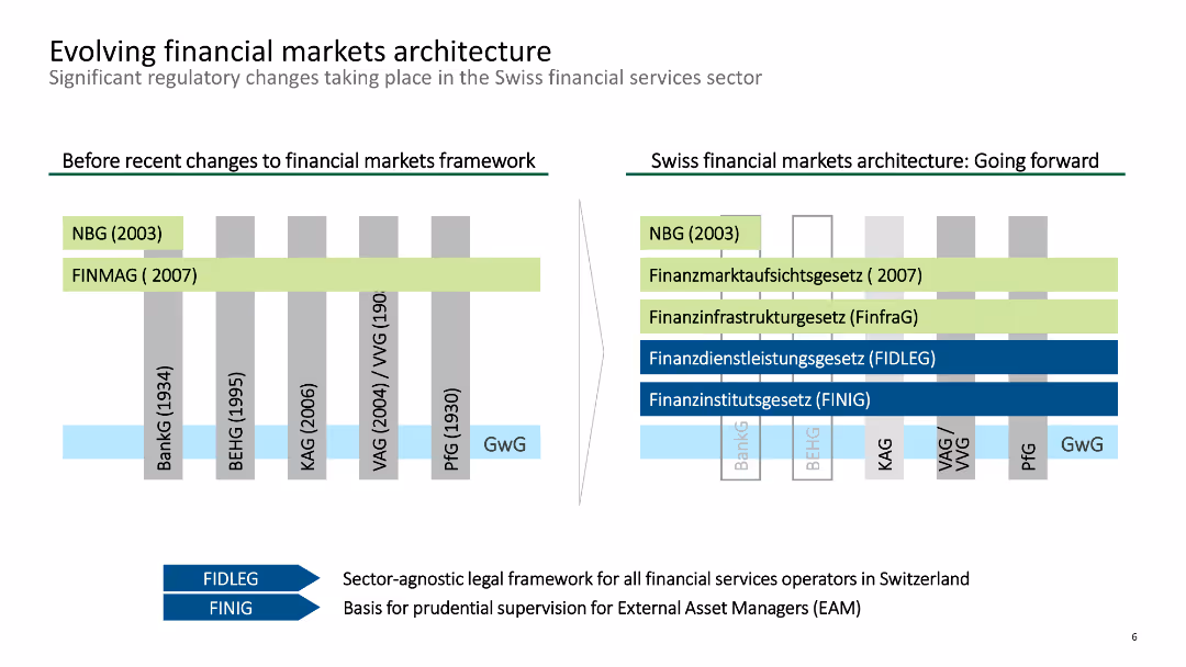
The slide includes two comparative diagrams of the Swiss financial markets architecture before and after regulatory changes.
Regulatory and Compliance
Financial Services
It depicts the significant regulatory changes in the Swiss financial markets framework, showing the old and new structures and the laws enacted to improve market operations.
financial, markets, architecture, regulatory, changes
false
Regulatory and Compliance
Financial Services
Header Horizontal
Deloitte
Add to my slides
Remove from favorites
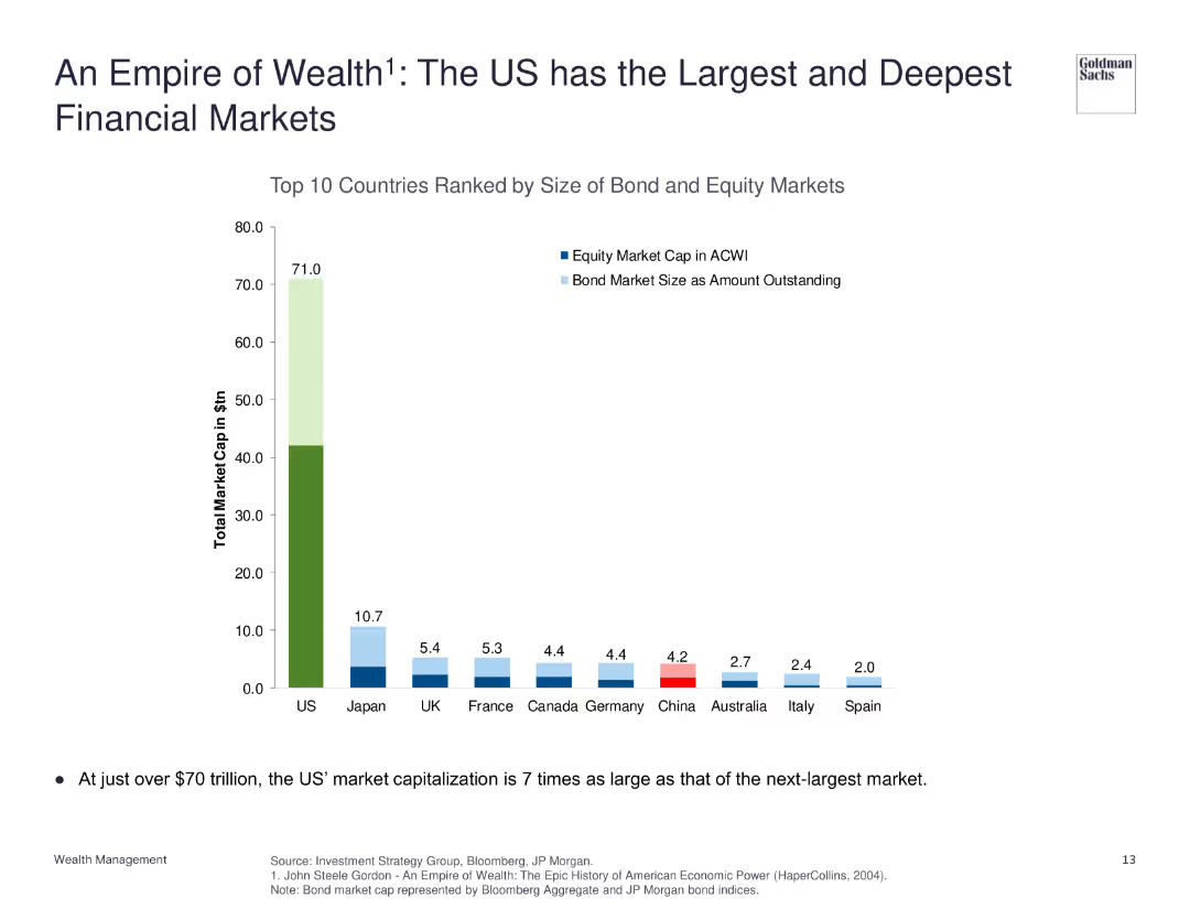
The slide features a column chart ranking countries by the size of their bond and equity markets, with the US market significantly larger than others.
Market Analysis and Trends
Financial Services
The slide emphasizes the scale of the US financial markets, with a total market cap far exceeding that of other countries, illustrating the depth and size of US bond and equity markets.
Financial Markets, US, Market Cap, Comparison, Scale
false
Market Analysis and Trends
Financial Services
Single Chart
Goldman Sachs
Add to my slides
Remove from favorites
Contains column charts illustrating the projected operational maturity impact on margins between 2019-2025.
Financial Performance
Financial Services
Analyzes the financial benefits of reaching high operational maturity, forecasting a significant margin increase for companies by 2025.
financial, maturity, performance, forecast, margins
false
Financial Performance
Financial Services
Mixed Chart
Accenture
Add to my slides
Remove from favorites
This slide contains three column charts comparing CET1 ratio, leverage ratio, and MREL/TLAC, each annotated with corresponding quarterly changes and numerical values. Detailed explanatory text and bullet points accompany the charts.
Financial Performance
Financial Services
This slide presents Q2 2023 financial metrics for Deutsche Bank, such as CET1 ratio, leverage ratio, and MREL/TLAC requirements, illustrating their changes over the quarter and factors affecting these metrics.
Financial metrics, CET1 ratio, leverage ratio, MREL, TLAC, quarterly comparison, Deutsche Bank
false
Financial Performance
Financial Services
Multiple Chart
Deutsche Bank
Add to my slides
Remove from favorites
The slide includes a table with various financial metrics for different indices (e.g., S&P 500, MSCI World) and two pie charts showing sector weights for S&P 500 and MSCI World.
Performance Metrics and KPIs
Financial Services
This slide presents the current financial characteristics and sector weights for major indices, offering a detailed comparison of various metrics and sector distributions.
financial metrics, sector weights, S&P 500, MSCI World, indices
false
Performance Metrics and KPIs
Financial Services
Multiple Chart
Morgan Stanley
Add to my slides
Remove from favorites
Slide includes three column charts showing the financial models for school coverage, titled by different government and commercial involvement scenarios. Colors used: blue, green, and red.
Market Analysis and Trends
Education & Training
The slide analyzes three funding models for schools in Java, Bali, and Sumatra, comparing costs, reductions, and gaps in funding, highlighting government involvement's necessity.
financial models, school funding, government involvement, Java, Bali, Sumatra, cost analysis, revenue sharing, subsidy, budget gap
false
Market Analysis and Trends
Education & Training
Multiple Chart
BCG
Add to my slides
Remove from favorites
This slide features a three-column layout with icons and bullet points under each column. The icons are simple and relevant to the respective themes.
Market Analysis and Trends
Healthcare & Pharmaceuticals
This slide summarizes the findings on financial outlook, operation priorities, and digitalization in hospitals, highlighting key points under each theme.
financial outlook, operation priorities, digitalization, hospitals, summary
false
Market Analysis and Trends
Healthcare & Pharmaceuticals
Pillar
LEK
Add to my slides
Remove from favorites
The slide presents column charts comparing profitability/EBITDA margins of medium-size and large-size private hospitals over the last three years, current year, and next three years.
Financial Performance
Healthcare & Pharmaceuticals
This slide provides a detailed analysis of the financial outlook for medium-size and large-size private hospitals in APAC, focusing on profitability/EBITDA margins over a specified period.
financial, outlook, private, hospitals, profitability
false
Financial Performance
Healthcare & Pharmaceuticals
Multiple Chart
LEK
Add to my slides
Remove from favorites
The slide features three circular icons representing financial outlook, strategic priorities, and digitalization and innovation. Each icon is accompanied by a text box explaining the respective focus area.
Financial Performance
Healthcare & Pharmaceuticals
This slide provides an overview of financial outlook for hospitals, strategic priorities post-COVID-19, and ongoing focus on digitalization and innovation in the healthcare sector.
financial, outlook, strategy, digitalization, innovation
false
Financial Performance
Healthcare & Pharmaceuticals
Pillar
LEK
Add to my slides
Remove from favorites
Contains a map of the U.S. with color-coded regions, table comparing the company to its peers, and a clear textual overview of assets, deposits, and loans.
Industry Overview
Financial Services
Overview of the company's financial standing, market position, and operational scope, suitable for introducing the company to stakeholders or for orientation purposes.
financial overview, market position, company scope, operational reach
false
Industry Overview
Financial Services
Graphic
Goldman Sachs
Add to my slides
Remove from favorites
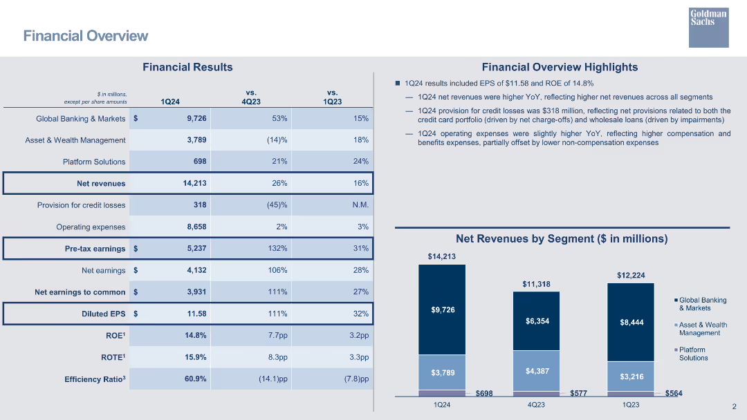
A table summarizing financial results across different segments and time periods, alongside key highlights and bar charts.
Financial Performance
Financial Services
The slide provides an overview of financial results for Q1, including net revenues, operating expenses, and net earnings.
financial overview, net revenue, operating expenses, net earnings, bar chart, financial results, quarterly analysis
false
Financial Performance
Financial Services
Mixed Chart
Goldman Sachs
Add to my slides
Remove from favorites
Contains table, column chart, and text explanations to depict financial data.
Financial Performance
Financial Services
Summarizes financial performance with revenue, earnings, and expenses details, highlighting changes from the previous year.
Financial, Overview, Revenue, Earnings, Expenses, Bar Chart, Column Chart, Profitability, Performance, Analysis
false
Financial Performance
Financial Services
Mixed Chart
Goldman Sachs
Add to my slides
Remove from favorites
The slide displays a series of table and pie charts with financial data across various business segments. It uses a clean, corporate color scheme predominantly featuring blues and grays.
Financial Performance
Financial Services
Provides a comprehensive financial overview of the company, including a full year net revenue mix and comparisons of current and past fiscal quarters.
financial overview, revenue mix, net earnings, investment banking, asset management
false
Financial Performance
Financial Services
Mixed Chart
Goldman Sachs
Add to my slides
Remove from favorites
A column chart is combined with additional data points and a yellow to blue gradient. The slide layout is data-heavy but organized, providing a snapshot of financial performance over a nine-month period.
Financial Performance
Industrial & Manufacturing
The slide provides a detailed financial overview, indicating a 2.0% increase in 9-month group sales despite weak volumes, and a significant growth in non-tire businesses.
Financial overview, Sales growth, Non-tire business, Volume, 9-month report
false
Financial Performance
Industrial & Manufacturing
Single Chart
Morgan Stanley
Add to my slides
Remove from favorites
Column charts showing underlying revenues, costs, PBT, and key metrics
Financial Performance
Financial Services
Highlights financial performance metrics for 1Q24, including revenues, costs, PBT, and key metrics
financial, performance, 1Q24, metrics
false
Financial Performance
Financial Services
Multiple Chart
UBS
Add to my slides
Remove from favorites
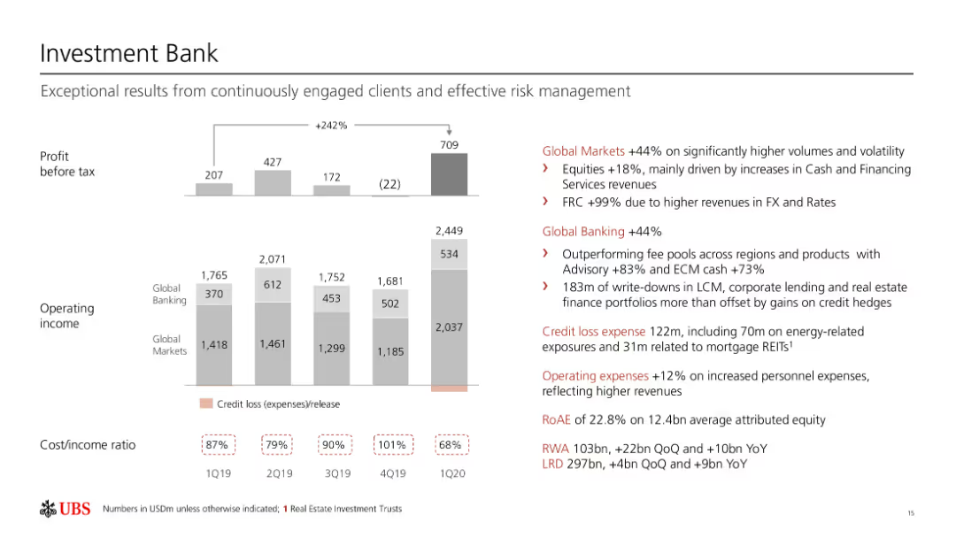
The slide includes multiple column charts and text elements. It is moderately dense, with sections divided by topic, showing financial performance metrics like profit before tax and operating income.
Financial Performance
Financial Services
The slide showcases the financial performance of the Investment Bank, highlighting profit before tax, operating income, and various metrics. It is used to analyze financial performance and results.
Financial, Performance, Banking, Metrics, Profit, Income
false
Financial Performance
Financial Services
Multiple Chart
UBS
Add to my slides
Remove from favorites
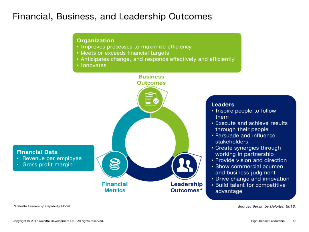
The slide features a circular diagram linking Financial Metrics, Business Outcomes, and Leadership Outcomes. Each section includes text describing key aspects and metrics related to these outcomes.
Market Analysis and Trends
Professional Services
It connects financial performance, business outcomes, and leadership outcomes, showing how effective leadership can drive financial success and overall business performance. The slide highlights specific metrics and outcomes influenced by leadership.
Financial Performance, Business Outcomes, Leadership, Metrics, Strategy
false
Market Analysis and Trends
Professional Services
Framework
Deloitte
Add to my slides
Remove from favorites
The slide utilizes a series of column charts to illustrate quarterly income, costs, and other financial metrics, with an emphasis on impairment costs and its impact on profitability.
Financial Performance
Financial Services
Evaluates the financial performance of the Consumer, Cards & Payments segment, particularly the effects of increased impairments on profitability and returns.
financial performance, CC&P, RoTE, impairment, profitability, Q423, Barclays, costs, income
false
Financial Performance
Financial Services
Multiple Chart
Barclays
Add to my slides
Remove from favorites
Slide with line and area charts depicting trends in combined ratios and return on capital.
Financial Performance
Financial Services
Reviews Lloyd's financial performance in 2018, discussing the challenges such as soft market conditions and major loss events that influenced their financial metrics.
Financial, Performance, Challenges, 2018, Lloyd's
false
Financial Performance
Financial Services
Multiple Chart
PwC/Strategy&
Add to my slides
Remove from favorites
This slide features a large title at the top, a key financial indicator as a prominent column chart on the left, and a detailed table of financial metrics on the right. The column chart illustrates CCB Pretax Income from 2019 to 2022. The table lists metrics like average deposits and loans, revenue, and expense across three years, with certain figures highlighted to draw attention.
Financial Performance
Financial Services
The slide communicates financial performance over three years, showcasing pre-tax income and detailed banking metrics such as deposits, loans, and expenses. It emphasizes financial growth and profitability, indicating a healthy financial status. Intended for financial analysts or investors, it serves to convey the company's financial strength and effectiveness in managing assets and liabilities, highlighting favorable trends that signify sound financial management and potential for sustained growth.
Financial, Performance, Deposits, Loans, Revenue, Expense, Growth, Profitability, Banking, Analysis
false
Financial Performance
Financial Services
Single Chart
JP Morgan
Add to my slides
Remove from favorites
Consists of column charts showing financial metrics such as IRR, MOIC, and dividends over time in various green tones.
Financial Performance
Energy & Utilities
Provides a comprehensive overview of Colgate's financial performance, including shareholder returns and investment dividends over recent years.
financial performance, dividends, returns, Colgate, energy
false
Financial Performance
Energy & Utilities
Multiple Chart
Barclays
Add to my slides
Remove from favorites
Bar graphs display net income and earnings per share growth over five fiscal years.
Strategic Planning
Financial Services
Highlights financial growth under a strategic plan, with emphasis on net income and earnings per share.
Financial performance, earnings growth, net income, strategic results
false
Strategic Planning
Financial Services
Multiple Chart
Booz Allen Hamilton
Add to my slides
Remove from favorites
Contains a series of column charts indicating trends in total revenues, adjusted EBITDA, and net leverage over several years. Each graph uses blue bars of varying heights to represent values, with key figures highlighted for emphasis.
Financial Performance
Financial Services
The slide summarizes financial performance trends over time, displaying revenue, EBITDA, and leverage. It's designed for financial analysis and discussions around fiscal management and operational efficiency in a corporate setting.
financial performance, EBITDA, leverage, operational efficiency
false
Financial Performance
Financial Services
Multiple Chart
Goldman Sachs
Add to my slides
Remove from favorites
Multiple column charts displaying annual financial data such as RoTE, total income, and cost ratio.
Financial Performance
Financial Services
Review of three-year financial performance including income metrics and loan ratios.
financial performance, income, loans, cost ratio, RoTE
false
Financial Performance
Financial Services
Multiple Chart
Barclays
Add to my slides
Remove from favorites
The slide presents a column chart comparing the performance of various indices (J.P. Morgan GBI-EM, EMBI, CEMBI) for Q4 2023. The layout is simple and data-focused.
Financial Performance
Financial Services
The slide provides a performance recap of different financial indices for Q4 2023, showing total return and breakdown by various factors like FX, rates, and credit spreads.
financial performance, indices, Q4 2023, J.P. Morgan, investment
false
Financial Performance
Financial Services
Mixed Chart
Morgan Stanley
Add to my slides
Remove from favorites
This slide features a green and white line chart against a black background, showing the performance of the "50 Most Innovative Companies of 2021." The slide is labeled with key percentages in bold green, providing a visual comparison to the "MSCI World Index." The data is clearly depicted for easy comparison, and the slide's overall design is straightforward, emphasizing the financial data presented.
Investment Analysis
Financial Services
The slide provides evidence of the financial performance of innovative companies, illustrating their continued outperformance during the COVID-19 crisis. It could be used by financial analysts or investment strategists to evaluate the merits of investing in innovative companies, demonstrating their potential for resilience and growth. The inclusion of an index comparison provides a benchmark for assessing the relative success of innovation-led strategies.
financial performance, innovative companies, COVID-19, MSCI World Index, investment strategy
false
Investment Analysis
Financial Services
Single Chart
BCG
Add to my slides
Remove from favorites
Features two column charts comparing the underlying TOP margin over time and a circle representing ROIC comparison, along with text annotations detailing financial strategies.
Financial Performance
Consumer Goods
Provides an overview of financial performance in emerging markets, emphasizing improvements in margins and returns. Useful for financial analysis and understanding the impact of operational efficiencies on profitability.
financial performance, margins, ROIC, profitability, operational efficiency
false
Financial Performance
Consumer Goods
Mixed Chart
Deutsche Bank
Add to my slides
Remove from favorites
Previous
Next
You don't have any favorites yet.
Please wait loading your favorites slides...
Create a FREE account to continue browsing
Receive Instant Access to 1,000+ slides from companies like McKinsey, Google, and Goldman Sachs
First Name
Last Name
Email
Password
I agree to all
Terms & Privacy Policy
Thank you! Your submission has been received!
Oops! Something went wrong while submitting the form.
Have an account?
Sign in
Upgrade to PRO to Save slides
Advanced Search and Filters
Access to 15,000+ slides
Access to Category Pages
Save/Bookmark Slides
PowerPoint Template Library
Pick a Plan
MONTHLY
$12/month
Billed every month, Cancel anytime.
YEARLY
$9/year
Billed $108 annually, Cancel anytime.
Checkout for $12/month
Checkout for $108/yr
Secured by Stripe | AES-256 bit encryption