My Account
My Slides
Search by Category
Companies
Slide Type
Use Case
Industry
Pricing
Templates
View All Templates
Download Template Slides
✦ AI
AI Prompt Library
AI Search
Feedback
Login
Logout
Get Started
Browse all Slides
Browse all Slides
Create a FREE Account
Instant access to 1,000+ real slides from top companies like McKinsey, BCG, Goldman Sachs, Google and many more!
First Name
Last Name
Email
Password
I agree to all
Terms & Privacy Policy
Thank you! Your submission has been received!
Oops! Something went wrong while submitting the form.
Have an account?
Sign in
Saved Slides
Total No. of slides saved
0
↻ Refresh
✖ Clear all
The slide features a column chart comparing food loss in millions of tons from 2020 to 2025, segmented by perishable and non-perishable produce losses. Orange and grey hues dominate, with clean text and percentage annotations.
Strategic Planning
Agriculture & Food Production
This slide presents FGN's goals for halving post-harvest food losses by 2025, displaying past data and future targets in a visually comparative format to emphasize the potential impact of reduced food waste.
food loss, perishable produce, 2025 target, post-harvest, reduction
false
Strategic Planning
Agriculture & Food Production
Mixed Chart
BCG
Add to my slides
Remove from favorites
Features two column charts showing the dramatic reduction in food loss from solar cold storage adoption among farmers, using a grey and orange color scheme for visual differentiation.
Strategic Planning
Agriculture & Food Production
Discusses the significant decrease in post-harvest food loss among farmers using solar-powered cold storage, projecting nationwide potential savings.
food loss, solar power, farmers, post-harvest, technology adoption
false
Strategic Planning
Agriculture & Food Production
Multiple Chart
BCG
Add to my slides
Remove from favorites
This slide employs a flow chart to delineate the complex interrelations between various factors that influence food prices, such as demography, economic growth, and climate change. Each factor is connected by arrows indicating its impact on food supply and demand, and ultimately on prices. The chart is organized with clear labels and a central question mark symbolizing the uncertainty in future food price predictions.
Market Analysis and Trends
Financial Services
This slide outlines the multifaceted drivers influencing future food prices, integrating economic, demographic, and environmental factors. It portrays the complexity of predicting food prices due to these interdependencies, highlighting the critical need for comprehensive market analysis.
food prices, economic factors, demographic changes, supply and demand, climate impact, market predictions, uncertainty, trade policies, production costs, financial markets
false
Market Analysis and Trends
Financial Services
Diagram
Roland Berger
Add to my slides
Remove from favorites
The slide includes two line charts: one for overall food prices by category and another for fertilizer prices, both from 2019 to 2023.
Market Analysis and Trends
Agriculture & Food Production
The slide examines the trends in food and fertilizer prices, highlighting easing pressures and potential risks affecting these prices.
food prices, fertilizer, agriculture, market trends, pricing risks
false
Market Analysis and Trends
Agriculture & Food Production
Multiple Chart
Accenture
Add to my slides
Remove from favorites
The slide features two line charts, one showing food prices and the other fertilizer prices, with indexes on the y-axis and years on the x-axis. Commentary text is present on the right.
Market Analysis and Trends
Agriculture & Food Production
The slide discusses the stability of food and fertilizer prices in November, highlighting dairy price increases and pressures from global events like the Russia-Ukraine conflict.
Food prices, fertilizer prices, dairy, market trends, global events
false
Market Analysis and Trends
Agriculture & Food Production
Multiple Chart
Accenture
Add to my slides
Remove from favorites
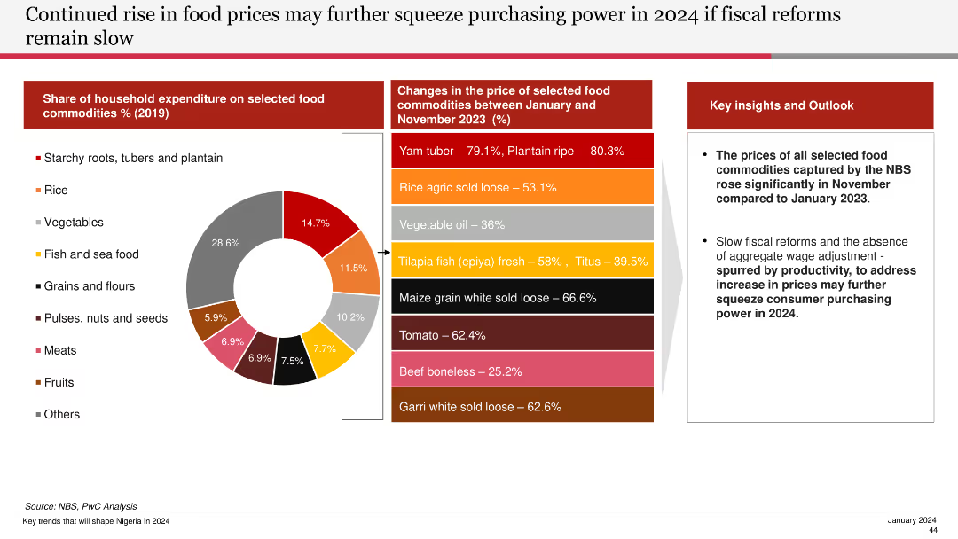
Features a pie chart of household expenditure on food commodities and a bar chart showing price changes of selected food commodities from Jan to Nov 2023.
Financial Performance
Agriculture & Food Production
Discusses the significant rise in food prices and the potential impact on purchasing power if fiscal reforms are not implemented swiftly.
food prices, purchasing power, fiscal reforms, commodities, household expenditure, 2024, food price changes
false
Financial Performance
Agriculture & Food Production
Mixed Chart
PwC/Strategy&
Add to my slides
Remove from favorites
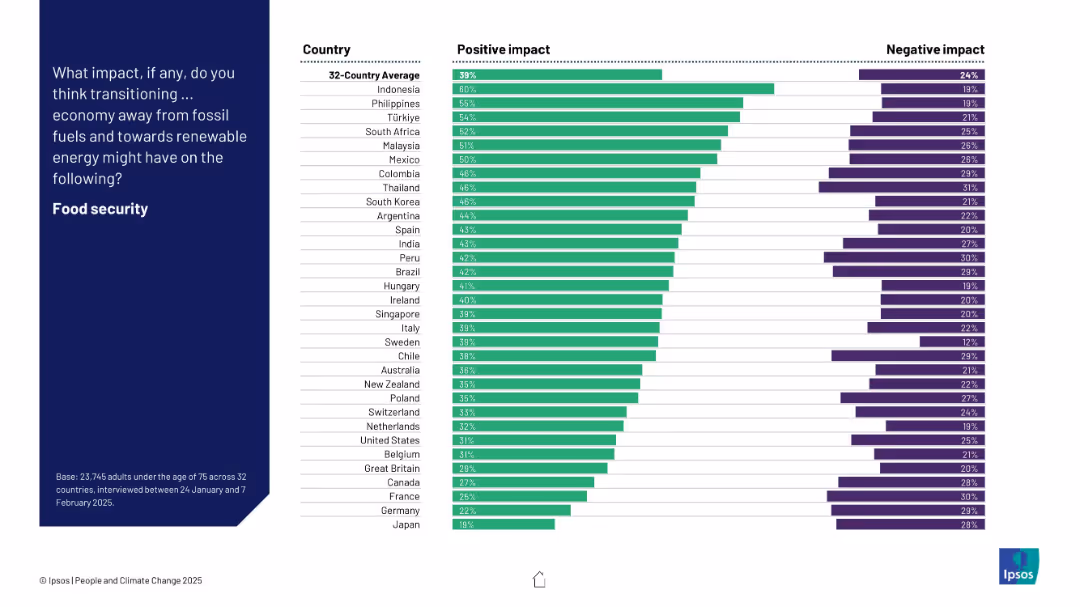
Bar chart of 32 countries ranking positive and negative expectations about the energy transition’s effect on food security.
Technology and Digital Transformation
Environmental Services & Sustainability
This slide captures global attitudes toward how moving to renewable energy affects food security. Indonesia, the Philippines, and Türkiye are most optimistic, while Japan and Germany rank lowest. Net positive views dominate across most countries.
food security, renewables, perception, climate, energy transition, bar chart, Ipsos, global opinion
false
Technology and Digital Transformation
Environmental Services & Sustainability
Mixed Chart
IPSOS
Add to my slides
Remove from favorites
Contains a flowchart and projected growth charts for food service channels, visually distinguishing between various service types like home delivery and eat-in with color coding and labels.
Strategic Planning
Consumer Goods
Analyzes the expected long-term changes in the food service industry due to the pandemic, focusing on the rise in off-premises dining and digital service adoption. Discusses how these trends could reshape the industry landscape.
Food Service, COVID-19, Digital Services, Industry Shift
false
Strategic Planning
Consumer Goods
Mixed Chart
BCG
Add to my slides
Remove from favorites
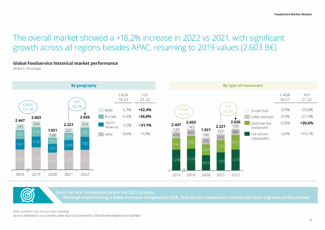
The slide includes a stacked column chart with green, gray, and blue segments representing different types of restaurants and their distribution across regions.
Market Analysis and Trends
Consumer Goods
Presents data on the global foodservice market, highlighting the distribution of various restaurant types across regions, and the overall market size in 2022.
Foodservice market, restaurant types, global distribution, market size, regional analysis
false
Market Analysis and Trends
Consumer Goods
Multiple Chart
Deloitte
Add to my slides
Remove from favorites
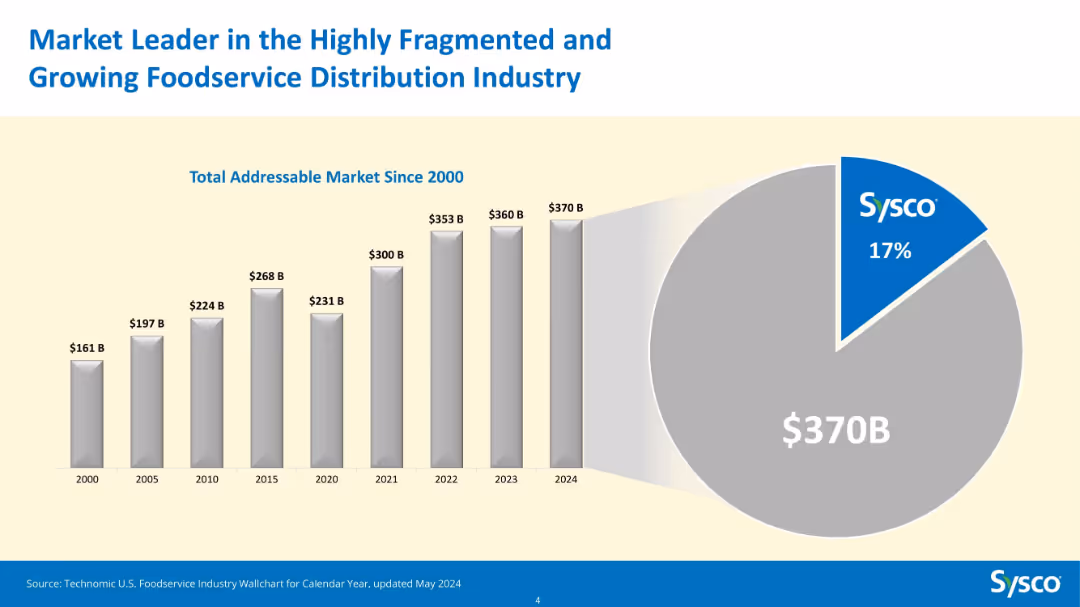
Bar chart (2000–2024) showing Total Addressable Market growth and pie chart for 2024 market share.
Market Analysis and Trends
Consumer Goods
This slide illustrates the expansion of the total addressable market for foodservice distribution in the U.S., which grew from $161B in 2000 to $370B in 2024. Sysco holds a 17% share of this growing market, highlighting its leadership.
foodservice, TAM, Sysco, market share, growth, bar chart, pie chart, distribution, industry size, leader
false
Market Analysis and Trends
Consumer Goods
Multiple Chart
Barclays
Add to my slides
Remove from favorites
Features a complex, colorful circular diagram appearing like a pie chart representing different sectors within the FoodTech industry.
Market Analysis and Trends
Agriculture & Food Production
Maps the key players in the 2021 FoodTech ecosystem, highlighting their focus areas and contributions.
FoodTech, ecosystem, mapping, industry, trends
false
Market Analysis and Trends
Agriculture & Food Production
Diagram
Accenture
Add to my slides
Remove from favorites
Slide contains images of individuals, ecosystem map, and pie chart.
Market Analysis and Trends
Agriculture & Food Production
Provides an overview of Swiss FoodTech ecosystem, identifying key players and trends in the industry.
FoodTech, ecosystem, startups, Switzerland, trends
false
Market Analysis and Trends
Agriculture & Food Production
Mixed Chart
Accenture
Add to my slides
Remove from favorites
Features a detailed circular diagram looking like a pie chart and text describing various trends within the FoodTech industry.
Investment Analysis
Agriculture & Food Production
Maps the FoodTech ecosystem according to key trends, showing how different players are aligned with these trends.
FoodTech, ecosystem, trends, mapping, alignment
false
Investment Analysis
Agriculture & Food Production
Diagram
Accenture
Add to my slides
Remove from favorites
Contains a timeline and bar graphs showing investment amounts for top FoodTech deals in Europe over three years, with flag icons for company countries.
Investment Analysis
Agriculture & Food Production
Provides details on significant 2020 FoodTech deals in Europe, such as investments in Karma and Oatly. Highlights a shift from food delivery to upstream value chains like AgTech and Food Science, with a focus on sector investment trends.
FoodTech, Europe, 2020, Investment Trends, Top Deals, AgTech, Food Science
false
Investment Analysis
Agriculture & Food Production
Multiple Chart
Accenture
Add to my slides
Remove from favorites
Divided into two sections with bar charts and company lists, focusing on the top FoodTech deals by value in 2020 for US and Chinese companies.
Investment Analysis
Agriculture & Food Production
Details major FoodTech deals in 2020, highlighting investments in companies like Lineage Logistics and Zomato. Discusses the significant role of US and Chinese companies in the FoodTech investment landscape.
FoodTech, Global Deals, 2020, US Companies, Chinese Companies, Investment Values
false
Investment Analysis
Agriculture & Food Production
Mixed Chart
Accenture
Add to my slides
Remove from favorites
This slide showcases a global map highlighting major FoodTech hubs worldwide with detailed annotations and icons representing various regions.
Industry Overview
Agriculture & Food Production
Discusses the global distribution of FoodTech hubs, emphasizing the strengths and innovations of different regions, including the role of academic and governmental support in fostering these ecosystems.
FoodTech, global hubs, innovation, startups, academic support
false
Industry Overview
Agriculture & Food Production
Graphic
Accenture
Add to my slides
Remove from favorites
Displays comparative bar charts and descriptive lists focusing on the performance metrics and market presence of global FoodTech companies.
Market Analysis and Trends
Agriculture & Food Production
Reviews global FoodTech performance with specific metrics like market growth and performance indices of companies across different regions. Useful for evaluating market trends and company standings in the FoodTech sector.
FoodTech, Global Performance, Market Growth, Company Evaluation, Performance Metrics
false
Market Analysis and Trends
Agriculture & Food Production
Multiple Chart
Accenture
Add to my slides
Remove from favorites
Showcases a network diagram and bar graphs detailing innovation initiatives and investment impacts in the FoodTech sector, segmented by technological advances and geographic distribution.
Technology and Digital Transformation
Agriculture & Food Production
Explores innovative developments in FoodTech, focusing on technological advancements and their impact on the sector. Highlights regional innovation trends and investment effectiveness, beneficial for tech developers and investors.
FoodTech, Innovation, Technological Advances, Investment Impact, Regional Trends
false
Technology and Digital Transformation
Agriculture & Food Production
Single Chart
Accenture
Add to my slides
Remove from favorites
Presents a timeline and a column chart reflecting the growth in FoodTech investments over the years, identifying key areas of focus like AgTech and Food Science. Includes annotations for significant startups and initiatives.
Investment Analysis
Agriculture & Food Production
Provides a comprehensive view of the investment landscape in the European FoodTech sector, with specific emphasis on sustainable and technology-driven initiatives.
FoodTech, investment, Europe, sustainability, AgTech
false
Investment Analysis
Agriculture & Food Production
Mixed Chart
Accenture
Add to my slides
Remove from favorites
Includes predictive analytics displayed through line graphs and future market projections for the FoodTech sector, with annotations for projected growth trends and investment hotspots.
Financial Performance
Agriculture & Food Production
Forecasts future trends in FoodTech investments, highlighting areas expected to see significant growth and investment opportunities. Useful for investors and analysts focusing on future market potentials and growth forecasting in FoodTech.
FoodTech, Investment Forecast, Growth Trends, Market Projections, Future Opportunities
false
Financial Performance
Agriculture & Food Production
Mixed Chart
Accenture
Add to my slides
Remove from favorites
This slide includes a column chart detailing investments in the European FoodTech sector by category from 2014 to 2020, emphasizing shifts in investment focus.
Investment Analysis
Agriculture & Food Production
Analyzes investment trends in the FoodTech sector, noting a shift from delivery services to more comprehensive solutions involving the entire food supply chain, focusing on sustainability and technological integration.
FoodTech, investments, trends, sustainability, technology
false
Investment Analysis
Agriculture & Food Production
Mixed Chart
Accenture
Add to my slides
Remove from favorites
Features dynamic market maps and bar charts that analyze the competitive positioning and market dynamics of major FoodTech companies worldwide.
Competitive Landscape
Agriculture & Food Production
Analyzes the competitive landscape and market dynamics in the FoodTech industry, focusing on major players and market shifts. Provides insights into strategic positioning and market opportunities, crucial for competitive analysis.
FoodTech, Market Dynamics, Competitive Analysis, Strategic Positioning, Market Opportunities
false
Competitive Landscape
Agriculture & Food Production
Mixed Chart
Accenture
Add to my slides
Remove from favorites
Slide includes icons, heavy text and a pie chart with detailed analysis of the distribution of startups within the FoodTech sector.
Investment Analysis
Agriculture & Food Production
Provides quantitative insights into the distribution of startups across various trends in the FoodTech sector.
FoodTech, startups, trends, analysis, distribution
false
Investment Analysis
Agriculture & Food Production
Mixed Chart
Accenture
Add to my slides
Remove from favorites
Sectioned text blocks discussing major trends in food technology, alongside relevant imagery and bullet points.
Technology and Digital Transformation
Agriculture & Food Production
Explores the key trends driving innovation in the Swiss FoodTech industry, focusing on sustainability, transparency, and efficiency.
FoodTech, trends, innovation, sustainability, transparency
false
Technology and Digital Transformation
Agriculture & Food Production
Header Vertical
Accenture
Add to my slides
Remove from favorites
Slide features a purple header with title and three sections in purple, pink, and dark purple blocks, containing column charts and lists of companies with financials and market status details.
Industry Overview
Agriculture & Food Production
Compares FoodTech unicorn companies across Europe, Americas, and Asia, highlighting market values and growth in companies like Delivery Hero, UberEats, and Meituan Dianping. Showcases investment trends and significant company valuations in the FoodTech sector.
FoodTech, Unicorns, Europe, Americas, Asia, Market Value, Company Growth, Investment
false
Industry Overview
Agriculture & Food Production
Mixed Chart
Accenture
Add to my slides
Remove from favorites
Features a column chart and several infographics showing the business impact of food trends on companies. The layout is clear, with distinct sections for statistics and expected impacts.
Customer and Market Segmentation
Agriculture & Food Production
Analyzes how food industry trends are impacting businesses, showing percentages of companies acknowledging the significance of aligning with these trends for future-proofing and customer engagement.
food trends, business impact, statistics, alignment
false
Customer and Market Segmentation
Agriculture & Food Production
Multiple Chart
Deloitte
Add to my slides
Remove from favorites
Visuals include silhouette icons representing different approaches to implementing food trends, with percentages beside each icon. The design is clean and easy to interpret.
Customer and Market Segmentation
Agriculture & Food Production
Discusses the strategic approaches companies are taking to implement future food trends, like partnerships and acquisitions. It highlights the importance of collaboration across the food ecosystem for effective transformation.
food trends, strategic approaches, partnerships, ecosystem
false
Customer and Market Segmentation
Agriculture & Food Production
Mixed Chart
Deloitte
Add to my slides
Remove from favorites
Features a circular flow diagram connecting three key aspects: Mix Advantage, Performance Advantage, and Create Value, using blue and white color scheme for clarity. The layout is simple and focused on the central idea without unnecessary details.
Operational Efficiency
Agriculture & Food Production
The slide explains Tyson's strategic model for its prepared foods division, emphasizing the interconnection between market positioning, operational performance, and value creation. This model could serve as a case study or inspiration for similar businesses aiming to refine their operational strategies.
Food, Tyson, Operational Efficiency, Strategy, Value Creation
false
Operational Efficiency
Agriculture & Food Production
Linear Flow
Barclays
Add to my slides
Remove from favorites
Features a column chart depicting year-over-year volume percentage changes in the food sector, with gray bars showing slight increases and decreases. The graph is straightforward, using minimal color to emphasize the changes.
Market Analysis and Trends
Agriculture & Food Production
This slide provides a snapshot of the food industry's modest growth trends over recent fiscal years. It aims to offer stakeholders a quick overview of market dynamics, focusing on minimal growth fluctuations, which could influence strategic decisions in product development or market entry.
Food, Volume, Growth, Yearly, Market Trends, Analysis
false
Market Analysis and Trends
Agriculture & Food Production
Single Chart
Barclays
Add to my slides
Remove from favorites
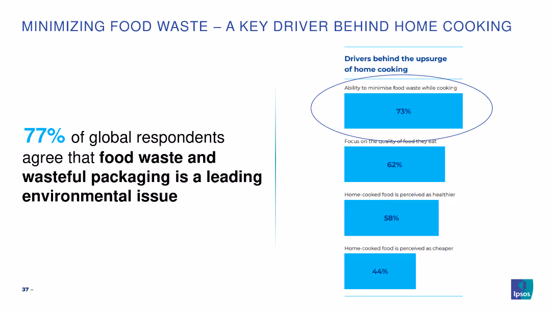
Simple bar chart highlighting key drivers for minimizing food waste while cooking.
Market Analysis and Trends
Environmental Services & Sustainability
Highlights the importance of minimizing food waste as a leading environmental issue.
food waste, cooking, environmental, global, drivers
false
Market Analysis and Trends
Environmental Services & Sustainability
Mixed Chart
IPSOS
Add to my slides
Remove from favorites
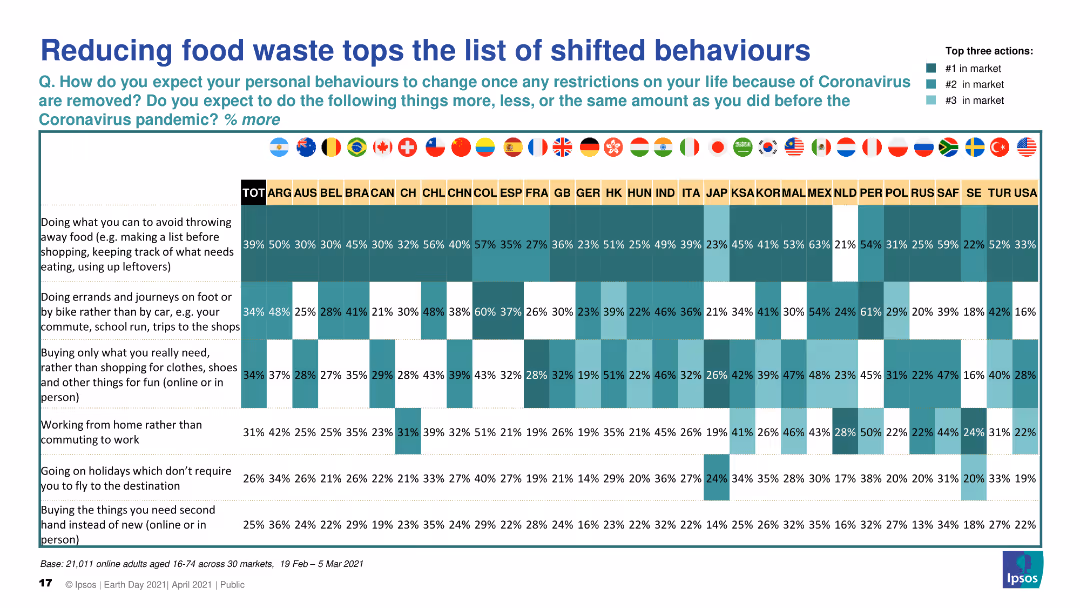
Features a horizontal bar chart comparing expected increases in various sustainable behaviors, with reducing food waste highlighted across different markets.
Market Analysis and Trends
Government & Public Sector
Highlights public expectation to increase sustainable behaviors, particularly reducing food waste, post-COVID-19, with data broken down by country.
food waste, sustainability, behavior change, post-COVID-19, survey
false
Market Analysis and Trends
Government & Public Sector
Table
IPSOS
Add to my slides
Remove from favorites
Horizontal bar chart showing expected increases in efforts to avoid food waste post-COVID-19 restrictions, with comparisons across global markets.
Market Analysis and Trends
Government & Public Sector
Reflects public commitment to increasing efforts to avoid food waste after COVID-19 restrictions are lifted, showing a positive trend in many countries.
food waste, sustainability, public commitment, post-COVID-19, survey
false
Market Analysis and Trends
Government & Public Sector
Multiple Chart
IPSOS
Add to my slides
Remove from favorites
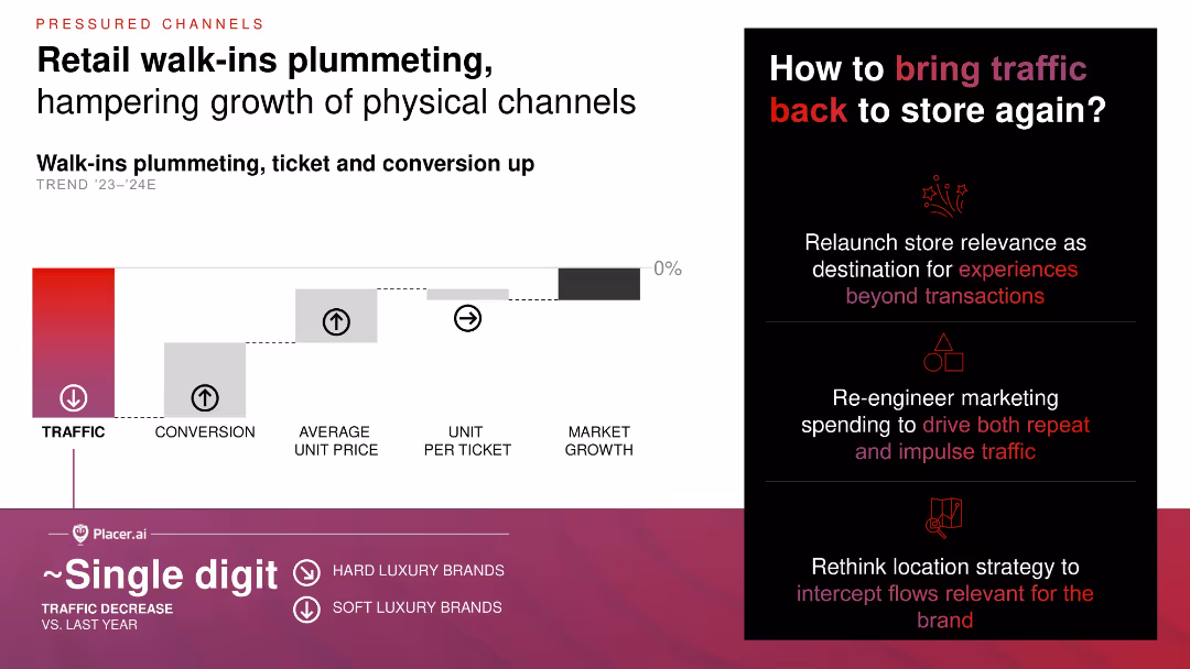
Step diagram visualizing impact of declining foot traffic vs. increases in conversion and average ticket; right column offers strategic suggestions with icons.
Operational Efficiency
Consumer Goods
Walk-in traffic for retail is dropping, but average ticket size and conversion rates are up, neutralizing overall market growth. The slide suggests marketing, location strategy, and experiential enhancements to reverse footfall trends.
foot traffic, conversion rate, physical retail, marketing strategy, experiential retail
false
Operational Efficiency
Consumer Goods
Mixed Chart
Bain
Add to my slides
Remove from favorites
Slide depicting the number of jobs supported by Ford USA, with a bar graph and a worker assembling a vehicle in the background.
Human Resources and Talent Management
Transportation & Logistics
This slide quantifies the impact of Ford USA on job creation, illustrating the multiplier effect of Ford employment on the broader economy.
Ford, employment, multiplier effect, American jobs, automotive industry, manufacturing, dealers, community impact
false
Human Resources and Talent Management
Transportation & Logistics
Single Chart
BCG
Add to my slides
Remove from favorites
A slide presenting an external study's findings on the F-150's status as the most American-made full-size pickup.
Product and Service Analysis
Transportation & Logistics
Discusses the significance of the Ford F-150 in the American auto industry, its sales, and its rank as an American-made vehicle.
Ford F-150, American-made, auto industry, truck sales, vehicle classification, market analysis, competitive ranking
false
Product and Service Analysis
Transportation & Logistics
Single Chart
BCG
Add to my slides
Remove from favorites
A split slide with textual information on the left about job impact and an image of a worker on the right.
Human Resources and Talent Management
Transportation & Logistics
Analyzes the job creation impact of the F-Series across various sectors, with a focus on multiplier effects.
Ford, F-Series, job impact
false
Human Resources and Talent Management
Transportation & Logistics
Single Chart
BCG
Add to my slides
Remove from favorites
A slide with a green background and four numbered images representing the report's content sections.
Financial Performance
Transportation & Logistics
Summarizes the report's content, which includes employment, GDP, manufacturing, and usage impact of the F-Series.
Ford, F-Series, report, contents, employment, GDP, manufacturing, usage
false
Financial Performance
Transportation & Logistics
Agenda
BCG
Add to my slides
Remove from favorites
A graph displays patent family citations in future mobility against a teal background, accompanied by statistical highlights.
Strategic Planning
Transportation & Logistics
Focuses on Ford's patents in the future of mobility sector, including AI and electric vehicles, with a high percentage of recent patents.
Ford, future of mobility, patents, autonomous, AI, electric vehicles
true
Strategic Planning
Transportation & Logistics
Single Chart
BCG
Add to my slides
Remove from favorites
The slide features a list layout with iconography for different industries like Aircraft monitoring and Surgical robotics.
Client Case Studies
Transportation & Logistics
Highlights Ford's patents being cited across industries from agriculture to biopharma with specific examples of applications.
Ford, innovation, patents, industries, agriculture, biopharma
false
Client Case Studies
Transportation & Logistics
Boxed
BCG
Add to my slides
Remove from favorites
Features a graph plotting the Average Competitive Impact™ against patent families and freshness percentage for various automotive companies, with a large arrow highlighting Ford's leading position.
Competitive Landscape
Transportation & Logistics
The slide communicates Ford's dominance in patent filings within the automotive industry, measuring both the quality and recentness of these patents, suggesting innovation and market leadership.
Ford, patents, automotive industry, innovation, competitive impact, market leadership
false
Competitive Landscape
Transportation & Logistics
Single Chart
BCG
Add to my slides
Remove from favorites
Graphical slide comparing Ford's patent impact and freshness to other auto manufacturers, with an image of a rugged terrain vehicle.
Technology and Digital Transformation
Transportation & Logistics
Illustrates Ford's innovative edge in the auto industry, as evidenced by the quality and recency of its patents.
Ford, patents, innovation, automotive industry, technology leadership, competitive impact, patent freshness, R&D
false
Technology and Digital Transformation
Transportation & Logistics
Single Chart
BCG
Add to my slides
Remove from favorites
A split diagram and bar chart display Ford's market share in commercial vocations.
Client Case Studies
Transportation & Logistics
Illustrates Ford's leading position in market share for commercial pickup trucks across various vocations.
Ford, pickup truck, commercial, vocations, market share
false
Client Case Studies
Transportation & Logistics
Mixed Chart
BCG
Add to my slides
Remove from favorites
A green and white slide detailing Ford's contribution to US GDP, including manufacturing and multiplier effects.
Financial Performance
Transportation & Logistics
Captures the overarching economic contribution of Ford to the US GDP, with a focus on manufacturing, sales, and associated multiplier effects from employee spending.
Ford, US GDP, economic contribution, manufacturing, multiplier effects, vehicle sales, after-sales service, community impact
true
Financial Performance
Transportation & Logistics
Single Chart
BCG
Add to my slides
Remove from favorites
The slide presents future projections using a bar chart showing the digital economy's growth, driven by tier 2 and 3 cities, with accompanying explanatory text.
Market Analysis and Trends
Technology & Software
Forecasts the increasing contribution of tier 2 and 3 cities to Indonesia's digital economy by 2025, indicating significant growth in e-commerce and other sectors.
forecast, digital economy, tier cities, Indonesia, growth, e-commerce, payments
false
Market Analysis and Trends
Technology & Software
Multiple Chart
Kearney
Add to my slides
Remove from favorites
Four column charts showing forecasts for EV assembly by region, Plug-in Hybrid Vehicle Assembly, BEV Assembly, and Full and Mild Hybrid Assembly.
Market Analysis and Trends
Transportation & Logistics
Forecasts the assembly numbers for different types of electrified vehicles by region for the years 2023 and 2028, with significant percentage increases.
forecast, EV, assembly, region, hybrid, BEV, vehicle, growth, market
false
Market Analysis and Trends
Transportation & Logistics
Multiple Chart
PwC/Strategy&
Add to my slides
Remove from favorites
The slide includes a flowchart detailing the preliminary engineering forecasting process, alongside a bullet list of key challenges and a bar graph summarizing budget versus actual adjustments.
Regulatory and Compliance
Government & Public Sector
Focuses on the challenges of robust forecasting in preliminary engineering within NCDOT, highlighting the discrepancies between budgeted and actual expenditures and the impact on project pipeline development.
forecasting, engineering, budget, NCDOT, process flow
false
Regulatory and Compliance
Government & Public Sector
Uncategorized
McKinsey
Add to my slides
Remove from favorites
Moderate complexity with bullet points, icons, and text
Market Analysis and Trends
Environmental Services & Sustainability
This slide predicts the long-term effects of technology trends on different industries. It is useful for strategic planning and forecasting future market developments. It discusses the anticipated changes and how industries can adapt to these trends for sustainable growth.
Forecasting, Long-Term Impact, Adaptation, Market Development, Sustainability
false
Market Analysis and Trends
Environmental Services & Sustainability
Header Vertical
McKinsey
Add to my slides
Remove from favorites
Slide includes complex elements such as key macroeconomic driver icons and a line chart comparing actual vs. model estimates of economic growth.
Operational Efficiency
Professional Services
Offers an in-depth view of Deloitte Access Economics' forecast models and their relationship with work put in place/work done in New Zealand and Australia. The slide details specific macroeconomic variables affecting forecasts and includes a visual comparison of model accuracy.
Forecasting, Macroeconomic, New Zealand, Australia, Economic Analysis, Regression Models, Accuracy, WPIP
false
Operational Efficiency
Professional Services
Mixed Chart
Deloitte
Add to my slides
Remove from favorites
The slide shows a column chart for the years 2018, 2019, and a forecast for 2025, alongside icons representing market drivers and macroeconomic indicators.
Strategic Planning
Consumer Goods
Projects the growth of the luxury goods market to 2025, considering current trends and potential disruptions. It aims to strategize for potential market changes.
Forecasting, Macroeconomics, Market growth
false
Strategic Planning
Consumer Goods
Mixed Chart
Bain
Add to my slides
Remove from favorites
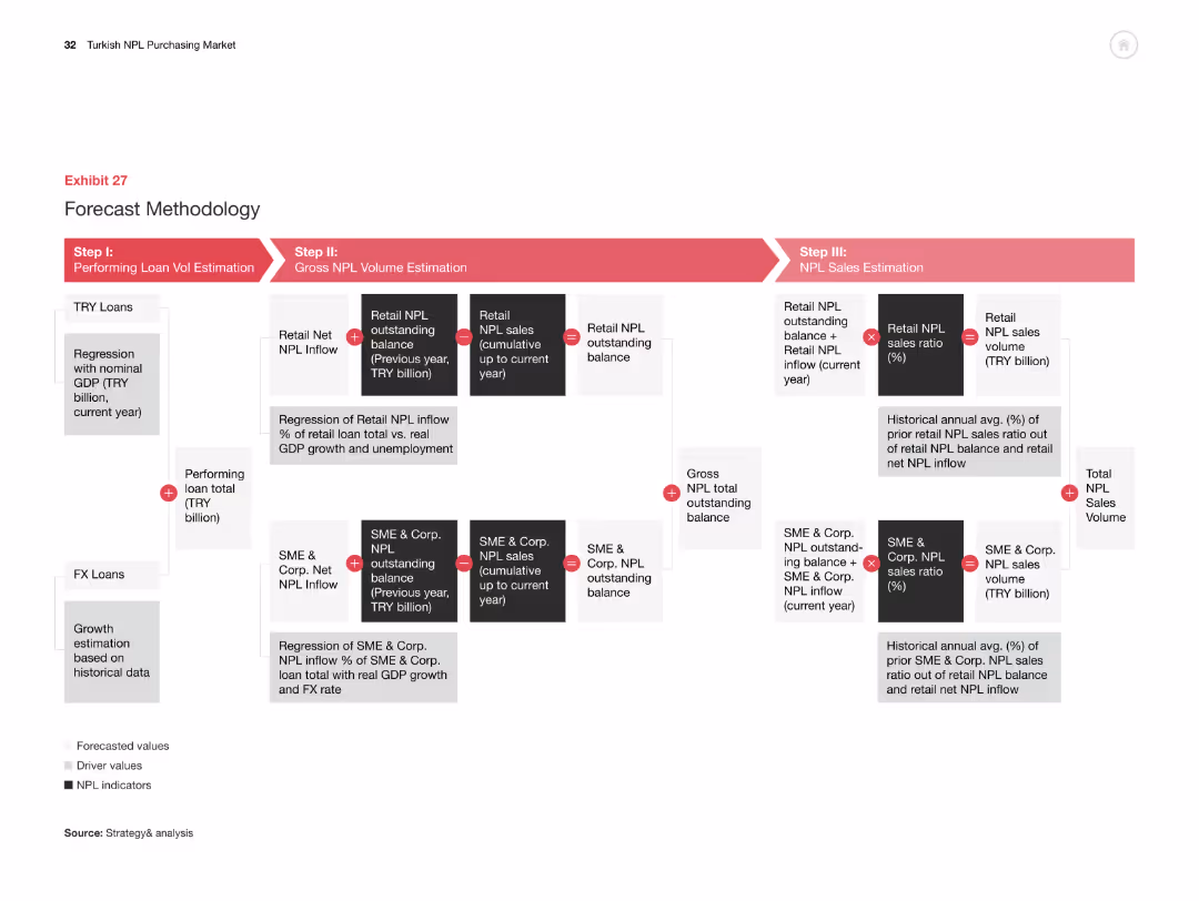
The slide has a flowchart showing the methodology for forecasting NPL volumes, broken down into three steps: loan volume estimation, NPL volume estimation, and NPL sales estimation.
Strategic Planning
Financial Services
This slide explains the methodology for forecasting NPL volumes in Turkey, detailing the steps involved in estimating performing loan volumes, gross NPL volumes, and NPL sales volumes.
forecast, methodology, NPL, estimation, flowchart
false
Strategic Planning
Financial Services
Linear Flow
PwC/Strategy&
Add to my slides
Remove from favorites
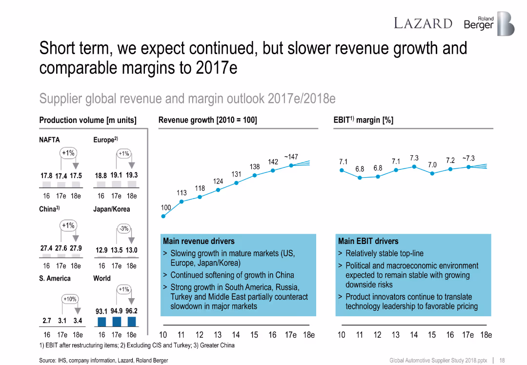
Multiple charts: production volume, revenue growth line, EBIT margin line; commentary on drivers of revenue and EBIT.
Strategic Planning
Industrial & Manufacturing
Projects slower but continued revenue growth and stable margins into 2018. Notes market-specific trends (e.g., slowdown in China, growth in South America), macroeconomic stability, and importance of product innovation in maintaining margins.
forecast, revenue growth, EBIT margin, regions, automotive production, global trends
false
Strategic Planning
Industrial & Manufacturing
Multiple Chart
Roland Berger
Add to my slides
Remove from favorites
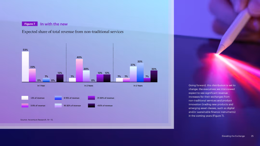
Clustered bar chart showing expected revenue shares from non-traditional services over 1, 2, and 3 years. Color-coded by revenue share range. Right image.
Strategic Planning
Financial Services
This slide forecasts increasing reliance on non-traditional services by exchanges. Executives expect significant growth in revenue from these sources, including innovations like digital asset trading and sustainable finance instruments over a 3-year horizon.
Forecast, Revenue Growth, Innovation, Non-Traditional, Exchanges, Future, Strategic Planning, Financial
false
Strategic Planning
Financial Services
Mixed Chart
Accenture
Add to my slides
Remove from favorites
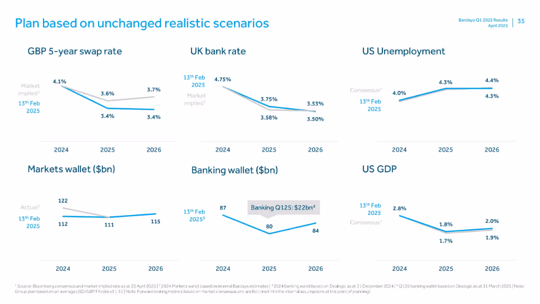
Six mini-line charts with macroeconomic forecasts and market estimates (2024–2026)
Strategic Planning
Financial Services
Displays economic assumptions behind Barclays' planning, including interest rates, unemployment, GDP, and market wallets. Emphasizes a stable outlook with moderate adjustments in macro indicators through 2026.
forecasts, interest rate, GDP, unemployment, wallet size
false
Strategic Planning
Financial Services
Single Chart
Barclays
Add to my slides
Remove from favorites
The slide features pie charts and bar graphs detailing firms' reliance on foreign exchange, improvements in accessibility, and sources of forex.
Risk Assessment and Management
Financial Services
The slide discusses the challenges local firms face in accessing foreign exchange, sources of forex, and the impact on business operations.
foreign exchange, accessibility, forex challenges, local firms, operations
false
Risk Assessment and Management
Financial Services
Multiple Chart
EY
Add to my slides
Remove from favorites
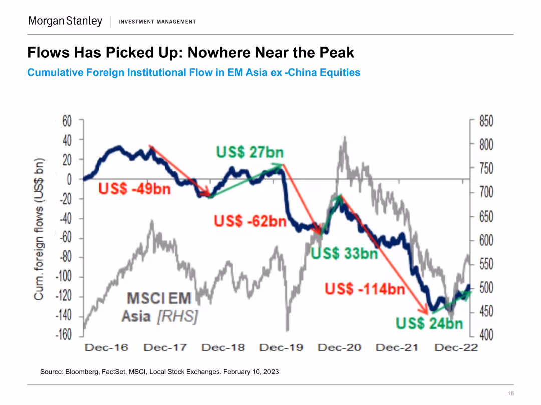
The slide includes a line chart tracking cumulative foreign institutional flow in EM Asia ex-China equities from December 2016 to February 2023. Key flow changes are highlighted.
Financial Performance
Financial Services
This slide shows the trends in foreign institutional investments in emerging market Asia, excluding China, indicating significant inflow and outflow events over the period.
Foreign Institutional Flow, EM Asia, Investment Trends, Equity Markets, Financial Performance, Market Inflows, Capital Movement, Investment Analysis
false
Financial Performance
Financial Services
Single Chart
Morgan Stanley
Add to my slides
Remove from favorites
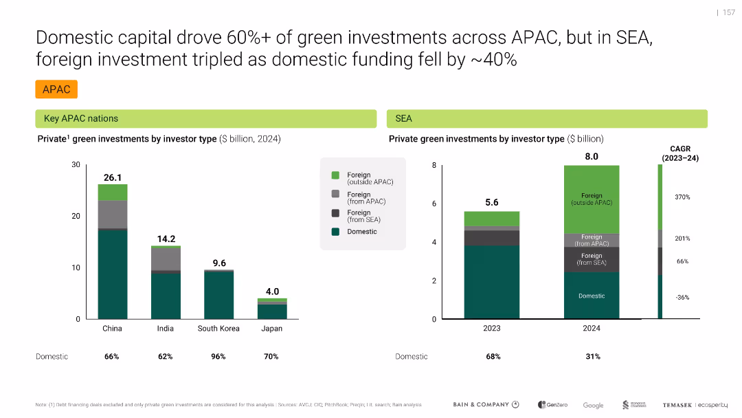
Side-by-side bar charts comparing domestic vs. foreign investment shares in APAC and SEA
Investment Analysis
Environmental Services & Sustainability
Shows a shift in SEA green investment sources: foreign capital (especially outside APAC) tripled in 2024, while domestic funding fell. Highlights domestic-heavy profiles for countries like South Korea.
Foreign investment, Domestic capital, SEA, APAC, Green funds, 2024, Capital flows, Infrastructure, Foreign vs domestic
false
Investment Analysis
Environmental Services & Sustainability
Multiple Chart
Bain
Add to my slides
Remove from favorites
The slide includes a portrait of Marinos Giannopoulos with text on the right discussing foreign investment in Greece. The background shows a coastal view.
Strategic Planning
Financial Services
This slide presents an external viewpoint from Marinos Giannopoulos, CEO of Enterprise Greece, discussing strategies to attract foreign investors to Greece.
foreign investment, Greece, strategy, external view
false
Strategic Planning
Financial Services
Mixed Chart
EY
Add to my slides
Remove from favorites
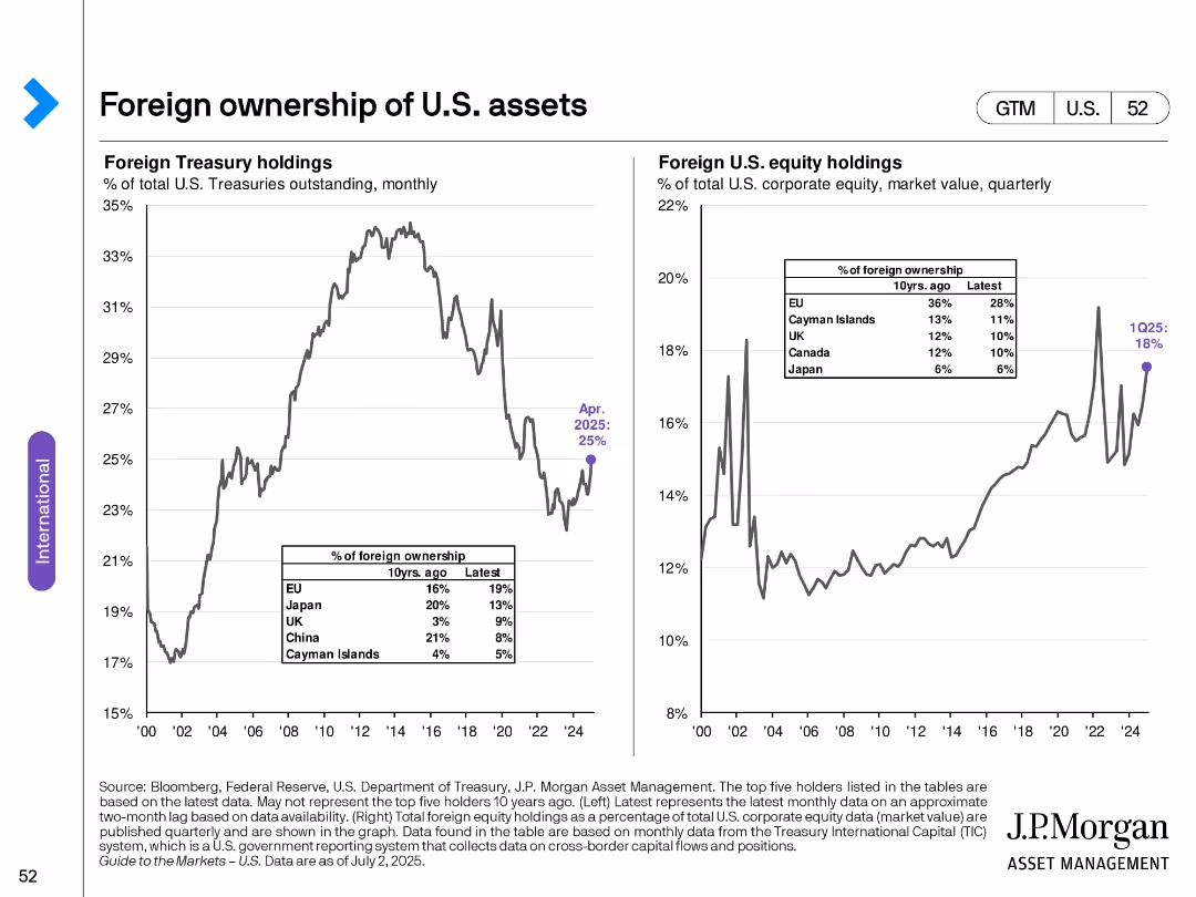
Two line charts with historical data: Left—foreign Treasury holdings; Right—foreign equity holdings in U.S. markets.
Investment Analysis
Financial Services
Shows trends in foreign investment in U.S. assets, tracking both Treasuries and equities over time. Also includes recent statistics on foreign ownership by region, providing insight into international capital flows.
foreign investment, U.S. equities, Treasuries, ownership trends, capital flows, international markets
false
Investment Analysis
Financial Services
Multiple Chart
JP Morgan
Add to my slides
Remove from favorites
The slide has a photo of Marinos Giannopoulos on the left with text on the right discussing foreign investor requirements. The background shows a seascape.
Strategic Planning
Financial Services
This slide discusses what foreign investors look for when considering investment in Greece and outlines strategies to attract more foreign direct investment.
foreign investors, Greece, strategy, investment
false
Strategic Planning
Financial Services
Multiple Chart
EY
Add to my slides
Remove from favorites
Detailed list and icons representing sectors with foreign ownership restrictions in the Philippines, structured in a clear, readable format.
Regulatory and Compliance
Government & Public Sector
Outlines foreign ownership limits in various sectors as per the Philippines' laws, providing essential information for foreign investors.
Foreign ownership, Philippines, restrictions, sectors, investment
false
Regulatory and Compliance
Government & Public Sector
Table
Deloitte
Add to my slides
Remove from favorites
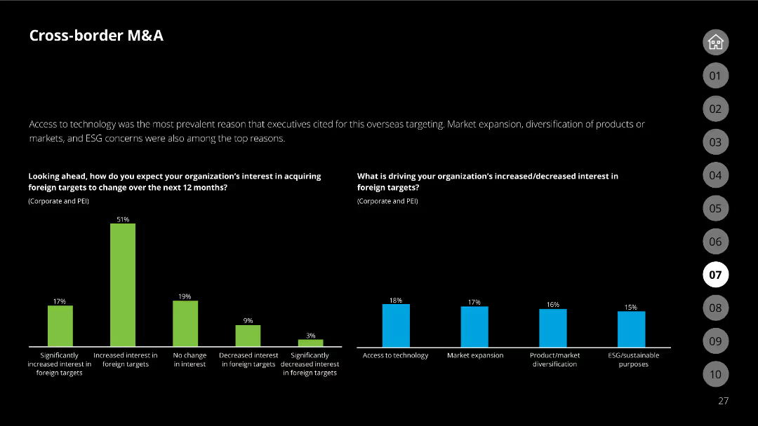
The slide has a black background with white text, a column chart indicating changes in interest for acquiring foreign targets, and reasons driving this interest shown in another chart.
Mergers and Acquisitions
Financial Services
Examines the factors driving increased or decreased interest in acquiring foreign targets, supported by data on how interest levels are expected to change over the next year.
foreign targets, acquisition interest, survey data, M&A strategies, drivers
false
Mergers and Acquisitions
Financial Services
Multiple Chart
Deloitte
Add to my slides
Remove from favorites
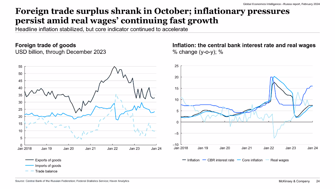
The slide includes two line charts: the left chart shows the foreign trade of goods in USD billion, while the right chart depicts the central bank interest rate, real wages, and inflation rates in Russia.
Market Analysis and Trends
Transportation & Logistics
The slide examines the shrinkage of Russia's foreign trade surplus in October, ongoing inflationary pressures, and real wage growth. It provides insights into economic conditions and policy responses in Russia.
foreign trade, surplus, inflation, real wages, economic conditions
false
Market Analysis and Trends
Transportation & Logistics
Multiple Chart
McKinsey
Add to my slides
Remove from favorites
The slide features a column chart displaying the NPS of France as a destination for foreign workers from 2016 to 2021, with quotes from industry experts on the right.
Market Analysis and Trends
Government & Public Sector
This slide shows an increase in France's attractiveness for foreign workers, highlighted by a rise in its NPS score in 2021.
Foreign workers, NPS, Attractiveness, Aerospace, Defense
false
Market Analysis and Trends
Government & Public Sector
Mixed Chart
Bain
Add to my slides
Remove from favorites
Features a structured layout with bullet points detailing services and expertise.
Risk Assessment and Management
Professional Services
Describes services in forensic accounting and investigations, including compliance, fraud detection, and financial analysis to help organizations manage and mitigate risks associated with financial irregularities.
forensic accounting, risk management, compliance, investigations, fraud detection
false
Risk Assessment and Management
Professional Services
Header Vertical
Alvarez & Marsal
Add to my slides
Remove from favorites
Utilizes a balanced layout of text and symbolic imagery to describe service facets.
Technology and Digital Transformation
Technology & Software
Discusses capabilities in forensic technology, emphasizing tools and methods for data analysis and security to protect against internal and external threats, highlighting bespoke solutions for varied client needs.
forensic technology, data security, investigations, digital solutions, cybersecurity
false
Technology and Digital Transformation
Technology & Software
Header Vertical
Alvarez & Marsal
Add to my slides
Remove from favorites
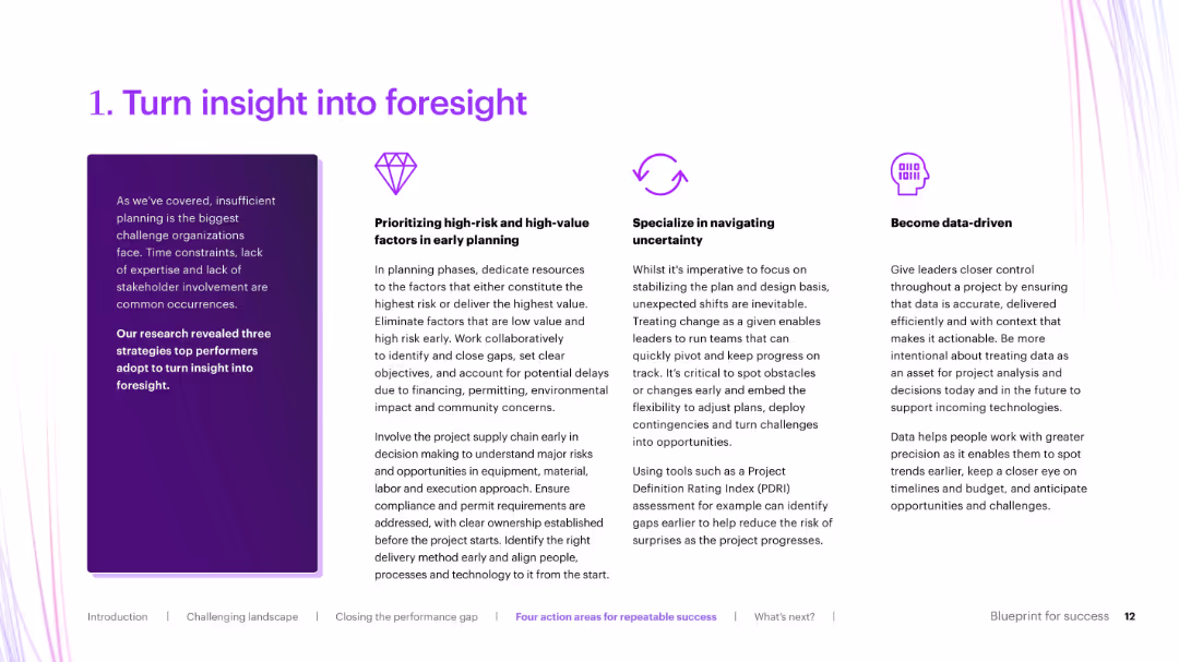
Three-column layout with icons and bold section titles, explaining strategies like data-driven planning and early risk identification.
Strategic Planning
Real Estate & Construction
Elaborates on the first action area from the previous slide: turning insight into foresight. It breaks down how organizations can improve planning through prioritizing risks, navigating uncertainty, and becoming data-driven.
foresight, early planning, risk mitigation, data-driven, uncertainty
false
Strategic Planning
Real Estate & Construction
Pillar
Accenture
Add to my slides
Remove from favorites
Features column charts and bullet points detailing key economic impacts and applications of Copernicus in forestry.
Industry Overview
Environmental Services & Sustainability
Explores the benefits of Earth Observation data for forestry, emphasizing improvements in forest management and economic benefits.
Forestry, Earth Observation, Management, Economic Benefits, Sustainability
false
Industry Overview
Environmental Services & Sustainability
Mixed Chart
PwC/Strategy&
Add to my slides
Remove from favorites
Slide displays a mix of text and column chart, explaining the market impact and Copernicus applications in forestry.
Market Analysis and Trends
Environmental Services & Sustainability
Describes the historical benefits of Earth Observation for forestry, detailing how it aids in management and contributes to economic growth.
Forestry, Earth Observation, Market Impact, Economic Growth, Management
false
Market Analysis and Trends
Environmental Services & Sustainability
Mixed Chart
PwC/Strategy&
Add to my slides
Remove from favorites
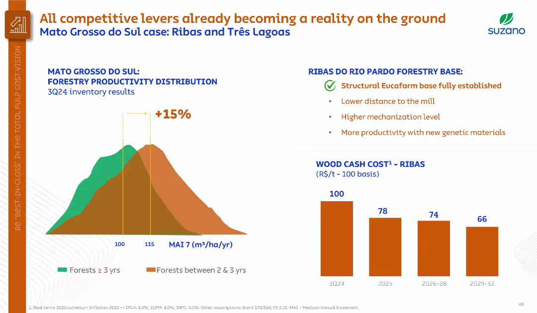
Histogram on forestry productivity, bullet points summarizing Ribas region benefits, and bar chart on wood cost.
Operational Efficiency
Agriculture & Food Production
Demonstrates forestry productivity improvements in Mato Grosso do Sul, highlighting the Ribas base’s structural advantages. Projects significant cost reduction in wood by 2029 through higher yields and mechanization.
forestry productivity, Ribas, genetic materials, cost reduction, MAI
false
Operational Efficiency
Agriculture & Food Production
Multiple Chart
Goldman Sachs
Add to my slides
Remove from favorites
The slide features a diagram and detailed table presenting the total potential of forestry residues for energy production by 2060, including theoretical, technical, and sustainable potentials, and various factors affecting its scalability and sustainability constraints.
Technology and Digital Transformation
Energy & Utilities
This slide provides a deep-dive into the potential of forestry residues as a feedstock for energy production, analyzing its total potential by 2060 and highlighting the scalability issues and sustainability constraints associated with its use.
forestry residues, feedstock, total potential, energy production, 2060, scalability, sustainability constraints
false
Technology and Digital Transformation
Energy & Utilities
Mixed Chart
Kearney
Add to my slides
Remove from favorites
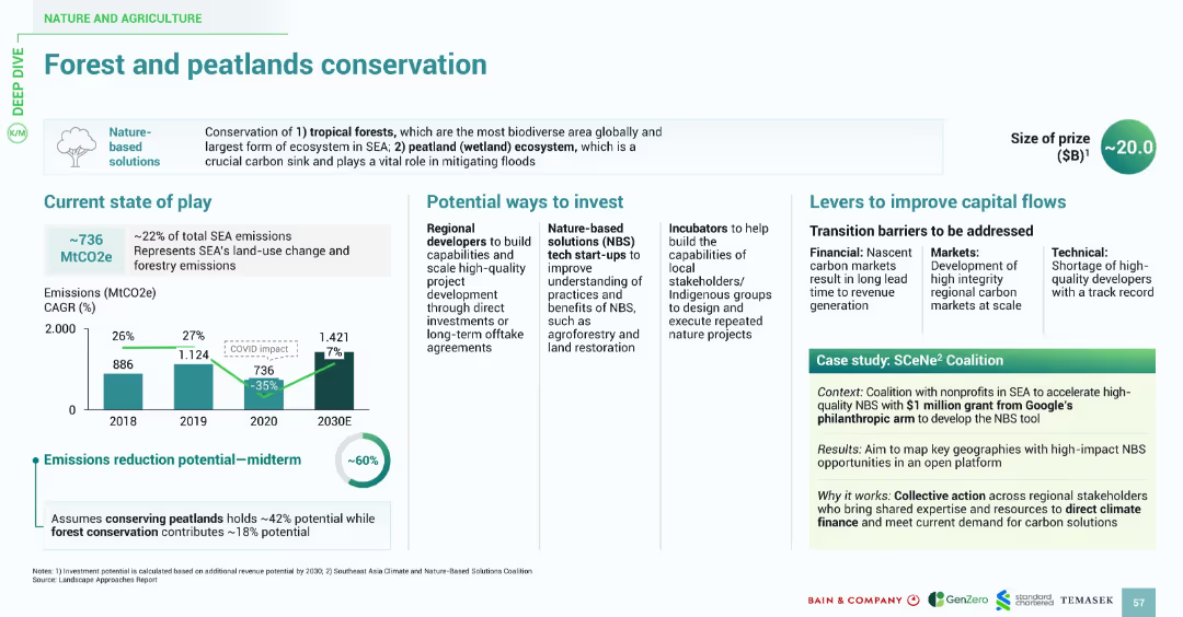
Balanced layout with emissions chart, investment options, capital flow challenges, and case study. Emphasizes visuals and consistent iconography for nature-based solutions.
Regulatory and Compliance
Environmental Services & Sustainability
This slide addresses the importance of conserving tropical forests and peatlands in SEA, representing 22% of SEA emissions. It shows midterm emissions reduction potential of ~60%. Investment suggestions include supporting local stakeholders and tech startups focused on land restoration. A case study of the SCeNe² Coalition highlights coalition-driven regional efforts funded by Google’s philanthropy arm.
forests, peatlands, conservation, emissions, SCeNe², NBS, land restoration, SEA
false
Regulatory and Compliance
Environmental Services & Sustainability
Multiple Chart
Bain
Add to my slides
Remove from favorites
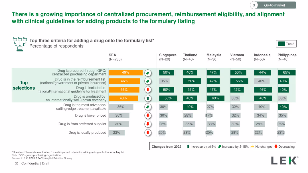
Vertical column chart showing the top three criteria for adding a drug to the formulary list across SEA countries. Criteria are color-coded and ranked by importance.
Regulatory and Compliance
Healthcare & Pharmaceuticals
Details the most important criteria for adding drugs to formulary lists in SEA, such as procurement through GPO, reimbursement status, and inclusion in treatment guidelines, with regional variations in importance.
formulary list, drug addition, criteria, GPO, reimbursement, treatment guidelines, SEA
false
Regulatory and Compliance
Healthcare & Pharmaceuticals
Multiple Chart
LEK
Add to my slides
Remove from favorites
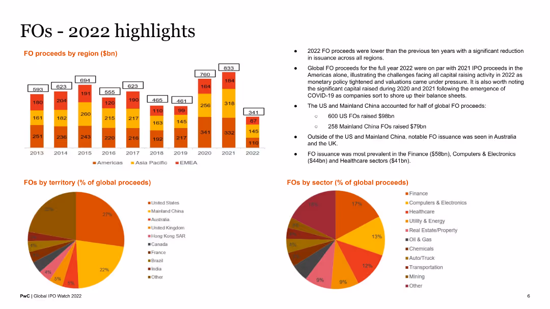
The slide features a column chart of FO proceeds by region, a pie chart of FOs by territory, and another pie chart by sector. Text blocks summarize key points about FO activities in 2022.
Market Analysis and Trends
Financial Services
This slide reviews follow-on offering (FO) activities in 2022, presenting data on proceeds by region, territory, and sector. It provides a comprehensive overview for analysts and stakeholders.
FOs highlights, 2022, regional proceeds, sector analysis, territory
false
Market Analysis and Trends
Financial Services
Multiple Chart
PwC/Strategy&
Add to my slides
Remove from favorites
Three column charts, showing projected use of coal, oil, and gas from 2015 to 2050 under different climate policy scenarios.
Market Analysis and Trends
Energy & Utilities
Analysis of future fossil fuel usage under various global warming scenarios, highlighting potential declines or growth in coal, oil, and gas usage depending on environmental policies.
fossil fuels, coal, oil, gas, climate policies
false
Market Analysis and Trends
Energy & Utilities
Multiple Chart
BCG
Add to my slides
Remove from favorites
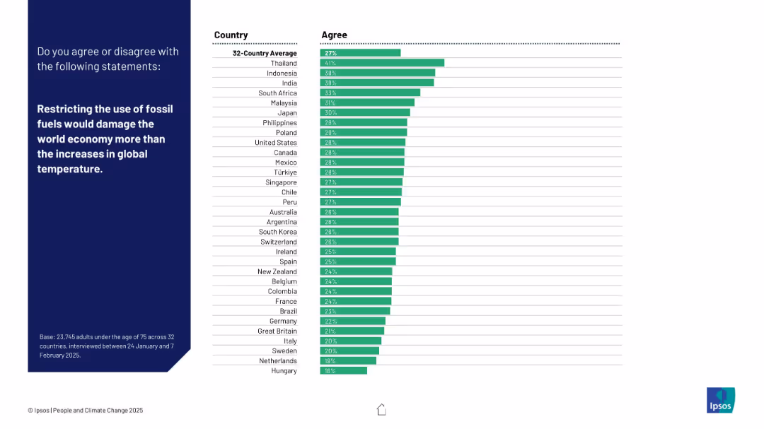
Standard layout with a horizontal bar chart showing agreement by country.
Strategic Planning
Environmental Services & Sustainability
Respondents were asked whether limiting fossil fuels would hurt the economy more than climate change. Thailand leads in agreement; Western countries show low support.
fossil fuels, economic impact, climate policy, temperature rise, global economy, Ipsos, energy strategy, environment vs economy, public opinion, international survey
false
Strategic Planning
Environmental Services & Sustainability
Mixed Chart
IPSOS
Add to my slides
Remove from favorites
The slide features a flow chart illustrating the energy efficiency example from fossil fuel extraction to mechanical energy conversion for hydrogen, electric motor, and ICE.
Technology and Digital Transformation
Energy & Utilities
The slide compares the efficiency of converting fossil fuels to hydrogen via SMR with ICE and BEV, demonstrating that the process does not lead to extra fossil fuel consumption. It visually represents energy conversion steps and efficiencies.
fossil fuels, hydrogen, efficiency, SMR, BEV
false
Technology and Digital Transformation
Energy & Utilities
Linear Flow
Kearney
Add to my slides
Remove from favorites
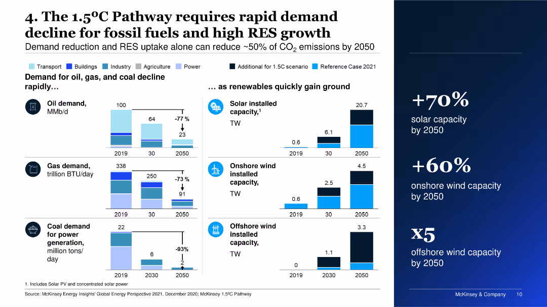
Features multiple column charts showing projections for the decline in demand for oil, gas, and coal, as well as growth in solar and wind capacities by 2050.
Market Analysis and Trends
Energy & Utilities
The slide emphasizes the necessity for rapid decline in fossil fuel demand and significant growth in renewable energy sources to achieve the 1.5°C Pathway.
fossil fuels, renewable energy, demand decline, solar, wind
false
Market Analysis and Trends
Energy & Utilities
Multiple Chart
McKinsey
Add to my slides
Remove from favorites
The slide includes a large orange circle graph depicting the comparison of reserves, production, and resources in gigatonnes of oil equivalent. It also features a smaller circle graph and several bar graphs showing percentages of various fossil energy types like coal, oil, and natural gas.
Industry Overview
Energy & Utilities
This slide highlights the vast difference between the production and the reserves and resources of fossil fuels in 2015. It breaks down production, reserves, and resources into types like hard coal, lignite, and crude oil. This is useful for analyzing the sustainability and future availability of these energy sources.
fossil fuels, reserves, production, resources, energy
false
Industry Overview
Energy & Utilities
Mixed Chart
Roland Berger
Add to my slides
Remove from favorites
The slide features multiple bar graphs showing the static reach of fuels like crude oil, natural gas, hard coal, lignite, and uranium in years. The graphs compare the reach based on current production and reserve levels.
Market Analysis and Trends
Energy & Utilities
Analyzes the potential scarcity of different fossil fuels based on their current production rates and known reserves. The focus is on how long existing reserves can sustain current production levels, with implications for energy planning and risk management regarding fuel scarcity.
fossil fuels, scarcity, reserves, production, sustainability
false
Market Analysis and Trends
Energy & Utilities
Mixed Chart
Roland Berger
Add to my slides
Remove from favorites
A two-dimensional matrix juxtaposing ‘Asset Management’ and ‘Consumer & Wealth Management’ against ‘Global Markets’ and ‘Investment Banking’.
Strategic Planning
Financial Services
Showcases the company's core areas of operation, signifying a stable and robust business structure. Useful for investor presentations or company orientation.
Foundation, Asset Management, Investment Banking, Global Markets, Wealth Management
false
Strategic Planning
Financial Services
Framework
Goldman Sachs
Add to my slides
Remove from favorites
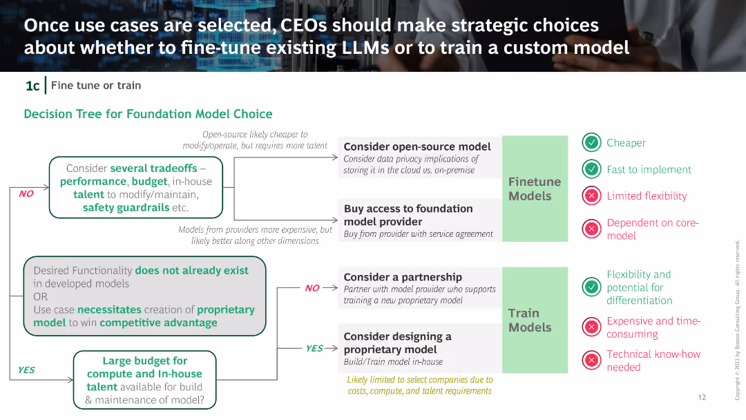
Decision tree outlining choices between open-source models, buying access, partnerships, and proprietary models, with trade-offs for each option.
Strategic Planning
Technology & Software
The slide provides a decision-making framework for selecting foundation models, weighing factors such as performance, budget, talent, and specific business needs.
Foundation model, Decision tree, Open-source, Proprietary model, Strategic choices
false
Strategic Planning
Technology & Software
Diagram
BCG
Add to my slides
Remove from favorites
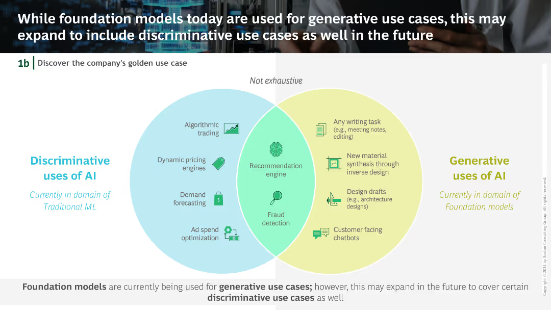
Venn diagram comparing discriminative uses of AI (Algorithmic trading, Dynamic pricing, etc.) with generative uses (Writing tasks, Material synthesis, etc.).
Technology and Digital Transformation
Technology & Software
The slide explores the potential expansion of foundation models from current generative use cases to include discriminative use cases, highlighting areas of overlap and distinction.
Foundation models, Generative AI, Discriminative uses, Venn diagram, AI applications
false
Technology and Digital Transformation
Technology & Software
Diagram
BCG
Add to my slides
Remove from favorites
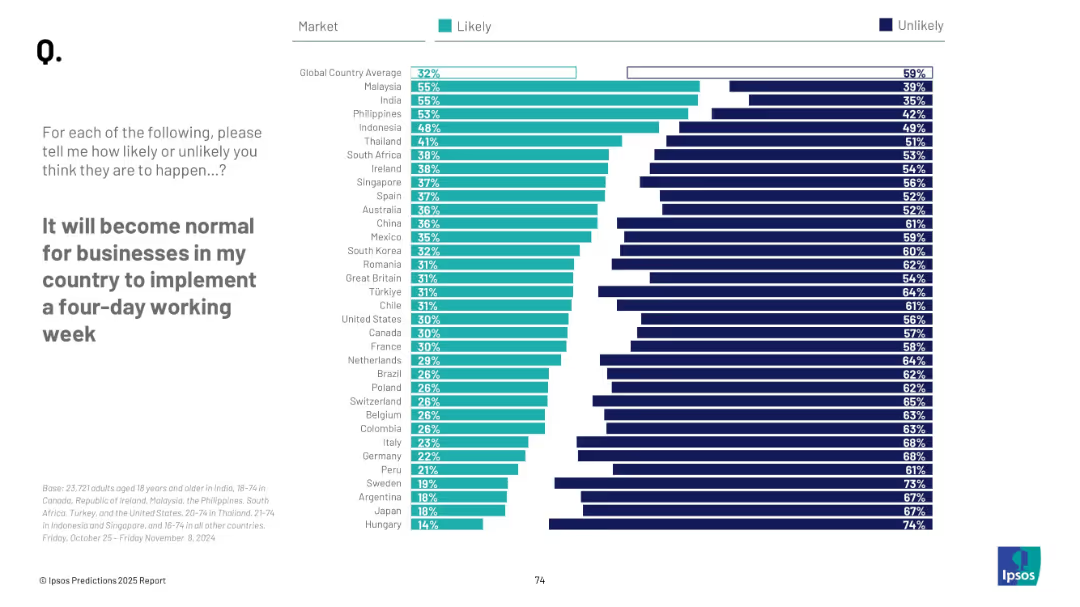
Vertical bar chart with teal and navy segments representing "likely" vs "unlikely" by country; text prompt on left.
Strategic Planning
Professional Services
This slide illustrates global opinions about the likelihood of a four-day workweek becoming a standard business practice. Malaysia and India show the highest optimism, while Western European countries and Japan are more skeptical. The global average belief in this change is 32%.
four-day week, business trends, workforce future, labor, global survey, workplace reform, Ipsos, productivity, business norms, change likelihood
false
Strategic Planning
Professional Services
Mixed Chart
IPSOS
Add to my slides
Remove from favorites
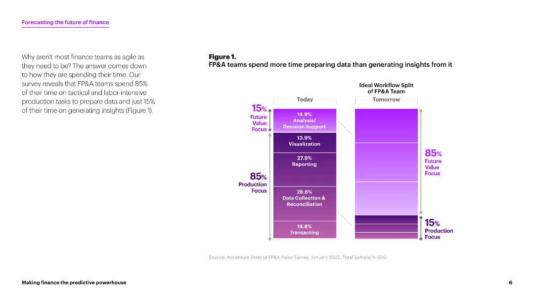
This slide contains a column chart comparing the time FP&A teams spend on various tasks today versus the ideal workflow split for tomorrow. The chart uses shades of purple to indicate the percentages of time spent on different tasks. The layout is clean with ample white space.
Strategic Planning
Financial Services
The slide discusses how FP&A teams currently spend 85% of their time on production tasks and only 15% on generating insights. It suggests a shift towards more analysis and decision support activities.
FP&A, data preparation, insights generation, workflow, finance
false
Strategic Planning
Financial Services
Mixed Chart
Accenture
Add to my slides
Remove from favorites
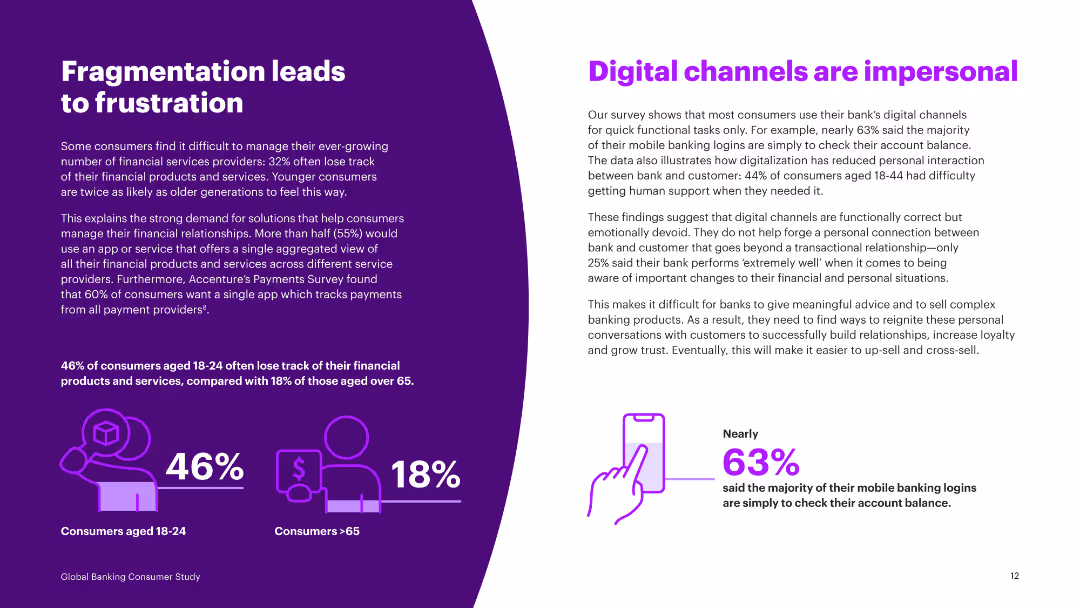
Text and infographics illustrating percentages of consumers losing track of financial products by age group, and preferences for app-based financial management.
Market Analysis and Trends
Financial Services
Discusses the frustration caused by financial service fragmentation and the growing demand for apps that aggregate financial management tools.
fragmentation, frustration, financial products, age group, app-based management, preferences, insights, survey
false
Market Analysis and Trends
Financial Services
Multiple Chart
Accenture
Add to my slides
Remove from favorites
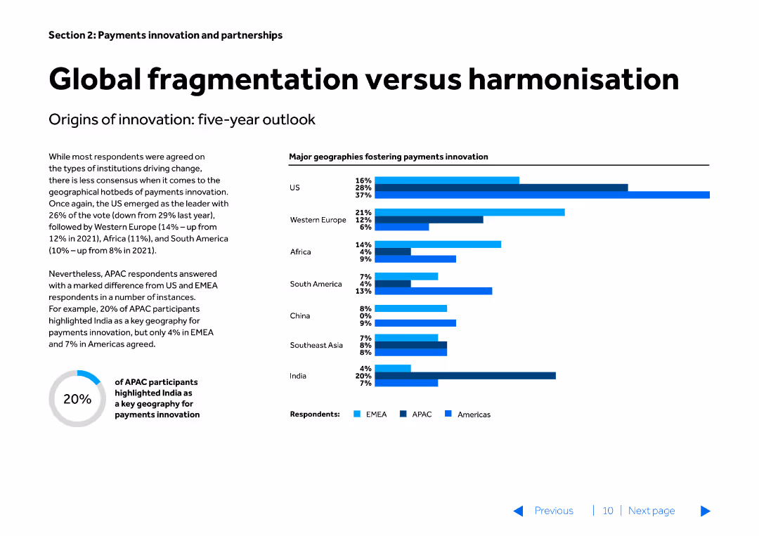
The slide features a title, a textual description, and a column chart. The column chart shows major geographies fostering payments innovation, with bars for the US, Western Europe, Africa, South America, China, Southeast Asia, and India, categorized by regions (EMEA, APAC, Americas).
Market Analysis and Trends
Financial Services
This slide examines the varying rates of payments innovation across different geographies, comparing the leading regions and highlighting the differences in innovation between US, Europe, and other regions. It is used for strategic planning in global payments innovation.
fragmentation, harmonisation, payments innovation, global, geographies, strategic planning, market trends, financial services
false
Market Analysis and Trends
Financial Services
Multiple Chart
Barclays
Add to my slides
Remove from favorites
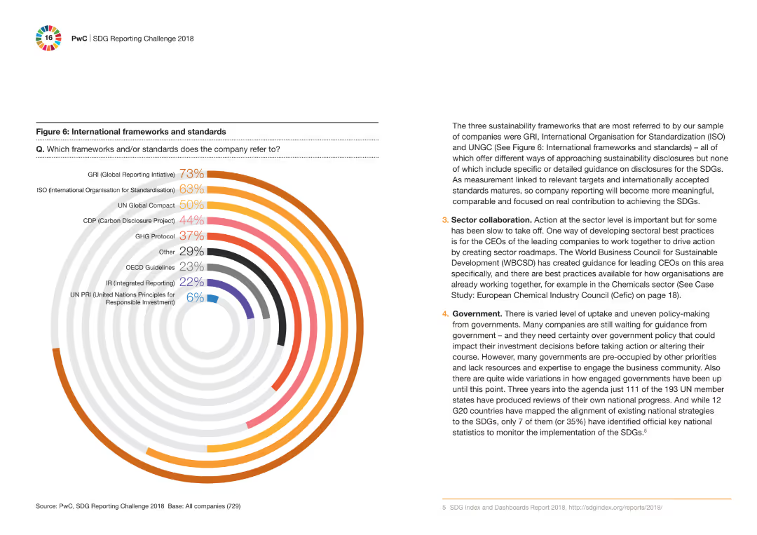
A circular bar chart displaying the percentage of companies referring to different international frameworks and standards. Accompanying text explains the importance of these frameworks in sustainability reporting.
Regulatory and Compliance
Financial Services
The slide showcases the international frameworks and standards most referred to by companies for sustainability reporting, with a circular bar chart highlighting the key standards like GRI, ISO, and UNGC.
frameworks, standards, sustainability, reporting, companies
false
Regulatory and Compliance
Financial Services
Mixed Chart
PwC/Strategy&
Add to my slides
Remove from favorites
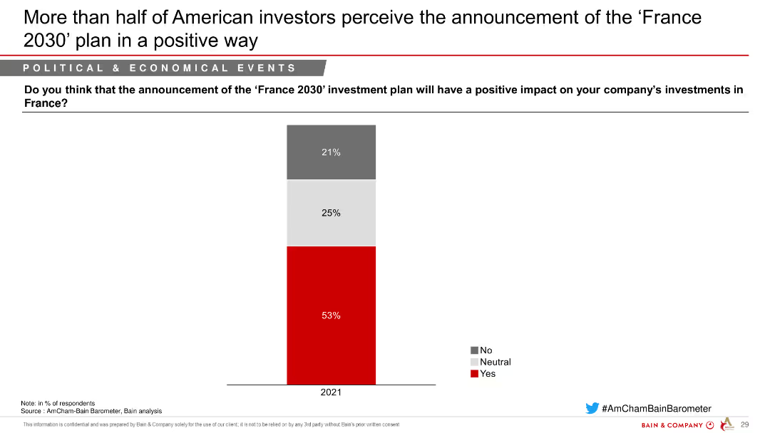
This slide features a column chart illustrating American investors' perceptions of the 'France 2030' investment plan, highlighting the percentage who view it positively, neutrally, or negatively.
Strategic Planning
Government & Public Sector
The slide presents data on American investors' views on the 'France 2030' investment plan, showing the majority see it as having a positive impact on their investments in France.
France 2030, investment plan, American investors, positive impact, strategic planning, government, public sector
false
Strategic Planning
Government & Public Sector
Single Chart
Bain
Add to my slides
Remove from favorites
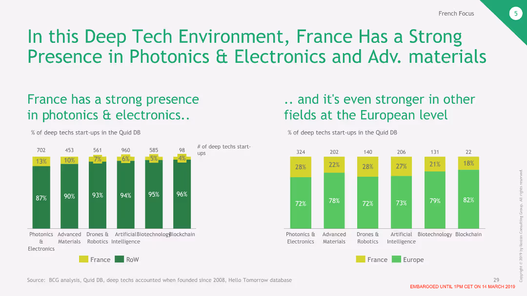
The slide features two column charts. The left chart shows the percentage of deep tech startups in France by category, and the right chart compares the percentage of startups in France versus Europe.
Market Analysis and Trends
Technology & Software
This slide illustrates France's strong presence in photonics and electronics, highlighting its competitive position in various deep tech fields compared to the rest of Europe.
France, Deep Tech, Photonics, Electronics, Comparison
false
Market Analysis and Trends
Technology & Software
Multiple Chart
BCG
Add to my slides
Remove from favorites
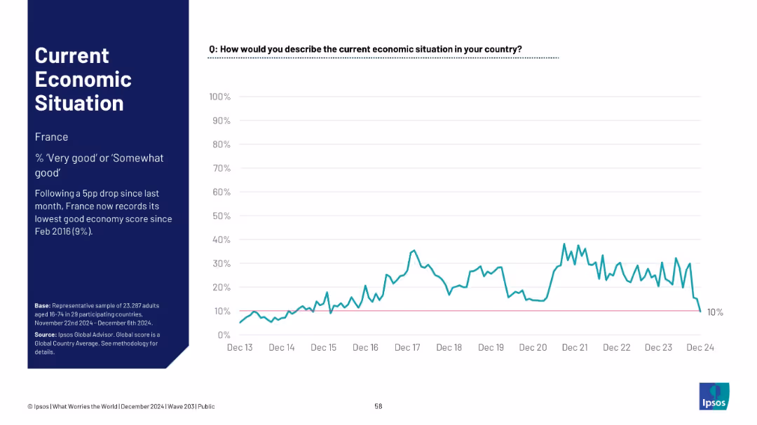
Timeline line chart focused on France; shows a sharp recent decline; minimalistic layout.
Market Analysis and Trends
Financial Services
France’s perception of its economic situation dropped to 10%, marking its lowest rating since February 2016, following a 5-point monthly decline.
France, economic decline, Ipsos data, historical low, 2024 drop, macroeconomic perception, time series, survey sentiment
false
Market Analysis and Trends
Financial Services
Mixed Chart
IPSOS
Add to my slides
Remove from favorites
Slide with multiple column charts detailing various French economic measures including corporate taxation, PACTE law, and unemployment insurance reform. Colors range from red to gray to indicate different levels of public perception from negative to positive.
Market Analysis and Trends
Government & Public Sector
Analyzes public perception of ongoing economic measures in France and their impact on the country's attractiveness, aimed at policymakers and economic analysts.
France, economic measures, public perception, corporate taxation, unemployment insurance, PACTE law, reform impact
false
Market Analysis and Trends
Government & Public Sector
Multiple Chart
Bain
Add to my slides
Remove from favorites
Split layout with left panel showing title and summary; right side features a time-series line graph (Nov 2013–Nov 2024) for France's economic view
Market Analysis and Trends
Government & Public Sector
This slide displays French public sentiment on the economy (% viewing it as 'very good' or 'somewhat good') over time, showing a current low of 14%—the lowest since April 2021.
France, economic sentiment, Ipsos, public opinion, trend, recession, survey, economy rating, chart, global study
false
Market Analysis and Trends
Government & Public Sector
Single Chart
IPSOS
Add to my slides
Remove from favorites
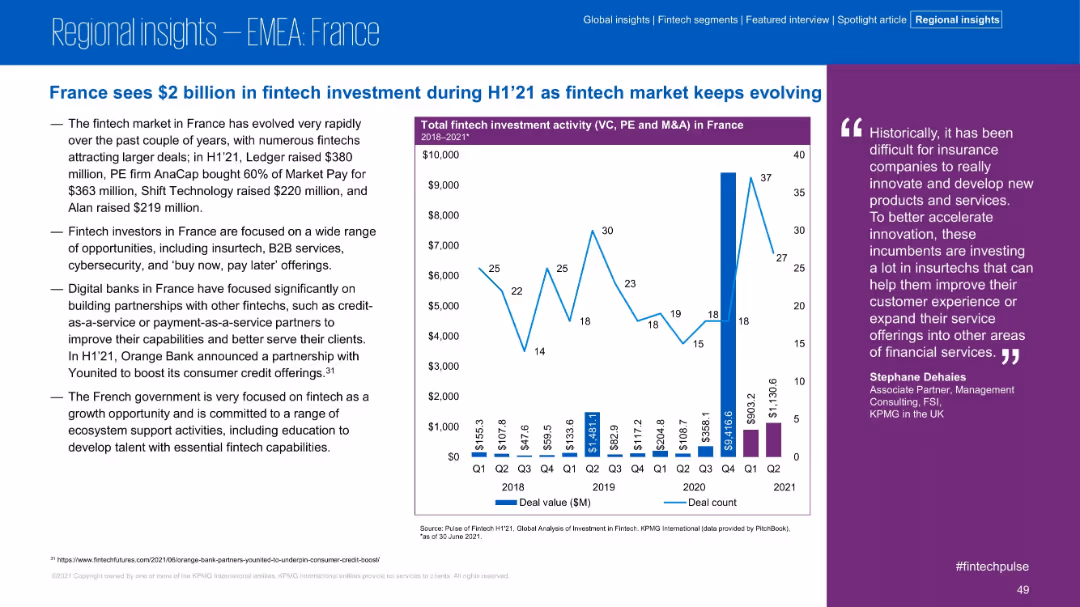
Text-heavy left panel and right-aligned investment trend chart; quote in purple column; professional and clear design.
Market Analysis and Trends
Financial Services
Fintech investment in France reached $2B in H1 2021, with multiple large deals and focus on insurtech, B2B services, and digital banks. The government’s support and emphasis on ecosystem development are also highlighted.
France, Fintech, H1 2021, Digital Banking, Insurtech, Investment, B2B, Government Support
false
Market Analysis and Trends
Financial Services
Mixed Chart
KPMG
Add to my slides
Remove from favorites
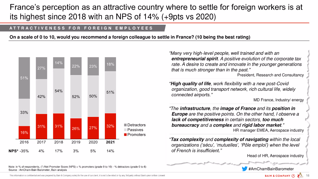
The slide contains multiple column charts, showing percentages of detractors, passives, and promoters from 2016 to 2023 about settling in France, with quotes from various business leaders providing context.
Market Analysis and Trends
Hospitality & Tourism
Analyzes the perception trends over years regarding France's attractiveness to foreign employees, noting a recent decline in positive ratings. It highlights testimonials on France's living conditions and labor costs.
France, foreign employees, NPS, perception, attractiveness
false
Market Analysis and Trends
Hospitality & Tourism
Mixed Chart
Bain
Add to my slides
Remove from favorites
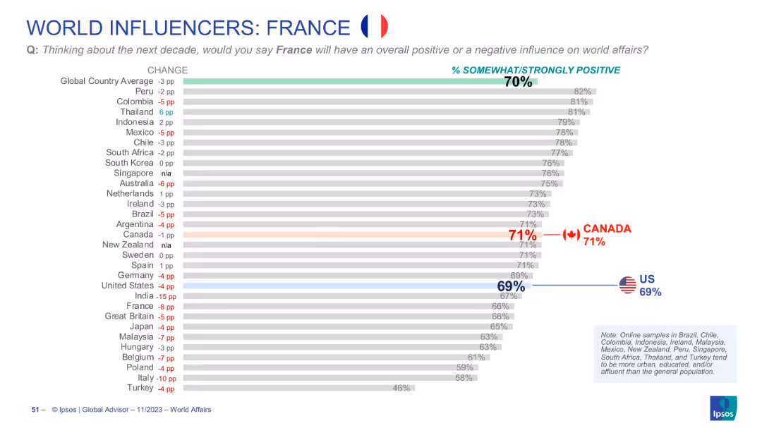
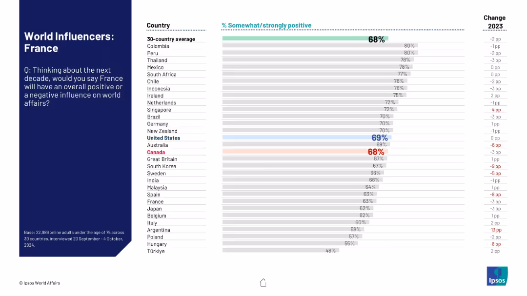
Similar horizontal chart showing views on France's global role
Market Analysis and Trends
Government & Public Sector
Tracks global views of France’s future influence. The global average is 70%. Canada scores France at 71%, while the U.S. gives it 69%. Includes year-over-year changes per country.
France, global perception, Canada, US, public opinion, diplomacy, Ipsos, bar chart, world influence, soft power
false
Market Analysis and Trends
Government & Public Sector
Single Chart
IPSOS
Add to my slides
Remove from favorites
Country ranking showing public opinion on France’s future influence on world affairs; includes change from previous year.
Strategic Planning
Government & Public Sector
This slide assesses global attitudes toward France’s projected global role over the next decade. It includes a 30-country comparison of positive sentiment and yearly change data, positioning France among peers.
France, international opinion, geopolitical role, global affairs, public perception, soft power, Ipsos data
false
Strategic Planning
Government & Public Sector
Mixed Chart
IPSOS
Add to my slides
Remove from favorites
The slide is a complex visual representation, using a Cartesian coordinate system chart with multiple criteria plotted along X (Importance of criterion) and Y (Position of France). Various factors are highlighted in red, indicating areas of improvement.
Market Analysis and Trends
Professional Services
This slide evaluates France's attractiveness to American investors focusing on factors like workforce cost, administrative complexity, and social climate. It suggests key improvement areas to enhance France's business environment.
France, investment, administrative complexity, social climate, attractiveness
false
Market Analysis and Trends
Professional Services
Single Chart
Bain
Add to my slides
Remove from favorites
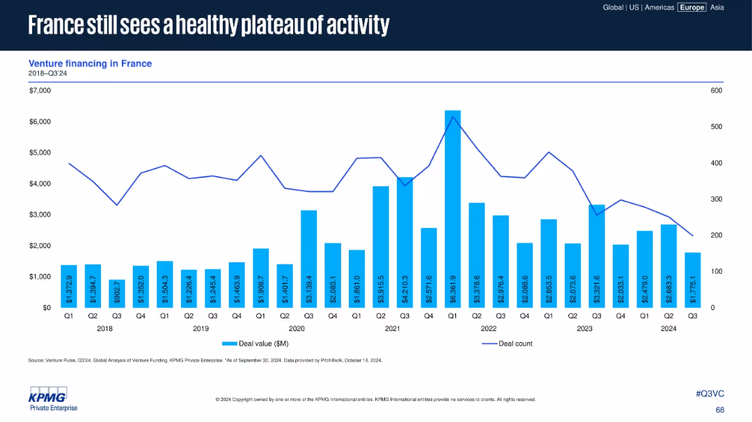
French venture financing data (deal value and count) from 2018–Q3 2024 in a standard dual-axis chart.
Market Analysis and Trends
Financial Services
France maintains a stable level of VC activity in Q3 2024, consistent with previous quarters. Despite no dramatic highs, the data reflects a healthy and sustained venture funding environment in the country.
France, venture capital, deal value, Q3 2024, stable investment, plateau, deal count, historical trend
false
Market Analysis and Trends
Financial Services
Single Chart
KPMG
Add to my slides
Remove from favorites
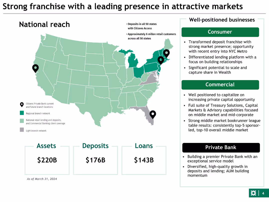
Map with highlighted regions, bullet points, and three large numeric values representing assets, deposits, and loans. The slide uses green color for emphasis.
Market Analysis and Trends
Financial Services
This slide highlights the national reach of a bank, detailing assets, deposits, and loans. It discusses the strategic positioning in consumer and commercial markets.
franchise, assets, deposits, loans, market
false
Market Analysis and Trends
Financial Services
Graphic
Barclays
Add to my slides
Remove from favorites
Column charts showing invested assets and transaction-based income growth across business segments
Market Analysis and Trends
Financial Services
Displays growth in invested assets and transaction-based income, showing client momentum
franchise, client, momentum, growth
false
Market Analysis and Trends
Financial Services
Multiple Chart
UBS
Add to my slides
Remove from favorites
Previous
Next
You don't have any favorites yet.
Please wait loading your favorites slides...
Create a FREE account to continue browsing
Receive Instant Access to 1,000+ slides from companies like McKinsey, Google, and Goldman Sachs
First Name
Last Name
Email
Password
I agree to all
Terms & Privacy Policy
Thank you! Your submission has been received!
Oops! Something went wrong while submitting the form.
Have an account?
Sign in
Upgrade to PRO to Save slides
Advanced Search and Filters
Access to 15,000+ slides
Access to Category Pages
Save/Bookmark Slides
PowerPoint Template Library
Pick a Plan
MONTHLY
$12/month
Billed every month, Cancel anytime.
YEARLY
$9/year
Billed $108 annually, Cancel anytime.
Checkout for $12/month
Checkout for $108/yr
Secured by Stripe | AES-256 bit encryption