My Account
My Slides
Search by Category
Companies
Slide Type
Use Case
Industry
Pricing
Templates
View All Templates
Download Template Slides
✦ AI
AI Prompt Library
AI Search
Feedback
Login
Logout
Get Started
Browse all Slides
Browse all Slides
Create a FREE Account
Instant access to 1,000+ real slides from top companies like McKinsey, BCG, Goldman Sachs, Google and many more!
First Name
Last Name
Email
Password
I agree to all
Terms & Privacy Policy
Thank you! Your submission has been received!
Oops! Something went wrong while submitting the form.
Have an account?
Sign in
Saved Slides
Total No. of slides saved
0
↻ Refresh
✖ Clear all
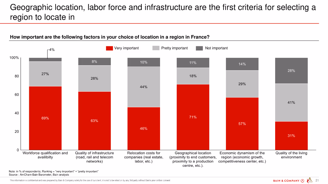
Column chart depicting the importance of various factors in choosing a location within France, highlighting workforce qualification, infrastructure, and geographic location.
Market Analysis and Trends
Professional Services
The slide discusses the key criteria for selecting a region in France, focusing on workforce qualification, infrastructure, and geographical location as primary factors.
geographic location, labor force, infrastructure, location criteria, France
false
Market Analysis and Trends
Professional Services
Single Chart
Bain
Add to my slides
Remove from favorites
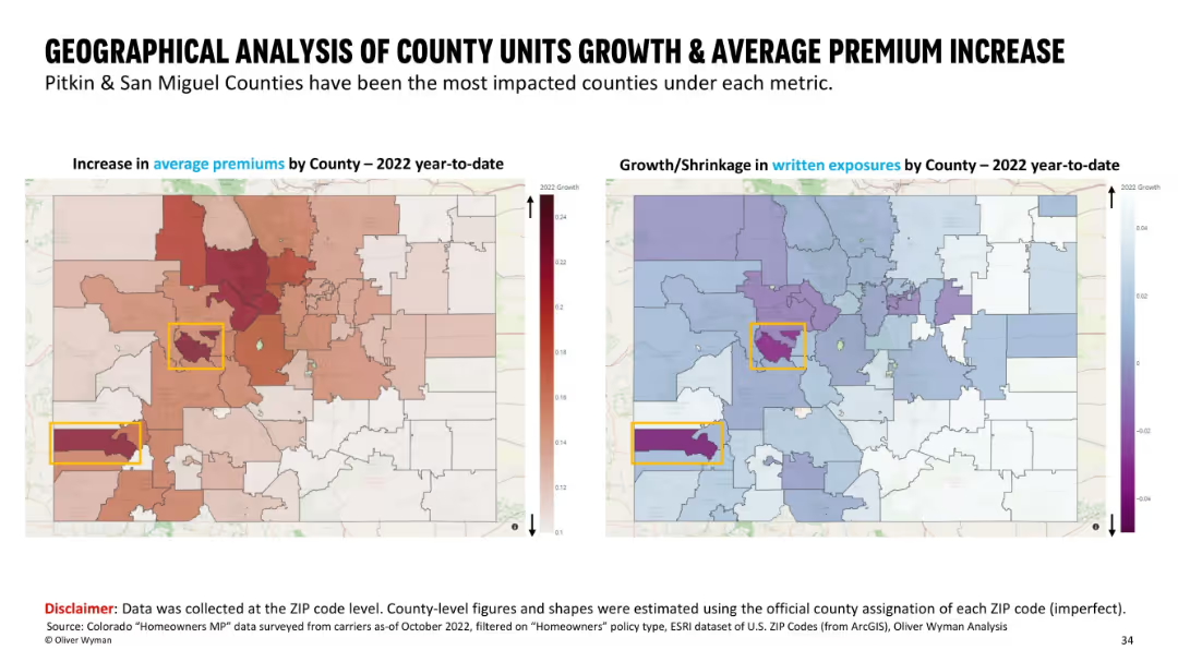
Side-by-side maps with county boundaries; left shows premium increases using a red heatmap, right shows growth/shrinkage in exposures with a blue/purple color scheme. Highlighted counties are boxed in yellow.
Market Analysis and Trends
Financial Services
This slide presents a county-level geographical comparison in Colorado, showing average premium increases and written exposure changes for 2022 YTD. Pitkin and San Miguel counties are highlighted as the most impacted. Visual heatmaps help emphasize regional differences in insurance metrics across ZIP codes mapped to counties.
geographic, premium increase, insurance, county analysis, written exposures, ZIP code, heatmap, Colorado
false
Market Analysis and Trends
Financial Services
Multiple Chart
Oliver Wyman
Add to my slides
Remove from favorites
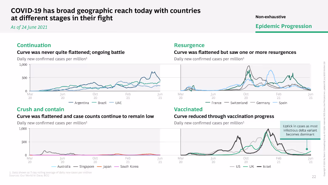
Multiple line charts comparing daily new COVID-19 cases per million across different countries, grouped by stages of epidemic progression.
Market Analysis and Trends
Healthcare & Pharmaceuticals
Compares the stages of COVID-19 progression across various countries, categorizing them into continuation, resurgence, crush and contain, and vaccinated.
geographic reach, stages, countries, progression
false
Market Analysis and Trends
Healthcare & Pharmaceuticals
Multiple Chart
BCG
Add to my slides
Remove from favorites
Two pie charts showing geographic distribution of net sales and breakdown by distribution channel for Essity. Each segment is color-coded and labeled with percentages.
Market Analysis and Trends
Consumer Goods
Analyzes geographic sales distribution and distribution channels for Essity, offering insights into market penetration and sales strategy.
Geographic Sales, Distribution Channels, Market Penetration, Sales Strategy
false
Market Analysis and Trends
Consumer Goods
Multiple Chart
Barclays
Add to my slides
Remove from favorites
Includes pie charts and a bar chart showing geographic coverage and preferred new locations for service centers.
Operational Efficiency
Professional Services
Discusses trends in geographic coverage and top locations for new service centers, reflecting strategic planning in operational efficiency and global expansion.
geographic, service centers, operational, planning, efficiency, expansion, trends, locations
false
Operational Efficiency
Professional Services
Multiple Chart
Deloitte
Add to my slides
Remove from favorites
A comparative slide with six pie charts representing different geographical regions and industries. Each pie chart shows the distribution of Champions, Leaders, Strivers, and Traditionalists.
Market Analysis and Trends
Professional Services
This slide presents the distribution of service player categories across different geographical regions and industries, highlighting the diversity in service management maturity.
geography, industry, Champions, Leaders, Strivers, Traditionalists
false
Market Analysis and Trends
Professional Services
Multiple Chart
Accenture
Add to my slides
Remove from favorites
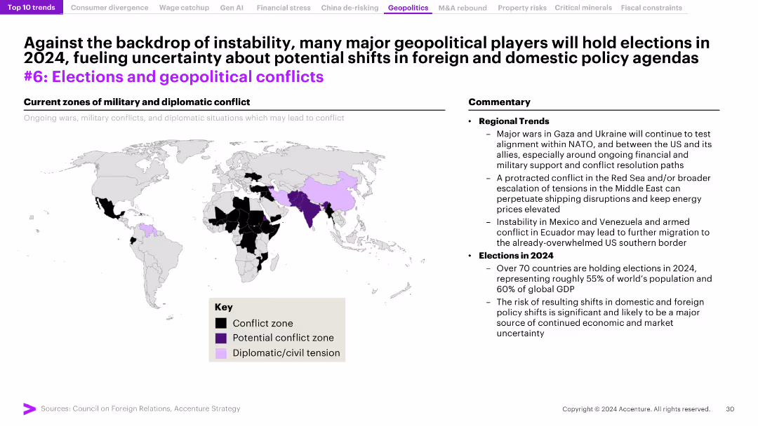
The slide features a world map highlighting zones of military and diplomatic conflict, and a commentary section detailing regional trends and upcoming elections.
Risk Assessment and Management
Government & Public Sector
The slide analyzes the impact of instability and elections on geopolitical conflicts, with a focus on regions experiencing conflict and the implications for 2024.
geopolitical conflicts, elections, instability, regional trends, conflict zones
false
Risk Assessment and Management
Government & Public Sector
Graphic
Accenture
Add to my slides
Remove from favorites
Text-dominant slide with a professional layout, utilizing bold headers and bullet points to delineate sections and present complex information in a digestible format.
Technology and Digital Transformation
Energy & Utilities
The slide discusses the uncertainties and potential impacts of the conflict in Ukraine on the global energy transition and decarbonization paths. It outlines various scenarios and raises questions regarding government policies, consumer responses, and the broader implications for GDP and energy supply and demand. This slide aims to provoke thought and discussion on how current geopolitical events may shape the future of energy and environmental policy.
Geopolitical, Energy Transition, Ukraine, Decarbonization
false
Technology and Digital Transformation
Energy & Utilities
Header Horizontal
McKinsey
Add to my slides
Remove from favorites
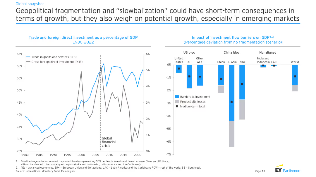
The slide includes a line chart showing trade and FDI as a percentage of GDP from 1980 to 2022, and a bar chart showing the impact of investment flow barriers on GDP across different global blocs.
Risk Assessment and Management
Industrial & Manufacturing
This slide examines the effects of geopolitical fragmentation and reduced globalization on growth, emphasizing the potential impacts on trade and foreign direct investment.
geopolitical, fragmentation, slowbalization, trade, FDI
false
Risk Assessment and Management
Industrial & Manufacturing
Multiple Chart
EY
Add to my slides
Remove from favorites
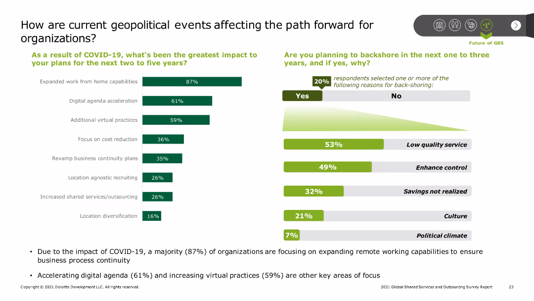
The slide includes a bar chart showing the greatest impacts of COVID-19 on organizational plans, such as expanded remote work and digital acceleration. Additional text covers backshoring plans and reasons, with key statistics highlighted.
Risk Assessment and Management
Professional Services
The slide explores how geopolitical events, particularly COVID-19, have impacted organizational strategies, emphasizing remote work capabilities and digital acceleration, as well as the rationale behind potential backshoring decisions.
Geopolitical impact, COVID-19, remote work, digital acceleration, backshoring
false
Risk Assessment and Management
Professional Services
Multiple Chart
Deloitte
Add to my slides
Remove from favorites
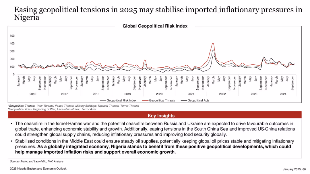
Line graph showing Global Geopolitical Risk Index trends with three colored lines (risk, threats, acts)
Market Analysis and Trends
Government & Public Sector
A historical graph tracks geopolitical tensions and risks since 2016. The insights highlight that easing conflicts (Israel-Hamas, Russia-Ukraine) and better global relations may stabilize oil and food prices, thus controlling inflation in Nigeria. It underlines the interconnected nature of Nigeria's economy with global events.
geopolitical, inflation, oil, trade, global risk, Nigeria, economic growth, conflict resolution
false
Market Analysis and Trends
Government & Public Sector
Mixed Chart
PwC/Strategy&
Add to my slides
Remove from favorites
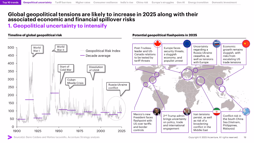
Timeline chart of geopolitical risk index on the left; world map with callouts of flashpoints on the right. High visual density with clearly labeled regions and historical context.
Risk Assessment and Management
Government & Public Sector
The slide explores rising geopolitical risks using a historical risk index graph and annotated world map pinpointing expected flashpoints in 2025 (e.g., US, Europe, China, Middle East). Emphasizes potential economic and political spillover effects from instability.
Geopolitical Risk, Flashpoints, 2025, Conflict Zones, Global Risk, Economic Spillover, War, Trade Tensions, Index
false
Risk Assessment and Management
Government & Public Sector
Mixed Chart
Accenture
Add to my slides
Remove from favorites
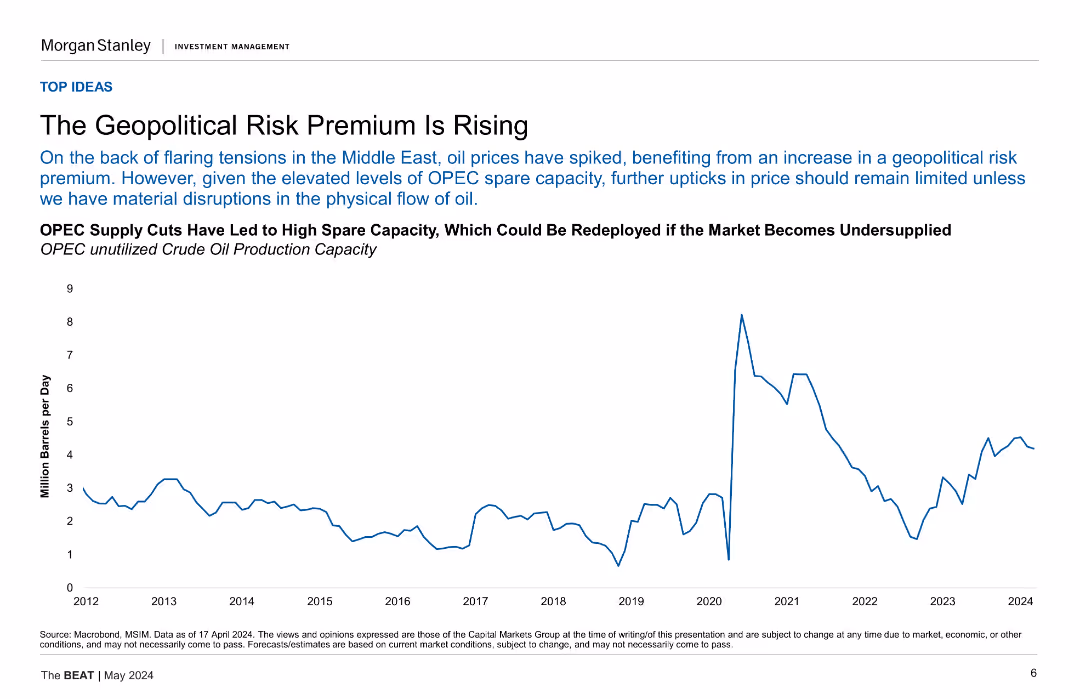
Contains a line chart showing OPEC's unused crude oil production capacity over time, with a focus on geopolitical risk.
Risk Assessment and Management
Energy & Utilities
This slide analyzes the rise in geopolitical risk premiums, illustrated by OPEC's spare crude oil production capacity, and discusses the implications for oil prices.
geopolitical risk, OPEC, crude oil, production capacity, oil prices
false
Risk Assessment and Management
Energy & Utilities
Mixed Chart
Morgan Stanley
Add to my slides
Remove from favorites
Multiple pie charts and tables showing the impacts of various geopolitical risks, comparing overall, G-SIB, and non-G-SIB perspectives.
Risk Assessment and Management
Financial Services
The slide assesses geopolitical risks such as cyberattacks, global trade changes, and sanctions, highlighting their impacts on different types of financial institutions.
Geopolitical Risks, Cyberattacks, Global Trade, Sanctions, Impacts
false
Risk Assessment and Management
Financial Services
Multiple Chart
EY
Add to my slides
Remove from favorites
Features bar charts, pie charts, and maps, providing a complex overview of geopolitical shifts and resource distribution.
Risk Assessment and Management
Financial Services
Discusses the changing geopolitical landscape and its impact on resource allocation, crucial for strategic planning and geopolitical risk assessment.
Geopolitics, Resource Management, Strategic Planning, Global Shifts, Risk Assessment
false
Risk Assessment and Management
Financial Services
Multiple Chart
PwC/Strategy&
Add to my slides
Remove from favorites
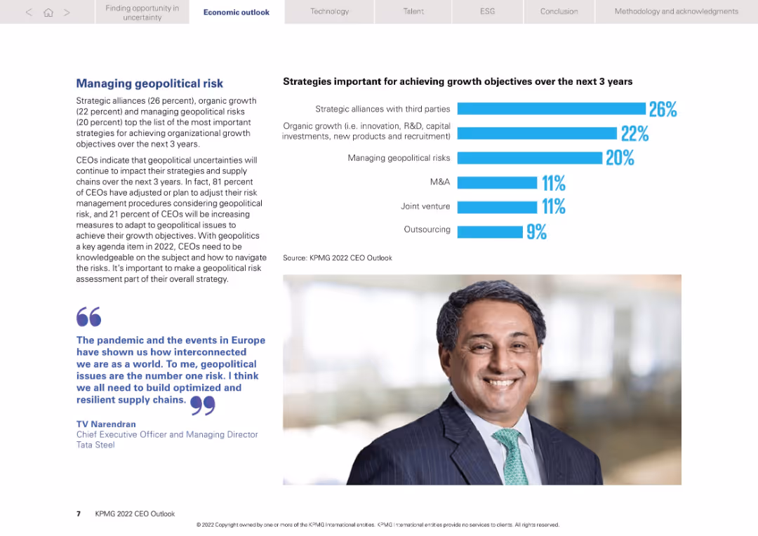
Two-column layout: textual insights on left and bar chart on right showing strategic priorities
Risk Assessment and Management
Professional Services
Focuses on geopolitical risk as a top concern for CEOs. 81% adjusted strategies to mitigate risks. Key growth strategies include alliances, organic growth, and risk management. Quote and image add credibility and personal insight.
Geopolitics, risk strategy, CEO insights, alliances, growth priorities
false
Risk Assessment and Management
Professional Services
Mixed Chart
KPMG
Add to my slides
Remove from favorites
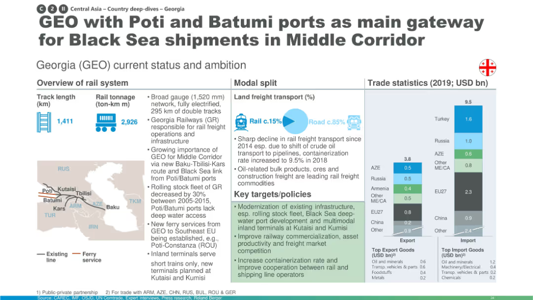
Layout mirrors previous slide: map, modal transport pie chart, and import/export bar graphs for Georgia.
Industry Overview
Transportation & Logistics
Georgia’s railway network is emphasized for its potential to serve the Middle Corridor through Black Sea ports (Poti/Batumi). It notes infrastructure challenges and targets to boost containerization and improve rail-to-sea connectivity.
Georgia, Black Sea, Poti, Batumi, Middle Corridor, freight, ports, rail connectivity
false
Industry Overview
Transportation & Logistics
Multiple Chart
Roland Berger
Add to my slides
Remove from favorites
This slide features a column chart comparing the perception of improvement needs across different business aspects between Global, EU, German, and Swiss companies.
Market Analysis and Trends
Professional Services
The slide visually compares organizational aspects such as talent recruitment, digitization, and agility, highlighting areas where German and Swiss companies see the most need for improvement versus European companies generally.
German companies, Swiss companies, agility, improvement, digitization
false
Market Analysis and Trends
Professional Services
Single Chart
PwC/Strategy&
Add to my slides
Remove from favorites
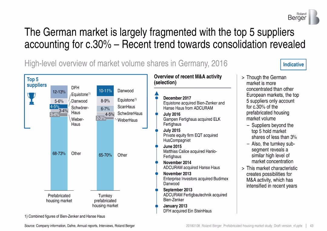
Two vertical bar charts and a timeline of M&A activity; light blue theme with clean, corporate design
Competitive Landscape
Real Estate & Construction
The slide presents a fragmented German prefab housing market where the top 5 suppliers hold only ~30% share. It includes market share breakdowns for the prefab and turnkey markets and outlines recent M&A activities, indicating industry consolidation.
German market, prefab housing, consolidation, top suppliers, Danwood, Equistone, acquisitions, market fragmentation
false
Competitive Landscape
Real Estate & Construction
Mixed Chart
Roland Berger
Add to my slides
Remove from favorites
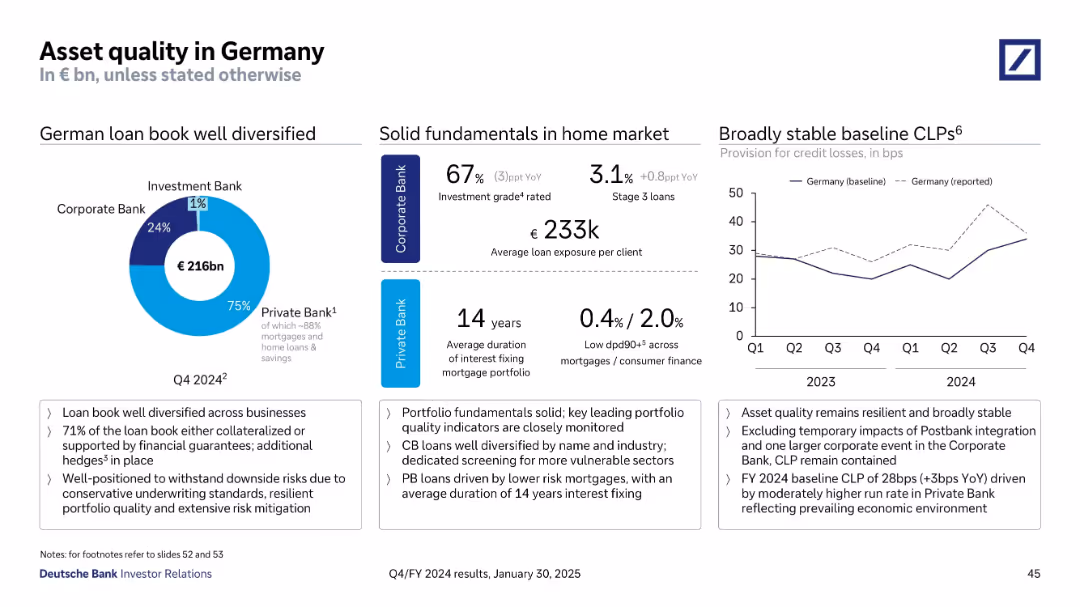
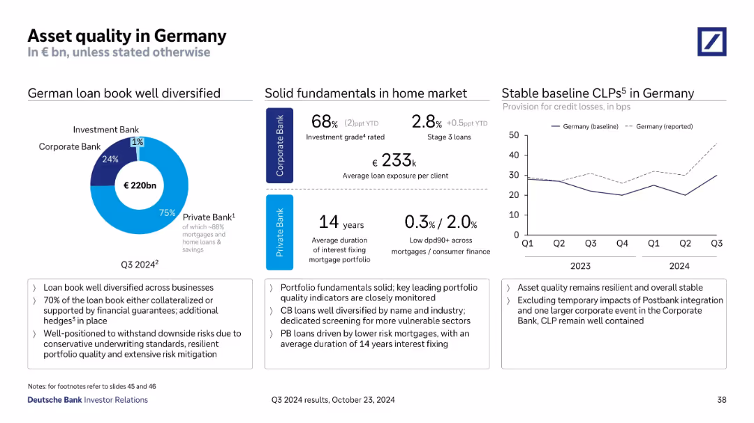
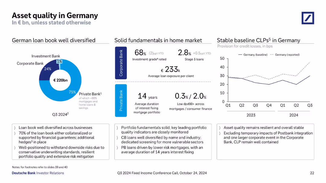
Combination of pie chart, stats blocks, and line chart; structured into three vertical sections with highlight box at bottom
Risk Assessment and Management
Financial Services
Assesses €216bn German loan book split across bank divisions, noting strong fundamentals and resilience. Loan quality indicators, interest fixing duration, and CLP rates remain stable. Conservative underwriting and hedges support portfolio quality despite macro pressures.
Germany, asset quality, CLP, mortgage, Private Bank, Corporate Bank
false
Risk Assessment and Management
Financial Services
Multiple Chart
Deutsche Bank
Add to my slides
Remove from favorites
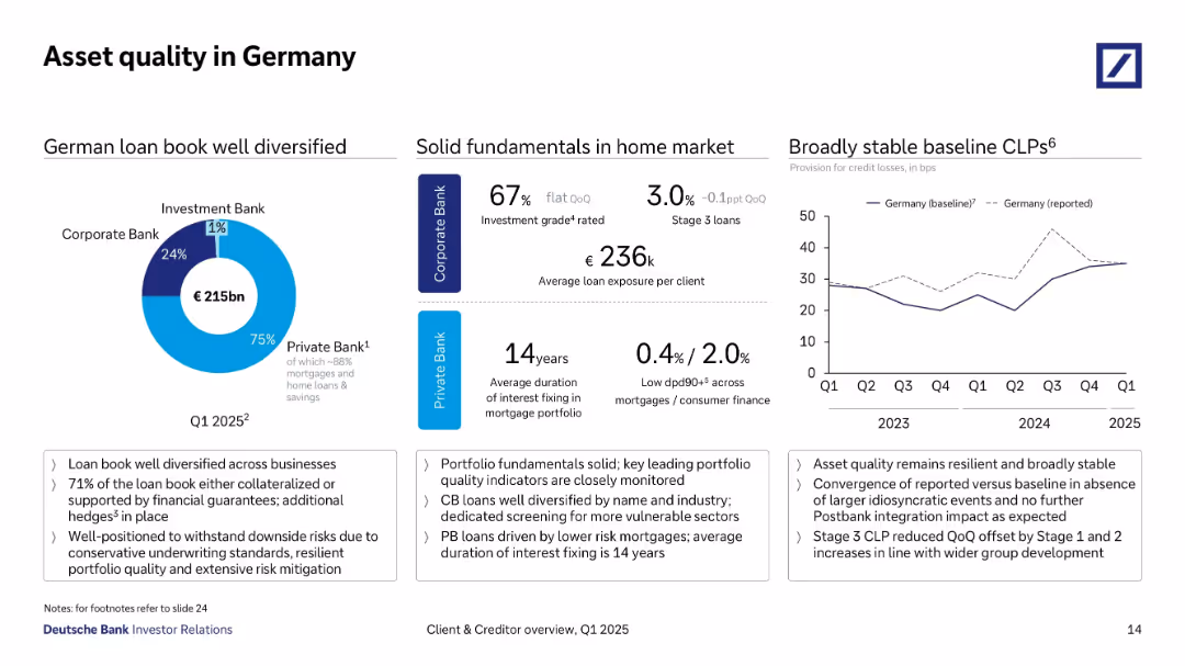
Circular chart with pie breakdown of German loan book; table of fundamentals; baseline CLPs chart.
Risk Assessment and Management
Financial Services
This slide analyzes asset quality in the German market, emphasizing a diversified €215bn loan portfolio primarily in the Private Bank. It includes solid fundamentals such as low dpd90+ rates, high insurance coverage, and conservative underwriting practices.
Germany, asset quality, mortgage loans, CLPs, diversification, conservative lending, loan book, Private Bank
false
Risk Assessment and Management
Financial Services
Multiple Chart
Deutsche Bank
Add to my slides
Remove from favorites
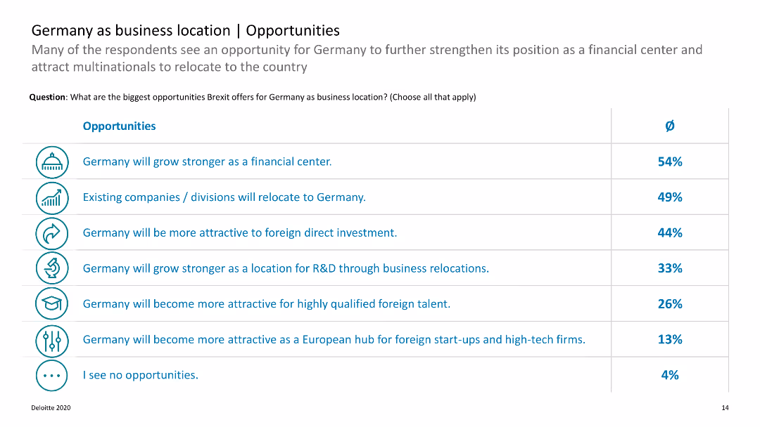
The slide features a list of opportunities with accompanying percentages. It uses icons and a horizontal layout.
Market Analysis and Trends
Financial Services
Describes various opportunities Brexit offers for Germany as a business location, focusing on sectors such as financial services and R&D.
Germany, business, Brexit, opportunities, relocation
false
Market Analysis and Trends
Financial Services
Table
Deloitte
Add to my slides
Remove from favorites
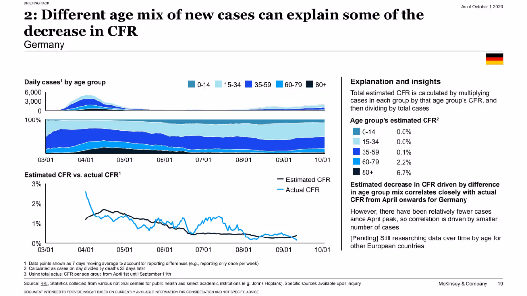
Stacked area charts showing case distribution by age and line chart comparing estimated vs actual CFR for Germany.
Risk Assessment and Management
Healthcare & Pharmaceuticals
Examines Germany’s age-disaggregated COVID-19 data to illustrate how a shift toward younger infections explains a reduction in CFR. Provides estimated CFR by age and supports findings with close correlation to actual CFR trends.
Germany, CFR, age mix, COVID-19, demographics, epidemiology
false
Risk Assessment and Management
Healthcare & Pharmaceuticals
Multiple Chart
McKinsey
Add to my slides
Remove from favorites
Three-column layout with pie chart on the left, data stats in the center, and a line graph on the right showing CLPs over time.
Financial Performance
Financial Services
Shows diversification in Germany’s €220bn loan book, dominated by Private Bank. Highlights solid fundamentals like investment grade, loan exposure per client, and low default rates. Graph shows CLP stability with temporary impacts from specific events.
Germany, CLP, Loan Diversification, Private Bank, Mortgage, Investment
false
Financial Performance
Financial Services
Multiple Chart
Deutsche Bank
Add to my slides
Remove from favorites
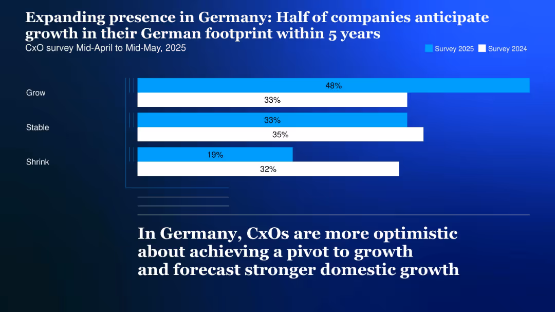
Horizontal bar chart comparing survey data from 2024 and 2025 with segmented blue bars on a dark gradient background
Market Analysis and Trends
Professional Services
The slide illustrates increasing optimism among CxOs regarding growth in Germany, with 48% forecasting expansion in their German footprint over the next 5 years.
Germany, CxO, growth, footprint, 2025, optimism, domestic market, survey, stable, shrink
false
Market Analysis and Trends
Professional Services
Single Chart
McKinsey
Add to my slides
Remove from favorites
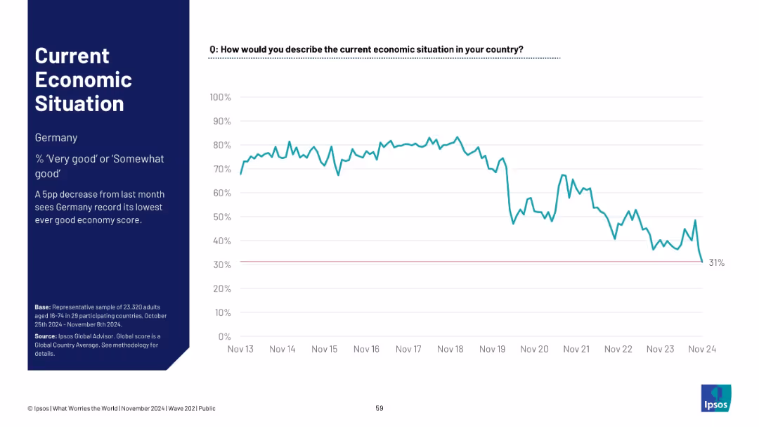
Similar layout as previous; focuses on Germany. Left panel has title and insights; right panel shows time-series graph
Market Analysis and Trends
Government & Public Sector
Germany records its lowest-ever good economy rating at 31%, with a sharp decline from stable historical highs. The graph shows public confidence waning dramatically over the decade.
Germany, economic outlook, sentiment trend, Ipsos, lowest score, public opinion, economy perception, Europe
false
Market Analysis and Trends
Government & Public Sector
Single Chart
IPSOS
Add to my slides
Remove from favorites
Line chart tracking Germany’s perception of the economy; commentary notes all-time low.
Market Analysis and Trends
Financial Services
Germany hit a new all-time low in economic sentiment with only 27% rating the economy as good, continuing a downward trend as noted in recent months.
Germany, economic sentiment, all-time low, 2024 perception, Ipsos chart, long-term decline, public opinion
false
Market Analysis and Trends
Financial Services
Mixed Chart
IPSOS
Add to my slides
Remove from favorites
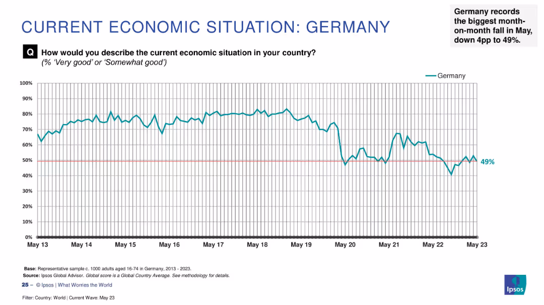
Time-series line chart of Germany’s economic sentiment (2013–2023); commentary at top right highlights trends.
Strategic Planning
Financial Services
Germany’s “good economy” rating has fallen to 49%, with a 4-point drop from the previous month. The chart shows consistent optimism until a noticeable decline post-2020. Commentary notes this is the sharpest recent fall among surveyed countries.
Germany, economy, public opinion, Ipsos, monthly change, pessimism, economic trend, financial concern
false
Strategic Planning
Financial Services
Single Chart
IPSOS
Add to my slides
Remove from favorites
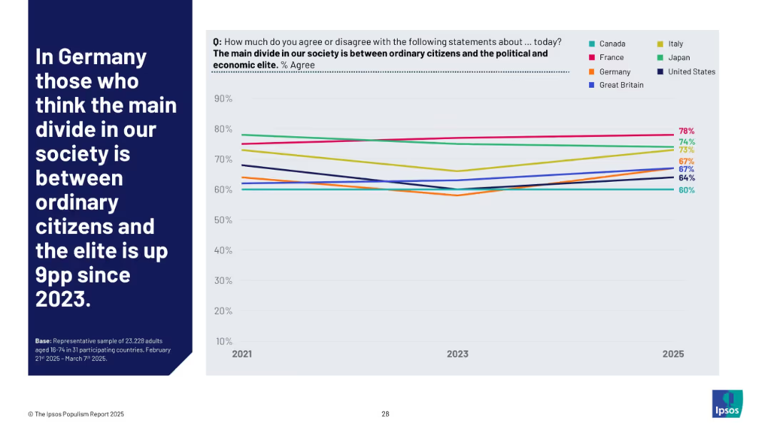
Left-aligned title text; right side shows a line chart tracking changes in Germany and peer nations for 2021–2025.
Market Analysis and Trends
Government & Public Sector
Germany has seen a 9 percentage point increase since 2023 in the belief that the main societal divide is between ordinary citizens and elites, aligning with broader populist concerns tracked globally.
Germany, elite divide, trend, societal perception, Ipsos, populism, 2025, comparison, inequality, citizens
false
Market Analysis and Trends
Government & Public Sector
Mixed Chart
IPSOS
Add to my slides
Remove from favorites
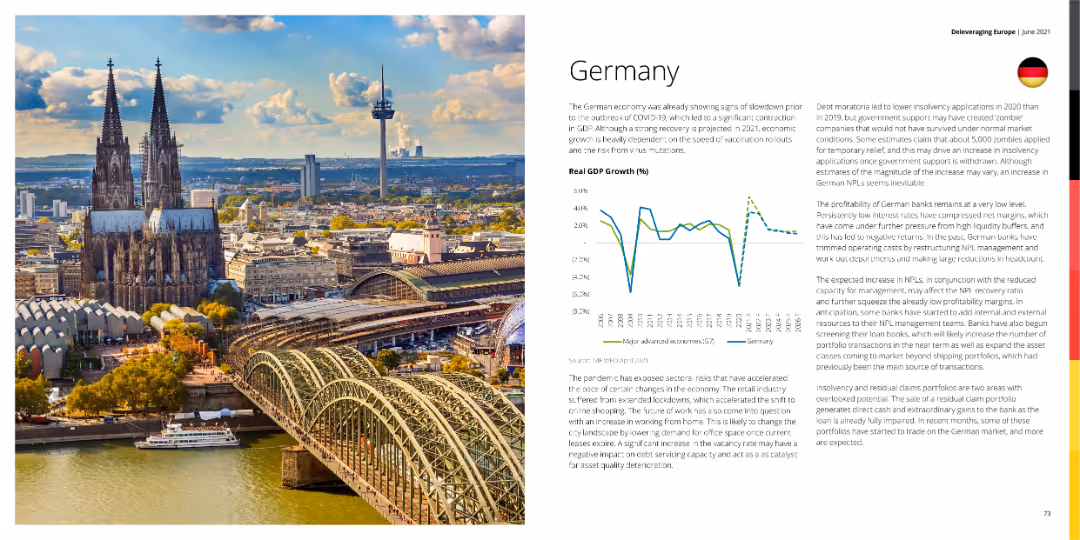
A photo of Cologne Cathedral with a graph showing Germany's GDP growth and a detailed text explanation.
Market Analysis and Trends
Financial Services
This slide discusses the economic conditions in Germany, highlighting GDP growth trends and the impact of COVID-19 on the economy.
Germany, GDP growth, economy, financial services, market analysis
false
Market Analysis and Trends
Financial Services
Mixed Chart
Deloitte
Add to my slides
Remove from favorites
A photo of Cologne Cathedral with a graph showing Germany's GDP growth and a detailed text explanation.
Market Analysis and Trends
Financial Services
This slide discusses Germany's economic conditions, highlighting GDP growth trends and the impact of COVID-19 on the economy.
Germany, GDP growth, economy, financial services, market analysis
false
Market Analysis and Trends
Financial Services
Multiple Chart
Deloitte
Add to my slides
Remove from favorites
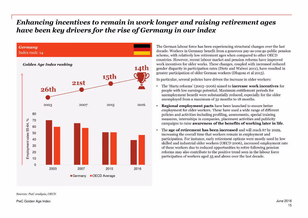
A combination of text and column charts discussing Germany's Golden Age Index ranking and key drivers.
Market Analysis and Trends
Government & Public Sector
Focuses on Germany's rise in the Golden Age Index due to incentives for longer work and higher retirement ages, and labor market reforms.
Germany, Golden Age Index, employment, incentives, retirement age, labor market reforms, drivers, older workers, policies, trends
false
Market Analysis and Trends
Government & Public Sector
Mixed Chart
PwC/Strategy&
Add to my slides
Remove from favorites
Table layout describing key measures and commitments of Germany's Hydrogen Strategy with icons illustrating different sectors like generation and infrastructure.
Regulatory and Compliance
Energy & Utilities
Describes Germany's hydrogen strategy with an emphasis on infrastructure, partnerships, and regulations to enhance the use of hydrogen as a sustainable energy source.
Germany, hydrogen, strategy, infrastructure, partnerships, 2020-2030
false
Regulatory and Compliance
Energy & Utilities
Multiple Chart
McKinsey
Add to my slides
Remove from favorites
Timeline showing the phases of Germany's hydrogen strategy from 2020-2050 with key targets for electrolysis capacity and infrastructure development.
Strategic Planning
Energy & Utilities
This slide covers the timeline and phases of Germany’s evolving hydrogen strategy, focusing on increasing production and infrastructure expansion.
Germany, hydrogen, strategy, timeline, 2020-2050, production, infrastructure
false
Strategic Planning
Energy & Utilities
Mixed Chart
McKinsey
Add to my slides
Remove from favorites
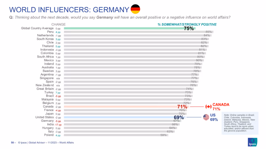
Bar chart with countries’ ratings of Germany's influence; Canada and U.S. shown with red and blue callouts
Market Analysis and Trends
Government & Public Sector
Measures how positively countries view Germany’s future influence. Germany averages 75% globally. Canada (71%) rates Germany above the U.S. (69%). Changes from prior year are also noted for each country.
Germany, influence, global perception, Canada view, US view, Ipsos, bar chart, world affairs, opinion trends, soft power
false
Market Analysis and Trends
Government & Public Sector
Single Chart
IPSOS
Add to my slides
Remove from favorites
Same format as others in the “World Influencers” series; shows global public views on Germany’s future influence.
Strategic Planning
Government & Public Sector
The slide presents international sentiment about Germany’s role in world affairs over the next decade, with 30 countries ranked by percentage of positive response. Comparative change from 2023 is shown.
Germany, international perception, soft power, global influence, public opinion, Ipsos, strategic role, world affairs
false
Strategic Planning
Government & Public Sector
Mixed Chart
IPSOS
Add to my slides
Remove from favorites
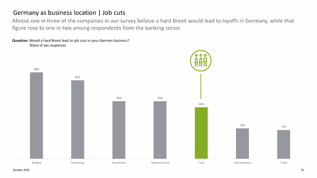
Bar chart displaying the likelihood of job cuts across various sectors due to Brexit, with color-coded bars.
Risk Assessment and Management
Financial Services
Analyzes the potential impact of a hard Brexit on job cuts in different sectors, highlighting banking and technology.
Germany, job cuts, Brexit, sectors, impact
false
Risk Assessment and Management
Financial Services
Single Chart
Deloitte
Add to my slides
Remove from favorites
Three-part slide: donut chart for loan distribution, bar charts for fundamentals, and a line graph for credit losses; detailed text explanations.
Risk Assessment and Management
Financial Services
Focuses on Deutsche Bank’s German loan book, showing 75% in Private Bank with strong underwriting. Key metrics include low delinquency, solid corporate fundamentals, and stable credit loss provisions (CLPs), despite minor increases due to temporary factors.
Germany, loan book, asset quality, CLPs, Private Bank, Corporate Bank, Deutsche Bank
false
Risk Assessment and Management
Financial Services
Multiple Chart
Deutsche Bank
Add to my slides
Remove from favorites
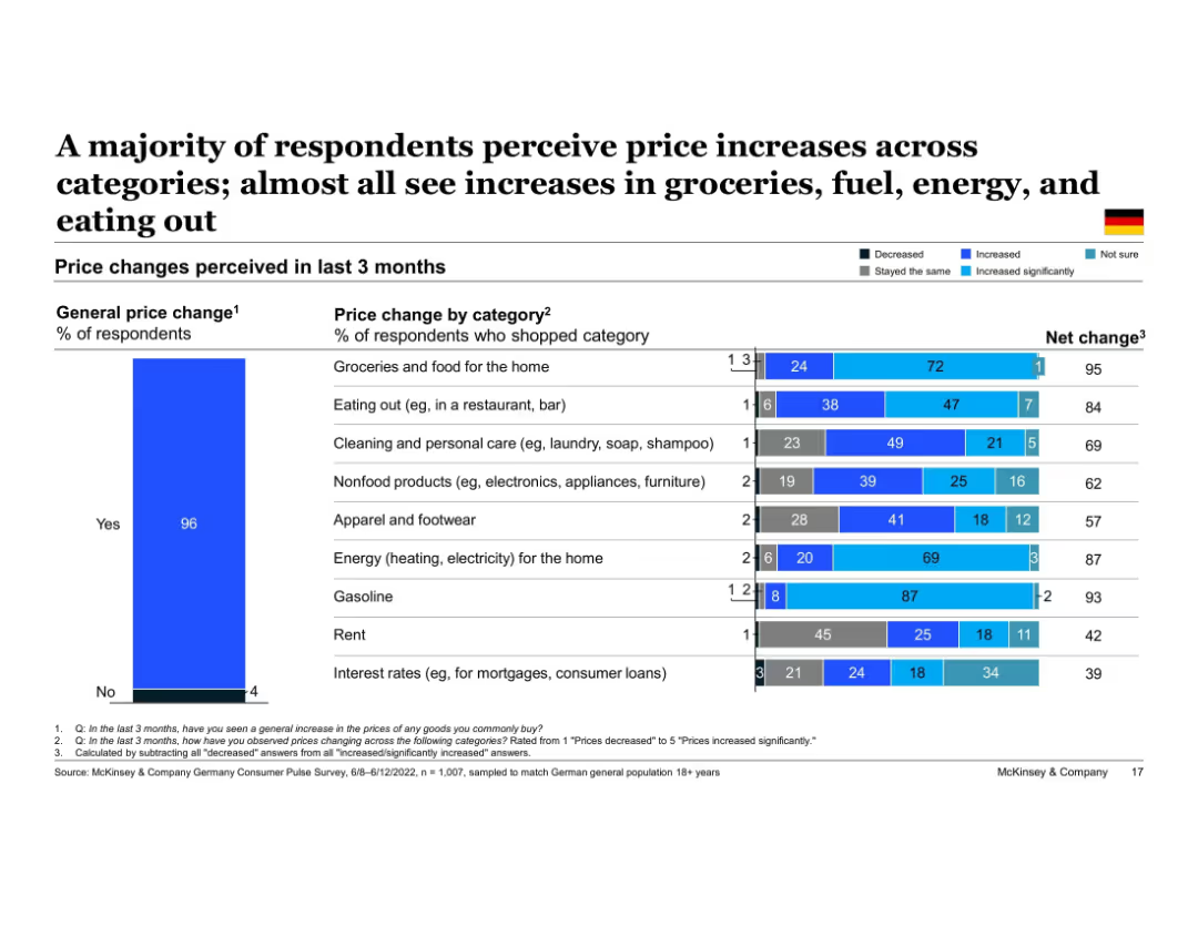
Two-part horizontal bar chart showing Germany's perceived price changes by category. Right chart breaks down responses into "Decreased," "Stayed the same," "Increased," and "Increased significantly." Left bar shows overall % perceiving general price increase.
Market Analysis and Trends
Financial Services
Most German respondents noticed price increases across multiple spending categories. Particularly high increases were reported in groceries, gasoline, and home energy. This breakdown helps identify where consumers feel inflation most directly across their recent purchases.
Germany, price changes, inflation perception, groceries, fuel, energy, spending categories, consumer insight
false
Market Analysis and Trends
Financial Services
Multiple Chart
McKinsey
Add to my slides
Remove from favorites
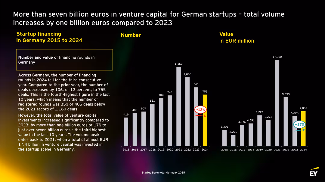
Dual bar charts comparing number and value of deals from 2015–2024. Highlighted values for 2024, black background with high contrast.
Investment Analysis
Professional Services
Highlights that while the number of startup financing rounds in Germany decreased in 2024, the total value of investments increased by 17%, signaling higher-value funding rounds despite fewer deals.
Germany, startup funding, venture capital, 2024, investment volume, deal count, EY, trends, growth, value
false
Investment Analysis
Professional Services
Multiple Chart
EY
Add to my slides
Remove from favorites
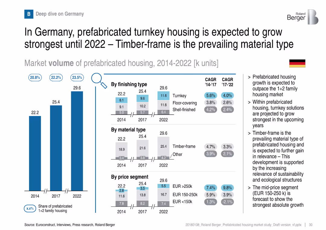
Similar layout to UK slide: volume bar chart and segmentation by finishing, material, price
Customer and Market Segmentation
Real Estate & Construction
Germany’s market is led by timber-frame construction and a high share of turnkey housing. Turnkey is projected to grow the most. Sustainability and mid-price segments are key drivers of future growth.
Germany, turnkey, timber-frame, sustainability, mid-price, prefabricated, housing market
false
Customer and Market Segmentation
Real Estate & Construction
Multiple Chart
Roland Berger
Add to my slides
Remove from favorites
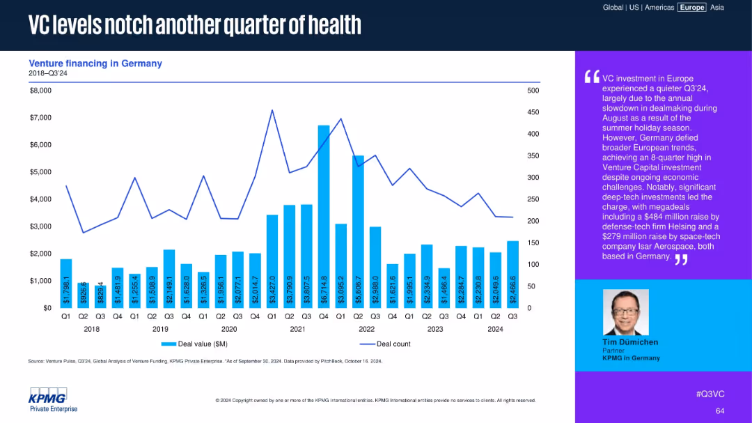
Chart with VC deal values and counts in Germany from 2018–Q3 2024. Commentary emphasizes deep-tech investments.
Market Analysis and Trends
Financial Services
Germany continues to show strong VC activity in Q3 2024, with deal volumes sustained by major investments in defense-tech and space-tech. The commentary notes an 8-quarter high despite broader European slowdowns due to summer seasonality.
Germany, VC investment, defense-tech, space-tech, deal value, Q3 2024, funding resilience, deep tech, European trend
false
Market Analysis and Trends
Financial Services
Mixed Chart
KPMG
Add to my slides
Remove from favorites
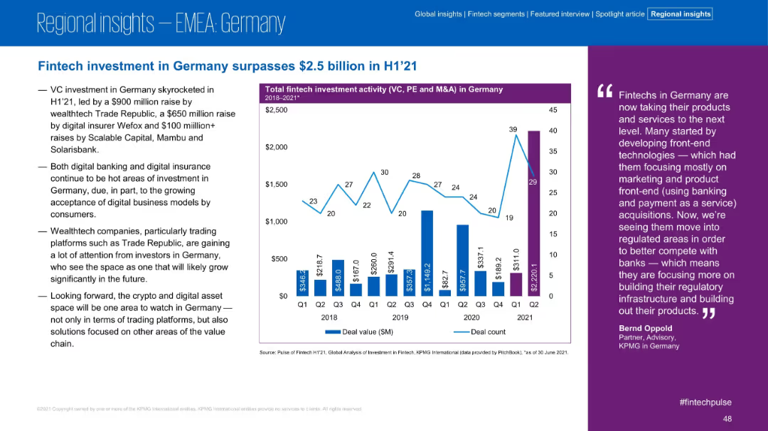
Similar structure to UK slide: left-side commentary, right-side bar/line chart, and a quote on the far right. Blue and purple accents.
Market Analysis and Trends
Financial Services
Germany saw over $2.5B in fintech investment in H1 2021, driven by large VC rounds in wealthtech and digital insurance. The slide discusses ongoing trends and the rise of regulated digital financial services.
Germany, VC, Wealthtech, Digital Insurance, H1 2021, Investment, Fintech, Growth
false
Market Analysis and Trends
Financial Services
Mixed Chart
KPMG
Add to my slides
Remove from favorites
The slide features a column chart illustrating global GHG emissions per sector in 2010 and the applicability of bioenergies in decarbonizing these sectors, including energy, industry, buildings, and transport.
Technology and Digital Transformation
Energy & Utilities
This slide highlights the potential of bioenergy to decarbonize various sectors, showing that bioenergy could address about 50% of global GHG emissions by applying it across energy, industry, buildings, and transport sectors.
GHG emissions, bioenergies, decarbonization, 2010, energy, industry, buildings, transport
false
Technology and Digital Transformation
Energy & Utilities
Single Chart
Kearney
Add to my slides
Remove from favorites
This slide includes a column chart on GHG emissions per year by source (coal, oil, gas, etc.) and a bar chart showing the remaining carbon budget for the 1.5°C target. Both charts use different color codes for better understanding.
Risk Assessment and Management
Energy & Utilities
The slide presents the current GHG emissions by source and predicts that the carbon budget for staying within the 1.5°C target will be depleted in about 10 years, urging immediate action to reduce emissions.
GHG emissions, carbon budget, climate target, emissions sources, energy transition
false
Risk Assessment and Management
Energy & Utilities
Multiple Chart
Kearney
Add to my slides
Remove from favorites
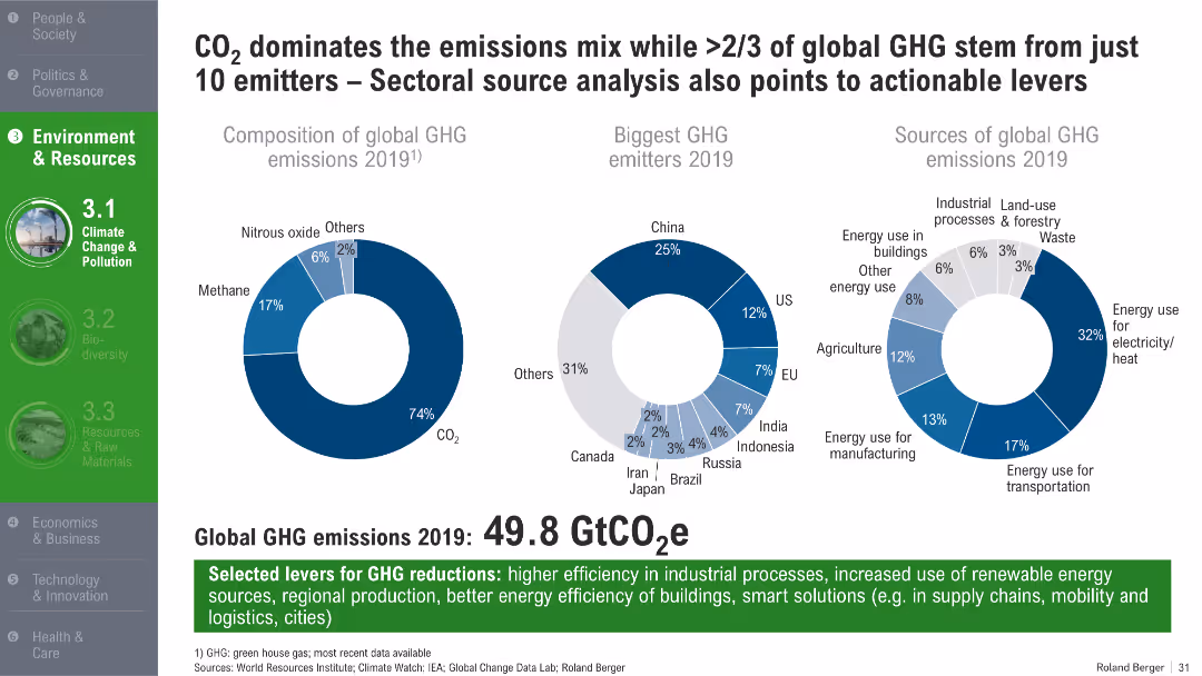
Three pie charts showing GHG composition, emitter countries, and sectoral sources; bold green headers and footnotes
Customer and Market Segmentation
Environmental Services & Sustainability
The slide identifies the dominance of CO₂ in global GHG emissions and highlights that a small group of countries and sectors contribute the most. It presents 2019 data on emission distribution by gas type, country, and economic sector, and suggests potential levers for emissions reduction.
GHG emissions, CO₂, top emitters, energy sectors, 2019 emissions, reduction strategies, industrial efficiency
false
Customer and Market Segmentation
Environmental Services & Sustainability
Mixed Chart
Roland Berger
Add to my slides
Remove from favorites
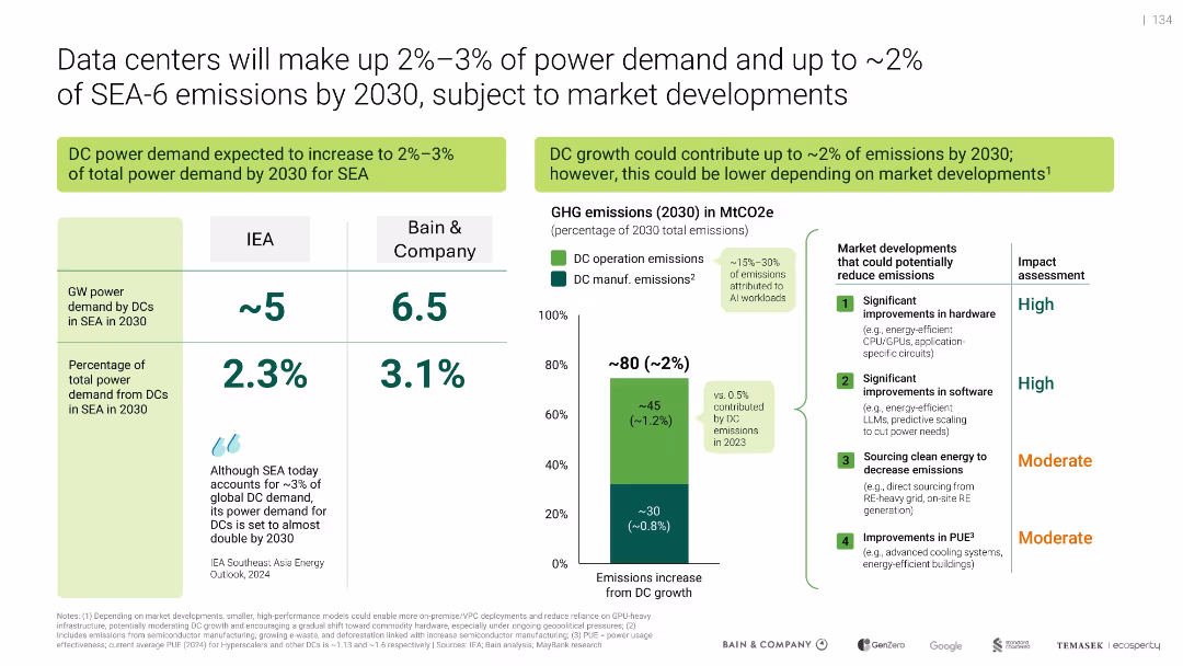
Grid and column layout with forecast charts, comparative stats, and emissions breakdown
Risk Assessment and Management
Technology & Software
Shows projections that data centers will represent up to 3.1% of SEA power demand and ~2% of emissions by 2030. Includes a comparison between IEA and Bain estimates and outlines market-driven strategies to lower emissions, particularly through hardware/software improvements and green energy sourcing.
GHG emissions, data center emissions, AI workloads, SEA energy use, power demand, sustainability, decarbonization
false
Risk Assessment and Management
Technology & Software
Mixed Chart
Bain
Add to my slides
Remove from favorites
The slide compares GHG emission reduction targets, net-zero commitments, and carbon tax implementations of ASEAN countries, with visual and textual explanations of their progress.
Regulatory and Compliance
Government & Public Sector
This slide provides a comparative analysis of how ASEAN countries are balancing economic development with decarbonization, detailing their emission reduction targets and carbon tax policies.
GHG emissions, decarbonization, ASEAN, government targets, economic development, comparative analysis, policies
false
Regulatory and Compliance
Government & Public Sector
Multiple Chart
BCG
Add to my slides
Remove from favorites
The slide includes text and an infographic explaining the different scopes of GHG emissions (direct, indirect, and other indirect), and their impact on corporate GHG emissions disclosure.
Regulatory and Compliance
Government & Public Sector
The slide discusses the development of corporate GHG emissions disclosure covering scopes 1, 2, and 3. It includes an infographic detailing the types of emissions, their definitions, and examples, emphasizing the increasing pressure on corporations to reduce GHG emissions.
GHG emissions, disclosure, scopes, corporate
false
Regulatory and Compliance
Government & Public Sector
Diagram
Kearney
Add to my slides
Remove from favorites
Features multiple stacked column charts showing the breakdown of GHG emissions by sector in Nigeria, with detailed legends and annotations for clarity.
Regulatory and Compliance
Environmental Services & Sustainability
Analyzes the distribution of greenhouse gas emissions across different sectors within Nigeria, emphasizing the significant impact of the energy sector.
GHG emissions, energy sector, Nigeria, environmental analysis, emission breakdown
false
Regulatory and Compliance
Environmental Services & Sustainability
Multiple Chart
BCG
Add to my slides
Remove from favorites
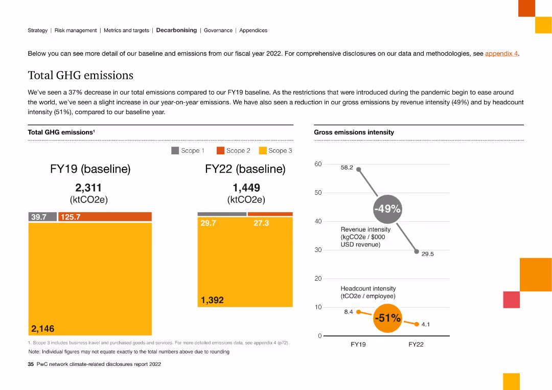
The slide presents data with column charts comparing GHG emissions between FY19 and FY22, showing a decrease in total emissions and intensity metrics.
Financial Performance
Energy & Utilities
The slide compares FY19 and FY22 GHG emissions data, demonstrating a 37% reduction in total emissions and improvements in emission intensity.
GHG emissions, FY19, FY22, reduction, intensity, scope, baseline, data
false
Financial Performance
Energy & Utilities
Multiple Chart
PwC/Strategy&
Add to my slides
Remove from favorites
This slide presents a column chart detailing percentages of global GHG emissions by sector for 2017, with color-coded sectors like oil, gas, coal, and different industries and transport modes.
Regulatory and Compliance
Environmental Services & Sustainability
Provides a breakdown of global greenhouse gas emissions by sector in 2017, highlighting major contributors like power, industry, and transport. Useful for discussions on targeted emission reduction strategies in significant sectors.
GHG emissions, Industry, Transport, Energy, 2017
false
Regulatory and Compliance
Environmental Services & Sustainability
Single Chart
BCG
Add to my slides
Remove from favorites
Contains a bar chart comparing greenhouse gas emissions by country in Sub-Saharan Africa, using distinct colors for visual clarity and emphasis.
Regulatory and Compliance
Environmental Services & Sustainability
Details Nigeria's position among Sub-Saharan countries in greenhouse gas emissions, highlighting the need for renewable energy solutions like solar power.
GHG emissions, Nigeria, renewable energy, Sub-Saharan Africa, environmental impact
false
Regulatory and Compliance
Environmental Services & Sustainability
Single Chart
BCG
Add to my slides
Remove from favorites
Column chart showing Canada's emissions reduction commitments across various sectors, with a focus on reaching net zero by 2050. Background image includes a bird and nature.
Regulatory and Compliance
Environmental Services & Sustainability
Outlines Canada's plan to cut GHG emissions across different sectors, detailing targets for 2030 and 2050. Highlights importance of immediate action for climate goals.
GHG, emissions, reduction, Canada, net zero
false
Regulatory and Compliance
Environmental Services & Sustainability
Boxed
BCG
Add to my slides
Remove from favorites
The slide features two prominent column charts comparing projected emissions and sector-wise reductions in Nigeria for 2030. A smaller detailed legend explains conditional targets. Visual elements are clearly structured for easy comparison between 'business as usual' and '2030 targets'.
Regulatory and Compliance
Environmental Services & Sustainability
This slide presents Nigeria's ambitious plan to cut GHG emissions by 45% by 2030, focusing on electricity generation as a primary reduction source. It compares projected total emissions against sector-specific targets, demonstrating a significant expected reduction from the electricity sector.
GHG, emissions, reduction, electricity, Nigeria, 2030, sector, targets, conditional, environment
false
Regulatory and Compliance
Environmental Services & Sustainability
Multiple Chart
BCG
Add to my slides
Remove from favorites
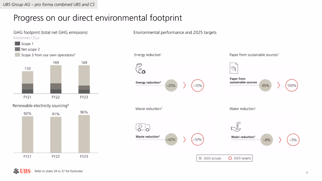
The slide features a combination of column charts and iconography to present data on GHG emissions, renewable electricity sourcing, and environmental performance targets.
Regulatory and Compliance
Financial Services
The slide details UBS Group AG's progress in reducing GHG emissions, increasing renewable electricity use, and achieving environmental performance targets by 2025.
GHG emissions, renewable electricity, targets, UBS, environmental performance
false
Regulatory and Compliance
Financial Services
Multiple Chart
UBS
Add to my slides
Remove from favorites
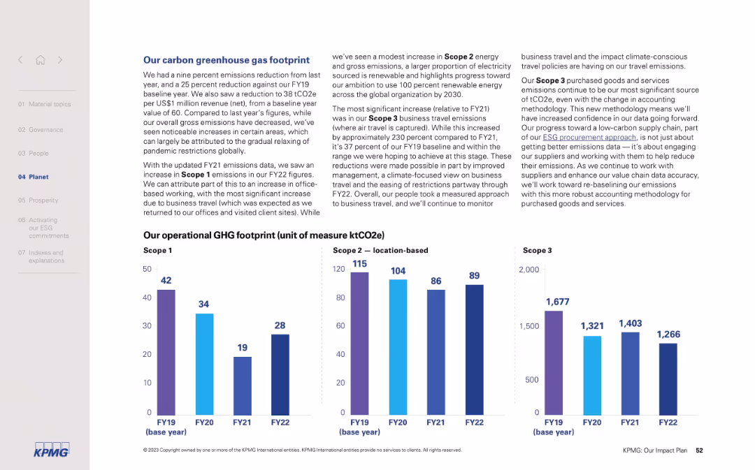
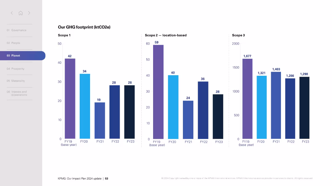
Two-column layout with detailed text on the left and three bar charts for Scope 1, 2, and 3 GHG on the right. Clean, structured, and corporate visual style.
Regulatory and Compliance
Professional Services
This slide outlines KPMG’s GHG emissions performance across Scope 1, 2, and 3 categories, highlighting trends from FY19 to FY22. It discusses reductions in overall emissions, reasons for increases (e.g., business travel), and procurement methodology improvements.
GHG emissions, Scope 1, Scope 2, Scope 3, carbon footprint, FY22, ESG, business travel, renewables, emissions tracking
false
Regulatory and Compliance
Professional Services
Mixed Chart
KPMG
Add to my slides
Remove from favorites
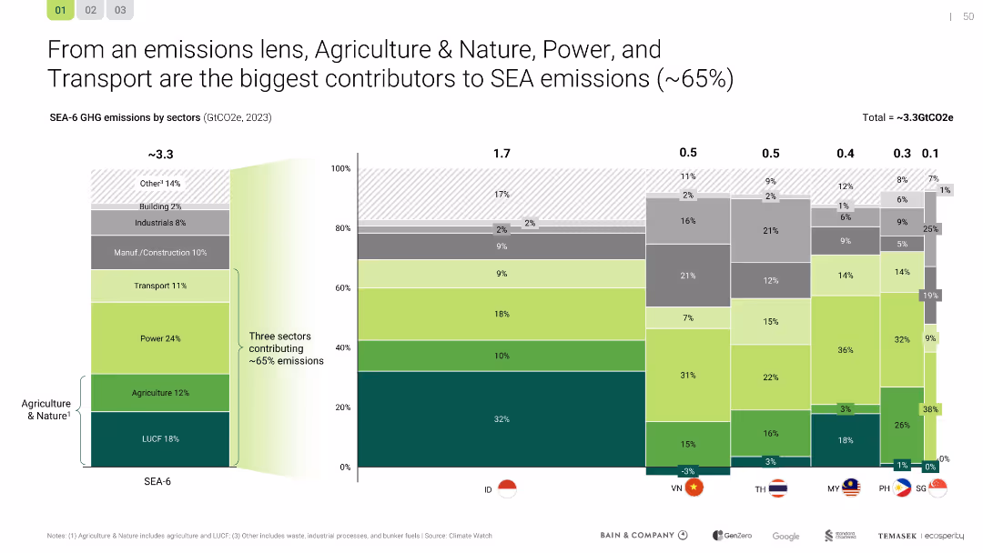
Stacked bar chart comparing GHG emissions by sector and country; includes SEA-6 regional total
Risk Assessment and Management
Agriculture & Food Production
This slide identifies the top emission sources in SEA (agriculture & nature, power, transport), contributing ~65% of GHGs. It compares country-level sectoral emissions and emphasizes the urgency of systemic emission reduction strategies.
GHG emissions, SEA-6, agriculture, power, transport, risk, CO2
false
Risk Assessment and Management
Agriculture & Food Production
Single Chart
Bain
Add to my slides
Remove from favorites
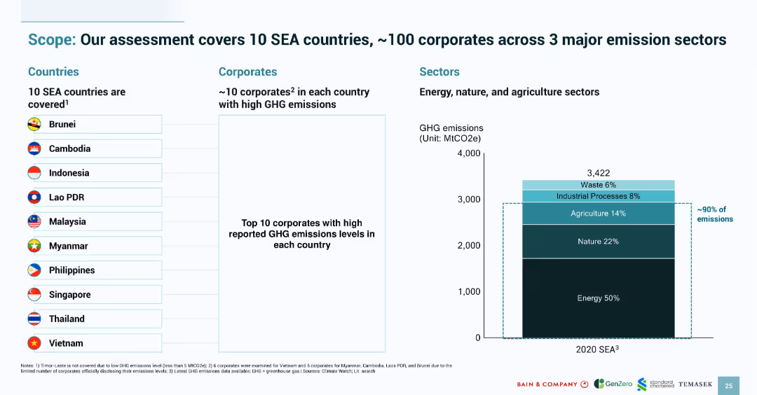
Three-column layout with countries, corporates, and sectors; includes flags, list items, and a stacked bar chart
Industry Overview
Environmental Services & Sustainability
Outlines the scope of an emissions study covering 10 Southeast Asian countries and ~100 corporates, focusing on energy, nature, and agriculture sectors. A stacked bar chart shows that ~90% of emissions come from these three sectors, emphasizing corporate accountability.
GHG emissions, SEA countries, corporates, sectors, scope, energy, nature, agriculture, analysis
false
Industry Overview
Environmental Services & Sustainability
Mixed Chart
Bain
Add to my slides
Remove from favorites
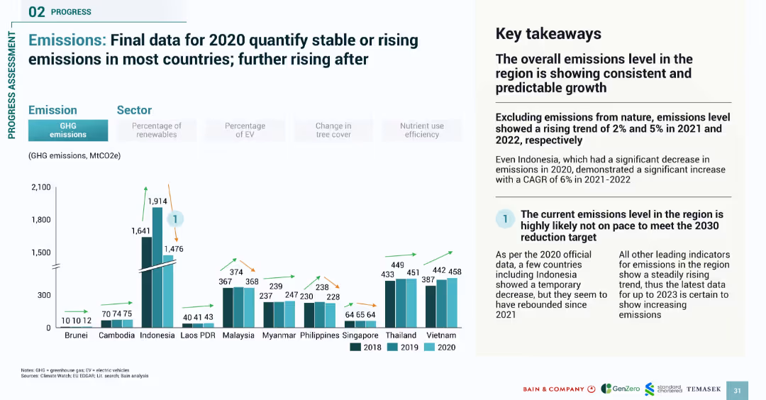
Bar chart comparing 2018–2020 emissions by country; paired with key takeaways in a two-column format
Performance Metrics and KPIs
Environmental Services & Sustainability
Presents official GHG emission data for 2020 across Southeast Asia, showing that most countries had stable or increasing emissions. Despite temporary declines, the trend reversed post-2020, indicating a continued challenge in meeting 2030 emission targets.
GHG emissions, SEA, national data, 2020 emissions, trends, progress, climate targets
false
Performance Metrics and KPIs
Environmental Services & Sustainability
Mixed Chart
Bain
Add to my slides
Remove from favorites
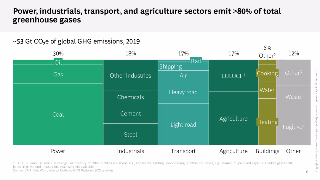
This slide features a treemap chart that shows the percentage of global GHG emissions by different sectors. Each sector is color-coded and divided into sub-sectors. The layout is dense with a lot of information compactly displayed.
Industry Overview
Environmental Services & Sustainability
The slide illustrates the contribution of various sectors, such as power, industrials, transport, and agriculture, to global greenhouse gas emissions in 2019. It highlights that these sectors are responsible for over 80% of total emissions.
GHG emissions, sectors, treemap, power, transport
false
Industry Overview
Environmental Services & Sustainability
Single Chart
BCG
Add to my slides
Remove from favorites
Three side-by-side bar charts by fiscal year (FY19–FY23) showing Scope 1, 2 (location-based), and 3 emissions. Purple and blue hues with clear labels.
Regulatory and Compliance
Environmental Services & Sustainability
Presents greenhouse gas (GHG) emissions across three scopes from FY19 to FY23, indicating progress and fluctuations in sustainability performance and environmental accountability efforts.
GHG emissions, sustainability, Scope 1 2 3, environmental reporting, FY trends
false
Regulatory and Compliance
Environmental Services & Sustainability
Multiple Chart
KPMG
Add to my slides
Remove from favorites
Includes a projection bar chart of GHG emissions from generators up to 2030, segmented by residential, commercial, and industrial contributions, in a clear and straightforward visual format.
Regulatory and Compliance
Environmental Services & Sustainability
Projects future greenhouse gas emissions from generators in Nigeria, providing insights for policy and infrastructure planning to mitigate these emissions.
GHG projections, 2030, Nigeria, policy planning, emissions mitigation
false
Regulatory and Compliance
Environmental Services & Sustainability
Single Chart
BCG
Add to my slides
Remove from favorites
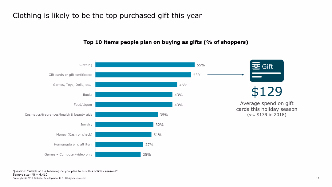
The slide presents a bar chart listing the top 10 items people plan to buy as gifts in the current year. It also shows the average spend on gift cards.
Market Analysis and Trends
Retail & E-commerce
The slide highlights the most popular gift items for the year and shows the average spend on gift cards compared to the previous year.
gifts, popular items, spending, gift cards, consumer behavior, retail, e-commerce, holiday shopping, trends, 2019
false
Market Analysis and Trends
Retail & E-commerce
Single Chart
Deloitte
Add to my slides
Remove from favorites
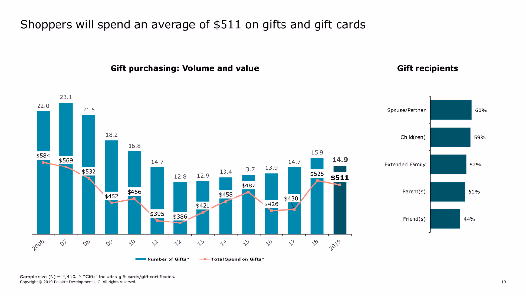
The slide features a column chart depicting the number of gifts purchased and the total spend on gifts from 2006 to 2019. A bar graph shows gift recipients by category.
Market Analysis and Trends
Retail & E-commerce
The slide shows trends in gift purchasing behavior and spending over the years, highlighting the average spend in 2019. It also indicates the primary gift recipients.
gifts, spending, trends, recipients, retail, e-commerce, holiday shopping, consumer behavior, gift cards, volume
false
Market Analysis and Trends
Retail & E-commerce
Multiple Chart
Deloitte
Add to my slides
Remove from favorites
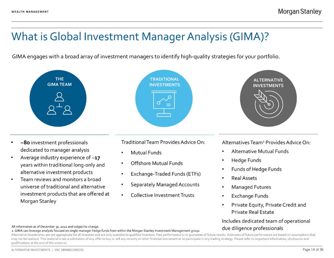
The slide is divided into three columns, describing the GIMA team, traditional investments, and alternative investments with bullet points and icons.
Market Analysis and Trends
Financial Services
This slide introduces GIMA and explains its role in investment manager analysis. It details the team's experience and the types of investments they manage, including traditional and alternative investments.
GIMA, Investment Analysis, Manager, Traditional, Alternative Investments
false
Market Analysis and Trends
Financial Services
Pillar
Morgan Stanley
Add to my slides
Remove from favorites
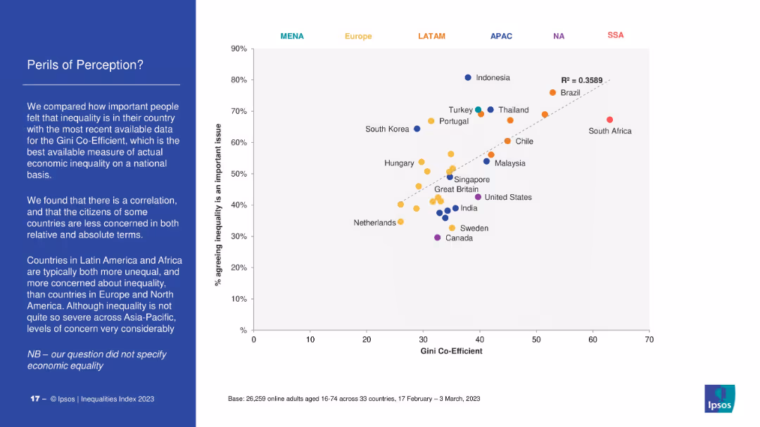
Scatter plot mapping Gini Coefficient (economic inequality) against percentage agreeing inequality is a major issue. Dotted trendline indicates correlation. Countries coded by region (color). Left-side text explains key takeaways.
Market Analysis and Trends
Government & Public Sector
The slide correlates perceived inequality with actual economic inequality (Gini coefficient). Countries in Latin America and Africa show high concern and inequality, while Europe and North America show lower concern. Highlights discrepancies in perception vs. data.
Gini coefficient, perception, inequality, economic data, Ipsos, regional comparison, Latin America, public opinion
false
Market Analysis and Trends
Government & Public Sector
Mixed Chart
IPSOS
Add to my slides
Remove from favorites
Features a world map background with key details on global presence and expertise areas in transaction advisory highlighted alongside.
Investment Analysis
Professional Services
Highlights the global reach and expertise of Alvarez & Marsal’s Transaction Advisory Group, focusing on financial and tax diligence and industry specialization.
Global, Advisory, Transaction, Financial, Tax
false
Investment Analysis
Professional Services
Linear Flow
Alvarez & Marsal
Add to my slides
Remove from favorites
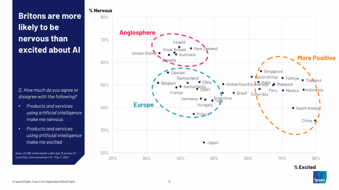
Left: title and context; right: scatter plot comparing countries by AI nervousness vs excitement
Industry Overview
Artificial Intelligence
A scatter plot shows that the UK aligns with the "Anglosphere" in being more nervous than excited about AI, unlike regions like Southeast Asia and Latin America. This highlights cultural and regional differences in AI perception based on a global Ipsos survey.
global AI attitudes, nervous vs excited, regional comparison, UK, Ipsos, emotion, perception, cultural divide
false
Industry Overview
Artificial Intelligence
Single Chart
IPSOS
Add to my slides
Remove from favorites
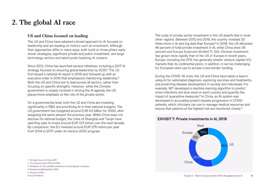
Two-column text with bullet points and chart inset (Exhibit 7) showing private AI investment shares by region (2018)
Strategic Planning
Artificial Intelligence
The US and China are leading in AI development through public and private investment. The slide outlines strategy, funding trends, and innovation leadership, with Europe lagging. COVID-19 applications and governmental strategies are discussed.
global AI race, US vs China, investment, policy, COVID-19, EU, private sector, leadership
false
Strategic Planning
Artificial Intelligence
Mixed Chart
McKinsey
Add to my slides
Remove from favorites
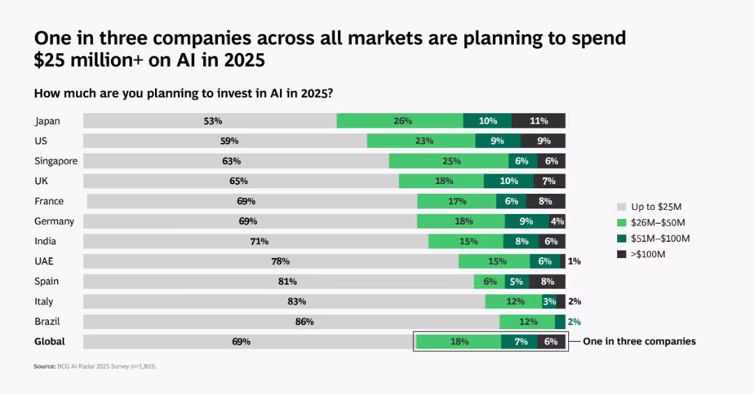
Bar chart layout with country comparisons. Various shades of green show different investment brackets; includes global average at bottom.
Market Analysis and Trends
Artificial Intelligence
Compares AI investment intentions across countries. 1 in 3 companies globally plan to invest over $25M in 2025, with regional variance in investment scale.
global AI spend, investment, 2025, countries, chart, BCG, $25M, analysis, survey, market planning
false
Market Analysis and Trends
Artificial Intelligence
Single Chart
BCG
Add to my slides
Remove from favorites
A world map colored in shades of blue indicating the percentage of activities that can be automated in different regions, accompanied by a pie chart showing economic figures for key regions.
Market Analysis and Trends
Industrial & Manufacturing
Analyzes the potential impact of automation globally, presenting the percentage of activities that can be automated by region and the economic impact in terms of total full-time equivalents (FTEs) and dollars.
Global, Automation, Economy, Impact, Regions
false
Market Analysis and Trends
Industrial & Manufacturing
Multiple Chart
McKinsey
Add to my slides
Remove from favorites
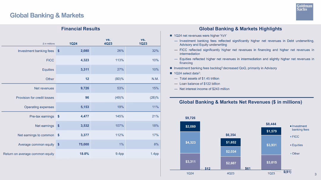
Detailed table showing financial results for various banking segments, with bar charts for net revenues and key highlights.
Financial Performance
Financial Services
Summarizes financial results in the Global Banking & Markets segment, including investment banking fees and FICC revenues.
global banking, financial results, investment banking, FICC, equities, net revenue, bar chart
false
Financial Performance
Financial Services
Mixed Chart
Goldman Sachs
Add to my slides
Remove from favorites
Slide with column chart showing 'Global Banking & Markets Net Revenues' segmented by revenue types, a detailed financial results table, and highlighted textual analysis of key figures.
Financial Performance
Financial Services
Focuses on the financial results and revenue specifics of the Global Banking & Markets sector, providing insights on performance factors, investment banking fees, and revenue streams. Designed for detailed market analysis and strategic planning.
Global Banking, Market Revenue, Investment Fees, FICC, Equities, Net Revenues, Financial Performance, Market Trends
false
Financial Performance
Financial Services
Mixed Chart
Goldman Sachs
Add to my slides
Remove from favorites
Detailed with column chart and table explanations, the slide offers a comparison of banking and market revenues. Colored columns represent different financial segments, providing a visual breakup of data for clear analysis.
Market Analysis and Trends
Financial Services
The slide analyzes global banking and market revenues, providing insights into areas like investment banking and equities. It’s used to discuss performance drivers and strategic business decisions with stakeholders familiar with financial markets.
global banking, market revenues, investment banking, equities, financial analysis
false
Market Analysis and Trends
Financial Services
Mixed Chart
Goldman Sachs
Add to my slides
Remove from favorites
Slide contains a world map highlighting regions with DB services, and a pie chart detailing regional revenue split.
Industry Overview
Financial Services
The slide showcases Deutsche Bank's global presence and distribution of services across various regions, emphasizing its extensive network.
global, banking, network, services, revenue, regional, presence, financial, pie chart, map
false
Industry Overview
Financial Services
Mixed Chart
Deutsche Bank
Add to my slides
Remove from favorites
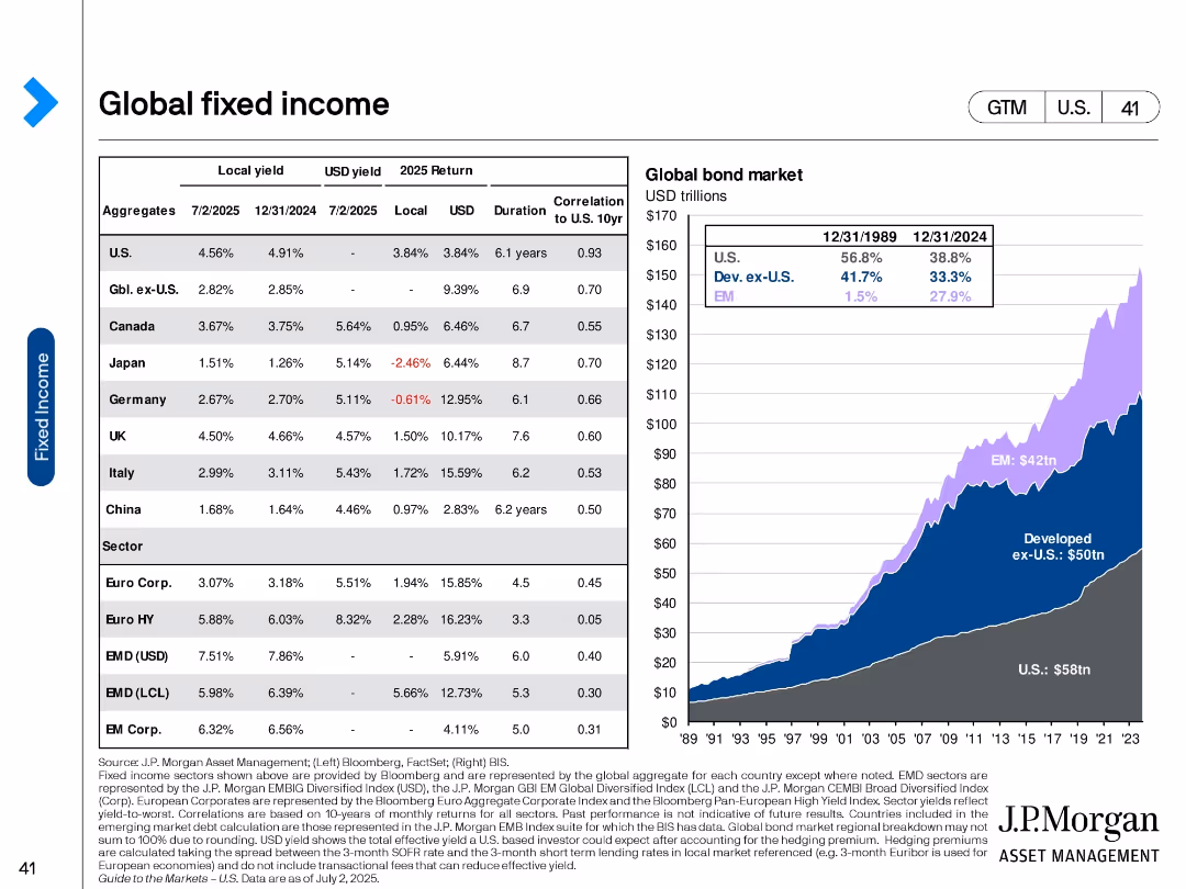
Table with returns and yields by region and sector; area chart of global bond market size over time.
Investment Analysis
Financial Services
Combines detailed bond return/yield data for key regions with a chart showing the growth of global bond markets since 1989. Highlights the dominance of U.S. and emerging market bonds and projected returns.
Global bonds, fixed income, returns, yields, emerging markets, developed markets, U.S. bonds, investment allocation
false
Investment Analysis
Financial Services
Mixed Chart
JP Morgan
Add to my slides
Remove from favorites
The slide features a horizontal bar chart showing the change in agreement with the statement on global brands from 2021 to 2022 in various countries.
Market Analysis and Trends
Technology & Software
The slide highlights an increase in the preference for global brands over the past year across different markets.
Global brands, market preference, survey, public opinion, brand analysis
false
Market Analysis and Trends
Technology & Software
Mixed Chart
IPSOS
Add to my slides
Remove from favorites
The slide includes a vertical bar chart comparing net agreement with the statement on global citizenship across various countries.
Market Analysis and Trends
Technology & Software
The slide presents survey data showing mixed feelings about global citizenship, particularly in emerging markets.
Global citizenship, emerging markets, survey, public opinion, international trends
false
Market Analysis and Trends
Technology & Software
Mixed Chart
IPSOS
Add to my slides
Remove from favorites
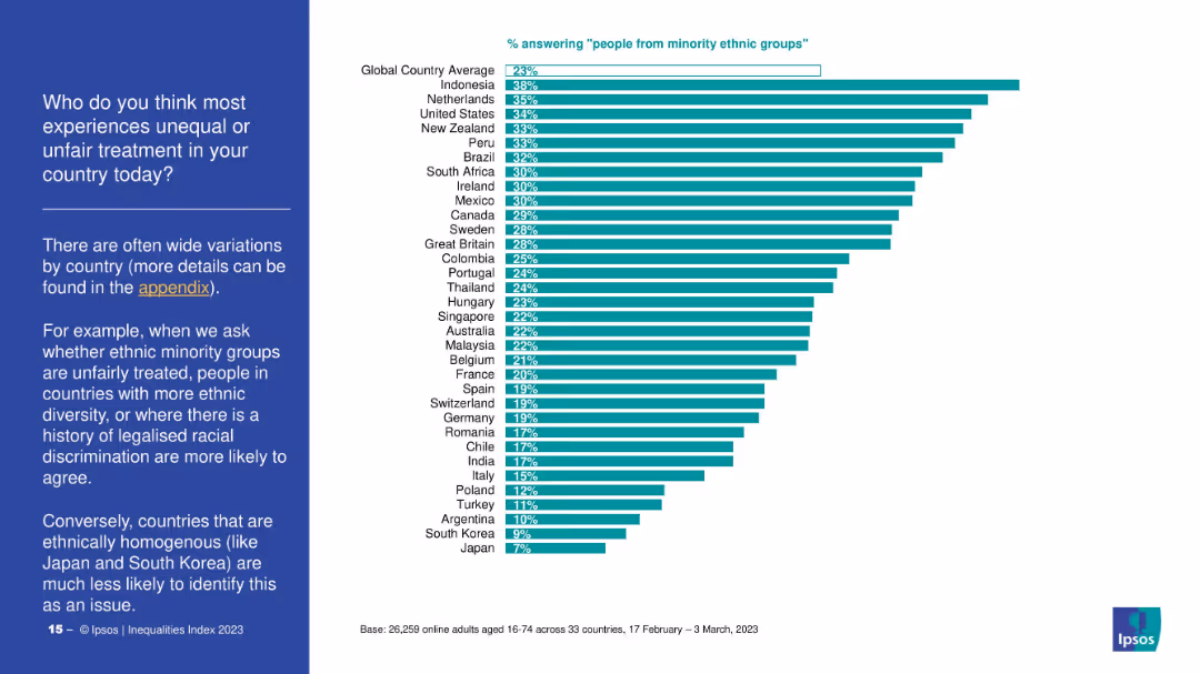
Horizontal bar chart comparing countries on how many people say ethnic minorities face discrimination. Left panel explains variability by national context. Data from 33 countries shown.
Market Analysis and Trends
Government & Public Sector
This slide presents global variation in perceptions of discrimination against ethnic minorities. Countries with diverse populations or histories of legalized racial discrimination report higher concern, while more homogenous countries show less concern.
global comparison, ethnic minorities, diversity, discrimination, Ipsos, public opinion, inequality, country ranking
false
Market Analysis and Trends
Government & Public Sector
Mixed Chart
IPSOS
Add to my slides
Remove from favorites
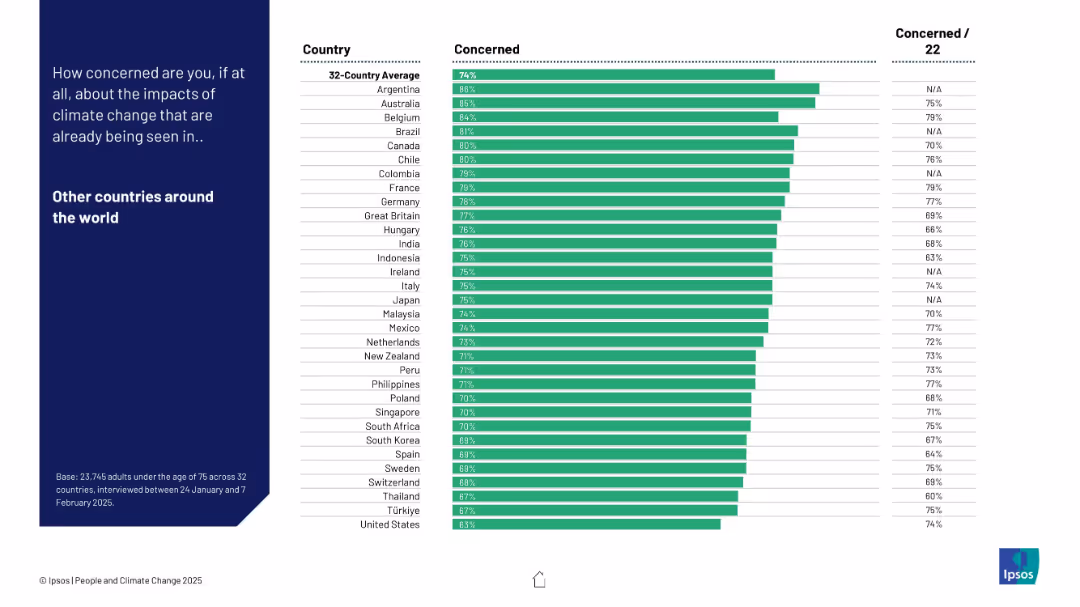
Bar chart sorted by highest to lowest concern; includes previous year’s data; blue background text box to the left.
Market Analysis and Trends
Environmental Services & Sustainability
Shows concern levels regarding climate change impacts globally, not just domestically. Argentina, Australia, and Belgium show the highest levels of concern for other countries.
global concern, empathy, international perspective, Ipsos, environmental perception, trend tracking
false
Market Analysis and Trends
Environmental Services & Sustainability
Mixed Chart
IPSOS
Add to my slides
Remove from favorites
The slide includes a horizontal bar chart listing various global issues that worry people the most, with percentages for each concern such as COVID-19, unemployment, and poverty.
Market Analysis and Trends
Environmental Services & Sustainability
This slide shows data from the Ipsos Global Advisor survey highlighting the top issues that worry people around the world, with increasing concern about climate change mentioned.
global concerns, COVID-19, unemployment, poverty, climate change, global survey, Ipsos, 2021, bar chart, percentages
false
Market Analysis and Trends
Environmental Services & Sustainability
Mixed Chart
IPSOS
Add to my slides
Remove from favorites
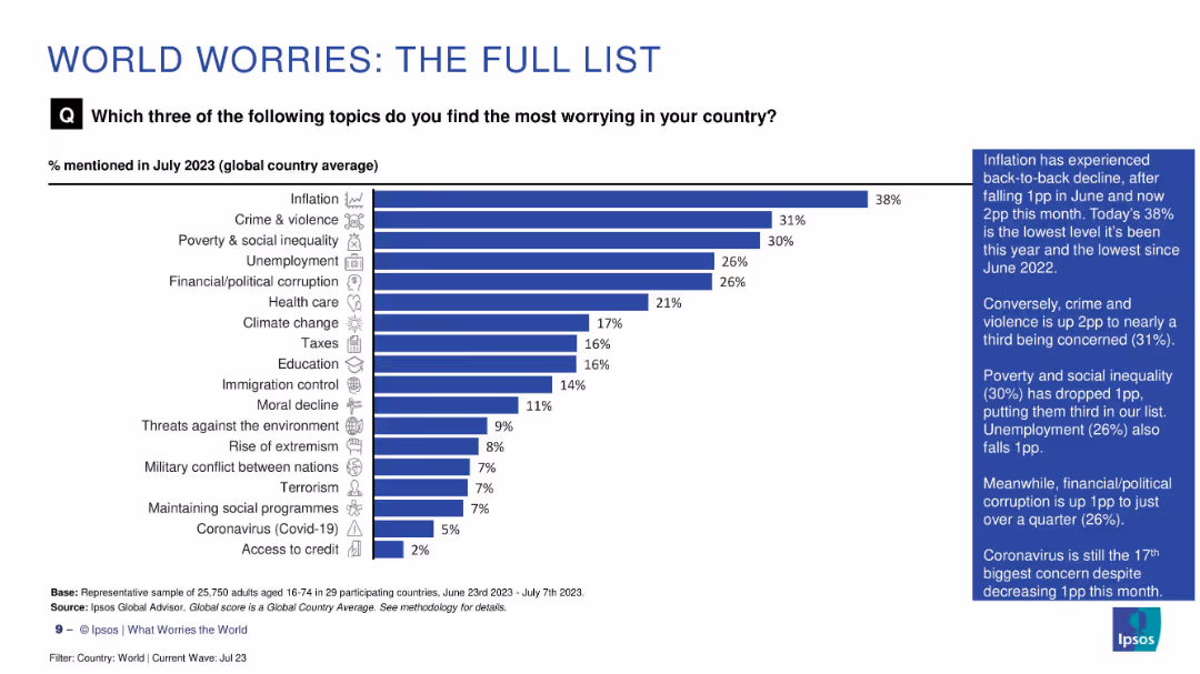
Vertical bar chart listing full range of global concerns by percentage in July 2023. Sidebar highlights key changes in concern levels.
Market Analysis and Trends
Professional Services
This slide provides a complete list of global public concerns, with inflation, crime, and inequality at the top. It captures shifts in worry levels over time, showing a broader range of societal anxieties beyond just economic or political issues.
global concerns, inflation, Ipsos survey, July 2023, public priorities, societal worries, full list
false
Market Analysis and Trends
Professional Services
Mixed Chart
IPSOS
Add to my slides
Remove from favorites
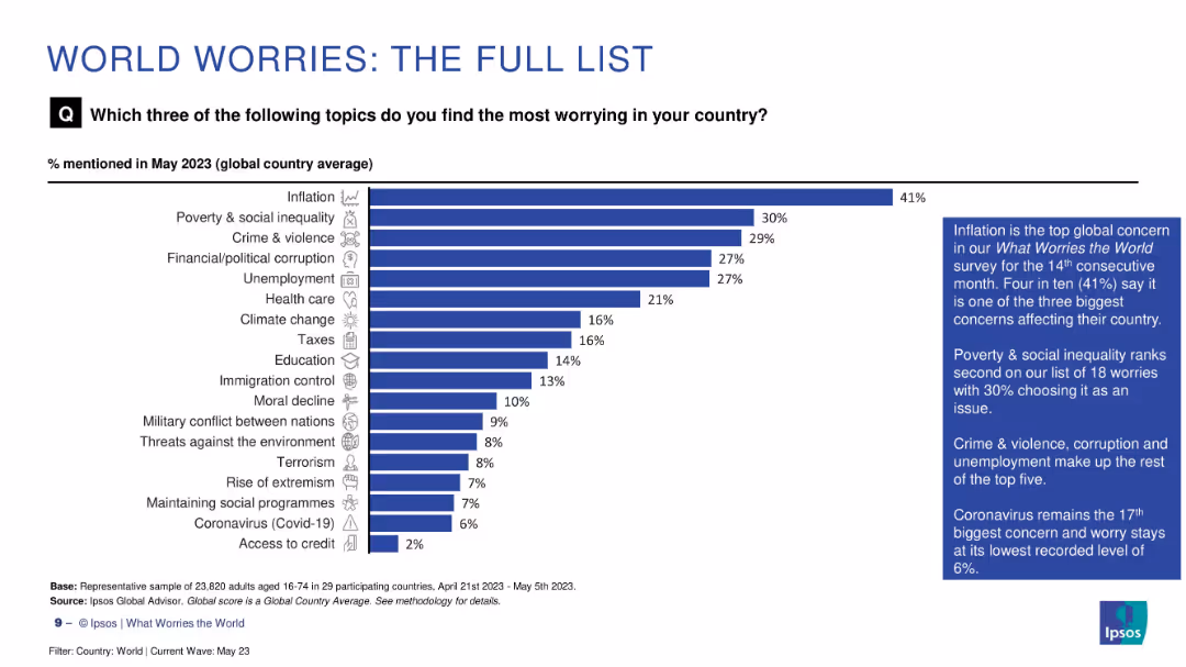
Vertical bar chart showing top 18 global concerns in descending order with annotated summary on the side
Market Analysis and Trends
Professional Services
This slide presents a ranked list of 18 key global worries. Inflation leads at 41%, followed by poverty, crime, and corruption. Less pressing concerns include extremism, terrorism, and COVID-19. Annotations summarize top themes and note declining concern levels for some long-standing issues.
global concerns, ranking, inflation, corruption, health
false
Market Analysis and Trends
Professional Services
Mixed Chart
IPSOS
Add to my slides
Remove from favorites
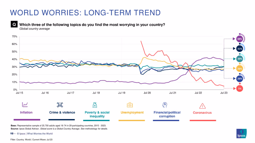
Line chart with six colored trend lines and circular percentage indicators on the right. Includes icons and legend.
Market Analysis and Trends
Professional Services
This slide visualizes global concerns over time, showing how major worries such as inflation, crime, poverty, unemployment, corruption, and coronavirus have fluctuated from 2015 to 2023 based on Ipsos survey data.
global concerns, trend analysis, Ipsos, inflation, crime, unemployment, poverty, coronavirus, corruption, survey
false
Market Analysis and Trends
Professional Services
Multiple Chart
IPSOS
Add to my slides
Remove from favorites
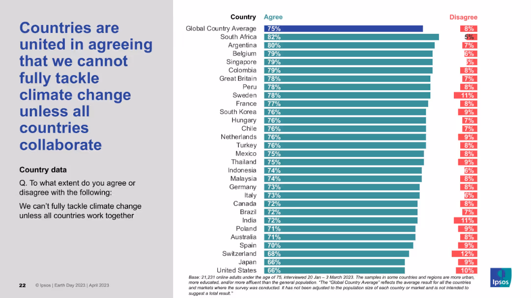
Layout consistent with others: statement on the left, bar chart showing agreement and disagreement levels by country on the right.
Strategic Planning
Environmental Services & Sustainability
The slide conveys a strong global belief that climate change cannot be addressed unilaterally and that international collaboration is essential. The agreement levels are high across most countries, reinforcing the shared view that climate action must be a global effort.
global cooperation, climate policy, collaboration, international unity, environmental challenge, Earth Day survey, Ipsos
false
Strategic Planning
Environmental Services & Sustainability
Mixed Chart
IPSOS
Add to my slides
Remove from favorites
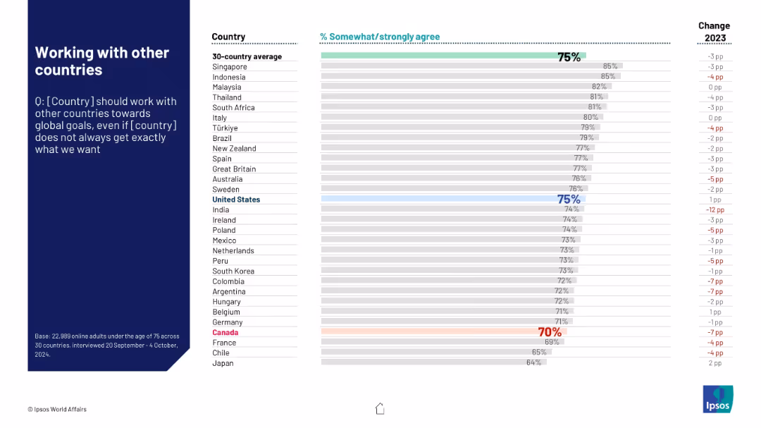
Similar layout. Assesses support for global cooperation even without perfect outcomes. Canada shown near bottom.
Strategic Planning
Government & Public Sector
Evaluates international attitudes toward cooperation with other nations on global issues. Despite some skepticism, most countries show strong support. Canada's support is relatively low at 70%.
global cooperation, diplomacy, international policy, strategic alignment, Ipsos research
false
Strategic Planning
Government & Public Sector
Mixed Chart
IPSOS
Add to my slides
Remove from favorites
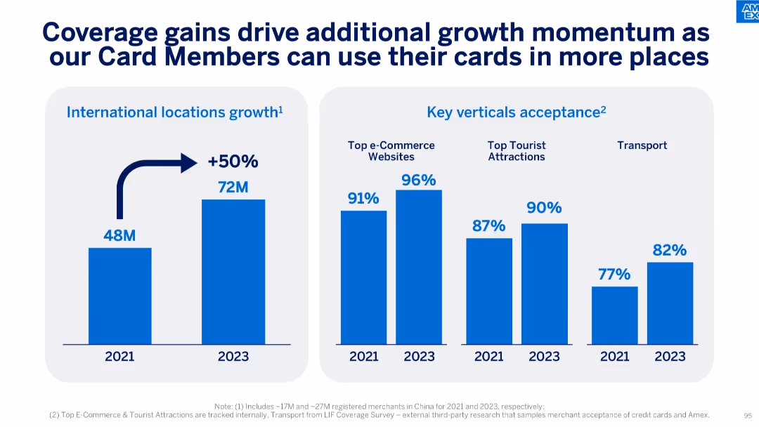
Side-by-side charts showing international location growth and acceptance in key verticals.
Strategic Planning
Financial Services
The slide highlights a 50% growth in international locations from 2021 to 2023, alongside acceptance improvements across e-commerce, tourist attractions, and transport sectors, indicating broader card usage opportunities.
Global Coverage, Card Acceptance, Growth, Locations, E-commerce, Transport, Tourism, Merchant Network
false
Strategic Planning
Financial Services
Multiple Chart
McKinsey
Add to my slides
Remove from favorites
The slide features a world map highlighting Ipsos' global offices and operations.
Market Analysis and Trends
Professional Services
The slide showcases Ipsos' global reach with offices in 90 countries and operations in over 130 countries.
global coverage, local understanding, Ipsos, offices, operations, countries
false
Market Analysis and Trends
Professional Services
Graphic
IPSOS
Add to my slides
Remove from favorites
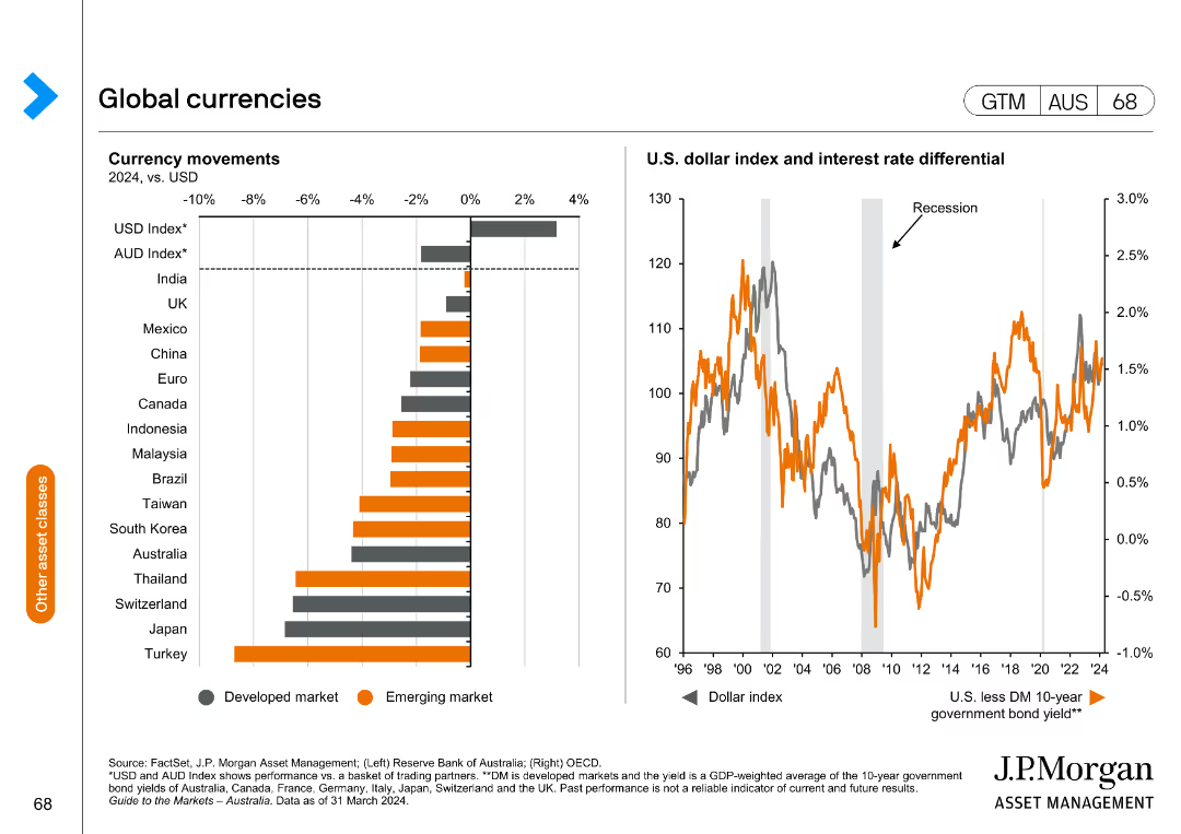
The slide features a bar chart on the left displaying currency movements in 2024 vs. USD for developed and emerging markets. The right chart is a line chart showing the U.S. dollar index and interest rate differential.
Market Analysis and Trends
Financial Services
This slide provides an analysis of global currency movements and the U.S. dollar's performance, useful for understanding currency trends and their impact on the global market.
Global currencies, USD index, interest rate, currency movements, financial analysis, developed markets, emerging markets
false
Market Analysis and Trends
Financial Services
Multiple Chart
JP Morgan
Add to my slides
Remove from favorites
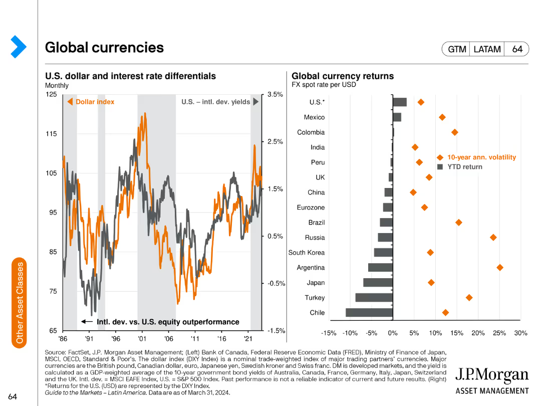
The slide features a line chart showing the U.S. dollar and interest rate differentials and a bar chart comparing global currency returns and their volatility.
Market Analysis and Trends
Financial Services
This slide analyzes the performance of global currencies, focusing on the U.S. dollar's performance relative to interest rate differentials and comparing returns and volatility across different currencies.
global currencies, USD, interest rates, returns, volatility
false
Market Analysis and Trends
Financial Services
Multiple Chart
JP Morgan
Add to my slides
Remove from favorites
Features logos and descriptions of various global data platforms involved in sustainability, with a focus on features and partnerships.
Technology and Digital Transformation
Technology & Software
Showcases data-driven sustainability initiatives globally, highlighting contributions of tech companies to environmental strategies, aimed at tech and sustainability sectors.
global, data collaboration, sustainability, technology, platforms, partnerships, logos, digital transformation, environmental strategies
false
Technology and Digital Transformation
Technology & Software
Table
Bain
Add to my slides
Remove from favorites
A comprehensive dashboard with various metrics presented in tables and small multiple graphs, summarizing global economic, business, and health data as of June 2021.
Financial Performance
Healthcare & Pharmaceuticals
This dashboard compiles critical global data from the pandemic’s impact on economic indicators, business activities, and health statistics.
global data, pandemic impact, economic indicators, business activities, health statistics, summary dashboard
false
Financial Performance
Healthcare & Pharmaceuticals
Mixed Chart
BCG
Add to my slides
Remove from favorites
This slide features two bar charts: one showing the bond market size in value and as a percentage of GDP for various countries, and another showing the debt and bonds as a percentage of GDP by country, broken down by government, corporate, and household sectors.
Market Analysis and Trends
Financial Services
The slide analyzes the global debt and bond market, comparing the market sizes and debt levels across countries, and breaking down the types of debt to provide insights into the financial health and risks associated with different economies.
Global debt, bond market, market size, GDP, government debt, corporate debt, household debt, financial health, economic analysis, financial risks
false
Market Analysis and Trends
Financial Services
Multiple Chart
JP Morgan
Add to my slides
Remove from favorites
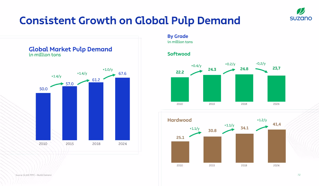
Three-bar charts: global market pulp growth and breakdowns by softwood and hardwood. Arrows and year-by-year data points show clear annual growth rates.
Market Analysis and Trends
Industrial & Manufacturing
Global market pulp demand is shown to steadily increase from 2010 to 2024, with distinct breakdowns for softwood and hardwood pulp. Growth rates are marked, highlighting yearly demand trends by grade.
global demand, pulp, softwood, hardwood, annual growth, trends, market analysis, forecast
false
Market Analysis and Trends
Industrial & Manufacturing
Multiple Chart
Goldman Sachs
Add to my slides
Remove from favorites
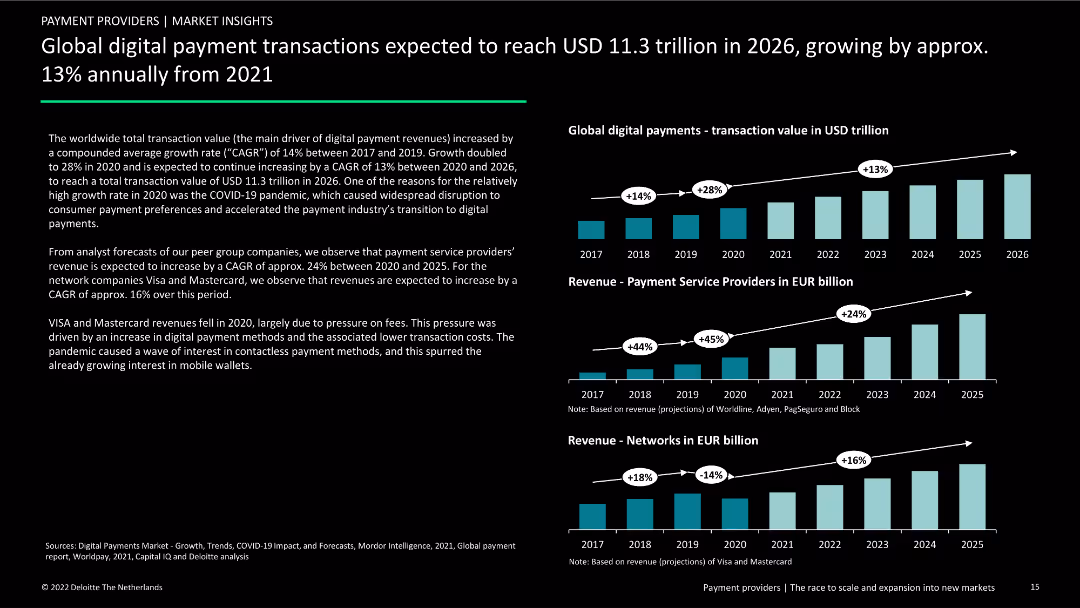
Contains three column charts showing transaction value, revenue for service providers, and revenue for networks from 2017 to 2026. Includes text explaining growth rates and factors.
Market Analysis and Trends
Financial Services
Forecast of global digital payment transaction growth and expected revenue increases for payment service providers and networks from 2021 to 2026.
global digital payments, transactions, revenue, forecasts, growth rates, market analysis, financial services, trends, future outlook
false
Market Analysis and Trends
Financial Services
Multiple Chart
Deloitte
Add to my slides
Remove from favorites
Slide with world map and pyramids representing the distribution of investment professionals, detailed with statistics, against a white and blue background.
Market Analysis and Trends
Financial Services
Showcases the global distribution of investment professionals within a firm and highlights their contribution to the firm's success.
Global Distribution, Investment Professionals, Statistics, Americas, EMEA, APAC, Tenure
false
Market Analysis and Trends
Financial Services
Table
Goldman Sachs
Add to my slides
Remove from favorites
The slide presents a world map with circular diagrams illustrating the geographical distribution of company assets, alongside statistical information in bullet points and percentage figures. The map uses different colors to represent various regions. Text boxes with additional information about the company's global presence are strategically placed around the map.
Market Analysis and Trends
Industrial & Manufacturing
The slide provides an overview of the company's global presence and balance in geographical distribution, with a focus on Europe, North America, China, and other regions. Key statistics such as the number of plants and R&D centers, along with the percentage of economic revenue per region, are shared. It may serve as an analysis tool for discussing market presence or expansion strategies.
Global, Distribution, Plants, R&D, Geography, Percentages, Map, Industrial, Revenue, Strategy
false
Market Analysis and Trends
Industrial & Manufacturing
Multiple Chart
Goldman Sachs
Add to my slides
Remove from favorites
The slide includes a column chart showing global economic growth sentiment across various regions. Text sections provide context. The chart is central and dominates the slide.
Market Analysis and Trends
Professional Services
Reflects global CEO sentiment on economic growth, valuable for analyzing regional business outlooks and strategic planning.
Global Economy, CEO Sentiment, Growth Prospects, Pessimism
false
Market Analysis and Trends
Professional Services
Mixed Chart
PwC/Strategy&
Add to my slides
Remove from favorites
This slide includes text boxes and a small bar chart with a mix of green and blue color schemes. It effectively uses space to separate different sections clearly, making it easy to follow.
Financial Performance
Financial Services
Discusses global economic indicators and CFO focuses in 2019, highlighting concerns about a potential US downturn and key economic risks. The slide aims to inform about macroeconomic trends and corporate strategies in response to economic forecasts.
global economy, CFO survey, US downturn, economic risks, GDP, macroeconomic trends
false
Financial Performance
Financial Services
Mixed Chart
Deloitte
Add to my slides
Remove from favorites
Previous
Next
You don't have any favorites yet.
Please wait loading your favorites slides...
Create a FREE account to continue browsing
Receive Instant Access to 1,000+ slides from companies like McKinsey, Google, and Goldman Sachs
First Name
Last Name
Email
Password
I agree to all
Terms & Privacy Policy
Thank you! Your submission has been received!
Oops! Something went wrong while submitting the form.
Have an account?
Sign in
Upgrade to PRO to Save slides
Advanced Search and Filters
Access to 15,000+ slides
Access to Category Pages
Save/Bookmark Slides
PowerPoint Template Library
Pick a Plan
MONTHLY
$12/month
Billed every month, Cancel anytime.
YEARLY
$9/year
Billed $108 annually, Cancel anytime.
Checkout for $12/month
Checkout for $108/yr
Secured by Stripe | AES-256 bit encryption