My Account
My Slides
Search by Category
Companies
Slide Type
Use Case
Industry
Pricing
Templates
View All Templates
Download Template Slides
✦ AI
AI Prompt Library
AI Search
Feedback
Login
Logout
Get Started
Browse all Slides
Browse all Slides
Create a FREE Account
Instant access to 1,000+ real slides from top companies like McKinsey, BCG, Goldman Sachs, Google and many more!
First Name
Last Name
Email
Password
I agree to all
Terms & Privacy Policy
Thank you! Your submission has been received!
Oops! Something went wrong while submitting the form.
Have an account?
Sign in
Saved Slides
Total No. of slides saved
0
↻ Refresh
✖ Clear all
Comprised of bullet-pointed information on green energy investment and icons representing partnerships, this slide details the activities of the Green Investment Group with visual emphasis on key figures.
Regulatory and Compliance
Financial Services
Showcases the scale of green energy investments and partnerships of the Green Investment Group. It emphasizes the group's commitment to the green transition, serving as a reference for sustainability-focused discussions.
Green Energy, Investment, Partnerships, Sustainability, Transition
false
Regulatory and Compliance
Financial Services
Pillar
Morgan Stanley
Add to my slides
Remove from favorites
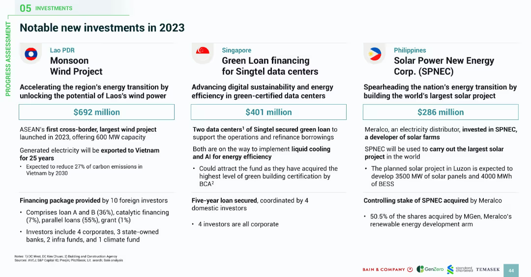
Three-column layout with country flags and icons; each block details a major investment project including funding size, partners, and strategic importance.
Investment Analysis
Energy & Utilities
The slide showcases key 2023 investment cases: Laos' $692M Monsoon Wind Project, Singapore’s $401M Singtel data center loan, and the Philippines’ $286M solar mega-project. Each project highlights energy transition goals, cross-border electricity, advanced technologies like liquid cooling and AI, and strategic partnerships.
green energy, investment projects, wind power, solar farms, data centers, ASEAN, Laos, Singapore, Philippines
false
Investment Analysis
Energy & Utilities
Pillar
Bain
Add to my slides
Remove from favorites
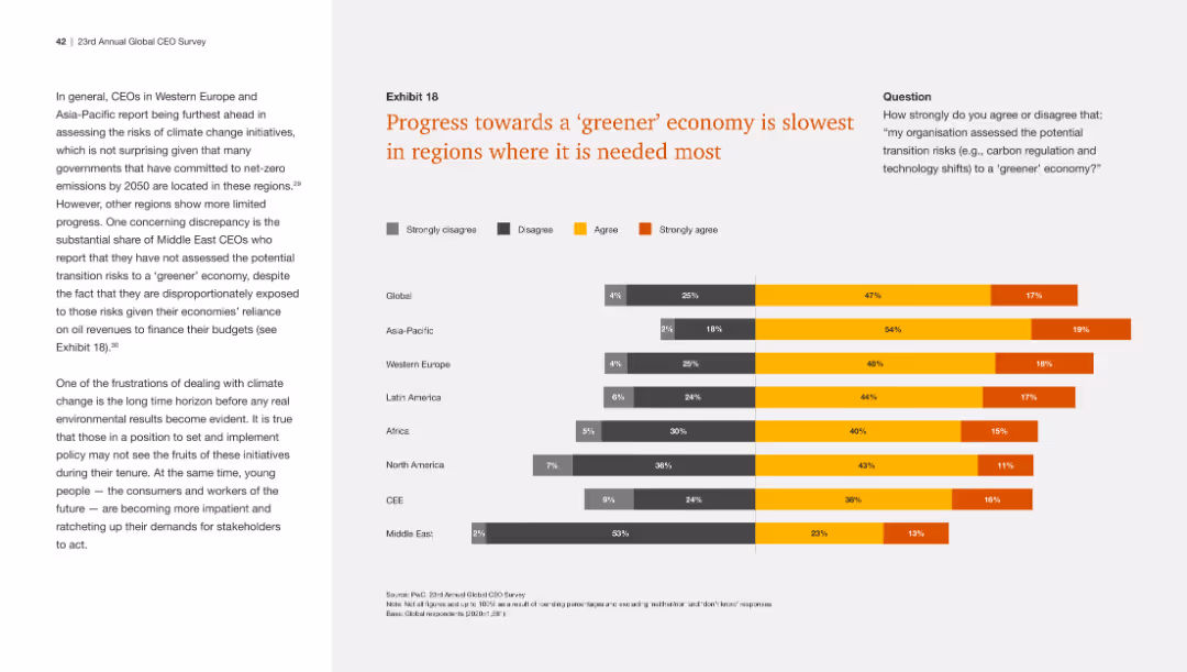
This slide contains a bar chart titled "Exhibit 18" with multiple bars representing different regions. The bars are segmented by the level of agreement to a statement about transitioning to a greener economy.
Regulatory and Compliance
Government & Public Sector
This slide shows global and regional perspectives on the transition to a greener economy, with data segmented by agreement level. It highlights areas where progress is deemed slowest, implicitly calling for increased action in those regions.
greener economy, regional analysis, CEO survey, environmental progress
false
Regulatory and Compliance
Government & Public Sector
Mixed Chart
PwC/Strategy&
Add to my slides
Remove from favorites
Bar chart displaying agreement on the organization's assessment of potential transition risks to a greener economy by global region, with a focus on the Middle East.
Market Analysis and Trends
Environmental Services & Sustainability
The slide discusses the slow progress towards a greener economy in various regions, with the Middle East showing the least agreement on assessing transition risks.
Greener economy, transition risks, regions, Middle East, assessment
false
Market Analysis and Trends
Environmental Services & Sustainability
Mixed Chart
PwC/Strategy&
Add to my slides
Remove from favorites
Column chart showing greenfield and brownfield investments in Europe from 2015 to 2022.
Market Analysis and Trends
Financial Services
Discusses the trends in greenfield investments in Europe, noting they have not yet returned to pre-crisis levels.
greenfield, brownfield, investments, Europe, trends
false
Market Analysis and Trends
Financial Services
Single Chart
EY
Add to my slides
Remove from favorites
The slide shows multiple charts: a bar chart for investment percentages in greenfield initiatives, a column chart for investment constraints, and a column chart for quality perception of PPP tenders.
Market Analysis and Trends
Real Estate & Construction
This slide evaluates the attractiveness of greenfield infrastructure investments in Italy, focusing on the allocation of financing, perceived investment constraints, and the quality of PPP tenders compared to EU averages.
Greenfield, infrastructure, Italy, investment, PPP tenders
false
Market Analysis and Trends
Real Estate & Construction
Multiple Chart
EY
Add to my slides
Remove from favorites
This slide includes a bar chart with horizontal bars colored in yellow showing various challenges related to green finance. The slide title and the chart caption are prominently displayed at the top.
Regulatory and Compliance
Environmental Services & Sustainability
The bar chart illustrates multiple obstacles for funding ESG initiatives, such as immature market infrastructure, high financing costs, lack of green finance professionals, and market transparency. Each challenge is quantified, indicating the percentage of respondents acknowledging these issues.
Green finance, ESG, Market challenges, Financing costs, Sustainability
false
Regulatory and Compliance
Environmental Services & Sustainability
Single Chart
PwC/Strategy&
Add to my slides
Remove from favorites
Slide includes a multi-colored heatmap representing various opportunities for developing green finance in Hong Kong. Each bar is differentiated by color corresponding to the level of opportunity.
Market Analysis and Trends
Financial Services
The chart assesses different sectors such as ESG reporting, green bonds, and sustainability funds, indicating the perceived opportunities in each sector. It uses percentages to show the response distribution across significant, moderate, and few opportunities, highlighting areas with potential for growth.
Green finance, ESG, Opportunities, Hong Kong, Market development
false
Market Analysis and Trends
Financial Services
Table
PwC/Strategy&
Add to my slides
Remove from favorites
This slide has a bar chart with horizontal bars, each representing a policy area with potential impact on green finance, colored in different shades of orange and gray.
Regulatory and Compliance
Government & Public Sector
Discusses several policy areas that could enhance Hong Kong's green finance competitiveness, like updating local tax policies, developing digital solutions for ESG reporting, and collaborating internationally on ESG data sharing. The importance of each area is measured by survey responses over two years.
Green finance, Policy, Subsidies, Tax, Hong Kong
false
Regulatory and Compliance
Government & Public Sector
Single Chart
PwC/Strategy&
Add to my slides
Remove from favorites
Slide displays multiple information blocks about specific financial products and services focused on environmental sustainability, accompanied by icons and bullet points detailing each initiative.
Investment Analysis
Financial Services
Explores Barclays' expansion into green financing through specialized teams and products, highlighting major projects and initiatives like Green Home Mortgages and the Energy Transition Group.
green finance, sustainability, investment opportunities, energy transition, financial services, environmental initiatives
false
Investment Analysis
Financial Services
Mixed Chart
Barclays
Add to my slides
Remove from favorites
Two content sections for different green finance initiatives. Logos of OCBC and Standard Chartered.
Financial Performance
Financial Services
Discusses green finance achievements such as a significant trade finance facility and a sustainability-linked loan. Used for financial strategy communication related to sustainability efforts.
green finance, sustainability, trade finance, loan, decarbonization, banking
false
Financial Performance
Financial Services
Header Horizontal
Morgan Stanley
Add to my slides
Remove from favorites
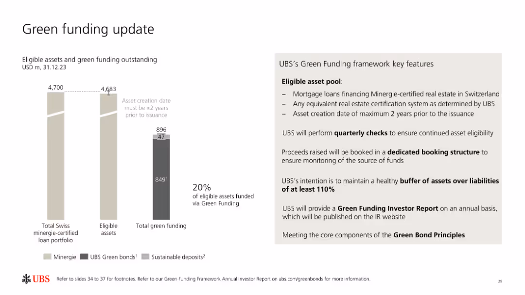
The slide includes bar charts and a list outlining UBS's green funding metrics, eligible asset pool, and key features of their green funding framework.
Investment Analysis
Financial Services
UBS provides an update on their green funding, detailing eligible assets, green bonds, sustainable deposits, and the framework for maintaining and monitoring green funding.
Green funding, UBS, sustainable assets, framework, bonds
false
Investment Analysis
Financial Services
Mixed Chart
UBS
Add to my slides
Remove from favorites
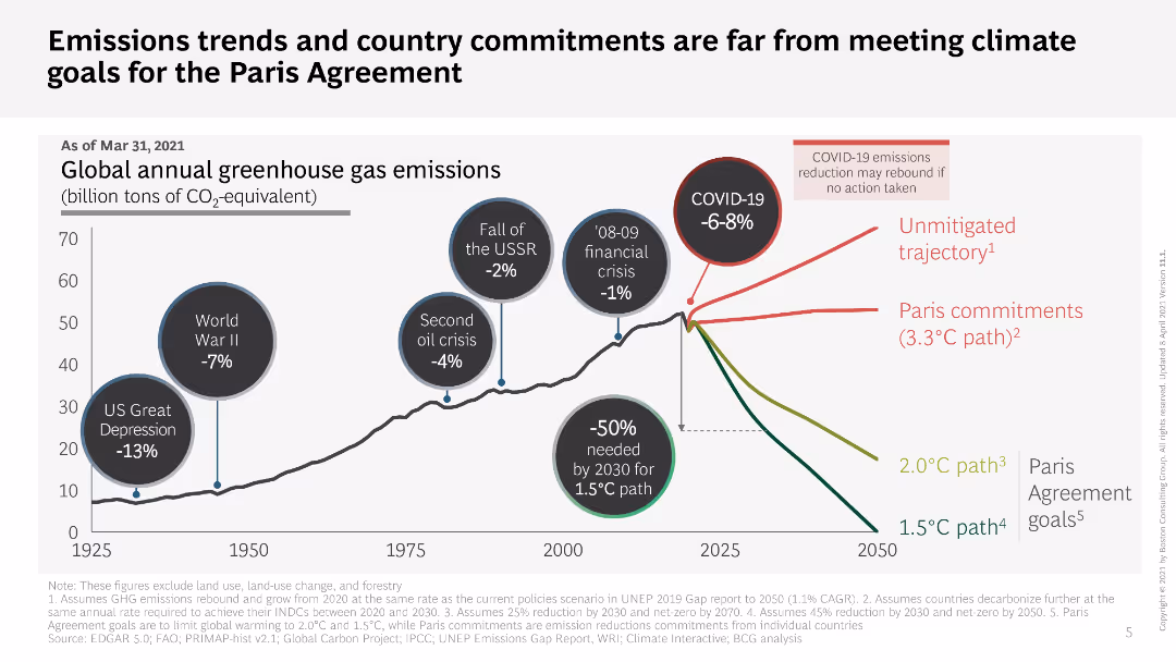
Line chart showing global greenhouse gas emissions trends with annotations for major events; text discussing the gap between current commitments and Paris Agreement goals.
Regulatory and Compliance
Environmental Services & Sustainability
Analyzes global greenhouse gas emissions trends and evaluates the gap between current country commitments and the goals set by the Paris Agreement, emphasizing the need for action.
greenhouse gas emissions, climate goals, Paris Agreement, emissions trends, country commitments, climate action, sustainability
false
Regulatory and Compliance
Environmental Services & Sustainability
Single Chart
BCG
Add to my slides
Remove from favorites
Column chart with actual ranks and CO2 saved metrics highlighted for specific actions.
Market Analysis and Trends
Environmental Services & Sustainability
Shows actual effectiveness of actions to reduce greenhouse gases, highlighting 'not having a car'.
greenhouse gas, emissions, CO2, car, child
false
Market Analysis and Trends
Environmental Services & Sustainability
Mixed Chart
IPSOS
Add to my slides
Remove from favorites
A pie chart showing global market average responses comparing two actions to reduce individual greenhouse gas emissions: eating a vegetarian diet with some imported products vs. eating a locally produced diet including meat and dairy.
Market Analysis and Trends
Environmental Services & Sustainability
This slide contrasts public perceptions of the environmental impact of eating locally produced diets including meat and dairy versus vegetarian diets with some imported products, highlighting misconceptions about greenhouse gas emissions.
greenhouse gas emissions, diet choices, public perception, vegetarian diet, local diet, environmental impact, global market average
false
Market Analysis and Trends
Environmental Services & Sustainability
Mixed Chart
IPSOS
Add to my slides
Remove from favorites
This slide contains a horizontal bar chart comparing two actions to reduce greenhouse gas emissions across various markets, with data points shown for each country.
Market Analysis and Trends
Environmental Services & Sustainability
The slide provides comparative data on the perceived effectiveness of locally produced diets versus vegetarian diets in reducing greenhouse gas emissions across different countries. It emphasizes that local diets are often seen as better despite evidence to the contrary.
Greenhouse gas emissions, diet comparison, vegetarian, local produce, market analysis
false
Market Analysis and Trends
Environmental Services & Sustainability
Multiple Chart
IPSOS
Add to my slides
Remove from favorites
This slide features a pie chart with three segments: 20% for eating a vegetarian diet with some imported products, 57% for eating a locally produced diet including meat and dairy products, and 23% for don't know. The left side includes a textual explanation.
Market Analysis and Trends
Environmental Services & Sustainability
The slide compares perceptions of diet choices that reduce greenhouse gas emissions. It highlights that a locally produced diet is perceived as more environmentally friendly by 57% of respondents, despite evidence suggesting a vegetarian diet with some imports is greener.
Greenhouse gas emissions, diet, vegetarian, local produce, environmental impact
false
Market Analysis and Trends
Environmental Services & Sustainability
Mixed Chart
IPSOS
Add to my slides
Remove from favorites
A column chart for Great Britain showing actions believed to reduce greenhouse gas emissions, ranked by perceived impact and CO2 saved. Bars are in varying shades of green.
Market Analysis and Trends
Environmental Services & Sustainability
This slide shows the ranking and perceived effectiveness of actions to reduce greenhouse gas emissions in Great Britain, emphasizing the gap between public perception and the actual CO2 savings potential.
greenhouse gas, emissions, public perception, Great Britain, impactful actions, CO2 savings, environmental impact
false
Market Analysis and Trends
Environmental Services & Sustainability
Mixed Chart
IPSOS
Add to my slides
Remove from favorites
A column chart showing the actual rank and percentage of people who think various actions reduce greenhouse gas emissions. Two sets of bars for Global Market Average and Great Britain are displayed.
Market Analysis and Trends
Environmental Services & Sustainability
The slide compares public perceptions in Great Britain versus the global average regarding the most impactful actions to reduce individual greenhouse gas emissions, highlighting a discrepancy between perception and actual impact.
greenhouse gas, emissions, public perception, impactful actions, Great Britain, Global Market Average, CO2 savings
false
Market Analysis and Trends
Environmental Services & Sustainability
Mixed Chart
IPSOS
Add to my slides
Remove from favorites
Column chart of actions to reduce greenhouse gas emissions, highlighting recycling and renewable energy
Market Analysis and Trends
Environmental Services & Sustainability
The slide asks which actions most reduce greenhouse gases, with recycling and renewables as top choices
greenhouse gas, emissions, recycling, energy, actions
false
Market Analysis and Trends
Environmental Services & Sustainability
Mixed Chart
IPSOS
Add to my slides
Remove from favorites
The slide is split into four quadrants, each with a bar or column chart displaying data on greenhouse gas emissions by scope, both market-based and location-based.
Regulatory and Compliance
Technology & Software
Showcases the company's efforts in reducing greenhouse gas emissions, aligning with sustainability goals. Used in ESG reporting and compliance overviews.
greenhouse gas, emissions, sustainability, ESG reporting, market-based, location-based, compliance, reduction efforts
false
Regulatory and Compliance
Technology & Software
Multiple Chart
McKinsey
Add to my slides
Remove from favorites
The slide presents moderate visual complexity with a balance of graphical elements showcasing greenhouse gas emissions data and text explaining alternative fuel use and activity footprint reduction. The layout integrates visuals and information effectively, with color coding to highlight different sections.
Technology and Digital Transformation
Industrial & Manufacturing
This slide elaborates on how the process industries' significant greenhouse gas emissions can be managed through the use of alternative fuels or the reduction of activity footprints via automation. It outlines various strategies for improving energy efficiency, reducing emissions, and the role of automation technologies in achieving these goals.
Greenhouse gas management, Automation in emissions reduction, Energy efficiency, Industrial process optimization
false
Technology and Digital Transformation
Industrial & Manufacturing
Single Chart
LEK
Add to my slides
Remove from favorites
The slide includes two charts: one showing the power balance of a new green H2 project over time and another showing the existing grid power mix with saturation hours.
Market Analysis and Trends
Energy & Utilities
This slide assesses the emissions impacts of annual matching based on the hourly grid mix, presenting data on oversupply and undersupply periods, and the resulting imbalances in carbon displacement during saturation hours.
green hydrogen, annual matching, emissions impact, hourly grid mix, power balance
false
Market Analysis and Trends
Energy & Utilities
Multiple Chart
BCG
Add to my slides
Remove from favorites
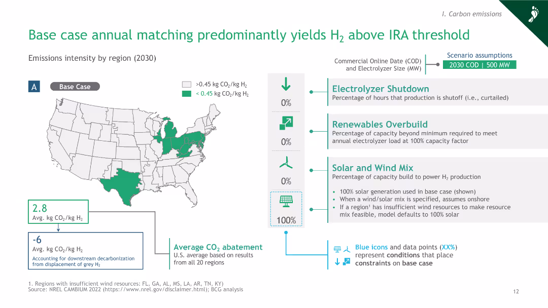
The slide includes a map of the U.S. with colored regions indicating emissions intensity, and a column chart summarizing assumptions and emissions outcomes.
Market Analysis and Trends
Energy & Utilities
This slide presents the base case scenario for annual matching, showing that most regions yield hydrogen emissions above the IRA threshold, with detailed assumptions and average CO2 abatement data.
green hydrogen, annual matching, IRA threshold, emissions intensity, U.S. regions
false
Market Analysis and Trends
Energy & Utilities
Graphic
BCG
Add to my slides
Remove from favorites
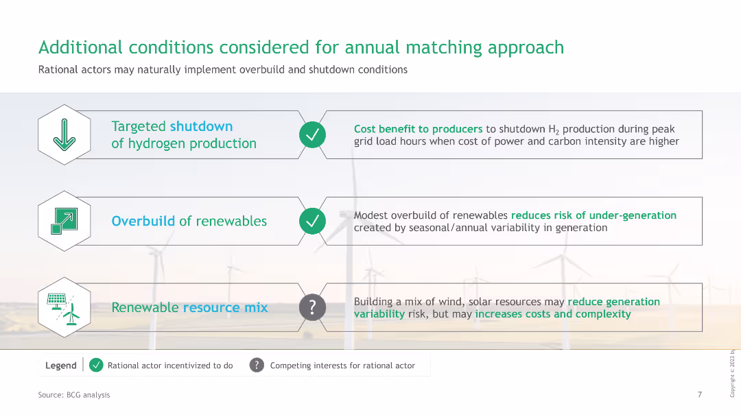
The slide features three icons with corresponding descriptions for conditions considered in annual matching: Targeted shutdown, Overbuild of renewables, Renewable resource mix.
Strategic Planning
Energy & Utilities
This slide explains additional conditions like targeted shutdown, overbuild of renewables, and renewable resource mix, which are considered for implementing an annual matching approach in green hydrogen production.
green hydrogen, annual matching, targeted shutdown, renewables, resource mix
false
Strategic Planning
Energy & Utilities
Table
BCG
Add to my slides
Remove from favorites
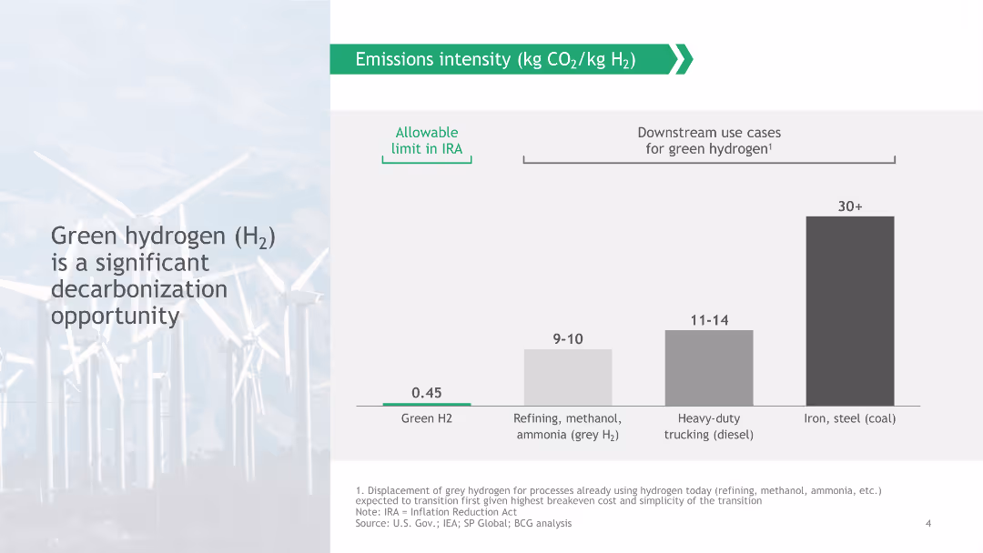
The slide features a column chart comparing emissions intensity (kg CO2/kg H2) of Green H2, Refining (methanol, ammonia), Heavy-duty trucking (diesel), and Iron, steel (coal).
Technology and Digital Transformation
Energy & Utilities
The slide presents green hydrogen (H2) as a key opportunity for decarbonization, showing emissions intensities and comparing them with downstream use cases for green hydrogen.
green hydrogen, decarbonization, emissions intensity, downstream use cases, IRA limit
false
Technology and Digital Transformation
Energy & Utilities
Mixed Chart
BCG
Add to my slides
Remove from favorites
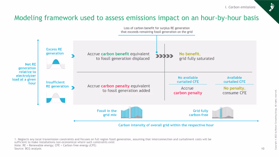
The slide features a diagram explaining the framework for assessing emissions impact hourly, including factors like excess RE generation, carbon benefit, and penalty.
Market Analysis and Trends
Energy & Utilities
This slide presents a modeling framework for assessing emissions impacts on an hour-by-hour basis, highlighting the interplay between excess renewable energy generation, fossil grid mix, and carbon penalties.
green hydrogen, emissions impact, modeling framework, renewable energy, carbon penalty
false
Market Analysis and Trends
Energy & Utilities
Framework
BCG
Add to my slides
Remove from favorites
A column chart compares the levelized cost of hydrogen as a feedstock for different grid utilizations (wind, solar, grid wind, grid solar) over different capacities (1 MW, 10 MW, 100 MW) by 2030.
Market Analysis and Trends
Energy & Utilities
The slide discusses the potential competitiveness of green hydrogen as a feedstock, noting the current higher cost compared to brown sources but highlighting future cost reductions.
green hydrogen, feedstock, levelized cost, grid, wind, solar, competitiveness, future cost, hydrogen production
false
Market Analysis and Trends
Energy & Utilities
Multiple Chart
Kearney
Add to my slides
Remove from favorites
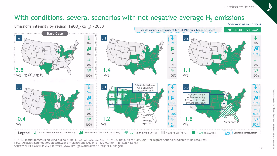
The slide includes six maps of the U.S. showing different scenarios with varying conditions for achieving net negative average H2 emissions.
Market Analysis and Trends
Energy & Utilities
This slide presents various scenarios under different conditions that lead to net negative average hydrogen emissions, with visual data indicating regional outcomes and specific condition impacts.
green hydrogen, net negative emissions, scenario analysis, U.S. regions, condition impacts
false
Market Analysis and Trends
Energy & Utilities
Graphic
BCG
Add to my slides
Remove from favorites
Slide shows a bar chart of global green hydrogen electrolysis projects by region, planned from 2015 to 2025.
Strategic Planning
Energy & Utilities
Projects the growth of global green hydrogen production capacity, emphasizing regional developments and strategic planning in the energy sector.
green hydrogen, production capacity, strategic planning, energy transition, regional analysis
false
Strategic Planning
Energy & Utilities
Single Chart
McKinsey
Add to my slides
Remove from favorites
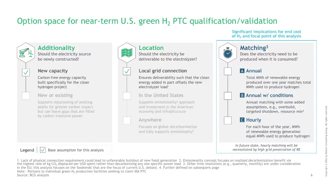
The slide is divided into three sections: Additionality, Location, and Matching, each with checkboxes and detailed points explaining each category’s criteria.
Regulatory and Compliance
Energy & Utilities
This slide outlines the criteria for near-term qualification and validation of U.S. green hydrogen production tax credit (PTC), focusing on additionality, location, and matching aspects necessary for compliance and efficiency.
green hydrogen, PTC qualification, additionality, location, matching
false
Regulatory and Compliance
Energy & Utilities
Pillar
BCG
Add to my slides
Remove from favorites
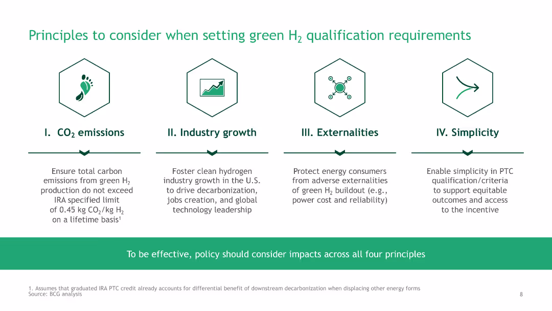
The slide features four icons representing principles: CO2 emissions, Industry growth, Externalities, and Simplicity, with brief descriptions under each.
Regulatory and Compliance
Energy & Utilities
This slide outlines key principles to consider when setting qualification requirements for green hydrogen, focusing on CO2 emissions, industry growth, externalities, and simplicity.
green hydrogen, qualification requirements, CO2 emissions, industry growth, externalities
false
Regulatory and Compliance
Energy & Utilities
Pillar
BCG
Add to my slides
Remove from favorites
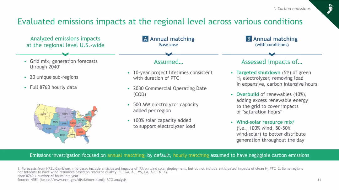
The slide includes a map of the U.S. divided into regions, with bullet points outlining the assumptions and assessed impacts of annual matching under various conditions.
Market Analysis and Trends
Energy & Utilities
This slide evaluates the emissions impacts of green hydrogen production at the regional level across the U.S., considering various conditions like targeted shutdown, overbuild of renewables, and wind-solar resource mix.
green hydrogen, regional impacts, emissions evaluation, annual matching, U.S. grid
false
Market Analysis and Trends
Energy & Utilities
Header Horizontal
BCG
Add to my slides
Remove from favorites
A map showing the REHYNE project overview, detailing the Shell refinery in Wesseling, Germany. The slide includes project details, including hydrogen production, emissions, and future plans.
Strategic Planning
Energy & Utilities
The slide outlines the business case for producing green hydrogen at the Shell refinery in Wesseling, covering current situation, integration of a 10 MW PEM electrolyzer, and future projections.
green hydrogen, Shell, Wesseling, refinery, PEM electrolyzer, Germany, project overview, hydrogen production
false
Strategic Planning
Energy & Utilities
Graphic
Kearney
Add to my slides
Remove from favorites
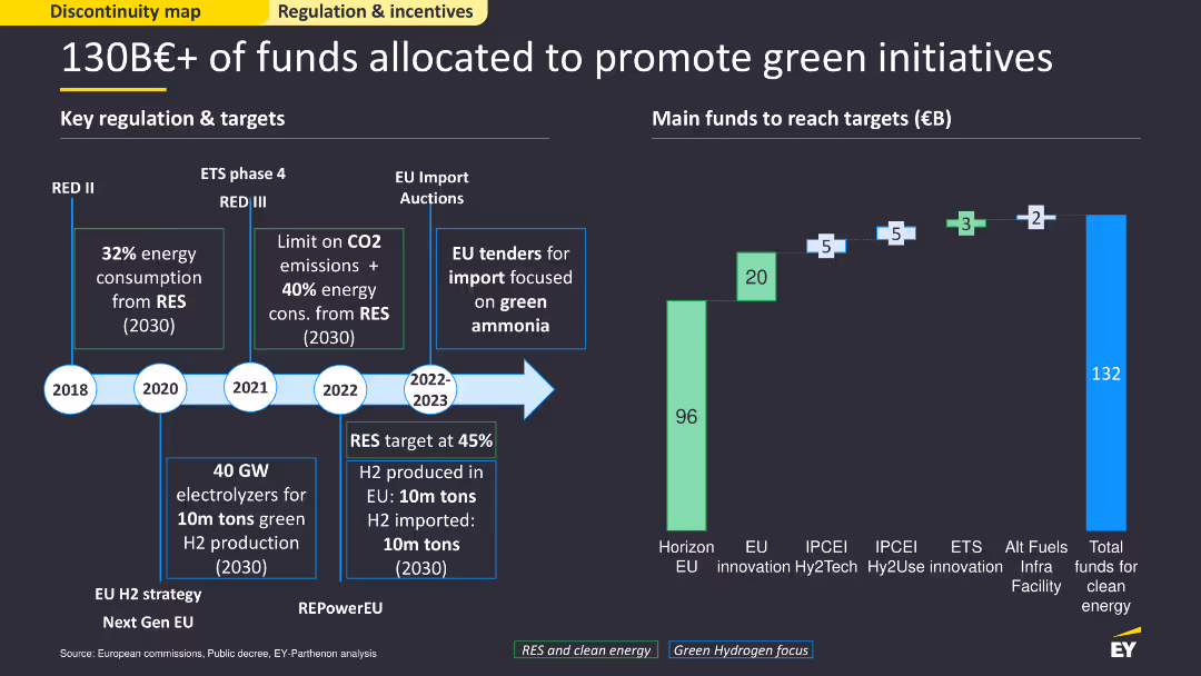
This slide contains a timeline and bar chart, showing key regulations and targets for green initiatives from 2018 to 2030. It uses green and blue colors to differentiate funds and targets, with clear markers for important milestones. The layout is detailed, providing a comprehensive overview of funding allocation and regulatory milestones.
Regulatory and Compliance
Government & Public Sector
The slide presents an overview of funds and regulations allocated for promoting green initiatives, highlighting key targets and timelines. It details significant milestones and the amount of funding dedicated to different initiatives, illustrating the comprehensive strategy to achieve sustainability goals by 2030.
green initiatives, funding, regulation, timeline
false
Regulatory and Compliance
Government & Public Sector
Mixed Chart
EY
Add to my slides
Remove from favorites
Slide divided into three vertical sections showing a progression from left to right. The left and right sections feature images of nature and stacked coins respectively. Middle section contains a query icon with questions.
Market Analysis and Trends
Environmental Services & Sustainability
This slide compares the current status of green capital deployment and its untapped potential against future revenue and investment needs by 2030 in Southeast Asia's green sector, emphasizing economic opportunities and requirements.
green investment, capital, SEA, 2030, revenue, economic opportunity, cumulative investment
false
Market Analysis and Trends
Environmental Services & Sustainability
Boxed
Bain
Add to my slides
Remove from favorites
Composed of four blocks each with a distinct background image and icon, detailing different strategic actions such as unlocking opportunities, confronting costs, strengthening financing, and driving collaboration.
Strategic Planning
Environmental Services & Sustainability
Outlines four key strategies to enhance green investment and climate action within SEA, focusing on proven solutions, addressing system costs, boosting green financing, and enhancing regional collaboration.
Green Investment, Climate Action, SEA, Financing, Collaboration
false
Strategic Planning
Environmental Services & Sustainability
Boxed
Bain
Add to my slides
Remove from favorites
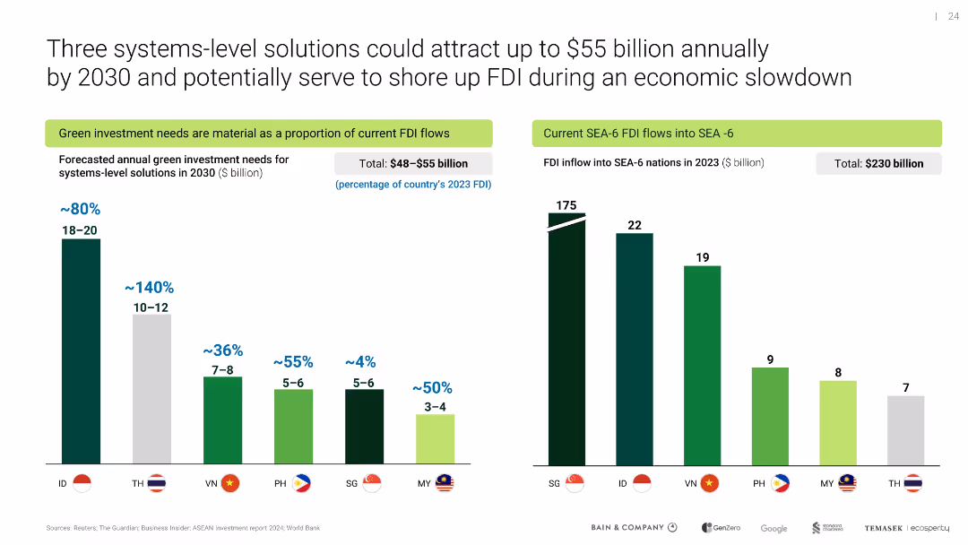
Two bar charts compare forecasted green investment needs and actual 2023 FDI inflows for SEA-6 nations
Investment Analysis
Environmental Services & Sustainability
Highlights investment potential of systems-level green solutions across Southeast Asia, showing material FDI alignment for future capital inflows in sectors like EVs and renewable infrastructure.
green investment, FDI, SEA-6, 2030 forecast, decarbonization finance
false
Investment Analysis
Environmental Services & Sustainability
Multiple Chart
Bain
Add to my slides
Remove from favorites
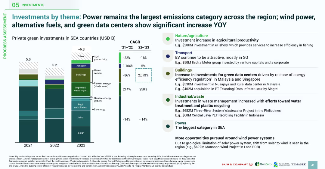
Vertical stacked bars show thematic private green investments by year; callouts on right highlight examples per category; color-coded investment types.
Investment Analysis
Environmental Services & Sustainability
This slide analyzes green investment themes in Southeast Asia by showing annual private investment volumes and their growth rates. Power, wind, fuel substitution, and green data centers are dominant categories, while sectors like green cement show exponential growth. Side annotations provide project examples and strategic drivers.
green investment, power sector, renewable energy, data centers, emissions, waste management, Southeast Asia, solar, wind, CAGR
false
Investment Analysis
Environmental Services & Sustainability
Mixed Chart
Bain
Add to my slides
Remove from favorites
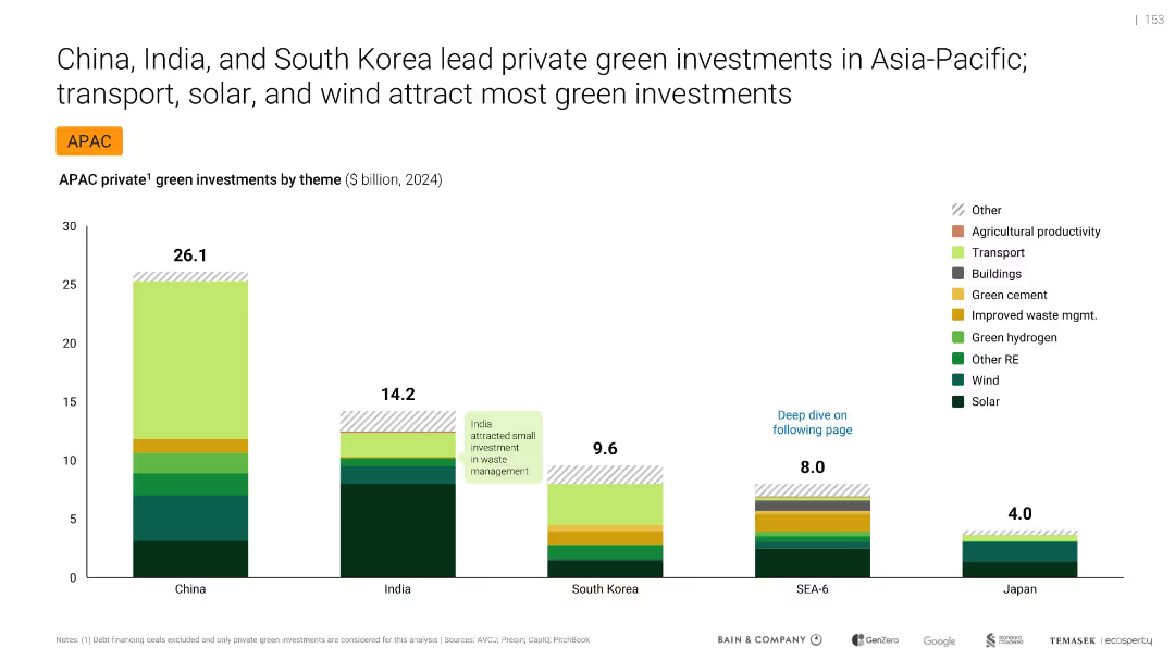
Bar chart comparing green investments by country and theme, labeled and color-coded
Investment Analysis
Environmental Services & Sustainability
Compares private green investments in APAC by theme and country for 2024. China leads with $26.1B, followed by India and South Korea. Main investment themes include solar, wind, and transport. Highlights regional differences and India’s underinvestment in waste management.
green investments, APAC, solar, wind, transport, China, India, South Korea, private capital
false
Investment Analysis
Environmental Services & Sustainability
Single Chart
Bain
Add to my slides
Remove from favorites
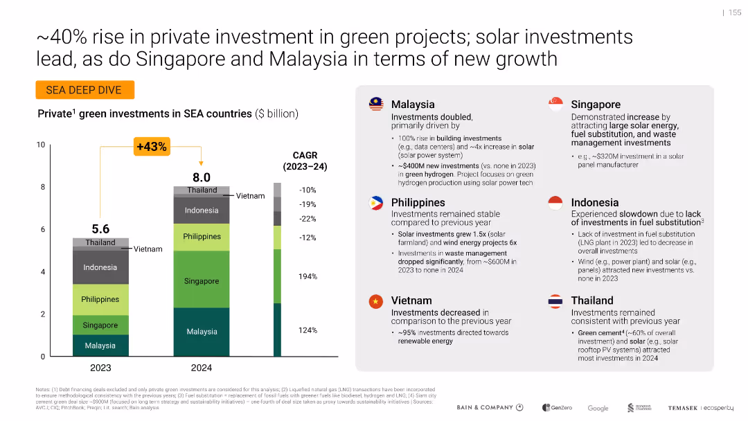
Bar graph on green investment per SEA country, side panel with country-specific insights using icons and flags
Investment Analysis
Environmental Services & Sustainability
Highlights a 43% increase in green investments across SEA countries from 2023 to 2024, driven mainly by Malaysia and Singapore. Provides country-specific breakdowns of contributing factors such as solar energy and data center investments.
Green investment, SEA countries, Malaysia, Singapore, Solar energy, Renewable, Growth, CAGR, Infrastructure, Hydrogen
false
Investment Analysis
Environmental Services & Sustainability
Mixed Chart
Bain
Add to my slides
Remove from favorites
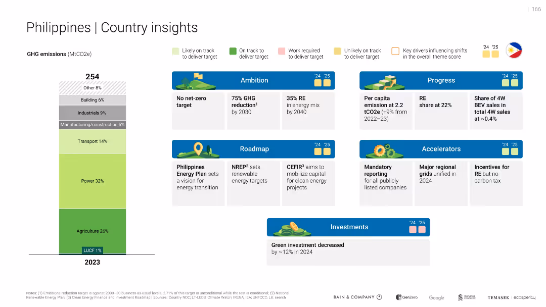
Layout mirrors Indonesia/Malaysia slides, includes emissions bar, ambition, roadmap, and investment status
Strategic Planning
Environmental Services & Sustainability
Highlights Philippines' roadmap (e.g., Energy Plan), green investment drop (~12%), and progress in regulatory frameworks. No net-zero target yet, but 75% GHG reduction goal exists.
green investments, goals
false
Strategic Planning
Environmental Services & Sustainability
Mixed Chart
Bain
Add to my slides
Remove from favorites
Slide displays a mekko chart detailing the value of deals in Singapore by key themes with annotations about top themes by investment types, deal example, and active investors.
Investment Analysis
Energy & Utilities
Analyzes the growth of green investments in Singapore, focusing on sectors like solar energy and alternative proteins. It includes a notable deal example involving Sunseap and EDP Renewables and lists key investors like Temasek and K3 Ventures.
green investment, Singapore, solar, Temasek, Sunseap
false
Investment Analysis
Energy & Utilities
Mixed Chart
Bain
Add to my slides
Remove from favorites
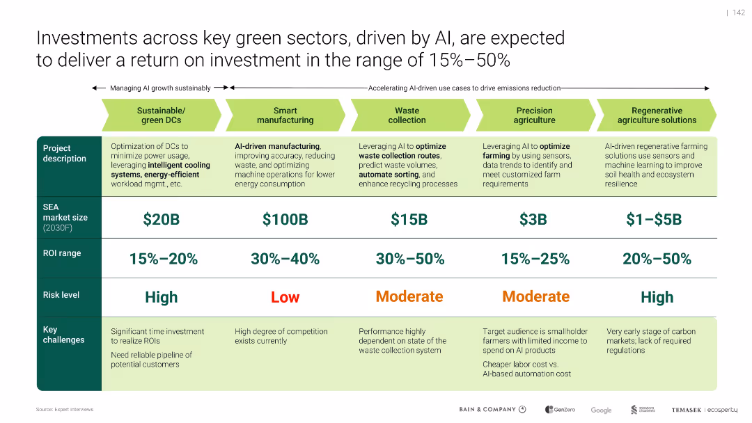
Horizontal sector comparison table with color coding for risk, ROI, and SEA market size
Investment Analysis
Artificial Intelligence
Compares five green investment sectors influenced by AI, such as smart manufacturing and sustainable DCs. Details expected market size, ROI ranges, risk levels, and barriers. Highlights ROI from 15% to 50% and the role of AI in enabling efficiency, particularly in waste collection and regenerative agriculture.
green investments, ROI, AI, smart manufacturing, sustainability, regenerative agriculture, SEA, energy savings
false
Investment Analysis
Artificial Intelligence
Table
Bain
Add to my slides
Remove from favorites
This slide is simple yet striking with a central image of a sprouting plant overlaid with a cross-section line, symbolizing growth and investment in green technologies.
Investment Analysis
Environmental Services & Sustainability
This title slide introduces a section focused on identifying viable near-term investment opportunities in the green sector, setting the stage for detailed discussions on specific areas such as renewable energy or sustainable agriculture.
green investment, sustainability, growth opportunities, sectors
false
Investment Analysis
Environmental Services & Sustainability
Title
Bain
Add to my slides
Remove from favorites
This content slide combines a text block discussing job impacts with two column charts. The left chart compares gray and green job changes under LCE scenarios, while the right chart shows total employment deviations from baseline over time.
Human Resources and Talent Management
Professional Services
The slide highlights the job market shifts due to the green transition, projecting job losses in fossil fuel sectors (gray jobs) and job creation in green sectors (green jobs) by 2050. It emphasizes the need for investment in eco-industries to boost employment and manage the transition smoothly.
Green Jobs, Employment, Workforce, Transition, LCE
false
Human Resources and Talent Management
Professional Services
Multiple Chart
EY
Add to my slides
Remove from favorites
Column chart on right showing emission reduction, text with bullet points on the left
Strategic Planning
Environmental Services & Sustainability
Highlights EY's efforts to reduce CO2 emissions from air travel, outlining strategies and goals
Green mobility, CO2 reduction, travel, emissions, EY
false
Strategic Planning
Environmental Services & Sustainability
Mixed Chart
EY
Add to my slides
Remove from favorites
This slide divides the content into multiple sections, each discussing different market challenges and proposed actions to accelerate the transition to green technologies in SEA.
Market Analysis and Trends
Environmental Services & Sustainability
Provides a detailed analysis of various market challenges and specific actions needed to unlock green opportunities in SEA, emphasizing regulatory and market access improvements to facilitate sustainable practices and investments.
Green Solutions, Market Access, Regulatory Framework, SEA, Sustainability
false
Market Analysis and Trends
Environmental Services & Sustainability
Header Horizontal
Bain
Add to my slides
Remove from favorites
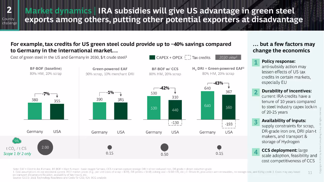
The slide uses a side-by-side comparison format to illustrate the cost differences between green steel production in the US and Germany. It includes column charts with cost breakdowns and a section on potential economic factors affecting these costs. The design is clear and data-focused.
Financial Performance
Industrial & Manufacturing
This slide compares the potential cost savings of US green steel exports versus German green steel, considering the impact of IRA subsidies and highlighting factors that may affect these economics, such as policy responses and input availability.
green steel, IRA, subsidies, cost comparison, US, Germany
false
Financial Performance
Industrial & Manufacturing
Multiple Chart
BCG
Add to my slides
Remove from favorites
This slide focuses on the "Green" aspect of sustainability targets, with a large section of text and a pie chart on the left side illustrating the allocation of a $285 billion fund across various criteria like "Renewable Transportation" and "Energy Efficiency". The right side features a coastal wind farm image.
Financial Performance
Government & Public Sector
Outlining the "Green" component of JPMorgan Chase's $2.5 trillion sustainable development target, the slide emphasizes investments in renewable transportation and energy efficiency. The pie chart offers a visual breakdown of fund allocation, while the image of the wind farm provides a tangible example of such investments. This slide could be presented to stakeholders to showcase the firm's dedication to environmental sustainability.
green, sustainable development, renewable energy, energy efficiency, investment, pie chart, JPMorgan Chase
false
Financial Performance
Government & Public Sector
Mixed Chart
JP Morgan
Add to my slides
Remove from favorites
Circular diagram illustrating the innovation landscape for renewable power integration, covering areas like technology, system operation, market design, and business models.
Technology and Digital Transformation
Environmental Services & Sustainability
The slide presents the interconnected innovations in green technology and renewable power integration. It highlights the synergies between different technologies and business models, emphasizing the role of AI and big data in advancing renewable energy solutions and enhancing system efficiency.
Green Technology, AI, Big Data, Renewable Energy
false
Technology and Digital Transformation
Environmental Services & Sustainability
Diagram
Roland Berger
Add to my slides
Remove from favorites
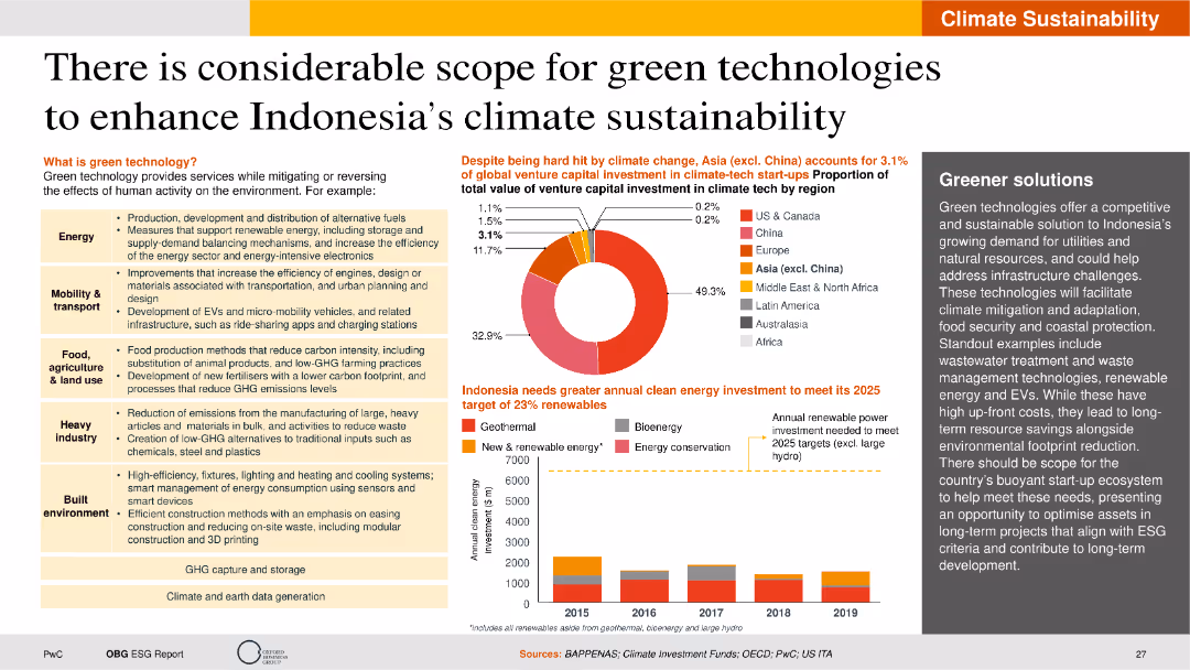
The slide is visually detailed with pie charts, bar charts, and text boxes. It highlights the scope of green technologies in various sectors, including energy, transportation, and agriculture.
Technology and Digital Transformation
Technology & Software
The slide explores the potential of green technologies to improve Indonesia's climate sustainability. It covers various sectors such as energy, mobility, agriculture, and the built environment, highlighting the benefits of green technologies in mitigating environmental impacts. The slide also presents data on venture capital investments in climate tech and the necessary investments for Indonesia to meet its renewable energy targets by 2025.
Green technology, climate sustainability, venture capital, renewable energy, mitigation
false
Technology and Digital Transformation
Technology & Software
Multiple Chart
PwC/Strategy&
Add to my slides
Remove from favorites
The slide features a bar chart comparing system adequacy – loss of load expectations (LOLE) for various countries (Ireland, Germany, Belgium, US, France, UK) expected in 2025, measured in hours/year. Key points about the importance of building a flexible grid are also included.
Strategic Planning
Energy & Utilities
This slide discusses the challenges in building a flexible and intelligent energy grid to handle the increasing load from renewable energy sources. It compares the projected system adequacy across several countries, highlighting the urgent need for grid modernization.
Grid, Flexibility, Intelligent, Energy, LOLE, 2025, Renewable
false
Strategic Planning
Energy & Utilities
Mixed Chart
EY
Add to my slides
Remove from favorites
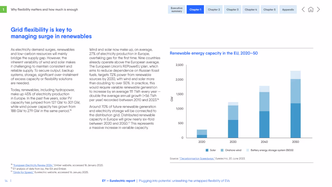
Two-column layout with left-aligned text and a right-aligned vertical bar chart. Light background, blue headers, and minimalist chart design.
Strategic Planning
Energy & Utilities
This slide emphasizes the increasing need for grid flexibility due to a surge in renewable energy generation in Europe. It discusses the growth in solar and wind capacity, REPowerEU targets, and the need for distributed storage.
grid flexibility, renewables, solar, wind, EU, REPowerEU, electricity, energy storage, overcapacity, distribution
false
Strategic Planning
Energy & Utilities
Mixed Chart
EY
Add to my slides
Remove from favorites
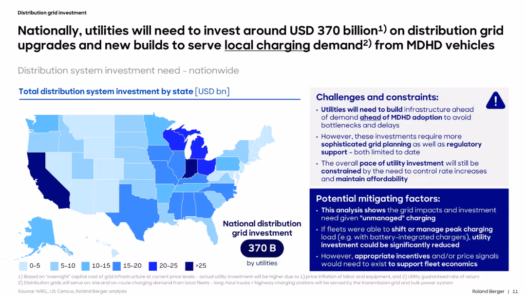
US map of grid investment by state. Right-hand panel lists challenges and mitigation strategies.
Strategic Planning
Energy & Utilities
This slide presents the national-level investment needed to support MDHD vehicle electrification. It breaks down estimated grid upgrade costs by state and outlines infrastructure, regulatory, and cost control challenges facing utility planners.
grid, investment, MDHD, charging, utilities, distribution, electrification, state, planning
false
Strategic Planning
Energy & Utilities
Mixed Chart
Roland Berger
Add to my slides
Remove from favorites
Features bar charts and diagrams related to grid optimization and energy aggregation technologies, including real-time data platforms.
Technology and Digital Transformation
Energy & Utilities
Analyzes how digital solutions like real-time load balancing and energy aggregation can enhance grid efficiency and resilience.
grid optimization, energy aggregation, digital solutions, real-time balancing, electricity grid, efficiency, resilience
false
Technology and Digital Transformation
Energy & Utilities
Mixed Chart
Accenture
Add to my slides
Remove from favorites
This slide features two contrasting bar charts that depict the reliability of grid power supply against the high reliance on generators by MSMEs in Nigeria, detailed with percentages and visual contrasts between reliable and unreliable grid scenarios.
Regulatory and Compliance
Energy & Utilities
Analyzing the impact of grid unreliability in Nigeria, this slide shows a high dependency on generators by MSMEs, with 70% using generators due to unreliable grid power, highlighting the need for improving grid reliability or alternative energy solutions like solar.
grid reliability, generators, MSMEs, Nigeria, energy, solar, reliability, dependency
false
Regulatory and Compliance
Energy & Utilities
Multiple Chart
BCG
Add to my slides
Remove from favorites
Features two column charts comparing access to electricity and reliability of grid power in Nigeria with other countries.
Market Analysis and Trends
Energy & Utilities
Highlights the challenges of grid reliability in Nigeria and its impact on the reliance on solar energy, using comparative data with other countries.
grid reliability, solar energy, Nigeria, electricity access, market impact
false
Market Analysis and Trends
Energy & Utilities
Multiple Chart
BCG
Add to my slides
Remove from favorites
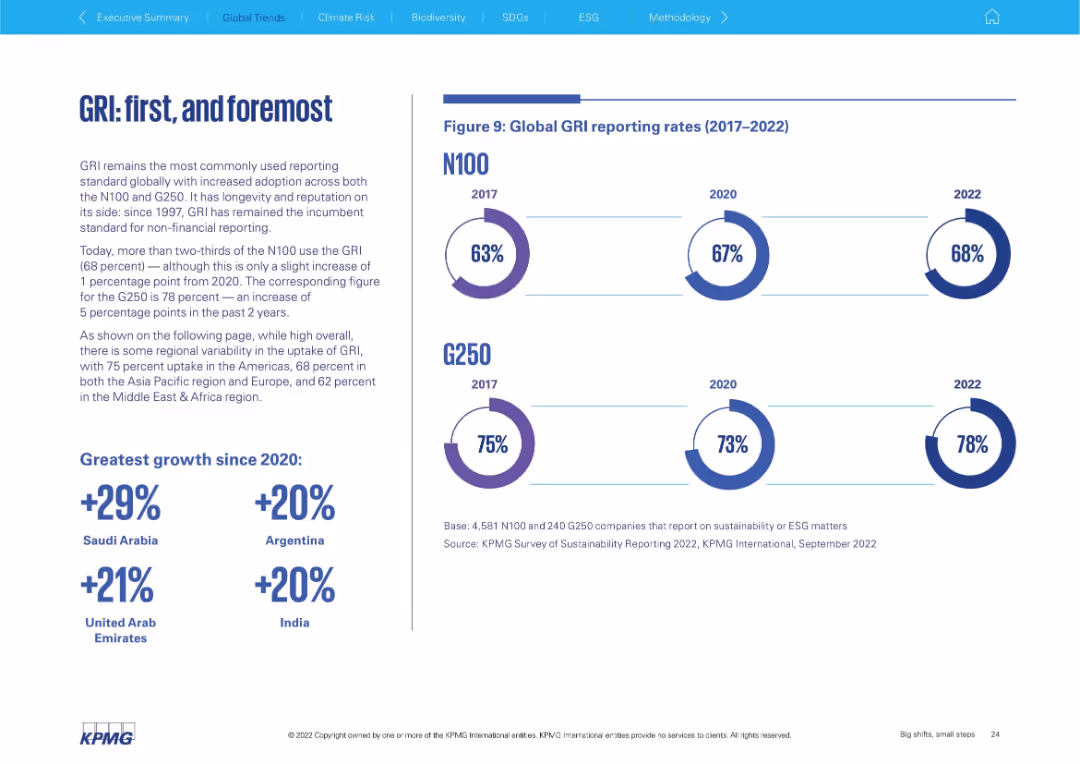
Text block on left explains GRI adoption; right shows circular charts for N100 and G250 (2017–2022)
Regulatory and Compliance
Professional Services
This slide emphasizes the dominant role of the Global Reporting Initiative (GRI) as a non-financial reporting standard. It shows increasing uptake by both N100 (68%) and G250 (78%) from 2017–2022, with top growth in Saudi Arabia and Argentina.
GRI, ESG standards, reporting framework, N100, G250, regulatory compliance, adoption trends
false
Regulatory and Compliance
Professional Services
Mixed Chart
KPMG
Add to my slides
Remove from favorites
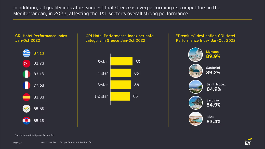
The slide includes bar charts comparing GRI Hotel Performance Index across different Mediterranean countries and hotel categories, with text summarizing key points.
Performance Metrics and KPIs
Hospitality & Tourism
This slide compares the GRI Hotel Performance Index for Greece with other Mediterranean countries and across different hotel categories, showing strong performance in Greece.
GRI Index, hotel performance, Mediterranean comparison, performance metrics, bar charts
false
Performance Metrics and KPIs
Hospitality & Tourism
Mixed Chart
EY
Add to my slides
Remove from favorites
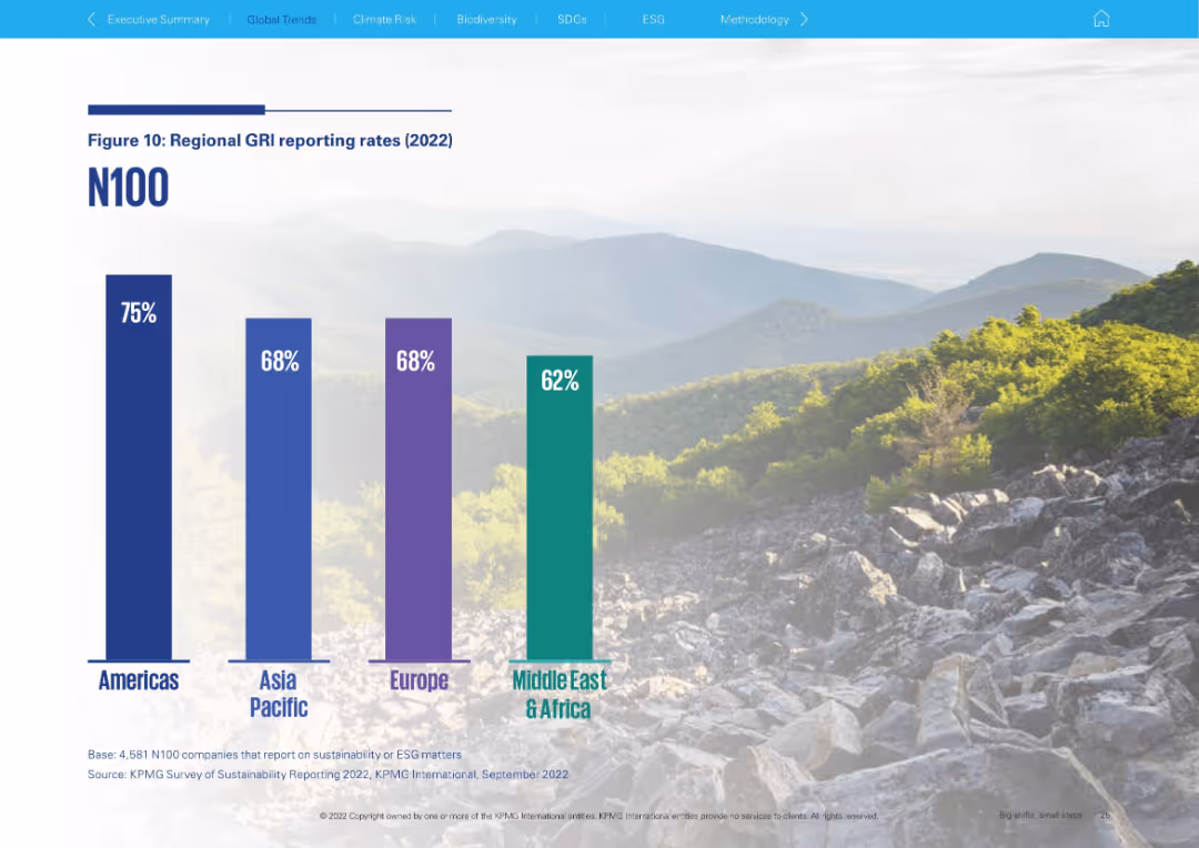
Large vertical bar chart against scenic mountain background; clean layout
Regulatory and Compliance
Professional Services
Depicts the 2022 regional breakdown of GRI reporting rates among N100 companies. The Americas lead at 75%, followed by Asia Pacific and Europe (68%), and Middle East & Africa (62%).
GRI, regional reporting, ESG, Americas, Asia Pacific, Europe, Middle East, benchmarking
false
Regulatory and Compliance
Professional Services
Single Chart
KPMG
Add to my slides
Remove from favorites
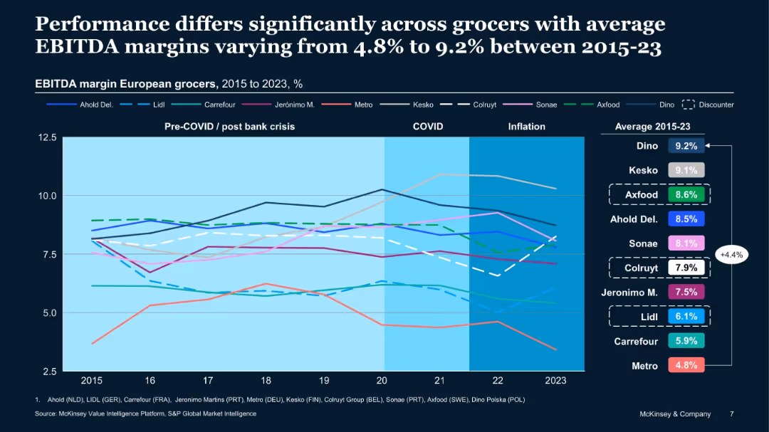
Line graph with multiple company EBITDA trends (2015–2023). Company names color-coded with average EBITDA shown to the right. Background shaded by period (COVID, inflation).
Performance Metrics and KPIs
Retail & E-commerce
Compares performance of major European grocers from 2015 to 2023. Highlights margin variability by company and identifies consistent top performers like Dino and Kesko, while others like Metro underperform. Data contextualized by external shocks.
grocers, margins, KPIs, performance, retailers, comparison
false
Performance Metrics and KPIs
Retail & E-commerce
Single Chart
McKinsey
Add to my slides
Remove from favorites
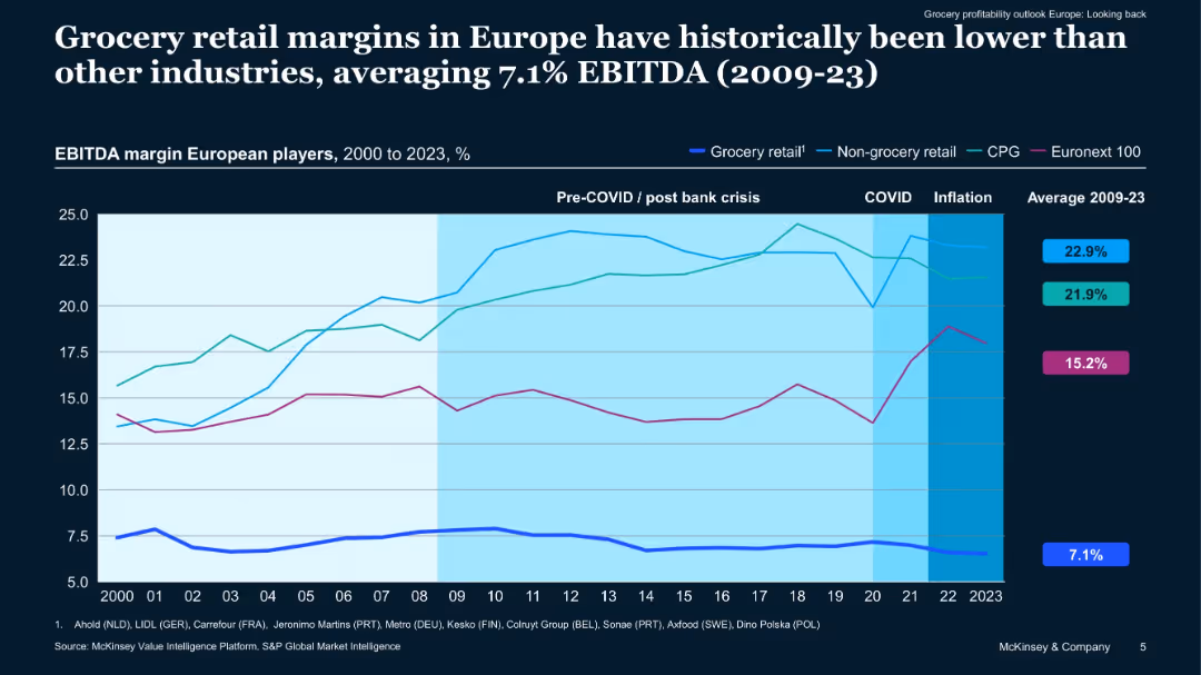
Line graph showing EBITDA margins (2000–2023) by industry segments including grocery, non-grocery, CPG, and Euronext 100. Color-coded lines with shaded periods (COVID, inflation) highlight trends.
Financial Performance
Retail & E-commerce
Shows historical EBITDA margins, indicating that grocery retail consistently underperforms compared to other industries. Analysis spans pre- and post-crisis, COVID, and inflation periods, emphasizing the sector’s structural profitability challenges.
grocery, EBITDA, historical margins, retail, financial trends
false
Financial Performance
Retail & E-commerce
Single Chart
McKinsey
Add to my slides
Remove from favorites
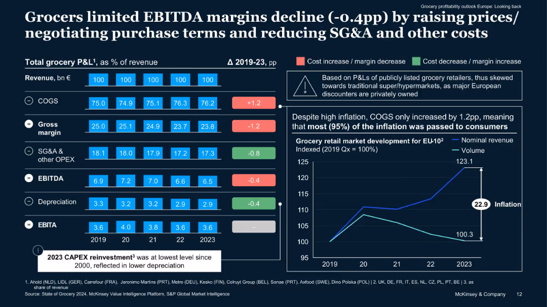
Bar chart with P&L components, color-coded margin changes, and a line graph of inflation vs volume. Uses visual markers for cost/margin impact.
Financial Performance
Retail & E-commerce
This slide dissects the total grocery P&L showing how grocers mitigated margin declines by passing on costs to consumers and reducing SG&A. Despite inflation, EBITDA declined only modestly. Market dynamics and pricing strategies are central themes.
grocery P&L, EBITDA, SG&A, inflation, cost control, price strategy
false
Financial Performance
Retail & E-commerce
Multiple Chart
McKinsey
Add to my slides
Remove from favorites
Line chart forecasting gross loans volume growth from 2010-2023 with different macroeconomic scenarios.
Market Analysis and Trends
Financial Services
The slide forecasts gross loan volumes in Turkey from 2010-2023, detailing various growth scenarios and economic factors.
gross loans, growth forecast, macroeconomic scenarios, financial projections, Turkey
false
Market Analysis and Trends
Financial Services
Mixed Chart
PwC/Strategy&
Add to my slides
Remove from favorites
Bar graphs contrasting the gross margins of private label and branded products, accompanied by distributor case studies.
Financial Performance
Financial Services
This slide highlights how an emphasis on private label products can lead to significantly higher gross margins in distribution businesses.
gross margins, private label, branded products, distribution, profitability, case studies
false
Financial Performance
Financial Services
Single Chart
EY
Add to my slides
Remove from favorites
The slide features a line chart tracking gross margin trends over a fiscal year and detailed tables showing gross margin percentage and account balances.
Financial Performance
Financial Services
This slide presents an analysis of gross margin trends, highlighting discrepancies in August that deviate from expectations, which necessitates further investigation.
gross margin, trend analysis, financial performance, sales, cost of sales
false
Financial Performance
Financial Services
Mixed Chart
EY
Add to my slides
Remove from favorites
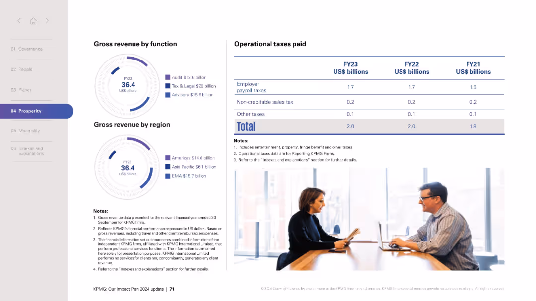
Two radial charts show revenue breakdown by business function and geographic region; table shows tax data.
Financial Performance
Professional Services
Presents KPMG's gross revenue figures for FY23 by both business function (Audit, Tax & Legal, Advisory) and region (Americas, Asia Pacific, EMA). Includes a table summarizing operational taxes paid for FY21–FY23. Visual layout combines infographics and numerical tables for financial clarity.
gross revenue, business function, region, KPMG, financial data, operational taxes, FY23, tax categories
false
Financial Performance
Professional Services
Mixed Chart
KPMG
Add to my slides
Remove from favorites
The slide contrasts ground with air transportation, using a simple table format with icons. It's visually straightforward, comparing with driver/autonomous and crewed/uncrewed categories.
Market Analysis and Trends
Transportation & Logistics
Discusses the potential for disruption in transportation, comparing current and future states of passenger and goods transport both on the ground and in the air.
ground transportation, air mobility, autonomous vehicles, VTOL, hyperloop, drones
false
Market Analysis and Trends
Transportation & Logistics
Header Horizontal
McKinsey
Add to my slides
Remove from favorites
This slide features a single column chart with textual explanations beside it. The slide layout is simple, showing the breakdown of profit before tax for different groups.
Financial Performance
Financial Services
This slide explains the financial performance of different group functions within the organization, detailing profit before tax and other related financial impacts.
Group, Functions, Profit, Breakdown, Tax
false
Financial Performance
Financial Services
Mixed Chart
UBS
Add to my slides
Remove from favorites
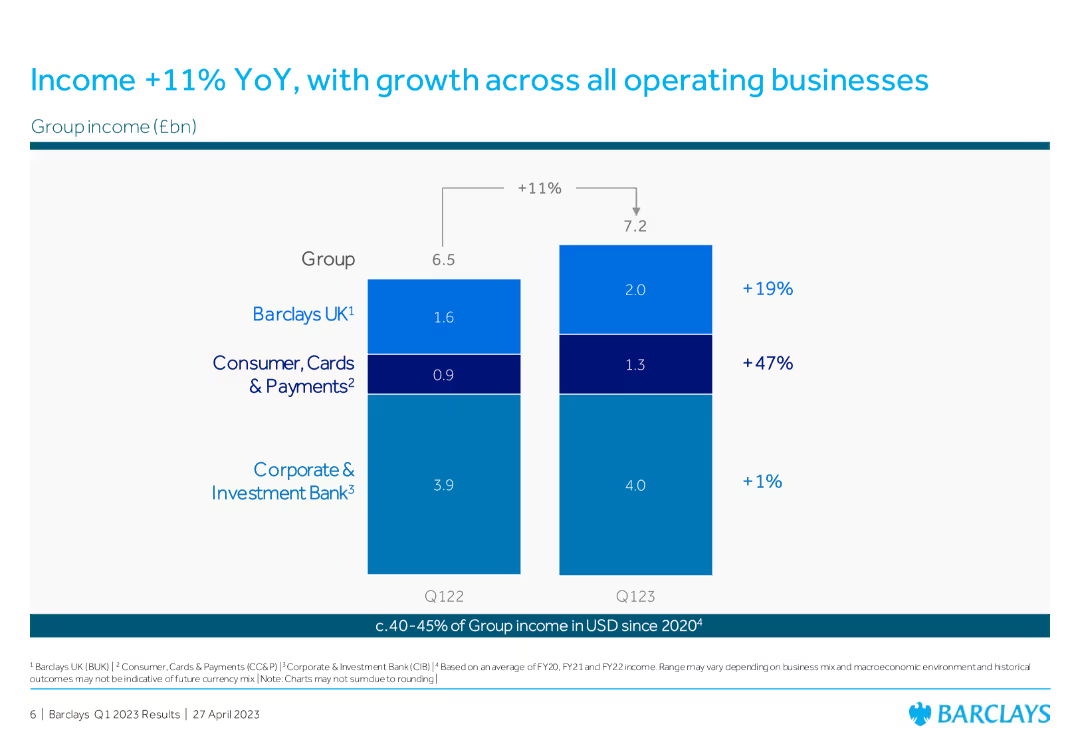
The slide features a column chart comparing group income for Q122 and Q123, breaking down contributions from Barclays UK, Consumer Cards & Payments, and Corporate & Investment Bank, showing YoY growth percentages.
Financial Performance
Financial Services
The slide illustrates the group income growth of 11% YoY, with contributions from Barclays UK, Consumer Cards & Payments, and Corporate & Investment Bank, highlighting the performance of each segment.
group income, YoY growth, Barclays UK, Consumer Cards, Corporate Investment Bank
false
Financial Performance
Financial Services
Single Chart
Barclays
Add to my slides
Remove from favorites
Column charts showing total revenues and profit before tax for different regions, with additional text explanations.
Financial Performance
Financial Services
Details the financial performance by region for Q3 2022, highlighting revenues and profits across various geographies.
Group results, regions, financial performance, UBS, 3Q22, revenues, profit, cost/income ratio
false
Financial Performance
Financial Services
Multiple Chart
UBS
Add to my slides
Remove from favorites
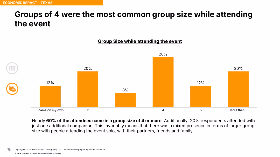
Vertical bar chart showing group sizes from solo to 5+ with orange bars; summary text at bottom.
Customer and Market Segmentation
Hospitality & Tourism
This slide presents data on group sizes of event attendees, showing that the most common size was 4 people. Nearly 60% came in groups of 4 or more, reflecting the event's group appeal.
group size, event attendance, social behavior, tourism, segmentation, group travel, audience analysis
false
Customer and Market Segmentation
Hospitality & Tourism
Single Chart
Nielsen
Add to my slides
Remove from favorites
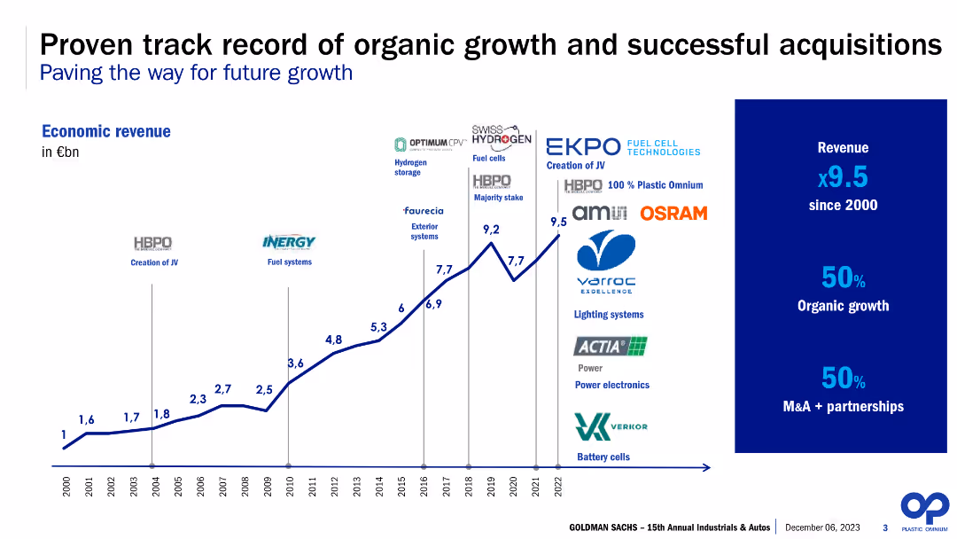
This slide features a line chart with annotations for specific years and acquisitions, a sidebar with bullet points emphasizing revenue growth, and a company logo. The color scheme is blue, green, and black on a white background. The chart is the central visual element, with textual information in the sidebar presented in a clear, hierarchical layout with the use of bold fonts and contrasting colors.
Financial Performance
Industrial & Manufacturing
The slide illustrates the company's economic revenue growth over the years, highlighting significant acquisitions. The sidebar emphasizes a nine-fold increase in revenue since 2000, with equal contributions from organic growth and mergers and acquisitions. It appears to be used for showcasing the company's financial growth trajectory and strategic acquisitions to stakeholders or investors.
Growth, Acquisitions, Revenue, Organic, M&A, Economic, Line Chart, Annotations, Industrial, Strategic
false
Financial Performance
Industrial & Manufacturing
Single Chart
Goldman Sachs
Add to my slides
Remove from favorites
Column chart showing growth, company logos, red stamped labels
Mergers and Acquisitions
Industrial & Manufacturing
Strategies and outcomes of LANXESS's acquisitions
Growth, Acquisitions, Synergy, Integration, Consumer Protection
false
Mergers and Acquisitions
Industrial & Manufacturing
Header Vertical
Morgan Stanley
Add to my slides
Remove from favorites
A timeline chart showing economic revenue growth from 2000 to 2022, marked with key acquisitions and partnerships. Accompanied by bullet points on revenue growth and success rates.
Investment Analysis
Industrial & Manufacturing
This slide highlights the company's history of organic growth and successful acquisitions, showcasing key milestones and revenue growth achieved through strategic partnerships.
growth, acquisitions, timeline, revenue, partnerships
false
Investment Analysis
Industrial & Manufacturing
Mixed Chart
Goldman Sachs
Add to my slides
Remove from favorites
Comprises column charts illustrating the percentage of respondents focusing on growth actions from 2022 to 2023, segmented by region (North America, Europe, Asia), highlighting shifts in strategic focus.
Market Analysis and Trends
Financial Services
Discusses the strategic shifts in growth actions among C-suite executives across various regions from 2022 to 2023, focusing on the increased emphasis on growth despite economic uncertainties.
growth actions, C-suite strategies, economic uncertainty, regional focus
false
Market Analysis and Trends
Financial Services
Multiple Chart
BCG
Add to my slides
Remove from favorites
Column chart showing year-over-year growth in client value (CV) and wallet growth for new and existing clients.
Strategic Planning
Financial Services
This slide explains the growth algorithm for client value and wallet growth, highlighting attrition and new sales.
growth, algorithm, client value, financial services, wallet growth
false
Strategic Planning
Financial Services
Mixed Chart
Gartner
Add to my slides
Remove from favorites
A series of blocks and arrows outline the current state and a 5-year growth plan, with textual and numerical information in a clear, linear fashion. The color scheme is predominantly blue with white text for readability.
Financial Performance
Financial Services
Describes a pro forma simulation for third-party growth, balance sheet management, and future fee-earning potential, including plans for asset under supervision (AUS) growth and capital strategy.
Growth, Balance Sheet, Pro Forma, AUS, Capital
false
Financial Performance
Financial Services
Table
Goldman Sachs
Add to my slides
Remove from favorites
The slide has multiple column charts displaying growth in customer banking and business banking, with annotations for specific years and percentage changes.
Performance Metrics and KPIs
Financial Services
Useful for illustrating growth trends in customer and business banking segments, demonstrating an increase in deposits and market share.
growth, banking, customer, business, deposits, market share, performance, analysis, retail, segmentation
false
Performance Metrics and KPIs
Financial Services
Multiple Chart
JP Morgan
Add to my slides
Remove from favorites
Contains a bar chart with different color indicators.
Strategic Planning
Financial Services
Analyzes investor preferences for corporate priorities, emphasizing growth, cash flow, and gross margin management as top considerations in the current economic climate.
growth, cash flow, margin, strategy, economic
false
Strategic Planning
Financial Services
Single Chart
BCG
Add to my slides
Remove from favorites
Vertical stacked bar chart with color-coded growth segments and legend; text callouts on right.
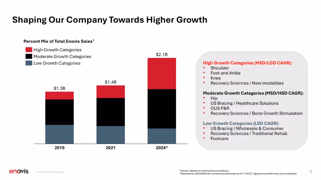
Strategic Planning
Healthcare & Pharmaceuticals
Illustrates shift in sales mix toward high-growth product categories over time (2019 to 2024), categorizing them into high, moderate, and low growth. Highlights strategic prioritization of faster-growing areas like shoulder, knee, and new modalities.
growth categories, product mix, revenue evolution, strategic focus, CAGR, product segmentation
false
Strategic Planning
Healthcare & Pharmaceuticals
Mixed Chart
JP Morgan
Add to my slides
Remove from favorites
This slide focuses on growth strategies through deepening client relationships and seizing market trends, with circular icons and bar chart. The design is clean, and the color theme is consistent with other slides, using shades of blue and white.
Strategic Planning
Financial Services
Detailing strategies for client relationship growth and trend adaptation, this JPMorgan Chase slide showcases investment areas such as data analytics and technology solutions. Suitable for strategic discussions on market trends, client engagement, and innovation in service offerings, particularly in private equity and debt.
Growth, Client Relationships, Market Trends, Data Analytics, Innovative Solutions, Private Equity, Private Debt, Traditional Assets
false
Strategic Planning
Financial Services
Multiple Chart
JP Morgan
Add to my slides
Remove from favorites
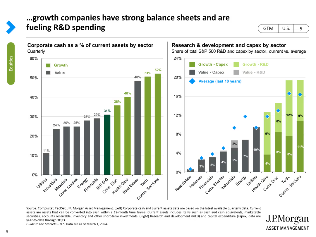
The slide uses column charts to display corporate cash as a percentage of assets by sector and R&D spending across different sectors.
Market Analysis and Trends
Financial Services
It highlights the strong balance sheets of growth companies and their significant investments in research and development.
growth companies, balance sheets, R&D spending, corporate cash, sector analysis
false
Market Analysis and Trends
Financial Services
Multiple Chart
JP Morgan
Add to my slides
Remove from favorites
Two large bar charts comparing revenue and EBIT variations of luxury brands from 2014 to 2017, emphasizing the cost of growth.
Financial Performance
Consumer Goods
Highlights the increasing cost of growth for luxury brands over recent years, using revenue and profit metrics to discuss financial sustainability.
Growth, Cost, Luxury Brands
false
Financial Performance
Consumer Goods
Multiple Chart
Bain
Add to my slides
Remove from favorites
The slide uses a mix of bar and column charts to present data on different levers for operations efficiency radar related to product portfolio.
Strategic Planning
Industrial & Manufacturing
The slide details key levers for growth and customer focus in product portfolios, showing activities and trends over time.
Growth, Customer Focus, Efficiency, Product Portfolio
false
Strategic Planning
Industrial & Manufacturing
Single Chart
Roland Berger
Add to my slides
Remove from favorites
Column chart of profit distribution, infographic elements
Financial Performance
Financial Services
Santander's growth in customer focus and diversification
Growth, Diversification, Customer Focus, Banking, Profit
false
Financial Performance
Financial Services
Mixed Chart
Morgan Stanley
Add to my slides
Remove from favorites
Uses icons and lists to illustrate five key growth drivers, presented in a clean, structured layout.
Investment Analysis
Financial Services
Showcases JPMorgan's focus on key growth drivers such as scaling asset management and expanding global presence, providing an at-a-glance view of their strategic direction and achievements in the context of investment and market expansion.
growth drivers, asset management, global, JPMorgan, strategy
false
Investment Analysis
Financial Services
Pillar
JP Morgan
Add to my slides
Remove from favorites
Combines multiple elements: bar charts on population and purchasing power, column charts detailing coffee consumption and e-commerce sales, and a pie chart comparing premium vs. affordable market sales.
Strategic Planning
Consumer Goods
Discusses multiple drivers for future growth in emerging markets, including demographic trends, consumer behavior, and digital transformation. This slide supports strategic planning by highlighting key areas for investment and development.
growth drivers, emerging markets, strategic planning, digital transformation, consumer trends
false
Strategic Planning
Consumer Goods
Multiple Chart
Deutsche Bank
Add to my slides
Remove from favorites
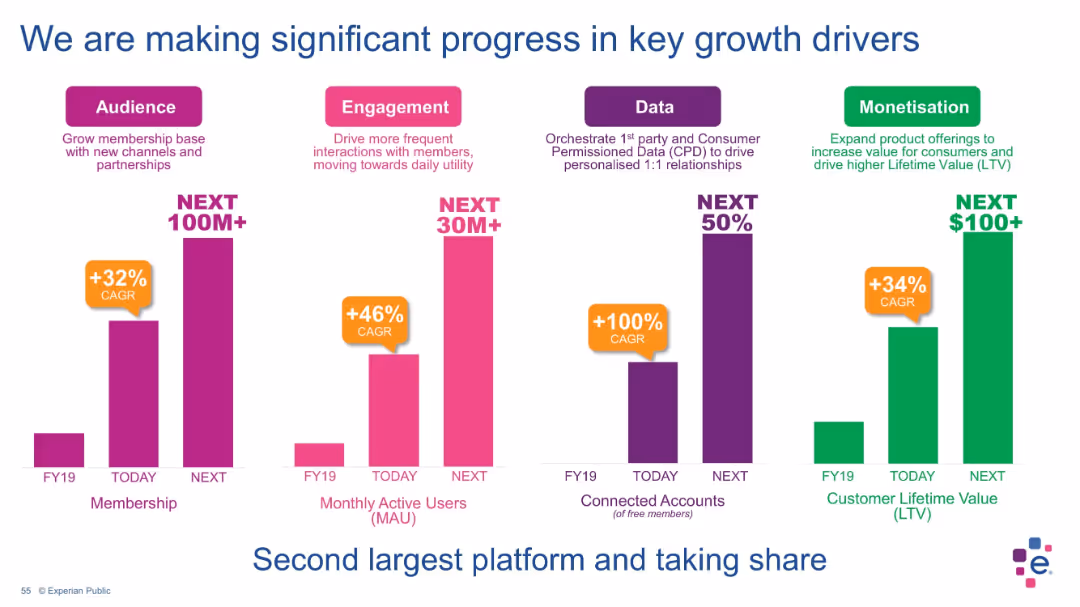
Four-bar vertical graph layout with labeled categories (Audience, Engagement, Data, Monetisation); each shows current value and future projections with CAGR % callouts.
Performance Metrics and KPIs
Financial Services
This slide shows Experian’s progress in key growth areas: audience (membership), engagement (monthly active users), data (connected accounts), and monetization (customer lifetime value). Each metric is supported with a compound annual growth rate and projections for next-stage goals, reinforcing platform scalability and user value expansion.
growth drivers, membership, user engagement, monetization, data utilization, KPIs, Experian, platform growth, customer value, projections
false
Performance Metrics and KPIs
Financial Services
Single Chart
Barclays
Add to my slides
Remove from favorites
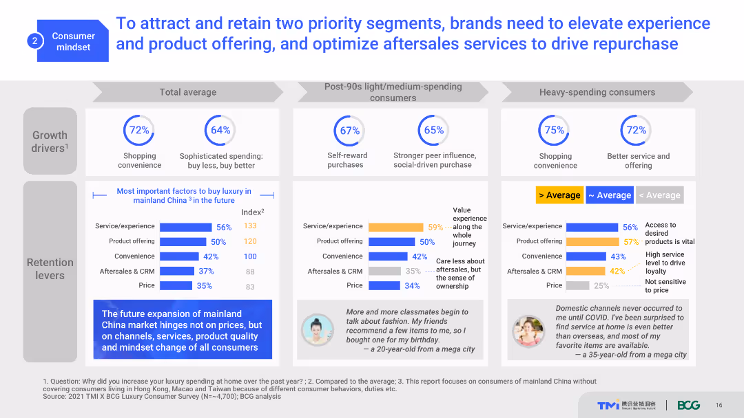
The slide uses a content layout with text, icons, and bar charts. It highlights growth drivers, important factors, and retention levers. The visual elements are organized into sections, making it moderately complex.
Strategic Planning
Consumer Goods
This slide discusses strategies for luxury brands to attract and retain customers by improving service, product offerings, and aftersales support. It highlights key factors influencing consumer purchases and loyalty.
growth drivers, retention, strategy, consumer loyalty, luxury market
false
Strategic Planning
Consumer Goods
Multiple Chart
BCG
Add to my slides
Remove from favorites
Showcases a composite stacked column chart detailing average deposits by branch age cohort, contrasting industry with Chase.
Strategic Planning
Financial Services
Explains the growth in the bank's deposit base and branch network's role as a long-term growth engine, with future deposit projections.
Growth Engine, Branch Network, Deposit Analysis, Financial Planning, Long-Term Strategy, Market Share
false
Strategic Planning
Financial Services
Single Chart
JP Morgan
Add to my slides
Remove from favorites
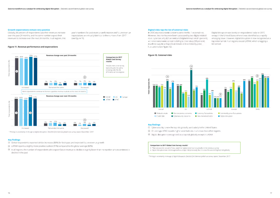
The slide features a detailed analysis of revenue change expectations over the past and next 24 months. It includes column charts and key findings on the positive growth outlook across different regions, and highlights the top external risks impacting businesses.
Market Analysis and Trends
Professional Services
This slide discusses positive growth expectations for revenue over the past and next 24 months, based on Deloitte's survey. It includes an analysis of external risks and key findings, showing a generally optimistic outlook across various regions.
growth expectations, revenue, positive outlook, Deloitte, external risks
false
Market Analysis and Trends
Professional Services
Multiple Chart
Deloitte
Add to my slides
Remove from favorites
Slide displays bar charts reflecting investor priorities in different financial aspects with a focus on growth and resilience. Notable changes from a prior survey are indicated.
Strategic Planning
Financial Services
Discusses investor expectations for companies to focus on growth and financial resilience, particularly relevant for corporate strategy and financial planning.
growth, financial resilience, investor expectations, corporate strategy, financial planning
false
Strategic Planning
Financial Services
Single Chart
BCG
Add to my slides
Remove from favorites
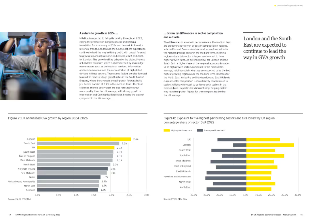
Features a small image of a person in a lab with two column charts showing annualized GVA growth by region and sector exposure percentages.
Strategic Planning
Government & Public Sector
Projects economic growth for 2024 and beyond, highlighting sectors and regions expected to lead in GVA growth, driven by sector composition.
growth forecast, 2024, GVA, regions, sectors, column chart
false
Strategic Planning
Government & Public Sector
Multiple Chart
EY
Add to my slides
Remove from favorites
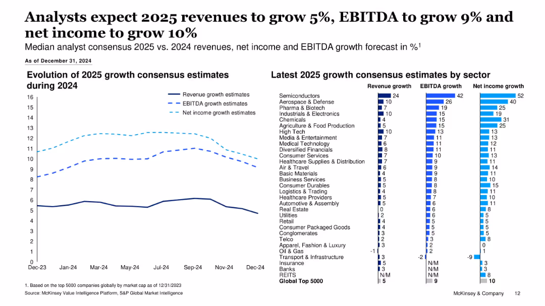
Combination of line chart and bar chart; left side tracks consensus growth estimate evolution, right side shows sector-specific 2025 growth forecasts.
Financial Performance
Financial Services
This slide outlines 2025 growth expectations for revenue, EBITDA, and net income across major sectors. Analysts forecast moderate growth, with semiconductors leading in all three metrics. Visuals show how estimates evolved over 2024.
Growth Forecast, Revenue, EBITDA, Net Income, 2025 Estimates, Sector Analysis, Consensus Estimates, Financial Performance
false
Financial Performance
Financial Services
Multiple Chart
McKinsey
Add to my slides
Remove from favorites
The slide includes two charts: one showing the change in IMF growth forecasts and another depicting current account changes as a percentage of GDP. The layout is clear and comparative.
Market Analysis and Trends
Financial Services
The slide discusses the positive correlation between emerging market FX performance and good growth/strong external balances, supported by IMF growth forecasts and current account data.
growth forecasts, current account, GDP, emerging markets, FX performance
false
Market Analysis and Trends
Financial Services
Multiple Chart
Morgan Stanley
Add to my slides
Remove from favorites
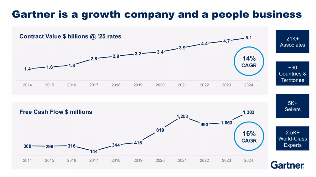
Two line graphs (contract value and free cash flow from 2014–2024) with supporting metrics on employee base; clean blue-and-white layout.
Strategic Planning
Technology & Software
Gartner highlights its sustained growth in contract value and free cash flow, with 14% and 16% CAGR respectively. The slide also emphasizes the scale of its workforce and global reach, supporting its position as a growth-focused company.
growth, Gartner, free cash flow, contract value, CAGR, global team
false
Strategic Planning
Technology & Software
Multiple Chart
Gartner
Add to my slides
Remove from favorites
The slide highlights Gartner’s growth with icons and figures representing revenues, countries, and associates. It lists accolades and major enterprise functions served.
Industry Overview
Professional Services
It provides an overview of Gartner’s growth, market presence, and the value it delivers through actionable insights and serving major enterprise functions.
Growth, Gartner, revenues, associates, enterprise functions, insights
false
Industry Overview
Professional Services
Pillar
Gartner
Add to my slides
Remove from favorites
Slide shows column charts comparing GDP, IT & Business Services, and Accenture's CAGR across different fiscal years, using shades of purple.
Financial Performance
Technology & Software
This slide illustrates Accenture’s growth compared to general economic indicators like GDP and sector-specific growth in IT and Business Services, highlighting the company's strong market performance.
growth, GDP, IT, services, CAGR, Accenture, market performance, economic, sector-specific, comparison
false
Financial Performance
Technology & Software
Multiple Chart
Accenture
Add to my slides
Remove from favorites
Previous
Next
You don't have any favorites yet.
Please wait loading your favorites slides...
Create a FREE account to continue browsing
Receive Instant Access to 1,000+ slides from companies like McKinsey, Google, and Goldman Sachs
First Name
Last Name
Email
Password
I agree to all
Terms & Privacy Policy
Thank you! Your submission has been received!
Oops! Something went wrong while submitting the form.
Have an account?
Sign in
Upgrade to PRO to Save slides
Advanced Search and Filters
Access to 15,000+ slides
Access to Category Pages
Save/Bookmark Slides
PowerPoint Template Library
Pick a Plan
MONTHLY
$12/month
Billed every month, Cancel anytime.
YEARLY
$9/year
Billed $108 annually, Cancel anytime.
Checkout for $12/month
Checkout for $108/yr
Secured by Stripe | AES-256 bit encryption


![Exhibit 16 Gross loans volume expected growth [TRY bn, 2010-23]](https://cdn.prod.website-files.com/654e70fb59937215cac87b19/6877e1fdf9a180cbc7296d30_A5ryN4QHyRoGmuS1MvsIOBFphbDtrNF_fNA1G5ff5oI.avif)