My Account
My Slides
Search by Category
Companies
Slide Type
Use Case
Industry
Pricing
Templates
View All Templates
Download Template Slides
✦ AI
AI Prompt Library
AI Search
Feedback
Login
Logout
Get Started
Browse all Slides
Browse all Slides
Create a FREE Account
Instant access to 1,000+ real slides from top companies like McKinsey, BCG, Goldman Sachs, Google and many more!
First Name
Last Name
Email
Password
I agree to all
Terms & Privacy Policy
Thank you! Your submission has been received!
Oops! Something went wrong while submitting the form.
Have an account?
Sign in
Saved Slides
Total No. of slides saved
0
↻ Refresh
✖ Clear all
Includes two line graphs illustrating pre-tax income projections over a timeline, with legends and annotations.
Investment Analysis
Financial Services
Discusses future income estimates related to growth initiatives, aiming for a positive return on investment, suitable for investor relations or financial planning.
Growth Initiatives, Income Projections, Investment, ROI, Financial Planning, Trends, Analysis
false
Investment Analysis
Financial Services
Single Chart
Goldman Sachs
Add to my slides
Remove from favorites
This slide features a dual column chart showing growth in the Chinese luxury market from 2015 to 2024 and the projected global market share in 2017 and 2024.
Market Analysis and Trends
Consumer Goods
Discusses the growth of Chinese luxury consumers and their impact on the global luxury market. Provides projections for future growth and market share.
growth, luxury, China, market, projection, consumer, global, retail, forecast, 2024
false
Market Analysis and Trends
Consumer Goods
Multiple Chart
BCG
Add to my slides
Remove from favorites
Contains a column chart with multiple bars representing market growth rates in various luxury goods categories such as shoes, jewelry, and bags from 2016 to 2017.
Market Analysis and Trends
Retail & E-commerce
Highlights growth trends in different luxury product categories, showing how key segments like jewelry and beauty products are driving industry growth.
Growth, Luxury Goods, Analysis
false
Market Analysis and Trends
Retail & E-commerce
Single Chart
Bain
Add to my slides
Remove from favorites
This slide features two column charts comparing firmwide management fees and AUS across several years. It is informative with additional key figures and growth opportunities listed, emphasizing on the increasing trend in a visually distinct manner with the use of color and size.
Financial Performance
Financial Services
Analyzes growth in management fees and AUS, showcasing the firm's growing financial stature and market opportunities, suitable for financial planning and forecasting discussions.
Growth, management fees, AUS, financial analysis
false
Financial Performance
Financial Services
Mixed Chart
Goldman Sachs
Add to my slides
Remove from favorites
Comparison of core client relationships and wealth held away from 2019 to 1Q 2022, shown with increase multipliers. Clean design with blue and green color coding.
Market Analysis and Trends
Financial Services
Illustrates the growth of Morgan Stanley's business and the concurrent expansion of market opportunity over time.
Growth, market opportunity, Morgan Stanley, core client relationships, wealth management, expansion
false
Market Analysis and Trends
Financial Services
Multiple Chart
Goldman Sachs
Add to my slides
Remove from favorites
The slide has three key sections with check marks, column charts showing revenue targets, and partnership logos for Apple and GM. The design is blue and white with teal highlights.
Market Analysis and Trends
Financial Services
This slide presents projected financial growth, emphasizing the market size, customer increase, and partnerships. It aims to showcase a long-term growth strategy using visual data representations, highlighting partnerships with major brands and future financial targets.
growth, market size, customers, partnerships, revenue
false
Market Analysis and Trends
Financial Services
Multiple Chart
Goldman Sachs
Add to my slides
Remove from favorites
Column chart showing the growth of video-based media and entertainment market size in India with projections until 2025, including LTV, OTT, and movie studios.
Market Analysis and Trends
Media & Entertainment
This slide discusses the growth of video-based media and entertainment in India, projecting a 12% CAGR until 2025, focusing on LTV, OTT, and movie studios.
growth, media, entertainment, India, projections
false
Market Analysis and Trends
Media & Entertainment
Mixed Chart
BCG
Add to my slides
Remove from favorites
Contains column charts with a trend line illustrating the bank's 10-year performance, including ROE, pretax income, and card sales market share. The layout is data-centric with a clear hierarchy.
Financial Performance
Financial Services
The slide is a retrospective view of the bank's decade-long performance metrics and market share growth, demonstrating sustained profitability and market presence.
growth metrics, profitability, market share, financial analysis, long-term performance
false
Financial Performance
Financial Services
Single Chart
JP Morgan
Add to my slides
Remove from favorites
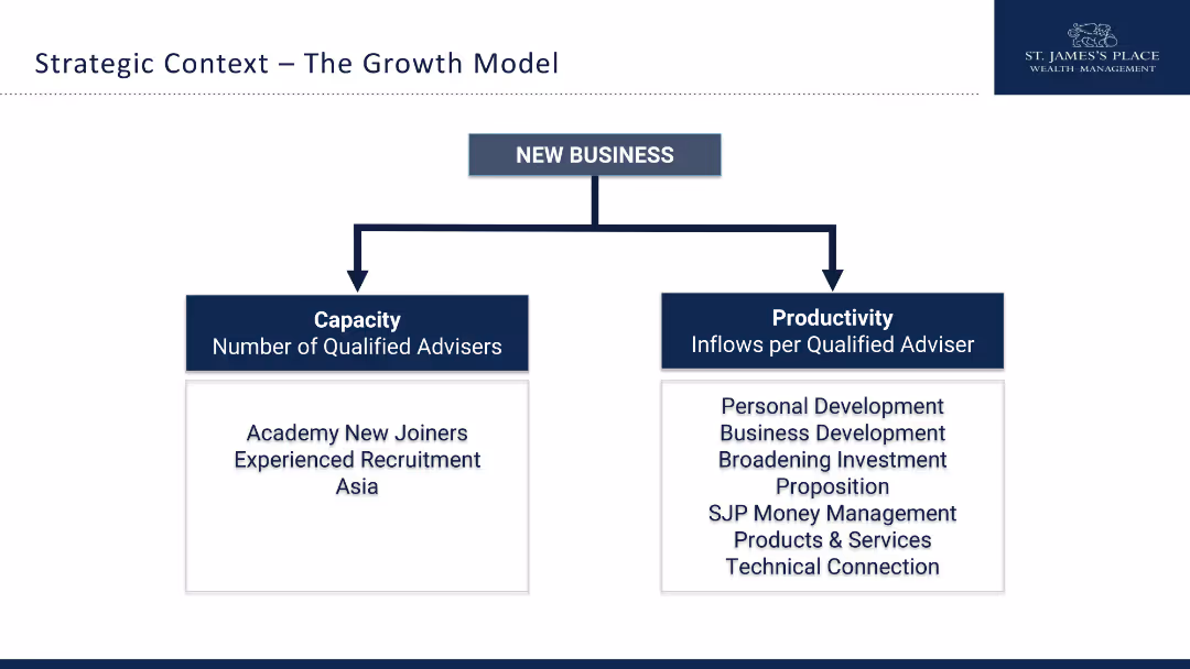
The slide features a hierarchical diagram with two main branches: Capacity and Productivity. Simple design.
Strategic Planning
Financial Services
This slide outlines the strategic growth model for new business, focusing on increasing the number of advisors and their productivity.
growth model, capacity, productivity, strategy, advisors, recruitment, development, financial services
false
Strategic Planning
Financial Services
Diagram
Deloitte
Add to my slides
Remove from favorites
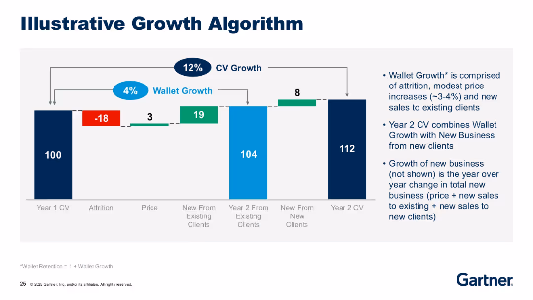
Waterfall chart visualizing client value growth from attrition, price, and new business; annotations explain wallet growth and CV growth components.
Strategic Planning
Technology & Software
This slide explains Gartner's growth model for client value, breaking it into wallet growth (existing clients) and new business (new clients). It uses a waterfall chart to illustrate how client value progresses year-over-year.
growth model, CV growth, wallet growth, attrition, Gartner, waterfall
false
Strategic Planning
Technology & Software
Mixed Chart
Gartner
Add to my slides
Remove from favorites
The slide features a column chart displaying rolling three-year net new assets in billions ($Bn) from 2016-2018 to 2021-2023, with bars increasing in height from left to right.
Financial Performance
Financial Services
The slide demonstrates Morgan Stanley's strong growth in net new assets over three-year periods, highlighting significant increases from 2016-2018 to 2021-2023.
Growth, Net New Assets, Financial Performance, Morgan Stanley, Column Chart, 2016-2023, Billion Dollars, Increasing Trend
false
Financial Performance
Financial Services
Single Chart
Morgan Stanley
Add to my slides
Remove from favorites
Column chart showing the share of new services in total revenue from 2019 to 2022, along with a description of four categories of new services focusing on technology and real-time data collection.
Market Analysis and Trends
Technology & Software
The slide highlights the growth in new services driven by technology, detailing the increase in revenue share and categories like real-time data collection and big data analysis.
growth, new services, technology, revenue, data analysis
false
Market Analysis and Trends
Technology & Software
Mixed Chart
IPSOS
Add to my slides
Remove from favorites
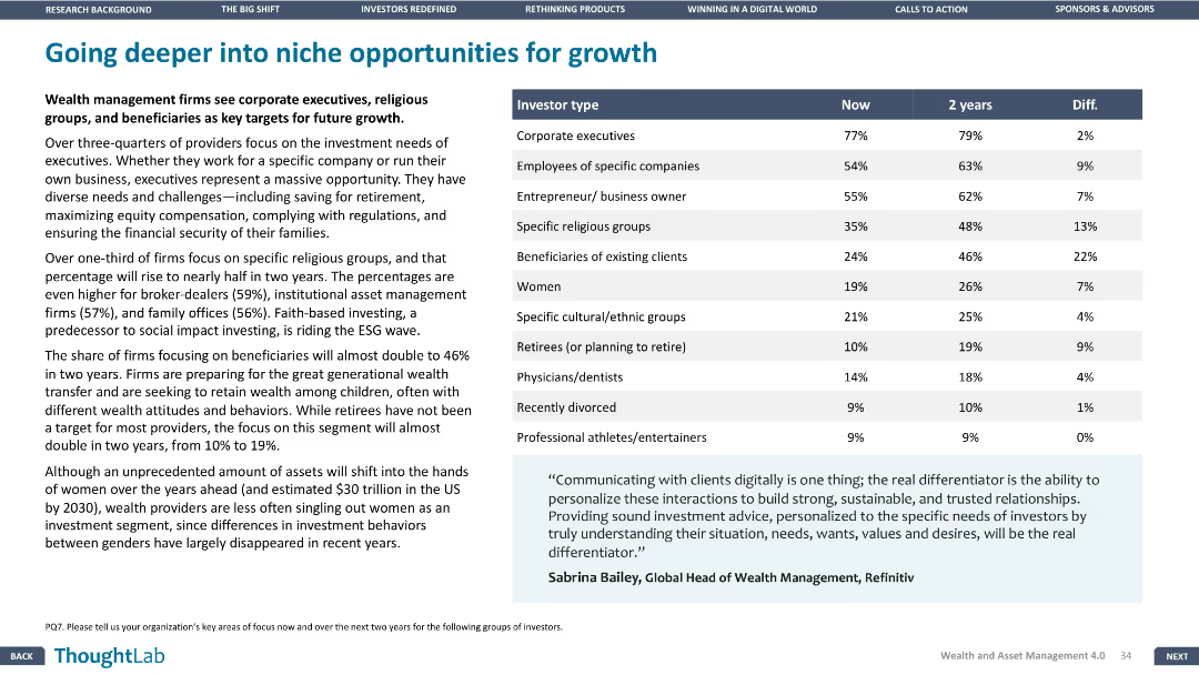
Column chart showing focus areas for future growth, categorized by investor type. Design is clear, with structured visual data presentation.
Strategic Planning
Financial Services
Examines niche opportunities for growth in wealth management, focusing on specific investor types like corporate executives, religious groups, and women.
growth, niche, investors, opportunities, wealth
false
Strategic Planning
Financial Services
Table
Deloitte
Add to my slides
Remove from favorites
A graphically intensive slide illustrating growth opportunities and textual information on a dark background.
Investment Analysis
Financial Services
This slide outlines the estimated growth opportunities across different financial sectors, highlighting the engineering support for these initiatives.
Growth, Opportunities, Franchise, Investing, Banking, Revenue, Engineering
false
Investment Analysis
Financial Services
Vertical Flow
Goldman Sachs
Add to my slides
Remove from favorites
Displays contrasting column charts comparing planned growth actions among leaders and industry peers in areas like innovation and hiring, set against a nature-themed backdrop.
Strategic Planning
Financial Services
Discusses how industry leaders differ from their peers in terms of investing resources into growth opportunities, particularly focusing on areas like technology innovation and new talent acquisition.
growth opportunities, industry leaders, technology innovation, talent acquisition
false
Strategic Planning
Financial Services
Mixed Chart
BCG
Add to my slides
Remove from favorites
Combines text and icons to outline industry trends and growth opportunities, focusing on tech and analytics, and IPO market evolution.
Strategic Planning
Technology & Software
Identifies growth opportunities in a changing industry landscape, focusing on technological advancements and market evolution.
Growth Opportunities, Industry Trends, Technology, IPO Market, Private Capital, International Expansion, Digital Transformation
false
Strategic Planning
Technology & Software
Table
JP Morgan
Add to my slides
Remove from favorites
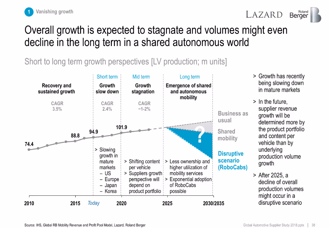
Line graph showing LV production growth phases from 2010 to 2035.
Strategic Planning
Industrial & Manufacturing
Projects light vehicle production growth phases, noting a shift to shared mobility and potential volume decline in the long term (post-2025).
growth outlook, shared mobility, RoboCabs, LV production, forecast
false
Strategic Planning
Industrial & Manufacturing
Mixed Chart
Roland Berger
Add to my slides
Remove from favorites
Comprising of bar charts and textual sections, this slide visually presents Barclays' capabilities and achievements in the US partner card market. It highlights their growth in partner card receivables and reasons partners choose Barclays, like track record and partnership focus.
Market Analysis and Trends
Financial Services
This slide discusses Barclays' strategic advantages in the US partner card market, showcasing their growth in partner card receivables and reasons why partners opt for Barclays, emphasizing their specialized capabilities.
growth, partner market, receivables, partnership focus, integration
false
Market Analysis and Trends
Financial Services
Mixed Chart
Barclays
Add to my slides
Remove from favorites
The slide shows two main sections: "Funds" with a column indicating up to 900 million euros, and "Usage" with various allocations such as acquisitions and CAPEX. The design is structured and clear, with color-coded segments.
Strategic Planning
Financial Services
The slide details Ipsos' growth plan for 2025, outlining cash allocation strategies including acquisitions, investment in CAPEX, dividends, and share buybacks, aimed at maximizing financial growth and shareholder value.
growth plan, cash allocation, acquisitions, CAPEX, dividends
false
Strategic Planning
Financial Services
Multiple Chart
IPSOS
Add to my slides
Remove from favorites
This slide uses a timeline layout with three phases represented as boxes progressing from left to right. The first phase, "Stabilizing, restructuring and planning (2023)," is in a light beige box. The second phase, "Restructuring, integrating and optimizing (2024 - 2026)," is in a medium beige box. The third phase, "Capturing sustainable growth and long-term value creation," is in a dark grey box. Below each box, there is a short description and a small arrow icon between the phases.
Strategic Planning
Financial Services
The slide outlines a phased plan to achieve long-term growth and value creation. Each phase has specific goals: achieving profitability in 2023, restructuring and optimizing from 2024 to 2026, and sustaining growth and delivering returns beyond 2026. The slide can be used to present a strategic plan to stakeholders.
growth, planning, restructuring, profitability, strategy
false
Strategic Planning
Financial Services
Linear Flow
UBS
Add to my slides
Remove from favorites
The slide is dense with a timeline chart showing milestones in organic growth, acquisitions, and regional expansion from FY70 to FY19, and staff headcount noted for certain years.
Financial Performance
Financial Services
This slide depicts Macquarie's financial growth trajectory over decades, highlighting significant business expansions and staff growth. Useful for analyzing historical profitability and growth strategies.
growth, profitability, timeline, acquisitions, expansion, financial, history, business, strategy, staff
false
Financial Performance
Financial Services
Single Chart
Goldman Sachs
Add to my slides
Remove from favorites
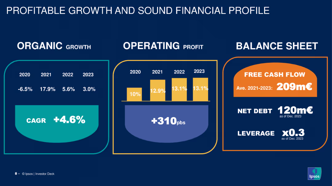
The slide features a three-column layout with data on organic growth, operating profit, and balance sheet metrics. Uses a combination of column charts and callouts.
Financial Performance
Financial Services
Shows the company's financial performance from 2020 to 2023 with metrics on organic growth, operating profit, and balance sheet, highlighting free cash flow and net debt.
growth, profit, balance sheet, financial performance, metrics
false
Financial Performance
Financial Services
Mixed Chart
IPSOS
Add to my slides
Remove from favorites
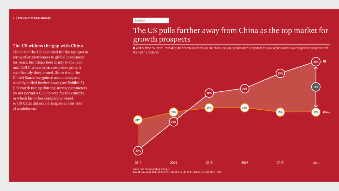
This slide has a line chart tracking the growth prospects for the US and China from 2013 to 2018, with distinct lines for each country.
Market Analysis and Trends
Financial Services
It shows that the US has increasingly pulled ahead of China as the top market for growth prospects, highlighting the US's sustained dominance in attracting investments.
growth prospects, US, China, market dominance, 2013-2018, line chart, financial survey, PwC, CEO Survey
false
Market Analysis and Trends
Financial Services
Mixed Chart
PwC/Strategy&
Add to my slides
Remove from favorites
Features multiple column charts showing how high-growth brands prioritize company purpose across various business aspects.
Strategic Planning
Professional Services
Details how high-growth brands integrate purpose into their operations and decision-making, enhancing corporate strategy.
growth, purpose, brands, strategy, corporate, business, marketing
false
Strategic Planning
Professional Services
Mixed Chart
Deloitte
Add to my slides
Remove from favorites
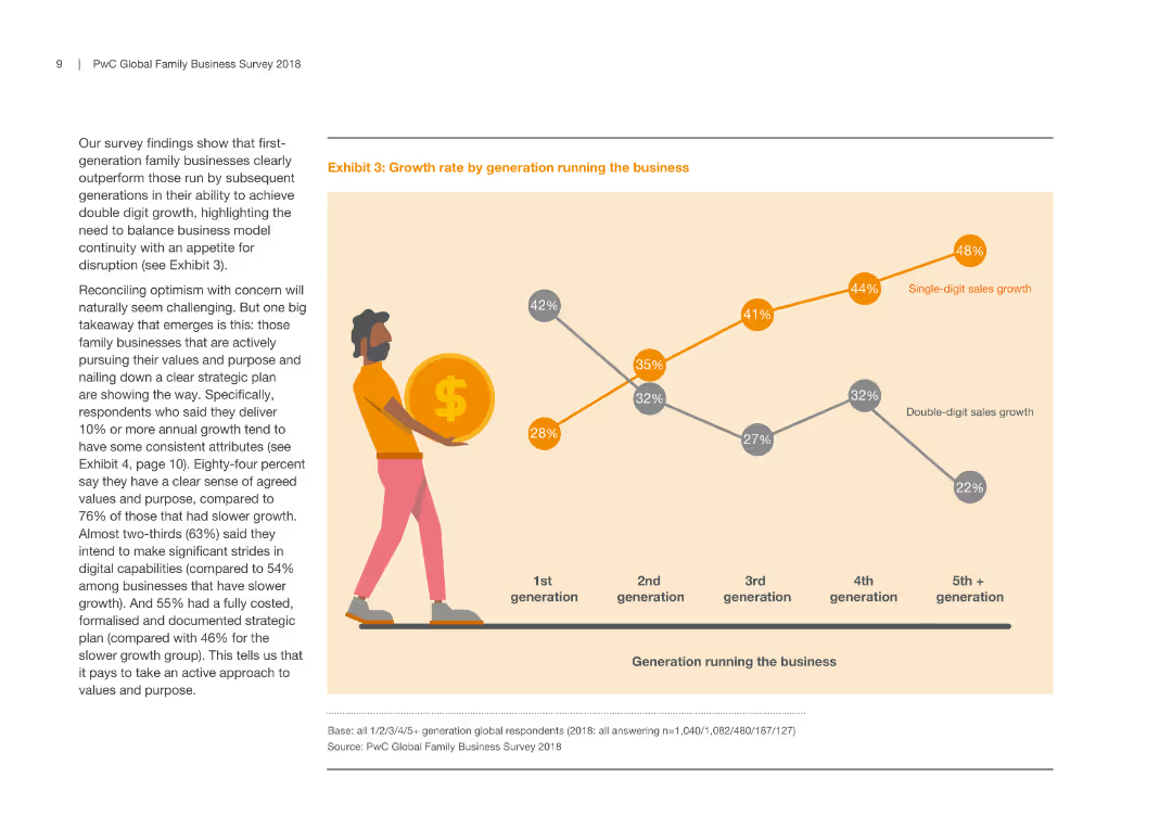
The slide includes a line graph showing growth rates by generation running the business. It has a simple design with one primary visual element.
Human Resources and Talent Management
Professional Services
This slide presents data on how different generations in family businesses achieve varying growth rates, highlighting the importance of strategic planning across generations.
growth rate, family business, generation, strategic planning, business performance
false
Human Resources and Talent Management
Professional Services
Mixed Chart
PwC/Strategy&
Add to my slides
Remove from favorites
This slide includes a horizontal bar chart displaying growth rates for various E&M segments from 2019 to 2024. Each bar is color-coded for different regions (India and Global), with segments like OTT video and VR exhibiting the highest growth. The design is straightforward with clear labels for easy comprehension.
Market Analysis and Trends
Media & Entertainment
Analyzes growth rates across different E&M segments, with a particular focus on high-growth areas such as OTT and VR, indicating potential investment or development areas. It serves to guide decisions on where businesses might focus their resources to capitalize on rapid market changes, especially in the context of emerging technologies in media.
growth rates, E&M segments, OTT, VR, market
false
Market Analysis and Trends
Media & Entertainment
Single Chart
PwC/Strategy&
Add to my slides
Remove from favorites
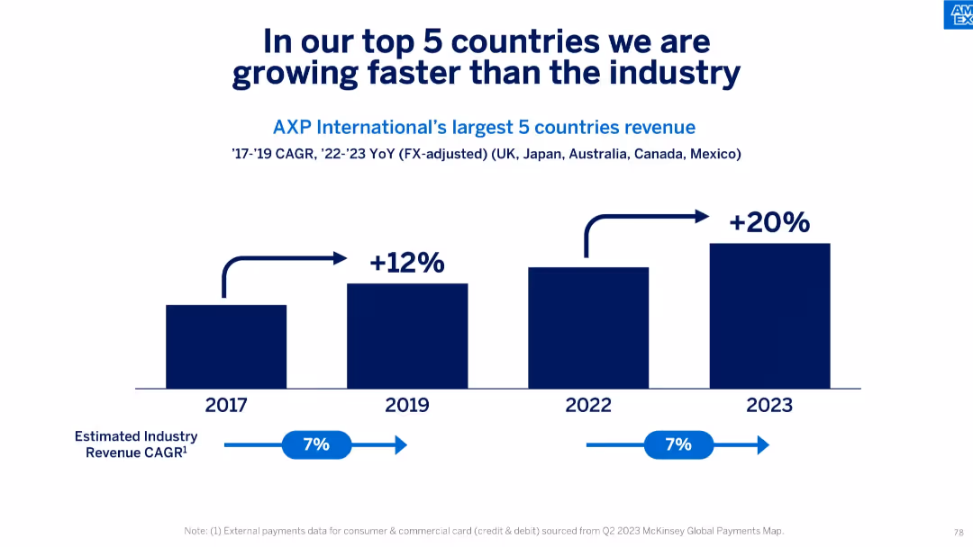
Simple stacked bar chart comparing growth percentages vs industry, 2017–2023.
Competitive Landscape
Financial Services
This slide compares AXP’s growth in its top 5 international markets (UK, Japan, Australia, Canada, Mexico) to the estimated industry CAGR of 7%, highlighting that AXP’s revenue grew significantly faster—20% in 2023 alone.
growth rate, top markets, international expansion, industry benchmark, CAGR, revenue, FX-adjusted, competitive edge
false
Competitive Landscape
Financial Services
Single Chart
McKinsey
Add to my slides
Remove from favorites
This slide shows a column chart illustrating a 10-year financial performance with another line graph overlay showing the growth rate. It uses shades of blue to distinguish years and performance metrics, with annotations for key statistics.
Financial Performance
Financial Services
Designed for financial review, the slide shows long-term growth and returns, making it suitable for investor presentations, annual reports, and financial analysis discussions.
growth, returns, financial, performance, analysis, long-term, metrics, banking, investment, trends
false
Financial Performance
Financial Services
Single Chart
JP Morgan
Add to my slides
Remove from favorites
The slide uses column charts to illustrate growth in advisors, client assets, and deposits, with a blue and green color scheme to represent different data segments over a five-year span.
Financial Performance
Financial Services
It outlines the firm's growth in terms of revenue, advisor count, client assets, and deposits, highlighting a significant positive trend in financial growth indicators.
growth, revenue, advisors, client assets, deposits
false
Financial Performance
Financial Services
Multiple Chart
Goldman Sachs
Add to my slides
Remove from favorites
The slide features three sets of column charts with color-coded bars representing revenue, pre-tax income, and assets under supervision over multiple years. Red and green arrows denote annual increases or decreases. There are also percentage values and text boxes providing a 10-year summary including recurring revenue, pre-tax margin, ROE, and net charge-off rate.
Financial Performance
Financial Services
Showcasing financial stability, the slide presents a multi-year overview of revenue, pre-tax income, and assets under supervision. It emphasizes consistent growth with yearly comparisons and long-term averages, suitable for financial reviews or investor relations.
growth, revenue, income, assets, financial stability
false
Financial Performance
Financial Services
Multiple Chart
JP Morgan
Add to my slides
Remove from favorites
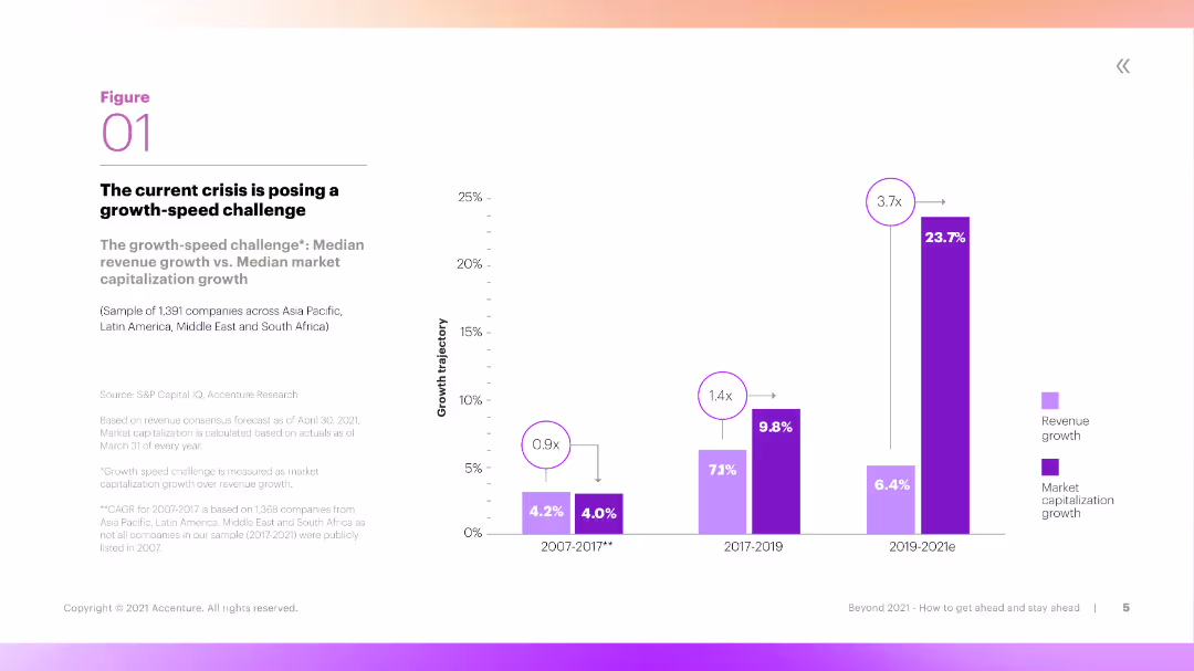
This slide features a column chart comparing median revenue growth and median market capitalization growth over three periods. The chart uses vibrant colors and clear labels to differentiate the data sets.
Market Analysis and Trends
Financial Services
The slide discusses the 'growth-speed challenge,' comparing revenue growth with market capitalization growth across three time periods. It highlights the challenges companies face in maintaining growth during crises.
Growth, Revenue, Market Capitalization, Crisis, Challenge
false
Market Analysis and Trends
Financial Services
Mixed Chart
Accenture
Add to my slides
Remove from favorites
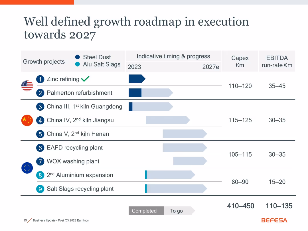
Timeline chart with horizontal bars indicating project progress, icons for flags and materials, and summary columns for Capex and EBITDA estimates.
Strategic Planning
Industrial & Manufacturing
This slide outlines nine growth projects (steel dust and aluminum salt slags) scheduled up to 2027, including timelines, Capex, and EBITDA estimates. It visually distinguishes between completed and pending milestones, helping assess strategic progress and financial expectations.
growth roadmap, Capex, EBITDA, recycling, 2027, zinc, aluminum, projects
false
Strategic Planning
Industrial & Manufacturing
Single Chart
Goldman Sachs
Add to my slides
Remove from favorites
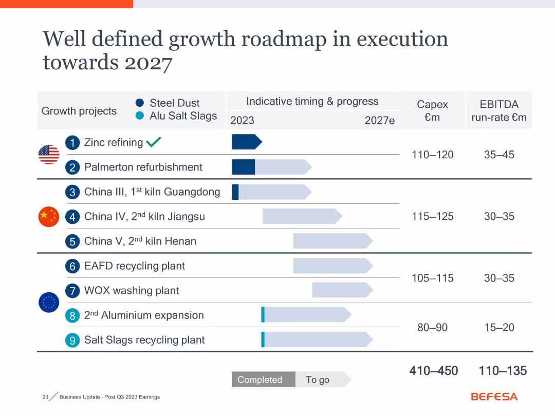
Identical layout as slide 18021; duplicate showing project timelines, status, Capex, and EBITDA across growth initiatives.
Strategic Planning
Industrial & Manufacturing
Repeats the visual and data of slide 18021: summarizing strategic initiatives through 2027, with emphasis on progress tracking and return expectations for steel dust and aluminum slag projects globally.
growth roadmap, strategy, Capex, recycling, aluminum, steel dust, 2027
false
Strategic Planning
Industrial & Manufacturing
Single Chart
Goldman Sachs
Add to my slides
Remove from favorites
The slide features bar graphs depicting e-commerce, online travel, transport & food, and online media sectors. Use of blue shades, minimalistic design.
Market Analysis and Trends
Technology & Software
This slide illustrates the growth in various sectors of Singapore’s economy post-2020, highlighting a healthy surge with future projections.
Growth, Sectors, Singapore, Projections, eCommerce, Travel, Food, Media, 2025, Recovery
false
Market Analysis and Trends
Technology & Software
Multiple Chart
Bain
Add to my slides
Remove from favorites
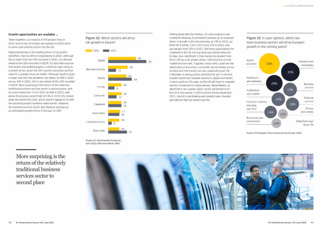
Contains text, a bar chart, and a bubble chart. The bar chart shows expected growth sectors in the UK, while the bubble chart highlights growth sectors in Europe.
Strategic Planning
Financial Services
The slide discusses growth opportunities and sectors driving growth in the UK and Europe, based on survey data.
growth sectors, UK, Europe, survey, column chart, bubble chart
false
Strategic Planning
Financial Services
Multiple Chart
EY
Add to my slides
Remove from favorites
Pie charts illustrating the classification success rate of machine learning models on company growth categories.
Market Analysis and Trends
Financial Services
Discusses the segmentation of companies based on their growth profitability and the effectiveness of machine learning models.
Growth segmentation, machine learning, profitability, classification success
false
Market Analysis and Trends
Financial Services
Mixed Chart
Accenture
Add to my slides
Remove from favorites
The slide features three vertical column charts comparing 'GS' to 'Peer avg.' for book value per share growth, dividend per share growth, and total shareholder return.
Financial Performance
Financial Services
This slide presents the growth metrics of a financial institution compared to its peers, highlighting its performance since a past event. It could be used for investor relations to show progress and outperformance in key financial areas.
growth, shareholder return, financial performance, benchmark, dividends
false
Financial Performance
Financial Services
Multiple Chart
Goldman Sachs
Add to my slides
Remove from favorites
This slide features a blue and teal color scheme with four column charts displaying growth and simplification metrics in different financial segments. A legend explains the growth (+) and simplicity (−) metrics, and there's a footnote reference.
Product and Service Analysis
Financial Services
The slide presents JPMorgan’s growth in products, front office locations, hires in business segments, and app modernization, alongside simplification through funds merged or closed. It aims to show progress over two years.
growth, simplification, financial products, app modernization, JPMorgan, column chart, business segments, metrics
false
Product and Service Analysis
Financial Services
Multiple Chart
JP Morgan
Add to my slides
Remove from favorites
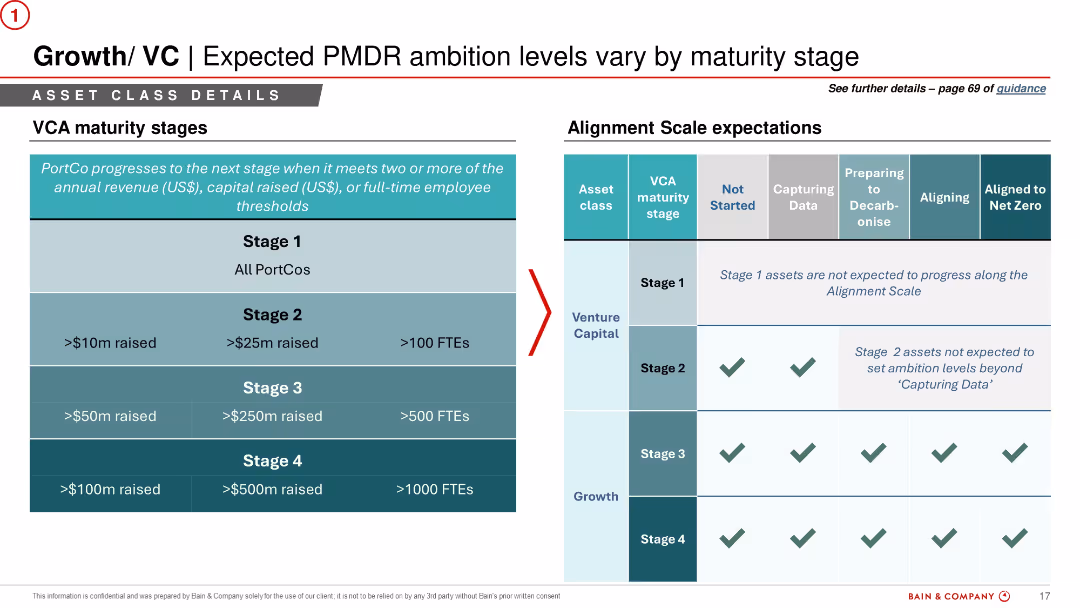
Split layout with a maturity stage table on the left and corresponding ambition levels in a matrix on the right. Uses checkmarks and shaded areas for visual emphasis.
Organizational Structure and Change
Financial Services
Links VC asset maturity stages (based on revenue, capital, and FTEs) with expected ambition levels in decarbonisation. Explains which stage each PortCo should achieve along the alignment scale, setting practical expectations for different investment levels.
growth stages, venture capital, PortCo, ambition, alignment scale, FTE, revenue, ESG strategy
false
Organizational Structure and Change
Financial Services
Table
Bain
Add to my slides
Remove from favorites
Structured around icons and bullet points focusing on strategies for wealth management and private banking.
Strategic Planning
Financial Services
Outlines JPMorgan's growth strategies for the next decade in asset management, including expanding and building new financial products.
Growth strategies, asset management, wealth management, private banking, financial planning, market expansion
false
Strategic Planning
Financial Services
Pillar
JP Morgan
Add to my slides
Remove from favorites
Contains three icons representing growth strategies ('Core', 'Breakout', 'Disruptive') with associated data points about their impact on outperformance.
Strategic Planning
Professional Services
Discusses different growth strategies and their potential impacts on a company's performance, advocating for a diversified approach to maximize growth and outperform peers.
growth, strategies, core, breakout, disruptive, performance, outperformance
false
Strategic Planning
Professional Services
Pillar
McKinsey
Add to my slides
Remove from favorites
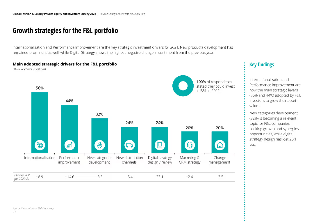
Column chart showing strategic drivers for F&L portfolio growth, with Internationalization and Performance Improvement leading.
Strategic Planning
Financial Services
Key strategic investment drivers for 2021 include Internationalization (56%) and Performance Improvement (44%), with Digital Strategy seeing the largest negative change.
growth strategies, F&L portfolio, strategic planning, investment drivers, performance improvement
false
Strategic Planning
Financial Services
Mixed Chart
Deloitte
Add to my slides
Remove from favorites
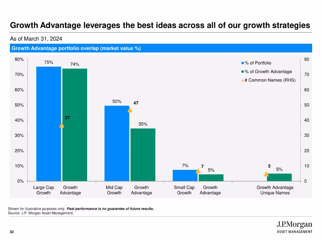
The slide contains a bar chart comparing portfolio overlap in market value percentages across different growth strategies, including large cap, mid cap, and small cap growth.
Investment Analysis
Financial Services
Highlights the overlap in portfolio strategies within J.P. Morgan’s Growth Advantage strategy, showing how different growth strategies are leveraged for optimal investment.
growth strategies, portfolio overlap, market value, large cap, mid cap, small cap, bar chart
false
Investment Analysis
Financial Services
Single Chart
JP Morgan
Add to my slides
Remove from favorites
Features a combination of text and graphics, including column charts that compare assets under custody and administration over a four-year span. The graphics are paired with descriptive text on the left.
Strategic Planning
Financial Services
The slide discusses the growth of the Securities Services division through new business wins, client retention, and market expansion. The charts compare assets under custody and administration from 2015 to 2019, indicating significant growth. This illustrates strategic achievements and market penetration.
growth, strategy, clients, market expansion, assets, custody, administration
false
Strategic Planning
Financial Services
Multiple Chart
JP Morgan
Add to my slides
Remove from favorites
This slide presents three strategic focus areas—Scale & Efficiency, Comprehensive Client Solutions, and Investing for the Future—each with icons and bullet points. The design is sleek with plenty of whitespace, balancing text and visual elements such as icons.
Strategic Planning
Financial Services
JPMorgan Chase's slide outlines its strategy for business and client growth, detailing operational efficiency through technology, client solution delivery, and investment for future needs. It could be used to communicate to stakeholders about ongoing and future strategic initiatives, emphasizing areas like ETFs, digital assets, and data solutions for sustaining and enhancing market presence.
Growth, Strategy, Efficiency, ETFs, Alternatives, Digital Assets, Data Solutions, Technology, Investment, Clients
false
Strategic Planning
Financial Services
Pillar
JP Morgan
Add to my slides
Remove from favorites
Checkmarks adjacent to key strategic and financial criteria, presented in a clean, bulleted format.
Investment Analysis
Financial Services
Criteria for assessing new growth opportunities, useful for strategic decision-making or investment opportunity analysis.
Growth, Strategy, Financial Stability, Investment, Evaluation, Criteria
false
Investment Analysis
Financial Services
Table
Goldman Sachs
Add to my slides
Remove from favorites
It has a four-part grid layout each with its icon and text, combination of column and line charts discussing opportunities and leveraging strategies within various aspects of the industry.
Strategic Planning
Financial Services
Identifies organic growth opportunities in investment banking across regions, products, clients, and sectors, outlining areas for potential expansion and the current #1 rankings to maintain and strengthen.
Growth, Strategy, Investment Banking, Clients
false
Strategic Planning
Financial Services
Multiple Chart
JP Morgan
Add to my slides
Remove from favorites
This slide includes a column chart series showing trends over years and a separate opportunity section with two vertical bar charts. There are icons with brief text descriptions at the bottom, and the design is structured with a mix of blue tones.
Financial Performance
Financial Services
The slide depicts strategic growth through advisor hiring, client referrals, and assets, along with investment in future planning, innovation, and market awareness, showcasing trends and future opportunities in the private banking sector.
Growth, Strategy, Investment, Banking, Trends, Opportunities, Innovation, Planning, Financial Services, Market Share
false
Financial Performance
Financial Services
Multiple Chart
JP Morgan
Add to my slides
Remove from favorites
Depicts various market segments with potential growth opportunities using purple boxes and white text. Design is straightforward and focused on future strategies.
Strategic Planning
Technology & Software
Outlines the substantial growth opportunities in different segments, including revenue cycle software and identity management. Useful for strategic planning sessions or investor relations meetings.
growth strategy, market opportunities, technology, strategic planning
false
Strategic Planning
Technology & Software
Pillar
Barclays
Add to my slides
Remove from favorites
This slide includes a vertical bar graph and a text block. The graph has two levels of progress in technologies, separated by "NEW" and "EXISTING". The left part of the slide contains bullet points. The layout is clean with a balance of text and visuals.
Strategic Planning
Financial Services
The slide presents a company's strategy for growth, emphasizing protection and expansion of its core business and venturing into new markets. It shows the introduction of new drilling technologies as a step towards sustainable growth. The slide is used for presenting business strategies.
growth, strategy, mining, technology, sustainable, market expansion, core business, drilling technologies
false
Strategic Planning
Financial Services
Diagram
Morgan Stanley
Add to my slides
Remove from favorites
Contains bullet point lists in three content blocks, color-coded to differentiate between maintaining discipline, optimizing current models, and transforming for the future.
Strategic Planning
Financial Services
This slide outlines the strategic initiatives for growth in the financial services sector, including maintaining operational discipline, optimizing the current business model, and investing in future transformations such as ML & AI.
growth, strategy, optimization, financial, discipline, AI, ML
false
Strategic Planning
Financial Services
Boxed
JP Morgan
Add to my slides
Remove from favorites
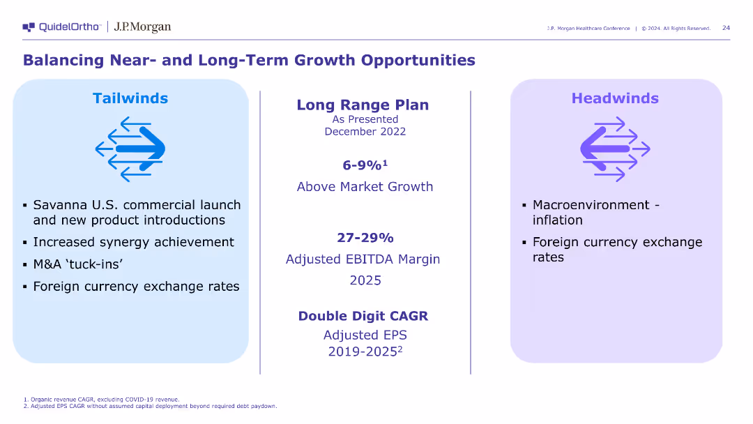
This slide is divided into three sections: Tailwinds, Long Range Plan, and Headwinds. It uses bullet points and a simple layout with blue and purple highlights for clarity.
Strategic Planning
Healthcare & Pharmaceuticals
Discusses the strategic planning and growth opportunities for QuidelOrtho, focusing on market tailwinds, long-term growth plans, and potential headwinds affecting the business.
Growth, Strategy, Planning, Tailwinds, Headwinds
false
Strategic Planning
Healthcare & Pharmaceuticals
Header Horizontal
JP Morgan
Add to my slides
Remove from favorites
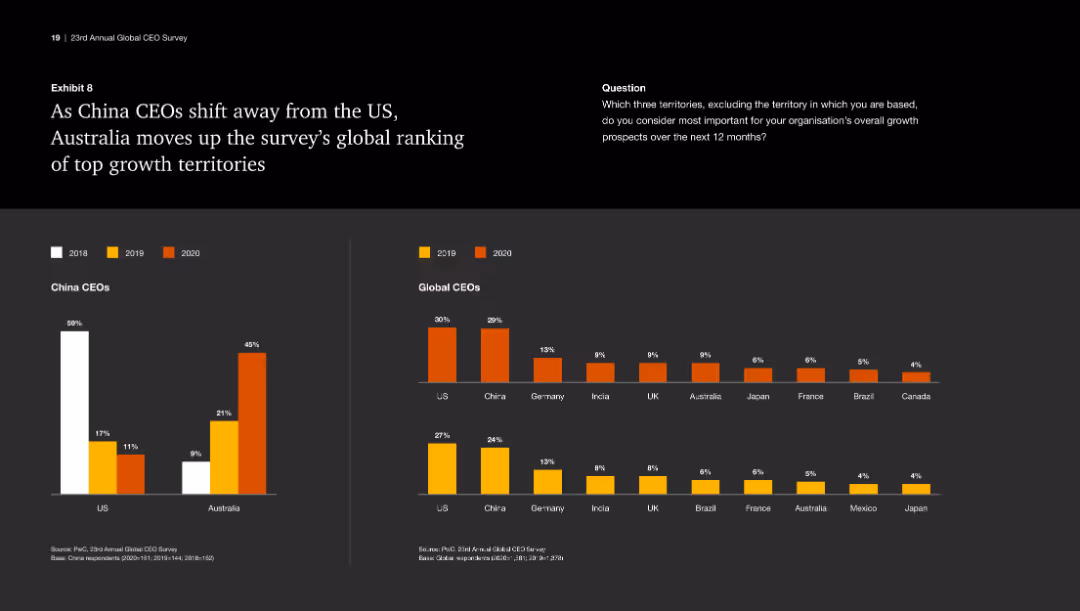
This slide features a column chart showing the ranking of US and Australia in terms of attractiveness to China CEOs from 2018 to 2020. It uses color to differentiate each year.
Market Analysis and Trends
Industrial & Manufacturing
The slide highlights the shift of China CEOs' preference from the US to Australia as a top growth territory, showcasing the rankings and changes over the years.
Growth territories, China CEOs, Australia, US, ranking
false
Market Analysis and Trends
Industrial & Manufacturing
Multiple Chart
PwC/Strategy&
Add to my slides
Remove from favorites
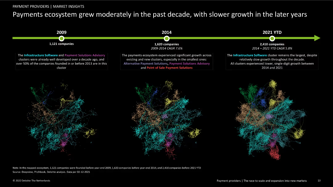
Contains three column charts showing the growth of companies from 2009, 2014, and 2021 YTD. Includes text boxes explaining cluster developments and a timeline at the top.
Market Analysis and Trends
Financial Services
Analysis of the growth in the European payments ecosystem over the past decade, focusing on company numbers and cluster evolution from 2009 to 2021.
growth, timeline, payments ecosystem, clusters, market analysis, financial services, trends, historical data, company numbers
false
Market Analysis and Trends
Financial Services
Linear Flow
Deloitte
Add to my slides
Remove from favorites
The slide shows three different growth trajectory graphs, each with a distinct shape (S-shaped, Trendline, and U-shaped), and is accompanied by descriptive text. The design uses grey tones with blue highlights. It's cleanly structured, presenting the information in an easily digestible format.
Strategic Planning
Technology & Software
This slide illustrates the post-pandemic growth trajectories of SEA's digital sectors, which can inform strategic decisions. It differentiates between sustained growth, a return to trendline, and U-shaped recovery, offering a nuanced view of market dynamics that can guide investment and operational planning.
growth trajectories, digital sectors, SEA, post-pandemic, strategic planning, market dynamics, recovery
false
Strategic Planning
Technology & Software
Multiple Chart
Bain
Add to my slides
Remove from favorites
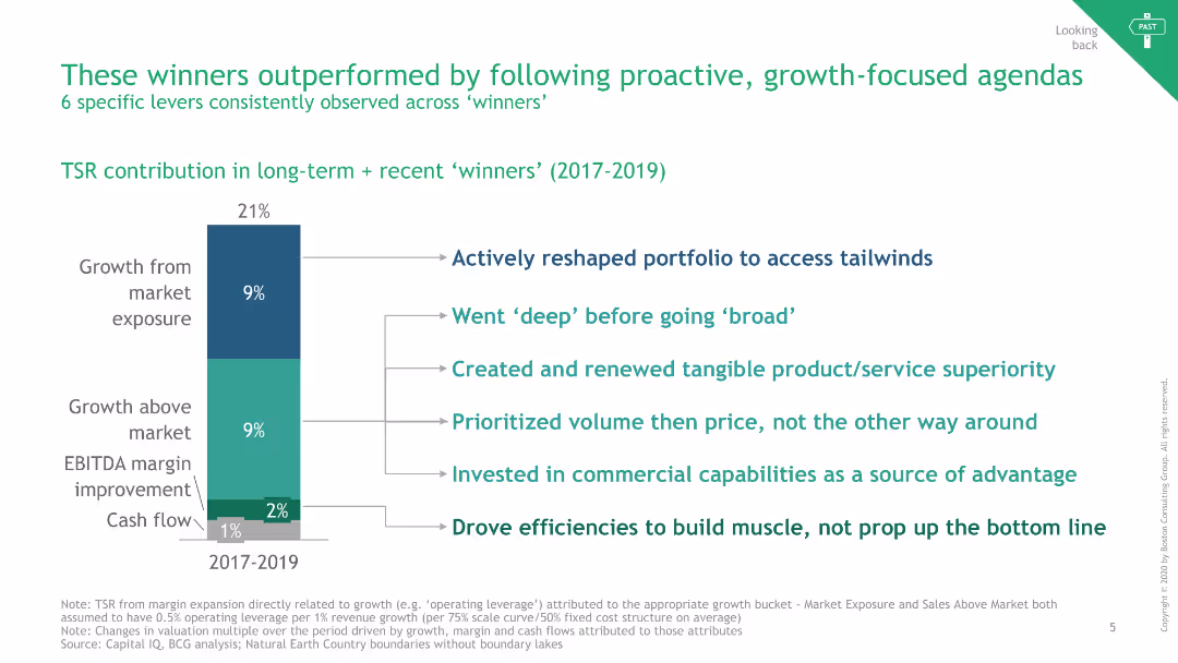
The slide features a vertical bar chart showing TSR contributions and bullet points listing six growth-focused strategies.
Strategic Planning
Consumer Goods
It outlines six levers consistently observed across high-performing companies, emphasizing proactive and growth-focused agendas.
Growth, TSR, Strategies, Proactive, FMCG
false
Strategic Planning
Consumer Goods
Mixed Chart
BCG
Add to my slides
Remove from favorites
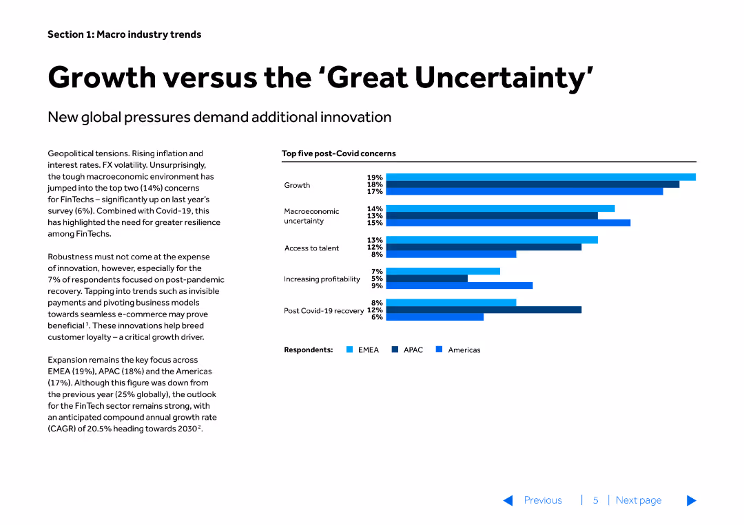
The slide has a title and a textual description on the left side, with a bar chart on the right side. The bar chart lists the top five post-Covid concerns with different colored bars representing different regions (EMEA, APAC, Americas).
Market Analysis and Trends
Financial Services
This slide discusses the impact of global pressures on innovation in the financial sector, highlighting the top concerns for FinTechs post-Covid. The slide is used to emphasize the importance of resilience and innovation in addressing growth and market uncertainties.
growth, uncertainty, innovation, FinTech, global pressures, market analysis, trends, post-Covid
false
Market Analysis and Trends
Financial Services
Mixed Chart
Barclays
Add to my slides
Remove from favorites
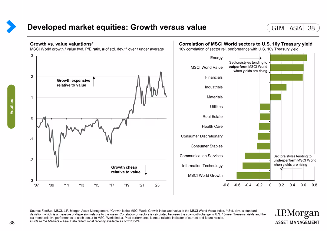
The left side of the slide presents a line chart showing the growth vs. value valuations over time, and the right side features a bar chart illustrating the correlation of MSCI World sectors to U.S. 10-year Treasury yield.
Market Analysis and Trends
Financial Services
The slide compares growth and value valuations in developed markets, highlighting trends and sector correlations with Treasury yields. It is used to identify market trends and investment opportunities.
Growth, value, developed markets, MSCI, Treasury yield, market trends, investment, sector correlation
false
Market Analysis and Trends
Financial Services
Multiple Chart
JP Morgan
Add to my slides
Remove from favorites
The slide has column charts, text annotations, and percentage changes, with a clear separation between visual elements. The design is clean and data-oriented.
Financial Performance
Financial Services
Outlines significant growth and value delivered from 2012 to 2021 in card services. Ideal for retrospective financial reviews or historical performance analysis.
growth, value, financial review, historical performance, card services
false
Financial Performance
Financial Services
Mixed Chart
JP Morgan
Add to my slides
Remove from favorites
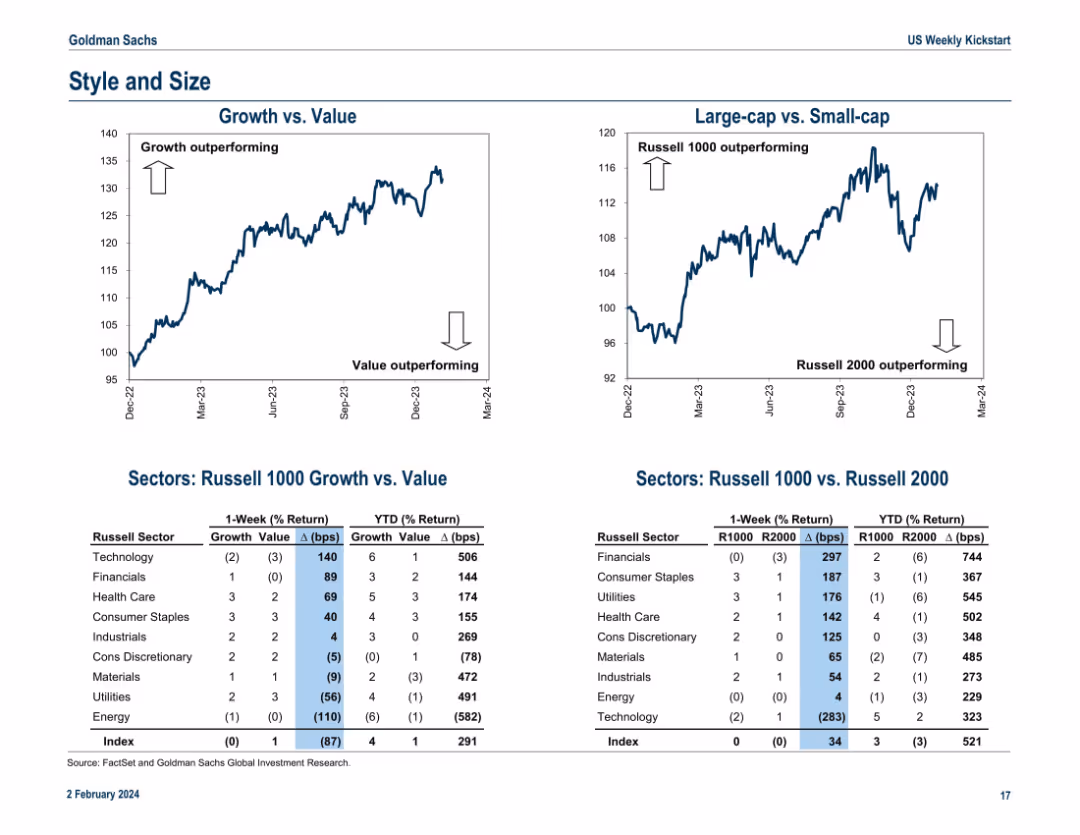
Dual line charts at the top for “Growth vs. Value” and “Large-cap vs. Small-cap.” Tables below show Russell sector performance by style (growth/value) and size (Russell 1000/2000) including 1-week and YTD % returns and basis point spreads.
Performance Metrics and KPIs
Financial Services
This slide analyzes style (growth vs. value) and size (large-cap vs. small-cap) performance. Growth stocks and large-caps are outperforming YTD. The lower tables quantify returns for various sectors by style and size exposure, offering a more nuanced performance assessment. It helps investors understand capital flow dynamics and market sentiment around size and value/growth preferences.
growth vs. value, large-cap, small-cap, Russell 1000, Russell 2000, sector returns, basis points, YTD performance, market style
false
Performance Metrics and KPIs
Financial Services
Multiple Chart
Goldman Sachs
Add to my slides
Remove from favorites
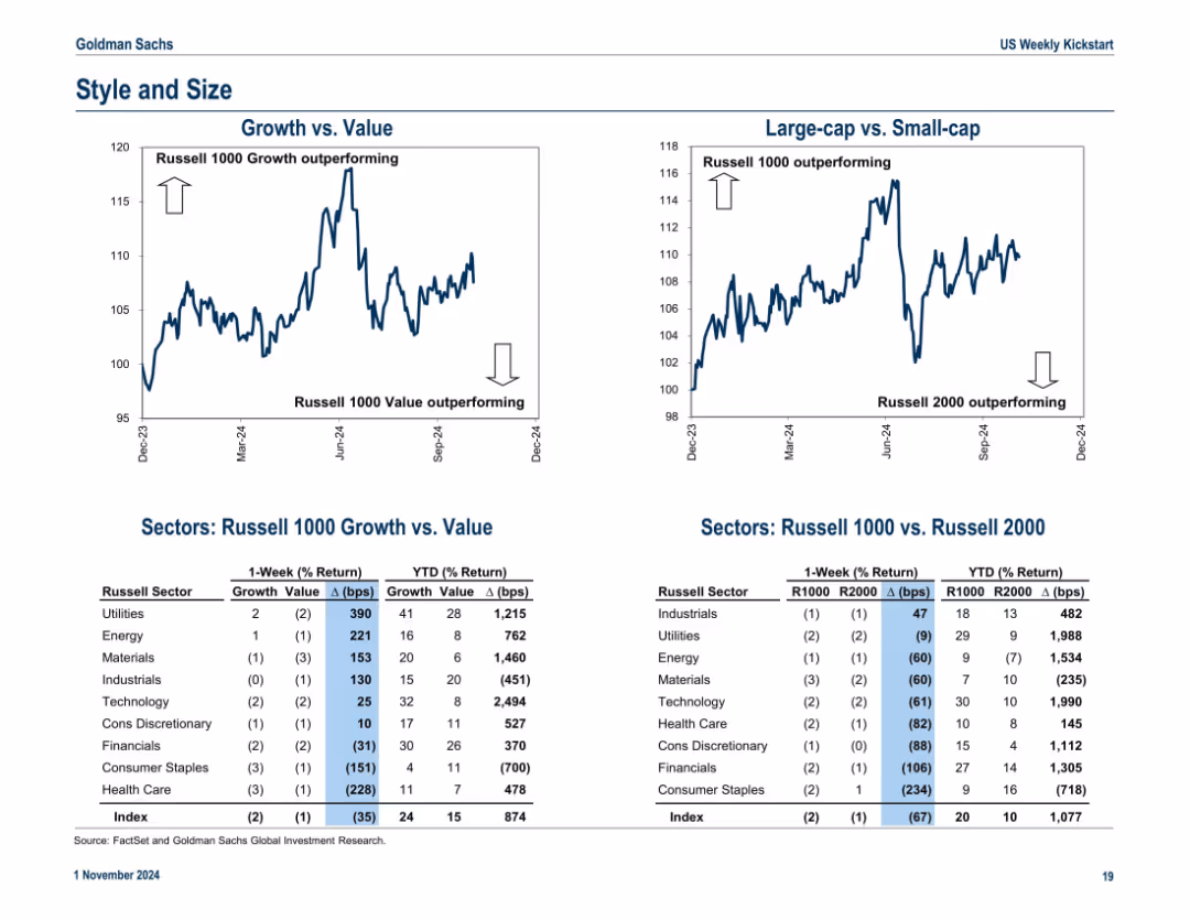
Two line charts comparing growth vs. value and large-cap vs. small-cap, accompanied by detailed performance tables by Russell sectors
Strategic Planning
Financial Services
Evaluates equity style and size rotation trends using Russell indices, along with performance data by sector. Growth and large-cap have outperformed year-to-date.
growth vs value, Russell 1000, Russell 2000, style rotation, sector return
false
Strategic Planning
Financial Services
Multiple Chart
Goldman Sachs
Add to my slides
Remove from favorites
Includes a line graph comparing different entities over time and a sidebar with explanatory text and bullet points for clarity.
Regulatory and Compliance
Financial Services
Explains the requirements for the Global Systemically Important Bank framework and potential solutions for capacity expansion.
GSIB, recalibration, capacity, regulatory compliance
false
Regulatory and Compliance
Financial Services
Mixed Chart
JP Morgan
Add to my slides
Remove from favorites
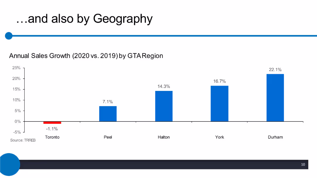
Column chart displaying annual sales growth by GTA region, with bars representing different regions such as Toronto, Peel, Halton, York, and Durham.
Market Analysis and Trends
Real Estate & Construction
The slide compares the annual sales growth percentages for different regions within the GTA between 2020 and 2019. Toronto shows a decline, while other regions show positive growth.
GTA, sales growth, annual comparison, regions, 2020 vs 2019, Toronto, Peel, Halton, York, Durham
false
Market Analysis and Trends
Real Estate & Construction
Single Chart
IPSOS
Add to my slides
Remove from favorites
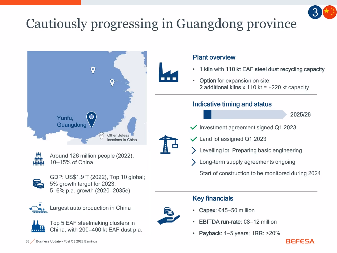
Left map with text on demographics, right section on plant overview and timing, plus bottom right financial metrics.
Strategic Planning
Industrial & Manufacturing
The slide discusses a new steel dust recycling plant in Yunfu, Guangdong, China. It outlines the strategic importance, growth potential of the region, and phased investment. Expected Capex is €45–50m with EBITDA of €8–12m. Timeline extends to 2025/26.
Guangdong, China, steel dust, EAF, Capex, recycling, market potential
false
Strategic Planning
Industrial & Manufacturing
Mixed Chart
Goldman Sachs
Add to my slides
Remove from favorites
Split layout with map of China, project highlights, and project status; uses icons, bullet points, and project financials
Investment Analysis
Industrial & Manufacturing
Details Befesa’s strategic expansion in Guangdong with one operational kiln and options for two more. Lists project timing, financials, regional strengths (auto/steel), and status of land and supply agreements.
Guangdong, kiln, investment, recycling, project timeline, capex, EBITDA, steel dust, expansion
false
Investment Analysis
Industrial & Manufacturing
Mixed Chart
Goldman Sachs
Add to my slides
Remove from favorites
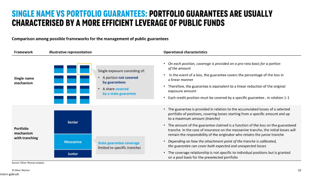
Two illustrated models (single name vs. portfolio guarantees) with operational characteristics explained side-by-side; uses charts and text.
Regulatory and Compliance
Financial Services
This slide compares two types of guarantee mechanisms for SME lending: single name and portfolio with tranching. Portfolio guarantees are shown to offer more efficient use of public funds and better coverage for both expected and unexpected losses.
guarantees, portfolio, single name, tranching, public funds, SME lending
false
Regulatory and Compliance
Financial Services
Mixed Chart
Oliver Wyman
Add to my slides
Remove from favorites
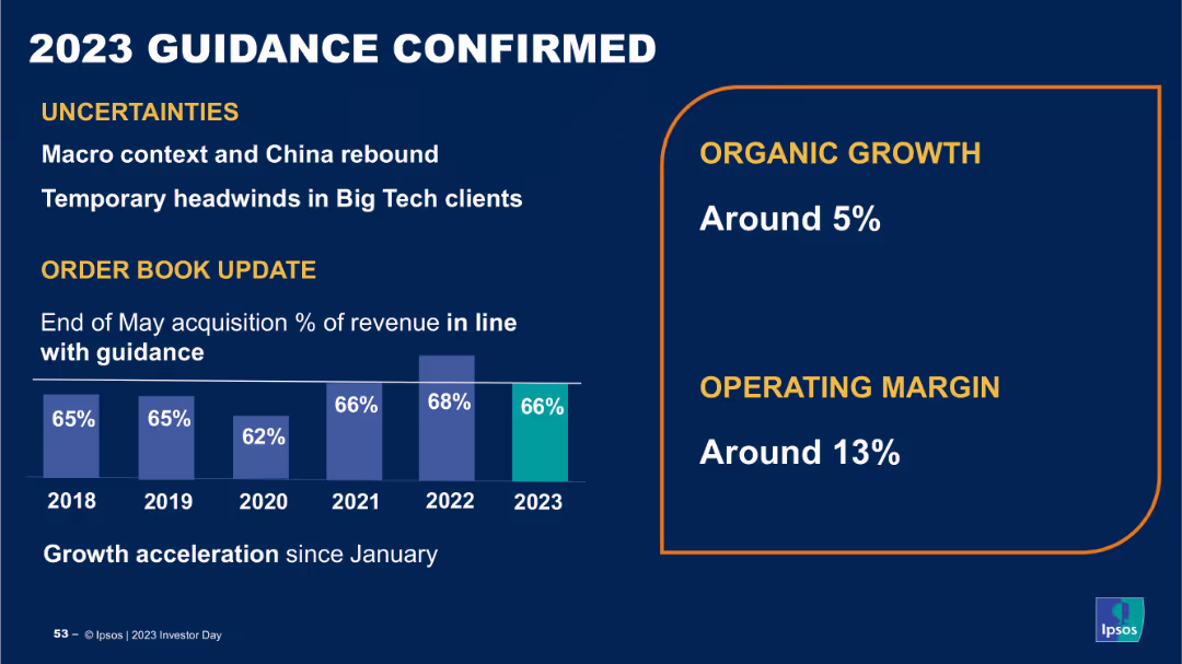
The slide contains a column chart showing percentage of revenue over years from 2018 to 2023, and a section with growth and operating margin percentages. The layout is structured and uses clear data visualizations.
Strategic Planning
Financial Services
The slide confirms Ipsos' 2023 guidance, highlighting uncertainties, organic growth, and operating margin targets, providing an update on order book and revenue projections, indicating stability and future growth prospects.
guidance, revenue, growth, operating margin, projections
false
Strategic Planning
Financial Services
Mixed Chart
IPSOS
Add to my slides
Remove from favorites
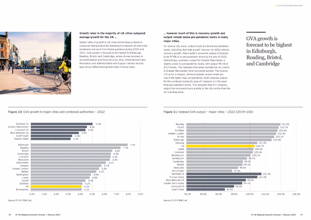
The slide features a title with a prominent image of a scenic landscape and a number "1". It includes a column chart depicting GVA growth in UK regions.
Market Analysis and Trends
Government & Public Sector
The slide discusses UK and regional economic performance in 2022, highlighting GVA growth in various regions and sectors with comparative analysis.
GVA, economic growth, UK regions, 2022, column chart
false
Market Analysis and Trends
Government & Public Sector
Mixed Chart
EY
Add to my slides
Remove from favorites
A combination of text, charts, and graphics, this slide presents data with a balance between visuals and written content. It includes a pie chart, a bar graph, and numerical highlights in callout boxes. The color scheme is consistent with the presentation theme.
Financial Performance
Industrial & Manufacturing
Details the estimated GVA and employment contributions of the Tempest programme to the UK economy from 2021 to 2050, with specific metrics and projections.
GVA, employment, Tempest, projections, UK economy, indirect contribution, induced contribution
false
Financial Performance
Industrial & Manufacturing
Mixed Chart
PwC/Strategy&
Add to my slides
Remove from favorites
Contains two column charts: one showing GVA growth in major cities and another showing indexed GVA output for 2022.
Market Analysis and Trends
Government & Public Sector
Analyzes GVA growth rates in major UK cities, comparing recovery levels to pre-pandemic benchmarks, and highlighting leading cities.
GVA growth, major cities, recovery, pre-pandemic, column chart
false
Market Analysis and Trends
Government & Public Sector
Multiple Chart
EY
Add to my slides
Remove from favorites
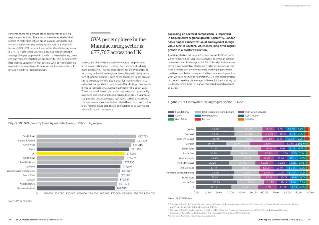
The slide has a text box on the left explaining GVA in manufacturing. On the right, there are two charts: a column chart showing GVA per employee by region and a stacked bar chart showing employment by aggregate sector.
Operational Efficiency
Industrial & Manufacturing
This slide explains the GVA per employee in the UK manufacturing sector and compares it across various regions and sectors, highlighting the importance of sectoral composition in regional economic growth.
GVA, manufacturing, regional comparison, sectoral composition, employment
false
Operational Efficiency
Industrial & Manufacturing
Multiple Chart
EY
Add to my slides
Remove from favorites
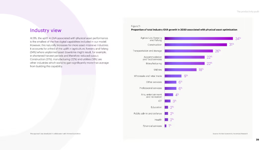
The slide features a column chart on the right side showing the proportion of total industry GVA growth by 2030 associated with physical asset optimization.
Market Analysis and Trends
Agriculture & Food Production
The slide discusses the impact of physical asset performance on GVA growth across various industries, highlighting agriculture, forestry, and fishing as having the highest uplift.
GVA, physical asset, growth, agriculture, forestry, fishing, construction, manufacturing, utilities, industry
false
Market Analysis and Trends
Agriculture & Food Production
Mixed Chart
Accenture
Add to my slides
Remove from favorites
The slide is filled with textual information, utilizing bullet points, icons, and colored boxes to distinguish sections. A small chart is present in the top-left corner. The visual complexity is moderate.
Market Analysis and Trends
Industrial & Manufacturing
The slide details the economic impact of the Tempest programme on the UK economy, projecting job support and GVA contribution. It serves as an analytical overview for stakeholders to understand the financial benefits and job creation prospects.
GVA, Tempest programme, economy, jobs, UK
false
Market Analysis and Trends
Industrial & Manufacturing
Text Only
PwC/Strategy&
Add to my slides
Remove from favorites
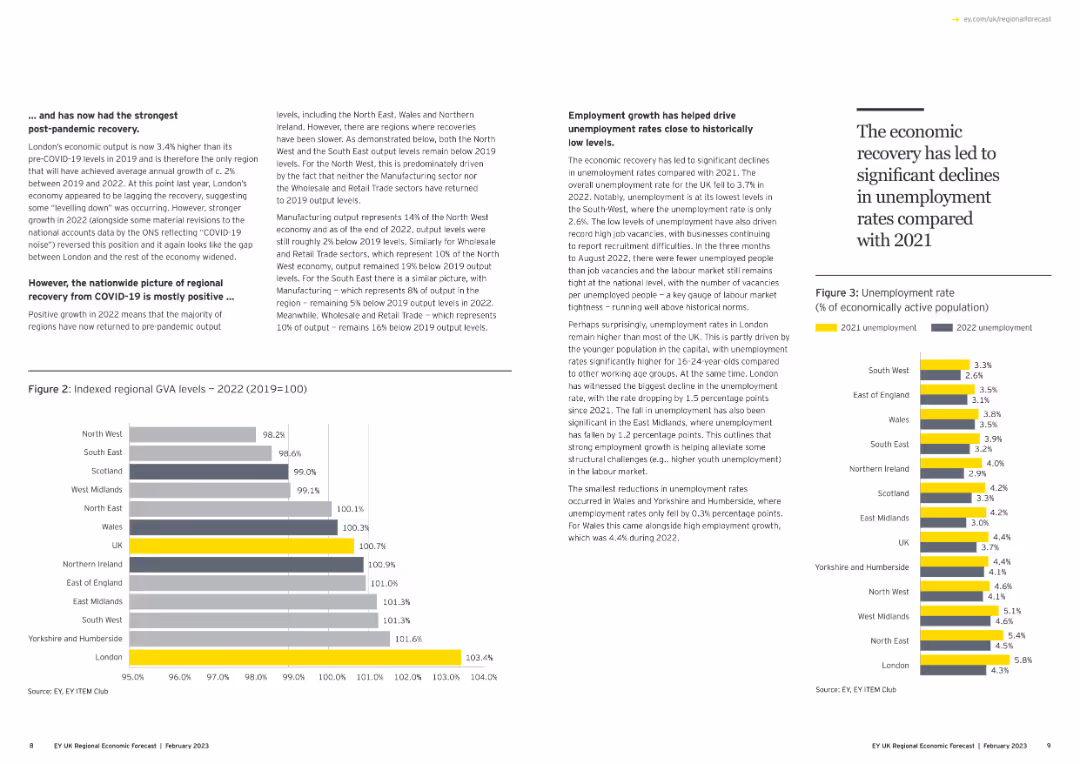
Contains a column chart showing indexed regional GVA levels and another column chart showing unemployment rates. Text discusses economic recovery trends.
Market Analysis and Trends
Government & Public Sector
Analyzes regional GVA levels post-COVID-19 and the employment growth that has helped drive down unemployment rates to historically low levels.
GVA, unemployment, economic recovery, regional analysis, column chart
false
Market Analysis and Trends
Government & Public Sector
Multiple Chart
EY
Add to my slides
Remove from favorites
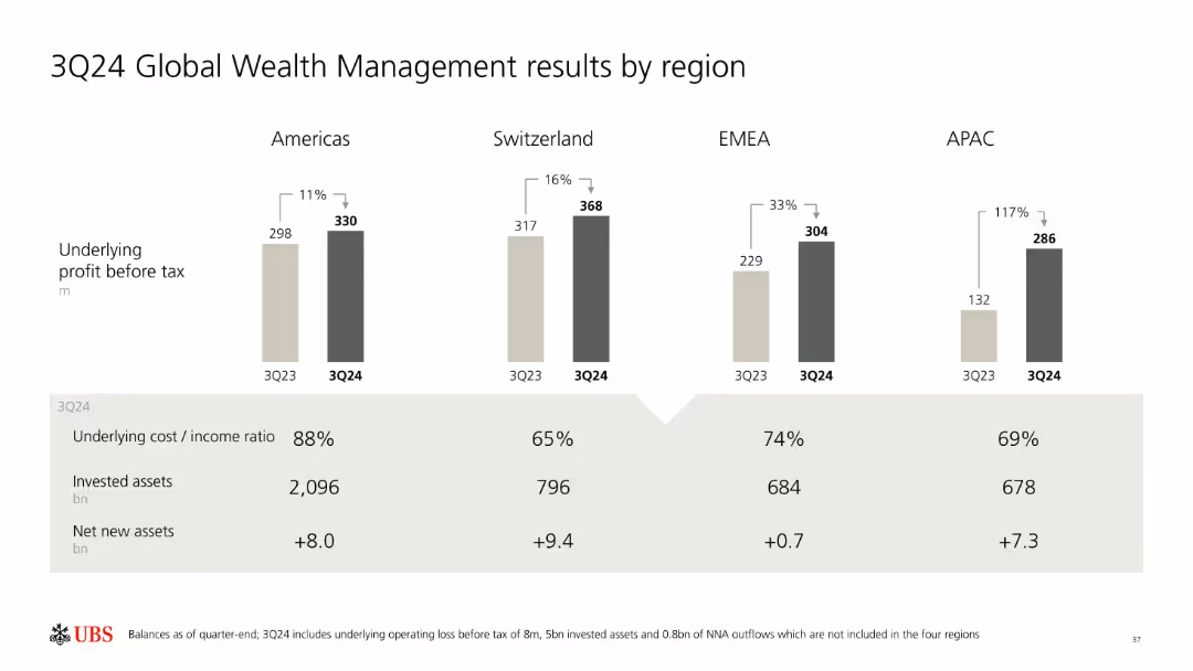
Bar chart showing YoY profit change across regions; summary table below with cost/income ratios and net new/invested assets.
Performance Metrics and KPIs
Financial Services
UBS presents its Global Wealth Management performance by region for 3Q24. Regional profits, cost/income ratios, invested assets, and net new assets are compared to 3Q23, highlighting notable growth in APAC and Switzerland.
GWM, profit before tax, UBS, net new assets, APAC, EMEA, Switzerland, Americas, regional performance
false
Performance Metrics and KPIs
Financial Services
Mixed Chart
UBS
Add to my slides
Remove from favorites
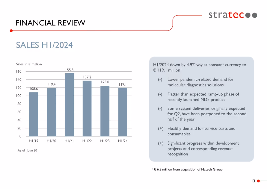
Bar chart on left showing H1 sales from 2019 to 2024; right side includes bullet point analysis with light blue background.
Financial Performance
Healthcare & Pharmaceuticals
Shows a sales decline to €119.1M in H1 2024, down 4.9% YoY. Explanations include reduced post-pandemic demand, slow product ramp-up, and delayed system deliveries. Highlights continued strength in service part demand and project revenue.
H1 2024, sales performance, diagnostics, COVID impact, revenue breakdown, consumables, STRATEC, demand trend
false
Financial Performance
Healthcare & Pharmaceuticals
Mixed Chart
Goldman Sachs
Add to my slides
Remove from favorites
The slide features a world map highlighting the number of H2 bus projects in various countries.
Market Analysis and Trends
Transportation & Logistics
The slide provides an overview of H2 bus projects worldwide, indicating the geographical distribution and the number of projects per country.
H2 buses, projects, global, evaluation, potential
false
Market Analysis and Trends
Transportation & Logistics
Graphic
Kearney
Add to my slides
Remove from favorites
The slide features a map showing the route of the H2 bus project in Pau, France, along with key characteristics and project partners listed on the side.
Regulatory and Compliance
Energy & Utilities
The slide describes an experimental project in Pau, France, using hydrogen buses for public transportation, highlighting project details, investment, and key characteristics.
H2 buses, public transport, France, experiment, Pau
false
Regulatory and Compliance
Energy & Utilities
Graphic
Kearney
Add to my slides
Remove from favorites
The slide features diagrams of powertrain architectures for H2 Internal Combustion Engines, Fuel Cell Electric Vehicles, and Battery Electric Vehicles.
Technology and Digital Transformation
Transportation & Logistics
Explores the main architectures for decarbonizing mobility, comparing H2 ICE, FCEV, and BEV in terms of energy storage, conversion, and power generation.
H2 ICE, FCEV, BEV, powertrain architecture, mobility, decarbonization, energy storage, conversion, power generation
false
Technology and Digital Transformation
Transportation & Logistics
Table
Roland Berger
Add to my slides
Remove from favorites
The slide includes bar charts showing the percentage penetration of H2 in vehicle production across different segments (on-road, off-road) from 2023 to 2030.
Market Analysis and Trends
Transportation & Logistics
Examines the expected penetration rates of H2 technology in vehicle production, highlighting significant increases in buses and forklifts by 2030.
H2 penetration, vehicle production, on-road, off-road, buses, forklifts, segments, market trends, 2030
false
Market Analysis and Trends
Transportation & Logistics
Multiple Chart
Roland Berger
Add to my slides
Remove from favorites
The slide includes text descriptions of positive and negative power control opportunities, supported by two bar charts showing power output from TAC and renewable sources.
Financial Performance
Energy & Utilities
This slide explores monetization opportunities for hydrogen producers by providing grid services. It details positive and negative power control scenarios and discusses how these services can reduce the Levelized Cost of Hydrogen (LCOH).
H2 producer, monetization, power control, LCOH, grid services
false
Financial Performance
Energy & Utilities
Multiple Chart
Kearney
Add to my slides
Remove from favorites
The slide presents various H2 storage systems (GH2 - Type III, IV, V, and LH2) with detailed descriptions and comments. Includes images of storage vessels and their applications.
Technology and Digital Transformation
Energy & Utilities
Explores the main H2 storage technologies for mobility, highlighting gaseous solutions already in operation and liquid solutions under development.
H2 storage, GH2, LH2, Type III, Type IV, Type V, technology, mobility, application
false
Technology and Digital Transformation
Energy & Utilities
Table
Roland Berger
Add to my slides
Remove from favorites
This slide features two column charts showing market value projections for H2 storage solutions from 2023 to 2030, segmented by application and region.
Market Analysis and Trends
Energy & Utilities
Analyzes the projected growth of the H2 storage market for mobility and infrastructure, with an expected market size of almost EUR 10 billion by 2030.
H2 storage, market size, projections, mobility, infrastructure, application, region, growth, EUR billion
false
Market Analysis and Trends
Energy & Utilities
Multiple Chart
Roland Berger
Add to my slides
Remove from favorites
The slide displays a comparison of Type I to IV H2 tanks, detailing materials, pressure levels, prices, and targeted applications. Visuals include detailed diagrams of each tank type.
Technology and Digital Transformation
Industrial & Manufacturing
Provides a comprehensive overview of different H2 storage tanks, their expected technology readiness by 2030, and specific use cases for mobility and infrastructure.
H2 storage, Type I, Type II, Type III, Type IV, technology readiness, market study, application, pressure levels
false
Technology and Digital Transformation
Industrial & Manufacturing
Table
Roland Berger
Add to my slides
Remove from favorites
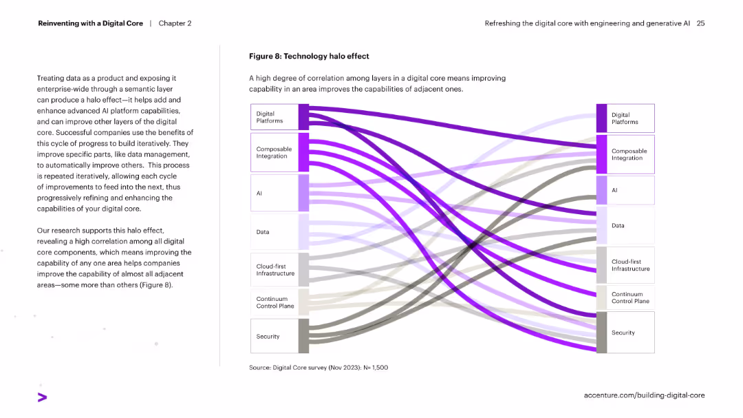
Sankey diagram on right visually showing correlation flows between different digital core components. Text on left explains the halo effect of improving one area benefitting others.
Technology and Digital Transformation
Technology & Software
Explains how enhancing one area of a digital core (e.g., AI or integration) strengthens other components. The high interconnectivity across the core's layers is represented visually in a Sankey diagram.
halo effect, digital core, integration, AI, correlation, transformation, platform improvement
false
Technology and Digital Transformation
Technology & Software
Diagram
Accenture
Add to my slides
Remove from favorites
Features a comparative column chart showing direct sales ROI by media channel, emphasizing the misleading nature of traditional MMM findings without considering the halo effect.
Market Analysis and Trends
Media & Entertainment
Explains the misinterpretation of media spending ROI across various channels when ignoring the halo effect, using direct sales ROI data.
halo effect, MMM findings, media channels, ROI, misleading
false
Market Analysis and Trends
Media & Entertainment
Single Chart
Accenture
Add to my slides
Remove from favorites
Slide contains multiple stacked column charts comparing categories of goods purchased second-hand in various countries, using green tones.
Market Analysis and Trends
Retail & E-commerce
Shows the distribution of second-hand luxury purchases by category in various countries, highlighting a preference for handbags and clothing.
handbags, second-hand luxury, global market, consumer preferences, country comparison
false
Market Analysis and Trends
Retail & E-commerce
Multiple Chart
BCG
Add to my slides
Remove from favorites
Timeline from 1871 to 2020 showing major milestones for Handelsbanken, including restructures and financial crises, with a large image of a bank building, text annotations detailing each phase.
Strategic Planning
Financial Services
Chronicles the history and significant events in the development of Handelsbanken, emphasizing its stability and resilience through financial crises. Useful for corporate presentations and history lessons on banking.
Handelsbanken, banking, history, financial stability, crises, corporate resilience, timeline
false
Strategic Planning
Financial Services
Linear Flow
Bain
Add to my slides
Remove from favorites
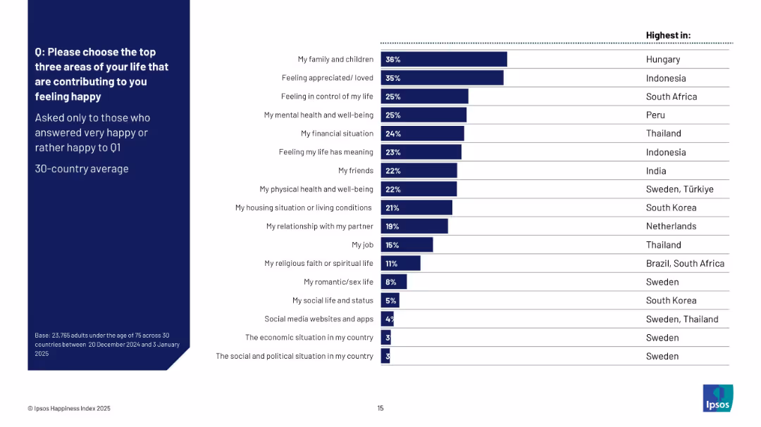
Horizontal bar chart showing top happiness drivers; includes right column listing countries with highest mentions per factor; clean layout with dark blue sidebar.
Customer and Market Segmentation
Professional Services
This slide lists the top life factors that contribute to happiness, based on survey respondents who felt happy. Family and feeling appreciated are top across countries, with South Africa, Indonesia, and Hungary showing unique peaks in some categories. It provides a comparative view of emotional contributors across regions.
happiness drivers, relationships, well-being, life factors, Ipsos, country comparison, 2025, global study
false
Customer and Market Segmentation
Professional Services
Mixed Chart
IPSOS
Add to my slides
Remove from favorites
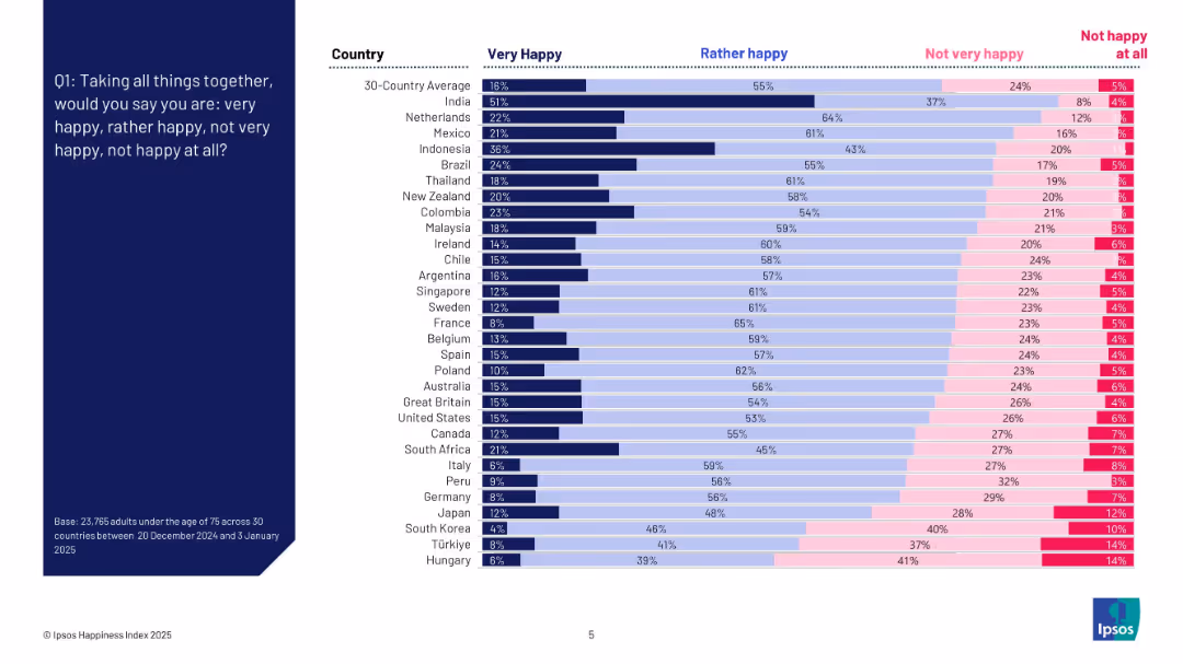
Bar chart with countries listed vertically and segmented horizontal bars for four happiness levels; left-aligned question text on dark blue background.
Market Analysis and Trends
Professional Services
This slide presents the percentage of people in 30 countries reporting different levels of happiness. It shows variation by country in responses to whether individuals feel "very happy," "rather happy," "not very happy," or "not happy at all." The chart reveals that India has the highest "very happy" rate, while Hungary ranks lowest.
happiness index, country comparison, survey, emotions, well-being, global trends, Ipsos, sentiment, 2025, ranking
false
Market Analysis and Trends
Professional Services
Mixed Chart
IPSOS
Add to my slides
Remove from favorites
The slide includes a column chart showing the distribution of happiness scores on a scale of 0-10, comparing data from May and December. Key scores and mean scores are highlighted in text boxes.
Customer and Market Segmentation
Healthcare & Pharmaceuticals
This slide presents survey results on happiness scores, showing the distribution of scores on a scale of 0-10, comparing May and December data, with a focus on mean scores.
happiness, survey, scores, comparison, distribution, column chart, public opinion, time periods, healthcare
false
Customer and Market Segmentation
Healthcare & Pharmaceuticals
Single Chart
IPSOS
Add to my slides
Remove from favorites
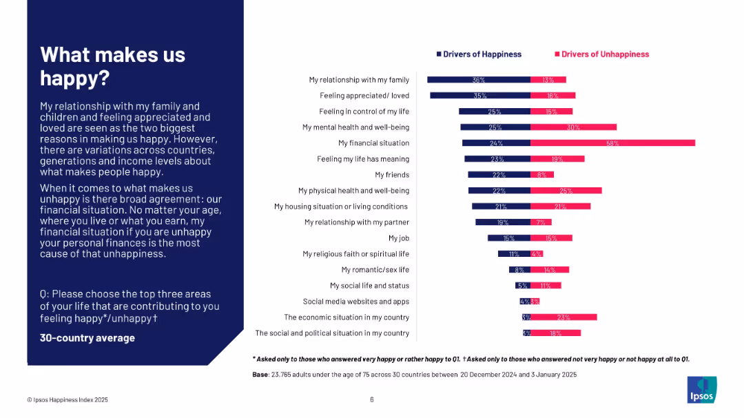
Dual bar chart comparing happiness and unhappiness drivers; left-aligned explanatory text in dark blue box; white background chart area.
Customer and Market Segmentation
Professional Services
The slide identifies key personal factors that contribute to happiness and unhappiness across 30 countries. Relationships and feeling loved are top drivers of happiness, while financial situation is the dominant cause of unhappiness. The layout compares these drivers side-by-side for clear contrast.
happiness, unhappiness, drivers, financial, relationships, mental health, global study, Ipsos, well-being, satisfaction
false
Customer and Market Segmentation
Professional Services
Mixed Chart
IPSOS
Add to my slides
Remove from favorites
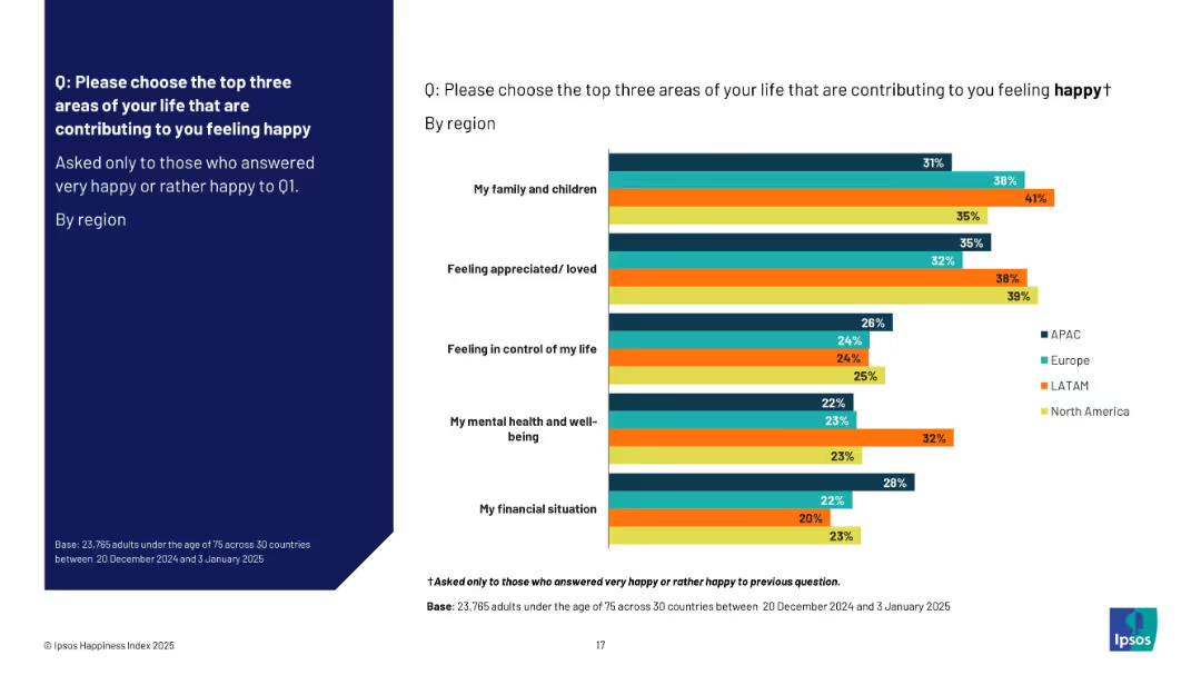
Split layout: left side features the survey question on a solid navy background; right side contains a horizontal bar chart comparing responses across four regions (APAC, Europe, LATAM, North America) with color-coded bars.
Market Analysis and Trends
Professional Services
This slide presents survey data on happiness contributors among people who reported feeling happy, segmented by region. Key contributing factors include family, appreciation, life control, mental health, and finances. The data shows varying emphasis across regions, with family and feeling appreciated ranking high globally.
happiness, well-being, regional comparison, family, appreciation, control, finances, survey data, global regions
false
Market Analysis and Trends
Professional Services
Mixed Chart
IPSOS
Add to my slides
Remove from favorites
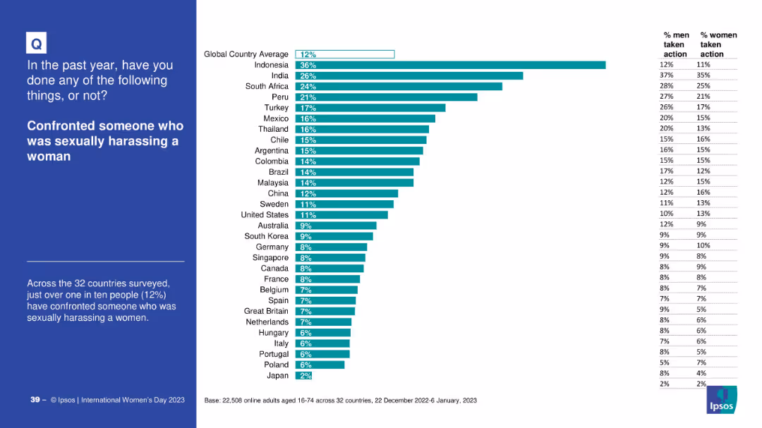
Consistent design: left-side question and description, right-side horizontal bar graph by country
Risk Assessment and Management
Government & Public Sector
This slide reveals data on how many individuals reported confronting someone for sexually harassing a woman. Global averages and gender breakdowns are provided, emphasizing relatively low confrontation rates.
harassment, confrontation, gender justice, global awareness, workplace safety, activism, Ipsos
false
Risk Assessment and Management
Government & Public Sector
Mixed Chart
IPSOS
Add to my slides
Remove from favorites
Contains column charts and demographic breakdowns, showing the reporting and satisfaction rates of harassment incidents by gender and orientation among Gen Z and Millennials. The visual design aids in understanding disparities.
Market Analysis and Trends
Professional Services
Discusses the differences in harassment reporting and satisfaction with organizational responses among different gender and orientation groups within Gen Z and Millennials.
harassment, diversity, inclusion, Gen Z, Millennials, reporting rates, satisfaction
false
Market Analysis and Trends
Professional Services
Multiple Chart
Deloitte
Add to my slides
Remove from favorites
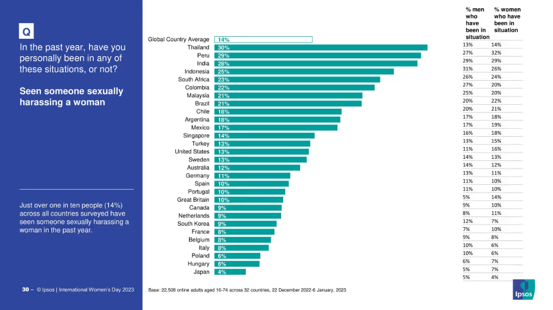
Country-wise bar chart on witnessing sexual harassment, with gender breakdown. Global average line included.
Risk Assessment and Management
Government & Public Sector
This slide presents global data on the percentage of people who witnessed sexual harassment of women in the past year. Thailand and Peru report the highest percentages, while Japan is lowest.
harassment, gender issues, observation statistics, global variance, witness data
false
Risk Assessment and Management
Government & Public Sector
Mixed Chart
IPSOS
Add to my slides
Remove from favorites
The slide features text, an image of a person, and column charts showing percentages of harassment and microaggressions experienced by Gen Zs and millennials.
Risk Assessment and Management
Professional Services
This slide examines the growing concern over harassment and microaggressions, particularly among Gen Zs, detailing experiences and impacts in the workplace.
harassment, microaggressions, Gen Z, millennials, workplace behavior, inappropriate behavior
false
Risk Assessment and Management
Professional Services
Multiple Chart
Deloitte
Add to my slides
Remove from favorites
This slide includes text, bar charts showing the percentage of respondents who reported harassment and how they felt their organization handled the issue.
Risk Assessment and Management
Professional Services
The slide discusses the reluctance of women, non-binary, and LGBT+ respondents to report harassment, and the perceived effectiveness of organizational responses.
harassment reporting, LGBT+, women, non-binary, workplace issues, organizational response
false
Risk Assessment and Management
Professional Services
Multiple Chart
Deloitte
Add to my slides
Remove from favorites
Utilizes bar charts and feedback scales to show the response effectiveness of organizations to harassment reports from Gen Z and Millennials. The layout is straightforward, focusing on readability and direct data presentation.
Market Analysis and Trends
Professional Services
This slide evaluates how well organizations handle reports of harassment from Gen Z and Millennials, highlighting the dissatisfaction with current workplace responses.
harassment response, organizational handling, Gen Z, Millennials, workplace feedback
false
Market Analysis and Trends
Professional Services
Mixed Chart
Deloitte
Add to my slides
Remove from favorites
Features pie charts and column charts detailing harassment and microaggressions in the workplace, with annotations explaining the data points. The design ensures easy comparison of statistics between Gen Z and Millennials.
Market Analysis and Trends
Professional Services
Details the prevalence of non-inclusive behaviors in workplaces affecting Gen Z and Millennials, with data on types of harassment experienced and reporting rates.
harassment, workplace, Gen Z, Millennials, non-inclusive behavior, reporting rates
false
Market Analysis and Trends
Professional Services
Multiple Chart
Deloitte
Add to my slides
Remove from favorites
Previous
Next
You don't have any favorites yet.
Please wait loading your favorites slides...
Create a FREE account to continue browsing
Receive Instant Access to 1,000+ slides from companies like McKinsey, Google, and Goldman Sachs
First Name
Last Name
Email
Password
I agree to all
Terms & Privacy Policy
Thank you! Your submission has been received!
Oops! Something went wrong while submitting the form.
Have an account?
Sign in
Upgrade to PRO to Save slides
Advanced Search and Filters
Access to 15,000+ slides
Access to Category Pages
Save/Bookmark Slides
PowerPoint Template Library
Pick a Plan
MONTHLY
$12/month
Billed every month, Cancel anytime.
YEARLY
$9/year
Billed $108 annually, Cancel anytime.
Checkout for $12/month
Checkout for $108/yr
Secured by Stripe | AES-256 bit encryption