My Account
My Slides
Search by Category
Companies
Slide Type
Use Case
Industry
Pricing
Templates
View All Templates
Download Template Slides
✦ AI
AI Prompt Library
AI Search
Feedback
Login
Logout
Get Started
Browse all Slides
Browse all Slides
Create a FREE Account
Instant access to 1,000+ real slides from top companies like McKinsey, BCG, Goldman Sachs, Google and many more!
First Name
Last Name
Email
Password
I agree to all
Terms & Privacy Policy
Thank you! Your submission has been received!
Oops! Something went wrong while submitting the form.
Have an account?
Sign in
Saved Slides
Total No. of slides saved
0
↻ Refresh
✖ Clear all
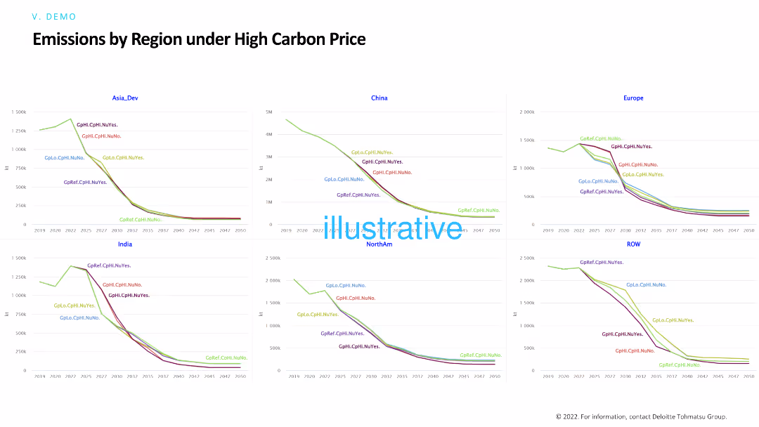
Similar to the previous slide, this one includes line charts showing emissions by region under high carbon price scenarios. The charts provide detailed comparisons of emissions trajectories for different regions over time.
Risk Assessment and Management
Environmental Services & Sustainability
This slide focuses on the impact of high carbon pricing on emissions across various regions, aiding in evaluating the effectiveness of carbon pricing policies in reducing emissions and managing environmental risks.
High carbon price, emissions, regions, environmental policies, carbon pricing
false
Risk Assessment and Management
Environmental Services & Sustainability
Multiple Chart
Deloitte
Add to my slides
Remove from favorites
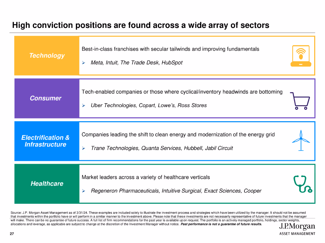
Utilizes colored sections with icons and text to highlight high conviction positions in Technology, Consumer, Electrification & Infrastructure, and Healthcare sectors.
Investment Analysis
Financial Services
Identifies and highlights key high conviction investment positions across various sectors, providing examples of companies within each sector.
high conviction, positions, sectors, technology, consumer, infrastructure, healthcare
false
Investment Analysis
Financial Services
Table
JP Morgan
Add to my slides
Remove from favorites
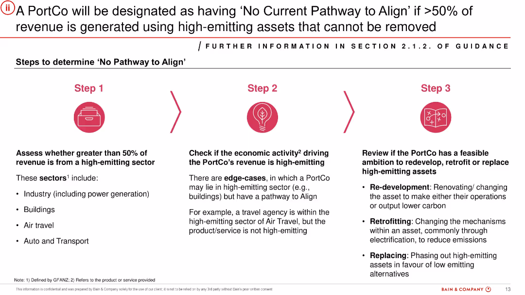
Step-by-step infographic with three sequential steps illustrated using icons. Each step has a title, brief description, and examples. Red icons and arrows highlight progression.
Risk Assessment and Management
Financial Services
Details a framework for determining when a PortCo has no viable path to align with decarbonisation goals. Criteria include revenue from high-emitting sectors, nature of economic activities, and feasibility of asset transition. Intended to classify assets realistically based on emissions challenges.
high-emitting sectors, alignment, risk, emissions, PortCo, feasibility, transition plan
false
Risk Assessment and Management
Financial Services
Linear Flow
Bain
Add to my slides
Remove from favorites
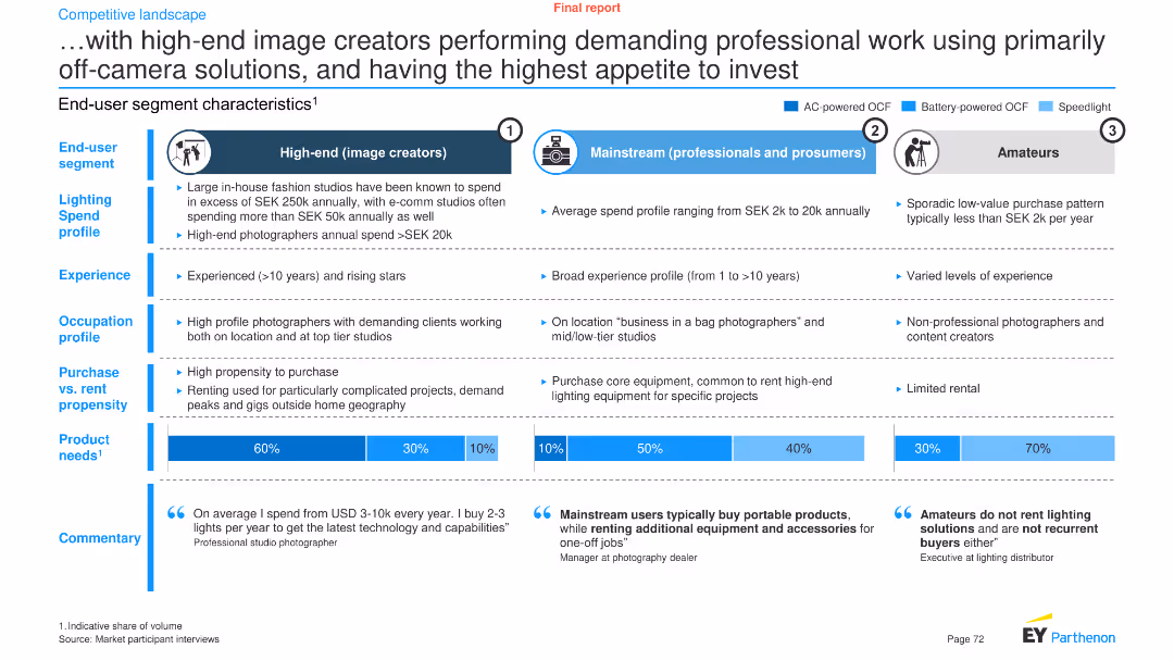
This slide has a comparative layout featuring three vertical sections. Each section describes a different end-user segment with icons, text, and bar graphs.
Market Analysis and Trends
Professional Services
It analyzes the characteristics, spending profiles, and product needs of high-end image creators, mainstream professionals, and amateurs.
High-end, image creators, lighting spend, segments, product needs, investment, professional work, end-user, market analysis, trends
false
Market Analysis and Trends
Professional Services
Multiple Chart
EY
Add to my slides
Remove from favorites
A stacked column chart illustrates the segmentation of the tourism industry in Europe by revenue, highlighting the high-end sector.
Market Analysis and Trends
Hospitality & Tourism
Discusses the market size and economic value of the high-end tourism sector within the broader European tourism industry.
High-end tourism, Market segmentation, Revenue, Europe
false
Market Analysis and Trends
Hospitality & Tourism
Multiple Chart
Bain
Add to my slides
Remove from favorites
A bar chart showing real GDP growth in selected economies for 2024 under baseline and higher-for-longer scenarios, with detailed text analysis on inflation, central bank policies, and economic conditions.
Risk Assessment and Management
Financial Services
This slide analyzes a higher-for-longer scenario where delayed easing by central banks amid sticky inflation trends could lead to recessionary conditions in key advanced economies.
higher-for-longer, GDP growth, inflation, central banks, economic conditions, 2024
false
Risk Assessment and Management
Financial Services
Mixed Chart
EY
Add to my slides
Remove from favorites
Features circular diagrams showing aspects of creativity in high-growth brands, with accompanying text discussing creative business transformation.
Market Analysis and Trends
Professional Services
This slide examines how high-growth brands foster creativity, encouraging risk-taking and collaboration, and compares these aspects with negative-growth brands.
high-growth, brands, creativity, professional services, market trends
false
Market Analysis and Trends
Professional Services
Multiple Chart
Deloitte
Add to my slides
Remove from favorites
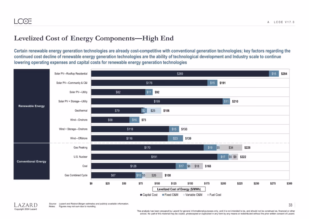
Same structure as slide 16648 but illustrates the high-end cost estimates for the same energy technologies.
Performance Metrics and KPIs
Energy & Utilities
Complements the previous slide by illustrating high-end LCOE estimates, revealing the cost variability in energy generation technologies. Highlights upper-bound costs influenced by regional and technological factors across renewable and conventional sources.
high LCOE, energy cost, renewables, fossil fuels, operating cost, capital intensity
false
Performance Metrics and KPIs
Energy & Utilities
Single Chart
Roland Berger
Add to my slides
Remove from favorites
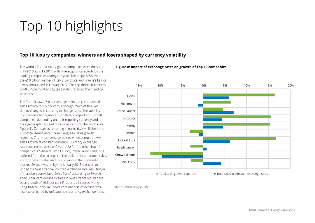
Text on the left summarizing the financial performance of the top 10 luxury companies, accompanied by a horizontal bar chart on the right comparing the impact of exchange rates on sales growth across these companies.
Financial Performance
Consumer Goods
The slide highlights the financial performance and currency exchange impact on the top 10 luxury companies, showing reported sales growth and the effects of exchange rate fluctuations. It is useful for understanding financial dynamics in the luxury sector.
Highlights, Financial, Performance, Luxury, Companies
false
Financial Performance
Consumer Goods
Mixed Chart
Deloitte
Add to my slides
Remove from favorites
The slide includes a column chart comparing vacancy rates and a bar chart showing timely application processing. It has a mix of text and visual data elements, with a clear focus on workforce metrics.
Operational Efficiency
Professional Services
Slide includes bar charts and a text block. Displays vacancy comparisons and application processing timeliness over time.
Highlights workforce capacity issues within DEHS, comparing vacancy rates and analyzing the timeliness of application processing over a specified period.
false
Operational Efficiency
Professional Services
Multiple Chart
Alvarez & Marsal
Add to my slides
Remove from favorites
Featuring a map of the U.S., this slide provides data points on the firm’s advisors, clients, and revenues, emphasizing their market presence. The design uses contrasting colors and icons to depict expansion in high net worth services.
Market Analysis and Trends
Financial Services
The slide promotes the firm's expansion into the high net worth sector within the U.S., highlighting its presence in key metropolitan areas and the importance of management fees to its revenue stream.
high net worth, expansion, U.S. market, advisors, revenue
false
Market Analysis and Trends
Financial Services
Graphic
Goldman Sachs
Add to my slides
Remove from favorites
This slide features a pie chart and a column chart detailing the segmentation of EO optical high-resolution market by industry. The layout is structured, containing explanatory texts and data labels.
Market Analysis and Trends
Environmental Services & Sustainability
The slide presents a detailed analysis of the EO downstream market shift towards higher resolution data and its implications on various industries. It’s useful for understanding market segmentation and potential data service opportunities.
high-resolution data, market shift, industry segmentation, data services, open data
false
Market Analysis and Trends
Environmental Services & Sustainability
Multiple Chart
PwC/Strategy&
Add to my slides
Remove from favorites
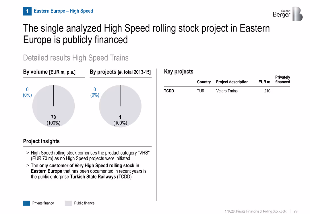
Single project table, pie charts show 0% private finance
Product and Service Analysis
Transportation & Logistics
The only high-speed rail project documented in Eastern Europe (TCDD in Turkey) is fully publicly financed. No private investment noted.
high-speed rail, Eastern Europe, TCDD, Turkey, public finance, Velaro, infrastructure
false
Product and Service Analysis
Transportation & Logistics
Mixed Chart
Roland Berger
Add to my slides
Remove from favorites
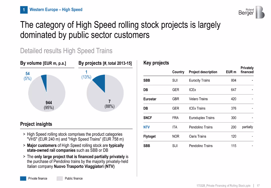
Pie charts, title, two data visuals (volume & projects), list of key projects with country/financing info
Product and Service Analysis
Transportation & Logistics
High-speed rail projects in Western Europe are mainly publicly funded, with only one partially private project (NTV in Italy). State-owned companies dominate.
high speed, rail, public sector, NTV, Italy, SNCF, SBB, DB, funding share, project breakdown
false
Product and Service Analysis
Transportation & Logistics
Mixed Chart
Roland Berger
Add to my slides
Remove from favorites
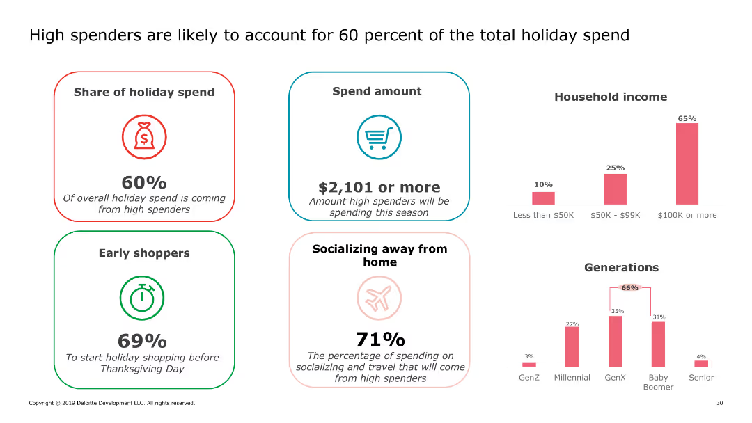
This slide includes multiple sections with different statistics about high spenders. It features icons and percentages related to share of holiday spend, spend amount, early shoppers, and socializing away from home.
Market Analysis and Trends
Retail & E-commerce
The slide discusses the significant impact of high spenders on overall holiday spending, highlighting their spending habits, early shopping behavior, and spending on socializing away from home.
high spenders, holiday spending, consumer behavior, early shopping, social spending
false
Market Analysis and Trends
Retail & E-commerce
Multiple Chart
Deloitte
Add to my slides
Remove from favorites
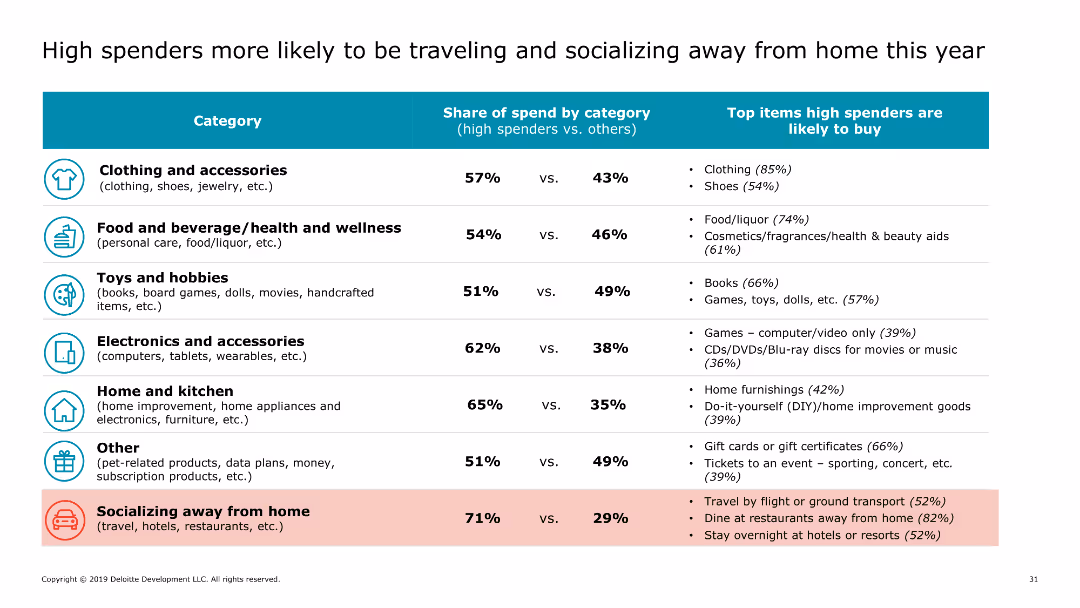
The slide features a table comparing the share of spend by category between high spenders and others. Categories include clothing and accessories, food and beverage, toys and hobbies, electronics, and socializing away from home.
Market Analysis and Trends
Retail & E-commerce
This slide provides a detailed breakdown of spending categories for high spenders versus other consumers, showing that high spenders allocate more budget to travel and social activities during the holiday season.
high spenders, holiday spending, spending categories, consumer behavior, travel spending
false
Market Analysis and Trends
Retail & E-commerce
Table
Deloitte
Add to my slides
Remove from favorites
Features pie charts, percentage callouts, and bullet points emphasizing the focus of high-tech leaders on as-a-service models for growth.
Investment Analysis
Technology & Software
Highlights the strategic focus of high-tech leaders on as-a-service for scaling businesses and the priorities of C-suite executives.
high-tech, as-a-service, leadership, C-suite, strategy, scaling
false
Investment Analysis
Technology & Software
Multiple Chart
Accenture
Add to my slides
Remove from favorites
Contains a central diagram with five strategic actions around it, each action is represented with an icon and a brief description.
Operational Efficiency
Technology & Software
Details the five fundamental actions high-tech companies should take to effectively adopt as-a-service models, from ecosystem expansion to redesigning the operating model.
high-tech, as-a-service, strategy, ecosystem, operating model, business
true
Operational Efficiency
Technology & Software
Diagram
Accenture
Add to my slides
Remove from favorites
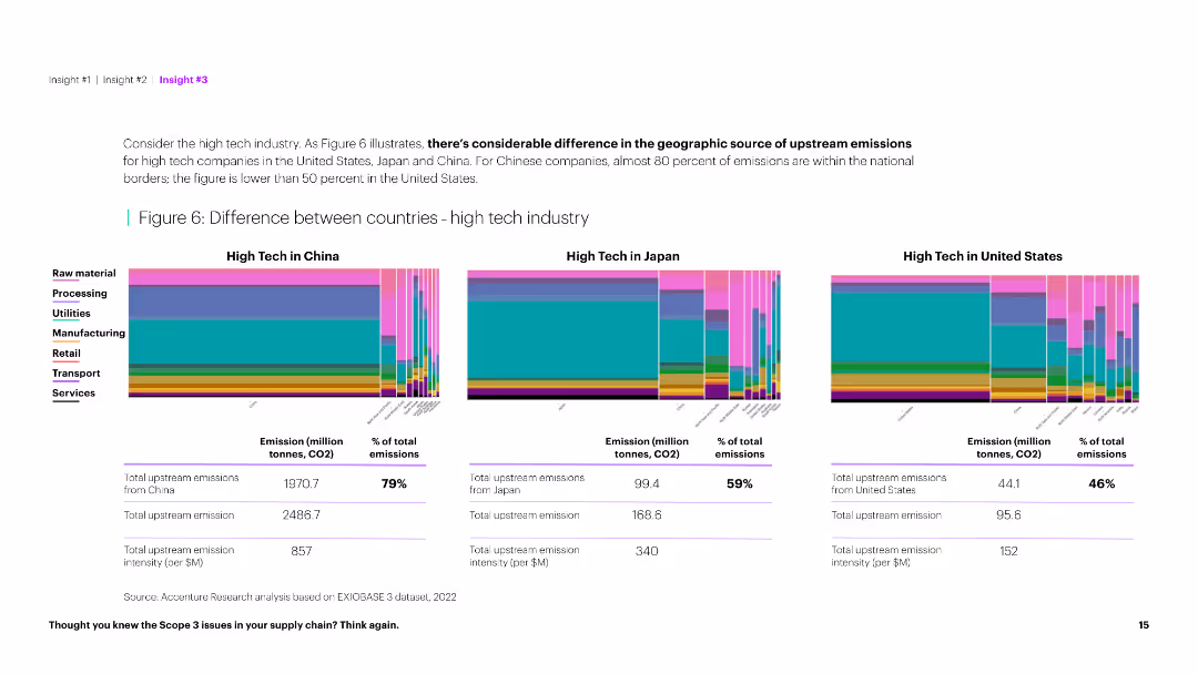
The slide features column charts comparing upstream emissions in the high tech industry across China, Japan, and the US, along with summary tables below.
Market Analysis and Trends
Technology & Software
This slide illustrates the significant differences in upstream emissions in the high tech industry among China, Japan, and the US, providing a comparative analysis.
High tech, emissions, country comparison, China, Japan, US, upstream, industry analysis, environmental impact, data visualization, sustainability
false
Market Analysis and Trends
Technology & Software
Multiple Chart
Accenture
Add to my slides
Remove from favorites
This Comparative Slide outlines Michelin’s expertise across 'R&D', 'MANUFACTURING', and 'GROWTH STRATEGY', using a balanced mix of text and images. The design is dense but clear, with color-coded sections and relevant images providing visual cues to the information presented. The structure allows for easy comparison of the three areas and their interconnectedness.
Technology and Digital Transformation
Industrial & Manufacturing
The slide describes Michelin's approach to expanding its high-tech materials business, detailing their R&D capabilities, manufacturing scalability, and growth strategies, including organic growth and M&A. It stresses the importance of leveraging their expertise beyond tires into more demanding applications, showing the connection between their foundational strengths and future growth potential.
high-tech materials, R&D, manufacturing, growth strategy, organic growth, M&A, expertise, Michelin
false
Technology and Digital Transformation
Industrial & Manufacturing
Linear Flow
Morgan Stanley
Add to my slides
Remove from favorites
The slide depicts a circular diagram with four quadrants, each containing an icon and text. The purple central circle anchors the design, while arrows point outward to the individual pathways described.
Strategic Planning
Technology & Software
Outlines four strategic pathways that High Tech companies can pursue to expand industry boundaries, such as mergers & acquisitions, strategic alliances, demand sensors, and leveraging the installed base for expansion into adjacent areas.
High Tech, mergers & acquisitions, strategic alliances, demand sensors, adjacent areas, industry ecosystems, leapfrog growth, market-relevant joint offerings, bespoke solutions, installed base
true
Strategic Planning
Technology & Software
Diagram
Accenture
Add to my slides
Remove from favorites
Uses a combination of bold text, numbering, and colored backgrounds to highlight five strategic imperatives for C-level executives in the high-tech industry.
Strategic Planning
Technology & Software
Outlines the primary strategic imperatives for high-tech C-level executives, focusing on as-a-service models and industry expansion.
high-tech, strategy, as-a-service, C-level, executives, industry expansion
false
Strategic Planning
Technology & Software
Linear Flow
Accenture
Add to my slides
Remove from favorites
Features a hexagonal, honeycomb-like graphic with icons and bullet points describing eight significant trends in the high-tech industry.
Strategic Planning
Technology & Software
The slide illustrates key industry trends impacting the high-tech sector, such as AI integration and 5G solutions, indicating a shift in industry paradigms.
high-tech, trends, AI, 5G, industry paradigm, cloud computing, smart devices
false
Strategic Planning
Technology & Software
Diagram
Accenture
Add to my slides
Remove from favorites
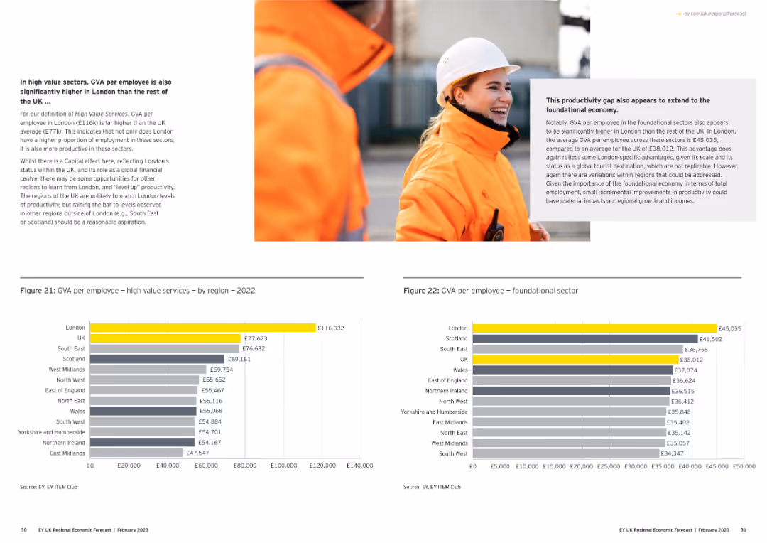
The left side of the slide contains a text box describing GVA in high value sectors. Below, two column charts compare GVA per employee in high value services and foundational sectors across different regions.
Market Analysis and Trends
Professional Services
The slide highlights the significant differences in GVA per employee in high value sectors and foundational sectors, emphasizing the higher productivity in London compared to other regions.
high value services, GVA, London, productivity, regional comparison
false
Market Analysis and Trends
Professional Services
Multiple Chart
EY
Add to my slides
Remove from favorites
This slide shows a line chart with multiple series representing high yield bond spreads, default rates, and energy sector spreads.
Financial Performance
Financial Services
The slide discusses high yield bond spreads and default rates, comparing energy and non-energy sectors and historical performance during recessions.
high yield bonds, default rates, energy sector, financial trends, bond spreads
false
Financial Performance
Financial Services
Single Chart
JP Morgan
Add to my slides
Remove from favorites
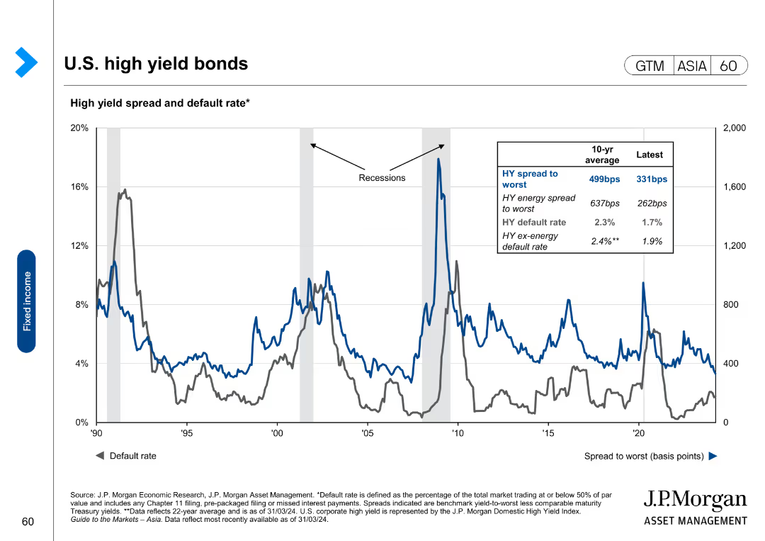
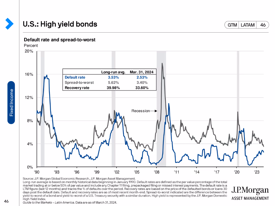
This slide features a line chart showing the default rate, spread-to-worst, and recovery rate for U.S. high yield bonds from 1990 to 2023. The chart uses three lines to represent different metrics, with annotations for key historical events.
Financial Performance
Financial Services
It presents historical data on default rates, spread-to-worst, and recovery rates for high yield bonds, highlighting trends and significant economic events that influenced these metrics.
High yield bonds, default rates, spread-to-worst, recovery rate, historical data
false
Financial Performance
Financial Services
Single Chart
JP Morgan
Add to my slides
Remove from favorites
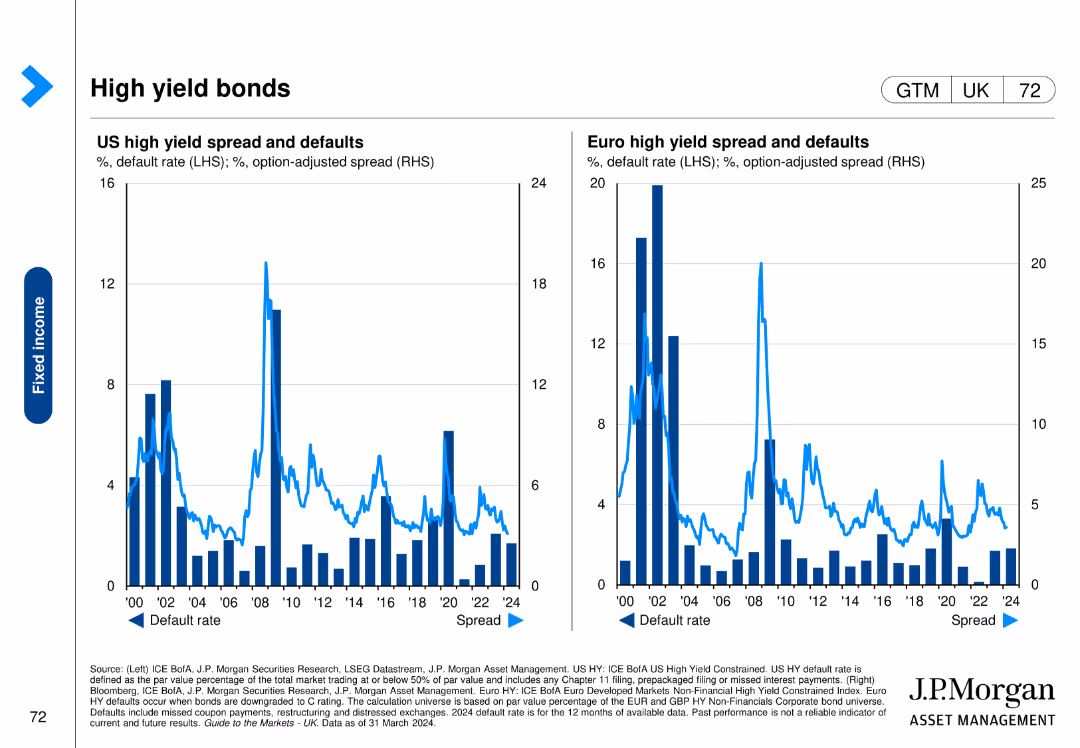
Features two column charts comparing US and Euro high yield spread and defaults over time, with default rates and option-adjusted spreads.
Financial Performance
Financial Services
This slide analyzes high yield bonds in the US and Europe, focusing on spread and default rates to assess the risk and performance of these bonds.
high yield bonds, spreads, defaults, US, Euro
false
Financial Performance
Financial Services
Multiple Chart
JP Morgan
Add to my slides
Remove from favorites
The slide features a dual-axis line chart tracking cumulative flows of US and European high yield bonds from 2013 to 2023. It uses a blue color scheme with two distinct lines, one for each region.
Market Analysis and Trends
Financial Services
This slide presents a comparison of high yield bond funds in the US and Europe, showing a trend of shrinkage since the end of 2020. It is useful for analyzing market movements and investment strategies in the corporate credit sector.
High Yield, Bonds, US, Europe, Trend, Market Analysis, Investment, Corporate Credit, Data Visualization
false
Market Analysis and Trends
Financial Services
Single Chart
Morgan Stanley
Add to my slides
Remove from favorites
Contains two sets of dual column charts for U.S. and European high-yield credit, showing trends in gross leverage and interest coverage over a decade.
Risk Assessment and Management
Financial Services
Slide compares the U.S. and European high-yield credit markets, focusing on gross leverage and interest coverage decline. Aimed at risk assessment in credit markets.
high-yield, credit, US, Europe, risk, leverage, interest, coverage, market, fundamentals
false
Risk Assessment and Management
Financial Services
Multiple Chart
Morgan Stanley
Add to my slides
Remove from favorites
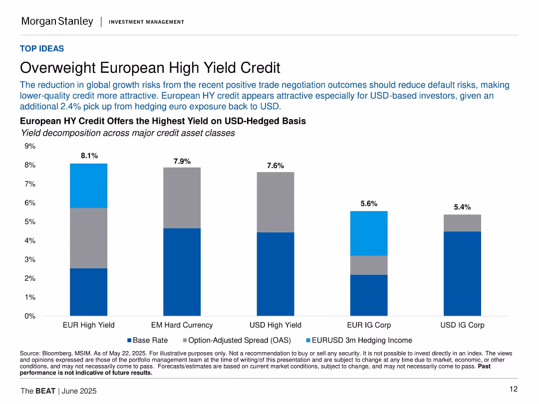
Vertical bar chart showing yields across credit classes; clean layout with three-part bar segmentation.
Investment Analysis
Financial Services
The slide recommends overweighting European High Yield (HY) credit, citing reduced global risks and high hedged yields. It compares yields (base rate, OAS, hedging income) across five credit asset types.
high yield, European credit, investment, spreads, hedging, yield comparison, bonds, fixed income, credit markets
false
Investment Analysis
Financial Services
Single Chart
Morgan Stanley
Add to my slides
Remove from favorites
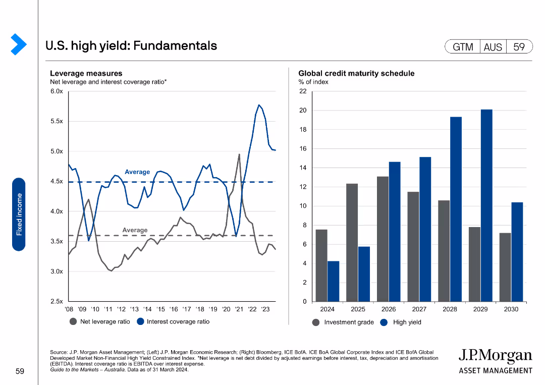
The slide features two charts: a line chart on the left showing net leverage and interest coverage ratio, and a column chart on the right showing global credit maturity schedule.
Market Analysis and Trends
Financial Services
It presents fundamental data on U.S. high-yield bonds, including leverage and maturity schedules, useful for analyzing financial health and risks in the high-yield market.
high yield, fundamentals, leverage, maturity, credit
false
Market Analysis and Trends
Financial Services
Multiple Chart
JP Morgan
Add to my slides
Remove from favorites
This slide has two line charts. The left chart shows the High Yield OAS from 1998 to 2023, while the right chart compares yields of Floating-Rate Loans, Emerging Markets, and High-Yield Bonds from 2015 to 2024.
Investment Analysis
Financial Services
The slide evaluates the current high yield market, showing that tight spreads offer less value and suggesting a shift to bank loans due to tighter spreads in the high yield market.
High Yield, OAS, Floating-Rate Loans, Emerging Markets, High-Yield Bonds, Investment, Market Trends
false
Investment Analysis
Financial Services
Multiple Chart
Morgan Stanley
Add to my slides
Remove from favorites
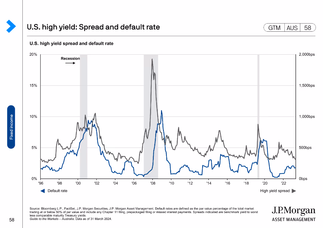
The slide contains a line chart showing the U.S. high yield spread and default rate over time, with marked recessions for context.
Market Analysis and Trends
Financial Services
It provides historical data on the spread and default rates of U.S. high-yield bonds, useful for assessing the risk and performance of high-yield markets.
high yield, spread, default rate, U.S., bonds
false
Market Analysis and Trends
Financial Services
Single Chart
JP Morgan
Add to my slides
Remove from favorites
Text and infographic on the left; vibrant hiking photo on the right. Descriptive, with teal accent colors.
Customer and Market Segmentation
Media & Entertainment
Hiking is profiled as the UK’s second most popular participation sport. The slide emphasizes its gender balance, youth appeal, and adjacency to lifestyle and retail sectors as growth levers.
hiking, participation, UK sport, gender balanced, lifestyle, youth, growth opportunities
false
Customer and Market Segmentation
Media & Entertainment
Mixed Chart
EY
Add to my slides
Remove from favorites
This slide includes a map and column charts showing the number of gaseous and liquid HRS globally, highlighting operational status and future plans.
Operational Efficiency
Energy & Utilities
The slide maps out existing H₂ production and distribution infrastructure, noting the phase-out of liquid HRS and the focus on gaseous systems for mobility.
H₂, Infrastructure, Mobility, Gaseous, Liquid HRS
false
Operational Efficiency
Energy & Utilities
Multiple Chart
Roland Berger
Add to my slides
Remove from favorites
The slide displays three column charts. The first illustrates a significant increase in global private bank client advisor joiners. The second shows a dramatic increase in training hours per new hire. The third exhibits a sharp rise in client asset flows from new hires. Each chart has a key takeaway indicated by an upward arrow and a multiplier.
Human Resources and Talent Management
Financial Services
It focuses on the investment in human capital, showcasing the hiring and training of financial advisors and their contribution to client asset flows. Ideal for discussions on talent acquisition strategies or HR analytics.
hiring, advisors, training, human resources, talent acquisition
false
Human Resources and Talent Management
Financial Services
Multiple Chart
JP Morgan
Add to my slides
Remove from favorites
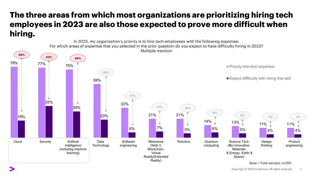
A column chart comparing the prioritization and difficulty of hiring tech skills, showing a discrepancy between priorities and hiring challenges.
Human Resources and Talent Management
Professional Services
The slide compares areas prioritized for tech hiring in 2023 with the expected difficulty in hiring, highlighting potential recruitment challenges.
hiring challenges, tech skills, recruitment, priorities
false
Human Resources and Talent Management
Professional Services
Single Chart
Accenture
Add to my slides
Remove from favorites
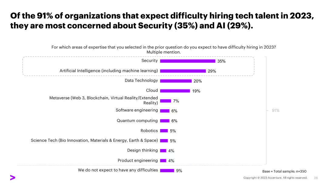
A column chart showing specific tech skills organizations find difficult to hire, such as Security and AI, with percentage values for each skill.
Human Resources and Talent Management
Professional Services
The slide shows the tech skills that organizations find difficult to hire in 2023, focusing on Security and AI, providing insight into talent acquisition issues.
hiring difficulties, Security, AI, tech skills, survey
false
Human Resources and Talent Management
Professional Services
Single Chart
Accenture
Add to my slides
Remove from favorites
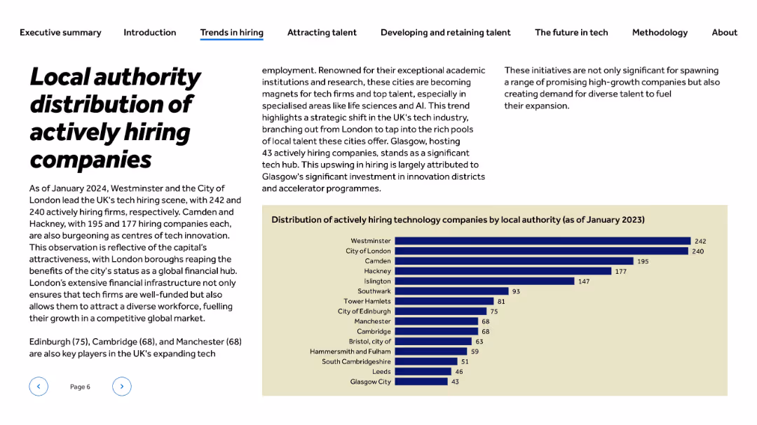
Left-aligned bold title and body text; right-aligned paragraph blocks; bar chart on beige background at bottom-right
Market Analysis and Trends
Technology & Software
This slide highlights the UK local authorities with the highest number of actively hiring tech firms as of January 2024. Westminster and the City of London lead with over 240 companies each, followed by Camden and Hackney. The content emphasizes the role of London as a global tech hub and includes hiring data from other cities like Glasgow and Edinburgh.
hiring distribution, tech companies, local authority, London, innovation, Glasgow, boroughs, talent, accelerator, job market, UK tech
false
Market Analysis and Trends
Technology & Software
Mixed Chart
Barclays
Add to my slides
Remove from favorites
The slide contrasts traditional vs. flexible hiring methods, with two columns of text and icons. There is a highlighted quote at the bottom from a business owner.
Human Resources and Talent Management
Technology & Software
It compares traditional and flexible hiring criteria, emphasizing the need for broader talent search approaches, aimed at HR professionals and hiring managers.
hiring methods, talent search, competencies, qualifications, HR, flexible hiring, traditional hiring, recruitment
false
Human Resources and Talent Management
Technology & Software
Header Horizontal
Kearney
Add to my slides
Remove from favorites
With a blue theme, this slide has two main columns comparing common issues with best practices in hiring, accompanied by related icons and labeled sections.
Human Resources and Talent Management
Technology & Software
It advocates for a seamless hiring process to ensure a positive candidate experience, targeting HR teams and recruitment strategies.
hiring process, candidate experience, HR, recruitment, best practices, common issues
false
Human Resources and Talent Management
Technology & Software
Header Horizontal
Kearney
Add to my slides
Remove from favorites
The slide contains a column chart showing the number of relationship managers and net hires across regions, alongside metrics for RM productivity improvements in CHF mn. Bullet points highlight strategic hiring efforts and productivity gains.
Human Resources and Talent Management
Financial Services
The slide illustrates the impact of targeted hiring in growth markets, showing net hires and productivity gains. It emphasizes the strategic approach to upgrading the talent base, resulting in higher RM productivity and improved client management outcomes.
hiring, productivity, talent management, RM, growth markets
false
Human Resources and Talent Management
Financial Services
Multiple Chart
Credit Suisse
Add to my slides
Remove from favorites
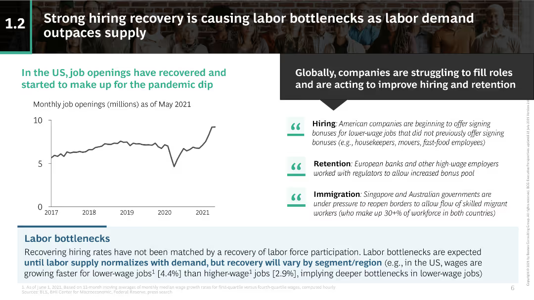
Line chart illustrating the recovery of job openings in the US; text blocks discussing hiring, retention, and immigration issues.
Market Analysis and Trends
Professional Services
Examines the recovery of job openings post-pandemic and the resulting labor bottlenecks due to a supply-demand mismatch, with a focus on hiring, retention, and immigration.
hiring recovery, job openings, labor bottlenecks, labor demand, retention, immigration, labor market, US job market, pandemic recovery
false
Market Analysis and Trends
Professional Services
Mixed Chart
BCG
Add to my slides
Remove from favorites
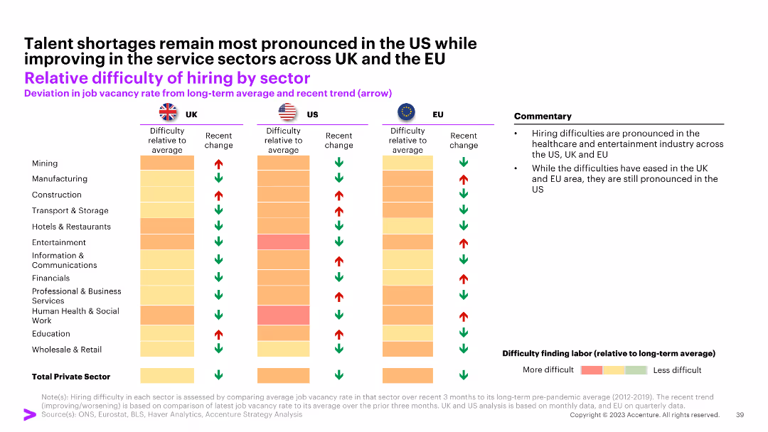
The slide contains a comparative bar chart showing the relative difficulty of hiring by sector for the UK, US, and EU, with color-coded arrows indicating trends.
Human Resources and Talent Management
Professional Services
The slide examines the hiring difficulties across various sectors in the UK, US, and EU, highlighting sector-specific challenges and improvements.
hiring, sector, difficulty, UK, US, EU
false
Human Resources and Talent Management
Professional Services
Table
Accenture
Add to my slides
Remove from favorites
Slide includes a line chart comparing past and expected future marketing hires, segmented by economic sector.
Human Resources and Talent Management
Professional Services
Analyzes trends in marketing recruitment, indicating a recovery to pre-Covid hiring levels and sectors leading the growth.
hiring trends, marketing recruitment, sector comparison, growth analysis, line graph
false
Human Resources and Talent Management
Professional Services
Mixed Chart
Deloitte
Add to my slides
Remove from favorites
The slide features column charts depicting the gender distribution of Hispanic employees across different professional levels in the venture capital sector. Accompanying textual descriptions provide additional context.
Human Resources and Talent Management
Professional Services
This slide details the gender distribution of Hispanic employees in the venture capital industry, providing comparative data from 2018, 2020, and 2022, and highlighting trends and disparities in representation.
Hispanic employees, Gender diversity, VC industry, Diversity analysis, Professional levels
false
Human Resources and Talent Management
Professional Services
Multiple Chart
Deloitte
Add to my slides
Remove from favorites
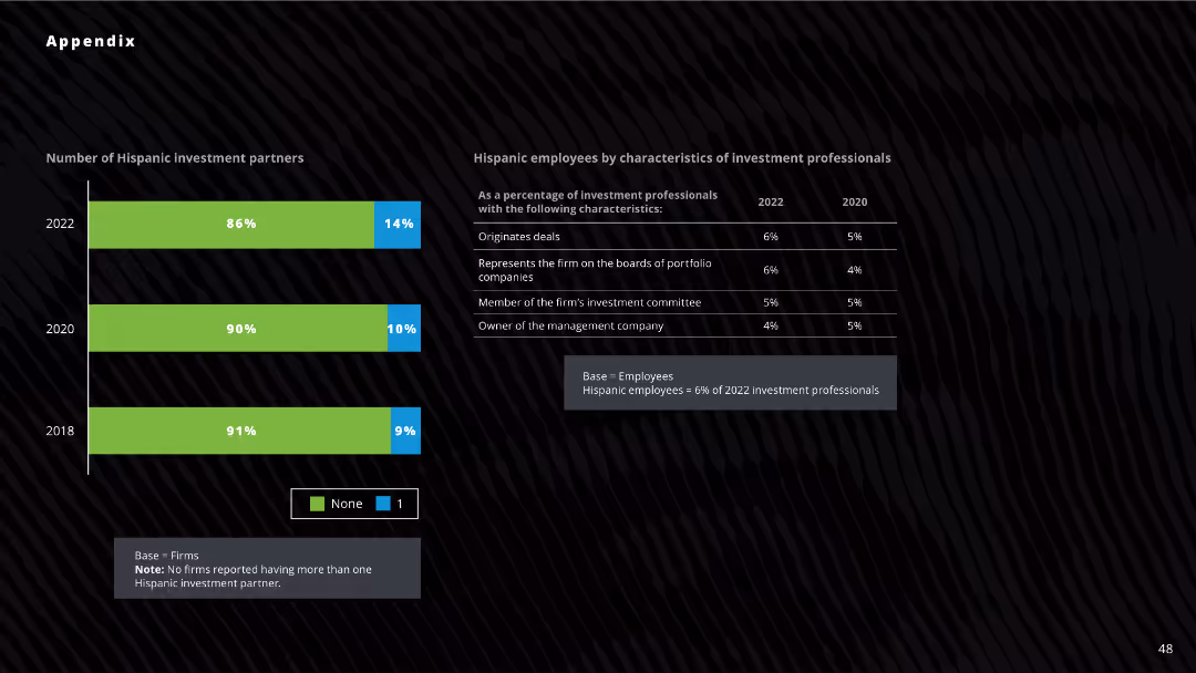
Column chart displaying the number of Hispanic investment partners across three years (2018, 2020, 2022). Data table to the right shows characteristics of Hispanic employees in investment firms.
Investment Analysis
Financial Services
The slide shows the percentage of firms with Hispanic investment partners and the roles of Hispanic employees in investment firms for 2022, 2020, and 2018. Useful for analyzing diversity in investment partnerships and roles.
Hispanic, investment, partners, diversity, analysis
false
Investment Analysis
Financial Services
Mixed Chart
Deloitte
Add to my slides
Remove from favorites
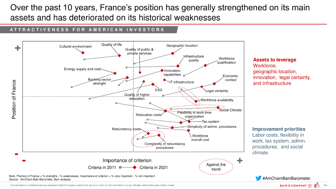
The slide contains a chart comparing France's position in 2011 and 2021 on various criteria, showing improvements and deteriorations over time.
Strategic Planning
Education & Training
This slide highlights the changes in France's strengths and weaknesses over the past decade, with improvements in key assets and ongoing challenges.
Historical comparison, Strengths, Weaknesses, Education, Training
false
Strategic Planning
Education & Training
Mixed Chart
Bain
Add to my slides
Remove from favorites
Contains two overlapping line graphs tracking the rate changes over time, complemented by a column chart for annual data. The layout is clean with a clear title.
Market Analysis and Trends
Financial Services
Evaluates insurance rate trends over an extended period, highlighting shifts in the market, with a focus on the direct Energy sector. Provides historical data to assess market conditions.
historical data, insurance rates, market analysis, energy sector, trends
false
Market Analysis and Trends
Financial Services
Mixed Chart
PwC/Strategy&
Add to my slides
Remove from favorites
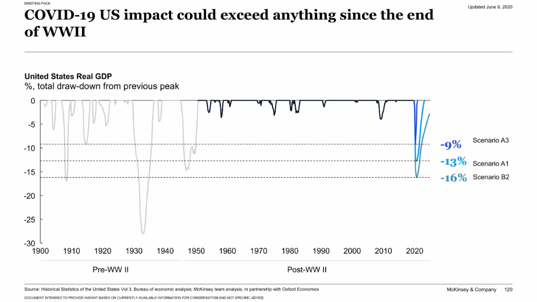
Full-width historical line chart showing draw-downs in US GDP from 1900 to 2020. Highlights three modern COVID-19 scenarios.
Risk Assessment and Management
Financial Services
Illustrates that potential GDP drawdowns from COVID-19 in the US could exceed post-WWII recessions. Visualizes historical drawdowns vs. estimated drawdowns from scenarios A3, A1, and B2.
historical GDP, recession, COVID-19 impact, US economy, draw-down
false
Risk Assessment and Management
Financial Services
Single Chart
McKinsey
Add to my slides
Remove from favorites
This slide includes two line charts comparing the historical levelized cost of energy for unsubsidized wind and solar PV from 2009 to 2023.
Market Analysis and Trends
Energy & Utilities
The slide analyzes historical cost trends for unsubsidized wind and solar PV energy, showing significant cost reductions and potential areas for further improvements and competitiveness.
Historical LCOE, Wind Energy, Solar PV, Cost Trends, Unsubsidized Energy
false
Market Analysis and Trends
Energy & Utilities
Multiple Chart
Roland Berger
Add to my slides
Remove from favorites
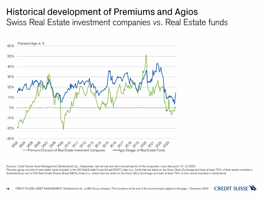
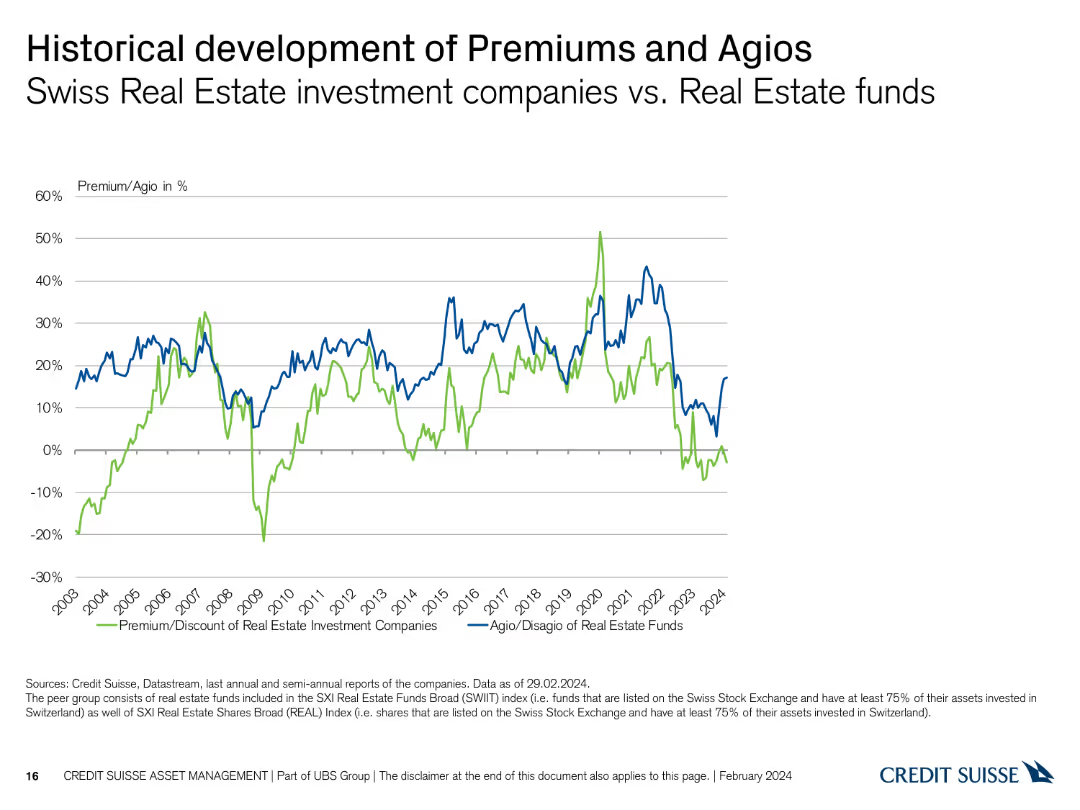
This slide contains a line chart comparing the historical development of premiums and agios for Swiss real estate funds.
Market Analysis and Trends
Real Estate & Construction
It shows the historical trends in premiums and agios for Swiss real estate investment companies versus real estate funds from 2003 to 2023.
historical, premiums, agios, real estate, funds
false
Market Analysis and Trends
Real Estate & Construction
Single Chart
Credit Suisse
Add to my slides
Remove from favorites
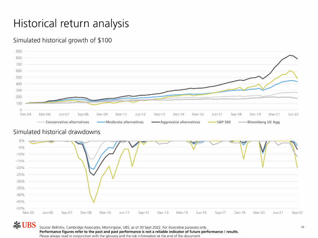
Features two line charts, one showing simulated historical growth of $100 and the other depicting simulated historical drawdowns.
Financial Performance
Financial Services
Analyzes historical returns of different investment strategies, comparing their growth and drawdowns over time to evaluate performance and risk.
Historical Returns, Growth, Drawdowns, Investment, Performance, Simulation, Analysis, Comparison, Strategies
false
Financial Performance
Financial Services
Multiple Chart
UBS
Add to my slides
Remove from favorites
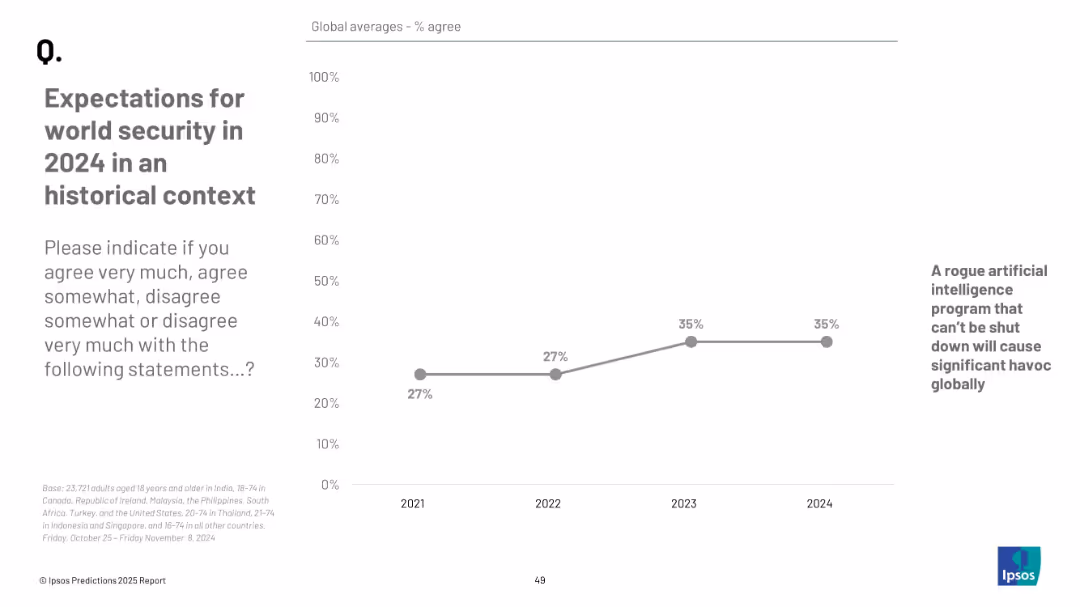
Line chart from 2021 to 2024; x-axis years, y-axis % agree; one question tracked over time; plain design
Risk Assessment and Management
Government & Public Sector
This slide tracks agreement over time (2021–2024) on the likelihood of a rogue AI causing global havoc. Agreement rose from 27% in 2021 to 35% by 2023–2024.
historical trend, AI risk, security perception, public opinion, Ipsos data, technology threat, chart
false
Risk Assessment and Management
Government & Public Sector
Mixed Chart
IPSOS
Add to my slides
Remove from favorites
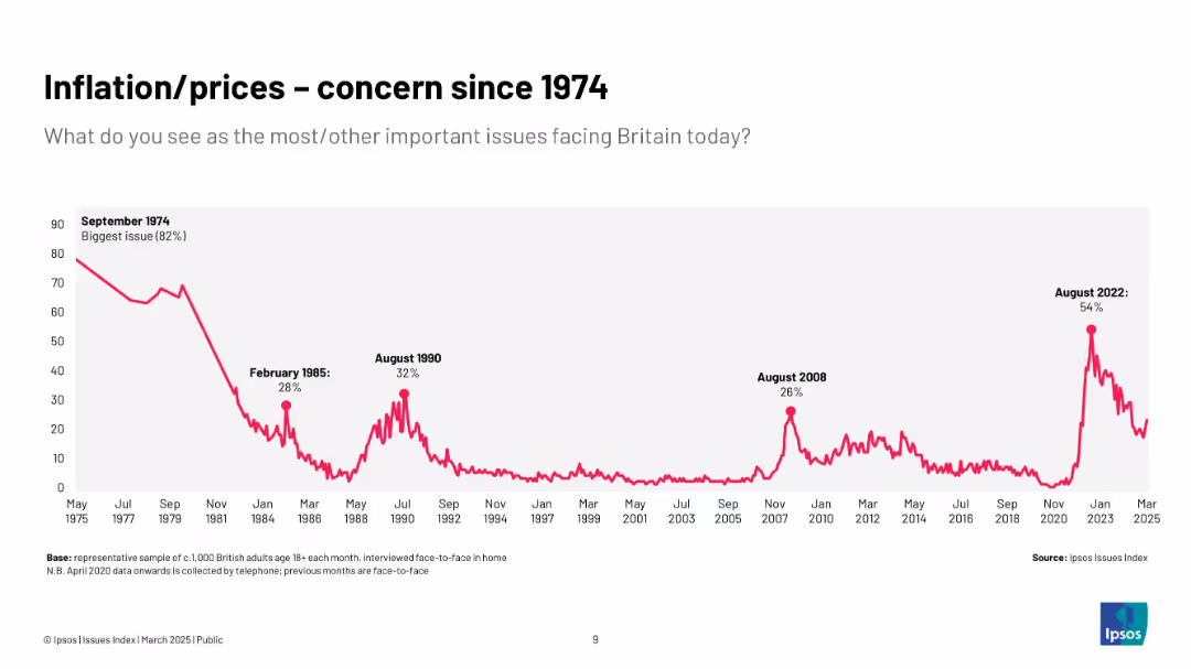
Extended historical chart (1974–2025) with inflation concern peaks in 1974, 1985, 1990, 2008, and 2022; all-time high in 1974.
Market Analysis and Trends
Government & Public Sector
Provides a historical context of inflation as a top public concern, emphasizing long-term trends and cyclical patterns over five decades, showing the recurring nature of inflationary fears.
historical trends, inflation, public opinion, Ipsos, UK, economy, long-term, prices
false
Market Analysis and Trends
Government & Public Sector
Single Chart
IPSOS
Add to my slides
Remove from favorites
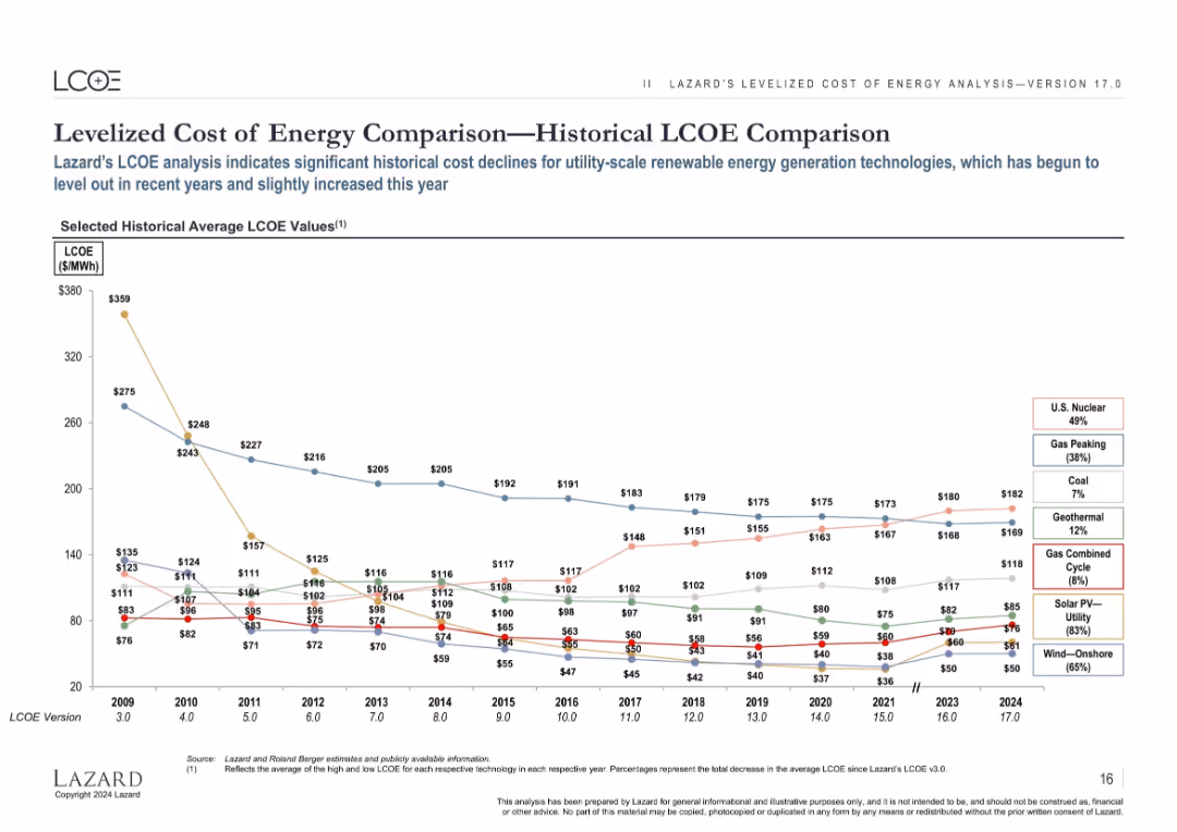
Line chart showing LCOE trends from 2009–2024 for various energy types; each source is represented by a colored line.
Market Analysis and Trends
Energy & Utilities
Tracks the historical decline in LCOE for renewables and compares it to fossil energy sources, showing strong long-term cost reductions, particularly for wind and solar, with a slight uptick in recent years.
historical trends, LCOE, renewable cost, time series, solar, wind, coal, nuclear, gas
false
Market Analysis and Trends
Energy & Utilities
Single Chart
Roland Berger
Add to my slides
Remove from favorites
This slide features a line chart depicting the historical development of premiums and agios for Swiss Real Estate investment companies versus Real Estate funds.
Market Analysis and Trends
Real Estate & Construction
It compares historical premium and agio rates, providing insights into market trends and performance over time in the Real Estate sector.
historical trends, premiums, agios, Real Estate, investment companies, funds
false
Market Analysis and Trends
Real Estate & Construction
Single Chart
Credit Suisse
Add to my slides
Remove from favorites
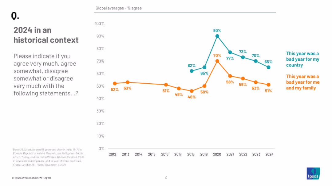
Line graph showing annual agreement trends from 2012 to 2024 for two statements, distinguished by color and labeled annotations.
Market Analysis and Trends
Professional Services
The slide shows longitudinal data on public agreement that 2024 was a bad year, both nationally and personally. Agreement levels have declined in recent years, peaking during 2020–2021, with 65% and 51% agreeing in 2024.
historical trends, public perception, 2024 reflection, sentiment analysis, Ipsos data, opinion tracking
false
Market Analysis and Trends
Professional Services
Mixed Chart
IPSOS
Add to my slides
Remove from favorites
This slide presents a line chart showing historical trends in the levelized cost of energy for various utility-scale renewable energy technologies over time.
Market Analysis and Trends
Energy & Utilities
The slide tracks the historical cost declines in utility-scale renewable energy, providing insights into cost trends, technological advancements, and market competitiveness over several years.
Historical Trends, Utility-Scale, LCOE, Renewable Energy, Cost Decline
false
Market Analysis and Trends
Energy & Utilities
Single Chart
Roland Berger
Add to my slides
Remove from favorites
Contains two column charts showing market value growth in EUR billion by segment and by region from 2023 to 2030, with a 47% p.a. growth rate noted.
Market Analysis and Trends
Transportation & Logistics
The slide projects significant growth in the H₂ mobile storage market for transportation and stationary storage, with detailed breakdowns by segment and region.
H₂, Mobile Storage, Market Value, Growth, Segments, Regions
false
Market Analysis and Trends
Transportation & Logistics
Multiple Chart
Roland Berger
Add to my slides
Remove from favorites
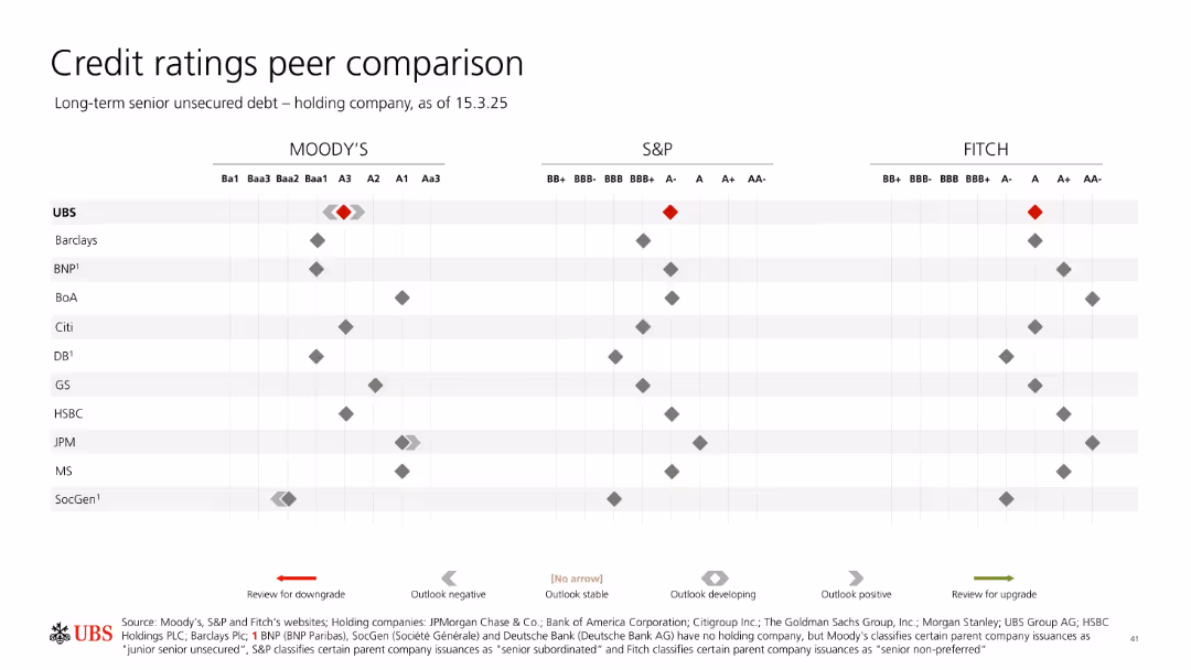
Similar format as previous slide; dot matrix with emphasis on holding company ratings for peer banks.
Competitive Landscape
Financial Services
This chart shows the long-term credit ratings of holding companies across major banks, including UBS, from Moody’s, S&P, and Fitch. It highlights UBS’s relative positioning and shows directional outlooks (e.g., review for downgrade/upgrade) as arrows.
holding company, credit rating, peer banks, Moody’s, Fitch, S&P, UBS, long-term debt, risk comparison
false
Competitive Landscape
Financial Services
Single Chart
UBS
Add to my slides
Remove from favorites
Slide with text descriptions and symbolic icons
Market Analysis and Trends
Retail & E-commerce
Discusses key influences on the 2018 holiday season, highlighting the role of Chinese consumers and the impact of economic factors on global retail.
holiday season, retail, Chinese market, economic factors
false
Market Analysis and Trends
Retail & E-commerce
Header Vertical
Bain
Add to my slides
Remove from favorites
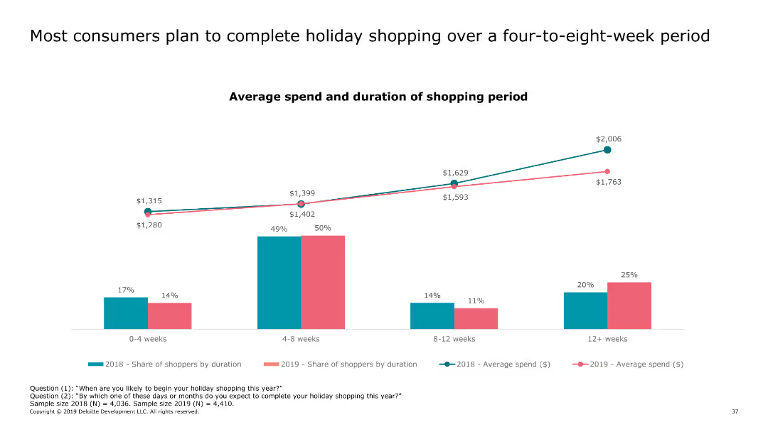
This slide contains a column chart comparing shopper behaviors and average spend across different durations of holiday shopping periods over two years.
Market Analysis and Trends
Retail & E-commerce
It details consumer shopping behaviors over varying durations, highlighting trends and changes in average spending during the holiday season over two consecutive years.
holiday, shopping, consumer behavior, trends, duration
false
Market Analysis and Trends
Retail & E-commerce
Single Chart
Deloitte
Add to my slides
Remove from favorites
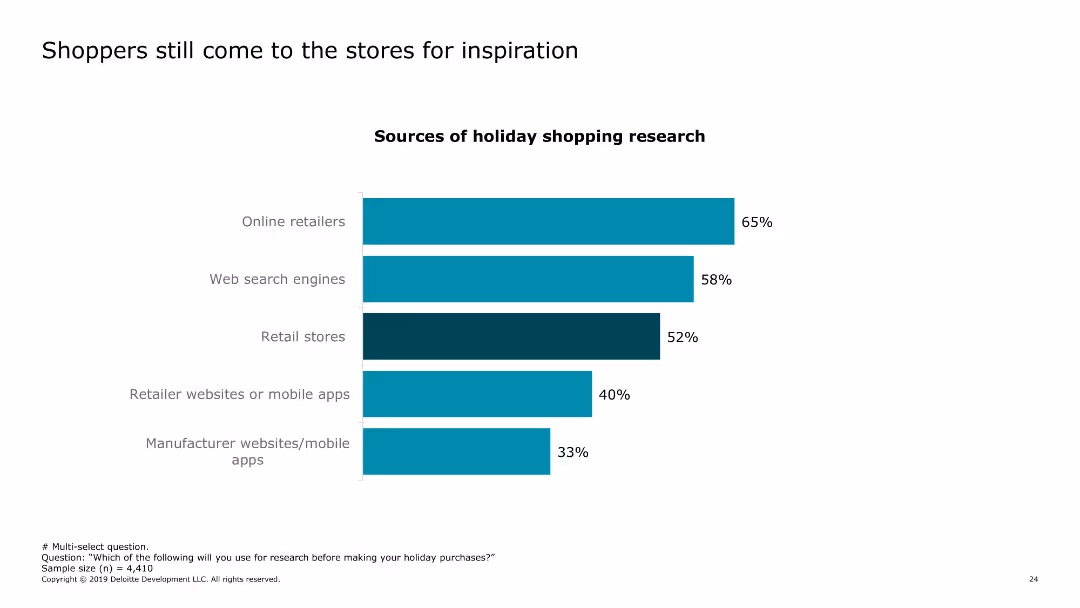
The slide features a column chart showing various sources of holiday shopping research. The bars represent online retailers, web search engines, retail stores, retailer websites or mobile apps, and manufacturer websites/mobile apps.
Market Analysis and Trends
Retail & E-commerce
This slide discusses the importance of physical stores in the shopping journey, despite the rise of online research. It provides a breakdown of where consumers look for inspiration during the holiday season.
holiday shopping, consumer research, retail stores, online research, shopping inspiration
false
Market Analysis and Trends
Retail & E-commerce
Single Chart
Deloitte
Add to my slides
Remove from favorites
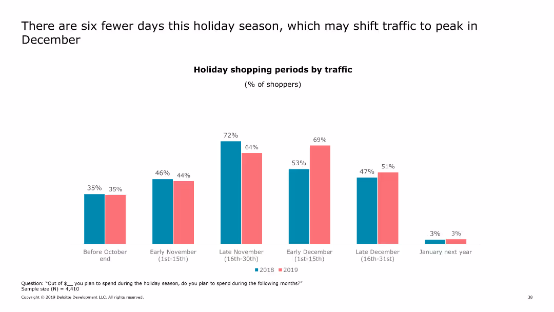
This slide includes a column chart displaying the percentage of shoppers across different shopping periods for two years, emphasizing the impact of fewer holiday days.
Market Analysis and Trends
Retail & E-commerce
It examines how a shorter holiday season influences shopper traffic, potentially shifting the peak shopping period to December.
holiday, shopping, traffic, peak, December
false
Market Analysis and Trends
Retail & E-commerce
Single Chart
Deloitte
Add to my slides
Remove from favorites
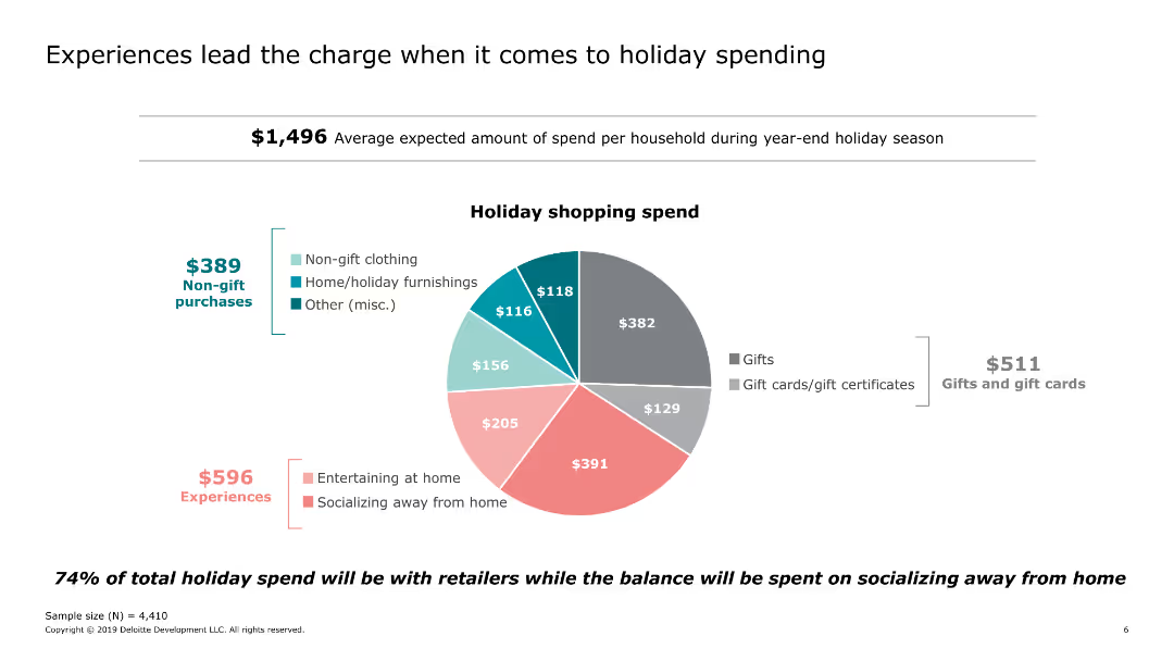
Includes a pie chart showing the distribution of holiday shopping spend across different categories.
Market Analysis and Trends
Retail & E-commerce
Examines the average holiday spending per household, highlighting the significant portion allocated to experiences such as socializing and entertaining at home.
holiday, spending, experiences, socializing, categories, gifts
false
Market Analysis and Trends
Retail & E-commerce
Single Chart
Deloitte
Add to my slides
Remove from favorites
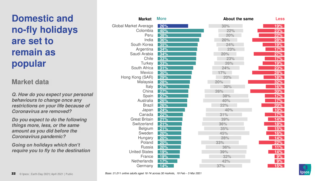
This slide contains a column chart comparing the expected changes in holiday preferences, focusing on domestic and no-fly holidays, across various global markets. The chart uses three color bars to represent "More," "About the same," and "Less."
Market Analysis and Trends
Hospitality & Tourism
The slide presents survey findings indicating that domestic and no-fly holidays will remain popular post-pandemic, comparing responses from multiple global markets.
holidays, travel, no-fly, domestic, market trends
false
Market Analysis and Trends
Hospitality & Tourism
Multiple Chart
IPSOS
Add to my slides
Remove from favorites
Slide with four color-coded sections detailing different business aspects affected by holistic cost programs: Growth, Cost, Talent, Liquidity.
Strategic Planning
Professional Services
Highlights the need for holistic approaches in addressing cost problems, illustrating how narrowly focused cost reduction programs can lead to issues arising in other areas of the business. This approach integrates various elements of the business for comprehensive improvement.
Holistic Solutions, Cost Reduction, Business Integration, Comprehensive Approach
false
Strategic Planning
Professional Services
Table
Deloitte
Add to my slides
Remove from favorites
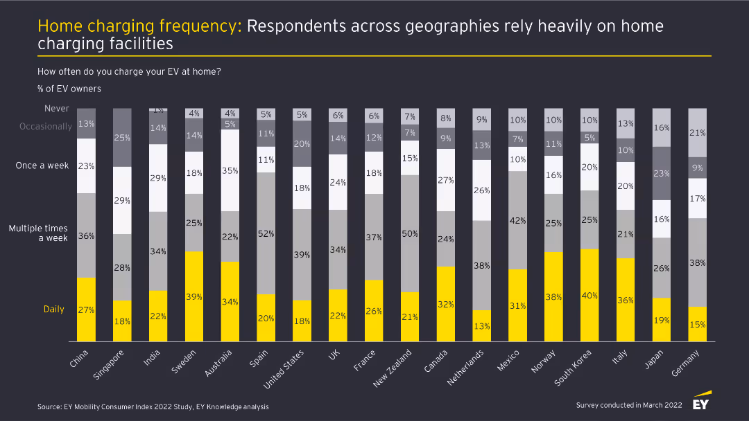
This slide presents a stacked bar chart showing the frequency of home charging among EV owners in different countries. Bars are divided into segments for daily, multiple times a week, once a week, occasionally, and never.
Market Analysis and Trends
Transportation & Logistics
The slide details how often EV owners charge their vehicles at home across various countries, with a significant portion charging daily or multiple times a week, indicating heavy reliance on home charging facilities.
Home charging, EV owners, charging frequency, market analysis, automotive industry
false
Market Analysis and Trends
Transportation & Logistics
Single Chart
EY
Add to my slides
Remove from favorites
Column charts and key statistics displayed clearly, with additional small bar chart showing the FICO score distribution.
Financial Performance
Financial Services
Analyzes home equity loans and changes over quarters with FICO score distribution, aiding financial institutions in assessing loan performance and customer creditworthiness within the home equity market.
Home Equity, Loans, FICO, Trends, Finance
false
Financial Performance
Financial Services
Multiple Chart
Morgan Stanley
Add to my slides
Remove from favorites
The slide includes a comparative bar chart detailing concerns regarding home EV charging across different regions (Global, North America, Europe, Asia-Pacific).
Market Analysis and Trends
Transportation & Logistics
It presents the concerns about energy costs and space availability for home EV charging, with regional differences highlighted.
Home EV charging, energy costs, regional concerns, installation costs, space availability
false
Market Analysis and Trends
Transportation & Logistics
Multiple Chart
EY
Add to my slides
Remove from favorites
Presents a line graph tracking the increase in social media hashtags for home hobbies, supported by a prominent quote.
Market Analysis and Trends
Retail & E-commerce
Analyzes the stabilization of market interests in home-based hobbies, indicating a sustained engagement in these activities beyond the immediate reaction to global events.
Home hobbies, Market stabilization, Social media trends, Hashtags increase, Engagement continuity, Line graph, Market interests
false
Market Analysis and Trends
Retail & E-commerce
Multiple Chart
Accenture
Add to my slides
Remove from favorites
This slide presents a clear title, a large column chart depicting growth in the home improvement market, and additional circular icons with percentages and brief descriptions. The design utilizes a consistent green and gray color scheme to aid in data presentation.
Market Analysis and Trends
Consumer Goods
Analyzes the temporary growth and expected decline in the home improvement sector during and post-COVID-19. It highlights the surge in market activity during 2020 due to increased consumer spending on home upgrades, with projections for normalization as the pandemic impact diminishes.
home improvement, market trends, COVID-19, consumer spending, retail impact, growth analysis, data chart
false
Market Analysis and Trends
Consumer Goods
Mixed Chart
BCG
Add to my slides
Remove from favorites
The slide is text-heavy, presenting three key points of focus: maintaining credit quality, improving service portfolio quality, and delivering customer experience, each with a checkmark icon. The right side includes brief details on the disciplined growth strategy, portfolio de-risking, customer satisfaction, and digital enhancements, all aimed at strengthening home lending services.
Operational Efficiency
Financial Services
This slide provides an overview of strategic initiatives in the Home Lending division of Chase, focusing on maintaining quality and customer satisfaction while managing risks. It highlights key achievements and future commitments in enhancing the home buying experience.
home lending, credit quality, customer satisfaction, risk management
false
Operational Efficiency
Financial Services
Table
JP Morgan
Add to my slides
Remove from favorites
The slide has a balanced comparative layout with a mix of column charts and text explanations, contrasting past and current performance metrics for home lending.
Performance Metrics and KPIs
Financial Services
Highlights the high-quality customer focus of JPMorgan Chase's Home Lending business, detailing improvements in experience, productivity, and financial health.
Home lending, customer experience, productivity, financial health, JPMorgan Chase
false
Performance Metrics and KPIs
Financial Services
Multiple Chart
JP Morgan
Add to my slides
Remove from favorites
This slide includes a column chart and a table outlining Chase's relationship strategies with Home Lending customers, including household numbers and new origination rates. There's a clear distinction between current and potential customers.
Strategic Planning
Financial Services
Illustrates how Chase focuses on deepening relationships with home lending customers by highlighting household statistics and capturing rates of new mortgage originations.
home lending, customer relationship, origination rate, strategy, households
false
Strategic Planning
Financial Services
Mixed Chart
JP Morgan
Add to my slides
Remove from favorites
Contains column charts on the left comparing government/subprime mix and servicing cost per unit from 2017 to 2021. Center lists metrics, right shows green column charts for Real Estate Portfolio data and a bar chart for net charge-off rate.
Financial Performance
Financial Services
Showcases improved servicing efficiency and optimized balance sheet in home lending, with decreased government/subprime mix, reduced servicing costs, increased loan sales and securitizations, and a lower net charge-off rate.
Home Lending, Efficiency, Portfolio Management, Risk, Asset, Securitization, Charge-Off
false
Financial Performance
Financial Services
Multiple Chart
JP Morgan
Add to my slides
Remove from favorites
This slide features two graphs: a stacked column chart showing mortgage origination volumes split between purchase and refinance, and a line graph illustrating the spread between primary and secondary mortgage rates over production costs. The slide is information-dense, with significant data conveyed through the visualizations and minimal text to avoid clutter.
Market Analysis and Trends
Financial Services
It portrays the state of the home lending industry, highlighting challenges in profitability due to changes in origination volumes and production costs. This slide is useful for analyzing market trends and risk factors in the mortgage lending space.
home lending, market trends, mortgage origination, profitability
false
Market Analysis and Trends
Financial Services
Multiple Chart
JP Morgan
Add to my slides
Remove from favorites
This slide features a pie chart on the left illustrating home lending portfolio by CLTV, a list in the center detailing major markets with forecasted declines, and bar graphs on the right showing NCO estimates for 2024-2025. The design is simple with color coding for easy interpretation.
Risk Assessment and Management
Financial Services
Showcasing the robustness of the Home Lending portfolio, this slide compares current equity and quality levels with anticipated market trends and stress scenarios. It's aimed at providing stakeholders with confidence in the stability and foresight of the company's lending strategies.
Home lending, Portfolio strength, Market trends, Stress scenarios, CLTV, NCO estimates, Equity
false
Risk Assessment and Management
Financial Services
Multiple Chart
JP Morgan
Add to my slides
Remove from favorites
The slide is split horizontally with two columns and features a sectioned layout. There are titles, subheadings, and bulleted lists, with no graphs or charts.
Industry Overview
Financial Services
This slide presents a summary of key initiatives and their progress related to home ownership, rental housing, and financial institution investment.
Homeownership, Rental Housing, Financial Institutions, Progress, Commitment
false
Industry Overview
Financial Services
Table
JP Morgan
Add to my slides
Remove from favorites
Line chart showing the trend in likelihood to purchase a home from Fall 2015 to Fall 2020. Two lines represent "Very likely" and "Very/somewhat likely".
Market Analysis and Trends
Real Estate & Construction
The slide depicts the percentage of respondents who are likely to purchase a home over the years, highlighting trends and changes in consumer confidence.
home purchase, likelihood, trends, Fall 2015-2020, consumer confidence, very likely, somewhat likely
false
Market Analysis and Trends
Real Estate & Construction
Single Chart
IPSOS
Add to my slides
Remove from favorites
The slide includes a line chart showing the decline in home sales since 2021 and a text block summarizing the impact on home affordability.
Risk Assessment and Management
Real Estate & Construction
This slide examines the decline in US single-family home sales due to affordability pressures, illustrated with a line chart depicting the sales trend from 2005 to 2024.
home sales, affordability, decline, real estate, construction, market analysis, trends, risk assessment, management, housing market
false
Risk Assessment and Management
Real Estate & Construction
Mixed Chart
McKinsey
Add to my slides
Remove from favorites
Line charts showing US existing home sales and housing starts, and y/y home price indexes from January 2006 to January 2024.
Market Analysis and Trends
Real Estate & Construction
Examines how reduced affordability constrains home sales, with construction activity supported by tight supply and easing interest rates.
home sales, housing starts, home price indexes, affordability, real estate, line chart, construction, supply conditions, interest rates
false
Market Analysis and Trends
Real Estate & Construction
Multiple Chart
EY
Add to my slides
Remove from favorites
Multi-line chart showing trends in the types of homes likely to be purchased (detached, semi-detached, condominium/townhouse) from Fall 2015 to Fall 2020.
Market Analysis and Trends
Real Estate & Construction
This slide presents the preferences in types of homes over time, indicating a decline or rise in popularity for each type of home among buyers.
home types, purchase trends, detached, semi-detached, condominium, townhouse, Fall 2015-2020
false
Market Analysis and Trends
Real Estate & Construction
Single Chart
IPSOS
Add to my slides
Remove from favorites
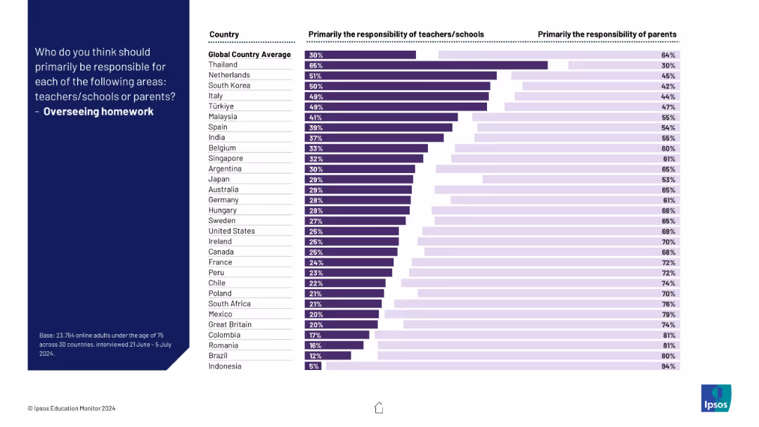
Horizontal bar chart indicating how much each country believes parents vs schools should oversee homework; striking parent-majority views.
Operational Efficiency
Education & Training
This slide examines the global view of who should be in charge of managing homework. In almost all countries, parents are seen as more responsible.
homework, parental involvement, responsibility, education, students, schools, efficiency, global views, Ipsos, learning
false
Operational Efficiency
Education & Training
Mixed Chart
IPSOS
Add to my slides
Remove from favorites
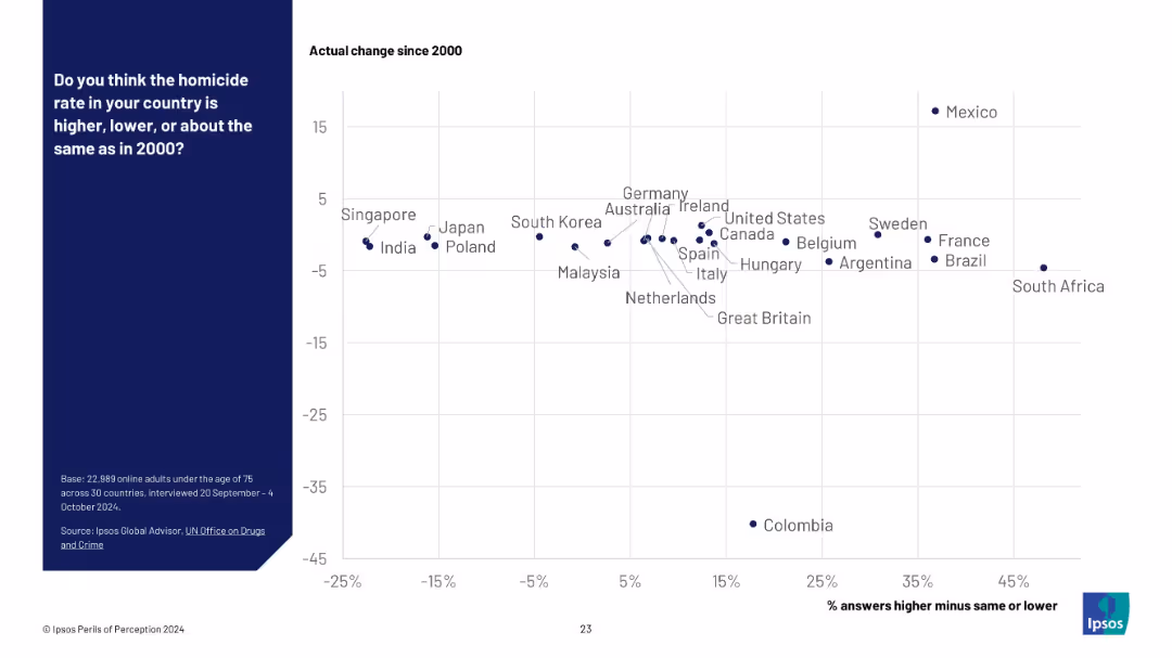
Scatter plot on a white grid background; x-axis shows public perception (% answers higher minus same or lower), y-axis shows actual change since 2000. Country names are plotted as data points. Blue panel on the left with survey details.
Market Analysis and Trends
Government & Public Sector
This slide compares public perception of homicide rates versus actual changes since 2000 across 30 countries. Countries are plotted by perceived change vs actual change, showing a disconnect between belief and reality in many regions.
homicide rate, perception vs reality, public opinion, crime statistics, international comparison, Ipsos survey, public safety, UN data, misperception, violence trends
false
Market Analysis and Trends
Government & Public Sector
Mixed Chart
IPSOS
Add to my slides
Remove from favorites
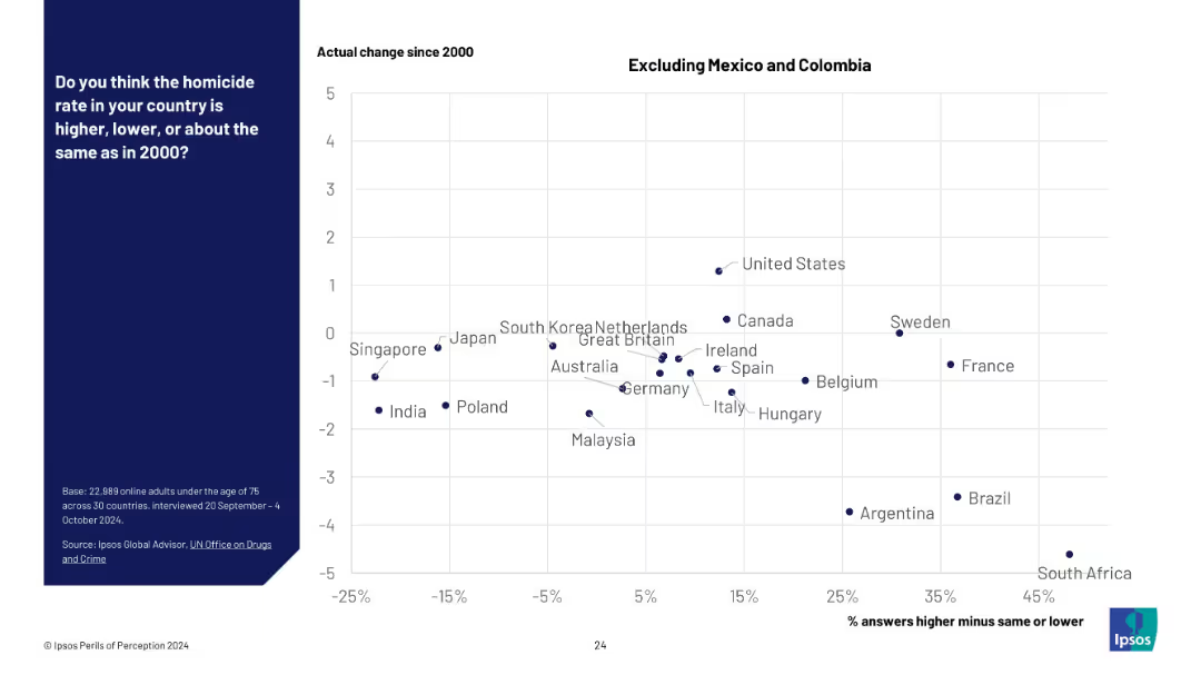
Same structure as previous slide but with Mexico and Colombia removed. Scatter plot on a white grid, allowing finer resolution for mid-range countries.
Market Analysis and Trends
Government & Public Sector
A refined view of homicide perception vs. reality by removing outlier countries Mexico and Colombia. The data suggests widespread overestimation of rising crime despite largely stable or falling homicide rates.
homicide trends, crime perception, data refinement, Ipsos survey, cross-country analysis, public misperception, safety, data visualization, international trends
false
Market Analysis and Trends
Government & Public Sector
Mixed Chart
IPSOS
Add to my slides
Remove from favorites
Displays a pie chart comparison of Hong Kong advertising revenue by segments for 2022 and 2027. The charts show a significant shift towards digital advertising over traditional formats like TV and newspaper. The design is straightforward with a clear visual representation of data changes over time, accompanied by concise text explanations.
Market Analysis and Trends
Media & Entertainment
Analyzes shifts in advertising revenue sources in Hong Kong, emphasizing the decline of traditional media and the rise of digital platforms. Useful for understanding market transitions and planning digital marketing strategies.
Hong Kong, advertising revenue, digital dominance, traditional media decline, market analysis
false
Market Analysis and Trends
Media & Entertainment
Multiple Chart
PwC/Strategy&
Add to my slides
Remove from favorites
Displays a line graph charting cinema revenue in Hong Kong from 2018 to 2027, with annotations highlighting specific trends and yearly changes.
Market Analysis and Trends
Media & Entertainment
Focuses on the expected rebound of box office revenue in Hong Kong, detailing the impact of COVID-19 and the success of specific films in driving revenue.
Hong Kong, box office, cinema, COVID-19, revenue rebound, films
false
Market Analysis and Trends
Media & Entertainment
Mixed Chart
PwC/Strategy&
Add to my slides
Remove from favorites
Slide contains a column chart detailing year-on-year cinema revenue in Hong Kong from 2019 to 2025.
Market Analysis and Trends
Media & Entertainment
Focuses on the recovery and forecast of Hong Kong's cinema industry, noting the impact of capacity limitations and film supply shortages.
Hong Kong, cinema, revenue, forecast, COVID-19
false
Market Analysis and Trends
Media & Entertainment
Mixed Chart
PwC/Strategy&
Add to my slides
Remove from favorites
Slide includes a column chart with year-on-year revenue data and growth projections for Hong Kong.
Market Analysis and Trends
Media & Entertainment
Analyzes the projected overall growth in Hong Kong's entertainment and media sector from 2016 to 2025, detailing the recovery from the pandemic.
Hong Kong, E&M, growth, forecast, pandemic
false
Market Analysis and Trends
Media & Entertainment
Single Chart
PwC/Strategy&
Add to my slides
Remove from favorites
Features a column chart showing year-on-year growth of the entertainment and media sector in Hong Kong, emphasizing future revenue projections.
Financial Performance
Media & Entertainment
Projects future growth of the entertainment and media market in Hong Kong, emphasizing the impact of business-to-business segments and cinema.
Hong Kong, entertainment, media, growth projection, cinema, business-to-business
false
Financial Performance
Media & Entertainment
Mixed Chart
PwC/Strategy&
Add to my slides
Remove from favorites
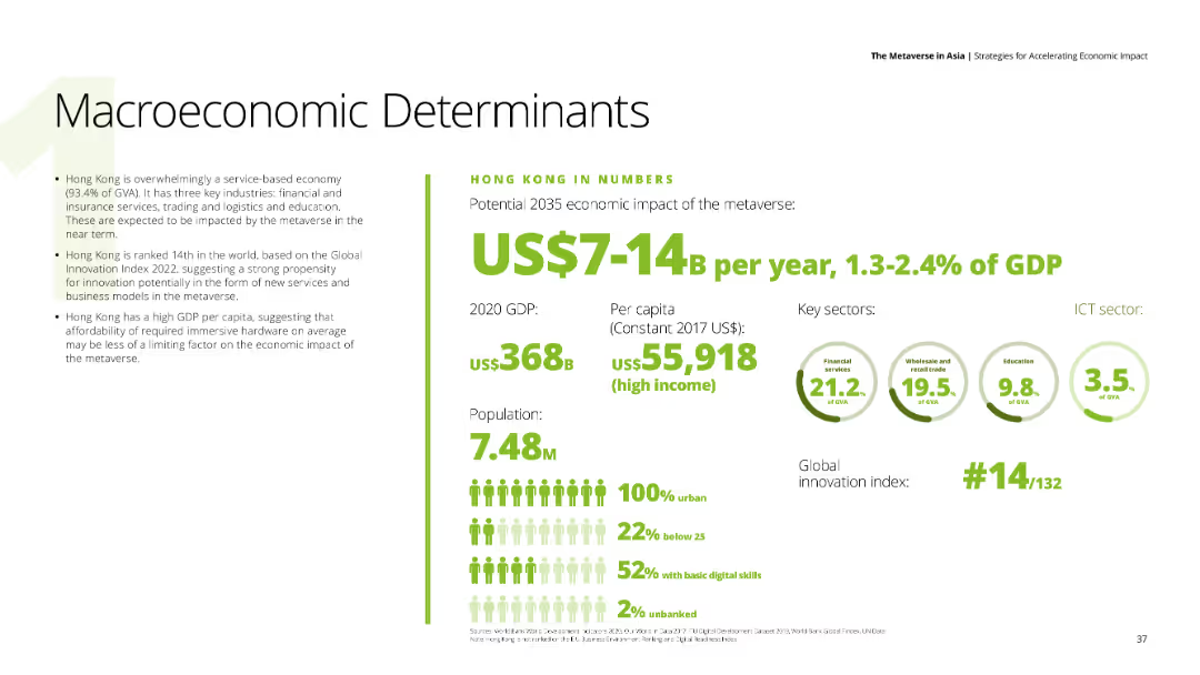
A data-driven slide with key economic indicators for Hong Kong, including GDP, population, and sector contributions.
Financial Performance
Financial Services
The slide presents Hong Kong’s macroeconomic determinants, highlighting the potential economic impact of the metaverse by 2035.
Hong Kong, GDP, economic impact, metaverse, financial indicators
false
Financial Performance
Financial Services
Mixed Chart
Deloitte
Add to my slides
Remove from favorites
This slide features multiple column charts comparing global and Hong Kong trade show revenues from 2022 to 2027. It includes detailed annotations and percentage figures for annual growth and CAGR. The slide is designed with a clear separation between the charts and descriptive texts, which provide additional context on market trends and the impact of lifted quarantine measures.
Market Analysis and Trends
Media & Entertainment
Analyzes the growth of trade show revenues in Hong Kong, comparing it to global rates and detailing the factors influencing these trends, such as COVID-19 impacts and policy changes. This is particularly useful for understanding regional market dynamics within the global context.
Hong Kong, global comparison, trade shows, revenue growth, CAGR, market trends, COVID-19
false
Market Analysis and Trends
Media & Entertainment
Multiple Chart
PwC/Strategy&
Add to my slides
Remove from favorites
Features a column chart showing the annual revenue figures for live music in Hong Kong from 2019 to 2025.
Market Analysis and Trends
Media & Entertainment
Discusses the trends and recovery in the live music segment in Hong Kong, highlighting the effects of COVID-19 on foreign artist visits.
Hong Kong, live music, revenue, CAGR, COVID-19
false
Market Analysis and Trends
Media & Entertainment
Mixed Chart
PwC/Strategy&
Add to my slides
Remove from favorites
This slide includes vertical column charts and a photographic background, depicting the market size from 2007 to 2019 with a focus on Hong Kong.
Market Analysis and Trends
Consumer Goods
Evaluates the socio-political effects on Hong Kong's luxury goods market, suggesting shifts in consumer and tourist dynamics towards other Asian markets.
Hong Kong, Market analysis, Socio-political
false
Market Analysis and Trends
Consumer Goods
Mixed Chart
Bain
Add to my slides
Remove from favorites
Features a bar chart comparing the CAGR of different media segments between Hong Kong and globally, using contrasting red and gray bars.
Market Analysis and Trends
Media & Entertainment
Analyzes the growth rates of various entertainment and media segments in Hong Kong from 2022 to 2027, highlighting areas like cinema and OTT video.
Hong Kong, media, entertainment, CAGR, growth rates, cinema, OTT
false
Market Analysis and Trends
Media & Entertainment
Mixed Chart
PwC/Strategy&
Add to my slides
Remove from favorites
The slide features multiple pie charts comparing the composition of internet advertising revenue between Mainland China and Hong Kong for the years 2016 and 2025. Each chart is colored distinctly to differentiate the categories like paid search, mobile display, etc. The layout is straightforward with each pie chart accompanied by a legend and annotations highlighting specific data points.
Market Analysis and Trends
Media & Entertainment
This slide shows the projected growth of mobile display advertising in Hong Kong, predicting a significant increase by 2025. It compares this trend with Mainland China's internet advertising revenue, highlighting the differences in growth within the regions. The slide aims to analyze market shifts and future potentials in the digital advertising space, especially mobile display, which is forecasted to grow at a compound annual growth rate (CAGR).
Hong Kong, mobile advertising, internet, 2025, CAGR, growth, pie chart, revenue
false
Market Analysis and Trends
Media & Entertainment
Multiple Chart
PwC/Strategy&
Add to my slides
Remove from favorites
Slide shows line graphs tracking the revenue trends and year-on-year growth for different regions.
Market Analysis and Trends
Media & Entertainment
Compares the economic impact on Hong Kong's entertainment and media revenue with global and regional trends.
Hong Kong, revenue, entertainment, media, growth
false
Market Analysis and Trends
Media & Entertainment
Multiple Chart
PwC/Strategy&
Add to my slides
Remove from favorites
Features pie charts comparing revenue segments from 2018, 2022, and 2027, alongside a column for contextual data. The pie charts display proportions in distinct colors for different segments, and the slide is text-heavy, providing detailed contextual information about the impact of the COVID-19 pandemic and recovery predictions.
Market Analysis and Trends
Media & Entertainment
Discusses the segment distribution of the business-to-business market in Hong Kong, focusing on the major hit from COVID-19 and recovery projections. Useful for business planning and analysis in post-pandemic market scenarios.
Hong Kong, trade shows, business-to-business, market distribution, COVID-19 impact, recovery prediction
false
Market Analysis and Trends
Media & Entertainment
Multiple Chart
PwC/Strategy&
Add to my slides
Remove from favorites
Previous
Next
You don't have any favorites yet.
Please wait loading your favorites slides...
Create a FREE account to continue browsing
Receive Instant Access to 1,000+ slides from companies like McKinsey, Google, and Goldman Sachs
First Name
Last Name
Email
Password
I agree to all
Terms & Privacy Policy
Thank you! Your submission has been received!
Oops! Something went wrong while submitting the form.
Have an account?
Sign in
Upgrade to PRO to Save slides
Advanced Search and Filters
Access to 15,000+ slides
Access to Category Pages
Save/Bookmark Slides
PowerPoint Template Library
Pick a Plan
MONTHLY
$12/month
Billed every month, Cancel anytime.
YEARLY
$9/year
Billed $108 annually, Cancel anytime.
Checkout for $12/month
Checkout for $108/yr
Secured by Stripe | AES-256 bit encryption