My Account
My Slides
Search by Category
Companies
Slide Type
Use Case
Industry
Pricing
Templates
View All Templates
Download Template Slides
✦ AI
AI Prompt Library
AI Search
Feedback
Login
Logout
Get Started
Browse all Slides
Browse all Slides
Create a FREE Account
Instant access to 1,000+ real slides from top companies like McKinsey, BCG, Goldman Sachs, Google and many more!
First Name
Last Name
Email
Password
I agree to all
Terms & Privacy Policy
Thank you! Your submission has been received!
Oops! Something went wrong while submitting the form.
Have an account?
Sign in
Saved Slides
Total No. of slides saved
0
↻ Refresh
✖ Clear all
The slide features a column chart comparing the levelized cost of mobility for different train types for the year 2030.
Financial Performance
Transportation & Logistics
The slide provides a future outlook (2030) on the cost-effectiveness of hydrogen trains with different sources compared to electric and diesel trains.
hydrogen trains, cost projection, 2030, electrification, diesel trains
false
Financial Performance
Transportation & Logistics
Mixed Chart
Kearney
Add to my slides
Remove from favorites
The slide presents a column chart comparing the levelized cost of mobility for different train types, including hydrogen, electric, and diesel trains.
Financial Performance
Transportation & Logistics
The slide compares the cost-effectiveness of hydrogen trains with chlorine and electrolysis sources, electric trains, and diesel trains based on levelized cost per passenger.
hydrogen trains, electrification, diesel, cost comparison, mobility
false
Financial Performance
Transportation & Logistics
Mixed Chart
Kearney
Add to my slides
Remove from favorites
The slide includes a map of a hydrogen train route in Germany and key information about the project, along with a quote from an official.
Technology and Digital Transformation
Transportation & Logistics
The slide highlights the use of hydrogen-powered trains in Germany, providing details about the project, including routes, refueling stations, and future plans.
hydrogen trains, Germany, electrification, diesel replacement, project details
false
Technology and Digital Transformation
Transportation & Logistics
Graphic
Kearney
Add to my slides
Remove from favorites
The slide contains a vertical column chart showing the cost components of shipping H2 from A to B. It includes visual icons representing different stages of the H2 value chain.
Market Analysis and Trends
Energy & Utilities
The slide discusses the cost components of transporting hydrogen (H2) from production to end consumer, emphasizing how decentralized production can avoid doubling the LCOH.
hydrogen, transportation, cost, production, storage, decentralized, energy, utilities, value chain, chart
false
Market Analysis and Trends
Energy & Utilities
Single Chart
Kearney
Add to my slides
Remove from favorites
Displays a comparative table of hydrogen use cases across different countries, including industrial feedstock, FCEV manufacturing, electricity generation, and heating.
Strategic Planning
Energy & Utilities
Compares how different countries are developing hydrogen use cases across various sectors, focusing on strategic planning and implementation.
Hydrogen, use cases, strategy, comparative, countries, industrial feedstock, manufacturing, electricity generation
false
Strategic Planning
Energy & Utilities
Table
Kearney
Add to my slides
Remove from favorites
Slide uses flow diagrams to illustrate the hydrogen value chain, detailing production, handling, and final use across various applications.
Operational Efficiency
Energy & Utilities
Explains the comprehensive value chain of hydrogen production and its applications, crucial for operational strategies in energy and manufacturing.
hydrogen, value chain, production methods, industrial applications, energy
false
Operational Efficiency
Energy & Utilities
Vertical Flow
McKinsey
Add to my slides
Remove from favorites
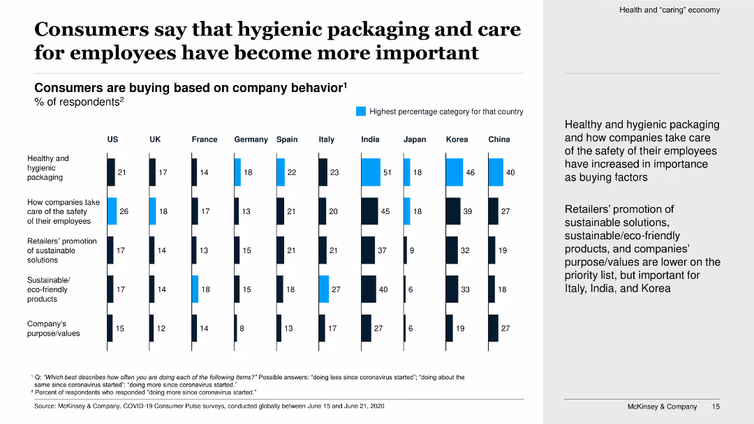
This slide features vertical bar charts showing the percentage of consumers buying based on company behavior regarding hygienic packaging and employee care.
Market Analysis and Trends
Retail & E-commerce
The slide focuses on the increased importance of hygienic packaging and employee care for consumers when buying, with significant variations across countries.
hygienic packaging, employee care, company behavior, consumer buying, bar charts, importance, survey, cross-country comparison
false
Market Analysis and Trends
Retail & E-commerce
Multiple Chart
McKinsey
Add to my slides
Remove from favorites
Hype Cycle chart depicting the maturity and adoption stages of various API technologies, from Innovation Trigger to Plateau of Productivity, highlighting trends like API Security Testing and Business Ecosystems.
Market Analysis and Trends
Technology & Software
The slide outlines the Gartner Hype Cycle for API technologies, showing where different API-related innovations currently stand in terms of expectations and market maturity.
hype cycle, API technologies, maturity, Gartner
false
Market Analysis and Trends
Technology & Software
Single Chart
Gartner
Add to my slides
Remove from favorites
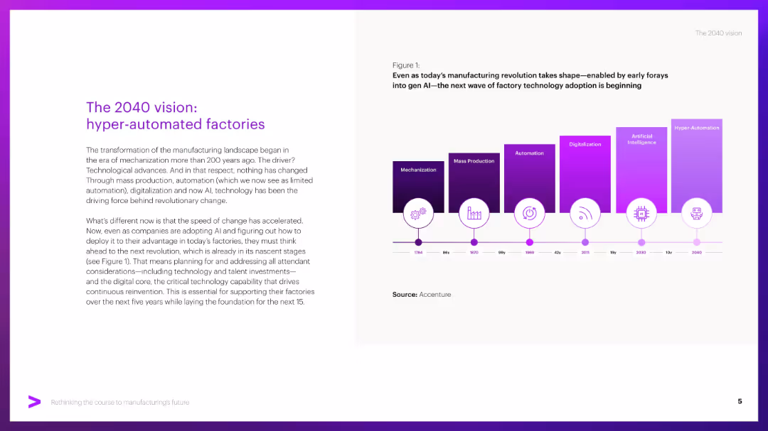
Split layout: left side has title and paragraph text, right side has a timeline graphic with colored blocks indicating tech evolution.
Strategic Planning
Industrial & Manufacturing
Describes the evolution of manufacturing from mechanization to hyper-automation, emphasizing the role of AI and digital technologies. Urges firms to prepare for upcoming shifts by investing in tech, talent, and digital core infrastructure.
Hyper-automation, AI, factories, automation timeline, digitalization
false
Strategic Planning
Industrial & Manufacturing
Mixed Chart
Accenture
Add to my slides
Remove from favorites
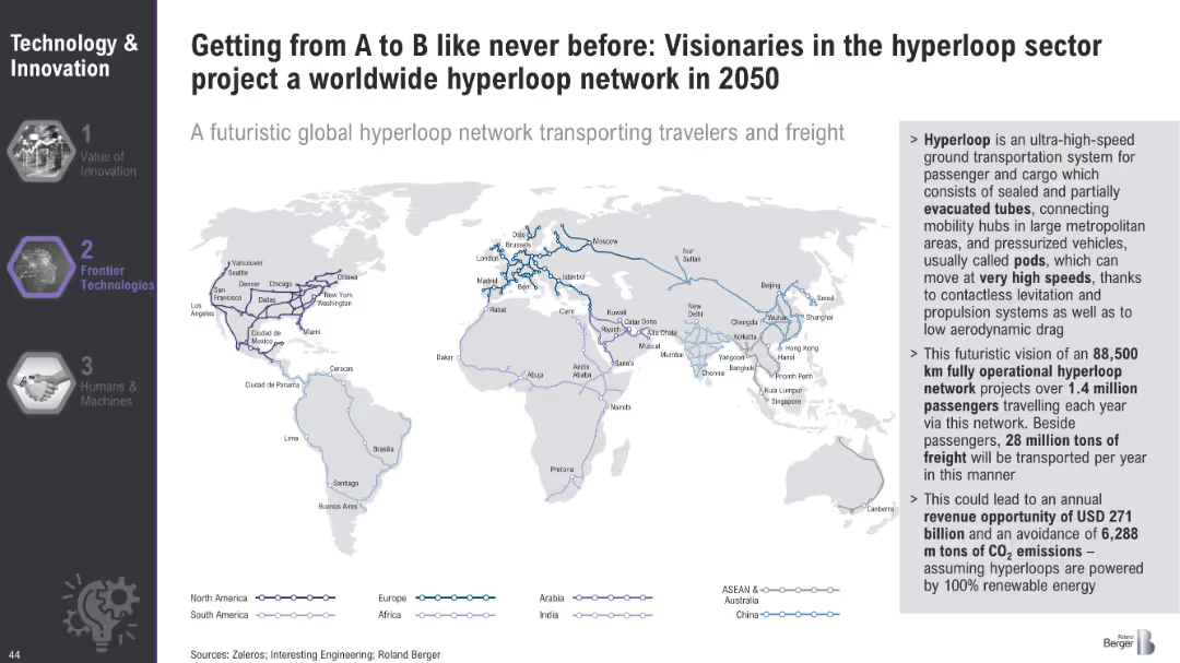
World map illustrating the projected global hyperloop network for 2050, highlighting major routes and connections across continents.
Technology and Digital Transformation
Transportation & Logistics
The slide envisions a global hyperloop network by 2050, outlining the potential routes and connections that could transport passengers and freight at high speeds. It emphasizes the economic and environmental benefits of this futuristic transportation system.
Hyperloop, Global Network, Transportation
false
Technology and Digital Transformation
Transportation & Logistics
Graphic
Roland Berger
Add to my slides
Remove from favorites
Slide showcases four segments with images and text, highlighting concepts of hyperpersonalization, ultraconvenience, community, and sustainability.
Customer and Market Segmentation
Retail & E-commerce
Discusses the evolving expectations of consumers for personalized and convenient experiences, emphasizing community and sustainability.
hyperpersonalization, ultraconvenience, community, sustainability, consumer behavior, engagement, millennials, Generation Z, demographics, ESG
false
Customer and Market Segmentation
Retail & E-commerce
Header Horizontal
BCG
Add to my slides
Remove from favorites
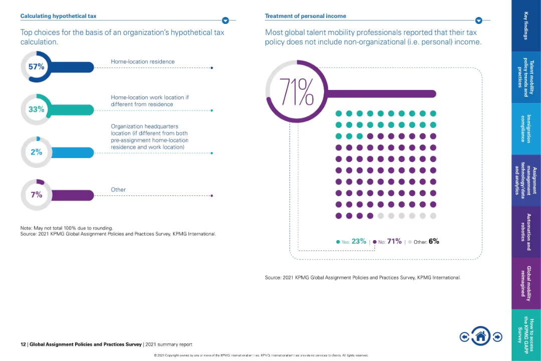
Left chart for tax basis breakdown; right side shows dot-matrix percentage graphic.
Regulatory and Compliance
Financial Services
Details how organizations determine hypothetical tax bases for assignments, with 57% using home-location residence. Also notes that 71% of global mobility professionals report excluding non-organizational (personal) income from tax policy.
hypothetical tax, personal income, tax basis, global mobility, tax calculation, compliance, tax policy
false
Regulatory and Compliance
Financial Services
Multiple Chart
KPMG
Add to my slides
Remove from favorites
Contains a hierarchical diagram of the IAF department and a world map with connections, illustrating global coordination.
Organizational Structure and Change
Financial Services
The slide explains how the IAF department responds to changing client needs, emphasizing its global coordination and strategic direction under the Group CEO's leadership.
IAF, Client Needs, Organizational Change, Global Coordination, Strategy
false
Organizational Structure and Change
Financial Services
Diagram
Credit Suisse
Add to my slides
Remove from favorites
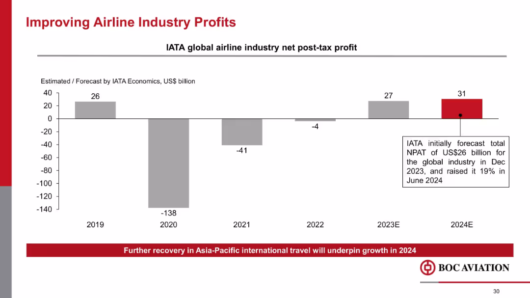
Vertical bar chart showing IATA profit estimates; bold highlight for 2024E; annotation box explaining forecast hike
Industry Overview
Transportation & Logistics
Charts the rebound in airline industry profitability post-COVID, highlighting IATA’s 2024 forecast of US$31B profit. Indicates optimism in airline recovery, especially in Asia-Pacific, and its effect on BOC Aviation’s outlook.
IATA, airline profits, aviation recovery, net profit, COVID rebound, forecast, industry trends
false
Industry Overview
Transportation & Logistics
Mixed Chart
Goldman Sachs
Add to my slides
Remove from favorites
Central smartphone image with features listed around it, and icons representing currencies and stocks.
Technology and Digital Transformation
Technology & Software
Promotes the IBKR GlobalTrader app, outlining its capabilities and global stock trading opportunities, emphasizing zero-commission trades.
IBKR, GlobalTrader, Mobile App, Stock Trading, Zero Commissions, Cryptocurrencies, Global Markets, Digital Platform
false
Technology and Digital Transformation
Technology & Software
Diagram
Goldman Sachs
Add to my slides
Remove from favorites
Two graphs showing growth trends: an area graph for client accounts and a column chart for client equity.
Financial Performance
Financial Services
Depicts IBKR's growth trajectory through area and column charts, detailing increased client accounts and equity, suggesting robust platform performance.
IBKR, Growth, Client Accounts, Client Equity, Area Graph, Column Chart, Financial Markets, Interconnectedness
false
Financial Performance
Financial Services
Multiple Chart
Goldman Sachs
Add to my slides
Remove from favorites
A horizontal timeline highlights key milestones in the company's history with descriptive text and images.
Industry Overview
Technology & Software
Traces the technological evolution of IBKR over four decades, marking significant milestones and innovations in trading platforms.
IBKR, Technological Evolution, Milestones, Automated Trading, Timeline, Innovations, Broker-Dealer, Market Expansion
false
Industry Overview
Technology & Software
Linear Flow
Goldman Sachs
Add to my slides
Remove from favorites
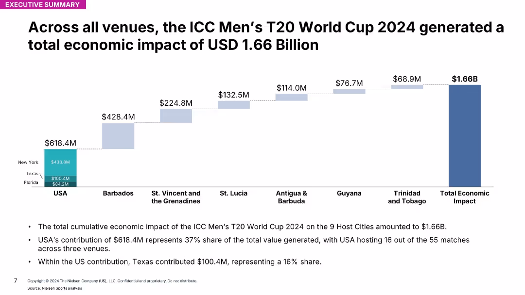
Stacked bar chart showing contributions by host countries/regions; total impact $1.66B
Investment Analysis
Media & Entertainment
Breaks down total $1.66B economic impact from ICC Men’s T20 World Cup across all host venues. USA is top contributor with 37% share, followed by Barbados.
ICC, T20, global impact, venues, host nations, event analysis, economic data, Nielsen, total contribution, summary
false
Investment Analysis
Media & Entertainment
Mixed Chart
Nielsen
Add to my slides
Remove from favorites
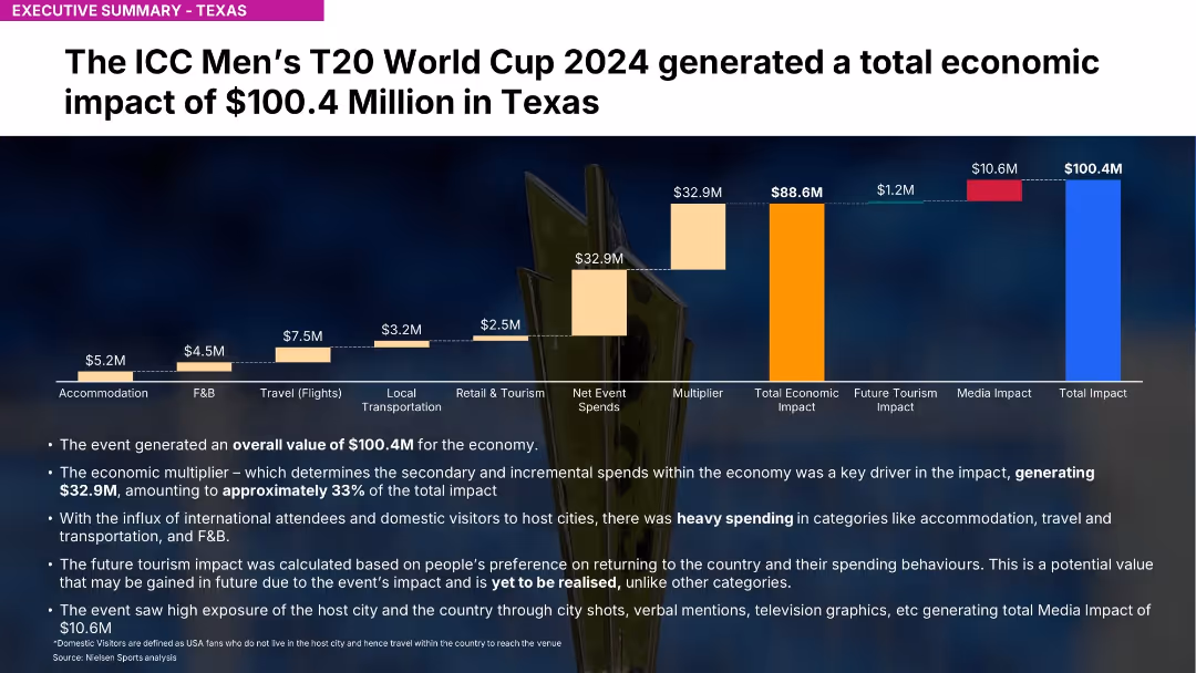
Bar chart with stacked economic impact contributions and bullet-point summary below
Investment Analysis
Media & Entertainment
Shows Texas generated $100.4M economic impact from the ICC T20 event. Key spend categories include accommodation, F&B, travel. Future tourism impact noted.
ICC, T20, Texas, economic impact, tourism, accommodation, F&B, Nielsen, sports economy, event analysis
false
Investment Analysis
Media & Entertainment
Mixed Chart
Nielsen
Add to my slides
Remove from favorites
Slide contains multiple data visualizations: a line chart comparing GDP growth of Iceland with EU, UK, and US from 2009-2021; a column chart showing tourist arrivals in millions from 2009-2021; a stacked area chart illustrating the share in total exports of goods; and a line chart depicting population growth. Colors and labels are clearly used to denote different data sets.
Market Analysis and Trends
Financial Services
This slide presents a comprehensive overview of Iceland's economic recovery post-financial crisis, highlighting major growth sectors like tourism and new industries such as IP sector, pharma, and fish farming. It visually compares Iceland's GDP growth with major economies and details the changes in tourism, population, and export composition.
Iceland, economy, GDP, tourism, exports, population growth, recovery
false
Market Analysis and Trends
Financial Services
Multiple Chart
Deutsche Bank
Add to my slides
Remove from favorites
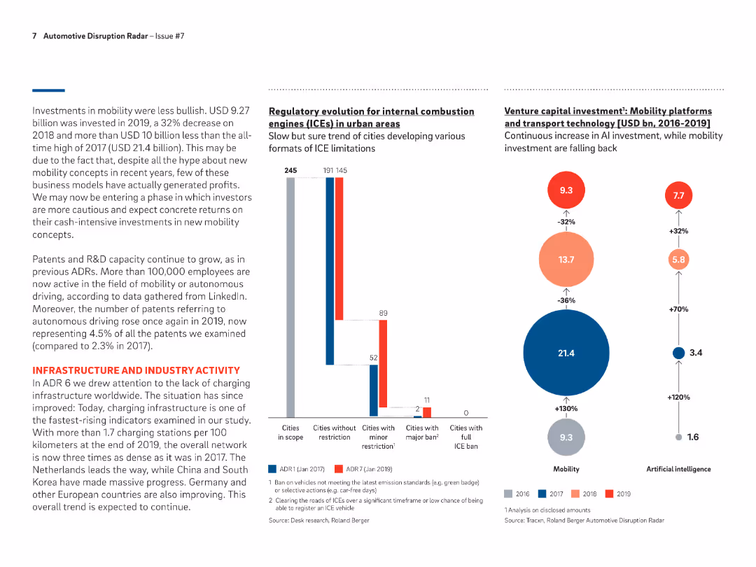
Bar chart showing the number of cities with various levels of ICE restrictions from ADR1 to ADR7, highlighting the increase in cities with minor and major restrictions.
Regulatory and Compliance
Transportation & Logistics
Discusses the regulatory changes impacting ICEs in urban areas, with a growing number of cities implementing restrictions to promote the adoption of cleaner vehicle technologies.
ICE restrictions, urban areas, regulatory changes, ADR
false
Regulatory and Compliance
Transportation & Logistics
Multiple Chart
Roland Berger
Add to my slides
Remove from favorites
The slide features multiple data visualizations including a large column chart, a line graph, and several tables with quantitative data. Colors like red and black are used for text and highlighting, with a clear division between different sections.
Market Analysis and Trends
Financial Services
This slide presents an overview of global token offerings in the first ten months of 2019, showcasing total funds raised and the evolution of offerings over the years. It includes specific examples like the Telegram ICO and uses visual aids to compare funding volumes and token offering counts.
ICO, STO, global, funding, blockchain, 2019, token offerings, digital tokens
false
Market Analysis and Trends
Financial Services
Mixed Chart
PwC/Strategy&
Add to my slides
Remove from favorites
This slide presents column charts showing the percentage of schools affected by various challenges impacting ICT teaching time. It includes quotes from the Federal Ministry of Education, Nigeria, and the Universal Basic Education Commission, highlighting the severity of irregular power supply in Nigeria.
Strategic Planning
Education & Training
This slide depicts the significant challenge of irregular power supply on ICT education in Nigerian public schools. It presents data and authoritative quotes to highlight the urgency of the issue and its impact on the effectiveness of ICT teaching, advocating for infrastructural improvements in the power supply.
ICT, Education, Nigeria, Power Supply, Challenges
false
Strategic Planning
Education & Training
Mixed Chart
BCG
Add to my slides
Remove from favorites
Showcases a bar chart comparing the duration of ICT classes in Nigerian schools to those in other countries, emphasizing the gaps in technology education.
Strategic Planning
Education & Training
Critiques the current state of ICT education in Nigeria, showing significantly lower hours dedicated to practical ICT training compared to other nations, arguing for improved infrastructure to bridge this gap.
ICT, education, Nigeria, technology training, international comparison, infrastructure gaps
false
Strategic Planning
Education & Training
Single Chart
BCG
Add to my slides
Remove from favorites
This slide shows a breakdown of ICT facility availability in schools by power source, using column and pie charts. It discusses the substantial reliance on generators due to unstable power supply and the associated challenges.
Strategic Planning
Education & Training
It analyzes the dependency on generators by Nigerian public schools for ICT, detailing the percentage of schools using generators and the impact on school operations and costs. The slide aims to underline the need for more reliable energy solutions to support education.
ICT, Generators, Nigeria, Education, Reliability
false
Strategic Planning
Education & Training
Multiple Chart
BCG
Add to my slides
Remove from favorites
This slide presents a bar chart comparing average minutes per week spent on practical ICT classes in various countries, highlighting the low figures for Nigeria both before and after solar adoption relative to other countries.
Strategic Planning
Education & Training
This slide offers an international perspective on ICT teaching hours, showing Nigeria's position relative to other countries and the impact of solar power adoption on improving these metrics. It suggests a need for continued efforts to enhance ICT infrastructure.
ICT, Global Comparison, Nigeria, Education, Solar Power
false
Strategic Planning
Education & Training
Single Chart
BCG
Add to my slides
Remove from favorites
Orange, blue and green hues separate policies and actions on the left from country examples on the right, emphasizing government roles.
Strategic Planning
Technology & Software
Focuses on government policies to retain and attract talent in the ICT sector, mentioning examples from different countries.
ICT, government policy, talent retention, work hours, diversity, workspace
false
Strategic Planning
Technology & Software
Header Vertical
Kearney
Add to my slides
Remove from favorites
Donut chart showing market share by country/region in the ICT industry for 2021, alongside a column chart projecting global ICT spending from 2021 to 2023.
Technology and Digital Transformation
Technology & Software
The slide highlights the importance of a mature ICT industry as a foundation for technological innovation. It shows the market share of different regions in the ICT sector and projects an increase in global ICT spending, emphasizing the role of ICT in economic development.
ICT Industry, Market Share, Global Spending
false
Technology and Digital Transformation
Technology & Software
Multiple Chart
Roland Berger
Add to my slides
Remove from favorites
A bar chart compares the ICT market size in 2021 and projected growth in 2026 across ASEAN countries. The slide background is dark red with a maroon header.
Market Analysis and Trends
Technology & Software
The slide predicts a substantial increase in digital talent demand aligned with the ICT market growth in ASEAN countries, useful for strategic planning in talent management.
ICT market, digital talent, ASEAN, market growth, talent management, 2026 projection
false
Market Analysis and Trends
Technology & Software
Multiple Chart
Kearney
Add to my slides
Remove from favorites
The slide features a column chart depicting participants' ability to correctly identify crypto assets, with categories for correct, incorrect, and unknown.
Market Analysis and Trends
Financial Services
This slide presents data on participants' knowledge and understanding of what constitutes a crypto asset.
Identification, crypto assets, knowledge, survey, participants
false
Market Analysis and Trends
Financial Services
Mixed Chart
IPSOS
Add to my slides
Remove from favorites
This slide has two sets of column charts comparing percentages of agreement on identity and transgender rights across different age groups.
Market Analysis and Trends
Government & Public Sector
It analyzes attitudes towards identity and transgender rights, showing how these beliefs are distributed across various age groups, from 16-24 to 55-74 years old.
identity, age groups, transgender rights, agreement, column chart, percentages
false
Market Analysis and Trends
Government & Public Sector
Multiple Chart
IPSOS
Add to my slides
Remove from favorites
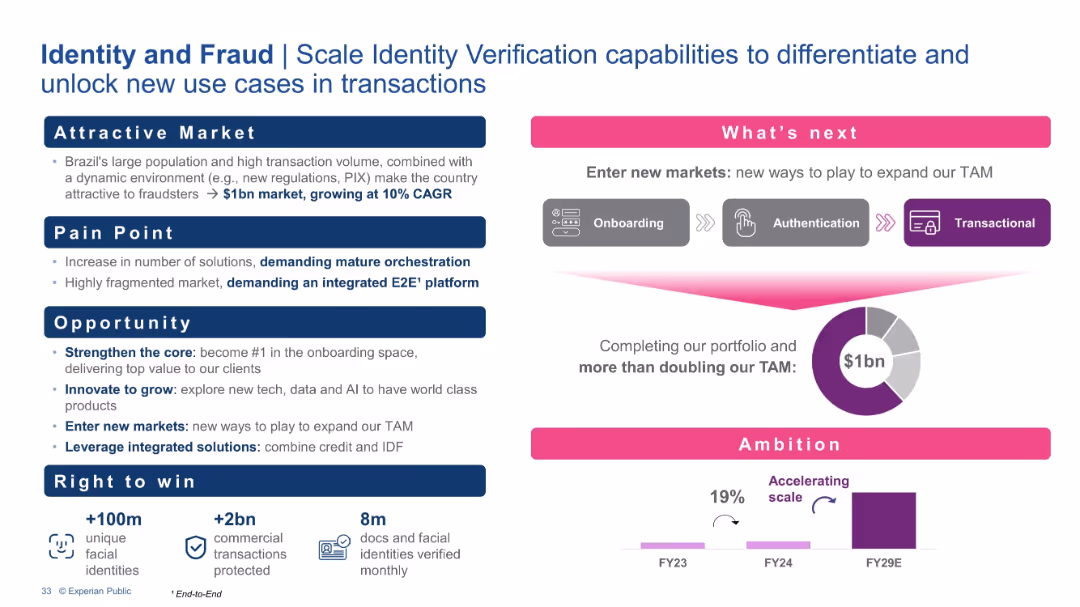
Structured into four sections (Market, Pain Point, Opportunity, Right to Win) and a visual roadmap under "What’s next." Includes metrics and a growth ambition chart.
Risk Assessment and Management
Financial Services
The slide discusses Experian’s strategy to expand its Identity and Fraud solutions. It identifies market size, pain points (fragmentation, need for orchestration), and strategic actions such as new tech integration and market entry. TAM is forecasted to double, with a goal to lead in onboarding and transaction validation.
Identity verification, Fraud prevention, Onboarding, TAM growth, Authentication, Risk management, Brazil market
false
Risk Assessment and Management
Financial Services
Multiple Chart
Barclays
Add to my slides
Remove from favorites
The slide features a line graph comparing perceptions of I&D maturity among different groups within organizations, showing variance in perceived progress.
Strategic Planning
Professional Services
This slide tracks the progress of inclusion and diversity initiatives through a maturity curve, reflecting varying perceptions among employees, HR, and different gender and ethnic groups.
I&D Initiatives, Maturity Curve, Perceptions, Employees, HR, Gender, Ethnic Groups, Progress, Diversity
false
Strategic Planning
Professional Services
Single Chart
Accenture
Add to my slides
Remove from favorites
The slide presents a column chart comparing regional data. It uses contrasting colors to differentiate between North America and the rest of the world across several I&D maturity levels. Textual analysis is provided on the side.
Strategic Planning
Professional Services
This slide provides insights into regional variations in I&D maturity levels, with a specific focus on North American perspectives versus global ones.
I&D, regional analysis, column chart, North America, global comparison, maturity levels
false
Strategic Planning
Professional Services
Single Chart
Accenture
Add to my slides
Remove from favorites
Diagram slide with interconnected elements illustrating stakeholders in the IdREN network. Icons and labels represent entities like government, business, and academia, with arrows showing interactions. A list details the benefits and operational model.
Strategic Planning
Education & Training
Provides an overview of the IdREN project aimed at improving connectivity within Indonesia's education and research sectors. Discusses the collaborative model involving various stakeholders and the potential to expand network coverage to more educational institutions.
IdREN, connectivity, education, research, stakeholders, network coverage
false
Strategic Planning
Education & Training
Framework
BCG
Add to my slides
Remove from favorites
The slide includes a large column chart tracking the funding volume of IEOs over several months, accompanied by a line chart detailing the share of IEOs in the overall token offering market. It employs a professional color scheme of red and grey shades.
Investment Analysis
Financial Services
Summarizes the recent trends in Initial Exchange Offerings (IEOs), particularly focusing on the significant roles they play despite a broader decline in token offerings. Highlights the largest IEO by Bitfinex and discusses the potential for IEOs as a stable crowdfunding mechanism.
IEOs, token offerings, funding volume, trends, Bitfinex, blockchain, 2019
false
Investment Analysis
Financial Services
Multiple Chart
PwC/Strategy&
Add to my slides
Remove from favorites
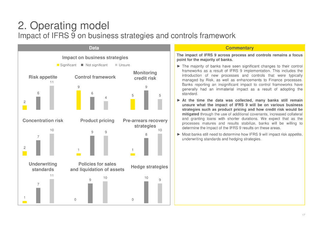
Includes column charts evaluating the impact of IFRS 9 on various business strategies like risk appetite, control framework, product pricing, and more, with a commentary box discussing overall impacts and uncertainties.
Operational Efficiency
Financial Services
Assesses the impact of IFRS 9 on different business strategies and controls framework, highlighting changes in risk appetite, control practices, and business strategies among banks post-implementation.
IFRS 9, business strategies, impact assessment, risk appetite, control framework
false
Operational Efficiency
Financial Services
Multiple Chart
EY
Add to my slides
Remove from favorites
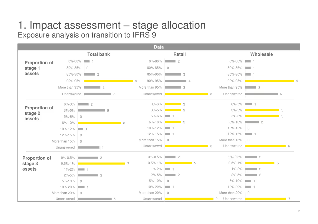
This slide includes three sets of horizontal bar charts showing the proportion of stage 1, 2, and 3 assets for Total bank, Retail, and Wholesale categories. The slide uses yellow and gray colors to differentiate data segments.
Risk Assessment and Management
Financial Services
The slide analyzes the exposure on transition to IFRS 9, detailing the proportions of stage 1, 2, and 3 assets across Total bank, Retail, and Wholesale categories, highlighting the potential impact and risks involved.
IFRS 9, stage allocation, risk assessment, transition, financial services, exposure analysis
false
Risk Assessment and Management
Financial Services
Multiple Chart
EY
Add to my slides
Remove from favorites
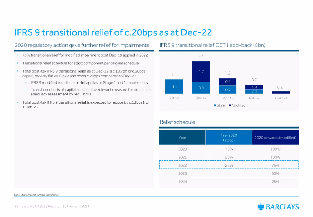
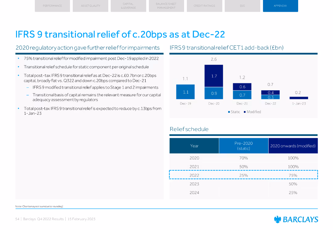
Combination of a bar chart showing IFRS 9 CET1 add-back history and a tabular relief schedule detailing pre-2020/static vs 2020 onward/modified relief percentages.
Regulatory and Compliance
Financial Services
This slide explains IFRS 9 transitional relief and its effect on Barclays’ CET1 capital. It presents CET1 add-back data from 2019–2022 and outlines how transitional relief for impairments will decline over time, affecting future capital adequacy metrics.
IFRS 9, transitional relief, CET1, impairment, regulation
false
Regulatory and Compliance
Financial Services
Mixed Chart
Barclays
Add to my slides
Remove from favorites
Column charts showing transitional relief impact and a table with the relief schedule.
Regulatory and Compliance
Financial Services
Details the impact of IFRS 9 transitional relief on Barclays' CET1 capital and outlines the expected schedule for reducing this relief in future years.
IFRS 9, transitional relief, CET1, schedule, capital
false
Regulatory and Compliance
Financial Services
Mixed Chart
Barclays
Add to my slides
Remove from favorites
Contains a column chart showing IFRS derivative trading assets and their impacts. Simple layout with key highlights on the side.
Financial Performance
Financial Services
Presents Q1 2023 IFRS derivative trading assets and the effect of netting and collateral on their valuation.
IFRS, derivatives, collateral, netting, financial reporting
false
Financial Performance
Financial Services
Mixed Chart
Deutsche Bank
Add to my slides
Remove from favorites
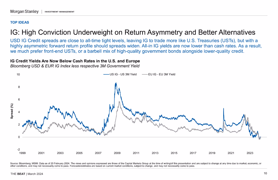
Line chart showing IG credit yields vs. cash rates in the US and Europe over time, highlighting the tight spread and lower IG yields compared to cash rates.
Investment Analysis
Financial Services
The slide discusses the underweight position on IG credit due to tight spreads and lower yields compared to cash rates, suggesting alternatives like front-end USTs.
IG Credit, Yields, Cash Rates, US, Europe, Investment Strategy, Financial Analysis
false
Investment Analysis
Financial Services
Single Chart
Morgan Stanley
Add to my slides
Remove from favorites
This slide is divided into two main sections, each featuring a column chart. The left graph shows the funding allocations under the IIJA, and the right graph details the IRA's focus areas like clean energy and deficit reduction.
Regulatory and Compliance
Government & Public Sector
This slide breaks down the financial allocations from the IIJA and IRA, focusing on new energy and climate investments. It is crucial for understanding how government spending is being directed towards sustainable projects.
IIJA, IRA, government funding, climate investment, energy policies
false
Regulatory and Compliance
Government & Public Sector
Multiple Chart
BCG
Add to my slides
Remove from favorites
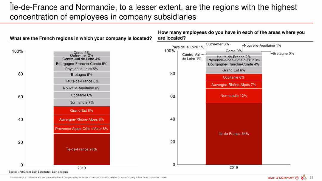
Two column charts showing the distribution of company locations and employee concentrations across various regions in France.
Market Analysis and Trends
Professional Services
The slide presents data on the concentration of employees in company subsidiaries in different French regions, highlighting Île-de-France and Normandie.
Île-de-France, Normandie, employee concentration, company subsidiaries, regions, France
false
Market Analysis and Trends
Professional Services
Multiple Chart
Bain
Add to my slides
Remove from favorites
Dominated by graphical data, this slide displays two main charts: the Eurozone real GDP forecast and the Eurocoin index, represented by bars and dots respectively. Text is limited, providing only sources and brief descriptions. The color palette includes shades of blue, black, and white. The slide design is clear, with each chart labeled and axis demarcated, promoting easy data interpretation.
Market Analysis and Trends
Financial Services
The slide illustrates IMF's economic forecasts and the Eurozone Eurocoin index, comparing them against other projections and historical data. It's typically used in economic or financial presentations to analyze trends, guide investment decisions, or provide economic forecasts.
IMF, GDP forecast, Eurozone, Eurocoin index, economic indicators
false
Market Analysis and Trends
Financial Services
Multiple Chart
McKinsey
Add to my slides
Remove from favorites
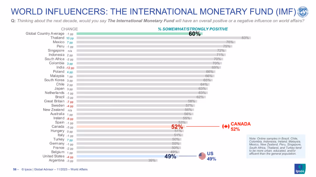
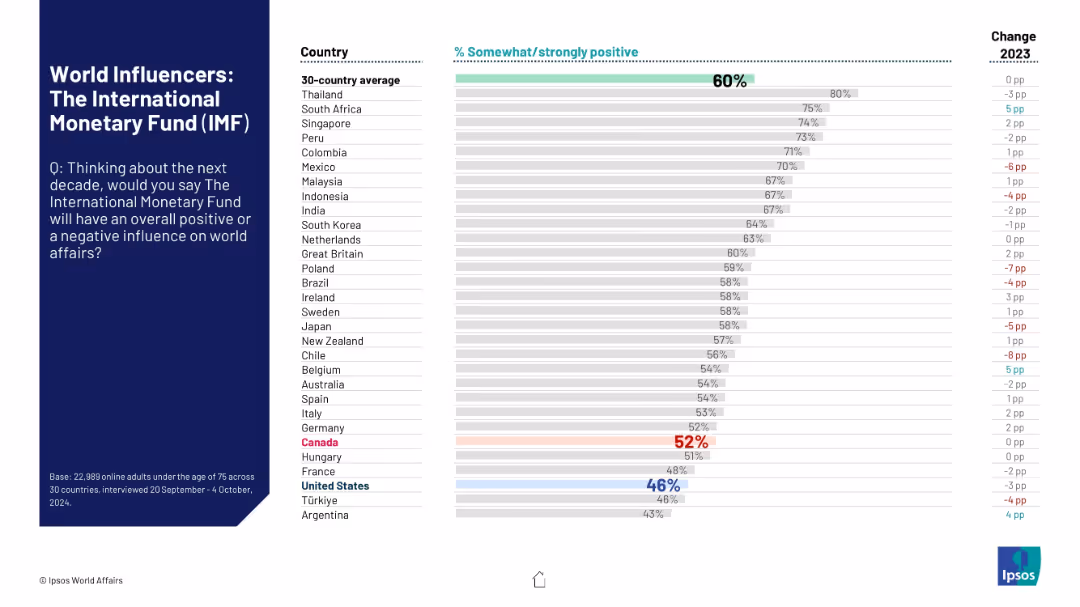
Horizontal bar chart with ranked countries, % values, and change indicators. Global and country averages shown. Flags highlight US and Canada positions.
Market Analysis and Trends
Financial Services
This slide presents global perceptions of the IMF’s influence over the next decade. The majority (60%) view the IMF positively, with strong support in Thailand and Mexico. US and Canadian views are lower than the global average.
IMF, global opinion, perception, influence, trends, country comparison, approval rating, international affairs
false
Market Analysis and Trends
Financial Services
Single Chart
IPSOS
Add to my slides
Remove from favorites
Uses standard layout with question on left and horizontal sentiment comparison by country on the right.
Market Analysis and Trends
Financial Services
The slide highlights how different countries rate the IMF’s potential global impact in the next decade. It visualizes approval ratings and the change from 2023, illustrating mixed global sentiment.
IMF, public sentiment, international finance, perception, influence, Ipsos, country comparison, bar chart, approval rating, 2024 survey
false
Market Analysis and Trends
Financial Services
Mixed Chart
IPSOS
Add to my slides
Remove from favorites
Images depicting industry applications of immersive tech, with short text descriptions underneath.
Technology and Digital Transformation
Technology & Software
Insights on how immersive reality could change operations within various industries, focusing on specific applications like AR for operational safety.
Immersive reality, industry operations, AR, VR, applications
false
Technology and Digital Transformation
Technology & Software
Pillar
McKinsey
Add to my slides
Remove from favorites
Provides examples and explanations of how immersive-reality technology is applied across different themes.
Technology and Digital Transformation
Technology & Software
Discusses the most mature applications of immersive-reality technology in areas like learning and situational awareness.
immersive reality, learning, product design, situational awareness, B2C use cases
false
Technology and Digital Transformation
Technology & Software
Header Horizontal
McKinsey
Add to my slides
Remove from favorites
Includes infographics and bullet points, detailing reasons why immersive-reality technologies are significant for business leaders.
Technology and Digital Transformation
Technology & Software
Argues for the importance of immersive-reality technologies, pointing to trends and forecasts for market growth and innovation.
immersive reality, market trends, innovation, venture capital, training scalability
false
Technology and Digital Transformation
Technology & Software
Header Horizontal
McKinsey
Add to my slides
Remove from favorites
Detailed illustrations and descriptions of various immersive-reality technologies such as AR and VR.
Technology and Digital Transformation
Technology & Software
Describes the different types of immersive-reality technologies, their applications, and how they blend technology into the world.
immersive reality, spatial computing, mixed reality, augmented reality, virtual reality
false
Technology and Digital Transformation
Technology & Software
Header Horizontal
McKinsey
Add to my slides
Remove from favorites
Illustrations of benefits and risks with corresponding bullet points, scales icon indicating balance.
Strategic Planning
Technology & Software
Explores the benefits of immersive tech in product development and risks like hardware improvement pace, covering strategic considerations for adoption.
Immersive tech, benefits, risks, strategy, product development, hardware
false
Strategic Planning
Technology & Software
Boxed
McKinsey
Add to my slides
Remove from favorites
Tabular comparison of industry use cases for immersive tech, accompanied by relevant isometric illustrations.
Technology and Digital Transformation
Technology & Software
Describes horizontal and vertical use case scenarios for immersive tech across various industries, highlighting specific applications and their significance.
Immersive tech, industries, use cases, application, significance
false
Technology and Digital Transformation
Technology & Software
Header Horizontal
McKinsey
Add to my slides
Remove from favorites
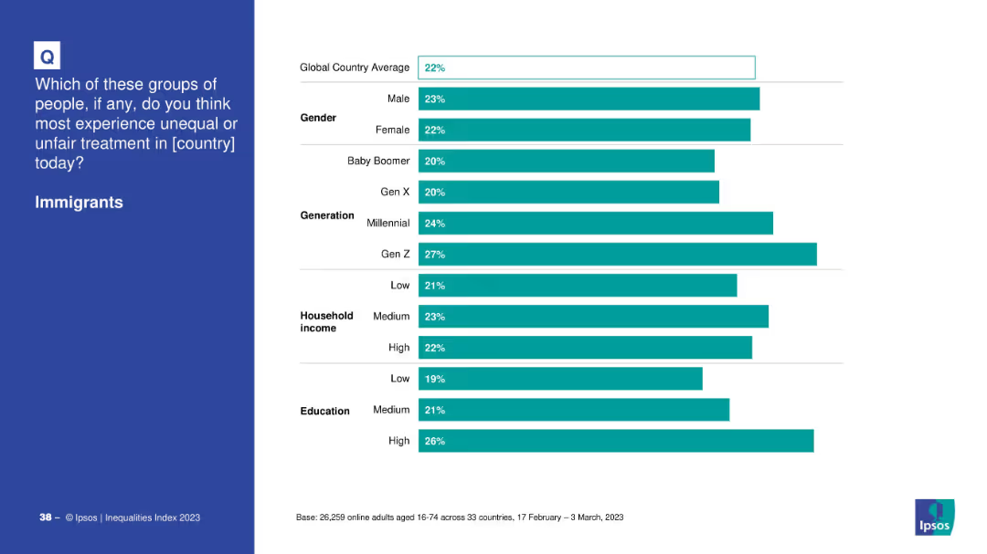
Consistent design: left text panel, right segmented bar chart by demographics.
Market Analysis and Trends
Government & Public Sector
Shows breakdown of perceived unfair treatment of immigrants based on gender, generation, household income, and education level across the global sample.
immigrants, demographics, treatment, gender, education, household income, generations, inequality
false
Market Analysis and Trends
Government & Public Sector
Mixed Chart
IPSOS
Add to my slides
Remove from favorites
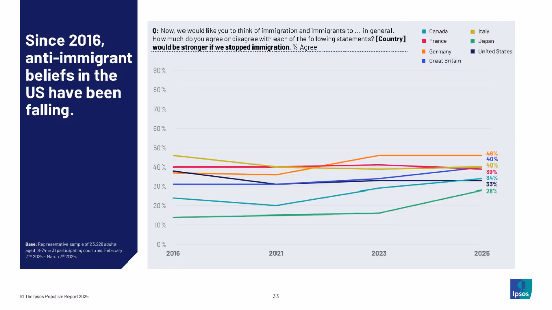
Split slide with left-aligned title text and a line graph tracking belief trends about immigration across selected countries from 2016–2025.
Market Analysis and Trends
Government & Public Sector
The chart shows how belief in the idea that a country would be stronger without immigration has shifted. It highlights a notable decline in anti-immigrant sentiment in the U.S. over time, with Japan showing a recent rise.
immigration, anti-immigration, United States, trend, public opinion, Ipsos, belief decline, 2025, policy attitude
false
Market Analysis and Trends
Government & Public Sector
Mixed Chart
IPSOS
Add to my slides
Remove from favorites
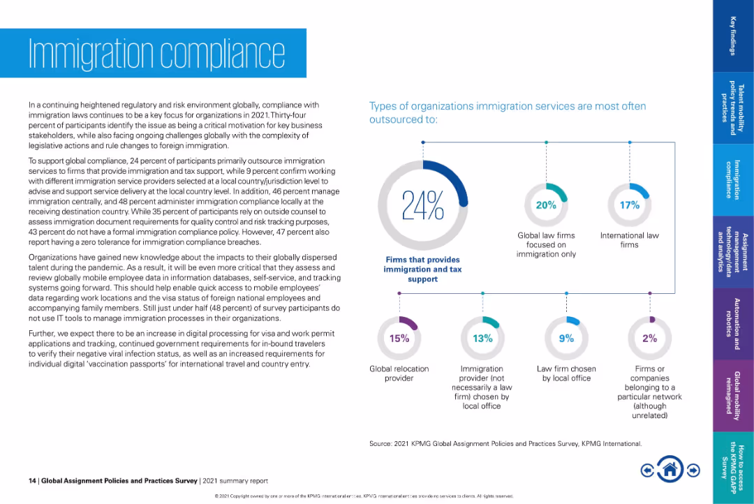
Left-aligned paragraph content; right side contains pie chart and bubble-linked service types.
Regulatory and Compliance
Government & Public Sector
Discusses how firms manage immigration compliance, with 24% outsourcing to firms providing immigration and tax support. Addresses challenges like legislative changes and lack of internal IT tools. Highlights evolving needs post-pandemic for remote worker compliance.
immigration compliance, outsourcing, tax support, visa tracking, mobility services, global regulations, employee relocation
false
Regulatory and Compliance
Government & Public Sector
Mixed Chart
KPMG
Add to my slides
Remove from favorites
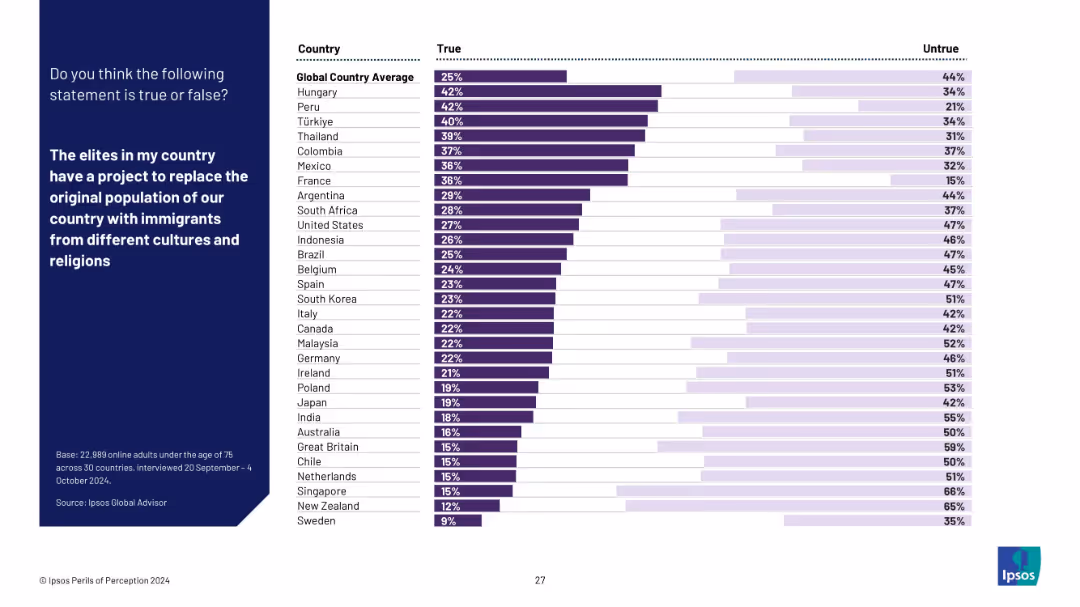
Horizontal bar chart ranking belief in the "replacement theory" – that elites aim to replace the native population with immigrants. Blue question panel, white background with ranked bars.
Regulatory and Compliance
Government & Public Sector
This chart visualizes belief in a conspiracy theory regarding immigration replacement. Countries like Hungary and Peru show high belief, while Nordic countries show low acceptance. Reflects public susceptibility to divisive narratives.
immigration, conspiracy theory, replacement belief, misinformation, national identity, survey, Ipsos, public trust, cultural tension
false
Regulatory and Compliance
Government & Public Sector
Mixed Chart
IPSOS
Add to my slides
Remove from favorites
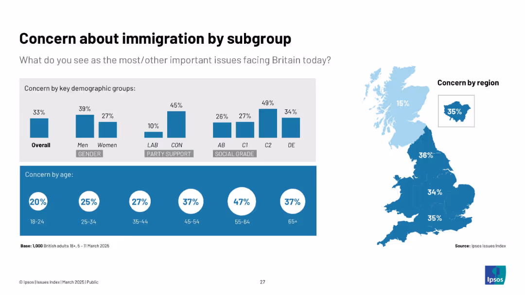
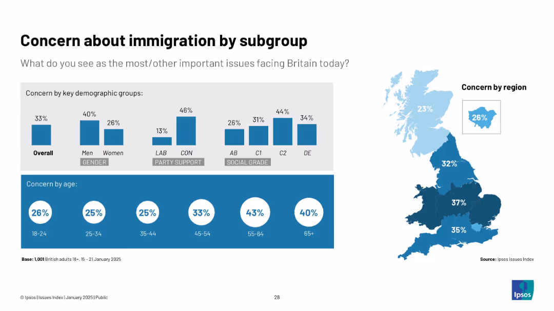
Blue-themed graphics with same visual format as Slide 19714. Includes maps and bar comparisons across demographic groups.
Market Analysis and Trends
Government & Public Sector
Highlights immigration concern segmented by gender, age, party affiliation, and region. Highest concern from older adults, men, Conservatives, and C2 social group. Scotland shows lowest regional concern.
immigration, demographics, politics, Ipsos, social segmentation, UK opinions
false
Market Analysis and Trends
Government & Public Sector
Multiple Chart
IPSOS
Add to my slides
Remove from favorites
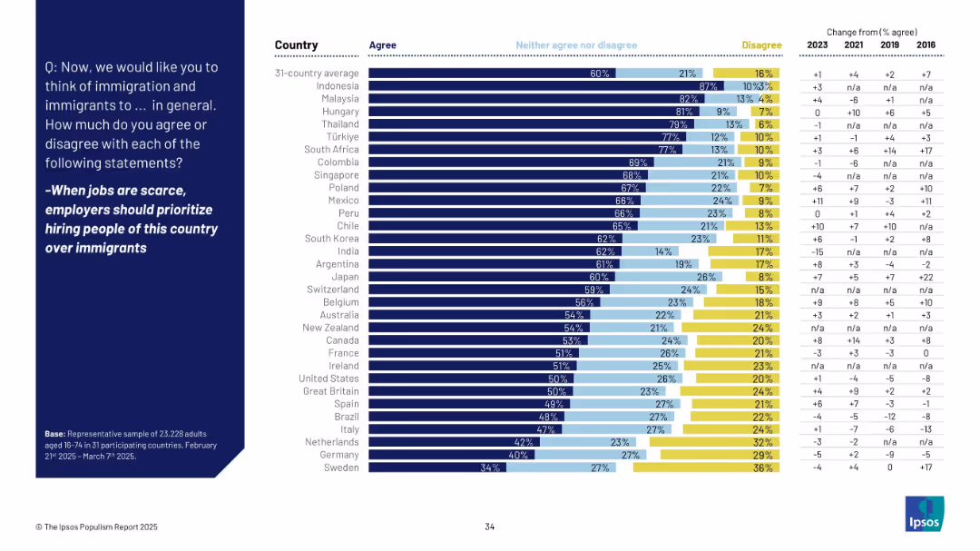
Horizontal bar chart with color-coded agreement levels by country and change over time; blue background with white text
Market Analysis and Trends
Government & Public Sector
This slide presents global survey data on the belief that native citizens should be prioritized over immigrants for jobs during times of scarcity. It shows country-wise agreement levels, disaggregated by agree, neutral, and disagree, along with historical trend comparisons from 2016 to 2025.
immigration, employment, prioritization, nationalism, global survey, Ipsos, agreement levels, trends, policy sentiment, public opinion
false
Market Analysis and Trends
Government & Public Sector
Mixed Chart
IPSOS
Add to my slides
Remove from favorites
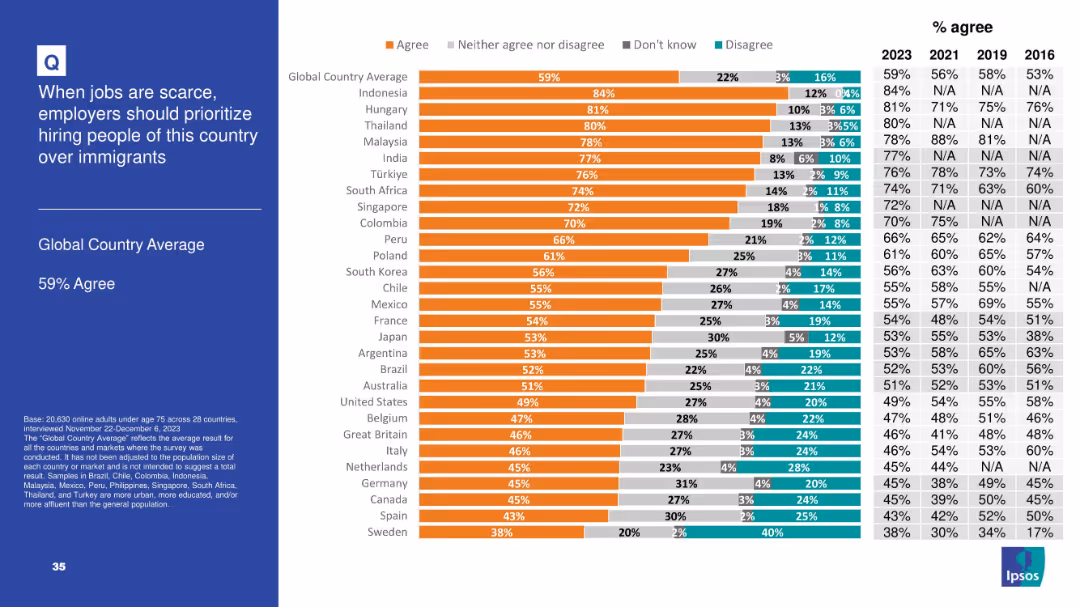
Horizontal bar chart with segmented agreement levels by country; includes historical comparison table (2016–2023) on the right and a bolded left-side title panel
Market Analysis and Trends
Government & Public Sector
The slide shows the level of agreement in 28 countries with the idea that employers should prioritize hiring nationals over immigrants when jobs are scarce. 59% globally agree, with particularly high support in Indonesia, Hungary, and Thailand.
immigration, employment, public opinion, nationalism, workforce, Ipsos, survey, global comparison, job scarcity, hiring priorities
false
Market Analysis and Trends
Government & Public Sector
Mixed Chart
IPSOS
Add to my slides
Remove from favorites
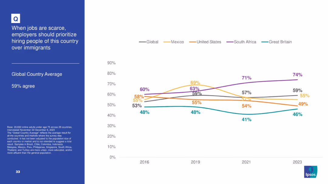
Split layout: left panel with question and stats, right panel features a line chart showing trend data (2016–2023) for selected countries; uses color-coded lines.
Market Analysis and Trends
Government & Public Sector
This slide presents a longitudinal comparison of agreement with the statement that employers should prioritize native citizens over immigrants when jobs are scarce. The line chart tracks sentiment across five countries and a 28-country average from 2016 to 2023, highlighting increasing support in some countries.
immigration, employment, public opinion, trend analysis, labor market, nationalism, Ipsos, 2023 data, country comparison, native preference
false
Market Analysis and Trends
Government & Public Sector
Mixed Chart
IPSOS
Add to my slides
Remove from favorites
Horizontal bar chart with segmented responses per country and historic agreement data. Left side states the average agreement rate and survey details.
Market Analysis and Trends
Government & Public Sector
This slide visualizes global perceptions about immigrants displacing local workers. Agreement levels for 28 countries are shown in a color-coded bar chart, supplemented with historic agreement data. The framing implies a localized identity-based perspective.
immigration impact, job competition, labor market sentiment, Ipsos data, 2023 opinion, economic anxiety, nationalist view
false
Market Analysis and Trends
Government & Public Sector
Mixed Chart
IPSOS
Add to my slides
Remove from favorites
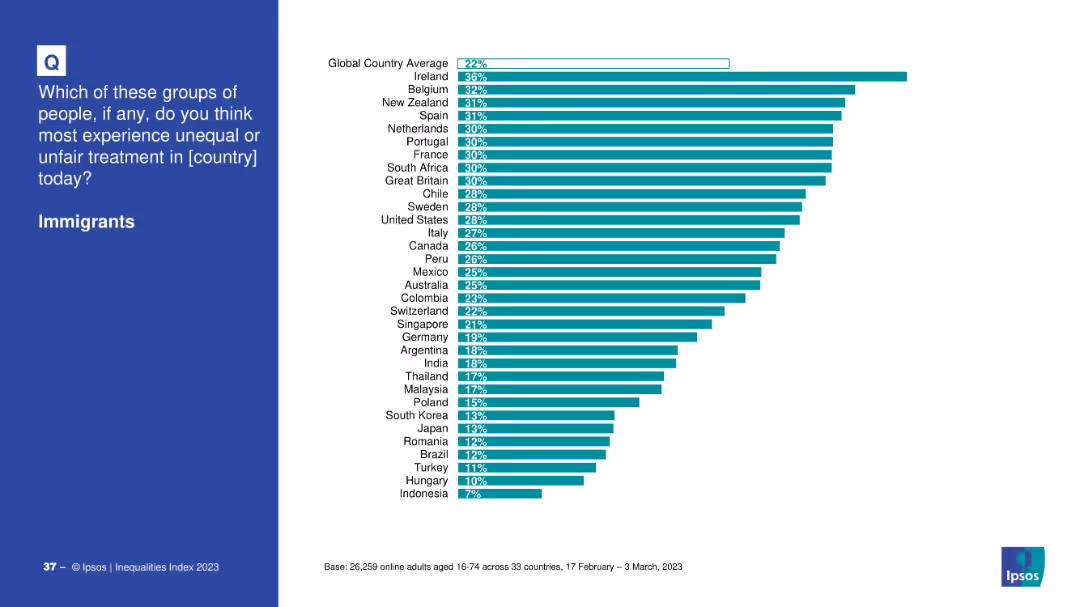
Blue left panel with the question; right side has a horizontal bar chart by country.
Market Analysis and Trends
Government & Public Sector
Depicts survey responses by country on the perceived unfair treatment of immigrants. Ireland, Belgium, and New Zealand rank highest, with a 22% global average.
immigration, inequality, countries, bar chart, discrimination, public opinion, Ipsos, 2023
false
Market Analysis and Trends
Government & Public Sector
Mixed Chart
IPSOS
Add to my slides
Remove from favorites
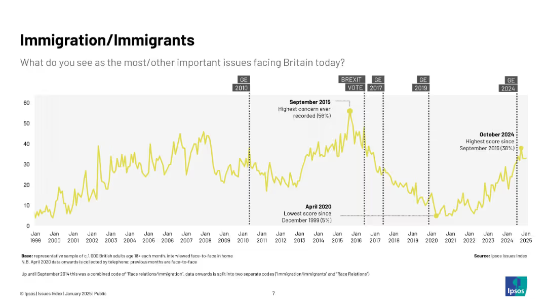
Yellow line chart (1999–2025) showing concern about immigration over time; highlights key dates like Brexit vote and 2015 peak.
Market Analysis and Trends
Government & Public Sector
Displays long-term trends in public concern around immigration in the UK, with major spikes during political debates and crises, notably Brexit and the 2015 refugee crisis.
immigration, Ipsos, Brexit, refugees, public concern, UK, politics, timeline
false
Market Analysis and Trends
Government & Public Sector
Single Chart
IPSOS
Add to my slides
Remove from favorites
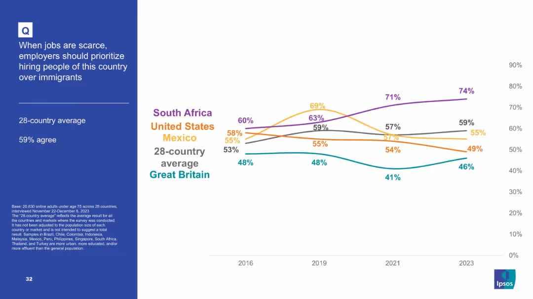
Chart and line graph format tracking sentiment trends over time across select countries; line plot includes global average trend.
Customer and Market Segmentation
Government & Public Sector
This slide reflects nationalist-leaning attitudes, with 59% globally agreeing that citizens should be prioritized over immigrants for jobs during scarcity. The trend line shows consistent support with South Africa peaking at 74% in 2023. The slide suggests growing concern over job competition and immigration policy sentiment.
immigration, jobs, hiring, nationalism, employment policy, survey, Ipsos, trends
false
Customer and Market Segmentation
Government & Public Sector
Mixed Chart
IPSOS
Add to my slides
Remove from favorites
Horizontal bar chart ranking country agreement levels on immigration's job impact; includes 2016–2023 trend data on the right
Market Analysis and Trends
Government & Public Sector
This slide presents global sentiment toward the belief that immigrants take jobs from native citizens. The global average agreement is 42%, with highest levels in India, Türkiye, and Malaysia. Trends from 2016 to 2023 are included.
immigration, labor market, native workers, job displacement, public opinion, sentiment, Ipsos, employment, nationalism
false
Market Analysis and Trends
Government & Public Sector
Mixed Chart
IPSOS
Add to my slides
Remove from favorites
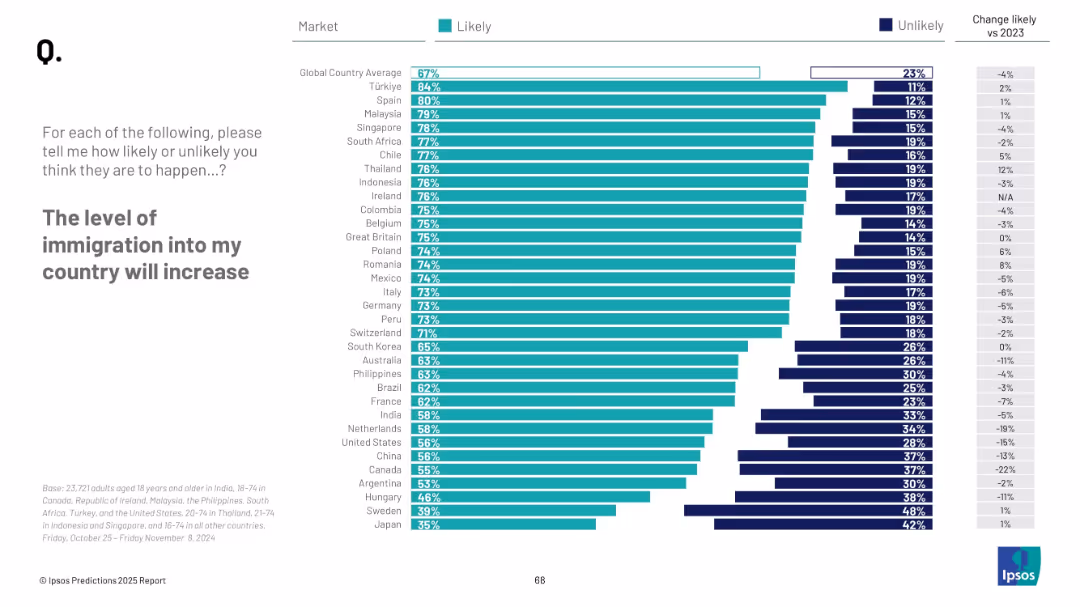
Horizontal bar chart showing country-wise Likely vs. Unlikely responses; change vs. 2023 displayed; ranked from highest to lowest likelihood.
Market Analysis and Trends
Government & Public Sector
This slide ranks perceptions of increased immigration by country. Türkiye, Spain, and Malaysia show the highest expectations. It also shows % change from 2023. Lower-ranked countries include Sweden and Japan.
immigration, migration trends, public perception, Ipsos, global sentiment, demographic change, national forecast, 2025 prediction
false
Market Analysis and Trends
Government & Public Sector
Mixed Chart
IPSOS
Add to my slides
Remove from favorites
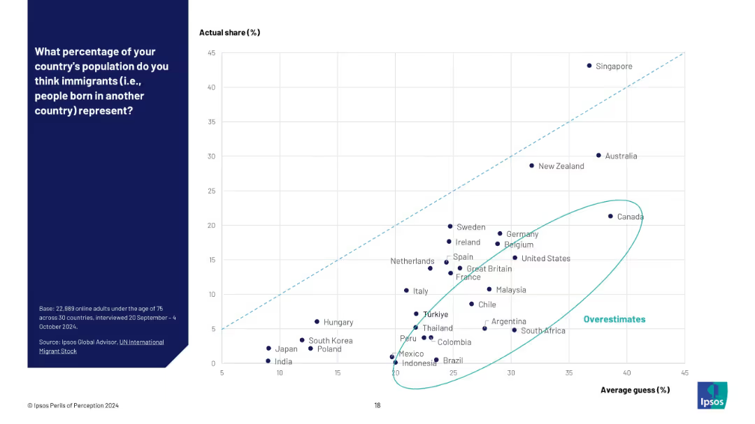
Scatter plot with average guess (%) on X-axis and actual share (%) on Y-axis; overestimators highlighted.
Market Analysis and Trends
Government & Public Sector
This slide shows a scatter plot comparing perceived versus actual immigrant population percentages. Countries are plotted to show which overestimated most, with a light blue ellipse marking the outliers.
immigration misperception, scatter chart, data gap, Ipsos perceptions, overestimate cluster, demographic misjudgment
false
Market Analysis and Trends
Government & Public Sector
Mixed Chart
IPSOS
Add to my slides
Remove from favorites
Bar chart with horizontal country-by-country comparisons, color-coded by response category; historical comparison columns on right.
Risk Assessment and Management
Government & Public Sector
This slide reports on agreement with halting immigration, with 43% globally in favor. There is significant variation between countries—Türkiye and India show high support, while Japan and South Korea show low. The slide suggests immigration remains a polarizing issue globally, tied to national identity, economic concerns, and political narratives.
immigration, nationalism, identity, population, politics, Ipsos, opinion, integration
false
Risk Assessment and Management
Government & Public Sector
Mixed Chart
IPSOS
Add to my slides
Remove from favorites
Split layout with statement and average percentage on left; right side contains stacked bar chart showing country-wise agreement/disagreement, with historical % agree data (2016–2023).
Market Analysis and Trends
Government & Public Sector
This slide shows public sentiment on whether countries would be stronger without immigration. A horizontal stacked bar chart displays responses across 28 countries, categorized by agreement levels and changes over time, providing a comparative and historical perspective.
immigration, nationalism, public sentiment, Ipsos survey, 2023 trends, immigration policy, demographic opinion, agreement rate
false
Market Analysis and Trends
Government & Public Sector
Mixed Chart
IPSOS
Add to my slides
Remove from favorites
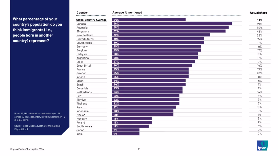
Bar chart with three columns: country, average % mentioned, and actual share; perception bars in purple.
Market Analysis and Trends
Government & Public Sector
This slide reveals how citizens across various countries estimate the proportion of immigrants in their population. It shows widespread overestimation, with perception often double the actual immigrant share.
immigration, population estimate, public opinion, perception vs reality, Ipsos, international migration, survey bias, overestimation
false
Market Analysis and Trends
Government & Public Sector
Mixed Chart
IPSOS
Add to my slides
Remove from favorites
Text with bar chart comparing views on prioritizing native citizens for jobs during economic hardship, split by political ideology and country.
Customer and Market Segmentation
Government & Public Sector
This slide explores populist opinions on immigration and economic protectionism. Radical right-wing supporters favor native job prioritization, while left-wing populists largely oppose such measures, indicating a major ideological divide.
immigration, populism, economic hardship, nationalism, party politics
false
Customer and Market Segmentation
Government & Public Sector
Mixed Chart
IPSOS
Add to my slides
Remove from favorites
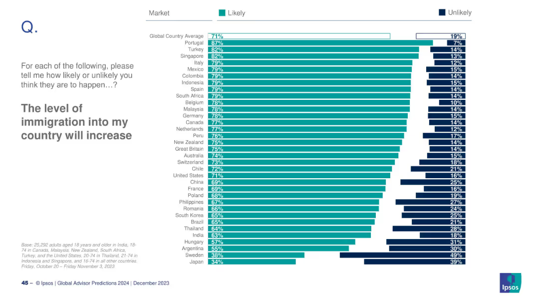
Horizontal bar chart by country; teal for Likely, dark blue for Unlikely; countries ordered by Likely %; global avg at top.
Market Analysis and Trends
Government & Public Sector
This slide highlights international public sentiment toward increasing immigration. Portugal ranks highest (87%), while Japan ranks lowest (34%). The global average is 71%. It provides insight into anticipated demographic shifts and migration expectations.
immigration, public sentiment, demographics, global trends, 2024, migration policy, Ipsos, perception, population, country comparison
false
Market Analysis and Trends
Government & Public Sector
Mixed Chart
IPSOS
Add to my slides
Remove from favorites
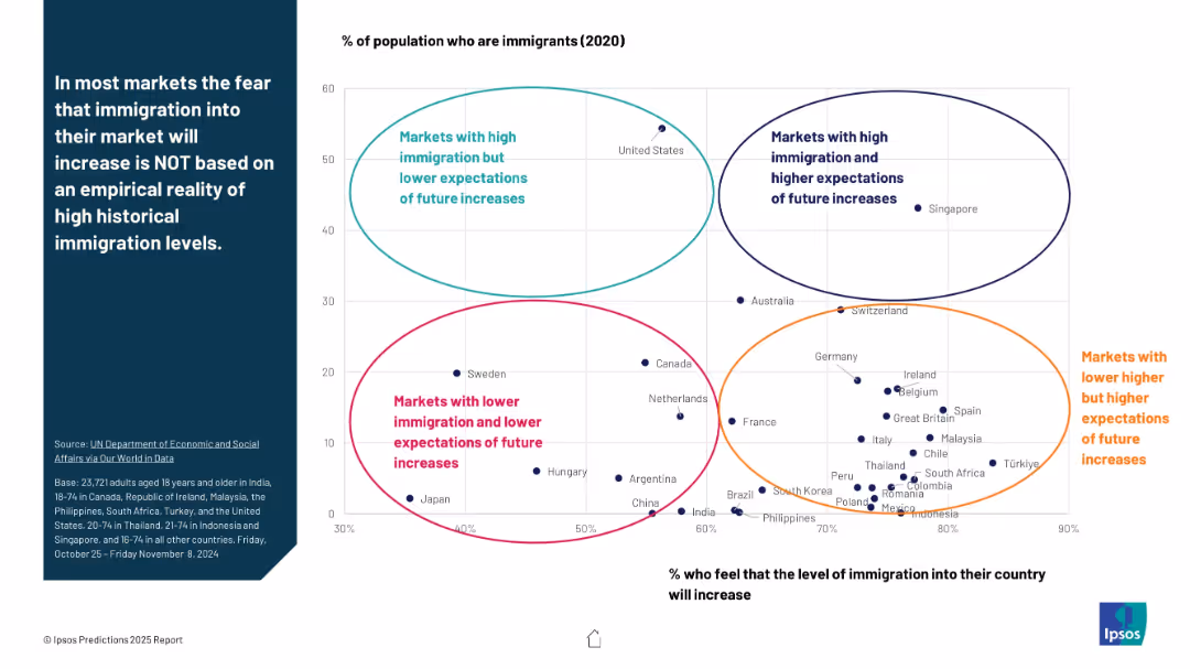
Scatterplot chart comparing % immigrants (X-axis) vs. % who expect increases (Y-axis); 4 labeled clusters of country groupings; bubble markers for countries.
Market Analysis and Trends
Government & Public Sector
The slide compares actual immigrant populations (2020 data) with public expectations of immigration increase. It highlights four quadrants, including countries with high/low immigration and high/low expectations. Main insight: fears about immigration aren't always aligned with data.
immigration reality, public fear, expectations, scatterplot, Ipsos, demographic comparison, market clusters, 2025 insights
false
Market Analysis and Trends
Government & Public Sector
Mixed Chart
IPSOS
Add to my slides
Remove from favorites
Mixed visuals: bar charts by gender, party, social grade, age + regional heat map.
Market Analysis and Trends
Government & Public Sector
This slide shows which subgroups are most concerned about immigration. Older adults and Conservative supporters show highest concern, while younger age groups show lower interest. Regional differences are also mapped.
immigration, region, age, politics, Ipsos, concern
false
Market Analysis and Trends
Government & Public Sector
Multiple Chart
IPSOS
Add to my slides
Remove from favorites
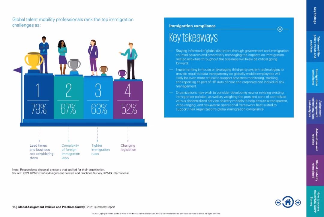
Podium-style infographic showing ranked challenges; blue box of takeaways to the right.
Risk Assessment and Management
Government & Public Sector
Visualizes the top four immigration challenges faced by professionals, led by "lead times and business not considering them" (79%). Also includes key recommendations like proactive data tracking and reevaluating service models for improved compliance.
immigration risk, lead time, foreign law complexity, immigration rules, legislation changes, compliance policy
false
Risk Assessment and Management
Government & Public Sector
Mixed Chart
KPMG
Add to my slides
Remove from favorites
Horizontal bar chart of countries showing agreement levels with anti-immigration sentiment, with trend data and change since 2016.
Market Analysis and Trends
Government & Public Sector
The slide visualizes sentiment that halting immigration would strengthen the country. Türkiye, Thailand, and Chile top the list; meanwhile, Japan shows a 12pp rise since 2021, and the U.S. has seen a decline since 2016.
immigration, sentiment, anti-immigration, policy, public opinion, 2025, Ipsos, nationalism, global comparison
false
Market Analysis and Trends
Government & Public Sector
Mixed Chart
IPSOS
Add to my slides
Remove from favorites
Timeline line chart from 1999 to 2025 showing concern levels over time, with annotations
Market Analysis and Trends
Government & Public Sector
This slide charts rising and falling public concern about immigration, showing spikes around 2015–2016 during Brexit discourse, and a renewed rise in 2024.
immigration, UK, concern, Brexit, Ipsos, timeline, survey, politics, opinion, chart
false
Market Analysis and Trends
Government & Public Sector
Single Chart
IPSOS
Add to my slides
Remove from favorites
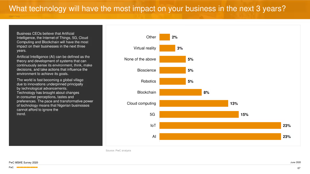
A column chart showing predicted impactful technologies for businesses, with AI and IoT tied for the highest impact, represented by orange bars.
Technology and Digital Transformation
Technology & Software
The slide predicts the technologies that will significantly impact businesses over the next three years, with AI and IoT being the top choices, followed by 5G and cloud computing.
impactful technologies, AI, IoT, 5G, cloud computing, technology and software, column chart
false
Technology and Digital Transformation
Technology & Software
Mixed Chart
PwC/Strategy&
Add to my slides
Remove from favorites
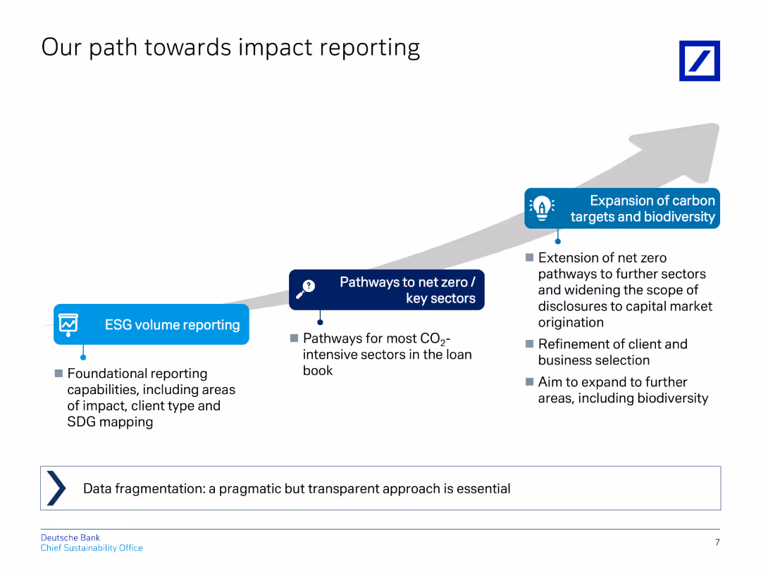
The slide uses a flow diagram to illustrate the progression from ESG volume reporting to net zero pathways and carbon target expansion.
Regulatory and Compliance
Financial Services
Outlines steps for improving impact reporting, including ESG volume reporting, net zero pathways, and carbon target expansion.
impact, reporting, ESG, net zero, carbon targets
false
Regulatory and Compliance
Financial Services
Linear Flow
Deutsche Bank
Add to my slides
Remove from favorites
The slide uses a flowchart to demonstrate the stages of an impact thesis from resources to impact. It includes an example related to education.
Organizational Structure and Change
Telecommunications
This slide details the "impact thesis" framework, explaining how logic models can be used to plan and assess social impact, using an educational example.
impact thesis, logic models, social impact, data collection, education, framework
false
Organizational Structure and Change
Telecommunications
Linear Flow
Accenture
Add to my slides
Remove from favorites
The slide uses a detailed flowchart to demonstrate the stages of an impact thesis specific to nbn, with labeled sections and connections between them.
Organizational Structure and Change
Telecommunications
This slide describes how NBN Co uses the impact thesis model to guide its social impact efforts, detailing specific activities and expected outcomes.
impact thesis, NBN Co, social impact, activities, outcomes, model
false
Organizational Structure and Change
Telecommunications
Diagram
Accenture
Add to my slides
Remove from favorites
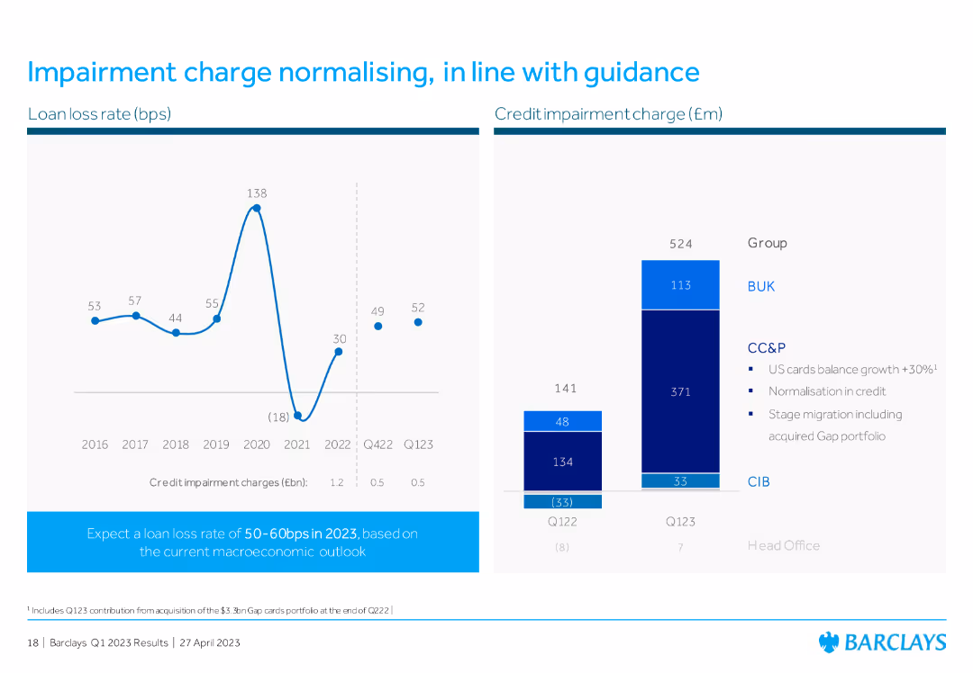
Line chart showing loan loss rates from 2016 to Q1 2023, and a bar chart displaying credit impairment charges, with bullet points explaining the normalization in credit.
Risk Assessment and Management
Financial Services
The slide illustrates the normalization of impairment charges, showing trends in loan loss rates and credit impairment charges, in line with Barclays' financial guidance.
impairment charge, loan loss rate, credit normalization, financial guidance, Barclays
false
Risk Assessment and Management
Financial Services
Multiple Chart
Barclays
Add to my slides
Remove from favorites
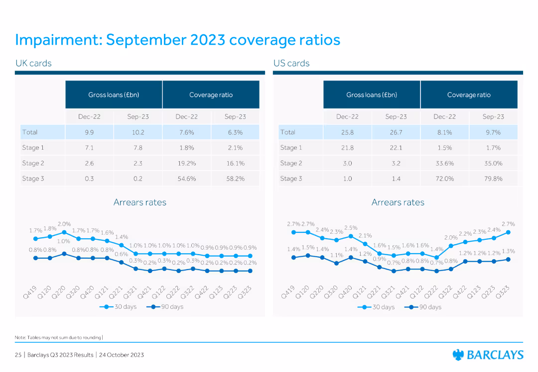
The slide presents two tables comparing gross loans and coverage ratios for UK and US cards, along with a line chart showing arrears rates over time. The design is clear and informative.
Financial Performance
Financial Services
It provides detailed coverage ratios and gross loan amounts for UK and US credit cards as of September 2023, along with trends in arrears rates, indicating financial health and stability.
impairment, coverage ratios, gross loans, UK, US, credit cards, arrears rates, financial health
false
Financial Performance
Financial Services
Multiple Chart
Barclays
Add to my slides
Remove from favorites
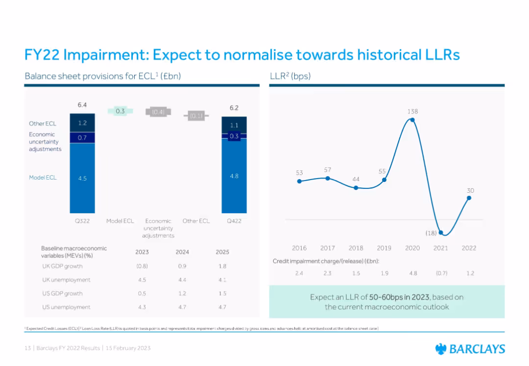
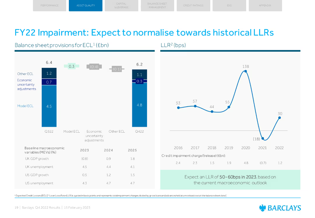
Dual-panel layout: Left uses stacked bar charts for provisions and adjustments; right displays a line graph of historical loan loss rates (LLR) from 2016 to 2022 with expected 2023 range highlighted.
Risk Assessment and Management
Financial Services
Describes expected credit loss (ECL) provisions and historical LLR trends, indicating a normalization toward historical rates. The slide provides macroeconomic assumptions and Barclays’ projections for 2023 based on a cautious economic outlook.
impairment, credit losses, LLR, macroeconomic outlook, FY22, FY23 forecast, provisions, economic assumptions
false
Risk Assessment and Management
Financial Services
Multiple Chart
Barclays
Add to my slides
Remove from favorites
Column charts showing balance sheet provisions for ECL and LLR trends. Economic uncertainty adjustments noted.
Risk Assessment and Management
Financial Services
The slide discusses expected normalization of impairments and loan loss rates, with economic outlook provided.
impairment, LLR, normalization, economic outlook, ECL
false
Risk Assessment and Management
Financial Services
Multiple Chart
Barclays
Add to my slides
Remove from favorites
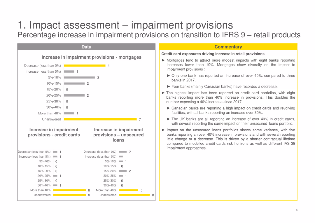
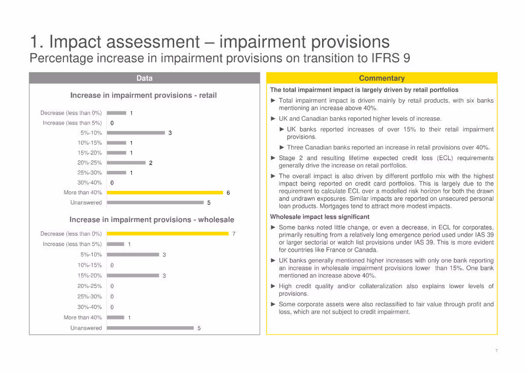
The slide uses bar charts to show increases in impairment provisions across various retail products, including mortgages, credit cards, and unsecured loans.
Risk Assessment and Management
Financial Services
Analyzes the increase in impairment provisions for mortgages, credit cards, and unsecured loans during the transition to IFRS 9.
impairment provisions, IFRS 9, retail products, mortgages, credit cards, unsecured loans, bar charts
false
Risk Assessment and Management
Financial Services
Multiple Chart
EY
Add to my slides
Remove from favorites
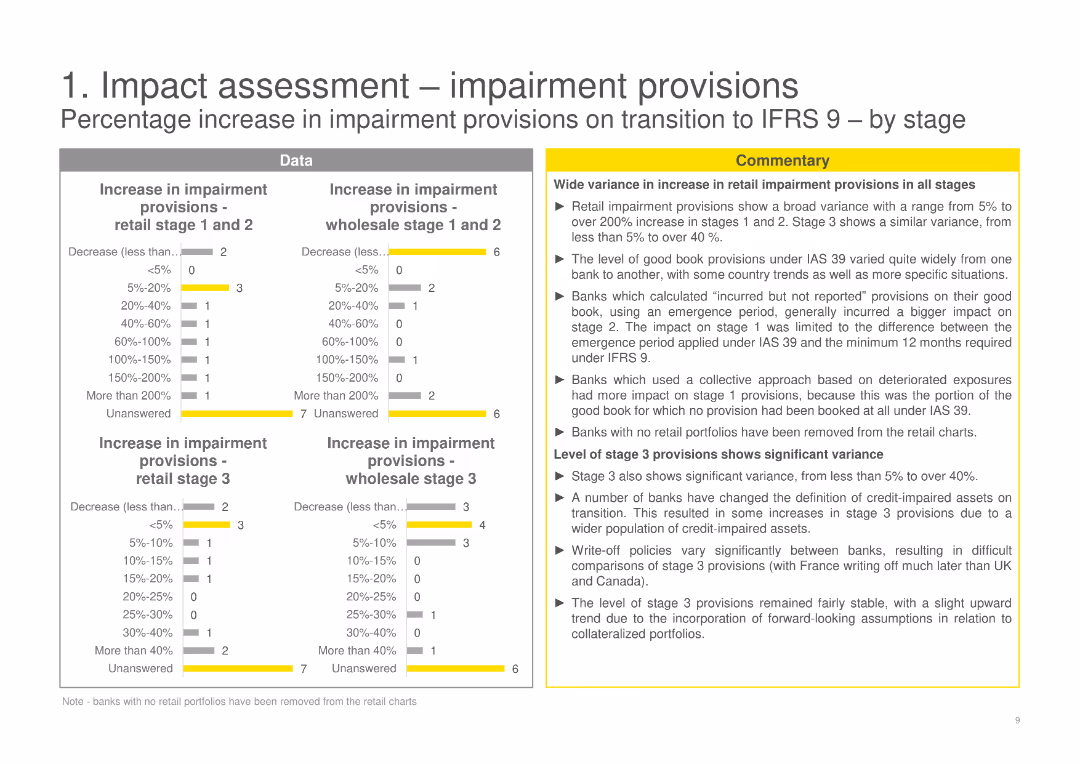
The slide displays bar charts showing the increase in impairment provisions by stage (retail and wholesale) during the transition to IFRS 9, with accompanying text.
Risk Assessment and Management
Financial Services
Examines the increase in impairment provisions by stage (retail and wholesale) during the transition to IFRS 9.
impairment provisions, IFRS 9, retail stage, wholesale stage, transition, data-driven, bar charts
false
Risk Assessment and Management
Financial Services
Multiple Chart
EY
Add to my slides
Remove from favorites
The slide contains bar charts and textual commentary, illustrating the increase in impairment provisions for retail and wholesale on transition to IFRS 9.
Risk Assessment and Management
Financial Services
Provides an analysis of impairment provisions increase for retail and wholesale products upon transitioning to IFRS 9.
impairment provisions, IFRS 9, retail, wholesale, transition, risk assessment, data-driven, bar charts
false
Risk Assessment and Management
Financial Services
Multiple Chart
EY
Add to my slides
Remove from favorites
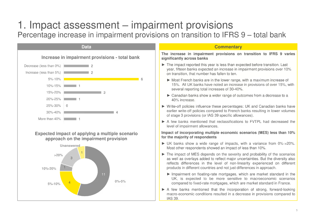
The slide displays a mix of bar and pie charts, along with commentary sections. Charts illustrate the percentage increase in impairment provisions.
Risk Assessment and Management
Financial Services
Analyzes the percentage increase in impairment provisions on transition to IFRS 9, varying significantly across banks.
impairment provisions, IFRS 9, risk management, transition, percentage increase, data, commentary
false
Risk Assessment and Management
Financial Services
Multiple Chart
EY
Add to my slides
Remove from favorites
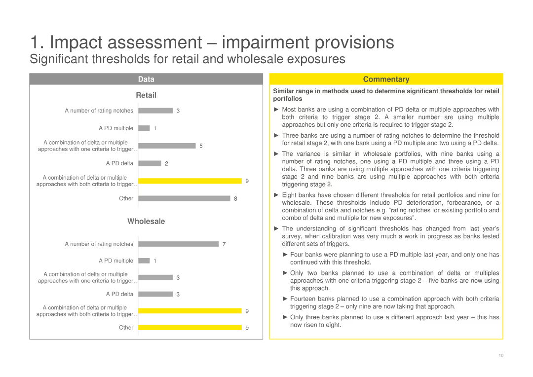
The slide features bar charts and textual analysis on significant thresholds for retail and wholesale exposures.
Risk Assessment and Management
Financial Services
Discusses significant thresholds for impairment provisions, comparing methods used for retail and wholesale portfolios.
impairment provisions, retail, wholesale, significant thresholds, risk assessment, IFRS 9, data-driven, bar charts
false
Risk Assessment and Management
Financial Services
Multiple Chart
EY
Add to my slides
Remove from favorites
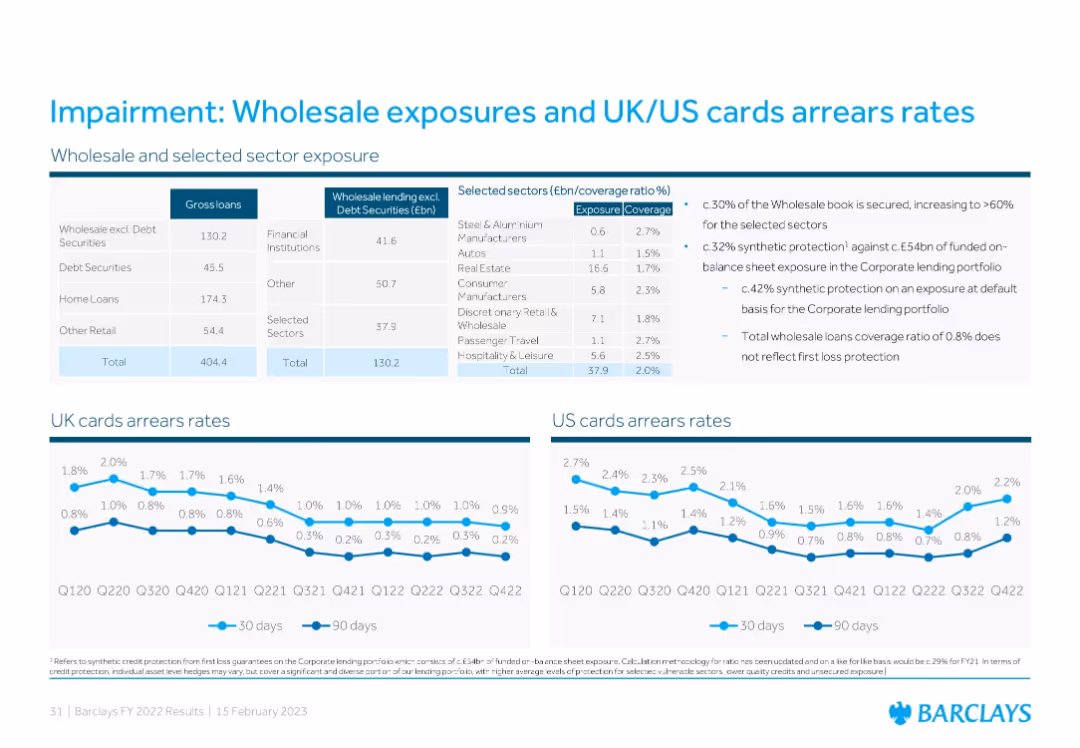
Tabular data on wholesale lending exposure, coverage ratios by sector, and two line charts displaying UK and US cards arrears over time for 30-day and 90-day periods.
Risk Assessment and Management
Financial Services
The slide outlines Barclays’ wholesale and sector loan exposures and impairment coverage, showing UK and US credit card arrears trends. It notes the secured portion of the wholesale book, synthetic protections, and impairment rate stabilization, illustrating credit quality and risk management efforts.
impairment, wholesale loans, arrears rates, coverage, credit risk
false
Risk Assessment and Management
Financial Services
Multiple Chart
Barclays
Add to my slides
Remove from favorites
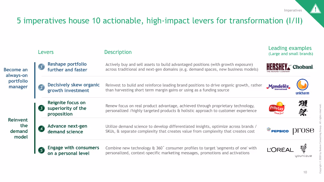
The slide uses a table format to list 5 imperatives and 10 levers for transformation, with associated examples and logos.
Strategic Planning
Professional Services
It details actionable levers for transformation across various industries, highlighting leading examples of implementation.
Imperatives, Levers, Transformation, Examples, Strategy
false
Strategic Planning
Professional Services
Table
BCG
Add to my slides
Remove from favorites
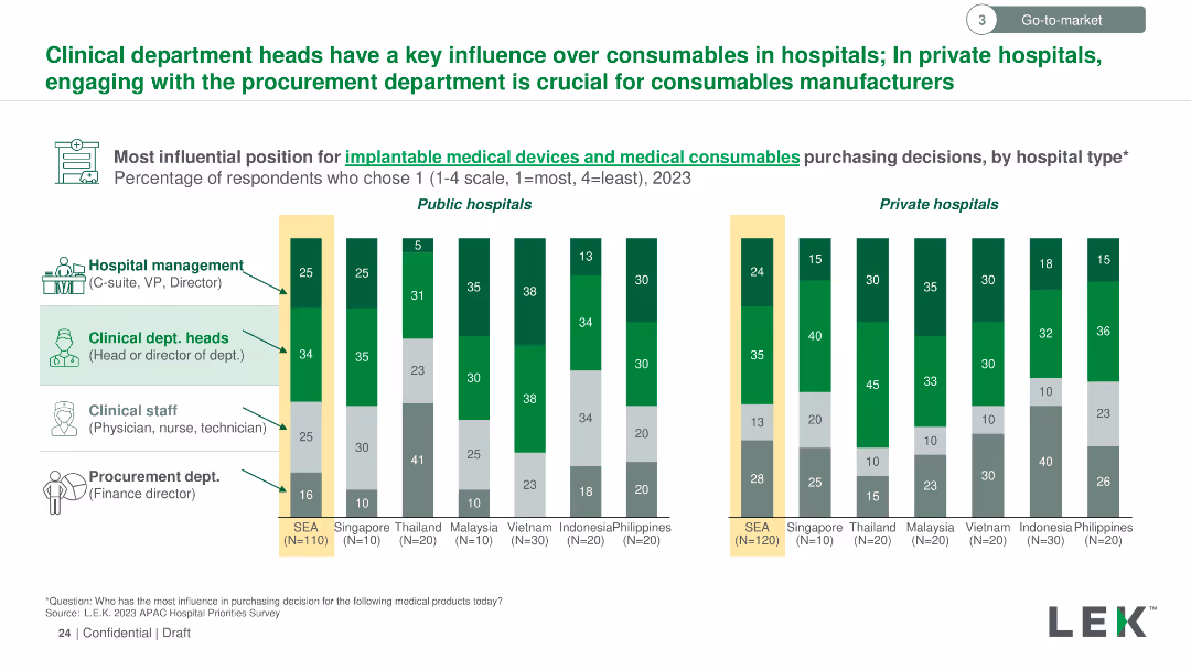
Vertical column chart showing the most influential roles in purchasing implantable medical devices and consumables across public and private hospitals in SEA.
Market Analysis and Trends
Healthcare & Pharmaceuticals
Highlights that clinical department heads are key influencers for medical consumables in public hospitals, while the procurement department is crucial in private hospitals.
implantable medical devices, medical consumables, purchasing decisions, clinical department heads, SEA
false
Market Analysis and Trends
Healthcare & Pharmaceuticals
Multiple Chart
LEK
Add to my slides
Remove from favorites
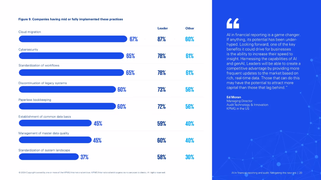
Two-column layout: left side includes implementation stats with a bar chart (Figure 9), right features a quote. Blue-white color scheme.
Operational Efficiency
Financial Services
Details implementation levels of key practices like cloud migration, cybersecurity, and workflow standardization that enable AI integration in financial reporting, especially among industry leaders.
implementation, AI adoption, cloud, cybersecurity, workflow, financial reporting
false
Operational Efficiency
Financial Services
Mixed Chart
KPMG
Add to my slides
Remove from favorites
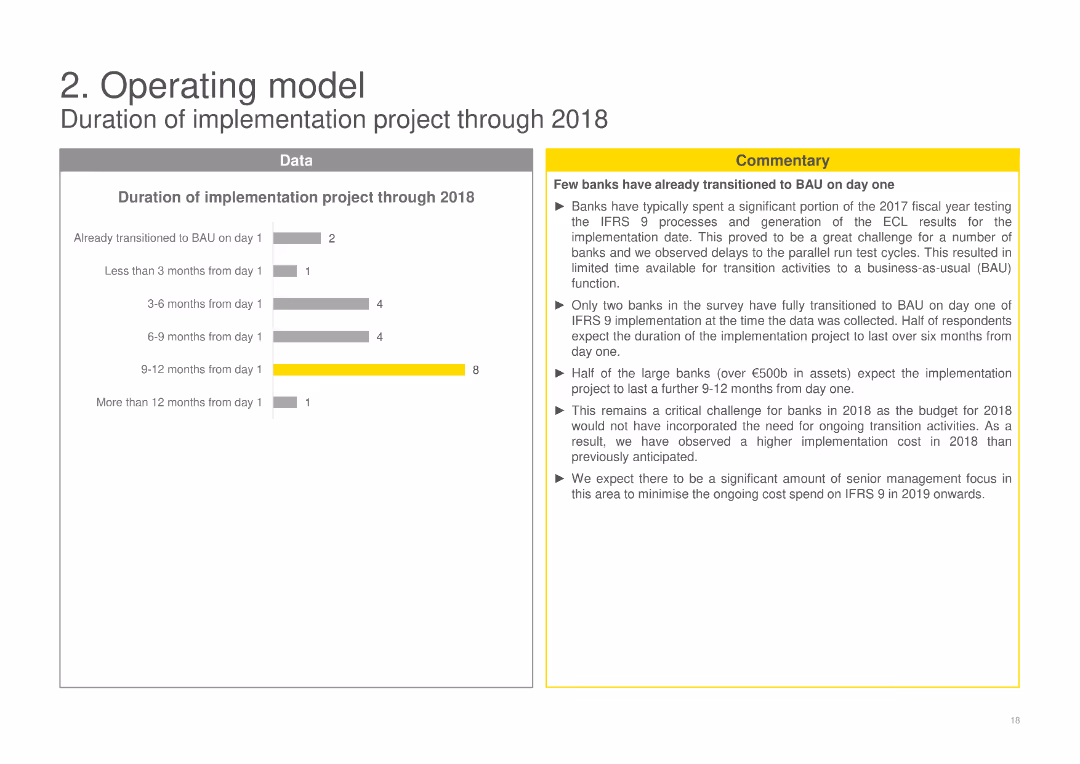
Shows column charts detailing the duration of the implementation project through 2018, segmented by time frames from less than 3 months to more than 12 months, with commentary on the project duration and implementation challenges.
Operational Efficiency
Financial Services
Examines the duration of IFRS 9 implementation projects, providing insights into the time frames banks experienced during the transition and the associated challenges, emphasizing the need for ongoing transition activities.
implementation project, duration, IFRS 9, transition challenges, financial services
false
Operational Efficiency
Financial Services
Mixed Chart
EY
Add to my slides
Remove from favorites
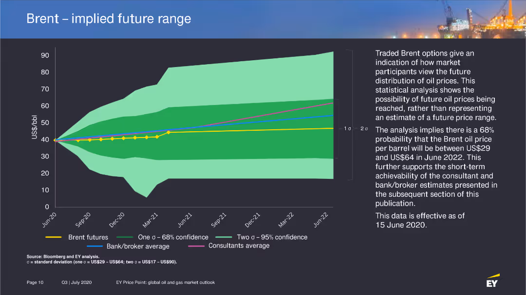
The slide contains a line chart with a shaded area representing the implied future range of Brent prices, based on statistical analysis of market participants' expectations.
Market Analysis and Trends
Energy & Utilities
Provides a statistical analysis of future Brent price distributions, highlighting the range of possible price outcomes and the factors that influence these projections.
implied range, Brent prices, future projections
false
Market Analysis and Trends
Energy & Utilities
Mixed Chart
EY
Add to my slides
Remove from favorites
Full-slide bar chart comparing relative importance of five accelerant categories. Large building image on the left with minimal top-line text. Horizontal bars with yellow and gray sections.
Strategic Planning
Financial Services
This slide conveys the relative importance of five accelerants in creating a world-leading FS hub. Technological infrastructure ranks highest (91%), followed by regulatory frameworks and cross-border trade. It emphasizes prioritization of innovation and legal infrastructure for sector development.
importance, accelerants, FS hub, infrastructure, planning, innovation
false
Strategic Planning
Financial Services
Single Chart
EY
Add to my slides
Remove from favorites
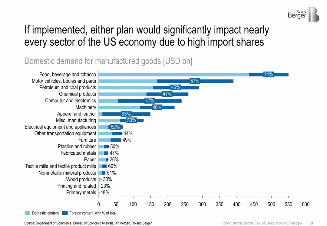
Horizontal bar chart with light blue and dark blue segments representing domestic and foreign content of manufactured goods across industries; labeled with percentages and USD bn values
Strategic Planning
Industrial & Manufacturing
This slide illustrates the heavy reliance on imports across US manufacturing sectors, showing that many sectors—especially apparel, computers, and vehicles—have high foreign content shares, making them vulnerable to policy changes like border taxes.
import dependency, foreign content, domestic demand, manufacturing, border tax, industrial sectors, policy impact, supply chain
false
Strategic Planning
Industrial & Manufacturing
Single Chart
Roland Berger
Add to my slides
Remove from favorites
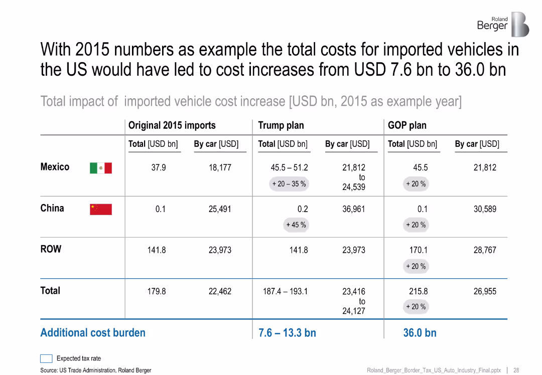
Comparative table showing import costs from Mexico, China, and ROW under original 2015 values, Trump plan, and GOP plan, with added tax burdens
Pricing Strategies
Industrial & Manufacturing
Demonstrates projected cost increases in imported vehicles under proposed US trade/tax policies using 2015 data. The Trump and GOP plans raise costs substantially, particularly from Mexico, with per car cost increases clearly noted.
imported vehicles, trade policy, tax plan, GOP, Trump, cost increase, automotive imports, pricing impact
false
Pricing Strategies
Industrial & Manufacturing
Table
Roland Berger
Add to my slides
Remove from favorites
Previous
Next
You don't have any favorites yet.
Please wait loading your favorites slides...
Create a FREE account to continue browsing
Receive Instant Access to 1,000+ slides from companies like McKinsey, Google, and Goldman Sachs
First Name
Last Name
Email
Password
I agree to all
Terms & Privacy Policy
Thank you! Your submission has been received!
Oops! Something went wrong while submitting the form.
Have an account?
Sign in
Upgrade to PRO to Save slides
Advanced Search and Filters
Access to 15,000+ slides
Access to Category Pages
Save/Bookmark Slides
PowerPoint Template Library
Pick a Plan
MONTHLY
$12/month
Billed every month, Cancel anytime.
YEARLY
$9/year
Billed $108 annually, Cancel anytime.
Checkout for $12/month
Checkout for $108/yr
Secured by Stripe | AES-256 bit encryption


![Immigrants take jobs away from real [NOUN FOR PEOPLE FROM COUNTRY, PLURAL]](https://cdn.prod.website-files.com/654e70fb59937215cac87b19/6899be4d9a8c1adf1431cb0b_9OB9oN2Ji8BDXxOKtyFOK6zEQct4HL14ajv2CN6v1VI.avif)

![Immigrants take jobs away from real [NOUN FOR PEOPLE FROM COUNTRY, PLURAL]](https://cdn.prod.website-files.com/654e70fb59937215cac87b19/6899bd61d3264f77333b116e_8pGF9UT-DKq9QfBTk4nQibYSFk5LxcGZXESeRTgQ4eM.avif)
![[Country] would be stronger if we stopped immigration](https://cdn.prod.website-files.com/654e70fb59937215cac87b19/6899bd5abc303b7d94f02f12_0Te_jmPYnbVvw-qHnHze3tKEeBz4_dT5PizkF-m_TSY.avif)
![[Country] would be stronger if we stopped immigration](https://cdn.prod.website-files.com/654e70fb59937215cac87b19/6899be436cb8c4720c8d5c48_2PPpHevHHqBR2M5cxv5elYBkz_0ss3_-jn7jUB4DuiM.avif)

![[COUNTRY] would be stronger if we stopped immigration](https://cdn.prod.website-files.com/654e70fb59937215cac87b19/6899baf91af119d21ad0f354_SQSyRKPDWoHUw-waWxlinT3a9LkxhGzU_QM5-54sdjY.avif)