My Account
My Slides
Search by Category
Companies
Slide Type
Use Case
Industry
Pricing
Templates
View All Templates
Download Template Slides
✦ AI
AI Prompt Library
AI Search
Feedback
Login
Logout
Get Started
Browse all Slides
Browse all Slides
Create a FREE Account
Instant access to 1,000+ real slides from top companies like McKinsey, BCG, Goldman Sachs, Google and many more!
First Name
Last Name
Email
Password
I agree to all
Terms & Privacy Policy
Thank you! Your submission has been received!
Oops! Something went wrong while submitting the form.
Have an account?
Sign in
Saved Slides
Total No. of slides saved
0
↻ Refresh
✖ Clear all
A pie chart showing the share of total imports from Costa Rica to the US by product type. The chart uses different colors for each segment, with highlighted sections for significant variations.
Market Analysis and Trends
Transportation & Logistics
This slide provides an overview of the top ten product imports from Costa Rica to the US, highlighting their share of total imports and annual variation from 2021 to 2022.
Imports, Costa Rica, US, pie chart, market trends
false
Market Analysis and Trends
Transportation & Logistics
Single Chart
Deloitte
Add to my slides
Remove from favorites
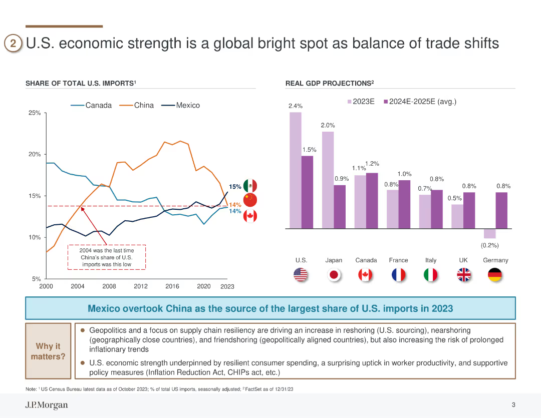
This slide contains a line chart showing the share of total U.S. imports from Canada, China, and Mexico, alongside a column chart with real GDP projections for various countries.
Market Analysis and Trends
Financial Services
The slide compares the U.S. import shares from major trading partners and projects GDP growth for 2023 and 2024-2025 for the U.S. and other countries. It emphasizes Mexico overtaking China as the largest source of U.S. imports and presents the U.S. economic strength as a key global player amidst shifting trade balances. This slide can be used for global economic analysis and forecasting.
imports, GDP, Mexico, China, trade shifts
false
Market Analysis and Trends
Financial Services
Multiple Chart
JP Morgan
Add to my slides
Remove from favorites
Line chart detailing the share of US imports from individual Central American countries, with key events marked on the timeline.
Market Analysis and Trends
Transportation & Logistics
This slide presents a line chart showing the share of US imports from various Central American countries, noting trends and significant events like US-China tariffs and COVID-19.
Imports, US, Central America, countries, timeline
false
Market Analysis and Trends
Transportation & Logistics
Single Chart
Deloitte
Add to my slides
Remove from favorites
Line chart showing the share of US imports from Central America and other regions over time, with key events marked along the timeline.
Market Analysis and Trends
Transportation & Logistics
This slide shows a line chart comparing the share of US imports from Central America to other main trading partners, highlighting impacts from events like US-China tariffs, COVID-19, and the Russia-Ukraine war.
Imports, US, Central America, trade, timeline
false
Market Analysis and Trends
Transportation & Logistics
Single Chart
Deloitte
Add to my slides
Remove from favorites
Column chart slide with three campaigns showing increases in impressions and corresponding revenue. Each column has a different color representing before and after Nielsen SS.
Financial Performance
Media & Entertainment
Illustrates the impact of increased impressions on revenue, showing significant growth across three campaigns with Nielsen Streaming Signals.
impressions, revenue, campaigns, Nielsen, growth, streaming signals
false
Financial Performance
Media & Entertainment
Single Chart
Nielsen
Add to my slides
Remove from favorites
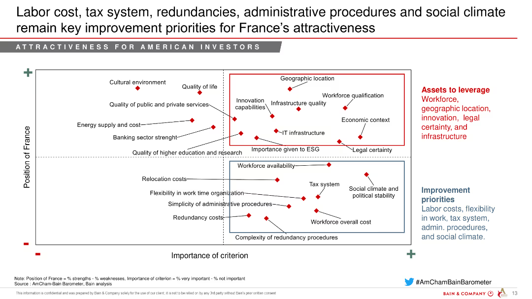
The slide features a chart mapping France's position on various criteria such as labor cost and tax system, with areas for improvement highlighted.
Regulatory and Compliance
Government & Public Sector
This slide outlines the key areas for improvement in France to enhance its attractiveness, focusing on labor cost and administrative procedures.
Improvement priorities, Labor cost, Tax system, Administrative procedures, Government
false
Regulatory and Compliance
Government & Public Sector
Mixed Chart
Bain
Add to my slides
Remove from favorites
The slide has three green boxes with white text, each detailing steps for improving third-party management through focus expansion, proactive measures, and visibility.
Strategic Planning
Professional Services
It outlines three key mindset changes organizations should adopt to benefit from integrated third-party management, emphasizing focus, proactivity, and visibility.
improvement steps, mindset changes, focus expansion, proactive measures, visibility, professional services
false
Strategic Planning
Professional Services
Linear Flow
Deloitte
Add to my slides
Remove from favorites
The slide has a dark backdrop with a split layout showing a large blue bar graph on the left and a segmented bar on the right. It employs contrasting colors to highlight different categories of data, with the main focus on customer rewards for data access.
Customer and Market Segmentation
Retail & E-commerce
It showcases strategies for consumer incentivization for data access, highlighting the predominance of traditional rewards. It is useful for discussing customer engagement tactics and market segmentation strategies in retail and consumer goods industries.
Incentives, Data Access, Consumer Engagement, Rewards, Market Segmentation, Retail, Consumer Goods
false
Customer and Market Segmentation
Retail & E-commerce
Multiple Chart
Kearney
Add to my slides
Remove from favorites
Features a detailed table comparing various countries with symbols indicating the presence or absence of incentives and disincentives like carbon taxes and renewable tariffs, accompanied by flags of the nations.
Market Analysis and Trends
Environmental Services & Sustainability
Discusses the necessity for stronger incentives or penalties to promote the adoption of green solutions across different nations, highlighting disparities in government actions and the effectiveness of existing policies.
incentives, penalties, green solutions, policy evaluation
false
Market Analysis and Trends
Environmental Services & Sustainability
Table
Bain
Add to my slides
Remove from favorites
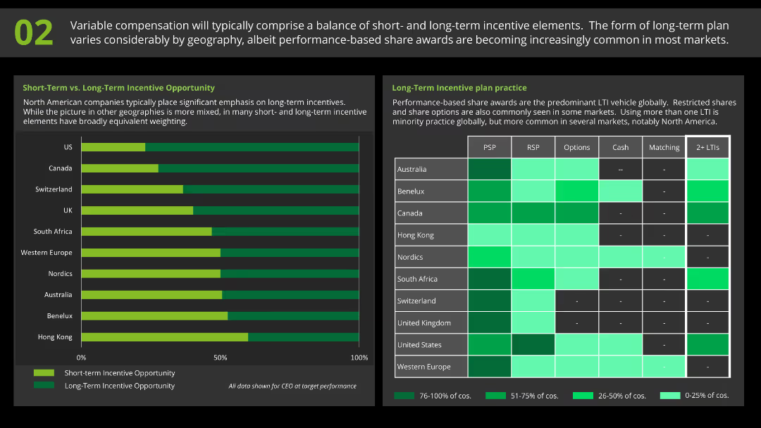
Two charts: a bar chart on the left comparing short-term vs. long-term incentive opportunities across countries, and a heatmap on the right showing the prevalence of various long-term incentive practices in different regions.
Strategic Planning
Financial Services
The slide analyzes the balance between short-term and long-term incentive opportunities in executive compensation, highlighting geographic variations and the commonality of performance-based share awards and other incentives in different markets.
Incentives, Short-term, Long-term, Compensation, Global
false
Strategic Planning
Financial Services
Mixed Chart
Deloitte
Add to my slides
Remove from favorites
The slide presents a circular diagram split into four segments (Strategic Intent, Leadership Behaviors, Inclusive Culture, Talent Actions) with a description of each component's role in fostering inclusion and diversity.
Strategic Planning
Professional Services
Detailing a framework for inclusion and diversity, this slide outlines strategic intents and behaviors that promote an inclusive culture within organizations, aiding in talent management and organizational policy development.
Inclusion, Diversity, Framework, Organizational Policy, Talent Management, Culture, Strategic, Leadership, Behaviors
false
Strategic Planning
Professional Services
Diagram
Accenture
Add to my slides
Remove from favorites
The slide presents a circular diagram outlining the four cornerstones of an inclusion and diversity framework, with corresponding enablers listed around the circle.
Strategic Planning
Professional Services
This slide offers a visual guide to the strategic components of inclusion and diversity in an organizational setting, aiming to foster a culture of inclusive and diverse practices.
Inclusion, Diversity, Framework, Strategy, Organizational Development, Culture, Strategic Components, Guide, Practices
false
Strategic Planning
Professional Services
Single Chart
Accenture
Add to my slides
Remove from favorites
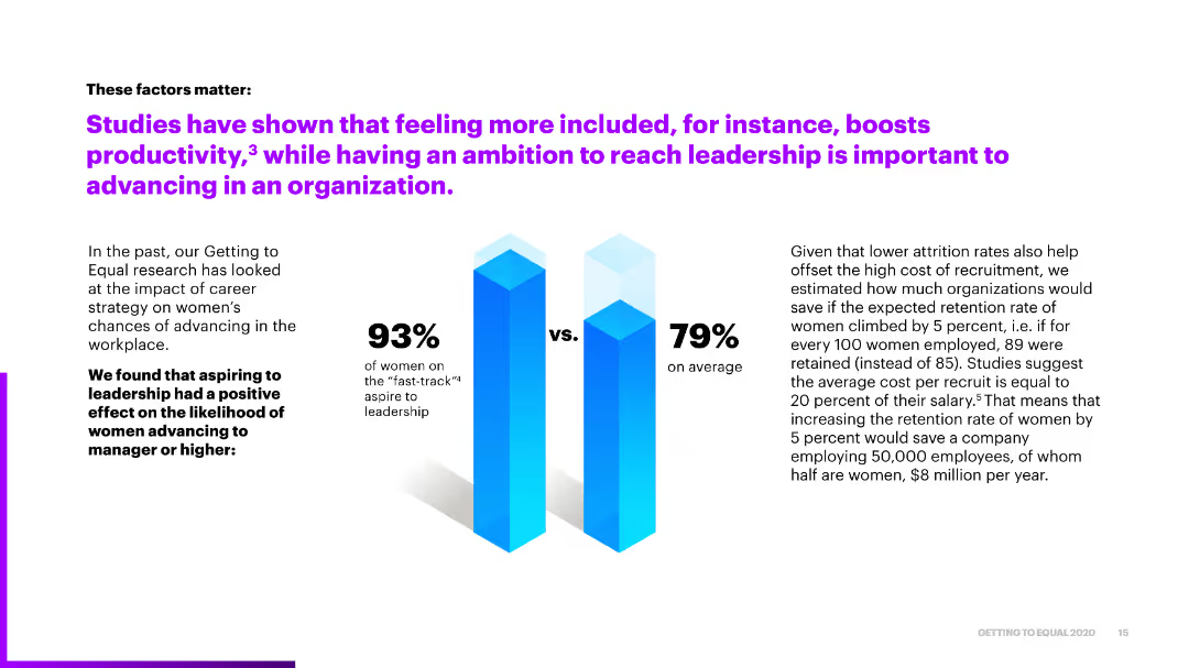
The slide features a column chart comparing the aspirations of women on the "fast-track" to leadership against the average, with text explaining the economic benefits of reducing attrition rates.
Market Analysis and Trends
Professional Services
It emphasizes the importance of feeling included and aspiring to leadership for productivity and advancement, showing how increasing women's retention rates can lead to significant cost savings.
inclusion, leadership ambition, retention, productivity, cost savings
false
Market Analysis and Trends
Professional Services
Mixed Chart
Accenture
Add to my slides
Remove from favorites
This slide displays three column charts illustrating the difference in perceptions between leaders and employees regarding inclusion, training opportunities, and reporting sensitive issues.
Market Analysis and Trends
Professional Services
It discusses how a significant portion of employees feel excluded from their organizations and compares these figures to leaders' beliefs, indicating a notable perception gap.
inclusion, training, reporting, perceptions, gap
false
Market Analysis and Trends
Professional Services
Multiple Chart
Accenture
Add to my slides
Remove from favorites
This slide contains a line chart comparing perceptions of inclusive culture maturity between different respondent groups with color-coded lines and percentage annotations.
Strategic Planning
Professional Services
Examines how U.S. respondents view the maturity of inclusive culture compared to a global sample, particularly among non-minority women.
inclusive culture, U.S., global comparison, line chart, maturity assessment, gender perspective, diversity
false
Strategic Planning
Professional Services
Mixed Chart
Accenture
Add to my slides
Remove from favorites
This slide presents an office meeting scene focusing on the theme of inclusive risk management. It combines textual content with an image showing a diverse group discussing risk strategies, illustrating the concept that risk management is a company-wide responsibility.
Organizational Structure and Change
Professional Services
The content highlights the importance of integrating risk management across all levels of an organization, not just within specialized risk teams. It argues for a holistic approach where everyone is empowered and informed to act on risk, enhancing the organization's overall risk culture and responsiveness to external and internal challenges.
inclusive, risk management, holistic approach, company-wide, empowerment, discussion, office
false
Organizational Structure and Change
Professional Services
Mixed Chart
Accenture
Add to my slides
Remove from favorites
Column charts, text, and image of a woman with headphones. Data on microaggressions and inclusivity in hybrid vs. fully remote vs. fully on-site work settings.
Human Resources and Talent Management
Professional Services
Examines the higher rates of microaggressions and lack of inclusivity faced by women in hybrid workplaces compared to other work settings.
inclusivity, hybrid work, microaggressions, culture, women, workplace, environment, behavior, engagement
false
Human Resources and Talent Management
Professional Services
Multiple Chart
Deloitte
Add to my slides
Remove from favorites
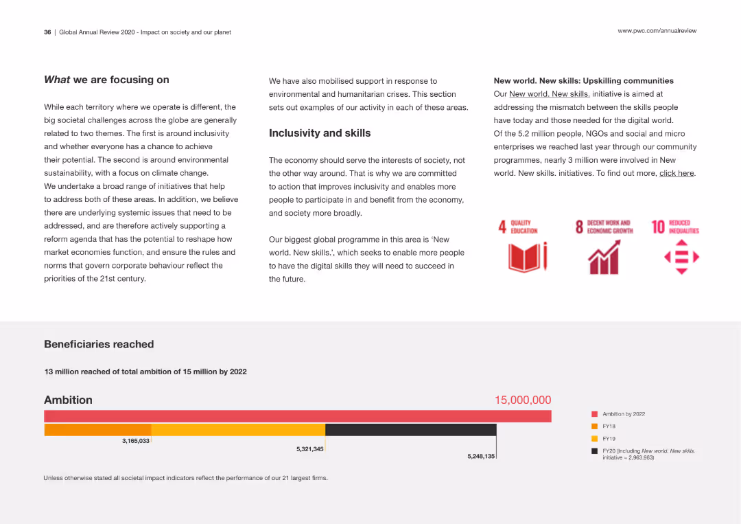
This slide is divided into three sections, detailing PwC's focus on inclusivity, environmental sustainability, and their 'New world. New skills.' initiative. It includes text blocks with headings and descriptive paragraphs.
Strategic Planning
Professional Services
The slide outlines PwC's strategic focus areas, including societal inclusivity, environmental sustainability, and a global program for digital skills development, highlighting their reform agenda.
Inclusivity, sustainability, digital skills, strategic focus, reform agenda
false
Strategic Planning
Professional Services
Mixed Chart
PwC/Strategy&
Add to my slides
Remove from favorites
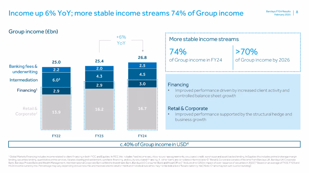
Stacked column chart with category annotations and a highlighted percentage summary. Large text for key takeaways.
Financial Performance
Financial Services
Demonstrates Barclays' FY24 group income increase of 6% YoY, with more stable income streams making up 74% of total income. Emphasizes growth in financing and retail & corporate income segments.
Income, Barclays, FY24, YoY, Retail, Financing, Corporate, Growth, Group
false
Financial Performance
Financial Services
Mixed Chart
Barclays
Add to my slides
Remove from favorites
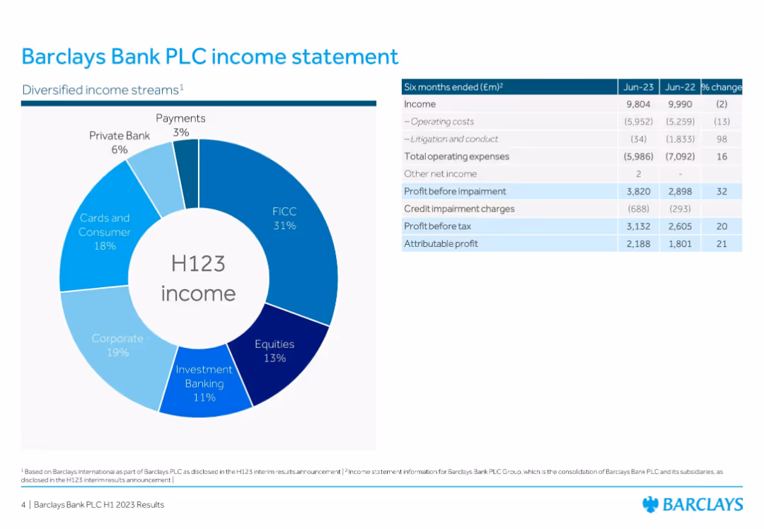
Doughnut chart (left) + financial table (right); simple, clean, corporate layout
Financial Performance
Financial Services
Displays diversified income streams for Barclays in H1 2023. The doughnut chart segments income sources like FICC, Equities, Investment Banking, etc., while the financial table details income, expenses, and profit data with YoY comparisons.
Income, Barclays, Profit, FICC, Equities, Banking, H1 2023, Revenue Streams, Financial Results
false
Financial Performance
Financial Services
Mixed Chart
Barclays
Add to my slides
Remove from favorites
The slide is a combination of pie chart and text blocks outlining income composition for Macquarie Asset Management. It features simplistic color code that differentiates various revenue streams. Despite its data richness, the design maintains clarity and organization.
Financial Performance
Financial Services
The slide breaks down the income sources for Macquarie's asset management arm, displaying various types of earnings and asset classes. Ideal for financial analysis, it helps stakeholders understand the diversity and stability of revenue, crucial for discussions on financial strategy and investment decisions.
income composition, asset management, revenue streams, Macquarie, financial stability, performance fees, asset classes, strategic analysis
false
Financial Performance
Financial Services
Multiple Chart
Morgan Stanley
Add to my slides
Remove from favorites
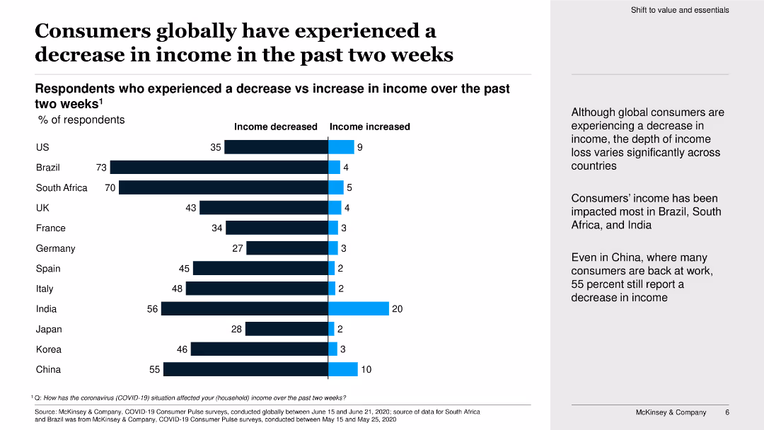
This slide features a horizontal bar chart showing the percentage of respondents in various countries who have experienced a decrease versus an increase in income.
Market Analysis and Trends
Consumer Goods
The slide presents data on how consumers globally have experienced income changes over the past two weeks, highlighting significant income decreases in certain countries.
income, consumers, global, decrease, increase, countries, percentage, bar chart, income changes, survey
false
Market Analysis and Trends
Consumer Goods
Mixed Chart
McKinsey
Add to my slides
Remove from favorites
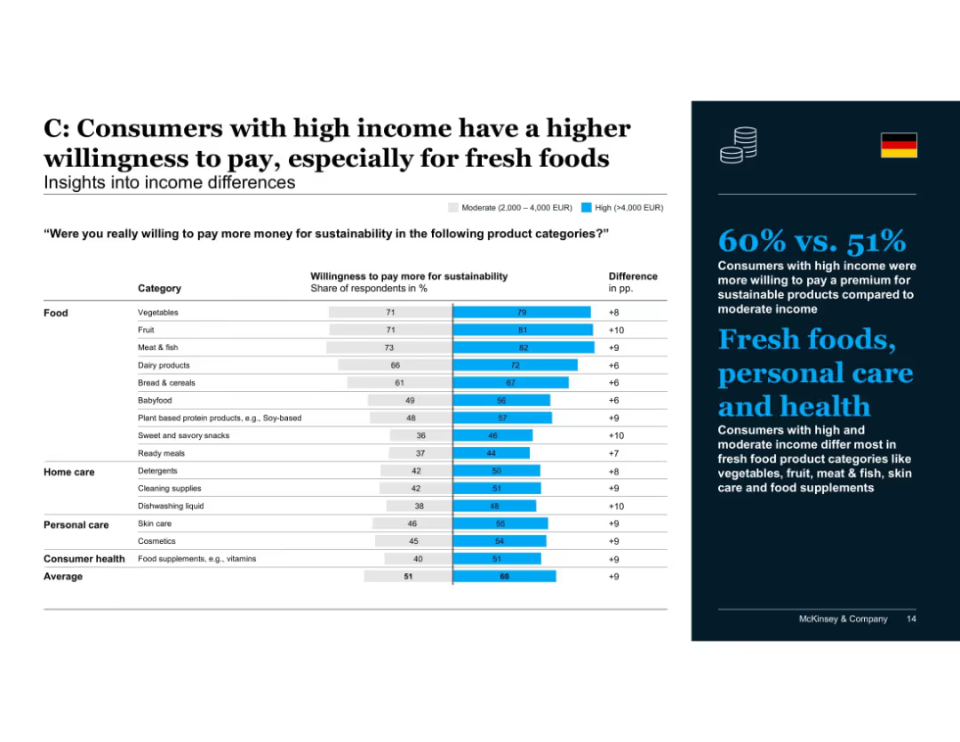
Bar chart comparing moderate vs. high income groups on willingness to pay more by product category
Customer and Market Segmentation
Consumer Goods
High-income consumers are more willing to pay a premium for sustainability, particularly for fresh foods such as meat, fruit, and vegetables. Differences are also noted in health and personal care categories, reflecting values alignment.
income differences, sustainability, willingness to pay, fresh food, high income, health products, personal care, McKinsey, Germany
false
Customer and Market Segmentation
Consumer Goods
Mixed Chart
McKinsey
Add to my slides
Remove from favorites
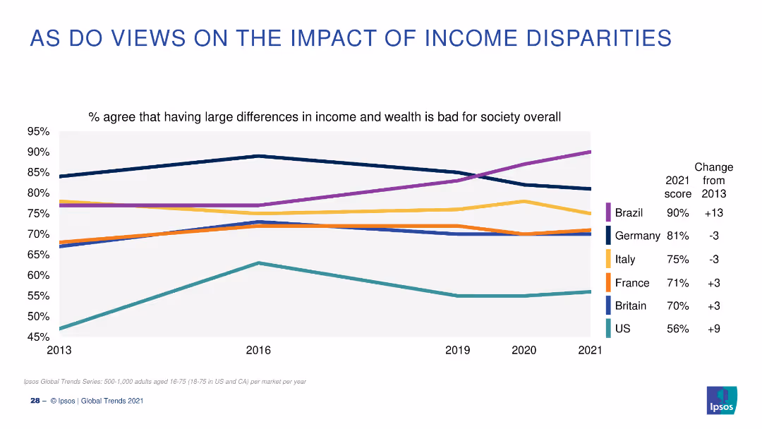
A line graph showing the percentage agreement over time (2013-2021) that large differences in income and wealth are bad for society, with trends per country.
Market Analysis and Trends
Financial Services
This slide shows the views on income disparities, highlighting the percentage of people who agree that large income differences are bad for society.
Income Disparities, Society, Agreement, Trends, Countries
false
Market Analysis and Trends
Financial Services
Single Chart
IPSOS
Add to my slides
Remove from favorites
Depicts column charts with percentages showing purchase cancellations by income level in various regions.
Market Analysis and Trends
Transportation & Logistics
Studies the impact of income on the likelihood of maintaining or cancelling car purchase plans during the pandemic.
income effect, purchase decisions, market behavior
false
Market Analysis and Trends
Transportation & Logistics
Multiple Chart
McKinsey
Add to my slides
Remove from favorites
Column chart comparing household income changes between March 2020 and December 2020, with categories for higher, lower, and the same income.
Financial Performance
Financial Services
Discusses changes in household income levels during the COVID-19 pandemic, comparing data between two specific months.
income, financial impact, COVID-19, household income, comparison
false
Financial Performance
Financial Services
Single Chart
IPSOS
Add to my slides
Remove from favorites
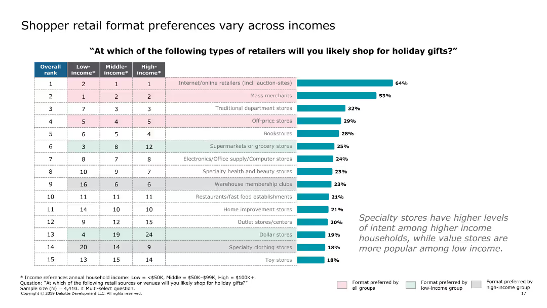
The slide shows a table and a bar chart comparing retailer preferences for holiday shopping across different income groups.
Market Analysis and Trends
Retail & E-commerce
The slide details how retail format preferences differ among low, middle, and high-income shoppers during the holiday season.
income groups, retail preferences, holiday shopping, consumer behavior, retail formats, e-commerce, 2019, shopping trends, income disparity
false
Market Analysis and Trends
Retail & E-commerce
Mixed Chart
Deloitte
Add to my slides
Remove from favorites
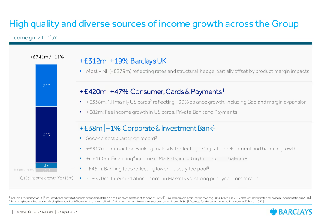
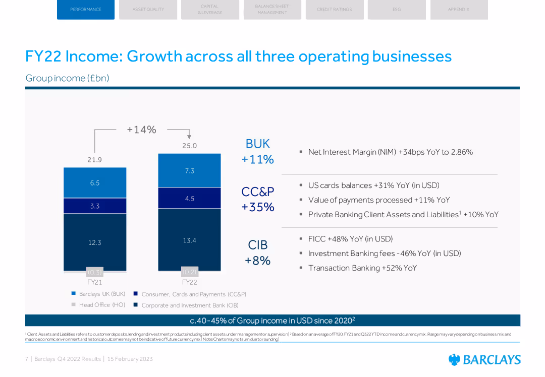
Column chart on the left showing income growth YoY, with three main income categories listed on the right with bullet points detailing contributions from Barclays UK, Consumer, and CIB.
Financial Performance
Financial Services
The slide showcases Barclays' income growth across various sectors: Barclays UK, Consumer Cards & Payments, and Corporate & Investment Bank, highlighting year-over-year increases.
income growth, Barclays UK, Consumer Cards, Corporate Investment Bank, financial performance
false
Financial Performance
Financial Services
Mixed Chart
Barclays
Add to my slides
Remove from favorites
The slide includes a column chart showing income growth across different business units with supporting bullet points. The layout is clear and professional with blue and white colors.
Financial Performance
Financial Services
The slide showcases FY22 income growth across Barclays' business units, emphasizing a 14% overall increase and specific growth metrics for each unit.
income growth, business units, Barclays, FY22, financial performance
false
Financial Performance
Financial Services
Mixed Chart
Barclays
Add to my slides
Remove from favorites
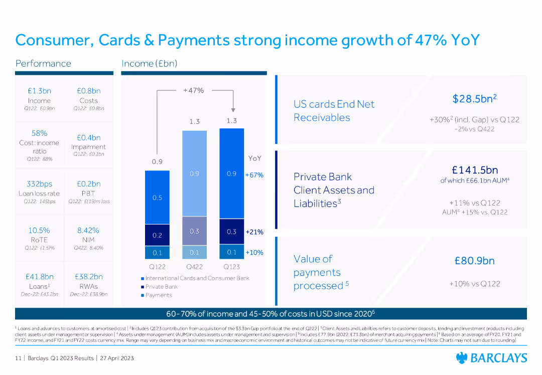
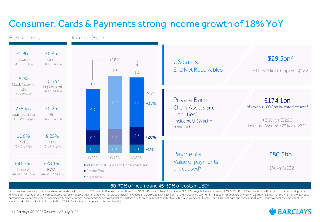
Column chart showing income and costs, with percentage growth YoY, and additional metrics on US cards, private bank client assets, and value of payments processed.
Financial Performance
Financial Services
The slide highlights the significant income growth in Consumer, Cards & Payments, with detailed figures on US cards and other financial metrics, demonstrating strong performance.
income growth, Consumer Cards, Payments, US cards, private bank, financial performance
false
Financial Performance
Financial Services
Mixed Chart
Barclays
Add to my slides
Remove from favorites
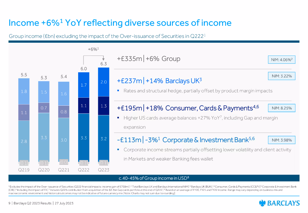
The slide presents a column chart with different income sources, highlighting year-on-year income growth percentages.
Financial Performance
Financial Services
This slide shows the income growth by various sources within the group, indicating a 6% overall increase year-on-year, and breaks down contributions by segments.
income, growth, financial, performance, sources, column chart, YoY, percentage, segment, diverse
false
Financial Performance
Financial Services
Mixed Chart
Barclays
Add to my slides
Remove from favorites
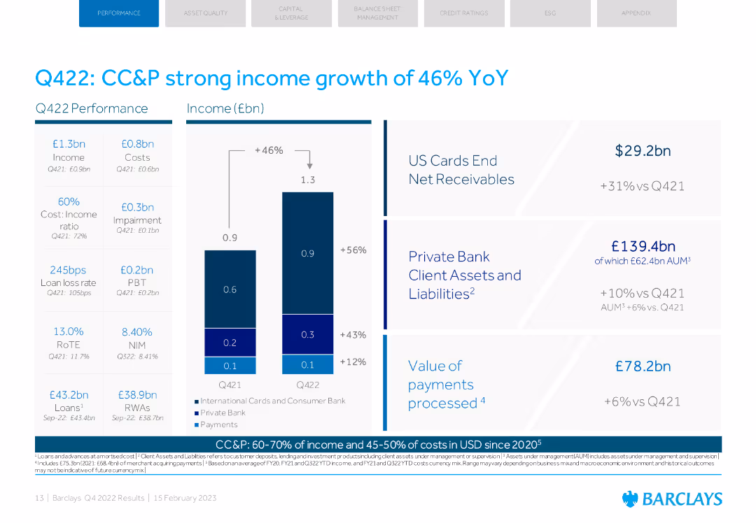
The slide features a column chart showing income growth from Q421 to Q422, and key financial metrics in text.
Financial Performance
Financial Services
This slide presents Barclays' CC&P income growth of 46% YoY, with detailed financial performance metrics.
income, growth, financial, performance, YoY
false
Financial Performance
Financial Services
Mixed Chart
Barclays
Add to my slides
Remove from favorites
This slide includes multiple column charts depicting income growth and performance metrics for different segments.
Financial Performance
Financial Services
Showcases strong YoY income growth for Consumer, Cards & Payments, with specific data on income and costs.
income, growth, financial, performance, YoY
false
Financial Performance
Financial Services
Mixed Chart
Barclays
Add to my slides
Remove from favorites
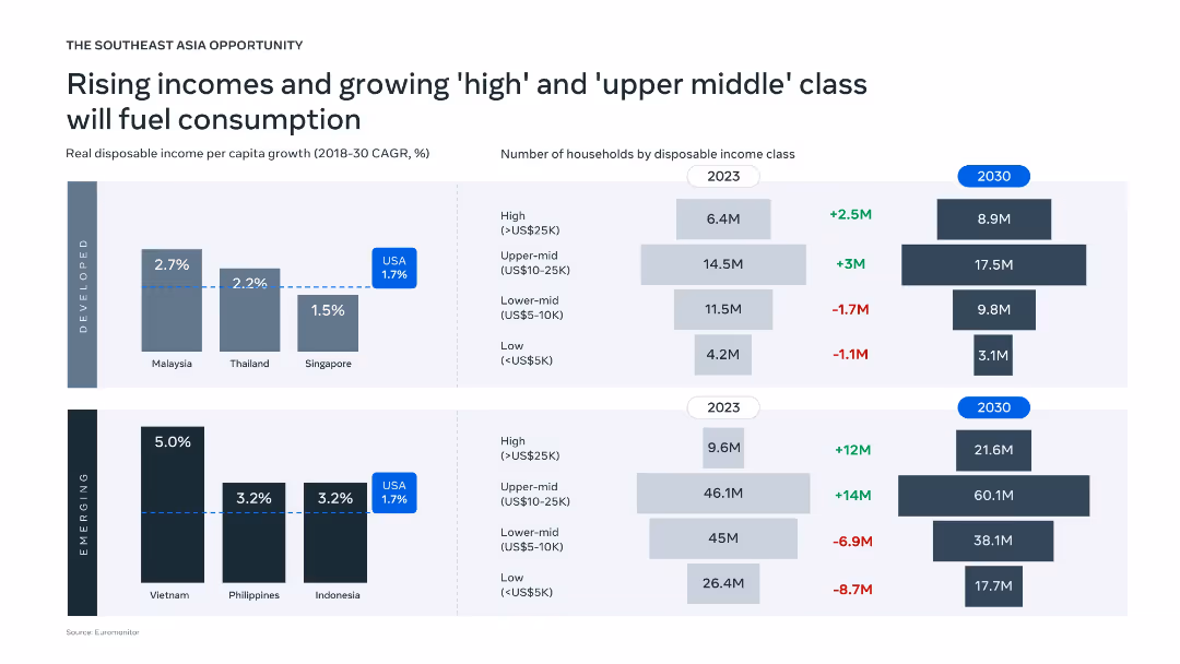
Split into "Developed" and "Emerging" sections with bar graphs and horizontal bar charts, using blue and grey color coding.
Market Analysis and Trends
Consumer Goods
The slide illustrates projected growth in real disposable income per capita in Southeast Asia from 2018–2030 and changes in household income classes between 2023 and 2030. Emerging markets like Vietnam show the highest income growth potential.
income growth, household income, Southeast Asia, consumption, projections, income class, disposable income, developed vs. emerging, CAGR, household segmentation
false
Market Analysis and Trends
Consumer Goods
Multiple Chart
Bain
Add to my slides
Remove from favorites
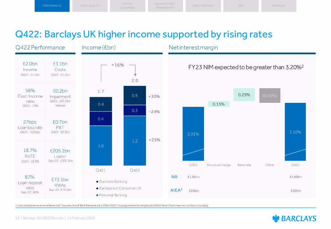
The slide contains two main sections: a column chart showing income growth and a chart for net interest margin. The design is clear with blue tones.
Financial Performance
Financial Services
The slide presents Barclays UK's Q422 performance, emphasizing higher income supported by rising interest rates and detailed financial metrics.
income growth, interest rates, Barclays UK, Q422, financial performance
false
Financial Performance
Financial Services
Multiple Chart
Barclays
Add to my slides
Remove from favorites
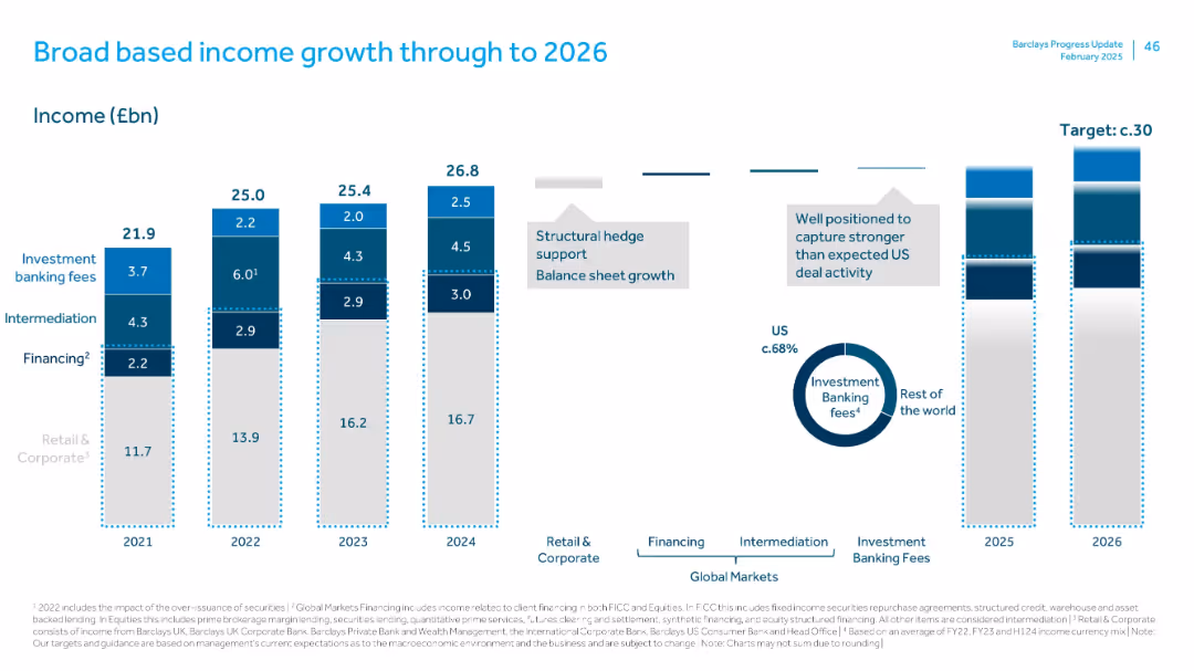
Multi-segment vertical bar chart showing income streams by type (Retail & Corporate, Global Markets, etc.) from 2021–2026.
Financial Performance
Financial Services
Projects Barclays' group income growth toward a ~£30bn target by 2026. Breaks down sources including retail, corporate, and investment banking. Highlights contributions from the U.S. and notes structural supports like hedge and balance sheet growth.
income growth, investment banking, financing, structural hedge, US exposure
false
Financial Performance
Financial Services
Multiple Chart
Barclays
Add to my slides
Remove from favorites
Features a column chart comparing the contribution to income growth from different business areas like Investment Banking and Global Markets in 2023.
Strategic Planning
Financial Services
Discusses the drivers behind Barclays' income growth, emphasizing management's strategic actions in investment banking and global markets.
income growth, management, strategy, investment, global markets
false
Strategic Planning
Financial Services
Single Chart
Barclays
Add to my slides
Remove from favorites
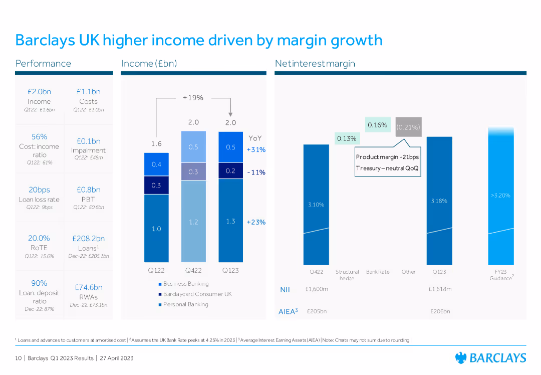
Two column charts: one showing performance and income growth, and the other net interest margin. Each chart includes percentage changes and key financial metrics.
Financial Performance
Financial Services
The slide emphasizes the income growth in Barclays UK driven by improved margins, detailing key performance metrics such as net interest margin and income.
income growth, margin growth, Barclays UK, net interest margin, financial performance
false
Financial Performance
Financial Services
Multiple Chart
Barclays
Add to my slides
Remove from favorites
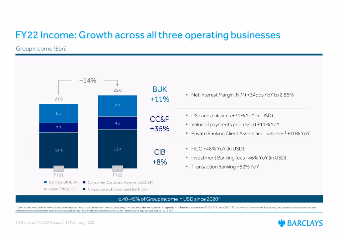
Stacked bar charts + bullet insights; YoY group income growth across BUK, CC&P, and CIB
Strategic Planning
Financial Services
Compares income across three Barclays business units in FY21 vs. FY22 with YoY percentage changes. Bullet points outline business segment growth drivers like US card balances, transaction banking, and FICC performance.
Income Growth, Operating Units, BUK, CC&P, CIB, YoY, Strategy, Revenue, Barclays
false
Strategic Planning
Financial Services
Mixed Chart
Barclays
Add to my slides
Remove from favorites
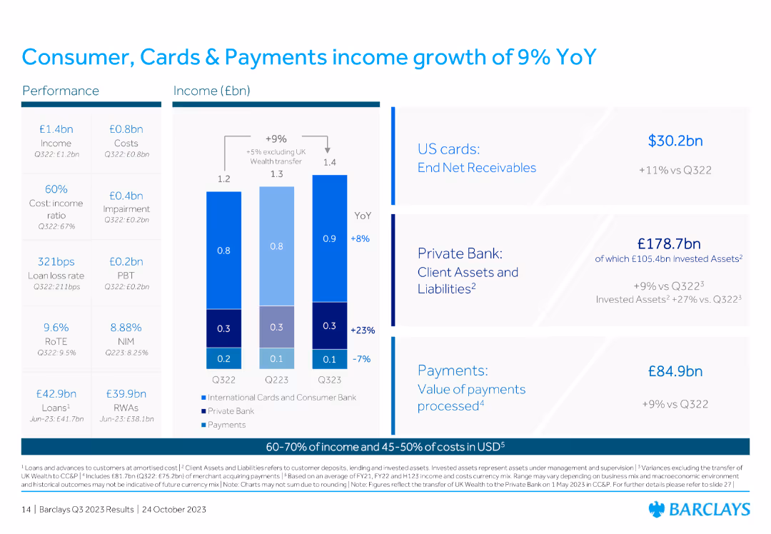
The slide features a column chart showing income (£bn) and financial performance metrics for Consumer, Cards & Payments from Q322 to Q323. It includes details on US cards, Private Bank, and Payments.
Financial Performance
Financial Services
The slide highlights the income growth of 9% year-over-year for Barclays' Consumer, Cards & Payments division in Q323, detailing performance metrics and financial indicators for US cards, Private Bank, and Payments.
income growth, Q323, Consumer, Cards, Payments
false
Financial Performance
Financial Services
Mixed Chart
Barclays
Add to my slides
Remove from favorites
Bar chart comparing happiness/unhappiness by income level; includes summary boxes below on biggest happiness/unhappiness drivers by income tier.
Market Analysis and Trends
Financial Services
This slide examines the correlation between income and happiness. It shows that higher income correlates with higher happiness, but personal relationships are still the top drivers of happiness. Financial stress is the leading source of unhappiness across all income levels. A nuanced perspective is presented with tier-specific insights.
income, happiness, financial stress, survey, Ipsos, emotional well-being, low-income, high-income, money and emotions
false
Market Analysis and Trends
Financial Services
Mixed Chart
IPSOS
Add to my slides
Remove from favorites
Contains a line graph comparing the Gini coefficient trends in developed and developing economies from 1990 to 2030.
Financial Performance
Professional Services
Examines the trends in income inequality within countries, highlighting differences in economic development and projections for future disparities.
income inequality, Gini coefficient, economic development, developed economies, developing economies
false
Financial Performance
Professional Services
Header Horizontal
Roland Berger
Add to my slides
Remove from favorites
This slide showcases a series of column charts illustrating potential reductions in income inequality by 2030 through different levels of retraining for excess workers. Each scenario shows the impact on the Gini coefficient under varying degrees of workforce retraining.
Human Resources and Talent Management
Education & Training
Explores strategies for mitigating income inequality induced by automation through workforce retraining programs. It quantifies the effectiveness of these interventions by displaying potential improvements in income distribution across multiple retraining scenarios, providing a clear policy directive on the benefits of investing in comprehensive educational and training initiatives to prepare the workforce for a changing economic landscape.
income inequality, retraining, Gini coefficient, policies
false
Human Resources and Talent Management
Education & Training
Single Chart
McKinsey
Add to my slides
Remove from favorites
Two bar charts comparing job vulnerability by income bands, with a side bar chart showing the percentage of vulnerable jobs in each income bracket.
Risk Assessment and Management
Financial Services
Presents the proportion of vulnerable jobs within various income bands during the COVID-19 crisis.
income, job vulnerability, COVID-19, financial analysis, risk management
false
Risk Assessment and Management
Financial Services
Multiple Chart
McKinsey
Add to my slides
Remove from favorites
Contains column charts showing car purchase intent across income levels in the US, Europe, and Asia.
Market Analysis and Trends
Transportation & Logistics
Analyzes how car purchase intentions among different income groups have aligned post-COVID-19.
income levels, car buying, market recovery, global trends
false
Market Analysis and Trends
Transportation & Logistics
Multiple Chart
McKinsey
Add to my slides
Remove from favorites
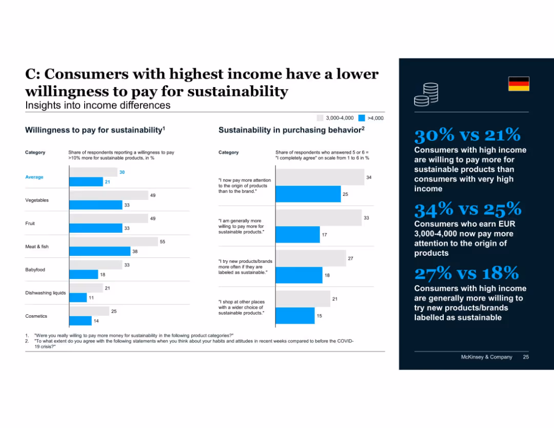
Income-based comparison using two bar charts: one for % willing to pay >10% more and one for agreement with sustainability-related statements; summary on the right.
Customer and Market Segmentation
Consumer Goods
Consumers with the highest income levels show less willingness to pay premiums for sustainability than those earning slightly less. However, middle-high income groups show higher engagement in paying attention to product origin and trying new sustainable products.
income levels, sustainability, willingness to pay, consumer behavior, purchasing patterns, high-income consumers
false
Customer and Market Segmentation
Consumer Goods
Mixed Chart
McKinsey
Add to my slides
Remove from favorites
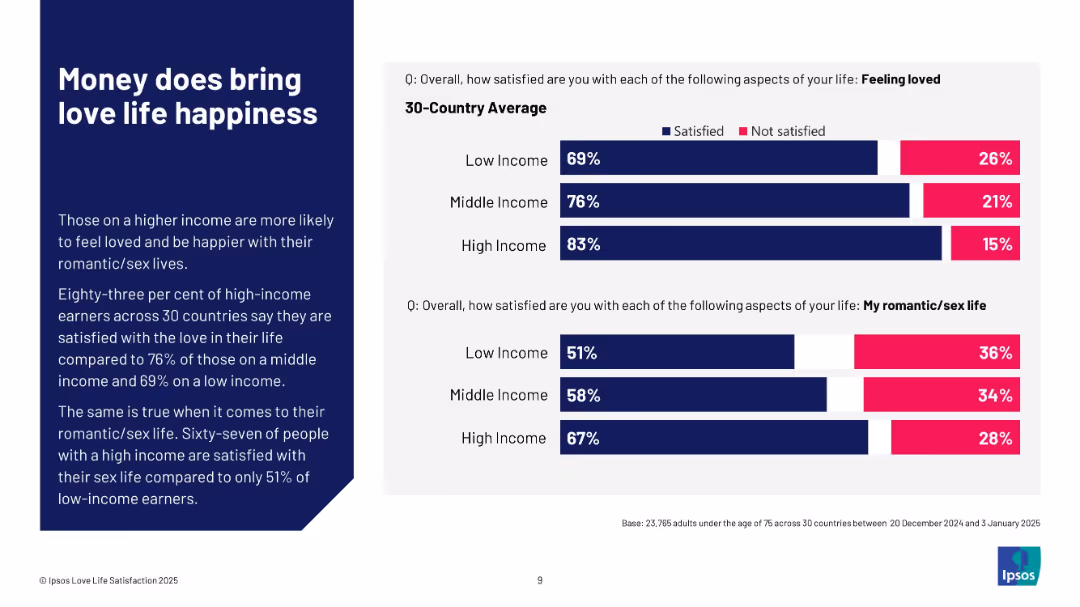
Two-column layout: left side features a bold headline and paragraph text; right side includes bar charts by income level
Market Analysis and Trends
Media & Entertainment
The slide shows that people with higher incomes report higher satisfaction in feeling loved and in their romantic/sex lives. Bar graphs compare satisfaction across low, middle, and high income groups across 30 countries.
income, love, satisfaction, sex life, happiness, Ipsos, survey, bar chart, comparison, global
false
Market Analysis and Trends
Media & Entertainment
Mixed Chart
IPSOS
Add to my slides
Remove from favorites
Contains several stacked column charts displaying income distribution across different years and conditions like pandemic and market changes.
Market Analysis and Trends
Financial Services
Analyzes Barclays' income stability across various market conditions, showing resilience and strategic adaptations over time.
income, market conditions, stability, strategy, adaptation
false
Market Analysis and Trends
Financial Services
Single Chart
Barclays
Add to my slides
Remove from favorites
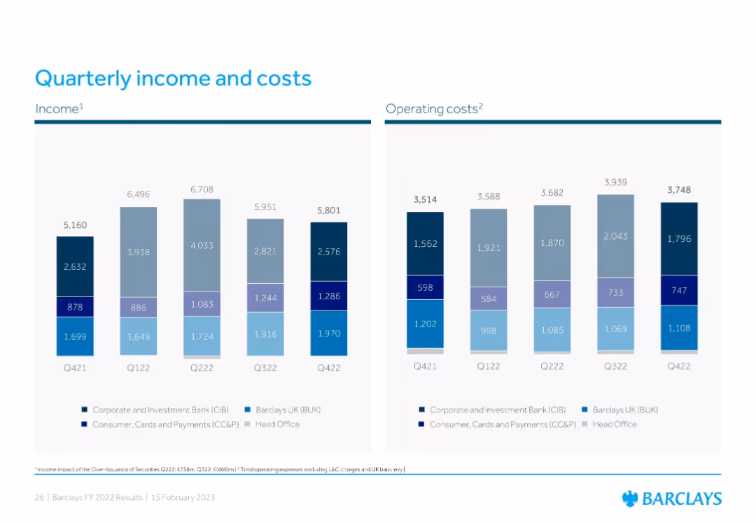
Side-by-side bar charts comparing income and operating costs across five quarters, segmented by business divisions with color-coded bars and values annotated.
Financial Performance
Financial Services
This slide presents a quarterly comparison of income and operating costs for Barclays, broken down into four business segments: CIB, BUK, CC&P, and Head Office. It highlights trends in revenue and expenses across Q4'21 to Q4'22, providing a visual of how different business units performed over time.
income, operating costs, Barclays, financial performance, revenue trends
false
Financial Performance
Financial Services
Multiple Chart
Barclays
Add to my slides
Remove from favorites
Scatter plot showing income per customer for 2023 against growth rate from 2018-2023 for various European countries. Countries are plotted and color-coded for clarity.
Market Analysis and Trends
Financial Services
Discusses the relationship between income per customer and growth rates across European countries, indicating which countries are growing or shrinking.
income per customer, growth rate, Europe, scatter plot
false
Market Analysis and Trends
Financial Services
Single Chart
Kearney
Add to my slides
Remove from favorites
Column chart with a radar chart overlay showing indicators like income per client, income per employee, and cost-to-income ratio. Indicators are displayed for 2018, 2021, and 2023.
Financial Performance
Financial Services
Highlights the significant growth in income and profitability for European retail banks in 2023 compared to previous years.
income, profitability, retail banking, Europe, radar
false
Financial Performance
Financial Services
Single Chart
Kearney
Add to my slides
Remove from favorites
The slide features a complex column chart showing income projections from 2021 to 2026 with overlays detailing changes in investment banking fees, financing, and intermediation.
Financial Performance
Financial Services
This slide visualizes diverse income sources of a financial institution projected from 2021 to 2026, highlighting a stable increase in investment banking fees and financing, thereby detailing financial growth strategies and income stability forecasts aimed at supporting growth.
Income, Projections, Banking, Growth, Stability
false
Financial Performance
Financial Services
Single Chart
Barclays
Add to my slides
Remove from favorites
The slide has a table on the left and a pie chart on the right. The table lists the top 10 tenant-customers with associated percentages of total headline rent. The pie chart shows the distribution of industries contributing to the total leases. Both charts are color-coded for clarity. There's also a summary statement at the top, highlighting the income security backed by government and MNC tenants.
Financial Performance
Real Estate & Construction
Analyzes the stability of rental income by showcasing the share contributed by top tenant-customers and the diversification across industries.
Income Security, Tenant Analysis, Government Tenants, MNC, Lease Distribution, Industry Diversification, Financial Stability
false
Financial Performance
Real Estate & Construction
Mixed Chart
Morgan Stanley
Add to my slides
Remove from favorites
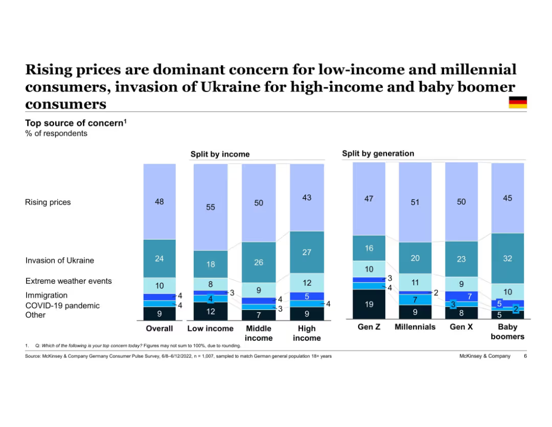
Dual split-bar charts dividing data by income and generation. Pastel color palette with a clean white background and national flag indicator.
Customer and Market Segmentation
Consumer Goods
This slide analyzes top concerns among German consumers segmented by income and age group. Rising prices concern all segments but more so low-income and younger people. Older and high-income individuals are more worried about geopolitical issues.
income segmentation, generational concerns, inflation, Ukraine war, consumer insights, Germany, behavioral analysis
false
Customer and Market Segmentation
Consumer Goods
Single Chart
McKinsey
Add to my slides
Remove from favorites
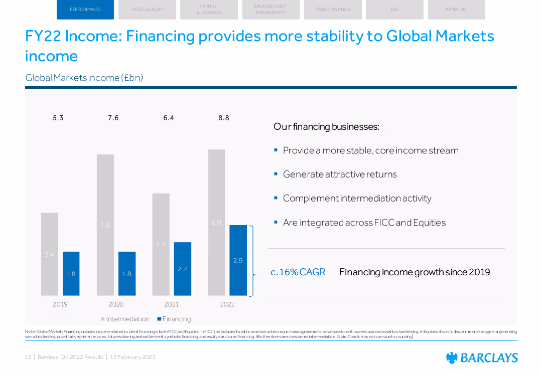
Column chart showing Global Markets income from 2019 to 2022. Key points about financing business stability.
Financial Performance
Financial Services
The slide focuses on the stability provided by financing income to Global Markets, with growth highlighted.
income, stability, Global Markets, financing, growth
false
Financial Performance
Financial Services
Mixed Chart
Barclays
Add to my slides
Remove from favorites
Features a table listing financial figures and a textual explanation section. The design is clean with alternating shading for rows to enhance readability. The color scheme is consistent with the company's branding.
Financial Performance
Financial Services
Reviews key financial drivers over different time periods, useful for in-depth financial analysis and performance reviews. It assesses the contributions from different sectors to the overall financial results.
Income Statement, Financial Drivers, Net Operating Income, Banking, Asset Management
false
Financial Performance
Financial Services
Table
Goldman Sachs
Add to my slides
Remove from favorites
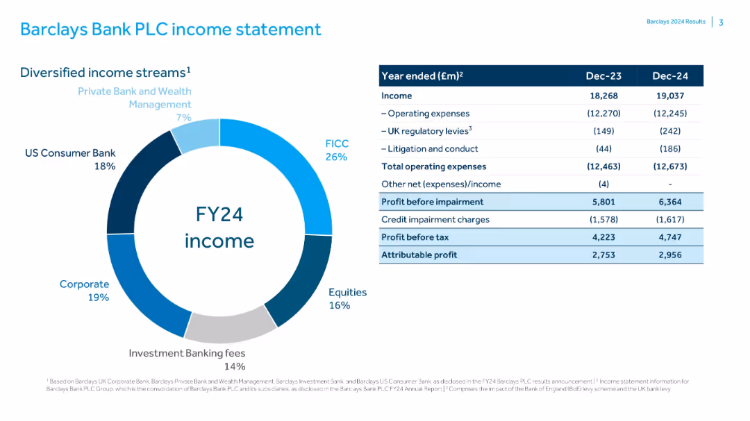
Pie chart showing FY24 income streams by division and a table with Dec-23 and Dec-24 income and profit data.
Financial Performance
Financial Services
Outlines Barclays Bank PLC's FY24 income distribution and performance metrics. Income is diversified across FICC, Equities, Investment Banking Fees, Corporate, Consumer, and Wealth segments. Profit before tax rose from £4.2bn to £4.7bn YoY.
income statement, FY24, Barclays, profit, FICC, equities, corporate, consumer bank
false
Financial Performance
Financial Services
Mixed Chart
Barclays
Add to my slides
Remove from favorites
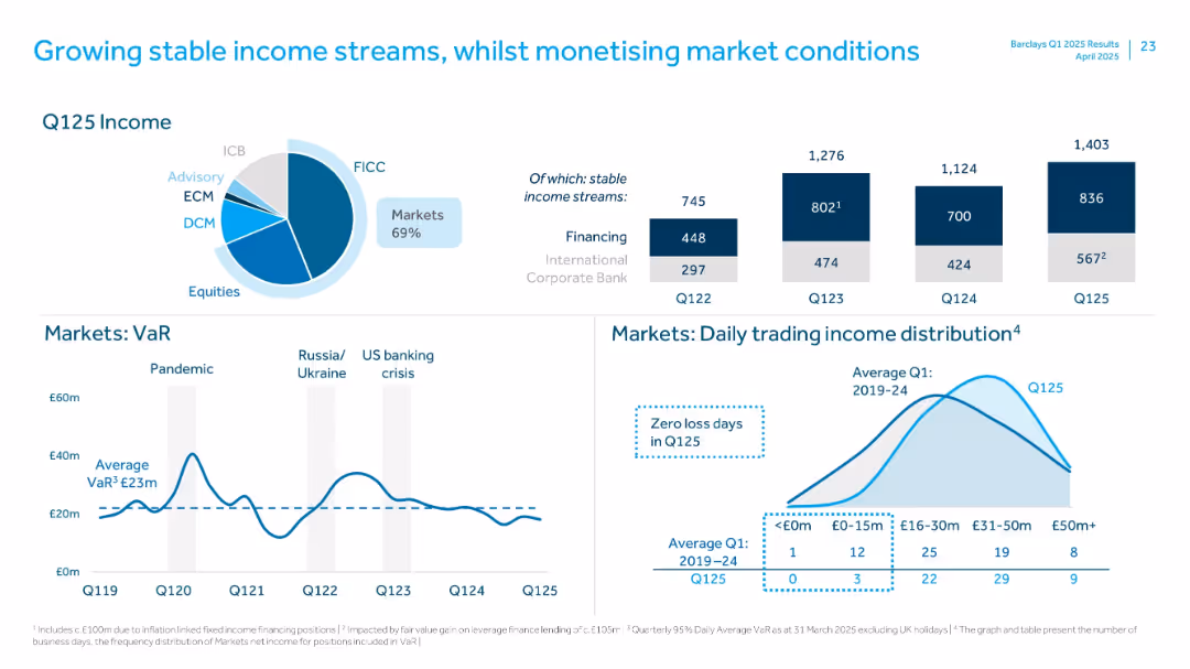
Pie chart and bar charts showing Q125 income mix, VaR, and trading income distribution metrics.
Performance Metrics and KPIs
Financial Services
Focuses on stable income from core sources, with charts on Q125 income split, market risk (VaR), and daily trading income. Notes high portion of stable income and zero loss days in Q125.
Income Streams, VaR, Trading Income, FICC, Markets, Q125, Stable Revenue, ICB
false
Performance Metrics and KPIs
Financial Services
Multiple Chart
Barclays
Add to my slides
Remove from favorites
Features comparative column charts showing household income trends in developed and developing countries from 2000 to 2030.
Financial Performance
Professional Services
Analyzes trends in household income across developed and developing regions, discussing shifts in economic groups and income disparity.
income trends, developing countries, developed countries, economic disparity, globalization
false
Financial Performance
Professional Services
Mixed Chart
Roland Berger
Add to my slides
Remove from favorites
Composed of a series of stacked column chart comparing group income over several years, focusing on variations by sector and the impact of specific securities issues on the overall financial trends.
Financial Performance
Financial Services
Analyzes the group income trends for FY23, breaking down the financial contributions by different sectors and the overall impact on the group's financial health, with specific focus on changes from previous years.
income trends, financial analysis, FY23, sectoral impact, financial health
false
Financial Performance
Financial Services
Mixed Chart
Barclays
Add to my slides
Remove from favorites
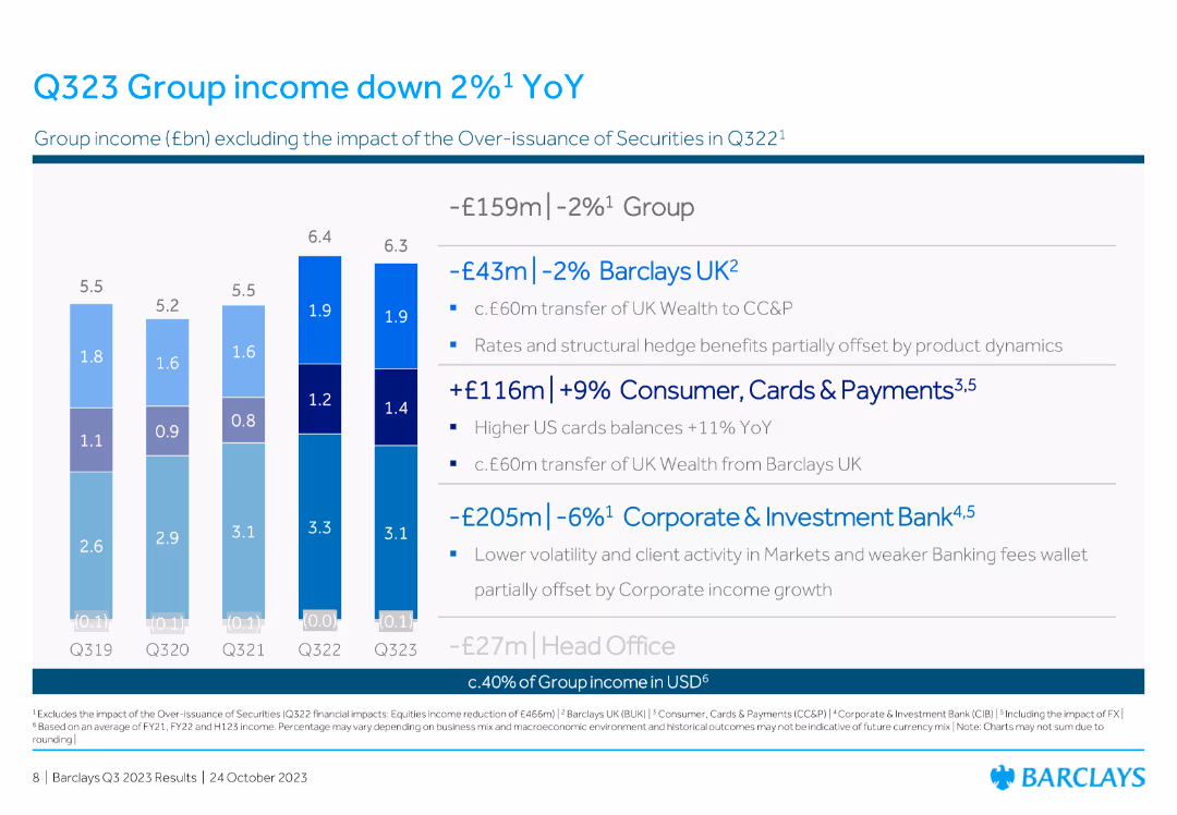
The slide contains a column chart displaying group income (£bn) excluding the impact of over-issuance of securities from Q319 to Q323. There is a breakdown of financial impacts for different divisions on the right side.
Financial Performance
Financial Services
The slide reports a 2% year-over-year decrease in Barclays' group income for Q323, providing a detailed financial impact analysis for various divisions such as Barclays UK, Consumer, Cards & Payments, and Corporate & Investment Bank.
income, YoY, Q323, Barclays UK, divisions
false
Financial Performance
Financial Services
Mixed Chart
Barclays
Add to my slides
Remove from favorites
The slide background is black with a green accent on the left, featuring two key figures in large font and a bar graph comparing the percentages of a historical trend across decades. Text explanations in white and green fonts are used to provide context to the data visualizations. It is designed for quick visual comparison and straightforward data communication, with the key takeaways highlighted in green for emphasis.
Risk Assessment and Management
Technology & Software
The slide compares the decline of incumbent companies' industry ranking over decades and the need for C-level ownership of innovation. It is designed to communicate the importance of maintaining an innovation edge and leadership in the market. The slide is useful for discussions on strategic planning, particularly in highlighting the challenges established companies face in staying competitive and the role of executive leadership in fostering innovation.
incumbent decline, industry ranking, innovation ownership, C-level engagement, competitiveness
false
Risk Assessment and Management
Technology & Software
Mixed Chart
BCG
Add to my slides
Remove from favorites
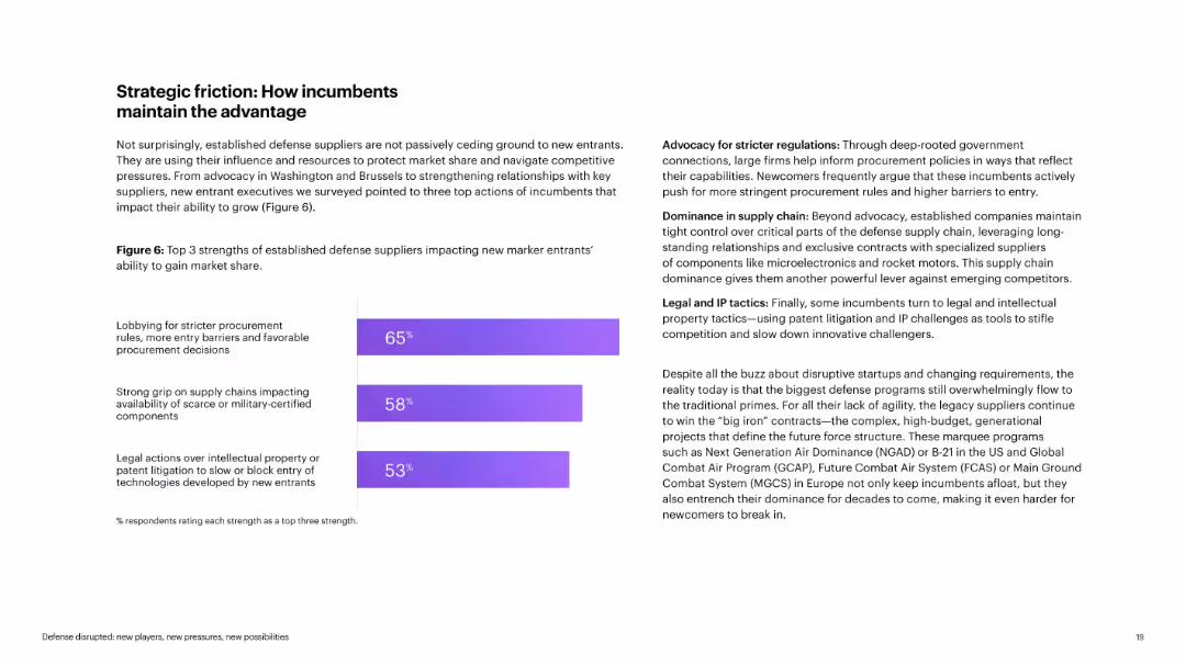
Left-aligned title with text content and bar chart on the right. Purple shades dominate chart and design accents.
Competitive Landscape
Government & Public Sector
Illustrates how traditional defense suppliers maintain dominance through lobbying, supply chain control, and legal/IP tactics. Describes the systemic advantage incumbents hold over startups in regulatory, contractual, and IP environments.
incumbents, lobbying, IP tactics, procurement, dominance, barriers
false
Competitive Landscape
Government & Public Sector
Mixed Chart
Accenture
Add to my slides
Remove from favorites
Simple agenda slide with a dark background, listing the main topics covered in the presentation with numbered points.
Strategic Planning
Professional Services
This slide serves as the index for the presentation, listing topics like nearshoring, opportunities from friendshoring, and challenges faced by the region.
Index, agenda, topics, nearshoring, challenges
false
Strategic Planning
Professional Services
Graphic
Deloitte
Add to my slides
Remove from favorites
Features two pie charts illustrating sector weights for the S&P 500 and MSCI World indices, along with a tabulated list of index characteristics. The charts and table are colored coherently to enhance readability and emphasize data distribution.
Investment Analysis
Financial Services
Provides a snapshot of the S&P 500 and MSCI World index characteristics and their sector allocation weights, informing asset allocation decisions.
Index characteristics, sector weights, S&P 500, MSCI World, asset allocation, investment portfolio, market analysis
false
Investment Analysis
Financial Services
Multiple Chart
Morgan Stanley
Add to my slides
Remove from favorites
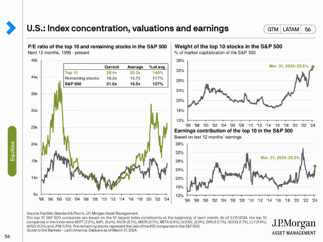
The slide includes two line charts and one column chart. The line charts compare P/E ratio of top 10 stocks and remaining stocks in S&P 500. The column chart shows the weight and earnings contribution of top 10 stocks.
Financial Performance
Financial Services
This slide examines the concentration, valuations, and earnings of the top 10 stocks in the S&P 500 compared to the remaining stocks, providing insights into market dynamics.
index concentration, P/E ratio, earnings, S&P 500, stocks
false
Financial Performance
Financial Services
Multiple Chart
JP Morgan
Add to my slides
Remove from favorites
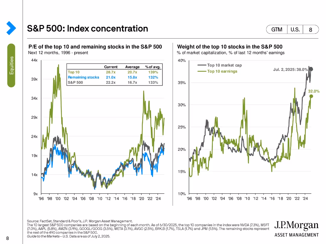
Dual-axis charts comparing P/E ratios and market weight of the top 10 S&P 500 stocks versus the rest.
Market Analysis and Trends
Financial Services
This slide explores the concentration within the S&P 500 by separating the top 10 companies from the remaining 490. It shows their P/E valuations and their share of market cap (38%) and earnings (32%) as of July 2025. Top 10 stocks are significantly overvalued relative to their historical averages.
index concentration, S&P 500, top 10 stocks, market cap, earnings, valuation, P/E ratio, dispersion, equity markets
false
Market Analysis and Trends
Financial Services
Multiple Chart
JP Morgan
Add to my slides
Remove from favorites
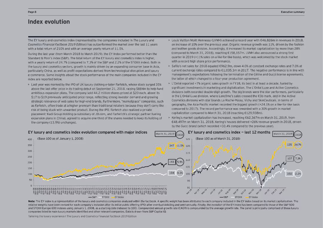
This slide includes line charts comparing the EY luxury and cosmetics index with major indices over time. The charts show index performance and compound annual growth rates (CAGR).
Financial Performance
Consumer Goods
The slide tracks the performance of the EY luxury and cosmetics index over the last 11 years, comparing it with other major indices and highlighting significant growth and market trends.
Index evolution, luxury goods, financial performance, market trends, CAGR
false
Financial Performance
Consumer Goods
Multiple Chart
EY
Add to my slides
Remove from favorites
Bubble chart showing size and liquidity of different indices with average traded daily value and market cap. Bubble size represents market cap in USD billions.
Investment Analysis
Financial Services
Compares the market cap and liquidity of various global indices, highlighting differences in traded value and constituent count.
index, market cap, liquidity, bubble chart, financial analysis, global indices, daily value, investment, market size
false
Investment Analysis
Financial Services
Single Chart
JP Morgan
Add to my slides
Remove from favorites
The slide includes multiple column charts and text blocks. The left side presents index scores by generation and work location, and the right side shows scores by sector.
Performance Metrics and KPIs
Professional Services
Provides index scores for remote work preferences by generation, work location, and sector, based on survey results. Highlights differences in remote readiness.
index scores, generation, work location, sector, survey
false
Performance Metrics and KPIs
Professional Services
Multiple Chart
EY
Add to my slides
Remove from favorites
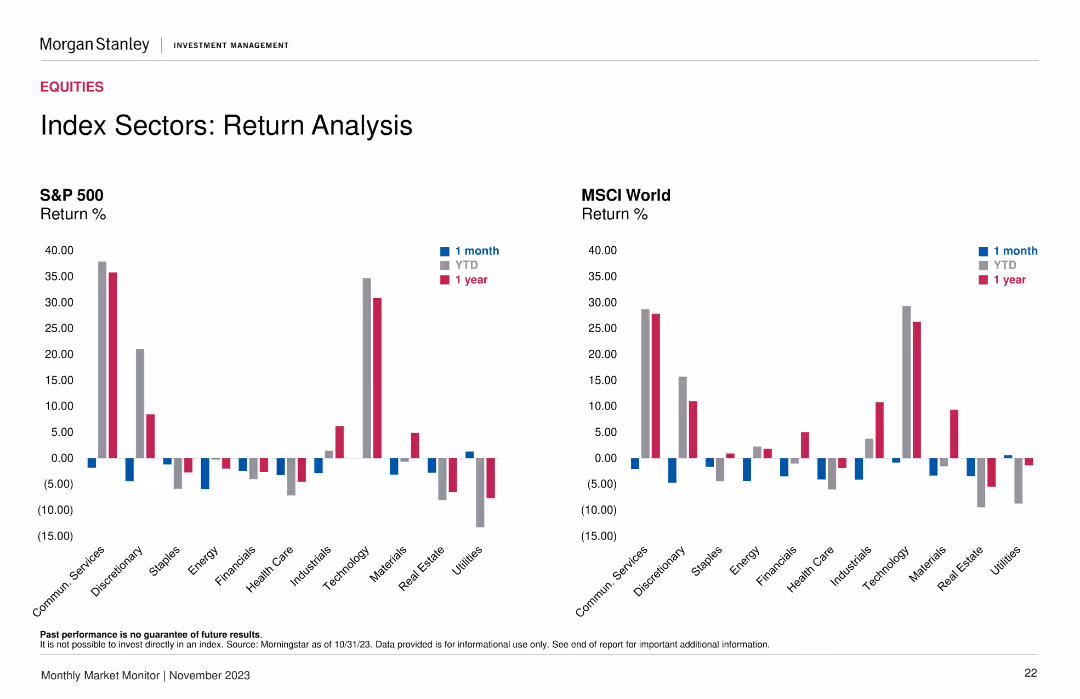
The slide features two sets of column charts showing the return percentages for S&P 500 and MSCI World index sectors over 1 month, YTD, and 1 year periods.
Market Analysis and Trends
Financial Services
This slide analyzes the return percentages for different sectors of the S&P 500 and MSCI World indices, providing a comparative view over 1 month, YTD, and 1 year periods.
index sectors, return analysis, S&P 500, MSCI World, performance
false
Market Analysis and Trends
Financial Services
Multiple Chart
Morgan Stanley
Add to my slides
Remove from favorites
Two sets of vertical column charts comparing the returns of S&P 500 and MSCI World index sectors over different time periods (1 month, YTD, 1 year). Sectors include Communication Services, Discretionary, Staples, Energy, etc.
Market Analysis and Trends
Financial Services
Compares sector-wise returns for the S&P 500 and MSCI World indices over different time periods. Useful for analyzing sector performance and making informed investment decisions.
index sectors, S&P 500, MSCI World, sector analysis, return analysis, time periods
false
Market Analysis and Trends
Financial Services
Multiple Chart
Morgan Stanley
Add to my slides
Remove from favorites
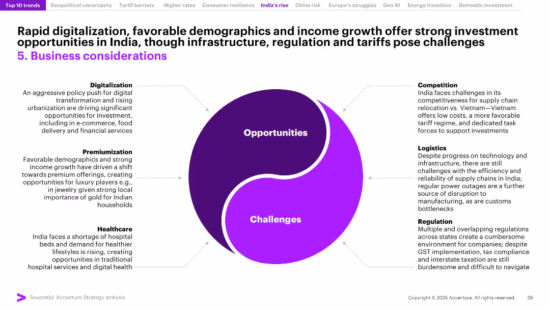
Yin-yang diagram showing “Opportunities” vs “Challenges” in India, surrounded by six labeled segments; minimalistic design with bold purple contrast.
Strategic Planning
Professional Services
This slide outlines the business landscape in India, balancing opportunities like digitalization, income growth, and healthcare demand against challenges in logistics, regulation, and competitiveness. It positions India as an attractive but complex market requiring strategic navigation of both growth drivers and structural hurdles.
India business, digitalization, demographics, regulation, competition, logistics, healthcare, premiumization, investment, challenges
false
Strategic Planning
Professional Services
Uncategorized
Accenture
Add to my slides
Remove from favorites
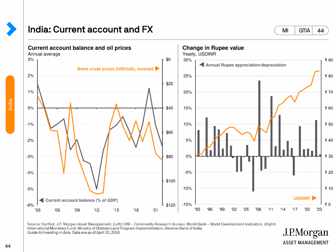
The slide features two line charts. The left chart compares India's current account balance as a percentage of GDP with Brent crude oil prices (inverted). The right chart shows the annual rupee appreciation/depreciation against USD from 1993 to 2023.
Financial Performance
Financial Services
This slide provides an analysis of India's current account balance in relation to oil prices and tracks the historical changes in the rupee's value against the US dollar.
India, current account, FX, rupee value, oil prices
false
Financial Performance
Financial Services
Multiple Chart
JP Morgan
Add to my slides
Remove from favorites
This slide uses gray and purple to show text-based descriptions to compare various digital initiatives by the Indian government. There are no charts or graphs, but icons are used to visually differentiate the programs. The layout is text-heavy with organized bullet points and specific program outcomes listed.
Market Analysis and Trends
Technology & Software
The slide provides a comprehensive look at India’s digital economy approach, detailing initiatives across infrastructure, regulatory changes, and talent development. It outlines several programs and their respective achievements, such as BharatNet and Digital India, reflecting the nation’s progress and ongoing efforts in digital advancement.
India, Digital Economy, Infrastructure, Regulatory, Talent, BharatNet, Make in India, FutureSkills, Startups, Digital Programs
false
Market Analysis and Trends
Technology & Software
Header Horizontal
Kearney
Add to my slides
Remove from favorites
The left graph plots internet penetration against GDP per capita for various countries. The right bar chart shows the number of real-time payments as a percentage of total transactions for India, Brazil, China, and the U.S. in 2022 and 2028F.
Technology and Digital Transformation
Technology & Software
This slide analyzes India's digital transformation, comparing internet penetration across countries and forecasting the growth of digital payments infrastructure.
India, digital transformation, internet penetration, digital payments, infrastructure
false
Technology and Digital Transformation
Technology & Software
Multiple Chart
JP Morgan
Add to my slides
Remove from favorites
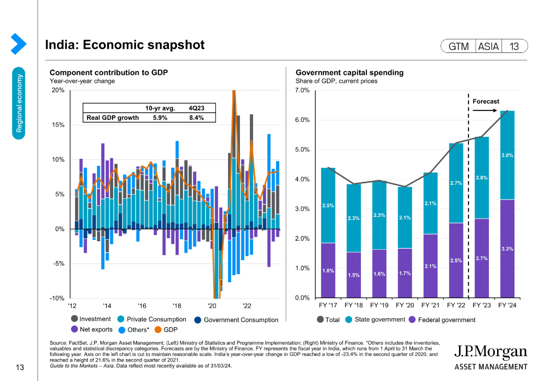
This slide includes a column chart showing GDP component contributions and a bar chart for government capital spending, with historical data and forecasts.
Market Analysis and Trends
Financial Services
Examines India's economic status by analyzing GDP contributions from various components and government spending, valuable for market and financial analysis.
India, Economic snapshot, GDP, Government spending, Financial data, Market analysis, Economic trends, Investment
false
Market Analysis and Trends
Financial Services
Multiple Chart
JP Morgan
Add to my slides
Remove from favorites
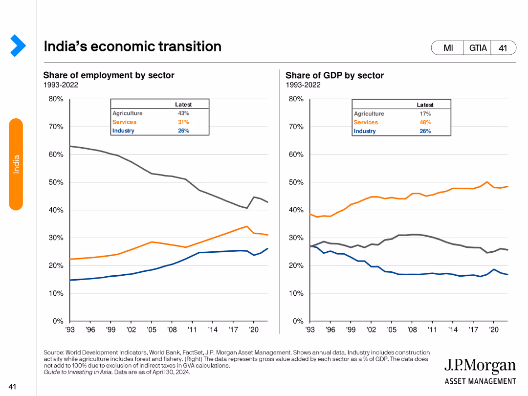
The slide has two line charts: one on the left showing the share of employment by sector from 1993 to 2022, and one on the right showing the share of GDP by sector over the same period. The layout is structured to compare changes in employment and GDP contribution.
Market Analysis and Trends
Financial Services
This slide examines the economic transition in India, focusing on shifts in employment and GDP shares across agriculture, industry, and services sectors over three decades.
India, economic transition, employment, GDP share, sector analysis
false
Market Analysis and Trends
Financial Services
Multiple Chart
JP Morgan
Add to my slides
Remove from favorites
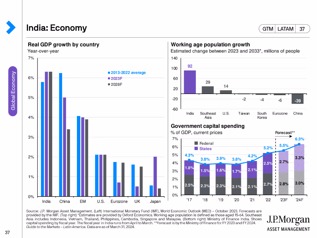
This slide includes a column chart showing India's real GDP growth by country, a bar chart showing working-age population growth, and a column chart displaying government capital spending by federal and state levels.
Market Analysis and Trends
Financial Services
The slide provides an overview of India's economic growth, demographic changes, and government spending trends, offering insights into the country's economic development and future prospects.
India, economy, GDP growth, working-age population, government spending, economic development, federal, state
false
Market Analysis and Trends
Financial Services
Multiple Chart
JP Morgan
Add to my slides
Remove from favorites
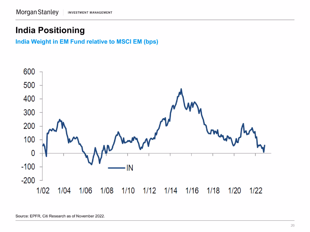
A line chart showing India's weight in EM Fund relative to MSCI EM (bps) from 1/02 to 1/22. The chart shows fluctuations in India's position within the EM Fund.
Market Analysis and Trends
Financial Services
The slide shows the positioning of India in the Emerging Market Fund relative to MSCI EM over time, highlighting its trends and fluctuations.
India, EM Fund, MSCI, Weight, Positioning
false
Market Analysis and Trends
Financial Services
Single Chart
Morgan Stanley
Add to my slides
Remove from favorites
The slide displays a column chart showing the growth in digital consumption in India from 2019 to 2022, including television, digital video, and other media types. It also compares pay TV households and OTT SVoD subscriber growth in India, the US, and China.
Market Analysis and Trends
Media & Entertainment
This slide highlights the rapid growth of digital content consumption in India, driven by increases in television and digital video usage. It compares India's trends with those in the US and China, emphasizing India's entertainment market potential.
India, Entertainment, Digital Consumption, Television, OTT
false
Market Analysis and Trends
Media & Entertainment
Multiple Chart
BCG
Add to my slides
Remove from favorites
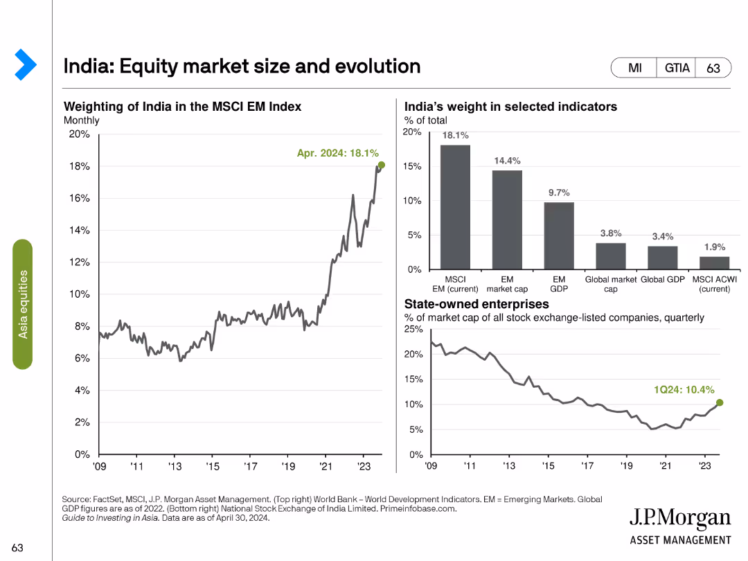
This slide features a line chart on India's weighting in the MSCI EM Index, and a bar chart showing India's weight in selected indicators, along with a line chart on state-owned enterprises' market cap share.
Market Analysis and Trends
Financial Services
The slide analyzes the growth and evolution of India's equity market, highlighting its increasing weight in global indices and the proportion of state-owned enterprises, providing insights into market dynamics and investment prospects.
India, equity market, MSCI EM, market evolution, state-owned enterprises, market cap, global indices, investment prospects, market dynamics, financial analysis
false
Market Analysis and Trends
Financial Services
Multiple Chart
JP Morgan
Add to my slides
Remove from favorites
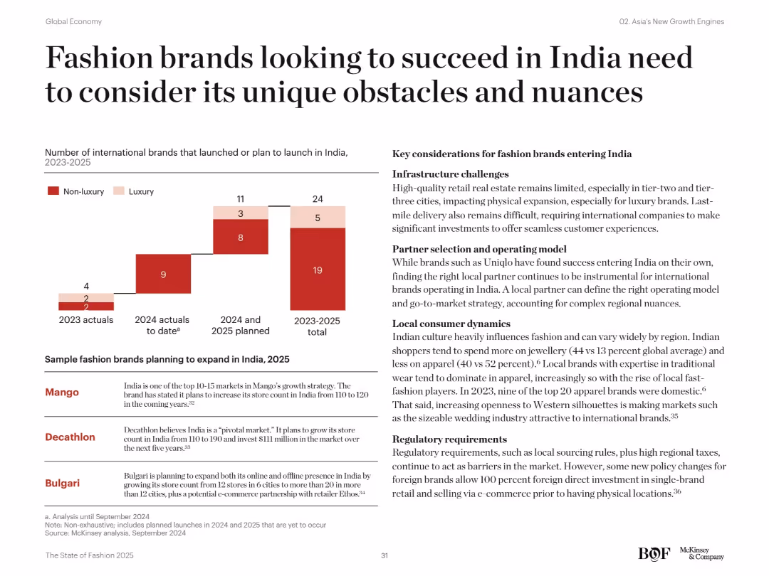
Bar chart on brand launches in India (2023–2025) split by luxury and non-luxury. Text outlines infrastructure, consumer behavior, and regulatory hurdles.
Strategic Planning
Consumer Goods
This slide outlines challenges for fashion brands entering India, such as real estate, complex regulations, and regional cultural differences. It emphasizes the need for strong local partnerships and understanding consumer behavior to navigate India’s growing but nuanced market.
India, fashion brands, infrastructure, regulation, consumer behavior, retail, expansion strategy, partnerships, non-luxury, luxury
false
Strategic Planning
Consumer Goods
Mixed Chart
McKinsey
Add to my slides
Remove from favorites
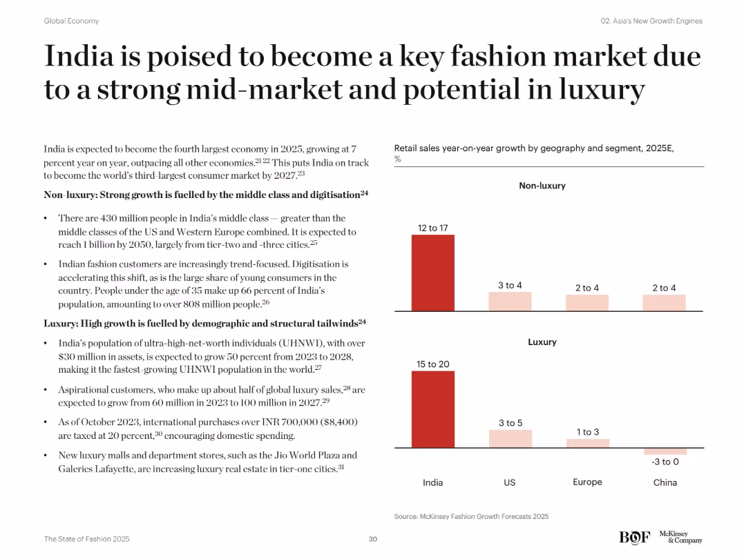
Side-by-side bar charts show projected retail growth in non-luxury and luxury segments by geography for 2025. Accompanying text provides demographic drivers.
Market Analysis and Trends
Consumer Goods
India is forecast to be a leading fashion market by 2025, fueled by a massive middle class and rapid digital adoption. Luxury growth is driven by UHNWIs and aspirational consumers. India is set to surpass Western markets in growth across both segments.
India, fashion market, middle class, UHNWIs, non-luxury, luxury, growth forecast, retail, digitization, demographics
false
Market Analysis and Trends
Consumer Goods
Mixed Chart
McKinsey
Add to my slides
Remove from favorites
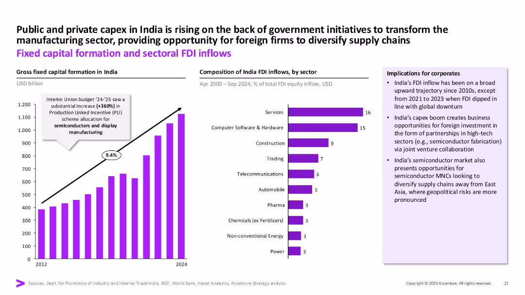
Left: Bar chart of India’s capital formation growth (2012–2024). Right: Horizontal bar chart of FDI by sector. Includes callouts and implications box.
Investment Analysis
Industrial & Manufacturing
This slide explores India's growing capex and FDI driven by government incentives and sectoral liberalization. It highlights high-tech sectors like semiconductors and software as primary beneficiaries, offering foreign firms a strategic diversification opportunity.
India, FDI, capex, manufacturing, semiconductors, supply chain, growth
false
Investment Analysis
Industrial & Manufacturing
Multiple Chart
Accenture
Add to my slides
Remove from favorites
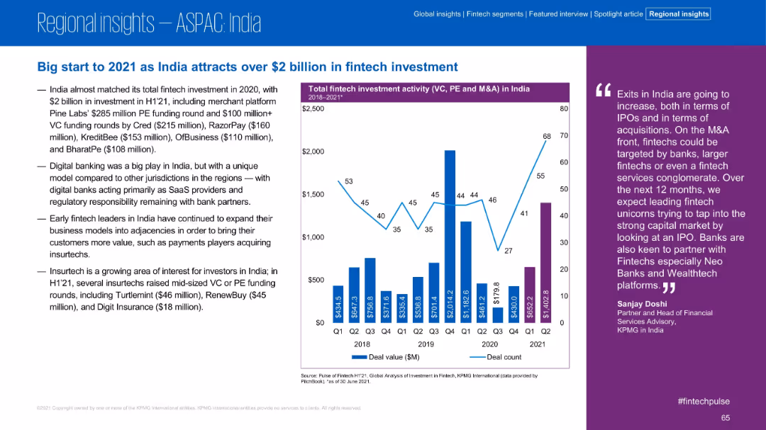
Content-rich slide with bullet points and a vertical bar graph of India's deal activity (2018–2021).
Investment Analysis
Financial Services
India attracted over $2 billion in H1’21 fintech investment, nearly matching 2020’s total. The slide details major deals, trends in digital banking and insurtech, and shows a deal volume chart by quarter.
India, Fintech, VC, PE, Insurtech, Investment, Digital Banking
false
Investment Analysis
Financial Services
Mixed Chart
KPMG
Add to my slides
Remove from favorites
This slide has two charts: a bar chart showing net foreign portfolio flows into Indian equities, and a line chart showing foreign market participation in Nifty 500 companies with holdings over 5%.
Market Analysis and Trends
Financial Services
The slide examines the net foreign portfolio investment in Indian equities over the years, alongside foreign market participation rates, to provide insights into foreign investor trends and market positioning in India.
India, foreign investment, portfolio flows, Nifty 500, market participation, equities, investment trends, financial analysis, foreign investors, market positioning
false
Market Analysis and Trends
Financial Services
Multiple Chart
JP Morgan
Add to my slides
Remove from favorites
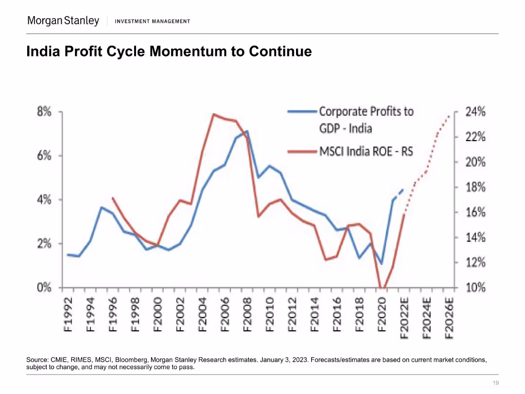
A line chart showing two lines: Corporate Profits to GDP - India (blue) and MSCI India ROE - RS (red) from F1992 to F2026E. The chart has two Y-axes for percentage values.
Market Analysis and Trends
Financial Services
The slide analyzes the profit cycle of Indian corporate profits relative to GDP and the MSCI India ROE, projecting continued momentum through 2026.
India, GDP, Corporate Profits, MSCI, ROE
false
Market Analysis and Trends
Financial Services
Single Chart
Morgan Stanley
Add to my slides
Remove from favorites
Three line charts showing India's y/y real GDP, y/y percentage change in CPI, and repurchase rate path from 2005-25F. Moderate complexity, effectively presenting economic data and trends for analysis.
Market Analysis and Trends
Financial Services
This slide provides an economic forecast for India, discussing sustained recovery, inflation moderation, and policy rate trends. It highlights the resilience of the Indian economy and potential risks to growth.
India, GDP, CPI, repurchase rate, recovery
false
Market Analysis and Trends
Financial Services
Multiple Chart
EY
Add to my slides
Remove from favorites
Features three line charts depicting India's y/y real GDP, y/y CPI, and repurchase rate from 2005 to 2025, alongside detailed explanatory text.
Market Analysis and Trends
Financial Services
Discusses India's economic resilience, GDP growth, inflation trends, and monetary policy expectations.
India, GDP, CPI, Resilience, Monetary Policy
false
Market Analysis and Trends
Financial Services
Multiple Chart
EY
Add to my slides
Remove from favorites
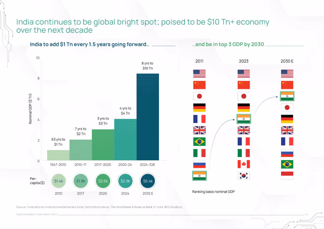
Dual-panel layout: left stacked bar of GDP timeline, right rank shifts of countries by GDP (2011–2030E)
Market Analysis and Trends
Financial Services
This slide charts India's rapid GDP growth trajectory and its expected rise to the top 3 global economies by 2030. It visually compares historical and projected GDP levels, showing acceleration from $1T in 63 years to an expected $10T in 8 years. Includes global ranking comparisons.
India GDP, economic growth, global ranking, nominal GDP, IMF forecast, growth projection, $10 trillion economy
false
Market Analysis and Trends
Financial Services
Mixed Chart
BCG
Add to my slides
Remove from favorites
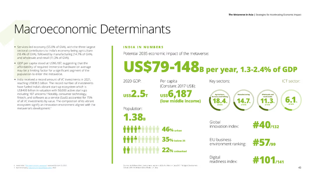
A data-driven slide with key economic indicators for India, including GDP, population, and sector contributions.
Financial Performance
Financial Services
The slide presents India’s macroeconomic determinants, highlighting the potential economic impact of the metaverse by 2035.
India, GDP, economic impact, metaverse, financial indicators
false
Financial Performance
Financial Services
Mixed Chart
Deloitte
Add to my slides
Remove from favorites
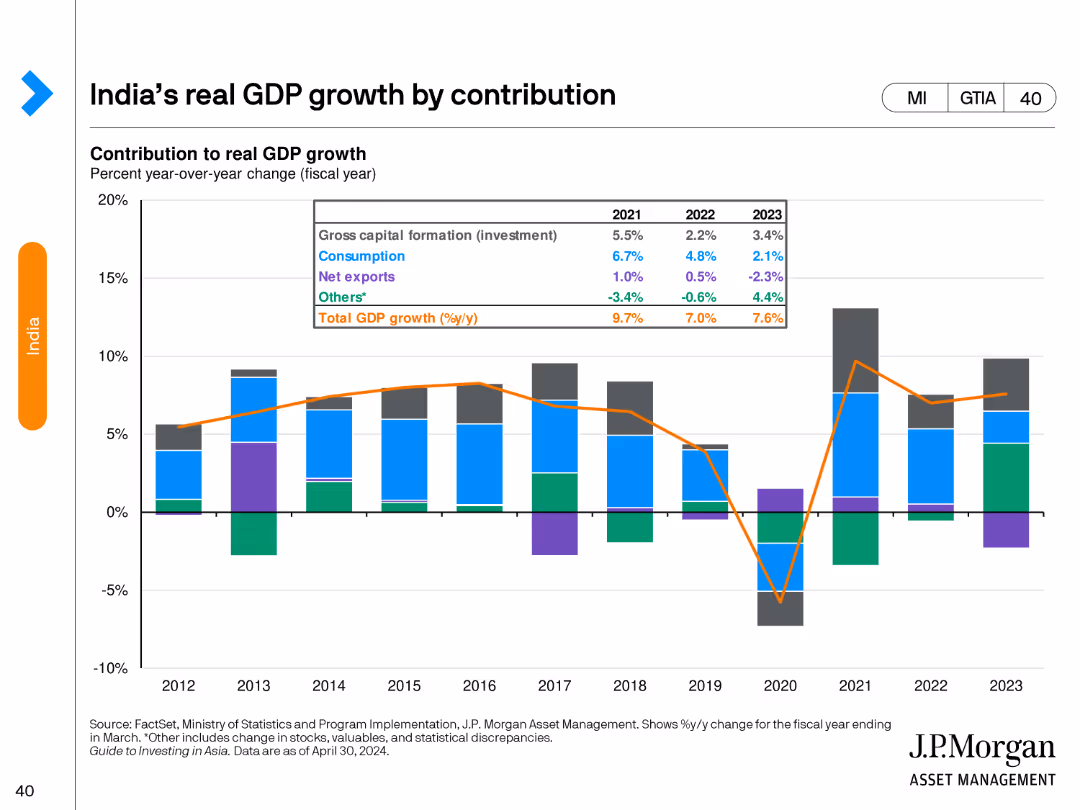
This slide contains a stacked column chart on the left, detailing the contribution to real GDP growth by various factors from 2012 to 2023. A line graph overlays the columns, showing total GDP growth percentage. The design is vibrant and data-rich.
Market Analysis and Trends
Financial Services
The slide analyzes India's GDP growth by various economic contributors, including investment, consumption, and exports, providing insights into economic performance over recent years.
India, GDP growth, economic analysis, investment, consumption
false
Market Analysis and Trends
Financial Services
Single Chart
JP Morgan
Add to my slides
Remove from favorites
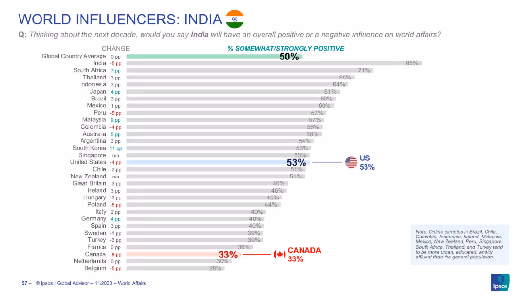
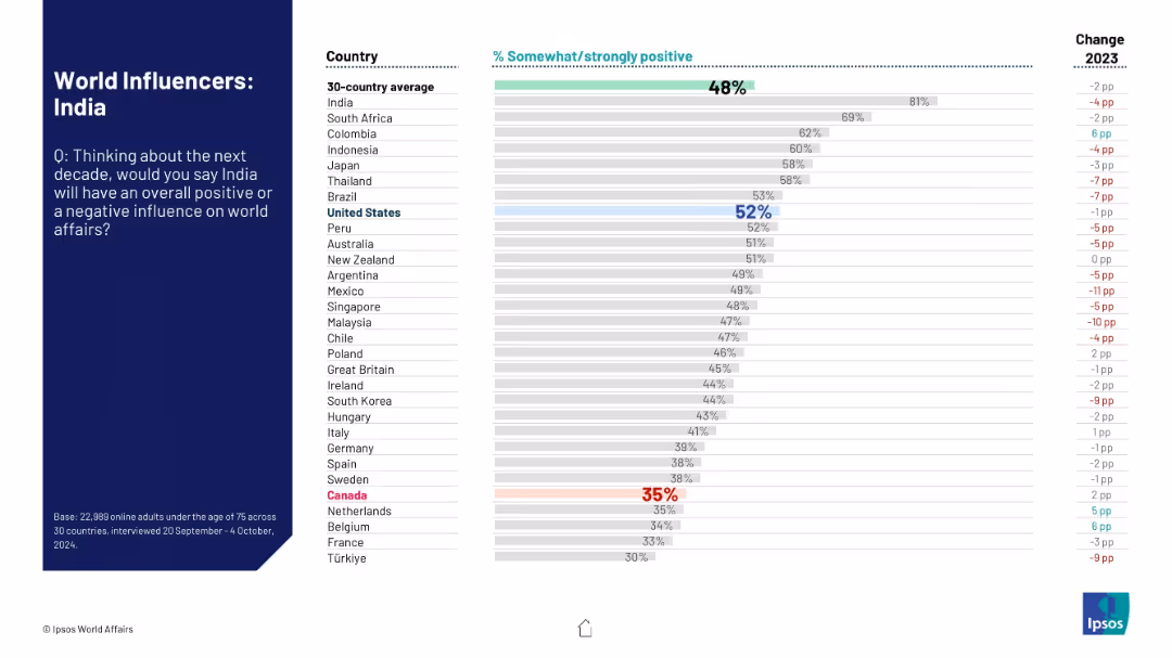
Horizontal bar chart ranking countries by % of positive influence attributed to India; includes flags and % changes.
Market Analysis and Trends
Government & Public Sector
The slide evaluates how global respondents view India's influence in the coming decade. While globally India holds a 50% positivity rating, the highest positivity comes from South Africa, and the lowest from Canada.
India, global image, public opinion, influence, Ipsos, rankings, decade outlook, soft power
false
Market Analysis and Trends
Government & Public Sector
Single Chart
IPSOS
Add to my slides
Remove from favorites
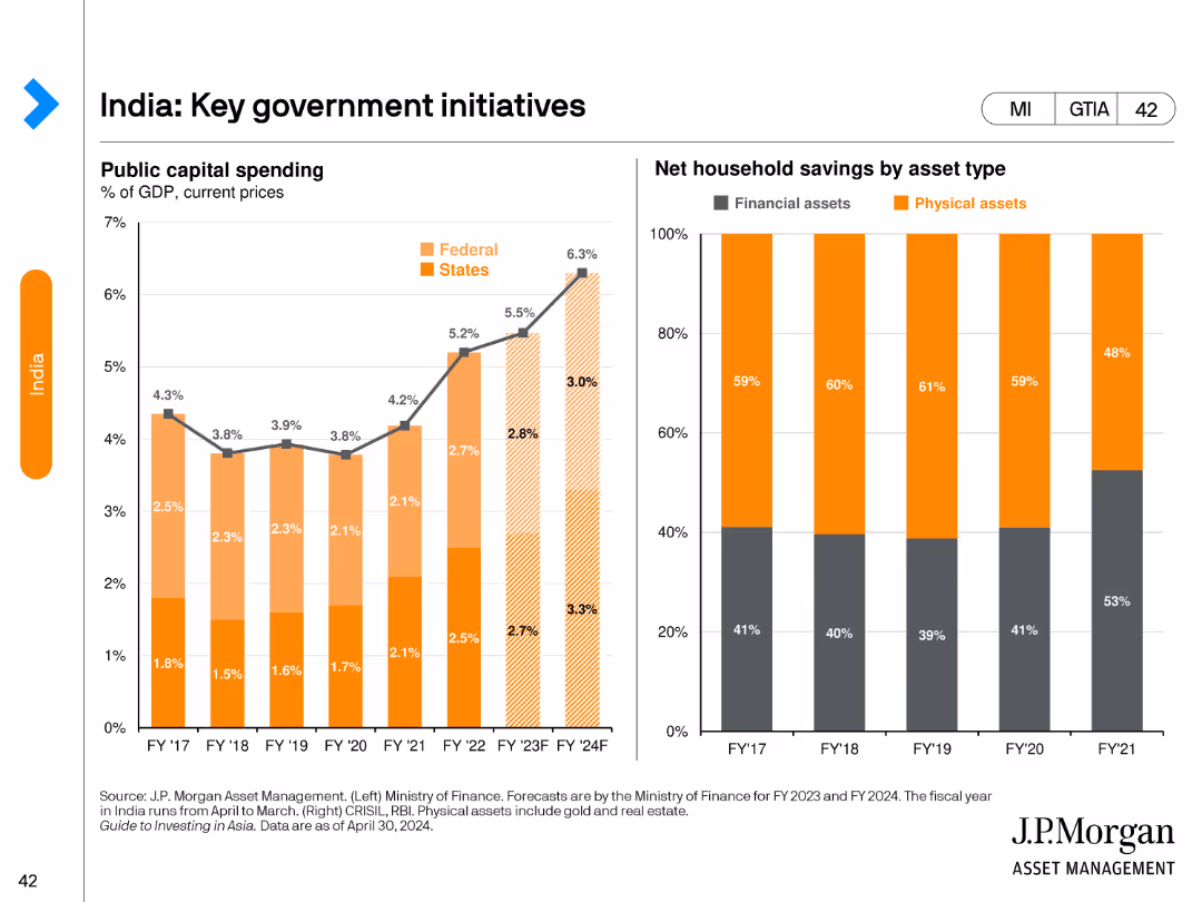
The left side of the slide features a stacked column chart showing public capital spending by federal and state levels from FY17 to FY24F. The right side has a stacked bar chart displaying net household savings by asset type from FY17 to FY21.
Regulatory and Compliance
Government & Public Sector
This slide outlines key government initiatives in India, highlighting trends in public capital spending and household savings to understand fiscal and economic policies.
India, government initiatives, public spending, household savings, fiscal policy
false
Regulatory and Compliance
Government & Public Sector
Multiple Chart
JP Morgan
Add to my slides
Remove from favorites
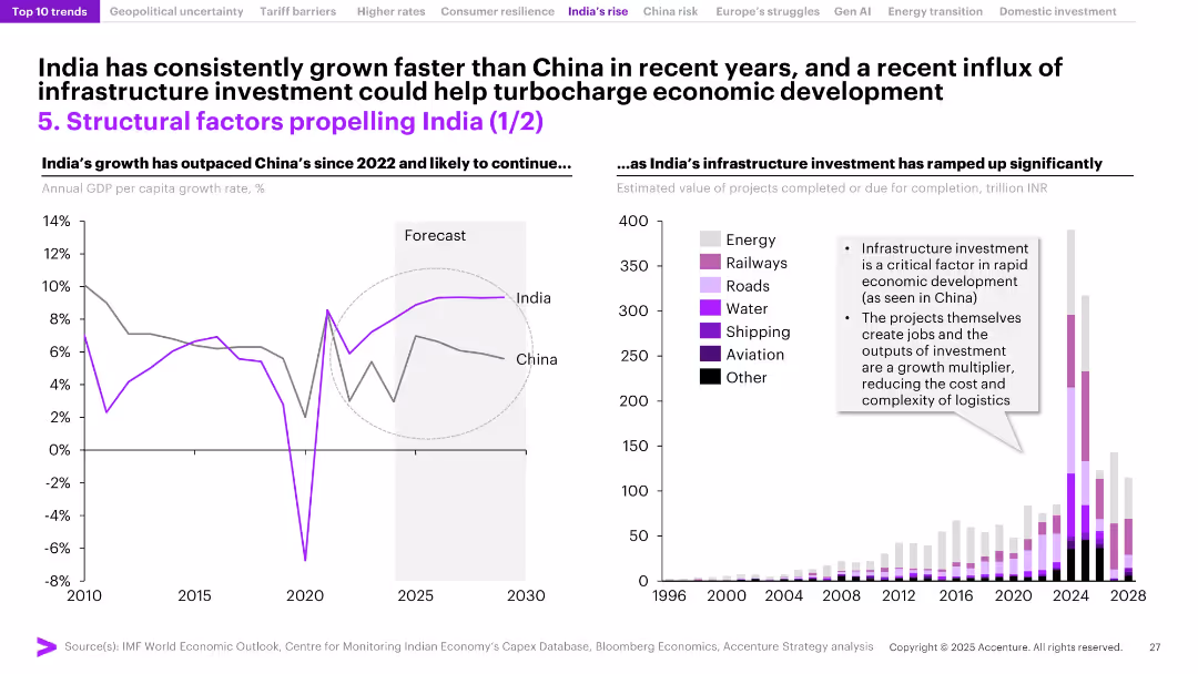
Split slide with left-side GDP growth comparison chart (India vs. China) and right-side bar chart of infrastructure investments by sector. Forecast zones shaded.
Investment Analysis
Government & Public Sector
India’s recent economic outperformance relative to China is showcased, alongside a rapid increase in infrastructure investment across sectors such as energy, roads, and railways. The slide underscores how infrastructure acts as a growth catalyst by creating jobs and improving logistics, positioning India for continued expansion.
India growth, GDP, infrastructure, China comparison, economic development, energy, railways, logistics, investment, capital spending
false
Investment Analysis
Government & Public Sector
Multiple Chart
Accenture
Add to my slides
Remove from favorites
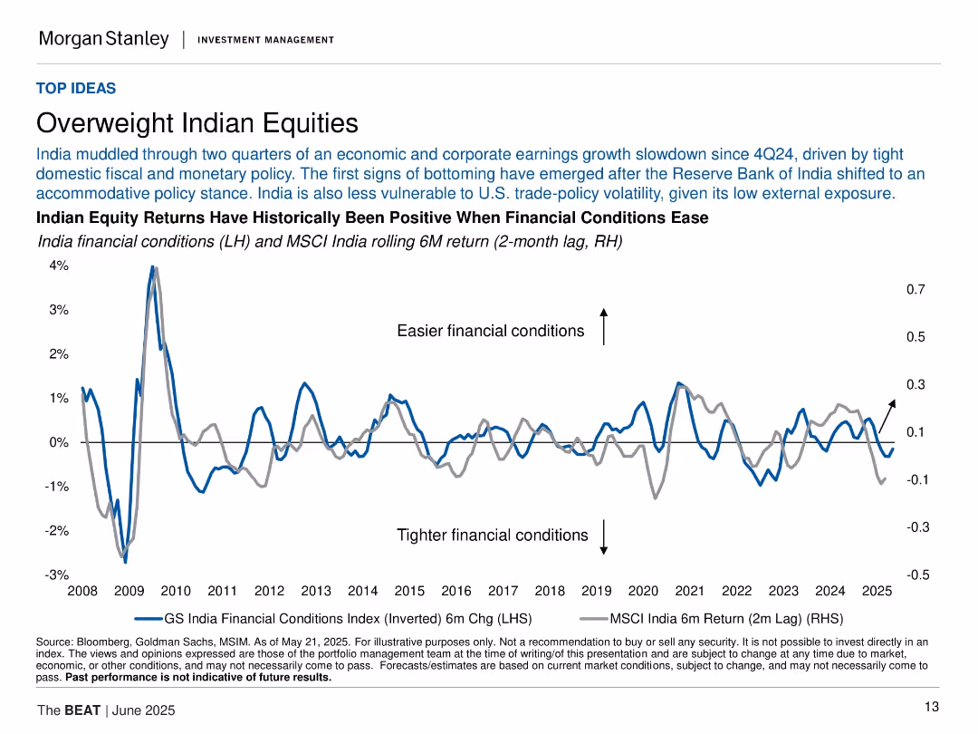
Dual-axis line chart showing India financial conditions and equity returns; minimal layout with focus on trends.
Investment Analysis
Financial Services
This slide supports overweighting Indian equities based on easing financial conditions and accommodative policy by the RBI. A dual-line chart illustrates the historical correlation between financial conditions and equity returns.
Indian equities, financial conditions, RBI, monetary policy, MSCI India, investments, easing, macroeconomic, returns
false
Investment Analysis
Financial Services
Single Chart
Morgan Stanley
Add to my slides
Remove from favorites
Layout identical to other slides: left-aligned prompt and title, right-hand bar chart comparing perceptions.
Market Analysis and Trends
Government & Public Sector
This chart shows how people in 30 countries perceive India’s global influence in the next decade. It reveals significant variation, with many countries reporting declining sentiment from 2023.
India, public opinion, world influence, Ipsos, perception trends, geopolitical role, survey, sentiment rating, international reputation
false
Market Analysis and Trends
Government & Public Sector
Mixed Chart
IPSOS
Add to my slides
Remove from favorites
The slide presents two focal themes: India's economic outlook with infographic circles and Saudi's economic reform with a map. Both sections include report links.
Market Analysis and Trends
Financial Services
It explores the economic growth potential of India and Saudi Arabia, emphasizing their strategic positions in global markets, which is informative for investors and policymakers.
India, Saudi Arabia, economic growth, market potential, strategic position, global markets, investment information, policymakers, Vision 2030, economic reform
false
Market Analysis and Trends
Financial Services
Mixed Chart
Morgan Stanley
Add to my slides
Remove from favorites
The slide features two column charts. The left chart shows MSCI India earnings growth estimates by sector for 2024 and 2025, while the right chart shows MSCI India price-to-earnings ratios by sector.
Financial Performance
Financial Services
This slide discusses sector earnings and valuations in India, providing earnings growth estimates and price-to-earnings ratios for various sectors. It is used for financial performance analysis and investment planning.
India, sector earnings, valuations, MSCI, price-to-earnings, financial performance, investment planning
false
Financial Performance
Financial Services
Multiple Chart
JP Morgan
Add to my slides
Remove from favorites
Previous
Next
You don't have any favorites yet.
Please wait loading your favorites slides...
Create a FREE account to continue browsing
Receive Instant Access to 1,000+ slides from companies like McKinsey, Google, and Goldman Sachs
First Name
Last Name
Email
Password
I agree to all
Terms & Privacy Policy
Thank you! Your submission has been received!
Oops! Something went wrong while submitting the form.
Have an account?
Sign in
Upgrade to PRO to Save slides
Advanced Search and Filters
Access to 15,000+ slides
Access to Category Pages
Save/Bookmark Slides
PowerPoint Template Library
Pick a Plan
MONTHLY
$12/month
Billed every month, Cancel anytime.
YEARLY
$9/year
Billed $108 annually, Cancel anytime.
Checkout for $12/month
Checkout for $108/yr
Secured by Stripe | AES-256 bit encryption