Create a FREE Account
Instant access to 1,000+ real slides from top companies like McKinsey, BCG, Goldman Sachs, Google and many more!
First Name
Last Name
Email
Password
I agree to all
Terms & Privacy Policy
Thank you! Your submission has been received!
Oops! Something went wrong while submitting the form.
Have an account?
Sign in
Library
Templates
Courses
Pricing
My Account
My Slides
My Templates
✦ AI
AI Prompt Library
AI Search
Sign in
Start Here
Logout
My Saved Slides
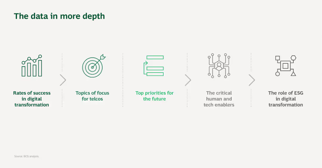
The slide uses a simple layout with five icons and brief text descriptions, visually connected by arrows, representing different focus areas in digital transformation for telcos.
Technology and Digital Transformation
Telecommunications
This slide provides an overview of the data topics covered in more detail later, focusing on digital transformation in the telecommunications sector.
Digital transformation, Telcos, Focus areas, Technology, Data analysis
Pillar
BCG
Saved
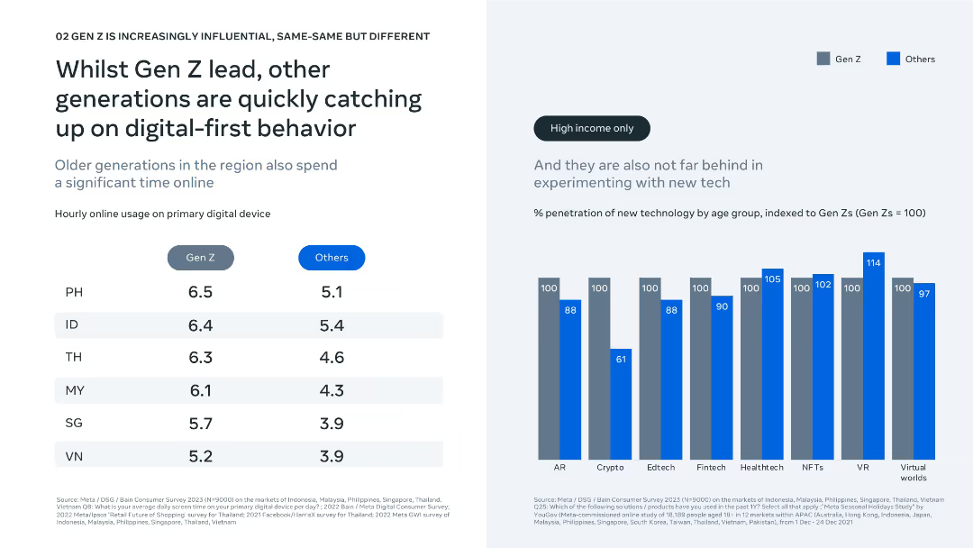
Dual-column layout showing device usage and tech adoption; clean bar and comparison chart visuals.
Technology and Digital Transformation
Technology & Software
The slide shows Gen Z leads in online engagement and tech adoption, but older generations are rapidly catching up, especially in high-income segments. Charts show hourly device usage and penetration of new tech by generation.
digital behavior, online usage, Gen Z, technology adoption, fintech, AR, VR, generational comparison, screen time, innovation trends
Mixed Chart
Bain
Saved
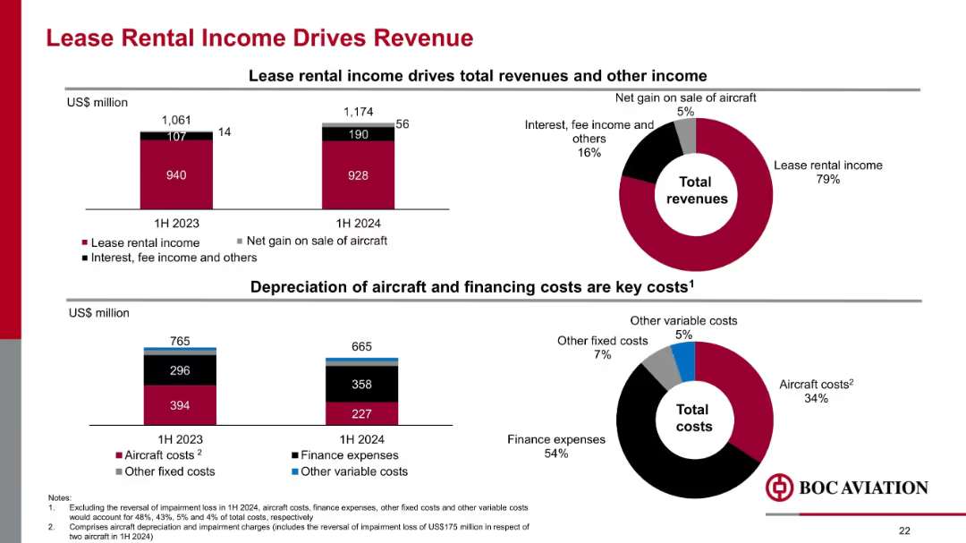
Combination of bar and donut charts showing revenue and cost composition in 1H 2023 vs. 1H 2024, focused on lease income and costs.
Financial Performance
Transportation & Logistics
Lease rental income remains the dominant revenue stream at 79% in 1H 2024. Gains from aircraft sales and fee income also contribute. On the cost side, finance expenses and aircraft costs make up the bulk of expenditures.
lease income, revenue, cost structure, aircraft depreciation, finance expenses, BOC Aviation
Multiple Chart
Goldman Sachs
Saved
Line chart showing Trade Services Vacancy Rate from FY18 to FY21 for blended, full-time, and part-time positions. A table comparing these rates across the years. Findings in text boxes.
Market Analysis and Trends
Government & Public Sector
Addresses the rise in trade services vacancy rates post-COVID, detailing the impact on service costs and operational capacity. Highlights the need for improved management and transformation.
trade services, vacancy rates, COVID-19 impact, operational capacity, service costs, management, transformation
Mixed Chart
Alvarez & Marsal
Saved
A bar chart highlighting the potential economic impact of a skills crisis, with key points summarized in text. The color scheme is purple and teal against a white background.
Risk Assessment and Management
Education & Training
The slide quantifies the potential economic loss to G20 countries due to a skills crisis and stresses the need for investment in education and technology.
Skills Crisis, G20, Economic Impact, Education Investment, Technology, GDP Growth, Risk Management, Labor Market, Forecast
Single Chart
Accenture
Saved
This slide presents an office meeting scene focusing on the theme of inclusive risk management. It combines textual content with an image showing a diverse group discussing risk strategies, illustrating the concept that risk management is a company-wide responsibility.
Organizational Structure and Change
Professional Services
The content highlights the importance of integrating risk management across all levels of an organization, not just within specialized risk teams. It argues for a holistic approach where everyone is empowered and informed to act on risk, enhancing the organization's overall risk culture and responsiveness to external and internal challenges.
inclusive, risk management, holistic approach, company-wide, empowerment, discussion, office
Mixed Chart
Accenture
Saved
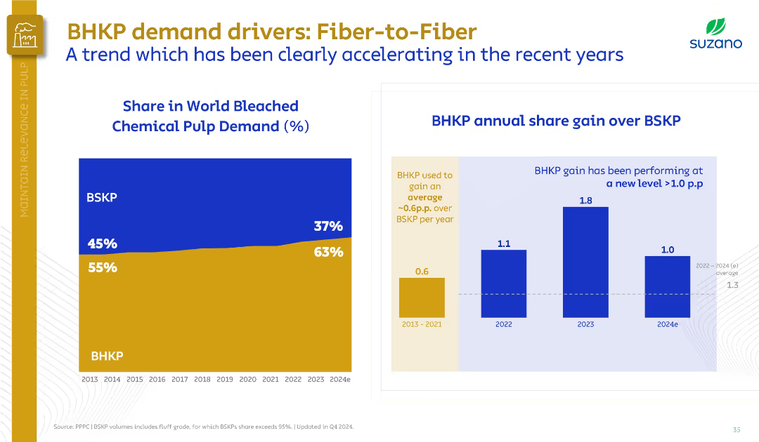
Left graph shows BHKP vs. BSKP share trend; right bar chart compares share gain. Uses a dual-panel data layout.
Market Analysis and Trends
Industrial & Manufacturing
The slide shows BHKP’s growing share in world pulp demand from 55% in 2013 to 63% in 2024, surpassing BSKP. Highlights increasing annual gains, particularly post-2022, signaling a market shift to hardwood pulp.
BHKP, BSKP, market share, demand growth, pulp, Suzano, fiber substitution
Multiple Chart
Goldman Sachs
Saved
The slide is divided into two sections, each featuring bar charts. One section shows the number of employees, and the other shows annual sales revenue percentages. This layout allows for quick comparisons between different size categories.
Market Analysis and Trends
Professional Services
This slide continues the demographic breakdown of the survey participants, focusing on the number of employees and sales revenue. It provides insights into the scale of companies involved in the survey, which can be critical for understanding the economic impact of their views and decisions.
Employees, Sales Revenue, Demographics, Survey, Company Size
Multiple Chart
Deloitte
Saved
Map of North America highlighting Enbridge's infrastructure with a pie chart and list of attributes about business stability and growth potential.
Investment Analysis
Energy & Utilities
Positions Enbridge as a key investment due to its stable cash flow and diversified infrastructure, critical for investor briefings and strategic investment decisions.
Investment, Infrastructure, Stability, Cash Flow, Growth Potential
Multiple Chart
Barclays
Saved
Column charts displaying the composition of non-core and legacy assets by type and source, along with textual explanations.
Strategic Planning
Financial Services
This slide details the exit strategy for non-core and legacy assets, including governance, risk management, and reduction targets.
non-core, legacy, assets, UBS, Credit Suisse
Multiple Chart
UBS
Saved
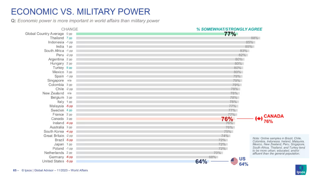
Horizontal bar graph showing agreement with the statement favoring economic power over military power; includes change indicators.
Strategic Planning
Government & Public Sector
The chart explores global sentiment that economic power outweighs military power in world affairs. The global average agreement is 77%, with highest consensus in Thailand and Indonesia, and lower agreement in the US.
economic power, military power, global opinion, Ipsos survey, international relations, strategic priorities
Single Chart
IPSOS
Saved
The slide features a column chart comparing wholesale, retail, and perimeter channels over 2017 and 2018, with associated percentage growth.
Market Analysis and Trends
Retail & E-commerce
Discusses the growth rates of personal luxury goods through various sales channels, highlighting the impact of different retail strategies.
luxury goods, retail growth, wholesale, perimeter sales, channel analysis
Multiple Chart
Bain
Saved
This slide shows a detailed timeline with various phases of the IPO process, highlighted in orange and red, making significant milestones clear.
Strategic Planning
Financial Services
Provides a detailed IPO timeline, marking key activities and workstreams from preparation to the public phase, emphasizing the structured timeline of events.
IPO, timeline, activities, preparation, public phase
Table
PwC/Strategy&
Saved
This slide displays a grid of colored boxes representing the growth of retail goods sales excluding auto and fuel across multiple countries (China, Japan, US, UK, Italy, Sweden). Each box corresponds to a month from January to July, color-coded based on the percentage change in sales compared to the previous year. The slide is visually organized to allow quick scanning of data across different months and countries, providing a snapshot of the retail sector's performance during the pandemic.
Market Analysis and Trends
Retail & E-commerce
The slide provides a visual summary of how retail sectors in various countries are recovering from the impacts of COVID-19, highlighting fluctuations in consumer spending and economic recovery. It is particularly useful for retailers and e-commerce platforms to analyze market conditions and consumer behavior trends, assisting in inventory and marketing strategies. This overview supports strategic decisions by showing which markets are rebounding and which remain subdued, enabling better resource allocation and promotional planning.
retail sales, COVID-19, economic recovery, consumer behavior, market analysis, e-commerce, strategic planning
Table
BCG
Saved
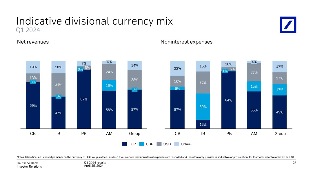
Two side-by-side stacked bar charts for Q1 2024: net revenues and noninterest expenses by currency
Financial Performance
Financial Services
Depicts the currency composition of revenues and expenses across Deutsche Bank divisions. EUR dominates most segments, but some variation exists in USD and GBP exposure. Provides insight into forex sensitivity across business lines.
currency mix, EUR, USD, GBP, net revenue, expenses, forex exposure
Single Chart
Deutsche Bank
Saved
This slide displays two vertical bar charts comparing desktop and mobile internet advertising revenues from 2010 to 2020, with growth rates noted.
Market Analysis and Trends
Media & Entertainment
Compares the growth of desktop versus mobile advertising revenues over a decade, marking a significant milestone for desktop revenues surpassing $40 billion for the first time.
advertising, revenue, desktop, mobile, growth, milestone, internet, 2020, media, technology
Single Chart
PwC/Strategy&
Saved
Slide with bar charts showing the expected and achieved Returns on Digital Investment (RODI) by automotive companies, compared to cross-industry performance.
Financial Performance
Transportation & Logistics
Discusses the financial returns on digital investments by automotive companies, highlighting how champions outperform contenders and cadets in achieving higher than expected RODI.
RODI, financial performance, automotive, investment returns, digital transformation
Multiple Chart
Accenture
Saved
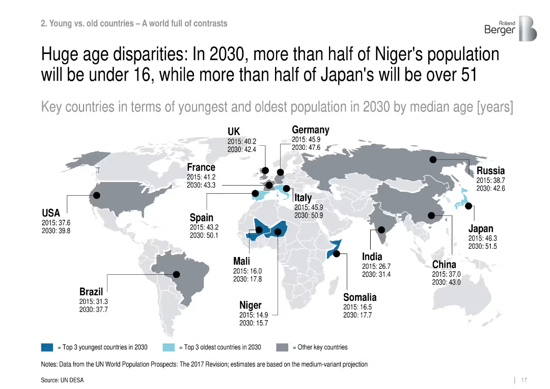
World map highlighting countries with youngest and oldest projected median ages in 2030.
Customer and Market Segmentation
Government & Public Sector
Compares countries with the youngest and oldest projected populations in 2030 by median age, revealing extreme disparities between nations like Niger (15.7) and Japan (51.5).
median age, population disparities, aging, youth bulge, demographic contrast, Niger, Japan
Single Chart
Roland Berger
Saved
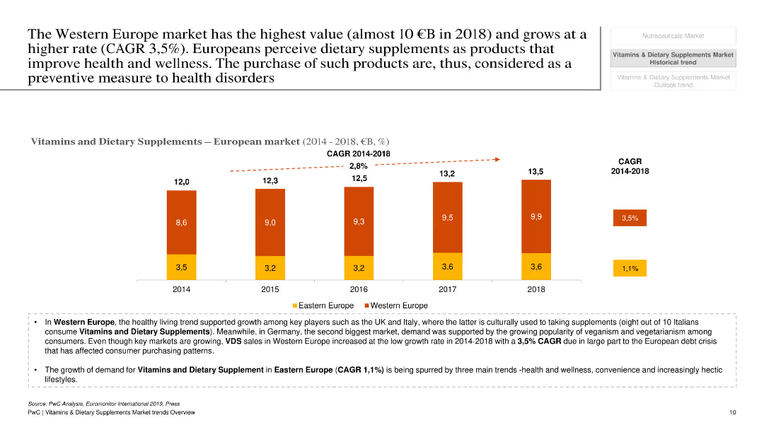
The slide has a white background with a column chart showing market value and growth rates of vitamins and dietary supplements in Western Europe from 2014 to 2018.
Market Analysis and Trends
Healthcare & Pharmaceuticals
This slide examines the market value and growth rate of vitamins and dietary supplements in Western Europe, focusing on key drivers and trends.
Vitamins, dietary supplements, Western Europe, market value, growth, trends, healthcare, pharmaceuticals, analysis
Mixed Chart
PwC/Strategy&
Saved
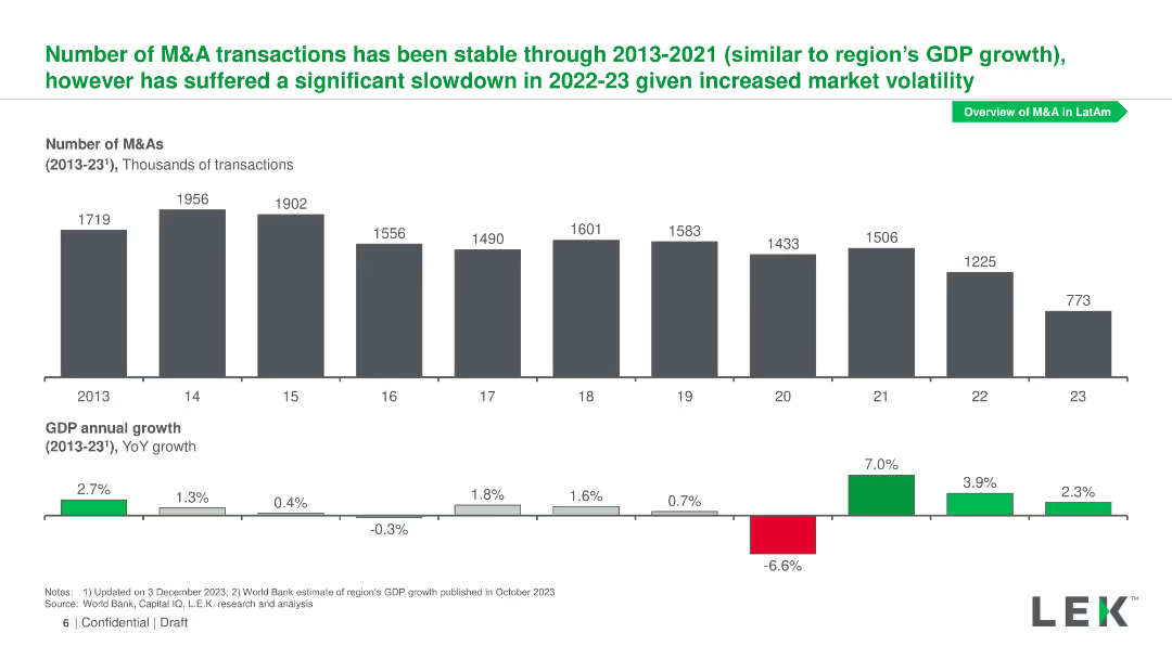
Column chart showing the number of M&A transactions from 2013 to 2023 and line chart displaying GDP annual growth over the same period.
Market Analysis and Trends
Financial Services
The slide displays M&A transaction trends from 2013-2023 alongside GDP growth rates, noting a significant slowdown in 2022-23 due to market volatility.
M&As, transaction trends, GDP growth, market volatility
Multiple Chart
LEK
Saved
This Data-Driven Slide includes a column chart showing 'MICHELIN’S HIGH-TECH MATERIALS REVENUES' with a positive trend over time, and two pie charts displaying '2022 revenue by geography' for Michelin and FCG. The slide is divided into three sections, with each section providing distinct information. The visual elements are complemented by descriptive text, making the data clear and the layout professional.
Financial Performance
Financial Services
The slide demonstrates the financial growth in Michelin’s high-tech materials sector, emphasizing a 20% revenue increase and detailing geographical revenue distribution. It also highlights the potential for expansion in North America and showcases the superior financial profile, including EBIT synergies and positive cash conversion, reinforcing Michelin’s financial stability and market growth strategy.
revenue, growth, financials, materials, expansion, EBIT, cash conversion, EPS, North America, market
Multiple Chart
Morgan Stanley
Saved
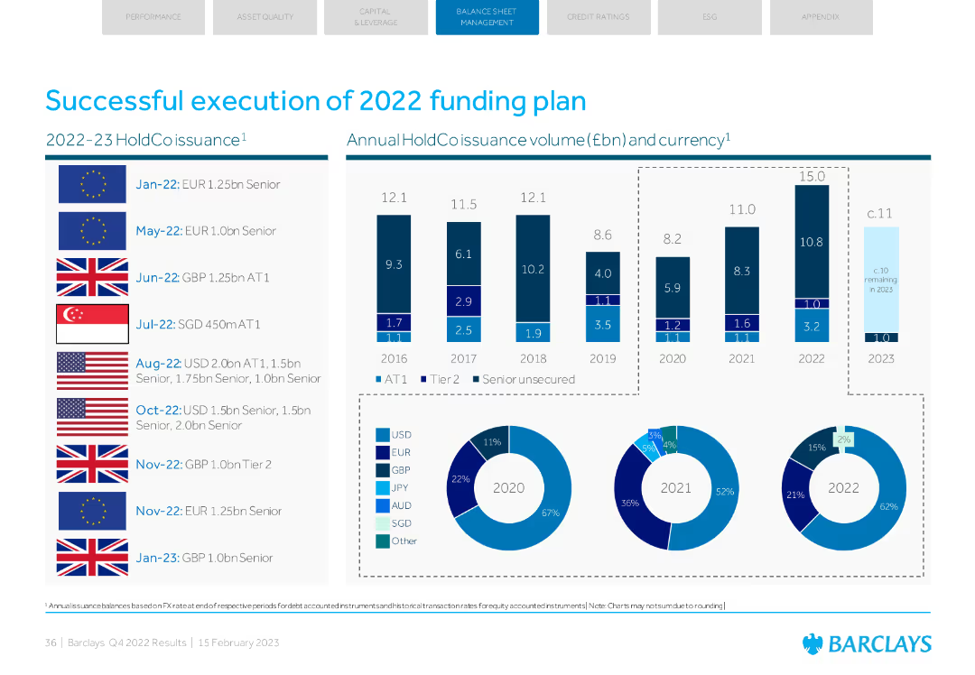
Column charts and pie charts illustrating holdco issuance volumes and currency breakdowns for 2022.
Financial Performance
Financial Services
Reviews the 2022 funding plan execution, detailing issuance volumes, currencies used, and the financial impact of these actions.
funding plan, issuance, 2022, volumes, currency
Multiple Chart
Barclays
Saved
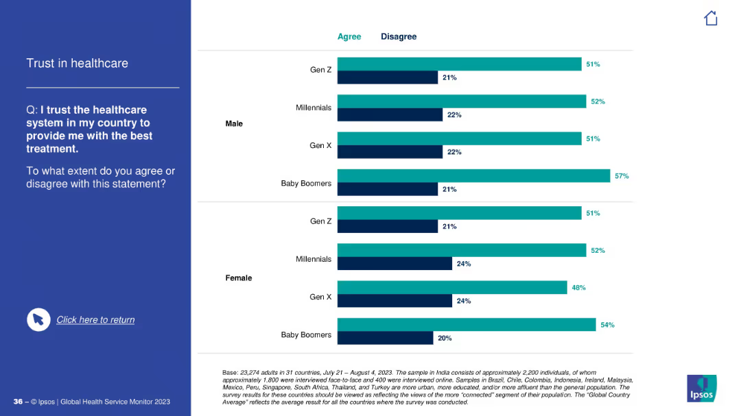
Same visual layout as previous: question and text on left, horizontal bar chart on right categorized by gender and generation.
Risk Assessment and Management
Healthcare & Pharmaceuticals
This slide explores trust in the healthcare system to provide the best treatment, comparing agreement and disagreement percentages across gender and generations. Baby Boomers show highest trust levels overall.
trust, healthcare, treatment, survey, gender, generations, perceptions, Ipsos, agreement, confidence
Mixed Chart
IPSOS
Saved
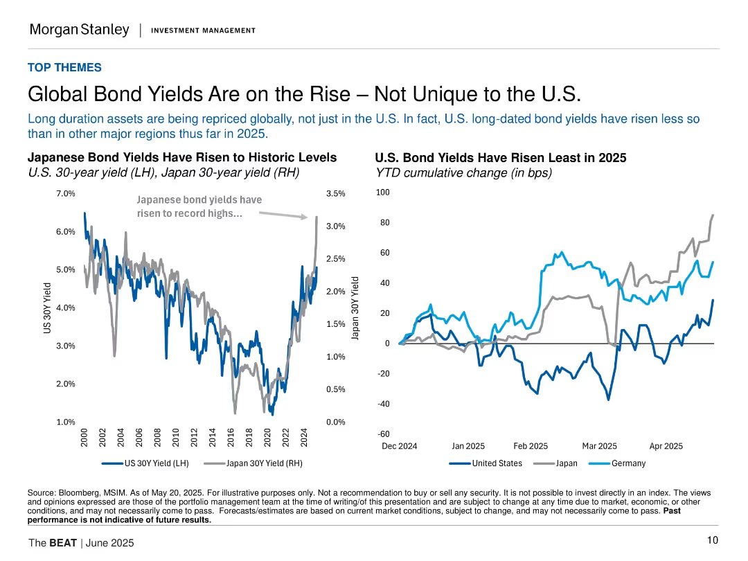
Two line charts comparing Japanese and U.S. bond yields; minimalist layout with dual-axis and legend.
Market Analysis and Trends
Financial Services
This slide analyzes global long-duration bond repricing, emphasizing that U.S. yields have risen less than in Japan or Germany. Charts show rising yields and cumulative changes across regions in 2025.
bond yields, U.S., Japan, Germany, interest rates, global market, long-term bonds, 2025, Morgan Stanley, inflation
Multiple Chart
Morgan Stanley
Saved
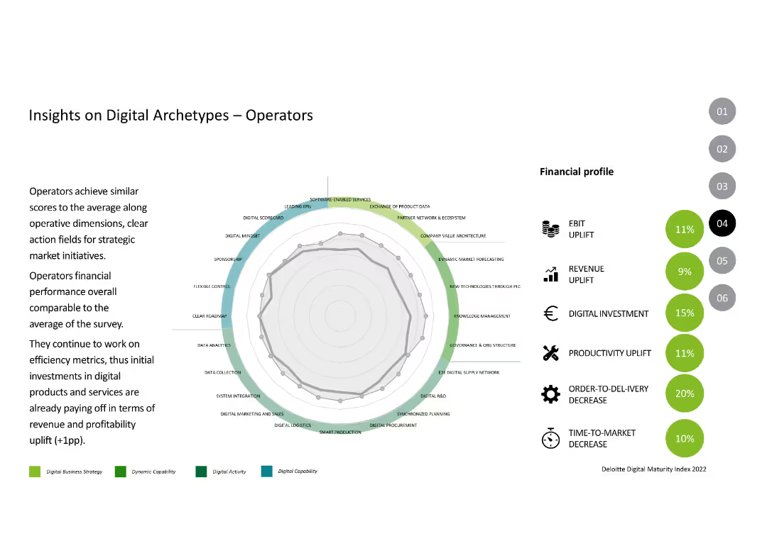
The slide includes a radar chart showing capabilities and financial metrics like EBIT uplift, revenue uplift, and productivity uplift, similar to previous archetype slides.
Competitive Landscape
Industrial & Manufacturing
The slide analyzes the "Operators" archetype, comparing their digital capabilities and financial performance to the average, highlighting their strengths and areas for improvement.
Digital Archetypes, Operators, Performance, Digital Capabilities, Financial Metrics
Mixed Chart
Deloitte
Saved
Previous
Next
If nothing, comes up, please save your slides first
Create a FREE account to continue browsing
Receive Instant Access to 1,000+ slides from companies like McKinsey, Google, and Goldman Sachs
First Name
Last Name
Email
Password
I agree to all
Terms & Privacy Policy
Thank you! Your submission has been received!
Oops! Something went wrong while submitting the form.
Have an account?
Sign in
Column Chart
Heatmap
Chevron
Org Chart
Infographic
Callouts
Timeline
List
Graphic
Picture
Process Flow
Diagram
Paragraph
Map
Table
Framework
Subtitle
Takeaway Box
Icon
Other Chart
Radar Chart
Waterfall Chart
Mekko Chart
Pie Chart
Scatter Plot
Line Chart
Bar chart
Bullet points