PRO
Four vertical rounded boxes with S, W, O, T at the top; sections for entering text under each.
PRO
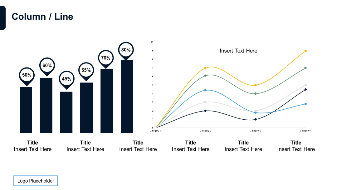
Combination of a column chart with value indicators and a multi-series line chart. Dual-panel layout.
PRO
Vertical process with three circular icons along a dotted line, aligned left. Bullet-point content block on the right side.
PRO
Split layout with a simple single-line chart on the left and bullet text section on the right. Minimalist design with a light background.
PRO
5x5 matrix with both row and column headers. Each cell includes bullet point placeholders. Vertical row headers are on the left, with purple accents.

PRO
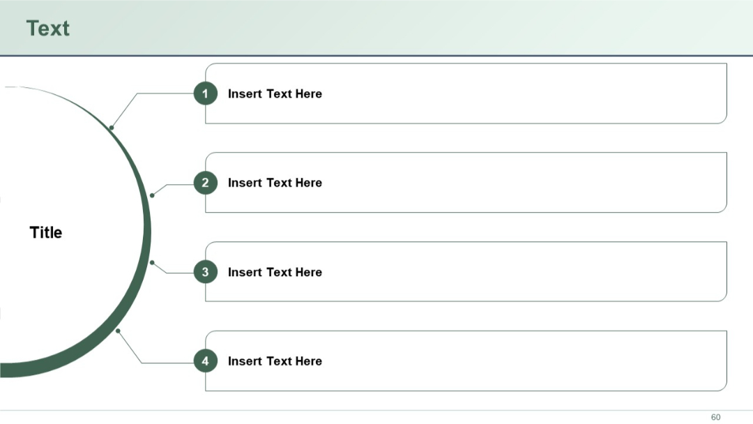
Left-dominant circular design labeled “Title” with four connected branches leading to numbered text boxes on the right.
PRO
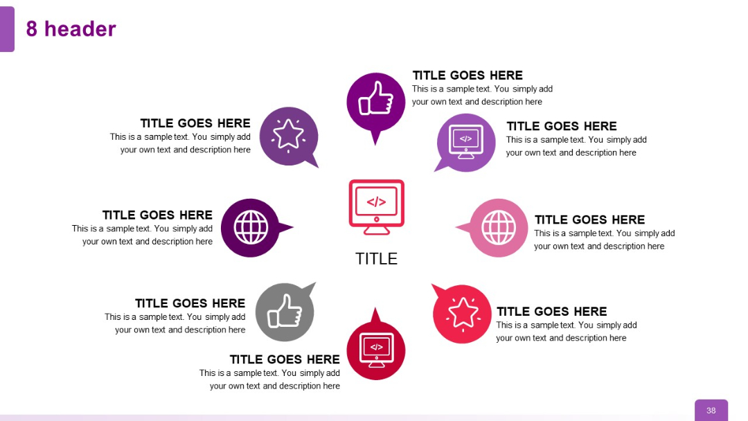
Symmetrical circular infographic with eight headers evenly spaced around a central code icon; each with its own unique color and icon.
PRO
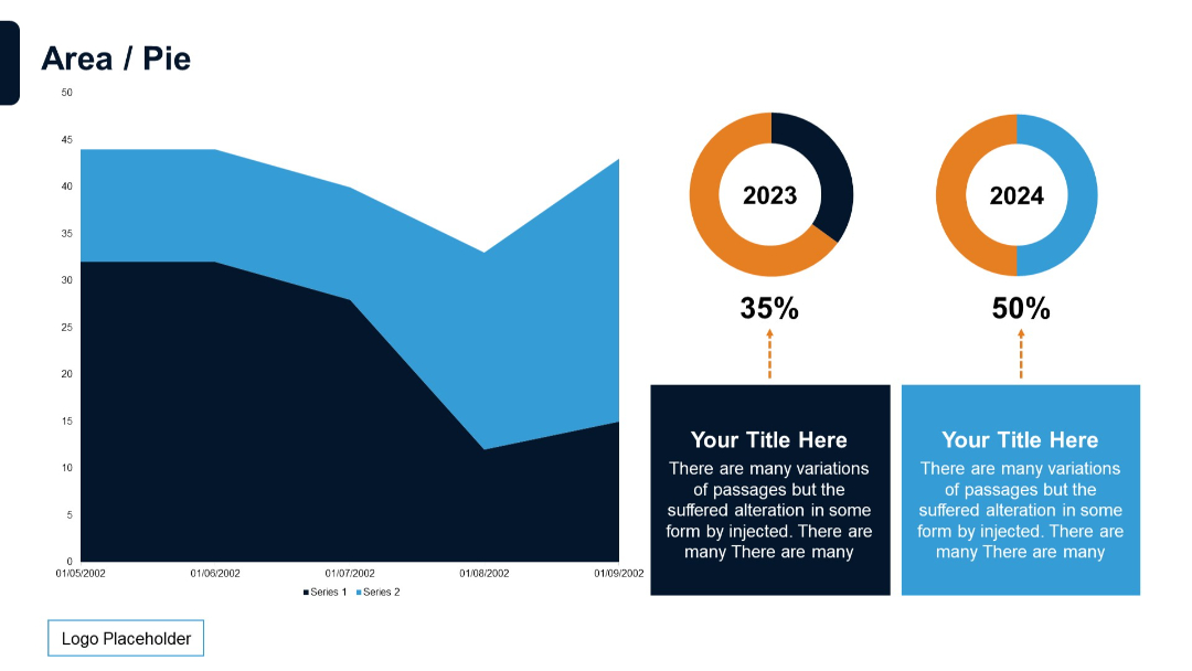
Combination slide with left side area chart and right side two donut charts (2023 and 2024) with percentages and text boxes underneath.
PRO
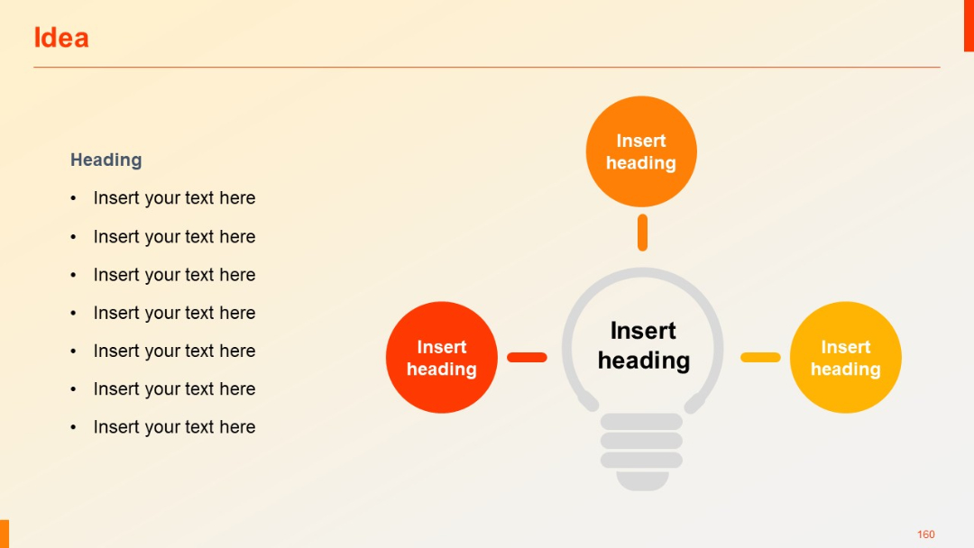
Lightbulb centerpiece with four surrounding circular icons connected by arrows; bullet list on the left.
PRO
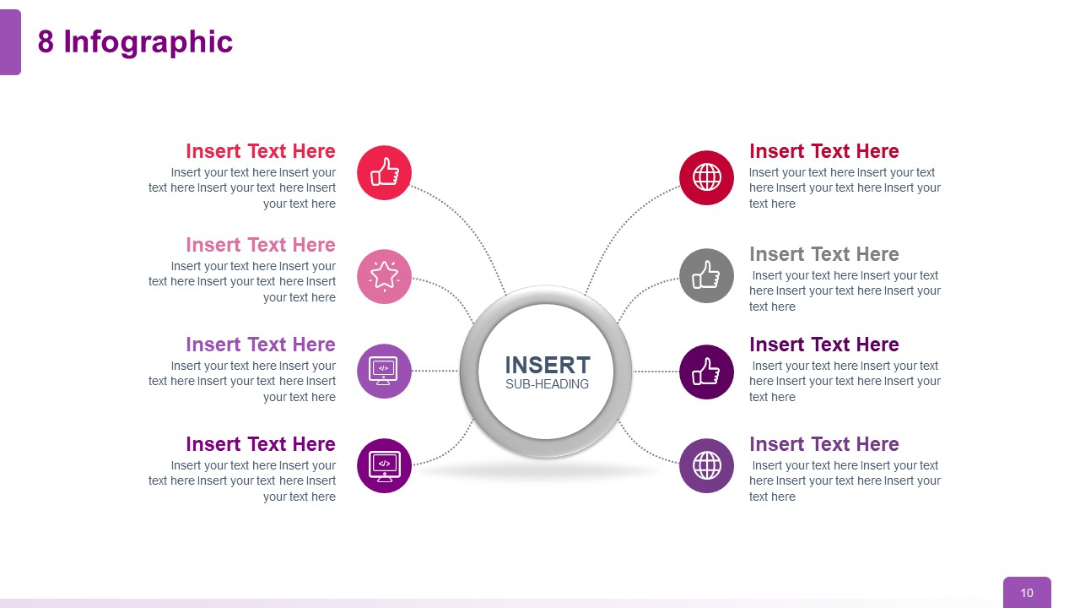
Eight-branch radial infographic layout with clear visual balance; icons and text flank a central hub.
PRO
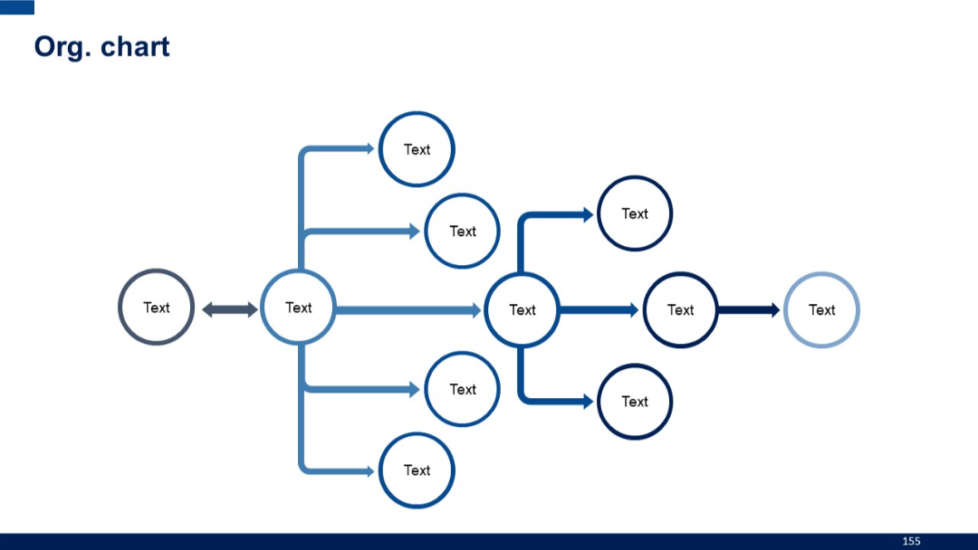
Horizontal organizational chart using arrows to connect circular nodes across multiple levels, forming a flow-like structure.
PRO
Timeline layout with a large icon on the left and a single bullet point extending horizontally with a purple connector line.

PRO
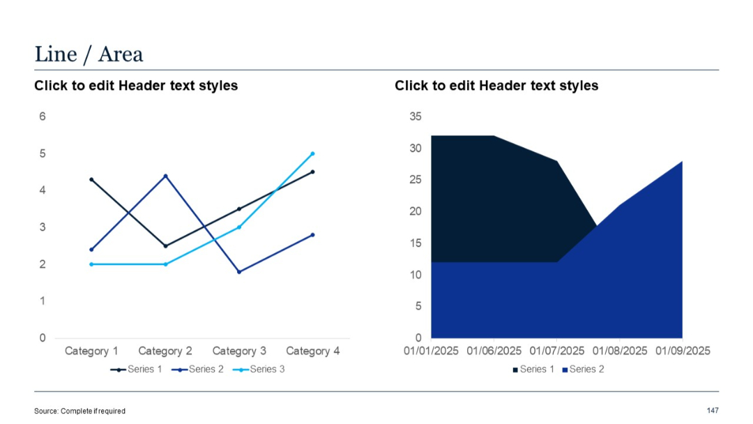
Left side has a 3-series line chart; right is a 2-series area chart. Time and category axes provide structured comparison.
PRO
Split-screen layout with text points on left, large "2x" stat on right; modern, clean design with white and blue backgrounds.

PRO
Horizontal bar chart with six identical-length bars (except the last, shorter), all in blue. Each bar is labeled “Logo” on the y-axis.
PRO
Full-screen background image of cityscape with network lines; quote text overlaid in bold white font.

PRO
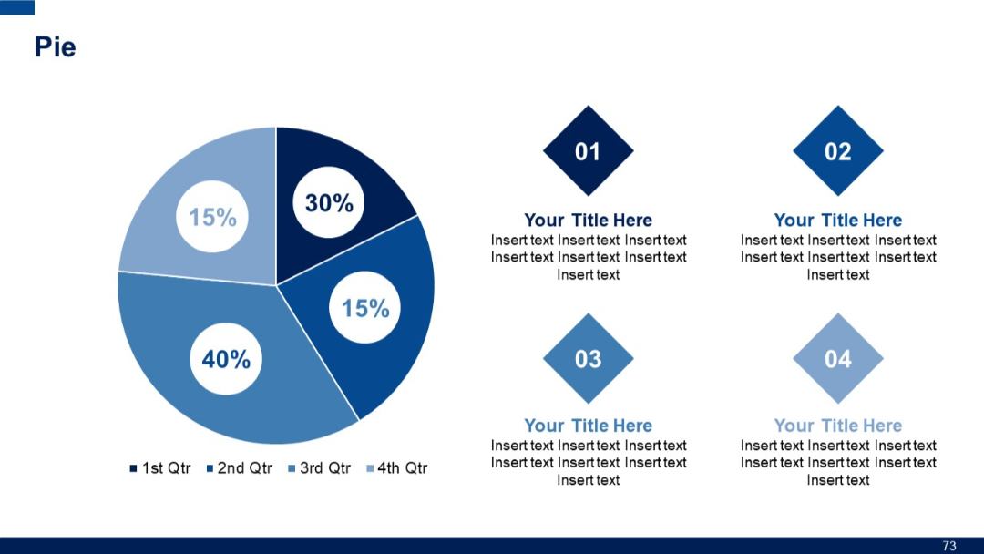
A large pie chart on the left with four segments, and diamond-shaped text placeholders on the right labeled 01 to 04.
PRO
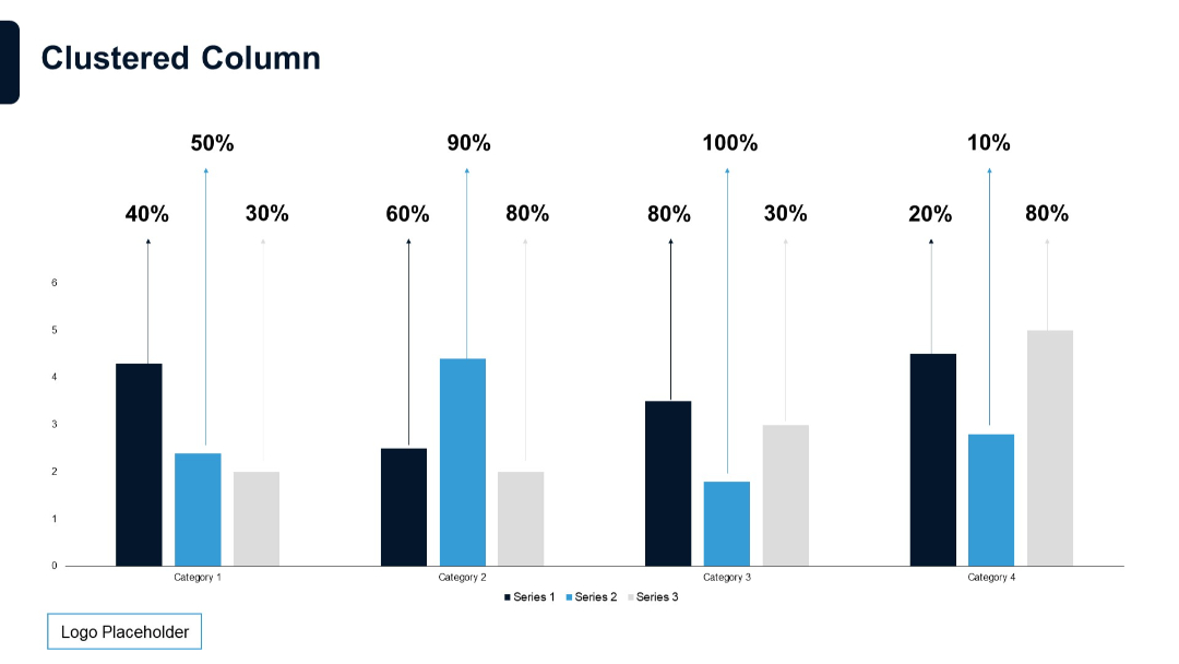
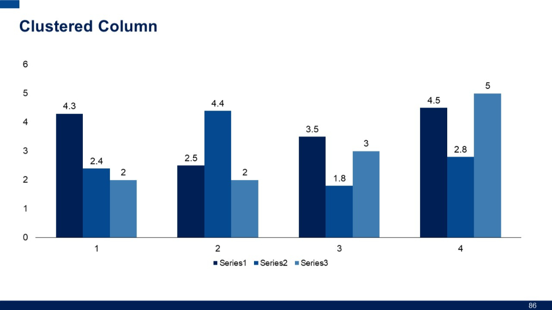
Plain clustered column chart with exact numerical values atop each bar. Displays three series over four categories.
PRO
Section divider slide with "01" in large font and "Qualitative Slides" subtitle below; blue and white horizontal split background.

PRO
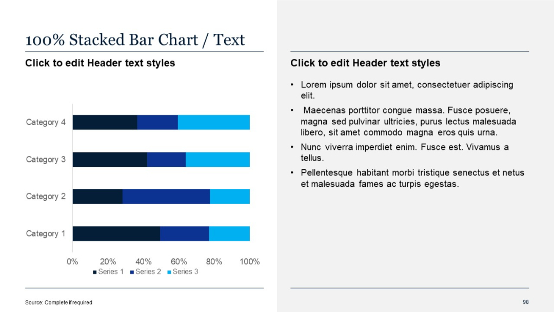
100% stacked horizontal bar chart with percentage values; explanatory text to the right.
PRO
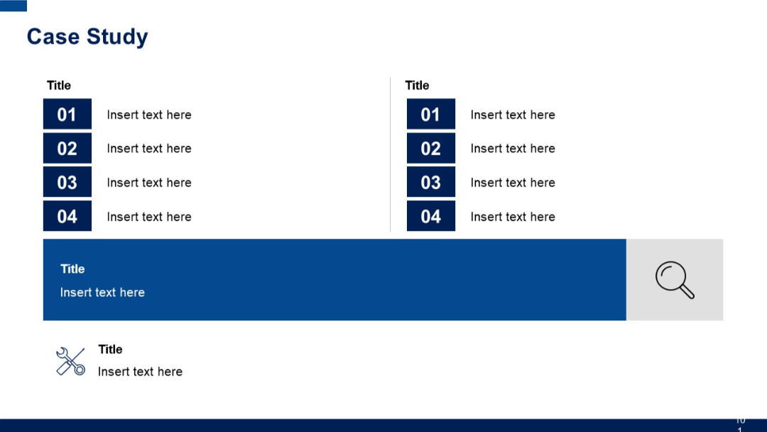
Two symmetrical vertical lists with numbered items, a large horizontal banner section with a magnifying glass icon, and a smaller icon section below.
PRO
Grid layout with rectangular orange vertical bars inside cells, arranged in three rows and eight columns, each column with a header title.

PRO
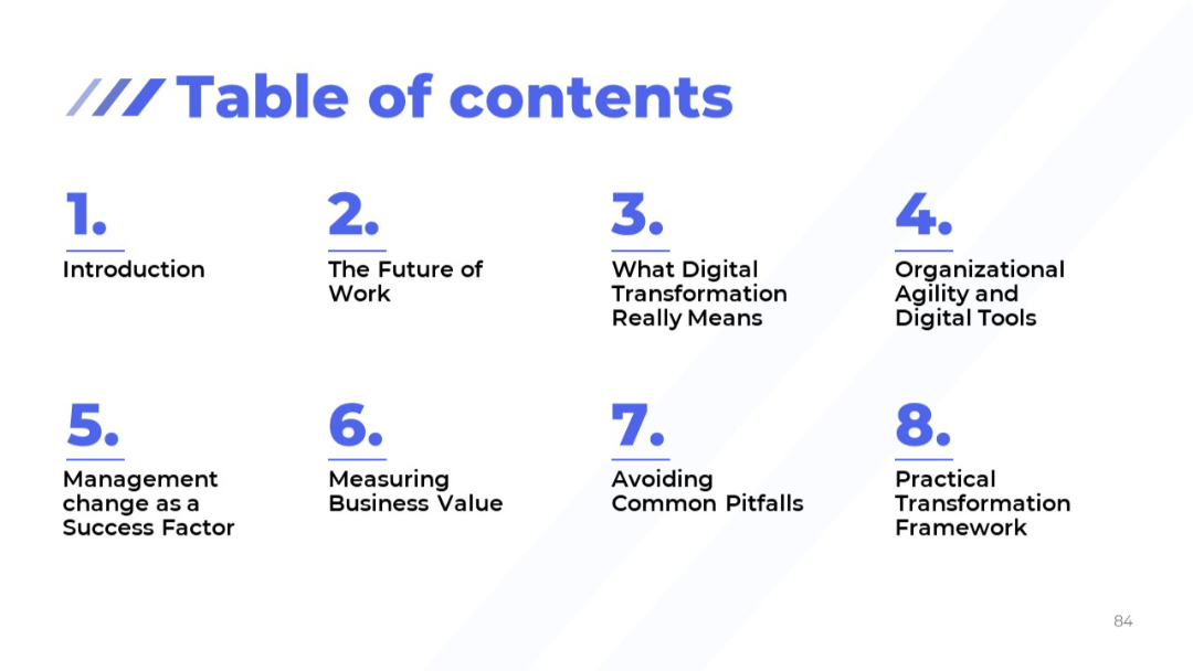
Minimalist grid layout on a light background showing 8 numbered agenda sections.
PRO
Four evenly spaced blocks with titles, headings, and detailed bullet points; alternating dark blue and light blue headers.
PRO
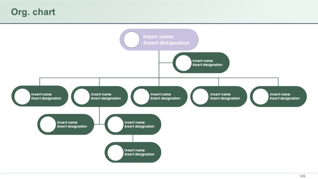
Flattened hierarchical org chart with horizontally aligned roles. Oval shapes and connecting lines show relationships across departments.
PRO
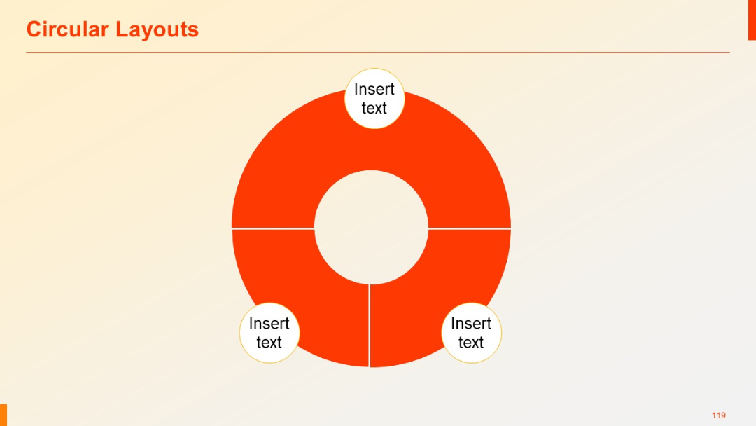
Circular chart split into four equal quadrants, each with a “Insert text” circle attached. Uses bold red color for emphasis.
PRO
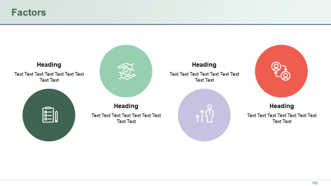
Circular icons with headings below. Five factors spread across the slide. Clean, balanced spacing.
PRO
Left-aligned scatter plot with diagonal growth trend and accompanying explanatory text on the right. White background with clean gridlines.

PRO
Basic area chart with two data series (Series 1 and Series 2) using red and orange fill. X-axis shows dates; Y-axis shows numeric values.

PRO
Two-panel layout: left side with quote text in a green block, right side for additional context or speaker info. Stylized quote marks and bordered boxes used.


