PRO
Left chart is a stacked vertical column, right chart is a line graph. Both use three consistent series colors in blue tones.

PRO
Doughnut chart on the left showing equal thirds, with three corresponding rounded text boxes on the right.

PRO
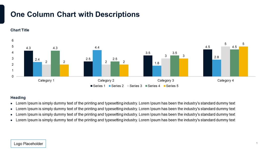
Single column chart with 5 series over 4 categories. Description text appears below with bullet points. Standard color-coded bars.
PRO
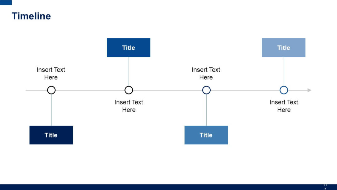
Horizontal line with 5 equidistant points. Text boxes appear above and below line with alternating filled/unfilled circular markers.
PRO
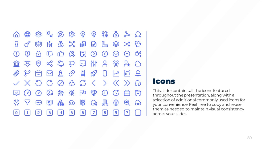
Grid of icons on the left, with descriptive text on the right. Clean, light background with simple layout.
PRO
Simple gradient slide with large "02" section number and title “Qualitative Slides.” Acts as a divider or chapter header.

PRO
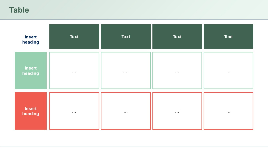
Three-color-coded rows (green, red, white) and a matrix-style 3x4 grid. Boxes contain ellipses or placeholders.
PRO
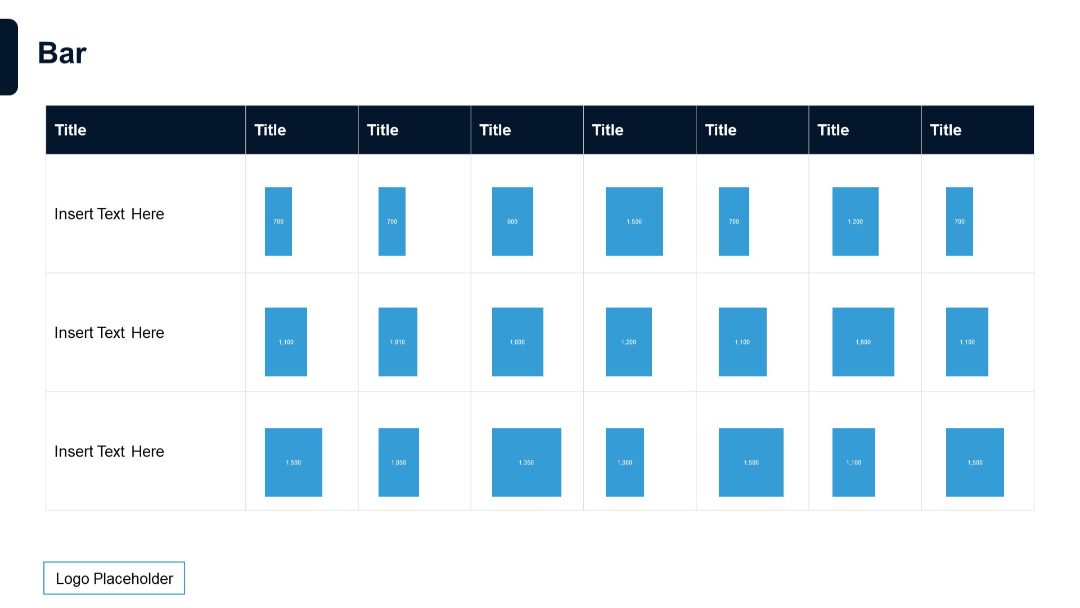
Grid of small vertical bar charts arranged in a table format. Blue bars in each cell with numerical values inside.
PRO
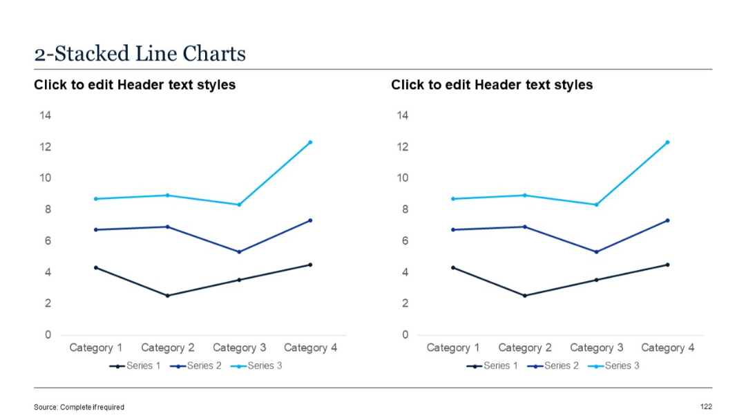
Two identical stacked line charts shown side-by-side. Each plot contains three series across four categories.
PRO
Four interconnected circular shapes forming an “X” in the center, each circle with a star icon and text box surrounding the graphic. Symmetrical layout.

PRO
A 5-column, 3-row table layout. The first column has red-highlighted blocks for each row. Remaining columns are light with placeholder text.

PRO
Dense multi-row Gantt chart with color-coded bars across a full-width time axis; legend at the bottom.

PRO
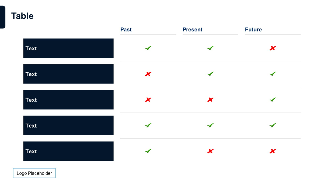
A comparison table with a left-aligned title row and multiple columns, each with check marks and crosses. Color-coded columns and a placeholder for logo.

PRO
Two clustered horizontal bar charts, each grouping three series per category with different colors.

PRO
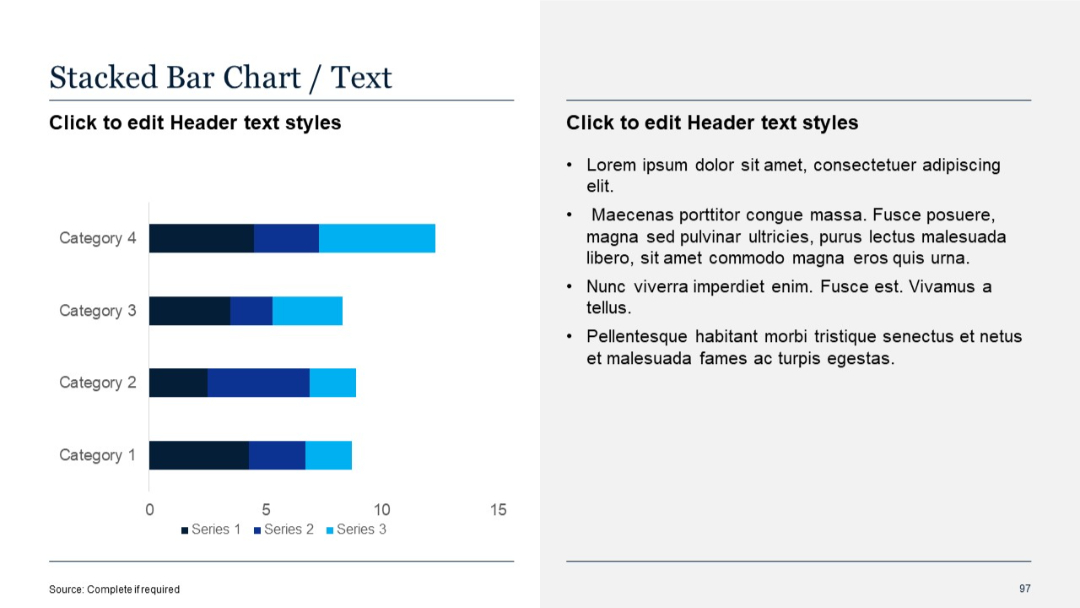
Horizontal stacked bar chart showing multiple data series per category; text on the right.
PRO
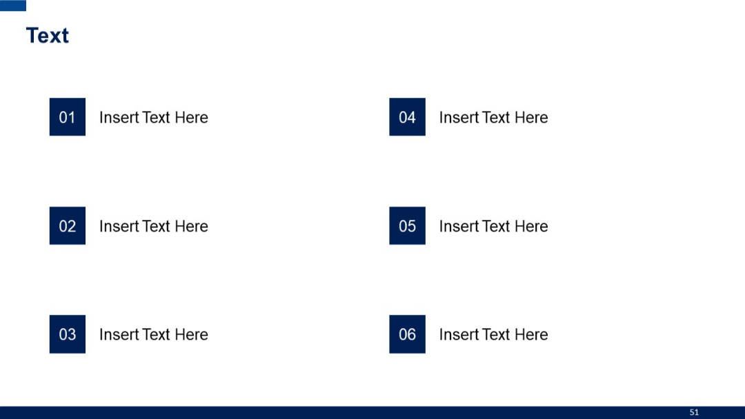
Two-column layout with six rectangular numbered blocks, each paired with placeholder text horizontally.
PRO
Similar layout to previous, but includes three rows. Top headers in red, lower rows with dotted placeholder content (“...”).

PRO
A circular, petal-style layout with six segments and surrounding editable text boxes. Each segment is color-coded and includes a visual marker.

PRO
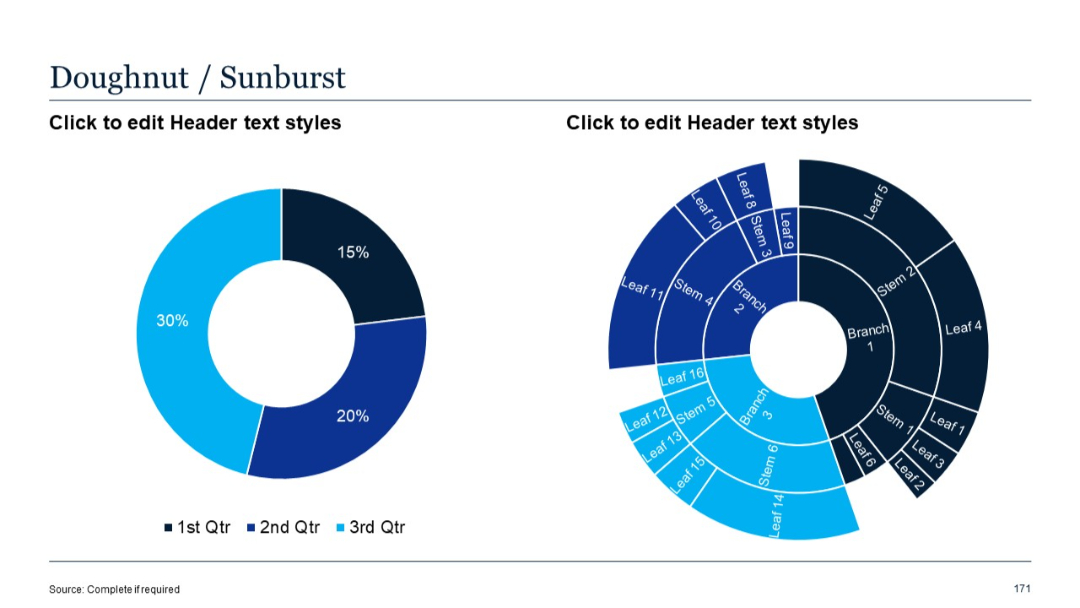
Two side-by-side circular visualizations: a simple doughnut chart on the left and a multi-layered sunburst diagram on the right.
PRO
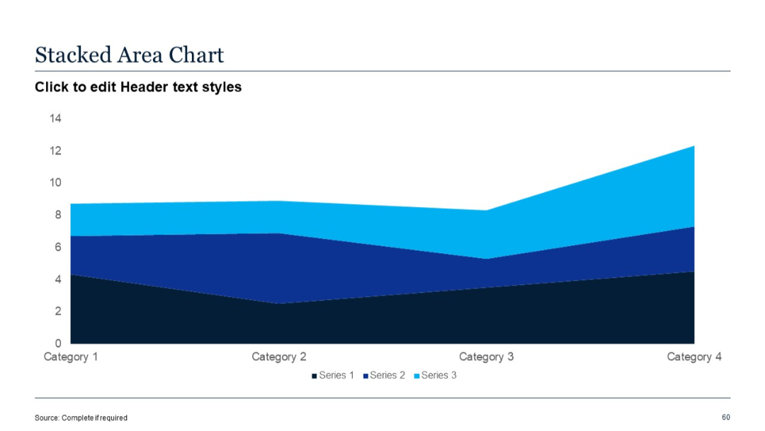
Filled stacked area chart; three data series; values build upon each other across four categories.
PRO
Three vertical cards with outline borders and icons above bold titles

PRO
Grid layout of four quote boxes, each with opening quotation marks and placeholders for content. Rounded boxes and soft purple accents suggest approachability.

PRO
Dark full-screen slide with central horizontal line ending in a circle, modern visual indicator.

PRO
Three-column time-based table (Past, Present, Future) with thick row headers and check/cross indicators in color.
PRO
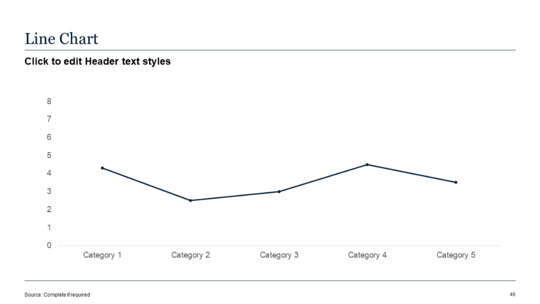
Simple line chart with one data series plotted across five categories. X-axis shows categories, Y-axis shows numerical values.
PRO
A matrix of six small horizontal bar clusters with icons, percentages, and labels. Color-coded by row.
PRO
Finance and people-focused icons in red outline. Includes wallets, cash, people in groups, and POS systems.

PRO
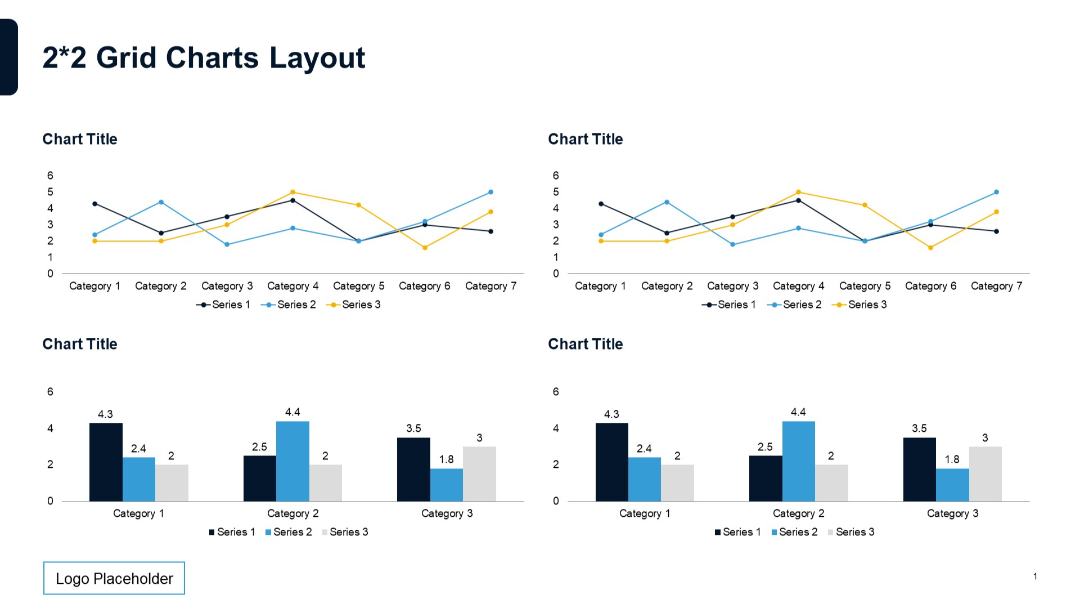
2x2 grid of charts, with top charts as line graphs and bottom as bar charts. Equal spacing, titles above each. Standard 3-series format.
PRO
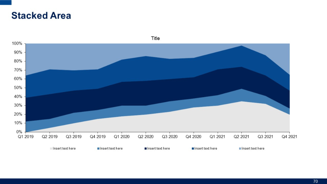
Stacked area chart with five data series over quarterly periods from Q1 2019 to Q4 2021. Legends and axes included.
PRO
Semi-circular segmented diagram with four colored arcs around a central circle labeled "HEADING", with text blocks adjacent to each arc.