PRO
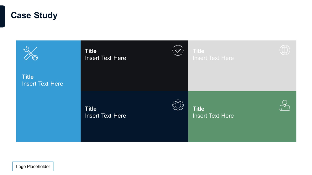
Grid layout with six icon-based sections (3x2), each featuring a red icon, a label ("XX"), title, and placeholder text.
PRO
Four horizontal boxes with numbered tabs in vibrant colors, each aligned in a vertical stack.
PRO
Symmetrical dual-column timeline with vertical lines and circular nodes connecting horizontally placed text.
PRO
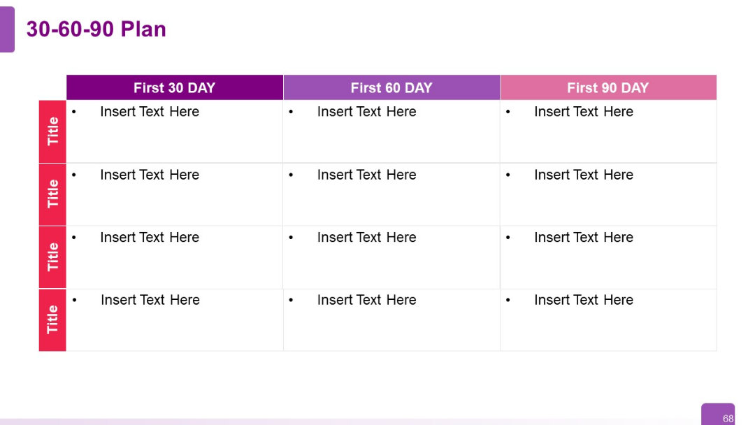
Table layout with rows for key activities/titles and columns for First 30/60/90 DAY. Each cell has bullet points for text.
PRO
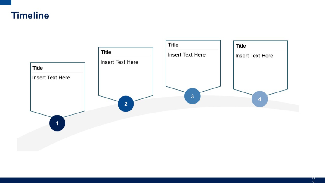
Curved ascending timeline with four flag-style text boxes connected to numbered circular markers from 1 to 4 along a rising path.
PRO
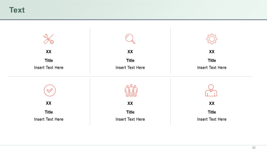
Grid layout with six blocks, each with an icon, title, and placeholder text. Colors alternate per block.
PRO
Left-aligned half-circle title with connected tick icons to right-aligned text for each item.

PRO
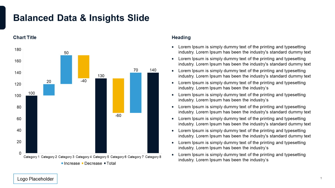
Waterfall chart on the left with increase/decrease values and total. Right side has bullet-point placeholders.
PRO
Vertical checklist icons connected by a line on the left, with text placeholders aligned to the right.

PRO
Five colorful circular icons arranged in a pentagon shape; each with heading and text. Balanced and symmetrical layout.

PRO
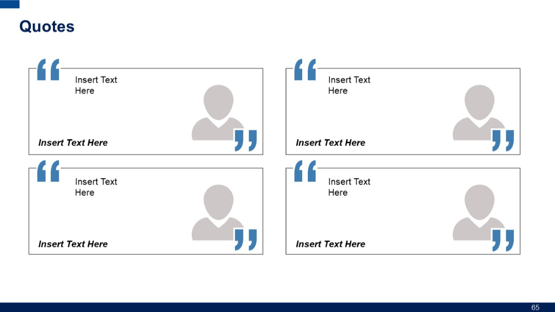
Four quote boxes with user icons and bolded placeholders. Each quote appears to be attributed to an anonymous figure, laid out in a 2x2 format.
PRO
Four-column layout with red headers. Each column contains a header title and corresponding placeholder text beneath.
PRO
Clean 2x5 grid with bold column headers for product analysis. Uniform rows with white background and green headers.
PRO
Grid of 28 line-style icons (e.g., magnifying glass, calendar, search, data) in red on a light background.

PRO
Grid of minimalist directional and functional icons on white background; icons include arrows, checkmarks, refresh, and navigation symbols.
PRO
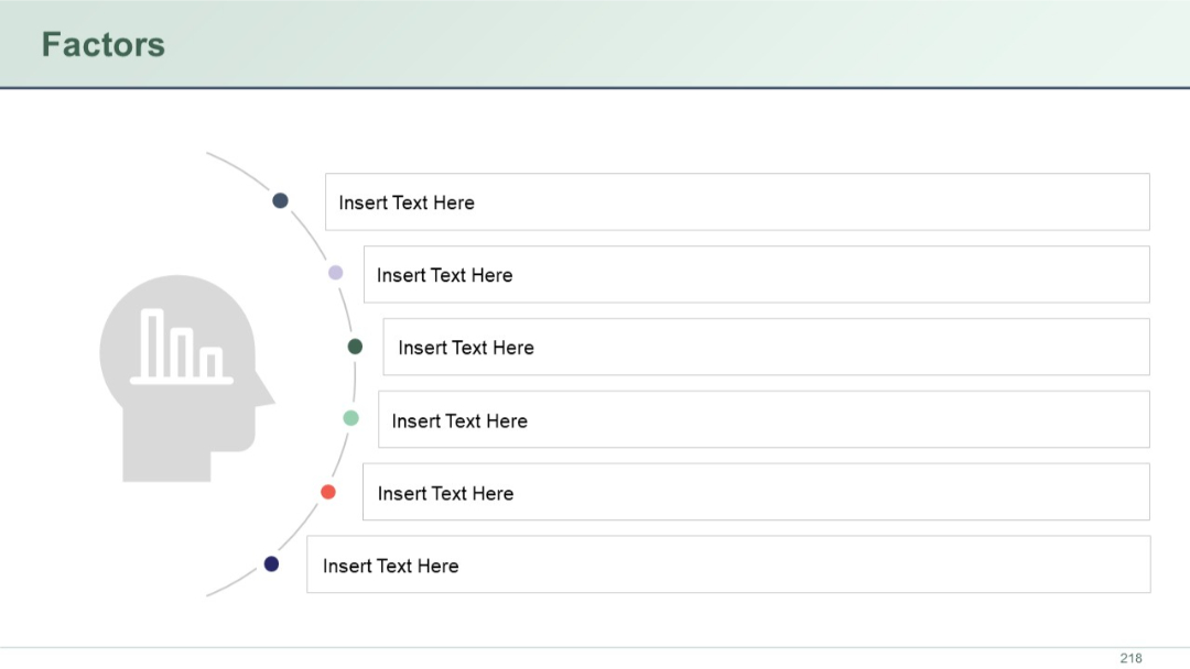
Silhouette of a human head with a chart inside on the left, and six rectangular text blocks radiating outward on the right, aligned along a curved path.
PRO
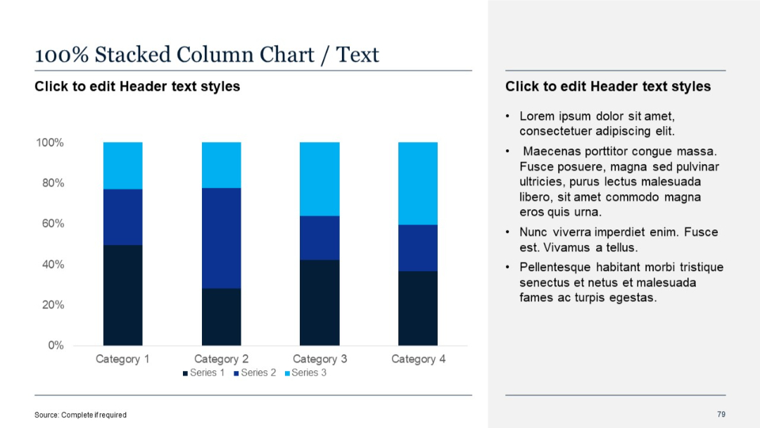
100% stacked vertical columns emphasizing proportional data breakdown. Labels marked by percentage on the x-axis.
PRO
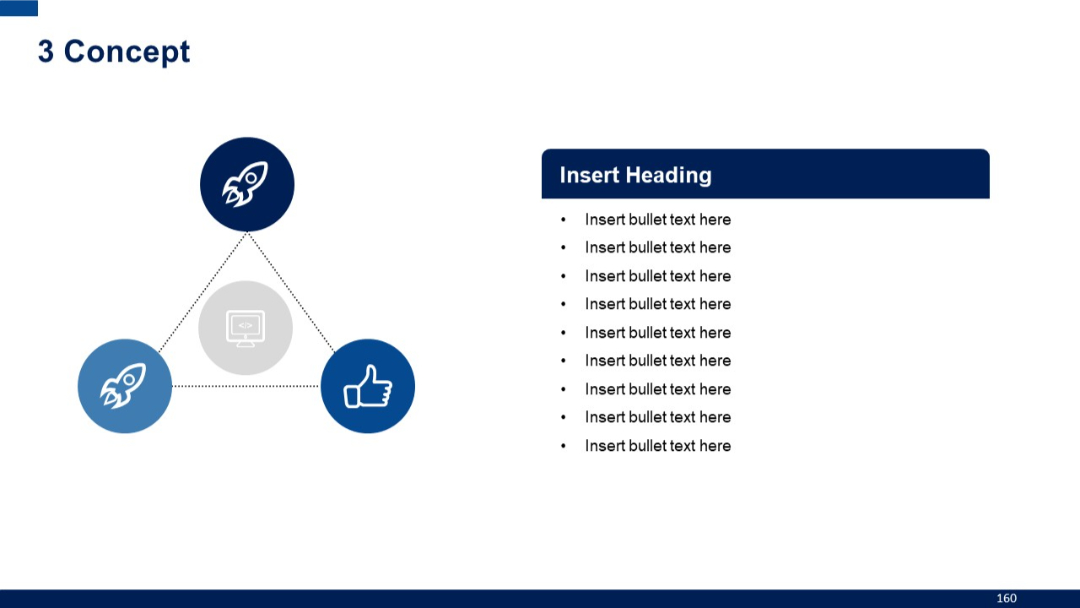
Triangular icon layout with dotted lines connecting each icon, central icon highlighted. Text content on right with bullet points.
PRO
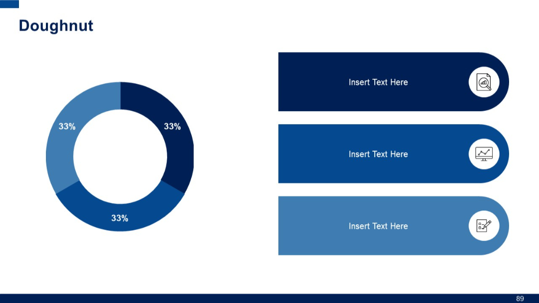
Left: Doughnut chart evenly divided into three equal segments, each labeled 33%. Right: Three rounded rectangular text boxes with icons.
PRO
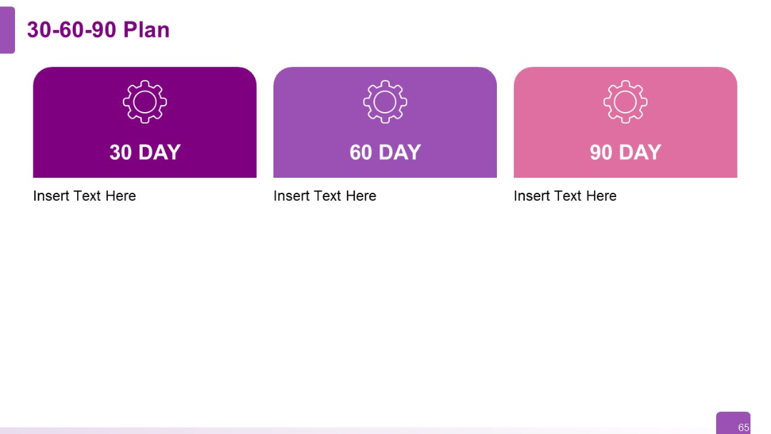
Horizontal layout with three rounded rectangular blocks labeled 30, 60, and 90 DAY. Each block includes an icon and editable text area.
PRO
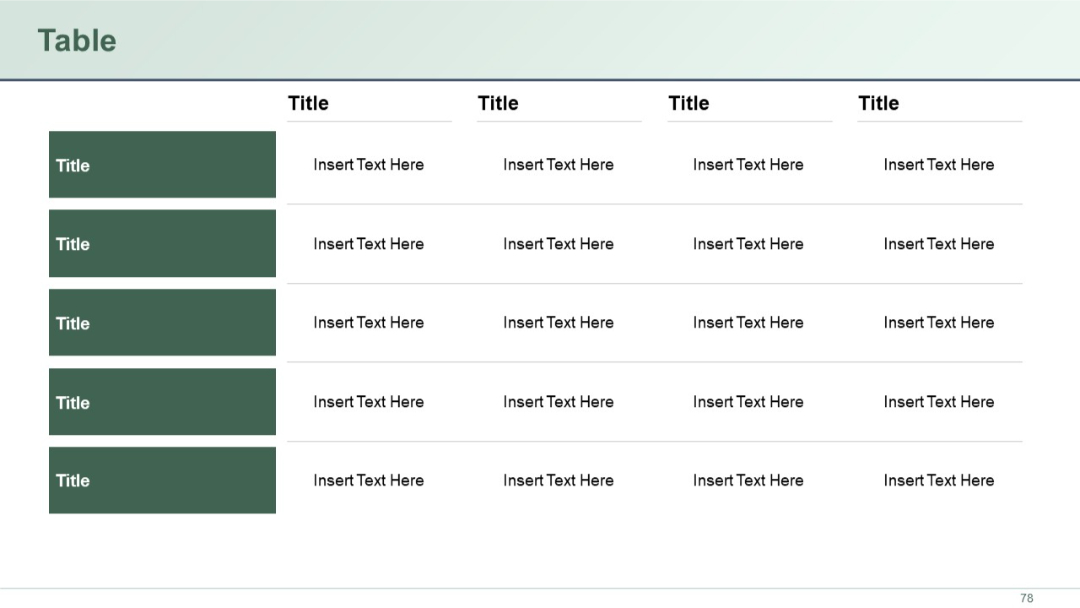
5-row, 5-column table with green block headers on the leftmost column. Clean table design with placeholders in each cell.
PRO
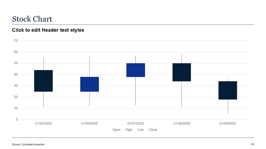
Candlestick-style chart with OHLC data across five dates; color-coded boxes with whiskers.
PRO
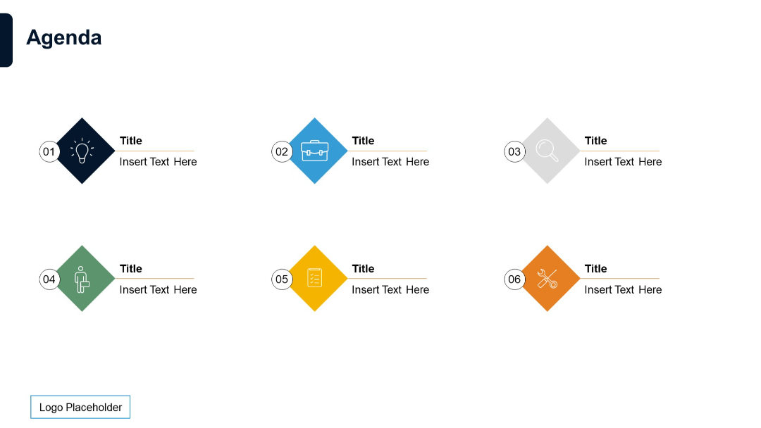
Agenda layout using diamond-shaped icons with numbers, colors, and titles in two rows.
PRO
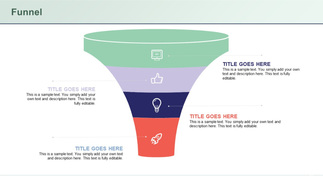
Inverted vertical funnel diagram with 4 color-coded segments, each with an icon and text box aligned to left or right.
PRO
Six icons and text elements in a radial format with even distribution around a central circle.
PRO
Four-column, two-row layout with red header blocks. First column contains red blocks on the side to indicate section labels.
PRO
Image grid layout on a dark background, similar to Slide 34, but includes all four business focus areas with accompanying icons and summary text for each.

PRO
Shows some charts and data points with minor style or spacing variation.
PRO
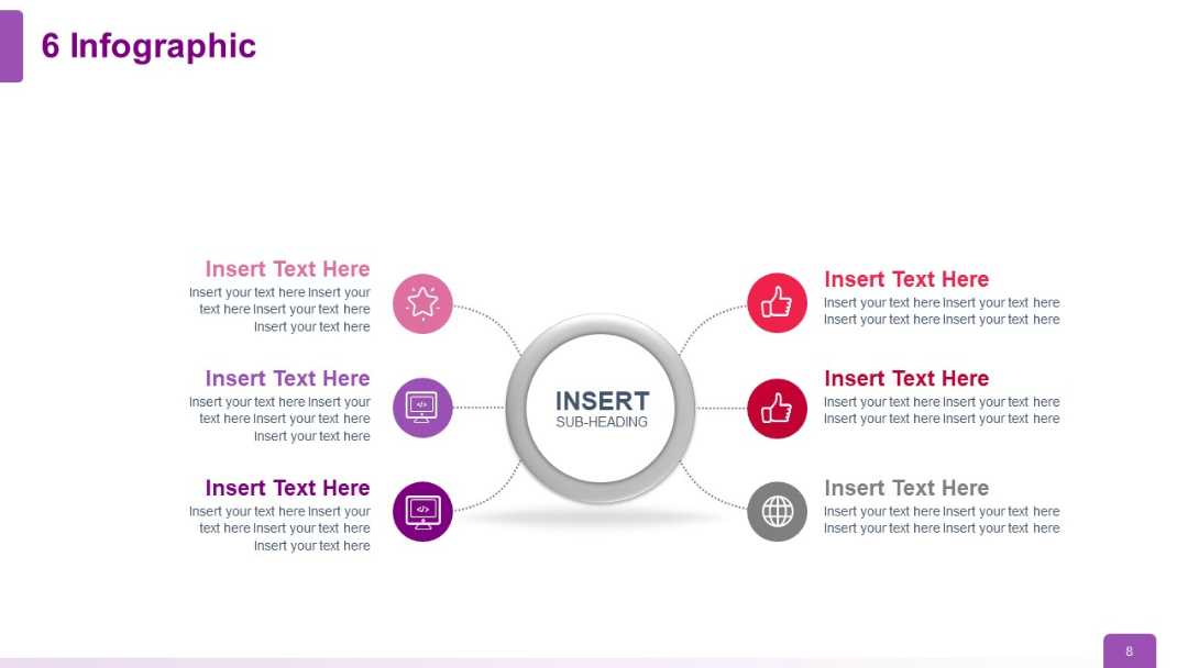
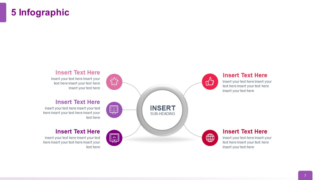
Five surrounding branches with icons and text stemming from a center ring; symmetrical layout.
PRO
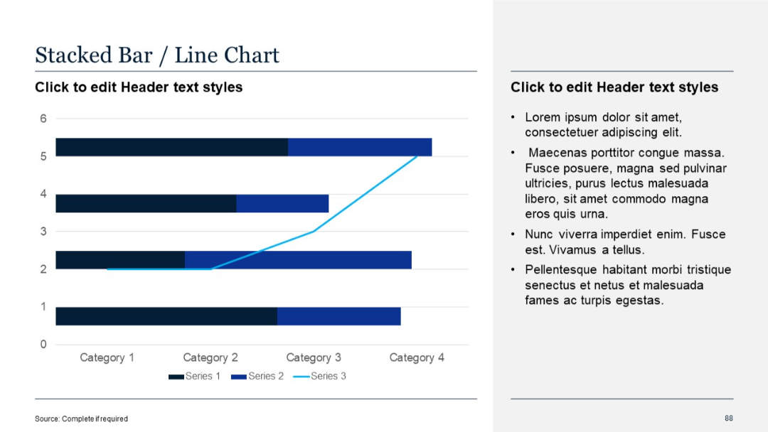
Horizontal stacked bar chart combined with line graph; two-column layout